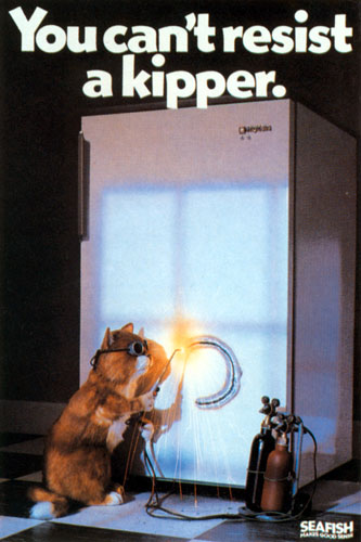
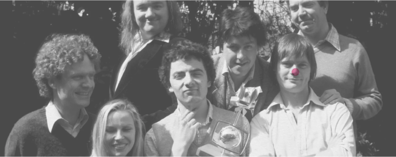
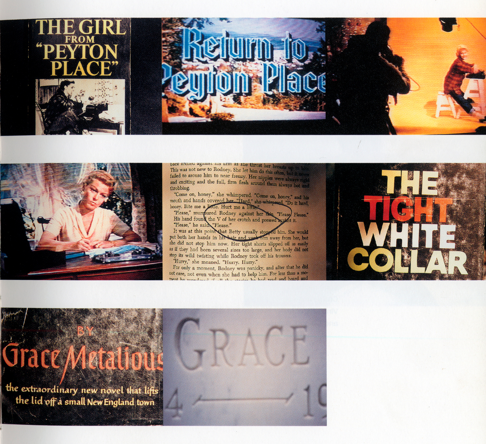
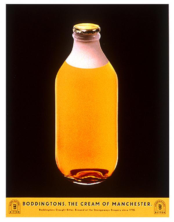
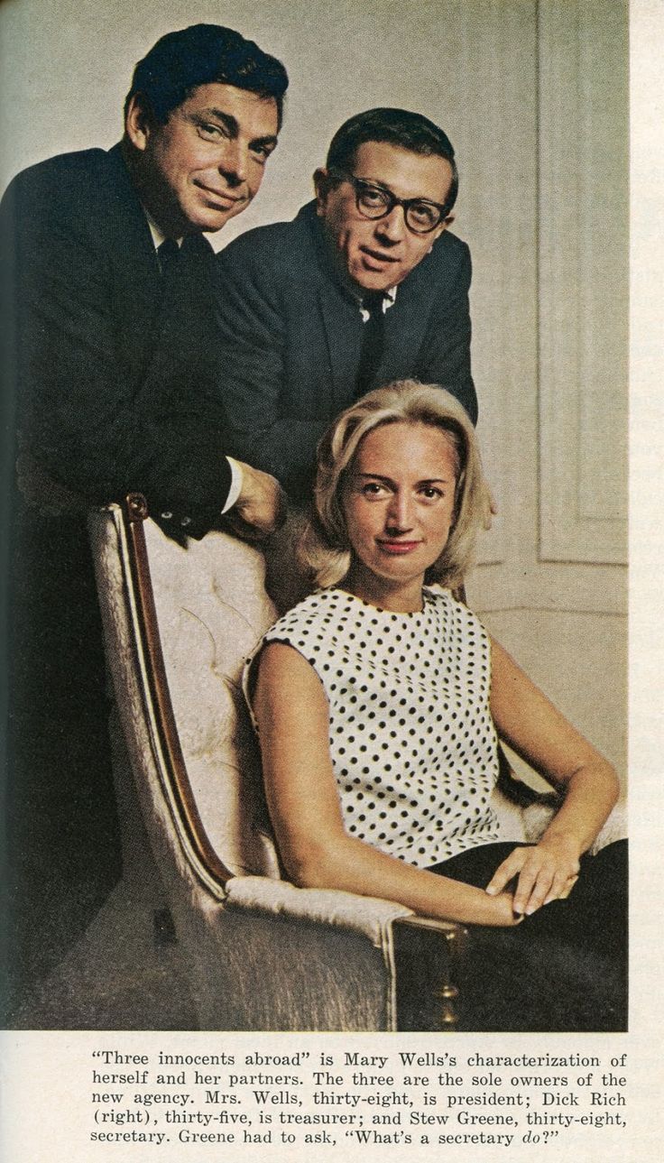
I wanted to do that ad.Everybody who saw it laughed. Why the hell didn’t I do it? It was so bloody annoying. I wanted to create something effected people it had effected me.Basically, make them laugh. So whenever I’d get a brief I’d do something in that style, something that felt like it was from that world: funny models of animals making a single product point. Then, over at BBH, Chris Palmer and Mark Denton started producing ads using funny models of animals making a single product point. Damn them. Why didn’t I do those as well! I could’ve done those. If I’d had that brief. Been at BBH. And thought of those ideas.
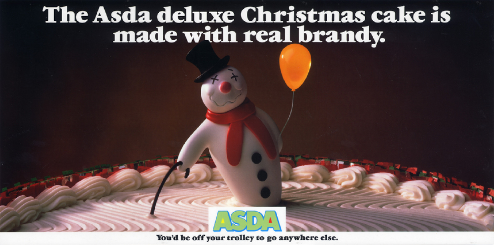
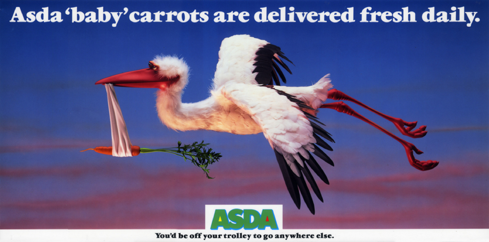
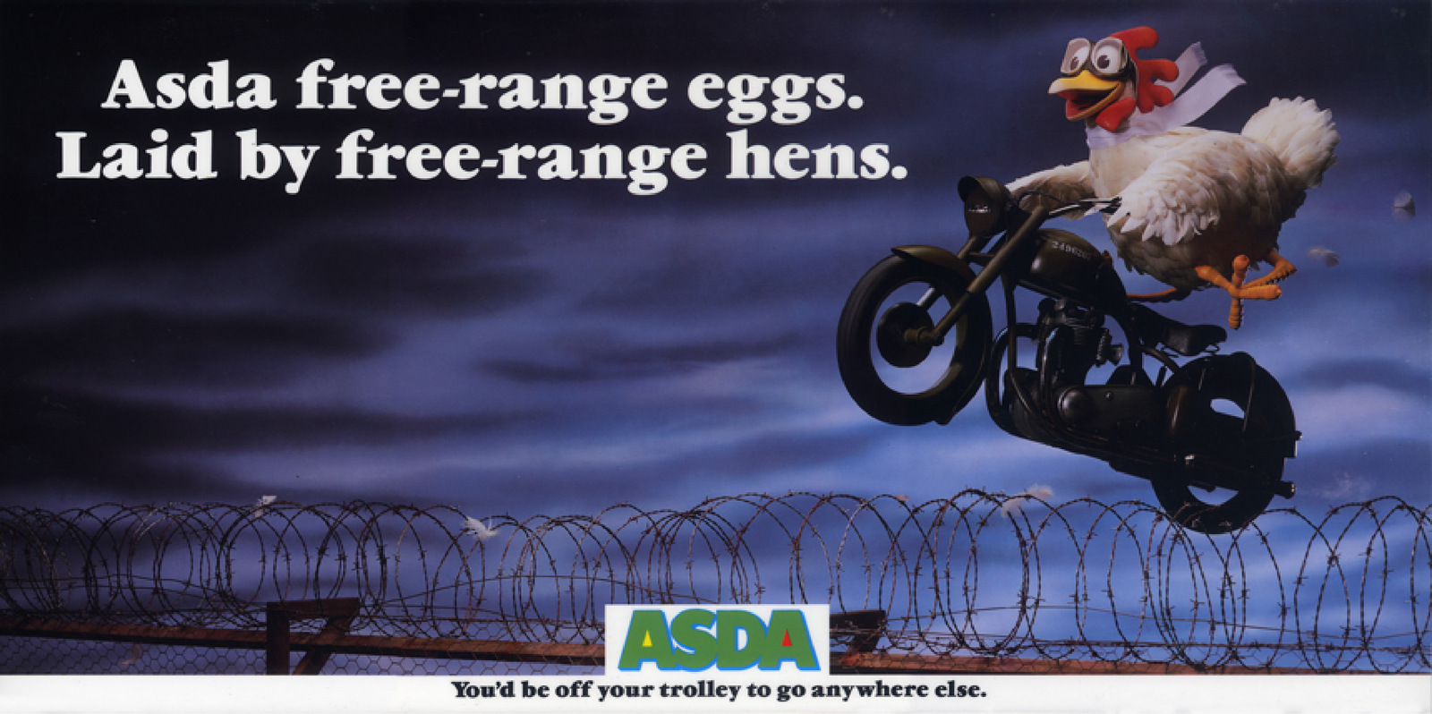
Like the previous twenty briefs I’d worked on, Findus frozen fish pieces seemed like the perfect opportunity to do some posters using funny models of animals making a single product point.
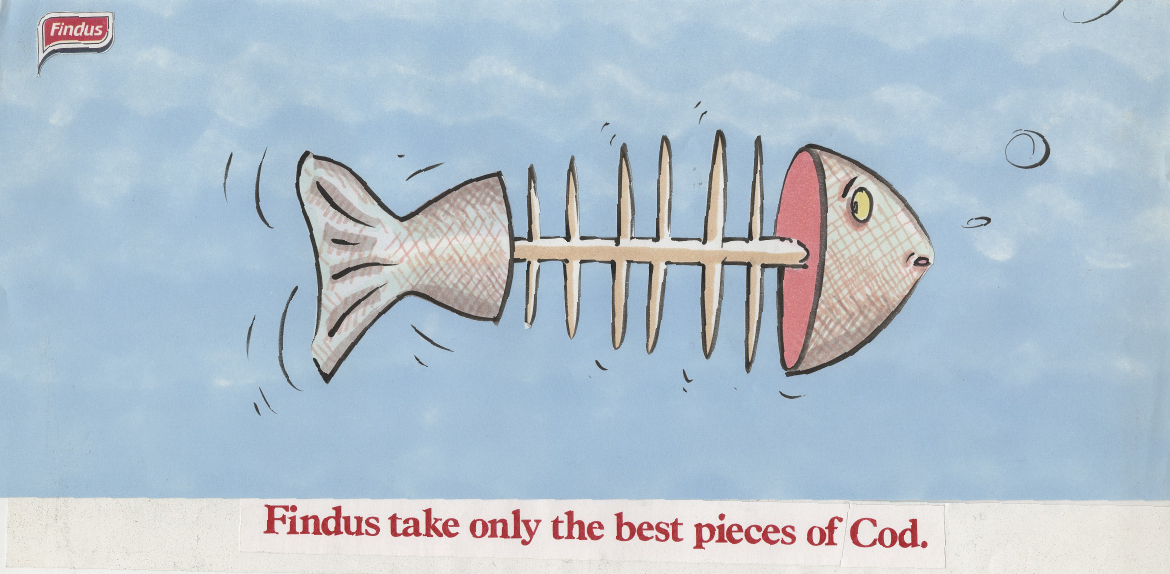
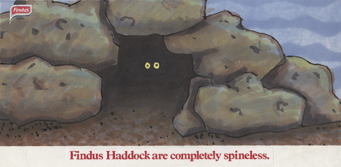
CLIENT: ‘They’re cute...but not right for us.’Damn it!How do I get some of that ‘funny models of animals making a single product point’ action?Chris and Mark went to Lowe’s and produced another hilarious poster with funny models of animals making a single product point.
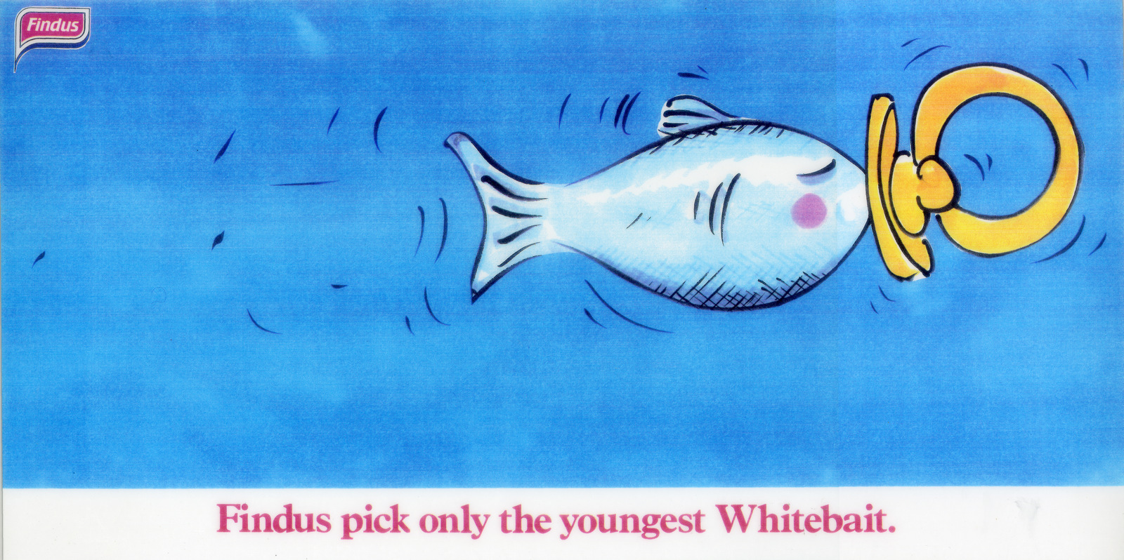
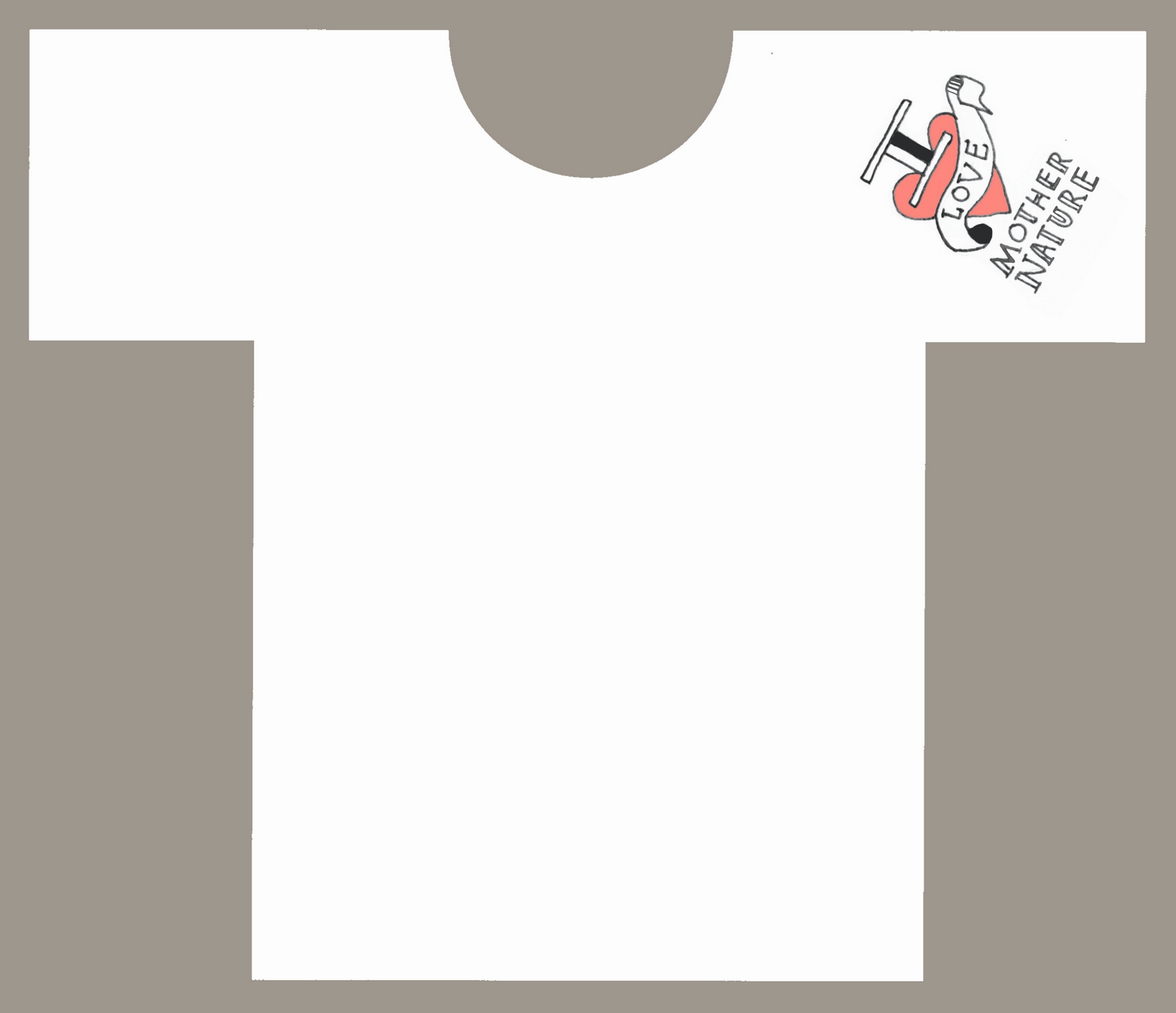
I didn’t do that one either, annoying!I never got to make a poster with funny models of animals making a single product point.But trying to do so was really helpful.Whether you want to to play guitar, paint or advertise, one of the best ways is to learn is to copy the people you love.p.s. If a team showed me the Seafish concept today, I couldn’t help but ask why a cat smart enough to go out and buy an oxy acetylene torch, with paws that are dextrous enough to operate the thing, doesn’t just open the fridge door?N.b. Here is a piece by Guy Gum giving a bit more insight into the Seafish poster:


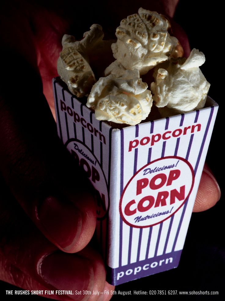
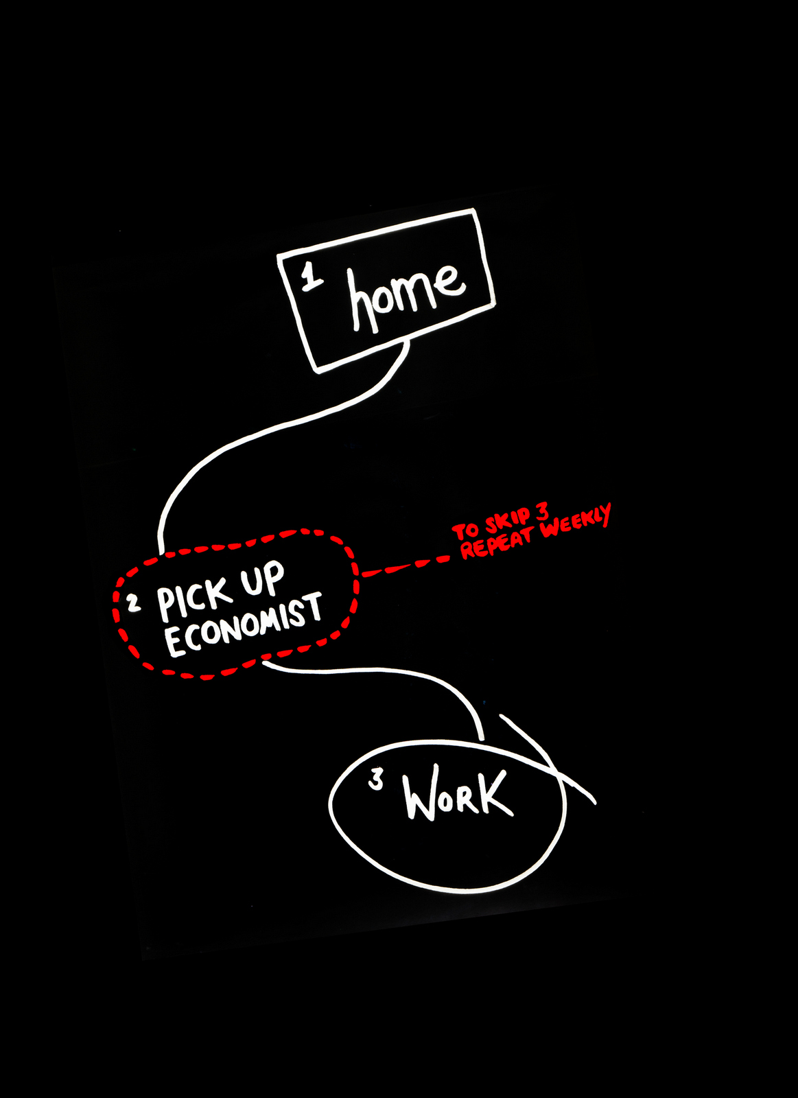
‘Can you do me an ad for Rushes Short Film Festival? it's to go in my Gongs magazine, it's an opportunity!’ - Mark Denton.
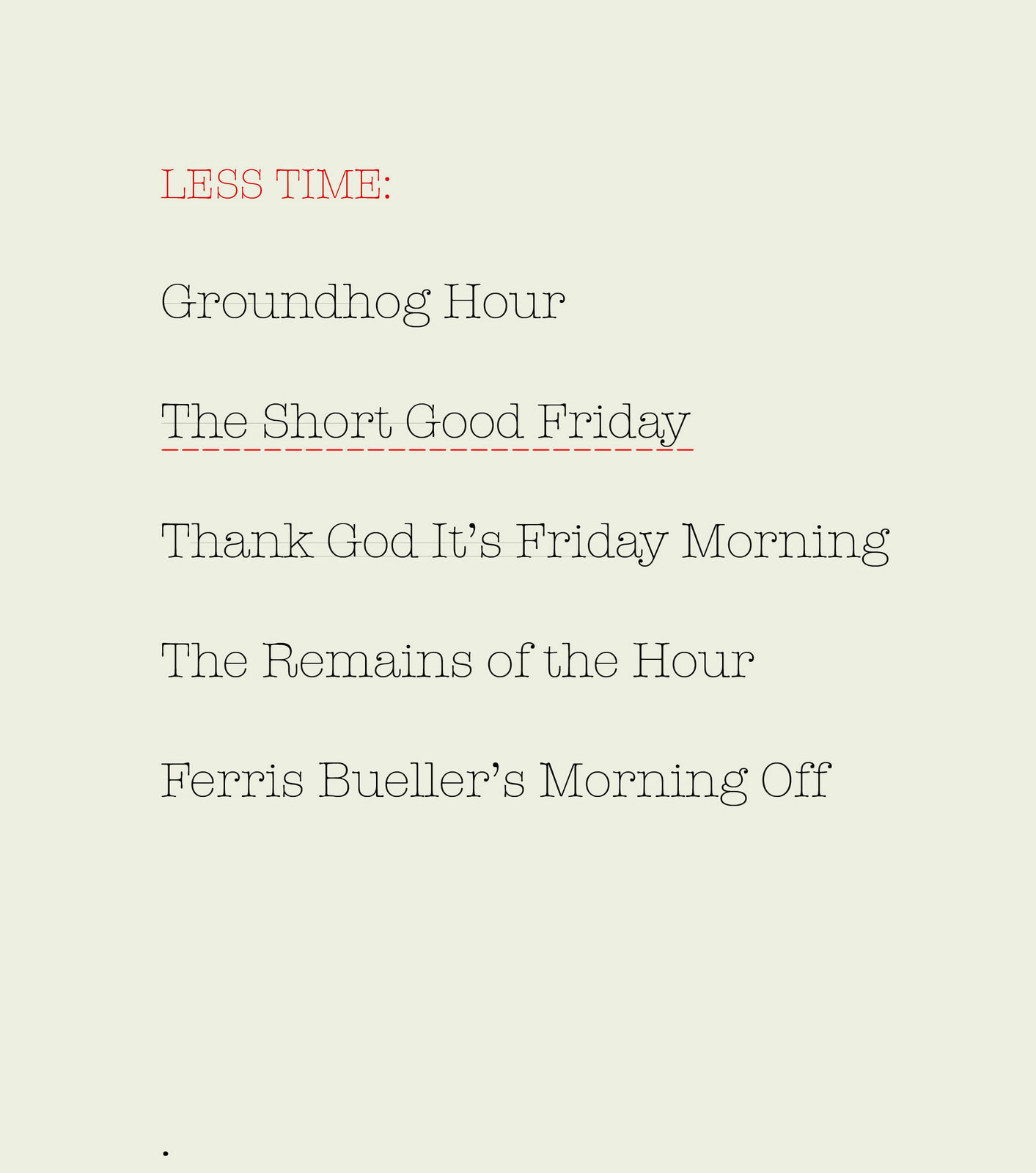
DISSOLVE TO THE FOLLOWING YEAR.‘Can you do me a campaign for my Short Film Festival? it's to go in my Gongs magazine, it's an opportunity!’ - Mark Denton.(The Therapy Short Film Festival was one of a number of ideas Mark has had over the years to redistribute money he's built up in his savings account.) Looking back on my previous short film effort, it was simple, dead clear, mildly humorous, BUT...it just reeked of ‘average’. I decided it was because it was a bit small and addy. It wasn't aspirational, it didn't celebrate the world of film. Afterall, the people who enter short film competitions dream of one day entering long film competitions, like The Oscars. Linking our little festival to the big, glamorous world of cinema would be a good start. So how could we say they're the same but much, much smaller? Change the names of films that mention time to a smaller amount of time, e.g. ‘Groundhog Hour’.
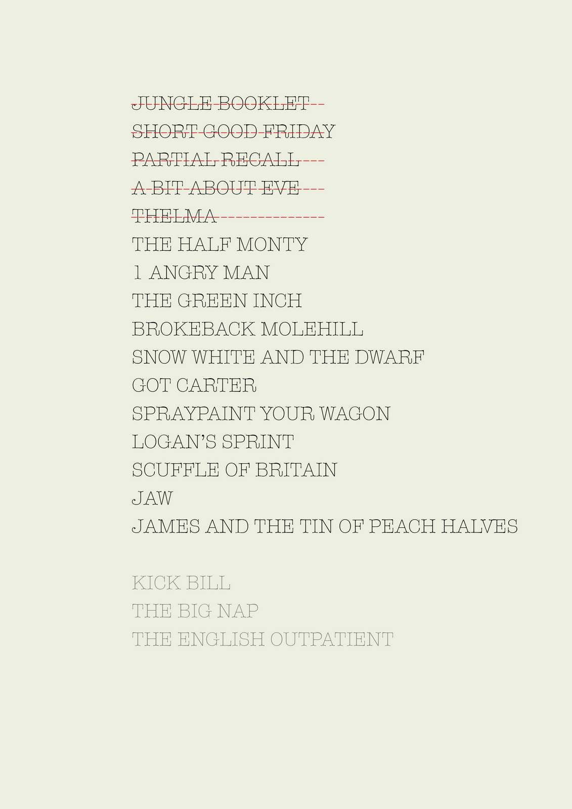
Typed they just looked like half ideas, but maybe if we turned them into film titles they might feel more substantial. I started looking at film titles to understand how they used images.
Patterns started to emerge. I started to turn the doodles into film titles with typographer Andy Dymock. We noticed images are often used to capture the mood of a film.
They may take a key icon to link to the title.
Sometimes the opening credits will travel around a film's location.
Mocked up, they appeared funnier. It's the clash of serious, almost pompous visuals with silly, almost childish words. But I wondered whether sticking to time related films was a bit too literal, all we needed to do was suggest this film wasn't very long.
We mocked up a few more. Retouching Boy Wonder, Oli Carver, took my crisp, shiny Mac layouts and started making them look ropy. By degrading the pictures, putting noise and a whole load of other layers on top of the image, it knitted all the elements together. It made it look like a piece of old film.
It looked better, but the type didn't feel cheesy enough for a Hollywood blockbuster.


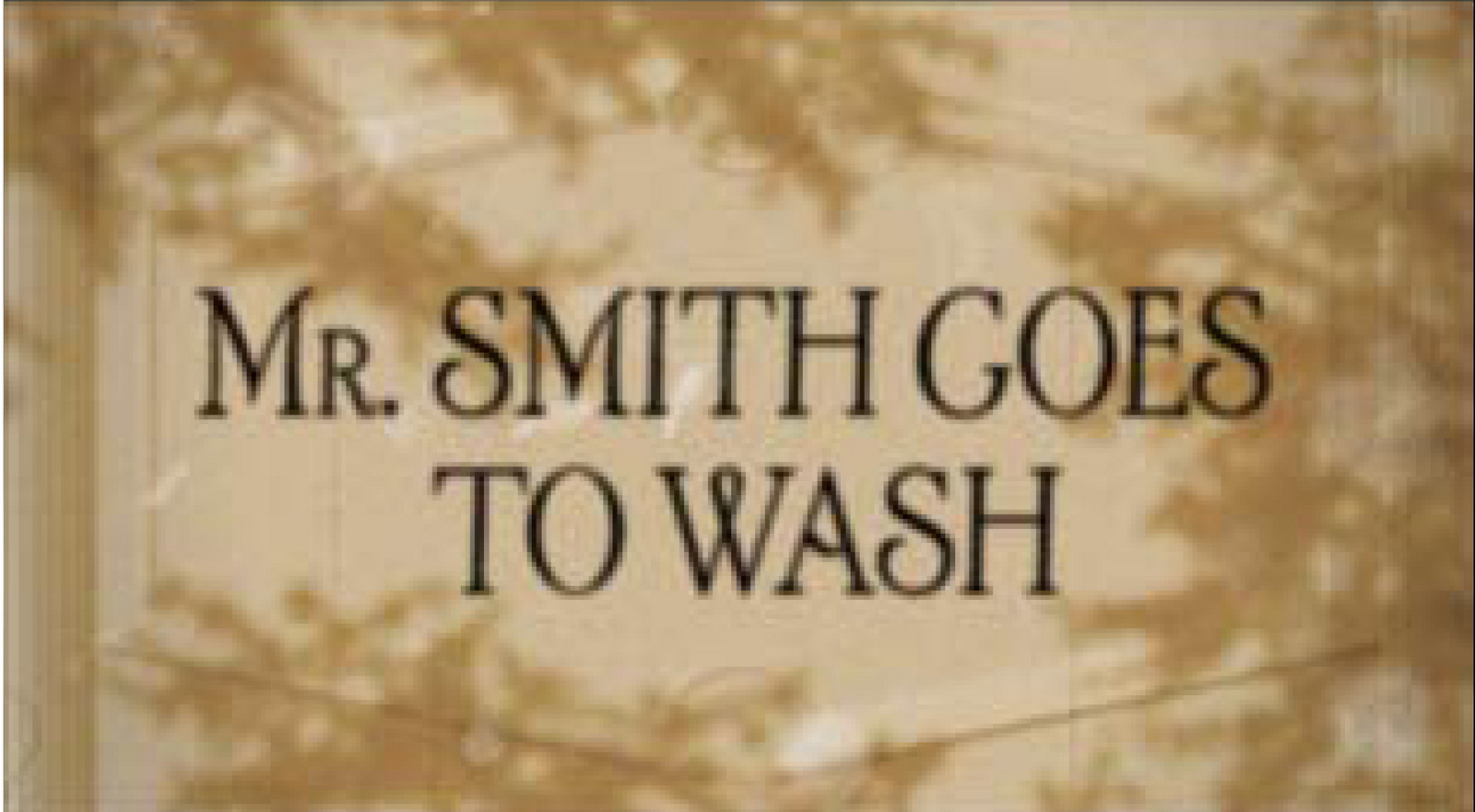
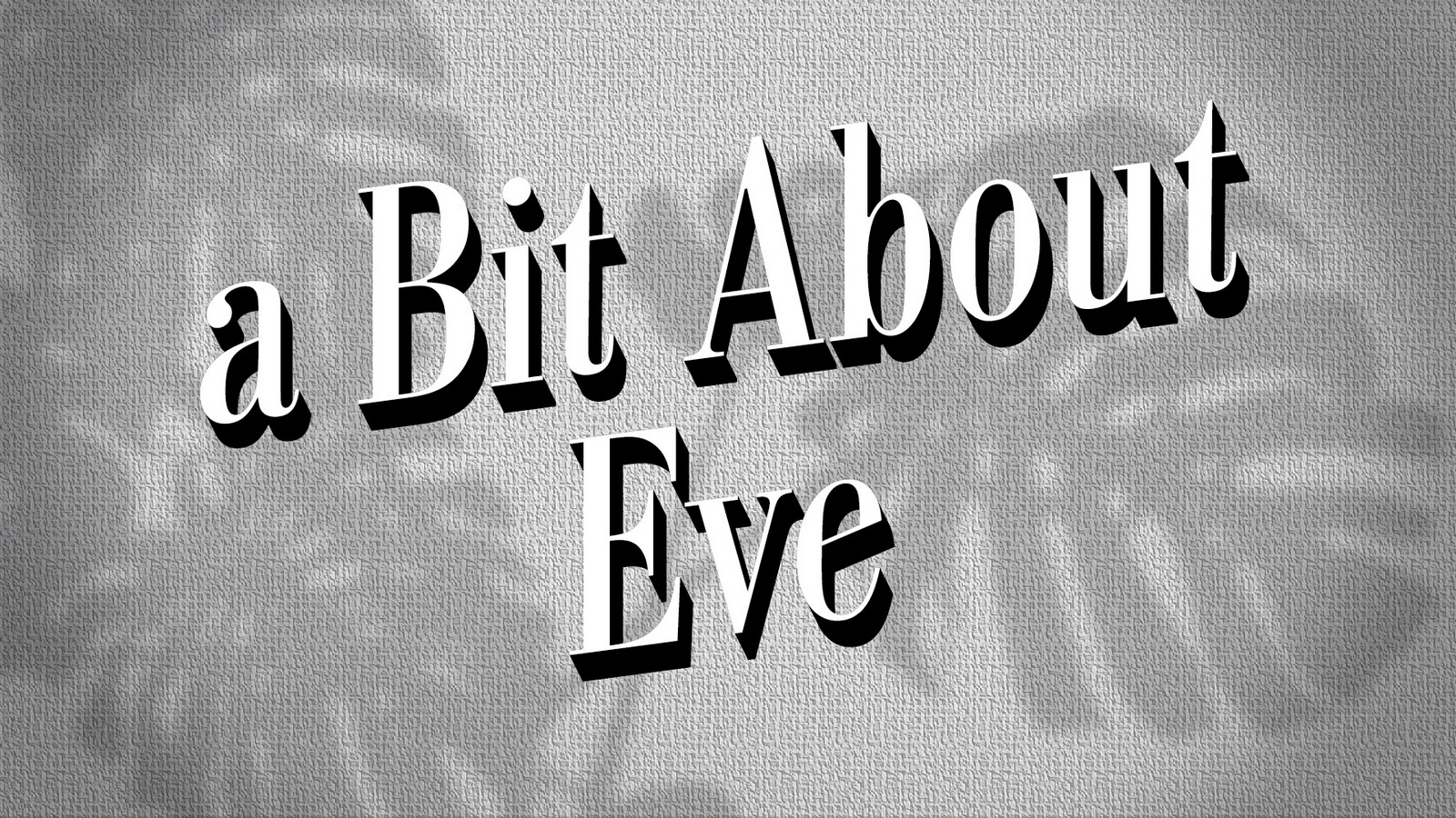
Mark Denton showed me a whole scrapbook of his full of old film titles using shadow against a two-dimensional background, they were very evocative, but this was the deal closer; dirt cheap to shoot. I wasn't sure of the ‘Mr Smith Goes To Wash’ idea, I loved that by simply cutting off the last few letters of the film's name it suggested a smaller film.But my worry was it might suggest a ‘sillier’ rather than ‘smaller’.
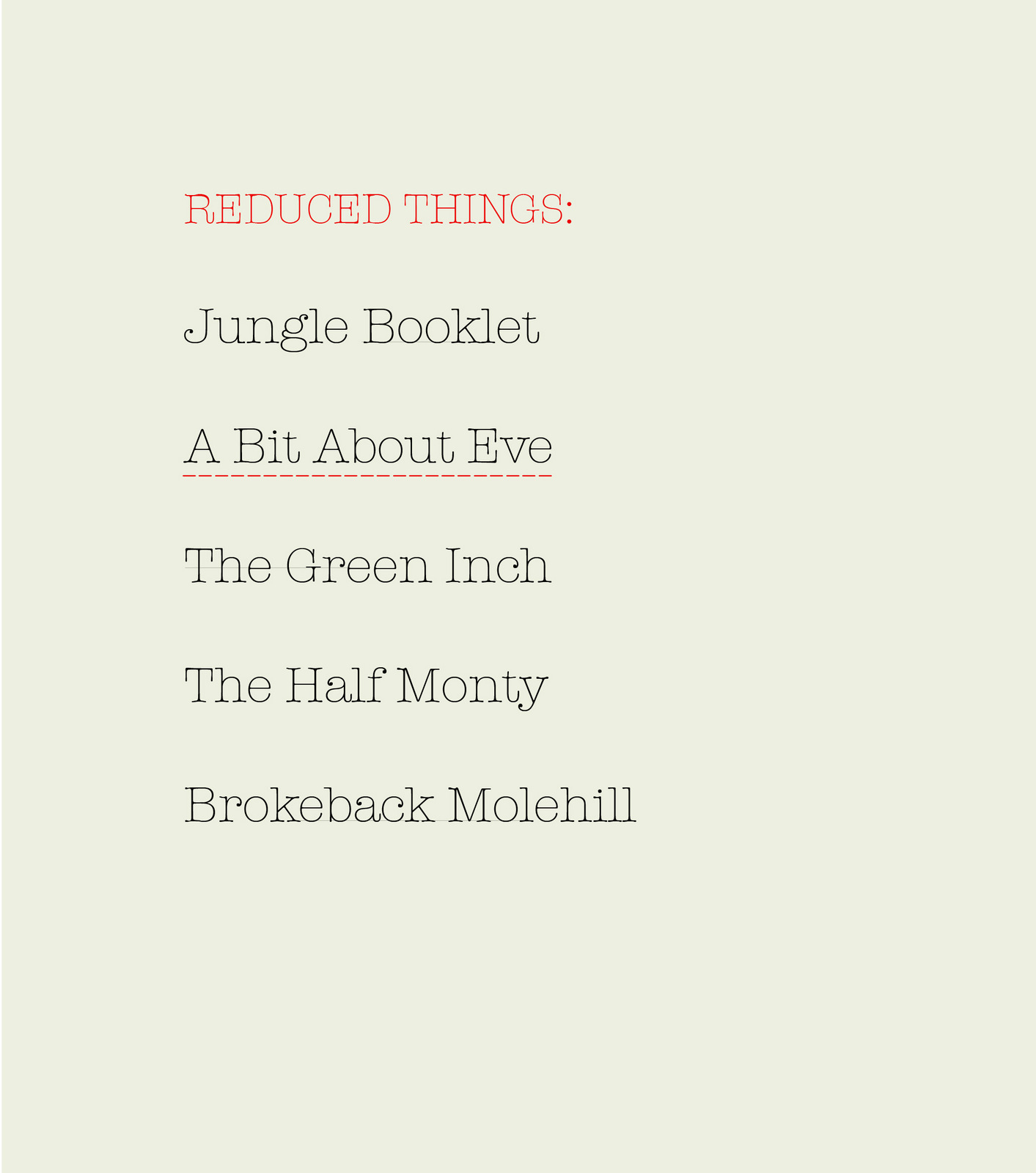
The next strand we looked at was smaller versions, e.g. instead of ‘Jungle Book’ it could be ‘Jungle Pamphlet’ or ‘Jungle Booklet’.
A cheap shot of a few palm leaves and some anaglypta wallpaper.
De-focussing it made it feel more believable.
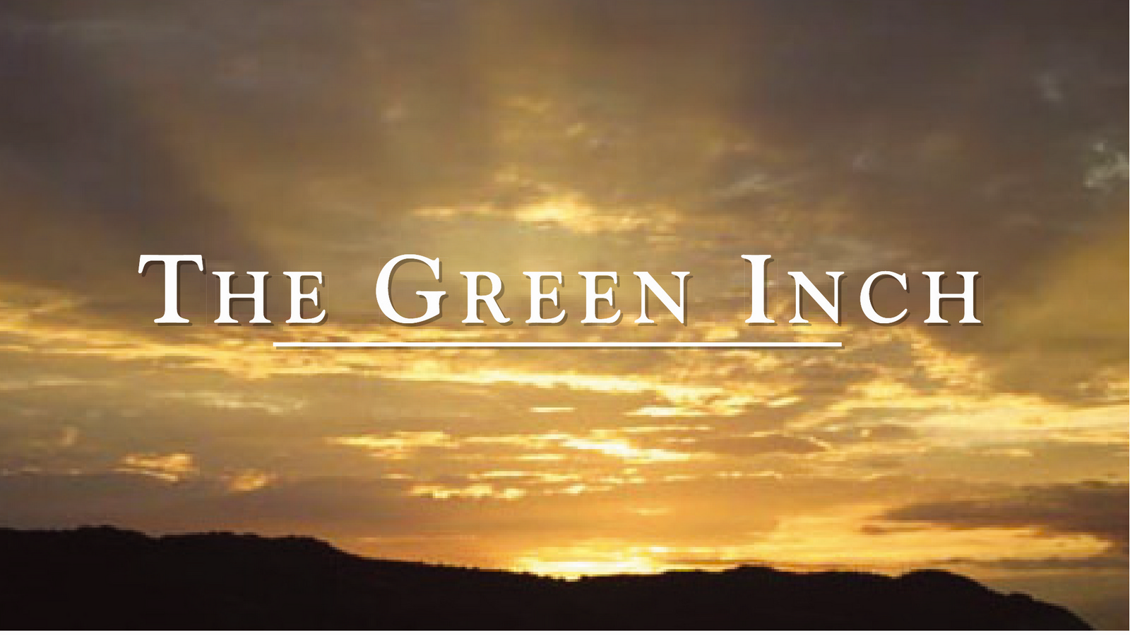
‘The Green Inch’ looked good, it scored well on greenness, but felt a bit small for the big screen.
We turned to God. We used one of his best sky arrangements to give the film scale and a sense of mysticism.
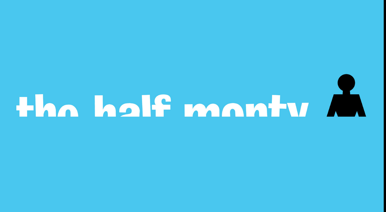
We went all graphic with the 'Half Monty'.
Another area for ideas could be ‘less’, literally suggest less things in the film, that could imply less time in a different way.
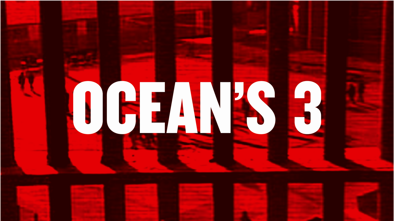
In terms of style, it's always better with an idea like this to visually show variety, old-fashioned and modern, black & white and colour, animation and film. So ‘Oceans 3’ was a chance to look contemporary.
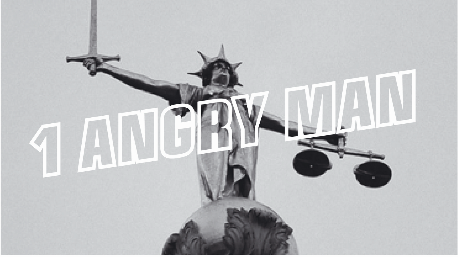
‘1 Angry Man’ was an opportunity to get all fifties-ish.
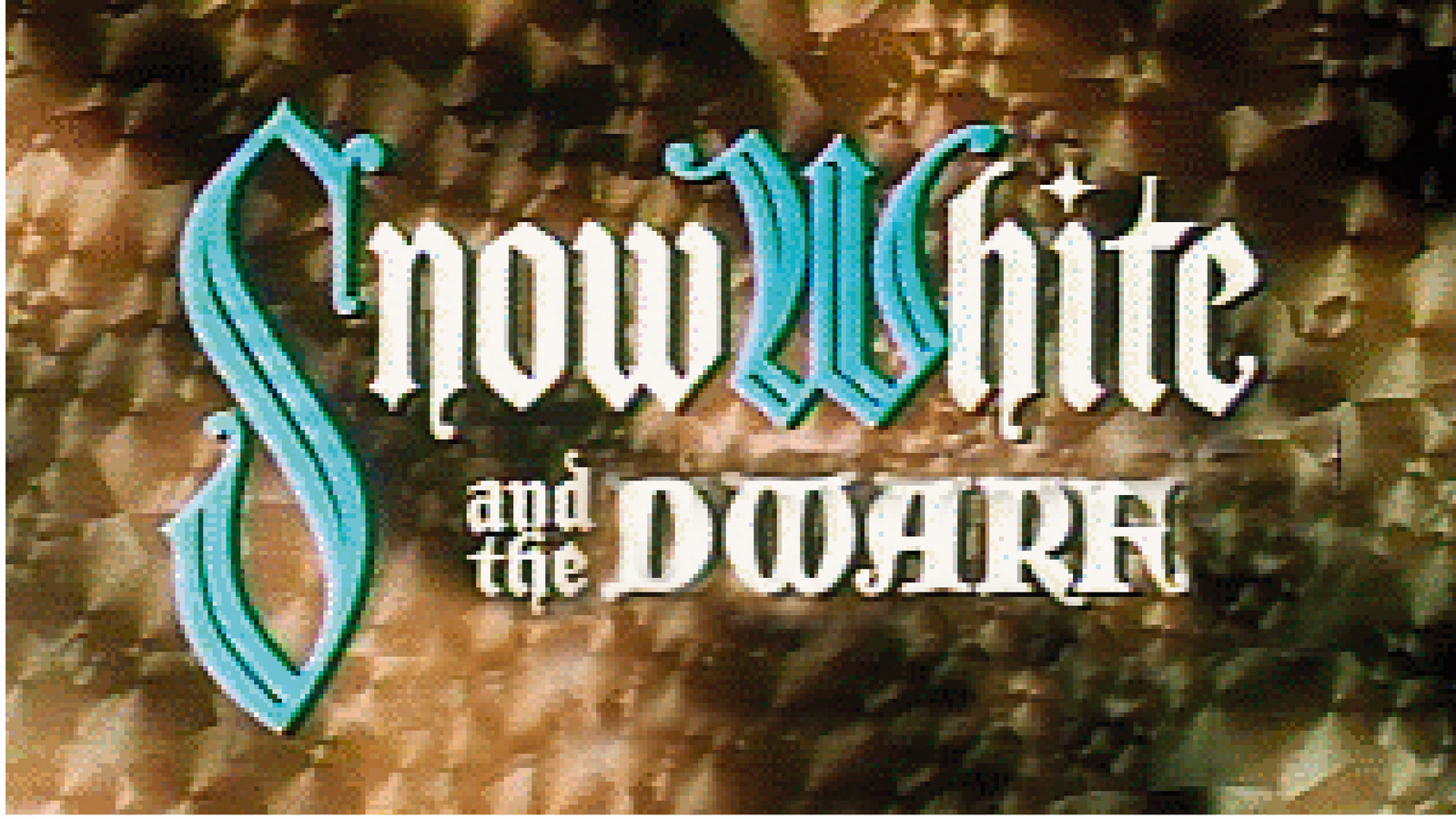
Snow White was Hollywood Technicolor, 40's style.
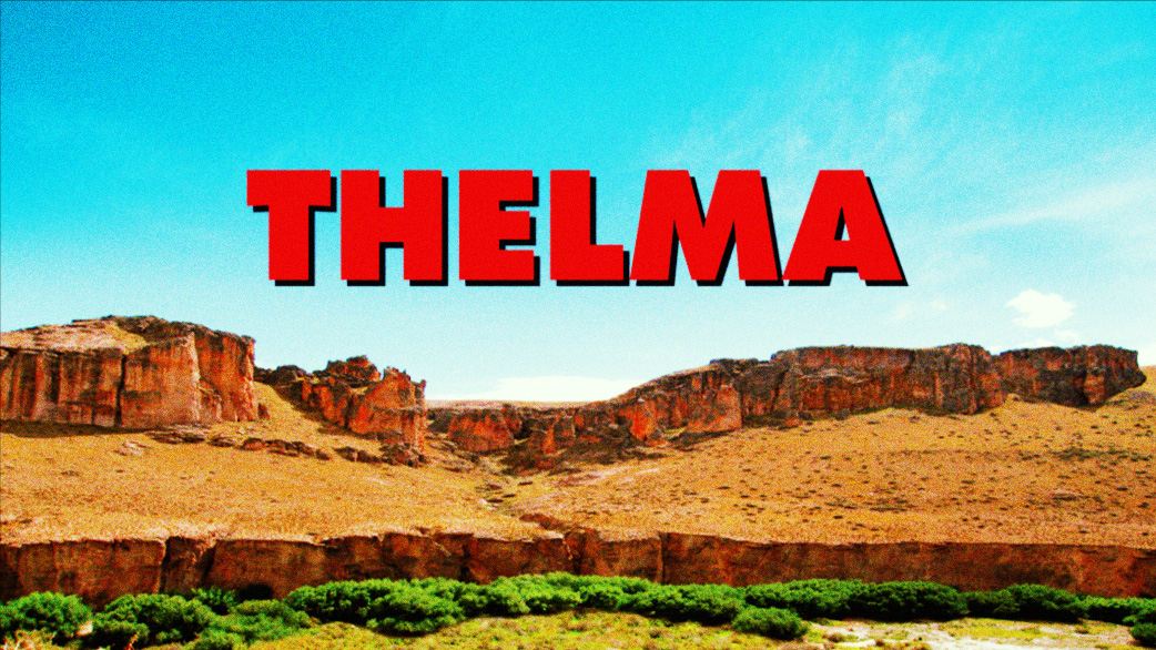
And ‘Thelma’ was pure, brash ’80's.Although the first version felt like it was hot off an Apple Mac.
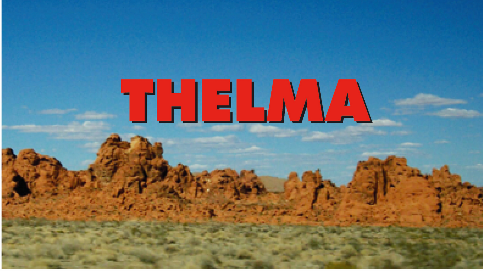
Pumping up all the colours made it feel more Technicolour.
Putting all the client bits into a title seemed like a good way to tidy the layout up.
Together, they looked like this on film:
Unfortunately, I got a bit arty, so they ended up looking like this in print.

To be fair, Helmut Krone was as much to blame as me.All that 'Create a new page' stuff he used to bang on about.Yes, it's great to create an unusual striking looking page, but not at the expense of the content.Why, in this case, go minimal?Having spent ages crafting lots of little gags and pastiches, why bury them in a big black space? And why make the pictures so small.I should've just got out-of-the-way of the ideas.
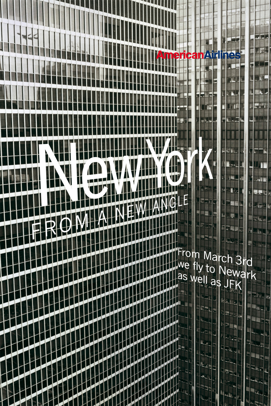
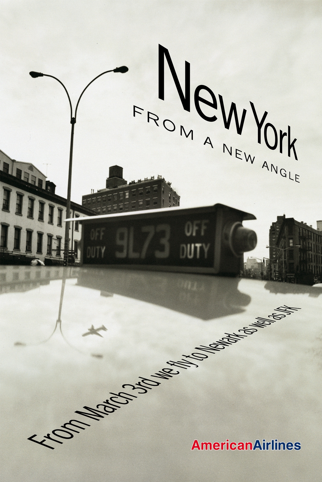
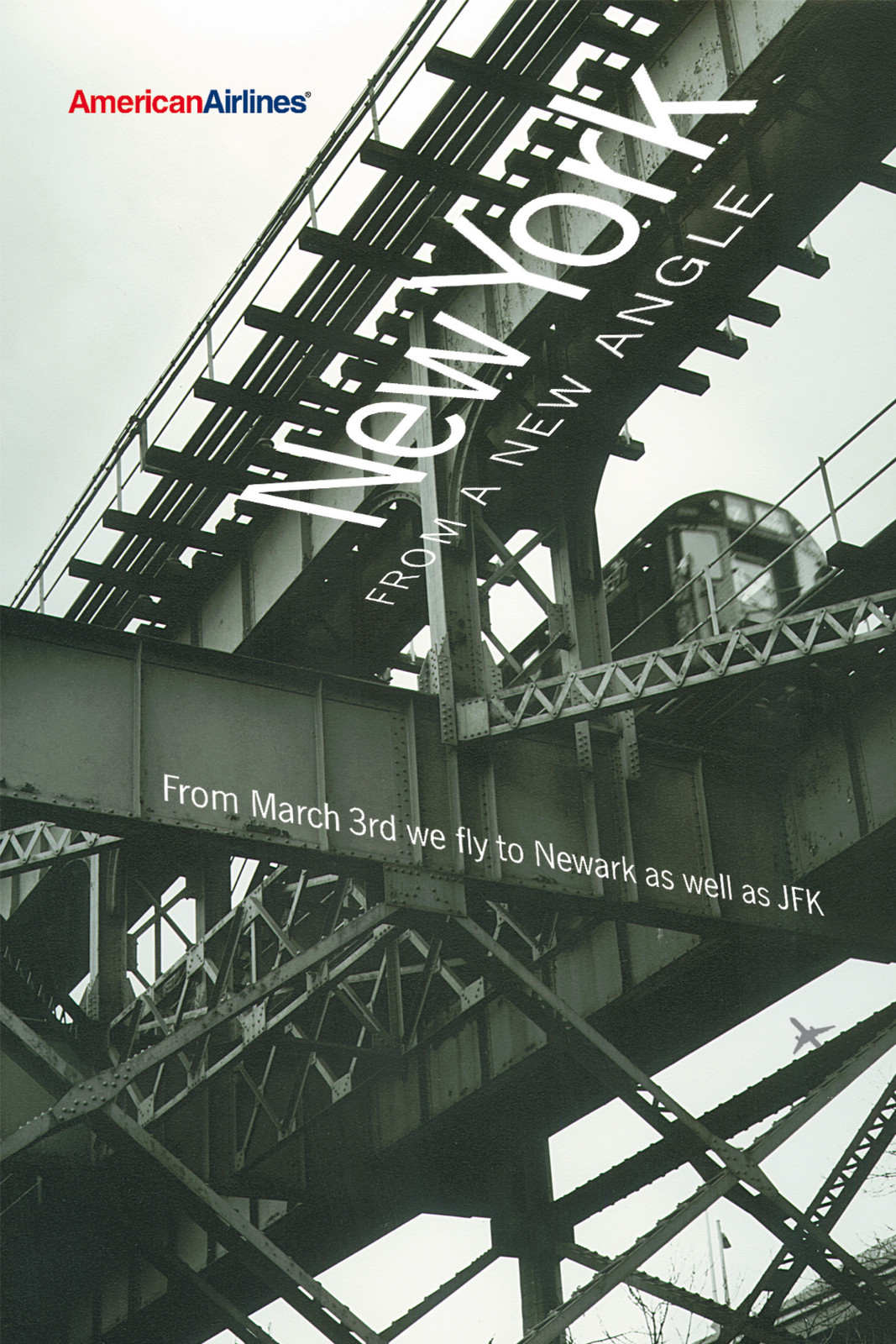
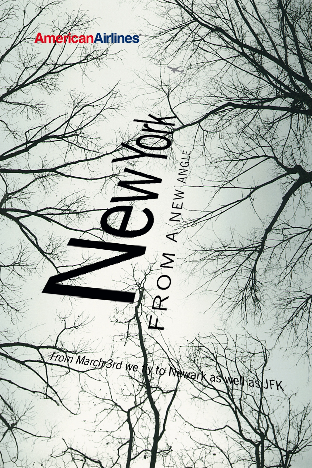
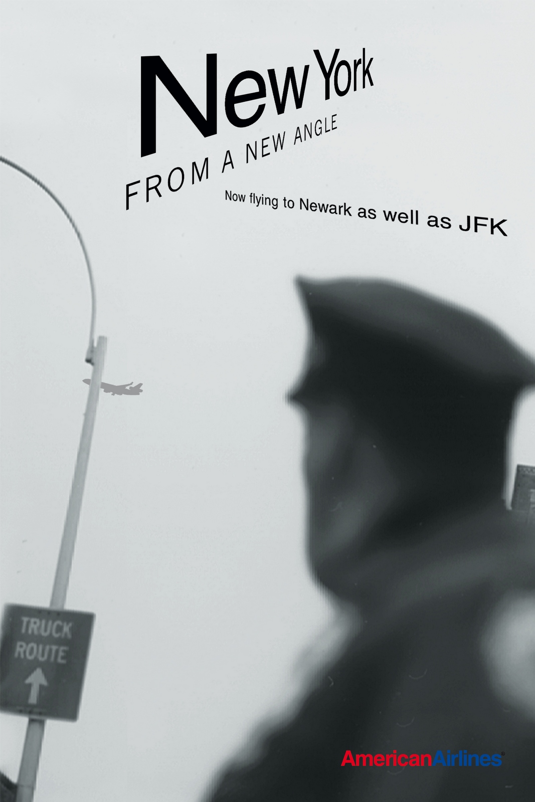
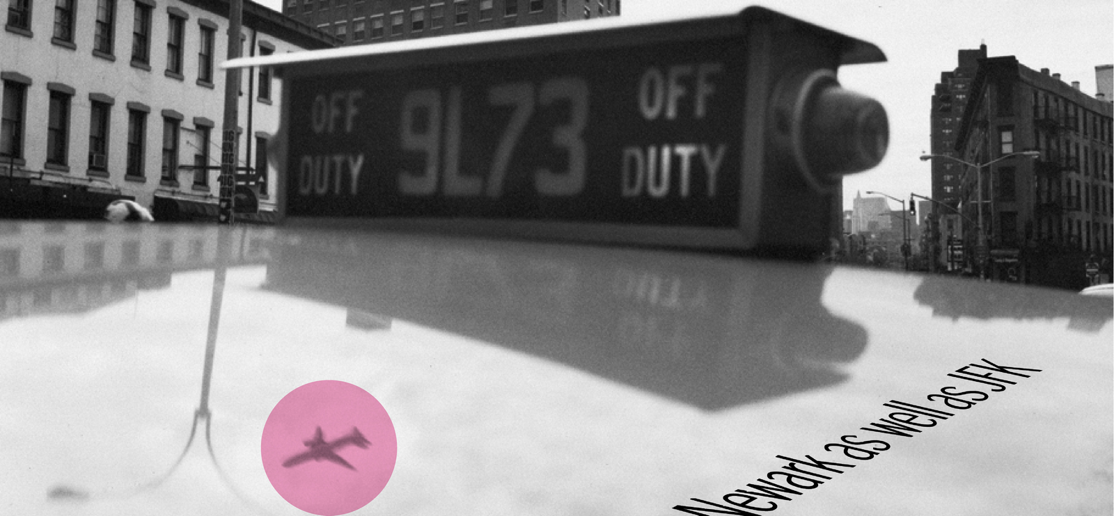
‘Wanna do some 48 sheets? They'll probably get rejected?’ Who could turn down an offer like that? 100% honest and also throwing down a challenge. BMP/DDB used to adapt American Airlines work dreamt up in the States, simply making their ideas fit our quirky British poster sizes. But the feeling in the agency, was that we should at least offer to do creative work occasionally, if only to justify the fees. So here was one such offer, who knows it might lead to us creating as well as adapting American Airlines work? BRIEF: American Airlines announce six flights a day to New York and once a day to New Jersey.As usual, the idea is in the problem. The problem was that surely that's two briefs, or two posters, one saying 6 flights a day to JFK, the other saying 1 flight a day to Newark. Why combine them?Trying to combine the two briefs lead us to this:
Bizarrely, the British client says yes. We just needed to wait for his American bosses to reject it, and we could all get on with our normal work. Feedback from the U.S. ‘Yes, love it!’ Even more bizarre.We buy the image rights to the photo and start printing. The day before the posters are delivered we get more feedback from the U.S. ‘PULL IT AT ANY COST!’ It's obviously made its way up the stairwells of some fancy New York tower until it found some cigar munching Vice President of something who didn't like the idea of making fun of America's most beloved President, ‘NO WAY...NOT ON MY WATCH MISTER!’About a month later, the same account guy ambles in: ‘I've just been chatting with the American Airlines client, he feels really bad about what happened and says he's got another brief, six sheets and he can sign it off. D'you want another go?’BRIEF: You can now go New York via Newark.‘Cool, is it quicker?’‘No.’‘Better, more modern airport?’‘No.’‘Quicker to pass through?’‘No.’ ‘Er...ok, why would you choose it over JFK?’‘You wouldn't.’ ‘What's good about it then...anything...nice colour lounges?’‘No.’ ‘What the hell do you want us to say then?’‘You can now go New York via Newark.’‘Ok, great.’Soooo...if you want to fly to New York via a different route, this is for you. If you want to land in different part of New York, then bingo, we're your guys. If you're bored with landing in the same old New York airport every time, then try us. If you want to approach New York from a new angle when you fly in, then we're the boys. Hang on, there's a neat visual bit to that; new angle. "New York from a new Angle" and we show bits of New York from weird angles. That could look cool. We could do the type like Saul Bass's cool North By Northwest titles, so the type is at a new angle too?
I sent the photographer John Offenbach to New York with the brief: Shoot iconic bits of New York from odd angles. (A terrific brief for a photographer.)He came back with some very cool shots.Looking at them, I thought we should add a little plane into each image, to make the images more relevant.As usual, typographer Dave Wakefield also did a great job, first he rejected the easy option of angling the text on a Mac, instead taking on the painstaking task of redrawing it.Then he fused the two together by clever placing of text and image. Check out the cab one for instance.
Two roughs that never ran.
A client known to be uninterested ‘creative’, gives bad briefs and will have non stop feedback from anonymous sources in the States. I guess the moral is; be optimistic, you just never know.
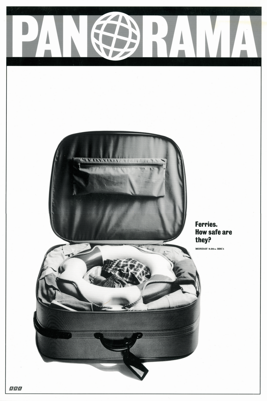
THE PROBLEM: Panorama’s audience was shrinking.
We knew where to find a potential audience; The Guardian, Times and Telegraph. But how do we approach ads for one of the BBC’s most respected programmes?
PANORAMA’S PERCEPTION: Serious, straight talking and truth-seeking.
ADVERTISING’S PERCEPTION: Bullshitting, tricking and spinning.
We couldn’t do anything about advertising getting itself a bad name over the last century, but we could avoid looking like we’re in that gang.
Ads tend to look like ads; a small logo bottom right, for example, tells you that you’re not looking at editorial, which is handy for most people because it allows them to ignore ads very quickly and go straight to the editorial.
Panorama had gravitas, so we needed a format we put our ideas into that didn’t scream ‘AD COMING! LOCK UP YOUR CHILDREN!’
The ideas themselves were straightforward: People rarely watch a season of documentaries because of the brand, they dip in and out according to that weeks story, so we needed to turn their stories into hooks, or ads as they are sometimes known.
Problems are good, they give you direction, without them you’re just doing ‘visual and verbal gymnastics’, as Bill Bernbach put it.
If you find the right problems you’ve got a chance of finding the right solution.
With Panorama, we had two problems:
a) Each episode of Panorama was unique, so we needed a very strong visual style that would hold together this very disparate range of subjects.
A strong visual style would also help us own stories that were being covered by media outlets.
Take ‘The O.J Simpson Trial’, who wasn’t covering that? I think even the Beano did an 8 page pull-out on that at the time.
b) We needed a visual style that had authority and didn’t feel like an ‘ad’.
The two problems got me thinking about magazines, they dealt with serious issues all the time, they managed to use humour without diminshing the gravitas if the issues.
I remembered a book from my first agency Brooks Legon Bloomfield, in fact it was their library, it was the only book on advertising in the building.
Consequently, I read it a lot, REALLY a lot.
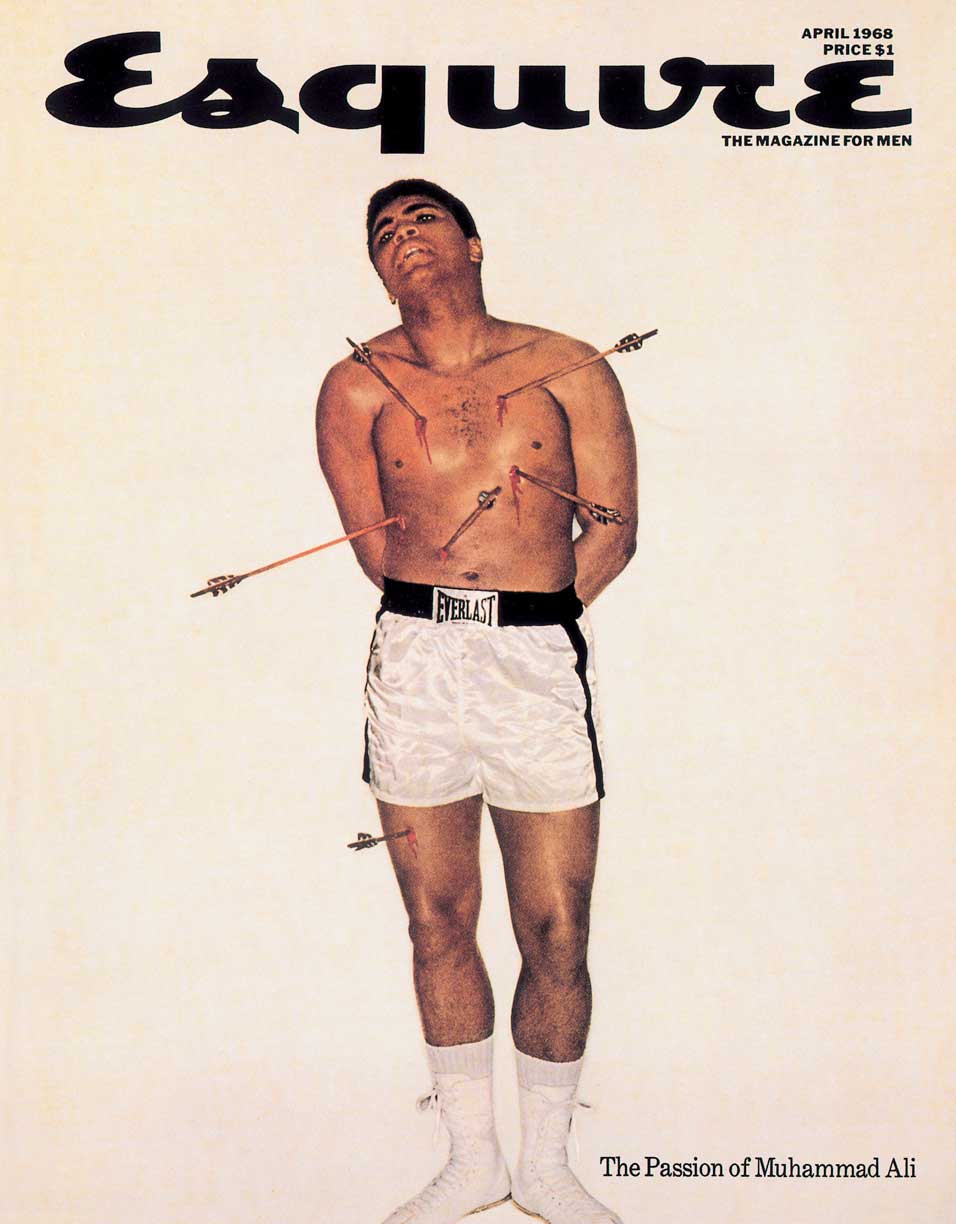
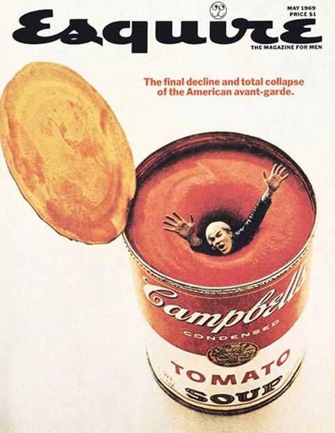
I didn’t love all of George Lois’ stuff, but I did love his Esquire covers.


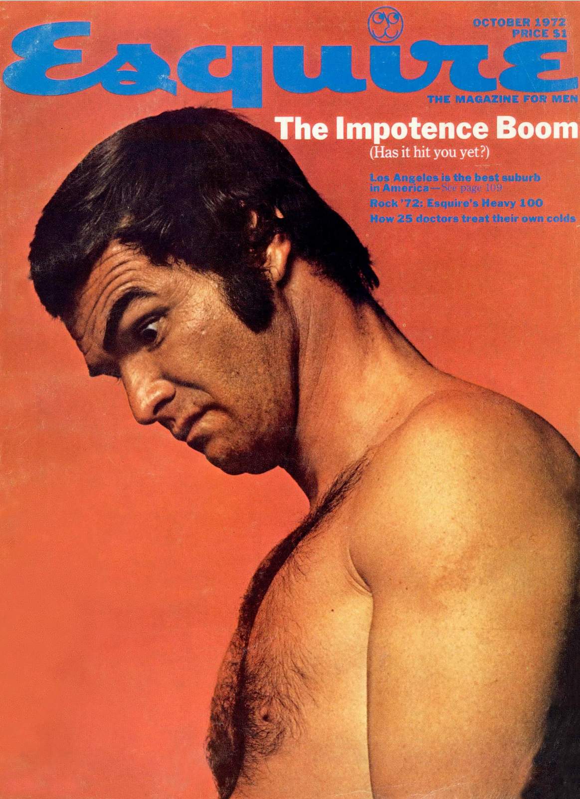

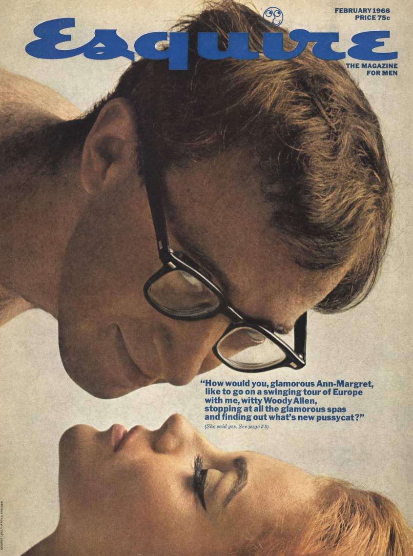
They managed to put over complex issues with simplicity and wit.
We took this as our inspiration.
Logo size is debated every day in agencies; agencies want them smaller to make the brand classy, clients want them big so that even if the public don’t engage with their message, at least they’ll see their name.
But here’s the thing, size doesn’t matter, it’s what you do with the logo that counts.If we made the Panorama logo look like a magazine masthead it wouldn’t feel like a logo.
It was as big as humanly possible, but it didn’t have that ‘desperate big logo’ feel.
It gave us a tremendous amount of flexibility, we could put anything in the area below, illustration, full-bleed photography, all type, and it would always feel part of the campaign.


I couldn’t find many discarded roughs for this campaign, a shame because knowing Tim Delaney, we probably wrote ten for every one that ended up being a made.
(Although there could be good reason why they were rejected and I haven’t got them.)
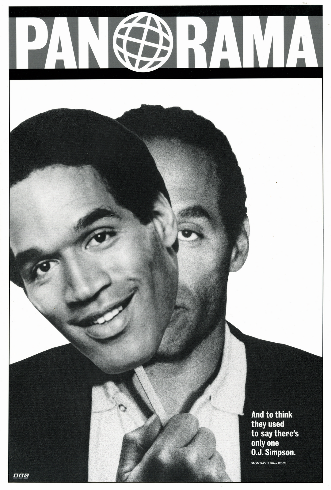
The only ones I could lay my hands on were for the episode covering the O.J. Simpson trial.On the face of it, this is a very clever neat idea:
As is this:
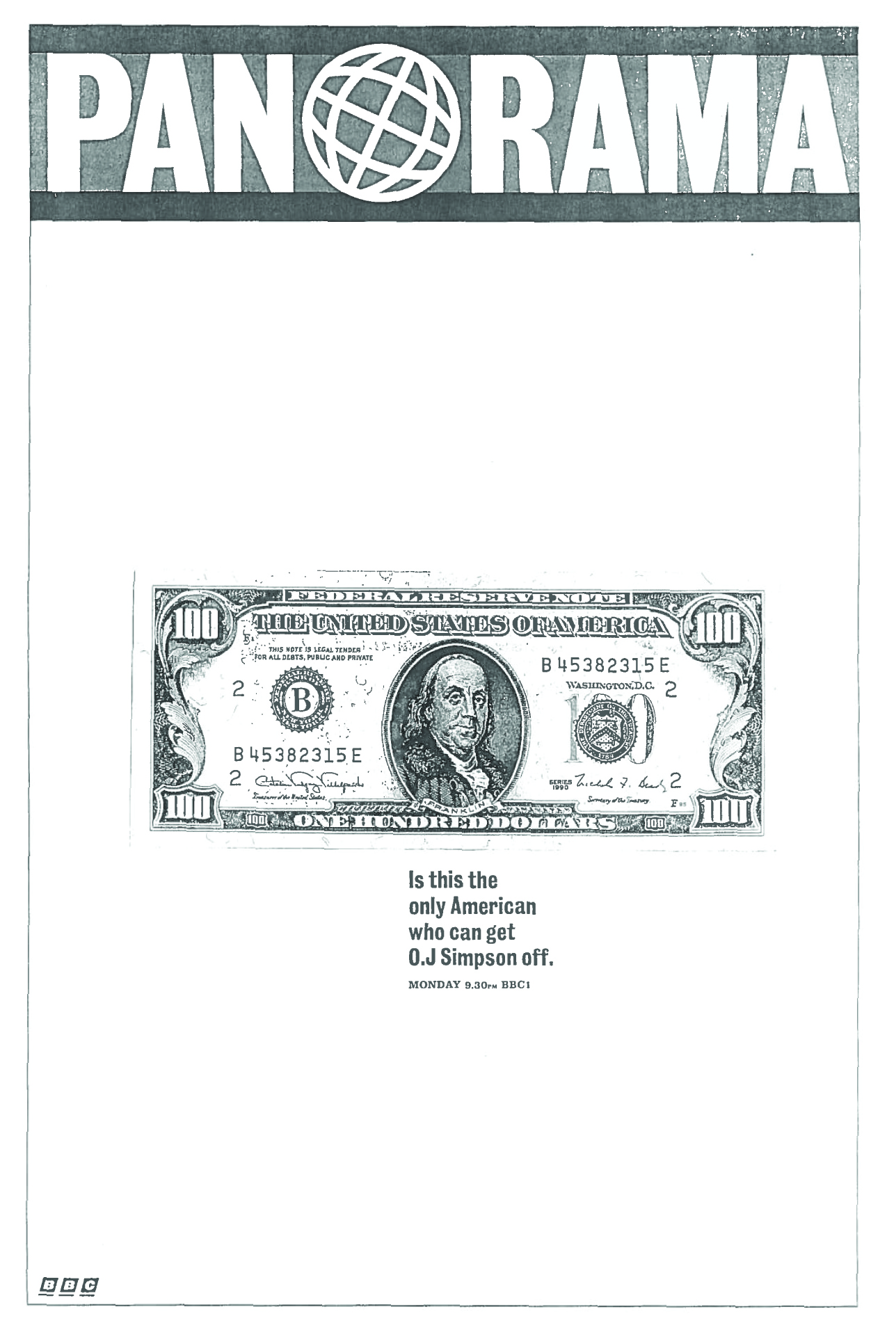
But, I think our ‘clever’ ideas are getting in the way of the story.
The story doesn’t need our spin, it’s the O.J. trial, at least show him.
In retrospect, two massive letters ‘O’ and ‘J’ would’ve been even more direct.
Also, ‘They used to say there’s only one O.J. Simpson?’, Who? Who used to say that? I’ve never heard anyone say that? Why lie?
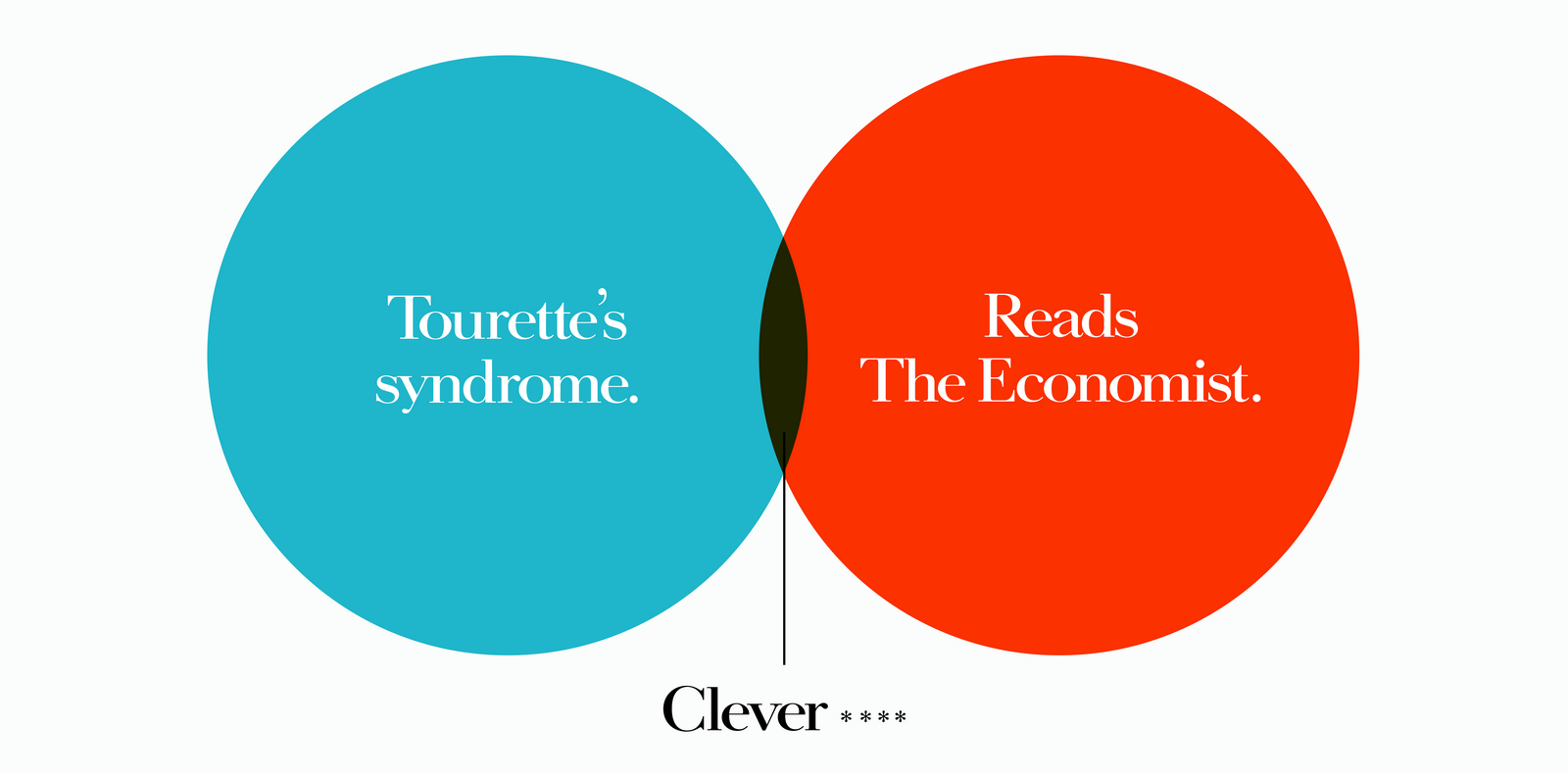
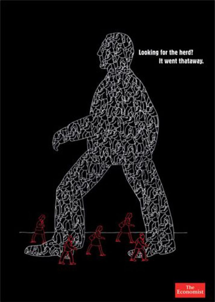
The Economist was an open brief at AMV. It meant that everyone in the creative department worked lunch hours, weekends and in downtime on posters for The Economist. This had been going on for about ten years.I turned up as Creative Director on the account, about ten years into the ‘Red Campaign’.I'd estimate that on average I'd approve one out of every fifteen ads I was shown.We'd need a campaign of ten posters to run every three months.So, at a fifteen to one ratio, over ten years, that means that the amount of ‘Red’ ideas thought up by the twenty or so creative teams by the time I'd got there was...a lot.About 6,000. But I was worried that ten years in the campaign was becoming a little too familiar, it'd lost an element of freshness. Awards were certainly down, which is sadly the case once a campaign wins awards and starts to become overly familiar. So initially, we pumped out yet more red ads.


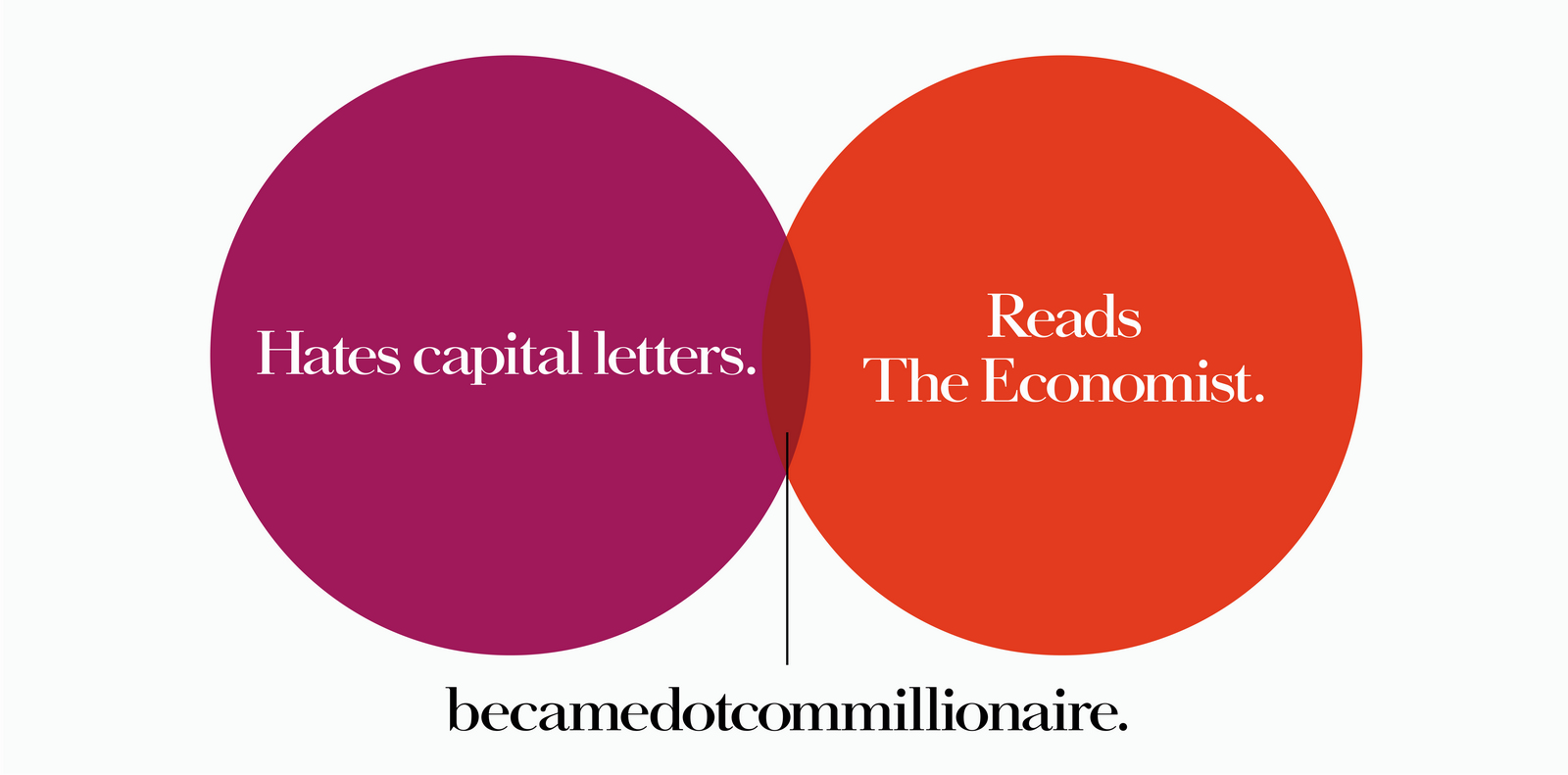
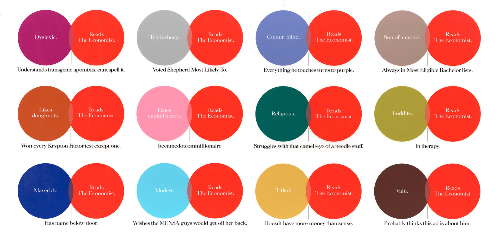
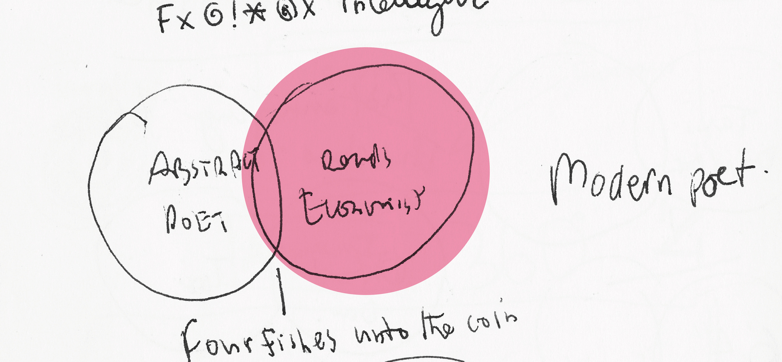
But whilst driving home one day I spotted a big red poster in the distance, I couldn't tell whether it was one that Sean and I had done, but I knew it was for The Economist.It got me thinking, the format is unbelievably well branded, but ten years on, are the public approaching the campaign like me; ‘Oh...there's one of those red Economist posters, I'm sure it's saying something witty about intelligence, but I can't be arsed to read it.’In a nutshell: Were they getting too predictable?I thought the colour and font were so distinctive we produce a mini campaign every quarter that had a slightly different graphic look.I spotted a venn diagram in Vanity Fair, a red circle overlapping a blue circle, a bit like this one.

I thought it'd be a great variant on the red look, and different, but a clever structure to write to.I had a go at writing some.
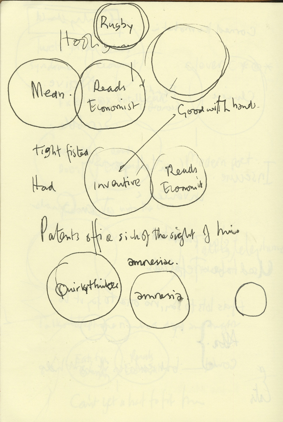

But it was a like a Mensa Test: One circle is red and says: "Reads The Economist", the blue circle says something else that's clever, and the bit at the bottom says something that is the summation of this that is both clever AND funny. I couldn't do it. I just couldn't unlock the formula. I explained it to Sean. He rattled off a load:
Once he’d unlocked the formula, I started start writing them too.
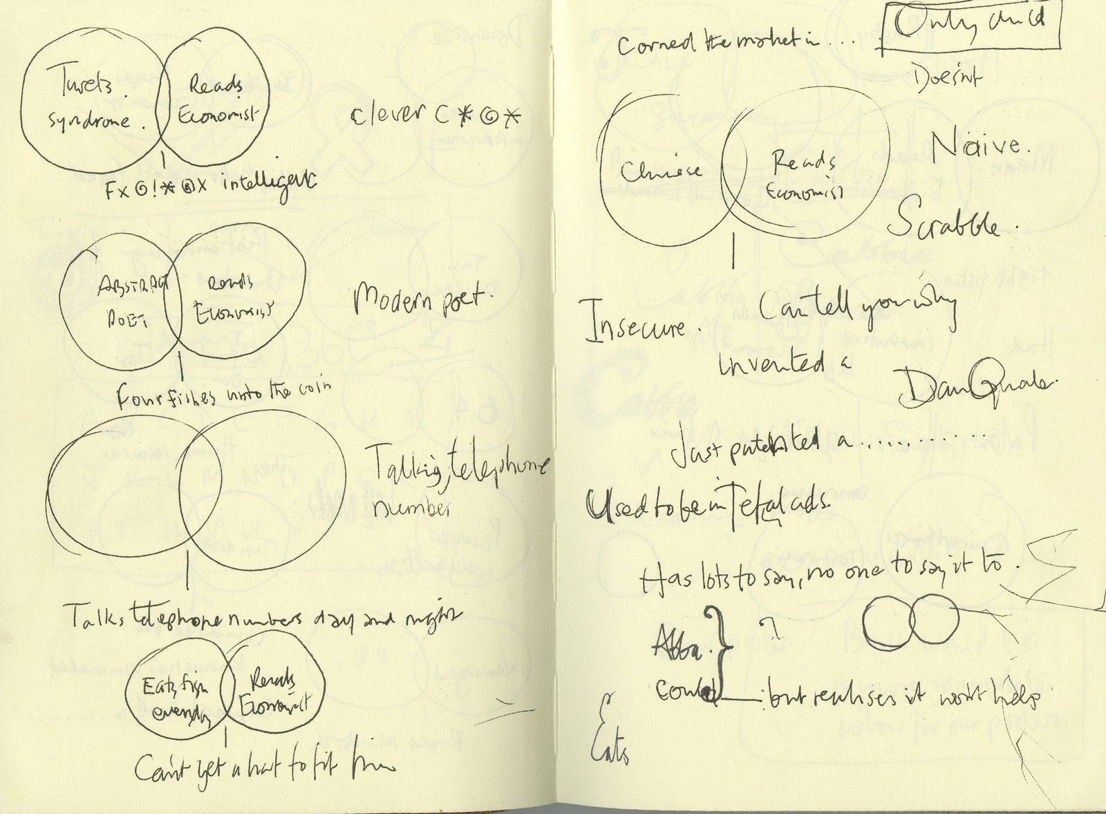
We loosened up a bit and started swearing.(But as the scamp below indicates, these were pre- spell-check days, at least for me.)

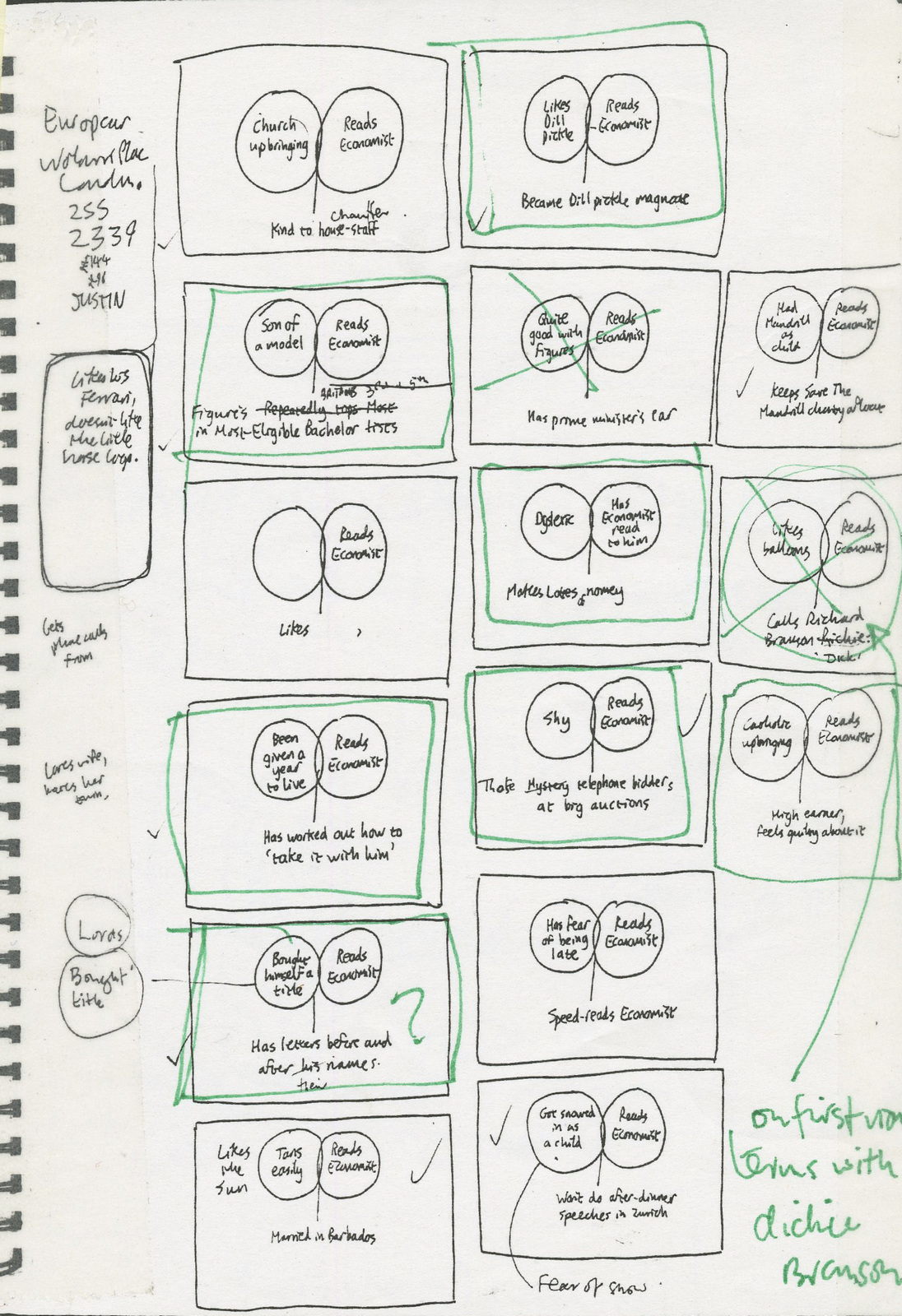
We took these scribbley little ideas above and turned them into ads.I'm consequently surprised how much this process changes the tone of the idea.What seemed funny as a scribble can look bland as a finished ad, what looked like a ridiculous, daft idea the client would never buy in a million years scribble can suddenly feel buyable once in a clients ‘clothing’.Sean and I looked at them in their new clothing and made some decisions.THE REJECTED.

Bit boring.

Funny, but probably a gag looking for a brief.I guess we may also be sued by Carly Simon, Warren Beatty, Mick Jagger or whoever the song is actually referring to.
This was actually bought by the client and pulled at the eleventh hour.Just as well, it probably wasn't what David Abbott had in mind when he set up the campaign.
So-so.

Bit basic.

There was another religion based idea we preferred.Client considered it intelligible, which was kind of the point. A shame, it was one of our favourites.

Didn't feel on brand, too chatty.

Knob gags did seem right for The Economist.

Quite liked it, wondered whether dill pickles were a bit down-market.

Damien Hirst said no.

Too flashy, too Eighties.

Too many words, also, it's bit childish, although it does use a lot of long words.

Why risk offending Jezza?THE CHOSEN.


The client rejected this one saying it was ‘unintelligible’Which was kind of the point, a shame as it was one of our favourites.
The client got cold feet and pulled this one at the eleventh hour.Just as well, it probably wasn't what David Abbott had in mind when he set up the campaign.Then, C.E.O Andrew Robertson came in: "I can't do it, we have to stick with the Red Campaign,it was David’s gift to the agency."Flip!It was decided we should run our campaign alongside the familiar red ads.They ran as tube cards and giant cross-track posters.They worked well as cross-tracks - people could get the structure, then see how it played out whilst waiting for their delayed train.
The following year I was Creative Director on a whole bunch of 'Red Posters' that were deemed sufficiently fresh to win a D&AD pencil and Campaign of the Yea at Campaign posters. So maybe Andrew was right, maybe it was David's gift to the agency?
Simons Palmer was the home of the Nike poster, they produced endless great posters which produced endless awards. So getting a brief for one, even a little 6 sheet for the Rugby World Cup, was like getting a ticket to the ball. When I first got there I was handed this approved line written by my shiny new writer Mark Goodwin. I didn't really get it to be honest, I'm still not sure whether I'm missing something? But I toiled away, arranging and rearranging the squashed up Futura font to try and give it its own look, but still very Nike. A warning sign seemed to be the way to go, the font was a given, the things to be decided were what colours? Red and white were a given as they were Nike colours and the most warningy of the colour wheel. Bars: With? without? If with, how many and how thick? I settled on putting a bar between each line, because it looked designy and cool. I showed my new boss Mark Denton. "Yeah, I like that, it looks great... right do you want to do a completely different looking one now, do whatever you want, let's see how it turns out."
Jesus! He likes it, but wants one that looks nothing like it. Idiot! What a waste of time! Why can't I just work on other briefs and get some more work out? In retrospect it may have been because they didn't have any new briefs to hand out. Me, impertinently: ‘Like what?’ Mark: ‘What about that book you showed me, on that old Dutch bloke?’ The old Dutch bloke was H. N. Werkman. Typographer, printer, artist and all round show off.
Brilliant, now I've got to put together my Nike ad in the style of some old Dutch geezer who’s work called for ‘spiritual resistance against Nazis’.Easier said than done.I spent the next few days trying to get into Anti-Nazi, H. N. Werkman’s frame of mind.Maybe his two colour design stuff could work?Eventually Tis, (typographer John Tisdall), and I came up with this.
It got into the D&AD Typography section that year.The first layout wouldn't have done, the idea wasn't strong enough.Perhaps there was method in Mr Denton’s madness.
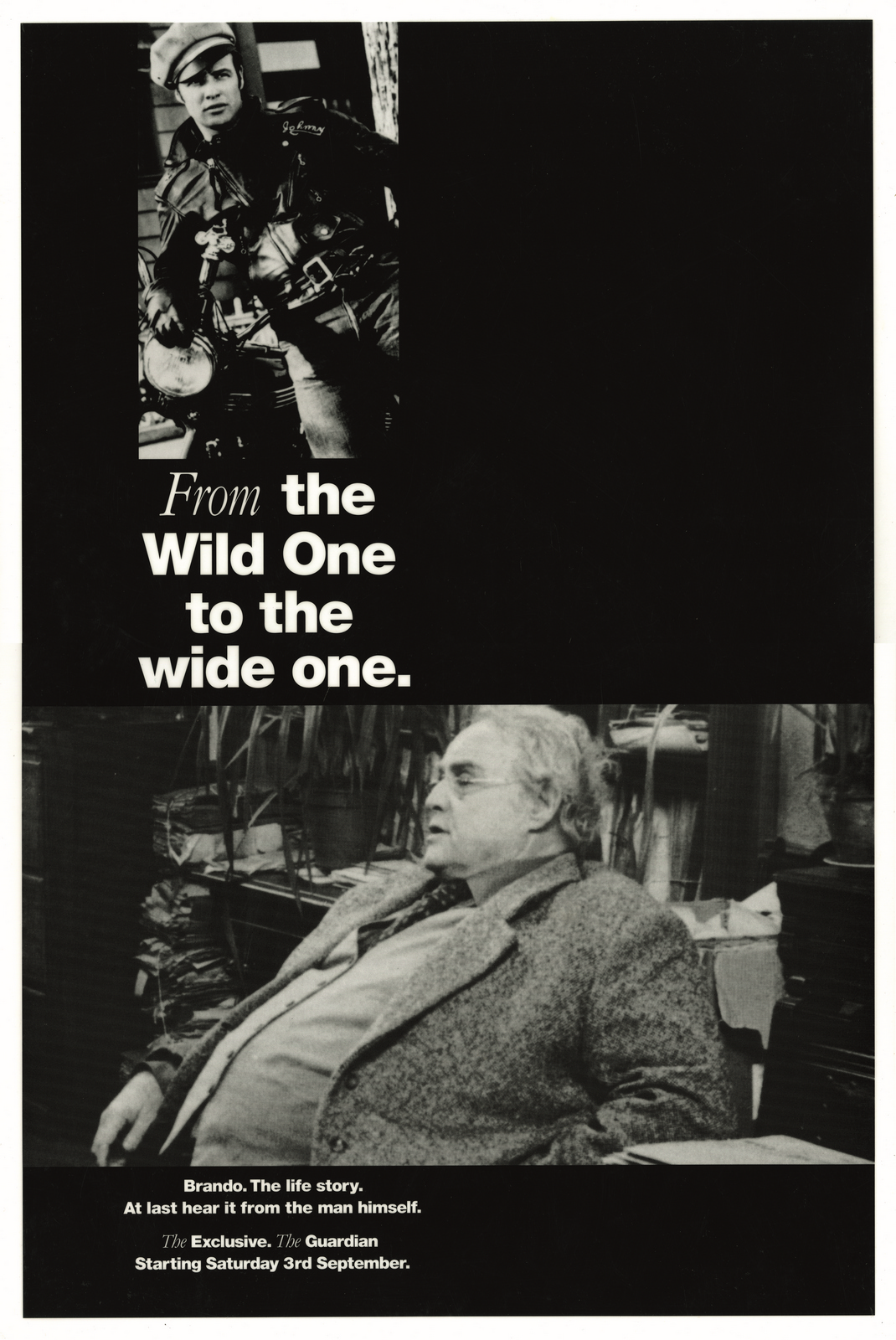
Newspapers deal in stories, they have to find them and write them up every day. If they find good ones their sales increase. So when agencies try selling them brand campaigns, they tend to think it's a lot of namby pamby nonsense. Instead they prefer their marketing to be based on specific content. That could be anything from a scoop to a serialisation of an autobiography. The problem is that the stories are rarely on brand, they are often the kind of thing that any newspaper could print, it just depends on who gets there first. So having a very branded template is crucial to tie that story with your newspaper.Here's some stories we had to promote:MARLON BRANDO’S AUTOBIOGRAPHY. EXCLUSIVE EXTRACTS.
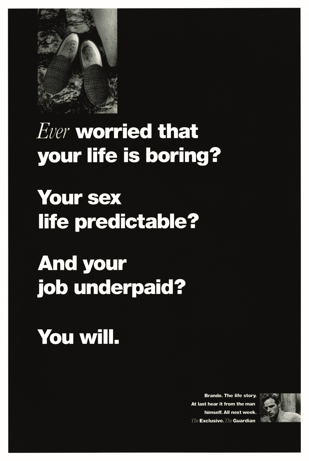
Why, when it’s about Brando, by Brando would you not lead on Brando? This was much better, it has a much higher percentage of Brando.
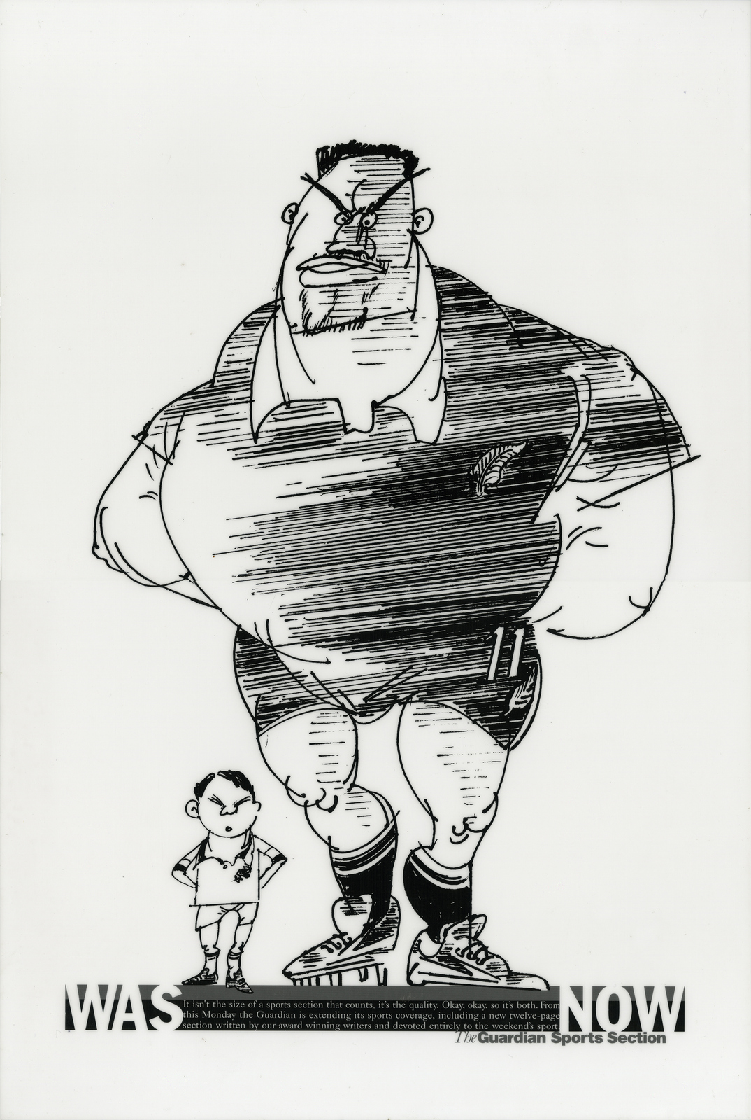
THE GUARDIAN NOW HAS A BIGGER SPORTS SECTION.
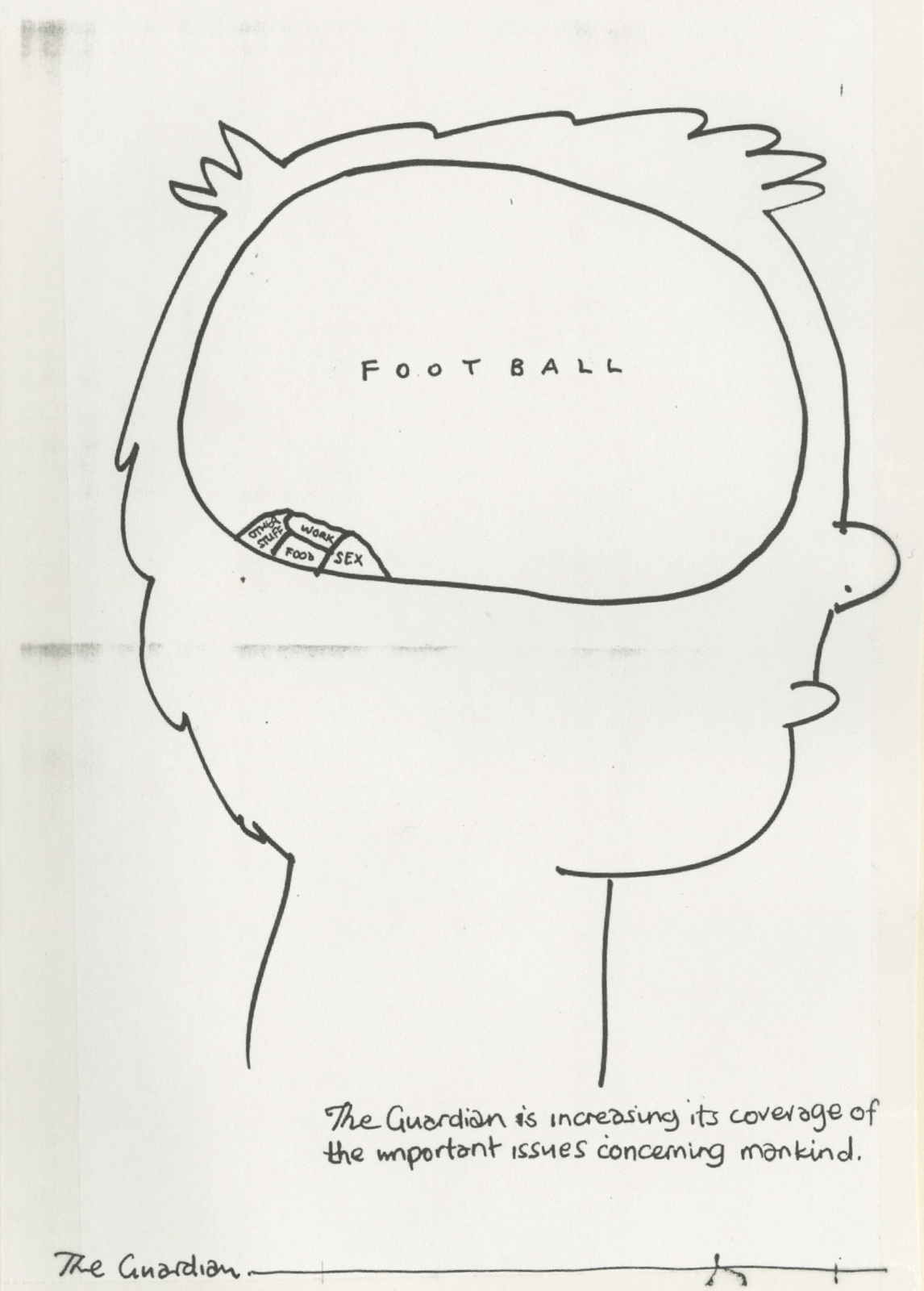
The idea above was rejected in favour the one below. Shame.
THE FRED WEST CASE. It's six o'clock when Tim Delaney walks in: ‘We need to send some ads over to The Guardian...in about an hour, new book on the Fred West case...what are you waiting for?’Some people would hate that kind of brief, I loved it. The Guardian have to buy, they've no time to fiddle with the ideas or the art direction. The only issue is actually coming up with something good within the hour. Two ideas were bought.
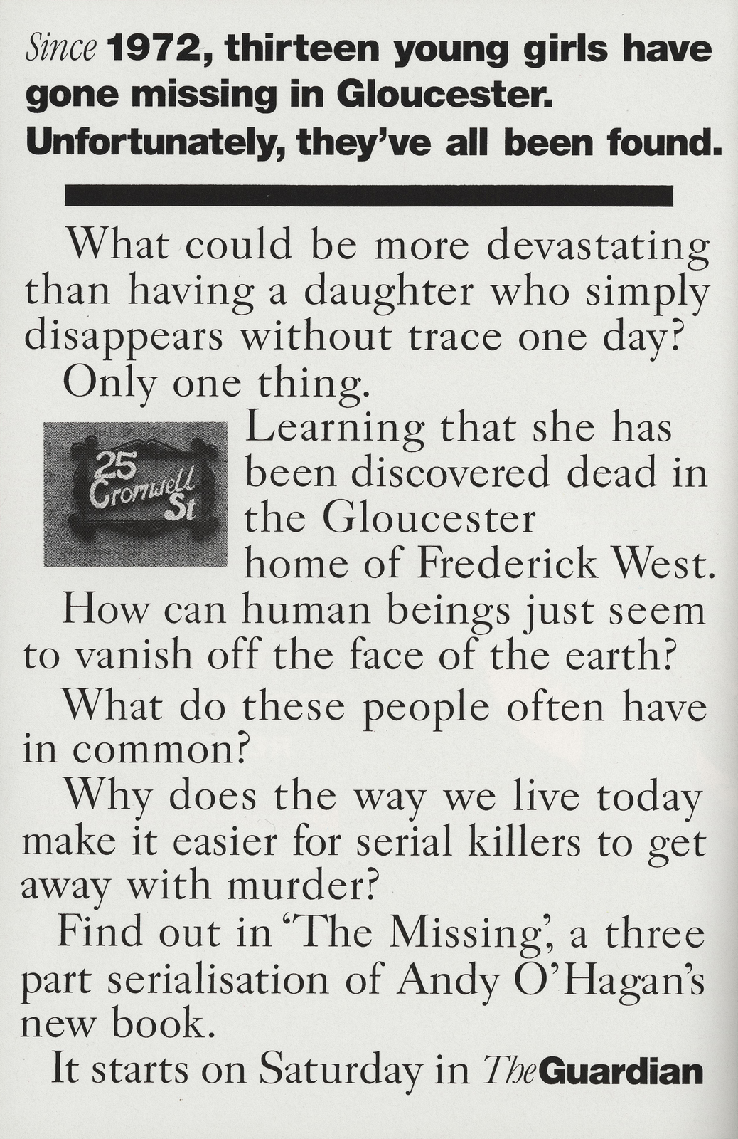
(It's odd how much of an icon that cheesy house sign became.) The second one looked very dramatic in the paper. The idea was to say "xx people go missing every day, this is the only mention it will get in a newspaper." I can remember thinking "Shall I put one 'x' or two? I'll put two, it makes the headline more dramatic.15? 16? Who knows? Hopefully the information department won't come back with a number too miniscule." (Note to editor: He hopes more people go missing because it helps his little ad? TWAT!") The information department came back and the ad ran. It said: "273 people go missing every day, this is the only mention it will get in a newspaper." 273!
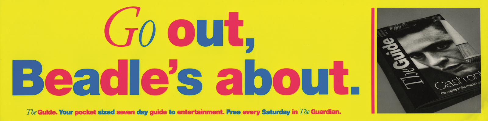
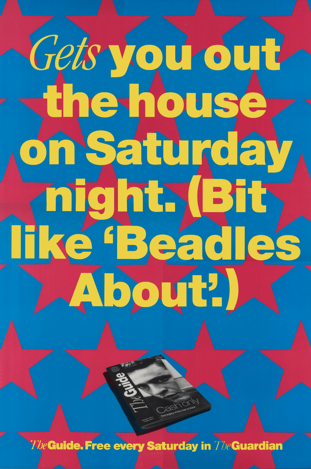
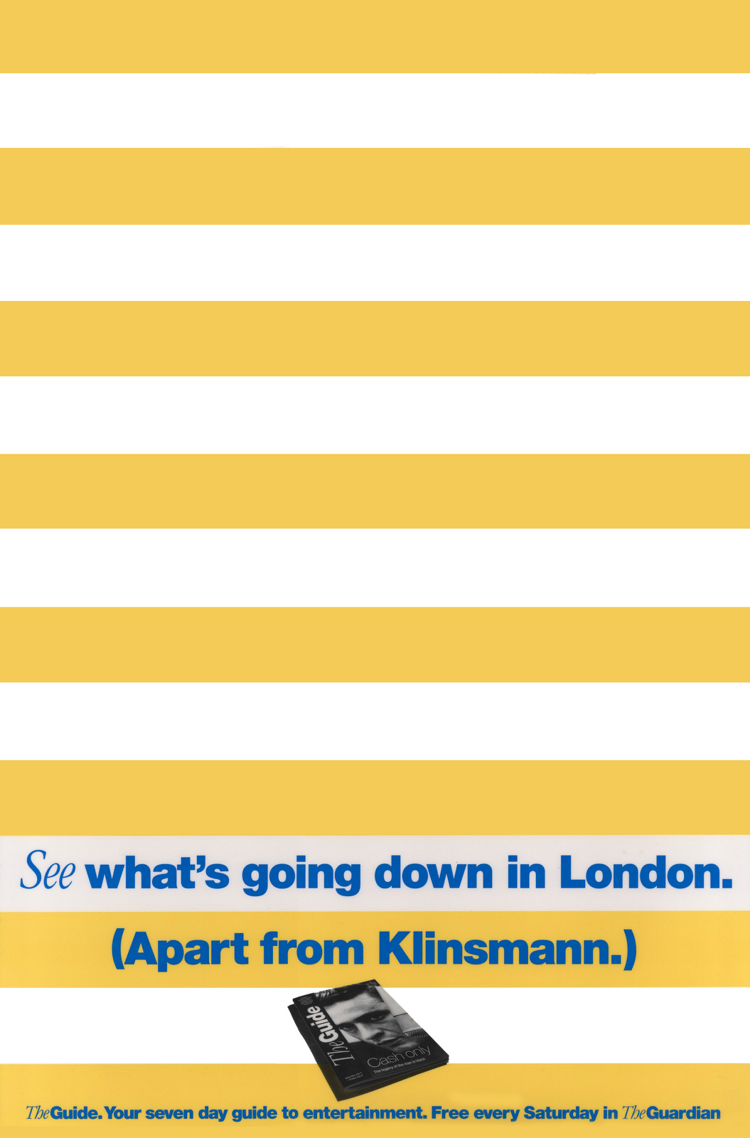
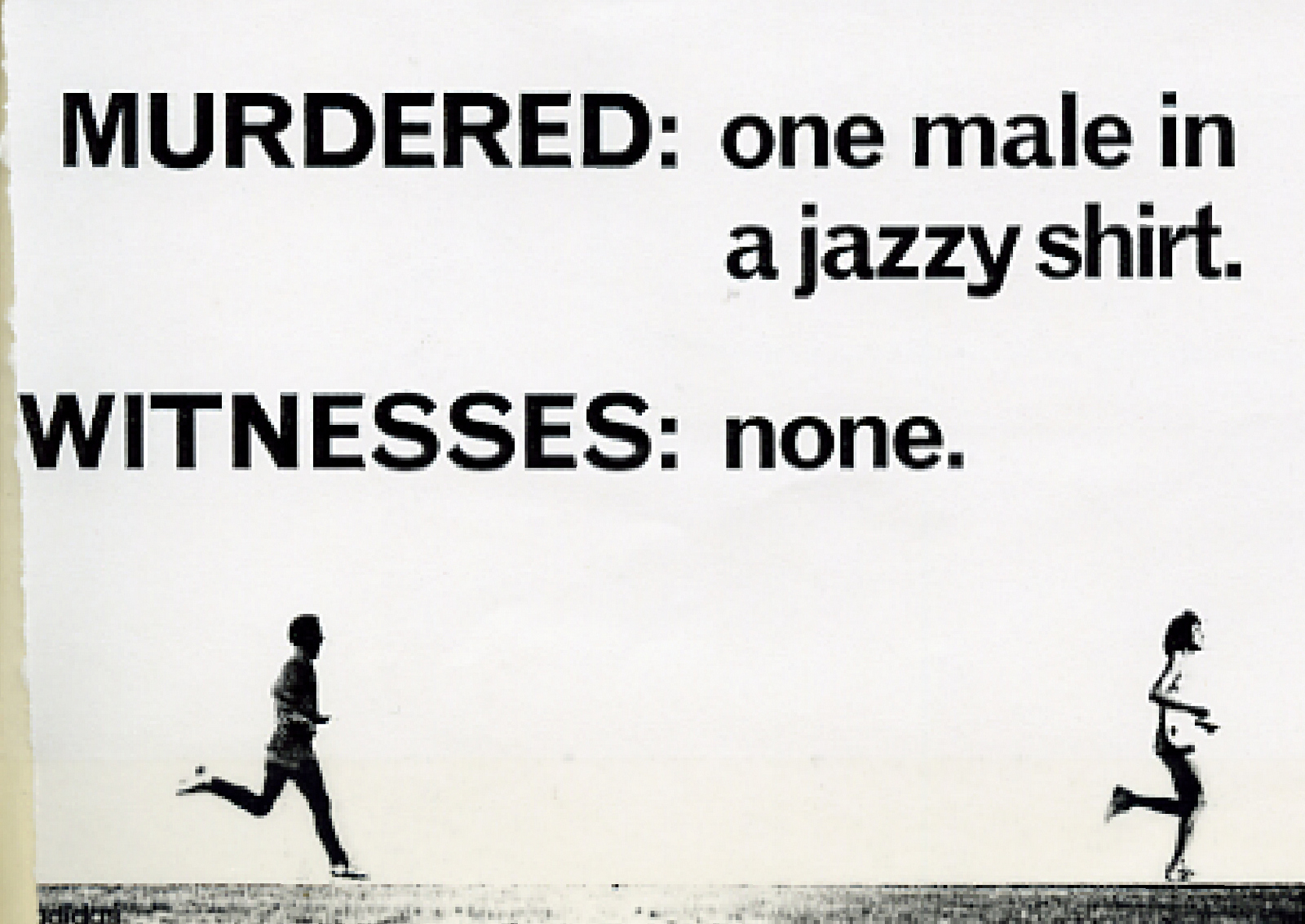
THE GUIDE. FIND OUT WHAT'S HAPPENING IN LONDON. What strikes me most about these now is how aggressive they are. We had a couple of goes at Jeremy Beadle. Once on a 96 sheet.
And once on 6 sheets. (Sorry Jezzlington.)
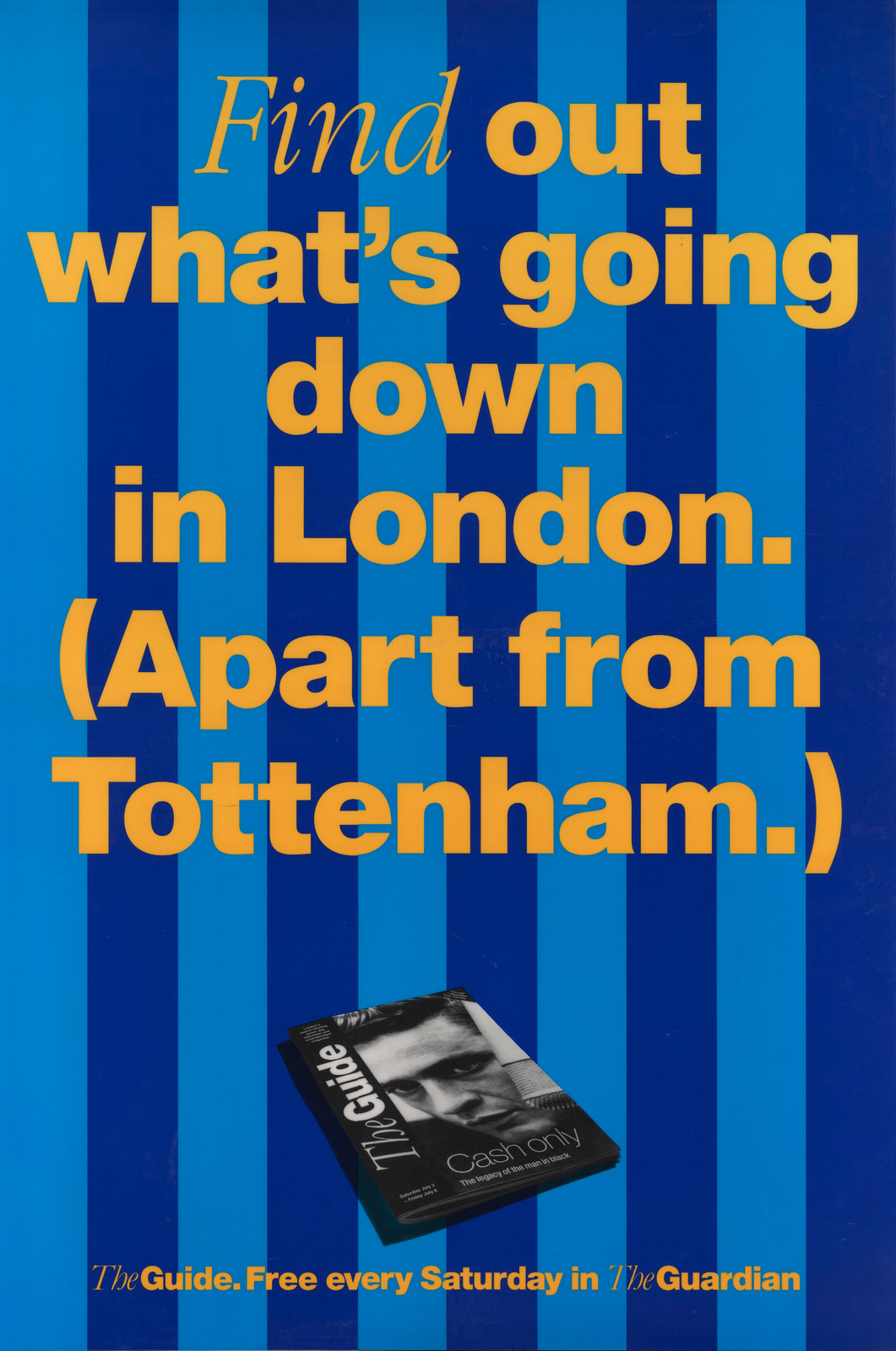
Then Tottenham.Not so personal but did we pick them for any other reason than myself and the writer Tony Barry were both Arsenal fans? I can't remember.
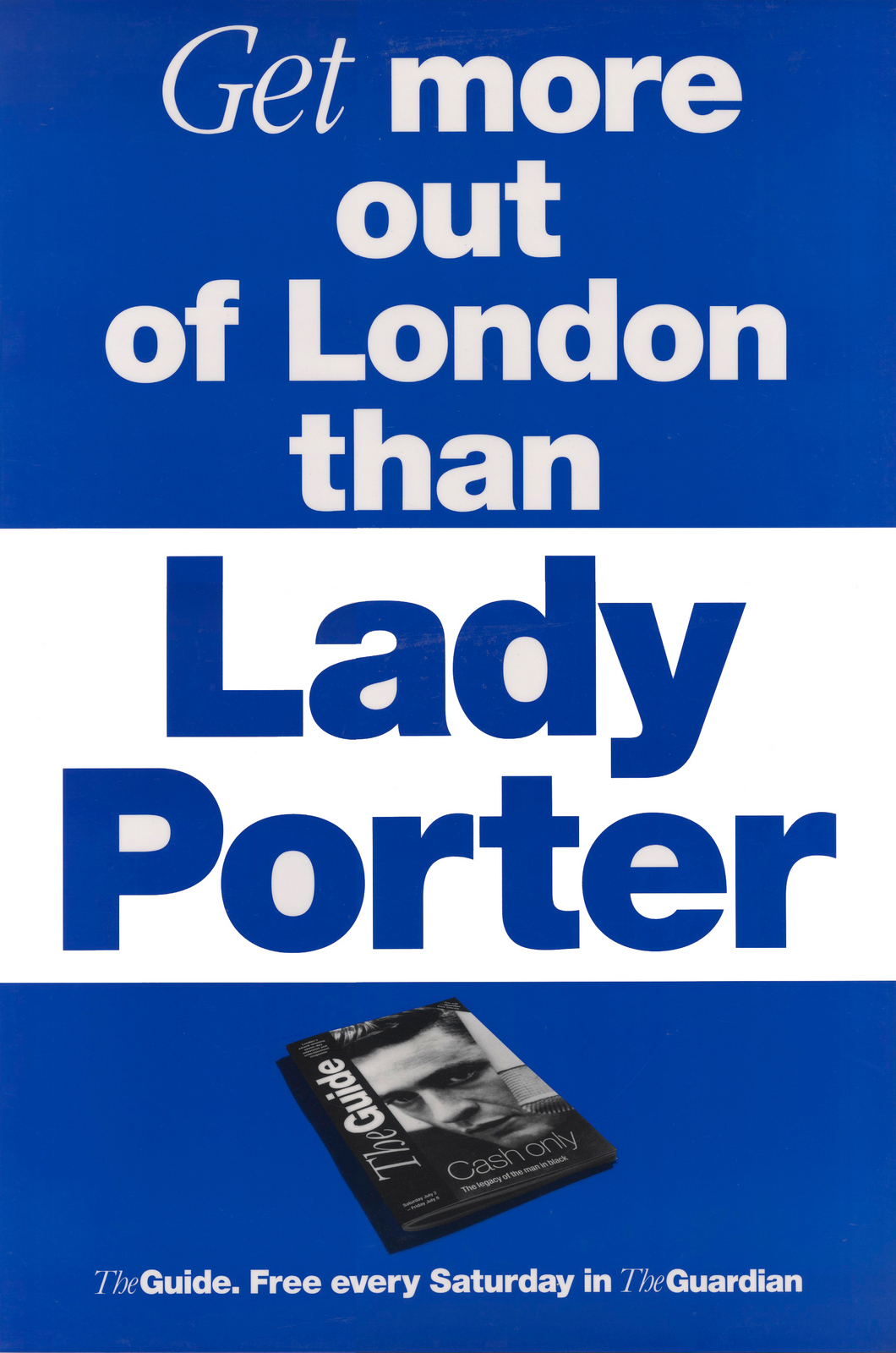
...and Lady Porter, although to be fair she had just been caught robbing London.
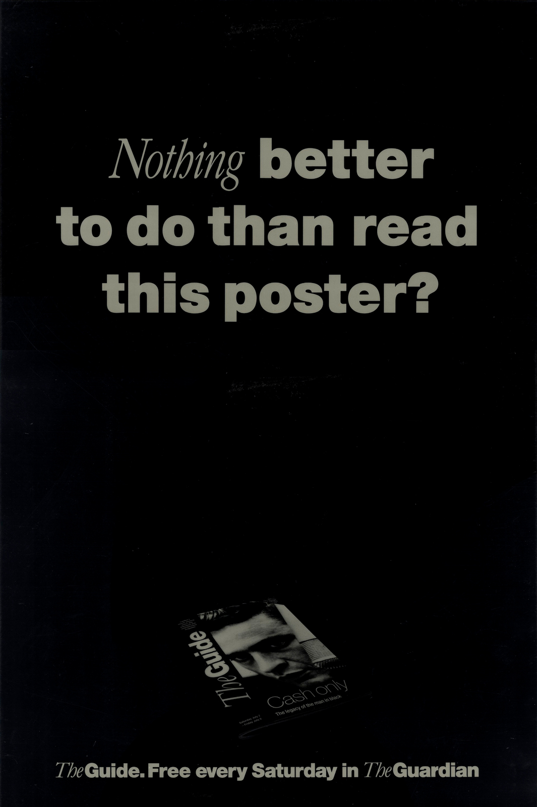
Then we implied everyone reading our posters was boring, or bored.
We spoofed this very famous BBH campaign of the time.

Like this.

We made a naff old, Benny Hill style joke, looked good though.
Got this one rejected for being too clever.
And finally, had another pop at Tottenham, well their diving new striker.
PREVIEW:
(Morrissey wouldn’t give his permission.)TRADE:Even in the trade we were having a pop at various individuals and companies.A newly disgraced Politician gets it in the neck.
Here, a whole agency is abused.
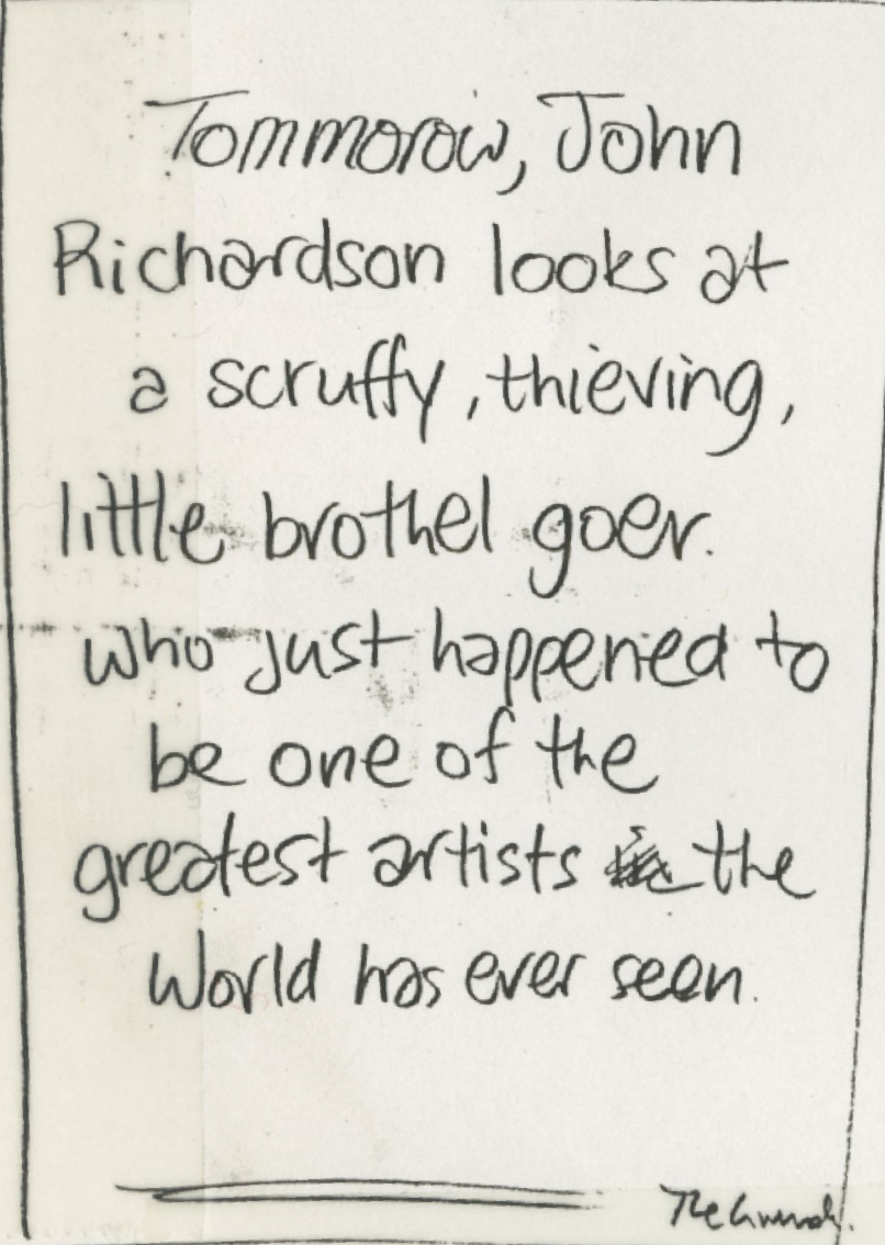
THE PABLO PICASSO BIOGRAPHY:We zoom straight to the pages that say he stole and went to brothels.
Charming.
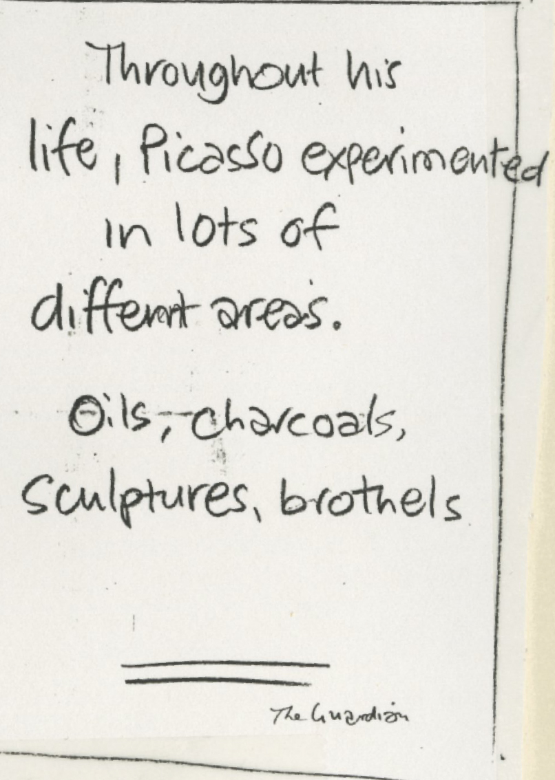
Brothels again.
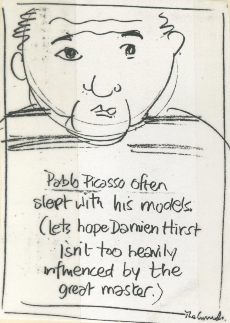
Presumably, a bad joke about Damien Hirst’s shark, sheep, cow stuff?
Terrible, terrible gag.
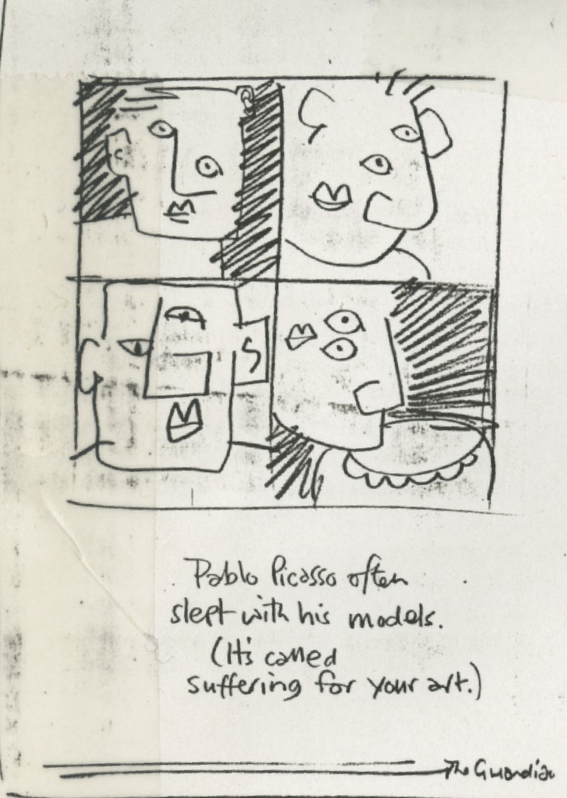
A bad gag, implying his models looked in real life like the do in his pictures.And then the finished ad.Somehow, unlike all the others, (which look like they were done by a couple of giggling schoolboys).

SO THE QUESTION IS: Why were we having a pop at all and sundry?Who was the culprit?Me?Tony Barry?Tim Delaney?Leagas Delaney?The Guardian?Or was that just an attractive vibe in the 90's?Answers on a postcard to...

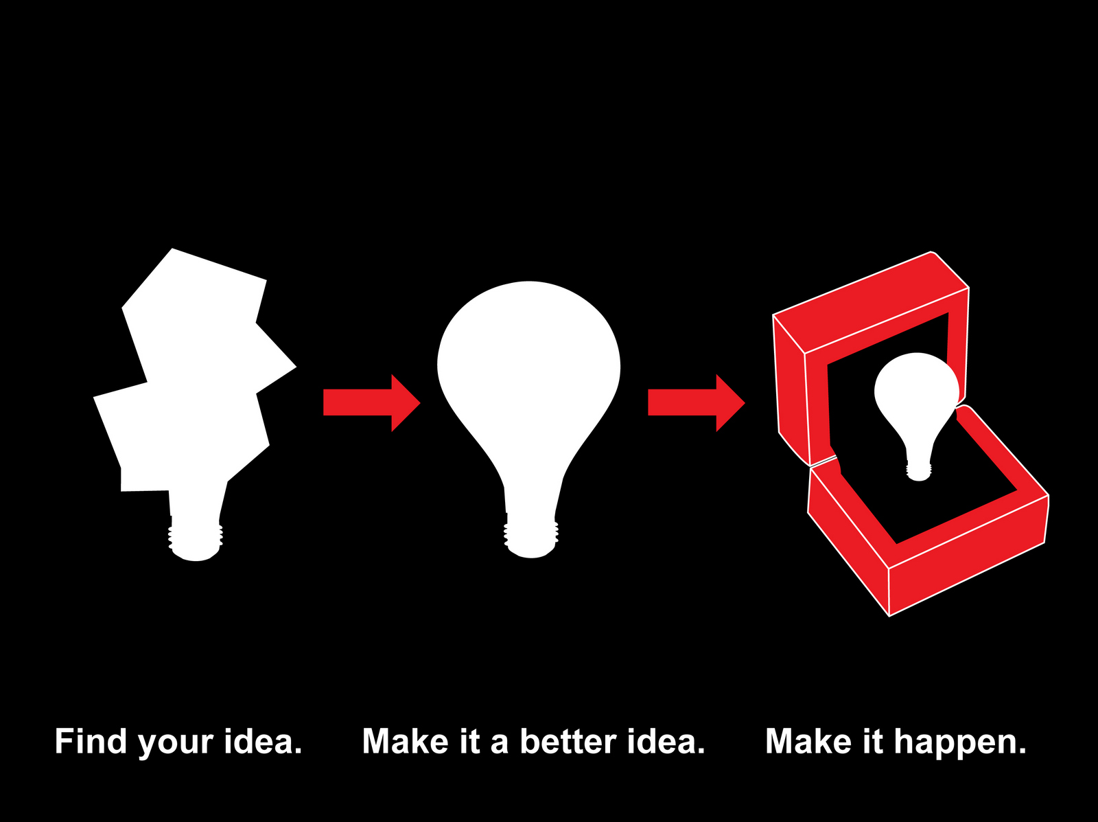
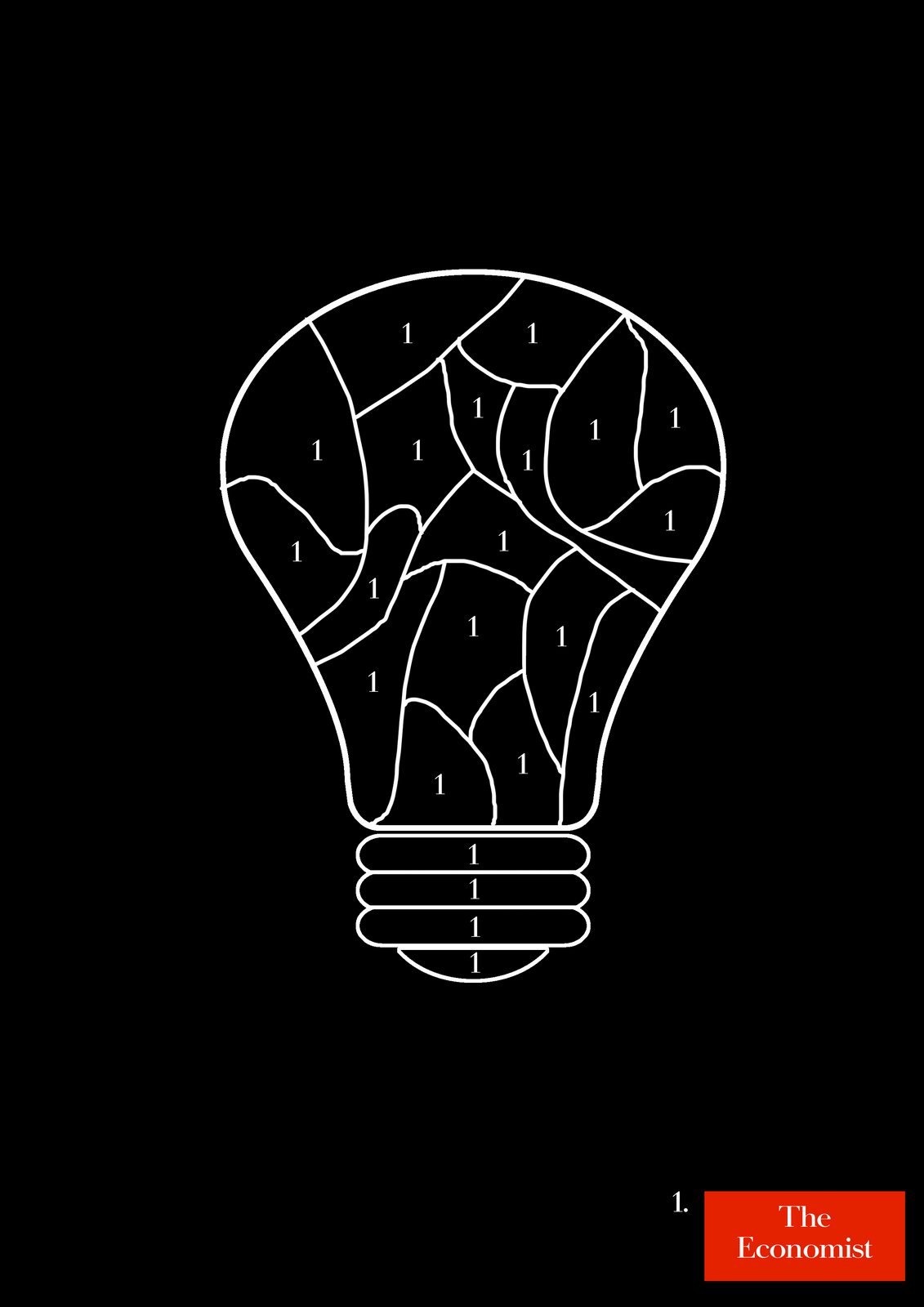
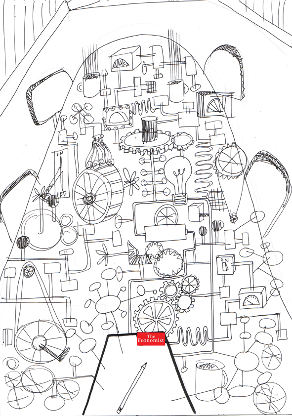
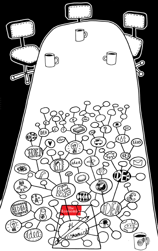
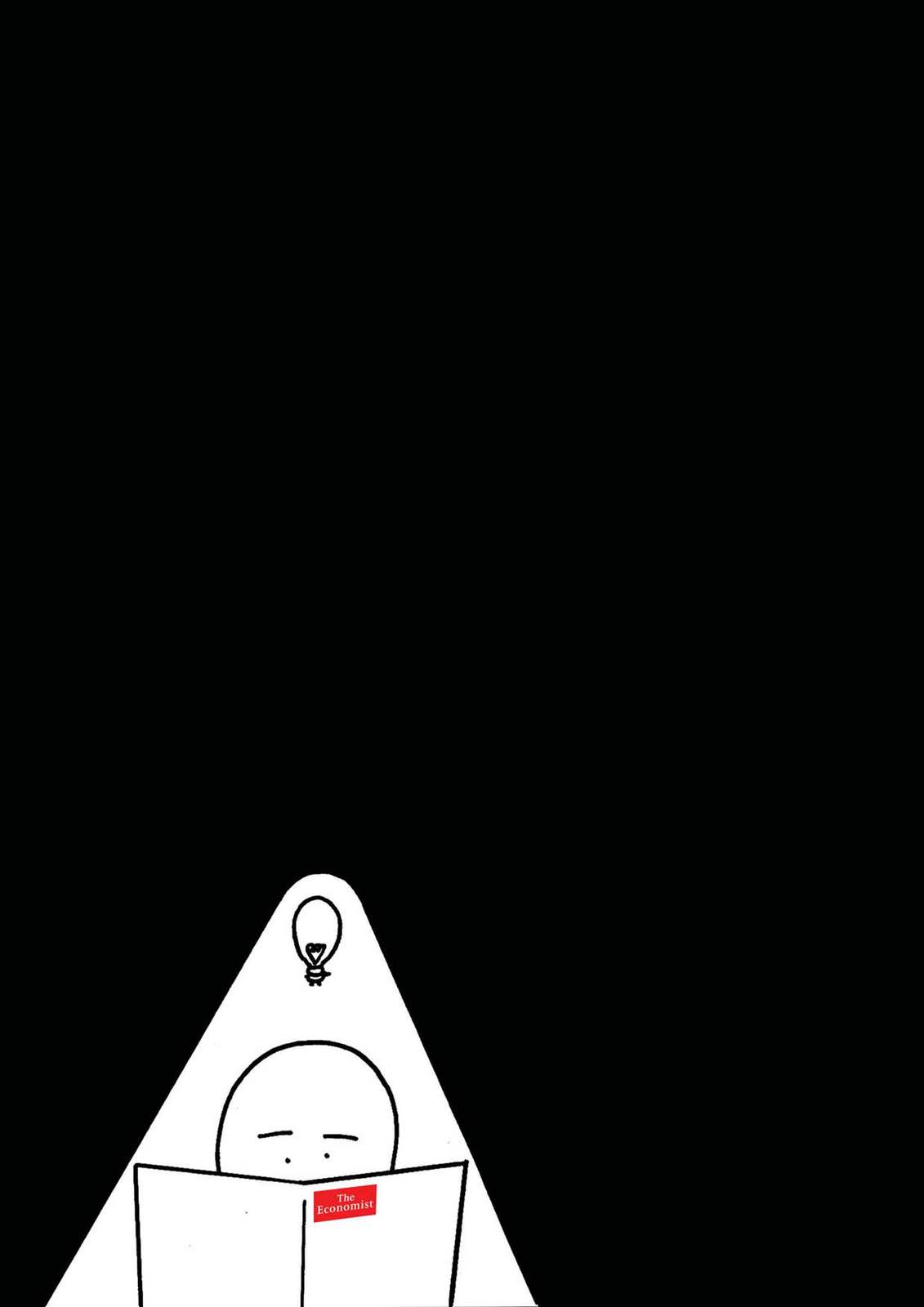
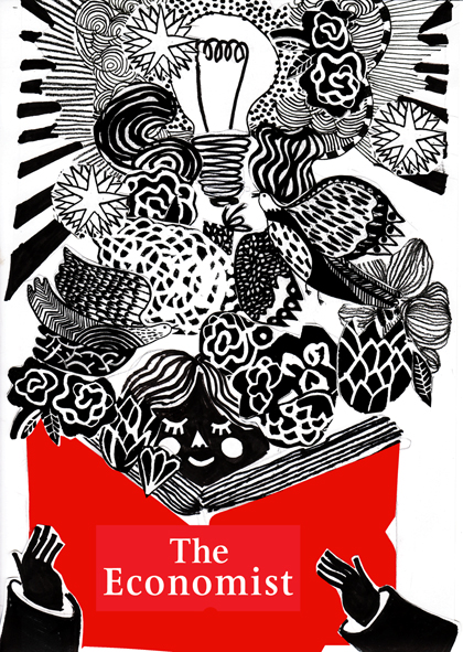
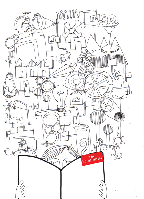
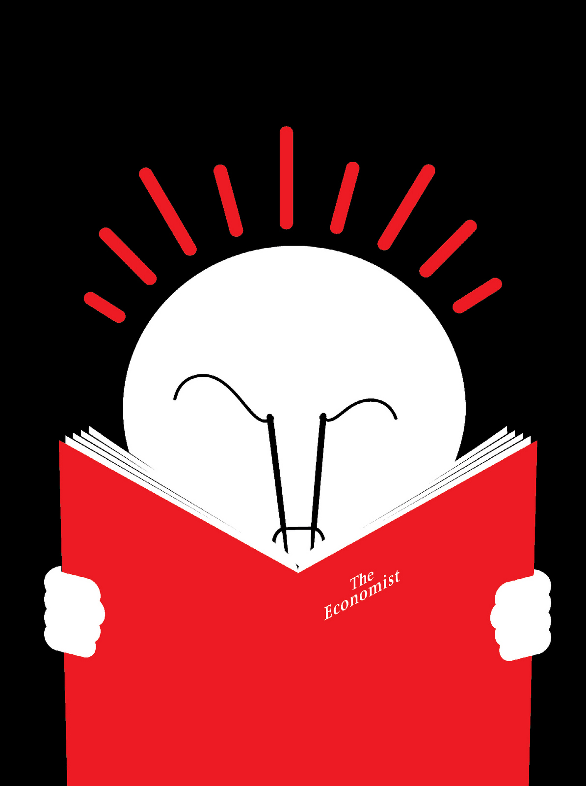
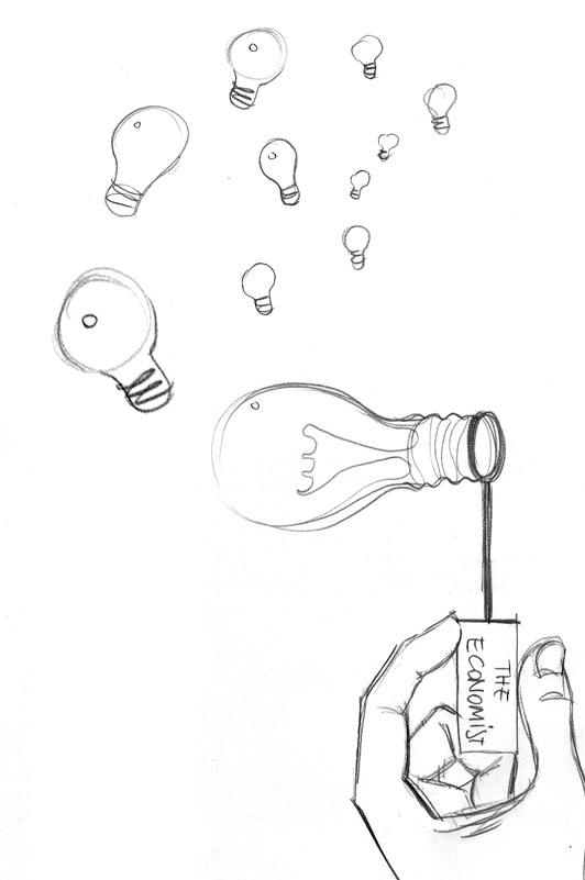
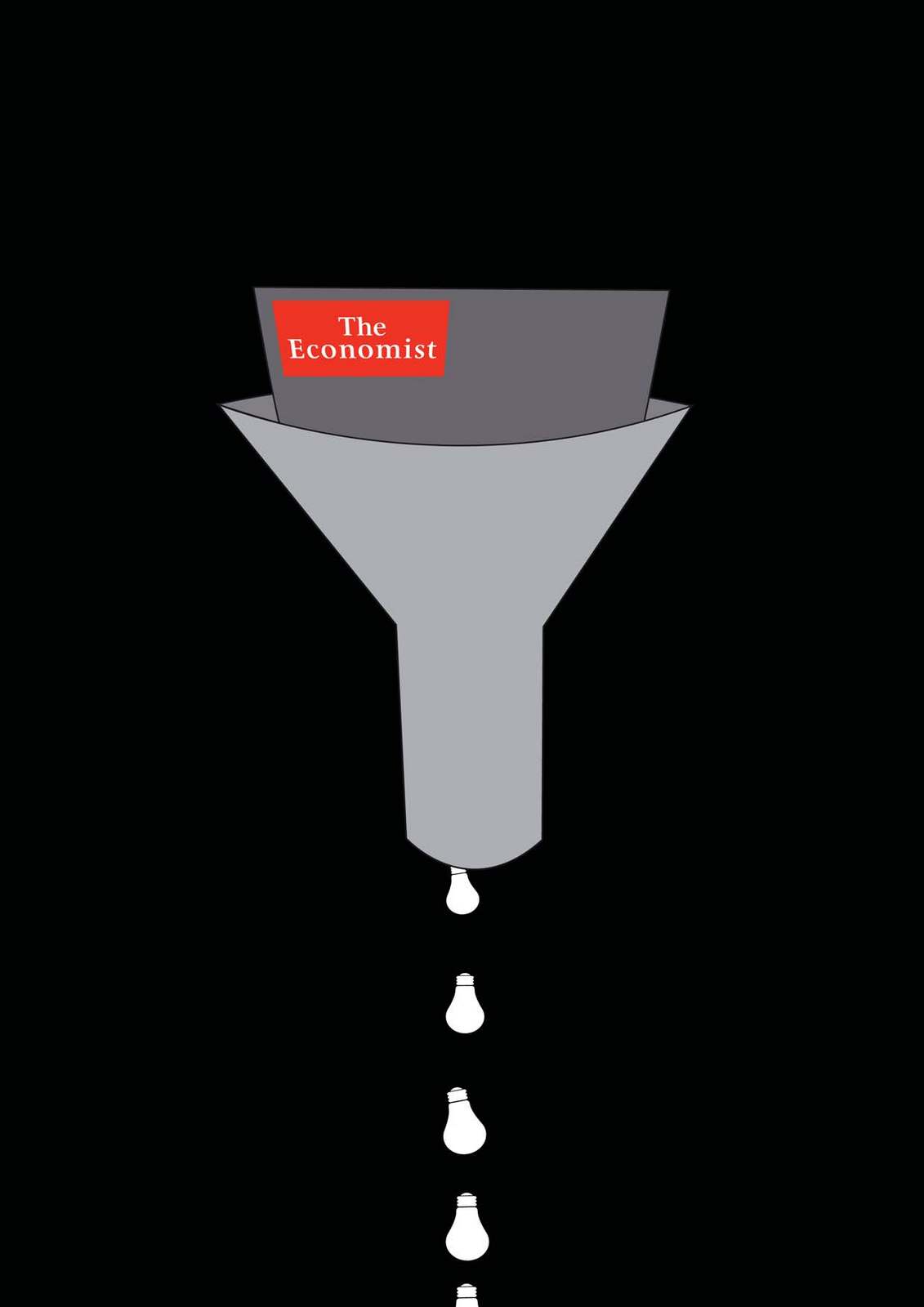
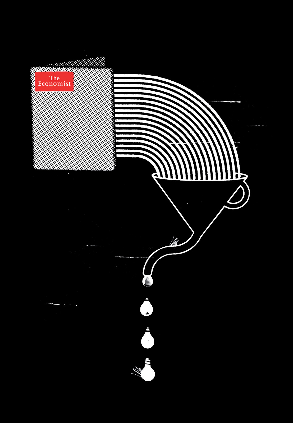
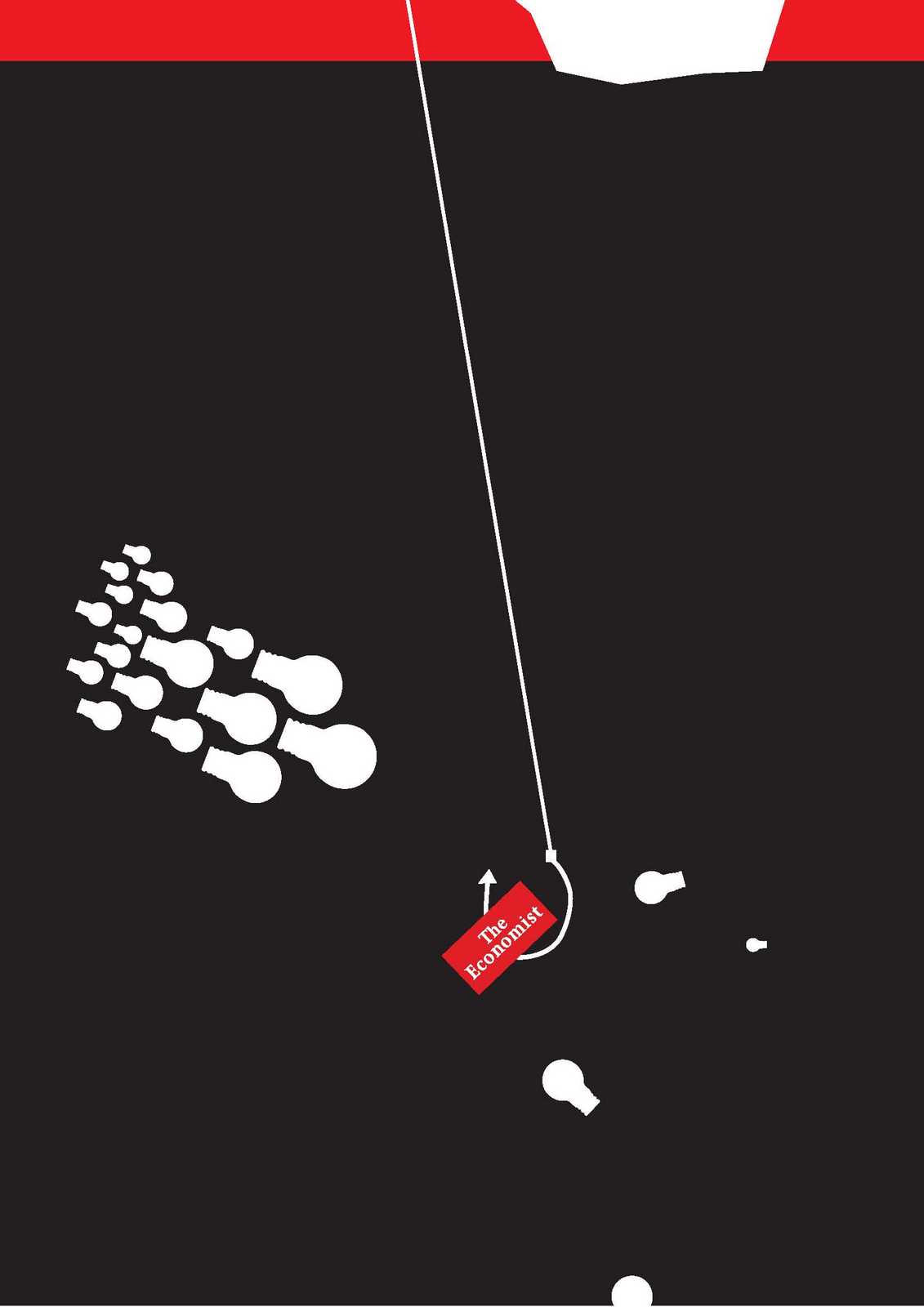
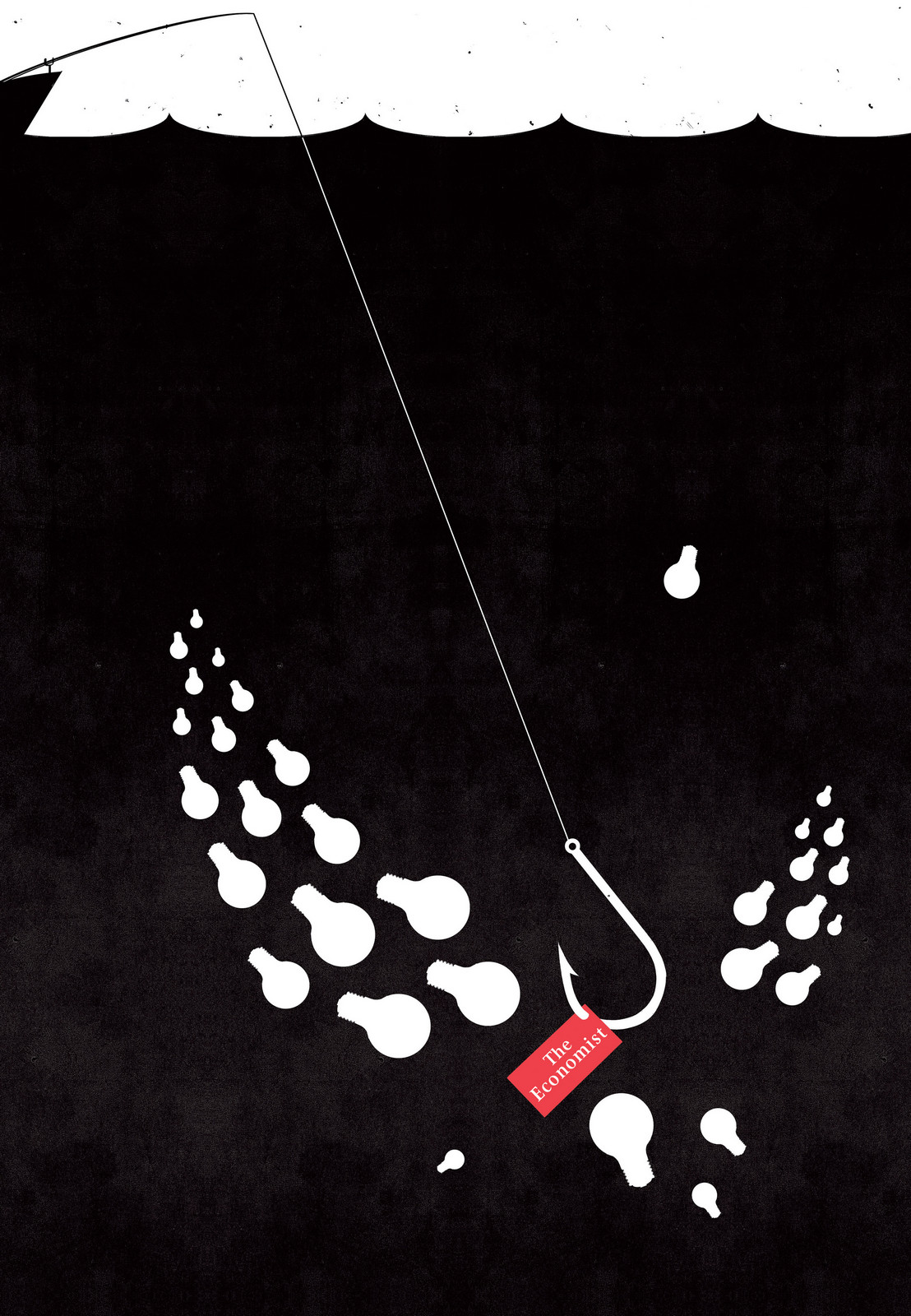
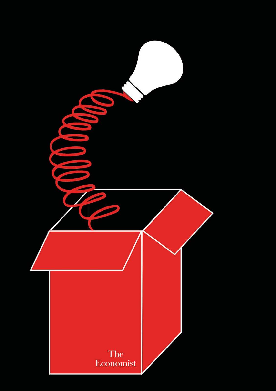
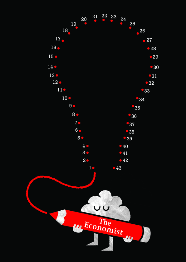
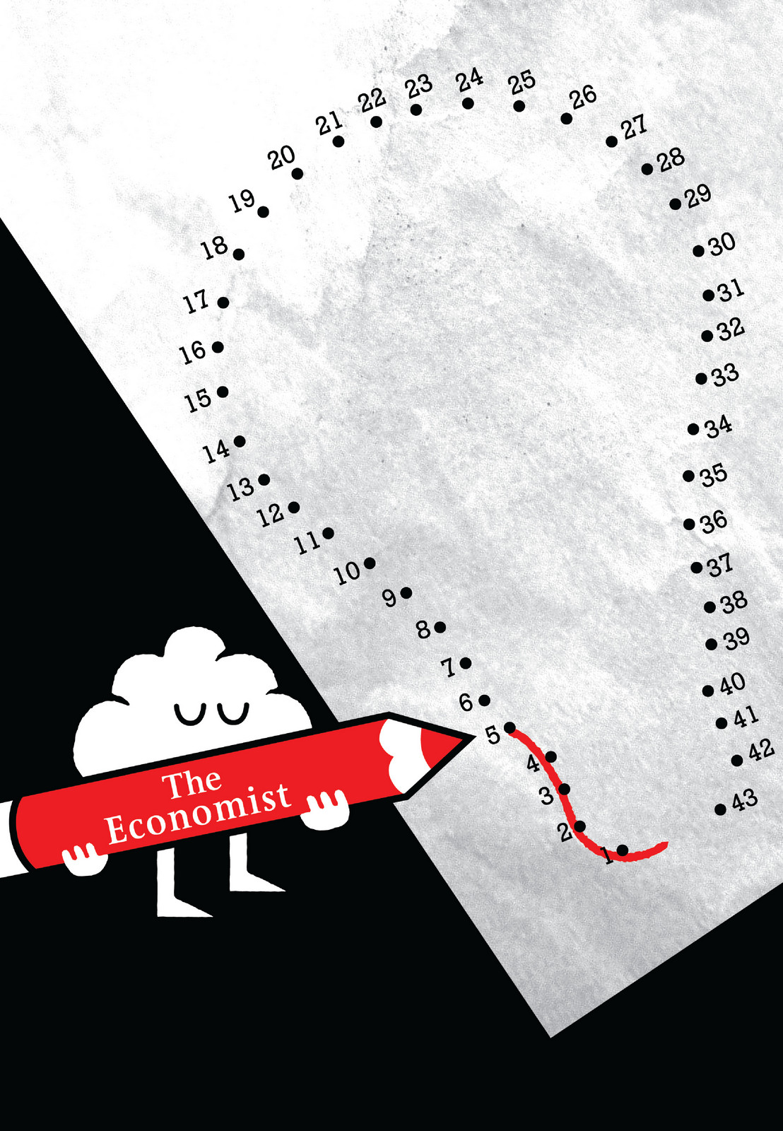
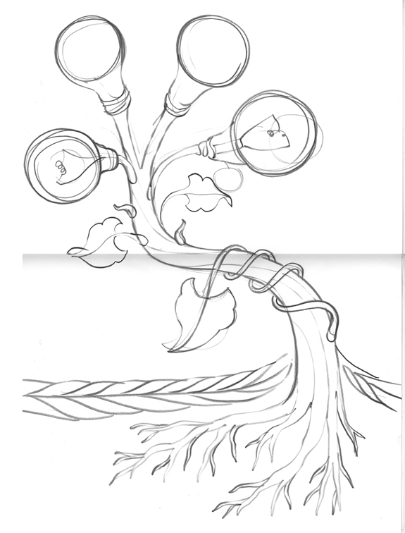
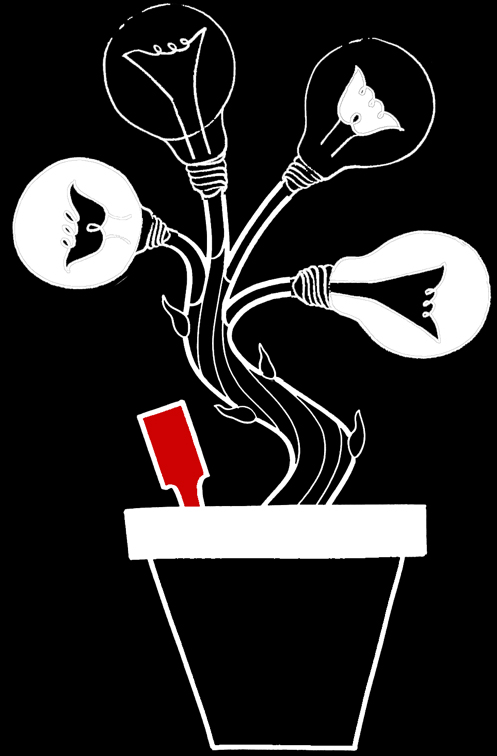
Not long after setting up DHM, we got a call from Media Guru and all round clever clogs Mark Palmer, he asked whether I could help The Economist out with a presentation. Of course I could, they're The Economist. Essentially, I put together a fancy looking PowerPoint presentation for them to take around the world. Titled ‘The Ideas People’, it set out the argument that The Economist wasn't a dry, factual business publication, it was stimulus for creative minds to generate ideas. I used the universal, possibly clichéd, symbol for an idea; the lightbulb. It helped unify the presentation, and turned complicated wordy charts into simple, charming visual ideas.Here are some of the slides:

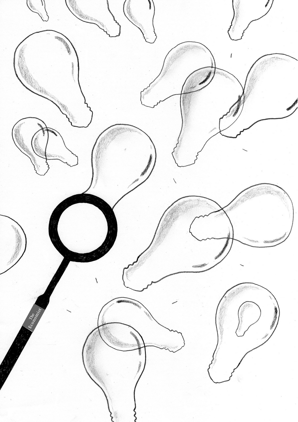
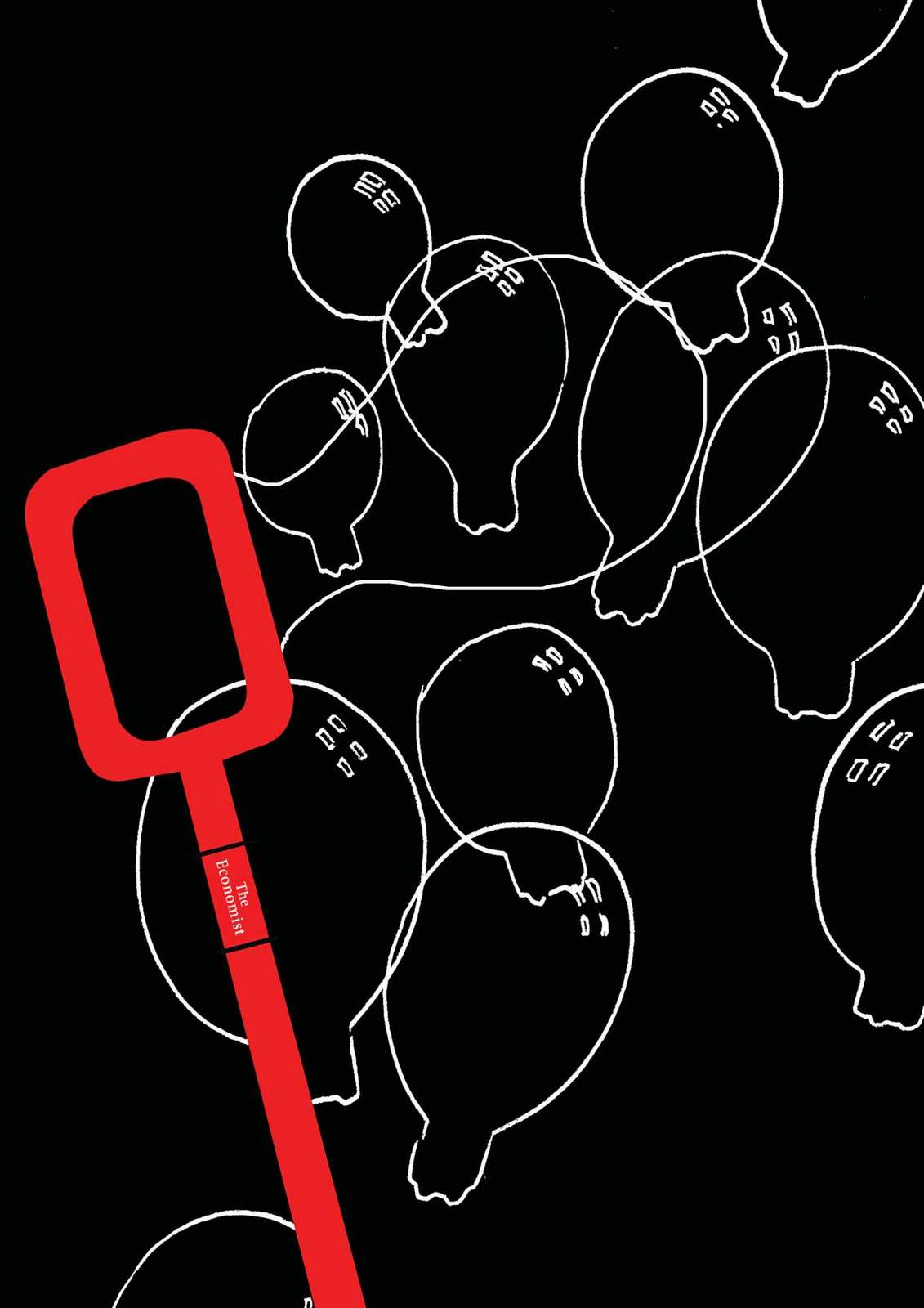
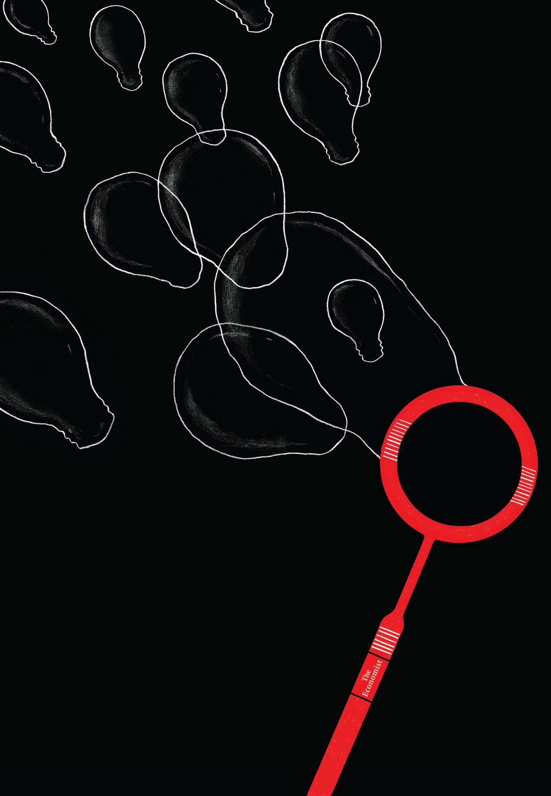
We waved goodbye and they went off happily to share their presentation around the globe.Six months later they call up ‘That presentation went down great, could you do us some ads on the same subject?’Of course, you're The Economist.At the time, the famous old red style was being replaced by a brand new shiny black style.


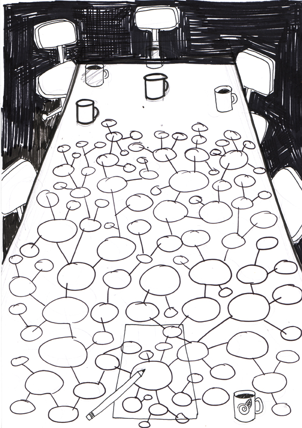
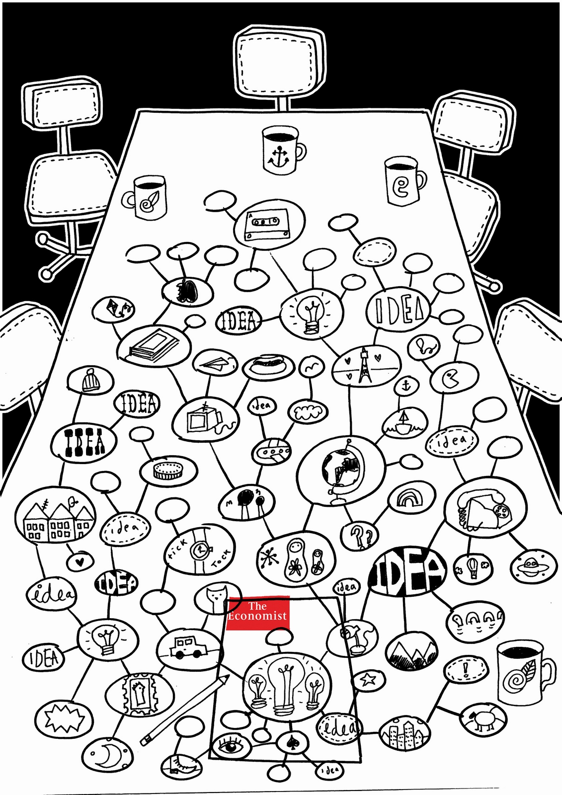
Reluctantly, I thought that whatever we came up should be in this new black style rather than the previous, more famous red. It's bloody tough to replace a famous campaign, and at first glance this new campaign looked clever, cool and modern.I tried to figure out how it worked, but I found it was neither fish nor fowl. It didn't have big powerful headlines like the famous red ads, and it didn't have visual ideas. I'd had a spell creative directing the previous campaign, and these lines felt like the writers were writing for the red campaign, only to discover later that their words had been given to some beardy Hoxton types who’d added some funky black pictures. The result was that the pictures took up all the real estate but didn't actually communicate anything, they were like a whimsical accompaniment to the headlines.Or worse, just making the words difficult to get at.We couldn't ditch the funky visuals because it wouldn’t feel like the new campaign, but I wanted it simpler.I briefed the creatives: ‘I want you to draw pictures that say ILLUSTRATOR’S 1st ROUGH:

I said no words.APPROVED.I like to give illustrators, photographers and directors freedom to interpret.I'm buying into their world.Sometimes I don't even give them layouts, I just describe the idea, that way they can imagine the idea it their way.Alfred Hitchcock said ‘If you cast well, you don't have to direct actor.’The down-side is that sometimes I get back results that I don’t like.And to avoid finances and timings spiralling out of control I have to switch from ‘do it completely your way’ to ‘thanks for imagining your way, it doesn't work, now I want you to now do it exactly like I say.’(a). (Agency rough.)
Oops, the illustration looks cool, but the idea has been lost.ILLUSTRATOR’S 2nd ROUGH:
Better, but the idea still isn't coming through clearly enough.Because the mind map has become 3D, so didn't look like a mind map. Plus, the ideas didn't feel as though they were coming from The Economist.ILLUSTRATOR’S 3rd ROUGH:
Much better, weird table though? Maybe we should cut a chunk out of that big blank bit at the end?ILLUSTRATOR’S 4th ROUGH:
That's it, colour it in!FINAL AD:
(b) (Agency rough.)
ILLUSTRATOR’S FIRST ROUGH:
Boy, that’s been ‘re-interpreted’.The idea has been discarded.Also, it didn't feel very ‘Economisty’.A DIFFERENT ILLUSTRATOR’S 1st ROUGH:
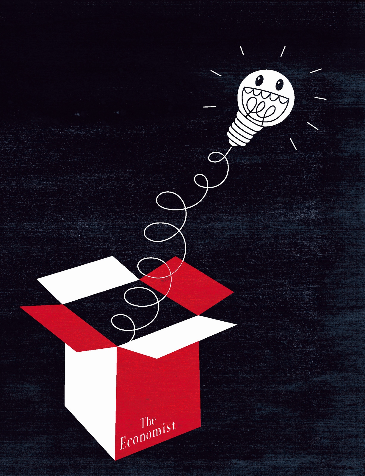
. She ignored the idea too, in an identical way. Spooky.We got yet another illustrator; Noma Bar, He sent in pdf full of ideas.They were all good, but they weren’t conveying our idea.Take this one, it's probably better looking than the final one we used, but do you get the idea from it?1:
Same with this one, it’s a bloody clever twist; the bulb being the head, but I don't think anyone would get the idea.2:
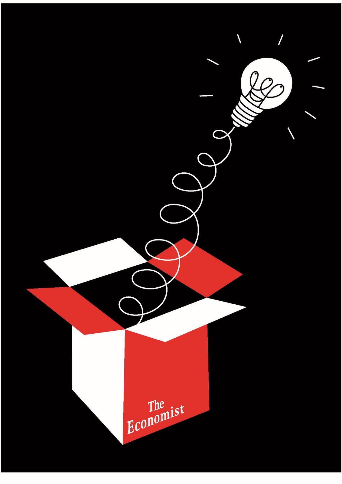
This one was nearer.Again, I thought it was clever, but worried the face would distract from our simple idea: ‘You’ll think of ideas when you read The Economist?’FINAL AD.:
(c) (Agency rough.)

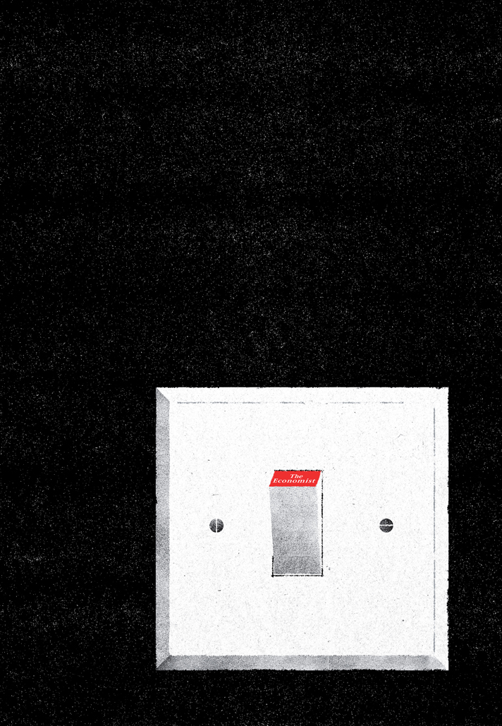
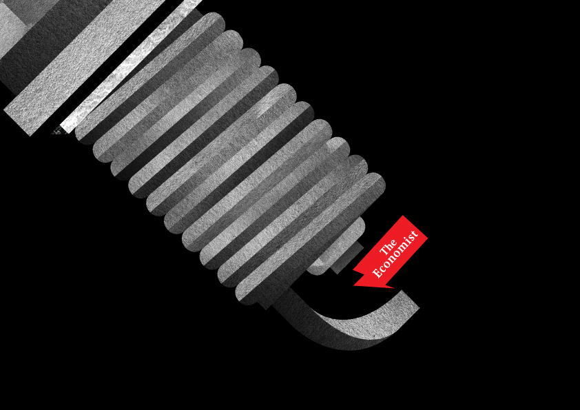
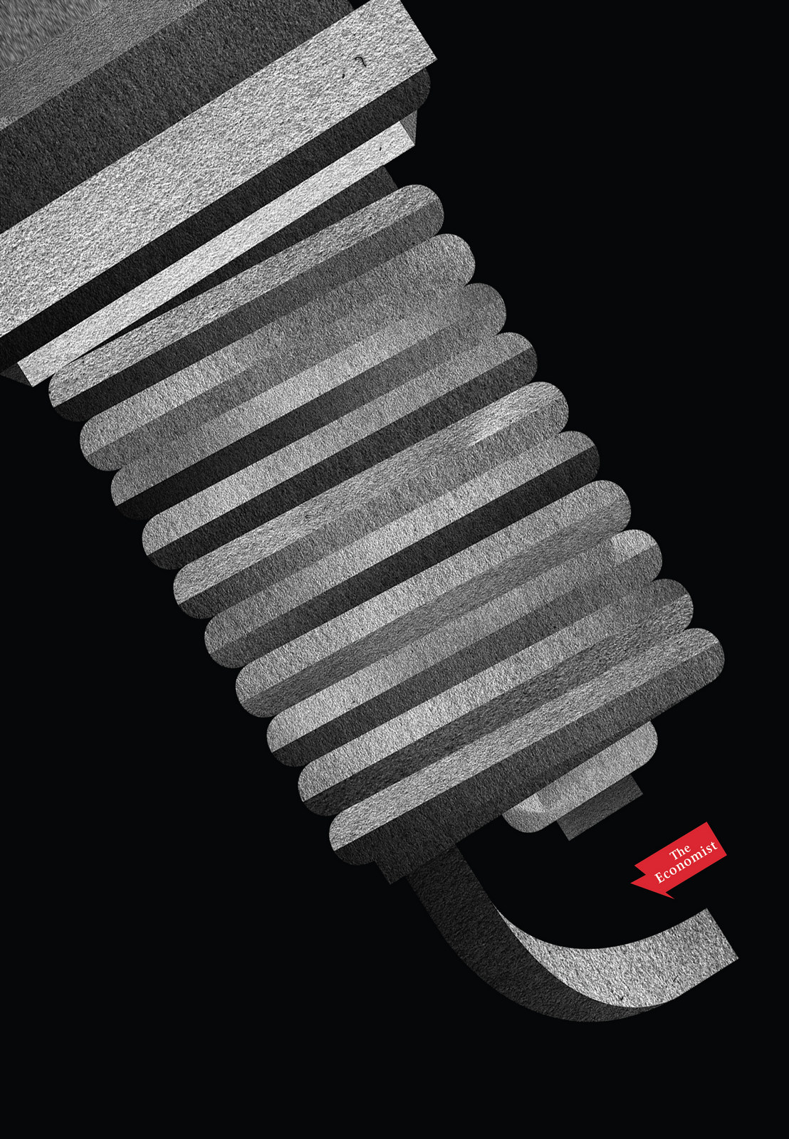
ILLUSTRATOR’S 1st ROUGH:
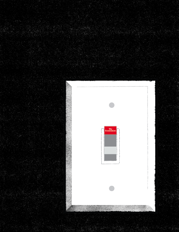
Looked good but didn't feel switchy enough. Too oblong. (Perhaps that's the shape of the switches this illustrator’s country?)ILLUSTRATOR’S 2nd ROUGH:
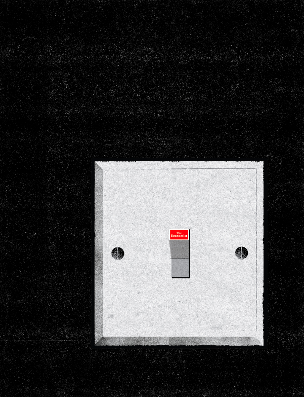
Better, but the actual switch, button bit, looks too small.Also, aside from whether it's technically accurate, this would make the logo really small, let's make it bigger.FINAL AD:
(d) (Agency rough.)
ILLUSTRATOR’S 1st ROUGH:
Looked cool, very graphic, but shouldn't we zoom in to the idea bit?And isn't that spark a bit big...for a spark?FINAL AD:
(e) (Agency rough.)
ILLUSTRATOR’S 1st ROUGH:
Cool, much better than ours, who needs a hand taking up all that space? What does it look like in black?ILLUSTRATOR’S 2nd ROUGH:
Looks good, maybe we should simplify those bubbles; too many and too much overlapping.FINAL AD:
(f) (Agency rough.)
LOTS OF INTERESTING, GRAPHIC INTERPRETATIONS OF OUR IDEA CAME IN:

In the end we plumped for the curvy, rainbow like one, it felt more upbeat and dynamic.FINAL AD:
(g) (Agency rough.)
Although it was all words, there was an interesting thought there.How do we make it visual?
ILLUSTRATOR’S FIRST ROUGH:
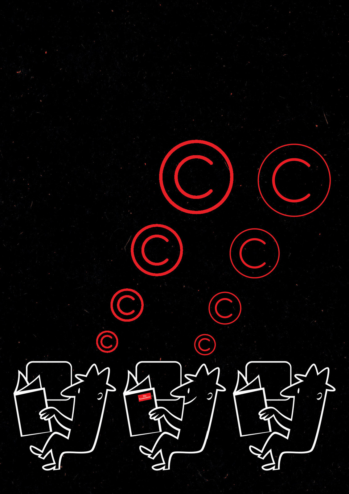
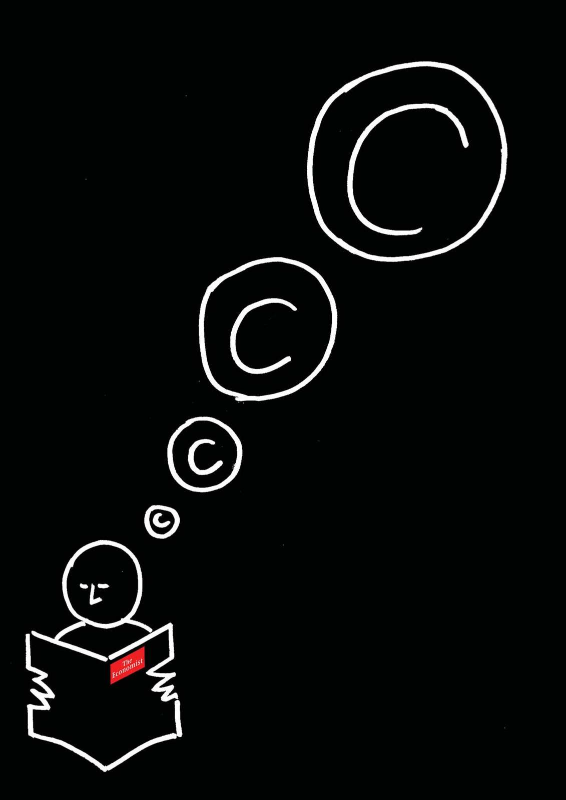
Great, like the addition of extra men like they’re on a train.But perhaps only one should be thinking copyright bubbles, to make him appear special.FINAL AD:
(h) (Agency rough.)
ILLUSTRATOR’S 1st ROUGH:
Simple, but the bulbs aren’t fish-like enough, they should swoop like a shoal, not hover.FINAL AD:
(i) (Agency rough.)
ILLUSTRATOR’S 1st ROUGH:
Why is the bulb grinning insanely? More to the point, why has he, I mean it, got a face?It doesn't look like an idea bulb with a face on it. Rub it out.FINAL AD:
(j) (Agency rough.)
ILLUSTRATORS 1st ROUGH:
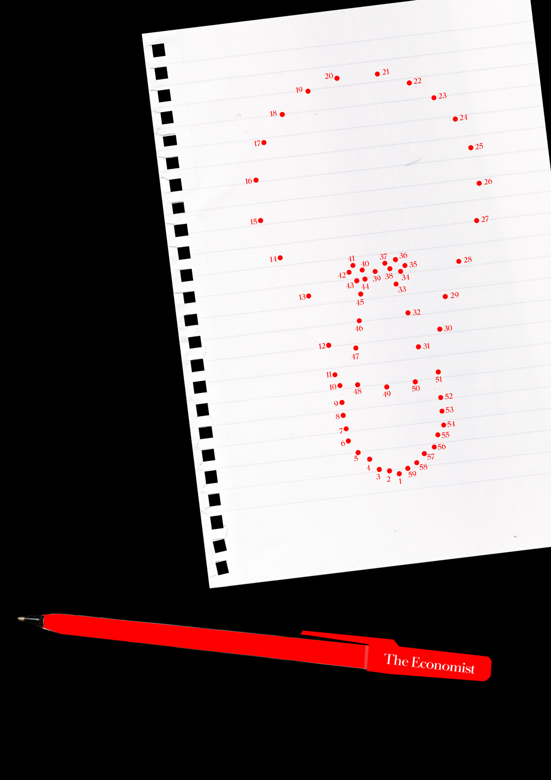
For some reason, the mad-cap illustrator drew the pencil being held by a little brain, cloud or marshmallow?We decide to keep Marshmallow Boy, he was just so cute, but insist on the dot to dot drawing being on paper.FINAL AD:
(k) (Agency rough.)I like it but question whether it’s about idea generation. It’s not, but we do it anyway.NO ILLUSTRATOR REQUIRED, WE USE OUR ROUGH:
(l) (Agency rough.)
ILLUSTRATOR’S 1st ROUGH:
Bit realistic isn't it? The bulbs look like they are made of glass? This is an analogy, metaphor...it's not real life.ILLUSTRATOR’S 2nd ROUGH:

Still way too real!ILLUSTRATOR’S 3rd ROUGH:
The pot and dibber thing are there, which is good, but make it more diagrammatic.ILLUSTRATOR’S 4th ROUGH:

Better, but go even simpler...like a diagram - flat colour, simple.We switch to a more graphic illustrator.NEW ILLUSTRATOR’S 1st ROUGH:

Much better, nice bee! Maybe we should lose the currency symbols and make the pot 2D, like a diagram.FINAL AD:

Putting this stuff together is a good reminder that however cool an illustrator is, you have to constantly check they don't stray off your idea and into just creating a cool picture.
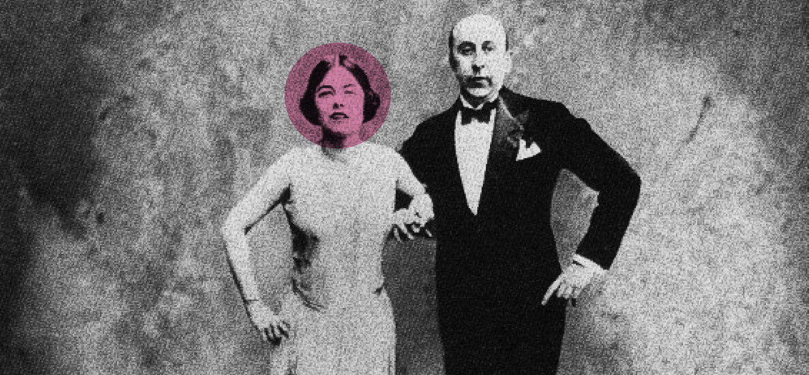
It’s tough for newbie creatives to get noticed. If you aren’t in an agency that produces good work it’s hard to produce good work.If you don’t produce good work it's hard to get a job in an agency that does. One of the ways around this is to find a client that will accept good. Up and coming copywriters Mike McKenna and Alastair Wood spotted one of these opportunities back in the late eighties; The IPA Society, they held lectures every month and would send out a typed up sheet of paper for all agency pin-boards.‘They could be posters! They’d be seen by every single agency in London.”All that was needed was friendly typographers, photographers and printers to donate their time free of charge.The first one they did got into the D&AD Annual, (a first for each of them).CUT TO A YEAR LATER: I was now Alastair’s Art Director and we got an opportunity to promote a talk ‘Desert Island Ads’.A tricky brief because it didn’t have a single focus or reference point. Eventually we settled on an idea which involved me scribbling glasses and bow ties onto an old an old, cheesy film still. The first people showed our shiny new proof to was BMP’s Mark Reddy and Richard Grisdale. Our book was going down pretty well until they got to our IPA poster.
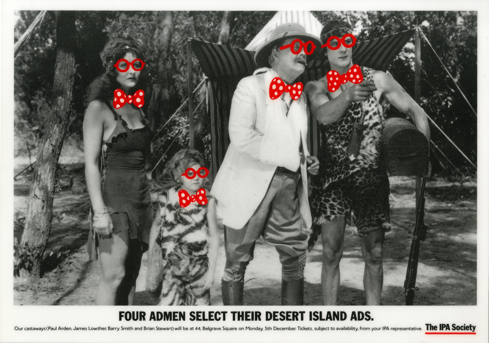
Mark: “Oh no! No...No...No...It's such a cliché! Silly glasses and bow ties?”We scuttled back out with our cliché.(I’d like to point the jury to exhibit A: Mark and Richard around the time the incident took place.)
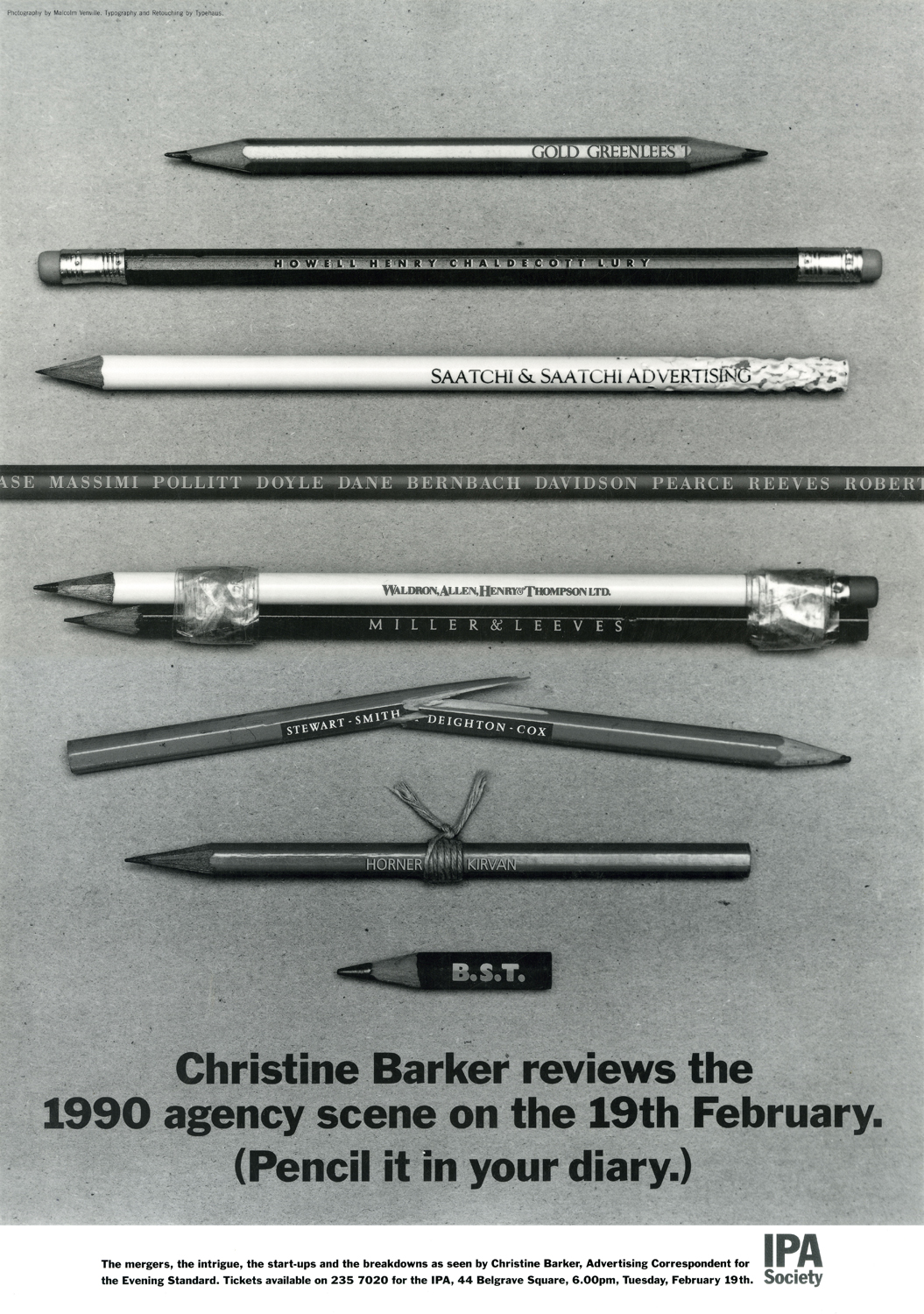
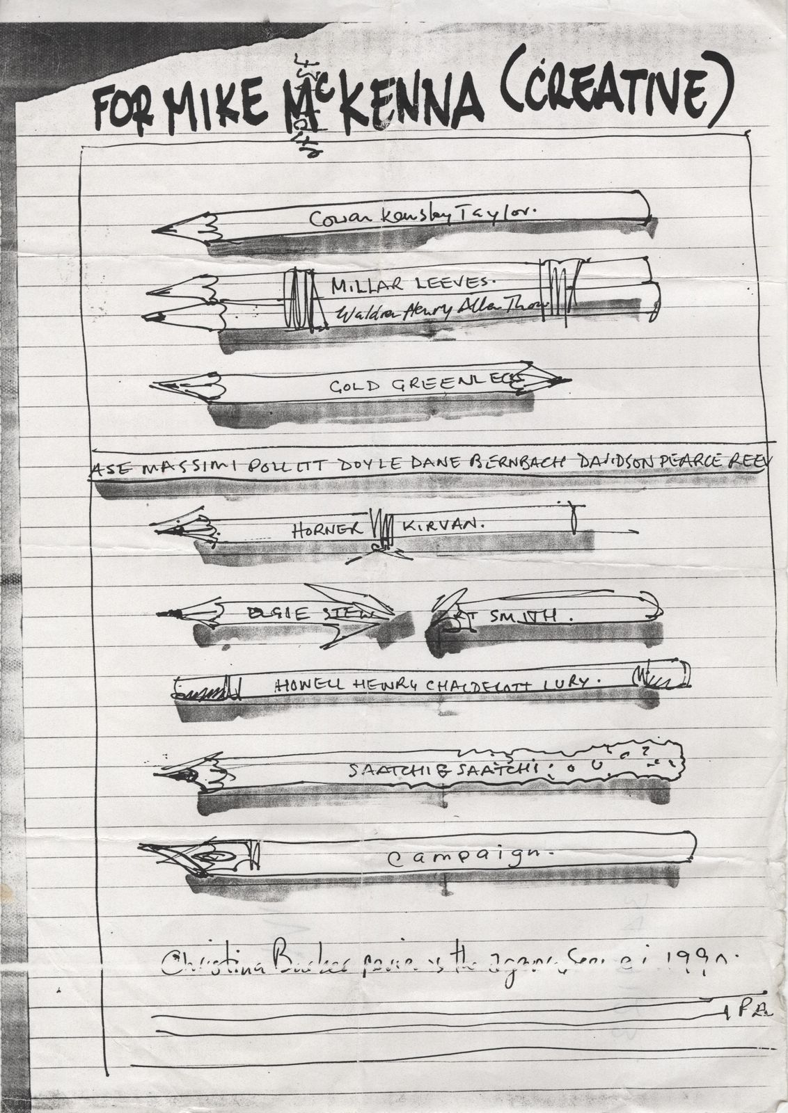
Shortly afterwards we got another IPA brief: ‘Christine Barker's Review of The Year’. Alastair was on holiday, so he suggested I work on it with his pal, Mike. How do you sum up a whole year in a single image?What unifies all agencies?What do all agencies have? PENCILS!
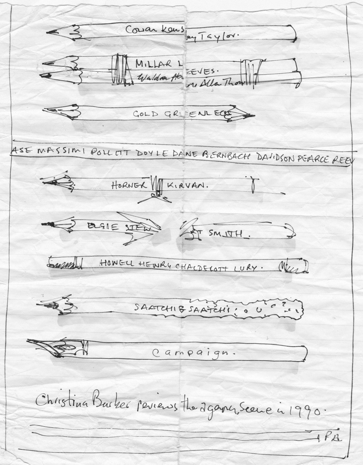
I got my mate with a camera, Malcolm Venvile, to shoot it for the £50 budget the IPA allocated. We made the pencils ourselves and used the back of a layout pad as the background. It got us into D&AD. Twice.
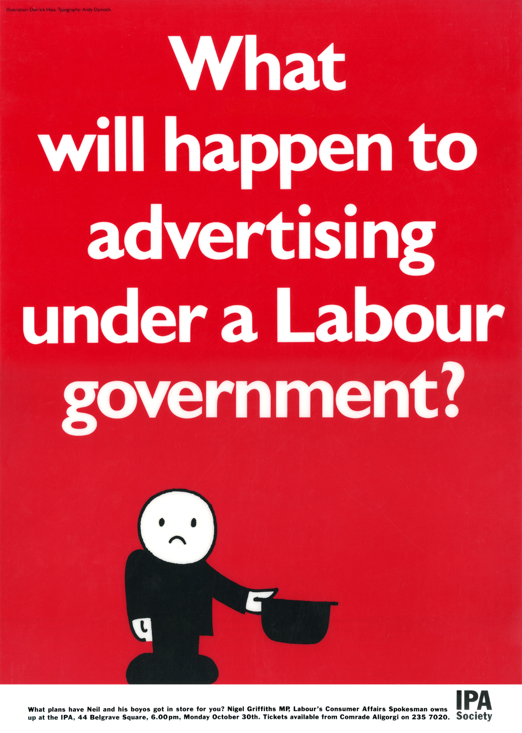
After this successful dry run, Mike and I teamed up and got a job at Publicis. In our first week we got an opportunity to produce another IPA poster: ‘Advertising under a Labour government’.Our new Head Of Art, Derrick Hass, insisted he draw Fred, (the little flower grading dude), also insisting he get a name check on the poster.The following week Campaign carried this story on the font page: ‘HOMEPRIDE FURY AT NEW AGENCY PUBLICIS’.It’d been brought to Homepride’s attention that their brand spanking new agency had used their character without permission, just to rub salt into the wound innocent little Fred had been used in a political context.A secretary called to arrange for me and Mike to have tea with C.E.O. Michael Conroy.DERRICK: “Keep me out...you’re kids, you’ll be fine, but don’t involve me... I didn’t even want to draw the bloody thing!”.MIKE: “Er...it’s got your name printed on it...you asked us to print your na...”DERRICK: “WHAT?... SHIT...SHIT...SHIT!”Mr Conroy was fine, he simply asked us to explain what had happened.
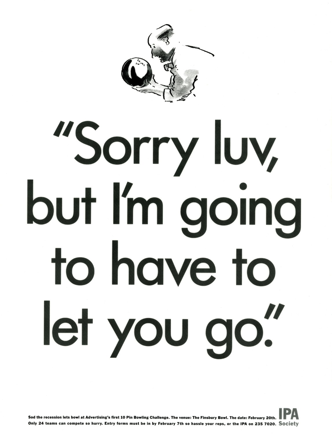
In 1992, at the height of the recession, we got a brief to promote an The IPA Bowling Evening.At the time, news of redundancies were almost daily, so making the event topical seemed a good way to go.The delightful illustrator David Holmes agreed to draw the ad for £0.(This was only after he tried persuading me to use free and easy scribble instead, unfortunately I didn't have the balls to use my own drawing, I wanted ‘professional’ illustrator.)
The next brief they gave us was for ‘The repackaging of John Major’. We thought we’d try to court controversy, like those great George Lois Esquire.
Our idea was to show the Prime Minister bum out, socks on.
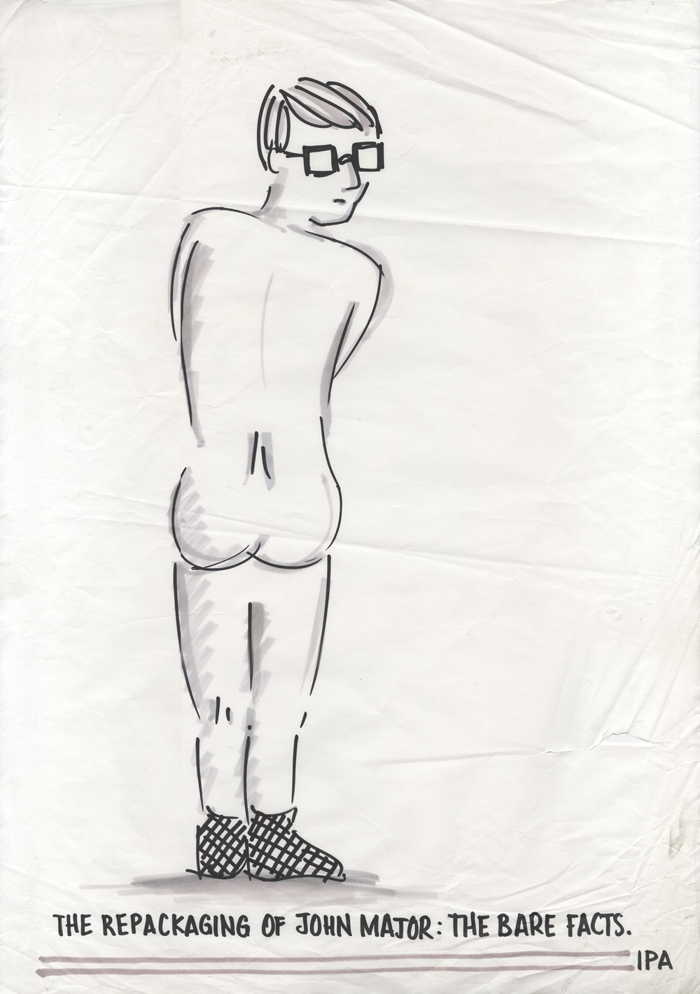
It was rejected, being viewed as too controversial.(The drawing must’ve been a homage to John Lennon’s ‘Two Virgins’ cover.)
Next was a talk by D&AD Chairman Edward Booth-Clibborn on ‘How to win more at D&AD’.(Would love to know what he said?)The previous year the D&AD Annual looked like this.

So we literally helped the character win more.

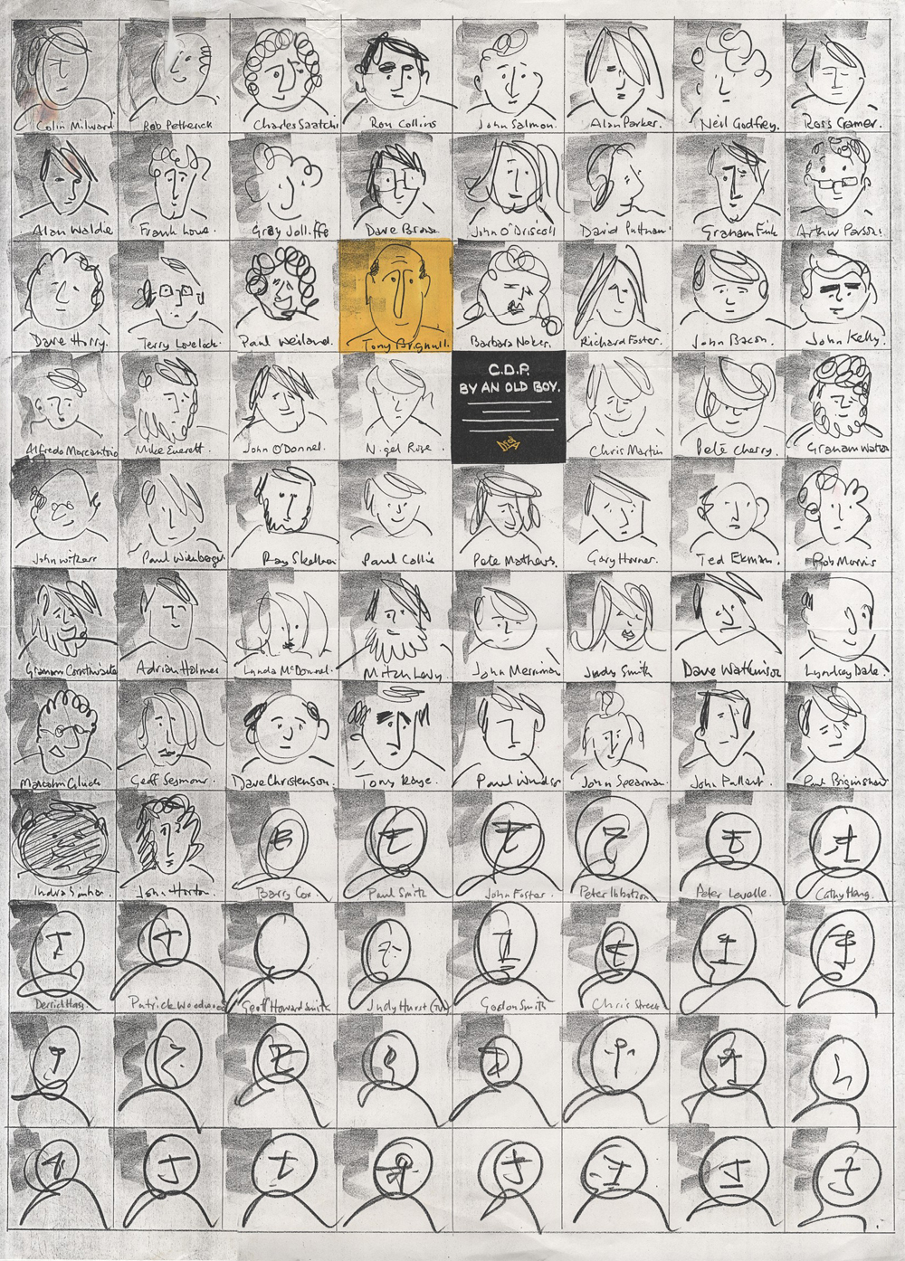
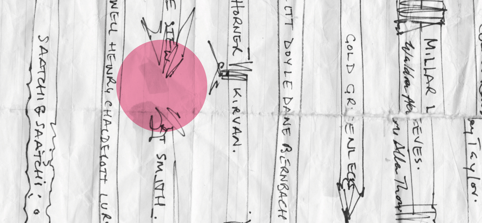
The last brief I worked on was for a talk by Tony Brignull on the glory days of CDP. By this point I was trying to make the layouts less basic, more creative. I liked this layout, it was very relevant; honouring all the creatives who’d contributed to CDP’s glory days, but picking out the speaker. The line seemed clever too; Tony was an old boy in that he’d worked there and he was old, he was an old boy.We just needed Brignull’s sign off.Excitedly, we took our fancy layout to Marylebone Road and waited, and waited, and waited for him to come down to the cafe in AMV’s reception.Eventually he came down, weary, not full of the joys of spring.No small talk, straight in “You have a poster?”We unfurl our A2 rough with a proud flourish.
“I hate it”, he got up and walked out.We looked at each other trying to figure out whether to follow him or slunk out onto Marylebone Road.We opted for the slunk out.Twenty years later I did another one.
Over the years a lot of teams hustled IPA briefs, the results of which can be found in D&AD Annuals.It’s important not just to rely on your day job.
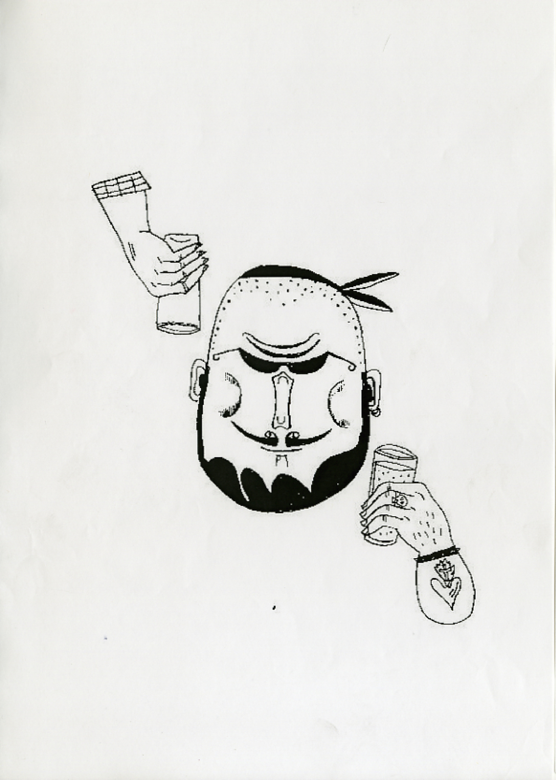
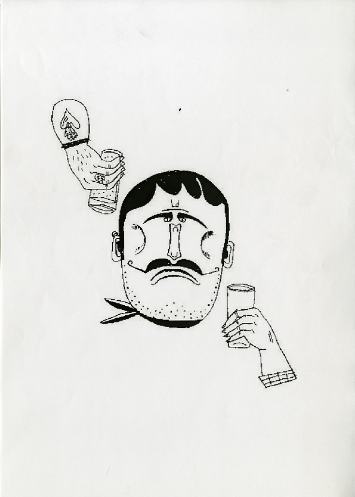
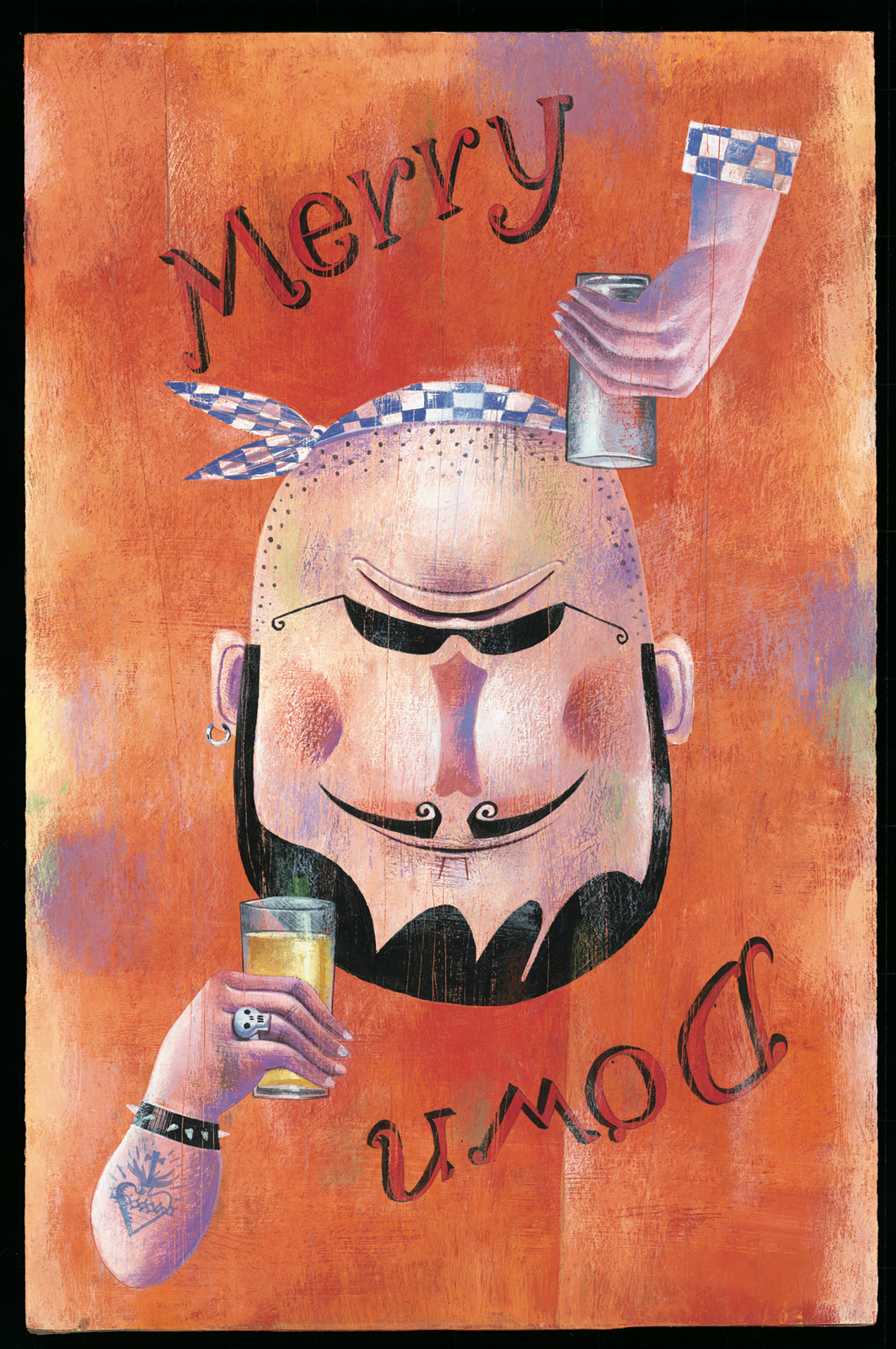
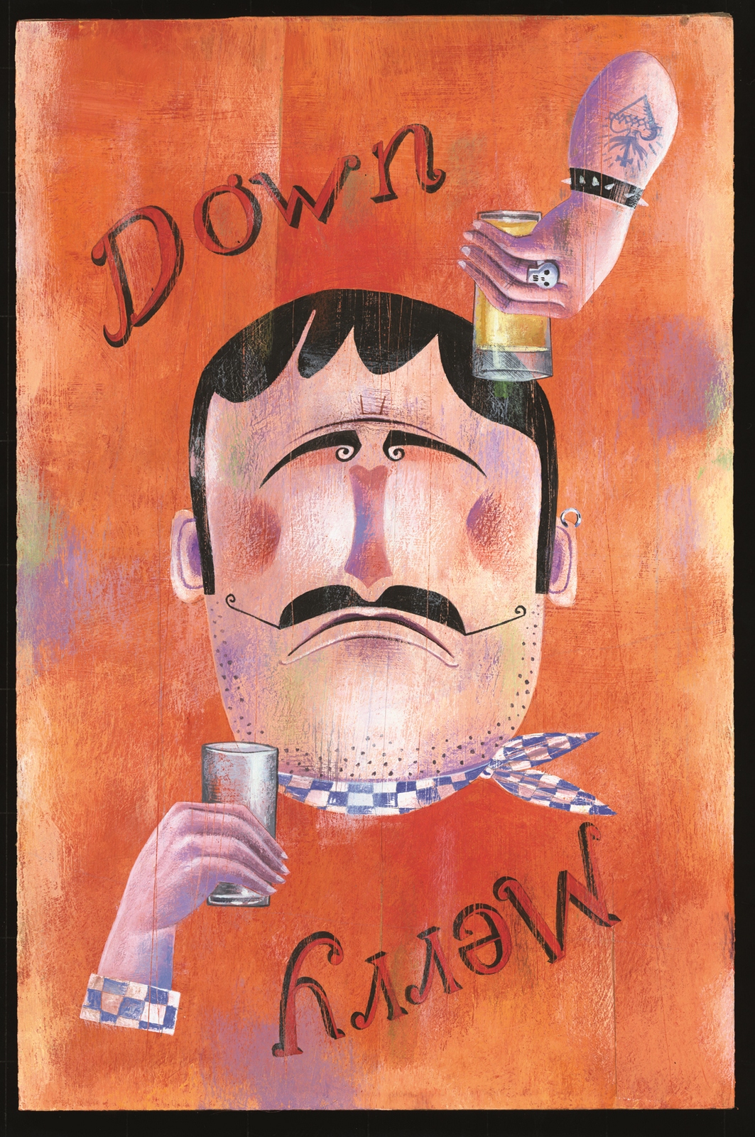
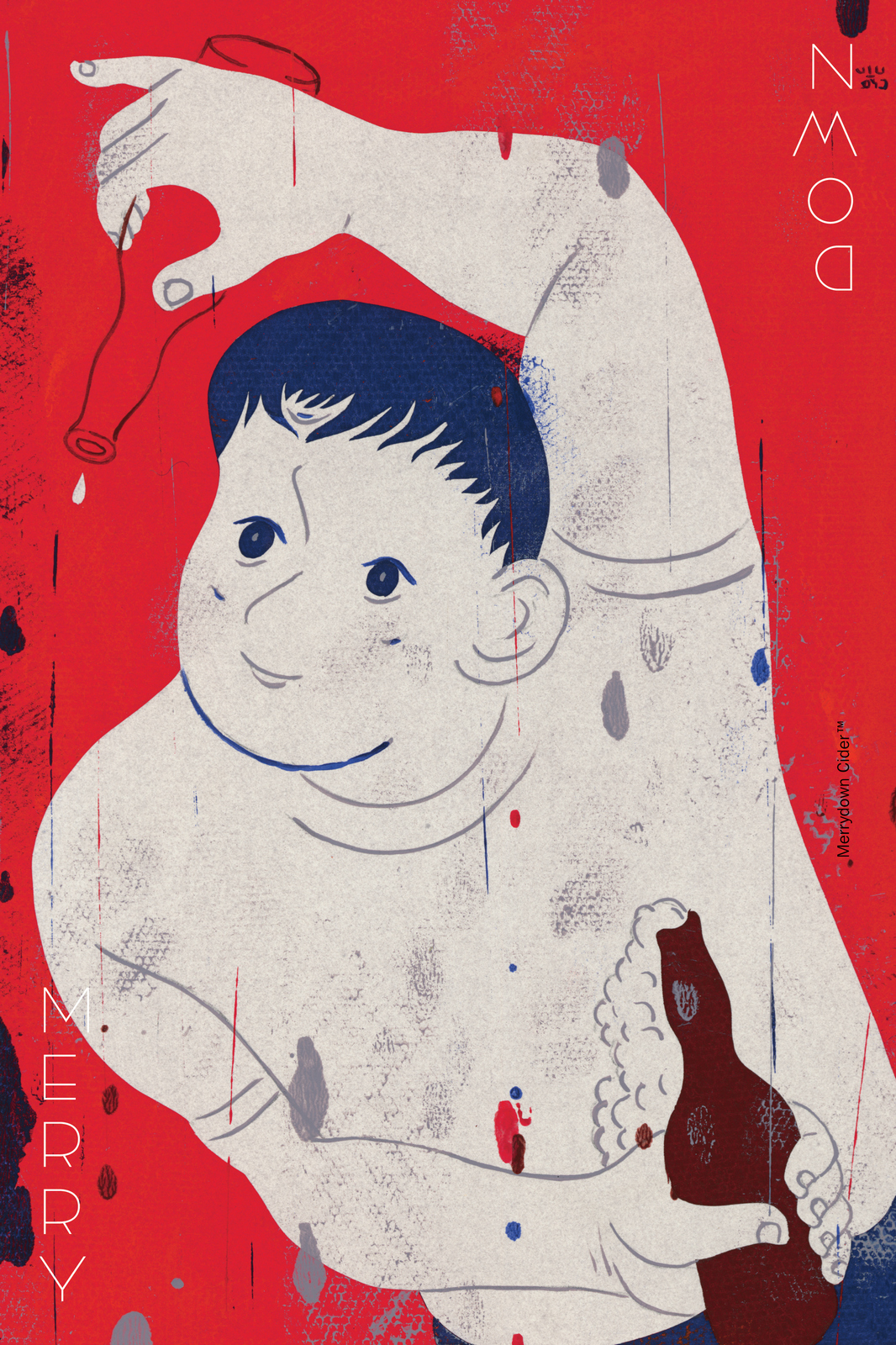
“We have a bit of an image problem with Merrydown, its main constituency appears to be students and street tramps.” Chris Carr, Merrydown Chairman.These were the only Merrydown ads we could remember seeing. (Written by Chris Wilkins.)
Six sheets and fly posters were booked, so posh, long copy ads like those were out.The creative department came up with various routes, some good, some less so.

Who’d have time to look at a picture, read the explanation below, then check out who it’s for below that, as they drive past our poster? I felt we needed something simpler, more like graffiti than advertising. Like the Milton Glaser ‘I love New York’ poster.
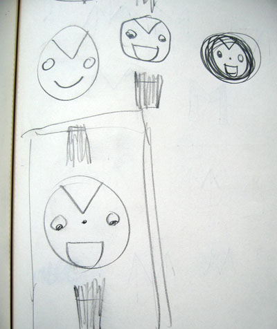
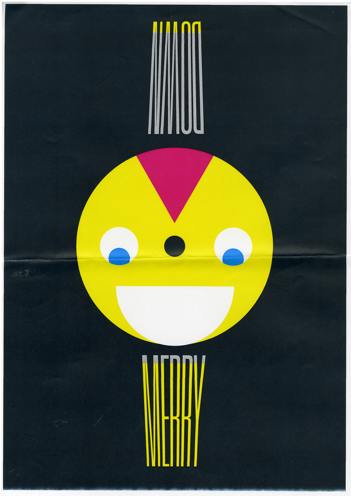
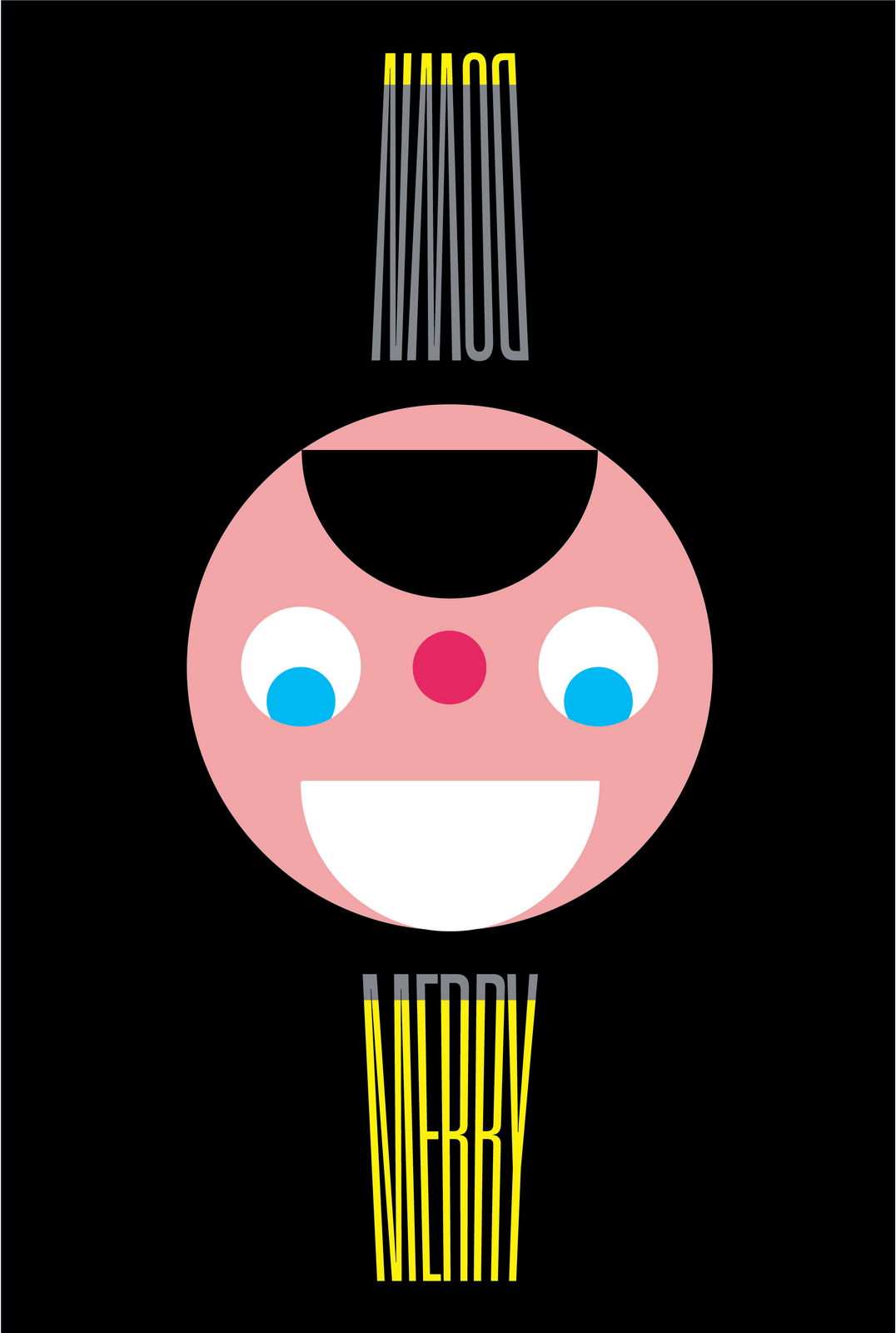
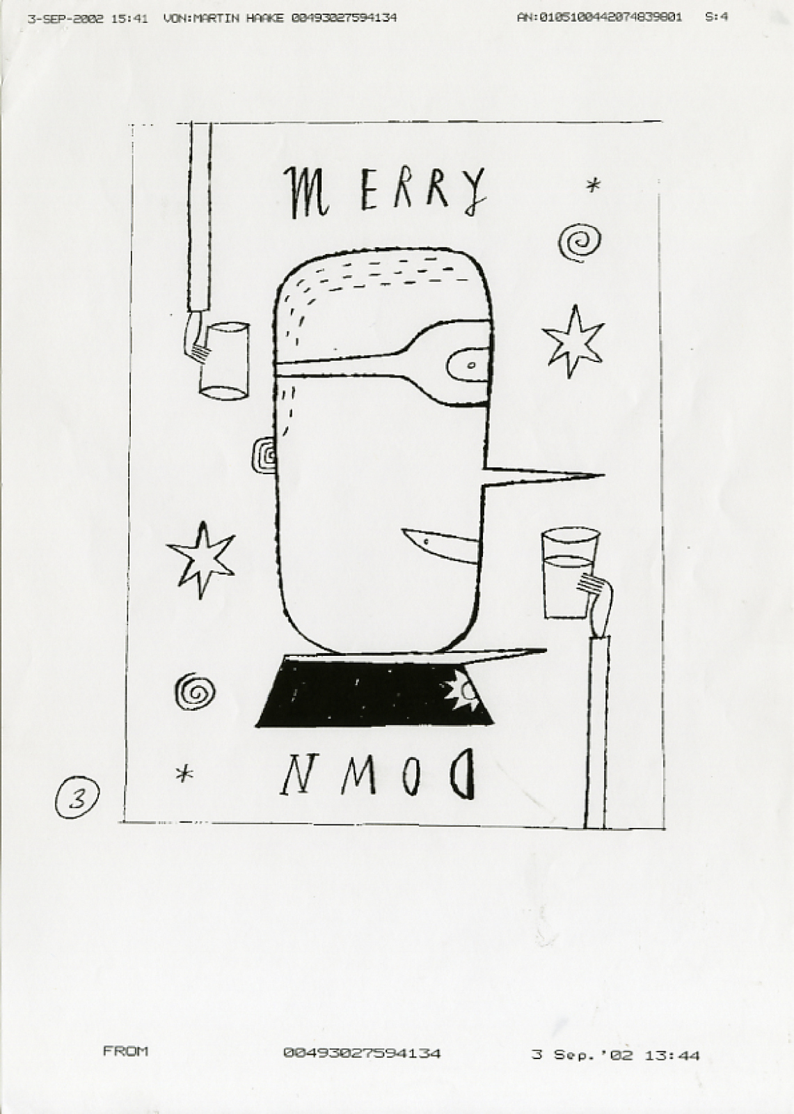
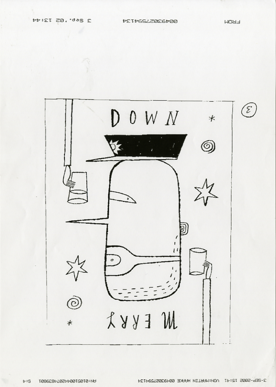
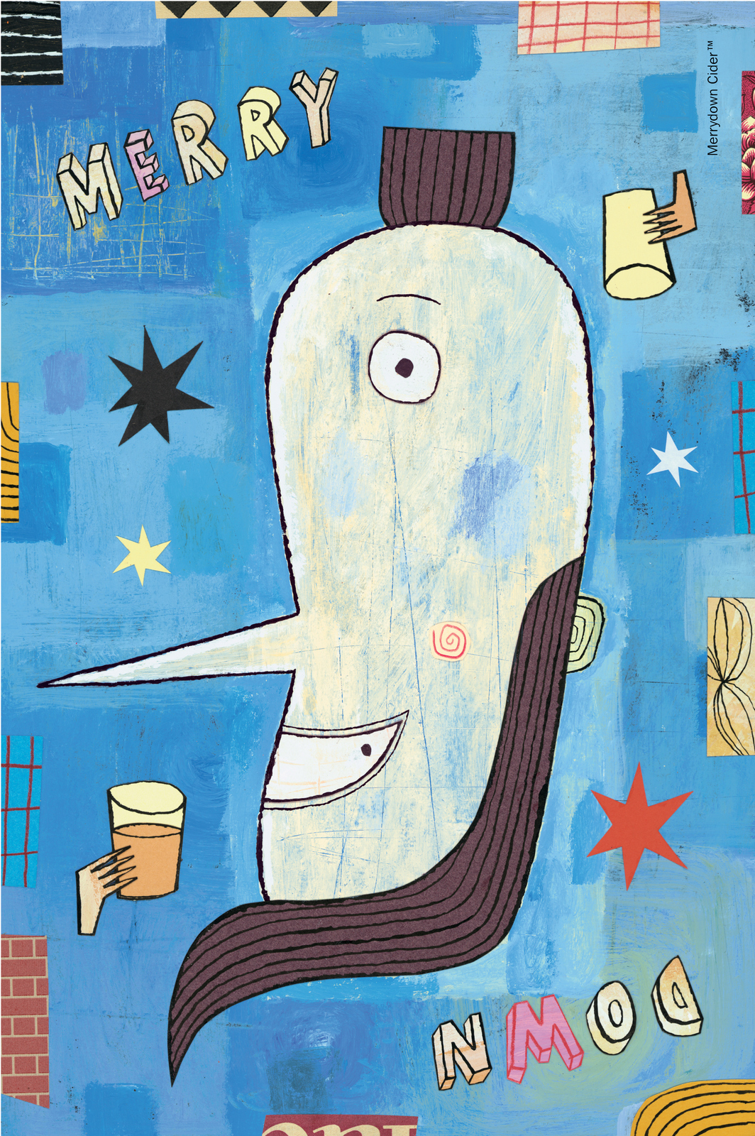
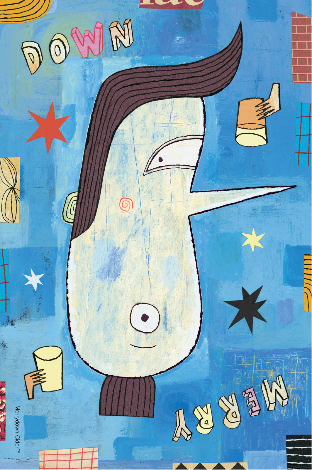
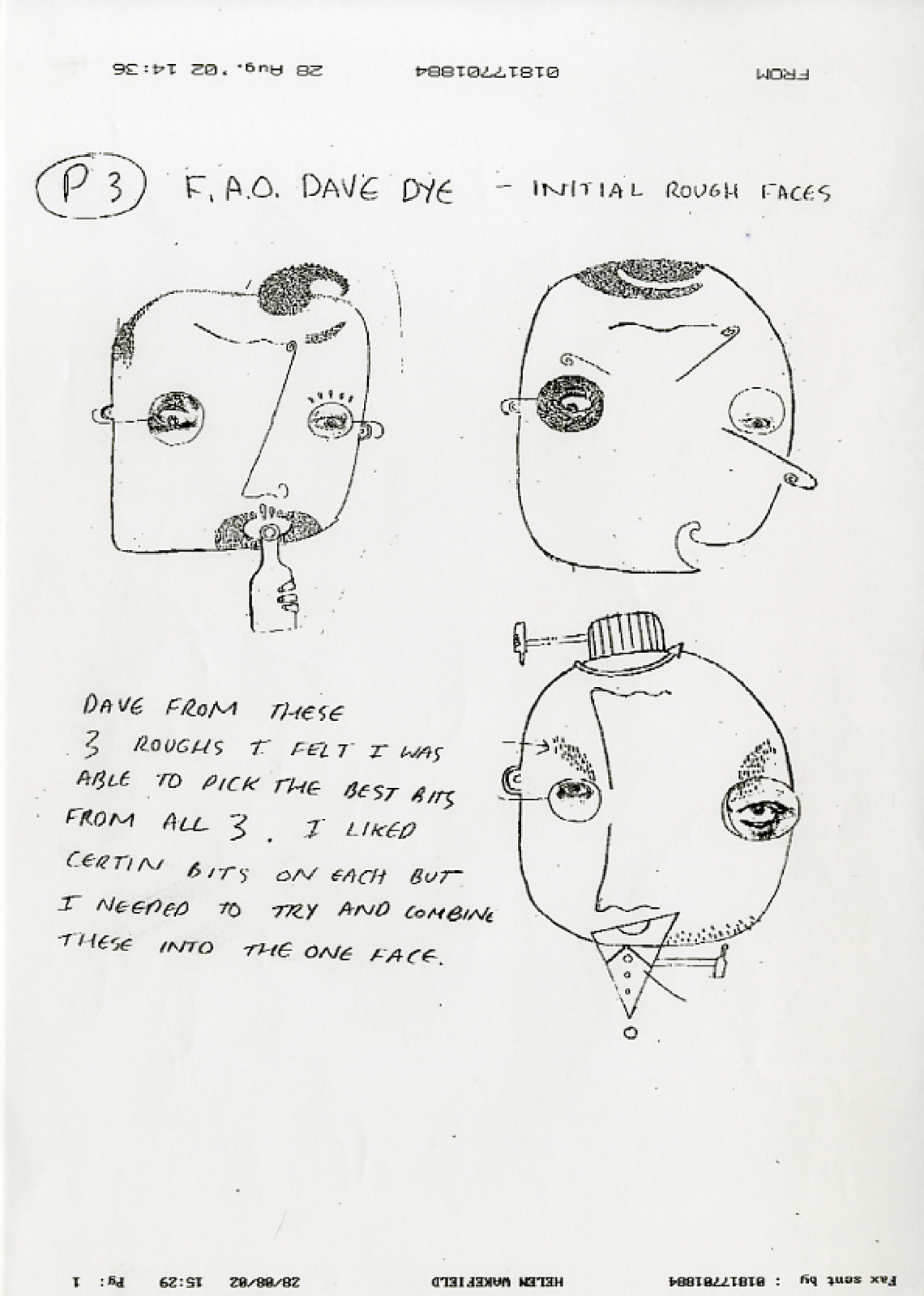
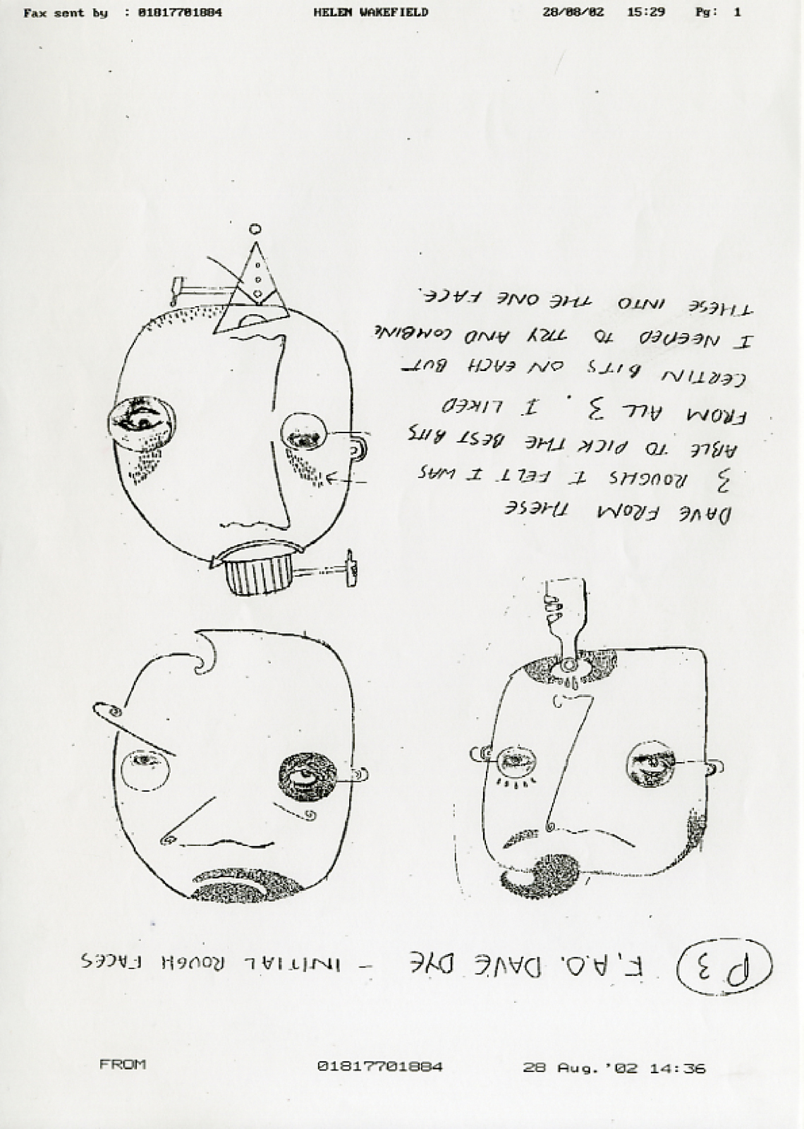
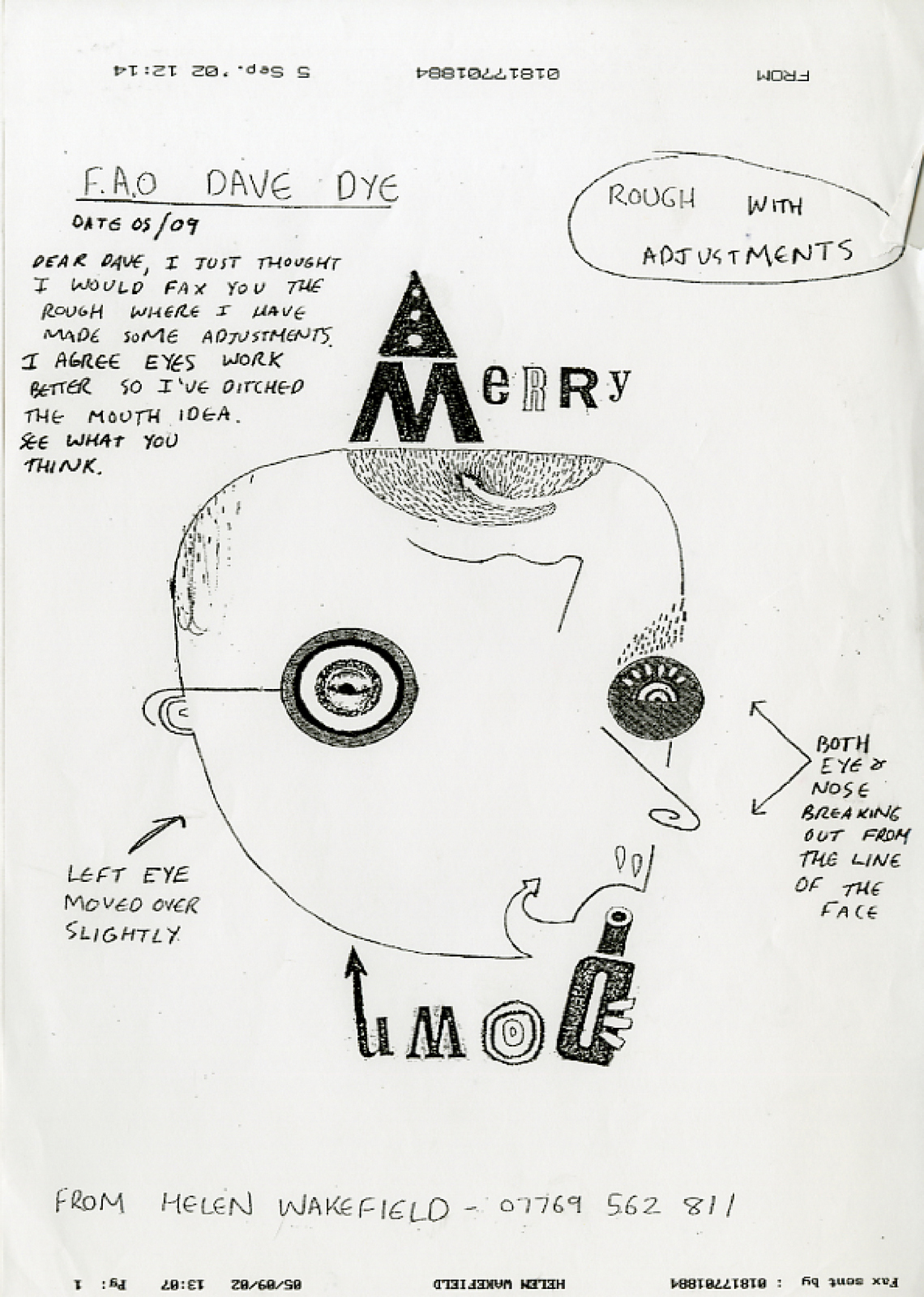
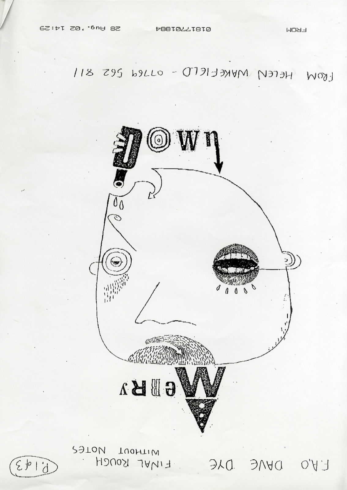
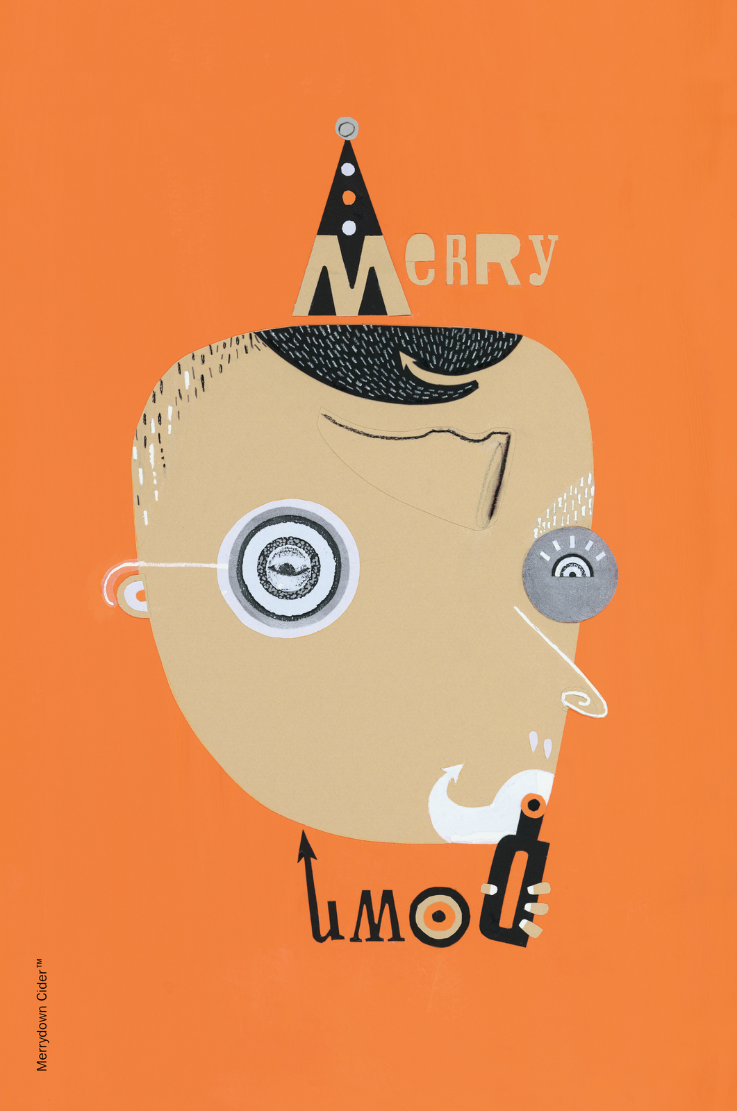
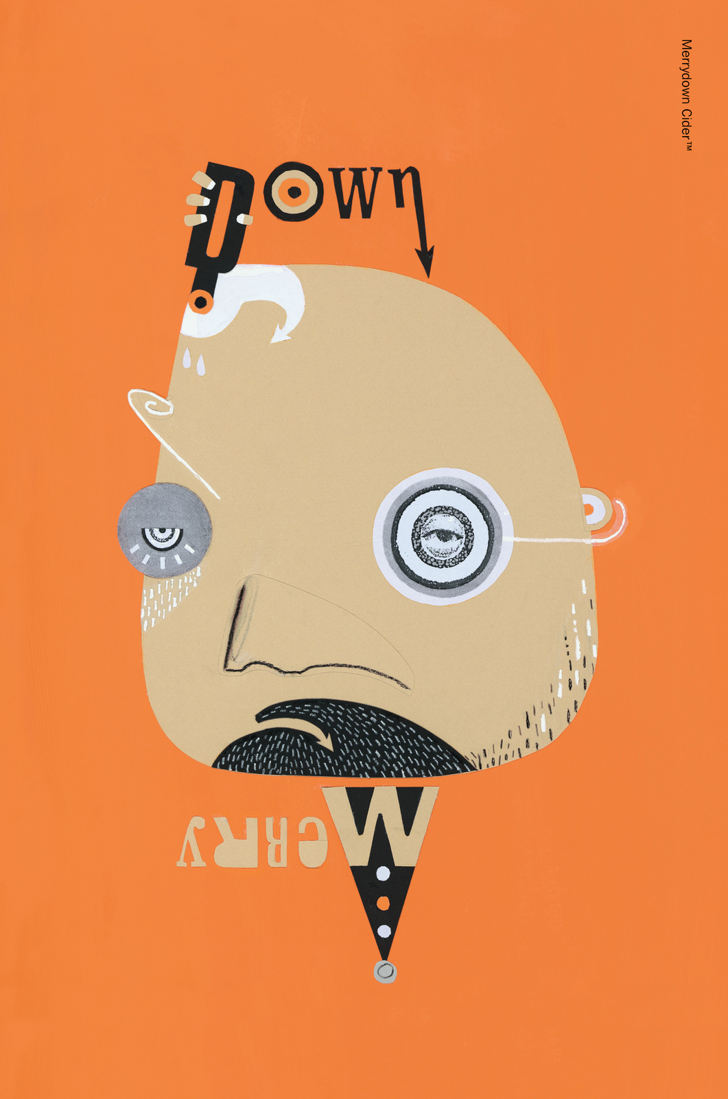
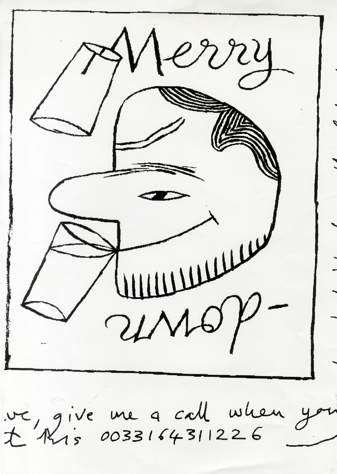
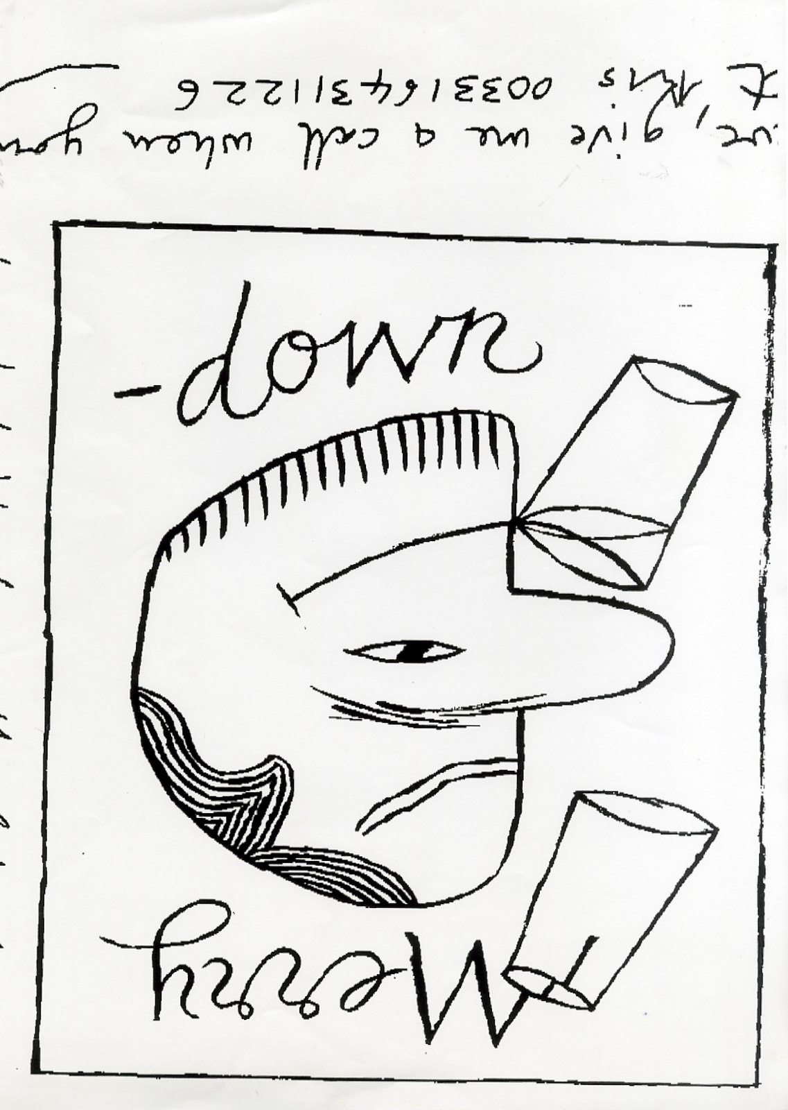
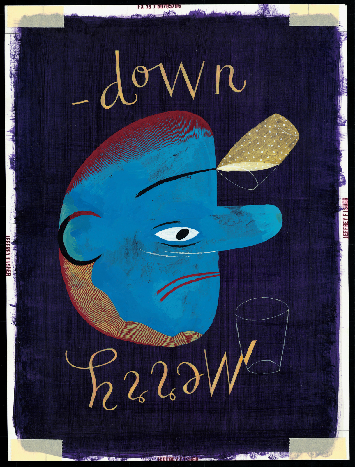
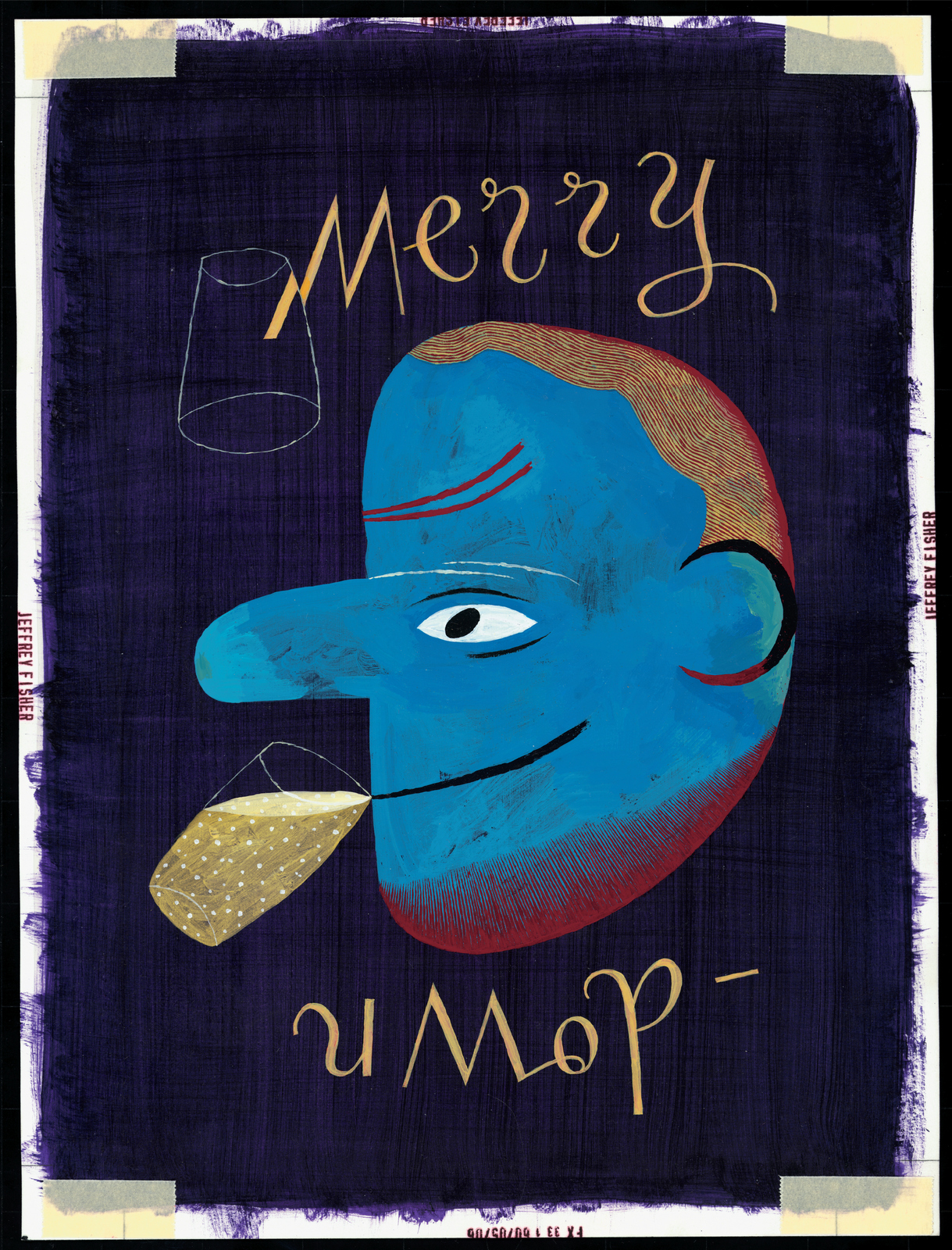
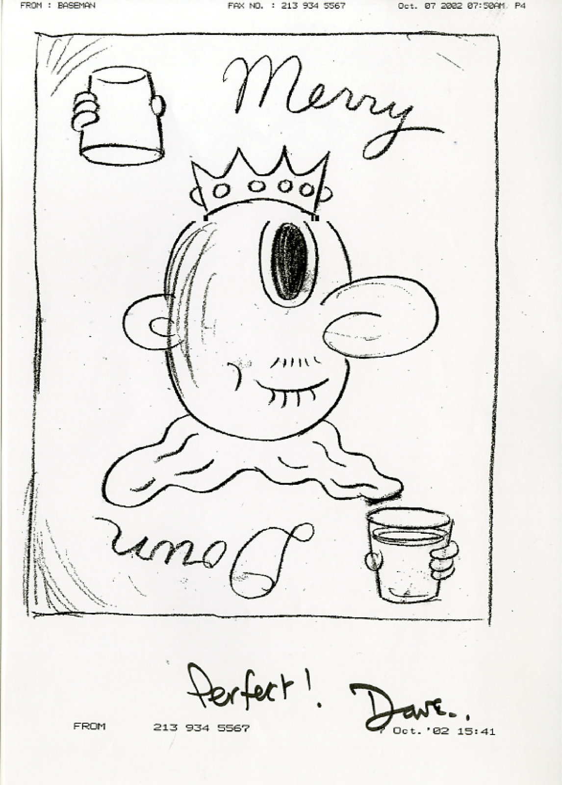
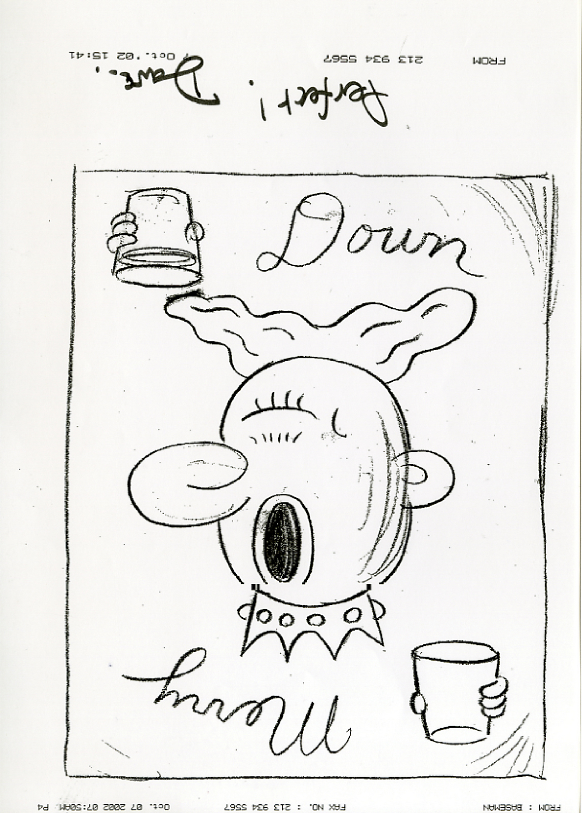
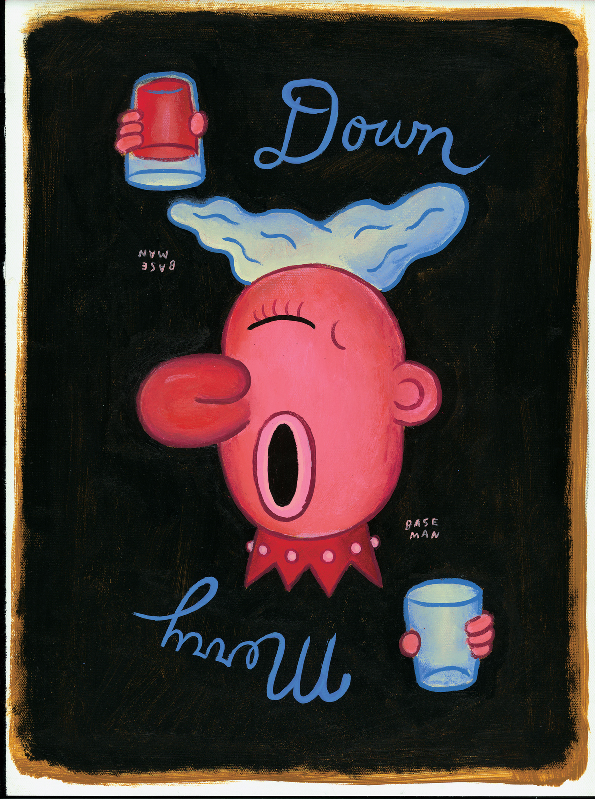
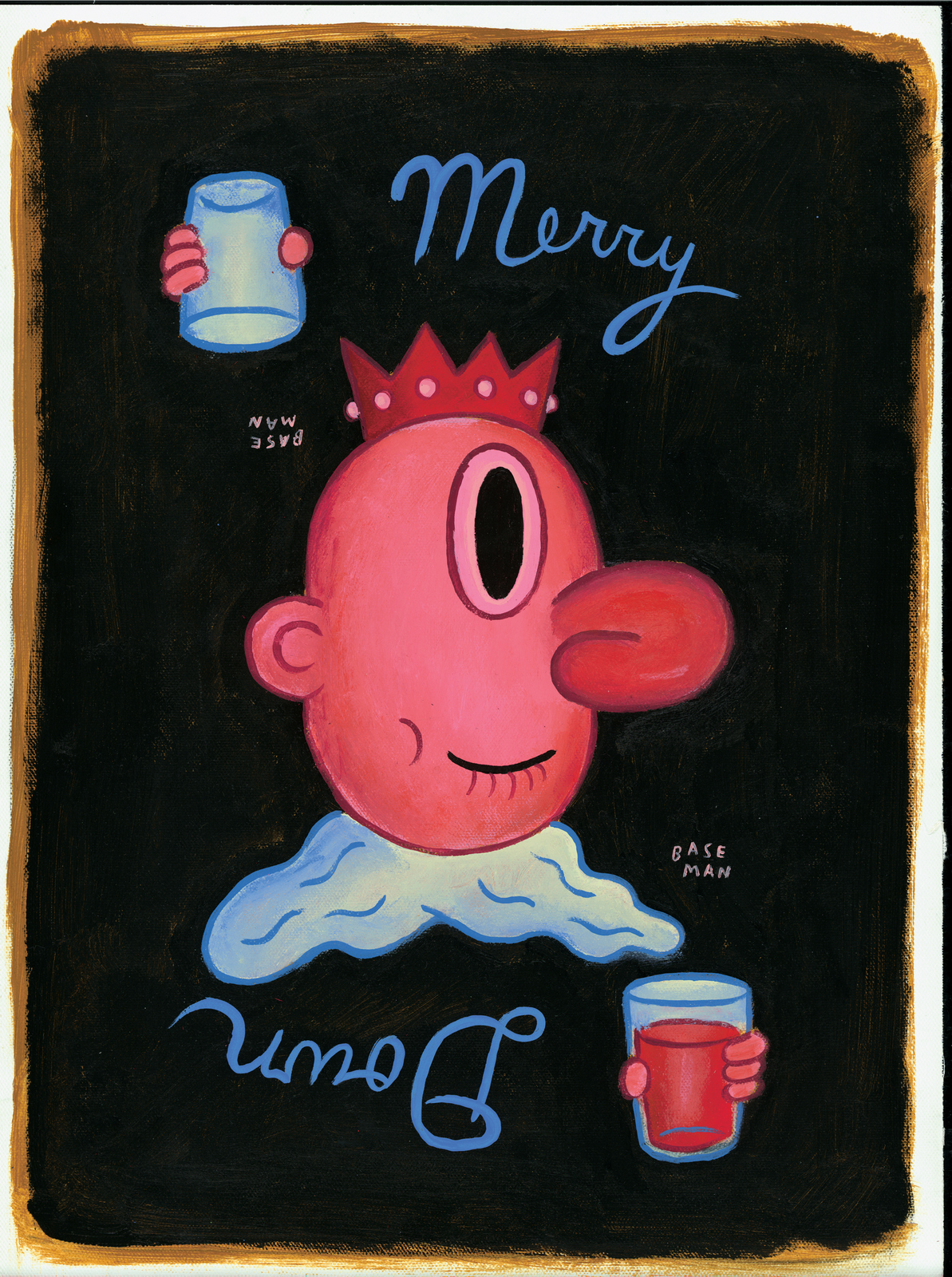
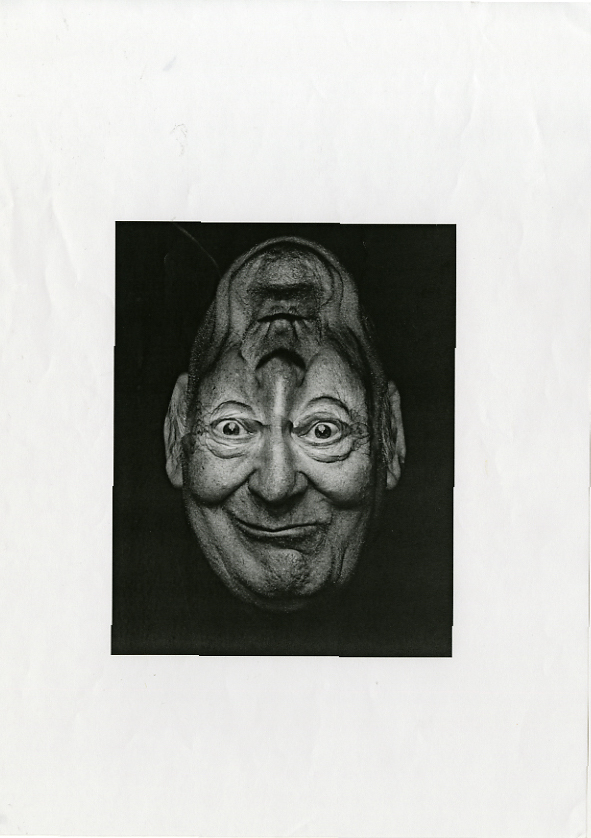
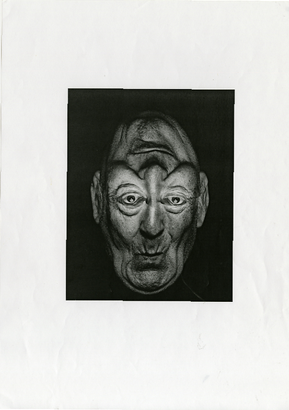
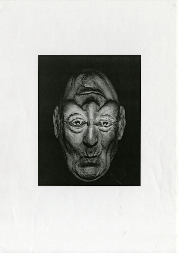
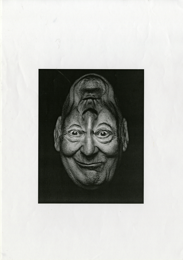
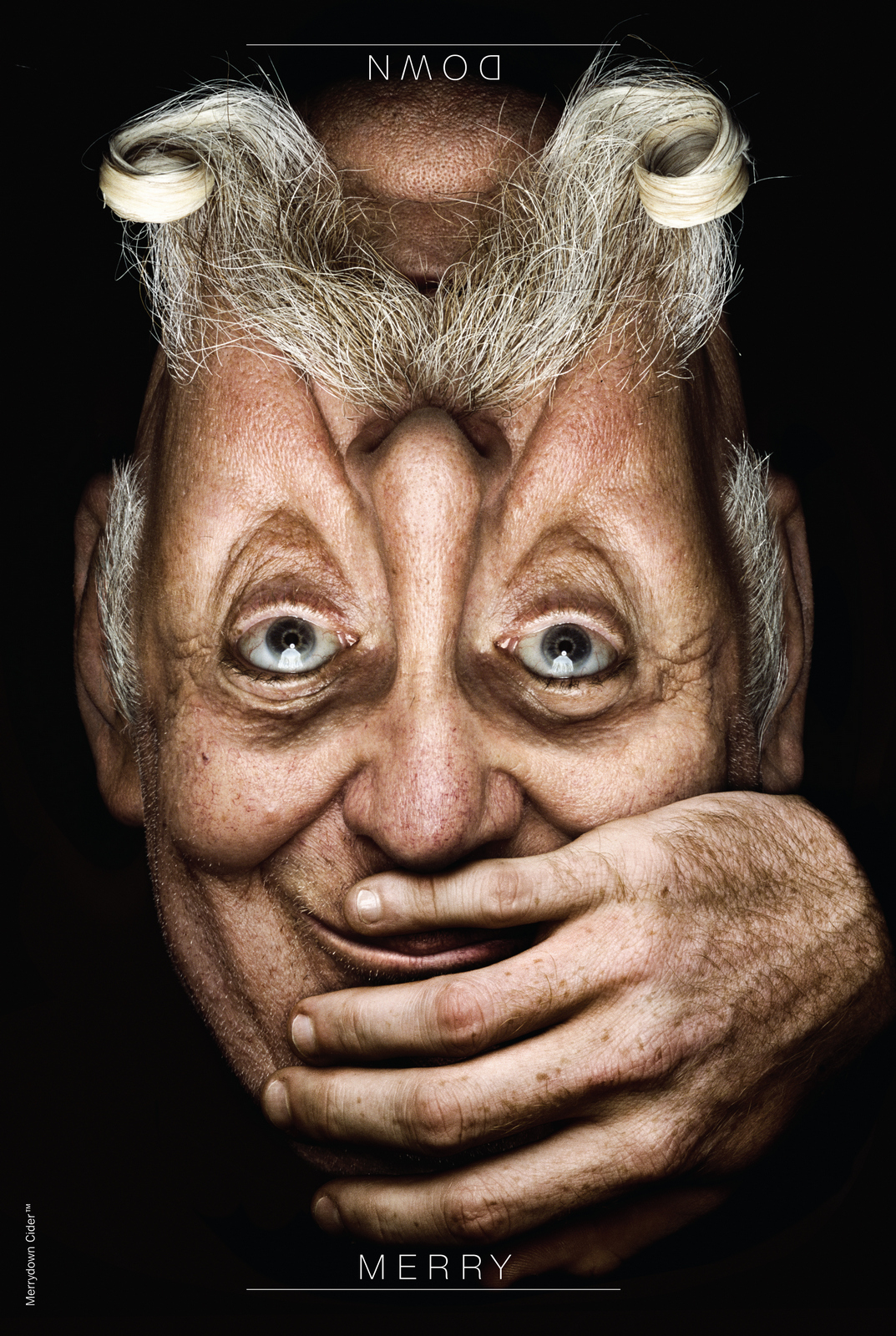
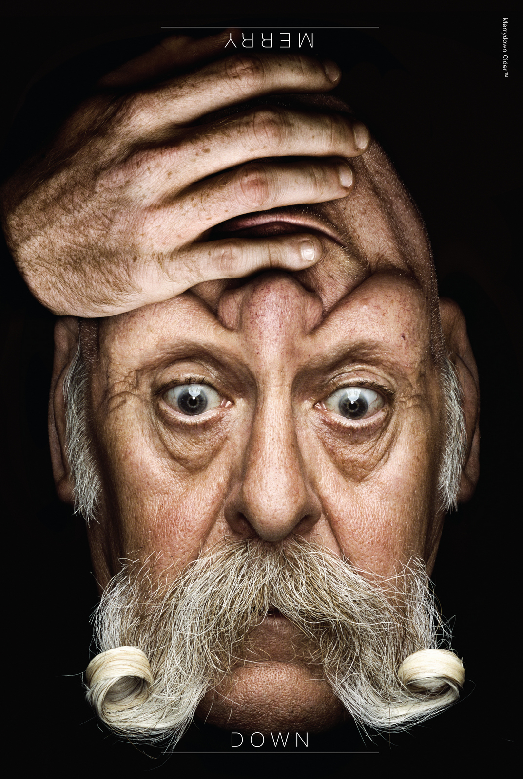
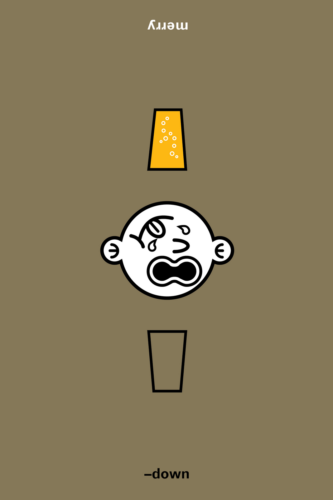
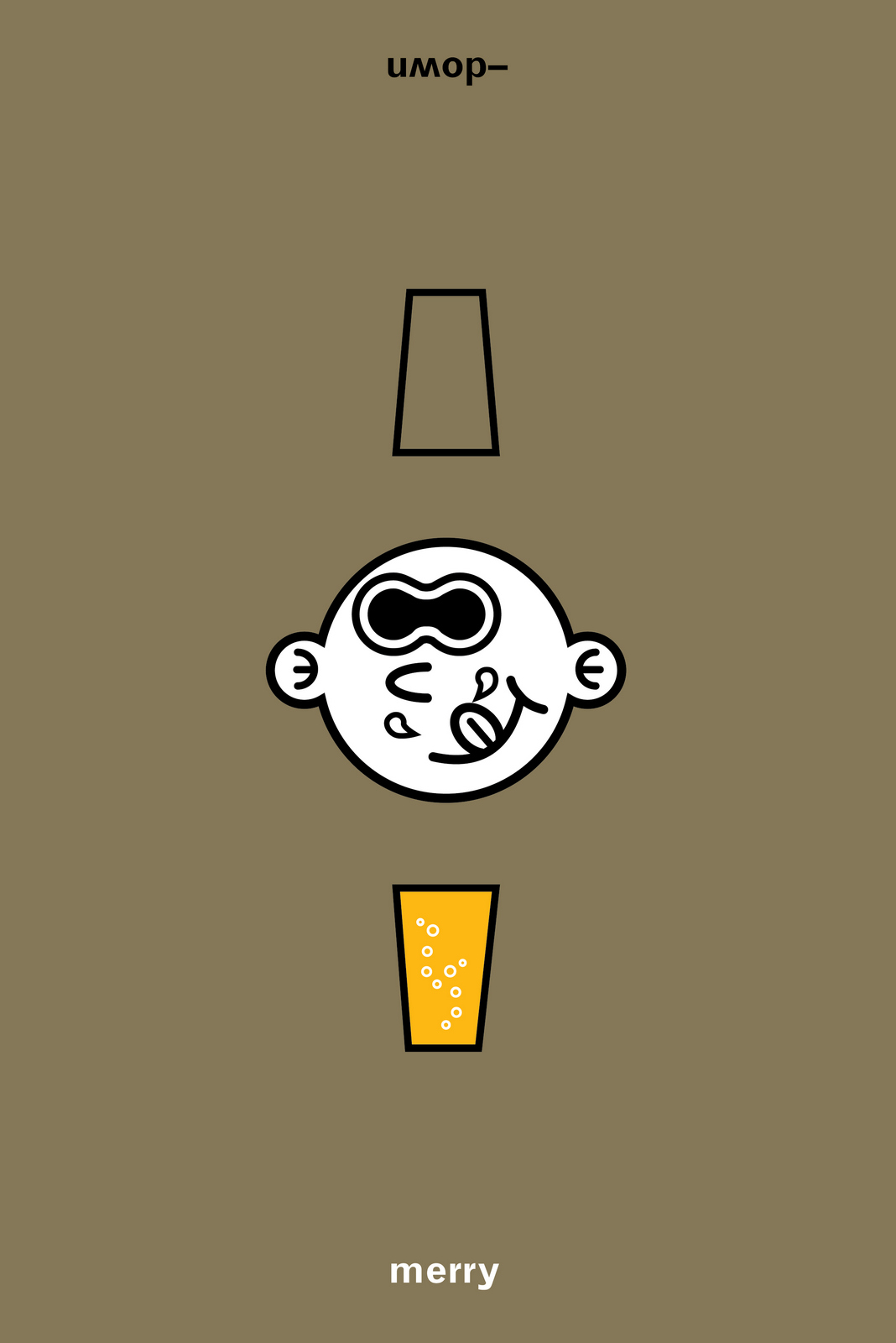
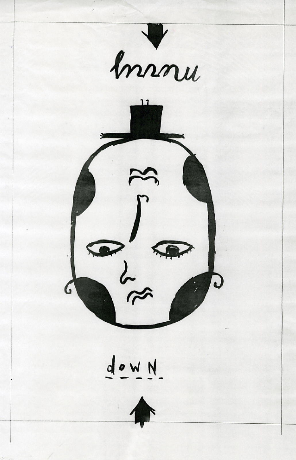
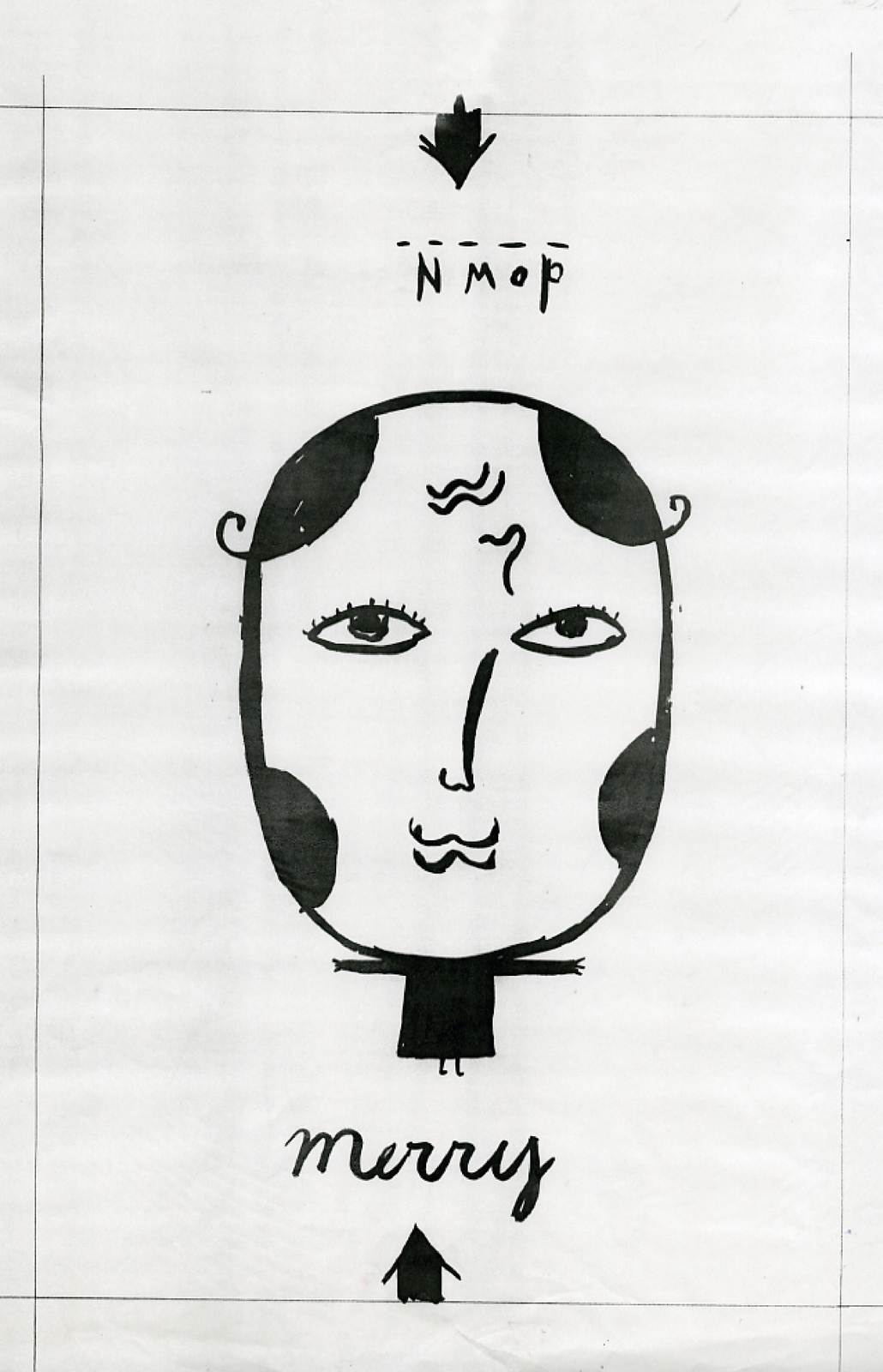
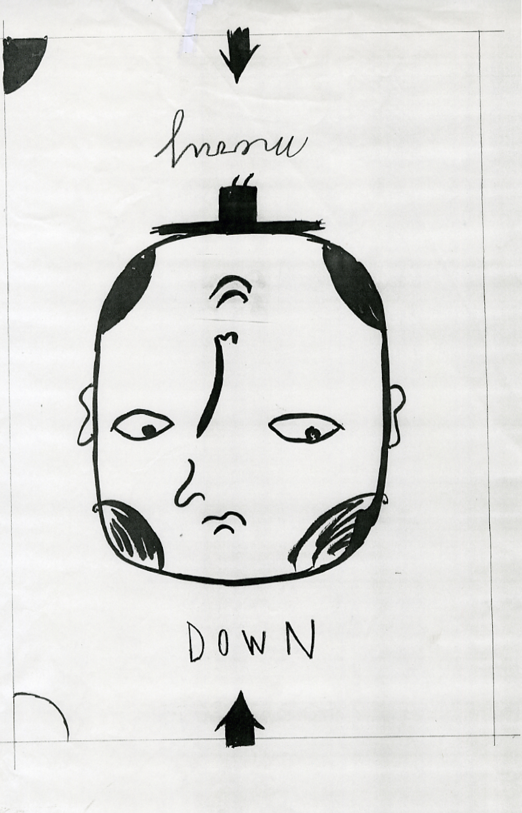
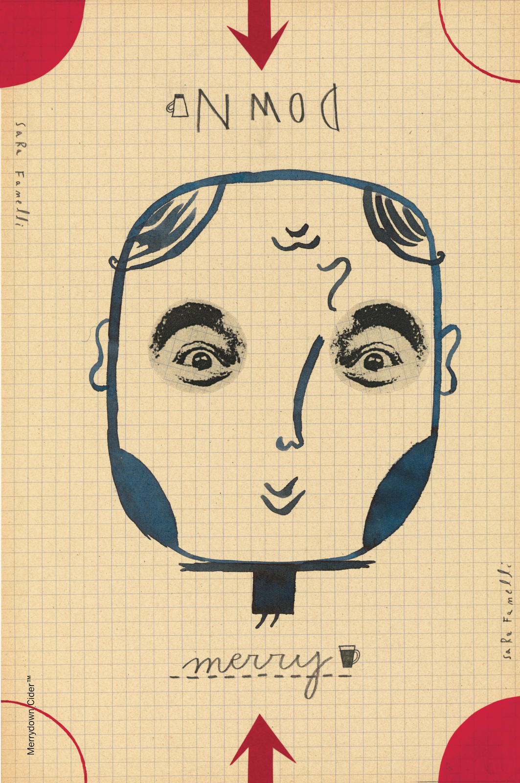
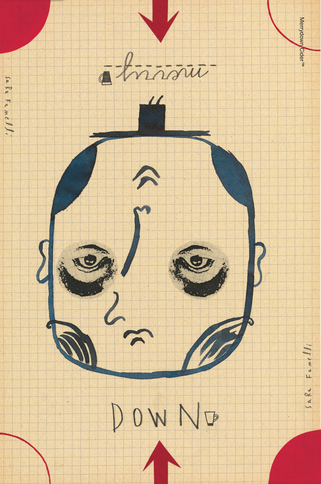
You couldn’t avoid taking in something that simple as you drove past.I’d doodled something shortly after meeting the client, it wasn’t really an ad or idea, I’d simply split the brand name in two.“Happy and sad in the same name, how weird?” I quite liked it, but dismissed it as it didn't seem to be an ad.But, it was simple, like the Milton Glaser poster, and very branded. I tried to think about how to give it meaning. I remembered those Victorian illustrations of faces that worked both ways up.
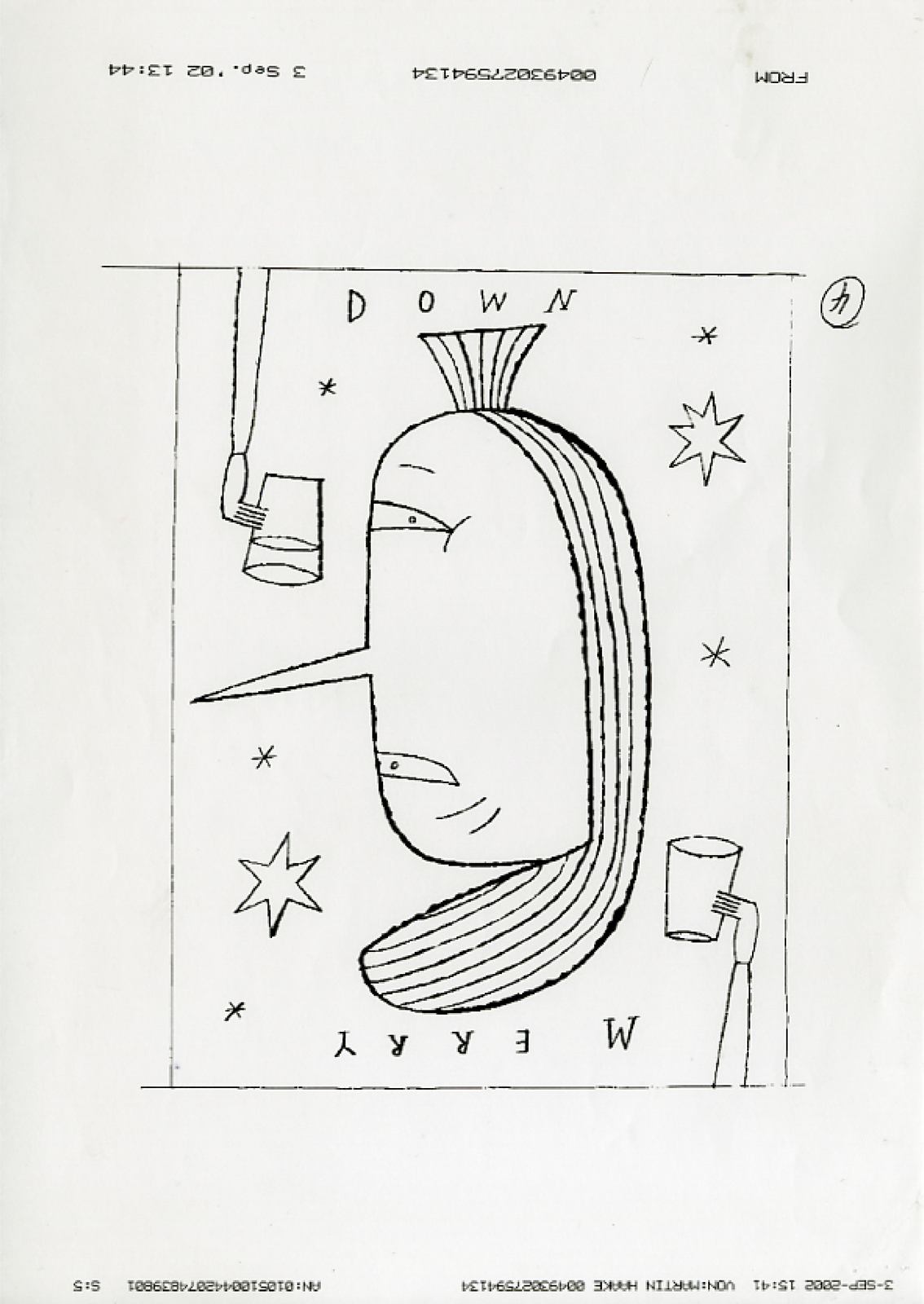
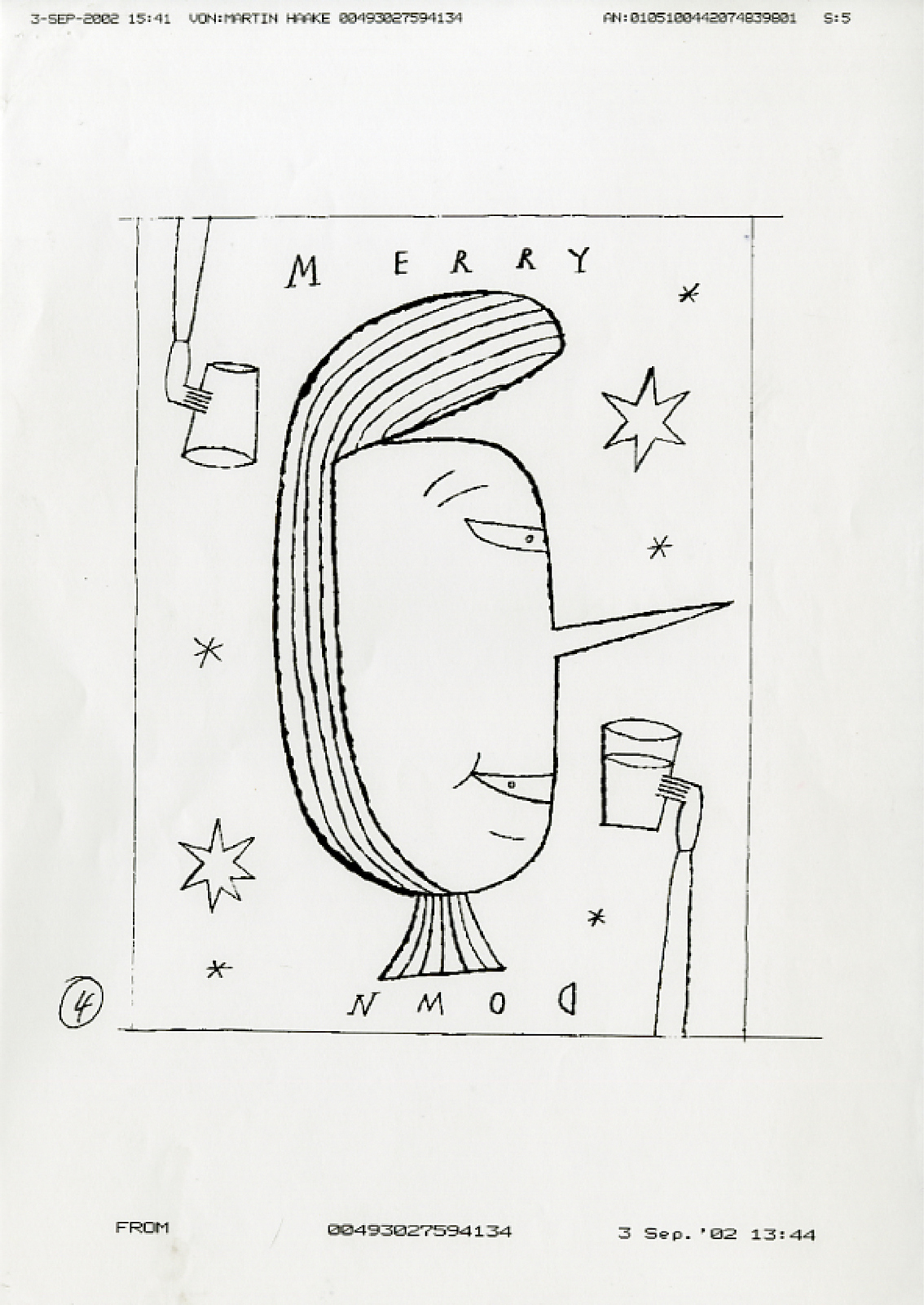
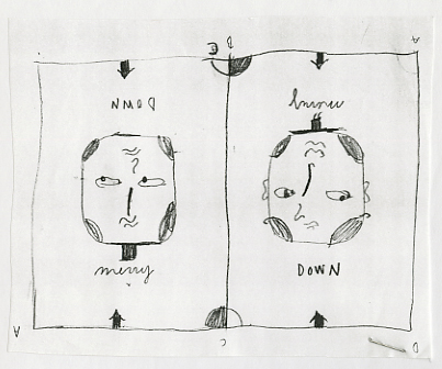
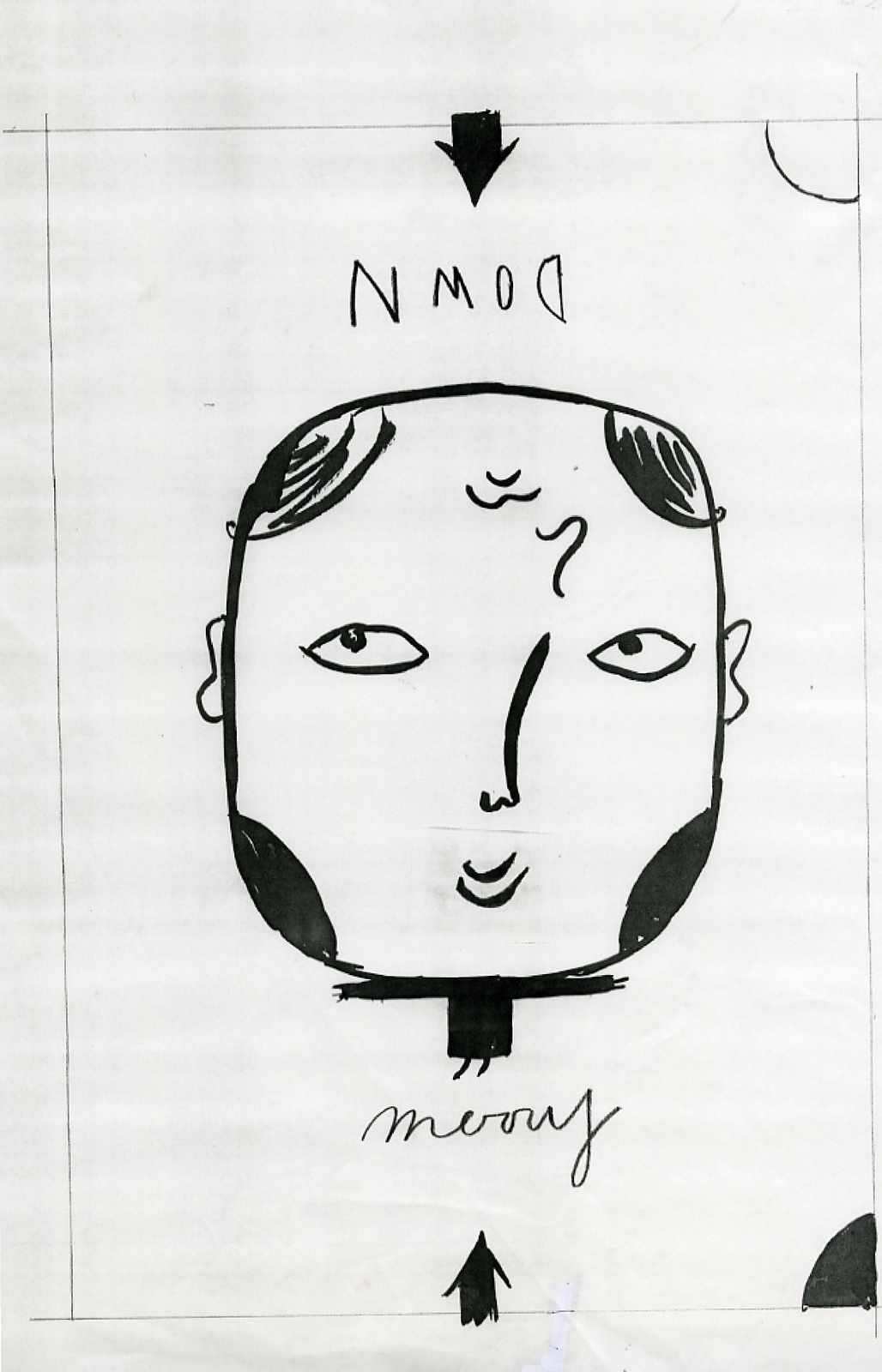
One way up could show a full glass of Merrydown and a smiling face; MERRY, the other way up could show an empty glass and a sad face; Down. I mocked them up, picking very contrasting illustration styles to show breadth.
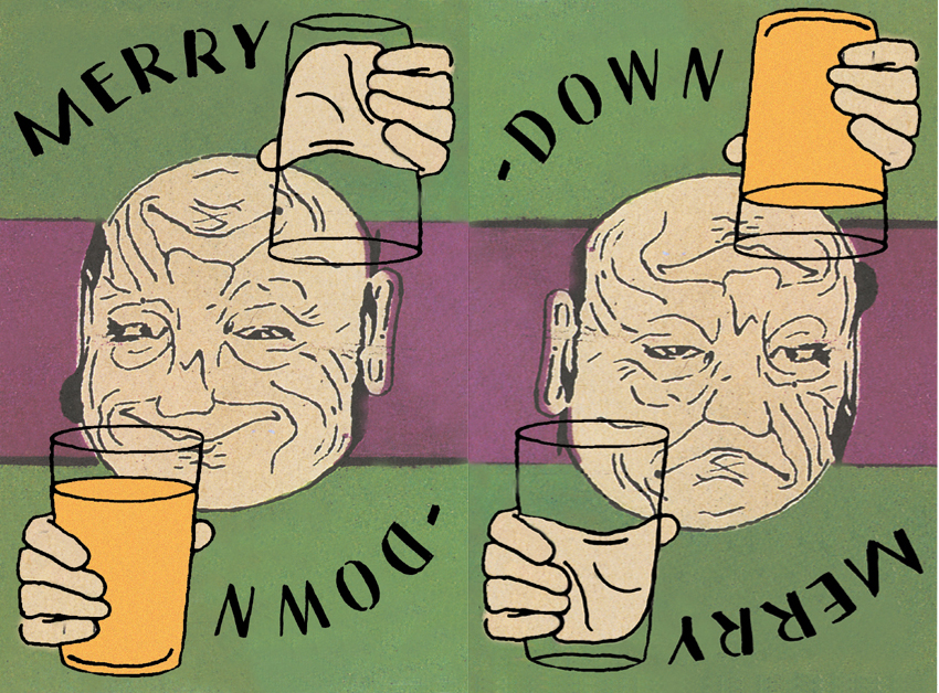
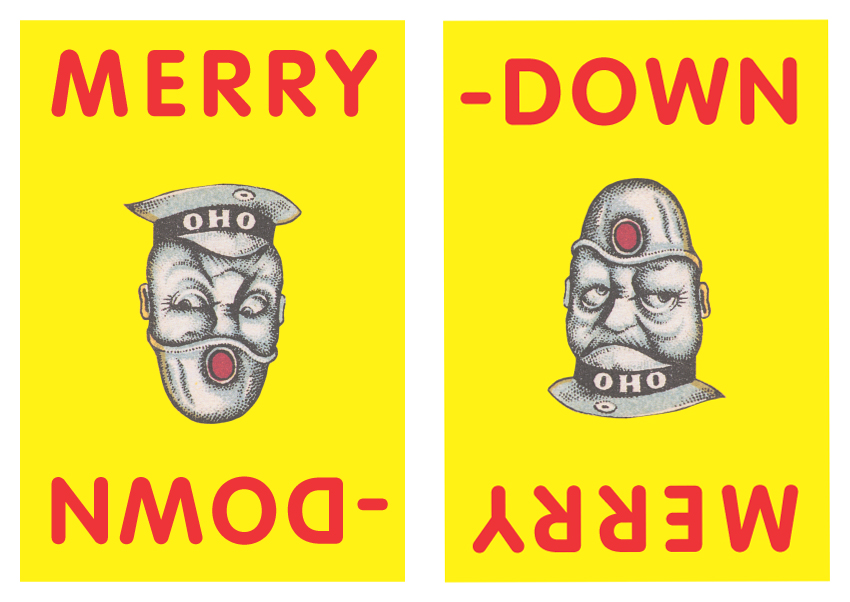
Merrydown were dire straits, so instead of over analysing the meaning, branding and whether they needed logos and photographic pack-shots, their reaction was ‘Yeah...fuck it...what have we got to lose?’.Right! Illustrators...erm?
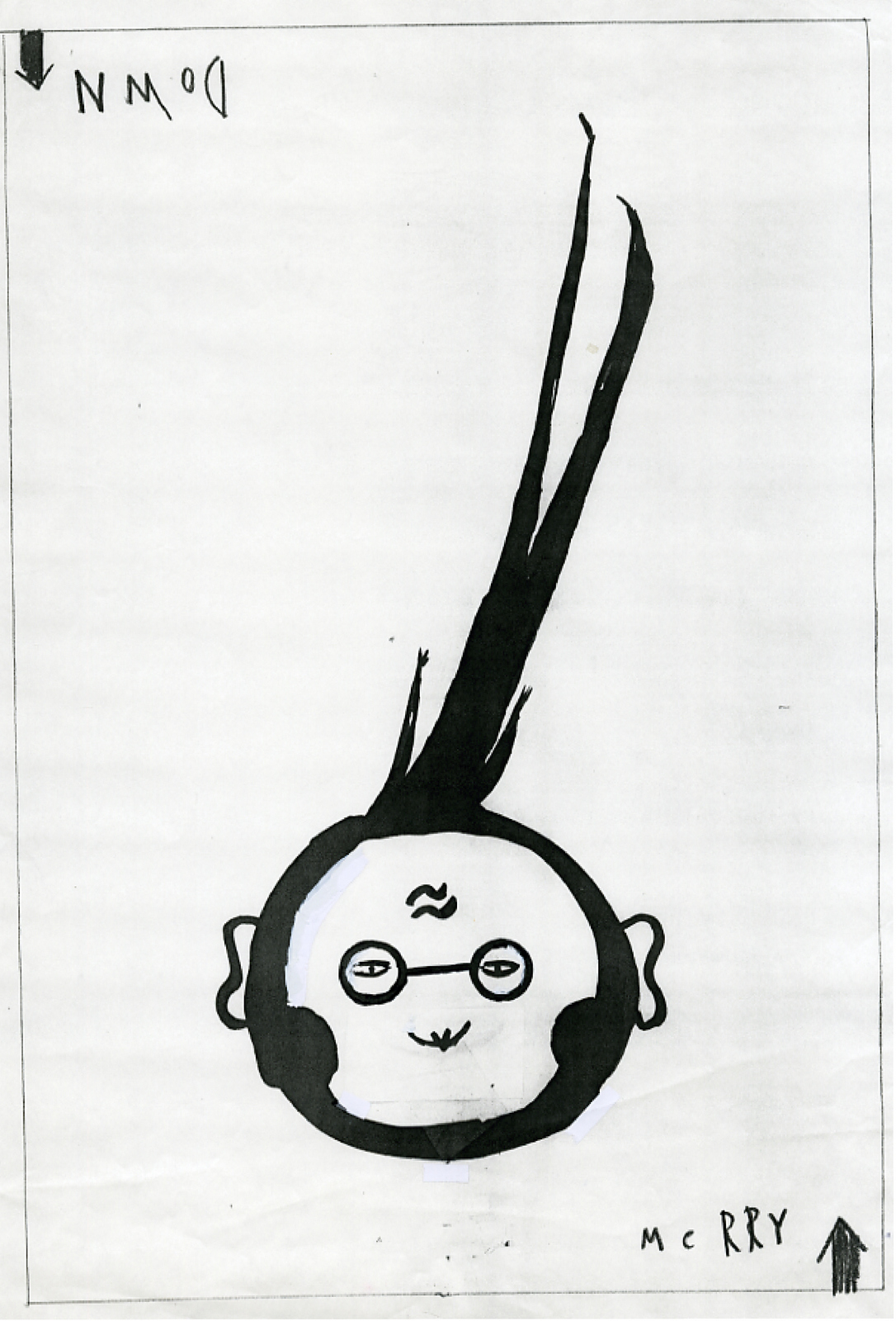
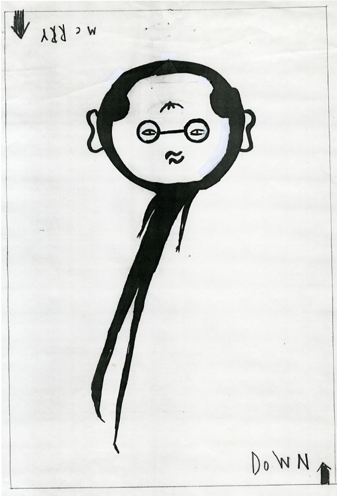
There are thousands of great illustrators out there, I was finding it difficult to narrow it down to five.Sod it, instead of getting five illustrators for a £1000 a pop, why not get ten for £500 each? It’s a good brief, I could give them complete freedom to compensate for the little fee, what the hell, they can only say no.Michael Johnson, the cool, bespectacled designer stopped by to update me on the progress of our agency book he was designing. He spotted the Merrydown idea on my wall, he liked it.I asked him if he’d worked with any good illustrators lately, he said he’d have a think and get back to me. Two days later he got back to me, instead of passing on illustrator’s names he passed over some rough sketches.
I bought this one. (I say bought, we didn’t pay him a penny.)
I thought he looked a bit ill, like he’d had a bit too much to drink, could we make him look a bit healthier?
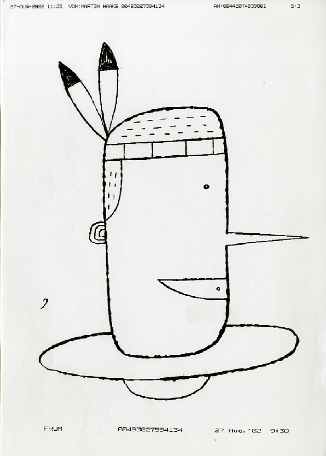
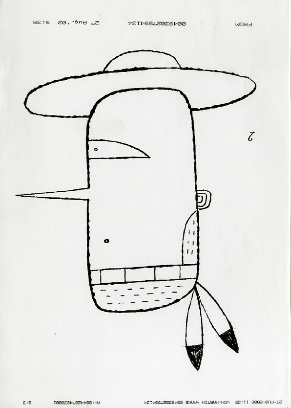
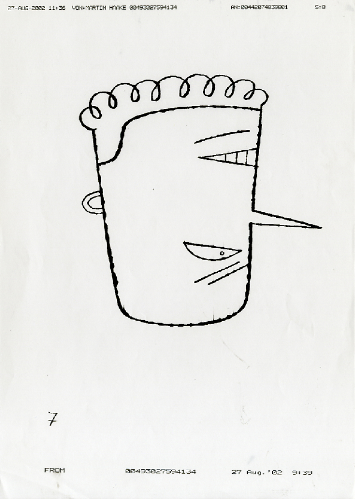
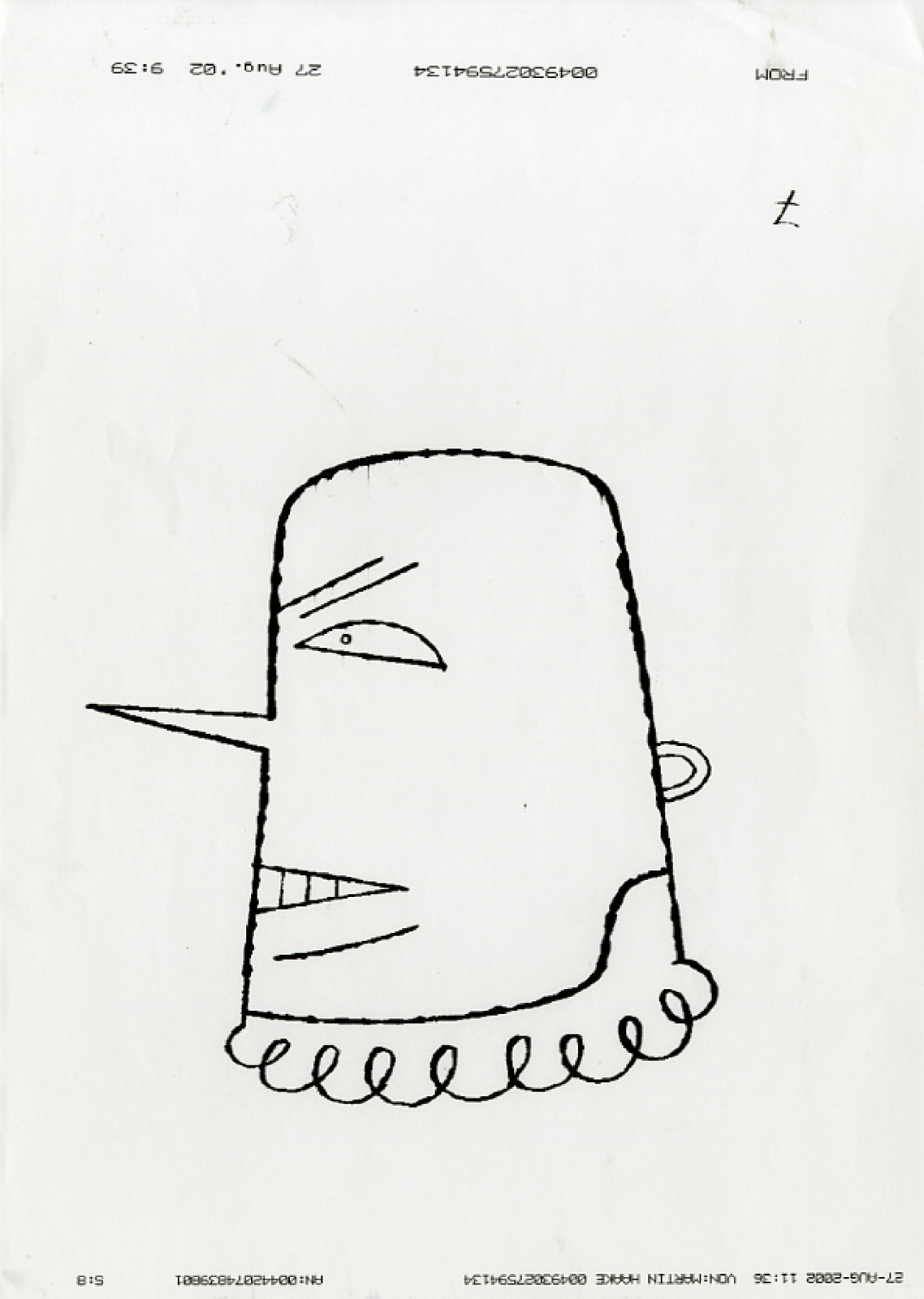
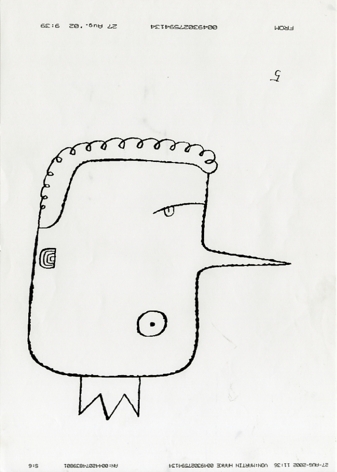
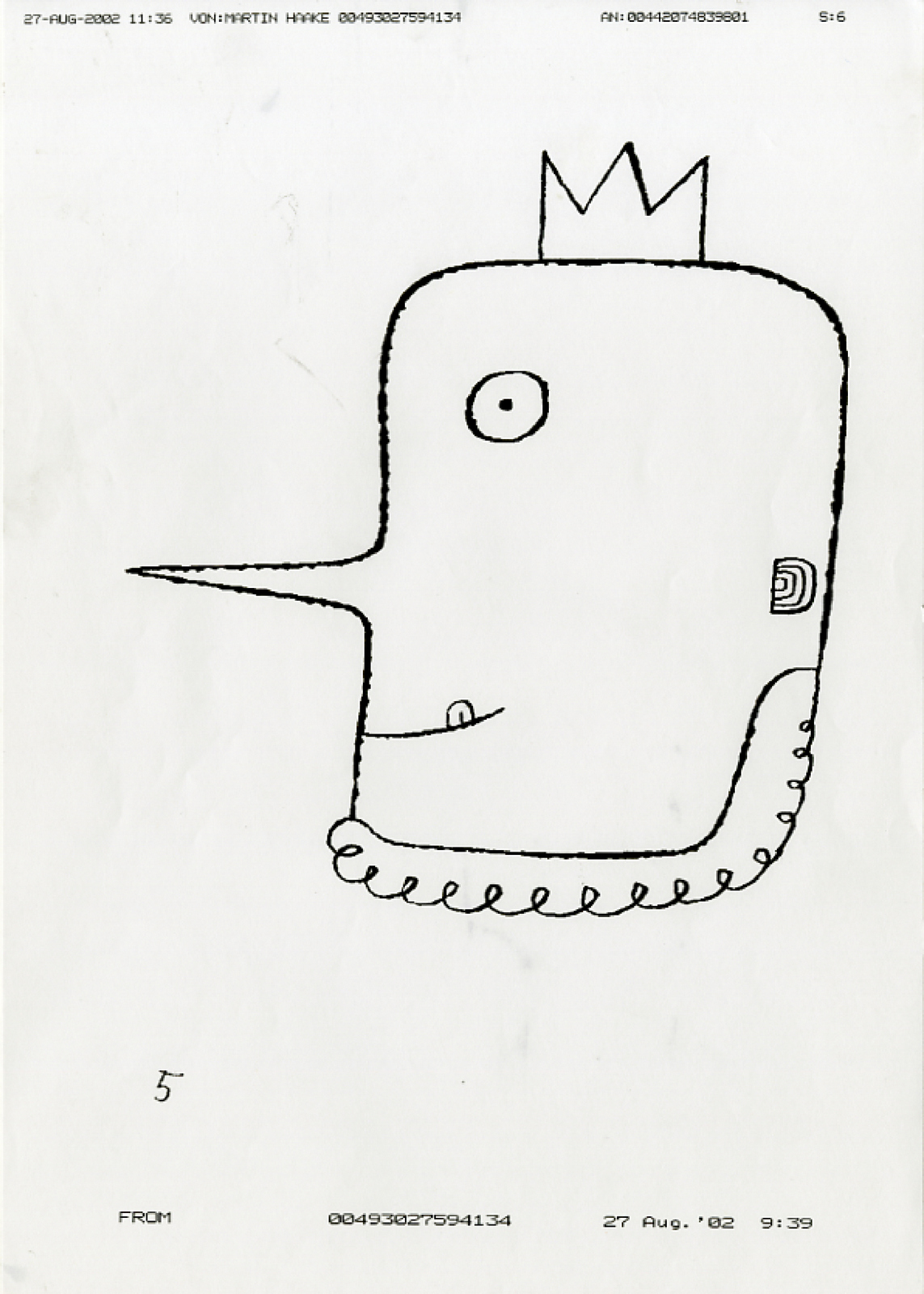
Martin Haake faxed over a long stream of ideas, all good.I loved the cowboy/Indian and cop/robber ideas, but worried their occupations may get in the way of the idea. (In retrospect, I was probably too sensible in my choice, some of the rejected ideas are just more fun.)
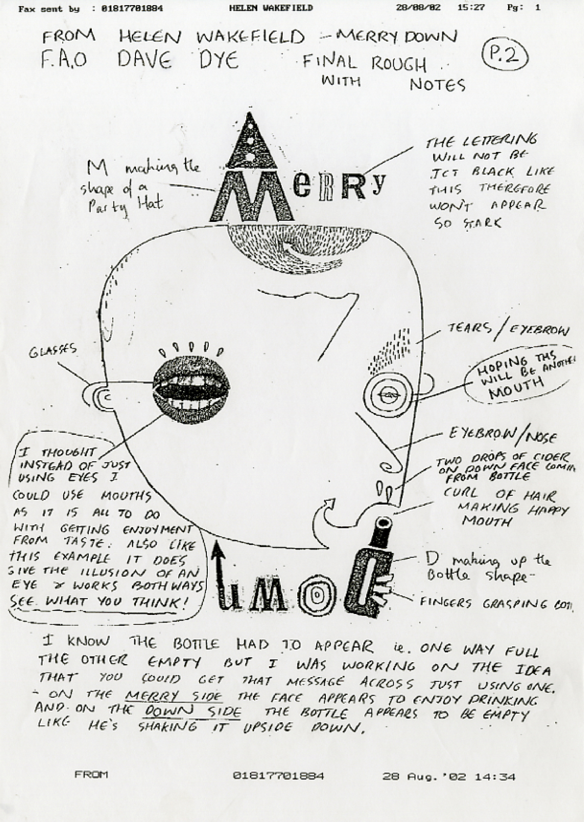
I wanted to give someone a chance straight out of college, I chose Helen Wakefield, I liked her idiosyncratic way of looking at the world, as you can see from her roughs.
Olaf Hayek sent in his scribble, it looked good.
Jeff Fisher sent this in, it didn't look great, but Jeff is a class act, so I thought it’ll probably turn out well.
Brian Cronin, one of the cleverest illustrators in the world, sent in a final illustration, no rough.
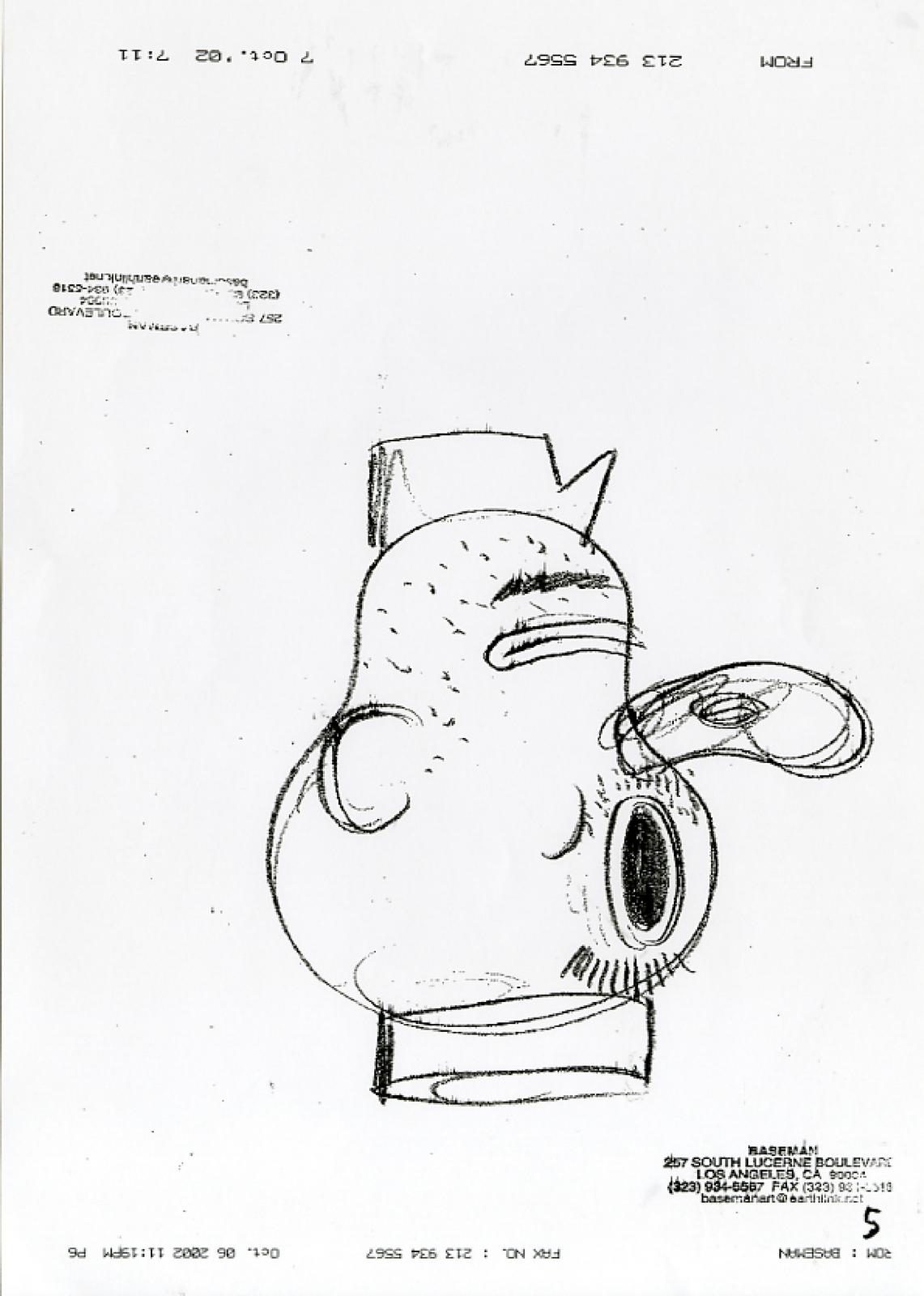
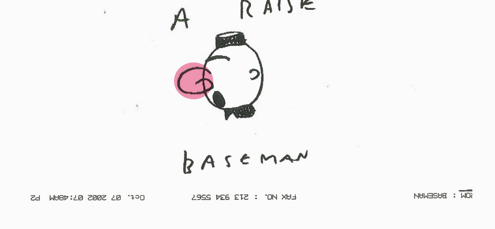
The usually uber expensive Gary Baseman agreed to draw for lunch money. Top illustrator, top bloke.
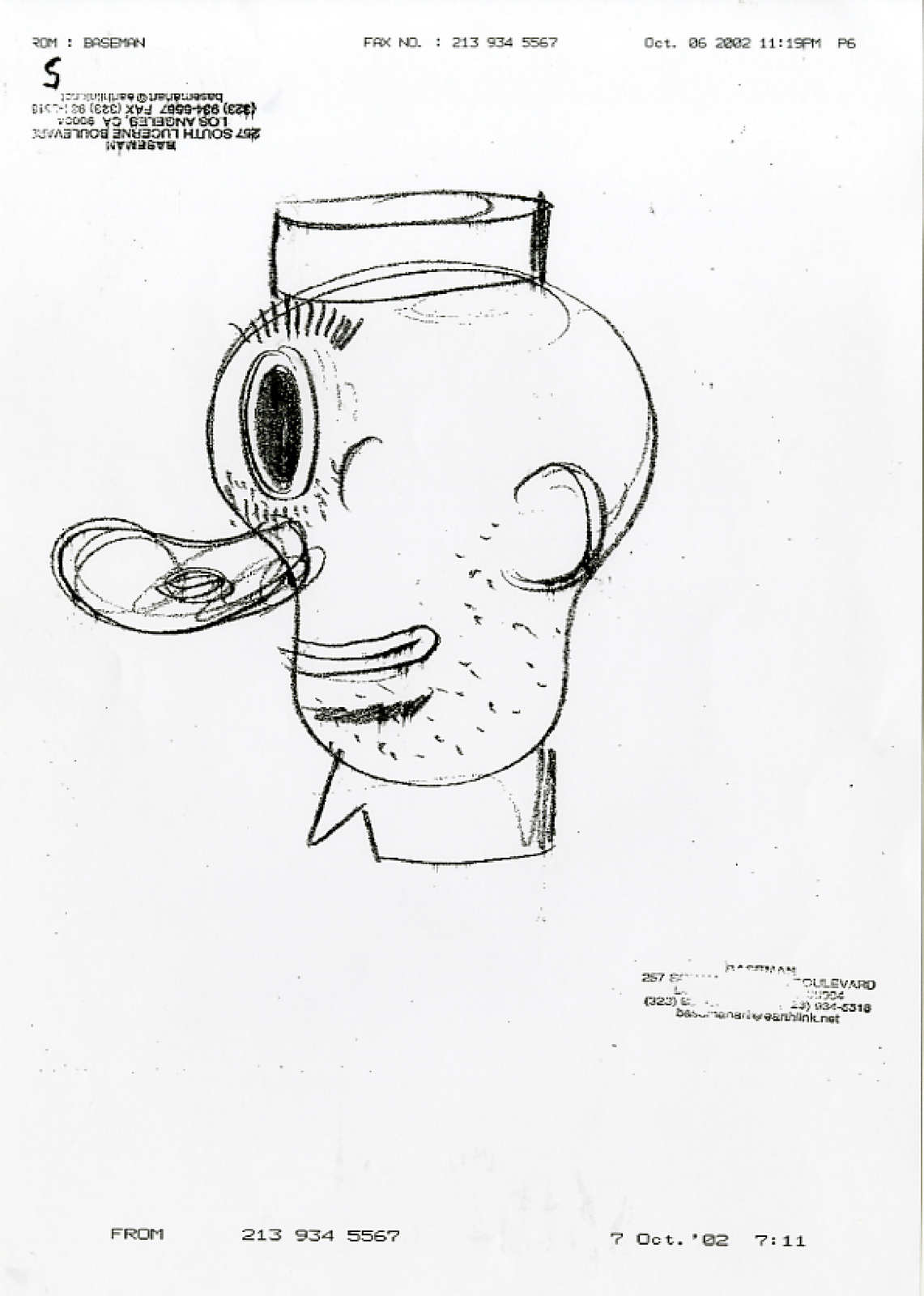
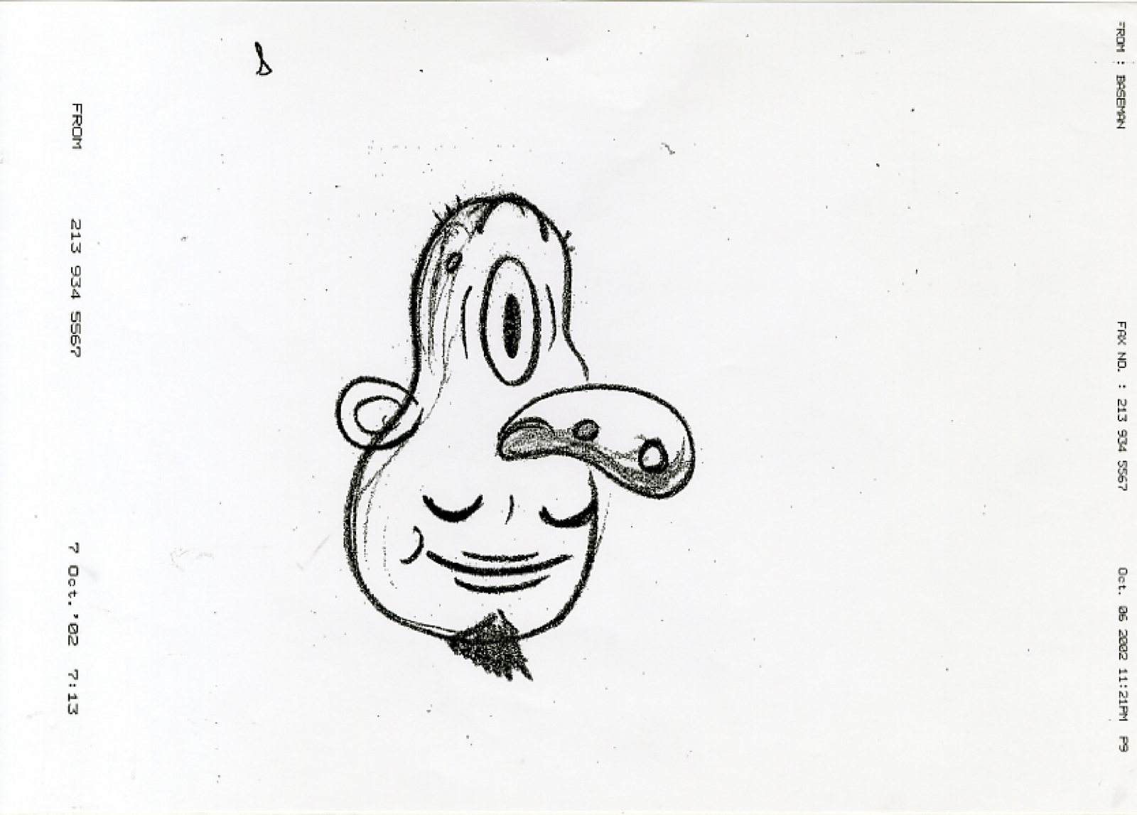
They all looked great, but this one made me smile widest.
Without thinking it through, I asked my mate and CDD in-house photographer, Giles Revell, if he’d shoot one. What a ridiculous request, how was that going to work then? But, Giles being Giles, said “Yeah...I’ll give it a go”.
A college tutor at the time, Mick Marston, did this one, which has a younger, funkier vibe.
I’d always loved Sara Fanelli’s work, a stylish mixture of collage and inks.
Too oniony.
Less oniony, quite like the tiny hat.
I thought the illustrations could do well at the awards, they didn’t.But the idea, that wasn’t really an idea, just a kind of Happy/Sad branding thingy, it did very well, winning D&AD silvers for Best Poster Campaign and Best Press Campaign.So I guess the moral of the story is; don’t go looking for awards, go where the brief takes you. Awards may follow.
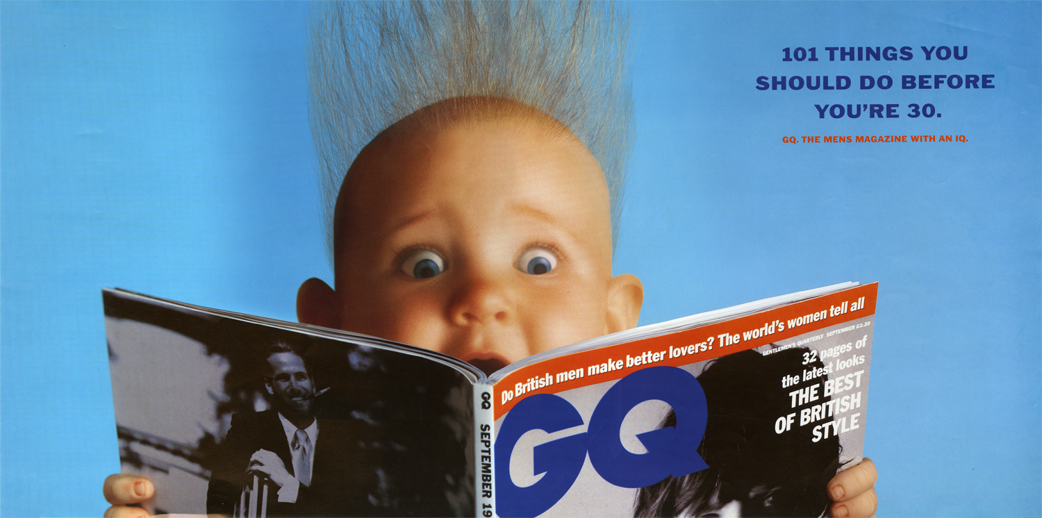
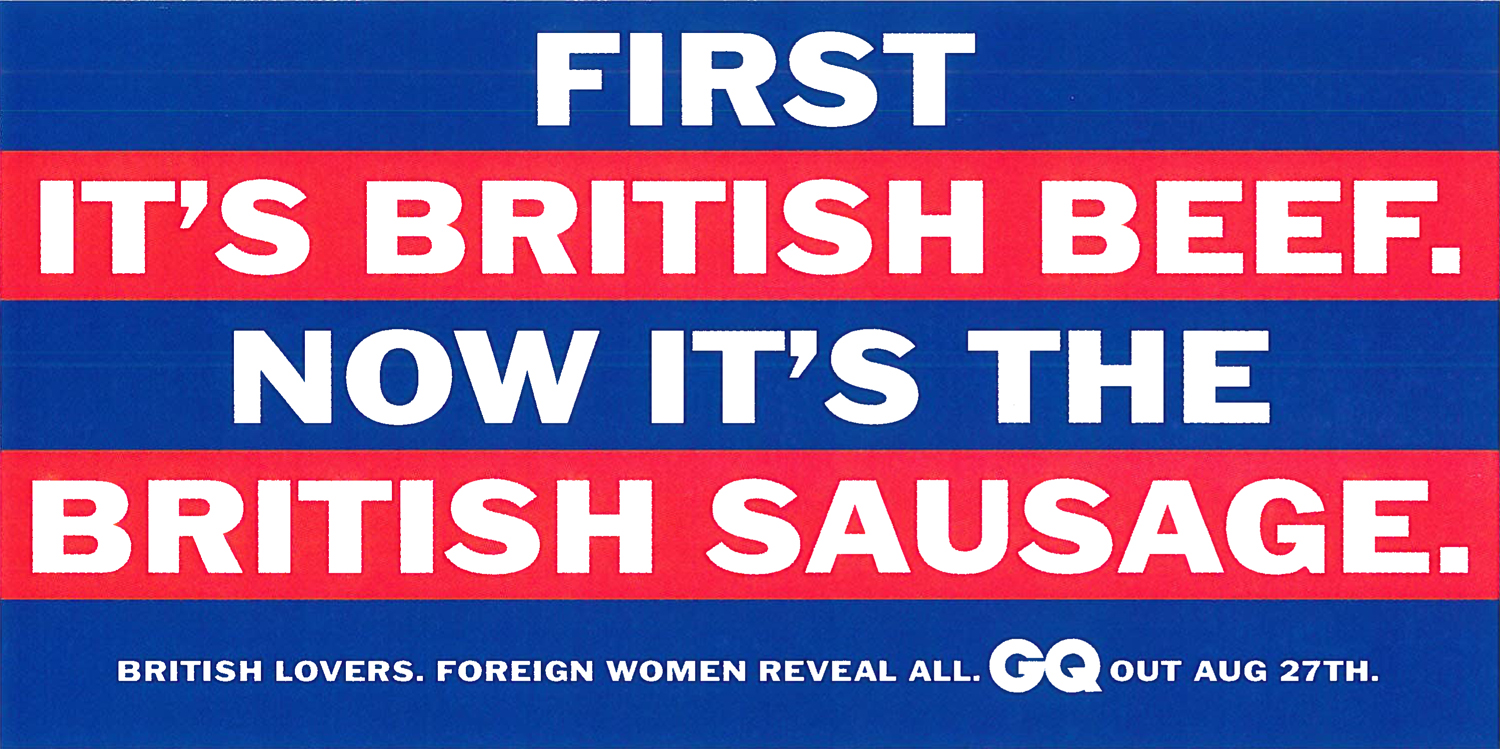
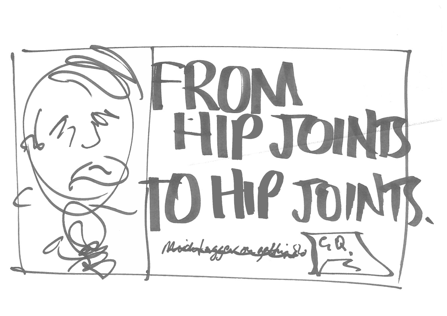
Something struck me upon finding this little batch of GQ ads; What magazines would run 48 sheet posters today, just to promote the August issue?My writer, Tony Barry and I had three stories to turn into posters.a) 101 things to do before you’re 30. b) Foreign women reveal all about British lovers. c) Mick Jagger at 50.It’s easy to see why these two were rejected, it’s never good business to start ‘outing’ Royals and pop stars.
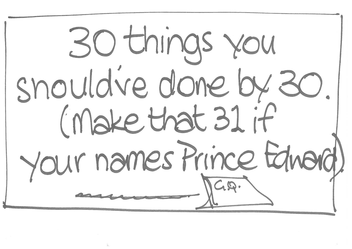

This was the one that run. You can see my time at Simons Palmer hadn’t been wasted, such an un-Leagas Delaney like poster. (The now famous artist Ron Mueck made the model of the baby, I should’ve robbed it from the shoot.)
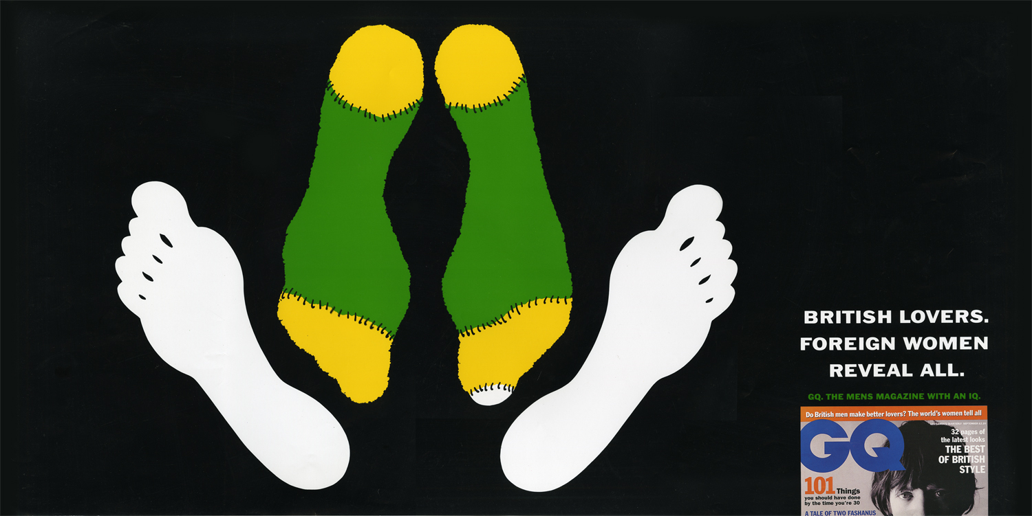
‘Foreign women reveal all about British lovers’. I’m sure it’s based on very robust research findings and empirical evidence, but what a waste of space. For those not born at the time, in 1994 countries were stopping the imports of British beef due to Bovine Spongiform, or ‘Mad Cow Disease’, as The Sun calmly called it.
It was rejected in favour of this one, which I drew. (I say drew, I actually I traced over an old Saatchi & Saatchi Health Education ad.)
Then Mick. This one was rejected. (Probably for being garbage.)
This one was good.
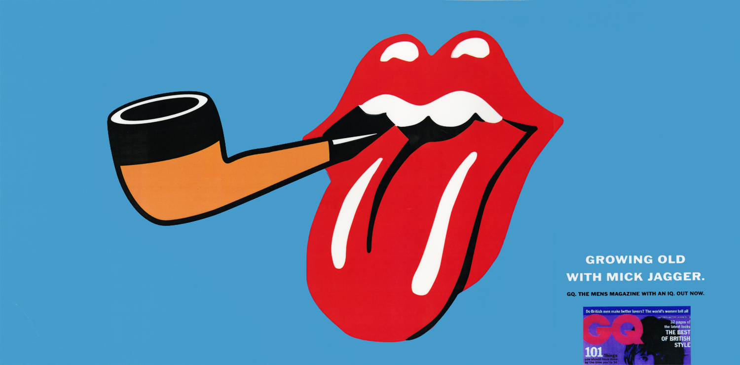
But with Mick Jagger being notoriously litigious, it was felt we should run it past him before it went to print. It turned out he wasn’t keen on seeing posters all over London implying he was a decrepit old fogey. Bit touchy?We seemed to have had another shot at insulting old people, but I don’t think this ran either.
Two things strike when looking at this stuff again: Why were we always having a pop at people? Old people, Cliff Richard, Prince Edward, Mick Jagger. Admittedly there was an article on Mick Jagger At 50, but we could’ve celebrated him rather than berated him. Also, Franklin Gothic Wide, what a great font, must use it again.

Bernbach.
Lois.
Gossage.
McCabe.
Ally.
Chiat.
Wieden.
McElligott.
Goodby.
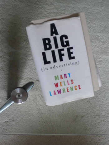
What about Wells?
I can only recall hearing that name once in the last twenty years.
Uttered by Tim Delaney.
In a tone that suggested he didn’t think she was completely useless.
Unusual, so it stuck with me.
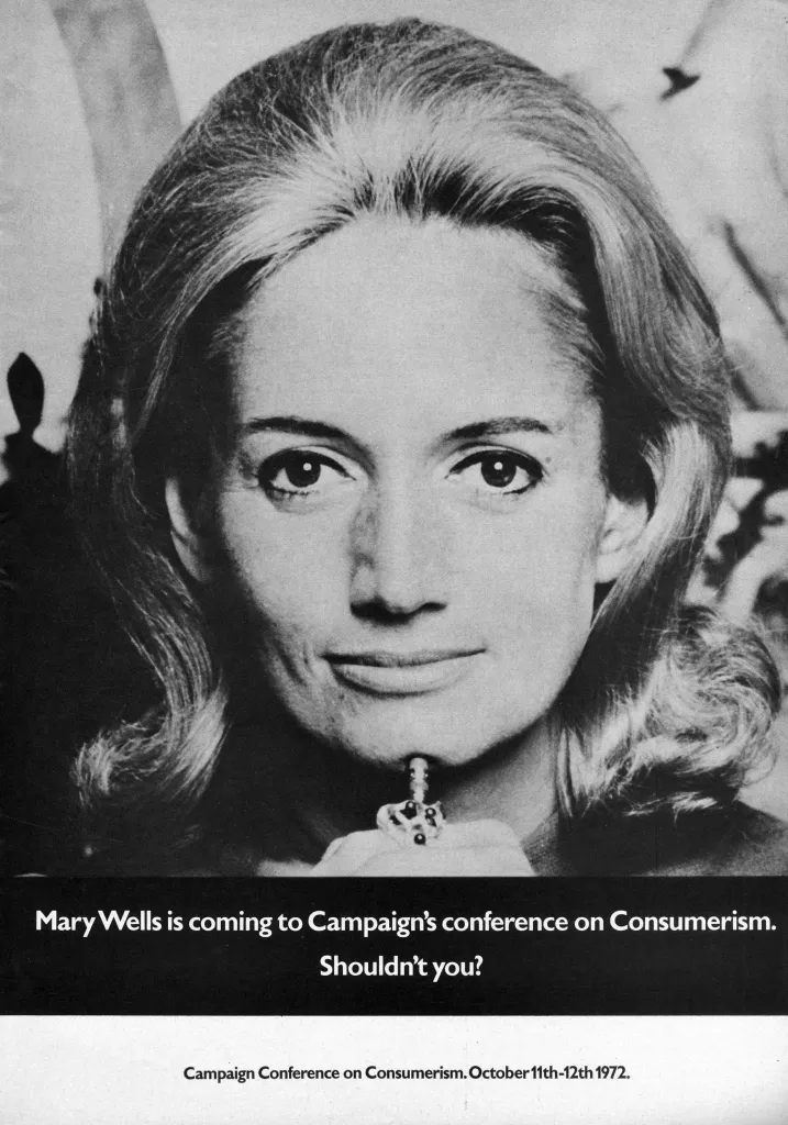
When her autobiography came out, I was first in line.
But her tone was jarring.
“Sure I had in me what it takes to lead the agency into becoming a global behemoth, but I liked doing creative work more.”
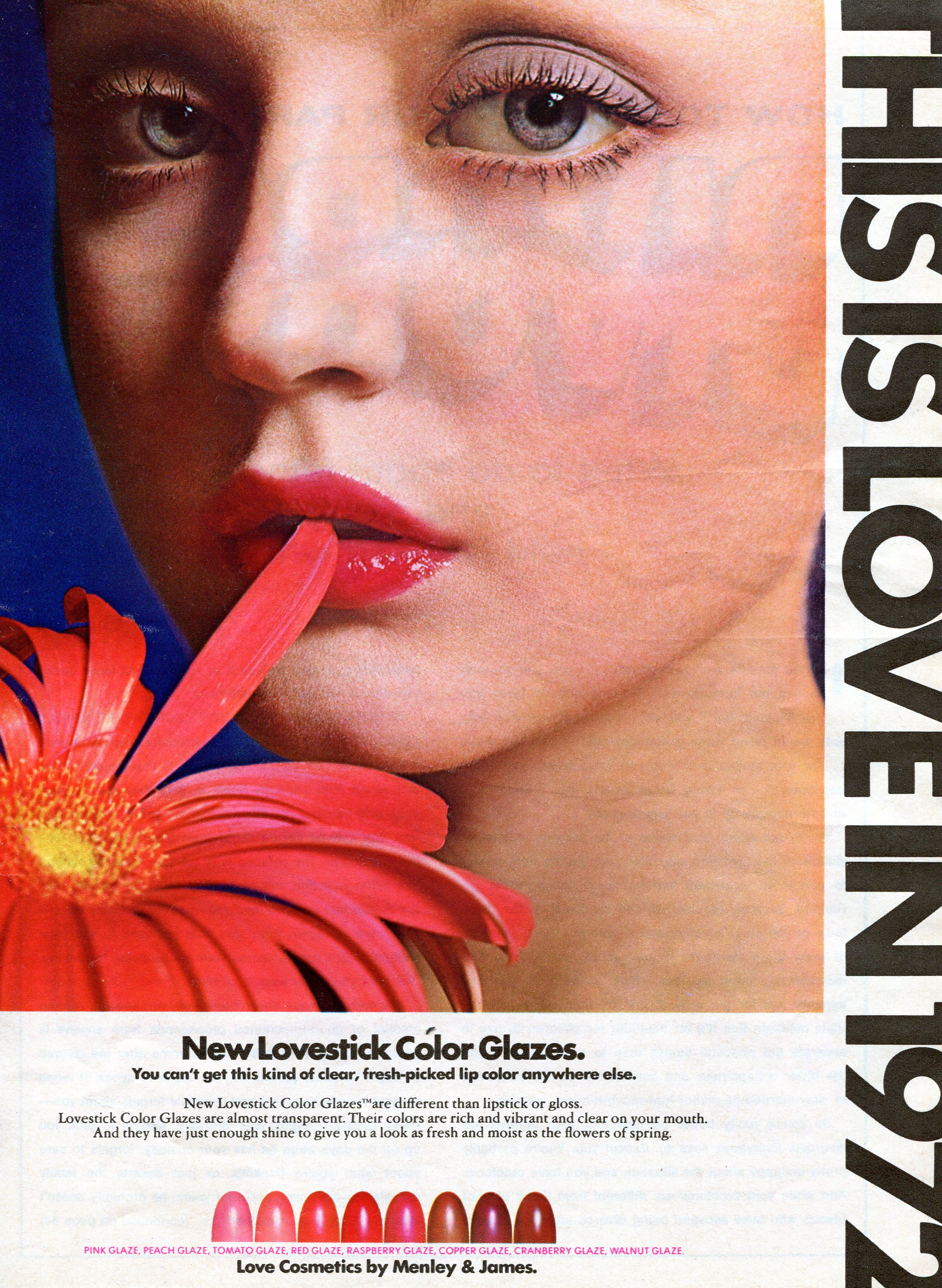
“Research told us our campaign for Love Cosmetics was more recognisable than the Statue Of Liberty.”
“There were only two talents in the agency I could completely trust – myself and Charlie.”Maybe it’s because I’m English?
One of the rules of being English is that you don’t big yourself up, you play things down.
You have to be self-deprecating 24/7.
It’s tiring.
But undoubtably, that self-confidence served her well.
Imagine the attitudes she faced as a high-flying women in Madison Avenue in the 50s?
And 60s, 70s and 80s?
She had no map, she had to make her own path in uncharted territory.
At least, uncharted by a women.
She was so well thought of, that in 1975 Bill Bernbach asked her to buy and run DDB.
(It very nearly happened.)
She started out in-house, writing ads for department stores.
In 1955, Doyle Dane Bernbach’s copy chief Phylis Robinson hired her.
Joining a copy department that was predominantly female.
In no time, she was running her own group.


Whilst at DDB she wrote for and ran The French Tourist Board account.
(The campaign was shot by the great Elliott Erwitt.)
Whilst at DDB she wrote for and ran The French Tourist Board account.
(The campaign was shot by the great Elliott Erwitt.)


In 1965 she left DDB to run a small agency called Jack Tinker & Partners.
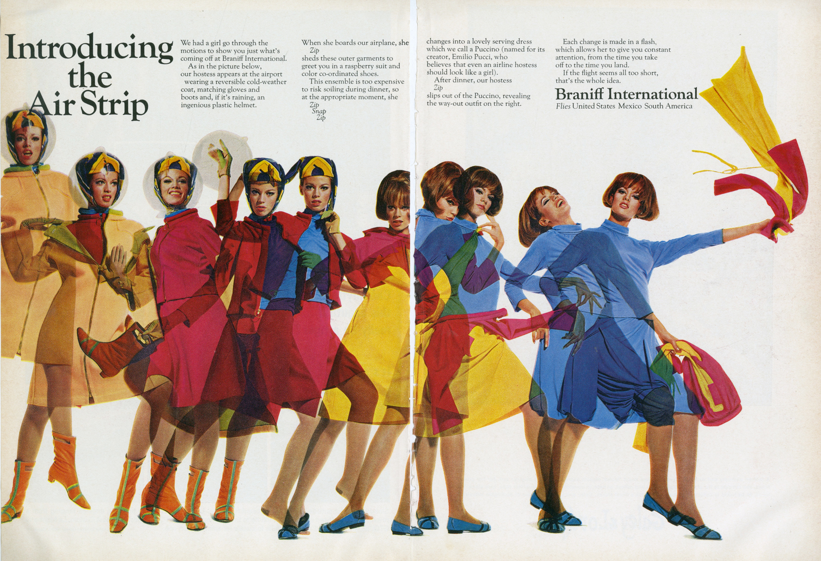
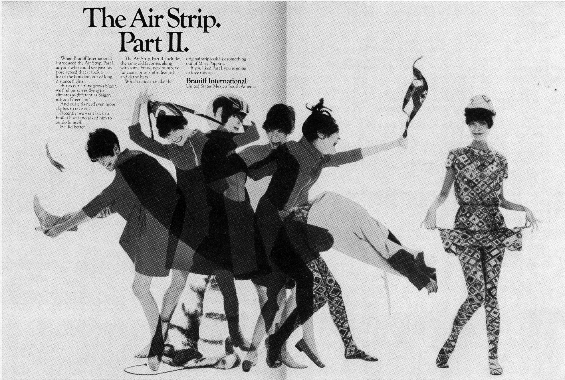
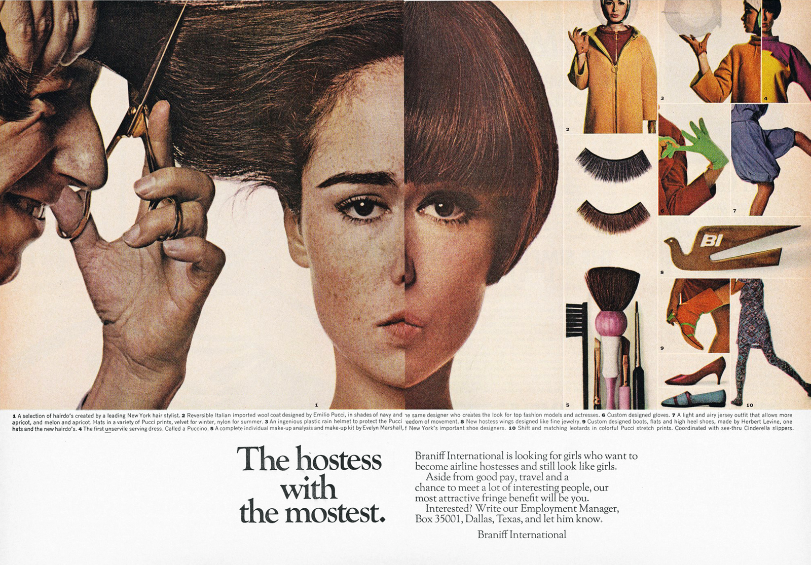
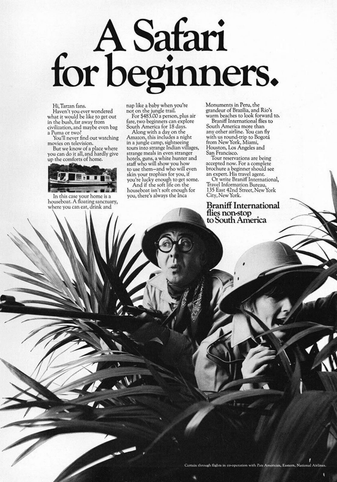
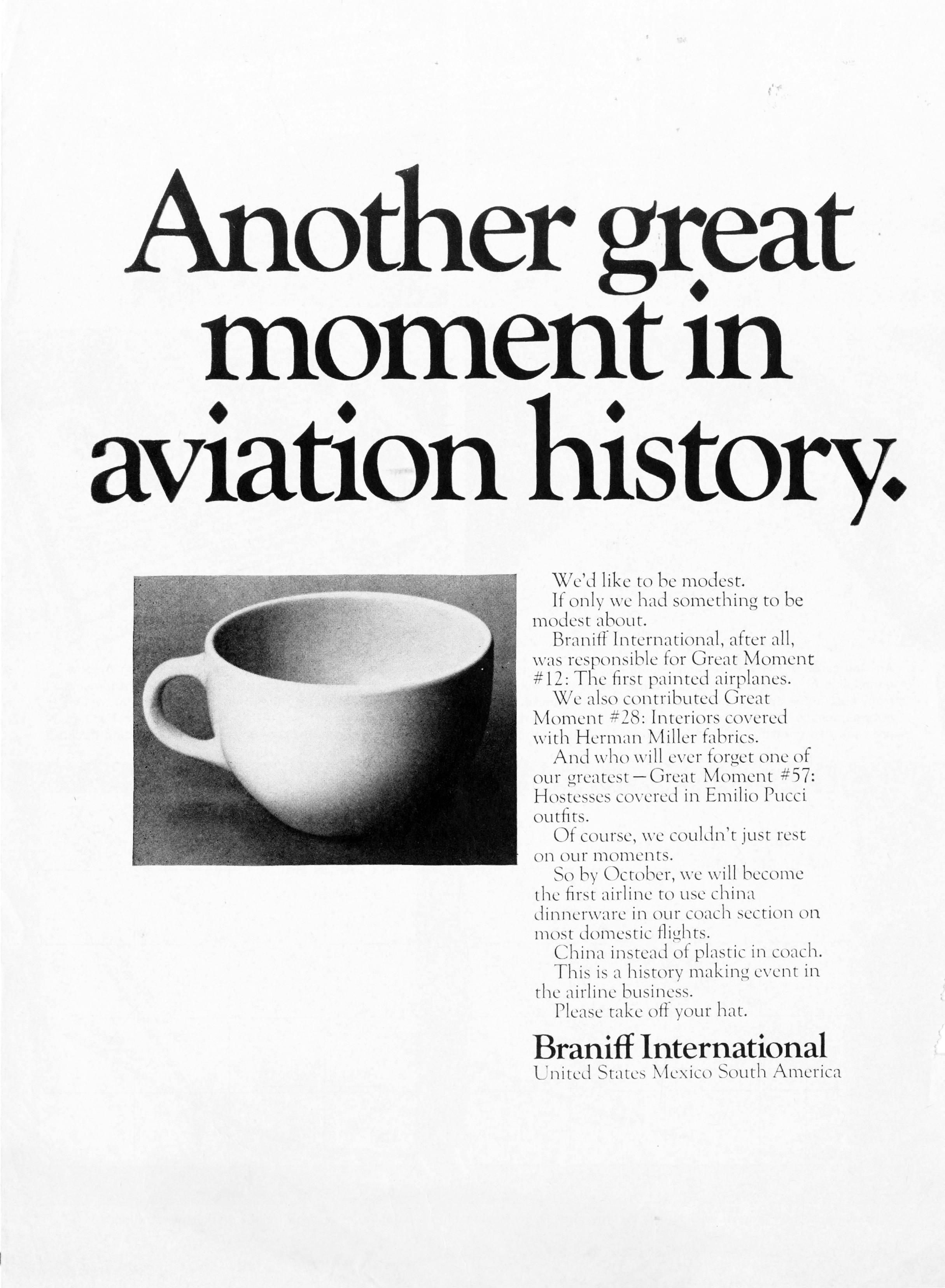
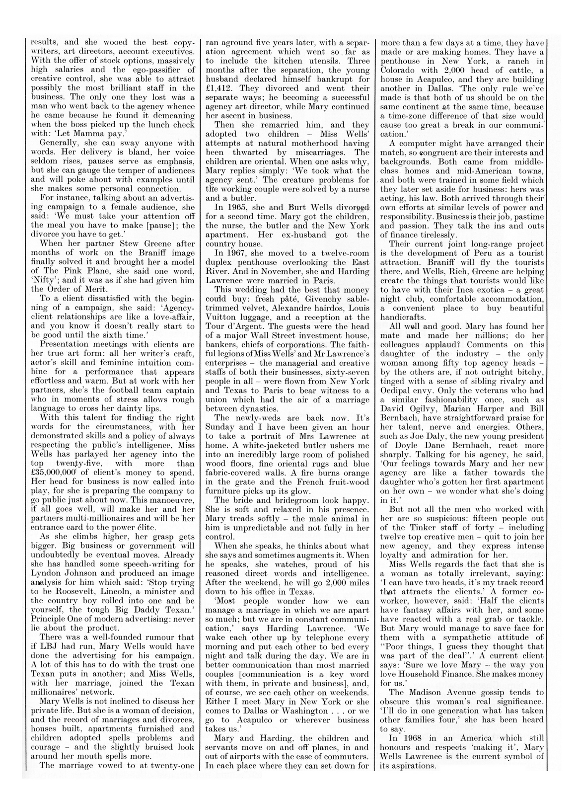
First, she tackles a fantastically dull client; Braniff Airlines.
She adds a bit of colour to the previously grey airline by adding colour – having the whole fleet of planes repainted.
What was once white, like every other airline, was now bright pink, orange, blue, yellow and green.
WRG the set about redesigning their logos, lounges, ticket offices and even uniforms, getting trendy, enlisting sixties’s fashionista Emilio Pucci for the job.
It was “The end of the plain plane”.
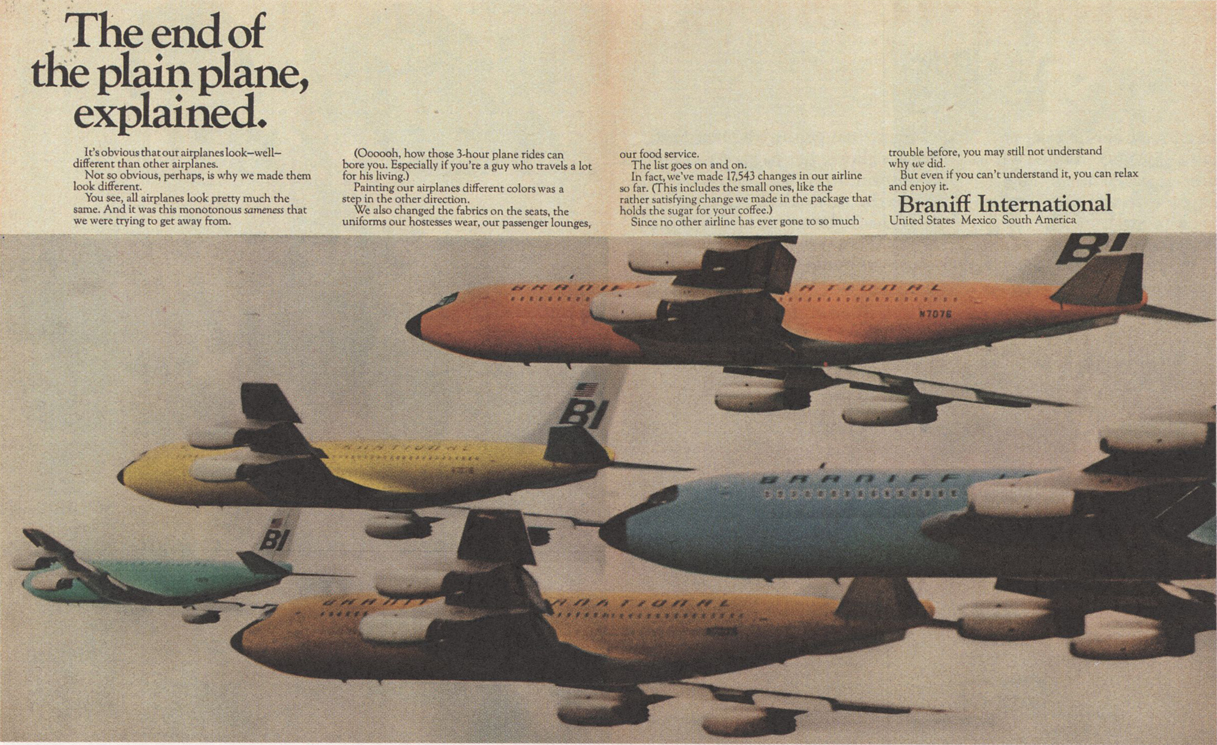
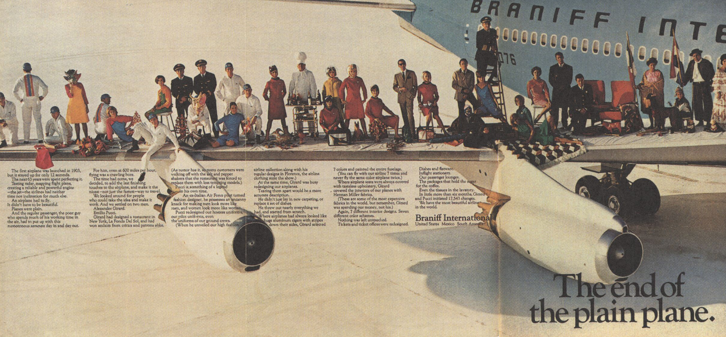
The end of plain uniforms too.
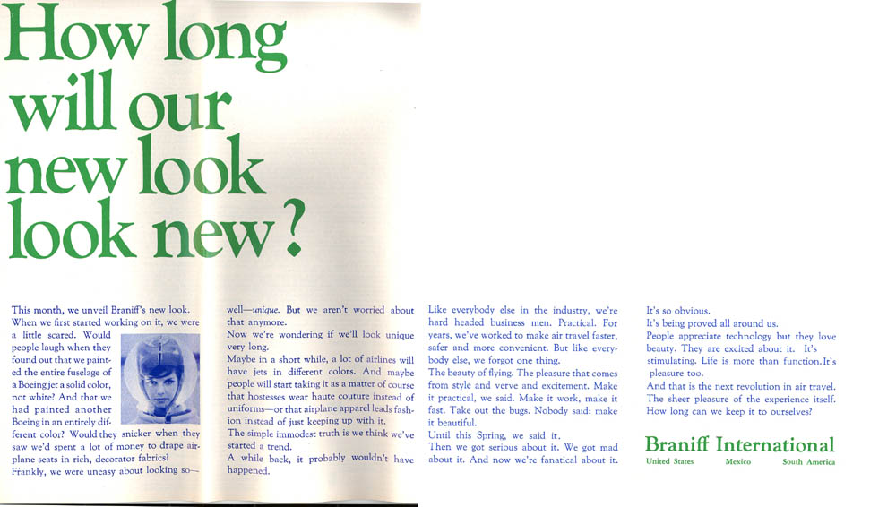
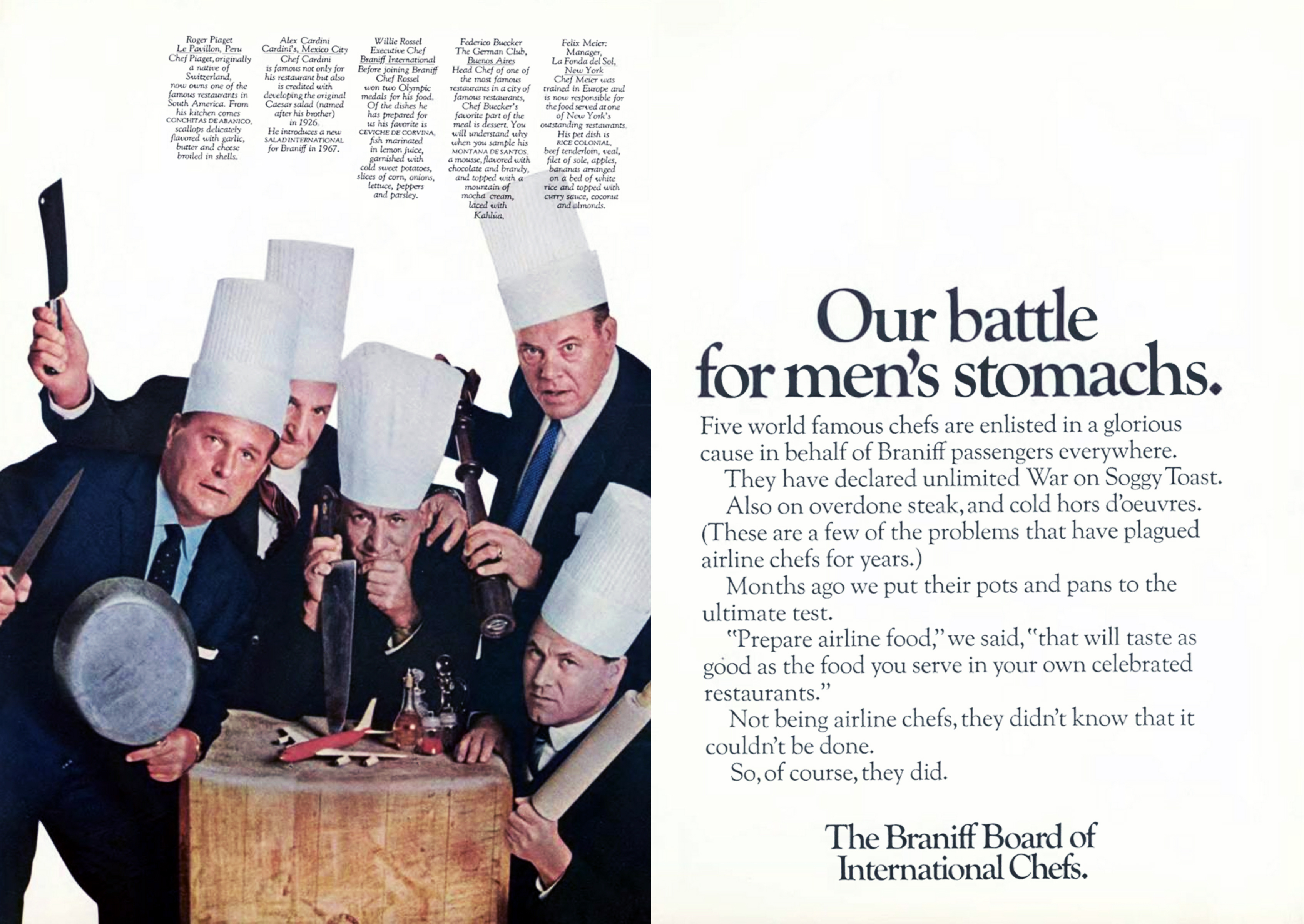
Even the food was overhauled.
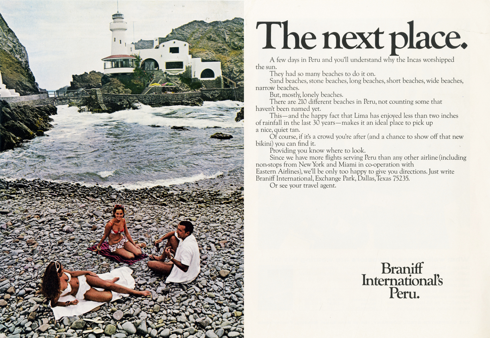
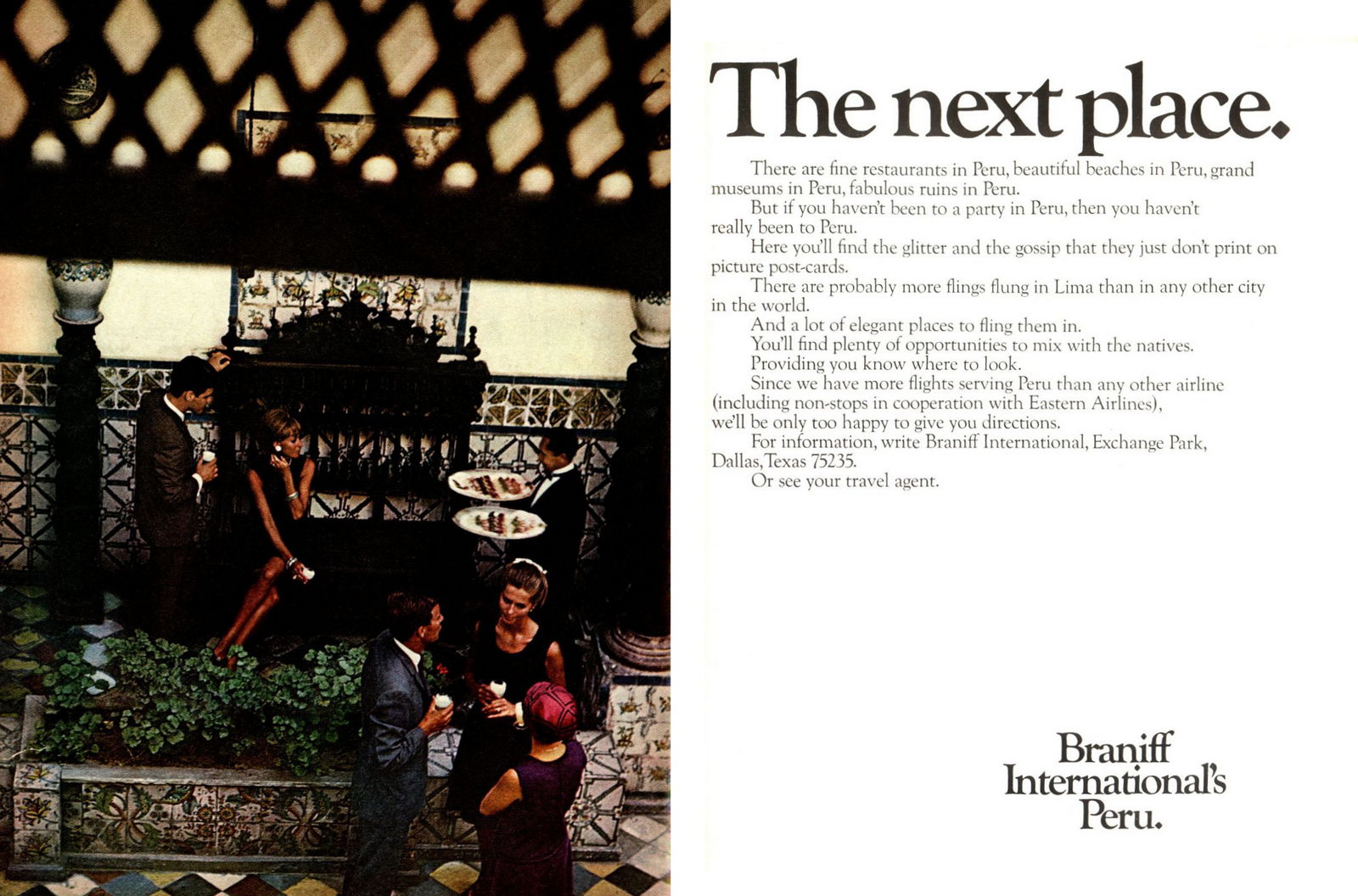
Next was to sell the new, lesser known routes Braniff flew to.


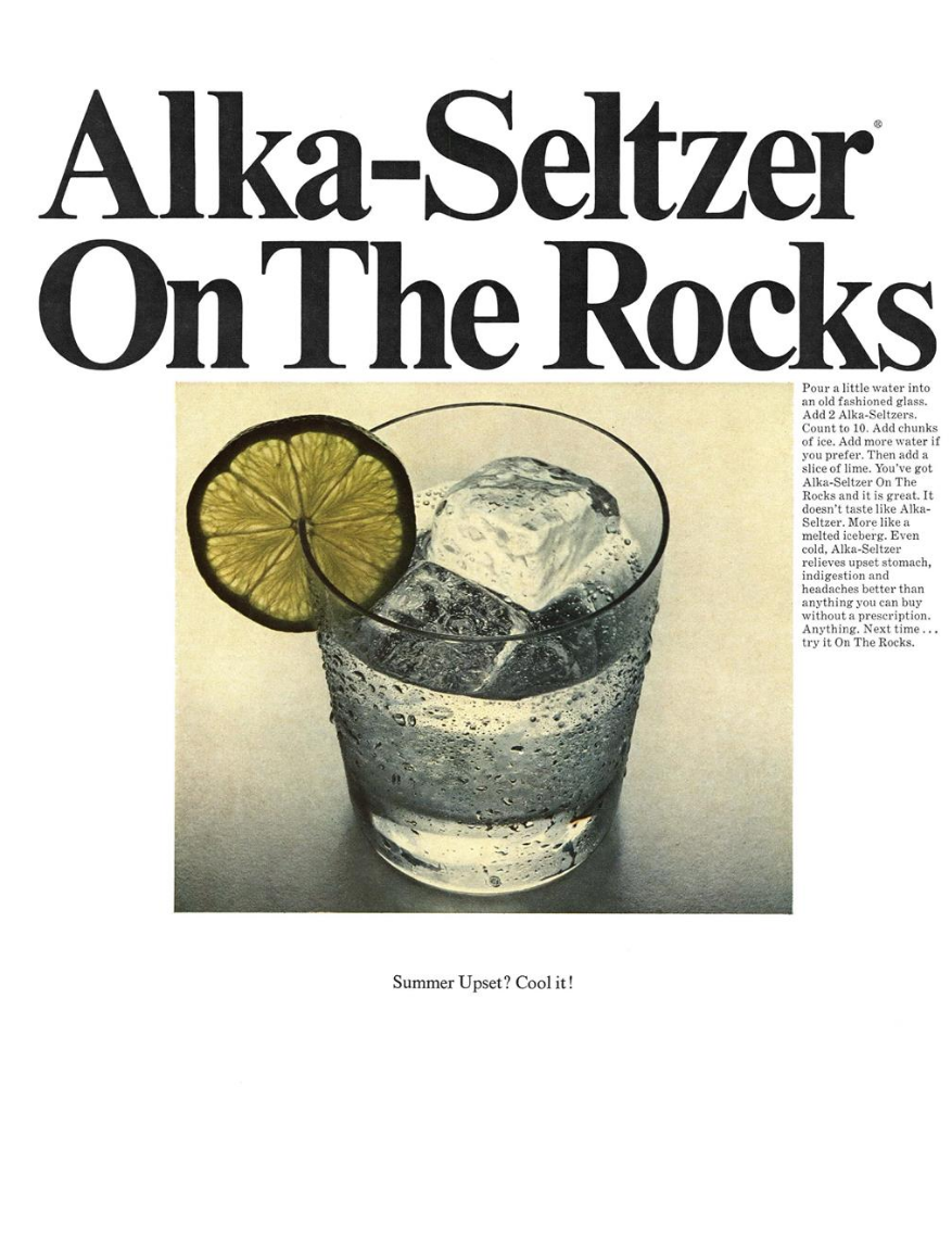
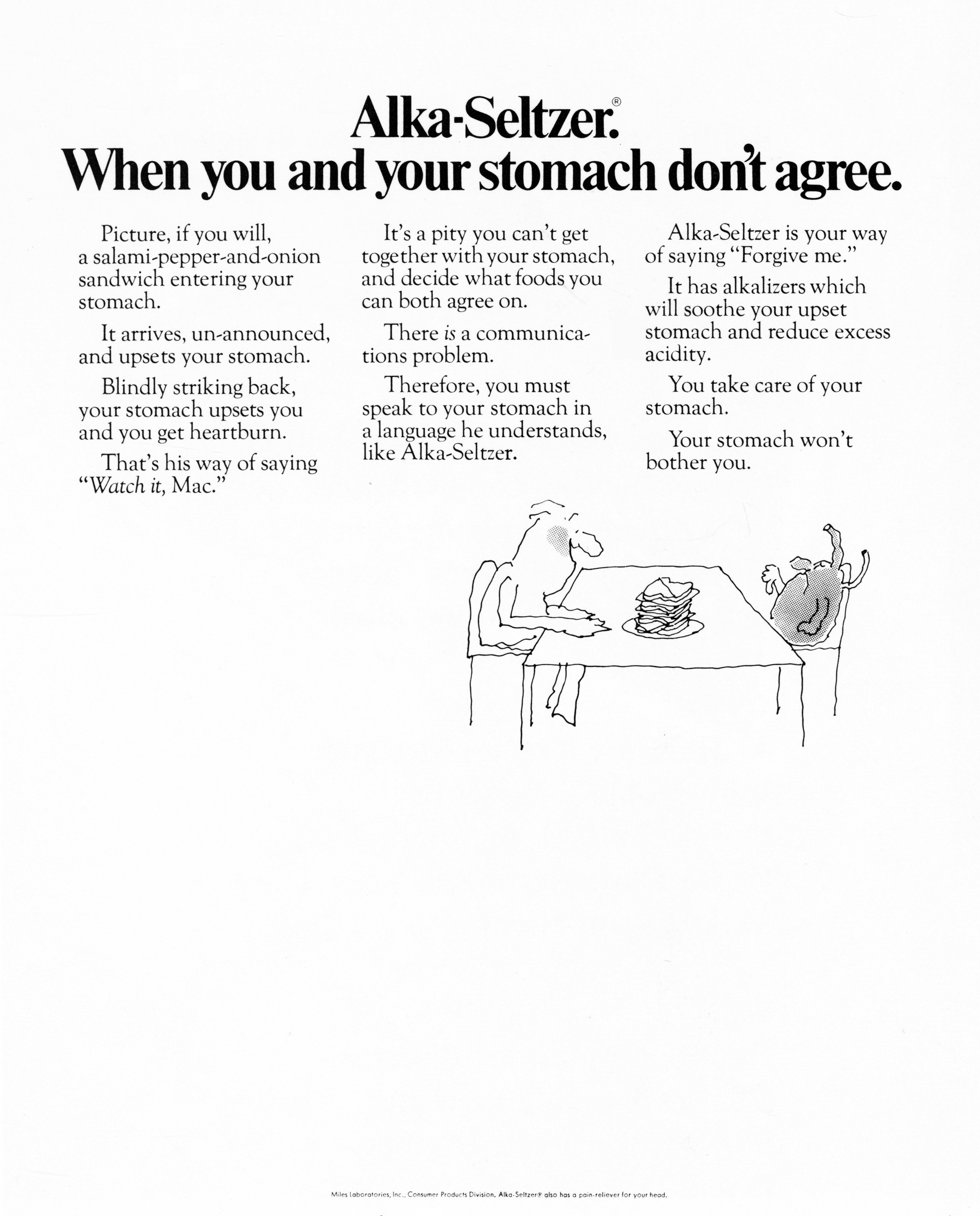
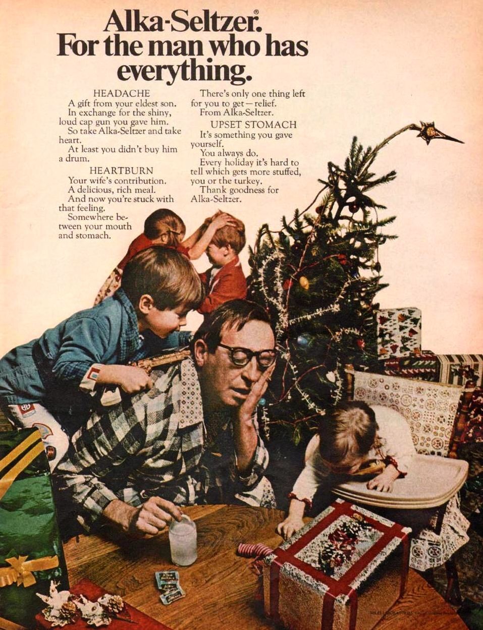
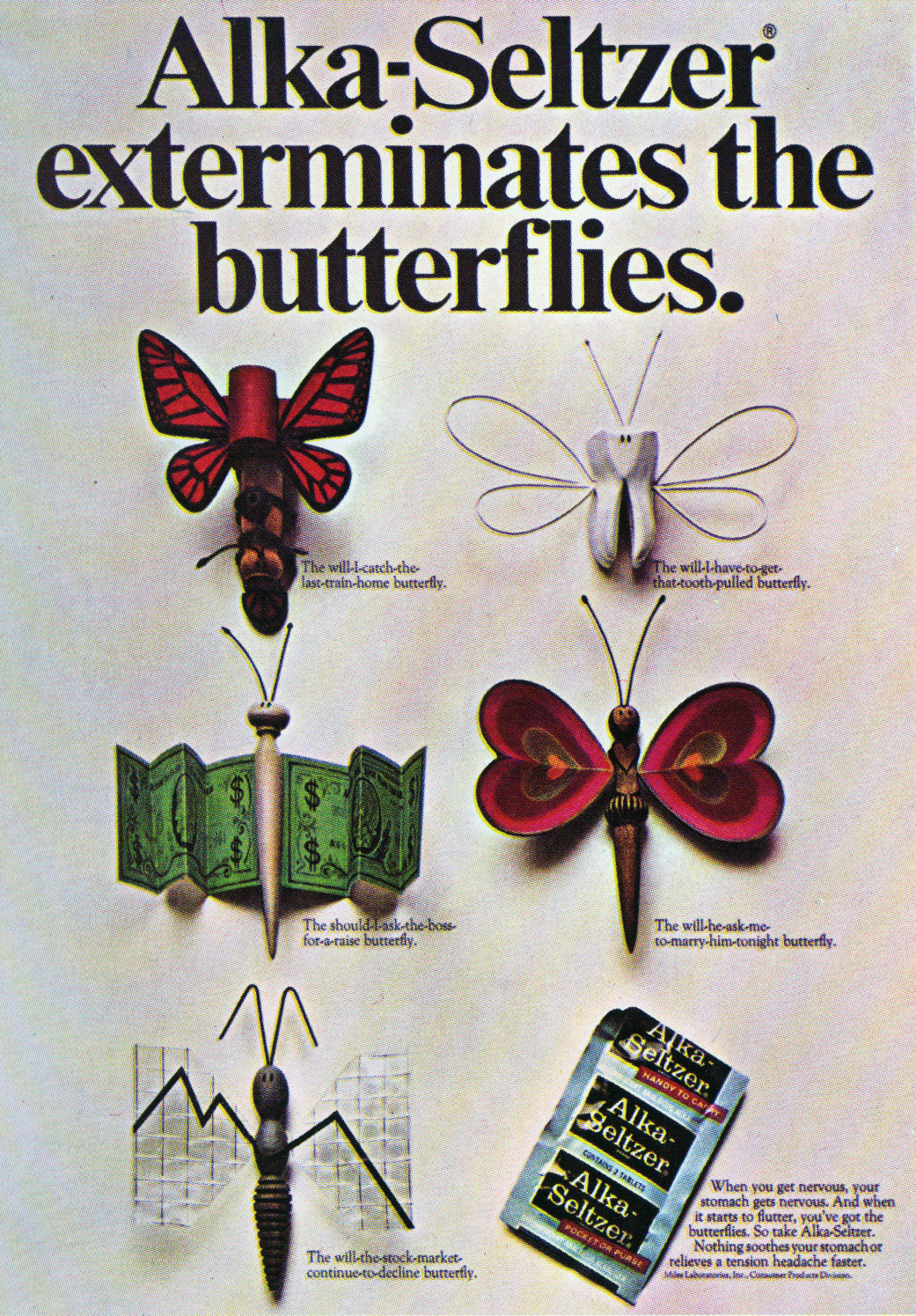
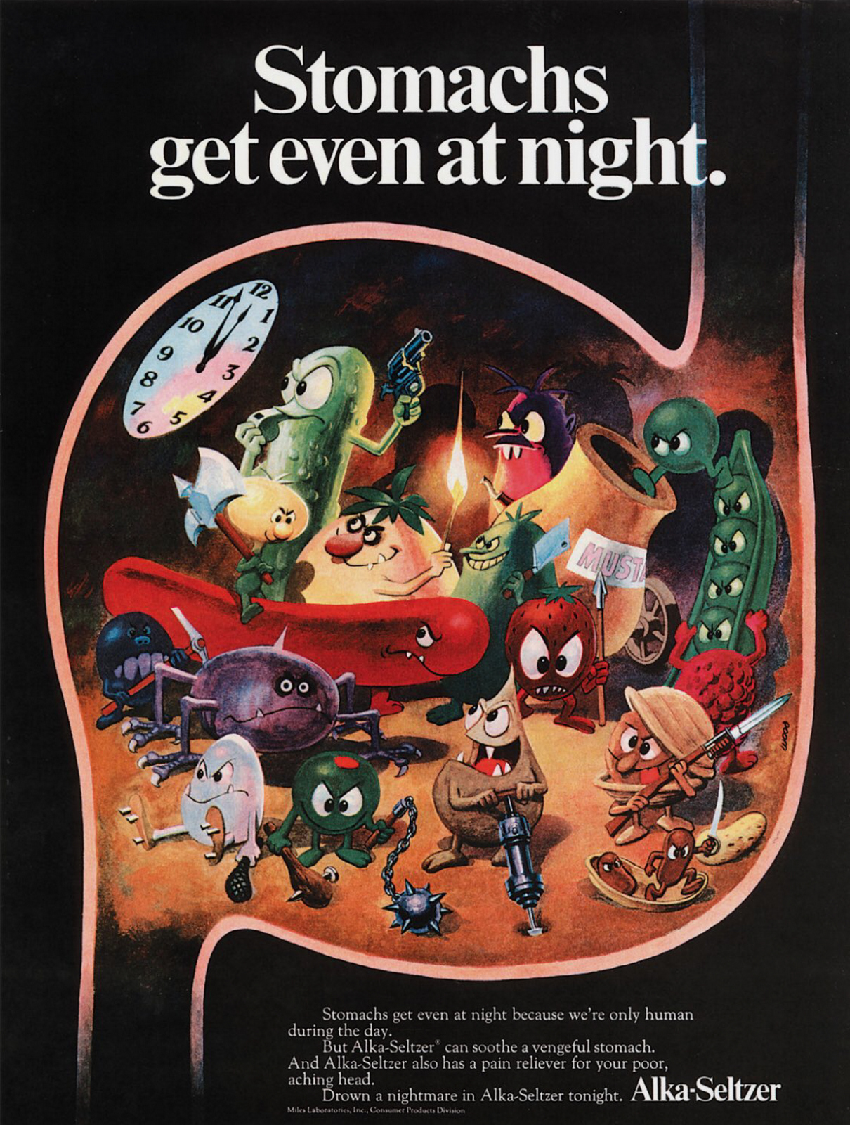
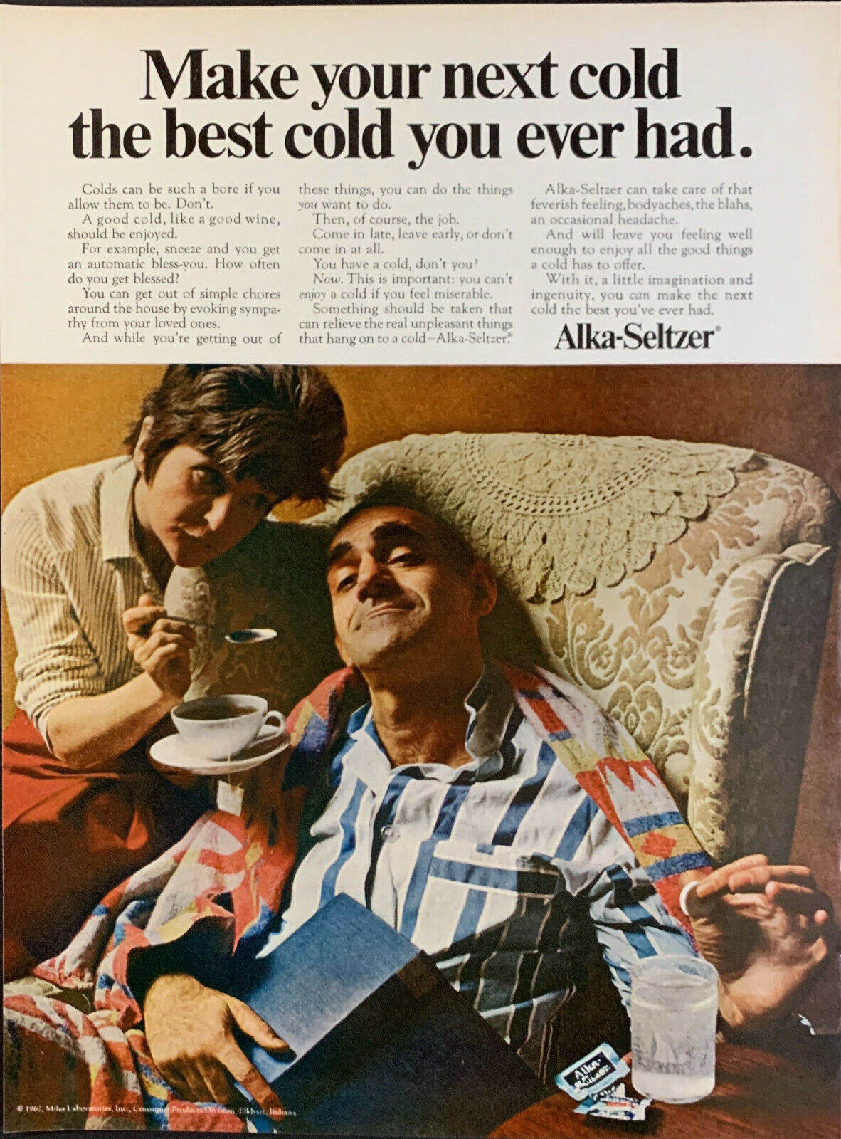
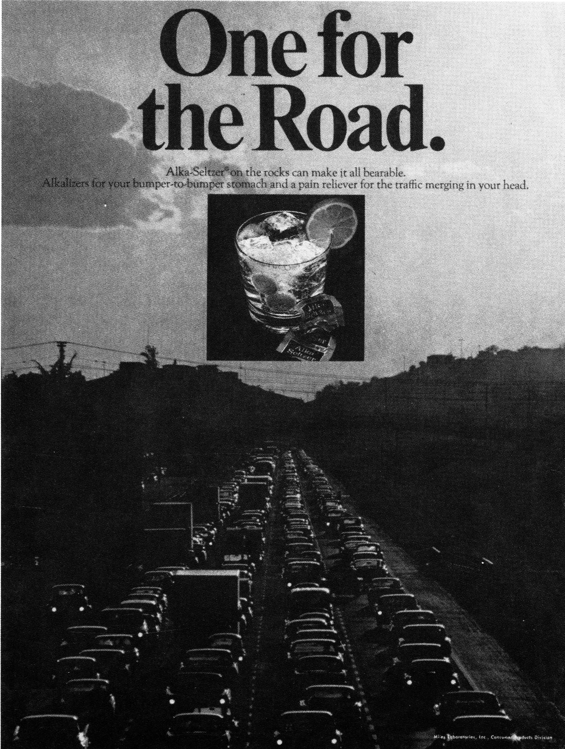
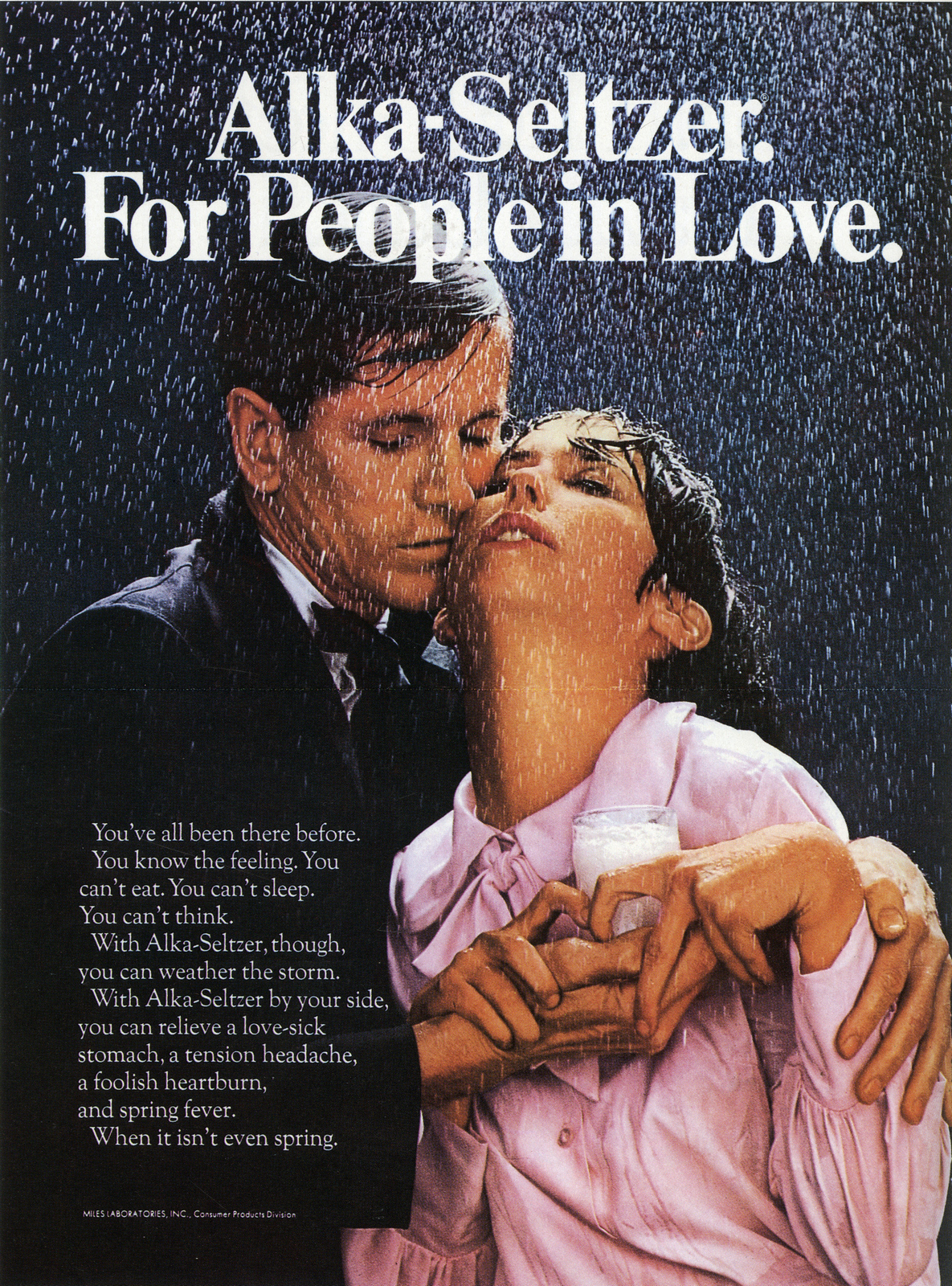
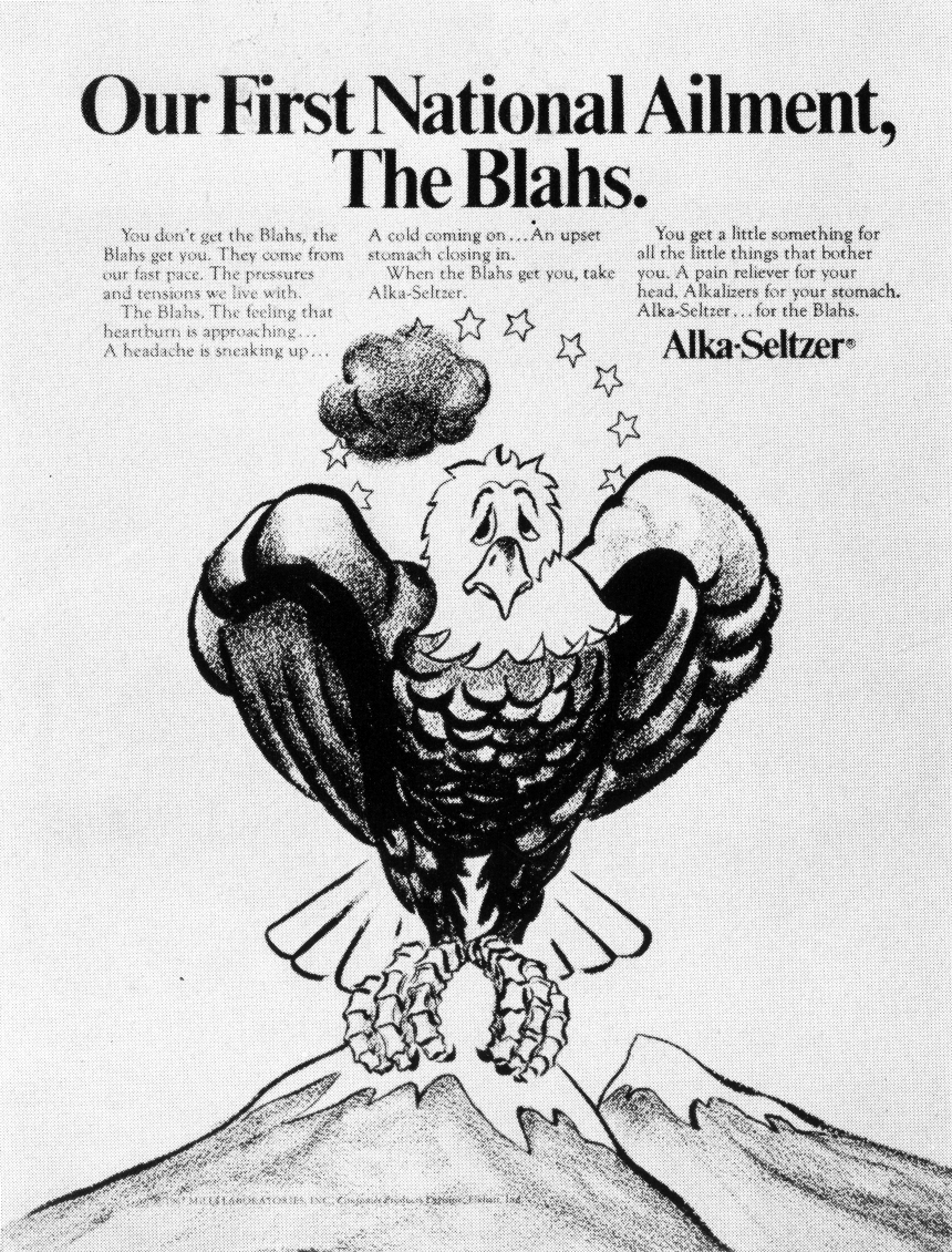
The work Mary wrote for Alka-Seltzer, they could run today. (If it wasn’t so darn pixellated.)
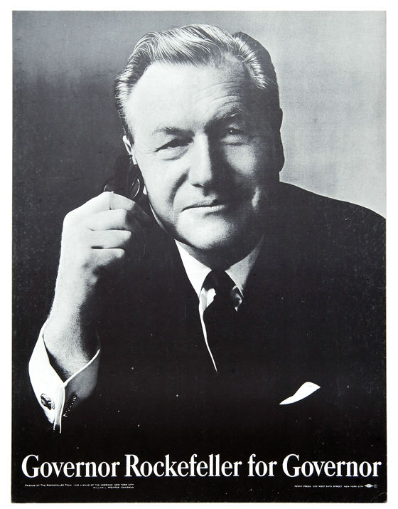
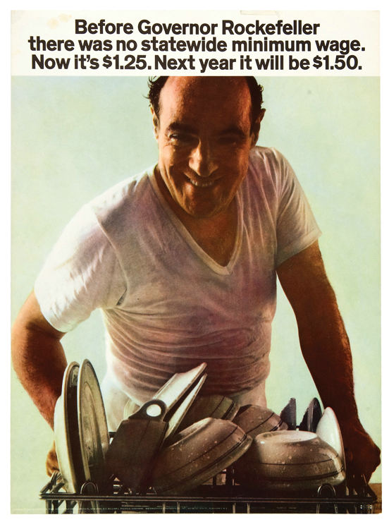
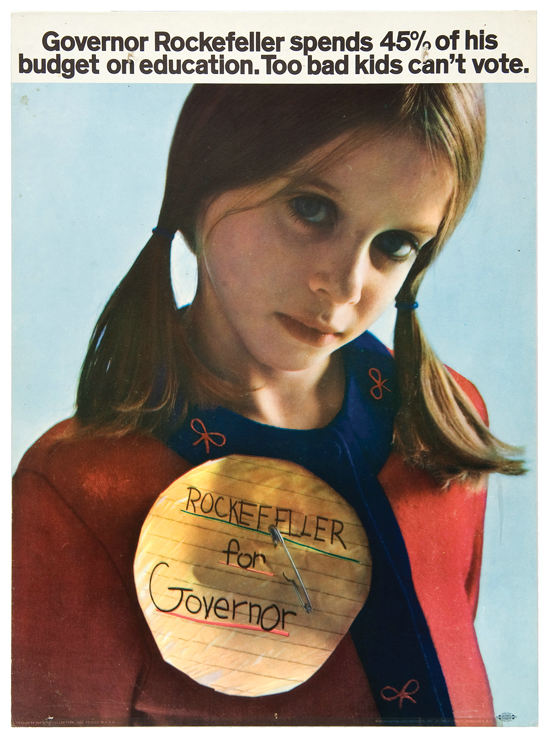
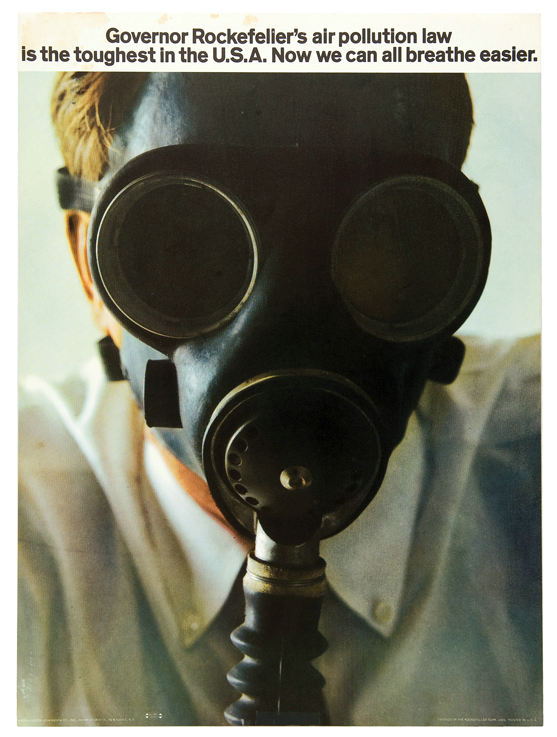
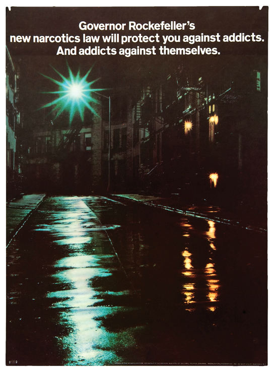
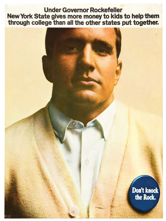
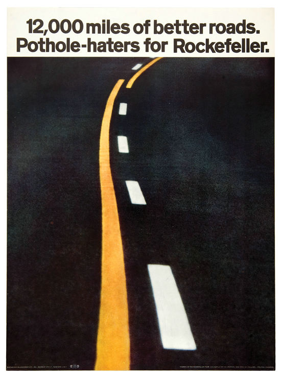
In 1966, she got an unpopular Governor of New York, Nelson Rockefeller, re-elected.
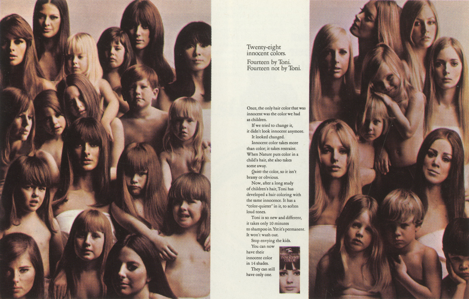
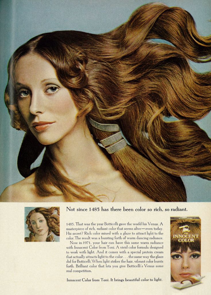
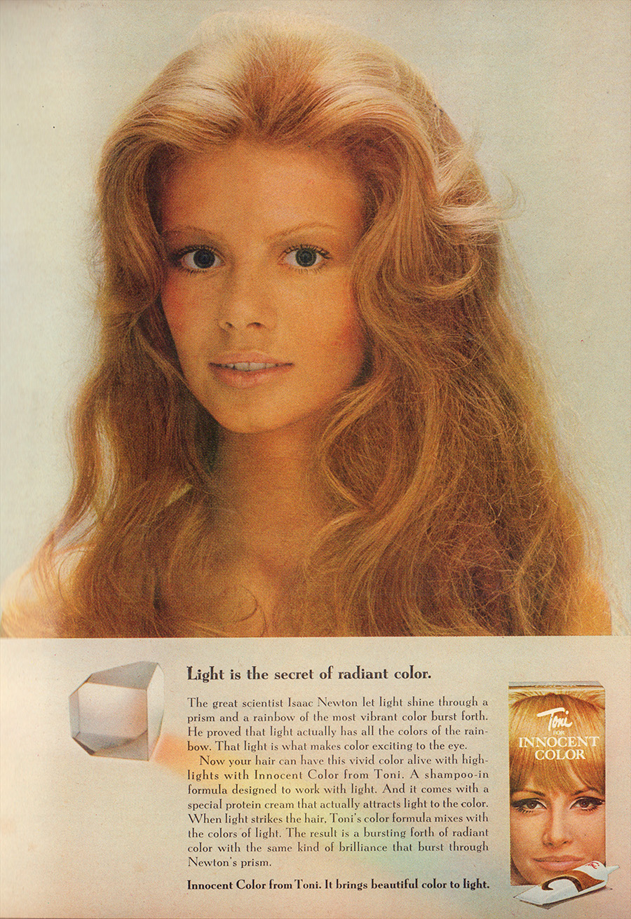
At the other end of the spectrum, they did some cool-looking work Toni Hair Color.

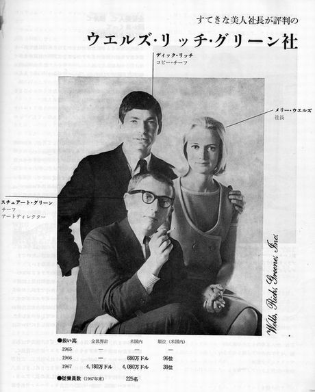
In 1966 she set up an agency with two other creatives; Wells Rich Greene.
She takes Braniff with her.
(Not surprising, she was married to the owner.)
Alka-Seltzer also follows her.
When trying to figure out how to sell more, Mary asks “Would taking two tablets would increase their effectiveness?”
That question changed the company, their packaging and advertising.
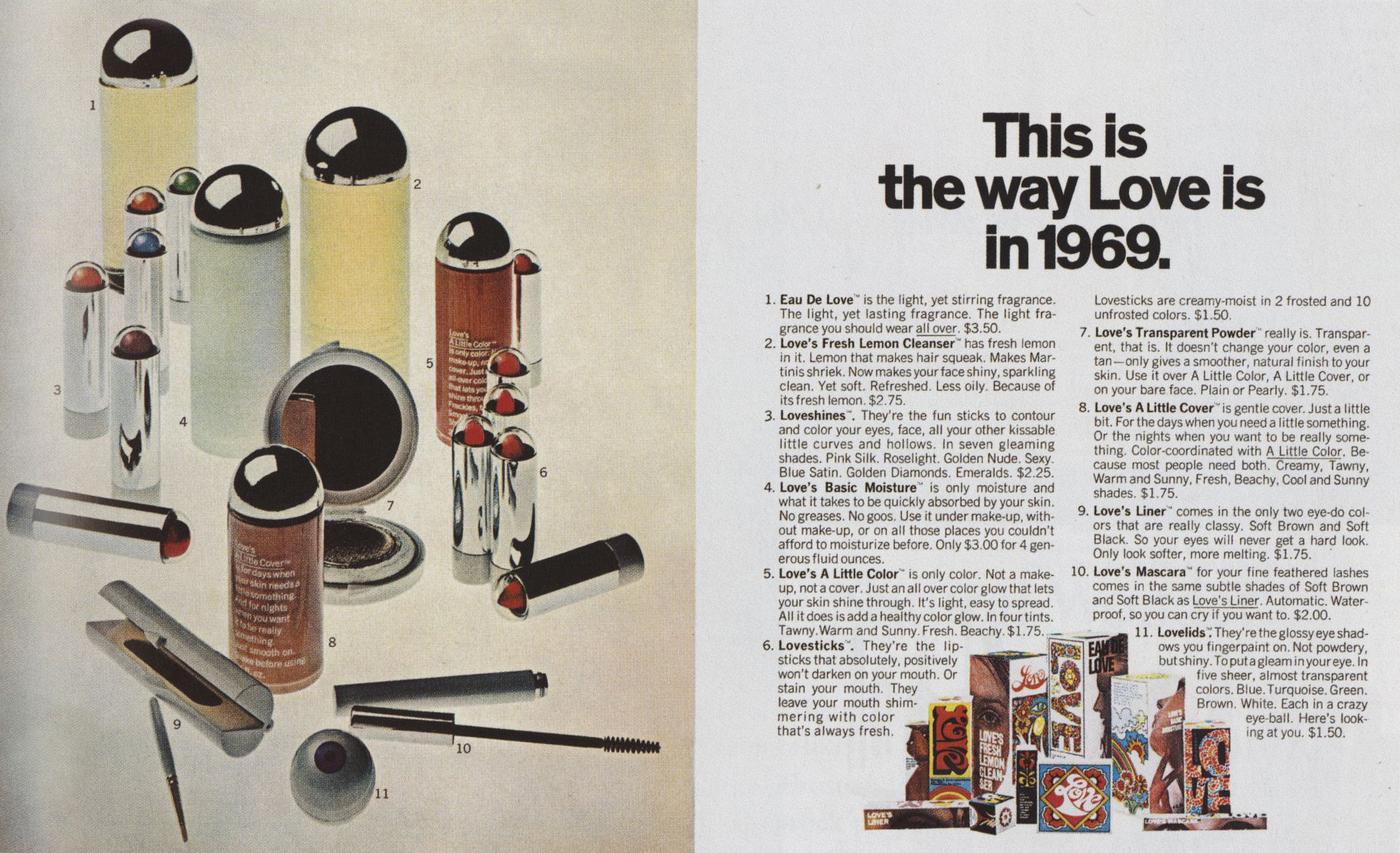
Rather than write some ads for a cosmetic company, they come up with a new brand; LOVE COSMETICS.
They choose the fragrances, design the packaging then write the ads.
They get hip hippy Donovan to do the music.


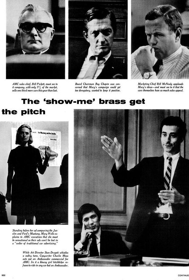
American Motors had a problem; people didn’t know what they made.
Sure, they knew it was cars, the clue was in the name, but what kind?
The range was so wide it was confusing.
The solution was very ballsy, use other manufacturers category leading cars to show what category yours were.
This is our Beetle, this is our Mustang and so on.
It sounds like an obvious idea, but it’s risky.
Will our cars stand comparison to theirs?
Will their, more famous cars be remembered and ours forgotten?
And this is something we’e paying for it, millions of dollars.
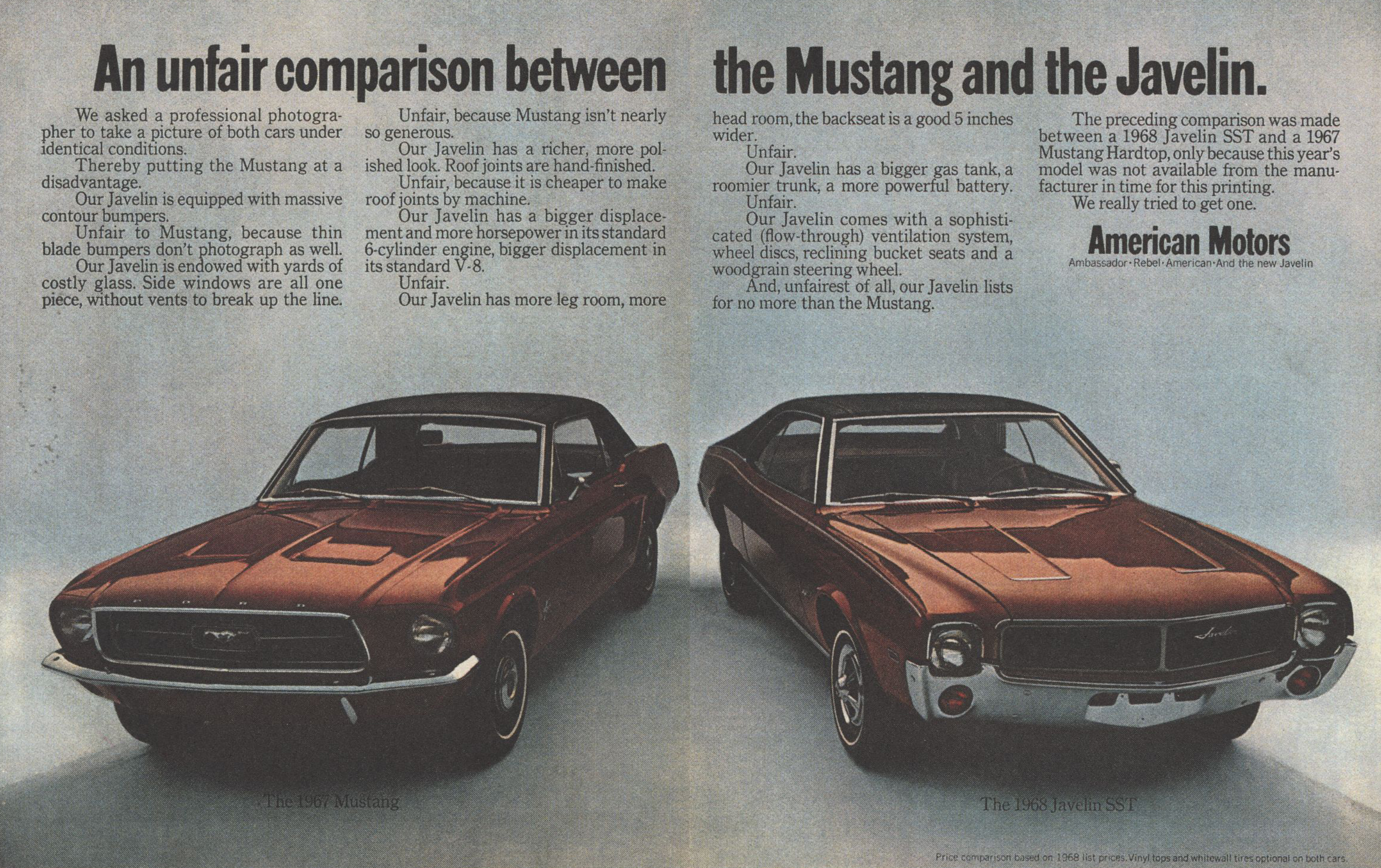


It worked.
Having positioned each car, they set about selling them.

.jpg)

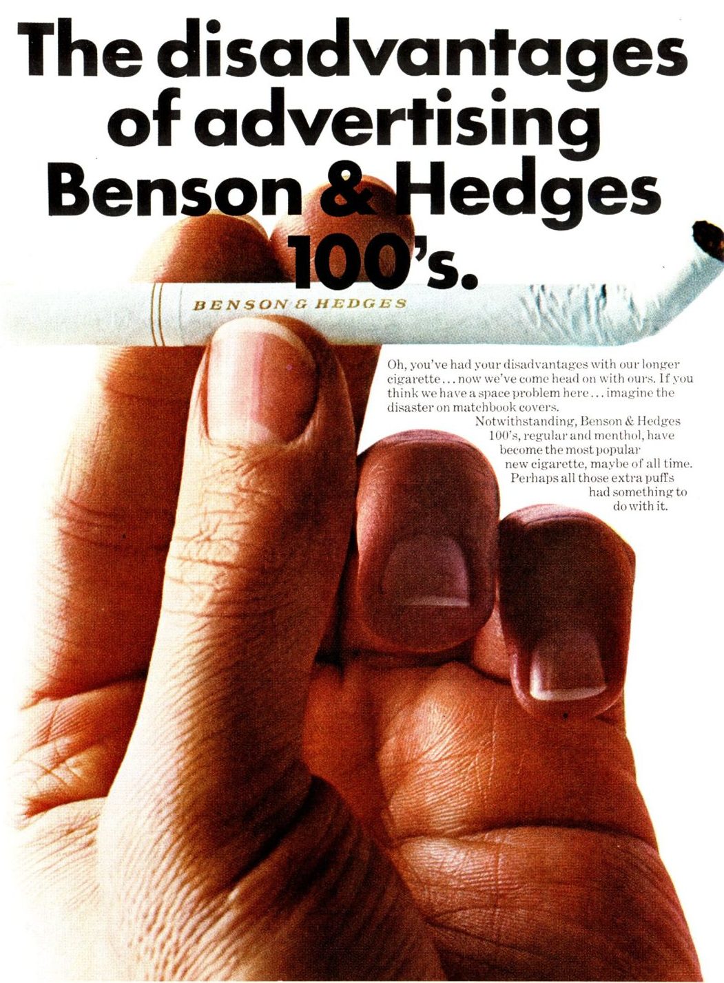
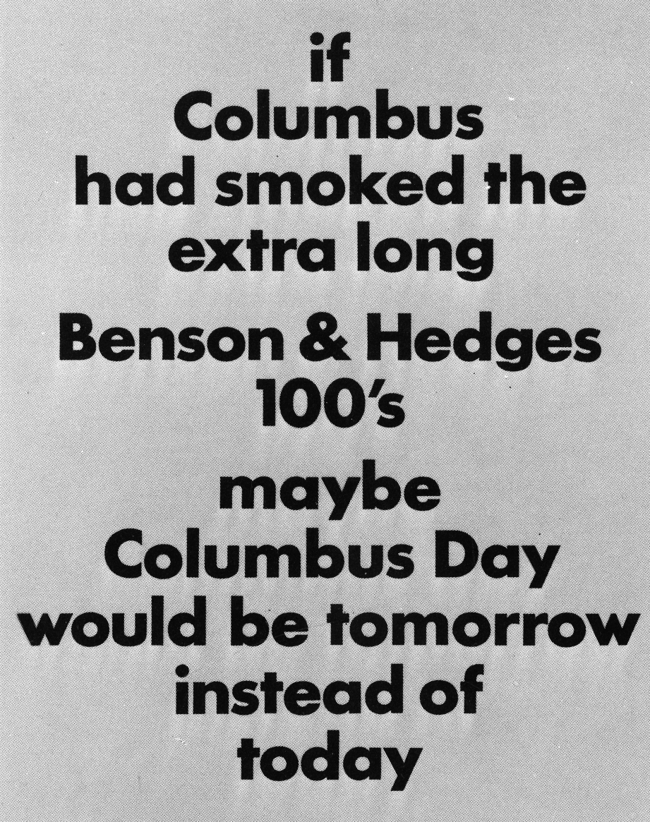
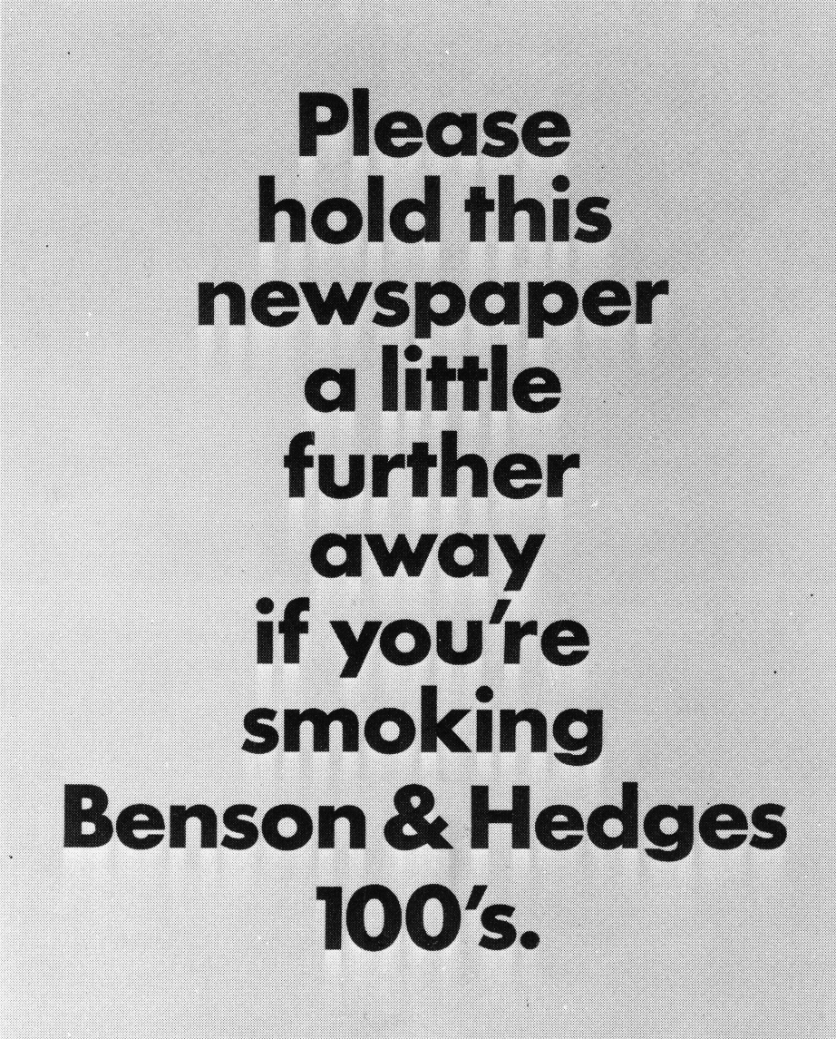
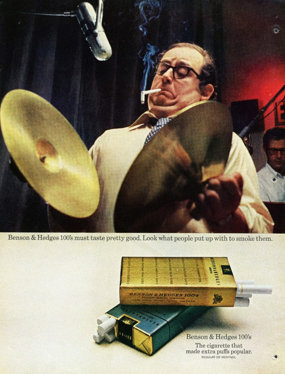
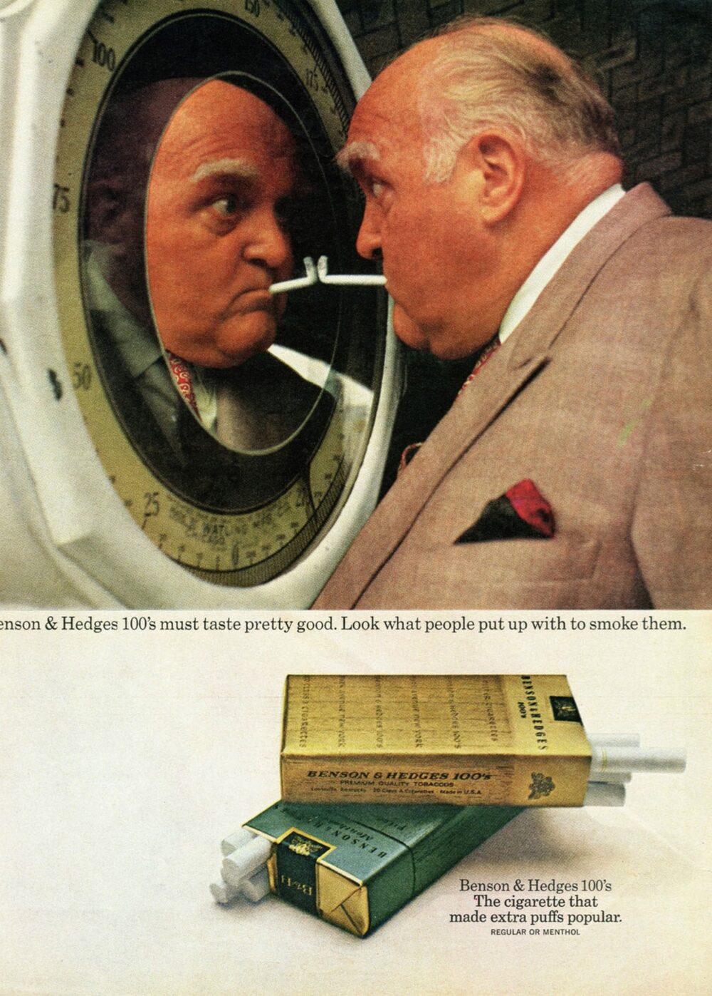
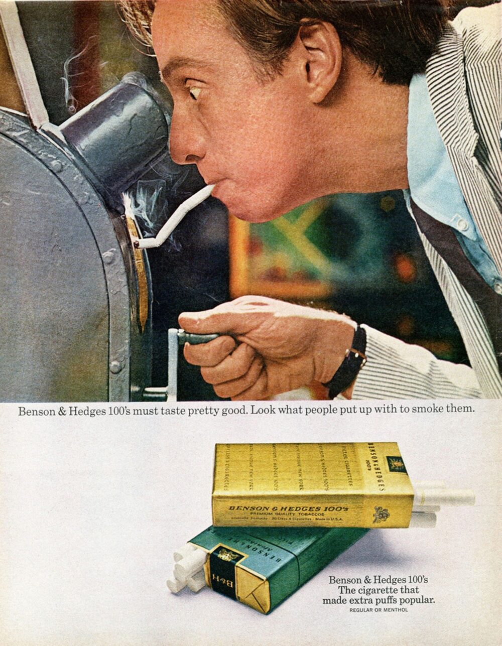
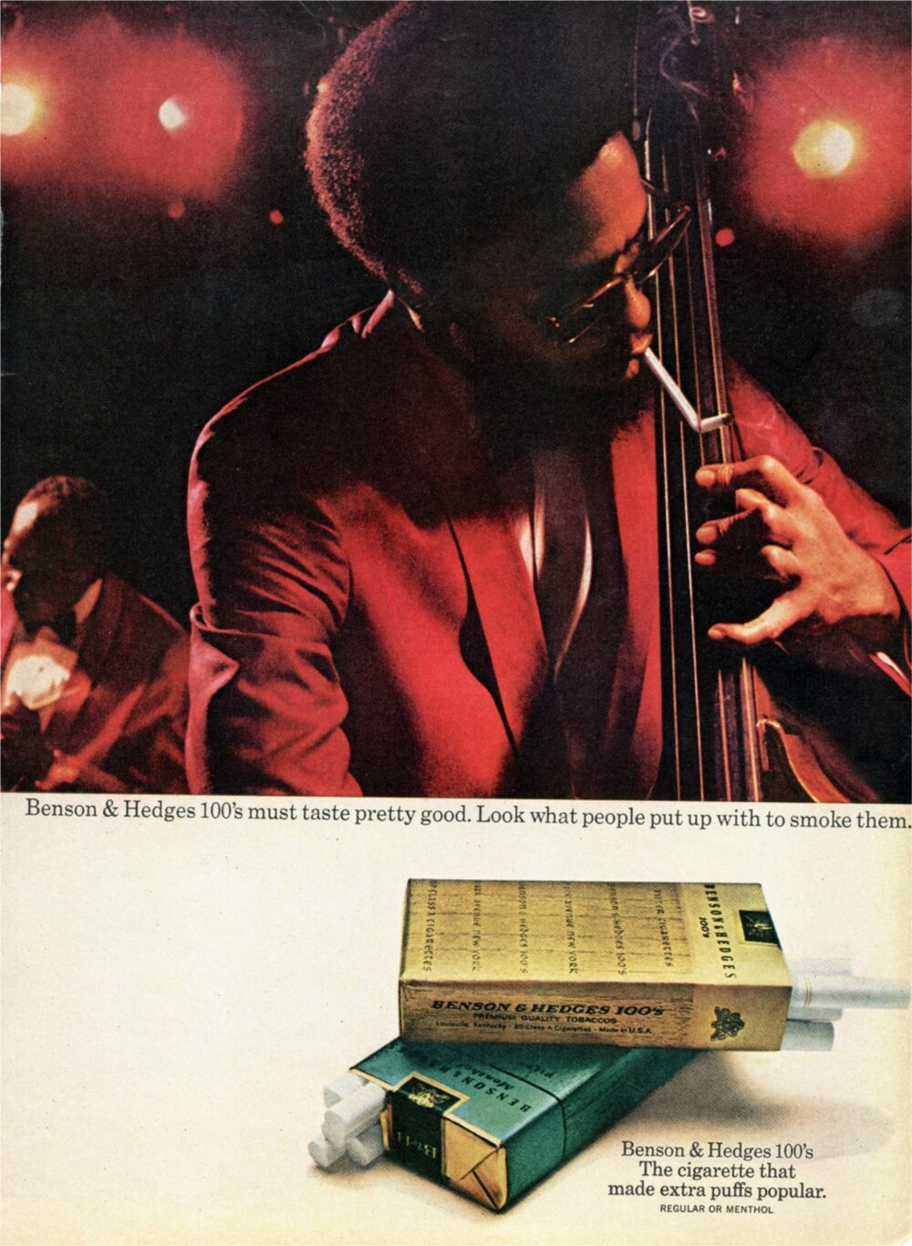
Benson & Hedges 100s were longer than usual cigarettes.
The way agencies would promote that extra bit of cigarette would be via the advantages.
It lasts longer, so many extra puffs, smoke less in number for the same smoking time and so on.
They all make total sense, but they’re dull.
Mary dramatised the disadvantages.

Midas Mufflers, or exhausts to us Brits, had a problem, they wanted to grow but said they were in a category of one, there were no other national exhaust fitting companies.
WRG found their competition: local garages.
People went there for petrol, tyres and a car wash; why not mufflers? It was very convenient.
So Midas took on local garages, saying they were not well stocked, staffed or informed.
But they did it with great charm.


We often talk about the ‘big idea’, but usually it’s simply a phrase.
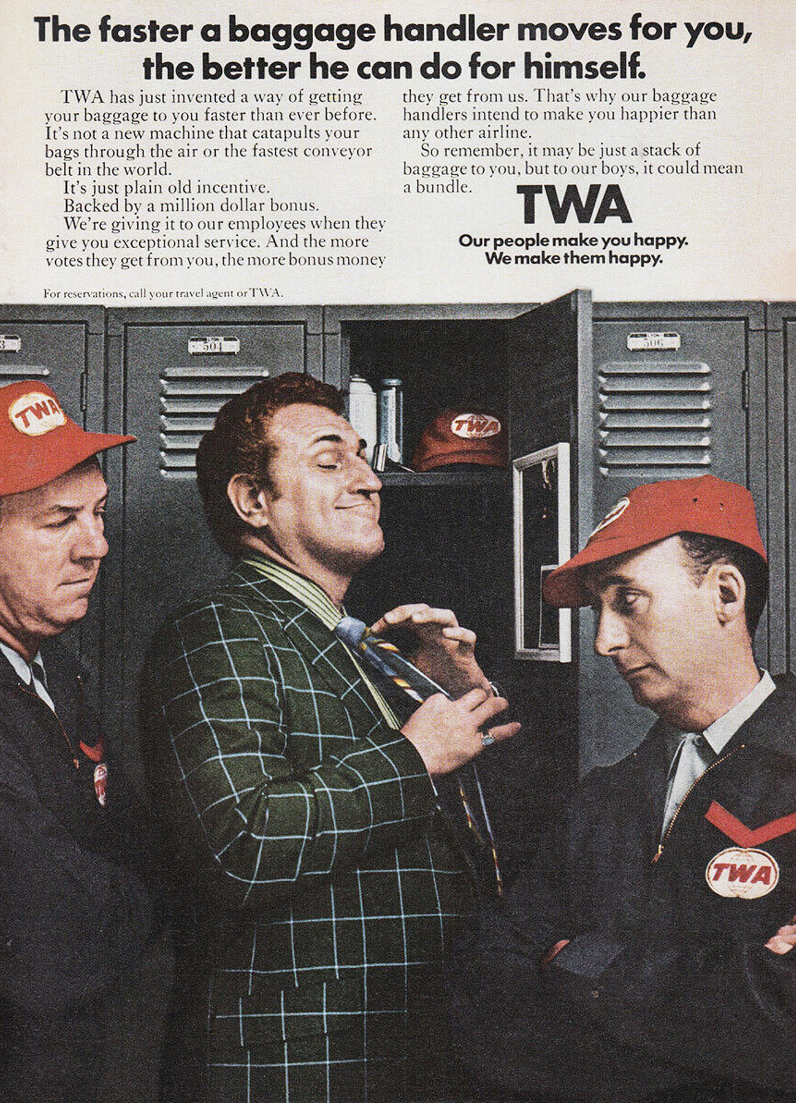
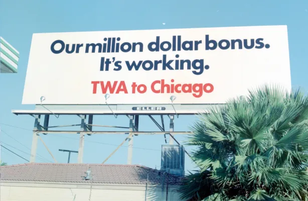
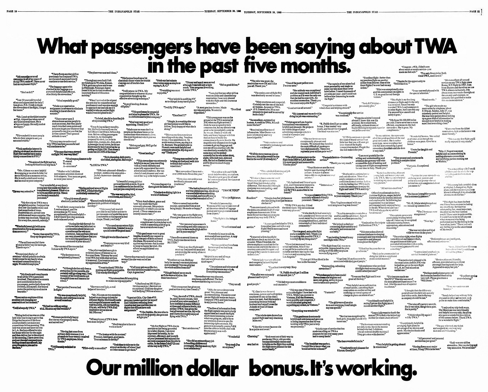
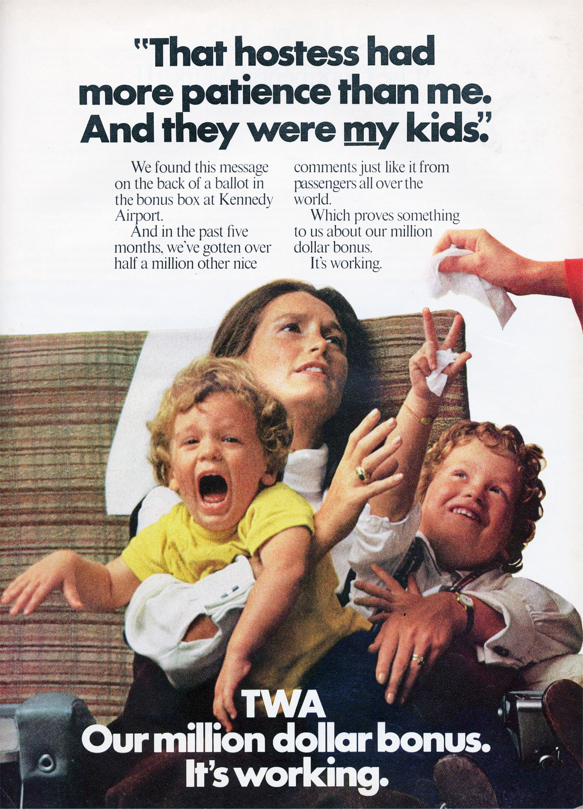
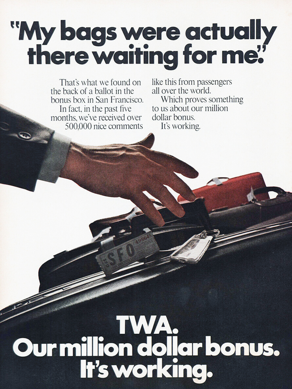
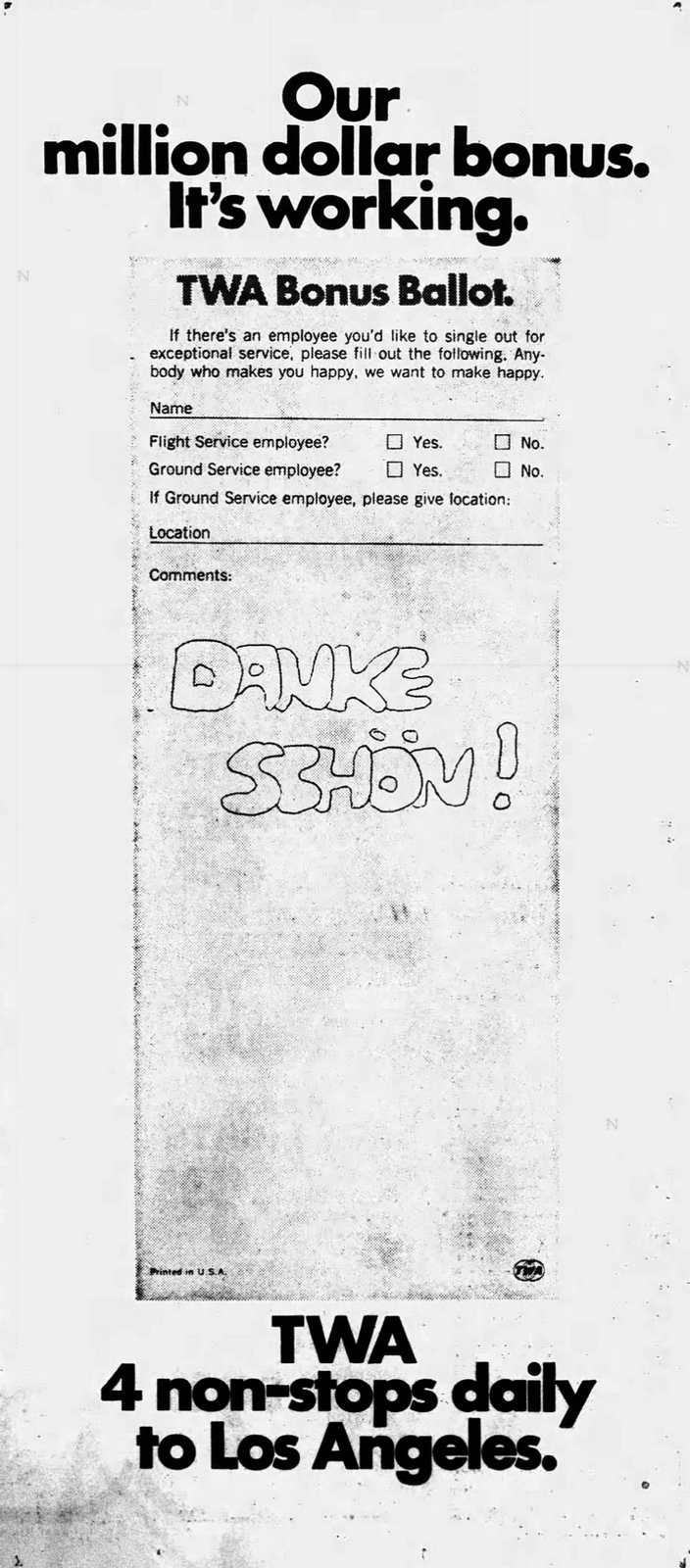
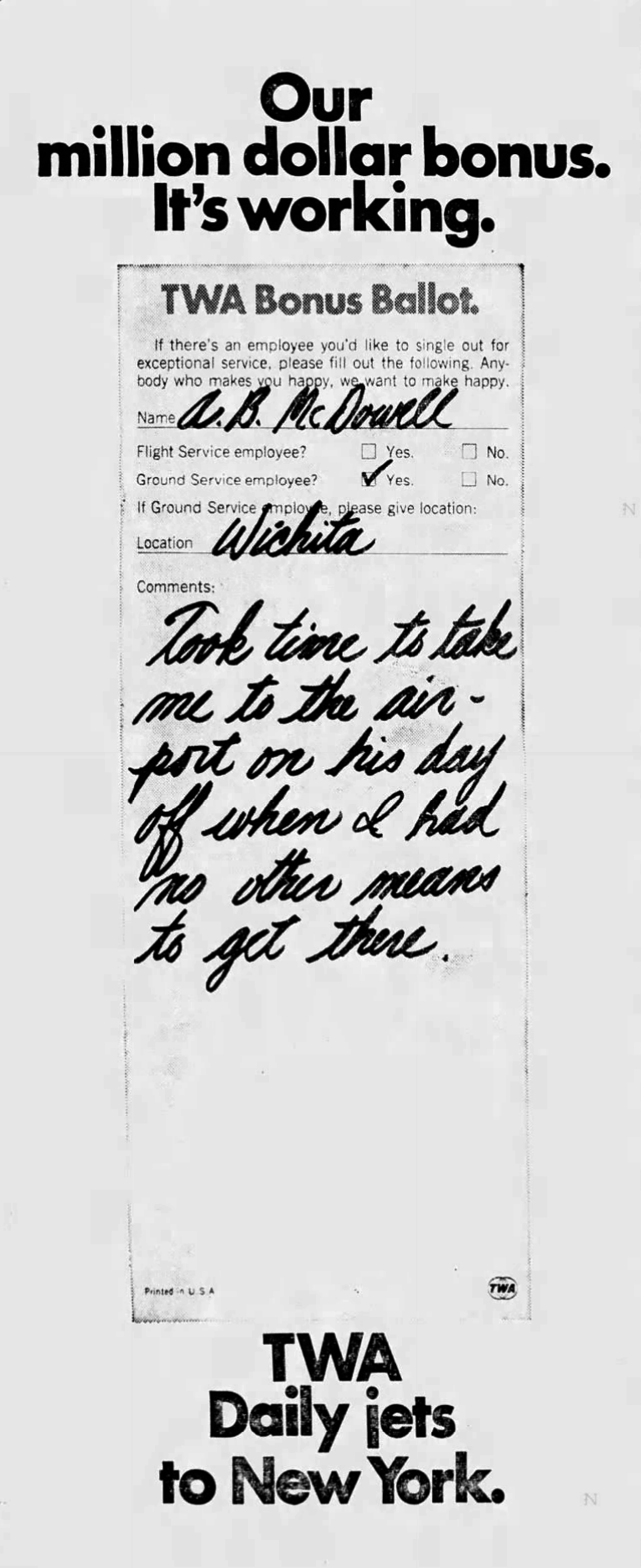
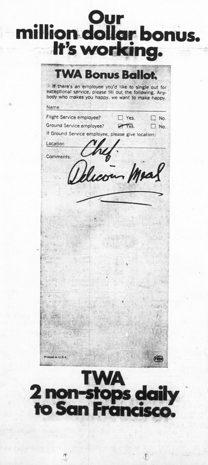
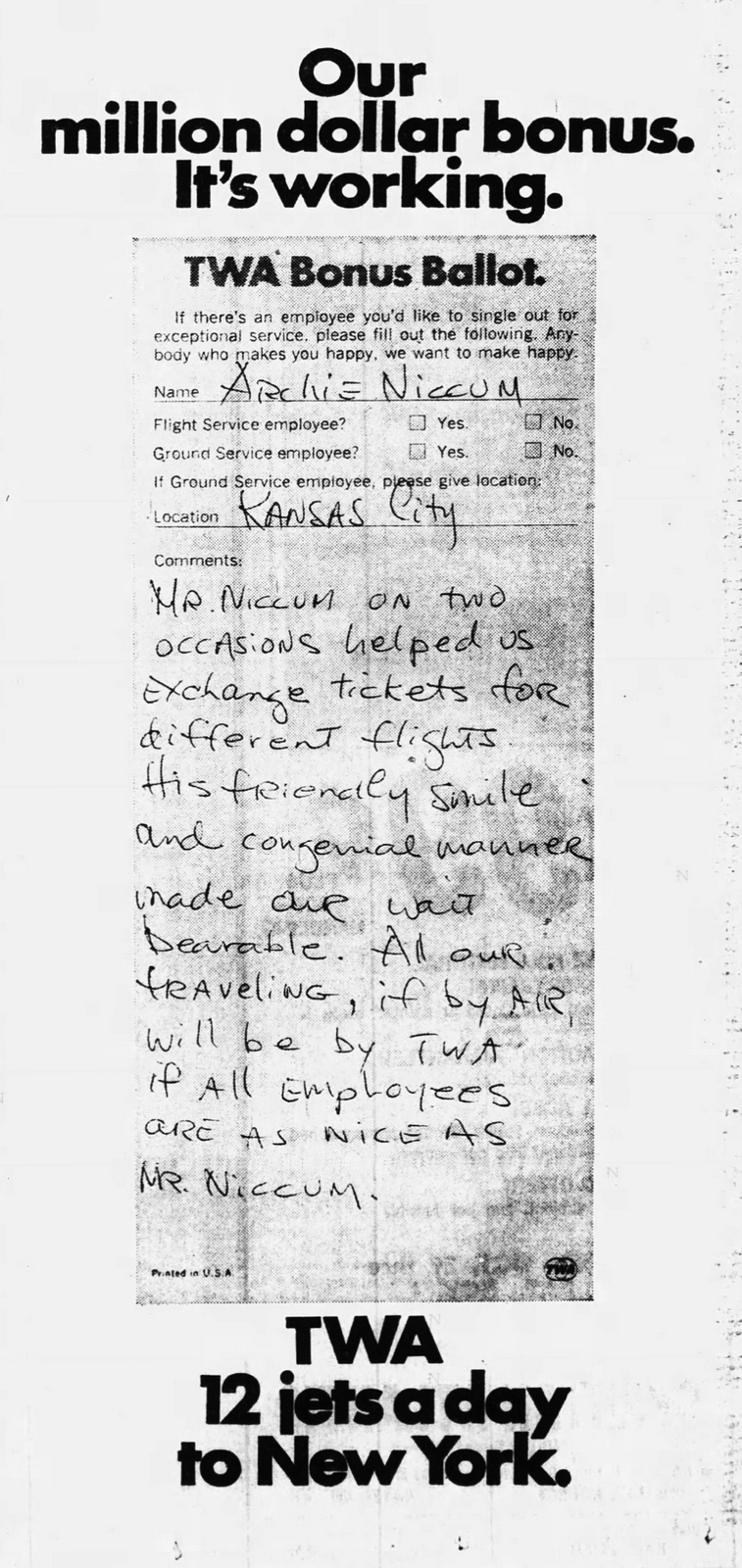
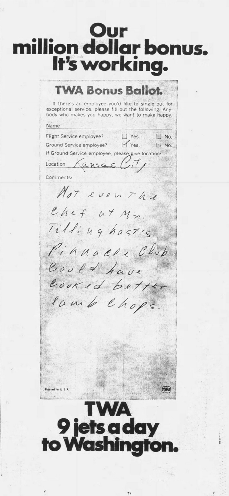
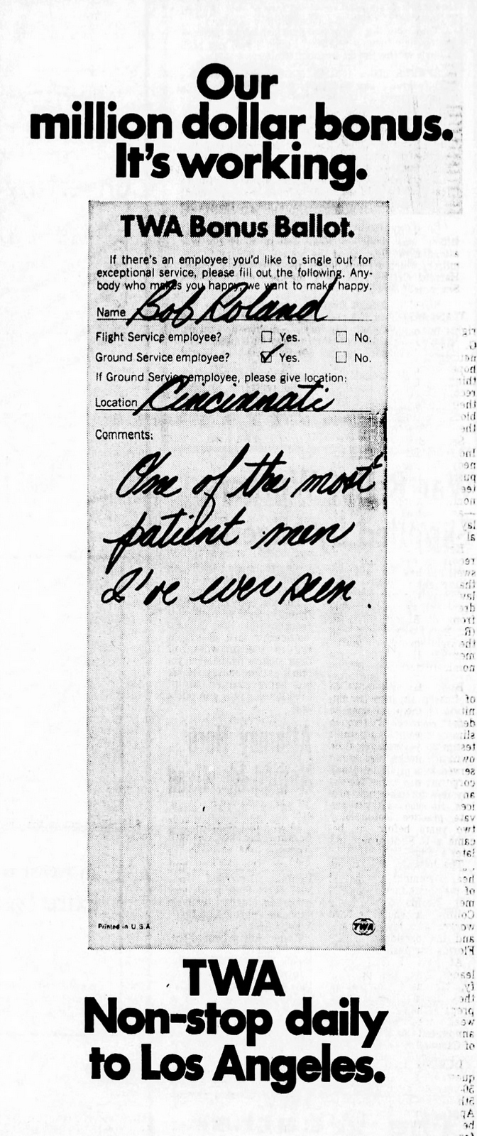
Mary’s idea for TWA was a big idea.
A million dollar idea.
How do you get people to take seriously that your airline staff care about customer service?
You hive off a million dollars from your marketing budget to give your staff bonuses if enough customers tell TWA that they went the extra mile.
The staff are aware they can make more money, so they try harder.
The public are aware the staff are trying harder.
Brilliant.
Sounds so easy and obvious.
Like all the best ideas.
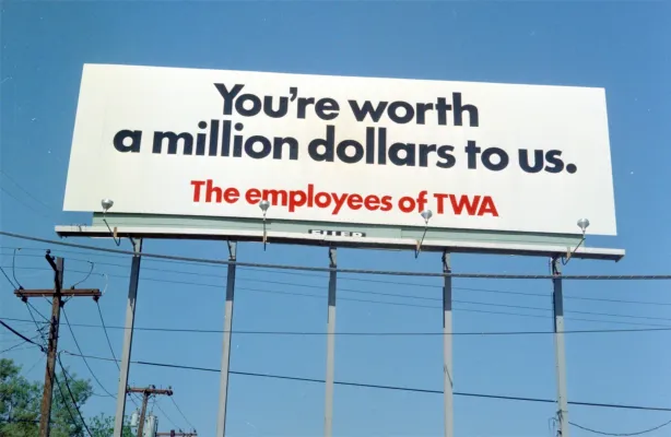
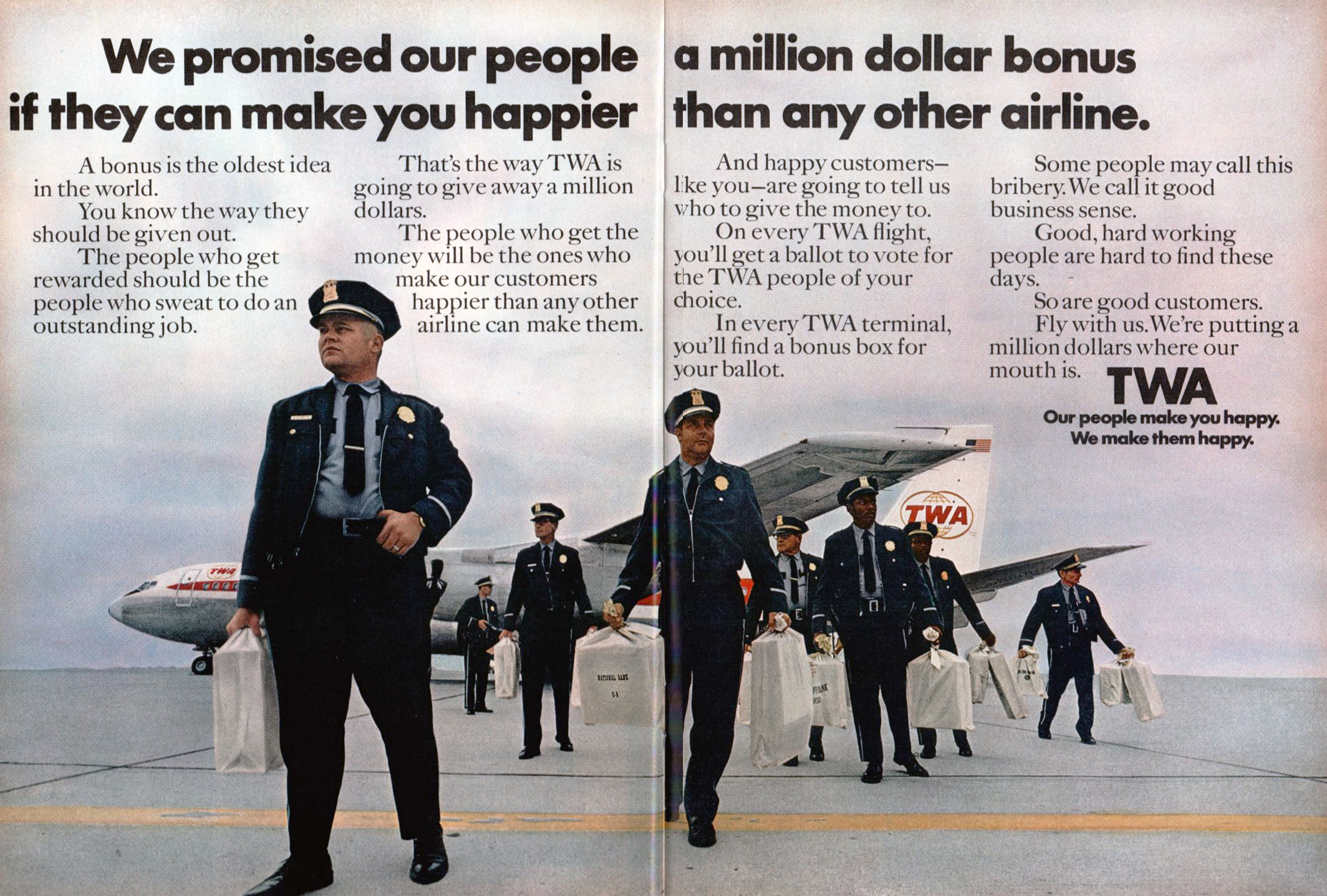
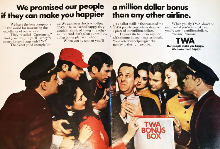
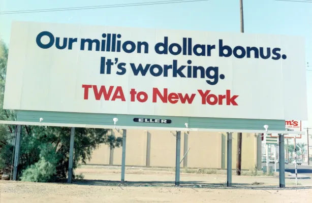
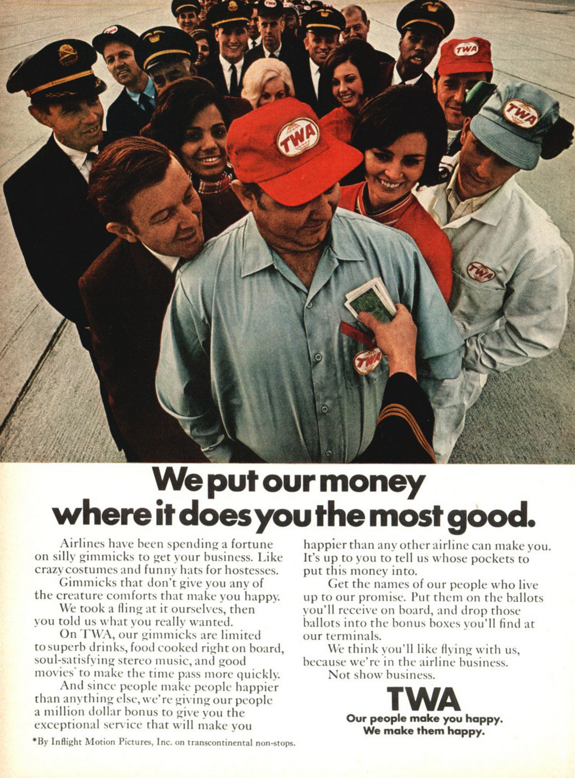
Having set the idea up, they cleverly use customer feedback to create ads to show people it’s working.
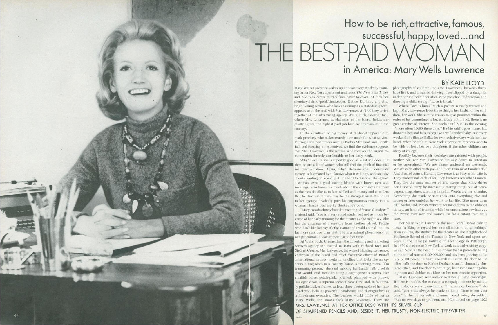
In 1975, New York City was a mess.
Strikes, garbage and murders were grabbing the headlines.
In fact, they lead the world in murders, they were world famous for it.
Plus, they had no money for fix it.
In fact, the government refused to help, hence this famous headline…
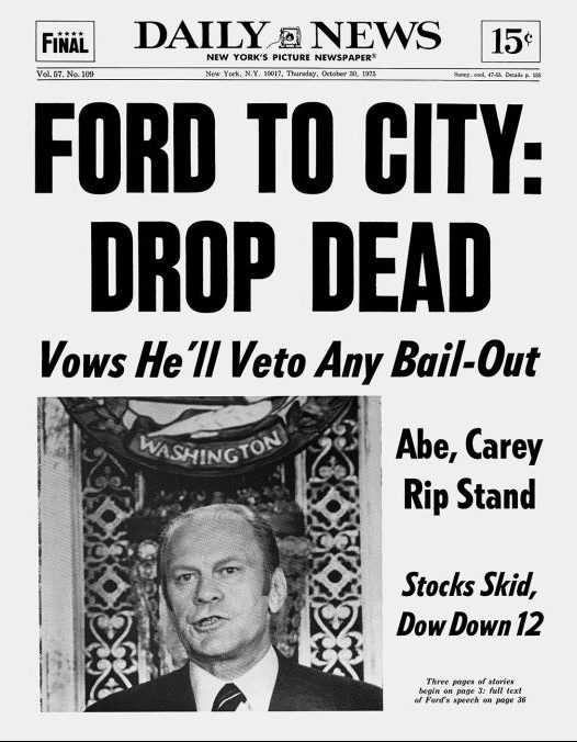
Mary was called in.
After a bit of research, she found that deep down, wherever they were from, people loved the New York.
The idea of New York, not the gritty reality – the spirit of it.
Mary decides the first thing they need is some kind of symbol for people to get behind.
She calls up Milton Glaser.
He’s busy, but they have a meeting in a yellow cab, before he gets out, he’s drawn this.

Which becomes this.
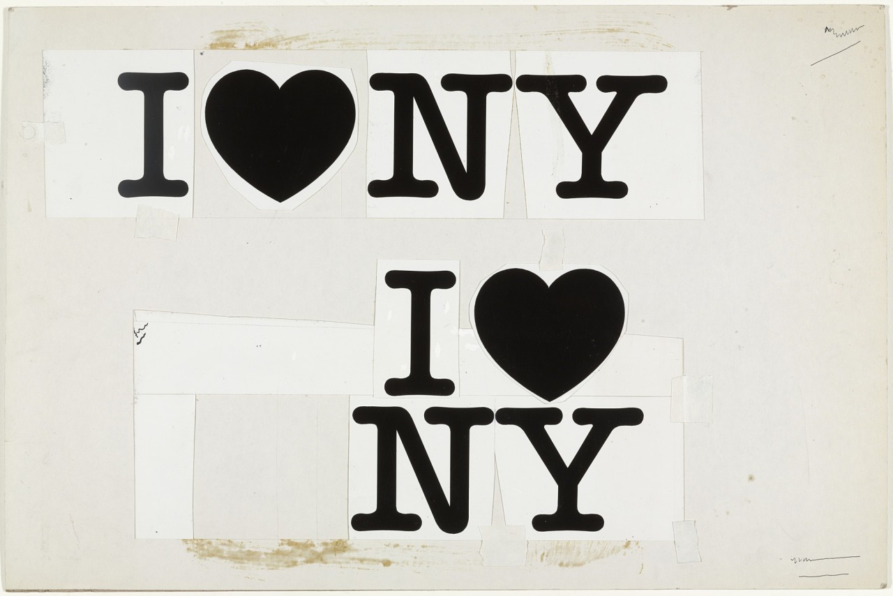
Then this.

Now you have a symbol, you get people to get behind it.
Literally.
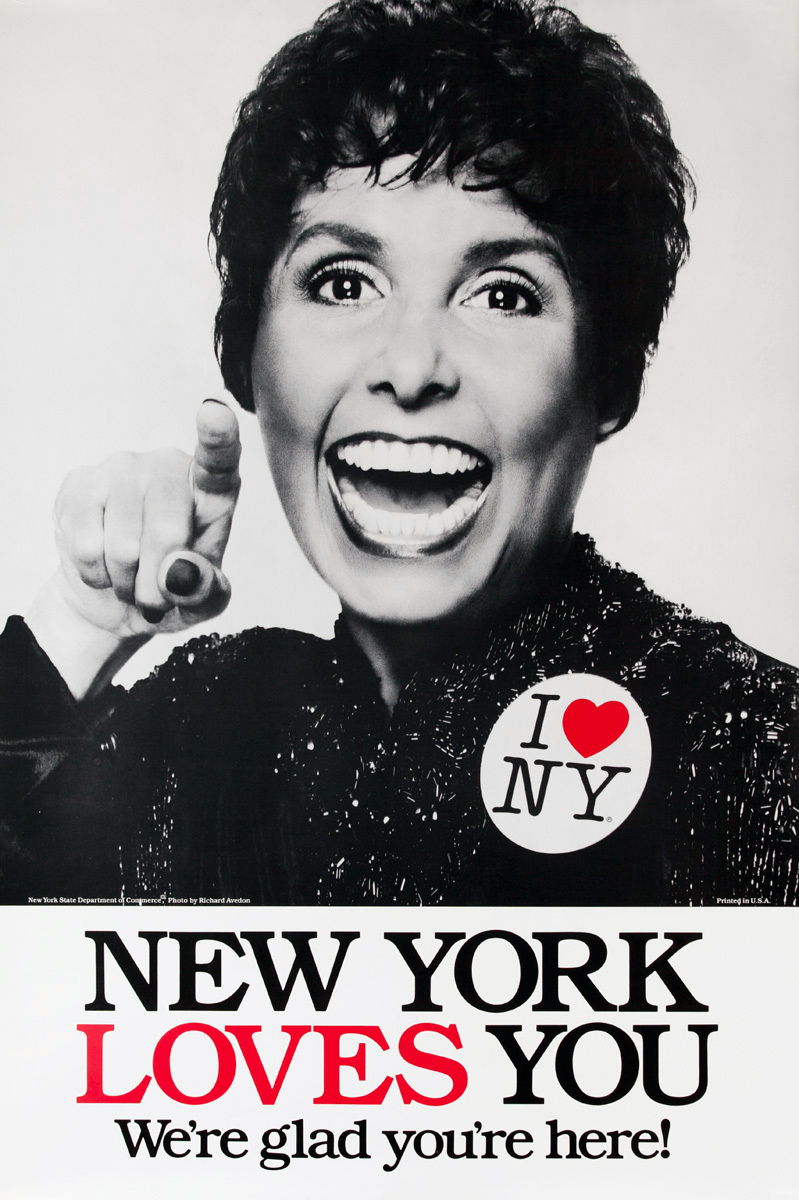
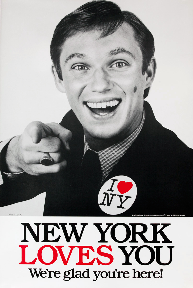
People start declaring their love of NY, the logo begins to pop up everywhere.

On TV, they didn’t apologise, they just celebrated the city.
Who doesn’t remember this?
As it grew into the eighties, Wells Rich Greene seemed to focus more on growth and finance than the work.
It’s hard to find any of their work from this period, mainly because it’s not in any awards shows.
Like rock stars, if you die at your peak your reputation lives on.
Get rich, fat and start producing uninspiring work and people forget how great you once were.
work, you get forgotten, (no matter how groundbreaking your early stuff may have been).
It’s a shame, because for about a decade – Mary rocked.
Creating the kind of integrated, 360°, media-neutral, big, famous campaigns that every agency would dream of doing today.
But she did it 46 years ago.
MORE MARY…


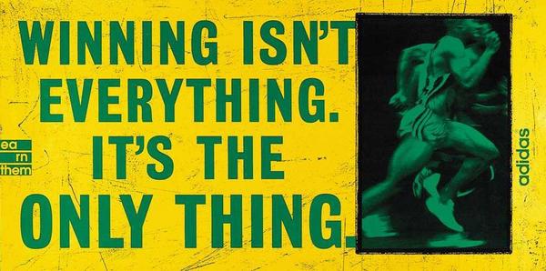
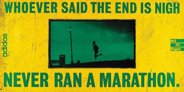
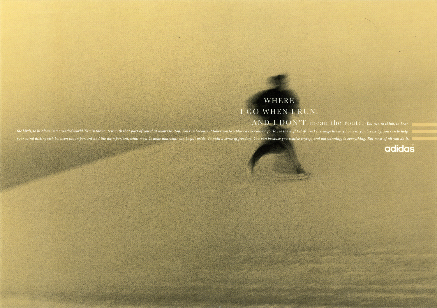
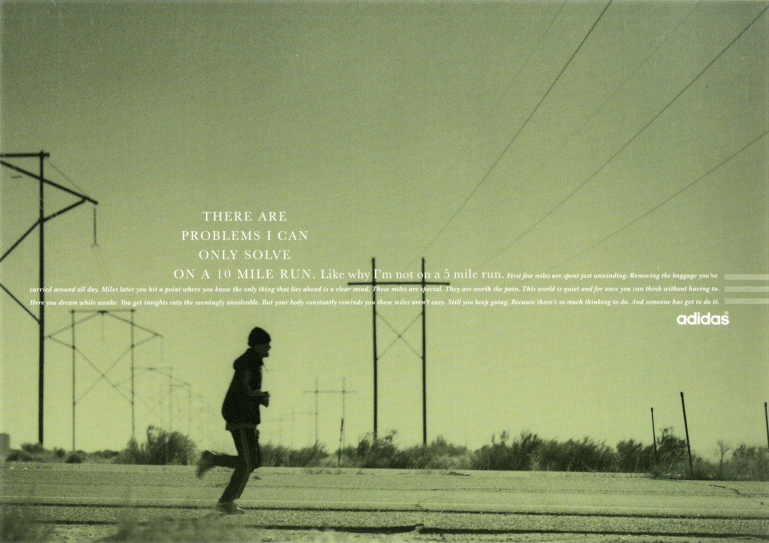
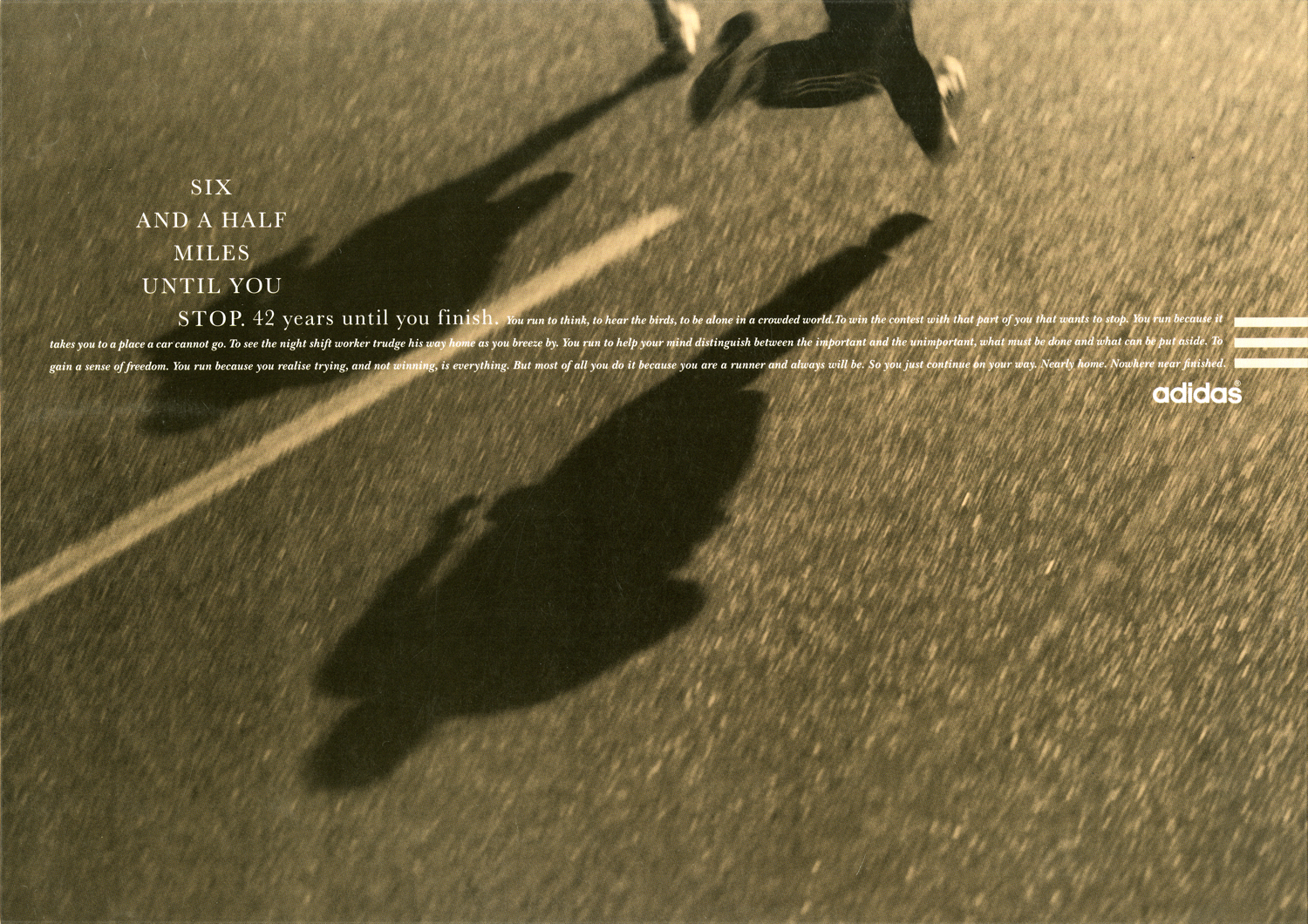
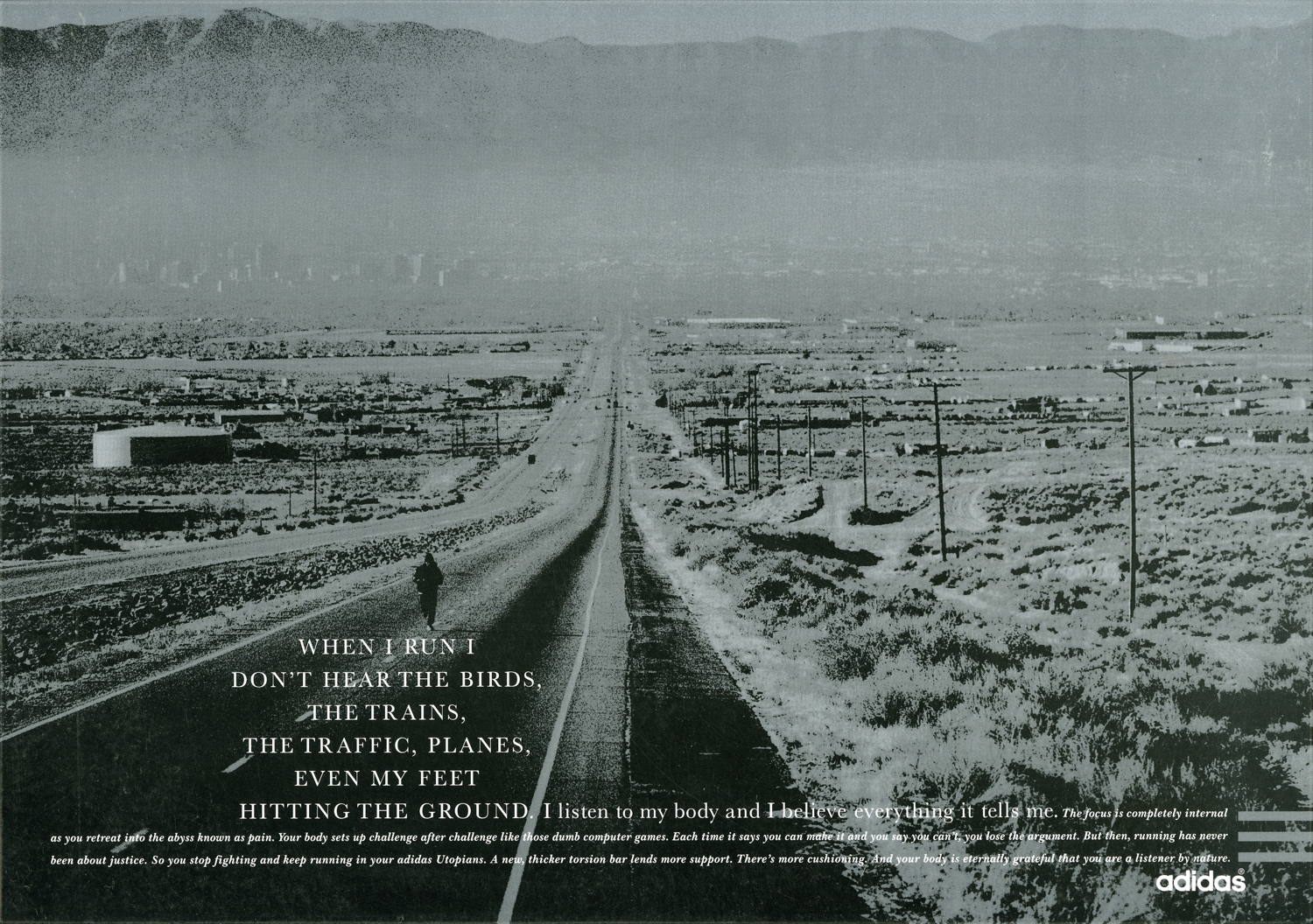
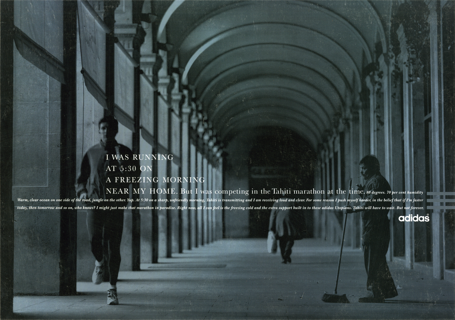
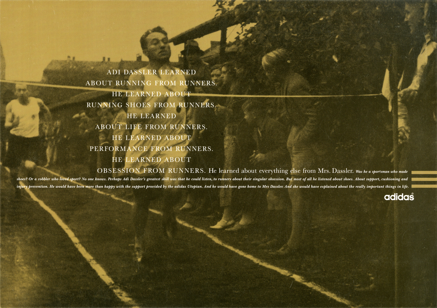
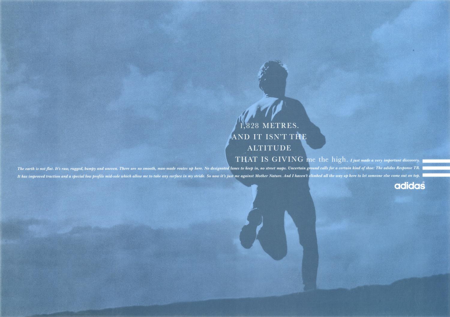
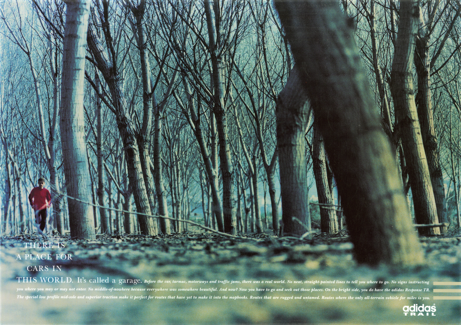
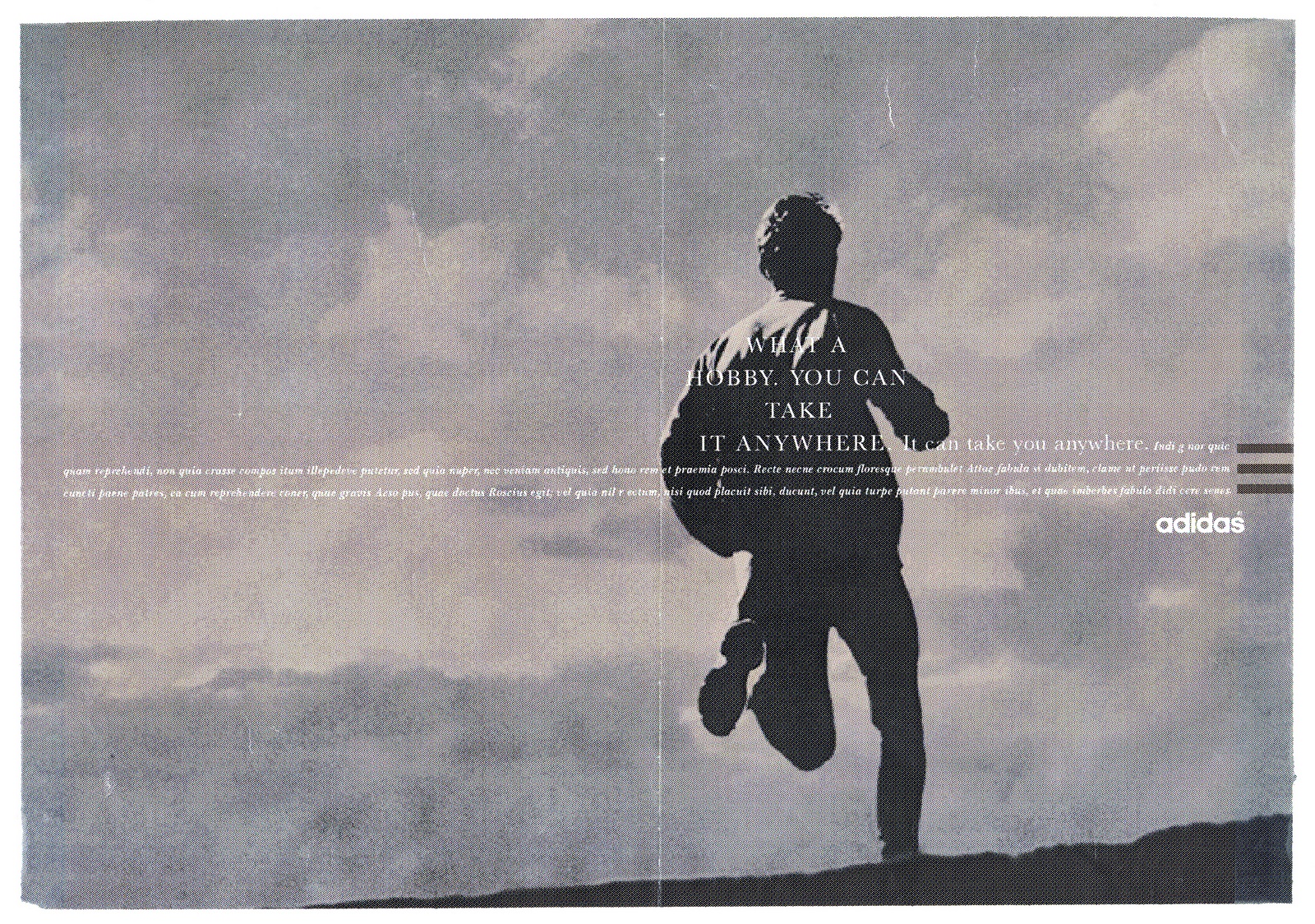
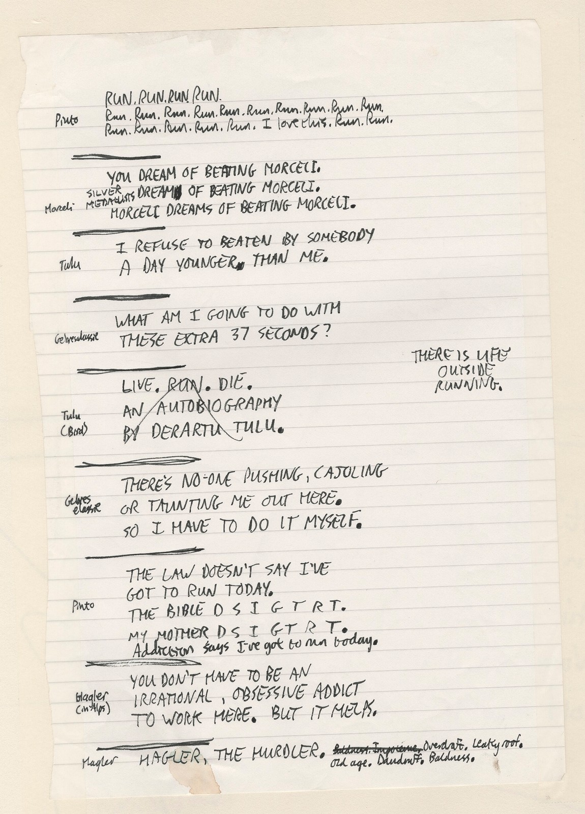
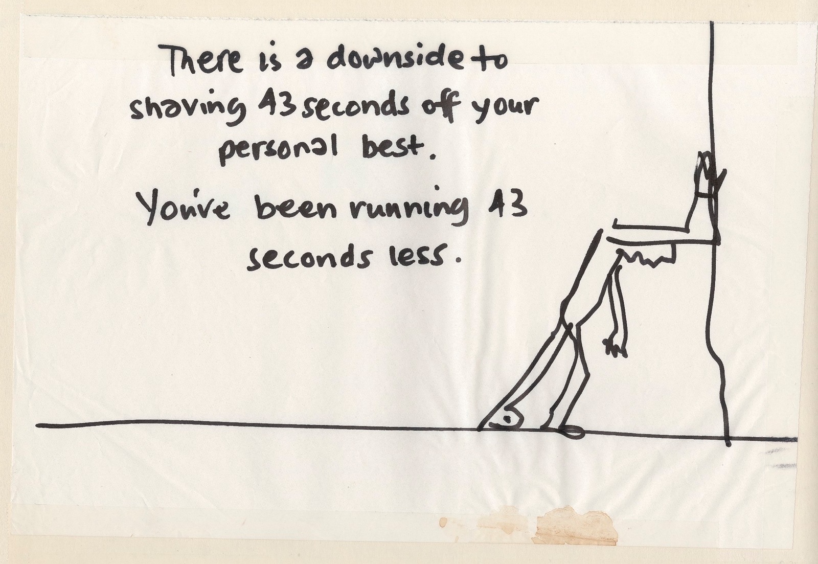
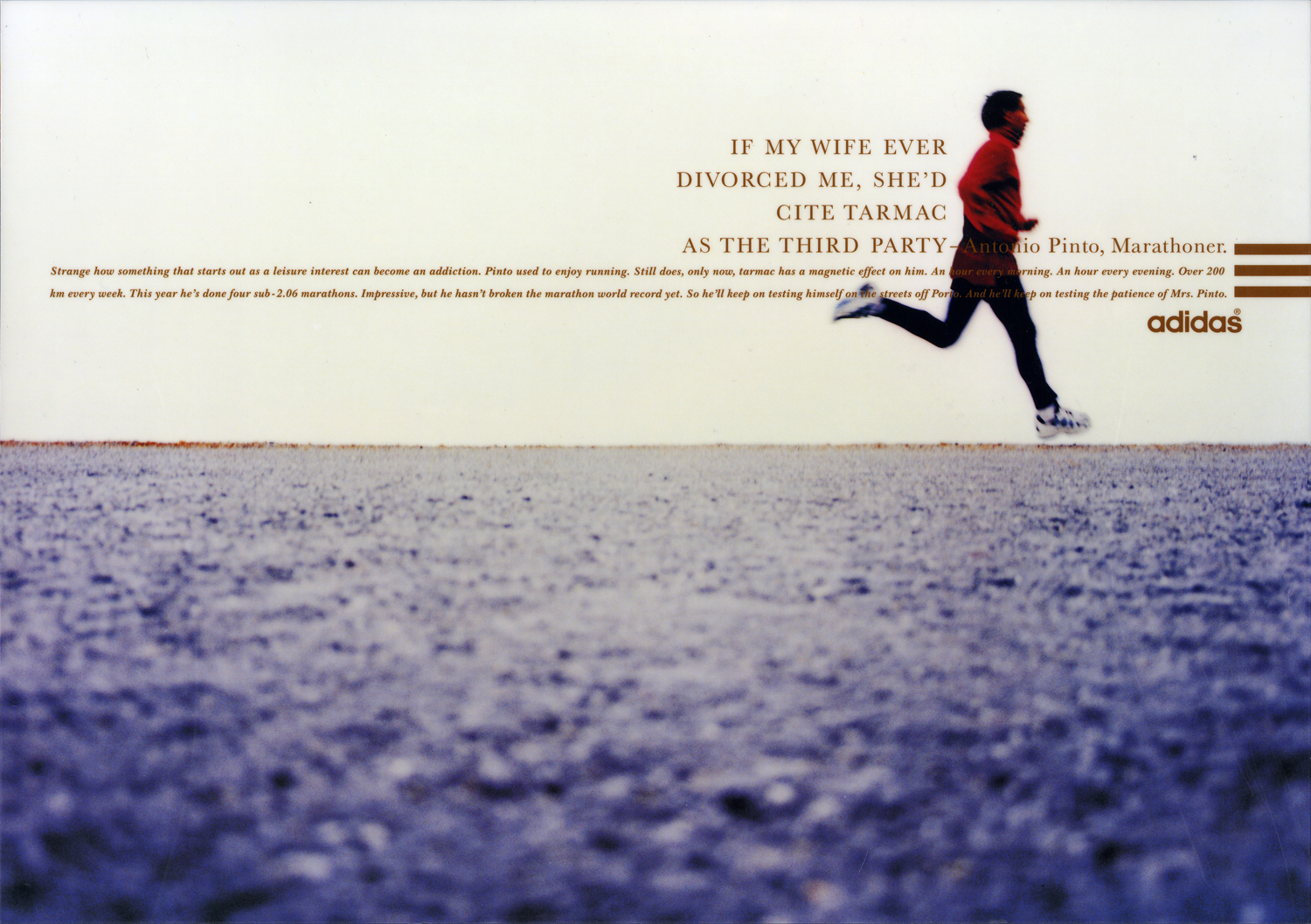
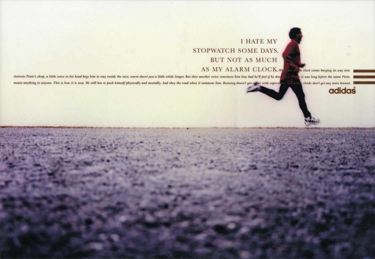
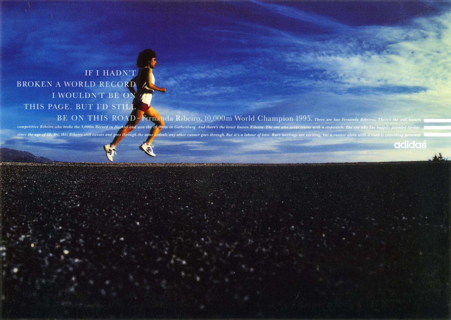
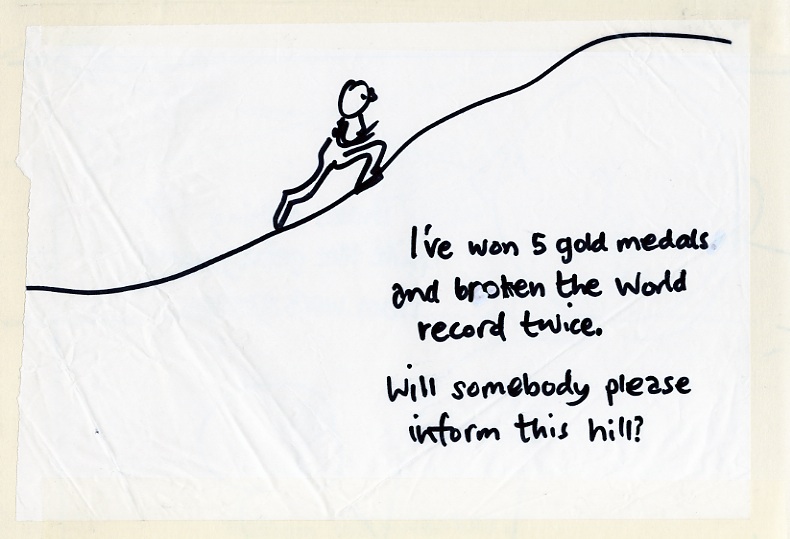
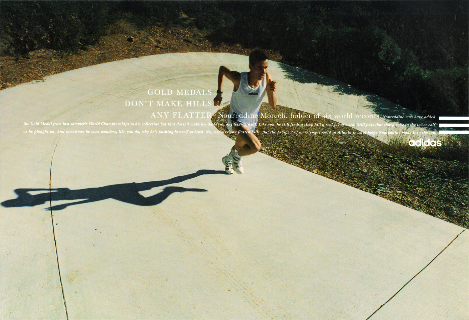
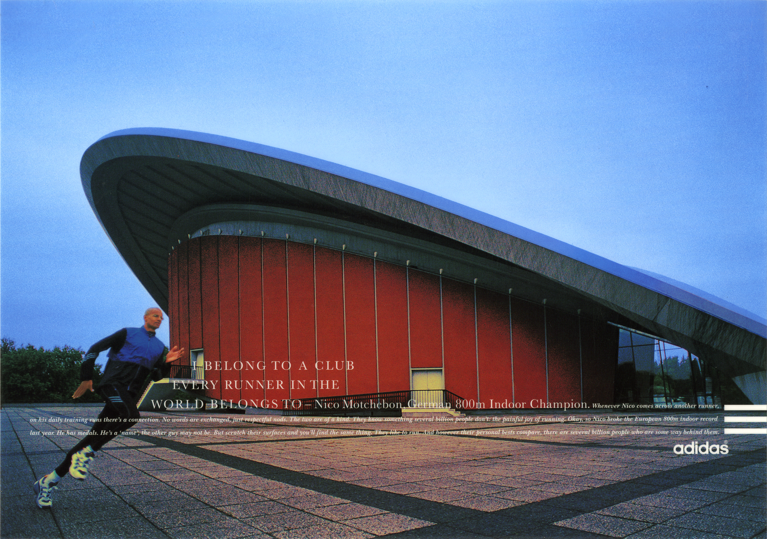
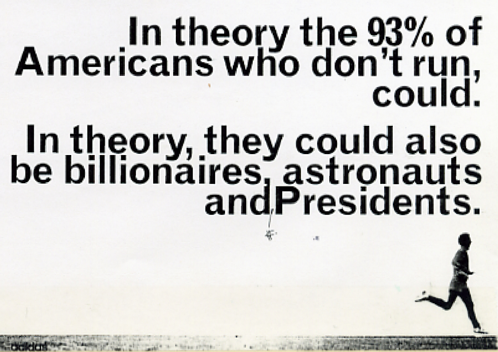
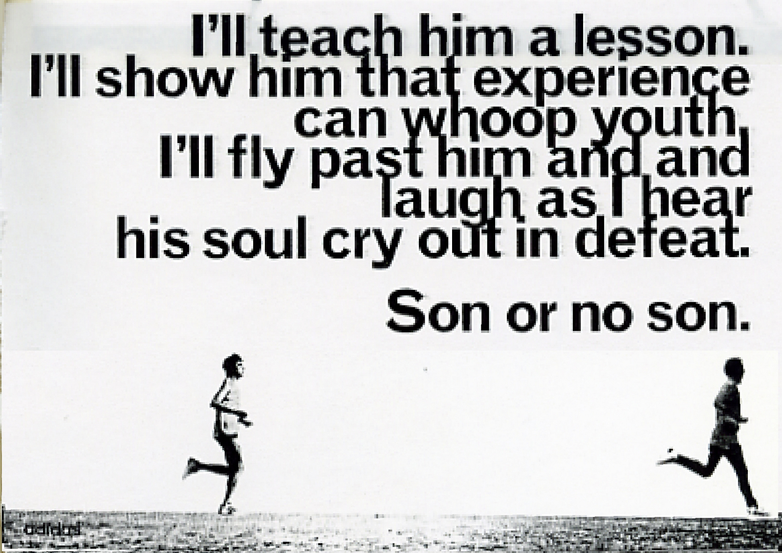
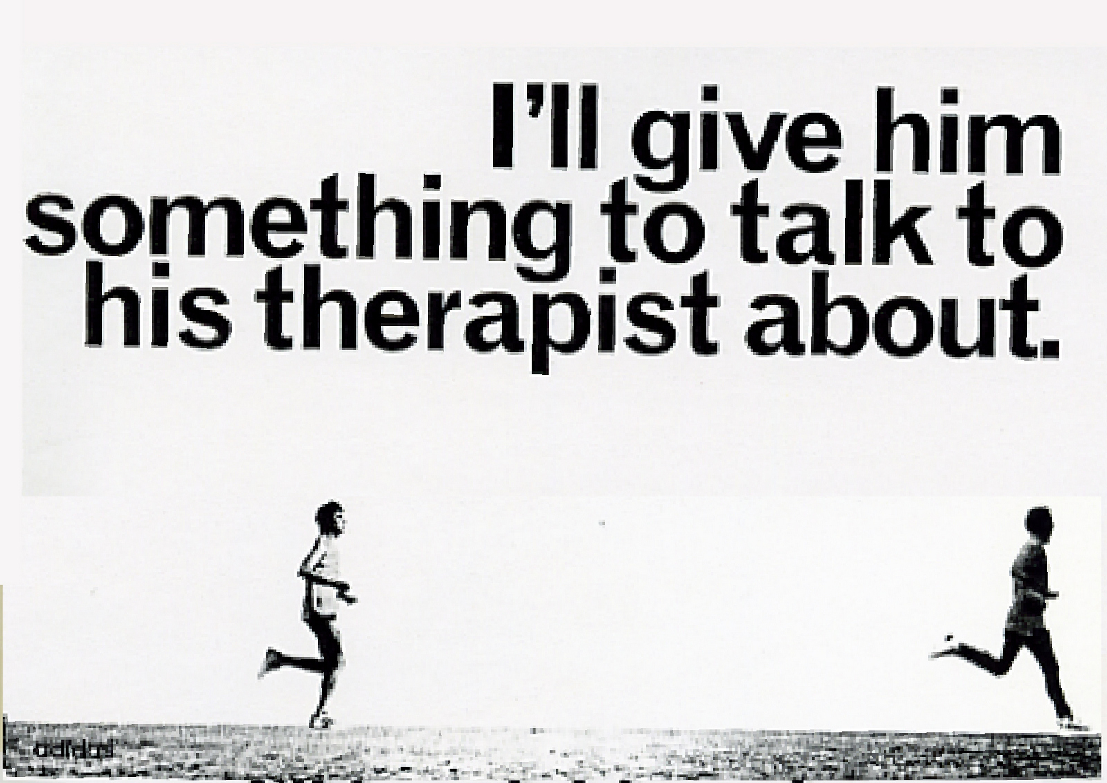
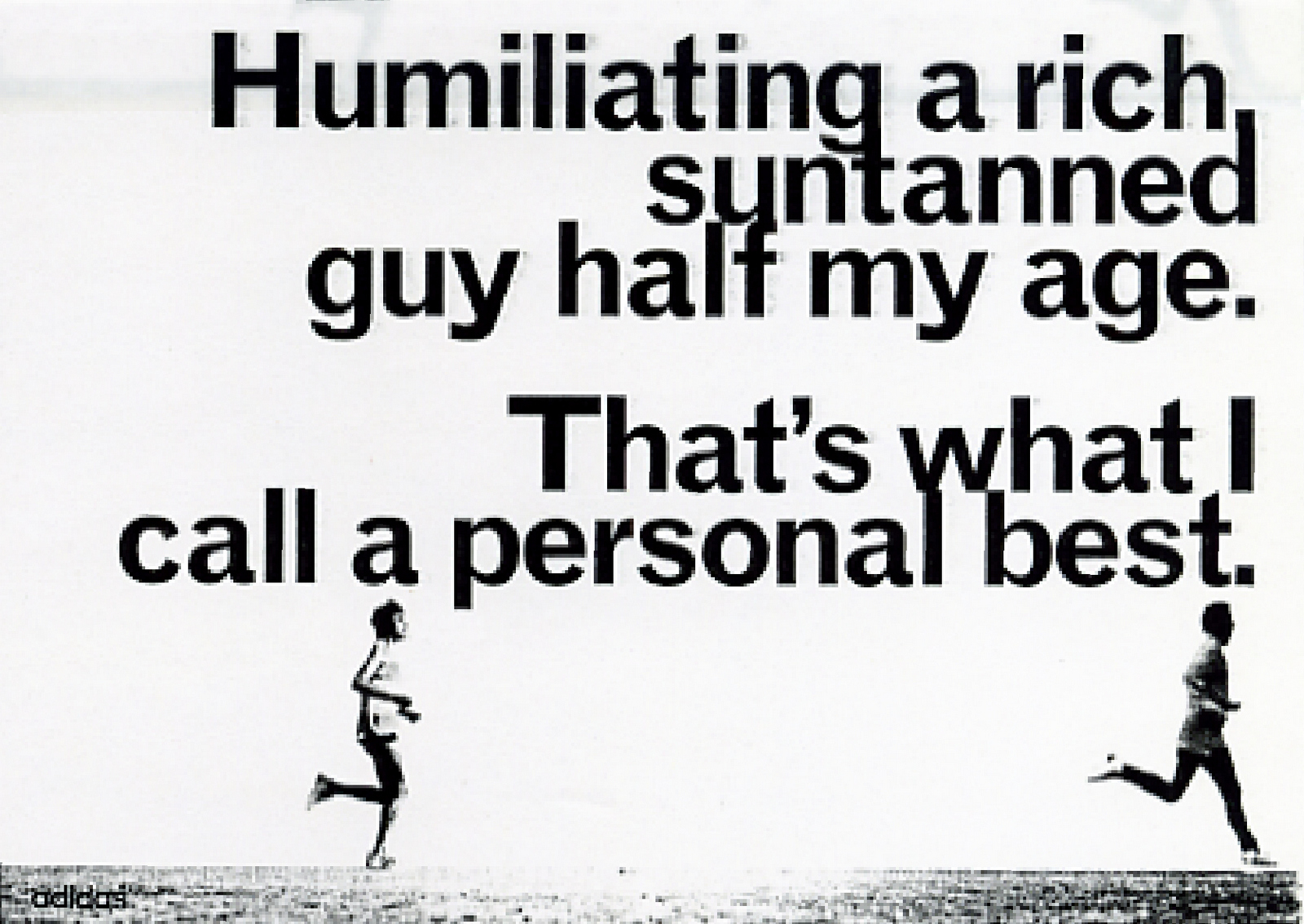
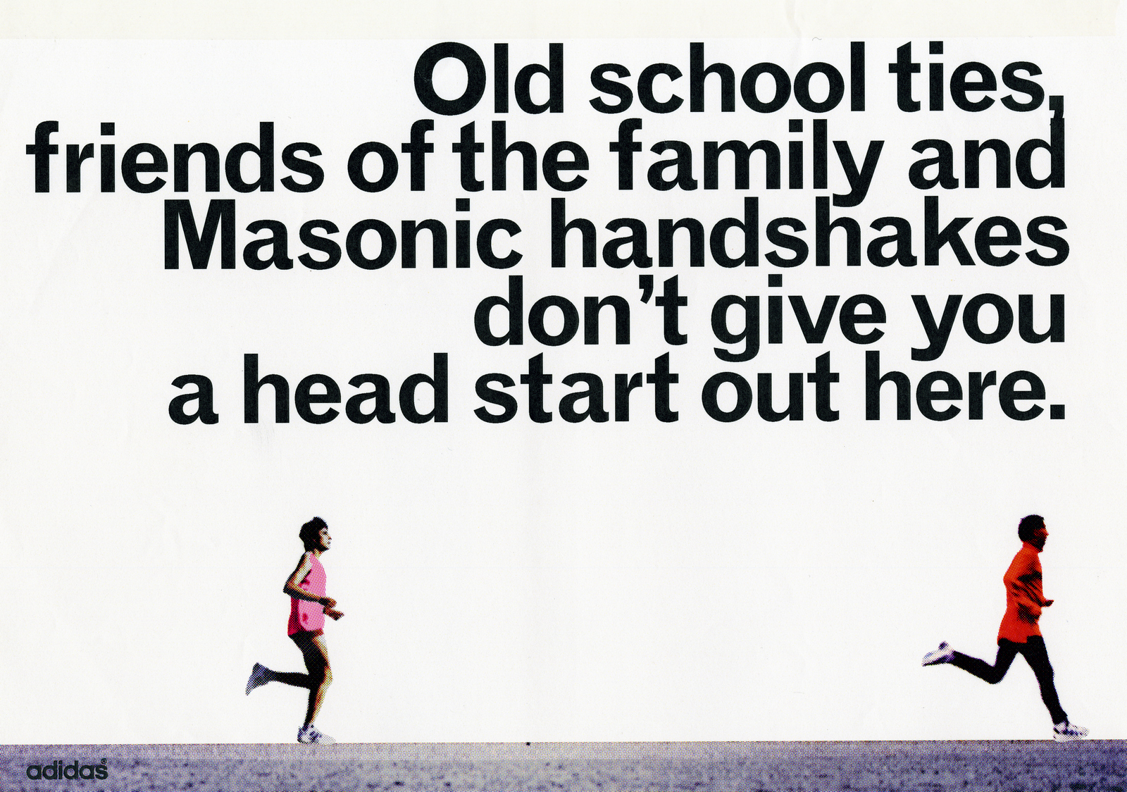
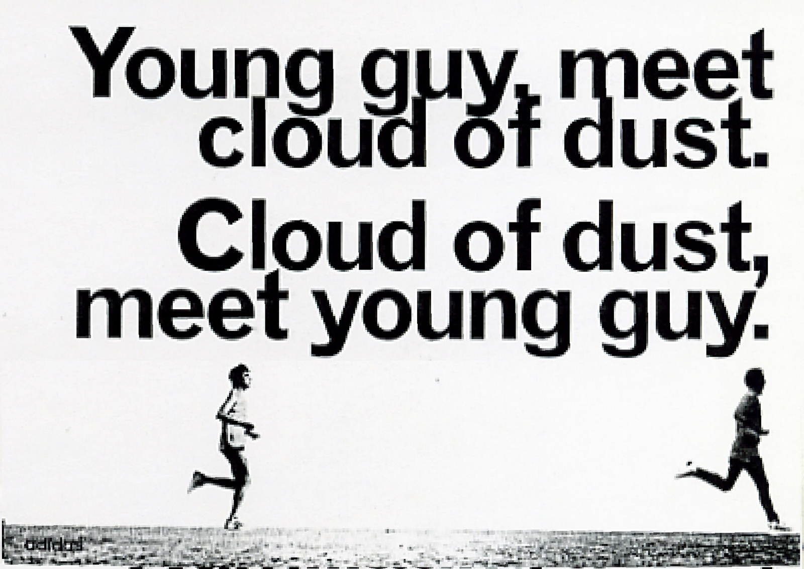
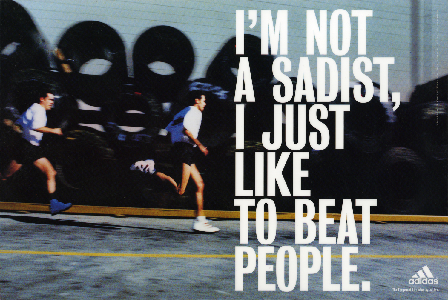
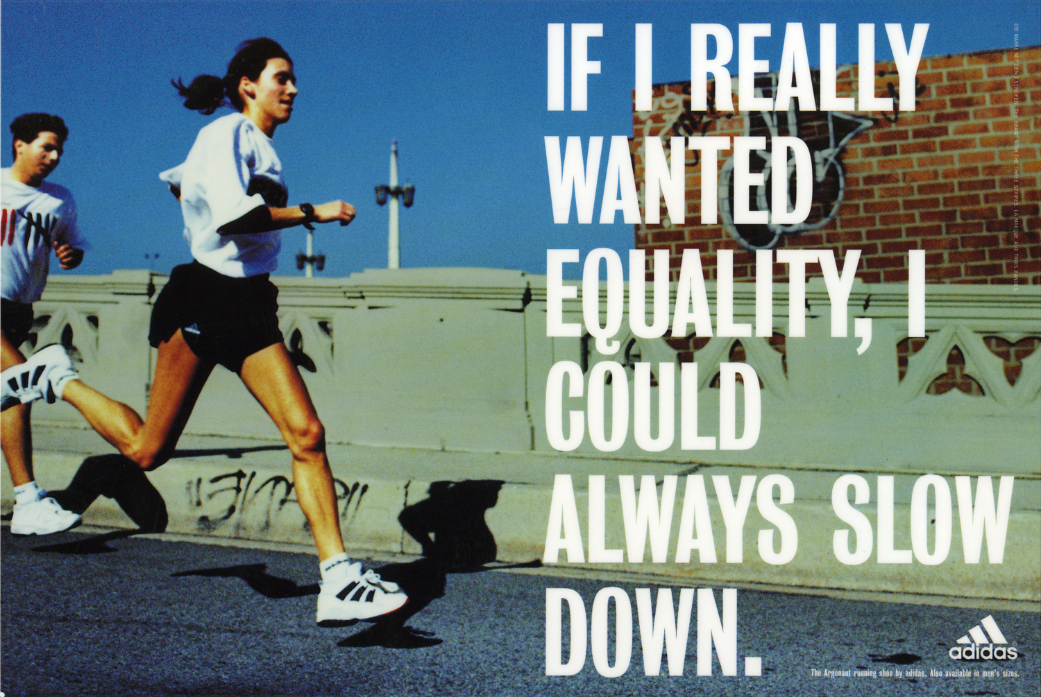
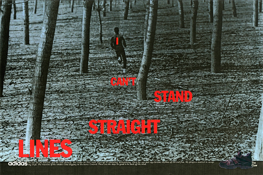
These were the first Adidas ads I did.Loud, aggressive and very yellow. I wasn't a big fan of the look that had been created at the time, I felt it killed the images and came over like Nike, only less sophisticated. (To be fair, they stand up surprisingly well today.) I got the chance to break away from this style with some running ads Tim Delaney had written. It helped that he’d written ads that were tonally very different from the previous work, instead of the testosterone-fueled attitude and swagger we’d all got used to writing, he’d written much more introspective lines, essentially runners’ thoughts on running. Whereas the brash ads were fine for sports like football or even tennis, it didn’t fit sports that were more introspective, like running. As a runner, I’d always thought that Wieden Kennedy Portland’s ads really got runners. Like the one below, probably my favourite running image, shot by Joel Meyerowitz.(http://www.pinterest.com/davedye/joel-meyerowitz/)
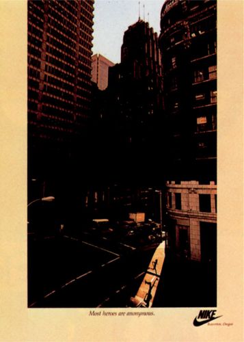
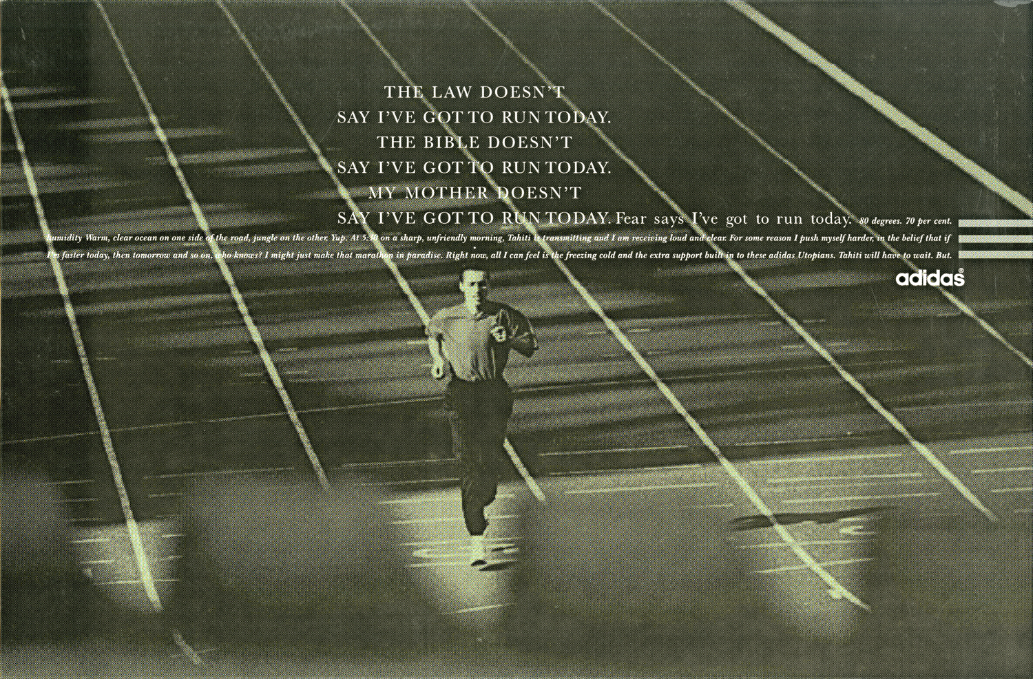
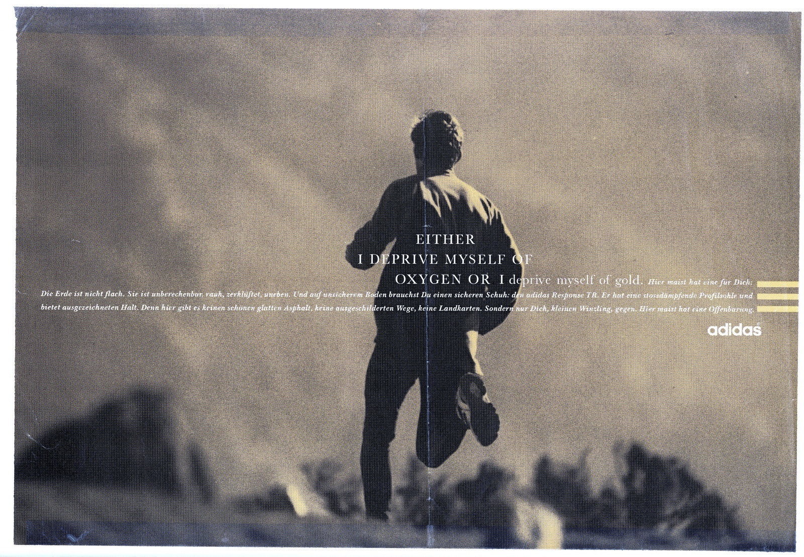
I love that ad. I love its quiet power. I love the tiny little runner, even though he’s dwarfed by sky scrapers your eye goes straight to him. I love the idea of celebrating the anonymous hero who puts in the miles day in day out, that is running. I love that the runner is a silhouette, he’s unrecognisable so you put yourself in his shoes.I thought our running ads could feel more sensitive, it would fit these new, more sensitive lines that Tim had written. Tim's mantra at the time was that we needed thoughts that runners would recognise. My writer at the time, Tony Barry, put it like “Tim wants lines that are good for runners and bad for your book”.I tried to make them look 180 degrees the opposite of what Nike were doing at the time. I HAD THREE IDEAS FOR ‘LOOK’. 1. Put the words/thoughts in the heads. 2. Use montages to suggest the runners are thinking. 3. Use three lines of copy to echo the adidas three stripe branding.

BUT THERE WERE PROBLEMS. 1. Putting headlines in heads only worked if the head was big. 2. The montages worked well on faces but not on running shots. 3. On it’s own, the three lines of copy idea was too subtle, (I added bars).
I didn’t want the layout to be a fixed, cookie-cutter style, I wanted the thoughts to be positioned wherever the runner is. So the layout was based on two sliding scales:a) Headlines could slide along horizontally, minimising or extending the length of the first line of copy, to be positioned by the runner.b) The block of type could slide up or down to be positioned by the runner.
These two didn’t run.
I did the next batch with the writer Dave Hieatt of Howies, Hiut Denim and ‘The Do Lectures’ fame.
Dave left.I wrote a couple myself. They didn’t run.
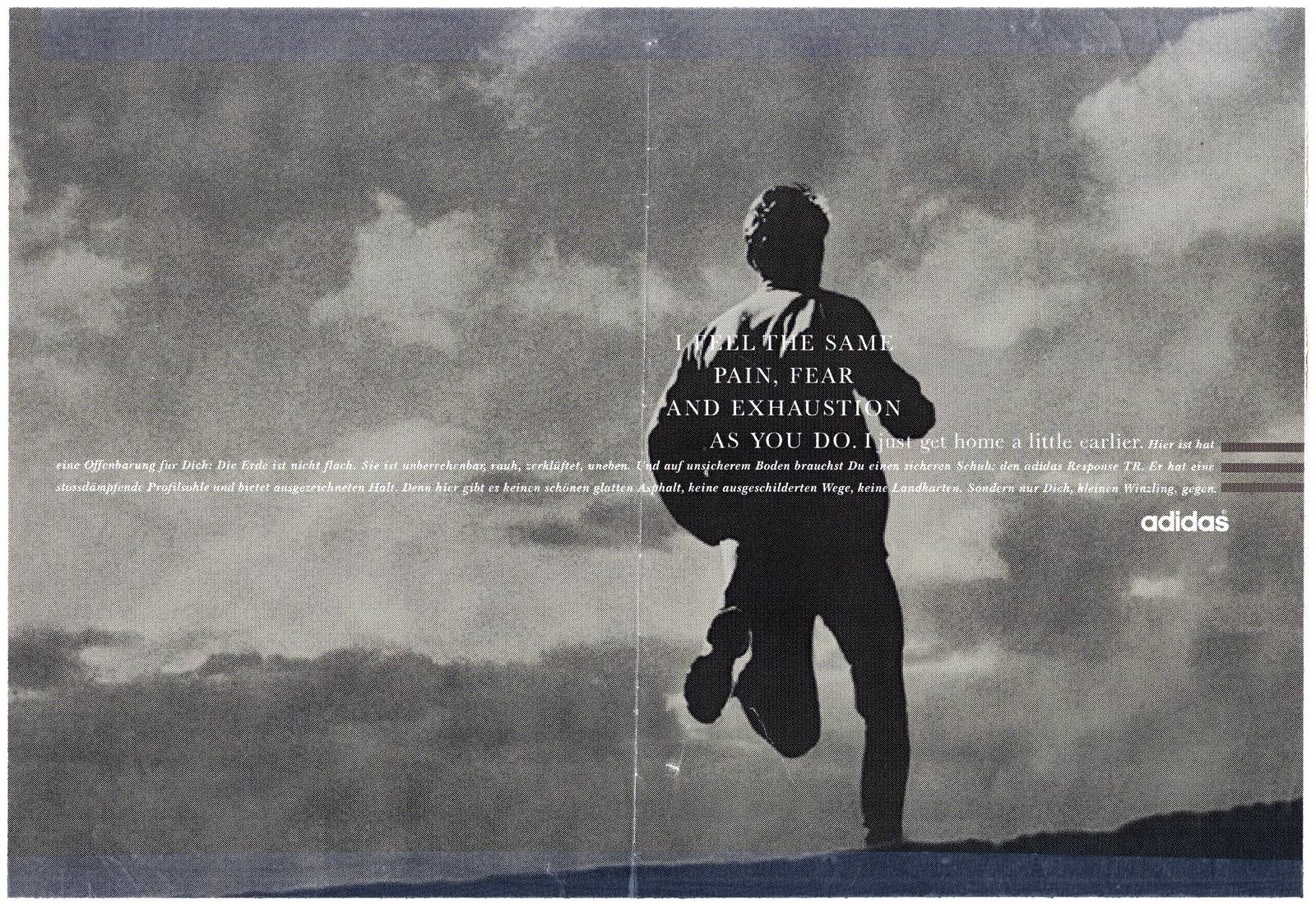
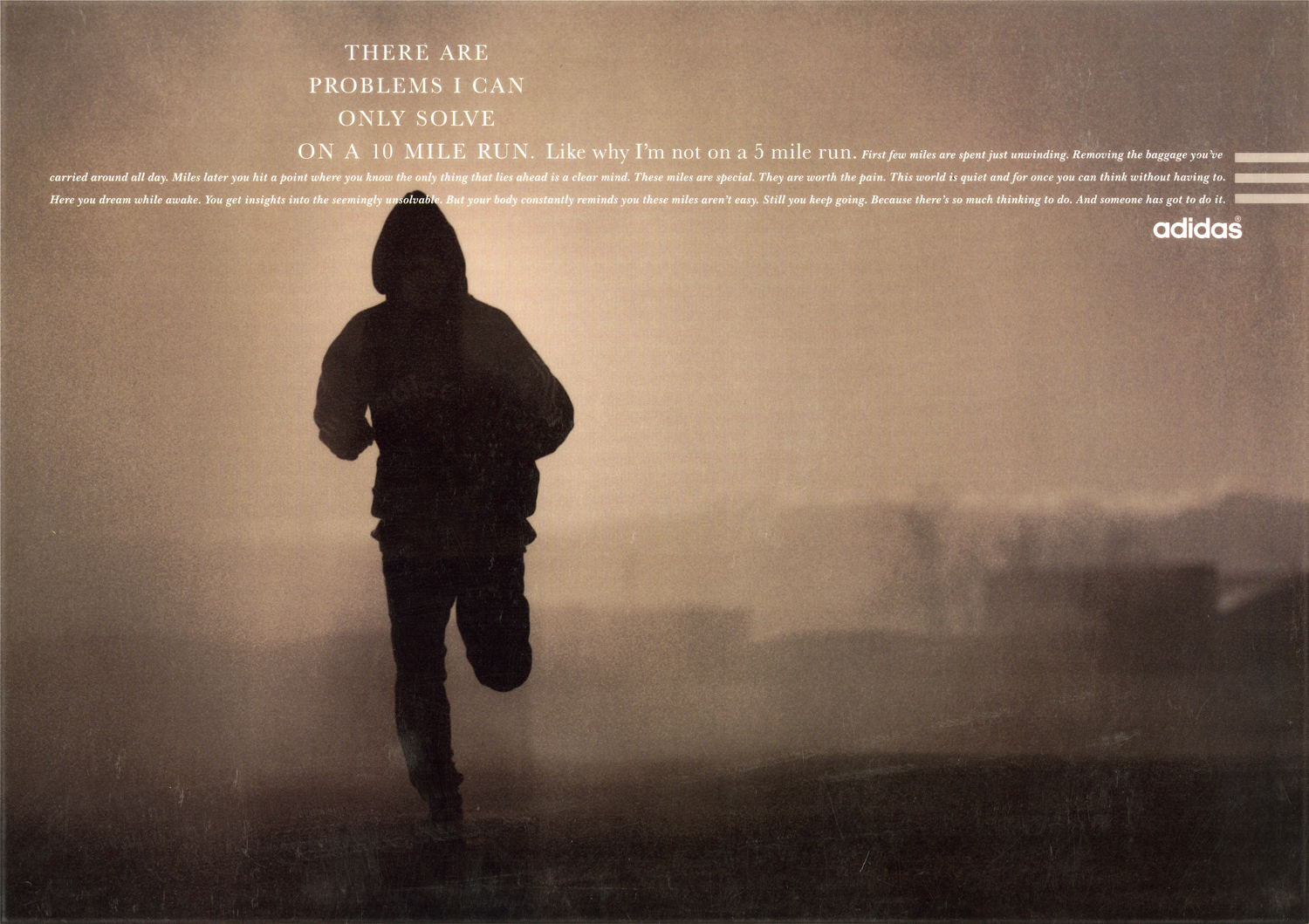
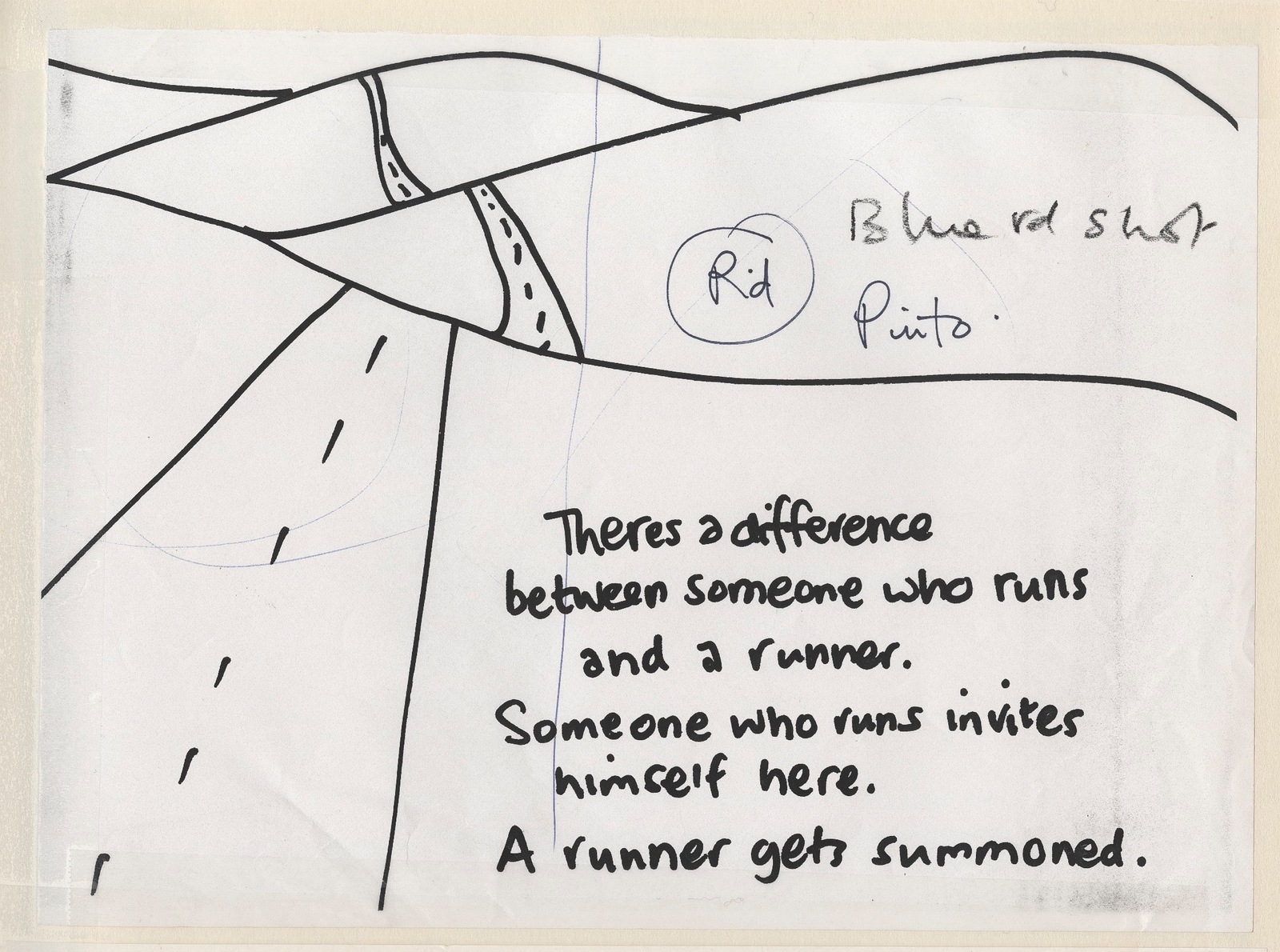
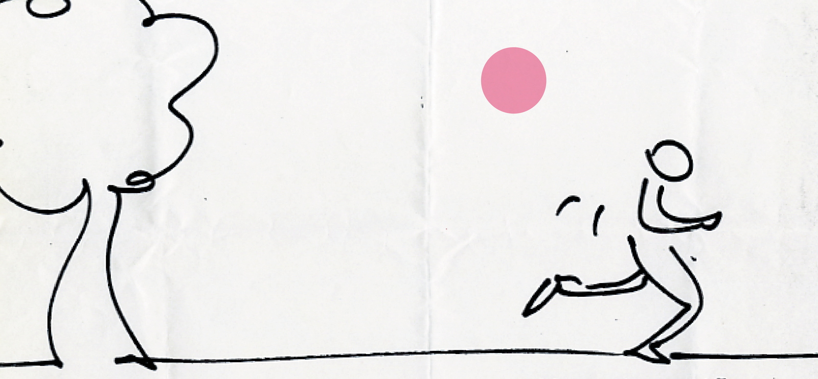
Then, I had an idea for a one that was more personal, not a word play or a clever headline.In fact, it’s not really a headline at all, it was just an idea relaying what I went through when I ran around Regents Park with my mate Mike McKenna. We’d run drag ourselves around by agreeing we’d stop when we got to the gate. When we got to the gate we'd say we'll stop when we got to hut.Kind of tricking ourselves around the park. I showed Tim: “No...runners don’t do that”. To be fair, Tim probably saw a hundred ideas a day, also, look at the state of the rough I showed him:
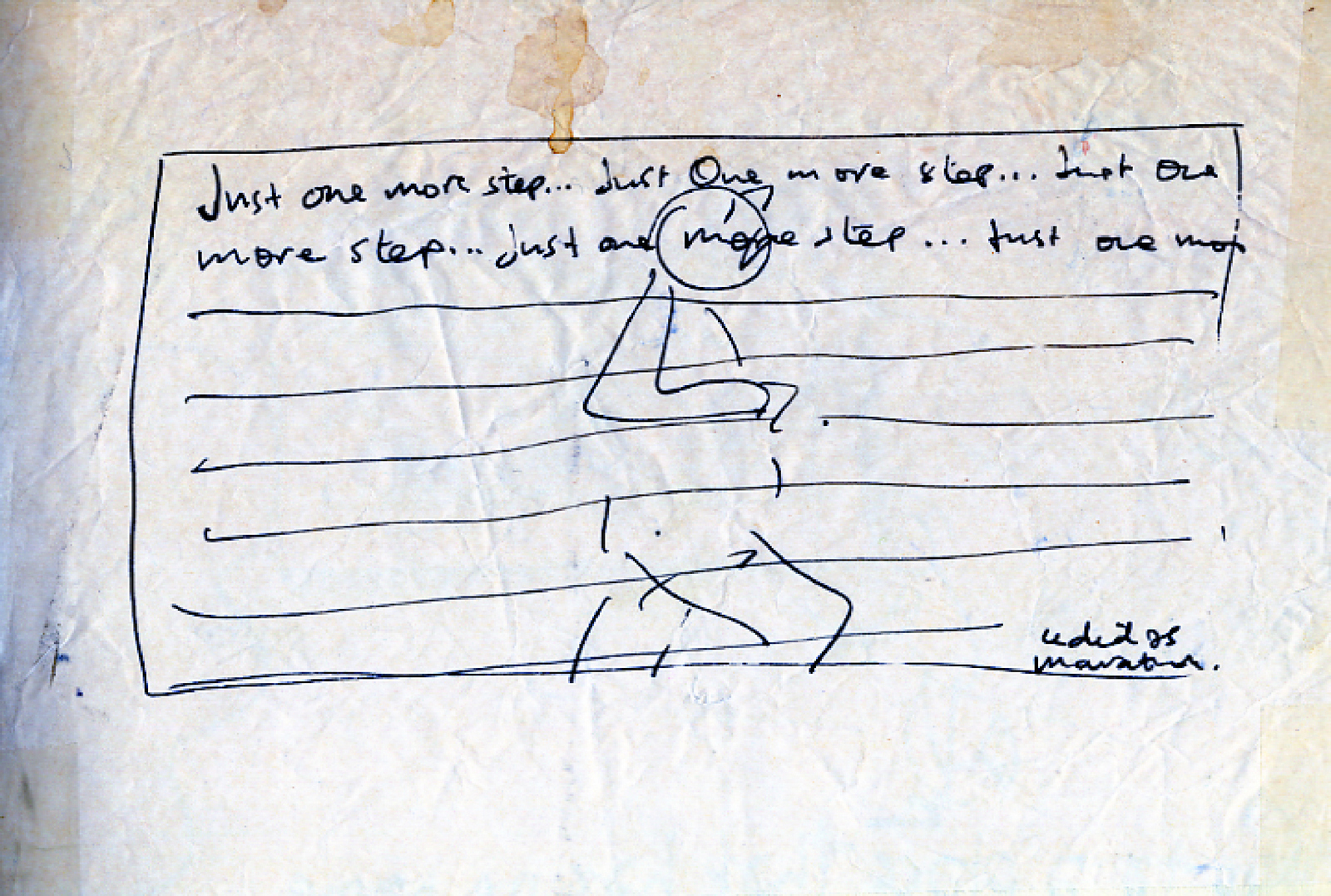
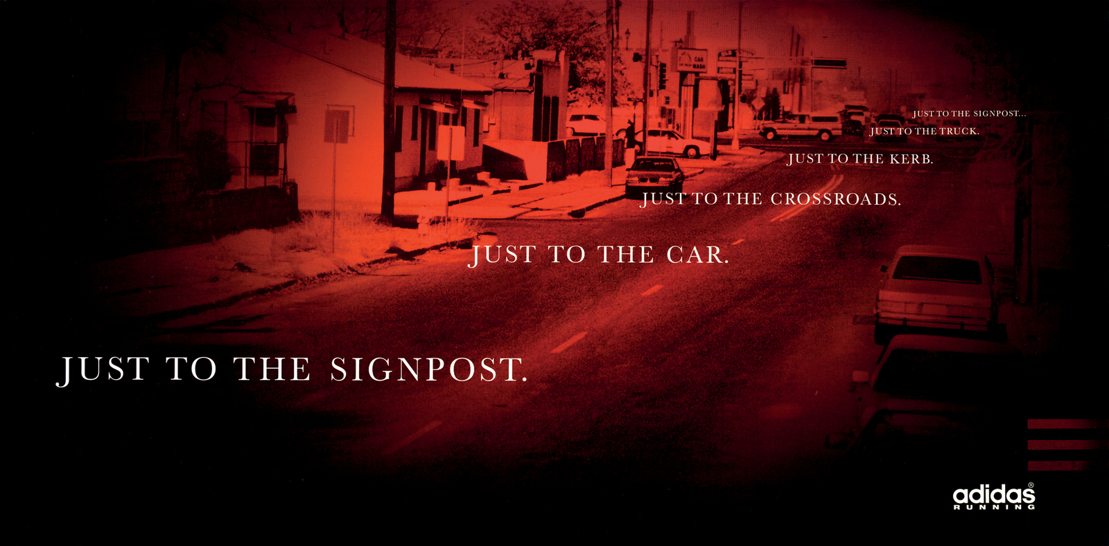
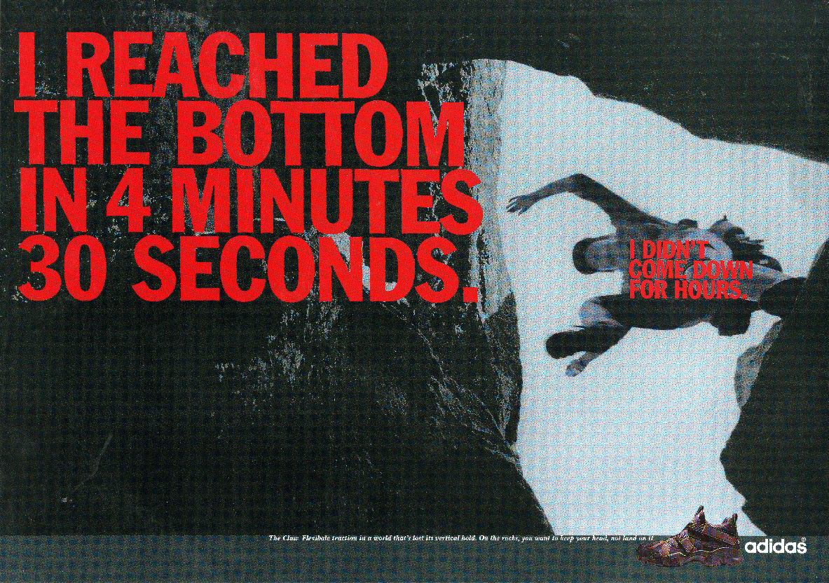
We always showed the roughest, scuzziest of scamps at Leagas, it was almost showing respect; we know you’re not going to be fooled by fancy drawing and neat writing. I wrote some more ideas but came back to the Regents Park idea, surely other people must do that too? I checked with a couple of other people in the Creative Department “Ever do that thing when you’re running where you say to yourself you’re going to stop at a certain point, then keep going point, then to another point?” Most said yes. I went through the draw of Douglas Brothers prints in the basement, looking for a shot I could use to mock-up the Regents Park idea. I found one that kind of worked if I retouched out the cars.I rarely argued with Tim, I figured he’s the boss, if I don’t like what he says I should work somewhere else.This time I started winding myself up, “I run, he does’t run. Also, I’m Head of Art, can’t he take my fucking word on one poxy ad? I’ve art directed all his ones about poetry and dreaming, what’s the point of being here if he’s not going to listen to a word I say?”. I queued up outside his office, he always had a queue. By the time I got to his office I was ready for a fight.“Tim, Yeah...it’s about this ad...I think we should run it...”Tim: “Ok.”“Because if you’re not even...” I left furious, like a tightly wound spring that hadn’t been unwound.But the ad had gone through. The problem was that when I made the words smaller as they trailed off into the distance it really helped the idea, but didn’t look like the rest of the campaign. Also, the three lines of copy, it didn’t need any, what would you talk about? Ignoring the campaign style I’d created seemed a cop-out, like failing.It would also be breaking from a very successful campaign, the ten previous ads had all got into D&AD. BUT...this idea didn’t work in that format. Sod it! I broke away from the format, you have to be lead by the idea. I changed the colour from the previous muted, pastelly colours to bright, flaming red. To make it look hot and sweaty. At the last-minute I put a very heavy vignette around the image to focus the eye down the street, as if the runner was purely focussed on the point they were trying to get to.
The others I did seemed a bit ady by comparison.
COLOUR.The client demanded it.
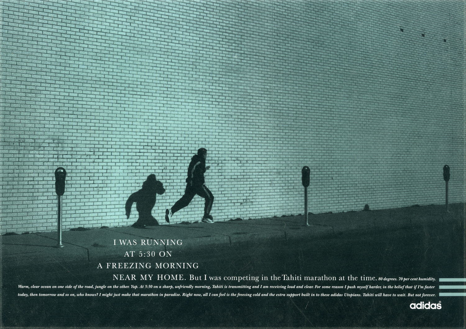
I also began trying to get into that runner’s mindset with my brand new, non-running, writer; Sean Doyle.
We liked this one.
Then a later in the magazine it appeared again.
“Runners don’t watch films like that”.We went back to our office to imagine what films Tim thought runners were watching: ‘Marathon Man’? ‘Chariots Of Fire’? ‘Cool Runnings’? ‘Midnight Run’? ‘The Loneliness Of The Long Distance Runner’?
We made this one twice, this version for the countries considered sophisticated.
And this one for the less sophisticated parts of the globe.
This idea...
...ended up looking like this.
We had a few goes at the headline on this one too.
Getting a bit cocky, I gave an outdoor moving shot to an indoor still life guy; Mark Mattock. Rather shooting the runner running, he posed him in action pose, like a still life.The results were horrific, contact sheet after contact sheet showed a guy who looked liked he’d been asked to stand in that position.Fortunately, there was one frame that worked, the only one.
U.S. RUNNING.The last running ads I did was for the U.S.
The look started out like this.
By the time they ran they looked like this.
, It felt almost full circle, we’d gone back to a more aggressive headlines, (maybe we thought Americans aspired to that?).We’d also gone back to big, brutal sans serif headlines, making them more like the original yellow and green campaign.Just not as yellow and green.
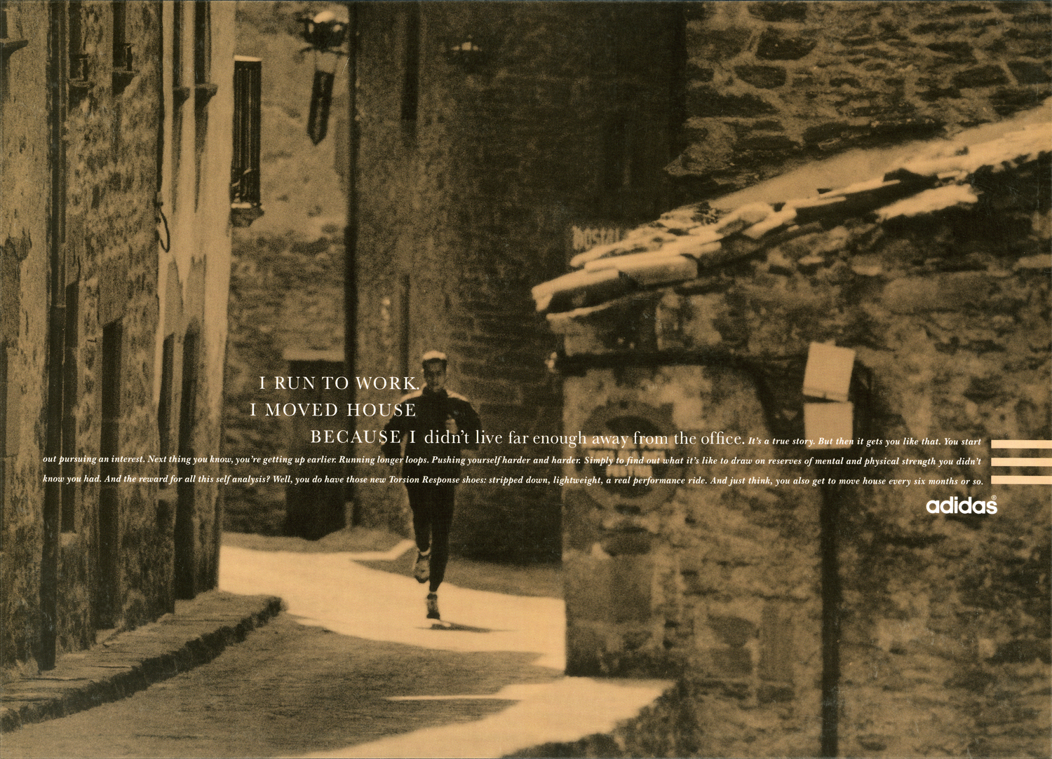
A year or so into Leagas Delaney, I found myself writer-less, Tim threw me together with another loose end; writer Dave Hieatt. Here are a few of the things we did.
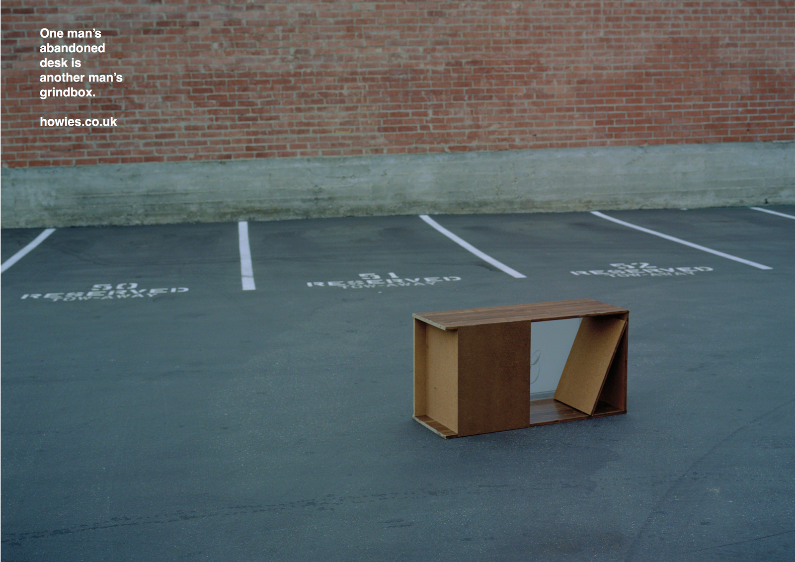
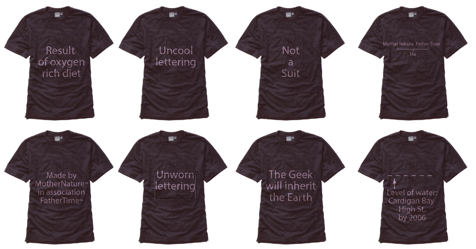
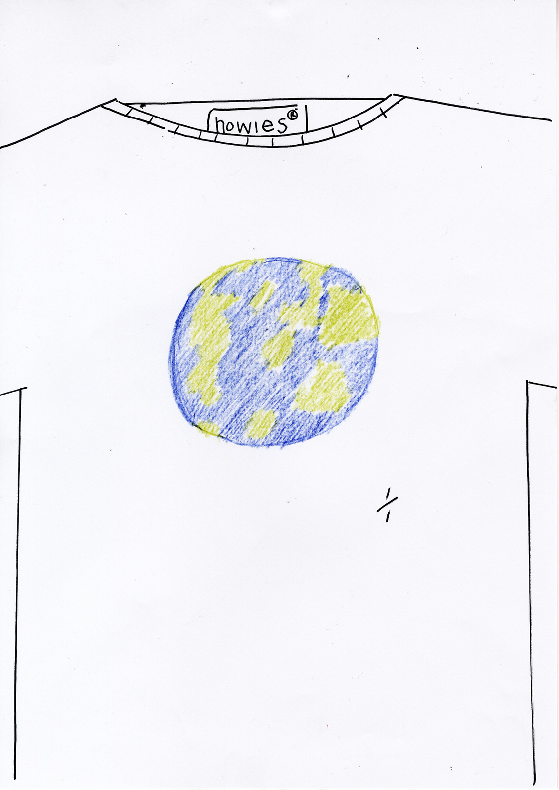
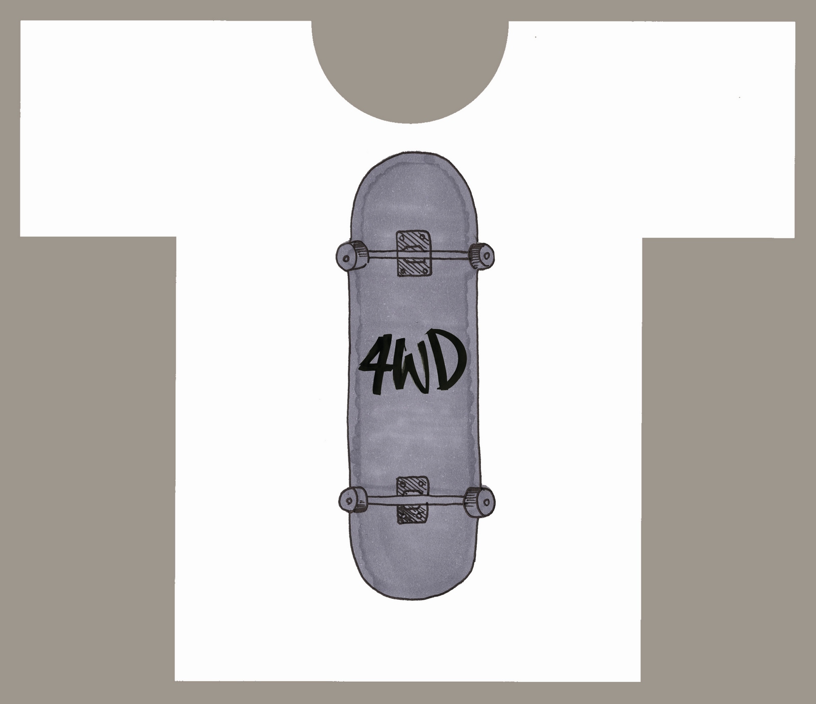
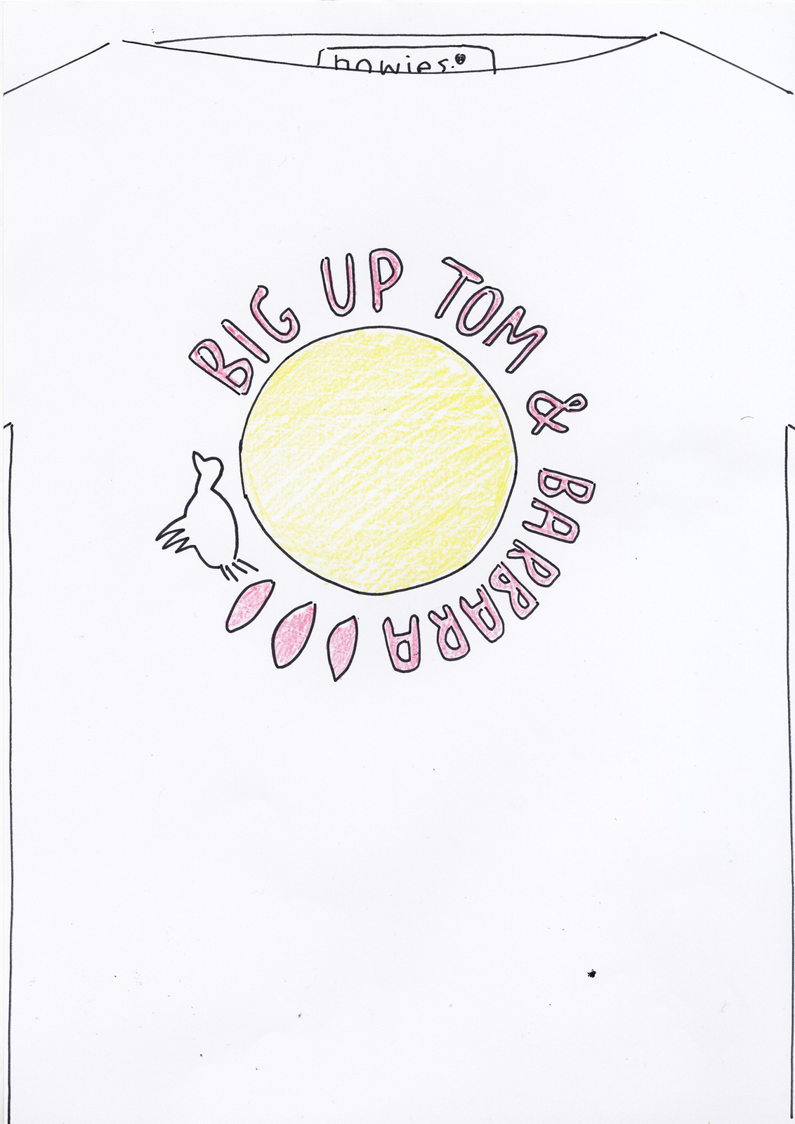
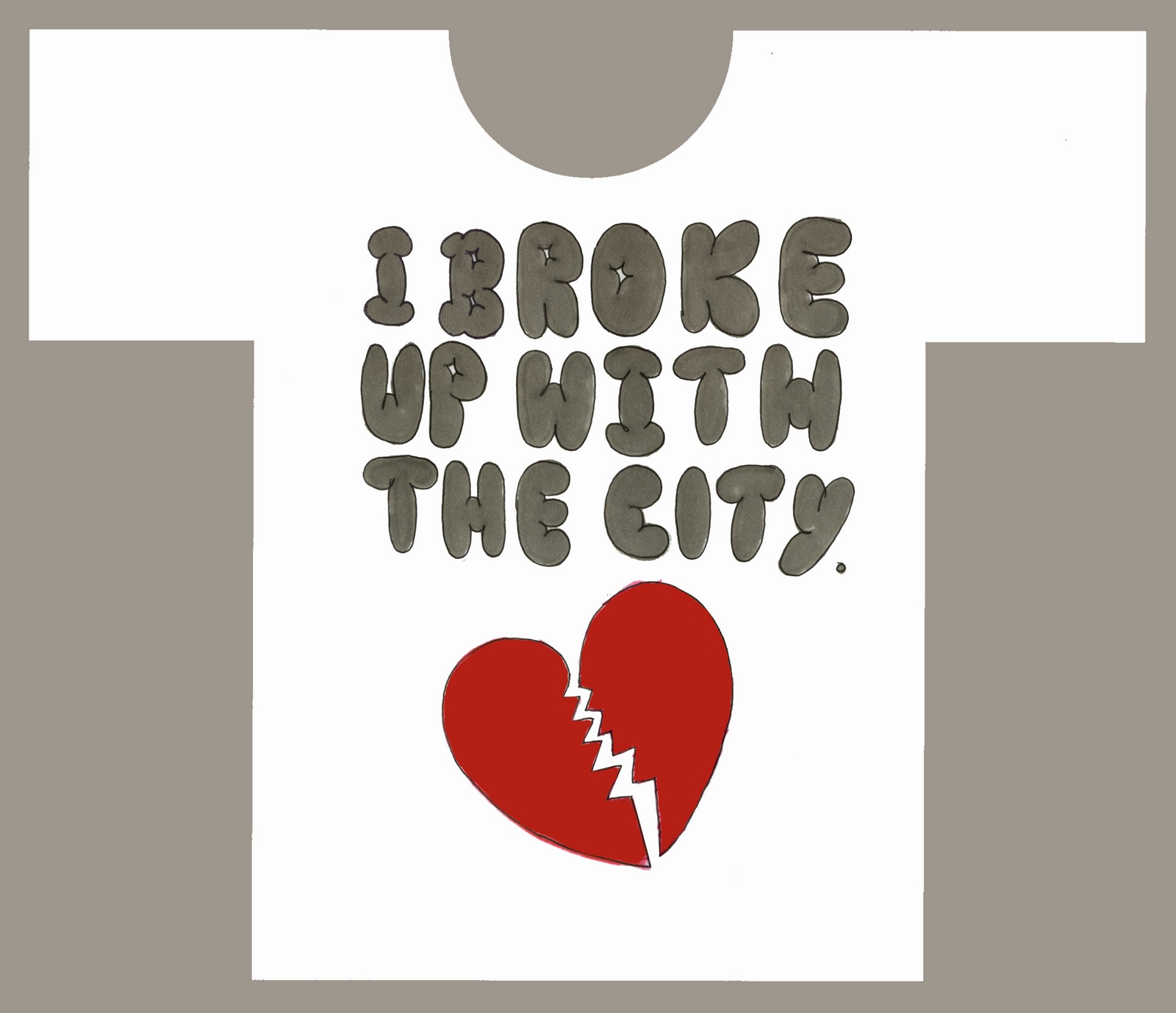
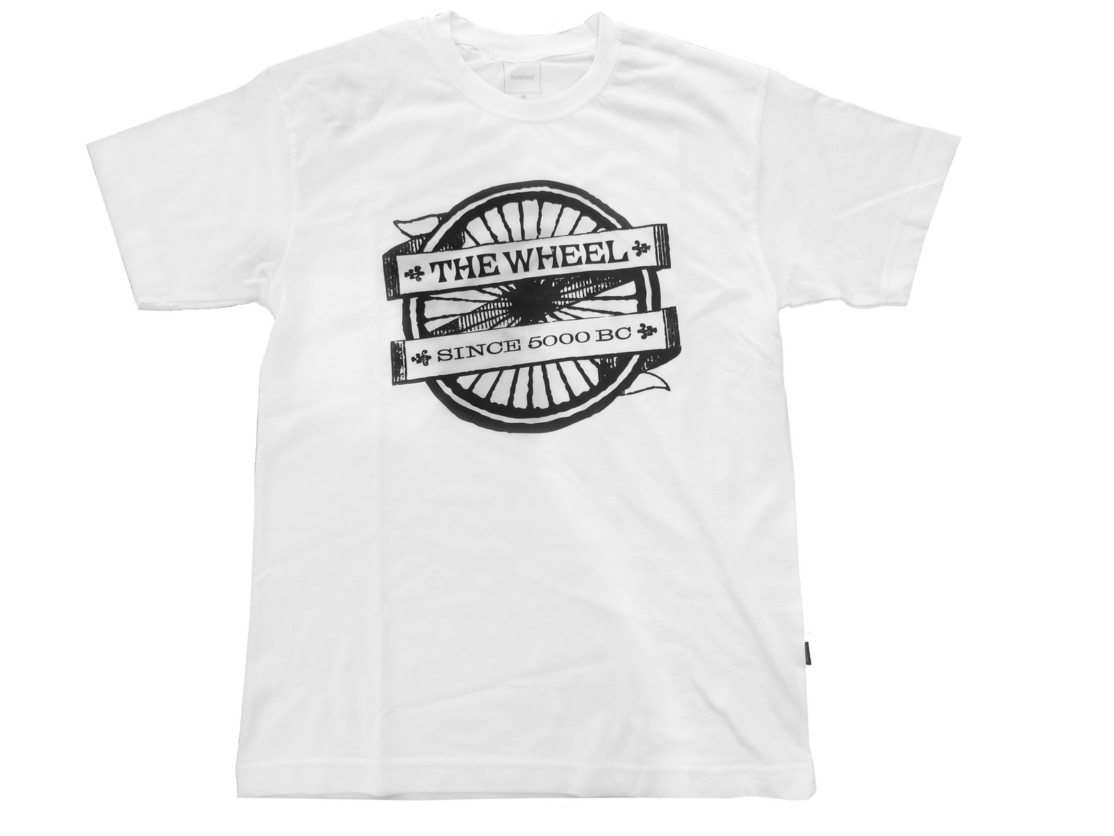
In between writing Adidas ads, Dave asked me if I wanted to make some T-Shirts with him.I would be the third partner, aside from Dave, there was a City-boy, business type, (I can't remember his name only his goal; to own a house with a drive in drive out drive way).Dave had a very clear vision: To make very ecologically sound, ethically decent, high quality, ie, expensive, T-Shirts aimed at the niche sports like BMX-ing, Surfing and Skateboarding.Dave had a name; Howies.He liked it because it sounded genuinely American.I didn't like it because it sounded genuinely American. (He's from the valleys in South Wales?)Howies it was.We designed a few T-Shirts over a couple of weekends, this is the first one that got made.

This one was based on this ad, I could never get Adidas to buy it.
But within weeks it became apparent that Dave REALLY wanted to do this, whereas I was happy to knock-up the odd T-Shirt, but didn't want to go to BMX meets, meet various cotton mills, T-Shirt manufacturers, look into the ethical use and disposal of dyes, etc.So I concentrated on my day job, while Dave did his day job AND built Howies into cool brand admired globally.Cut to a decade later.Dave calls up asking for some advice on advertising.I tell him I'm weeks away from setting up a new agency, ‘Cool, Howies can be your founding client.’Excellent, finally some payback for that ‘Life*’ T-Shirt they've been selling for the last ten years.He tells me that Timberland have bought into Howies and want to help them expand abroad, which means significantly increasing their marketing budget.‘But we don't want to look like we're selling out’ he added.There’s an old BBH line they used in their AAR reel that I've always loved; ‘Don't sell, make people want to buy’.I thought let’s not do ads, let’s produce bits of content about Howies view of the world, like their brochure, but put it in ad spaces.
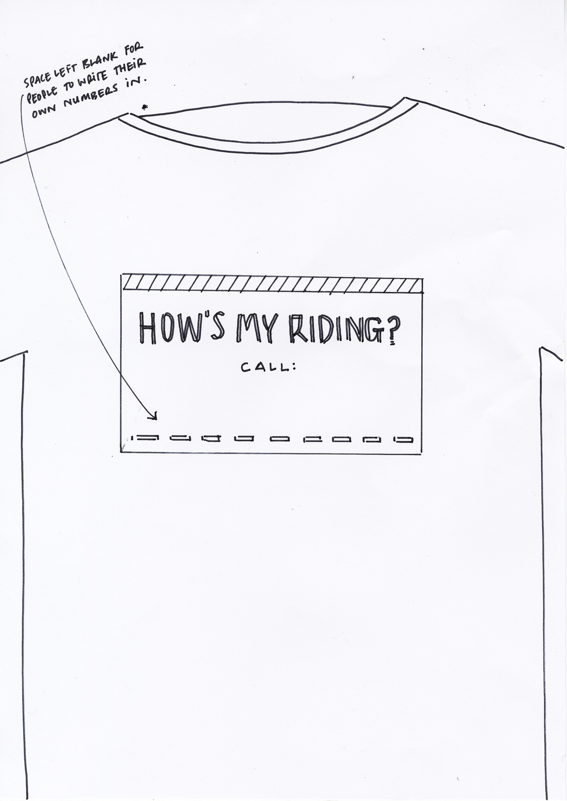
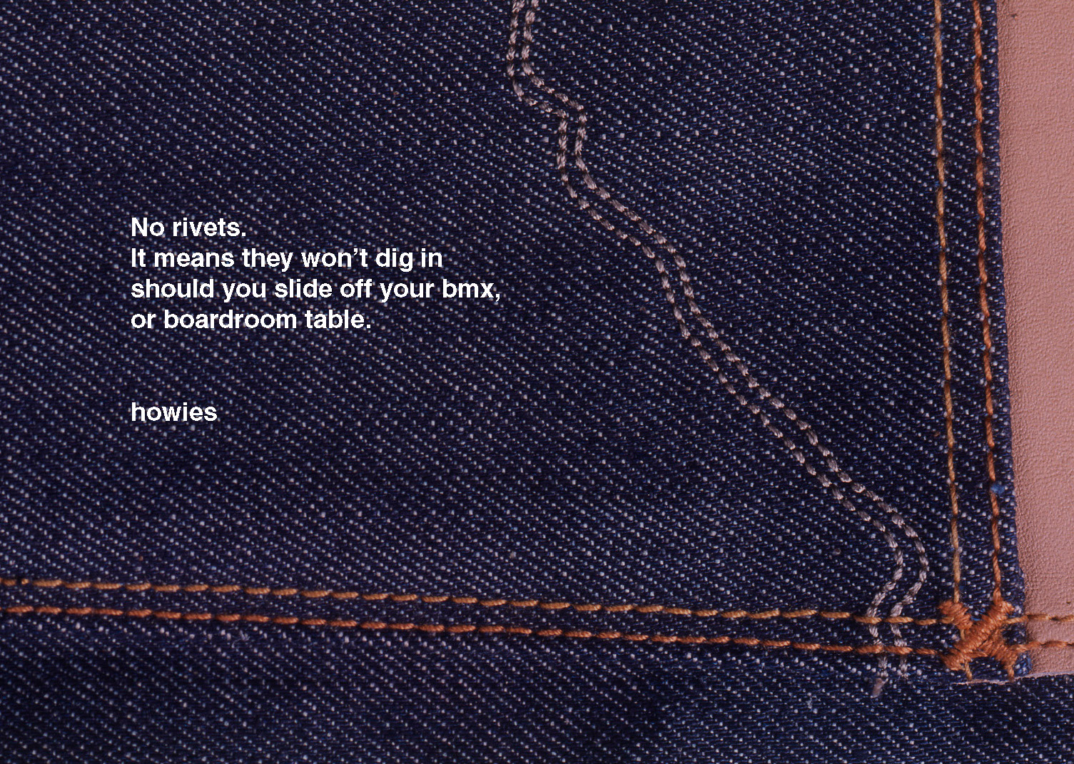
HOW SHOULD THEY LOOK? Not like advertising or marketing, we do’t want to look like we're selling, because we may come over a selling out.So, goodbye logos, end-lines, cookie-cutter identical layouts, brand colours and bits of graphics in general.Also, if we make the headline and brand name the same size font it won’t feel like advertising.Coming across a piece of Howies marketing should be like a break from being bombarded by ads.TONE: Not full of superheroes, we want normal people doing the right thing, self-effacing, offering small personal insights rather than global ones.Overall, we need to show positivity and humanity.1st ROUGHS.We wanted thoughts and observations on BMXing.

These got chosen to run as our first ads.
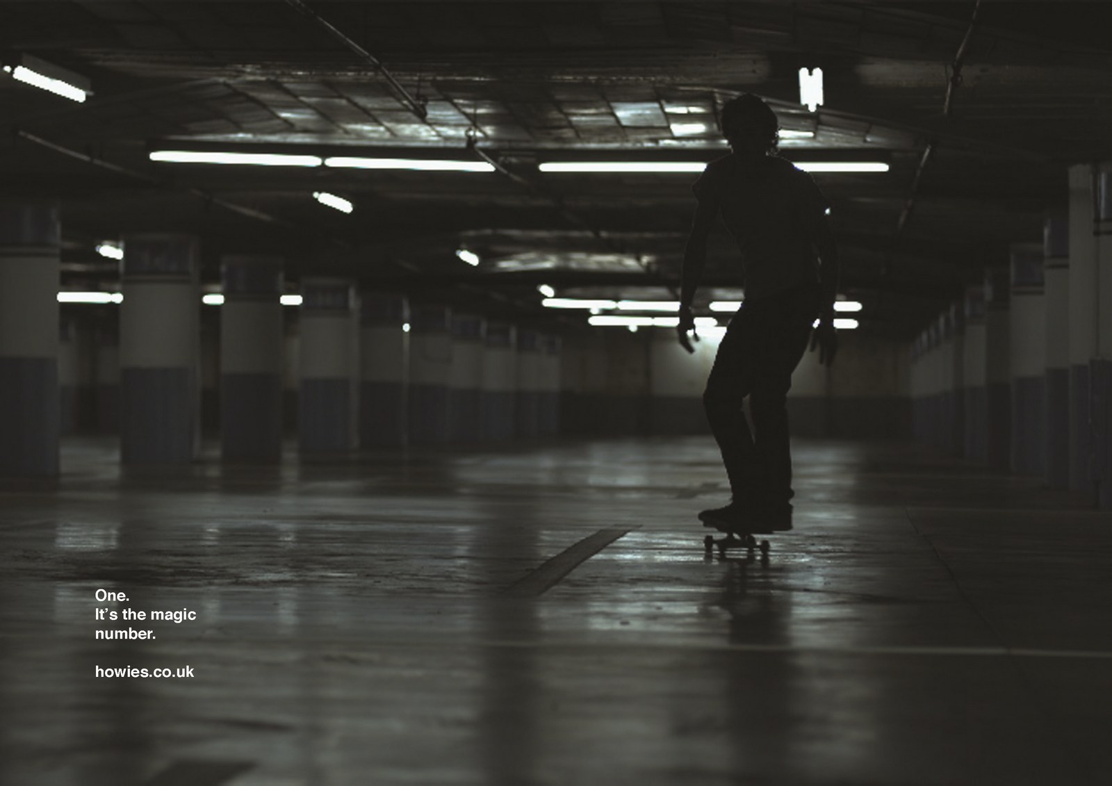
FILMS:The opportunity came up to make a couple of films for the web and cinema.Instead of showing amazing surfers or skateboarders, why not show terrible ones?Maybe the films would be more empathetic if they were based on people trying.Also, rather than show a group having fun, let's show an individual ‘in the zone’, enjoying the solitude.We had a working line that summed it up; ‘Get better, fail more’.(Photographer Charlie Crane shot them, they were first bits of moving film that ever passed through his camera.)
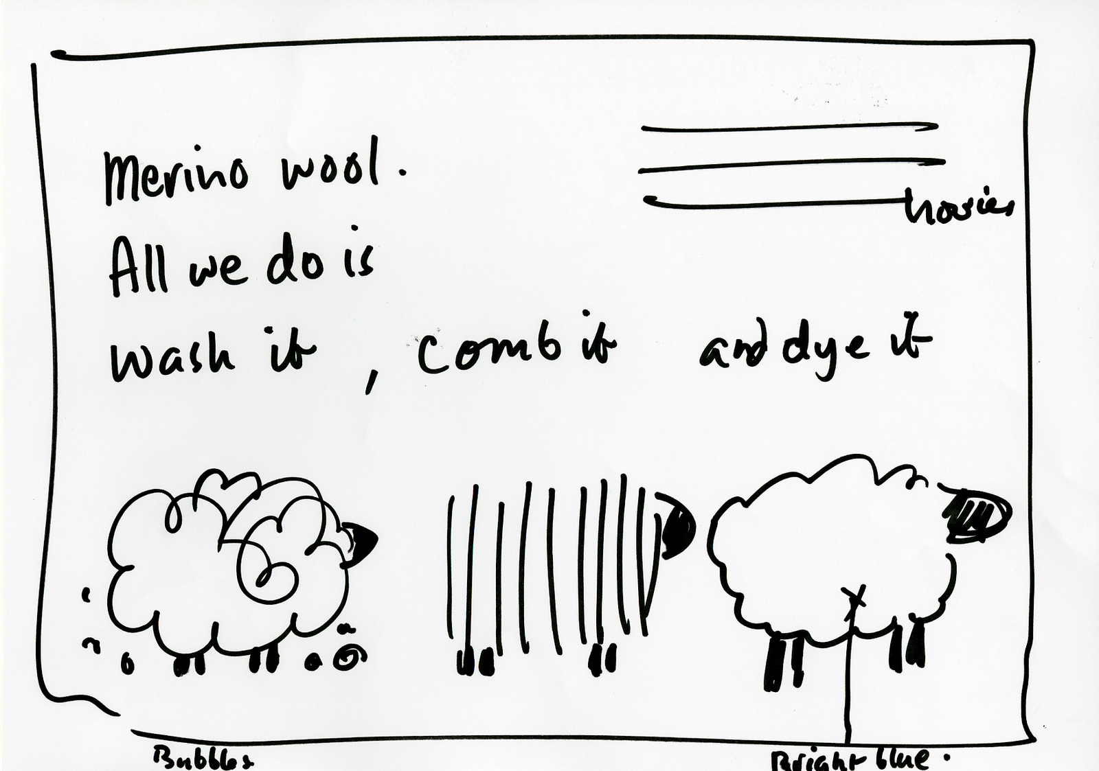
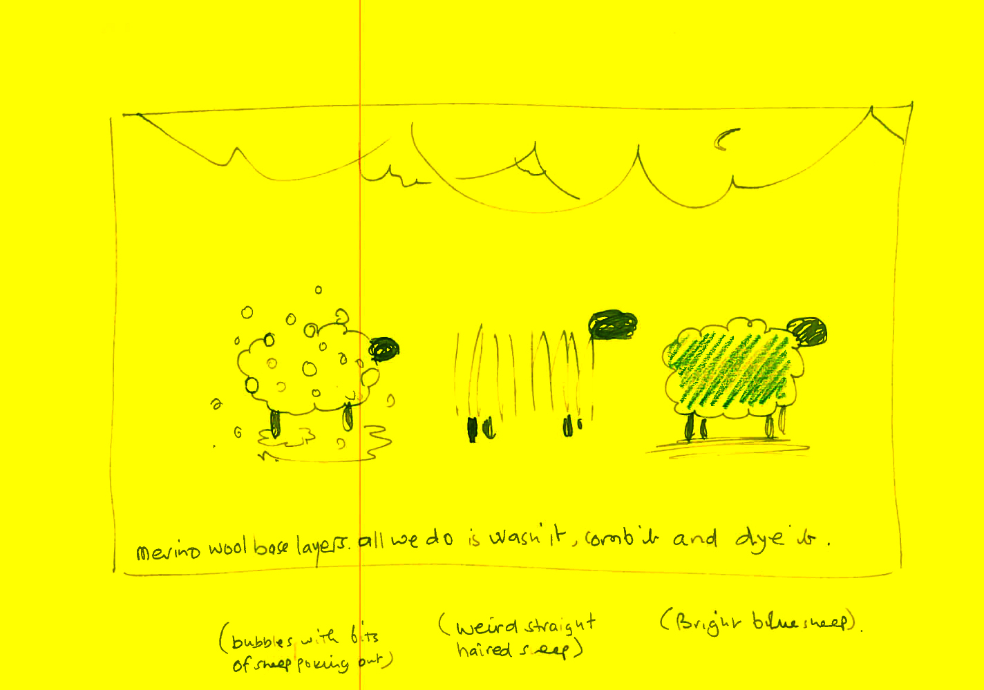
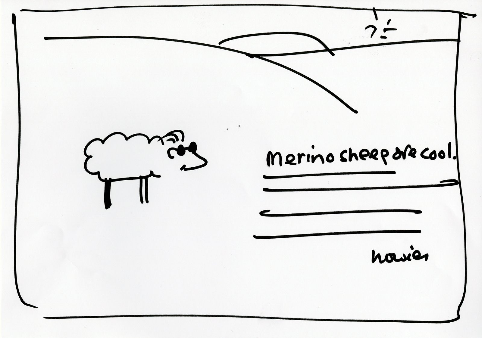
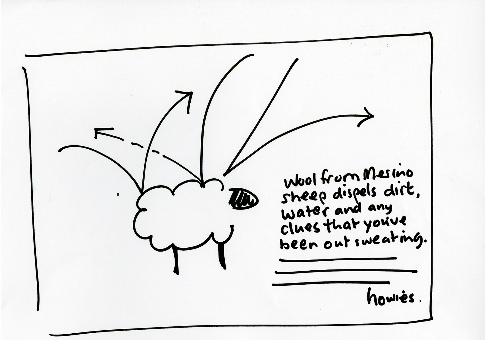
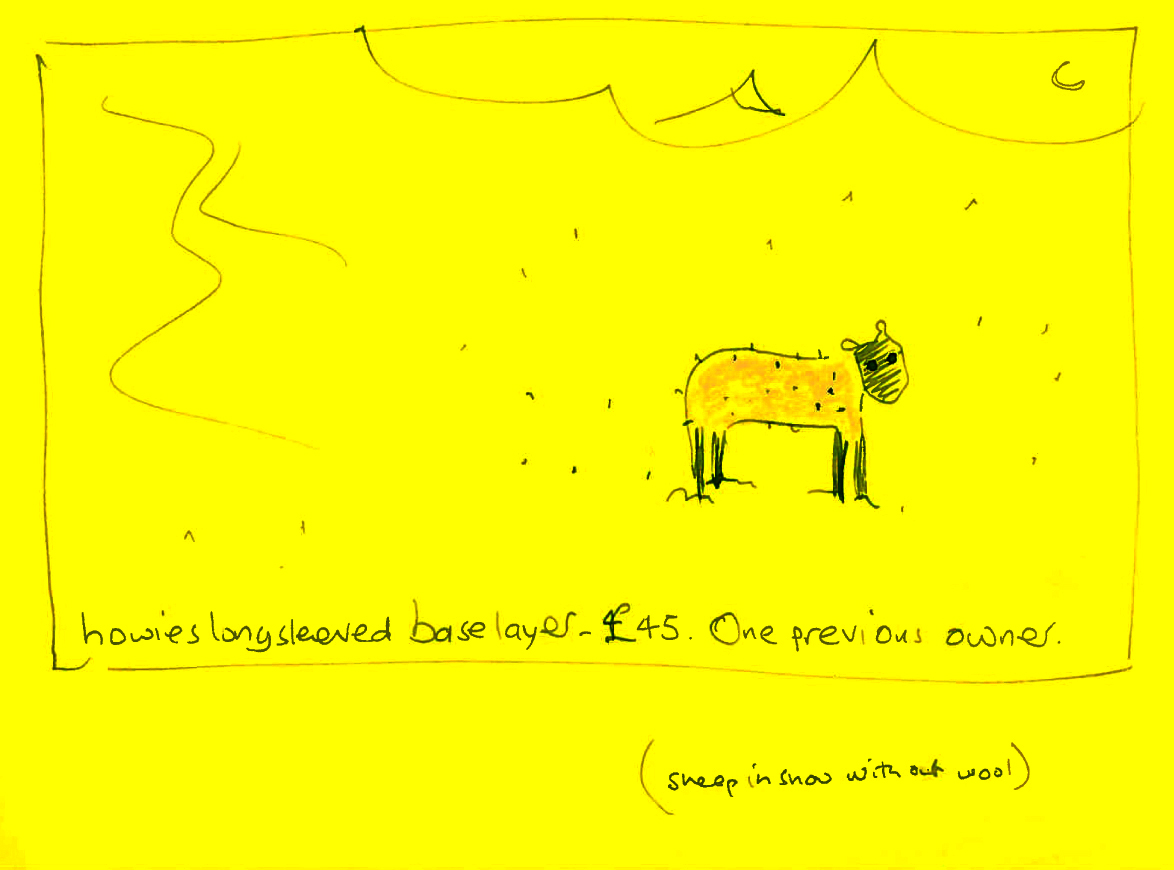
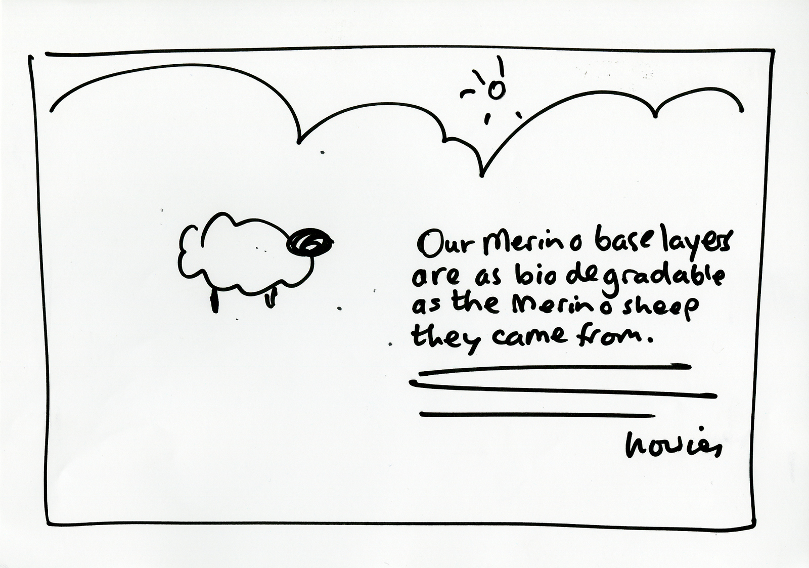
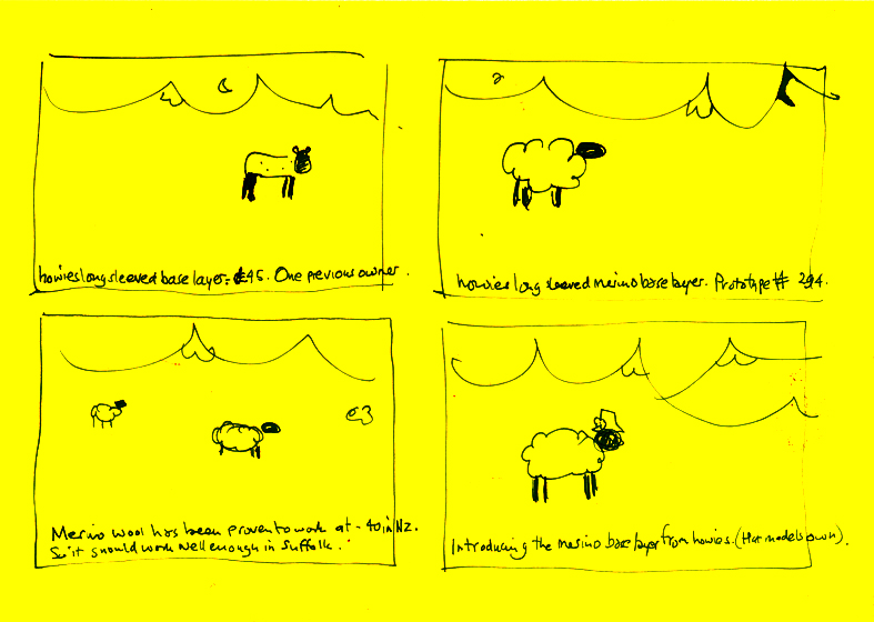
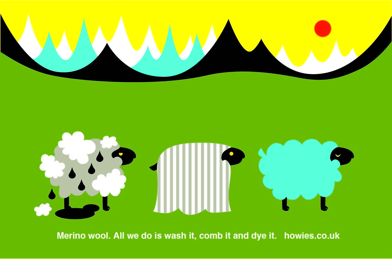
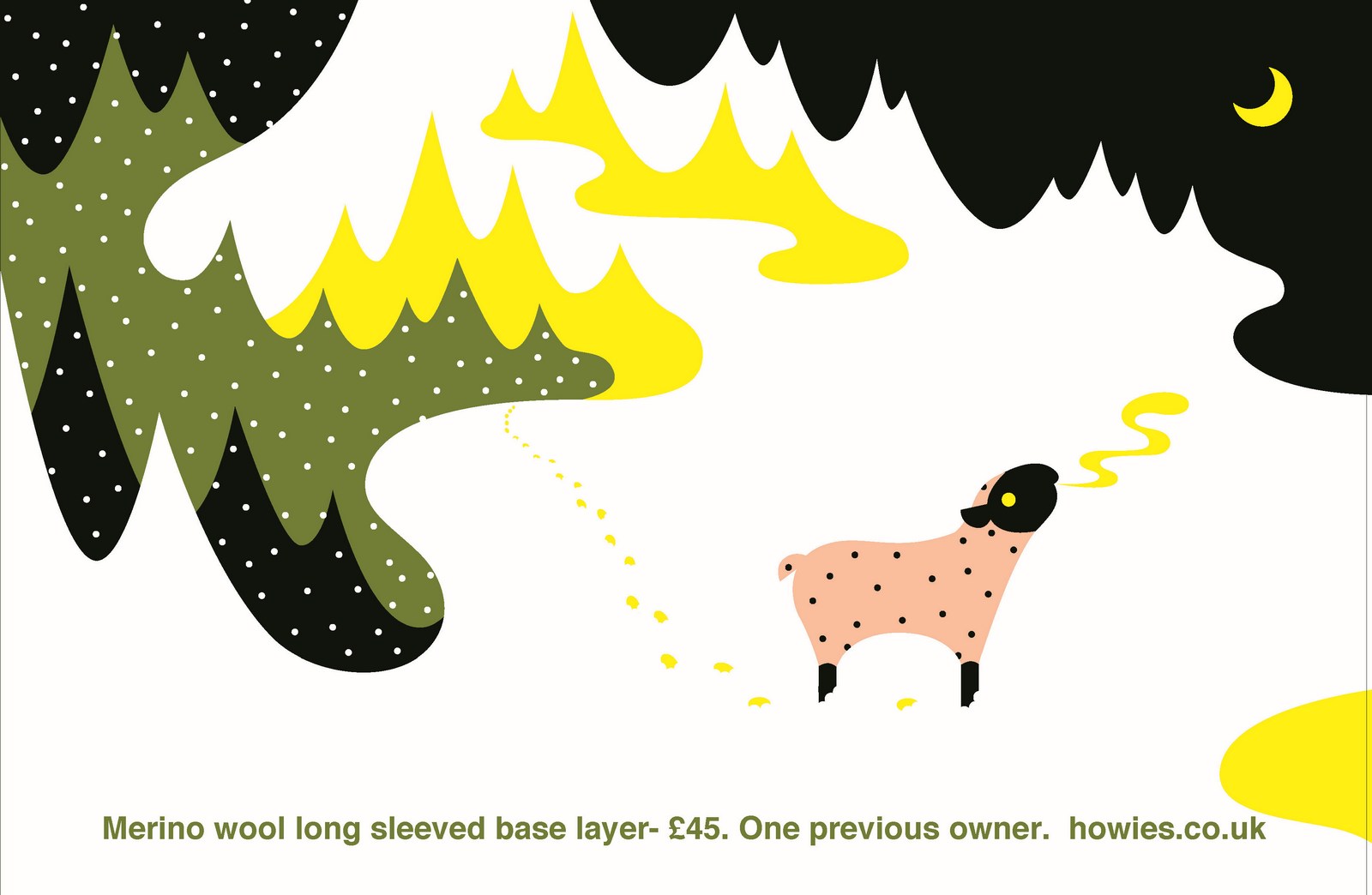
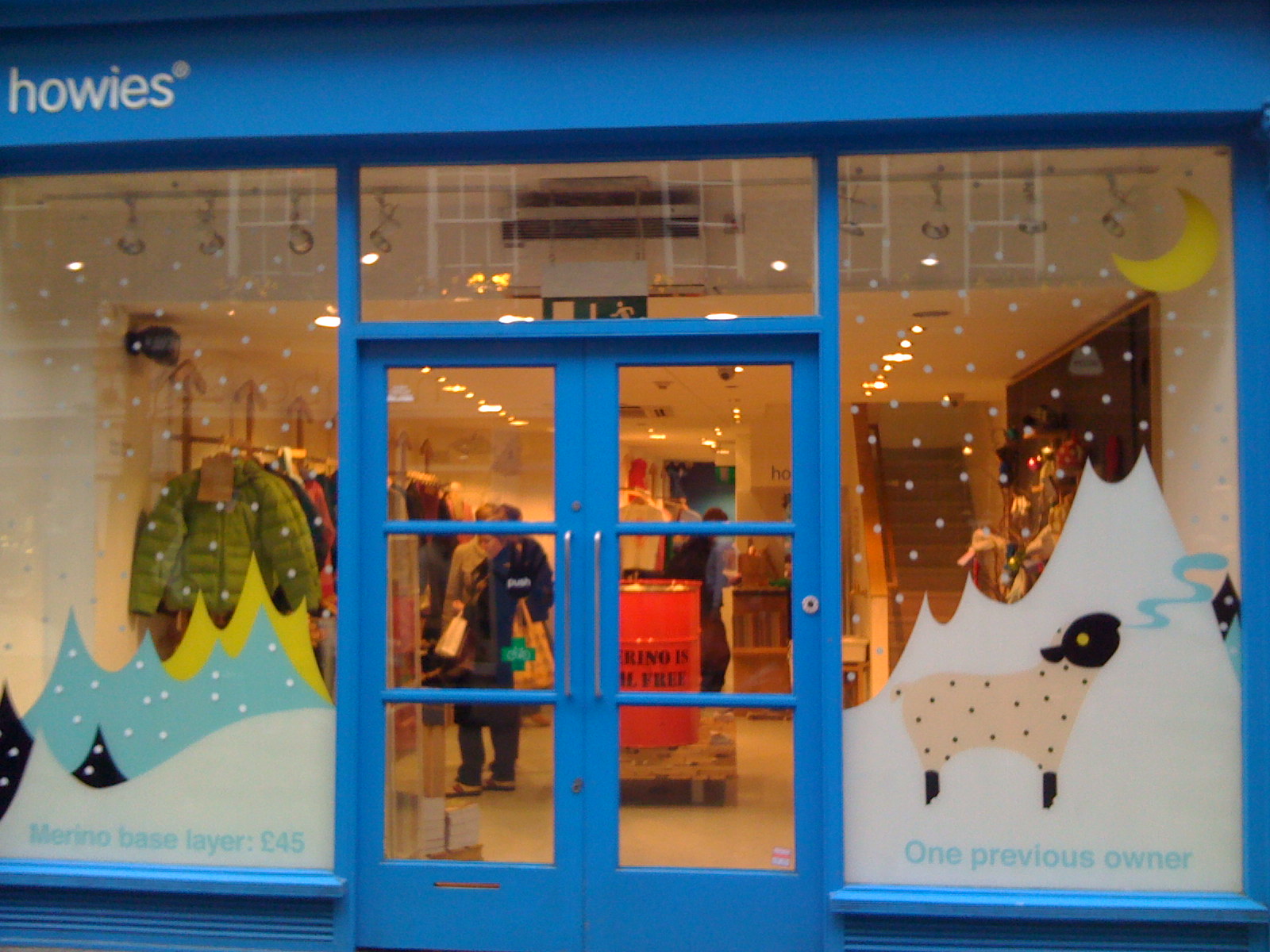
MERINO WOOL:Dave briefed us to tell people about the amazing properties of Merino wool. We had a go.
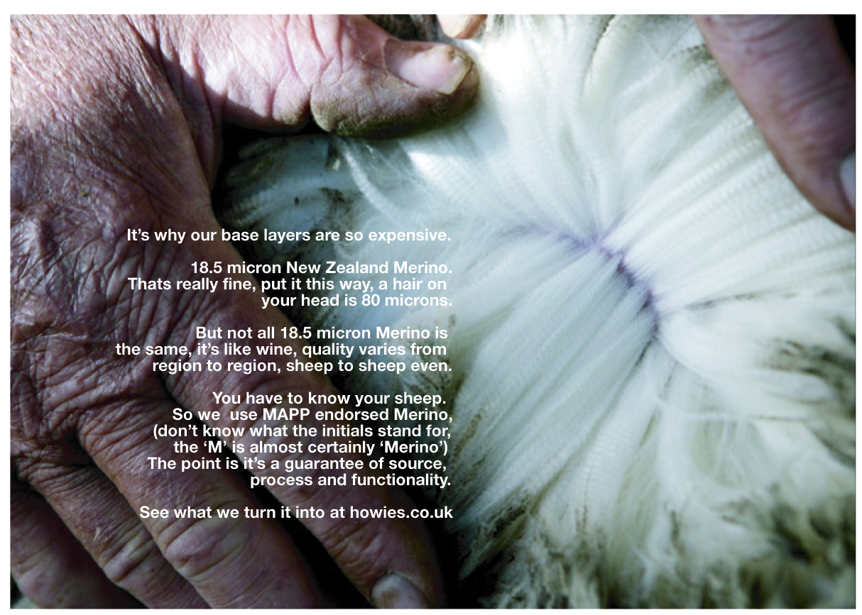
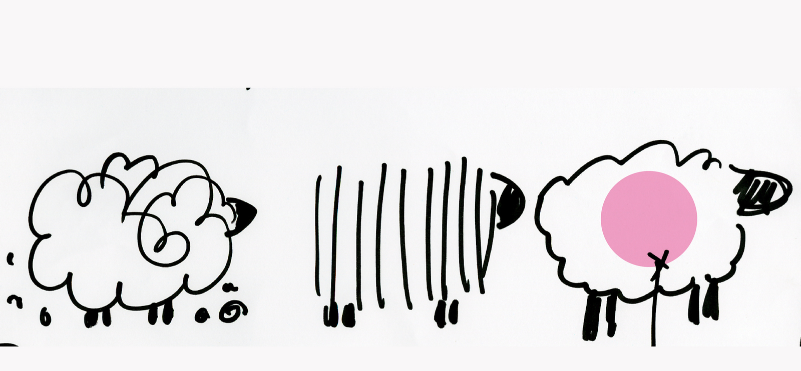
Dave: ‘They're a bit similar to the first batch, let’s do something completely different, let’s keep moving’.Luckily, my old writer Tony Barry was bored, having swapped creating for directing he hadn’t yet adjusted to those periods when your diary is all windows.We worked on the brief and frankly just had a laugh.A few days in we went through the pile of scribbles we'd amassed, every few bits of paper seemed to feature a drawing of a sheep.
We rounded up our sheep ads and presented them to Dave and Claire.
They loved them.I now had to find a way to make them relate to each other, stand out and look cool.I chanced upon a fantastic Japanese illustrator called Kin Pro.Unfortunately she didn’t speak English, so everything went via her friend who had a vocabulary of 23 English words. (I'm not knocking her, my Japanese is sketchy too.)But trying to explain things like why the sheep was wearing a very brightly coloured hat was tough, it took a lot of patience.FIRST AD. ILLUSTRATOR’S 1st ROUGH:
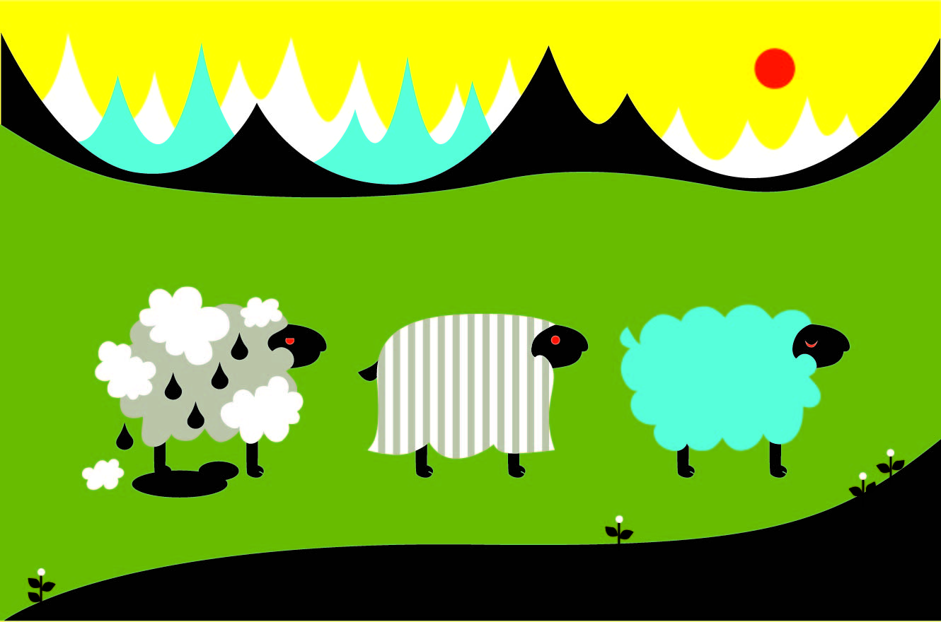
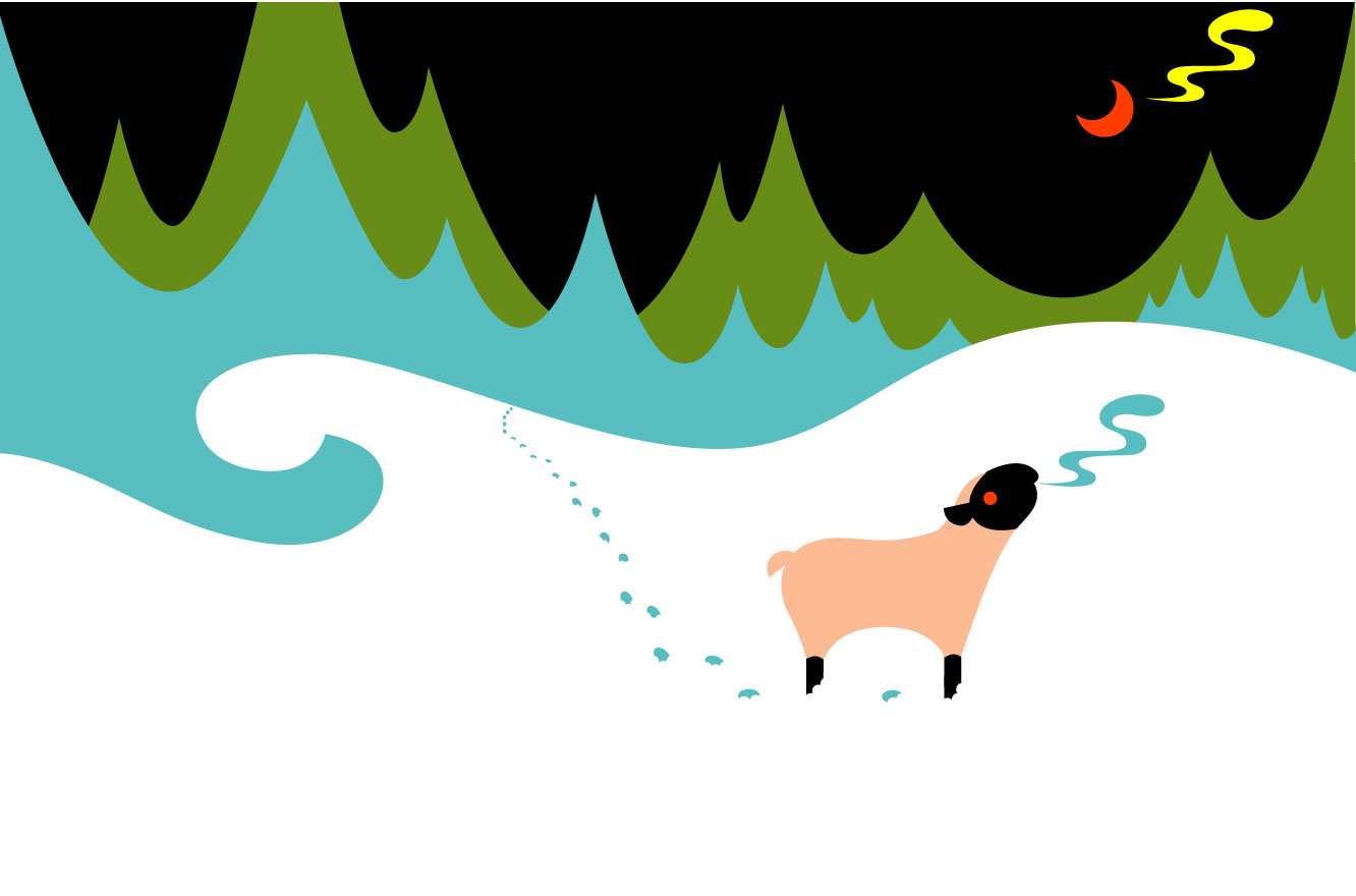
It looked great, but the red eyes were a bit freaky.Oh, and that black bit at the bottom looks a like an oil slick, and might get in the way of the type.FIRST AD. ILLUSTRATOR’S 2nd ROUGH:
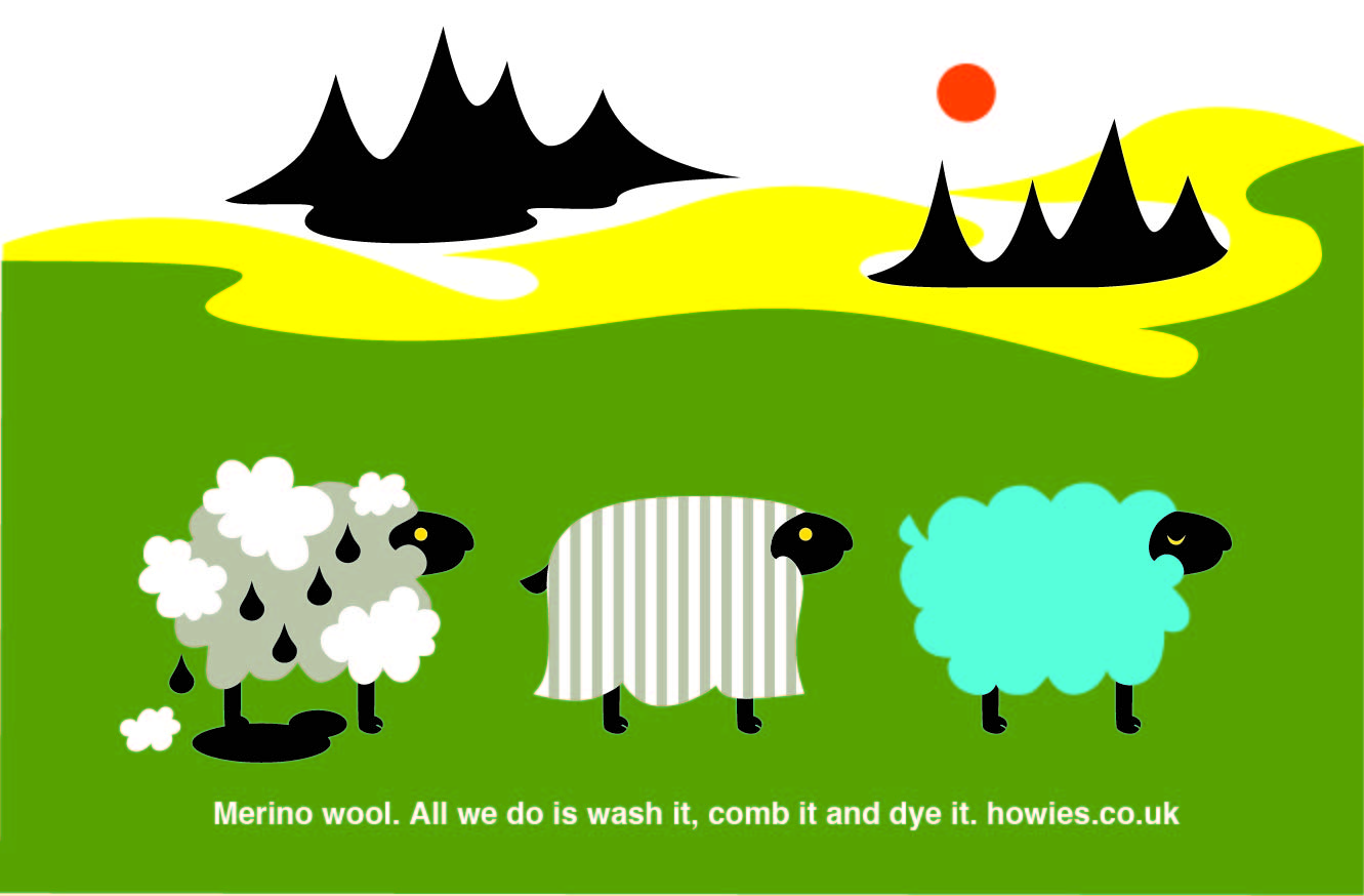
Better. Although I preferred the yellow sky from the first version, it looked like dusk.Also, the mountains jump out too much now, the yellow helped flatten them out.FIRST AD. FINAL:
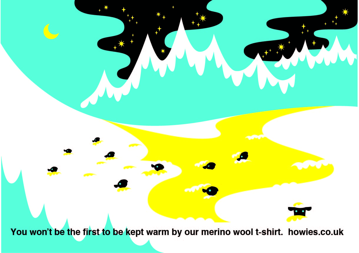
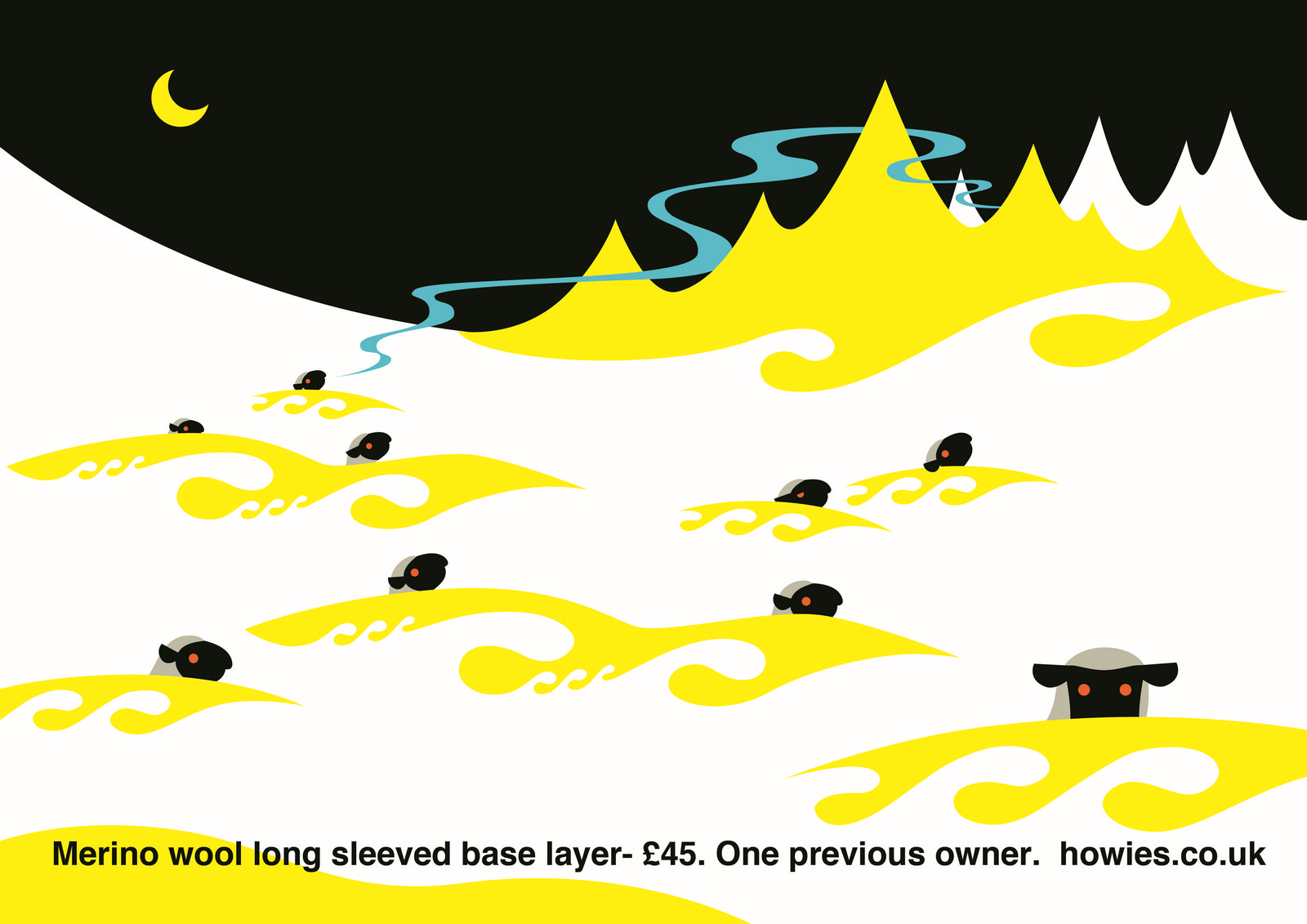
SECOND AD. ILLUSTRATOR’S 1st ROUGH:

The mountains look like they’re melting.SECOND AD. FINAL:
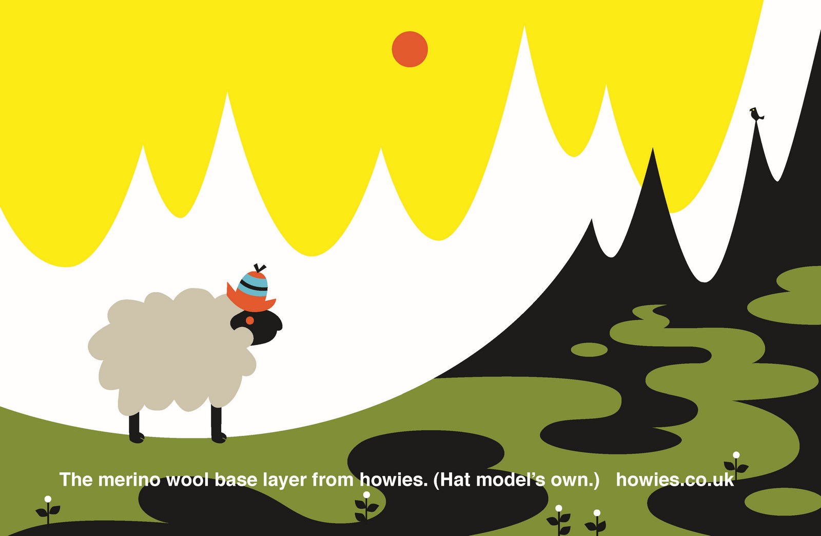
THIRD AD. ILLUSTRATOR’S 1st ROUGH:
Nice looking, but doesn’t look cold enough.THIRD AD. ILLUSTRATOR’S 2nd ROUGH:

Cool, although he doesn’t look like he’s been shaved, he just looks pink, what about those little dots you have in cartoons, like ‘Tom & Jerry’, to suggest having been shaved?THIRD AD. FINAL:
FOURTH AD. ILLUSTRATOR’S 1st ROUGH:
Looks a bit Christmassy, should it look harsher, and maybe we need a less sensible sounding line?FOURTH AD. FINAL:
They worked well on the stores too.
A SLIGHT HICCUP.My younger brother, BMX legend John Dye, get’s interviewed by a leading BMX magazine and says ‘Soul-less businessmen are moving in on sports like ours trying to make a quick buck selling cheesy T-Shirts, companies like Howies, it’s run by an Adman!’Awkward.Dave mentions it in passing, I say ‘Yeaaaah...not ideal.’It’s never mentioned again, we crack on.
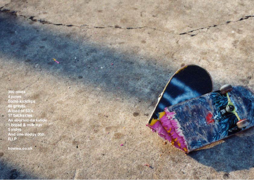
SKATEBOARDING:David and Ollie, both ex-skateboarders, came back with a large pile of ideas. I quickly googled ‘ollies’, ‘pipes’ and ‘kickfilps’ and the restIt turns out they are real words, I now not only understood the ads and liked the fact that non-skateboarders wouldn't.
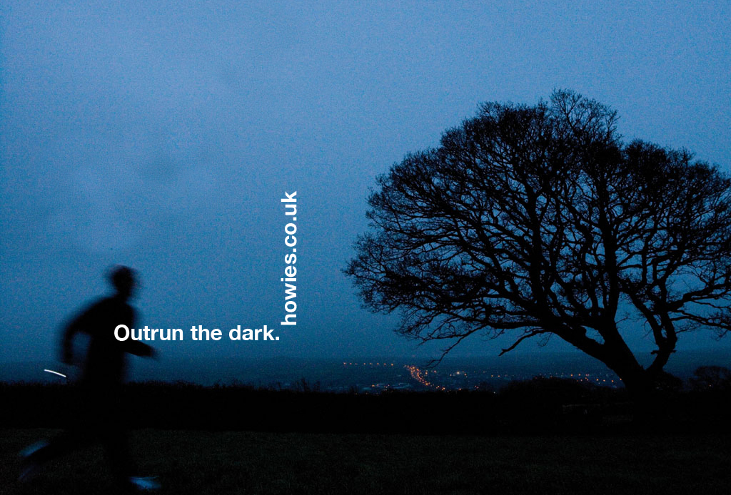
RUNNING:
I liked this one but it didn’t run, I worried that people wouldn’t get it, (it’s the theme from ‘Rocky’, the fact that I've written this explanation means I still didn’t think people would get it).T-SHIRTS.It was an ongoing brief, for T-Shirt ideas. we'd produce a batch of lines like this.
Some then had a visual element added, like this.

The chosen ones were then finished up:
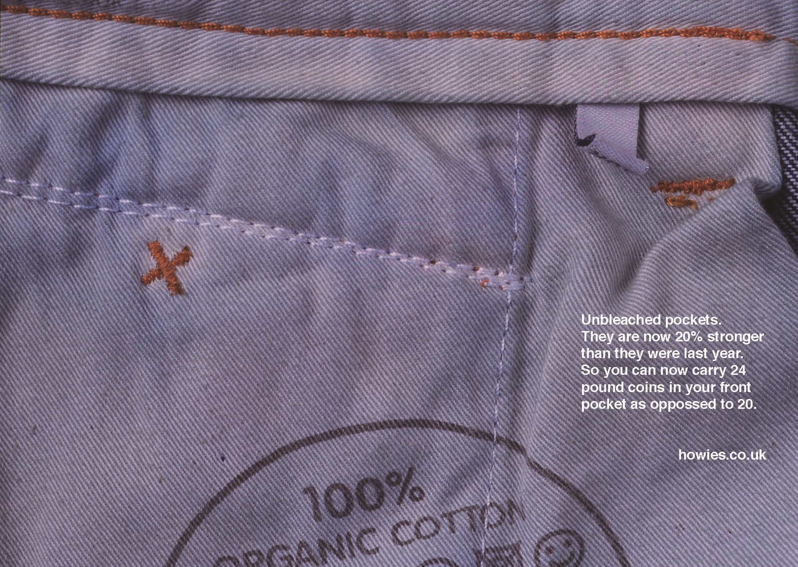
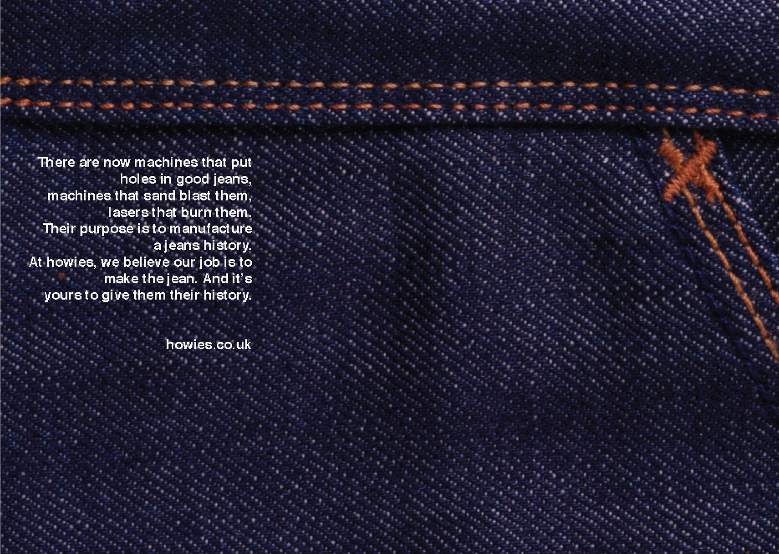
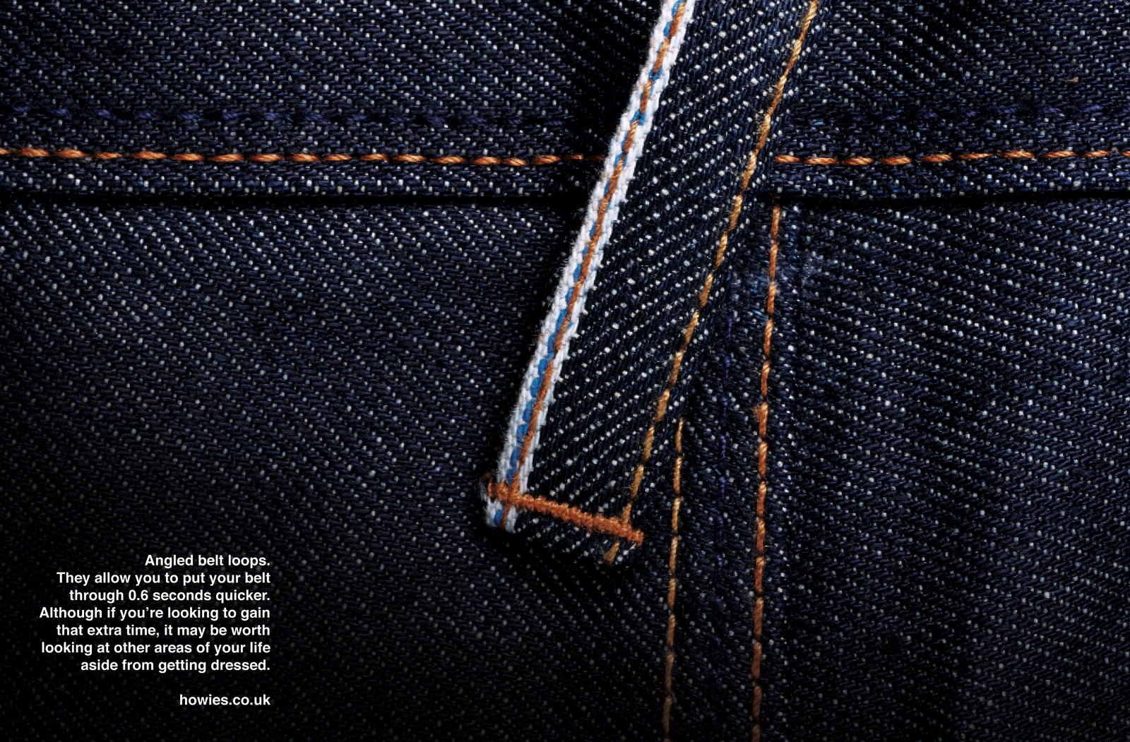
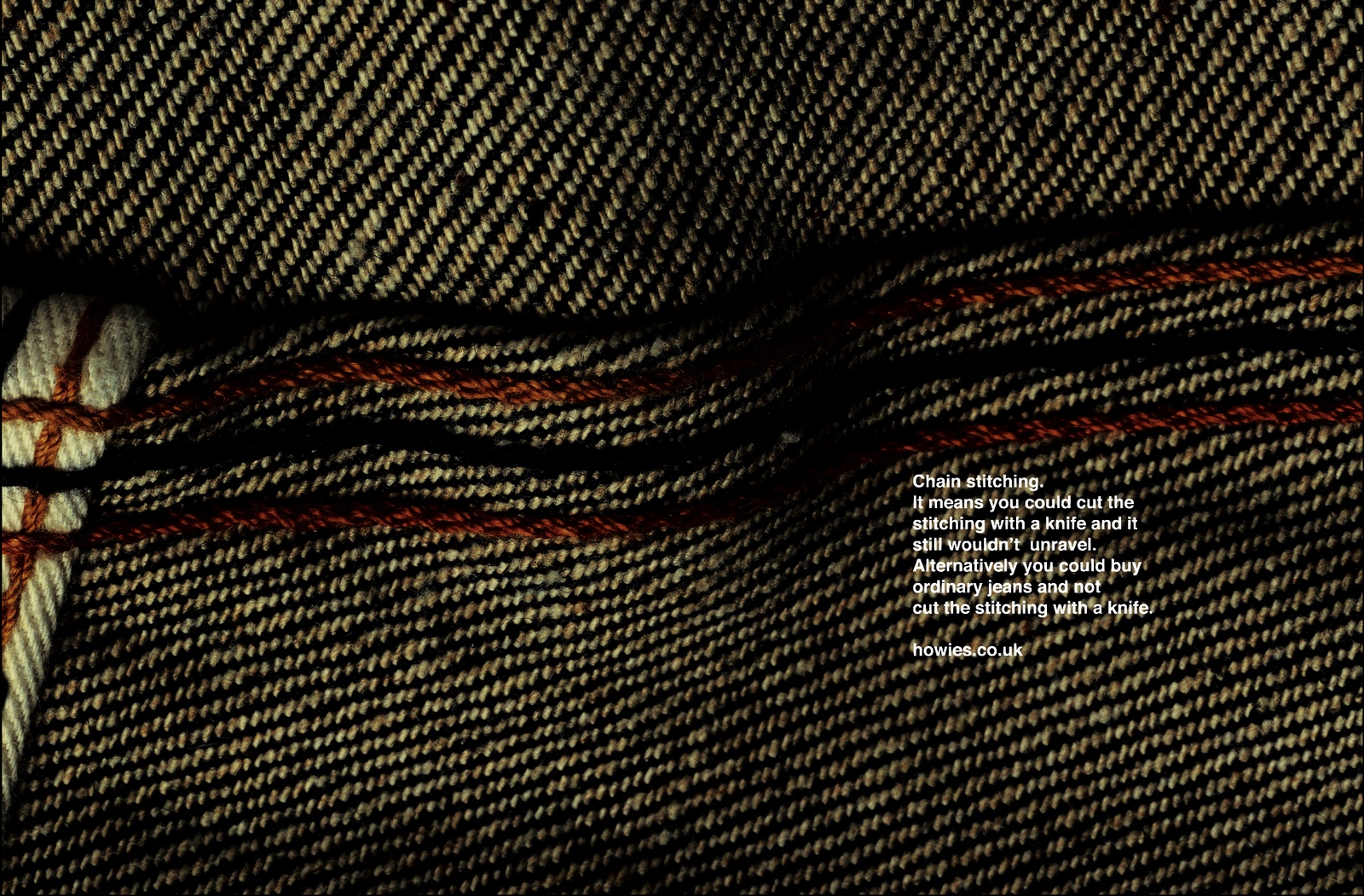
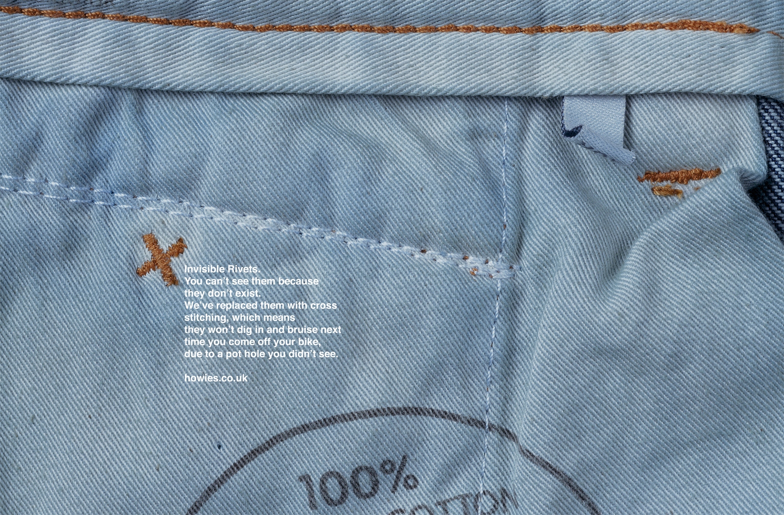
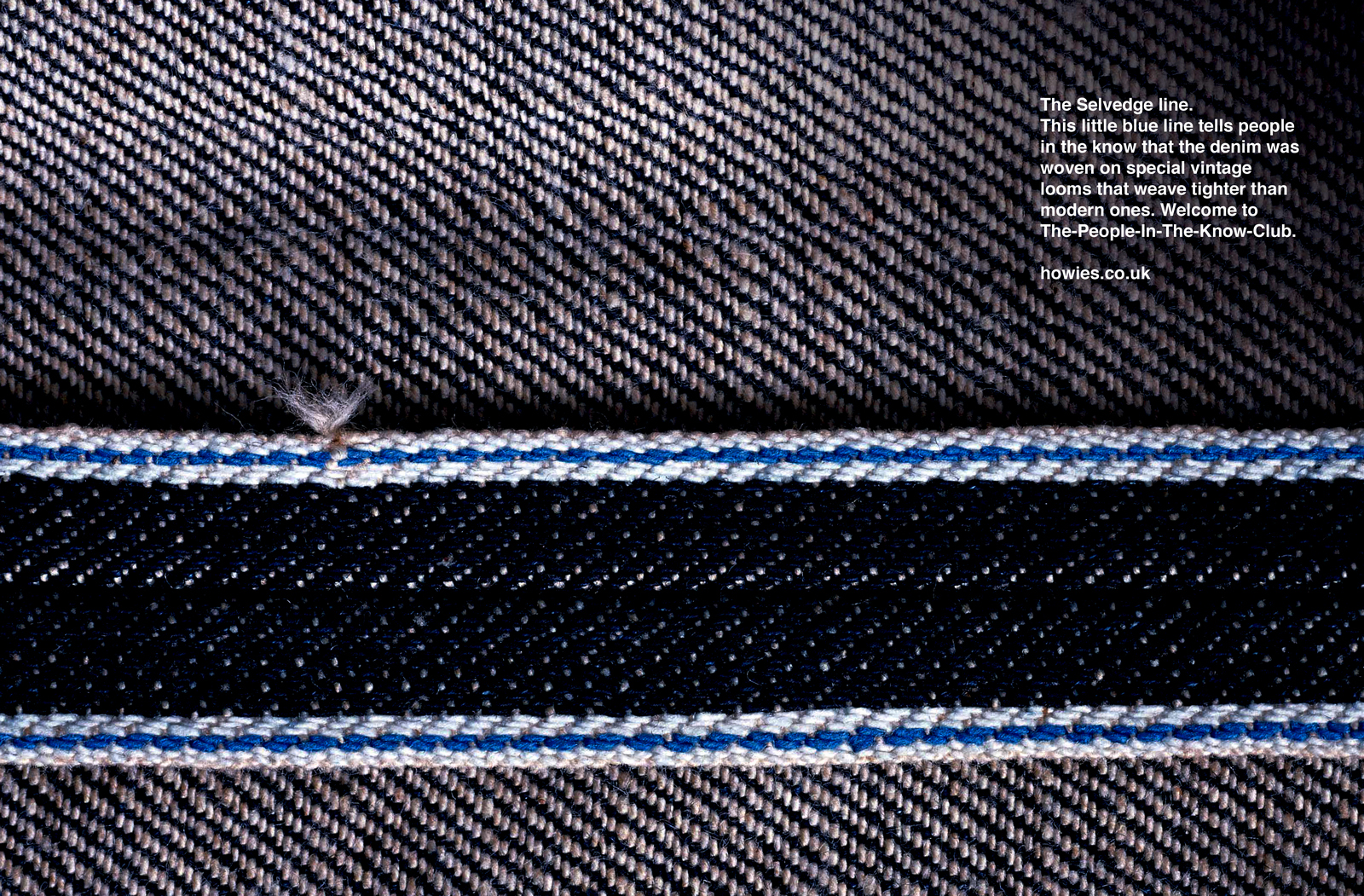
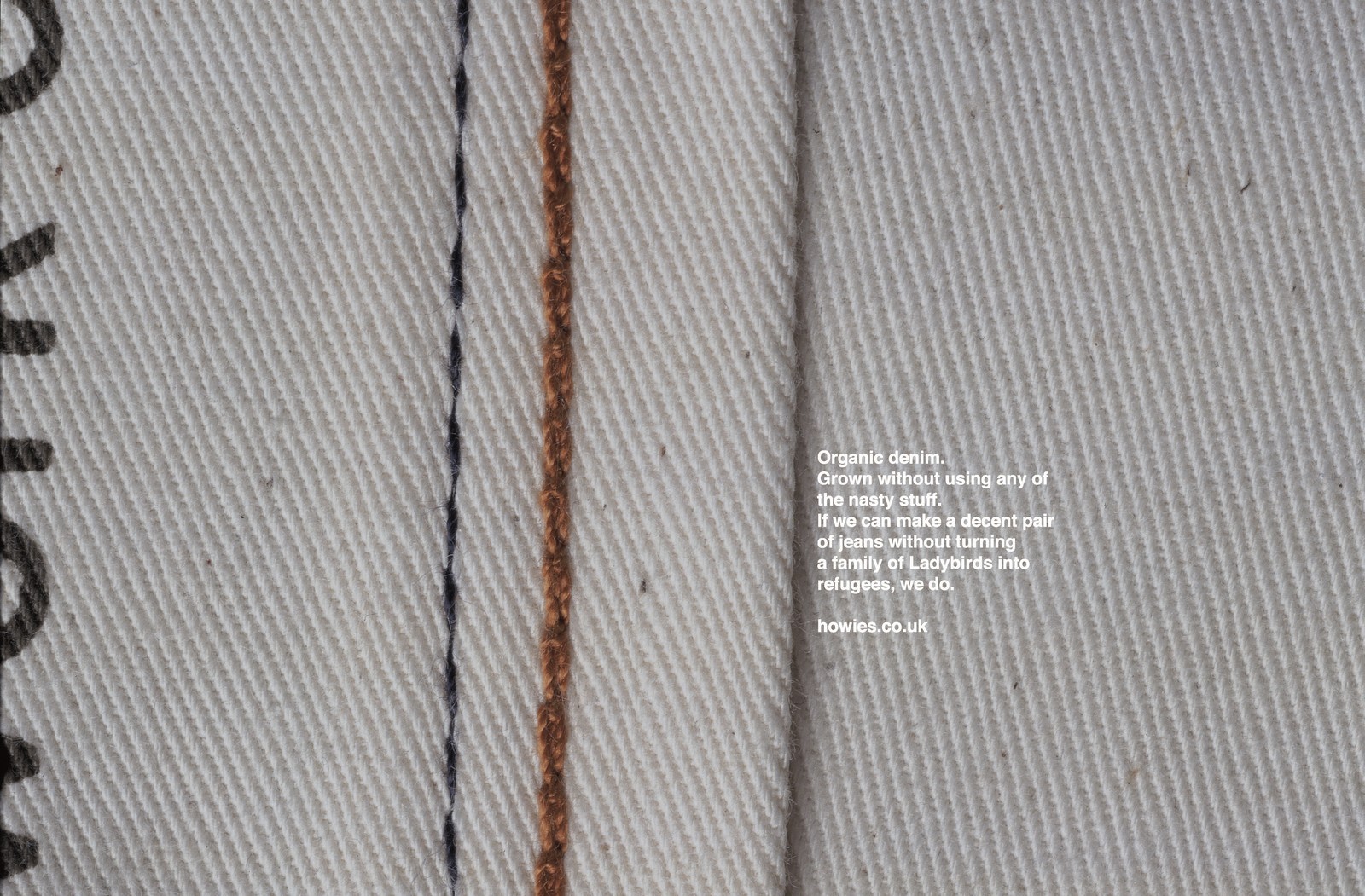
DENIM.One of the things that made Howies great was the quality of their ingredients.Take denim, Dave would seek out the top denim guy on the planet, then sweet-talk him into working taking on an account smaller than any he'd previously agreed to.Howies denim was the highest quality, what other brands would sell for £300 a pair would be £100 from Howies.We were tasked with an education job, explain why their jeans were so good.REJECTED:
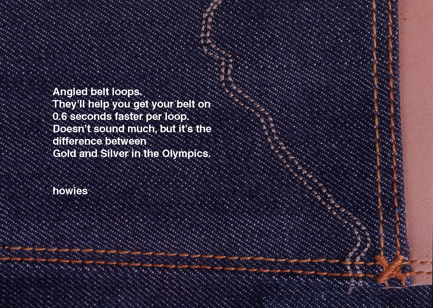
It sounded a bit too serious, almost hard sell. Plus, shouldn’t we show the thing we're talking about?
A bit too odd.
Initially, we liked the idea of fessing up about the fact that it wasn’t just BMX-ers and Skateboarders who Howies mailed their gear out to, a lot went to The City,Goldman Sachs in particular.But we came to our senses, a BMX brand may appeal to a City Boy, a City Boy brand won’t appeal to a BMX-er
Liked it, but a little worthy.APPROVED:
Unfortunately, Timberland didn't deliver, their sales started to go through the floor and they got consumed with putting out the big fires, ignoring their small, perfectly formed brand in Blighty*. A huge shame for Howies, but not to Dave, he's banked the lessons and has since set up the Do Lectures, (http://www.dolectures.com/), and more recently Hiut Denim, (http://hiutdenim.co.uk/)*NOTE TO EDITOR: Does Wales count as Blighty?
THIS I KNOW: Agency: AMV/BBDO. Writer: Sean Doyle. Photographer: Nadav Kander.THIS IS WHAT I DON'T:What the hell are they talking about?Or for that matter, what do TimeBank do/sell/make?
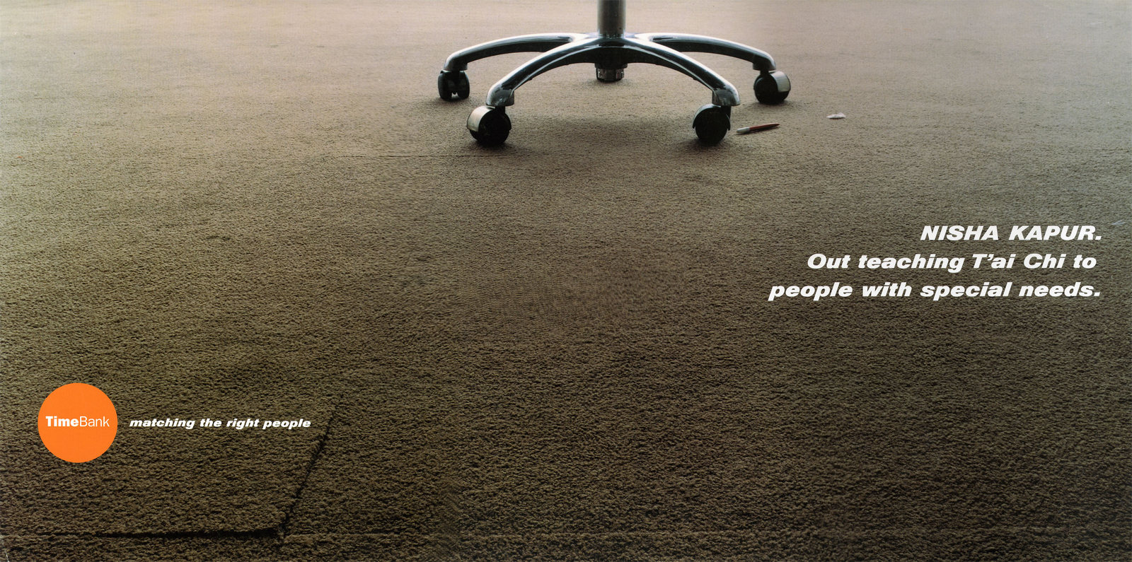
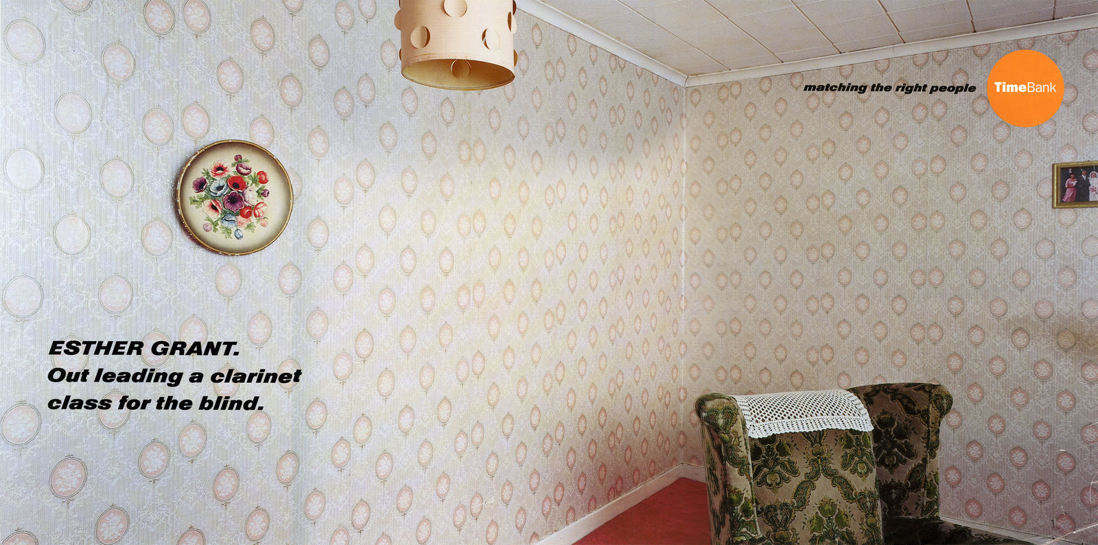
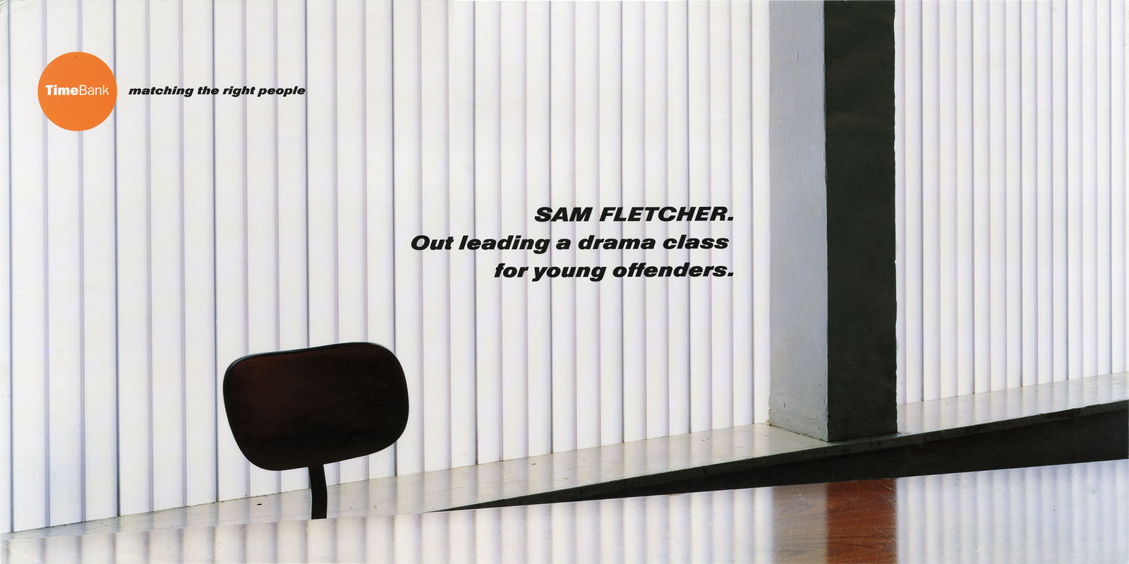
Can anyone help? Answers on a postcard to P.O. Box ....(I will now pay Google a visit and ask them what they know of these TimeBank people.)
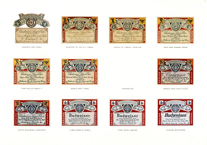
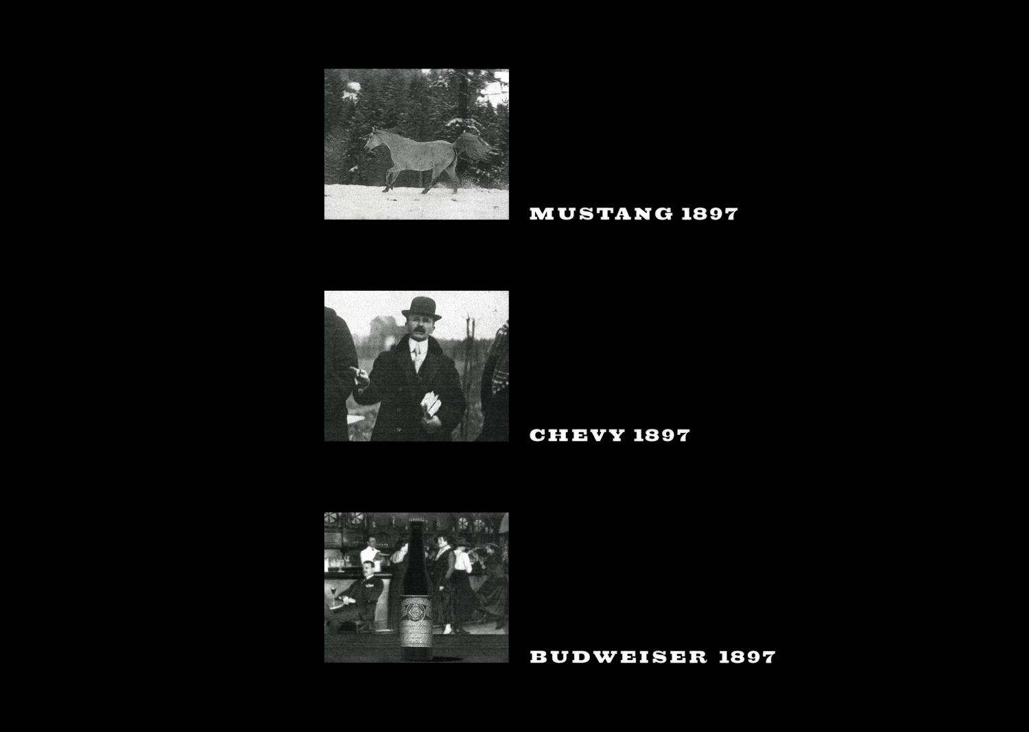
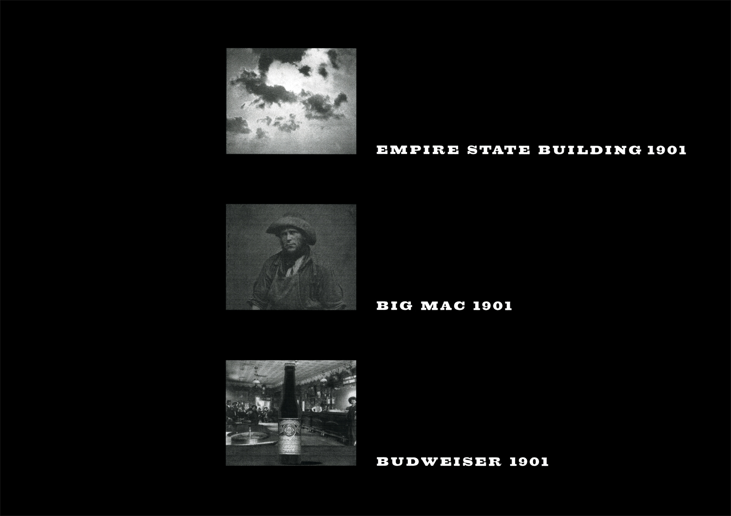
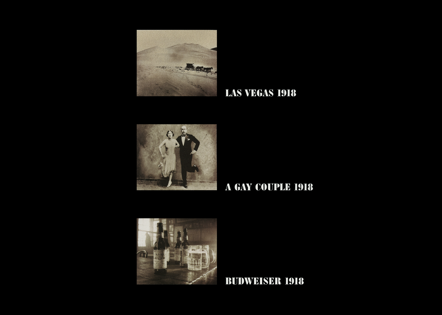
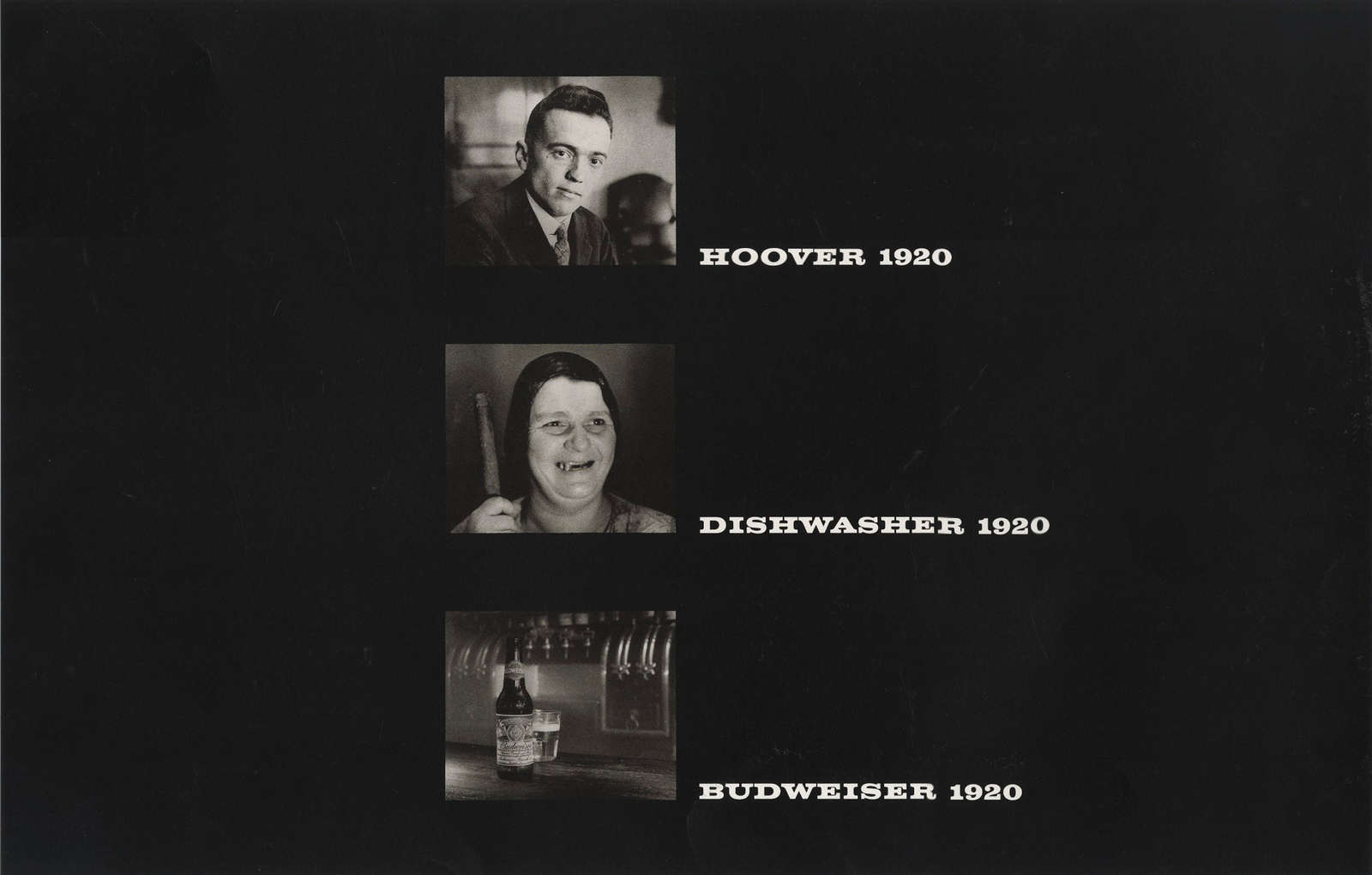
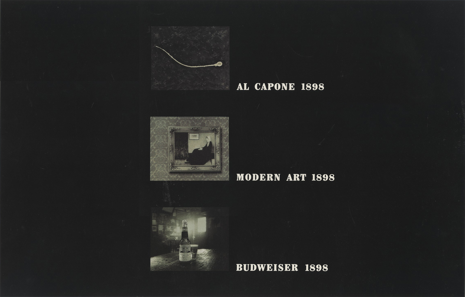
This was a very popular ad when I turned up at Bishopsbridge Road. When the client asked for more they were told the cupboard was bare, it was a one-off.New fangled beers were popping up in the more fashionable bars every week, Budweiser needed a campaign to give them a bit of cache.Sean Doyle and I were briefed on a campaign aimed at readers of the Face, Wallpaper and ID, what’s the technical term for them? Fashionistas? Opinion formers? Hipsters? Twats? August Busch III and his gang wanted to really stick it to those newbies and say something like: ‘They’re kids, wet behind the ears, we’ve been brewing beer for over a hundred years, so we're really good at it now.’Account Man: ‘A heritage campaign? In THOSE publications?’Client: ‘But that’s the key difference between us and all these new lagers.’Planning: ‘Nothing is less cool than banging on about being old, it's so worthy and dull. We need a hip message to talk to hip people, and heritage isn’t hip.’The planners and clients got into a Mexican stand-off. One of my bug bears at BMP was that the planners were sometimes too smart to allow themselves to say the obvious, they’d turn the obvious into something ‘interesting’ so that the creatives could create.A noble cause, but sometimes it would mean ‘15% off Volkswagen Beetles’ becomes ‘The sixties is now even more attainable’, sometimes it cab be really helpful, sometimes frustrating.Creative: ‘Why are the sixties now even more attainable?’Planner: ‘Because there's 15% off Volkswagens Beetles’Creative: ‘Can't we just say that?’Personally, I'd think; you figure out what’s the most motivating thing to say and I'll figure out how to make it interesting, it's what I'm paid for.If reminding people of Budweiser’s long history makes people question those beers in short pants they're buying, fine, let's figure out how to make their history cool.It doesn't have to be screeds of copy banging on about the founders and their philosophy around hop choice.The first thought that occurred to us was that old comedy staple, ‘she's so old that... (fill in the crazy stone-age/prehistoric/Elizabethan reference of choice.)The second was that America is virtually brand new, 150 years ago in America is older than 150 years ago in Britain.THINGS THAT DIDN'T EXIST BACK THEN.There was hardly anything U.S. when Budweiser started, virtually everything we associate with the U.S. today didn't exist when Adolphus Busch started brewing, 1876. No Empire State Building, no Las Vegas, no Statue of Liberty, no Kardashian’s.Let's try that in pictures:
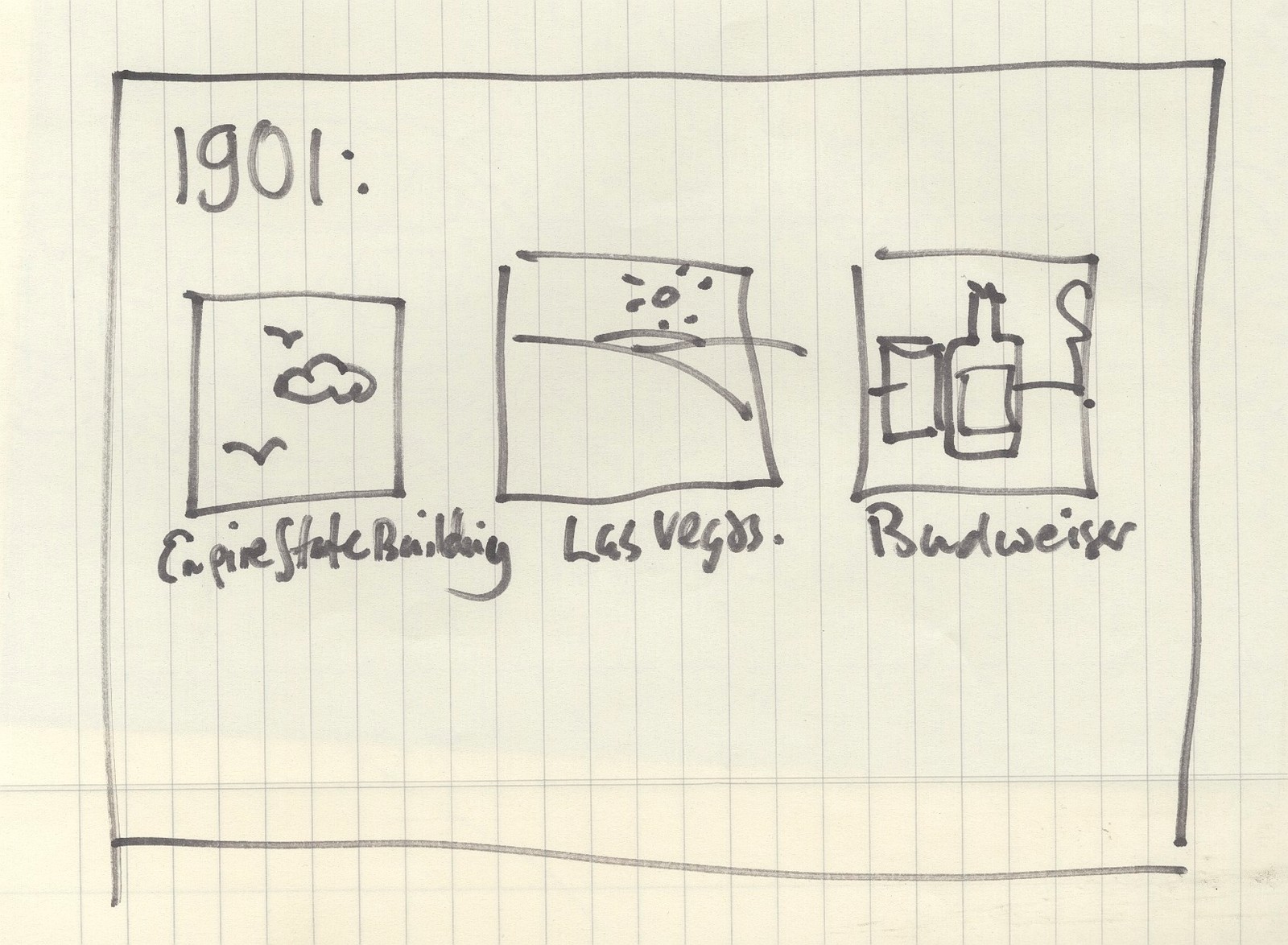
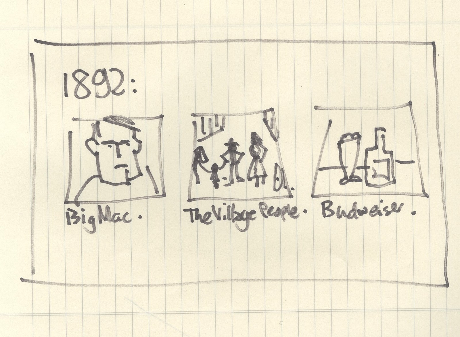
We liked it, but worried that simply showing things that weren't there might be a bit like the ‘Prohibition’ ad.So what else has changed?WORDS HAD DIFFERENT MEANINGS BACK THEN.A ‘Big Mac’ didn't exist so in those days probably meant large bloke called ‘Mac’.There must be loads of those.
THINGS LOOKED DIFFERENT BACK THEN.A hundred years ago John Wayne would’ve been tiny, in fact he'd have looked like a tadpole.How do we make things look cool, for our hipster types?Running the pictures left to right felt a bit traditional, so I ran them down the left hand side of the gutter, hipsters love the kind of shit.Where do we put the pack-shot? We‘ve got a bottle in the ad already we don‘t need one.Logo? The word ‘Budweiser’ is already there and really big, what‘s the point of essentially repeating it in another font? Also, if we want to look cool let's avoid looking like an ad, what's less cool than looking like you're desperately trying to flog your wares?
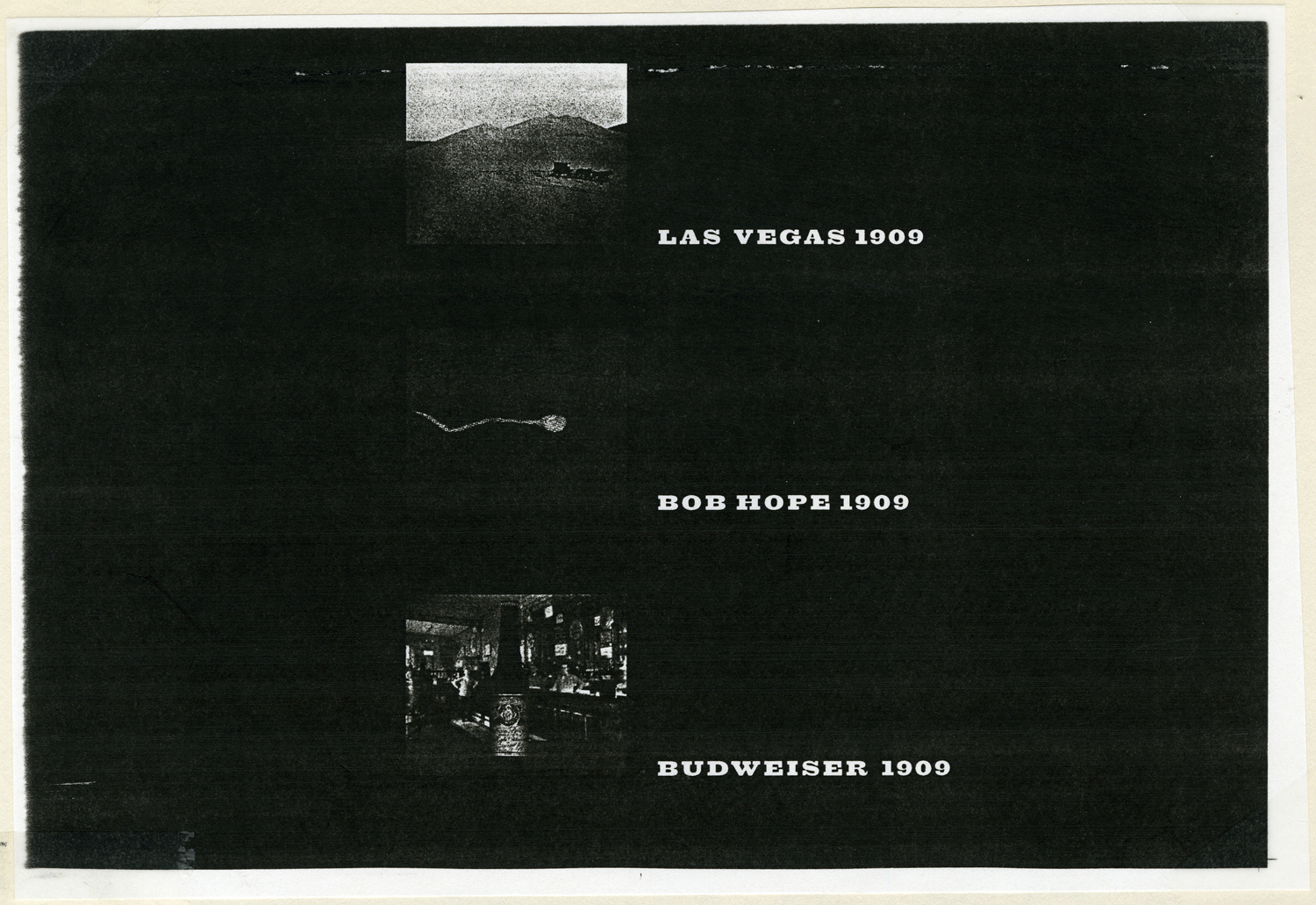
The Estate of John Wayne didn't want him portrayed as a sperm, (perhaps because he'd effectively be nude?)
The Estate of Bob Hope didn't want him portrayed as a sperm either. (He's English anyway, isn't he?)
The two car companies didn't want to be associated with alcohol.
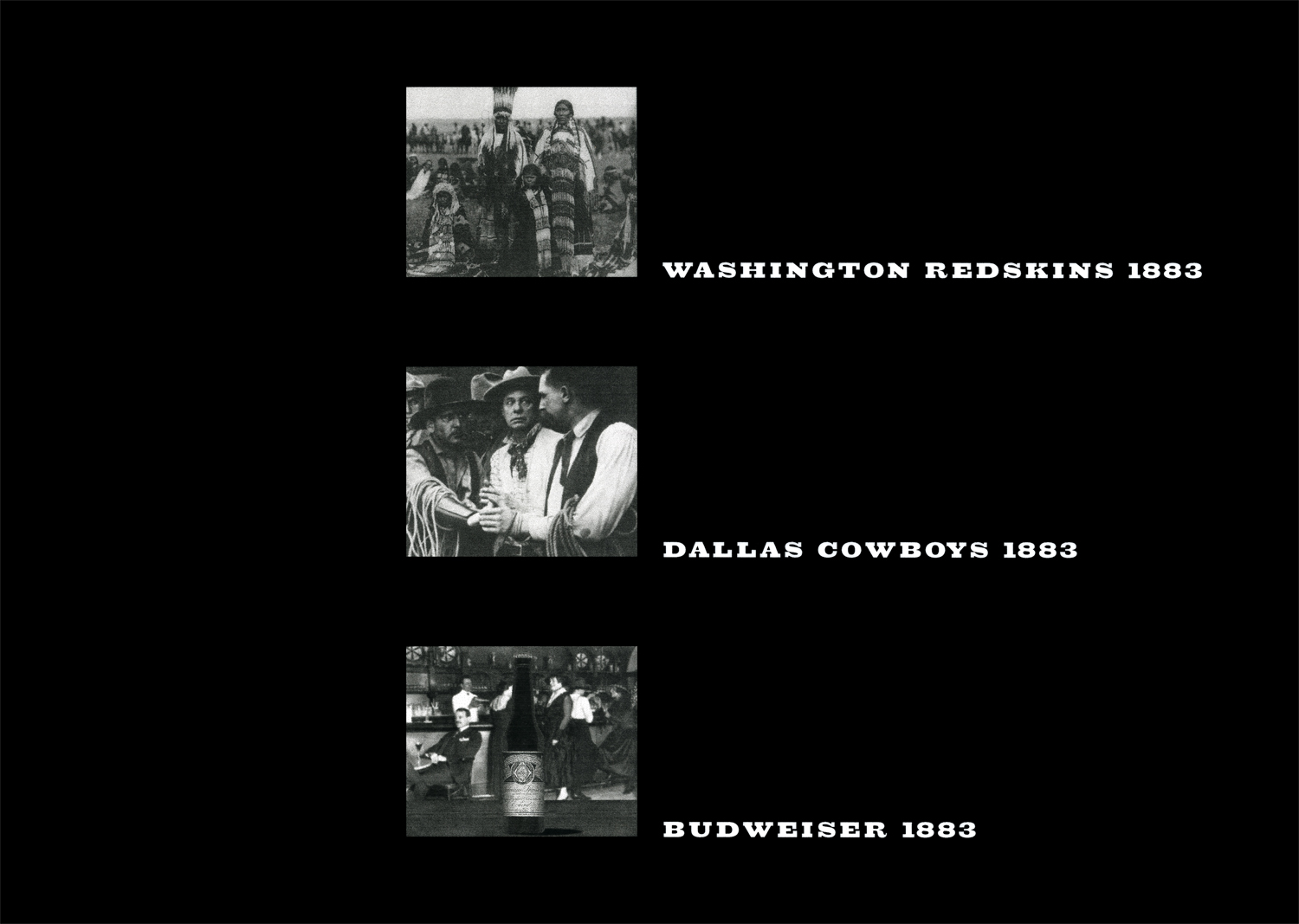
The two American Football teams passed.
That utter clown, Ronald McDonald, also said no.
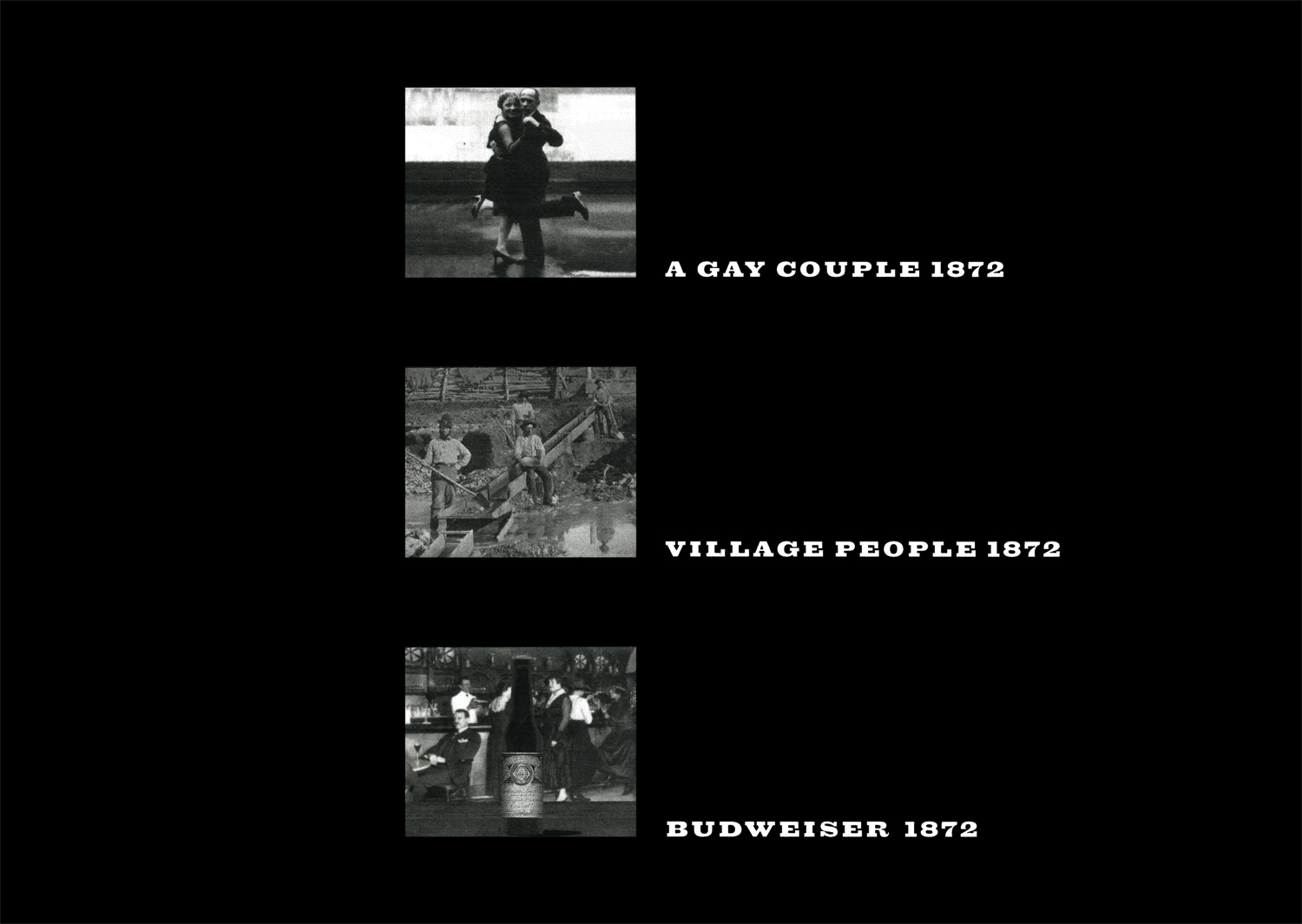
That way passed-their-sell-by date disco group was also a no.Which left us with these three ads.To break up the look of them, I gave each a different colour bias: greeny, browny and yellowy, to get technical about it.Typographer Dave Wakefield then picked fonts appropriate to the dates in each ad.(Although he's possibly the only seven guys in the country who’d appreciate that detail.)
They went down really well. They should've run for a number of years, but ironically Budweiser got obsessed with how fresh their beer was, they started printing ‘Born on’ dates on all their beers to show when that beer was first bottled. Is anyone really worried they are drinking stale beer from a freshly opened bottle? Ironically they ditched saying they were really old to saying they were really new.Like all those new beers.
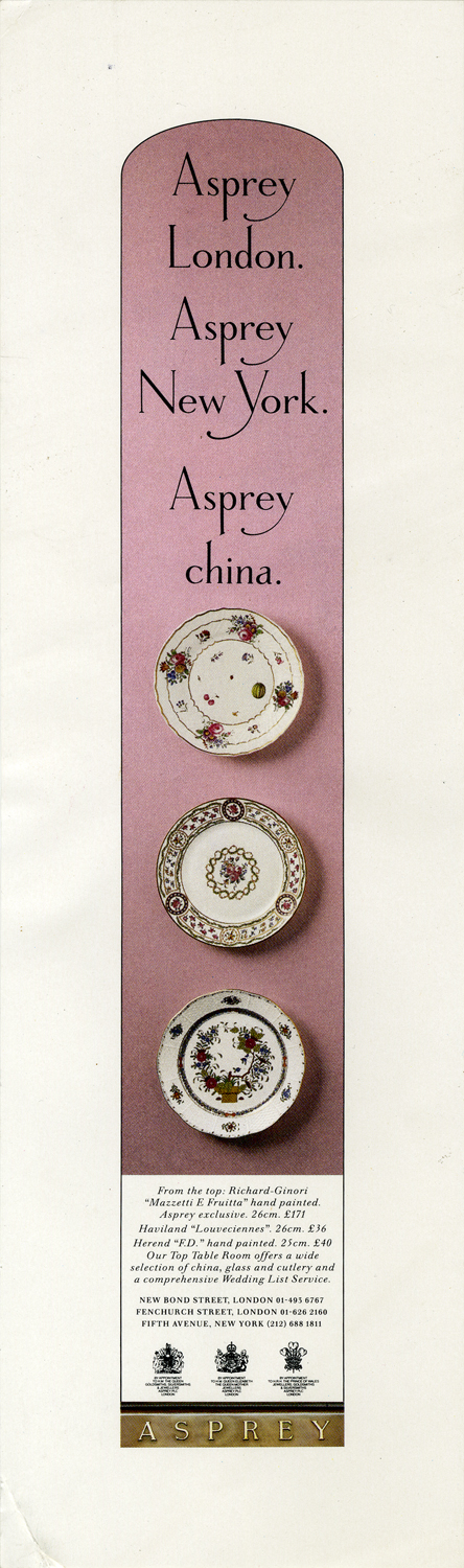
It’s one of the first campaigns I ever made.The agency was Cromer Titterton, my writer was Alastair Wood, the typographer was Andy Dymock and the photographer was Duncan Sim.But the key person involved was the photographer’s assistant, a scruffy, curly-haired Brummie called ‘Malc’. We shot for three weeks to get the three shots above. Malc was treated like a 17th century slave. We shot in the freezing, windy Highlands of Scotland, at the end of the day Duncan would sometimes say to the Brummie ‘Sleep here tonight, in the van, we don't want to lose this spot...Night!’ We'd then go back to the fancy hotel to eat, drink and be merry.We’d turn up to the location next morning, Duncan would bang on the side of the van ‘MALCOLM! Wake up! Let’s go!’ He’d be up and in action within seconds of waking up. Because he had it so tough, Alastair and I would smuggle food and drinks out to the van, it was the least we could do, he was a lovely, positive chap.Cut to a year later, ‘Dave it's Malcolm, Malcolm Venville...Duncan’s assistant, can I come in and get your advice on my pictures, I'm going to be a photographer.’He turned up at my office in Edwards Martin Thornton with a ramshackle box of photographs; stuff from college, random pictures of his girlfriend and a few portraits of reggae stars, taken as a favour for a friend's magazine. All were grainy and black and white. At that time advertising photographs were colour and glossy.What a shame, I thought, he's such a nice bloke.I gave him a couple of tiny jobs to help him out financially.The first was a portrait of my Nan, I gave him £50.(I remember asking her to wear black and white clothing so that I would get an idea of what the picture might look like, I guess I didn't trust him?)The second was a proper job, a small proper job.I asked him if he was able to take a colour picture of some expensive plates?‘Yeah, easy!’I was a bit anxious, if the client, snooty up market jewellers Asprey’s, ask to see Malc’s folio to assess his appropriateness I may look daft, the most relevant picture in there would be the grainy black and white picture of stoned Lee Scratch Perry eating breakfast, from a plate.He’s approved, on the day of the shoot I arrive to find the three plates to a pink wall with Elephant Gum.It looks perilous to me ‘will that hold those plates? They’re worth more than this shoot?’, Malc replied ‘Oh yeah!...It should do.’
We got away with it, the pictures we useable.I figured he owed me a favour, so I asked him to shoot a poster for the IPA Society for me,
He agreed, insisting it be shot in daylight.There was zero budget, the background is an upside-down layout, we made the ‘models’ ourselves.
He did a good job, and he was right, daylight gave it a nice feel.Shortly afterwards I had a proper ad that needed shooting, one with an actual budget.Do I risk giving it to my, by now, best mate? Or give it to proper photographer?He ‘pitched’ for it, showing Richard Avedon shots as reference, again he wanted to shoot using daylight and wanted a fifties feel.Sod it.
He did a great job. (Again shot in daylight and printed by Klaus Kalder on lith paper.)We tried to hustle a few projects by offering free creative and photography, providing we had complete creative control.
At that time, Malc was working out of a retouching company called O'Connor Dowse, who gave him a room at the back of their offices to use as a studio, for free.Malc convinced Grenville, the owner, that a big ad in Campaign would really put them on the map.
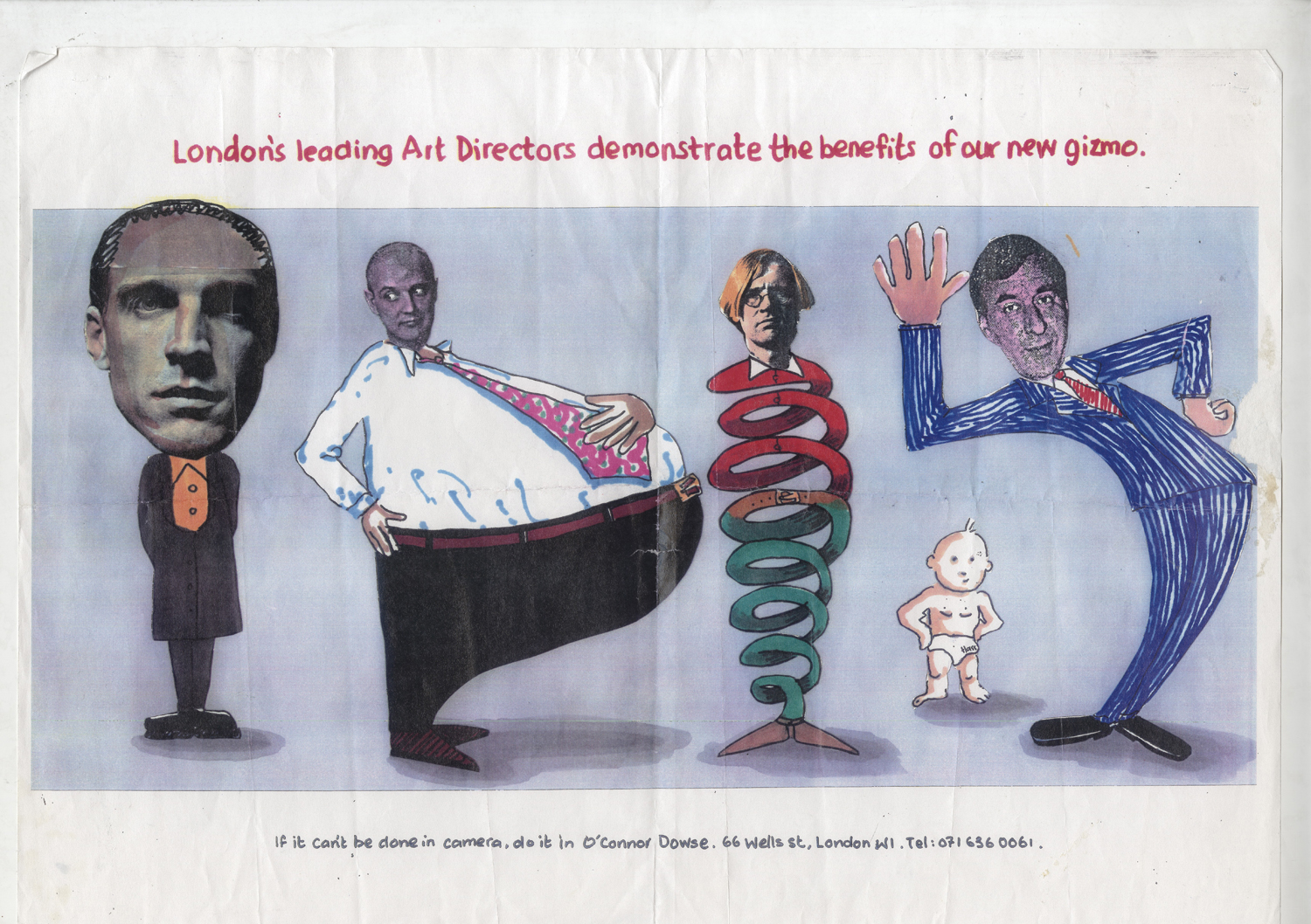
It's possible that we felt an endorsement from London's leading Art Directors really would help O'Connor Dowse, but we were very aware that meeting the best Art Directors and Creative Directors in London would be pretty useful to us. Paul Arden, John Hegarty and Alan Waldie turned us down. Graham Fink said yes, but made Mike McKenna and I come up dozens of concepts for his image, then picked the one below.
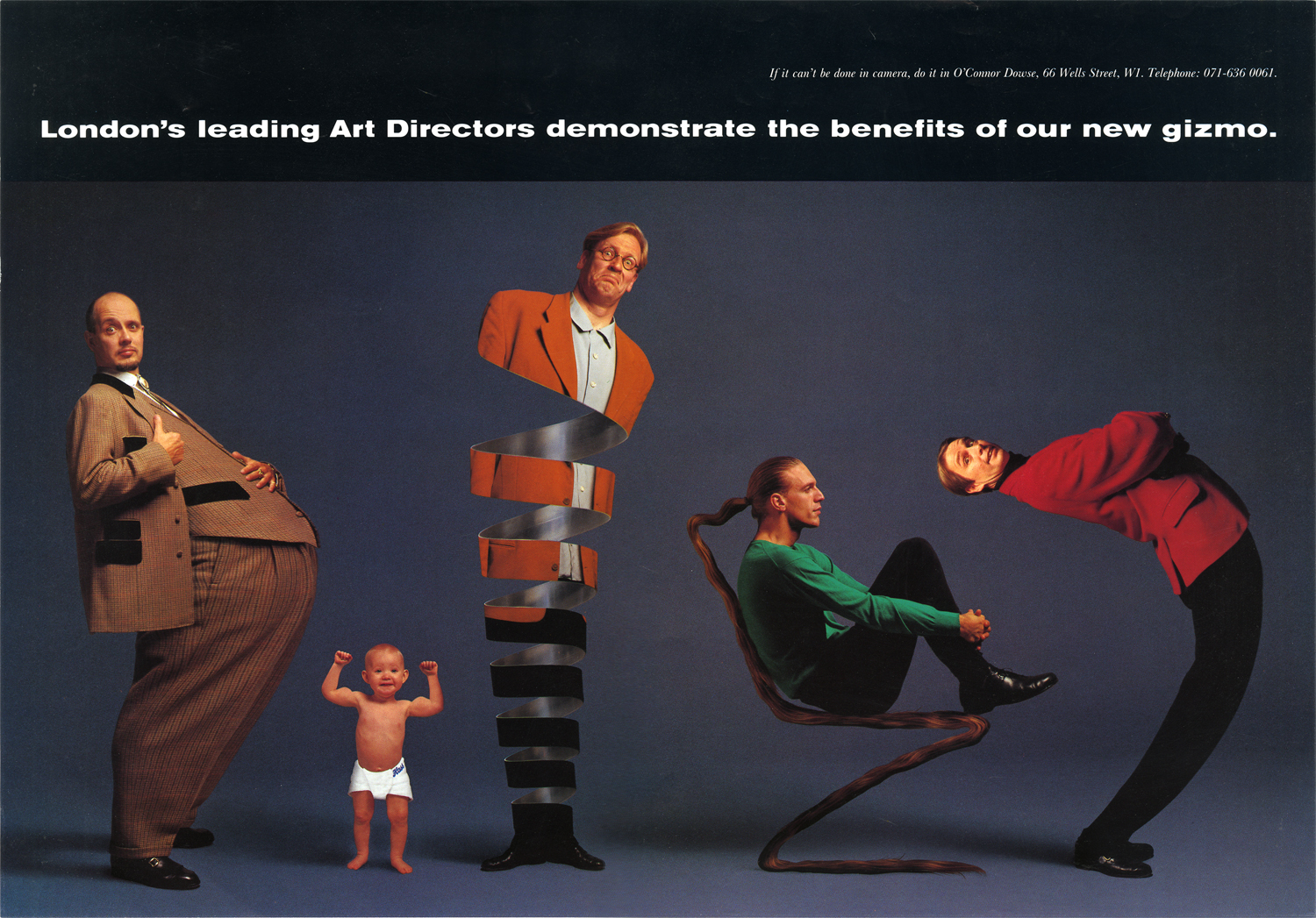
The ad was a great success. I've no idea what it did for Grenville, but Malc started shooting regularly with the Marks, Denton and Reddy, and I was hired at Simons Palmer DENTON Clemmow & Johnson within the year.
A few years ago I needed an old beer poster for a presentation.I knew the Art Director’s name - John Knight, so headed to Google - nothing!I then searched the agency name, the year, the writer's name, the photographer's name - nope!Desperate, I googled every every miss-spelling I could think of - diddly squat!I eventually found it after trawling through a ton of old awards books.While leafing through all those award winning ads from the 70s and 80s, I was struck but how few were John's.He was a huge influence on my generation of creatives, consistently coming up with new, fresh ways of making ads, how could he be so underrepresented?"Truly groundbreaking work never does very well at the awards, it splits the juries and ends up not getting voted in. John suffered a lot from that." John Hegarty told me (John was his old boss at TBWA).The problem with looking at all the fresh work 30 years later is that things move on, what was innovative in 1985 is unlikely to feel so today. Once a unique path is forged it's then open to the public, any idiot can then follow it.For a bit of context, here's what most ads from the time looked like, it's a very good ad, but it looks exactly like an ad.
This is a 48 sheet poster from the same period of John's.It would've been about 20 foot long.Coming across it on a street would've been startling.
No headline.No logo (usually bottom right).No end line.No product shot.No pun. (They were all the rage at the time.)Just a single photograph.In the photograph was hidden a headline, logo, end line and product picture, but they were all woven together in an image that evoked another era.An era that probably brewed better beer.It made me think an old brewery in the Midlands was cool.Not an easy thing to do.I found out it was produced by an Art Director called John Knight. (Bottom left.)
Known to friends as ‘JFK’.Not because his middle name was Frank, Fred or, like the better known JFK, 'Fitzgerald', John's 'F' was due to his habit of breaking up words with an ex-fuckin’-spletive."It shocked people, swearing wasn’t as common back then" John’s old writer Ken Mullen told me.His ads weren’t like other people’s, here’s why:1.The style of his ads are bespoke to each client.E.g. The beer posters are made from bits of pubs, the Laura Ashley ads are made from fabric and the Duckham's oil ads are made from car parts.2. The art direction feels like a human being made it.3. His ads don't look like ads - so people look at them.DDB.Here's the earliest ad I could find of John’s.There are three creatives credited, an established team plus a junior - John, so I think it's safe to assume it was John's idea.VOLSWAGEN.
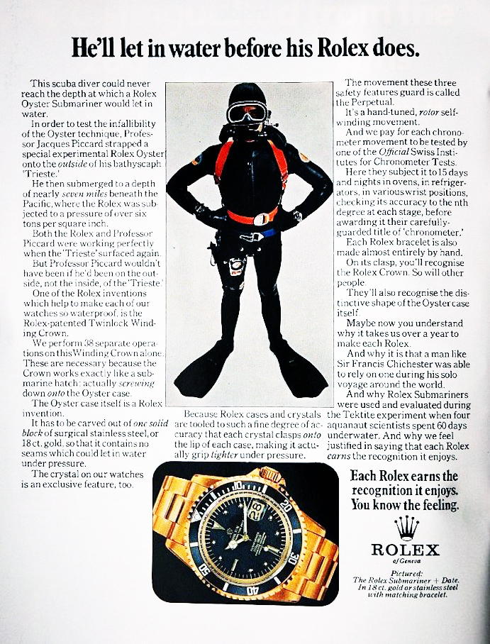
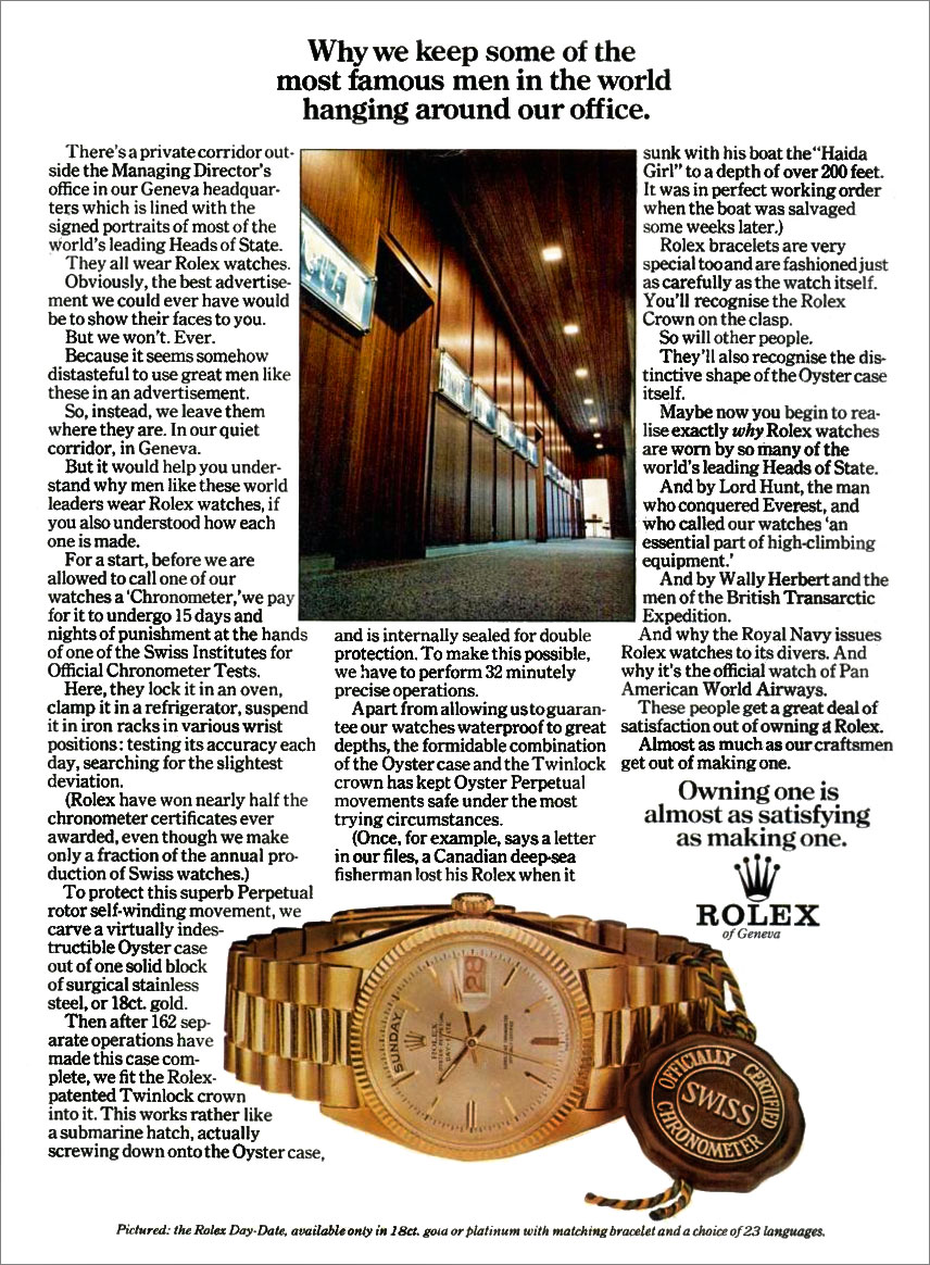
J. WALTER THOMPSON.ROLEX.

GUINNESS.
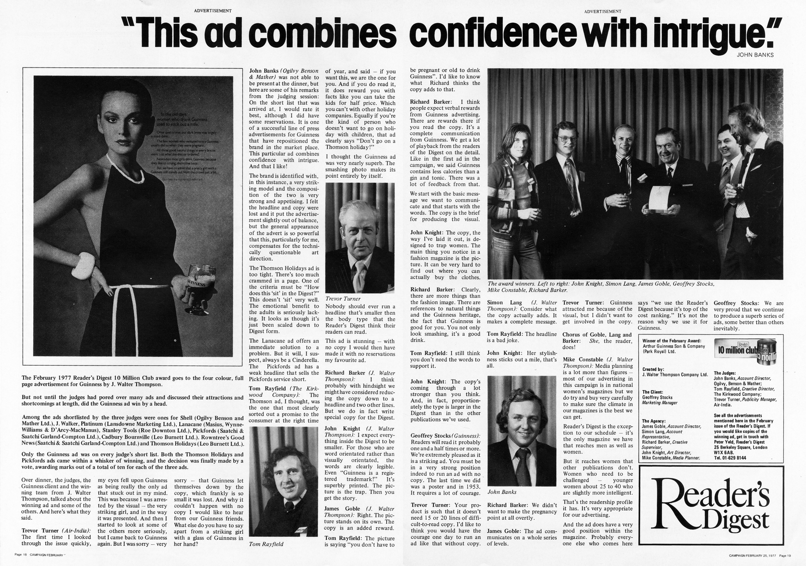
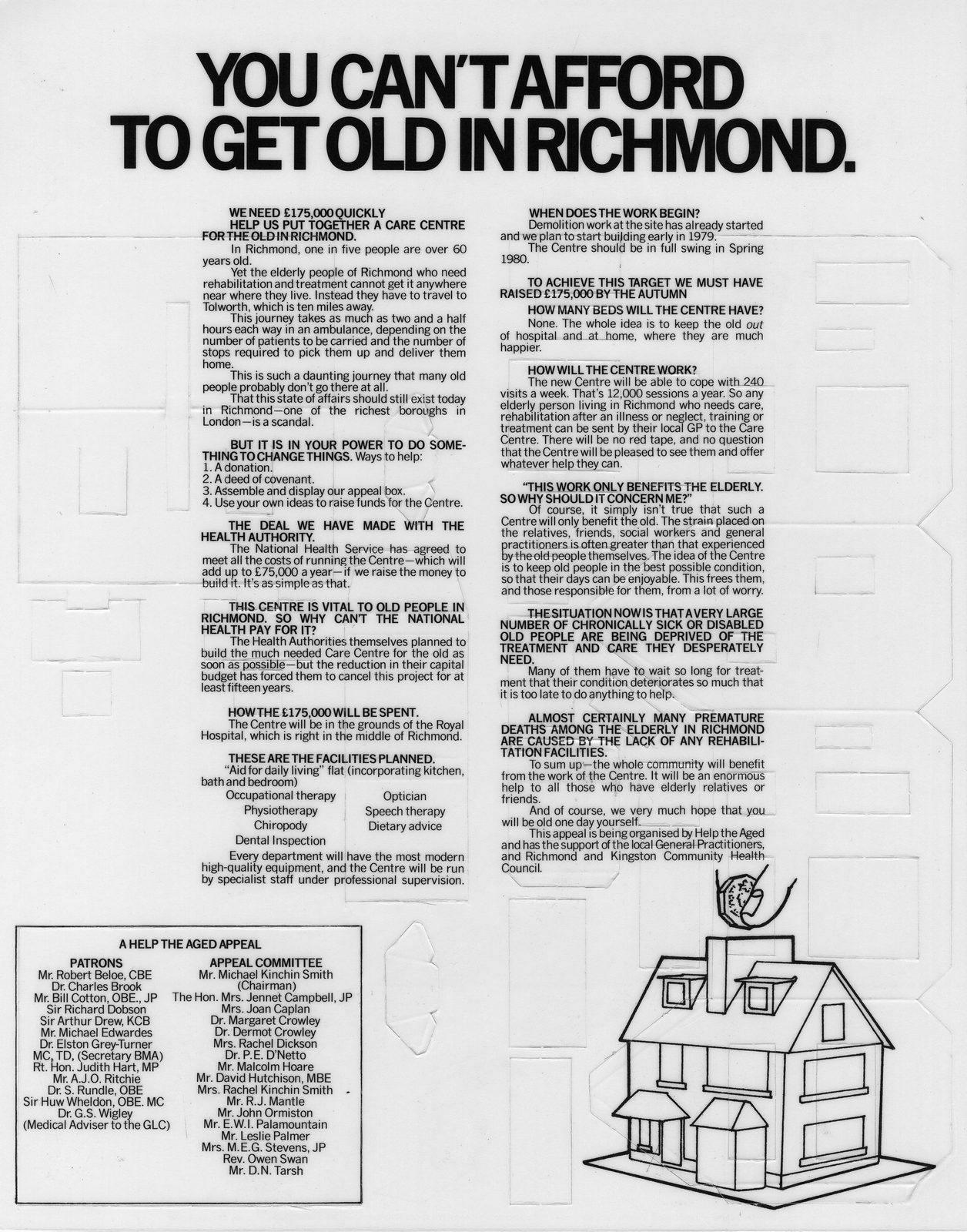
Although a sweary, hard-drinking Millwall supporter, John also had a sensitive side; he was an expert on wild flowers, bred canaries and helped green charities before they were called green charities.HELP THE AGED.
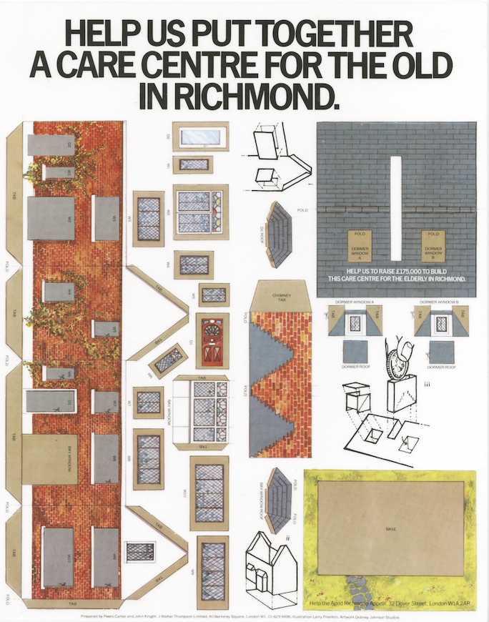
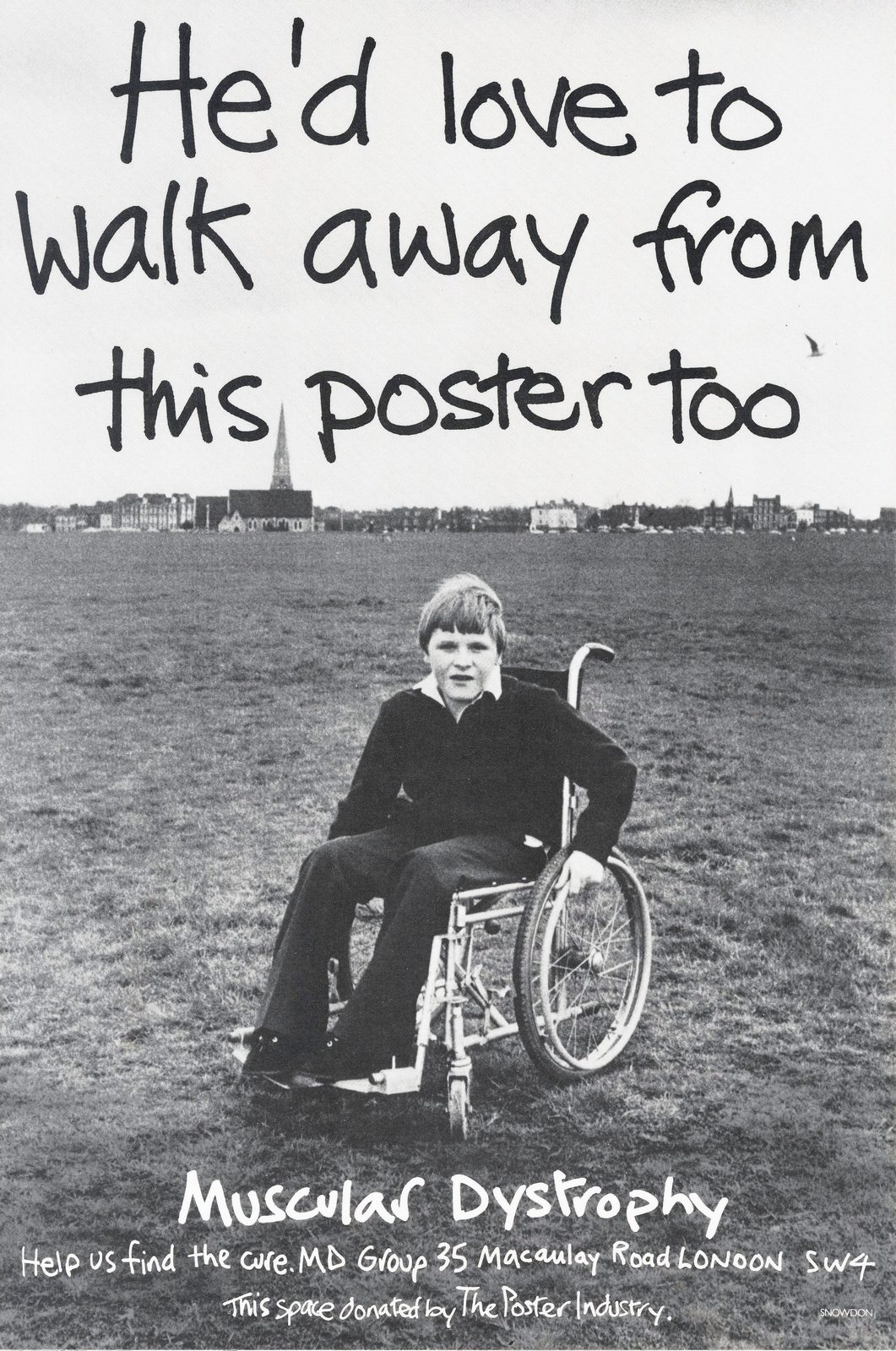
MUSCULAR DYSTROPHY.John sweet-talked Lord Snowdon into shooting this poster.For nothing."It ran for 14 years...every time it came down, fundraising fell" - Peers Carter (John's writer on the poster.)
TBWA.In the seventies you were either a Designer or advertising Art Director.You didn’t skate between the two, weirdly, advertising art directors would consider it a diss to be called a 'designer'.John did both.
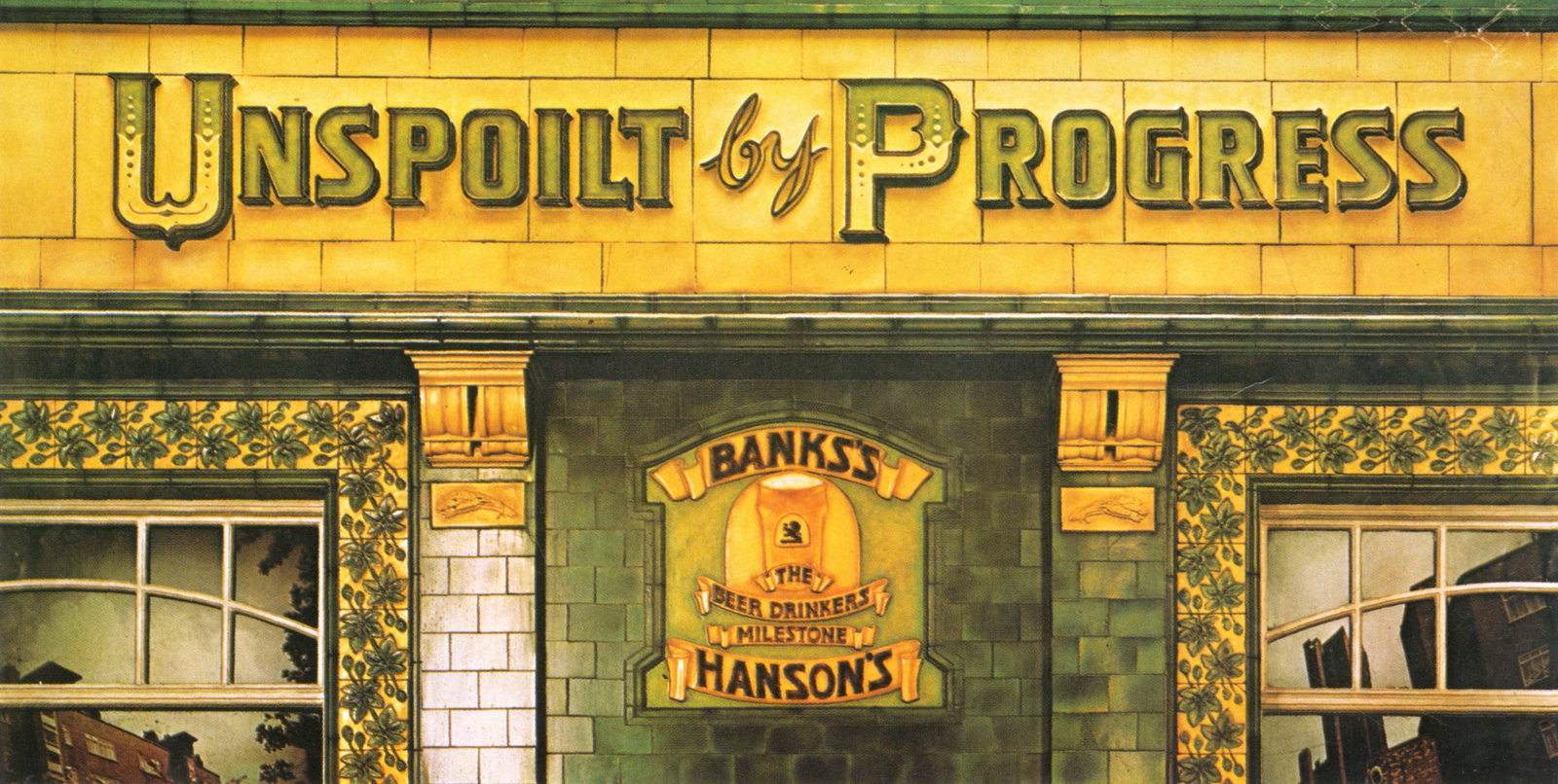
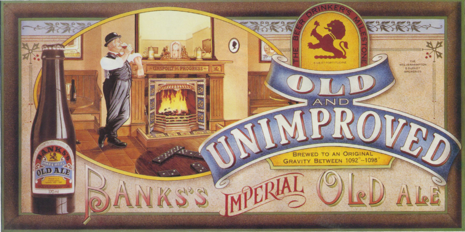
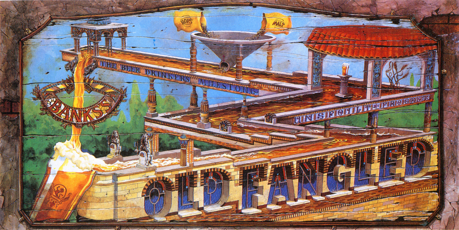
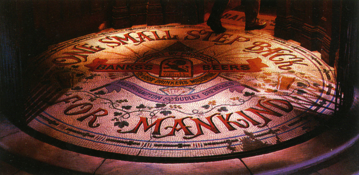
BANKS'S.For me, this campaign is one of the best poster campaigns ever.
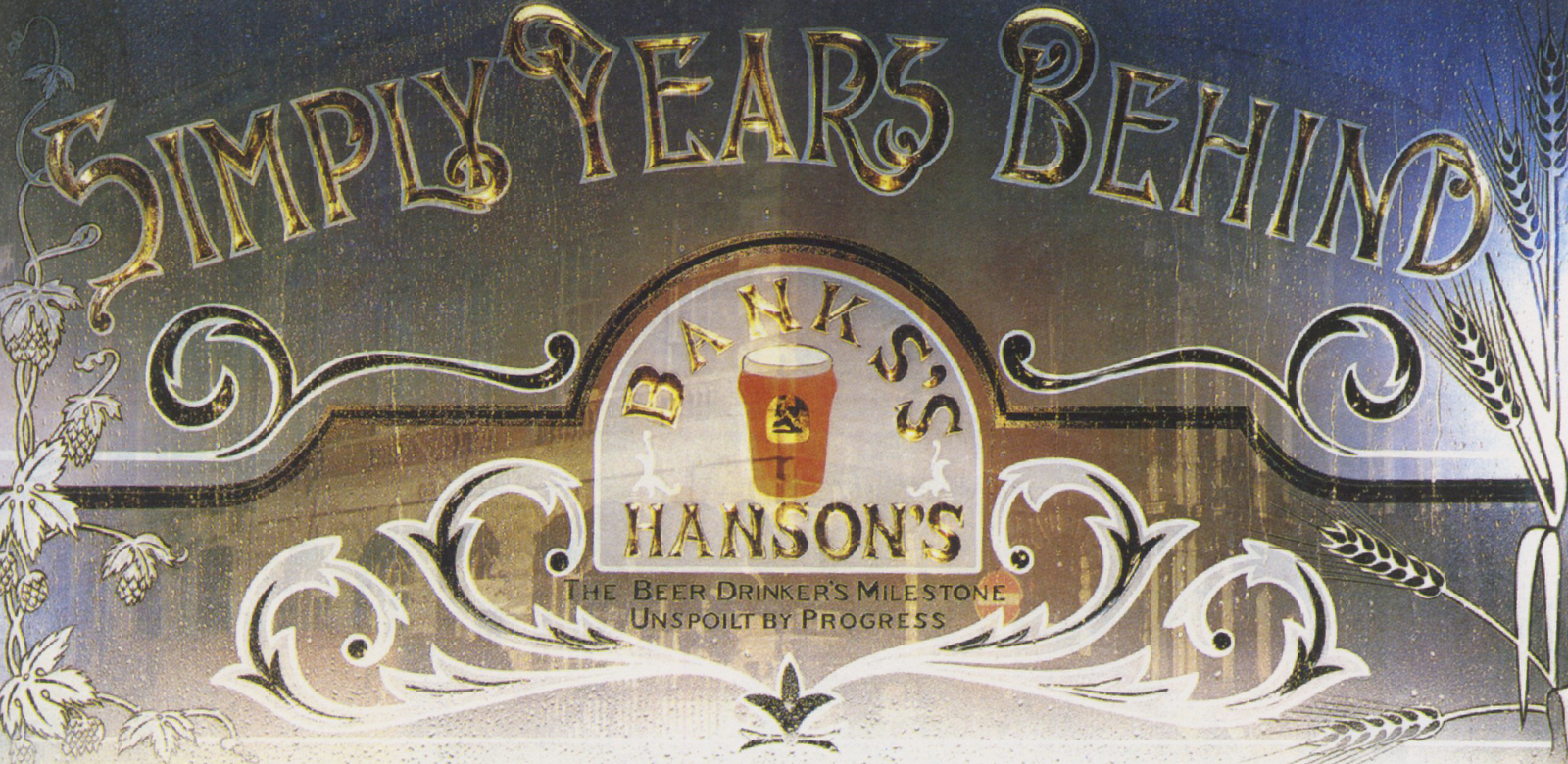
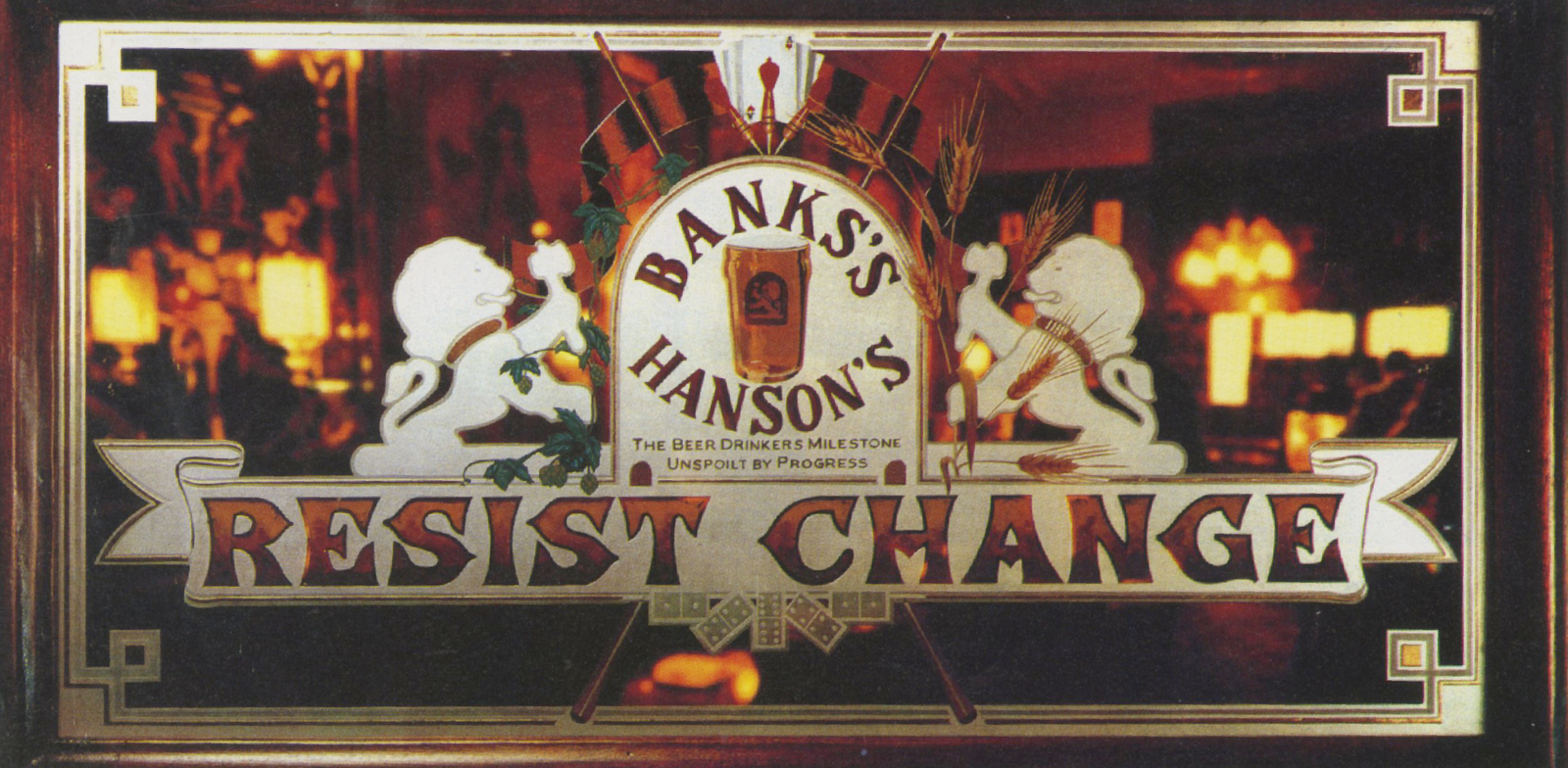
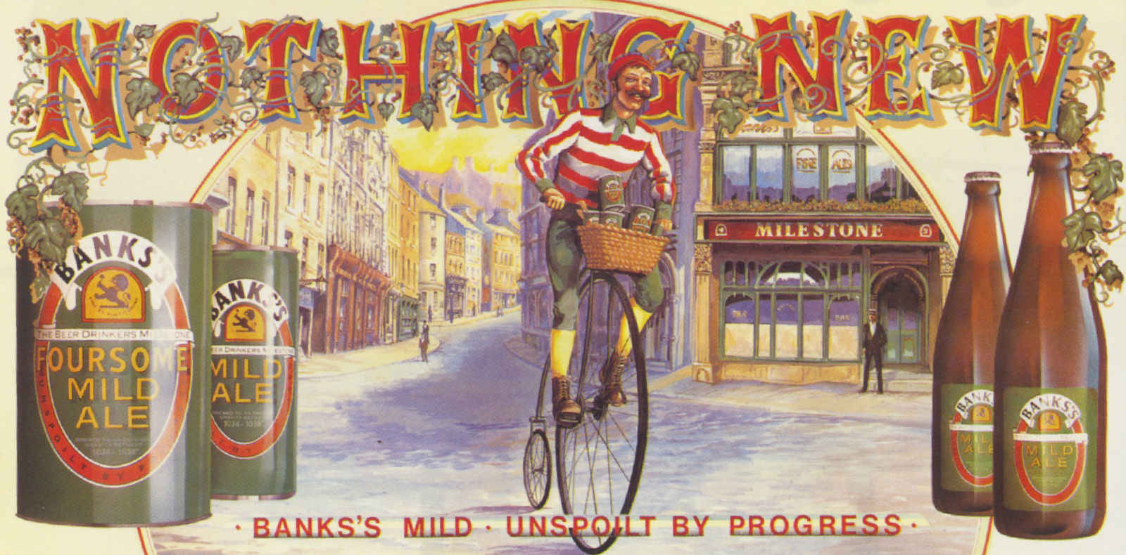
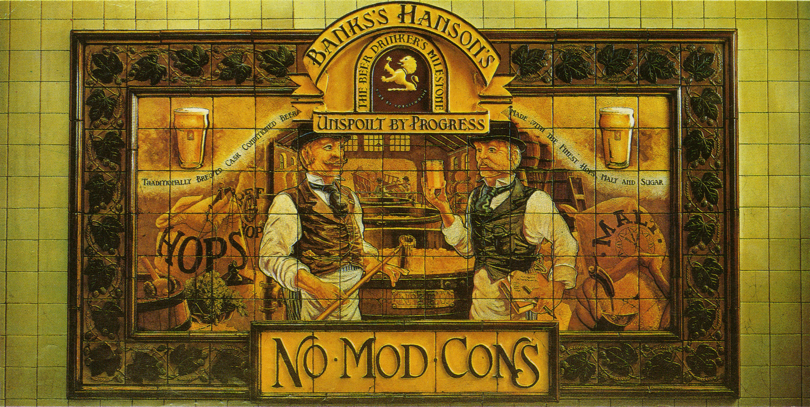
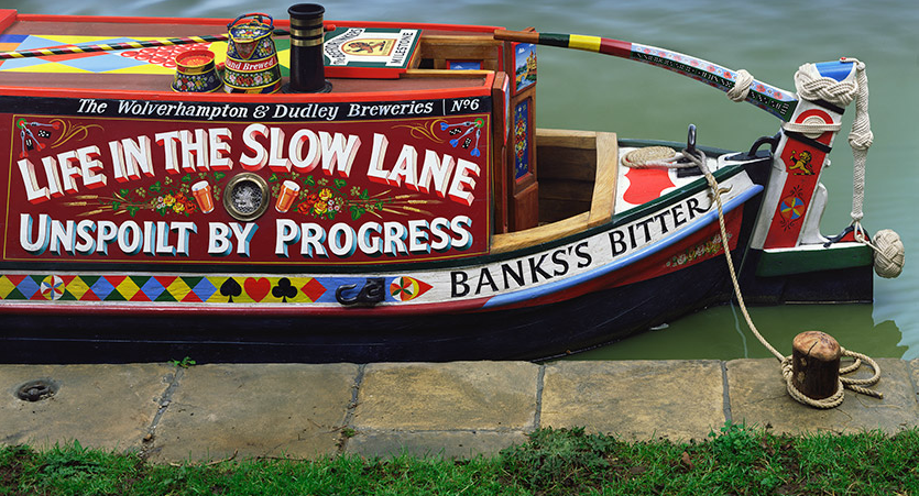
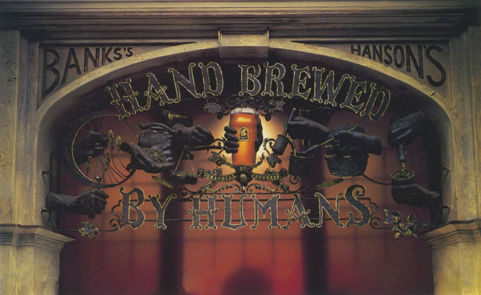
(I presume this last one parodies the famous Fiat ad from the time -'Hand built by robots'.)"He was no believer in deadlines.I remember once on Banks’ weeks and weeks were going by without anything happening, I thought the only way to solve it would be to get everyone in the same room to find the culprit.John came in last, looked around at assembled faces and said ‘looks like I’m gonna need fuckin' legal representation' ". - John Hegarty (his Creative Director at TBWA.)VOLVO.He managed to convince some of the least commercial artists of the day to grubby their hands with adverts; David Hockney, Eduardo Paolozzi and Dame Elizabeth Frink.Convincing Volvo to pay their fees wouldn't have been a walk in the park either.But he made it happen.
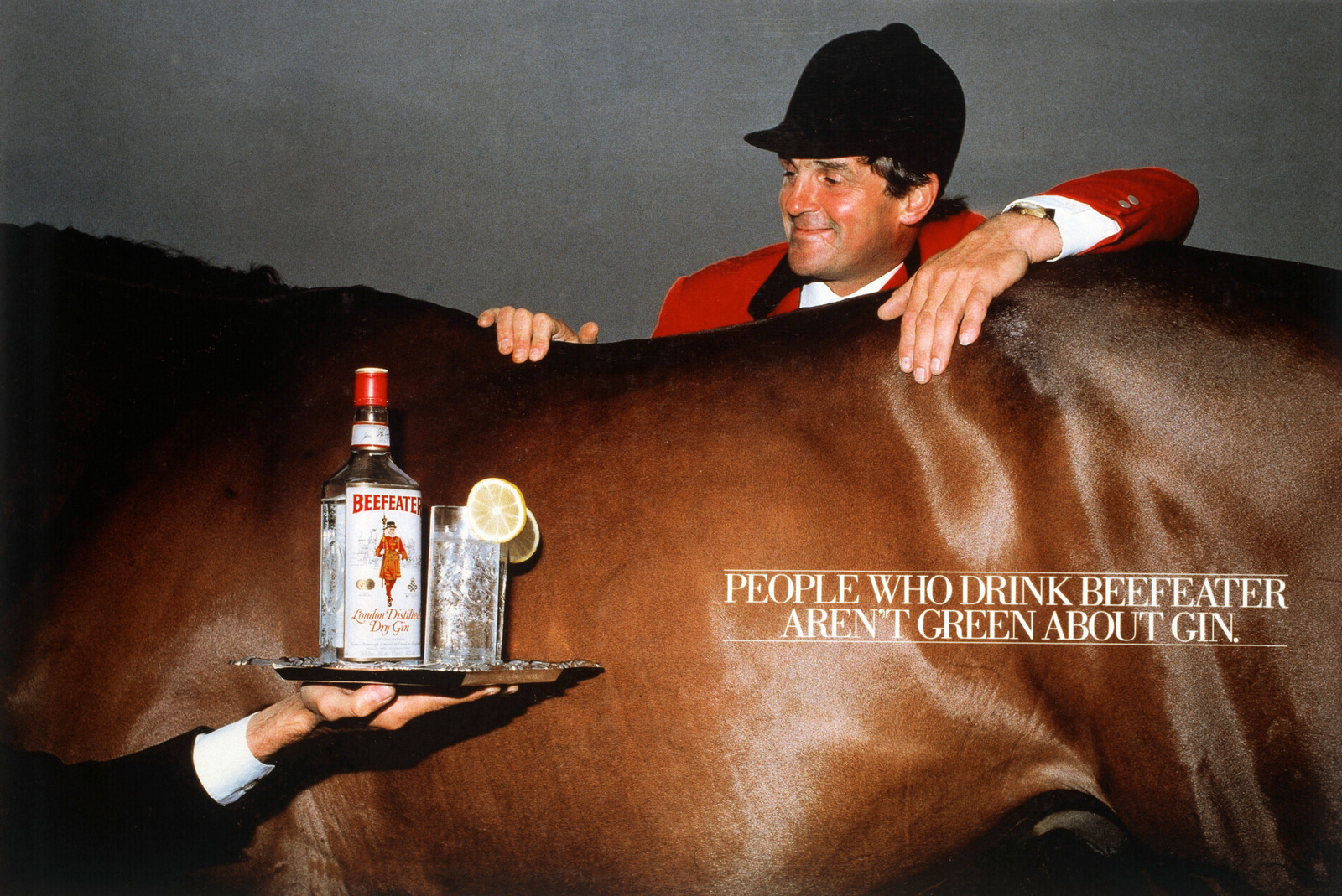
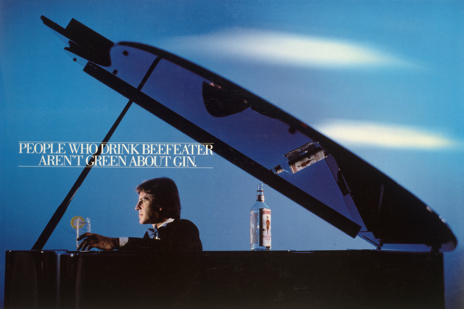
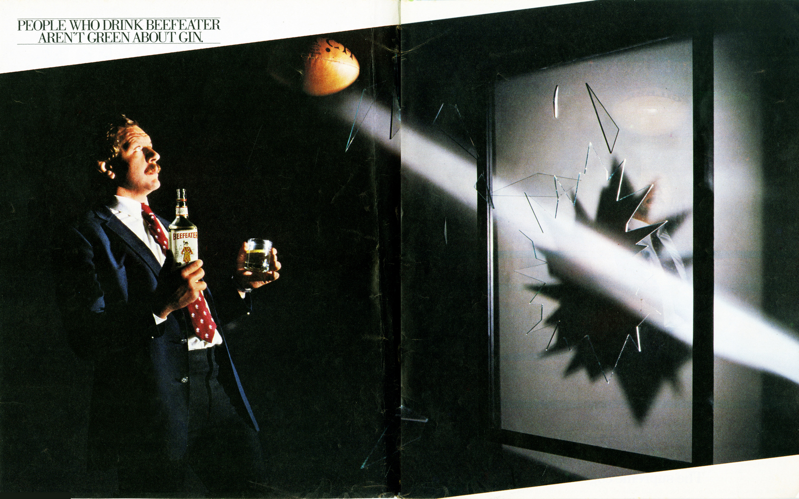
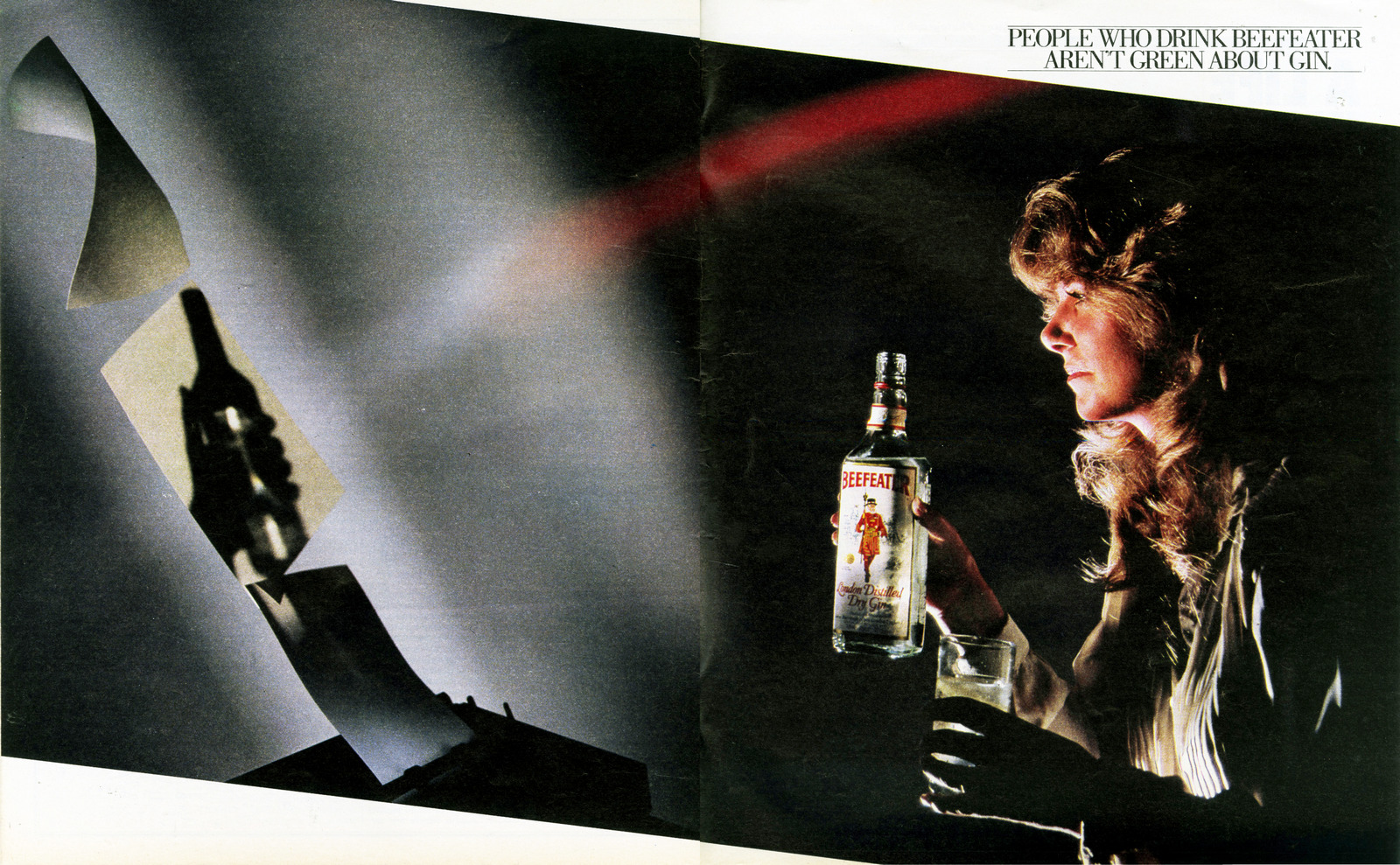
BEEFEATER GIN.A campaign knocking Gordon's, the gin in the green bottle.(Great shots by Brian Griffin.)
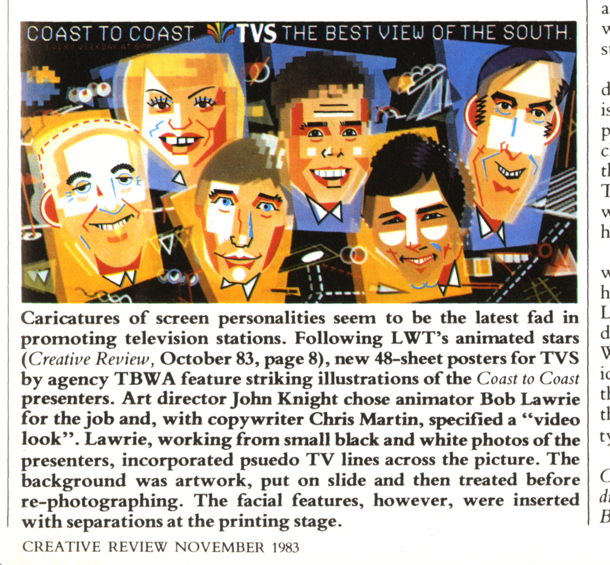
TVS.He was doing illustration/photography mash-ups before the term ‘mash-up’ was released to the general public.
MURRAY MINTS.
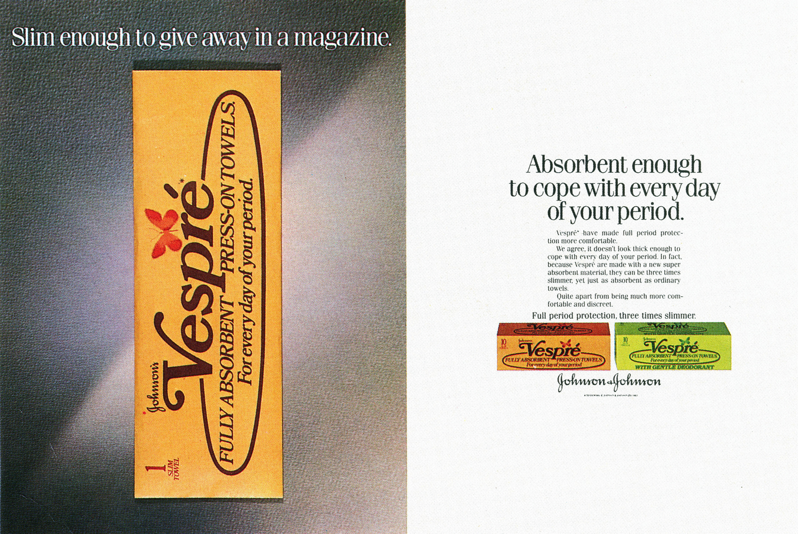
VESPRE.A great product placement idea, done with a real product.
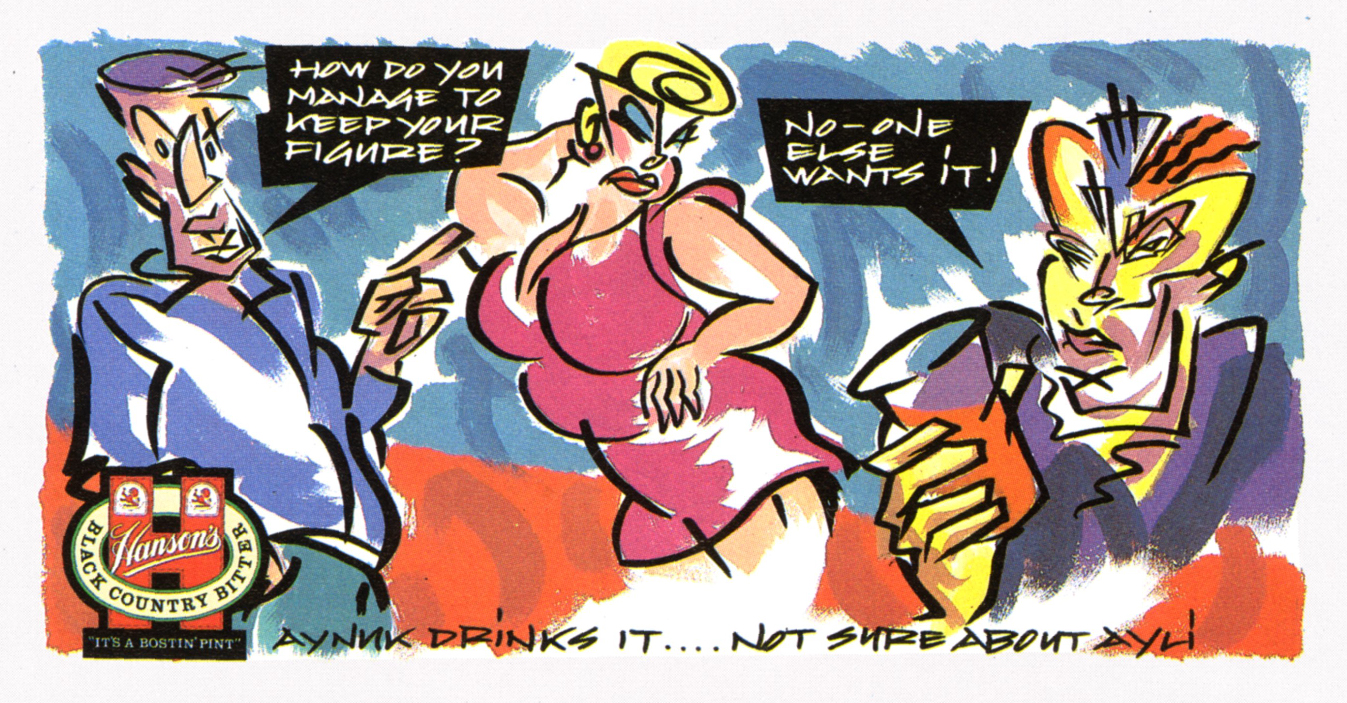
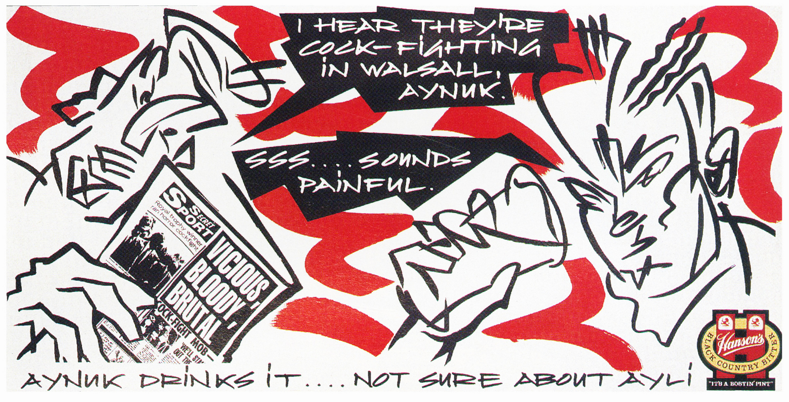
HANSON BREWERY.

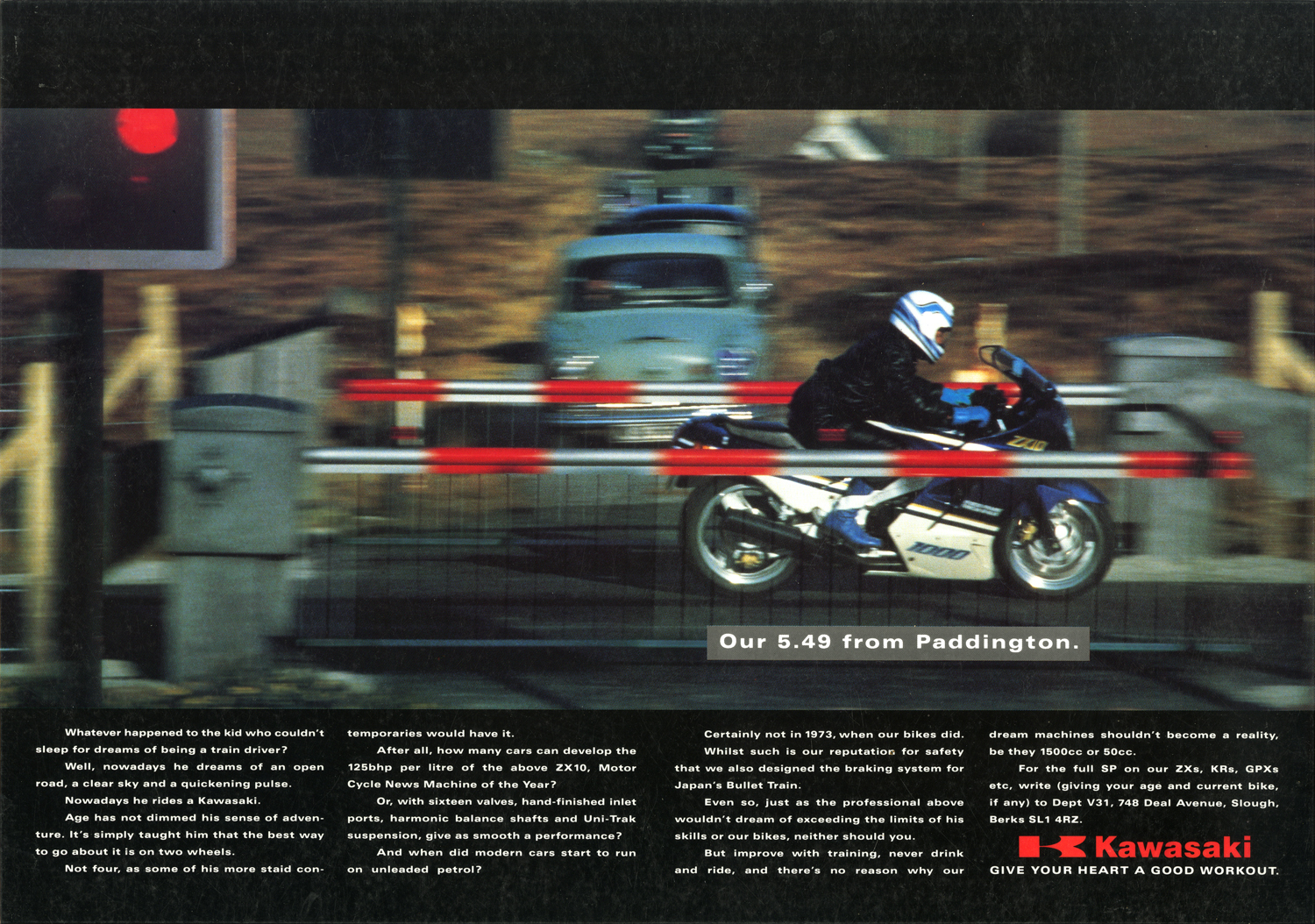
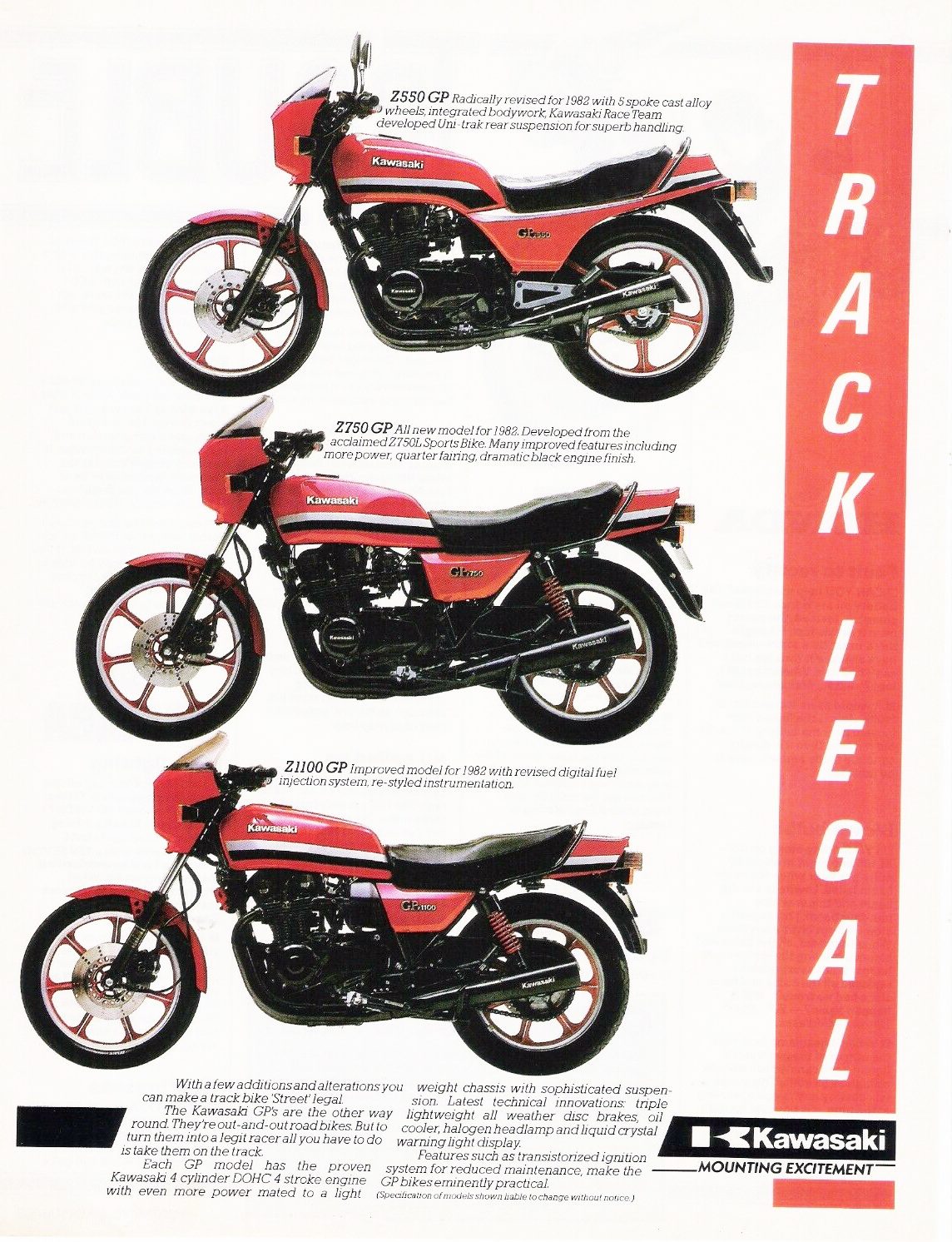
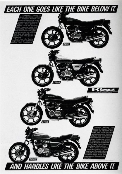
KAWASAKI.For the time, these layouts would’ve been considered very ‘out there’.
SINGAPORE AIRLINES.A great shot by Bob Carlos Clarke. (That smudge above the guy's head says ‘Sorry about Thursday’.)

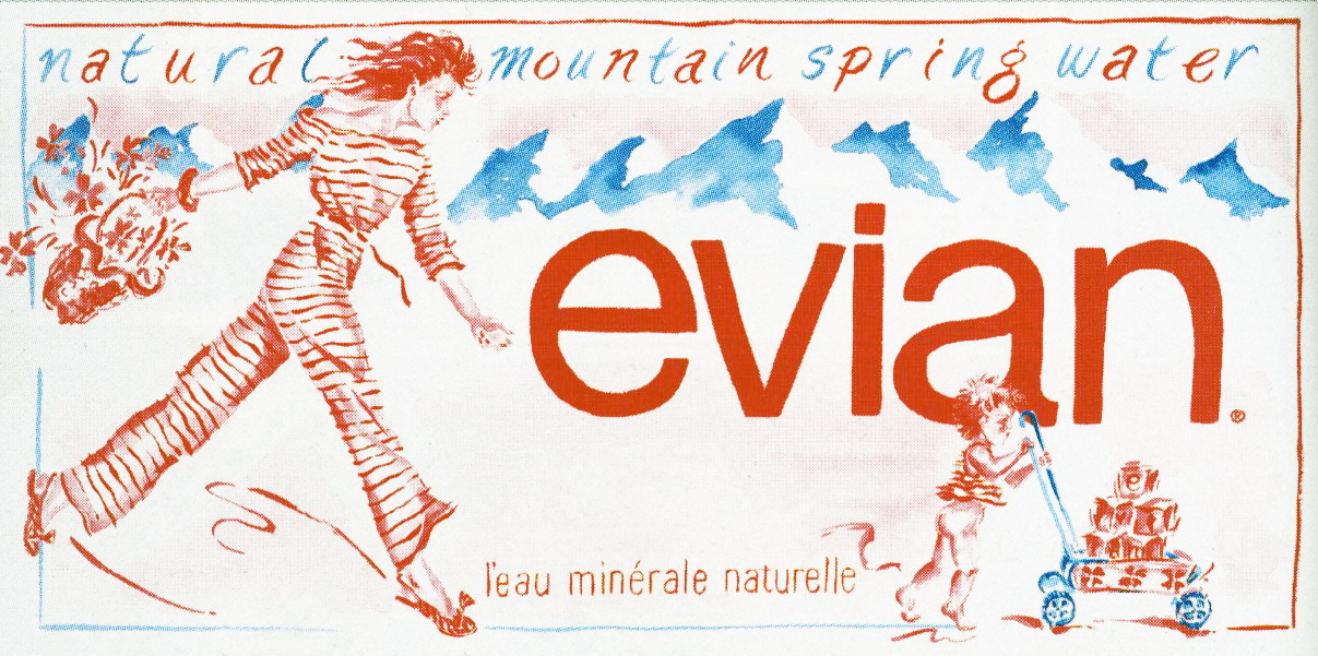
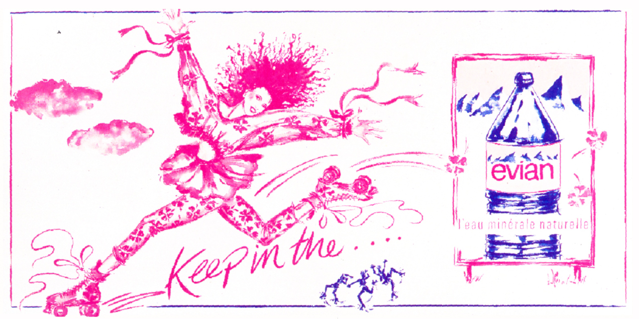
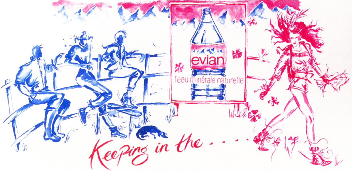
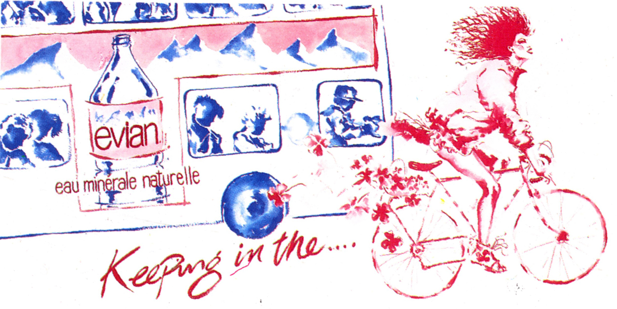
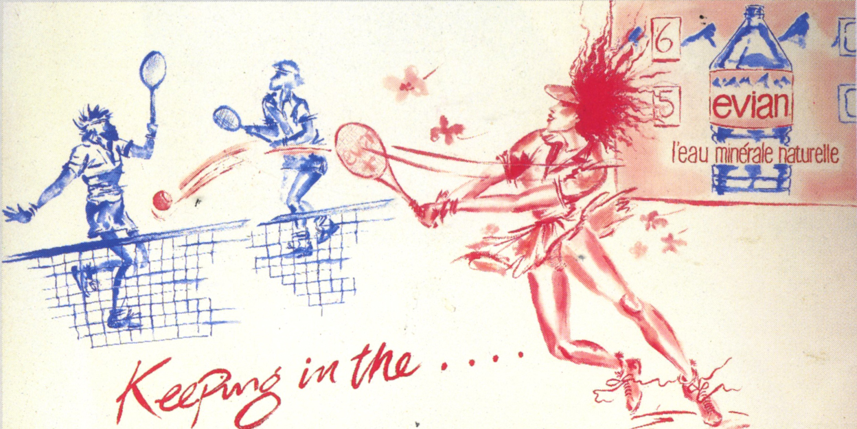
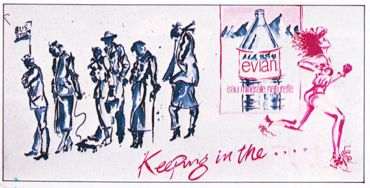
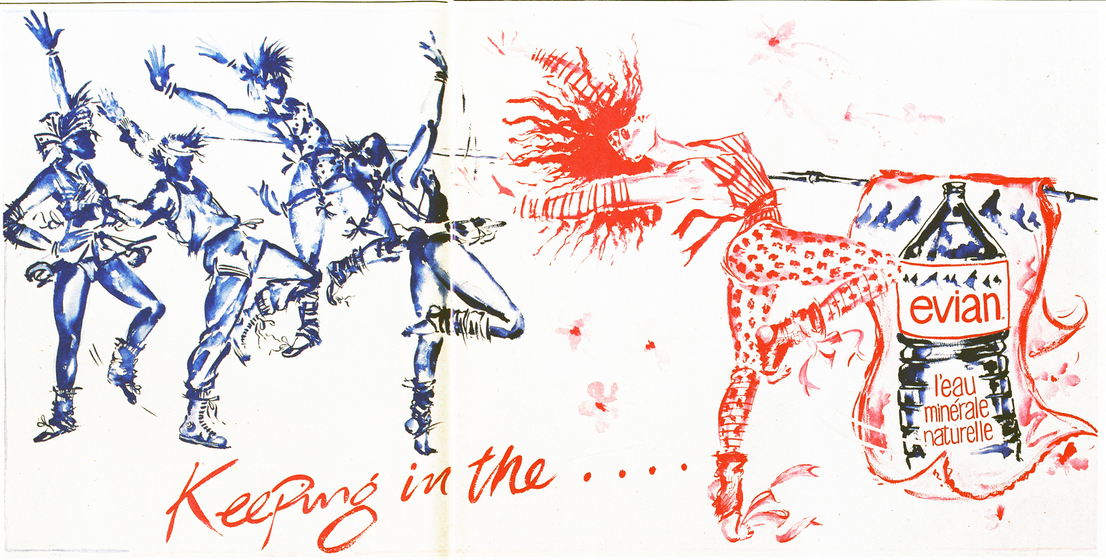
EVIAN.Apparently John lined up artist Allen Jones to illustrate the Evian campaign, it was all ready to go when the client got cold feet, worried that the imagery may be too erotic.
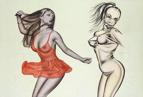
In the end, illustrator Conny Jude stepped in and did a great job.
JOHNSON & JOHNSON.
WCRS.Qantas."For a writer like me it was terrific working with John, he'd take your thoughts and ideas into surprising places.On Qantas, for example, I’d written a long copy ad about the effects of jet lag, John went down to the studio and, to echo the effects of Jet lag distorted and distressed all the type, which was fine, and then, without telling me, swapped around the first four lines of copy.It made no sense.He then hid from me to try and avoid the possibility of me trying to change it.When people, including me, saw what he'd done it seemed ridiculous, in retrospect it was brilliant.’’ - Giles Keeble.
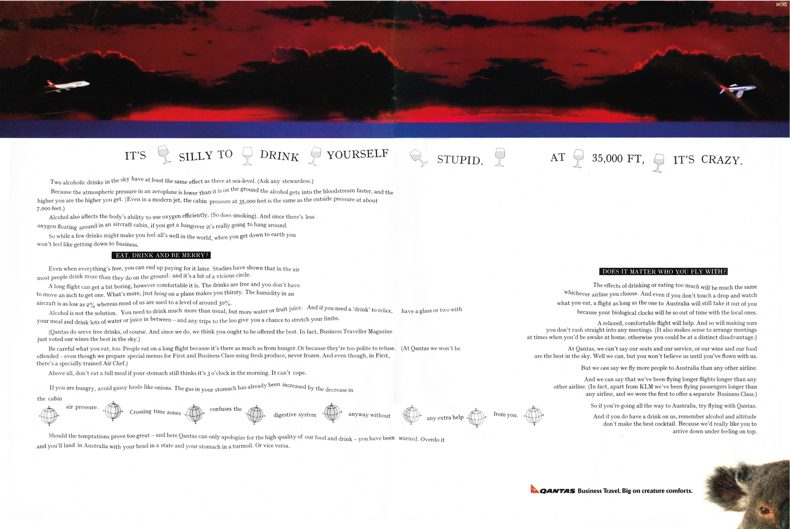
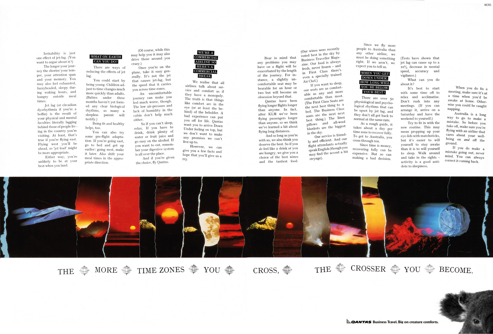
“Before we worked together at WCRS, I nearly worked with John at AMV.I was going to be to be paired with Brian Morrow, an art director from TBWA, at the last moment David Abbott informed me that Brian would be working with another writer instead, Brian contacted me and said ‘You should speak to John Knight, he’s the one I copy." - Giles Keeble.DULUX NATURAL WOODCARE.Very simple, cool homemade font.
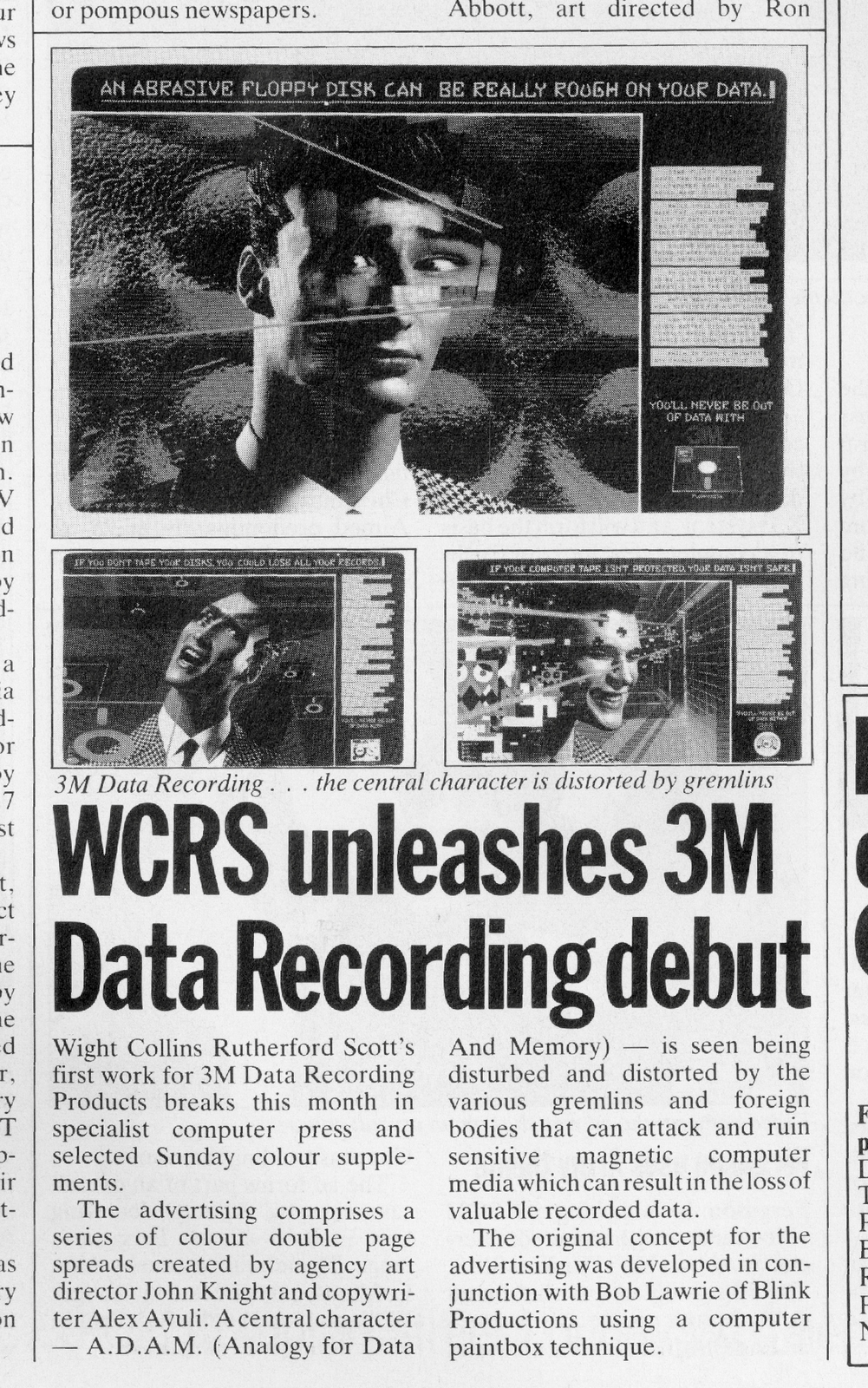
LAURA ASHLEY."The Laura Ashley ads we did with the illustrations made from their fabrics were blown up and put in the windows of all their shops, they used to stop people in the streets." - Giles Keeble.
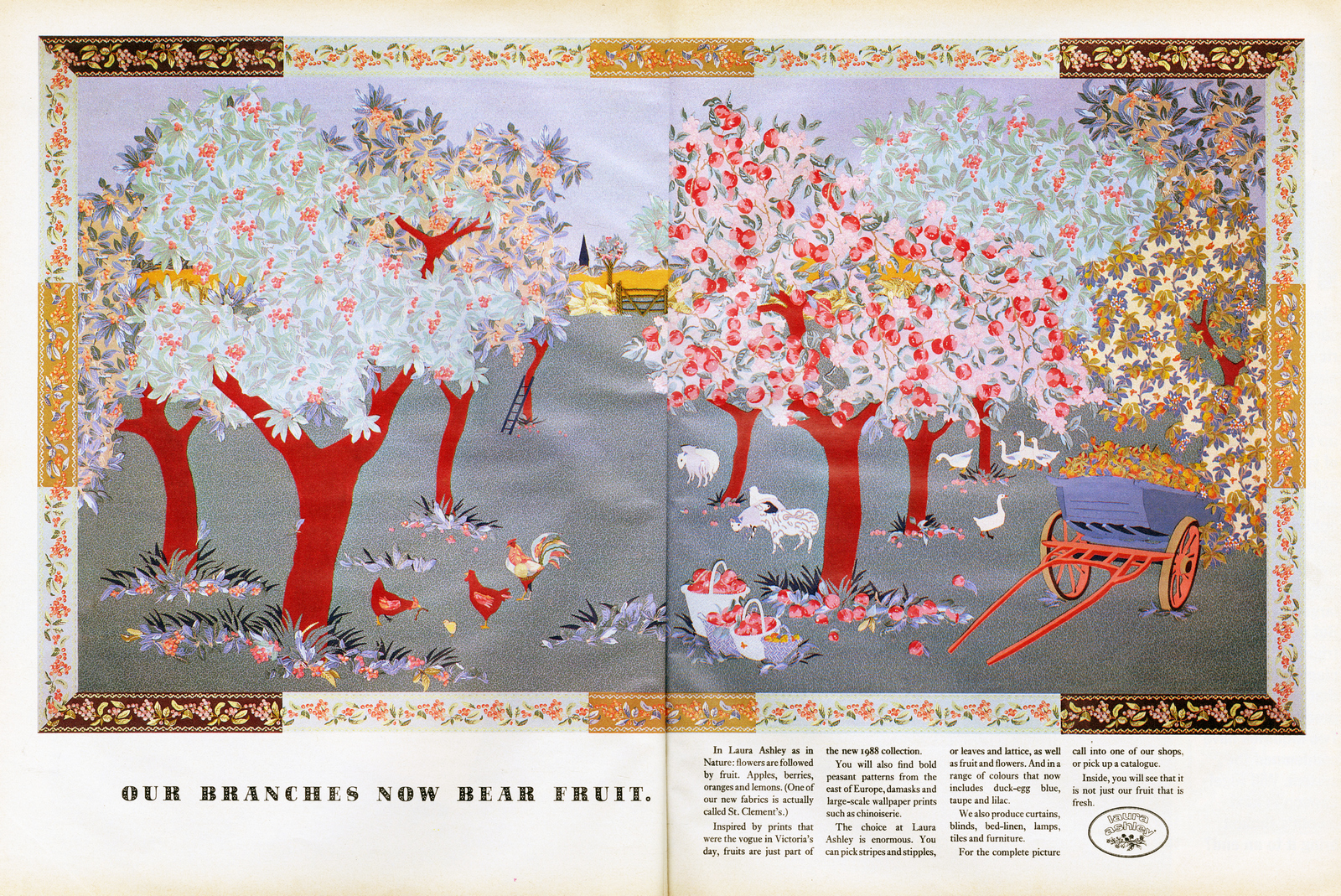
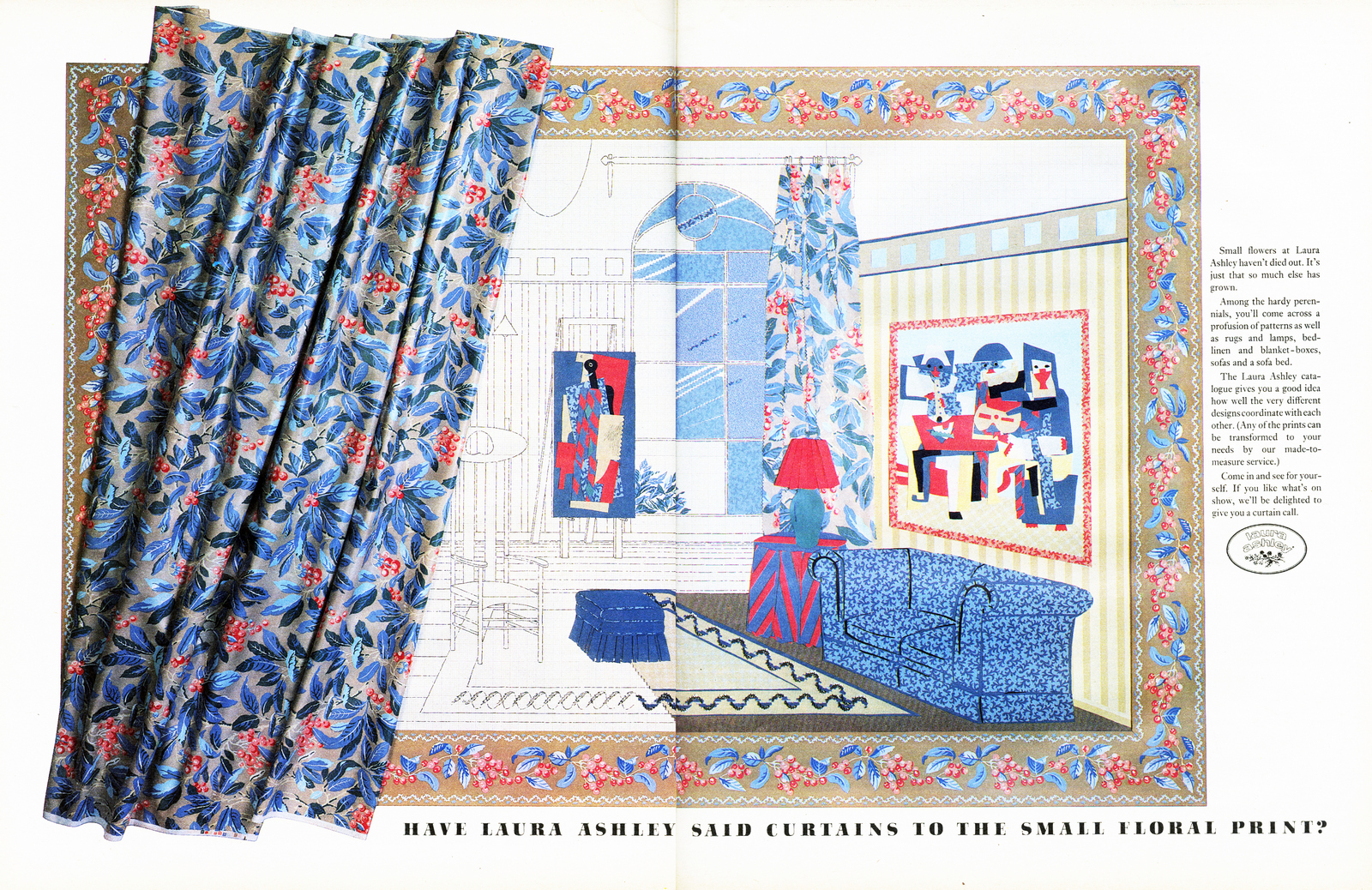
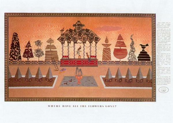
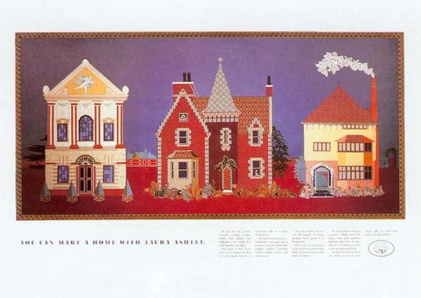
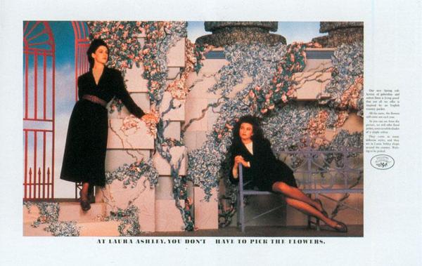
DUCKHAMS.
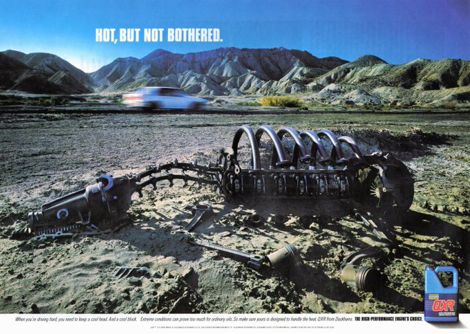
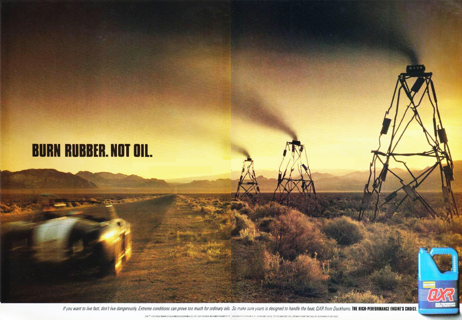
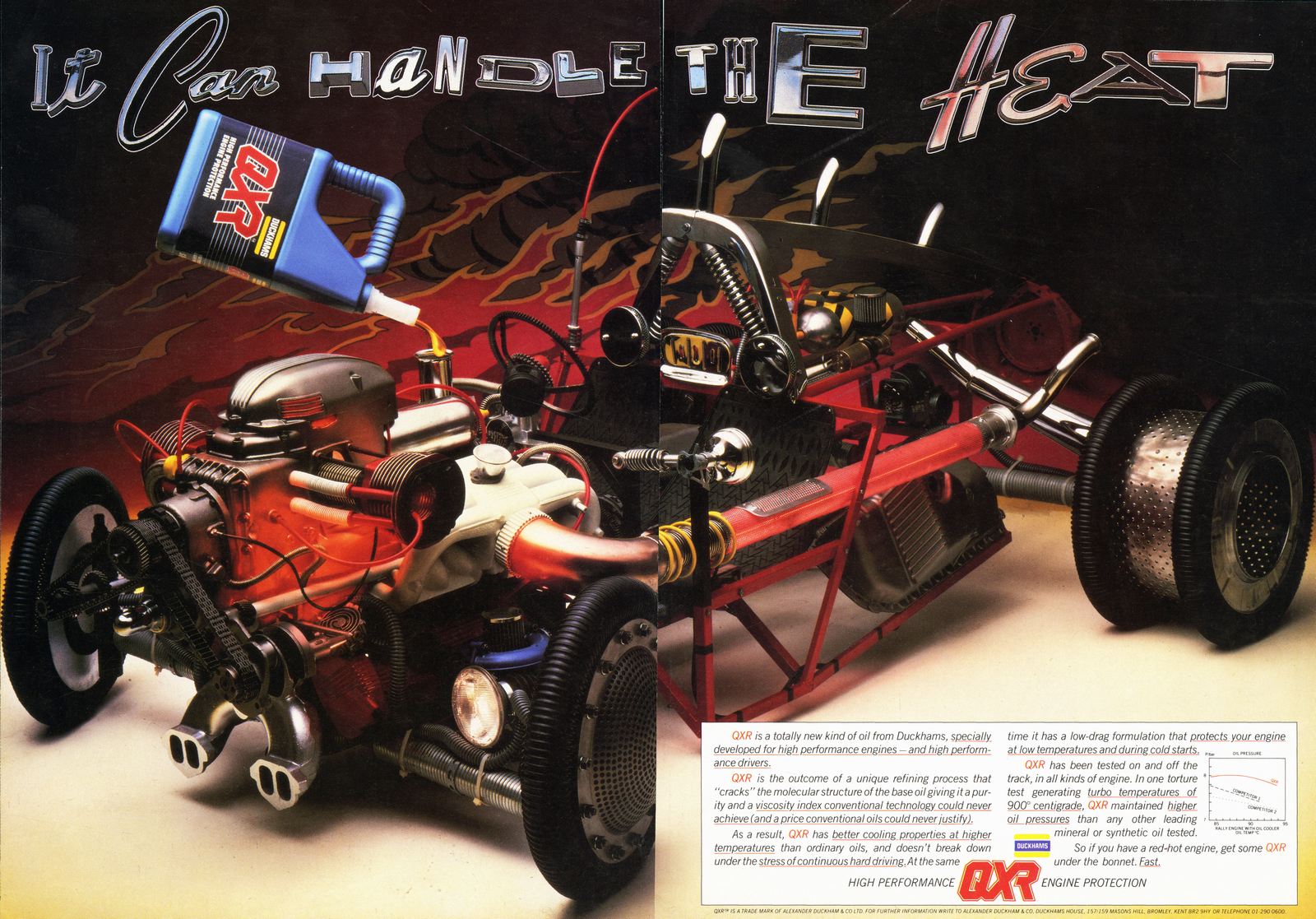
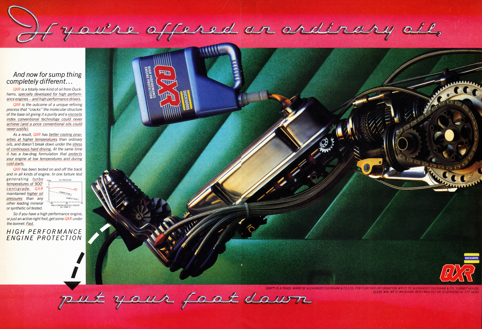
MCVITIES.Shot by photographer Lucinda Lambton.
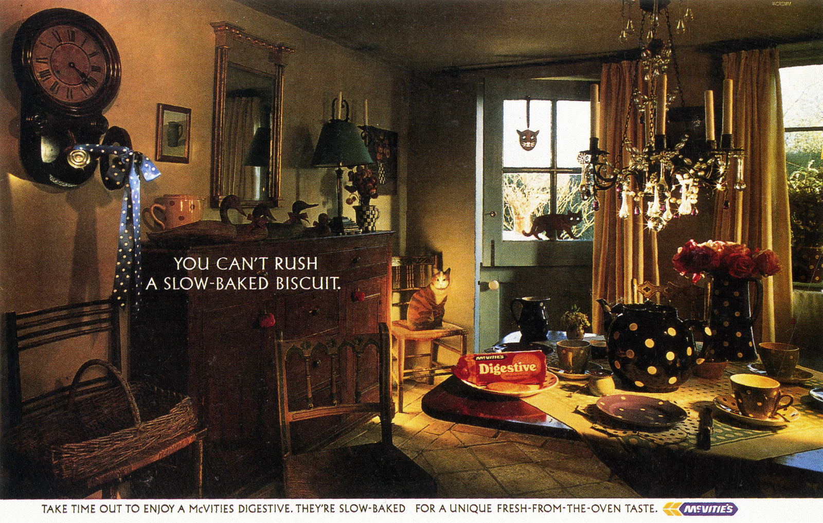
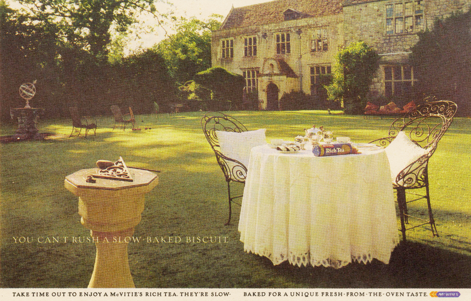
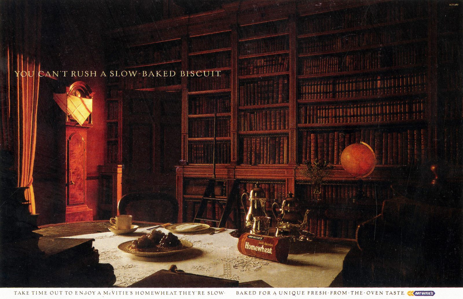
FCB.LONDON TRANSPORT.
THE DAILY MAIL.
LEO BURNETT.MCDONALD'S.They look pretty straight forward now, but I remember seeing them at the time; they weren’t like any McDonald’s ads I’d ever seen before, they signalled that McDonald's were changing.Not just as a burger company, but an advertiser too.
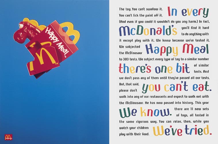
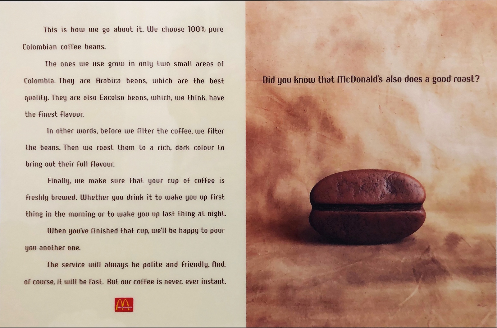
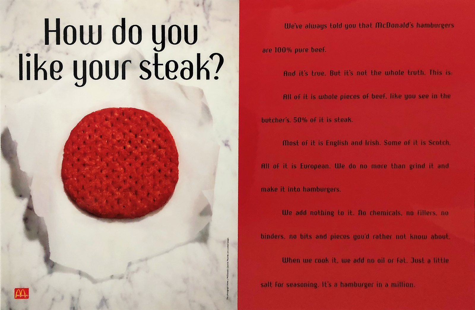
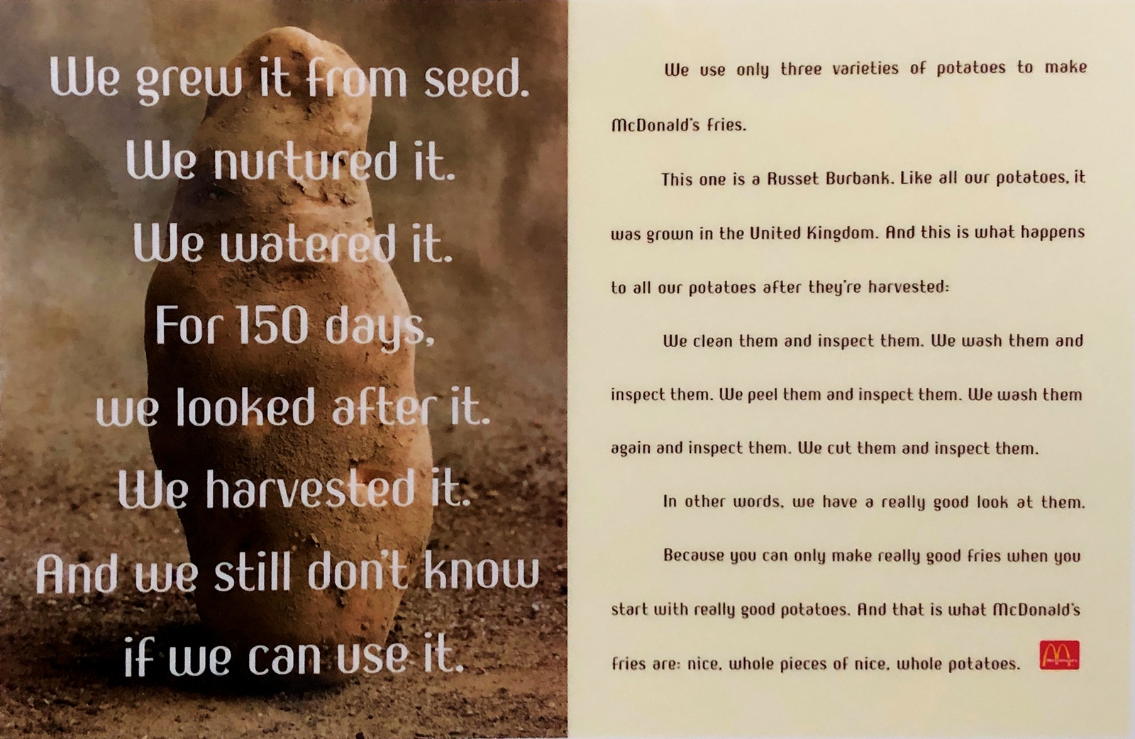
Johnnie Walker (tests).

Atomic Energy Authority.
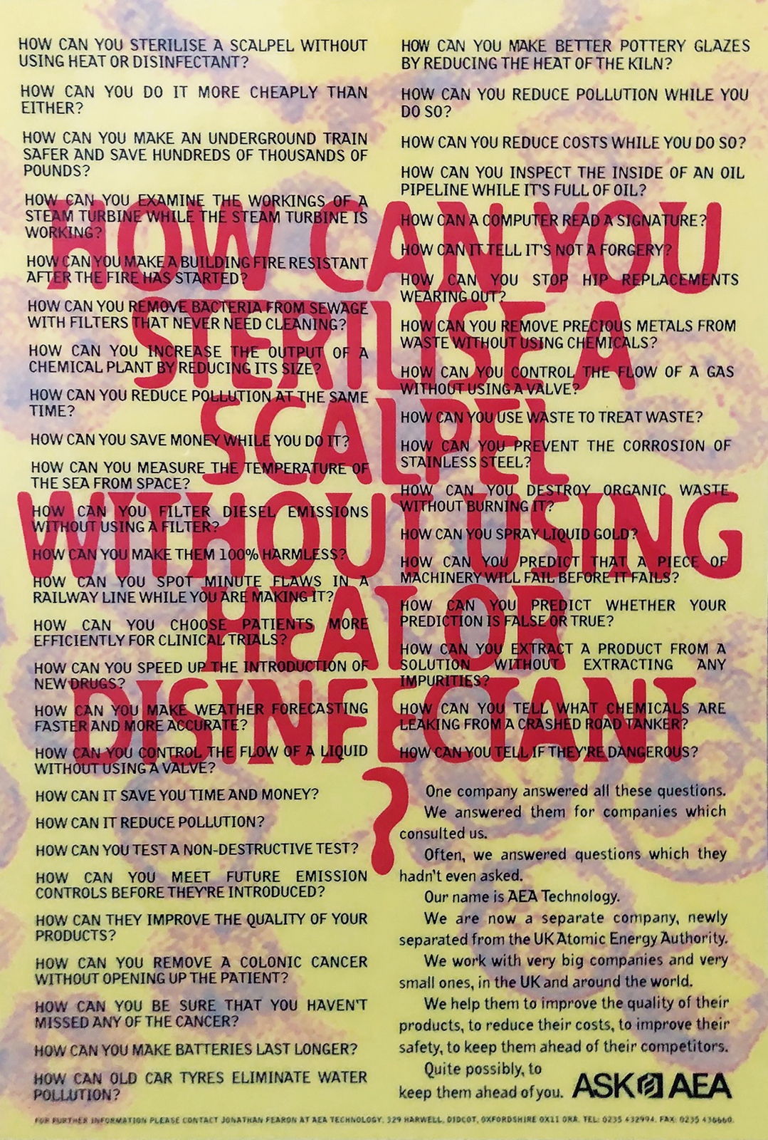
"Unfortunately John didn’t have the talent to handle his talent.He was a good influence in the department, would have made a good lecturer. Inspirer."- John Hegarty.Sadly, in October 1996, John lost an 18 month battle with cancer, aged just 50.
More JFK:In the late eighties he goes head to head with the Art Director responsible for that Sainsbury's ad I showed earlier - AMV's Ron Brown.John argues that most Art Directors pick up a phone to a photographer the minute an ad is approved, and that there's a whole expressive, distinctive world of Illustration that is being ignored, Ron argues that real life beats interpretation.Strangely, this debate is just as relevant today.
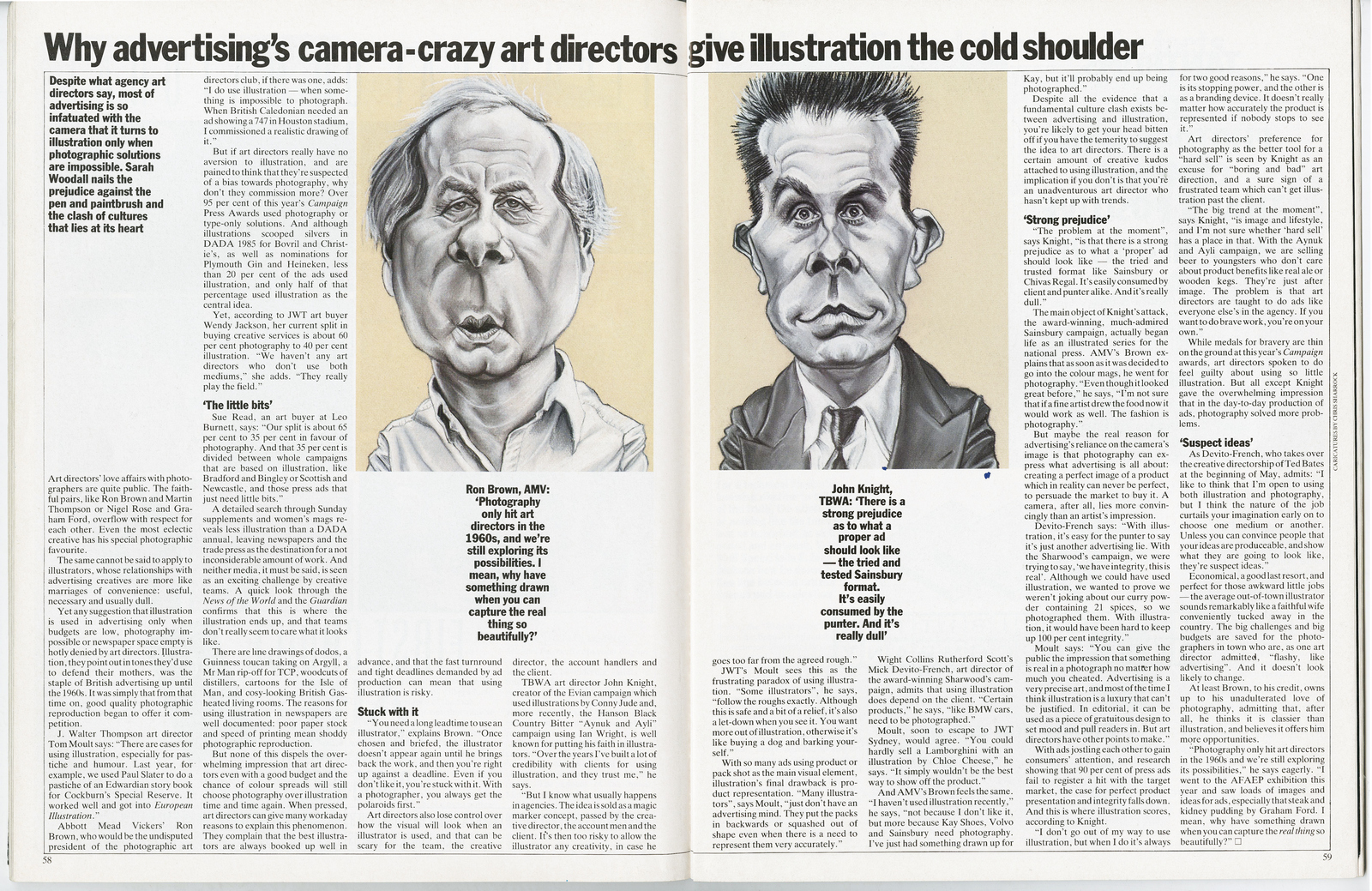
In the following issue, Gerry Farrell has a pop at him about the article, (on the plus side - good portrait).
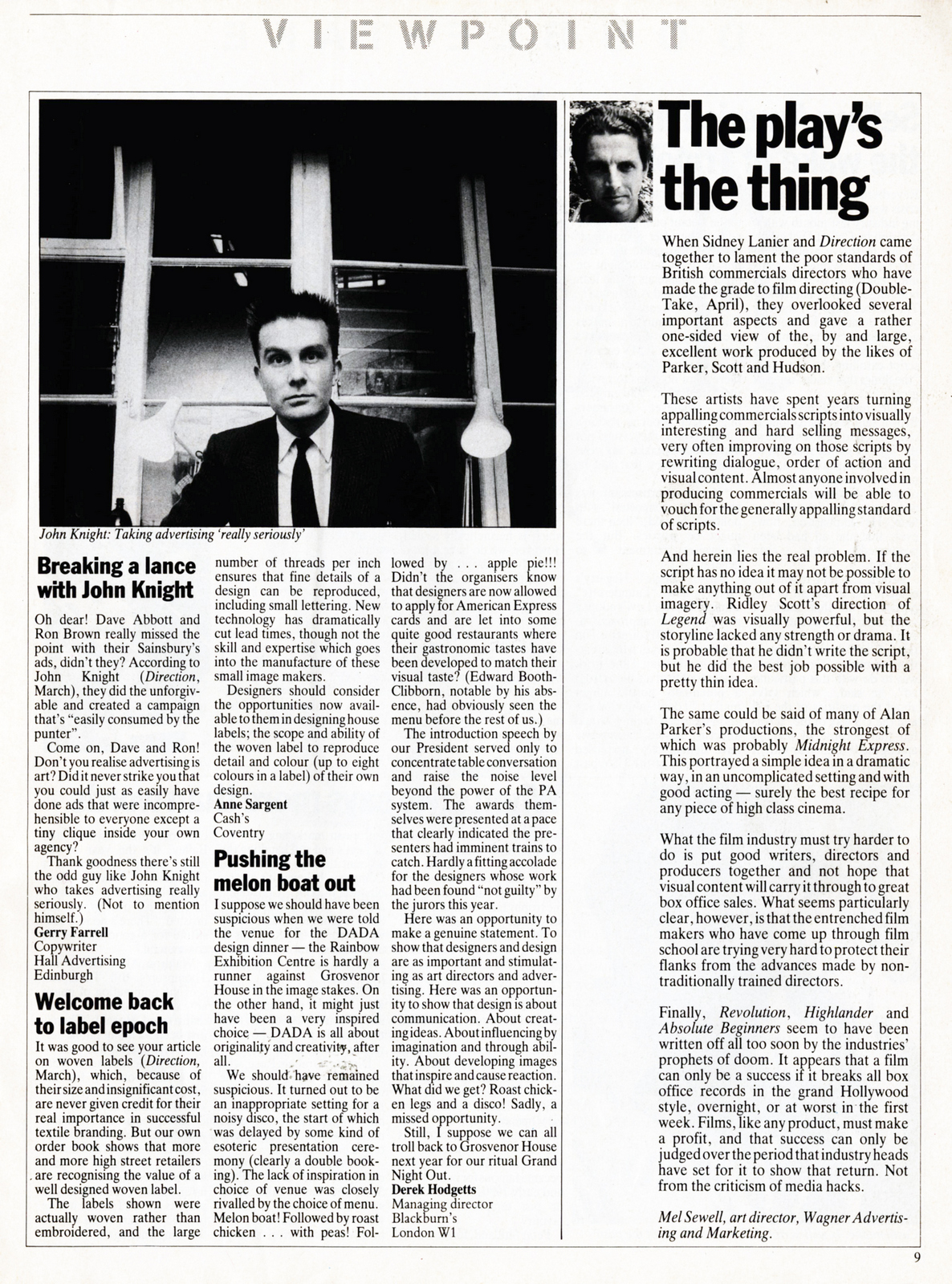
I knew Lorraine Chase had been John’s partner for twenty years, I’d heard she’d inspired the Campari script that made her a household name. It’s writer, Terry Howard, sat next door to John at JWT and would often hear Lorraine through the walls, he could never quite reconcile the elegant face with the common voice.When flicking around the internet looking for John’s work I found this headline about Lorraine's time in I’m A Celebrity Get me Out Of Here! - ‘"Tedward was a reminder of Lorraine Chase’s former, deceased partner John Knight" says Emmerdale star.
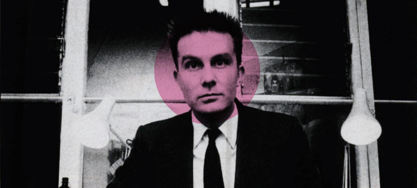
I once pitched for Vertu (I'd never heard of it either).It turned out to be a luxury mobile phone brand and when I say luxury, I mean luxury, some phones were a hundred grand a pop. Ironically, given some of their products were made of solid gold and had diamonds stuck on them, the brief was “to take the bling out of the brand”.Their previous advertising had desperately tried to justify the price - 'thousands of hours of this, precious stones that, polished with Unicorn’s jizz', etc, etc.True luxury brands don’t have to justify their existence.They have swagger, bordering arrogance.Their vibe is “If you don’t like our stuff you can fuck right off.”We thought they should stop apologising and trying to justify their existence, in advertising terms, their problem wasn't that they were too blingy, the problem was they weren't blingy enough.WE MADE SOME RULES FOR OURSELVES:1. Show the phone being used by people with gravitas (not celebrities, people with jobs).2. Don't say much, just be, look supremely confident.3. Store staff had told us that if they could get a phone in the hands of a customer, they increased their chances of a sale.Because the phones were very tactile and weighty, so we wanted to try and capture that in the photographs.PROBLEMS:1. Showing someone famous AND a product is tough when the product is so small, it'll be swamped by the famous person.Show David Beckham driving a car and you’ll recognise him AND see all the details of the car.Alternatively, show him using a phone and the phone will vanish.2. How do our ads stand out when famous person + product is a very familiar ad construct? ANSWER: We just show famous people’s hands - creating a distinctive, own-able visual style AND allowing the premium product to be seen in all its blingy glory.
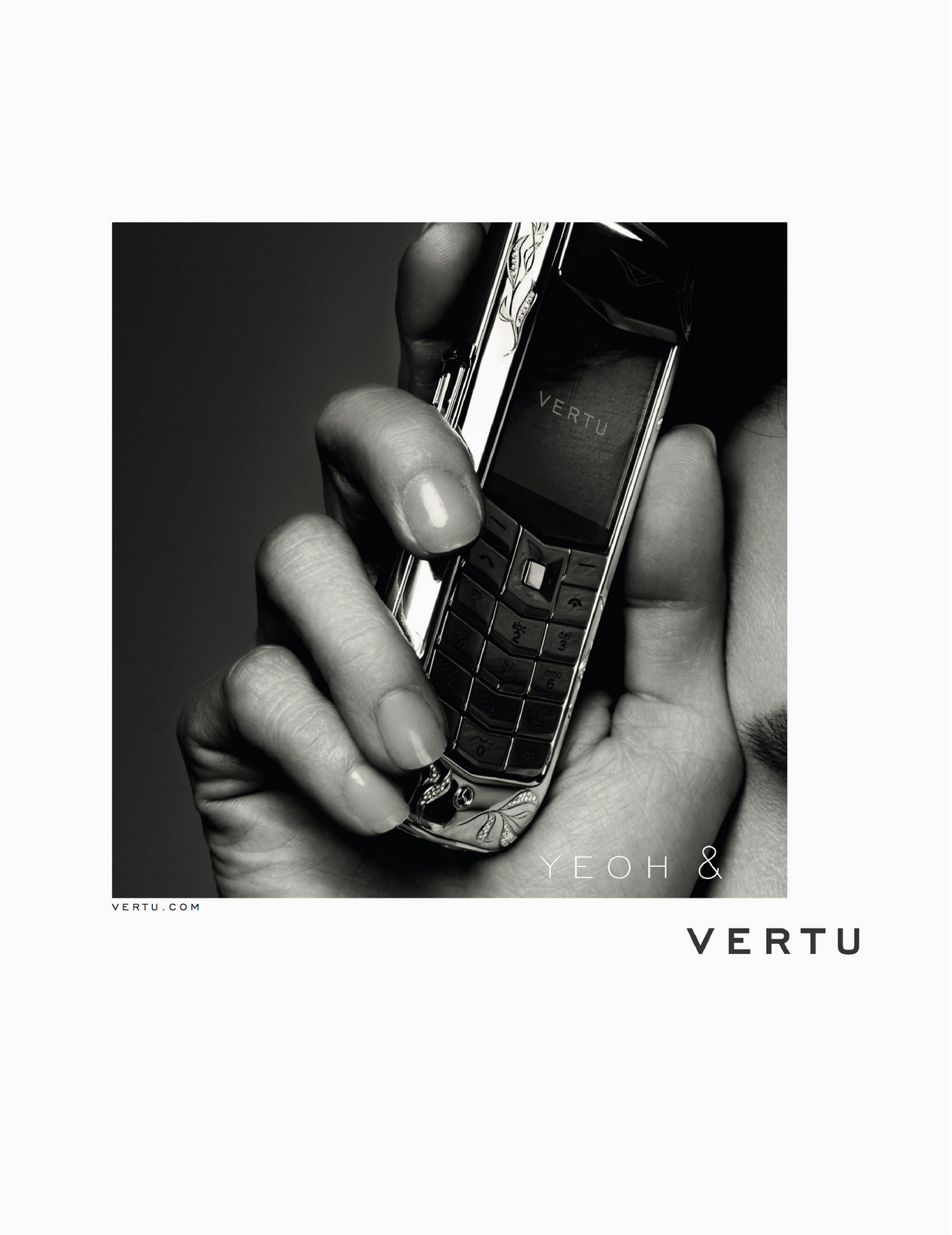
We found out we were the only agency not to offer up a way de-blinging their diamond encrusted phones. So we won.The ads look simple enough now, but often the process in making them complicates them.Stuff gets added, sentences get lengthened, nothing is left to the public's imagination.Often, very intelligent, well meaning comments can kill a brand, particularly a luxury brand.THIS IS HOW IT COULD HAVE GONE:
“I LOVE IT! Just one thing, would it be possible to pick a shot where we could see Michelle's face?We've paid all that money to use her after all.”
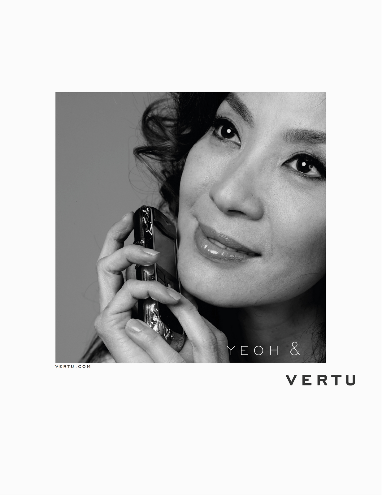
“That's better. I wonder whether we should put ‘Michelle’ in front of ‘Yeoh’ just to be on the safe side?”

“Excellent! Excellent! Whoa!... Hang on, the phone's a bit hard to see - perhaps we should put a pack shot at the bottom of the ad, elegantly done, of course.
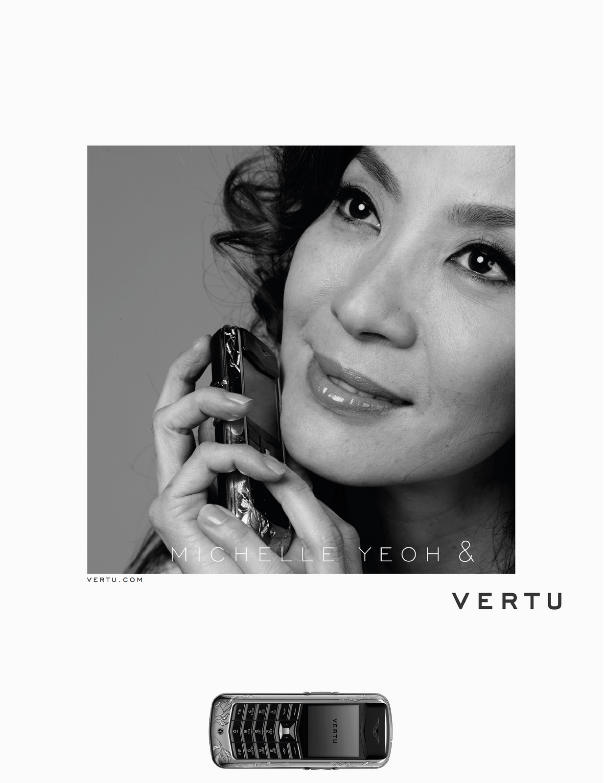
"People are used to seeing Michelle in colour, could we look at using a colour photo?"

“Fantastic! Love it! Oh... hang on, what if someone likes the look of that phone and wants to buy one?Shouldn’t we show them where they can be bought? Let the dog see the bone, so to speak?"

"This might not work, but a friend, who’s by no means a marketing expert, made an interesting suggestion - swap the ampersand symbol for a love symbol? It's more of an endorsement...She... 'Loves it'.Could we just look at it?”

"Ooh no, looks tacky. Let's just say it with words: 'Michelle loves her Vertu'.Much classier than that trashy symbol."
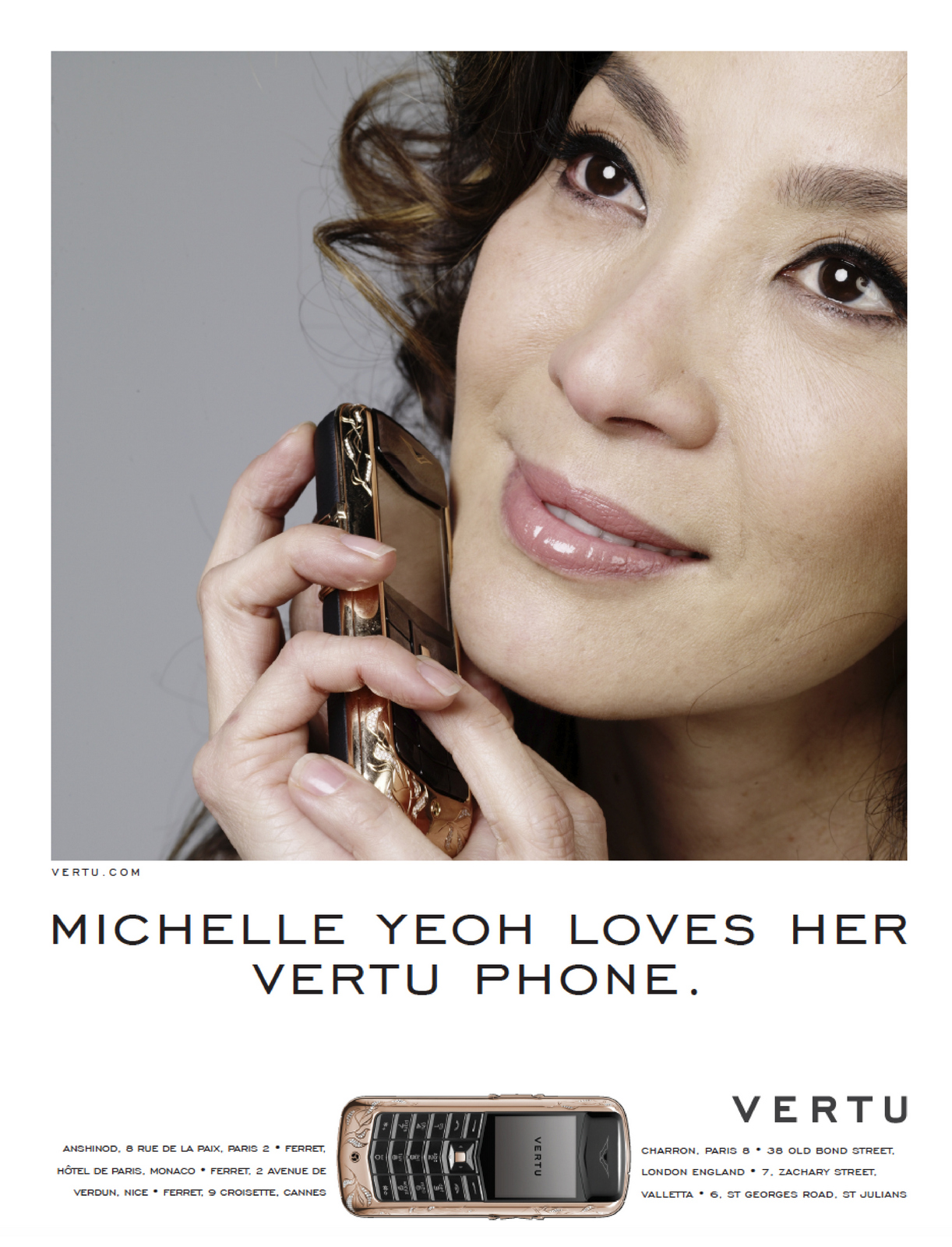
"Better. Much better. But it now begs the question 'why does Michelle Yeoh love her Vertu phone?Could we just add a smidge of copy?"
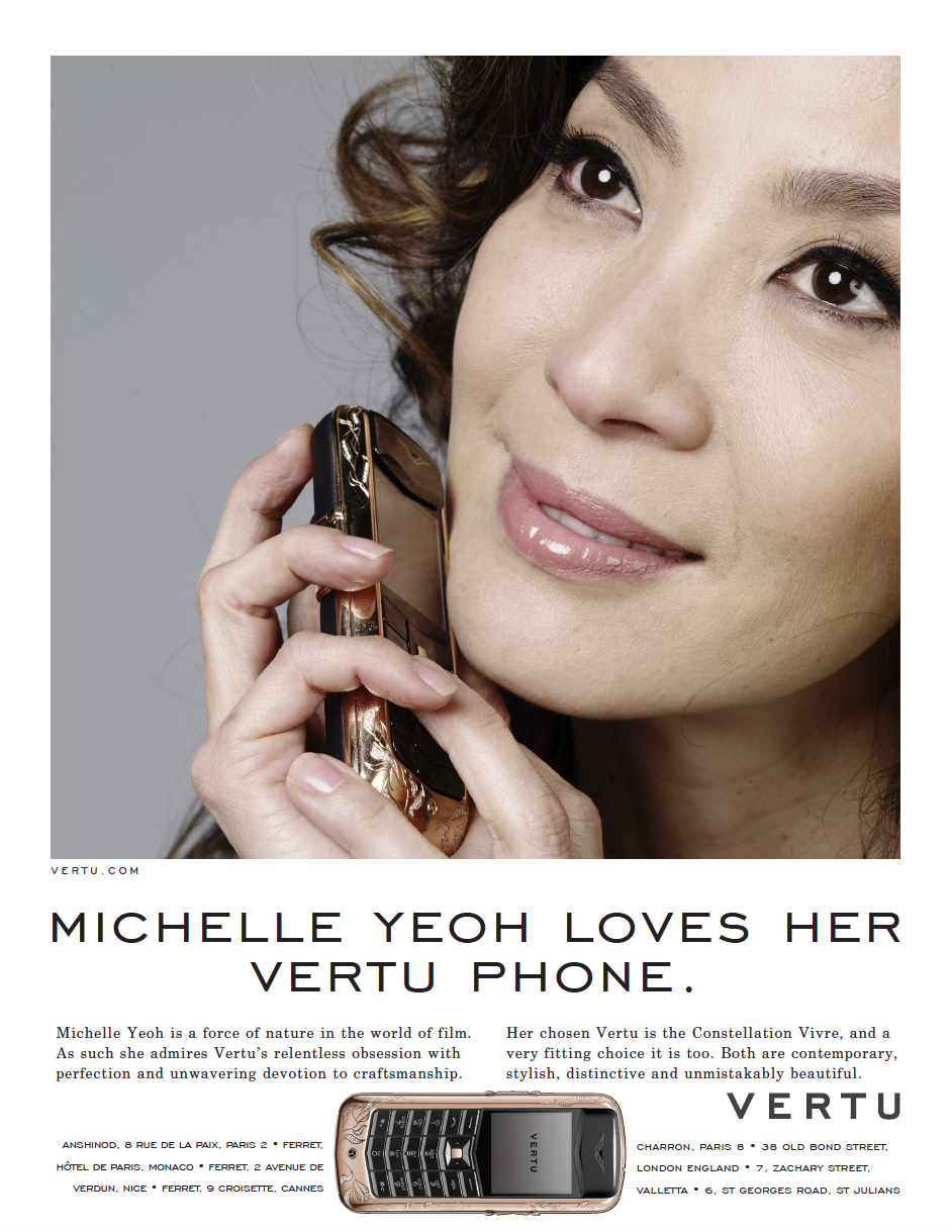
"Oh. My. God! You know what you've done don't you? You've only gone and created a frickin' masterpiece!Thank you. Thank you sooo much."Fortunately, that wasn't how it went.This is how the campaign ran across the world for the next five years.
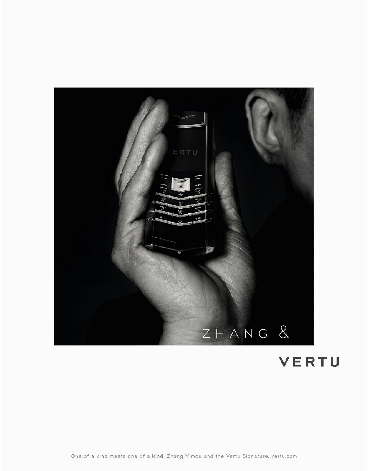
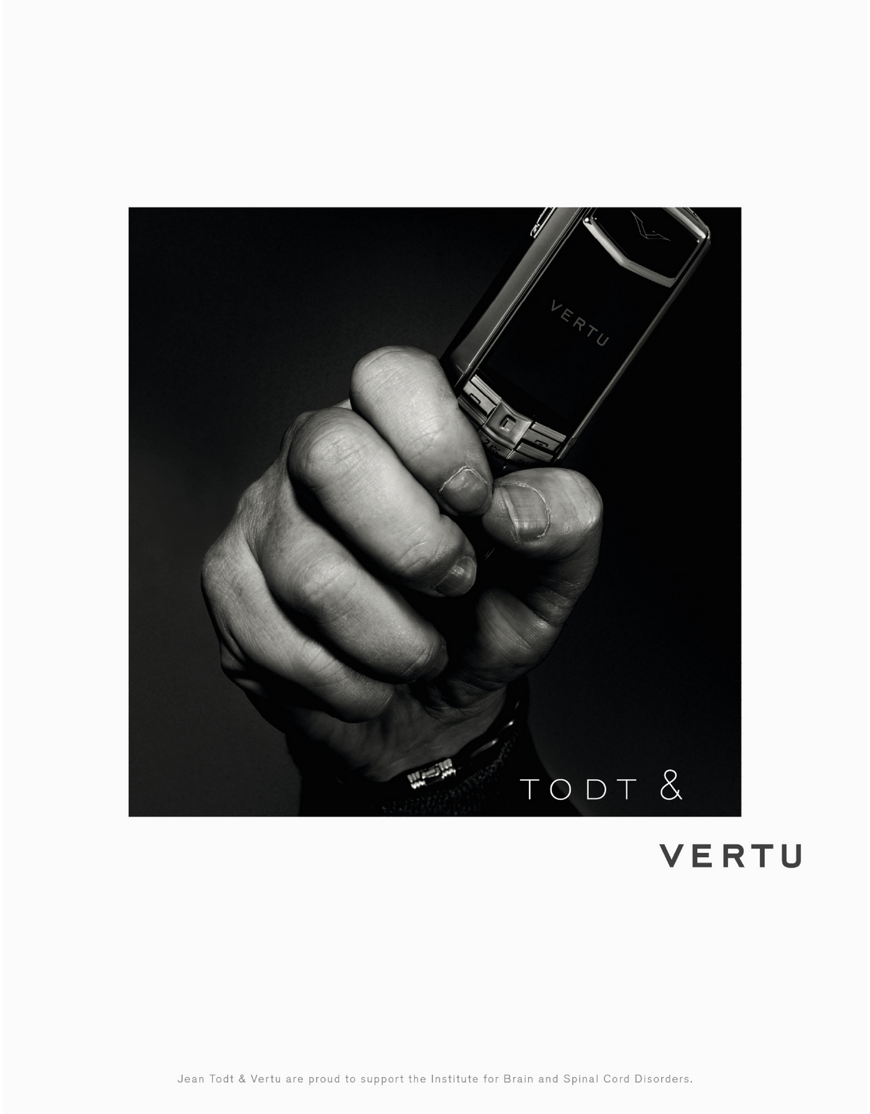
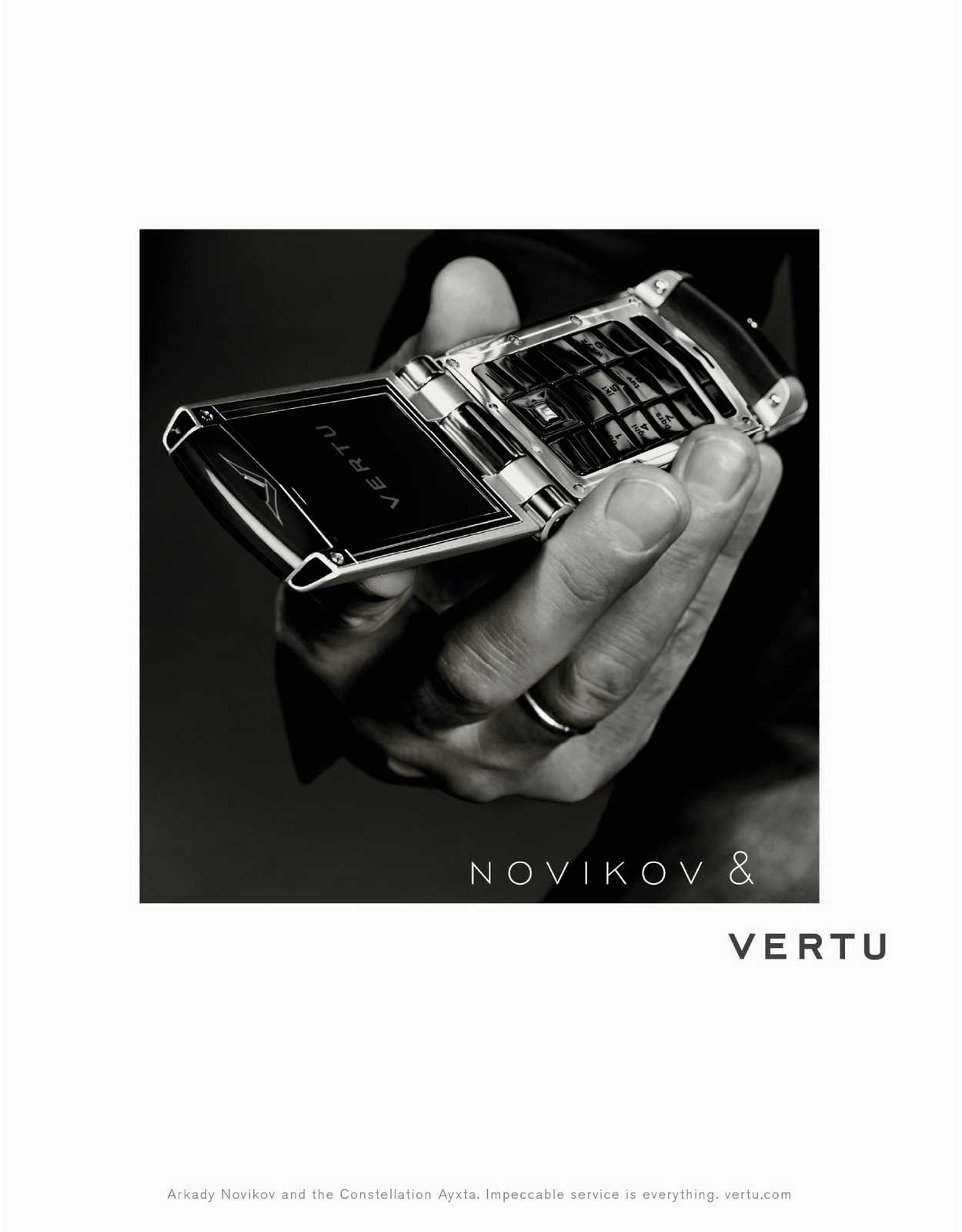
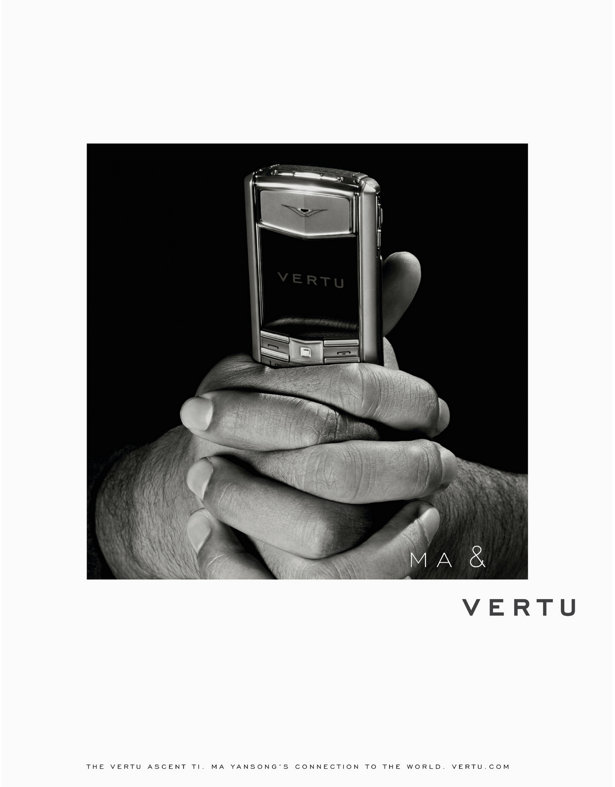
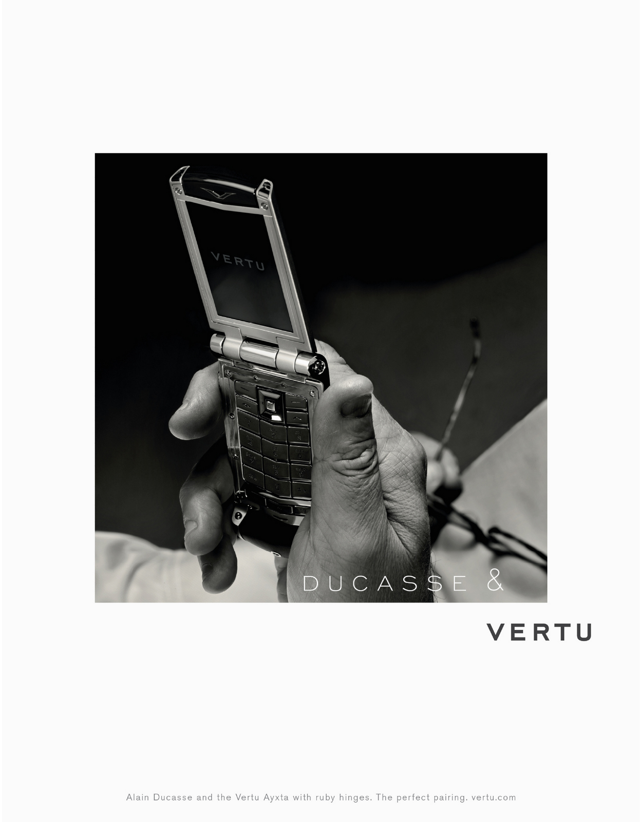
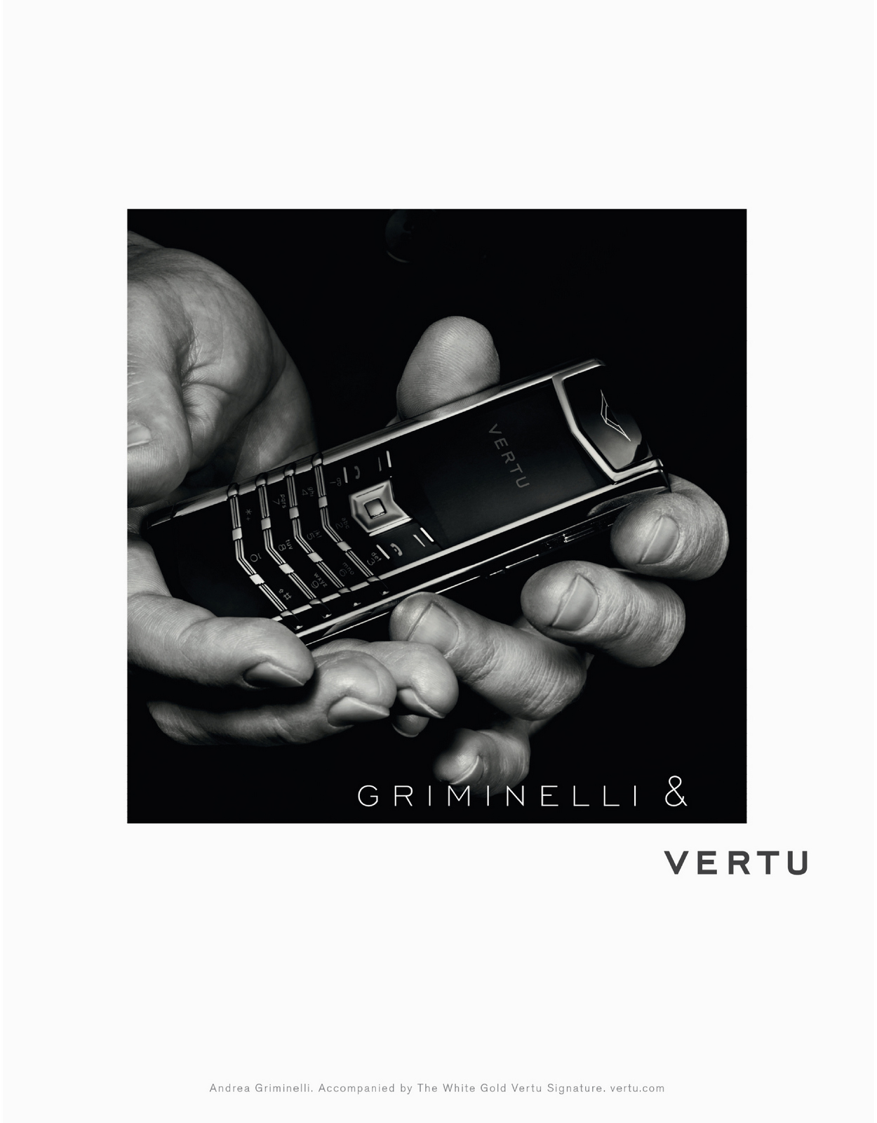
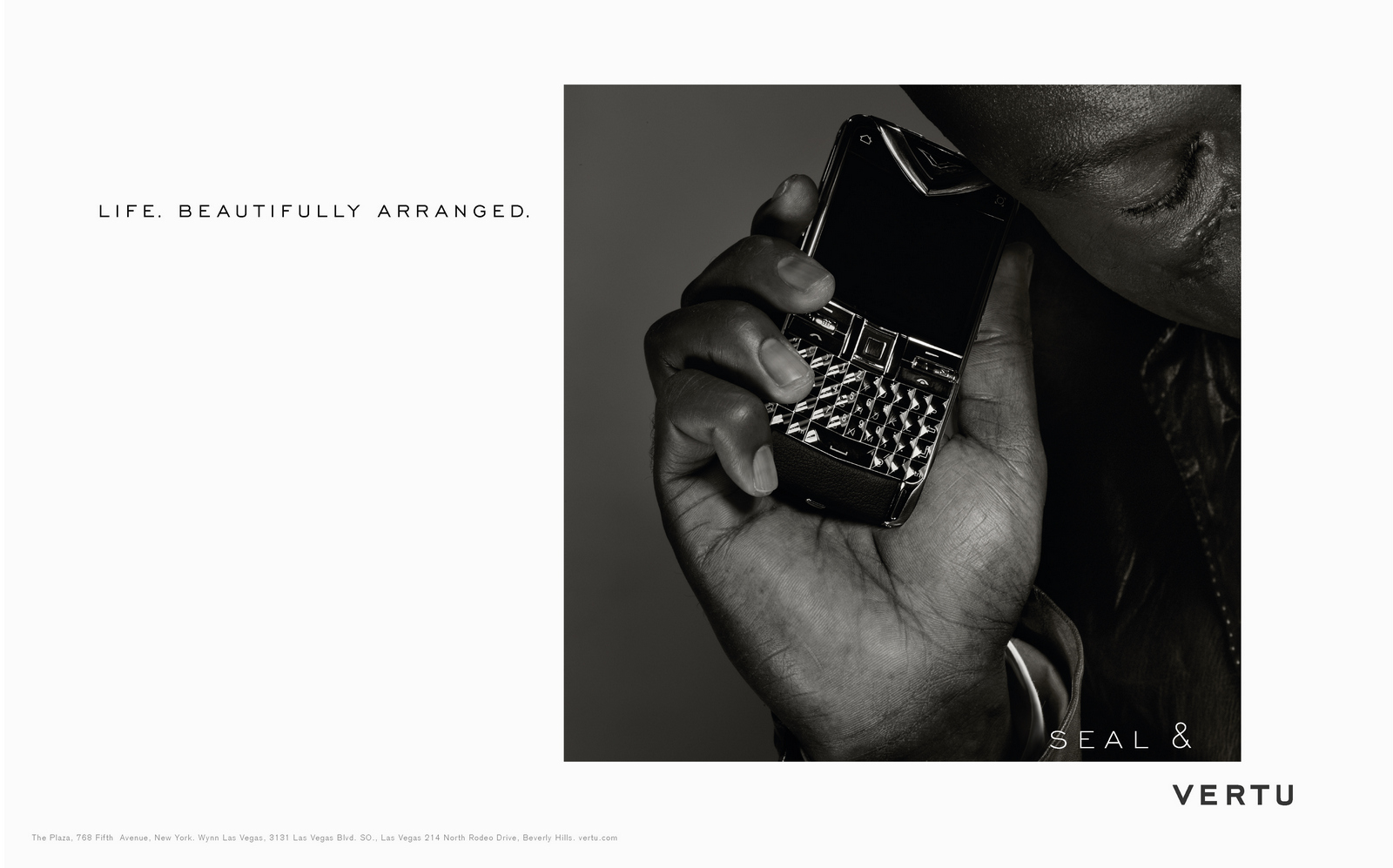
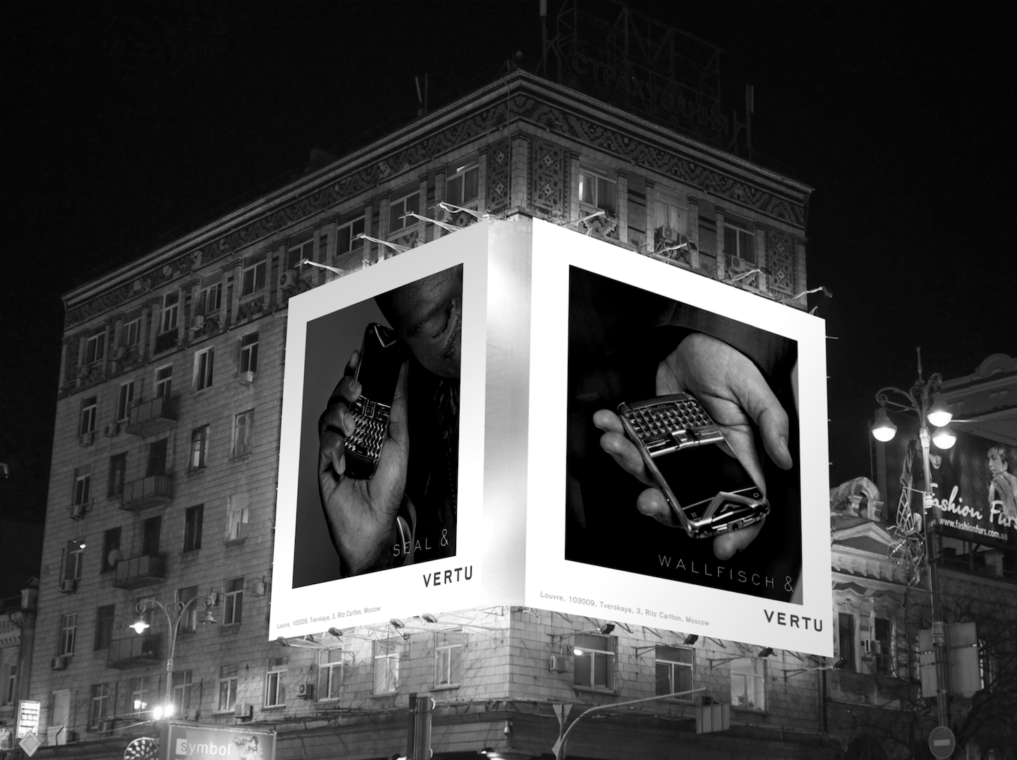
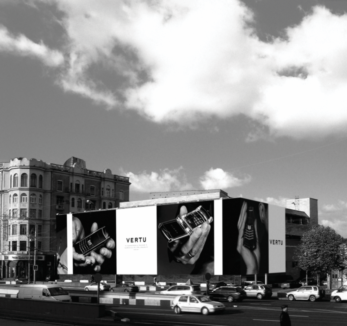
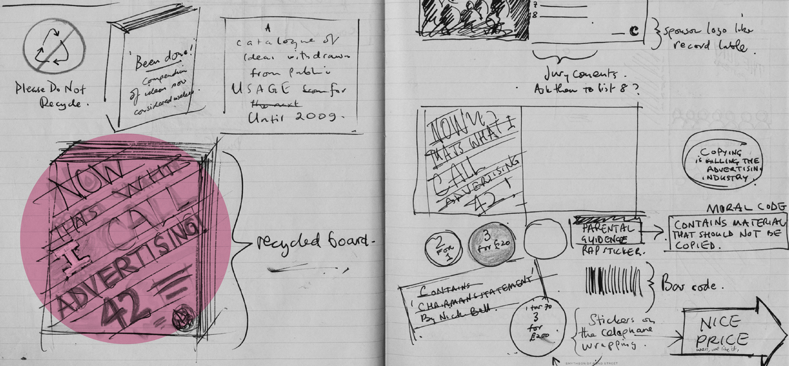
Whether it’s about humans, products or a companies, people make judgements first and post rationalise them later. As Oscar Wilde and Head & Shoulders Dandruff Shampoo put it; ‘You never get a second chance to make a first impression’. To control the impression you make you need to control the elements that go into creating it.Avoid sending out conflicting signals with elements that aren’t aligned, all the element that makes up a company’s personality need to point in the same direction.THERE ARE THREE BASIC ELEMENTS:1: FONTS. Fonts are like voices, they can sound like Harry Redknapp or Stephen Fry,and it's important you pick the right voice for a brand.E.g. Something feels wrong? Feels right.

2: COLOURS. Colour sets a tone, it creates an instant mood. People already have associations with colour hard wired into them,so it’s useful to use those perceptions. e.g. Red equals danger.E.g. Something feels wrong? Feels right.

3. WORDS. They should come directly from a company’s personality, ‘interesting’ ways of sayingstuff may get in the way of communicating who you really are.E.g. Something feels wrong? Feels right.

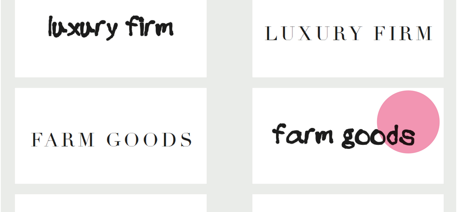
It’s hard to believe now, but there was a time when rolling news wasn’t a thing. Whilst at AMV/BBDO, Sean Doyle & I got the brief to explain that not only was rolling news a thing, called BBC News 24, it was a good thing. It occurred to us that 90% of news was unplanned, random acts, terrorism, floods, accidents, things you just couldn’t predict or plan for.It seemed like a good angle; news doesn’t stop happening, so BBC News 24 never stops running.The thought was so obvious, it ran the risk of insulting the intelligence of our audience, so we made the ads a bit sarcastic, tongue in cheek, as if ‘You already know this, but...’.Like it was reminding rather than informing.We wrote out some expressions of this idea.
Dave Wakefield came up with a neat idea for the poster layouts; let’s represent rolling news by showing rolling headlines.Genius, simple idea, that hadn’t been done. (I think?)
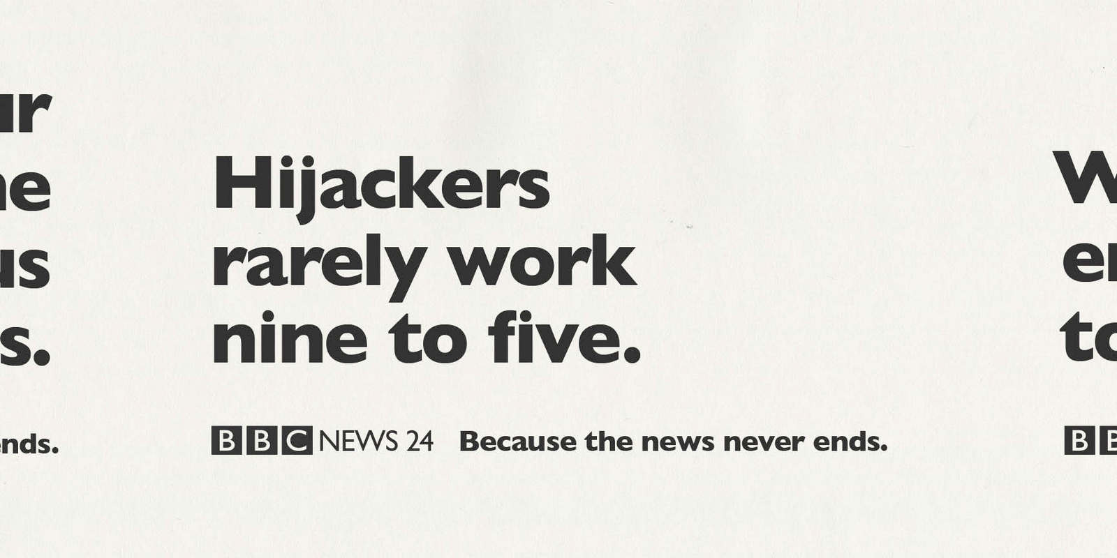
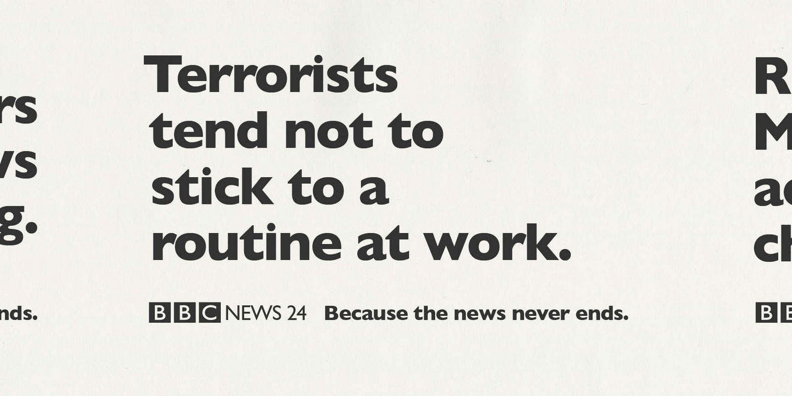
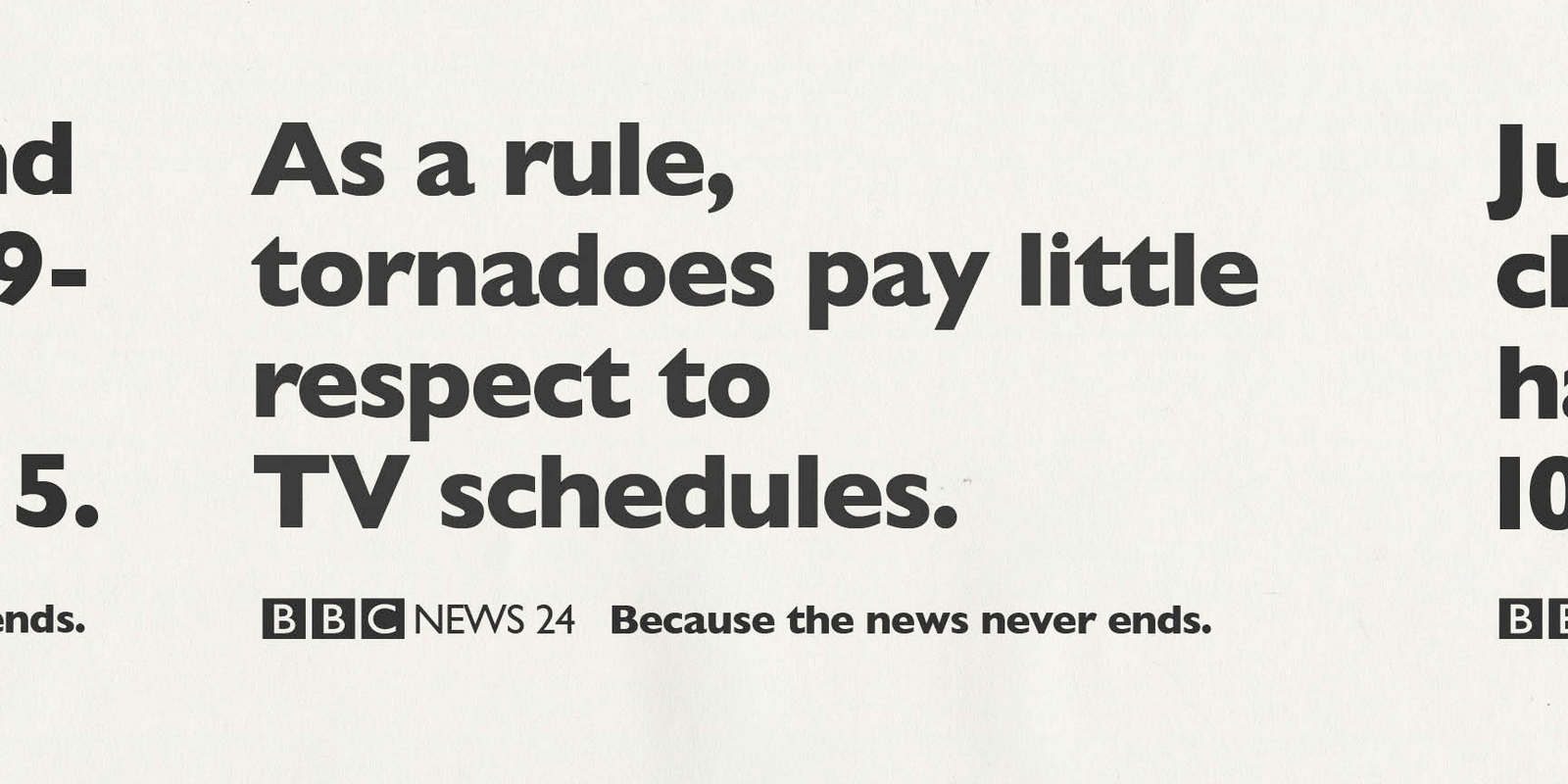
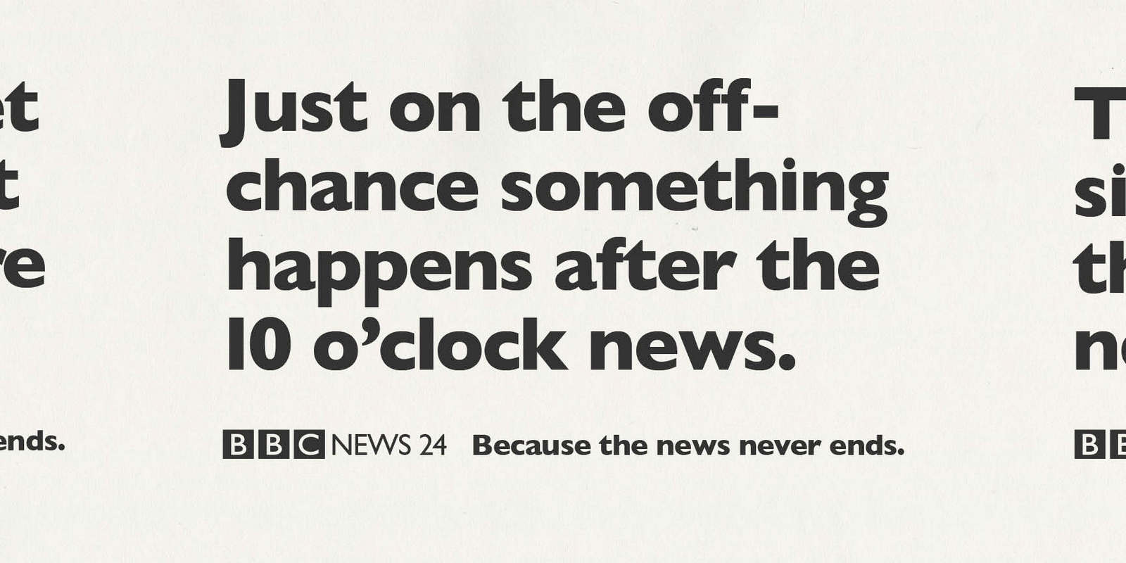
CLIENT: “Great. But we could look bad if a hijacking, natural disaster or terrorist attack happens when the ads are running?”What? You mean we could look bad if some actual NEWS happens?Lighten up, it’s just a bit of fun!She wasn’t budging.We reluctantly agreed to make the ideas less specific events.Out went half the work. (Including our favourite script - We see a plane hijacking, cut to a news anchor ‘And that’s the end of tonights news’, cut back hijacker stop hijacking, he puts down his gun, takes a seat and starts reading a copy of Hello.)But we still shot these five, Ringan Ledwidge helped us make fun of the idea that the news stopped when the announcer said ‘That’s the end of the news’.
The posters ran like this, there’s the tiniest hint of the rolling news idea, I think the client wanted to see more of the colour they were paying for. Shame.

The campaign hit televisions and streets the second week of September 2001. Yep, THAT September. It was all taken off air and billboards immediately. Fortunately, we didn’t have the embarrassment of having to explain our ‘fun’ hijacking ad. After that, nobody needed ads to explain the benefits of rolling news.
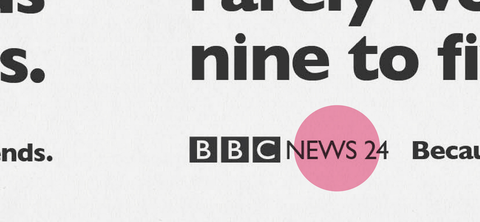
‘‘I’ve just had lunch with someone who used to work at Simons Palmer, I told him he needed some advertising for his company, Posterscope, and you’d do it.You could do something good like that old Mike Shafron ad?’’ - Mark Denton.
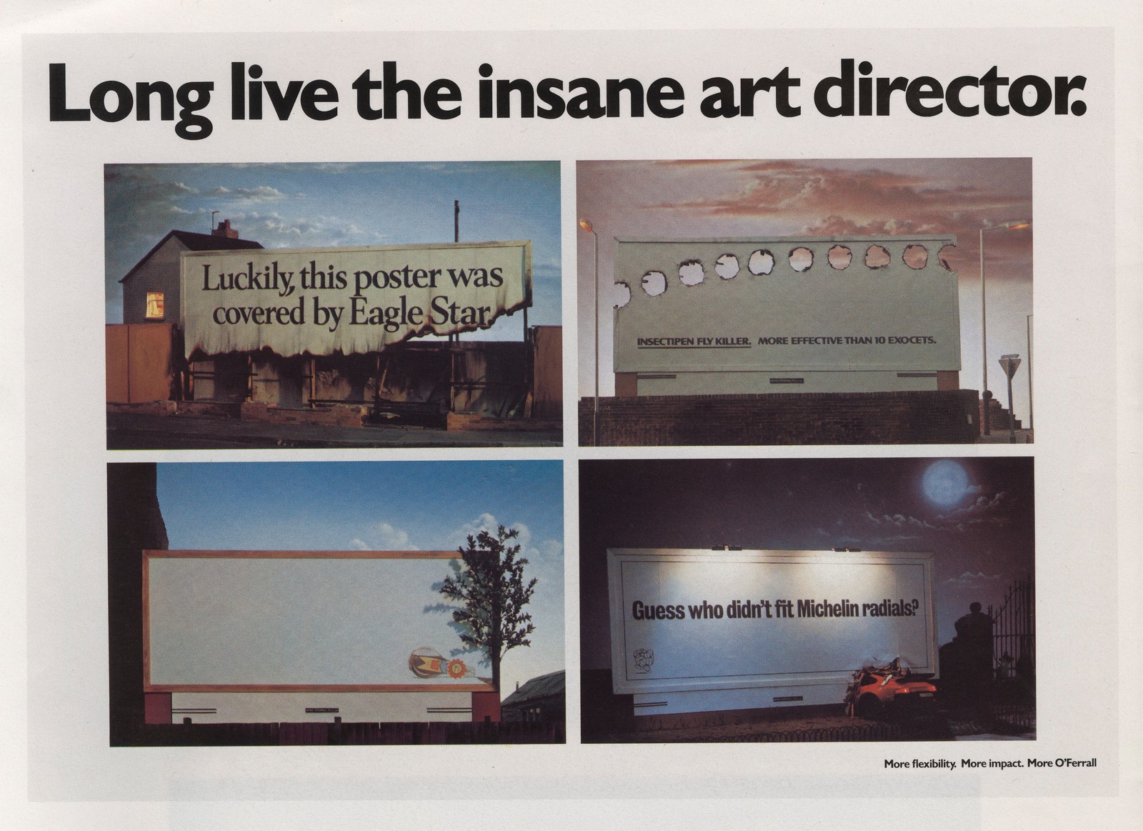
I remembered the ad well, the ads within it were great.But the more I thought about it the more I had an issue with it - the ideas within it were too good, who can think of ideas as good as that?If I were a client or media person I may think posters can only be good if they are produced exceptional creative people, who then have the flexibility to dream up fancy, one-off, expensive special builds.I figured that we needed to produce a campaign that looked like any idiot could it, no fancy dan photography or illustration, just words. Single colour words.I'd only just bought an Apple Mac to figure out how to use Adobe Illustrator, so minimal was not only a strategic choice, it was probably all I could do at the time.
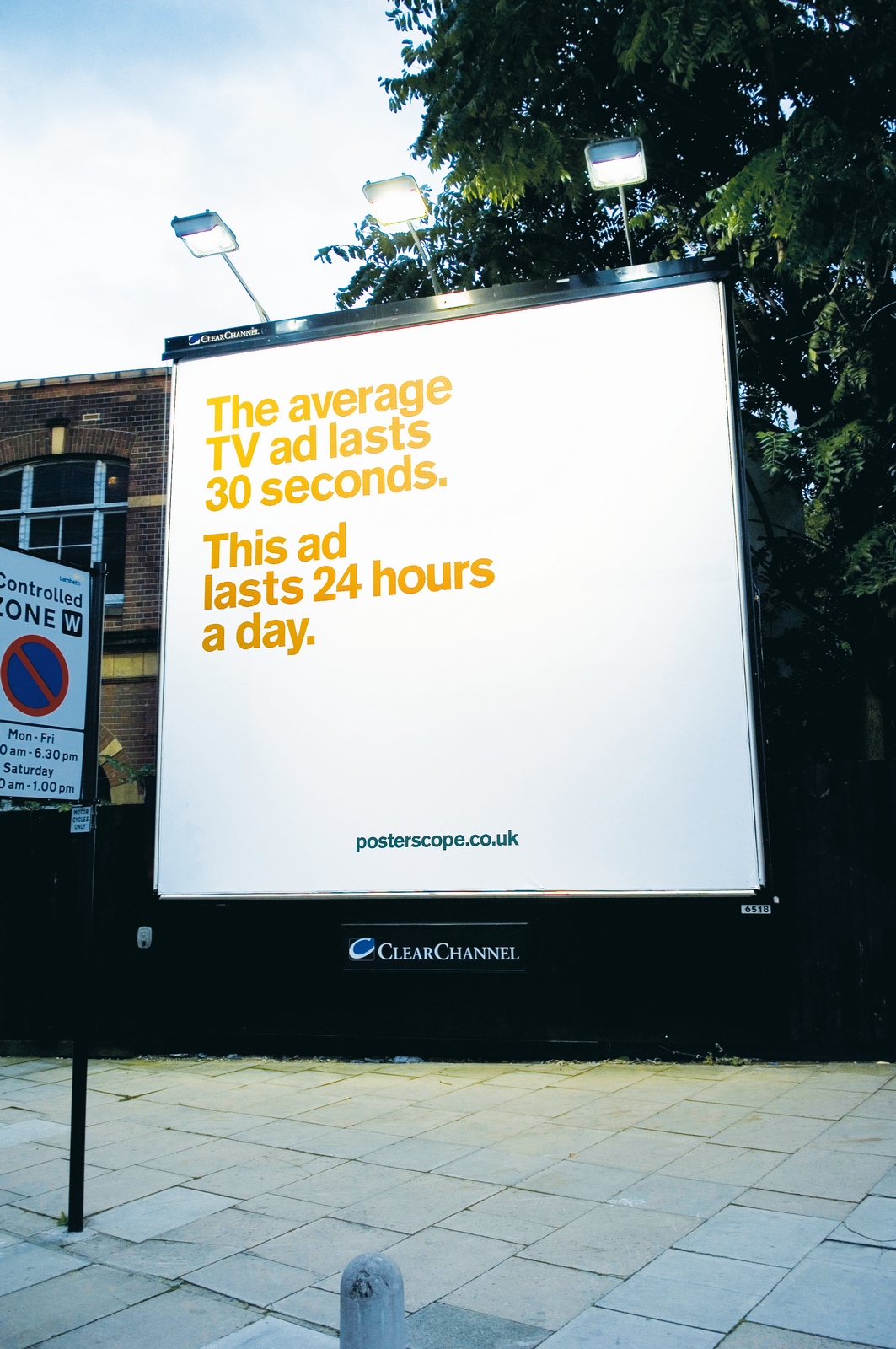
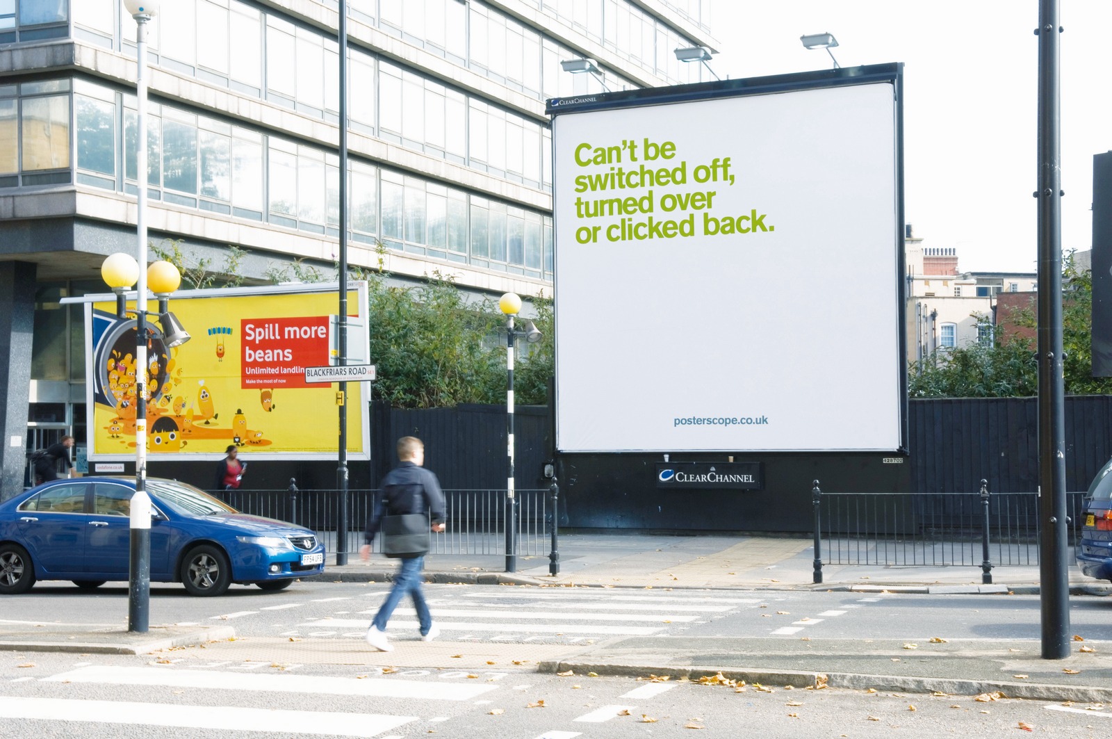
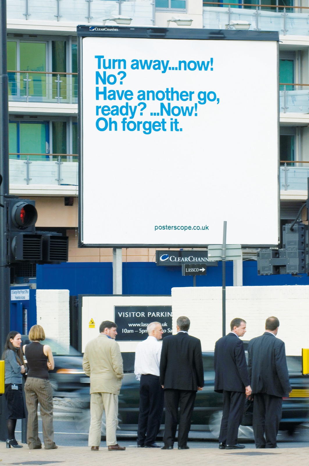
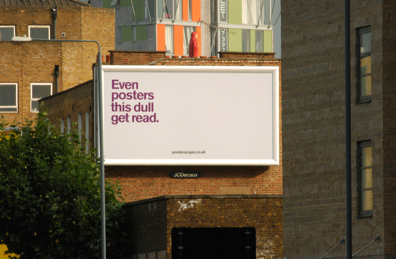

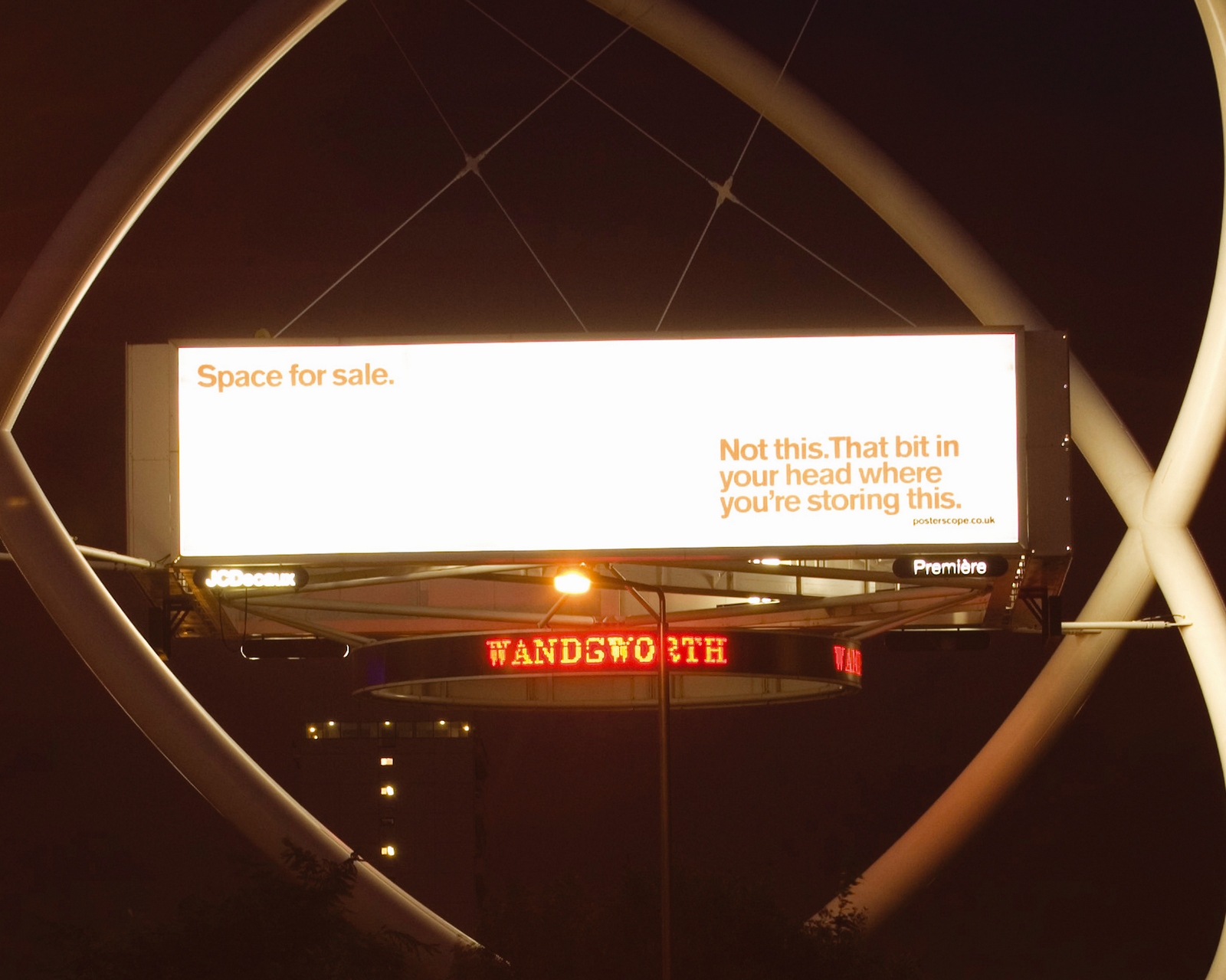
They got a lot of P.R. for Posterscope at the time. We vowed to do the same again the following year.A year later we produced this batch.
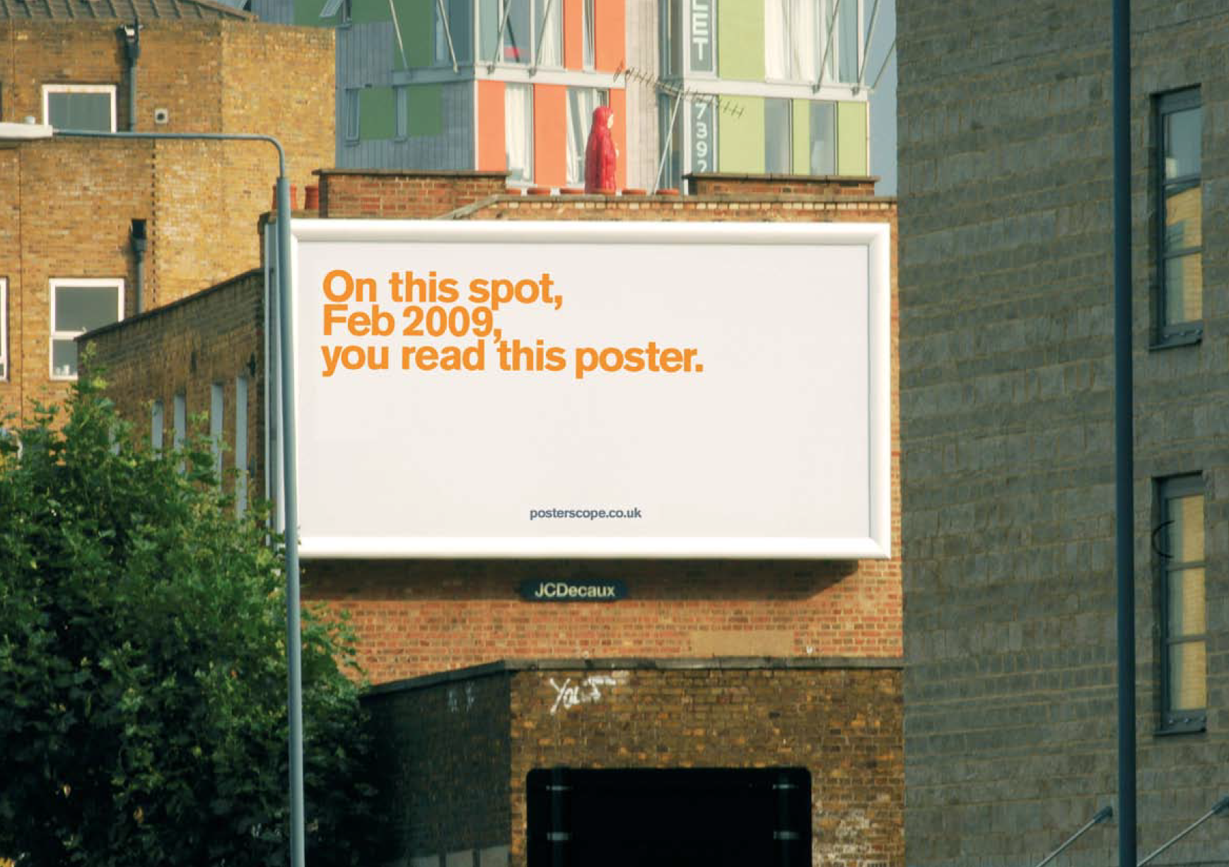


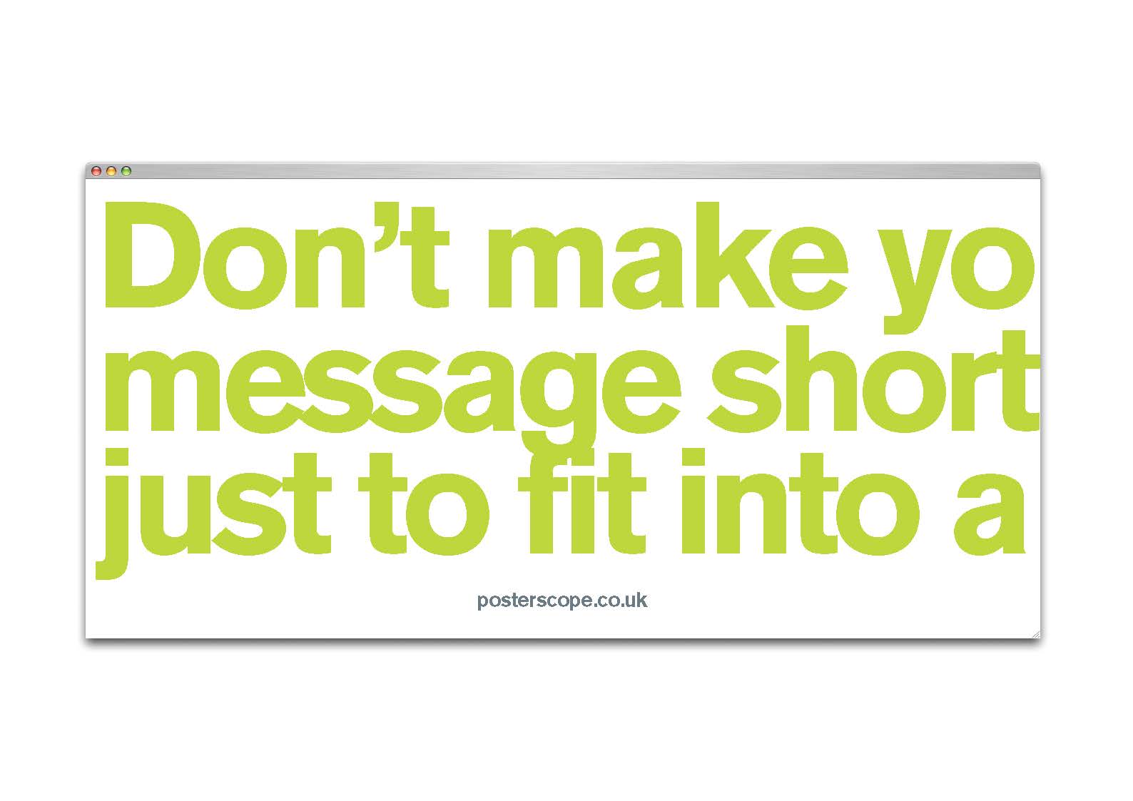


A few ran, most didn’t.But, the story has a happy ending, a couple of months ago Mark's wife Anna Denton, (or Anna Denton-Spaghetti as she's known in Theatre circles), put on a play - Sex Cells, I did some posters and Glen at Posterscope repaid Mark and I for the posters done six years previously by putting them up around Hammersmith to help get sell tickets.
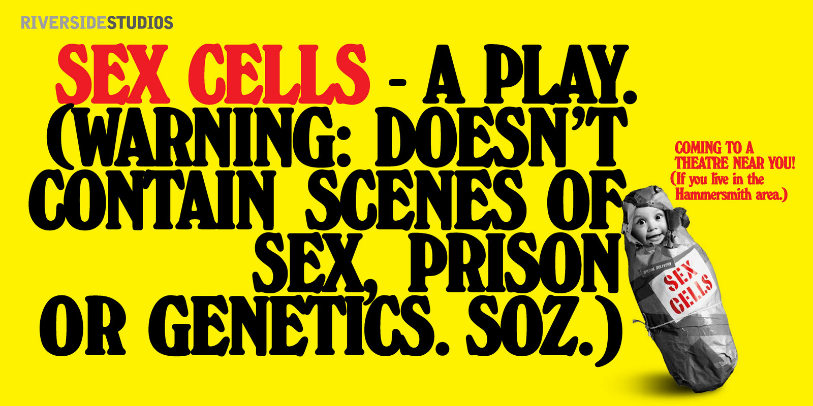
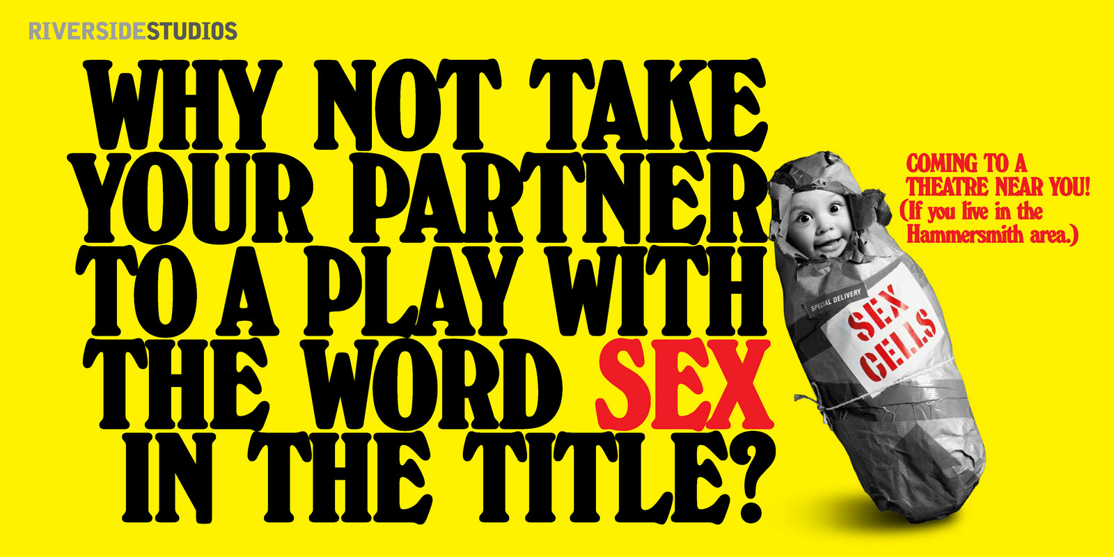
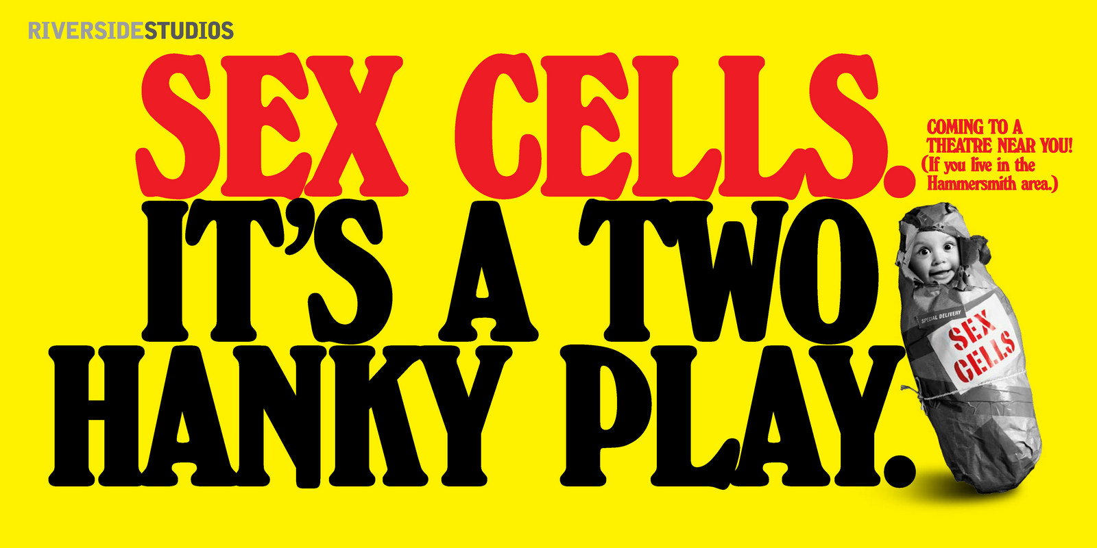
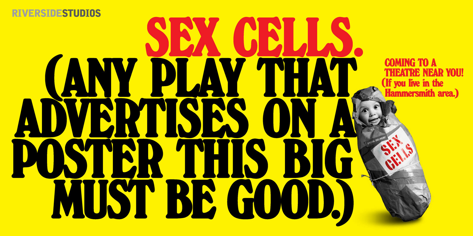
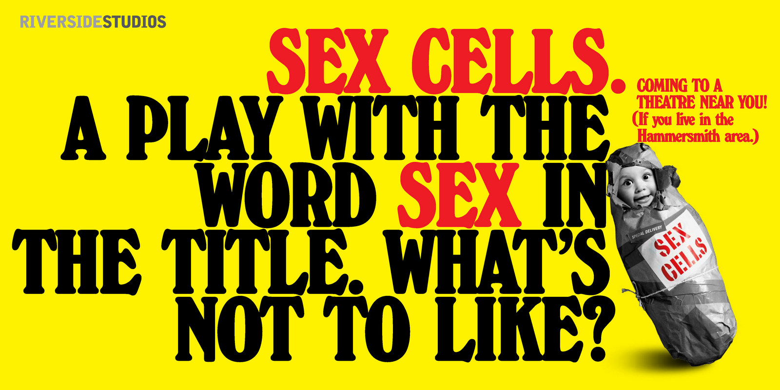
Mark & Anna in front of one of them. And they say romance is dead?
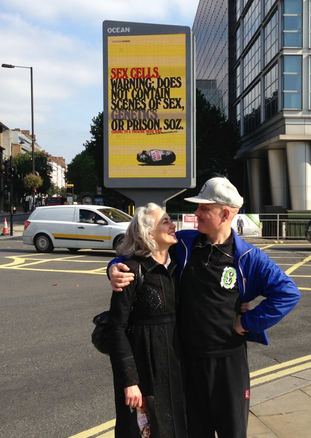
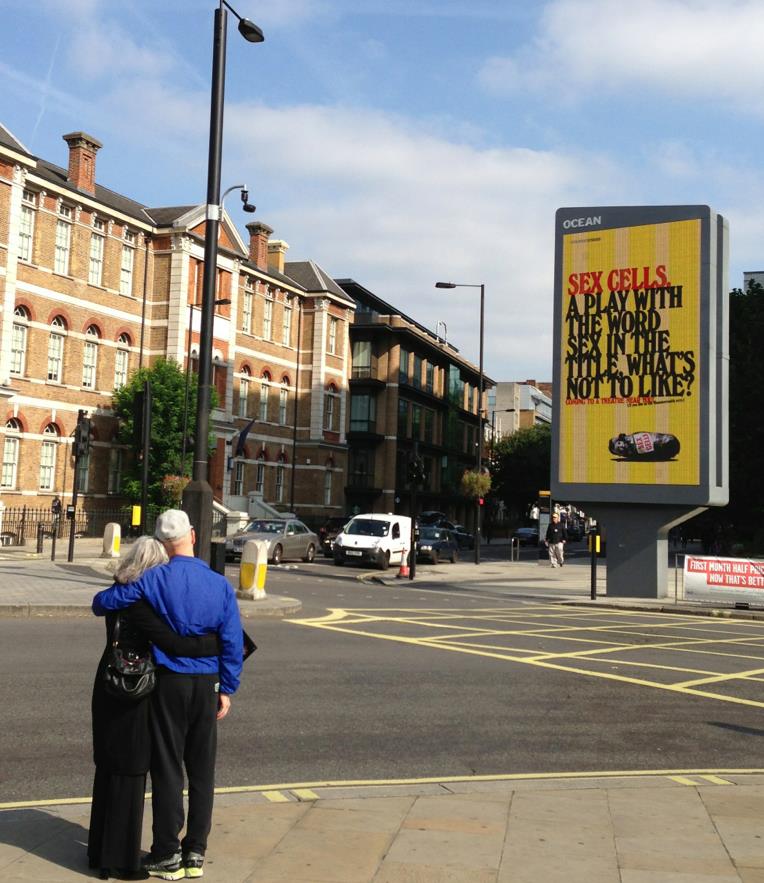
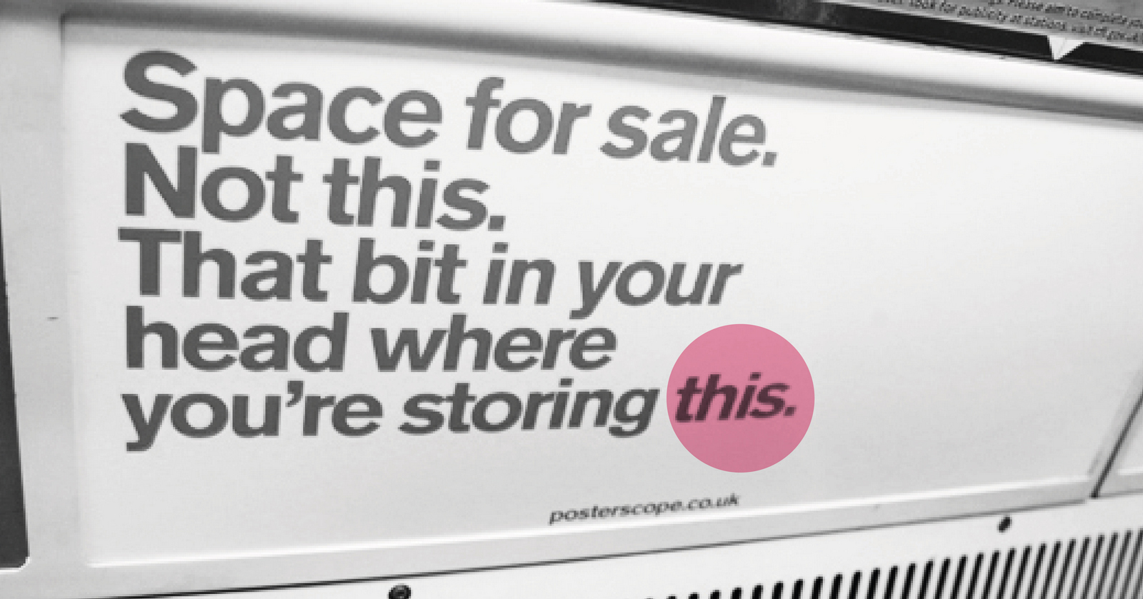
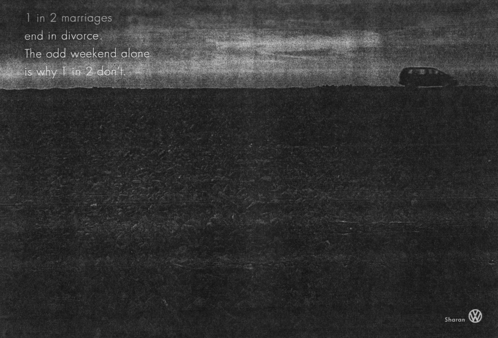
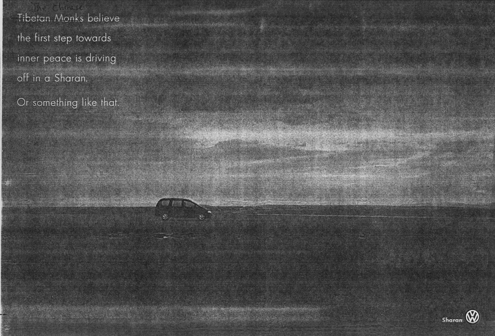
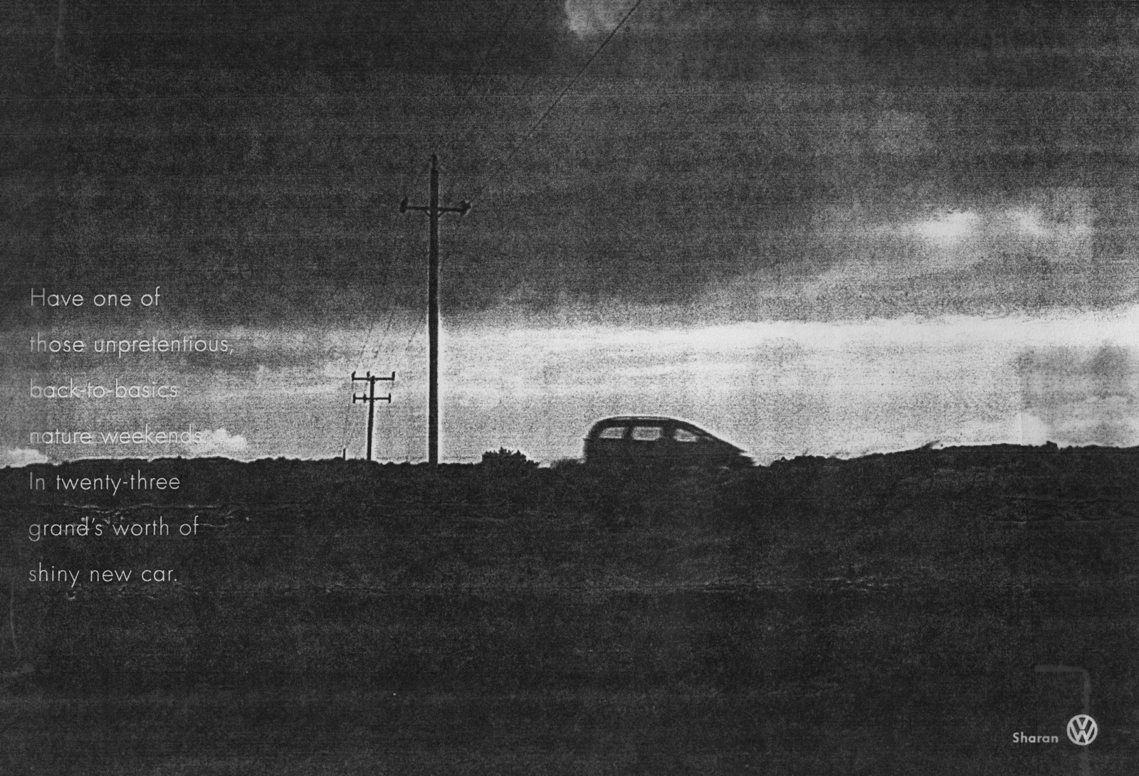
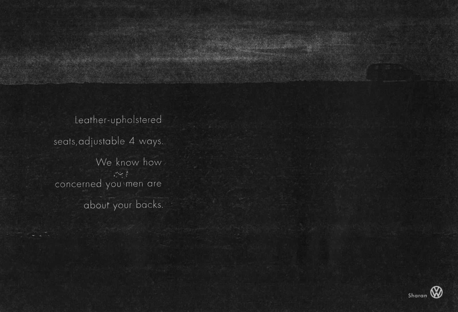
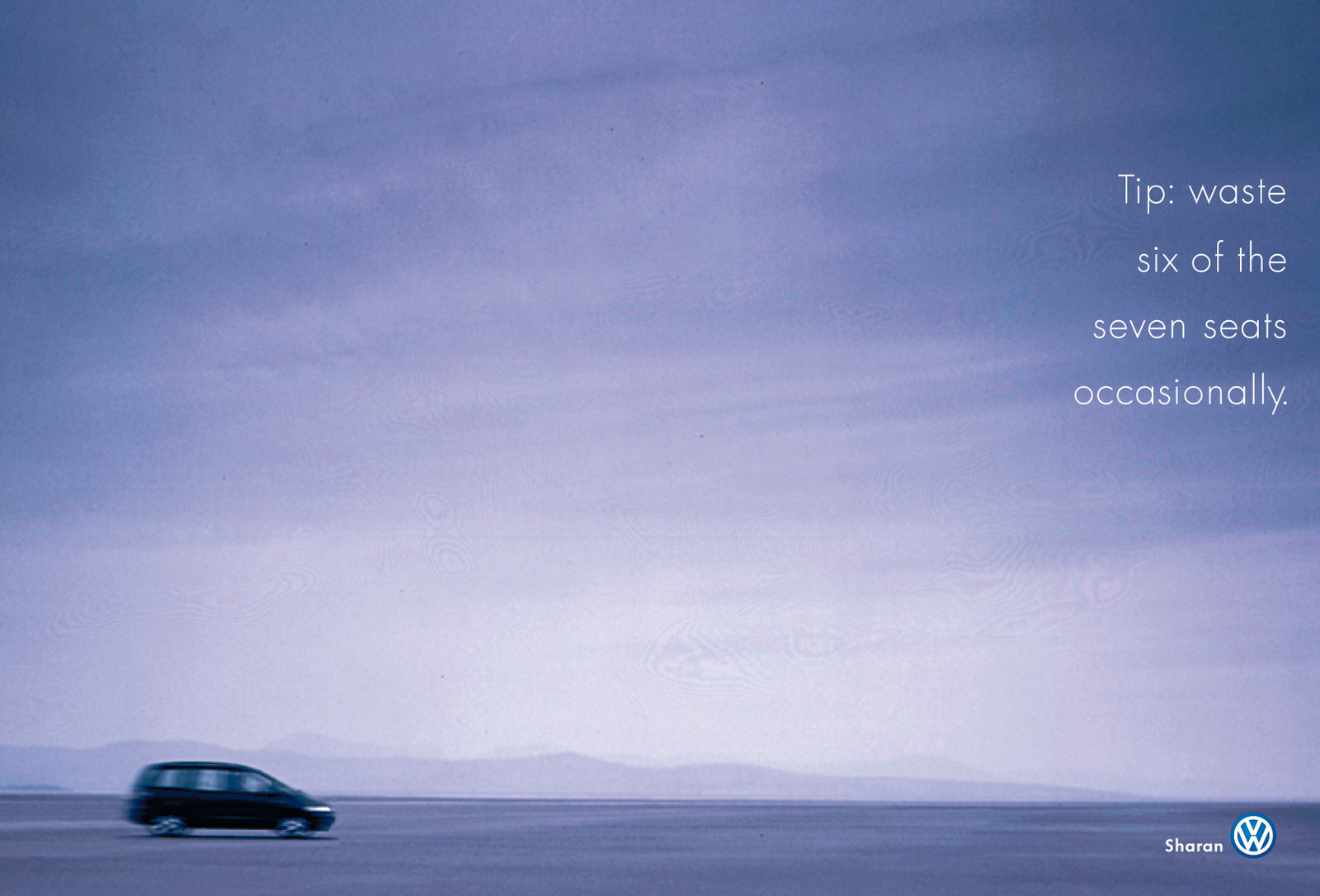
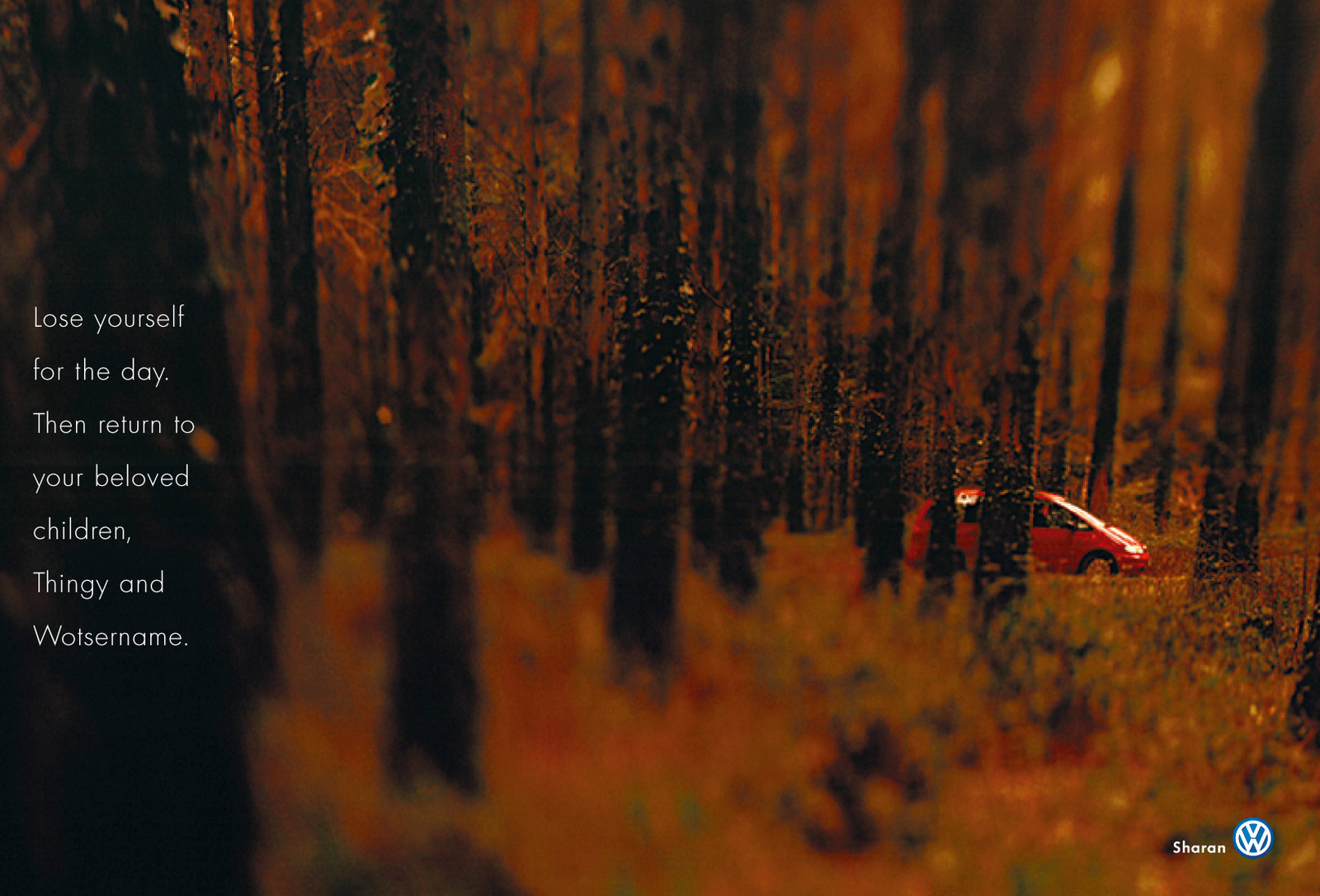
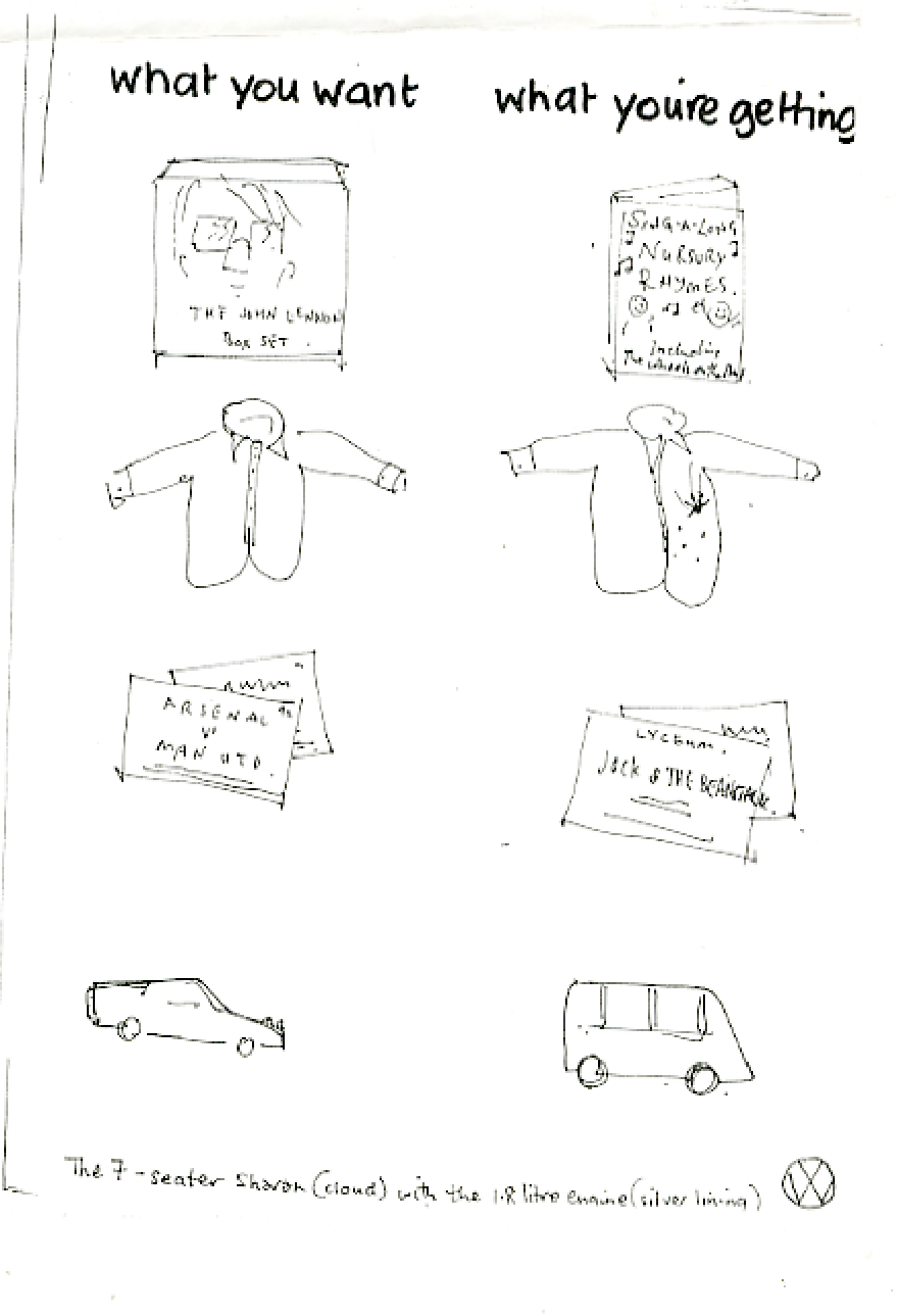
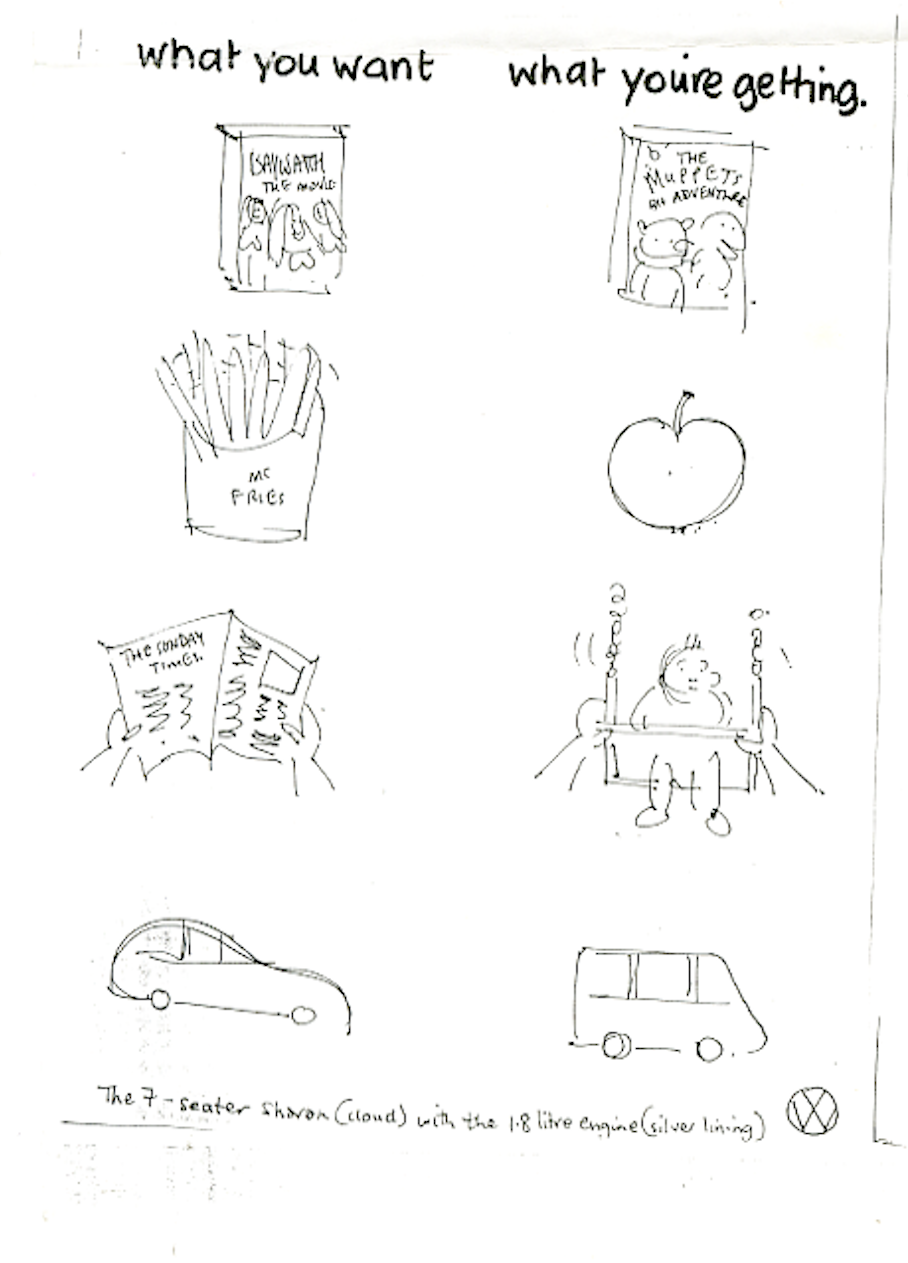

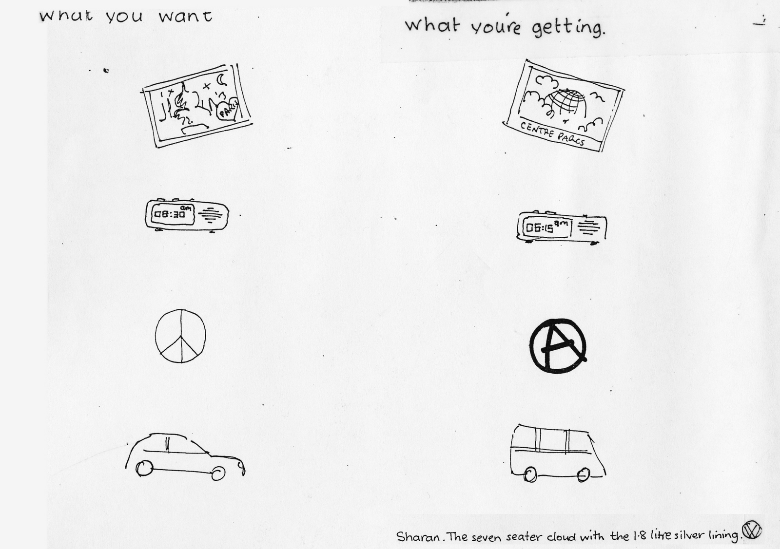
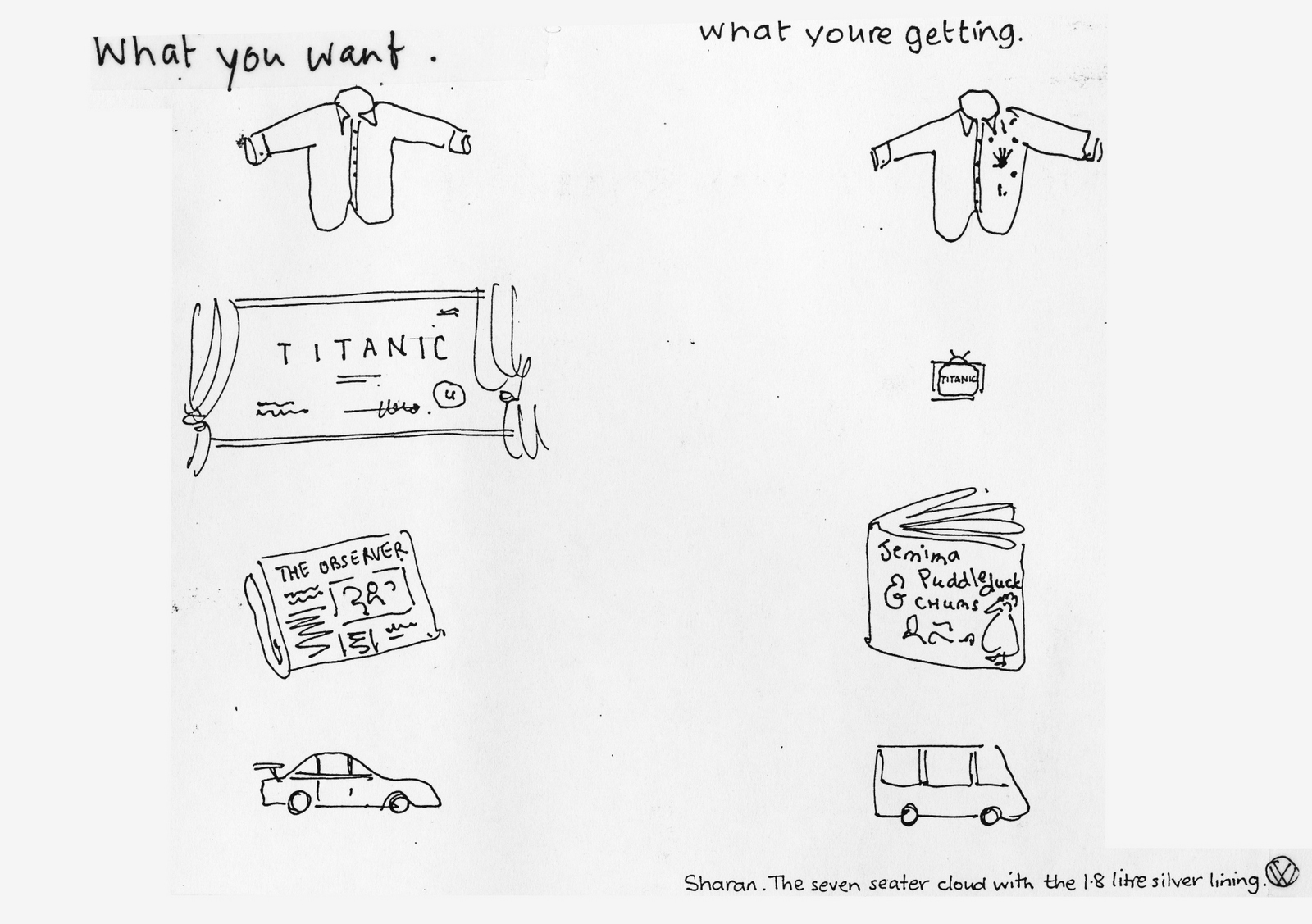

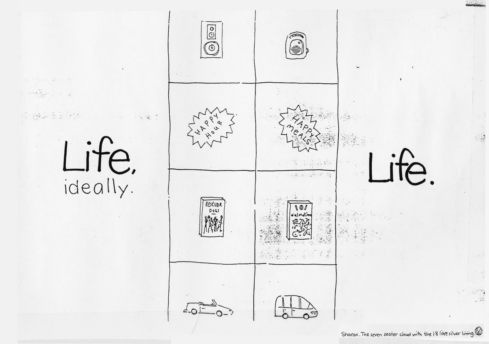
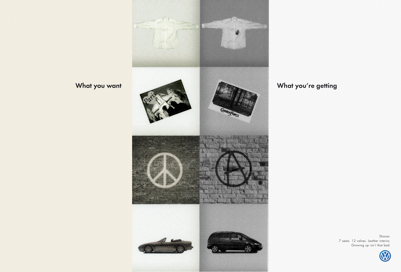
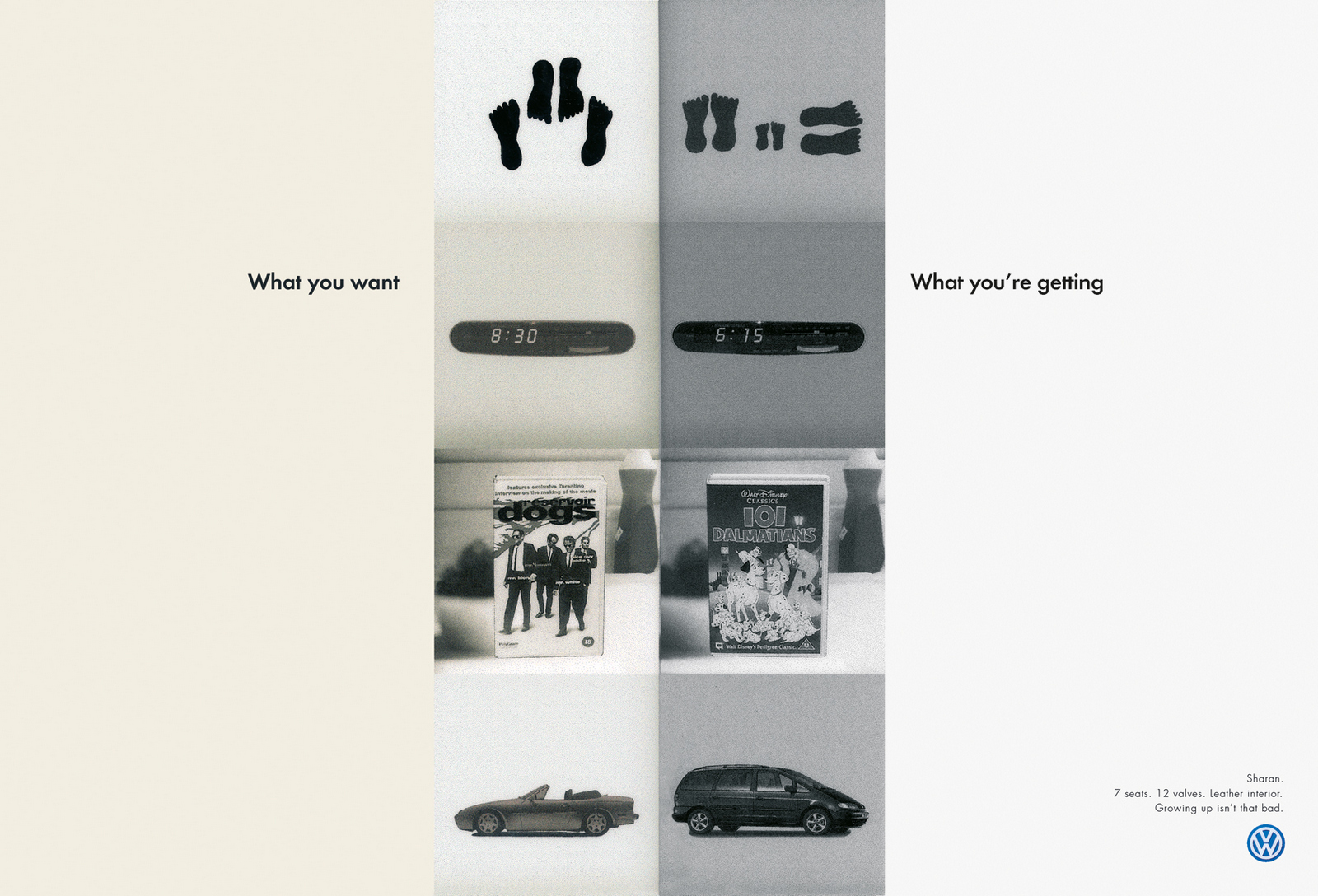
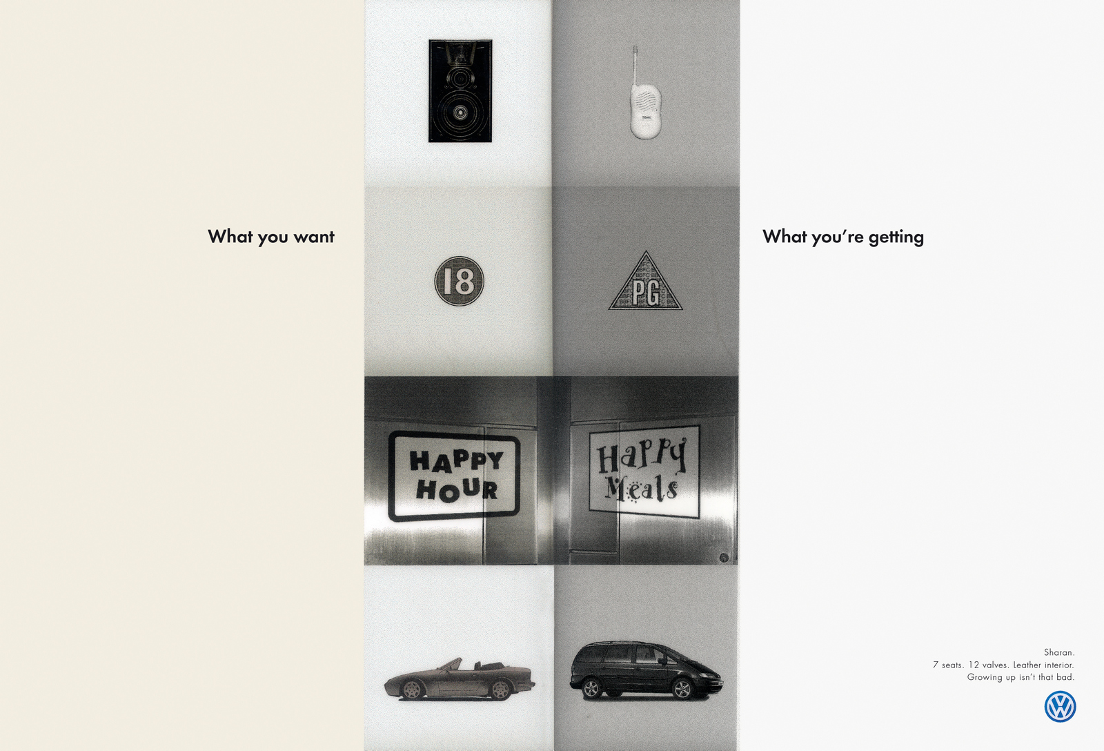
They were shot, made and supplied to magazines. At the eleventh hour the client got cold feet and pulled them, they worried they were underselling the car. A replacement campaign celebrated the Sharan’s ‘hidden power’, eg. A shark smoking a pipe.‘Hidden power’? Strategically that’s complete...what’s that technical term planners use?
Every so often, a newspaper or magazine will call up asking for some ads. These can be anything from ‘If drugs were legalised how would they market themselves?’ to ‘How should banks communicate post 2008?’. Strangely enough, one such brief helped me secure my first job in advertising; ‘How would Vets advertise if it became legal for them to do so?’. (The concepts below ran in Marketing Week, probably helped turn my trial into a job.)
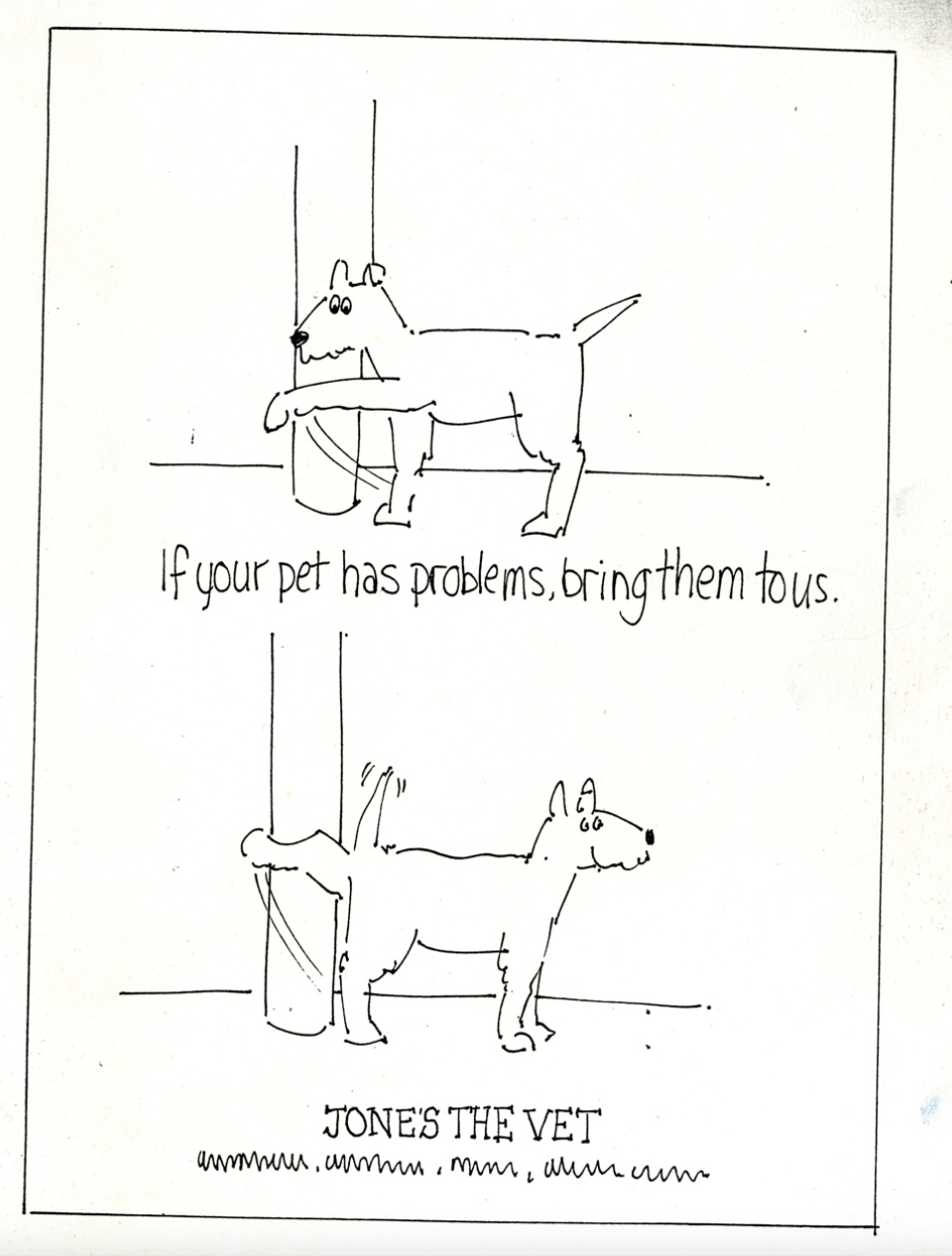
(Hang on a minute... ‘How would vets advertise if it became legal for them to do so?’, was it ever illegal for Vets to advertise? I guess it must’ve been, how weird is that?) Anyway, back to the point; ‘What would happen if the Government stopped trying to scare smokers and talked to them like adults?’ The Observer asked. We fully understood the question, we'd tried to scare the shit out of smokers whilst at AMV/BBDO. The most effective Anti-Smoking campaign produced at the agency focused on how it affected your looks. Which as a non-smoker seemed insane Death? - ‘Fine’, Lung cancer? - ‘Whatever’, Gangrene? -‘Sure, no biggie’, Dry Skin? - ‘Whoa! Dry Skin? Now that I can do without!’ The point was, smokers aren't daft, they know the risks, lecture them and they switch off.So with The Observer brief we thought we'd remind them of the dangers by accentuating the positive, to the point of being downright silly.Tonally we wanted to be more like a mate down the pub ribbing them than a authoritarian figure talking down to them.So we created a fake brand ‘NOTHING’ and advised people to smoke it, lampooning kitsch advertising cliches.
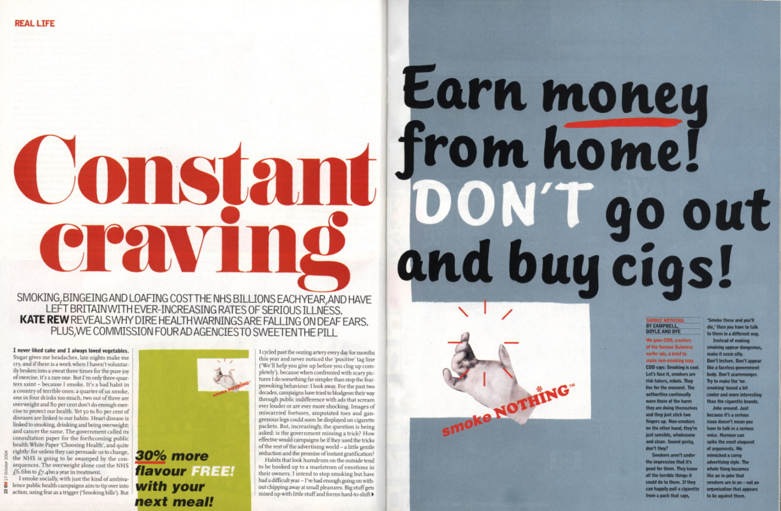
About a week after the magazine came out, someone called from the NHS, the North ‘We saw your posters in The Observer, can we have ’em?’Fantastic!They ran in the East Midlands as 6 sheets.A lot of P.R. was generated as the approach was seen to be different, resulting in the chap who'd called us talking about them on a several radio shows.No money changed hands, but everybody won. It seemed.
One year later the C.O.I. came in to check out our creds.(Every four years or so they'd troop around all the new agencies, generally pick two new, interesting ones, and kick off a couple that weren't working out.)CDD were seen as interesting, probably because three out of the three names over the door were creatives, also, we'd all worked with the C.O.I. at previous agencies.We had a great meeting.The feedback was that they really liked CDD because we were creative and 'interesting', we were down to last three, they were looking to put two on the roster. Good odds.Another meeting was arranged to meet a larger group of C.O.I. bods.Another great meeting.It appeared to be a done deal.Then we thought we'd share this news with them: ‘‘We've already worked together’’‘‘Really? How so?’’ said the man from the Ministry.SFX; Drumroll, ‘‘We did these...for FREE!’’They didn't seem quite so delighted as we'd imagined; ‘‘Oh, and who did you do them for?’’‘‘The NHS...North Birmingham.’’ we replied.‘‘We can see that, who were the individuals?’’Slightly thrown by the sudden change in room temperature, we offered up aname, maybe they were chums?They all scribbled it down.The meeting ended shortly after.We didn't get on the roster.If you're not in the creative department you probably understand why, but for those in creative departments, here's why; Those guys sole job to decide who the C.O.I. does and doesn't work with.The last thing they want is some renegade agency busting their system.Doh!
As a rule, I like campaigns that can only be used for the client they were written for. Take ‘Compare The Meerkat’, if that client doesn't buy it you chuck it in the bin. It's a good test of whether it's own-able. If you can swap the logos for competitors and it works just as well, generally that's a bad sign. But, not everyone has something unique to shout about. Sometimes you find yourself on the same brief for different clients, sometimes exactly the same brief but in a completely different category.THE ECONOMIST.I had whilst working on The Economist at AMV/BBDO that was just perfect for them;The Economist gives you knowledge > the knowledgeable have less questions > The Economist are making the question mark extinct.
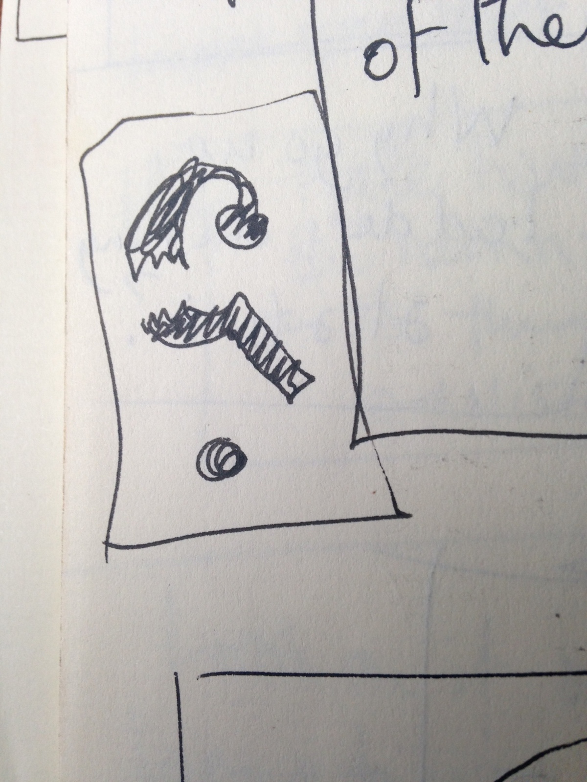

But I could never quite put it over in a way I was happy with, it always seemed a bit too basic, and as clever was almost a mandatory on an The Economist brief.ASK JEEVES.Cut to a couple of years later, Ask Jeeves came to talk to us at CDD.They were a search engine, I presume the name came from the idea that you type in what you're looking for and Jeeves goes to fetch it.We had a thought that was just perfect for them; Ask Jeeves a question and he'll answer it, he's basically making the question mark extinct.Jeeves could literally go around killing question marks.
True, he'd have to run around committing murders left, right and centre, not exactly on brand, but ironically it might make him more likeable, stop him being such an unctuous little twat. For a start, he could kill one on the homepage in a new way every day.
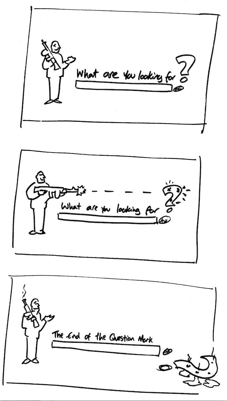
He could be seen fleeing from the murder scene on posters.
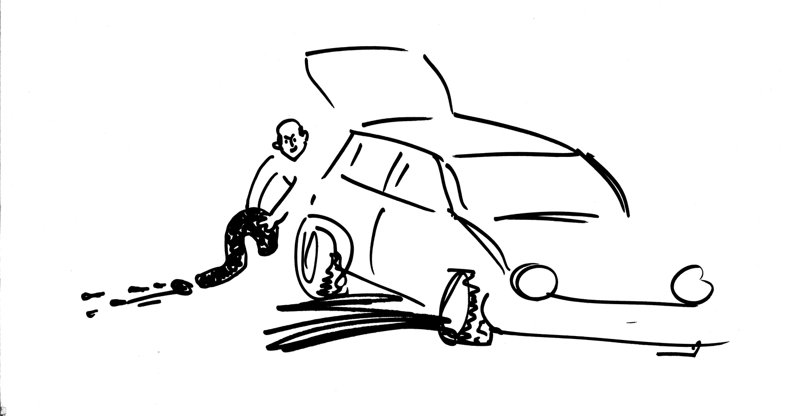
The idea came together really well, so we got a fancy illustrator to do some fancy roughs to present at the pitch.
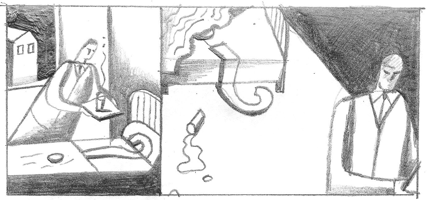
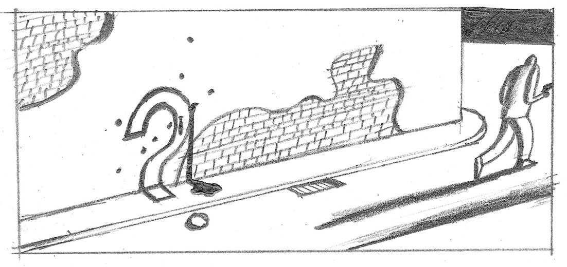
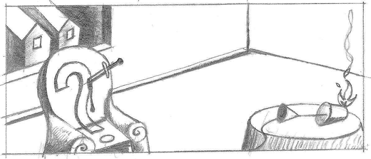
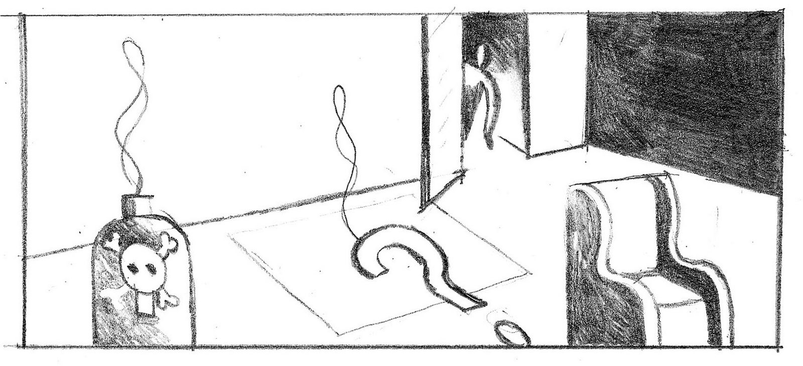
It turned out the Ask Jeeves bods weren't keen to turn their brand icon into a murderer. Weird?BBC. Sx months later, the BBC asked for some trailers for BBC Learning.BBC Learning? What to do? What to do?Bingo! We had a thought that was just perfect for them; Learning = knowledge, becoming knowledgable means asking less questions, making the question mark extinct. Bingo!Draw it up!

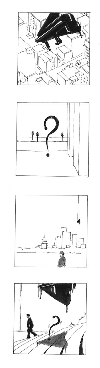

They liked it. While they were liking it their budget was pulled. Flip.AQA.Another six months or so go by, we have a chemistry meeting with two tech chaps, they tell us about their new ‘‘It’s for mobile phones, text any question you like to 63336 and you’ll have an answer in minutes, it’s called ‘AQA’, it stands for ‘Any Questions Answered.’’THANK YOU GOD!service, turnup Primrose Hill to ask us whether we'd produce some advertising for them in exchange for some equity. (A tiny, weeny, little bit of equity.) THANK YOU GOD!First, they needed a logo.
It was rejected in favour of an inferior idea that will pop up shortly.ADVERTISING.Ironically, considering we had a campaign reading and sitting in a drawer just waiting to be used, we ignored it.
The logo and ads were rejected.I didn’t mind the ads being rejected but thought the logo was strong.Certainly better than where we all ended up.We thought the advertising stripped back, minimal clean, minimal and would jump out from the clutter of newspapers, they thought it was boring.We go again, let’s have another look in that bottom drawer.
Surely this is just perfect for them; Their whole business is answering questions, they are literally making the question mark extinct.We delicately removed Jeeves from the executions.
ILLUSTRATOR.
We then set about thinking up some new executions.Now that Jeeves had been ditched we restricted ourselves to only two scenarios; the murder or the disposal of the body/question mark. This new found freedom was great, for a start they needn't all be murders, the culprit could be Mother Nature.
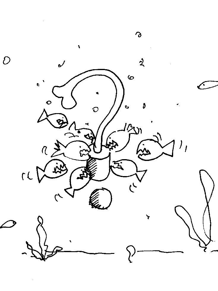
They could also be a bit more esoteric:
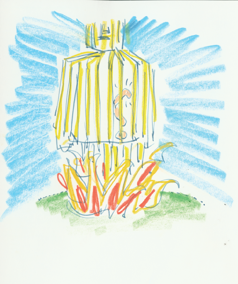
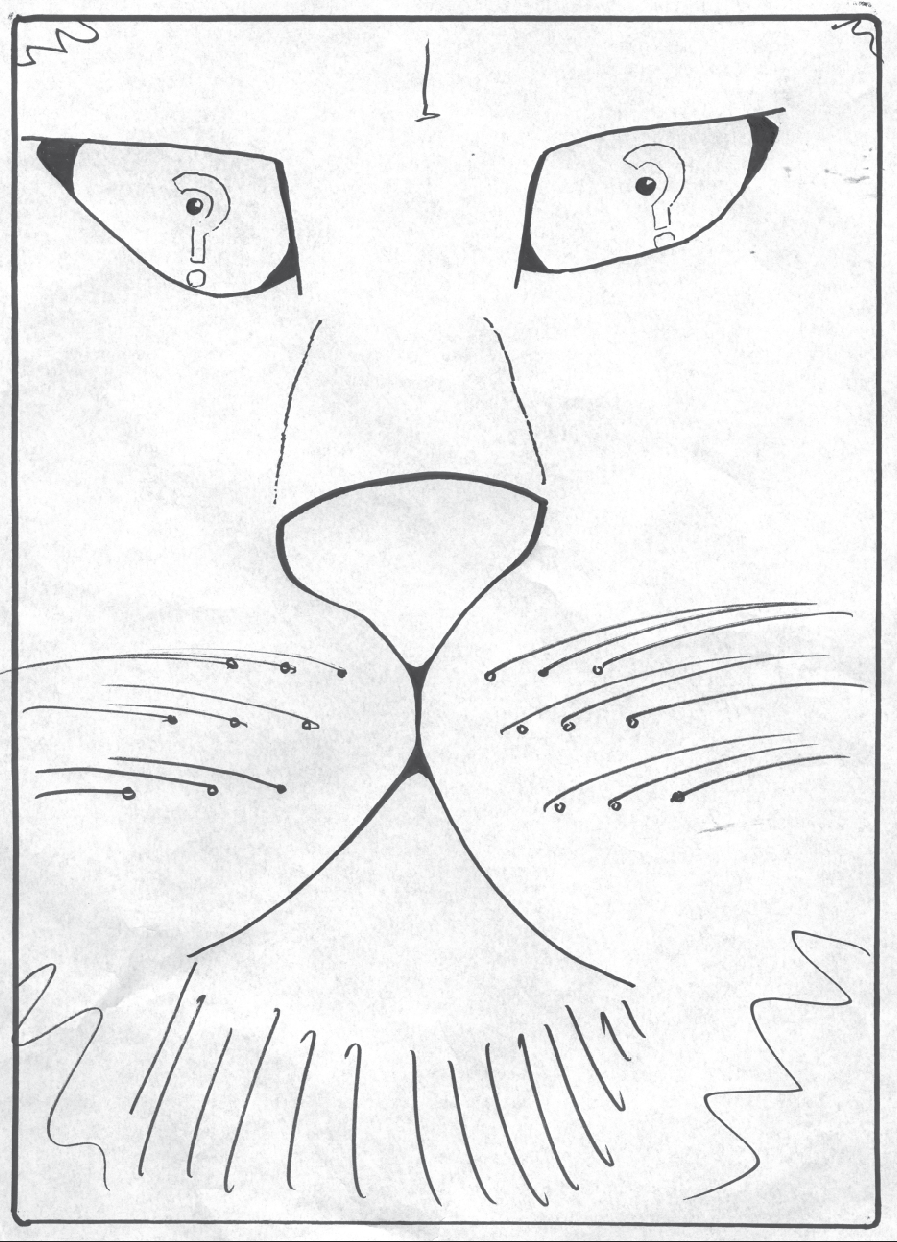
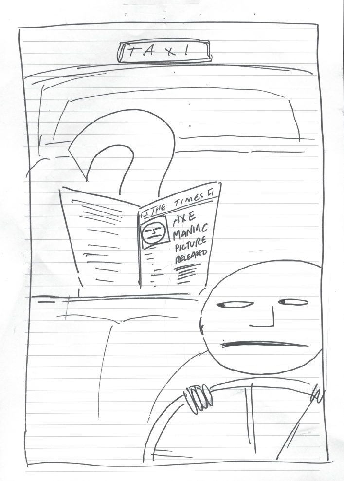
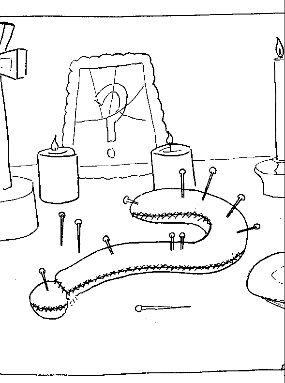
They could be post death set ups.
We presented them.
‘Don't get it?’
‘Too violent.’ (But it's a sodding question mark!)
‘Don't get it?’
‘Don't get it?’
‘Er...?’
‘Too depressing.’ (But it's a sodding question mark!)
‘Don't get it?’APPROVED.We started with the campaign with the ideas that were easiest to get.
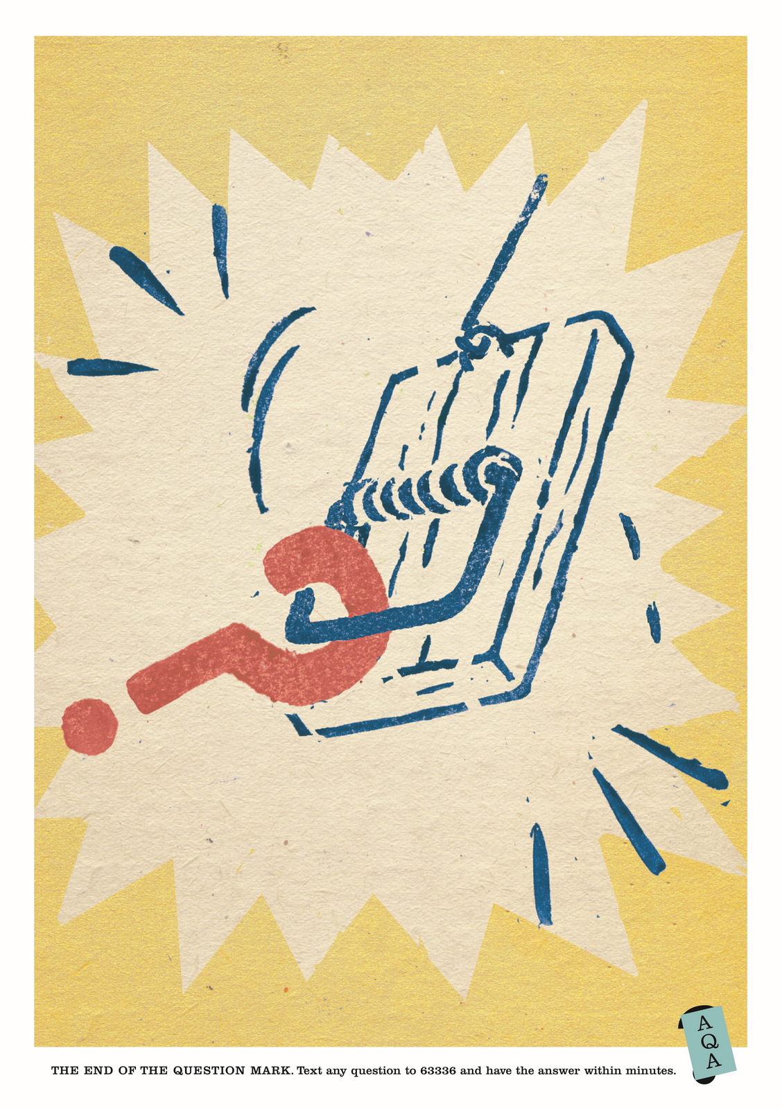
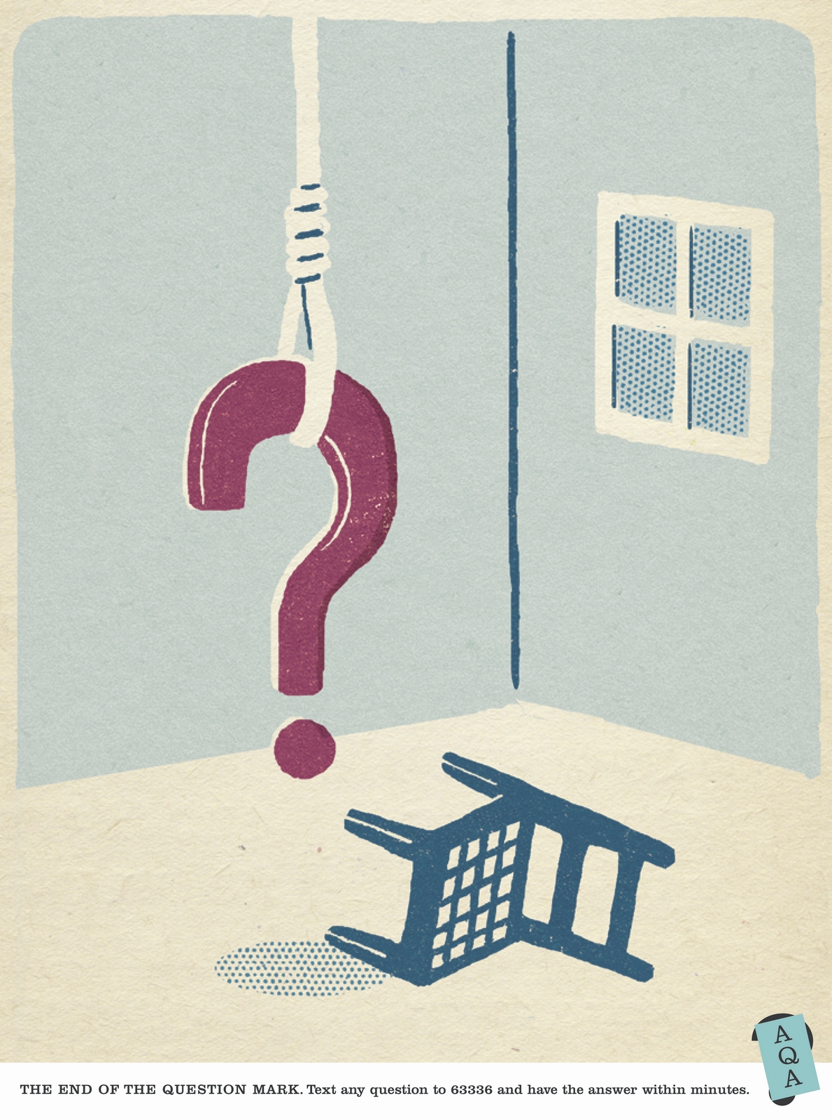
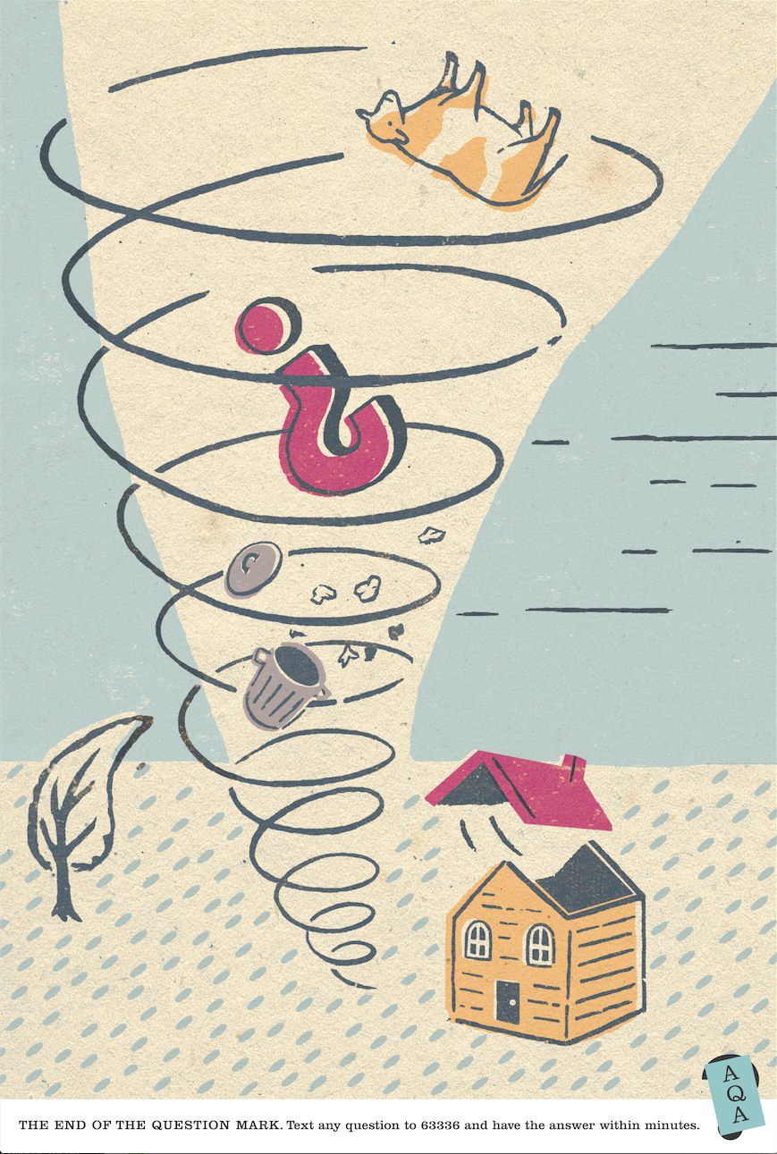
Then they got a bit cleverer.
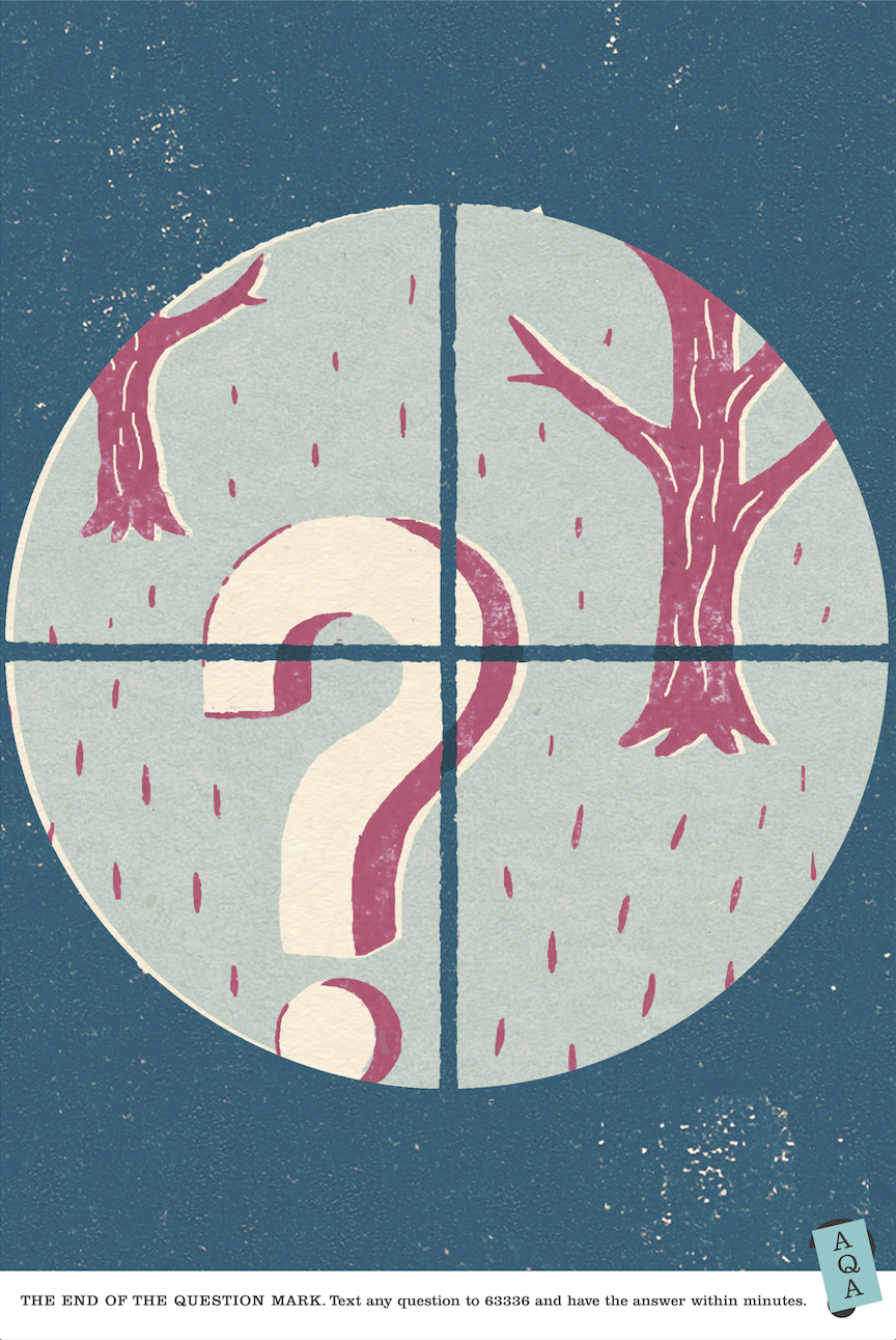
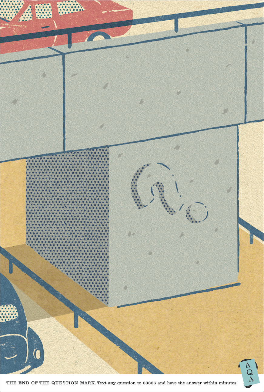
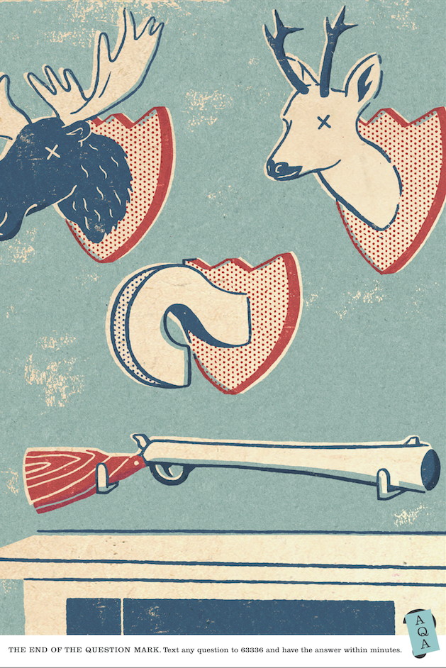
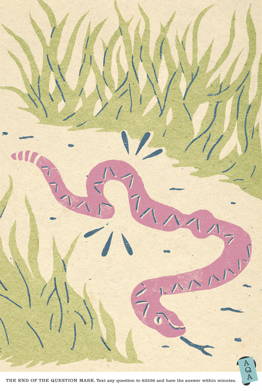
You had to think about them a bit more, but when you got it, it was rewarding. A bit. Take this one, inspired, or robbed, depending on your point of view, from a scene from a film 'Kentucky Fried Movie', where a white man is dropped into a ghetto, I think it was Harlem?
Here's the first rough.
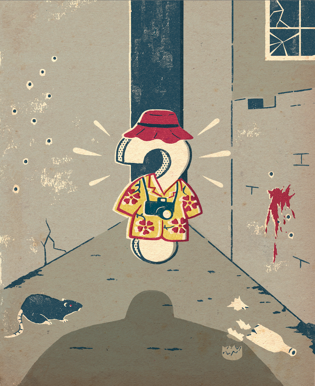
Client: ‘What's with the blood...and RATS? Bit scary.’ (But it's a sodding question mark!) Final version. (As you can see, we cleaned up the ghetto.)
We produced their business cards too.
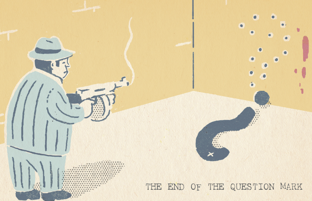
.
We produced a little giveaway booklet.
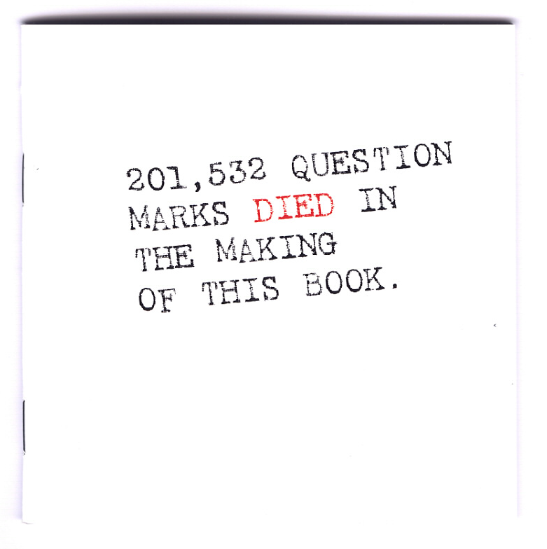
Which ended up being a book, a book that Amazon tells me is now worth 1p.
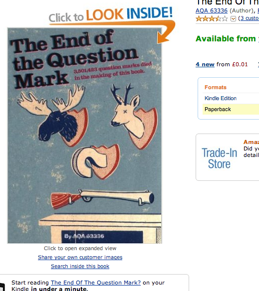
And finally, a few posters to go into the loos of colleges, for some reason ignoring the question mark altogether?
‘‘Volkswagen want us to pitch.’’If you've just started an agency - that's what you dream of hearing.It was the Commercial Vehicles division, but was still big and still Volkswagen.Volkswagen; DDB, Bill Bernbach, Helmut Krone, etc.What an opportunity!But it's 2009, the post-bank meltdown is really starting to bite.We're officially in a recession and Volkswagen vans are dearer than non-Volkswagen vans.I need to find a writer who can actually write.Who can make the case to businessmen as to why should pay more for a van when money's tight.Who can talk their language businessman to businessman.Who can do that? My mind was blank. Whilst I was trying to conjure up some names, the National Newspaper Marketing Association got in touch, they wanted me to pick an ad to put in their classics gallery.I picked this one.
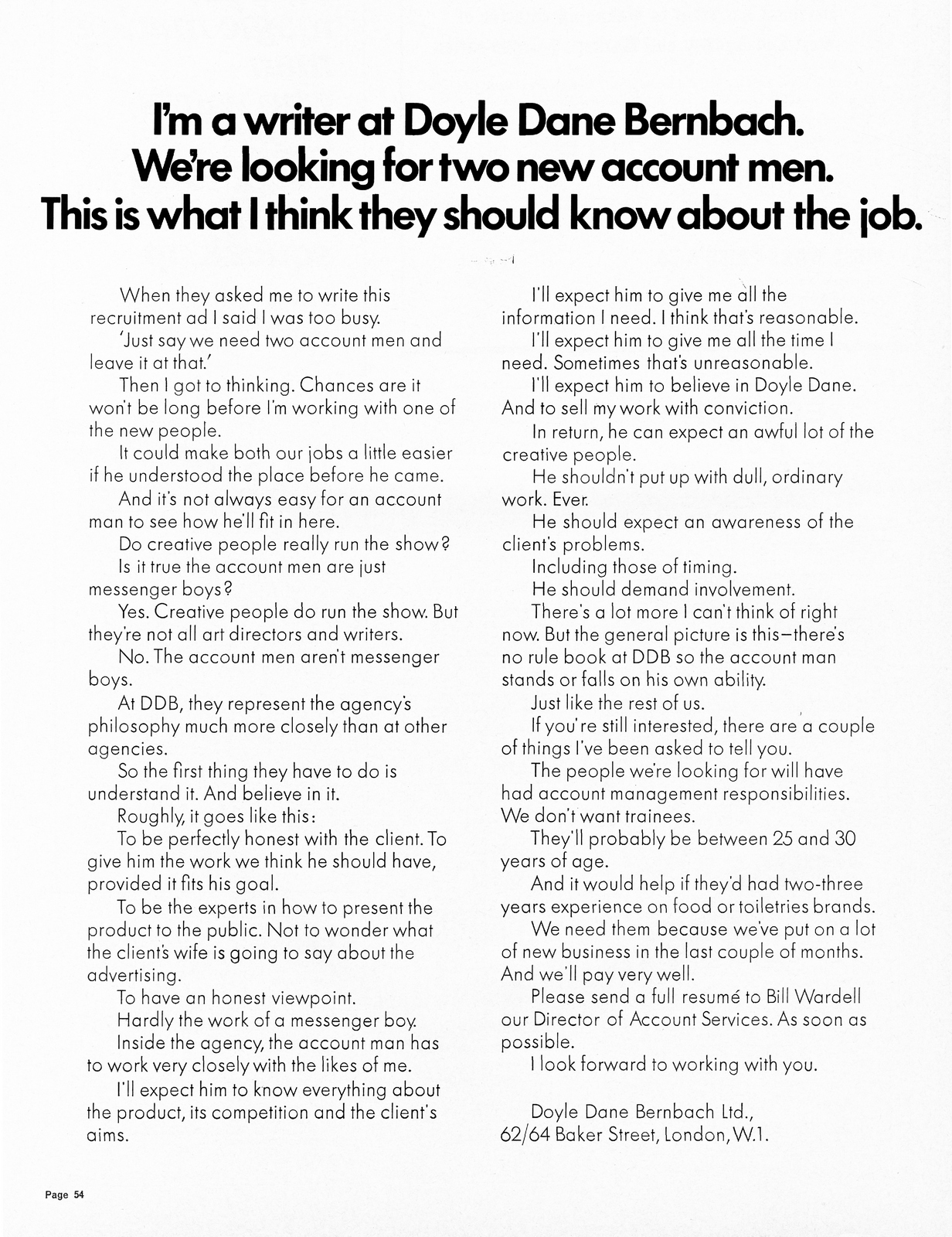
Off-brief in retrospect - it didn’t run in a newspaper (it appeared in Campaign, a trade magazine).Anyway, I loved it, the way it drew you in and unfolded.sold you the agency.The human, honest voice, that sold the agency to me so well, that by the end of the ad I wanted to apply for the job myself.Even though I'm not an account man.And now, forty-something years later - they’ve almost certainly filled that position by now.That’s the kind of writer we need on Volkswagen; a writer who could talk to businesses in their own language, who could rationalise spending a bit more now for the longer term.A David Abbott type.So let's think; who writes and thinks like David Abbott?Couldn't think of anyone, my mind was locked on David Abbott.I asked around for suggestions.Zilch.Then I realised; he isn’t type, just like Bowie, Picasso and Tarantino aren't types.They one-offs.Damn! What a shame - he’d be perfect.The only way to move on from that idea was to ask him, get a “No”, then I could think afresh.‘‘I’m terribly rusty. I haven’t written an ad in years.’’Me, cheekily; ‘‘It’s only thinking, I’m sure you’ll remember how to do it.’’He tentatively agreed to meet and discuss the project.I catch a cab to his lair, just behind Peter Jones in Kings Road.Moments before stepping into the taxi, I'd been given a hot-off-the-press copy of the new Creative Circle Annual, which I’d designed with my chum Mark Denton.David had been given the President’s Award, so there was a big, 8-page feature on him inside.It's the only copy of the book in existence, but sod it - I’ll give him to him, it’s a nice gesture.He ushered me into his stylish apartment, come office.It was a sea of mahogany and faded book spines.Roasting coffee beans and classical music wafted through the air.As I handed him the Annual to him it occurred to me that it fit the surroundings.Exhibit A:
He looked at it quizzically, like he was trying to figure out how it worked.He goes straight to the index, like any Creative, checking out his pages.He then starts flicking through the annual to find his bits.As the pages flicked I had a horrific flashback; Two months before, with the book nearly complete, Mark suggested we put little headers on each page, like in comic books - ‘‘Y’know, like‘Billy Whizz he’s full of... jizz’... little, rhyming bits of nonsense”. A good idea, but it meant we had to writing sixty of these meaningless, rhyming bits of nonsense in the next couple of days. We split the task; thirty each. In my pile was the David Abbott Presidents Award pages. I didn’t think much of it at the time, it was just another one in an endless pile I had to write. I wrote six and showed them to Billy Mead, a mate who's office was opposite mine in Newbugh Street.I said ‘‘They’re bits of nonsense really, not much logic to them, don’t overthink it, just pick one you like”, he scanned down the list, bursting out laughing halfway down.‘‘Which one’s that Bill?”‘‘That one - He’s Abbo, he’s original, but he’s not aboriginal!”.Really? Ok, in it went.Cut to three months later.So, there I am, sitting opposite Abbo, who's original but not aboriginal, in his apartment waiting for him to read it.Live, right in front of me.Nightmare!His eyes will hit that phrase any minute.Bingo! His eyes scan it.
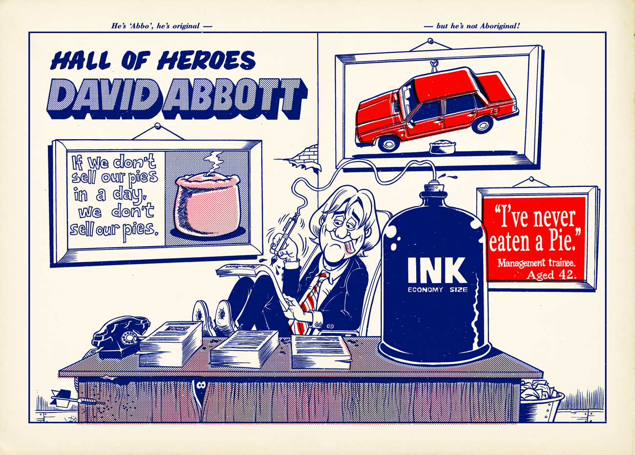
It’s difficult to describe his expression - a kind of confused wince. He then closed the book ever so carefully, and slowly placed it on a coffee table.As if it might contain an undetonated explosive device.Feeling comfortable the book wouldn't explode, he moved swiftly on “So, tell me about this project of yours”. We had a lovely chat and he agreed to give it a go. Three hours later, a phone call ‘‘Hey Dave, I hadn’t realised you’d designed that book, I’m so pleased now that I wasn’t rude about it”.I said I was aware it didn't quite fit in with the other books.‘‘No...I’m sure I'll find a place for it.” We cracked on.Initially, he was quite tentative, offering to write the copy for a couple of headlines I'd written.What could I do? He said he liked them, but made me feel a bit uncomfortable.Mind you, not as uncomfortable as when he'd read out his copy.I'd go over to his office, sit on the sofa next to him and he'd read his copy, in a mid Atlantic drawl. My face only two feet from his.He'd shoot me a look every so often, checking for a reaction.What's an appropriate reaction?Or expression?Too happy and you look like some giddy, sycophant with no critical facility.Too thoughtful and you look like you're weighing up his words, judging his copy like you know better.I tried not to fall in either side of the line, so ended up with a slightly, gormless stare with a hint of appreciation.The tentative phase didn't last long, David was soon back in the groove, running the show.He'd email updates and improvements throughout the day.Often completely reversing a previous request 'ignore that last email, I’ve changed my mind’.Just like a normal person.He was on top of every detail, forever polishing. It was surprising how much he cared, he could’ve just dipped in and out.This was my favourite of the ads he wrote.It was kind of off-brief, it came to him a few days before we presented.He changed the words about ten times, small, one word changes, at one point he wanted a subhead under the picture saying 'Photo donated by the Volkswagen Owner's Club’.Then wanted it removed.He also did what he had done many times before, what very writers do; break the fourth wall.This time referring to himself as the cheap, freelance writer.

Whilst we were working with David, I told everyone at DHM to keep it quiet, If it got out it may look like we'd used him as some kind of pitch stunt.We were working with him for what he could do, not who he was.We pitched.I read the first bit of copy out loud.

"That’s well written” the senior client said.I smiled, how weird is that, no one ever says that, if only they knew.I read the next one.

“That’s well written too.”OMG! Who says that? In a pitch too?I shot my partners a knowing look - as if to say this is nuts?I read the final piece of copy.

“Very well written, who wrote them?”Who wrote them? Who gives a shit? What kind of question is that?‘‘Kevin the copywriter, upstairs.’’‘‘Someone in the building you don't know.”‘‘What difference does it make?’’Those are just some of the things I didn’t say.Instead, I smiled awkwardly, thinking - I can't even answer that?The client mistook my smile as a sign of modesty - “Did you write them?”I looked at my partners awkwardly, one said ‘‘Tell him!”.“It was...er... a chap called David Abbott” I said.Younger client; “David Abbott in the Parts?”I kid you not, they had a bloke back at Volkswagen who ran their Spare Parts Department called David Abbott.Senior Client; “THE David Abbott?”The intermediary was looking at me incredulously, thinking “why's he making this up this shit?”I told them yes, that David Abbott.He then asked ‘‘Well, will he work on the business if you win it?”.‘‘Yes of course”. I lied.What could I say?We finished the pitch, they LOVED the work, said it was the best advertising they’d seen, the only work that really captured the Volkswagen tone of voice.Great! In. The. Bag.I call David, I tell him it went well and slowly go through the unbelievable reaction to his copy, including ‘‘David Abbott in Parts?”He laughs.Then I have to admit I lied.‘‘Oh don't worry, what else could you say? Besides, of course I'll work on it if we win it.”Two weeks later they gave the business to Iris ‘‘They do everything under one roof, not just advertising.”Flip!Here's some of the other work we presented.(Some written by David, some by Sean Doyle.)