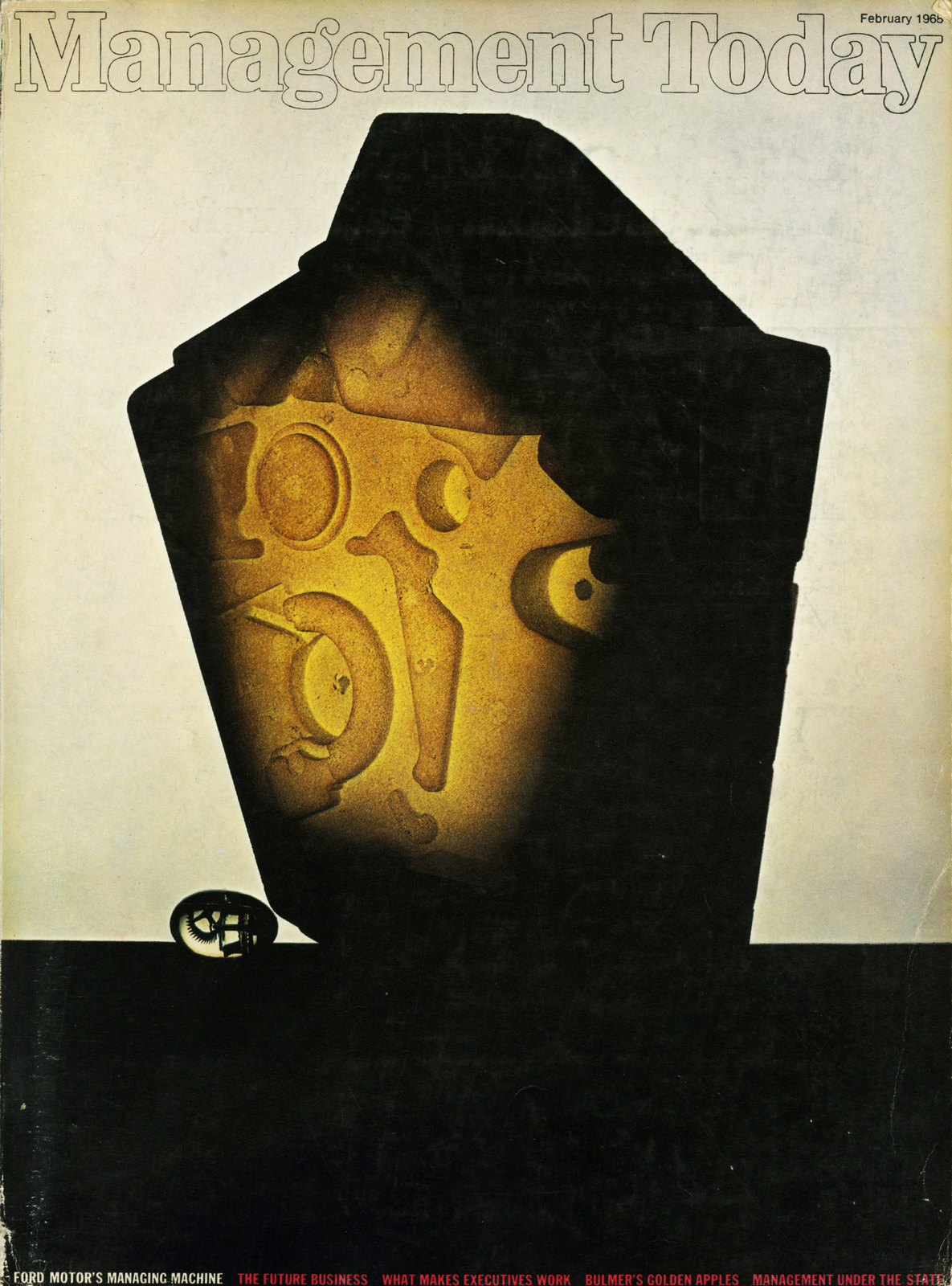
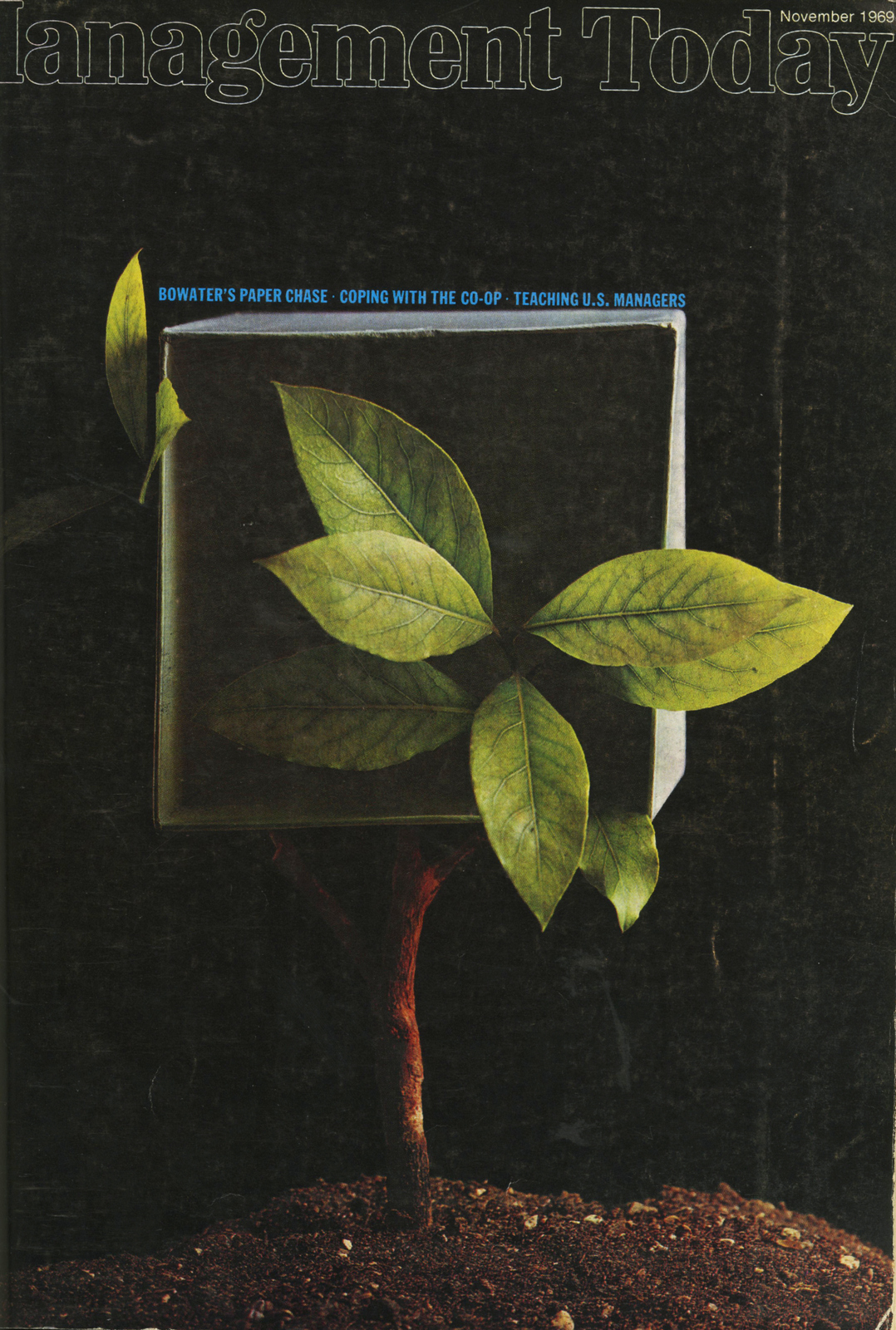
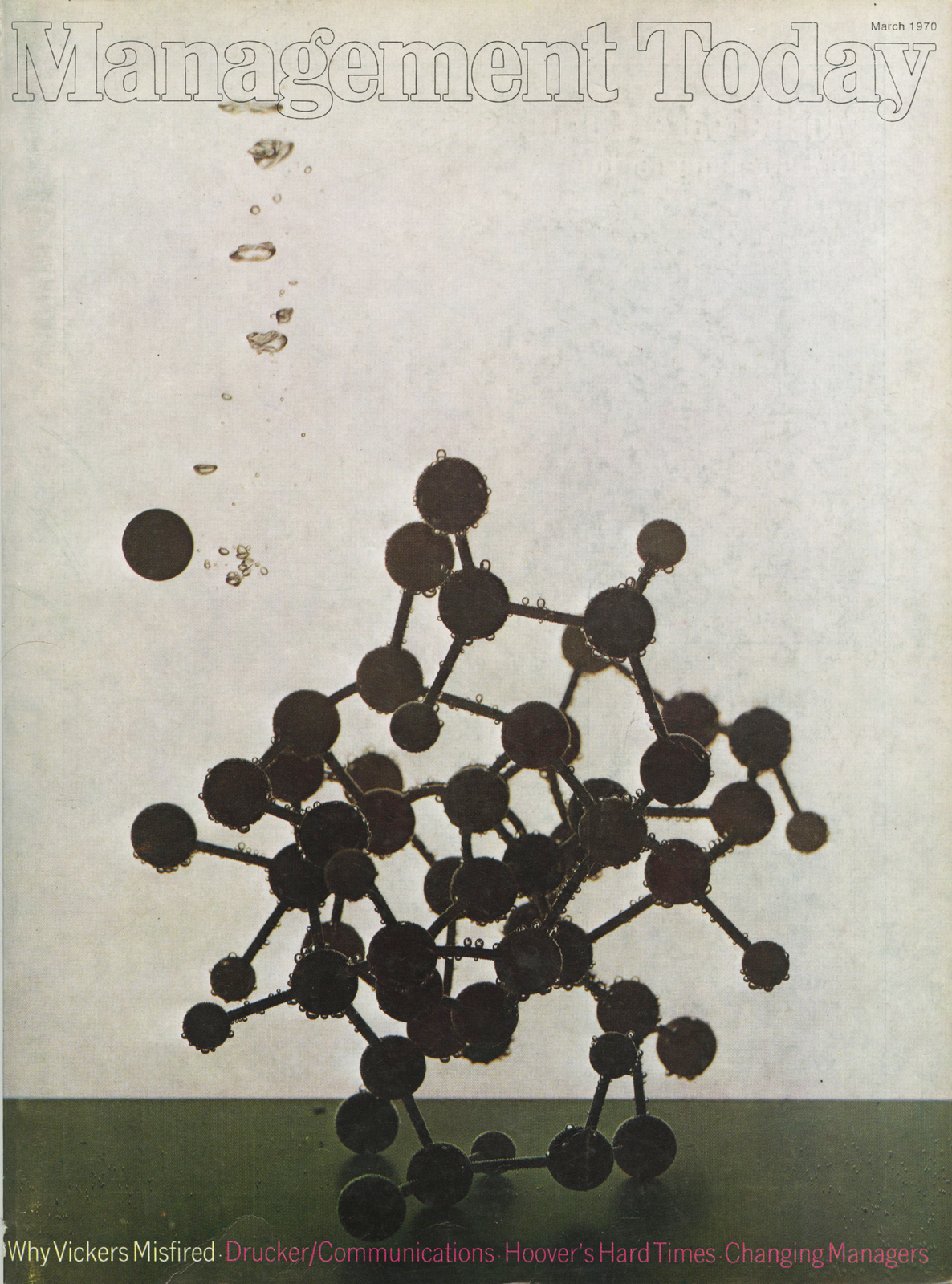
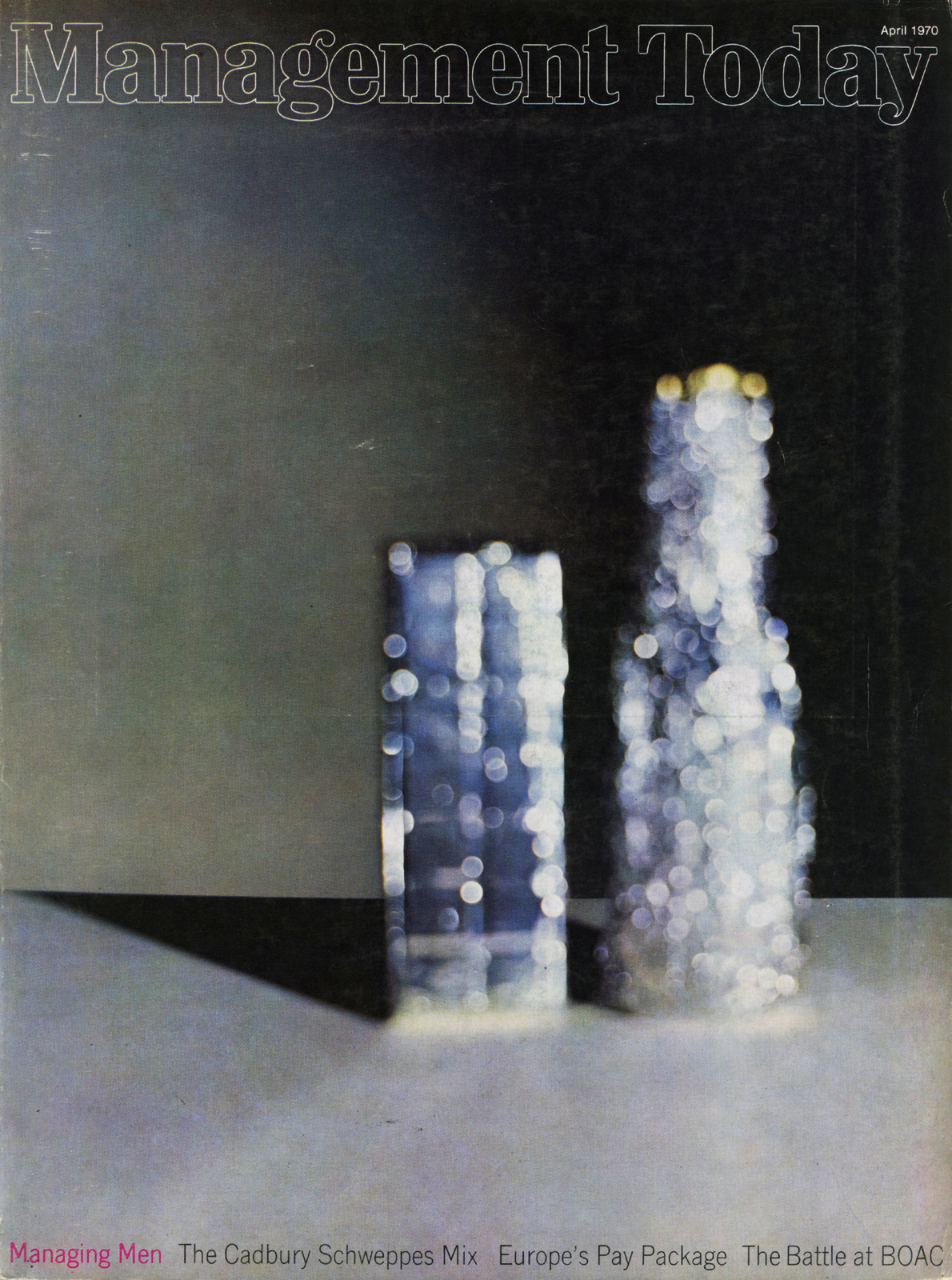
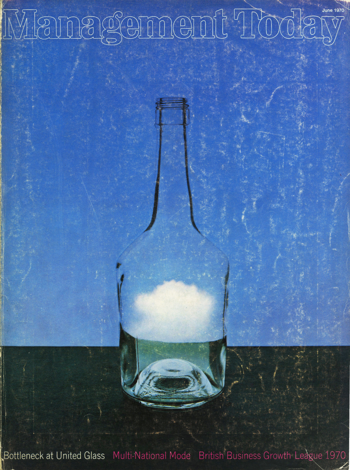
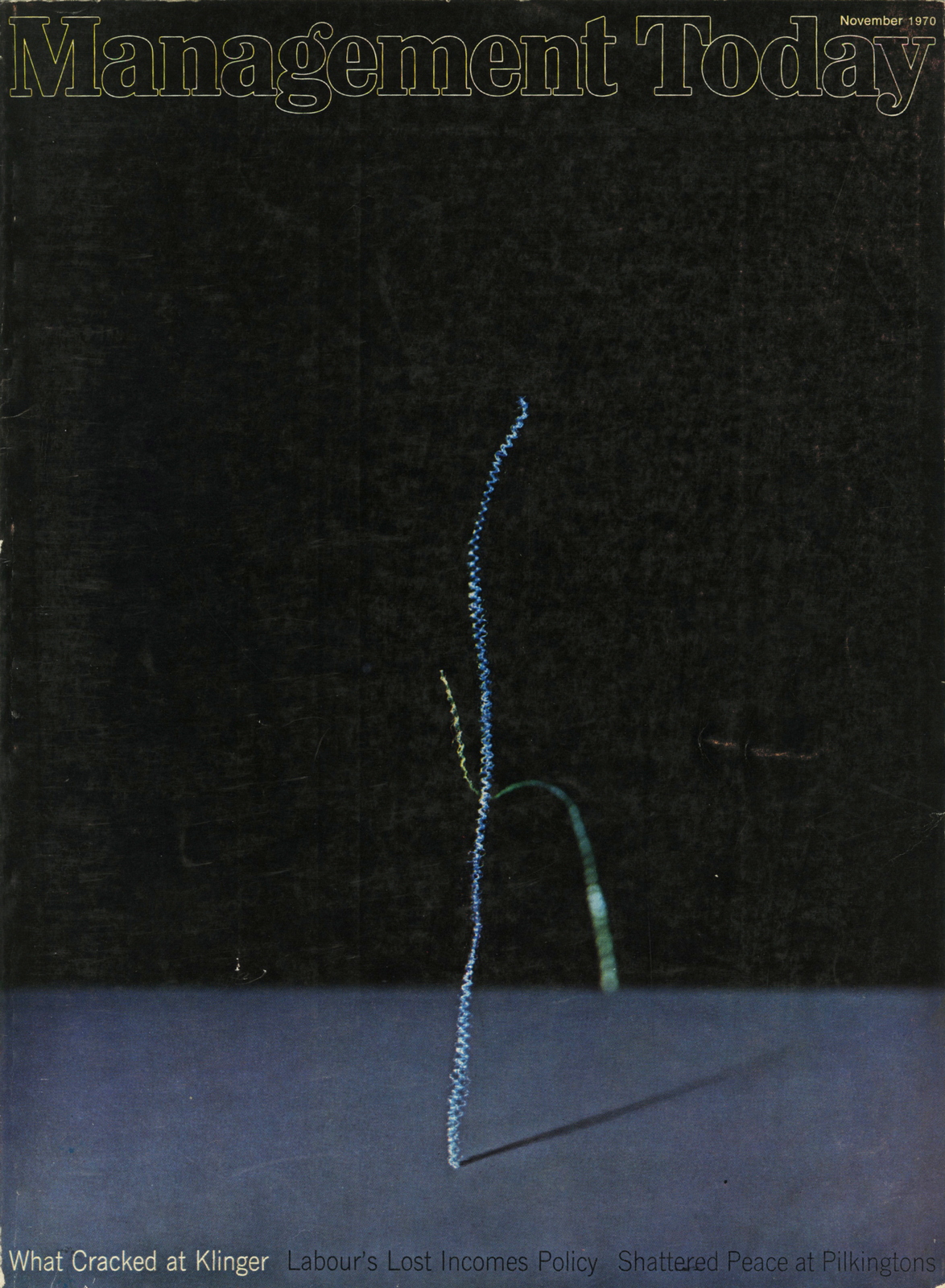
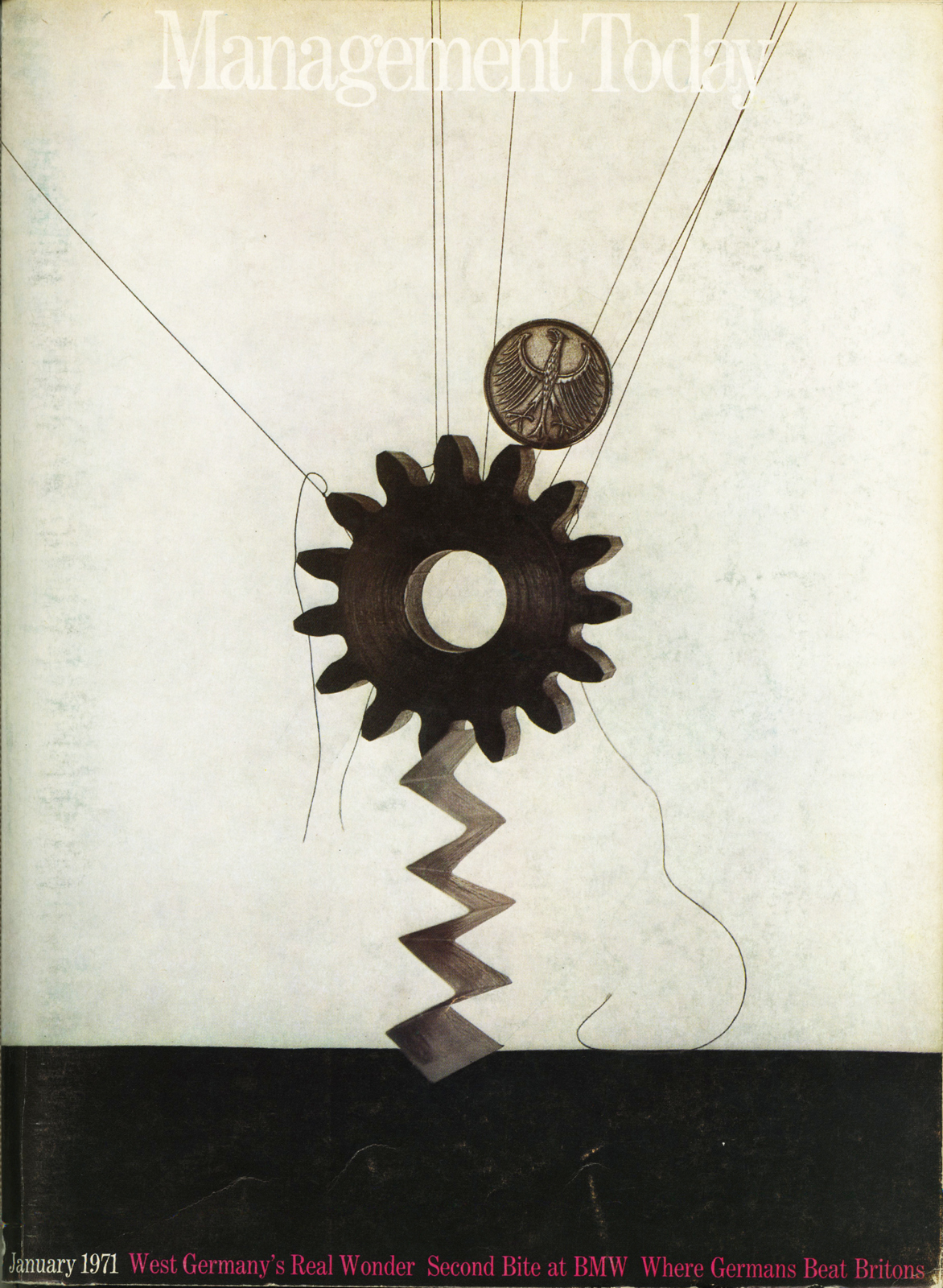
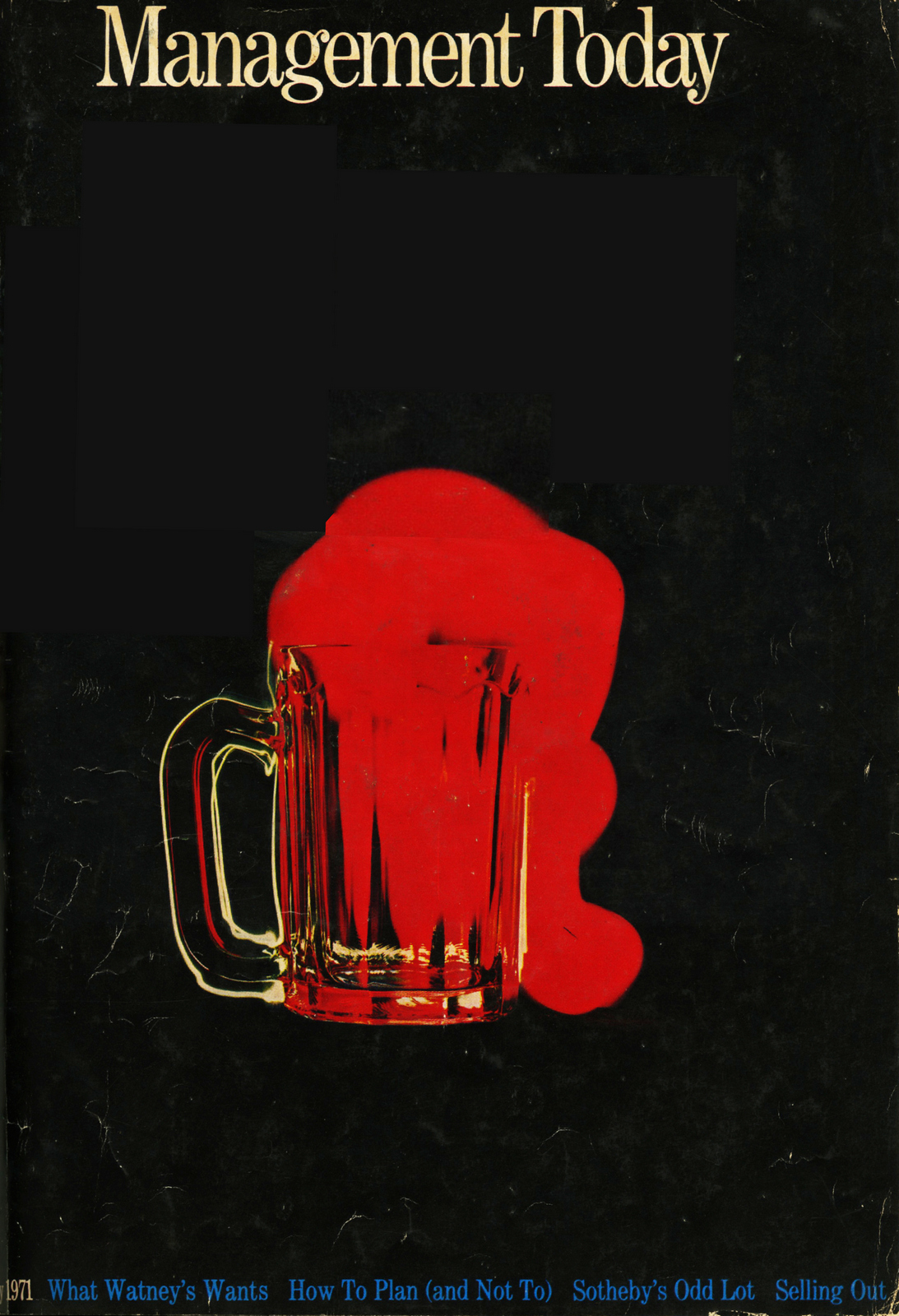
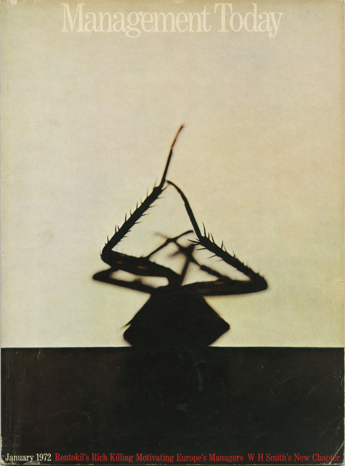
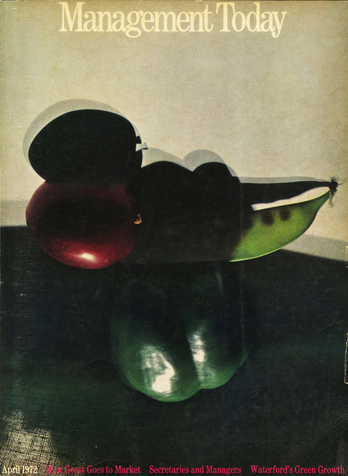
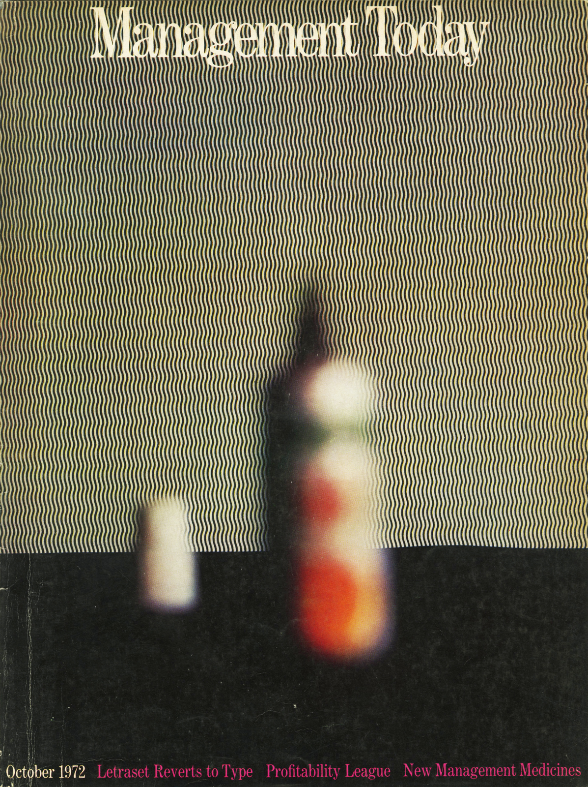
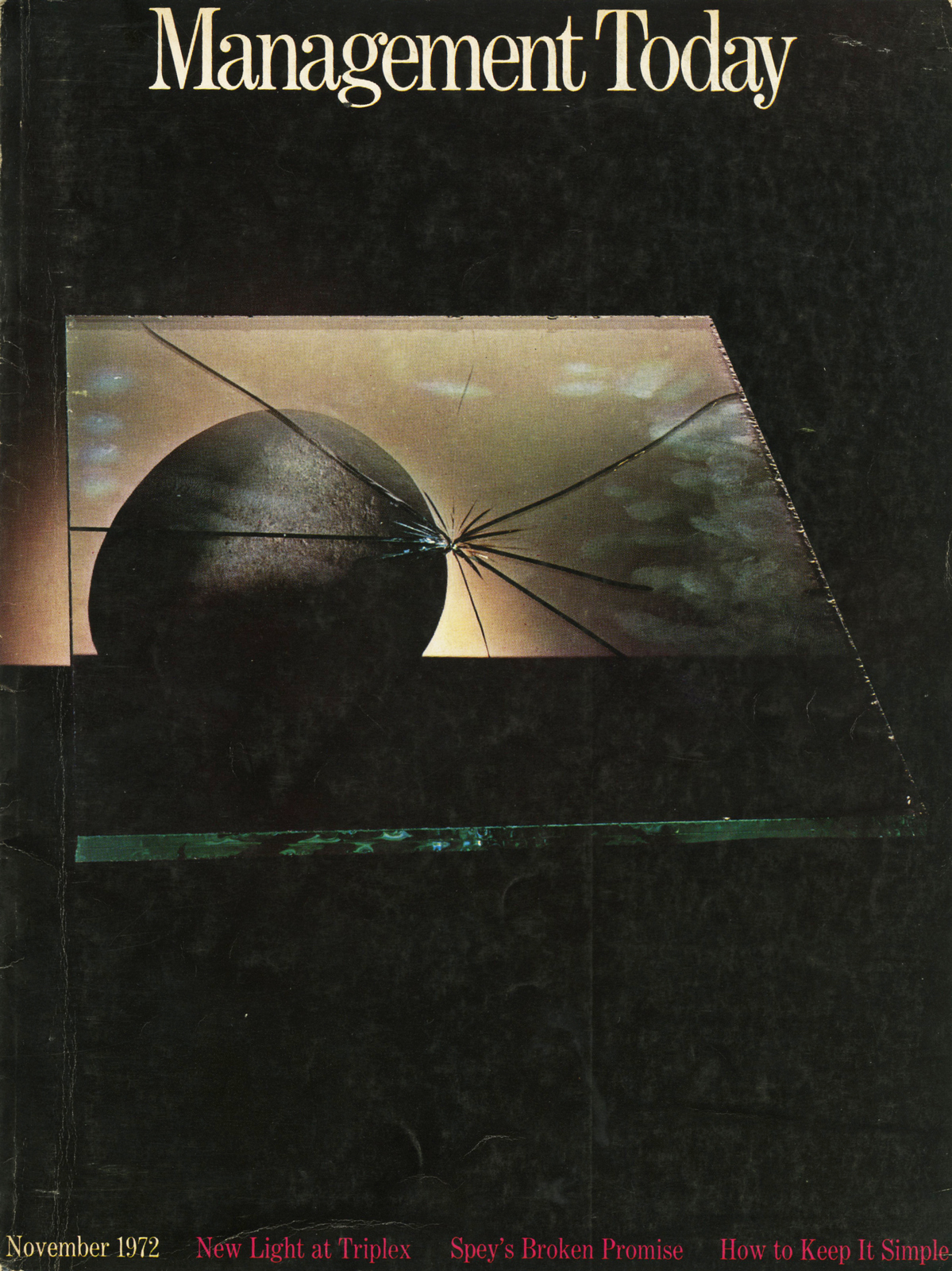
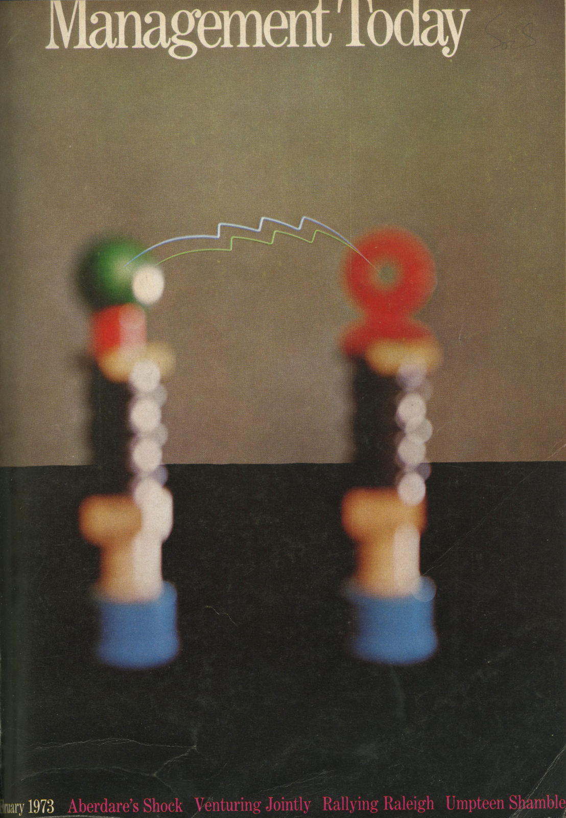
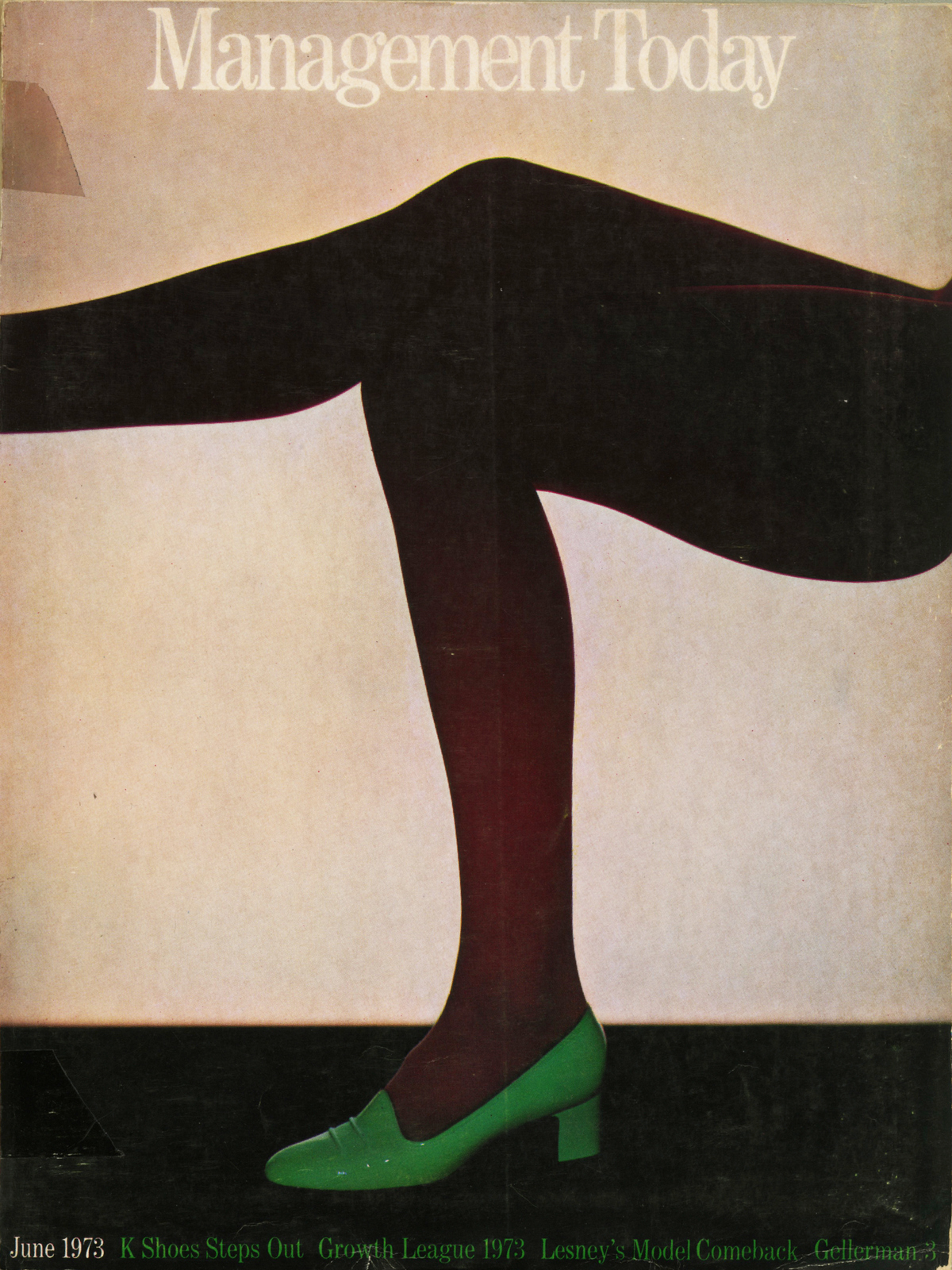
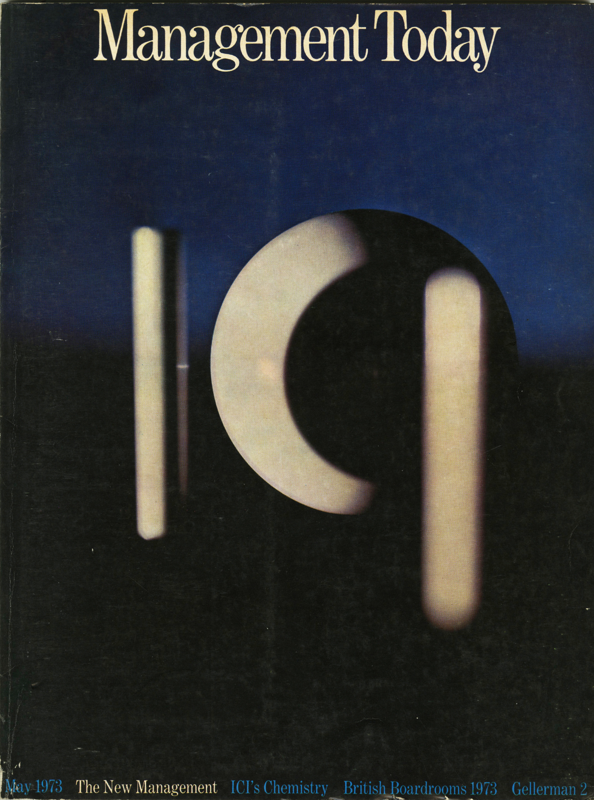
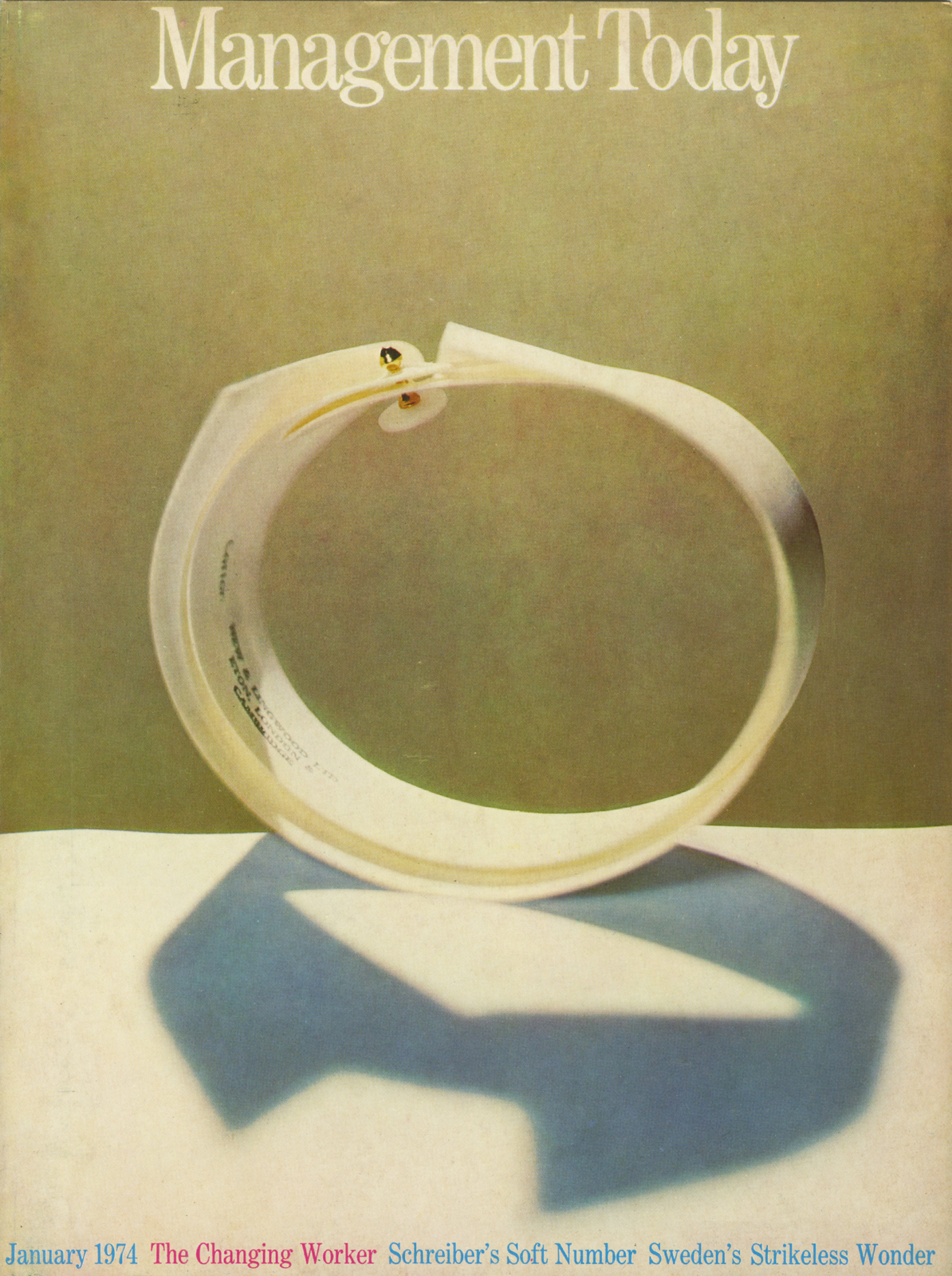
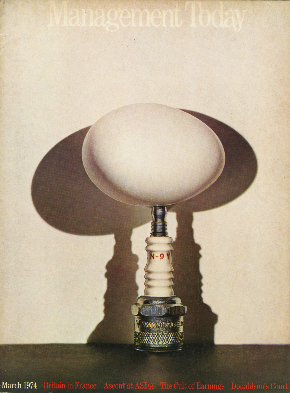
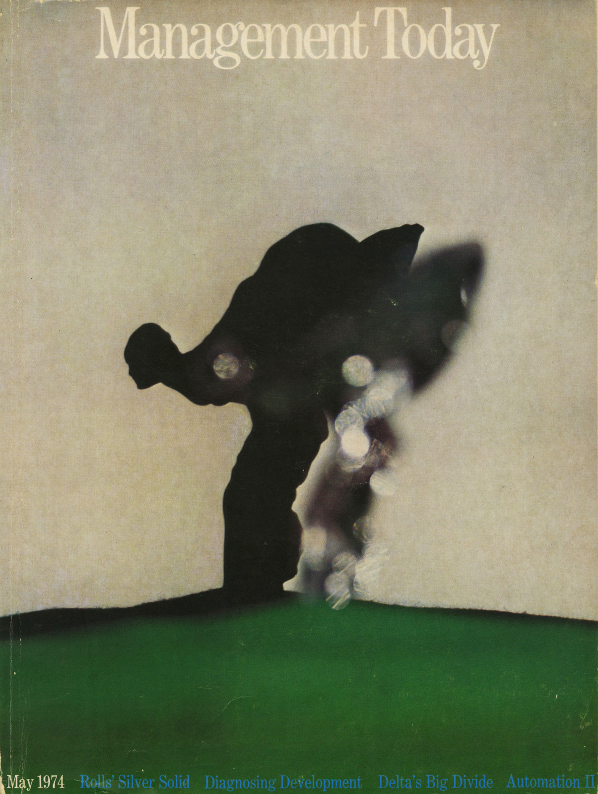
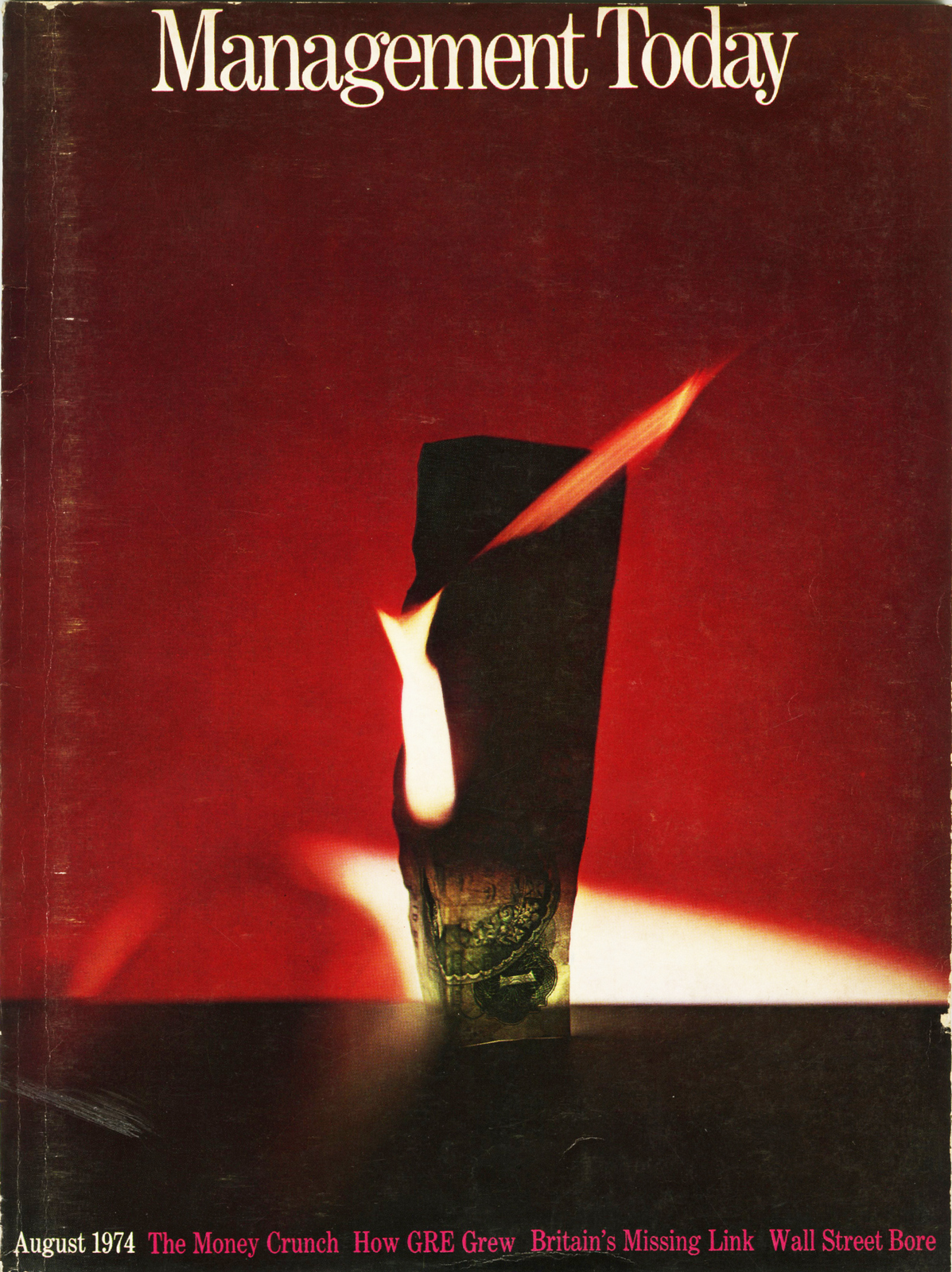
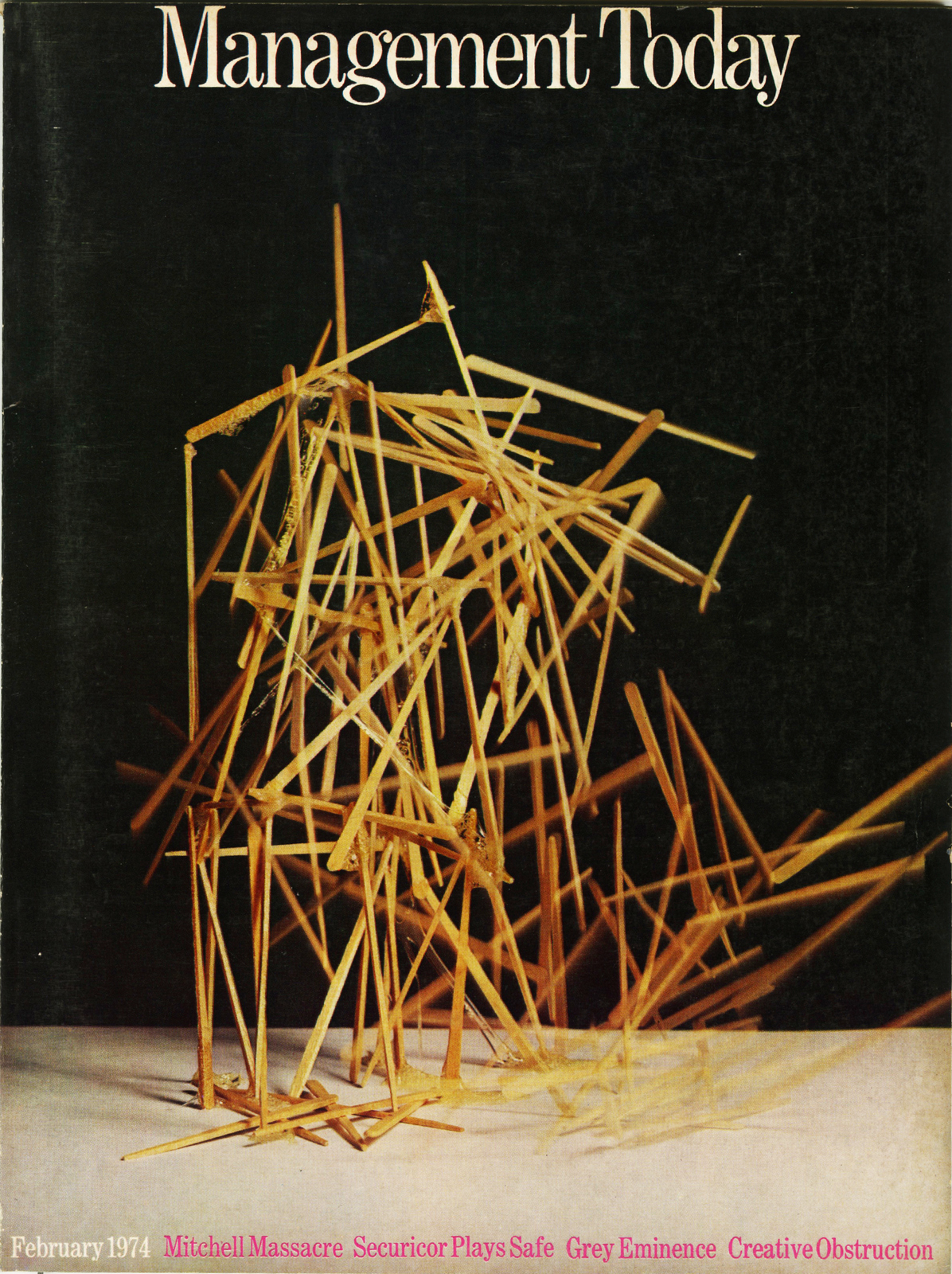
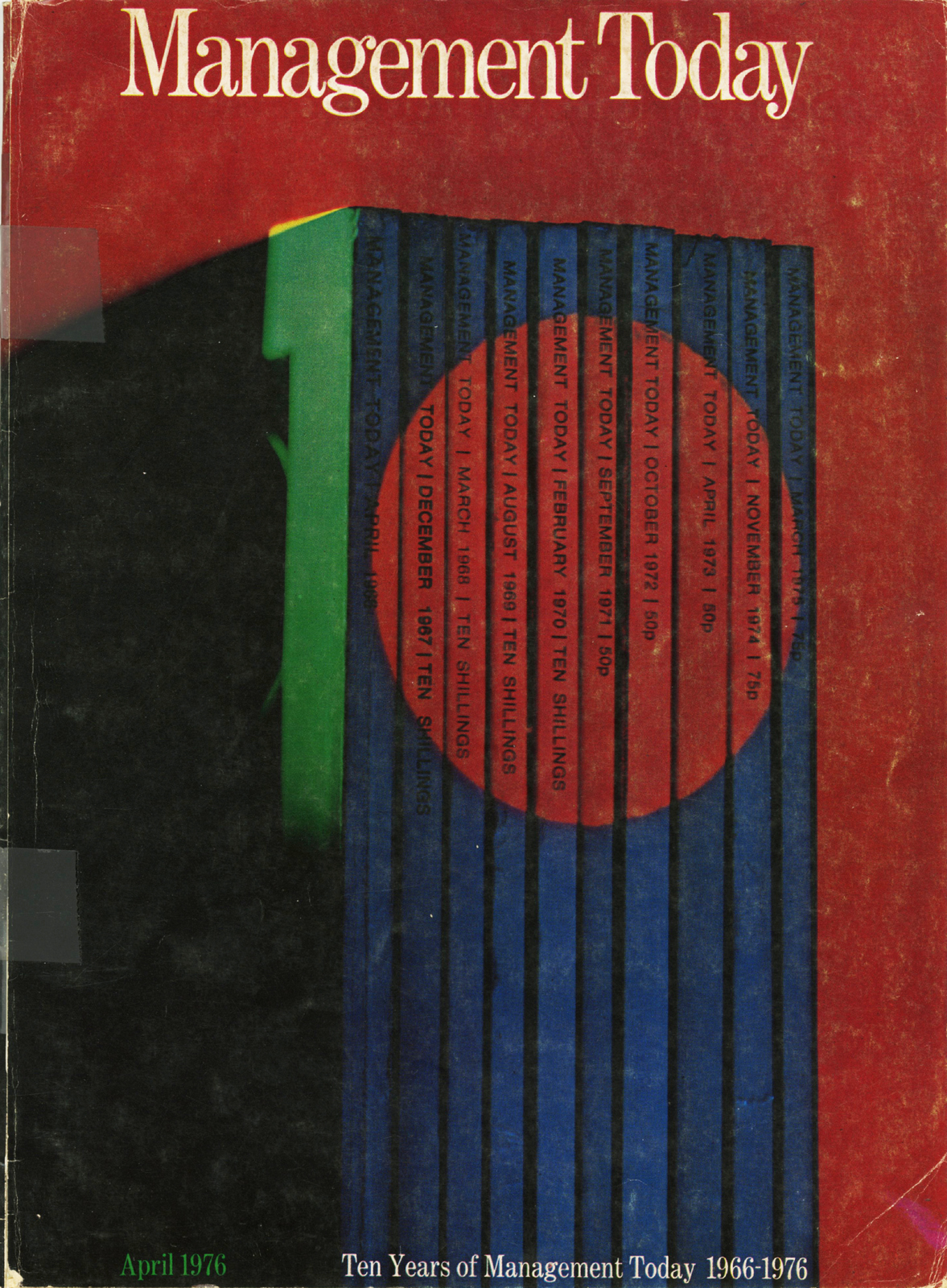
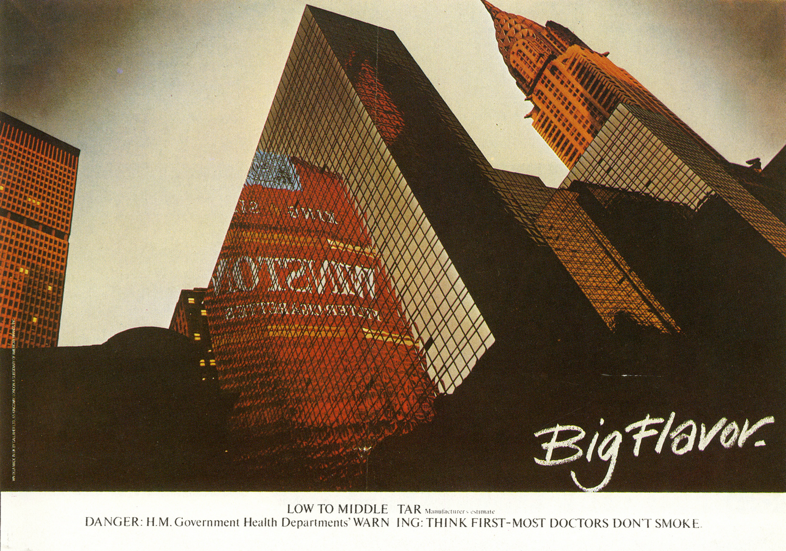
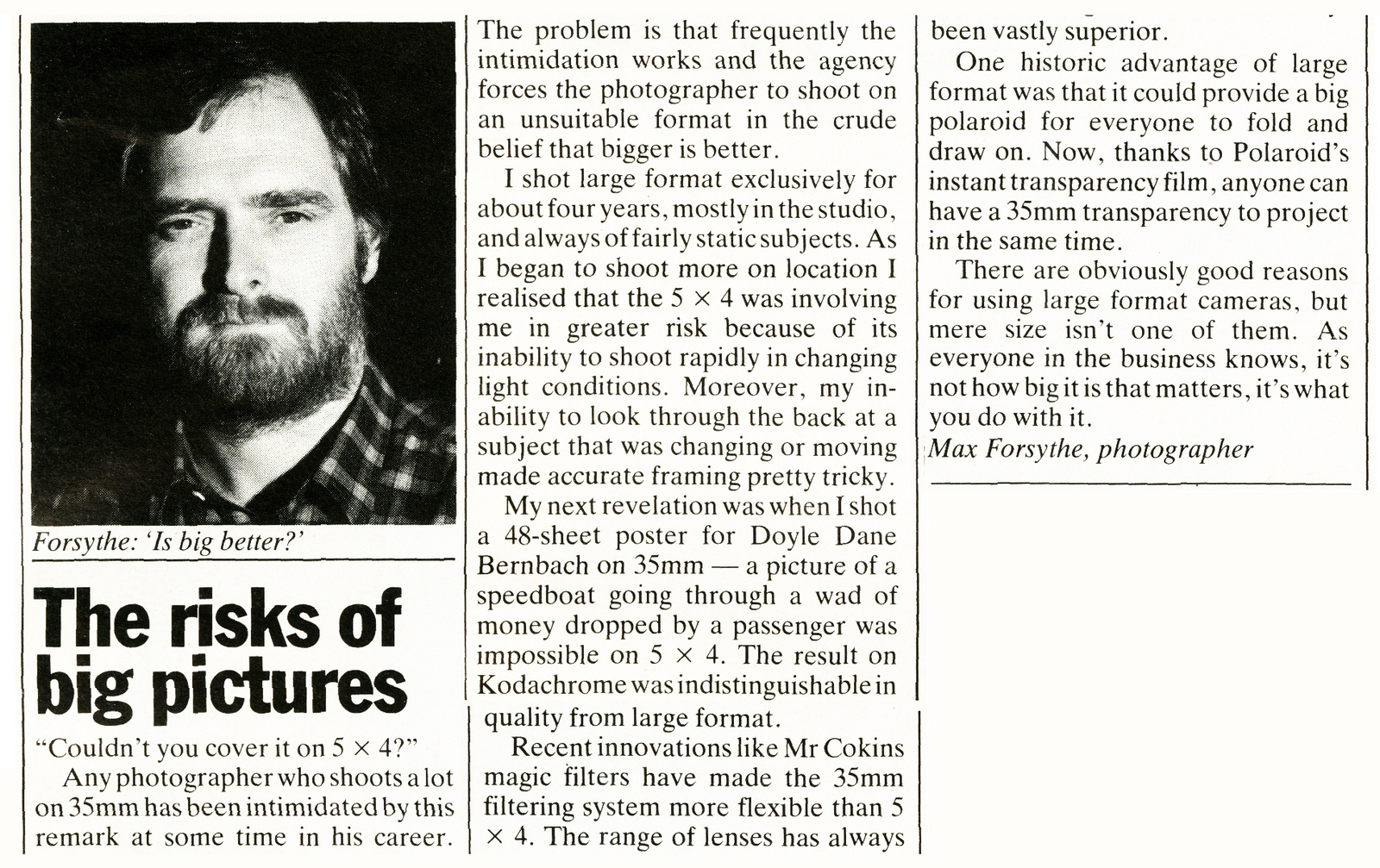
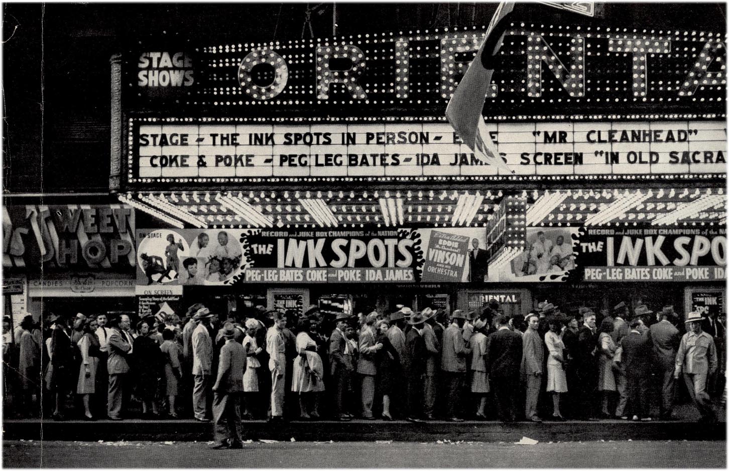
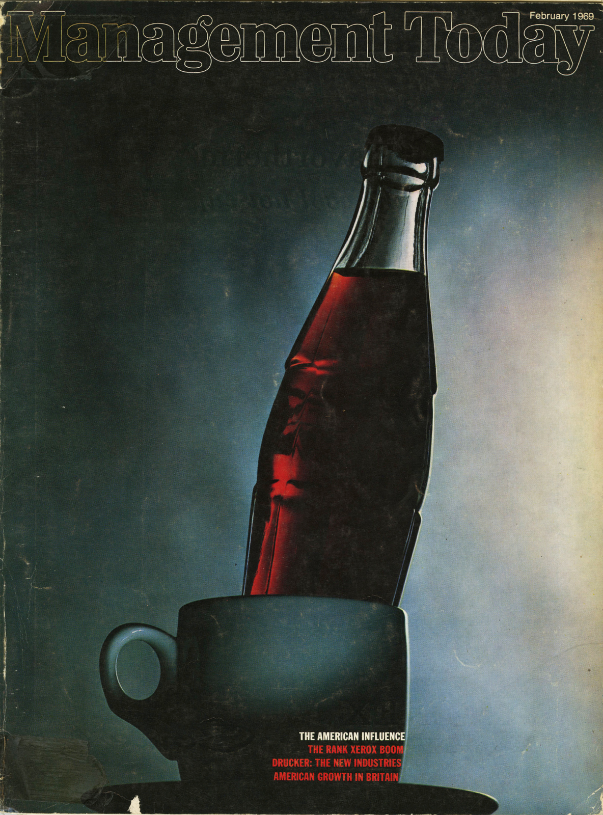
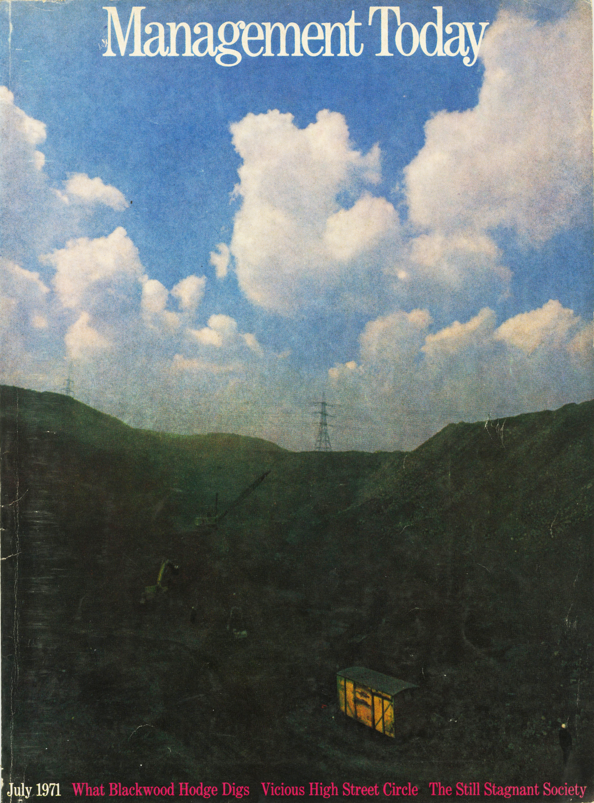
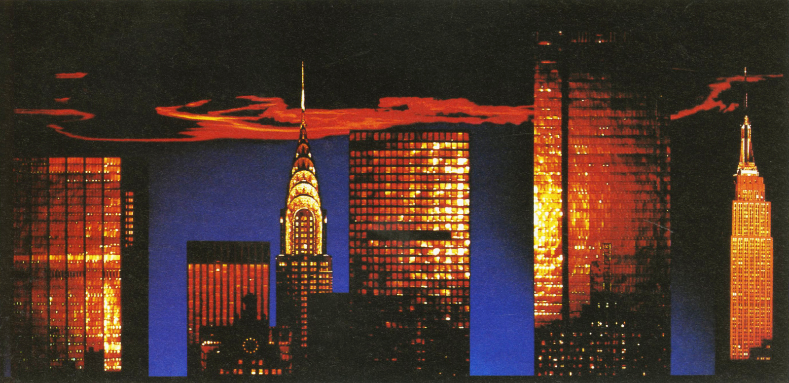
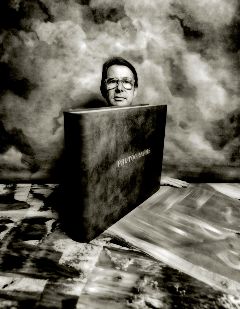
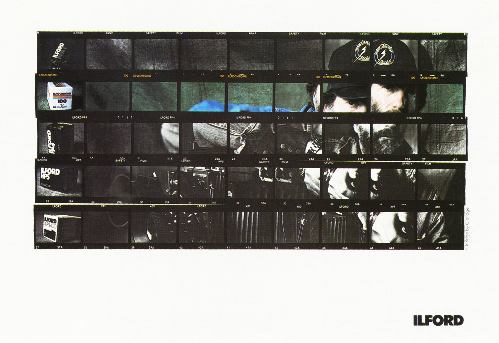
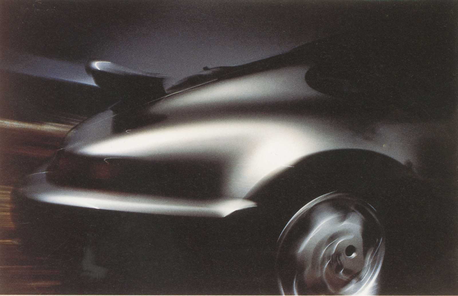
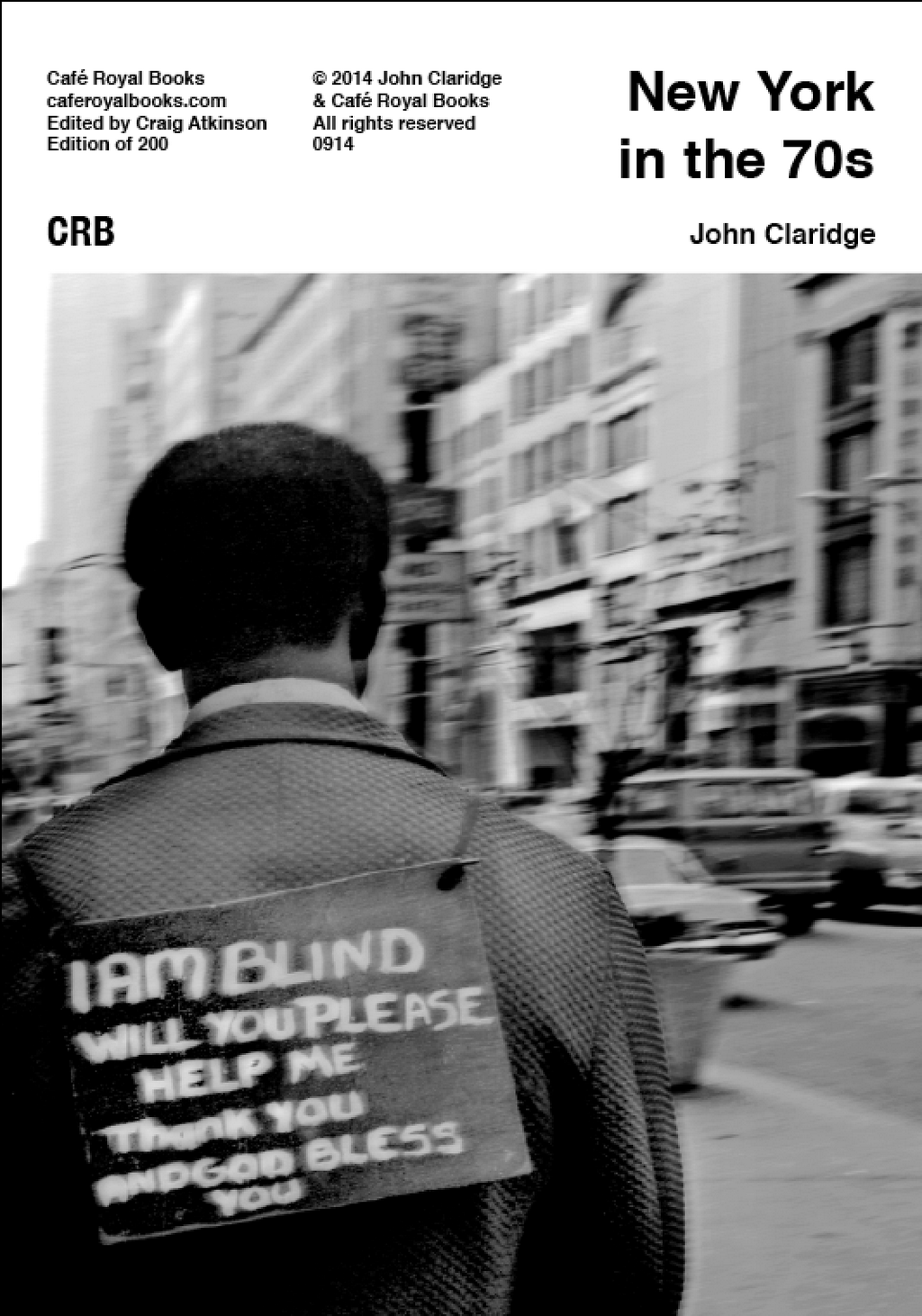
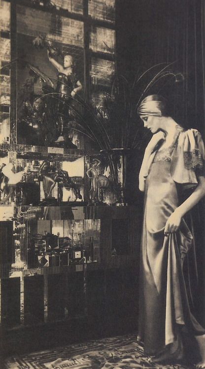
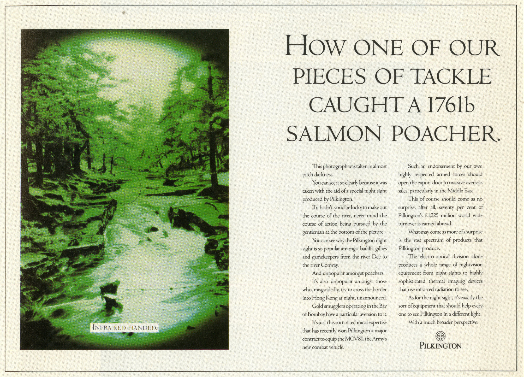
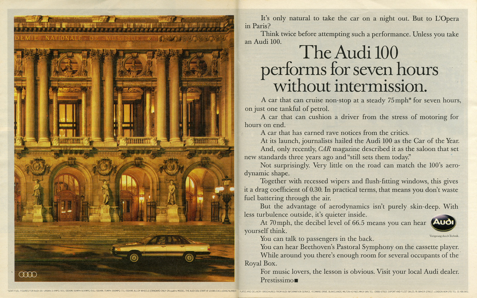
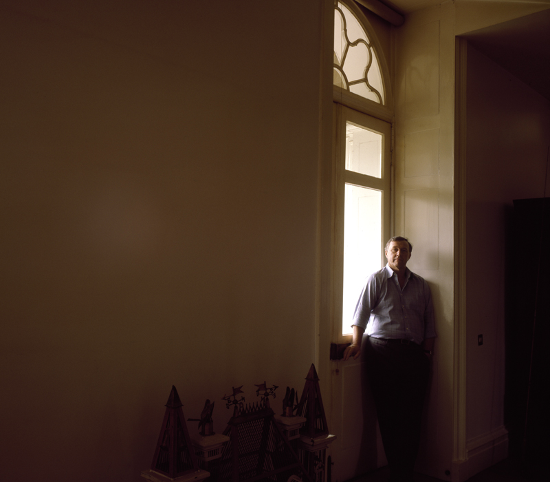
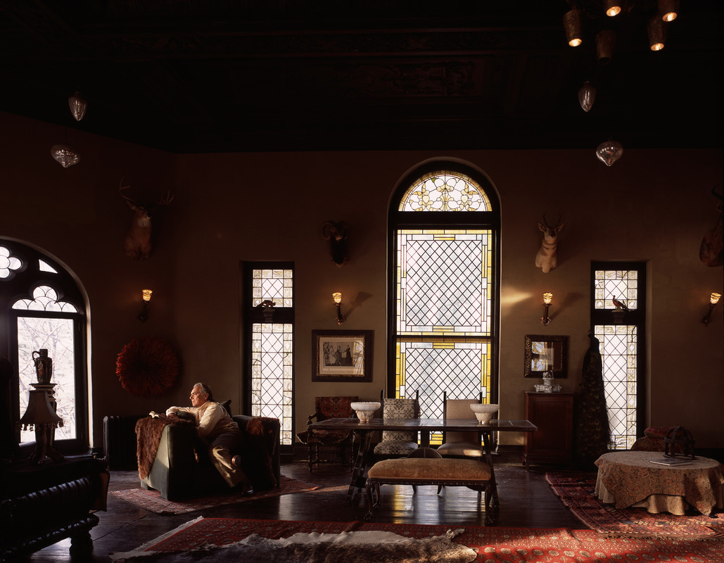
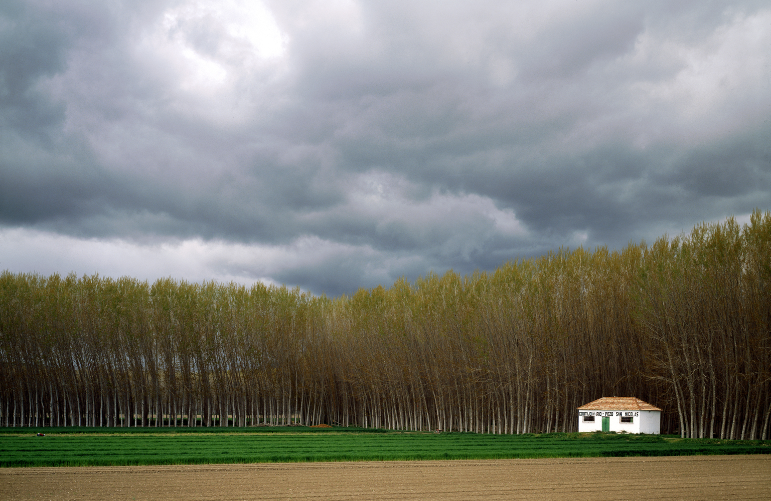
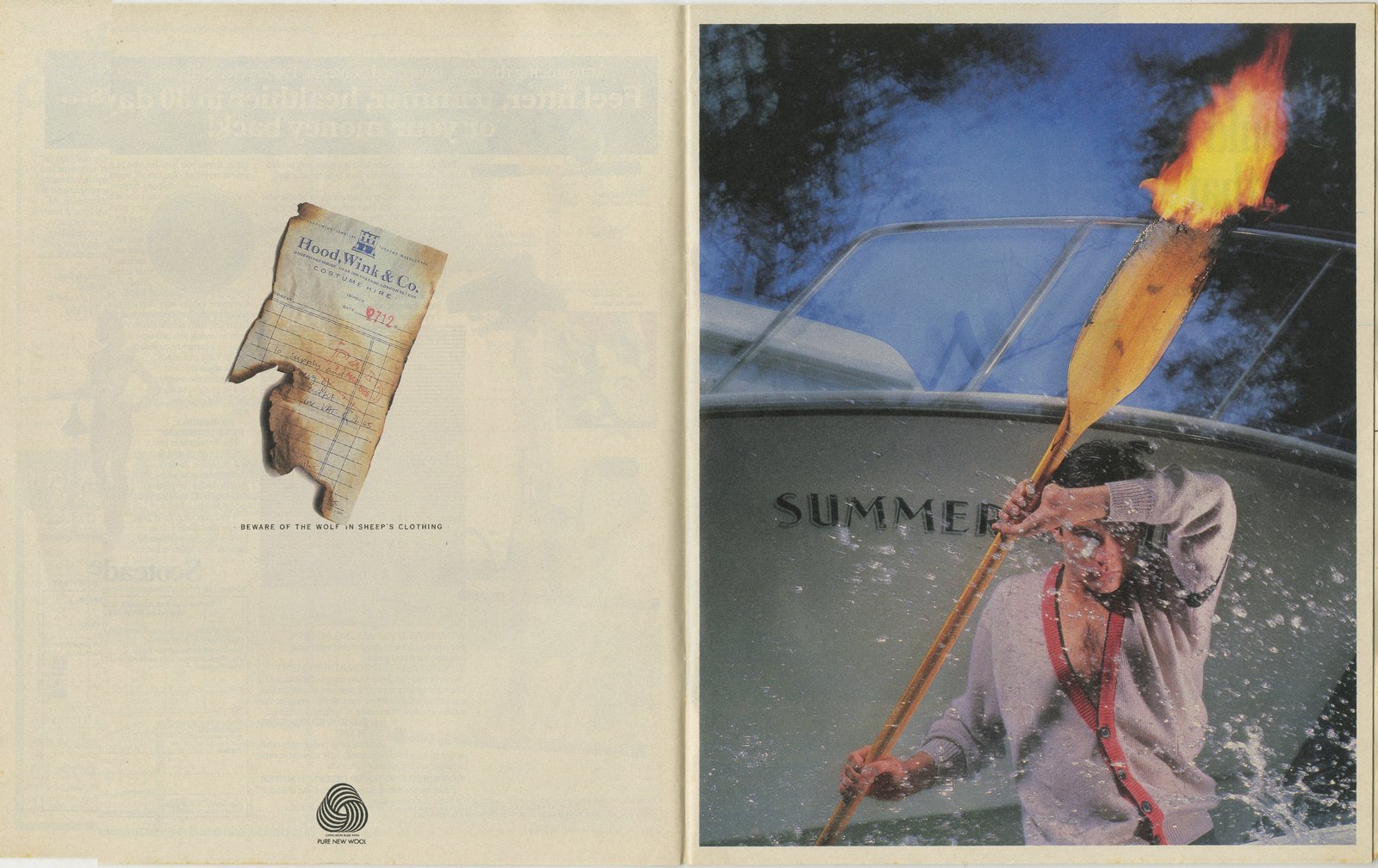
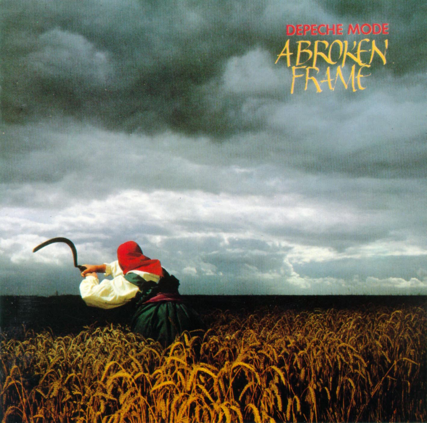
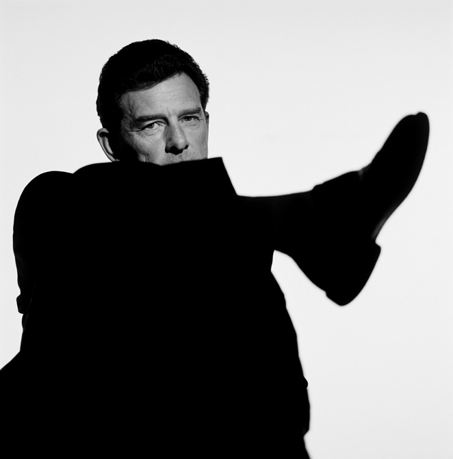
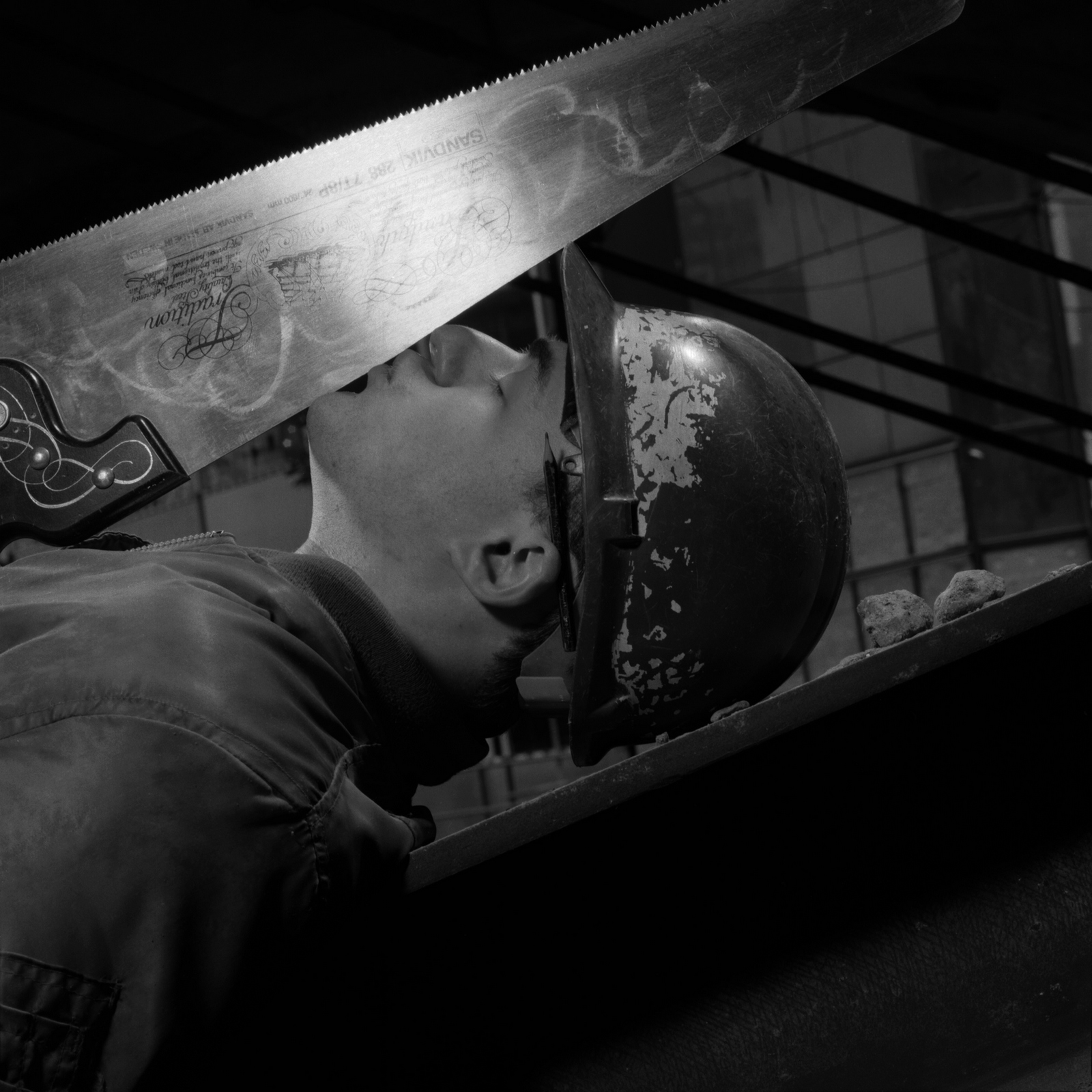
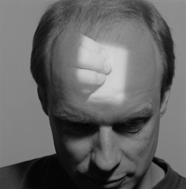
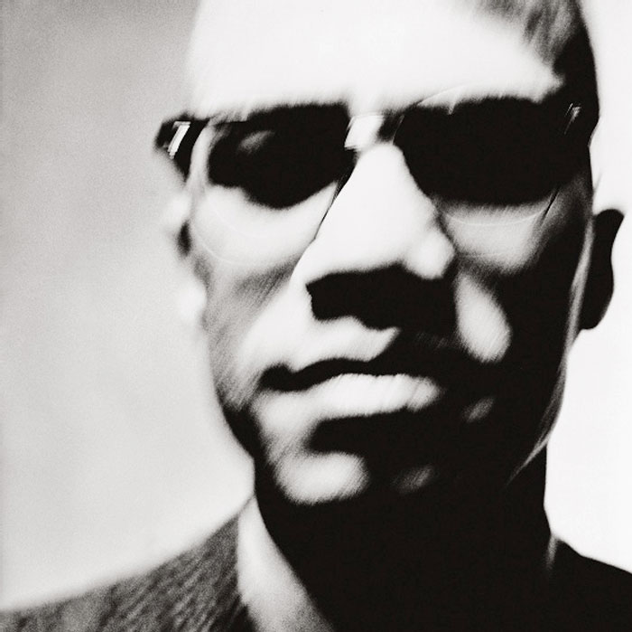
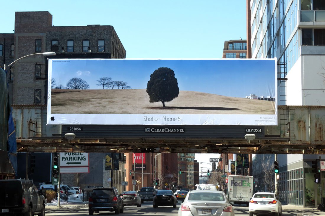
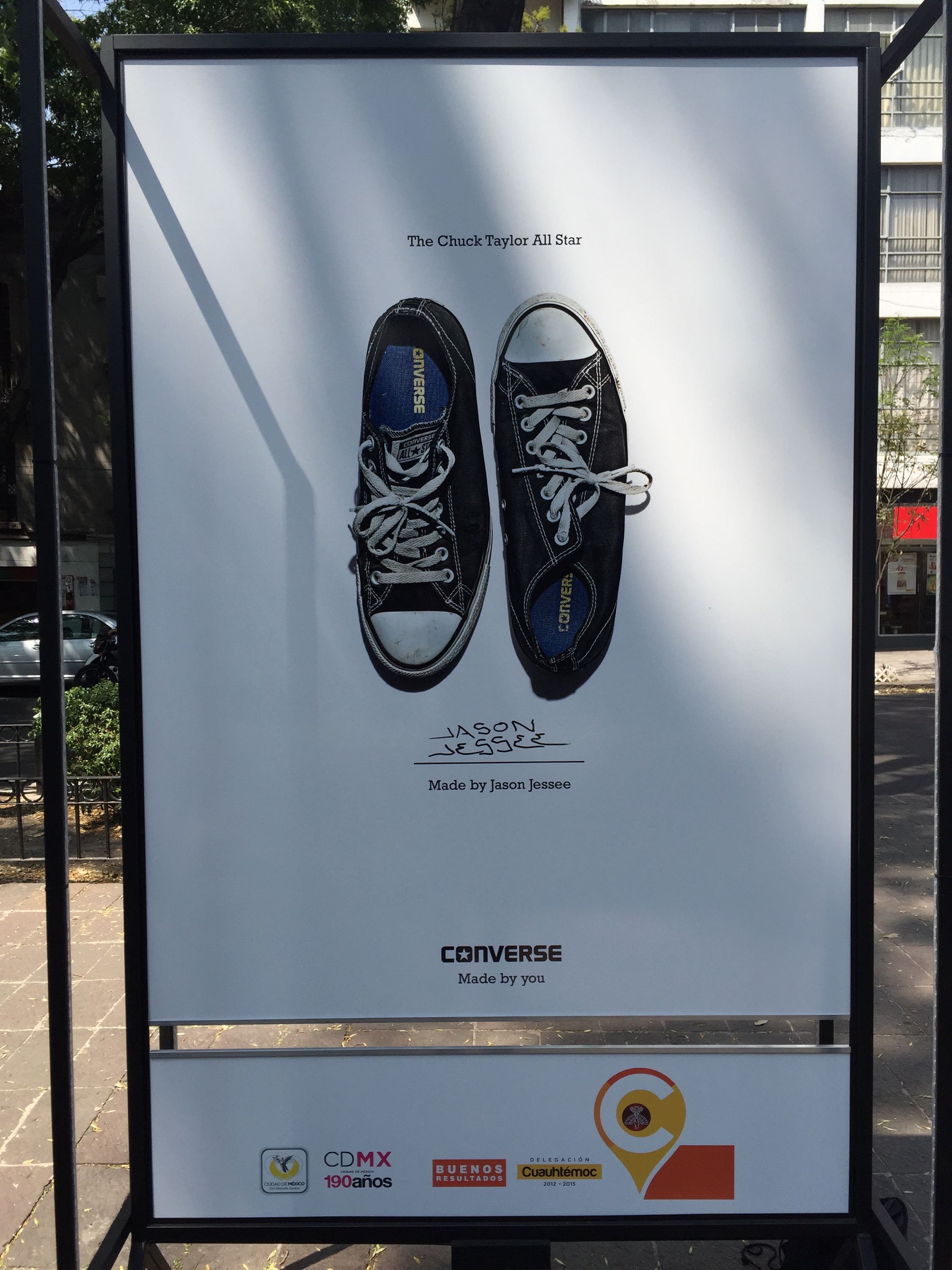
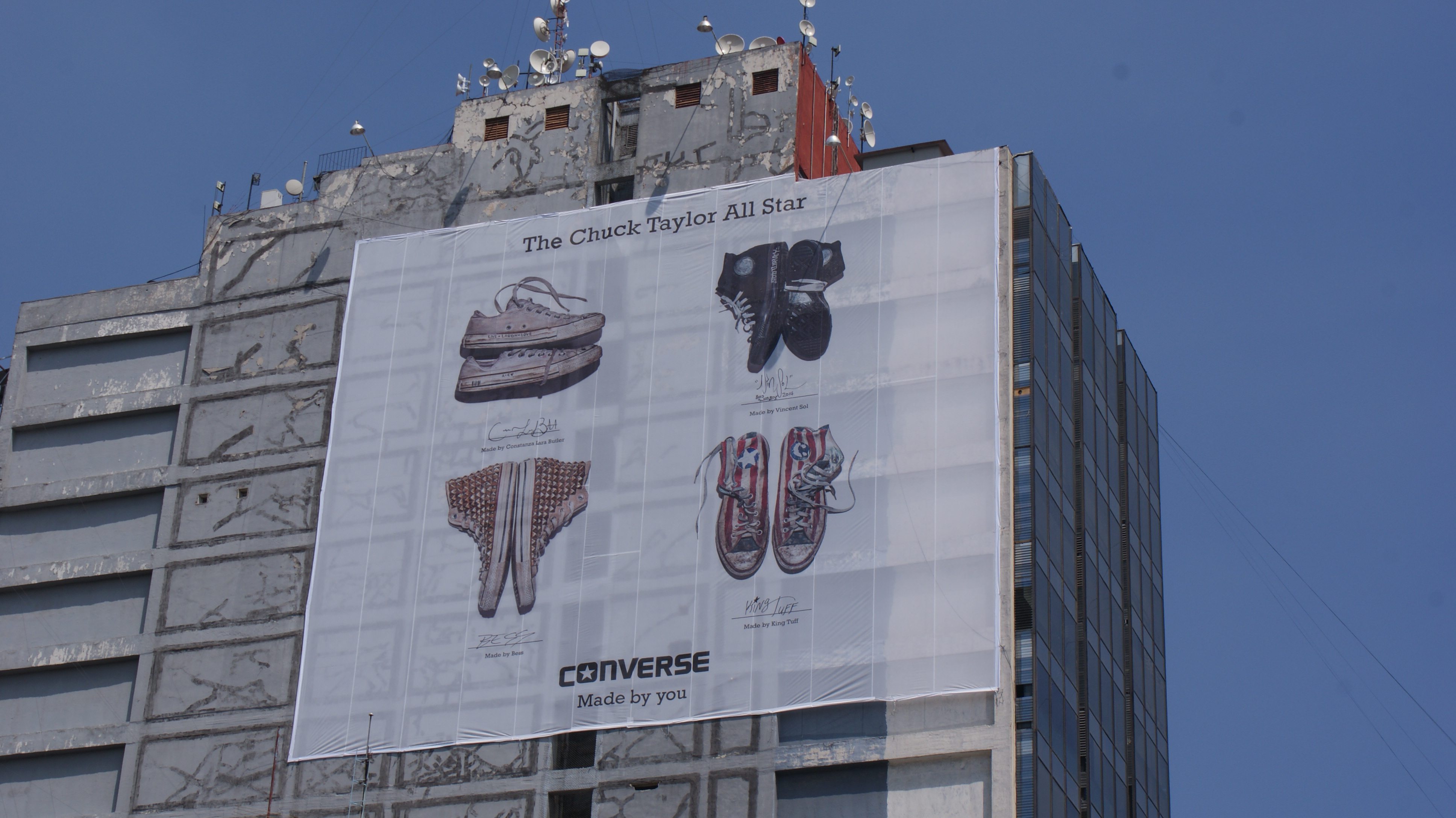
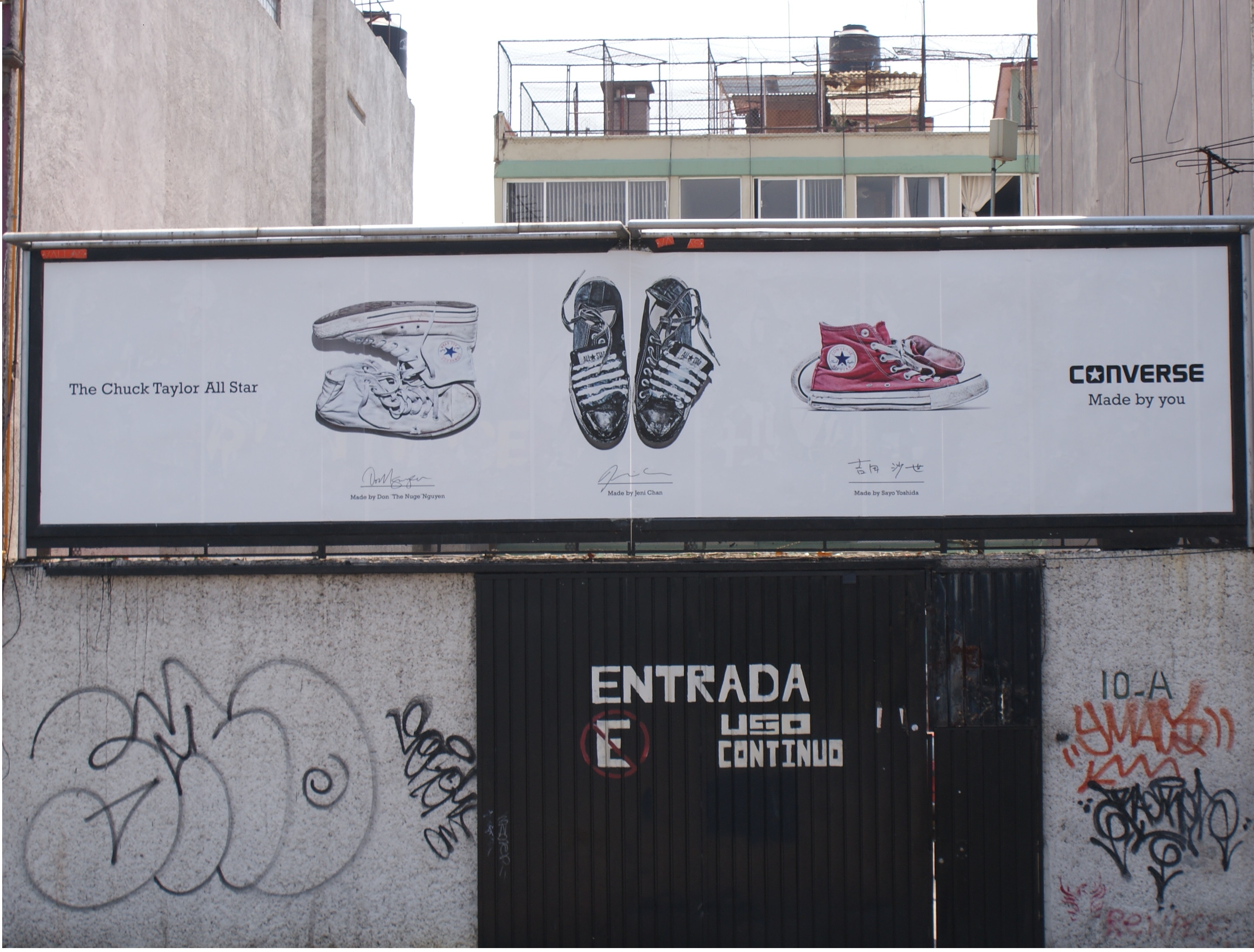
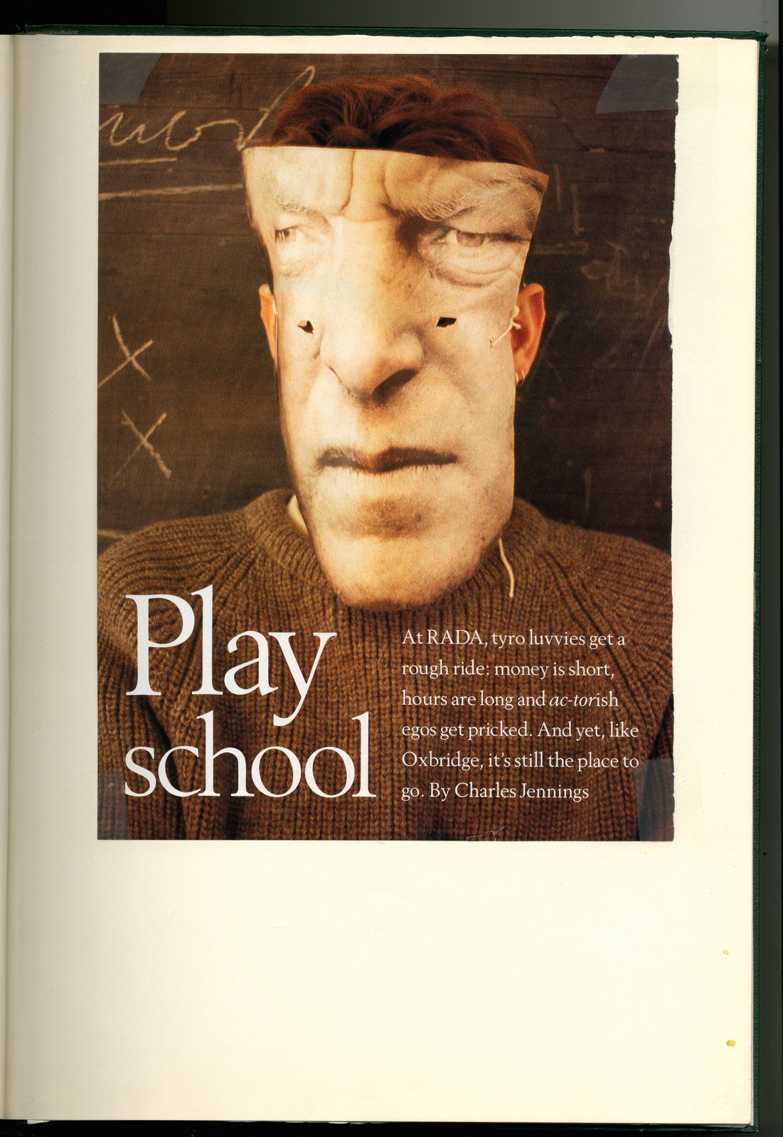
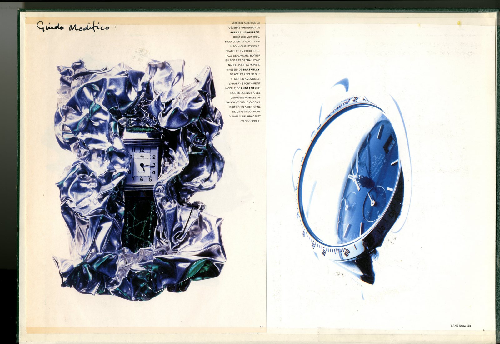
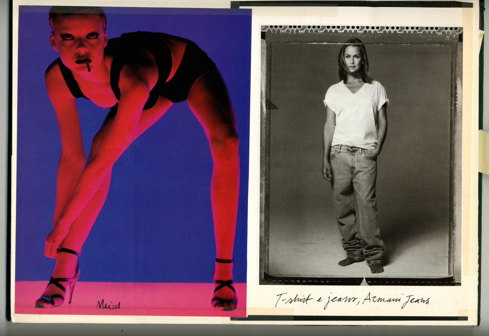
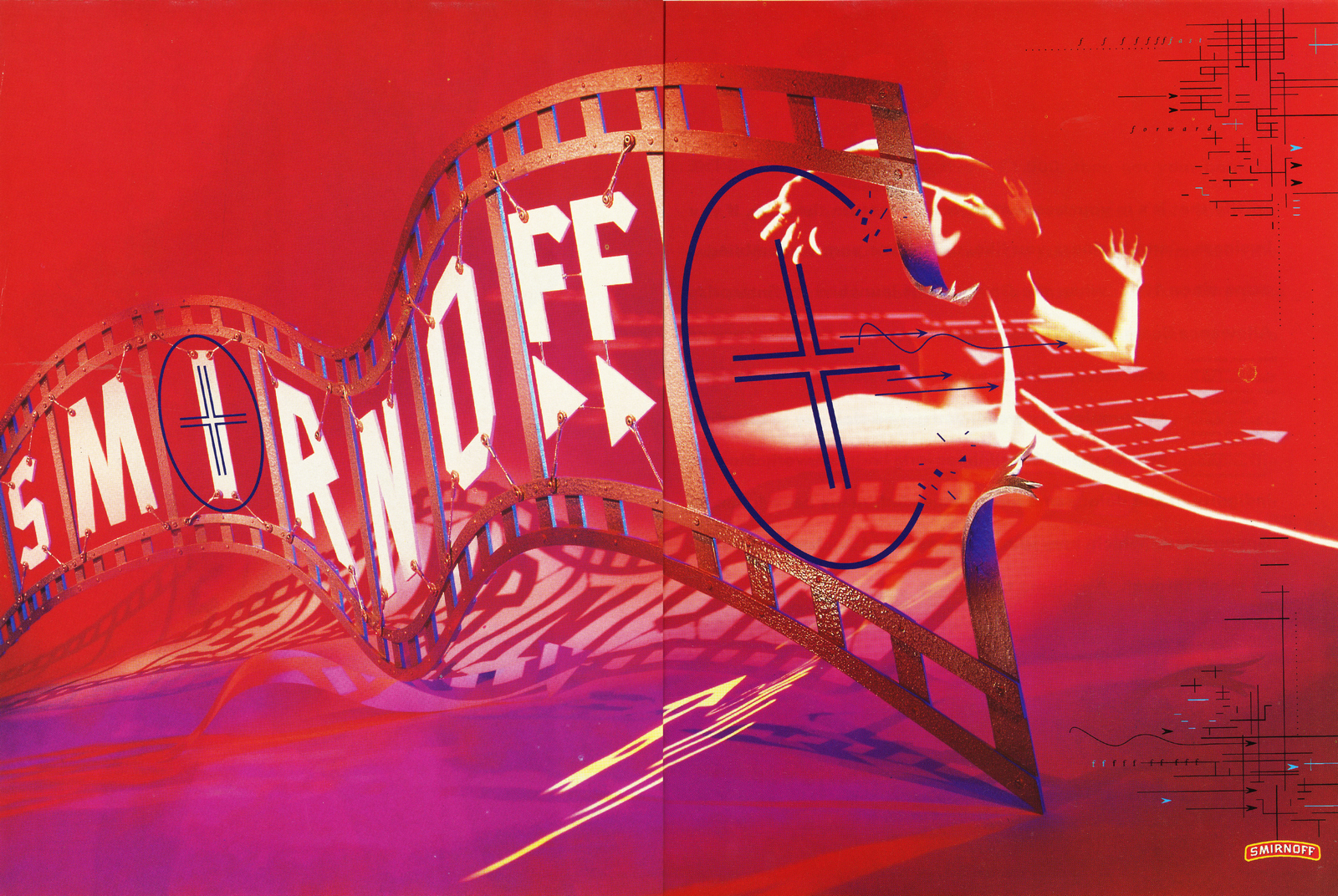
Penn and Avedon are almost as well-known today as they were when they were alive and working.It's rare to be given a treatment, whether photographic or film, that doesn’t reference at least one of their images.Why not? They were two of the three best commercial photographers of the last century.The third has been virtually forgotten.Google ‘Bookbinder’ and you’ll be lucky to find a handful of images.(And those images will be very small.)I'm going to try to change that.Here’s the first tranche; The Management Today covers he did with the art director Roland Schenk.


He didn't just shoot covers.Occasionally he shot stories.
N.B. Thanks to Matthew Gwyther and Sarah Ozgul at Management Today for allowing me to access their archives, and Matthew Ford for putting us together.P.S. If anyone is in contact with Lester or has copies of his work, please get in touch: dave@davedye.com

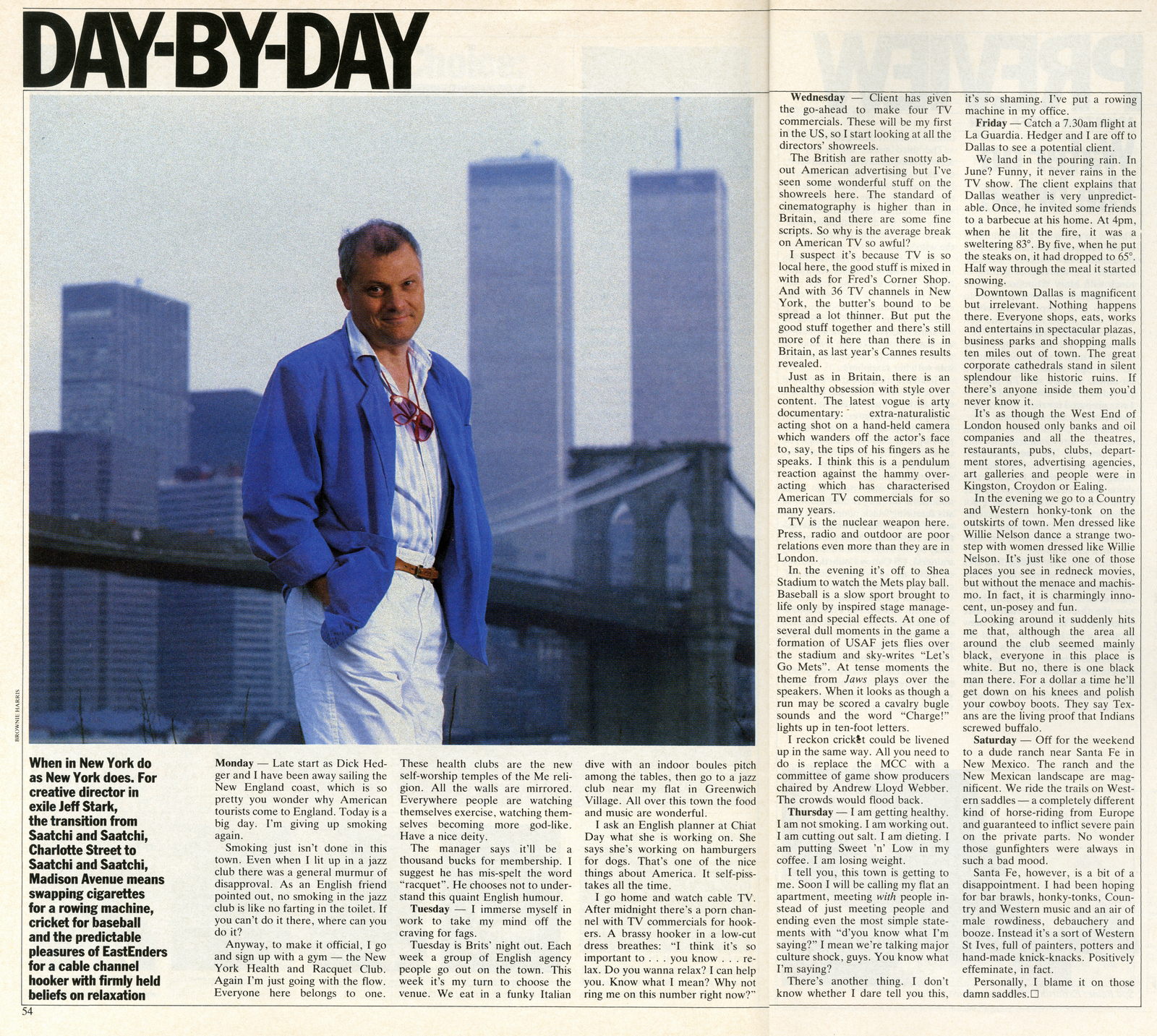
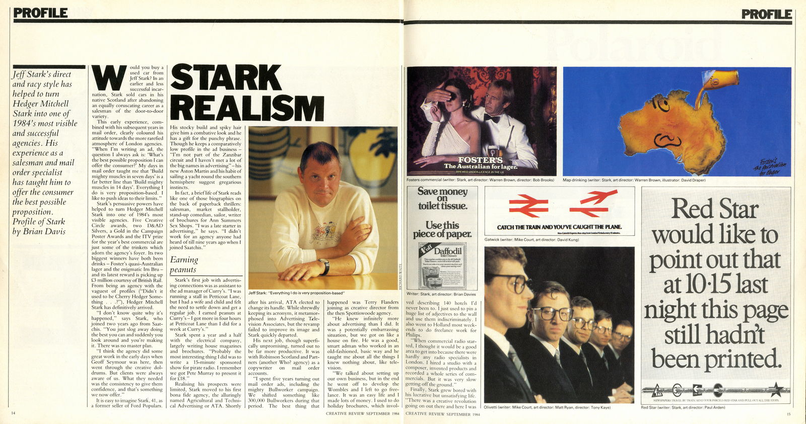
Where did you grow up?Stirling, Scotland. Hitch-hiked to London the week I left school.Unusually, you had a lot of weird jobs before you got into advertising, so what did you learn from your time;a) running a stall on Petticoat Lane?People will buy anything as long as you can convince them it’s stolen.b) Selling Morris Minors?I learned that being 18 and looking 15 wasn’t a good start for being a car salesman.People used to come in and ask if my dad was around.c) Writing brochure copy for Anne Summer’s Sex Shops?They had one product called Anne Summers Love Foam.It was an aerosol can with a picture of a naked woman covered in foam.But if you soaked it and peeled the wrapper off it said Gillette Shaving Foam.An early example of advertising providing added value.d) Selling door to door?Hardest job in the book.You need a lot of training and a very rehearsed pitch.I was 17 and had no training whatsoever.But I looked a bit sweet and innocent so I went for the sympathy vote.e) Assisting the Advertising Manager at Curry’s?I found out I had gone into advertising by the wrong door. f) Writing mail order ads for Bullworkers?Direct response advertising is like basic training for copywriters. Everyone should have to do it before they get let loose on regular clients. One of the key things I learned is that you double the response if you can inject a sense of urgency. Tell them if they respond in the next 7 days they get something extra. One of the most successful headlines I ever wrote was EMERGENCY SALE.How did you end up in advertising?I started writing brochures about farm machinery at ATA then went on to mail order at Robinson Scotland.Robinson Scotland & Partners. Any better?More money because nobody there knew anything about advertising and I had read a book on it.You were schooled in advertising by the Father of the Wombles, Terry Flounders?Yes he had recently been eased out of the creative directorship of Spottiswoode’s, a FMCG agency with mainstream clients like Bachelor's Soups. He taught me a lot.At the age of 32 you decide to get a job in a proper agency.Your book was made up of Bullworker ads and spoof radio ads, I’m guessing a lot of agencies passed before Saatchi’s took you on?Yes. It was the spoof radio ads that got me the job at Saatchi.Was Saatchi’s your first choice?Yes. I was offered a job at Charles Barker for more money. (They liked me because I wrote 30 dirty jokes a month for a top shelf magazine called Knave.)I had to take a drop in earnings to go to Saatchi but they said I could keep my freelance work going on the side and they didn't mind if I took a few business calls at work.At one point I was making more money flying to Holland for the weekend and writing brochures for Philips than I was making in the week at Saatchi.
What did you make of Admen compared to market men?I was already in the ad business as assistant ad manager at Curry’s when I had the stall in Petticoat Lane.I just did it on Sunday mornings with another Curry’s guy called Jim Satterthwaite, who went on to become MD of Greys.The market men treated us with a degree of suspicion, but I used to love watching the hucksters selling stuff of the back of a lorry.“You don't ask me where I got the goods and I won't ask you where you got the money”. “My father works for the company that makes this product. He's not the managing director. He's the night-watchman. I'm saying no more.”


Who’s work did you admire at the time? Only DDB New York and CDP in London.

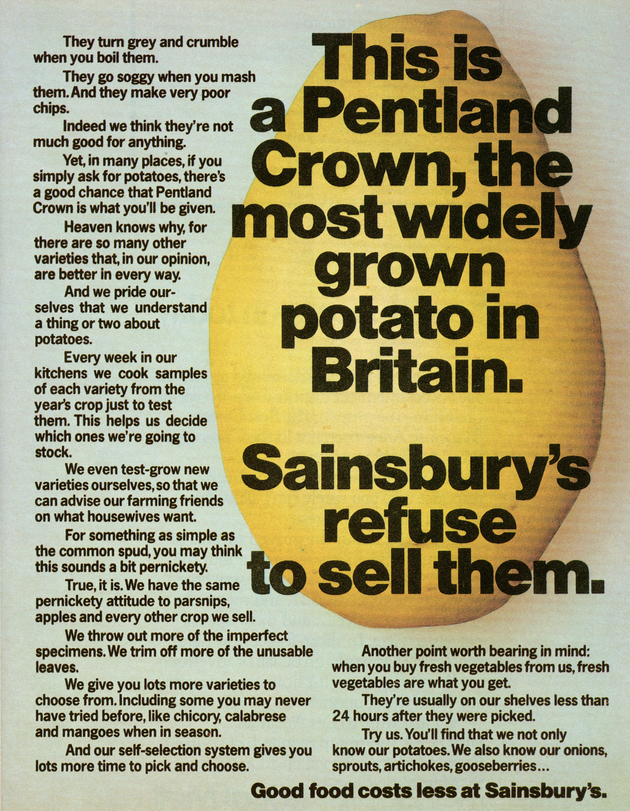
David Abbott’s Sainsbury’s work that followed yours was much gentler?I thought it was probably more on the money than mine.I was never into the David Abbot/CDP ‘dare we suggest’ school of copywriting.But it helped to establish Sainsbury’s as THE middle class supermarket.
To an Art Director like me, a massive Paul Arden fan, the difference between your ads pre and post Paul is amazing? But he must've been hard work?Paul always said that in a AD/CW team the AD is always the creative director because he/she listens to the writer's ideas then decides which ones to draw up. That's true but only in press.
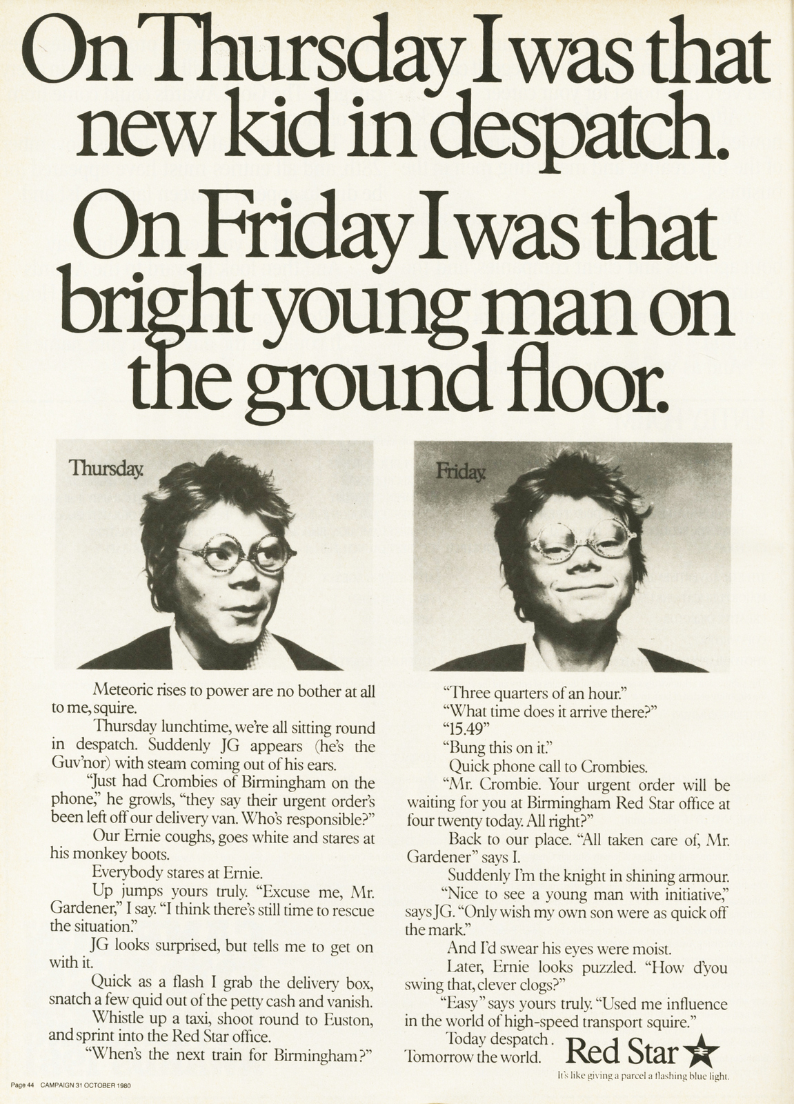
Incidentally the ‘new kid in despatch’ was my son with Paul Arden’s glasses on upside down.I’ve always thought that they were quite arty glasses for a kid to wear, they were upside down?I love that, it's the tiny detail that makes those pictures pop.


I’ve never seen your name on an ad for the Conservative Party, didn’t you work on it?No. It was Jeremy Sinclair and Andrew Rutherford’s domain.
You and Paul Arden appear, from the outside, to be polar opposites, one a hard nosed salesman, the other, an arty-farty type, how did you work together?Actually we got on really well for that very reason. We each recognised that the other had something that we lacked.
How did you come to leave Saatchi’s?I’d always admired Charles Saatchi and wanted to have my name on the door of an agency and make a bundle of money like him.Didn’t Charles try to stop you?Yes they doubled my salary to stay.So Hedger took on a bloke called Carter instead. But that didn't work out so a year later he approached me again. This time I took the plunge.Why join Hedger Mitchell, fame, fortune or both?When I started in the business everyone over 45 was a dinosaur.They wore bow ties and had carnations in their buttonholes.My long-haired bejeaned generation just pushed them aside.So I was determined this wasn't going to happen to me.I was going to make enough money to get out at 45 and sail round the world, a lifelong dream.As it turned out my generation went on to run the show right into their sixties.The other reason is vanity.There's a certain thrill about having your name above the door and it made you more of a figure in the industry.Campaign would phone me regularly for a quote on something topical.They never did that before.
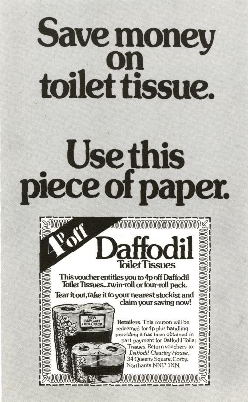
Going from a rich behemoth like Saatchi’s to a tiny boutique must have been odd, did you panic in the beginning?No not really.I remember pointing out at a board meeting that we could run the whole agency with 10 people instead of 40.I could write all the ads, all I needed was an Art Director.Dick Hedger could do all the selling. All we needed apart from that was a media guy, a receptionist and a couple of secretaries and we’d make a ruddy fortune.They didn’t go for it.DAVE: Was that seriously debated?That’s the kind of silly thing I think, that one can kind of channel ads, if the pressure is on and you’re in the groove.I’ve always found it weird that some creatives, good ones too, take weeks and weeks to write an ad.When I joined Saatchi I was 33.I’d been freelance for several years and had never worked for an agency that anybody had ever heard of.I was used to writing three or four ads a day and didn’t realise that in big agencies you got a week.So when I got to Saatchi and got my first brief I went back to Jeremy within a couple of hours with the ad.Also, I was thrilled at getting full-page ads to do.Nobody had ever given me a full-page in a national paper to write so I wanted to get my hands on every brief that was going.I did the Daffodil toilet paper ad within my first couple of weeks there.
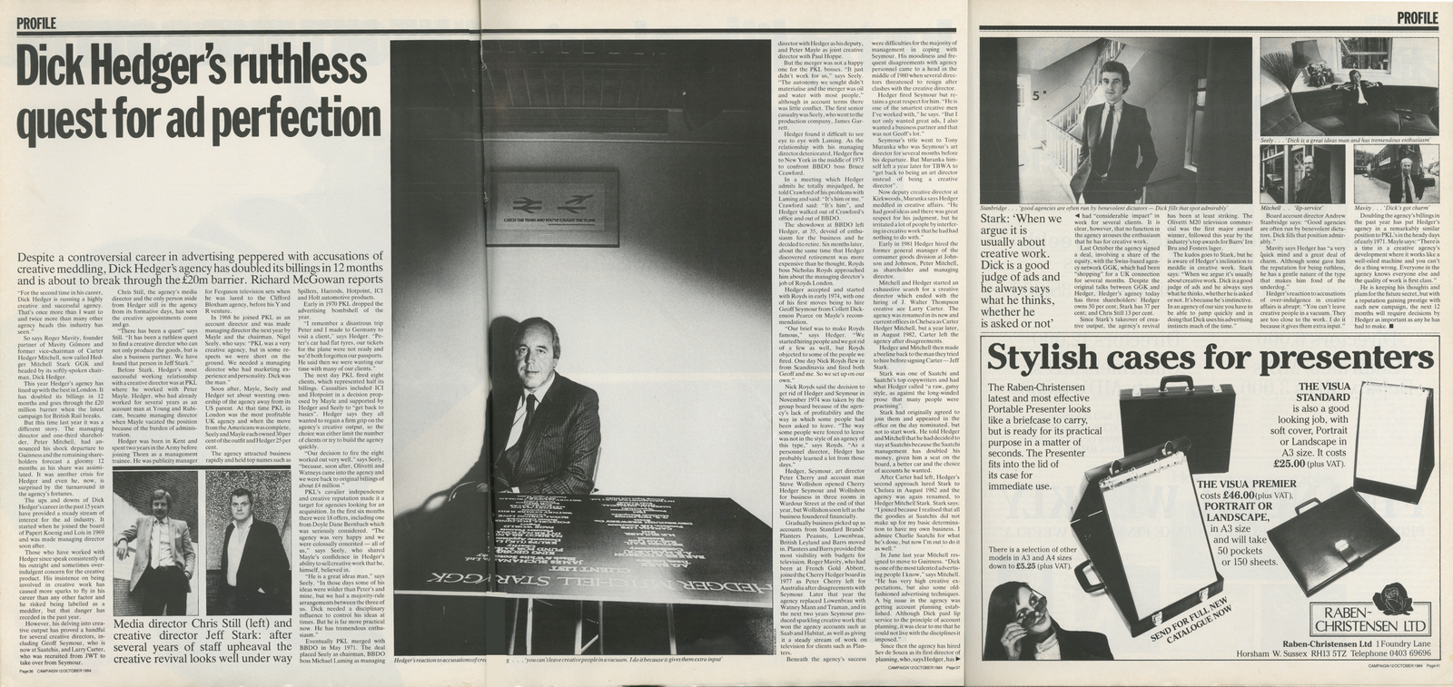
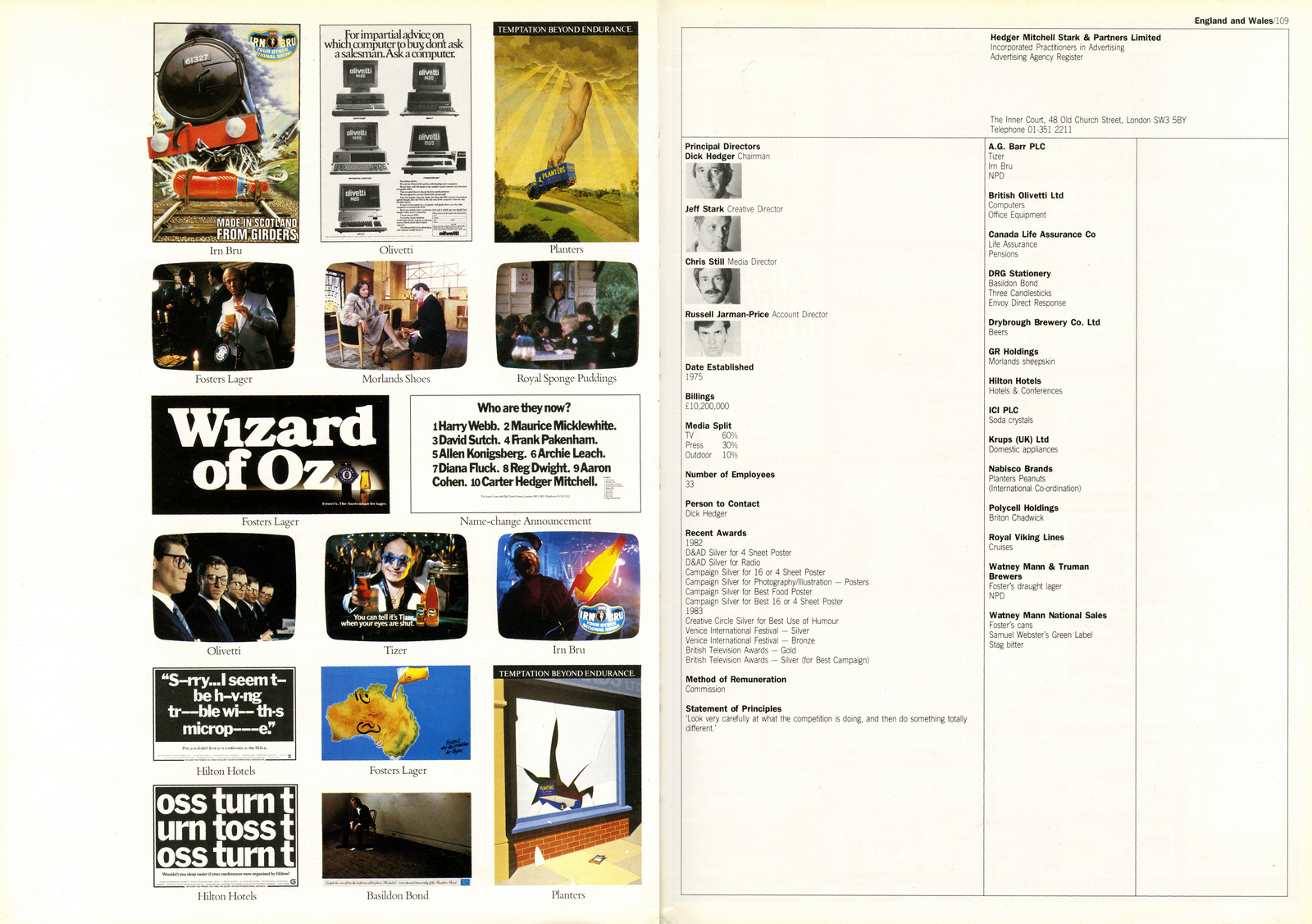
‘Look very carefully at what the competition is doing, then do something completely different’.I love your statement of principles, not the kind of thing agencies say today?I think the good ones still do.My other guiding principle, which I explained to the creatives on my first day, was that I wouldn’t pass any ad that I didn't think would sell the product based on my direct response experience - even if I thought it would win an award. (There had been a spate of award-winning ads from CDP that had notably failed to sell anything.)

I know some of the ex HMS creatives, they all seem quite...confident, what did you look for when you hired creatives?My policy on hiring creatives; hunger counts for more than anything.Intelligence comes second.Practicality third.

Why would a fancy-dan, Aston Martin driving adman put his neck on the line and attempt to humour the blood thirsty crowds of the Comedy Store?The Comedy Store came long before the big money and the Aston Martin.Like a lot of people I had watched comedians getting big laughs and thought ‘I’m sure I could do that’. And to a certain extent I could.When it was good it was the best drug ever.When it was bad it was hellish.
Be aware that much of the HMS work wasn’t actually written by me personally, so I wouldn’t like to claim that it was.
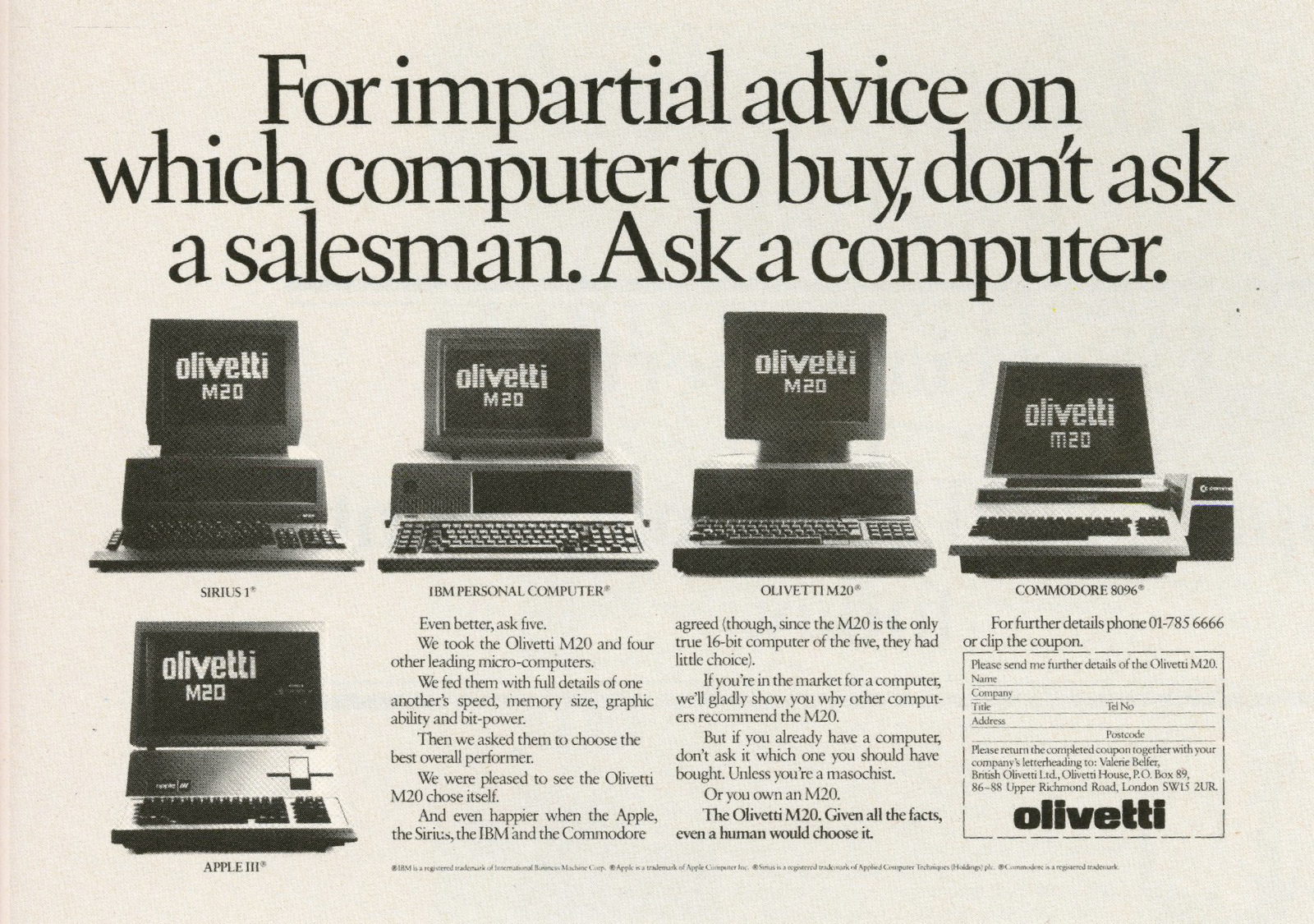
Tony Kaye. You were a very early adopter?Yes. Mike Shafron was a great fan of his and had introduced us.The first commercial he ever shot for me was for Olivetti.He shot four times as many shots as we could ever use.Then when they processed the stock it was all milky and we had to shoot it again.So I said before we went any further we should edit the milky film together and see how it was working, which we did.Then when we came to reshoot it we knew exactly how to do it.Pity you don't get milky film any more.Tony then got flushed with success and went barking mad.I think even he would admit that.
You basically wrote ‘Crocodile Dundee’ didn’t you?No. I’ve often been given credit for inventing the Fosters campaign but I didn’t.It was an Australian writer called Rowan Dean, who knew all about Paul Hogan before he’d ever been heard of here.He then promptly went back to Australia, leaving me and Warren Brown to write the ads.Though I would argue that the innocent abroad we created in those ads was the persona that Hogan developed into Crocodile Dundee.The stuff he was doing in Australia at the time was nothing like that.
Can I tell you another funny story about the Fosters poster? Dick Hedger went to sell it to the Watney’s client, but he wouldn't buy it. Dick came out of the meeting with his tail between his legs and met Dave Trott and Mike Greenlees waiting in reception. (They had the Holsten Pils business.) Dick showed them the poster and moaned about the client not buying it.
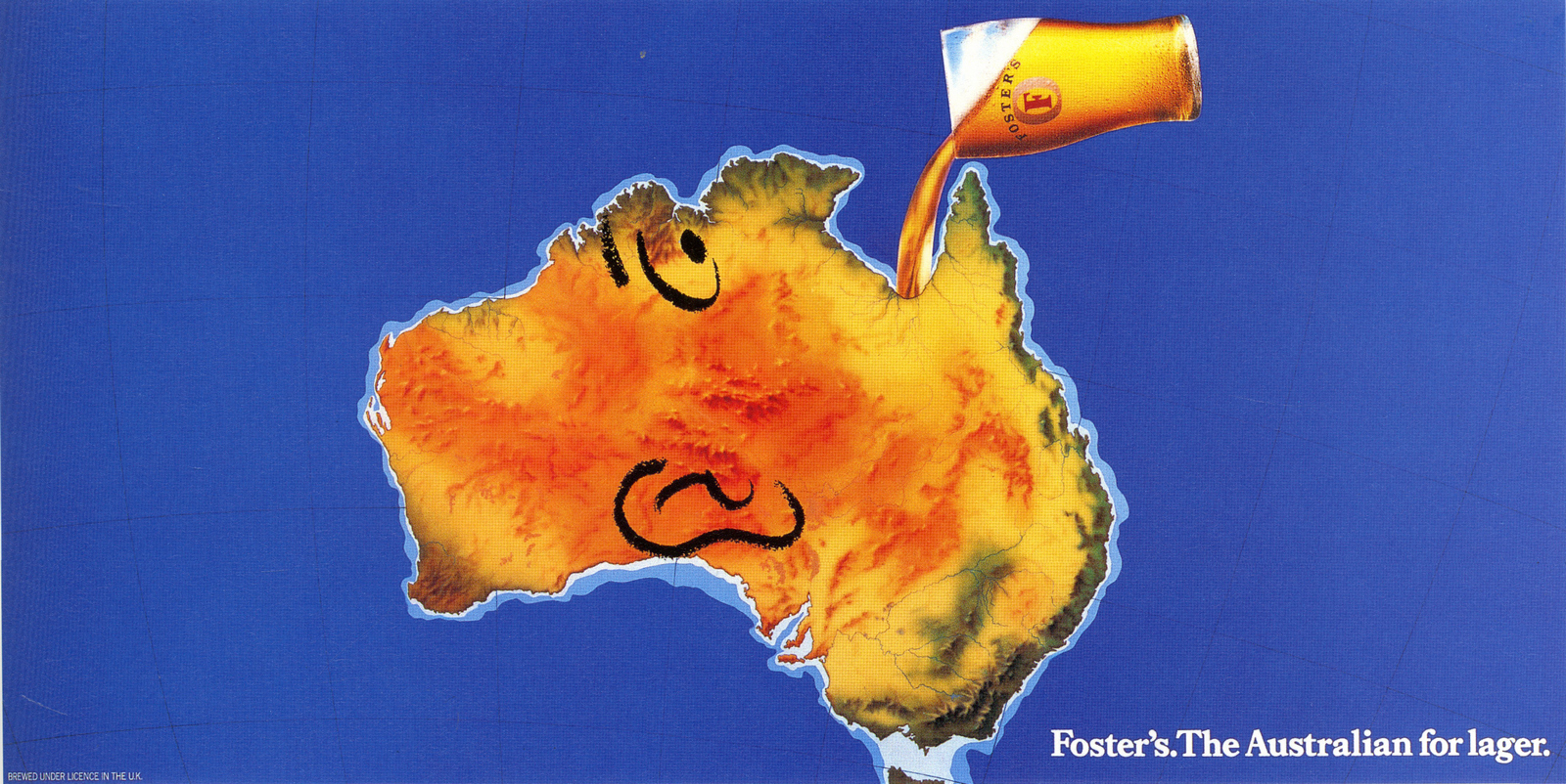
They said ‘It’s brilliant, let us have a go’. So, our rival agency went in with our ad and told the client he was mad not to buy it. Do you think that could happen nowadays?


Just as Hedger Mitchell Stark starts winning awards and business you sell?The way it happened was this. Charles Saatchi rang me and said he wanted me to come back as CD.I said I couldn’t leave because I had an agency depending on me.He said ‘don’t worry, we’ll buy the agency’.It was a bum deal for them because our biggest client was Fosters and they had to resign that due to conflict with Castlemaine XXXX.Do you ever regret selling?Sometimes I regret that we didn’t carry on.Campaign told me they were about to announce that we were agency of the year and had to re-think in a hurry.But we were already talking to GGK about selling out to them. Saatchi was a better deal.
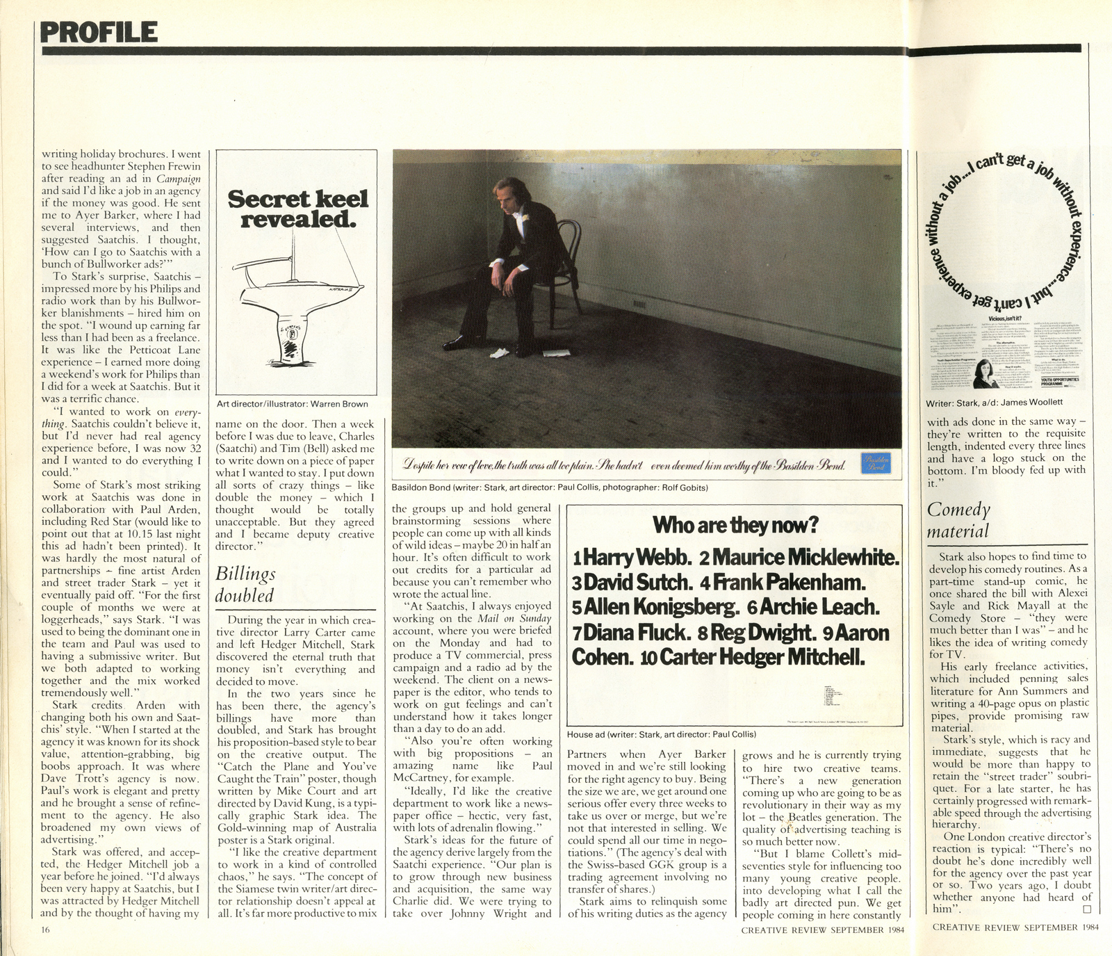
In 2005 my agency, CDD, was awarded the National Portrait Gallery advertising account.The only proviso was that the Chairman had to approve someone from the agency.I was nominated.It was arranged for me to take tea with the Chairman, Charles Mills, a very eccentric posh bloke with braces attached to pin-stripped trousers that started just below his nipples. I think he may now even be a Sir...or a Lord?He was a lovely guy, he told me he was slightly anxious about dipping his toes back into the advertising world as his only previous experience of advertising had been an unmitegated disaster.Unfortunately he’d approved an ‘awful campaign whilst at the V&A’.“Not the ‘Ace Caff’ campaign?’ I said. ‘I’m afraid so’ he replied. ‘That wasn't awful, that was brilliant!’.He went on to tell me that everyone was appalled internally, he still seemed quite traumatised.We spent the whole meeting discussing the campaign, with me trying to convince him that he was wrong, that it was a great campaign.He said it he hadn’t dared look at it since it ran.When I got back to the office I tracked down the ‘Brian Sewell’ film and a couple of the posters then sent them to him.He emailed back to say ‘It wasn’t as awful as he remembered, in fact, he actually quite liked it’.So how did you end up coming up with such a traumatising idea?Here's what happened. I was living in New York and came over to London for a few days so dropped in to Charlotte Street to say hello.Paul showed me a campaign he’d been working on for V&A, lots of arty pictures with headlines like ‘Vivacious & Alluring’, ‘Visceral & Arresting’ etc. Very Paul.
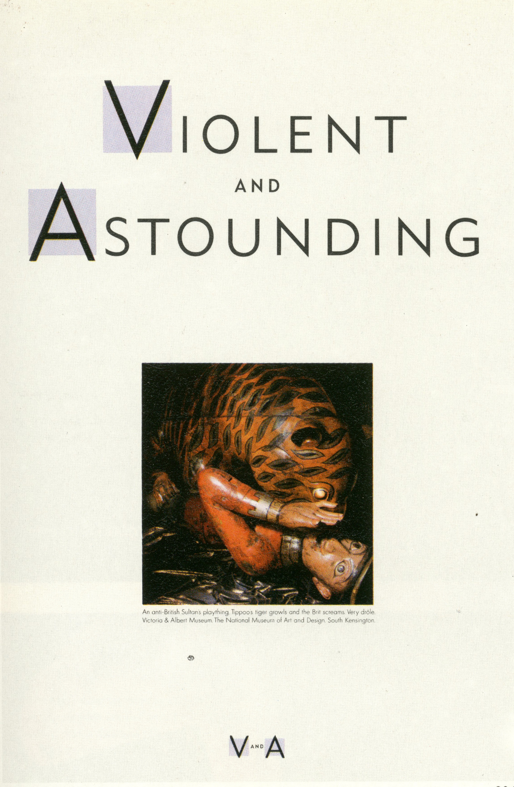
He asked me what I thought. I said ‘boring’.He said ‘I know. What should I do?’I said ‘what’s it got that would appeal to a Sun reader?’He told me it had a great cafe.I pondered for a bit and, came up with the line ‘An ace caff with quite a nice museum attached’, I only meant it as a joke, not a real ad, but Paul loved it.I then wrote a couple of headlines and went back to New York.(I don’t think I wrote all those V&A ads, I can’t remember which ones are mine.)A few days later I phoned him from New York and said ‘I’ve got a better idea; The picture is a picture of Tom Stoppard and Jerry Hall gazing at a nude male statue and both looking at his dick, the headline says “Tom & Jerry & Victoria & Albert”.Then there’d be ‘Janet & John & Victoria & Albert’ with Janet Street-Porter and some politician for writer called John, etc.But Paul said “No, I prefer the ace caff”.I said “they‘ll never buy it”, but I was wrong.Maurice Saatchi went in person and sold it to them.There was a huge outcry with questions in the House of Commons, loads of press coverage. The media spend was tiny but the furore it created was worth millions.I have met V&A people who were horrified by the campaign but, like the ‘Pregnant Man’, which only ever ran once in a paid space, but it got huge awareness for no money.Also, at that time the V&A had a much more fuddy-duddy image than it has now.(No Alexander McQueen shows or anything like that.)


The rumour was that the idea of colouring the footage came about to try and save the ad.No. It was Tony Kaye’s first big breakthrough with a proper budget.Nobody would touch him with a bargepole.But he had briefly been my A/D at Hedger Mitchell Stark and I knew he was a real talent, though the madness needed careful handling.The colour tinting was his idea from the word go.When I presented the finished ad to the client he said ‘great, it’ll be nice when you get the proper coloured footage’.Tricky.But British Rail was an incredibly loyal client.They followed me out of Saatchi, then followed me back in again.
The ad also had a sequel, using the same cast?Yes several, but none quite as good as the original.
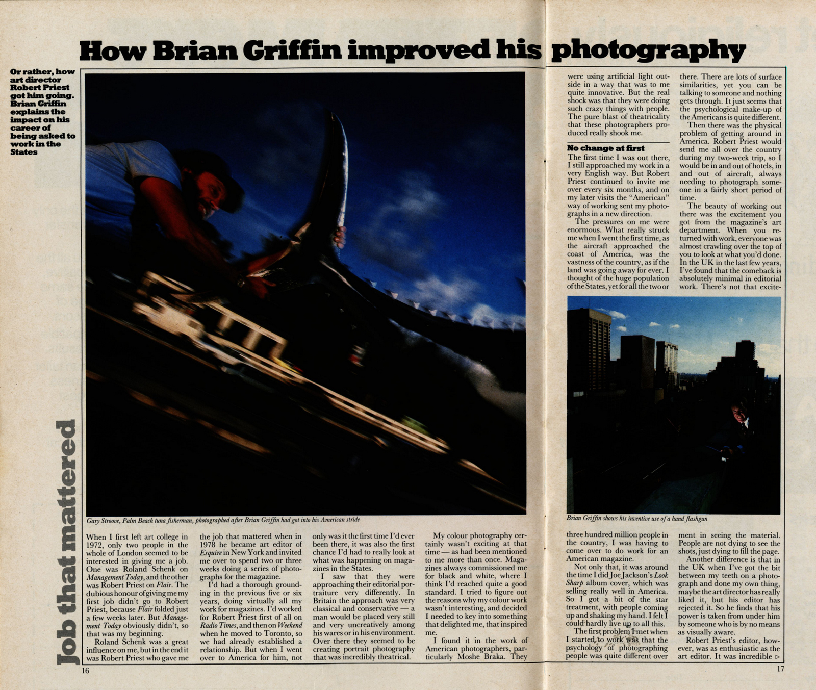
You switch to Saatchi’s New York. What was the difference creatively?Chalk and cheese.At Saatchi New York people queued up to work on Proctor & Gamble because they were more open to ideas than the other big client, General Mills.The work was hellish, but I loved living in New York and I was only seeing out my time at Saatchi before the big round-the-world sail.(I only got half way round before getting bored.)
While there you worked with DDB titan Bob Levenson?Yes but he was having a tough time with the way the New York advertising scene was developing - all that research and all those layers of nervous client types, with the power to say no but not to say yes.We got on well though and liked each other.Your tv work from your time in New York is incredibly graphic.There isn't much of it. I barely got anything made.

Your first few directing jobs were shockingly graphic, where did that approach come from?I felt I needed to prove that I could be visually original.Directing is a job that requires several skills. Some of them come naturally, others you have to work at.For me, working with actors and telling the story was the bit that came easily, the visual side was where I felt I needed to prove myself.It’s true in movies too. Mike Leigh is great with actors and performance, not too great visually. Ridley Scott the other way round.
Which ad did you wish you'd written?‘Kiss your piles goodbye.’ ‘The complete history of motorcycling since last Tuesday’, (Motorcycle News). The ‘Where’s the Beef’ campaign for Wendy’s. The ‘Red’ ad for Virgin.
Why didn’t you keep any of this work?I never keep anything.I always thought ‘it’s only advertising, don't kid yourself it’s art.’ Paul and I used to argue a lot about this.I was in it for the money, he was in it for the kudos.We both got what we wanted.Seen any good ads lately?Yes lots of TV, especially the adventure-seeker stuff for Lurpak and internet ad for Old Spice.But hardly any good press and never any good stills photography.Why? There are dozens of great photographers out there starving.Thanks Jeffery.
Where did you grow up?I grew up in Newry in Northern Ireland, a great place to live before religion destroyed it.When did you take your first picture?Probably in my teens, my uncle was a wedding photographer, so I used his half plate camera.I took a lot more serious pictures on a trip to the US when I was 18.What was your first job?I was an Assistant Art director at what was then Hobson Grey.I was fired after 3 months.How did you get into an ad agency?I did some ads at the London College of Printing, I was lucky enough to be under John Gillard who taught me what an idea was.My finest was an ad for a police recruitment brief with the line ‘Not every Tom, Dick, or Harry can be a Bobby.’That got me my first job.You worked for the legendary CDP art director Colin Millward, tough?Colin was a tyrant, but he was always on our side.He insisted on good work and but then insisted that the work was sold to the client.Who were your influences at the time?Robin Wight, who I worked with, and John Hegarty.We would meet for lunch regularly and collect ads from New Yorker and Esquire.We’re still good friends and meet often to put the world to rights.Do you remember which ads you cut out?VW, Chivas Regal, Avis, there was a wealth of inspiration.

You worked on Ford, did that mean you were in Alan Parker’s Group?No, I was in John Salmon and Arthur Parsons group, by this time Alan was making movies in the basement.


CDP were probably the best agency in the country, why leave?Robin and I got an offer to set up an agency with a talented guy called Richard Cope.We couldn’t refuse.

What a freaky photo - Robin Wight isn’t wearing a bow tie.What was he like to work with?Robin was great, he was very analytical and also a great copywriter, he believed in ‘interrogating the product’ until we arrived at a viable concept.


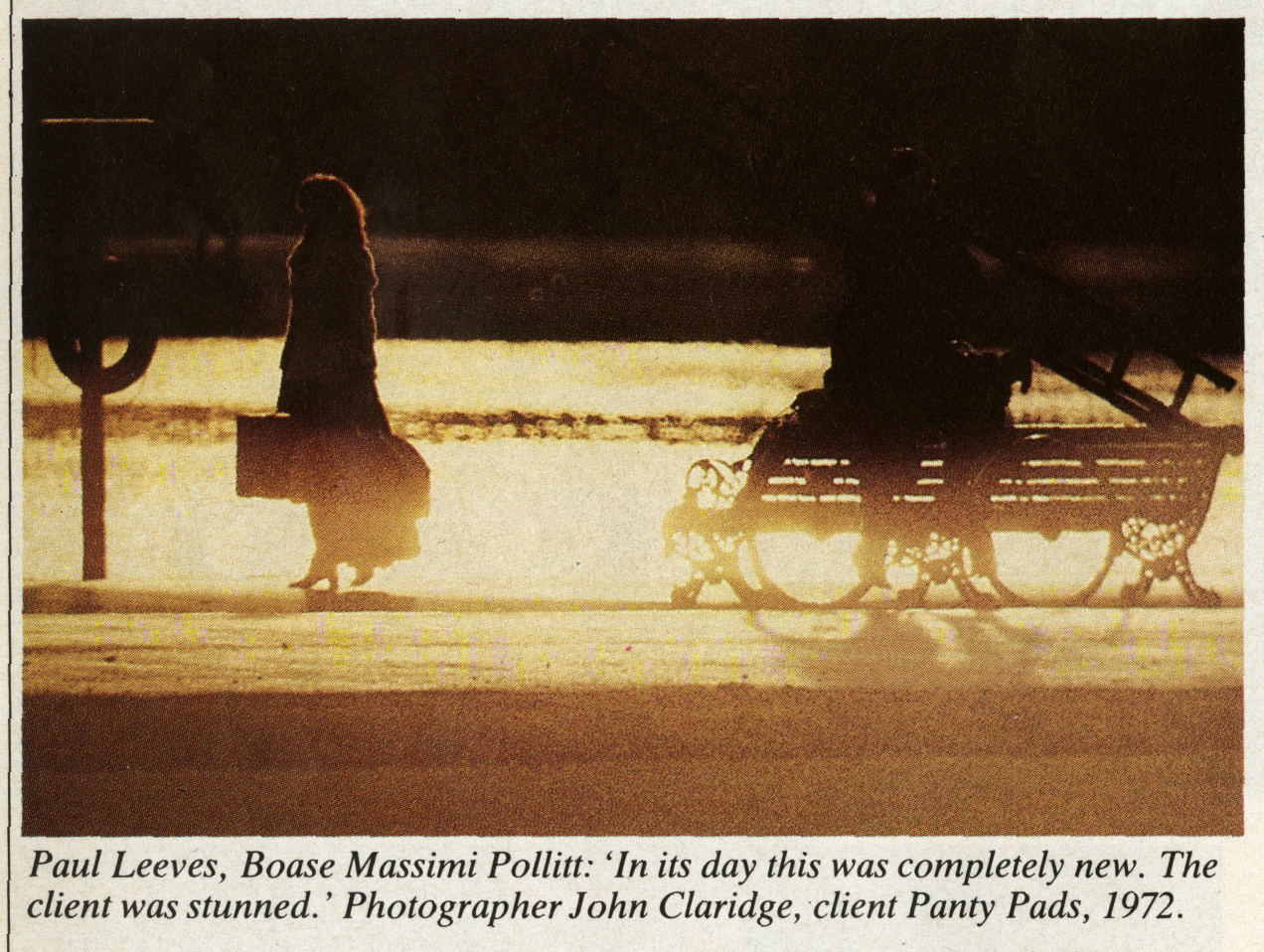
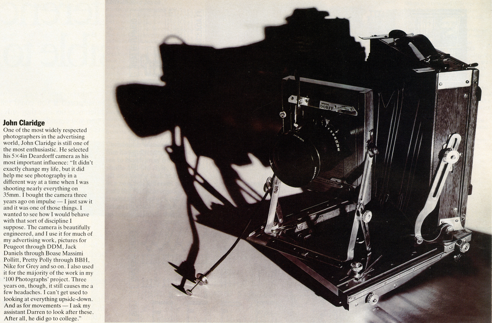
Which photographers were you working with at the time?Stephen Coe shot a lot of still life for me, and I worked a lot with John Claridge.


What happens between Euro and you being a photographer?I realised I was better at taking pictures than agency management, so with the courage born of deep ignorance I set up a studio and starting taking pictures.

What was the first image someone paid you to produce?I can’t remember, I think it was a Birds Eye shot for art director Arthur Parsons, but he was taking a considerable risk.I can remember doing a lot of midnight re-shoots.


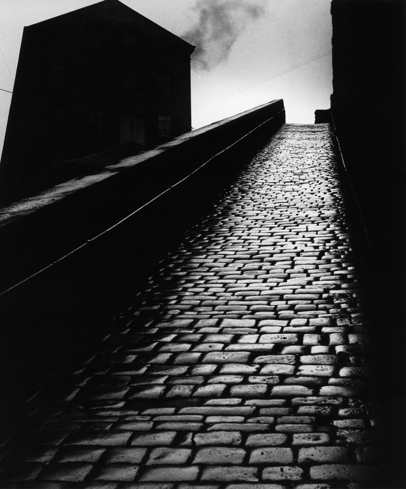
Who was the best Art Director you worked with and why?I’ve worked with some very talented people, but Gary Denham springs to mind for his sheer irreverent creativity.Who were your early photography heroes?Bill Brandt,
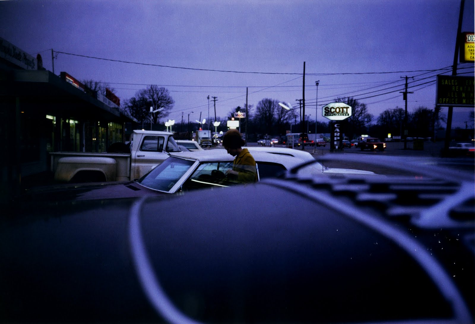
William Eggleston.
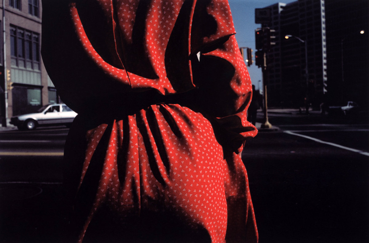
Harry Callahan, (not 'Dirty Harry').
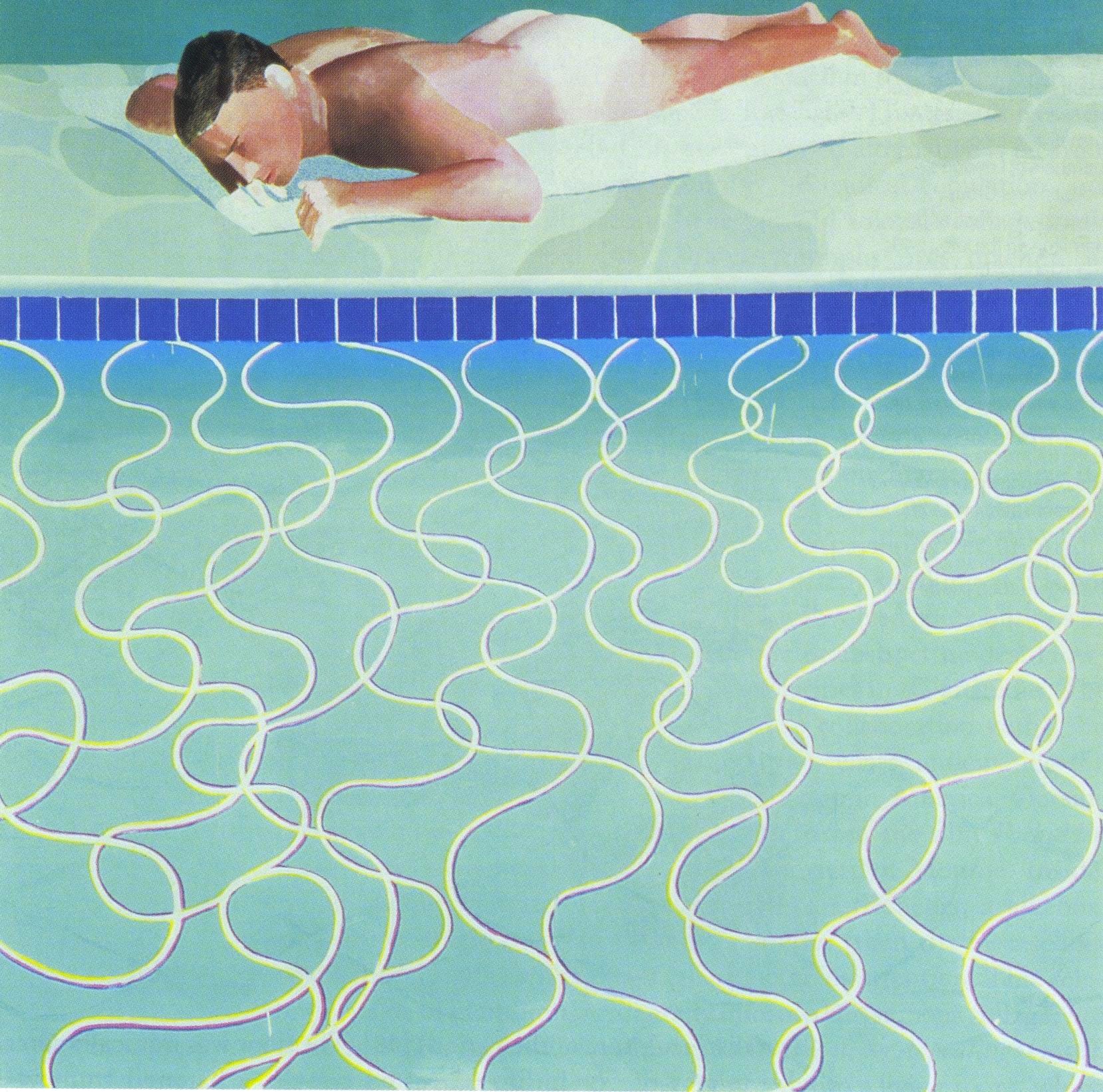
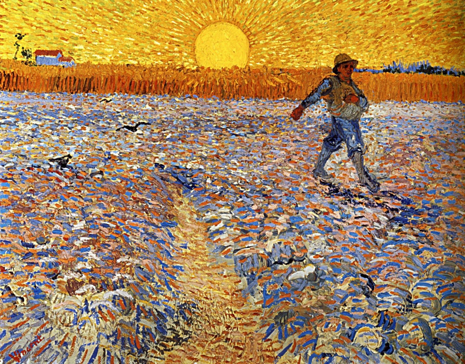
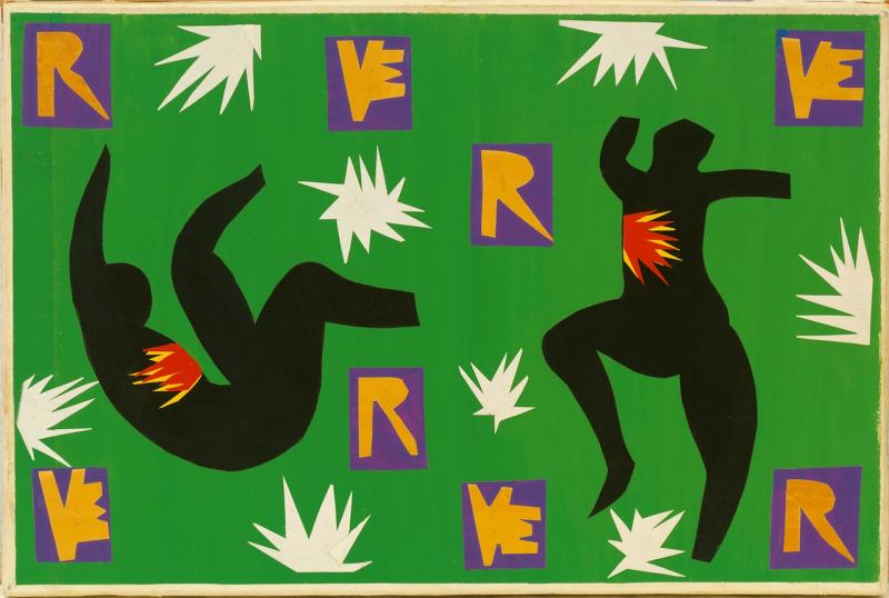
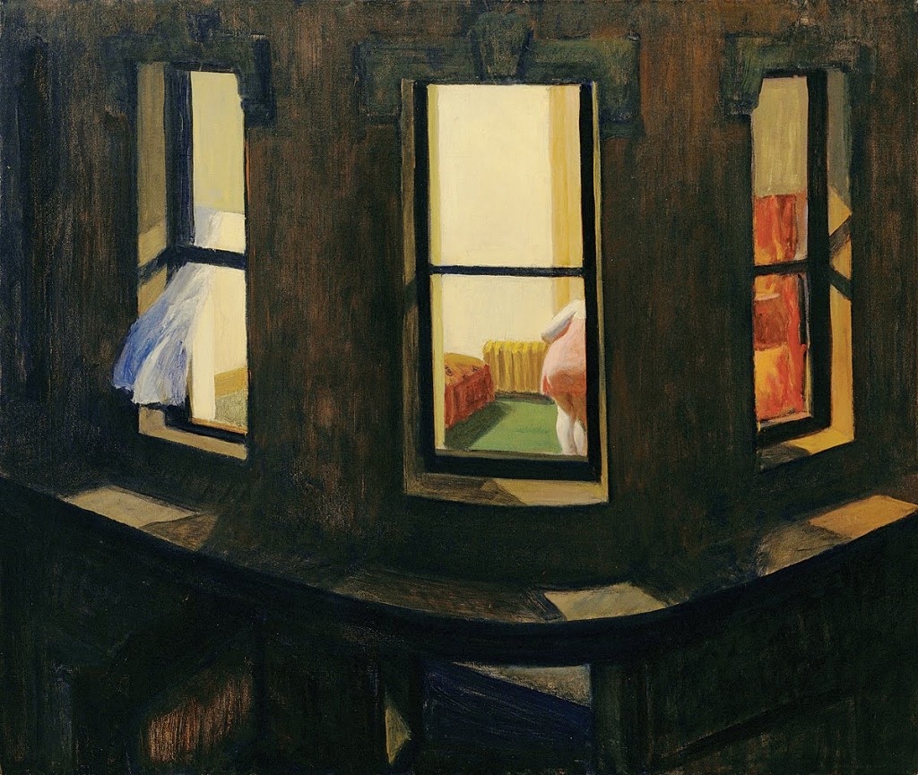
But perhaps I was more by David Hockney...
...Van Gogh...
Matisse and of course...
...Edward Hopper.
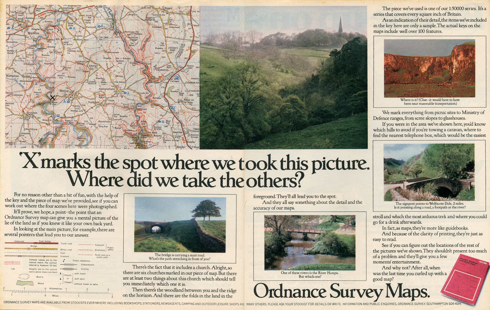
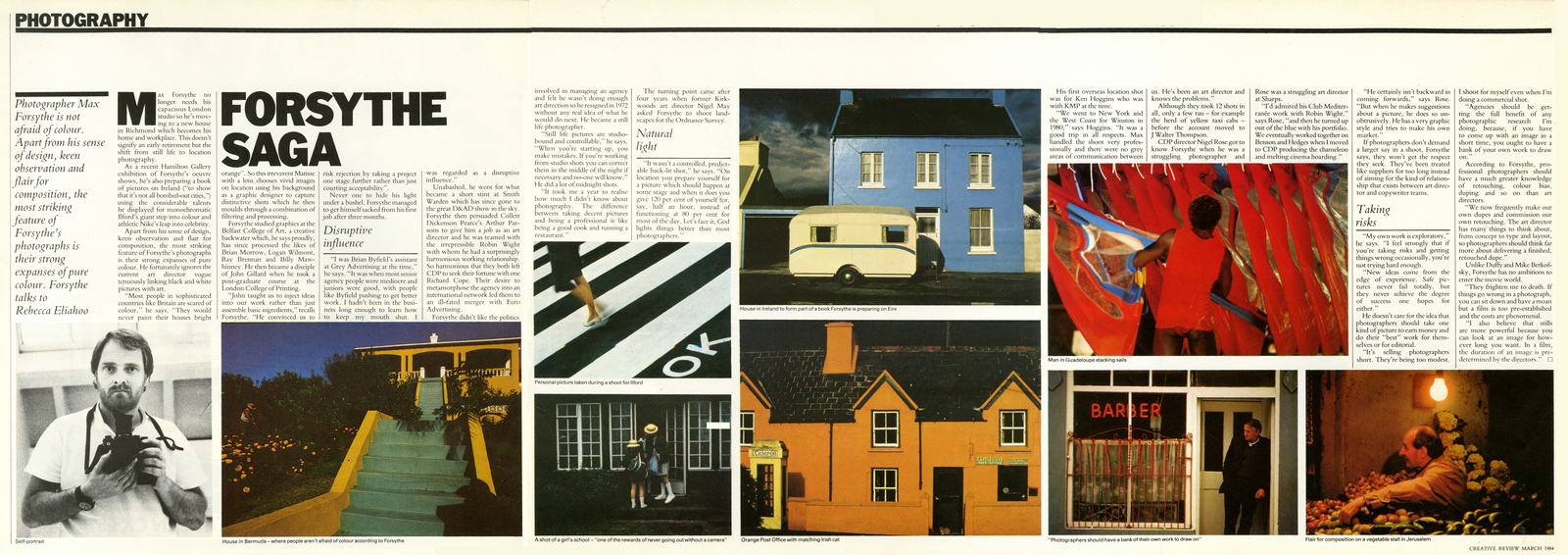
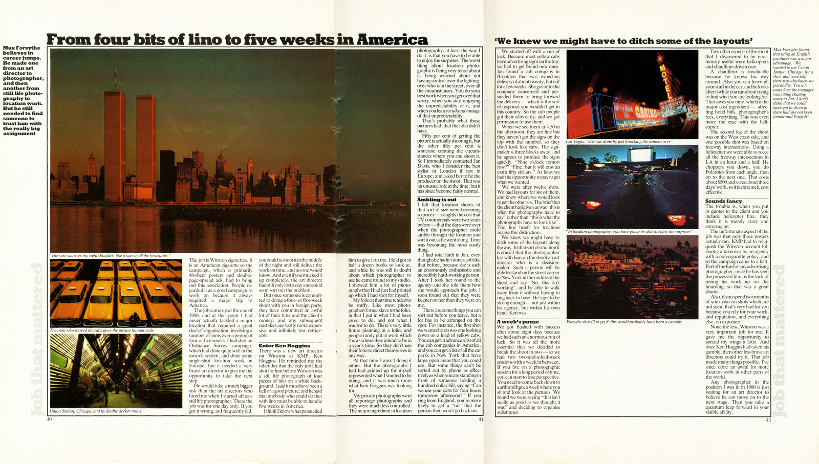
How did you graduate from small, table-tops to grand landscapes?An Art Director called Nigel May trusted me with a shoot for Ordinance Survey.It was right at the time that travel became a lot cheaper and location shoots became more possible.The next big shoot was six weeks in the US with Ken Hoggins.


Did you prefer a tight brief or an open brief?I prefer Art Directors to tell me what they want the picture to say, rather than what they want it to look like.


I love the Ilford campaign you did for FCO, it could run today. (If they still made roll film?).Hang on, Ilford - FCO, Nike - FCO, Ordnance Survey - FCO, I see a pattern emerging?It wasn’t a large agency, but FCO was one of the best in London at the time,I worked a lot with Ian Potter, the Creative Director, we produced a lot work I am very proud of.
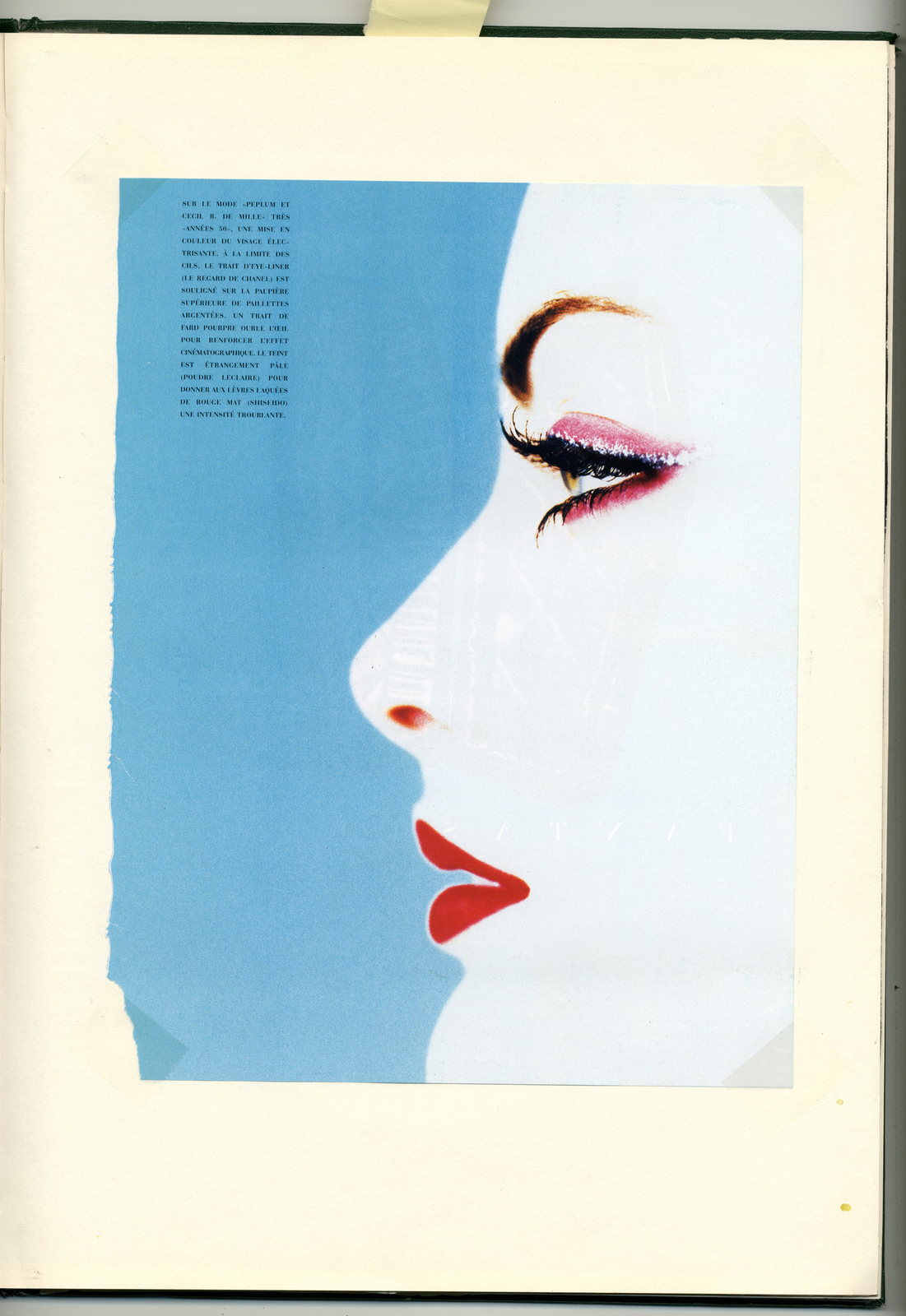
Your early work was uber-colourful, did you ever shot black and white?I did, I don’t think I was ever comfortable with it, there were a lot of people doing it better.I felt that colour had been much maligned; Black and white was art, colour was seen as what you got from Boots.Very few disciplines have ignored a major development like photography ignored the creation of colour film.I published a book called ‘Colour Prejudice’ in the 80’s to argue the case for colour, and had the first colour exhibition that Hamilton's Gallery had ever hosted in 1984.


You’re obviously very interested in composition, particularly playing with graphic shapes? I remember an old friend of mine, Derrick Hass, (he’d hate being referred to as ‘old’), bringing in one of your posters and saying ‘Look, it's just like a bloody Miro’.
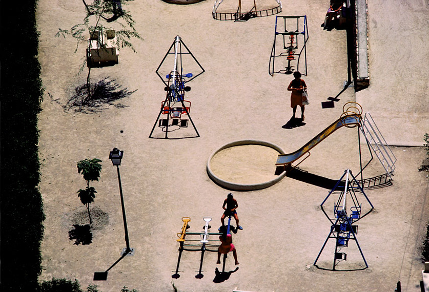
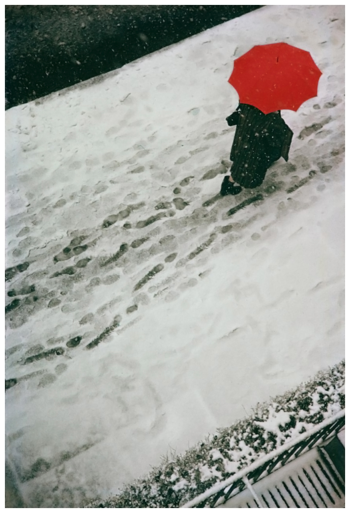
Spanish Playground... It's still one of my favourite pictures, it is one of the rewards for always carrying a camera.Even when going for lunch in a small Spanish town.I studied Graphic Design at college, not photography, I didn't have a lot of the baggage that photography students can pick up.Having been a successful art director, did you find it difficult accommodating art directors?The opposite, I understood what they were trying to achieve and understanding that perversely gave me more freedom.I don't think I ever fell out with an Art Director or had a serious disagreement, their contribution was almost always constructive.
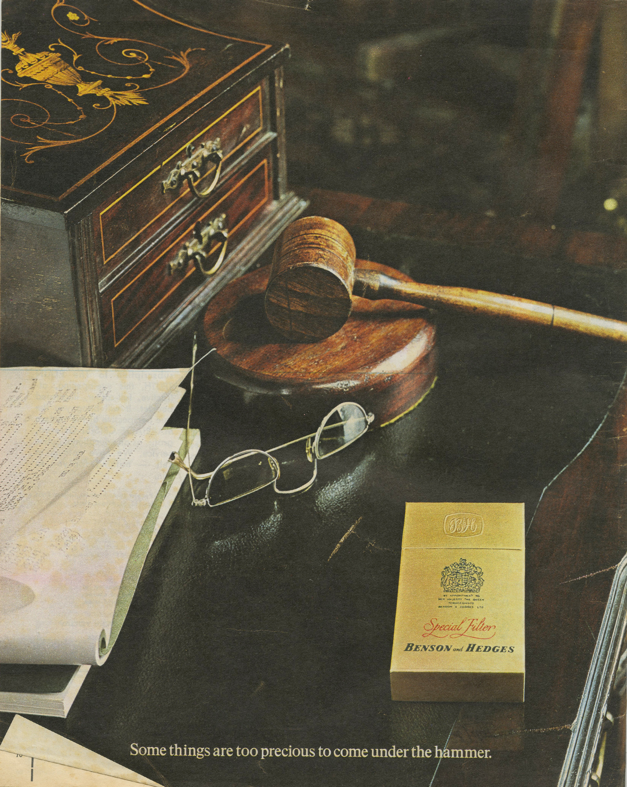
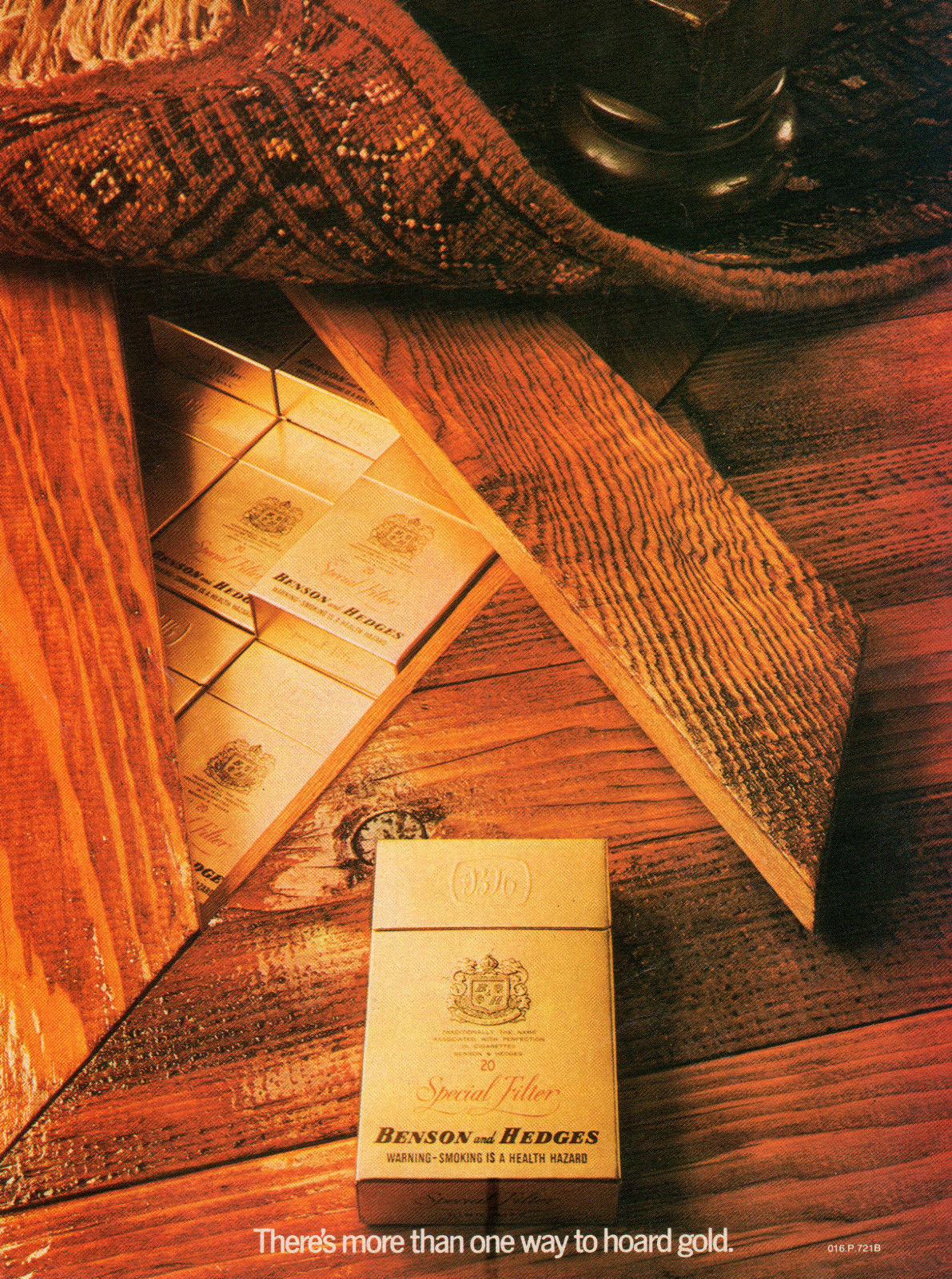
Photoshop would make this B&H image so much easier now, but would you end up with a better result?No, it would just be easier, the best thing about that ad is Nigel Rose’s idea.


Has the digital image manipulation lead to better images?It’s managed to elevate mediocrity to acceptability.But there is no substitute for being able to ‘see’ pictures rather than build them.Which ads were you most pleased with the final result?Probably the ads I shot for Land Rover, I shot them over several decades, they were great locations and normally great ads, with very few restrictions.The Land Rover clients were the best in the world to work with.
I love the ‘Flesh Tints’ spreads, have you done much editorial?I’ve shot very little editorial, I wish I’d shot more.I started shooting with Wendy Harrop at Interiors Magazine, and then later with Ilse Crawford and Claire Lloyd.All very talented ladies from whom I learnt a lot, I enjoyed the totally different disciplines.

One of the reasons I wanted to talk to you and a few of your contemporaries is that I’m struck by just how strong and expensive your images look compared to a lot of images around today?The simple answer is that they cost more.Advertising agencies were the gate keepers to sales, press and posters were important media and it was worth spending money on the production.As clients now have many other ways of generating sales the agency's power has diminished and the client is now demanding ‘cheap’ as most of them can't tell the difference.I remember you telling me about the idea behind Lensmodern when you launched in 2006; ‘People will be commissioning less and less so we are making it possible for them to access high quality images’, or something to that effect. A pretty good hunch?Yes and no. The market for good images in advertising is diminishing.The demand now seems to be for royalty-free, dirt cheap images that are being used on the web.Perhaps the big wheel will turn and clients will realise that in general, good is more successful than mediocre.Which photographer would you’d love to join Lensmodern? Name them, we could do a live shout-out.No, there are just too many.
How do you get young art directors to understand the difference between your archive and Google images?They do understand, but good work is more expensive and clients are increasingly unwilling to pay for it.My kids give a song about 10 seconds before deciding whether they like it or not.Why not?They’ve made no financial investment.Also, there’s a million more songs out there lined up for them, free and ready to go.Photography used to cost a fortune, so people took it seriously and treated it with respect.Unfortunately, in the absence of critical judgment people use price as a benchmark for quality. Speed and access are now more important.Finally, which photographers do you admire today?Mostly guys we represent, like Andreas Heumann,
Ashton Keidtsch.
Jaap Viegenthart and many more, the measure is ‘I wish I’d taken that’.

Others are Luke, my son.
And Steve McCurry.

Shot anything good recently Max?Of course, old photographers never retire, they just go out of focus.

NB.

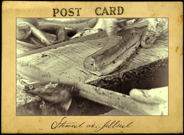
I did this ad for free.My theory was; get freelance work, do it free in exchange for a free hand.I thought it would allow me to get together better work than I could in my day job.At the time asking John Claridge to shoot your layout was like asking Jay Z to write your jingle.The chances are he's going to say no, but if he said yes, you'd almost certainly have a good ad.He said yes.The result was probably the first ad I made that actually looked good.John, like Me, you grew up in the East End of London, how was it for you?Growing up in the East End, the old East End that is, was fantastic. I loved every moment. Great parents, great mates.I boxed for six years. I also represented West Ham at athletics and I loved motorcycling (I still have a couple). Got into a bit of ‘trouble’ but most of all I took pictures.When did you take your first picture?About the age of eight, I spotted a plastic camera at a local funfair in the East End.I just had to win it, it was as simple as that. I wanted to take home all the memories of that day. Obviously, I adore eels, stewed or jellied. We’d go on holiday to Southend and eat fresh seafood, so I thought I’d send this postcard back to everyone.
When did you start to take it seriously?My first serious camera when I was fifteen, bought by hire purchase.I still have it, but it’s resting now.
What was your first job?The West Ham Labour Exchange sent me 'up West'.For a job in the Photographic Department of an Advertising Agency, McCann-Erickson.Which I got.
So what was a normal day for you in the McCann Erickson Photographic Department.When I started, the college graduates wouldn’t speak to me, I was told I was from the wrong side of the tracks.You were at McCann’s the same time as one of my favourite designers - Robert Brownjohn, did you meet him or work for him?
Yes, I not only met BJ but also worked with him on a few projects and I took pictures for him for Typographica Magazine. We would also spend time in the darkroom experimenting with different types of photographic techniques. We also experimented with sliding the emulsion off glass plates that I had exposed to different typefaces. I then manoeuvred the emulsion into different shapes. The plates and emulsion were then dried and projected onto photographic paper showing what could be achieved with distorting typefaces.
How, only a year after getting your first job, did you get yourself an exhibition?BJ and Ross Cramer, as well as many Art Directors, liked my East End documentary pictures, and one day BJ said “You’re going to have an exhibition, kid.”An offer I couldn’t and wouldn’t refuse. The exhibition was said to have shades of Walker Evans. That was when I was seventeen.
Who were your early photography heroes?Walker Evans.
Bill Brandt.
Irving Penn.

Robert Frank.
Avedon.

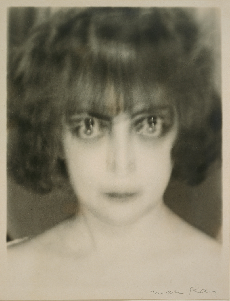
Man Ray.
Eugene Atget.
Robert Doisneau.

Andre Kertesz,
Brassai.
And Josef Sudek.

I read that you just turned up on Bill Brandt's doorstep one day?Yeah, I went to his home in Hampstead to give him one of my prints.I was seventeen.He was lovely, gentle and polite. He invited me in and asked my opinion on some work he was doing I walked away feeling ten feet tall.
How did you become David Montgomery's assistant?

When I was seventeen and still at McCann’s, I was recommended to David by BJ, Ross Cramer and Terry O’Neill.What did you learn from David Montgomery?An invaluable door opened to a new way of thinking about editorial and commercial work. David also allowed me to print, not just for him, but also forJeanloup Sieff,

Don McCullin
and Saul Leiter.
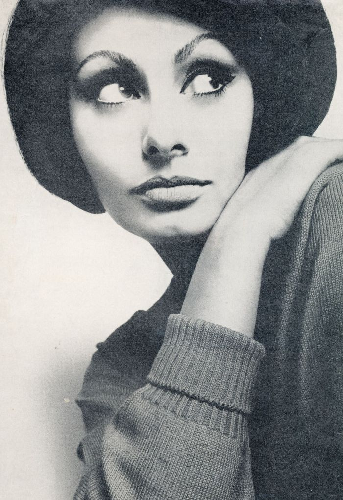
I only discovered Saul Leiter three or four years ago, he went straight into my top five photographers, what was he like?A good man, a real pleasure to print for. Also very laid back.You go it alone at nineteen, opening your own studio, you must’ve been a confident kid?I just needed to take pictures.What was the first job you got as a photographerMy very first commissions were for Management Today, Queen, Town, Harper’s, and Nova Magazines.


Who were your early clients?A lot of cars and countries; Bahamas, Indian Tourist Board, English Tourist.Cars? Audi, Rolls Royce, Porsche, Citroën, Ford, I'm sure I've missed a couple.

What was "Five Soldiers"?A film I did based on an American Civil War tale, comparing it to the war in Vietnam.It caused a riot amongst the students when it was shown at a university campus in the US, and ended up getting banned, but made its way onto the underground circuit.The press compared the film to Luis Buñuel.Unusually, you've done great stuff across the map; portraits, landscapes, still life, cars, reportage?Yeah, I'm a photographer.LANDSCAPE:
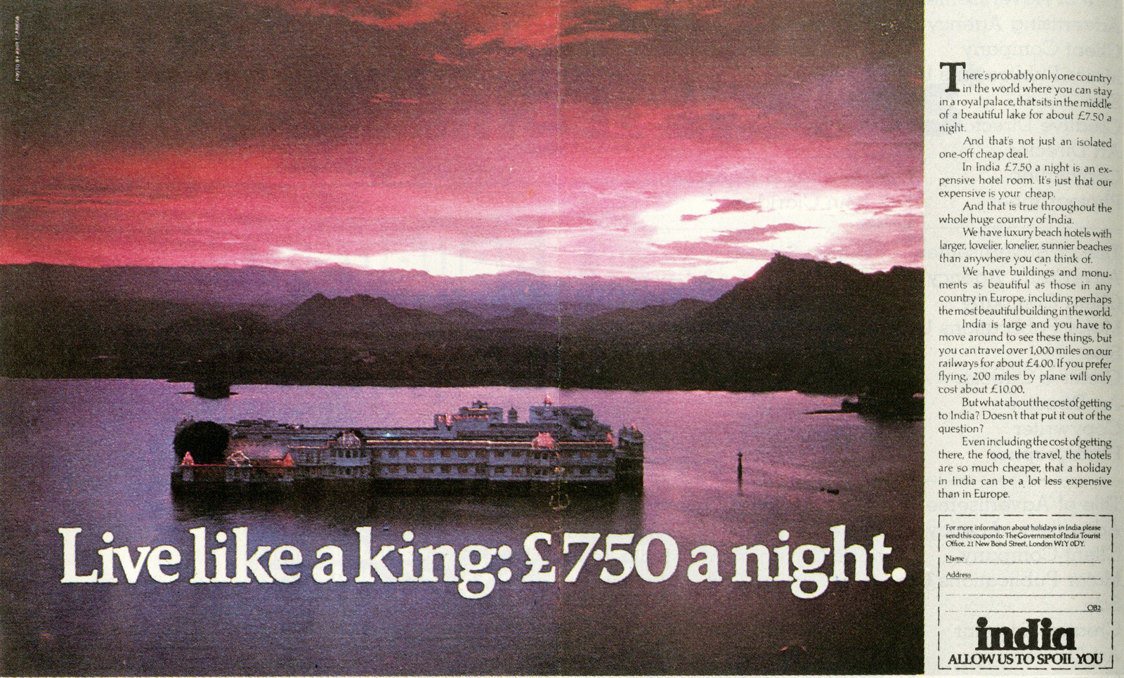
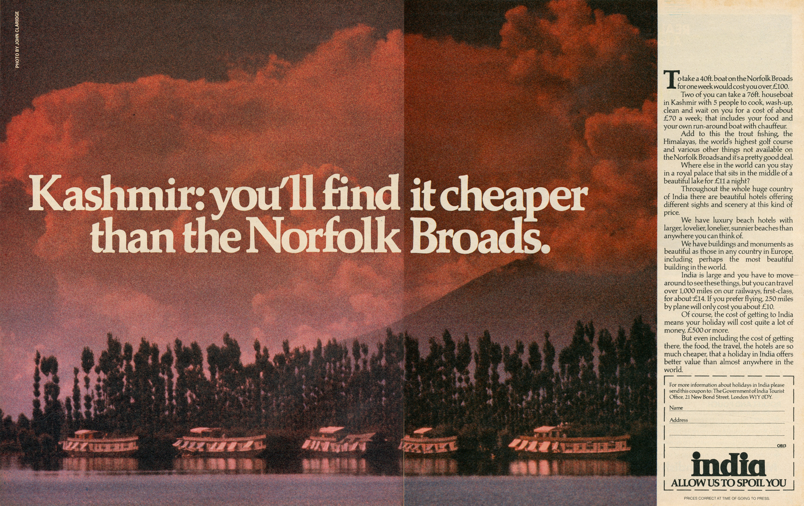
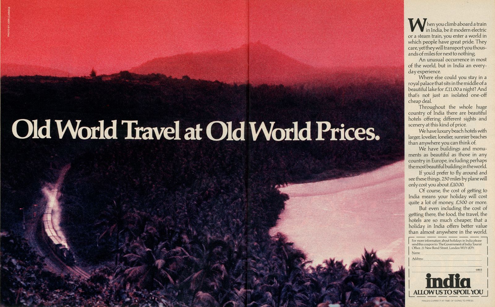
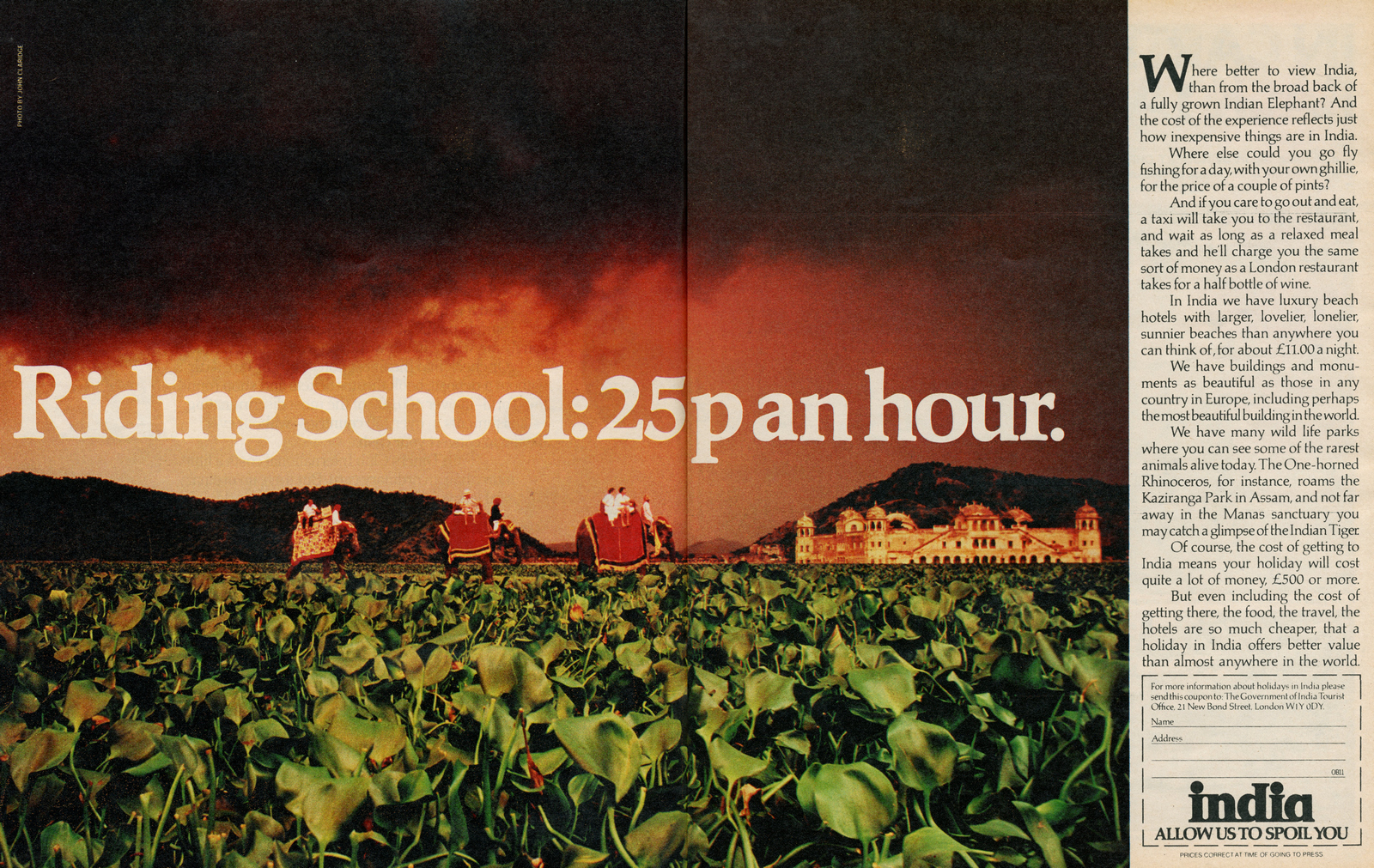
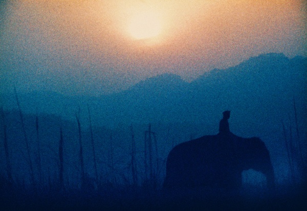
The 'India' campaign still looks great, were there layouts or did you just find the shots when you got there?With headlines from Geoff Seymour, rough layouts from Graham Cornthwaite, Graham, myself and my assistants went off to India to explore and discover what we could do with their brief.

Did you prefer Art Directors to give you a tight brief or an open brief?I have no problems with Art Directors giving me any type of brief.
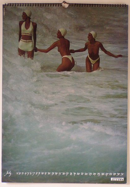
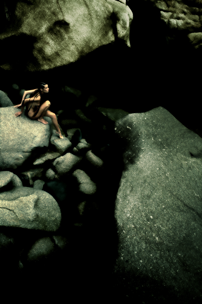
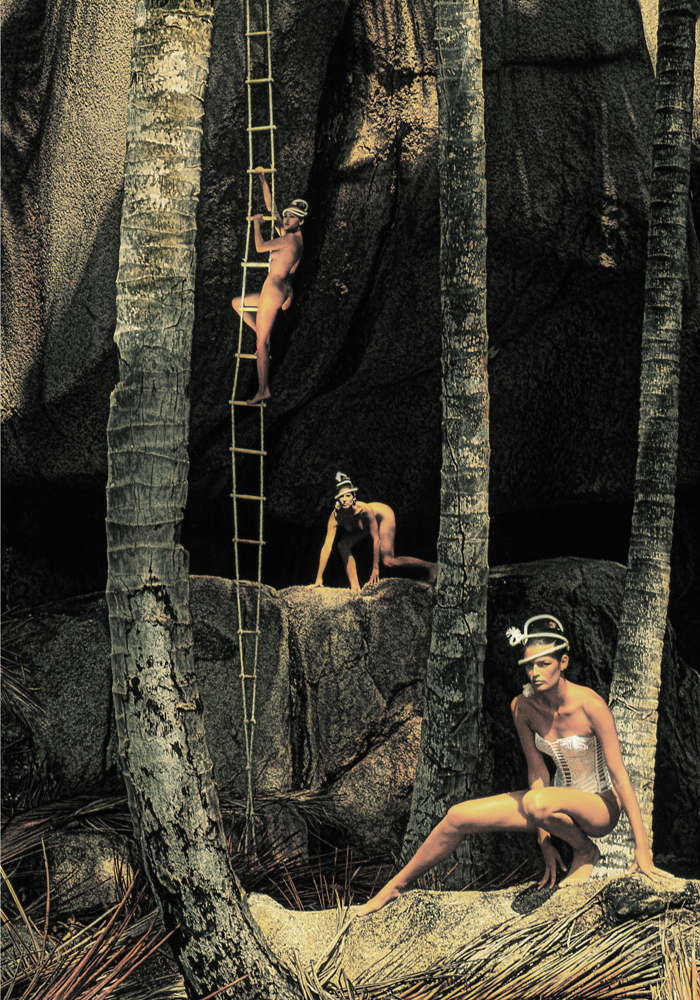
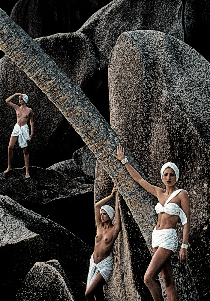
You're then asked to -a) Pick some of the most beautiful women in the world.b) Take them to a tropical island.c) Ask them to take their kits off.d) Bank a large cheque for the above.Nice gig the Pirelli Calendar?Course it fucking was.
I've written about Qantas Art Director John Knight, very underrated?John Knight was and still is underrated.Had a lot of fun working with him.Not only a great mind, a great sense of humour.Also, he swore more than me.

Rumour has it that you knocked out a couple of Art Directors? And I don’t mean with the quality of your pictures.YES!PORTRAITS.
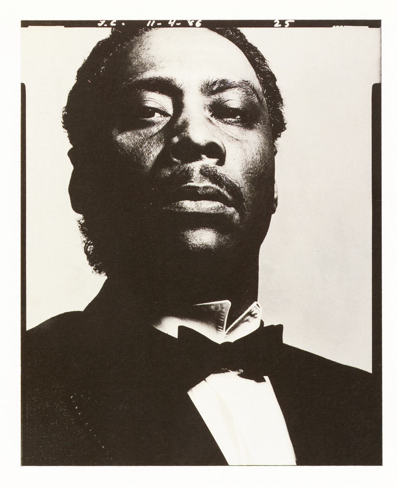
How did you start shooting the jazz portraits?I shared the lease of 47 Frith Street, Ronnie Scott’s Jazz Club, with Ronnie, (below) and Pete King for fourteen years.I had the two top floors of the building where I had my studio, office, darkroom and lived. So each night I used to go to sleep listening to jazz, which was great, (if you loved jazz).

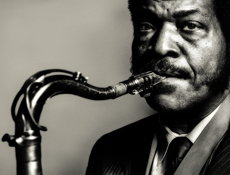
My favourite was Chet Baker, what he was like?
Chet Baker was a very charming man.While I was telling him about the first time I ever heard him play was on an EP called ‘Winter Wonderland’ that I had bought when I was thirteen; he hesitated, thought and told me the line-up and then just looked towards me with all his memories.Then I took the picture.
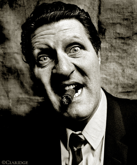
You've shot Britain's most famous comedians, who made you laugh most?Tommy Cooper.When he looked at me, it was very difficult not to break into laughter.We did three rolls of film and it was getting intense, quite serious.He said 'This is serious, isn't it?', and I was in fits of laughter.He was courteous to me, and when I said I loved Laurel & Hardy, he started doing impressions of Oliver Hardy until I had tears running down my face, I had to stop him.I think the pictures tell the story, there's some fun photographs and some serious photographs - I know he had demons, but I found him a very lovely man, very gracious.
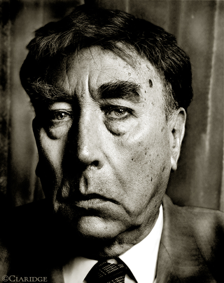
The Frankie Howerd shoot was interesting.He was up and down. Funny one minute sad the next.Quiet a few demons I think.
Spike Milligan came to my studio.We sat around listening and talking about jazz for a couple of hours before I shot a picture.Another lovely man with a very deep sense of humour.
The ad you did with Derrick Hass for the Covent Garden Art Company is amazing, it could run tomorrow unchanged.(If they were still going...people sent out for artwork...computers didn't exist...)It was hard to find the model for that shoot.

You spent a bit of time modelling, the other side of the camera?Ha Ha.
Who was the best Art Director you worked with?This is very difficult to answer as I worked with all the best Art Directors in the business. Not just Art Directors, but Designers, Copywriters and Typographers.You seemed to create a new, very distinctive portrait style, with those very dark, moody Klaus Kalde lith prints?I, myself, in the darkroom was exploring different printing techniques for portraits and separately with Klaus exploring Lith printing.
STILL LIFE.

What ad were you most pleased with?Without question I worked in the golden age of Advertising with like-minded people who all had an opinion and passion about communication. It was not run by a committee of visually illiterate people with no soul, which seems to be the norm these days.However, I must say that, in my mind, there are a few exceptions but sadly very, very few. So I feel I was extremely lucky to have had a great deal of fun, crazy times,seen the world and produce, I think, some important work.Many talented people made that possible.Do you think digital technology has helped photography?Experimenting is now easier, but I see less of it?Like any new technology, it has it’s pluses and minuses.For me photography should come from the heart. not the head.Which ever way you want to run with it.Did you meet Avedon, Penn or any of your photography heroes?Just Bill Brandt. Not just a great photographer, but also a very charming man.What do you shoot with today?Cameras. Anything, I’m not a camera freak.Do you still print your own stuff?Of course.What photographers do you admire today?Robert Frank.
Sebastiao Salgado.
Sarah Moon.
You seem seem to be publishing more books these days than J. K. Rowling?Hopefully a very important one next year. Will keep you informed.
“To me, people are like lighthouses in a very big ocean, with wind and rain and waves trying to break them and make them go under.” – Rolph Gobits.
Did you come from an arty family Rolph?
I did not come from an arty family at all.
Do you remember being aware of photography whist growing up in Holland?I was aware of photography at a very young age when growing up in Amsterdam.I was about five or six years old when my father or mother took me to a friend who had a dark room. To me it was a miracle to see a plain piece of paper (that is what it looked to me) swimming in what appeared to be a dish with plain water and slowly but surely an image appeared from this blank piece of paper.The first exhibition of photography I ever did go and see was Robert Capa in the 1950s.
When did you take your first picture?
I bought my first camera when I was about 13 years old. It was a 35 mm Yahica camera which could shoot at 1000th of a second, which seemed unbelievable to me.
The first pictures I photographed was of an airplane with had propellers, as jet passenger planes were not yet in service.
I was trying to freeze the rotating propellers at 1000 of a second as I wanted to test the seemingly amazing shutter speed.
Only much later I realised I could have photographed this airplane with the propellers stationary and would have got the same result on film.
It showed clearly my naïvety.What was your first job?
When I was fifteen years old I was working during the summer holidays in a bank six days a week sorting punch cards which were processed through a machine. This was the forerunner to computers.
Which photographer did you assist?
I never assisted any photographer.On completing my M A degree at the Royal College of Art, I got commissions immediately, working for magazines like NOVA, Cosmopolitan, Daily Telegraph and many others.
What was the first picture you were paid for?
After completing the RCA I got commissioned to photograph for BIBA, which was just about to open its new store in Derry & Tom’s building in Kensington.
You seem to have made a conscious effort to switch from being a poppy, trendy fashion photographer to a more classical, serious photographer?When I first left the RCA I took on almost any job which came my way.I was so keen to get started having been a student, firstly for four years at Bournemouth and Poole College of Art, followed by two years at the RCA.It was time giving up being a student and becoming a “professional”.There also comes a time when you get bored with listening to stories of fashion models rabbiting on about their social lives.
What was your first ad that turned out well?If I remember correctly, the first advert which turned out well was for an agency called Fletcher, Shelton, Delaney.It was a black and white advert with directors in a boardroom and a sheep.The directors were all played by staff of the advertising agency.The sheep was easier to work with than the “directors” who thought this was all a bit of fun.I was really thrown in at the deep end and realised I was entering an industry like no other.Preceding this I had only worked on editorial photography for two years.


Who were your early photography heroes?
Robert Capa,
Irving Penn,
.png)
Richard Avedon,

Edward Steichen,
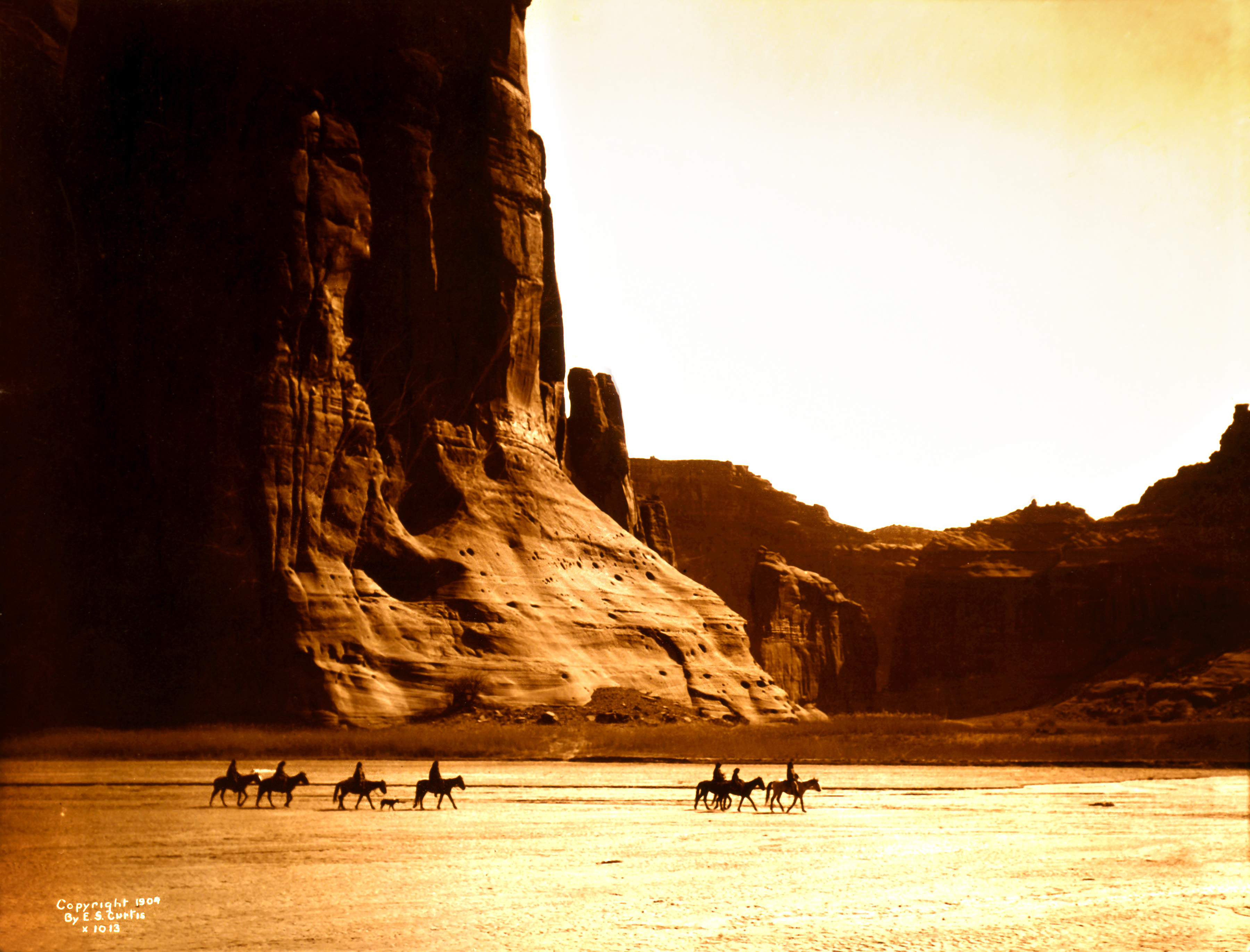
Edward Curtis,
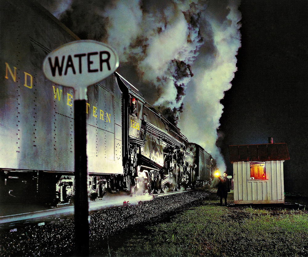
Winston Link,
Man Ray,

Sarah Moon,

Paul Strand and many others.
Your compositions aren’t very ‘advertising’.
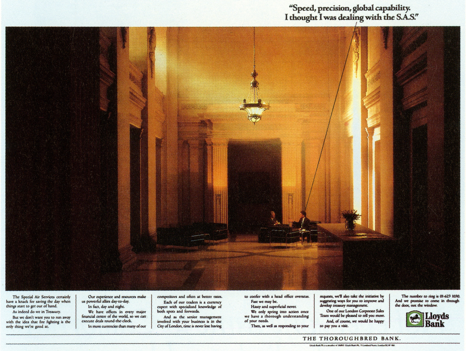
Ad photography tends to be graphic and in-your-face, your shots are calm, detailed and distant. Take the Lloyd’s Bank ad, I love that the surroundings are dwarfing the two people talking. Not many art directors would do that or want that?
Because my portfolio was very editorial any art director who wanted to work with me wanted very much the look of my editorial work.
It was the beginning of a new look which was taking place.
This occurred as several ex RCA students entered the advertising industry and all had a personal vision which was very different from the established advertising look.


It’s a bit ‘Sophie’s Choice’, but who’s the best art director you’ve worked with over the years?
This is incredibly difficult to answer as some gave me a free hand and other directors knew precisely what they wanted.
I enjoyed very much both disciplines.
I cannot say who is the best art director but some of the art directors that spring to mind are Paul Arden, Neil Godfrey, Fergus Fleming, Nigel Rose, Alan Waldie and many more. There are just too many as I have worked in the industry for over thirty-five years.


It’s a bit ‘Sophie’s Choice’, but who’s the best art director you’ve worked with over the years?This is incredibly difficult to answer as some gave me a free hand and other directors knew precisely what they wanted.
I enjoyed very much both disciplines.
I cannot say who is the best art director but some of the art directors that spring to mind are Paul Arden, Neil Godfrey, Fergus Fleming, Nigel Rose, Alan Waldie and many more. There are just too many as I have worked in the industry for over thirty-five years.
.jpg)


Money aside, what do you prefer shooting – advertising or editorial?
I truly have no preference. In editorial you can do whatever you want while with advertising you have to bear in mind there is a “product” that needs to inform on many different levels.


I think a lot of your shots have been badly handled by art directors.
Your pictures are classic, sometimes like paintings and need to be put in simple environments, but many of your shots have been put into layouts where the coloured backgrounds and fancy type don’t do justice to the delicacy of the images?
Many People’s opinions have to be considered to get the final “ look”. The best conceived adverts are the ones where the art director knows what he wants and fights any other opinions people express.
You have to be a benevolent dictator.
It is that very quality that makes the best art directors the best art directors.


I would imagine art directors gave you very open briefs?
Sometimes the open brief consisted of many discussions with the art director many weeks before the shoot.
We would sit down and talk about his ideas and my vision and collectively we would arrive at the ideal situation which would make the advert look like an open brief.
Compared to an art director who may have “battled” for months to get his idea through many discussions and arguments at the agency meetings, it is important for me to understand what is possible and what is definitely a no go with my idea of solving the “problem”.
Most photographers who take portraits focus on the face.
Well, it is a portrait after all.
So if you are shooting the artist Jenny Saville, most would try and capture her expression, like this.

Some, the bolder ones, may pull back a little to also capture a bit of body language.
And then there’s Rolph.
Few see the world like that.
It makes an art director’s job very easy, the picture does all the hard work.
Simply bung a bit of type in the corner and your spread looks amazing.
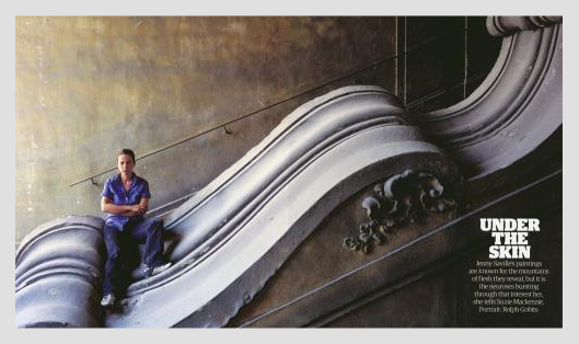
Your choices are like other people’s mistakes.
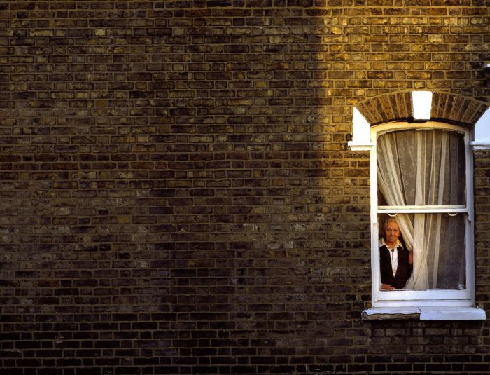
Take the portrait above, few would be bold enough to have the face of the subject taking up only two percent of the total area, or below, few would push the window to the side to show lots of blank wall.
This bloke hasn’t been told where the camera is.
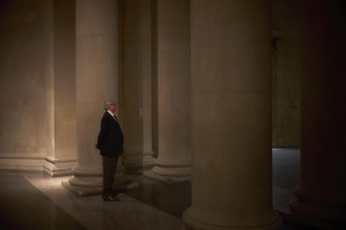
There’s a big black thing in shot.
Just a few words about the Jenny Saville image, because her paintings are very large I photographed her small intentionally. This was the whole idea of photographing her.
In almost all cases I cannot explain how I compose an image.
It is not about size of the person or product; it is about what feels right and gives the sort of emotion I get when I see the location or person.
It is about what feels right to me.
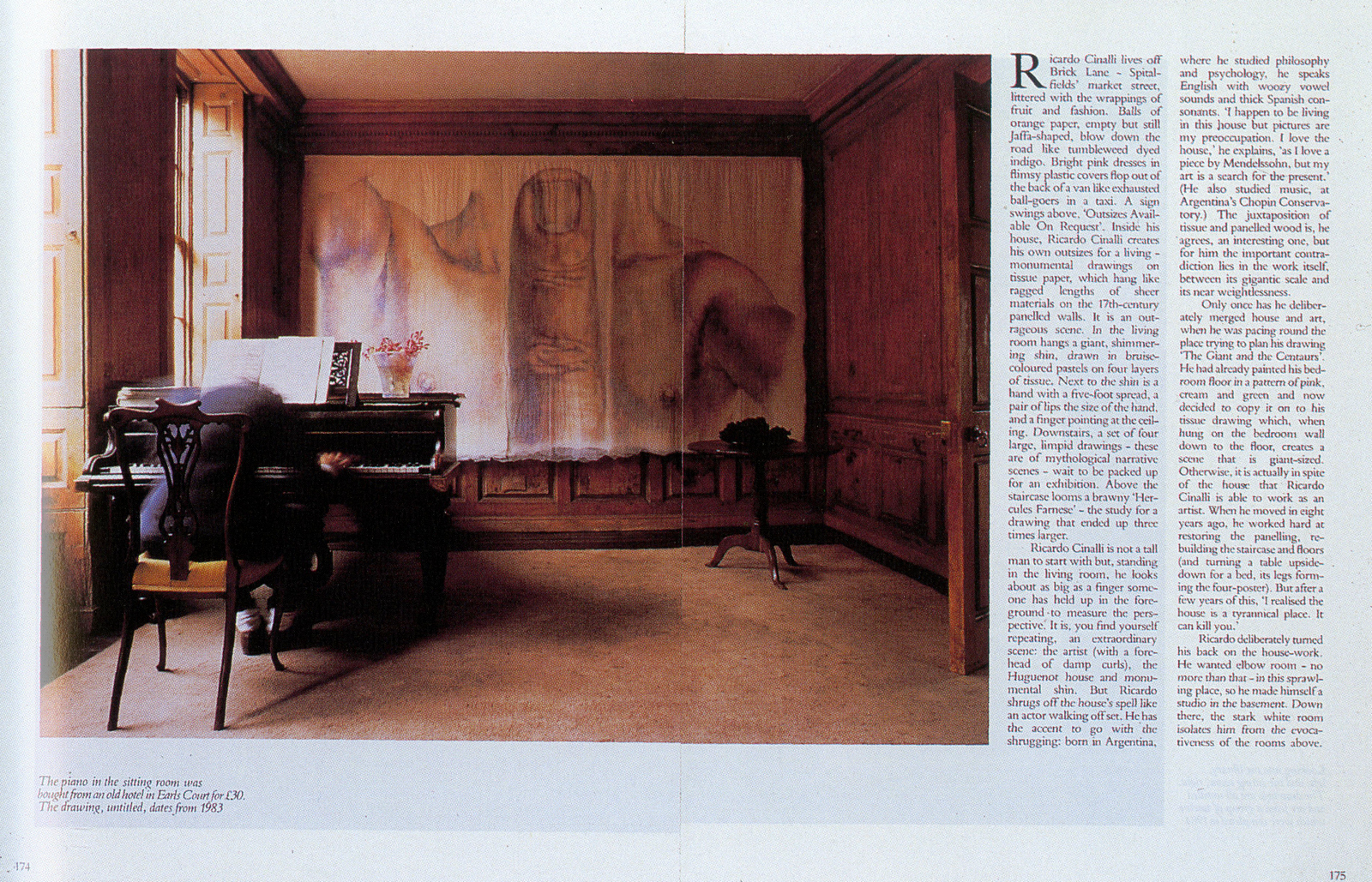
When I worked in the “editorial word” and had to photograph famous people who only gave me ten or fifteen minutes maximum, I had to make quick decisions, it developed my skill to see a composition.
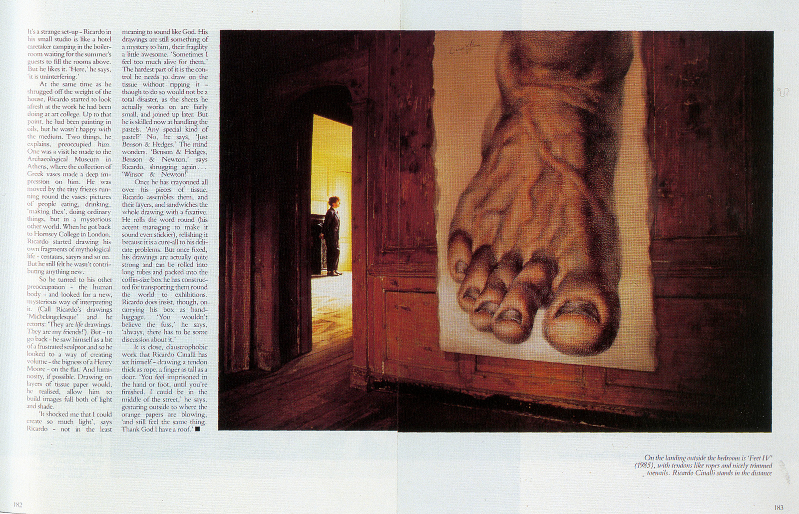
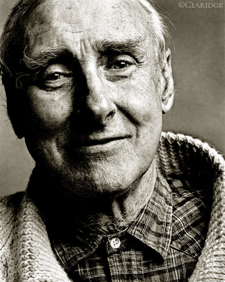
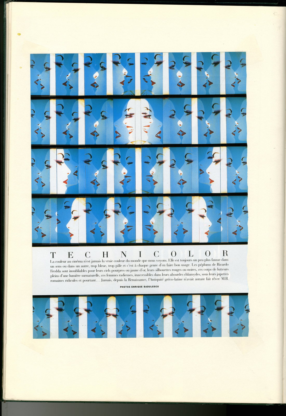
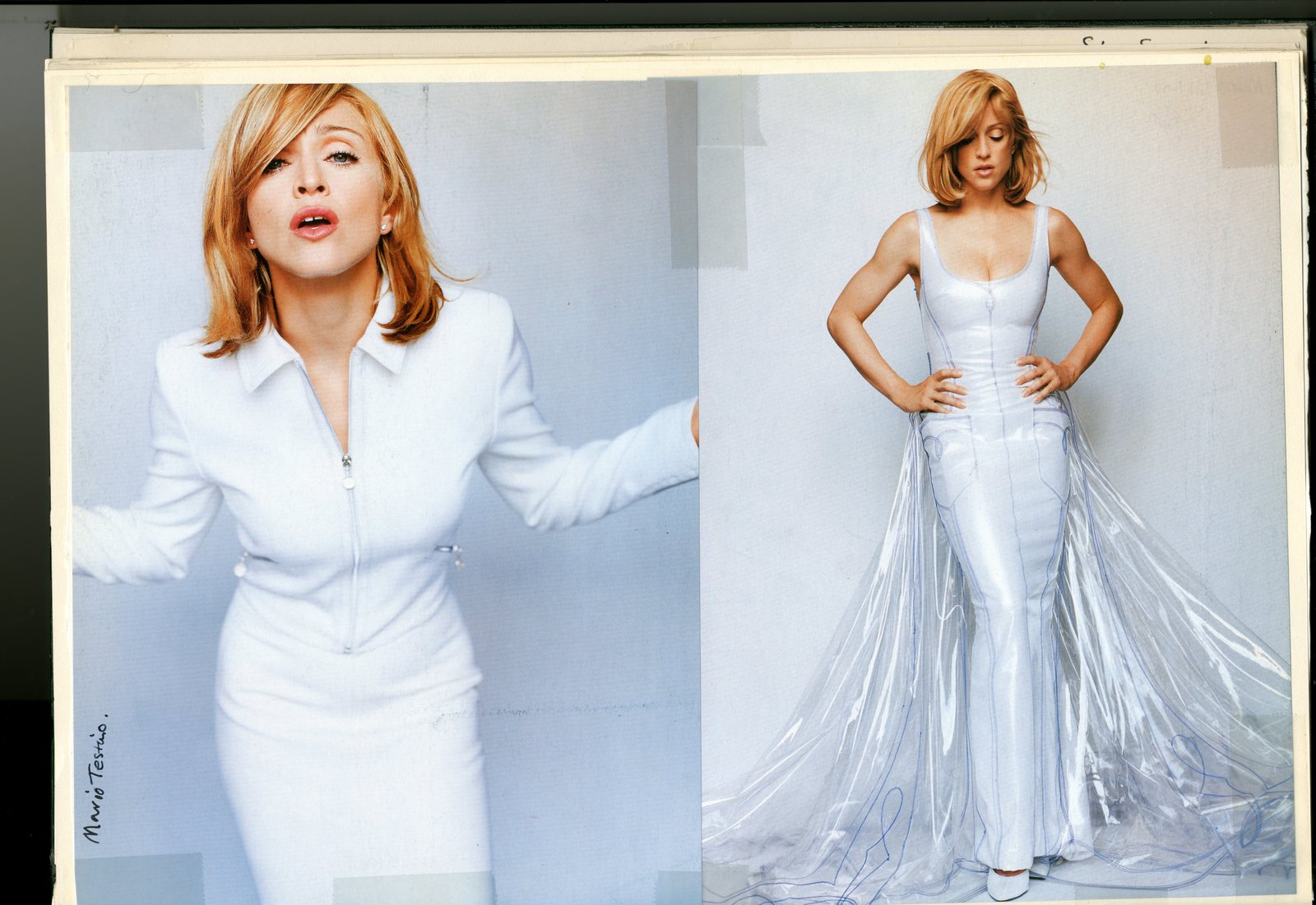
This was especially true during my work for Management Today magazine, working for Roland Schenk, as all the people I photographed were the creme de la creme of business people and felt very uncomfortable having a camera shoved up their noses.
This was the beginning of me showing more about their environment rather than their faces.
This way the captains of industry felt more relaxed and comfortable.
For some reason most of these CEO’s expressed to me they preferred going to the dentist than being photographed.
I presume they tell the dentist a preference to being photographed rather than visiting them.
Do art directors find you easy going and flexible, or immovable, like a rock?
This question makes me laugh.
With bad art directors I was immovable as they were very indecisive of what they wanted and therefore relied on my input, whilst working with good art directors became a team effort and was very much open to exchange of ideas.
Your work looks as though you were inspired by painters more than photographers?I am inspired by painting as the artist has a clear understanding of what light can do and how light creates an atmosphere as well as texture and space.
If I could paint, which I can’t, my passion would increase by 1.
What’s the favourite ad you’ve done?
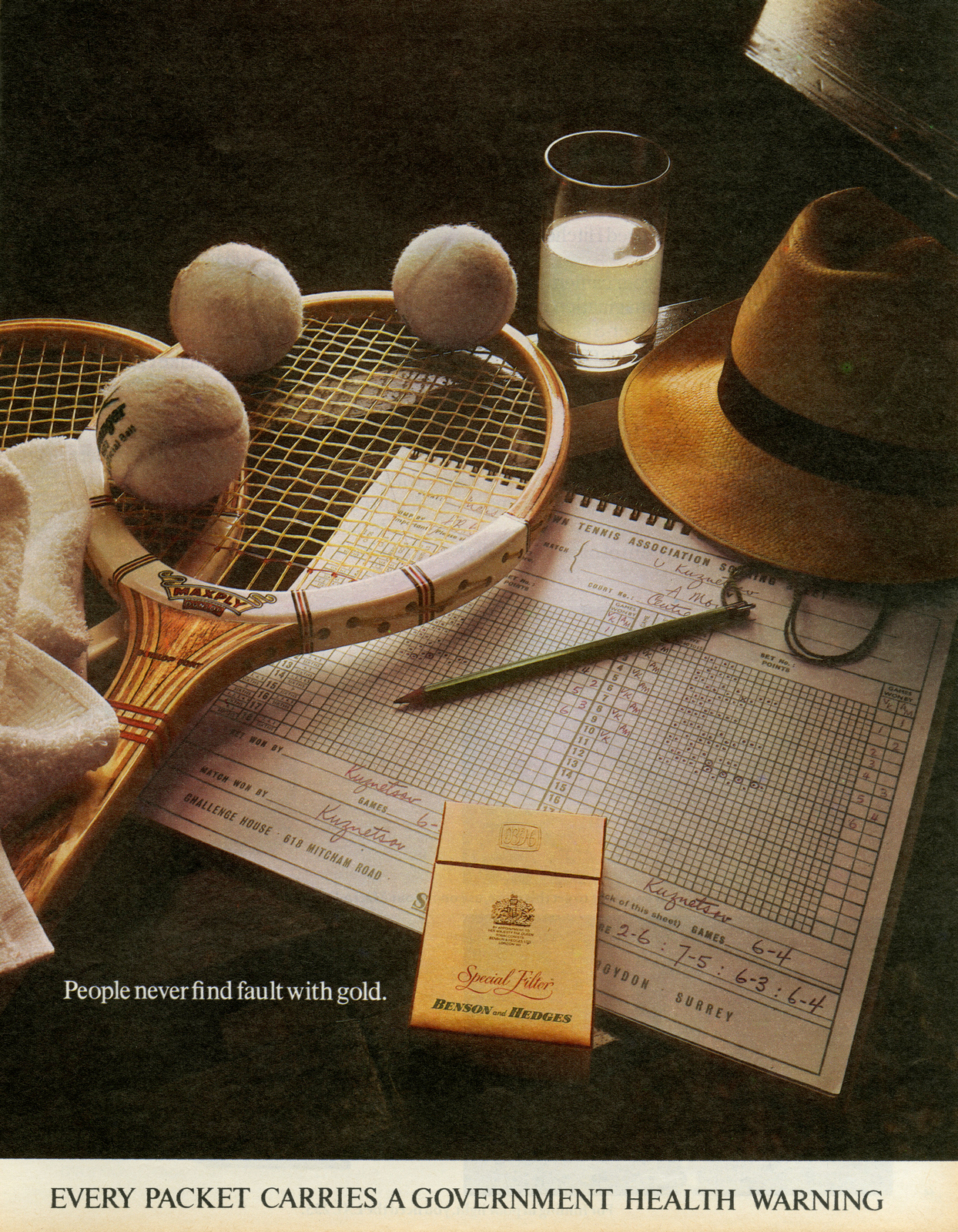
Impossible to answer as I am very proud of many advertisements I have worked on. I’m proud of a Benson & Hedges ad I worked on, it took 12 days and a 28 minute exposure.

Also other factors should be considered with this statement; enjoyment, difficulty, stress, problem solving (no Photoshop or manipulation), teamwork, weather, etc.

What’s the favourite ad you haven’t done?
Anything by Guy Bourdin.
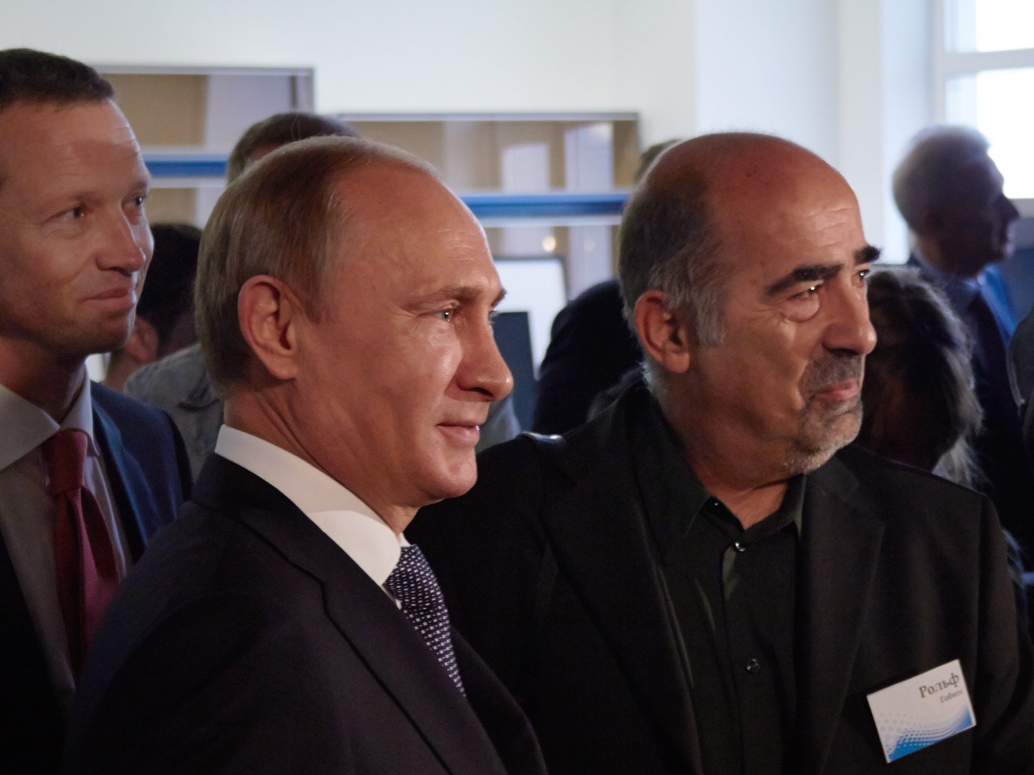
What’s happening, are you doing a selfie with Putin? He watched my masterclass and the students working with ballet dancers.He just talked to me about an “Englishman” teaching at the only campus University in the whole of Russia, (with over 20,000 students and about half living in dormitories on an island with many thousands from all over the world).
CGI vs In-camera?
No contest; anything achieved completely in camera shows the craftmanship of the photographer.
Photography has become an illustration and can no longer be said to tell the “truth”.
Digitisation has made photography easier, less expensive and allowed everyone to do it, but has it helped the images themselves?
I am not against digitisation.
However it should only be used if a conventional method makes it impossible to get the desired result.
Nowadays it is just used because it is easier and time-consuming, but it makes you lazier. It is software that stops you thinking and using your brain.
The job of the photographer has been reduced as somebody else takes over part of his job he was responsible for himself.
If he makes a mistake the software will correct his stupidity.
The result is; he will be less involved with the process of taking the picture.
When I get the results from a photographic shoot today it’s like it’s from Ikea – put tab a into slot b, just hundreds of pieces shot to get the lighting just so, but the end results aren’t better?
You’re absolutely right about your statement.
I was told the following story by a colleague in our industry.
A well-known agency commissioned a “trendy” fashion photographer to take a car shot in the studio.
He had never taken a car picture in the studio.
The agency hired two assistants who had a great deal of experience doing studio car photography.
In order to save educating the fashion photographer and save time, each part of the car was photographed separately and then put together like a puzzle.
Why not use the expert in the first place rather than creating a patchwork of images that never looked complete.
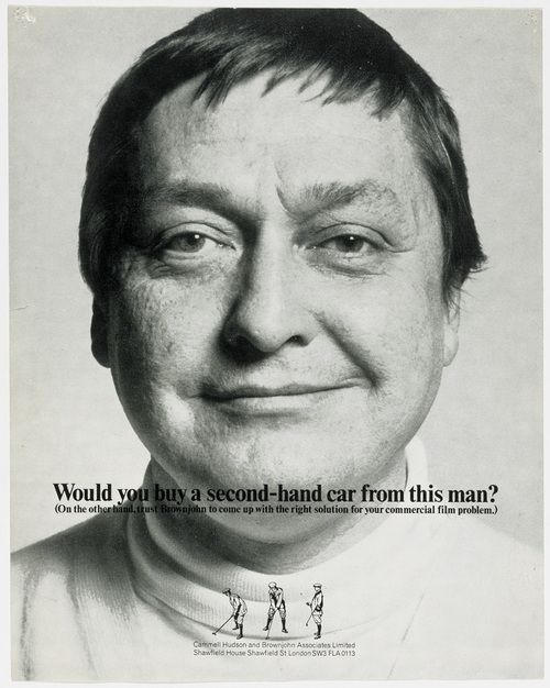
DAVE: Which of your rivals did you respect most?
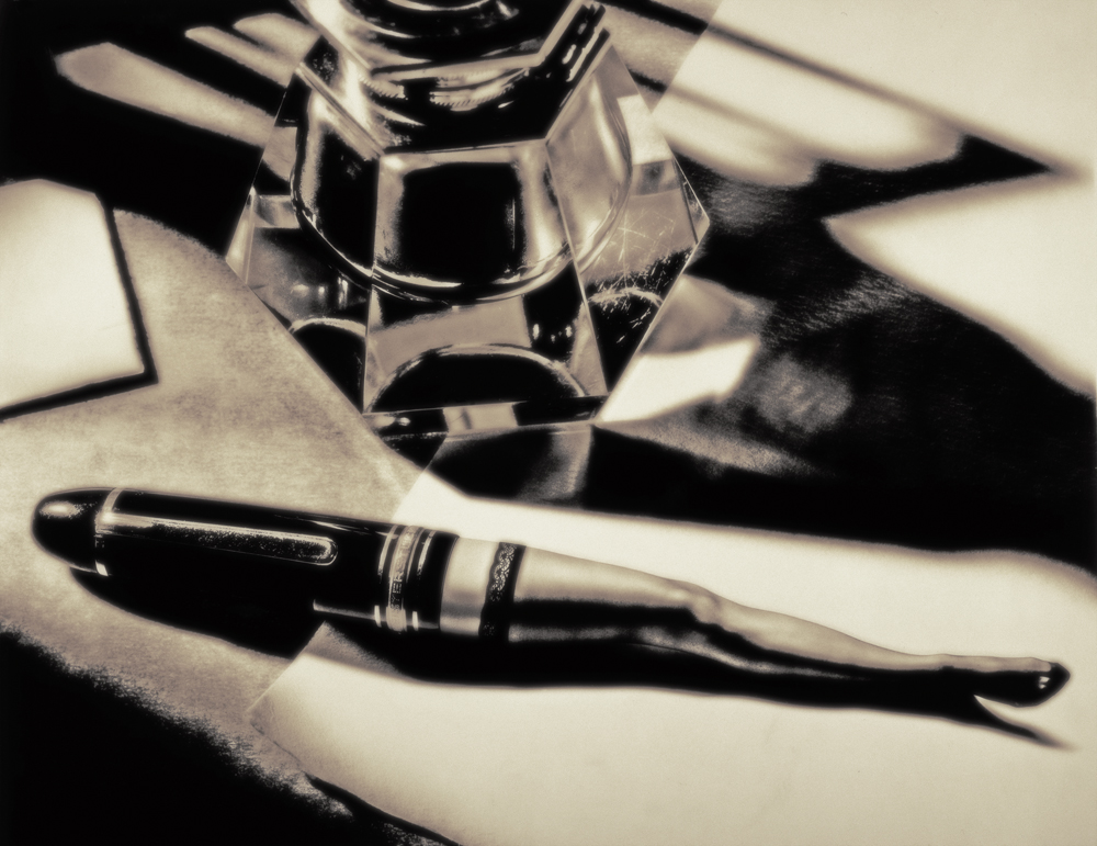
It was not rivals but more the sort of photography I admired but could never do myself such as Lester Bookbinder,
Graham Ford,
Francois Gillet.
I sense that you’re enjoying photography as much now as you ever have?
I have always enjoyed photography and always worked on my own projects when I was not busy working on commercial projects.
However, I miss commercial work as I enjoy the challenge of solving a problem set by others . It pushes you to think beyond your own world and comfort zone.
It is very rewarding to overcome a problem in the context of being part of a team and meeting a deadline.
To make a comparison; If you are a skier, skiing by yourself you probably take the comfortable route downhill that does not challenge you too much but if you go downhill with somebody equally good you probably try to be more adventurous and try to push each other to the limit.
I enjoy this challenge of getting to the finishing line=end product.
Which photographers do you admire today?
Salgado,
Helmut Newton,
Tim Flack,

Nadav Kandar,
Donald McCullin,
Weegee,

William Eggleston,

Diane Arbus and many others.
What’s Lensmodern?
Lensmodern is an internet online gallery and picture library selling prints and licensing images to the media industry.
Our aim was to create this company selling images of photographers who did not want to be with agencies like Getty and Corbis which are run by financial institutions.
Our organisation is run by photographers and for photographers.
Our aim is to occupy a niche market not covered by the corporations.
Presently we have over 40,000 images and have agents in many countries representing our many photographers.
“To me, people are like lighthouses in a very big ocean , with wind and rain and waves trying to break them and make them go under”.I love it, what does it mean?
The lighthouse represents a human being and the ocean and wind represents your life in this world. The ocean and wind are unpredictably like life itself; it changes all the time.
From birth to death your life is equally unpredictable and people through circumstances try to overwhelm you with ideas, rules, regulations and telling you what to do.
They try to break you down and become like everybody else.
But you must not become like everybody else and fight for your individuality that distinguishes you from everybody else.
Your strongly held beliefs and conviction must never be drowned by insipid substitutes.


Thanks Rolph.
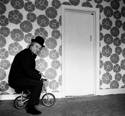
You grew up in the land of the Brum?I was actually born in the Children's Hospital in Birmingham, although I grew up in the Black Country in a town called Lye.Art College?I worked in engineering until I was 21, so as a mature student I studied at Manchester Polytechnic School of Photography.Did they teach you anything useful?How to lose your virginity and smoke.When did you take your first picture?As an amateur around 1965, but as a professional November 1972.
What was your first job?I was a trainee draughtsman.That must have fed into your photography?Assisted my sense of proportion, when it comes to composition.Did you assist anyone?No.
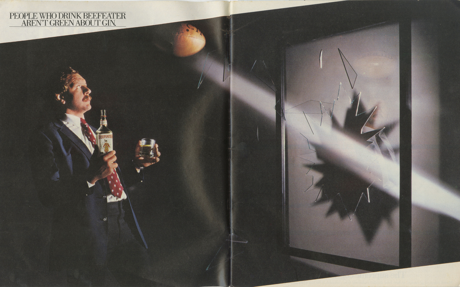
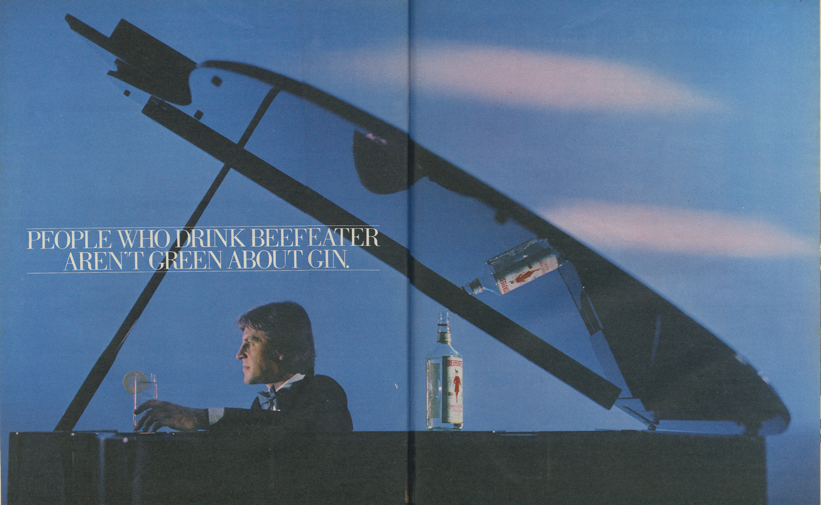
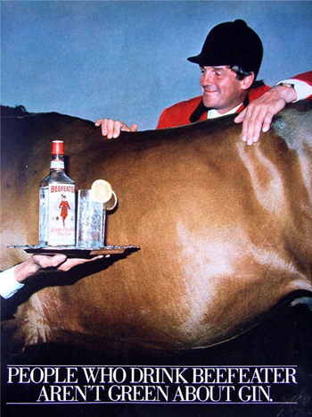
What was the first picture you were paid for?It was for the magazine Management Today, I shot Newsprint being unloaded from a barge on the Thames, just down the road from where I live now in Rotherhithe, South East London.Who were your early ad clients?Daily Mail, British Airways, Hewlett Packard, Olivetti, Levi’s, Philips & Beefeater Gin.
Who were your early photography heroes?Myself.What traits did you most admire in yourself?Obsessiveness, aesthetic judgment, bravery, competitive spirit and being not afraid of hard work.After your smoke filled upbringing in Birmingham, how did you find the glitzy world of advertising?I have always enjoyed problem solving and advertising certainly nourished that. Being a good mathematician, inherited from my engineering days in Birmingham, served me well, certainly when jumping through photographic technical hoops on advertising shoots, prior to the advent of Photoshop.I found advertising enjoyable because it not only involved creativity but a high level of problem solving.


Who was the best Art Director you worked with?Paul Arden, because he loved photography and understood how to use it powerfully.


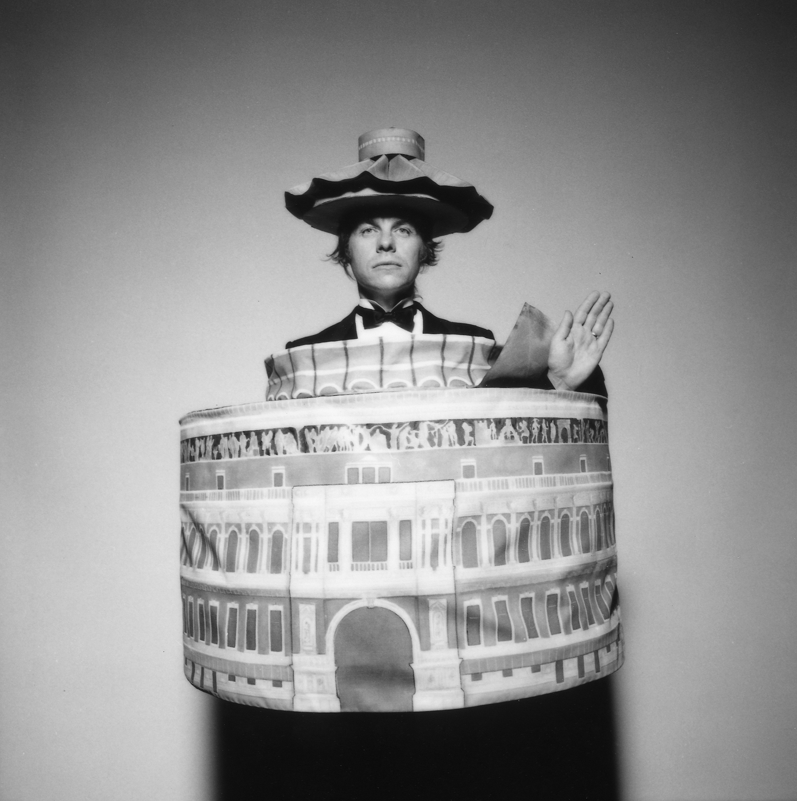
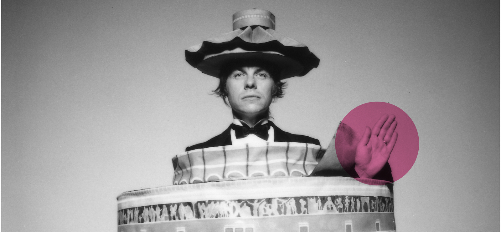
I heard a rumour that you once turned up to the D&AD Awards, being held at the Royal Albert Hall, dressed as the Royal Albert Hall.Is this true and if so do you have photographic evidence?I certainly did and here I am in the outfit.
What was your first good ad?I just can’t remember having done so many.
You worked with a little known art directing hero of mine - John Knight, how was he to work with?That was on the Beefeater Gin campaign.John made me feel like anything goes!He enjoyed working in my studio, which at that time was situated in the dark overgrown weed land of the disused docks.
Were you difficult to work with?Eccentric but never difficult. In fact maybe far too easy at times.
You’re quite arty, did you like the commercialism of advertising?No.
What ad were you most pleased with?Probably the 1991 film I shot for Paul Arden, who was Creative Director at Saatchi’s.Its title was 'For The World' and was for Forte Hotels.My brief was to get Rocco Forte a Knighthood, he got one!
Why move into commercials? Cash?It was my ego getting the better of me.Did you prefer Art Directors to give you a tight or open brief?Always an open one of course.Well, the top art directors were confident creative’s and always set an open brief.
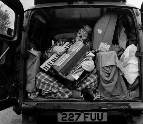
DAVE: As well as being a ludicrously well paid advertising photographer you had a parallel career as a barely paid rock photographer?Correct.
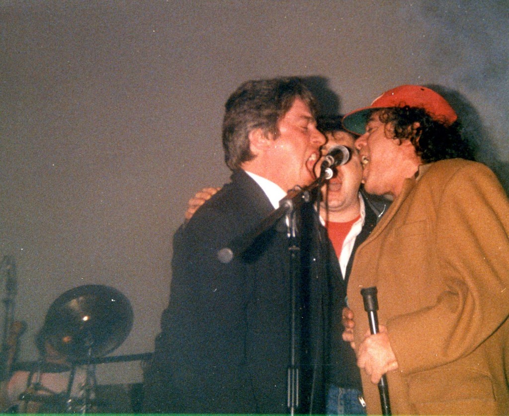
And sang with Ian Dury?Me duetting with Ian at my 40th birthday party, which was also the launch party for my book ‘Work’.How many album covers have you shot?I think almost 200, if you include single sleeves.
Is shooting an album different to shooting an ad?Because of the total freedom, most definitely.

You shot a lot of them with your mate Barney Bubbles. Surely one of Britain’s most talented and least known designers?Absolutely criminal. Mainly due to the fact he took his life 20 years ago.What did you learn from Barney?At the point of absolute failure arrives success.Do you have an example?Too many to recall an individual example.It was most often that the edge of the envelope was pushed.
Often there's only a face and a prop, so how is it that your portraits are so distinctive?I wish I knew.I guess its the fact I always try so hard to produce something that is different.Plus coming from the Black Country certainly gives you a warped outlook on life.I presume some come from observing and thinking on the spot?
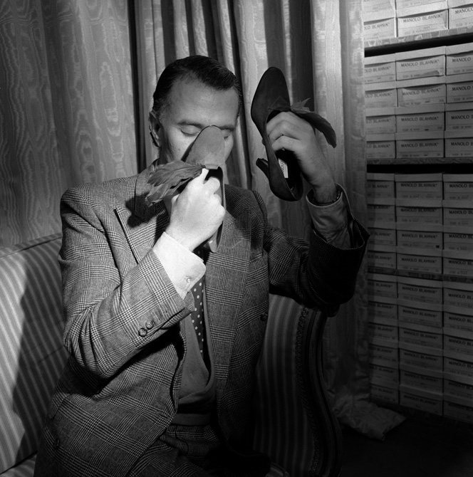
But some come from you having the sheer cojones to ask someone famous to do something weird?‘Ere Manolo, sniff those shoes for Me’.
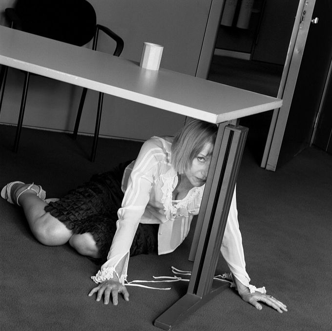
‘Helen, be a love and crawl under that table for me.’
‘Lie down and give that saw a kiss for me matey’
‘Can we just cover one with a saucer on your bonce?’
‘Ere Damien! Stick this thing in your gob!’
Where do you get the brass-neck to ask famous people to do silly things?I have no choice. For I have to ask them otherwise the photograph would be boring.I experienced that first hand when you shot some portraits for Me, (and art director David Goss).
We shot the first few, they all went well, but when it came to Dave Trott we couldn't think how to shoot him.You said to your assistant ‘Pop down to the sports shop and get some ping pong balls, I think we'll pop one in Dave's mouth.’‘You won't’ said Dave.So we didn't.It was not easy trying to make Dave Trott interesting, and his lack of collaboration didn't help.
You have portraits that are supposedly shot in camera, but Brian, how on earth can you do this in camera?
Being an ex-engineer I developed many light machines to produce in-camera effects.
For years after people visiting my studio would stand within this light machine.So I'm guessing you're not a fan of CGI and retouching?I’m one of the last practicing living photographers that had to do it all in camera, which involved technical gymnastics.It's good that they don’t request photographers to be that clever these days because its painful and you have to be really good.
Do you think the digitisation of photography has advanced imagery?Created a great deal of harm in developing homogeneity in image making.However it has opened up opportunities due to the decimal divisions now in exposures, to create beautifully lit scenarios when employing lights.
If you could take a portrait of anyone, living or dead, who would you choose?Princess Anne.Which of your rivals did you respect most?Irving Penn. and Richard Avedon.
And Richard Avedon.
Why and why?Constantly, day after day, as professional photographers they produced powerful images from a variety of subject matters.Only the truly great photographers can photograph anything to a high standard.
Which photographers do you admire today?None.
N.B. A Direction magazine article from the early eighties.
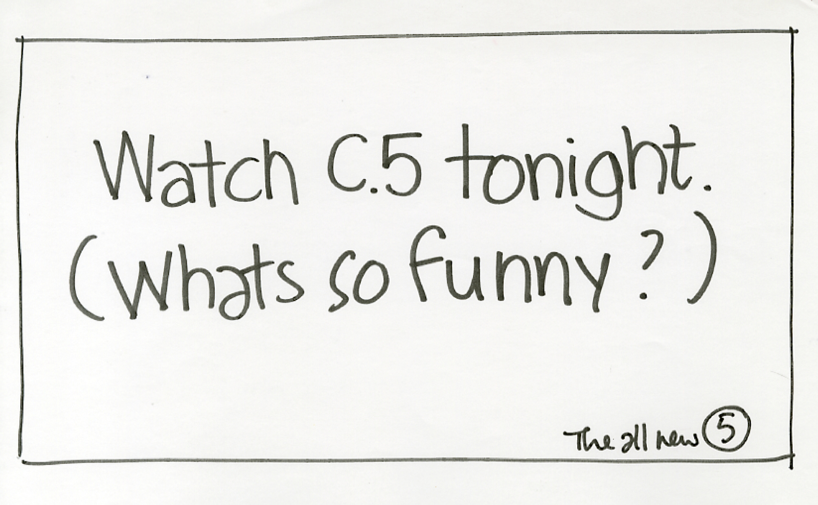
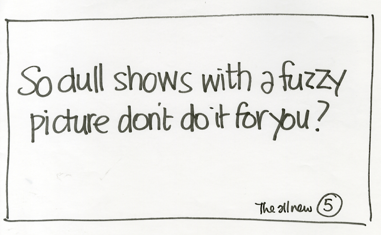
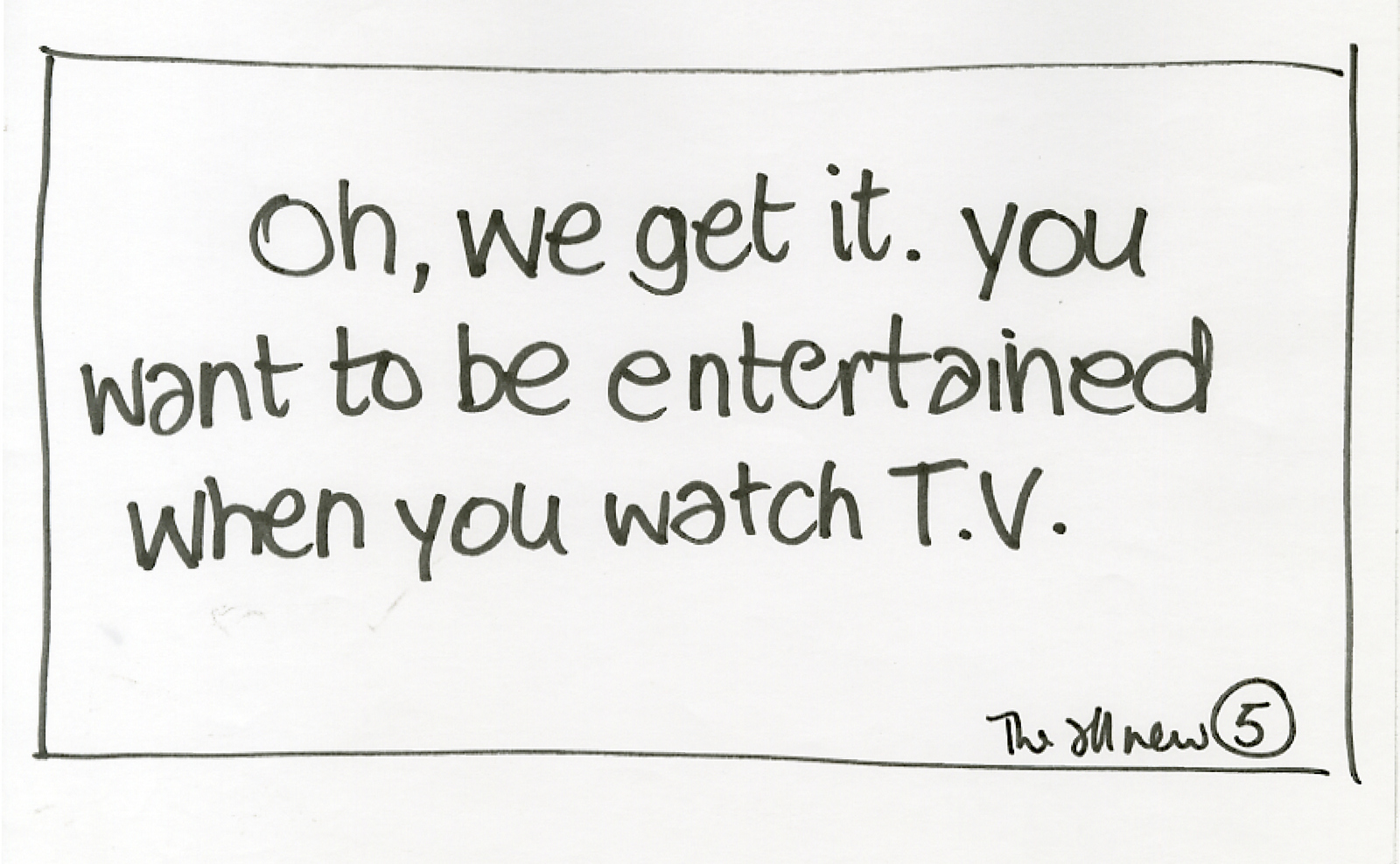
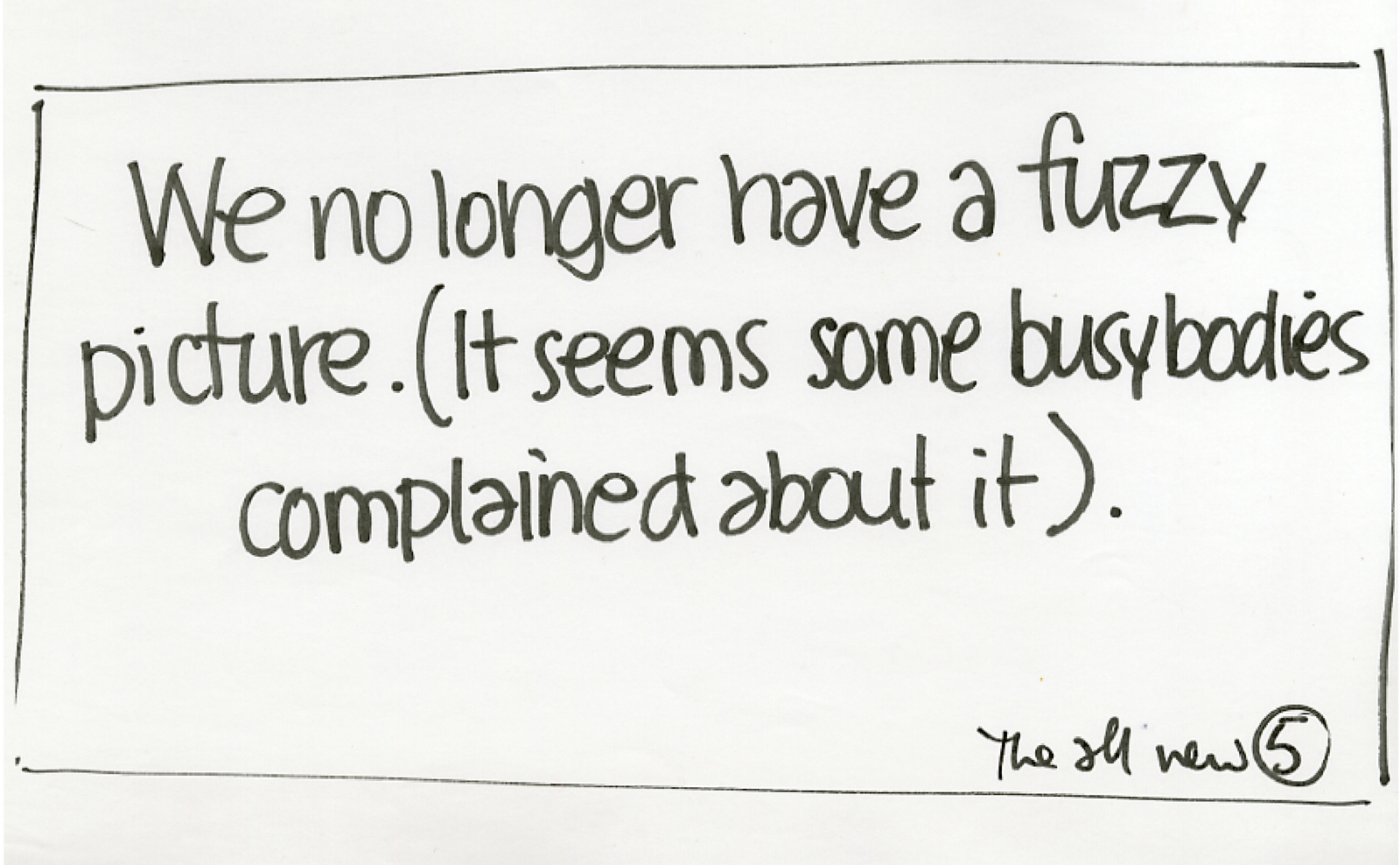
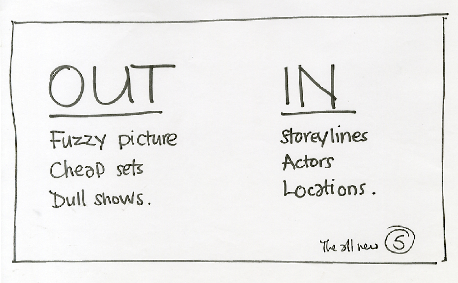
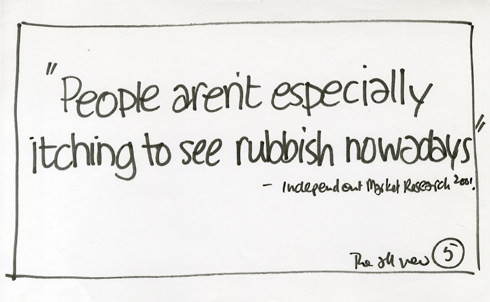
Subject:'IMPORTANT!!' I didn't recognise the name of the sender, let's call her Nadia Johnson. What could it be? What have I missed? Is it the bank? Tax office? Maybe it's something good? A publisher with a huge cheque wanting to turn this blog in to a book? What could it be? Should I be worried? Excited? Turned out ‘Nadia’ was a student looking for a job. So it was a kind of trick. I guess Nadia thought that if she put ‘IMPORTANT!!’ in the subject box I’d read on. She was right. But she hadn't considered how I'd feel by the end of the email - tricked. So if someone asked me to pick one email from my inbox that wasn't important, I’d pick that one. Because she’d forced me to assess its importance. In advertising, over-claiming is second nature . It's easy to get clients to buy it, but hard to get the public to. If someone reads ‘Product X will rock your world’, they are forced to assess whether it’s true. Generally, they conclude that it isn’t. So it gets put into a big bin marked ‘Products That Won't Rock My World’. It also demonstrates that you don't understand, or care, about the person on the other end of your message, maybe even that they are daft enough to believe it. Hardly a way to create empathy. Let’s say the subject of Nadia’s email was ‘Not important’. Then I couldn’t help but think that Nadia was being too self effacing, too polite. But if asked to pick an email that wasn’t important, it wouldn't be Nadia’s, because she had made a connection, albeit a small one. Ultimately, advertising is simply connecting companies to people. Understanding context is crucial. But it’s hard for advertising to put out messages that are realistic. If you can legally put messages out that say your product will rock your world, why wouldn’t you? It's a good theory, but harder to sell than ‘We’re AMAZING!’.EXHIBIT A: Channel 5. Today, a new channel gets lost amongst the hundreds already out there. In the late nineties, a new channel was the fifth channel. Good news, the new channel got a tremendous amount of media attention. Bad news, the channel turned out to be rubbish and got a tremendous amount of media attention. They had a transmission issue which meant the picture was fuzzy. This was probably just as well, because the programmes were shocking. Dodgy Australian soaps like ‘Sons & Daughters’ and ropey French gameshows like ‘Greed’.That was their high-end offering, lower down their schedules they had a whole bunch of cheap documentaries; ‘Strictly Hairdressing’, ‘Swindon Superbabes’ and ‘On the Piste’.They had tacky chat shows like ‘Roy’, ‘HG’s Planet Norwich’ and ‘Melinda’s Big Night In’. Their lead soap, ‘Family Affairs’, was so poor they blew up the majority of the cast in a boat, so they could start again. People ignored Channel 5. It had, appropriately enough, a 5% share. It was a big bowl of wrong. So a couple of years in they felt they needed a new ad agency to get people to give them another chance. Before they came into CDD for a chemistry meeting, we thought we’d get the ball rolling by sketching out a few ideas to talk about. So how the hell do we get people to tune into something that had been lambasted since it launched? Why would anyone believe it’ is now good? They can’t just say they are now good, they’ll look as though they're in denial. If we say ‘Channel 5 are good’ people will simply think ‘Nope, they’re not'.David Abbott used to say ‘a small admission gains a great acceptance’.Our strategy was to admit we hadn’t been good. If we say ‘Hands up, we were bad, but we've changed’ people will agree with the first bit and may be a little more open minded on the second bit. It worked for Avis, Volkswagen and Skoda, why not Channel 5? How exciting. We got our Pentels out.
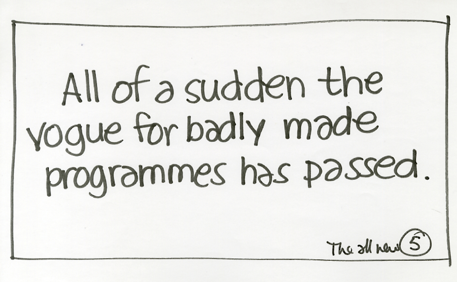
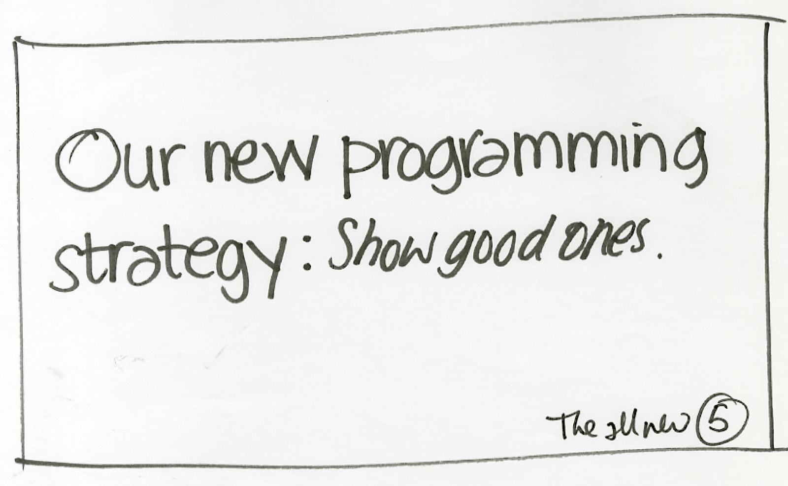

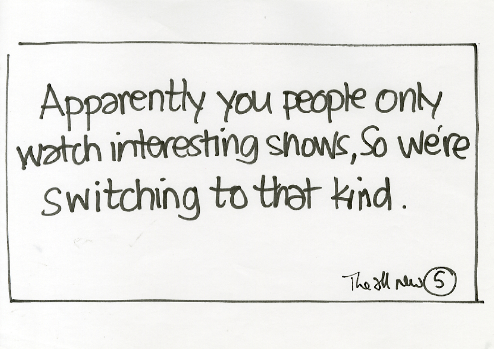
‘It wasn’t what we were expecting’ said the guys from Channel 5.‘We know, exciting isn't it?’ we said.‘Er... yeah...could we take copies of the ads back to the office?’ Great we thought, they obviously like them so much they want to show the guys back at the ranch. In retrospect, they probably wanted proof of what had just happened. We didn’t get that account. Channel 5 ran some ads saying they were amazing.(Nobody believed them, their share didn’t rise.) A few years later, a new Channel 5 Marketing Director chanced upon the ads we’d written.She was tickled, called us to put us straight onto their new pitch to change their perception.
I risk sounding like a bad planner here.
At least he ones that make a trend out of a coincidence. Over the last decade I’ve watched creativity in advertising shift.
Simplicity used to be king.
It was the mountain all creatives attempted to scale.
All over the globe you’d find creatives giving themselves aneurysms by trying to tell stories using as few words and pictures as possible.
‘Minimum means, maximum meaning’ as the great Abram Games put it.
Why?
Simple stands out more than complicated.
Simple is easier to understand than complicated.
Simple will be remembered more than complicated.
But, simple is difficult.
Not only to do, but to hang onto.
1. PLANNING:
It’s very difficult to distil a company down into a single, focussed message.
Actually, let me rephrase that; it’s very difficult to pick the single most effective strategy from a sea of possible routes.
2. CREATIVE:
Being concise is a skill that is difficult to acquire and takes effort once acquired.
As Churchill once said ‘I’m sorry it’s such a long letter, I didn’t have time to write a short one’.
3. CLIENTS:
It’s difficult for a Marketing Director to be single minded.
They are often work a variety of stake-holders, each of whom believes their particular area is crucial to the success of the business, and should therefore be recognised in their company’s advertising.
Heritage vs NPD vs recipe vs packaging vs customer service vs price vs ‘we’re just great!’.
There is rarely an outright winner.
The only way forward is to reference the all of the messages in some way, maybe it’s handled in message hierarchy maybe it’s split over media channels.
It’s probably feels like playing roulette, spread your money across lots of numbers or put it all on a one?
The difference is that if you spread your bets in advertising you reduce your odds.
Complicated dramatically reduces your chances of getting noticed.
You are already competing against over 2000 other advertising messages a day, but who can remember 1% of what they’re exposed to?
Name twenty you saw yesterday?
I’m betting you can’t?
You’ve screened them out, your brain knows you can live a perfectly happy life without engaging with them, so saves it’s energy for the important stuff, like remembering to say ‘skinny’ when ordering your Latte.
Your brain screens out the complicated ads first, all that stuff to read and work out, who can be arsed?
Simple is tougher to screen.
Sometimes it can grab your attention against your will.
This isn’t new news.
But over the last decade simple hasn’t been the goal.
Ads have become a basket to put all kinds of random stuff into.
Which makes the process easier for everyone, because each can hold their own, slightly different opinion, nobody has to be on exactly the same page.
And as product differences become scarcer, company differences have moved centre stage.
So ads have become about the ‘vibe’.
But most use the same, off the shelf vibe; ‘friendly thirty somethings, relaxing, being 33% bonkers whilst occasionally sipping, tasting or using the product casually.’
Sam Scali, from Scali McCabe Sloves; ‘Own every speck of dust on the page’.
Meaning the page starts blank, don’t put anything on it that isn’t helping your idea.
But if your vibe and isn’t clearly defined, there’s no information that can’t be added, anything fits.
“Watch us making this ad at http://www.youmustbebloodybored.” in the corner? No problem, “Get a free 4 inch plastic presenter with every new policy opened” on the end-frame’? Consider it done.
“If cheese isn’t your thing, we also make butter!” as a flash? Sure, whatever.
WHO’S ASKING WHETHER THE PUBLIC WILL:
a) Notice it?
b) Understand it?
c) Remember it?
So, to my point; I’ve seen three campaigns recently that make me think simple may be on it’s way back.
They all answer the questions above.
1. A PRODUCT DEMO.

2. AN ENDORSEMENT CAMPAIGN.

3. A BRANDING CAMPAIGN.
Is there anything that connects them other than their timings?
They are all global campaigns.
They are all super minimal.
They each have only one message.
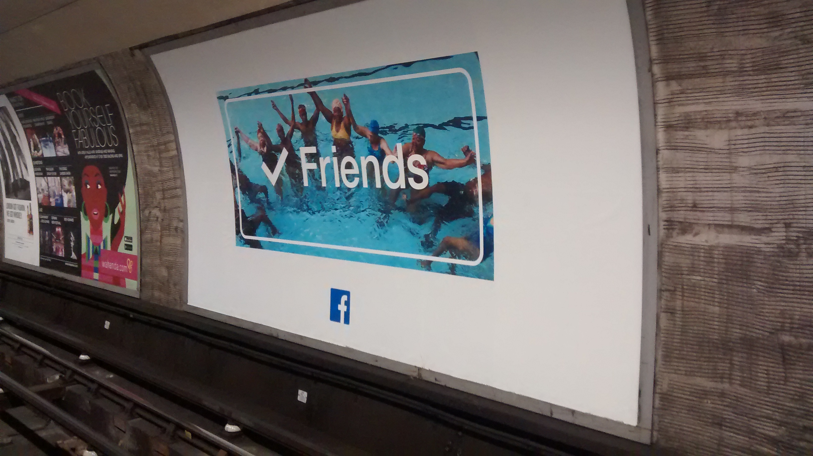
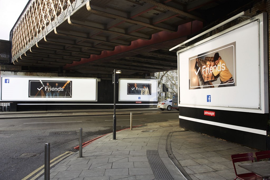
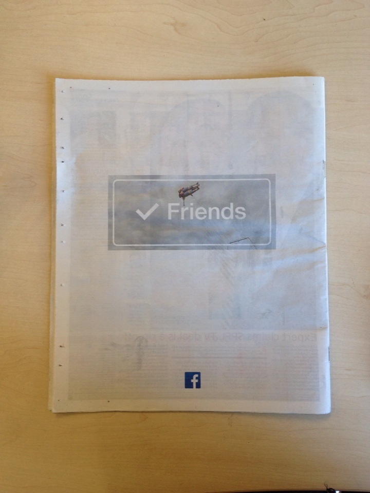
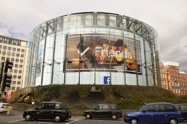
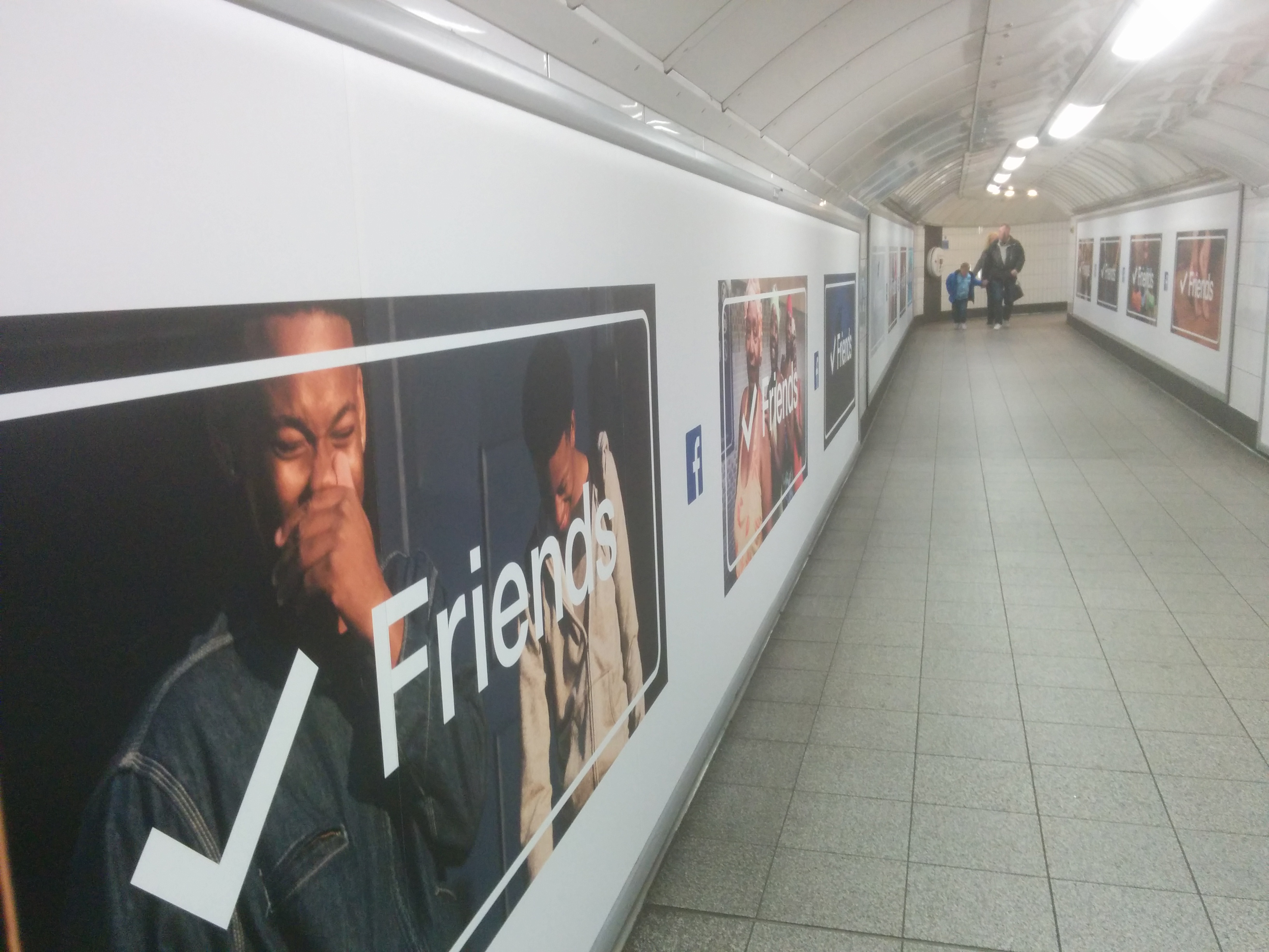
They aren’t even trying to push you elsewhere at the bottom, like a website, a video, twitter, etc. (Well, Facebook is, because…it’s Facebook.)
None are from conventional ad agencies, Media Arts Lab, Anomoly and The Factory, (Facebook’s in-house creative agency).
The clients are amongst the most successful companies on earth.
Is it only the non-conventional agencies that are confident enough to produce conventional advertising?
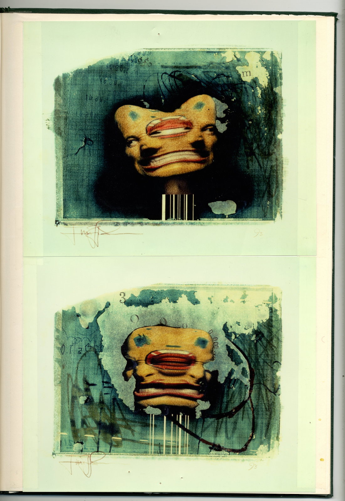
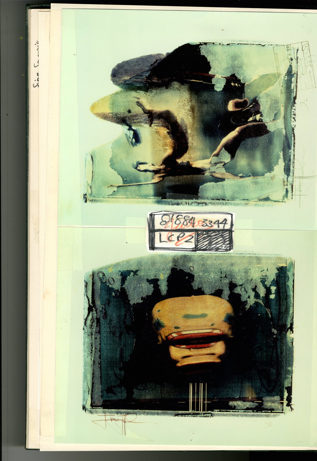
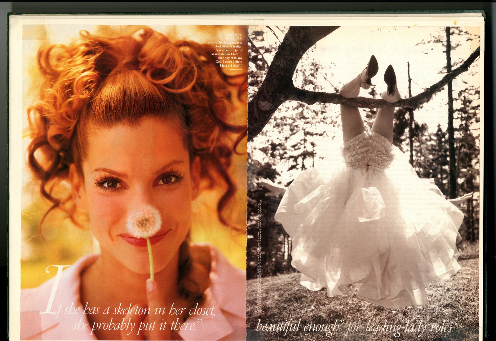
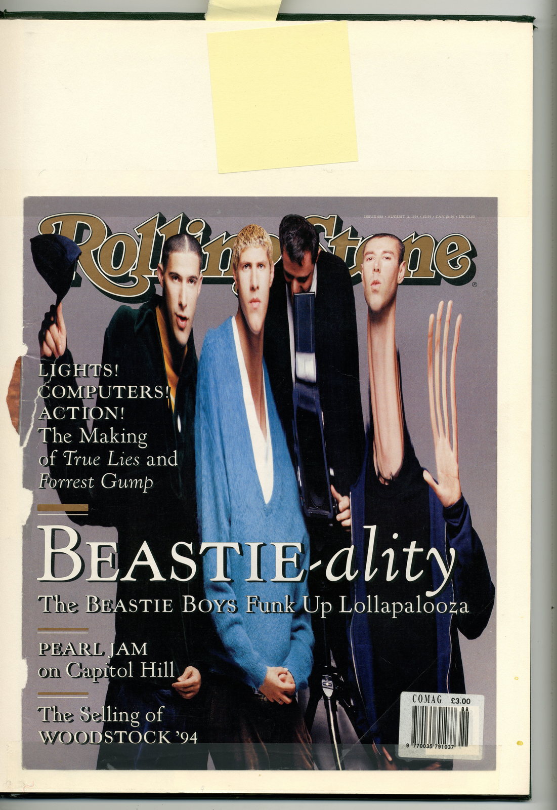
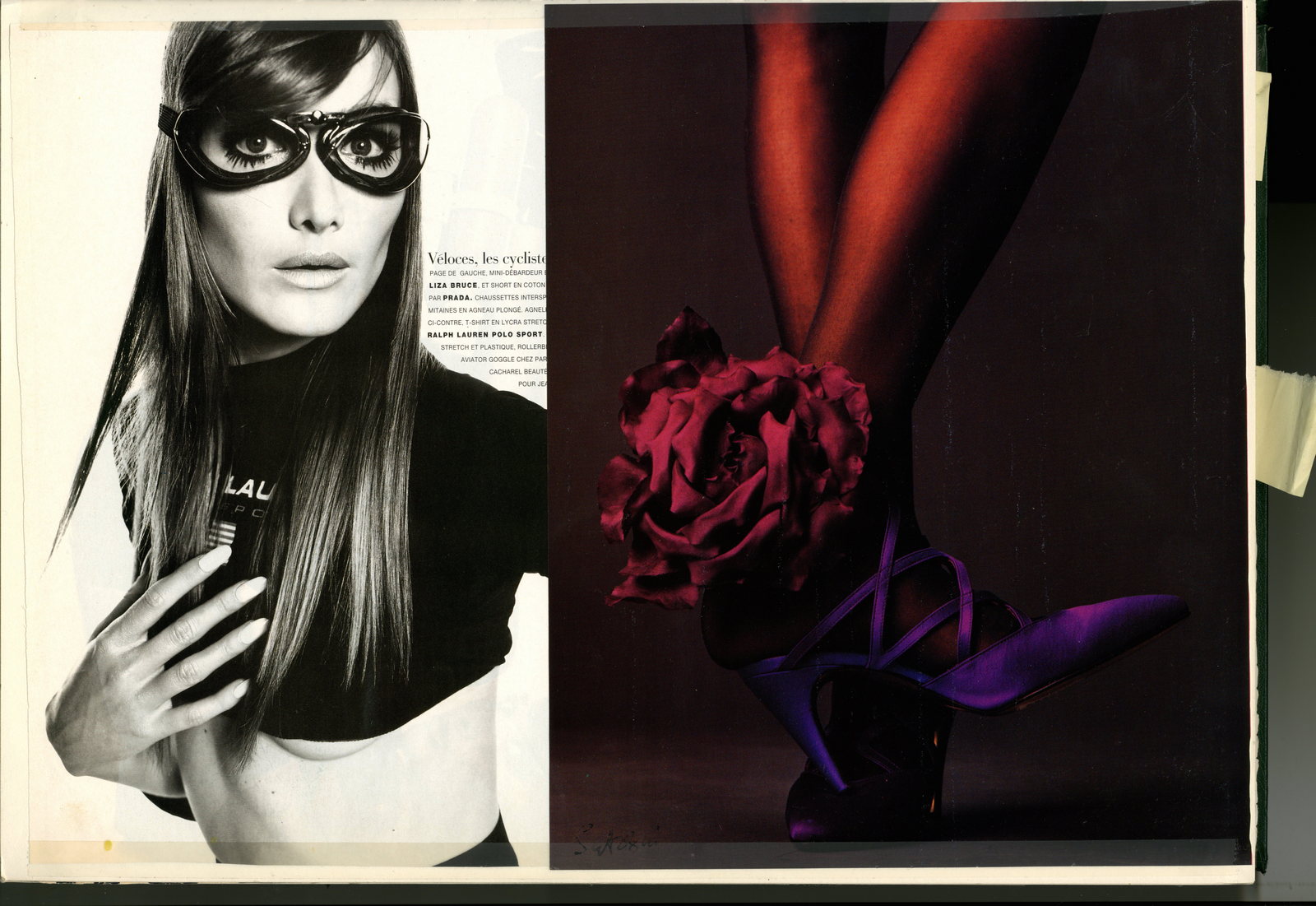
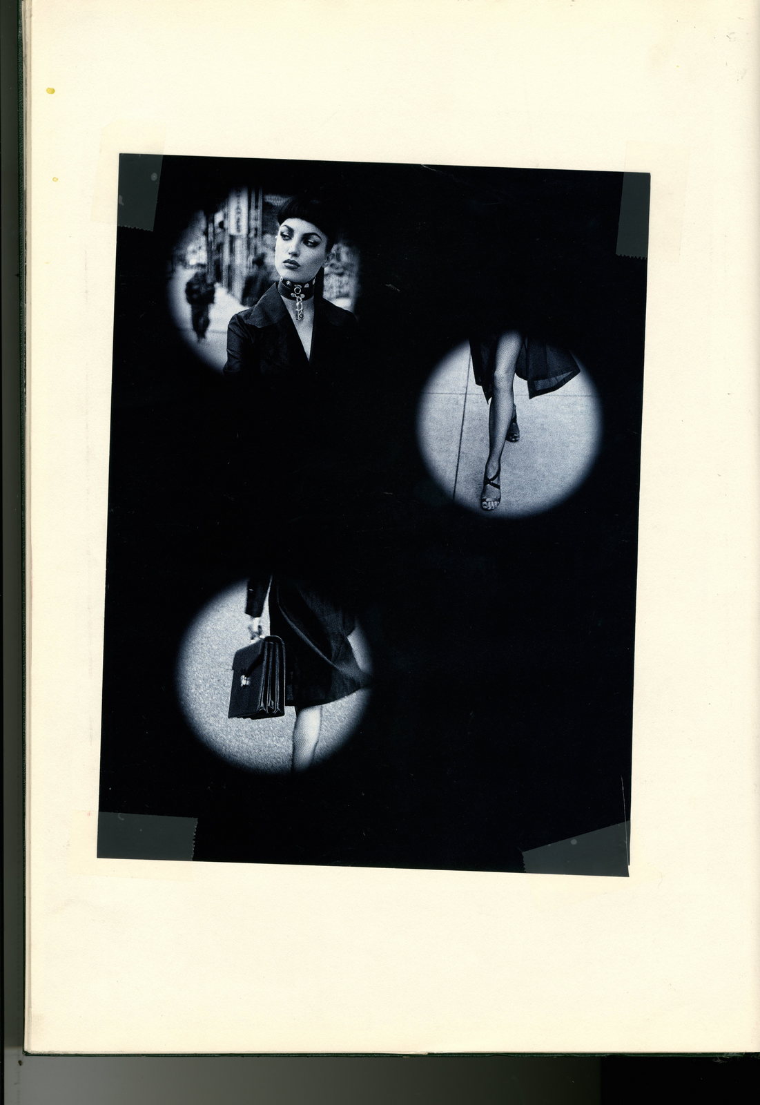
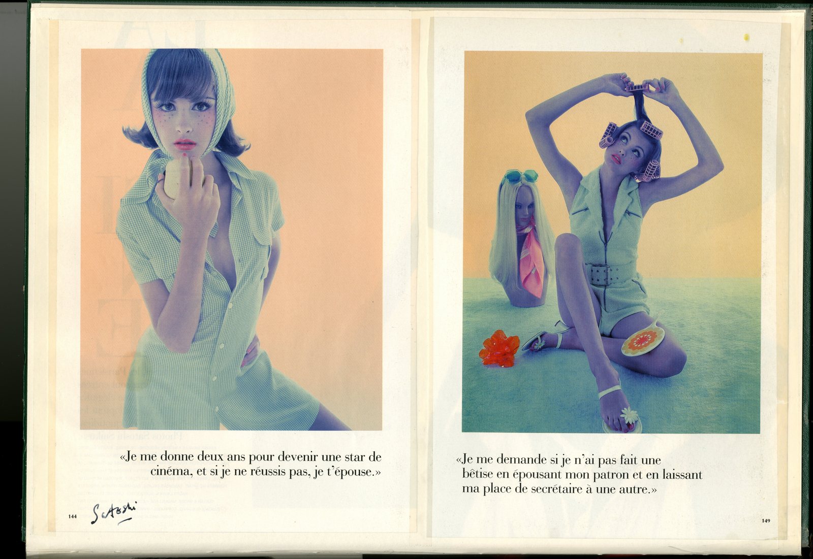
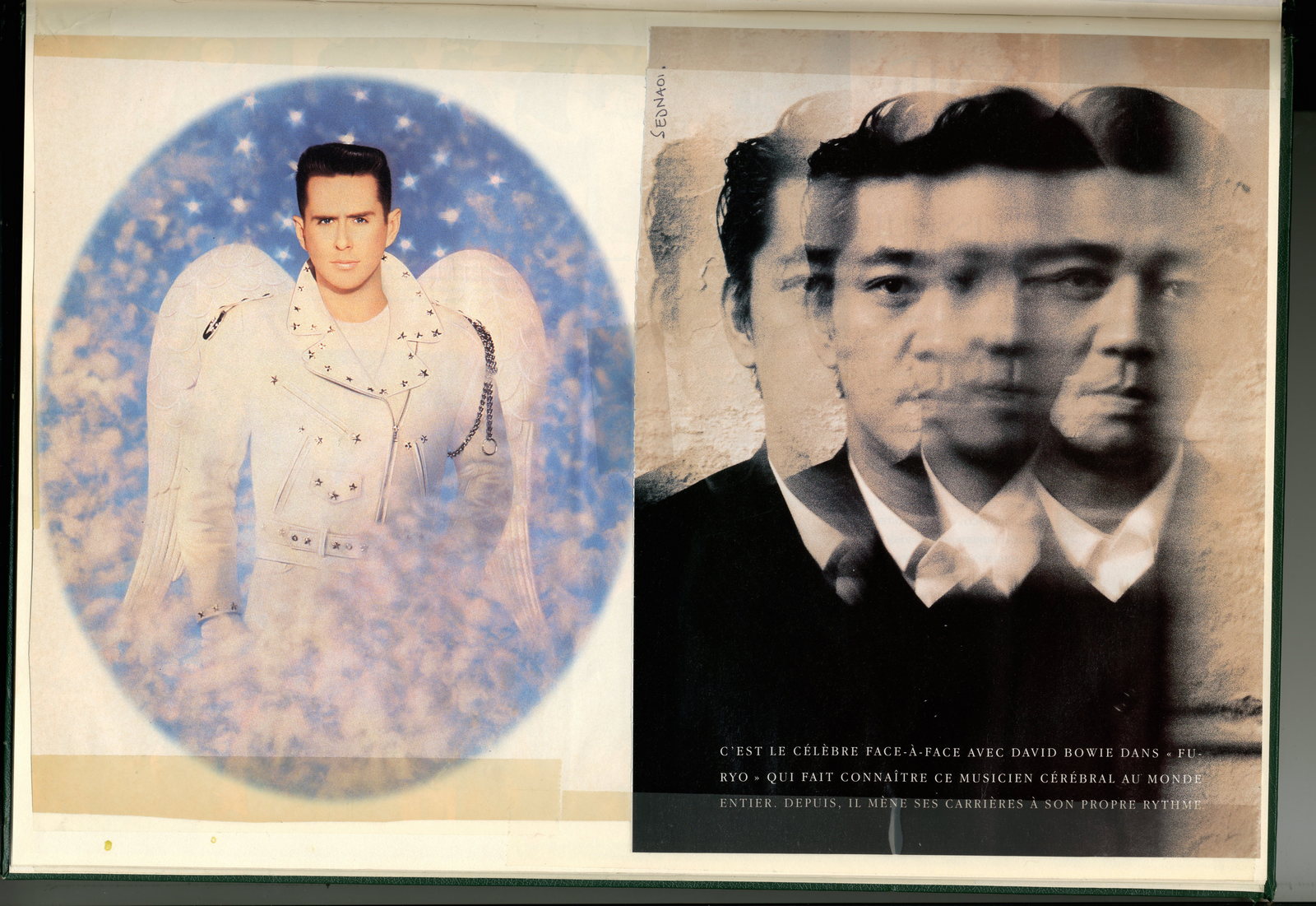
Another green scrapbook.(For the young people out there, a scrapbook is a kind of pre-internet, analogue way of bookmarking web pages, only heavier and, as it turns out, longer lasting.)This one is full of photographic reference. It's from about 1993/4, when Satoshi Saikusa, Raymond Meier and Rolling Stone Magazine were all the rage. At least they were in my world.There's a couple of images in there I'd forgotten all about.They are screaming tortured heads.Almost like Francis Bacon, only greener.I wish I could read the signature to give the guy credit, they still look extrordinary.All I can remember is that a guy from The London College of Printing came to see me with a book of amazing images like the four below.I tried to helping by designing a poster for him as a mailer, it showed all these amazing howling, tortured heads with a line underneath that said ‘Also available for weddings, graduations and bar mitzvahs’.The plan was to get someone at The L.C.P. to print it for free, but unfortunately we couldn't make it happen.It’s a real shame, I love his images and would loved to have helped.If anyone recognises the images and knows his name, let me know and I’ll credit and tag the images.


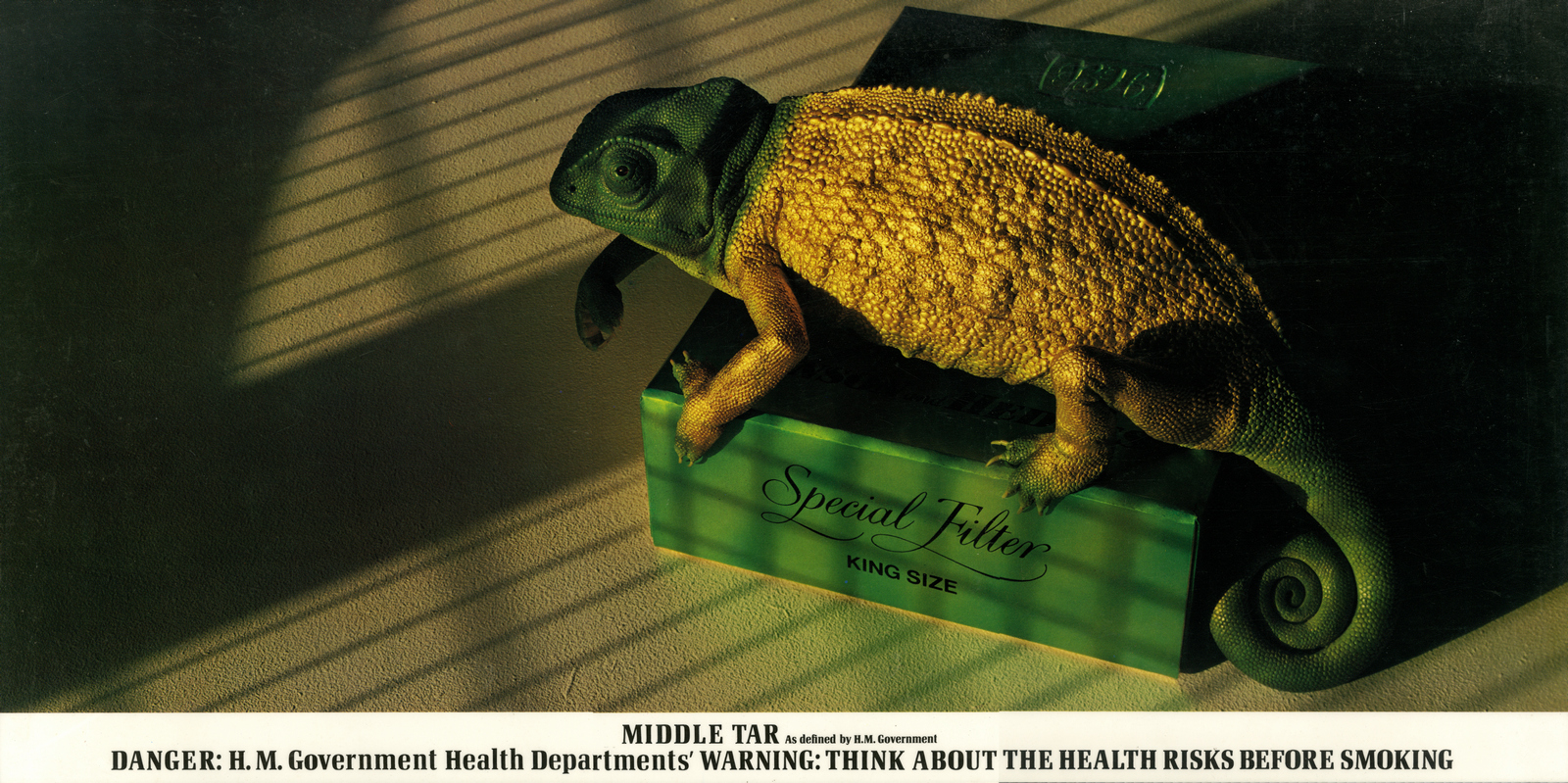
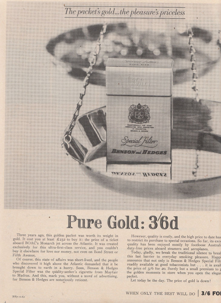
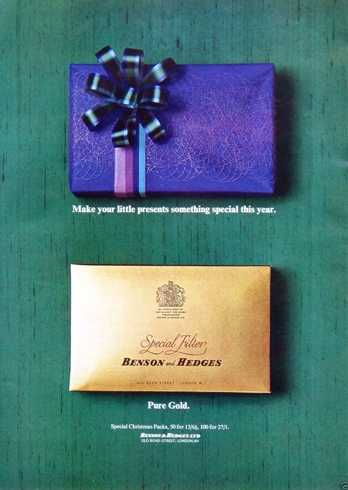
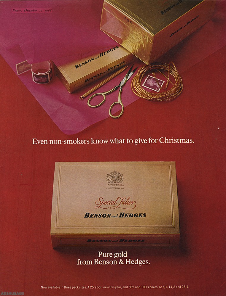
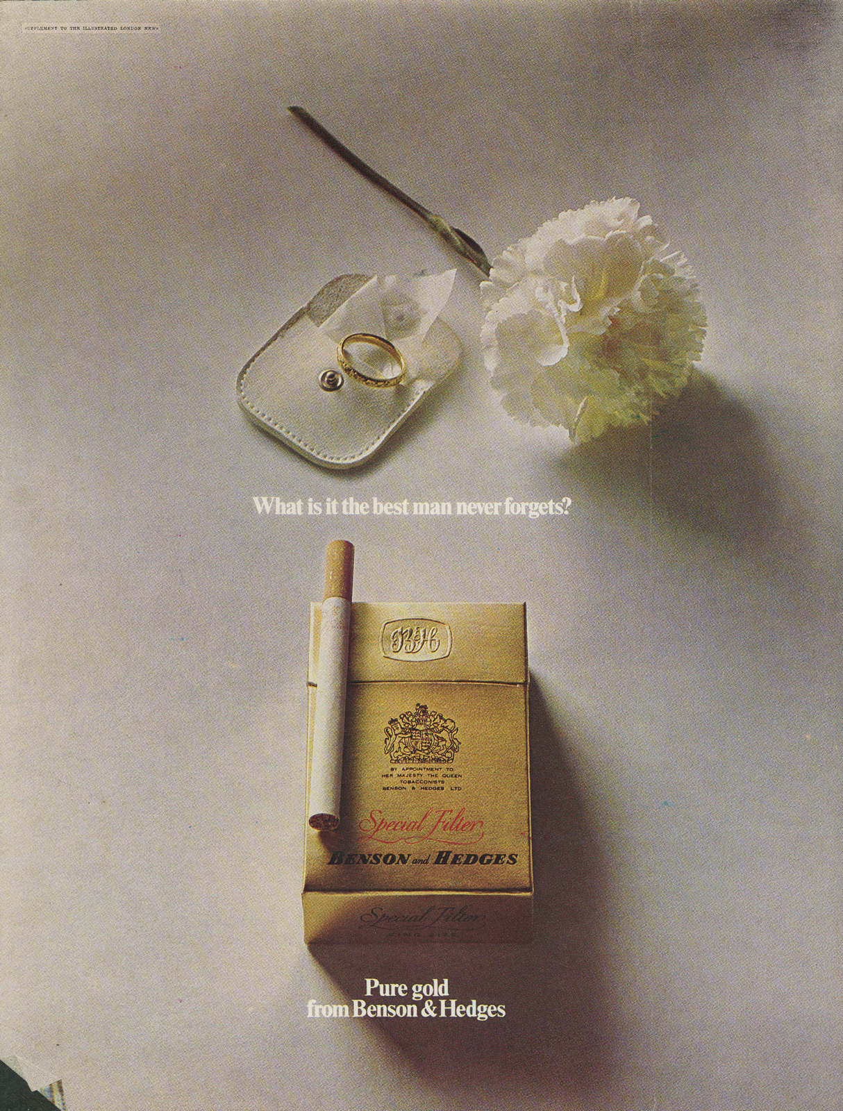
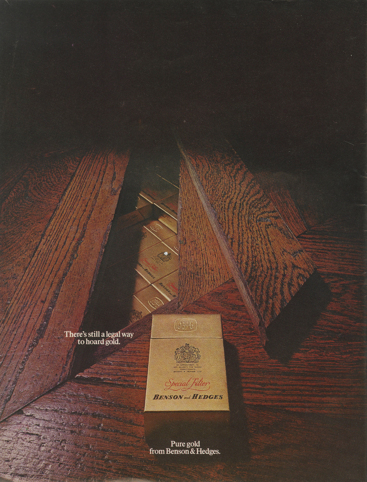
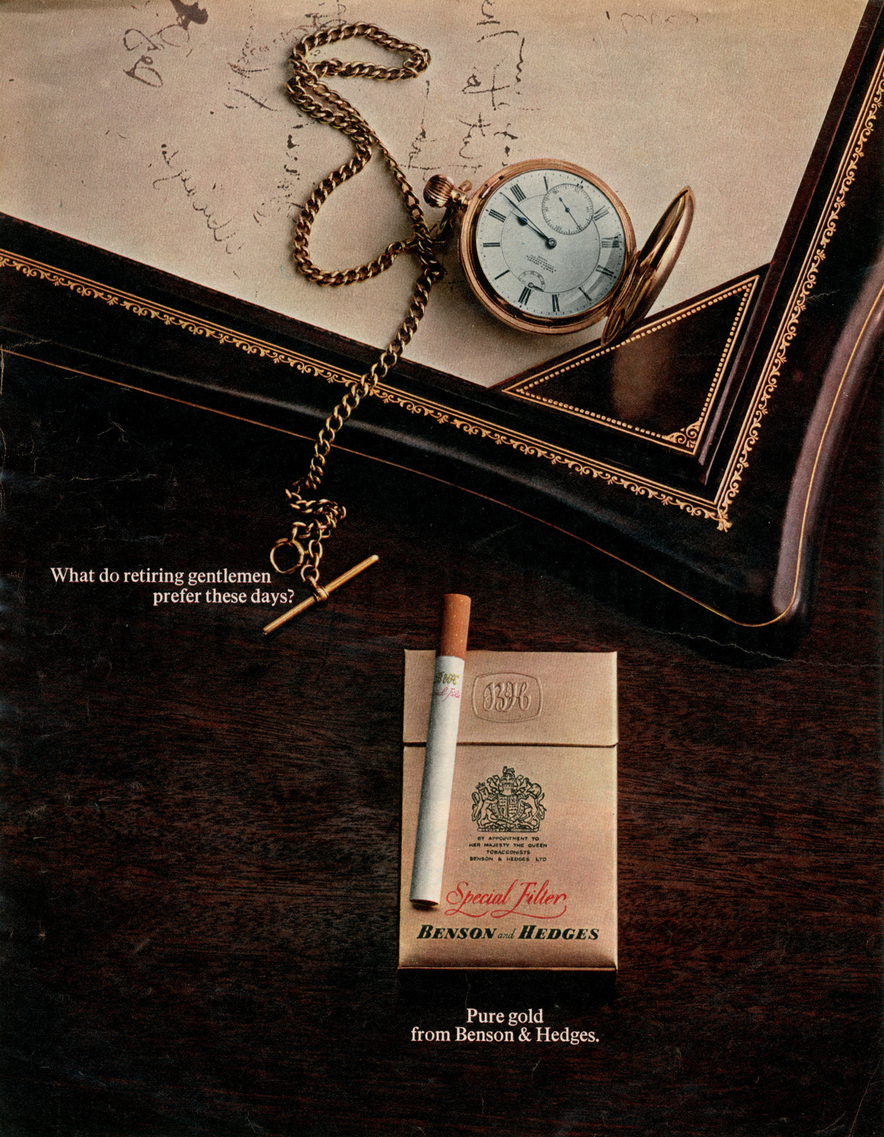
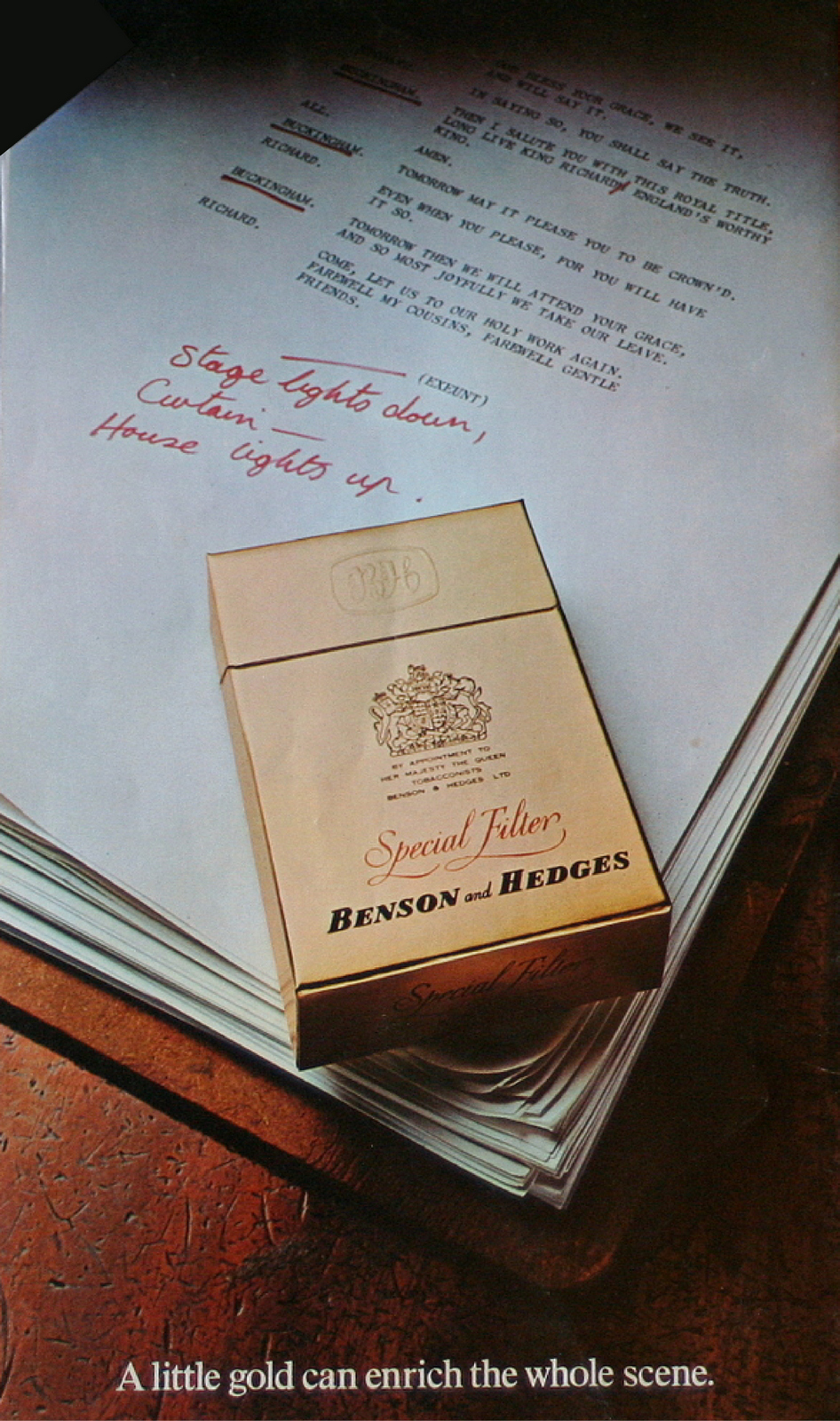
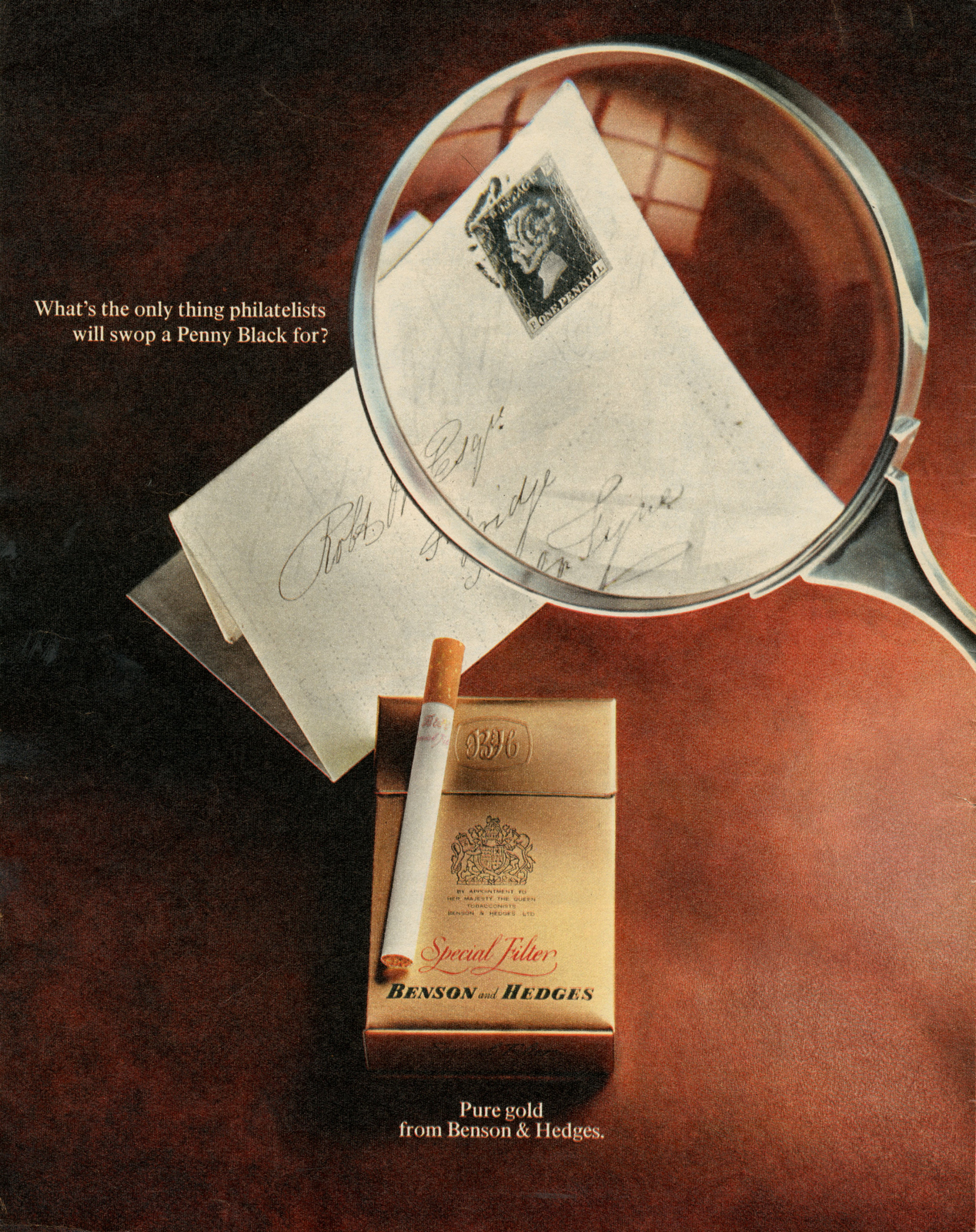
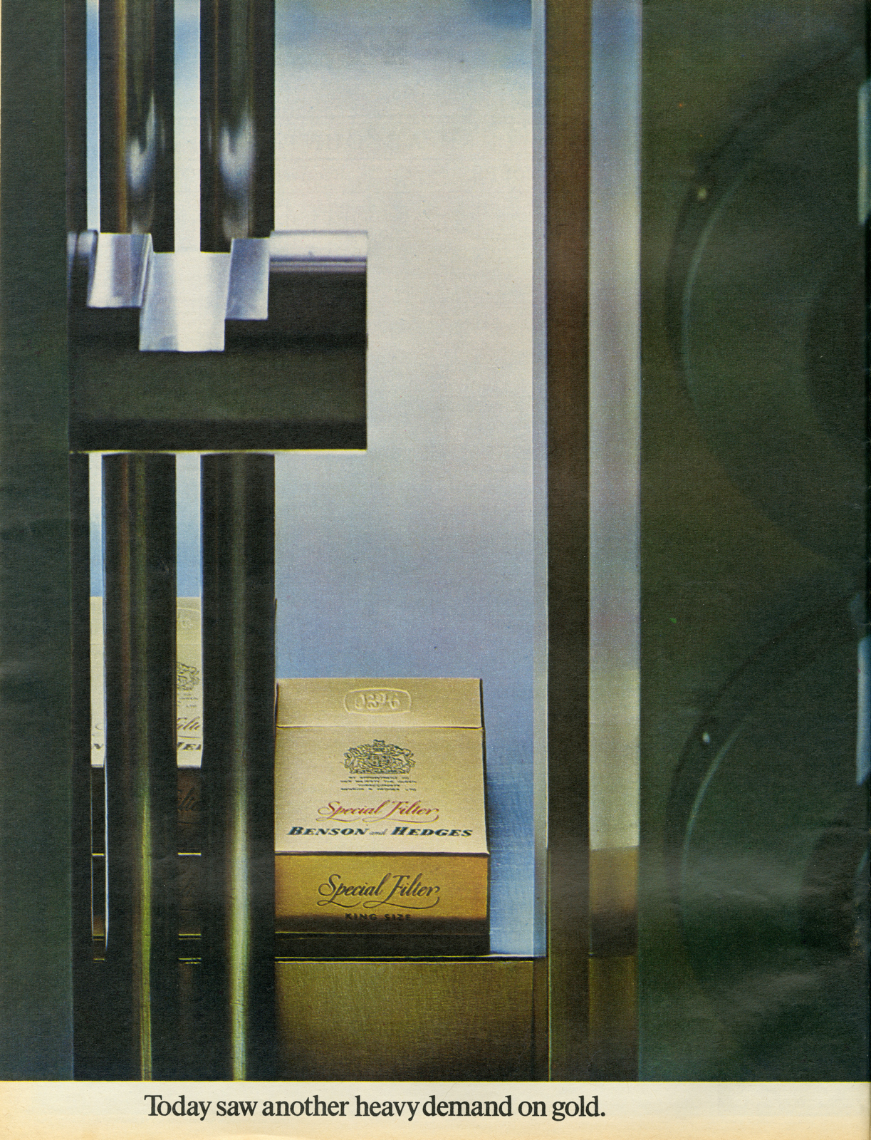
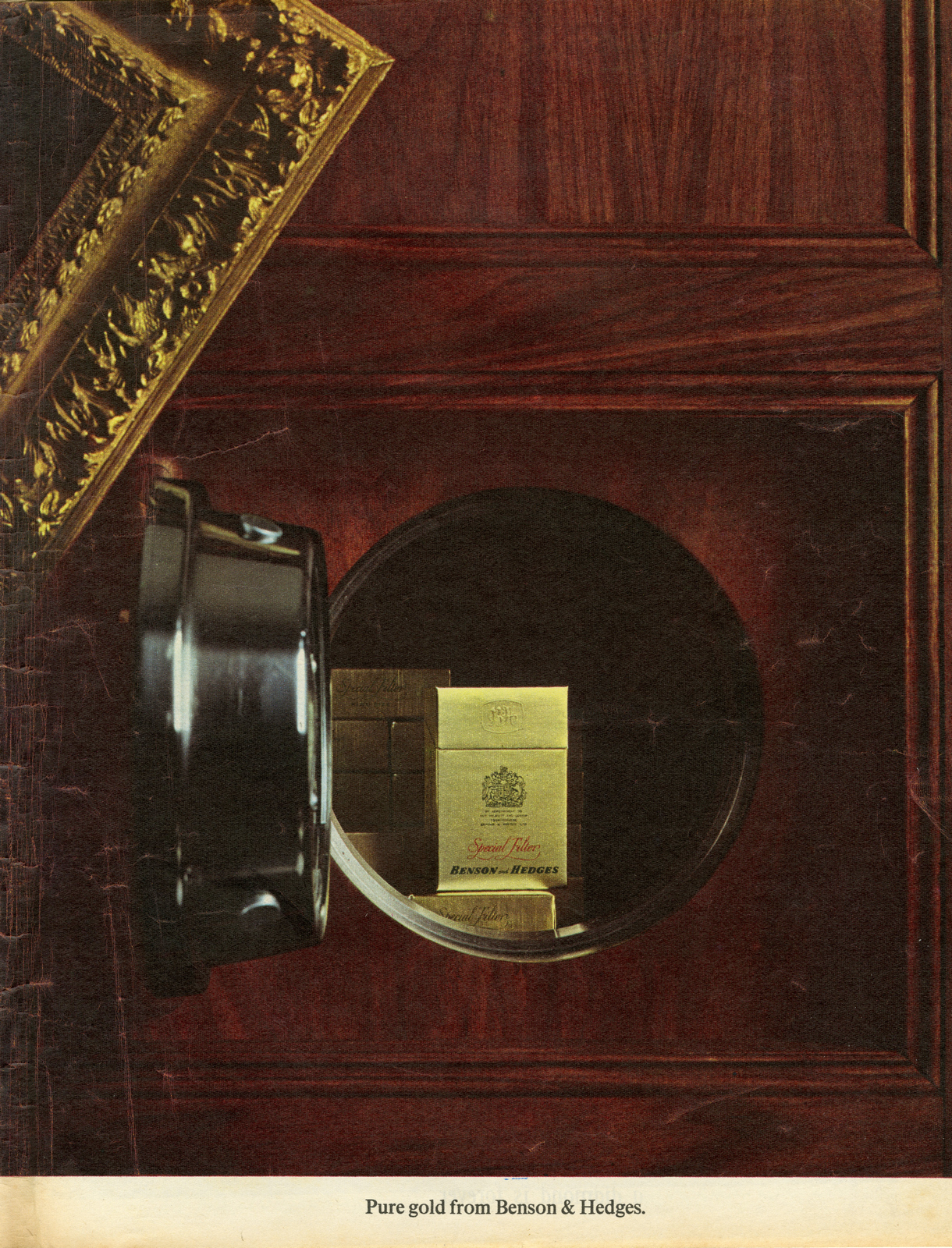
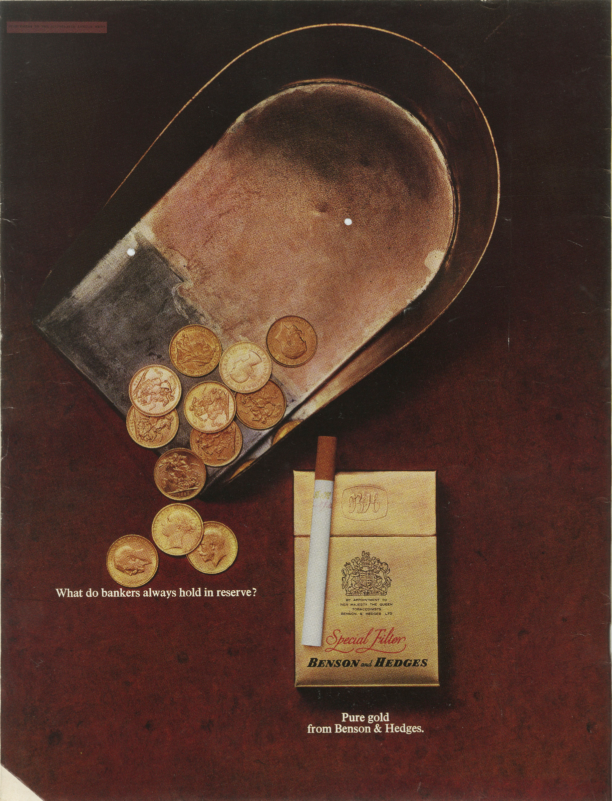
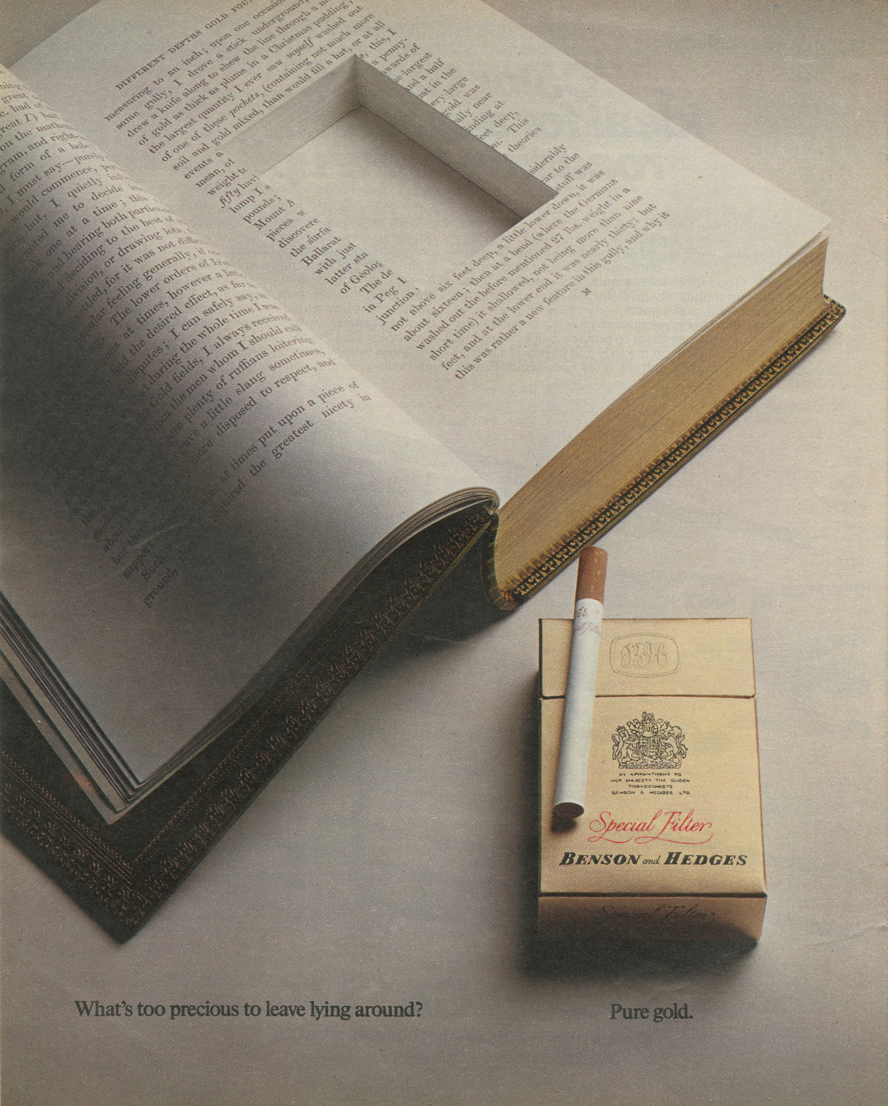
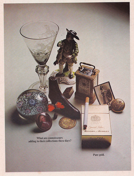
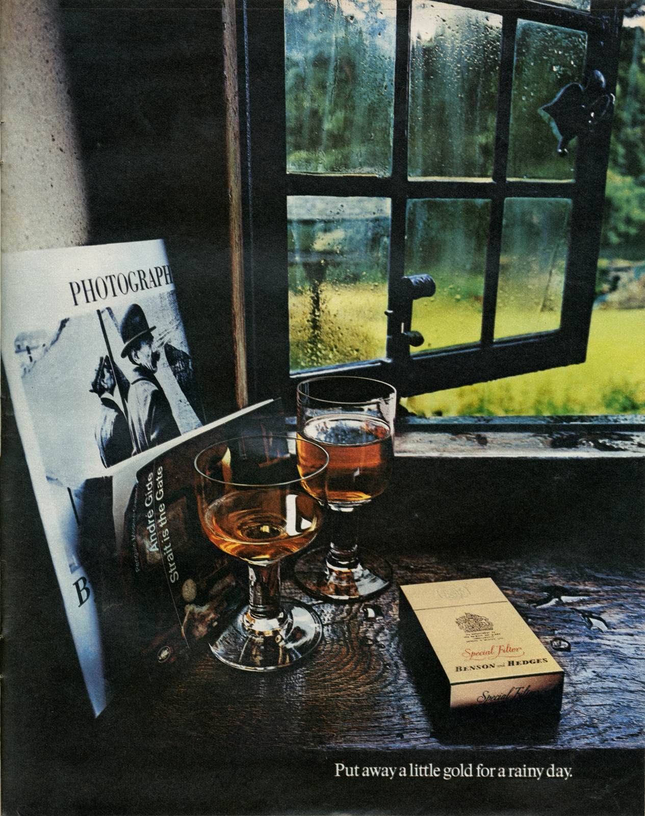
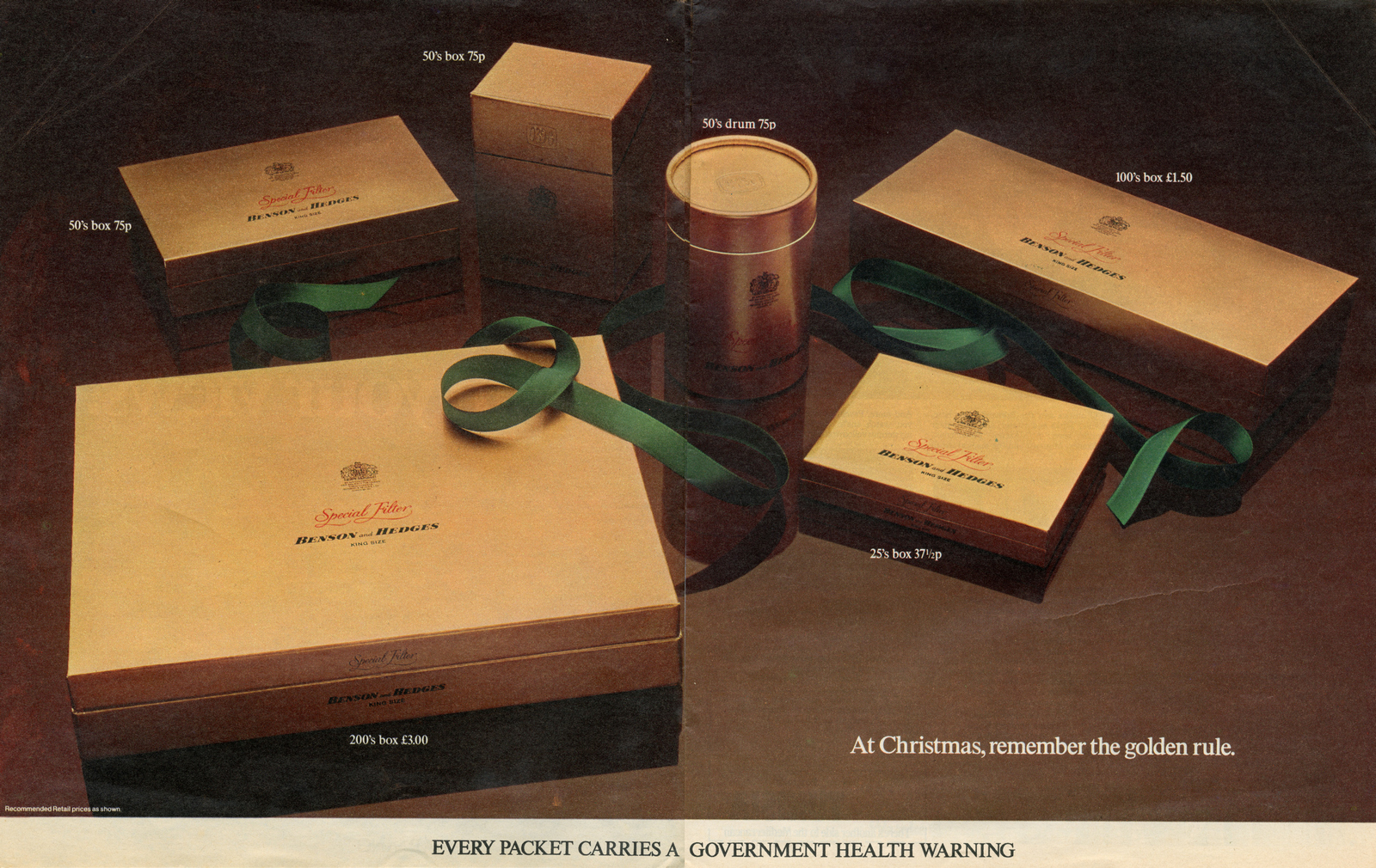
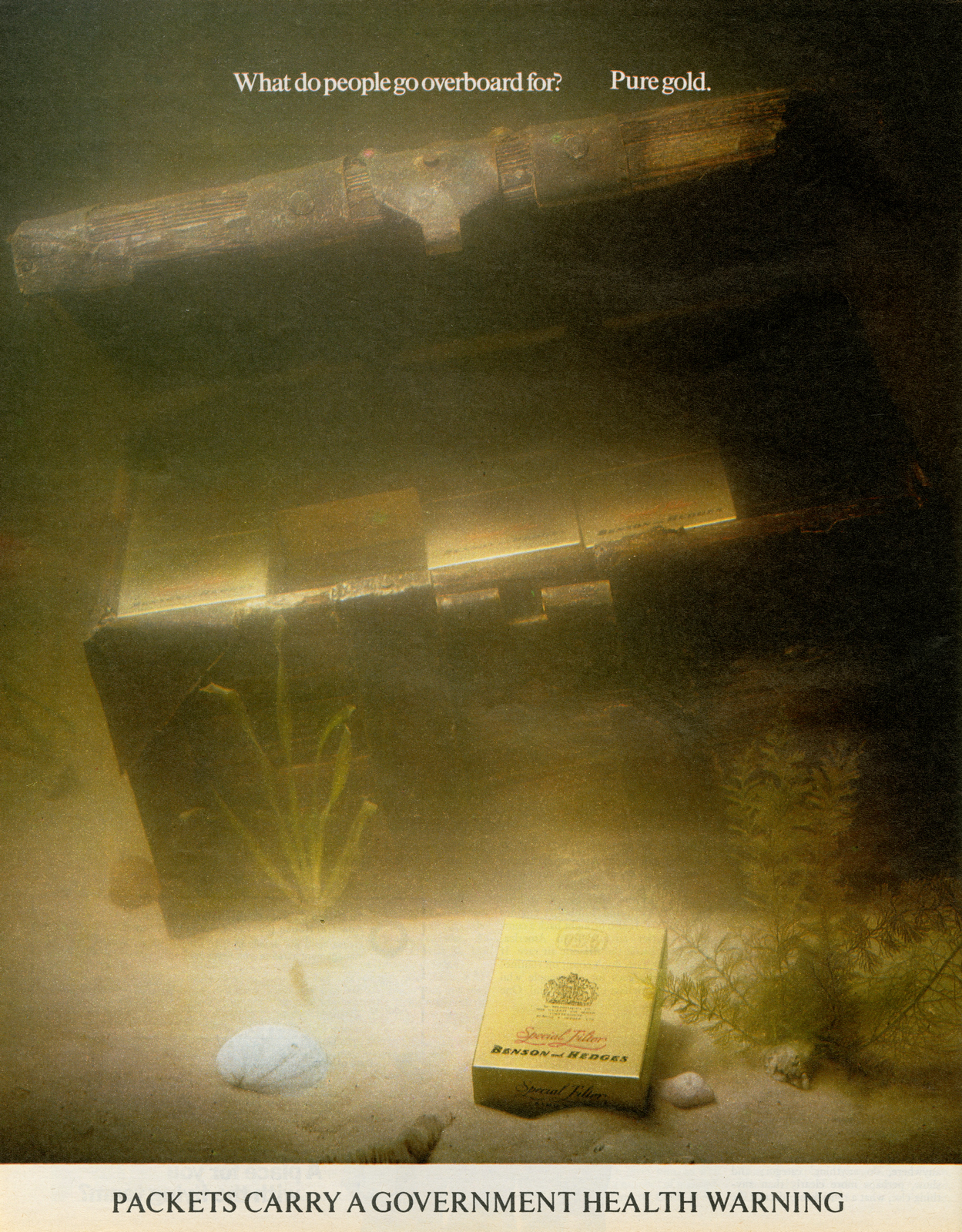
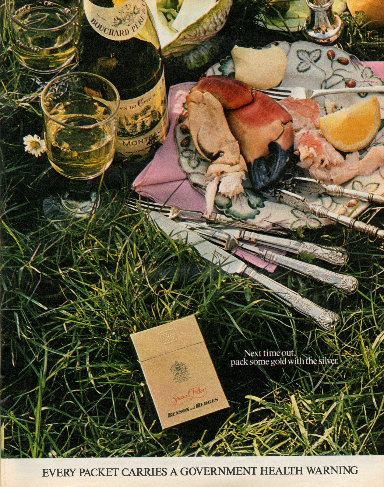
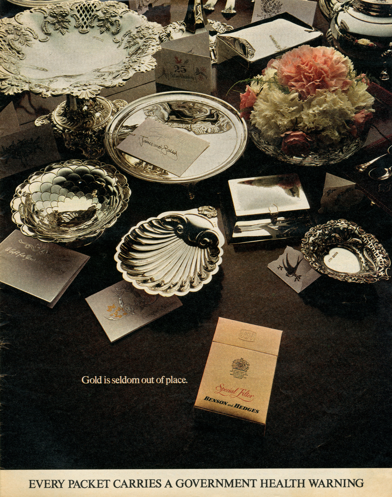
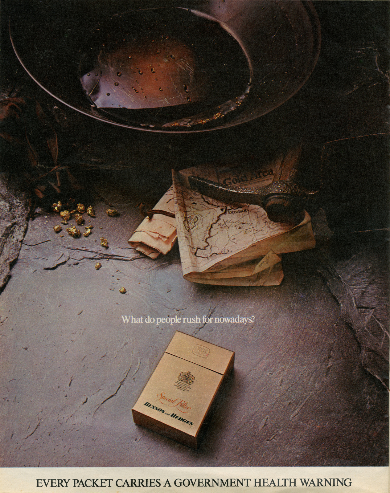
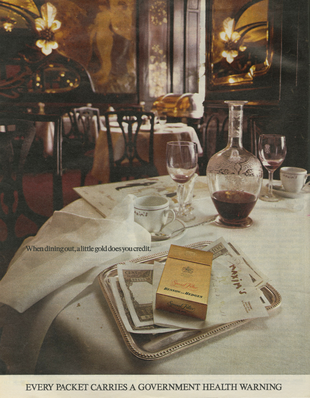
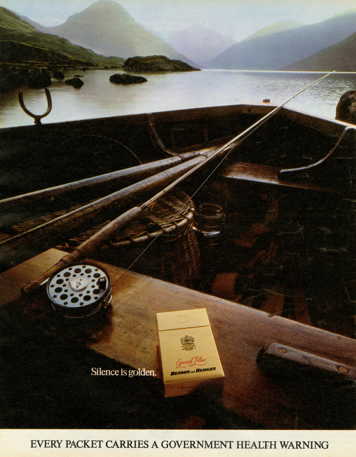
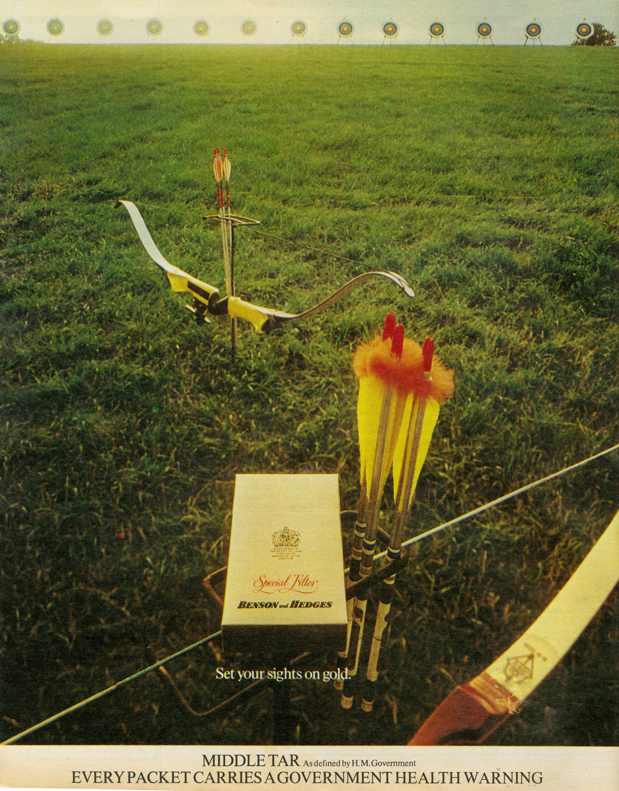
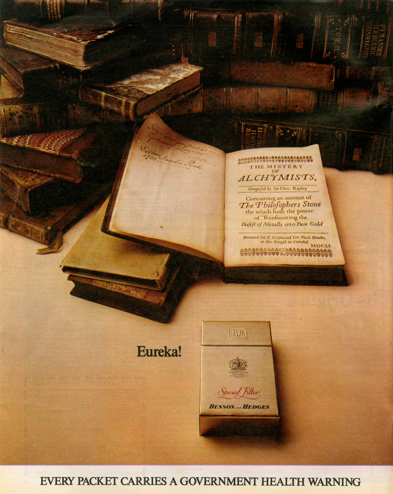
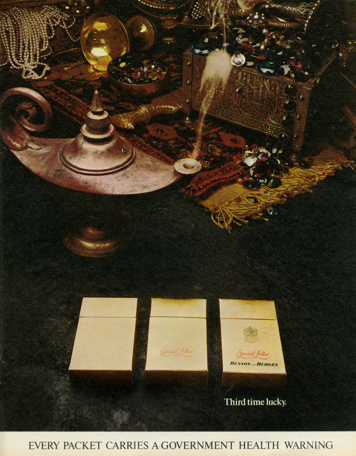
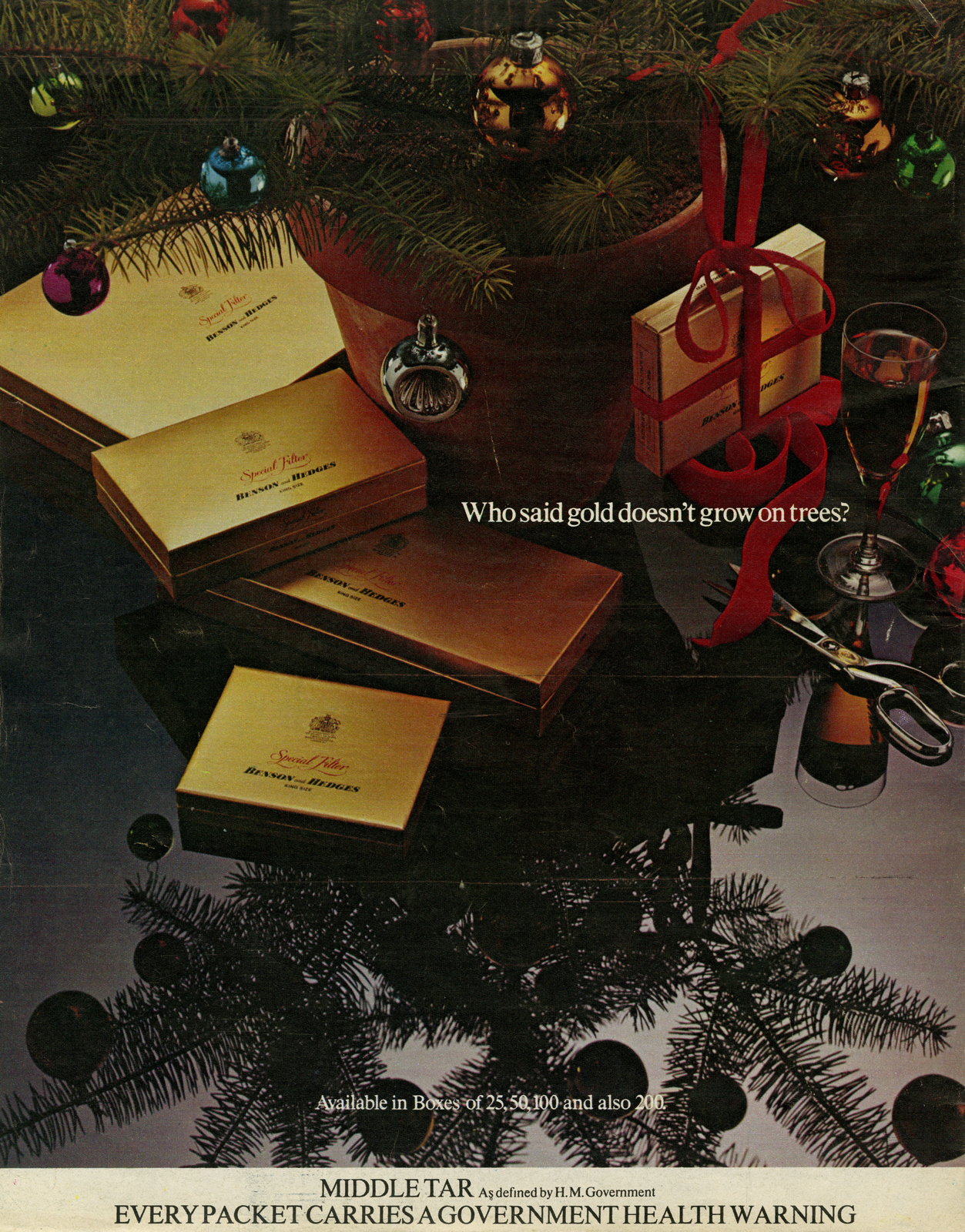
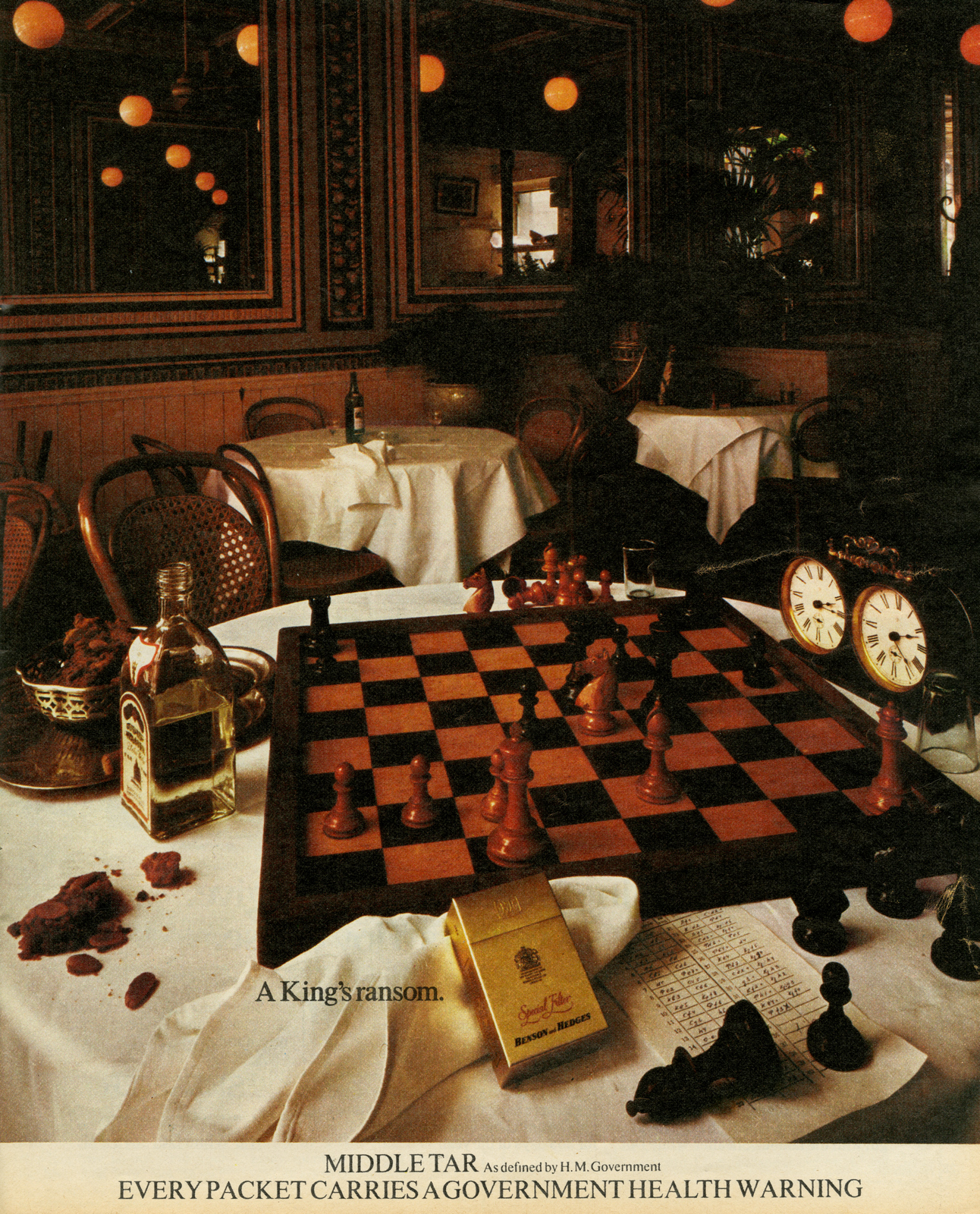
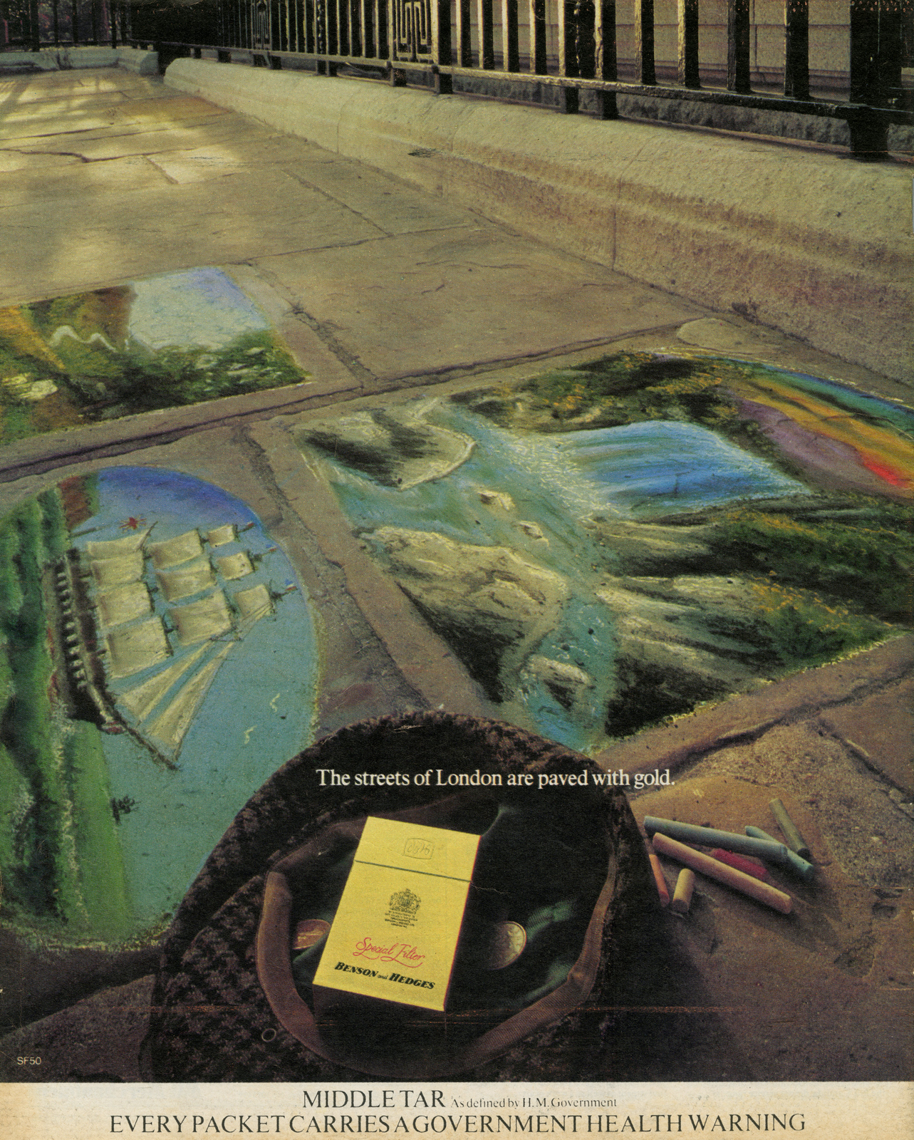
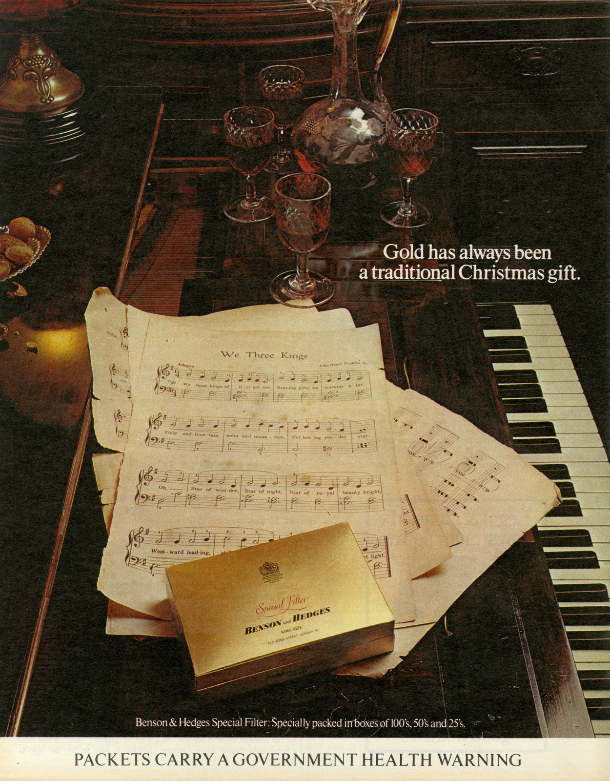
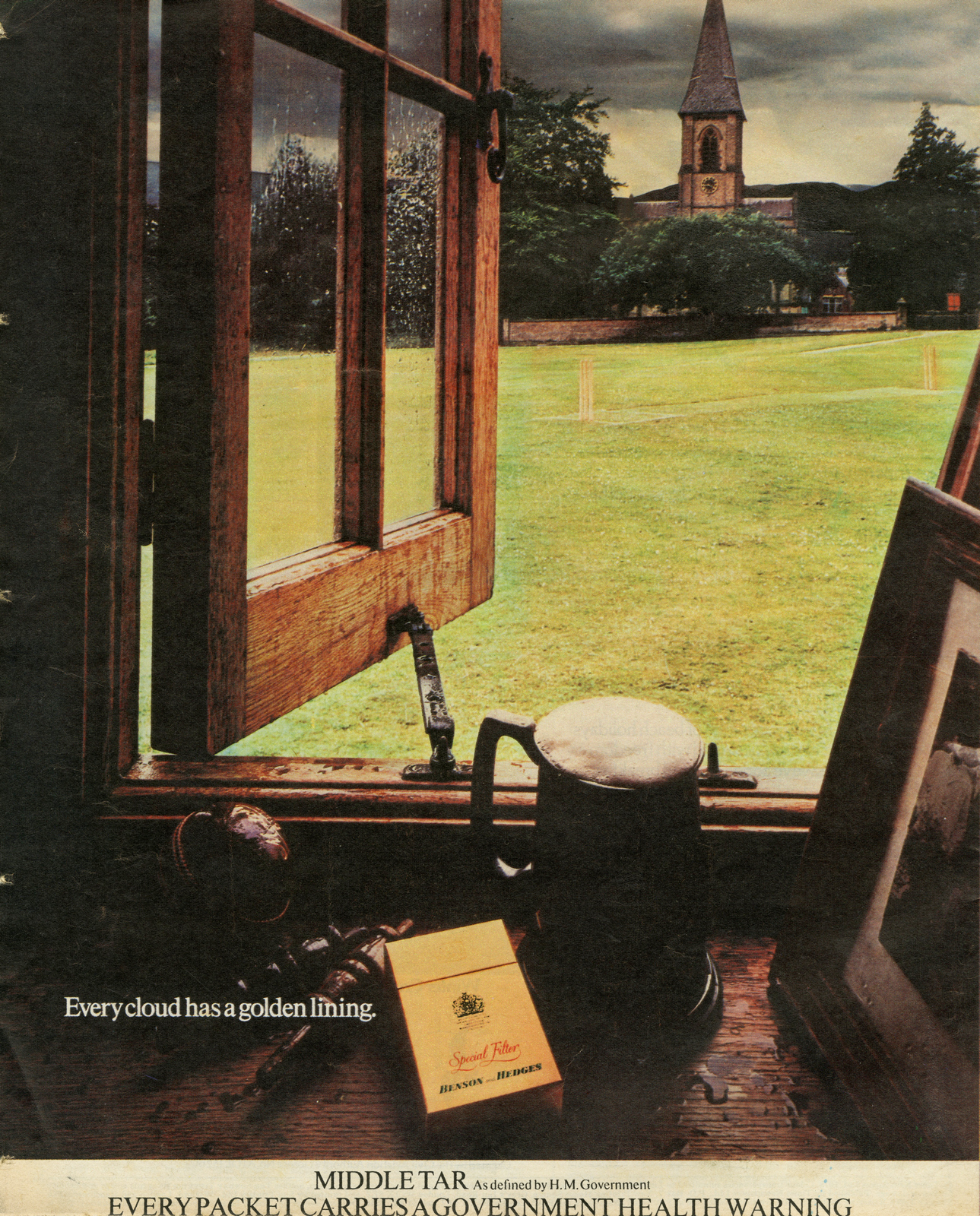
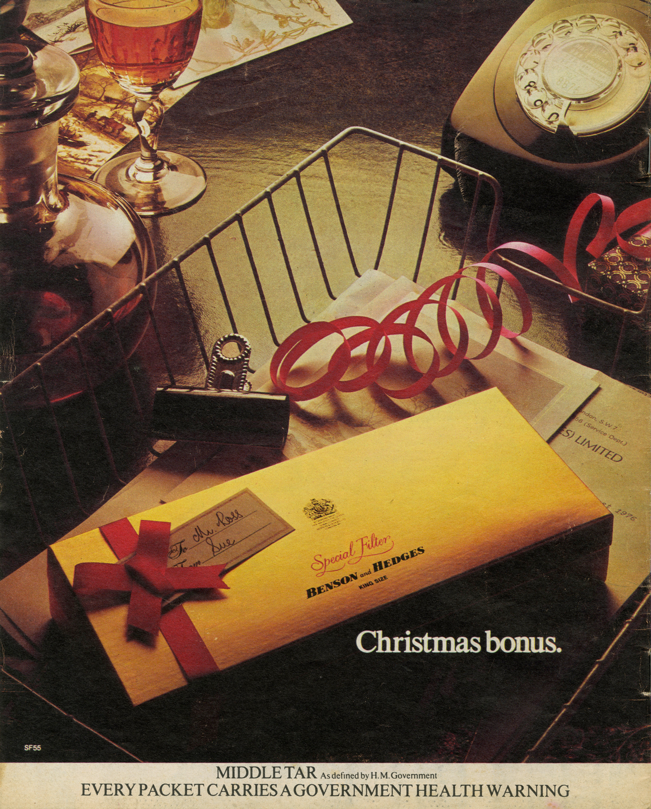
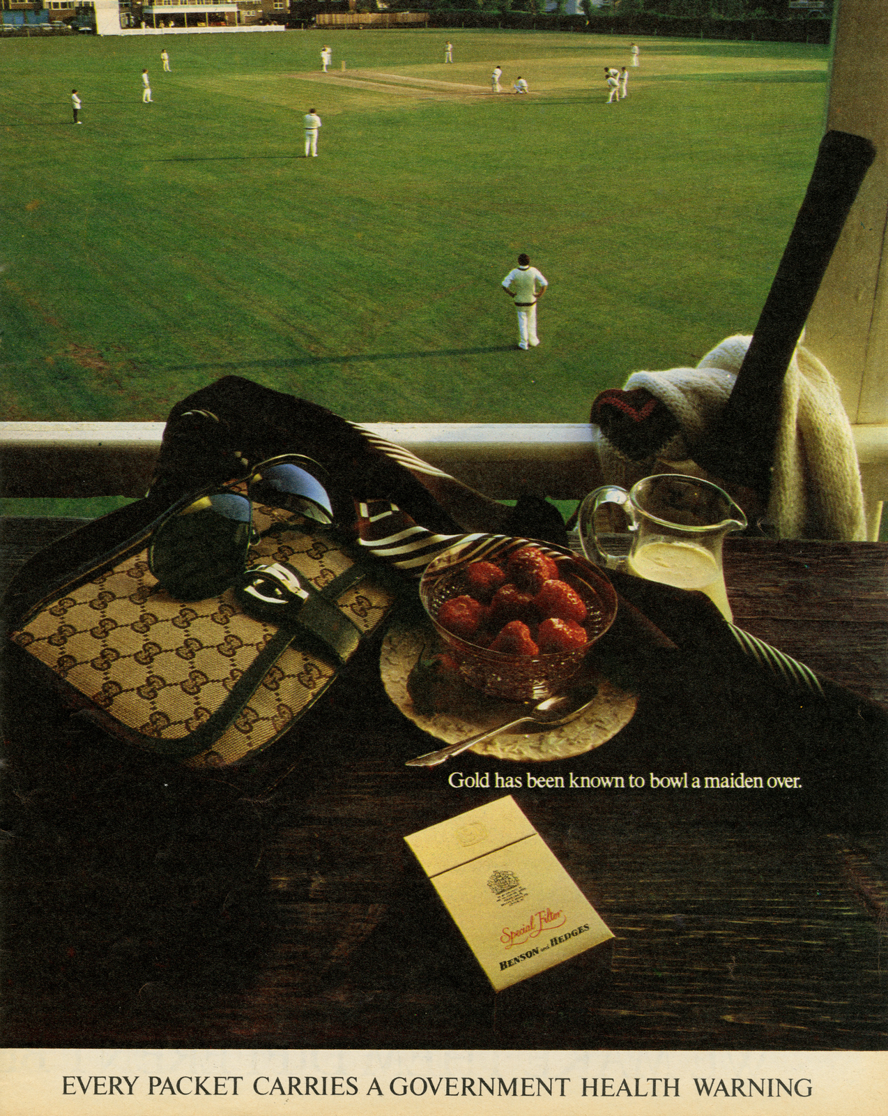
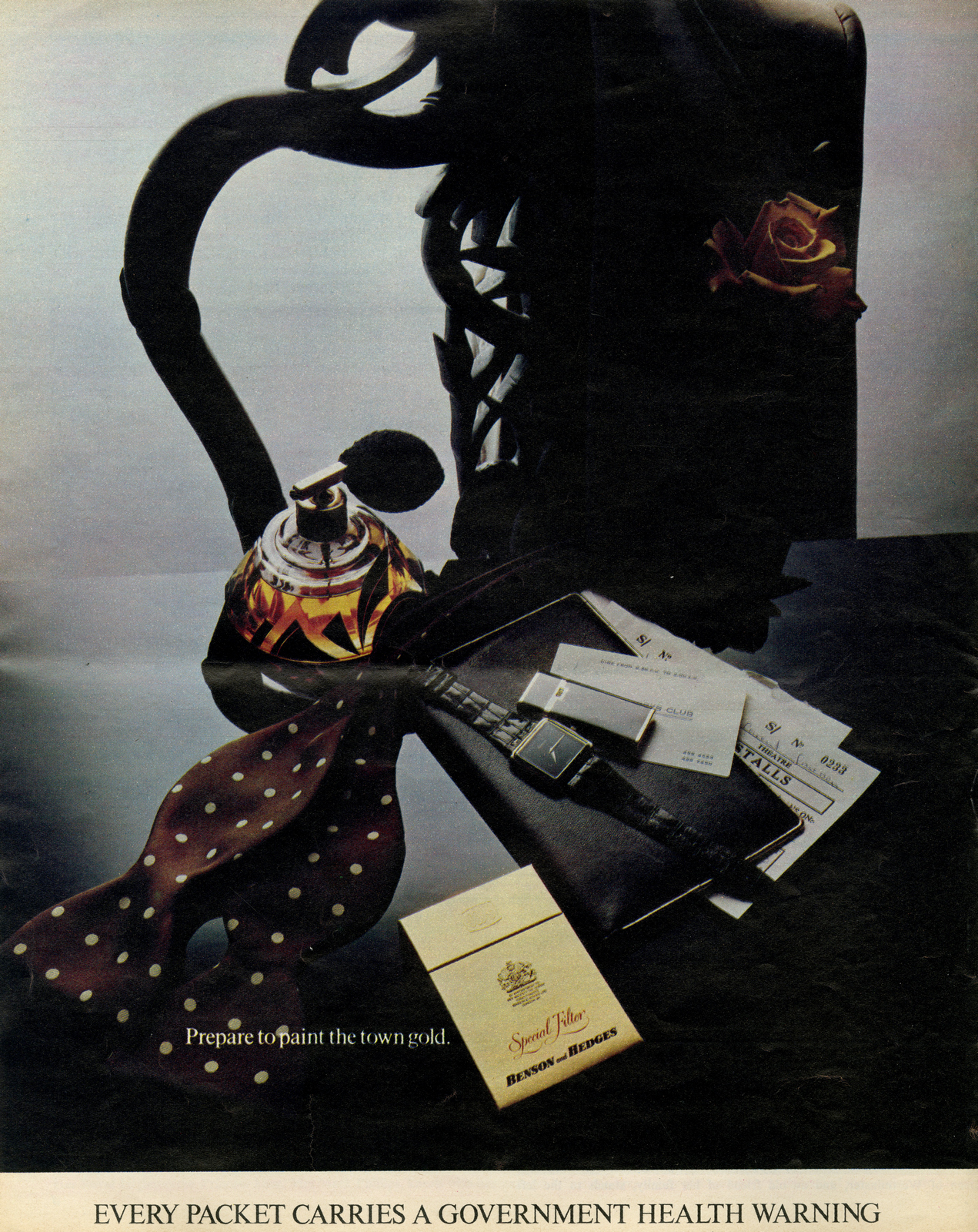
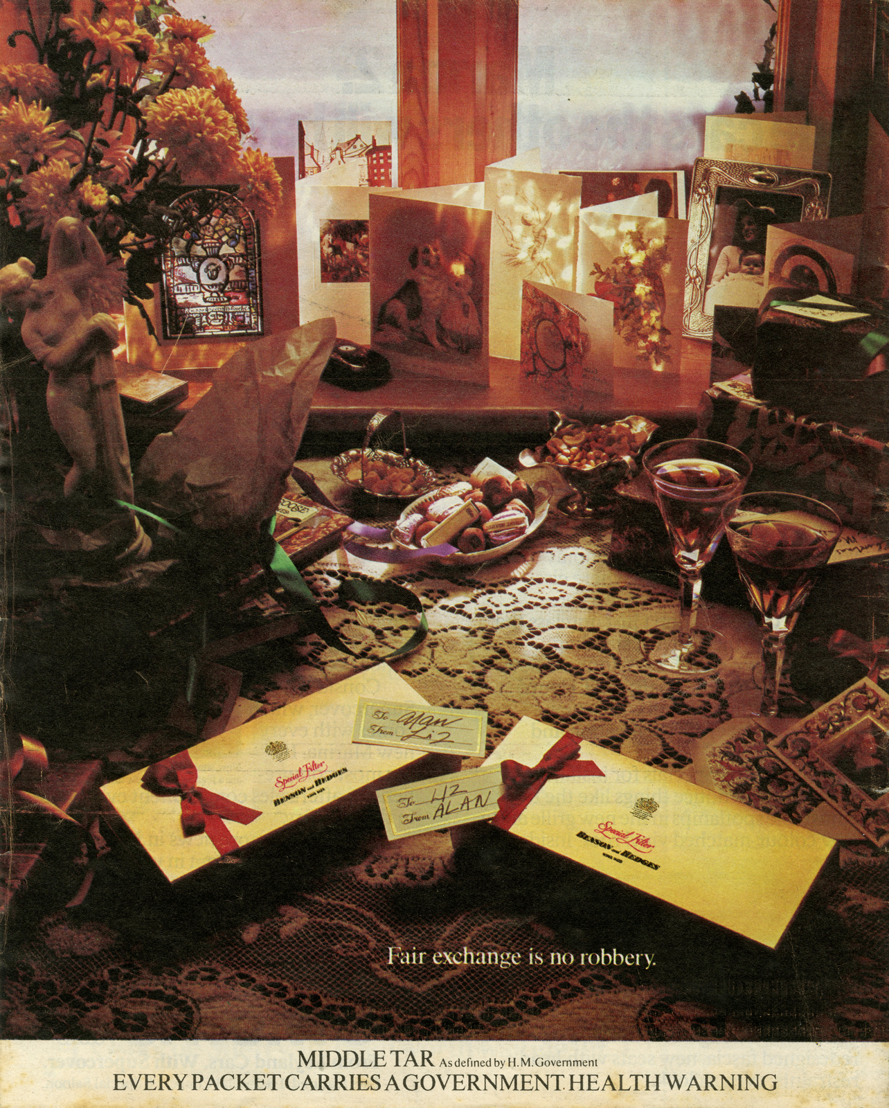
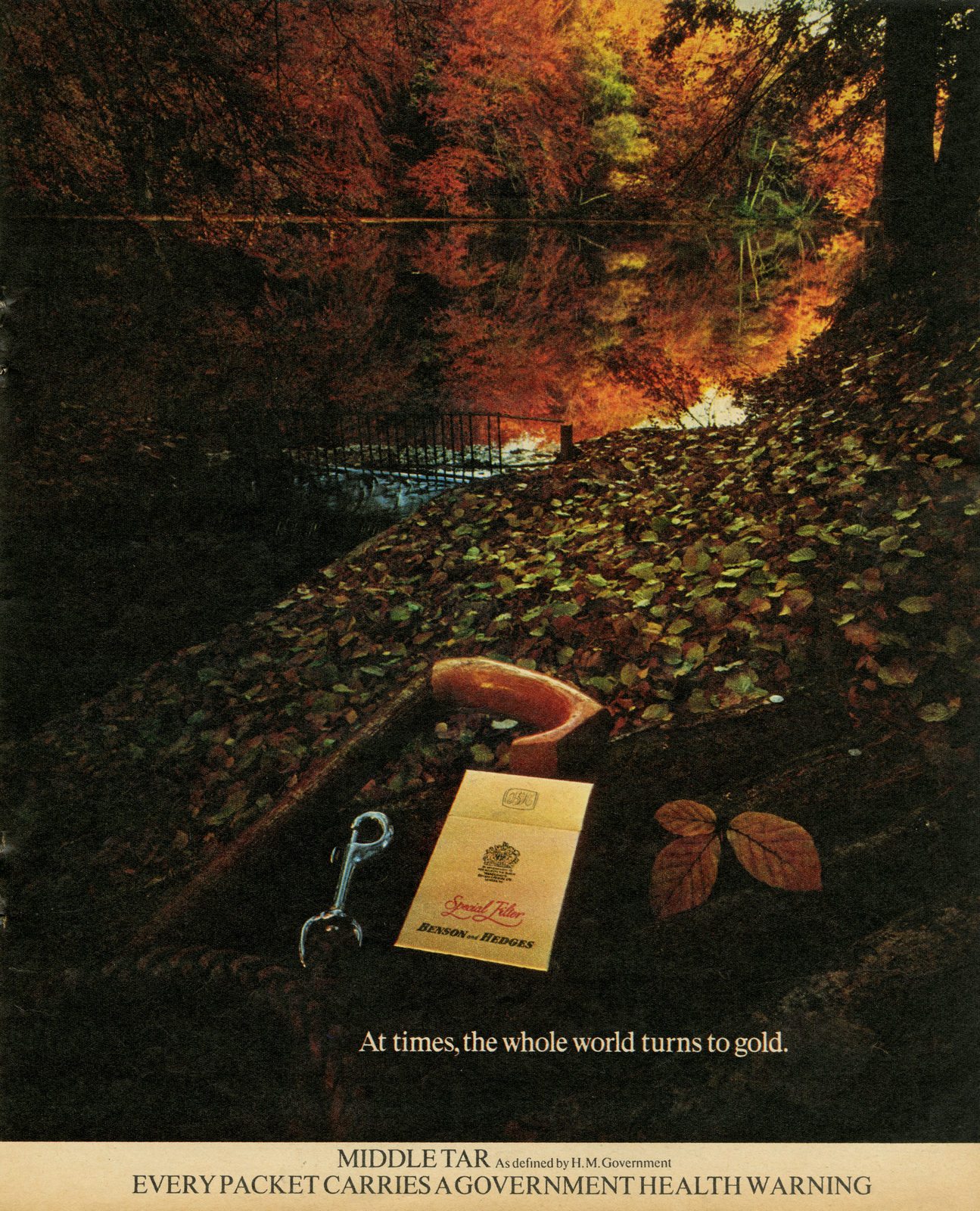
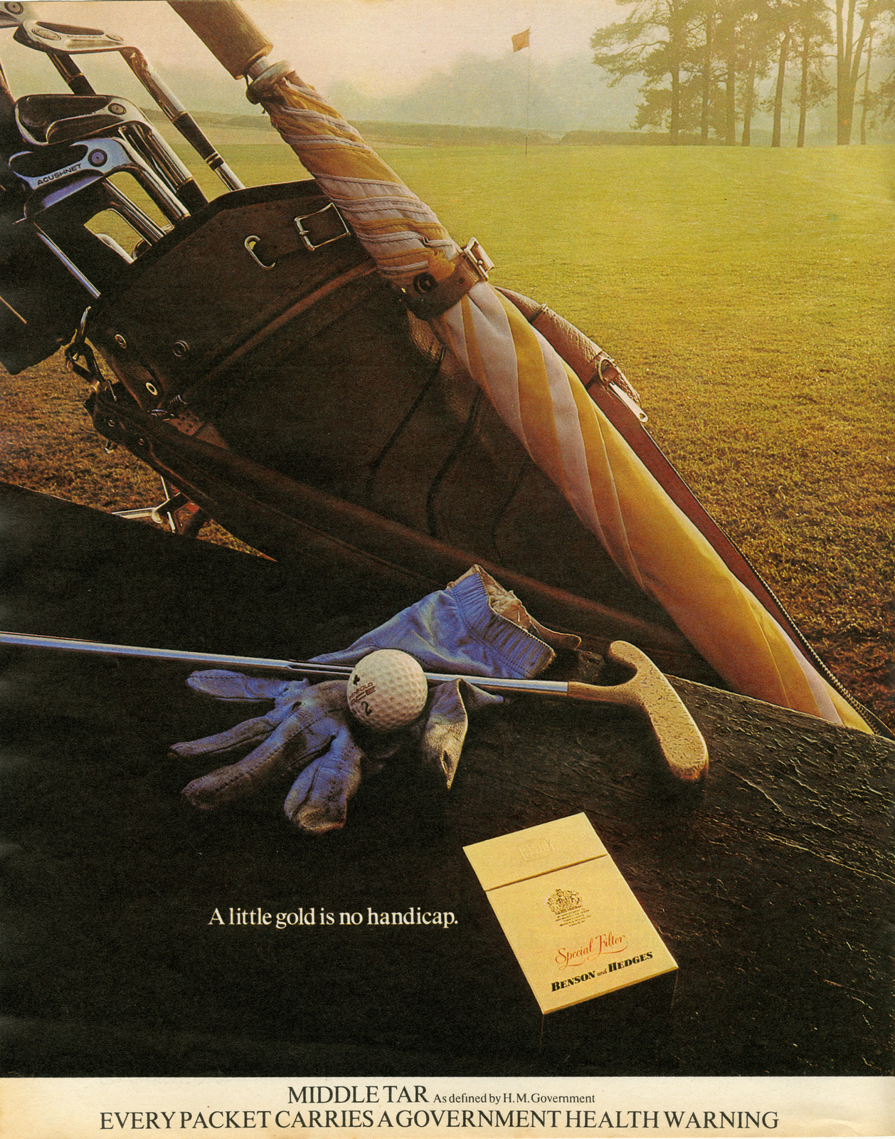
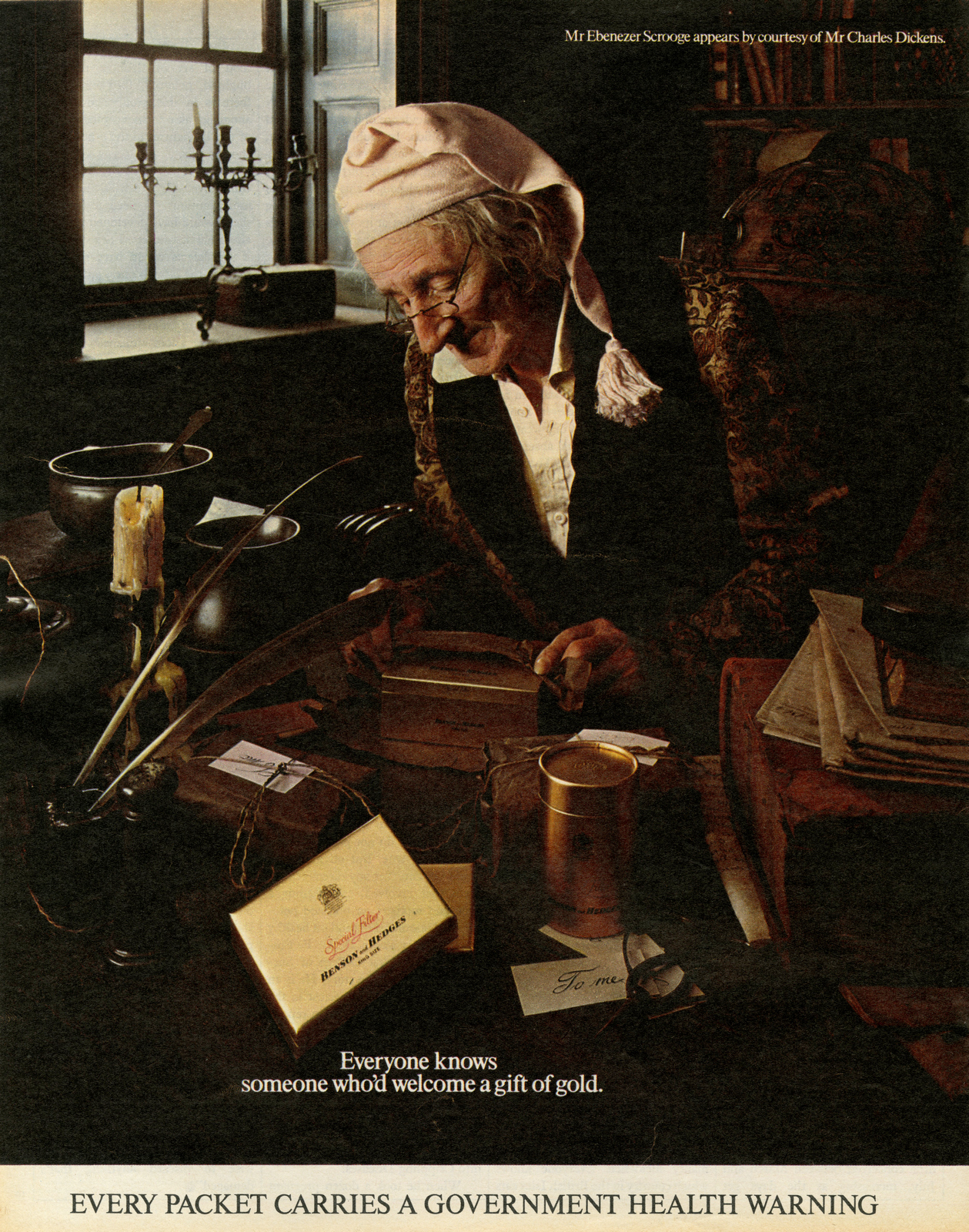
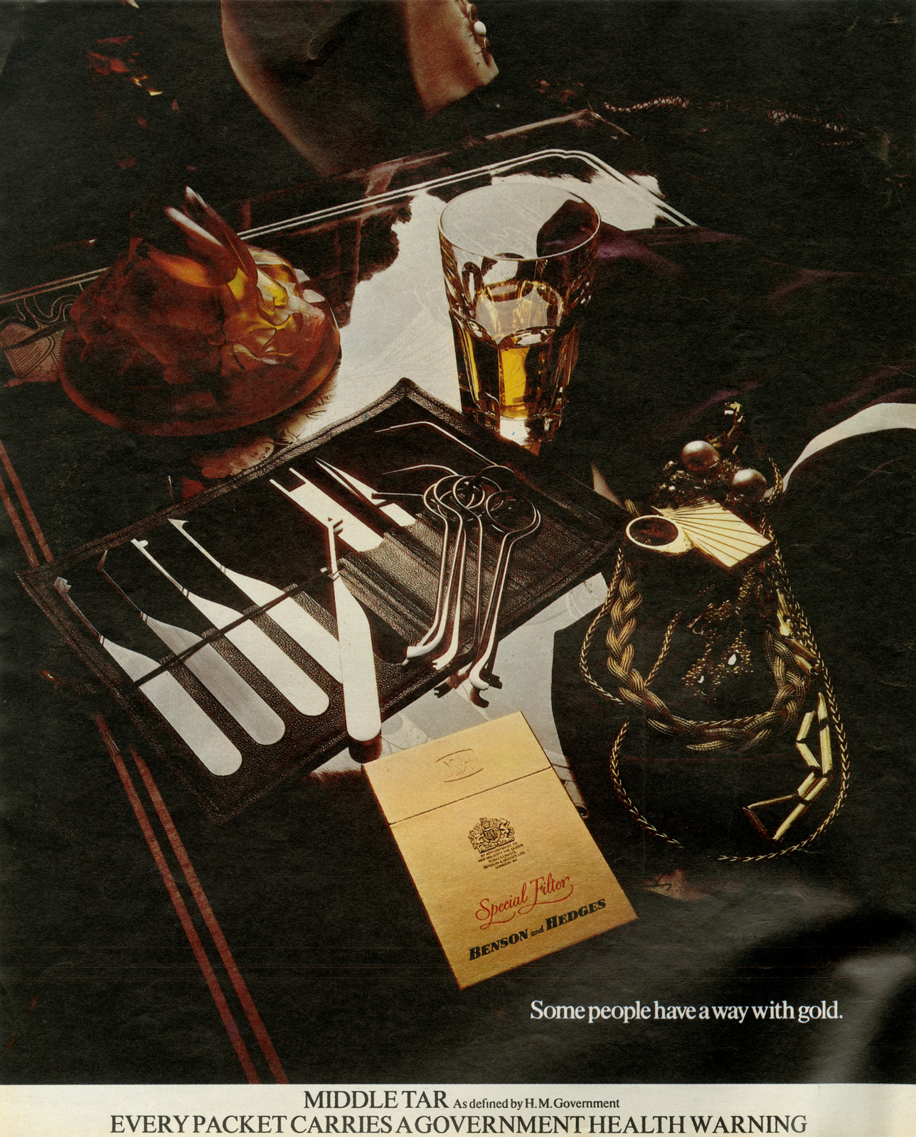
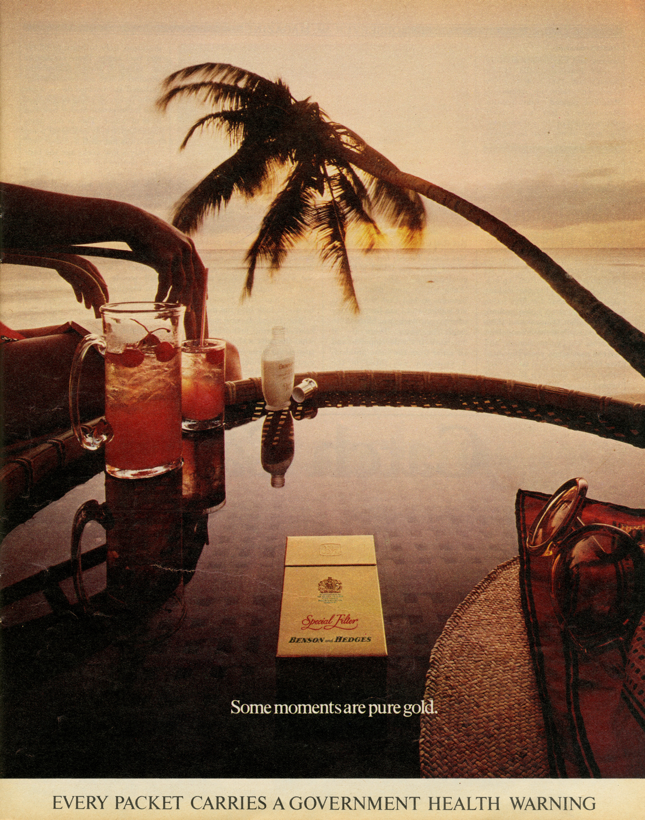
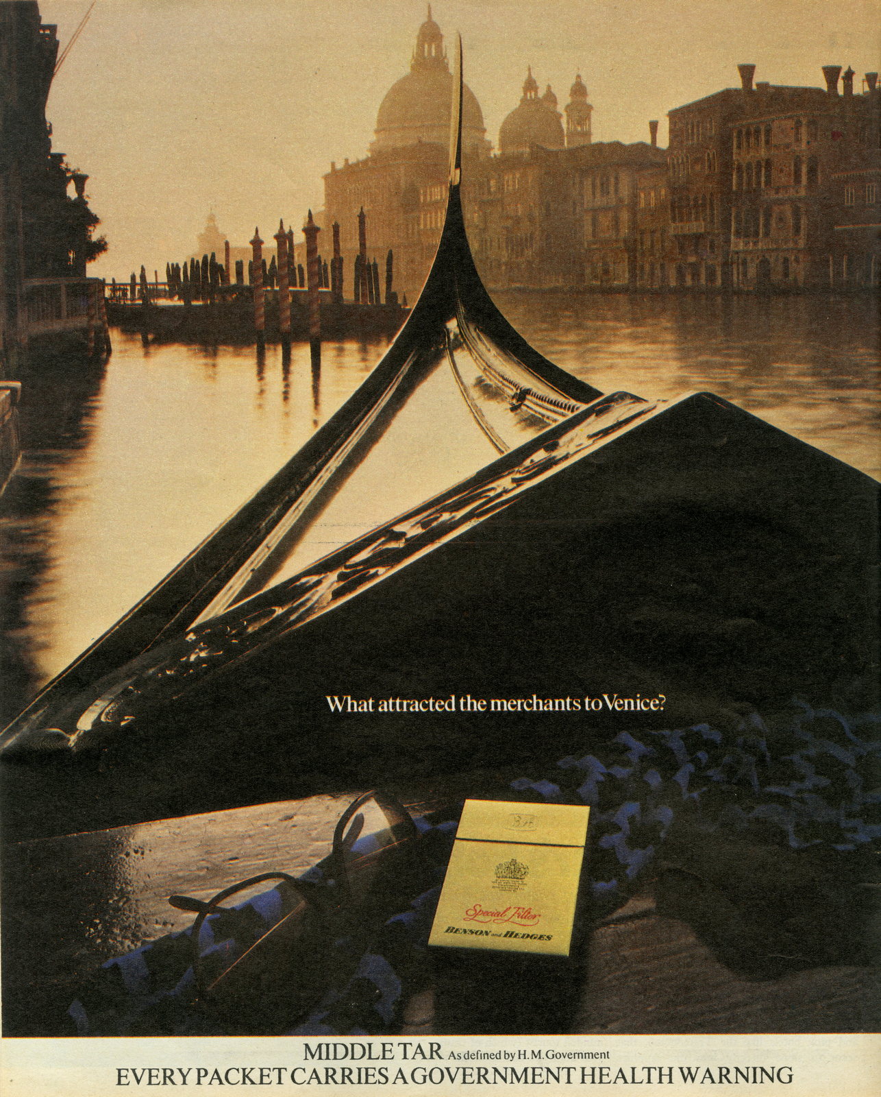
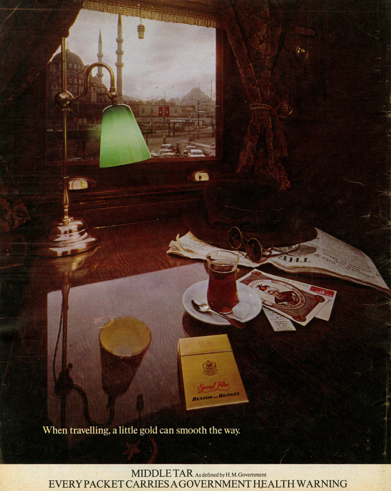
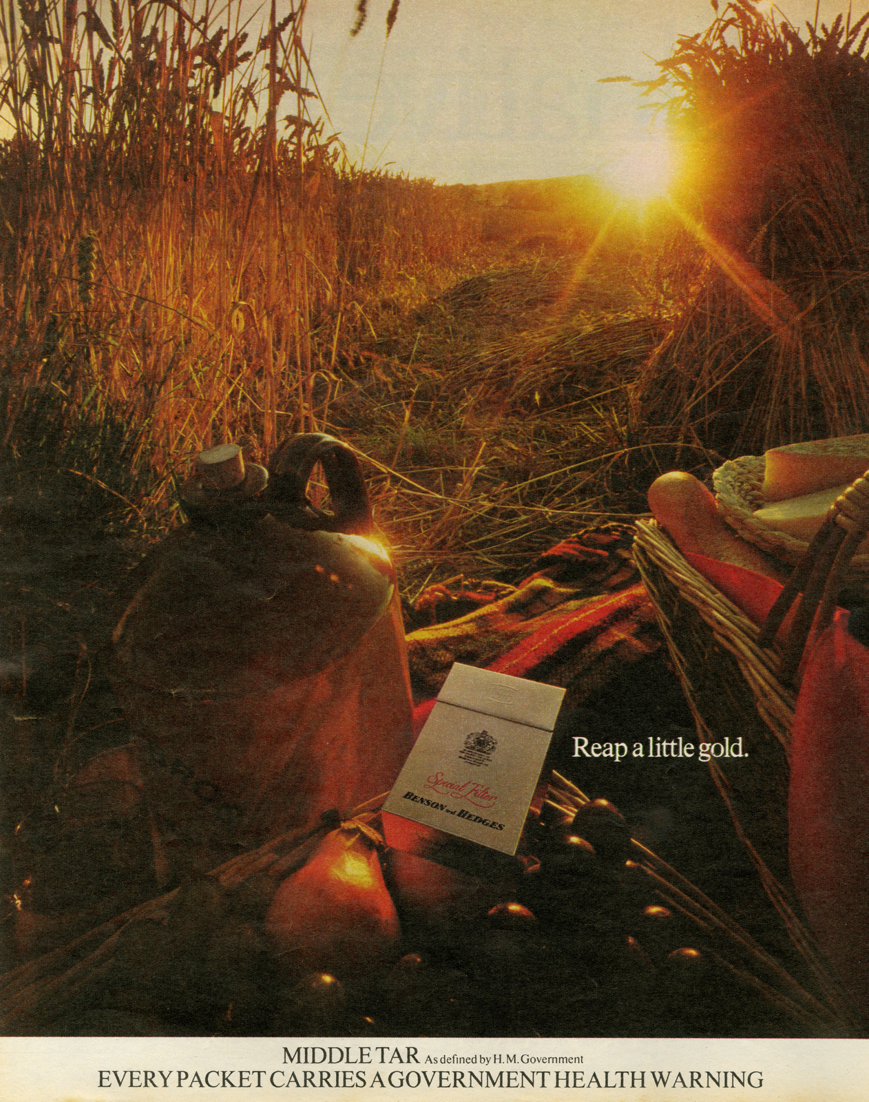
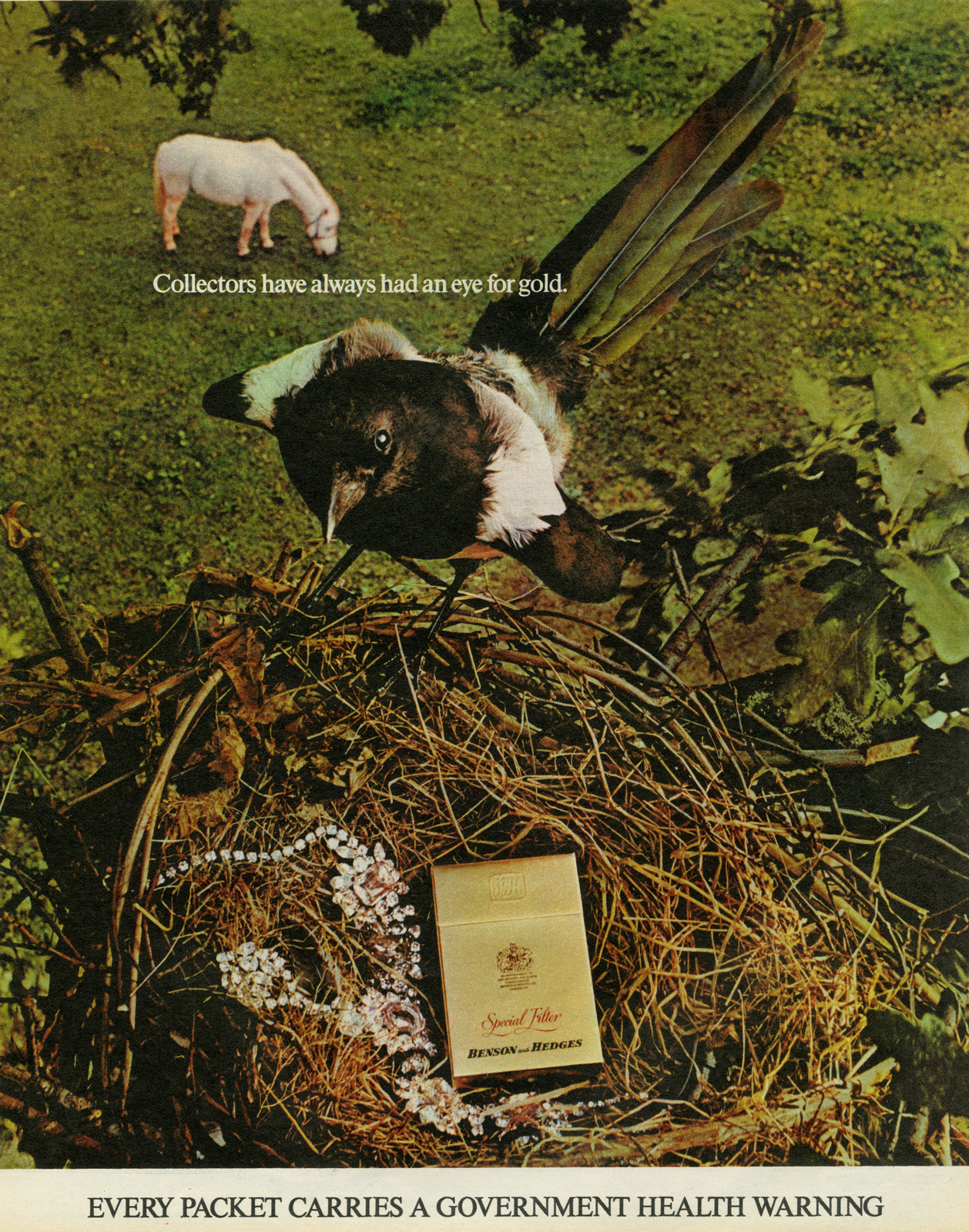
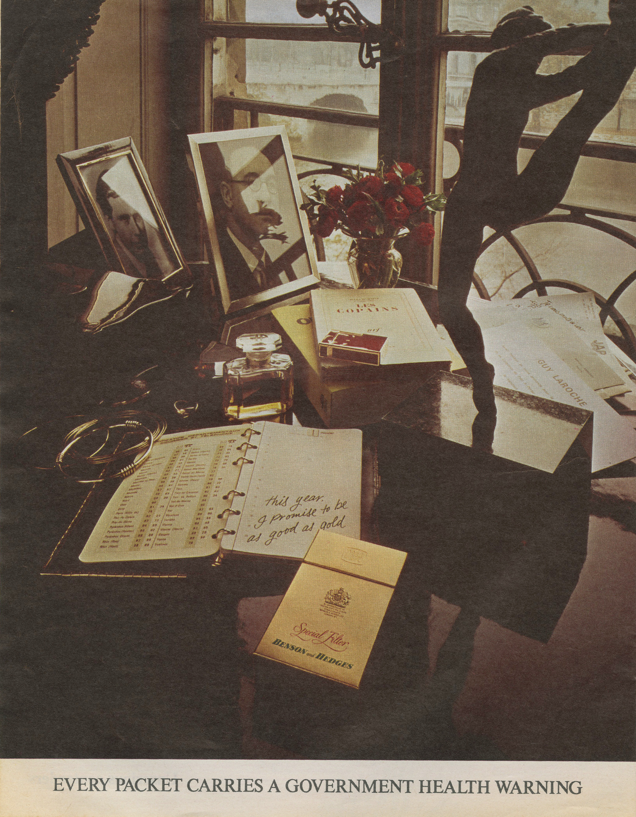
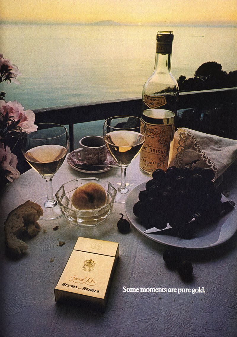
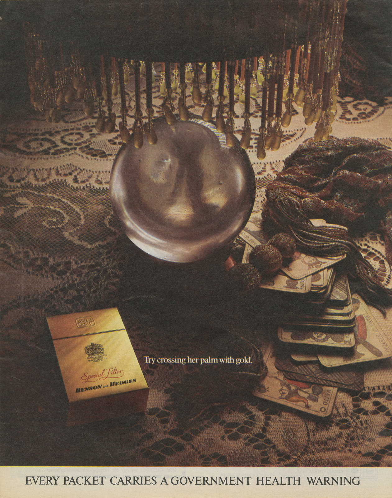
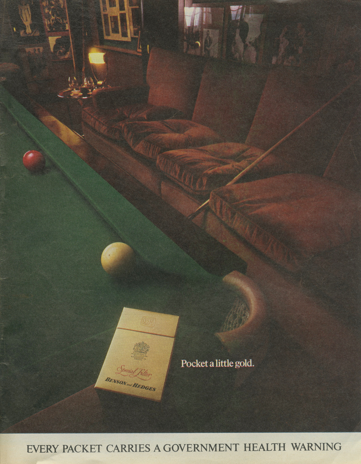
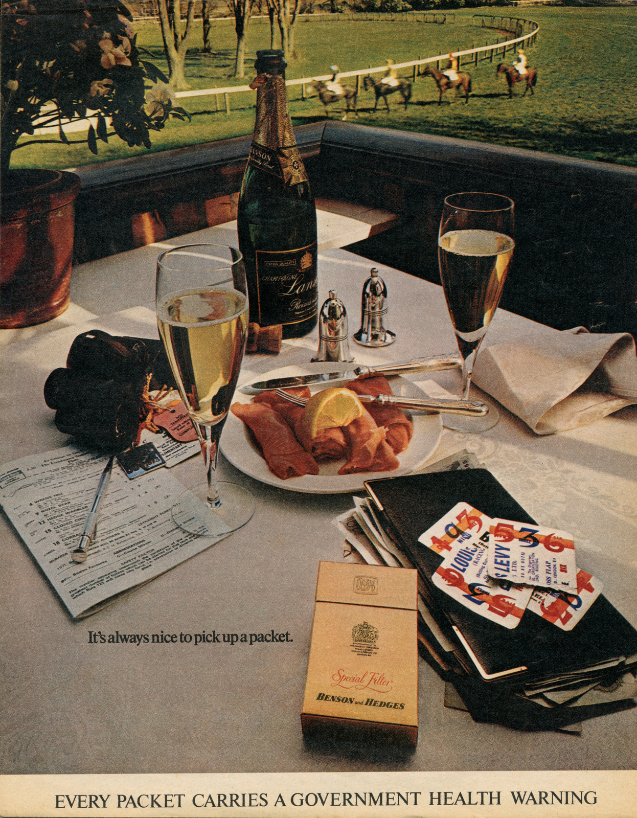
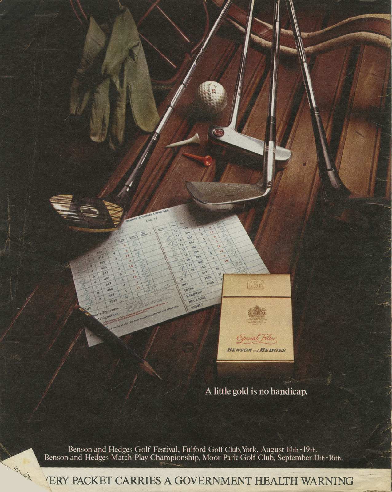
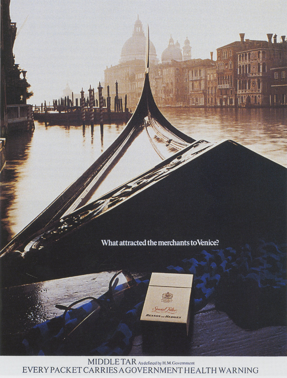
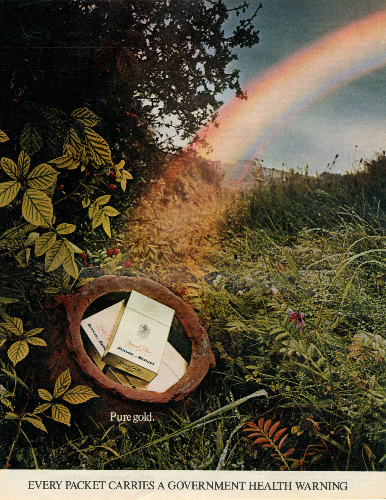
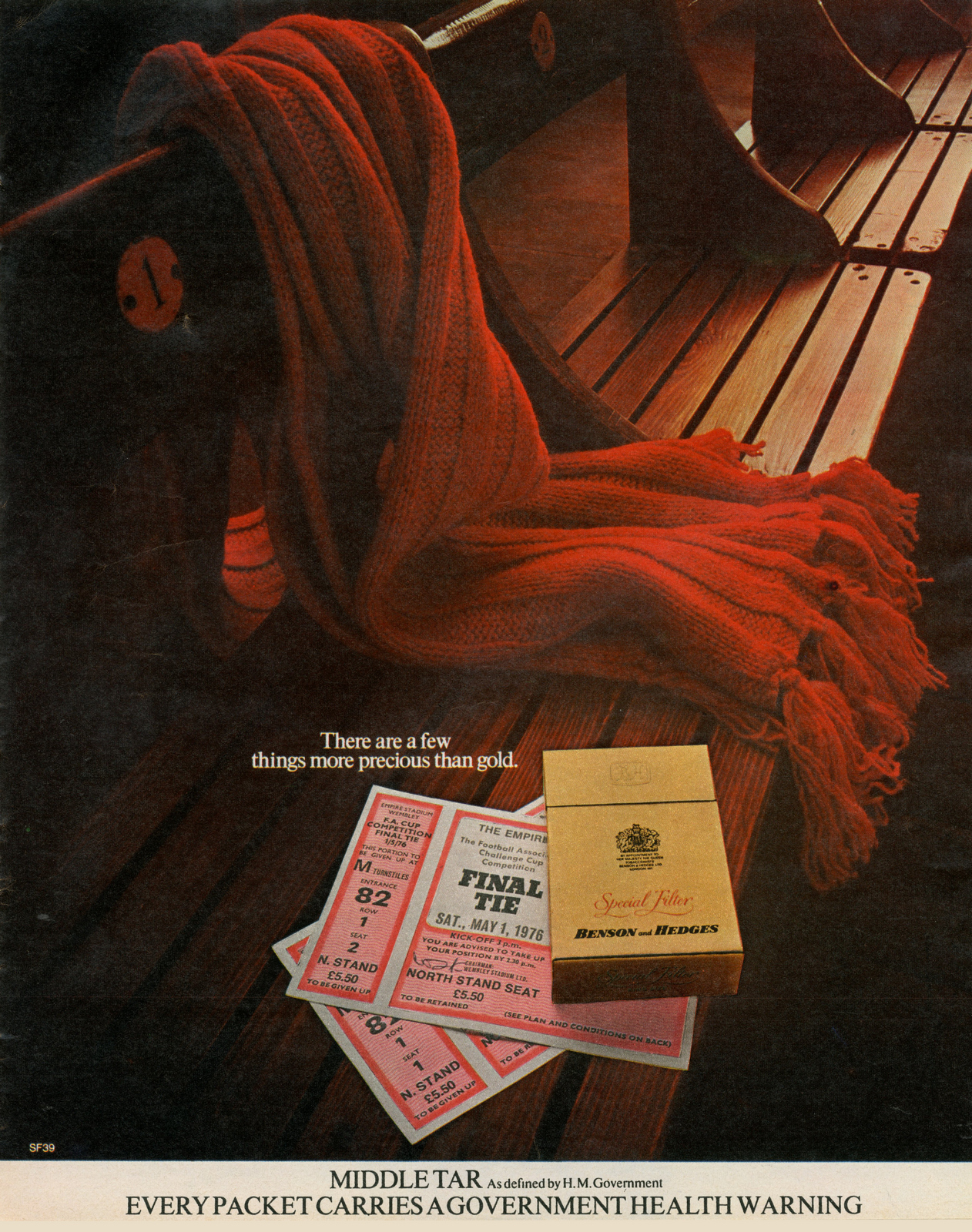
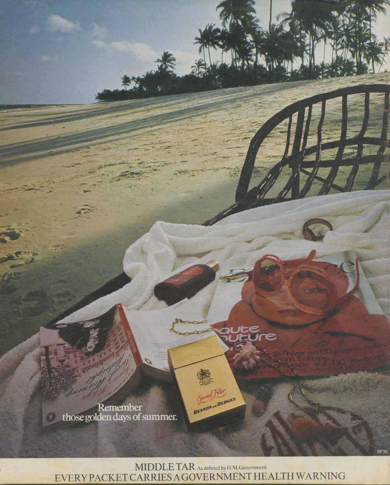
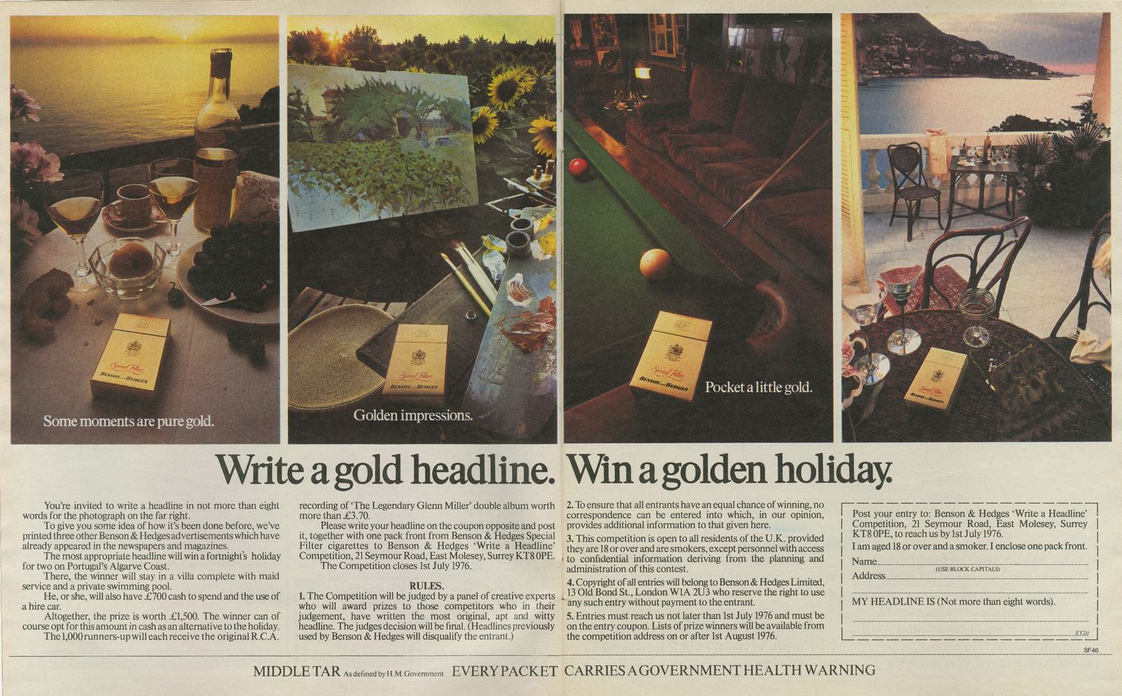
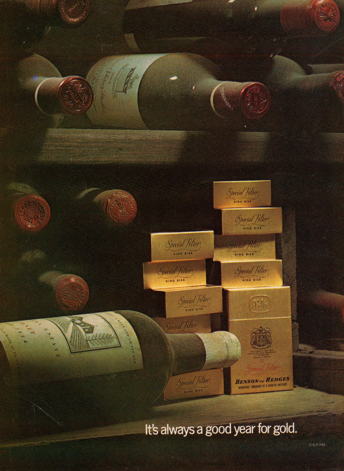
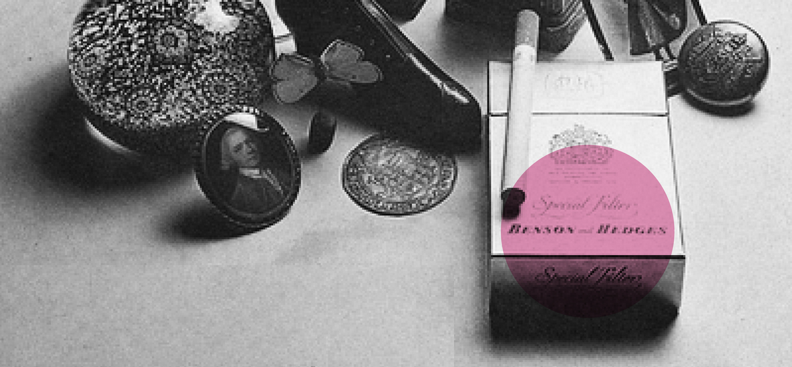
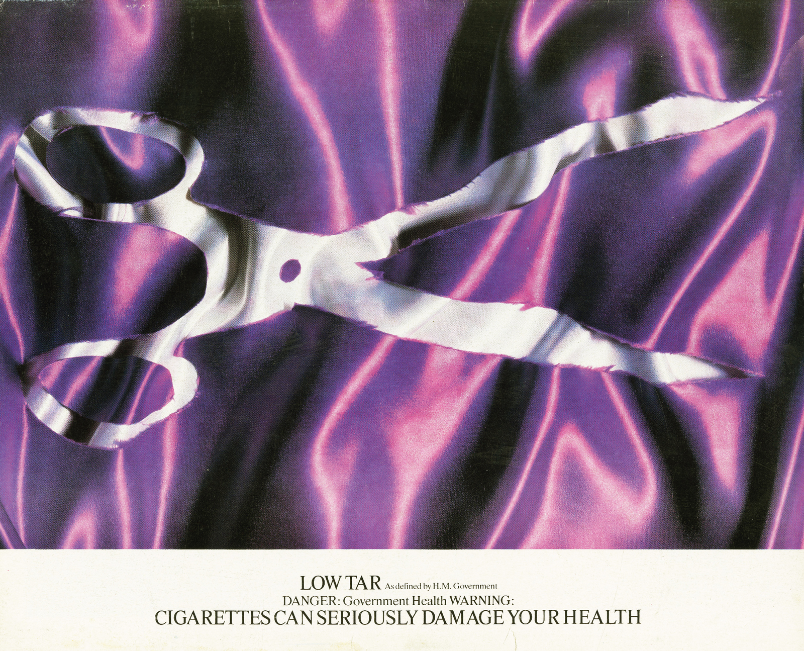
In 1962, a bright, shiny new agency Collett Dickerson Pearce was offered a big account, the DuMaurier cigarette brand.This good news was particularly timely, as many at the fledgling agency were starting to worry their jobs.The agency turned the offer down.Founder John Pearce told the potential client the brand was a ‘dead duck’, and he didn't want his agency to work with 'no-hope brands' or brands that they didn't truly believe would respond to advertising.But being a decent sort of chap, Mr Pearce tried to help out the client trying to give him some business, by saying he’d take on that ‘funny looking king-size brand in gold foil packs’ that he’d recently seen in Old Bond Street shop.The client was baffled, he said he agreed that the brand in question may have a future in the king-size sector, but that sector was small he couldn't commit much budget to it.‘Never mind the budget’ said Pearce ‘Give us the brand and we'll make something of it’.The early work looks unremarkable, but at the time cigarette ads came in two flavours;a) Starring heroes; cowboys, naval officers and all manner old world status symbols.b) Starring ‘cool young people snogging and smoking’, as early B&H copywriter Frank McCone put it.Because king-size cigarettes carried a king-size price tag, Frank and Art Director Mike Savino tried to justify the price by referencing the distinctive gold foil pack.They wrote a line ‘Pure Gold from Benson & Hedges’.As the campaign developed they started treating the pack as if it were a valuable object, like jewellery or money.As the campaign develops so too does the photography. Some of the images still look amazing. And by 1980, (still with CDP), Benson & Hedges was the biggest selling cigarette in Britain.
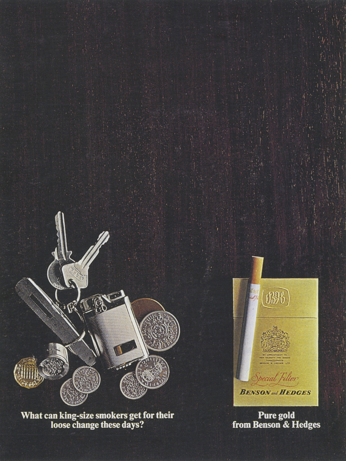
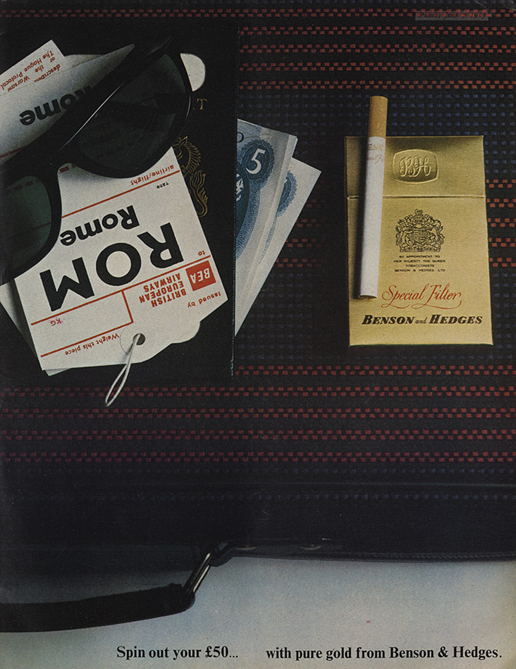

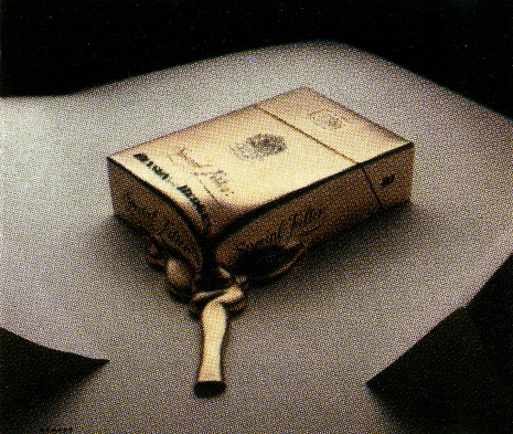
Nb. Weirdly, they re-shot a couple of sixties ads in the seventies.Badly.Compare these two the the two earlier versions to appreciate the value of a good photographer.
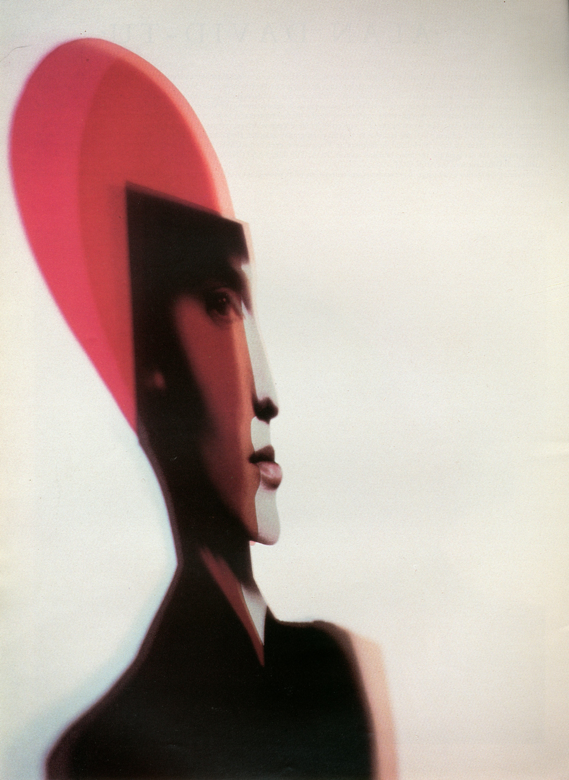
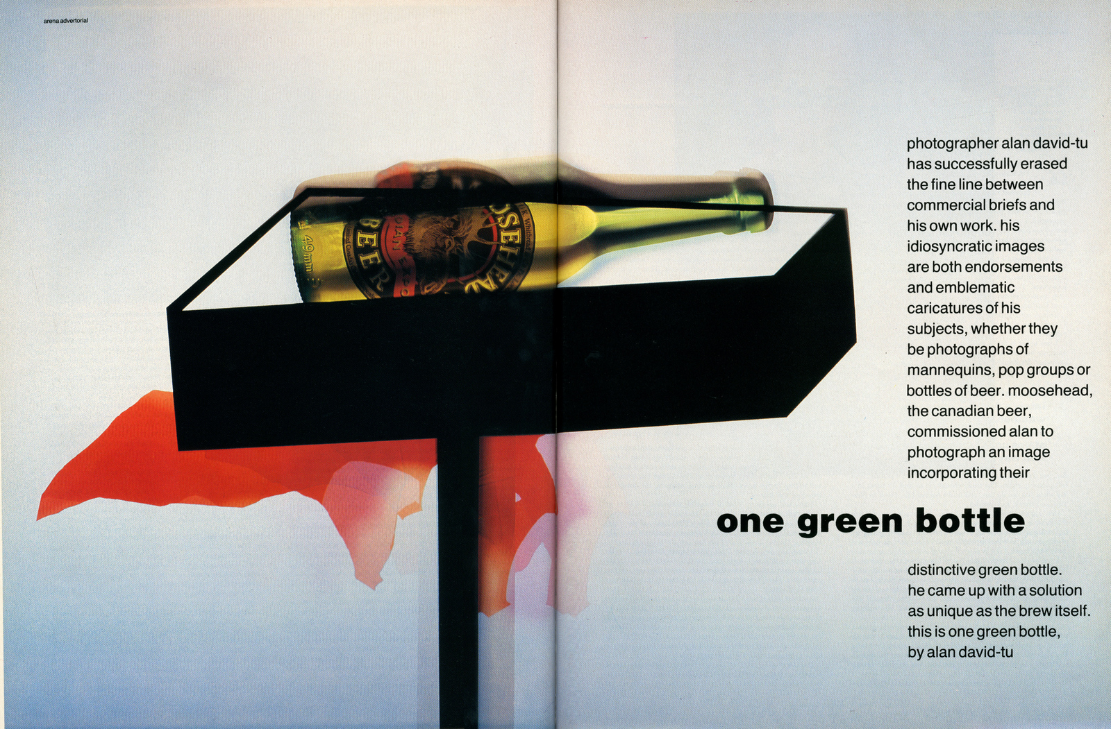
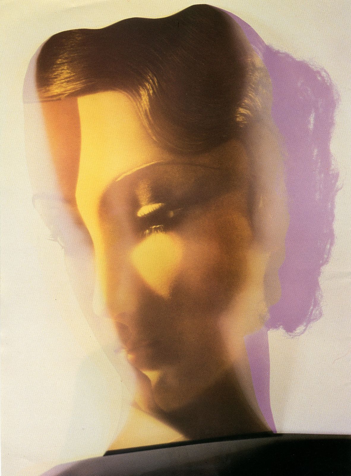
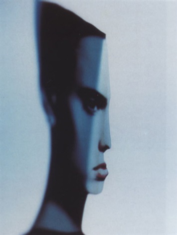
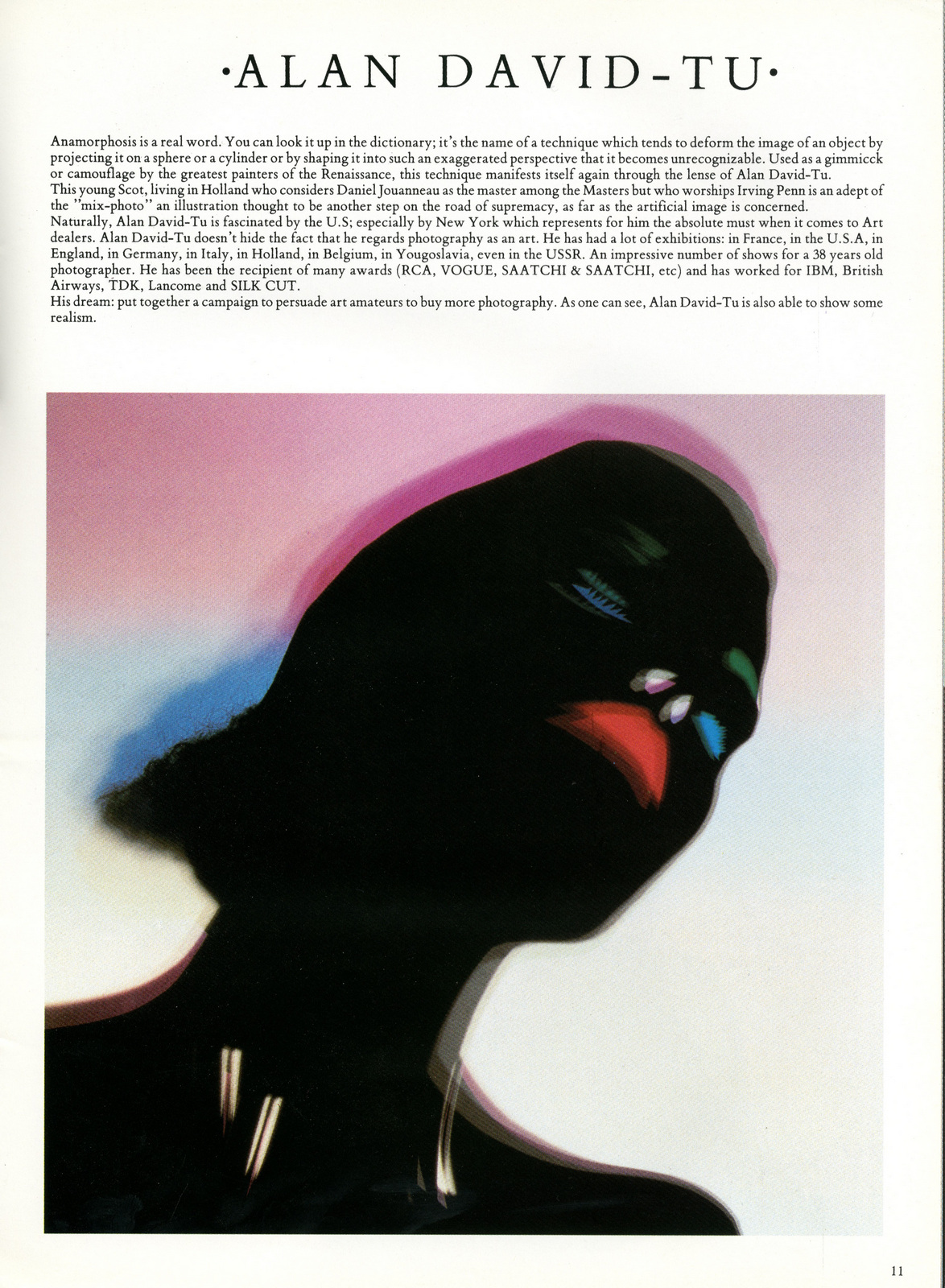
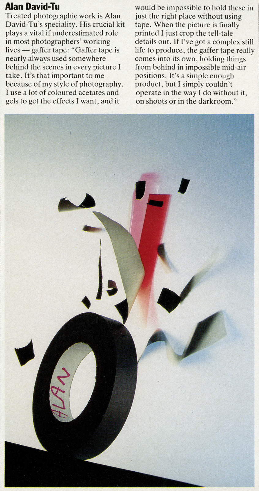
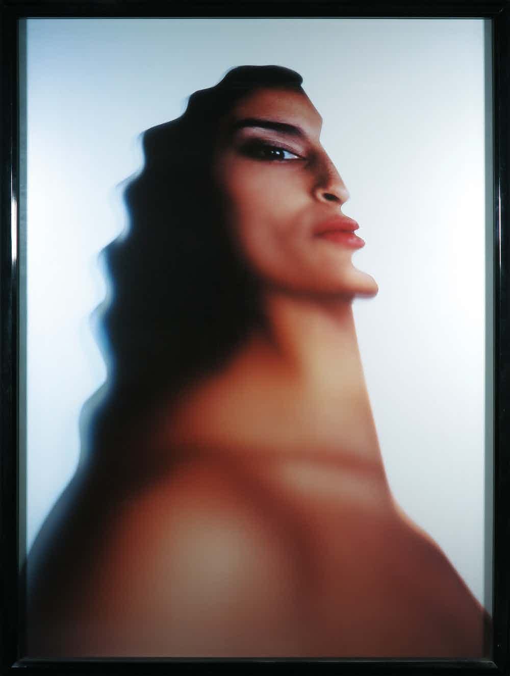
Whenever briefing photographers at Harper’s Bazaar, Art Director Alexey Brodovitch would send them off with the same brief - ‘Astonish me!’.With a lot of photography today, it feels like the brief is ‘Can you do it like that?’.It's understandable, it's easier to get a client to approve your vision if you show them an example of exactly what it looks like. But the most difficult job in advertising is stopping people to engage with your idea, and one thing that stops people more than most is the unusual - something they haven't seen before.There's never been a point in human history where more people have been trying to attract the public's attention.So the need to surprise, intrigue and astonish has never been greater.Astonishing jumps queues.Different gets waved to the front.Even odd will get preferential treatment.Scottish photographer Alan David-Tu's images won't be confused with other photographers.Whether a pair of sneakers, a face or a roll of gaffer tape - they're astonishing.


I’ve written previous posts on ‘turning stories into ads’, The Guardian, the BBC’s Panorama and GQ.
I wrote them because it struck me that although the brands were very different, what they wanted was exactly the same; An appropriate visual style to hold ideas about any subject under the sun.
Take The Guardian, the ads I worked on ranged from the trial of mass murderer Fred West to the fact that footballer Jurgen Klinsmann couldn’t stay upright if their was another footballer within a circumference of ten feet.
It now seems to be the way media does media.
You rarely see media owners talking about what they stand for, like The Economist, now it’s more likely to be ‘we have this bit of content on Tuesday’.
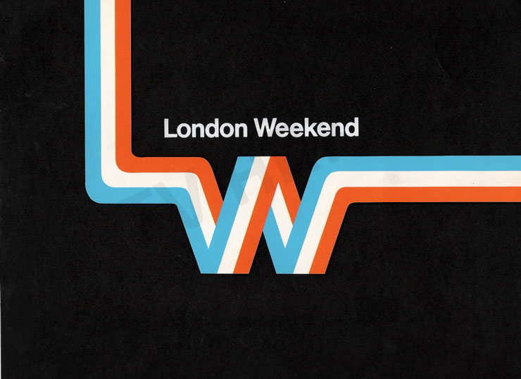
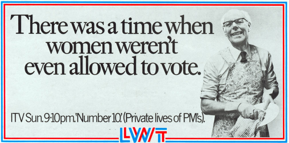
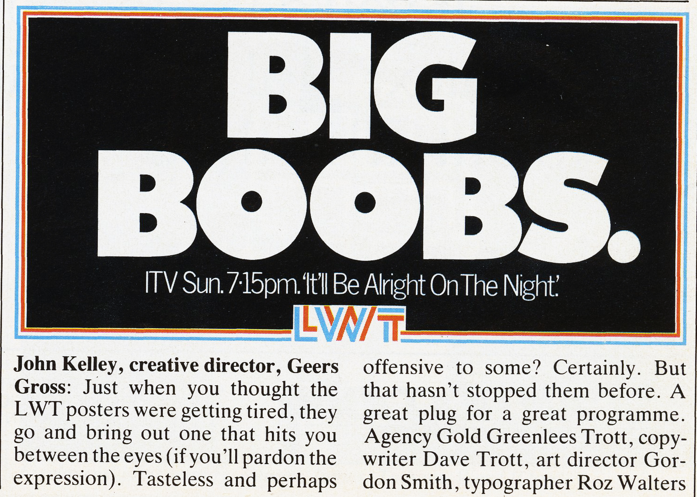
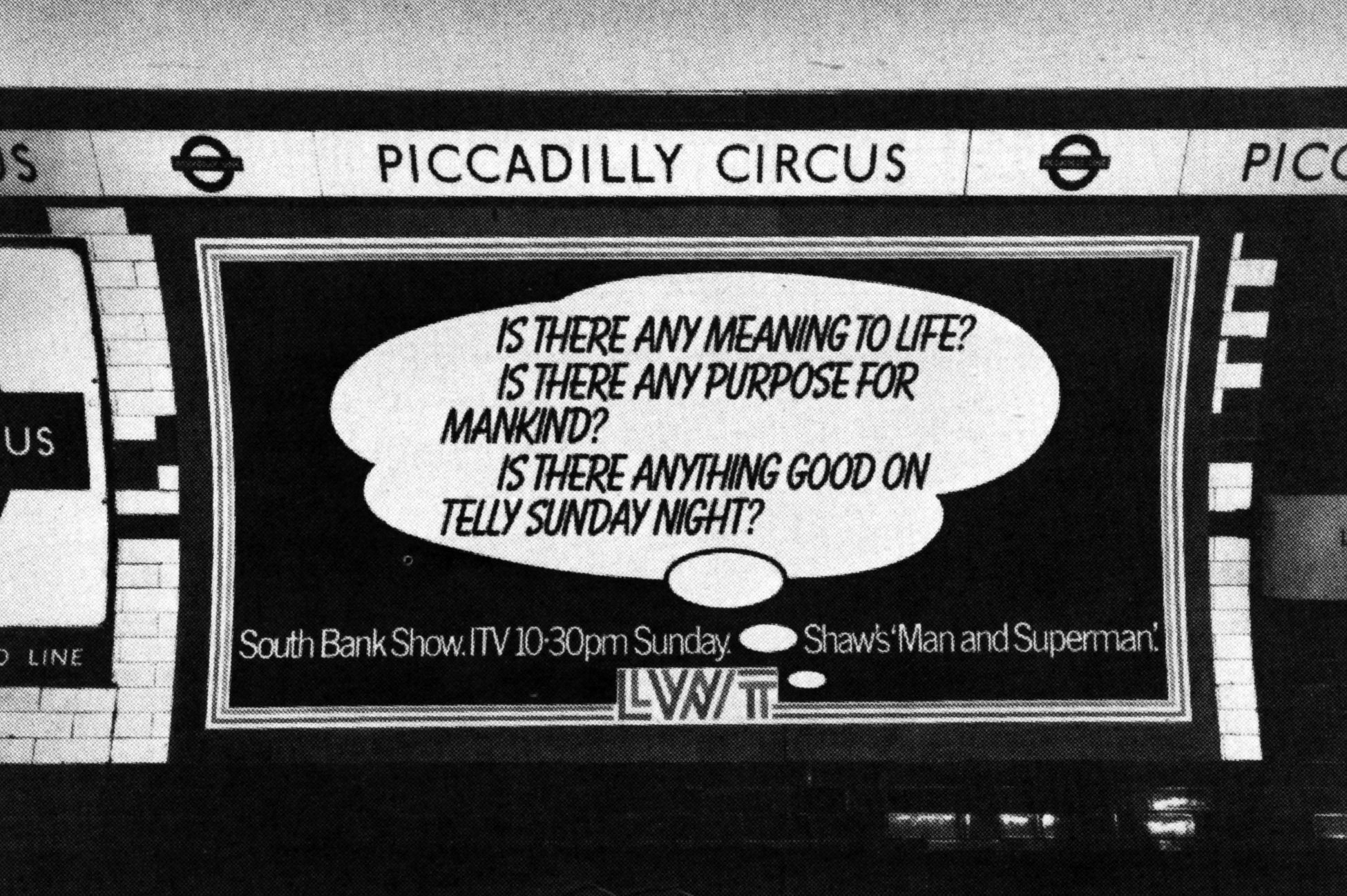
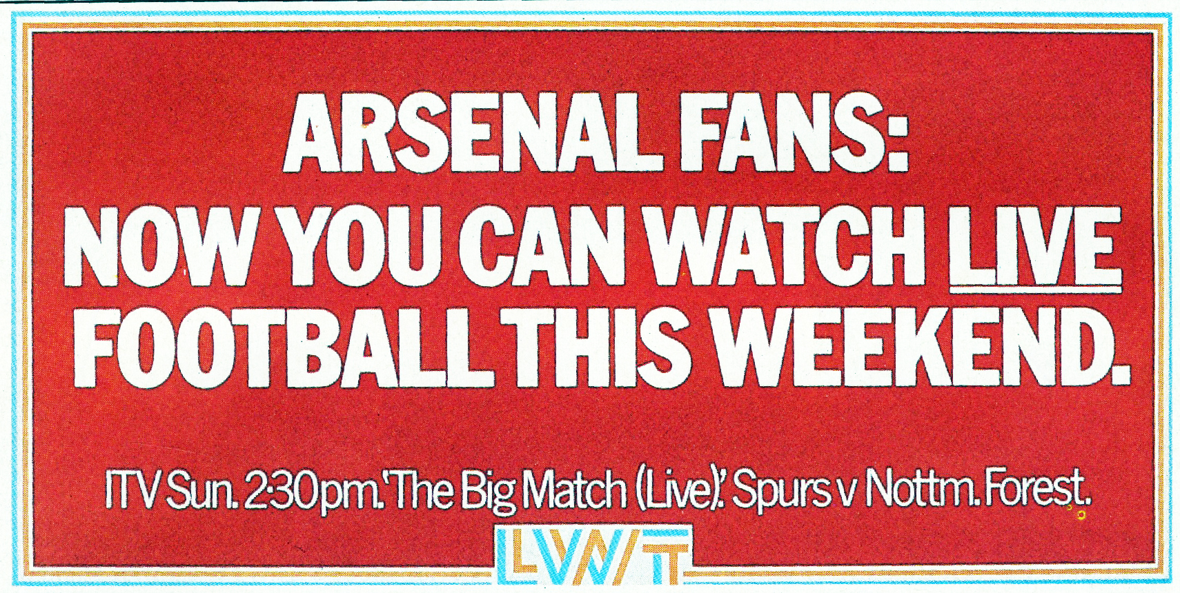
When chatting to Dave Trott recently, it occurred to me that they could probably all be traced back to GGT’s LWT poster campaign.
I don’t know if it was the first, but it’s certainly the best example of turning stories into advertising.
He mentioned they had produced seventy or eighty posters, so I couldn’t resist trying to track them all down and check what he remembered much about them.
I got to about 65 before the trail ran dry, thanks to Axel Chaldecott, Dave Waters and Paul Grubb. (Paul in particular had a ton of info, so I’ve included that too.)
DAVE TROTT: We never actually had the LWT account.
An agency called The Creative Business had it.
The man who ran the agency, David Bernstein, was a good friend of the LWT client, Ron Miller.
Both were good blokes, so the account wouldn’t move.
But one day Mike Gold had an idea.
He said to Ron Miller, don’t move the account, but just let us do the trade ads for you.
If you really want to get agency media departments to shift their money onto LWT you need to do something exciting.
Get their attention, create a bit of a stir.
At that time there were two commercial TV channels in London, both competing for ad agencies’ media money.
Thames TV ran Monday to Thursday.
LWT ran Friday to Sunday.
So the job was to get agencies to shift money out of Thames and onto LWT.
LWT tried to do this with a DPS in Campaign each week, running the same old media graphs.
Mike Gold said, if you let us run ads that get ad agencies talking about the ads, LWT will be much higher profile than Thames and you’ll look more attractive.
So Ron Miller said we could do his trade ads.
Mike Gold said the trade ads should be programme ads, as high profile as we could make them.
Leagas Delaney, who did the Thames TV advertising, did the sensible thing.
They ran half page ads in the Evening Standard.
But Mike said he had a much more exciting idea than that.
Mike had just seen a TV programme about communist China.
There were no newspapers, so each week they pasted a government press release onto the wall of every village.
In each village people would stand around waiting for it to change.
Mike said we could do that with posters.
If we changed the poster in the same place each week, people would be watching for the new one.
We’d only put the posters outside ad agencies, but no one would know that, they’d think the posters were everywhere.
The problem was, with a poster each week we could only print one plate, but LWT wanted their logo in 3 colours.
So Gordon Smith, the art director, had an idea.
He said each set of posters would run for 13 weeks at one poster a week.
Why didn’t we print 13 week’s-worth of colour logos and borders and keep them in a warehouse.
Then pull off a week as we needed and print the single plate.
That way we got full-colour posters printed in the same time as single-colour posters.
And that’s what we did.
When they ran, Mike Gold went round checking each poster site and having some moved to the other side of the road.
Why did he do that?
The posters ran in winter: it was light in the morning and dark at night.
People would see them coming in to work, but not going home.
You won’t find many media blokes that thorough.
When we did the ads, it wasn’t fair to give them to a particular team.
So we let everyone have a go but not in working hours.
If you wanted to do a poster you had to do it on your own time.
This meant, every Saturday, the agency was full of young creatives wanting to get an LWT poster in the D&AD annual.
DAVE: Paul Grubb and Sam Hurford showed me a rough with the picture of a snooker table with the pockets broken out, no headline.
It made sense because the biggest snooker draw at the time was Alex “Hurricane” Higgins.
But, good as the picture was, I thought the picture on its own was too subtle for a poster.
It would have made a good press ad, but posters have to work faster, from further away, in bad weather.
So I made Grubby put “Hurricane Warning” across the top.
He didn’t like it, he wasn’t happy.

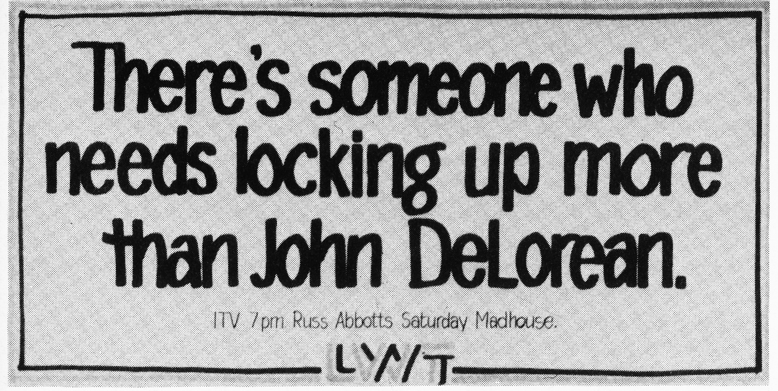
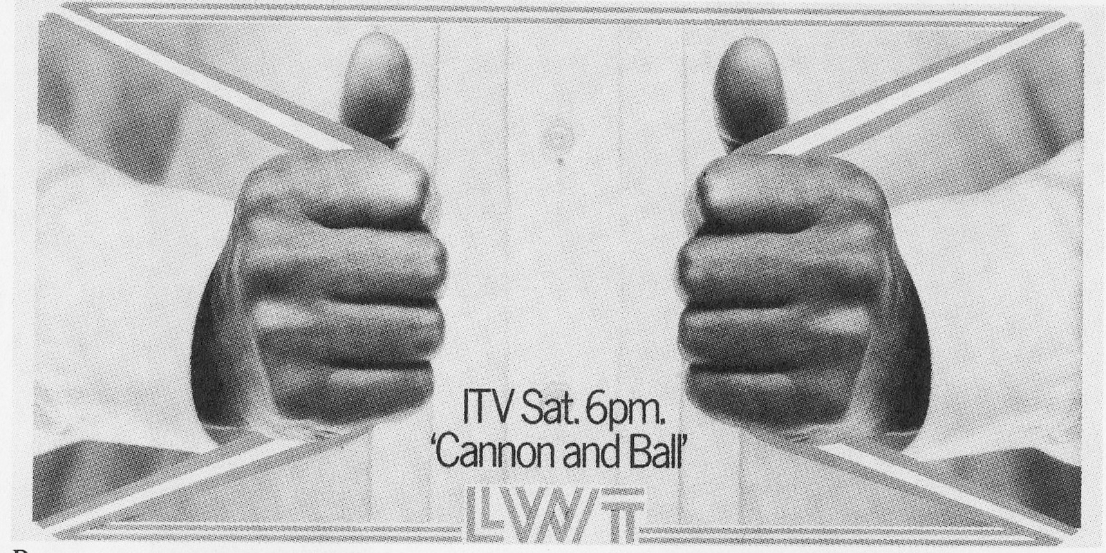
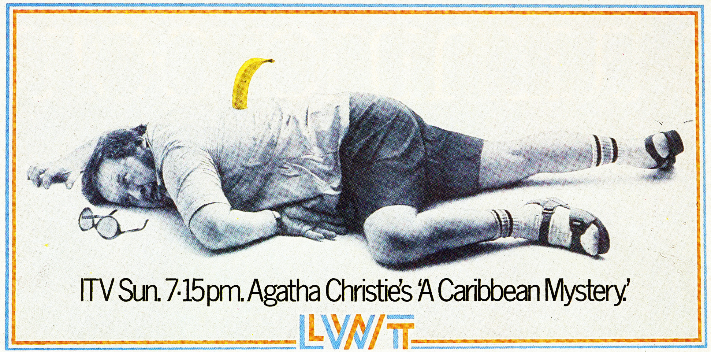
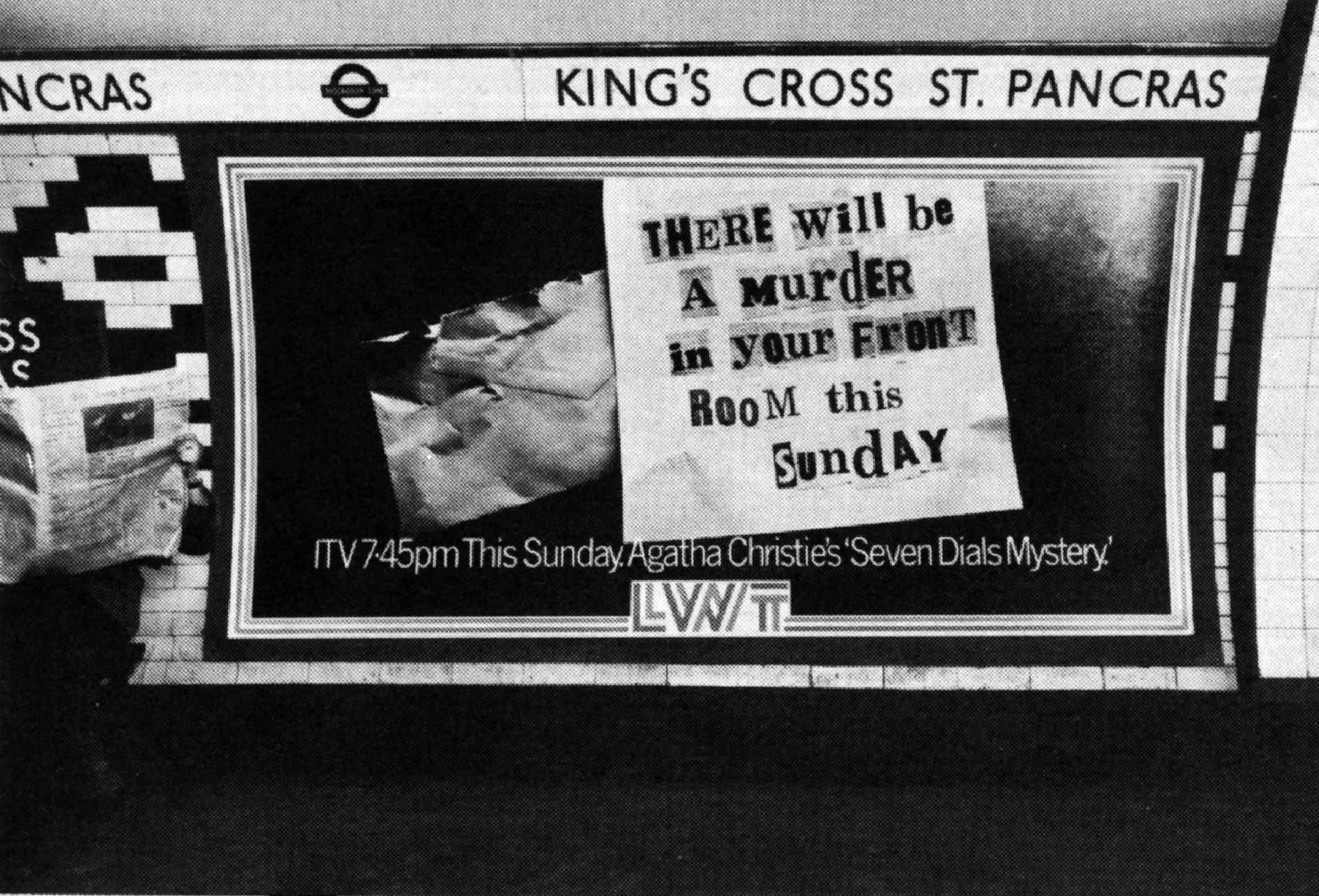
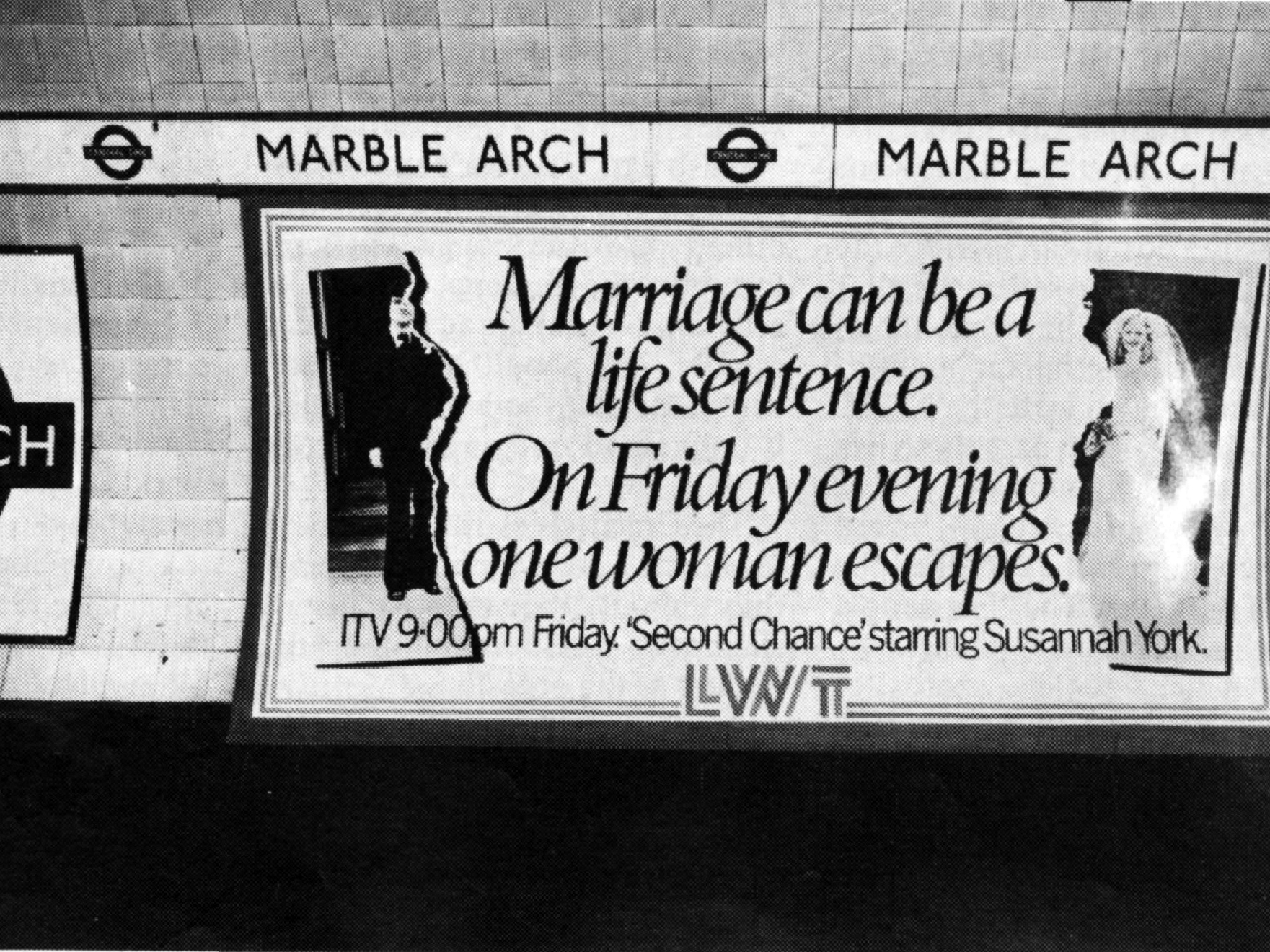
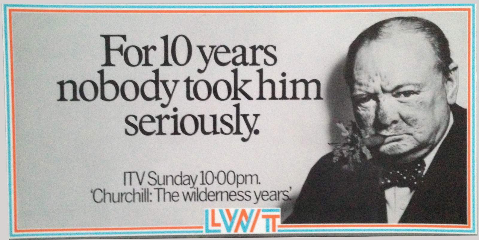
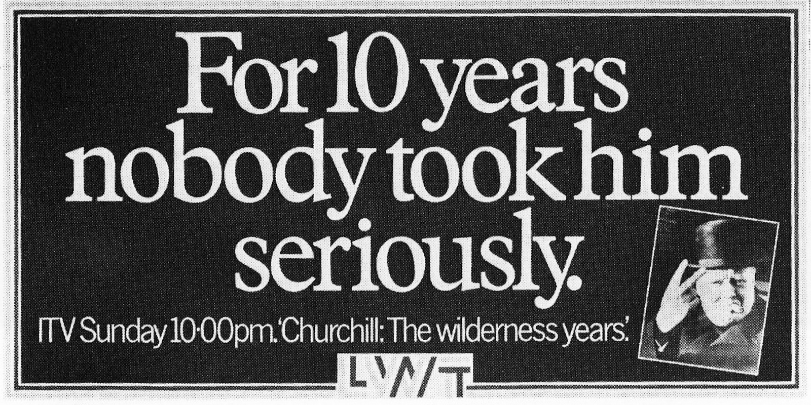
REJECTED. DAVE: The client thought this would upset Russ Abbott, John DeLorean and anyone who invested in the company (like the Government).
THIS WAS THE AD THAT RAN. PAUL GRUBB: We used whomever, whatever was available. The Art Director Dave Waters wore a skirt for this.
DAVE: I tried to get the client (Ron Miller) to buy two ads before this one.
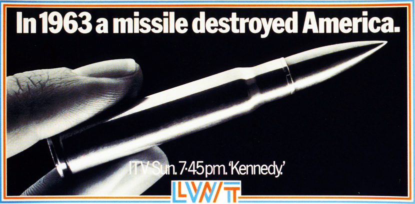
Same visual but different headlines.
One said ‘WHAT WAS THE LAST THING TO PASS THROUGH KENNEDY’S MIND’.
The other said: ‘I NEED ANOTHER PARADE LIKE A HOLE IN THE HEAD’.
Ron turned them both down so I thought we’d better go back with something serious.
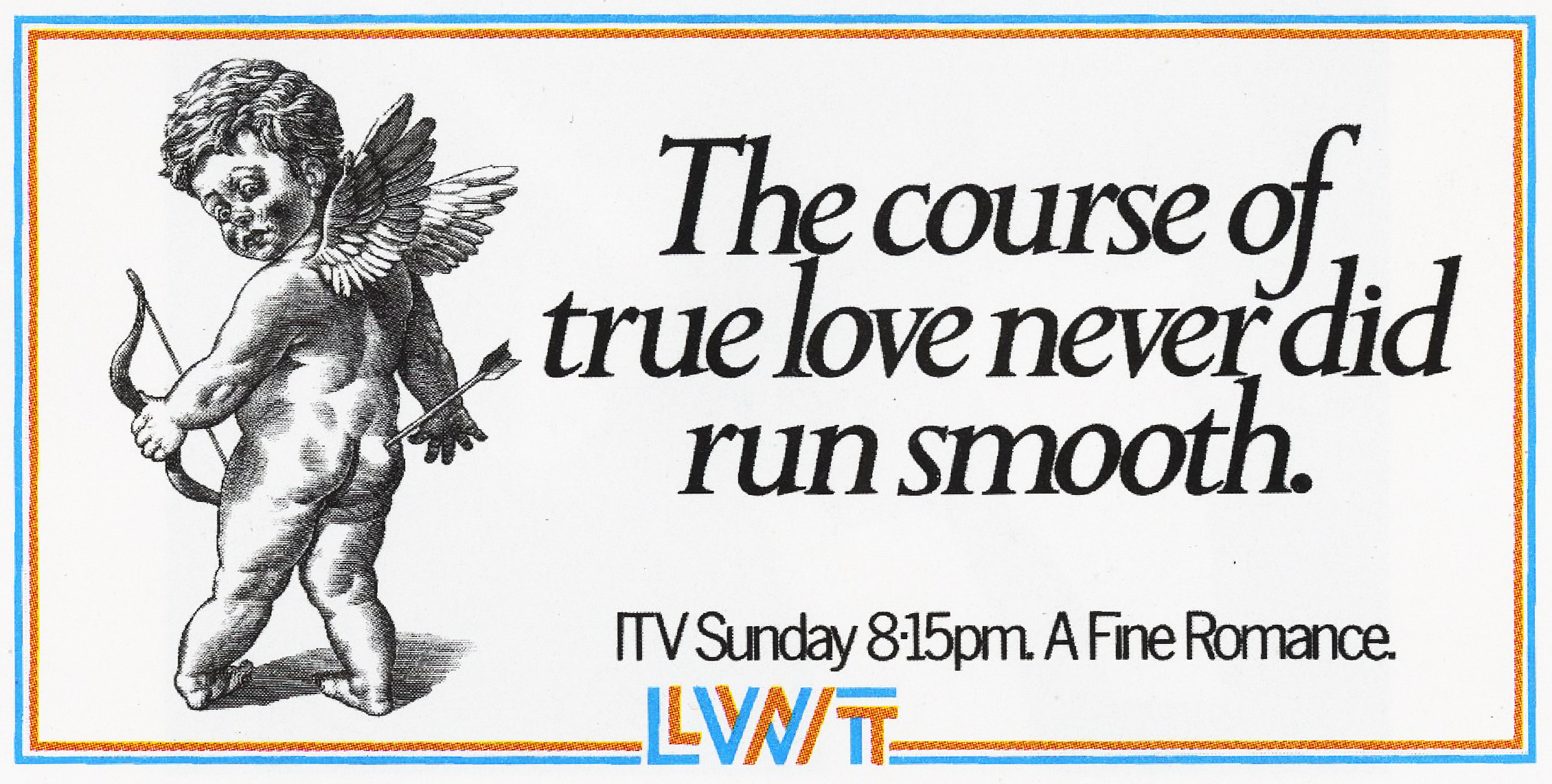
PAUL: As you know, Mike Gold came up with the idea of preprinting the coloured border so we only had to print a black plate inside, allowing us the quick (at the time) turnaround of a poster a week.
And our clients were so good they allowed us to experiment, and here’s one such.
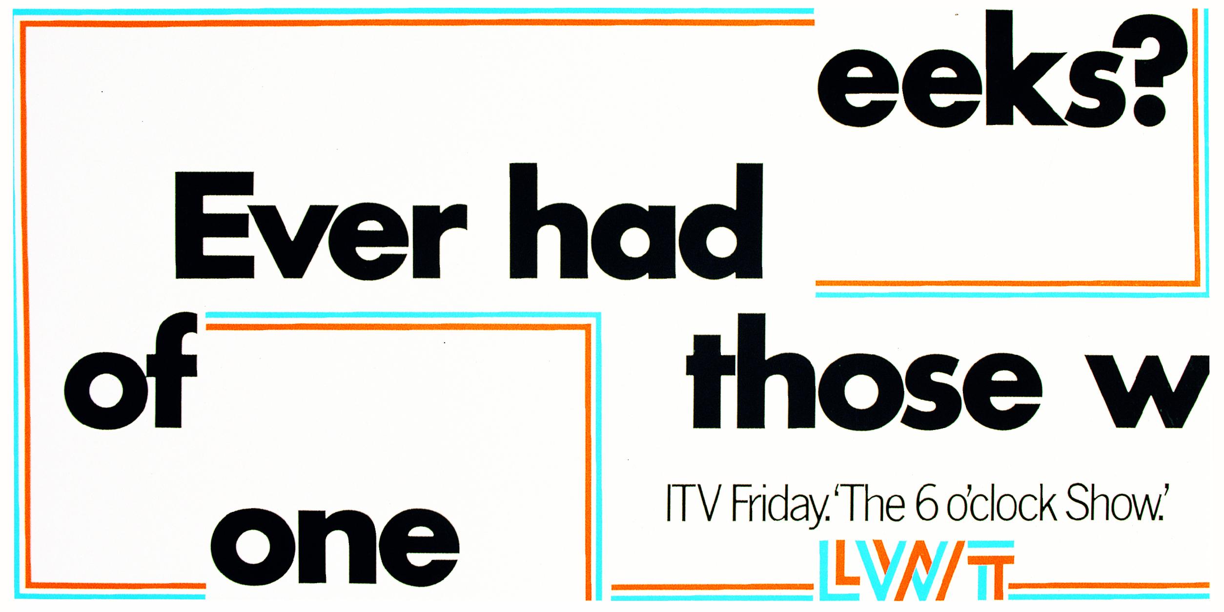
We thought it would be great to mix the sheets up, but in more than a couple of locations, the contractors posted them up in the normally correct sequence with the border aligned around the periphery (against specific instructions) so in those places it was just a poster that read ‘EVER HAD ONE OF THOSE WEEKS?’, leaving people who cared wondering what the hell was going on. The irony….
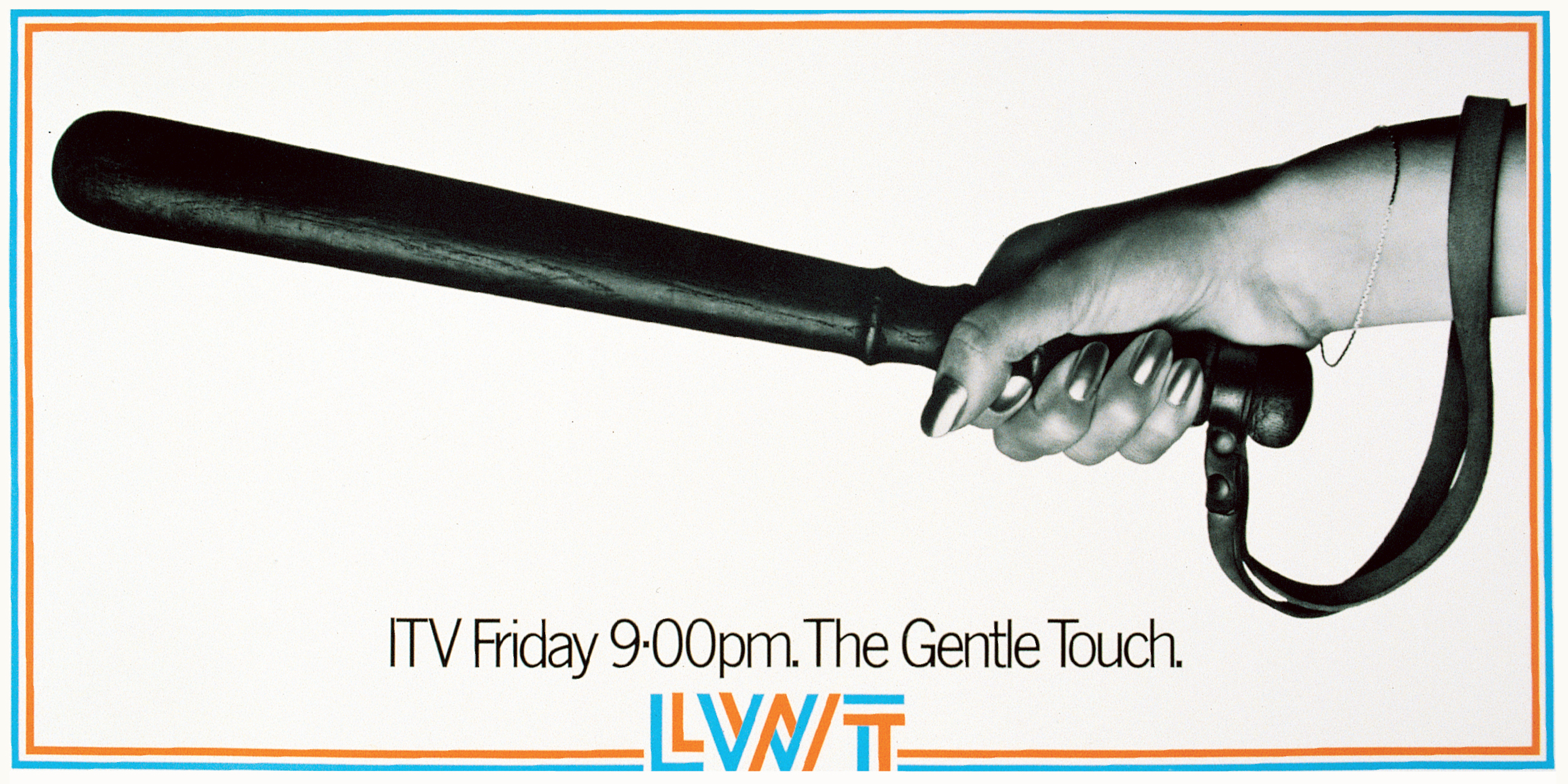
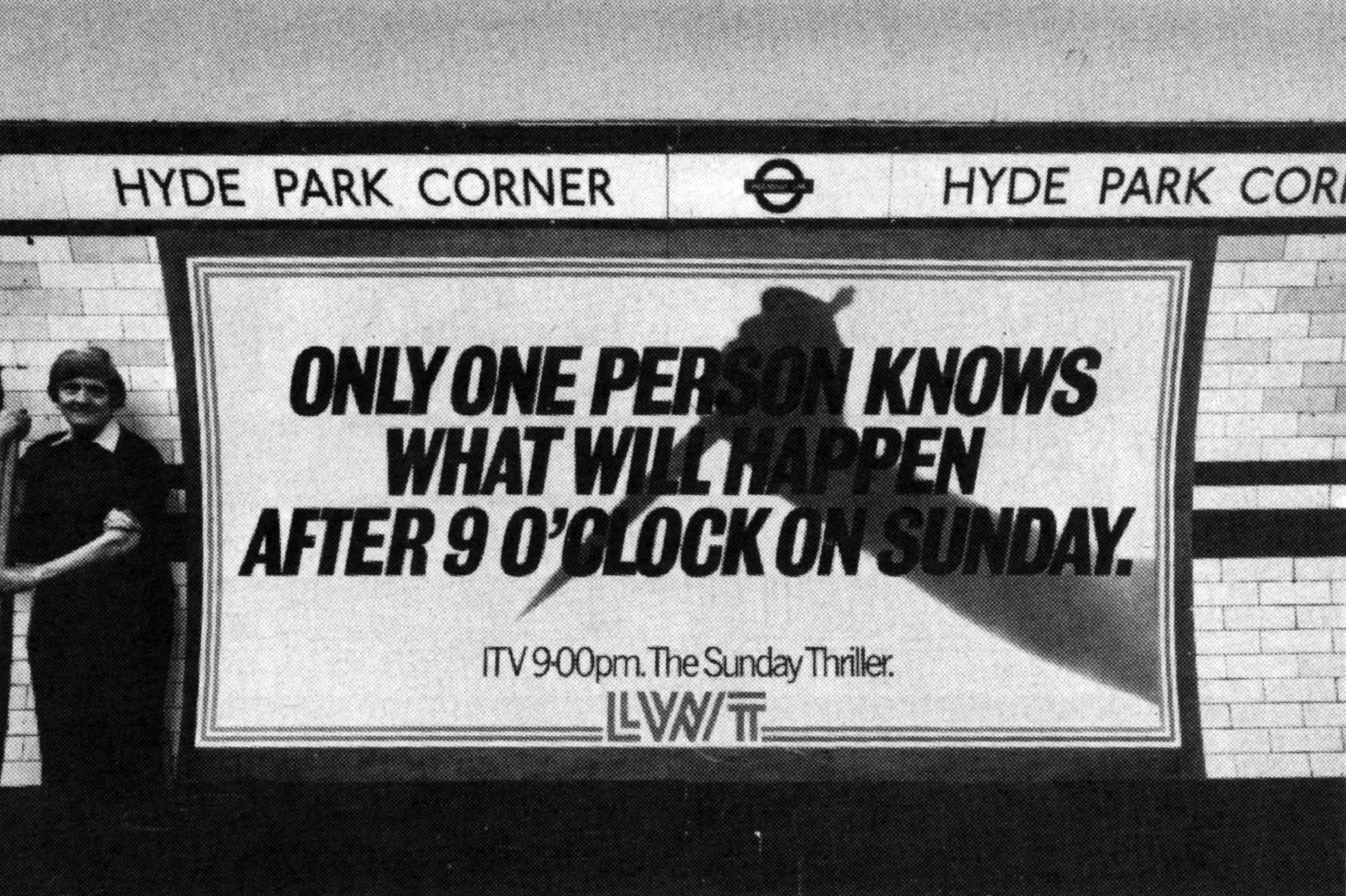
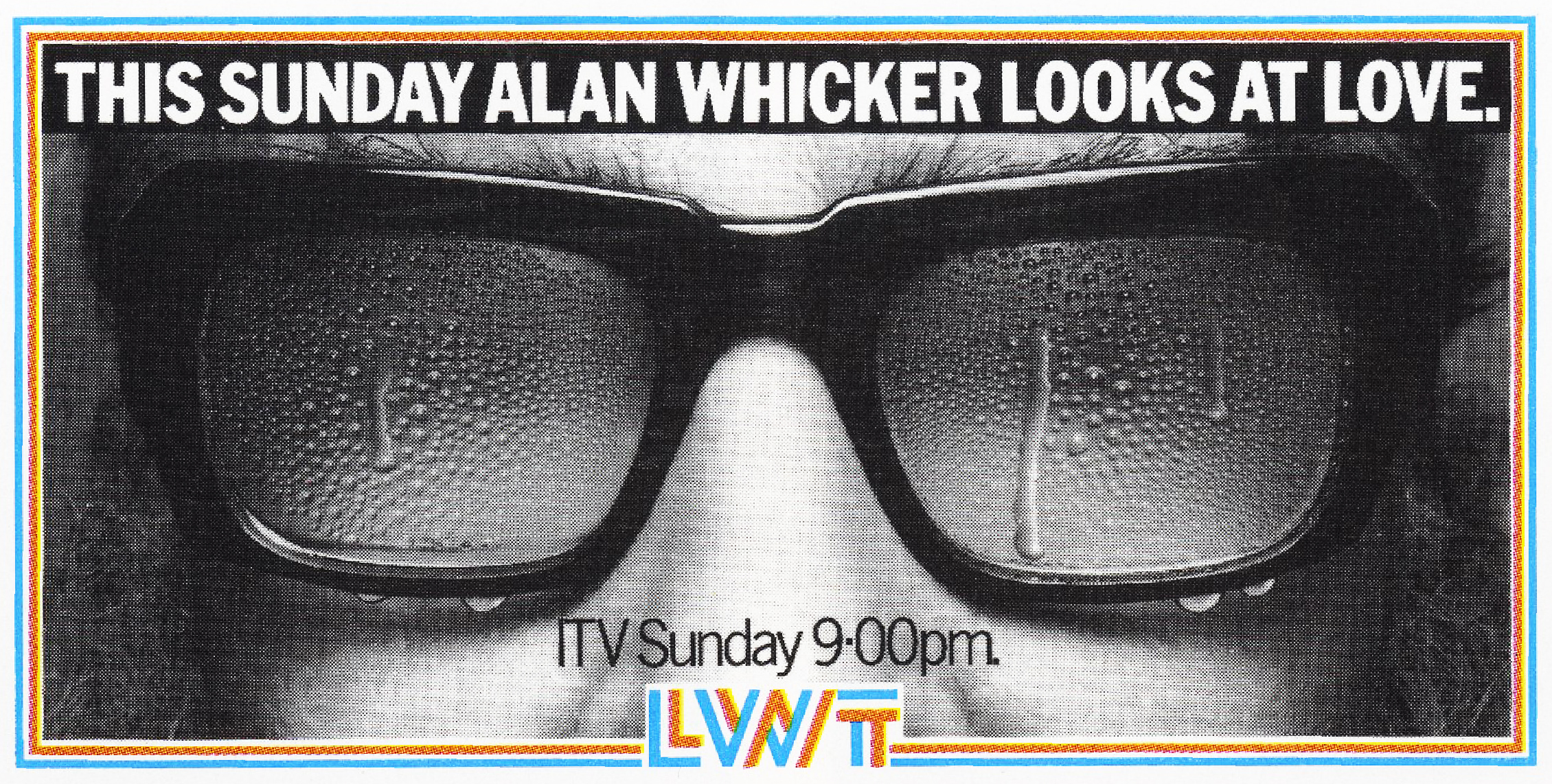
DAVE: I was always disappointed that no one got this one.
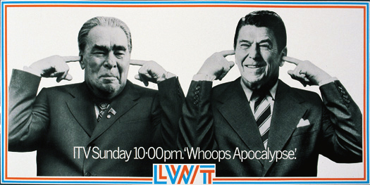
The picture was meant to be both of them putting their fingers in their ears to avoid the sound of all the H bombs going off.
But everyone thought it meant they didn’t want to listen to each other.
I think we over-thought it.
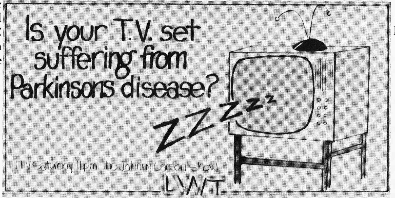
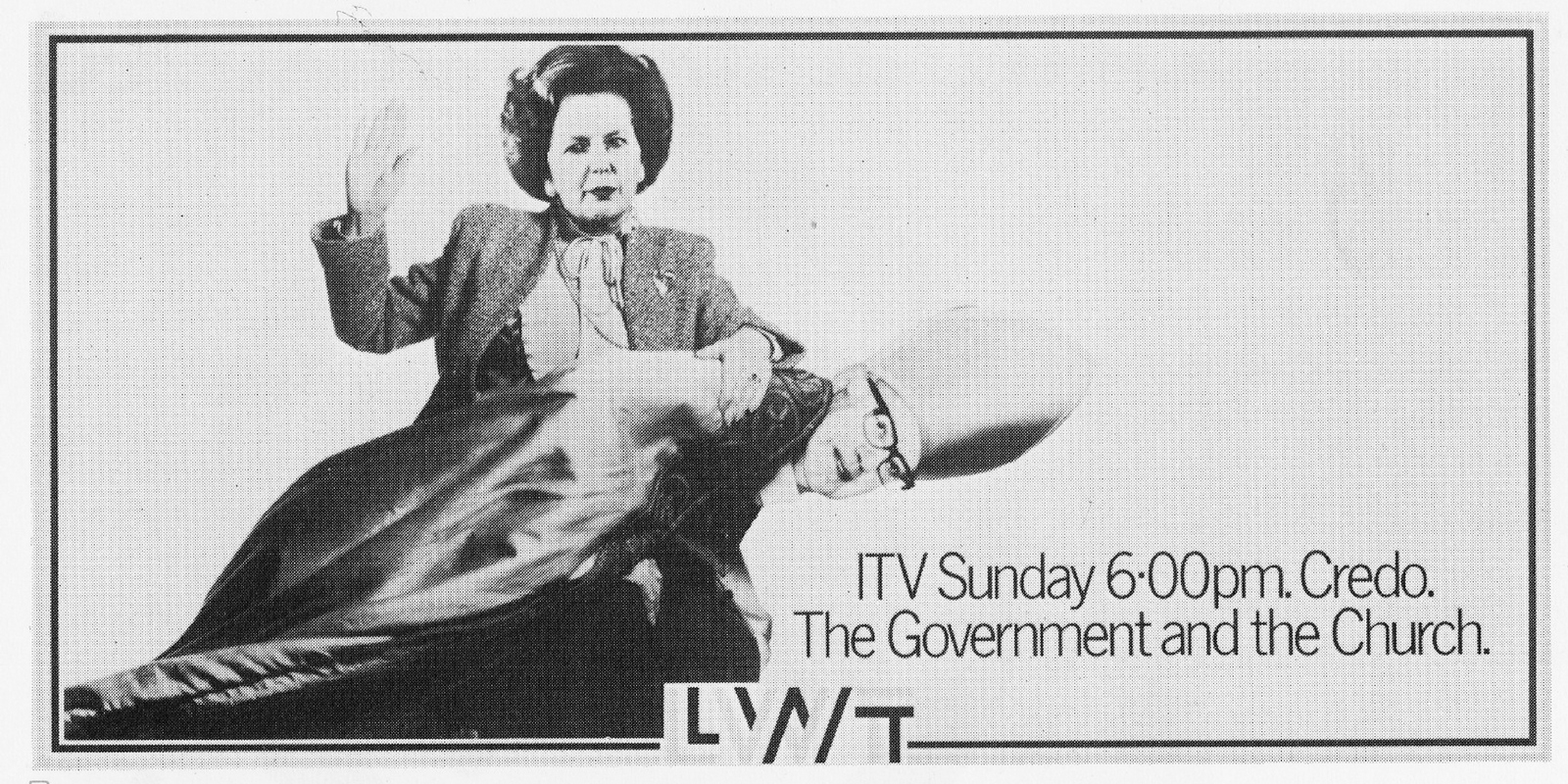
REJECTED. DAVE:The client thought this would have upset Michael Parkinson, the BBC and anyone with Parkinson’s Disease.
PAUL: This was one of my favourites. Everyone was genuinely nervous about what the reaction would be.

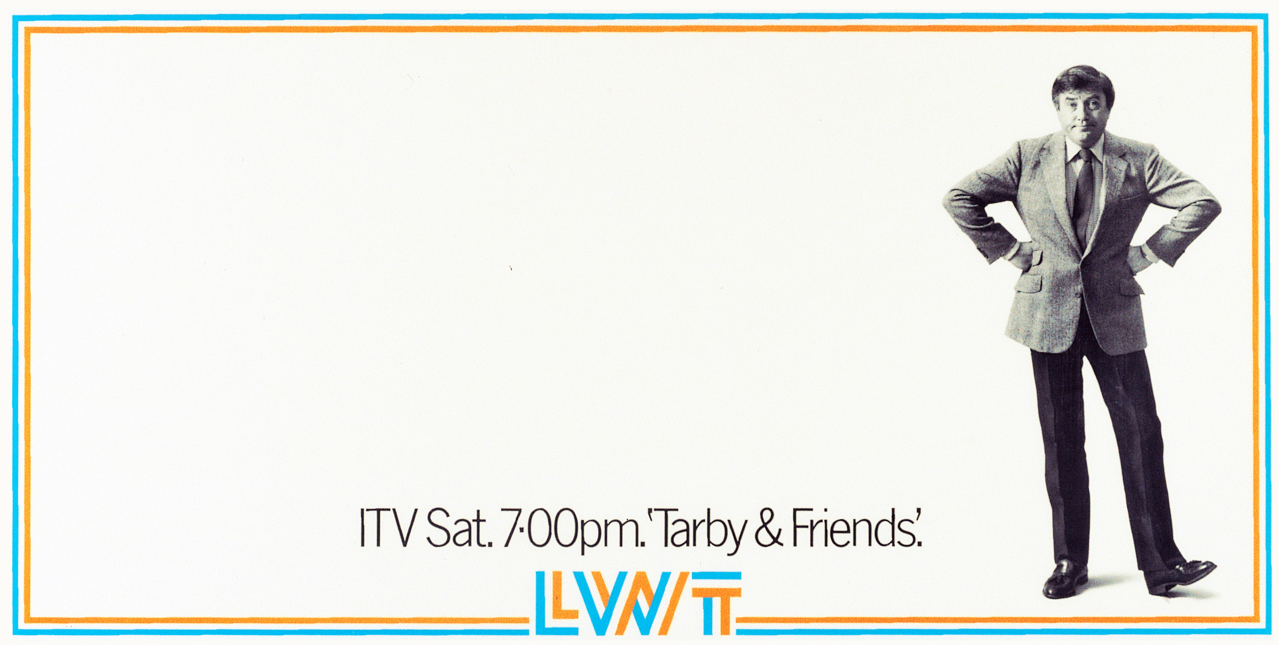
PAUL: We had to get Tarby’s approval for this and when he agreed, we thought he didn’t understand the idea, thinking it was just a picture of him.
Also, he wanted to actually be photographed rather than us using a stock shot.
On the shoot, he said ‘‘you guys think I don’t understand the concept don’t you? I’m not thick, I know you’re implying I have no friends’’.
We were young we didn’t know how to respond.
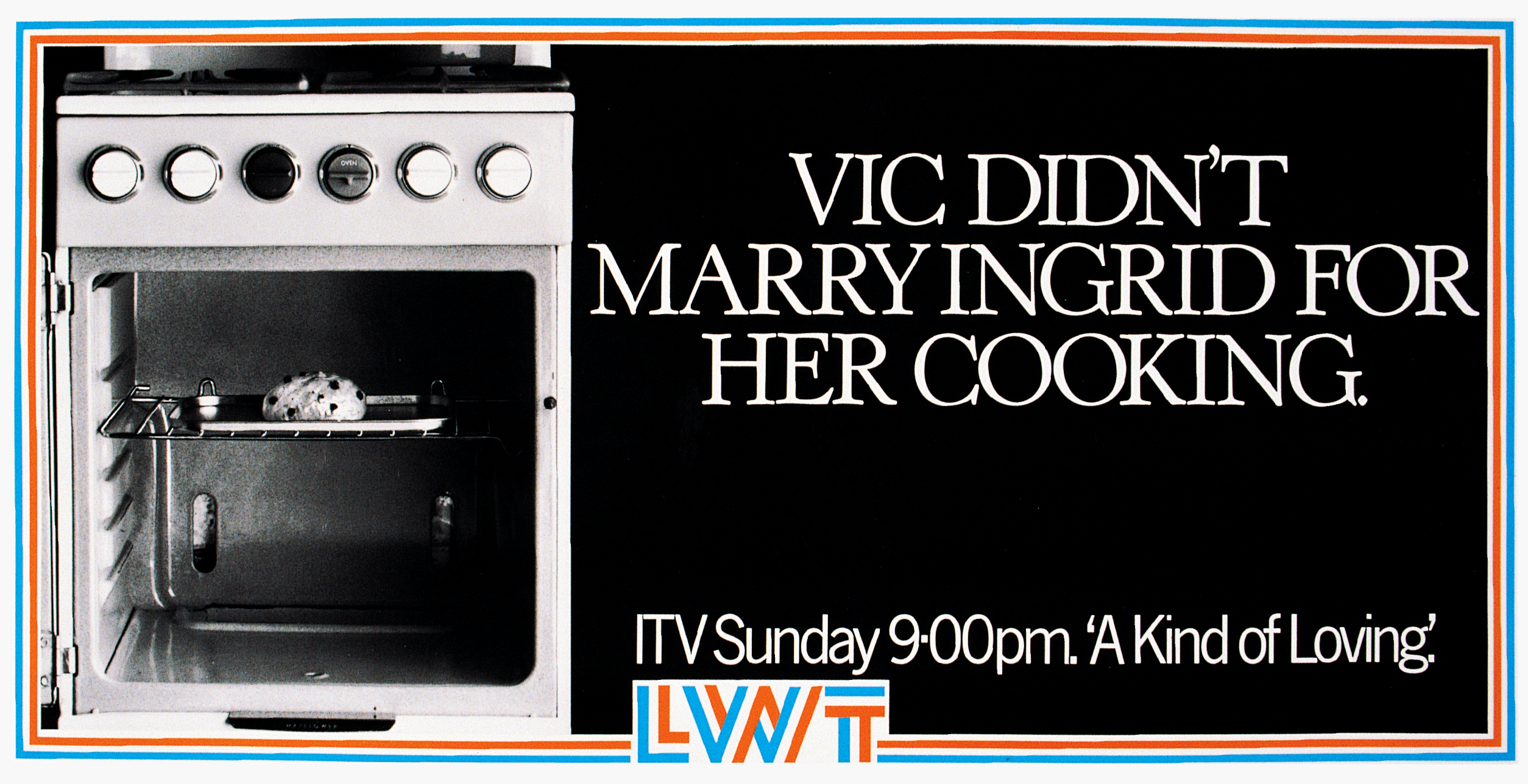
PAUL: We were masters of the concrete idiom, leading some people to call us the concrete idiots.
We bent the rules on this one, or the border at least – we didn’t have a preprinted folded and creased corner so we had to pressure the printers to work through and whack this particular one out in a week.
Nice result though.
PAUL: Always prodding the establishment, trying to provoke and annoy.
DAVE: Paul Grubb had a picture of the Ayatollah with blood dripping from his hands.
I changed it to have a shadow on the wall, then added the headline.
I think we got bomb threats after this ran, which we were all pleased with.

DAVE: Nick Wray did this one.
White out red but still just one plate to print.
As a Man Utd fan, Nick hated Arsenal and they had a reputation for drawing or winning one nil.
I think Terry Neil was the manager when this ran.
After it ran he got the sack and threatened to sue us.
So Nick was happy.
REJECTED. DAVE: The client turned this idea down because it didn’t accurately reflect the storyline, or how much LWT had spent on it.

REJECTED. DAVE: This one was turned down as well. Even though it reflected the storyline, he thought it might upset the people who were selling it to him.

REJECTED. DAVE: This one was turned down as well. Even though it reflected the storyline, he thought it might upset the people who were selling it to him.

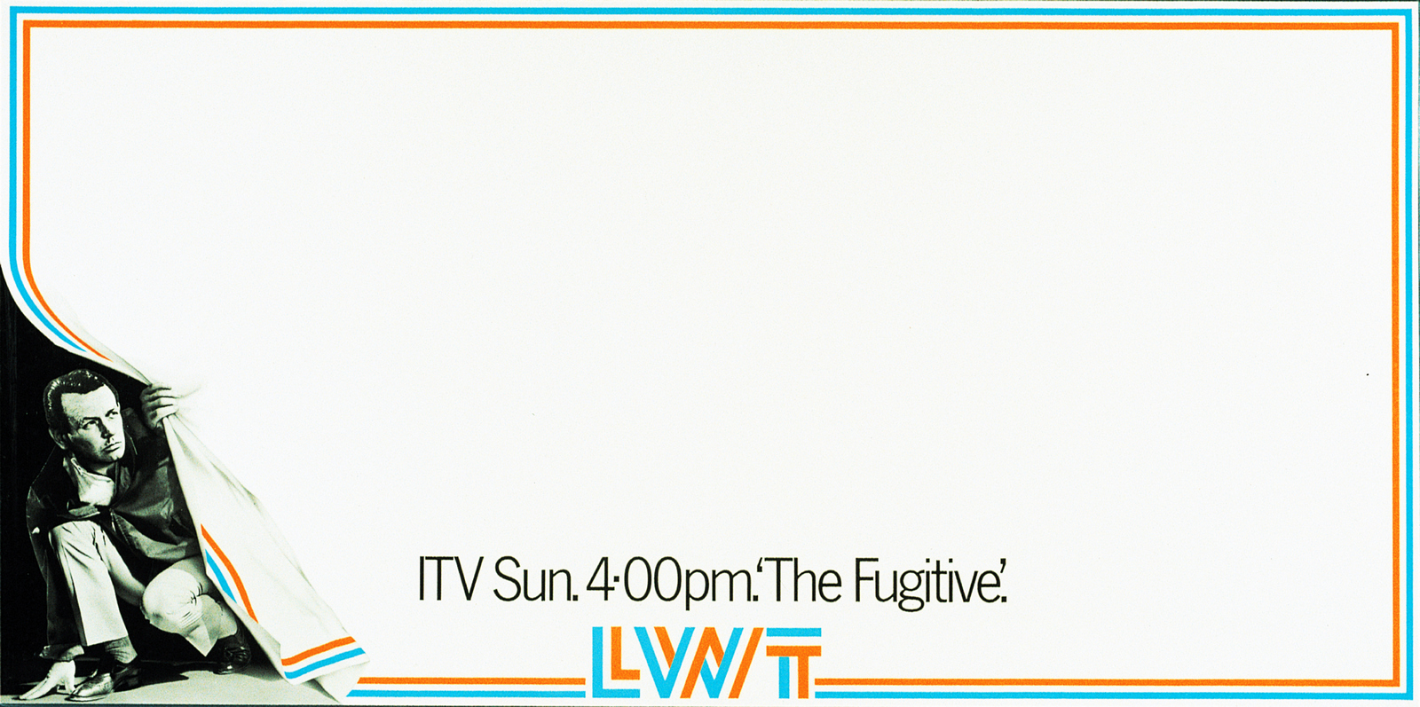
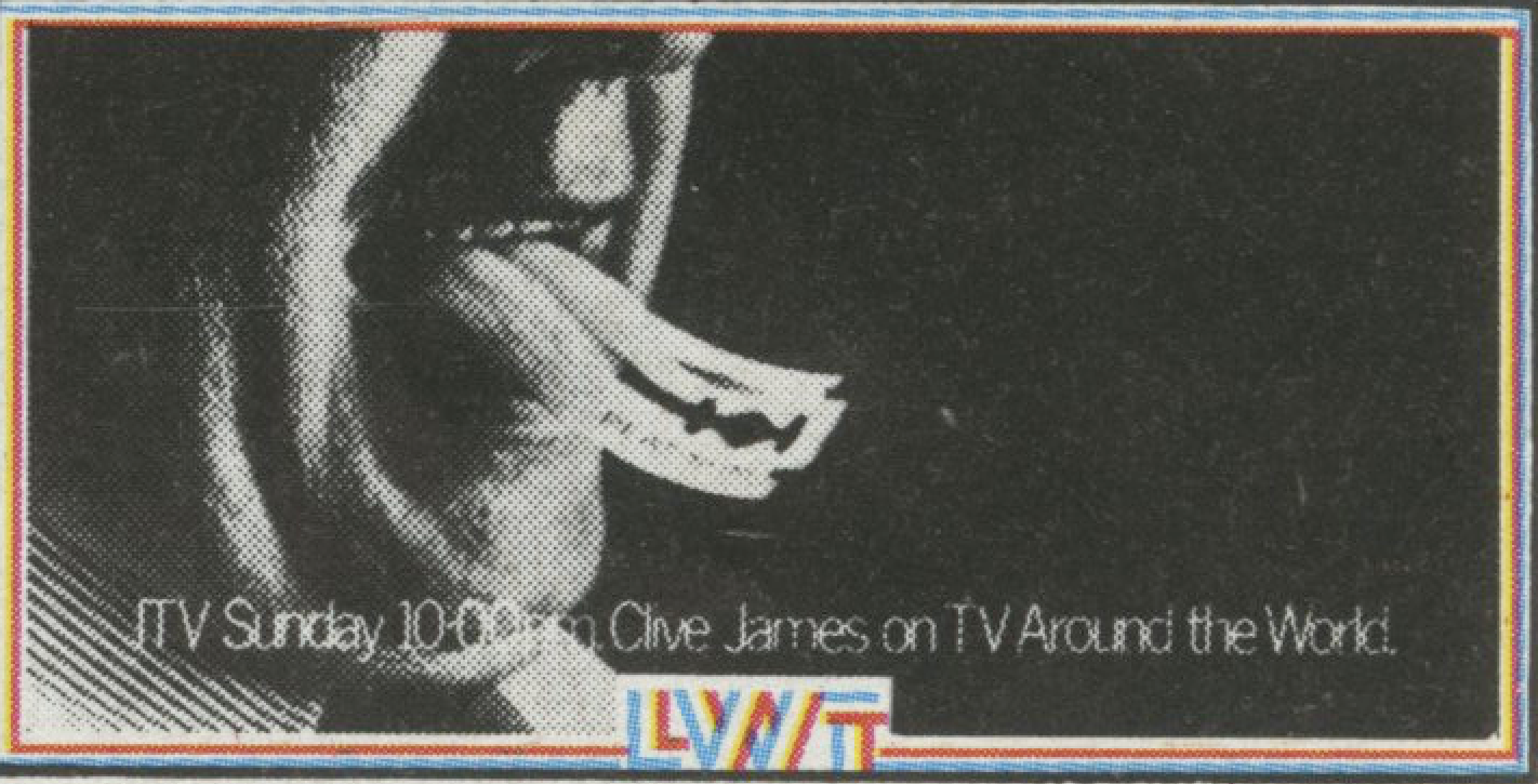
PAUL: Along with The Fugitive, this was the only other time we strayed from the black plate only template.

REJECTED. This was pulled at the eleventh hour, because the client worried it may be seen as disrespectful.
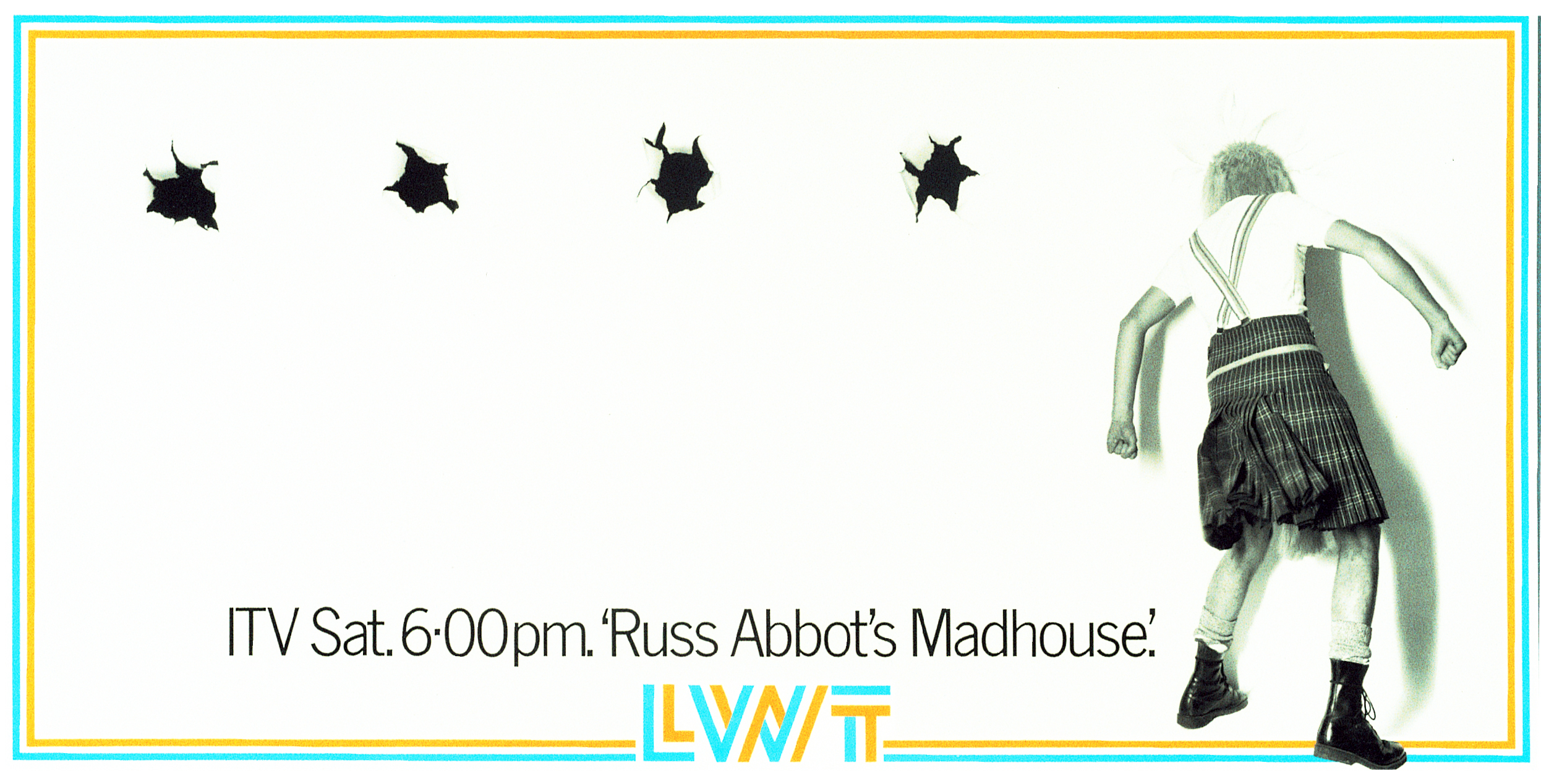
THIS ONE RAN.
DAVE: All these legs belonged to people who worked at the agency.
One pair belonged to a very senior account man who said he subsequently got very aroused every time he went past the TV producer (on the right) and thought of her panties round her ankles.
Fair enough.
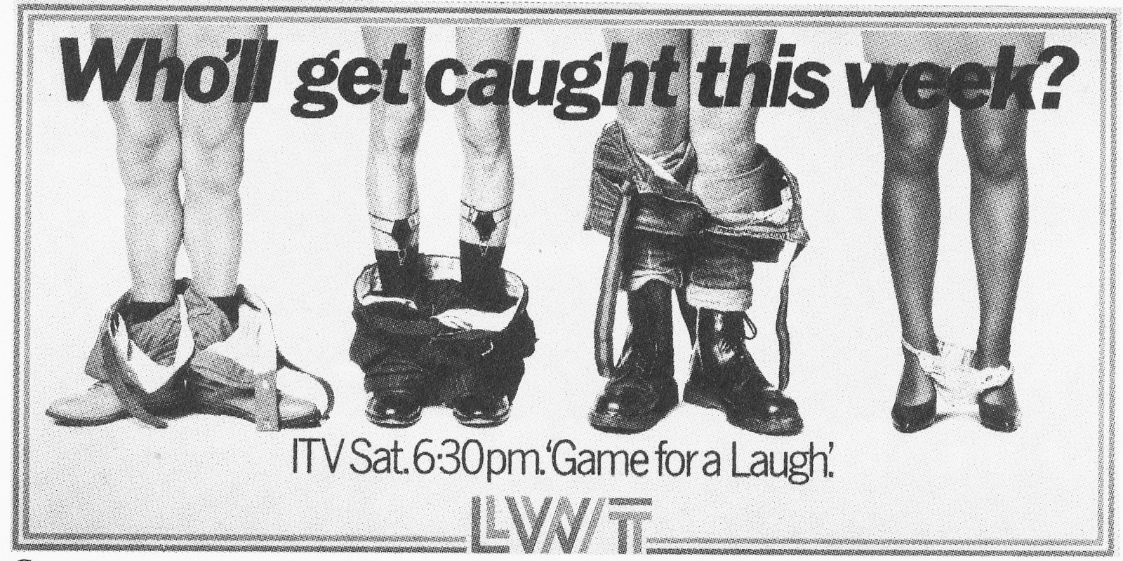
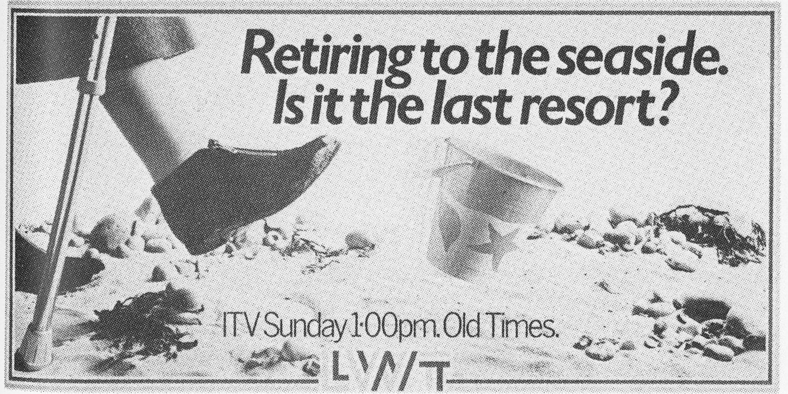

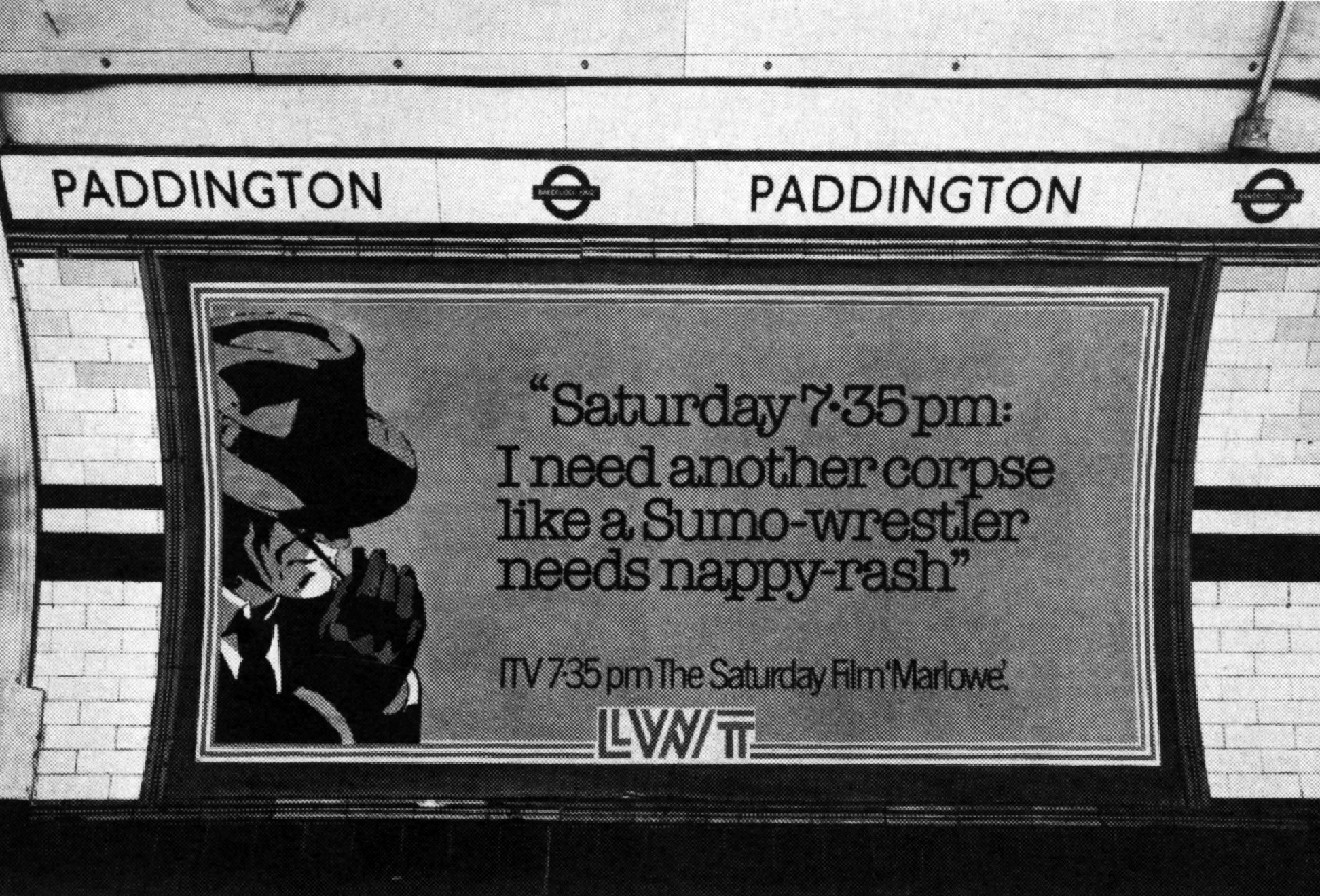
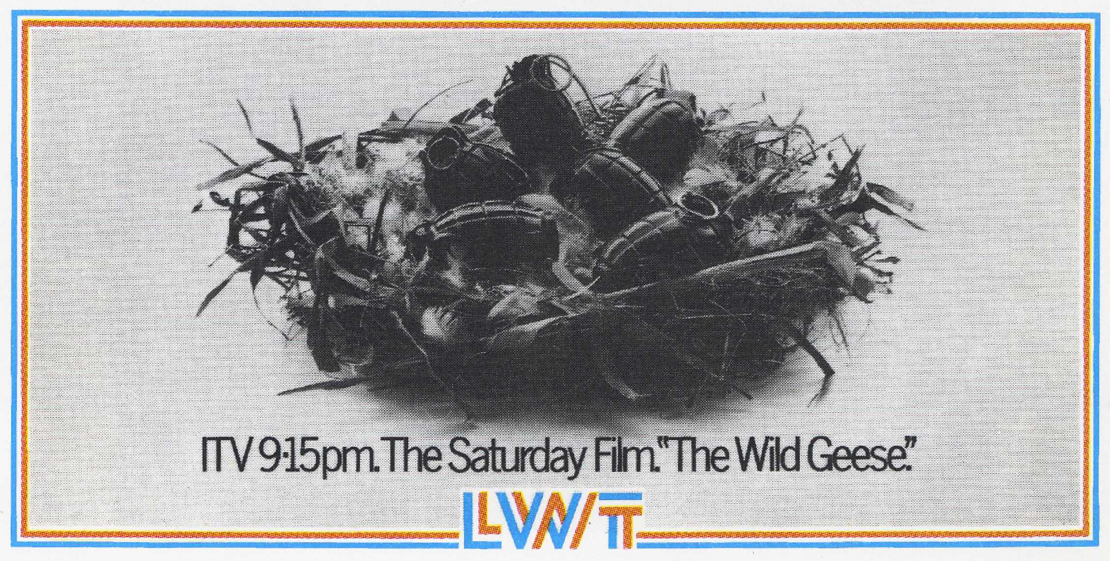
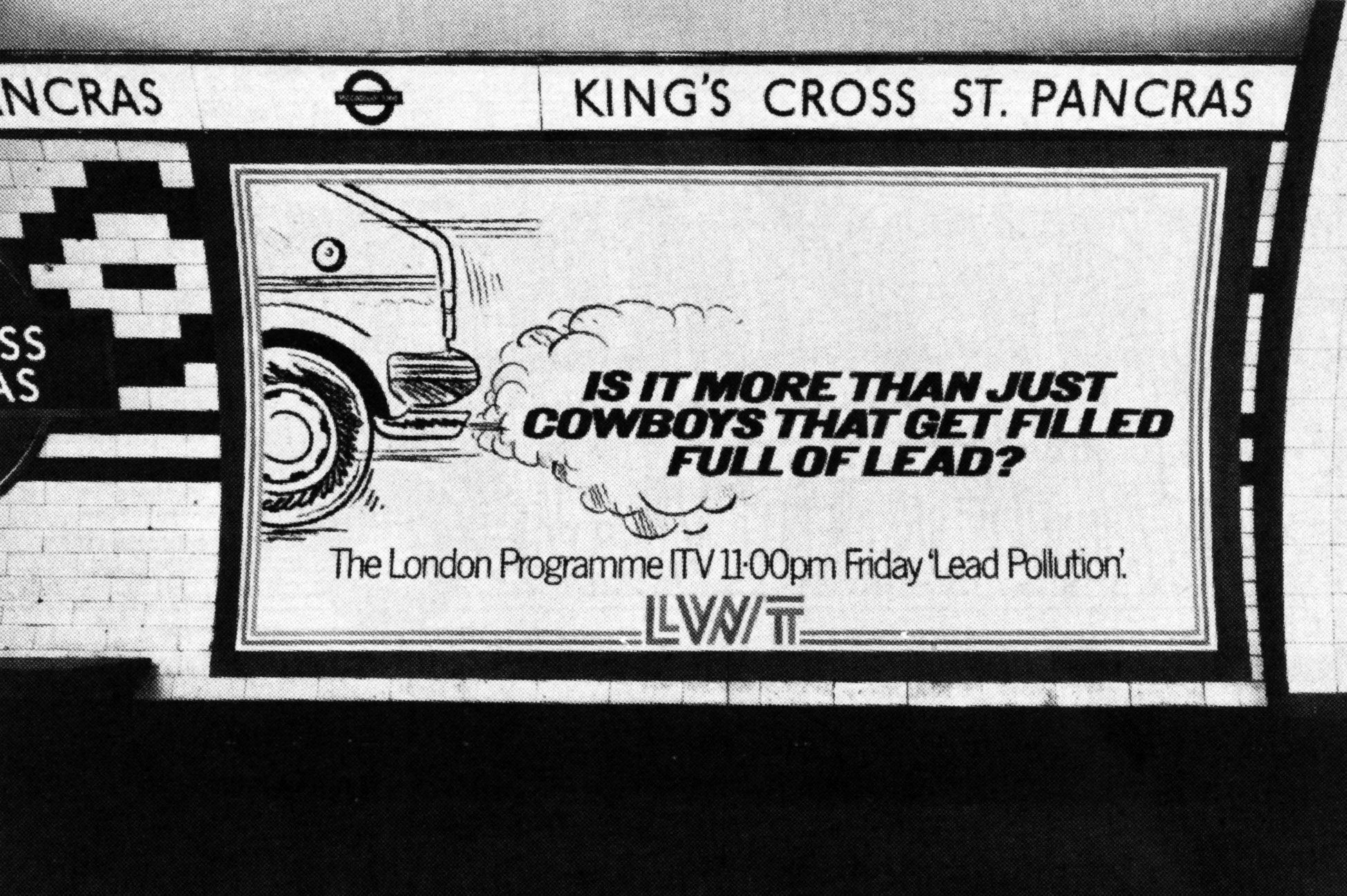
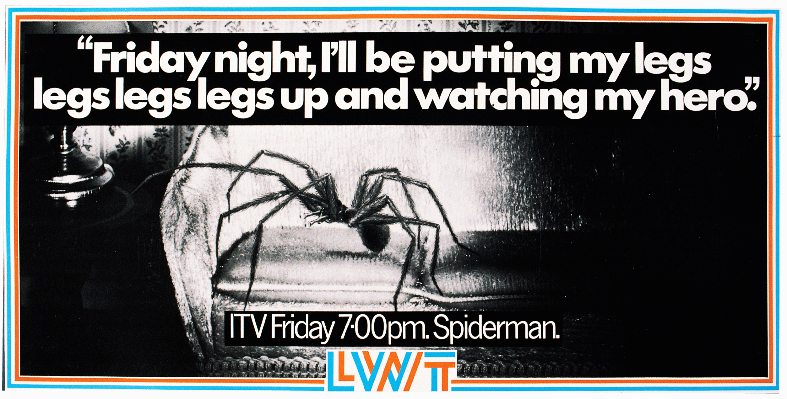
PAUL: A very good, well known creative, whom I won’t name, at the time accused Gordon of art directing with a knife and fork based on this poster.
He may well have had a point, but he really missed the point – these were literally thrown together, some worked brilliantly and some didn’t work at all.
But we had fantastic clients like Michael Grade, Ron Miller and John Birt who stuck by us through the good and bad times.
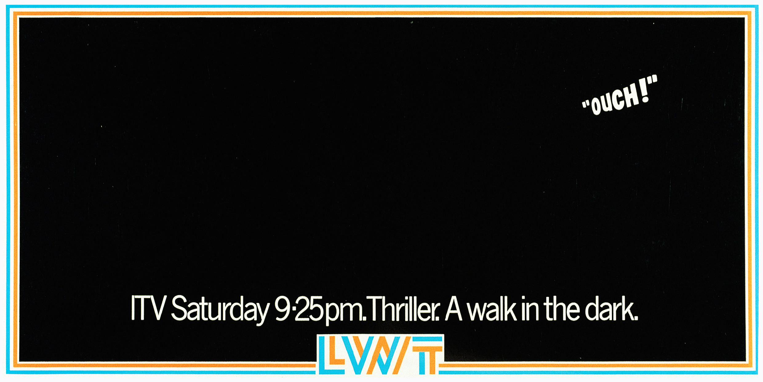
REJECTED. DAVE: The client thought this would upset Janet Street-Porter, women, and anyone with big teeth.
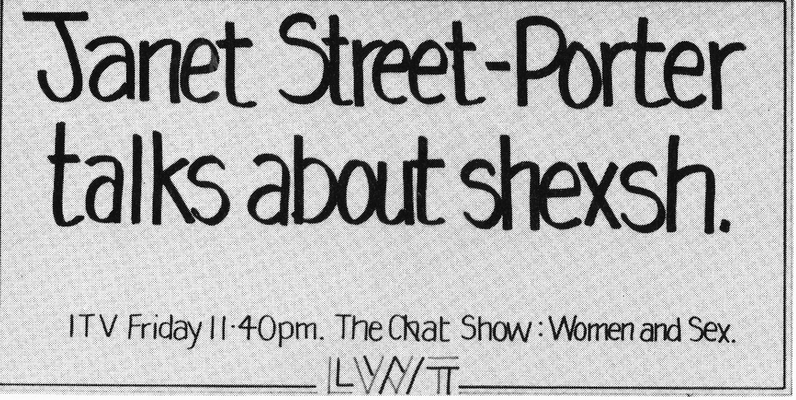
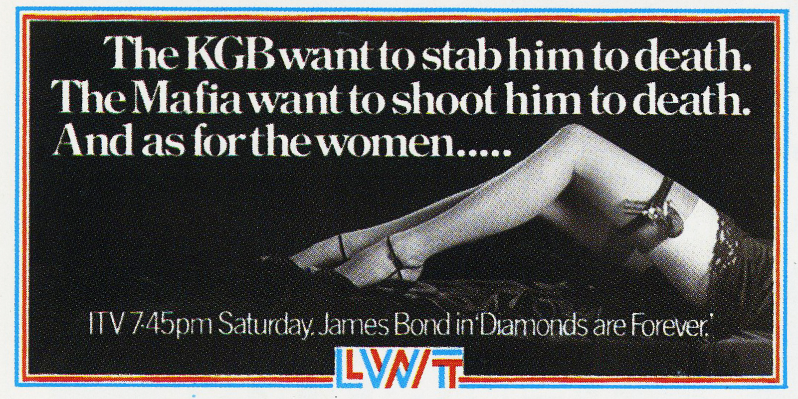
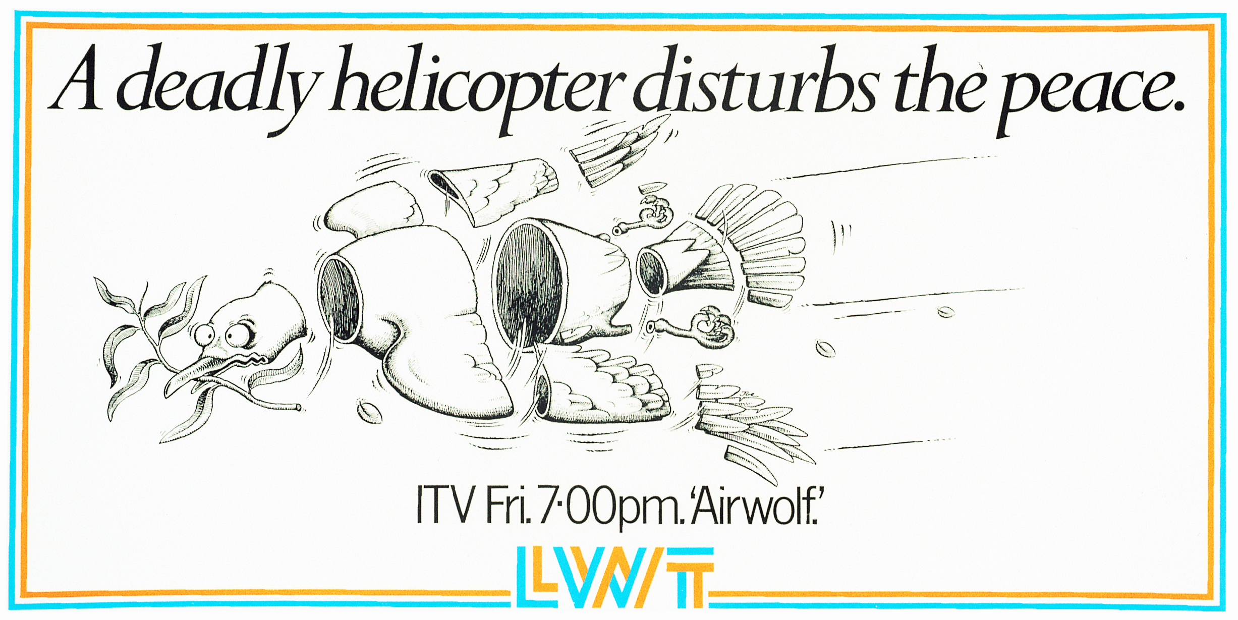
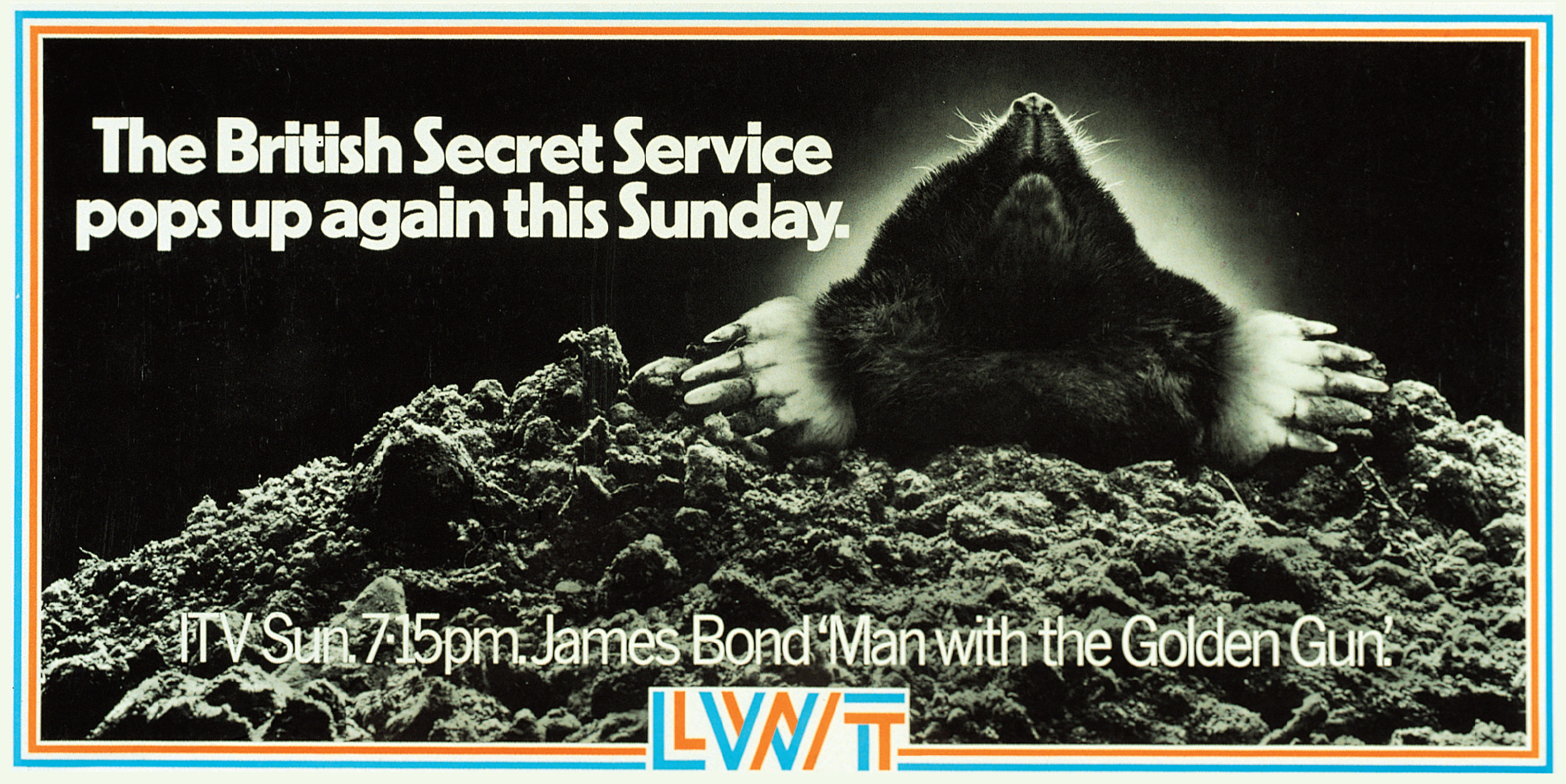
PAUL: This was a time when there were many news stories about gay spies. We never won any pc awards, there was no PC in GGT.
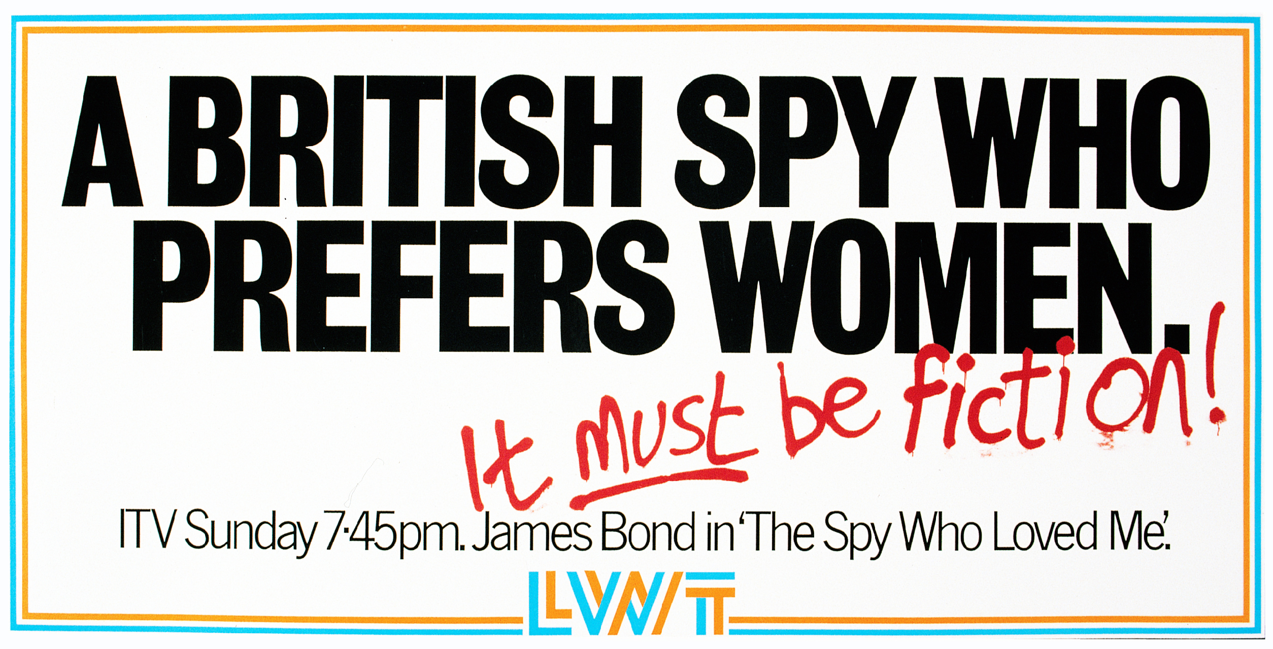
PAUL: This one raised a few hackles – typically ‘offensive’ GGT style.
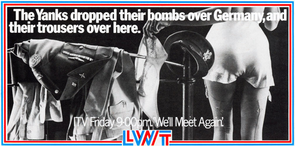
DAVE: Not a great poster but the one that got us into most trouble.We ran it a few days after someone had broken into the Queen’s bedroom and sat chatting to her on the end of her bed.Daily Mail readers were outraged that we could take the piss out of such a scandalous thing. How dare we?
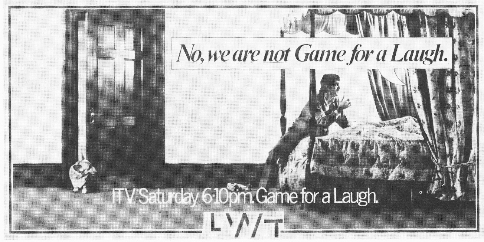
DAVE: We didn’t know much about this programme except the detective was a Vietnam veteran.
When it ran, the client (Ron Miller) said he had a problem with his boss, who thought it looked like a black man’s hand.
And that we were implying all gun crime was down to black men.
We kept pointing out it was a white man’s hand, but it he didn’t believe us.
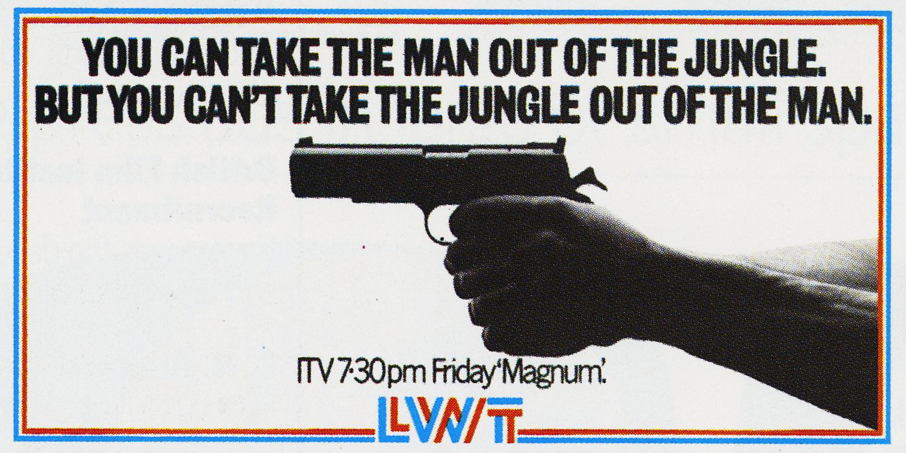
REJECTED. DAVE: This was turned down by the client for not reflecting the gravity of the occasion.

THIS IS THE AD THAT RAN.
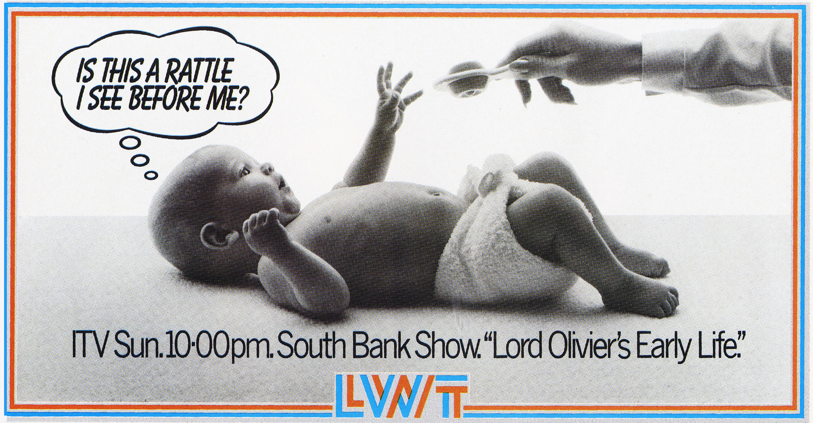
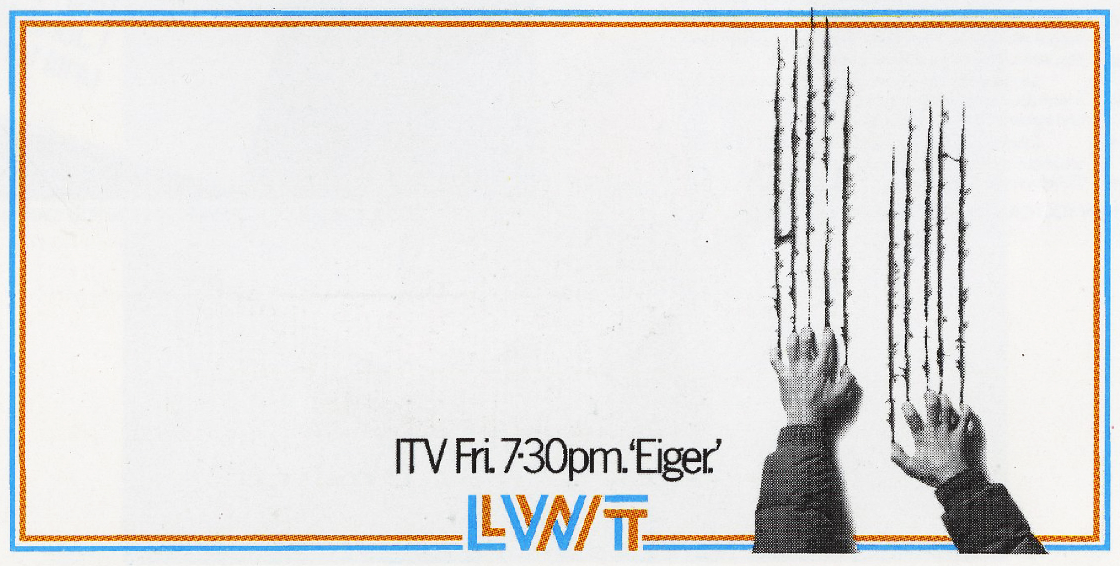
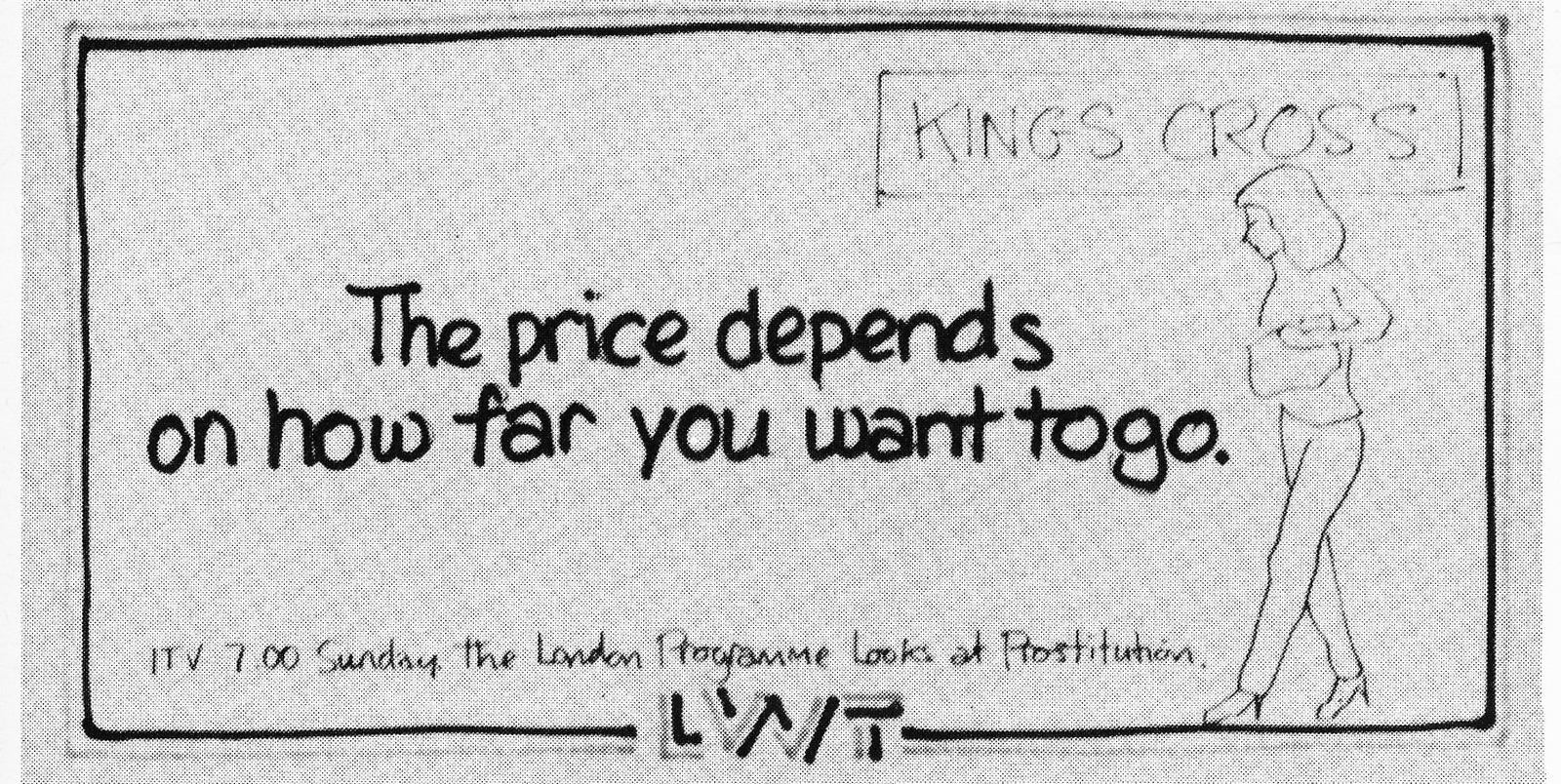
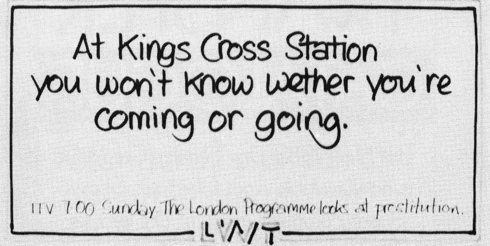
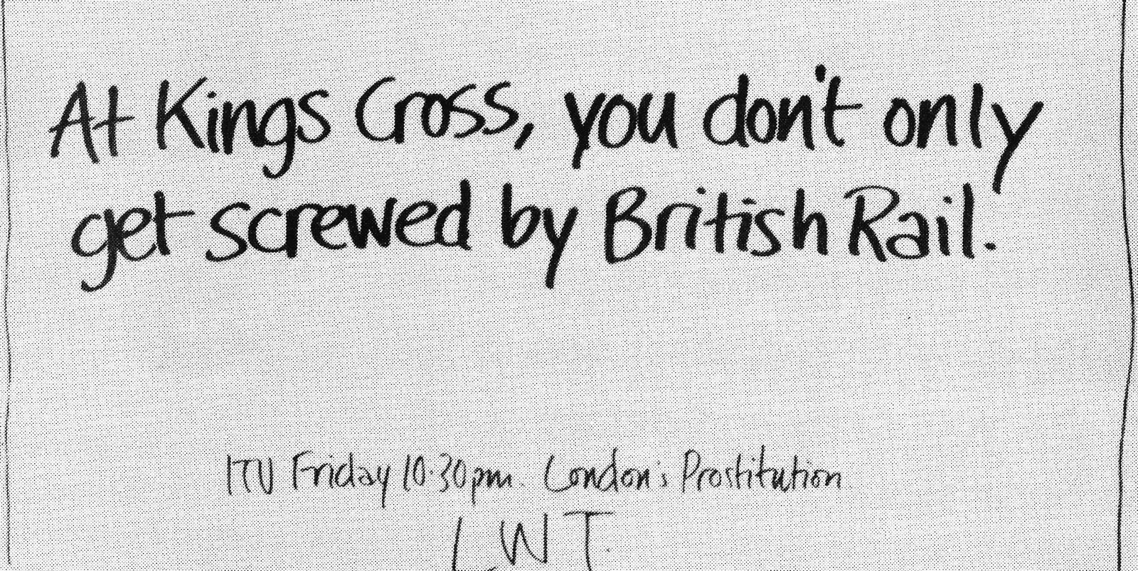
DAVE: Those were all rejected in favour of this one.
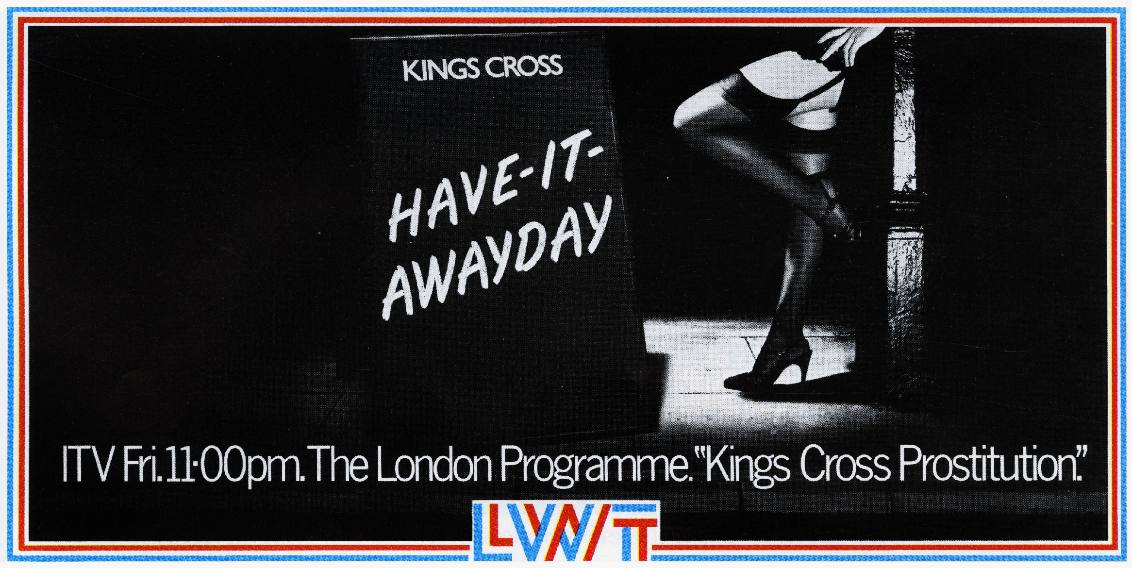
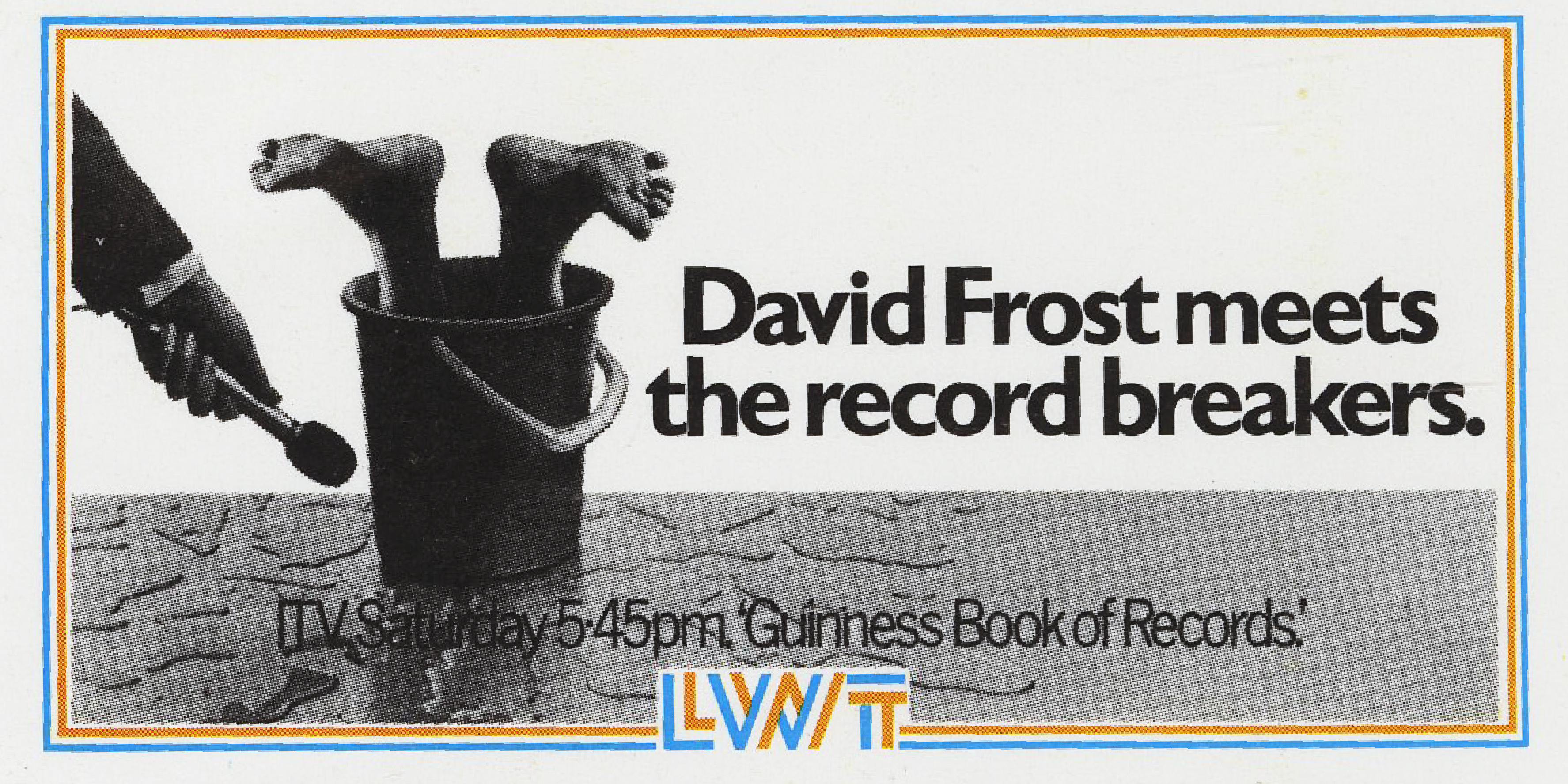
REJECTED. DAVE: It was felt to be to be somewhat unpatriotic towards British Leyland.

REJECTED. DAVE: This was turned down because the client felt it might upset Arthur Scargill.
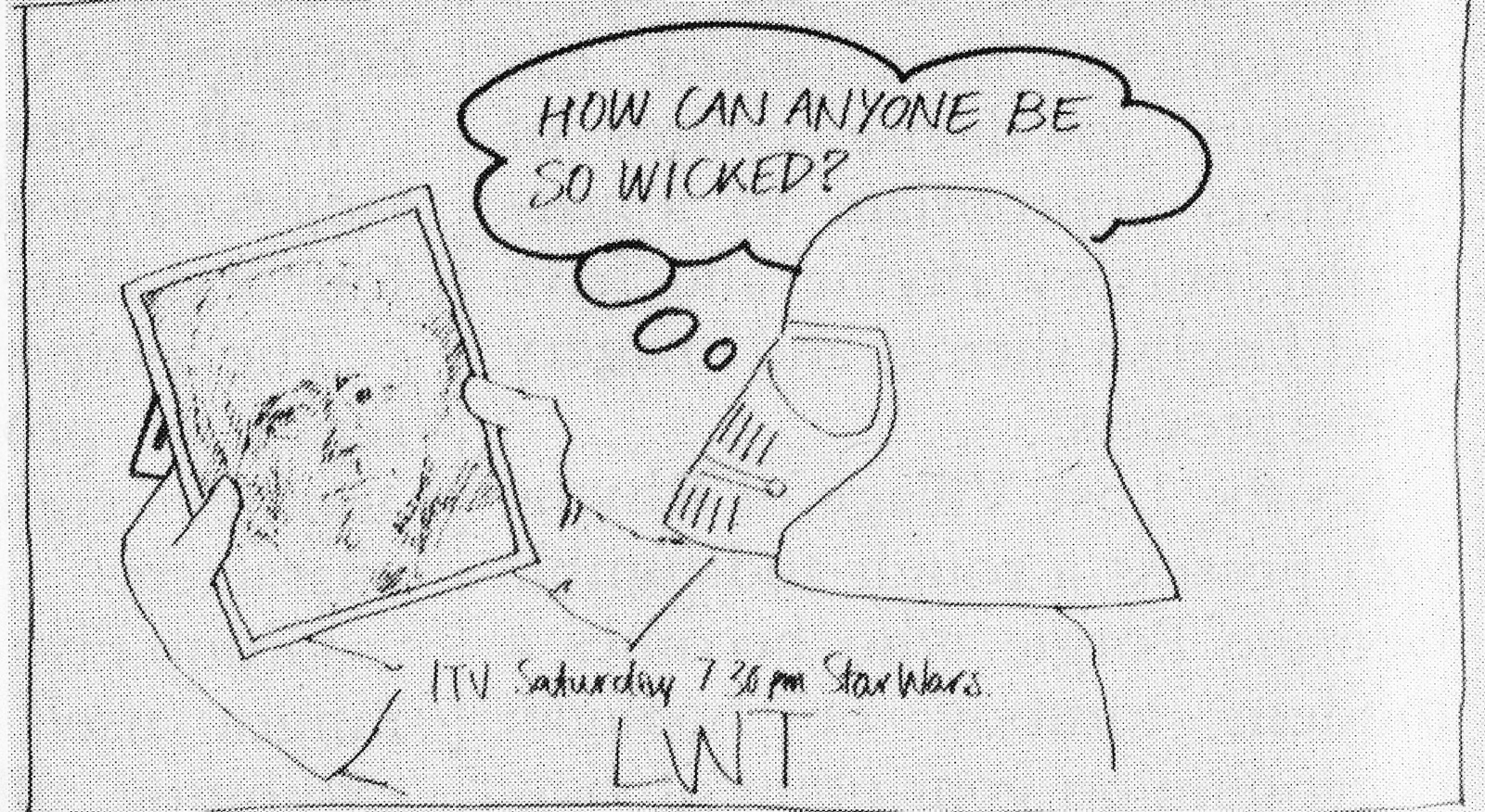
THIS IS THE AD THAT RAN.
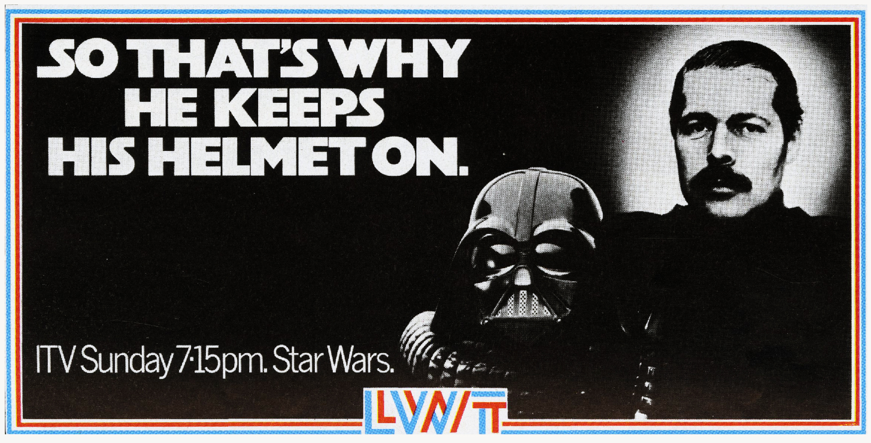
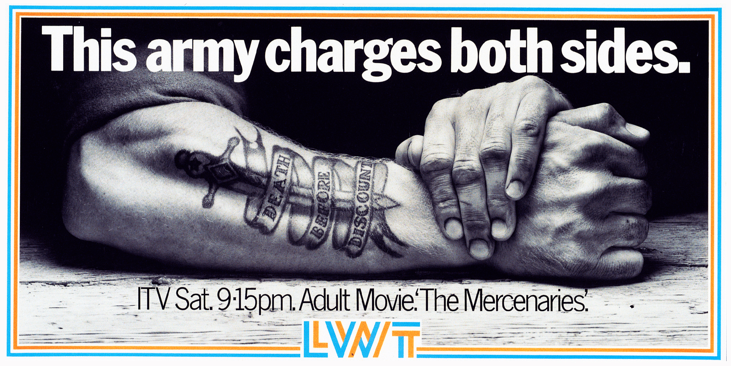
REJECTED. DAVE: The client turned it down because it would have upset Steve Ovett, Sebastian Coe and anyone with premature ejaculation.

PAUL: One of two posters we did with Linda Lusardi, who was a very popular page 3 girl during that period (I can’t believe they still do that!).
This is the original artwork.
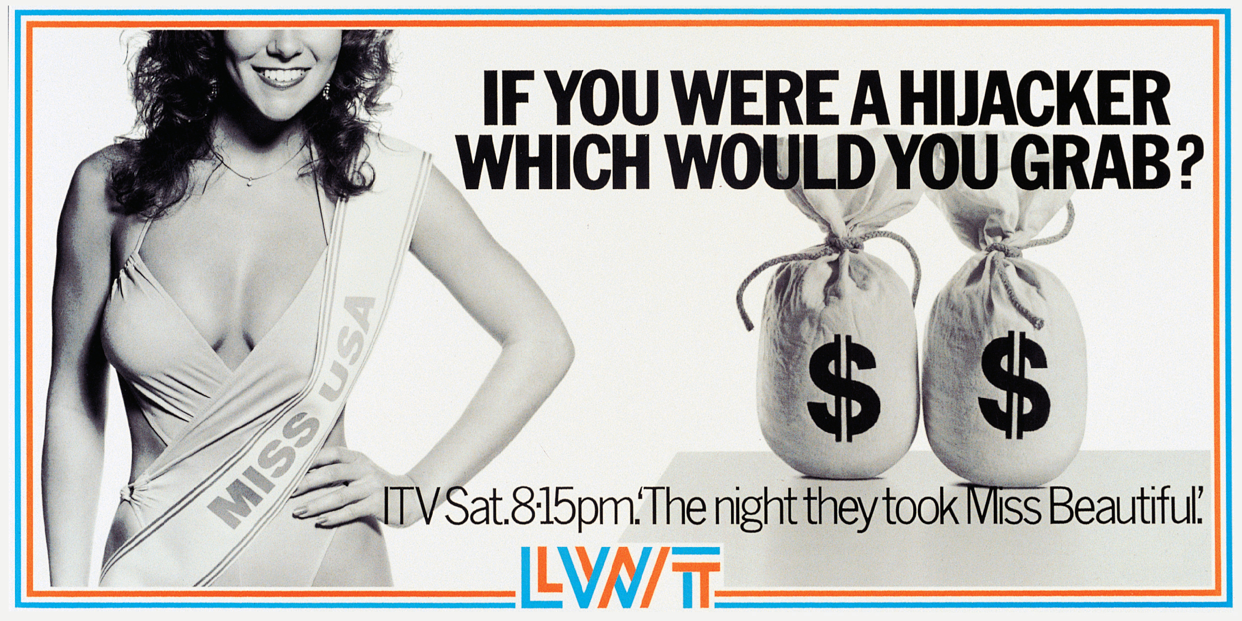
Trotty, unbeknownst to Micky Finn, who was the account director at the time, made us retouch her boobs to be twice as big, because he didn’t think they were noticeable enough.
So Brian Harvey (remember actual art retouchers?) did a magnificent job of giving her Dolly Parton-esque prominence.
Micky didn’t see the artwork until he got it out of the bag at the client.
He came back and stormed into Trotty’s office and went ballistic, I thought he was going to attack him!
We ran with this un-retouched version, much to Trotty’s disgust.
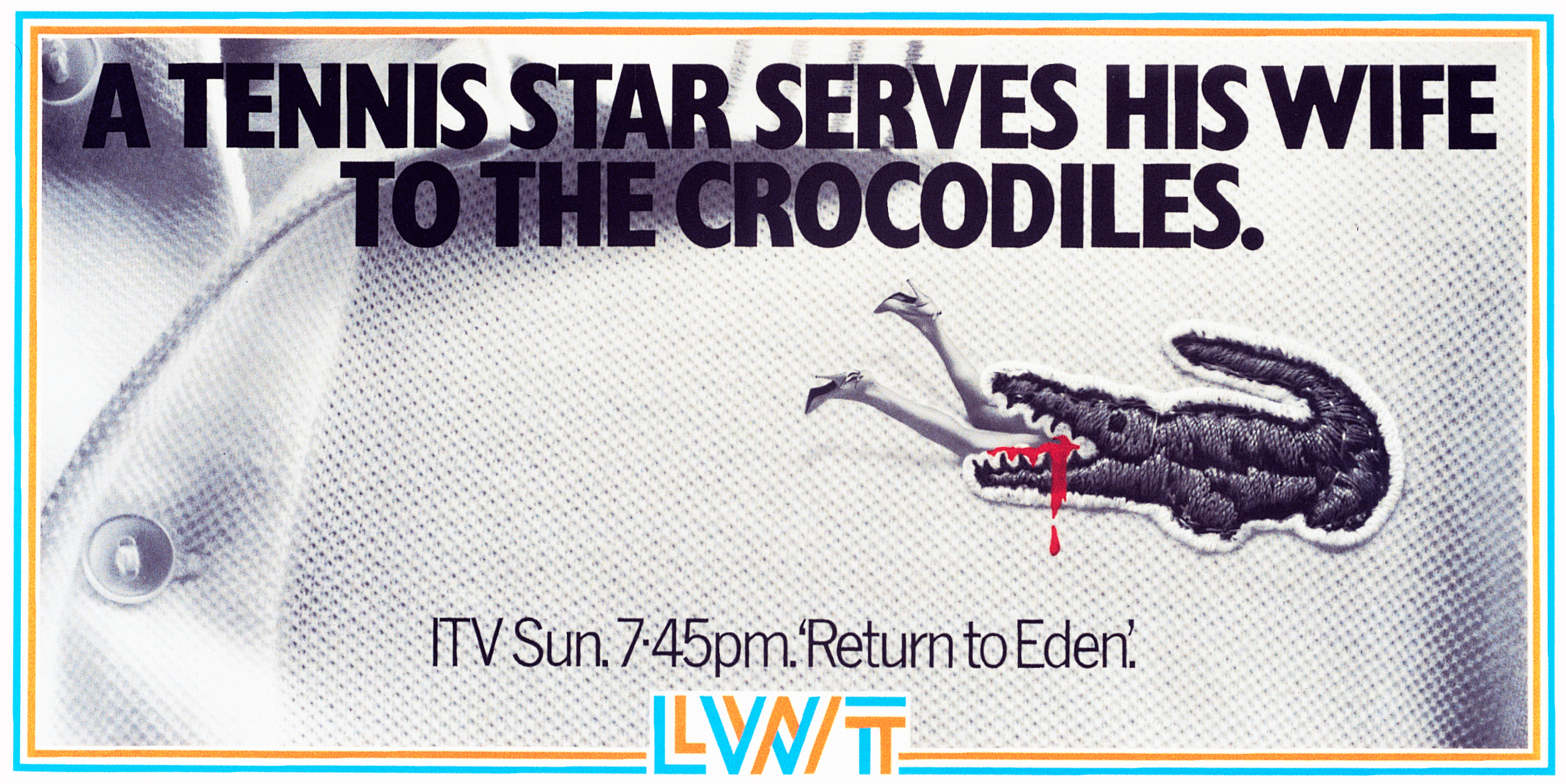
REJECTED. DAVE: The client turned it down because the advertising for E.T. hadn’t started yet.

REJECTED. DAVE: The client apparently turned this down because he had relatives at the BBC.

THIS IS THE ONE THAT RAN.

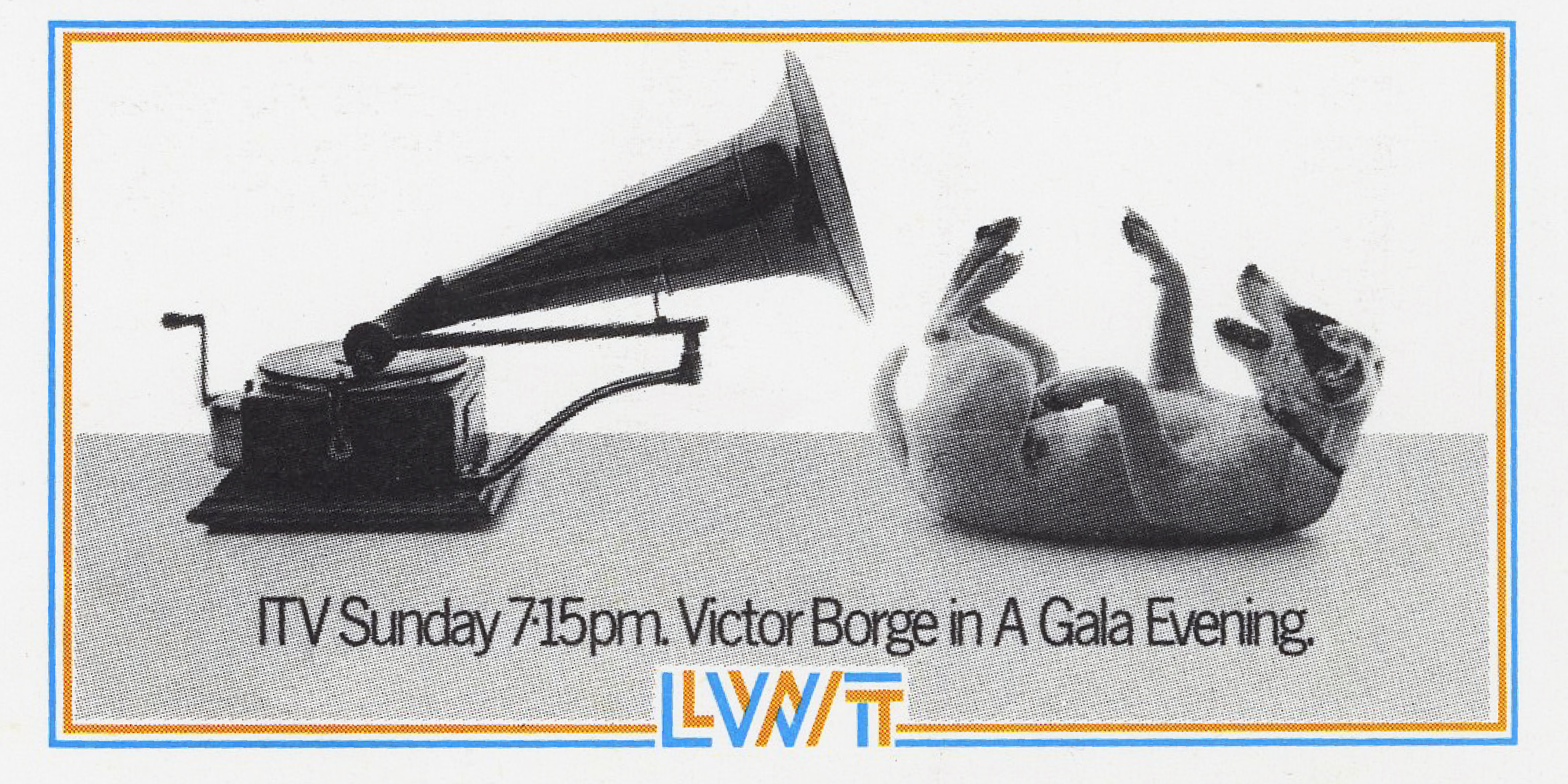
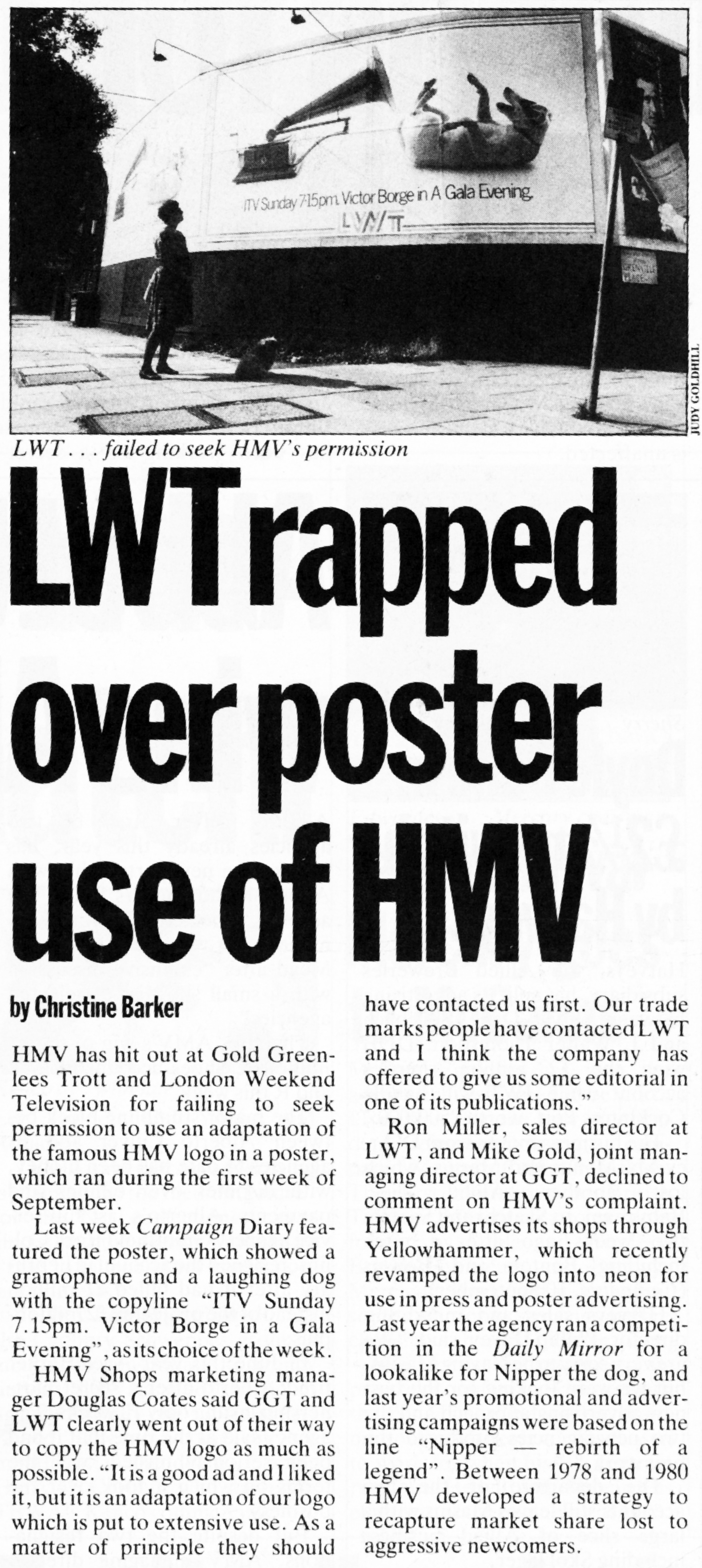
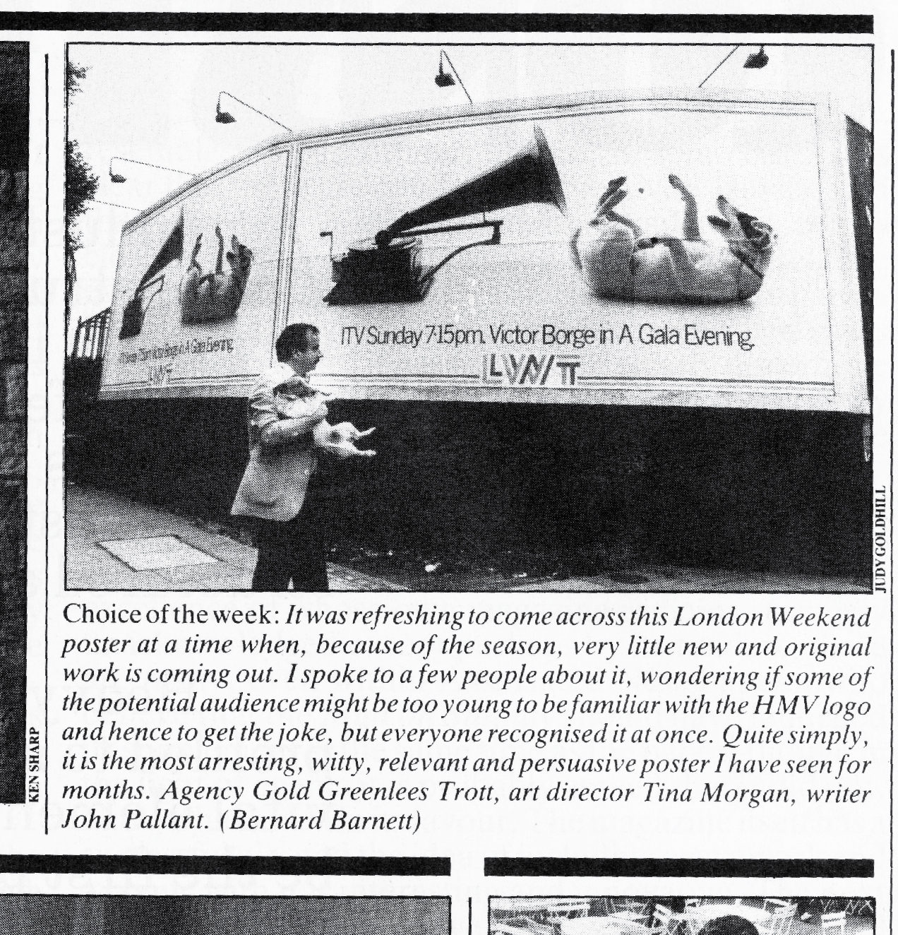

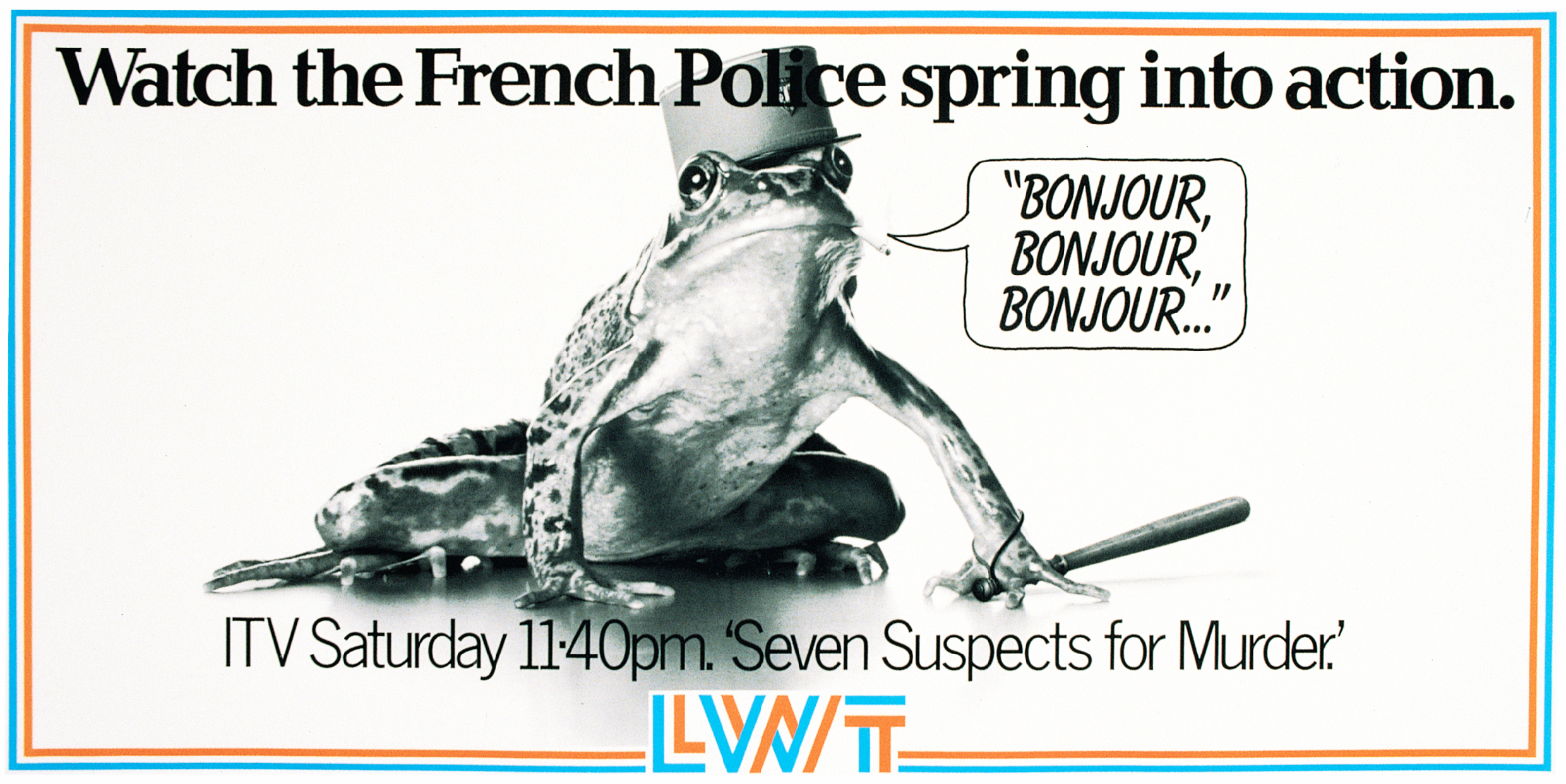
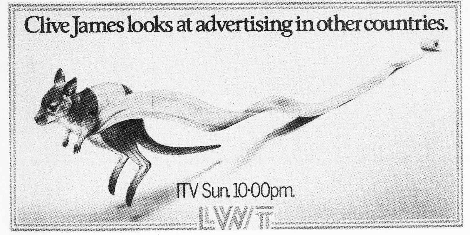
Tim Berners Lee; what an absolute rascal.Not only did he shaft the chaps at Yellow Pages, the manufacturers of Fax machines and the purveyors of XXX filth in the Soho district of London, he's made scrapbooks virtually extinct.Their numbers are dwindling, reportedly below those of the Snow Leopard.Before you could simply call up a hundreds images for any photographer or illustrator you care to mention, you could only reference those images if you owned them.Which meant;a) Buying a book on a particular photographer. Fine, but expensive, if you wanted references of someone world-famous, like Irving Penn. But not fine if you wanted references for some up and coming turk.b) Keep all the photographers cards and pages you liked in a scrapbook.I’ve come across a bunch of these in the loft recently.What’s striking is the sheer focus you get by viewing only one or two images of a particular photographer.The tyranny of choice we now face each time we need to commission an image can be confusing, particularly as there appears to be less specialism.Most photographers now shoot everything under the sun; portraits, landscapes, still lives.You name it they can put a camera in front of it and press the clicker.(Often with surprisingly average results.)Anyhow, here's one of my scrapbooks, photography I liked, circa 1992.Ironically, although it now feels redundant, I wouldn't mind betting that most of these images aren't currently on the net.Let me correct that, weren’t on the net.
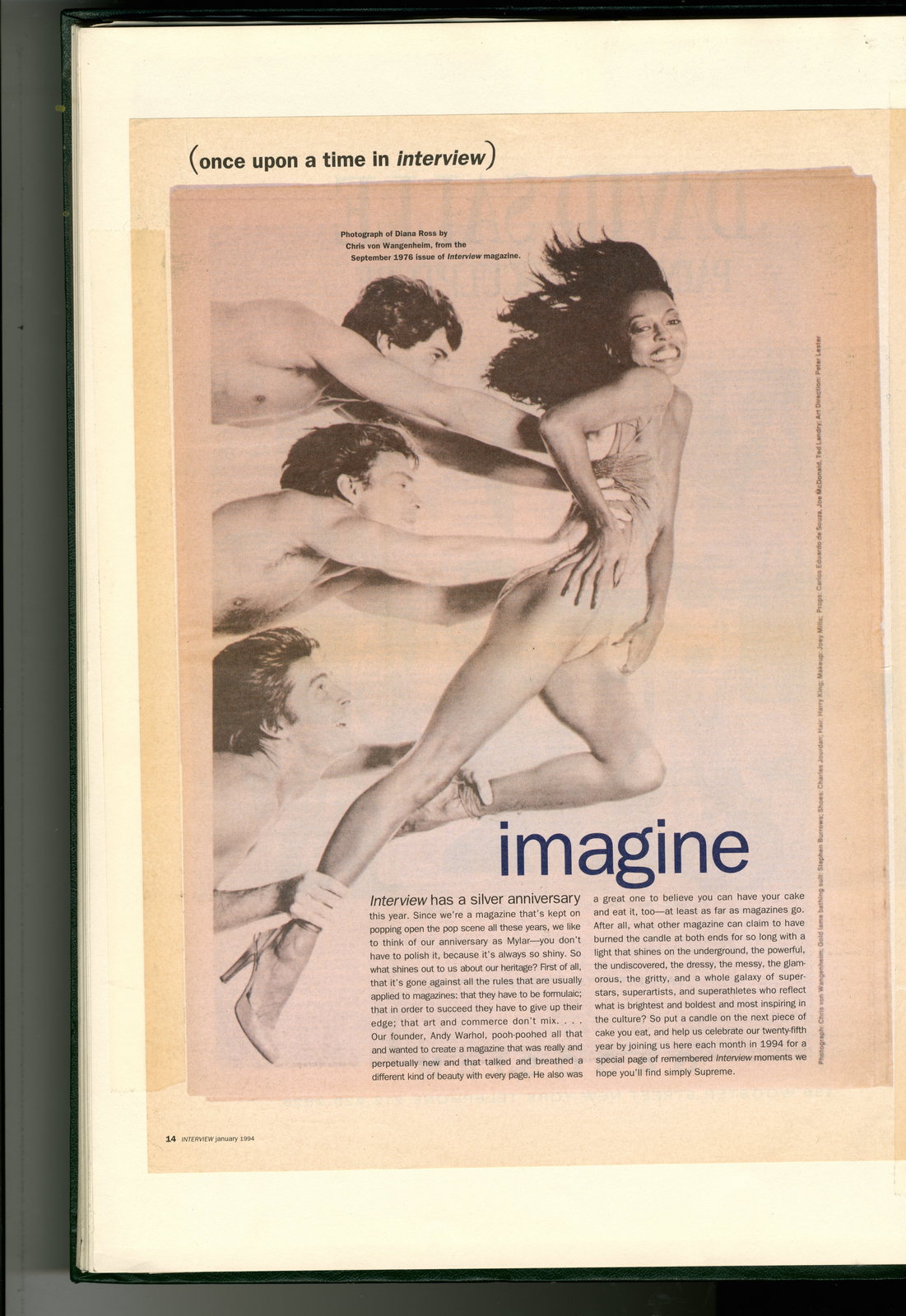
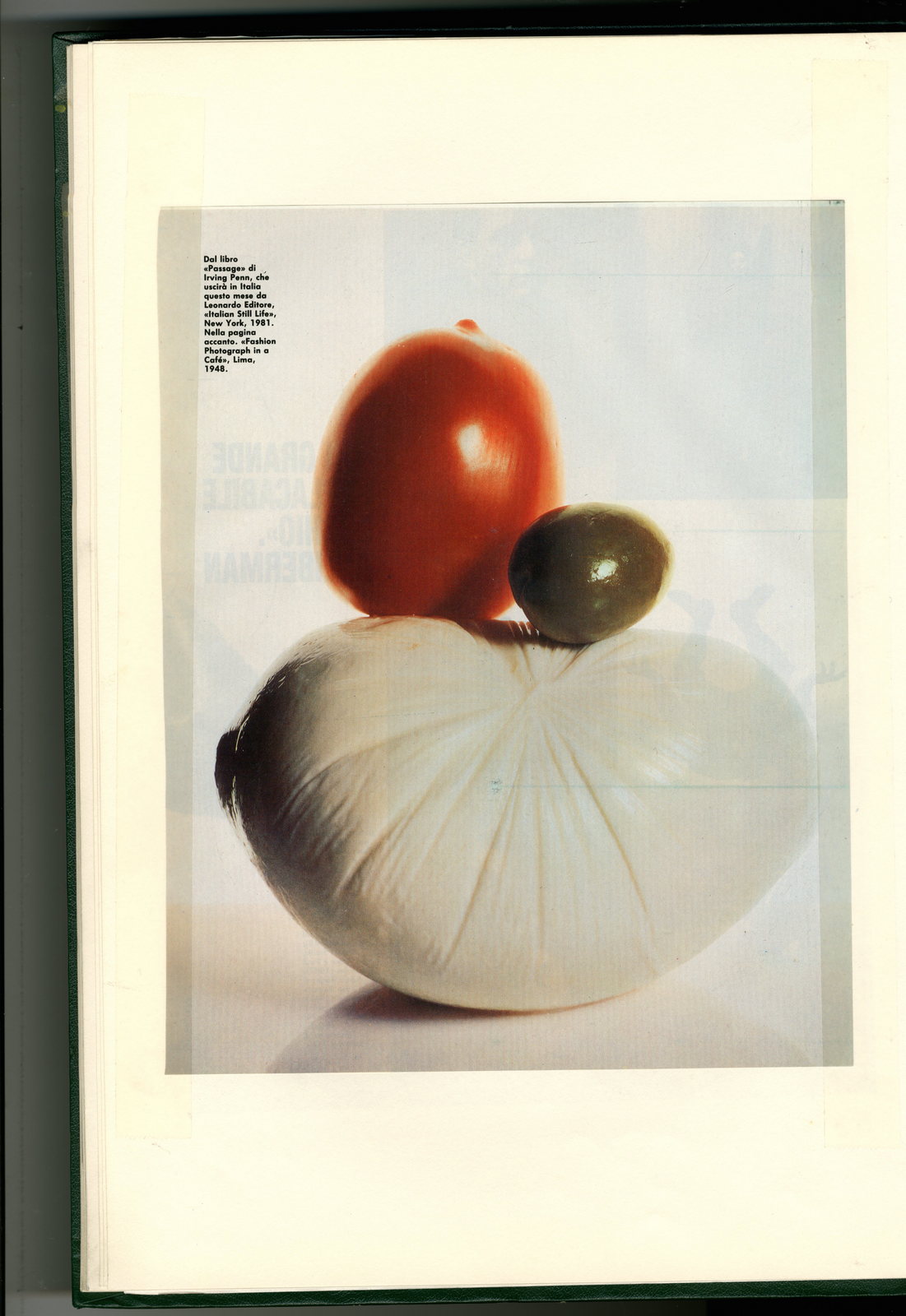
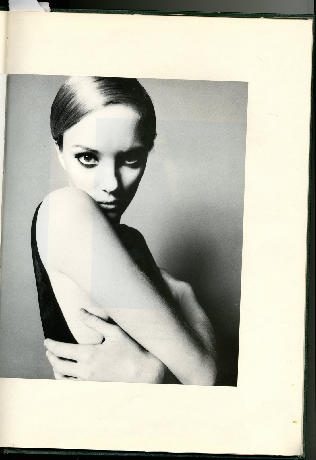
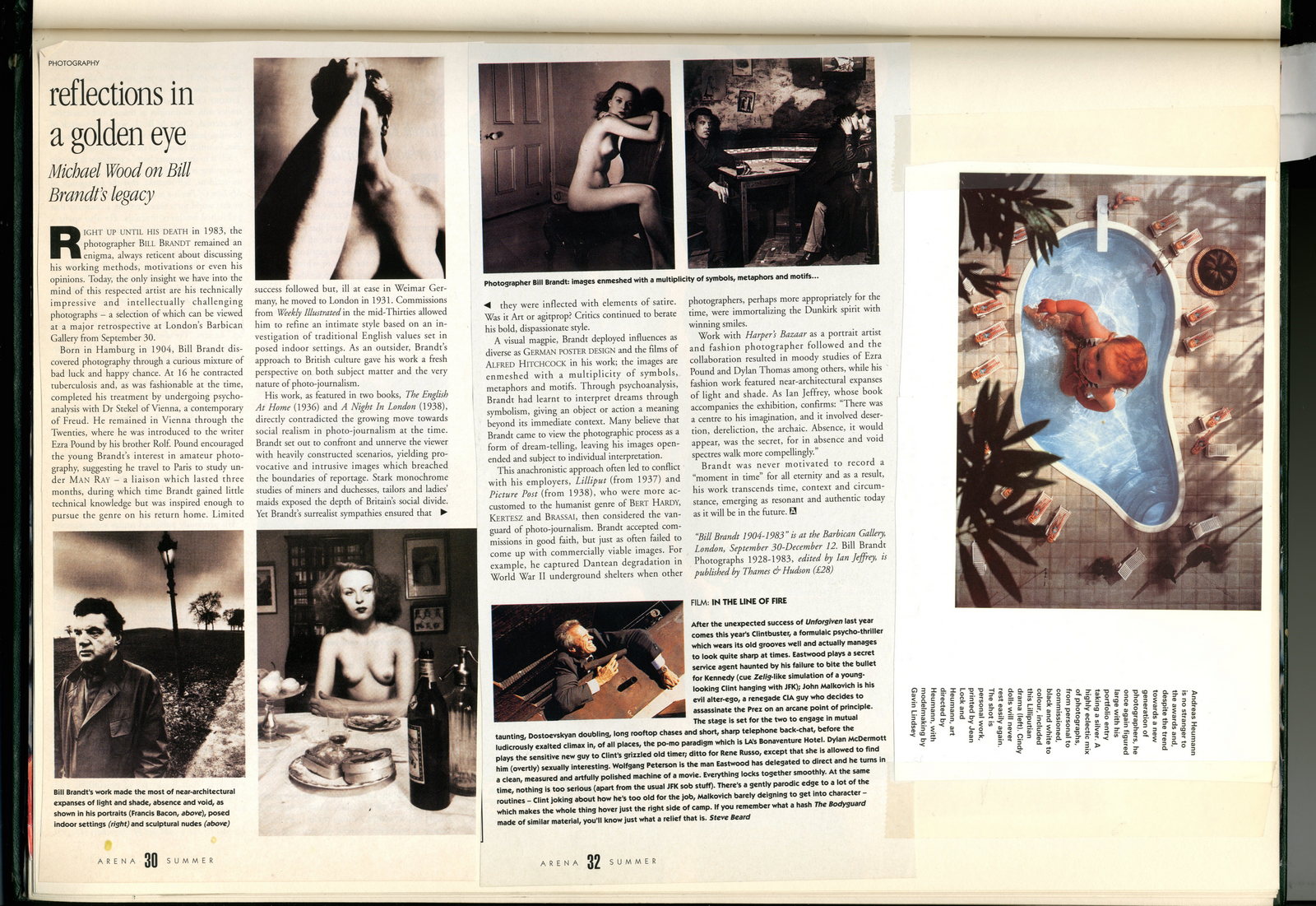
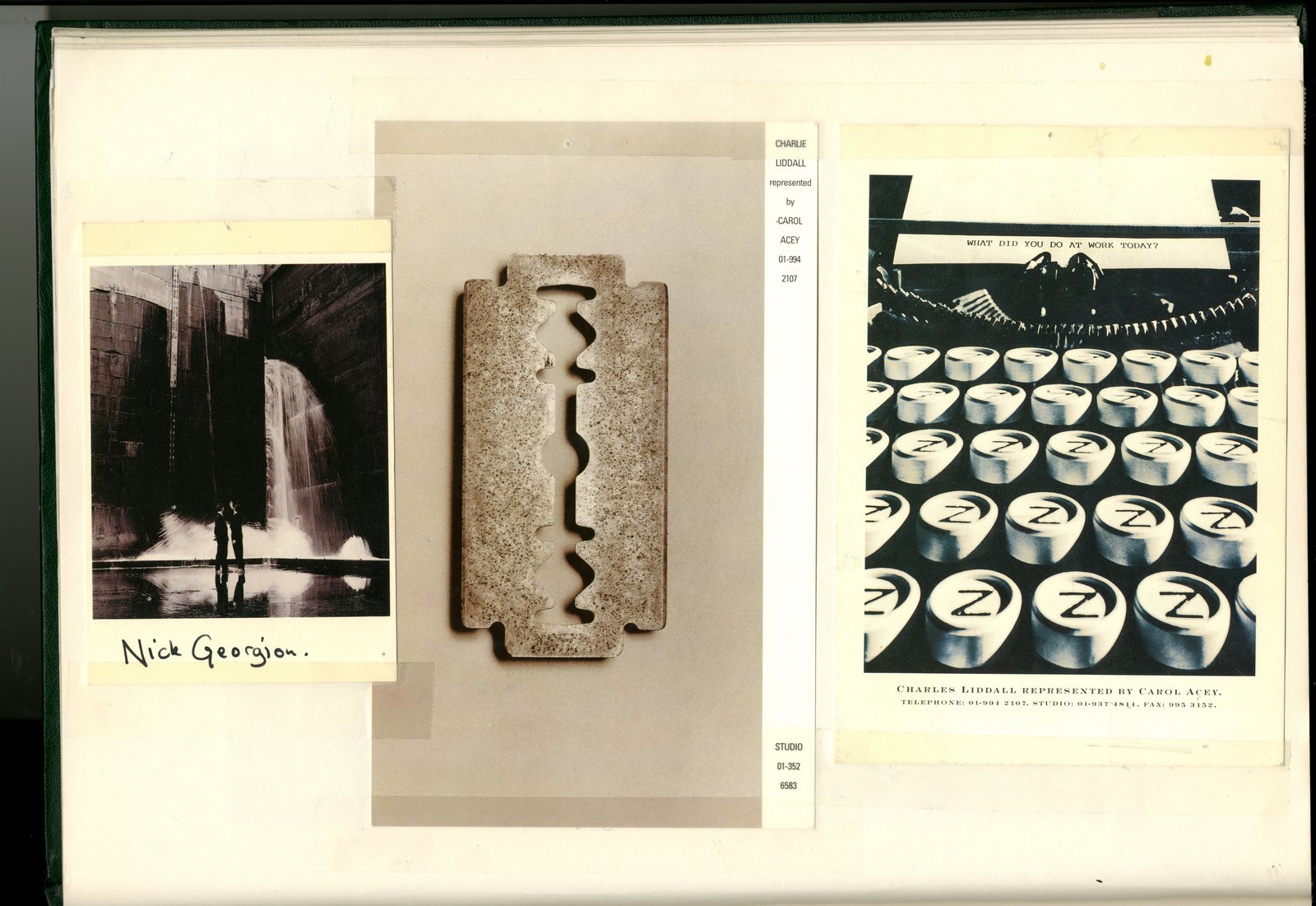
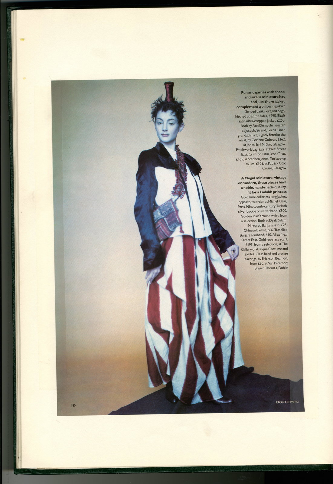
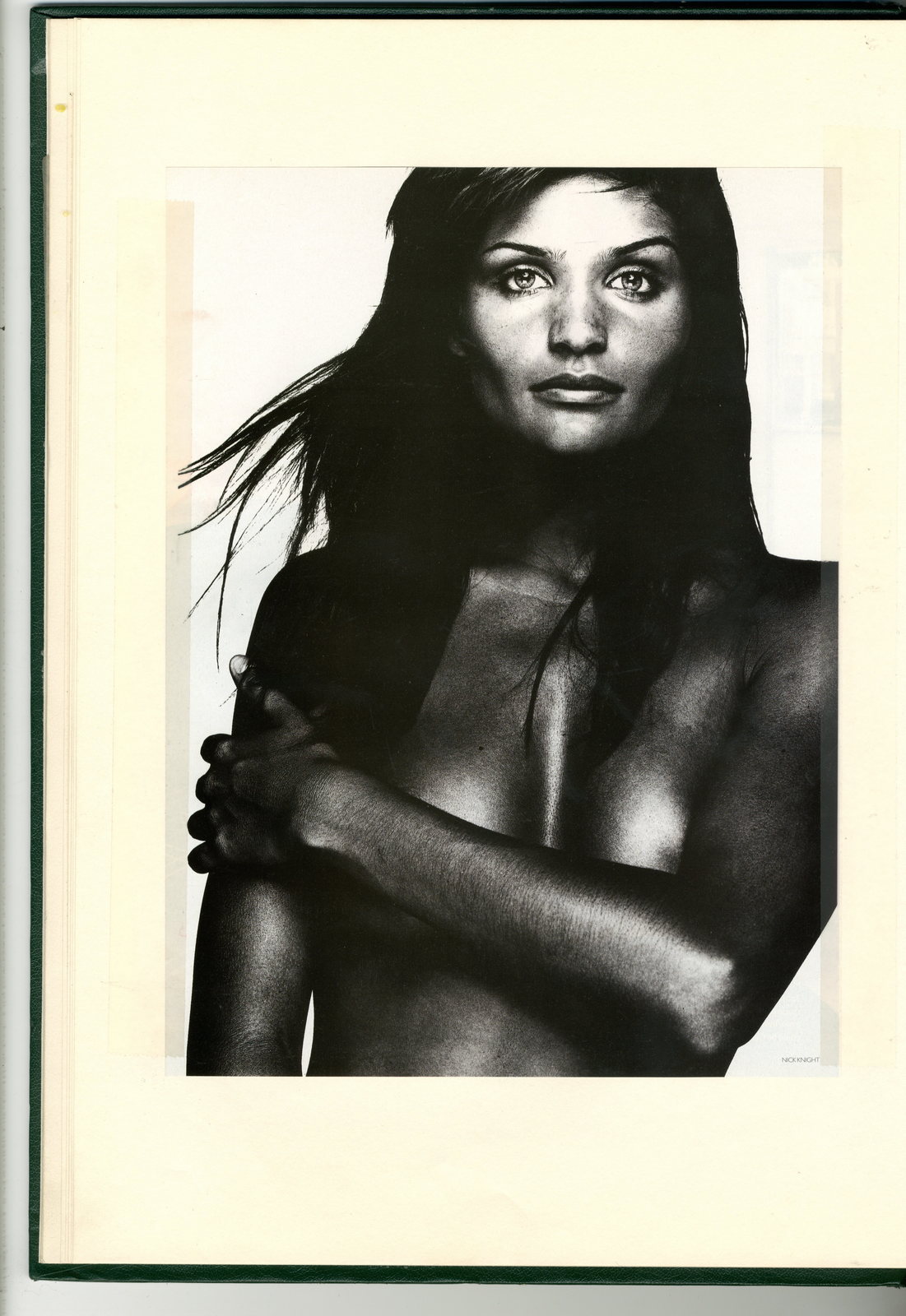
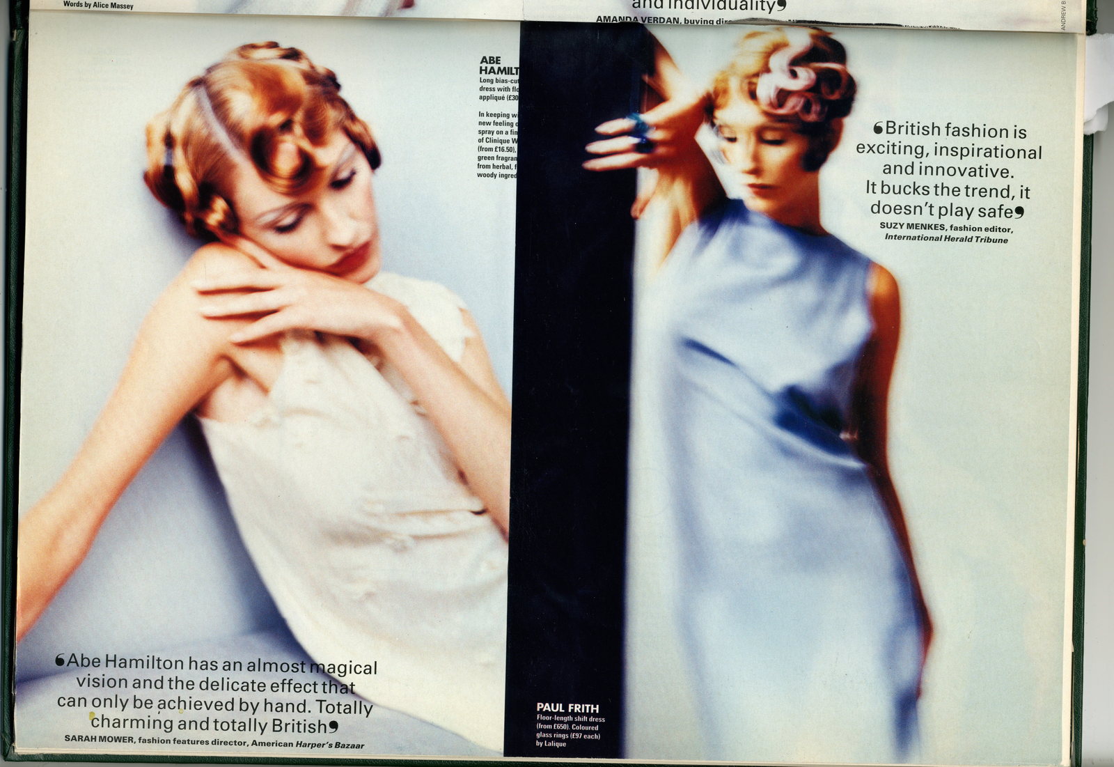
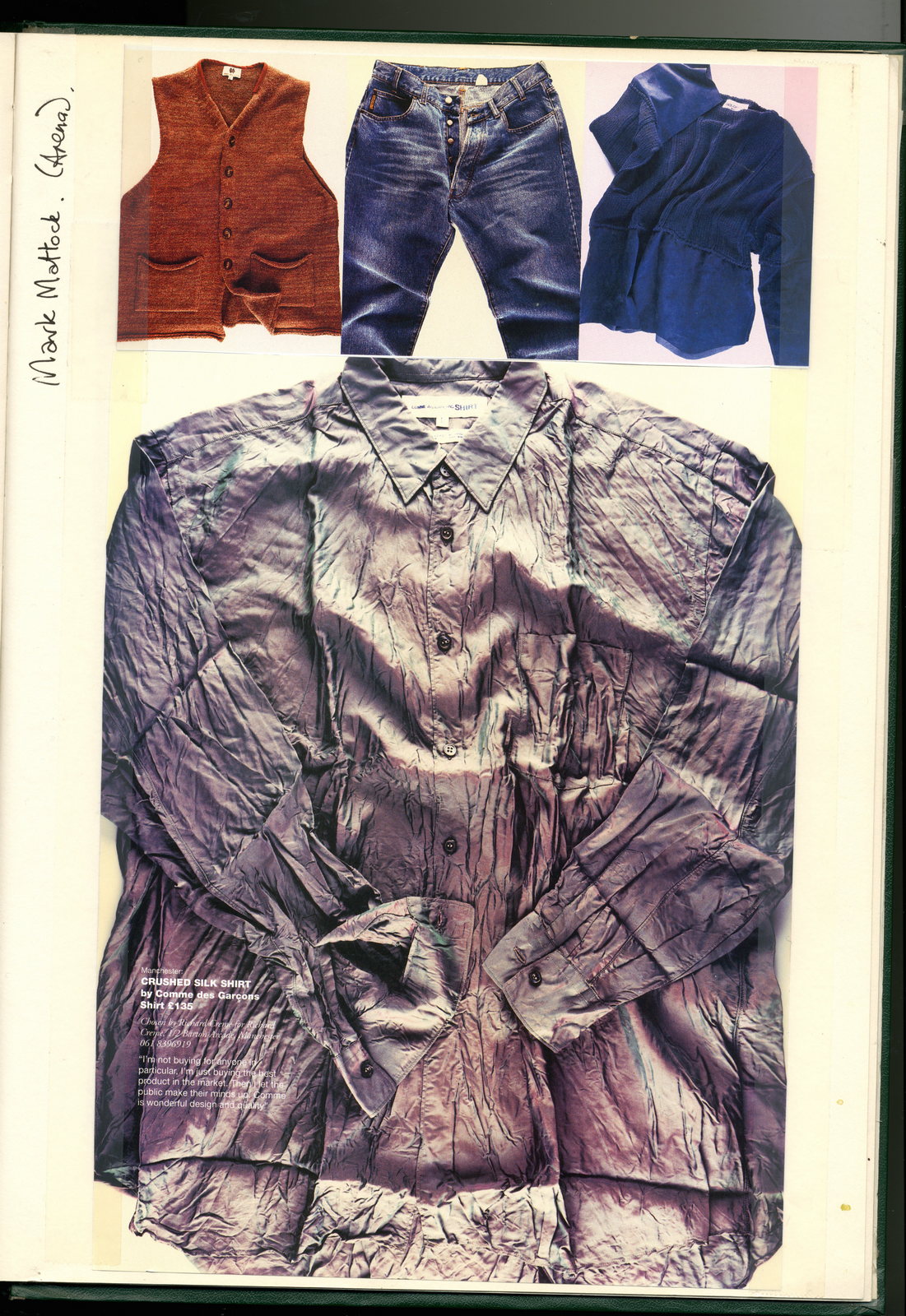
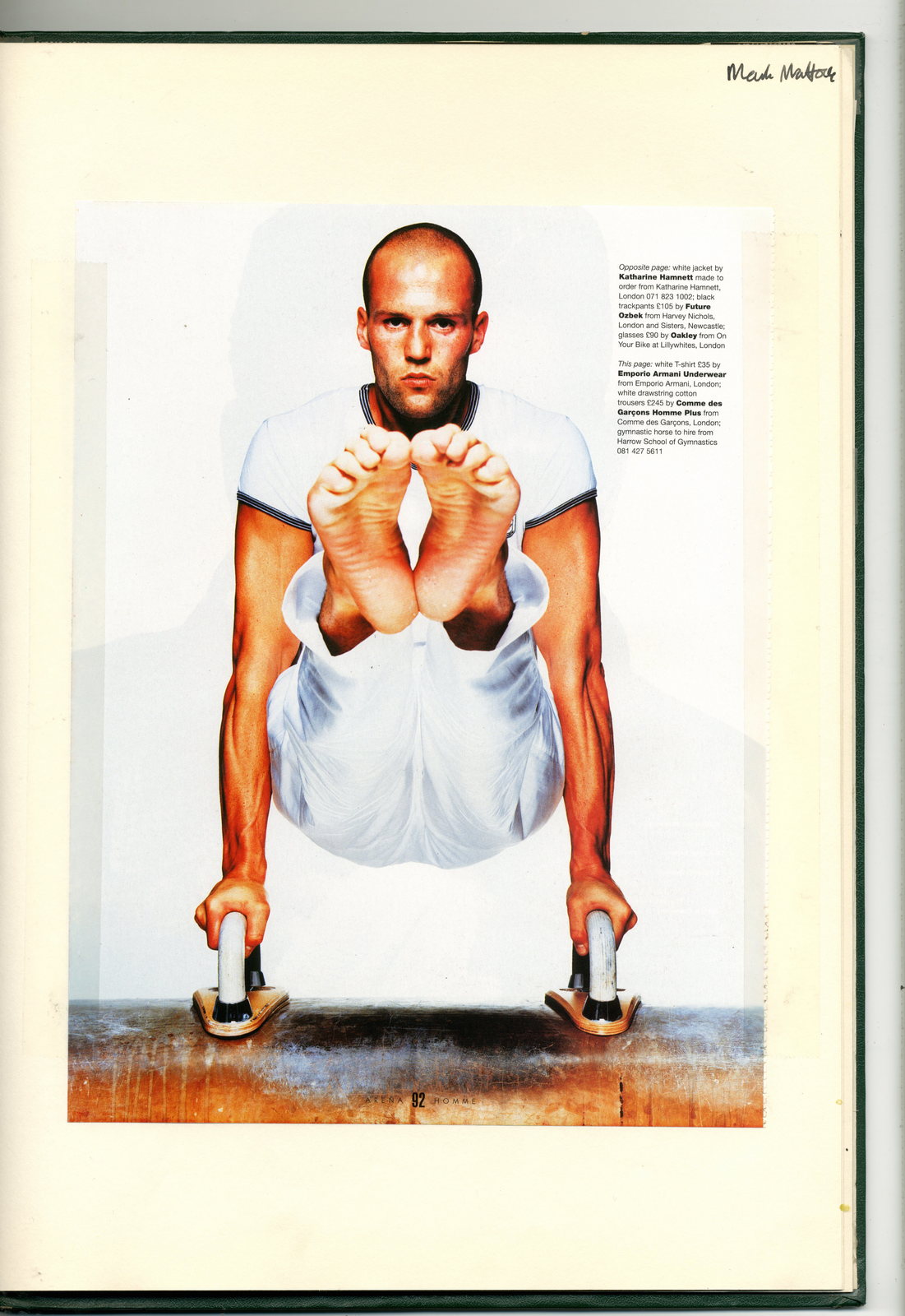
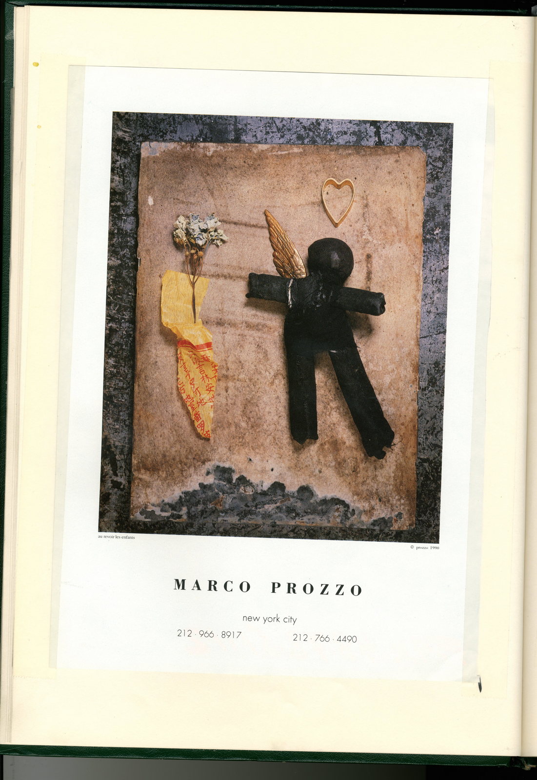
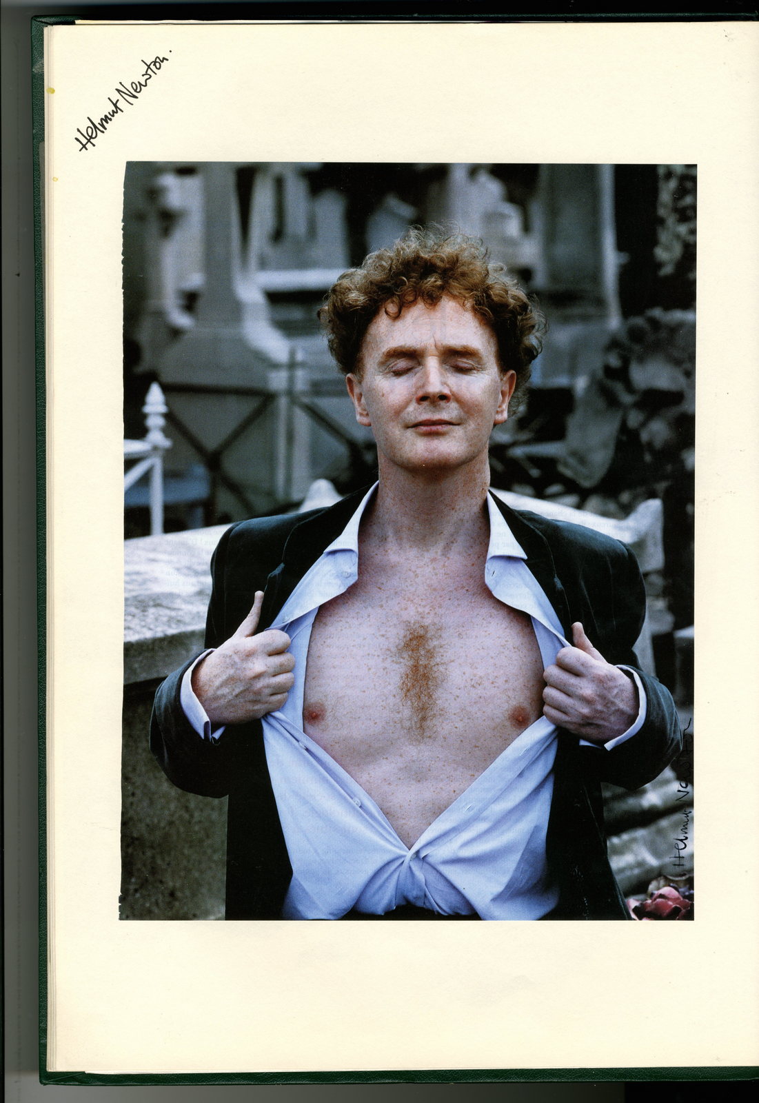
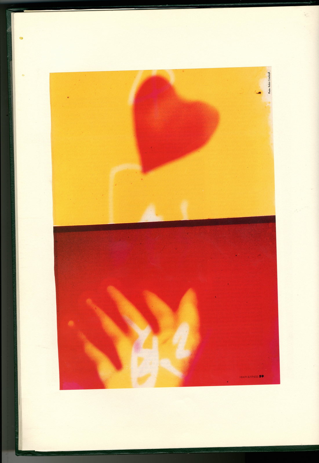
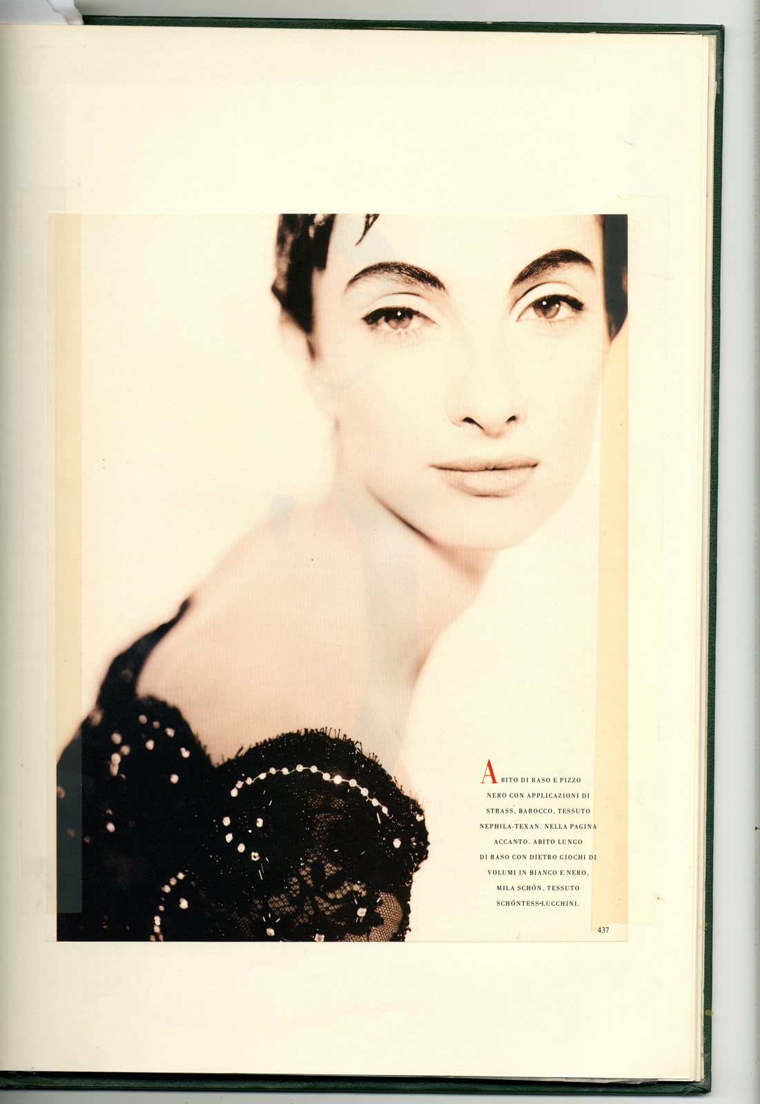
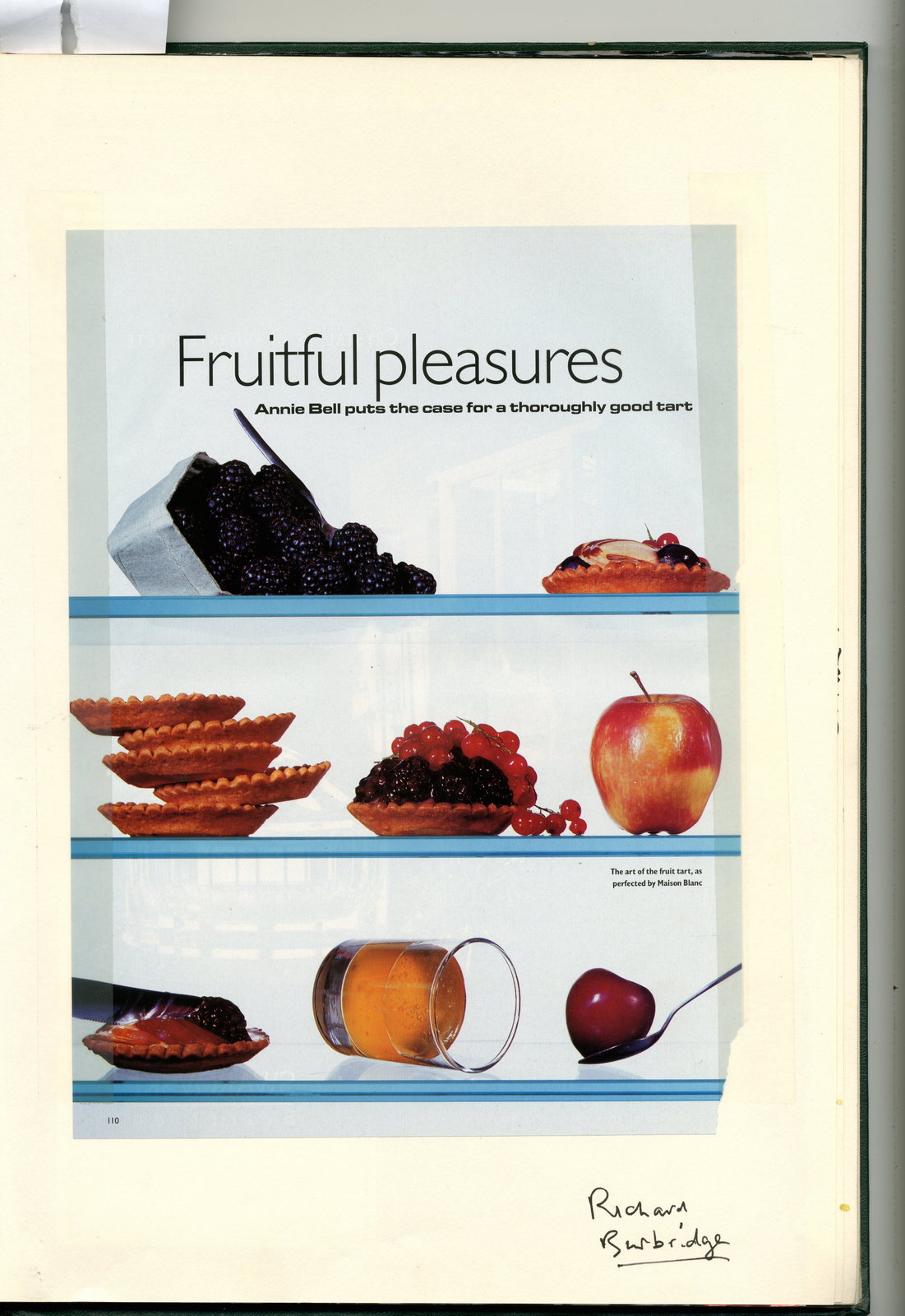
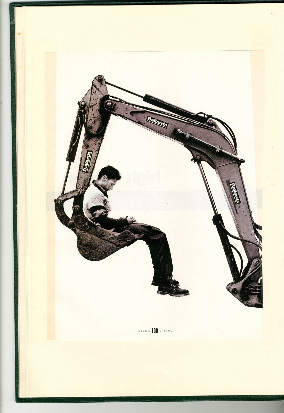
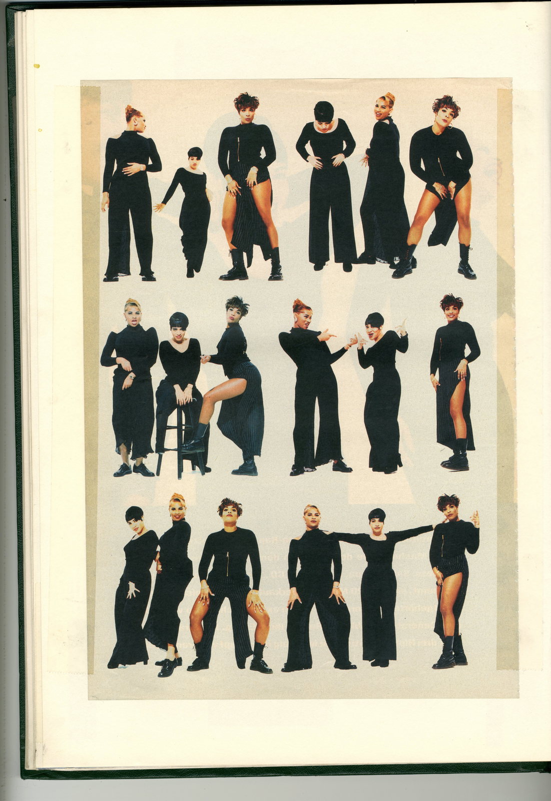
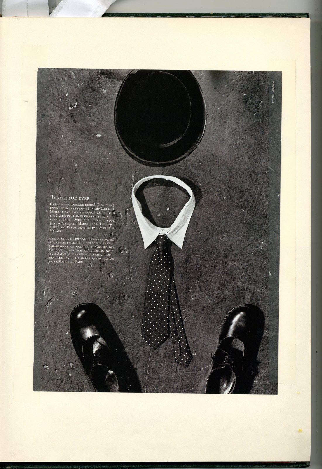


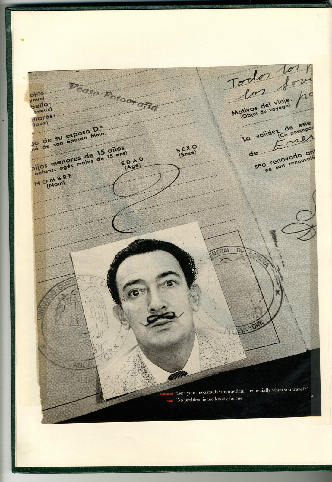

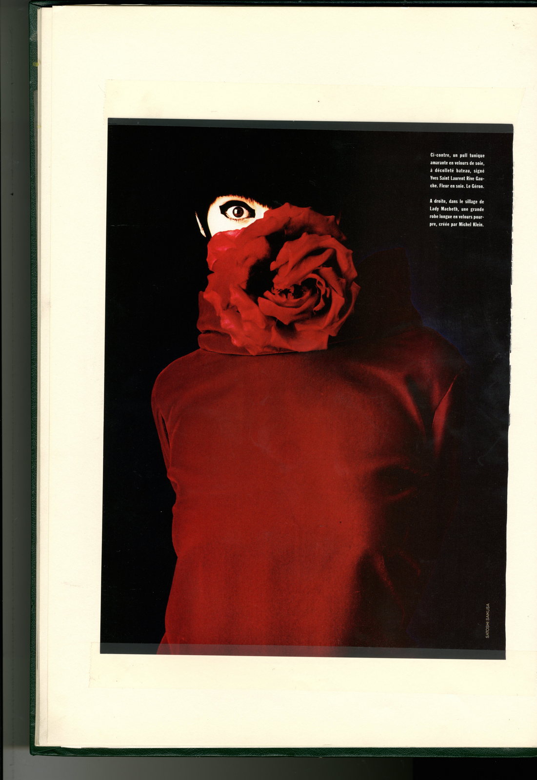
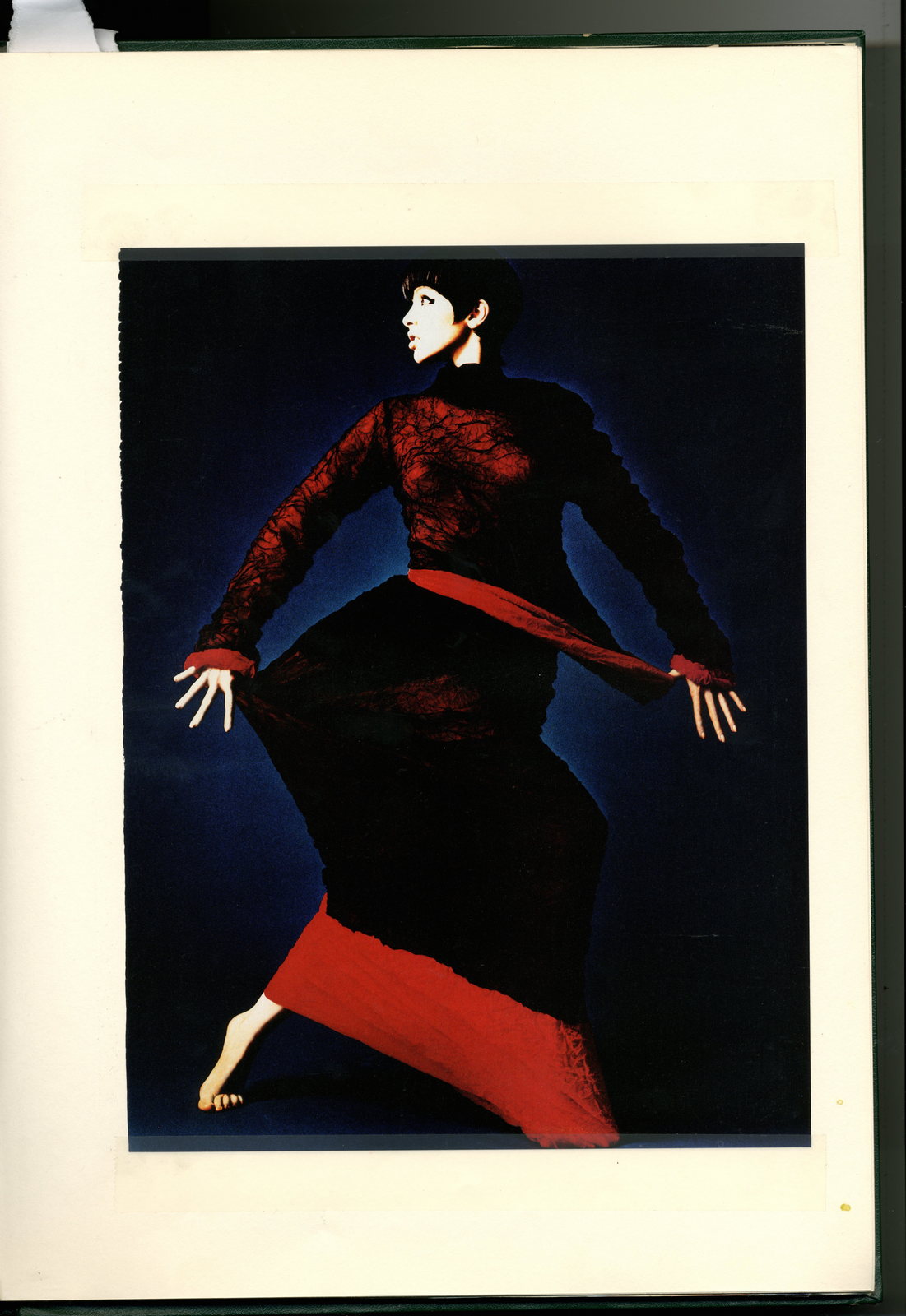
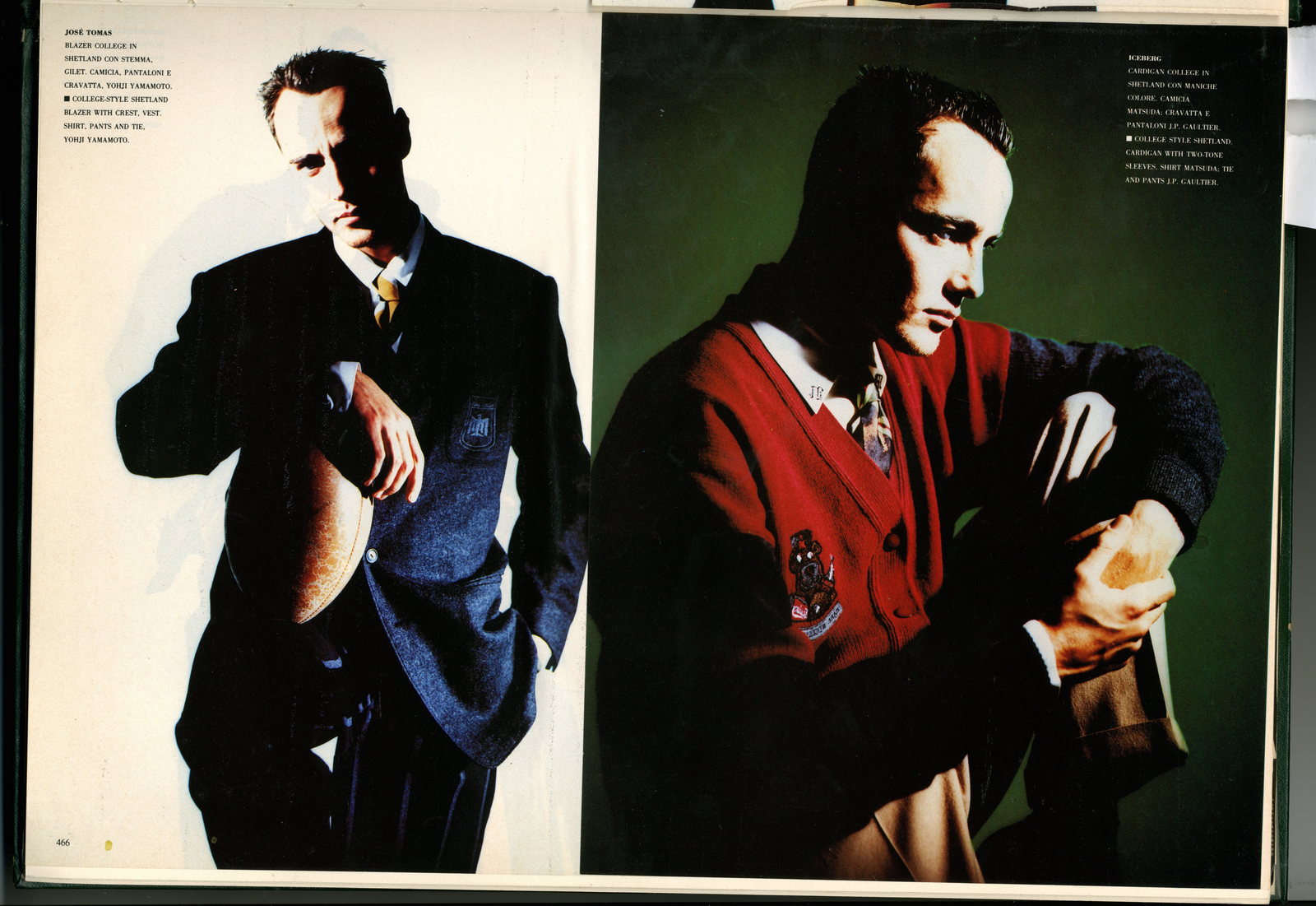
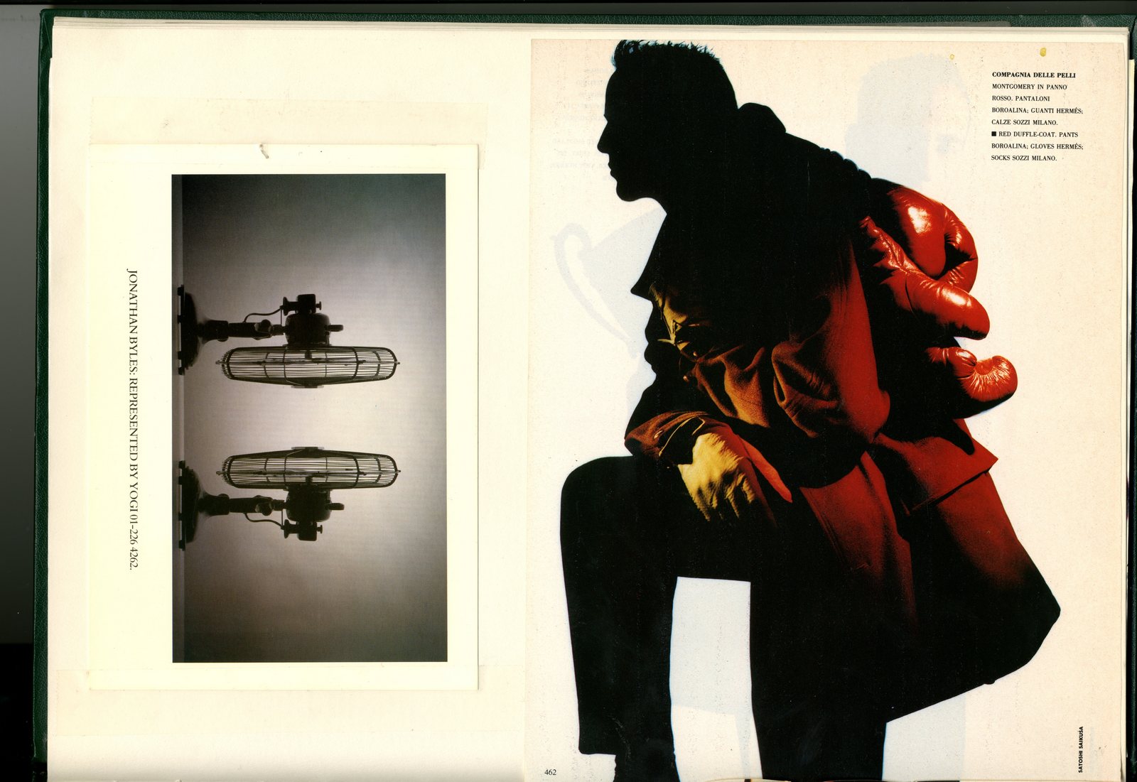
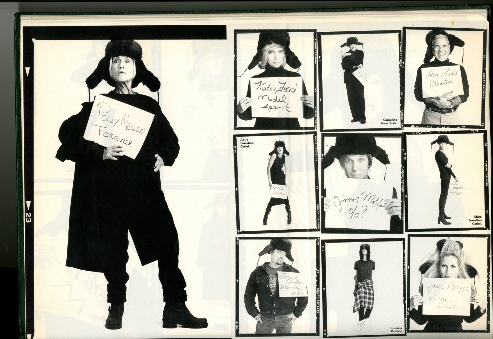
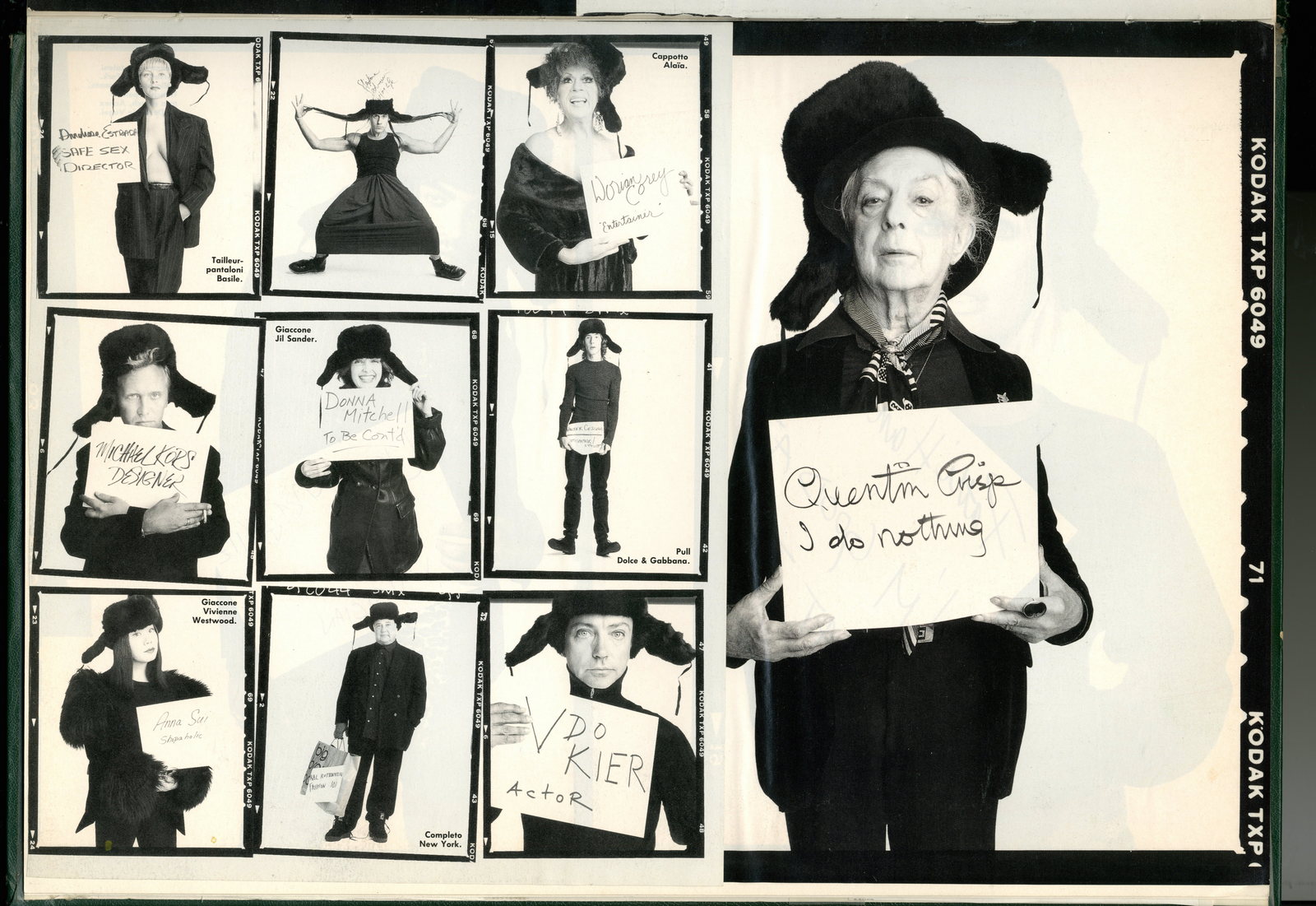
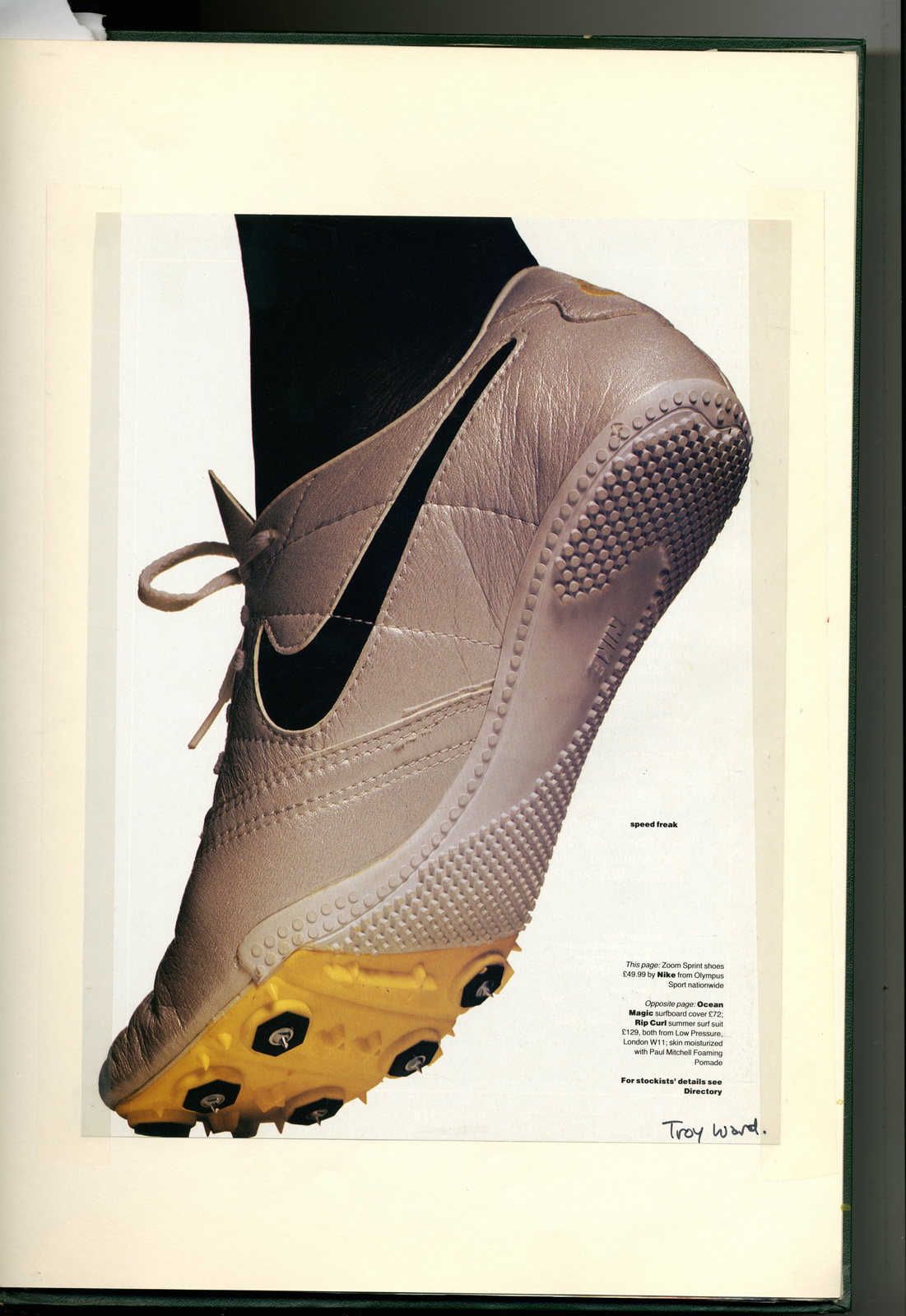
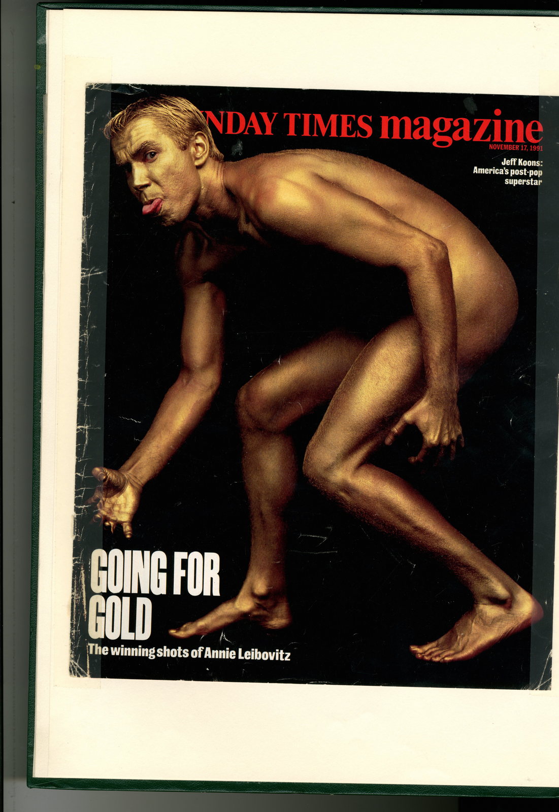
When I got into the business GGT was like Mother, Wieden’s & Droga 5 rolled into one.
Every creative from my generation was desperate to work there.
It wasn’t just that they did good ads, they were doing things in a new, almost punk way, making other creative agencies appear like Emerson Lake & Palmer; pompous, overblown and dull.
As far as creatives were concerned GGT stood for ‘someone beginning with ‘G’, Someone beginning with ‘G’ and DAVE TROTT’.
But, Dave was annoyingly picky, and didn’t have enough office space to for an entire generation of creatives.
So we gobbled up the work, philosophy and quotes.
We drank the Kool-Aid. (And ate the cup.)
Like Apple geeks devouring Steve Jobs every fart.

What made a boy from West Ham want to get into the poncy world of advertising?
I was working in a factory at 16 (apprentice toolmaker).
It seemed to me that the attractive birds were all in the draughtsman’s office.
So I asked my dad if I could go back to school to get A levels to train to be an architect.
While I was doing A level art, I discovered I loved oil painting.
I went to East Ham tech to do foundation, but I got turned down by 7 art schools for a fine art degree.
My sister helped me get a scholarship to art school in New York.
I thought while I was there I’d switch to acrylics instead of oils, and do Pop art, like Warhol and Lichtenstein.
It was a short step to graphic design, then I discovered advertising and it was duck to water.
But, when I took my book round, everyone said my ideas were better than my layouts.
So I had to drop being an art director and become a copywriter.
I read that the bullseye of someone’s taste was their sixteenth summer.
What were you listening to, watching and laughing at in your sixteenth summer?Mainly Motown I guess, I was a mod.
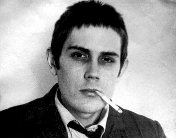
But I also listened to lots of comedy records: I knew The Goon Show and Peter Sellers albums off by heart, also Flanders & Swann, Tom Lehrer, Bob Newhart, Stan Freberg.
Those guys were decades ahead of Monty Python.
I had a Saturday job in a mod clothes shop in Carnaby Street called Robot, ‘mod’ to me meant parka’s, Tonic suits and skinny ties.
I get the sense it was more to you?
Yeah, Carnaby Street wasn’t paved over when we used to go there, there were about 3 good shops in the whole street.
Also Lawrence Corner, the real Army/Navy store, was great. You could find stuff no one else knew where it was from.
But what about the philosophy of the mods?It meant being different, finding a new look before anyone else did.
Clothes and hair were a way to express yourself, another canvas.
So you really put a lot of effort in.
There weren’t any hair stylists in those days, just barbers who could only cut hair to look like your dad’s.
So I used to cut my own hair: short and spiky at the front, and backcombed on top.
Art School in New York.
Apart from the lack of Pie & Mash shops, what was the difference between East Ham and East Village back in the sixties?
I thought it would be the most stylish place on the planet.
Boy was I wrong.
When I got there everyone dressed like slobs, no one cared what they looked like.
Worse, because I cared what I looked like, everyone assumed I was gay.
Style had totally bypassed the USA, like the 1960s hadn’t happened.
This wasn’t the rebellious, outrageous, art school atmosphere I’d been expecting.
I felt like I’d been exiled to an old folk’s home.
I couldn’t believe I’d left London for this.
You got to work at Carl Ally in your final year of college.
One of the best agencies in the world at the time, learn anything useful?
The guy who taught me was called Mike Tesch.
He did the Federal Express “When it absolutely, positively has to be there overnight”
https://www.youtube.com/watch?v=NeK5ZjtpO-M.
He taught me logic: that everything has to be there for a reason.
Later on, John Webster taught me the same thing.
People used to copy John’s stuff thinking all you had to do was be weird and wacky, but that was just the execution.
It was always there for a reason.
Look at the difference between Honey Monster (John) and Monster Munch (bad copy of John).
Meet any ad legends out there? Bernbach? Ogilvy? The one-eyed Hathaway Shirt bloke?
Wish I did but no, I was just a kid.
I got fired from my first job for drinking the beer in the client fridge.
It was okay to smoke dope, but they had a thing about drinking.
I would go out for a pint at lunchtime and they thought I was an alcoholic.
Coming back to Blighty, did you have an idea of where you wanted to work?
Nope, just picked the first 50 names out of the Yellow Pages and sent them copies of my portfolio.
In those days my portfolio was really different: I had complete campaigns with straplines: press and TV. Media recommendations. Strategies.
Everyone else just had individual ads (usually for Guinness and VW) with puns.
So you chose BMP to learn how to do TV from John Webster?
No, I was much better at press then, so my book was mainly press ads.
I got offered jobs from Peter Mayle at BBDO (a press agency) and John at BMP (a TV agency).
I nearly went to the press agency because that was what I was good at.
But then I thought, if I go there all the heavyweights will be working on press so I won’t get any.
But if I go to BMP, all the heavyweights will be working on TV, so I should get loads of press. And that’s what happened. I would work on TV during the day, trying to learn it, then I’d do some press at night just to make sure I got something into D&AD.
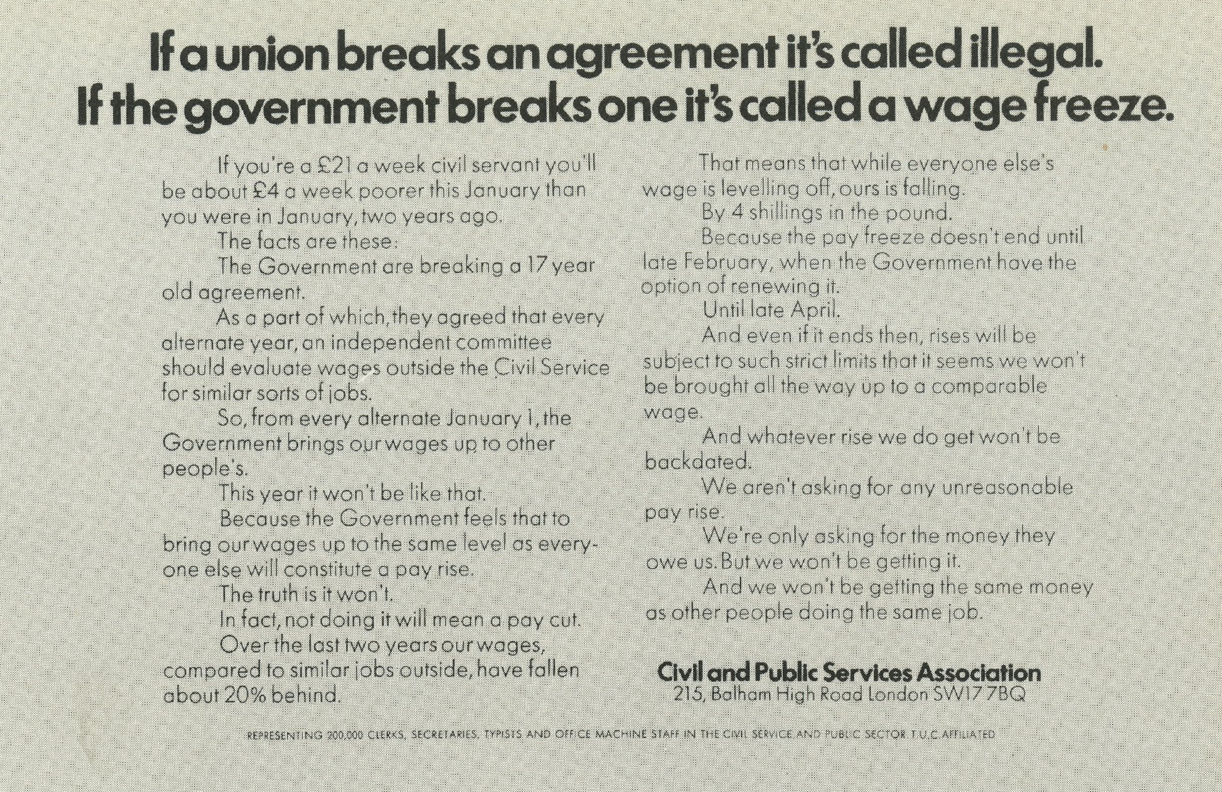

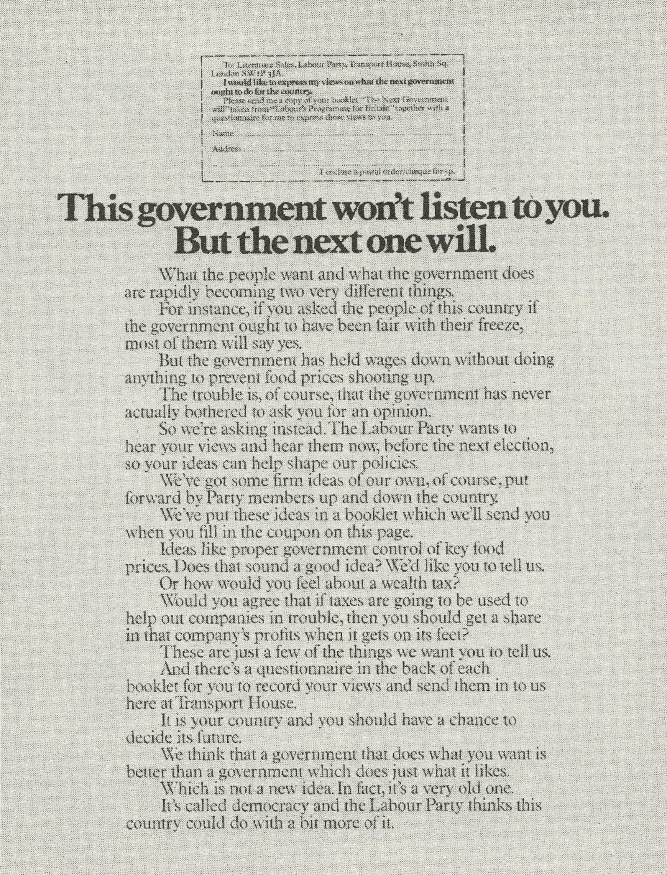
GOOD NEWS: You get your first ad into D&AD…
You wait till the annual comes out.
You run to the book store.
You pick up a copy and go straight to the credits to find your name…
That must have been irritating, being called ‘David’?
http://youtu.be/IG0m0FLyLI0<
You famously lied and cheated your way in to BMP, would you recommend that route to students?
It’s only cheating if you get caught, and if you get caught you’re stupid.
I only nicked a few ads that I knew I could have done anyway, just to pad out my book.
The guys I nicked them from were in NY and they’d never come to London.
6 months after I got the job, John Webster doubled my salary.
That’s when I told him about nicking the ads, I thought it was funny but he went ballistic.
I said “Why, you’ve given me the raise for what I’ve done since you’ve hired me. The book was just the platform ticket”.
Anyway, secretly I think he loved the story so he built it up and told everyone.
I think naughtiness and creativity are linked.
Let’s imagine I’d got a job with you at GGT.
A couple of months in you discover that my book had been padded with stolen work.
I defend myself ‘I could have done it, my book is a mere ‘platform ticket’.
I can’t believe you would’ve responded wit a ‘fair enough son, now back to work you young rascal’.
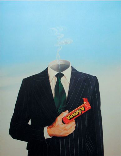

What made you want to give up your evenings to start the D&AD Student workshops? Nothing on TV?
At my art school in NY they decided they couldn’t teach us advertising properly so they sent us to Madison Avenue to learn from the pros. I thought it would be a good idea to do that when I got back here.
So how did you persuade a whole bunch of creatives to use their evenings to teach instead of getting drunk? (Getting drunk was what creatives did in the seventies wasn’t it?)
I wanted to get a different person to teach each week at their agency, but no one answered my letters because they didn’t know who I was.
So I thought it needed some credibility. I asked D&AD to sponsor it. As soon as I did, 60 creatives signed up for it.
I decided to launch it one evening at BMP, but Jeremy Sinclair was the only person who turned up.
I was furious and ready to chuck it in, but Jeremy said “No one knows nobody else turned up.
Everyone thinks they’re the only person who didn’t come, so let’s carry on, on our own.
He nominated me as Chairman, then seconded me, then said it was unanimous. And we started filling in names in the calendar and sent it out to everyone.
Jeremy was right, everyone thought everyone else had agreed, so they all meekly complied.
That was how it started.
Legend goes that you were overlooked for the Creative Directors job at BMP so stropped off. True?
Pretty much.
John Webster had to choose between me and Graham Collis for the ECD job, I was a pain in the arse so he chose Graham. I would have worked for John forever, but I couldn’t work for Graham, so I had to leave.
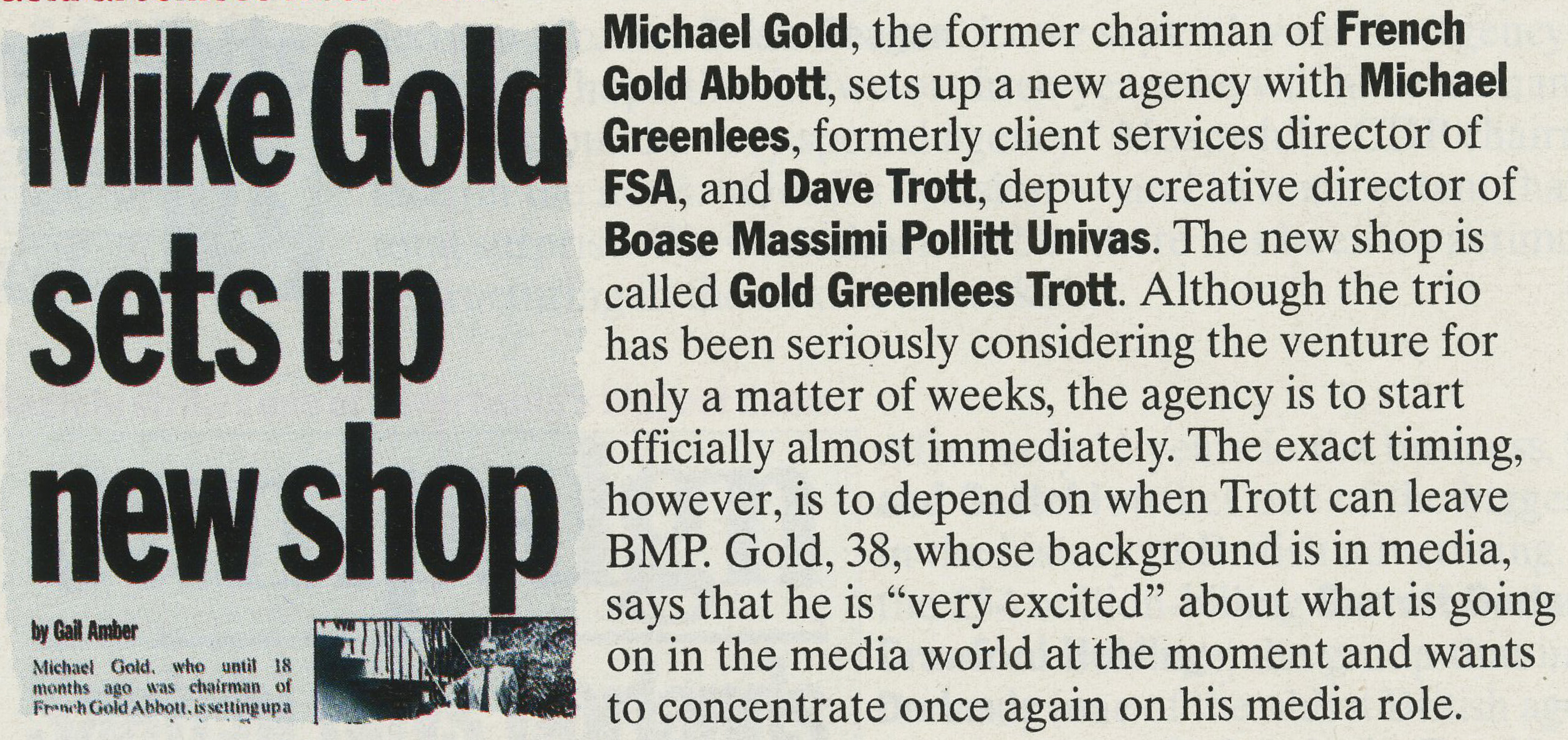
Who came up with the idea of starting an agency, G,G or T?
Cathy Heng, my wife, had worked at FGA with Mike Gold, she said he was unemployed so I called him.
He said he wanted Mike Greenlees. Cathy said Mike Greenlees was a workaholic, that was good enough for me.

GGT went nearly a year without any business.
How many days were you from packing it in?
DT: My plan was never to have an agency.
I wanted a job as creative director of a big agency, but no one had heard of me so I had to work out how to get famous in a hurry.
Mike Gold was David Abbott’s ex-partner (FGA), I thought if we opened an agency Campaign would have to keep putting my name next to his, people might think I was somehow in Abbott’s league.
We put our houses up against a bank loan and, if we didn’t take a salary, that would last us 6 months.
By the time we ran out of money I thought I should be famous enough to get the CD job I wanted.


You finally win an account, Holsten Pils, and the agency burns down.
You must have thought it just wasn’t meant to be?
Nah, an agency is the brains behind it, not the building.
We had a phone line put in Mike Greenlees’s house and were up and running the next day.
Didn’t miss a beat.
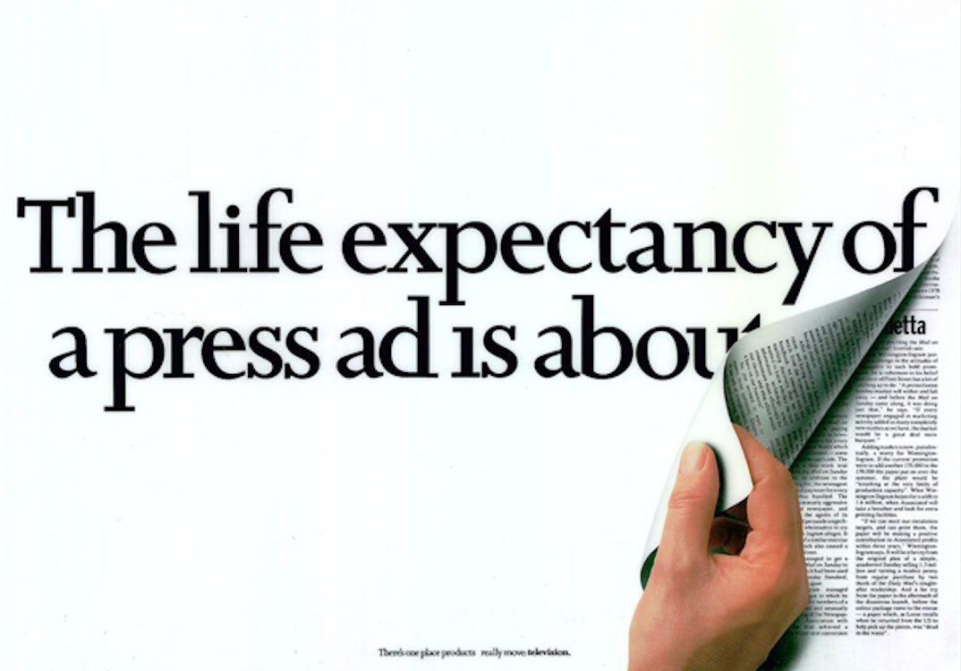
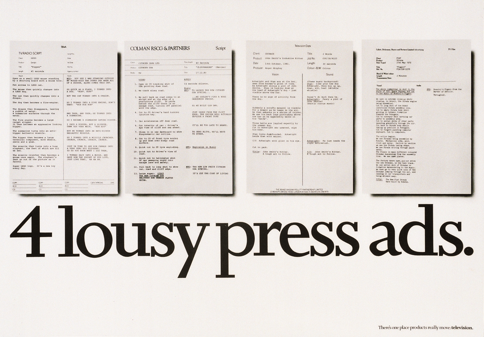
You were brilliant with young people, less good with senior citizens. Why?
Youngsters were more desperate, they didn’t have a choice, they had to do what I told them.
If they did what I told them they’d soon have a really good book and reel.
Middle and heavyweights wouldn’t do what I told them, they wanted to do it their way.
I didn’t need the aggravation of that.
Plus they were overpaid for the amount of work they did.
I could get 5 young teams for the cost of a heavyweight team, 10 young teams for the cost of two heavyweight teams.
Inside a year those youngsters would be as good as the heavyweights for a fraction of the price.

The D&AD Rejects Course. Why start a rival to your baby the D&AD Students course? altruism or fuck-you cockiness?
The idea of the D&AD Advertising Concepts course was to take anyone (bike messengers, secretaries, etc) and see how fast they improved.
So people at the start would be pretty bad. That didn’t worry me, but D&AD only wanted to allow the best people onto the course.
That was the opposite of the original idea: it was like elitism.
So my agency decided to teach “The D&AD Advertising Rejects’ Course” instead.
It was like the dirty dozen.
We managed to get the rejects more jobs than the people on the main course.
What I loved was that we had people pretending to be rejects who’d actually been accepted to the main course, because the rejects’ course was better.
So, yeah, definitely a fuck-you.
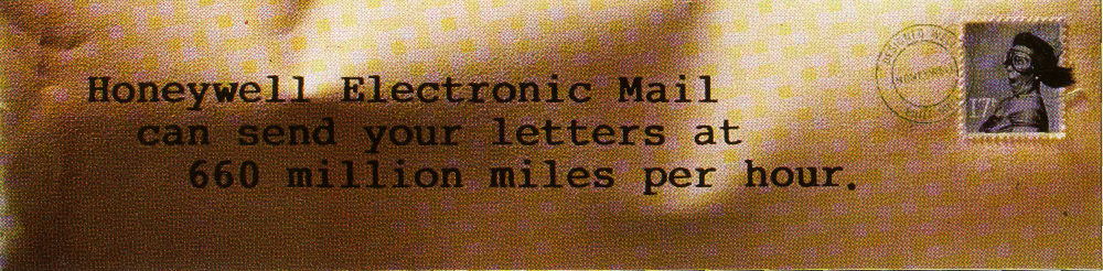


Did you rule by fear?
Maybe, but that’s not a bad thing, like Alex Ferguson at Man Utd.
You want to be great, my job is to make you great.
That may not be comfortable, but it’s not comfortable getting to be the best.
If you’re desperate enough to do whatever it takes to be great, then I’m the right boss.
If it’s more important for you to feel comfortable and nice and stroked, then I’m the wrong boss.
I can still recall reading a quote of yours that made me think you might be a bit evil: ‘Insecurity is a great battery to plug into.’
Are you a bit evil?
I think you have to make yourself more frightened of failing to fulfil your potential than you are of embarrassment.
Fear is a great fuel.
Learn how to turn it on, learn how to make fear your friend.
Learn how to use fear to make you do what you know you really want to do but are too embarrassed.
(I’ll put ‘No, not Evil’.)
Did you buy a spare copy of this issue for your Mum?

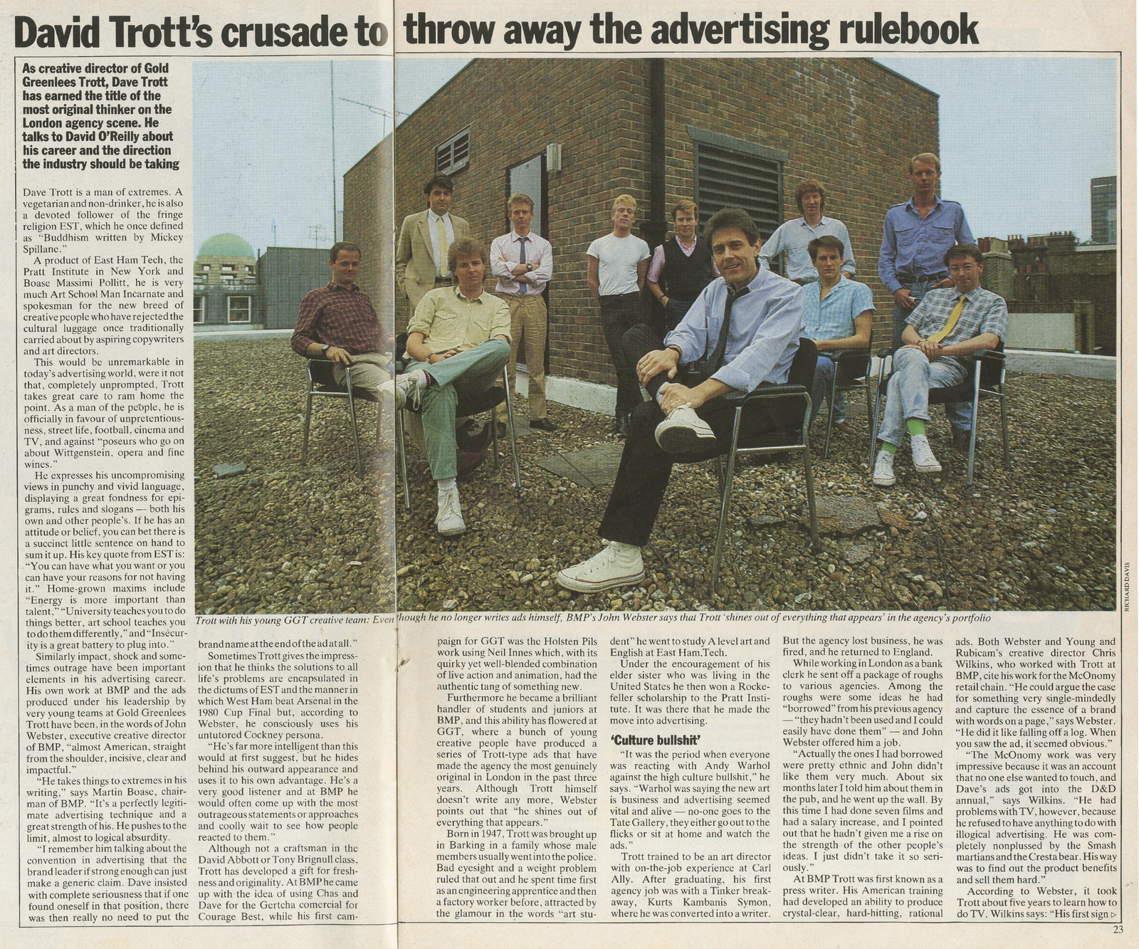
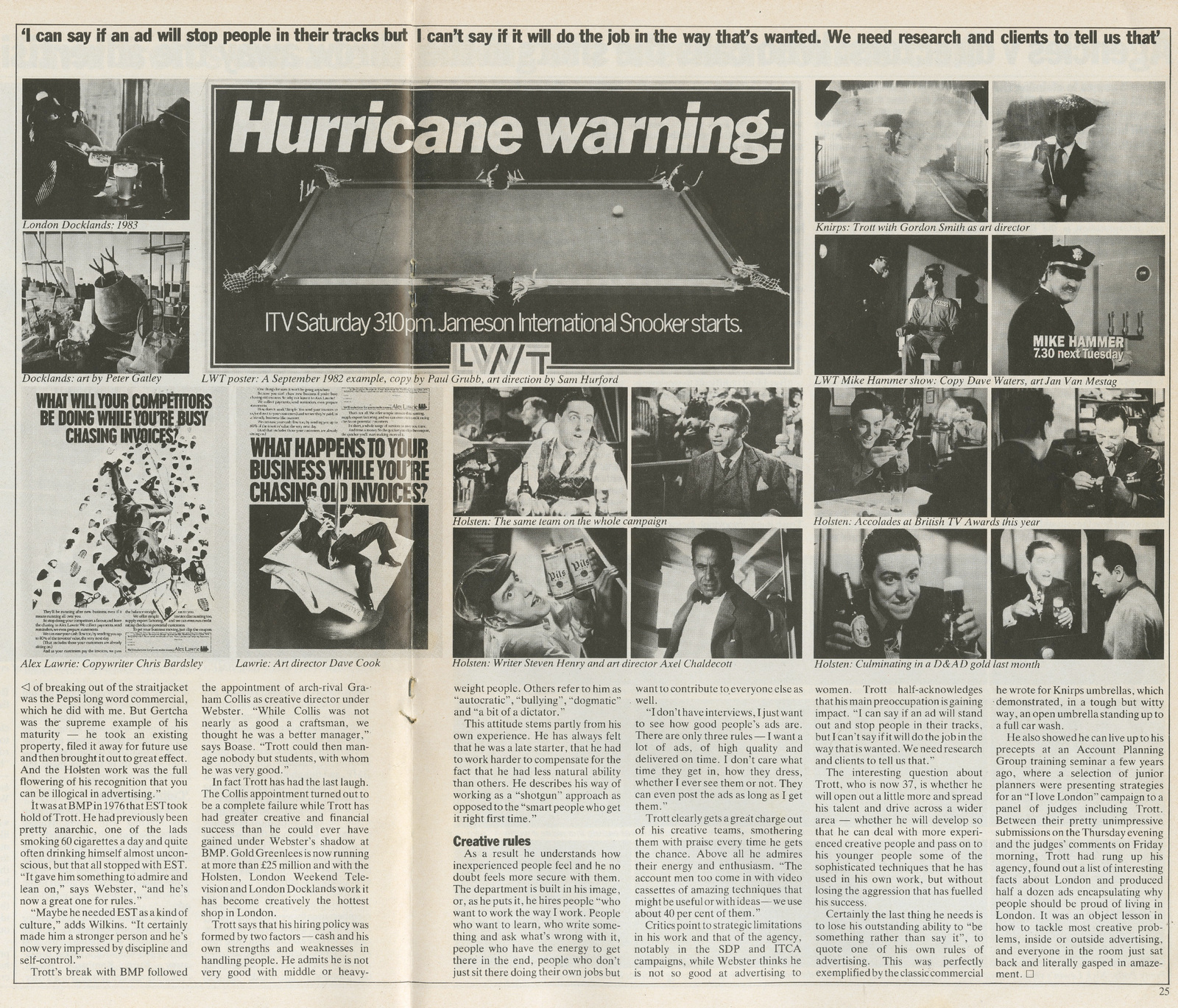
How difficult are you on a scale of one to ten.
If you’re good: I’m 3 or 4. If you’re not: I’m probably 9 or 10.
Because if you’re good you want to grow, and that’s constantly difficult, and that’s what you want.
Someone to keep stretching you.
To me, GGT was the first punk agency, rejecting experience, knowledge and qualifications, in favour of energy and enthusiasm?
Absolutely.
There’s a lot more fun in being the underdog.
All the fun is in beating people who are better, richer, more talented, more experienced, people with more advantages than you.
People that you shouldn’t beat.
There’s no fun in beating people who you should beat.
You’d come from the best agency in the country, partnered the best creative in the business and had recently picked up D&AD pencils for Courage, Victory V’s & Fisher-Price? Some underdog?
Garry Neville said “Indignation is a great source of energy”.
So you need to find a source of energy you can plug into.
For me that was convincing myself I was the underdog.
Convincing myself I wasn’t as good as everyone else, so I’d have to try harder to beat them.
Telling yourself you’re as good as anyone else just makes you relax and take your foot off the gas.
You get complacent.
Then you lose.
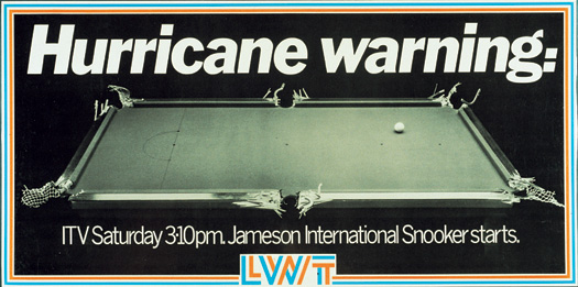
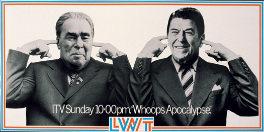
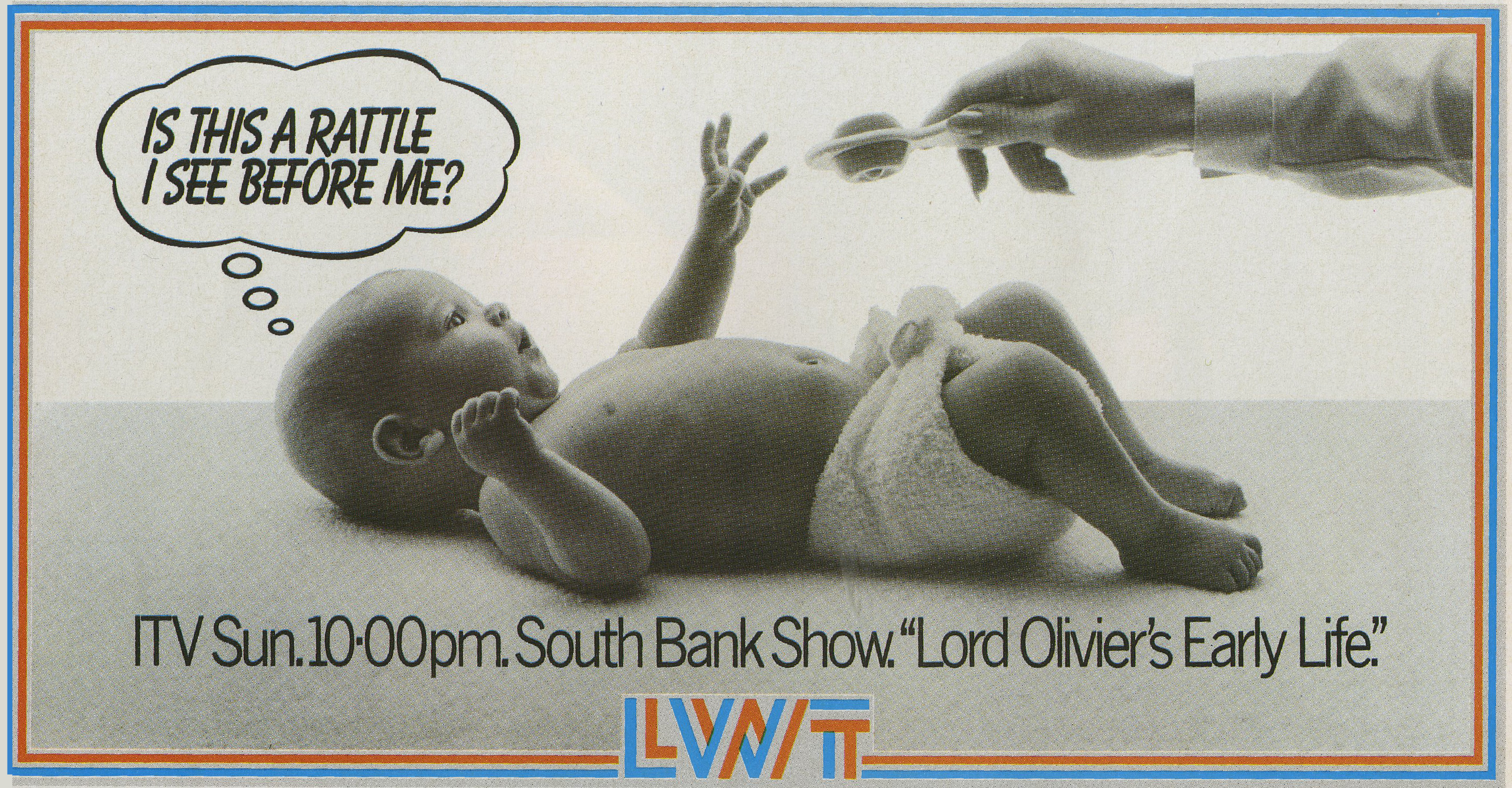
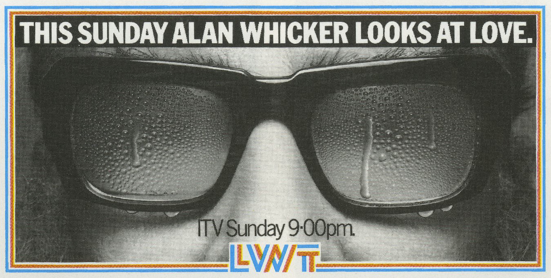
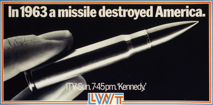
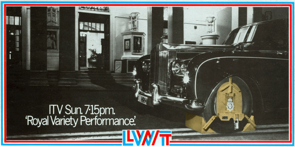
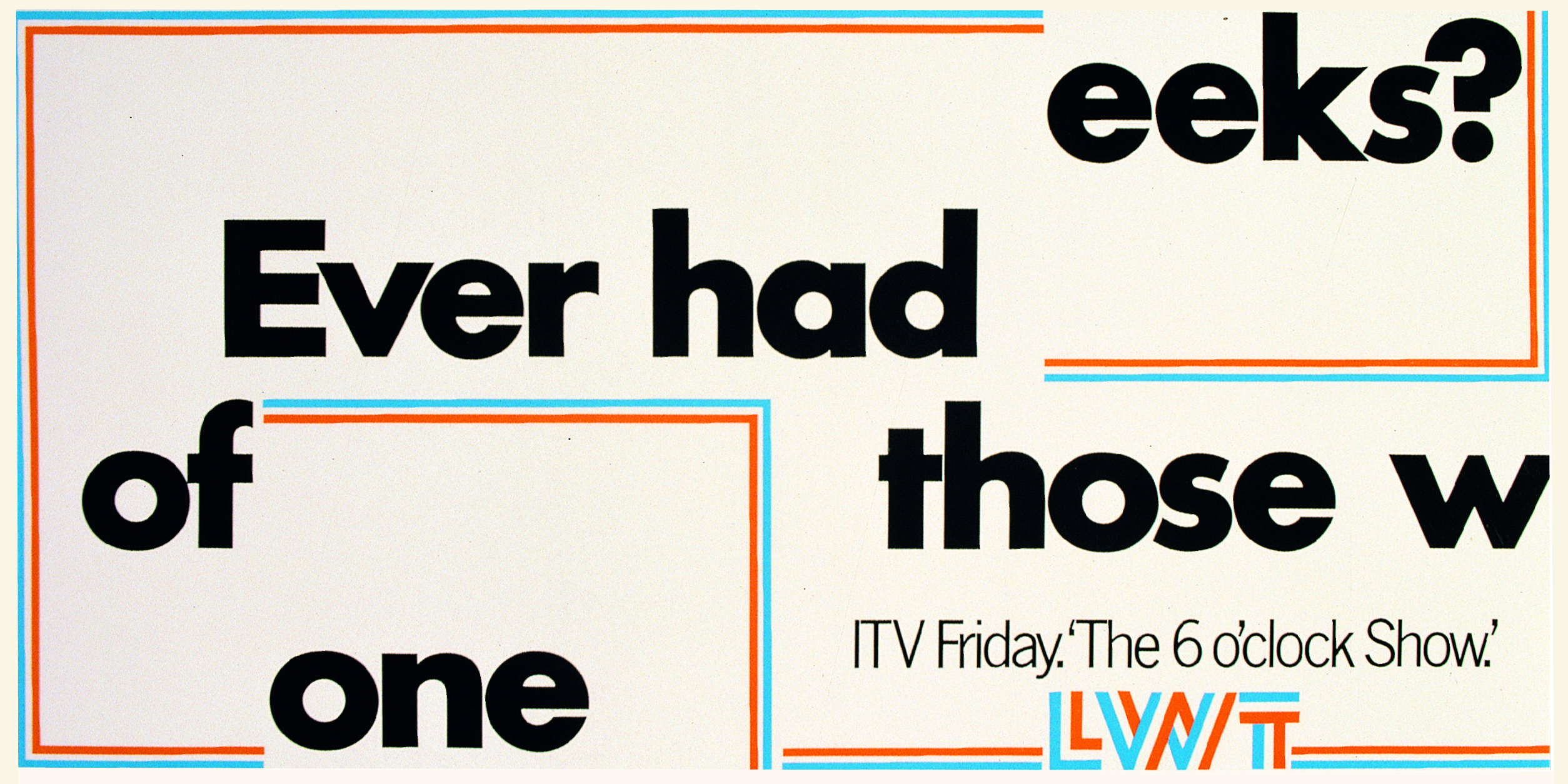
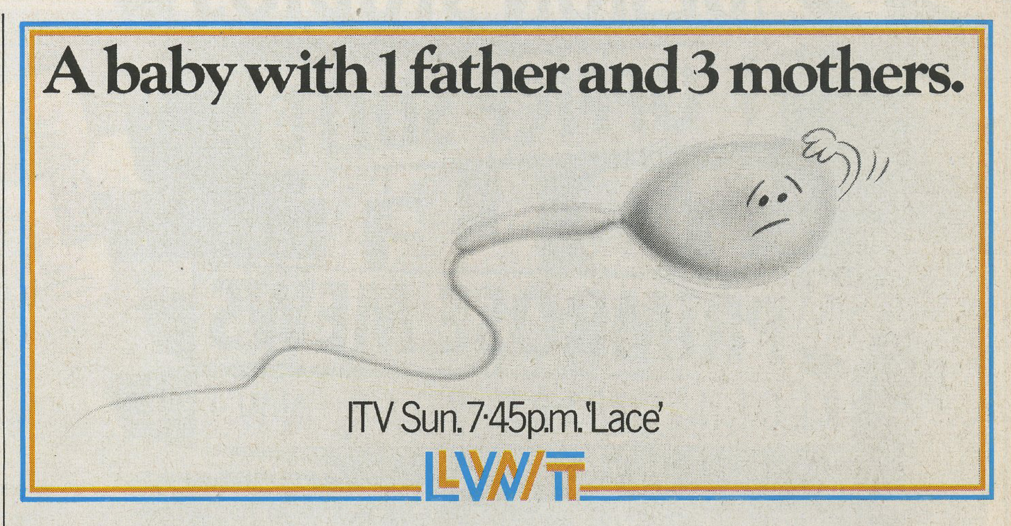
GGT were big zaggers:
a) Hiring scally’s from up and down the country, not southern, middle class Oxbridge types.
(Wherever that is.)
b) Sticking two fingers up to endless refining ,rewriting and generally diddling around type craft.
c) Not trying to appear smooth, tasteful or arbiters of ‘cool’.
There was a real buzz in doing exactly the opposite of all the smug fat-cats.
They wanted Oxbridge educated, well-crafted, tasteful, advertising.
We used to call it the “Dare We Suggest” school of advertising.
They wouldn’t say “This is big”.
They’d say “This is big, dare we suggest, bigger than you’re used to”.
We used to call ours “Fuck me” advertising.
We wanted people to look at it and go “Fuck”.
‘Smug Fat Cats’, ‘Oxbridge’, ‘Dare We Suggest’.
Other working class creatives assimilated, what made you want to fight?
Growing up in east London I thought changing my accent and pretending to be middle class was the only way out.
Then I went to New York.
Bill Bernbach was celebrating what made people different: Jews, Italians, Irish, Blacks, not hiding it.
He made middle class just seem boring.
I thought if I go back to London I can do that for working class cockneys like me.
They’re a lot more fun than the middle class.
You’re always very complimentary about BBH, on the face of it, the complete antithesis of GGT?
The one thing BBH did that I agree with is they got their thinking right.
We all learned at the Bernbach school (same as Abbott and Webster).
Reduce it down to the simple thing, the reason anyone should buy this.
Our execution was very different, but our basic thinking was the same.
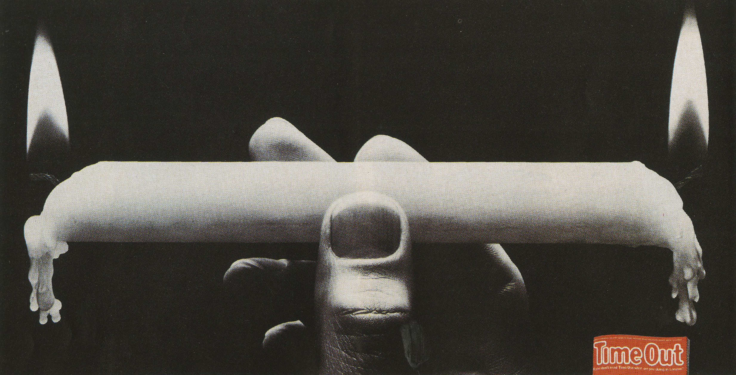
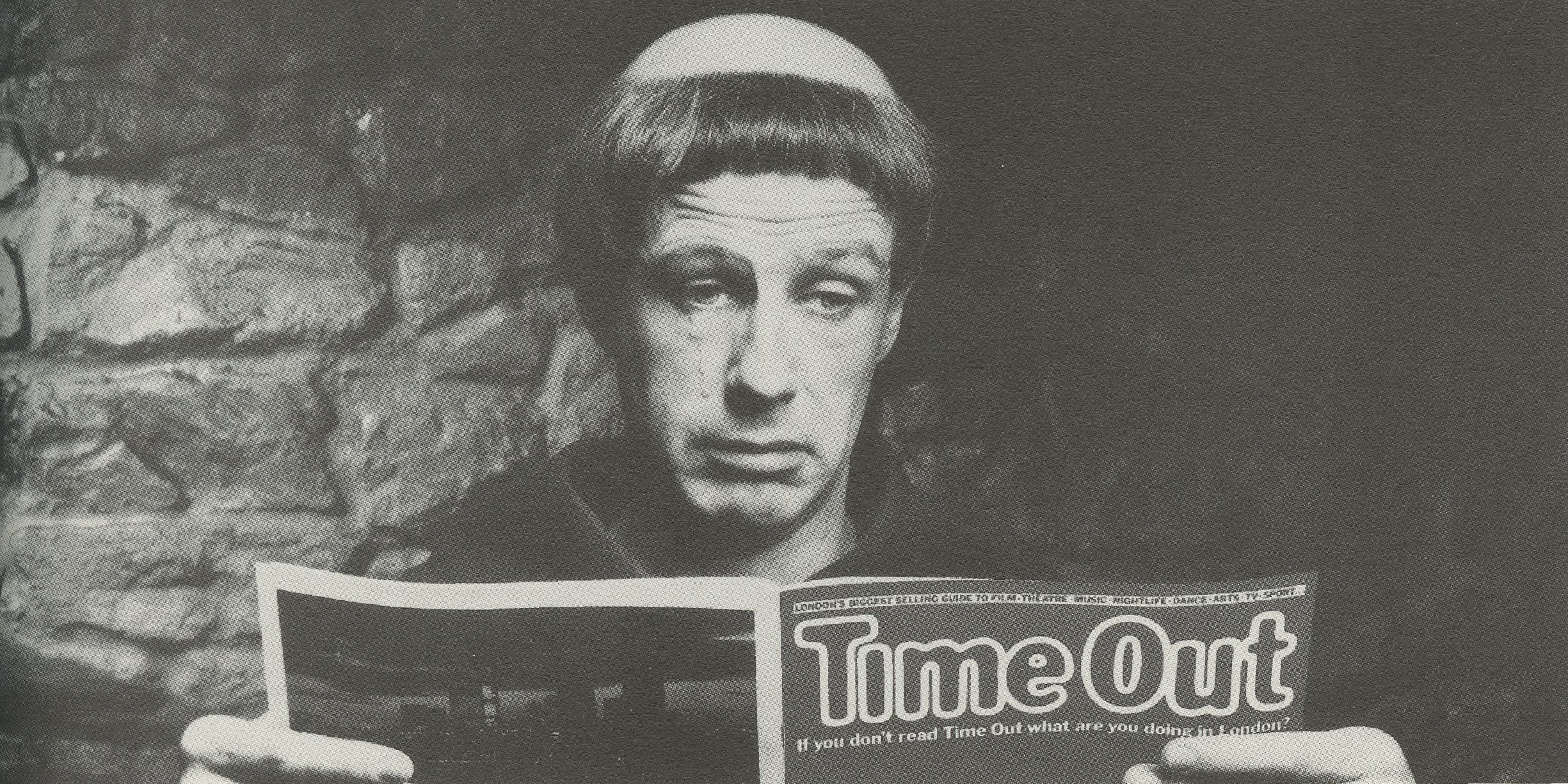

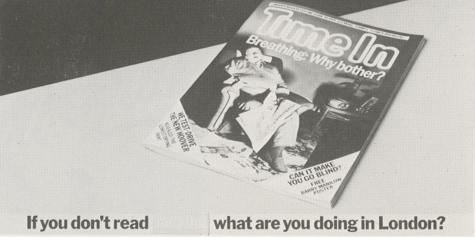
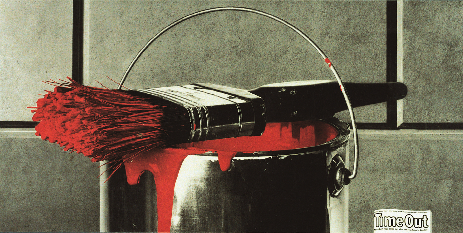
“GGT? The new Allen Brady Marsh, jingle merchants. I don’t know what all the fuss about?” – A previous Creative Director of mine .
Was Rod Allen an inspiration? Do you own a Bontempi organ?
Agencies often refer to their competitors in a mocking way, it’s a back-handed compliment.
BBH used to refer to us as “The thinking man’s Allen Brady Marsh”
M&C used to refer to BBH as “Miserable excellence”.
My influence was John Webster not ABM.
Webster mixed the corny concept with an intelligent execution, ABM, like Leo Burnett, etc just stopped at corny.
Incidentally, Cadbury’s kept taking accounts away from BBH and giving them to GGT, because our advertising worked better for that target audience (mainstream).
BBH were better on upmarket products – Levis, Audi, etc.
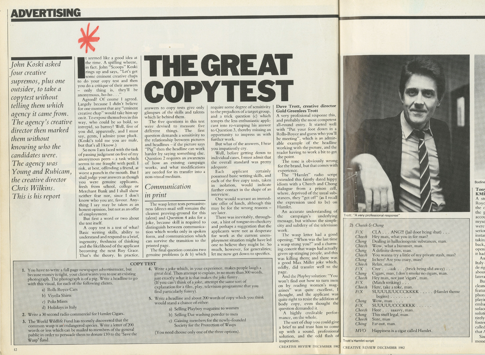

How did you go, kicked or walk?
Mike Greenlees had moved into the PLC, which meant GGT lost its best account man.
Mike wanted a less argumentative, more fashionable, ECD than me. He told me the name, I disagreed.
I wrote a list of every ECD I would step down for, all the people I respected.
Then I added that name to the bottom and said “Spot the odd one out”.
Mike said that was a great list and took it to see if he could get any of those names.
Actually he ignored the list and hired the name he wanted, but I heard he showed that list to the creative department and said it was a list of everyone I respected including the guy he’d hired, in my own handwriting.
Very clever, I had to admire it.
What was the hardest thing about leaving?
Everything.
So you missed Gold and Greenlees and ‘everything’.
Why did you leave again?
We disagreed about the way we should grow.
Mike Greenlees wanted to go for size, I just wanted quality.
Mike was CEO of the public company and hired a new creative director. That left me with nothing to do.
Were you ever tempted to get a big, fancy job?
DT: Before GGT I was, but it never happened.
I don’t think I’m political enough to be able to play those games.
Why weren’t BST ginormous?
The 3 partners never agreed on what we were doing or why.
I missed Mike Greenlees and Mike Gold too much.
At GGT we all agreed on what we were doing (until the very end).
That’s the difference.
A creative director can’t just push it through on his own, it’s a team game.
Facebook communities of 20,000.
23700 followers on Twitter. 196 likes on Instagram.
Clients seem thrilled with these small numbers, what’s happened to mass communication?
Yup, it’s just fashion.
People think they’re missing out if they don’t jump on the bandwagon.
Everyone is confused, it’s a great time to be selling media.
Over the years you’ve put a lot of brand names and product information into people’s memory banks.
Today, people can find anything they want, anywhere, anytime, so is remembering stuff still important?
Remembering your name is only NOT important if you’re market leader.
If you’re Coca Cola, or Nike, or Microsoft, or Hertz.
But if you’re not market leader, if you’re Pepsi, or Adidas, or Apple, or Avis that works against you.
If I ask for a beer, I’ve got more chance of getting a Bud than anything else, because they are the market leader.
But most beers aren’t Budweiser, so they have to get specified or they’ll get ignored.
That’s why Meerkats works better than anything else in that sector.
If you don’t get specified, if you just sell a generic property, you sell the market leader because they have more distribution.
I last heard the term USP in2002.
Are they still relevant in an age of content, twitter feeds and social communities ?Why did you marry your wife?
If you can tell me what’s good about her, what makes her different that’s her USP?
Why did you buy the car you’ve got, or the house you’ve got, or anything you’ve got?
Was it because of the number of Facebook likes the brand got, or what you read on Twitter about the brand?
I don’t think so.
You can call it what you like, but the mind works the way it’s always worked.
Don’t listen to the latest gimmick, just look at your own behaviour.
Advertising used to be one of the few outlets for a creative mind.
As the number of outlets has increased do you think the IQ of the average Ad person has decreased?
I think what’s ruined it is too many university graduates.
Too many people who’ve been trained to think exactly like everyone else.
The great people came through the post room: Charlie Saatchi, Tim Bell, Frank Lowe, Peter Mead.
They had to learn it for themselves, how to out-think other people.
How to hustle.
Now that’s a dirty word, now everyone has learned the same stuff at the same institutions so they’re all interchangeable.
Who’s the best adman/woman you’ve ever come across?
For me John Webster.
But Paul Arden always said Charlie Saatchi. John Webster always said Colin Millward. Helmut Krone always said Bill Bernbach. Ed McCabe always said Carl Ally.
I guess it depends who you were exposed to.
SOPHIE’S CHOICE SECTION: What’s more useful;
Talent or hard work?
Toughness or empathy?
Observation or imagination?
Putting a creative department together is like putting a football team together.
You need a spine of hard workers you can depend on, (Ferguson had Paul Scholes and Phil Neville, Roy Keane), I had Dave Waters, Nick Wray, Paul Grubb.
You need some people who maybe don’t work so hard but can really surprise you sometimes, (Ferguson had Beckham), I had Steve Henry and Mary Wear.
Tony Cox used building a creative department was like hosting a dinner party, pick a couple of people to keep the conversation going, a couple of eccentrics, an annoying person to wind people up, a sprinkling of attractive ones, etc.
Yes, if you see it as a cocktail party.
Steve Henry once said the difference between working for me or Andrew Cracknel was the difference between football and cricket.
I imagine that’s probably true, and includes cocktail parties.
Just think of what the desired outcome is in each case.
Which of your ads has had the biggest effect on your career?
It would be a toss-up between Gercha and Toshiba I guess.
What’s your best hiring ?
I can tell you in a pub over a pint. But if I say it here whoever I don’t mention will be pissed off.
I don’t hear the phrase ‘been done’ much these days.
No one remembers more than a year back, so no one knows what’s been done.
Also it’s international so no one knows what’s been done.
Also it’s mainly about clients and suits, so no one knows what’s been done.
Also it’s just about awards (not the annual) which are forgotten inside a year (unlike the annual).
One day on Scamp’s blog, people ridiculing your pamphlet ‘How To Get A Job In Advertising’ . The next day was a 24 hour Trottothon.
You made yourself available to answer criticisms live, all day.
On the face of it, a generous gesture, but to me , knowing a bit more about you than the Scampettes, I thought you were saying ‘Come and have a go if you think you’re hard enough!’.
True?
My attitude is, this is advertising, it’s the wrong place for shy people.
I just thought, at the time, it was a very fast way to get back in the mainstream.
Sure lots of young twats were being pretty shitty (always the ones who sign themselves ‘anonymous’).
I just thought who cares what they’re saying, as long as they’re talking about me I seem relevant.
As Mae West said “It’s better to be looked over than overlooked”.
The exchange went on for several days.
So I copied it off and sent it to every client and marketing person I could think of.
I don’t think anyone read it all, so the bad comments didn’t matter, but everyone got the idea that I was really fluent with digital media and online.
So it worked for what I wanted.
The blog.
Why such little sentences.
Like this?
Helmut Krone started it by cutting up Julian Koenig’s copy.
He said copy has to look inviting (less dense, more open space) or people just won’t read it.
Before you engage with your mind, you engage with your eyes.
Check out e.e.cummings.
What’s the point of blogging?
If you look at any purchase decision as a funnel, it goes: Awareness, Footfall, Conversion.
First you have to be aware something exists. That’s the point of most advertising.
Then you have find out where you can get it. That’s mainly the internet.
Then you have to actually part with the cash. That’s either the physical shop or online.
Depending on the blog, how big the audience, the subject matter, etc, it will fit into one of those boxes.
Your blog turned into books and lectures, was that a plan?
I never saw it as a blog, but as a book in progress.
I knew I wouldn’t write a blog if it disappeared after I’d written it.
I also knew I couldn’t write a 300 page book.
So I thought let’s put them together.
The fact that it’s going to be a book will make me rewrite each post properly like a piece of copy.
The fact that each is a page long means I don’t have to write 300 pages.
But at the end of a year that’s how many pages I’ll have.
How did the Forum help your career?
Before it was The Forum it was called est.
Think of it as a boot-camp for the mind.
What I loved was that it took the fear out of living.
It replaced emotion with logic.
Now, if it made sense you could do it, whatever conventional wisdom said. It showed me the stupidity of making decisions by worrying about what other people said.
I encouraged the creative department to do it. Everyone who did it either became an ECD or they opened their own agency.
Any regrets?
Oh yeah, but as Gordon says “It’s better to regret what you have done than what you haven’t”.
Thanks for your time Dave.
Dave’s Desert Island Ads:


Interview with top GGT team Dave Waters and Dave Cook:
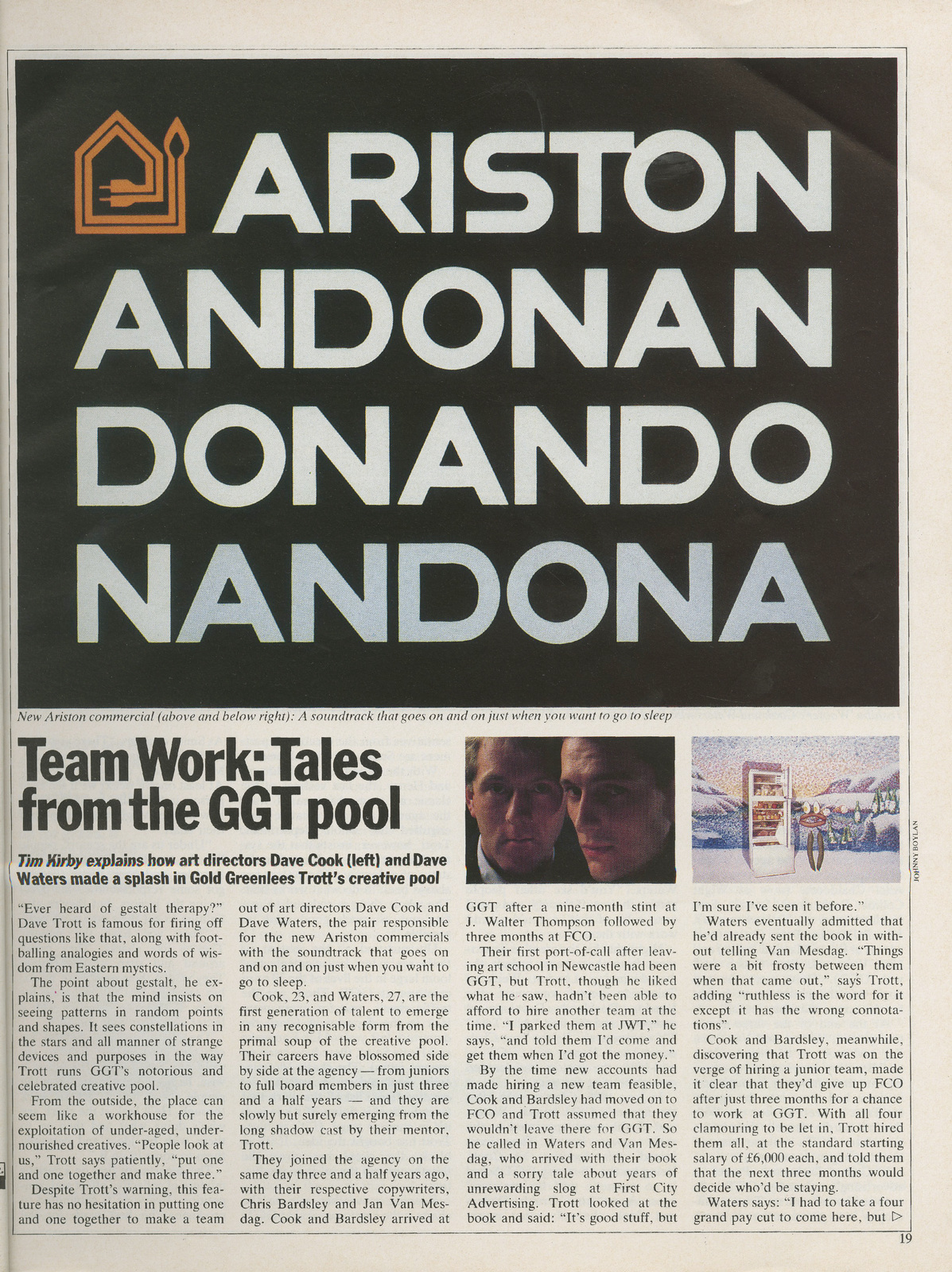
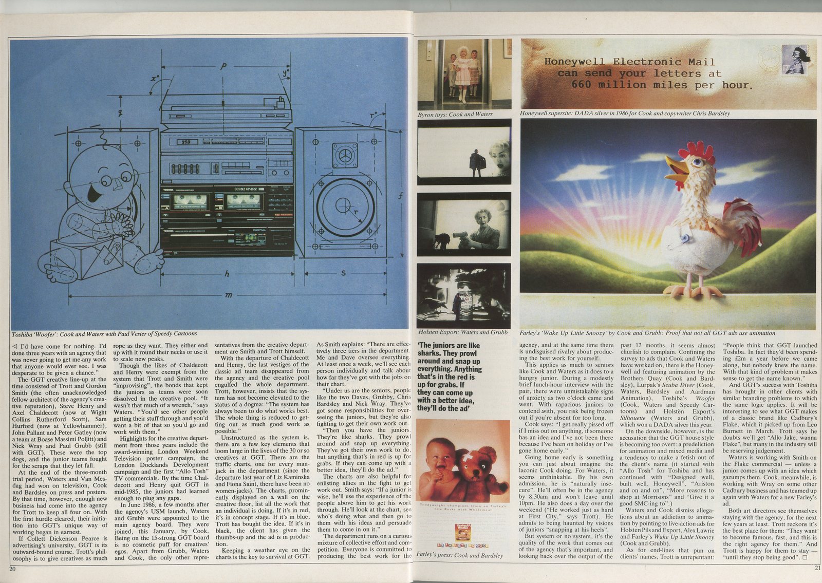
Dave discussing:
Dave drawing:
Dave teaching:
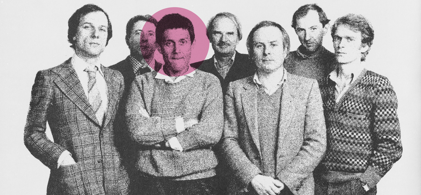
Agencies and clients generally shack up together after a single blind date, (or a pitch, to give it its technical name.) As a result, the relationship is a marriage of convenience; ‘‘Do you, Least Bad Agency In The Process, take you, Client Who Needs To Look Like They’re Shaking Things Up?’’But when an ‘old flame’ comes back the dynamic is different, you feel you have to do everything you can to justify their decision.Or at least I did when this happened back in 2009.I got a call from Andy Wood, formerly Adnams Marketing Director, now their C.E.O. and top chap.He talked fondly of the old ‘Beer From The Coast’ campaign we'd created together six years earlier.
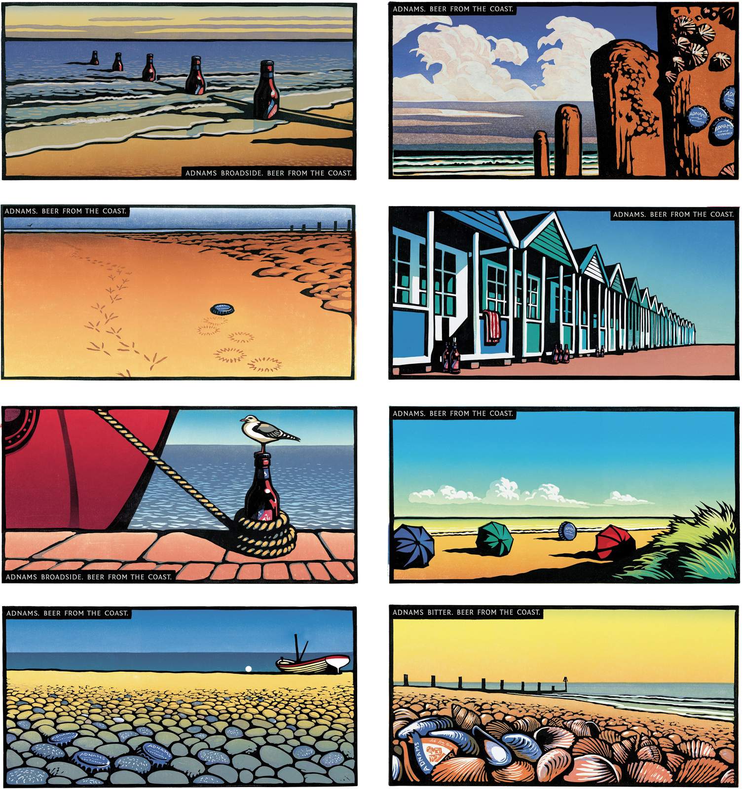
Then he told me that their marketing had ‘lost its way a bit in recent times’, research had said people saw them ‘a bit like a Volvo, reliable, trustworthy, but boring’.He shared some of their most recent ads.

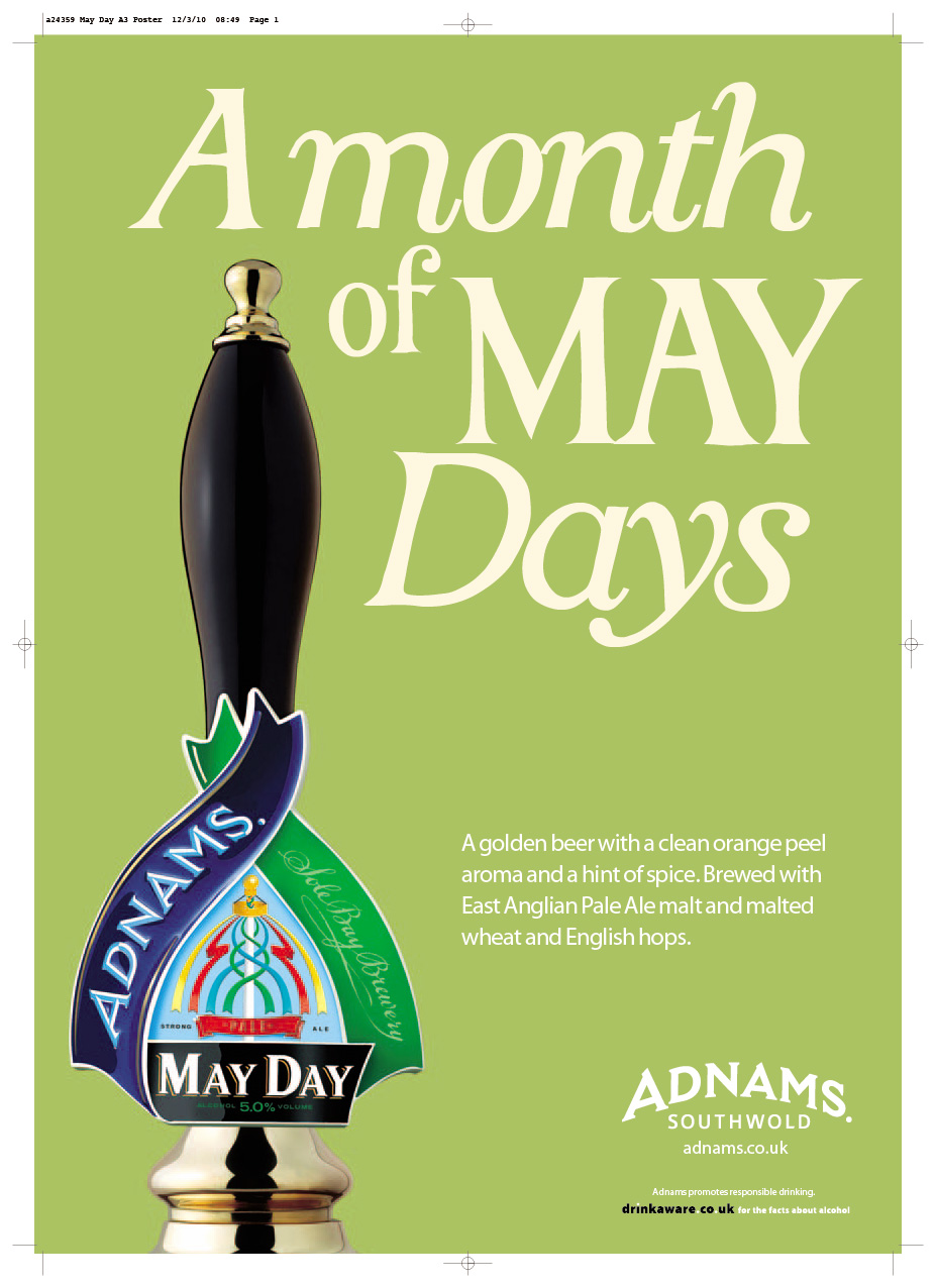
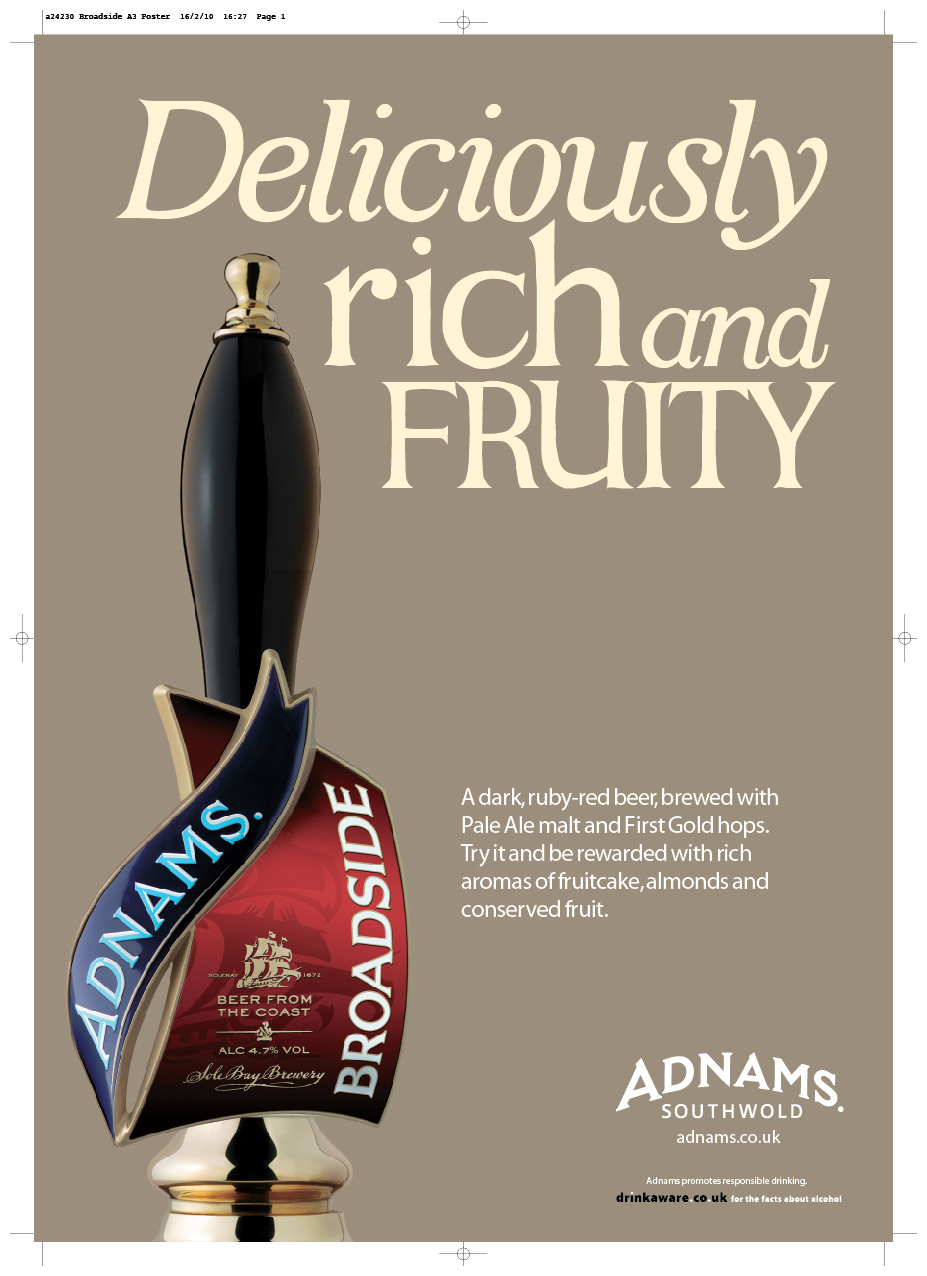
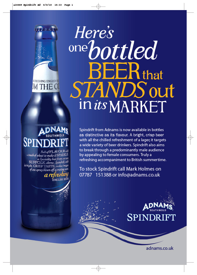
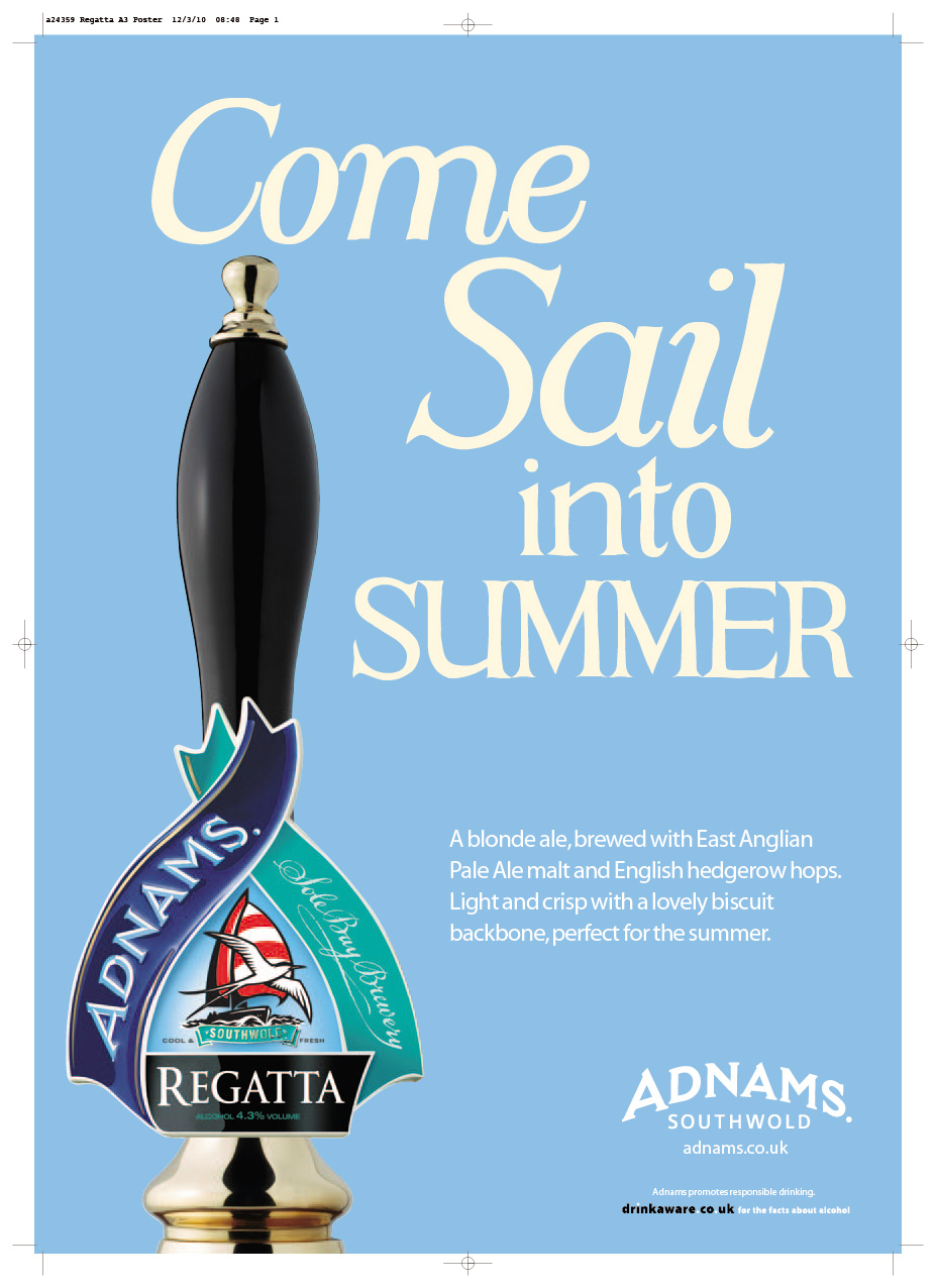
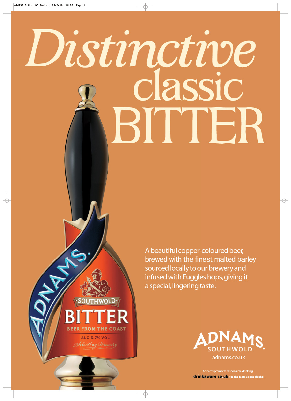


Wow! The only positive I could find was that they consistently featured generously proportioned pictures of a pump clip, which would be lapped up by all those...er... pump clip fans out there.He was reluctant to jump back into producing more Beer From The Coast work, as it felt like a backwards step.I told him I'd mull the problem over.What to do?The ‘Beer From The Coast’ campaign was pretty well-known, so it felt wrong to completely ignore it and reinvent the wheel, maybe we could evolve it?I remembered back to when we were writing the first campaign; a planner had argued ‘brewing beer next to the sea doesn't actually make it taste better’.Technically that may be true, but emotionally it isn't.maybe we should lie and say it does make it taste better? If done in a tongue in cheek way, maybe saying being brewed by the coast DOES make it taste better could be cool?E.g. ‘Every pint contains special pockets of unique Southwold Sea Air.’ It would be a kind of USP, (that's ‘Unique Selling Point’ for all you post Compact Disc generation.).It could give Adnams a bit of attitude, make them more contemporary. Less Volvo-ey.I emailed Andy a couple of concepts.
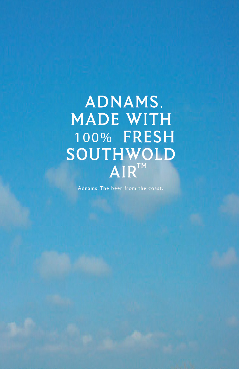
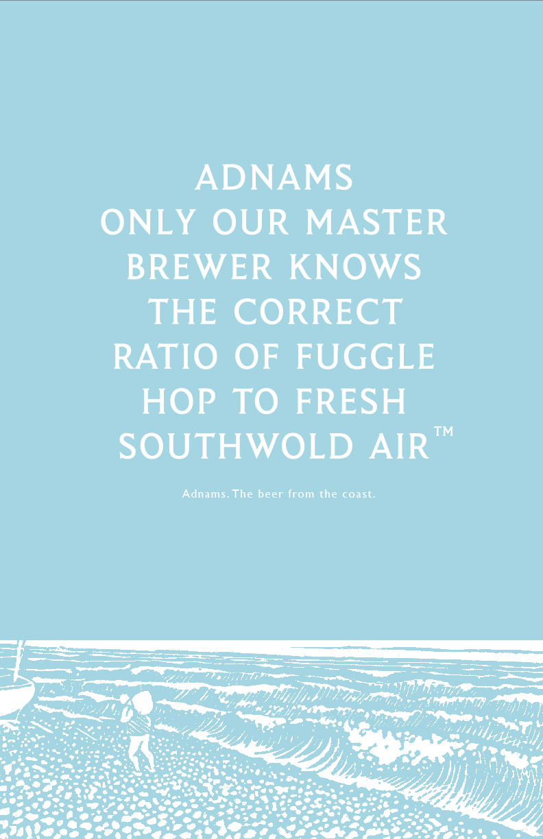
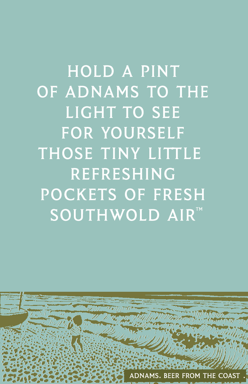
He liked them.But there was a problem, the idea was too beer focussed.The Adnams of 2009 was different from the Adnams of 2002, it had diversified, they now distilled Whiskey, had a growing number of stores, hotels, wine departments and all manner of brand extensions.All these different parts of the business looked different too.We'd need to unify them.But the messages would be quite diverse, ranging from ‘30% off Rioja’ to ‘Weekend Hotel Breaks’ to ‘New Store opening’ to ‘Mayday Bitter is back’.Given the range and type of messages we'd need to cover, words seemed to be the only way to go.We'd need to create a distinctive voice to make it feel like one brand.The most successful 'voices' tend to feel true to the company.Baked Bean companies that talk like street pimps or Banks that talk like they are your oldest friend don't tend to hang around for long.So what truths could be used to build Adnams voice?We put together a presentation.
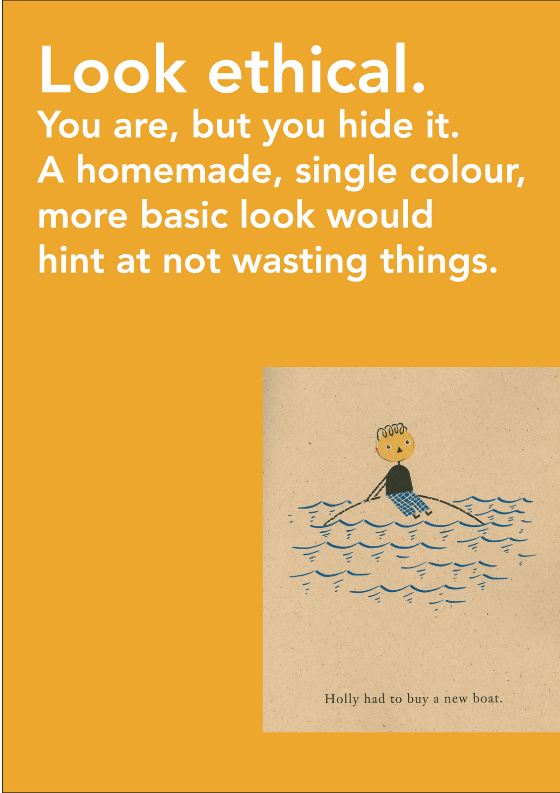
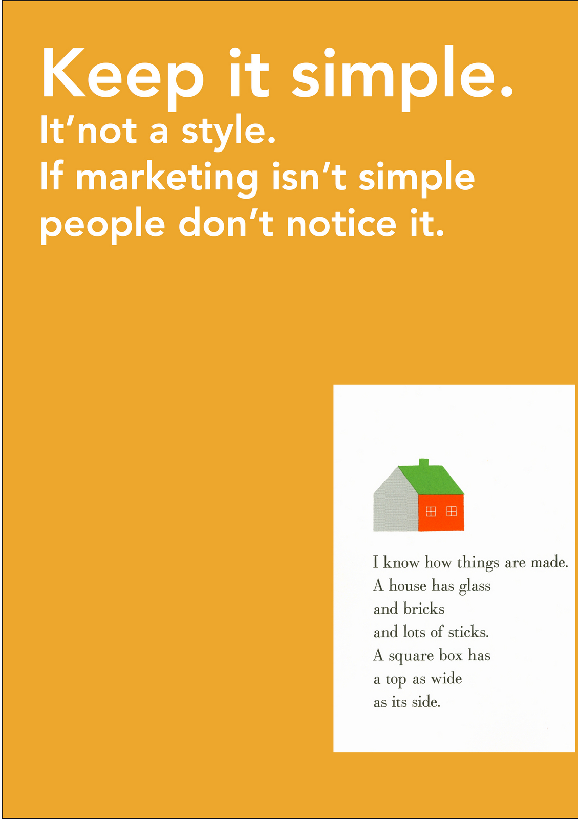

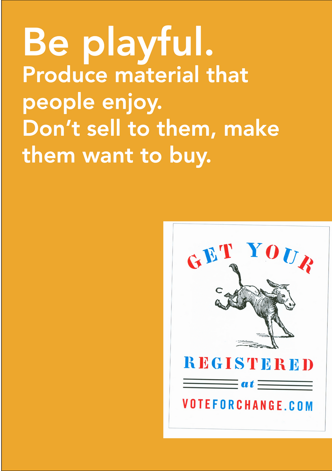
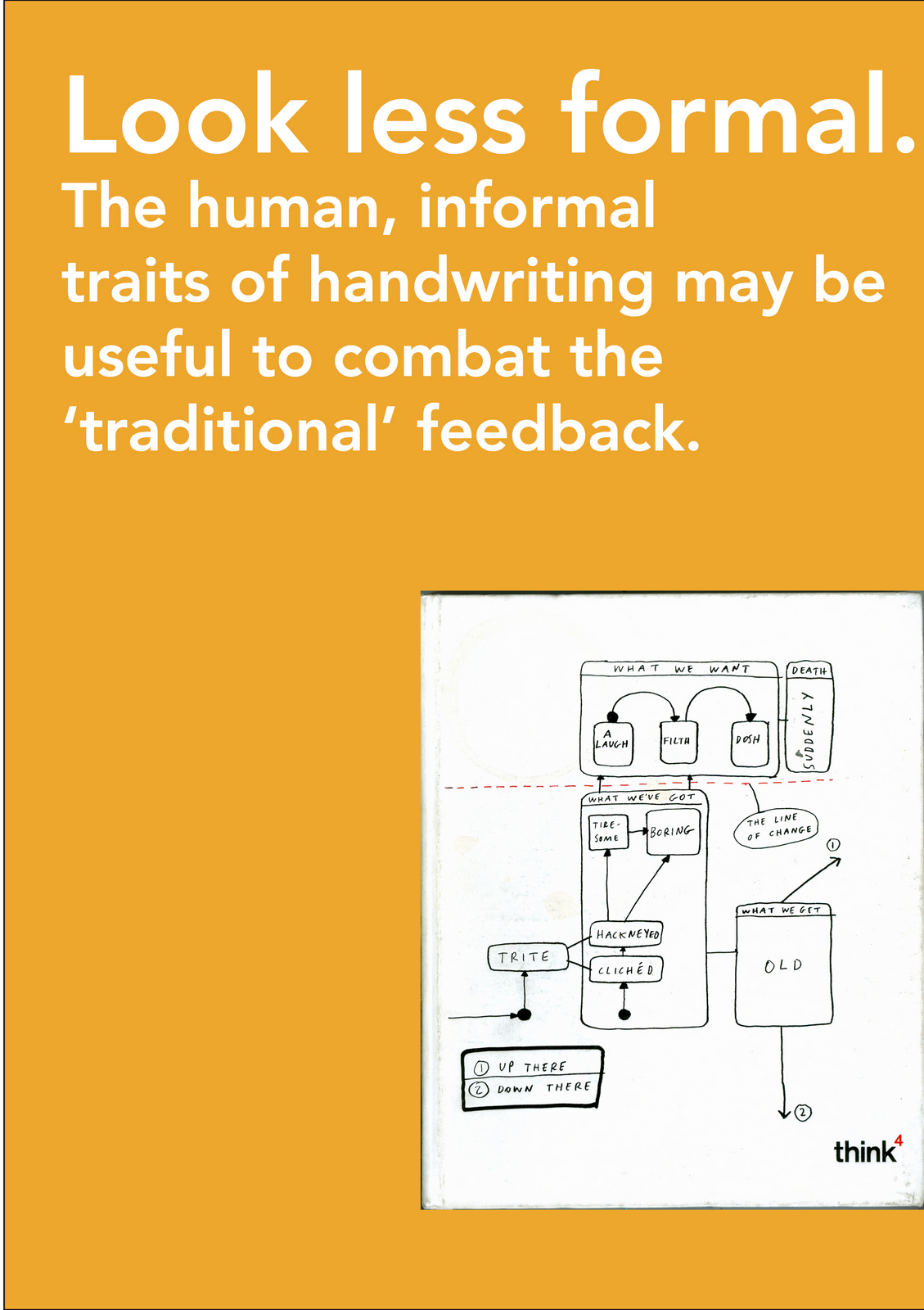
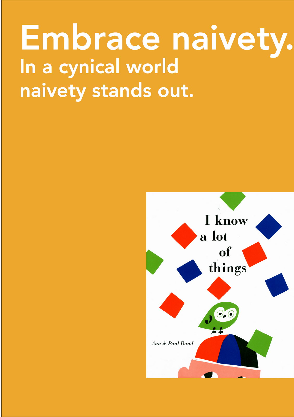
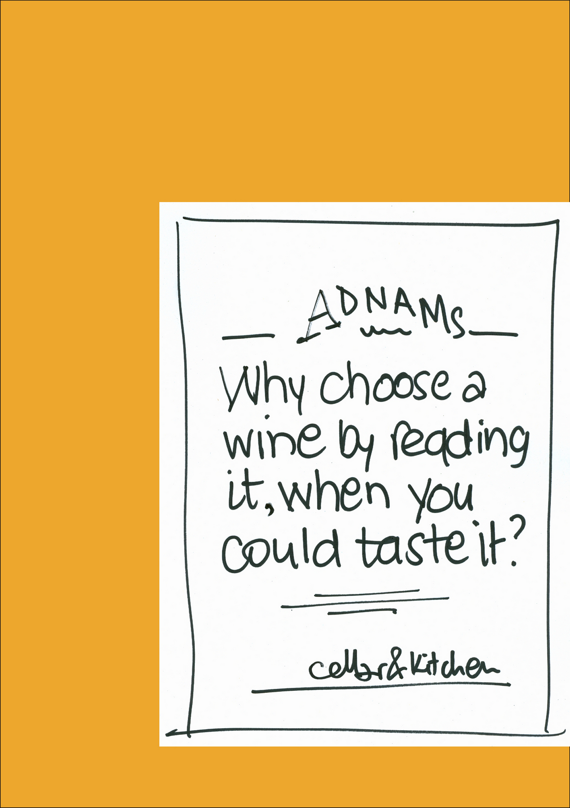
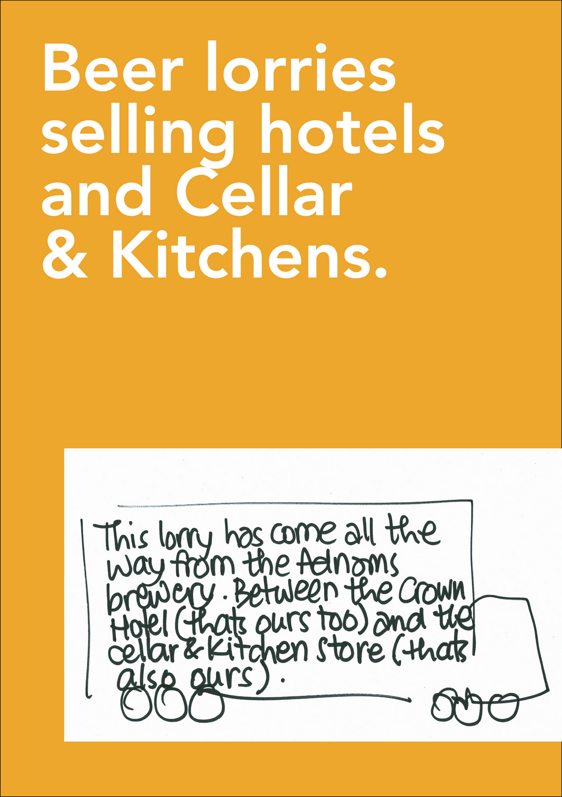
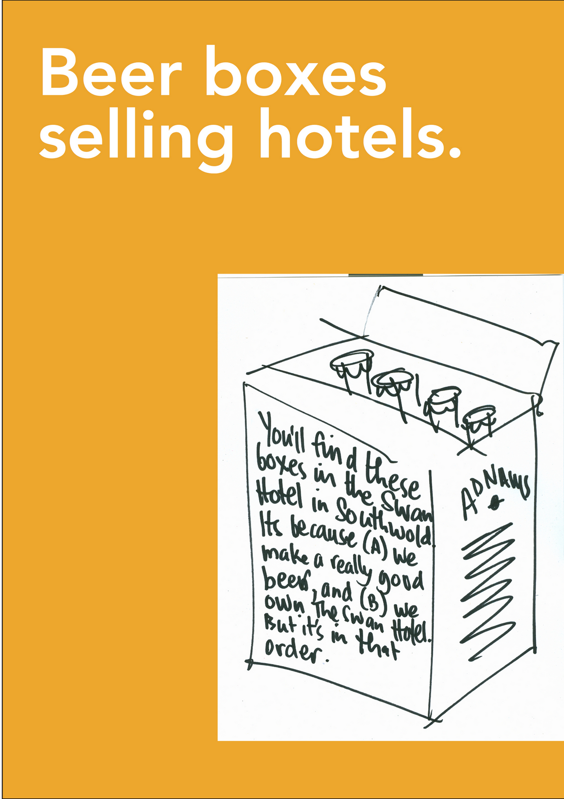
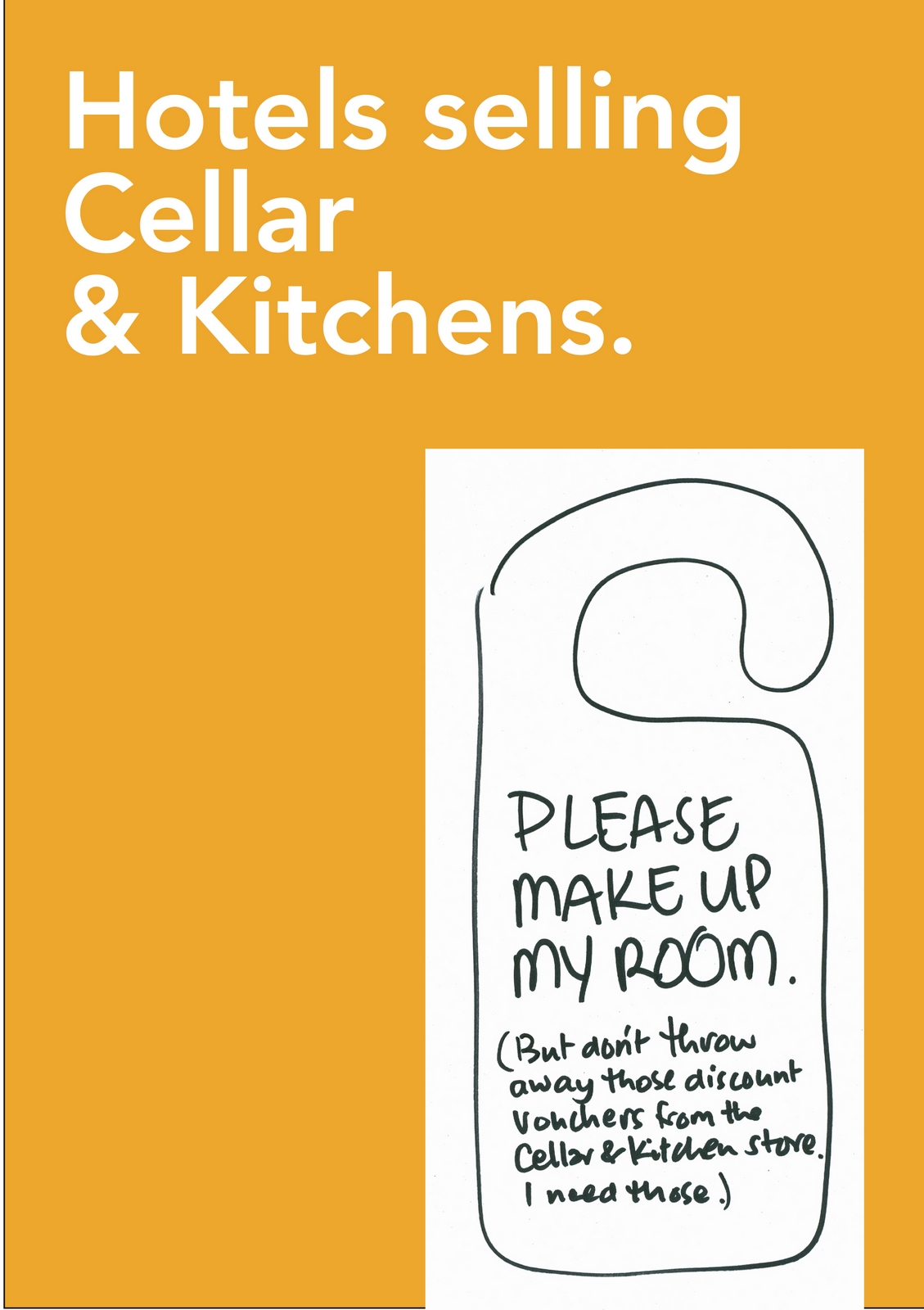
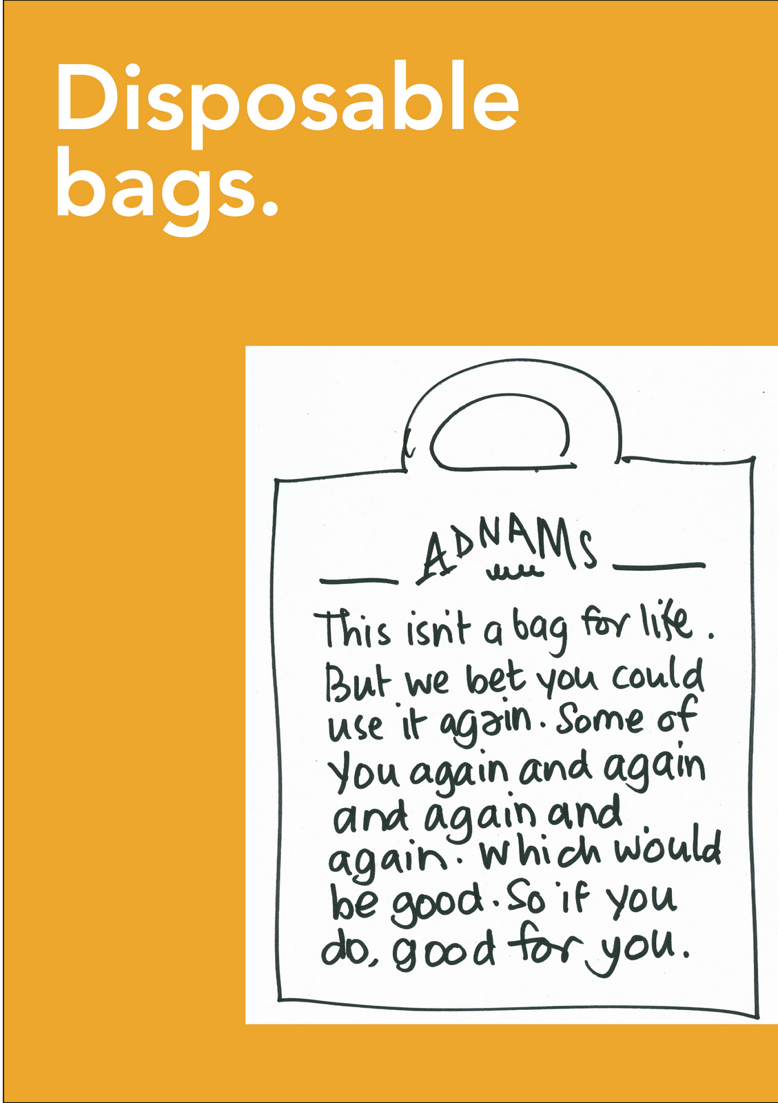
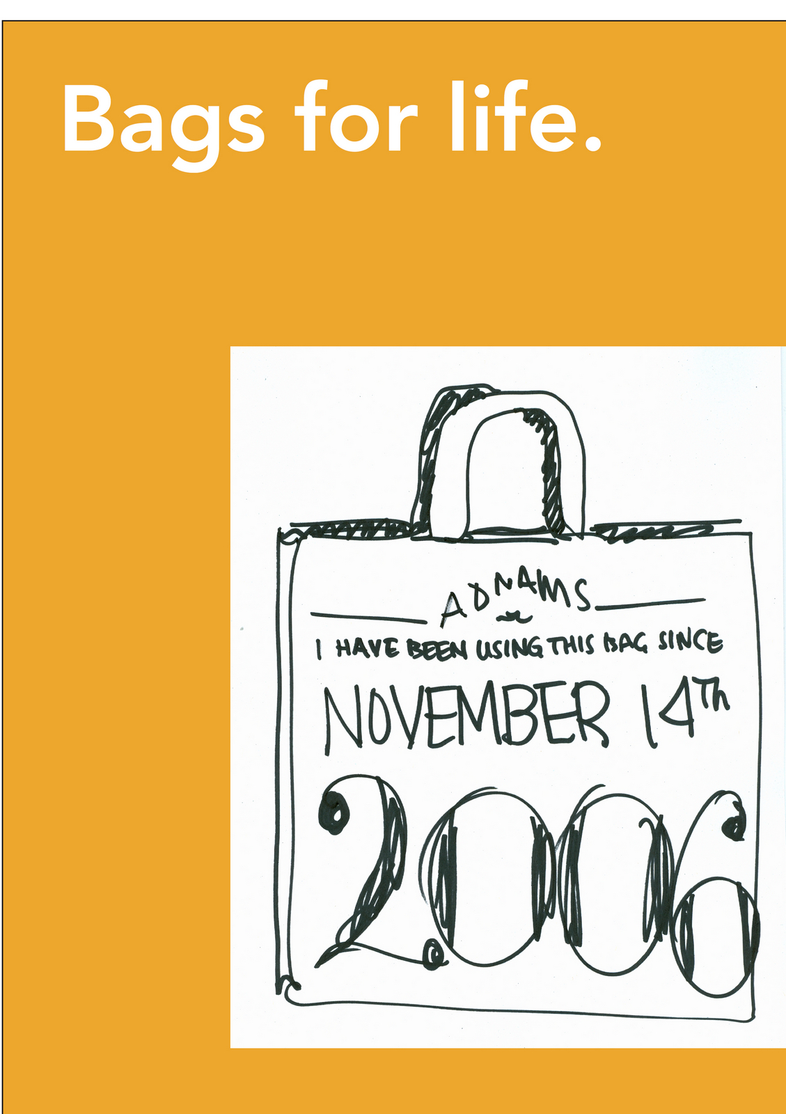
This theory was bought.But what did it mean in practice?How would it look?I liked the idea of using recycled papers as backgrounds, to look home-made.I felt photographs of beer would look too corporate.Photographs of products can look cool, graphic, vibrant and powerful.But they rarely charm.We just need to find the right illustrator...ooh, there he is, sitting on the other side of the office; Simon Barna, the dude on placement, he could draw?
But could he draw a pint of beer?
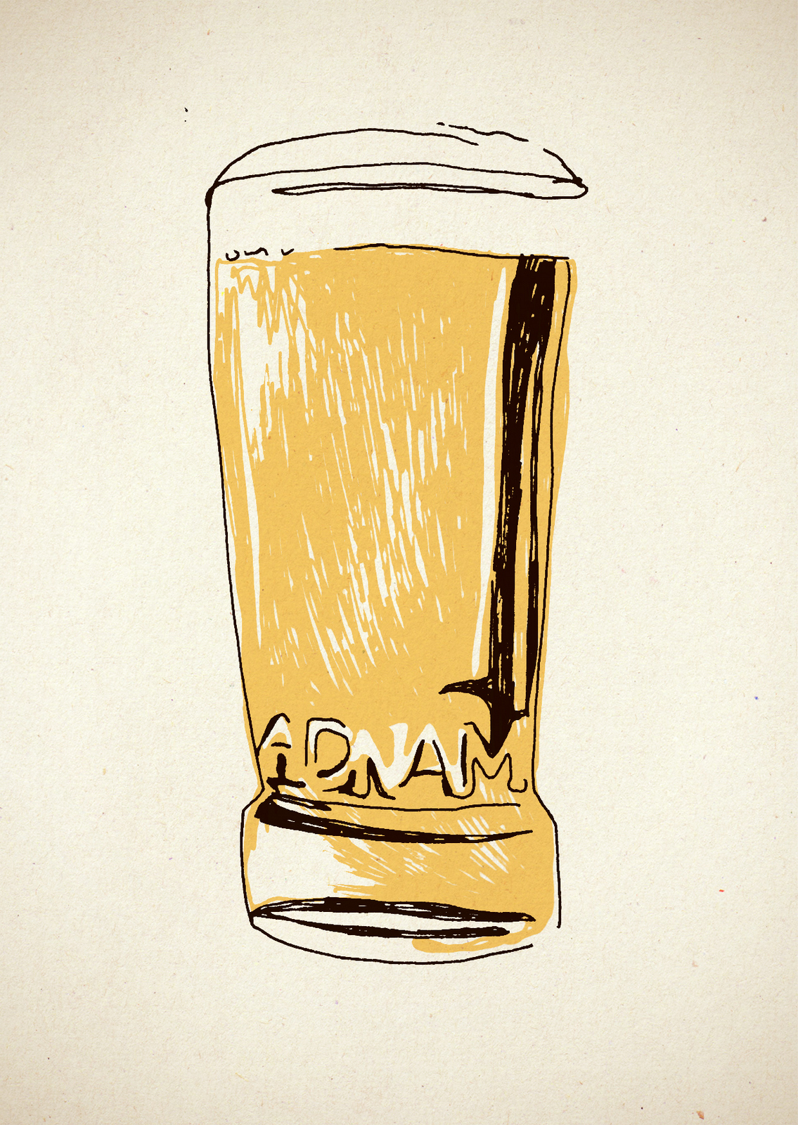
Yes!POSTERS.I tried a single font in the initial roughs.
But I felt it was a bit formal, maybe we needed to be more playful and mix up the fonts?
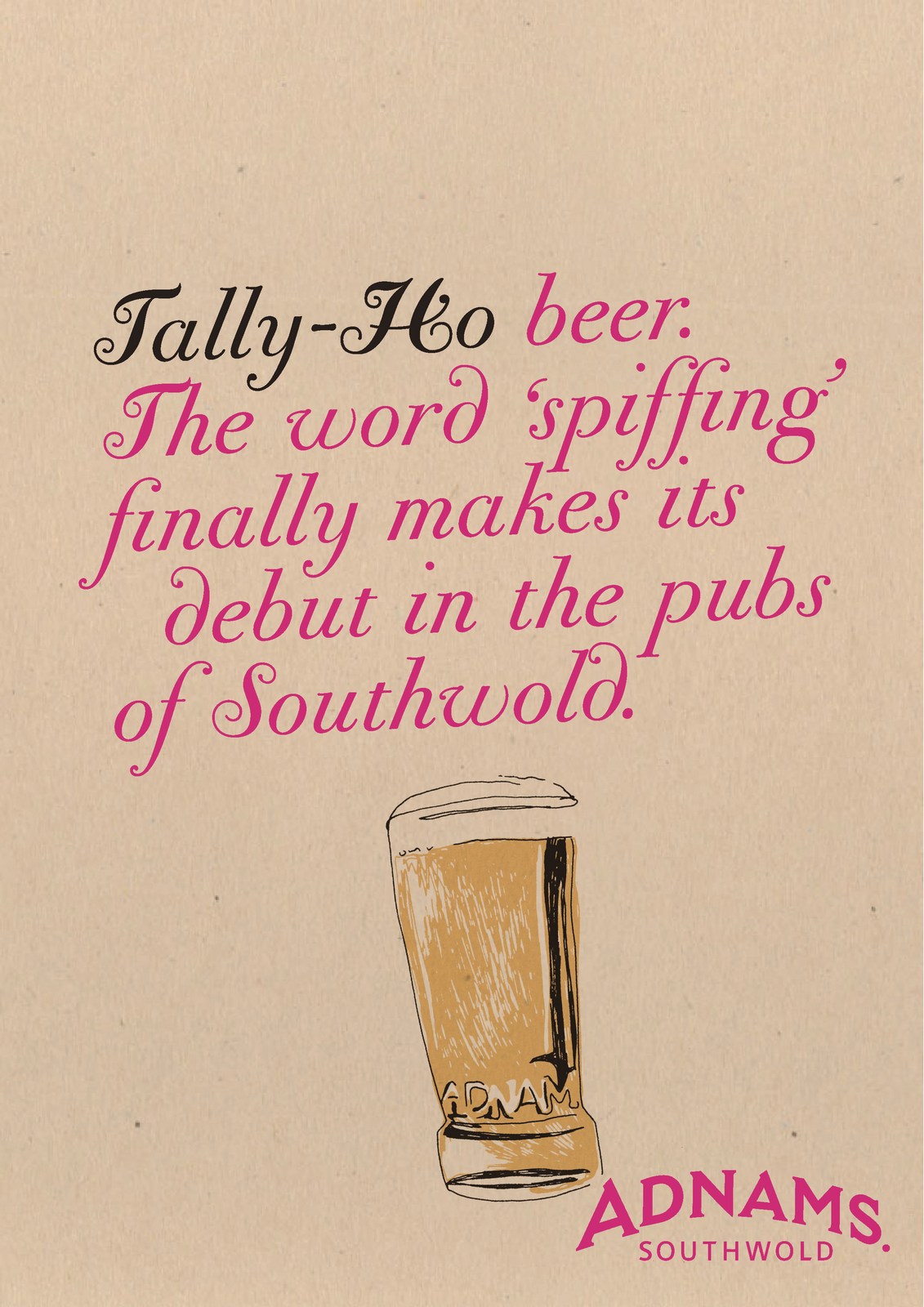
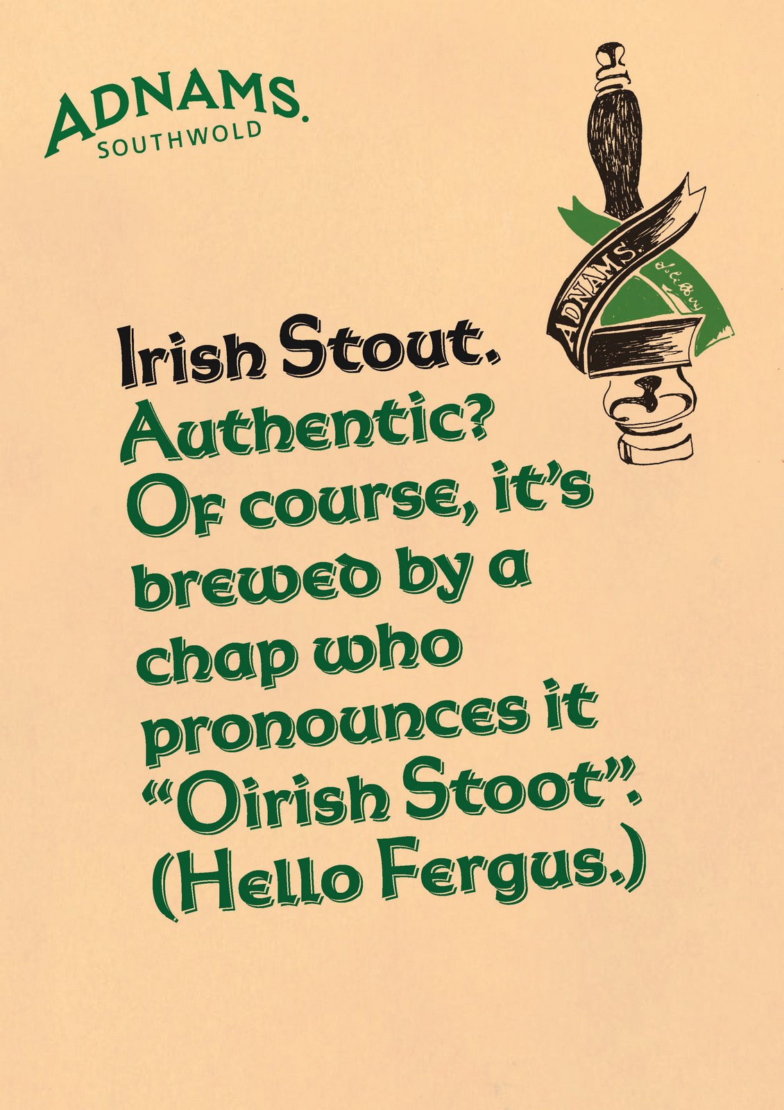
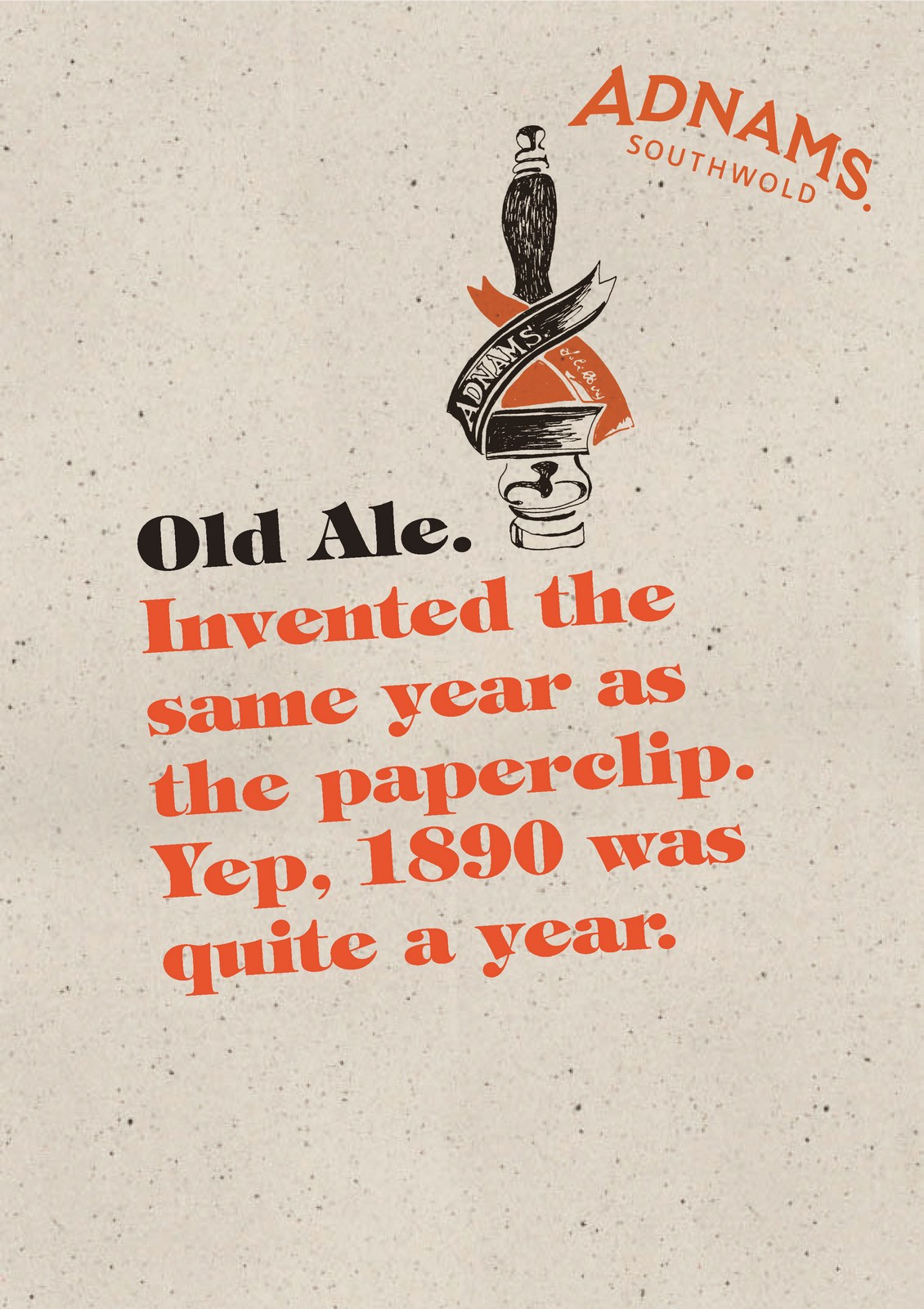

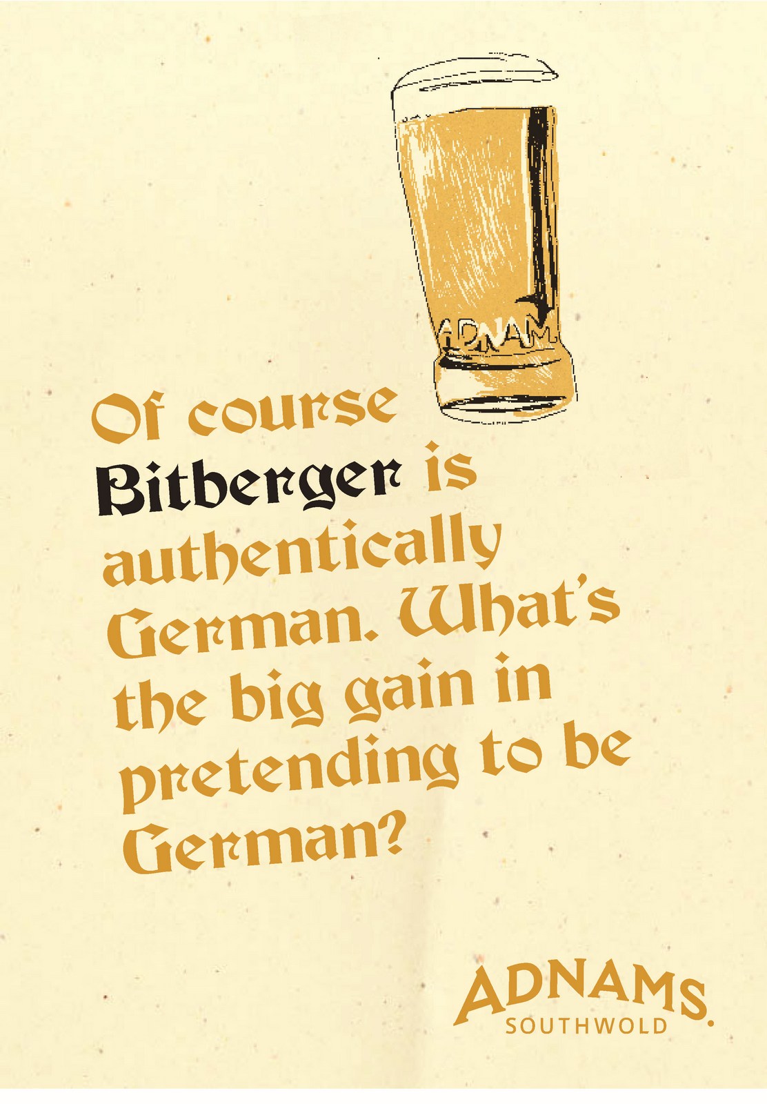
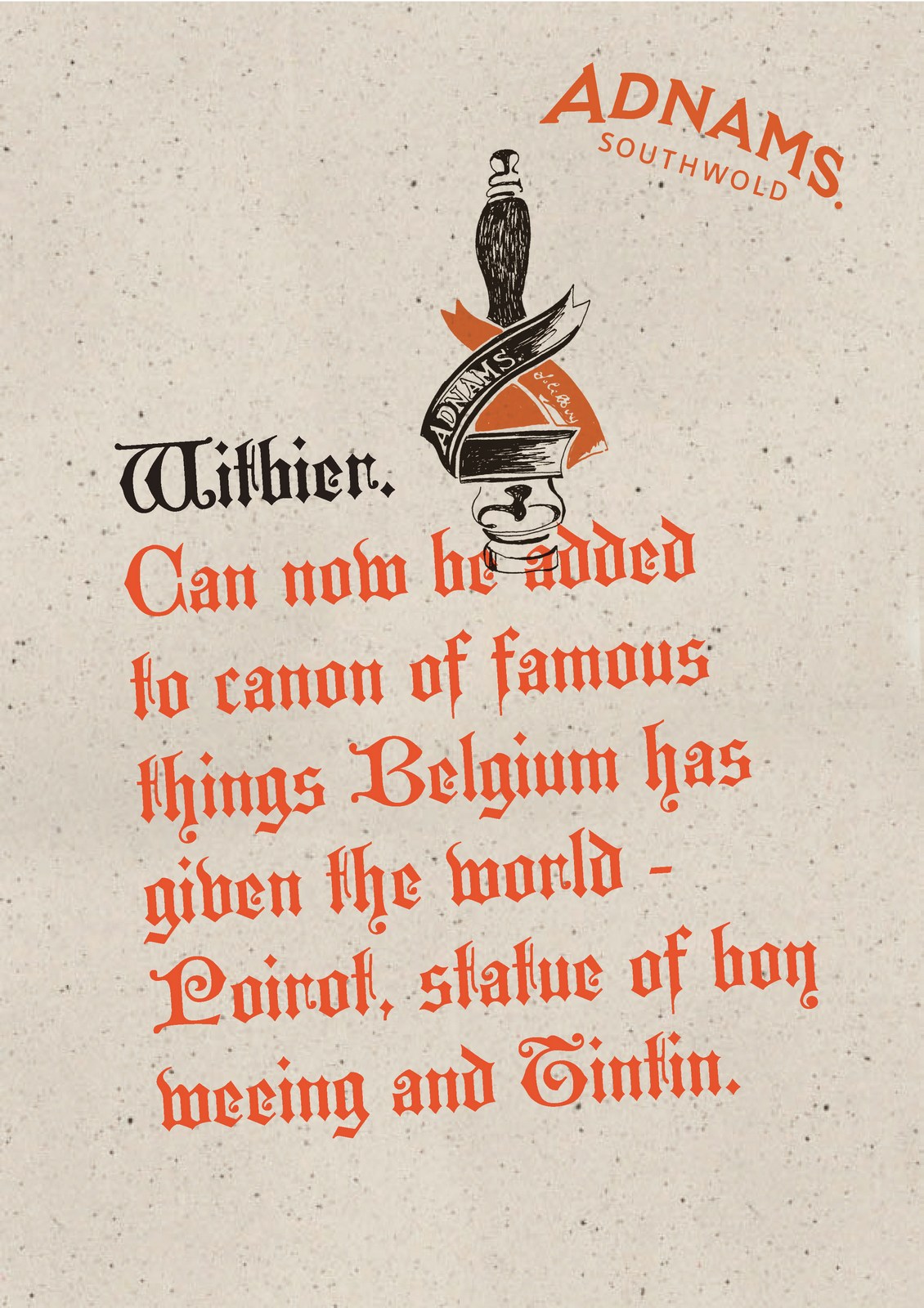
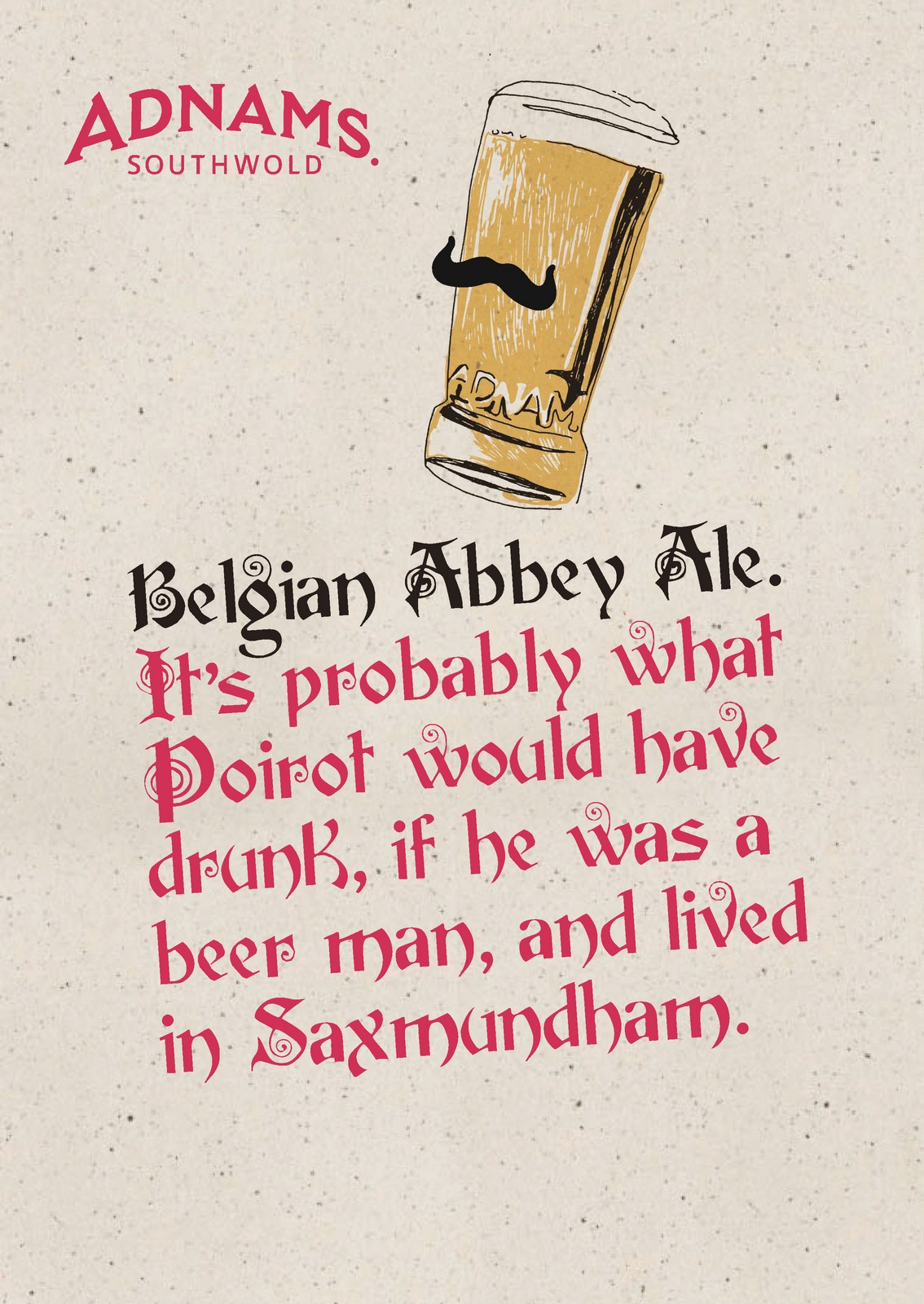
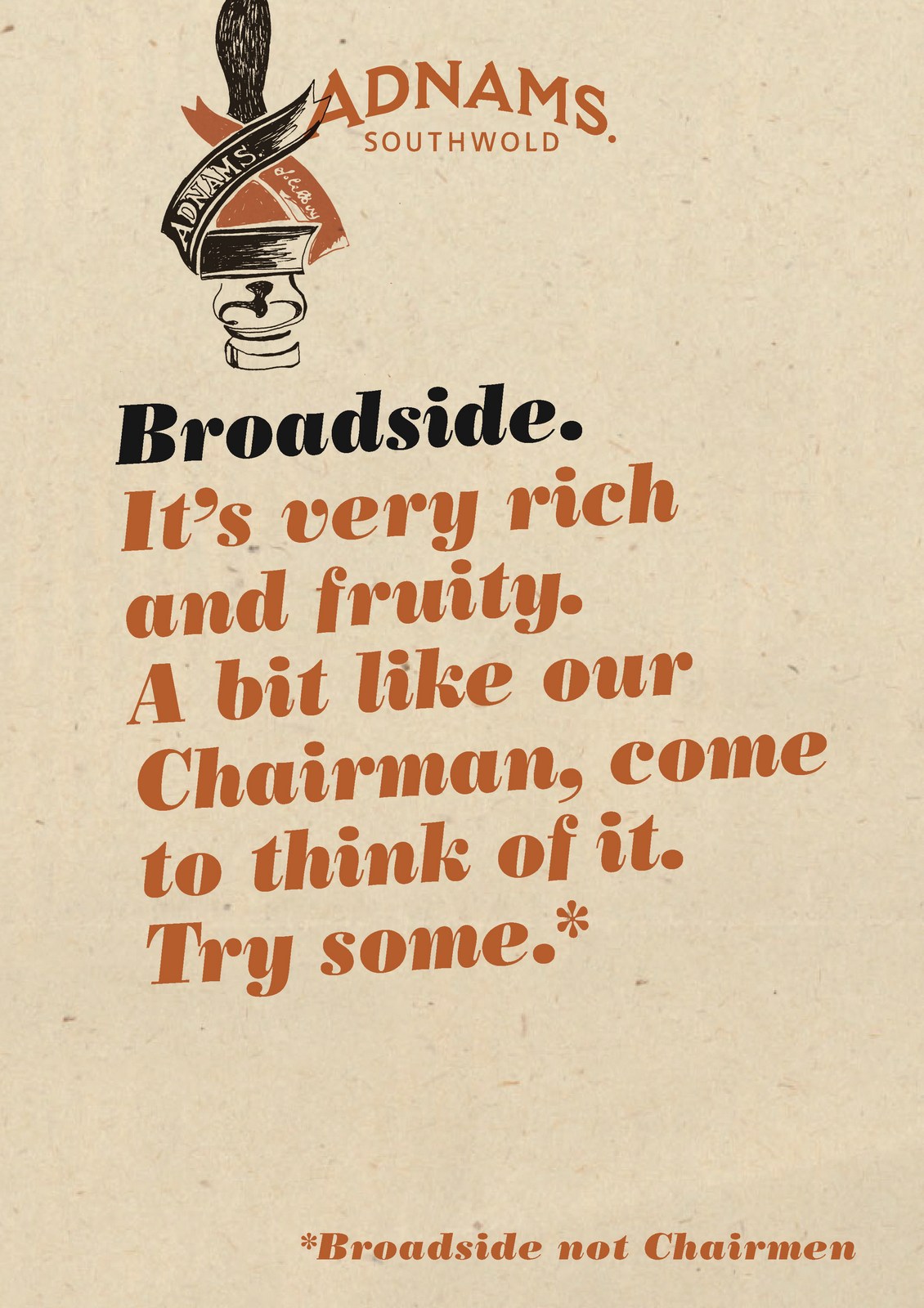
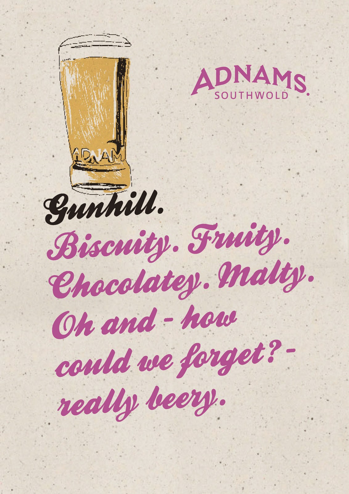
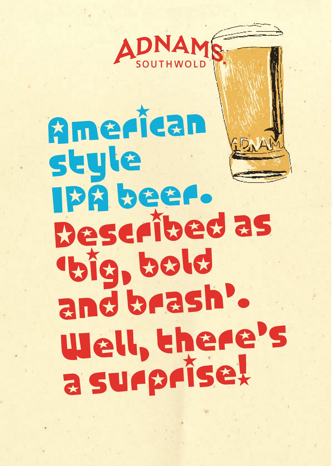
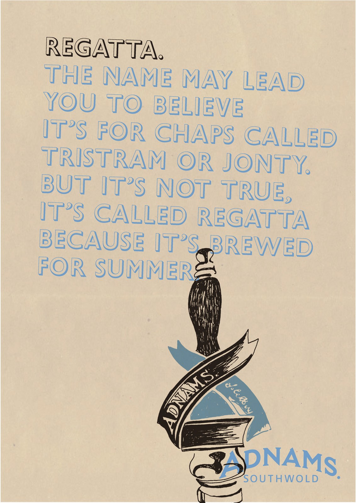
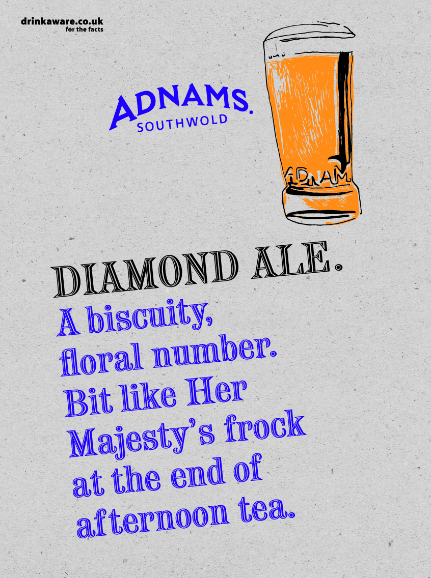
I was happy with the tone of the words.They weren't overtly selly, so felt like they were talking to an intelligent, sophisticated audience.The tone was kind of 'We know that your too intelligent to trick, so we're just going to joke around with you about the merits of a particular beer, then you buy what the hell you want to buy. It's no skin off our nose."It made Adnams appear confident.The various recycled paper backgrounds worked well, giving the ads a homemade, environmentally friendly feel.Changing the font from beer to beer gave each beer its own flavour, BUT it just made the campaign feel erratic.We're supposed to be unifying.We needed to give ourselves stricter guidelines:
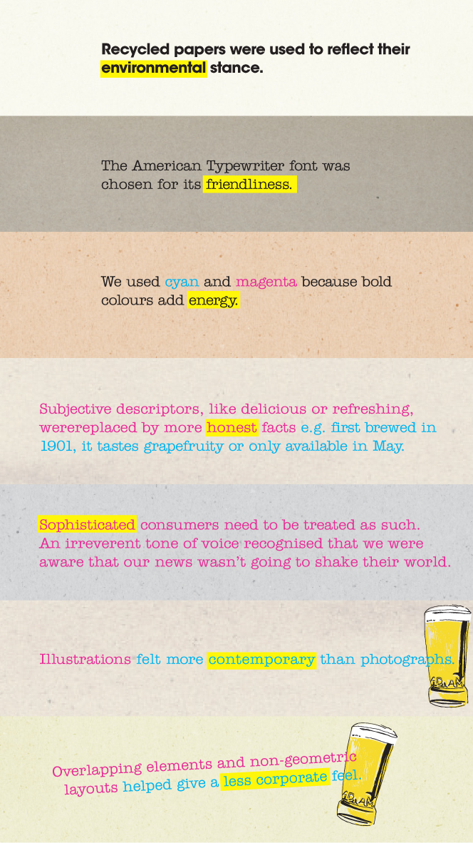
Which makes them look like this.
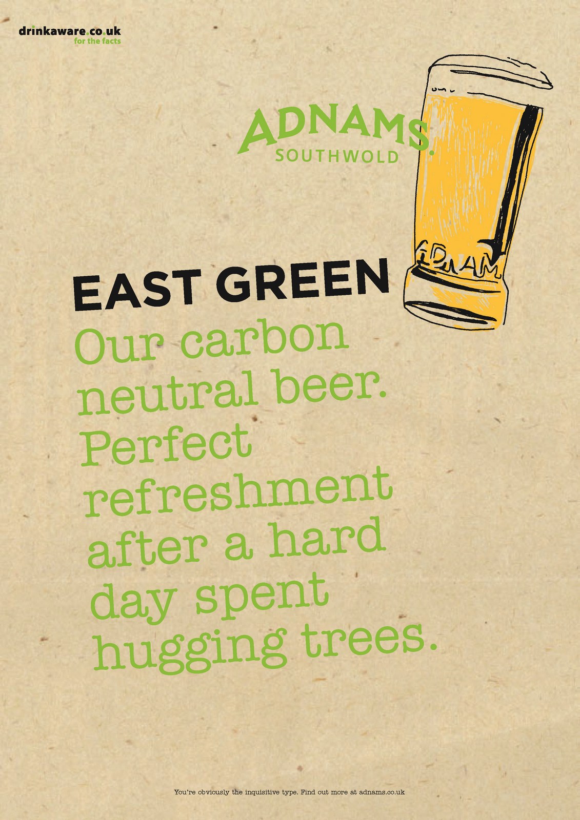
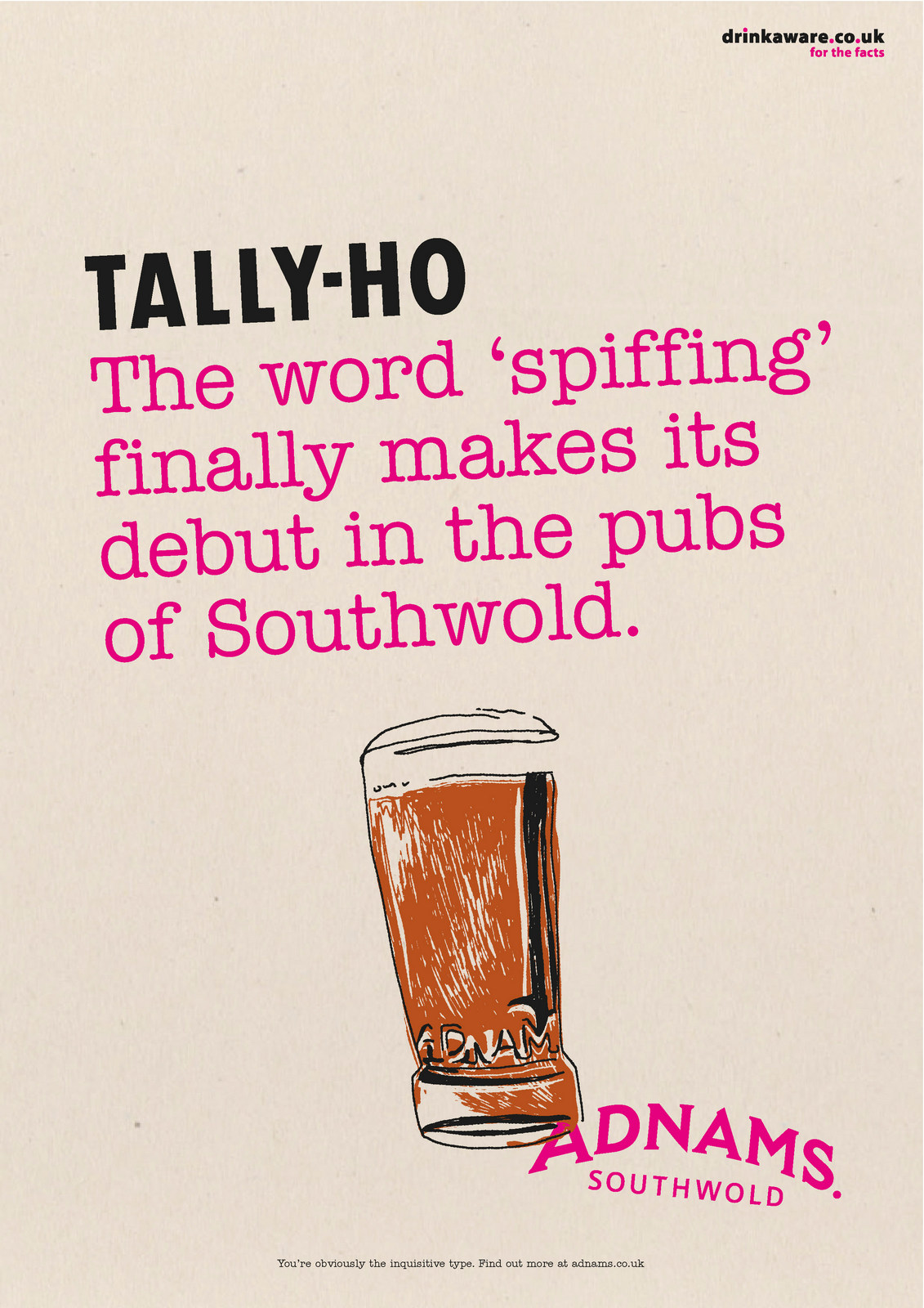
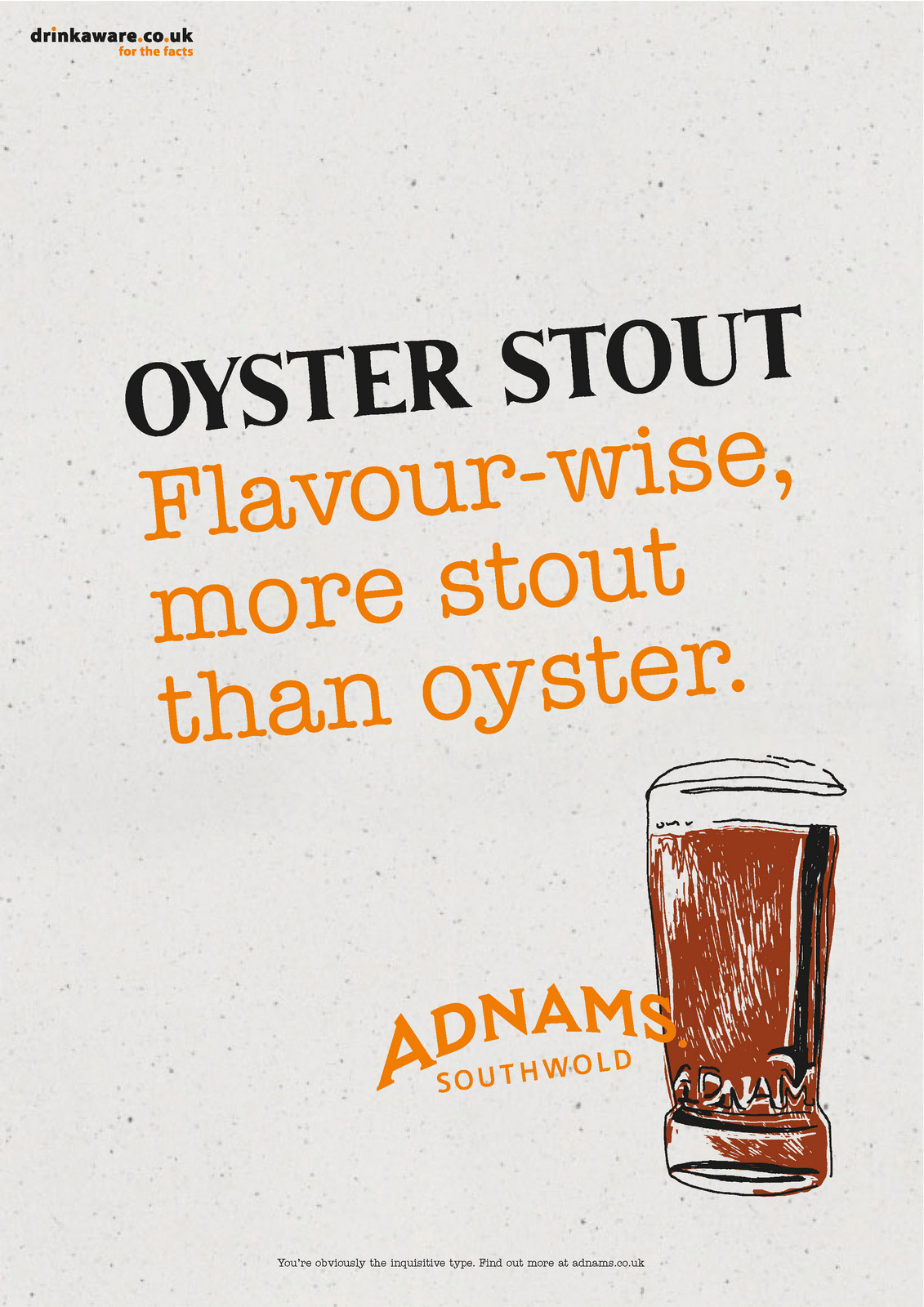
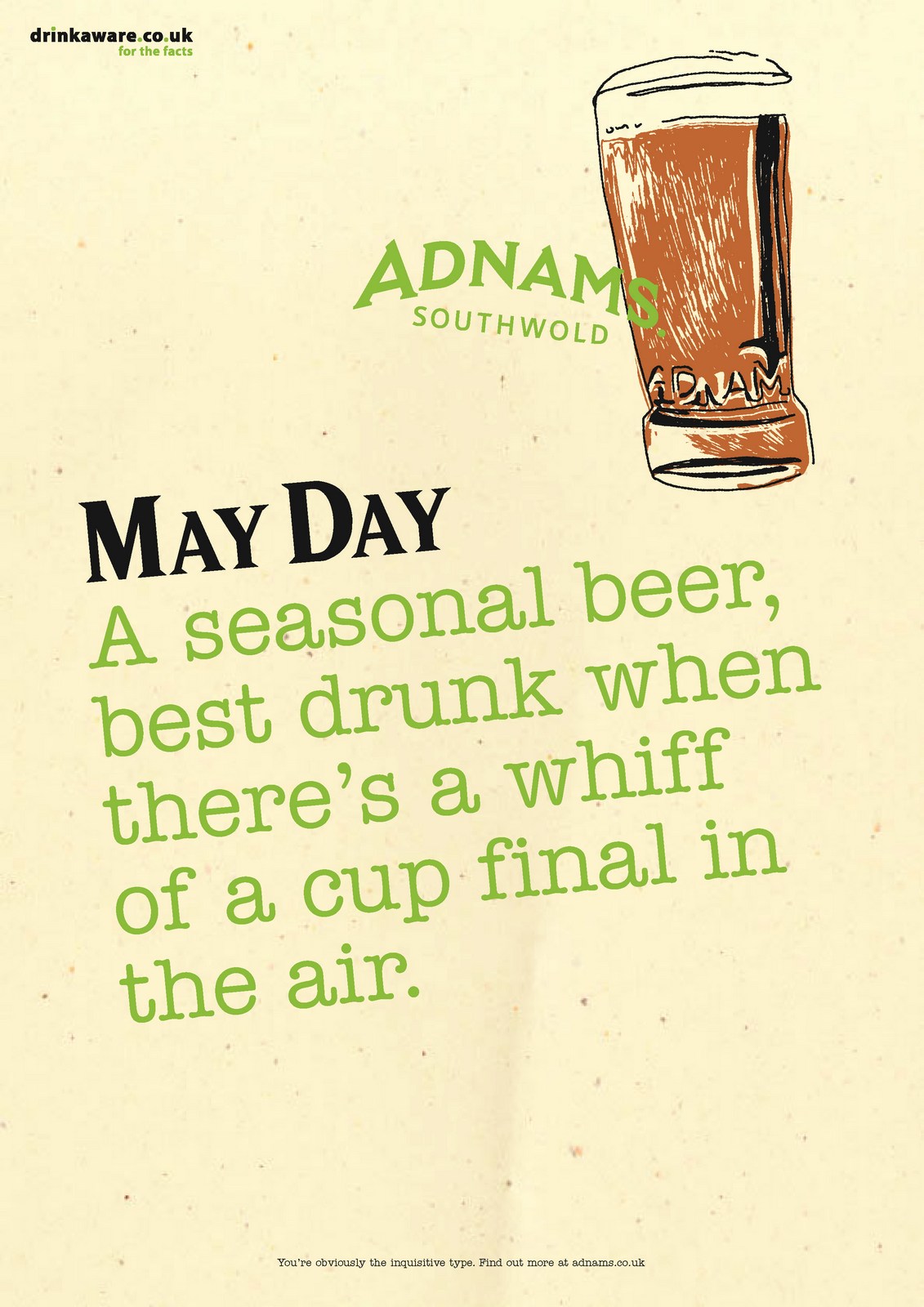
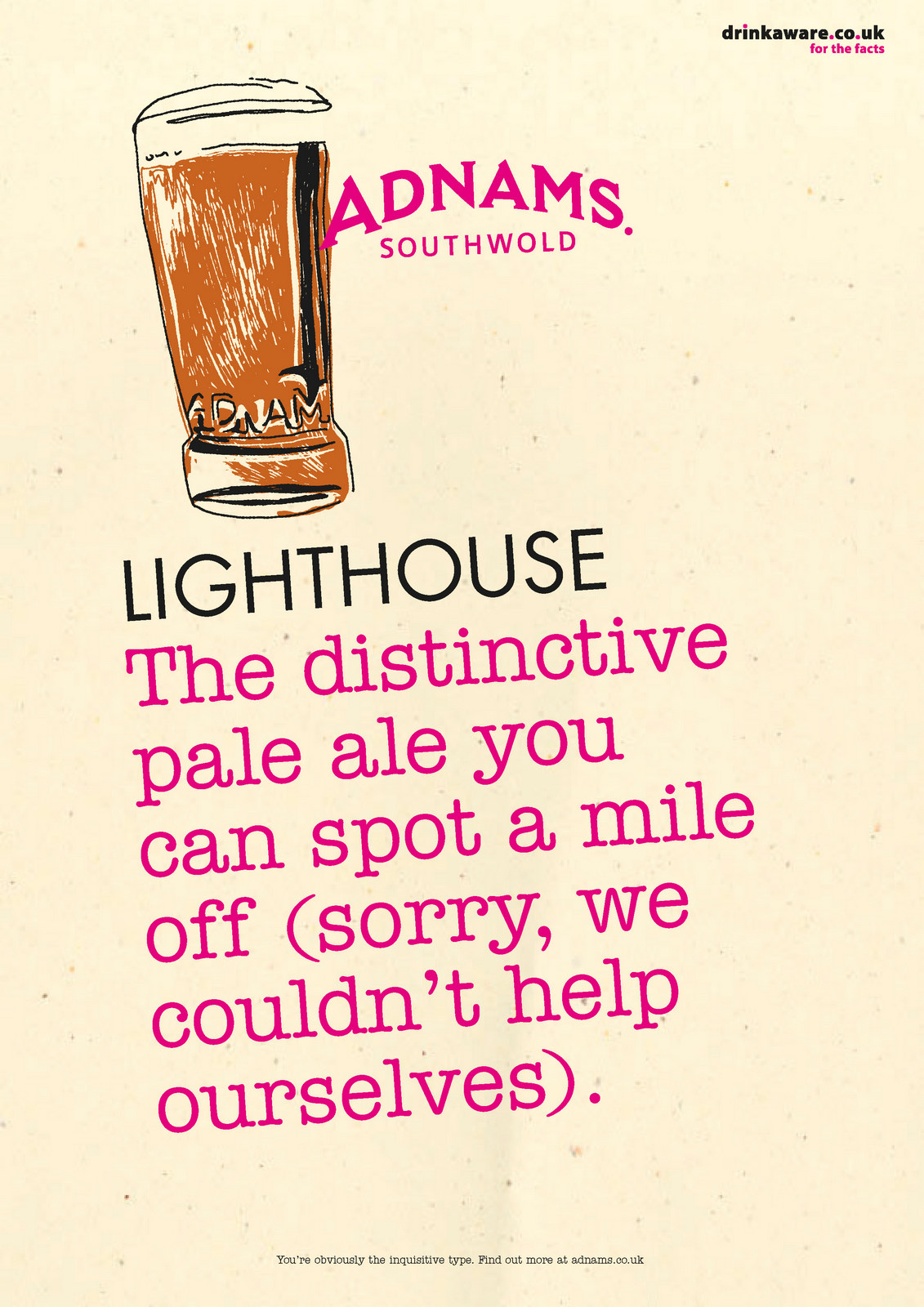
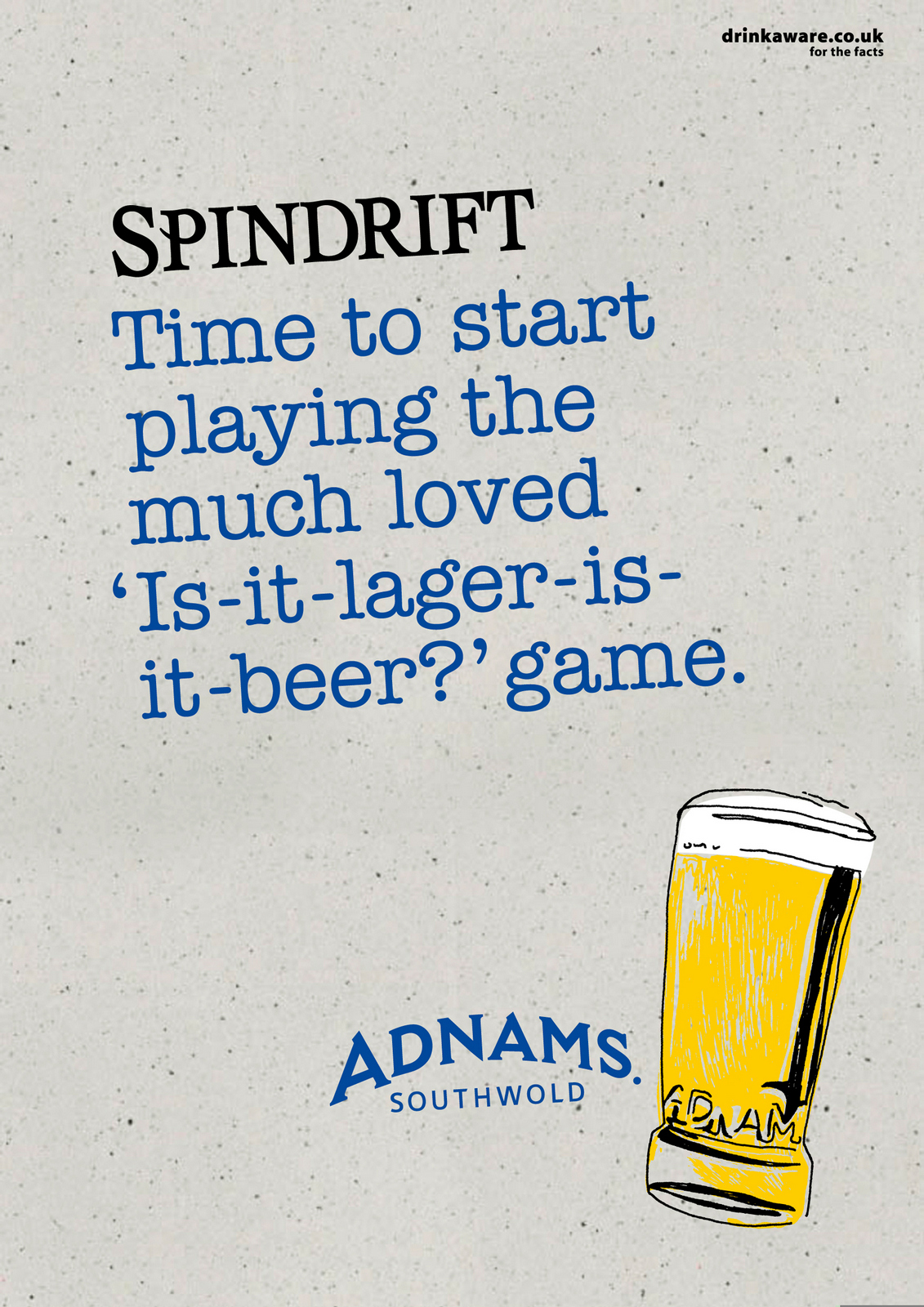
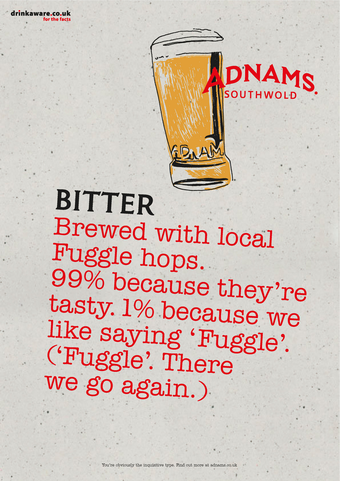
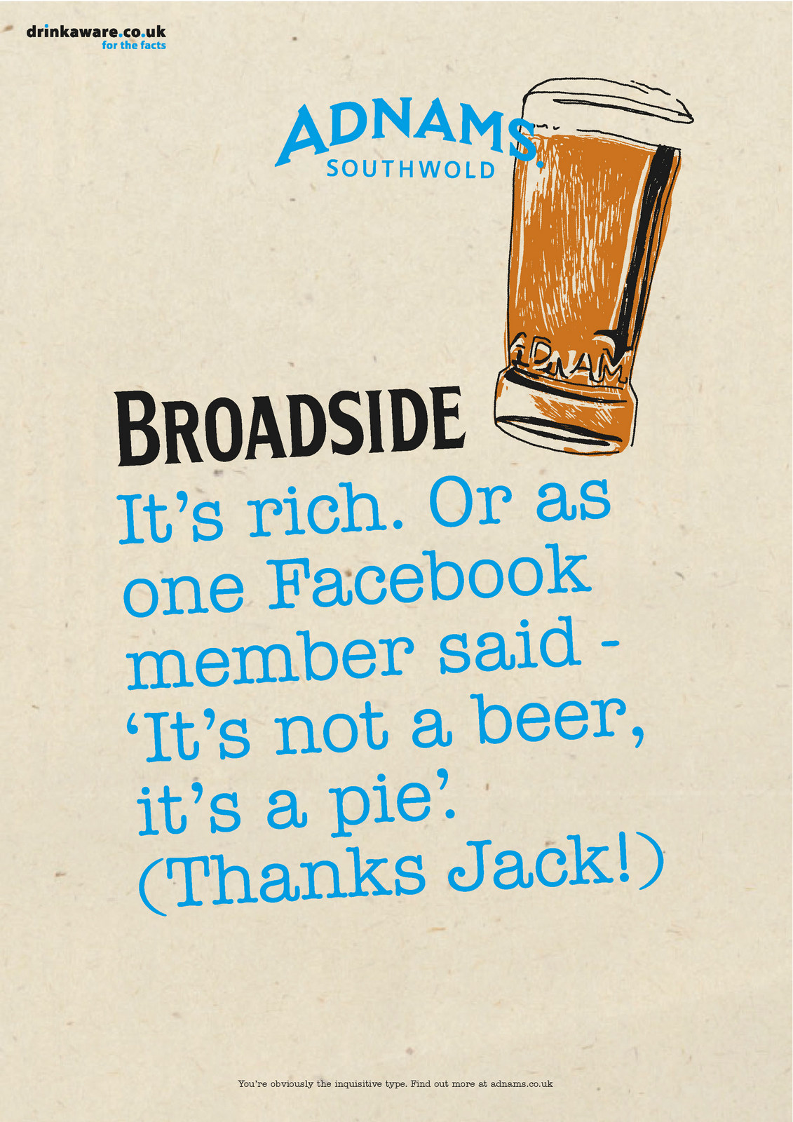

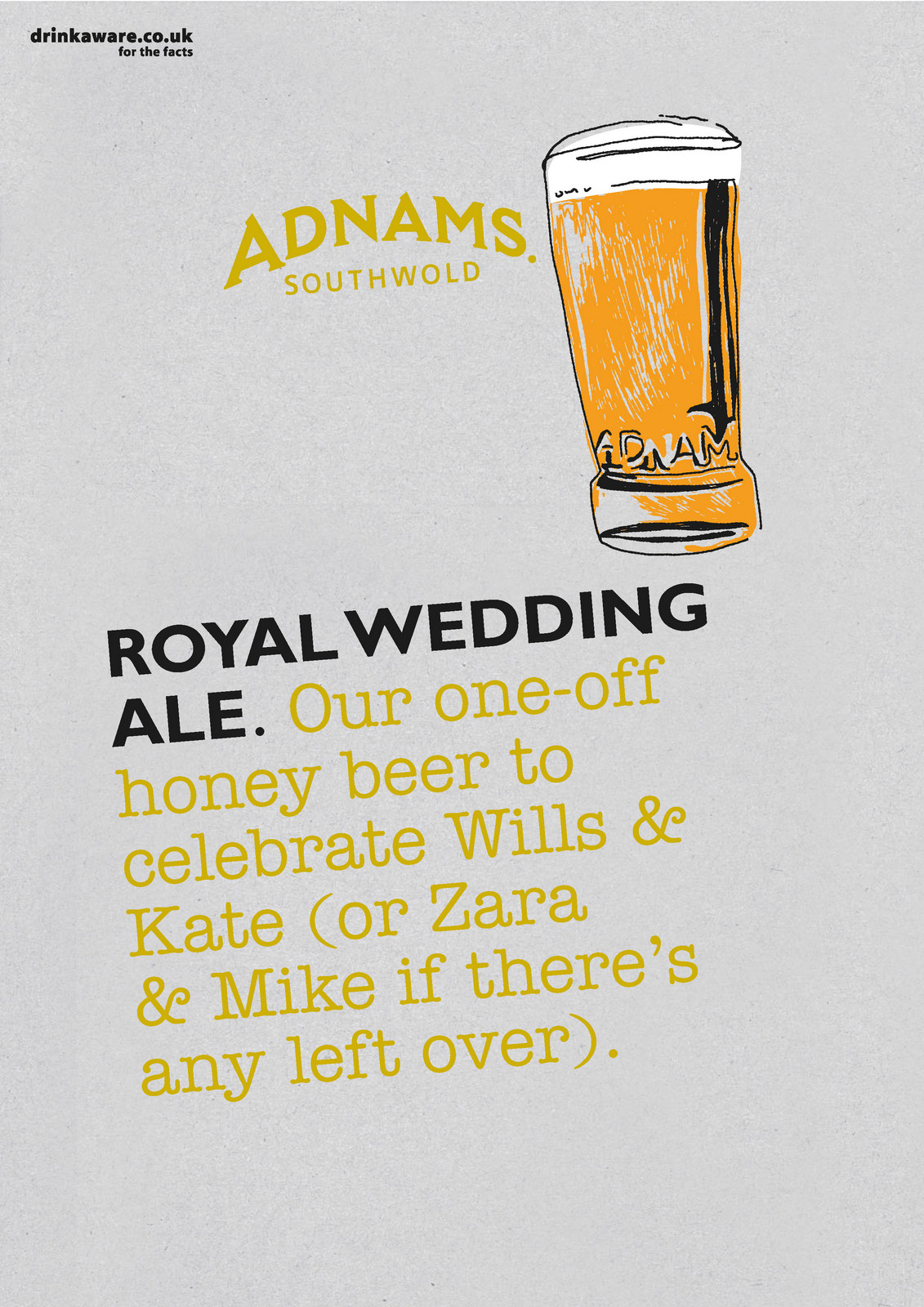

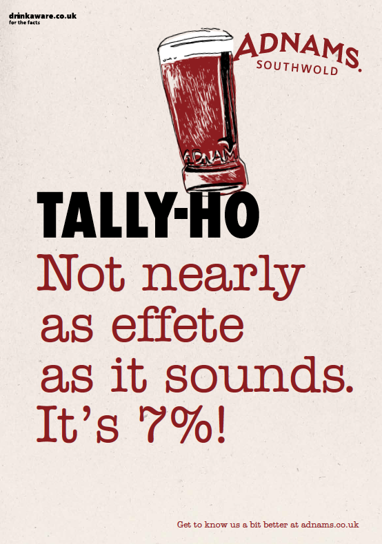
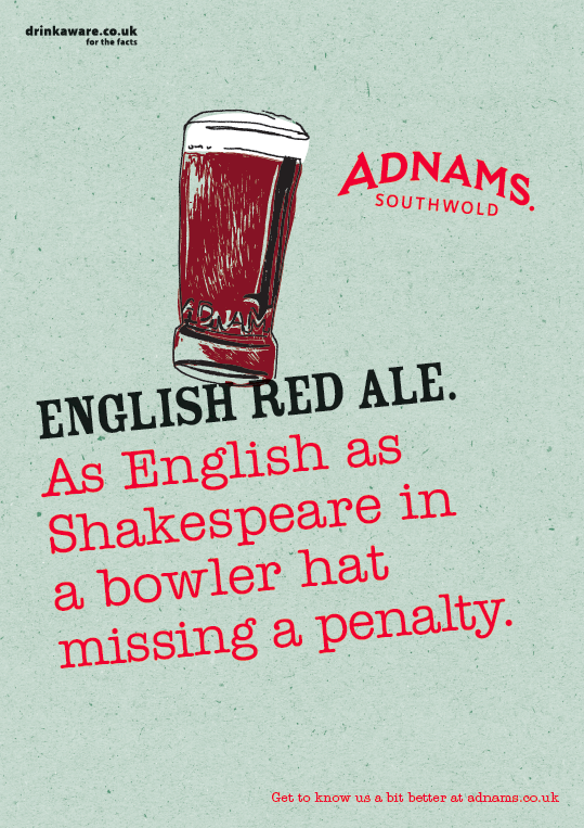
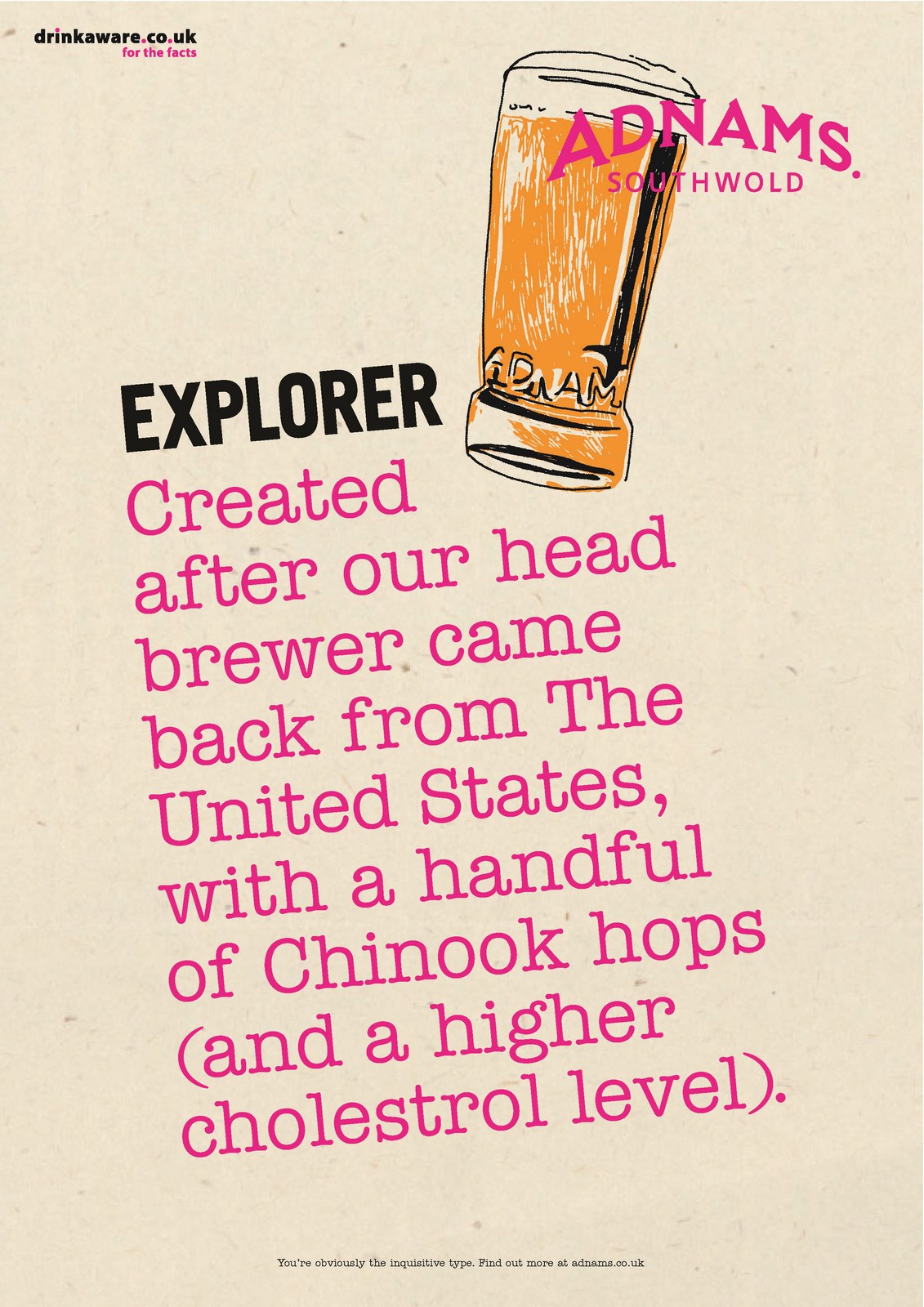
BROCHURE/BOOKLET THINGY.We needed to get the whole Adnams story out there, their views on the environment, their diverse portfolio, etc, etc.We could house it on their site, but it would also be good to create something we could put in people's hands, whether they were trade or consumers.We set about creating a book.First I needed an illustrator, I wanted someone who was a bit naive...
...fun...
...a bit scribbley...
...positive...
and not too polished...
I chose Nicholas Saunders:
I went to Southwold to make notes and collect ideas for it's content, then sent them to Nicholas to weave his magic.
I wrote a manifesto for the intro page, then Nicholas brought it to life.
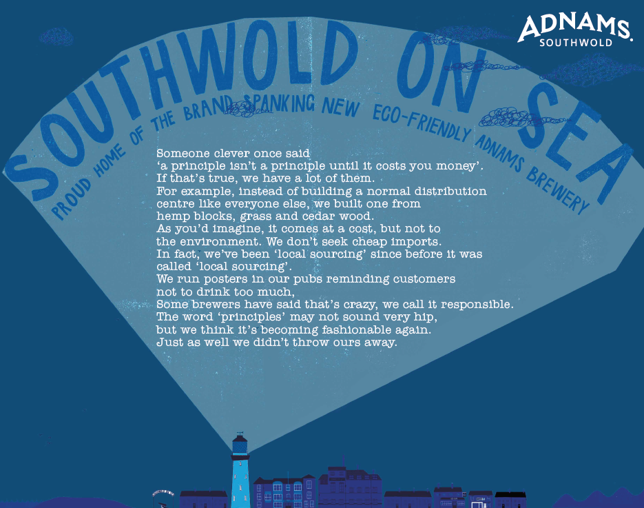
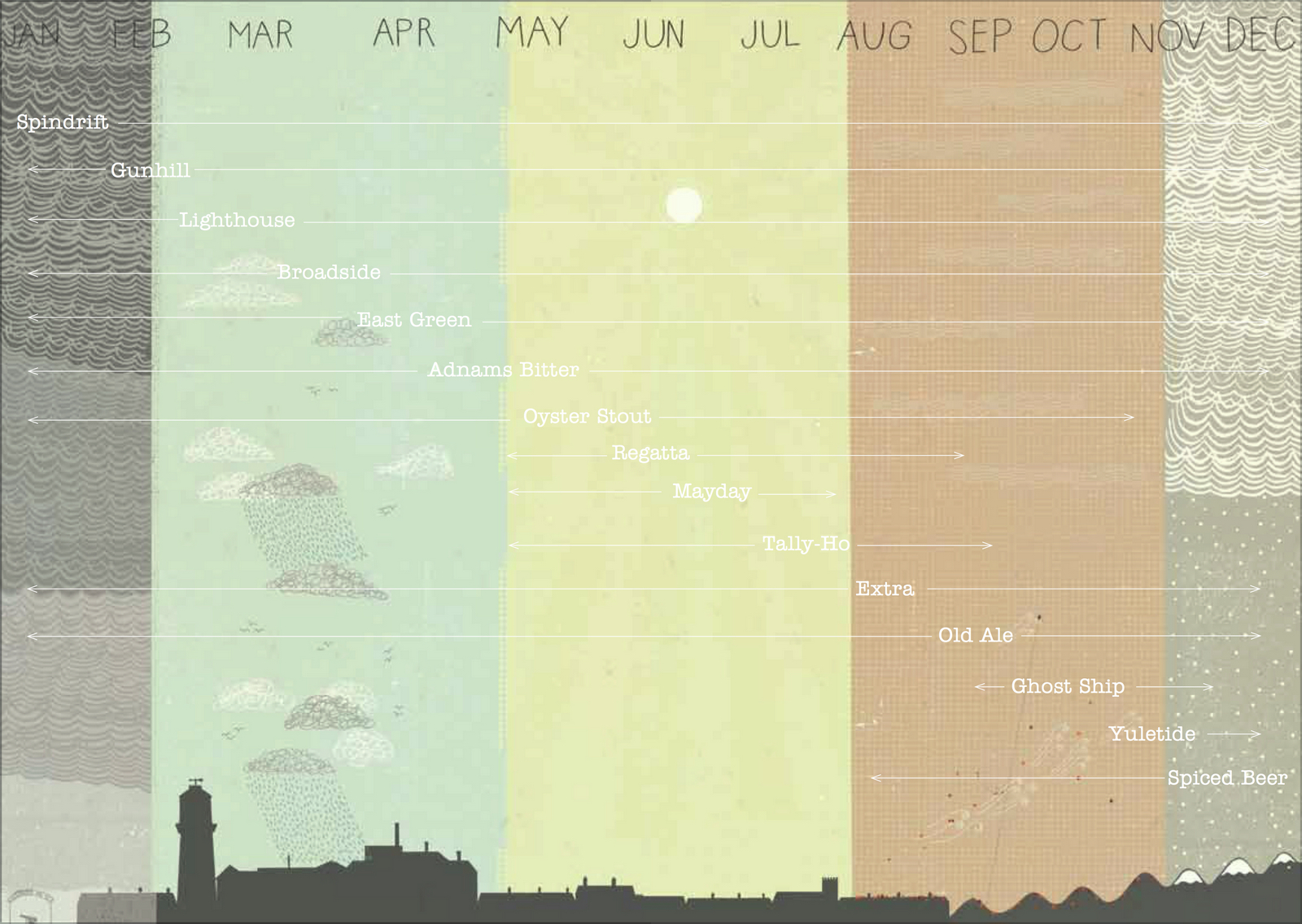
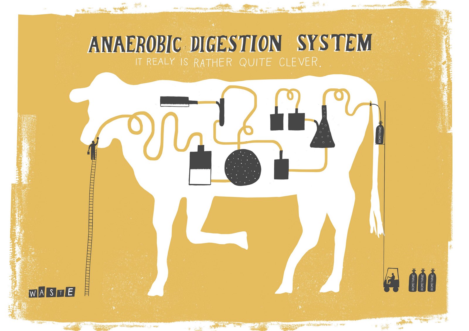
We needed a section on ordering beer online.I thought it would be cool to have a picture with bottled beers hidden within it, and titled ‘Where to find our beer?’, a bit like a kids book.
Nicholas's first rough looked good.

But maybe it would look more interesting if it wasn't confined to a street?
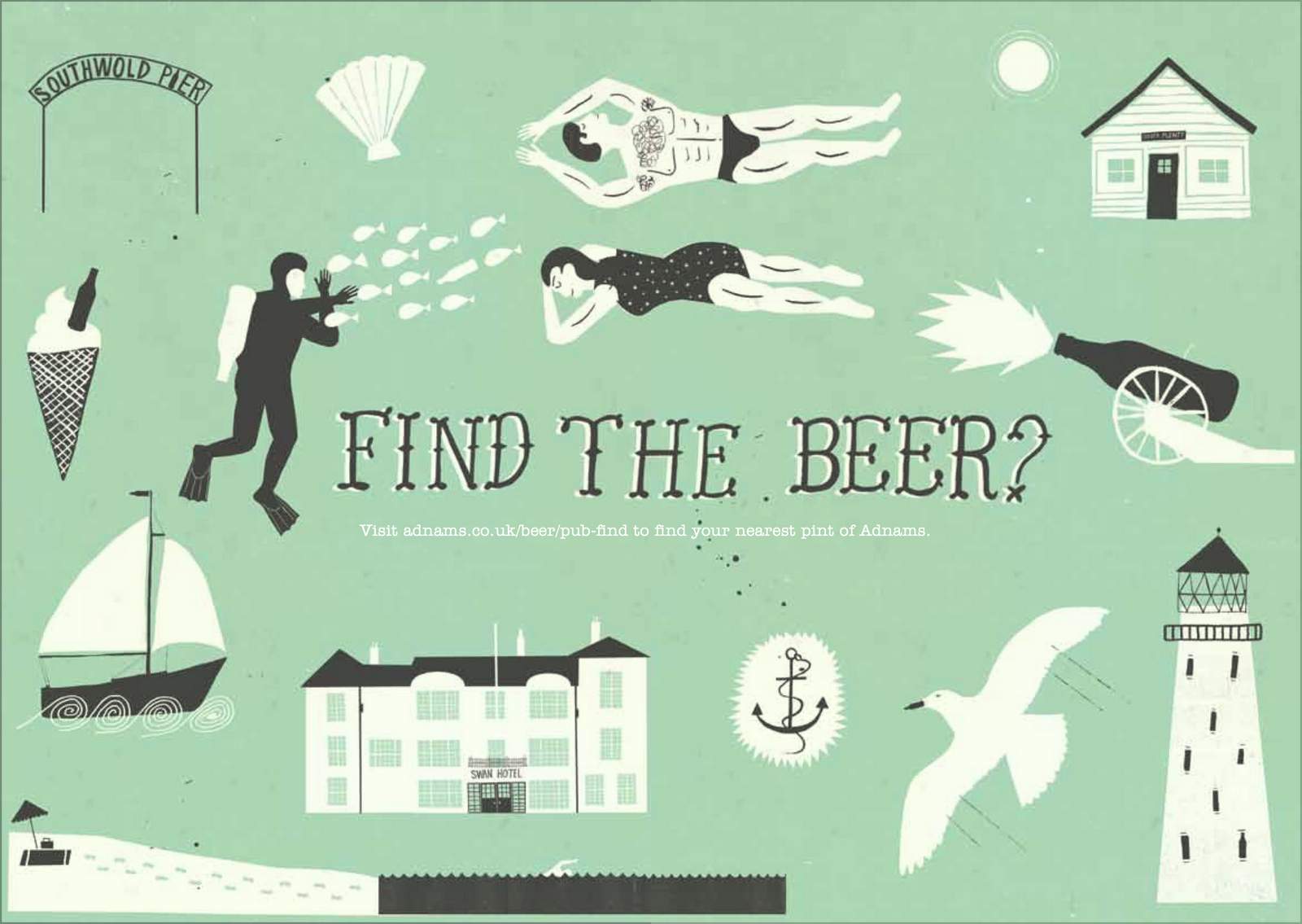
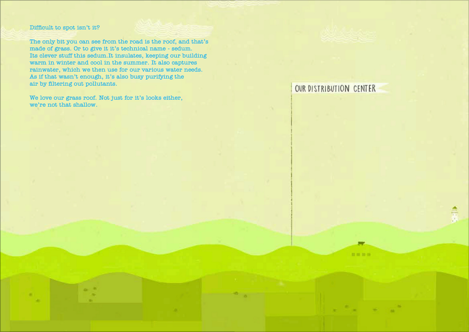
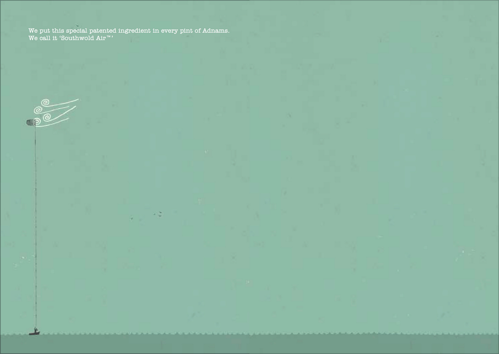
We turned some of the illustrations in the book into ads.
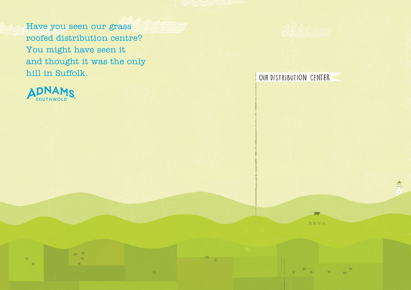
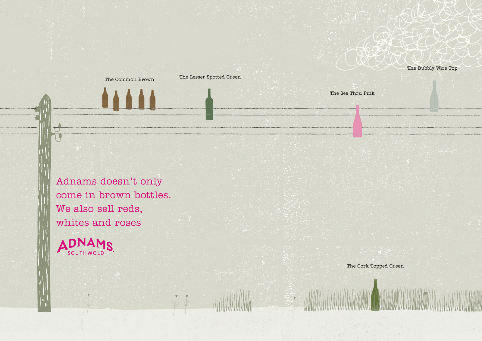

Also, maybe we could rehash that 'coastal air' idea?

WEBSITE.We re-skined it, changing it from this...
...to this...


BADGES.We colour coded the Adnams tours with a range of cool enamel badges.
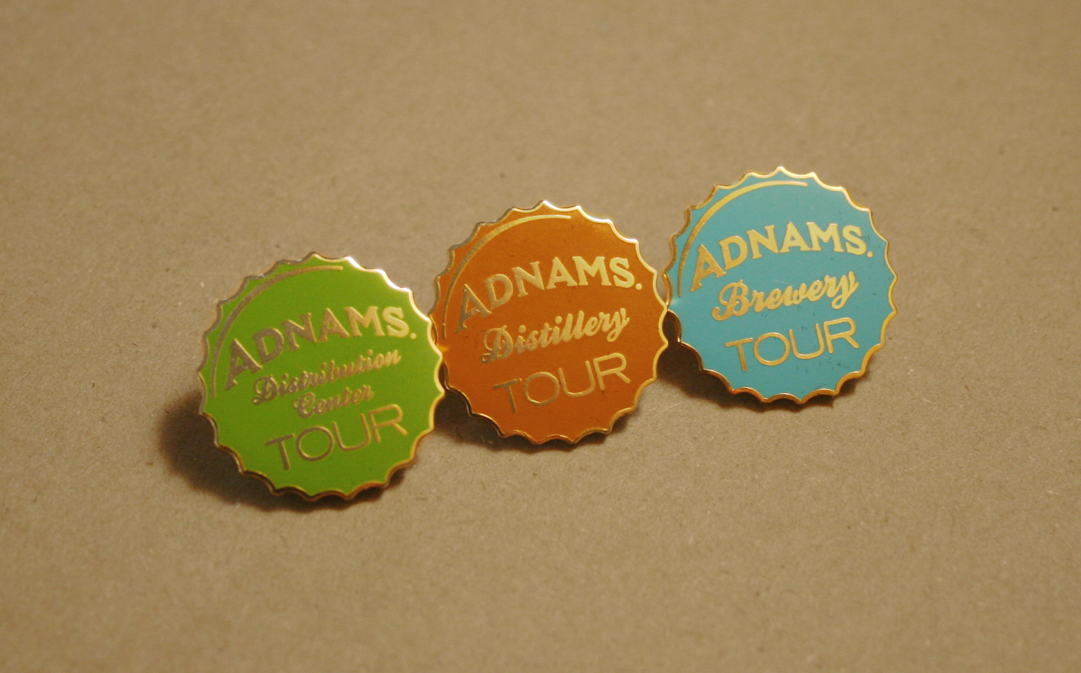

Seasonal Cellar Wine Club.It didn't seem to stand for anything in particular, so I tried to coral some facts and views on the world to let people know why they were different.
SOCIAL.Their brewery is smack bang in the middle of Southwold High Street, so we turned one of their windows into an Instagram/Facebook/Pinterest photo-op.
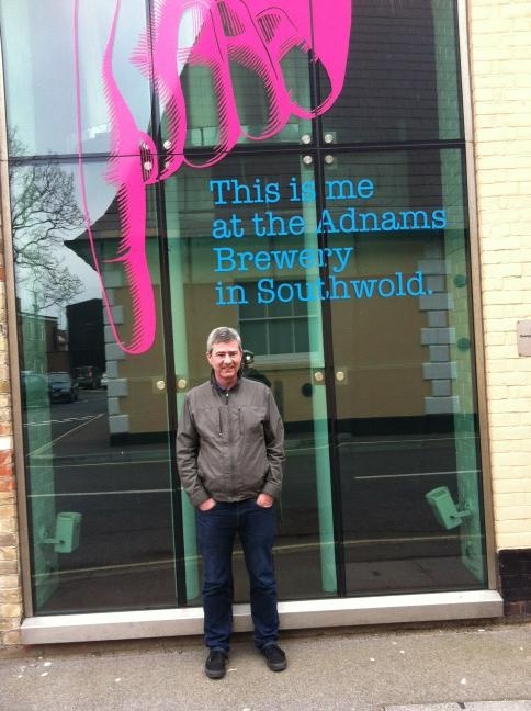
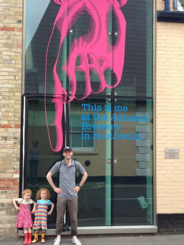
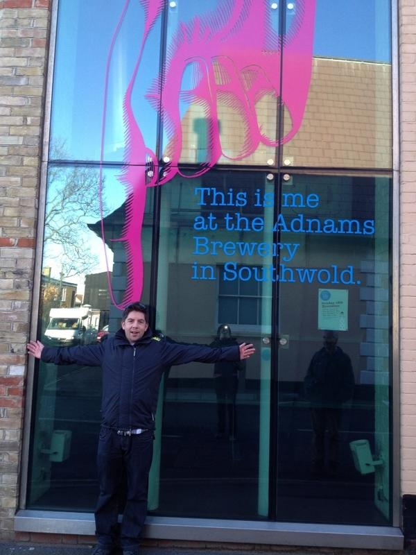
BOXES.The ultimate free media, most simply print the name of the product and a few functional details, it's a waste, it's 's a great way to to get your story out. Free.
LORRIES & VANS.We turned them into moving 48 sheets.
CELLAR&KITCHEN STORES.We took our new voice in store.
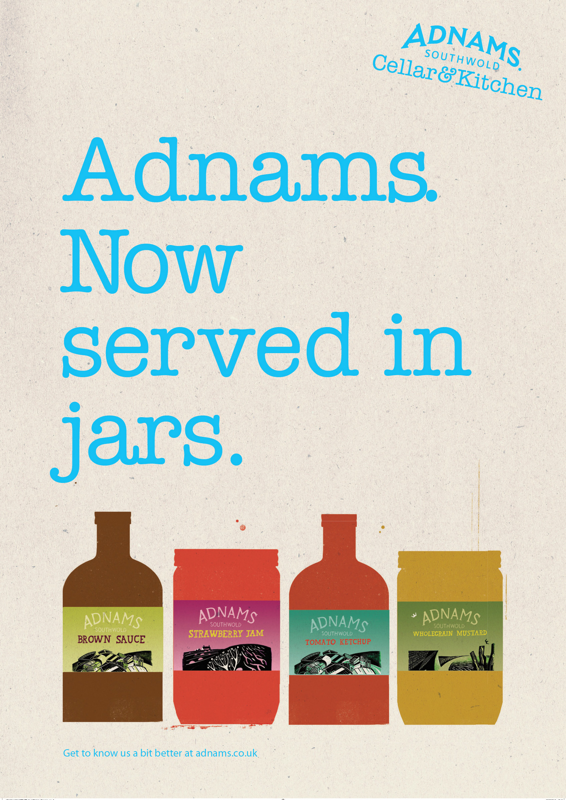

AWARDS.We let people know about them.

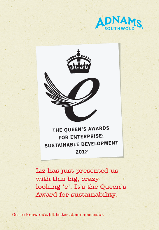

THE LATITUDE FESTIVAL.It's very local.
NEWMARKET SPONSORSHIP.
BEERMATS.One of the least used, most read bits of media; the humble beermat.
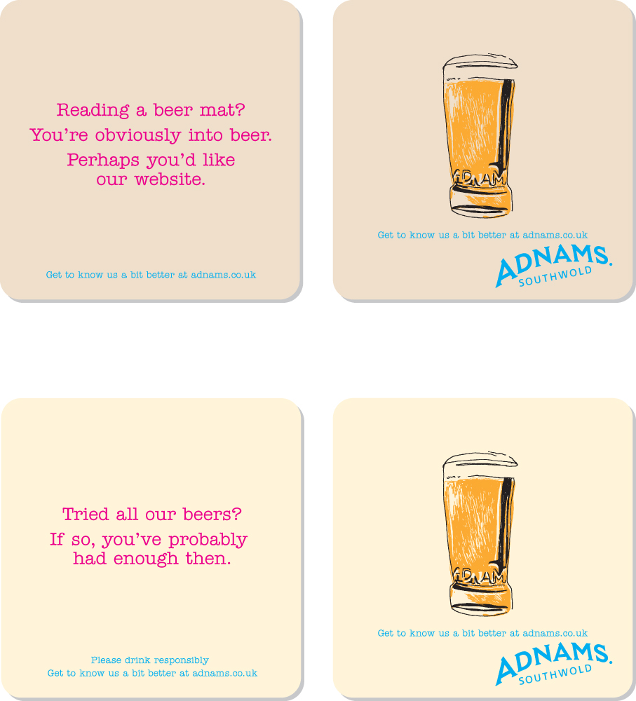
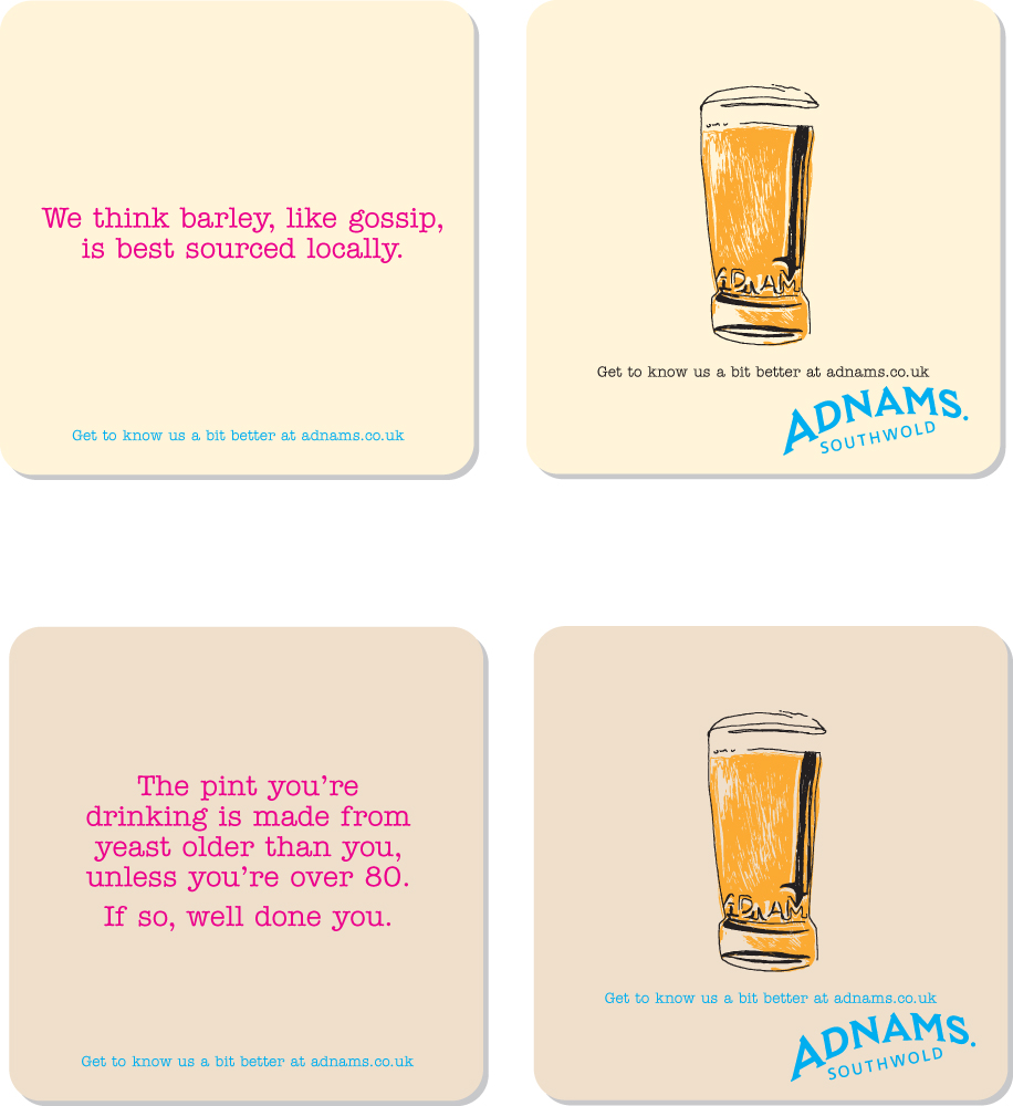
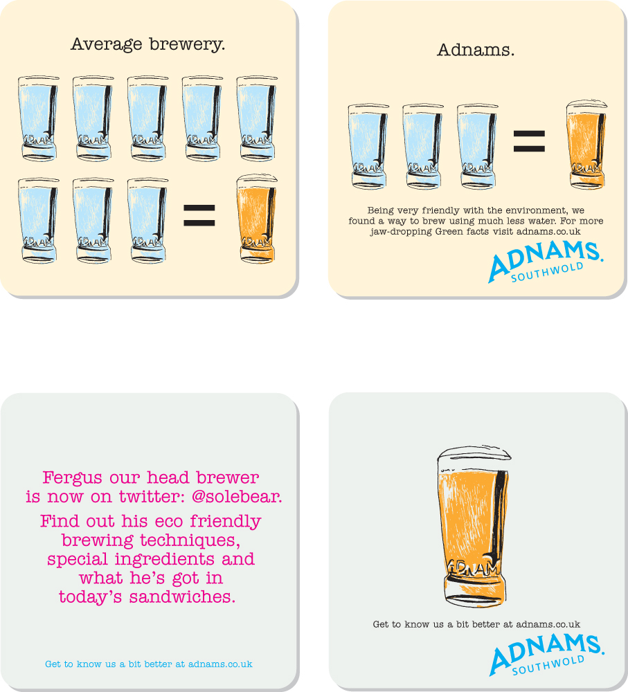
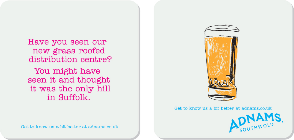
JACK BRAND.We helped create this sub brand.We wanted to create something authentic, not just Shoreditch cool.Andy Wood, the Adnams C.E.O. turned up at our offices with just the thing, ye olde Adnams bottle.
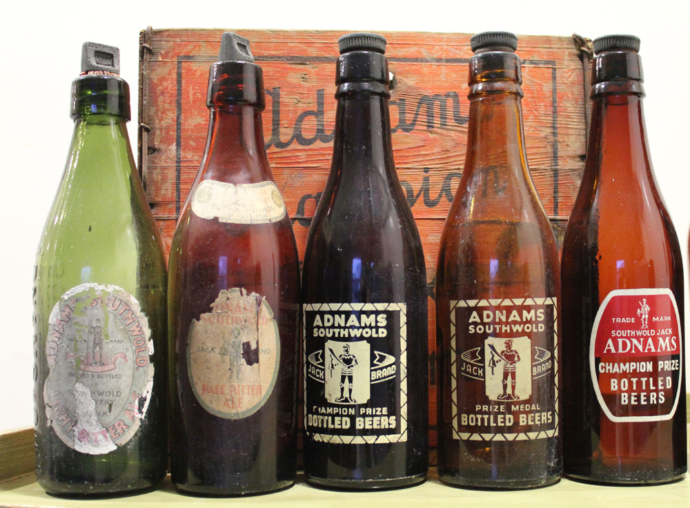
We based our design on it.
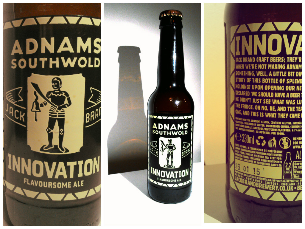
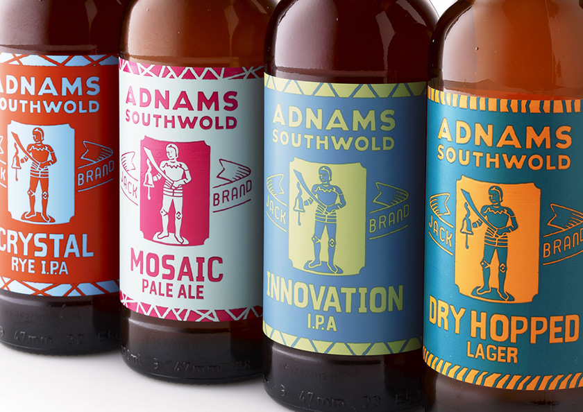

THE END.Three years in Adnams was beginning to be ‘de-Volvo'd’, made cool even.But, and we should have guessed it given their environmental policies, Adnams decided to source their creative work locally.It's understandable from their point of view, they now had a template to copy and agencies in Suffolk are cheaper than those in Soho.Is it really worth paying writers to find an angle on a new message when we could just say it?Is it worth paying for Art Directors to Art Direct each execution when we already have a style to copy?Is it worth debating with an agency about what they want vs what we want?Is it worth listening to an agency push us to be ballsy when we don't always want to be?Is it worth arguing about whether the layout is cleaner without the extra info?Is it worth having to listen to the agency wang on about which is the wittier execution?Well, on the evidence of their recent work, below, I'd have to say:YES!,YES!,YES!,YES!,YES!andABSO-BLOODY-LUTELY YES!But then again, I'm horribly biased, you decide.
It’s sometimes tough to argue the obvious. When you have teams of people analysing, strategising and theorising it’s difficult to sound like the dumbest guy in the room. Take ABC, someone must have had to pitch the idea ‘How about we say tv is good?’
‘‘TV is good? Duh!’’It doesn’t sound very creative or intelligent, but it’s right. It's not the kind of idea that's greeted with joy; ‘Shouldn’t we be saying people need tv in their lives? Or say that it's the most cost-effective way to shift a product? Or maybe we say it enriches lives and gives joy to the joyless? Educates the uneducated, y’know... the white trash... thickheads?’There are armies of people with long titles and big qualifications looking for something intelligent sounding to build a career boosting power point presentation around. So holding on to your gossamer thin vibe against an army wanting empirical evidence is hard.‘Haven’t we got a demographic insight? Some media usage numbers? A chart with some big numbers on? Come on, throw us a bone here?’But sometimes a believable emotion can be more powerful than a dubious fact.I remember Paul McCartney once being challenged about the unevenness of The Beatles ‘White Album’, ‘Wouldn’t it have been better to put all the best tracks onto a single ’Instead of defending Bungalow Bill, Savoy Truffle and all the other ‘interesting’ tracks, he said “Nah, leave it alone, it's The Beatles ‘White Album’ ”.So uber-confident that you have to agree.The guys at TBWA/CHIAT/DAY adopted the same attitude with the ABC posters; ‘You want us to defend TV? Er... well, there hasn't been any World Wars since tv got going, how about that? Now fuck off...idiot!’Rather than defending tv, it makes you think it doesn’t need defending. Lee Clow, TBWA\Chiat\Day’s Chairman: ‘We thought, why not kind of honestly celebrate the notion that TV is a good part of our lives, and sitting down in front of it for a while isn’t a bad thing.’
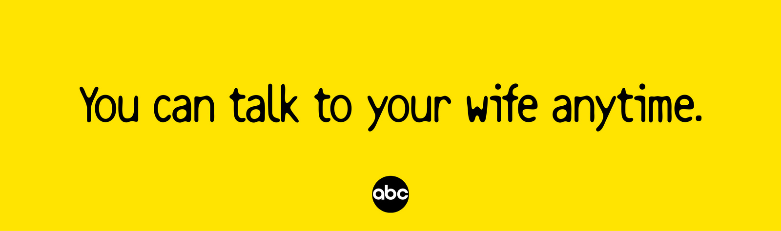
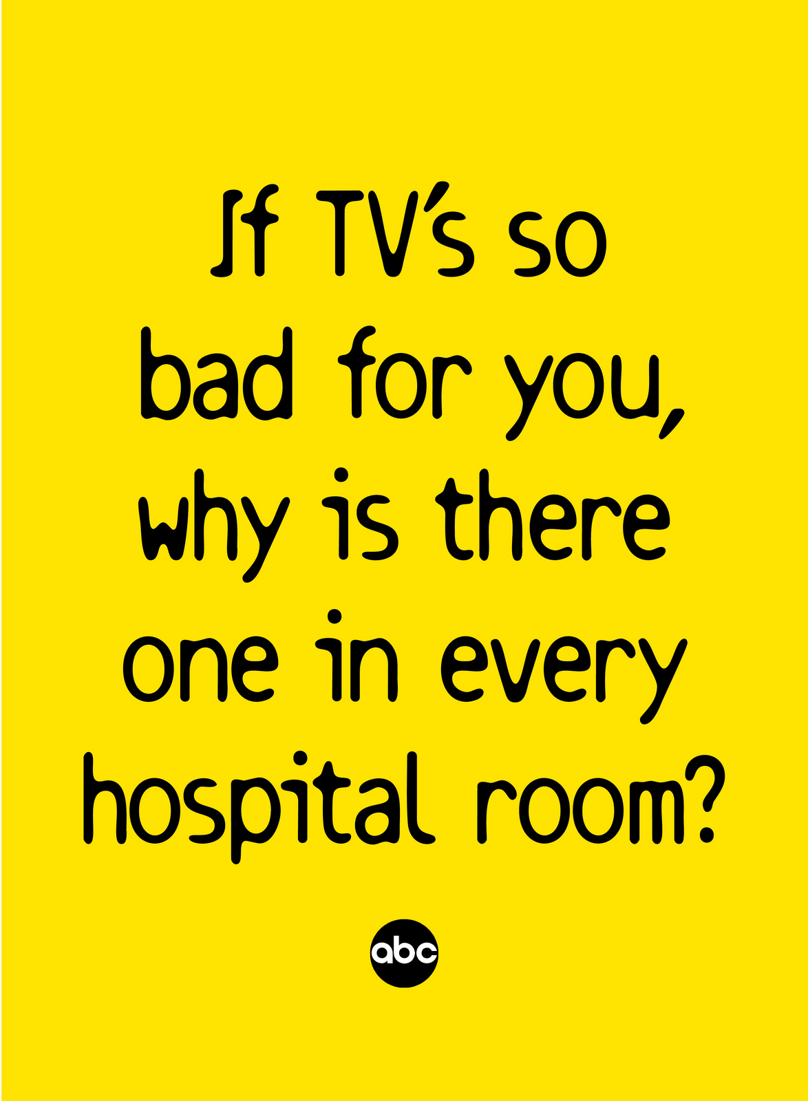
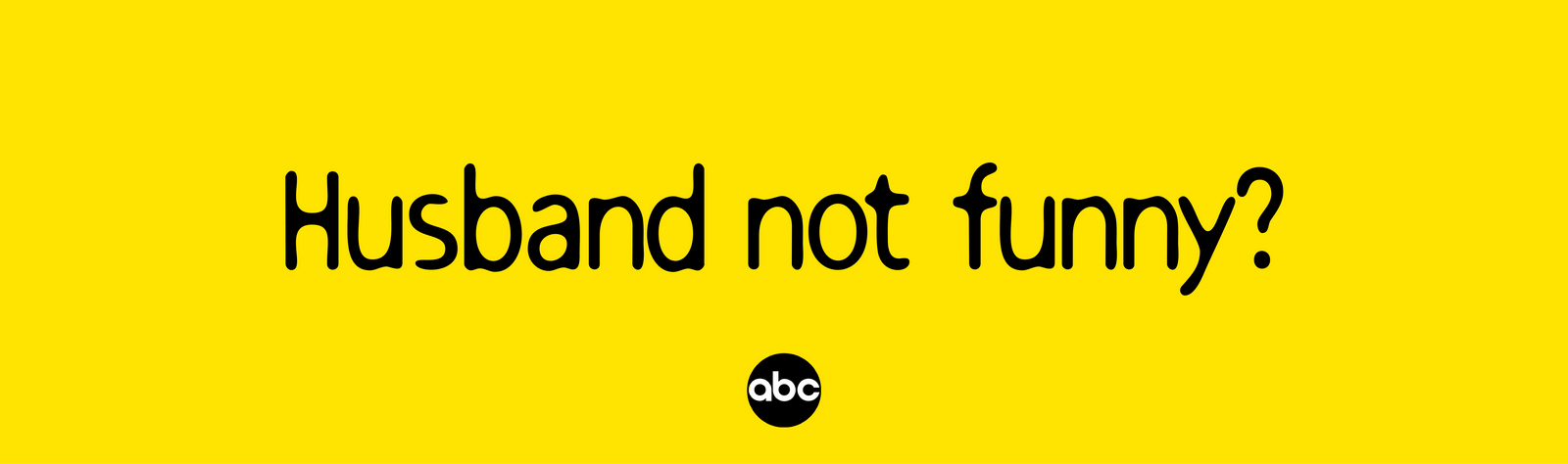
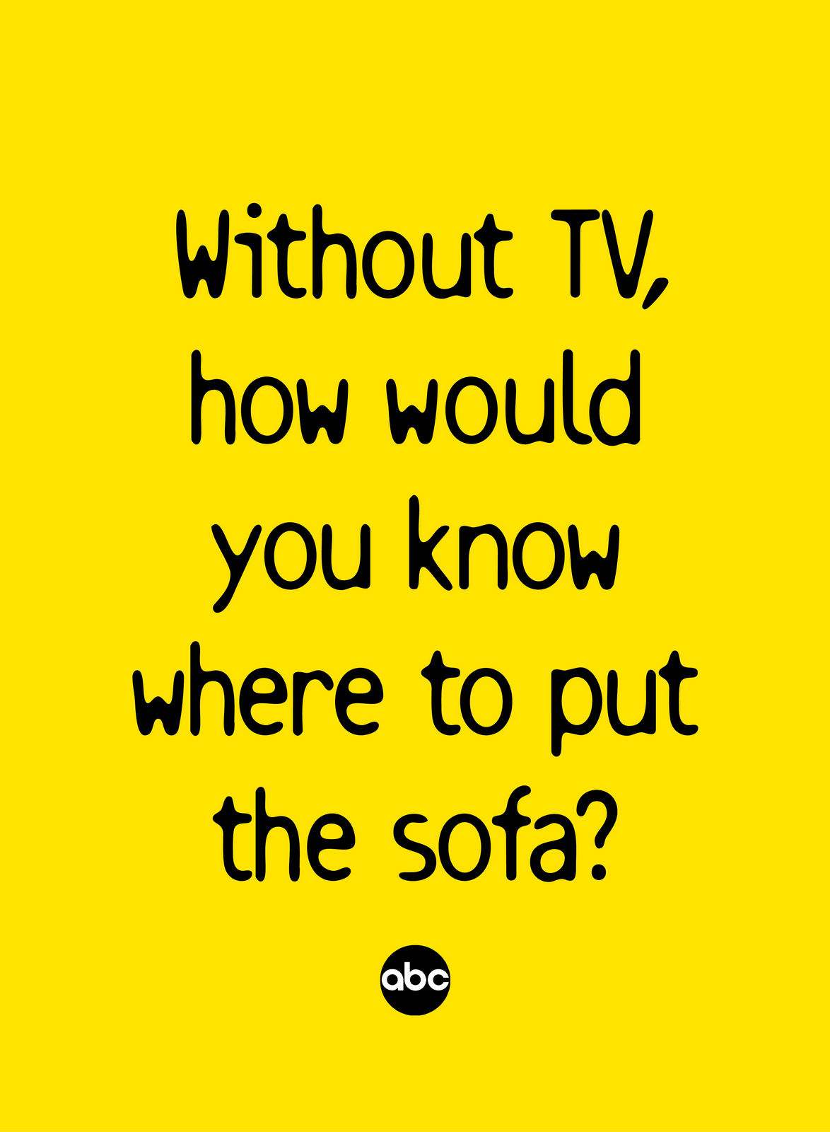
The ads above look good here, on your computer, but the place radically simple, human and funny ads like these work really well is out on the street.What felt a little too basic on a piece of paper in a meeting will shout above the rooftops when on a billboard.What felt like a childish joke as a scribble in an office can often kill all the pompous, patronising bullshit that surrounds when on a street.
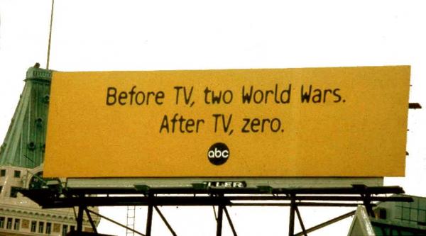
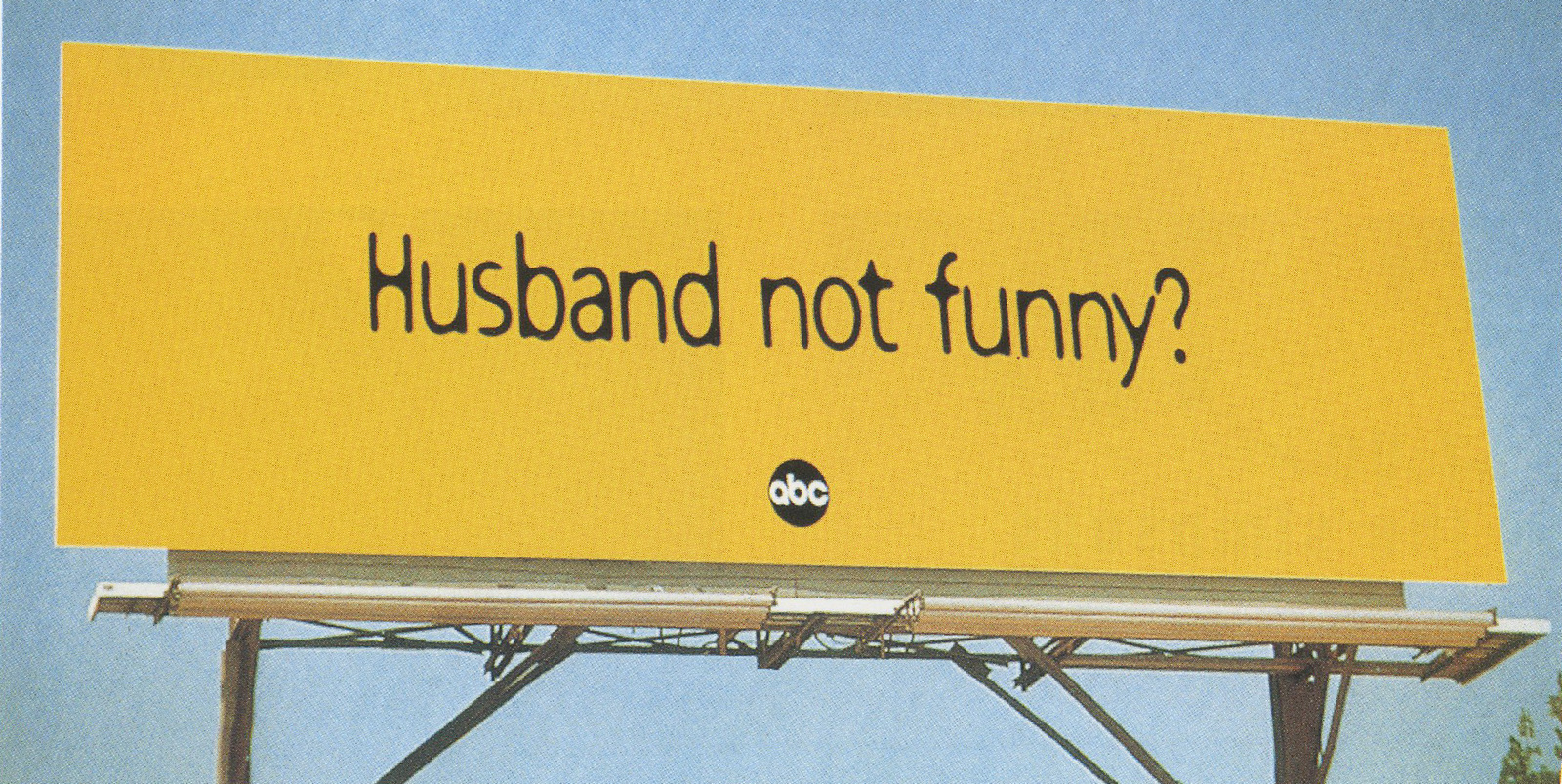
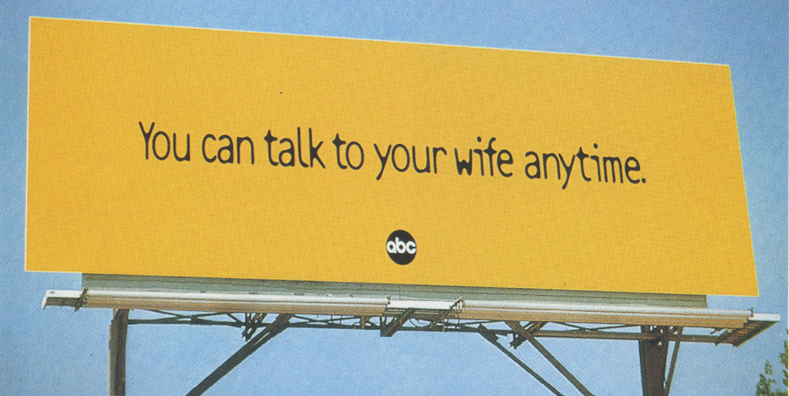

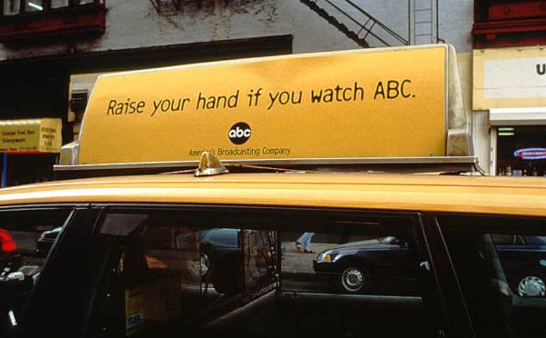
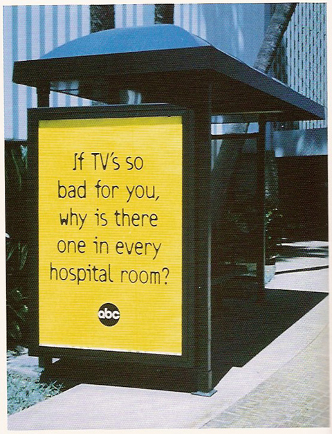
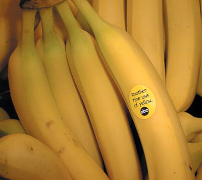
Looks easy. Isn't.
When you start a job with the title ‘Creative’ you feel compelled to be very creative.It’s easy to confuse being described as ‘creative with with being ‘nuts’, ‘bonkers’ or ‘out there’.Consequently, you tend to emulate or simply copy people who appear very weird.In 1987 I attempted to Jean Paul Goude.I can’t recall whether it was of lack of money, poor script or the fact that it was for one of the least cool brands in the world, (Hotpoint), but Jean Paul Goude declined to help us make our ‘Jean Paul Goude’ ad. (A shame, as it would’ve made the task much easier.) Instead, we got the director Nick Lewin.Red hot at the time, having just directed two very cool Levi’s ads for BBH; ‘Marlin’ and ‘Rivets’.Try as we might, the ads didn’t end up very Goude.I realise now that very creative people’s minds work differently to the the average bod. They are stuffed with a whole bunch of weird reference points, as unique to them as their finger prints.Often these reference points are ignored or thought of as uncool by the majority.But very creative people connect these disparate reference points in idiosyncratic ways, eg. “I want a kind of ‘H R Puff ‘N’ Stuff ’ vibe, but with bit of ‘Lou Grant’ attitude and a kind of Fiorucciesque stye?Oh, and a Gilbert O’Sullivan type soundscape…upbeat Gilbert O’Sullivan, not the maudlin shit.”
Their idiosyncratic reference points and take on culture gives them their aesthetic.It’s almost impossible to mimic someone else’s aesthetic.So, although we tried very hard, I, and Nick Lewin, weren’t Jean Paul Goude.He was just too damn idiosyncratic.He was a brilliant illustrator, photographer, Art Director, Director, Choreographer, Wallpaper Designer, etc.His images, whether moving or still leap out of magazines, spring from screens.They’re striking and incredibly seductive.This is him, (acting the giddy goat):

He started out as an illustrator, a very good one.
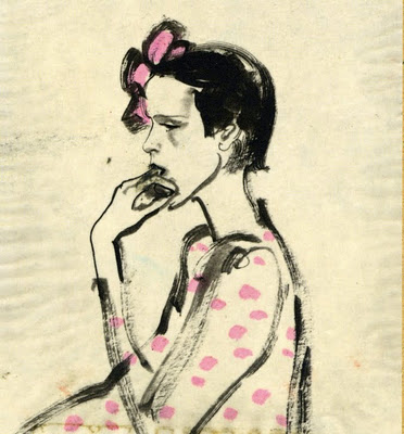
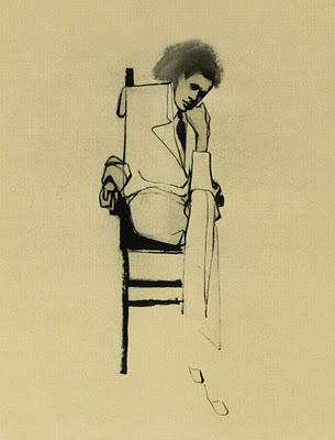
Then he turns up at Esquire as an Art Director, executing stuff like this for George Lois.(Yes, that George Lois.)
Occasionally art directing his own covers.

But mostly illustrating for them.


Images start to get more realistic with the advent of the airbrush.


He then mixing photography and airbrushing.


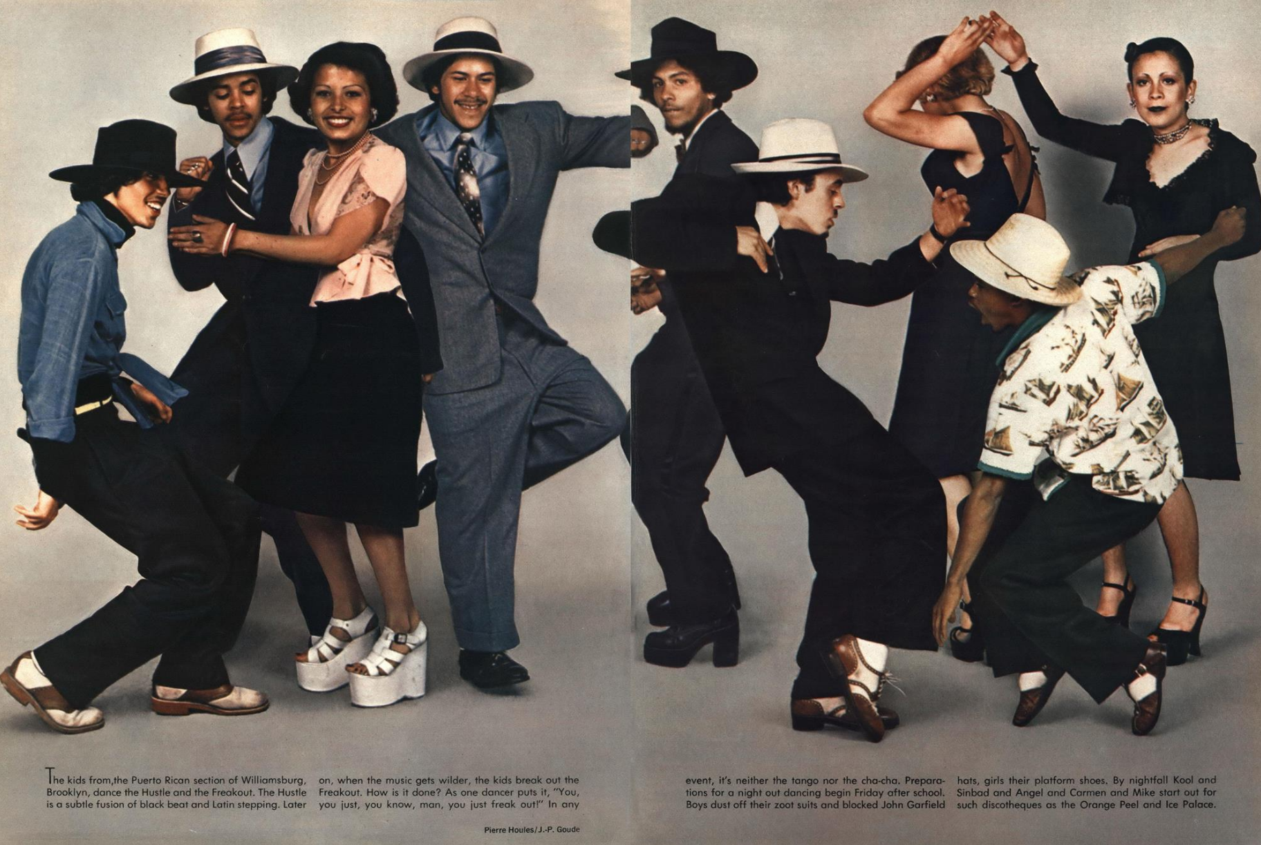
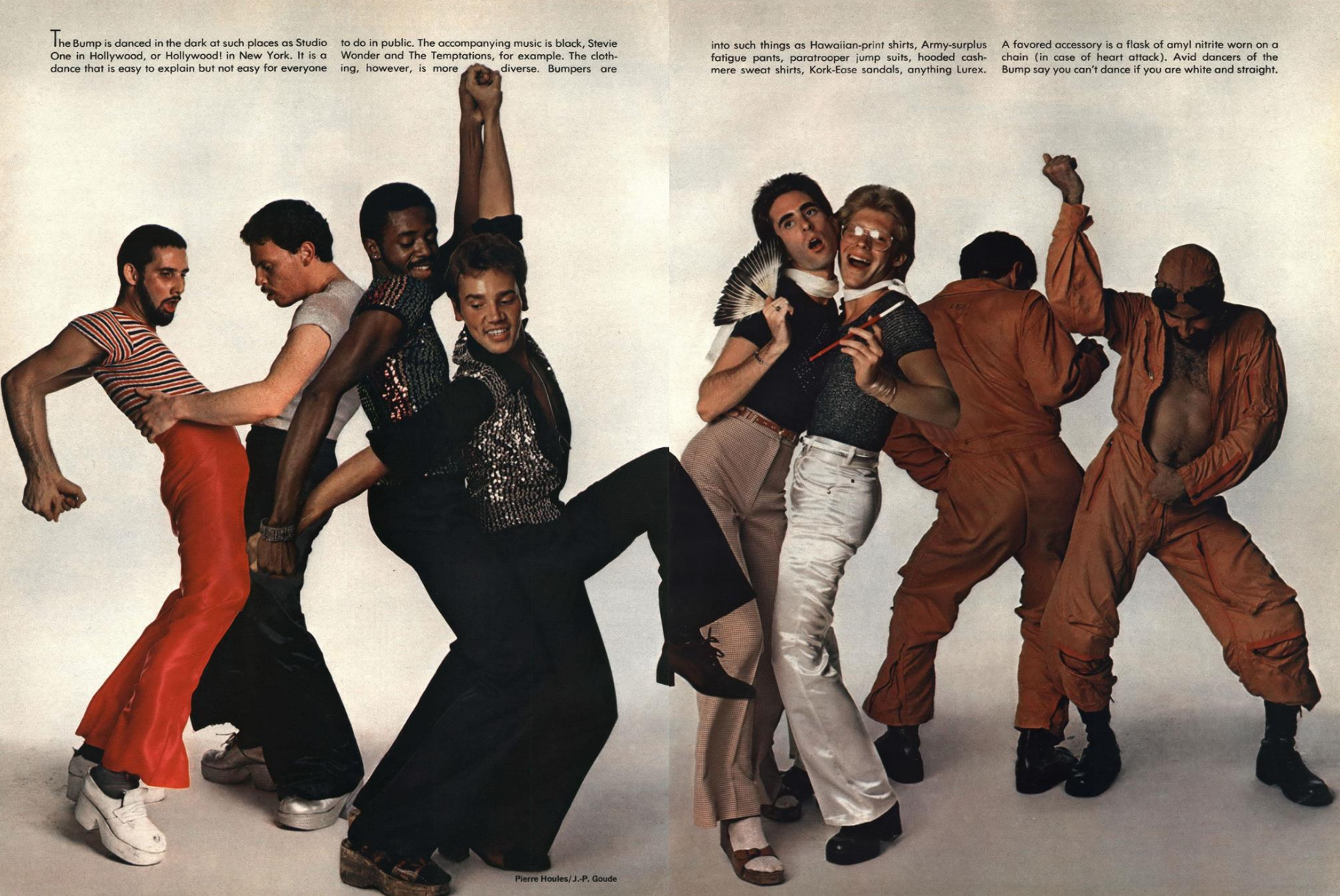

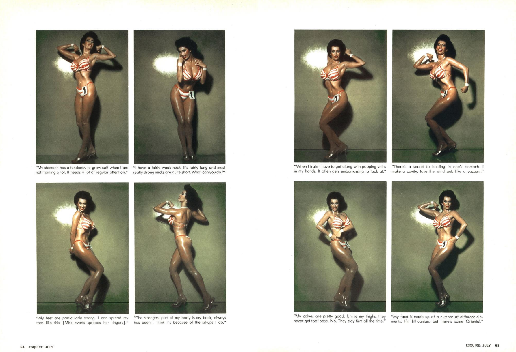

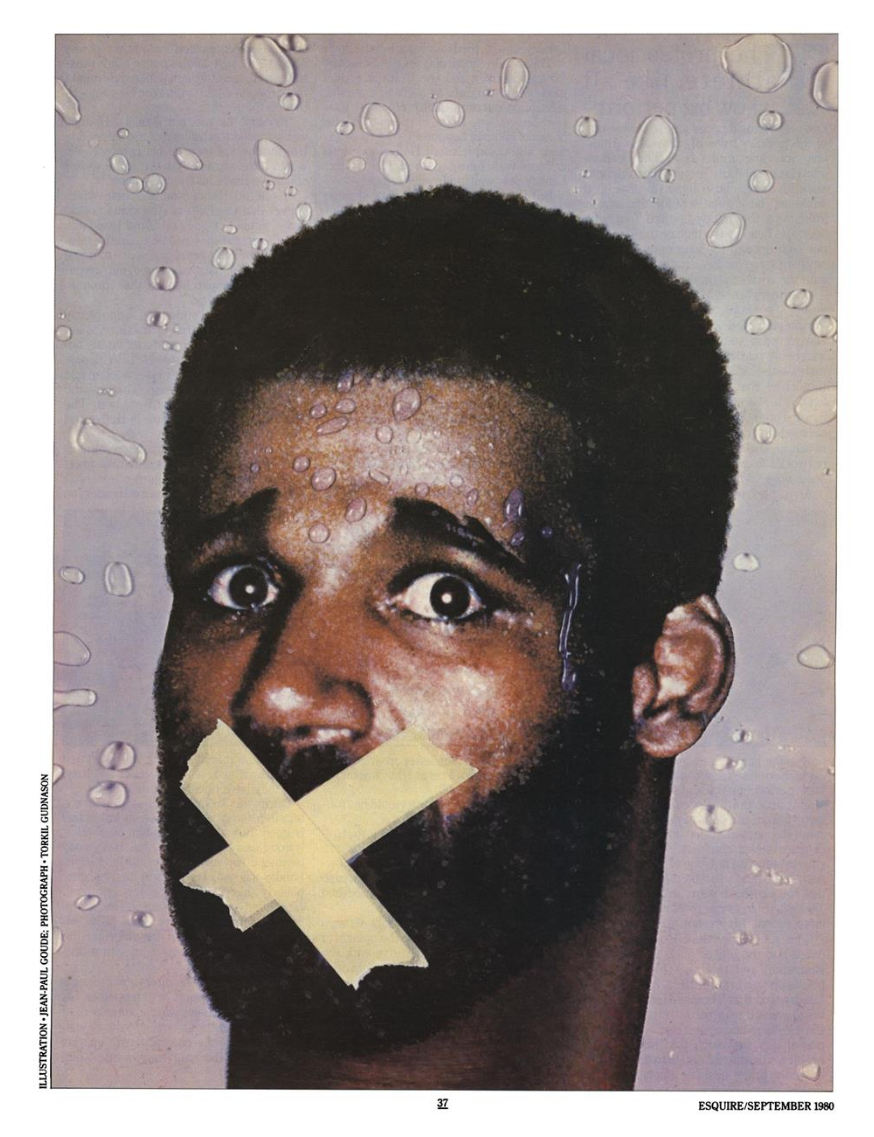
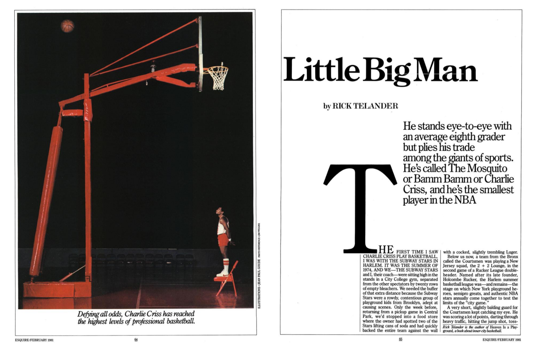


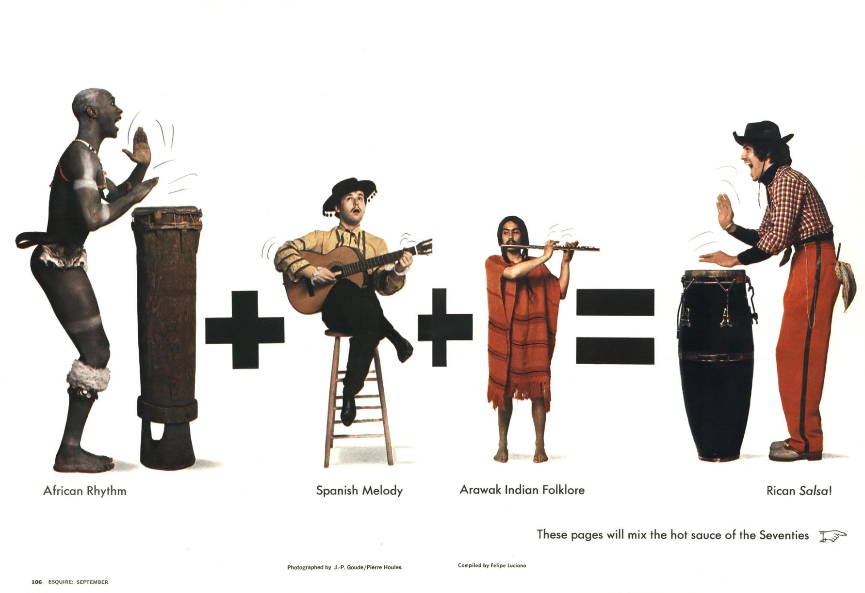
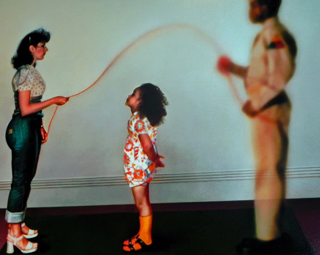
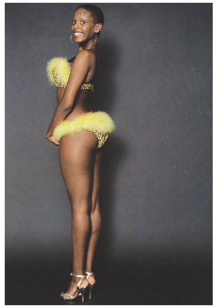
He gets a new girlfriend and takes control of her image:
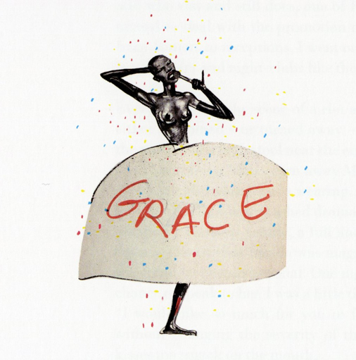
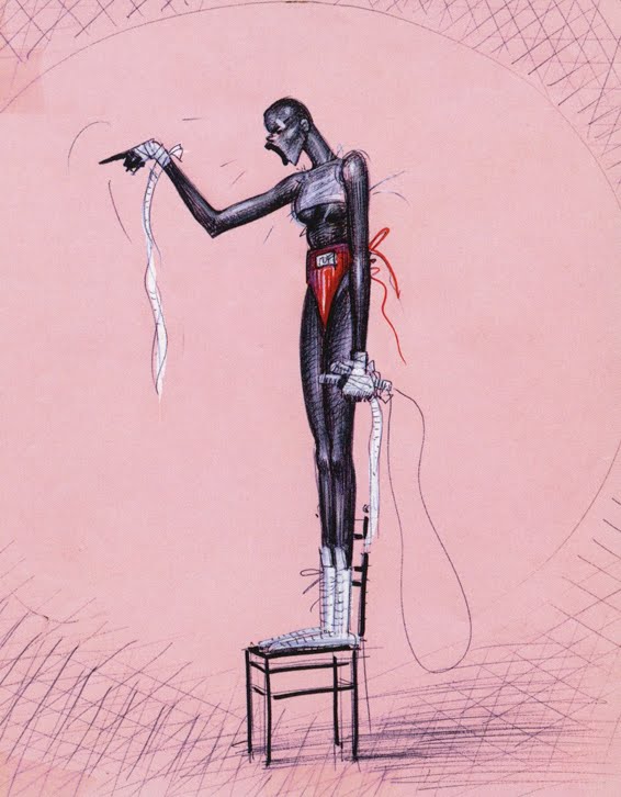

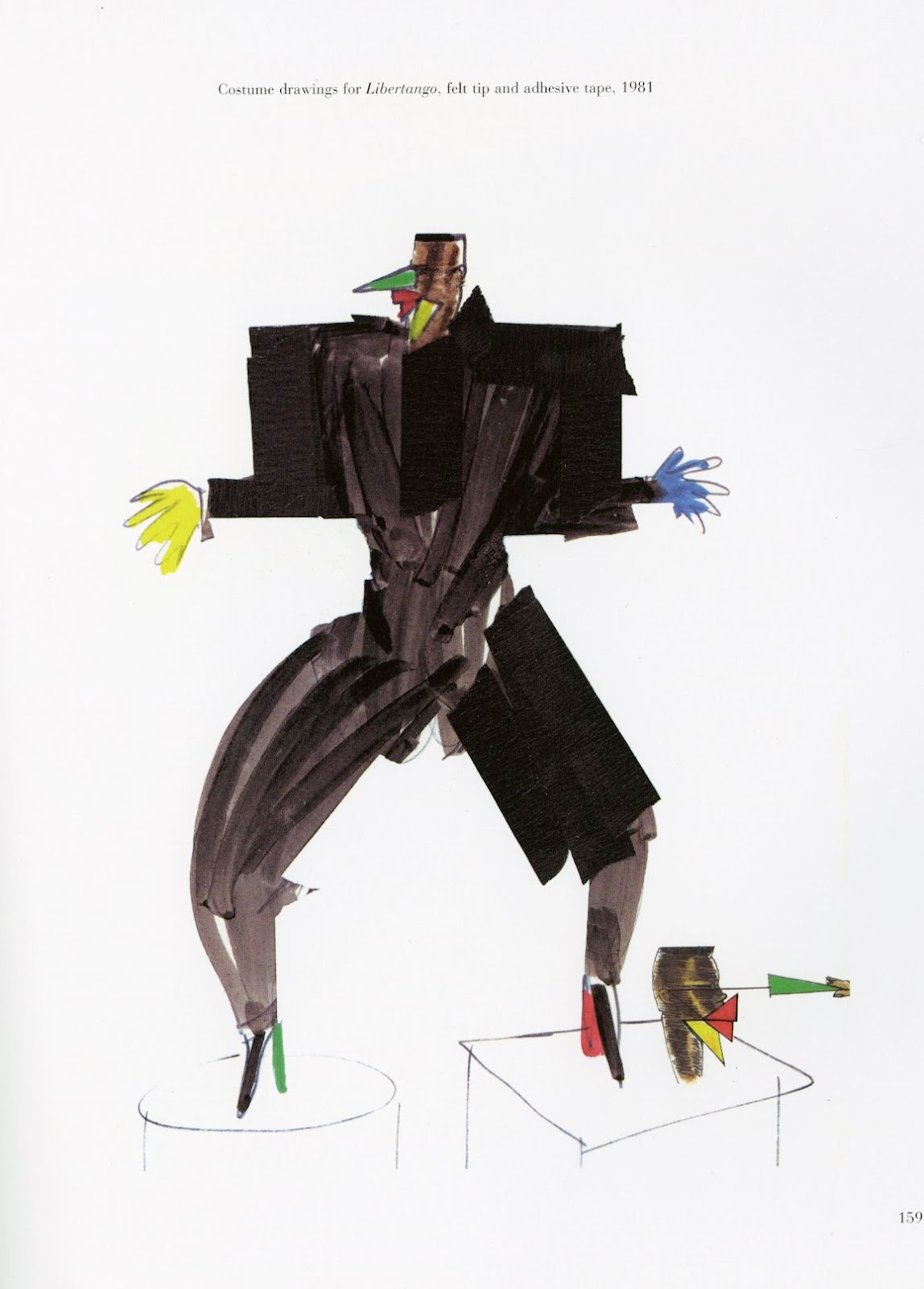
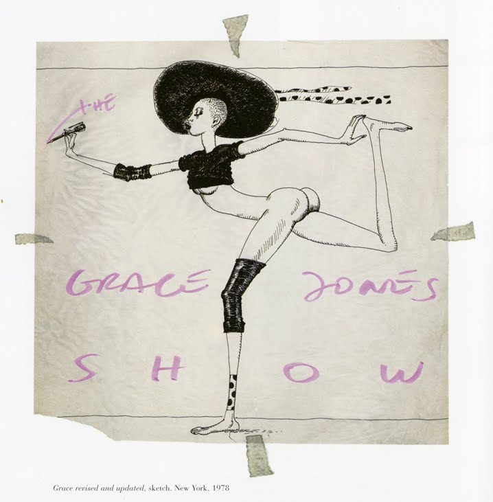
As there’s no Photoshop, Goude cuts up negatives and airbrushes the print.


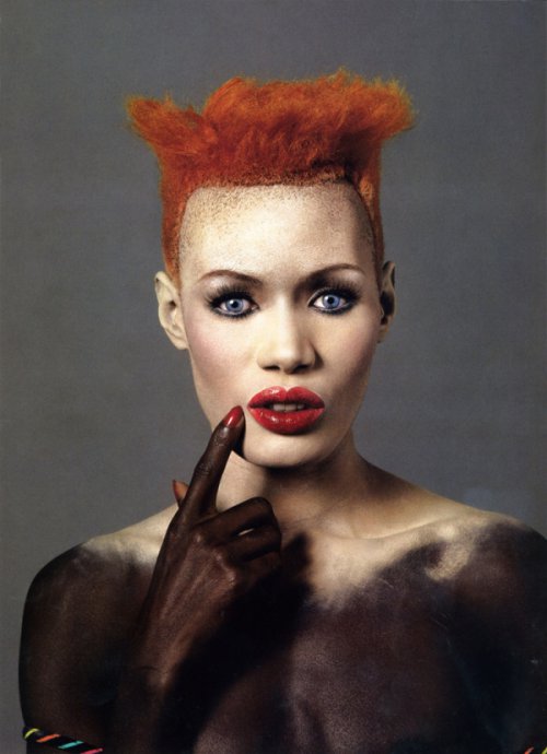

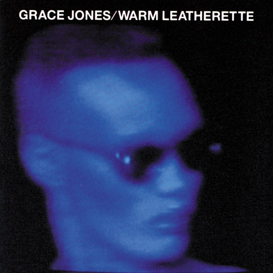
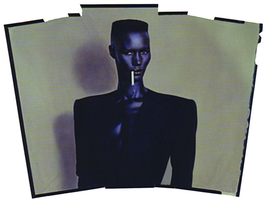
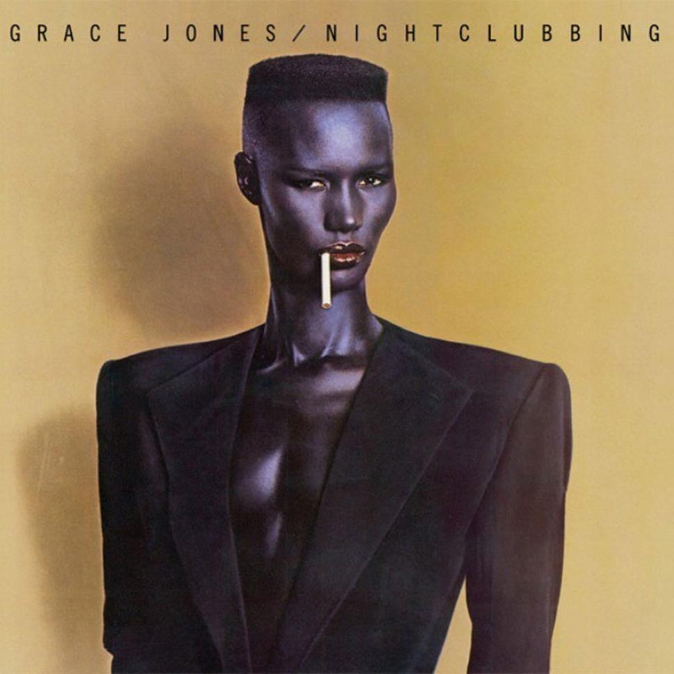


He starts choreographing and directing her gigs:
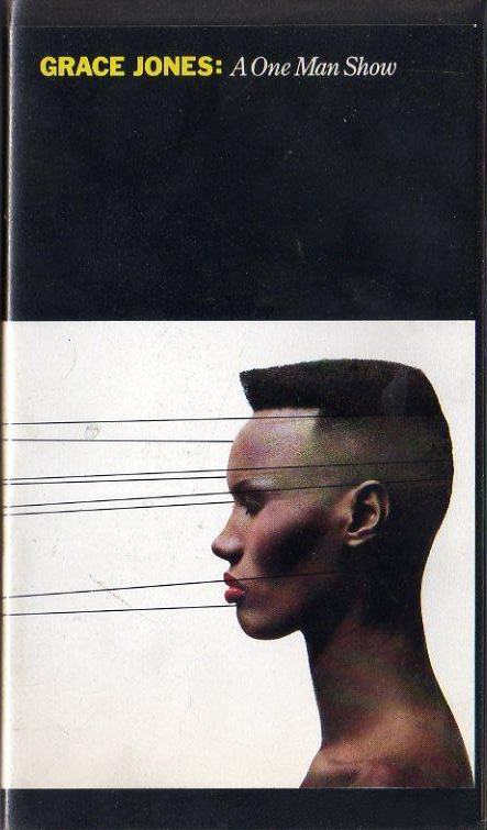


Farida.
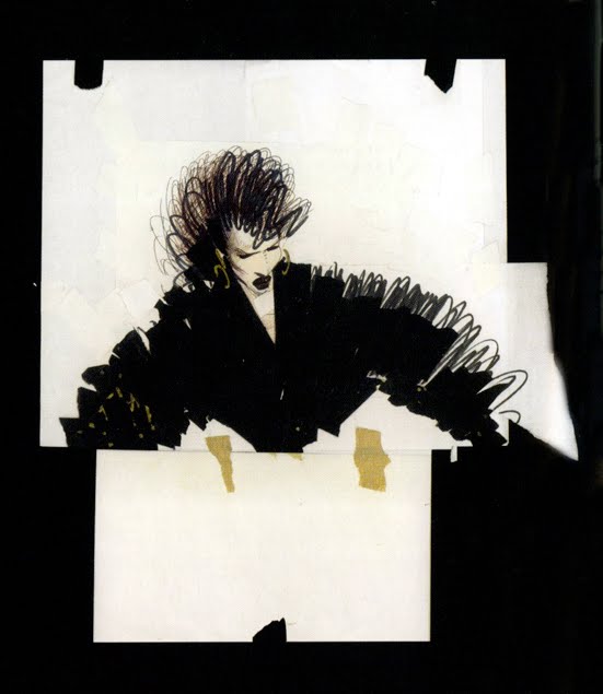
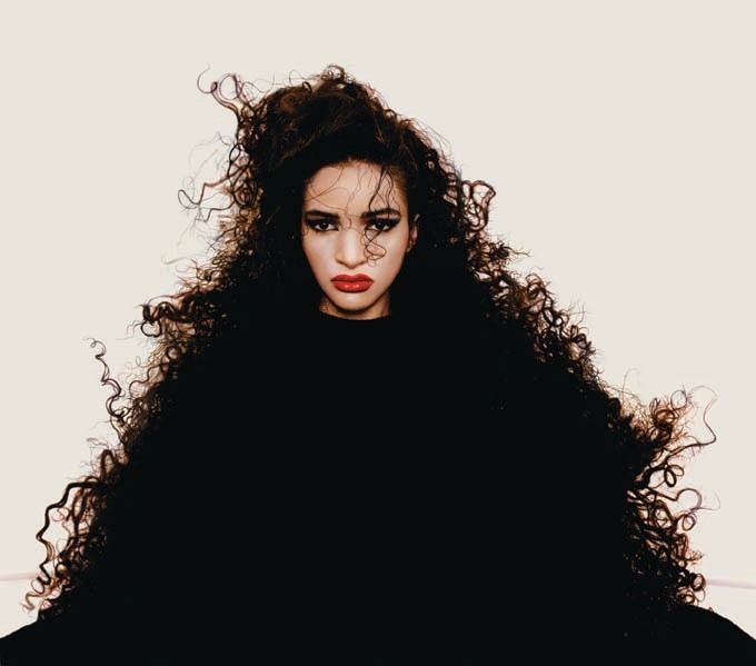
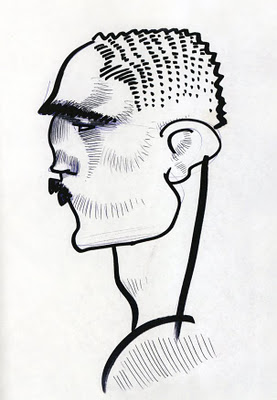
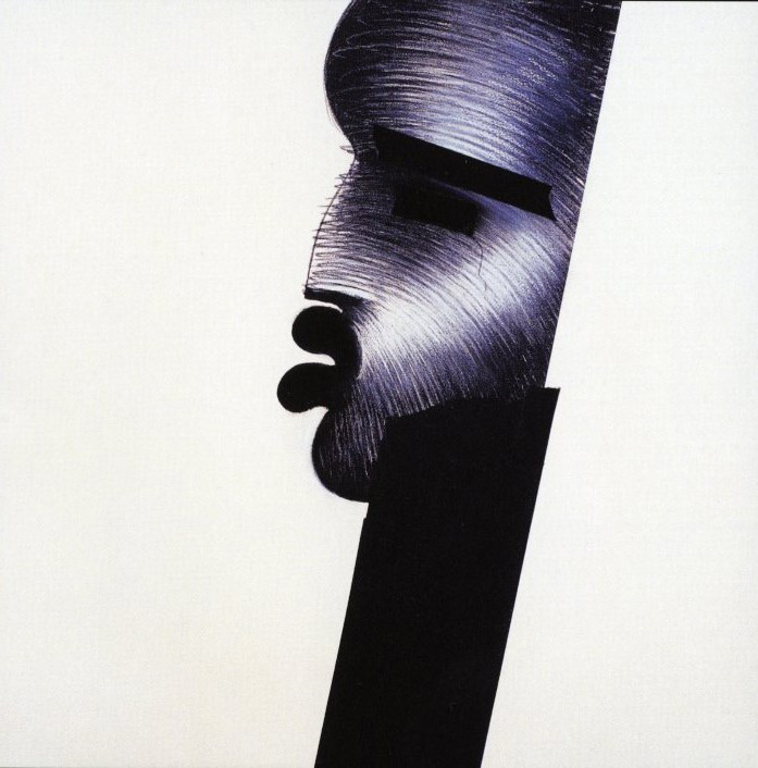
He starts directing commercials. Unlike anyone else at the time:
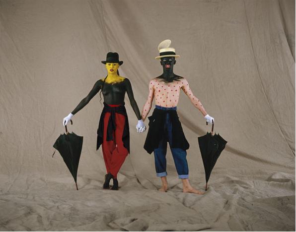

You were Fallon McElligott’s first Creative, Tom obviously liked you, what did what did you make of Tom when he first interviewed you?Actually, I had known Tom at Bozell. We never worked together as writer and art director, but I knew him. So when he offered me a job, it wasn't out of the blue. I remember we sat by a fountain and Tom said we would buy up all the foam core in the entire city and pitch new accounts. I kept my mouth shut but it sounded to me like a lot of work. Tom was excited. That excitement started then and lasted for seven years. It got everything and everybody going.
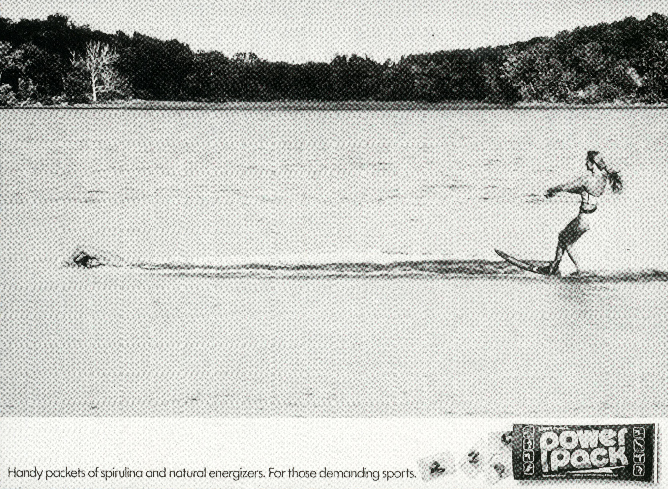
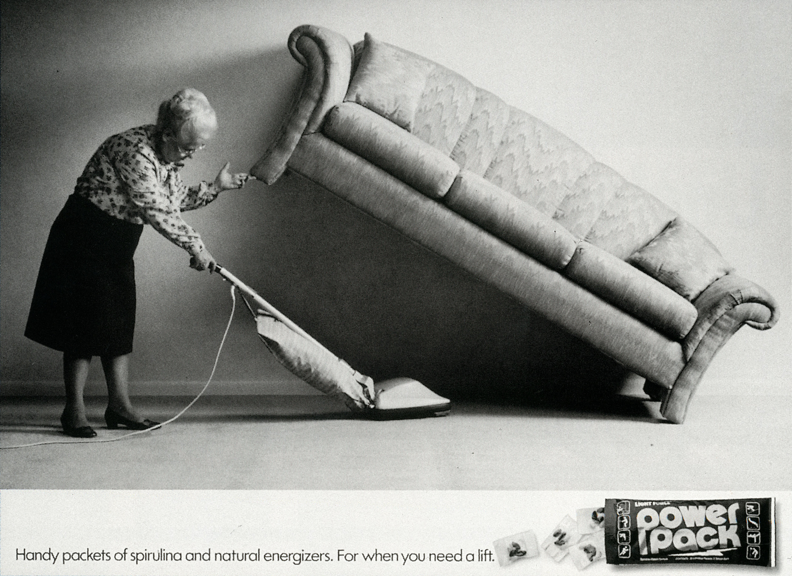
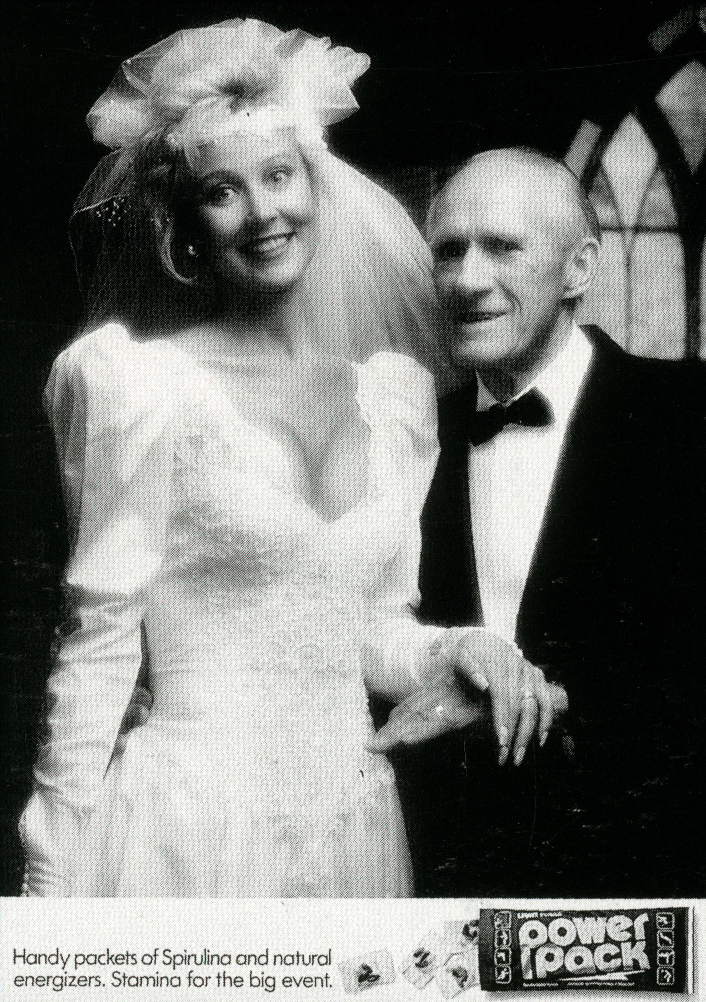
At what point did you think you had a future in advertising, was there a particular idea, award, comment, etc?First, I had an instructor my senior year of college who pulled me aside and told me that he normally told design students who weren’t very good to go into advertising.Second, he told me he was making an exception in my case.He thought I’d make a good designer but he thought I’d do better in advertising.Third, I did.We had a week’s break from school.I left the outside window near my work area unlocked so I could sneak in and use the stat camera.At first I didn't think I’d be able to get in because there was snow all around the building, if I walked up to the window my tracks would show.I walked around the building with my back to it until I got to my window and crawled in and repeated that for a week until I was done.My book won an award at graduation and it came with a good-sized check so I thought I might do ok.Did you feel like you were in advertising or against it?I hope I’m being honest here, I always felt like I was against it.My first day on the job in advertising, my wife asked me how was it? I said I think there's more people in it to be in it than to do it.It felt like I was always trying to make it better than it was.There was always resistance to doing good work.Years later I remember looking at an award show list of results on the wall and I turned to the first person I saw and said we're making history.It was Pat Fallon and he said yeah, but we don’t realise it.So I went home that night and told my wife that we were making history and I realised it.She said yes and you bitched and complained your way through the whole thing.


Minneapolis. Do you think the cold helped keep you all alert and focused?Yeah.I had a grade school teacher who started the day one really cold morning by telling us to look around the room at all the red cheeks and then he told us it would be a good day, we would learn a lot because we had been so cold.I thought he was full of shit but I never forgot it.Did you FM guys feel like you were on a mission to add a bit of intelligence to the schlocky world of Advertising?Yes.It was us against everybody else constantly.And I remember Tom coming back from a meeting with the 4A’s in New York.He told us we were going to work on a campaign to improve the image of advertising.I said the best way to improve it was to make it better.Well, Tom disagreed.We went back and forth several times.I was at one end of the conference table and Tom was at the other.The rest of the department was sitting on both sides.It got tense.I remember seeing the worried reactions from the creatives stuck in the middle as I pounded the table at my end and Tom did the same at his end.Finally, Tom ended it by saying he was going to great ads for it and he wanted others to join him.Much later I realised that Bill Miller and I had won a gold in The One Show, for a spot we did for advertising in that campaign.I still shake my head today, I think we were both right?At the time, most campaigns created a hermetically sealed brand worlds, Fallon McElligott’s work used the real world and culture in particular, why?I don’t know if I have an answer for that.Maybe it's the red cheeks from the cold.Also, one of Tom’s favourite expressions was zig when the others were zagging.We never wanted our work to resemble anybody else’s.Our work for our clients always had to be different.
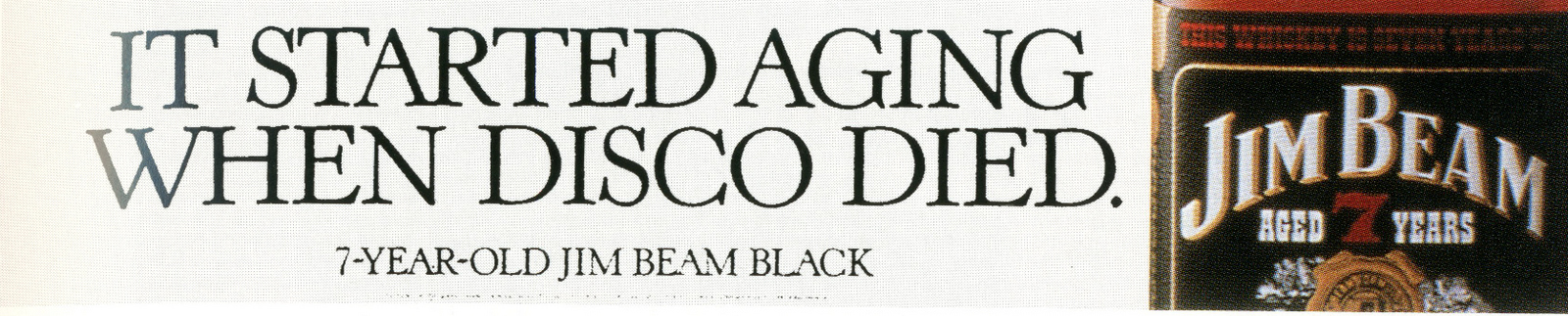
Tom McElligott, most influential ad man of the 80s?I would certainly agree with that, but then I’m biased.How comfortable was Tom’s seat on that first day?You know, that’s something I never thought about.Looking back on it you'd think it would have been the big topic for me then.It wasn’t.It never crossed my mind.I think it was because I had been there so long.I just kept my head down and made ads and helped others do the same.A reporter asked me once how I kept everybody in the department.I said I didn’t keep them they kept me.We cranked it up.Adweek described you as a Creative’s Creative Director, why?When I was associate Creative Director a reporter asked one of my writer partners how much time I spent on my own work and how much time I spent helping others.I said seventy percent on my own work, thirty percent on others.My partner said the exact opposite.I discovered that I got a bigger kick out of helping somebody else do a good ad than I did doing one myself.It was sort of like a drug; the more I did it the better it felt.I remember my associate Creative Director standing in my doorway with a fake frown on his face and he said “Just when I thought I’d done a great ad, here comes a young team down the hall with a campaign better than anything I’ll ever do”.I said that's exactly why we’re here.I also fought for good work.I fought anything and anybody to get good work out, I fought a lot.The Creative Department gave me a bullet proof vest with my name on it for taking all the flak.
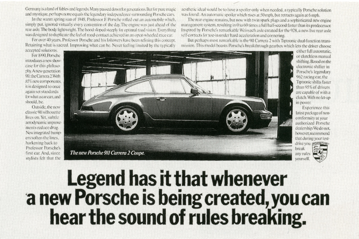
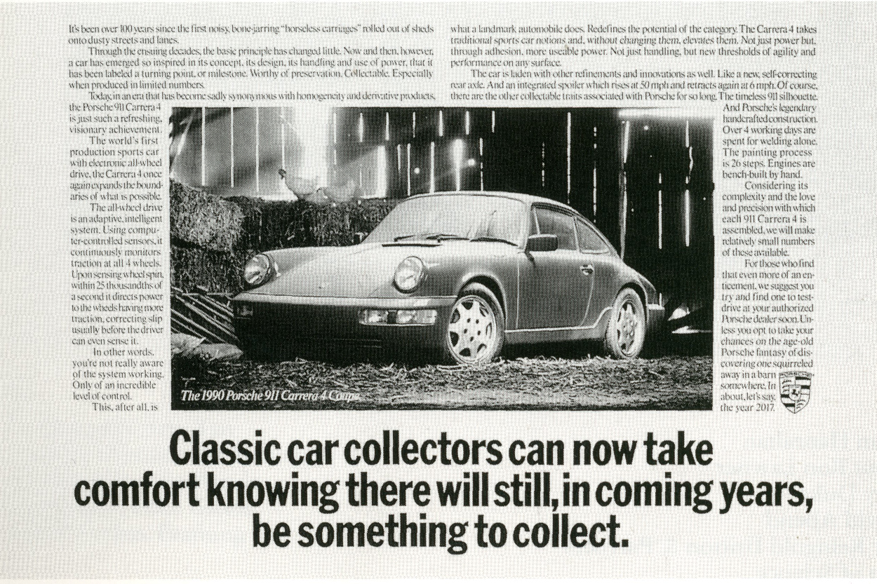
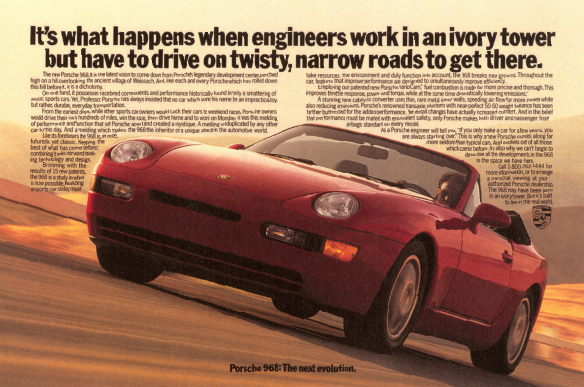
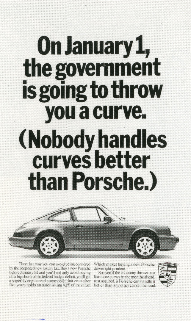
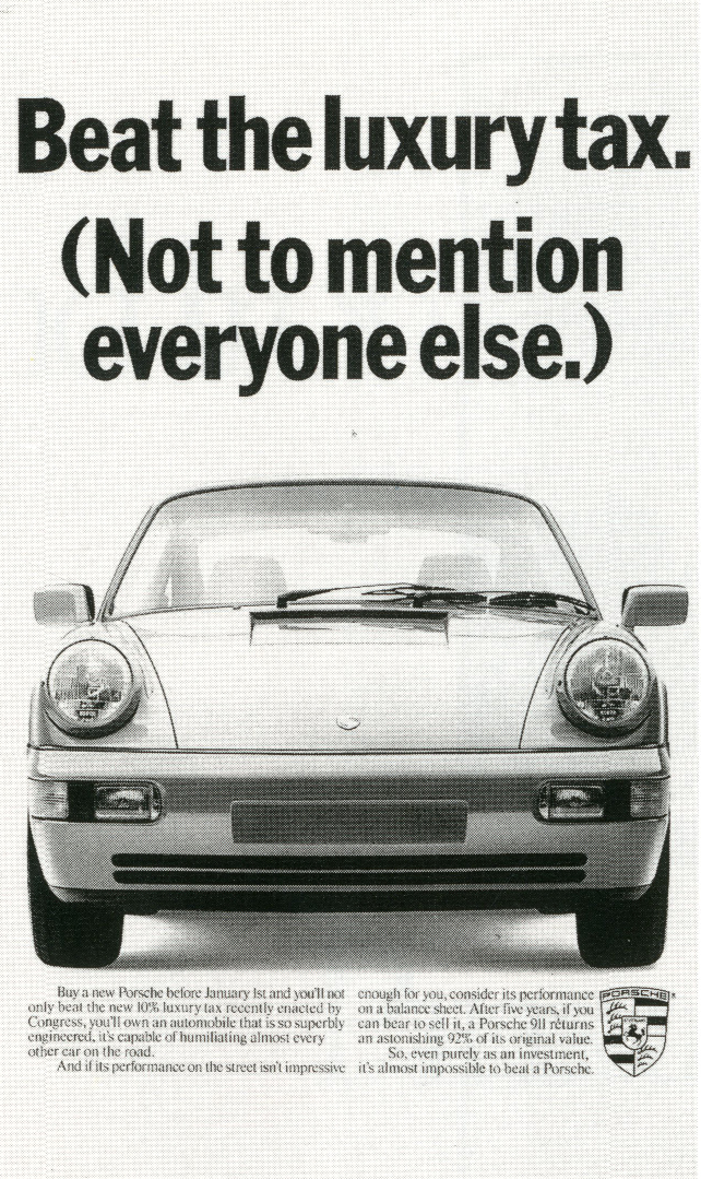
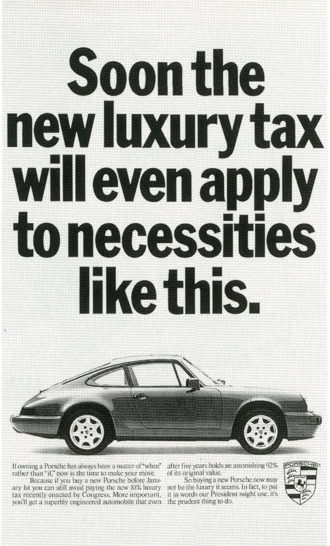
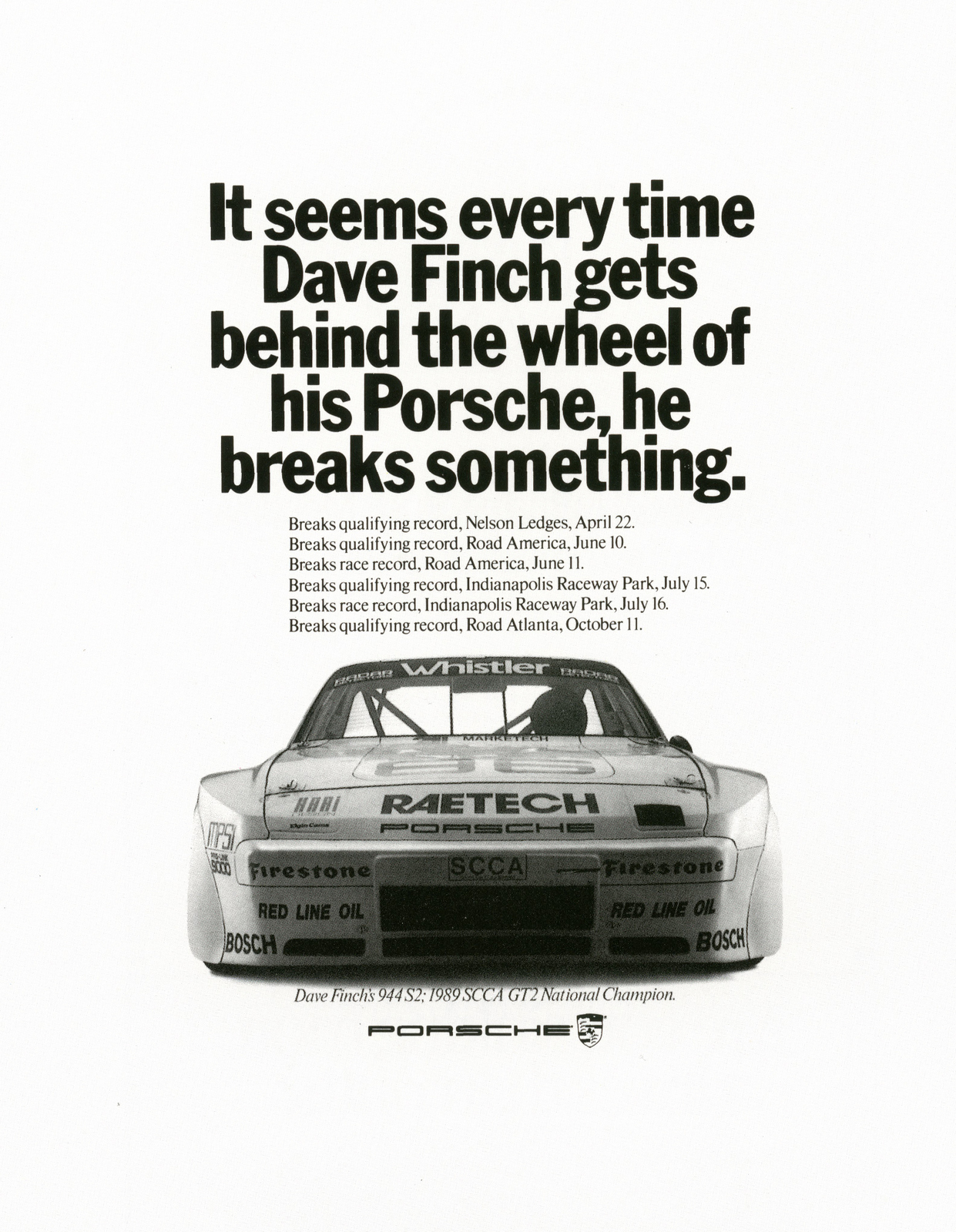
Luke Sullivan described his first walk through the Fallon McElligott Creative Department like this; ‘Genius, Genius, Genius, stairwell, Genius, Genius...’ What did you look for when hiring?We looked for the best people we could find.We seldom hired.Nobody in the department wanted to give anything up.We were selfish I guess.When we did hire we looked for a sense of humour first and foremost.I had help from others in the department when looking at books. I’d often ask them to recommend the best of the best. I never doubted their ability or their choices.I was comfortable delegating that and I was always happy with the results.They did not let me down.
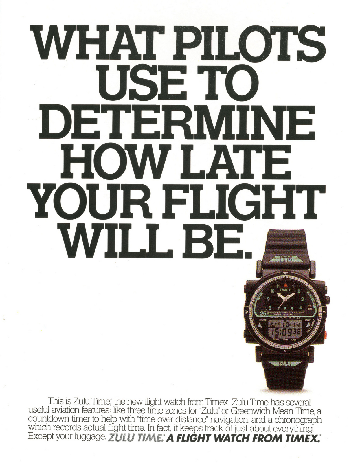
Were you a hard task master?Well, I don't know if I’m the best person to answer that.I don’t think I was.But I know that if there was a chance of a campaign being great, it didn’t feel like work to me.If we had one good ad on the table six would always be better.I also thought no Creative Director should ever get paid to tell people who that idea sucked or he or she had seen that ad before.Leave those alone, that’s not saying anything.I used to sometimes get what I called a burst of ice water in my veins just before going into a room full of ad ideas.I never wanted to leave a One Show gold campaign on the wall. Then I’d shake it off, be myself and enjoy the work.
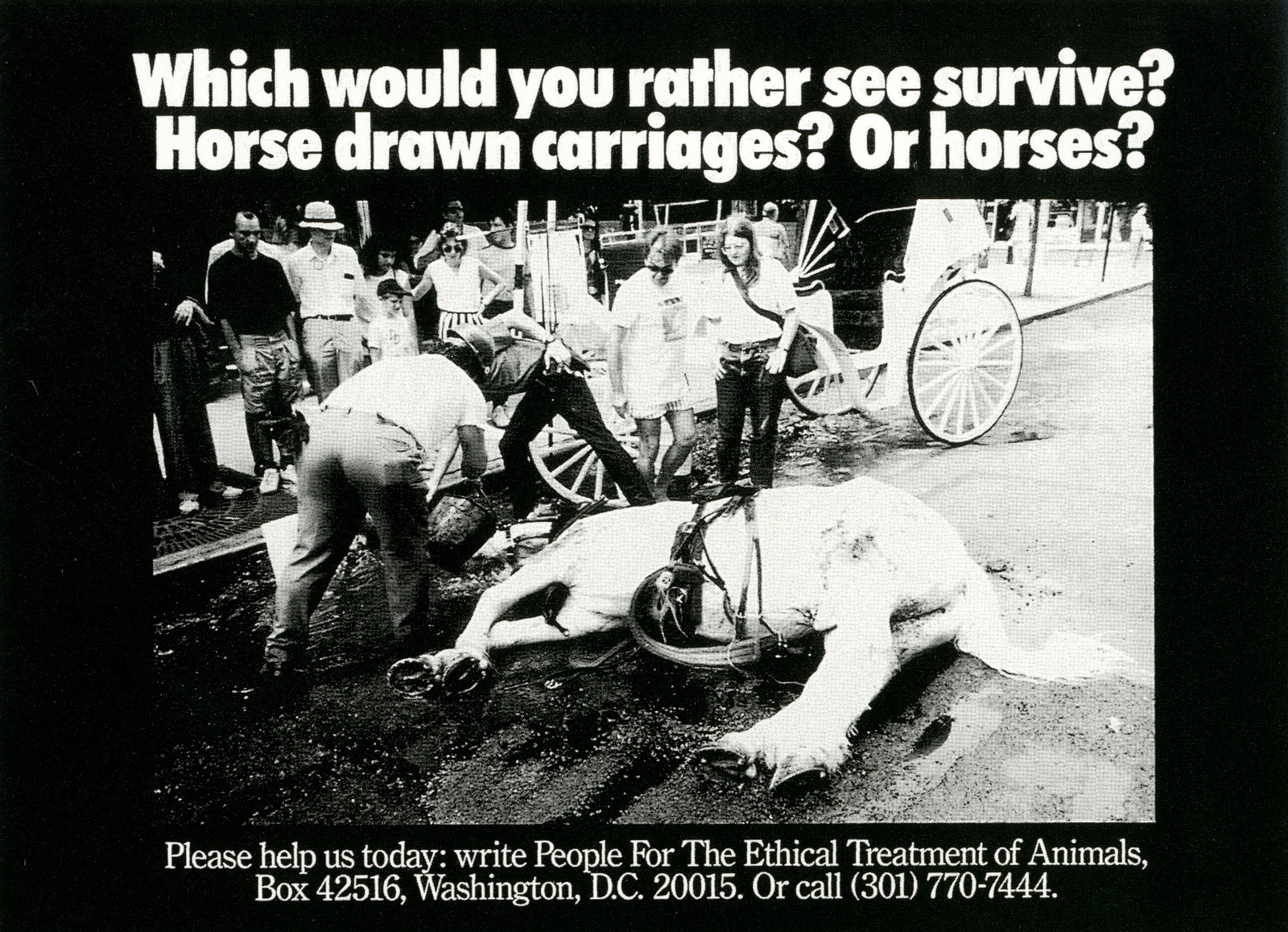
Who’s the most gifted person you've ever worked with?Bob Barrie.What was the ad you wrote that made you think you could do it.All of those in my book when I crawled though the window I guess.Under Tom, the work had either great headlines or great visuals.Under you there were a lot more new structures, I loved the way that the creative work, seemed to be looking for new ways of structuring an ad, ie; Jim Beam.

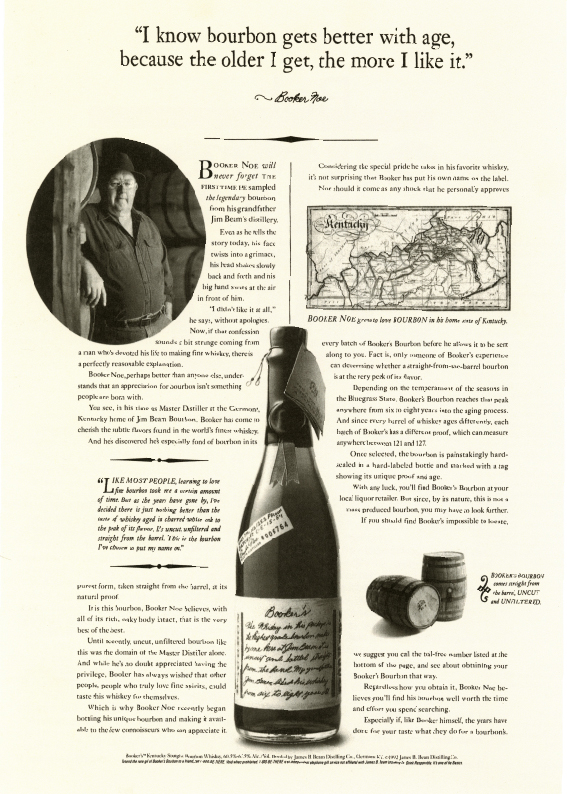
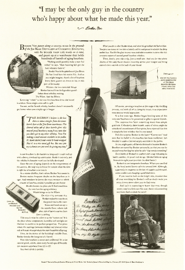
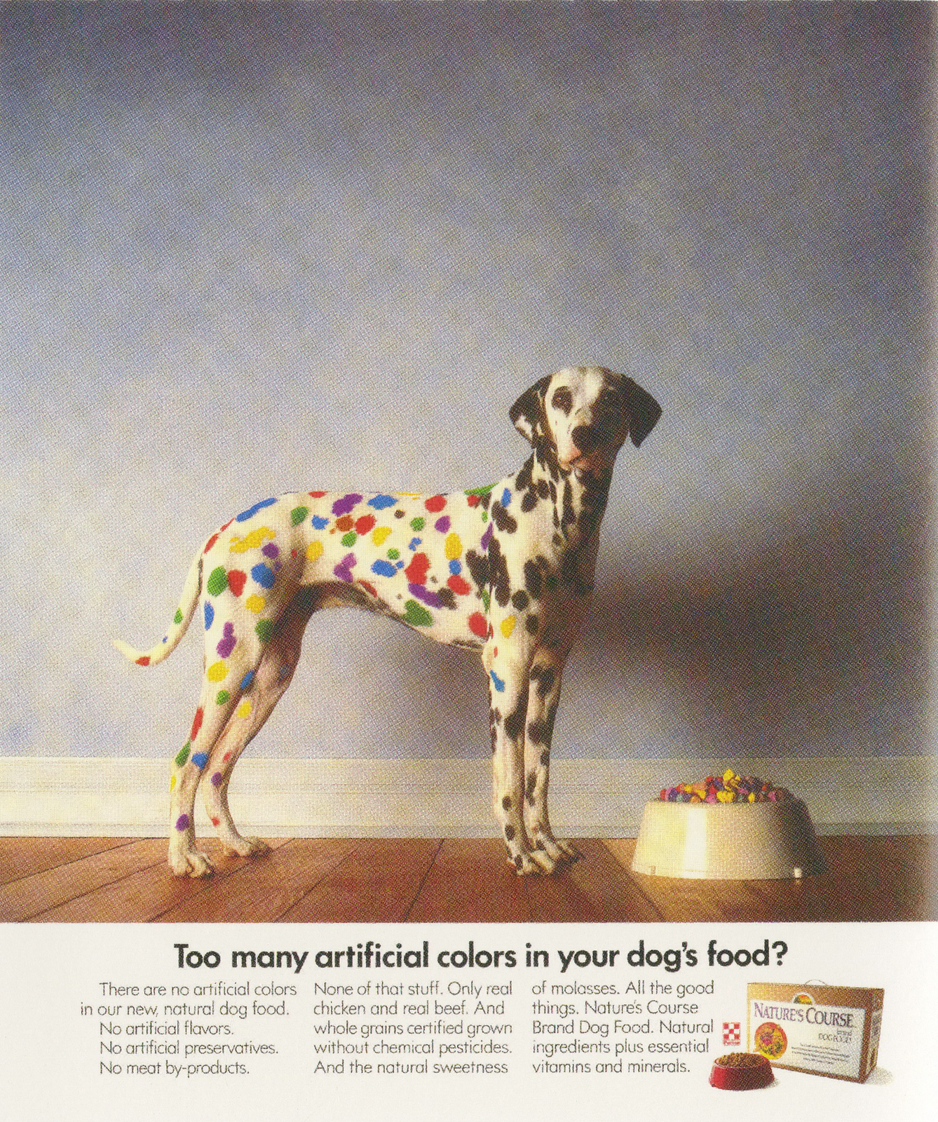

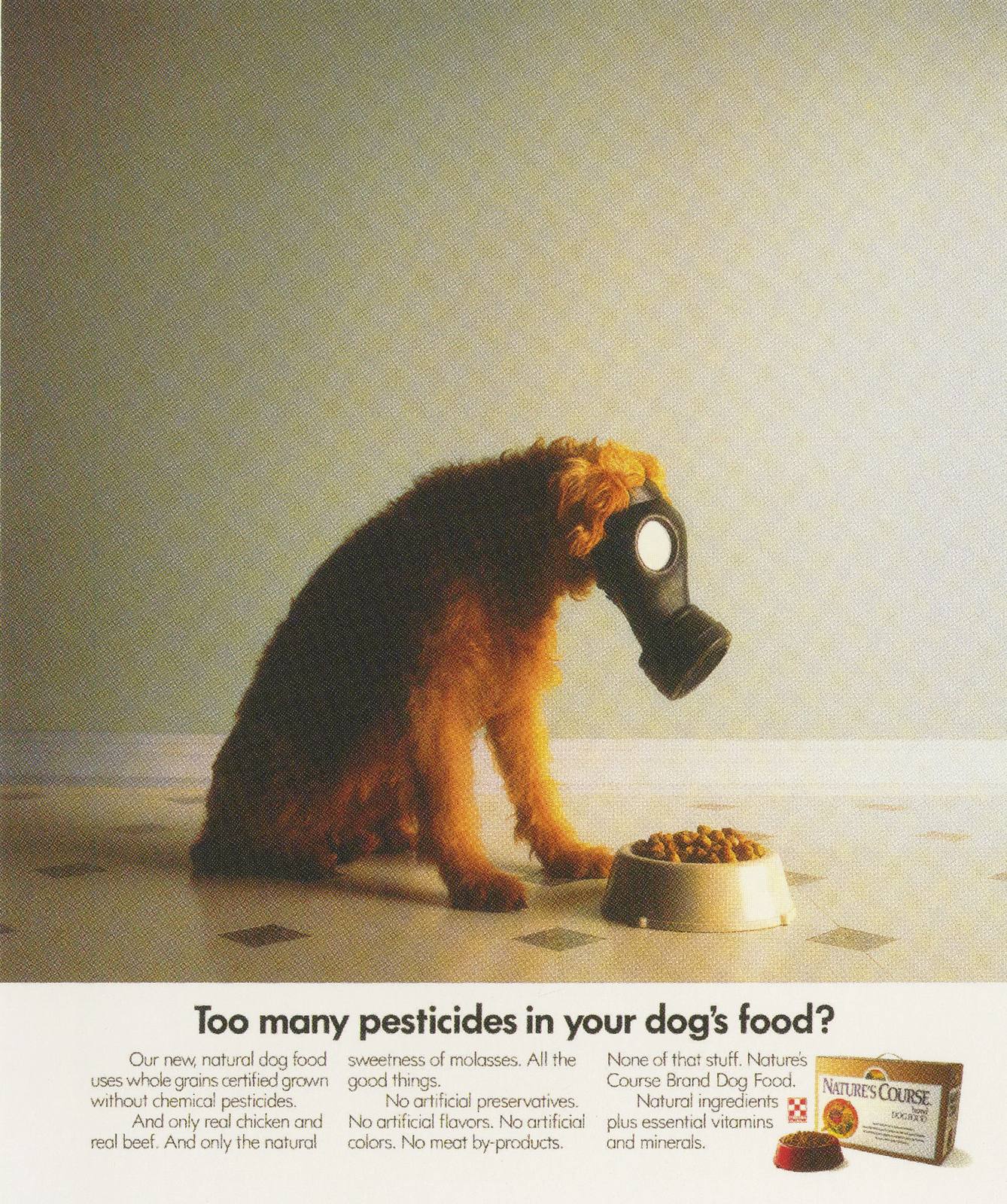
I think some of it goes back to ‘Zig when the others are zagging’.We were naturally trying to avoid looking like the other guys.It’s interesting that you mention Jim Beam here.I should tell you that at one point we had like fourteen different campaigns for fourteen different products of theres.One day we got word that the president of Jim Bean brands thought that all his work looked too much alike.We were told he was coming to the agency to tell us personally.I had a hunch that the president had never seen all of his campaigns in one room.I knew I hadn't and I worked on all of them.We lined up all the campaigns on all the walls of our largest conference room.They looked like they we’re shot out of machine guns.The president came in sat down lit up a cigar and leaned back in his chair and looked around the room.He was surrounded.He left without ever mentioning anything about the ads looking alike because they didn’t.That’s a credit to all the Creative teams who did the work.A lot of your old Creative department wrote to me after my blog about Tom, they were very protective of you, pointing out some of the work I’d featured was under your watch.Also, and without exception, they said that not only did you continue the quality of the creative work, you raised it.E.g. Bob Barrie: ‘Pat was a wonderful guy who had some really big shoes to fill after Tom’s departure, and he filled them admirably. Some of the best work done in Fallon’s history was created during Pat’s reign as CD”.How did you do that?I remember talking to Tom about the energy in the creative department years ago.We were standing in the hall and the building was such that if you walked out of you office and turned left and kept walking you'd eventually end up back at your office.I said the energy level was like a big wheel with fire crackers on it spinning like crazy around and around the whole floor, I said you couldn’t stop it if you tried.I lit as many firecrackers as I could get my hands on, and lit them as fast as I could, everybody in the creative department did their part and more.The result still puts a smile on my face today.You made Fallon McElligott’s reel as good as their print, how?My true love was television.It was always just more exciting to me.I think your work is better when you enjoy something.As time went on we got more and more chances to do television and the more we did the better we got.Sometimes a team might worry that an idea might not work in production and they would come to me and express their concerns.I’d always tell them it was like running through a brick wall.Get up a head of steam and blast your way through.And whatever you do don't hesitate.I remember telling one team if it sucks tell them I did it.
Enjoy pitching?No.Burnham, Whatsit & Thingy. Ever a possibility?Pat Fallon asked me once what I thought of Fallon Burnham.I told him I’d think about it overnight.The next morning I went to his office and I told him honestly it didn’t sound better than Fallon McElligott to me.Which campaign do you wish you’d written?I guess I don’t think that way.I’m usually too happy for the people who do good ads that I don't think of it in that manner.
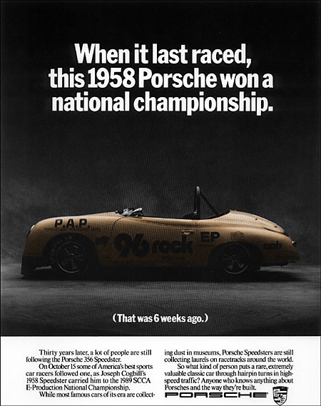
Talent or desire, what’s more important?I’ve seen great talent without desire and I’ve seen great desire without talent, they both make me equally sad. I think an equal mix makes people special.Seen anything good lately?Yes, there’s stuff my son has done that makes me smile.Great, thanks for yor time Pat.
Above, Pat is far right, below, Pat’s diagram on how to succeed.

N.B. Bob Barrie has just emailed Me this:
He said the previous post about Tom McElligott had initiated a lunch reunion in Minneapolis.Some hadn't seen Pat in a couple decades, Tom Lichtenheld flew in from Chicago and Jarl Olsen flew in from San Francisco.In the picture is a big chunk of the pre-1985 Fallon McElligott Rice Creative Department: Left to right: Mark Johnson, Mike Lescarbeau, Jarl Olsen, Dean Hanson, Bob Barrie, Tom Lichtenheld. Seated: Bruce Bildsten and Pat Burnham.
One of the first ads I remember liking:
It just seemed so exotic. Surely fashion ads featured smiley, but unattainable models demonstrating how to wear that product? An arse, virtually against the camera lens, puts the product in the shade.The name of these shoes is printed in tiny, little type. It's as if they don't give a shit. Which is why it's so cool. The cool don't pander.If you're very cool you forge your own path; surprising, shocking and causing controversy along the way. (It's true, that's how we roll.) But creating that vibe isn't as easy as it sounds. Ad agencies rarely do it, they get too bogged down with logic and strategy.So fashion houses chase photographers to give them attitude.I didn't know it at the time, but that arse was shot by the late, great Guy Bourdin.
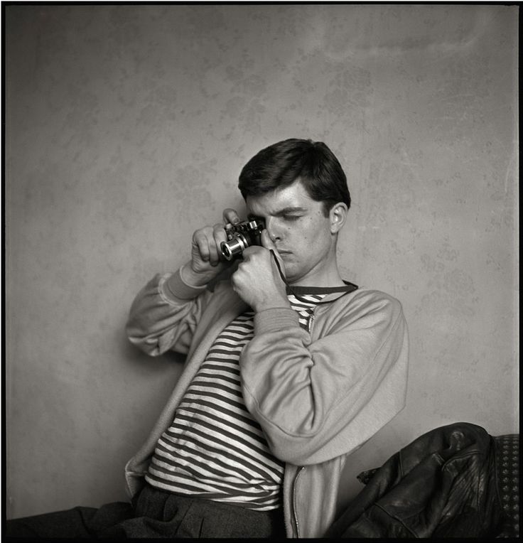
Arguably, Bourdin is the most influential fashion photographer ever. (Or most ripped off, depending on how you view that kind of thing.)In 1964, Francine Crescent, accessories editor at French Vogue, was asked by Roland Jourdan to suggest a photographer to shoot some ads for his father's company; Charles Jourdan, she suggested the thirty six year old Bourdin.
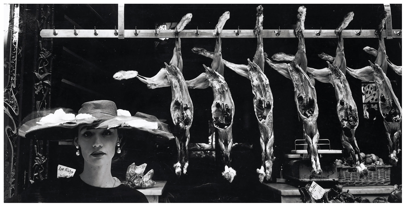
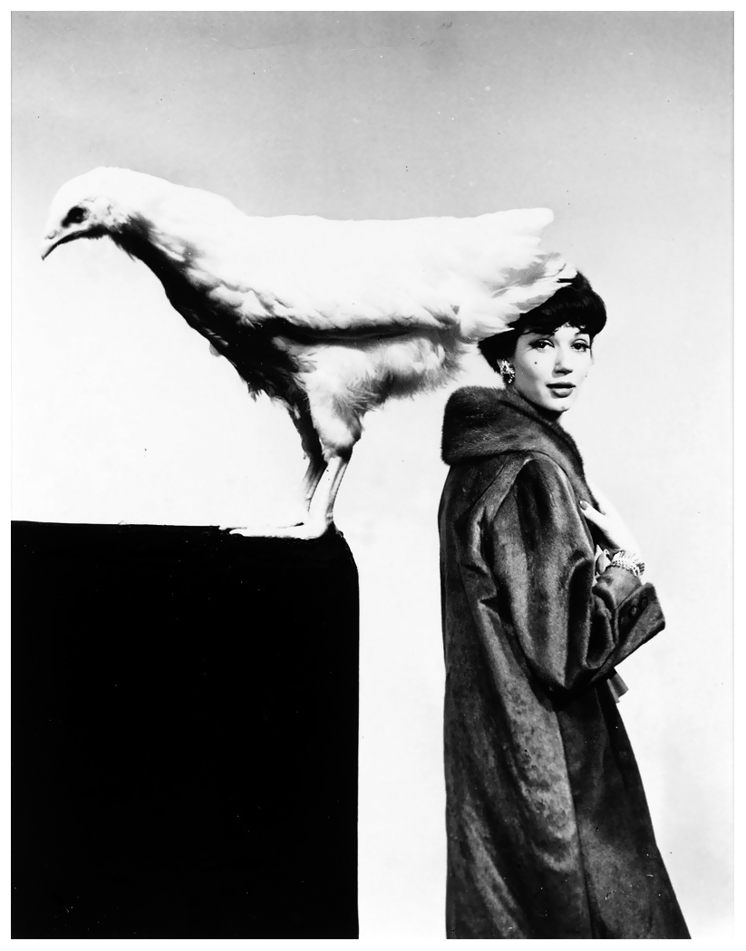

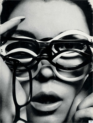

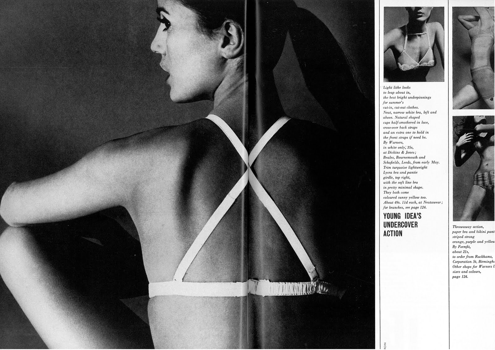

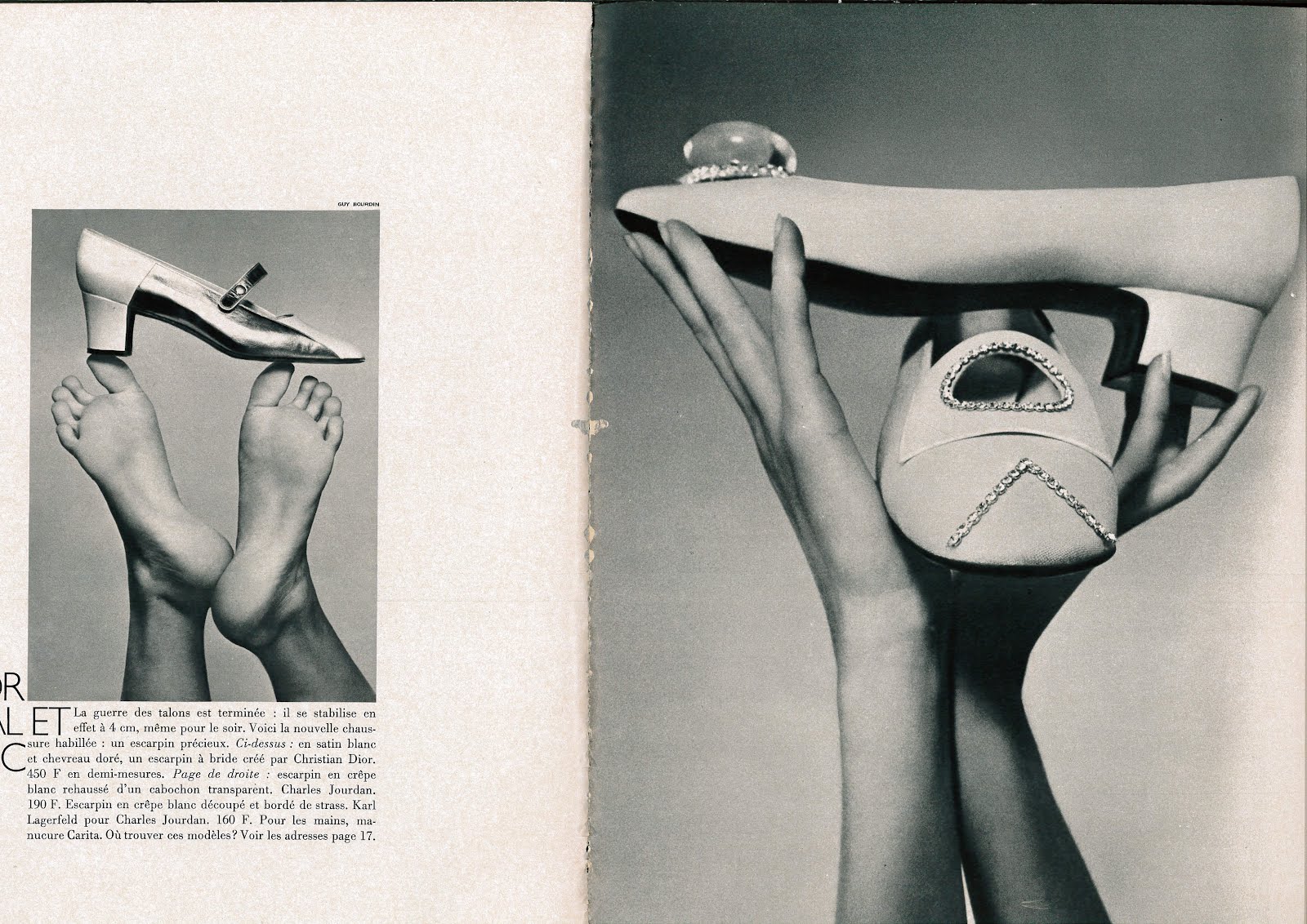
He accepted but insisted on absolute control, Francine reassured Roland, ‘‘Don't worry, you won't be married, you could always change photographer.’’Reassured, Roland went ahead, it turned into a seventeen year ‘marriage’, (from 1964-1981), during that time Roland never turned down a single picture. It took a lot of courage, the pictures weren't like those in other fashion ads, rather than classy, sophisticated and aspirational, they could be dark, seedy and dangerous.The shoes were presentedas fetishistic objects of desire, or as some bod at the time put it; ‘They rejected the the traditional product shot in favour of atmospheric, often surreal tableaux and suggestions of narrative.’The collaboration started innocently enough with these, very sixties, graphic style ads.


As Roland starts to trust Guy the ads get more ambitious, models start to be represented rather than shown:

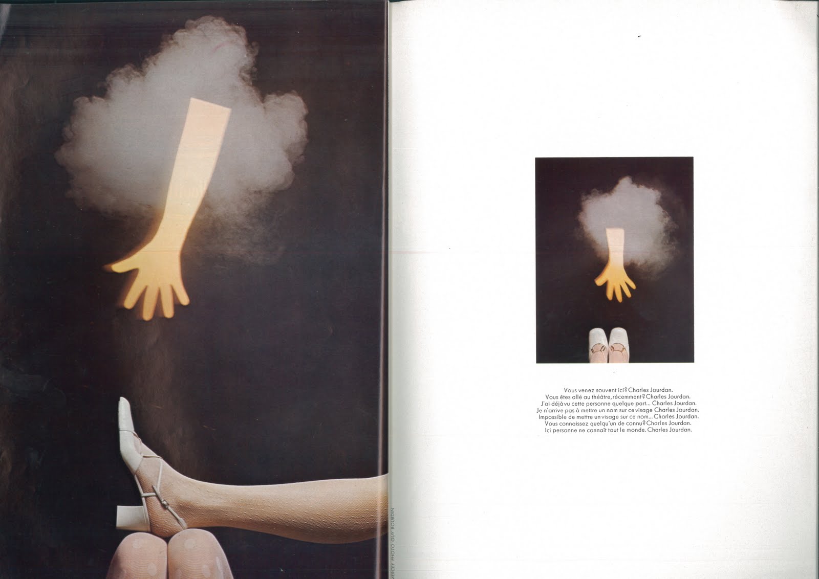
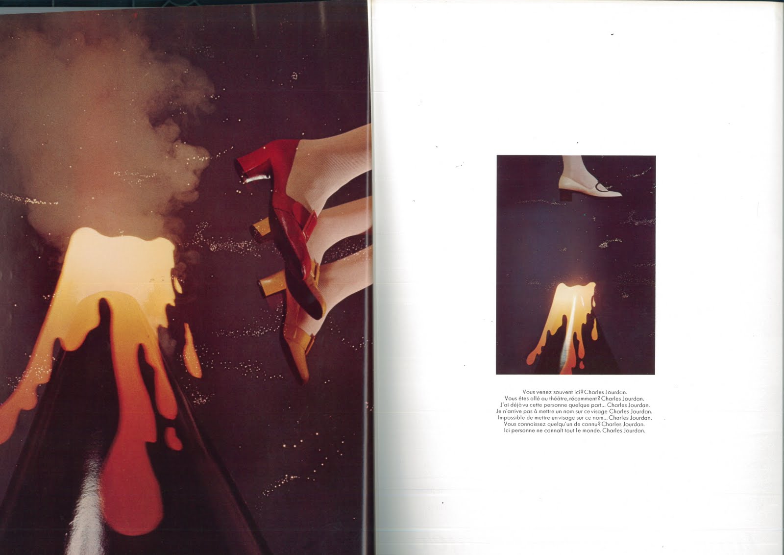
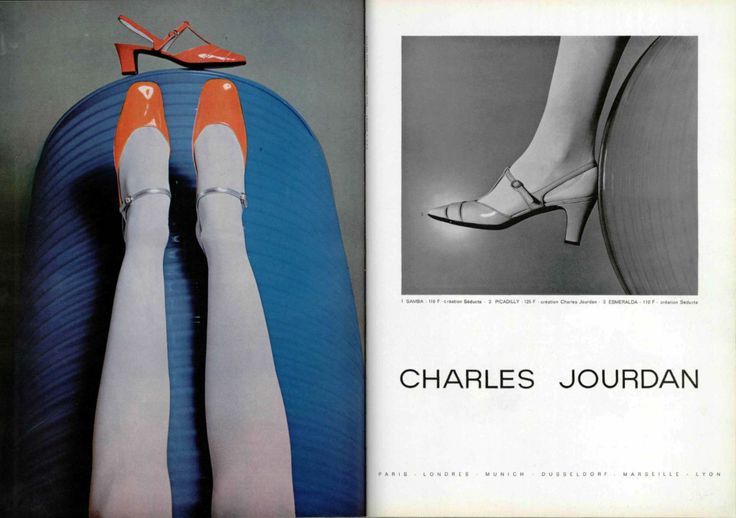
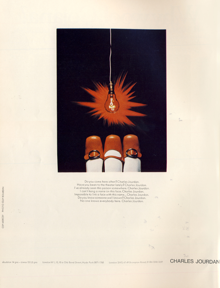
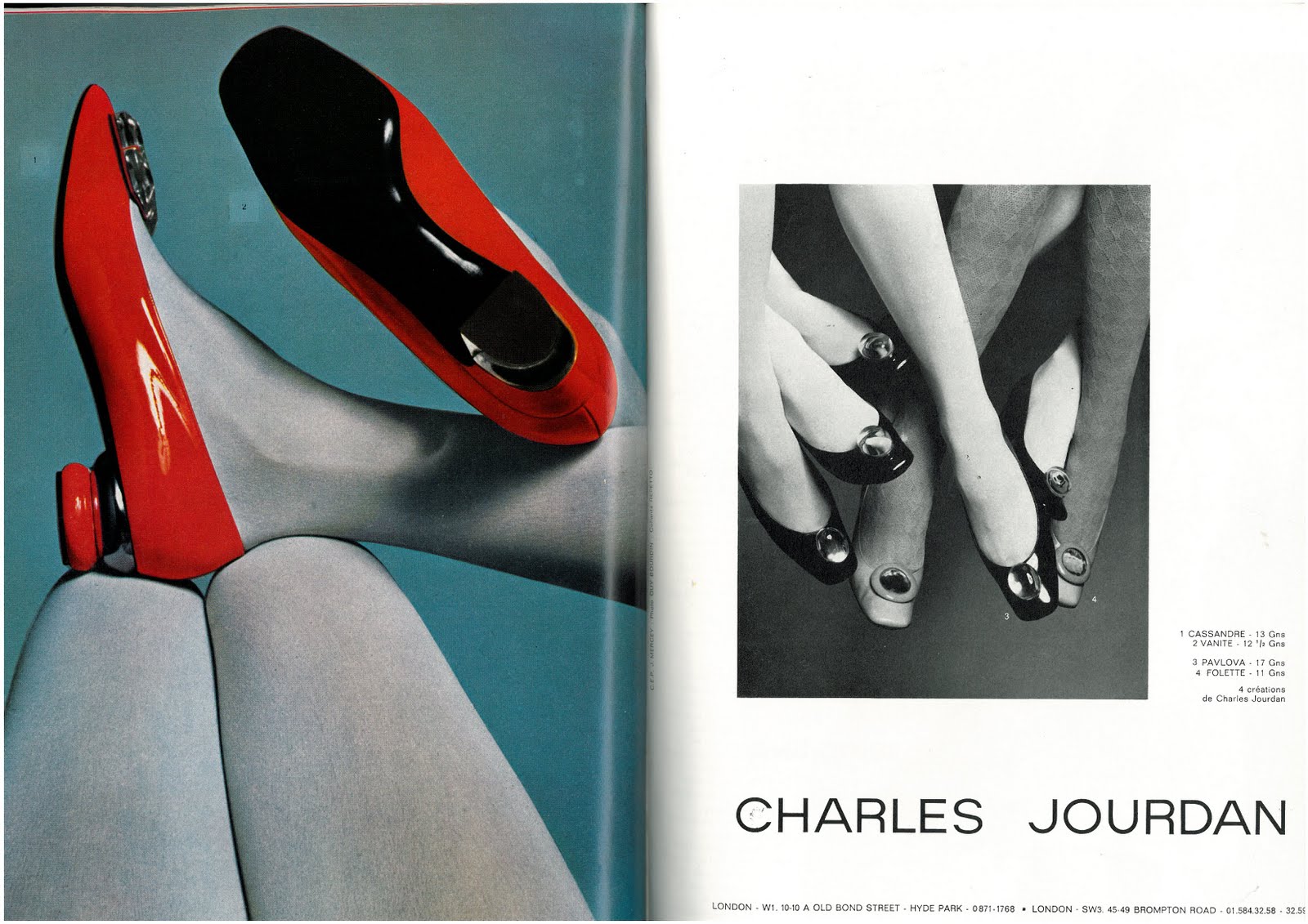
Faces aren't disposed of altogether, they still pop up occasionally over the years.
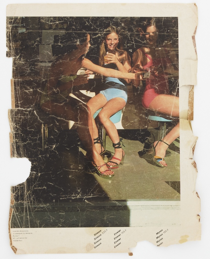
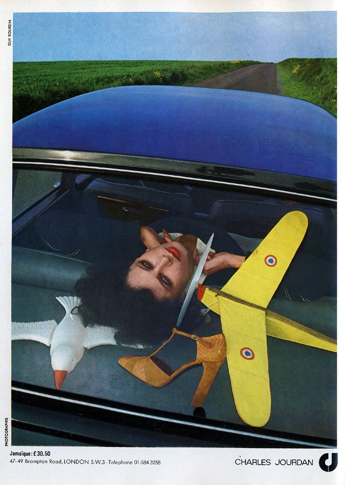
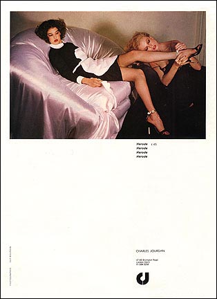
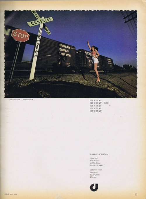


The shots are very atmospheric, full of attitude, cool, sexy etc, but faces in ads are problematic:1. They are distracting, the readers eyes go straight to them like a magnet.2. They can alienate, few people have faces like the models in the ads.3. Most ads have faces in them, so they don't stand out.Who knows whether that was Guy's thinking, but over time faces definitely become scarcer. He comes up with tons of inventive ways of showing shoes without pesky models faces trying to steal the limelight.1. CROP THE MODELS OUT:
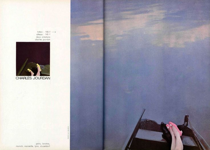
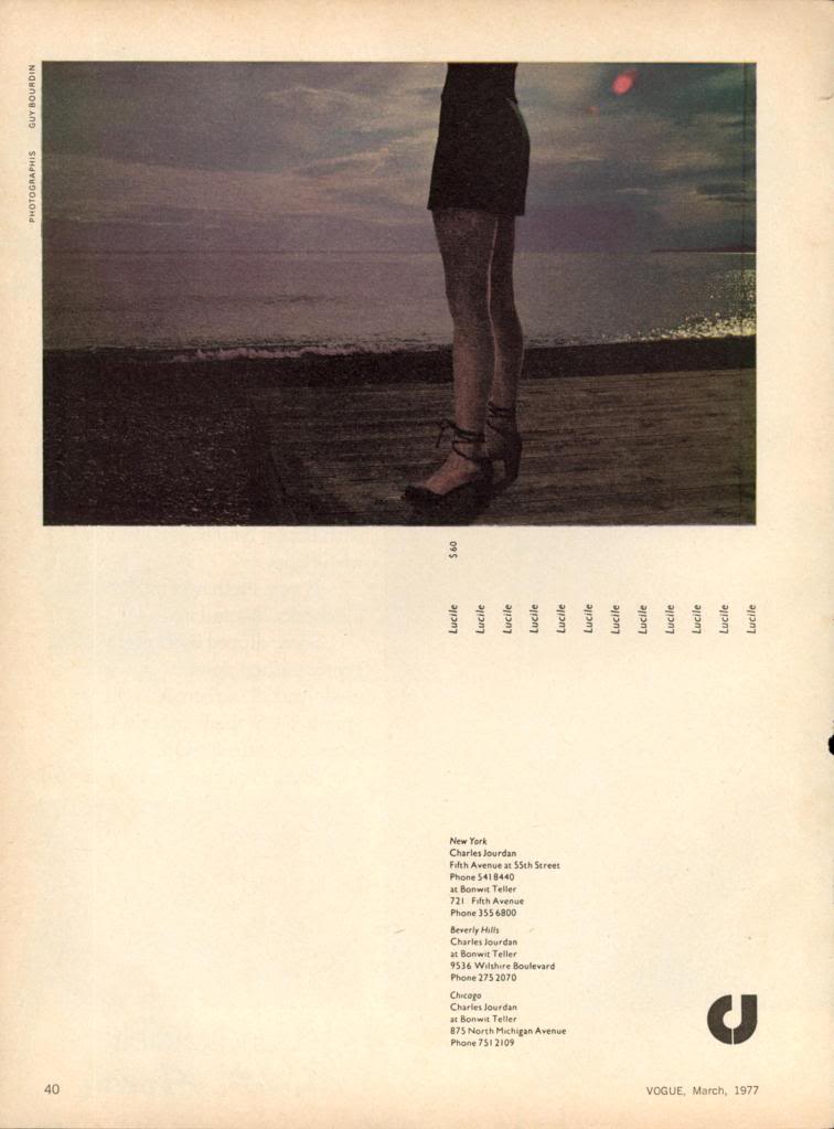
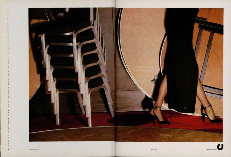


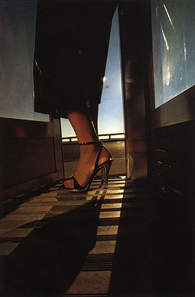
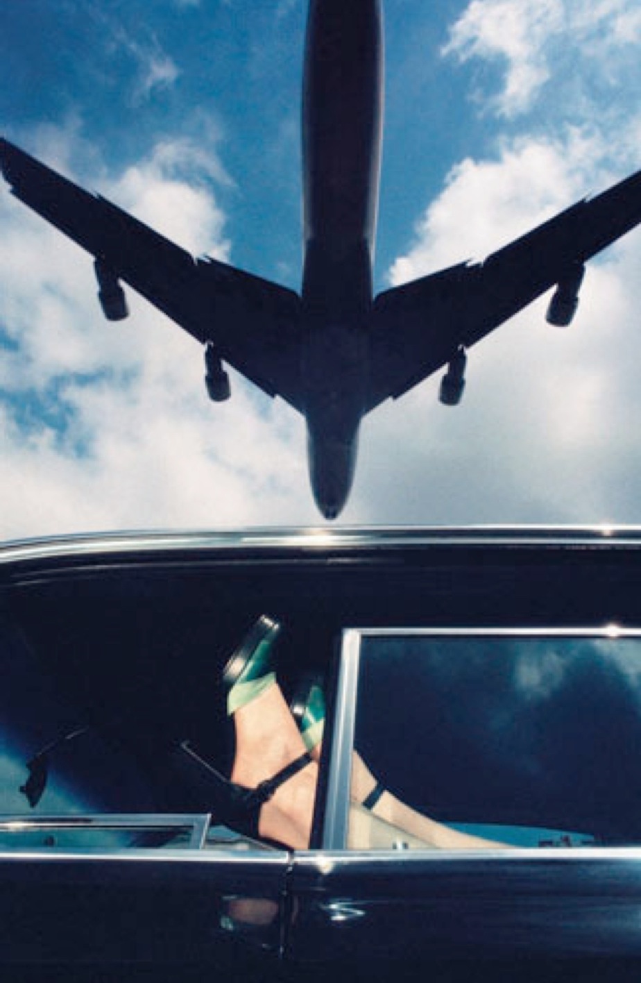


2. PUTTING THE MODELS IN THE SHADOWS:
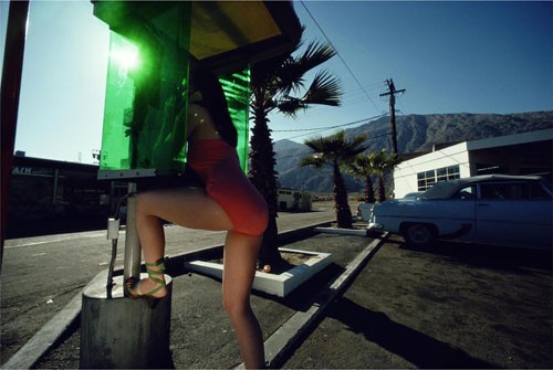
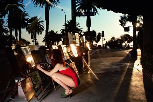


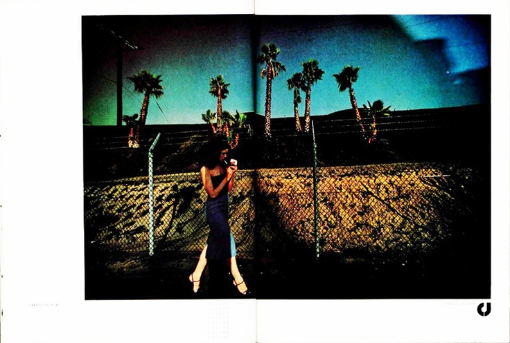
3. MASSIVE CLOSE UPS OF THE SHOE IN ACTION:
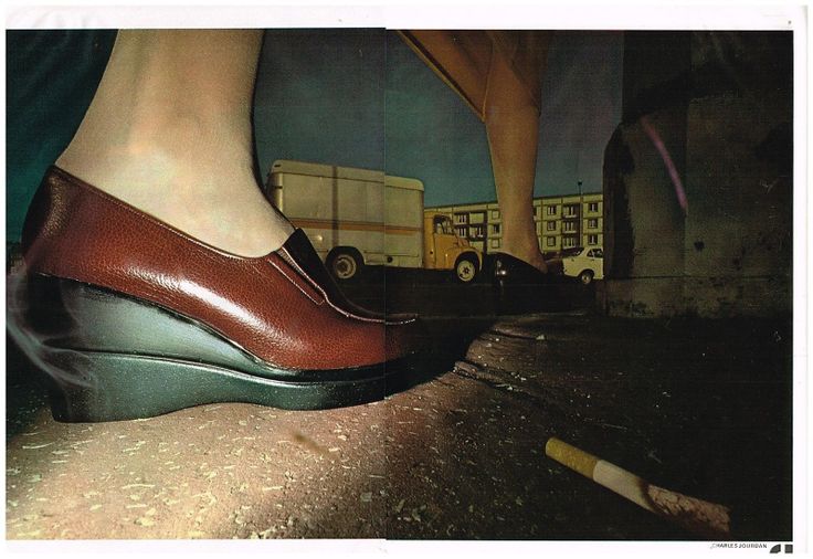


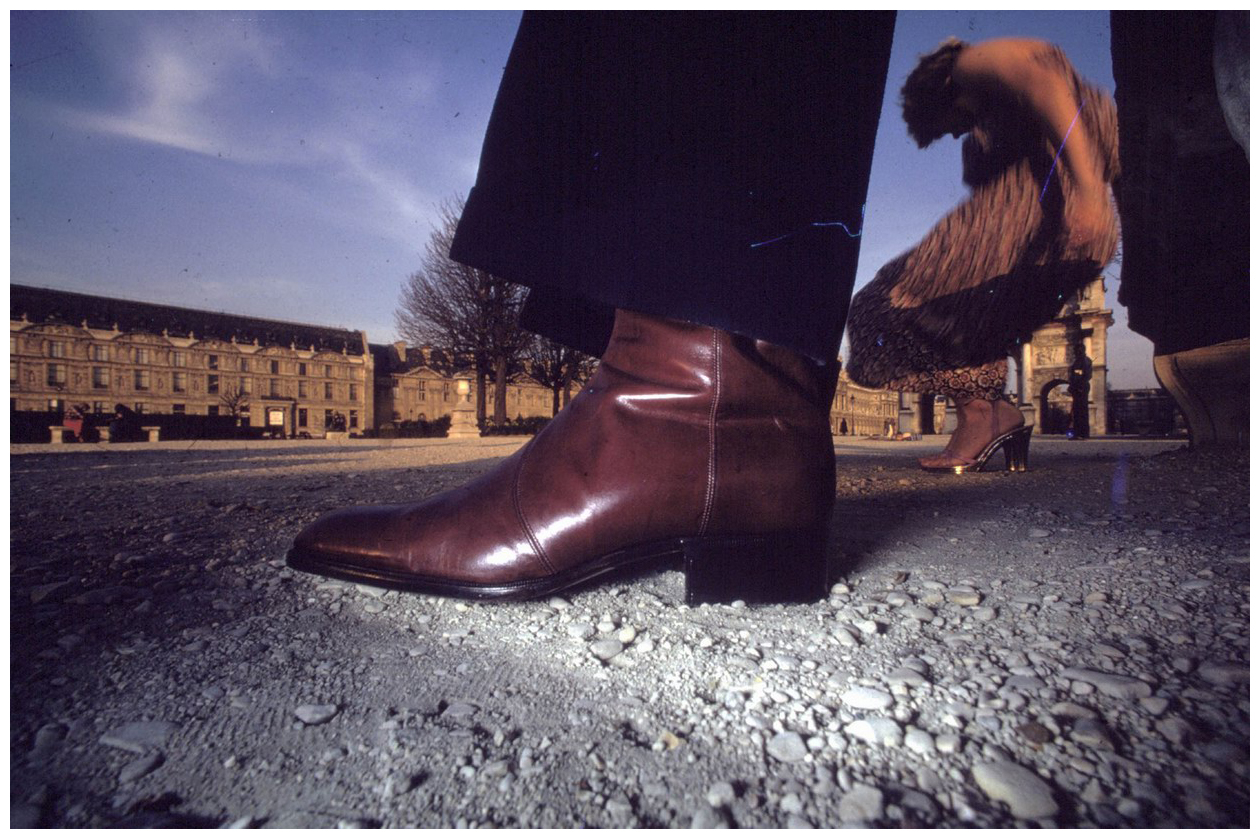
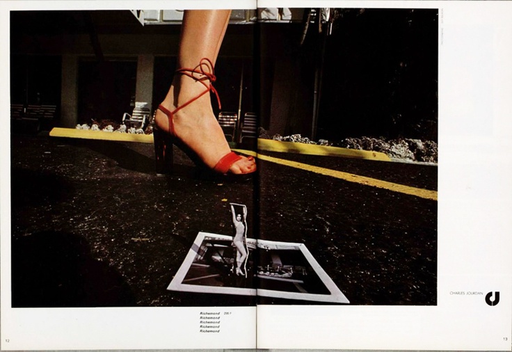
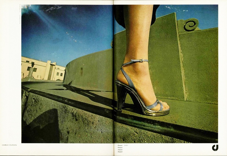
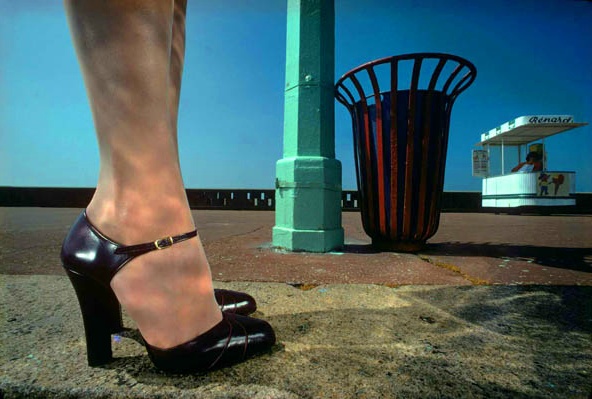


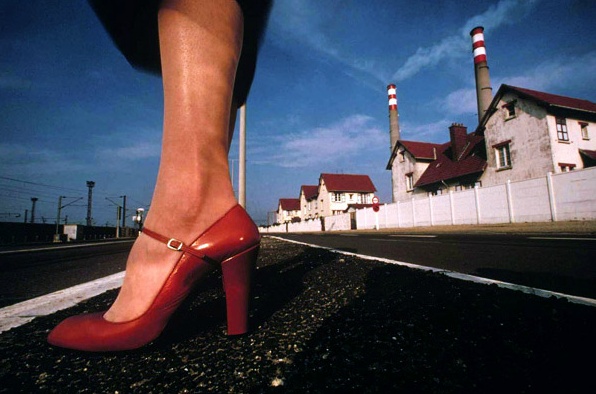
4. SEPARATE THE SHOE FROM THE MODEL:
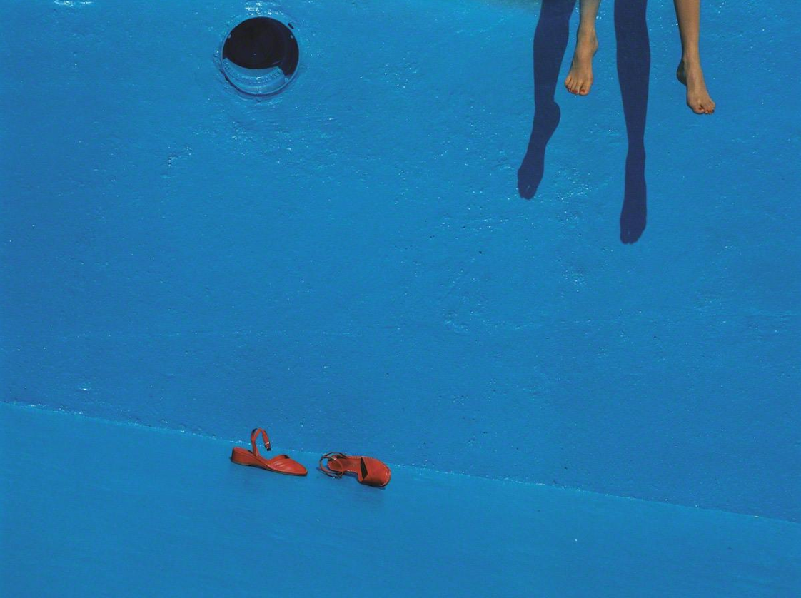


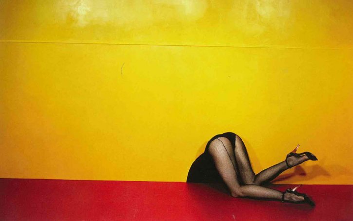


5. GET THE MODEL TO LOOK ANYWHERE BUT INTO THE CAMERA:
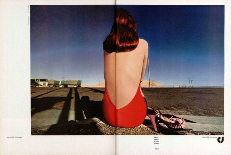


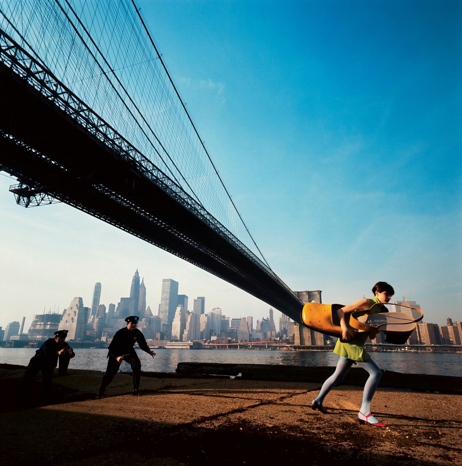


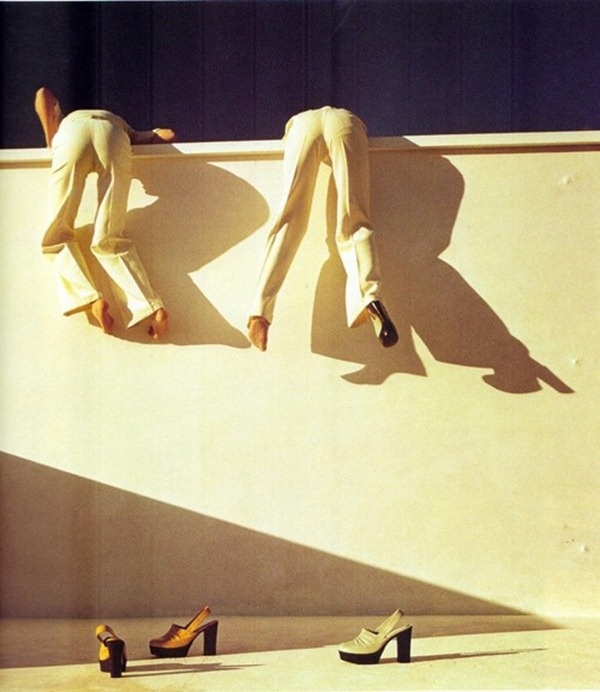
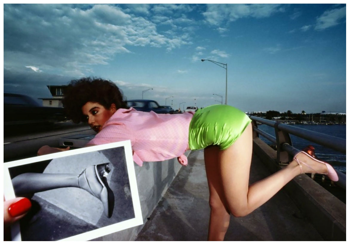
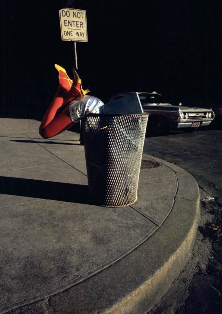
6. PUT THINGS IN FRONT OF THE MODELS:


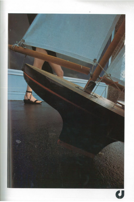


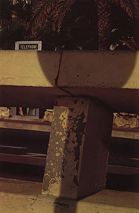


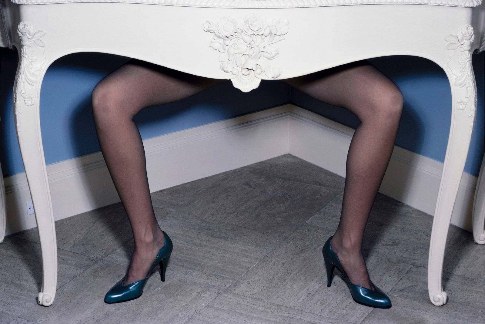


7. EVERYTHING BUT THE SHOES ARE OUT OF FOCUS:
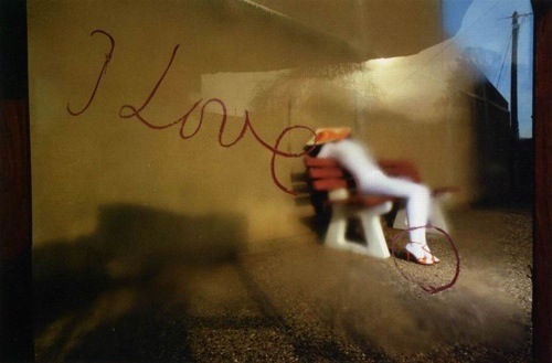
8. CUT FROM THE MODEL BEING TOO SMALL TO SEE TO BEING TOO BIG TO SEE:
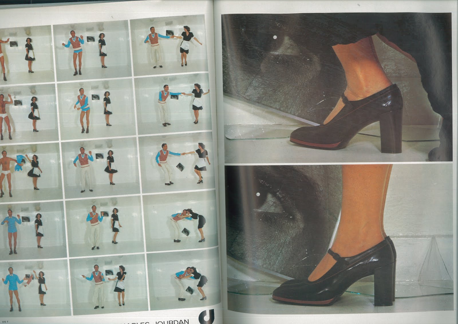


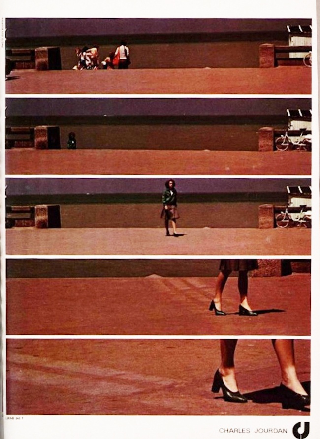
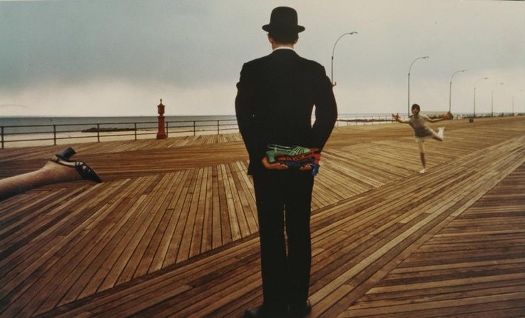
9. CHOP THE MODEL'S LEGS OFF:(Well, just using the relevant, dismembered bit of a mannequins leg to stick the shoe on.)
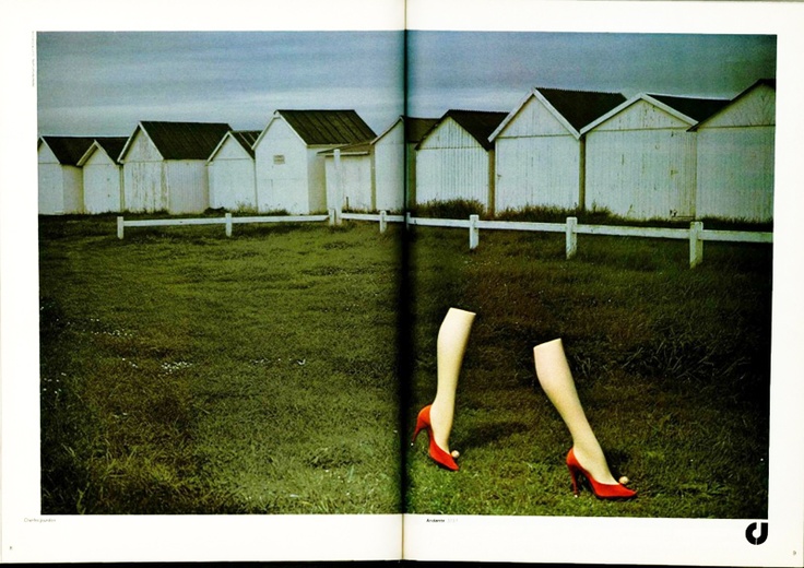
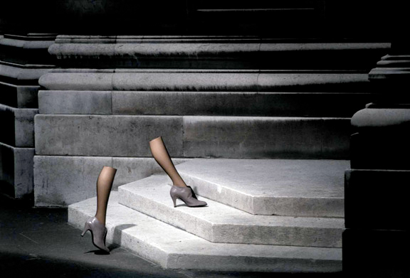
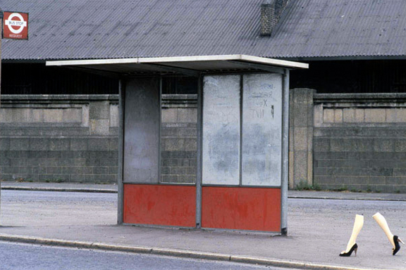


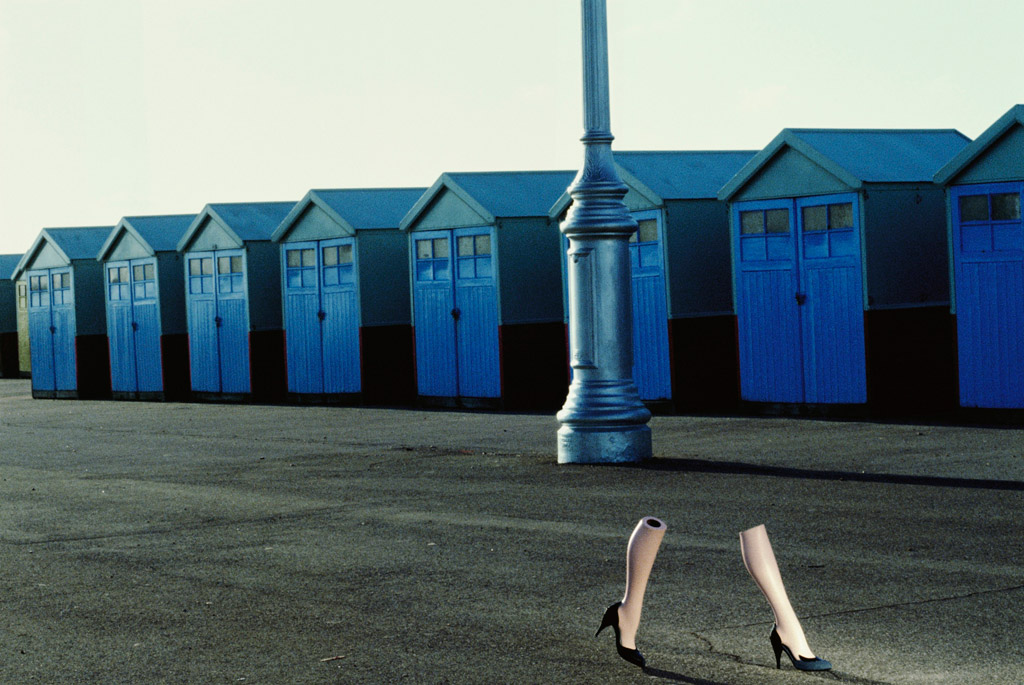
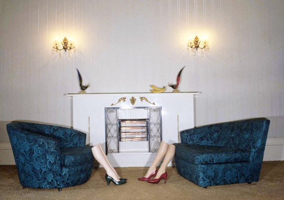
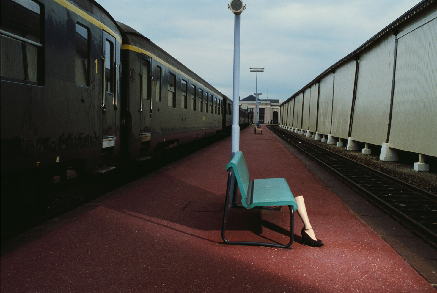
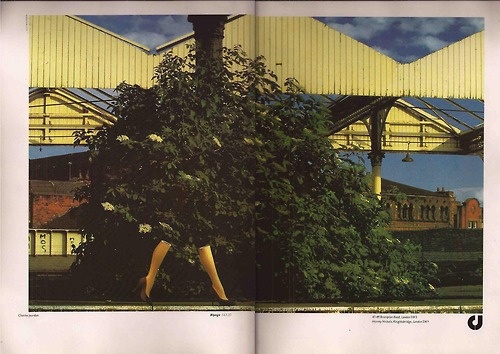
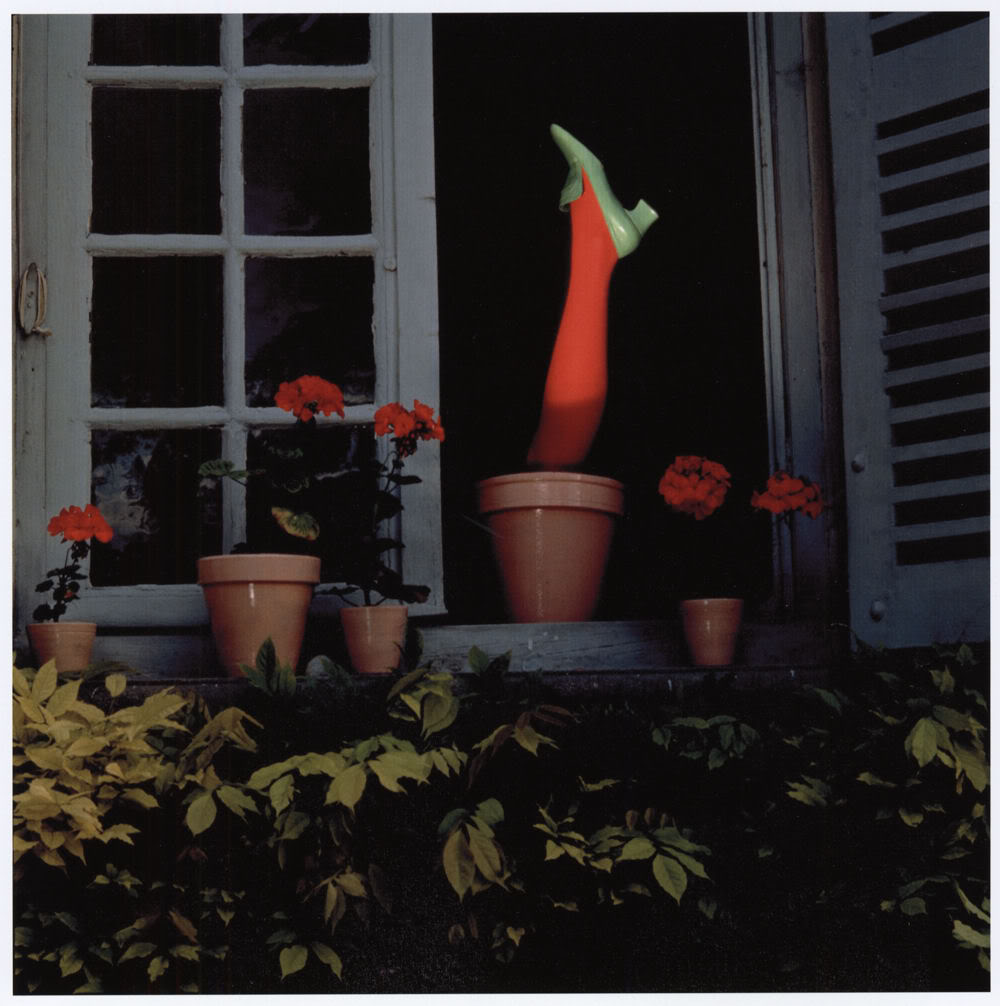
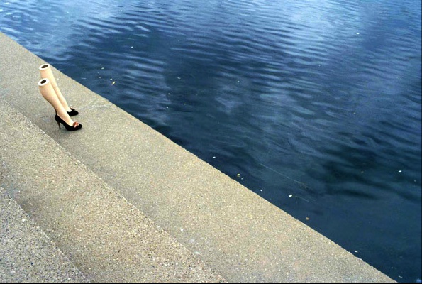
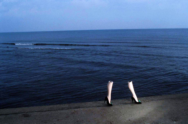

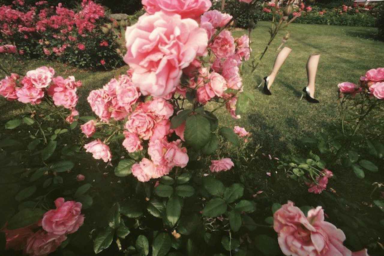
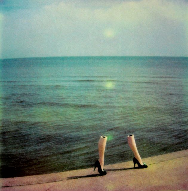


10. NO MODEL:
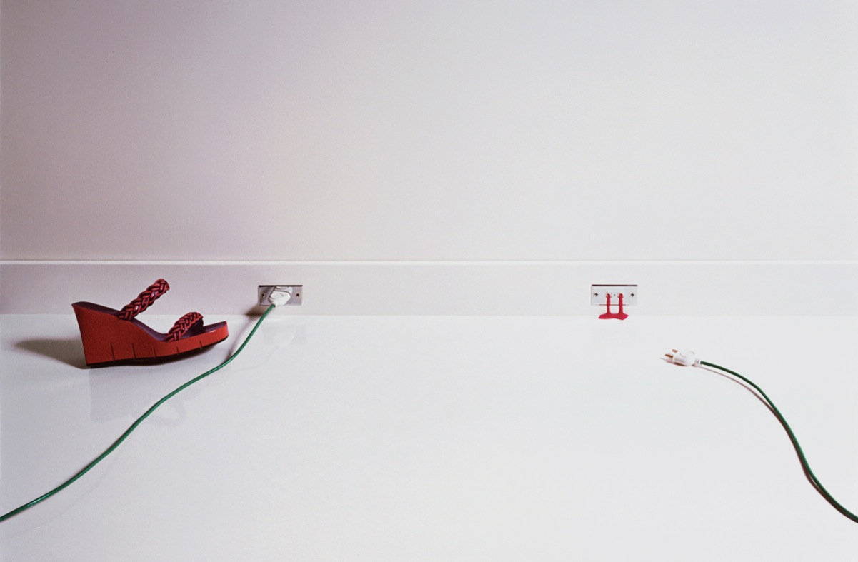
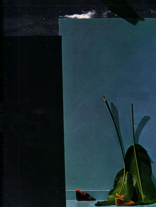
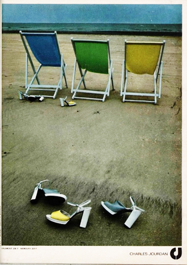

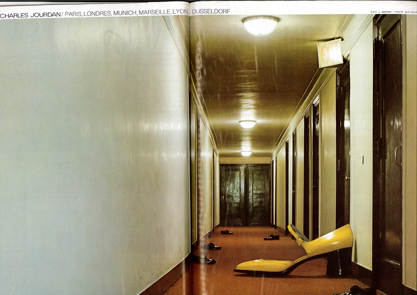


From todays perspective, we could debate whether some of the pictures are sexist, misogynistic or just plain wrong.But what isn't debatable is that they transformed a little French shoe manufacturers into one of the coolest brands of the seventies and changed fashion photography.

(Geek link: http://www.pinterest.com/davedye/guy-bourdin/)N.b. I don't know the chronology of these ads. I'm certain it's not how I've shown them, but I wanted to segment them in this way to show how one man kept reinventing the idea of the ‘shoe shot’. So all you chronology freaks, hold off on the comments.

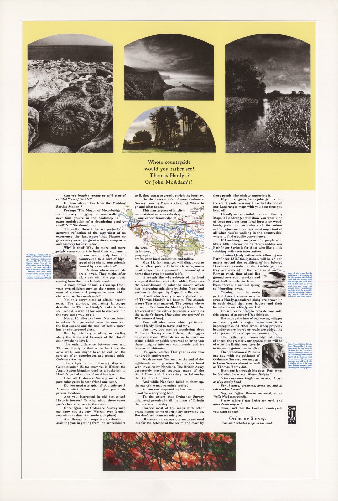
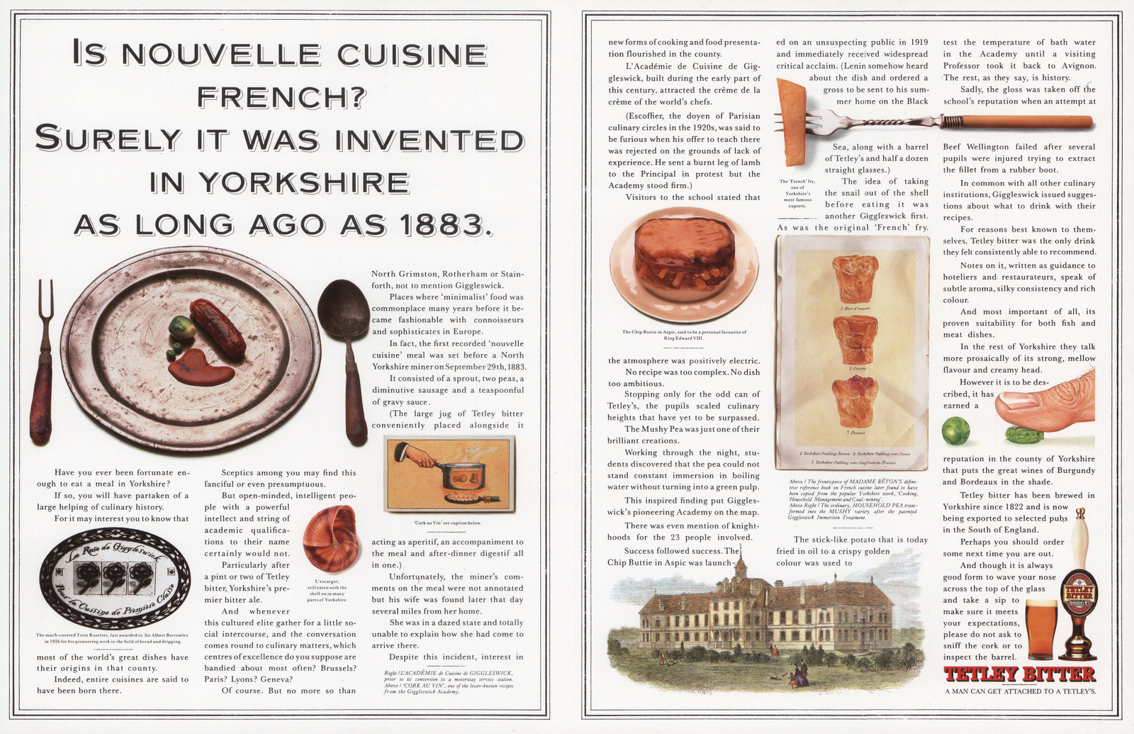
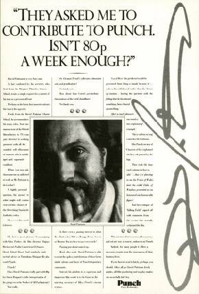
I used to love those long copy Leagas Delaney ads.True, I never read the copy, but the theory at the time was that if you write a thousand words on, say, how a boot was made, you’d appear like a very well made boot.Showing a thousand words of copy was like a bit like a quality mark.But I liked them because they looked nice.Well, sophisticated, to be more precise.In a sea of price flashes, exclamation marks and big, black, condensed type, these ads reeked of class, which obviously rubbed off on the brands and products they were representing.When I got to Leagas Delaney I was always looking for an opportunity to create a campaign rammed with words.It would seem impolite not to, a like going to Blackpool and not bringing back a stick of rock or going to going to Pisa and not getting a picture pretending you're holding up the tower.WATERSTONE’S.What could be more appropriate for a campaign heavy on wordage than a store that sold words?
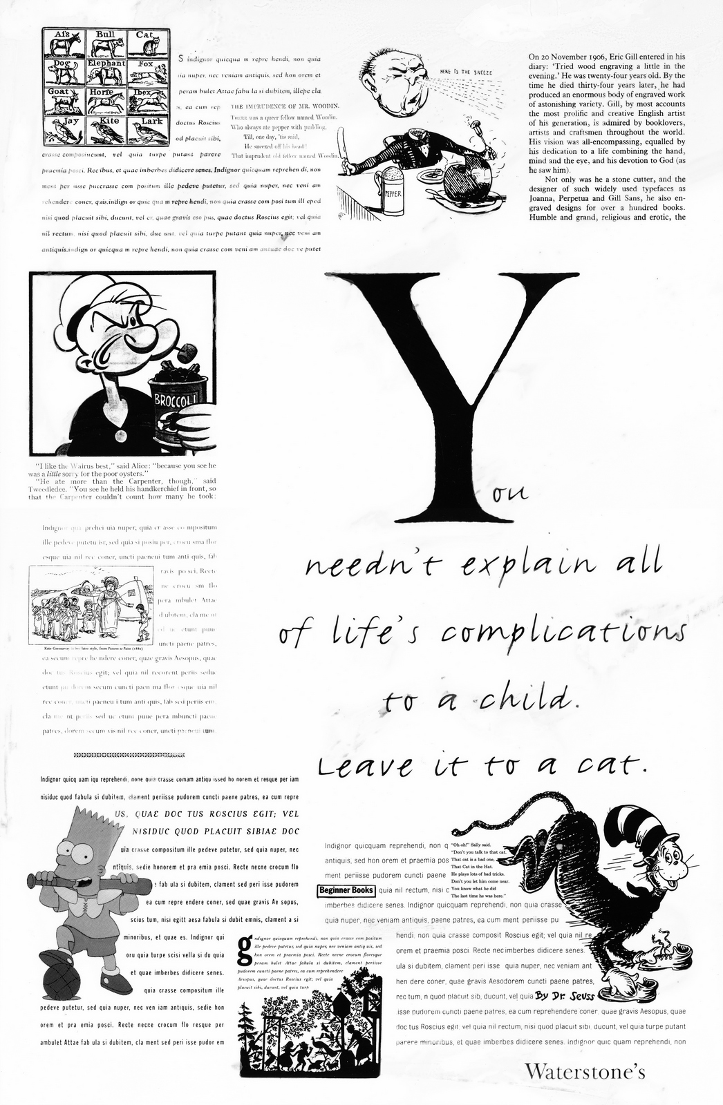
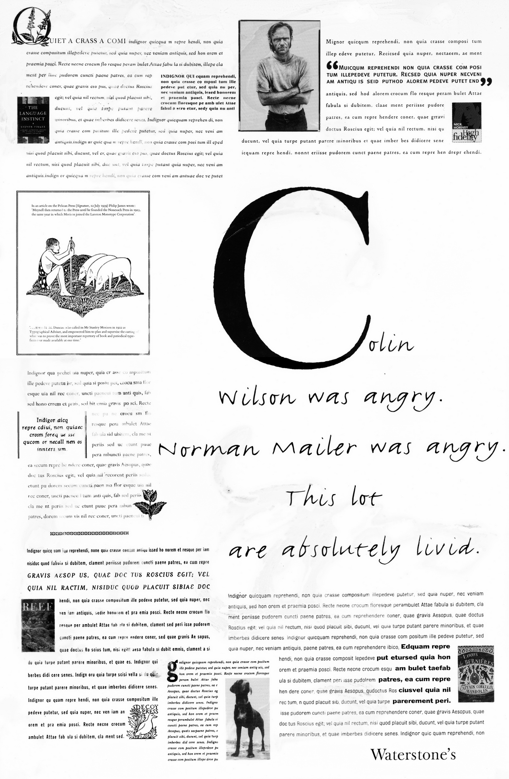
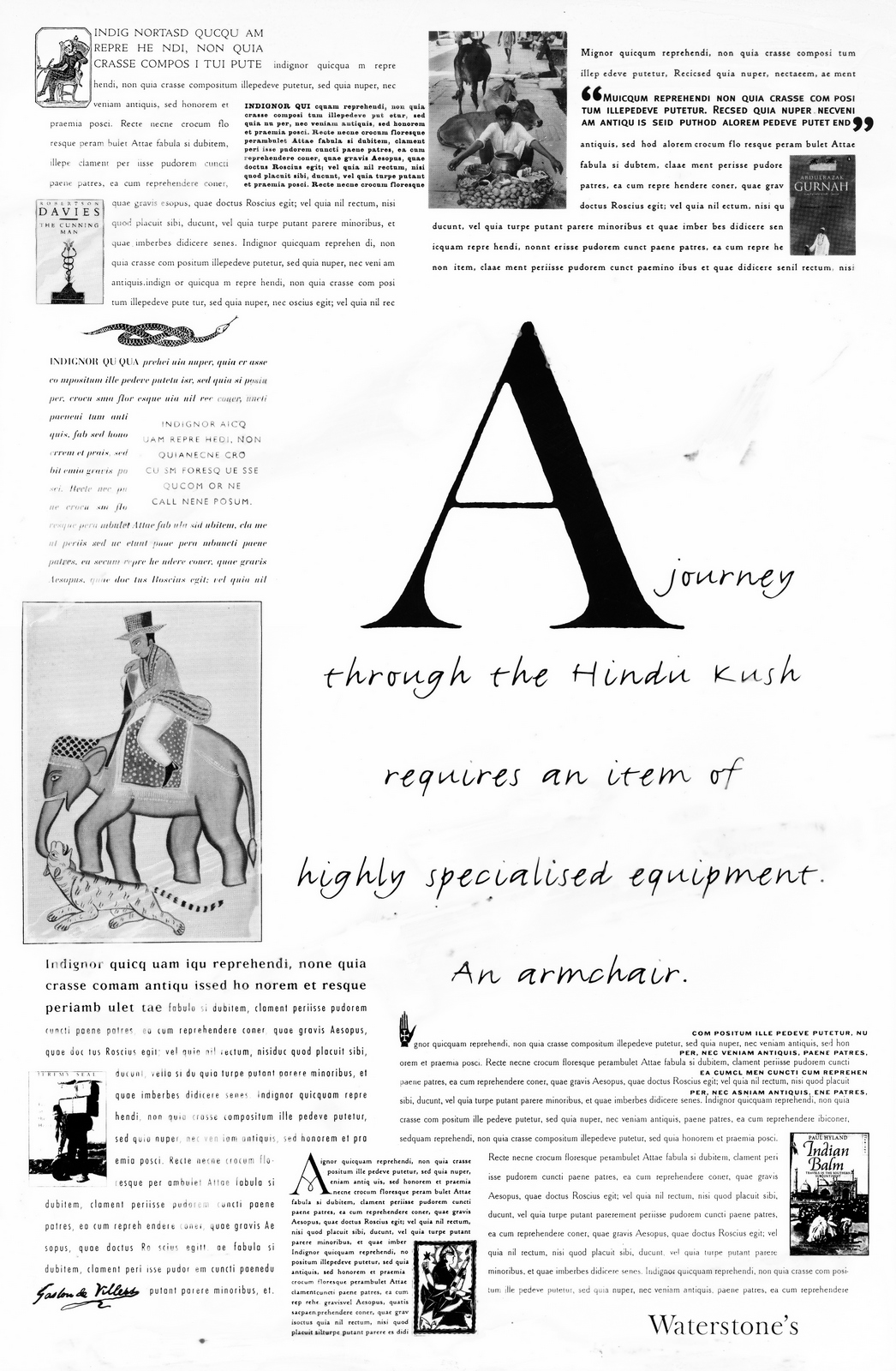
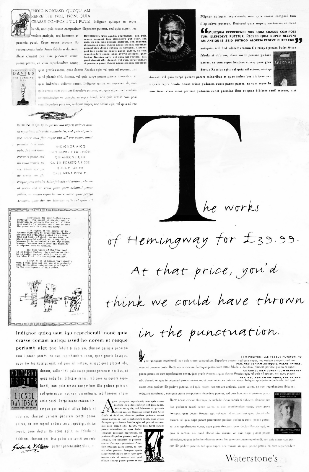
The man from Waterstone’s, he say ‘No!’.BUSHMILLS. On the face of it you may think users of this particular product may prefer slurring words to reading them, but Bushmills is aimed at a pretty sophisticated bunch, maybe they'd appreciate a bit of a history lesson?
Perhaps a bit too many words and too little colour.
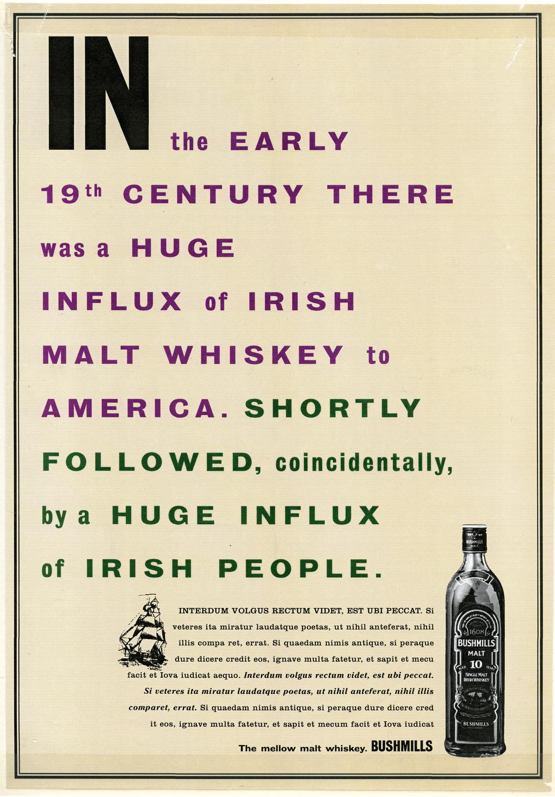
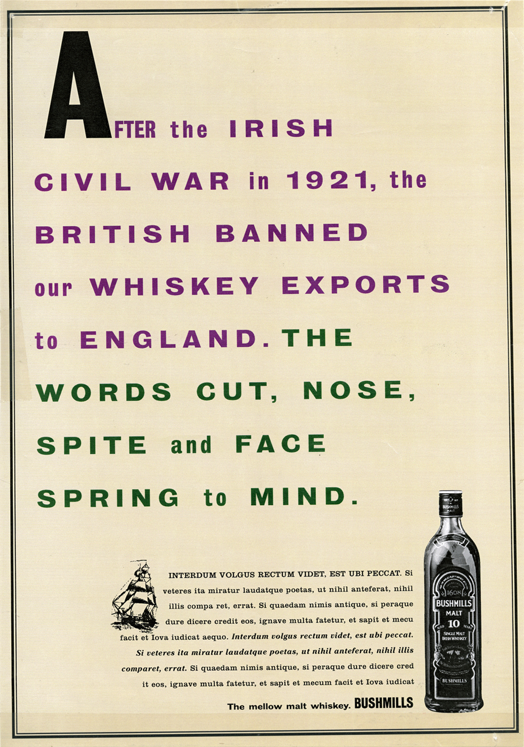
It turned out that Bushmills didn't think their target audiences wanted a history lesson, ‘They want to see people having fun...young people...enjoying life’.ENGLISH HERITAGE. Surely people interested in England's Heritage will be up for a bit of reading? Our first end-line was ‘You own it, visit it’, it was rejected on a technicality, the public didn't actually own it. It became ‘It’s yours, why not visit it?’. We set out to connect the sites to the readers. The previous campaigns tended to big everything up so much that they felt distant and inhuman. We wanted to do the opposite. For example, rather than trying to impress people with the scale or numbers of relating to Hadrian's Wall, we'd pick a smaller, more human aspect, like a bit of thousand-year old graffiti. Each ad could contain about half a dozen or so these details, and instead of stringing them together in one long piece of copy, we thought they'd be more readable if we broke them into separate, bite-size chunks. Tonally, if are going to tell the English public that this is theirs, perhaps we should talk like them rather than plummy accented types who ran it. But first we needed to produce a raft of small space ads.
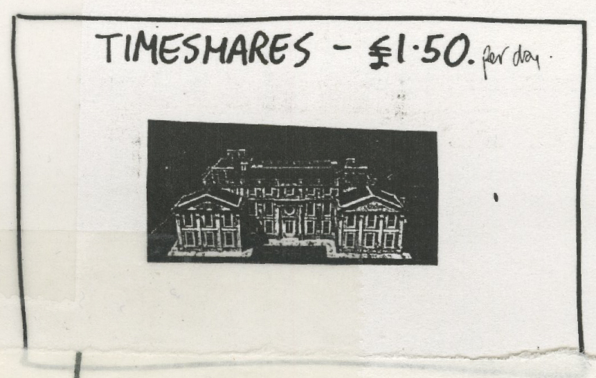
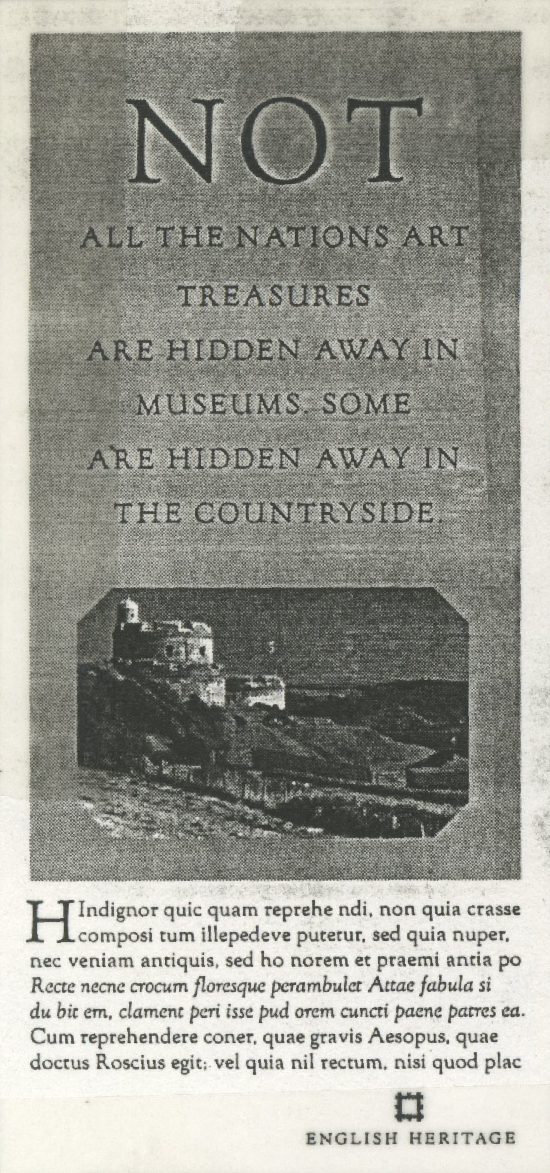
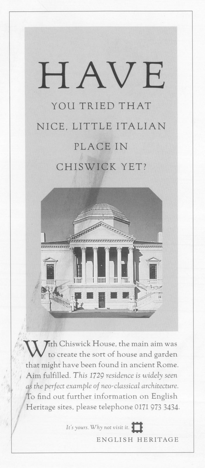
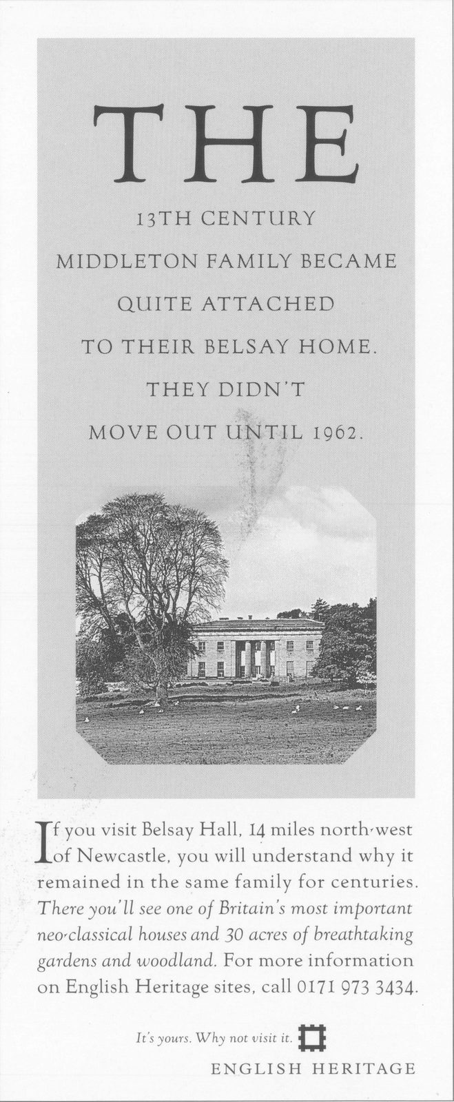
I needed to turn scribbles like this into something sophisticated, traditional and erudite.
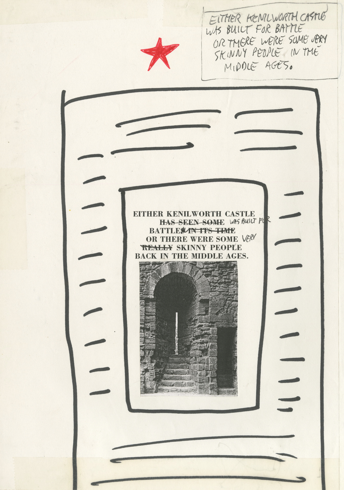
I mocked up this as a start point.
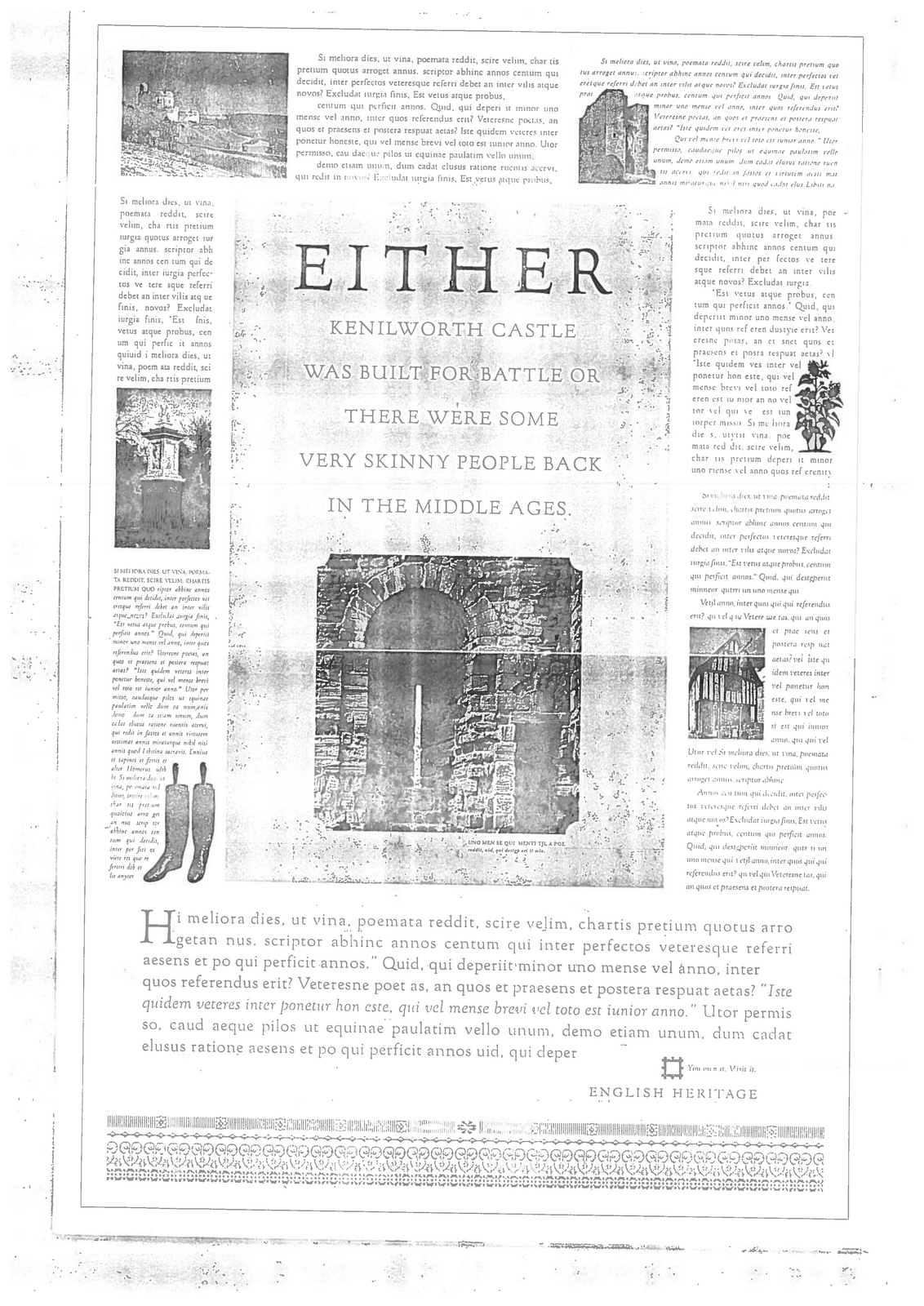
Note that ornate, wiggly line thing at the bottom, it was a kind of place holder for a bit of nice looking typographic ornamentation, to make the ads look sophisticated. English Heritage bought the campaign. The client had the word heritage in their name, surely a good enough reason for traditional hot metal type? Who could work in hot metal, and turn that squiggly line into a sophisticated bit of graphics? Tony and Kim, who sat a few doors down suggested their old mate from BMP; Dave Wakefield. Dave agreed, but had one concern “It’d be nice if that wiggly line meant something?” ME: “Err, yes it would, but aaanyway...” DAVE: “You know, if it had a real meaning.” ME: “Yeeeeah... anyway, what about this type then?” DAVE: “I can’t really think about the type without resolving this issue of what the wavy lines mean?” ME: “Here’s the truth Dave, they don’t really mean anything...they are just there to make it look nice...decoration.” DAVE: “I don’t really like decoration for decoration sake, I think it should have a sound reason for its use.” ME: "Couldn’t that reason be that it looks really nice?" DAVE: “No.’ ME: “Give me an example of what it could be?” DAVE: “Er, I don’t know.” ME: “Brilliant! Has anyone seen Tony or Kim?”Dave disappeared to think some more.He came back with a plan; a)Base the typography on the period of the site we were talking b) Base the wiggly lines on shapes, objects or patterns relating to each site. c) Link the wiggly lines to the typography by using typographic elements from the same typographic family.I had no idea how he’d do it, but the theory sounded good. (My view on commissioning people is the same as Alfred Hitchcock's view on casting people; “If you cast actors well you don't need to direct them.”)Dave read everything there was to read on each of the sites we were using in our ads, doodling ideas along the way.
Then, bizarrely, he made the theory into brilliant bits of design and typography.He used the floor plan of Walmer Castle.Henry VIII had three castles on the site built in the shape of the Tudor Rose.
This was then cast in metal. It contains over a thousand elements.
He used a combination of morse code, dazzle camouflage and ranking stripes as the inspiration for the base for the Winston Churchill ad. (The morse code is an Admiral Ramsey quote from the period “BEF evacuated”.)

For the Hadrian’s Wall ad, Dave read ‘The whole of Breeze and Dobson’s ‘Hadrian’s Wall”.’, whatever that is? Out of it he understood the Roman obsession with exact mathematics, he translated the thirteen primary forts from South Shields to Bowness, each showing a black, twin-portal gateway. He worked it out by scratching away on this piece of paper.

Three ads into the campaign, the head client, Jocelyn Stevens fired the agency. We had referred to Her Majesty as her Royal Highness, or vice versa. Bang! Instant dismissal, all the other ads were binned.WARNING: Producing an ad in hot metal sounds all very romantic and cool, but beware, the letters are literally made out of metal, so there's no cheating, you can’t squeeze the words by 7% to make them fit. You have to rewrite it. If you look closely at some of the lines on the ads above, you’ll see they are one or two lines long, it meant when Sean's copy was traced to check if it fitted, Dave Wakefield would phone to ask Sean if he could lose two here add five there and so on. It doesn't sound terrible until you try and write ‘Experiences of the’ with two less characters, or ‘authentic detail’ with three extra characters. It's like some kind of evil MENSA test. Sean would politely agree to take on Dave’s request, put the phone down, light up a cigarette and start mouthing phrases that containing words like ‘Dwarf’, ‘Wakefield’, ‘Idiot’, ‘Elf’ and ‘Pillock’. But he’d do it.
Alcohol is weird. People are happy to pay three times more than they need to, simply to have the right words printed on the bottle.In blind tests, most can't even taste the difference between one beer and another. I pitched for an alcohol brand recently, we produced film where the public were asked their opinions after tasting various whiskies.What they didn't know was that all the prices that were showed on the various bottles were lies.Not surprisingly, the most expensive one was considered best, its virtues were extolled with words and phrases like 'smoother', 'the flavour lingered longer', 'velvetier' and so on. They were talking about the cheapest one.With alcohol, no-one likes to admit it, but people are buying the vibe as much as a liquid. So when you're advertising it; personality is key. At BMP, the saying was that "People drink the advertising.' Take the Gilbey's Gin campaign.I've always loved this campaign, the agency could've banged on about the unique recipe.its Britishness.It's heritage.Or taken the usual 'Juniper berry' route.p. Instead, they gave it a personality, one that was totally unlike the competition. The ads gave the impression that Gilbey's wasn't one of those boring, old-fashioned Gin's, they were hip. And they did it in a way that got noticed.Their ads looked nothing like ads. They used the illustrator Glen Baxter.

(Glen is still creating very funny drawings/Art and exhibiting: http://www.flowersgallery.com/exhibitions/flowers/2013/glen-baxter/ ) Baxter was, and is, quintessentially British, eccentric and irreverent. Perfect ingredients for a Gin. The biggest compliment I can give the creative team is that I can't see what they did. It looks like they just gave Glen the brief and printed what he gave them back. It's rarely that simple.(Note to Editor: Is there any mileage in a ‘Ads that don't look like ads’ series?)N.b. David Horry has just got in touch with a bit of info on the development of this work:‘The Gilbey's was very odd.As you suggest Baxter basically did all the work in his own mystical way - we never saw a layout - sketch it was fait accompli.and the suit - Mike Robinson did a pretty good job persuading the clients to buy the campaign - who being CDP we didn't meet.But in order for Baxter to have this creative freedom, (and get paid), We insisted that the first ad we ran was entirely the agency line.He was not to deviate - Dave Brown and I first met him at The Chelsea Arts Club which I felt was Bohemian enough for The Colonel.He told us that he'd spent his early life in Leeds teaching mathematics and football!!He liked the idea but was most reticent about the first concept.Fortunately his agent, ‘Naughty Nigel’, made sure the money talked and it all happened without any stress or quibble.The original ad was 'It was the largest Gilbey's and tonic they had ever seen.'It was lovely - I think privately he hated it.But he penned all the others and the client changed absolutely nothing - nothing - nothing!! And 'Naughty Nigel' got his 20%.But the next year the campaign was dropped and we moved on to other things.’


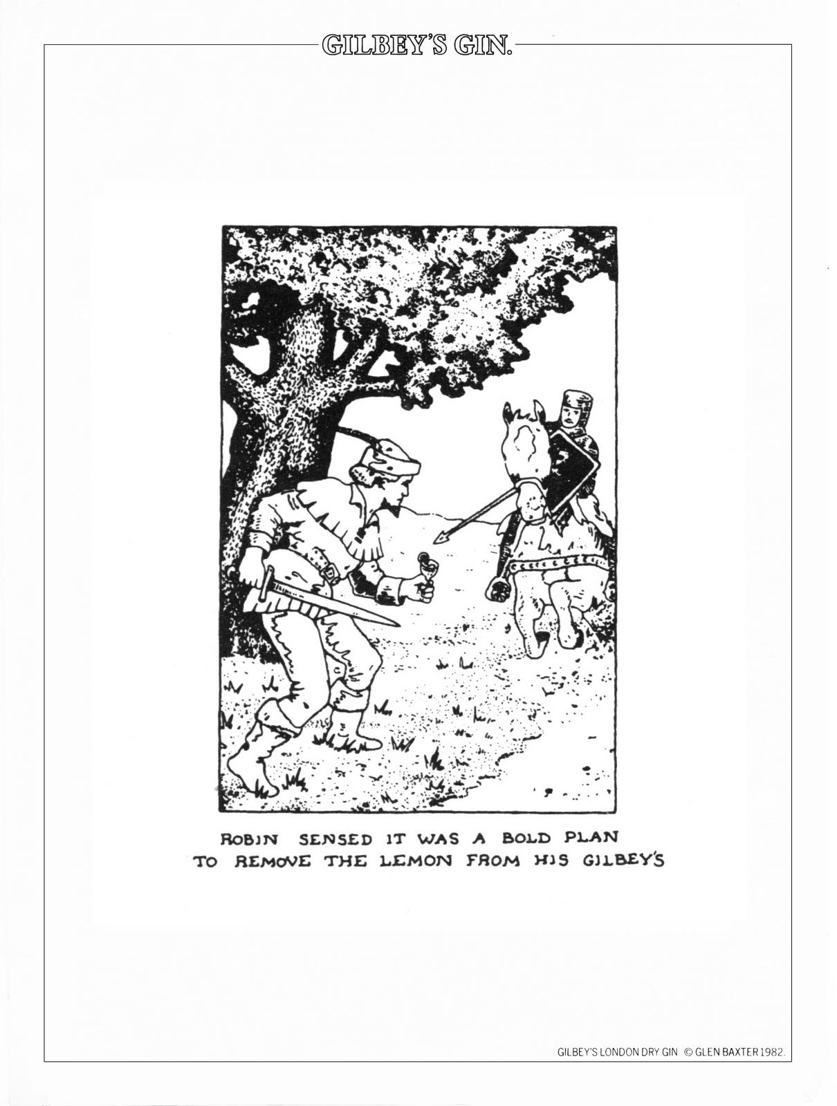
Nb. Here's an old bit of ephemera from the Dave Horry's collaboration with Glen Baxter:
After twenty top ten hits ’58 and ’62, Neil Sedaka's hits dried up. His publisher gave him one last shot. Neil, anxious, sweaty, his weave starting to unravel, decided to order in every No. 1 record from around the globe. He played them over and over, analysing every detail. He then borrowed, or as we say in Advertising 'was inspired by' the melody from one, the hook from another a guitar sound from another and so on and so on. Essentially, creating a mash-up before the term existed. BINGO! No.1 record. (Can't remember which one, if anyone knows let me know, I promise I won't out you.) True, it's not the way Nick Drake made music, but it's probably a better way of creating for our business than Nick's, Joni's or Neil's. We can't wait for the muse to strike. We can't experiment because we want to grow as individuals. We can't put stuff out there because it means a lot to us. We're expected to make something happen. Random isn't helpful, reference points are. If you know what's out there you can decide whether it's of any use for the brief you're currently working on. The more reference points you can draw on, the more appropriate your work can be. As the cliché goes; If your only tool is a hammer, every problem looks like a nail. Knowing history doesn't sound as cool as knowing what's happening today, but often what's happening today is often a corruption of what happened yesterday anyway. Coco Chanel puts it better: ‘Anyone who thinks their work is original just hasn't got a good memory’.It's only in retrospect are you reminded of all the reference points you've used.PENHALIGON’S. They came to us a few years back with the familiar problem: ‘Who are we?’They were a very old company, (pre-Sedaka), yet run by young, cool people who doing surprisingly contemporary things, e.g. fragrance launch was themed like an illegal Speakeasy held in an NCP car park. Not the quite the Granny brand their marketing might lead you to believe.
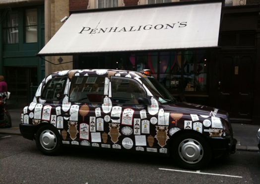
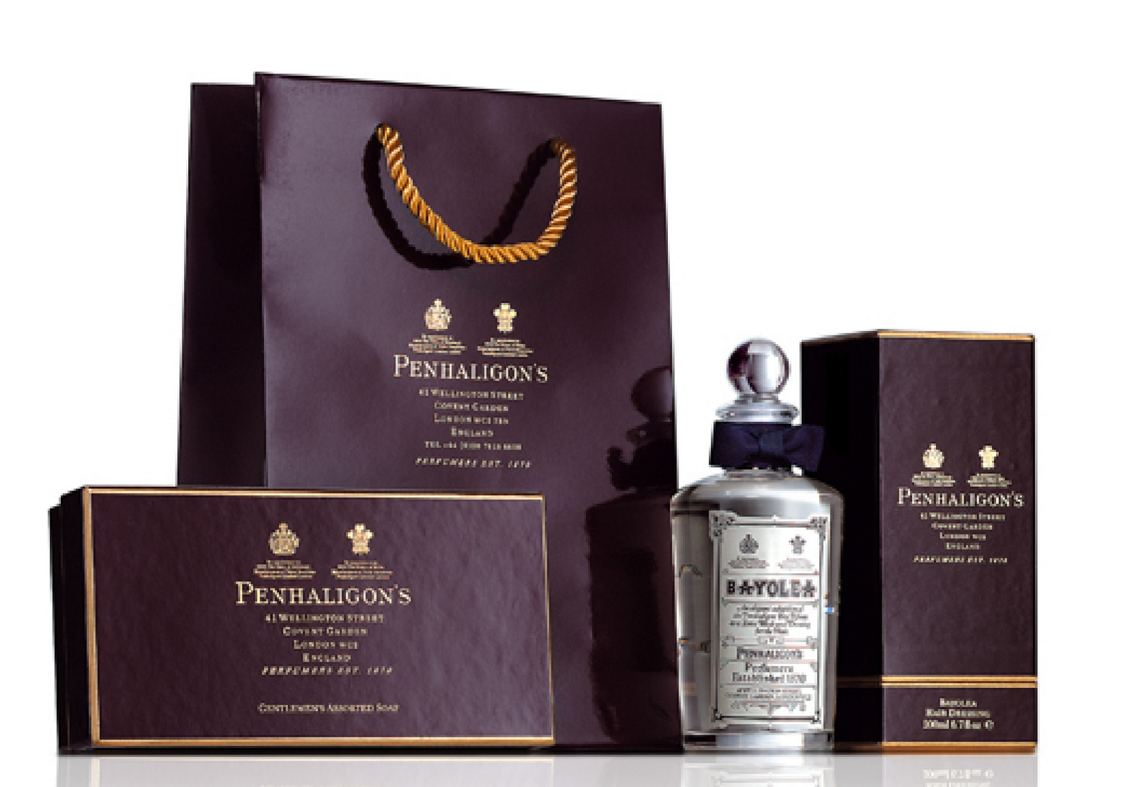
So how do we position them? Are they old or new? Well the most accurate answer would be 'yes'. Traditionally, that's not a brief, it's schizophrenia. But it's differentiating, and more to the point; true. So how do we straddle these two opposites?STRATEGY.Attract the opposite sex. (Lynx, in other words, or virtually every other fragrance brand out there. Except Penhaligon's, ironically.)
‘Attract the opposite sex’ translated into a Victoriana becomes:

TONE.How can we do sex Penhaligon's style? Well, Victorian style?The Victorians were prudish and sexually repressed, so let's use innuendo.Which is very British, and that is a very important ingredient in Penhaligon's appeal around the world.We could use innuendo like the illustrator Donald McGill did in his saucy seaside postcards.
Or maybe like Sid James and the gang in the Carry On films.
LOOK: Even though 'sex' is quite racy for a company like Penhaligon's to talk about, there's still a danger it could come across as old-fashioned.We need to inject a bit of energy, irreverence and anarchy.Jamie Reid's unstructured work could be useful, random fonts, clashing colours, things ripped out.
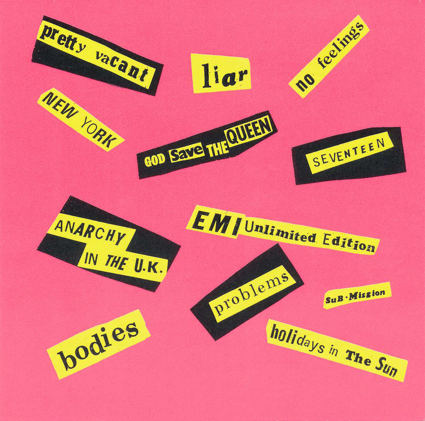
Also, the found art and neon colours used in the posters of Sister Corita Kent.One of my top 5 poster designing Nuns.

FONTS.Maybe we should use some exotic looking wood fonts?
SO, HERE'S OUR INGREDIENTS:1. ‘Merchants of Attraction’ end line.2. A bucket of neon inks.3. Random scraps of torn out paper.4. A big box of stylish but distressed Victorian fonts.5. A large bunch of funny, repressed ways of saying 'get laid'.6. A handful of inexpensive Victorian etchings.Swirl them around a mixing bowl and they look like this:
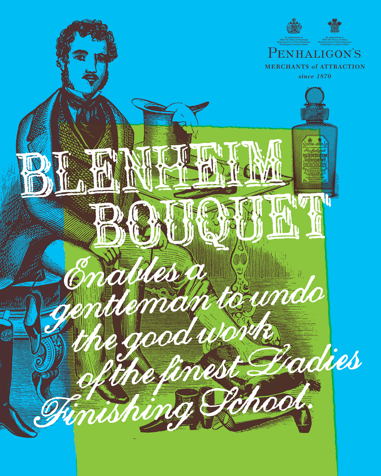
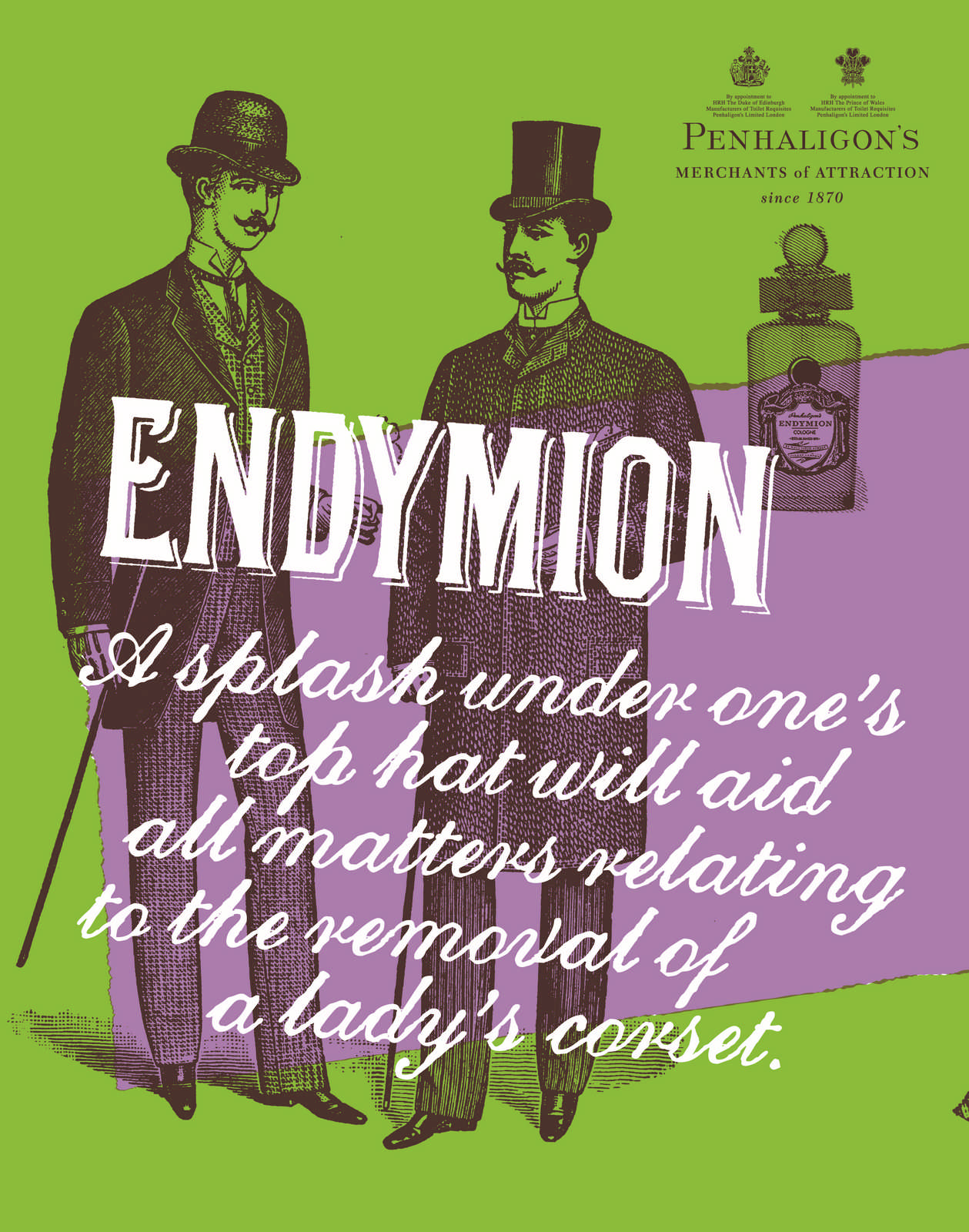
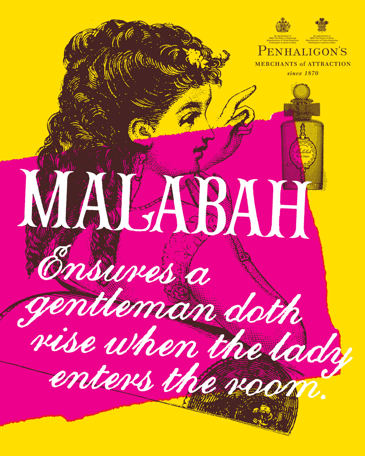
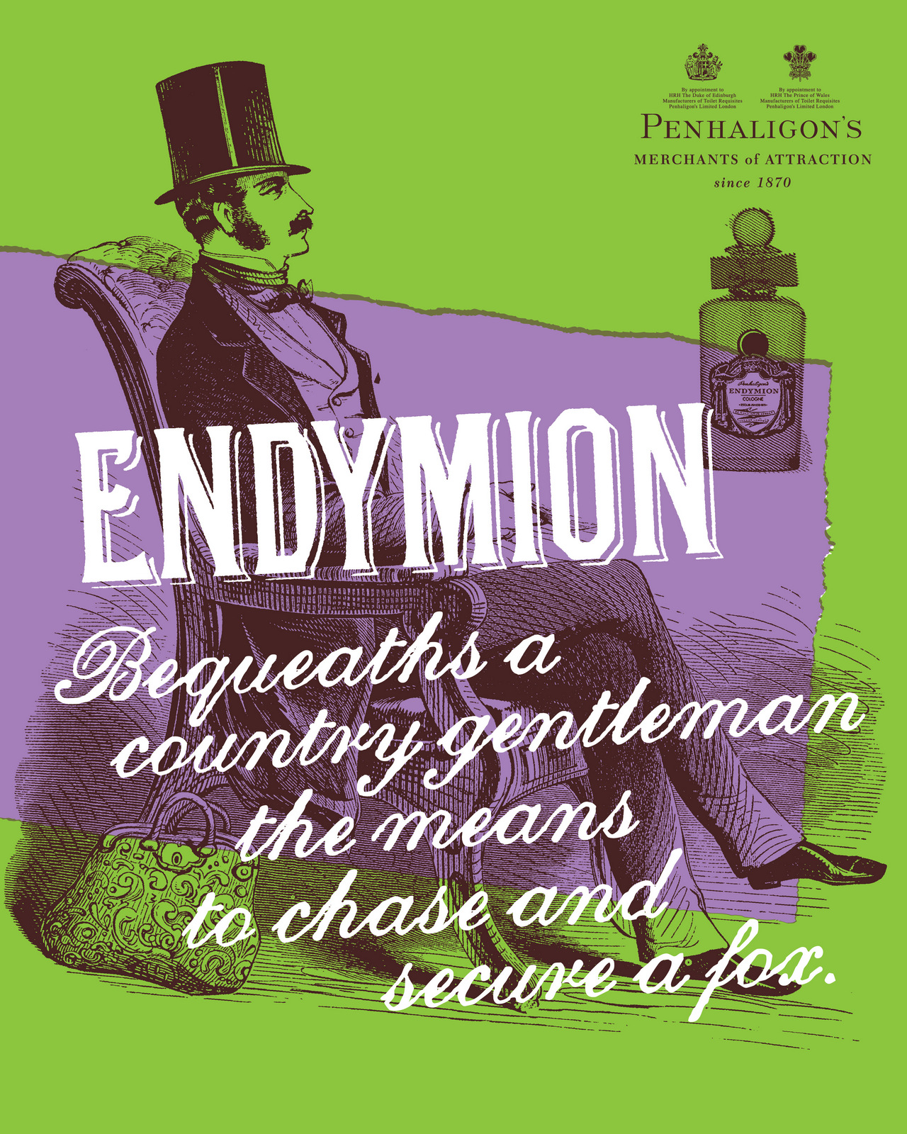
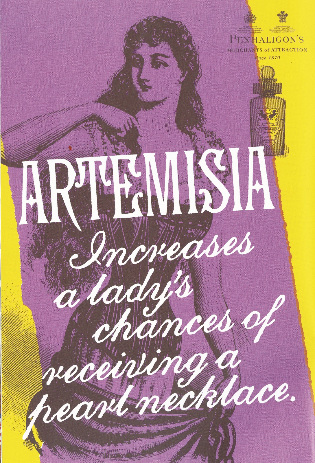
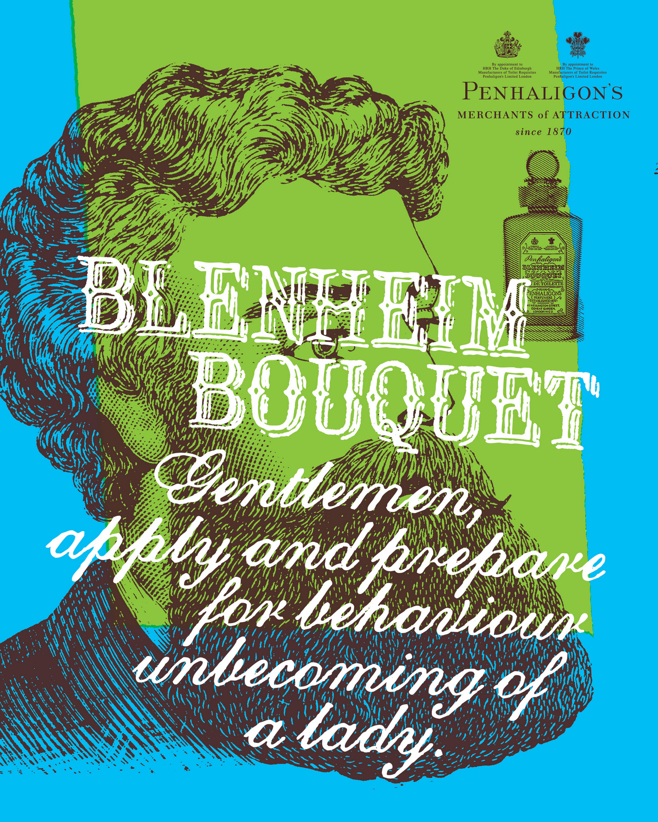
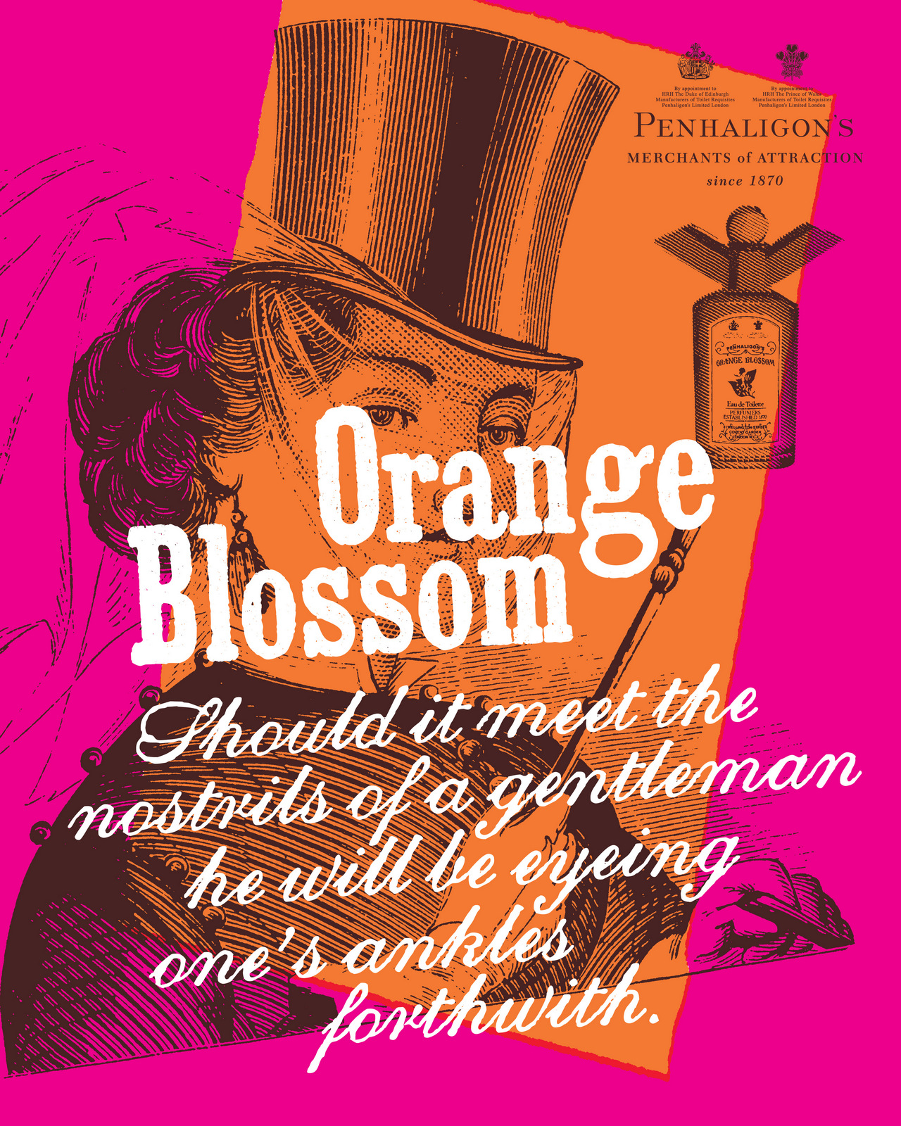
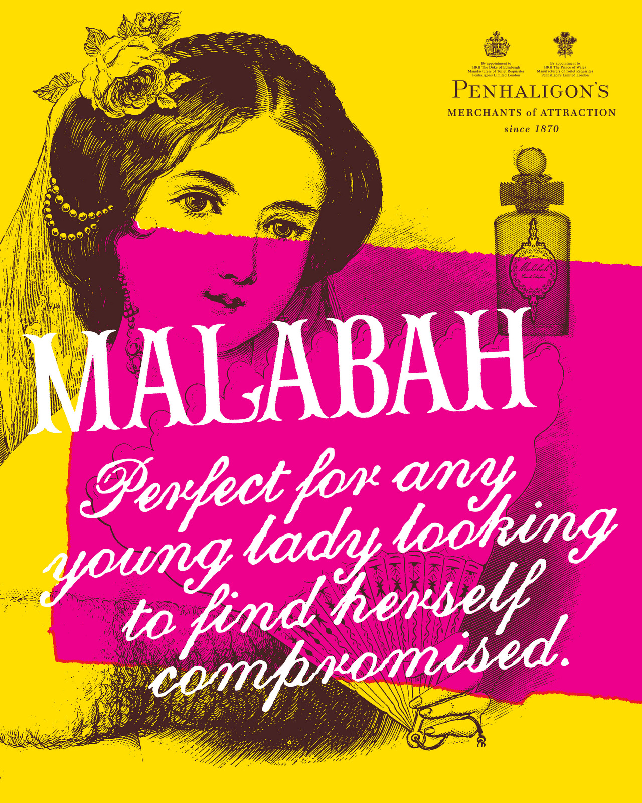
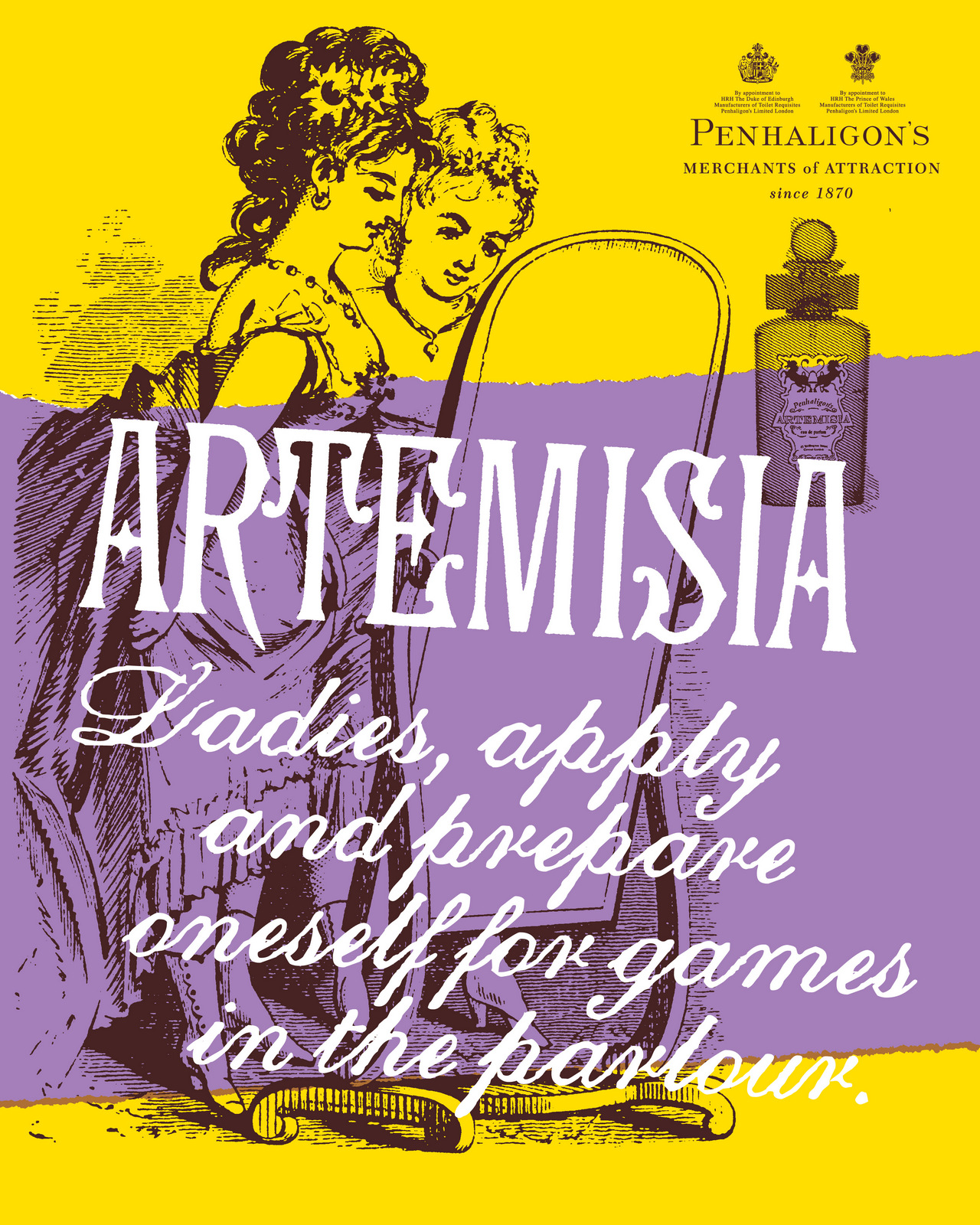
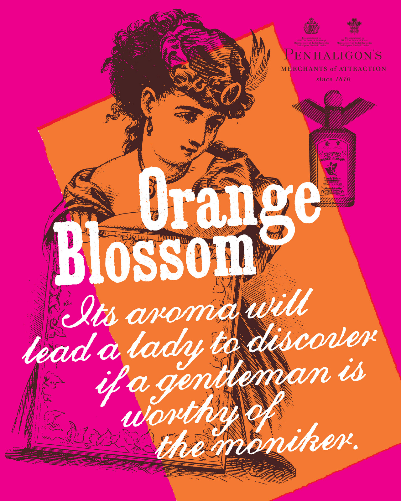
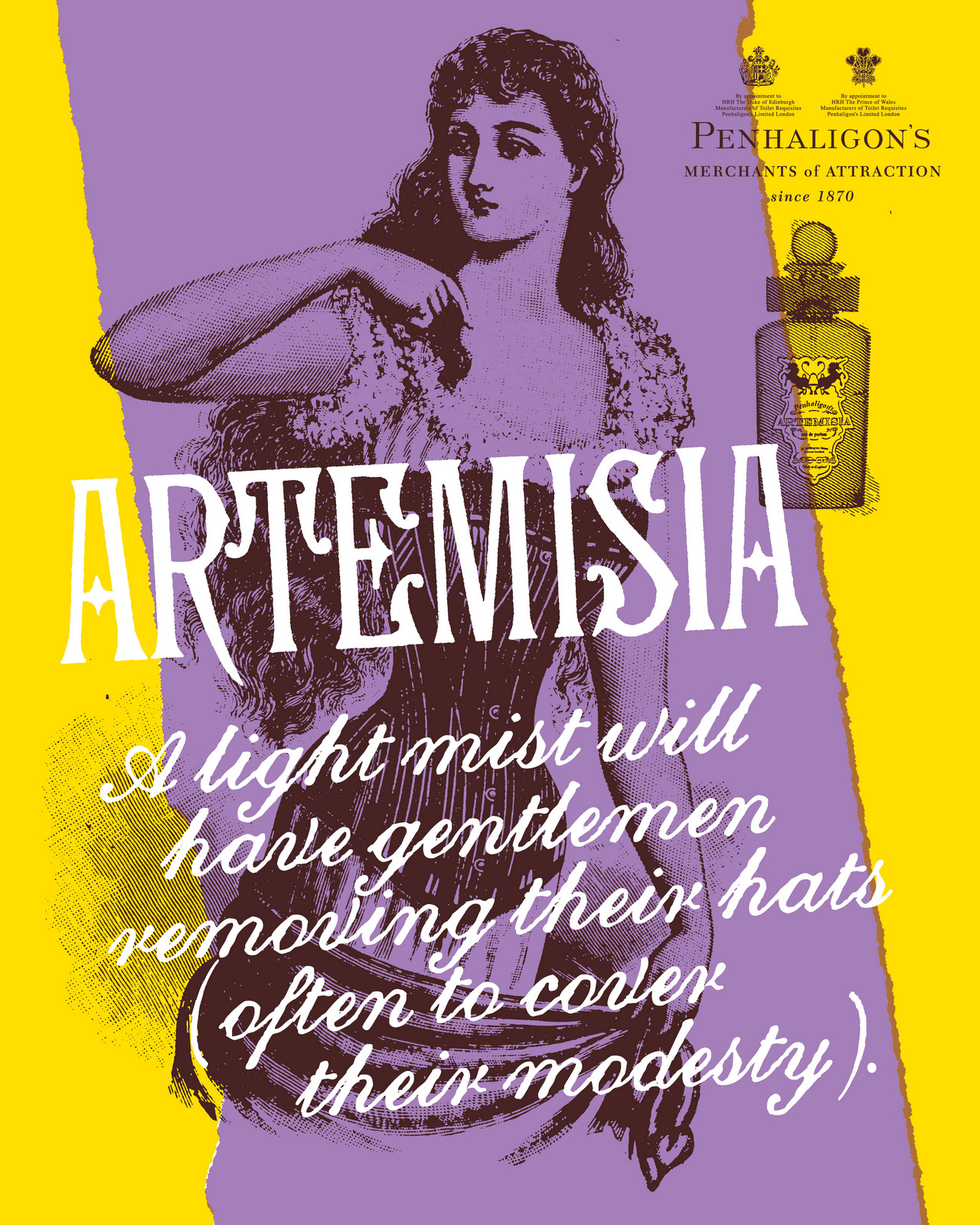
This one was rejected for being excessively cheeky, but ended up finding its way into the 'Sex Cells' programme.
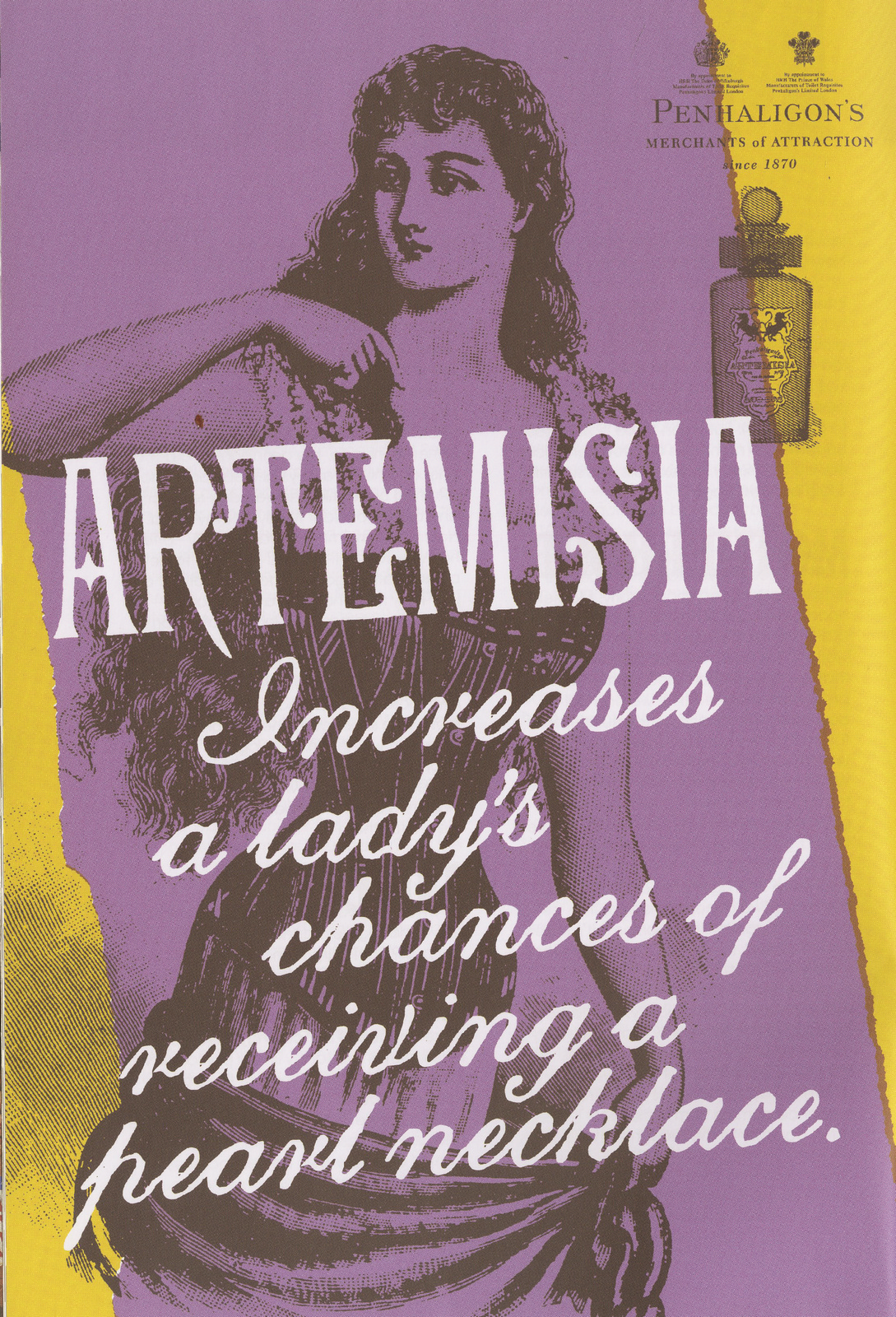
The harsh graphic treatment worked particularly well on 'Store opening' hoardings, which were starting to be needed more and more regularly.
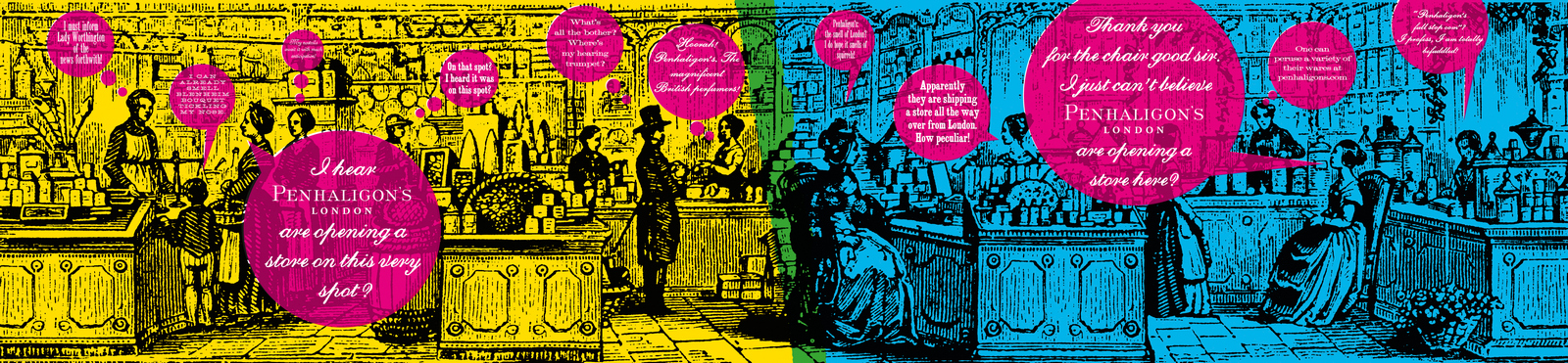
We then had a new fragrance to launch; Juniper Sling.As it was inspired by gin and the Jazz Age, it would make sense to swap periods, out went Victorian in came the roaring twenties .The first requirement was a piece of content-cinema ad-website-film thing.An old and new film thing?Zelig! The Woody Allen film made up it's own version of history, but did so in a serious, believable documentary style.
We wrote up a fictitious history Juniper Sling in the twenties; The bob haircut was created to allow Juniper Sling to waft more freely, the flapper dance craze began after girls would flap their arms to around to waft the fragrance towards a guy, it was outlawed due to its aphrodisiac qualities, etc.Mark Denton came on board to help us create and make this bit of old news footage.Here's his storyboard:
We wrote a lot of lies.Then used them in mock-ups of old newspaper pages.


[vimeo 41490931 w=500 h=373]In terms of the posters, the debate was how far do we move from the style we'd created, Victorian, to 1920's style? We tried a few twenties tests.


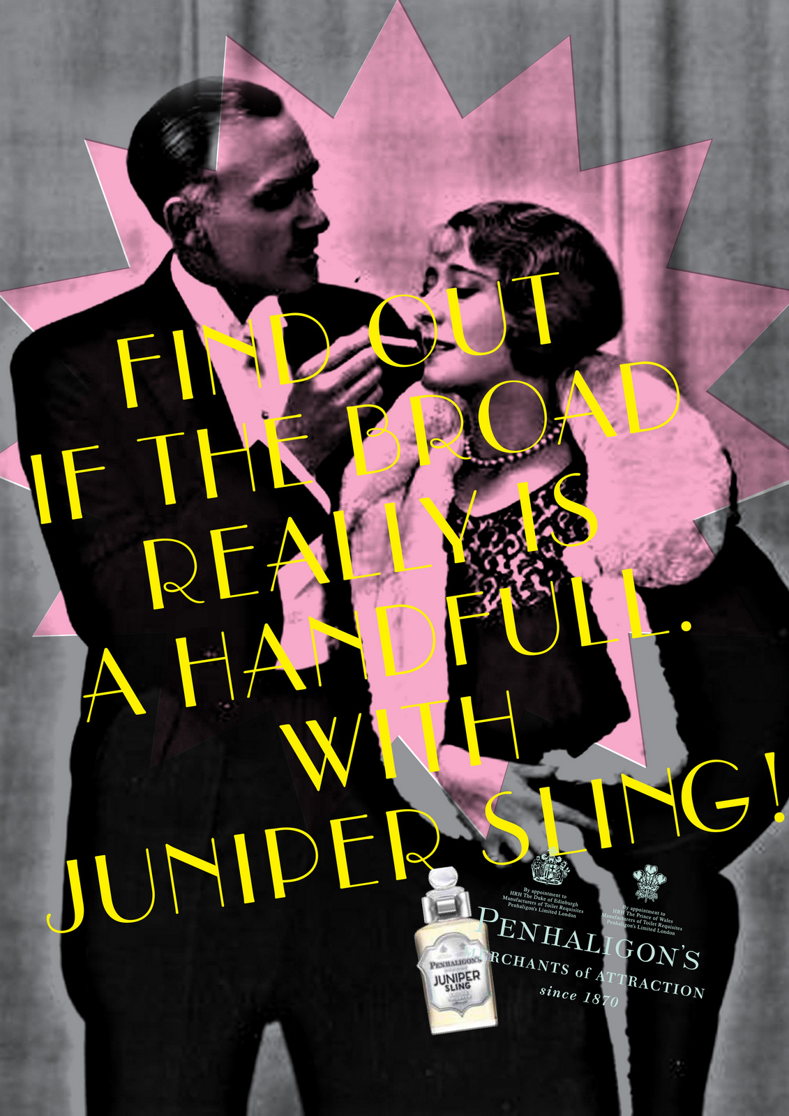
But in the end we linked back visually to the first campaign.
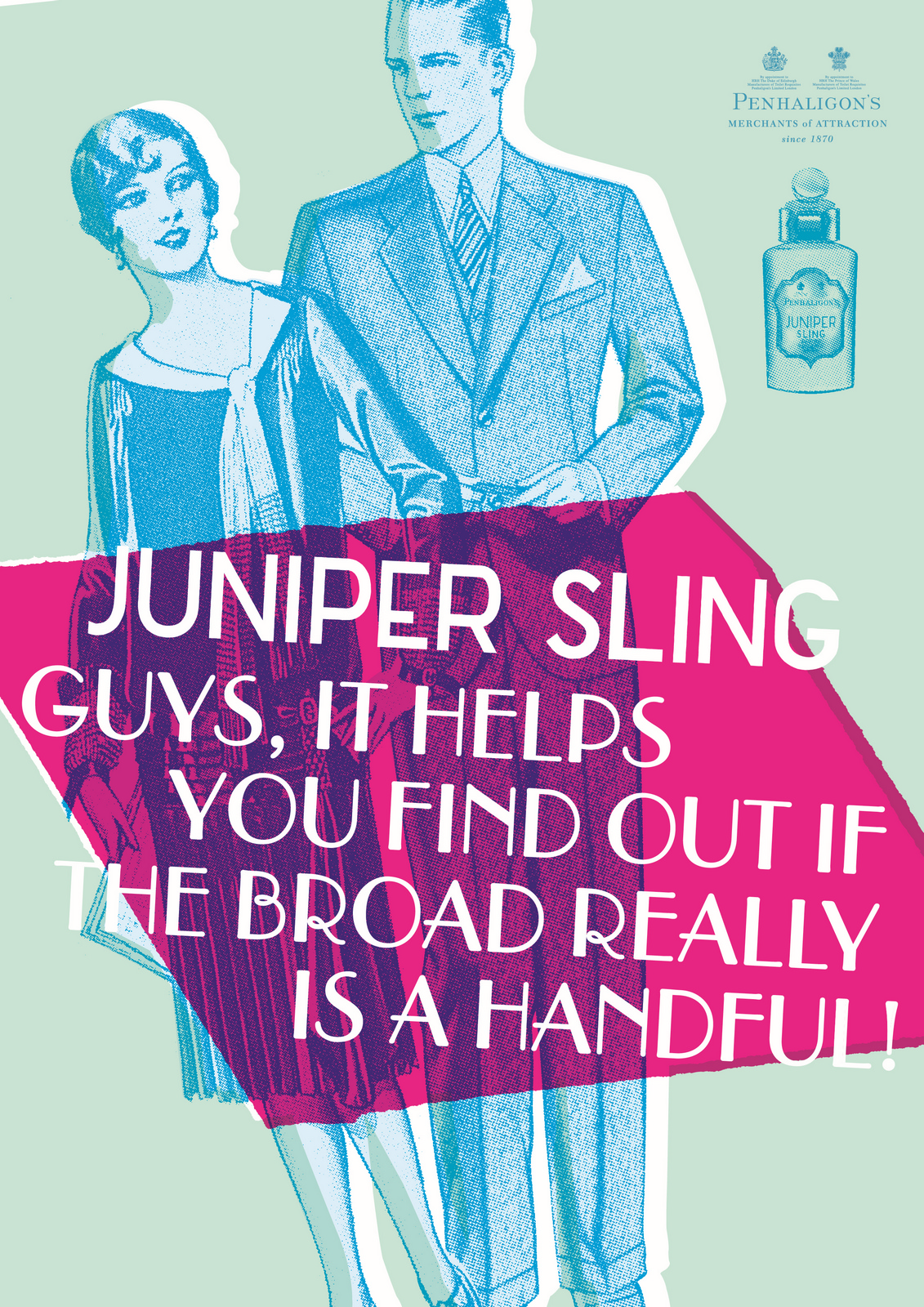
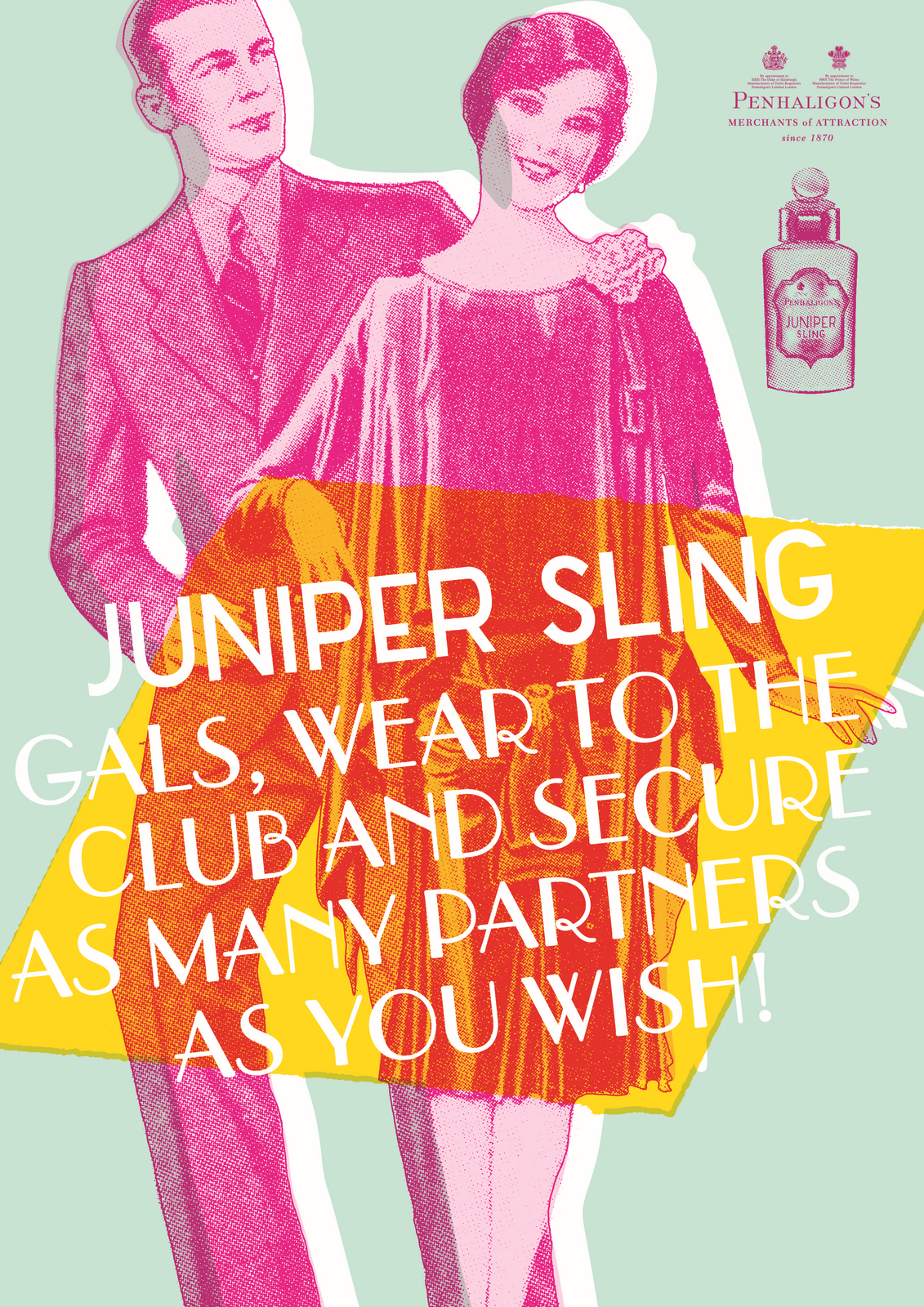
At Christmas we got a chap, like the late great Stanley Green to patrol Regent Street.
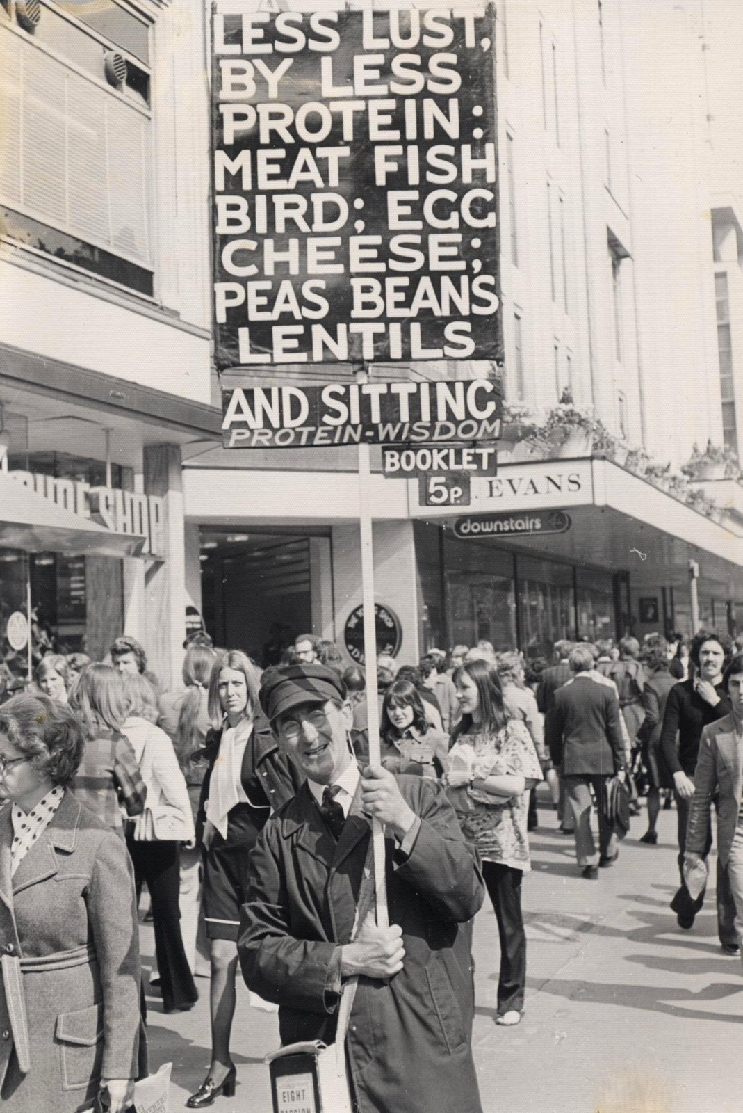

We made discount vouchers look like old bank notes.

We made self deprecating posters mocking Penhaligon's posh heritage.
MOVEMBER.Every year we'd collaborate with the Movember guys and produce a poster.
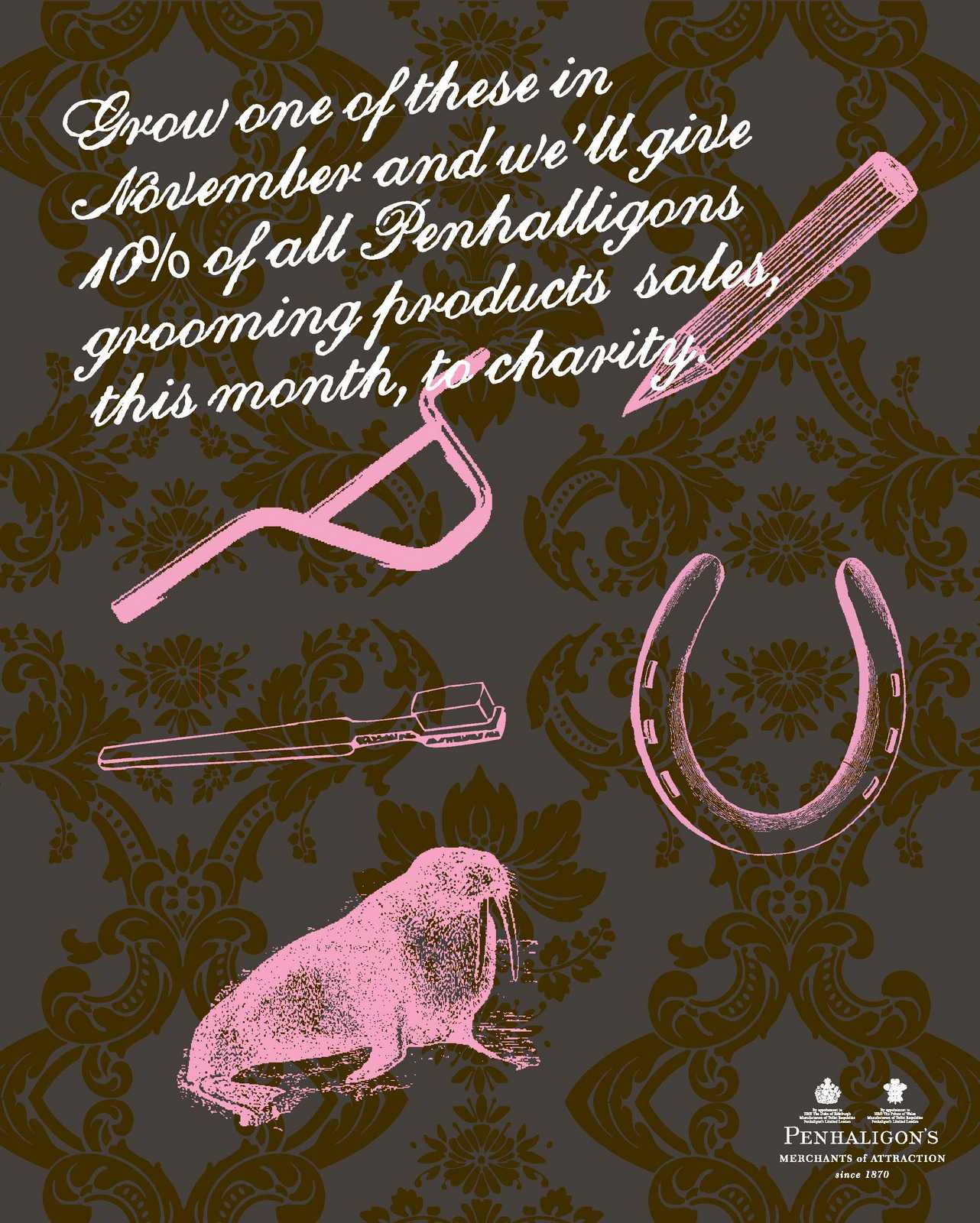
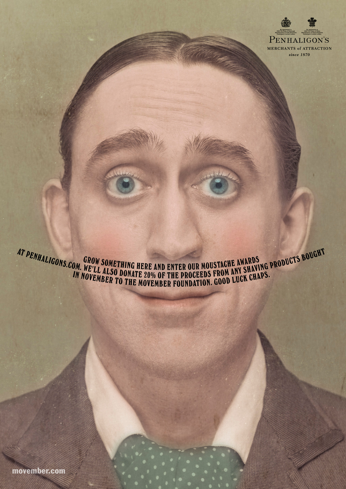
Weirdly, the last starred that film director I mentioned earlier, Mark Denton.1. A rough to show the client.
2. Photography test for Mark's position.
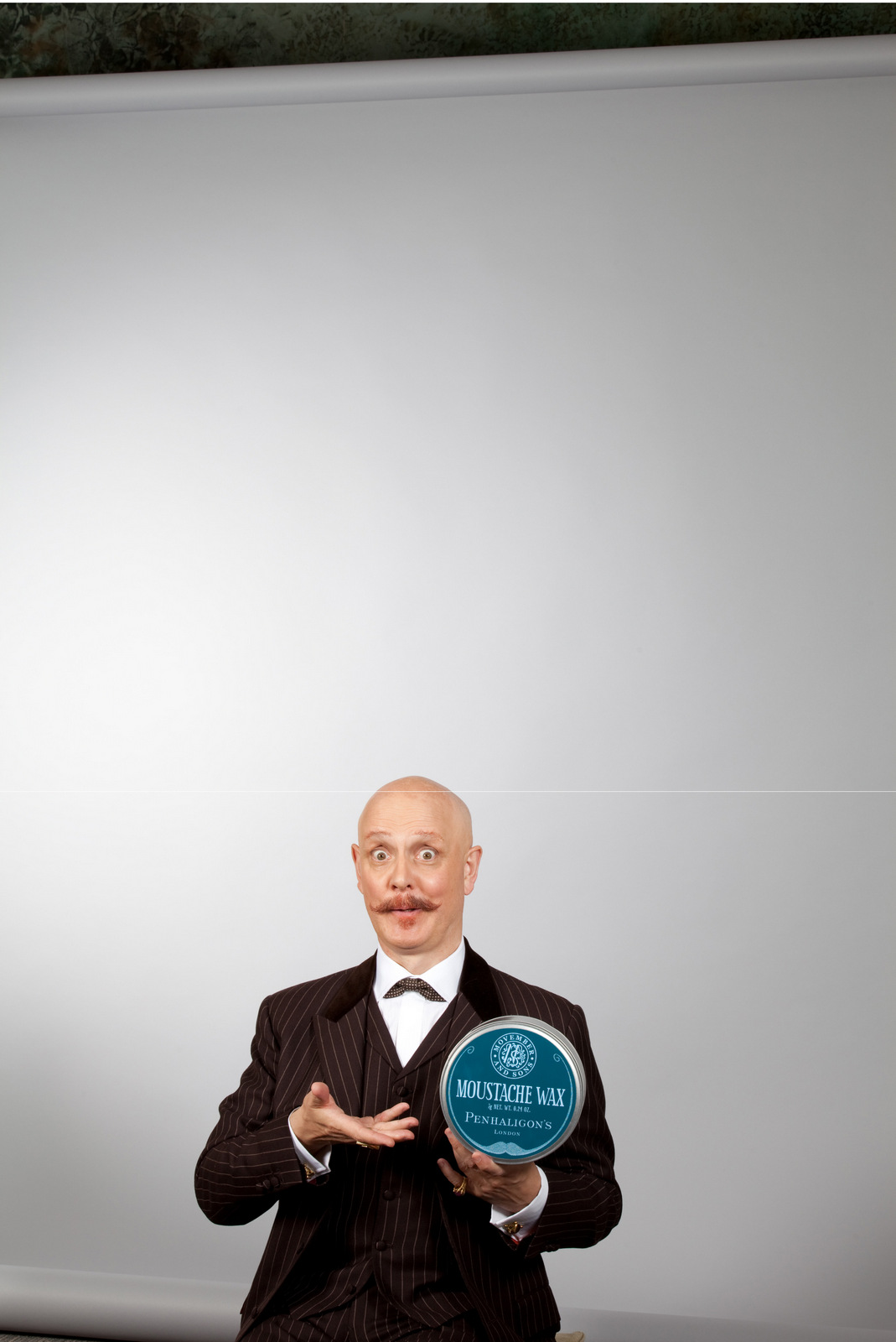
3. Photography test to check the background.
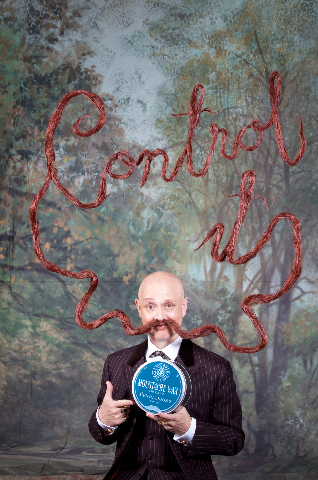
4. The final ad.
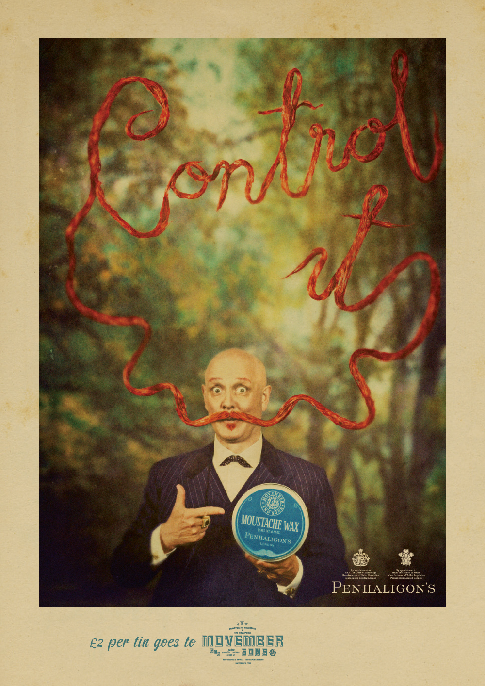
Gradually, the briefs started to move from brand to fragrance specific work.Some of the executions were cool, but in describing the unique story of each fragrance the unique story of the brand gets lost.

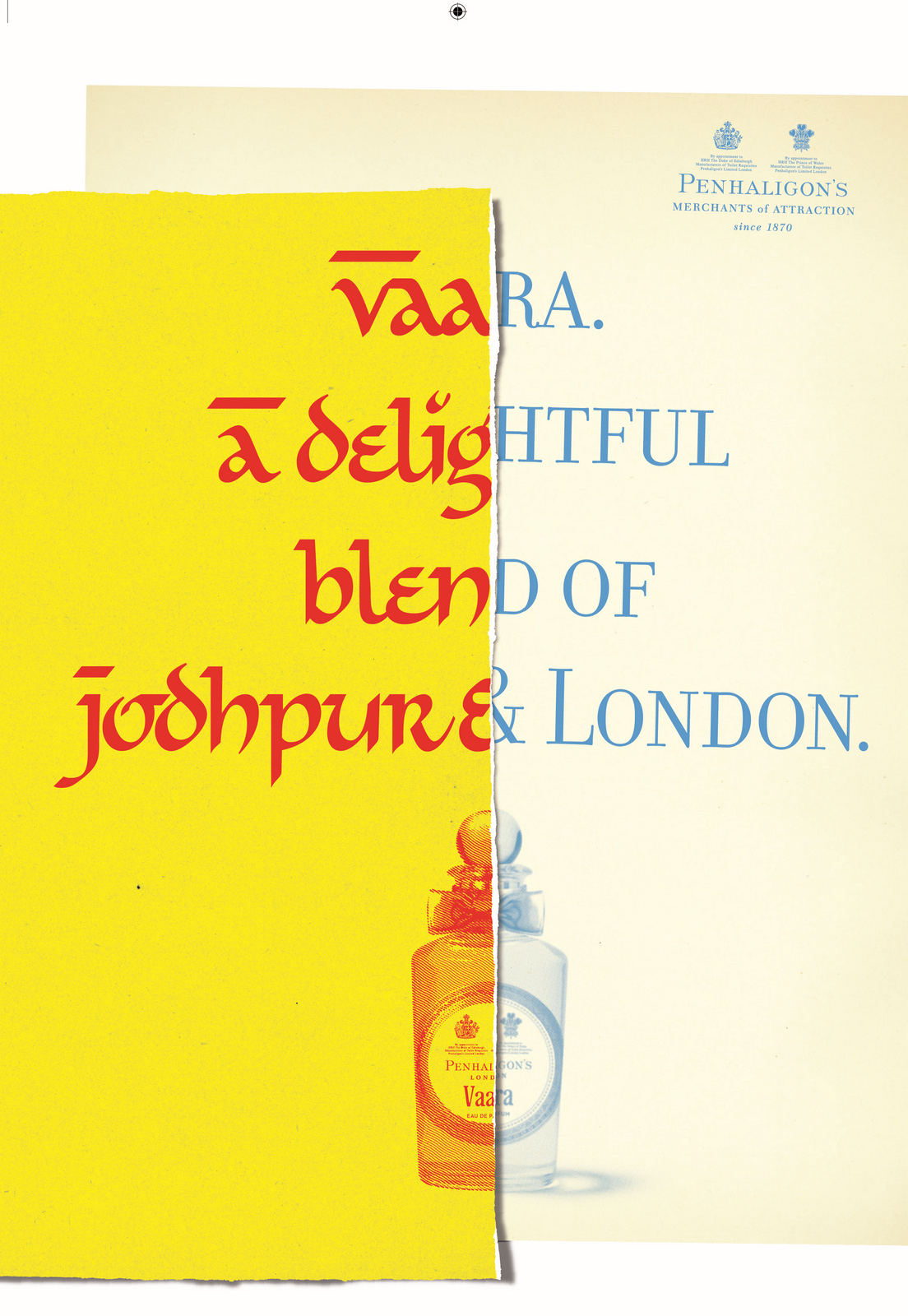
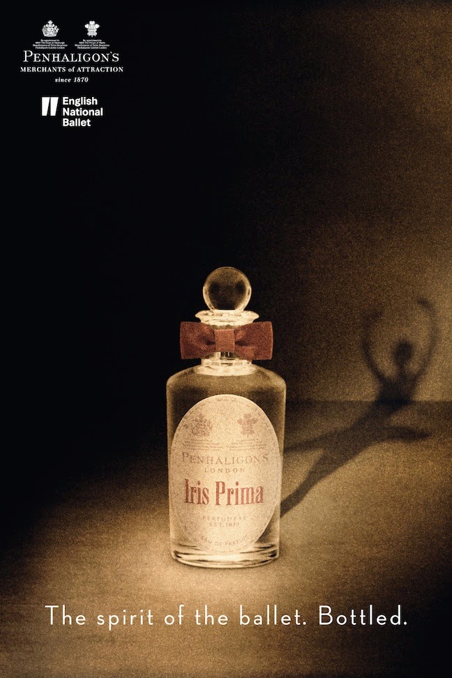
I'm not sure how many points of reference I've mentioned on this one client, but I'm sure Neil Sedaka would be proud.
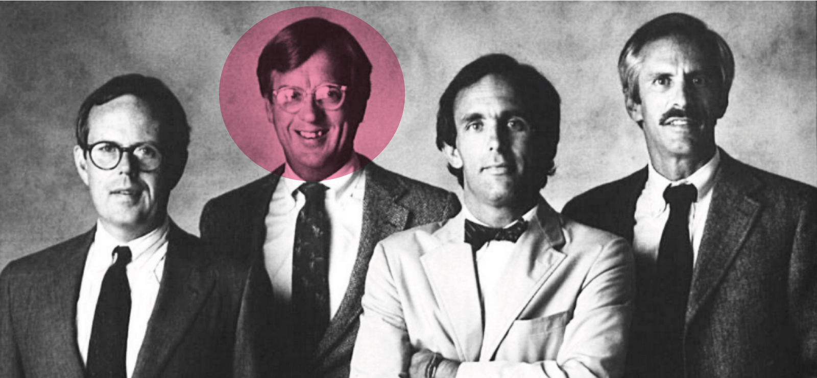