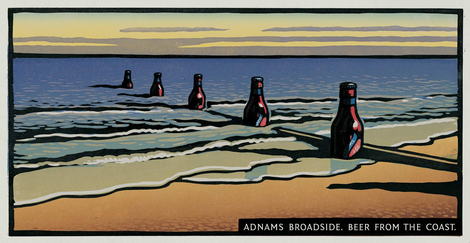
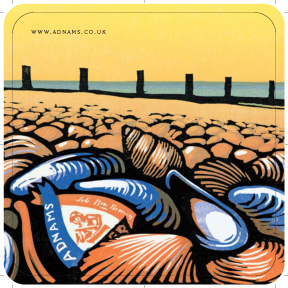
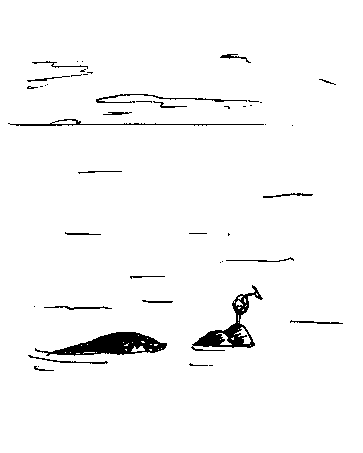
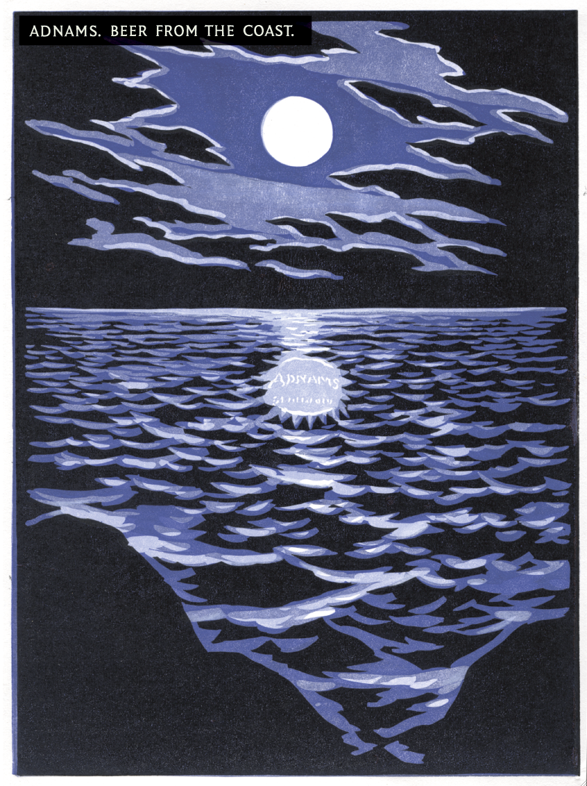
“It’s Simon Loftus on the phone, he says he’s a chum of John Hegarty.” It turned out that he needed some advertising for his family’s brewery.BBH had a conflict (Boddington’s) so John had given him our phone number.Simon was not only the Chairman of Adnams, he was a totally inspirational, lovely guy.I had a cottage in Suffolk, so I knew of Adnams, although they were pretty small, I thought they were quite classy.Not all ‘spit and sawdust’ like a lot of brewers. The agency trekked up to Southwold for the traditional pre-pitch brewery tour, to find the ‘silver bullet’, that special part of the brewing process that makes their beer great.We were told about the unusual hops, the quirky layout of the building even the "special cat" that takes care of the mice. Who cares? Next time I see a bottle of Adnams in Sainsbury's I won't be thinking ‘Oh, that’s the one with the quirky brewery layout’. It was all so fiddly and small. About 90ft behind the brewery was the North Sea. “That’s got to be unusual, hasn’t it? Is there another brewery by the Sea?' Planner; ‘It doesn’t affect the taste of the beer’. True, but if I was looking at a whole stack of weirdly named beers in the beer aisle I might remember that Adnams was from the Seaside?It's better than the alternative - ‘Kevin The Mouse Catching Cat?’. Strategy agreed, what about media?They had about a million quid media spend, so not enough in production to come over as premium on tv (rookie directors and short time lengths). But spend it outdoors and they could be the most premium posters around. We set about linking beer and sea for an outdoor campaign.
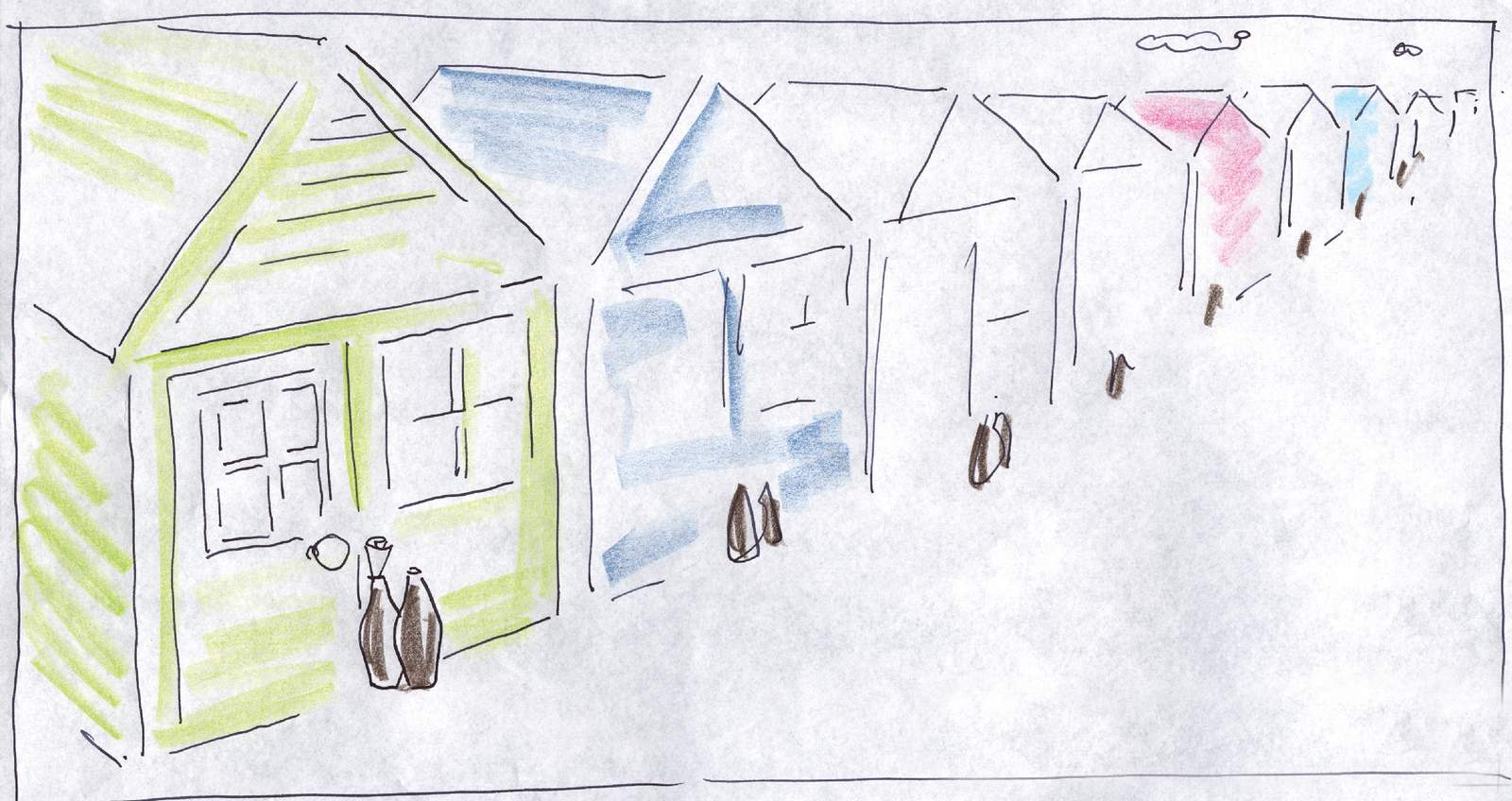
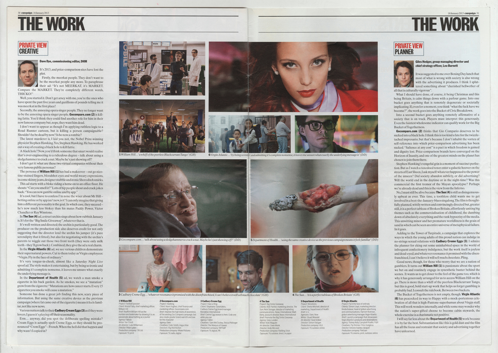
They looked a bit GGT-ish, sort of cartoony, so we went a bit more B&H-ish - surreal.
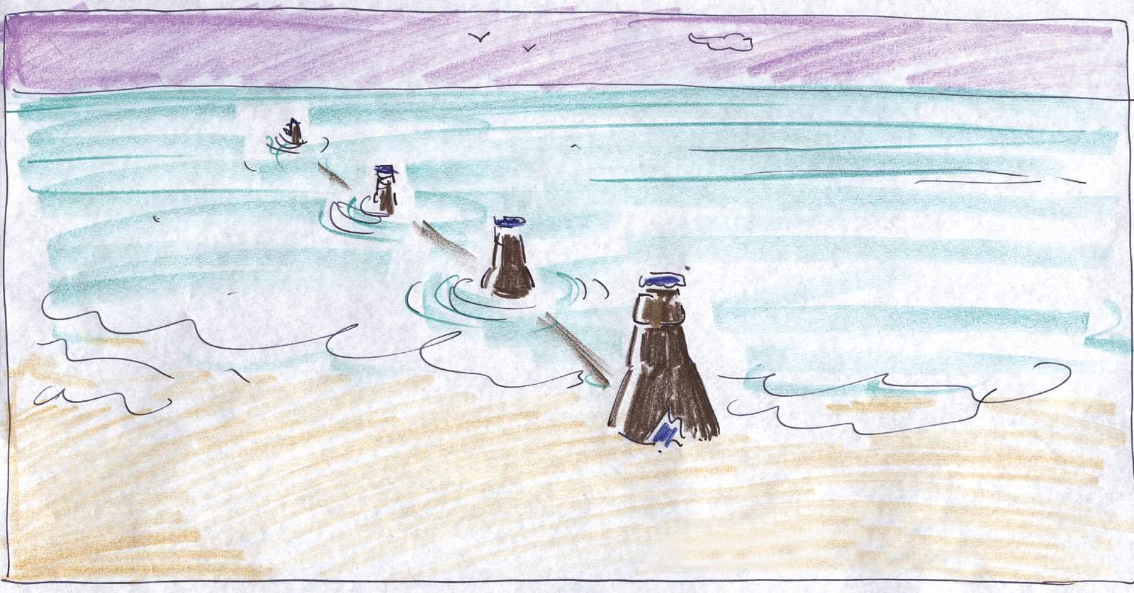
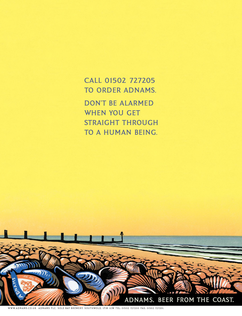
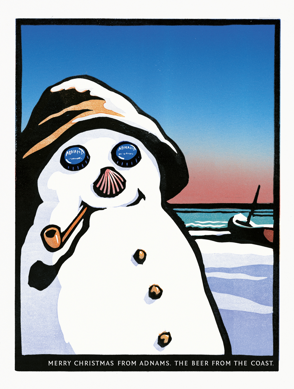
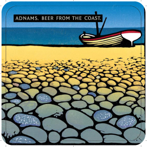
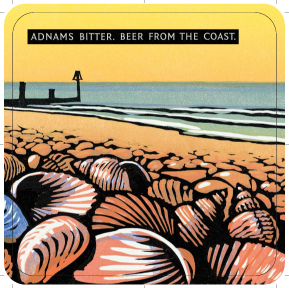
I liked them, but thought they still didn't scream premium.'From the brewery by the sea' was replaced with 'The beer from the coast', it just sounded posher.
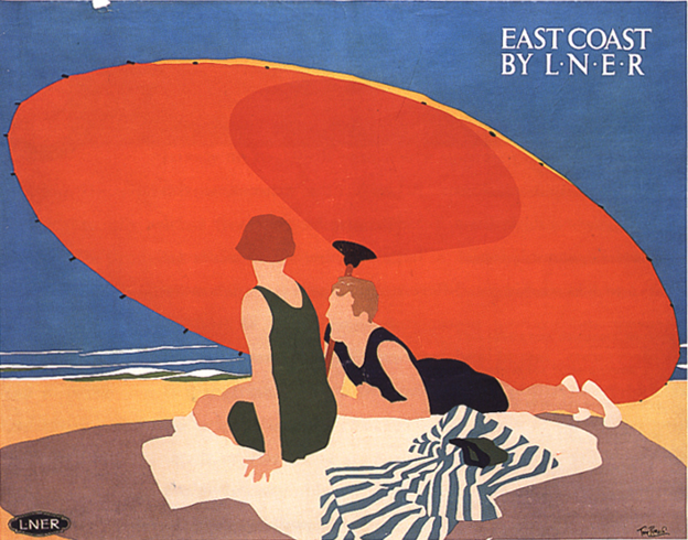
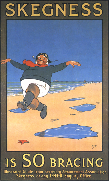
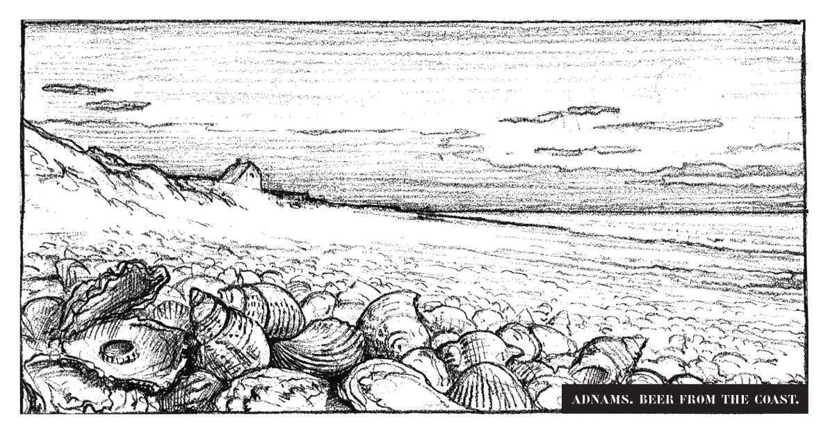
But they also needed to look sophisticated.Classy, evocative of the British coast - that idealistic view of the Britain of the past.But without going all retro.And distinctive, in a style Adnams could make their own.I looked at the old railway posters from the thirties, the ones promoting trips to the seaside. (To be precise, in the style of Frank Newbould. If you're quite geeky, I’ve got a board on him: http://www.pinterest.com/davedye/frank-newbould/)
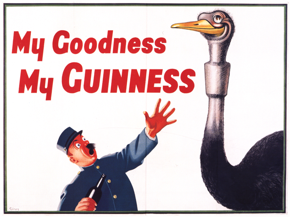
I also checked out the early Guinness work.
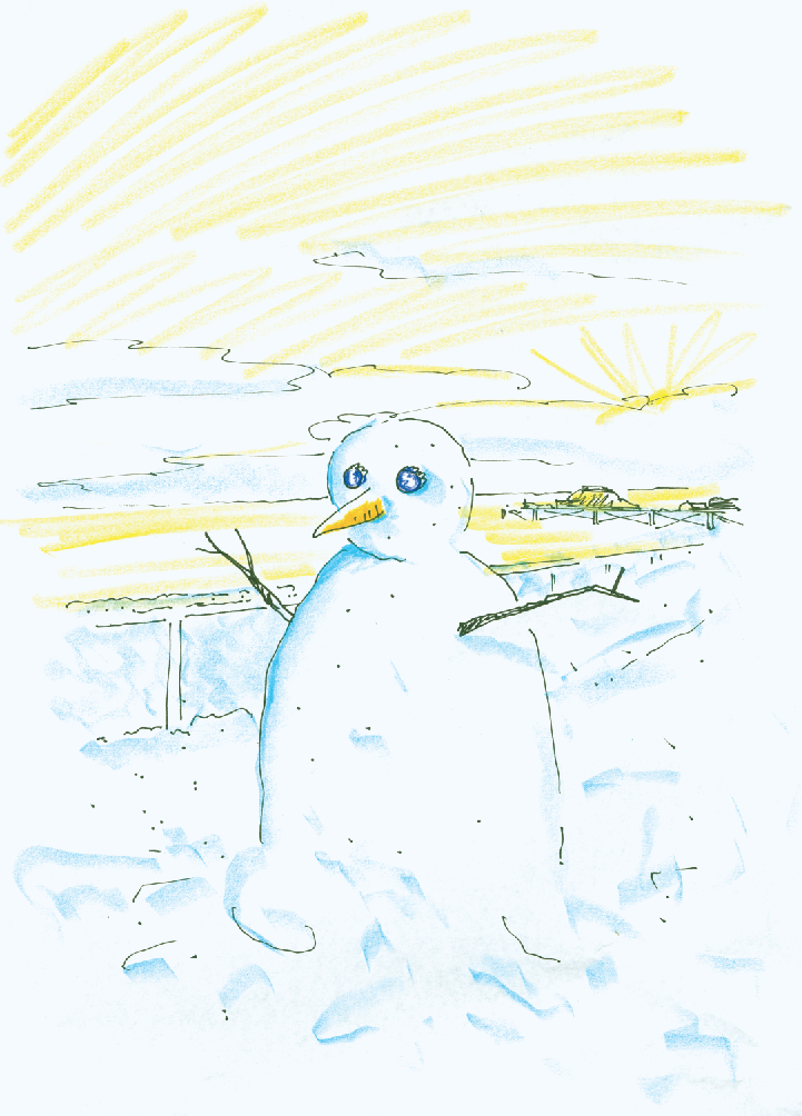
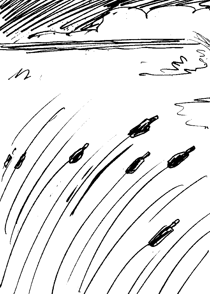
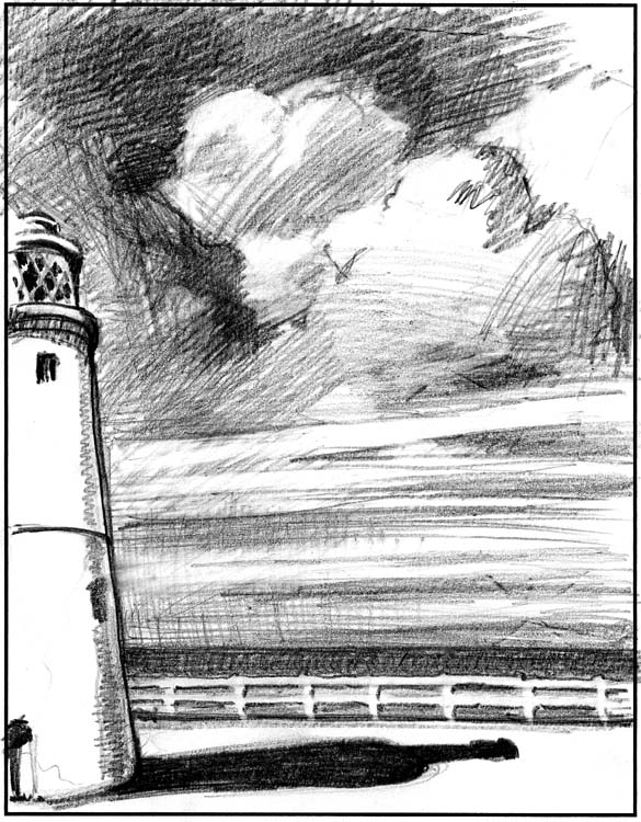
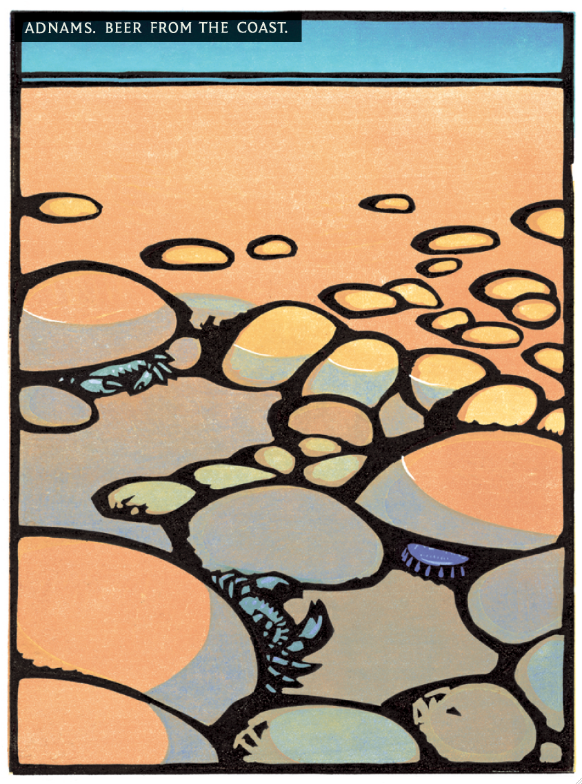
Some kind of mash-up of the two seemed to be the way to go.Wood/lino cuts made sense, which meant Christopher Wormell or Andrew Davidson.Both amazing illustrators. In the end, I went Wormell, he just seemed more coasty. We got him to do some test to show the client that the images could look sophisticated (not scrappy little cartoons like my drawings).
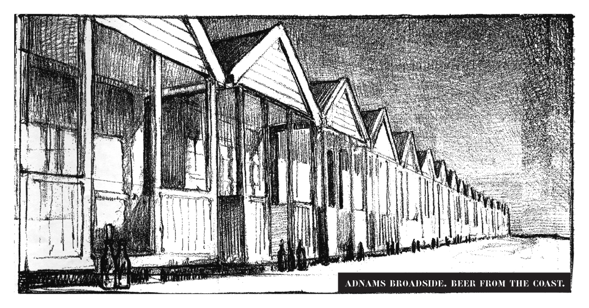

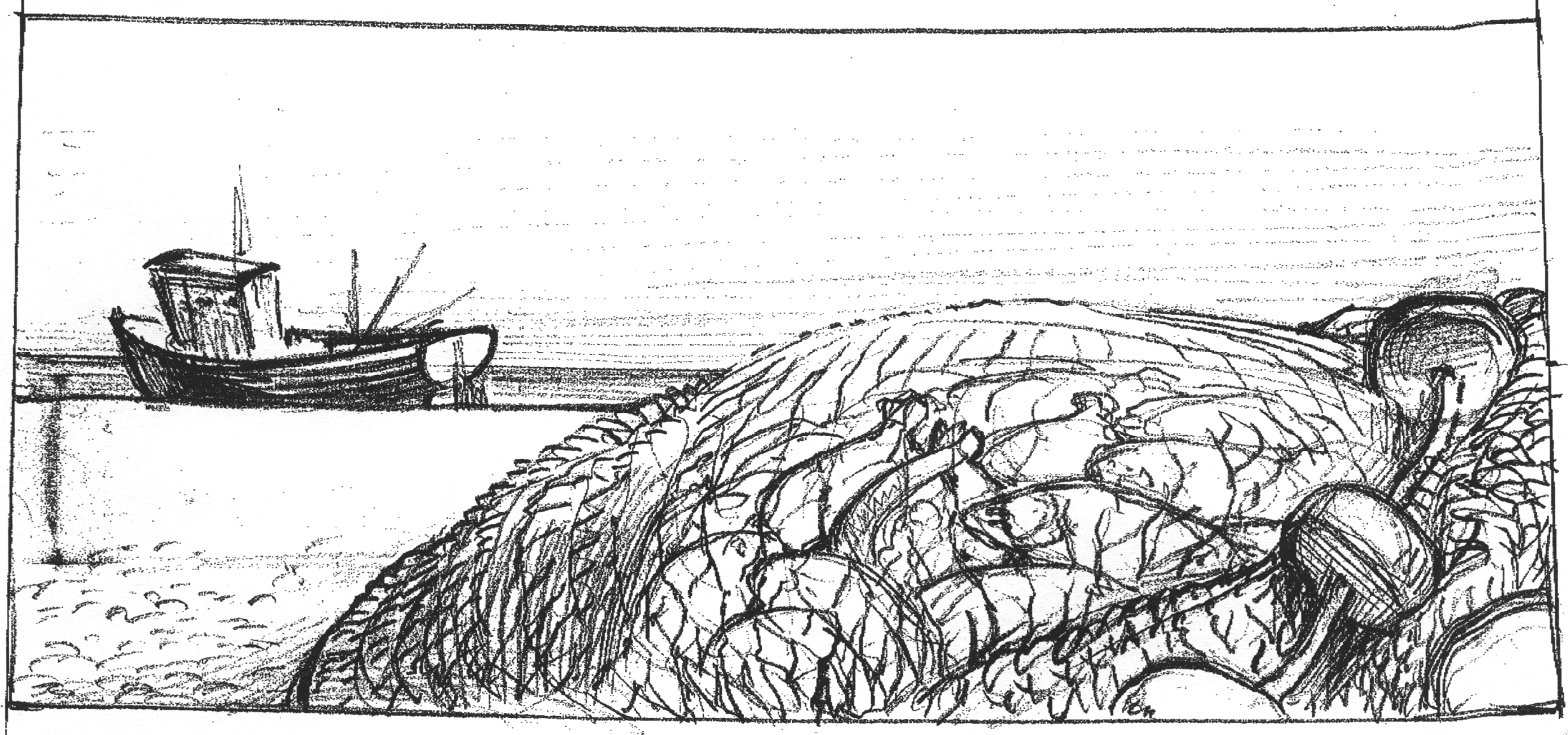
They looked great, but a bit serious, maybe he could do a coloured drawing?He did one, in pastels.To the trained eye it looked absolutely, well... shit.
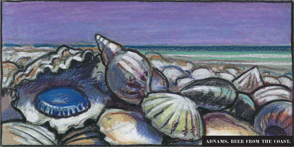
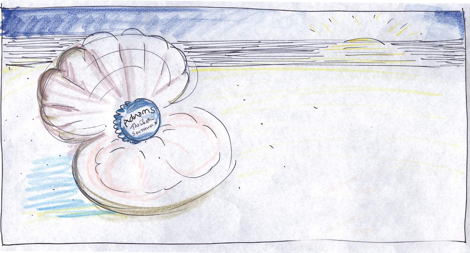
Maybe I'm just not a pastels kind of guy?To get that premium feel he'll have to cut one, a finished image. He agreed to do a test for £500.
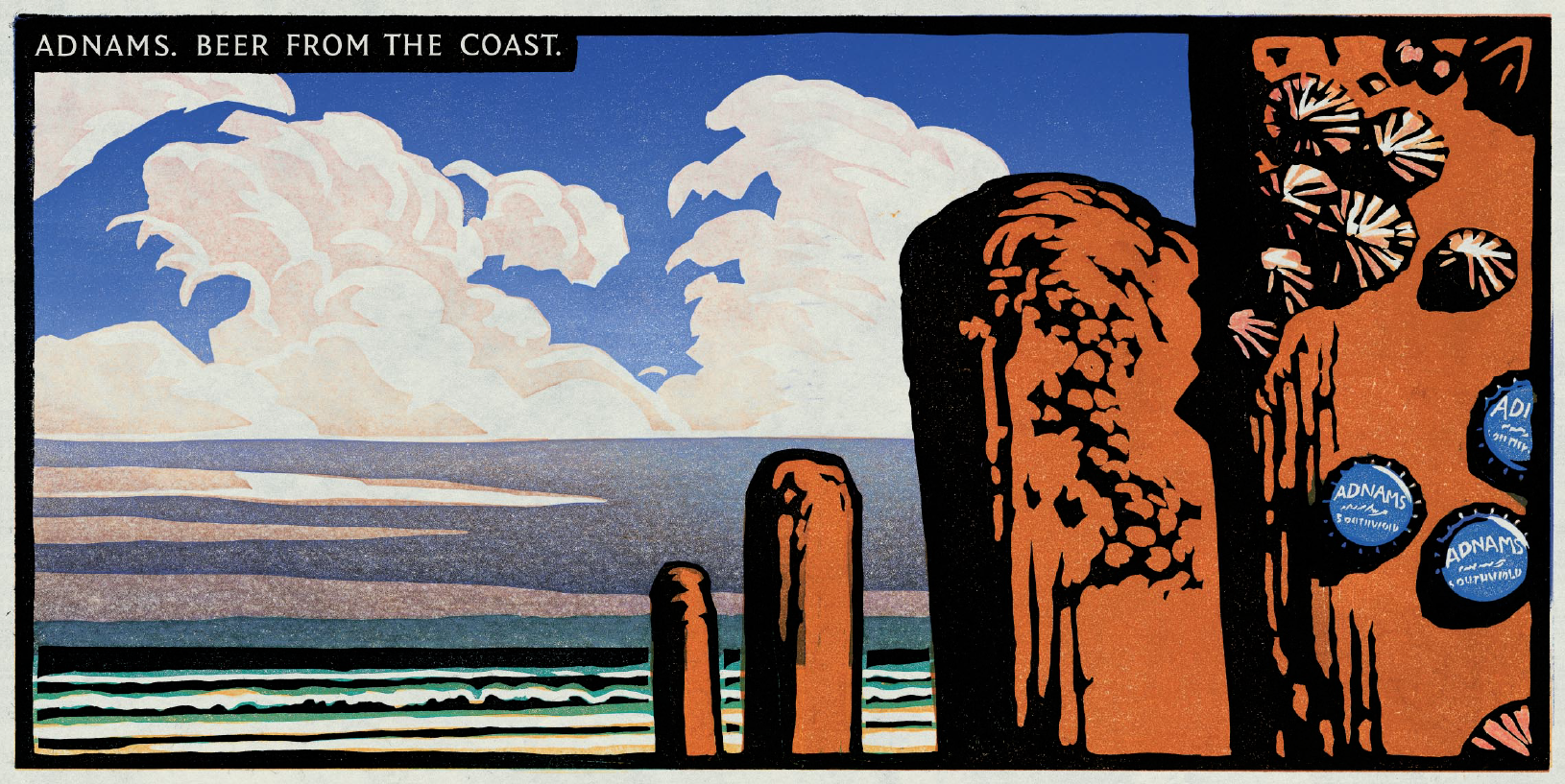
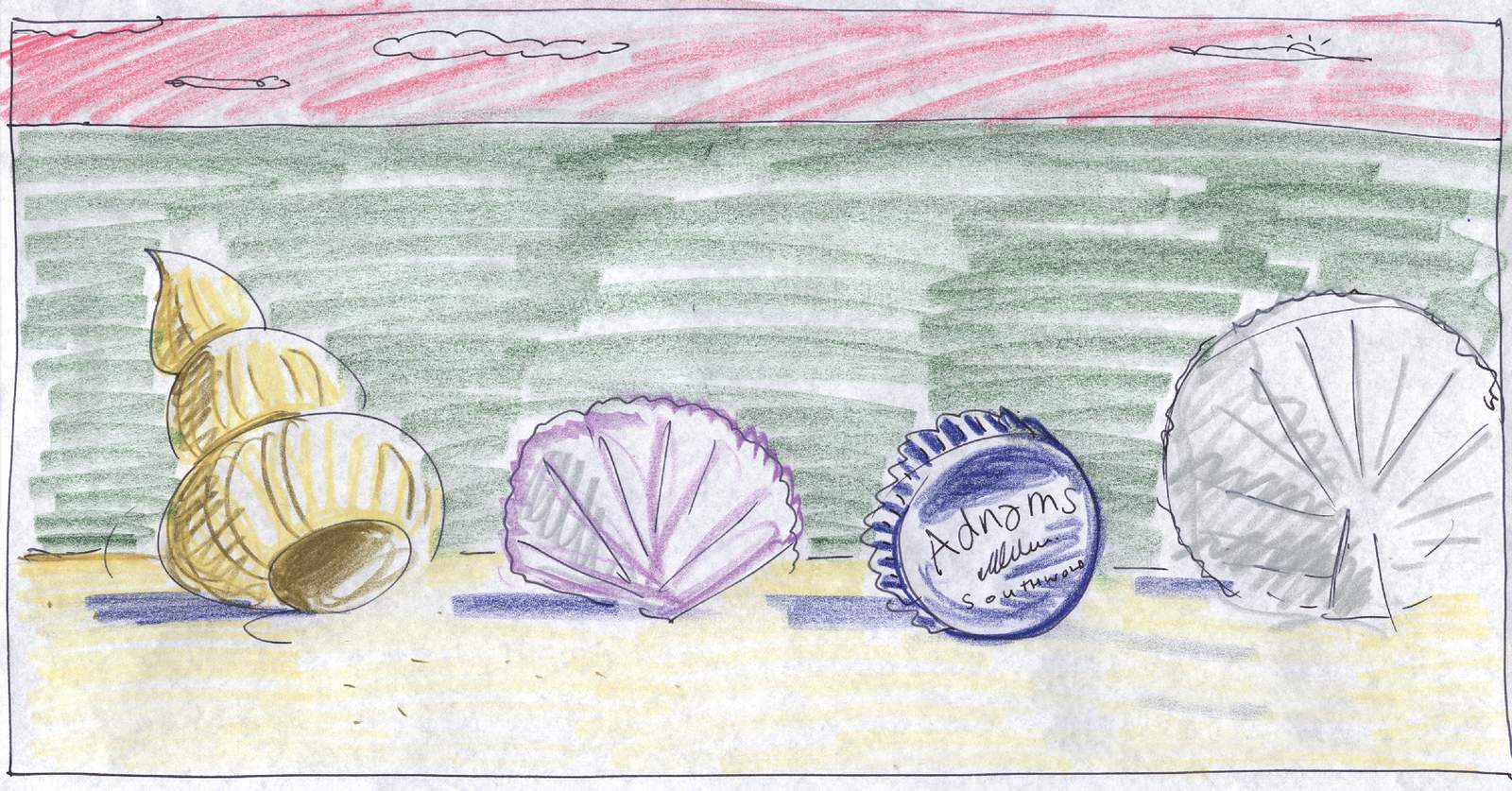
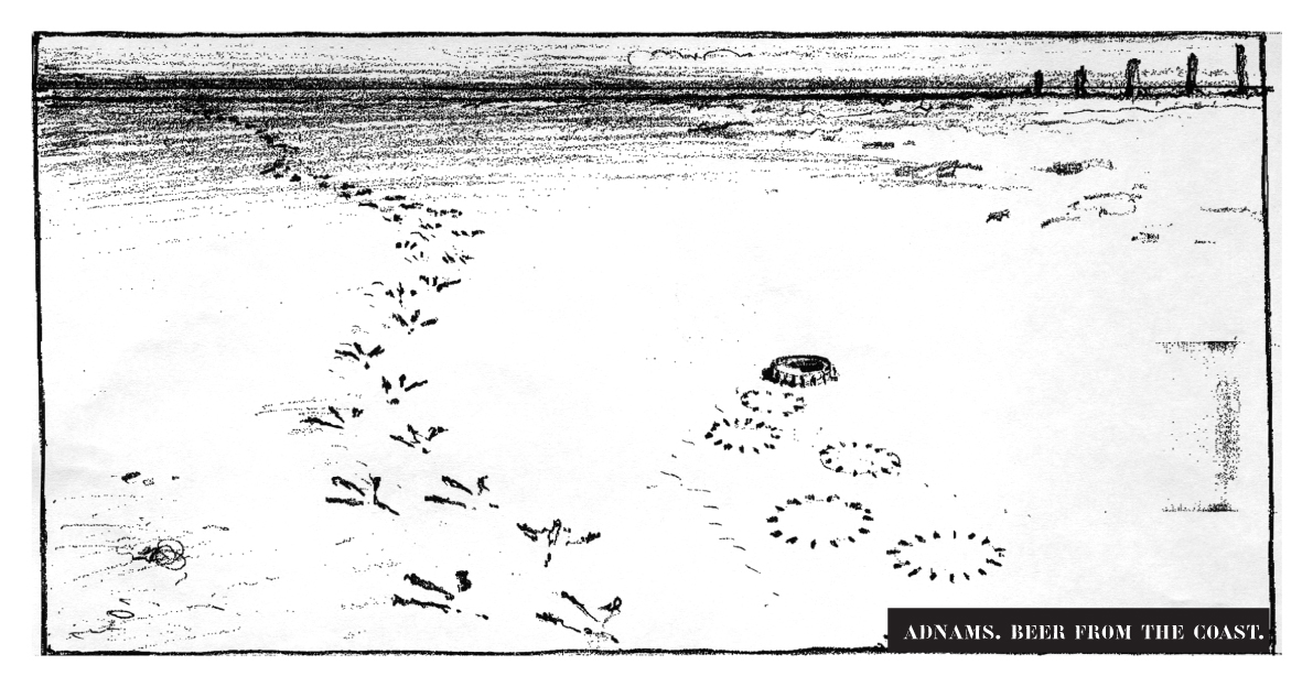
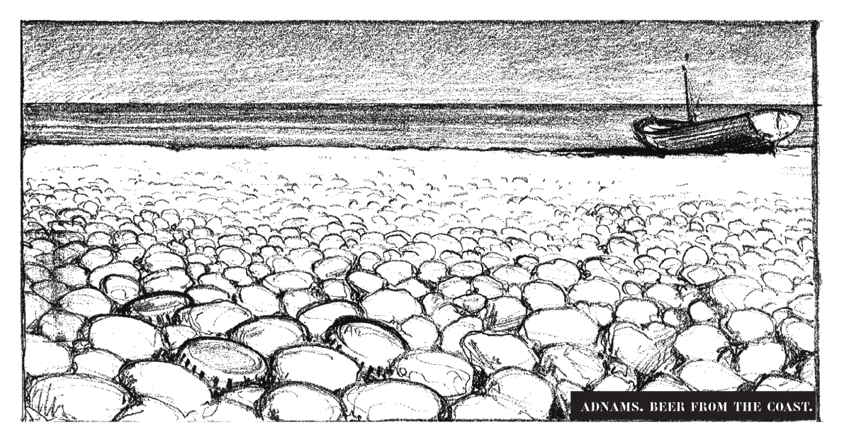
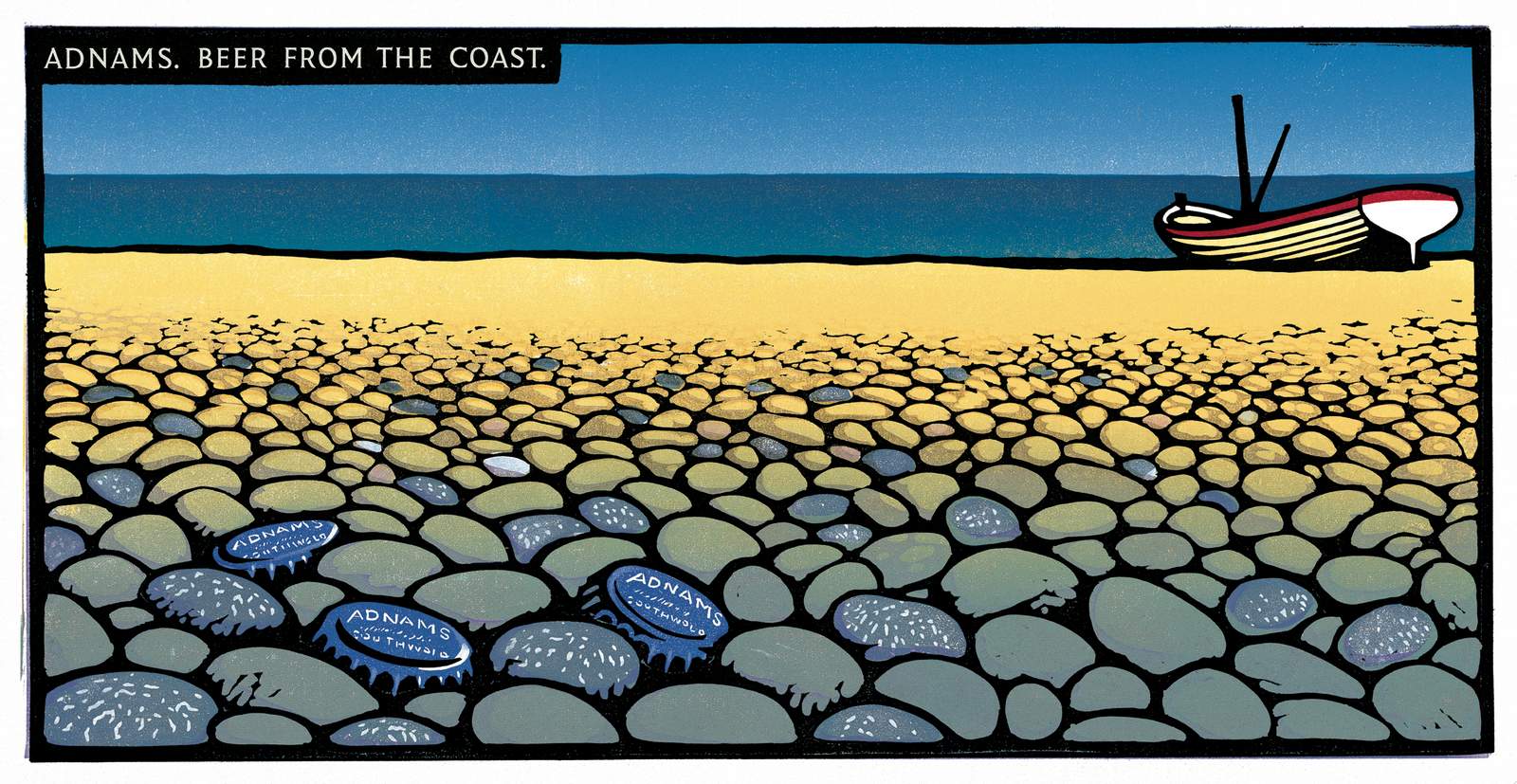
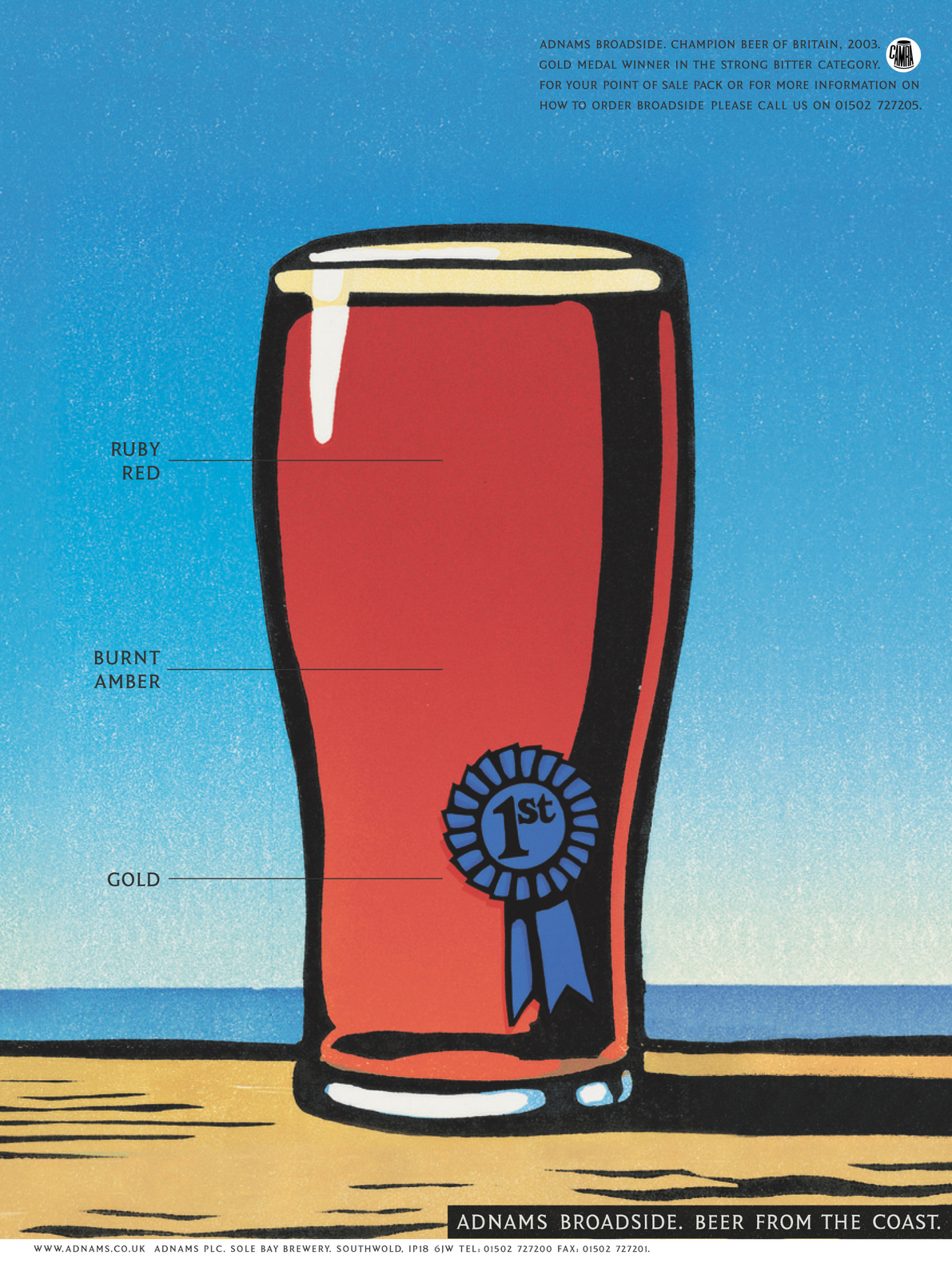
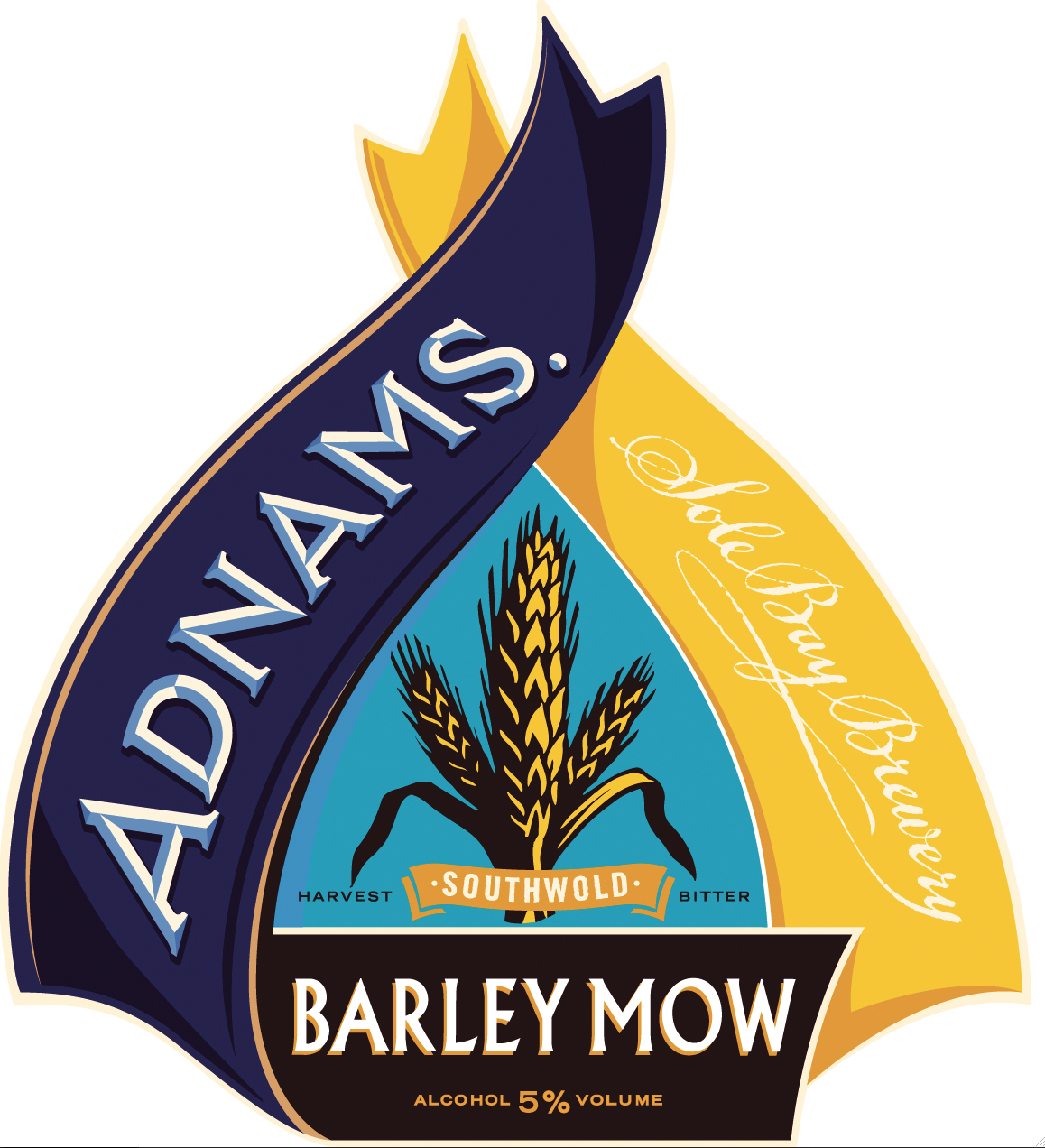
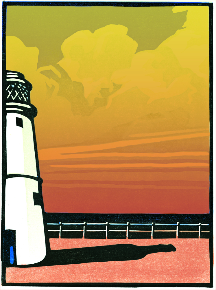
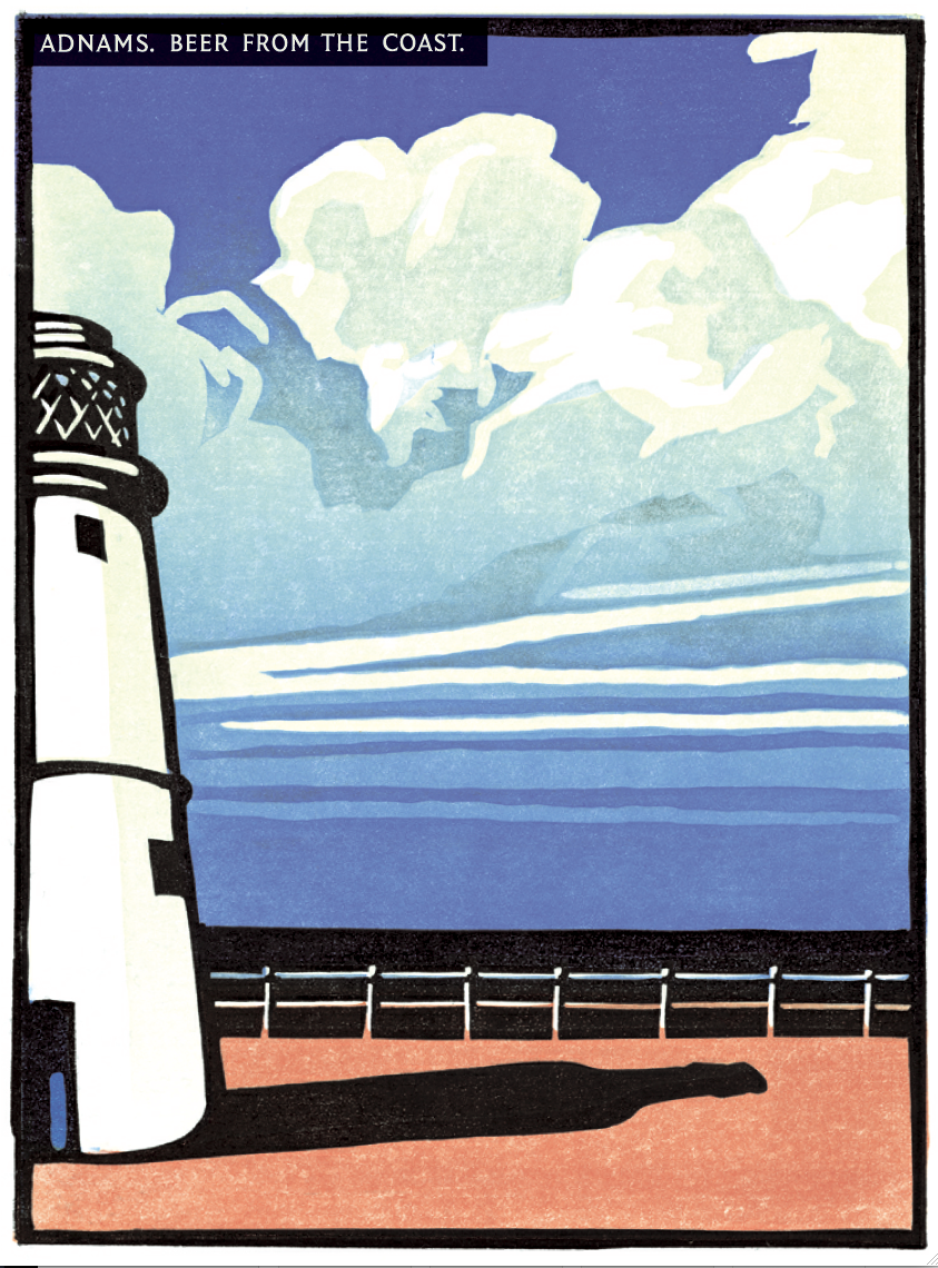
Wow! Amazing!We pitched.They loved it.All twelve Adnamites clapped at the end of the pitch.Not because they thought it was good creatively, but because it felt like it accurately represented them.Previously, their advertising had tried to make them something they weren’t - Jack The Lad beer boys.They’d been told ‘that’s what you have to do if you want to appeal to the public...it’s advertising’.We won.First job; illustrating the other nine 48 sheets.The bottle caps worked well, they felt effortless and iconic.
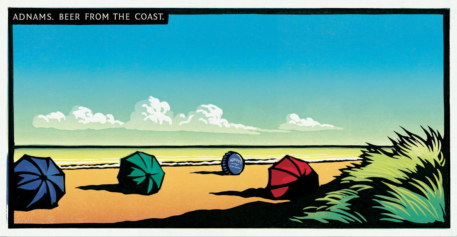
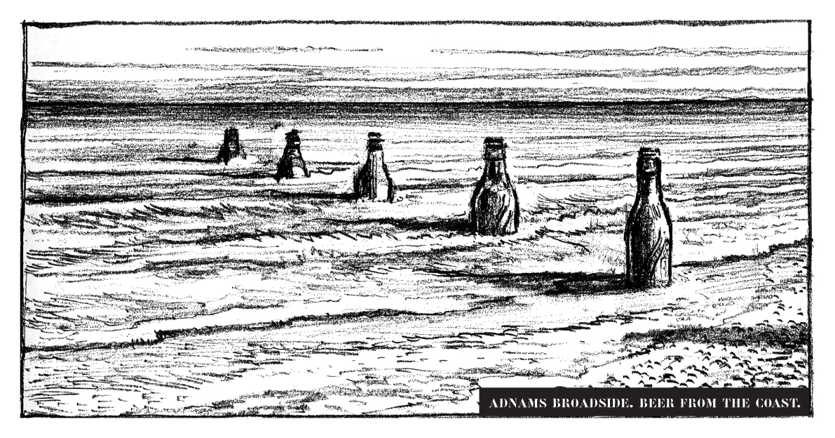
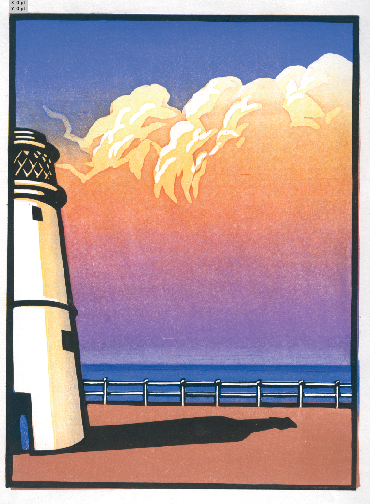
The bottles were ok, a bit more addy, a bit less stylish.
The pump clips felt more contrived.
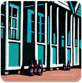
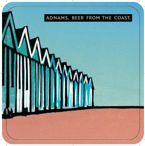
We then set about transforming everything they produced into our new style.Trade ads.

A Drink Aware poster.
A Christmas ad and card.
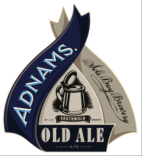
Pump clips.Here's my rough.
Here's Chris's.
Here's the finished pump clip.
Another one.
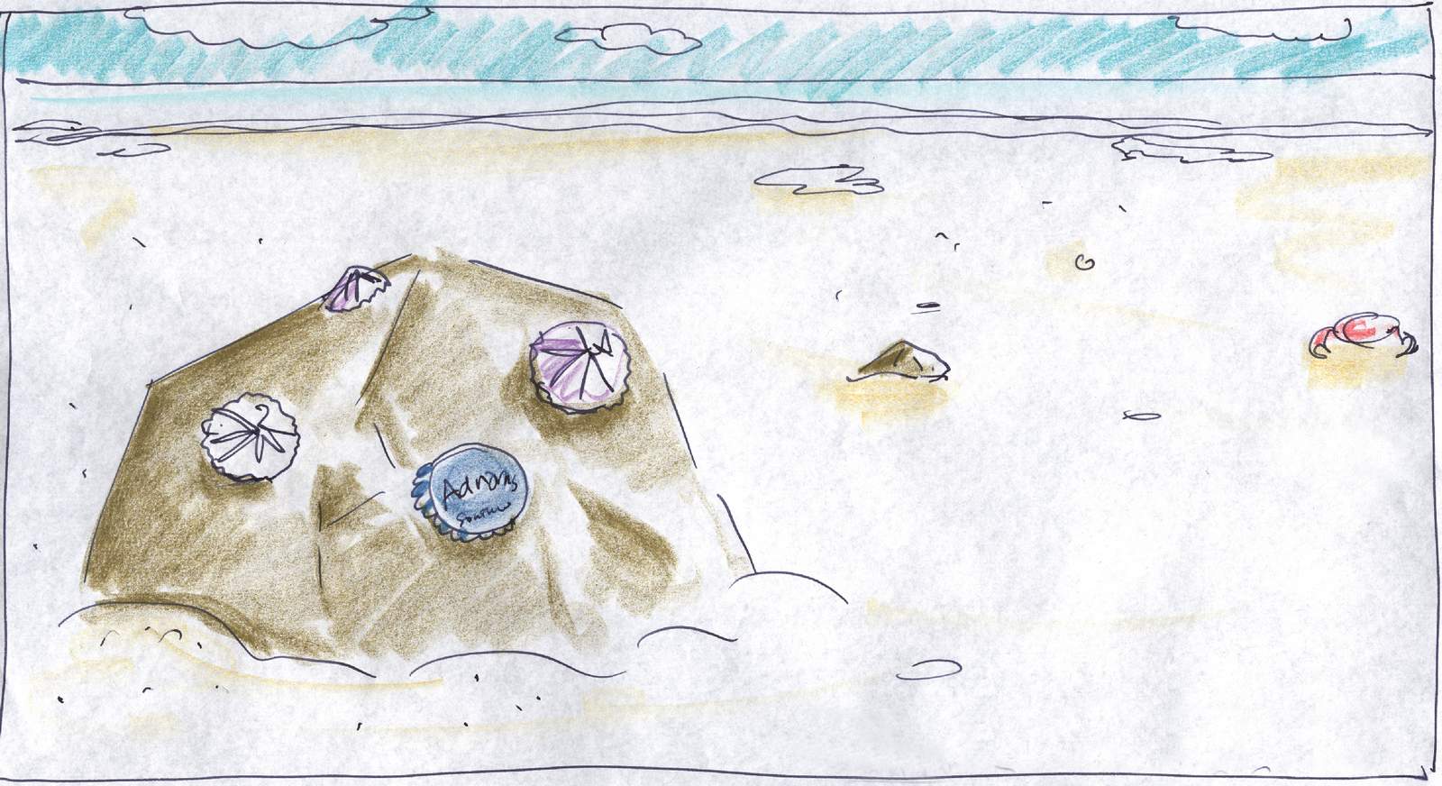
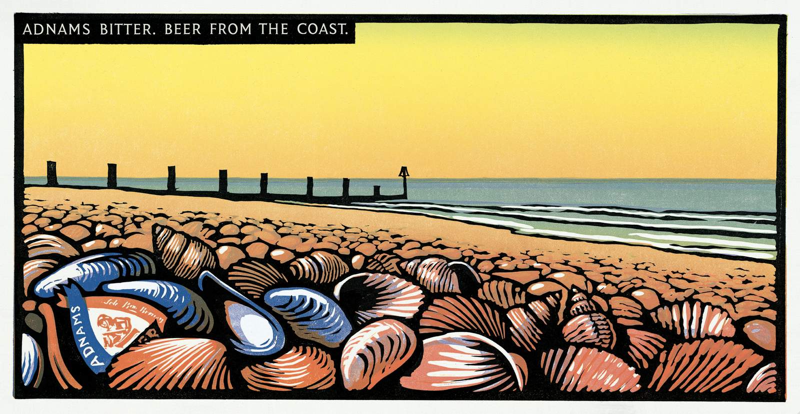
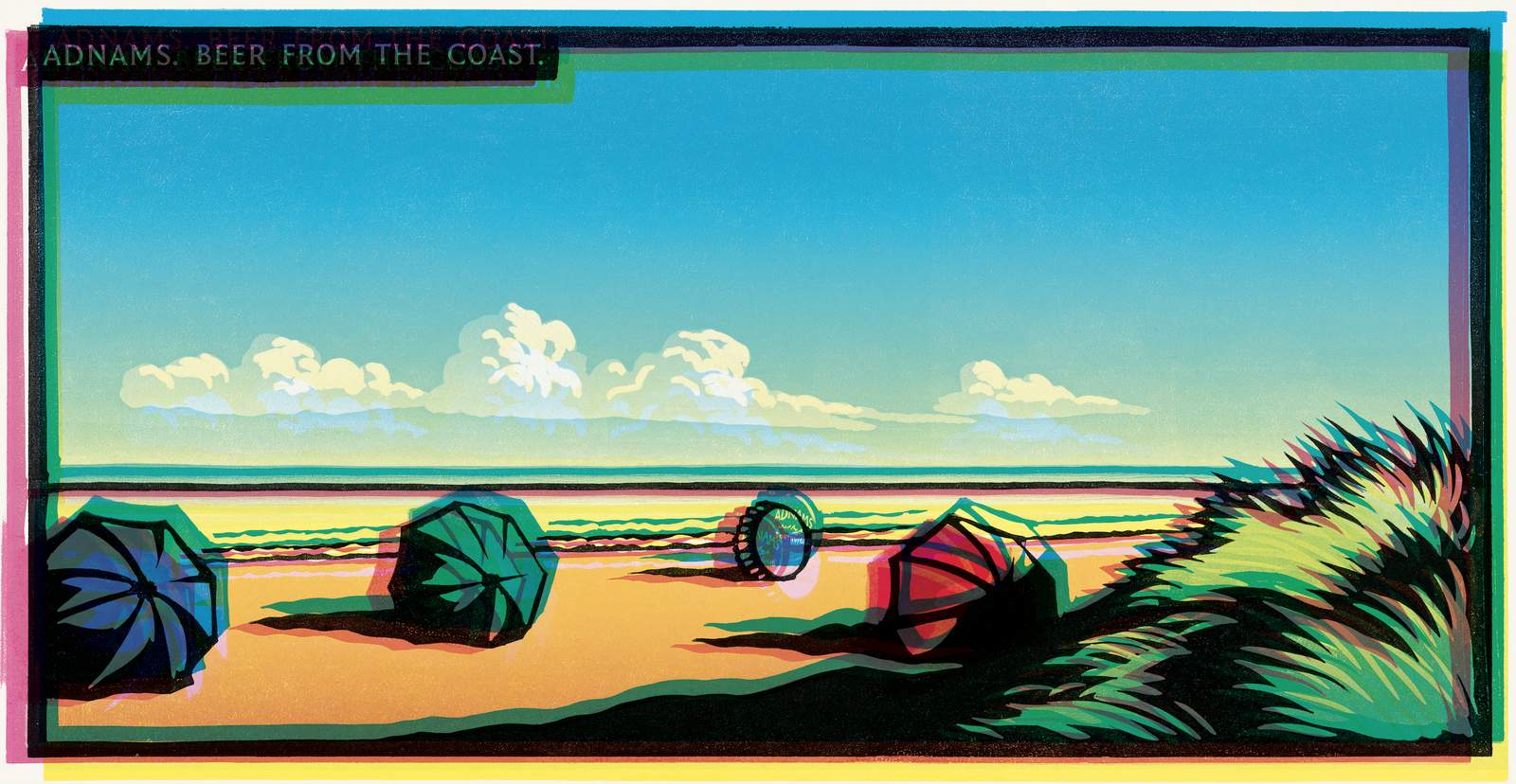
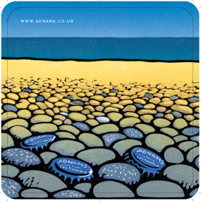
Beer mats.Turning 48 sheet posters into square beer mats was a problem.48 sheets are effectively two squares side by side.I couldn't crop any of the posters within a square.I'd either crop out the main bit of the drawing or the bit relating to Adnams, the cap, bottle or pump clip.They just didn't work.Then, like most problems, the problem is the solution - break them in two, front and back, and people could match them up like a little game.(Ok, it's no FIFA 14, but it's a little bit of engagement.)
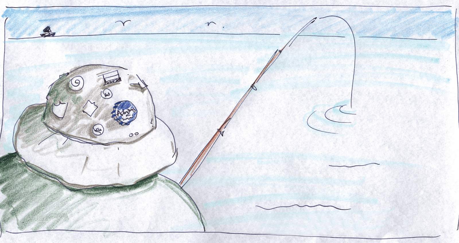
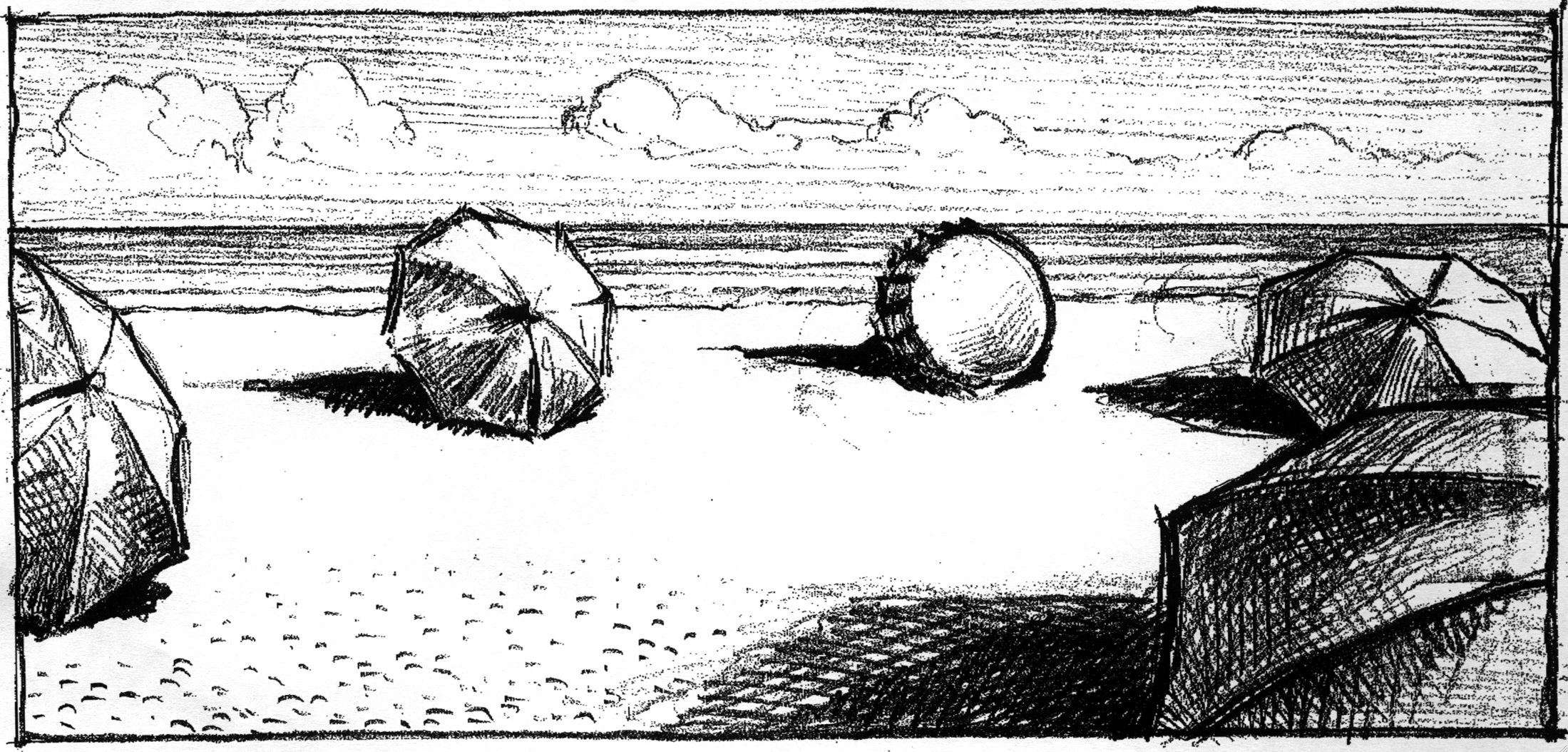
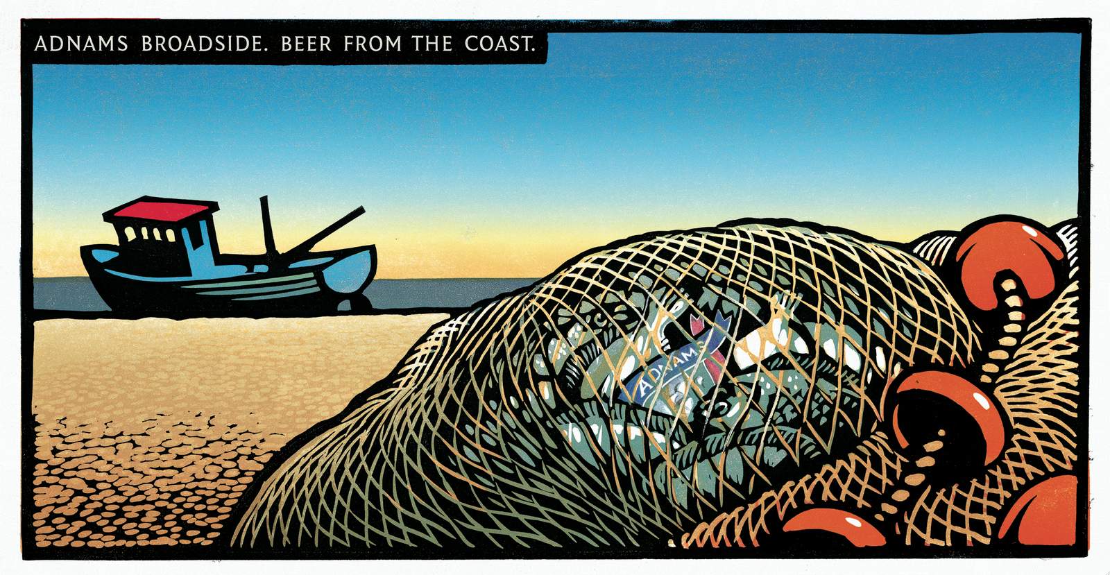
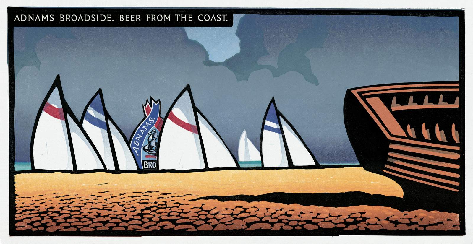
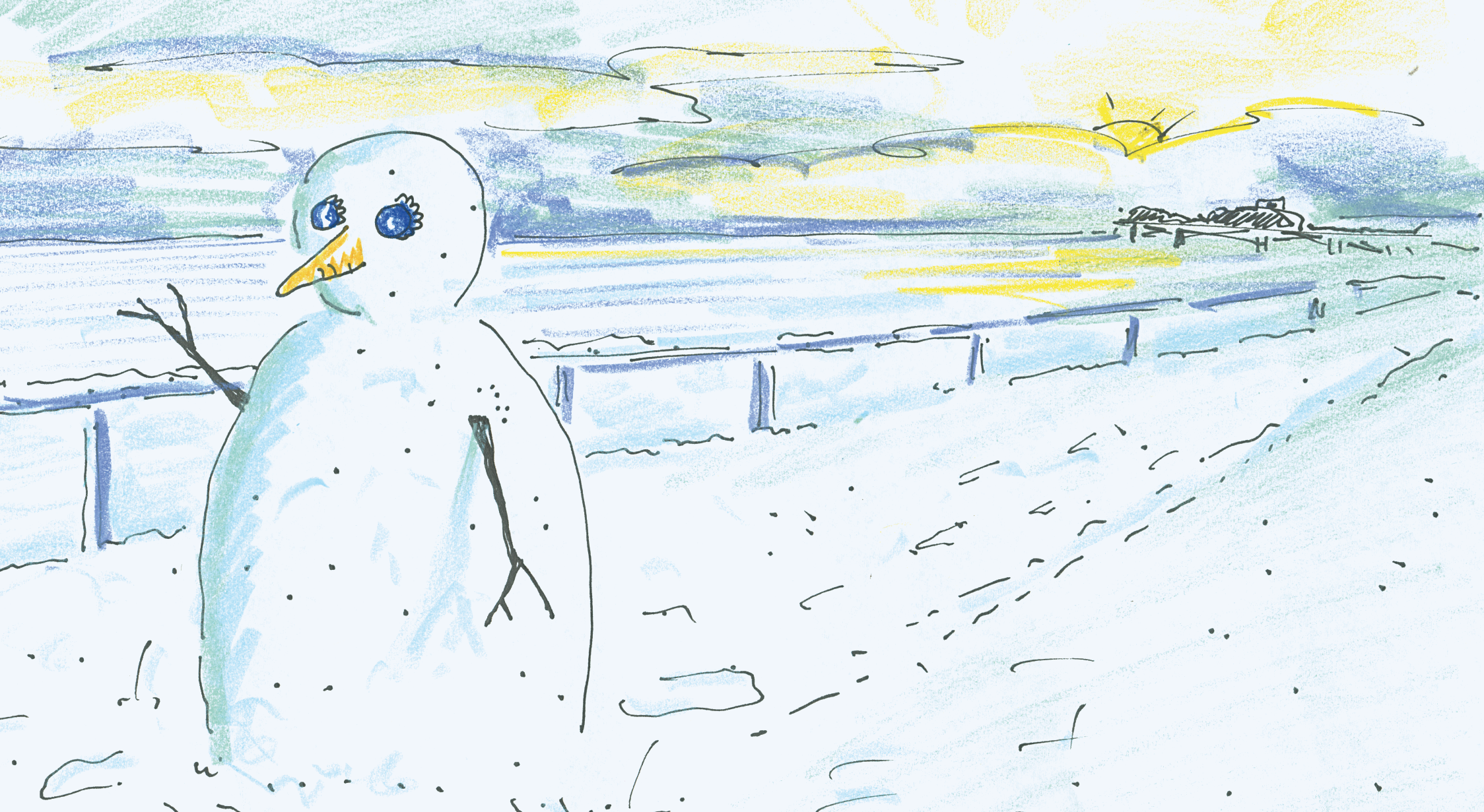
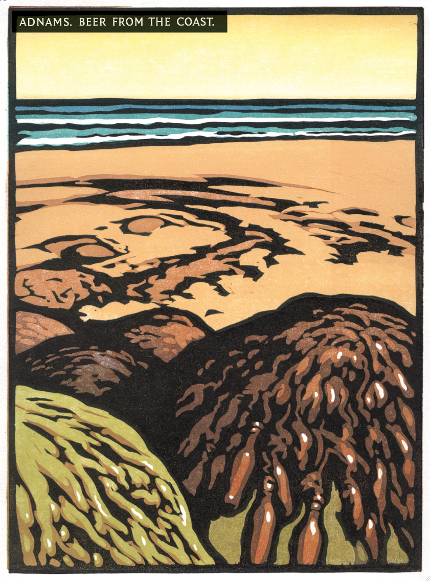
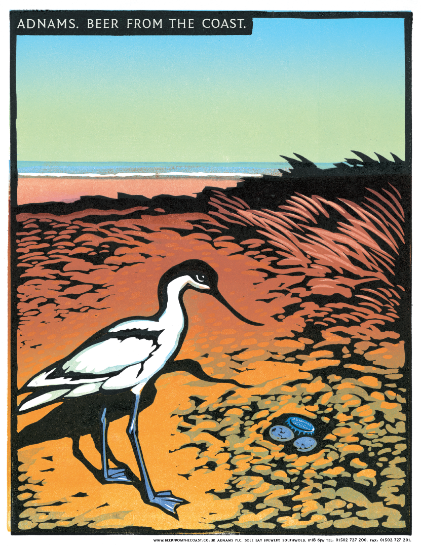
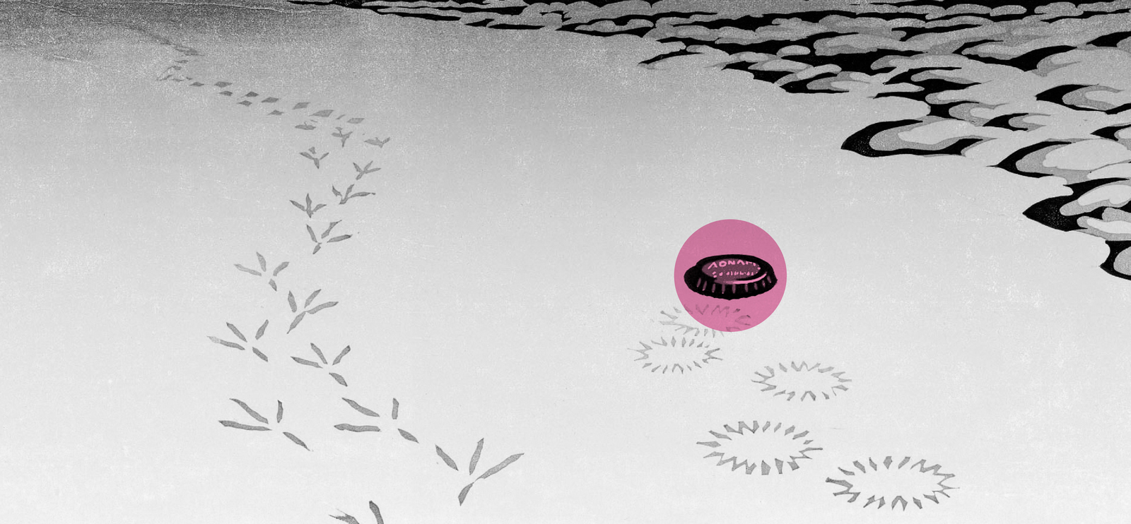
Then...nothing.I think the feeling up Southwold was that they've done their marketing, maybe review the situation in a decade or so.We advised them to invest in an ongoing dialogue, to build on the awareness and goodwill the campaign had generated in the first year.I tried to hustle up more ideas.It was tough, because I'd think 'What haven't we used from the coast? (NOT seaside), we've done pebbles, boats, groynes, fishing nets, shells, beach huts, harbour bollard things...whatever the hell they're called - what's left?'Nothing.I’d imagine wandering up and down the coast trying to think what I'd find - 'Sea - done it...Sky - not coasty enough...Pebbles - done it...Grass...not coasty enough...Seagulls...not bottle or cap shaped...er...sea again...'But gradually you eek out a few thoughts.Here are some from my notebook.
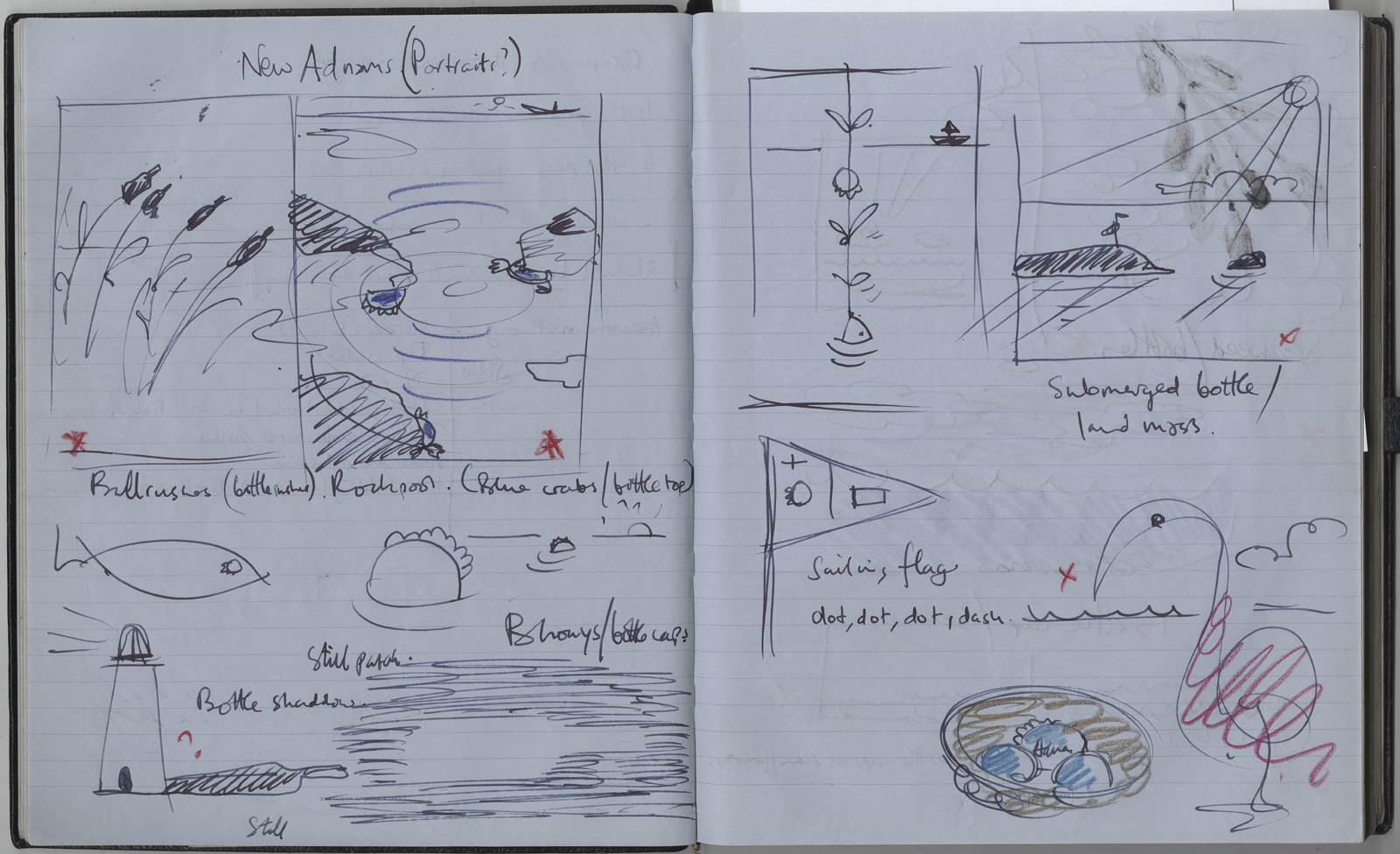
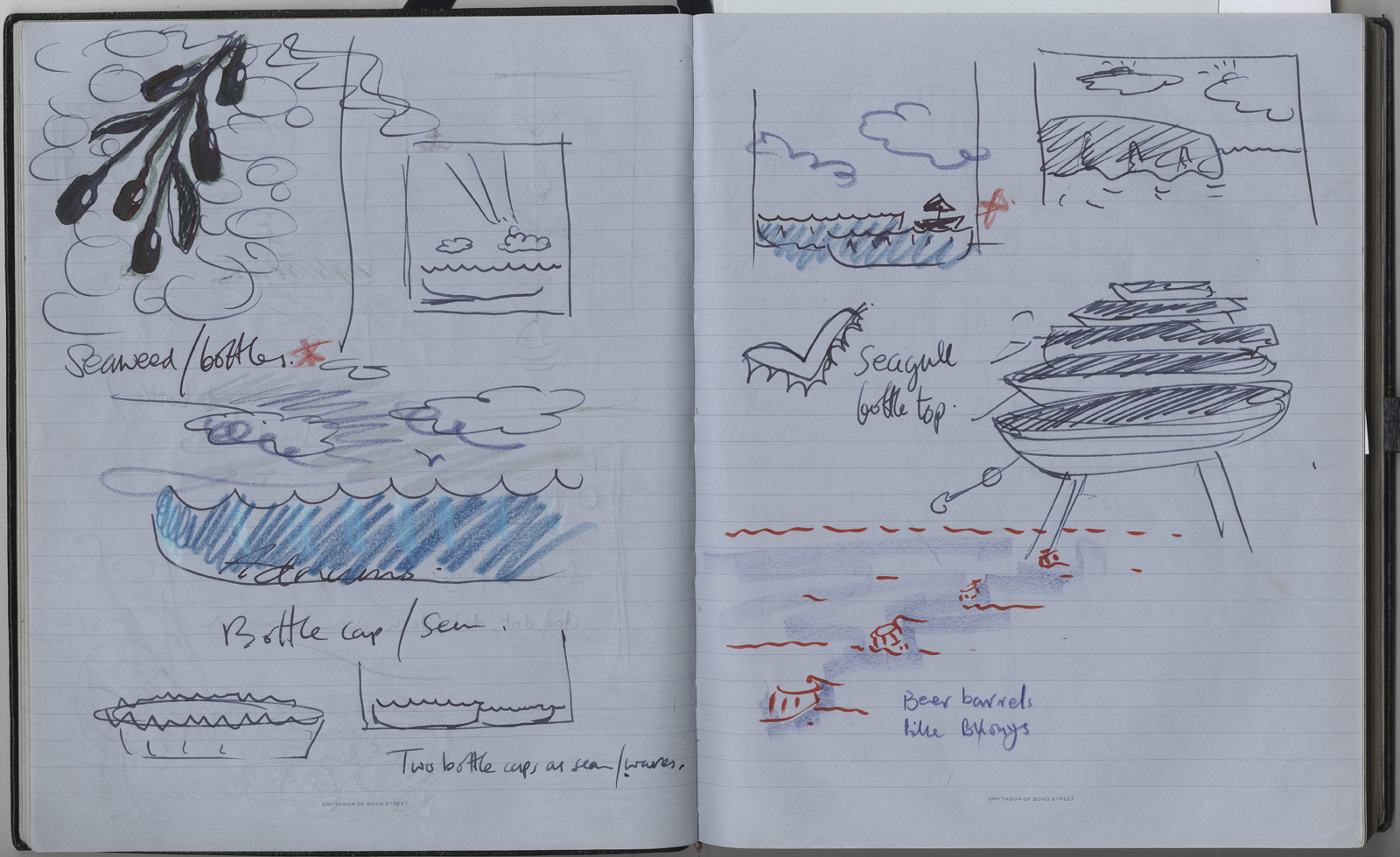
I picked out my favourites and presented them to Adnams.
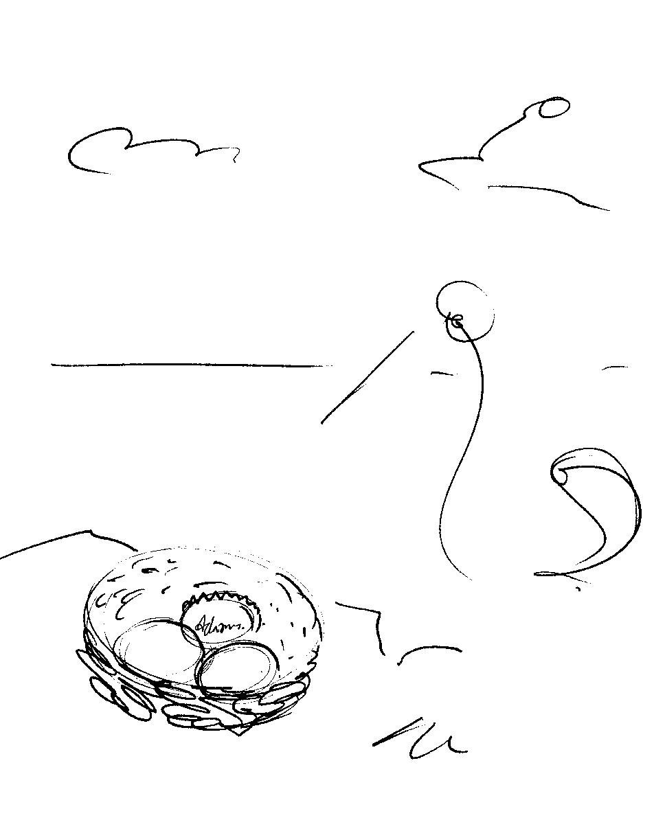
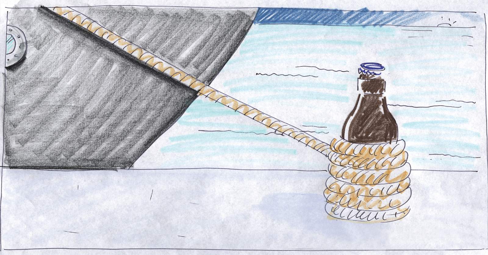
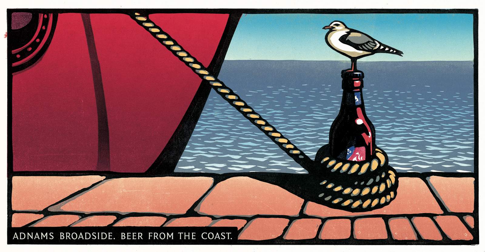
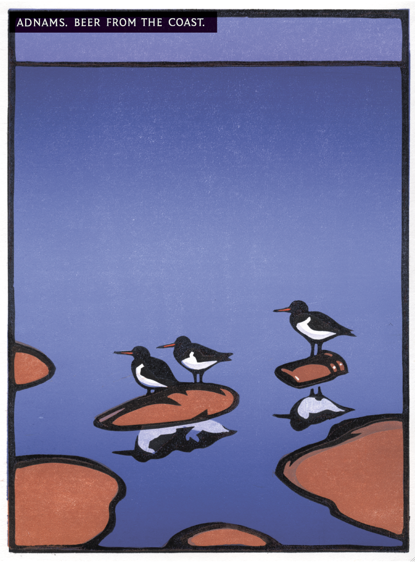
I'd found out that they were making more money per month selling our ads on tea towels, mugs and all manner of merchandise than they were paying us fees.So my angle was 'let's at least get a small batch of illustrations together, which could be t-shirts, tea towels, tea cosies, press ads, posters or whatever. It's content you can use'.They agreed.My favourite was this one, I liked that you had to discover the idea.
The rough looked good.
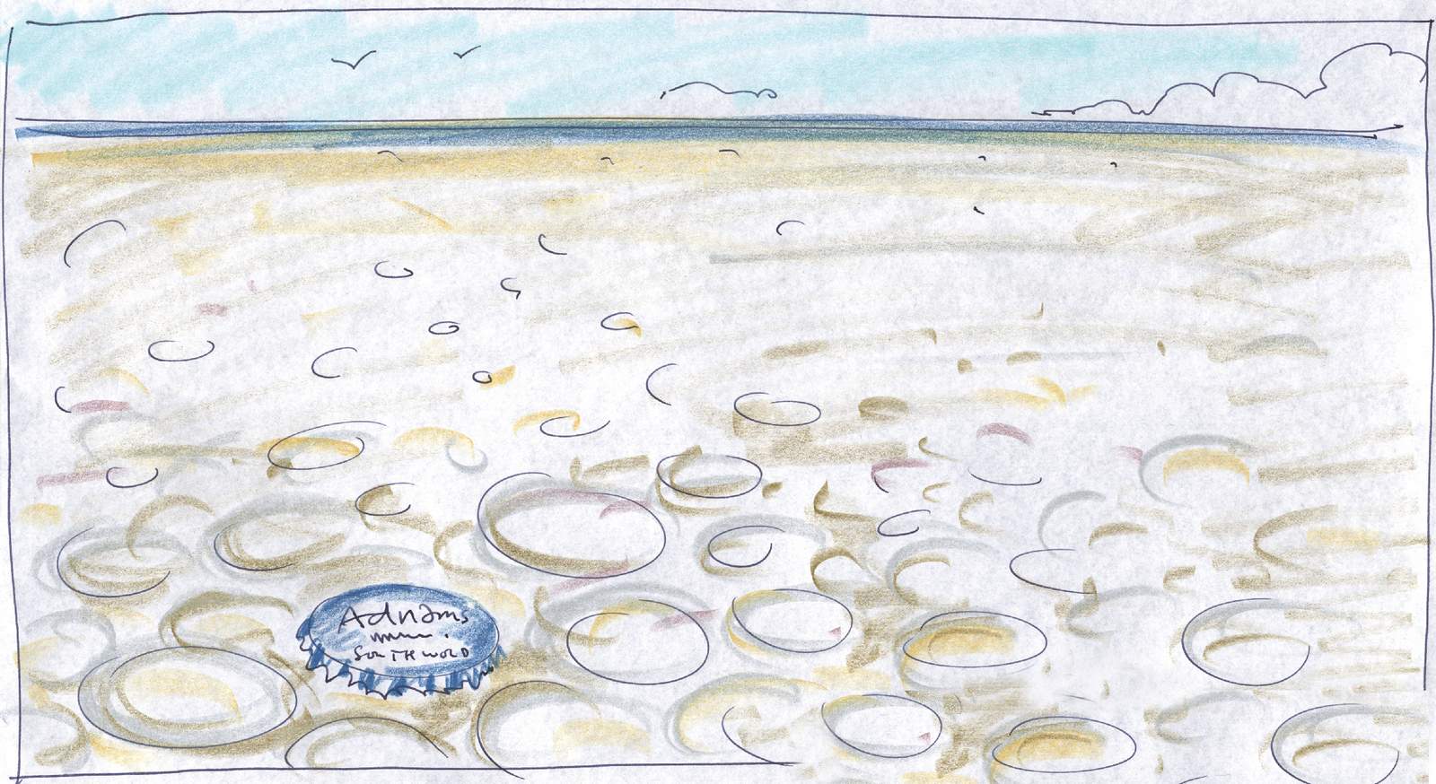
The first print looked...weird, more like a printing error than a sunset.
The second one looked great, but the sunset was so colourful and lively it distracted the eye from the idea, the shadow.
Chris had a third pop at it, it was cool.
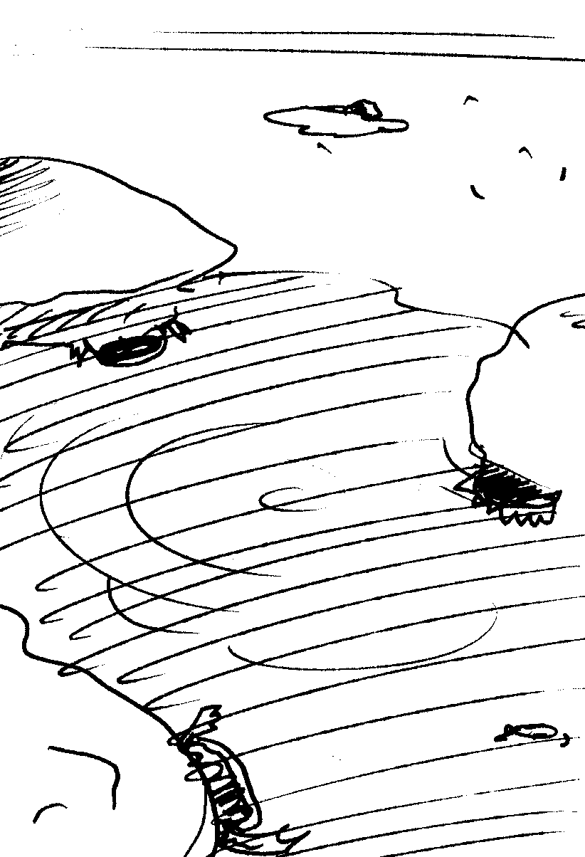
We never ran the one below.I always thought it had the potential to be really strong, but the first print didn't work at all - the sea was too choppy, the idea look contrived.In retrospect, a still sea with no waves would've worked. (Damn it! Ten years too late.)
They ran a bit as press ads, but didn't get used much.Adnams then went into hibernation for a bit, until I worked with them again a few years later. But that's a whole different post; ‘ADNAMS Part 2: Words’, will follow...at some point.

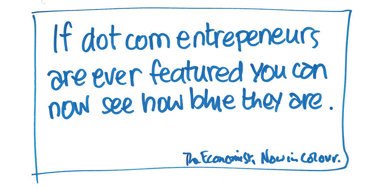
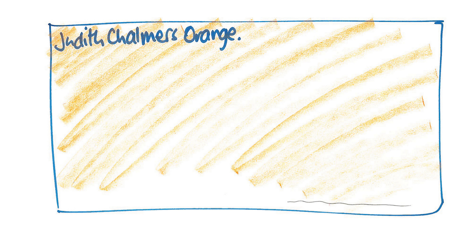
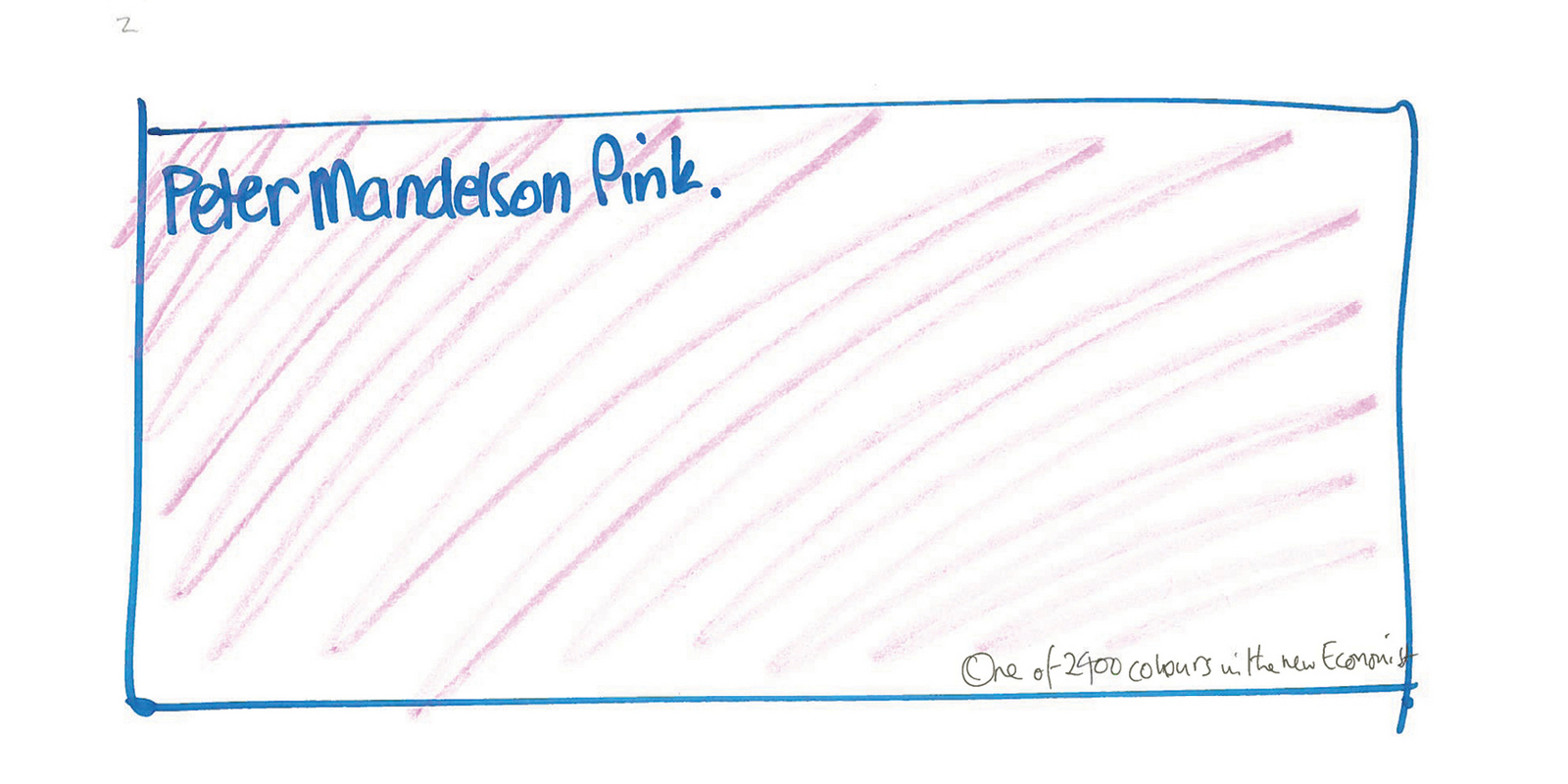
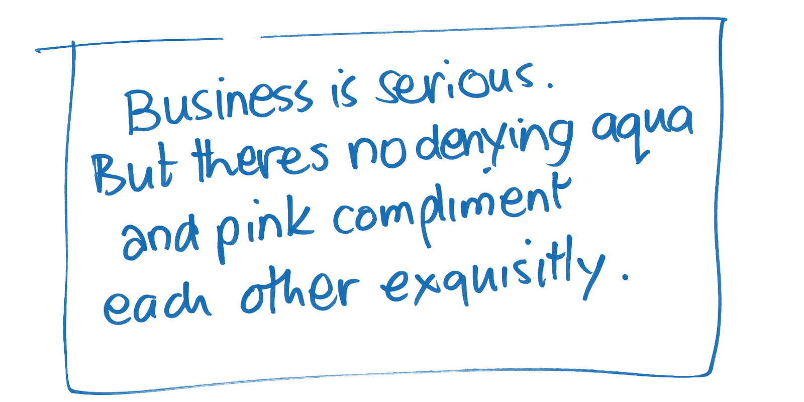
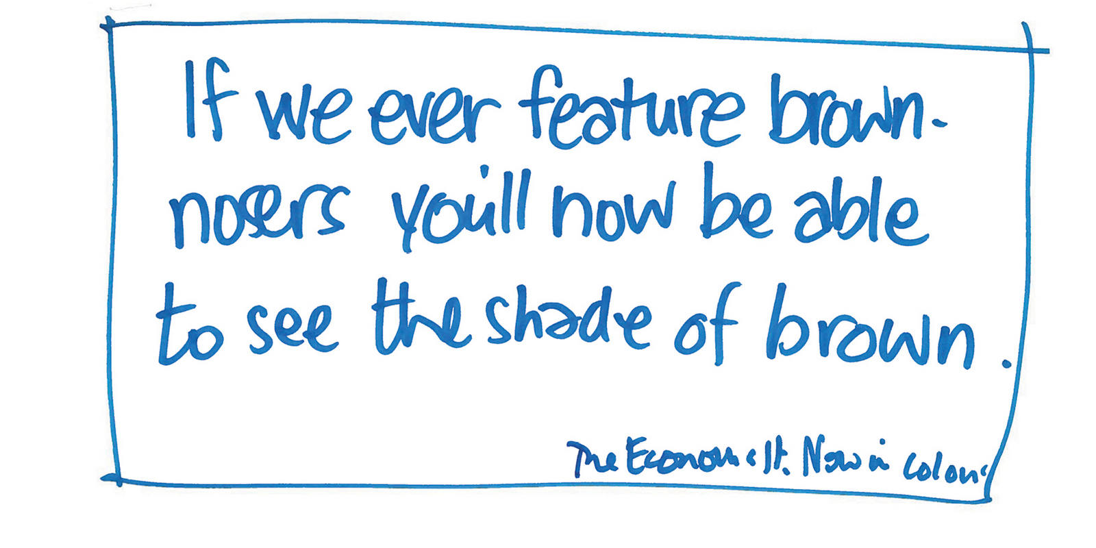
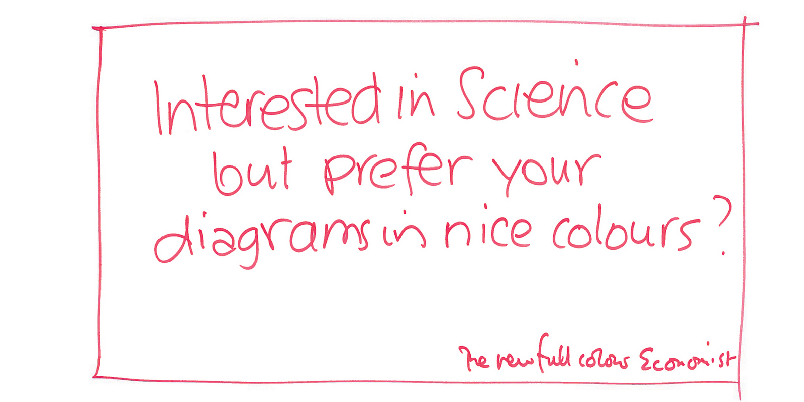
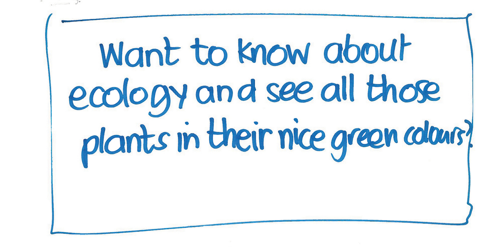
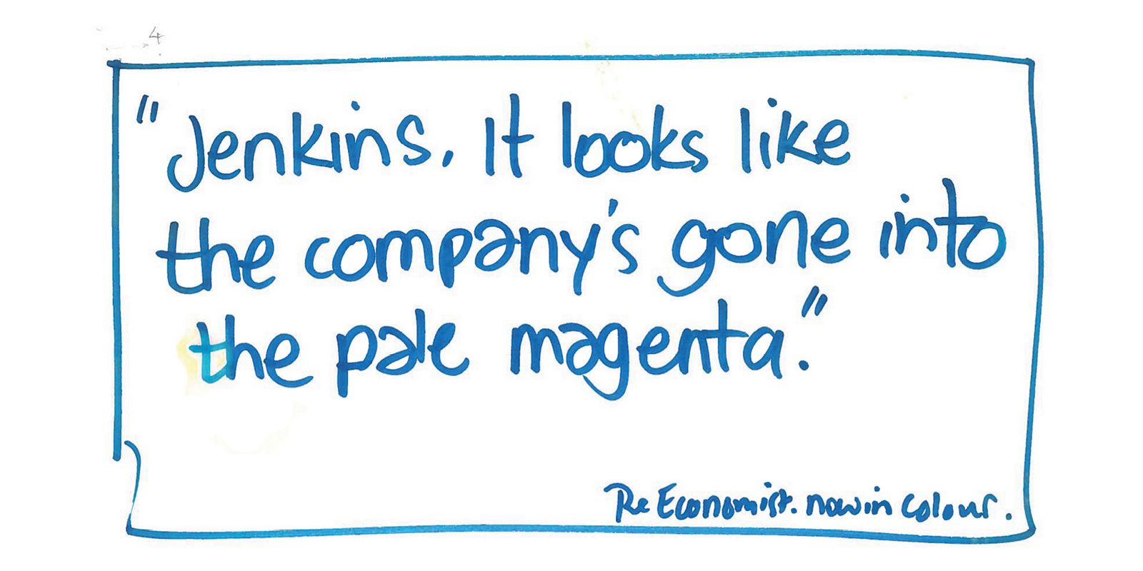
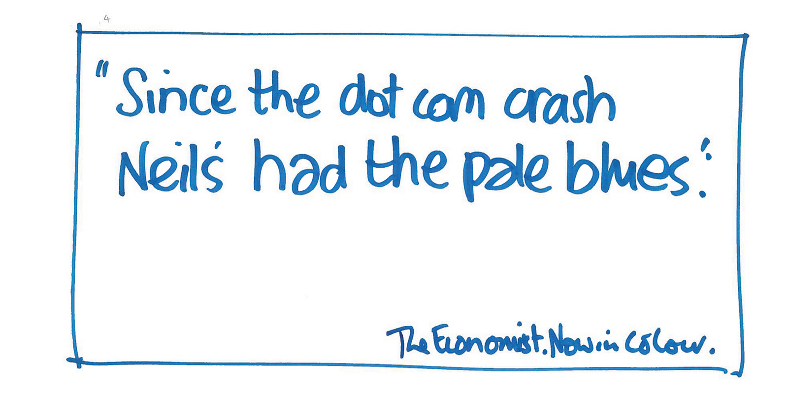
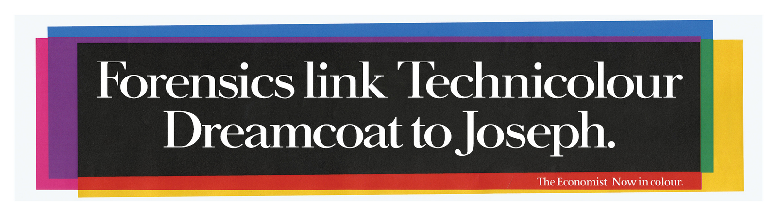
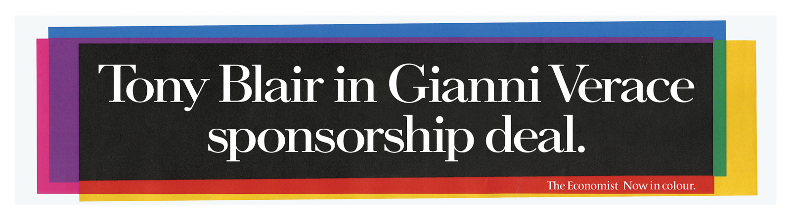
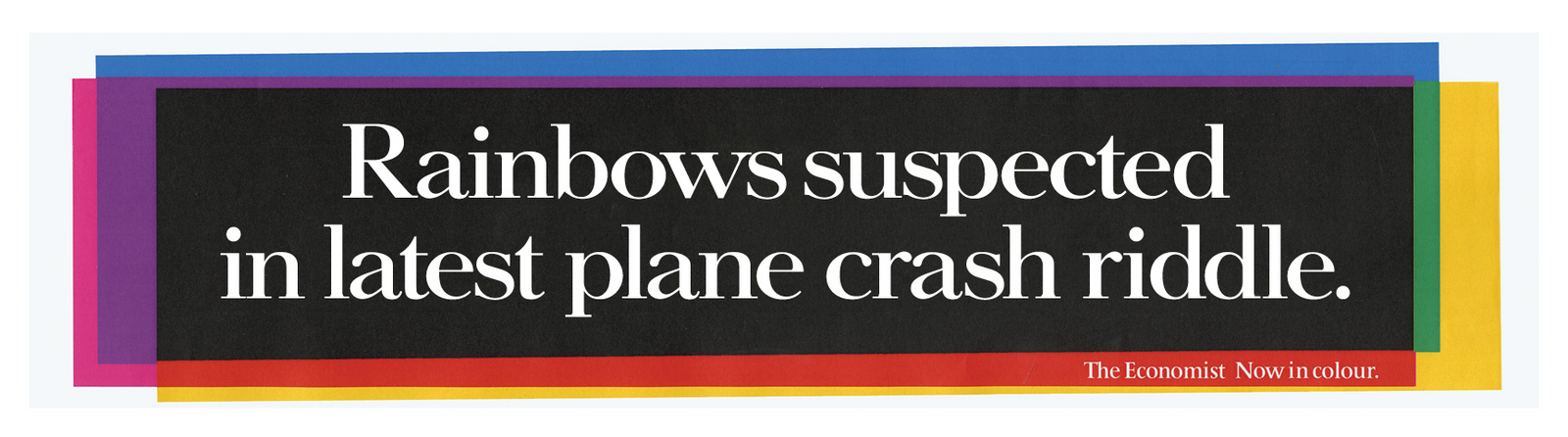
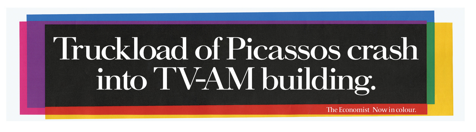
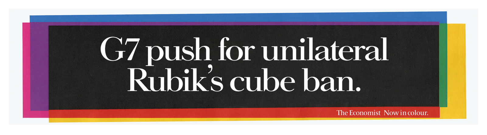
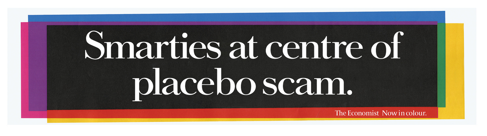
I just found this batch of rejects for The Economist. I was surprised at how many shots we'd had at the brief. I knew the work was getting past the Creative Director, because I was he. It must've been the client. I can't remember who first coined that phrase ‘bouncebackability’, (I think it was a footballing Ian, Holloway or possibly Dowie), but it's a crucial, if unglamorous skill every creative needs. Your ideas are torched every single day. As good as you get at debating, persuading and plain arguing, you're still going to go again, again and again on the same brief. You need to be positive every time. Anyway, The Economist, it was a tough brief, after years of using advertising spaces to flatter the readers intelligence, we now needed to tell them 'Great news - Colour pictures!' It was difficult to think how this wasn't a clash with the high brow image of our reader that had been carefully built up over the years. We tried to be Economisty, but talk about colour.1st GO.
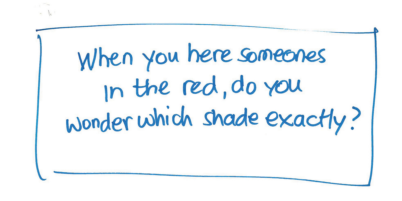
REJECTED:'Too like the regular Economist work'. (Spelling 'hear' wrong probably didn't help.)
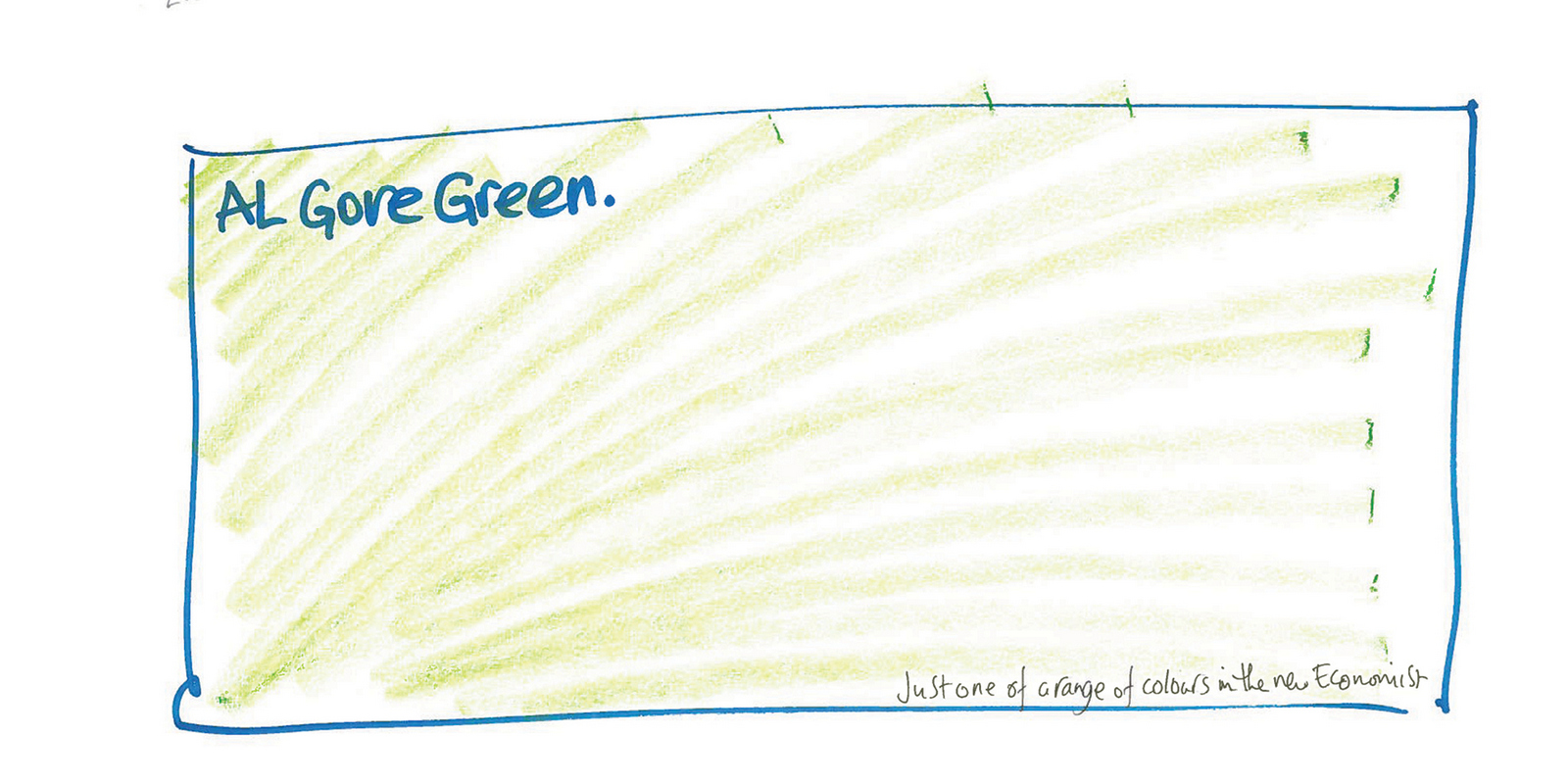
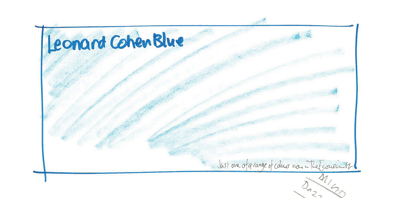
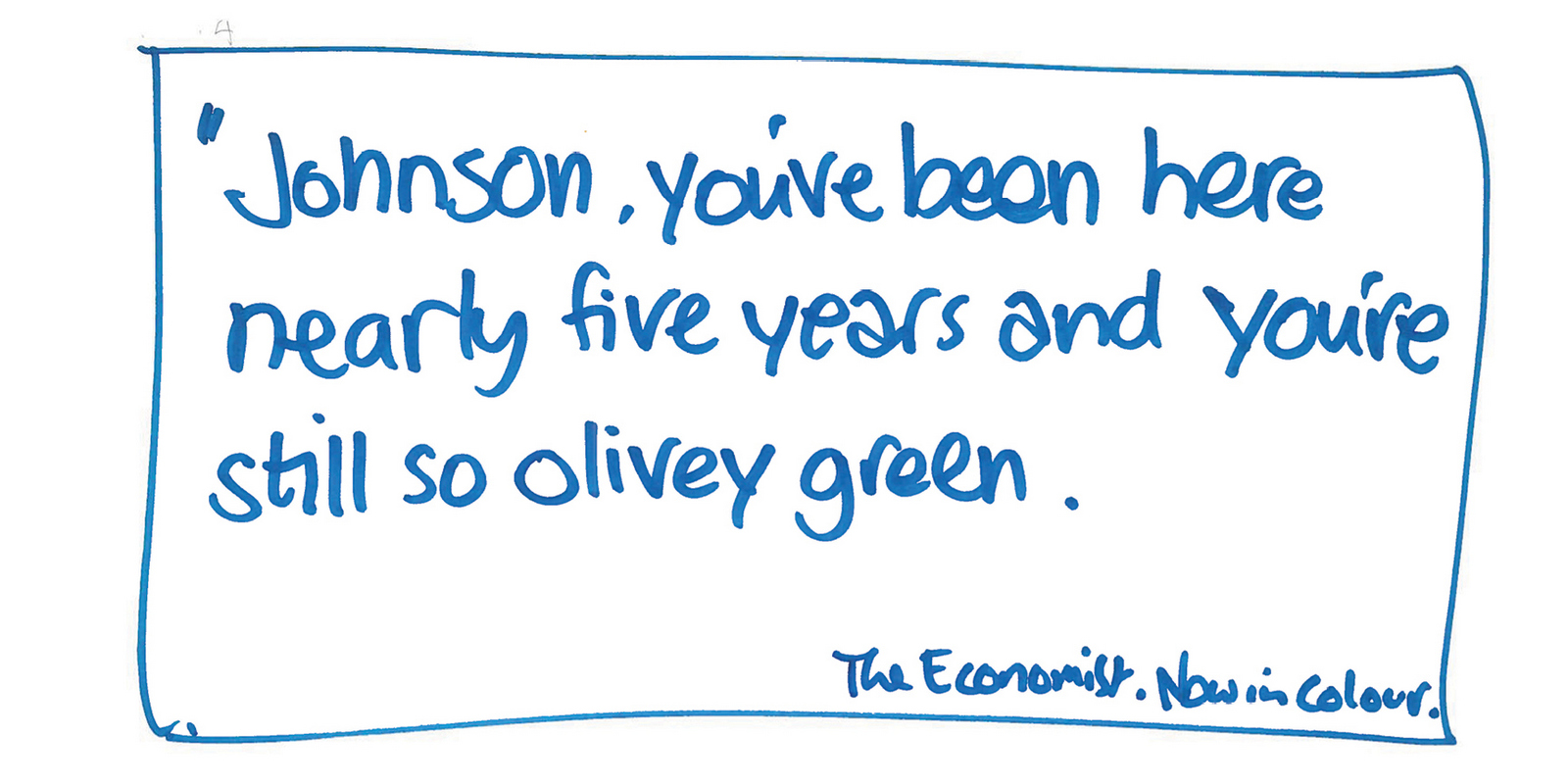
Rejected; 'Too clever-clever'.6th GO.
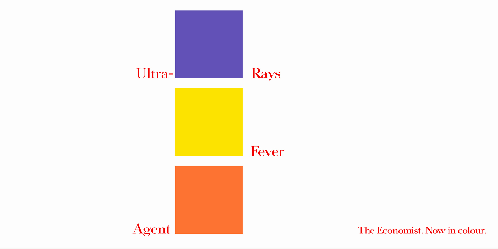
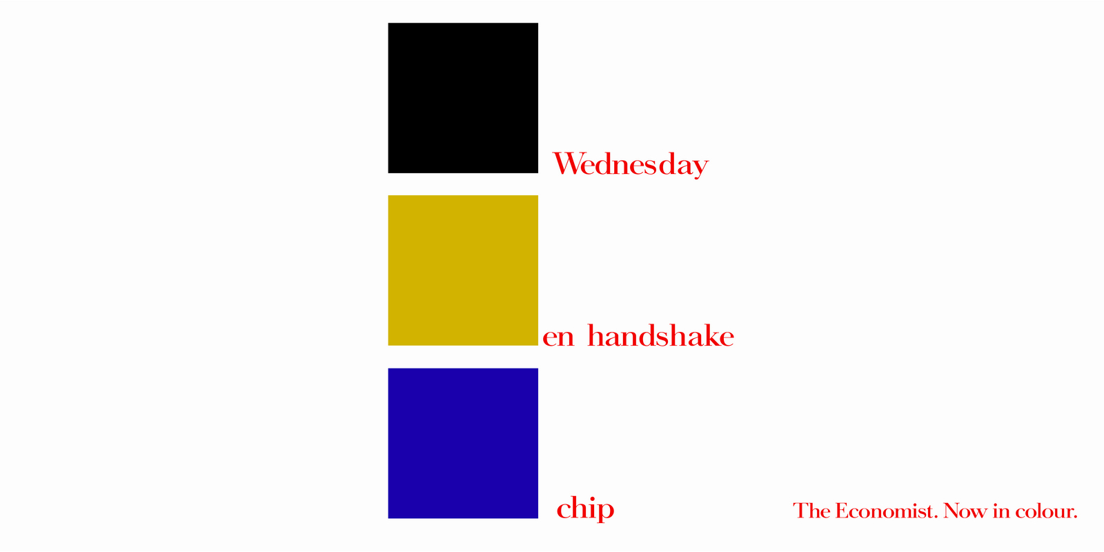
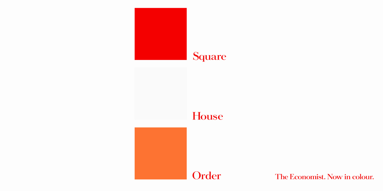
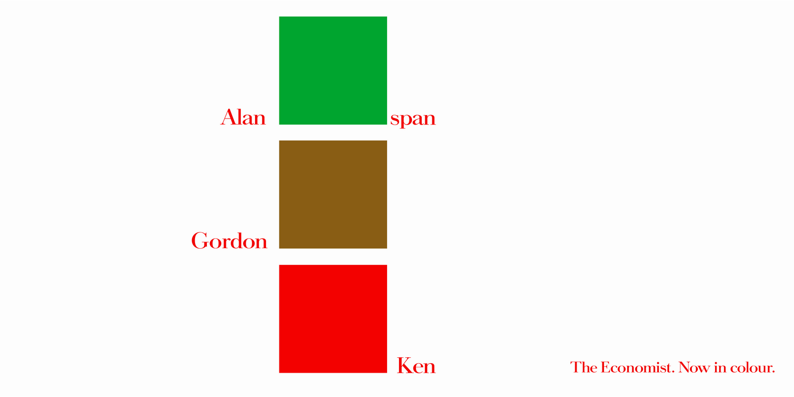
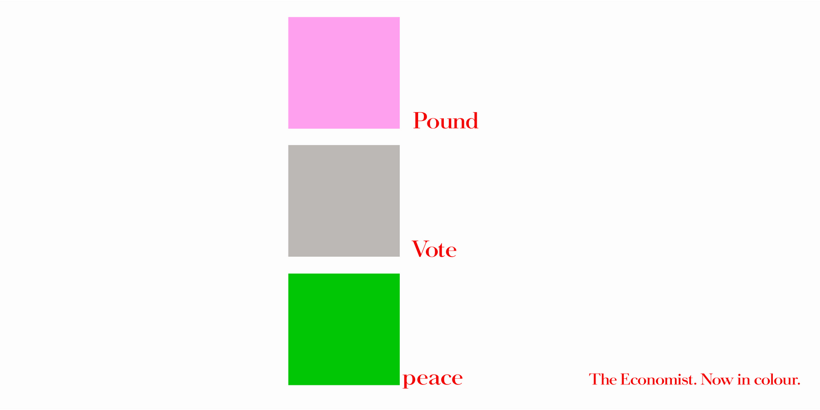
Although in retrospect, I think I prefer the 'clever-clever' campaign.
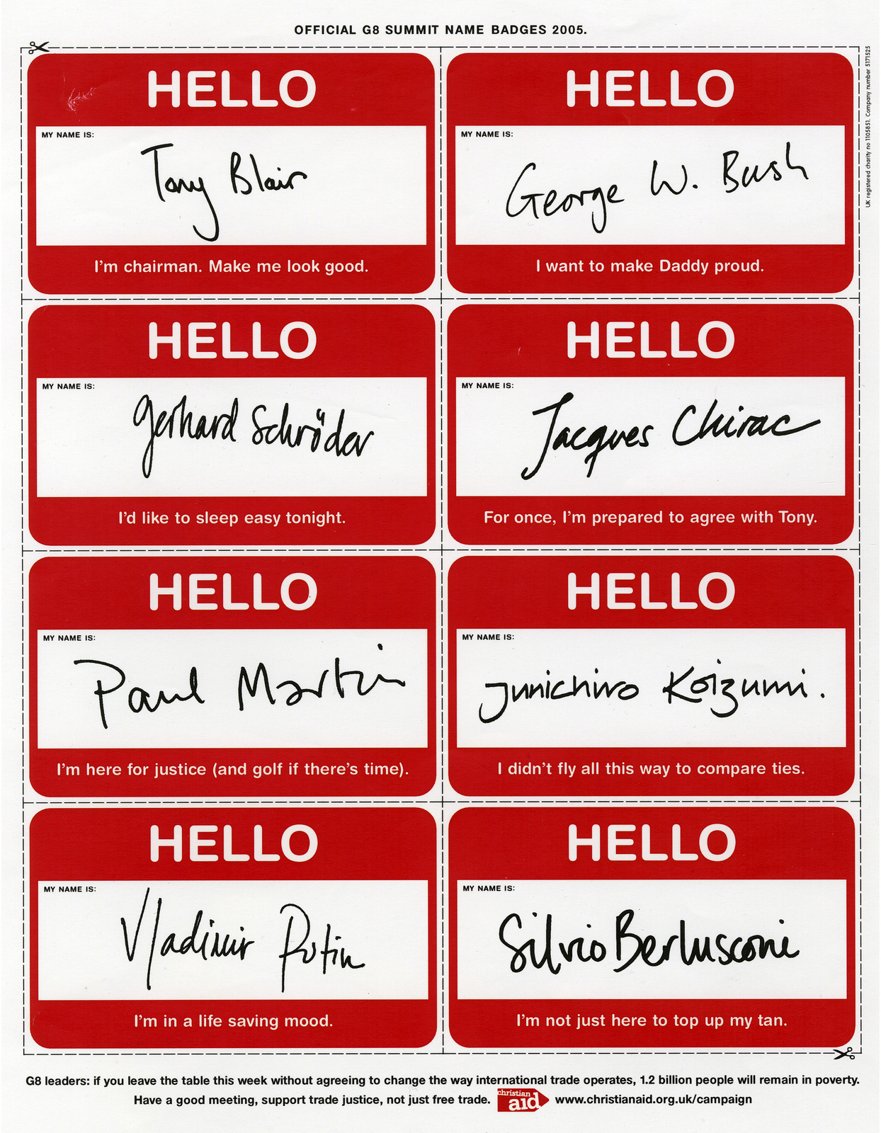
Whilst at AMV/BBDO Sean and I got a brief to write an ad for the British Television Craft Awards. The BTA Awards with the word 'craft' inserted are less desirable than the ones without that word. But they're awards none the less. It got us thinking - what creatives would enter an awards scheme aimed at recognising everyone but the creatives who came up with the idea?
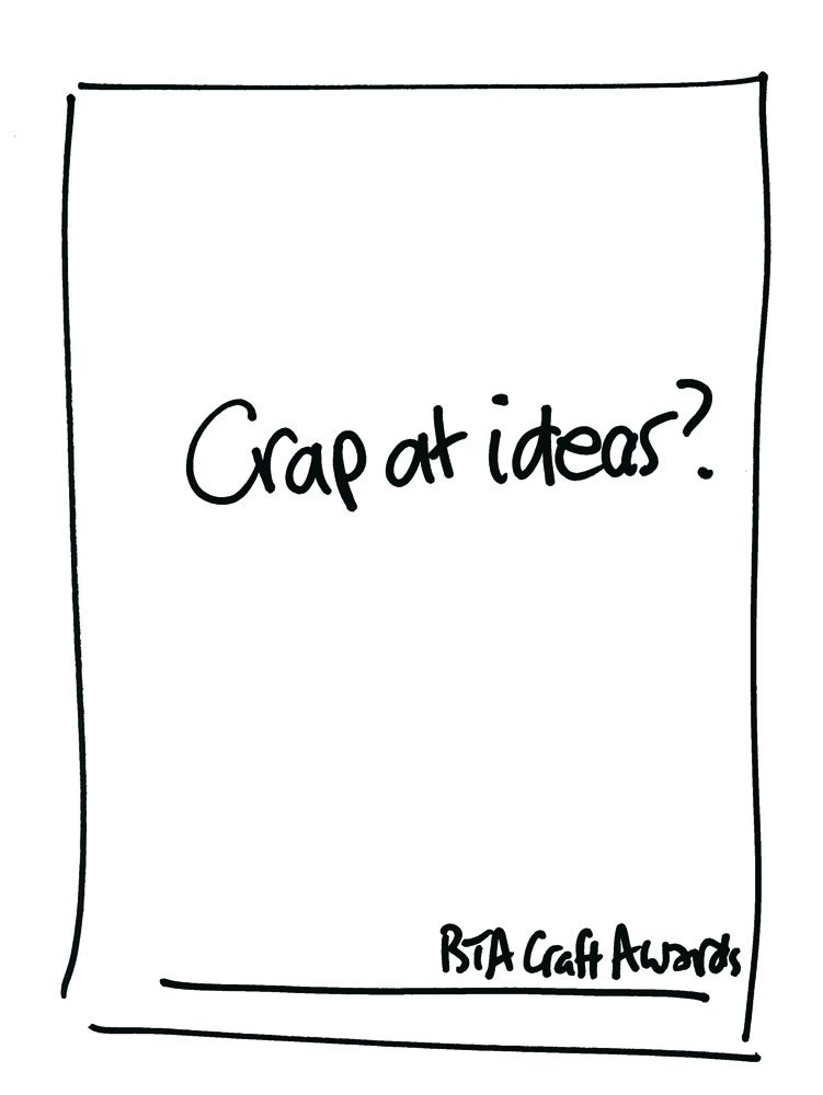
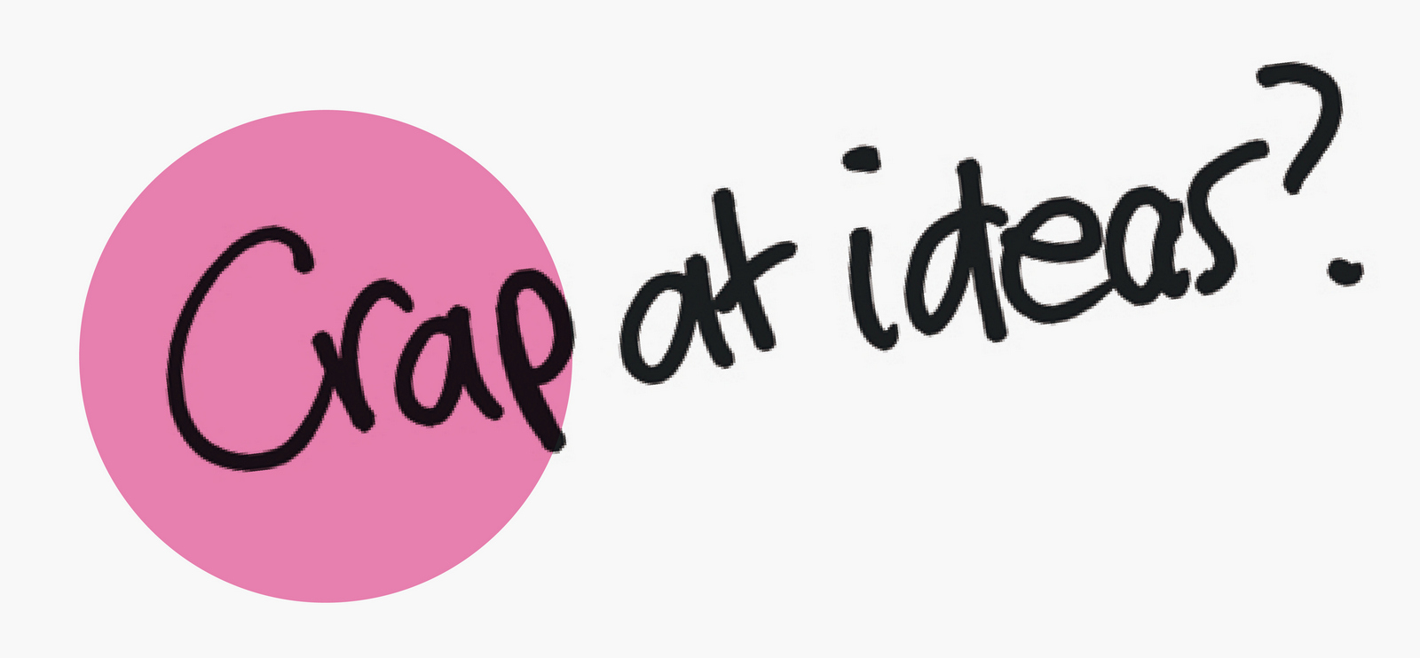
Initially it said 'Shit at ideas?', but the word 'shit' was felt to be too strong for those delicate types that read Campaign.I liked the idea so I tried really hard to make it look great.A simple bit of type seemed too... simple.Then BINGO! - 'What about if our idea about ideas being overly crafted was overly crafted itself? That's clever.Let's over art direct our idea to the point of looking pretentious, making it look ironic and therefore hilarious, right?
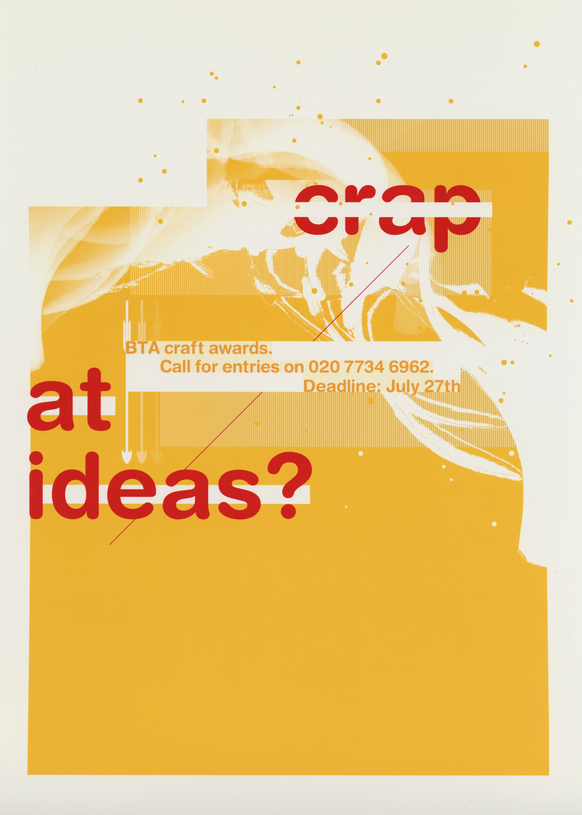
Wrong.Making it look like a pretentious, overly art directed ad meant people didn't look at it long enough to engage with what it said.Obvious really.
I used to work with a very smart writer called Alastair Wood. One thing he said left a lasting impression on me; 'None of my proofs are as good as the roughs'. I realised it was a common complaint amongst writers. Ideas, when first expressed have an energy, vitality and humanity, because people only write or draw the key elements. There's no fat. The process of bringing ideas to life often kills them. Firstly, because it's easy to get seduced by hot photographers, passionate illustrators, belligerent designers etc. Secondly, the concepts lose their individuality. The charm and energy of the scribble often replaced by tired looking fonts and clichéd or over complicated imagery. It's to stay focused and simply service the idea. Possibly because of Al, I like comparing the scribble, where the idea is was first expressed, to the finished ad, to see the journey an idea has been on. If I've been thorough, I should know why I chose every mark on the page. Here's a before and after to illustrate what I mean.
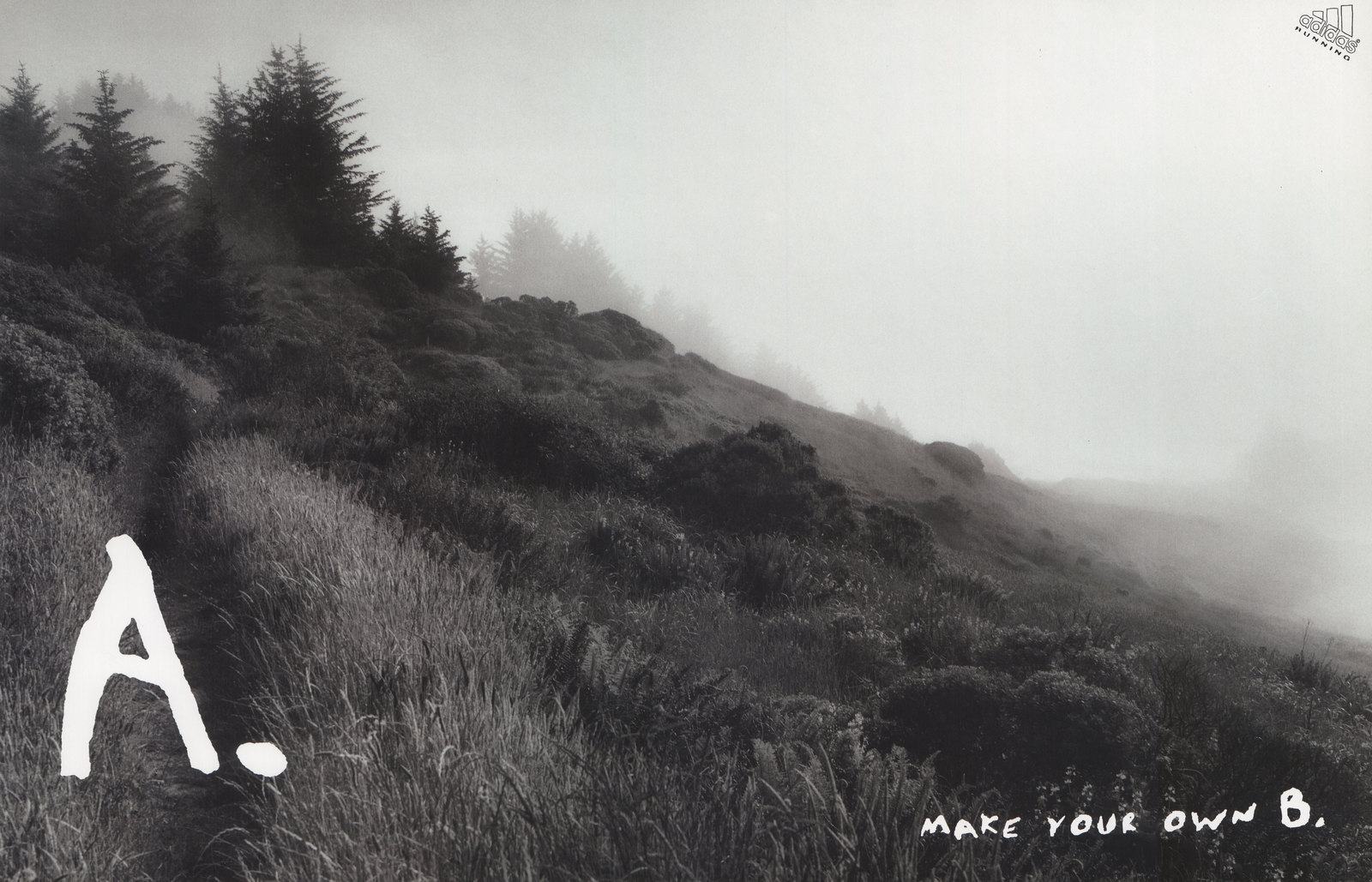
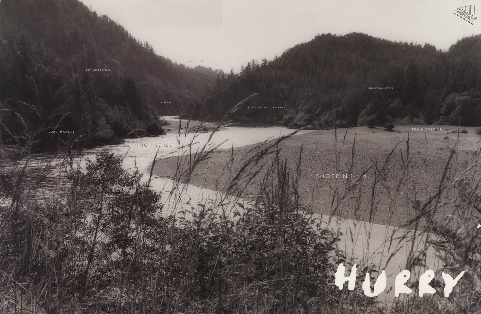
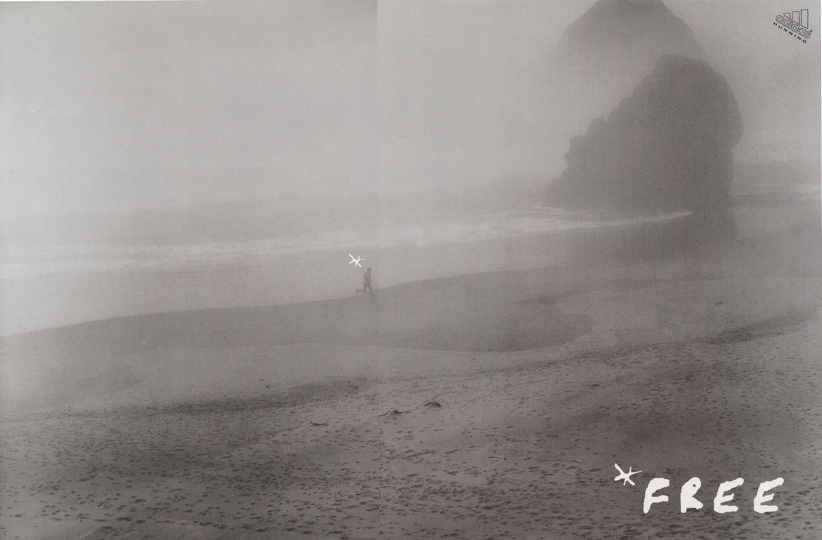
It's a rough put together by my old writer Sean Doyle.It's not very refined to say the least, but it's dead clear, human and has a certain charm.So, what to do?Making a picture you wanted to inhabit seemed key.But what style?As the ad was about getting lost in nature, black and white seemed good, it felt more natural than colour.Logically of course this makes no sense, but perhaps in a overly brightly coloured world of magazines it felt more neutral, which nearly spells natural.Fine Art photographer Sally Gall was chosen to shoot the campaign, just edging out Joel Meyerowitz, who's amazing, but I just felt she captured very evocative moods.Again, as the idea was about getting back to nature, fonts could feel a bit formal, something handmade felt more appropriate.Eventually, the font was some chopped up handwriting that I found in the studio, it belonged to top designer Graham Woods, (except the 'A', which was a font, then run through a photocopier a few times then flipped the wrong way around).The logo looked a bit sharp and shiny, so we traced over it by hand. Badly.It hasn't dated much because it was never fashionable.
Nb. Here are the other two.
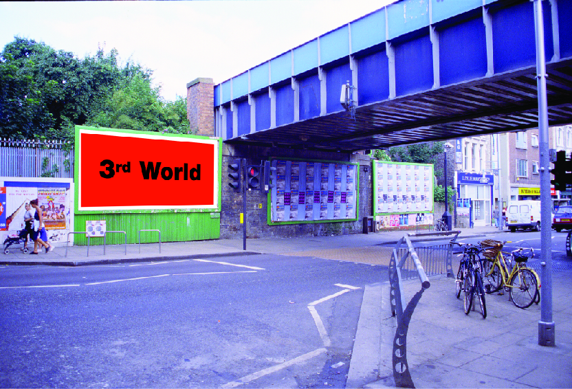
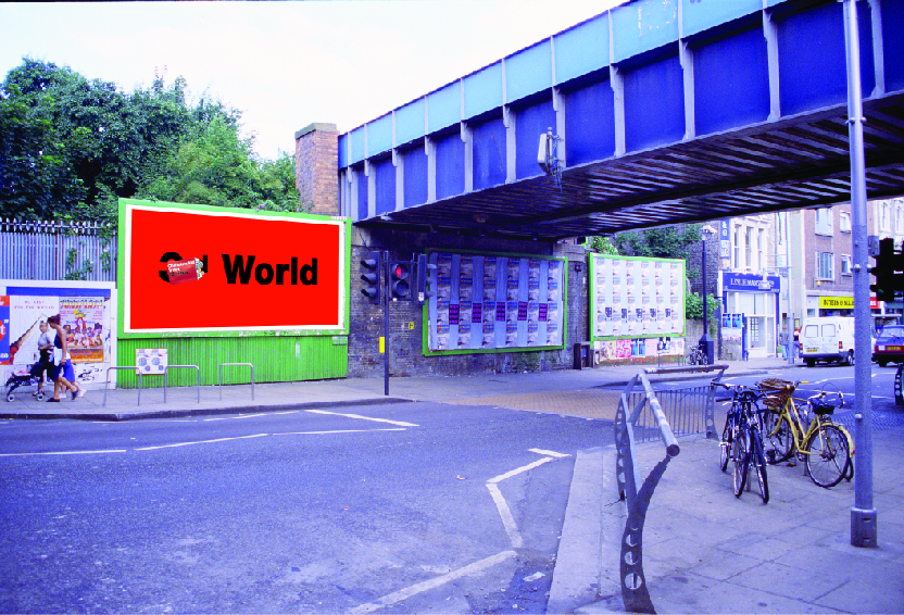
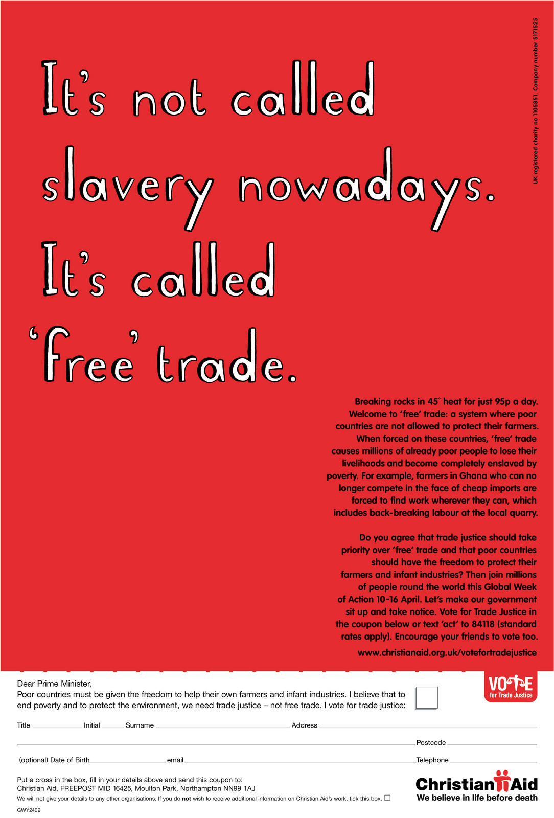
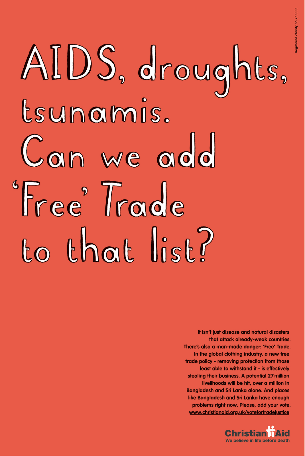
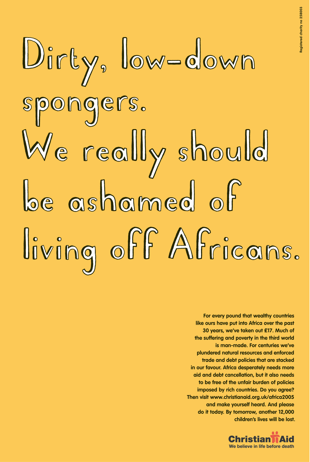
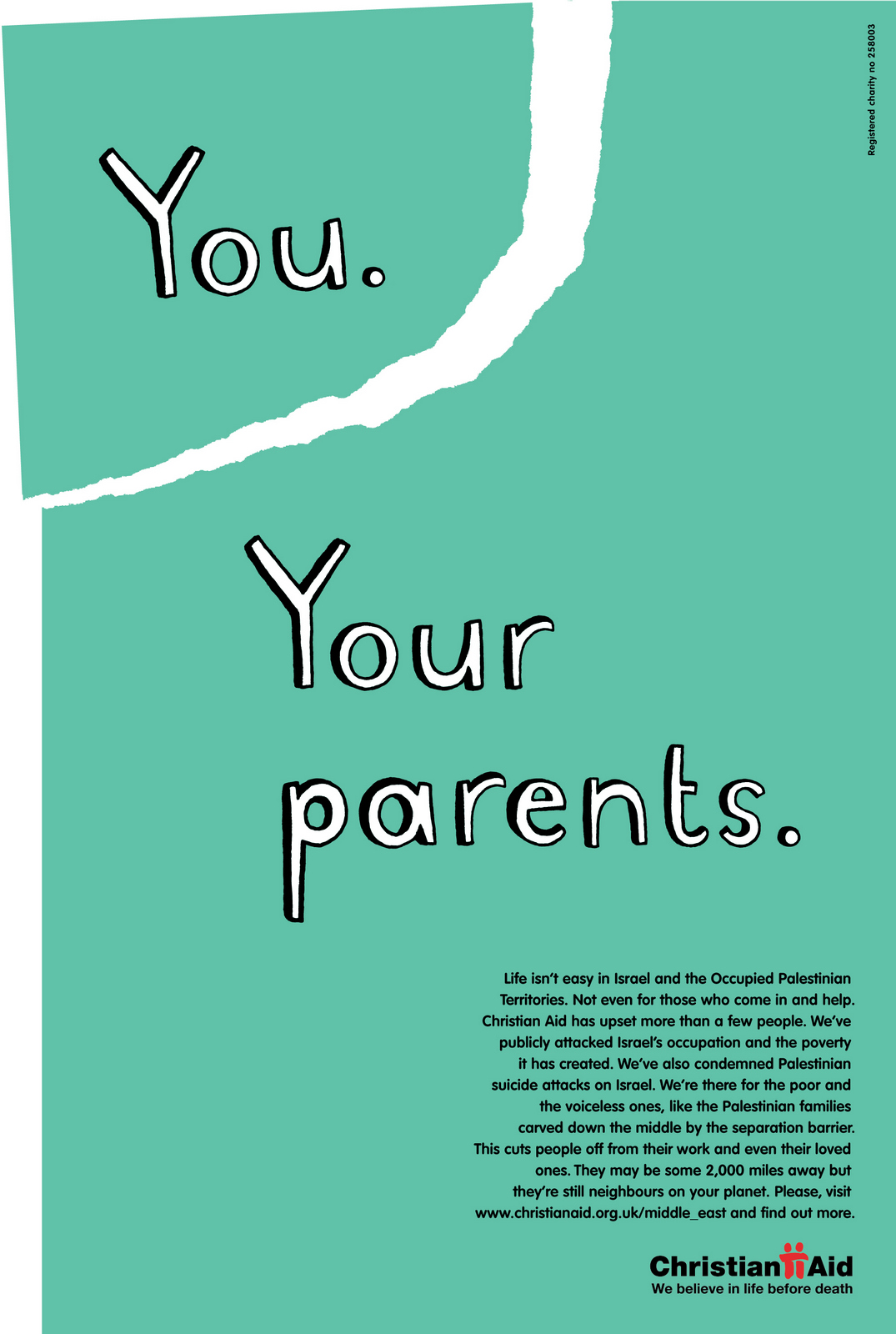
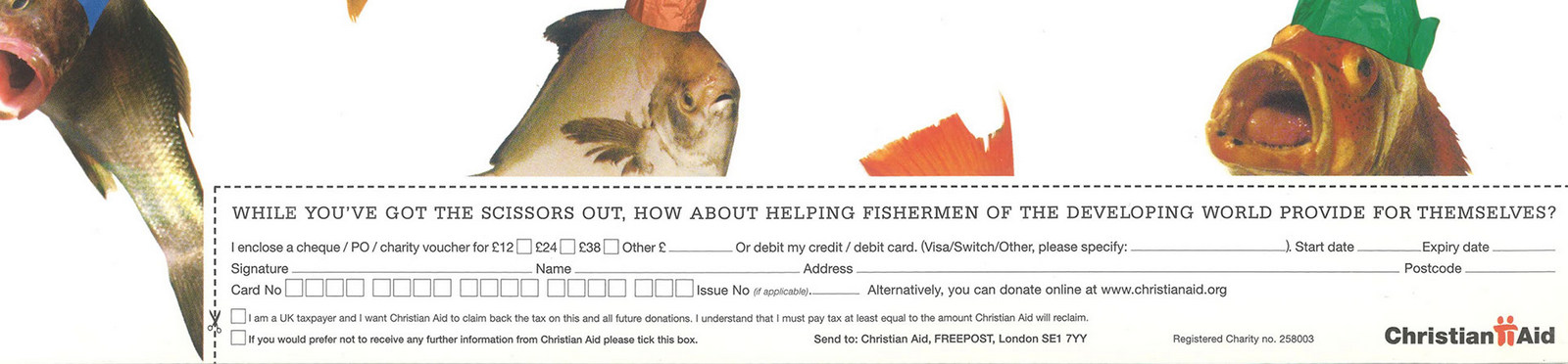
I once pitched for Christian Aid.It’s an emotional subject matter, I got emotional.Sean Doyle and I wrote lots of very angry ads, essentially trying force people to reach into their pockets and save a starving child's life.
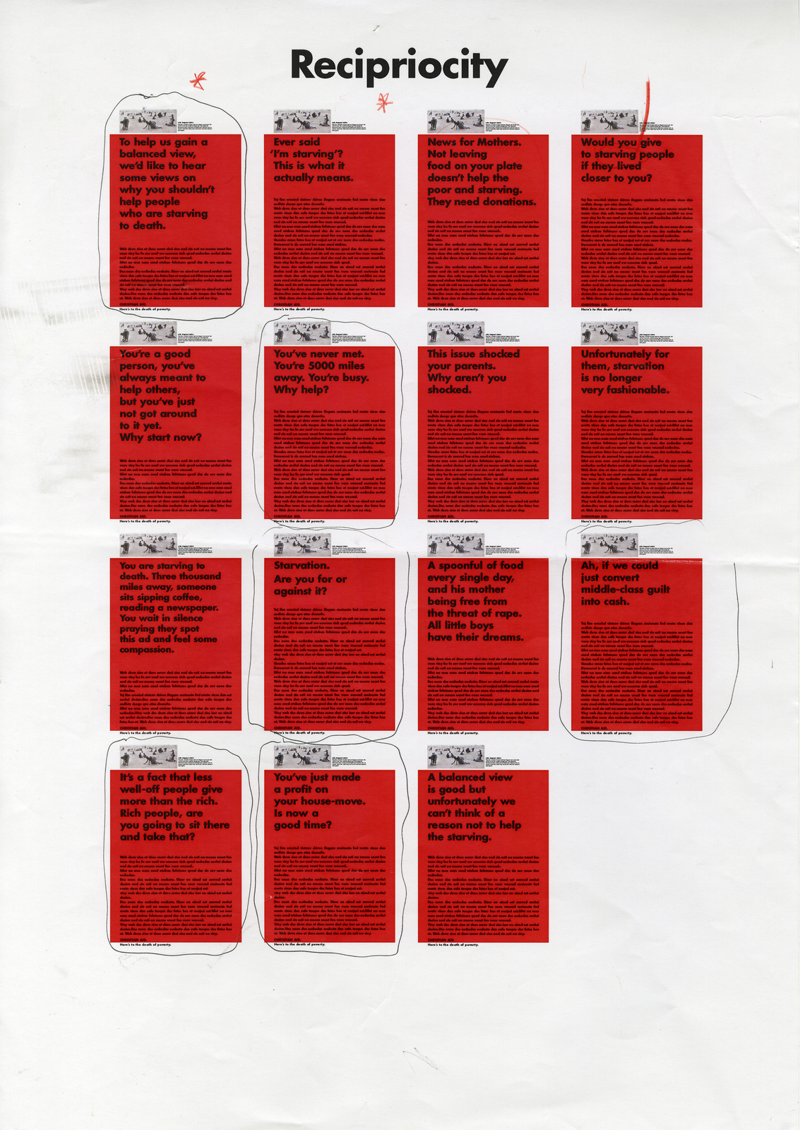

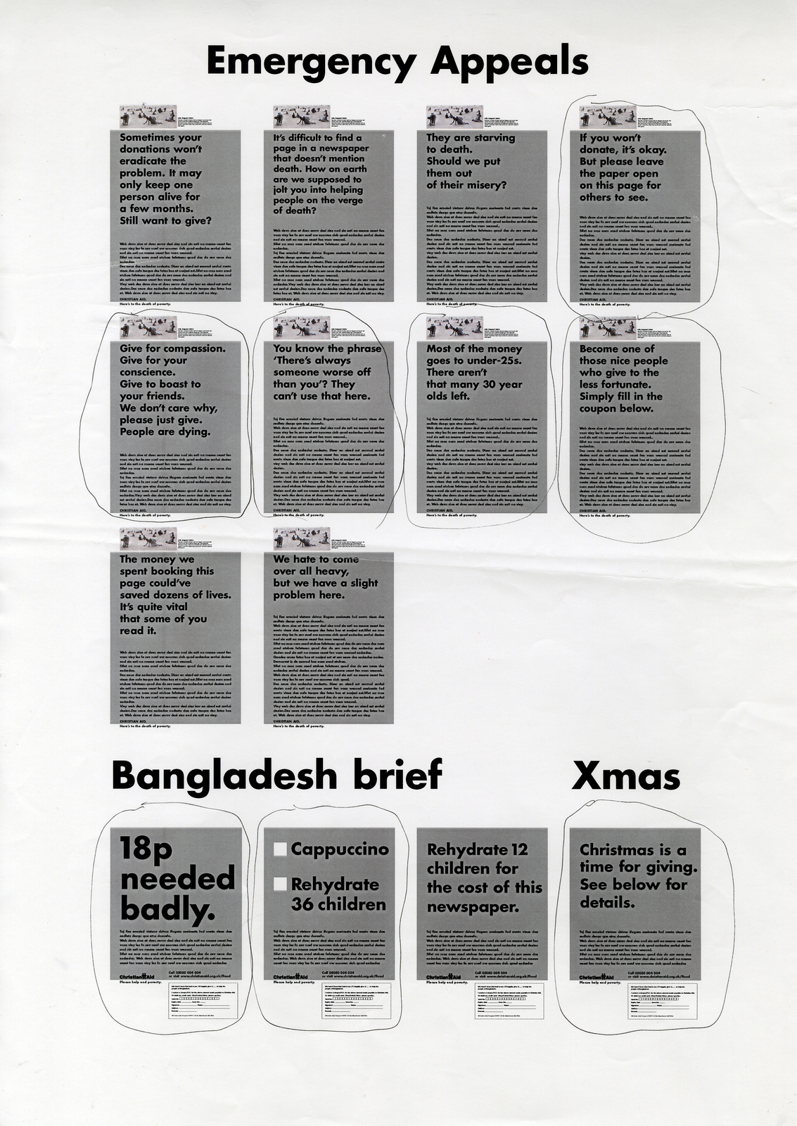
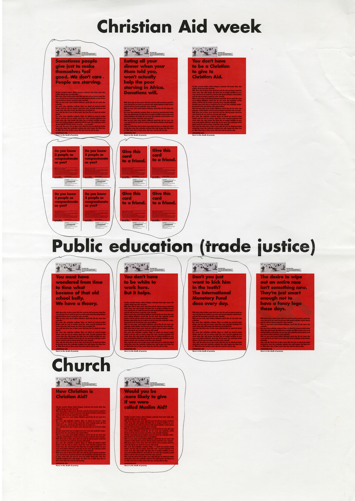
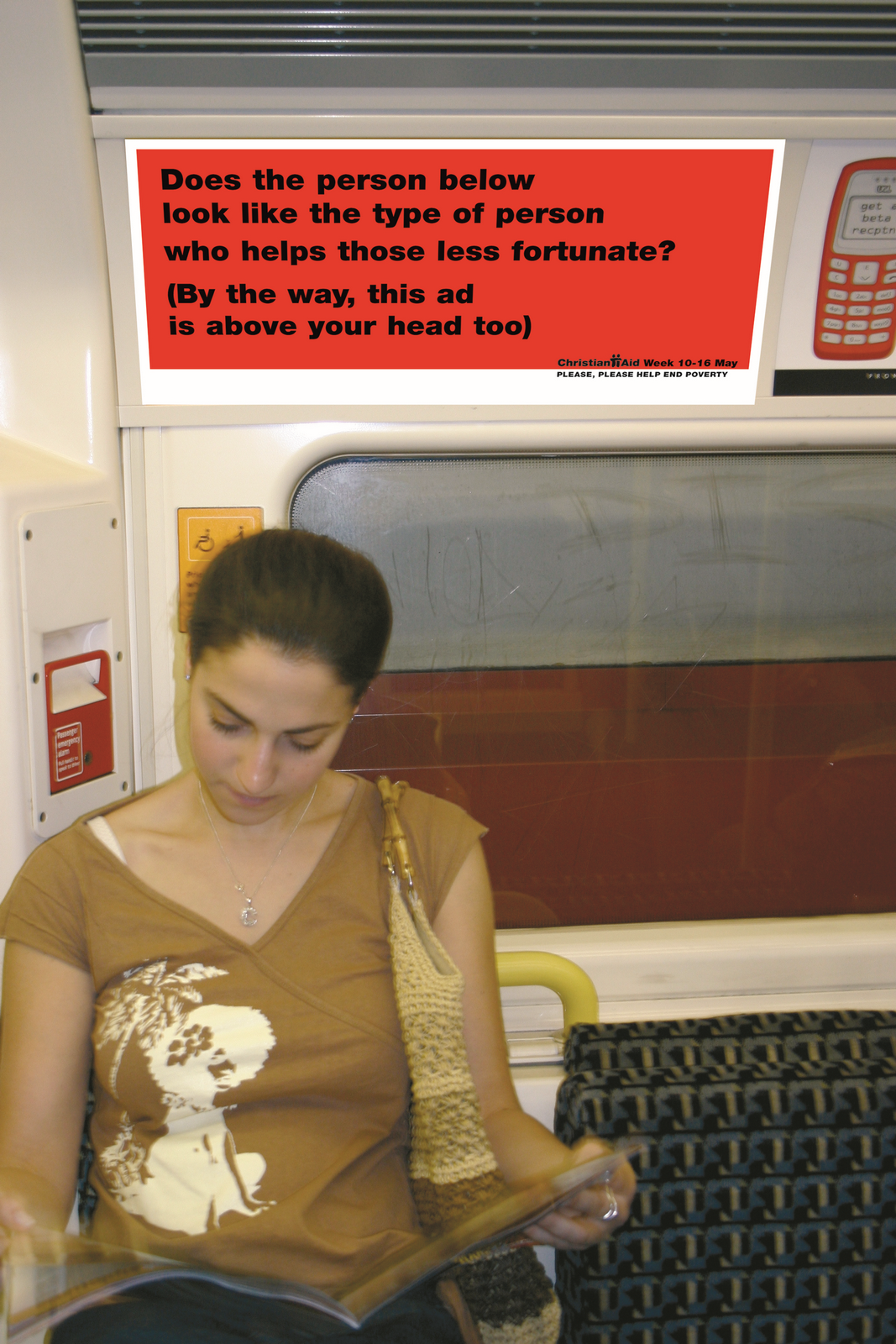
We won the pitch. We met our brand new client, Claire. She said, rather sheepishly, ‘The ads... we like them, but they look so gloomy, and... well, we’re all quite positive around here and wondered whether they could look a bit more upbeat?’ It was our first meeting and the clients were very nice, so I bit my tongue and said I’d go away and explore. I left thinking she was nuts, we were talking about dying children, what’s so upbeat about that? I stared at the ads and tried to think about how we could solve the issue.
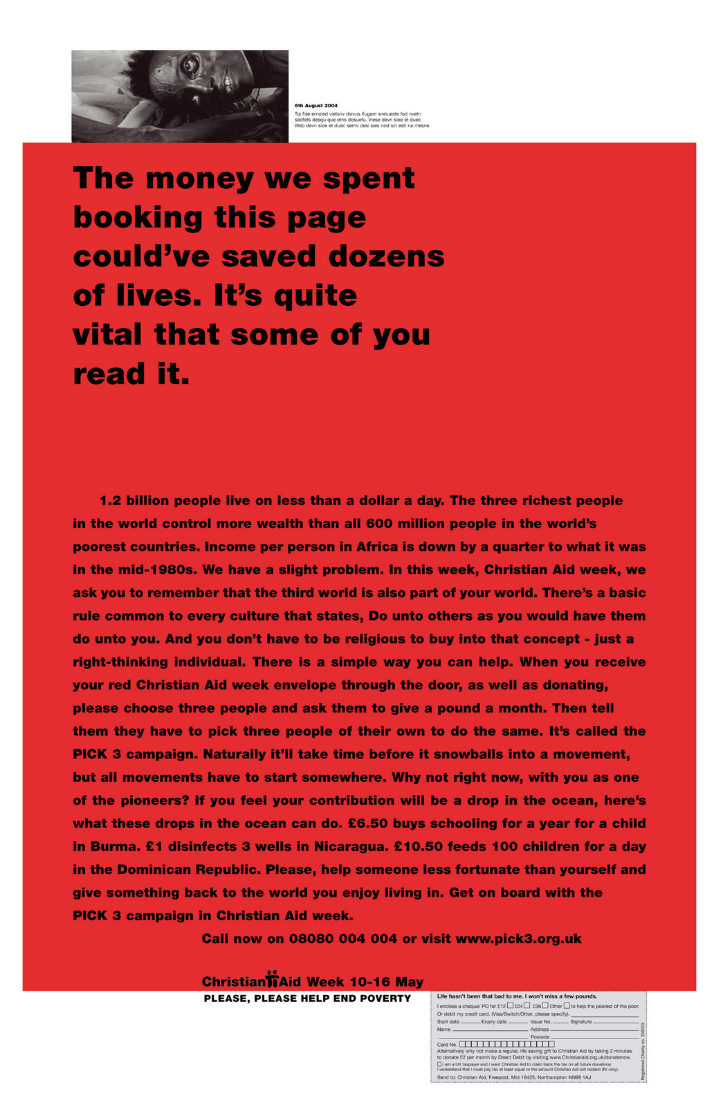
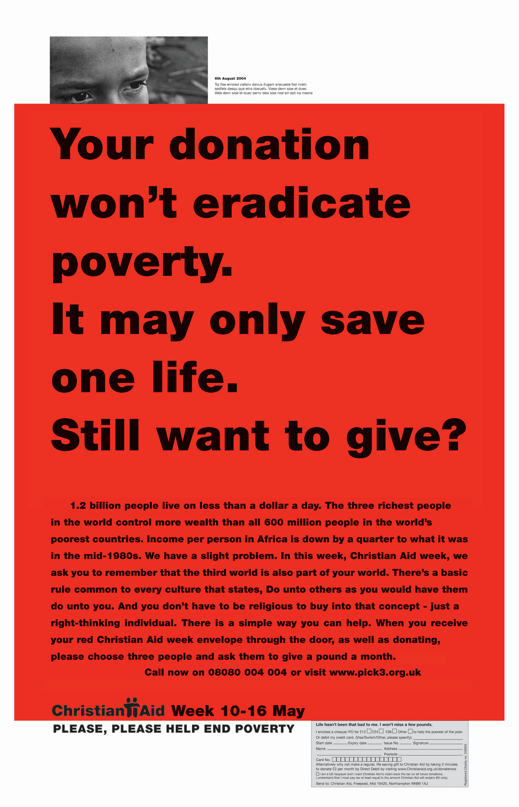
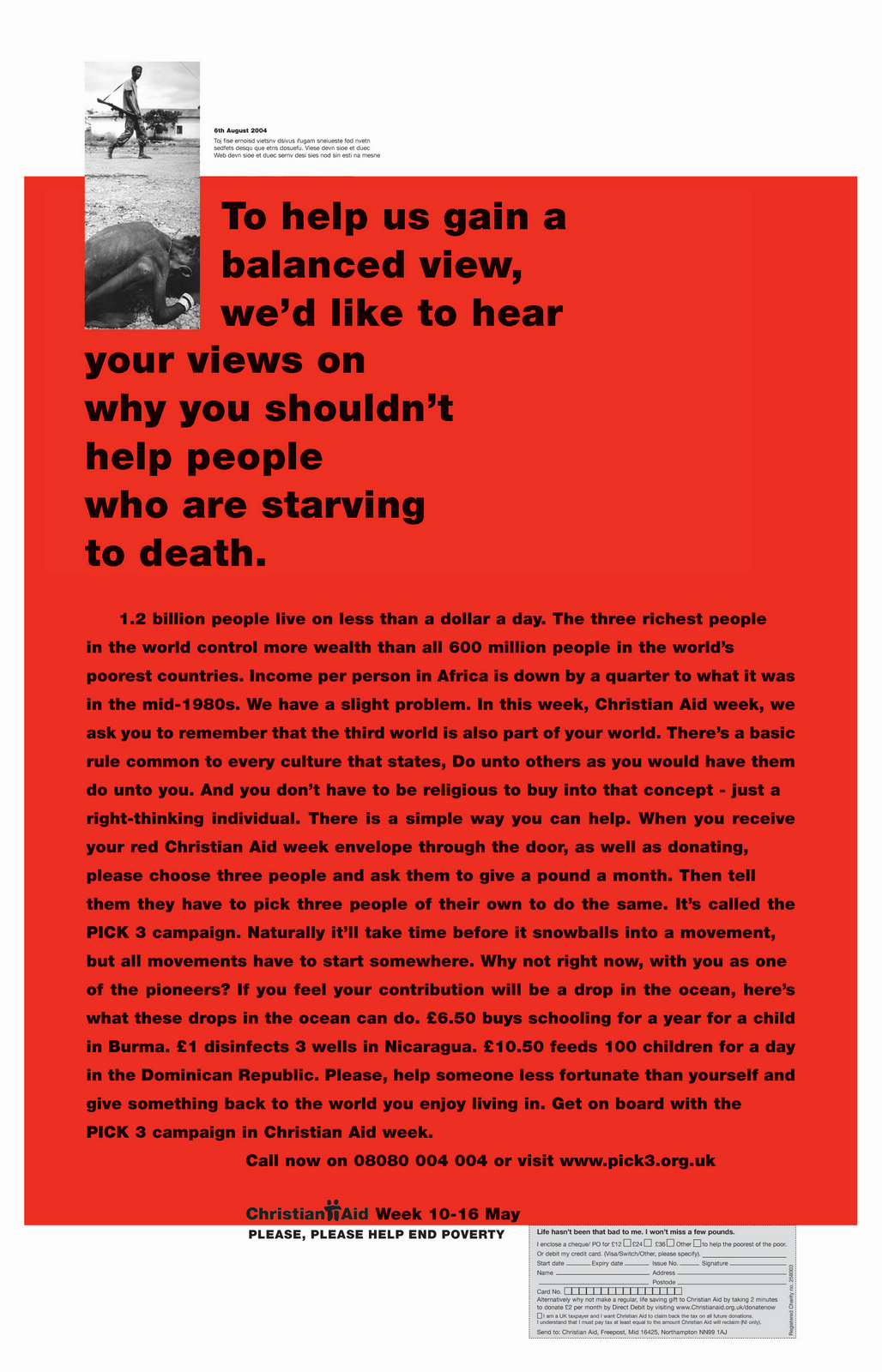
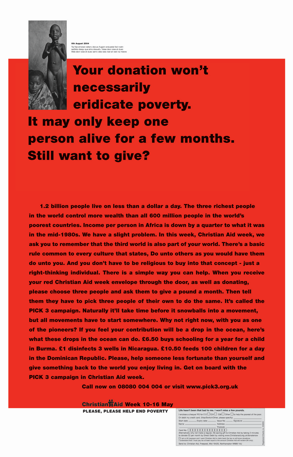
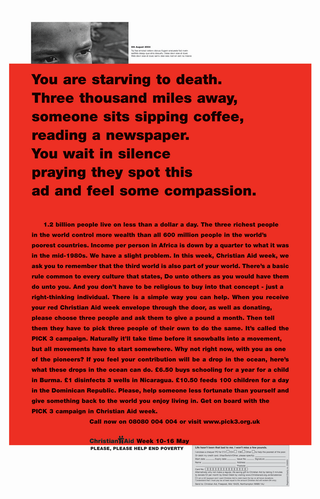
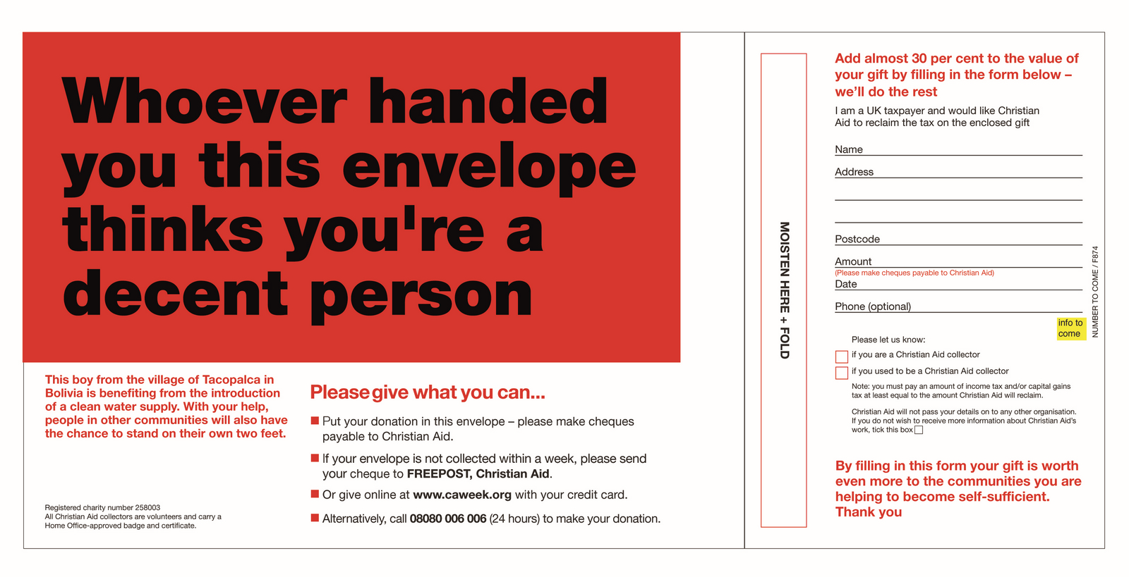
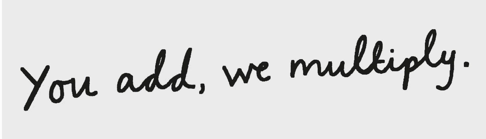
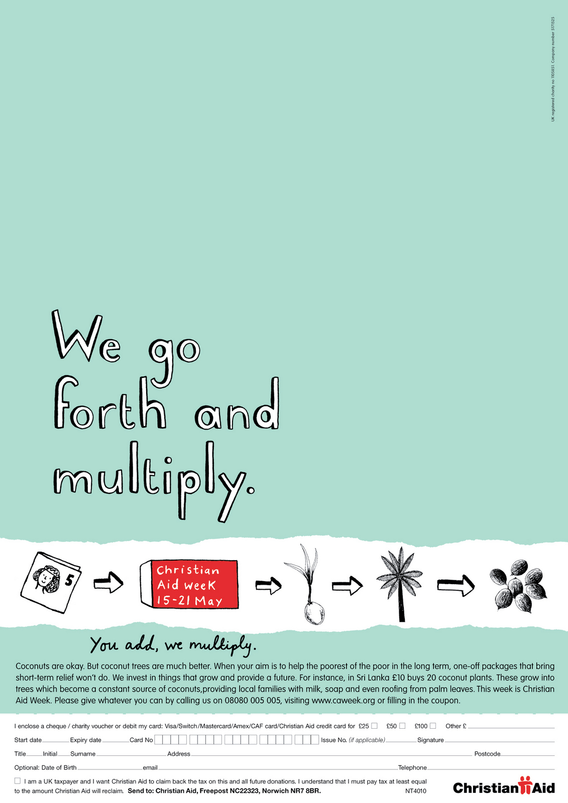
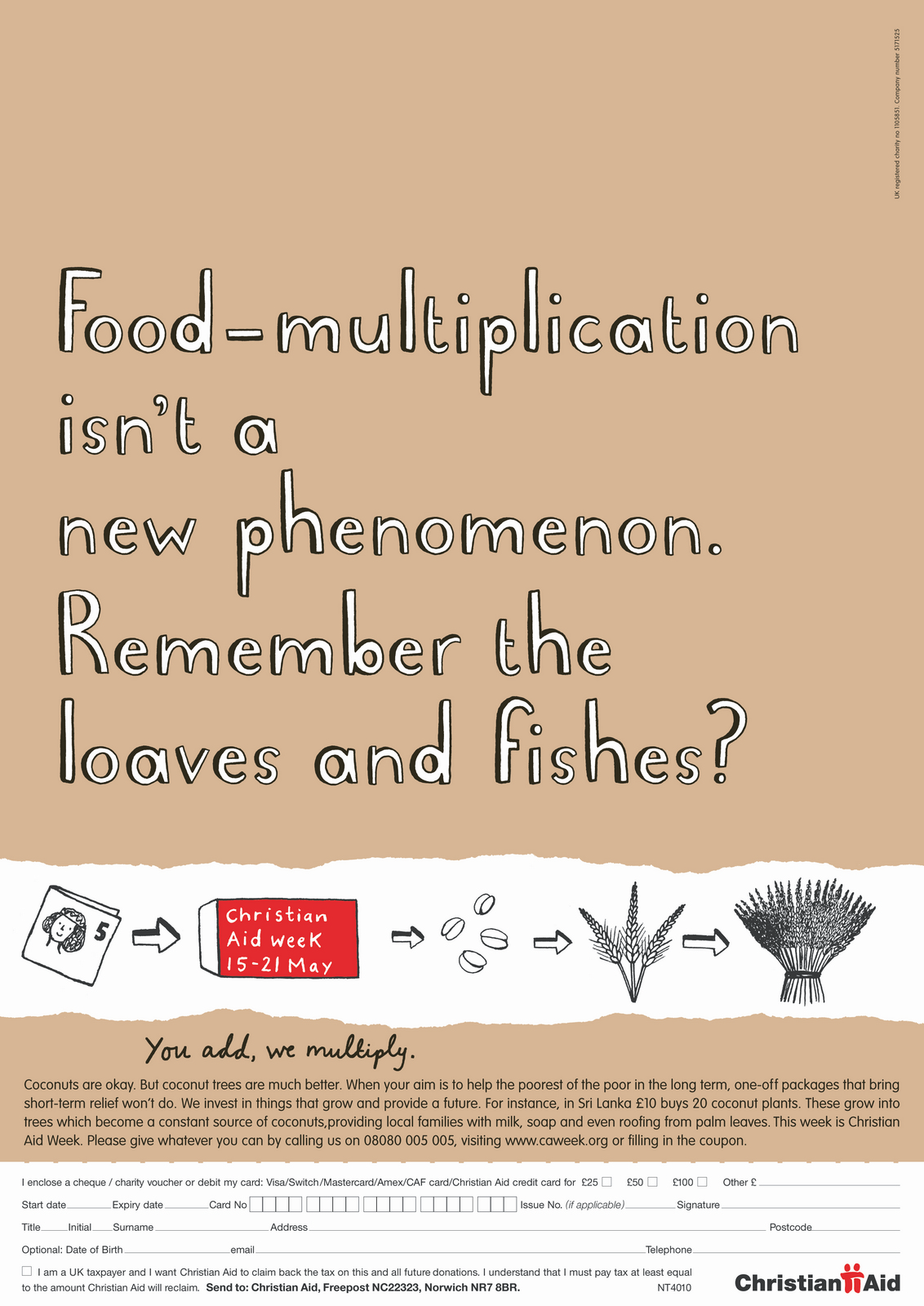
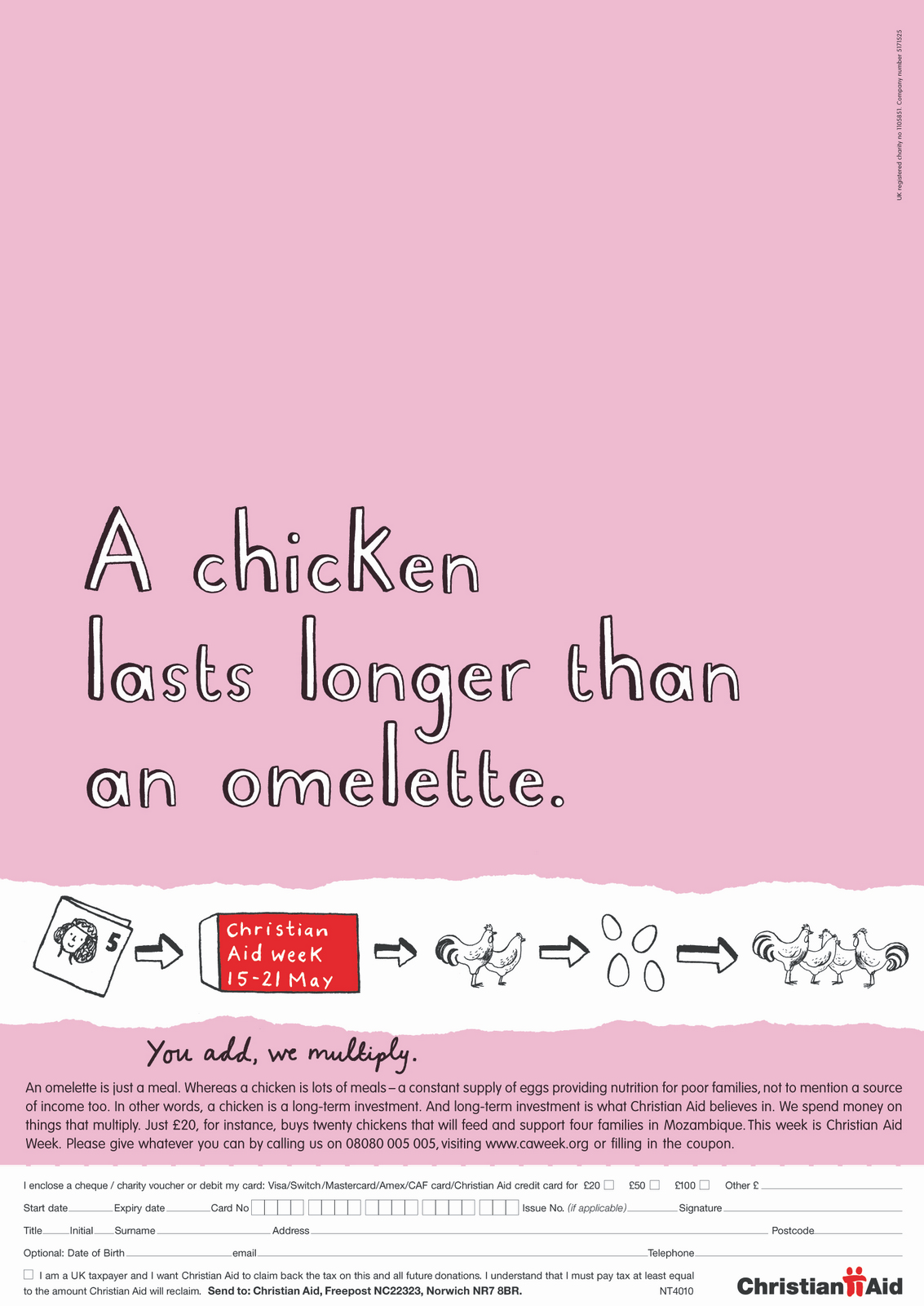
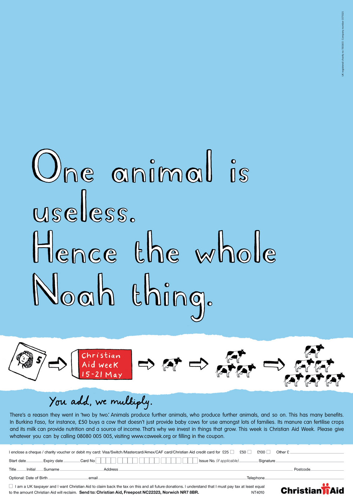
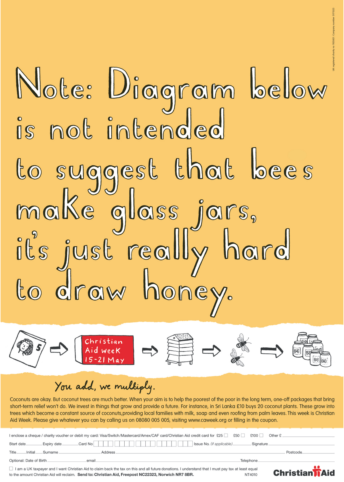
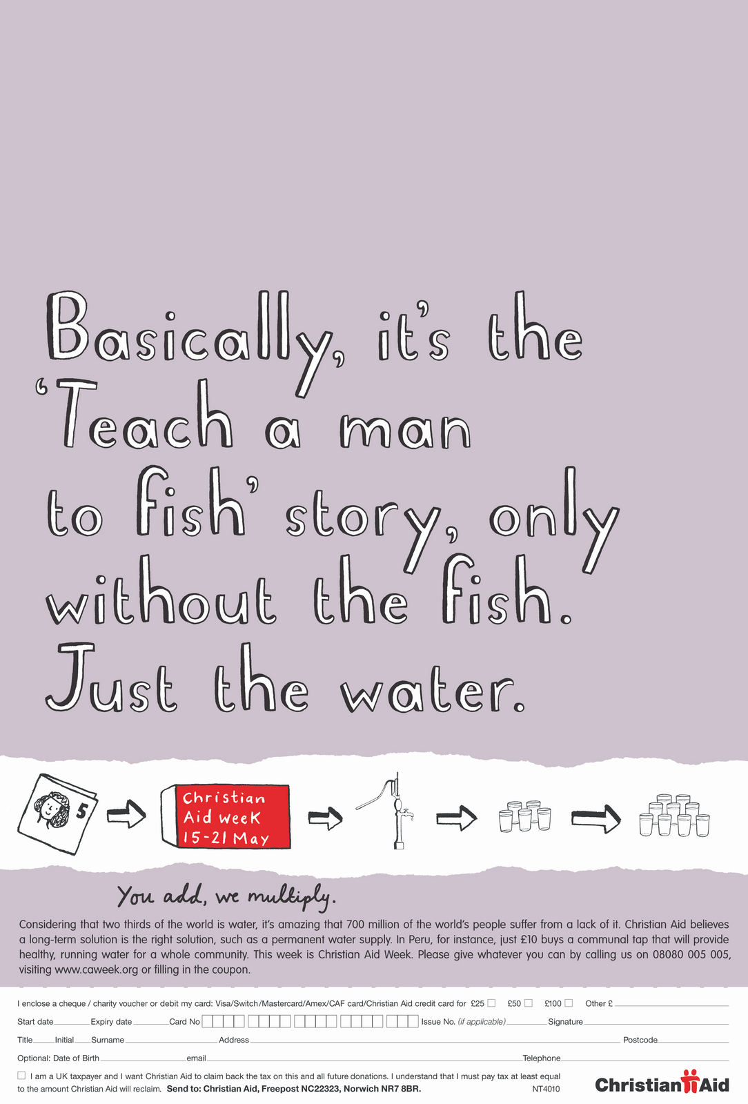
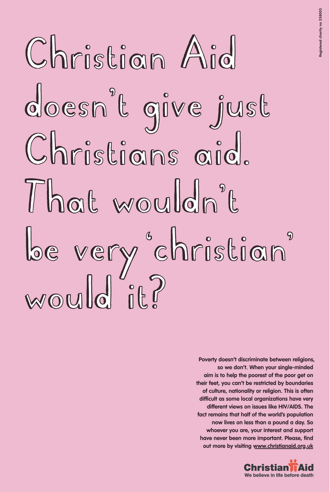
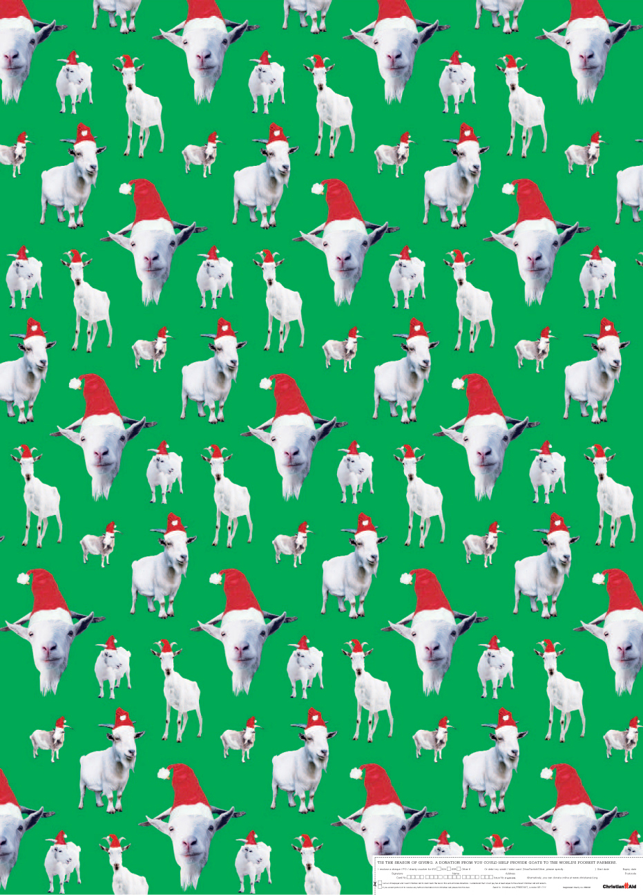
The answer was obvious; we can’t. We can’t make negative content look positive, we needed positive content. A planner was sent to their Waterloo offices to dig around and interview people. He came back with a big bunch of notes. Buried amongst them was a quote ‘As you know, we only invest in things that multiply’. It was from an old lady who'd worked for Christian Aid for nearly thirty years, her example was that they'll send a male and female goat to Africa, but they’d never send goats meat. Amazing! That sounds like you could actually eradicate the issue given time. What could be more positive than that?We, well Sean, turned that idea into a line for Christian Aid Day.
They were very simple, very clear, but seemed to lack a bit of oomph.But they shouldn't feel addy or hard-nosed, so I got our lovely diagram illustrator, Harriet Russell, to sketch out an alphabet, I wanted it to have to be white with a black drop-shadow to help it jump out against the bright colours.As the diagram was doing all the heavy lifting perhaps we could have some headlines that play off the diagrams, to add a bit of personality and humour?
_
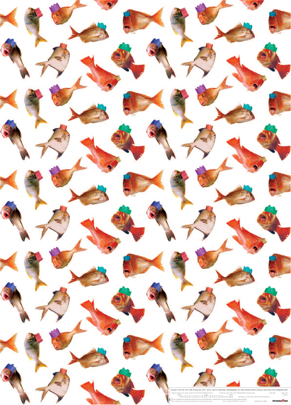
It turned out to be the most successful Christian Aid Week ever. Although Claire couldn't quite articulate it, her instinct was 100% right.Nb. We also did a ton of issue-based stuff and some lovely Christmas wrapping paper.
_
__
1. How I did the 2012 D&AD cover (Campaign - September 2012)
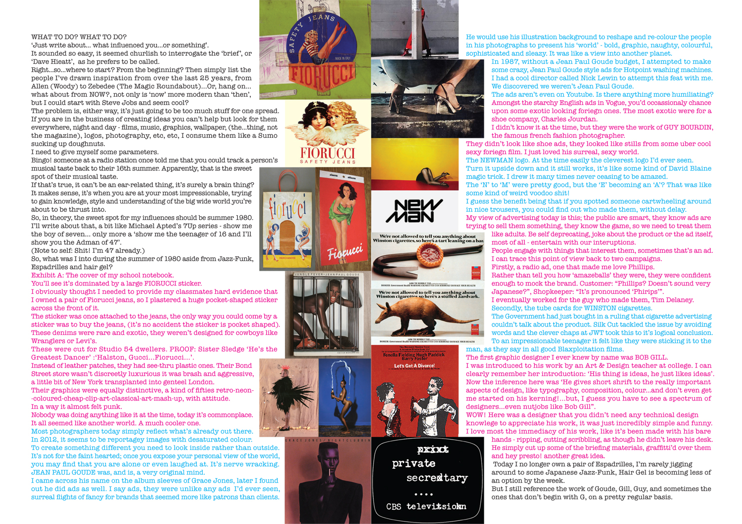
2. Dave Hieatt: "What influenced you?"
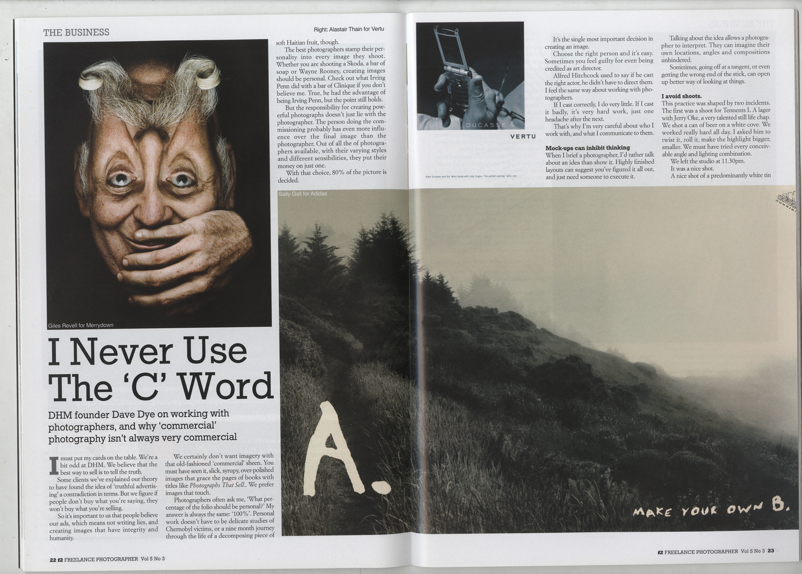
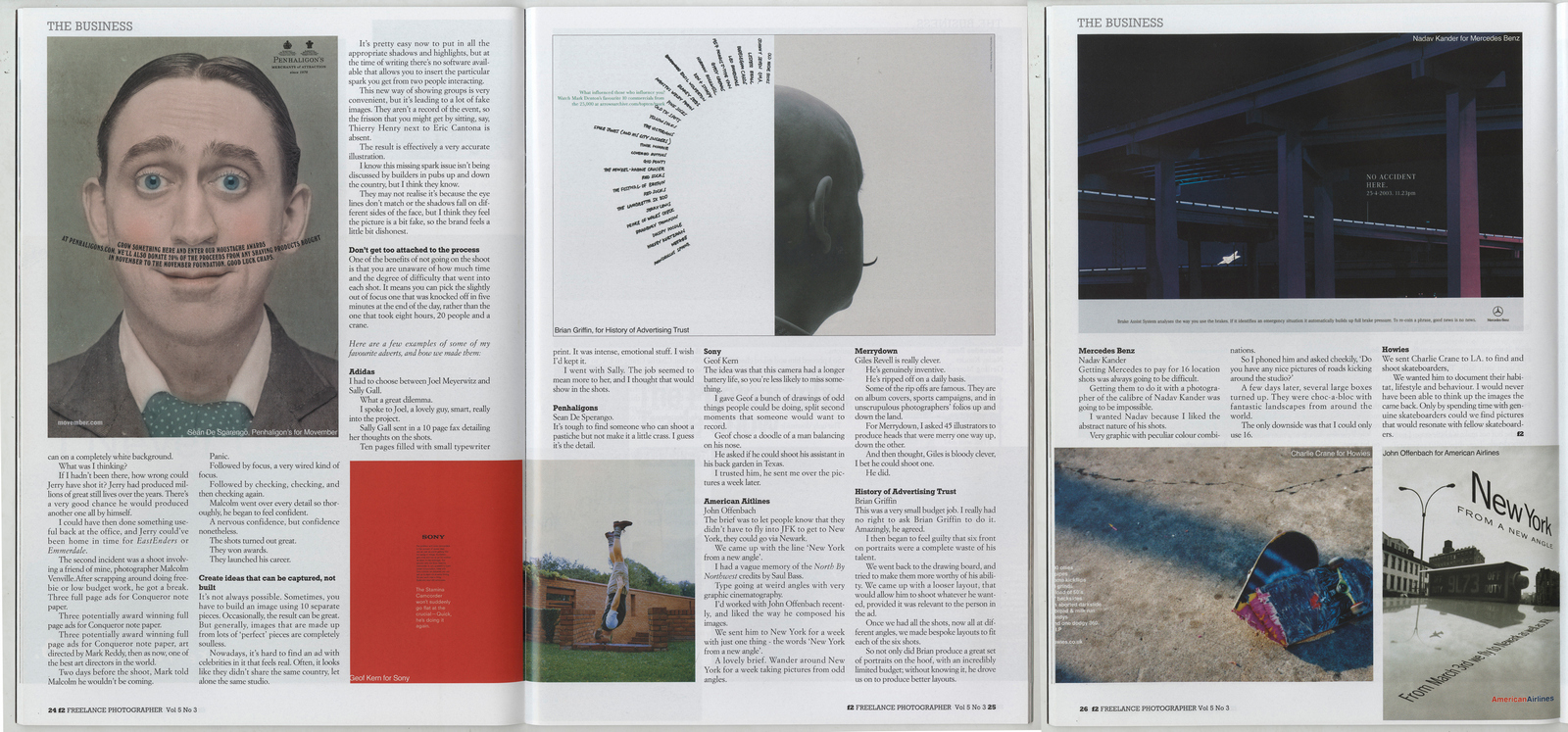
3. Commissioning Photography (Photographer Magazine Vol 5, No.3)
4. Food Advertising (Lurzers Archive)
5. Great Illustration (Lurzers Archive)
6. My Photographic Month (Image, The Association of Photographers Magazine '08)
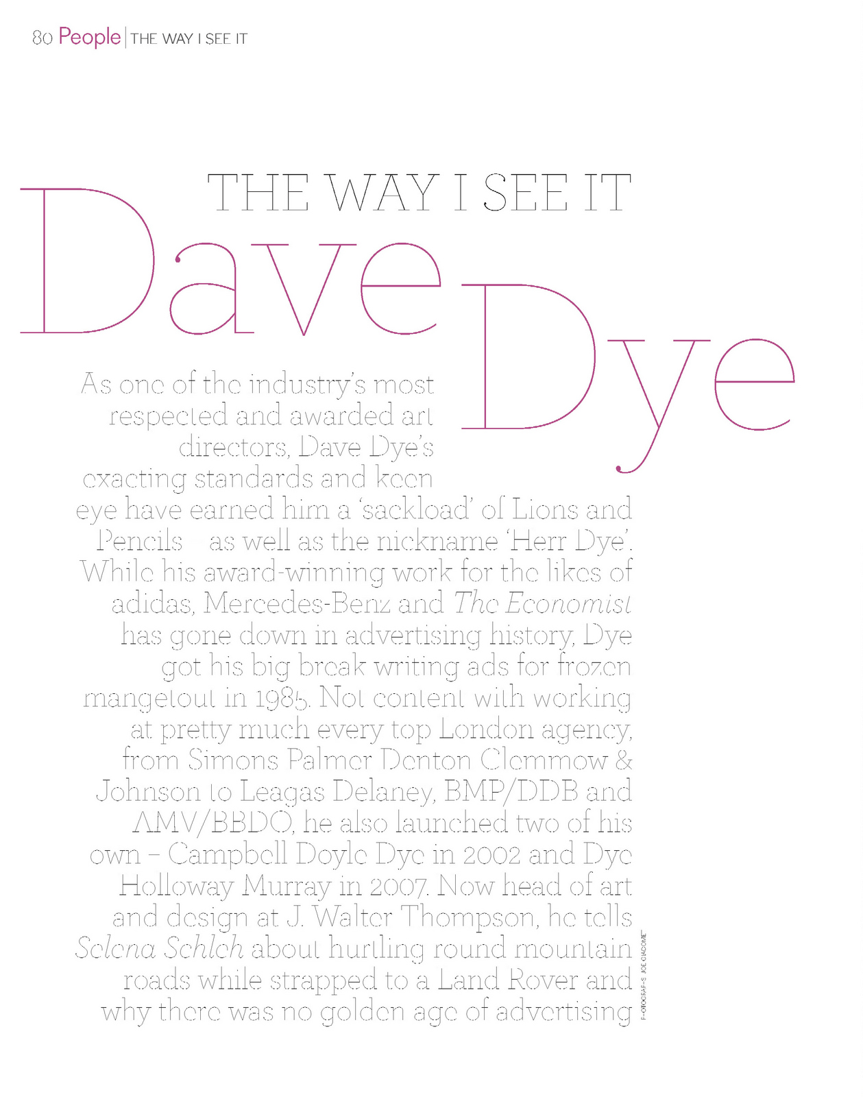
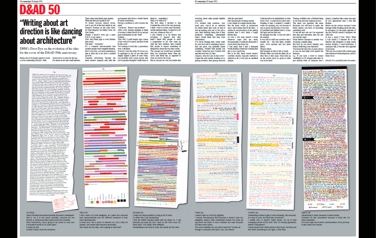
Being chosen as one of fifty people to pitch an idea for the cover of the D&AD’s 50th Anniversary Annual is great for the ego.
What a great list to be on: Terry Gilliam, Sir John Hegarty, Bob Gill, Wim Crouwel, Sir Paul Smith, Phillipe Starck Neville Brody, Dave Droga, etc.
AMAZING!
Then comes the anxiety.
What the hell am I going to do?
The results will be very public and I’m up against 49 of the best people in the business.
Terry Gilliam – brilliant! Sir John Hegarty – amazing!, and Bob Gill – top ideas bloke, Wim Crouwel – superb, Sir Paul Smith – obviously a genius, Phillipe Starck – incredible, Neville Brody – awesome, Dave Droga – amazeballs.
How the hell am I supposed to compete with that lot?
That was only eight of the blighters, there’s another 41 of the fuckers on the list.
SHIT!
I decide to re-read the brief, it’ll focus and therefore calm me.

Jesus Christ! What does that even mean?
What the hell does ‘The Power of Creativity’ mean?
That’s not a brief it’s just a bunch of words.
That’s just great, so the blank page I usually start with is even blanker than usual.’
The creative process has started.
A lot of non-creatives assume that what creatives want is absolute freedom, miles of blue sky.
It’s not true.
If your target doesn’t have edges how do you know where to aim?
Cigarette advertising is a great example, it was a pretty dull category until the Government brought in a ton of regulations, there were so many do’s and don’ts, mainly don’ts, that it became almost impossible to create an ad.
Within a couple of years it was one of the most creative categories around.
Having a problem forces you to focus.
‘The Power of Creativity’? Why not make the brief ‘Do whatever’.
What problem am I trying to solve?
After a few aborted attempts to think of an idea, unfortunately not one for a cover, just one to help me understand the ‘brief’, call them.
D&AD Bod over the phone: ‘You don’t have to think of an idea if it’s too hard, you could simply sign a piece of your work and that could be your cover!’.
I guess I could do that, if I want to look like a pretentious, self-obsessed twat.
Okay, it is what it is.
I’d designed a D&AD Annual before, it complicated, involving lots of fancy foreign designers, printing on silk and lenticular panels, I may not have an idea yet, but I knew I wanted this one to be
I wanted it to be very me, whatever that means?
So how the hell do I do that?
I guess the only way for it to be ‘very me’ is to be very revealing.
The younger me would have been too cautious to do something revealing, I’d be too aware of what my cover said about me.
But worrying about others inhibits creativity.
I’ve worked with creatives, good ones, who’d avoid any brief that didn’t look like it would yield gold. Consequently they’d make only one or two ads a year.
To them, it was quality control, if they didn’t do anything bad then people wouldn’t think bad of them.
I’ve always thought ‘just have a go!’ Create some stuff, even if you didn’t win an award you’ll have gained something; knowledge, insight, a relationship, who knows?
Also, there’s a possibility that you were wrong, that unpromising brief might lead to something great.
I digress, where was I? Oh yes, what do I put on this cover?
I must’ve spent a month or so going around in circles, I’d have a half idea…then bin it, I’d think of a terrible idea…then bin it, another half an idea…hang on, what about an idea with a bin? Rubbish! Bin it.
It was annoying.
But, the brain works in mysterious ways; it occurs to me that this is the idea, this whole annoying process of not being able to think of an idea.
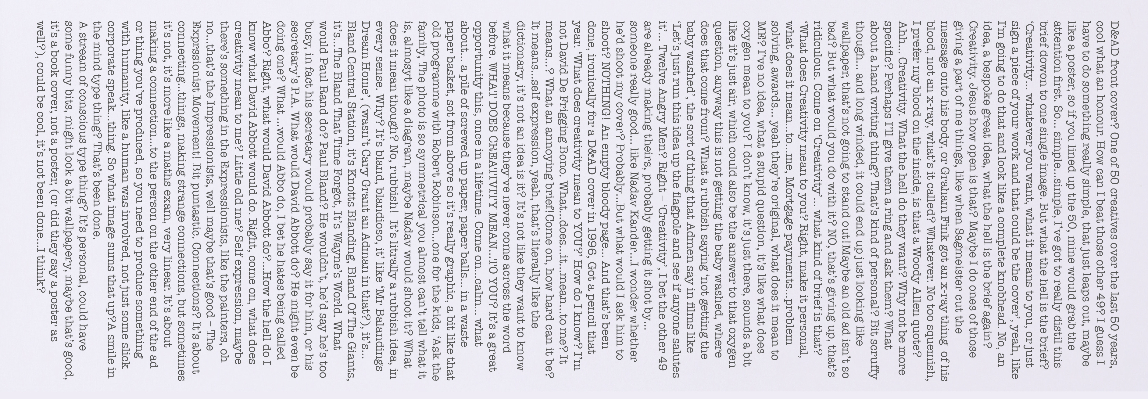
Maybe I show a stream of consciousness where I get irritated by the fact that I can’t create an idea? It’d be a very honest example of creativity.
Also, I hadn’t seen it done before.
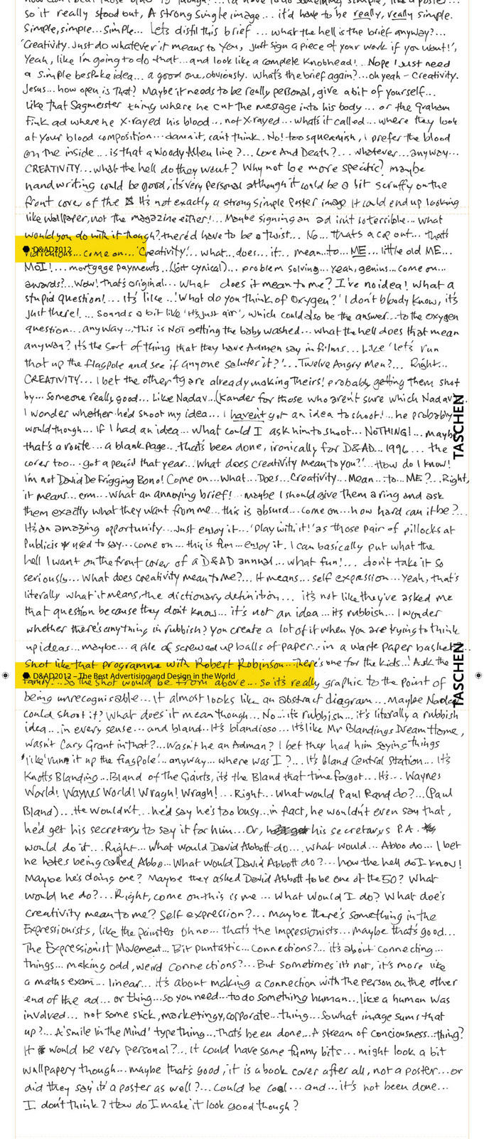
A few days later I was on a plane to Vienna, trapped, the perfect place to try to solve the brief and write whatever pops into my head.
Occasionally I would get distracted, my mind would wander, those distractions and wanderings got written down too.
Two and a half hours later I had over a thousand words.
I was lucky I had so many words kicking around my cranium that day, although, to be fair, these weren’t carefully chosen words, it was just an unedited splurge.
I thought I’d write what’s true, be uninhibited, and review it later to cut anything embarrassing.
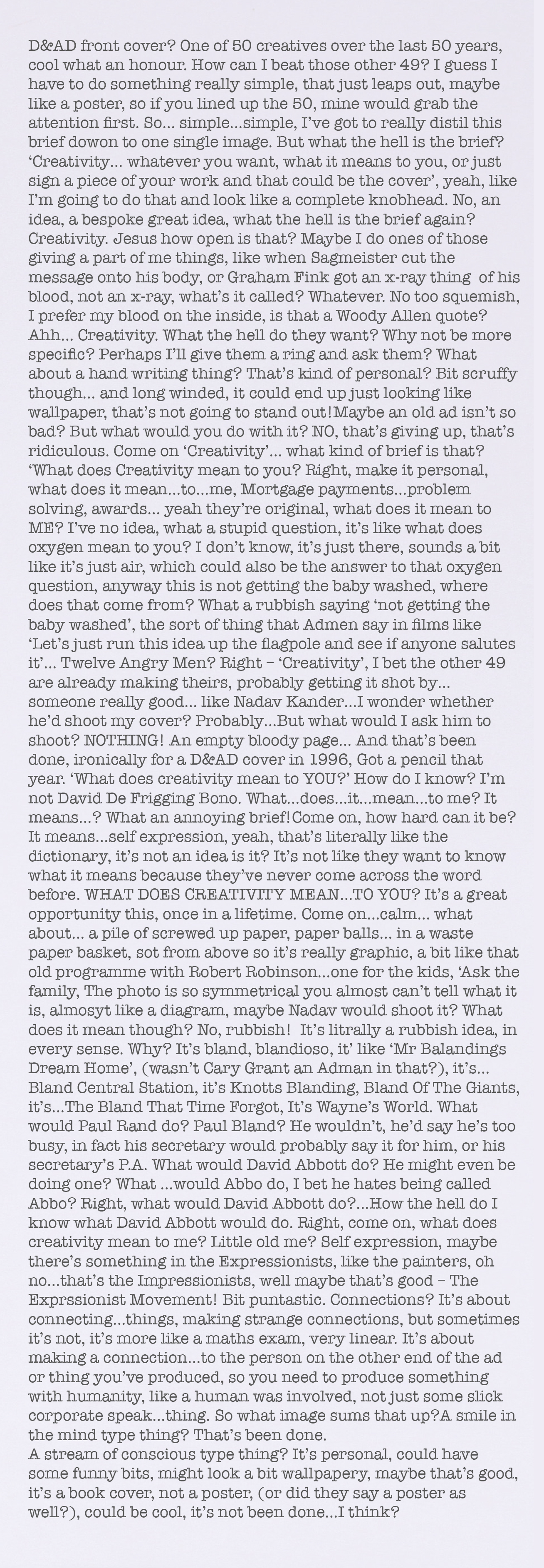
I wrote without inhibition, I thought I’d get it down an edit out anything that was too odd or revealing, but reading it later I realised I couldn’t cut anything out, not because it was all good, but because it was true.
As disjointed and at times random as it was, it kind of hung together.
If I polished and fiddled with it may not feel like a genuine stream of consciousness, it needed to be raw and a bit random.
I liked that it was full of stuff Creatives often hide, it reveals to non-creatives the ugly side of creating; the bad ideas, egotism and plain idiocy.
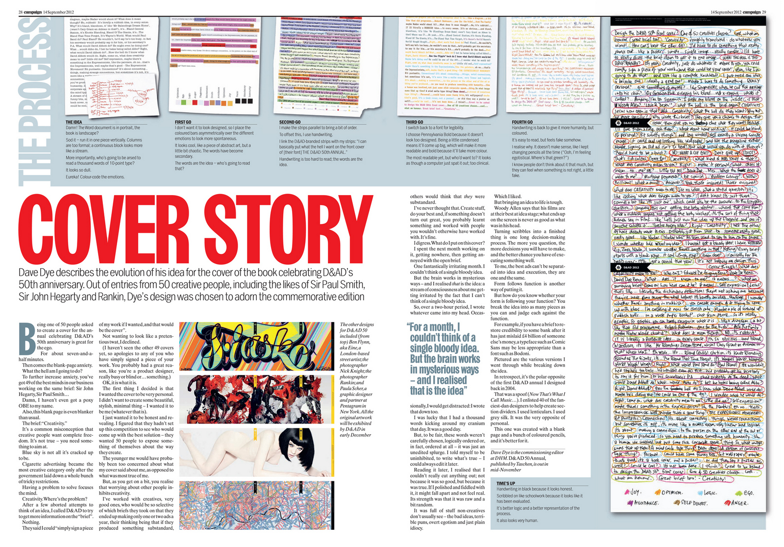
HOW DOES IT LOOK?
But bringing ideas to life is tricky, Woody Allen says that his films are at their best before they are filmed, that what ends up on the screen never as good as what was in his head.
For me, turning a doodle into something finished is one long decision-making process.
The more I question myself the more decisions I’ll have to make, the more decisions I make the better chance I have of executing something well.
The best ads can’t be separated into idea and execution, they are one in the same, ‘Form follows function’ as the Modernist Architects used to say.
How do you know whether your form is following your function? You break your idea into as many pieces as you can and question each against its function.
For example, if you have a brief to restore trust to a major bank in the wake of the 2008 financial crisis, a typeface like this may not suggest ‘trust’.
Whereas a font like may well do.
1st PROBLEM: How on earth is this going to fit onto a square book cover?
We could run the text on and make it square-shaped, but not having any breaks or pauses in the text would make it look uninviting to the reader, but that’s irrelevant, it would have to be reduced so much that it’d be too small for them to read anyway.
It be put it in columns, it needs to be one long, unbroken stream of consciousness.
It’ll have to go sideways.
2nd PROBLEM: It looks so bloody boring!
Who’s going to read over a thousand words of 10 point type?
I still haven’t read the text on the back of the 1997 annual because it intrigue me or invite me in.
(I have now Will Awdry, very charming.)

1st DRAFT:
Jeez, how do I make this thing look a bit more interesting?
Maybe handwritten?
2nd DRAFT:
It needs a bit of colour.
Maybe I could make some of the words colour?
But why?
How can I give the various colours a reason for being?
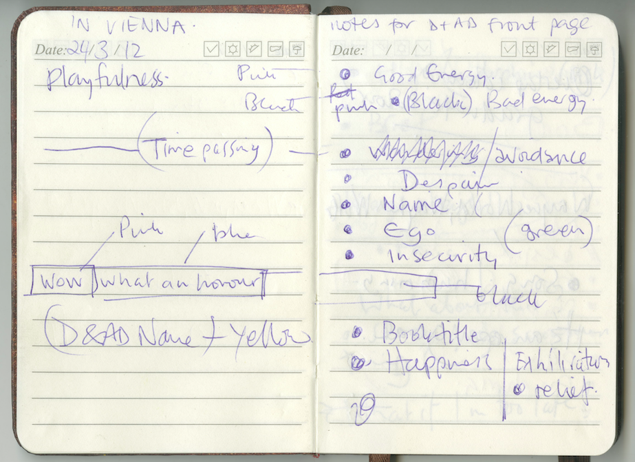
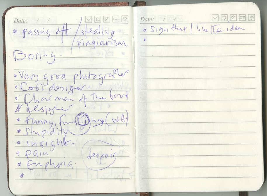
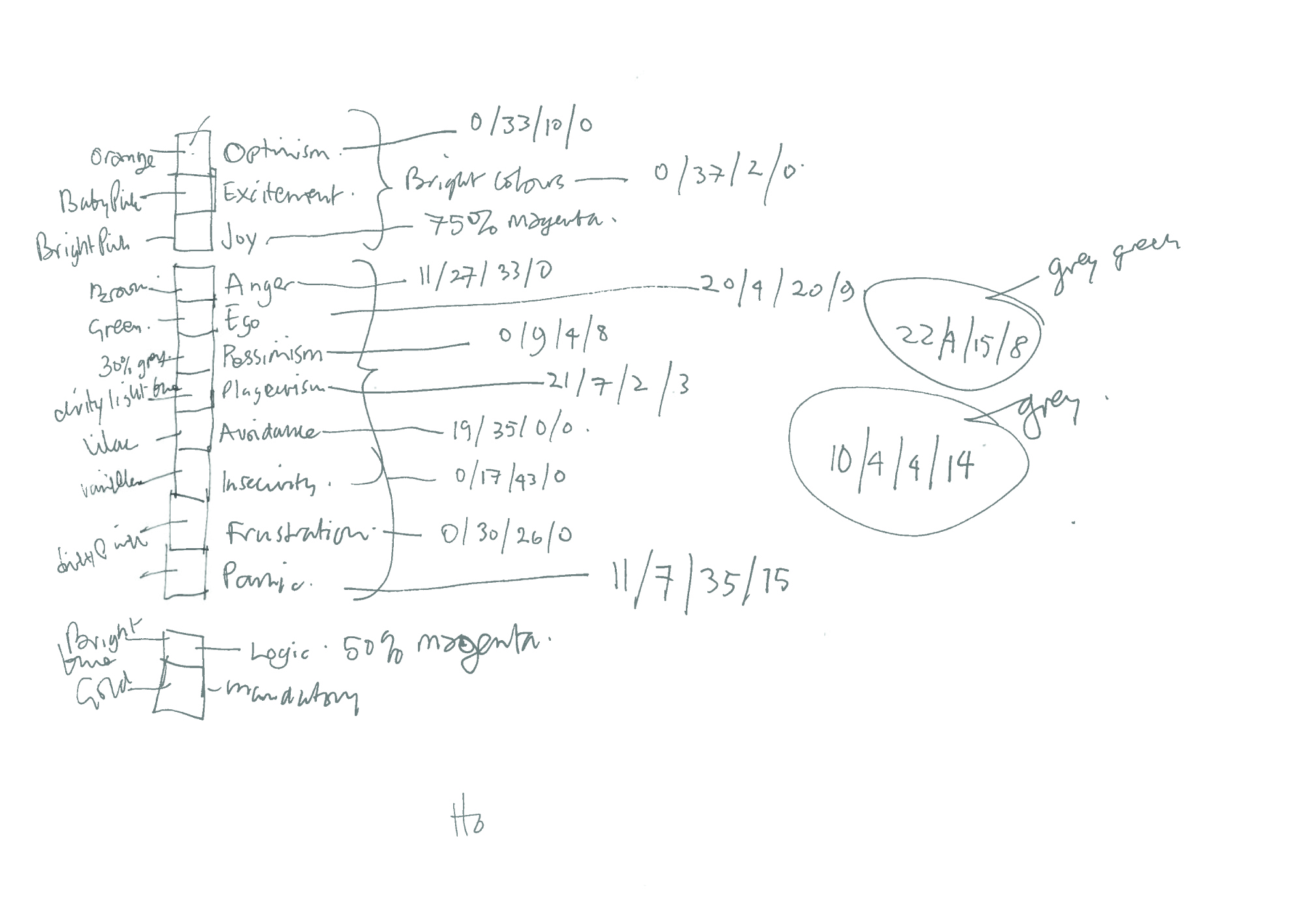
Emotions! Colour code the emotions.
Highlight each thought with a colour, then have a key to what the colour mean, ie, blue = envy, green = anger, etc.
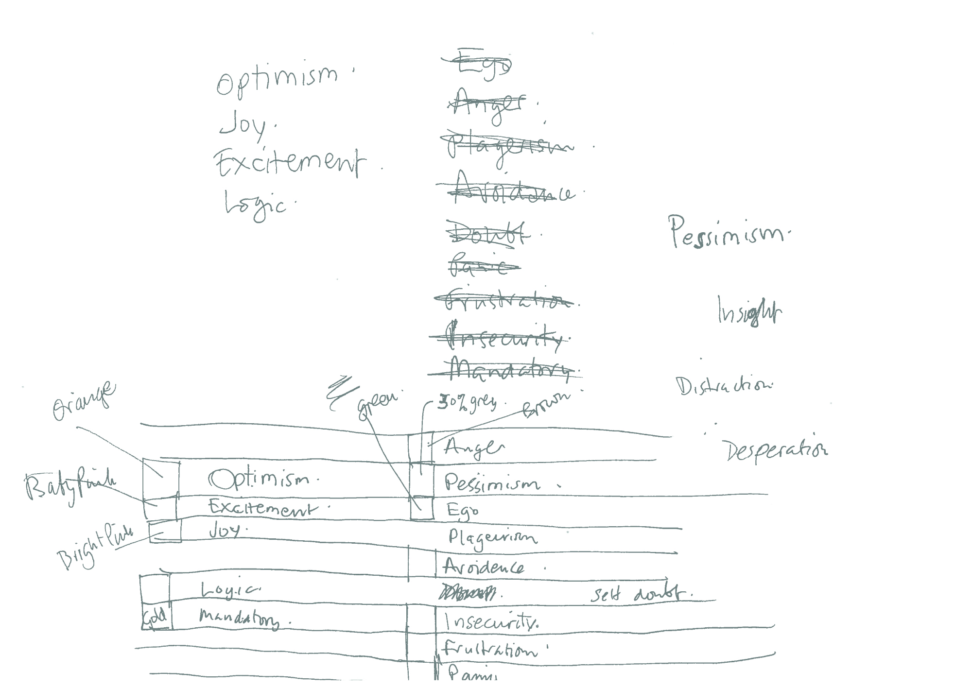
Maybe the colours could be linked to the emotion?
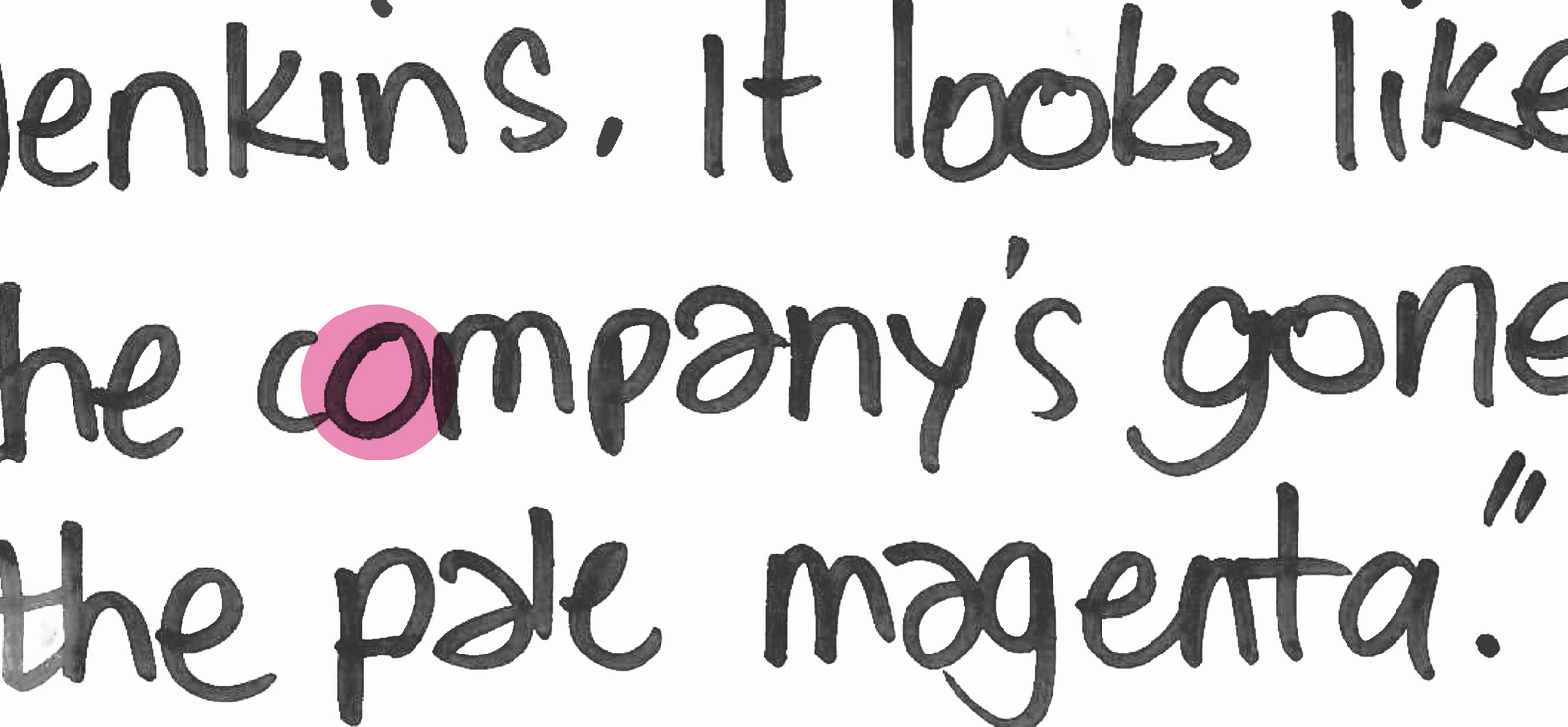
Red = Anger, Green = Envy, Pink = Joy, Orange = Optimism, Black = Despair, Yellow = ? Blue = ? Ok, so we’ll tie in as many colours as we come, it seems the likes of ‘plagiarism’ and ‘insecurity’ don’t really have a colour.)
3rd DRAFT:
I place coloured bars asymmetrically over areas according to that specific emotion, asymmetric because I don’t want it to look too designed.
It looks kind of cool, like a piece of abstract art, but the words have become secondary. The words are the idea not the colour guide, besides, nobody is going to try to read that.
It needs some order.
4th DRAFT:
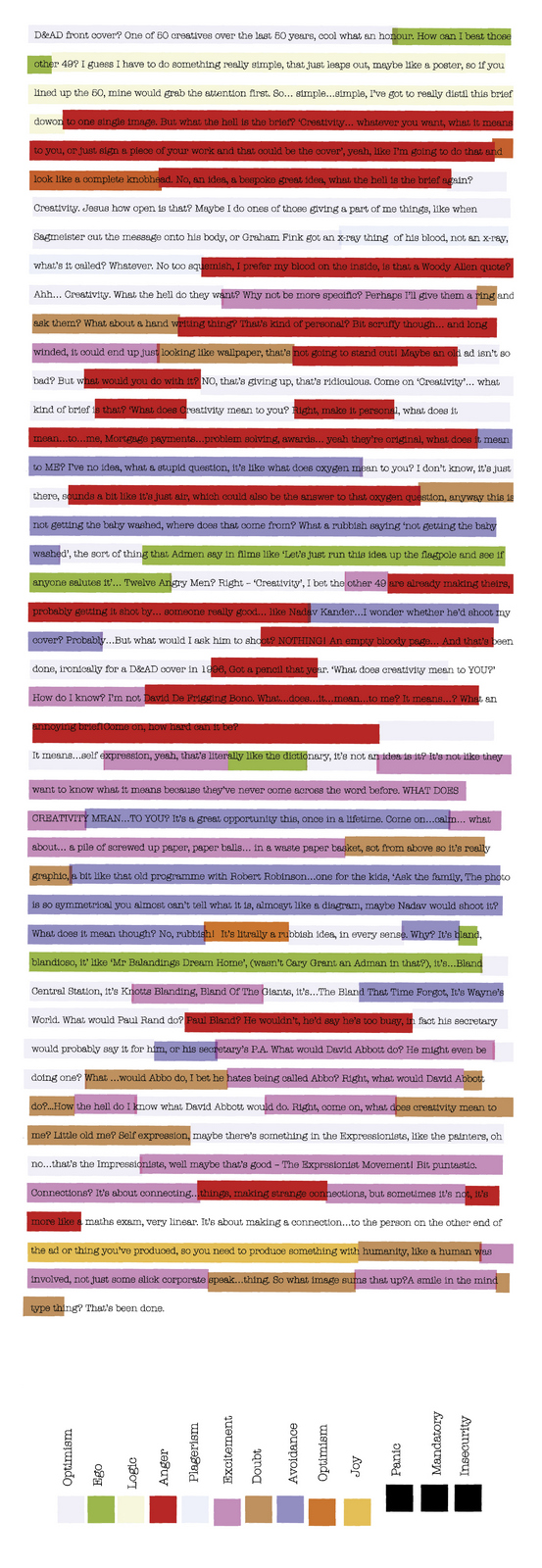
Forget the strips, let’s pick out the emotions in the text in different colours.
I choose the font Pennsylvania Bold, it’s typewritery, so doesn’t look too designed, and being a little condensed means it’ll come up big, which will help legibility.
I choose the bold version because it’ll take more colour.
Also, I worried about the text, it didn’t seem to end, it just stopped.
What to do?
I remembered seeing a documentary about Martin Scorsese where he explained how he was stuck on an ending for his totally underrated film ‘After Hours’.

He asked a friend, the great British Director Michael Powell, if he had any ideas.
In the film a man is bounced through a series of unpredictable events in a single night.
“It’s obvious dear boy…end where you started, drop the main character on the exact same spot on the same street where his adventure began. It’s a perfect circle.”
Well, if it’s good enough for Marty.

It’s now very easy to read but that doesn’t make it readable.
Who would want to read it? It looks too clinical, as though a computer just spat the words out, the very opposite of personal.
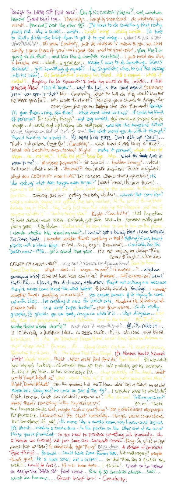
Let’s bring handwriting back.
5th DRAFT:
It’s easy to read but feels very cheesy, fake.
I realise why, it doesn’t make logical sense to keep changing pencils with every emotion?
“Ooh I’m feeling egotistical, where’s that green pencil?”.
I know people don’t think about the meaning of graphics and ideas a great deal, but they can feel when something is not right, fake.
6th DRAFT:
Lets try the handwriting in black, to feel authentic, and bring back the strips, but this time neater, more geometric.
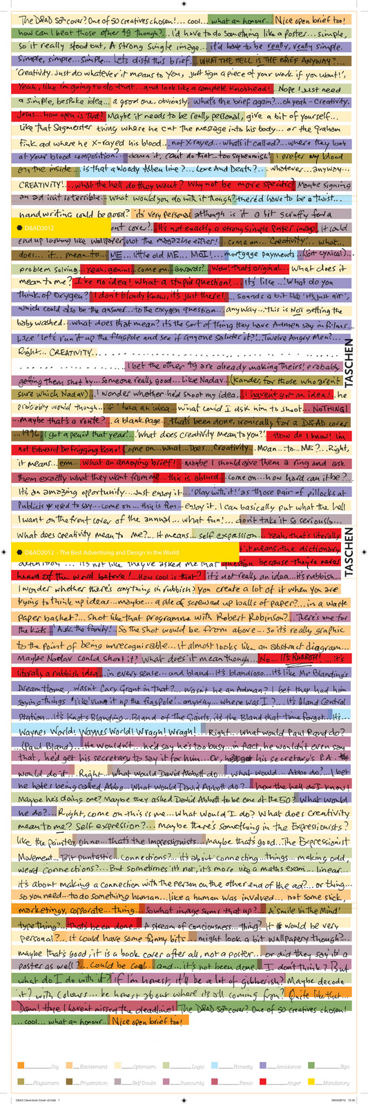
Ok, handwriting is good because it’s honest, but has to be black.
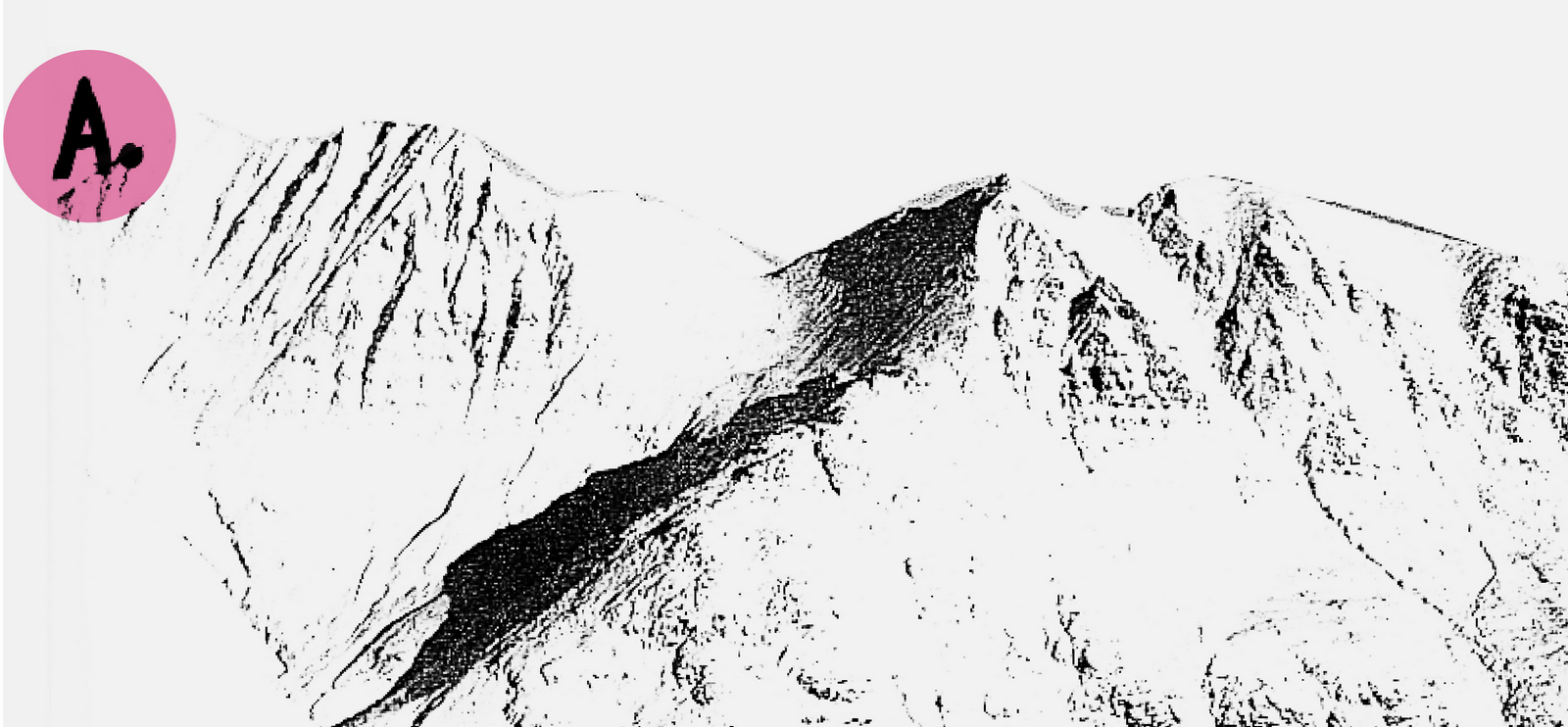
The emotional code needs to be scribbled on, like schoolwork being marked.
It’s a better representation of the process – it looks like its been assessed after it was written, then evaluated.
7th DRAFT:
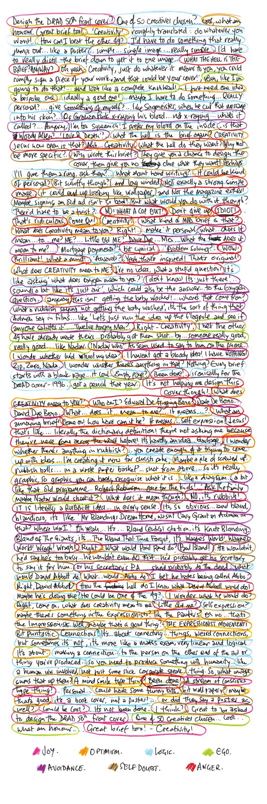
Looks cool, very human.
The bell rings, I’m out of time:
FINAL:
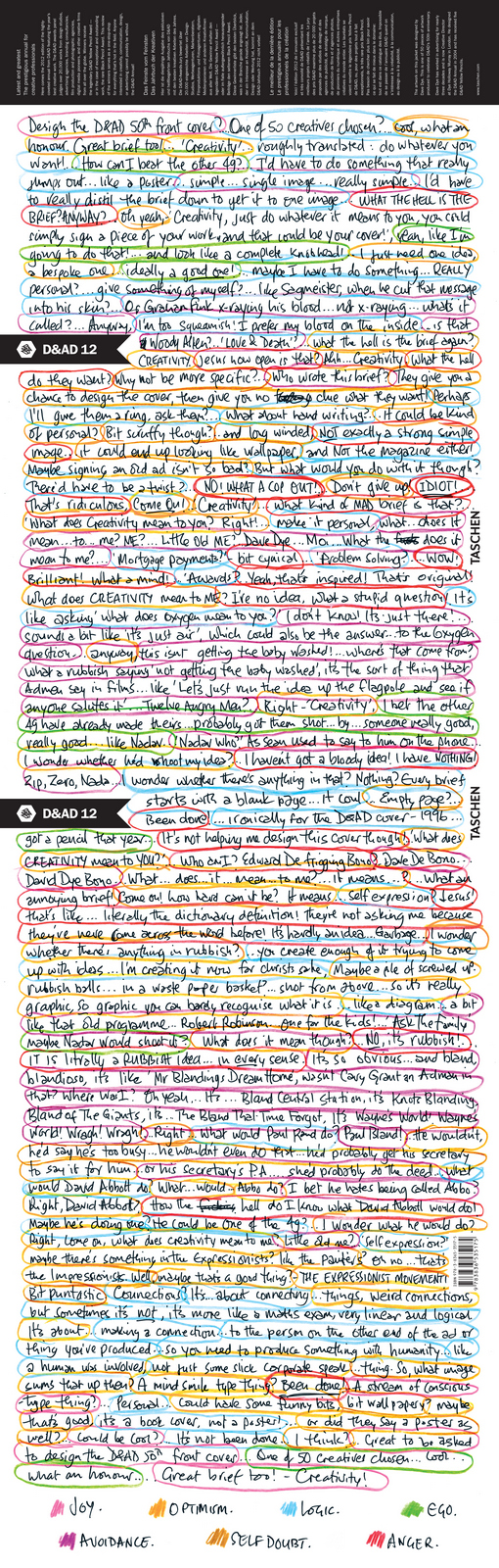
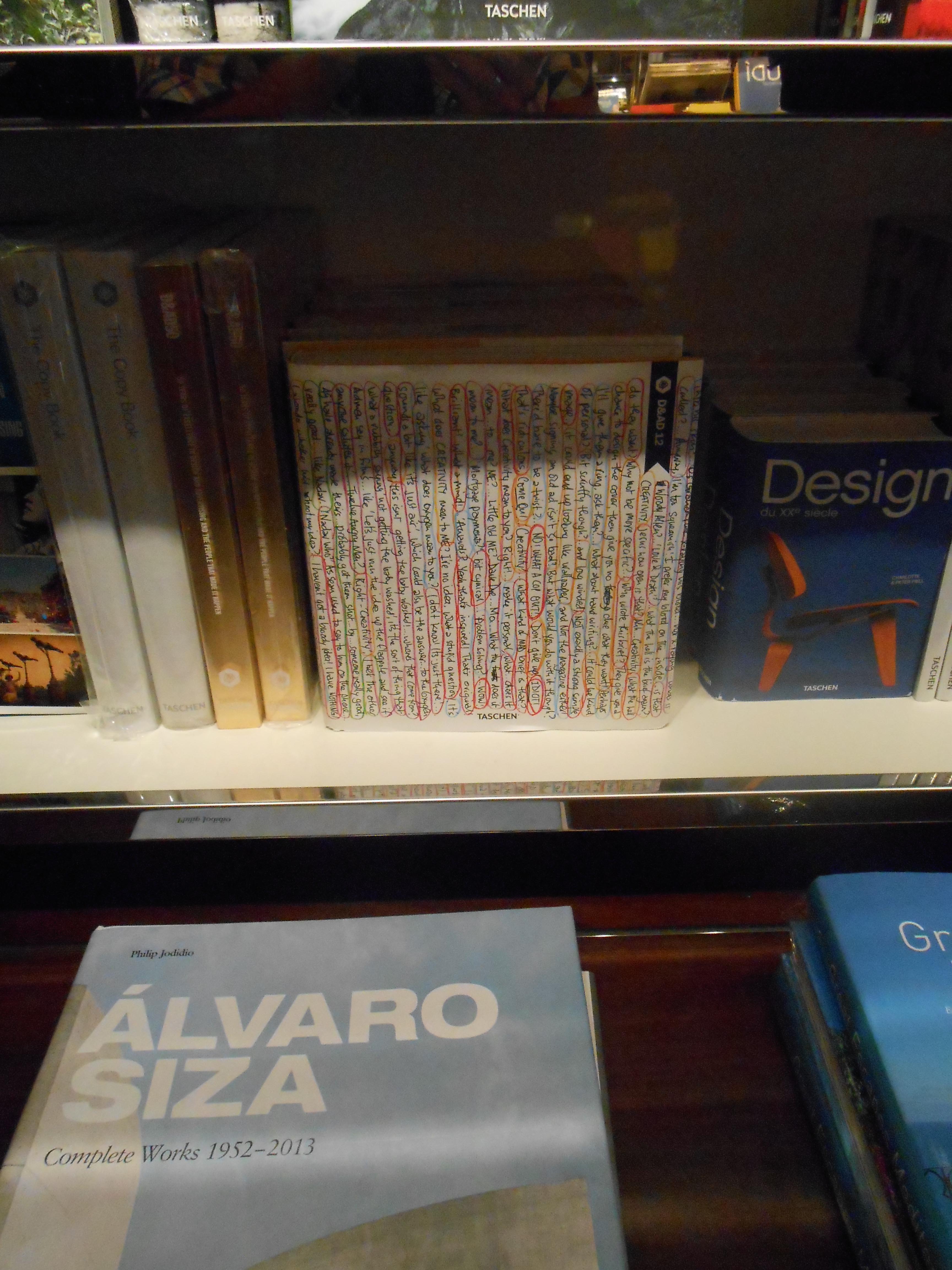
It was chosen as the official 2012 cover.

I guess the moral of the story is; BE YOU.
Because sometimes it’s better to look inside rather than out.
You’re unique.
I’m stopping now, I’m starting to sound like a hair-care commercial.
Nb. When I designed the 2004 annual I modestly buried my credit in a sea of names.
A few years later the designers of the annual credited themselves on the front cover.
I thought if I ever got the chance again I’d be less modest.

Job done.