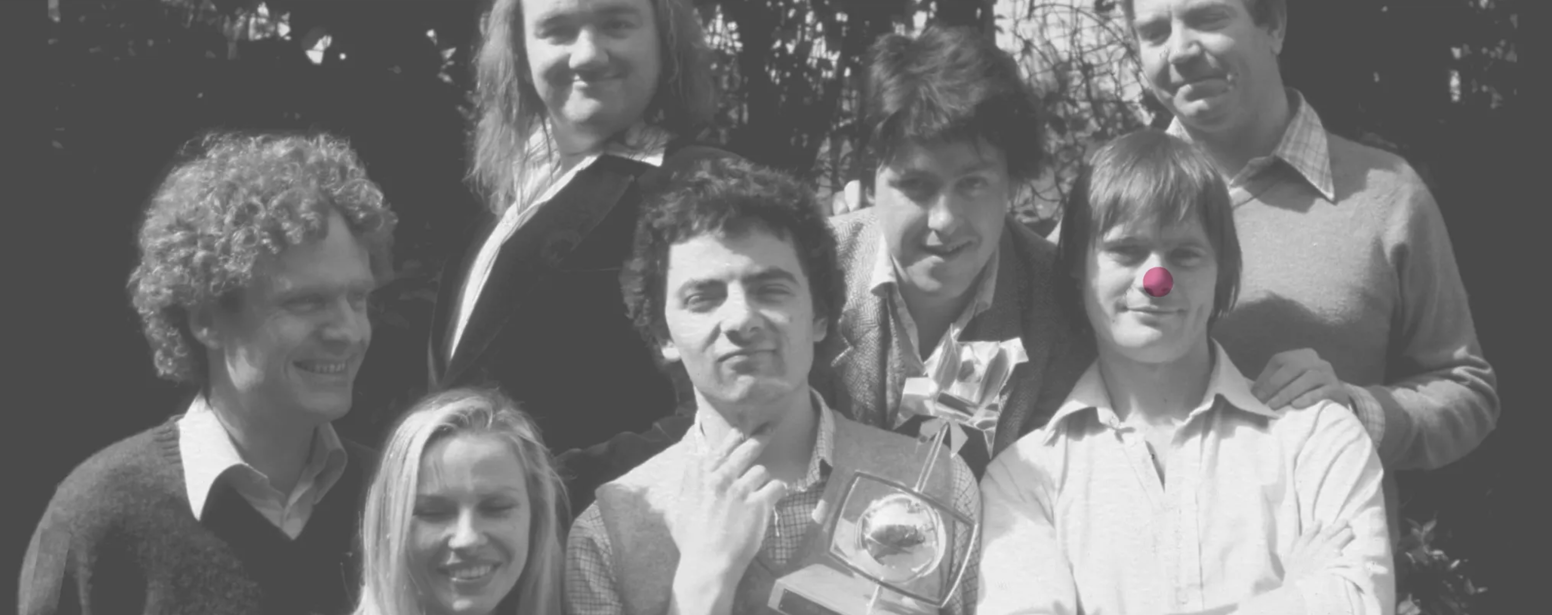

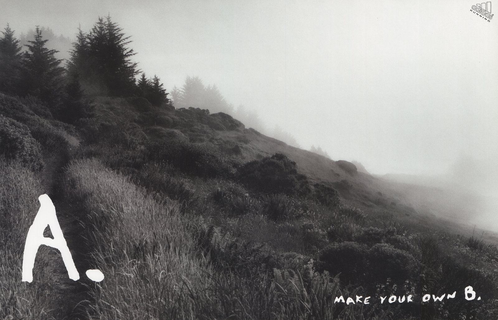
I used to work with a very smart writer called Alastair Wood. One thing he said left a lasting impression on me; 'None of my proofs are as good as the roughs'. I realised it was a common complaint amongst writers. Ideas, when first expressed have an energy, vitality and humanity, because people only write or draw the key elements. There's no fat. The process of bringing ideas to life often kills them. Firstly, because it's easy to get seduced by hot photographers, passionate illustrators, belligerent designers etc. Secondly, the concepts lose their individuality. The charm and energy of the scribble often replaced by tired looking fonts and clichéd or over complicated imagery. It's to stay focused and simply service the idea. Possibly because of Al, I like comparing the scribble, where the idea is was first expressed, to the finished ad, to see the journey an idea has been on. If I've been thorough, I should know why I chose every mark on the page. Here's a before and after to illustrate what I mean.
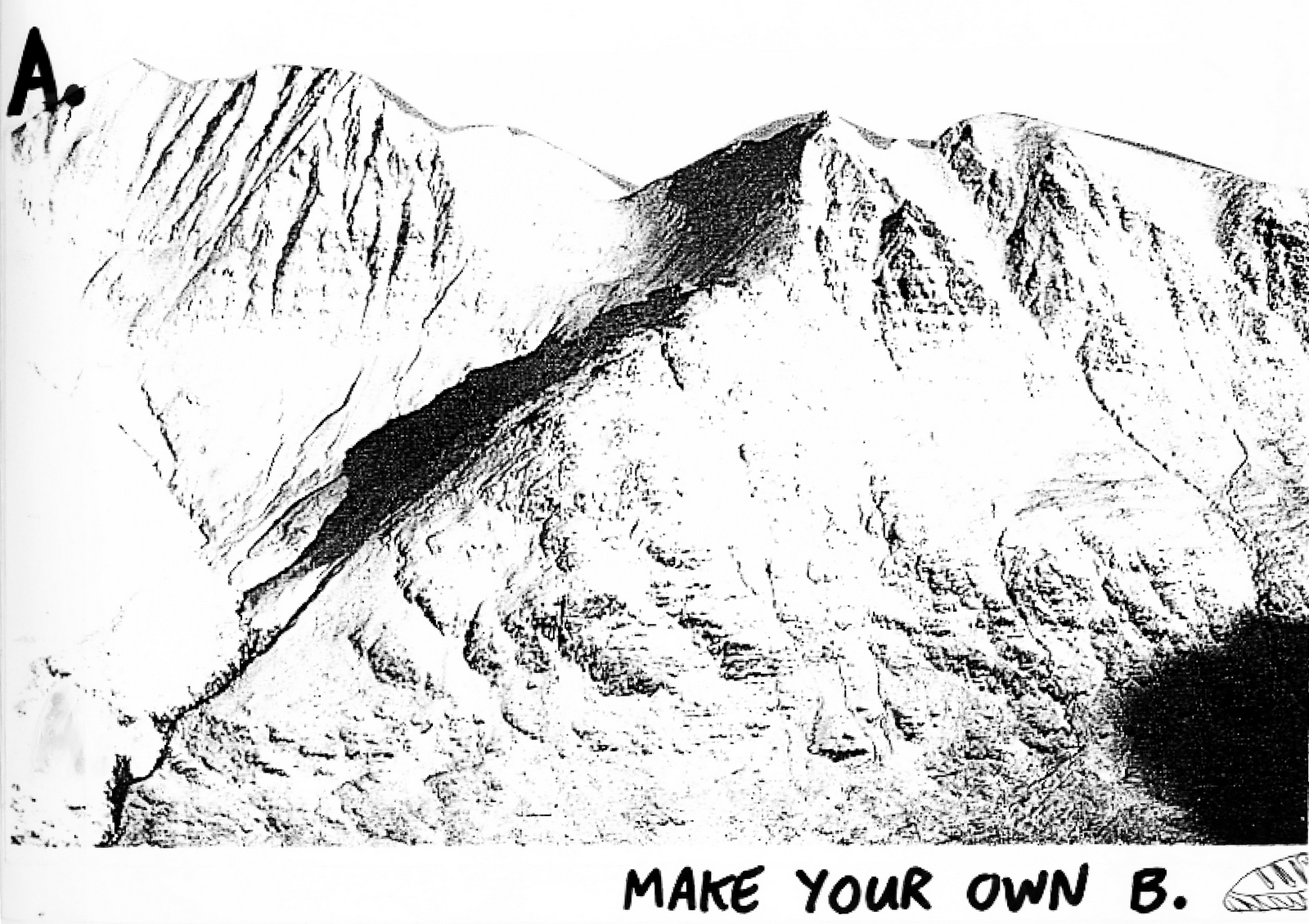
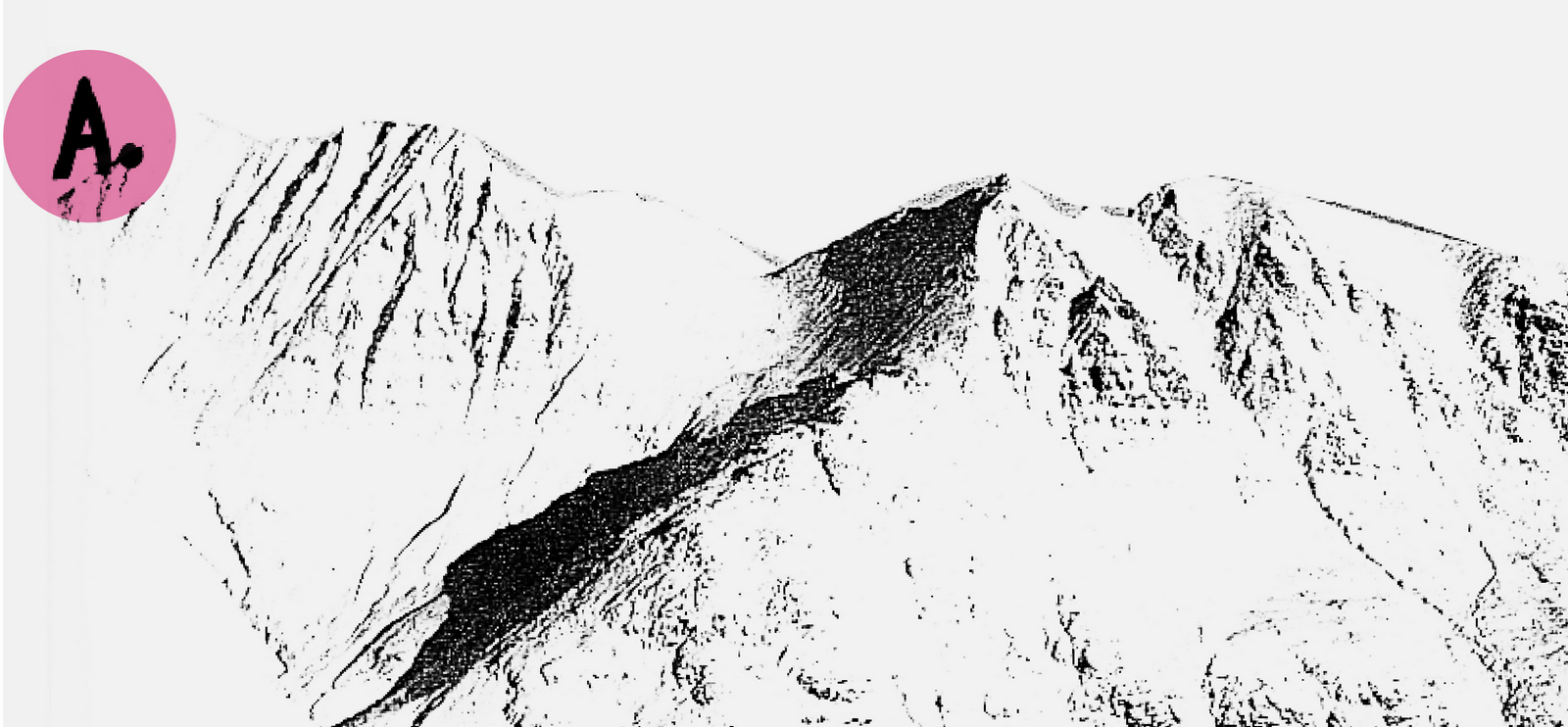
It's a rough put together by my old writer Sean Doyle.It's not very refined to say the least, but it's dead clear, human and has a certain charm.So, what to do?Making a picture you wanted to inhabit seemed key.But what style?As the ad was about getting lost in nature, black and white seemed good, it felt more natural than colour.Logically of course this makes no sense, but perhaps in a overly brightly coloured world of magazines it felt more neutral, which nearly spells natural.Fine Art photographer Sally Gall was chosen to shoot the campaign, just edging out Joel Meyerowitz, who's amazing, but I just felt she captured very evocative moods.Again, as the idea was about getting back to nature, fonts could feel a bit formal, something handmade felt more appropriate.Eventually, the font was some chopped up handwriting that I found in the studio, it belonged to top designer Graham Woods, (except the 'A', which was a font, then run through a photocopier a few times then flipped the wrong way around).The logo looked a bit sharp and shiny, so we traced over it by hand. Badly.It hasn't dated much because it was never fashionable.
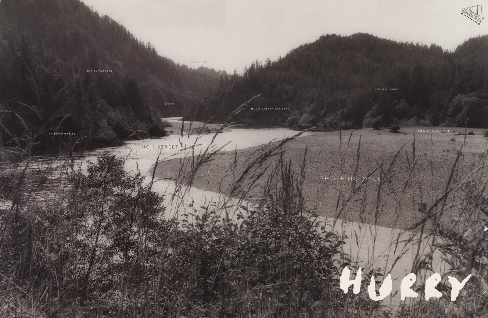
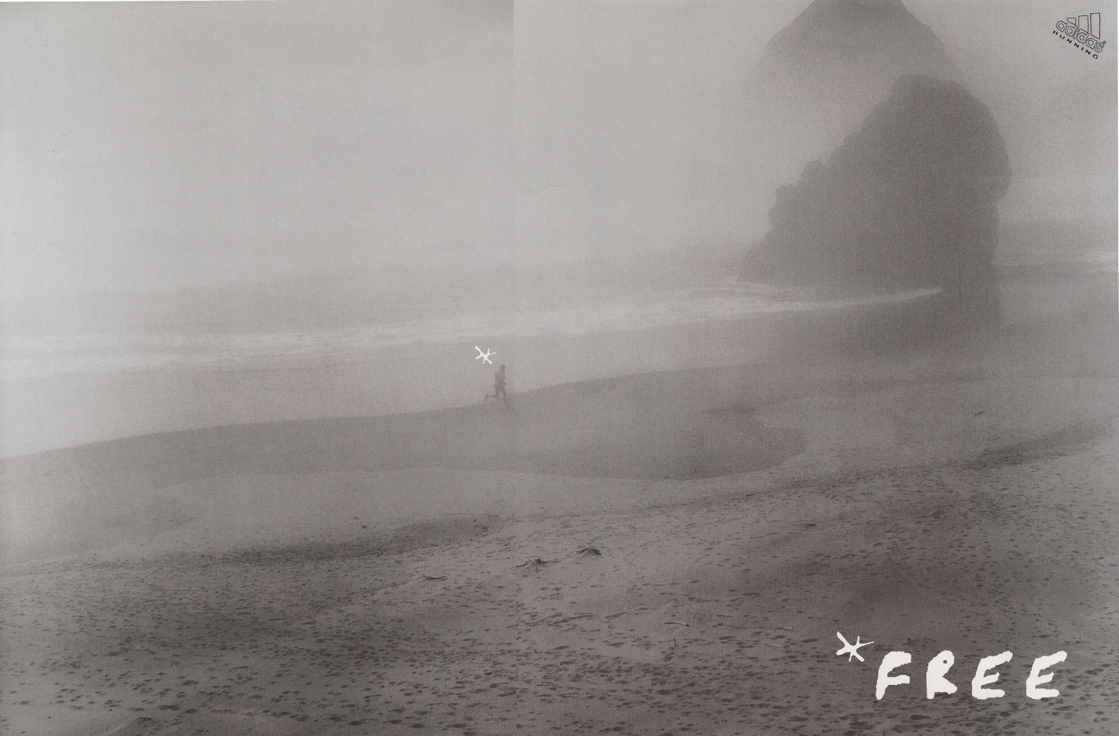
Nb. Here are the other two.


Lorem ipsum dolor sit amet, consectetur adipiscing elit. Suspendisse varius enim in eros elementum tristique. Duis cursus, mi quis viverra ornare, eros dolor interdum nulla, ut commodo diam libero vitae erat. Aenean faucibus nibh et justo cursus id rutrum lorem imperdiet. Nunc ut sem vitae risus tristique posuere. uis cursus, mi quis viverra ornare, eros dolor interdum nulla, ut commodo diam libero vitae erat. Aenean faucibus nibh et justo cursus id rutrum lorem imperdiet. Nunc ut sem vitae risus tristique posuere.
Delete