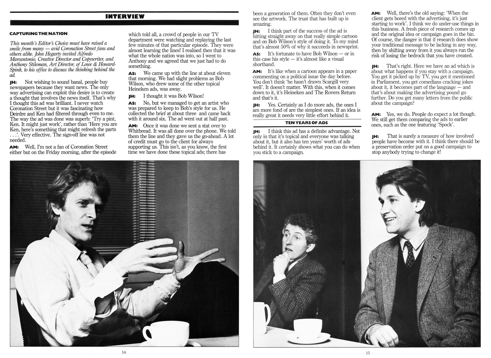
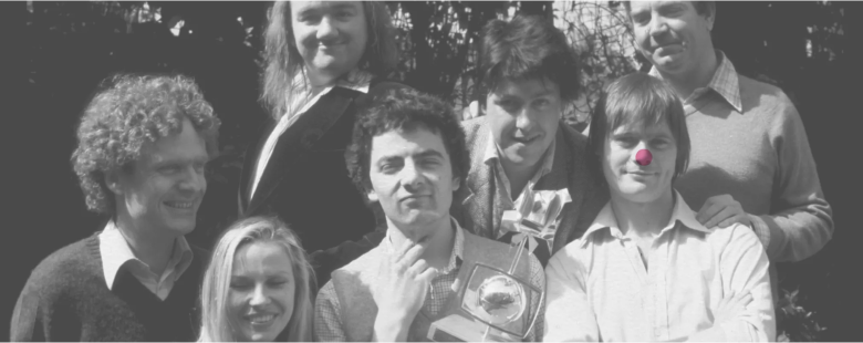
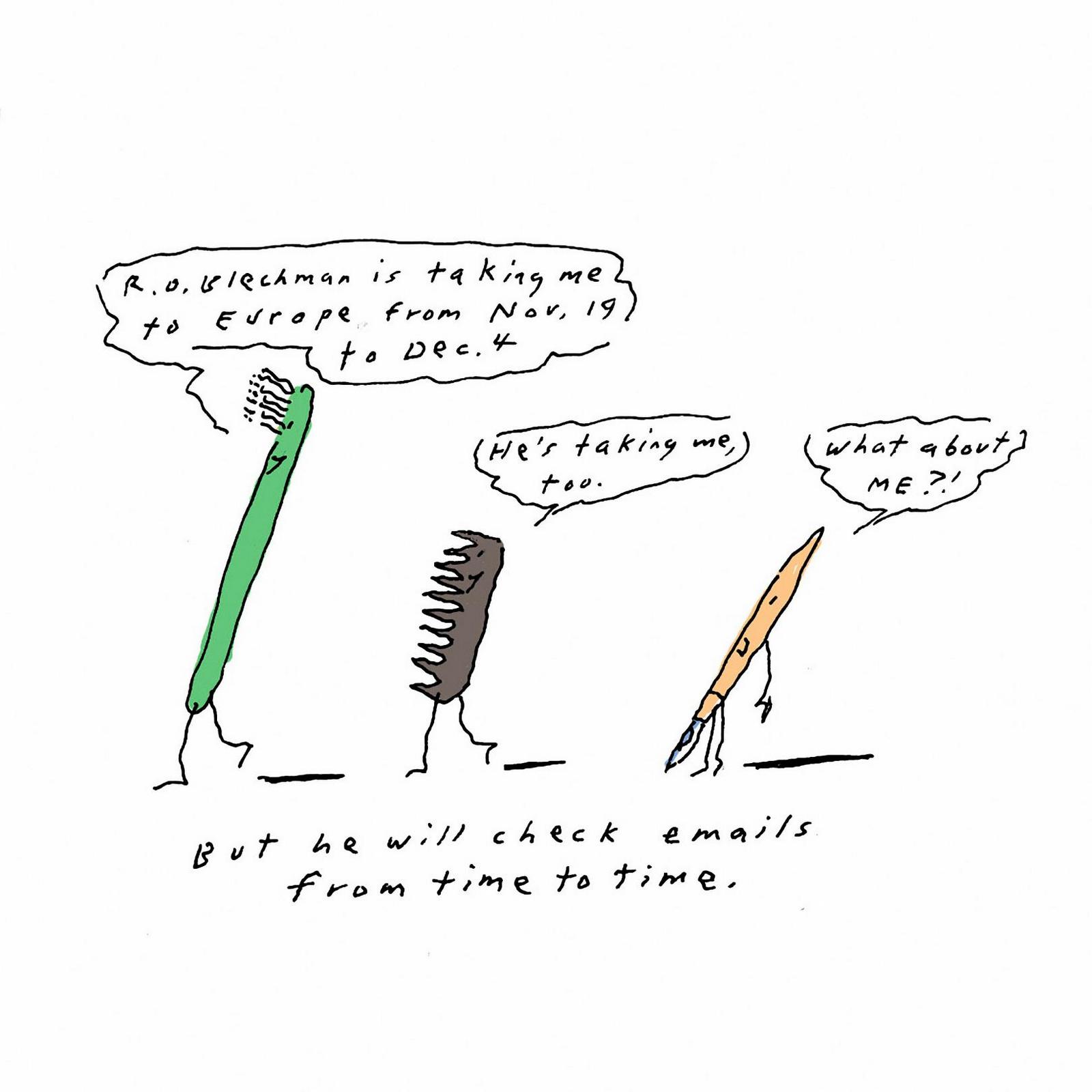
So far, I’m about eighty podcasts in.
If someone tells me they listen, they usually follow up with ‘that Frank Lowe one’s great’ (or ‘sick’, depending on their age).
I always ask why, but never get a clear answer.
They just like it.
It was enjoyable to record too, but I left wondering why
he'd barely mentioned Lowe Howard-Spink.
As if he’d only ever worked at CDP.
Which was a shame, CDP had been amazing, but they weren’t my era.
Lowe’s was.
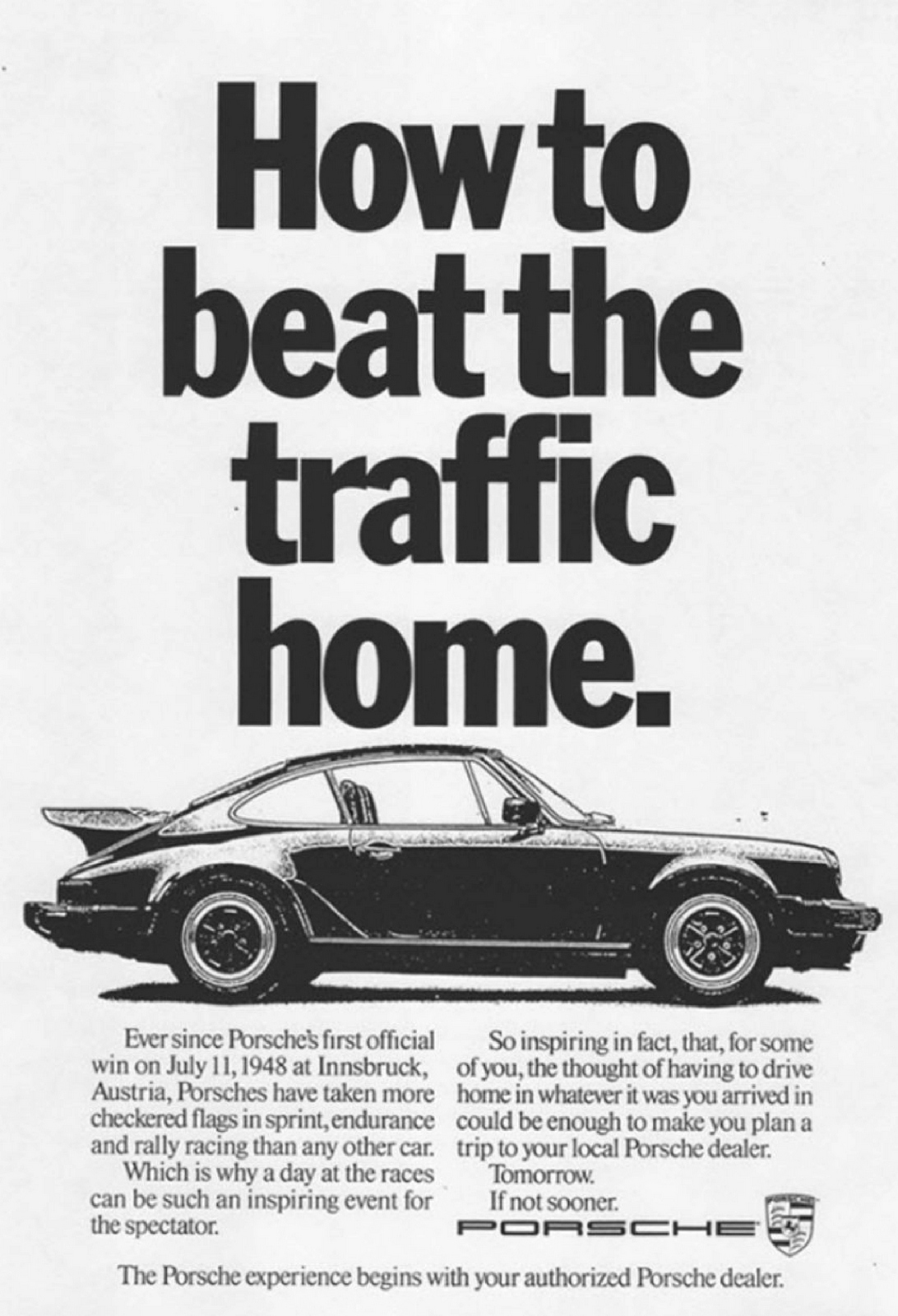
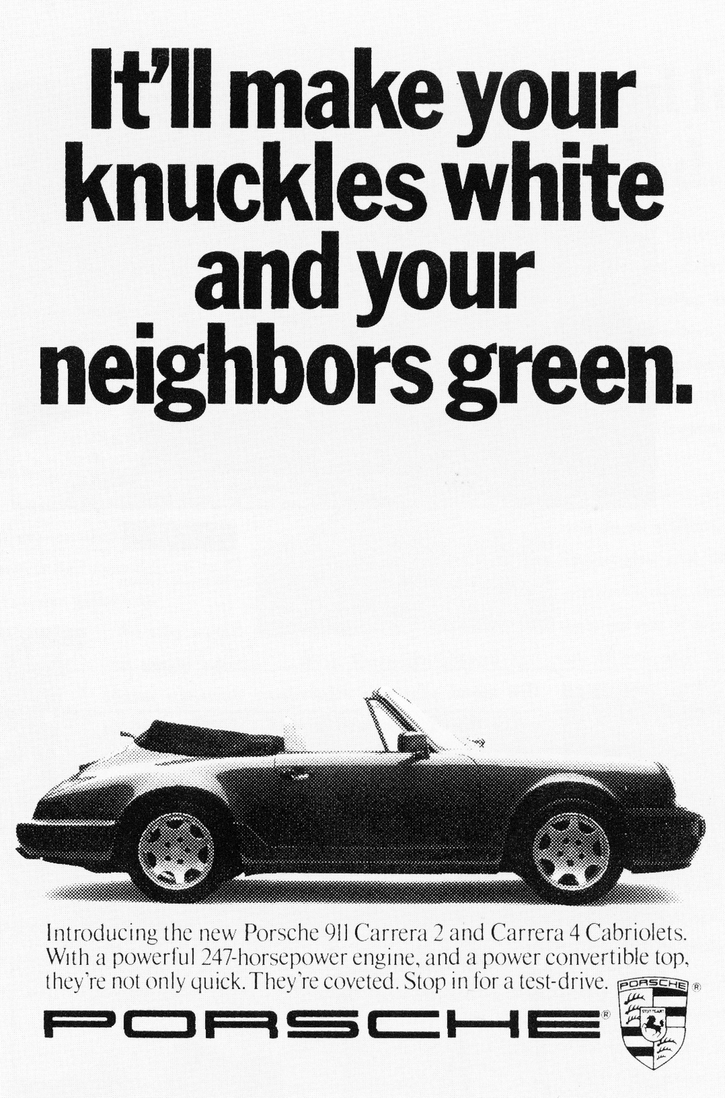
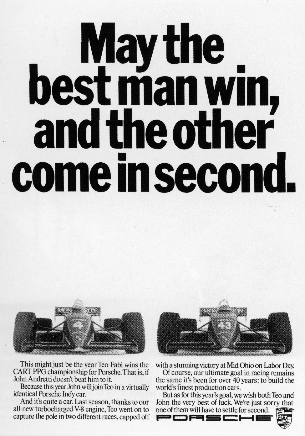
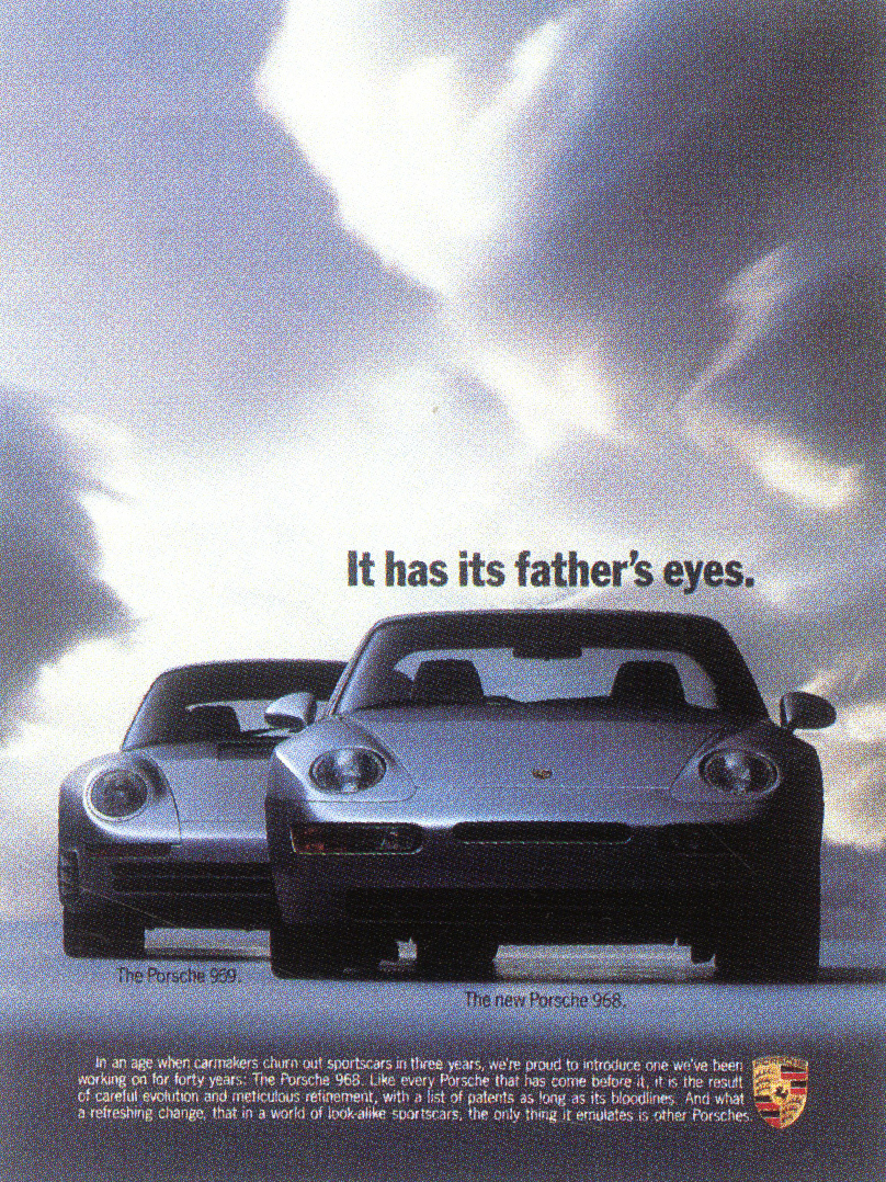
By the time I’d snuck into advertising the cool agencies were the new ones – GGT, BBH, AMV and the agency that carried Frank’s name.
Year after year, they won big awards for big clients.
Stella Artois, Vauxhall, Tesco, Heineken, I could go on.
So I will – Lloyds Bank, Reebok, Weetabix, Gordons Gin, Parker Pens, The Mail On Sunday, Condor, Castella, Tizer, Ovaltine, KP, The Hanson Trust, Birds Eye, Smirnoff, Coca-Cola - they were huge.
And all of those clients won awards.
And, unlike CDP, they started opening or acquiring offices across the globe.
But it wasn’t always this way.
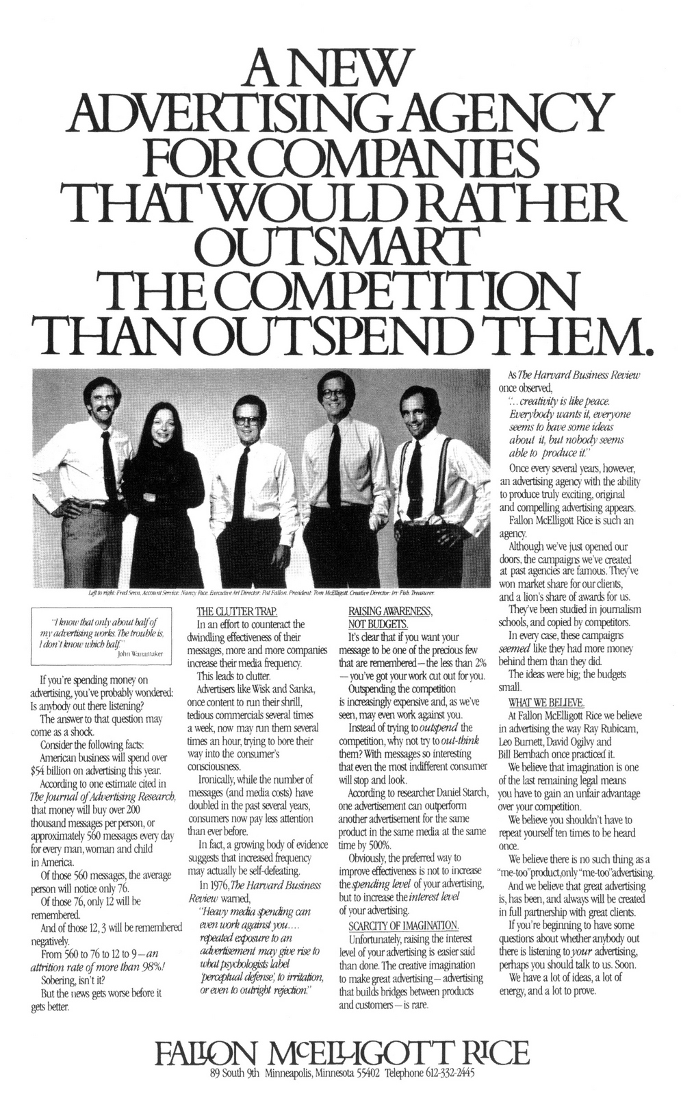
In 1981, only months after opening their doors, they were in turmoil.
Totally dysfunctional.
Having swiped a big chunk of CDP’s senior talent, they didn’t have a plan or structure of how to use them.
Who over-saw who?
Did anybody over-see anybody?
Who was Creative Director?
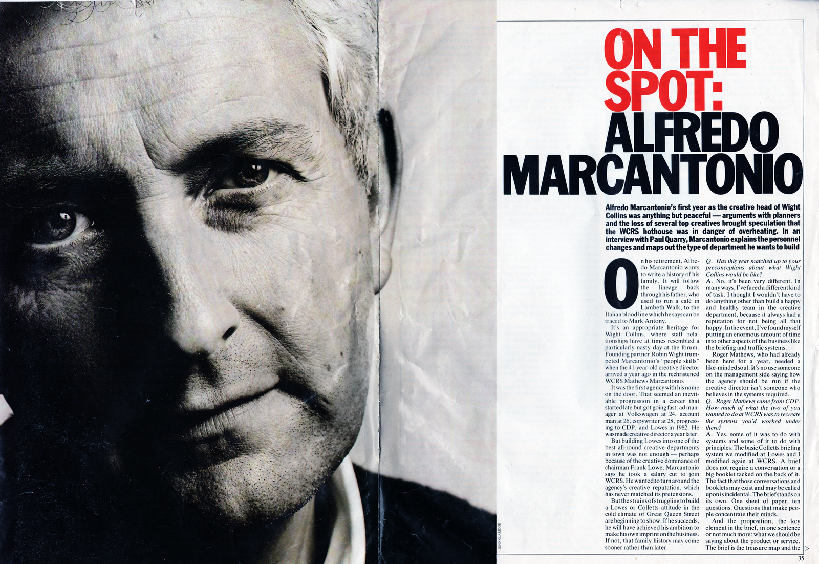
Dave Horry? Alan Waldie? John O’Driscoll? John Kelley? Alfredo Marcantonio? Or the recently added former CDP superstar Geoff Seymour?
They found that too many creative leaders meant they had no creative leader.
Six months in, Horry, O’Driscoll and Kelley walk.
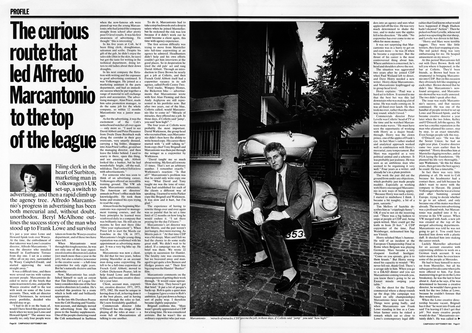
On the way out the door, they advise Frank that he needed a Creative Director and it should be the least-known and youngest of the breakaways – Alfredo Marcantonio.
Suddenly, things started to work.
We talk about why and the rest of Marc's career, hope you enjoy it.

MARSTELLAR.
Bickerton.
Mercedes-Benz.
FRENCH GOLD ABBOTT.
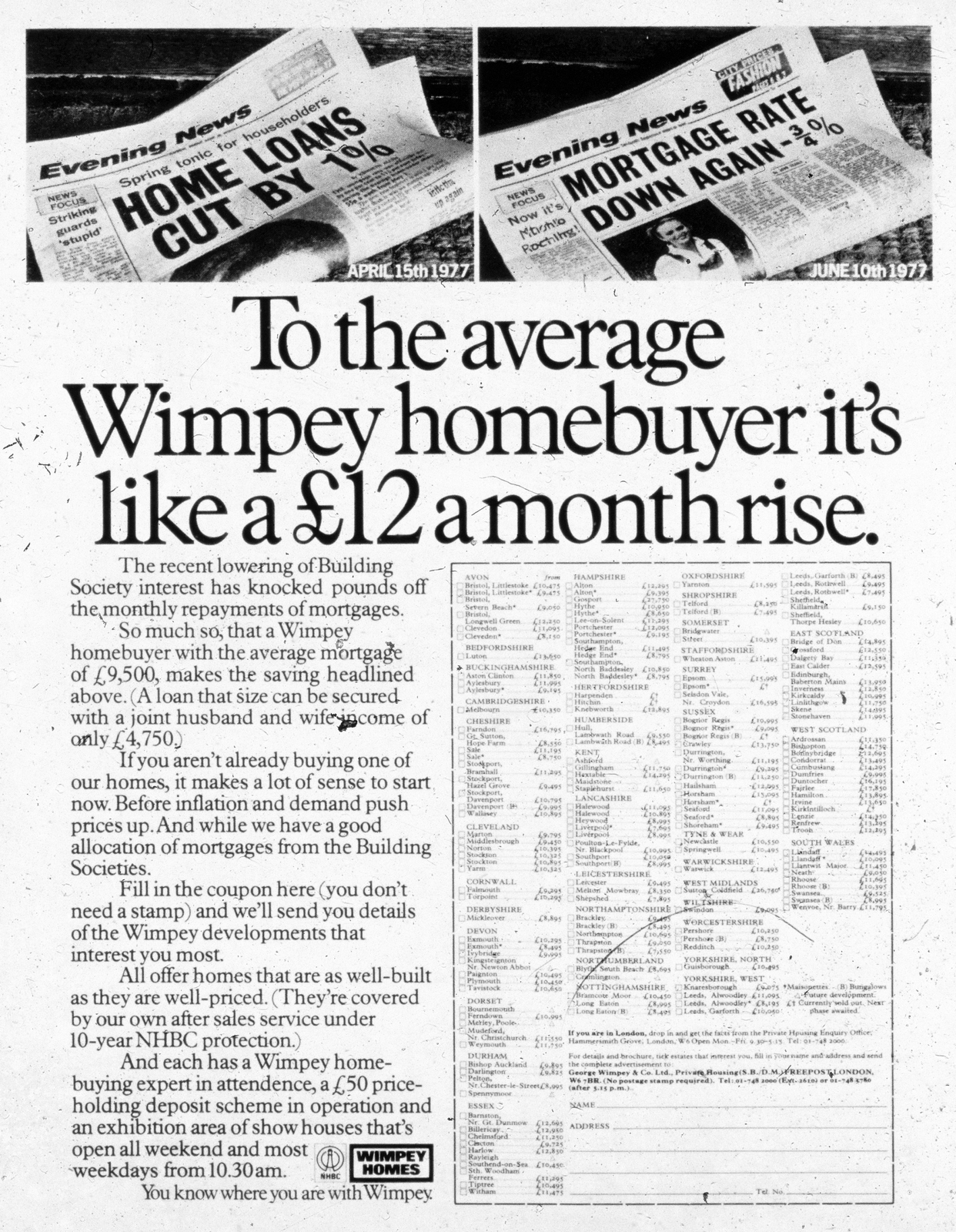
Wimpey Homes.
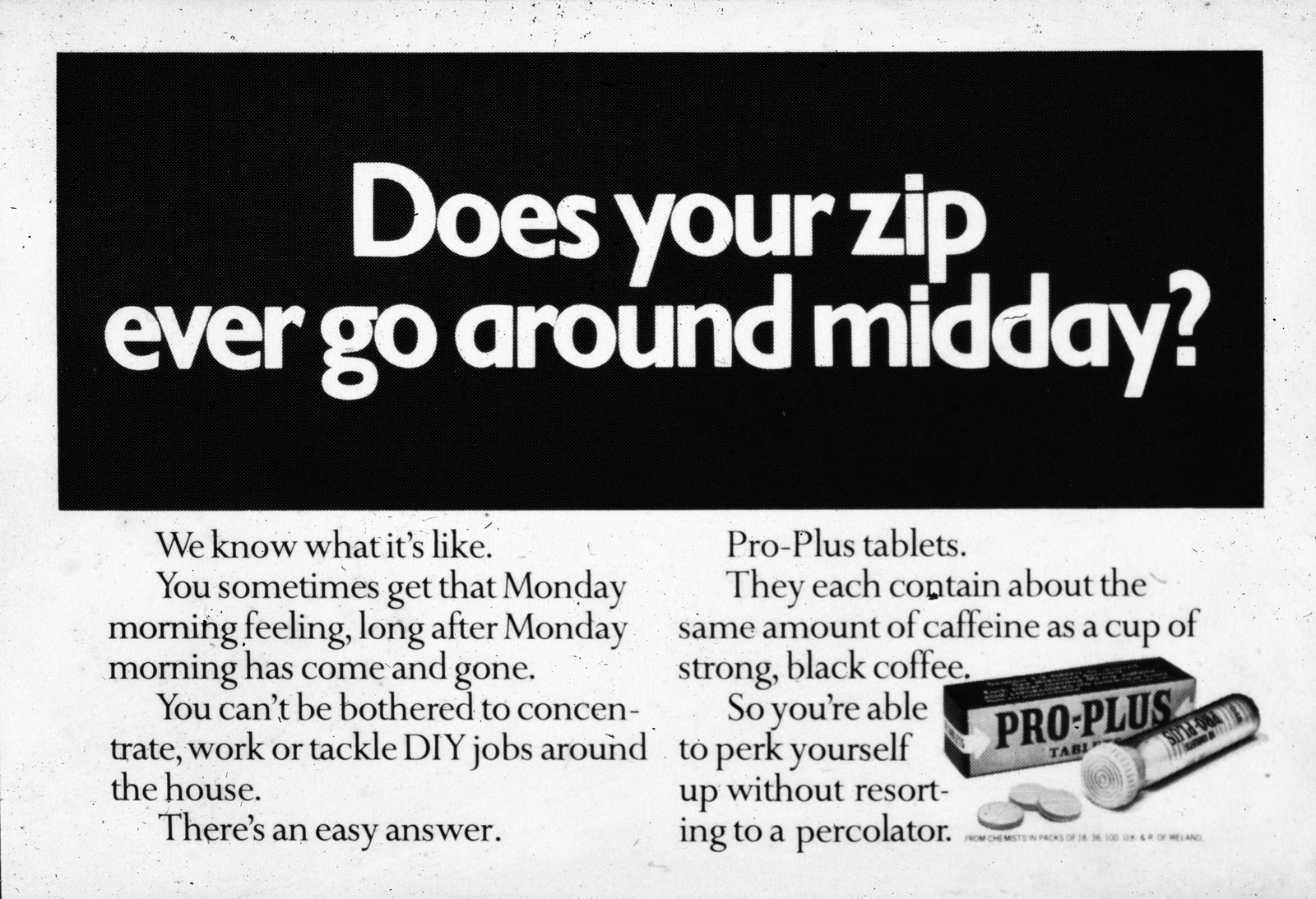
Pro-Plus.
COLLETT DICKENSON PEARCE.

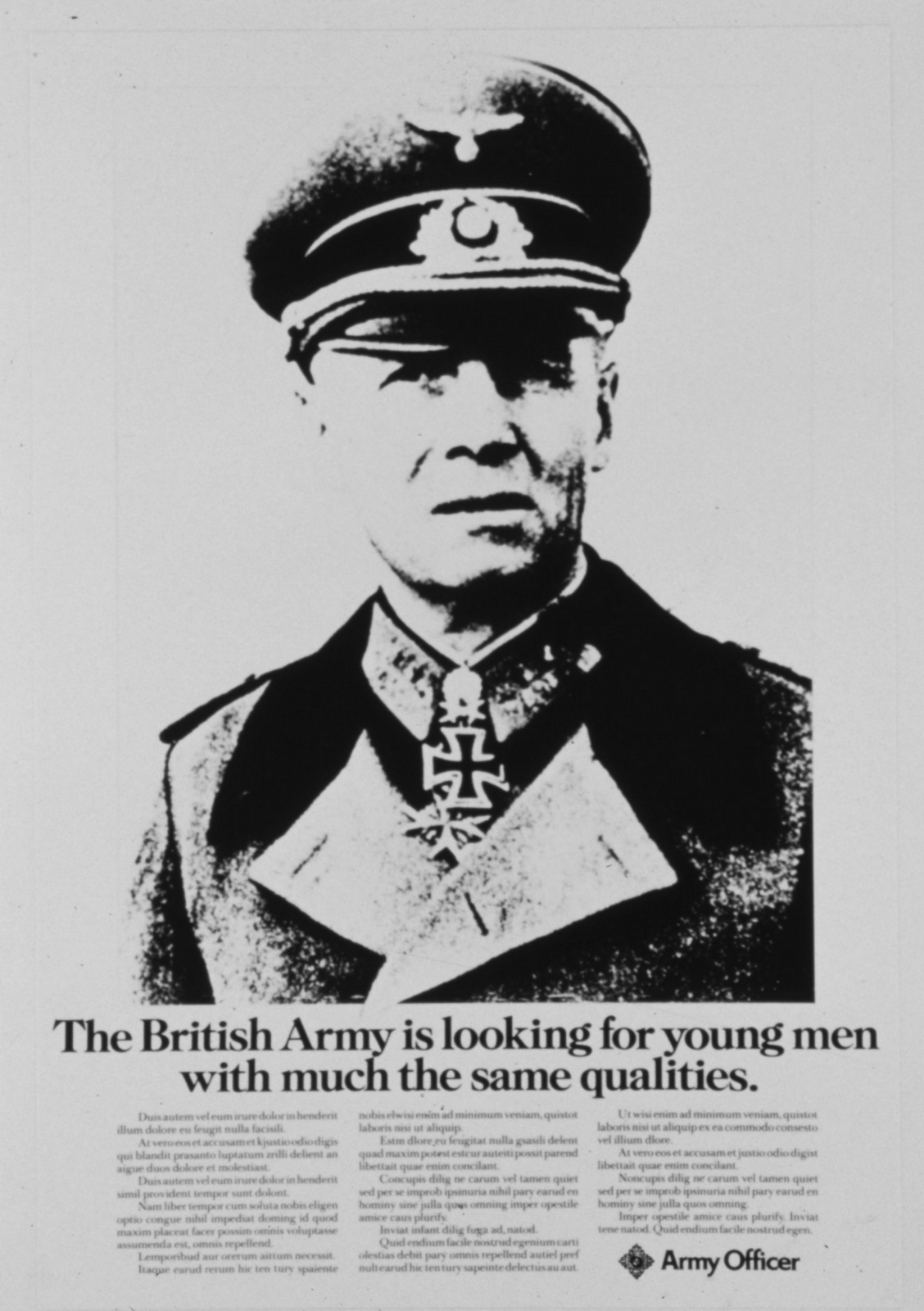
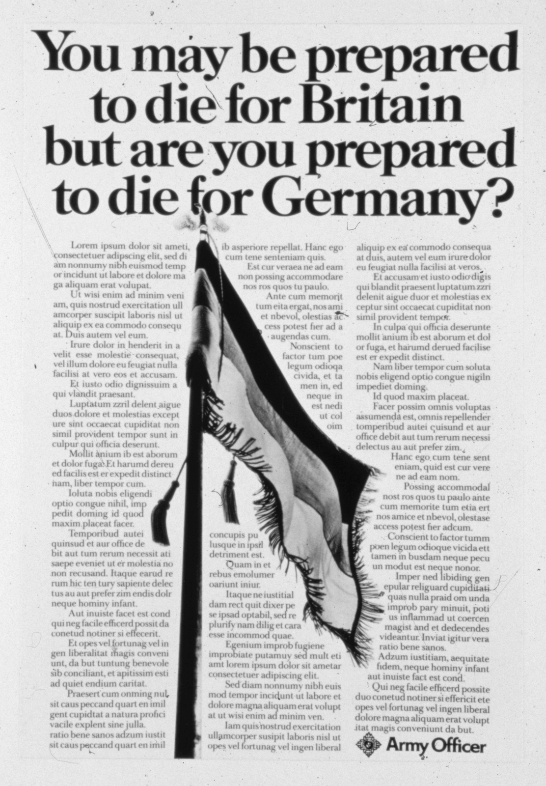
The Army.
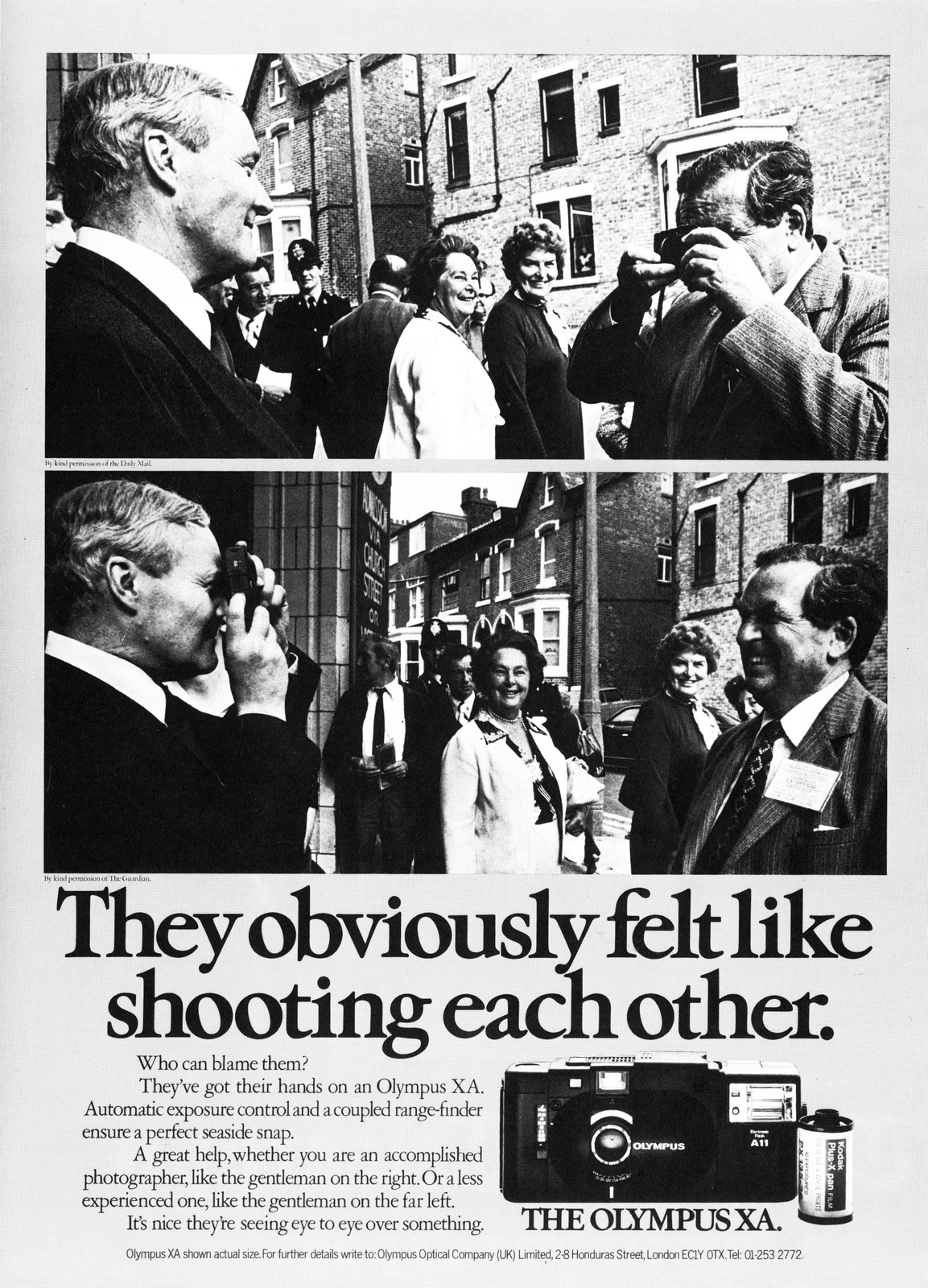
Olympus.
Lancia.
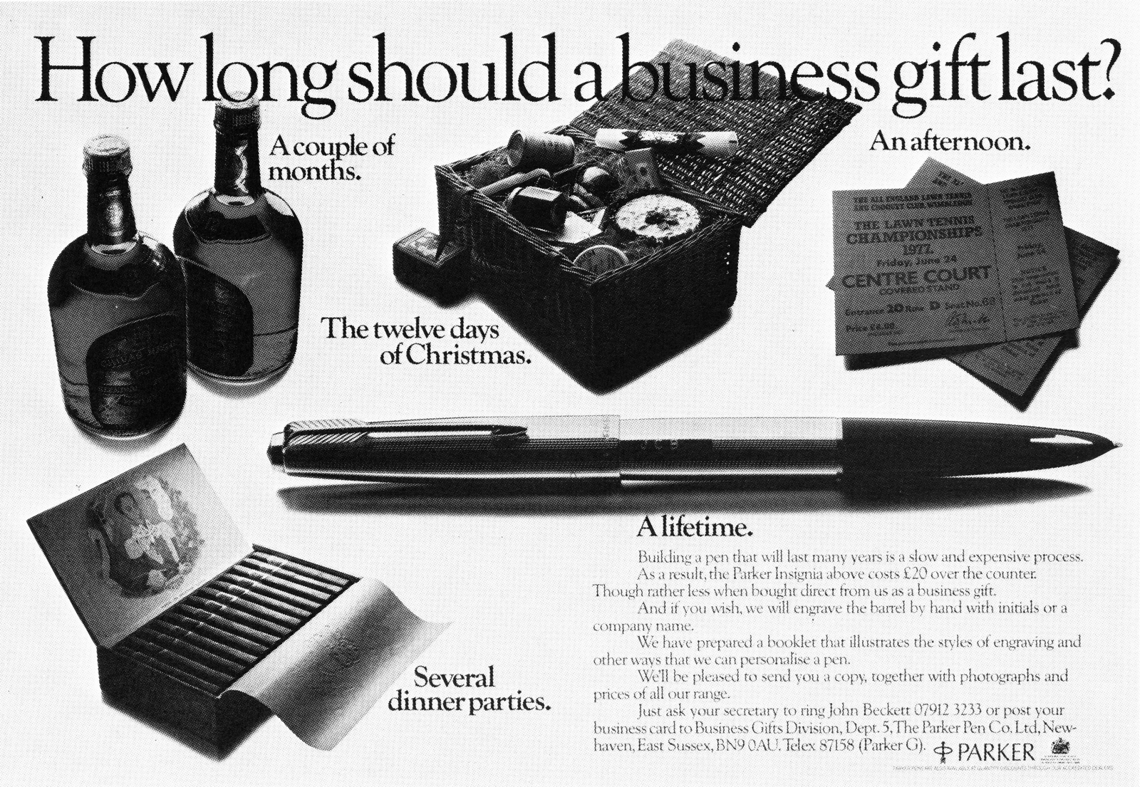
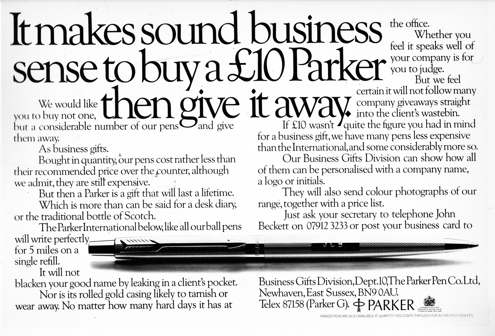
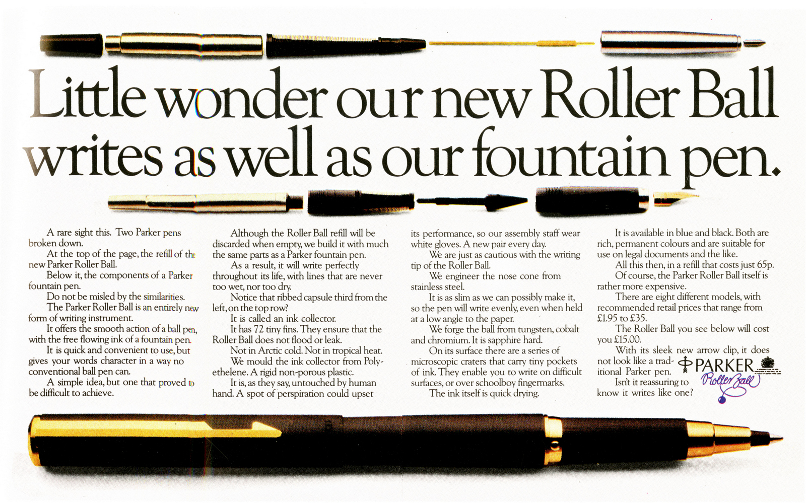
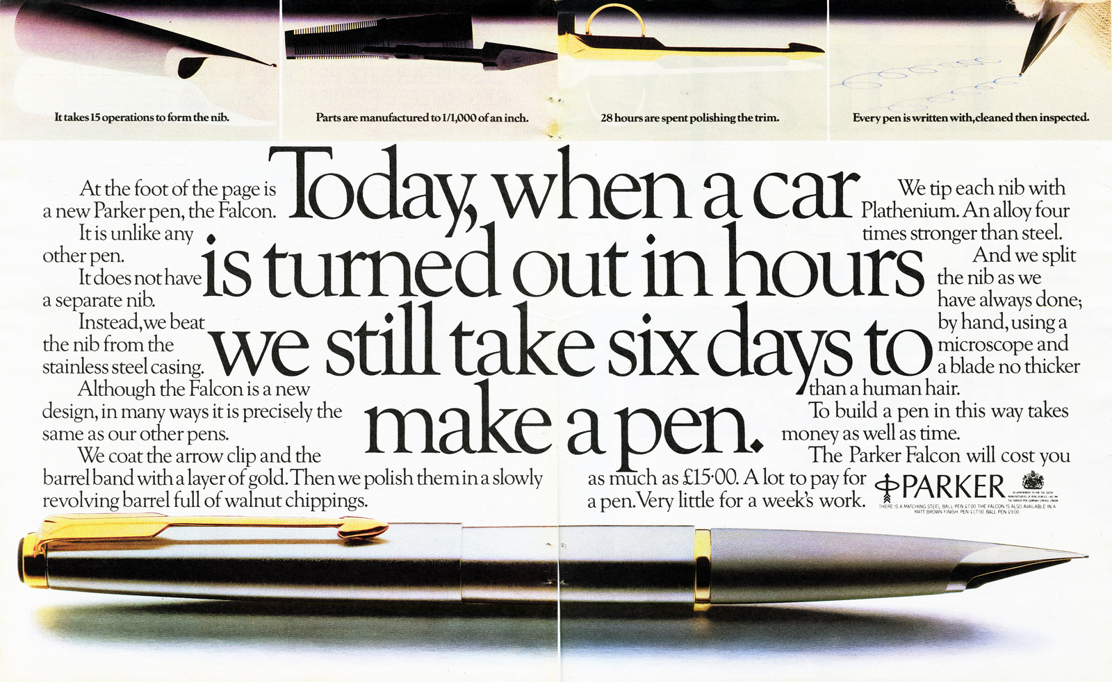
Parker.

Hamlet.
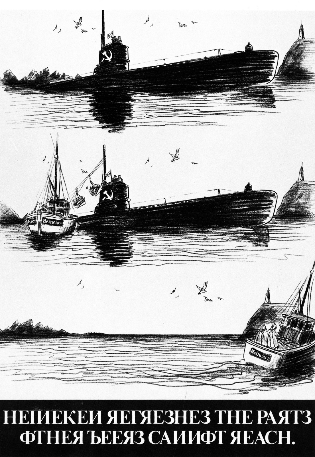
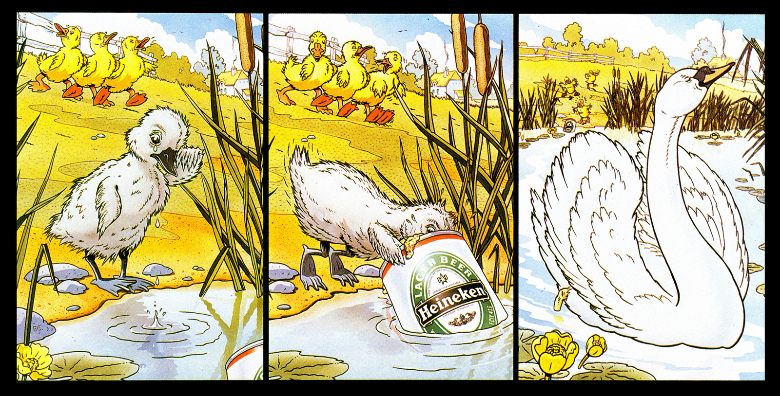
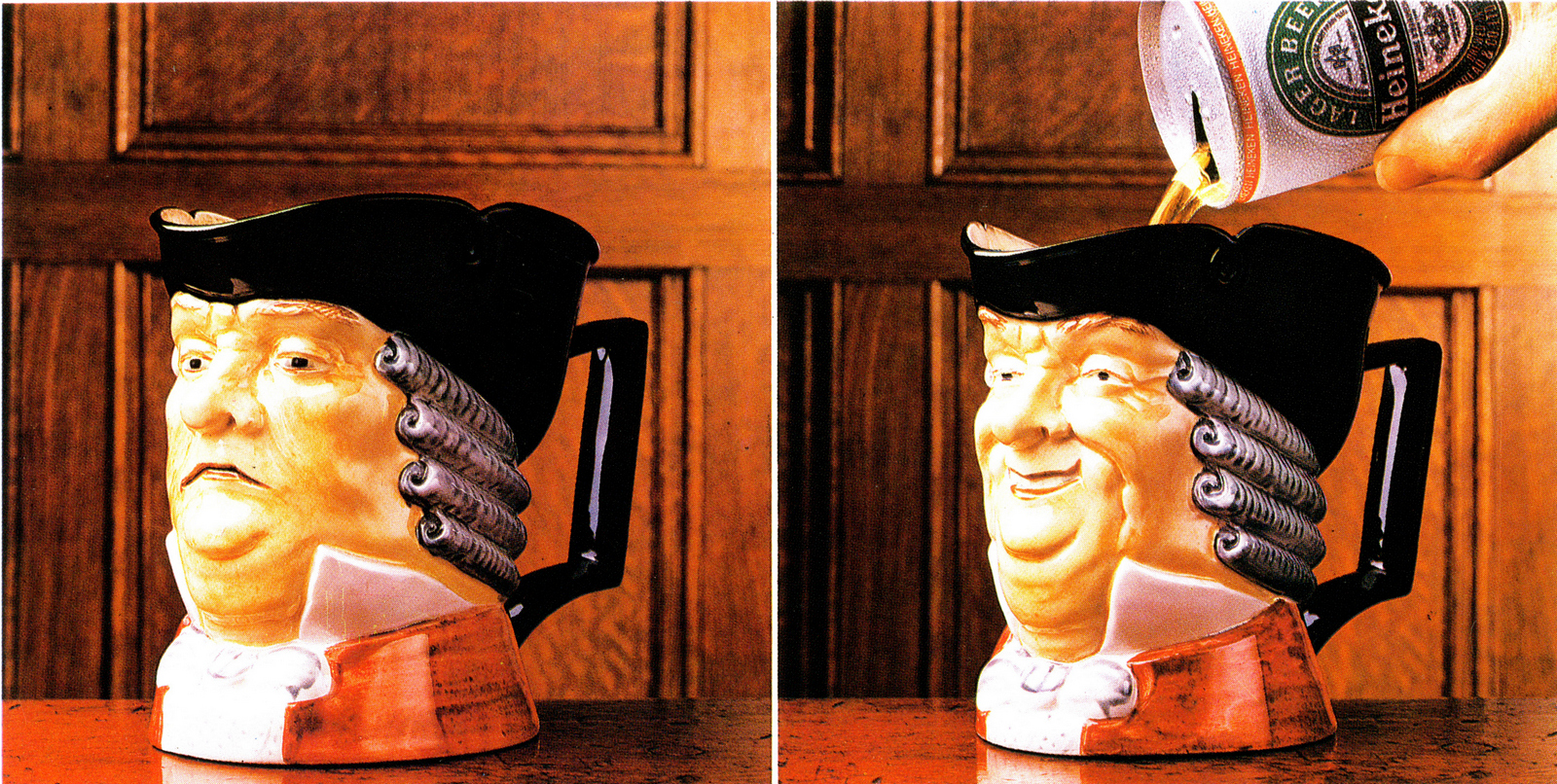
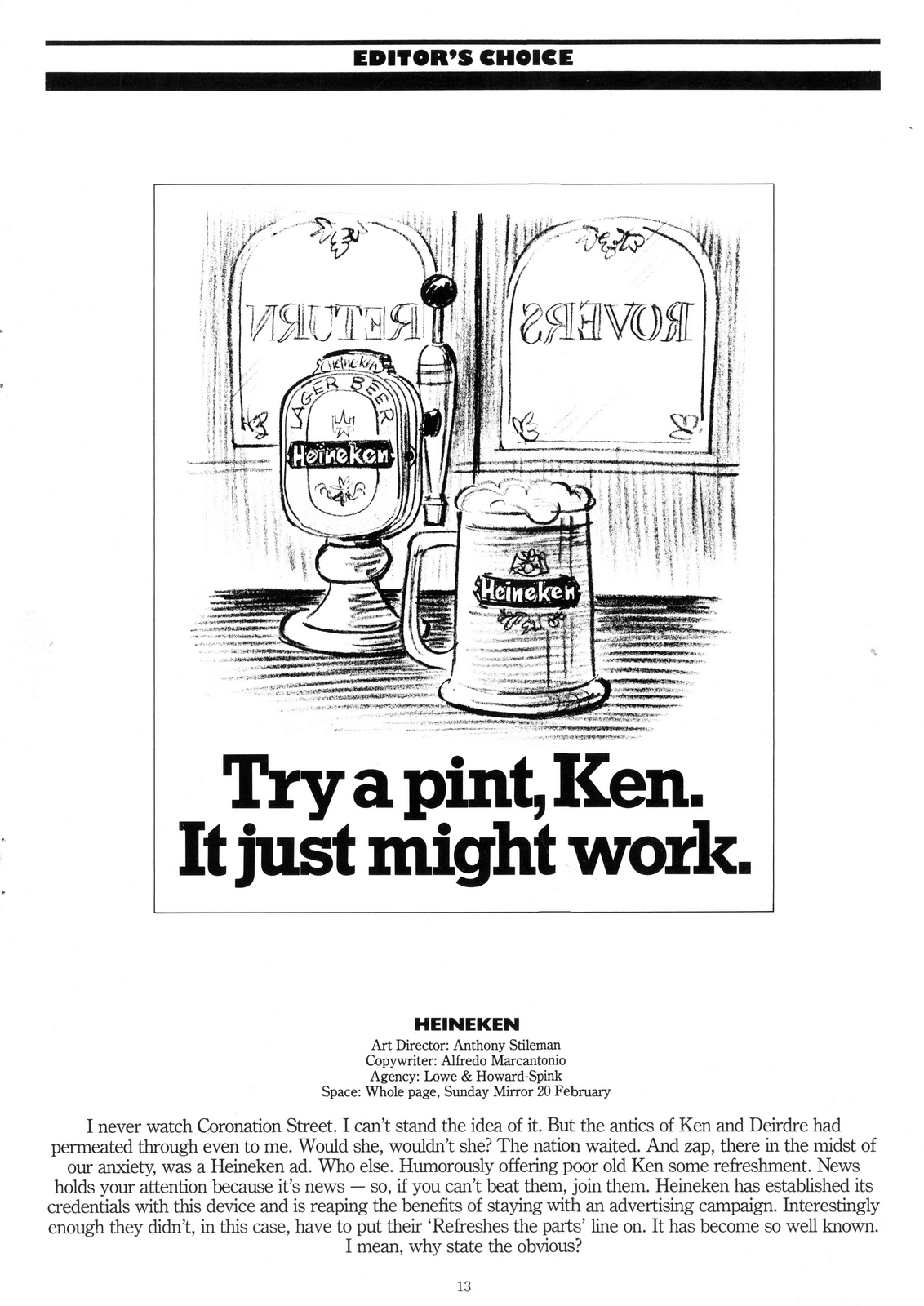
Heineken.
Silk Cut.
Bird's Eye.
B&H.
EMI.
Lowe Howard-Spink
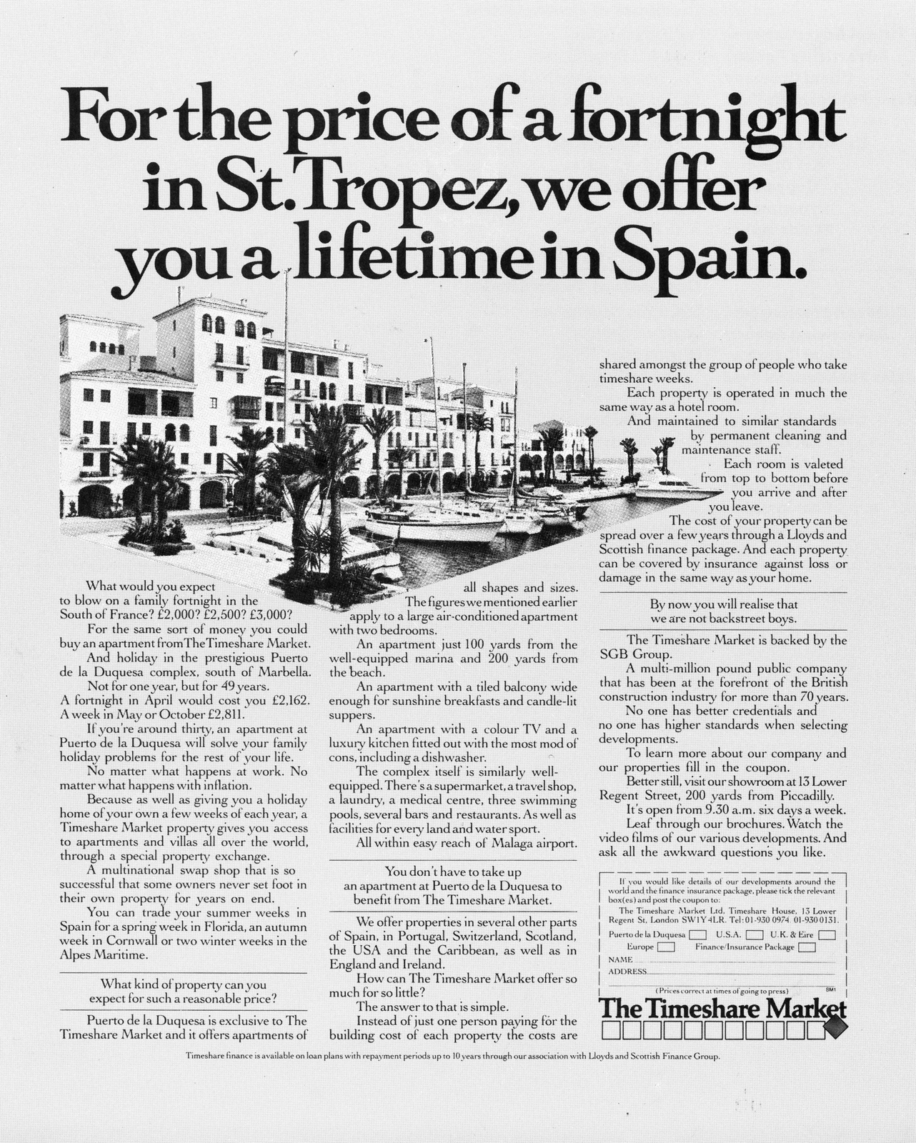
Timeshare Market.
Trophy Best Bitter.
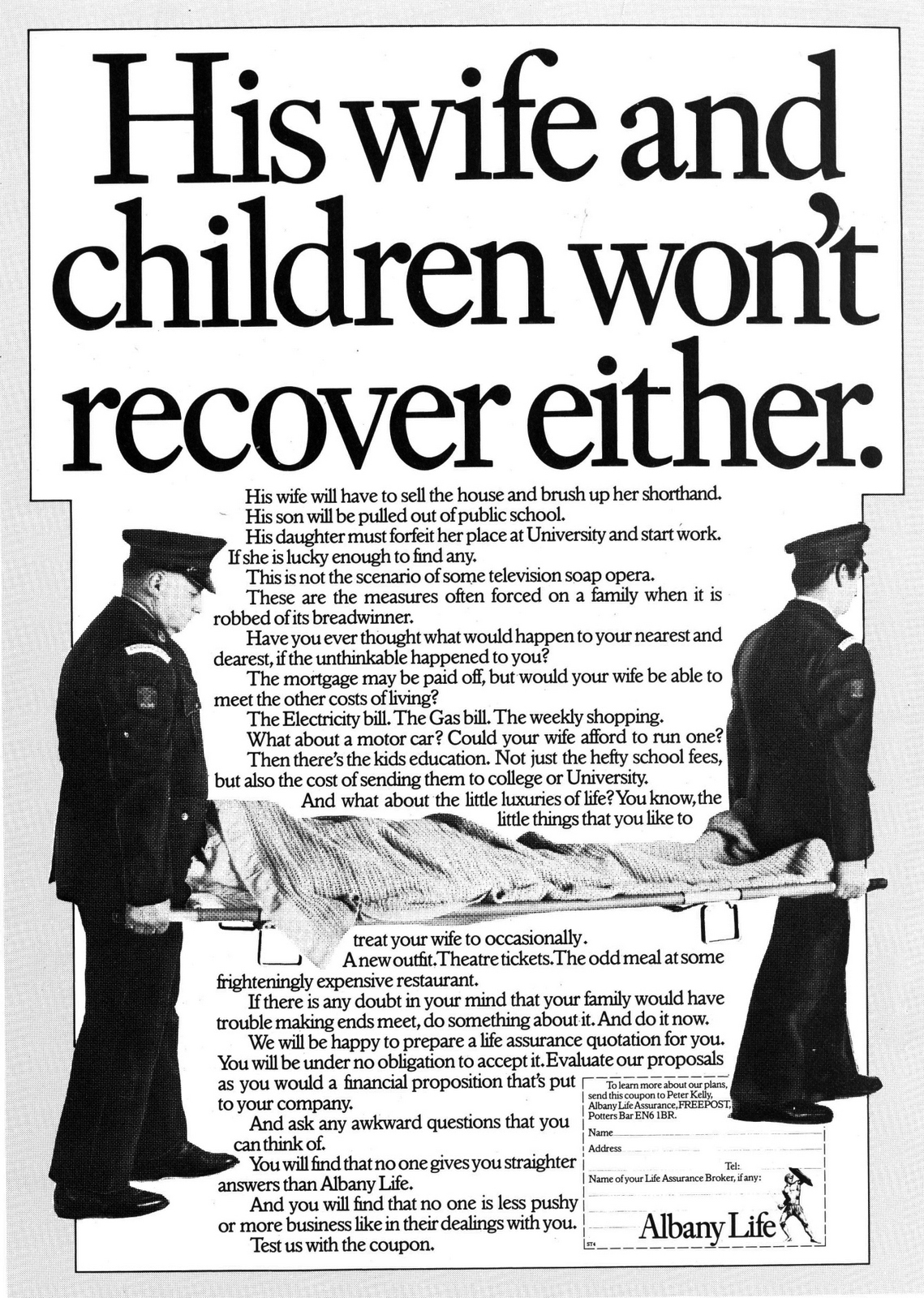
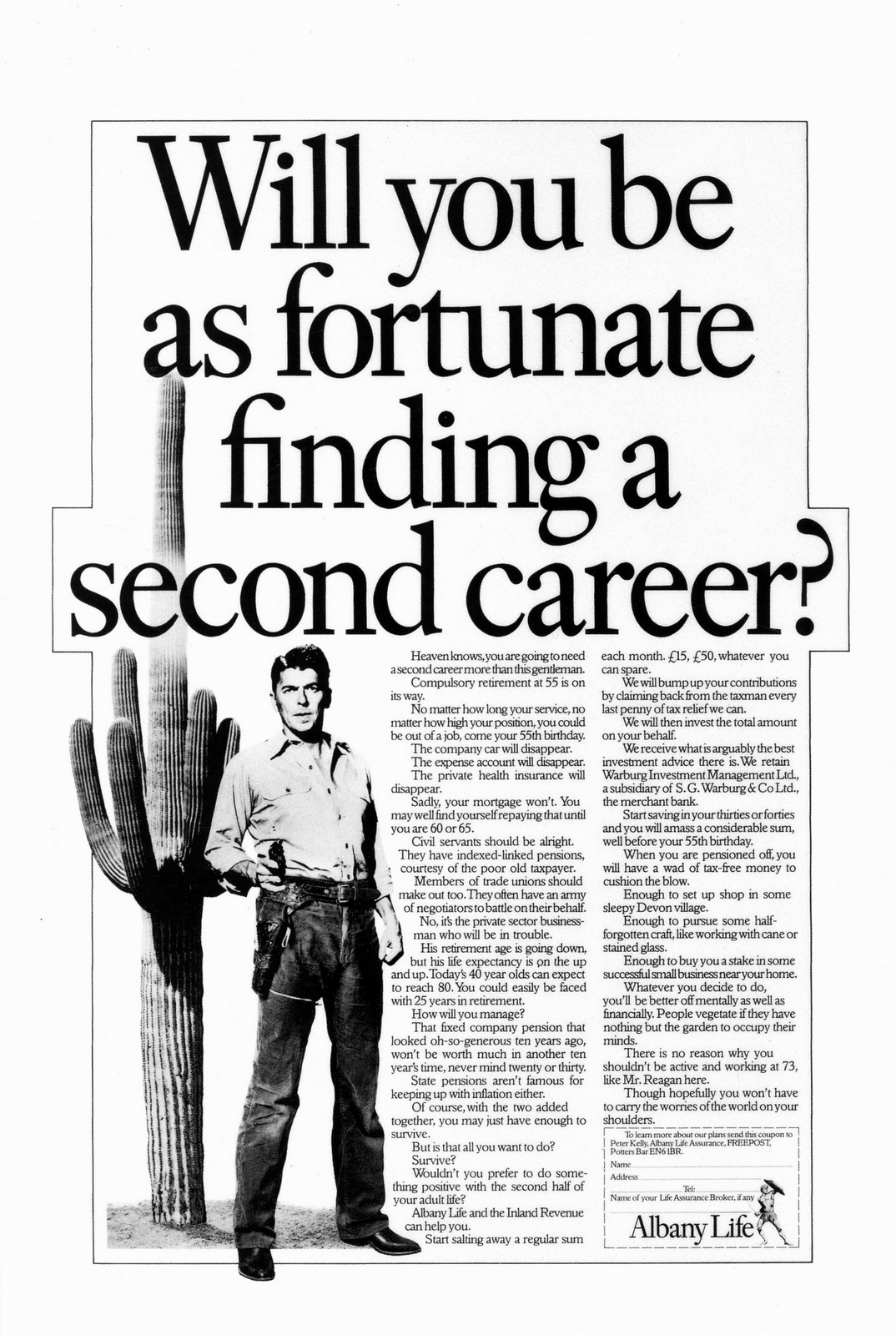
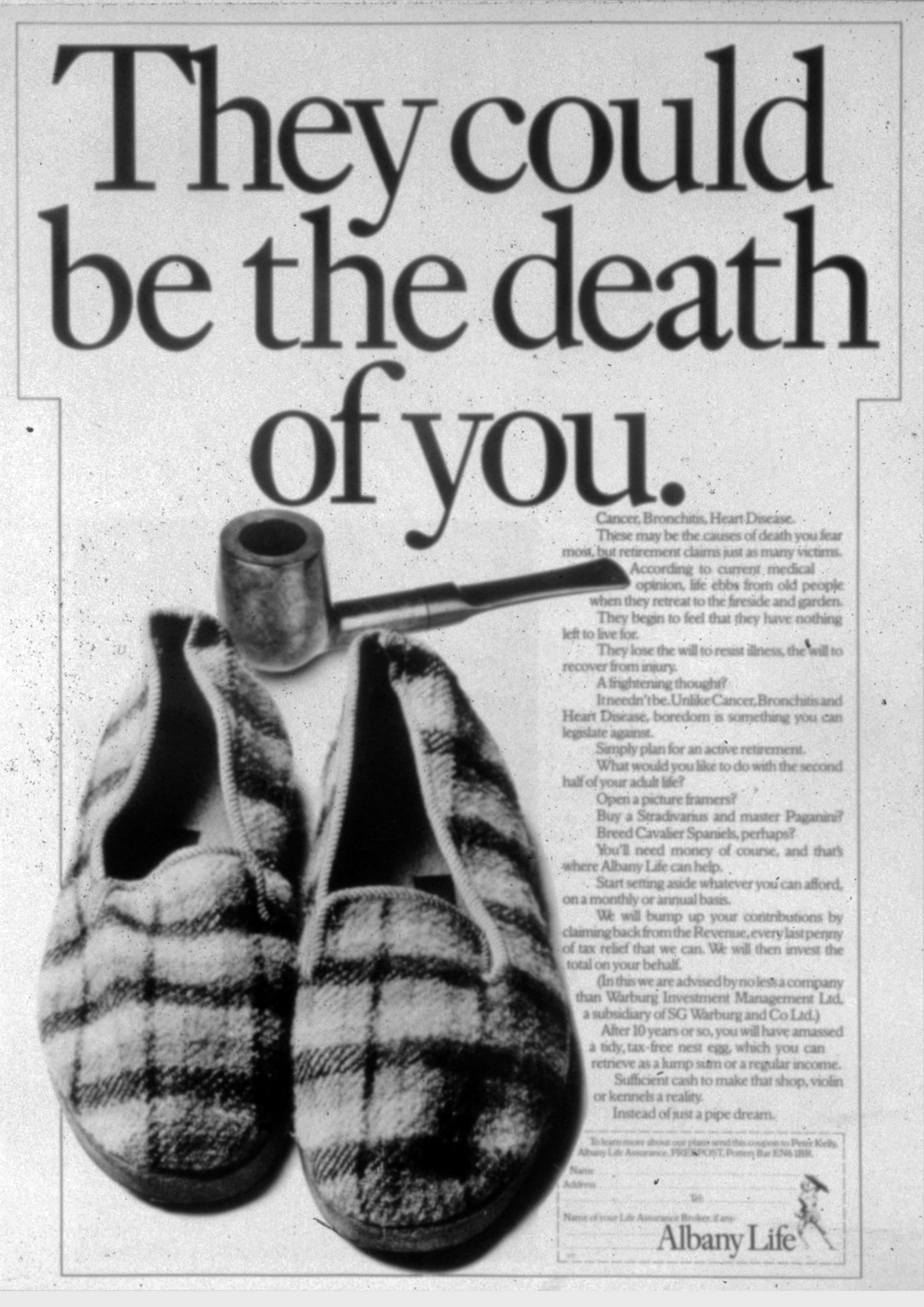
Albany Life.


Parker Pens.


Heathrow Airport.

The Daily Mail.
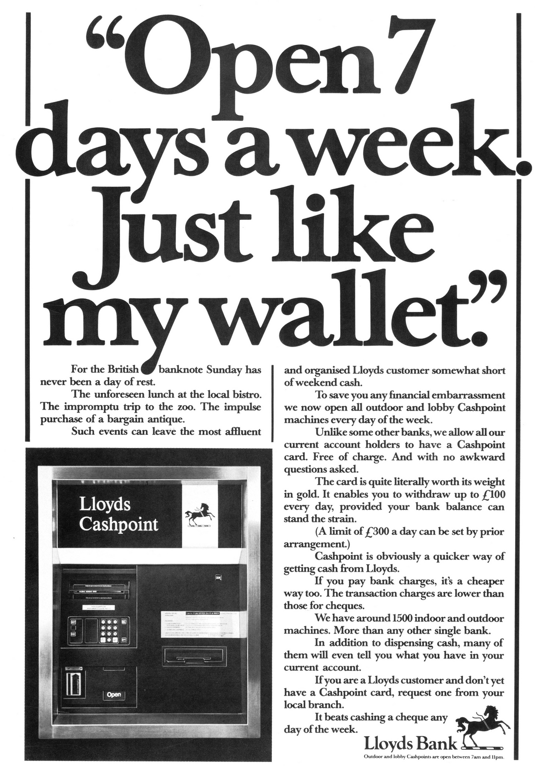
Lloyd's Bank.


Stella Artois Championships.

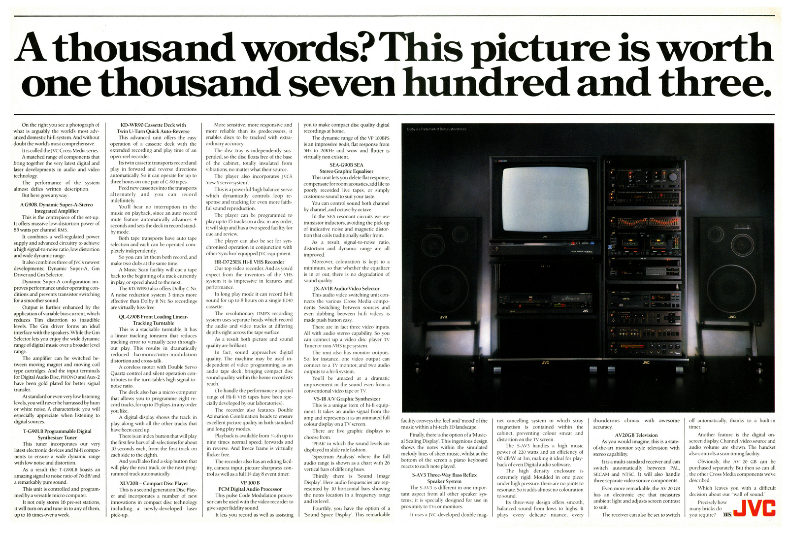
JVC.
WCRS MATTHEWS MARCANTONIO.
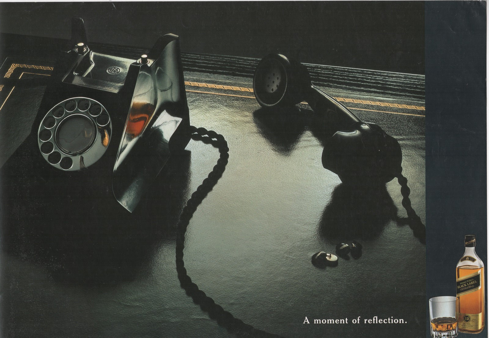
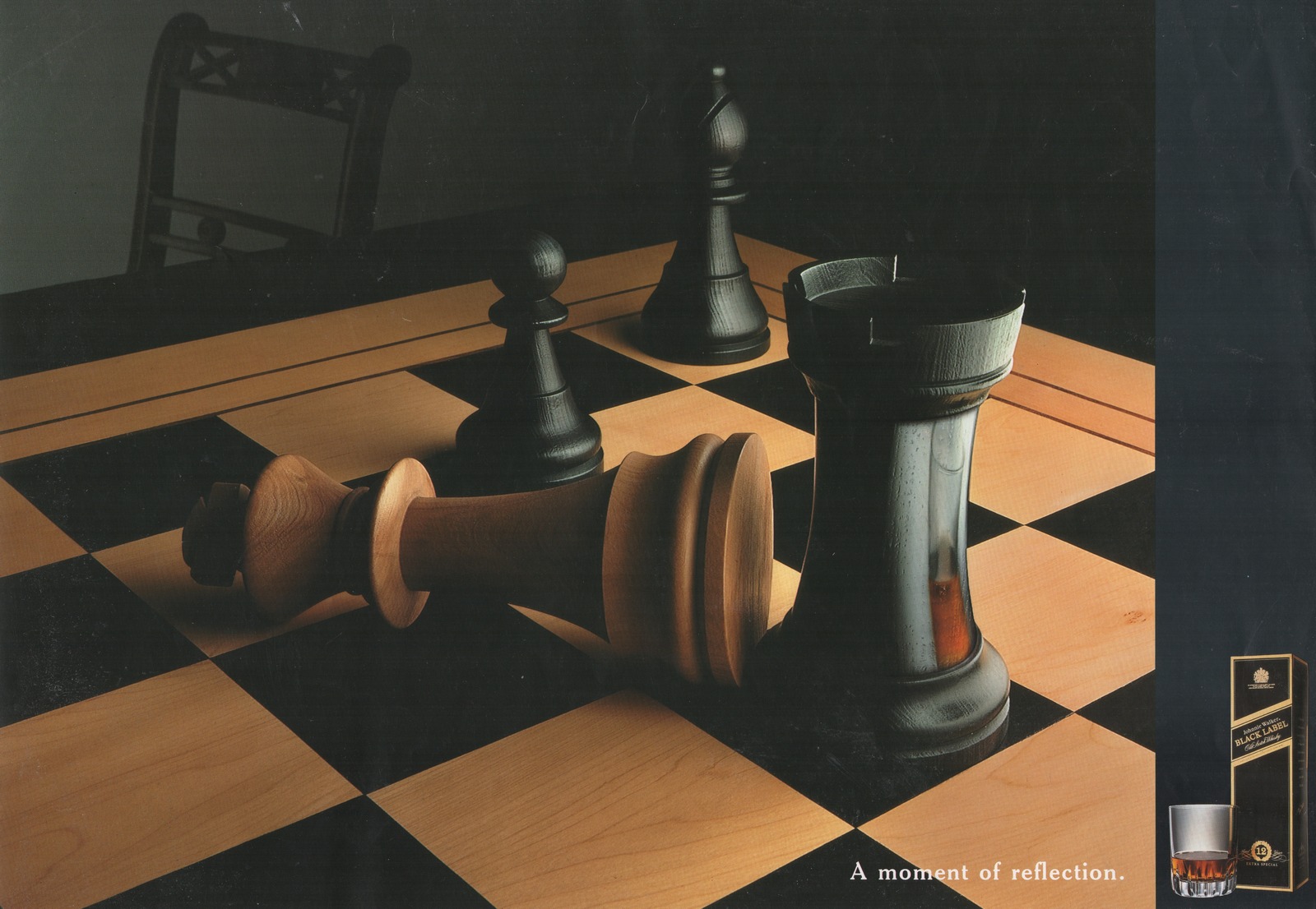
Johnnie Walker Black Label.
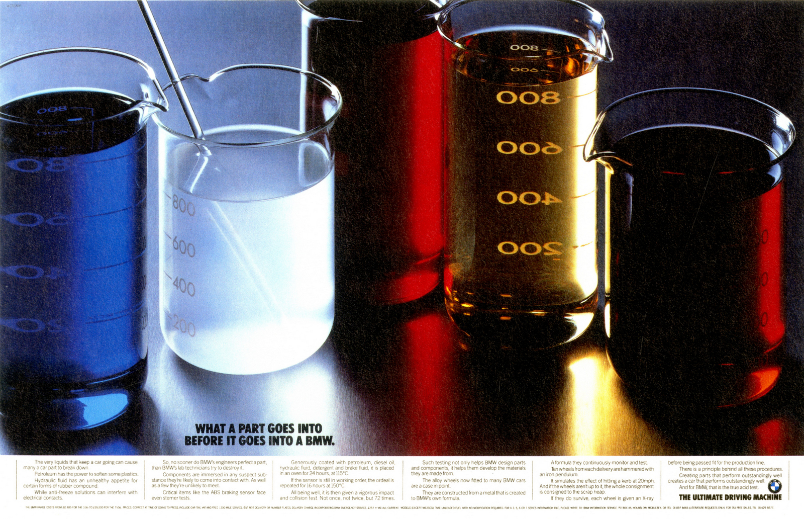
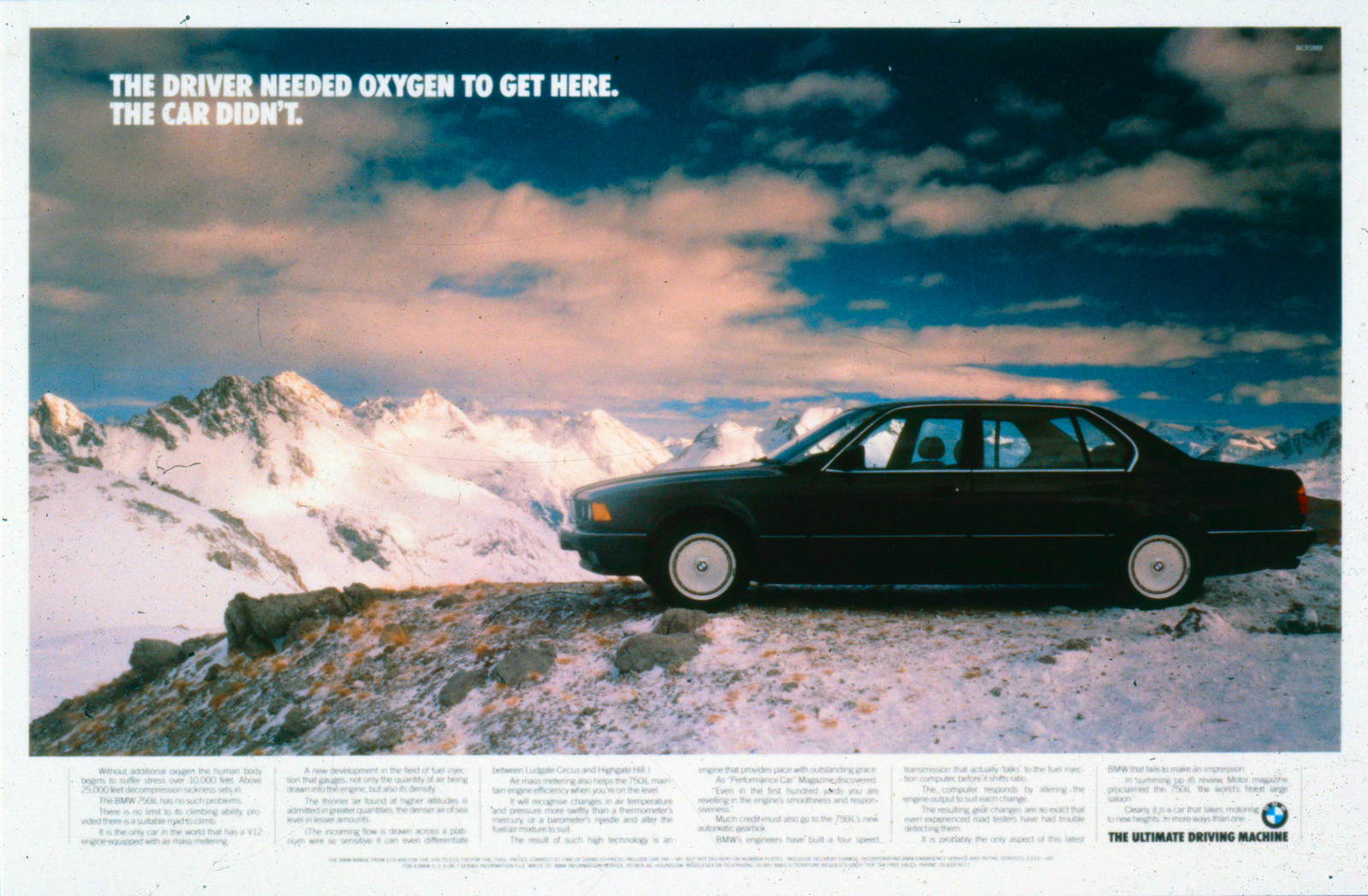
BMW.
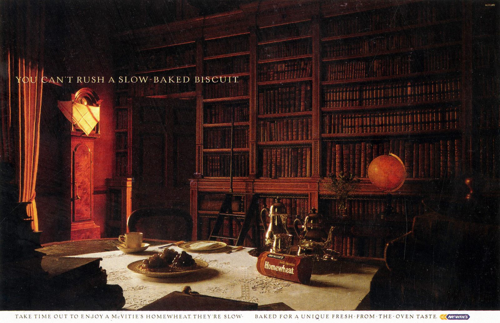
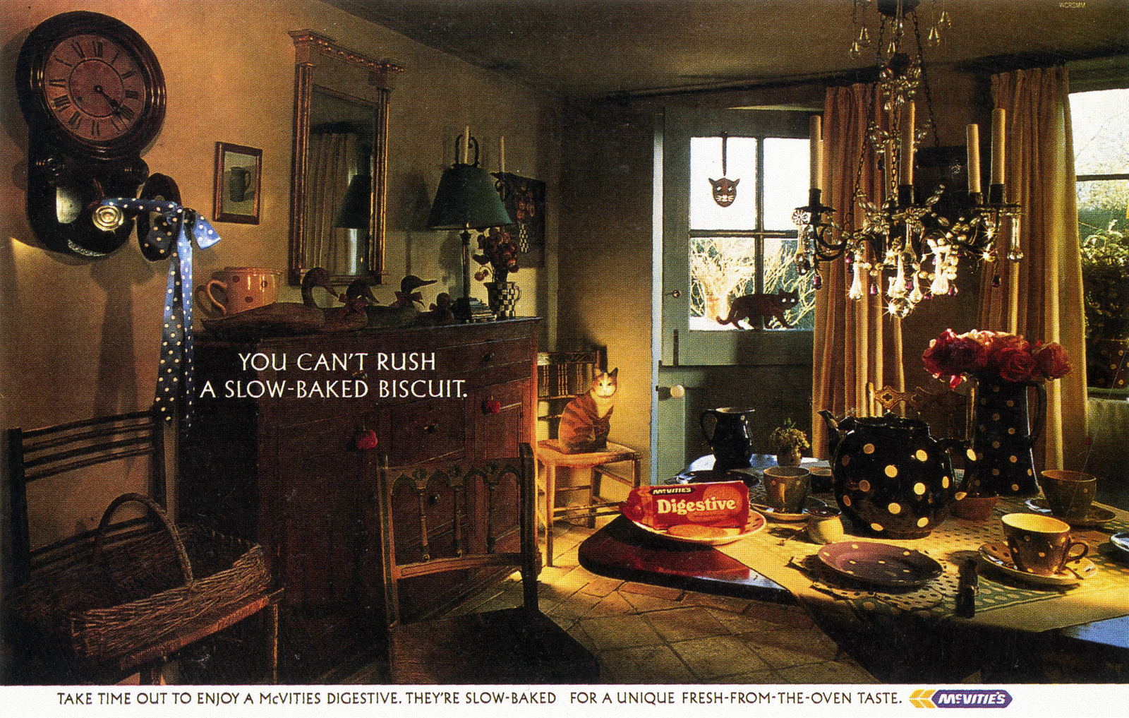
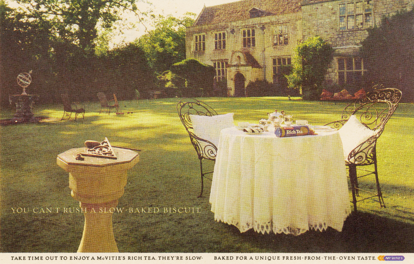
McVities.
Lego.
BMW.
ABBOTT MEAD VICKERS/BBDO.
The Economist.
BBC.
CIGA HOTELS.
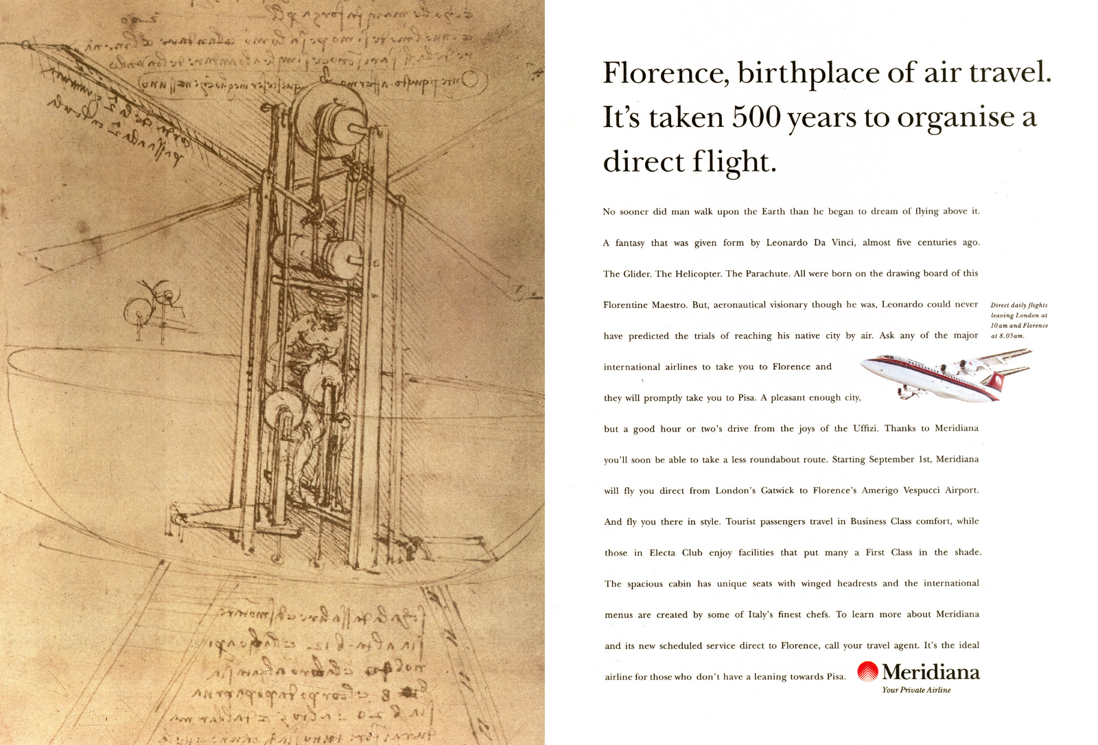
Merdiana.
BOOKS.
'Remember Those Great Volkswagen Ads?'

'Well Written And Red.'

PR.


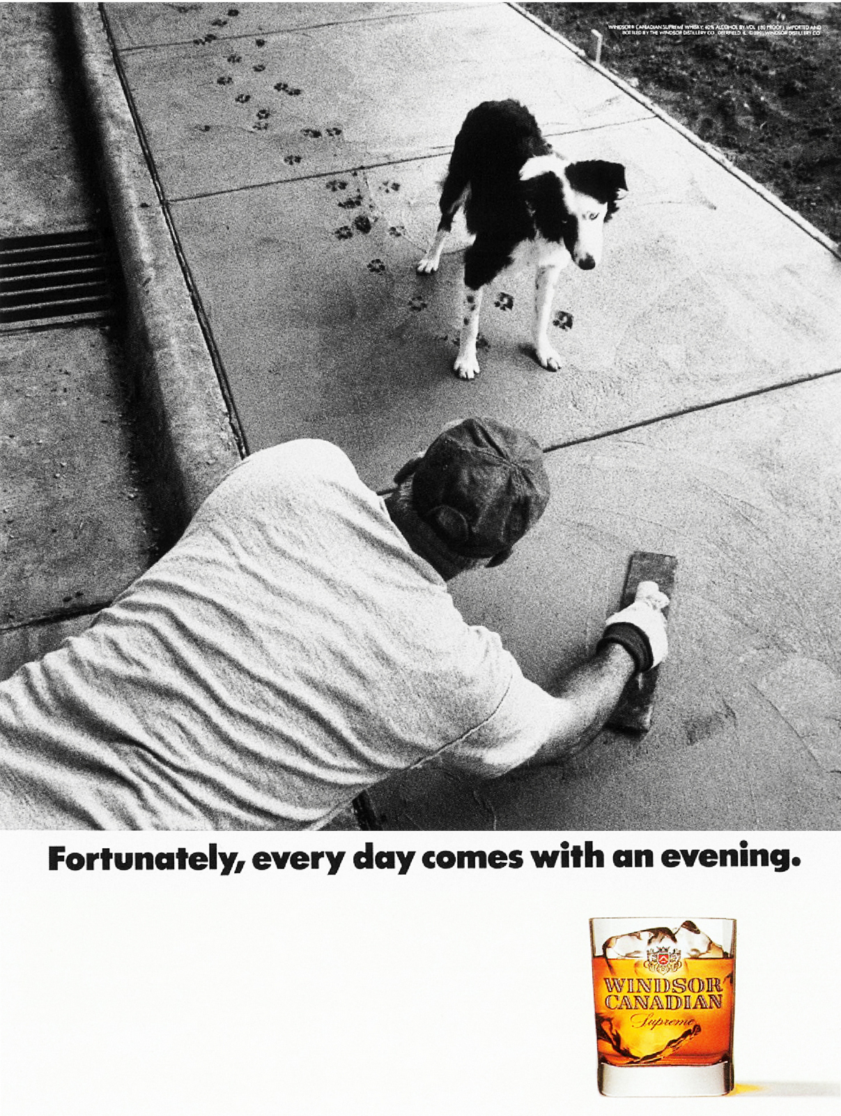
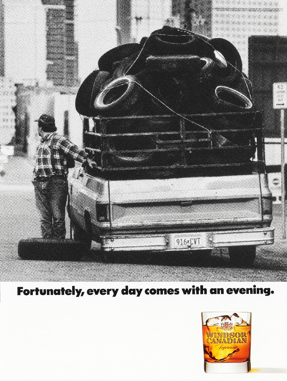
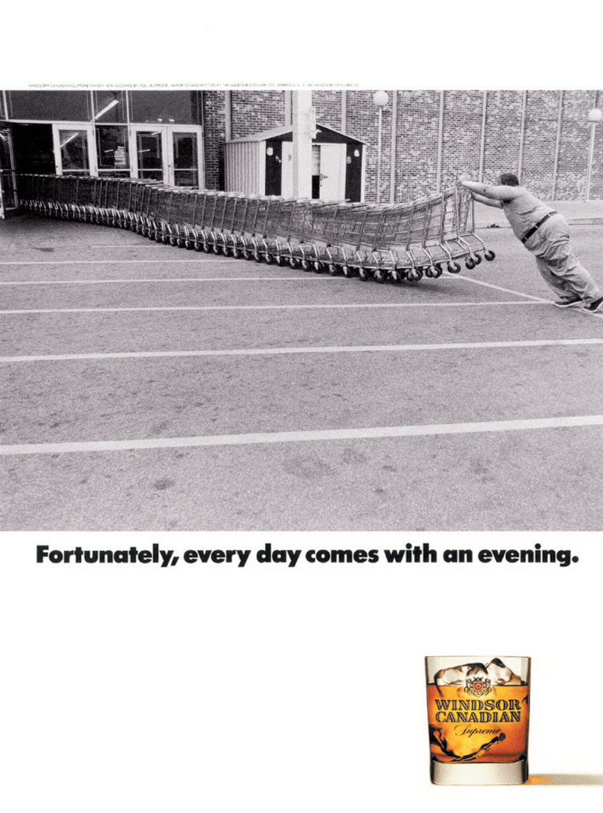
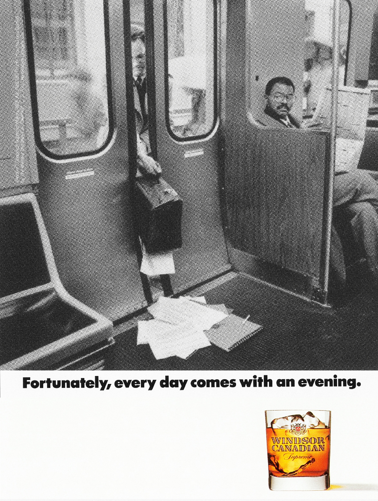
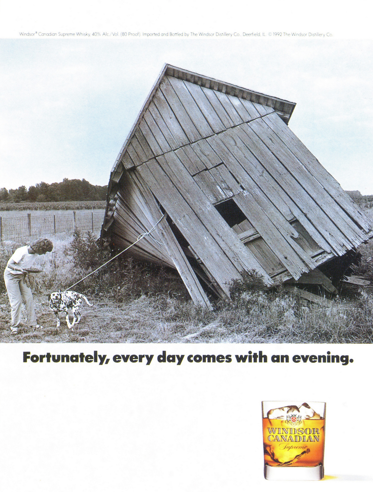
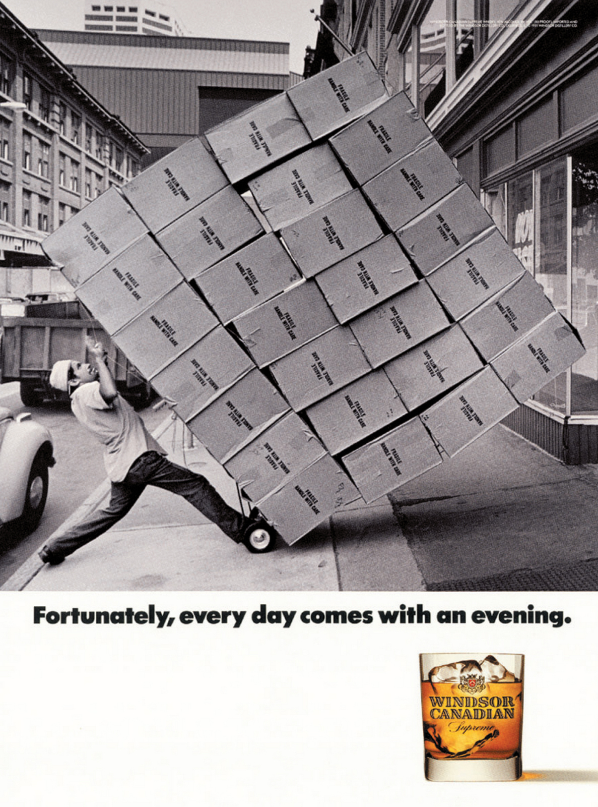
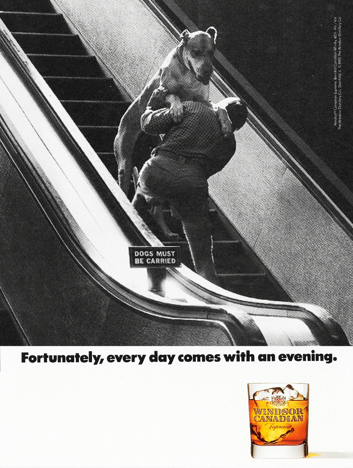
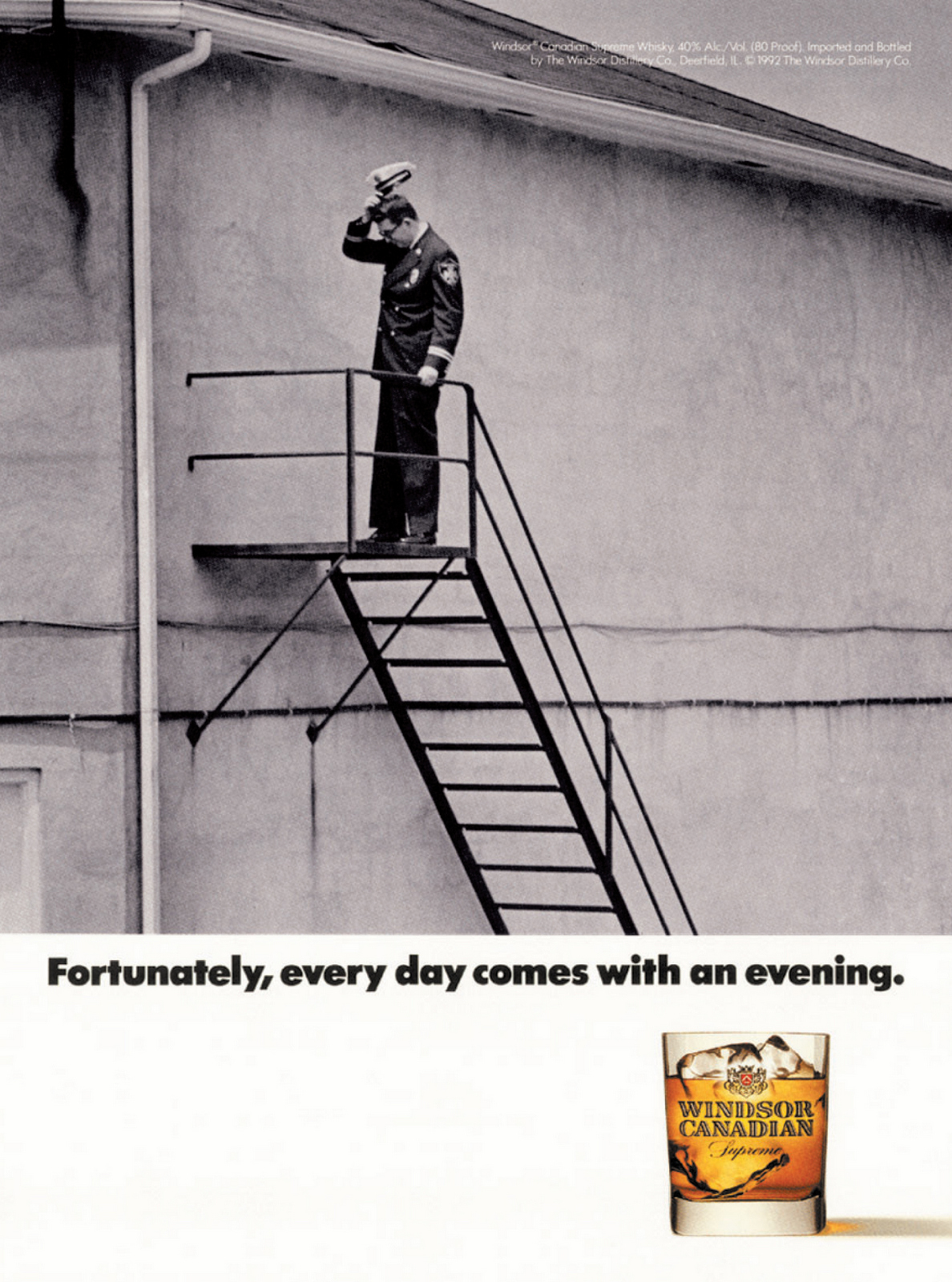
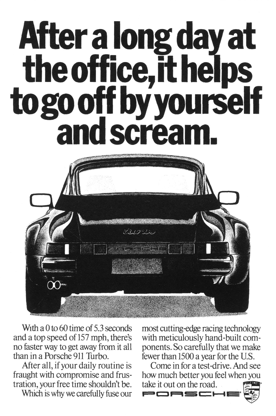
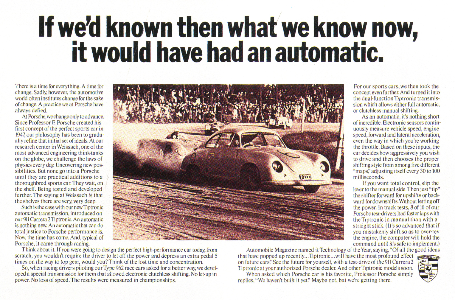
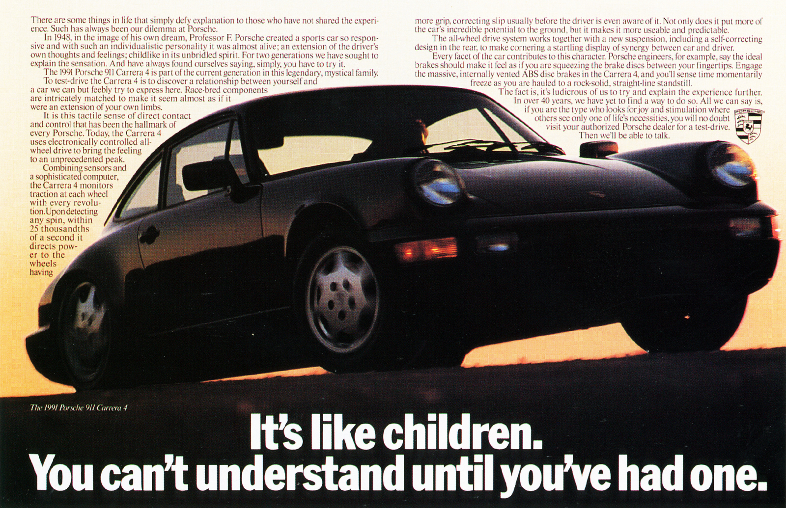
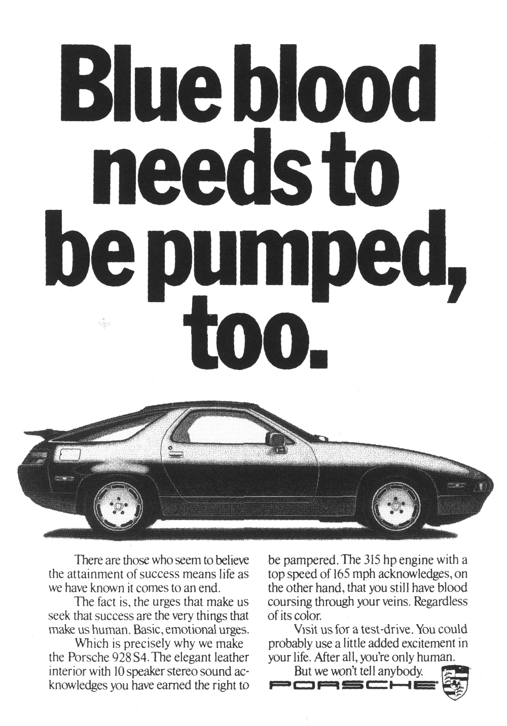
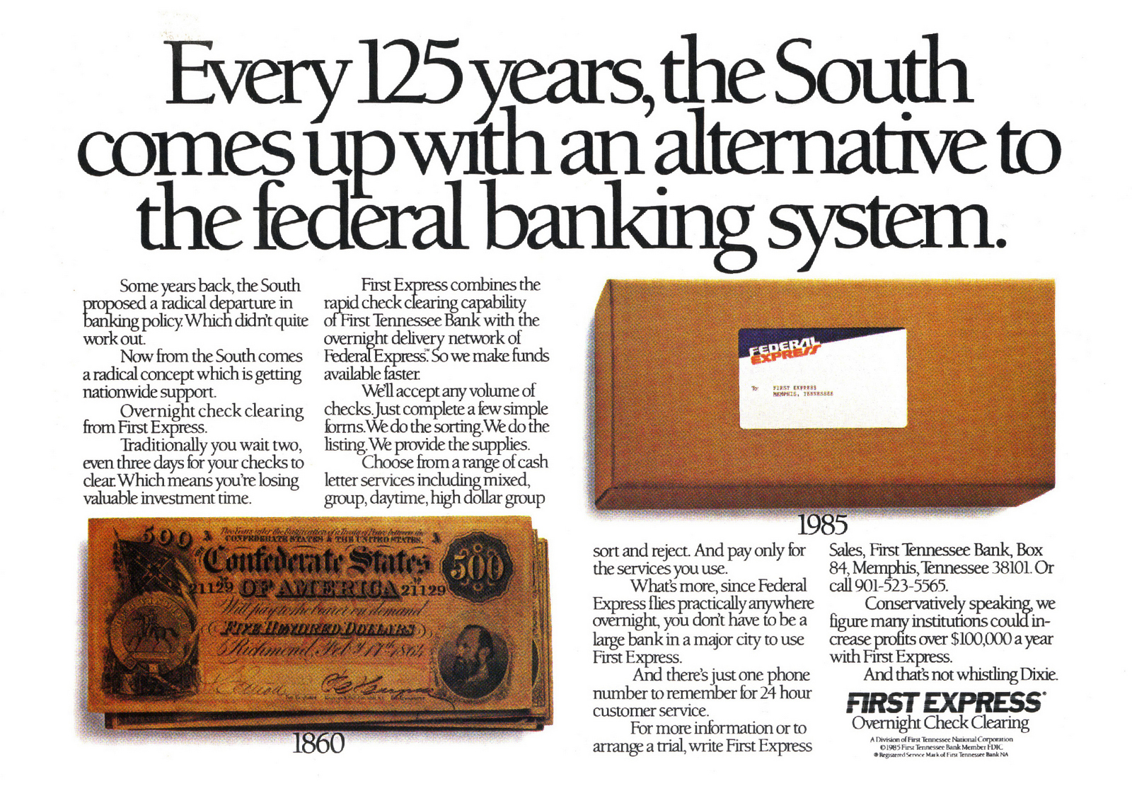
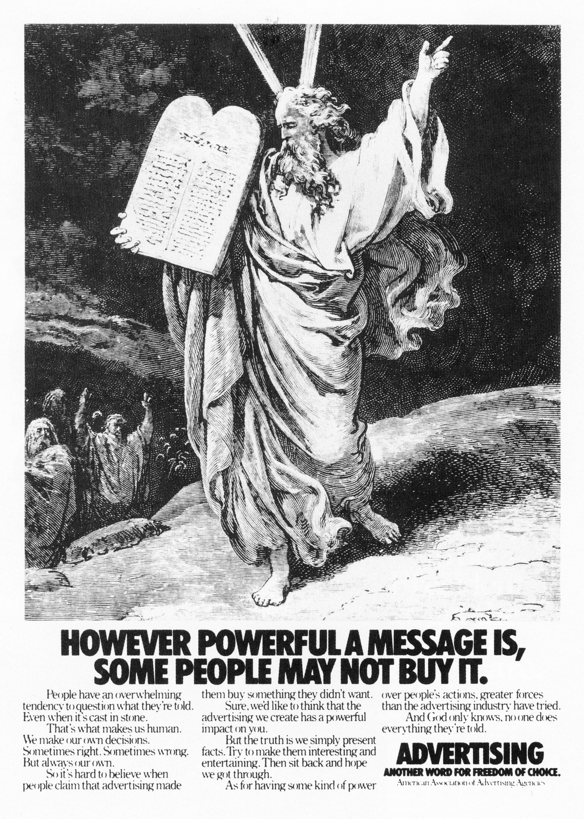
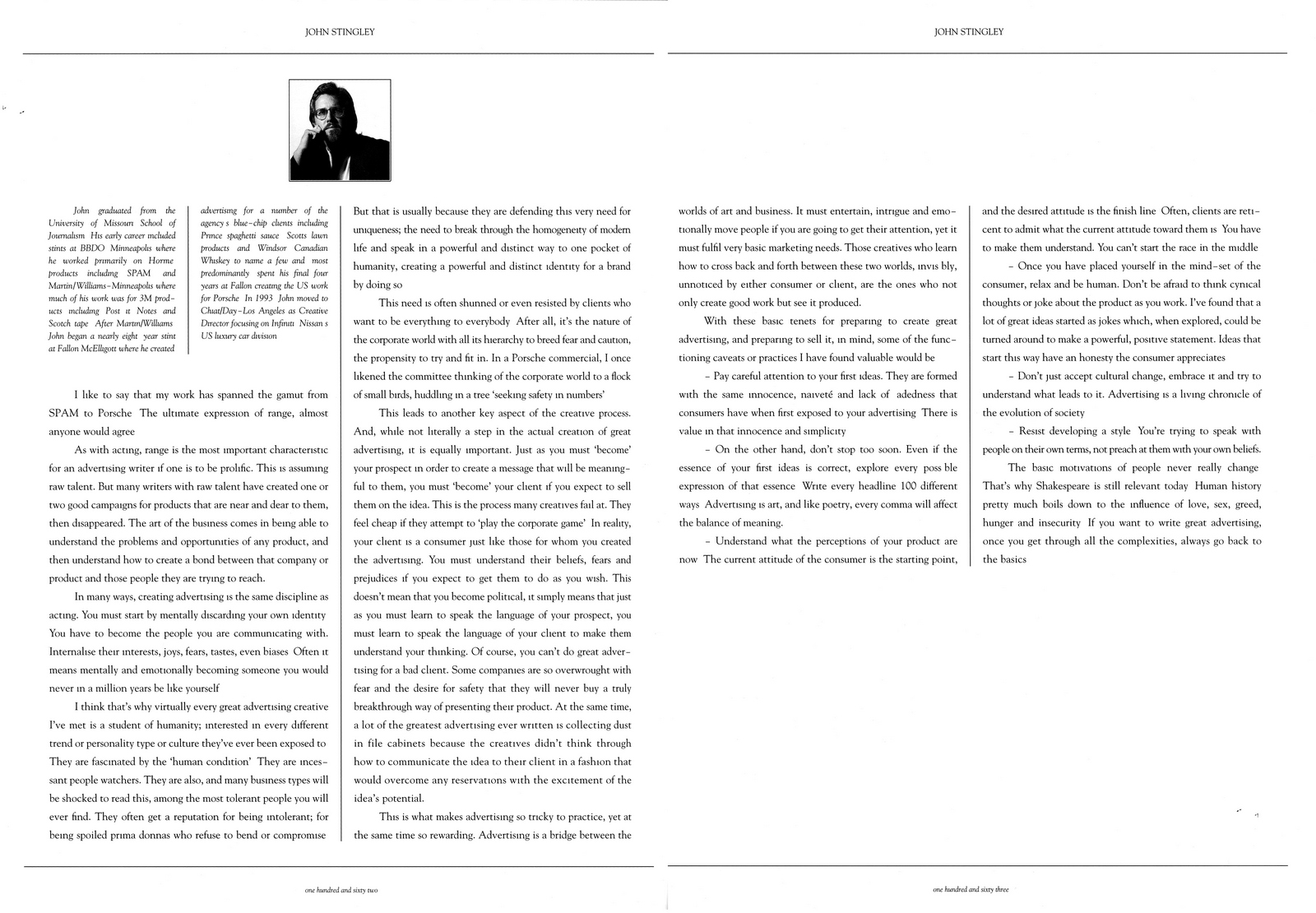
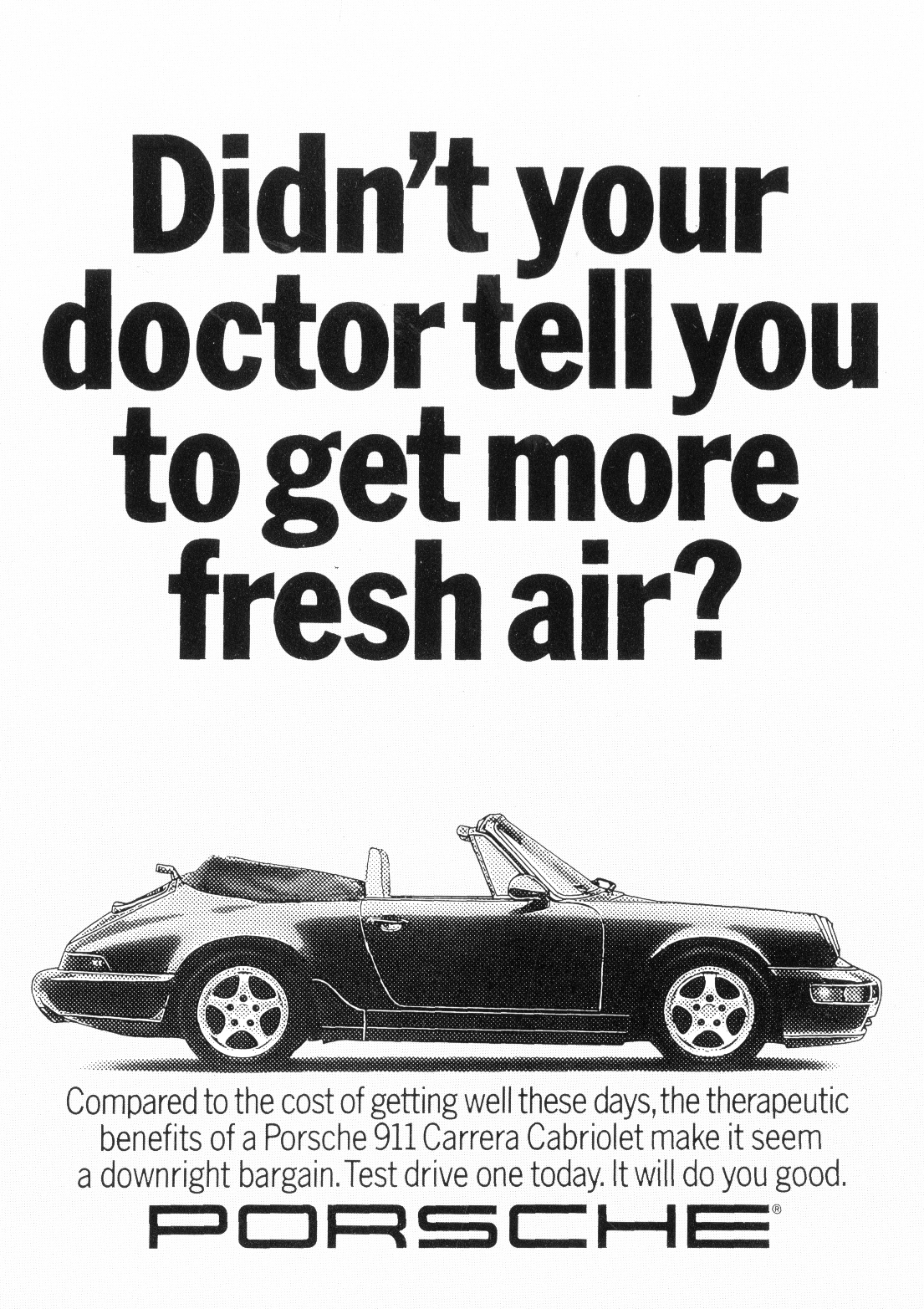
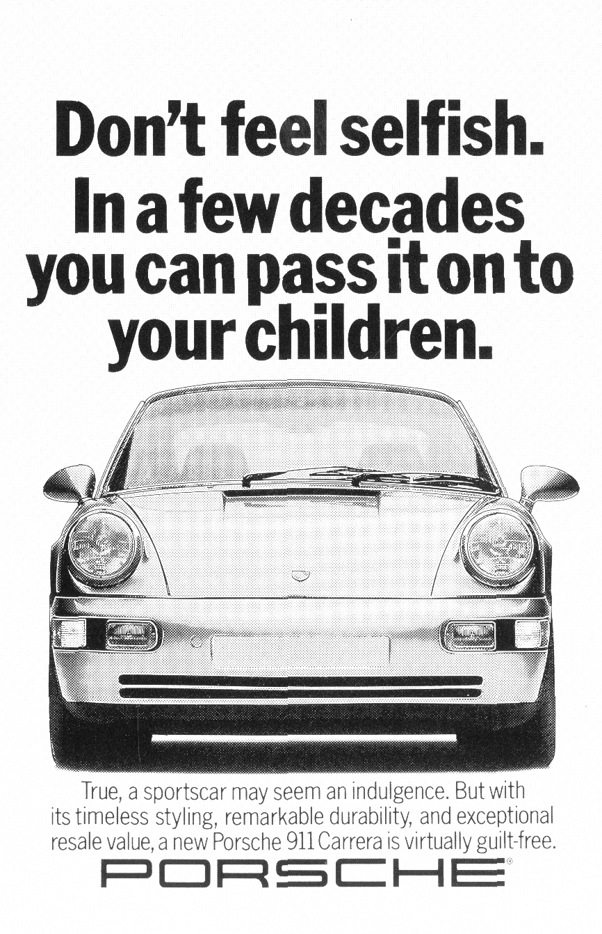
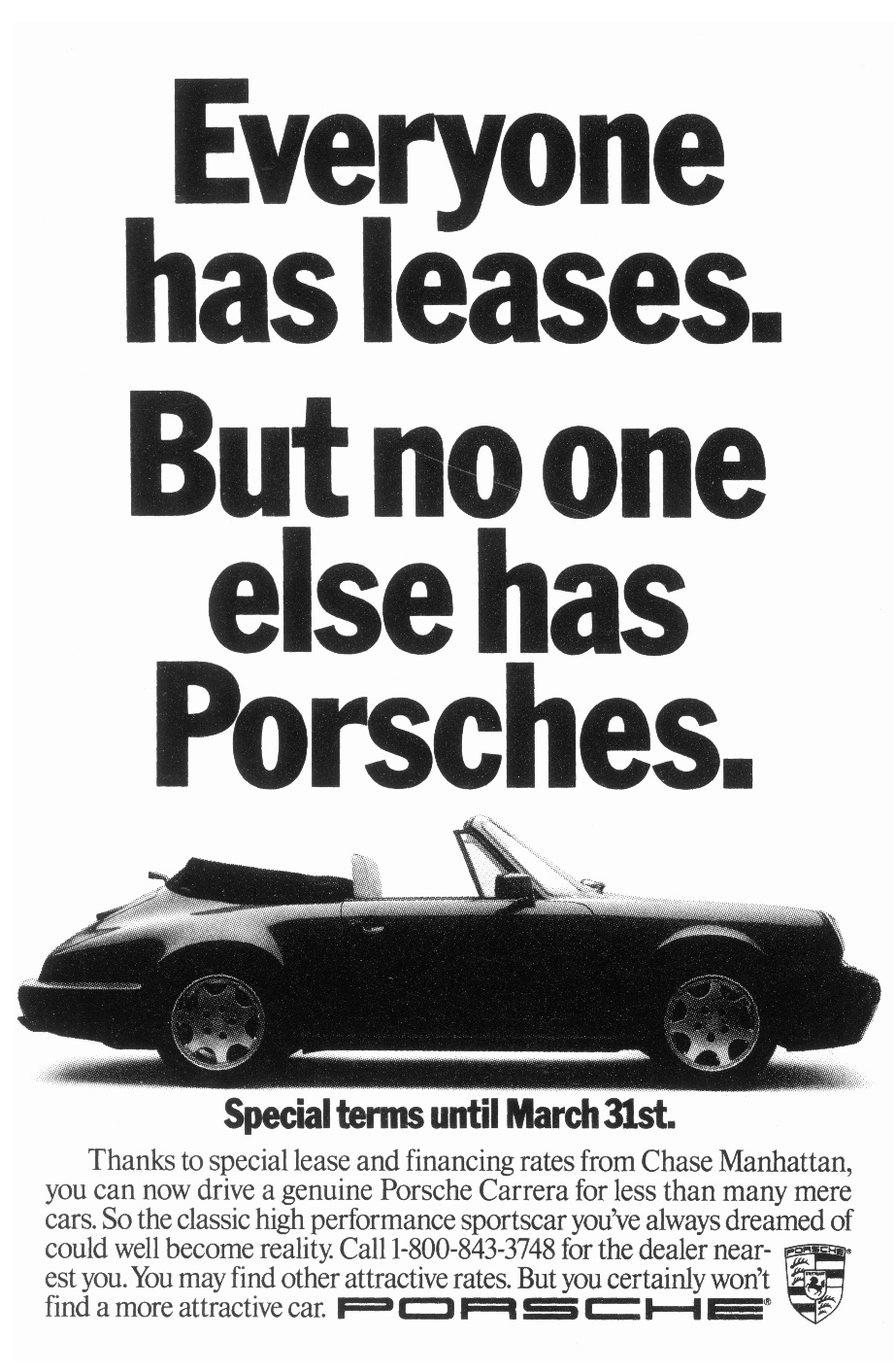
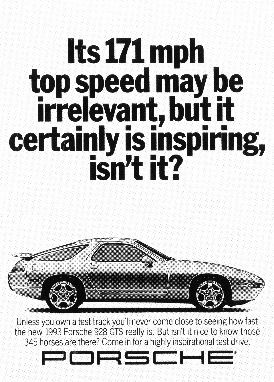
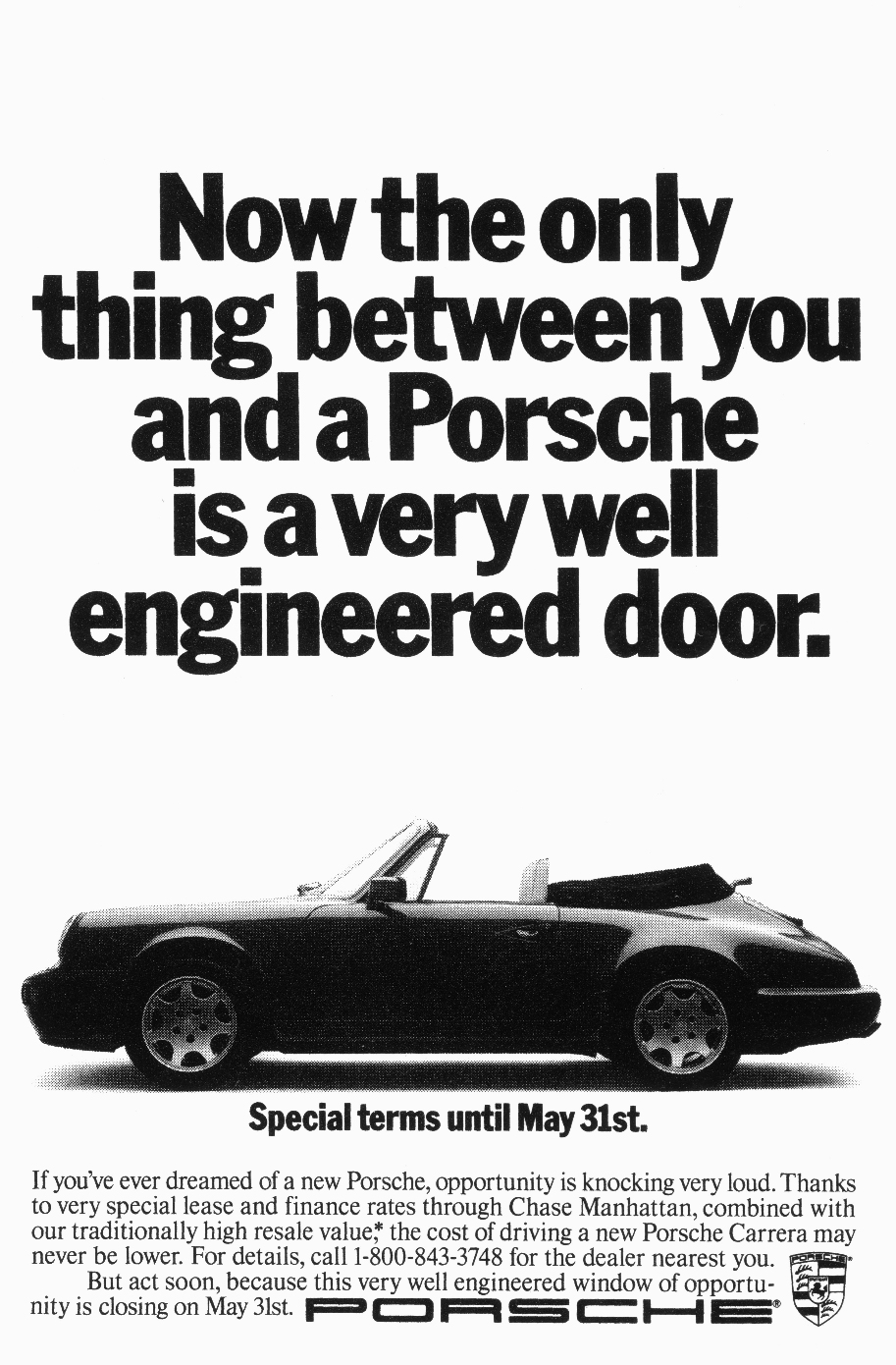
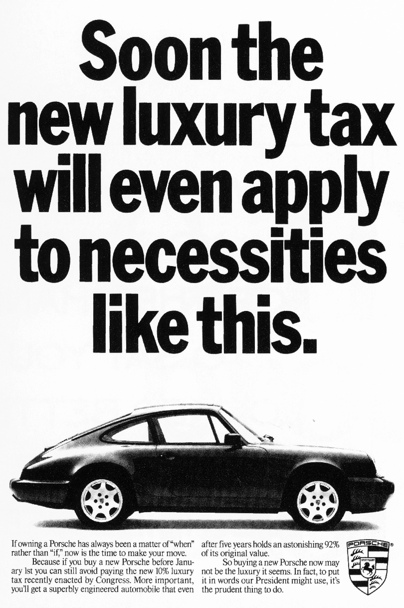
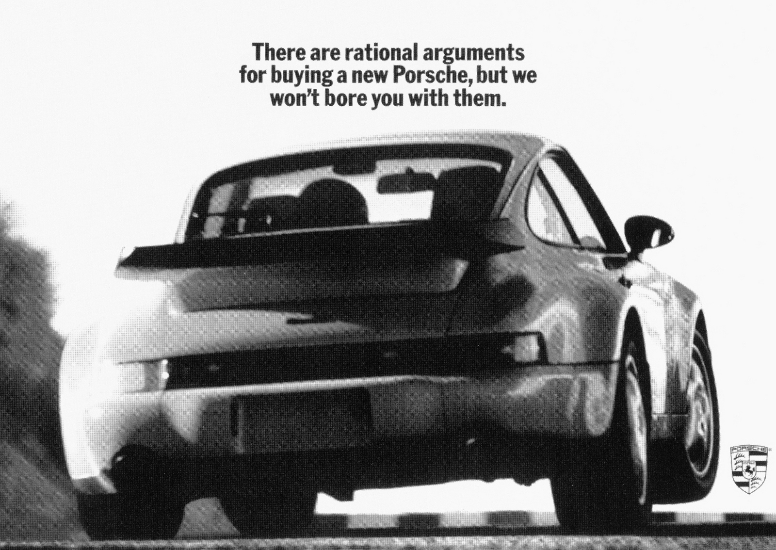
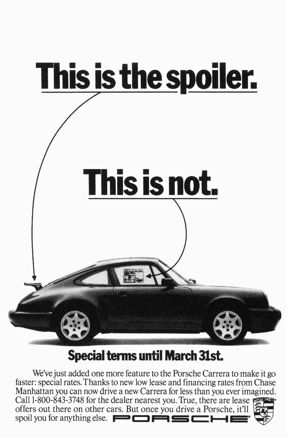
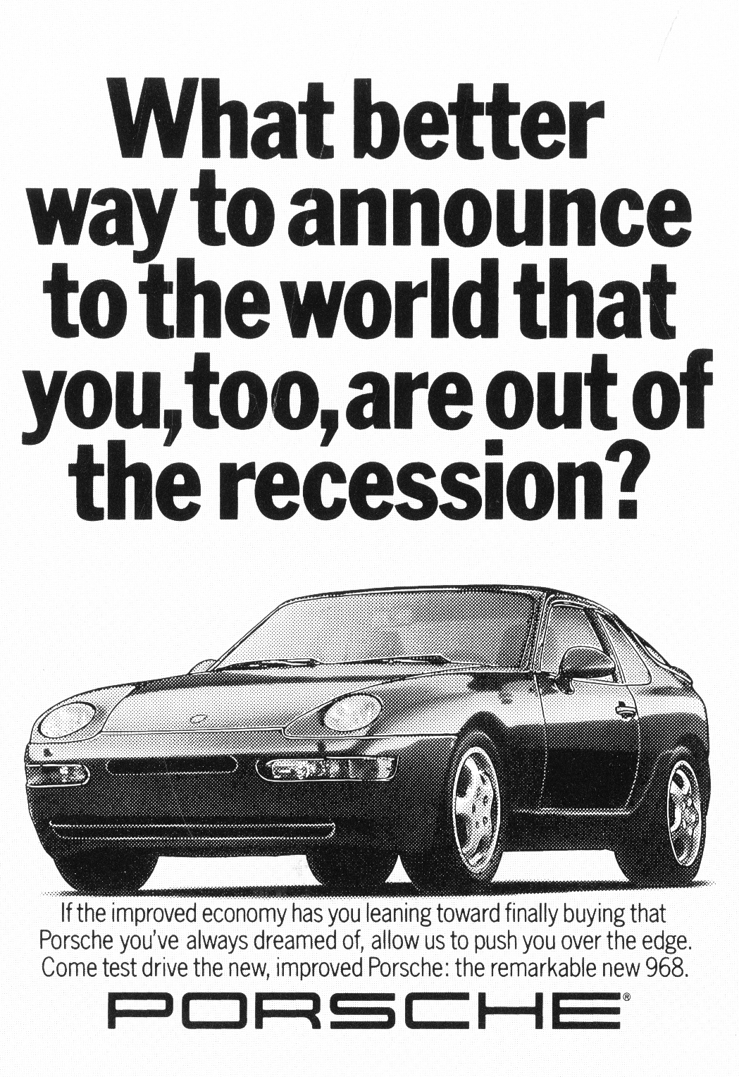
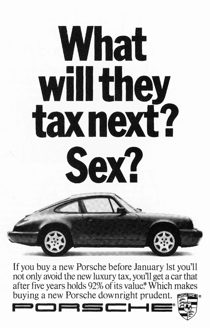
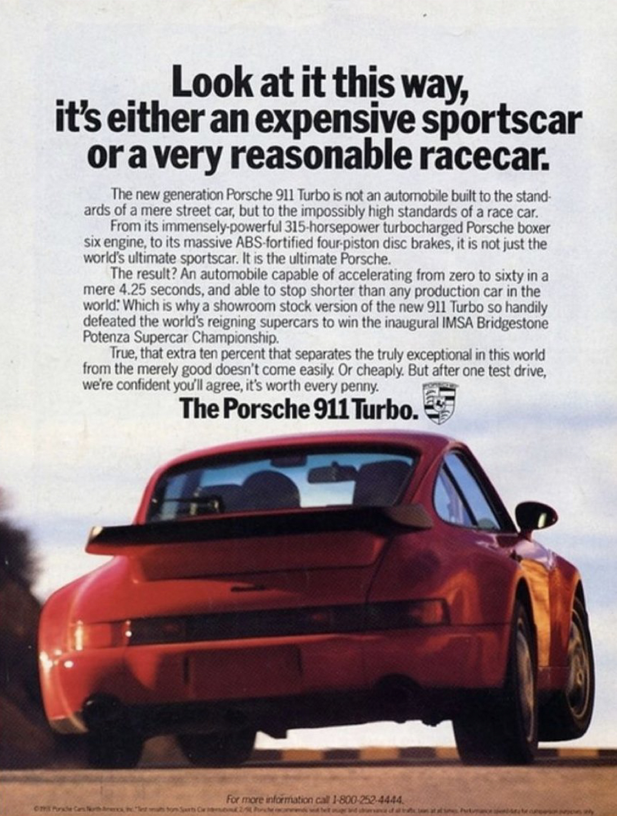
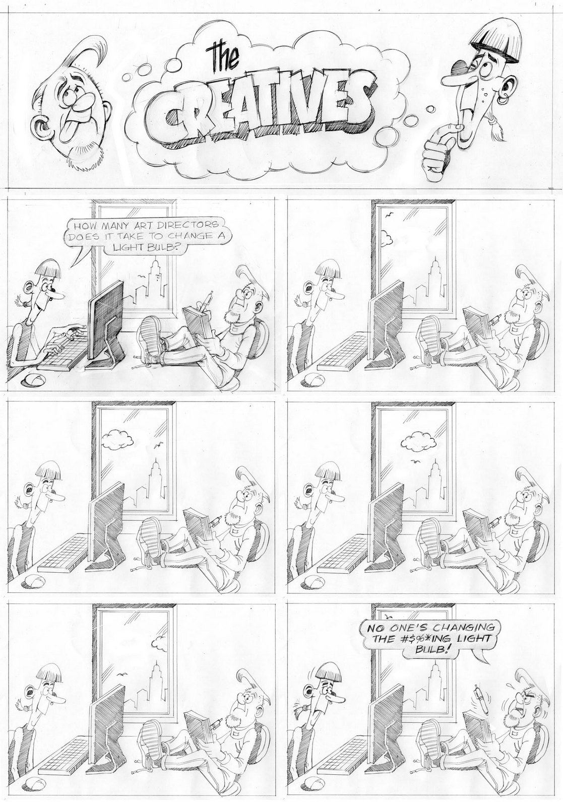
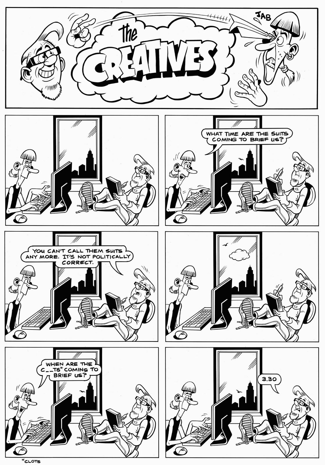
There are many ways of writing ads.Simply stating that your product is good.Giving evidence that it's good.Or making people feel that it's good.Ai could spit out versions of the first two pretty quickly, but it’d struggle on the third.The third requires a bit of psychology, observation and understanding of what makes people tick.Bill Bernbach put it this way “It took millions of years for man’s instincts to develop. It will take millions more for them to even vary. It is fashionable to talk about changing man. A communicator must be concerned with unchanging man, with his obsessive drive to survive, to be admired, to succeed, to love, to take care of his own.”So if, for example, you’re Porsche, you could state that your cars are terrific, you could make people aware that every new 911 now comes with a 12-speaker sound system as standard, but saying ‘It’s like children, you can't understand until you've had one' makes them seem so much more desirable.John Stingley wrote that one, plus another bunch just as good.A lot of his work doesn’t get into the nuts and bolts of a product, it steps back from the detail and talks about how it relates to you, like Windsor Canadian Whisky – ‘Fortunately, every day comes with an evening’.I caught up with John recently to pick his brain on this stuff, hope you enjoy it.

MARTIN/WILLIAMS.3m.


FALLON McELLIGOTT.

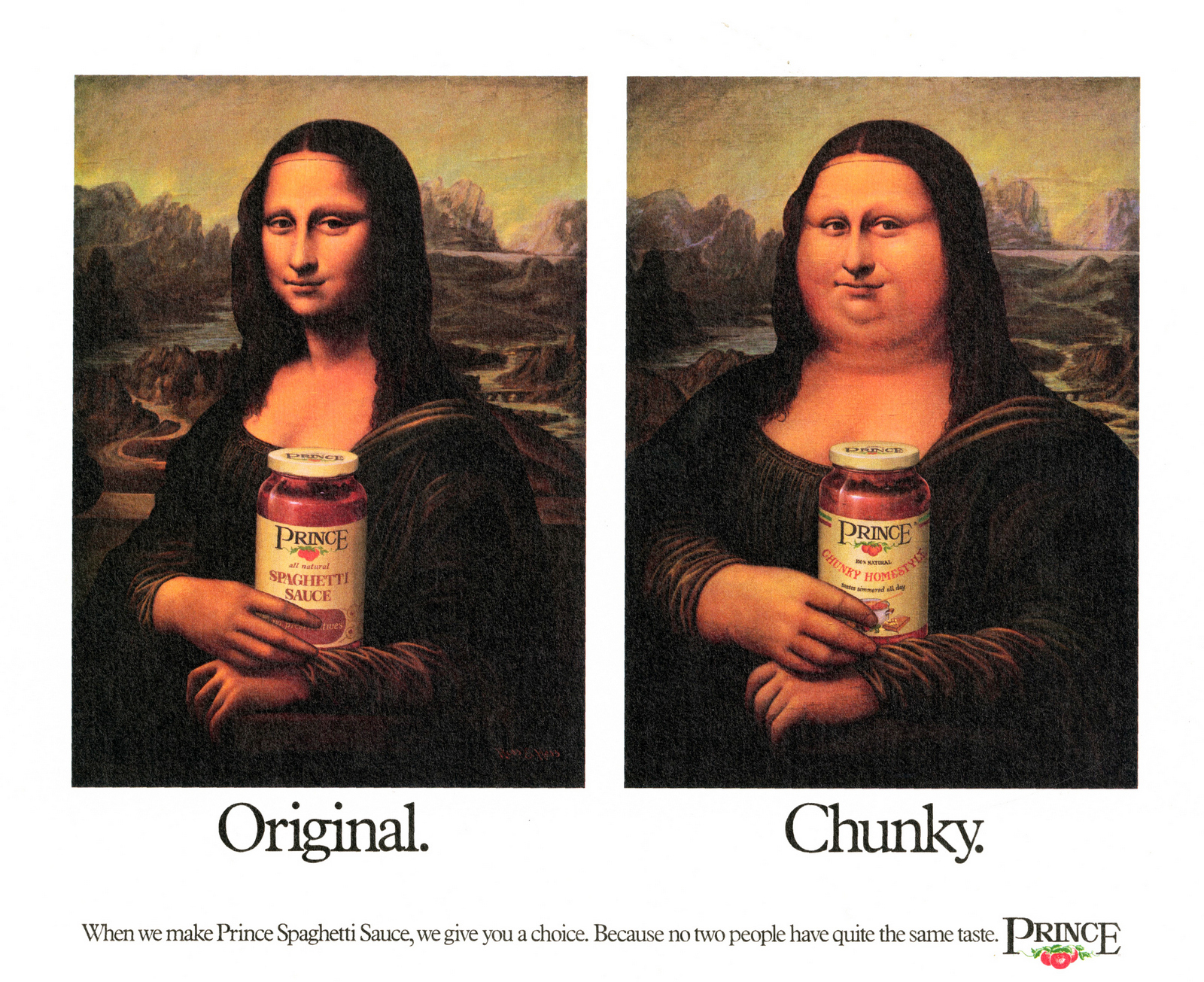
Princes Spaghetti Sauce.

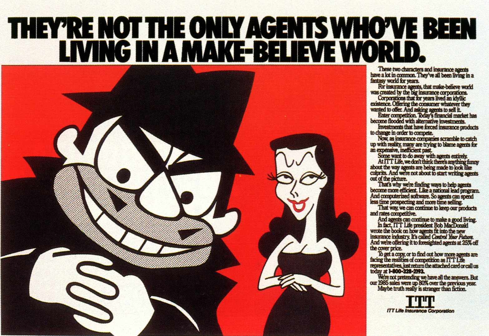
ITT.
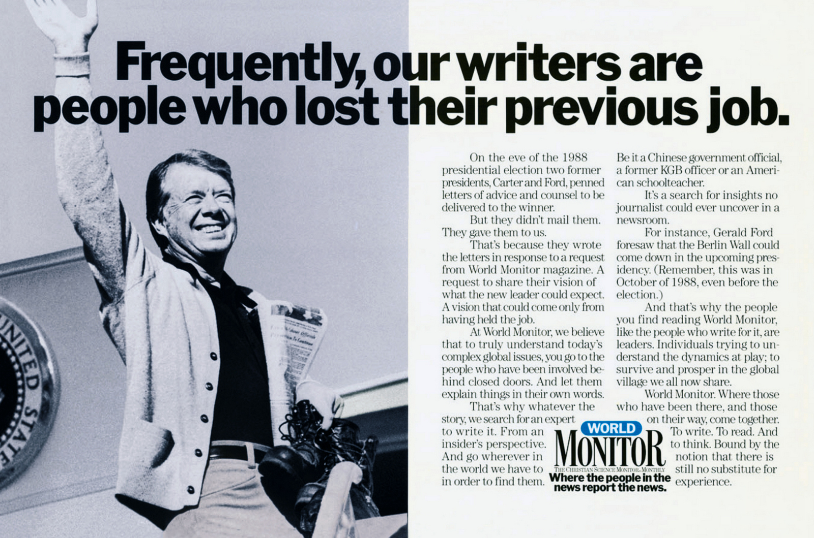
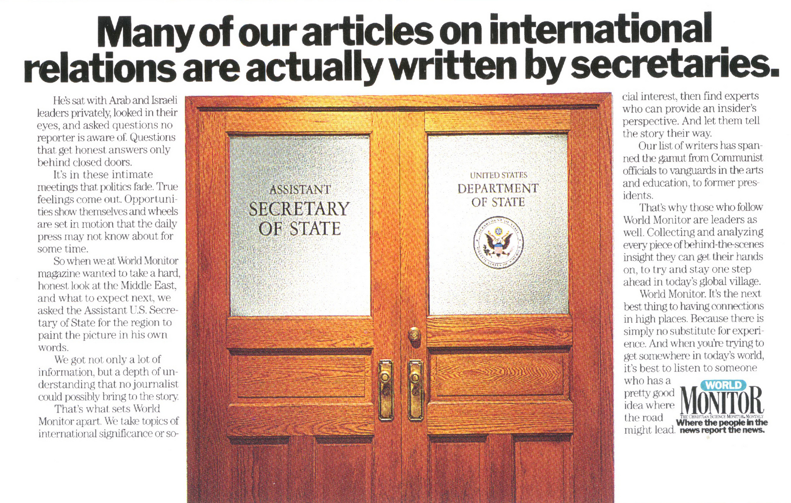
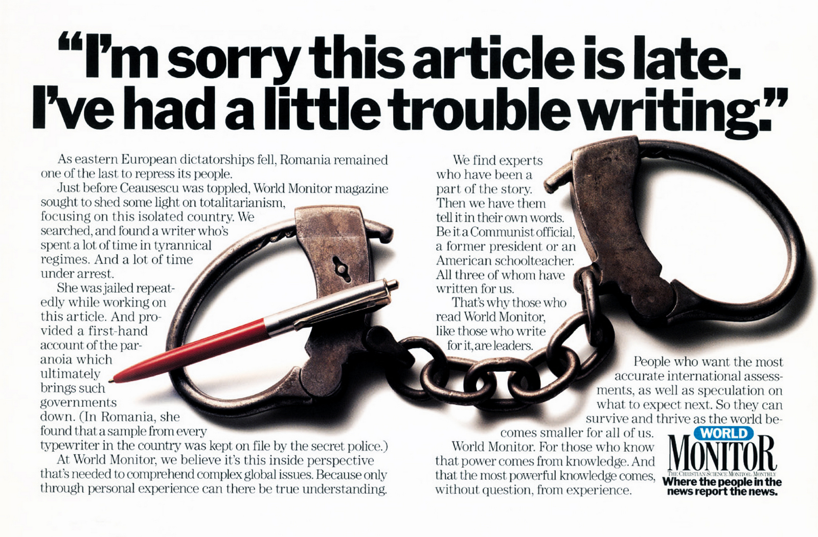
Monitor.

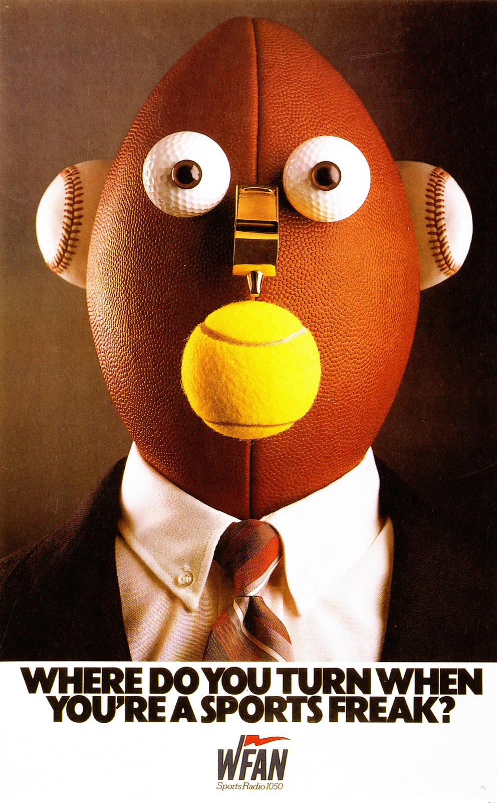
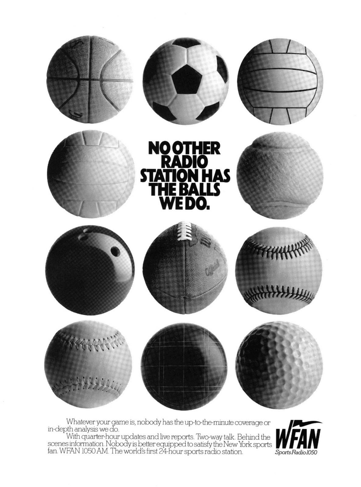
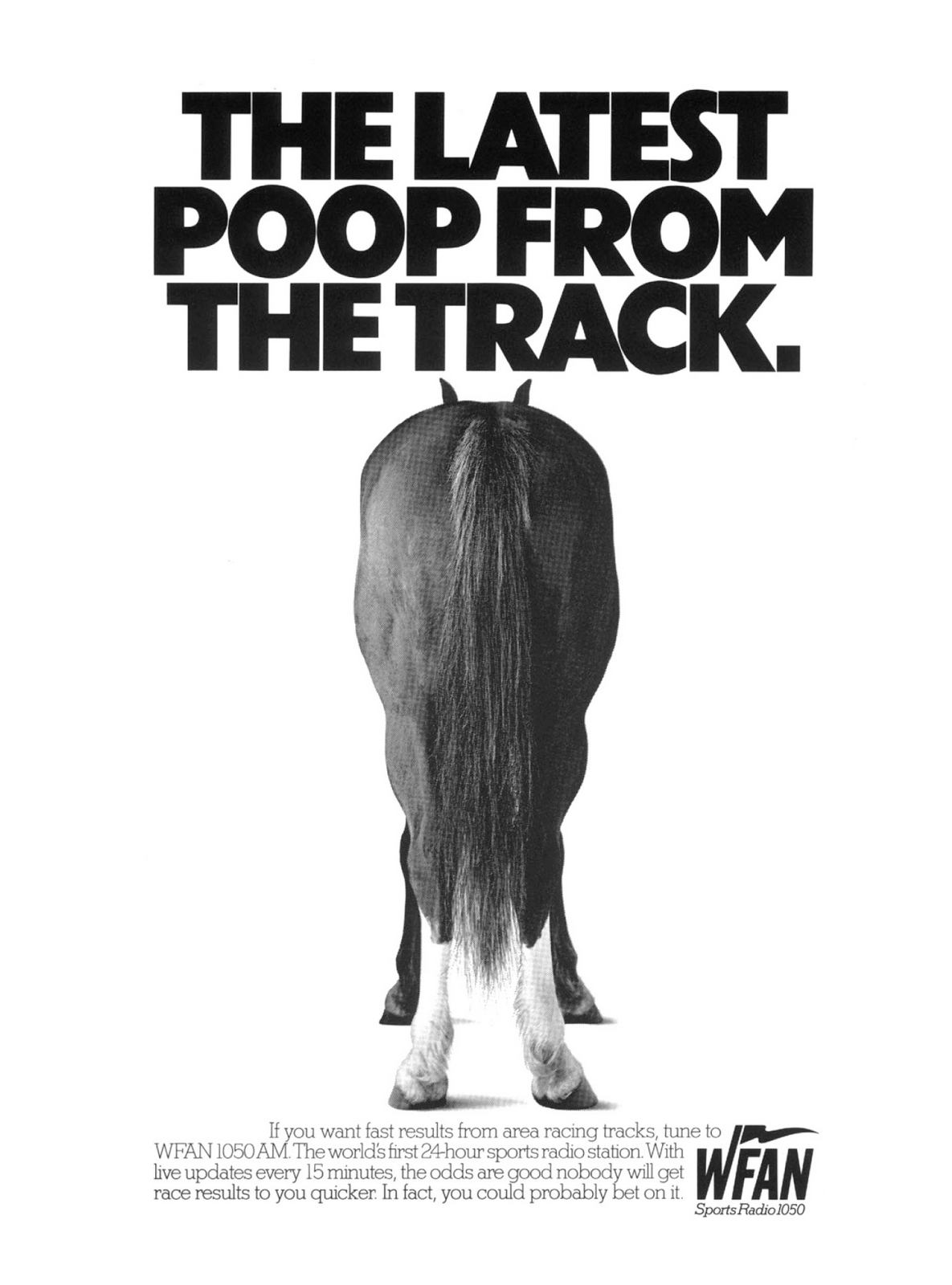
WFAN.

Canadian Windsor.
Scotts.
Porsche.


Lee.


Fed-Ex.
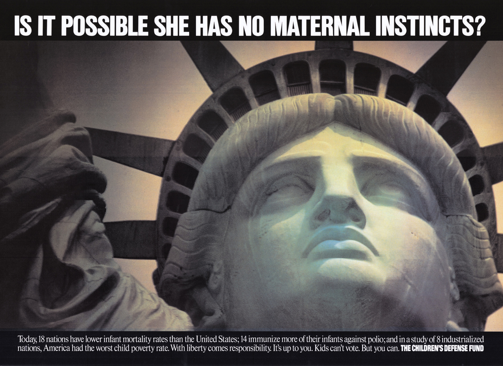
The Children's Defense Fund.

Marine Midland.


Advertising.
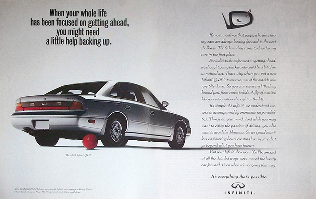
CHIAT/DAY.Infiniti.


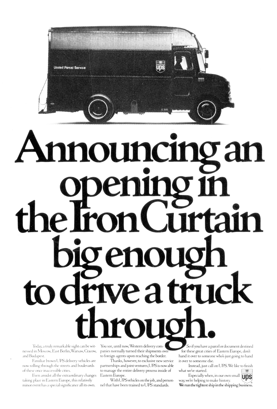
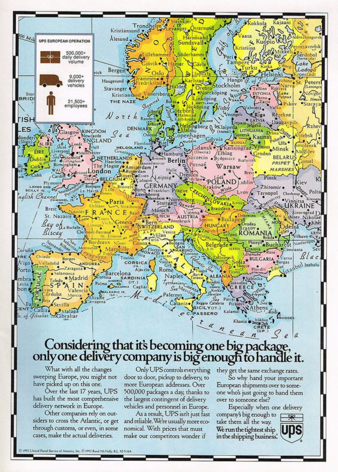
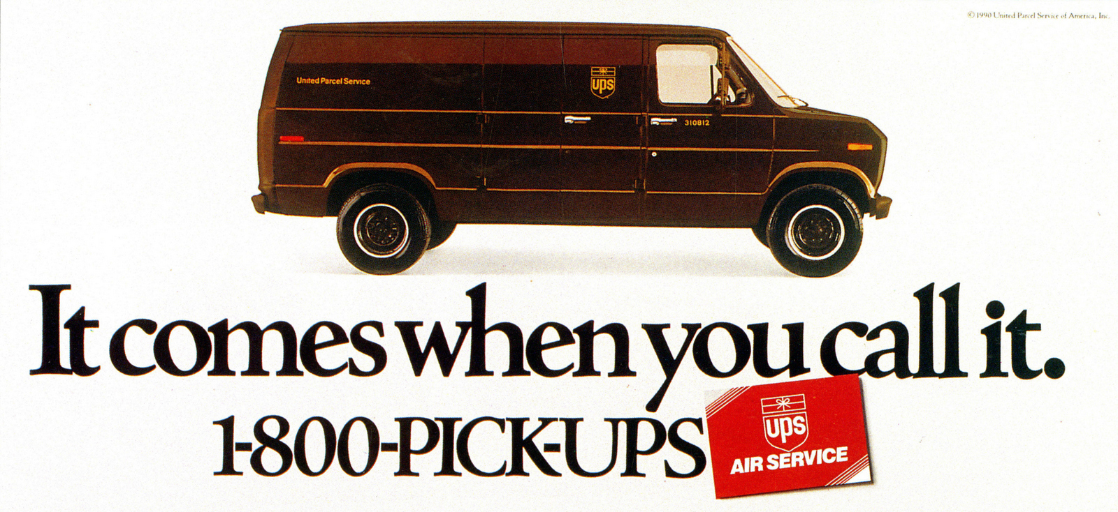
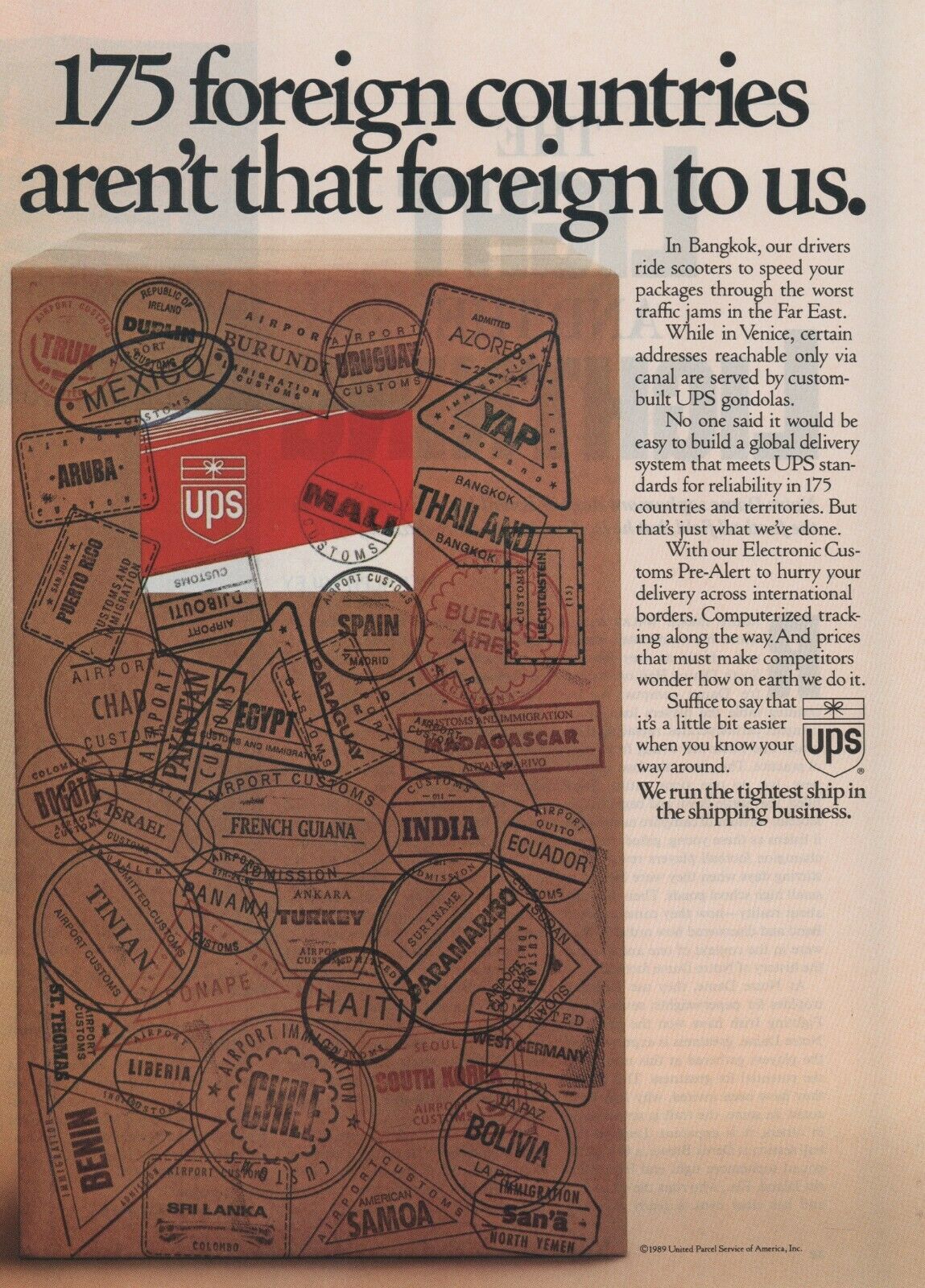
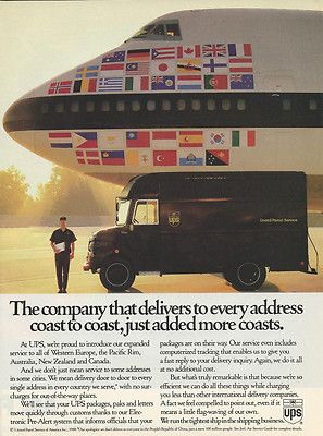
AMIRATTI & PURIS.U.P.S.


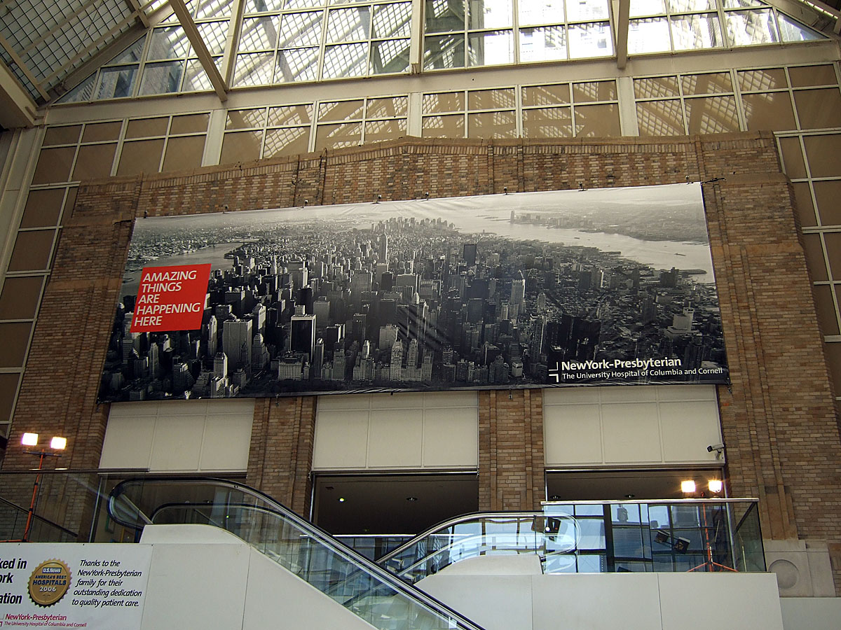
OGILVY & MATHER.IBM.OBSERVATORY.New York-Presbyterian.


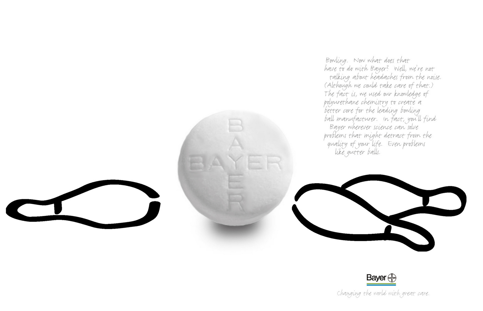
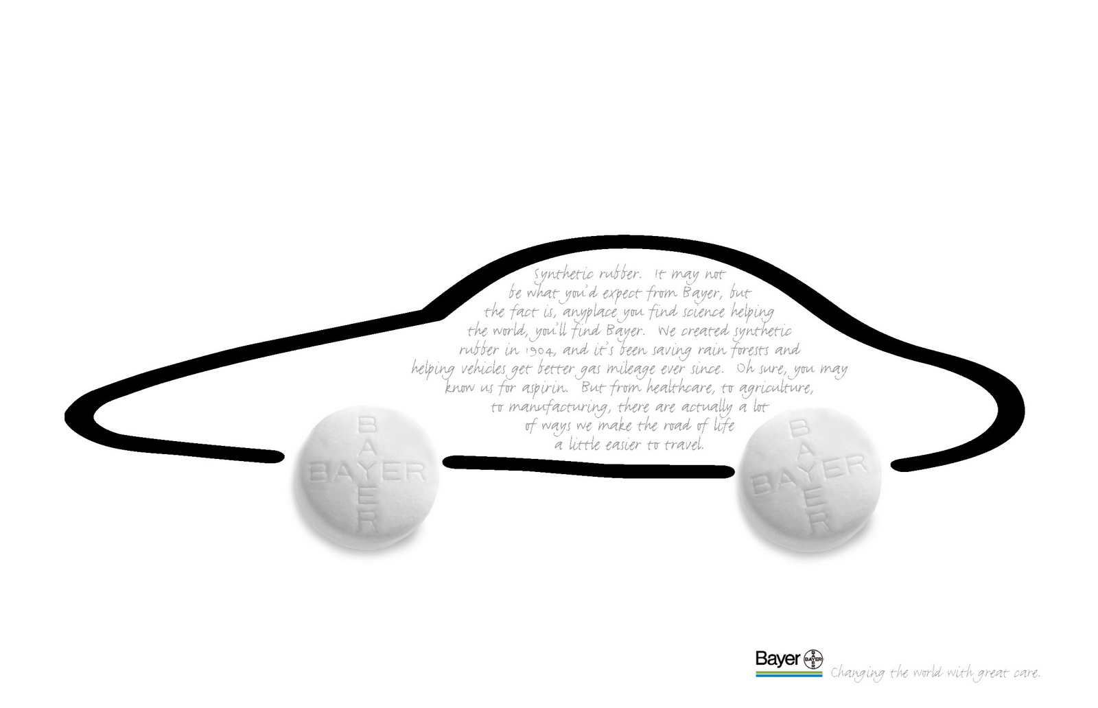
Bayer.

Bessemer Trust.


John on writing...
Last week, Vikki Ross asked me to do one of her Copy Safaris.
A stroll around London judging advertising in the wild, then posting on Twitter.
One of the good things is that you don’t pick and choose, you comment on everything; the good, the bad and the fugly.
One of the benefits of having to give an instant take, often on the move, is you can’t overthink it, you react more like the rest of the people on the street.
Who don’t work in advertising.
(Well, as much as you can after working three decades in advertising.)
Anyway, here’s my feed from last Monday…
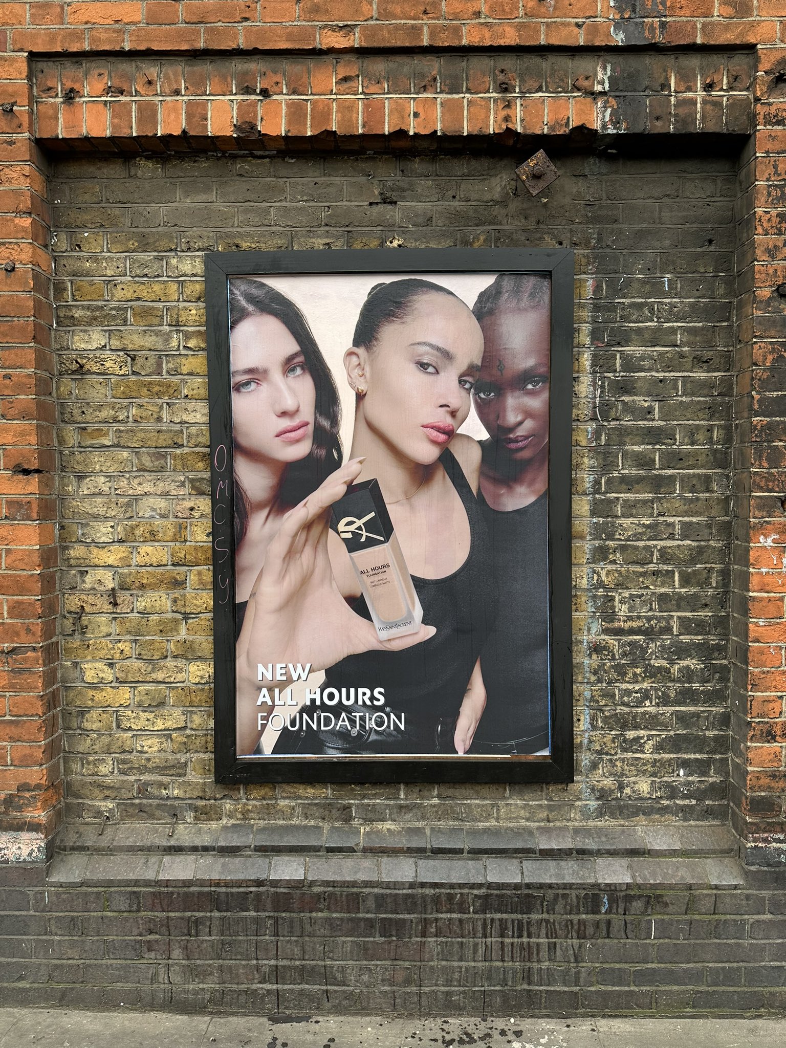
COPY SAFARI, SHOREDITCH, 06/03/23.
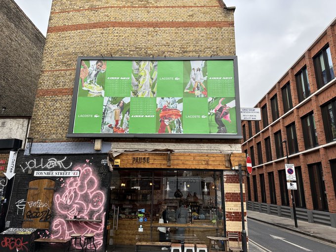
‘Mmm…very green…looks like they’re trying really hard to be cool, so therefore not.’

‘The glare on this isn’t ruining your enjoyment.
They’ve buried the lede haven’t they?
£4.99 a month is cheaper than usual (possibly because you have damned ads interrupting).
Or do something insightful for sports fans to get below the surface of sport?
Too many pictures and words.’

‘I’m supposed to think – ‘finally, a company that’s concerned about me and my future!’ Never heard of them, why would I invest with them?
Throw me a bone.’

‘New York City’. Yes, New York City – what of it?
Read the small print and you find they have 7 flights a day.
‘7 flights a day’ next to the Statue of Liberty is better.
But you’re selling NYC 7x a day – it should be glorious, inspiring.’

‘I used to love Apple ads.’
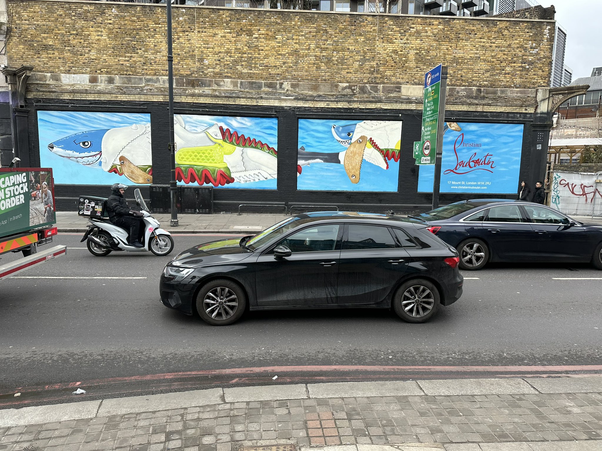
‘Noticeable. Looks a bit cheap for Louboutin.
Presume they’re doing trainers now?
Shark related trainers?
That’s all I’ve got.’
‘Intriguing, super simple.
Better than the usual over-cluttered theatre posters.’

‘More green stuff chopped up into little pieces.Why not push all of your gun powder into one big pile and make a big explosion – not lots of little ones?’
‘Don’t live life without it’ – Why?
Got any reasons?
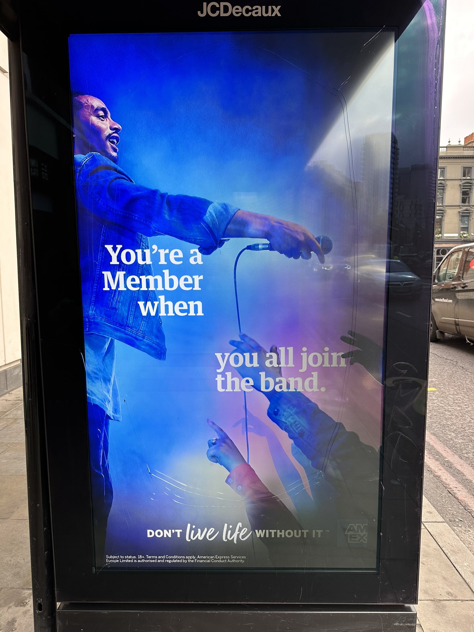
‘You’re a member when you join the band’ – is this a metaphor?
Are they doing some music related activity (that they don’t reference here?)
I have some credit cards Amex, why should I trade one for one of yours?’
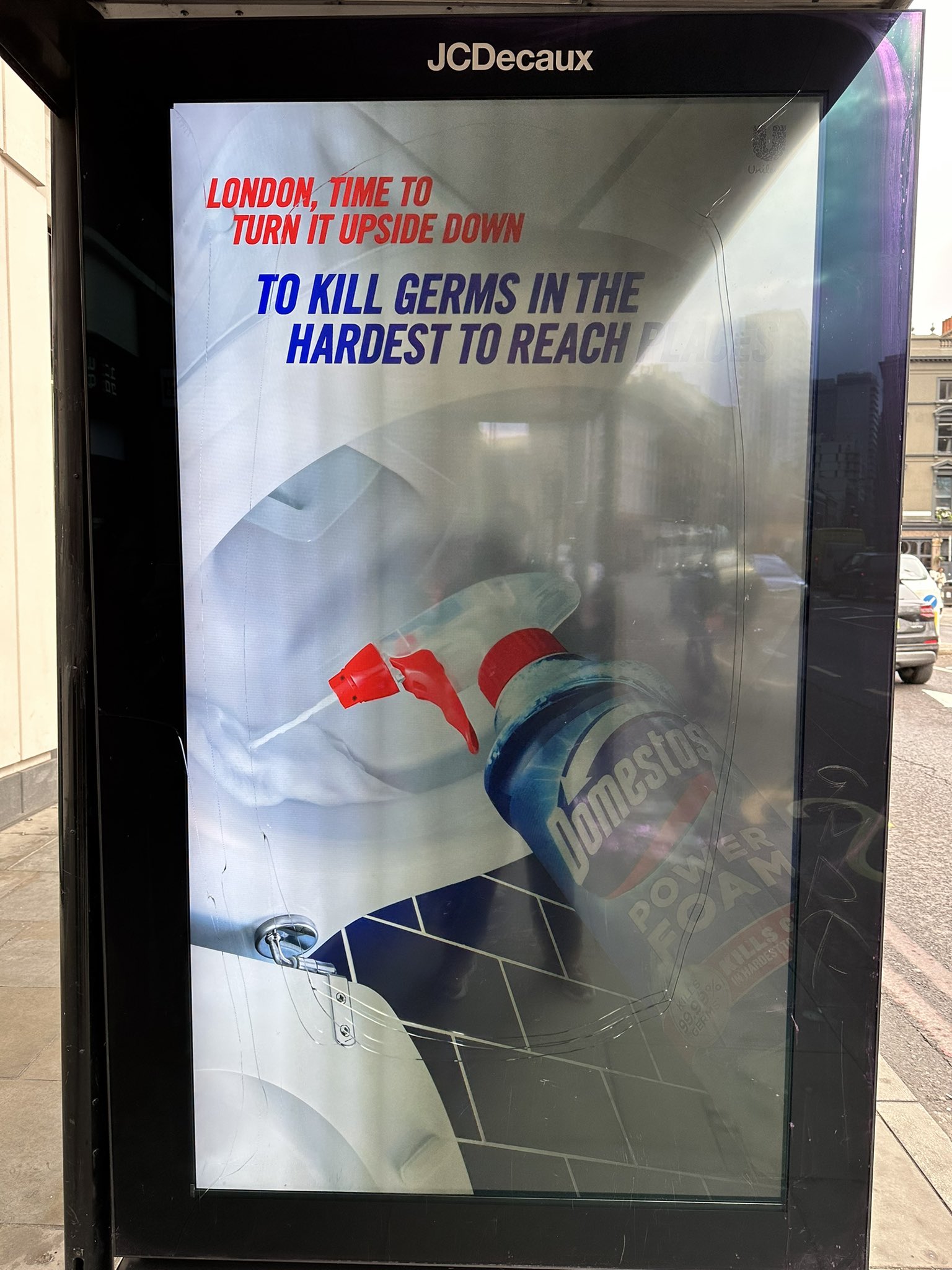
‘Turning Domestos upside down to kill hidden germs seems like an interesting thing to do a poster on.
Showing the product upside down in a toilet bowl doesn’t seem to be adding to the words.
Or intriguing or attracting any passers-by?’
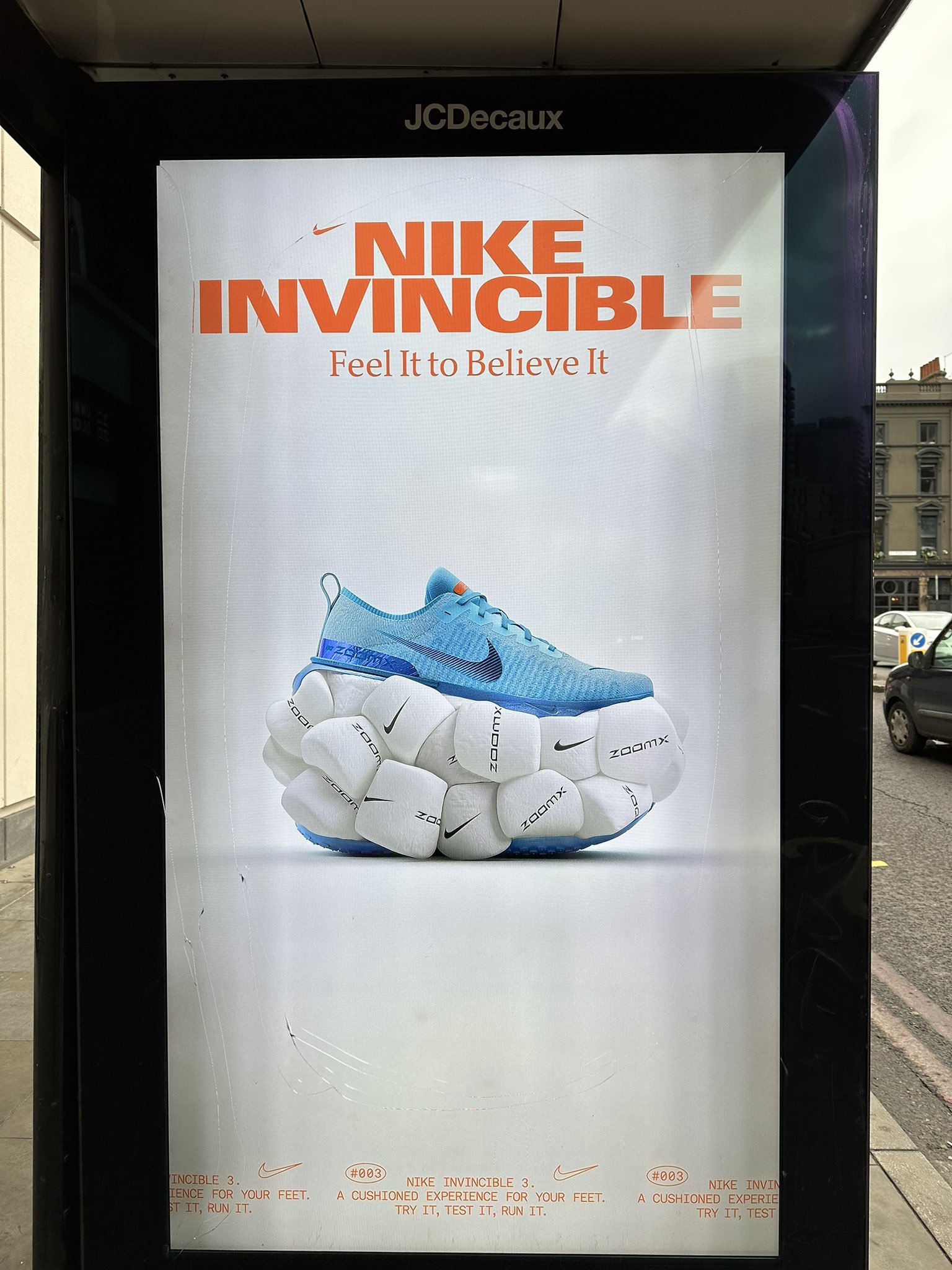
‘Nike have produced some of my favourite ever ads.
This isn’t one of them.
I’ve no idea what this is about.
Presume it’s a joke?’

‘There’s a great story here about the philosophy and integrity of Birkbeck for the 200 years.
‘Freedom’ doesn’t capture it or do it justice.
Read on and you’ll get more.
But what percentage will? 10%?
Maybe they should’ve focussed more on Marcus Garvey than Mark Robinson?’

‘Requires a lot of attention for a poster.
Lots of small type and little details.
Doesn’t feel like must-see tv.’
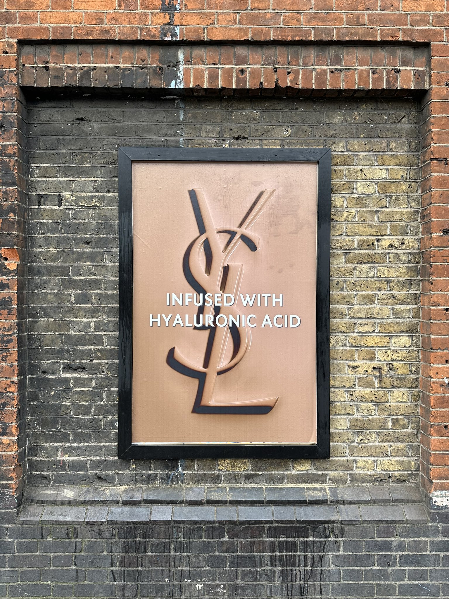
‘Hyaluronic acid.’
Excellent! One of my favourite acids.’
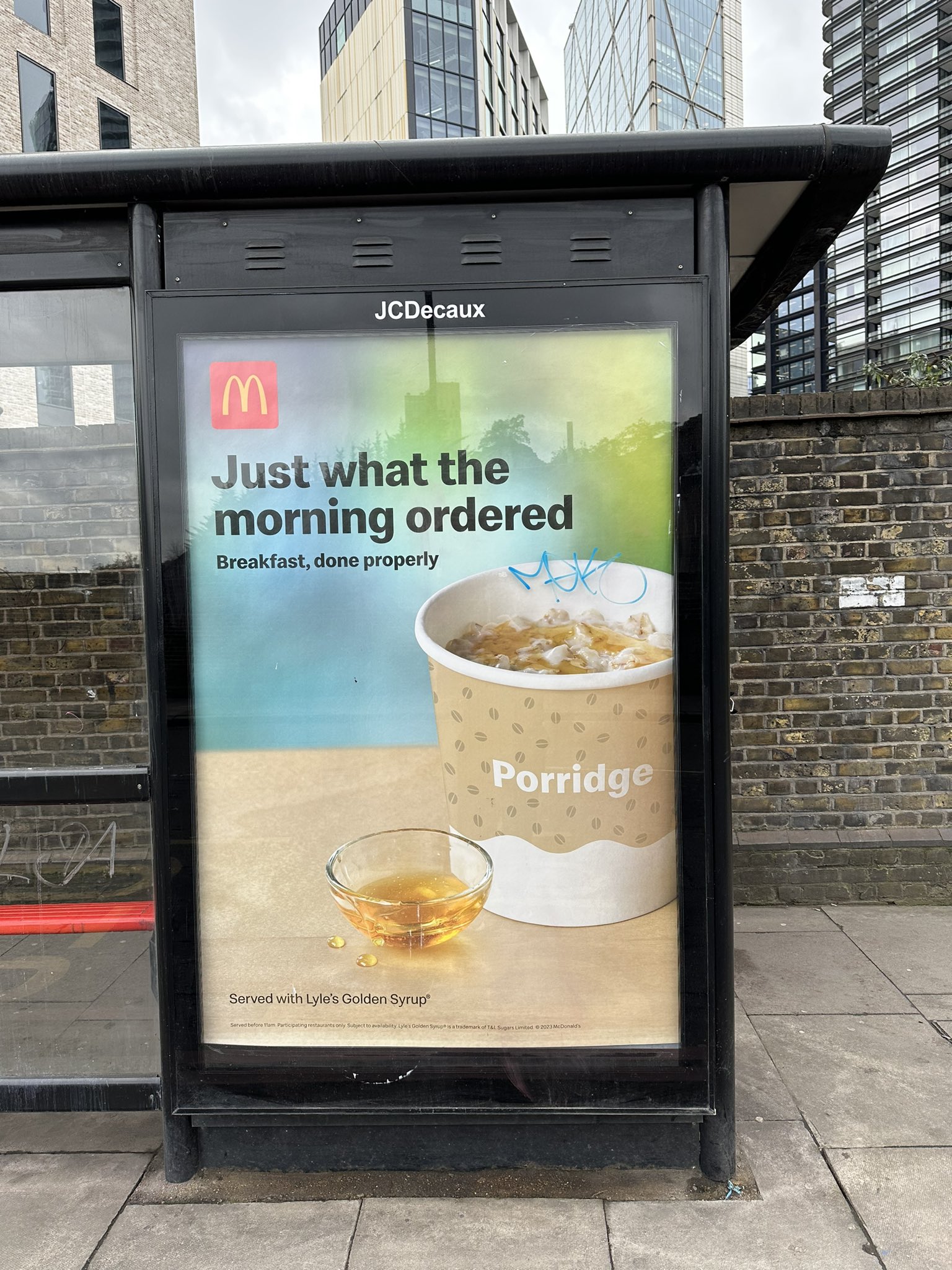

‘Shouldn’t ‘now permanent’ be the brief?
(Not the small print.)
Don’t get ‘The clue’s on the name’?
The chilli?
It’s called the ‘McSpicy’, we get it already.’
I know it’s easy being a critic.
But boy; what a depressing bunch of posters.
I’m not criticising the culprits, just the ads.
There are all manner of reasons why they ended up like this – a dictatorial client, a nervous account team, a bad agency/client relationship, unambitious creatives or all of the above.
Who knows? But what I do know is that the exact same briefs were once fought over by creatives.
Because posters were so public (and big).
And today, with all the other channels slicing their audience into smaller and smaller segments, outdoor is the only media left that everyone sees.
Young, old, rich, poor, Cavaliers, Roundheads, lovers and haters of Marmite, basically, everyone.
Well, everyone who leaves their home.
To be fair, these folks are hard to talk to.
For a start, they’re on the move, so are unlikely to engage with anything more than a single image and a handful of words.
Because they’re on the move, not online, you need to do something they’ll remember when they stop.
It sounds so simple, but posters are hard to do.
It’s why Creative Directors would tell budding creatives working a new multi-media campaign ‘Start with posters, if it works there it’ll work anywhere’.
So why that bunch were so poor?
a) They’re complicated.
Lots of little bits and pieces everywhere, most require you to stop, engage and read beyond the headline.
Research says public interest in advertising is declining not increasing.
b) They’re joyless.
As if the people who created them didn’t found them a chore to do.
The best advertising feels effortless, obvious, like it would’ve been fun to be in the room.
c) They’re quiet.
Really quiet, take the Lacoste ad; why divide a 20ft by 10ft space into 12 little pieces you can’t see from a distance?
There’s a rule of thumb I used to find helpful: fill 90% of the poster with a big picture or big words.
To be honest, it was hard to say anything positive about them.
Was it always like that?
Difficult to say, name any year and the majority of posters out there would’ve been crap.
But they’d have been simpler crap.
Terrible five word headline you could read from the other end of the street.
Big cheesy pictures that could see from the other end of the street.
Take this Campaign article from a 1998.

Admittedly, they’re not a random selection, like Shoreditch our bunch, they’ve been chosen.
But all 39 are simpler than the ones that confronted us in East London.Like them or not; they are posters.Proof of that is that they still work the size of postage stamps in the article.Try reducing the Shoreditch posters down to that size – they’ll vanish.
Why have we drifted towards this more complicated output?Does asking creatives to use a single image or no more than a handful of words now seem unnecessarily cruel today?
Maybe?
But I’m with that old duffer David Ogilvy, who said “Give me the freedom of a tight brief.”Constraints fuel creativity.
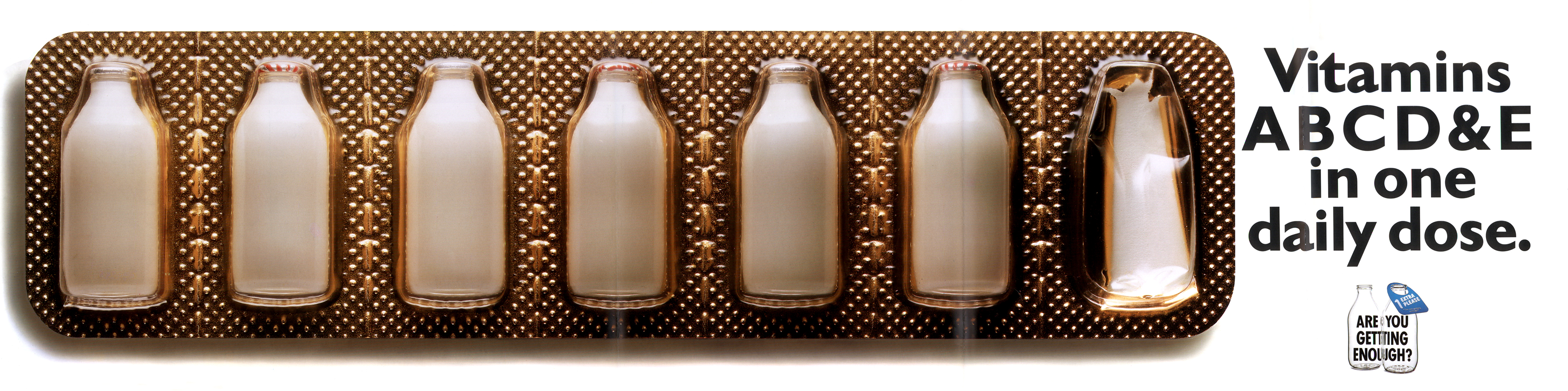
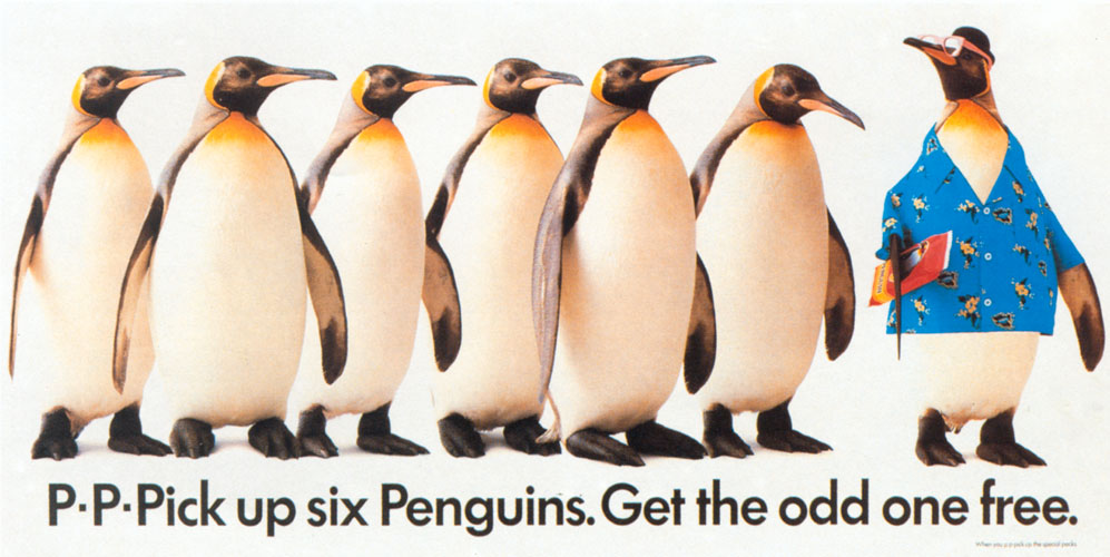
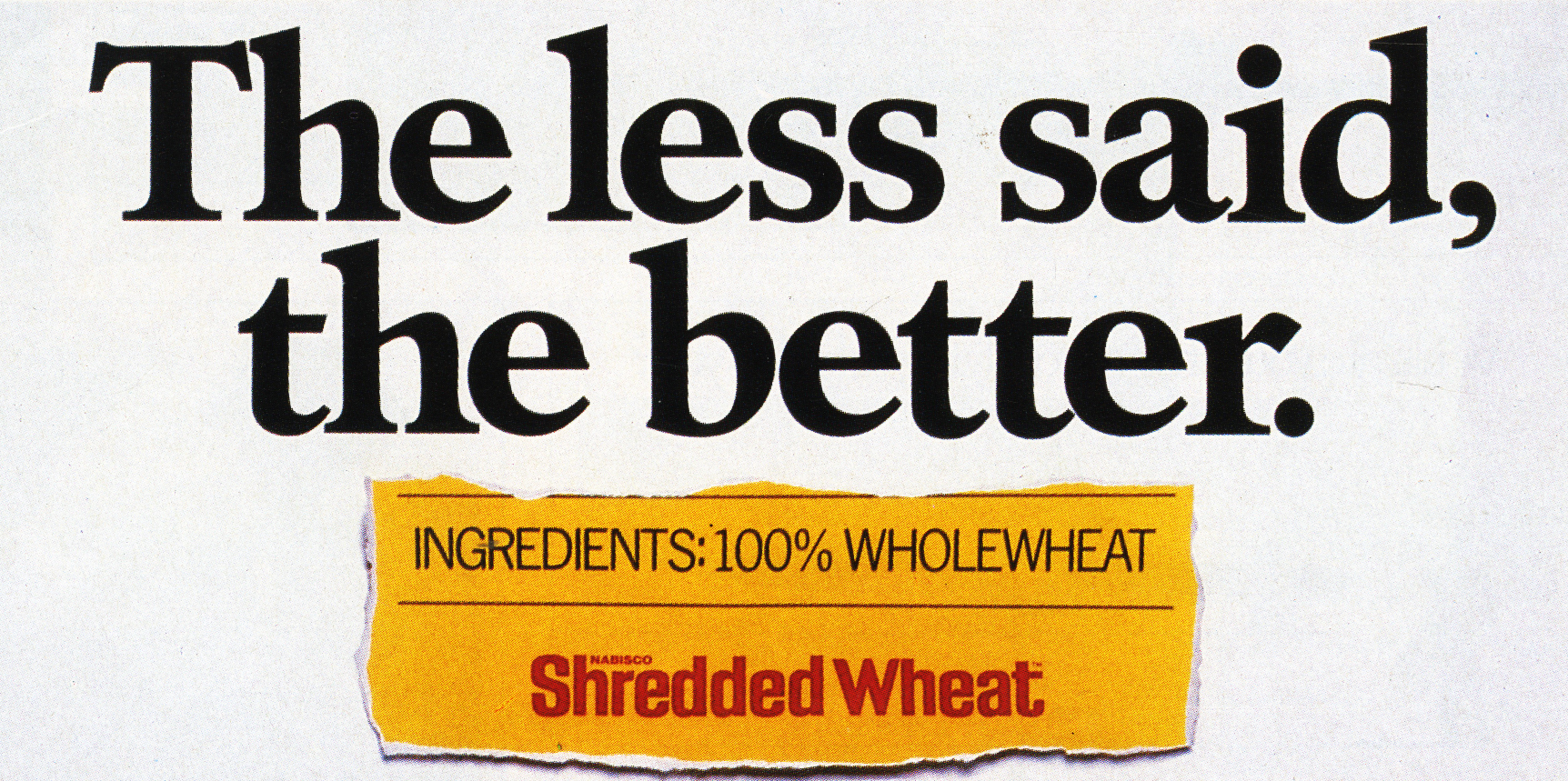
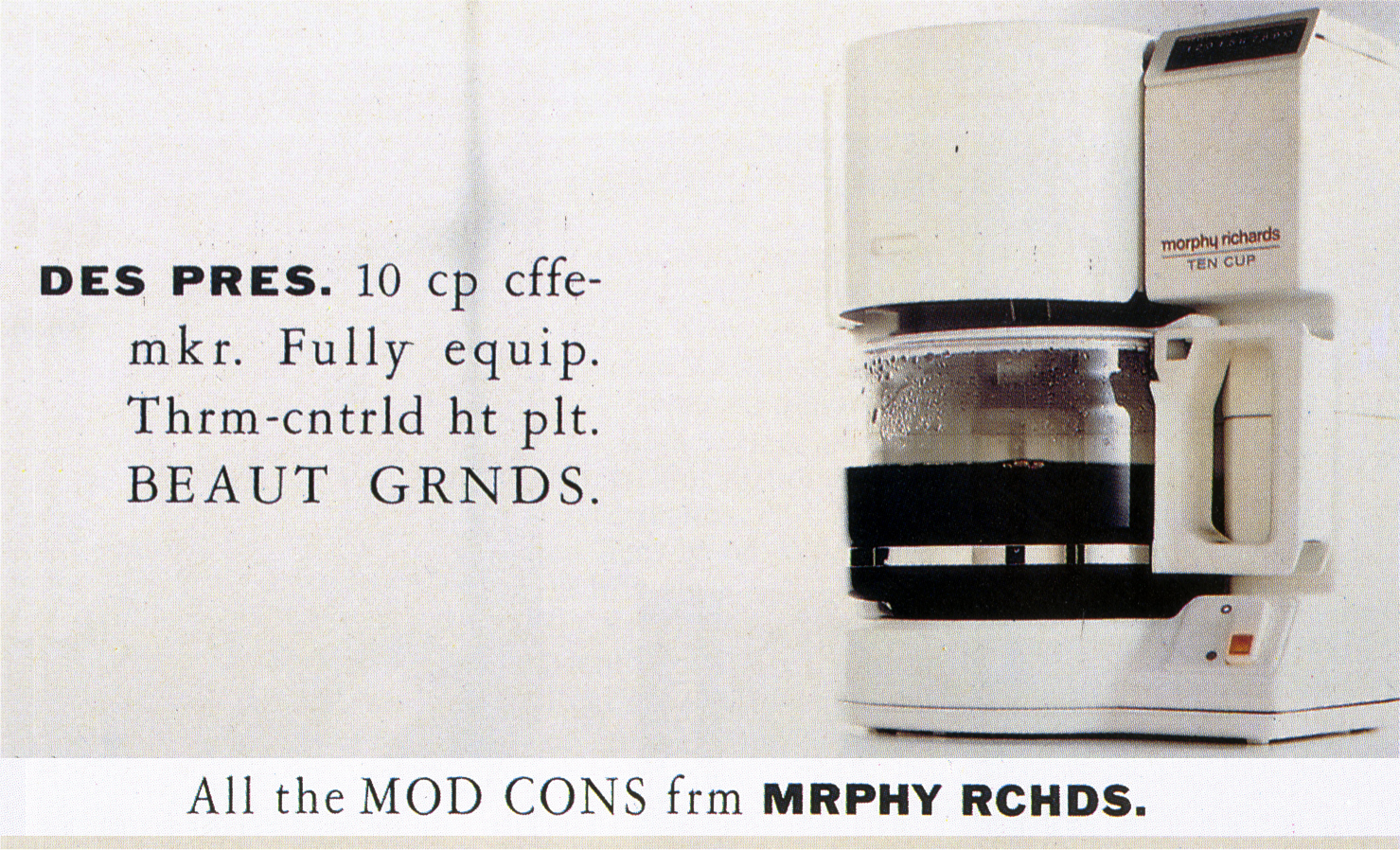
N.b. Rather than show a bunch of award winning old posters, I thought it might be interesting to show a bunch of non-award winning old posters.
If these didn’t get in it makes you wonder what did?
Guinness.

Basildon Bond Paper.

Lucozade.

Asda.

Levis.
The Observer.

Golden Virginia.

Legal & General.

Milk.
Vauxhall.

Fruit Gums.

Heinz Beans.

Percil.

Penguin Biscuits.
Shredded Wheat.
Laughing Cow.

Crown FM.

Morphy Richards.
Revlon.

Warburton’s Bread.

Ecover.

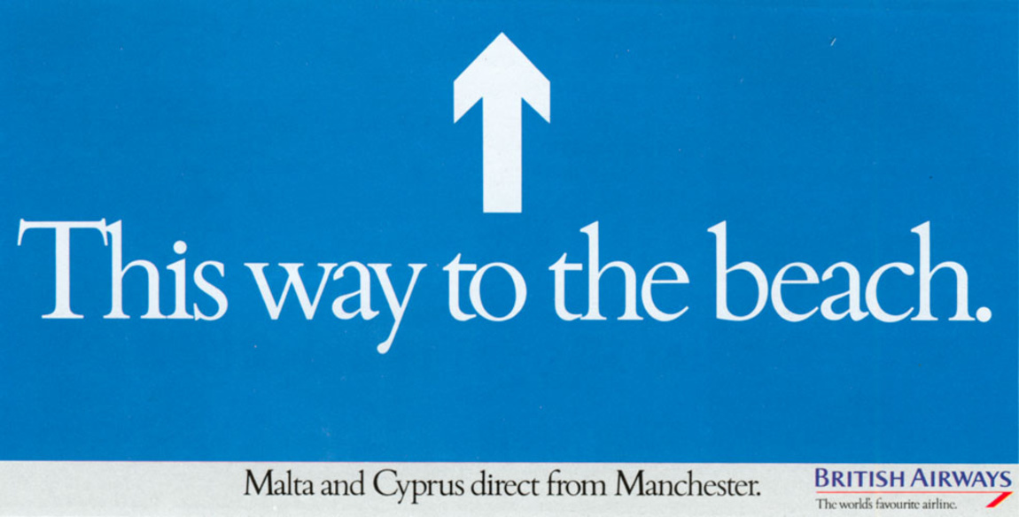
British Airways.
Morrisons.

White Horse.
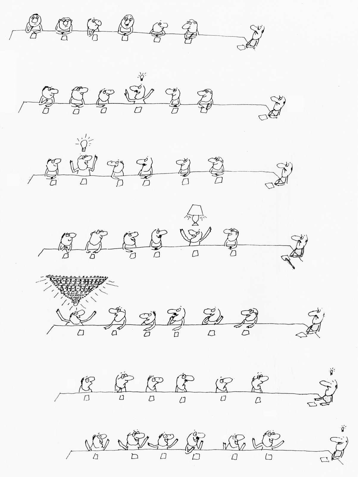
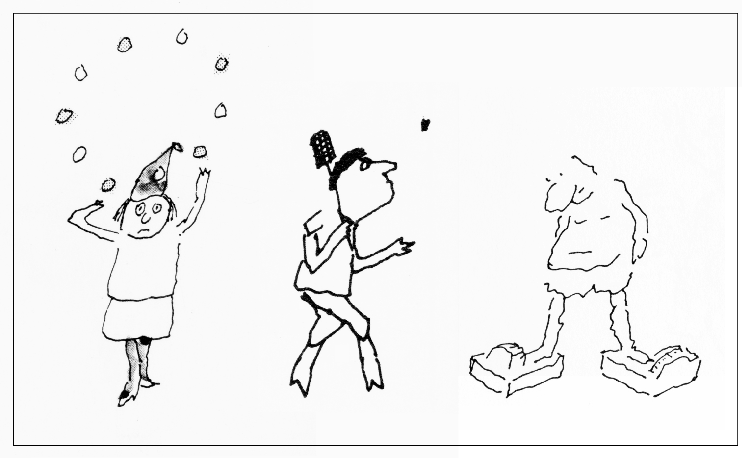
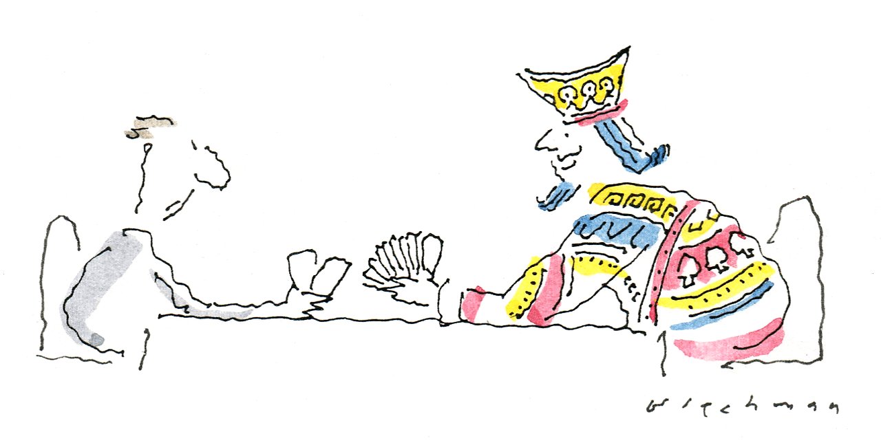
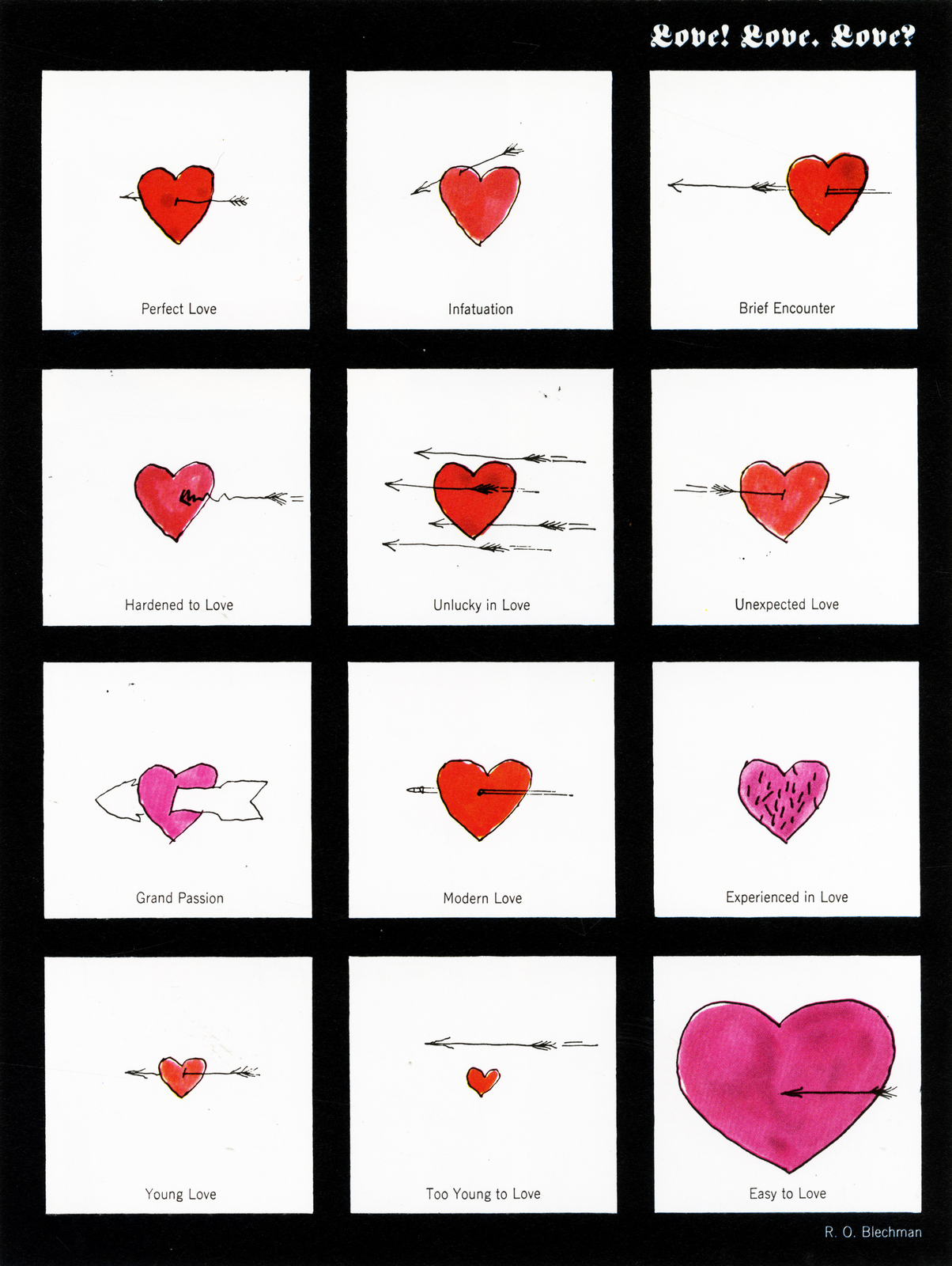
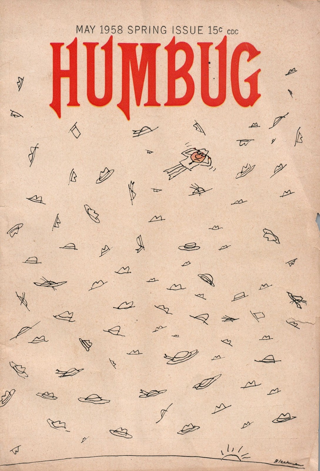
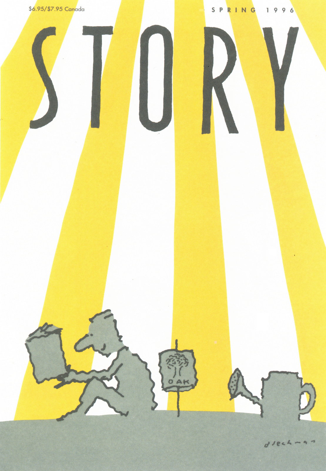
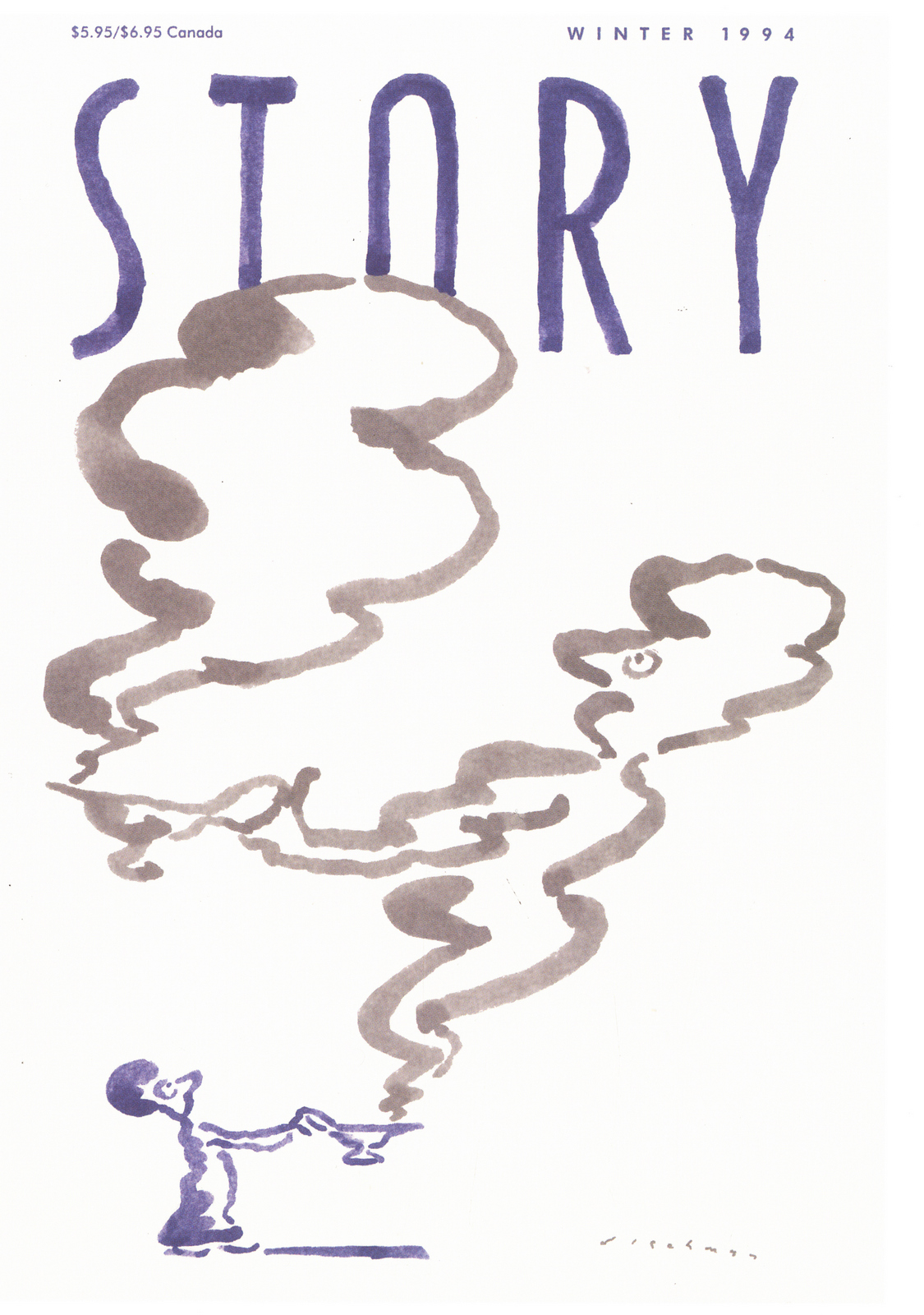
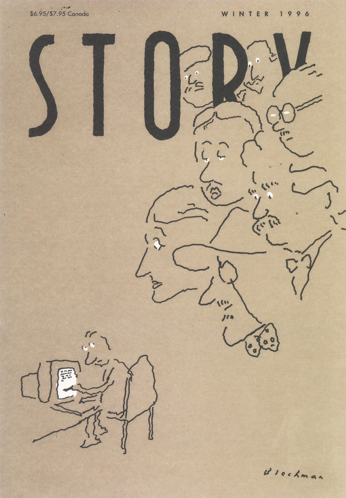
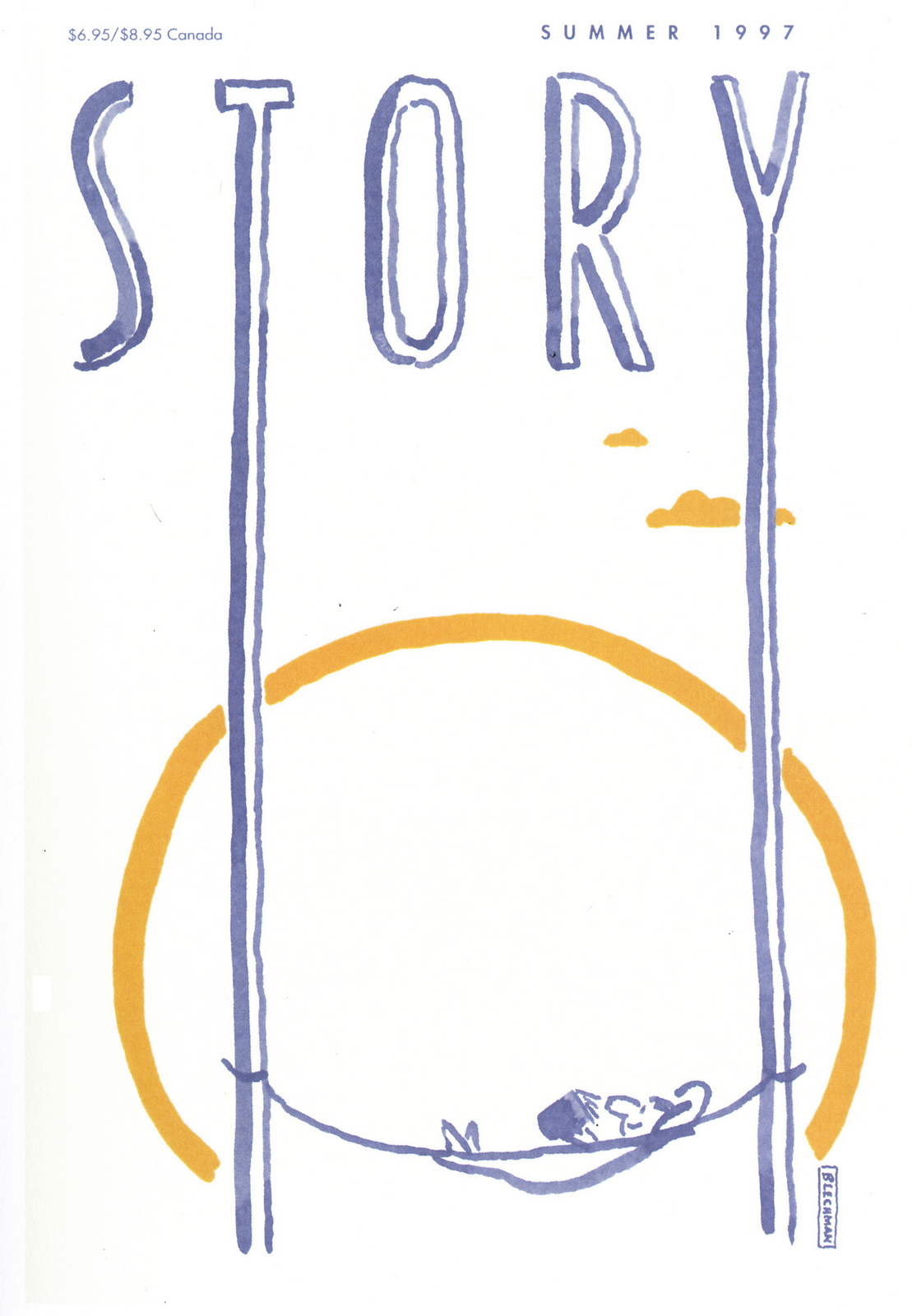
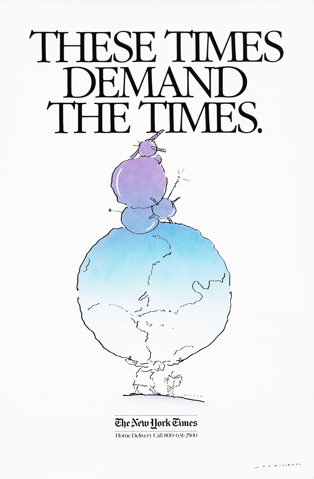
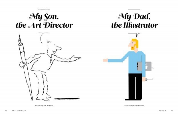
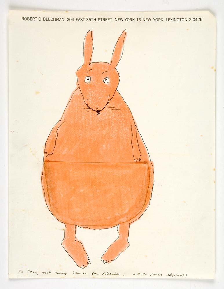
That was the first drawing I saw by R. O. Blechman.I loved it instantly.Firstly, it's a great observation of how companies operate, particularly ad agencies.But also, I was in the ideas business and I'd never seen them represented like that - in different levels from a tiny lightbulb to an enormous chandelier.I also loved the naive style of the drawing.It looked like a note one naughty child would pass to another secretly in class.Drawn in a hurry because they were excited.The apparent lack of craft means it feels personal, human.A master draftsman like Leonardo daVinci couldn't improve it.He'd kill it.Over the years I became more familiar with Blechman's lines.Often referred to as a nervous line.Countless ad folk have copied it - Alan Parker, John Hegarty, Gray Jolliffe and dozens more, including me, it just looks so easy (try it).You'll find you can draw squiggley lines in the shape of a person, but they feel like those chalk outlines the police draw around bodies; dead.Bob's not only feel alive, they conjure up multiple personalities with endless emotions.Often with a couple of dots and two or three lines.It's like some kind of magic trick.And whereas most artists get smoother, slicker and more polished over the years, Bob chose to move in the opposite direction - his line becoming more broken and juddery with each year. (Come to think of it, didn't Picasso take a similar route?)Take a look - early, later, later still.
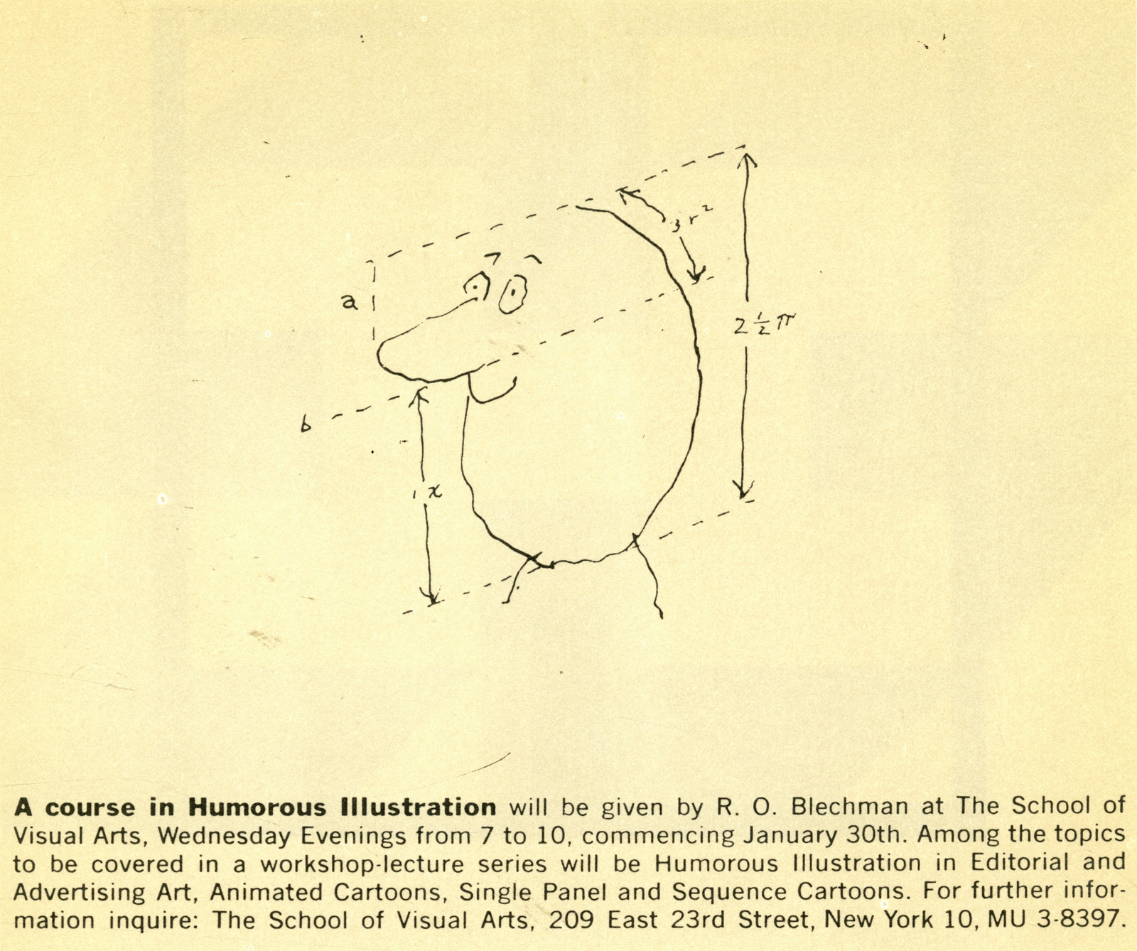
This distinctive style meant you could spot a Blechman from the next county.He used to teach lessons on it.(Love that fake science around that doodle.)
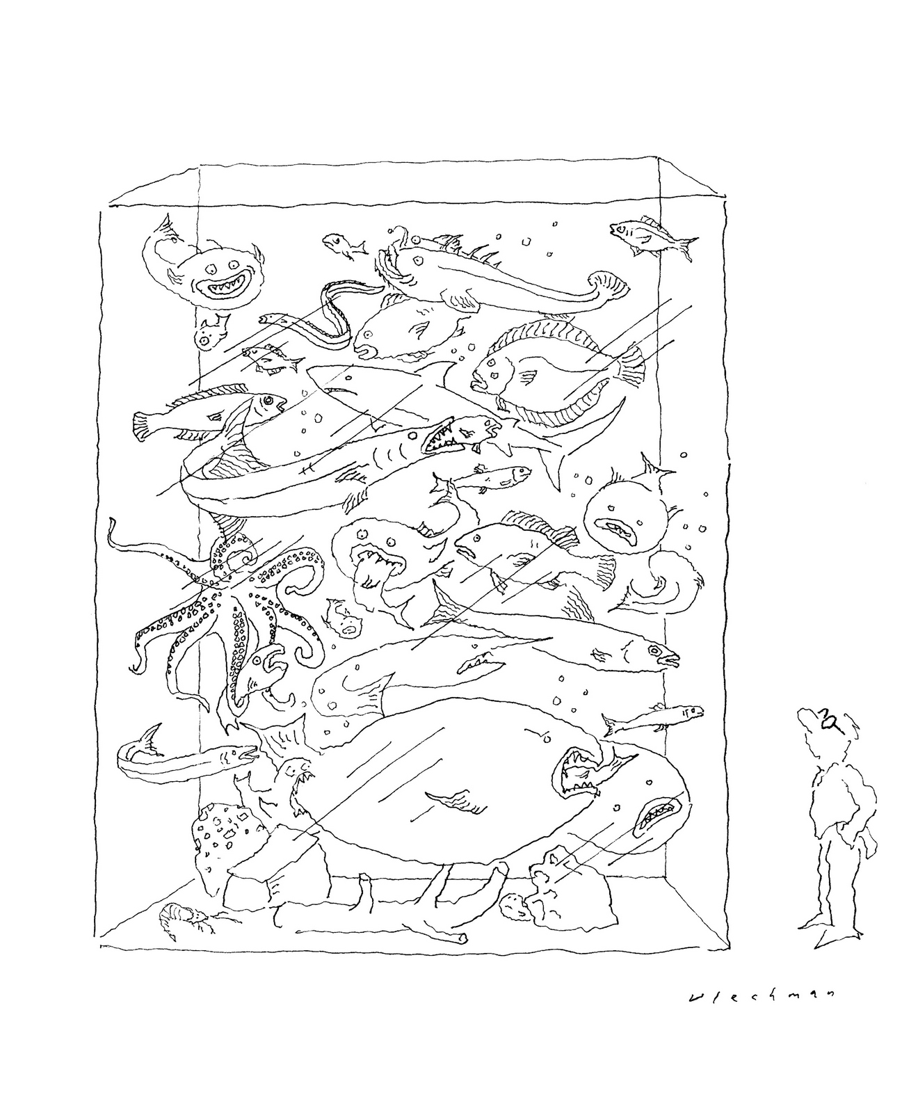
But more important than his lines are his ideas.They cover the map, from the big, weighty issues, like politics and death, to the kind of every day minutiae Seinfeld would go on to cover.If you look at that first cartoon above or the last one in this stream, you'll see that the observations are as relevant today as they were then.They're about being human.And whereas the styles of many of his contemporaries timestamp their work, Bob's human, anxious lines don't date.Now 91, Bob still draws a cartoon for the New York Times every week.We had a great chat, hope you enjoy it.
LIFE.
POLITICS.

MAGAZINE COVERS.Humbug.
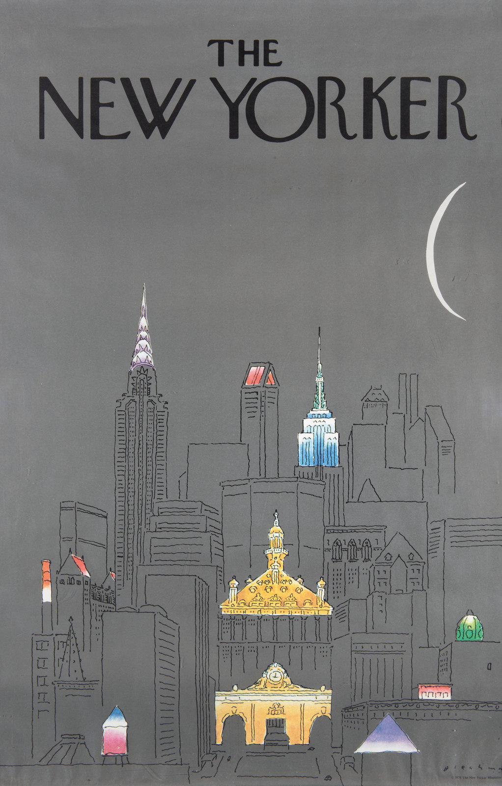
The New Yorker.


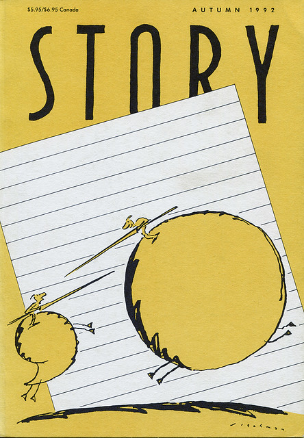
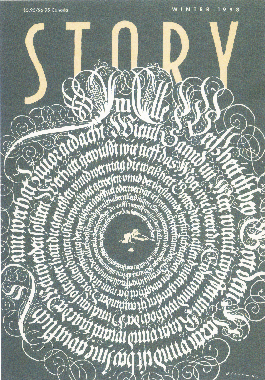
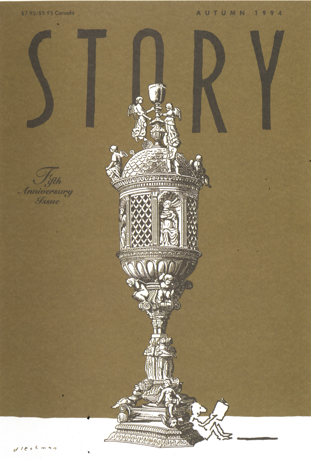
Story Magazine.Bob was offered a token fee, $100, by a new magazine to reprint one of his old drawings on their launch issue, he decided 'who cares about the money' and created a new drawing.This lead him to create every cover for the next 8 years.
ADVERTISING.Alka Seltzer.

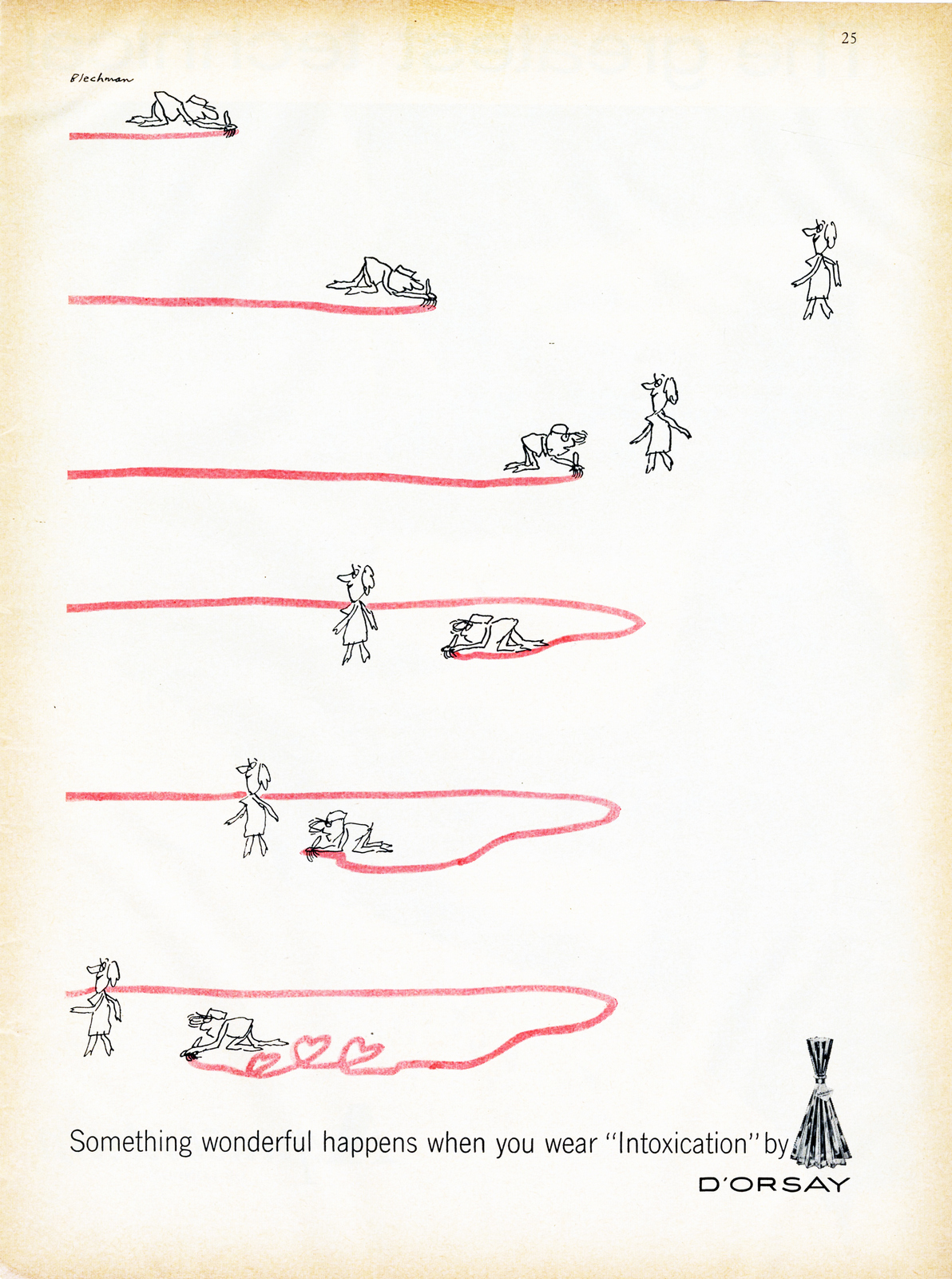
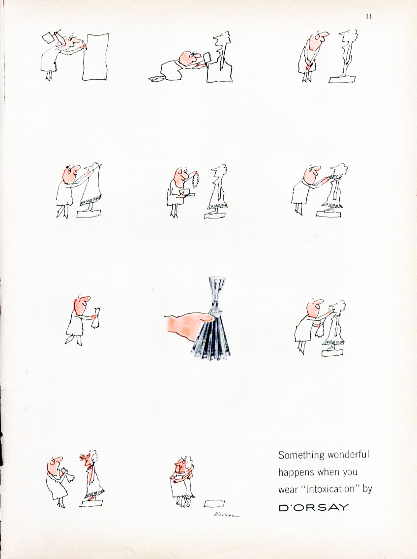
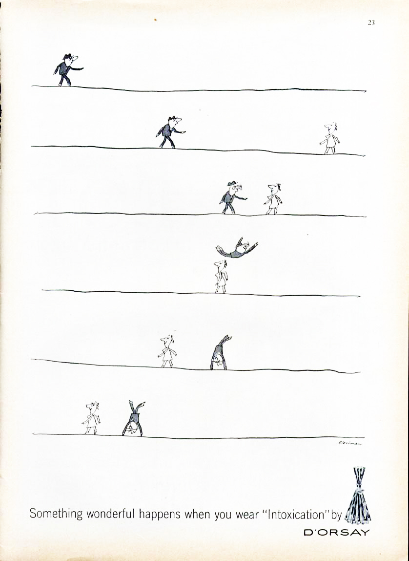
D'Orsay.
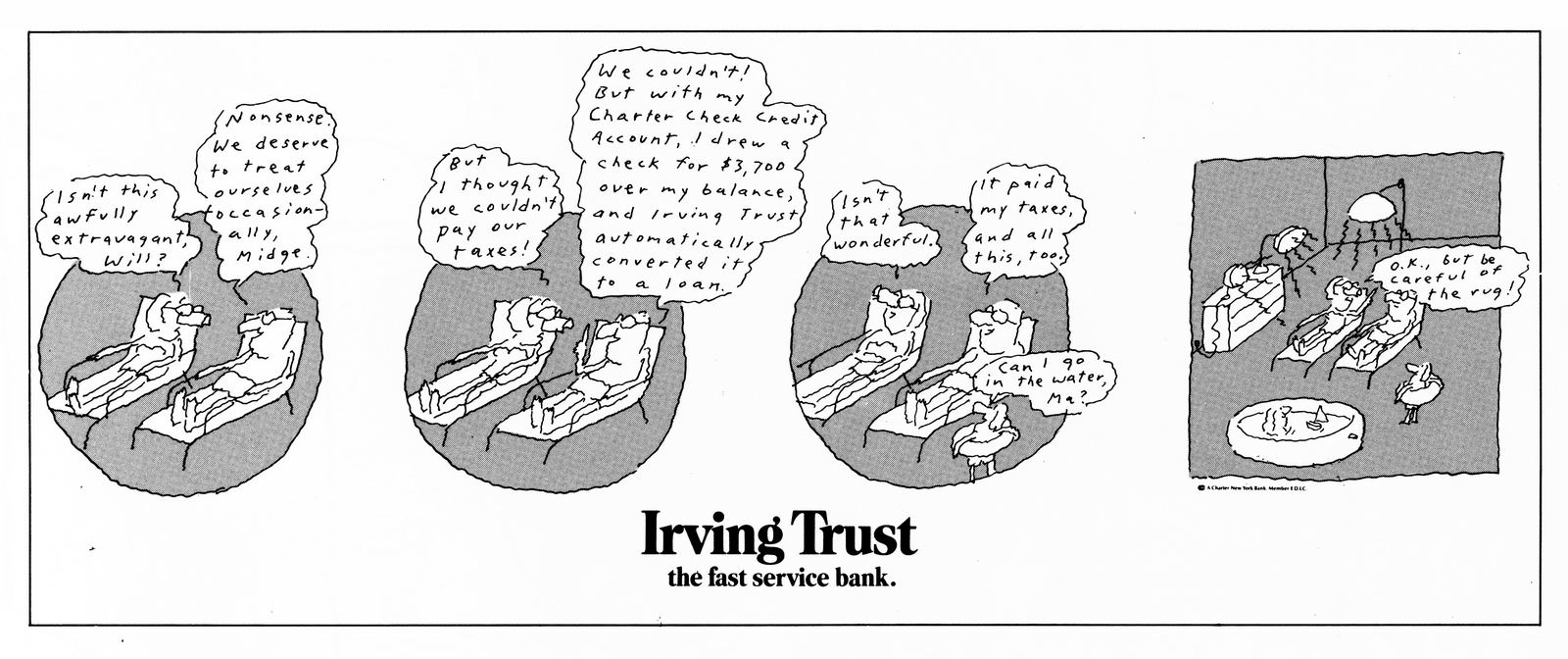
The Irving Trust.
Renault.


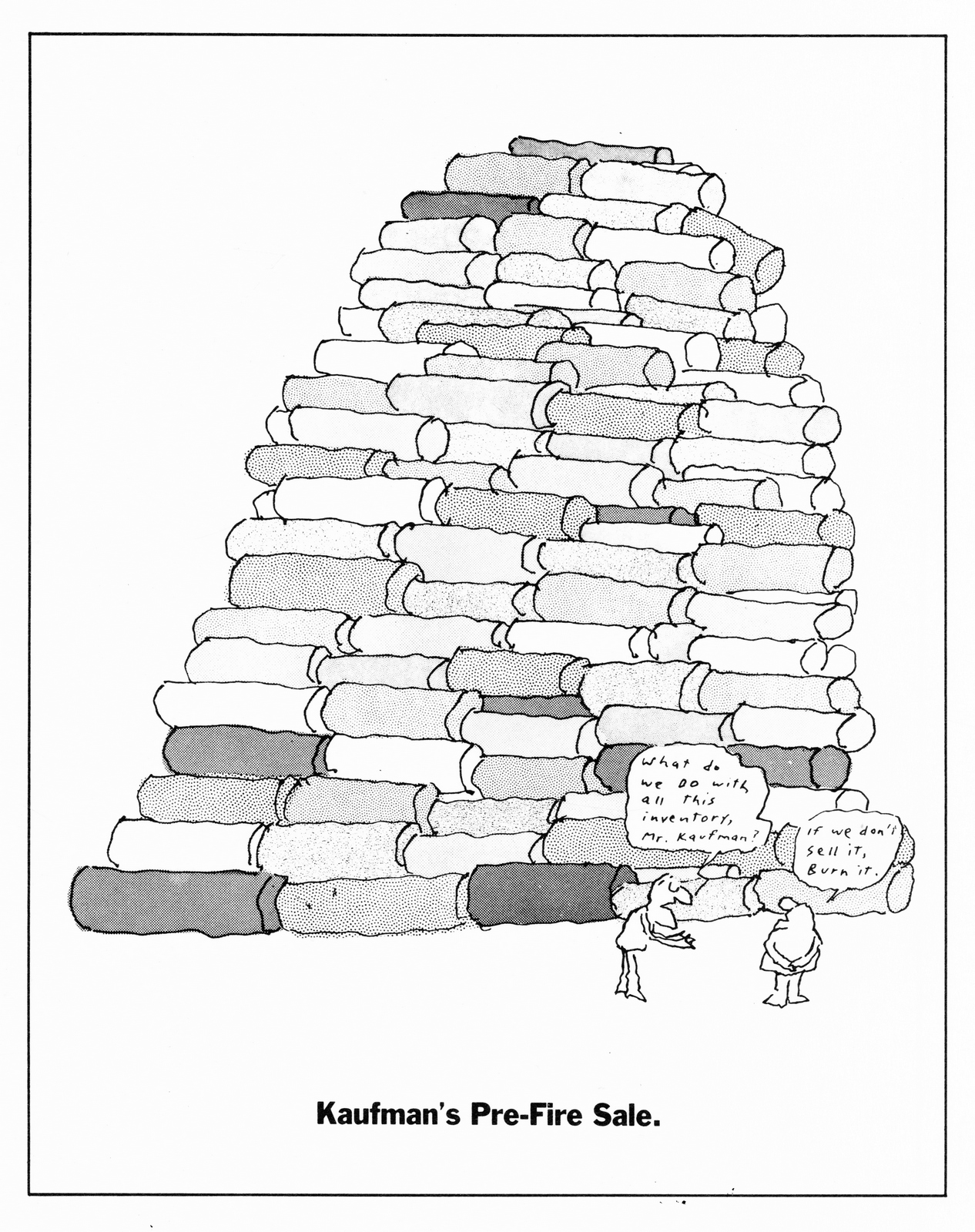
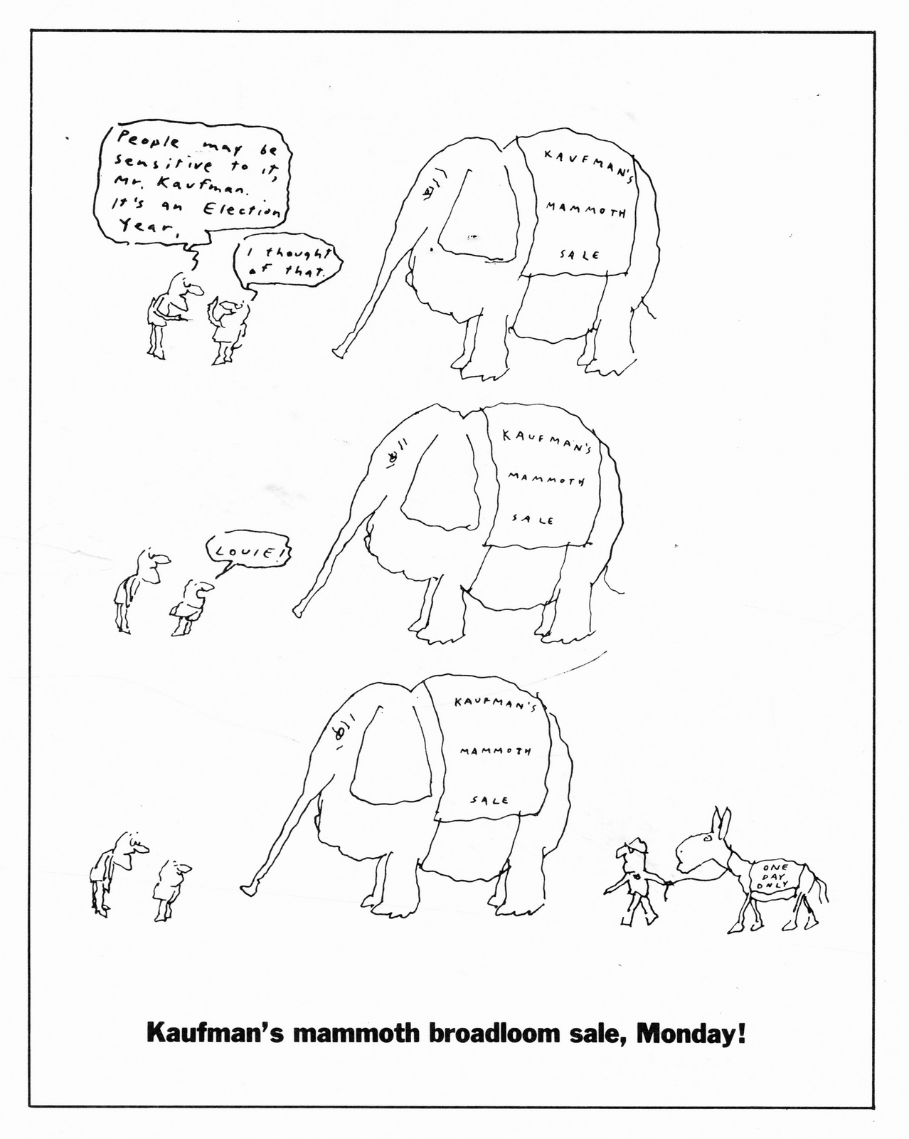
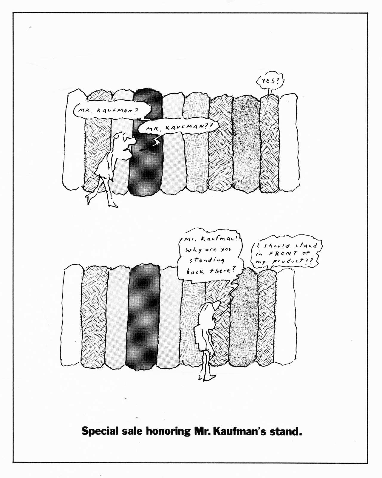
Kaufman's.

The New York Times.

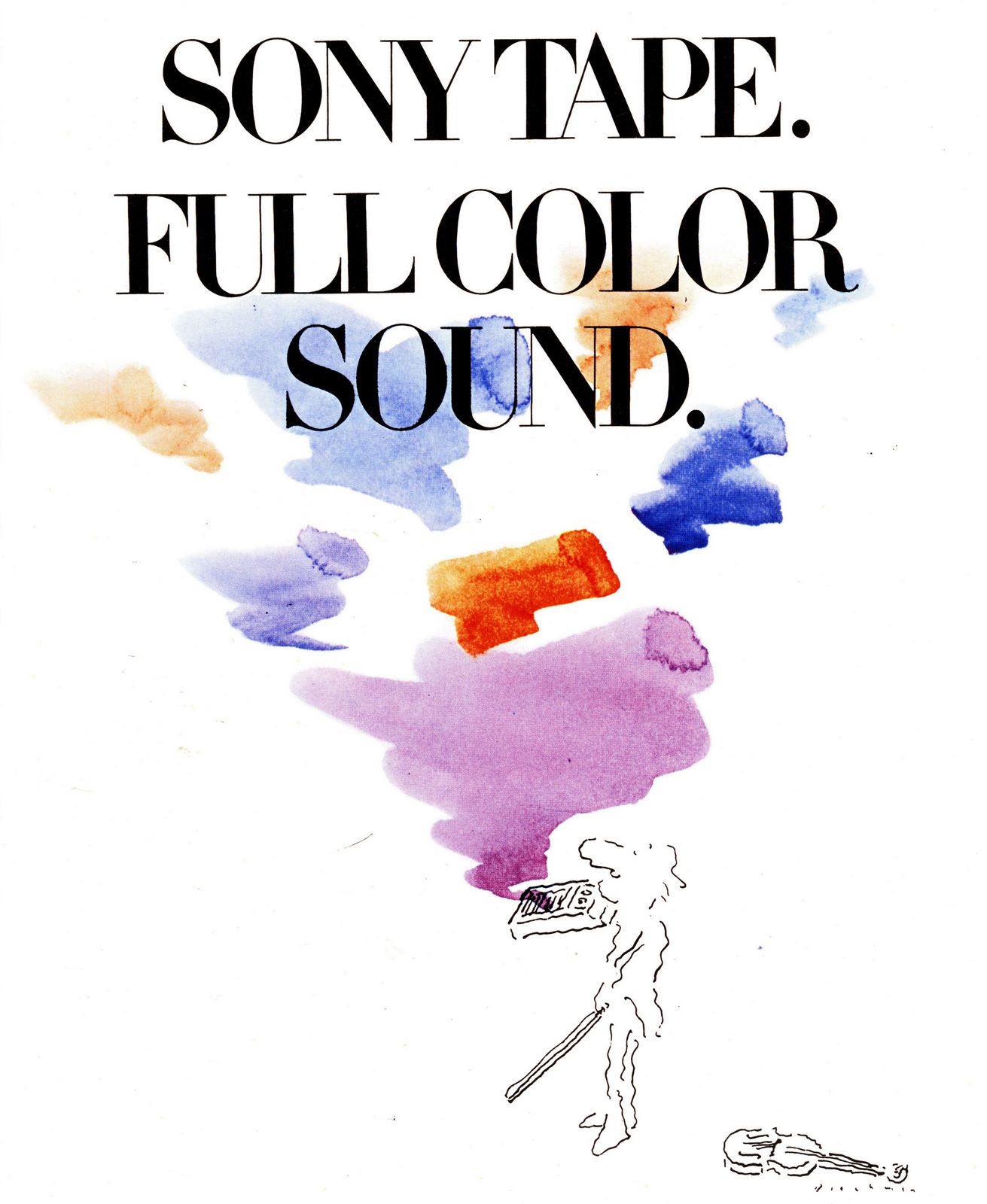
Sony.
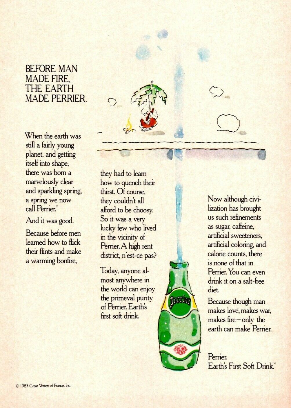
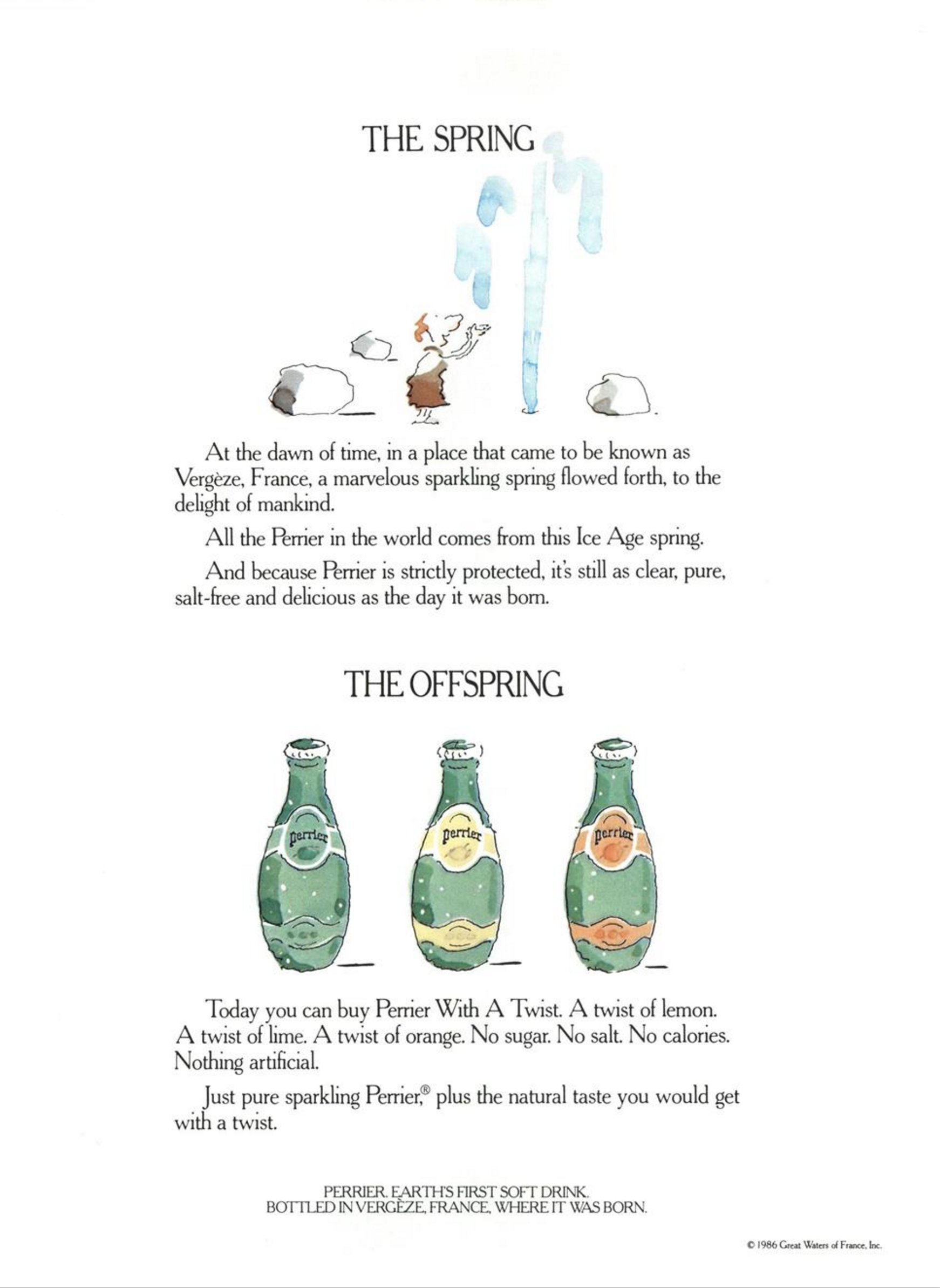
Perrier.


TV ADS.Alka-Seltzer.
Mobil.
CBS.
Perrier.
SHORT FILMS.
RECENT WORK.

Bob has also been collaborating with his son, Nicholas.

BLECHMAN EPHEMERA.


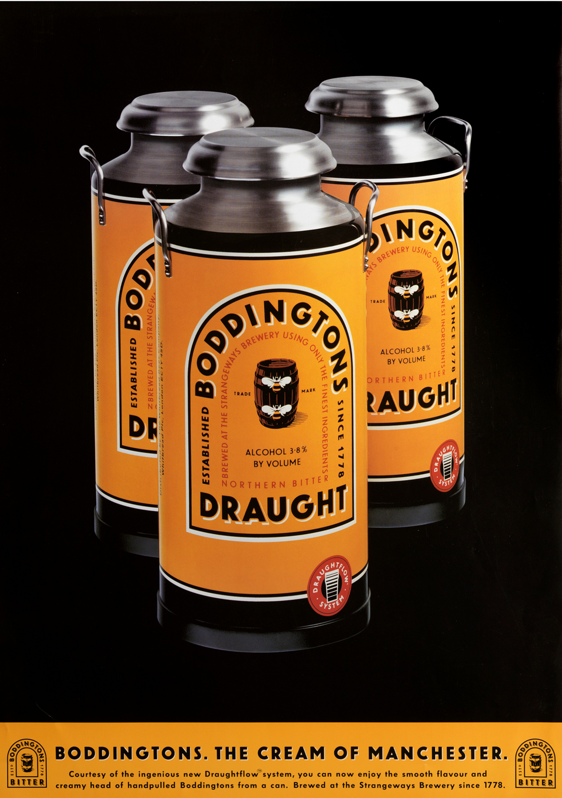
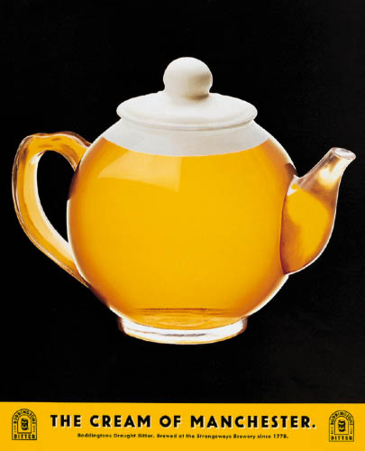
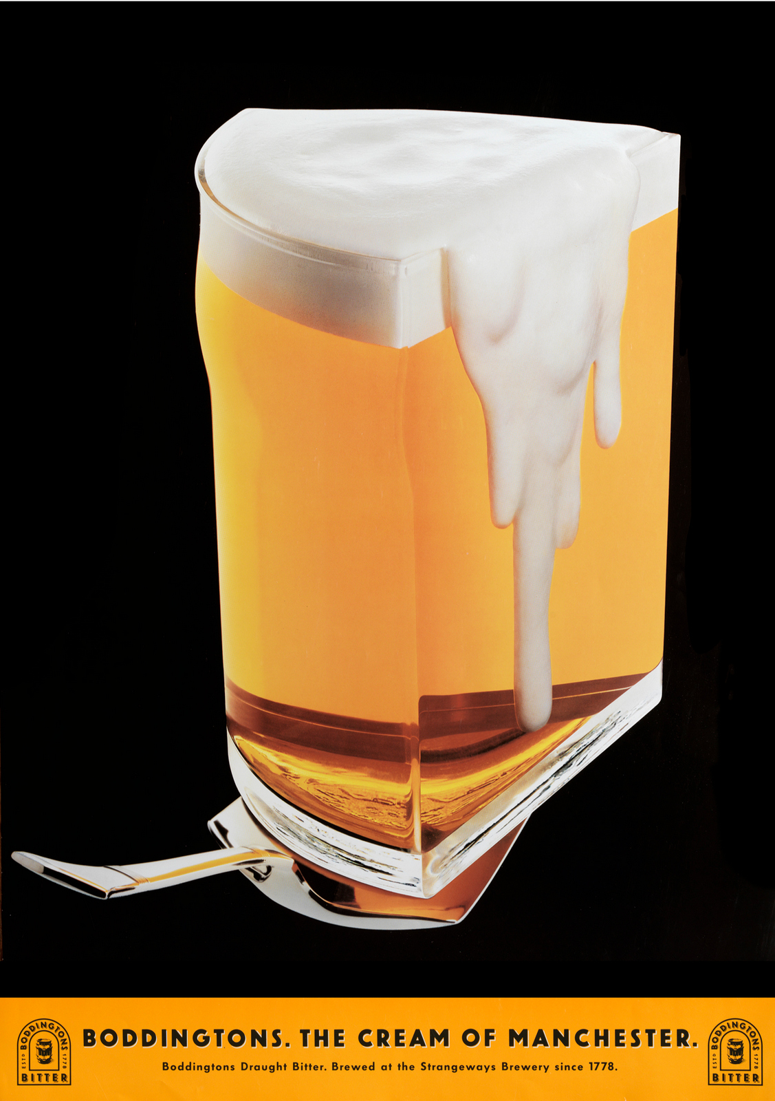
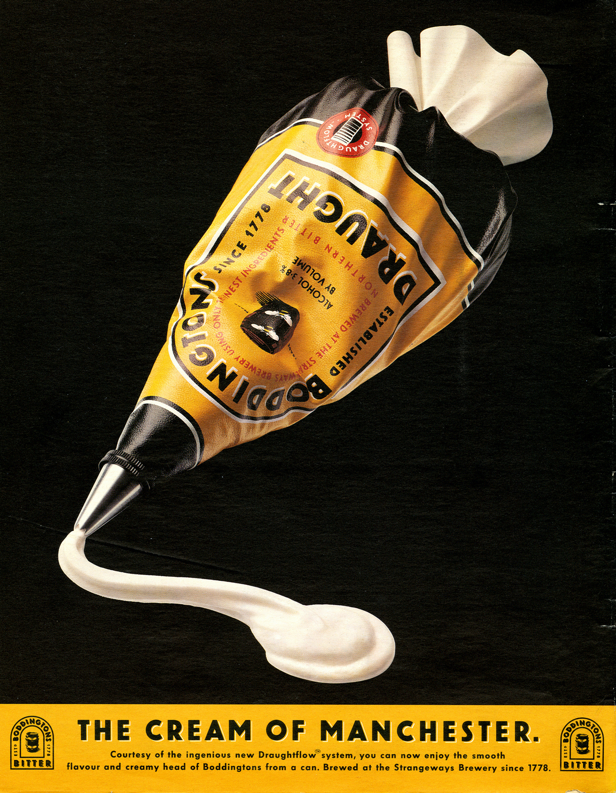
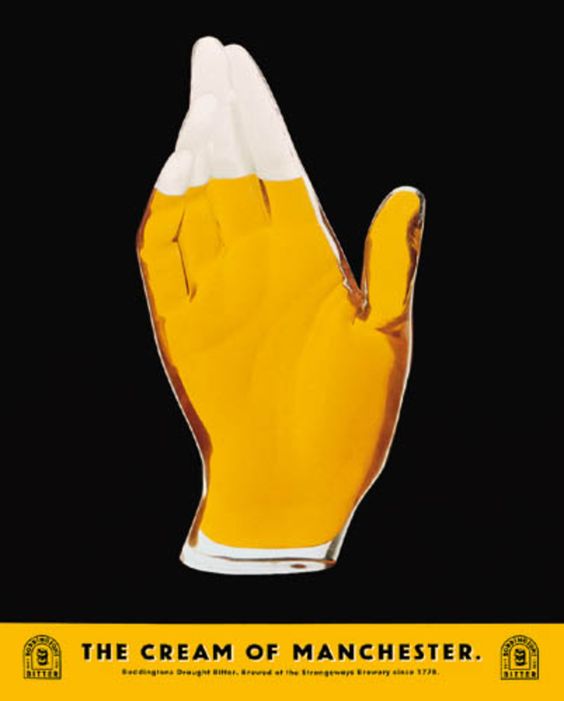
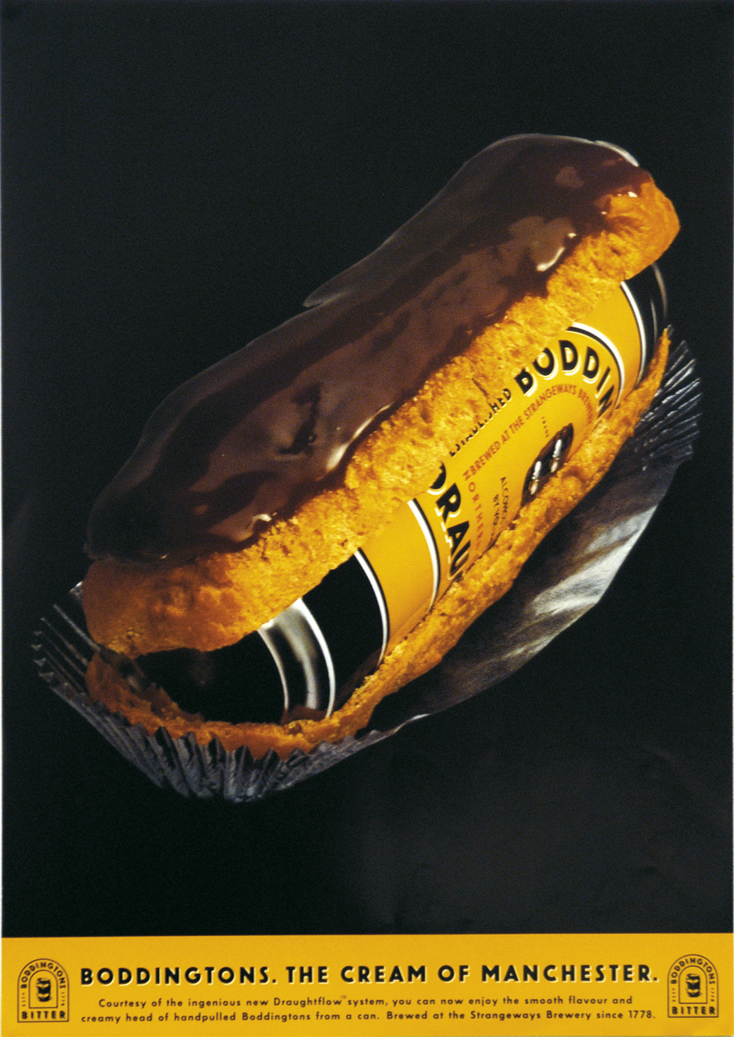
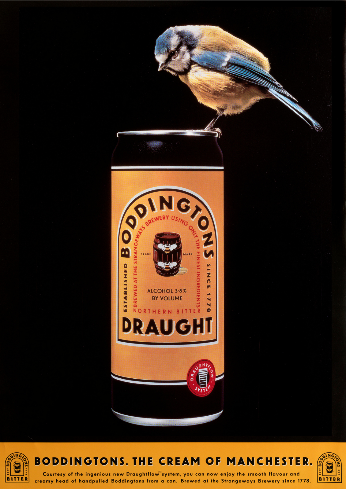
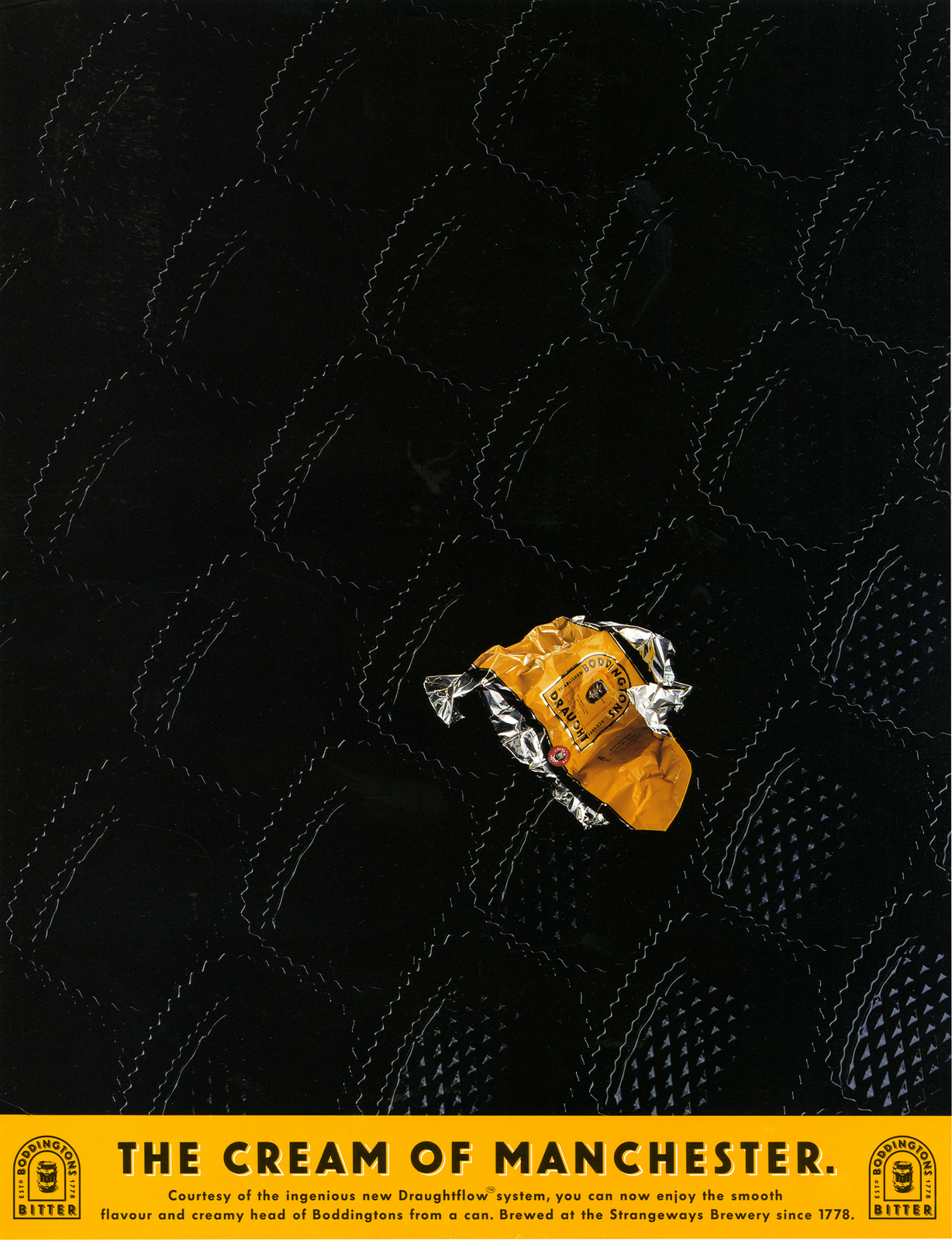
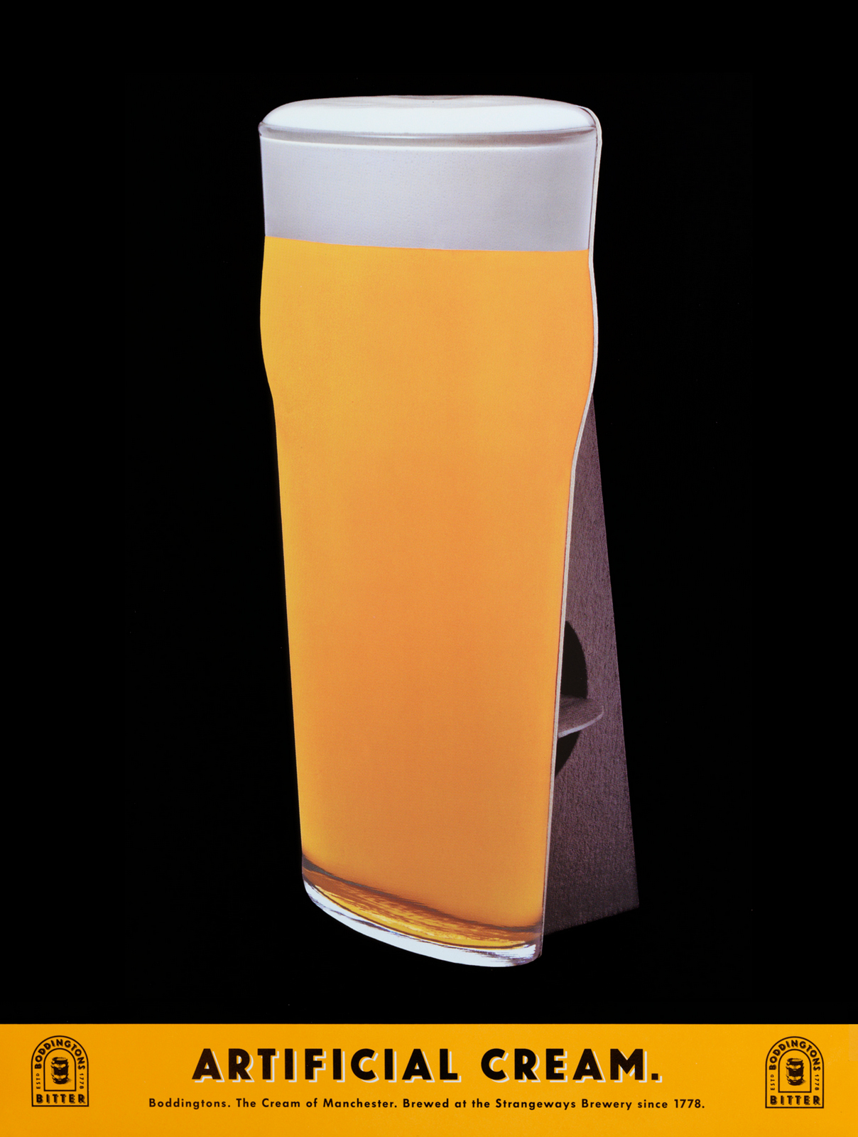
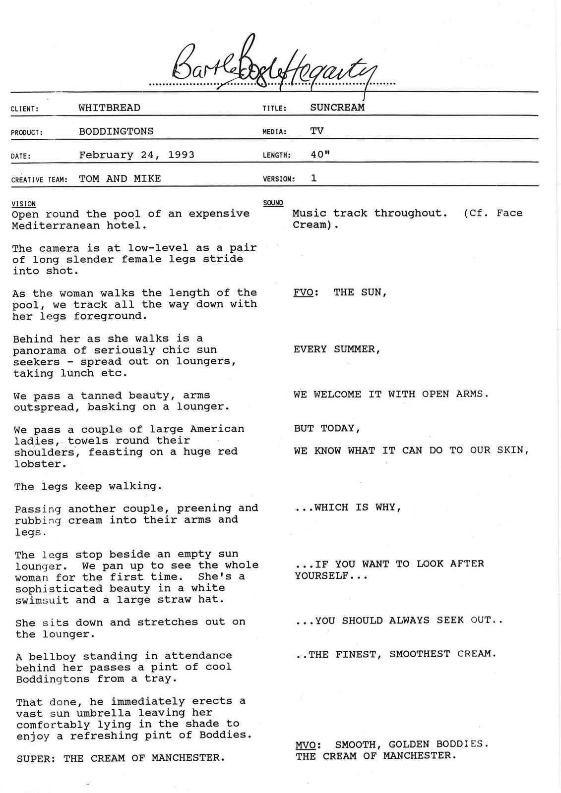
'There is a possibility that ad agency Bartle Bogle Hegarty’s Cream of Manchester ad campaign, which ran from 1991 until 1999, is responsible for the transformation of that city'. - Stuart Jeffries, The Guardian, 2019.I know, it sounds ludicrous?Who knows whether it's true, but one thing is unarguable; they took a little-known bitter from the North of England and created a campaign that made it famous.Even beyond our shores.Here it is being referenced in Friends.
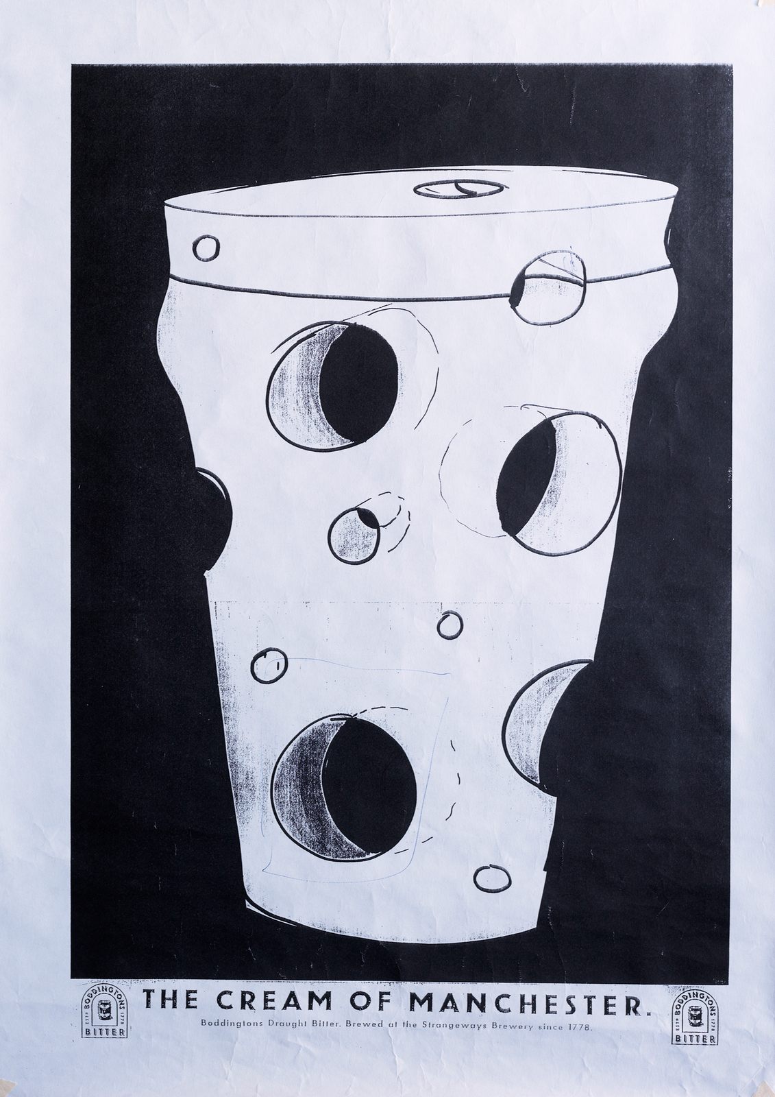
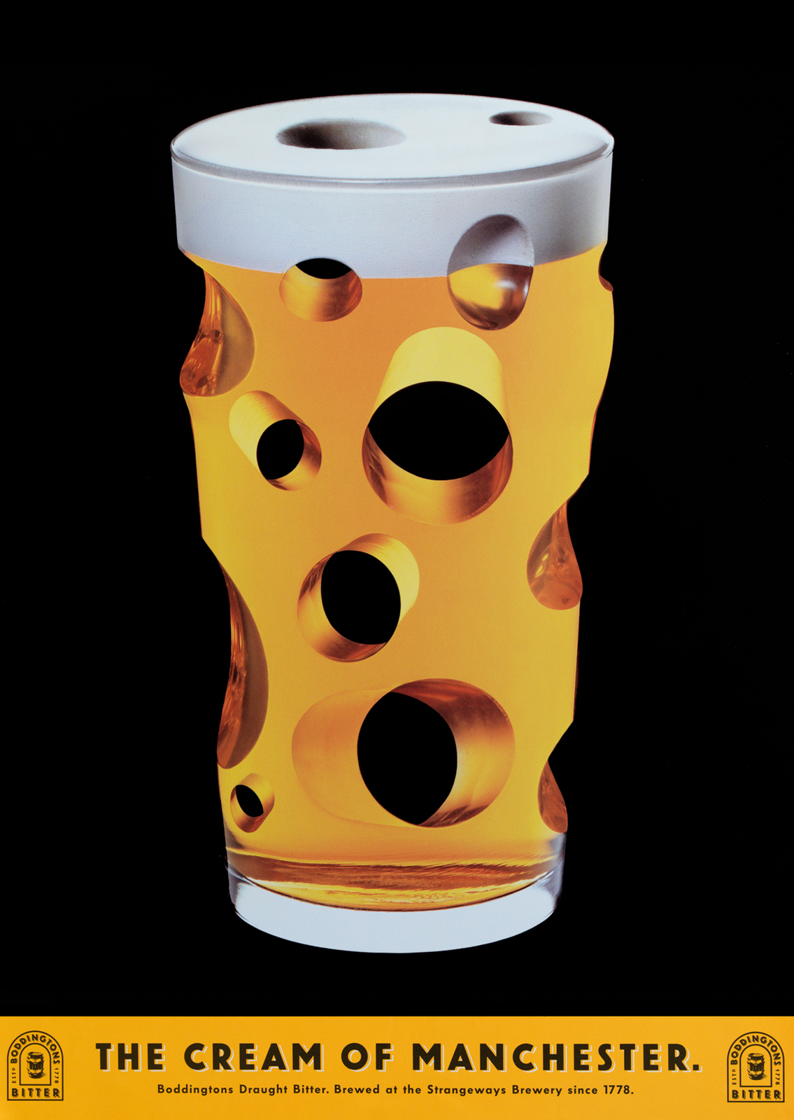
I loved that campaign, so thought I'd look into it and grill those responsible.CREATIVE DIRECTOR: John HegartyWRITER & CO-CONCEPT CREATOR: Tom HudsonWRITER: Tim RileyMODELMAKER: Gavin LindsayPHOTOGRAPHER: Tif HunterTHE ART DIRECTOR & CO-CREATOR WAS MIKE WELLS. (I tried to track down, but had no luck, apparently he's an antique dealer, somewhere.Mike, if you ever read this, get in touch and I'll add your comments too.)What was the initial Boddingtons brief?JOHN: I seem to recall it being about the creamy head.Controversial at the time, because, although they liked a creamy head up North, in the South it was seen as froth taking up valuable beer space. A bit of a con.Also, as usual, research told us it was a mistake too, saying ‘Don’t mention the head!’.But we thought, well, Boddingtons does have a creamy head, people are going to find out sooner or later, so let’s celebrate it!It was different.As the team, did you see this brief as a big opportunity?TOM:They gave it to a junior team to play with, because Boddingtons came into the agency as a bit of wild card.Whitbread, an existing client, had just bought the brand which until then had just been a much loved local session pint in Manchester.They were going to experiment with rolling it out nationally, they'd never advertised nationally before.What came first; the poster-like ideasor the media idea - back pages were like posters?JOHN:The media idea.Kev Brown had a view that we should use back pages because they were like posters.He said that often people turn over a magazine once they’ve read it, then it sat there, ad up, like a poster.The same on the tube, people are often looking at a row of back pages.He also said they were undervalued as most people didn’t want the back pages.Did you have any other ideas before 'Cream?'TOM: The initial brief was 'the ultimate smooth drinking pint’.A very familiar brief at BBH at the time – Levi’s were the ‘ultimate jeans’.A few campaigns went up on the wall...there was one route featuring great things that came from Manchester, one of the executions featured the Bee Gees.So the 'cream' idea was off-brief?TOM:More radical than cream was being brave enough to talk about a pint of bitter from Manchester.Until then, Yorkshire was the only reputable place bitter to originate from.What was the first idea?TOM: The milk bottle.It was where the whole idea was born - let’s put a pint of beer in a milk bottle!Make it a pint of gold top and that’ll do the whole creamy thing. Bingo.And it looked fucking cool.We put the line on it and off we went.

How did John Hegarty first react to them?TOM: He loved them.He used to reference Lady Diana – the most famous woman in the world on the strength of her image alone – at that stage she was so shy she’d barely said a word to the world’s media, but her image defined an era.We wanted work that had the same visual power.Most food and drink clients don’t like you ‘playing around with their product’, was it a tough sell? JOHN: No, Whitbread were a terrific client, they knew we needed to do something different, they bought it straight away.Were you excited about the possibility of the photographs when the layouts chugged through the fax machine?TIF: Totally. This was the first time that I’d been considered for a whole campaign rather than just a single ad.And it was BBH.So, no pressure!
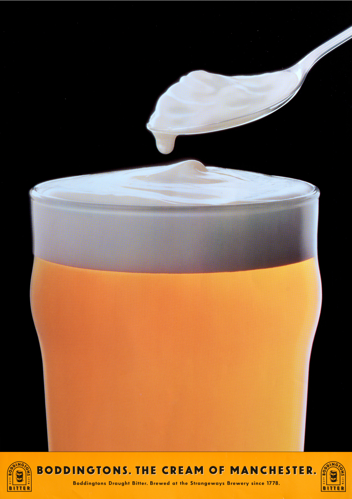
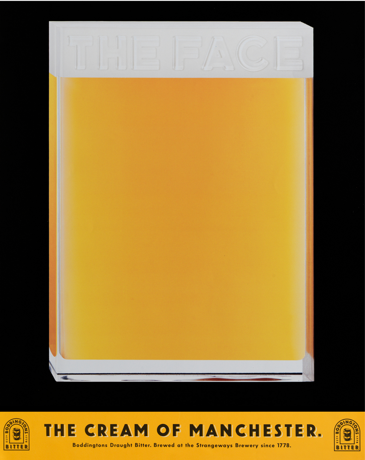
The ads looked very distinctive at the time?TOM: The look was inspired by a fashion editorial in The Face, all shot out of black.I loved it and wanted it on every campaign we did.TIF:Mike and Tom were very clear about the overall look of the ads.I spent a few days testing to come up with a look and feel that fitted their idea - backlighting the beer with very tight masking, using black velvet card close to the subject, combined with black masks close to the camera lens.Once the lighting “formula” was worked out for solid and transparent subject, each shot took about two days.For me, still life advertising photography meant shooting large format 10x8 film, where as far as possible everything was created in camera, with limited involvement of post production.

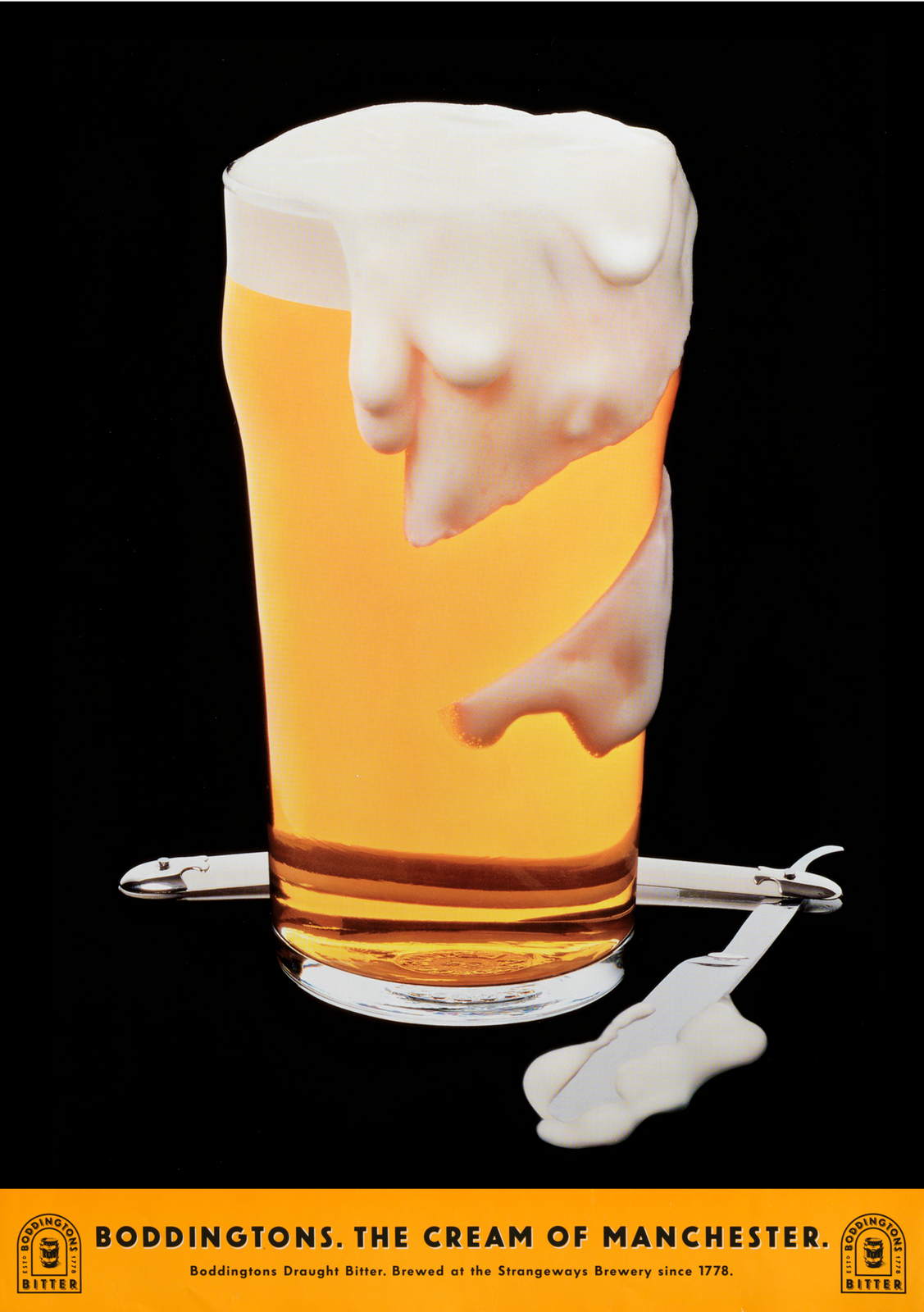
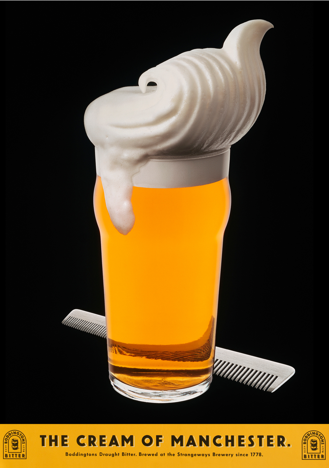
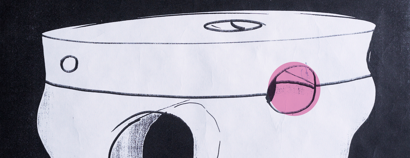
Did the fact that your models were going to be shot against black affect how you made them?GAVIN:All the models were transparent, three dimensional objects, so they were affected by what was behind them as much as what was in front of them.Each one was mounted in front of a light-box and lit from behind, with some front fill.Black card was placed around the edge, slightly behind the centreline of each model to mask the stray light and help cutting out for the final image.But it also had to avoid refracting through the real beer that was used in each case.Was the angle of the shots set before the models were made or were they found with the camera?GAVIN: The angles were pretty much taken from Mike Wells' and Tom Hudson's original layouts.Although we had to ensure that the back of each model was featureless and didn’t refract through the front design and confuse the form.TIF:Although we could shoot the finished models from various angles, their position in the ad’s composition was pretty much figured out before they arrived on set.One of the rules we made early on was that the beer was always the beer - so the head that you see in the pictures was always the genuine Boddingtons head.We got through a lot of beer.We poured many pints just to use a few spoonfuls from creamy head.Gavin came up with brilliant ways of creating the heads on the shots, for instance in 'Quiff', 'Cone' and 'Scoop' - he made fine, sharply sculpted forms to fit in to the top of the glass, which we dipped in bowls full of Boddingtons head, just before taking the shot.It allowed the natural texture of beers head to be captured in camera.

How many ideas did you come up with in that first year?TOM:Once we’d shot the first couple, we had enough ideas on the wall to last 5 years.
Were the images cut out and dropped onto back backgrounds or shot in camera?TIF:The black background was always part of the brief and was there on every transparency that I shot.To get the light to flow around each element of the composition we used very small plinths for subjects to sit on.They were always complicated sets, lots of clamps, clips, cut card wrapped in black velvet, etc.

Were the models scaled up?GAVIN:They were all made actual size, there wasn't a creative need for any of them to be scaled.It was always my preference to work at life size, unless the end result dictated otherwise.There were several reasons we chose life size in this instance, all to do with using the real Boddingtons product for authenticity.Each of the objects we made were conveniently a similar size to a pint glass, so that kept the models a consistent scale.Working 1:1 also helped when applying the beer head ‘foam’ to the inside face of each ‘glass’.We’d developed a technique to give the appearance of tiny bubbles in the head pressing against the inside surface.The texture was then sprayed over with a cream coloured paint.Working with real beer meant a working in very small windows of time and opening of hundreds of cans of Boddingtons.
Which was the trickiest to shoot?TIF: The Cone.Supporting it without seeing the support and having it full of beer was an engineering nightmare.A special rig that came out of the back of the cone, then up to a supporting truss - all covered in black velvet.That finally did the trick.

Which was your favourite execution?TOM:Cone is the crème de la cream.But milk bottle is still the one for me .. because it was the idea and the layout that unlocked everything and I can still remember bullying Mike to colour it in the way I wanted it.He wasn’t happy about it.But being Mike he still did it with a smile.He was a great partner.GAVIN:It has to be the ice cream cone - it wasn’t the one that started the campaign off but it certainly established itself as an advertising icon.JOHN: The Ice cream cone, everything came together – the idea, the execution, the look, it just looked iconic.TIF:The cone. The final image became the most iconic of the campaign, in my opinion, and graced the reception of BBH for many years.
Which was the most difficult model to make?GAVIN:Hands. It was the only one we decided not to use liquid in a hollowsculpture.Taking reference from religious iconography, I decided to pose the hand in a position that meant there was very little space to create a void to then fill with beer.Instead we sculpted the internal hand shape, then cast it as a solid beer form, that was then coated in lacquer before casting a second layer of clear resin over the surface, creating the final form.It required several models that fitted one inside another, 'Russian doll’ style, with a uniform wall thickness to represent the glass.The coating of lacquer acted as a disrupter in the refraction between the two cast elements, giving the appearance of liquid inside a glass hand.Did you coordinate the angle of the shot with Tif before you made the model?GAVIN: The angles were pretty much taken from Mike and Tom's original layouts.Although we had to ensure that the back of each model was featureless and didn’t refract through the front design and confuse the form.
That wasn't how bitter advertised itself back at the time?TOM: No, it was all serious men with their hops and their mash tuns .. and lots of long copy (often run around the hops) explaining the craft and the flavour.
(A couple of years in, Tim Riley takes over the copywriters seat.)BBH in the 90s, working on Boddingtons; good gig?TIM:When John offered me a job there, working with Mike Wells, I thought: “It doesn’t get any better than this”. But it did. Because the first thing I got to work on was the Boddington's campaign that Mike had created with Tom Hudson a couple of years earlier. All the hard work had been done for me. Mike and Tom had come up the big idea.All I had to do was suggest more executions that they hadn’t already thought of.
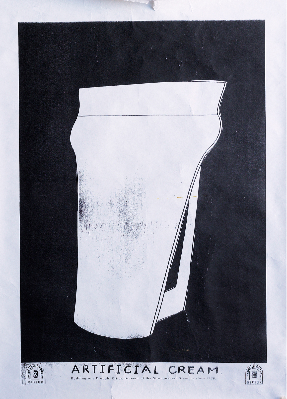
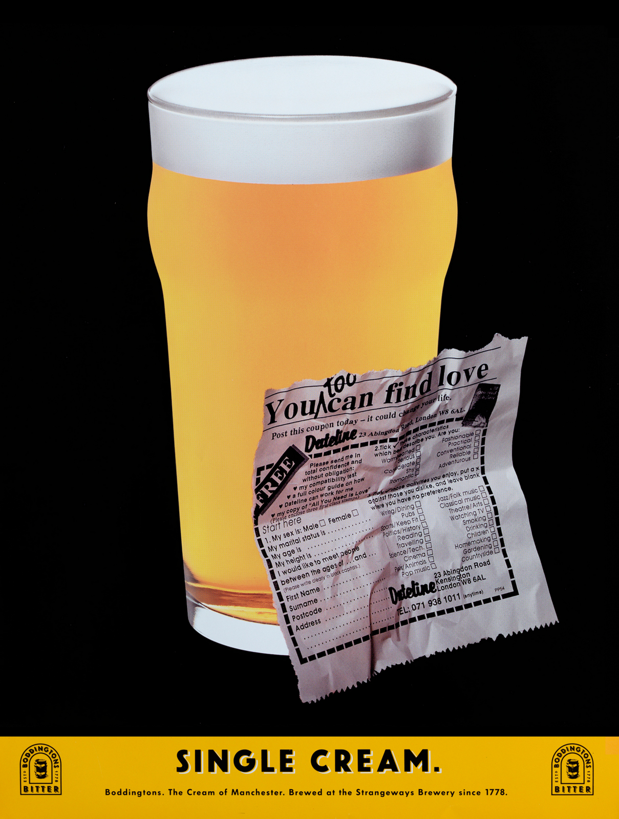
Was it a campaign you admired before you worked on it?TIM:Oh yes. It’s hard to overstate just how radical it was at the time. I don’t think beer had ever been sold that way before – with striking visual metaphors. All the Guinness work with puns on the pint owes a huge debt to Boddington’s, I think.I do have a very dark and guilty secret, though.Several years earlier, when I was working at BMP, we had the John Smiths Bitter account. John Webster had created this loveable Yorkshire character called Arkwright, who was obsessed with his pint of John Smiths.Anyway, one day a young team, Sean and Jim, came into my office with a script they’d written.It described Arkwright’s wife dipping her fingers in a pint, then putting it behind her ears – like perfume.I’m ashamed to say I thought it was a bit off-putting.Beer? Behind your ears? Naah… Of course, it was pretty much the same idea that Boddies would later do in their first, ground-breaking TV campaign.So, if you’re reading this, Sean and Jim, I can only apologise. Did you try to bring your own take to the campaign – Rileyfy it, if you will?TIM: I really liked the way Richard Foster and John Horton moved The Economist campaign on when they took it over from Ron Brown and David Abbott.By that stage, the campaign was well-known enough for them to play with the conventions a bit.They did things like an all-green newspaper ad ('The Economist is full of surprises') and a 96 sheet that was red and blue ('Two thirds of the world is covered by water. The rest is covered by The Economist').So, when I got the Boddington’s brief, I tried to think of ways to do the ads slightly differently.Was your cunning scheme to bring words to the party? TIM: Calling it a scheme is being a bit generous, but yes.Up to that point, the line was always the same – as I guess it had to be when you were establishing the campaign.I just thought the work was well-known enough by that stage for us to be able to stretch things a bit.So when we got the brief for the new print campaign, I just wrote down all the different kinds of cream I could think of, then we thought of visuals that could go with them.We did one ad that didn’t show the beer at all – just a black panel. The headline said: Vanishing Cream.
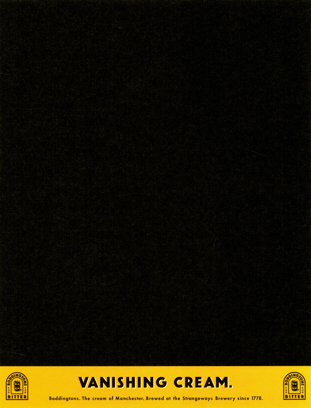
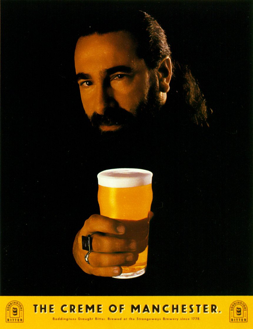
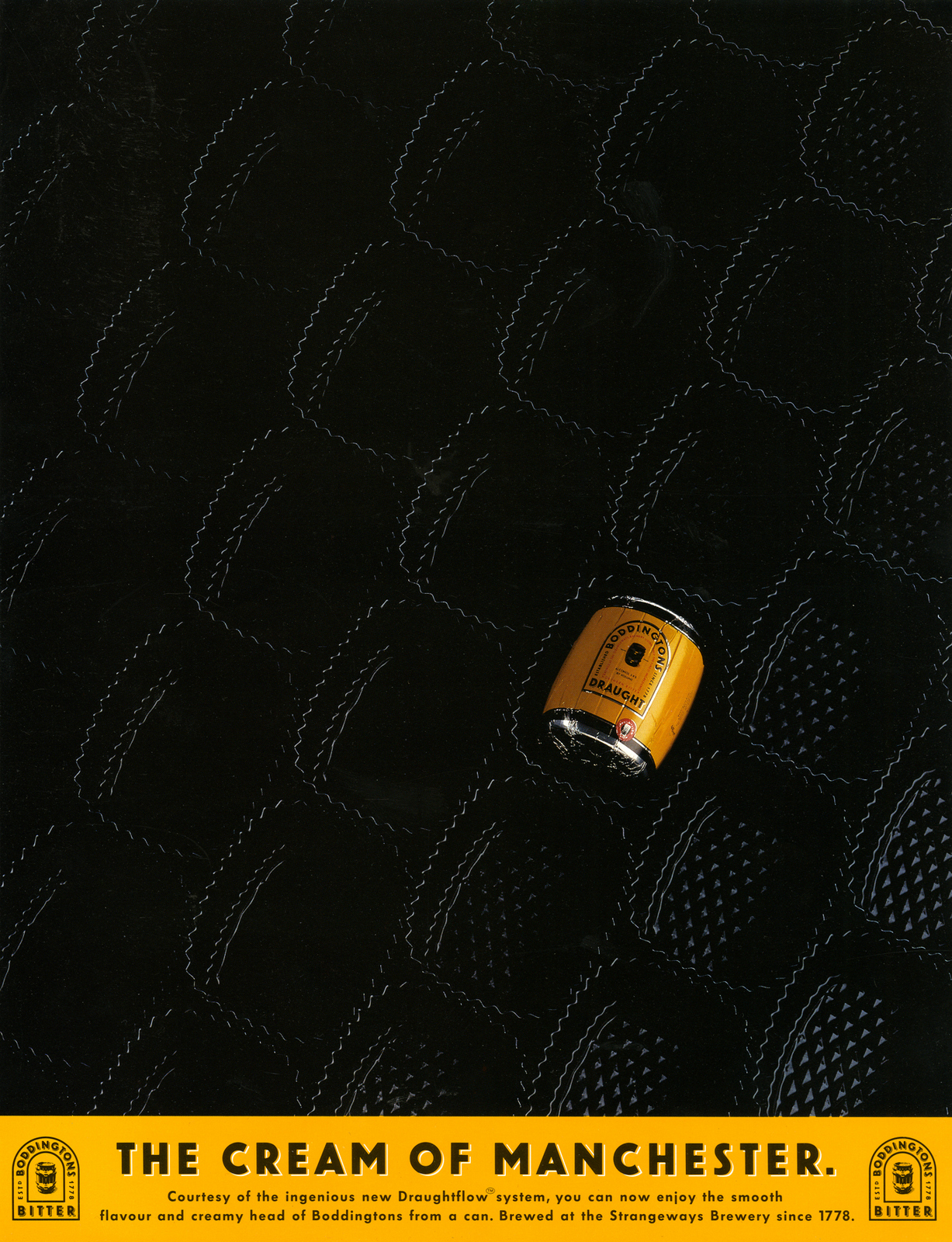
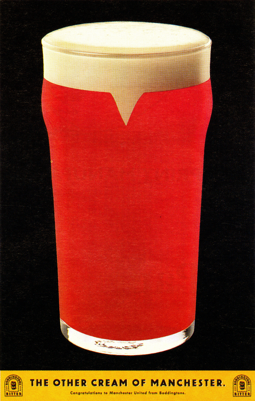
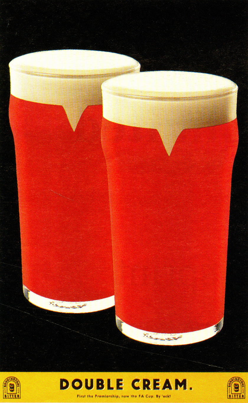
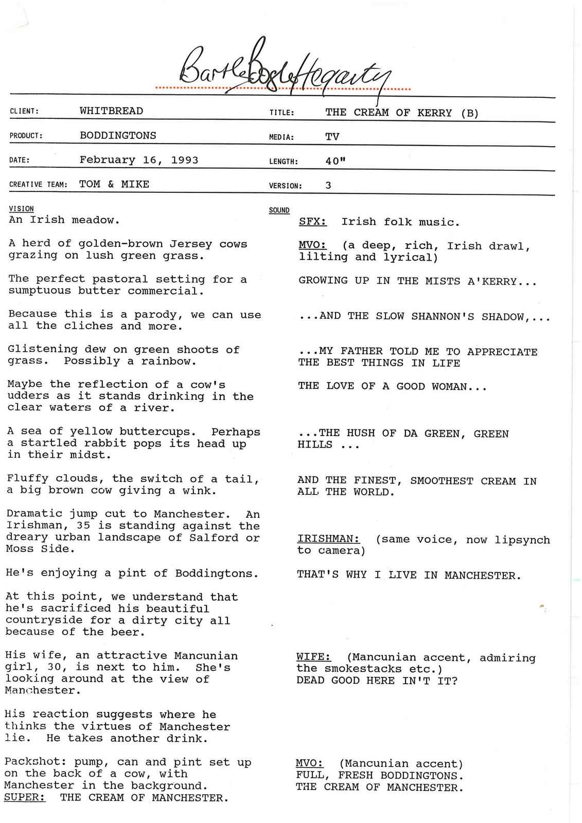
A technical question, on 'Vanishing', were you flipping through the thesaurus looking for words to link to cream or did you think 'it'd be great to do a blank one', then made that work?(People imagine it's the former, but I find it's more often the latter.) TIM: Yes, that’s exactly right.The campaign had such a distinctive look, I thought: What’s the most extreme thing you could do in an execution that would still work as an ad?Could you take the product out completely? That might look interesting.Then I thought: Hang on, if you made the line ‘Vanishing Cream’ that would work.There wasn’t actually a brief for new print work at that point.I think it was my first week or so at BBH and I was keen to get some work out quickly and make a good impression.Also, I wanted to make sure we did them before somebody else did. It was a very talented department!Same with The Man Utd pint ads, they were both spec ads too. As I’m sure everyone will remember, 1993 was the year Man United won their first league title since 1967 - so Mike and I wrote an ad where the pint was red and white, with the line: The Cream of Manchester.But there was a concern within the agency that this might alienate City fans, so it wasn’t presented.Then, the following year, United won the league again, and this time we were allowed to present the ad to the client. Not only did they buy it, they asked us for another ad the following week when United won the FA Cup. So this time the ad showed two red pints with the line: Double Cream.
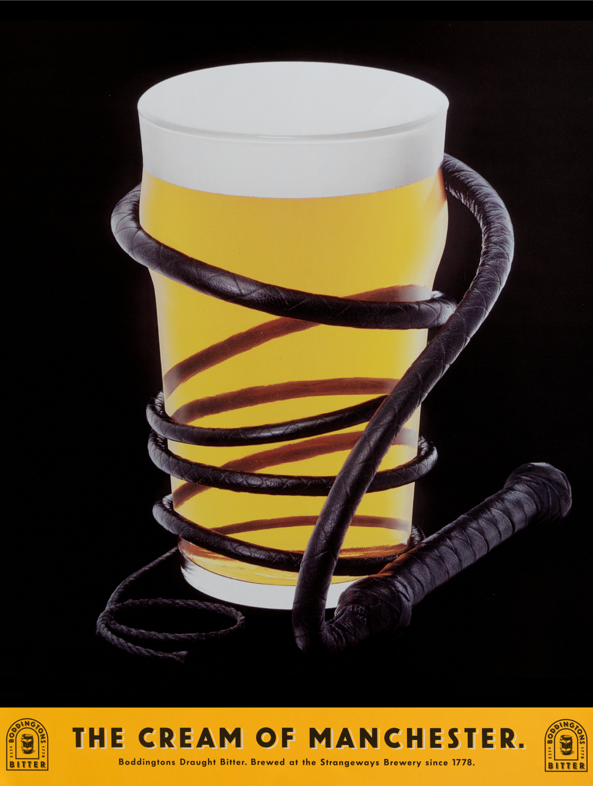
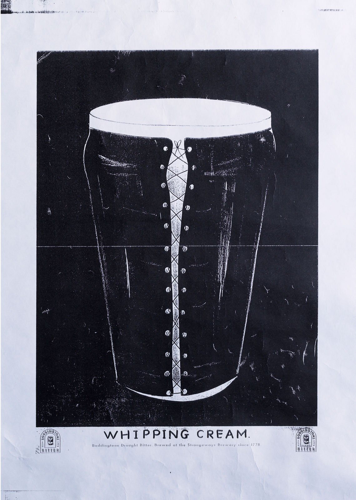
I presume it was one of those campaigns, a bit like The Economist, where it's easy to come up with lots of ideas but hard to come up with a good one.JOHN: True. It’d be the same on Levi’s, we’d write 25 or so scripts before we landed on a good one.With Boddingtons, maybe the ratio was ten to one?TIM:Whether I came up with any good ones is really for others to judge. But in all honesty, it was one of the easiest briefs I ever worked on. It was such a brilliant creative leap by Mike and Tom in the first place, you really couldn’t miss.From memory, every ad we presented to the client was bought. And they all got into D&AD. I felt like a bit of a fraud, really.This brilliant opportunity just fell into my lap. Thank you, Mike and Tom. Were there any good ones that didn’t sell?I can’t remember if the client didn’t buy it, or the powers-that-be wouldn’t present it, but Mike came up with bondage-style execution that showed the pint in a lace-up leather basque with a bullwhip beside it. The headline was: Whipping Cream.It was up on the office wall for about a year.But our strike rate was so good, you couldn’t really complain.A couple of years later, Bruce Crouch and Graham Watson got the TV brief and managed to get a ‘whipping cream’ idea away.
Was John very involved?TIM:Very.

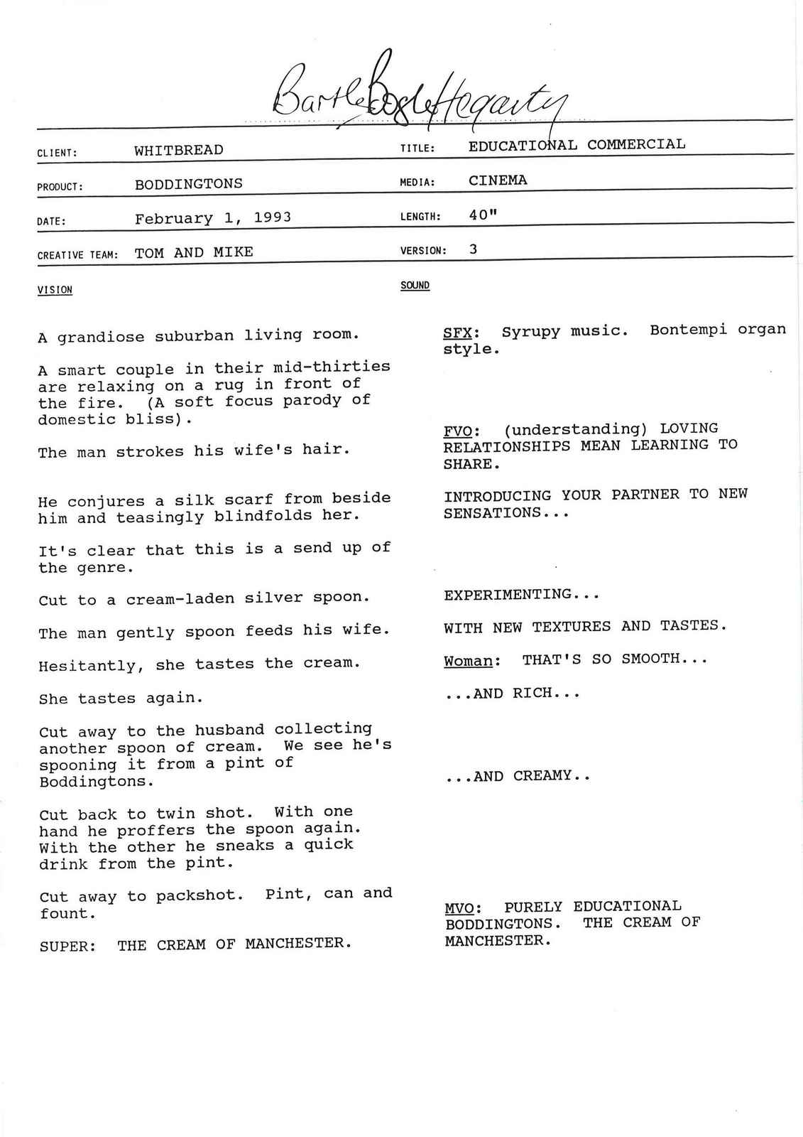
Today, these images would be created using CGI. Would that make them better or worse?GAVIN:In the right hands CGI is an amazingly creative tool.I can’t see why it would lose anything, there are few talented artists using it as a medium who’ve come from a traditional sculpting background.It would allow greater expression in the sculpting of the models, we were limited by casting techniques and the inevitable unforeseen problems that would occur when creating the ‘prototype' objects.Why do the images still look fresh today?TIF: I think they engage with a gentle visual humour, as well as their use of a visual language.Also, the imagery didn’t rely on post production gimmicks or slickness. They look real because they are real. And I think the human eye and brain enjoys that.Plus, a year or two in there was real enjoyment for the audience to work out what the visual pun was this time.Keeping a campaign interesting and cool, for 6 years, without changing the brief, is very rare.I’ve told people in recently about how different the process was back in the 90’s, from conception to execution.I never used to meet the client.The only agency meetings I went to then were with the creatives, in their office over a cup of tea.I never wrote a treatment.On Boddingtons, Mike came to the studio for part of every shoot, but watching three men spoon beer head from a bowl its't super exciting, so he wouldn't hang around.The process of creativity was allowed to flourish by allowing specialists to do what they do best, without interference.It was a very iconic poster and press campaign, why switch to tv?JOHN: Good question. I asked the account guy that, that when he first told me they were going on tv.I said ‘Let’s just buy more posters’.But I guess it was a reach issue?The temptation must've been to not stray too far from the print?TOM:Yes, we did initially have a look at a black and orange animation route, but found our feet with some northern humour and still not a hop in sight.JOHN: A script was sold in that I didn’t like, it was taking the print campaign too literally, I felt we needed to take the essence, the idea, not copy the print.So I had to go up to the client and unsell the scripts.We ended up doing ‘Face Cream’ instead, which was my favourite, as it broke the ground.Was there a huge pile of rejected scripts before John approved one?TOM: Yeah, I still have some.Bear in mind that life was different then – you could still write scripts with women in bikinis and not get cancelled or condemned.Luckily, some of the early scripts never got made!
TOM:Here's the original memo (printed out and dropped on your desk by hand) concerning the ‘communications check’ after the first ad ‘Face Cream’ aired.


TIM:One of the other things I lucked into when I joined BBH was a fully approved script for the second TV spot.It was a parody of a famous Cornetto ice cream ad set on the Grand Canal in Venice.
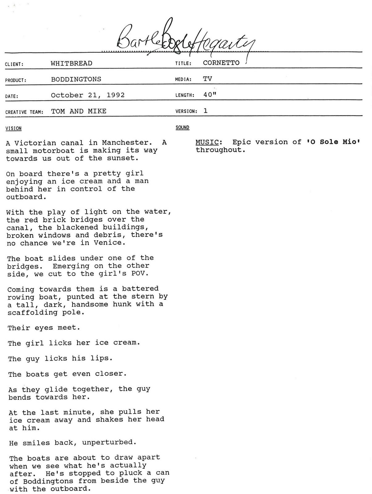
TIM: I think it was the first TV appearance for Anna Chancellor, who became world famous a year later as Duckface in Four Weddings and a Funeral.I remember her getting on well with the camera operator on the shoot, Nigel Willoughby. So well, in fact, that they ended up getting married.In a classic creative team move, we told John we thought we should go to Venice to shoot the ad.John was having none of it. The idea is they’re in Manchester, he said, so that’s where you have to shoot it. He was right, of course.He also insisted that we use an old recording of Enrico Caruso singing O Sole Mio as the soundtrack. Mike and I weren’t sure at first, but, once again, John was right.The producer, Kate O’Mulloy, had the brilliant idea of sending the script to Jeff Stark, who had just started directing.Not only did he make the ad look great, he also added a couple of lines of funny dialogue that lifted the whole thing.How did you turn Manchester into Venice?JEFF:We had to use lots of lights as it wasn’t sunny, we also shot really tight at first so that the bridges looked Venetian – or just about.When then we pull back in the ad to reveal it’s not Venice but Manchester, you see factories and smoke stacks and there’s some bloke fishing and a couple walking along the towpath, one pushing a shopping trolley, which is something that you won’t see in La Serenissima. Of course, Manchester’s very different now.We also used a scratchy recording of O Sole Mio to spoof the Cornetto ad that was popular at the time.What was improvised on the day?JEFF: I told Anna to drink the beer like a man and then wipe the froth from her mouth as she sat in the gondola. When she did, the lipstick smeared up her cheek. The makeup woman rushed over and said: ‘You can’t do that!’ But I said: ‘Hang on! That’s really funny.'
Why did the campaign stop?JOHN:It got sold.Whitbread sold it to some lot who just didn't care, they under invested and let it rot.It's a real shame, this country isn't very good at looking after its brands.The brewery is a car park today.N.b.As proof to how smitten I was with the campaign at the time, here's a spoof of it I did with Tony Barry on behalf of The Guardian whilst at Leagas Delaney.

‘I’ve just done a Volvo ad with no car in it, it doesn’t get any better than that!’Those were the first I heard on day one at AMV/BBDO.It was the Art Director's way of saying 'it’s good here'.I appreciated the intent, but thought it was weird.Who cares if the ad has a car in it? Is it a good ad?But that's how a certain group of creatives think.For them wins are - running an ad word-free, securing hot director X to shoot their ad, getting the word 'dick' approved in a headline, keeping a logo as small as it was on the initial rough, and yes, whether they can avoid showing the product.Those kind of things can be helpful, but they shouldn't be the goal.But, to them, they're just doing their job, which they see as being creative.Innovating.Breaking rules.Going crazy.‘Fucking around with shit’.Being lead by what's new, different and of course, their own instincts.Clients are viewed as obstacles.Research is for dullards.They often create interesting work, but not much of it runs.Why? ‘The client bottled it!’ or ‘The agency rolled over'.Maybe if they were called 'Communicators' rather than 'Creatives' they wouldn't feel the need to appear so damned creative all the time?Instead of spending all their waking hours with their noses in Japanese animation, Dutch deconstructed typography or surrealist photography, maybe they'd offset if with subjects linked to communication?Rather than just look forward, maybe they'd look back at what worked, what didn’t and why?Maybe they'd ask people outside the creative department what they thought?Maybe they'd see data, psychology and research as helpful?There are people in creative departments like this, I've worked with them - Tom & Walter, Rich & Andy, David Abbott and John Webster to name but a few.This second group tend to do better work than the first group.But if the first group feels more like your gang, here's a trailer by South Korean animator Seunghee Kim for her film 'The Realm of Deepest Knowing'. Enjoy.
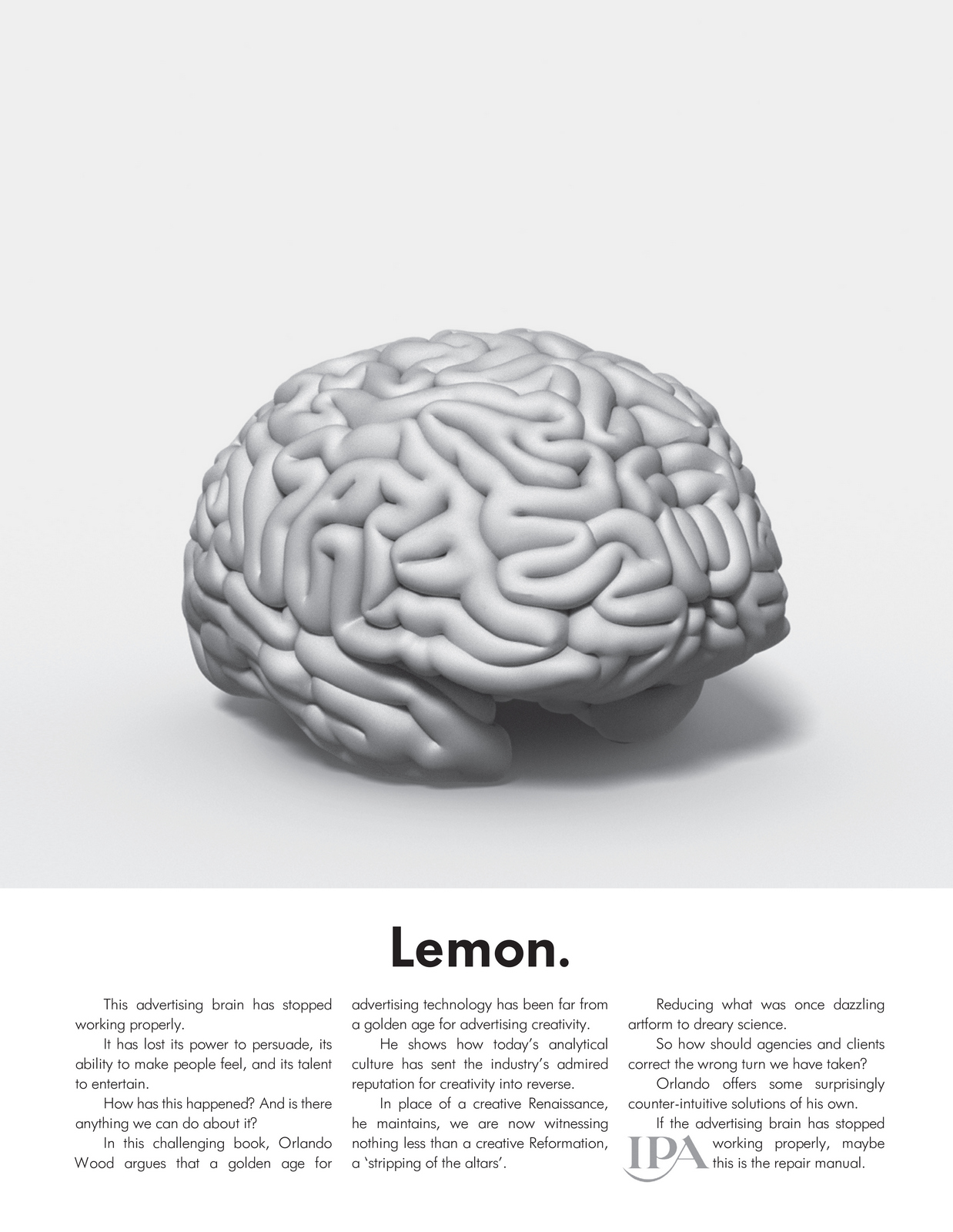
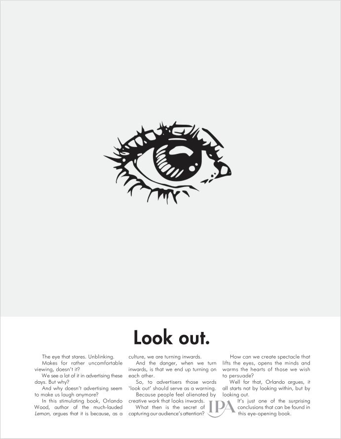
If second lot is more you, you may enjoy this chat with Orlando Wood.He's the Chief Innovation Officer at System1, where he forensically observes links between advertising, psychology and the creative arts.We chat about his findings on what's working, not working and why (which have been published with the IPA in two volumes; 'Lemon' and 'Look Out').Hope it's useful.
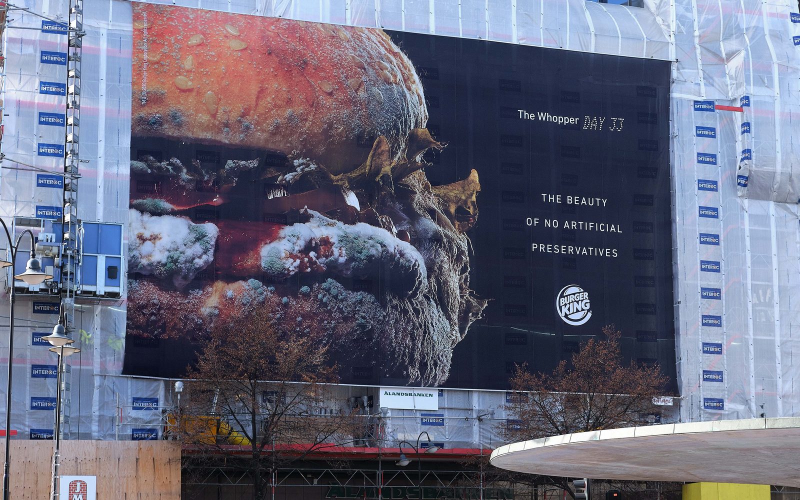
N.B.Here's a few of the things we refer to in our chat.This chart.
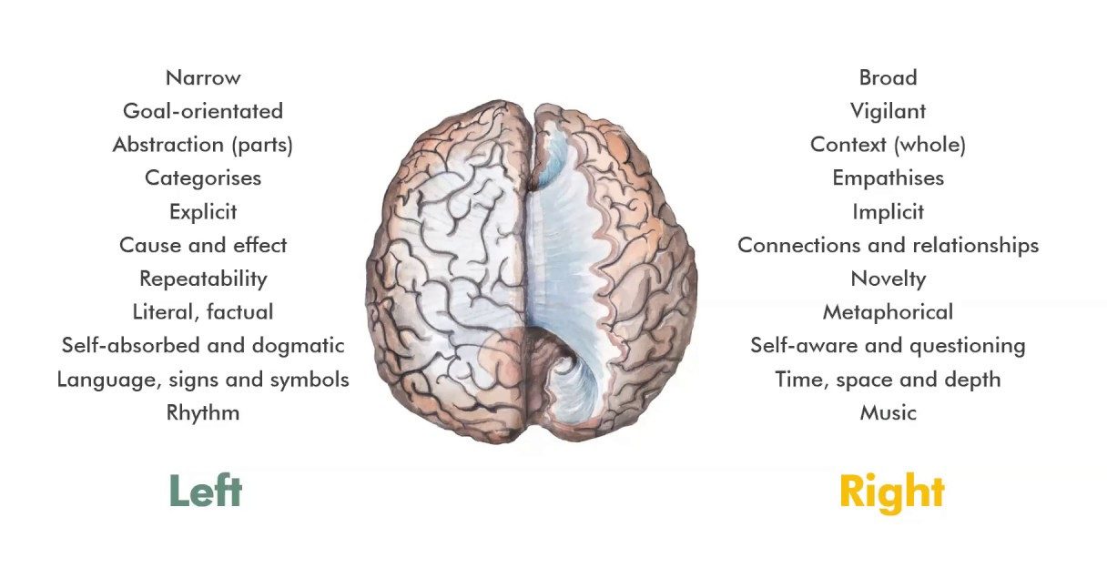
Ads that Orlando found ‘disrupted and got noticed by the industry but didn't connect with the public'.a) Burger King.
b) Bodyform.
A current ad for people searching for something (without a story).
An old ad for people searching for something (with a story).
An ad that is purely trying to entertain.
A performer picked to his turn' on behalf of a brand.
ACCIDENTS.In a left brain dominated environment everything has to be pre-planned and buttoned down, reducing the chances of improving and evolving an idea.In a right brain world the the unplanned can be turned into gold.(Literally in some cases.)In 1961 the Director of a Dulux ad brings his dog to the shoot, it accidentally walks onto set and into history.(It's still it's brand icon today.)
A prop leaf falls from a prop tree, leading to a script rewrite.
A robot falls over, it's kept in and becomes the best bit of the ad.
The star suggests an old music hall gag - looking at his watch and pouring a drink in someone's lap.It becomes the campaign.
The star won't stand still, she needs a loo break. (Admittedly, people would go to jail for this now,. but it added charm back then.)
MODERN BRANDS DOING YE OLDE FASHIONED THINGS.a) Having a long running theme.
b) Using a character.(And having a long-running theme).
c) Localising work.U.S.
U.K.
d) Using an easy to understand moral to a story.(If you want a proper cup of tea you should drink Yorkshire Tea.)
TO READ MORE ORLANDO, CHECK OUT THESE.(Available from Amazon.)

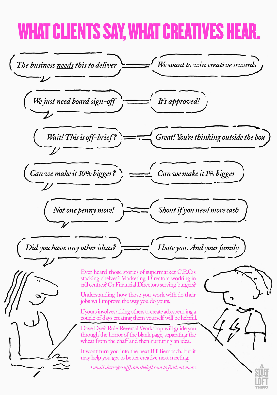
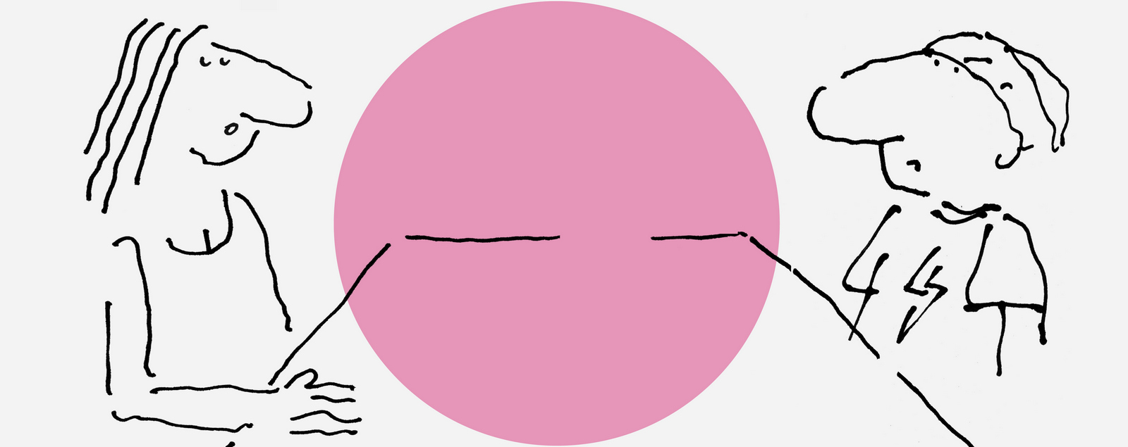
Last year I wrote a post about working on Milky Bars (https://davedye.com/2021/11/30/the-milky-bar-adult/).The intro stayed with me;"Is there another industry with a bigger disconnect between supply and demand?One side continually supplying what the other side won’t buy.“We serve them smoked salmon, they ask for fish paste” was how copywriter Malcolm Gluck described the situation.Marketing Directors may describe it as ‘We ask for smoked salmon, they serve us fish paste’.Regardless of who’s right or wrong, why the disconnect?Why are their criteria for judging creative work so different?Put clients and agencies in the same room to agree on what makes good advertising and they’ll be agreeing and high fiving in no time.Lob a piece of creative work and you’ll see the two sides separate like oil and water.It’s not just the subjective nature of the business, if it was it would be harder to predict which side of the table will be pushing for what.It’s like one side are shopping for apples, the other oranges.I’ve spent the first half of my career arguing the case for apples and the second half trying to understand this addiction to oranges whilst explaining the benefits of apples."It got me thinking - maybe the crossed wires are caused by not fully understanding what the other side of the table actually do.Sure, they know the job titles and the tasks, but not what it's like to do them.So this summer I'm going to run a few Role Reversal Workshops.The idea is that the people commissioning the ads spend a couple of days creating them.From brief to finished ad.To better understand what creatives actually do once they've been handed a brief.Some panic, some get excited, but few ignore the brief.Generally, the process goes like this:Try your damnedest to make sense of that brief.Try to think of your own experiences of product or category.Try to find relevant references.Try to edit down your ideas. (Some call this 'Killing your babies'.)Try to simplify them.Try to polish.Reading that list is one thing, doing it is another.If you'd like to find out more, email me on dave@stufffromtheloft.com
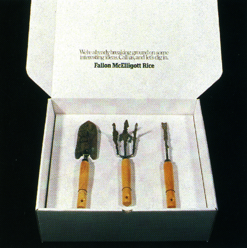
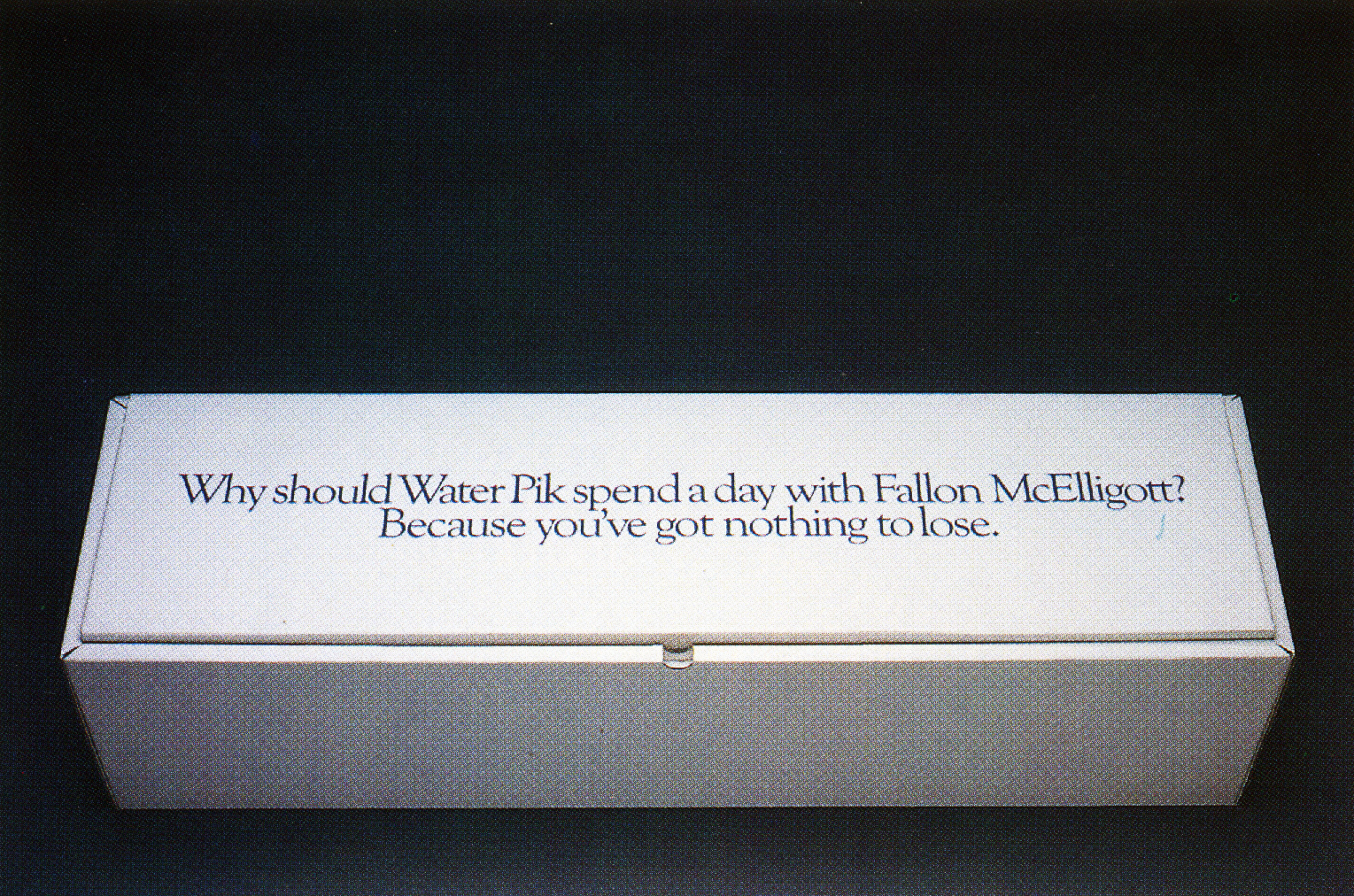
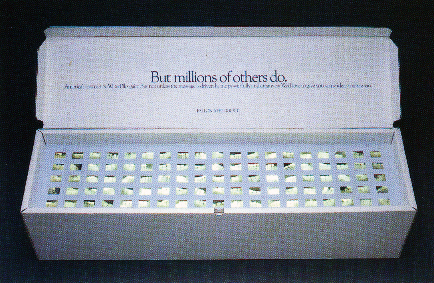
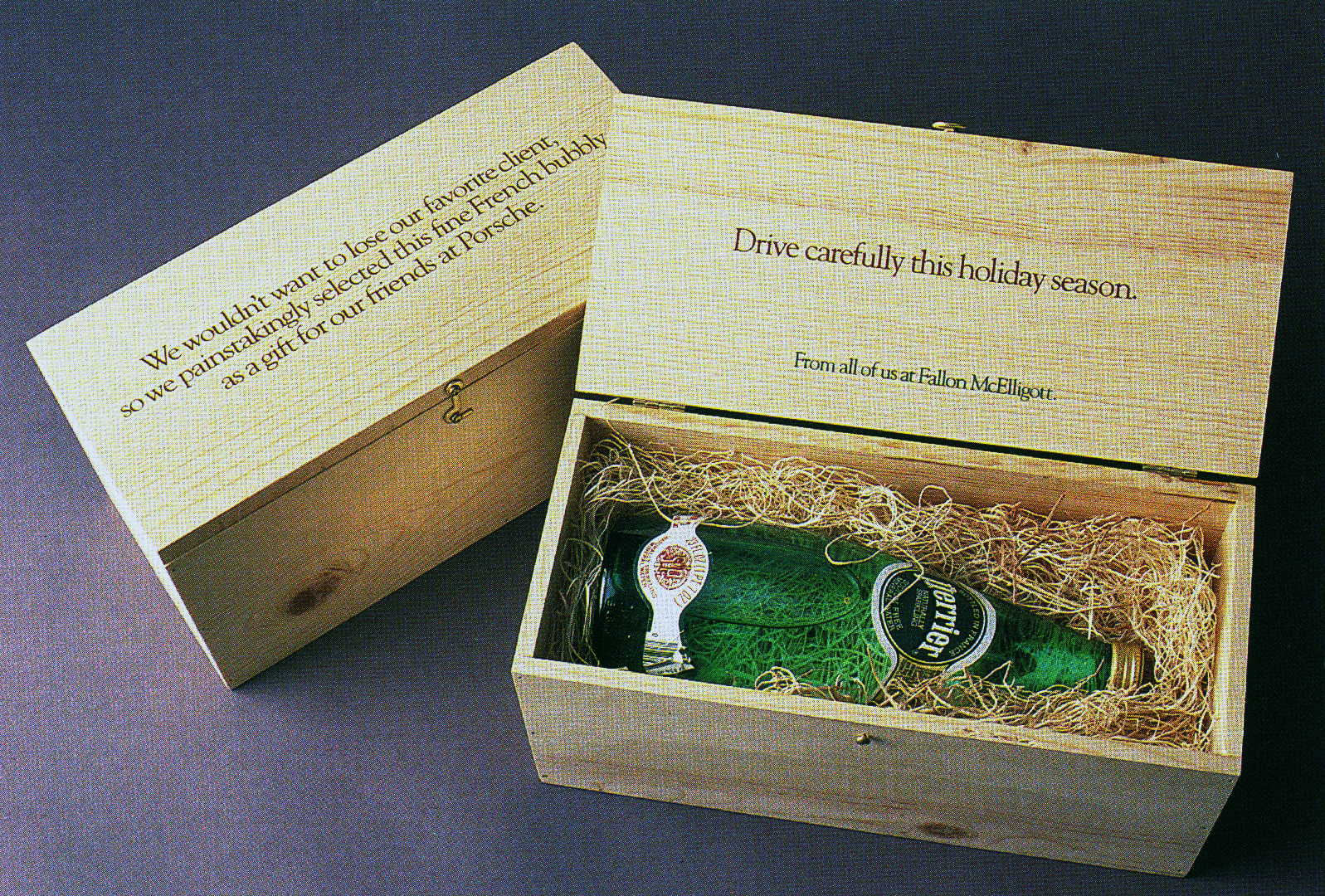
How did you end up at Fallon McElligott Bruce?I got there very early, but I suspect I came close to being there from the beginning.I had met Tom McElligott at the University of Minnesota when he spoke to an advertising class I took.He was at the creative agency Bozell and Jacobs and asked me to come back and interview a couple of times.I got impatient with student loans to be paid that I took a job at a not-so-great agency.Then, bam, a couple weeks later the iconic “Outsmart” Fallon McElligott Rice manifesto ad appeared in the Minneapolis Star Tribune.
(Oh, how I miss full page newspaper ads.)Tom knew he was opening the agency when he was interviewing me at B&J and I always suspected he was looking for a decent cheap copywriter.And I was cheap!I think my uber talented friend Jarl Olsen filled that role at the beginning.Then I moved to another strong creative agency called Duffy, Knutson and Oberpriller where I had a chance to partner with the great designer (then, actually, an art director) Joe Duffy and study copywriting under a great and vastly underappreciated writer and creative director named Gary Knutson.With Joe and Gary, I was able to write those beautiful two-thousand-word long copy ads for some upscale menswear clients we had, which Joe made look absolutely stunning with beautiful illustrations.They still hold up.DKO was also where I met a future Fallon creative partner, the brilliant art director Tom Lichtenheld.Then, after a year or so, Joe was invited by his old college friend Pat Fallon to open a graphic design agency -Duffy Design- that would be aligned with Fallon McElligott Rice.I was the first person Joe hired: Me, a writer, because Joe wanted to create design work that was as conceptual as it was graphic.But there was a handshake agreement with Tom McElligott and Joe that I could move over to the agency after a year, when Duffy was established.And, man, did it get established.Just a legendary design agency that gave birth to so many greats.But FMR was still a new agency.If I remember correctly, I was employee number twenty-nine.And I knew how fortunate I was to land there.I like to say it was like I was invited to join The Beatles.So what was it like presenting work to Tom?Of course, Tom was a brilliant writer but also an incredibly shy and, well, socially awkward man.He wouldn’t say much, but what he did say mattered.He had high standards about all the right things. I’m sure you’ve heard of his idiosyncrasies.If he was undecided about a couple of ideas, he’d rub the back of his neck, nervously. At least you knew you were close.One thing that always stuck with me with Tom was his fearlessness.The first commercial I shot at FMR was low, low budget. It was shot on ¾” videotape by a cheap production house in Minneapolis.But, damn, if Tom didn’t insist on me using a great, national voiceover.It made this cheap spot feel rich. I took that boldness with me through my entire career.It's also important to note that by the time I got there, Tom wasn’t around long.I remember I was at a TV shoot for Timex watches in London with my creative partner Houman Pirdivari. (We actually shot a lot of comedy in London at that time with directors like Roger Woodburn and Paul Weiland because the more subtle British approach to humor was more in line with FMR’s sensibilities.) Quite unexpectedly, Tom showed up briefly at a pre-pro meeting before disappearing.Then, weeks later, he disappeared from the agency.Of course, Nancy Rice never gets the credit she deserved. She was an art director with a keen sense of what made great, great. Nancy’s opinion really mattered.As did the opinion of all the other giants at Fallon: Dean Hanson, Bob Barrie, Luke Sullivan, Mike Lescarbeau, and on and on.
The agency probably had a more award-wining clients at that point than any - were Porsche briefs the most coveted?Obviously, Porsche was a very sexy brand. But we were doing great work for every brand -even the stodgy Wall Street Journal- so I don’t remember it being that much more coveted than others.Every account offered the potential to do something amazing. Personally, I started at Fallon by working on these wonderful long copy ads for the iconic New York department store Bloomingdales.At first, I ghost wrote body copy for McElligott’s headlines and then took over and wrote all the ads.My good friend Mark Johnson was the (very tasteful) art director, and he also was the lead art director on Porsche.John Jay was our client -talk about tasteful- well before he went to Weiden and Kennedy as his background was in design and fashion.You could run those ads in the New York Times today and they’d hold up.

Porsche’s small ads were better than other cars big ads.Did the senior creatives work on the tiny ads as well as the big stuff?Good question.Remember I was very young in the late 80’s (and would like to believe I still am.)Tom McElligott and Mark Johnson created the beginnings of the campaign: Big spreads and then some TV.Mark had worked on some of the iconic BMW work at Ammariti and Puris, and he brought that sensibility and impeccable eye.He also brought the great photographer Jeff Zwart, who he had met on BMW and gave him his first shot at TV.Tom, although a very bookish guy, was fanatical about cars and Porsche.After Tom left, a more senior writer than I named John Stingley took over on the big national ads.And I and another writer named George Gier did the dealer ads, although I had the chance to write so many of them.Legendary creatives Bob Barrie, Tom Lichtenheld and Bob Brihn were the art directors. (My sincerest apologies if I missed anyone.)That was back when automakers created “dealer kits”: A book full of small space newspaper ads that they could add their name to and run in local media. Porsche wanted to give their dealers choices, so it was a great creative opportunity.We just dug in and killed it on every ad. Literally, we’d write dozens of ads in a sitting, and then ruthlessly edited ourselves.Speaking of “dealer kits”, my father was a minor partner in a small-town VW dealer during the Beetle glory years.On some Saturdays he’d take me to work, and I’d hang out in his little office while he worked on the sales floor.To keep me occupied he’d let me page through the dealer kit.It was the early 70’s so those were still the Doyle Dane Bernbach glory years.They left quite an impression on my very young brain.
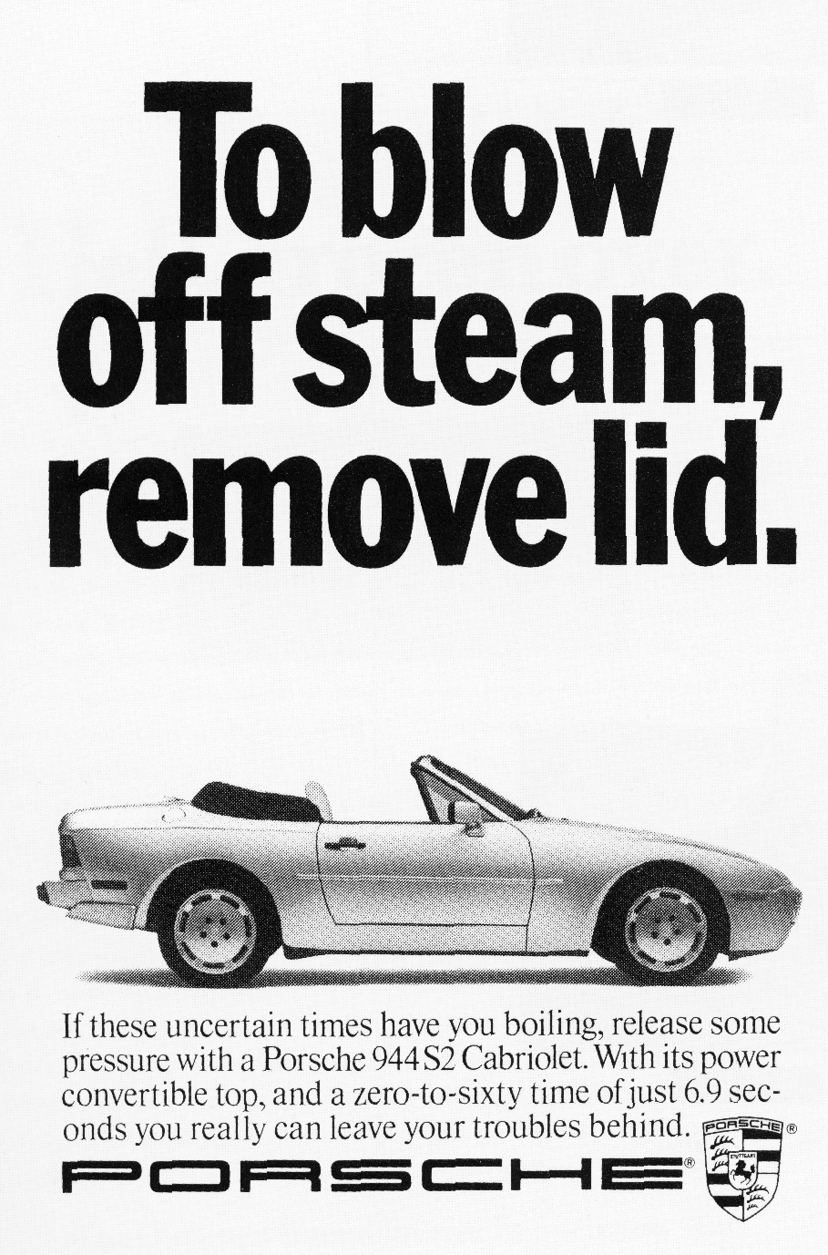
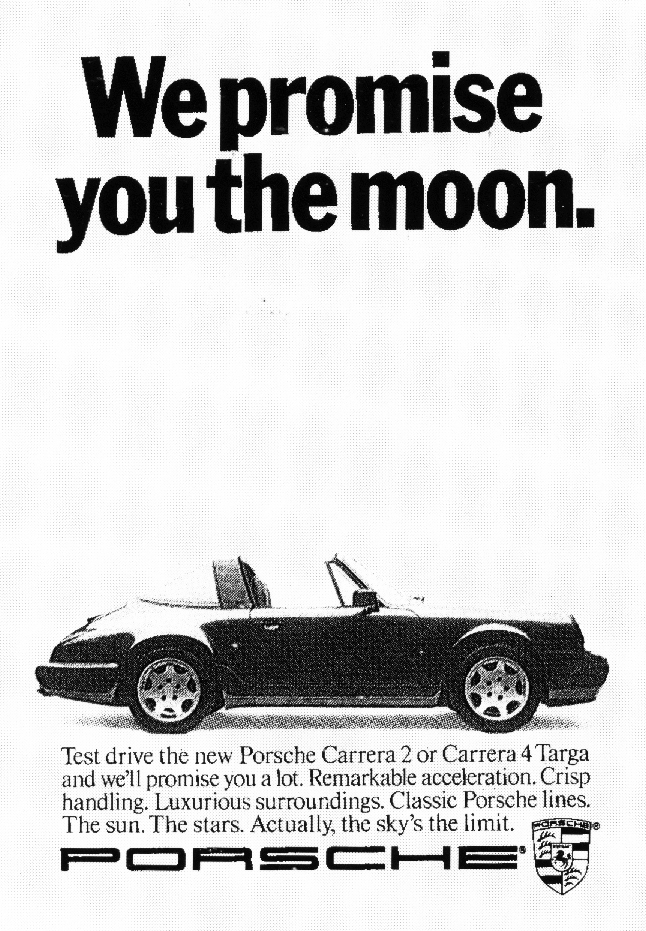
What’s the difference between writing for a premium brand like Porsche and writing for a mass brand?I’ve written for a lot of premium brands: BMW, Nikon, Bloomingdales, high end spirits, menswear brands.And I always preferred them. I felt like the audience was more sophisticated so your language could be a bit more elevated and the ideas more intelligent. They also tend to be passion brands, instead of commodities, and that always makes things more interesting.There’s something deeper emotionally and often history that you can tap into.That’s just much more interesting to me than a laundry detergent.
Many premium brands avoid humorous, feeling it cheapens a brand, you embraced it, why?I’d actually call our brand of writing wit, instead of humor. And that’s an important distinction.There would be a sophisticated wink, the work was deliberately clever and smart instead of jokey.I think when premium brands do go for more broad humor it does cheapen the brand.I actually worked on BMW much longer than Porsche -twelve versus three or four years- so I felt even closer to BMW and have always driven their cars.When other agencies would get the BMW account and start doing humor it just made me cringe.One of my art directors on BMW, Tom Lichtenheld, actually wrote one of the best billboards ever for BMW.It was for the high-end 6-series and the line was three letters: U.O.U. Brilliant. It was wit, not a joke.
Can you remember any lines you loved that didn’t go through?Damn, I wish I could.I remember us having a pretty high sell rate because we edited ourselves profusely.There’s a fake Porsche ad that someone must have written for a dealer to win an award.The headline was: “Small penis? Have we got a car for you.” I never would have shown the client something like that.That’s too cheap and easy. And I had way too much respect for the brand and my client -Jim McDowell- who ultimately became my BMW client and championed BMW Films.

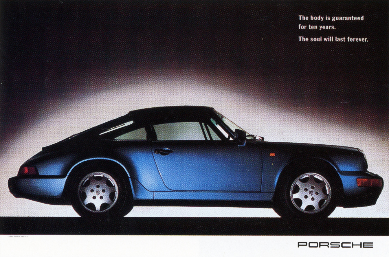
Most of the big, fancy Porsche ads showed the car flying along and talked about the exhilaration of the drive, but some of my favourites were the absolutely static looking ads where the car was shown like a sculpture and talked about it as being parked in your mind or a museum.Why the shift?The big color spreads Mark art directed were a mix of studio and moving shots: All stunning.The small dealer ads begged for the simplicity of a static photo. It was “here I am and this headline is the proposition”.But later, my partner Tom Lichtenheld and I had the opportunity to do a full-color magazine spread campaign for most international markets outside of the UK and Germany. (The UK and Deutschland had brilliant creative agencies in Leagas Delaney and Jung Von Matt.)Tom and I wanted to do something a bit different with gorgeous studio shots, small headlines and less copy.We wanted them all to feel like a print you’d frame, rather than an ad.We actually borrowed one or two photos that Leagas had taken (we collaborated closely with Leagas and JvM and Porsche owned the images, after all).And then a wickedly talented young Minneapolis photographer named Shawn Michenzi perfectly mimicked the style on the remainder of the ads to fit our smaller budget. I think there’s something more powerful about a studio shot.The car is like a predator about to pounce.In fact, when I led the Cadillac account at Fallon a decade ago, we did the same thing. Elegant static car shots and powerful, well-crafted headlines. (One showed a monster of a high-performance car -a CTS-V- with its door open, revealing an elegant interior. The headline, written by Duffy Patten, was “A china shop in a bull.” That could’ve been a Porsche ad.)
Did you feel in competition with the other handful of writers writing Porsche ads?Oh, God yes. But only in the best way.What made Fallon such a special place is that we all competed yet, at the same time, all strove to make each other’s work better.We may have competed on some level, but we wanted the agency to succeed above all.It’s a key to a creative culture that I still cultivate with my teams today.Some CD’s believe in pitting creatives against each other. I steadfastly do not. What’s the best Porsche ad you’ve written and why?Man, that’s a tough one. I think it was one of the international spreads I did with Tom.It was a photo of 911 Turbo with the line “Product Benefits: Too fast. Doesn’t blend in. People will talk.”

The one that keeps getting shared on Instagram by Porsche and car fanatics is “Honestly now, did you spend your youth dreaming about someday owning a Nissan or a Mitsubishi?”
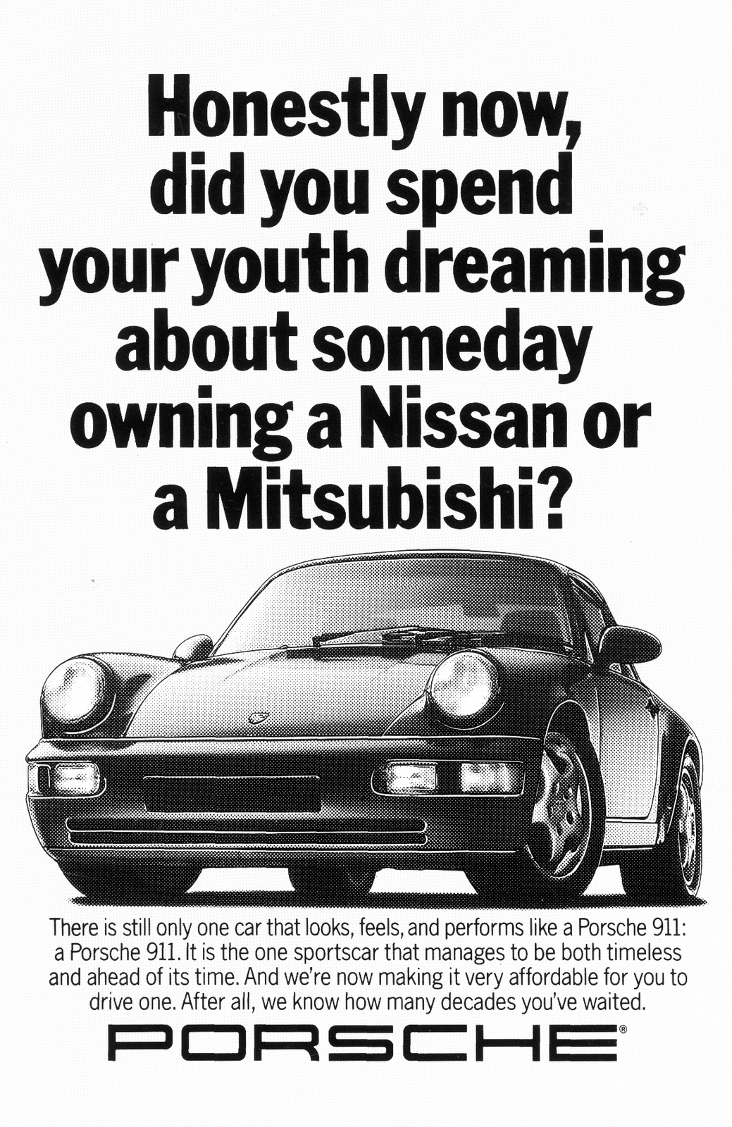
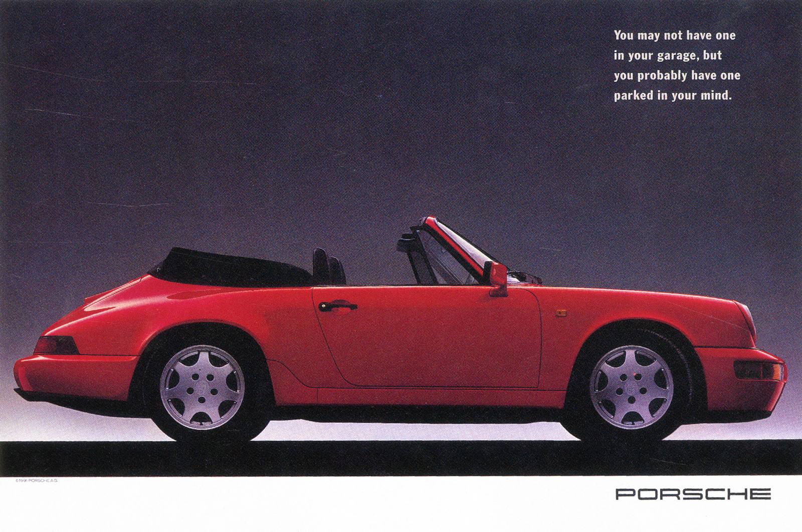
Besides relating to me personally (damn, I guess I’ve still never owned a Porsche) it came out of an experience I had while working on the account.I was invited to visit Weissach, the hallowed ground outside of Stuttgart where Porsche’s test track and main research center is located.I drove in past security with Fred Senn, one of the founding partners of Fallon and an excellent account director.It was the lunch hour and there was a new Mitsubishi 3000 GT parked out front.It was crawling with very German engineers in lab coats: Under the hood, in the driver’s seat, underneath it.It looked like a commercial, honestly. The car had just come out and with its massive performance numbers it was a formidable competitor.But then again, it wasn’t.But I had the opportunity to write so many.Again, I was lucky to land at such a magical place at such a special time and work on such an iconic brand.What’s the best Porsche ad someone else has written and why?Without a doubt, “It’s like children. You can’t understand until you’ve had one.”
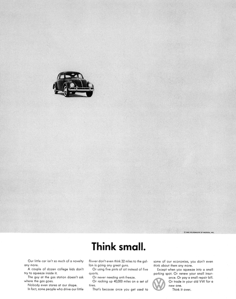
What’s the best ad for a car you’ve ever seen?Doyle Dane Bernbach’s “Think small.”
Which writer has had the most influence on your work?I can’t choose one, honestly.The entire early DDB crew because they changed everything… and the trailblazing DDB women.Then Tom and David Abbott and Tim Delaney.Obvious choices, I know, but still. I always admired that intelligent, observational, subversively clever school of writing.What did you learn from Tom McElligott?Again, I spent a lot more time being influenced by Pat Burnham and all of the other brilliant creatives at Fallon because Tom left so early.I was at Fallon for twenty-five years, after all. But I think the thing I took away from Tom, other than intelligence and craft, was fearlessness.The way he, Pat and Nancy (and Fred and Irv) started an agency in Minneapolis and just took on the world.The fact that he insisted I use one of the best voiceovers in the country on my cheap, video-taped commercial was imprinted on me.That same boldness and fearlessness led to the kind of talent we attracted to BMW Films. David Fincher, Ridley and Tony Scott: Why the hell not call them?What single tip would you give a young copywriter working on an up-market brand for the first time.Dig deep and then go deeper.Interrogate the product.Know it’s history, precisely how it is made, why people are so damn passionate about it.Because if people aren’t passionate about it, it really doesn’t deserve to be an up-market brand.Your mission is to make it feel like it’s worth even more, no matter how expensive it is.
 STEP 3: A NEW MANIFESTO.
'We've got to tell people the plot's changed'.
With Mark's thorough briefing over, he asks me to write up a new manifesto.
I do.
It ends up sounding like something Nigel Farage might have written.
I guess if you're going to start shouting about why Britain's better than everywhere else, xenophobia comes as standard.
(Note to geeks - I love the copy split between pages, I don't know whether Paul made that happen or it was a happy accident, but it's great.)
STEP 3: A NEW MANIFESTO.
'We've got to tell people the plot's changed'.
With Mark's thorough briefing over, he asks me to write up a new manifesto.
I do.
It ends up sounding like something Nigel Farage might have written.
I guess if you're going to start shouting about why Britain's better than everywhere else, xenophobia comes as standard.
(Note to geeks - I love the copy split between pages, I don't know whether Paul made that happen or it was a happy accident, but it's great.)
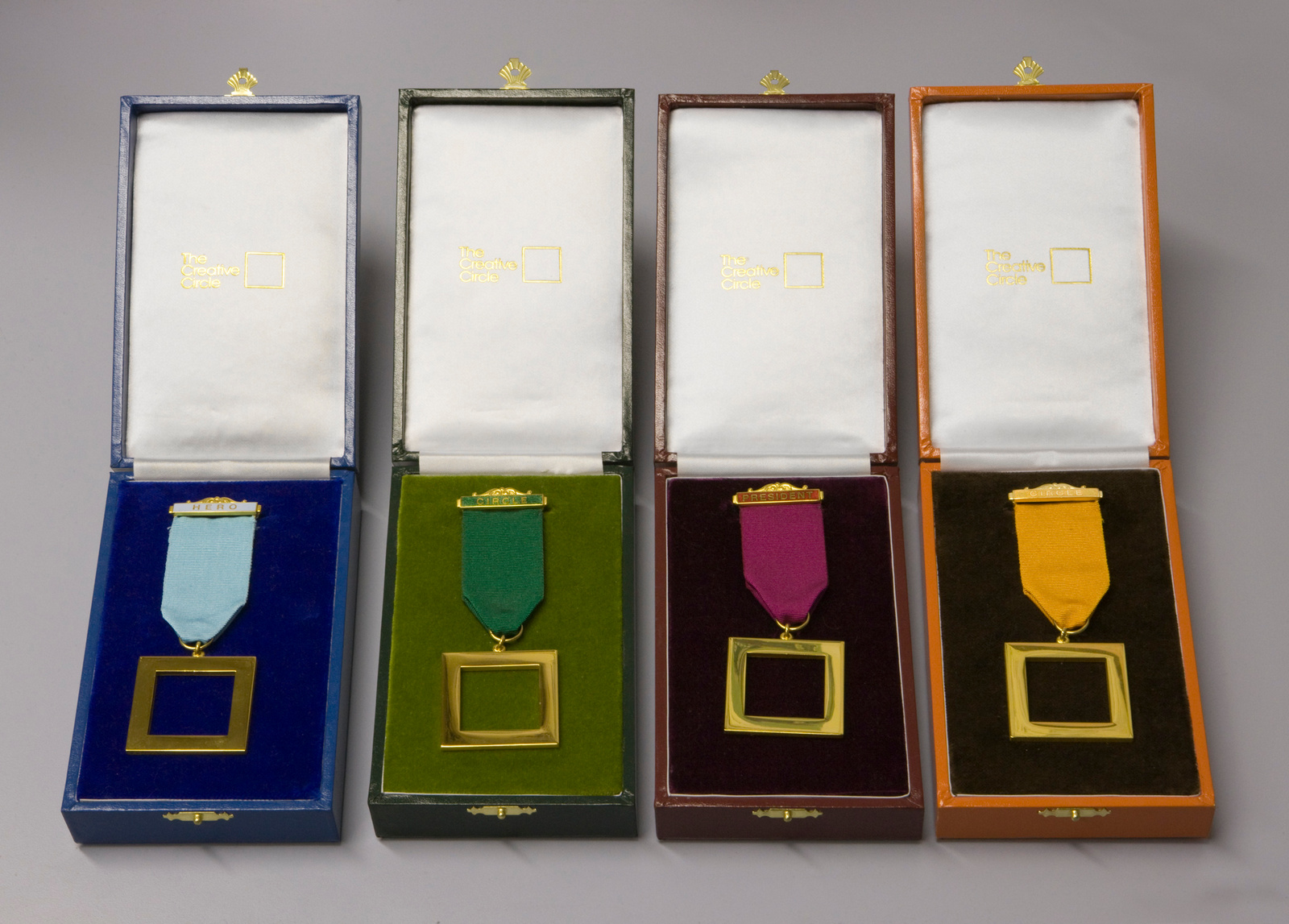
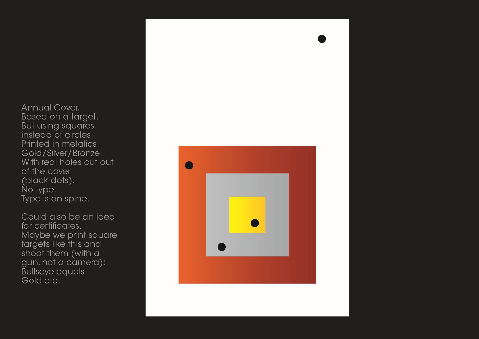
 STEP 4: A NEW AWARD.
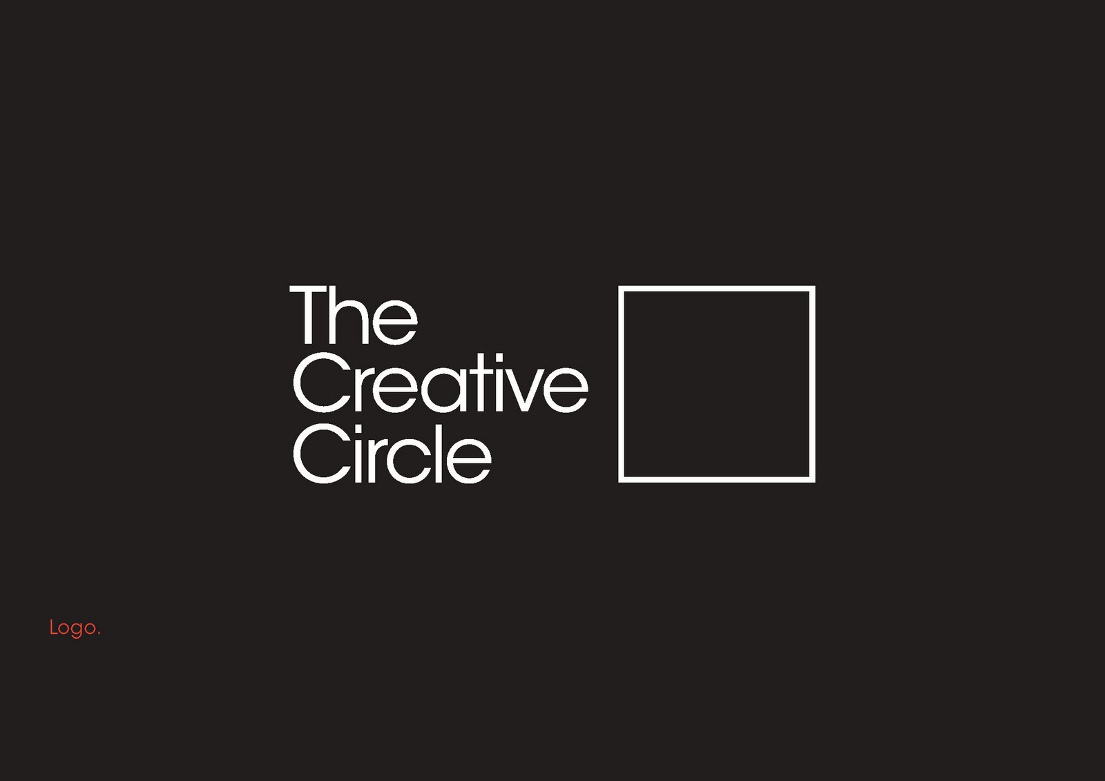
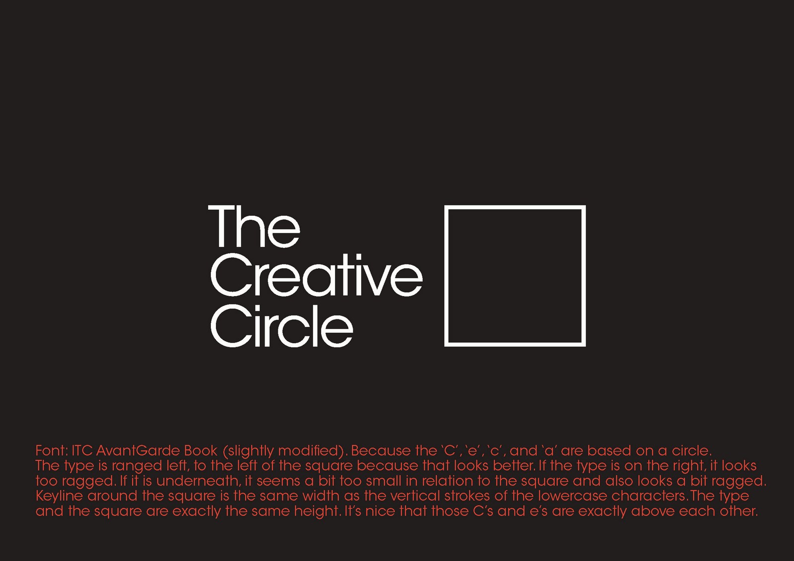
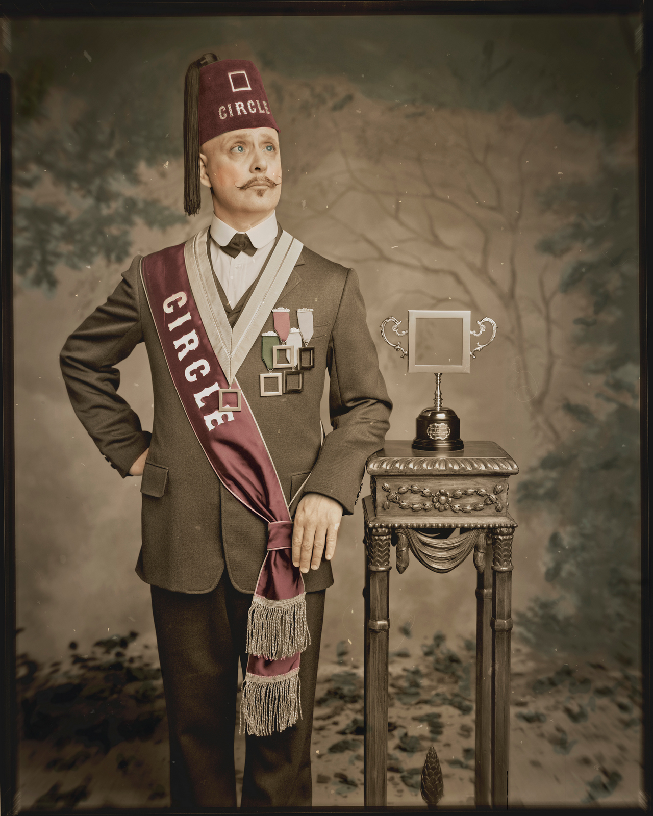
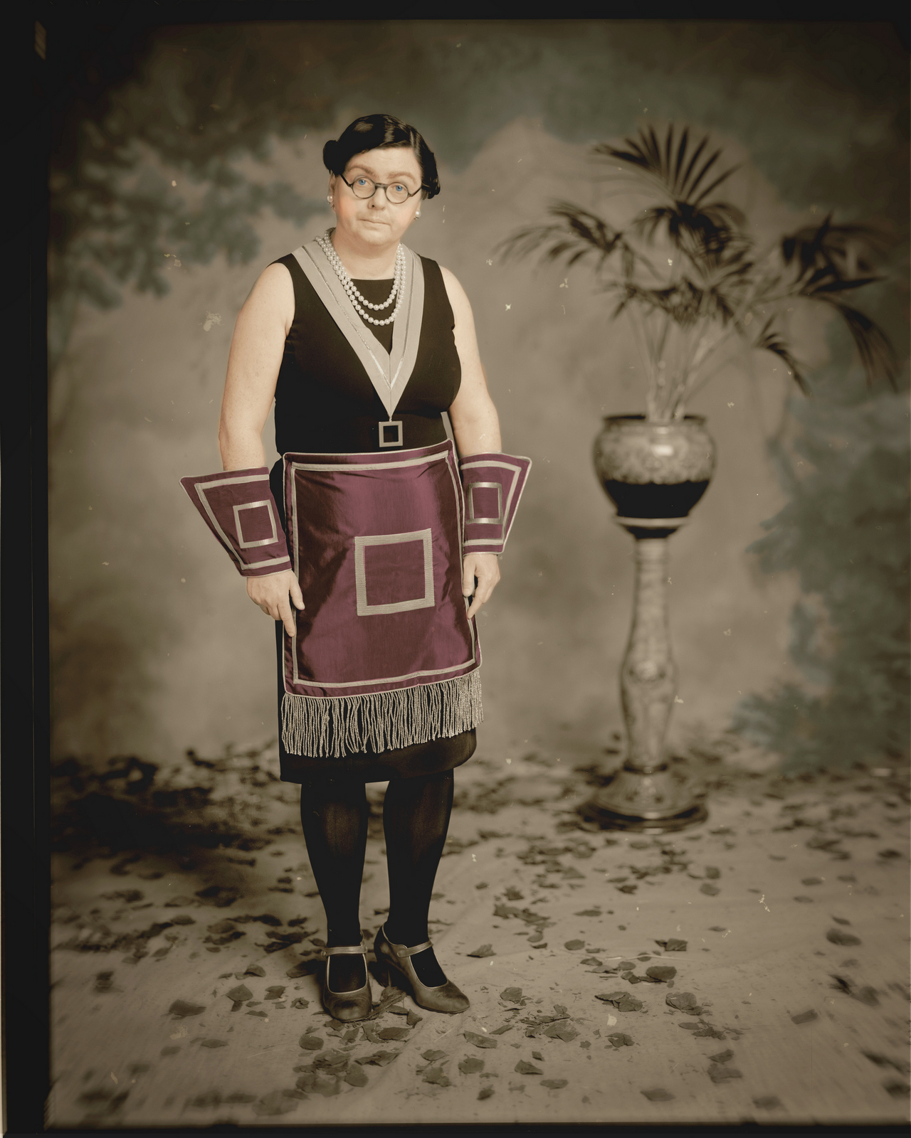
If your logo is square your award has to be too.
A normal person would have a nice metal square on a piece of marble.
Mark isn't normal, many call him 'special', so he puts F.A. cup handles either side of a metal square.
STEP 4: A NEW AWARD.
If your logo is square your award has to be too.
A normal person would have a nice metal square on a piece of marble.
Mark isn't normal, many call him 'special', so he puts F.A. cup handles either side of a metal square.
 Brilliant! I honestly cannot think of another person who come up with that solution.
Because it's a silly idea, you'd figure just getting it realised was enough. As if you've been naughty and got away with it. that you come up with and ask your previous awards manufacturers to make.
But no, Mark being Mark, he takes this irreverent scribble to the finest, most established trophy manufacturers in the land - Purdey. (The guys who made the actual F.A. Cup. FFS!)
Brilliant! I honestly cannot think of another person who come up with that solution.
Because it's a silly idea, you'd figure just getting it realised was enough. As if you've been naughty and got away with it. that you come up with and ask your previous awards manufacturers to make.
But no, Mark being Mark, he takes this irreverent scribble to the finest, most established trophy manufacturers in the land - Purdey. (The guys who made the actual F.A. Cup. FFS!)
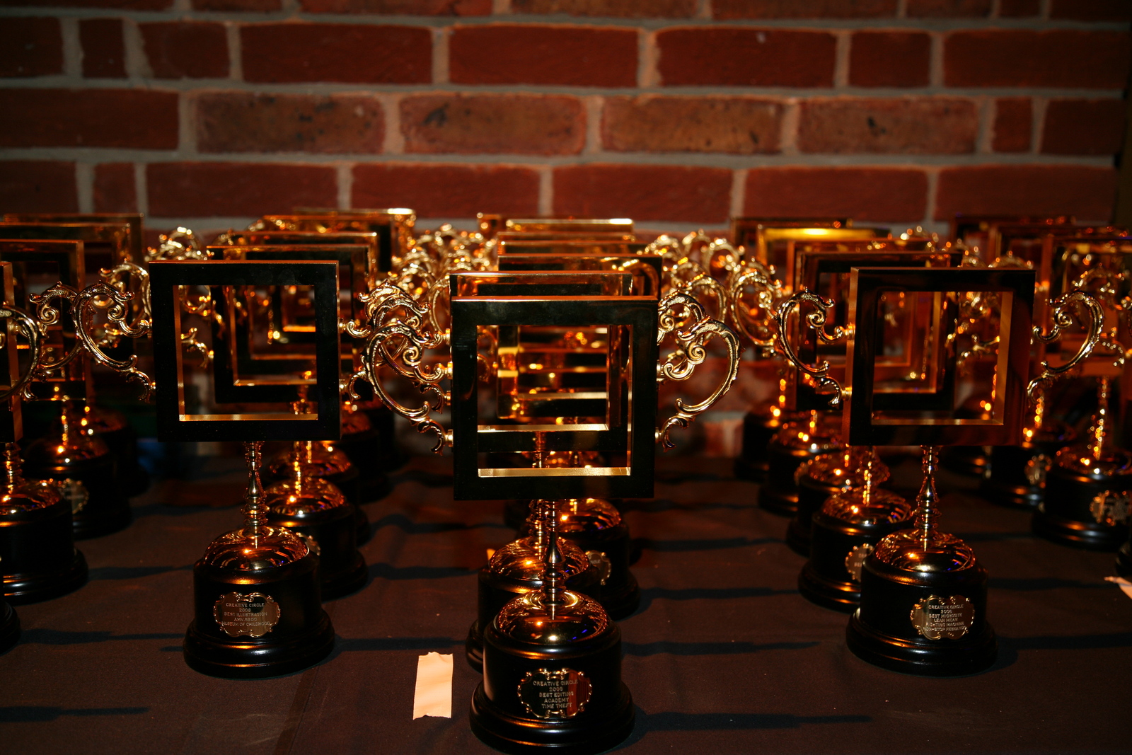 They also cast the medals, which were equally fine.
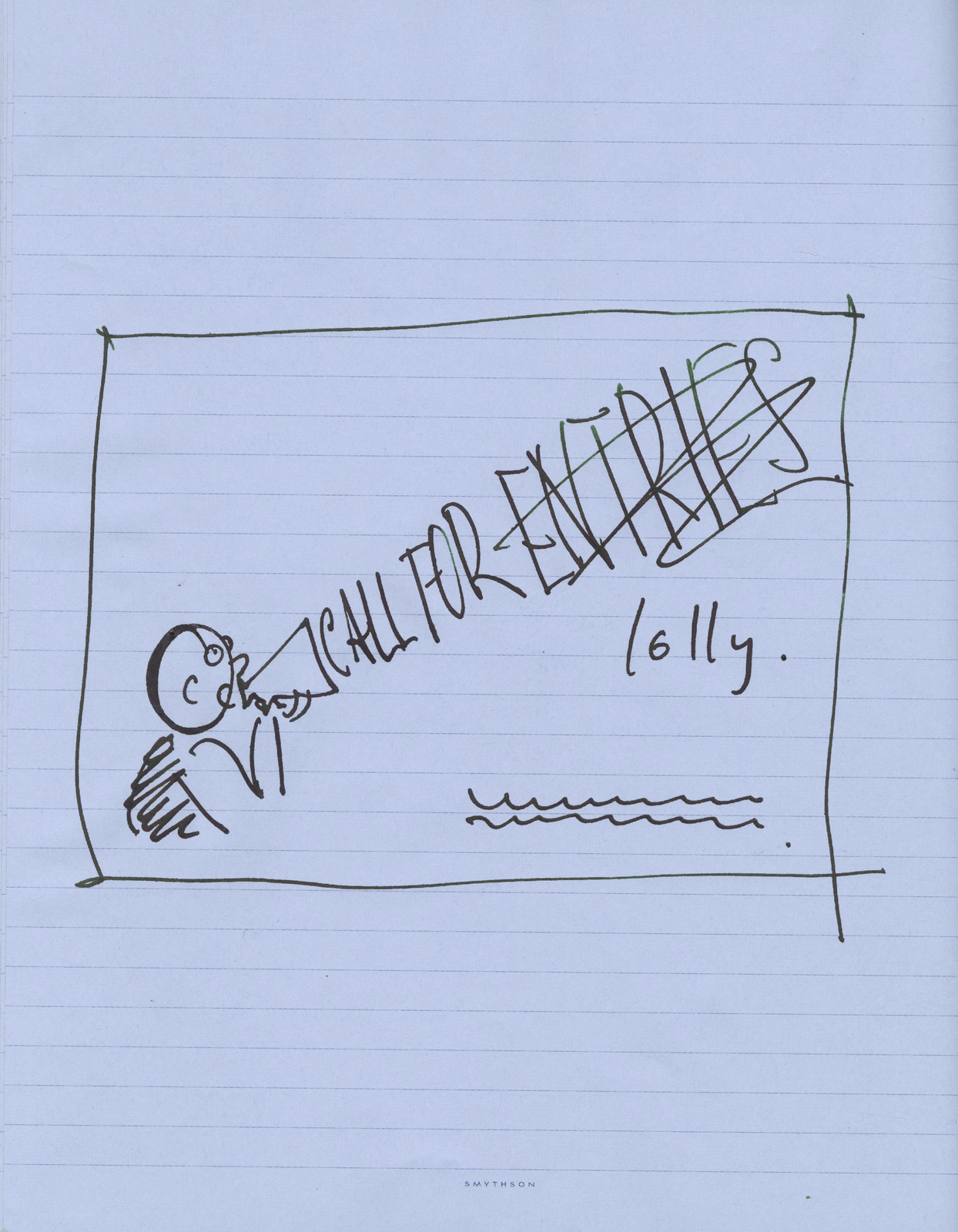
 STEP 5: A PRINTED EMAIL.
Most awards shows only engage with you once a year - Call For Entries, we didn't want to wait a year, we wanted to start telling people things were changing immediately.
But rather than have our newsletters and updates ignored or sent to spam, Mark suggests we print them on a long scroll of paper, a bit like the ones town cryers read from in Dickens novels.
It was to be called The Creative Circular (good name).
I mocked up a rough.
STEP 5: A PRINTED EMAIL.
Most awards shows only engage with you once a year - Call For Entries, we didn't want to wait a year, we wanted to start telling people things were changing immediately.
But rather than have our newsletters and updates ignored or sent to spam, Mark suggests we print them on a long scroll of paper, a bit like the ones town cryers read from in Dickens novels.
It was to be called The Creative Circular (good name).
I mocked up a rough.
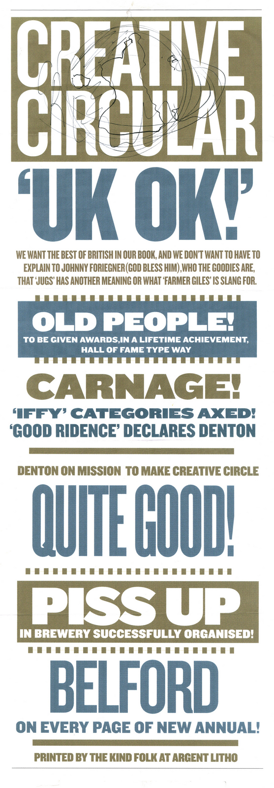 I gave all my scribbles to Adam Whittaker, a great designer, who developed it to this point (for free).
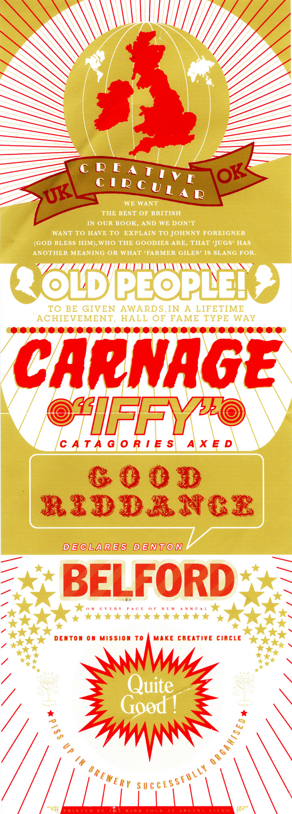 For some reason we didn't end up printing any.
It could've been cashflow? Either way - thanks and sorry Adam!
STEP 6: THE FIRST AWARDS NIGHT UNDER THE NEW REGIME.
On the night, there were squares are everywhere.
(And I don't just mean from the Smee's creative department.)
For some reason we didn't end up printing any.
It could've been cashflow? Either way - thanks and sorry Adam!
STEP 6: THE FIRST AWARDS NIGHT UNDER THE NEW REGIME.
On the night, there were squares are everywhere.
(And I don't just mean from the Smee's creative department.)
 There was a new, hilarious host.
 A new award; The Hall of Heroes, which Mark gave to Paul Arden.
 And, an all new 'British' menu.
 STEP 7: THE FIRST ANNUAL.
Mark again goes to the second best art director in London.
STEP 7: THE FIRST ANNUAL.
Mark again goes to the second best art director in London.
 Paul wastes no time in coming up with a scheme to quadruple his workload; place every ad in situ.
Posters were dropped onto billboards, commercials were dropped onto images, not just the winners either.
Every.
Single.
Entry.
It's a Herculean task, but Paul and his elves complete it.
The result is magnificent.
Paul wastes no time in coming up with a scheme to quadruple his workload; place every ad in situ.
Posters were dropped onto billboards, commercials were dropped onto images, not just the winners either.
Every.
Single.
Entry.
It's a Herculean task, but Paul and his elves complete it.
The result is magnificent.

 STEP 8: THE 2008 ANNUAL.
Mark begins developing a theme for the new annual based on the Masons.
STEP 8: THE 2008 ANNUAL.
Mark begins developing a theme for the new annual based on the Masons.
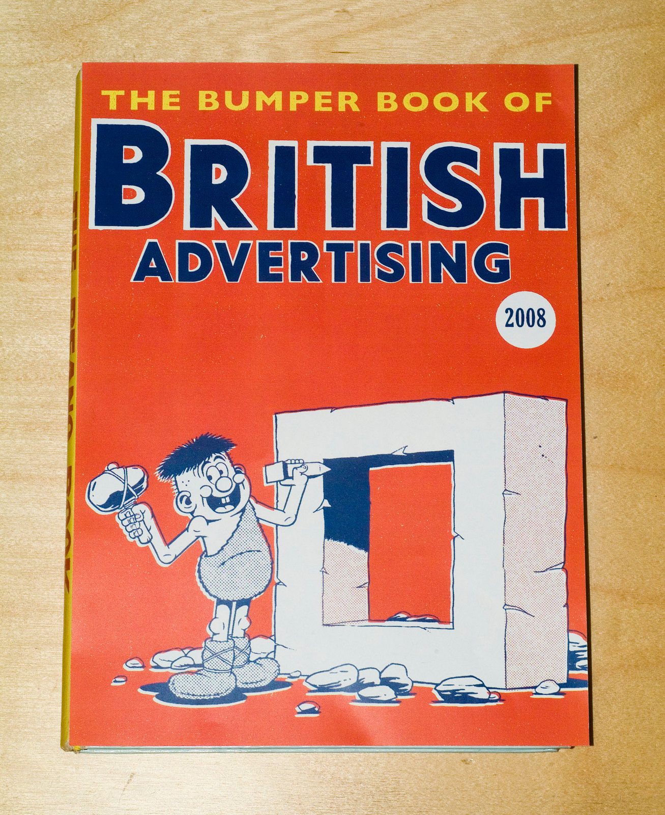
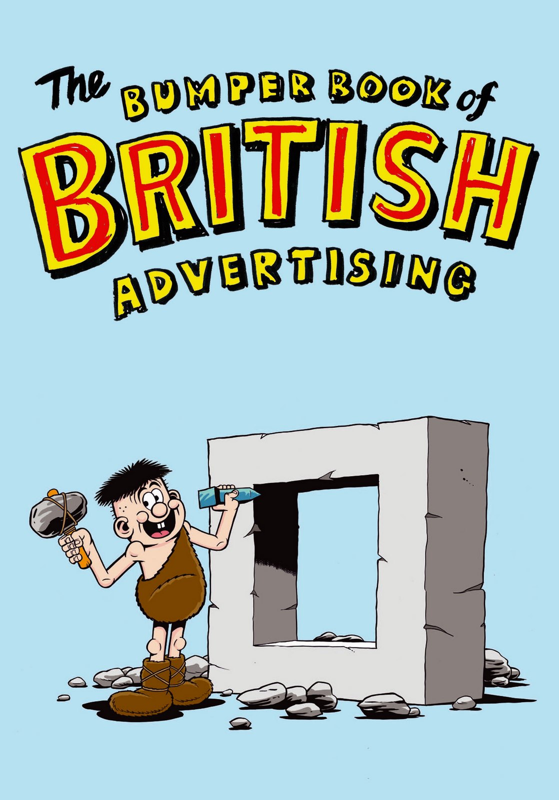
 STEP 9: THE 2008 CALL FOR ENTRIES AD.
I take Mark through a pile of ads I've rejected from my placement teams.
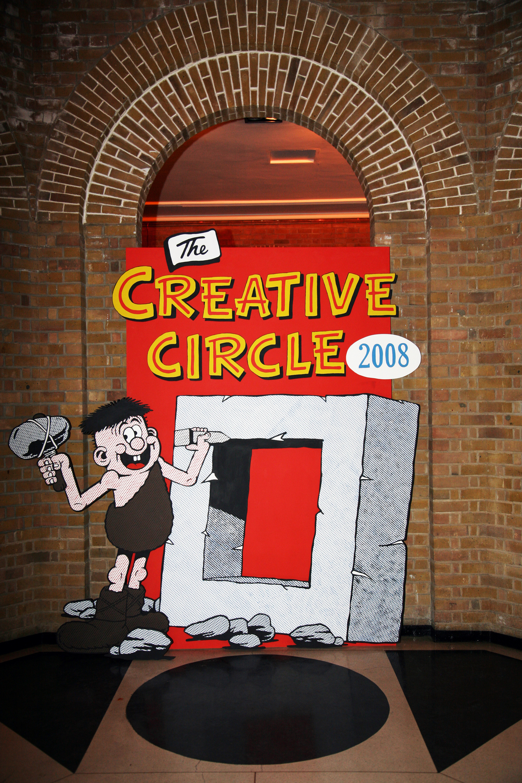
The minute Mark's eyes fall on a drawing of a Bunty Annual, he kills his Masonic idea and announces - 'The 2008 annual should be like a Beano Annual!'.
(At least, that's my memory, his credits me with suggesting the idea. But I suspect he's lying.)
If that's going to be our style, our Call For Entries ad needs to reflect it.
I have a Beano-type thought.
STEP 9: THE 2008 CALL FOR ENTRIES AD.
I take Mark through a pile of ads I've rejected from my placement teams.
The minute Mark's eyes fall on a drawing of a Bunty Annual, he kills his Masonic idea and announces - 'The 2008 annual should be like a Beano Annual!'.
(At least, that's my memory, his credits me with suggesting the idea. But I suspect he's lying.)
If that's going to be our style, our Call For Entries ad needs to reflect it.
I have a Beano-type thought.
 Mark likes the idea.
But, for possibly the first time in his life, he worries about appearing in the ad.
He doesn't want the Creative Circle thing to be all about him.
I think he's our No. 1 asset.
He relents.
Then finds a Beano reference he's happy with.
Mark likes the idea.
But, for possibly the first time in his life, he worries about appearing in the ad.
He doesn't want the Creative Circle thing to be all about him.
I think he's our No. 1 asset.
He relents.
Then finds a Beano reference he's happy with.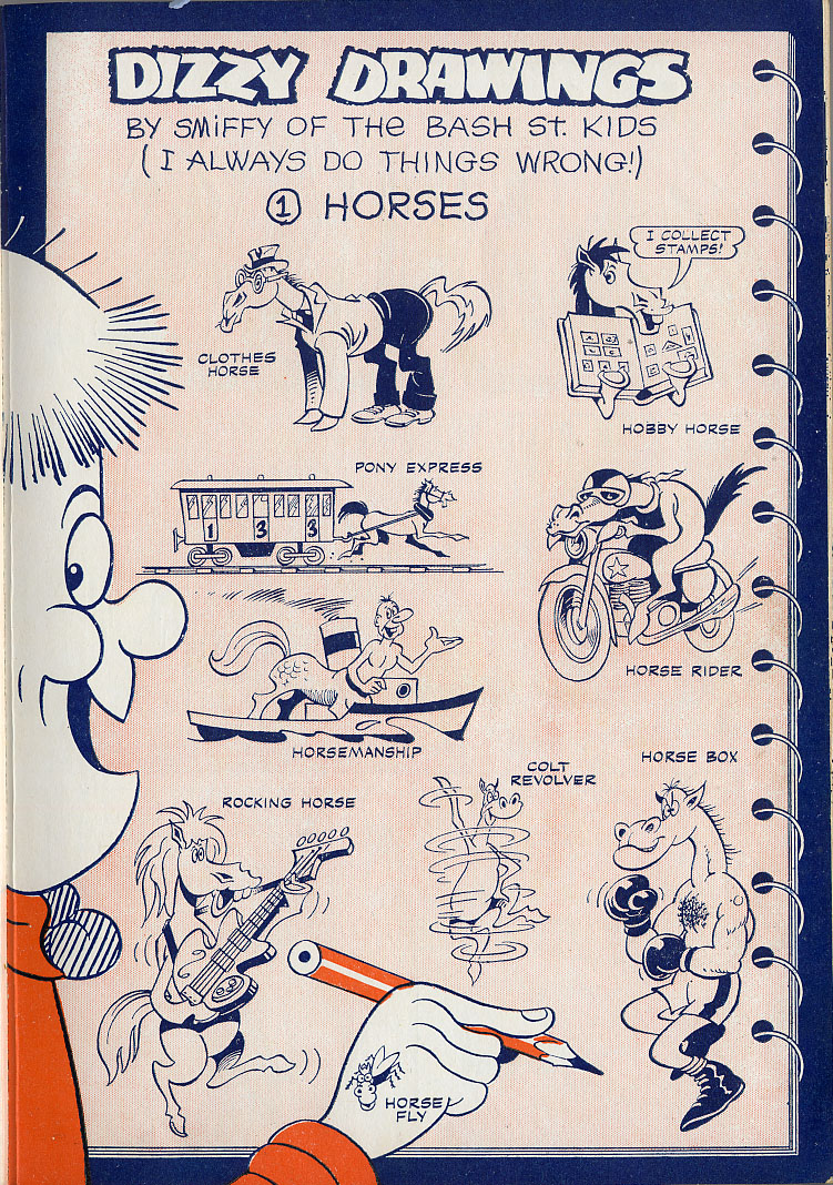 Illustrator Steve Bright is chosen to mimic the style..
We send Steve a reference of Mark shouting for the ad.
Illustrator Steve Bright is chosen to mimic the style..
We send Steve a reference of Mark shouting for the ad.
 Steve sends back his pencil rough.
 Often, when you commission illustrators who don't do ads to do ads, they change their style.
They try too hard, rather than doing what they normally do, what is the very reason we've chosen them.
We feed back: simpler, less lines and more cartoony.
Essentially, more Beano-ish.
We couldn't make the headline work in one line, it was too small.
But the dot screen worked well, made it feel authentic.
Often, when you commission illustrators who don't do ads to do ads, they change their style.
They try too hard, rather than doing what they normally do, what is the very reason we've chosen them.
We feed back: simpler, less lines and more cartoony.
Essentially, more Beano-ish.
We couldn't make the headline work in one line, it was too small.
But the dot screen worked well, made it feel authentic.
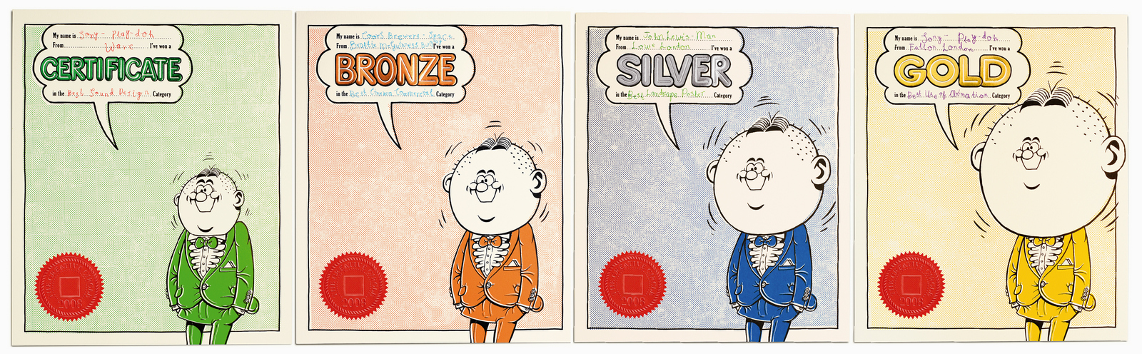
 STEP 10: NEW AWARDS CERTIFICATES.
Mark comes up with a great idea - use the same characters on each certificate, but make his head bigger the more prestigious the award.
The first rough comes in.
STEP 10: NEW AWARDS CERTIFICATES.
Mark comes up with a great idea - use the same characters on each certificate, but make his head bigger the more prestigious the award.
The first rough comes in.
 Somehow it didn't seem to work.
It looked like a bigger head stuck onto each character, not like his head had grown bigger.
We decide to keep the features the same size.
Somehow it didn't seem to work.
It looked like a bigger head stuck onto each character, not like his head had grown bigger.
We decide to keep the features the same size.
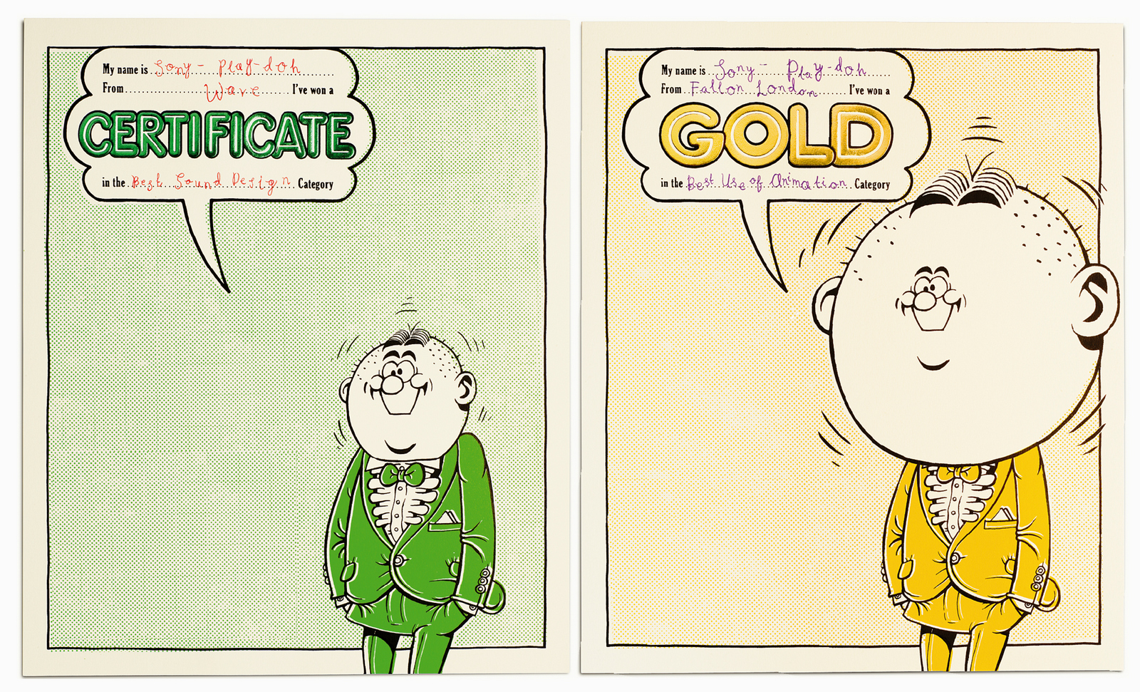 Better.
Only one, teensy little problem - there's no mention of who the certificates are from.
And they're printed, foiled and embossed.
Better.
Only one, teensy little problem - there's no mention of who the certificates are from.
And they're printed, foiled and embossed.
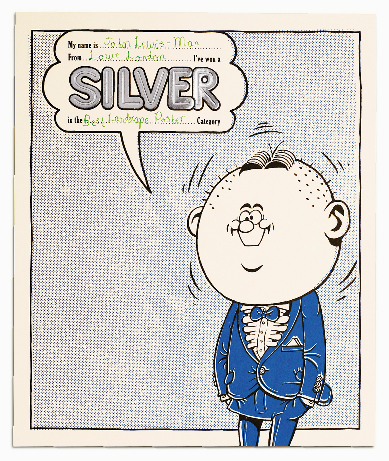 Cornered and desperate, Mark comes up with a great solution - a sticker that looks like a kind of wax seal.
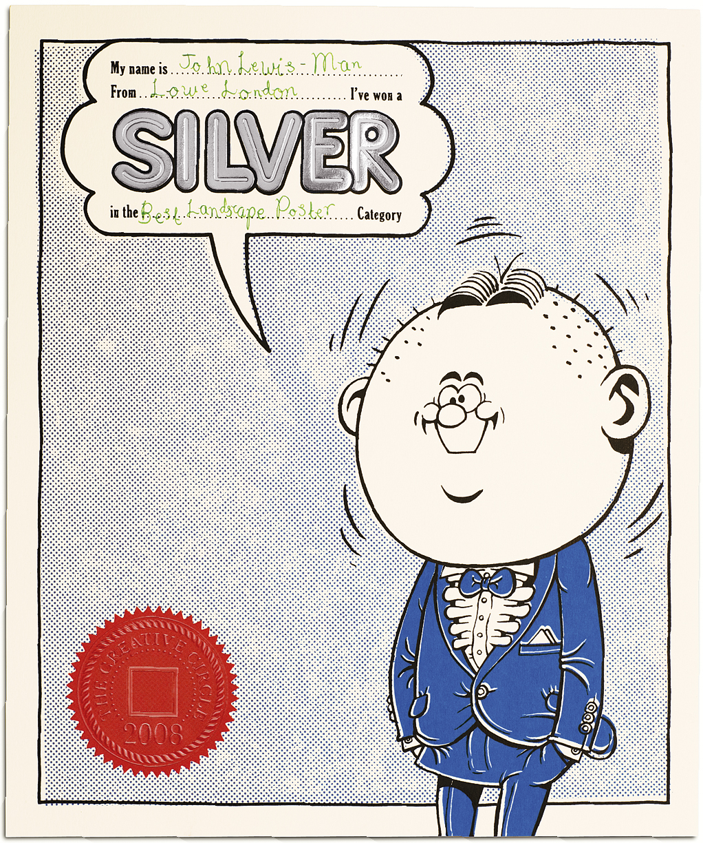 It looks cooler than it it'd been printed on, more official.
The final set.
It looks cooler than it it'd been printed on, more official.
The final set.
 STEP 11: A PUSH FOR MEMBERSHIPS.
We set out to enlist an army of like-minded creatives.
To celebrate what's great about British creativity and fight against the invasion of foreign scam.
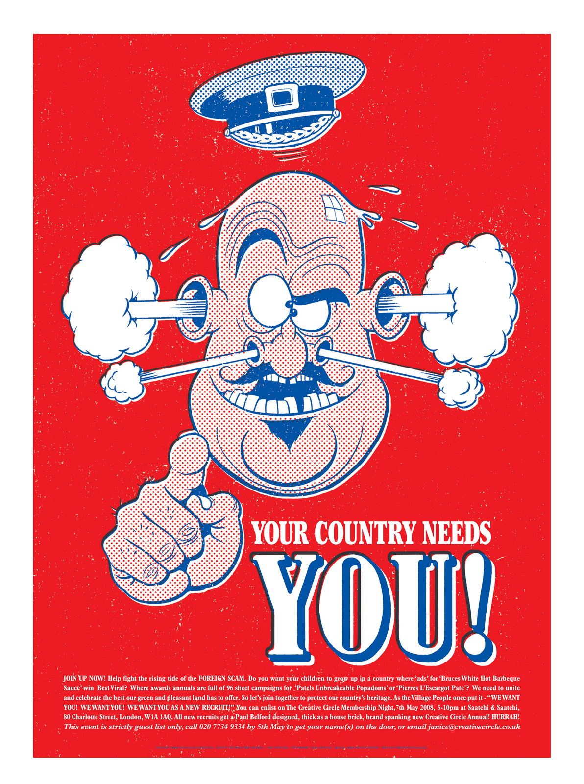
The first thing that springs to mind is that old Lord Kitchener.
STEP 11: A PUSH FOR MEMBERSHIPS.
We set out to enlist an army of like-minded creatives.
To celebrate what's great about British creativity and fight against the invasion of foreign scam.
The first thing that springs to mind is that old Lord Kitchener.
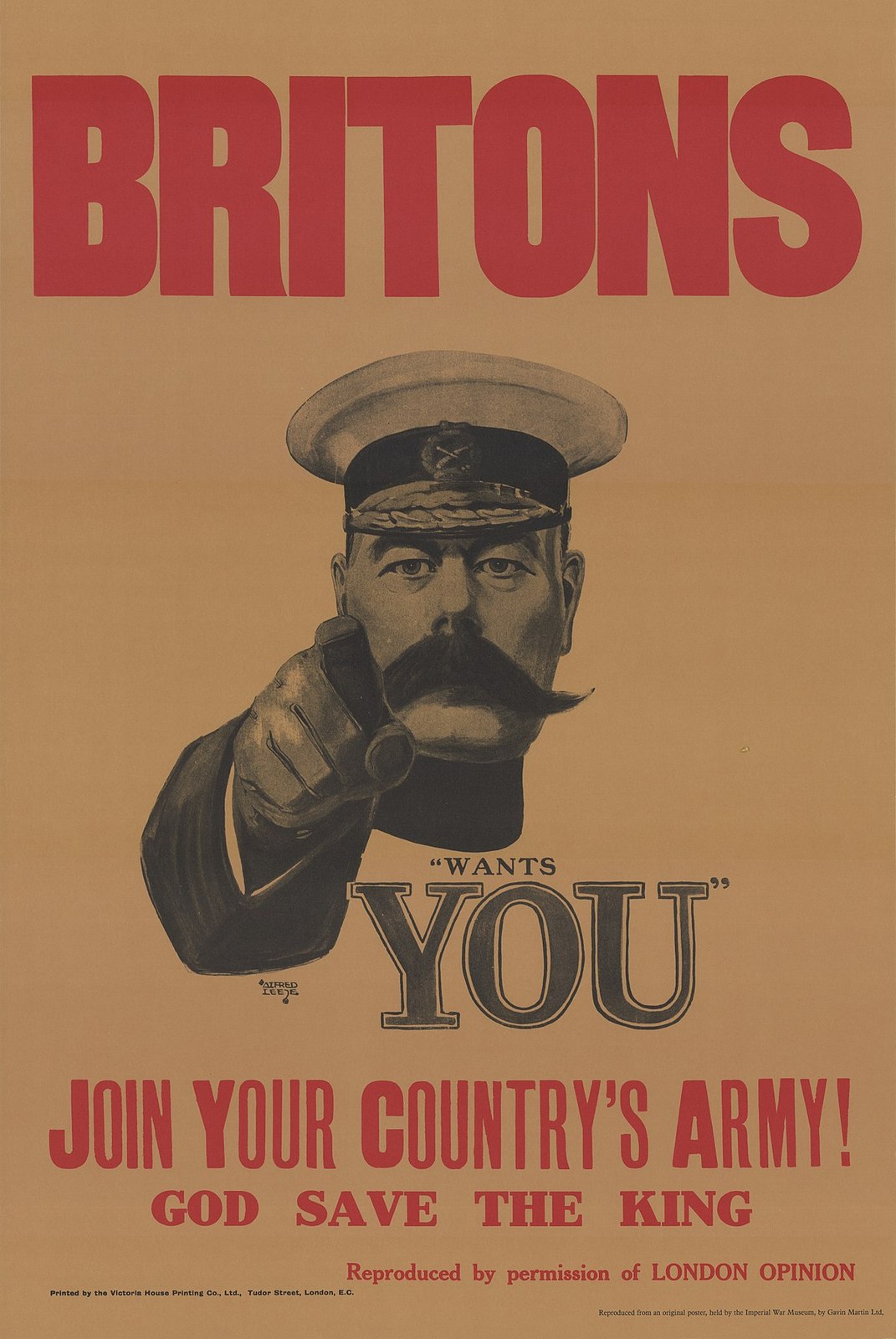 It's British, it's famous, maybe we could spoof it?
The problem is it's a bit of an old cliché.
It's been spoofed a million times.
Ah! But has it been spoofed Beano style? Featuring Mark Denton?
A quick bit of desk research tells us no.
Hurrah! We press on with our version.
It's British, it's famous, maybe we could spoof it?
The problem is it's a bit of an old cliché.
It's been spoofed a million times.
Ah! But has it been spoofed Beano style? Featuring Mark Denton?
A quick bit of desk research tells us no.
Hurrah! We press on with our version.
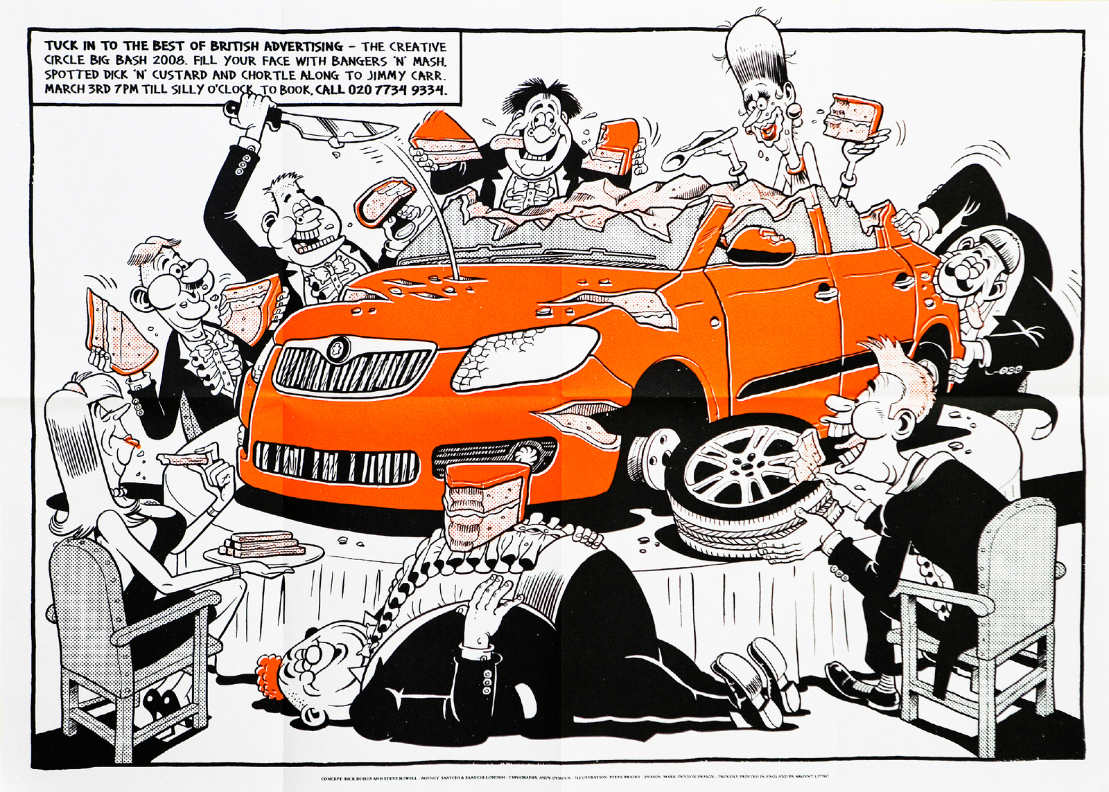
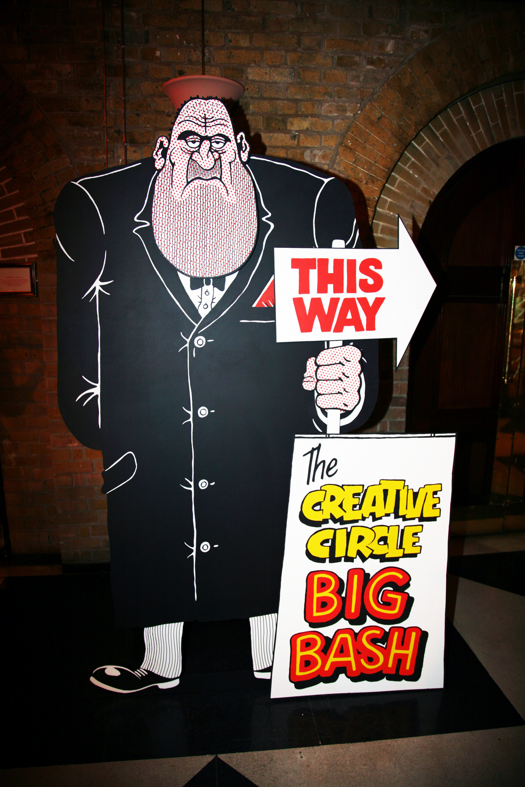
 STEP 12: SELLING TICKETS FOR THE 2008 AWARDS NIGHT.
Our friend, the late, great Paul Silburn, put his expensively compiled creative department on it.
This was what popped out. (Based on the award winning Skoda ad of the period.)
STEP 12: SELLING TICKETS FOR THE 2008 AWARDS NIGHT.
Our friend, the late, great Paul Silburn, put his expensively compiled creative department on it.
This was what popped out. (Based on the award winning Skoda ad of the period.)
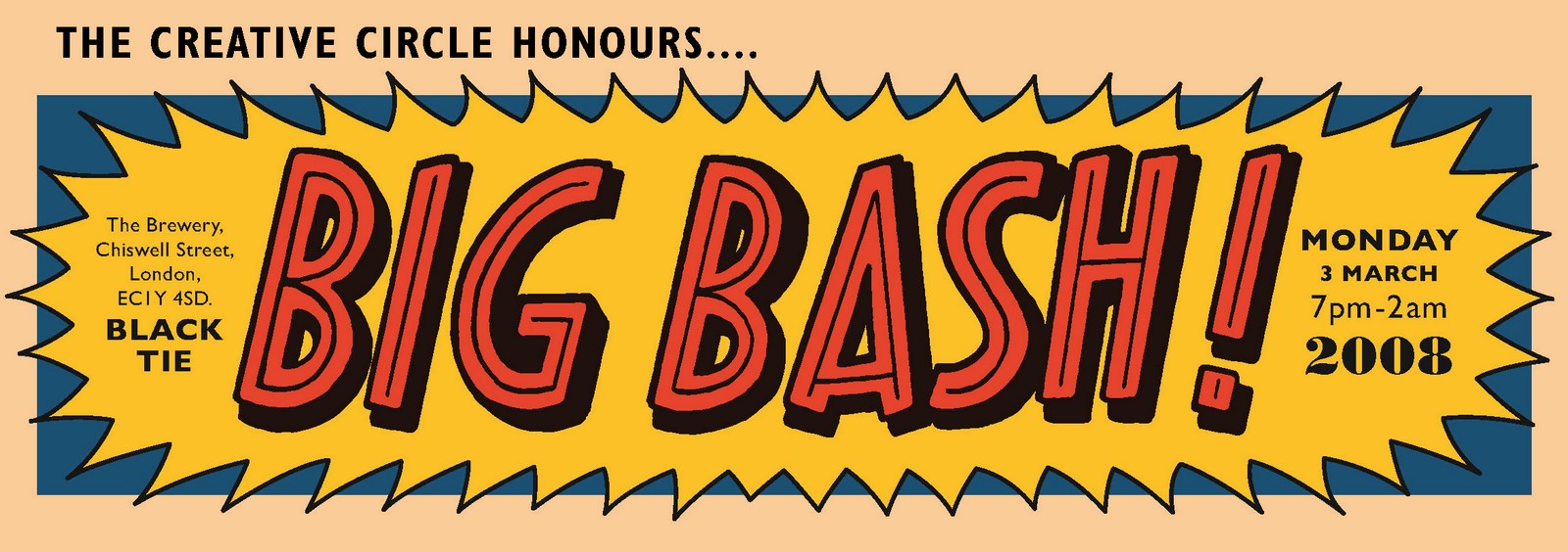
 STEP 13: THE 2008 AWARDS NIGHT.
In true Beano style, it was rechristened the 'Big Bash!'.
STEP 13: THE 2008 AWARDS NIGHT.
In true Beano style, it was rechristened the 'Big Bash!'.
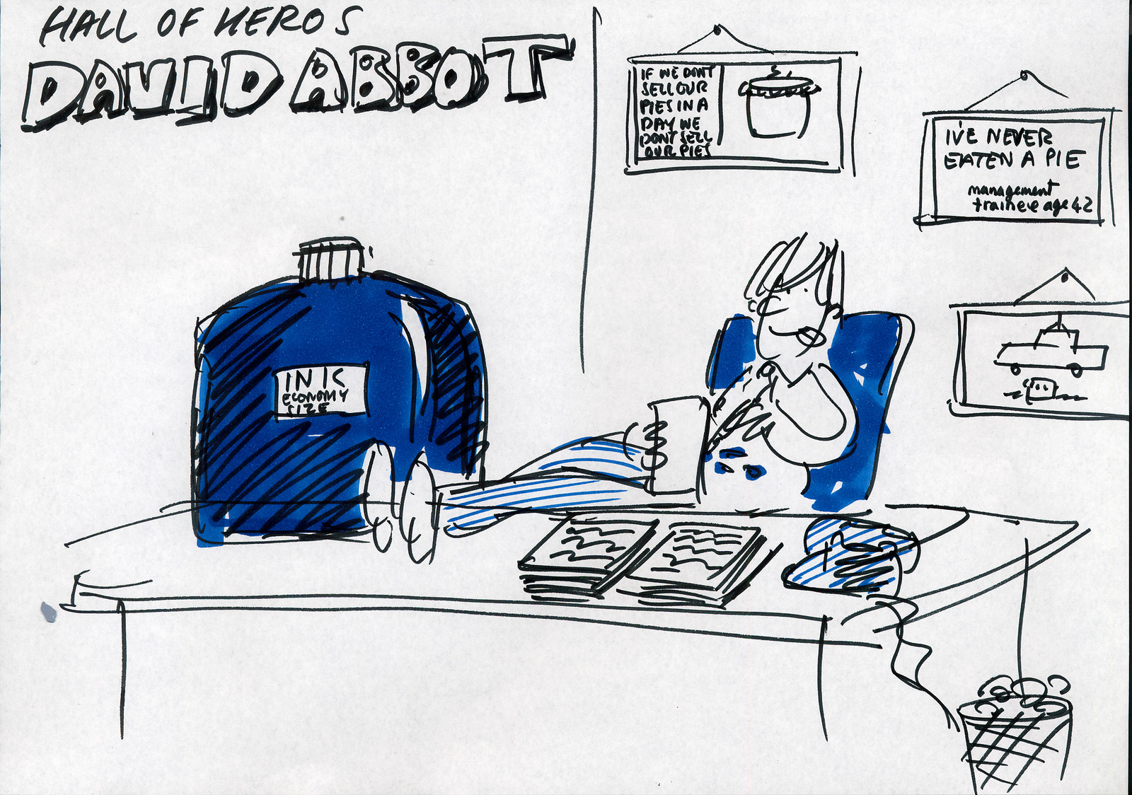
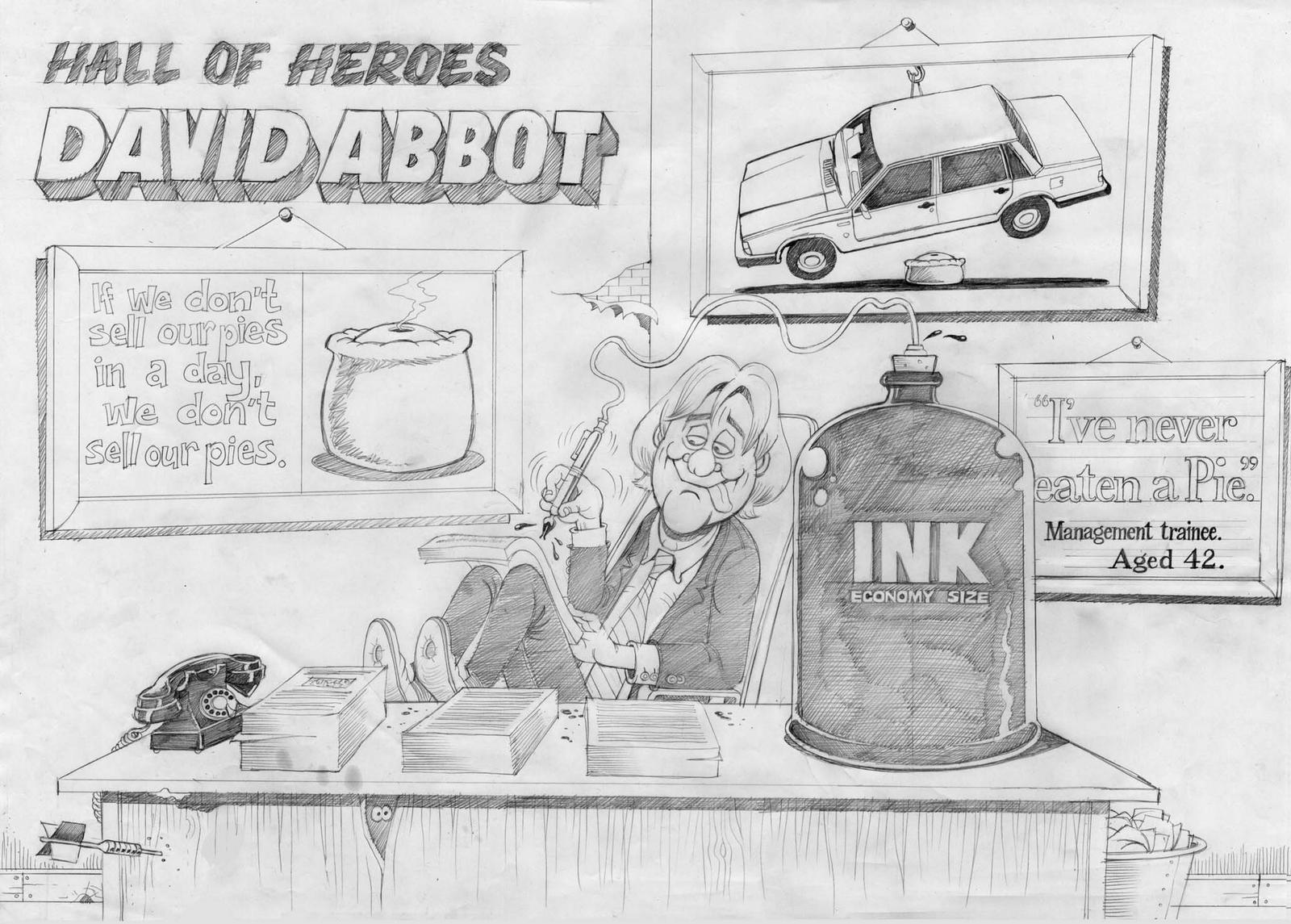
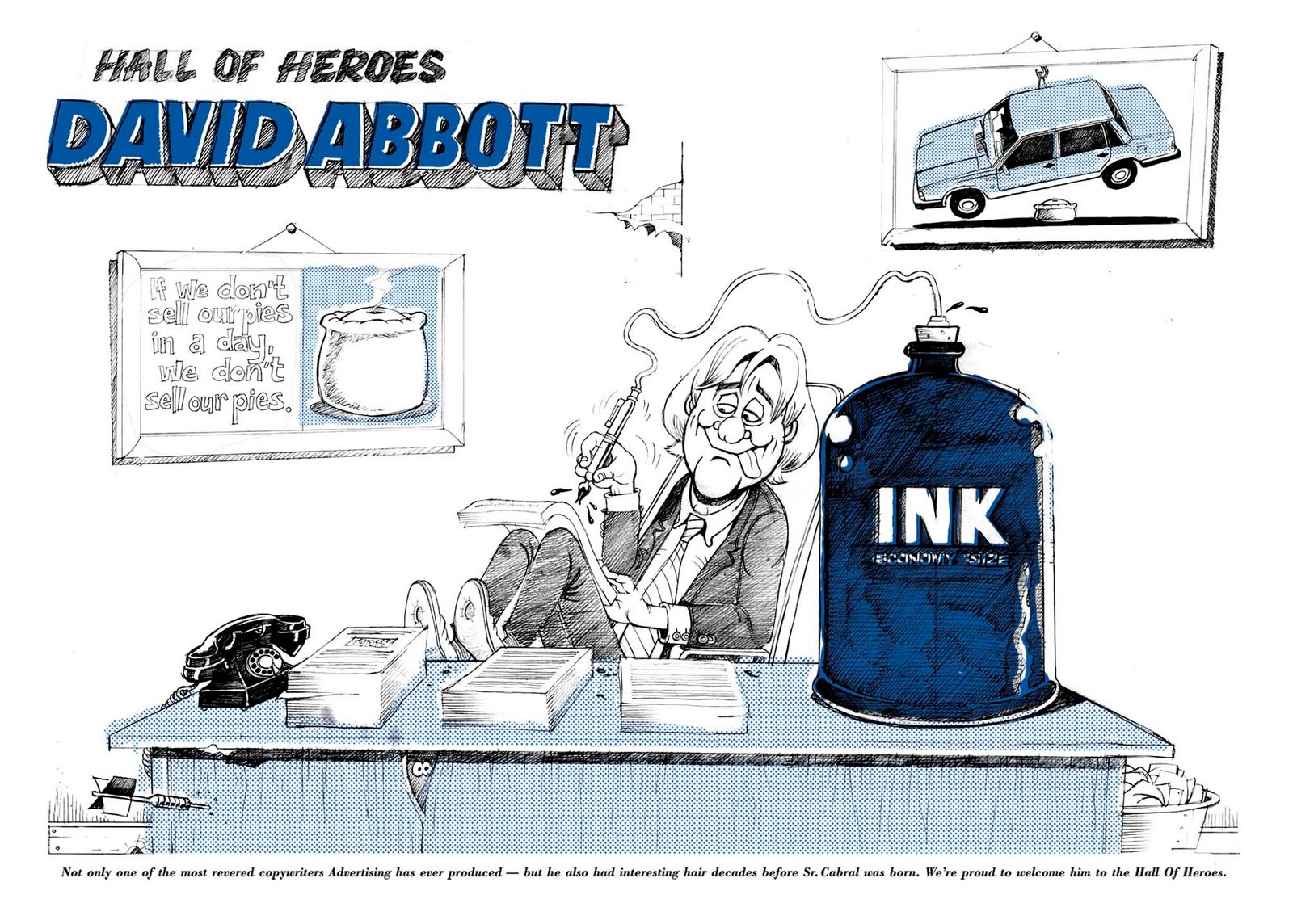
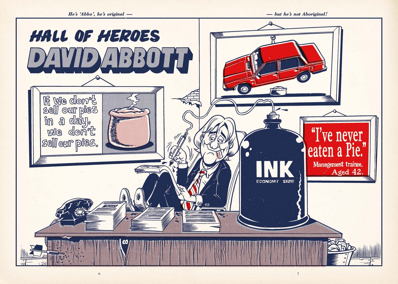
 THE HALL OF HEROES AWARD.
In most annuals, this would be called The President's Award, or the Lifetime Achievement Award.
Mark chose to give it to David Abbott.
THE HALL OF HEROES AWARD.
In most annuals, this would be called The President's Award, or the Lifetime Achievement Award.
Mark chose to give it to David Abbott.
 Here's me looking at him...lovingly.
 To separate the awards categories during the presentation, Mark and I made a bunch of little films, each replacing circles with squares.
 STEP 14: THE 2008 AWARDS ANNUAL.
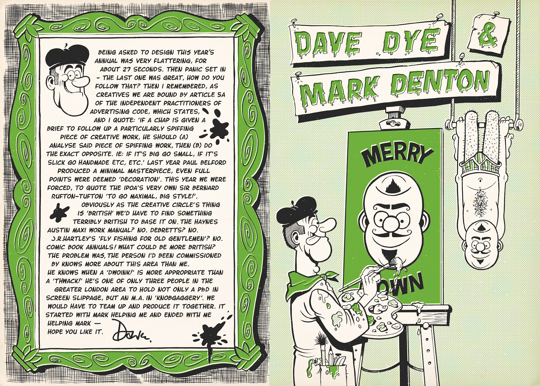
I've designed a few annual before, D&AD 2004 & 2012, one of the problems you face is how to expand your idea, which is usually just an idea for a cover, into a whole annual.
Take the 2004 D&AD Annual; My idea for the cover was to spoof those low-rent compilation albums 'Now That's What I Call Music'.
But you only have a title and two sides of graphics to mimic - how do you expand that out into end papers, contents pages, divider sections, etc, etc?
The brilliant thing with the 2008 Creative Circle Annual was that our idea for a theme had produced annuals, so we could study exactly what they did.
STEP 14: THE 2008 AWARDS ANNUAL.
I've designed a few annual before, D&AD 2004 & 2012, one of the problems you face is how to expand your idea, which is usually just an idea for a cover, into a whole annual.
Take the 2004 D&AD Annual; My idea for the cover was to spoof those low-rent compilation albums 'Now That's What I Call Music'.
But you only have a title and two sides of graphics to mimic - how do you expand that out into end papers, contents pages, divider sections, etc, etc?
The brilliant thing with the 2008 Creative Circle Annual was that our idea for a theme had produced annuals, so we could study exactly what they did.
 There were a few tests for the cover.
This looked cool, but possibly a bit too vintage.
There were a few tests for the cover.
This looked cool, but possibly a bit too vintage.
 We settled on this one.
 Which became this.
 Open the book and you have what bibliophiles call endpapers, they're the first and last spreads in books.
They're often just a pattern, if you own a fancy old book, it may well look like marbling.
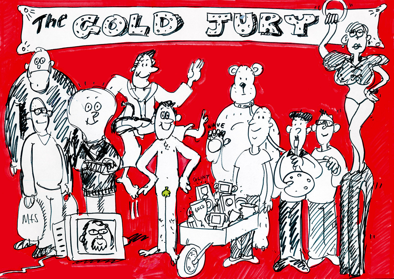
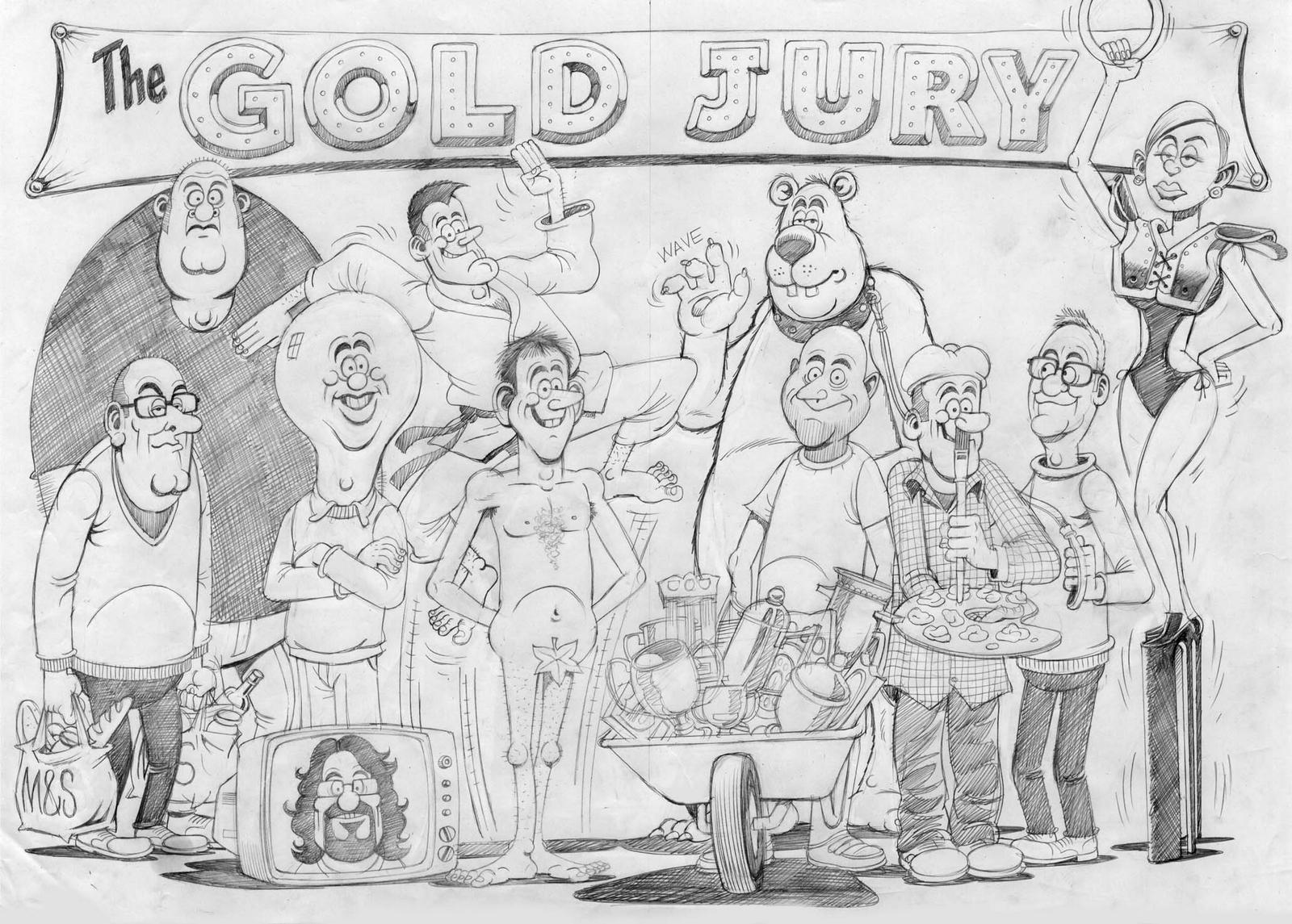
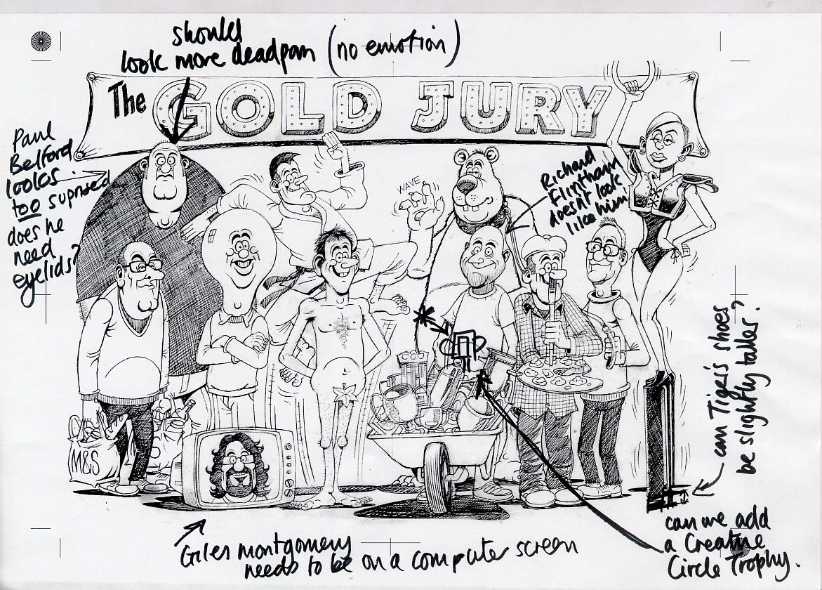
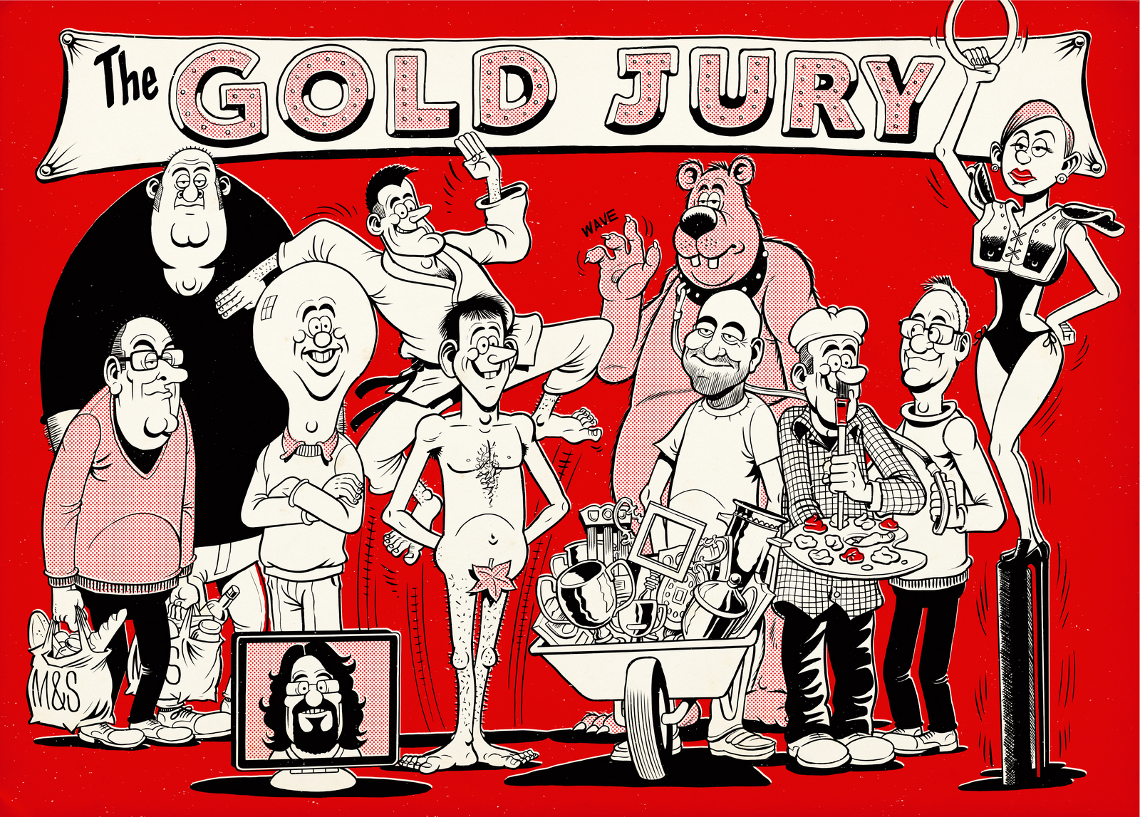
This seemed to be like the perfect opportunity to do a before and after, a start and end idea.
Mark took the Gold Jury and sketched a formal and chaotic version.
Each juror was done in a way to link to their personality or work, so Richard Flintham is pushing a wheel barrow full of awards, Tiger Savage is teetering on top of a pair of stiletto heels and Damon Collins is dressed in Karate gear.
The guy with the Hitler moustache is supposed to be me.
Campaign had recently published an article on nicknames and had suggested that at AMV mine was 'Herr Dye' - due to my strict regime. (It wasn't true, I guess they think of the name then make up the story. I hope it's not like that now Maisie?)
FRONT.
Mark's rough.
Open the book and you have what bibliophiles call endpapers, they're the first and last spreads in books.
They're often just a pattern, if you own a fancy old book, it may well look like marbling.
This seemed to be like the perfect opportunity to do a before and after, a start and end idea.
Mark took the Gold Jury and sketched a formal and chaotic version.
Each juror was done in a way to link to their personality or work, so Richard Flintham is pushing a wheel barrow full of awards, Tiger Savage is teetering on top of a pair of stiletto heels and Damon Collins is dressed in Karate gear.
The guy with the Hitler moustache is supposed to be me.
Campaign had recently published an article on nicknames and had suggested that at AMV mine was 'Herr Dye' - due to my strict regime. (It wasn't true, I guess they think of the name then make up the story. I hope it's not like that now Maisie?)
FRONT.
Mark's rough.
 Steve Bright's first pencil.
 Mark's revises.
 Final.
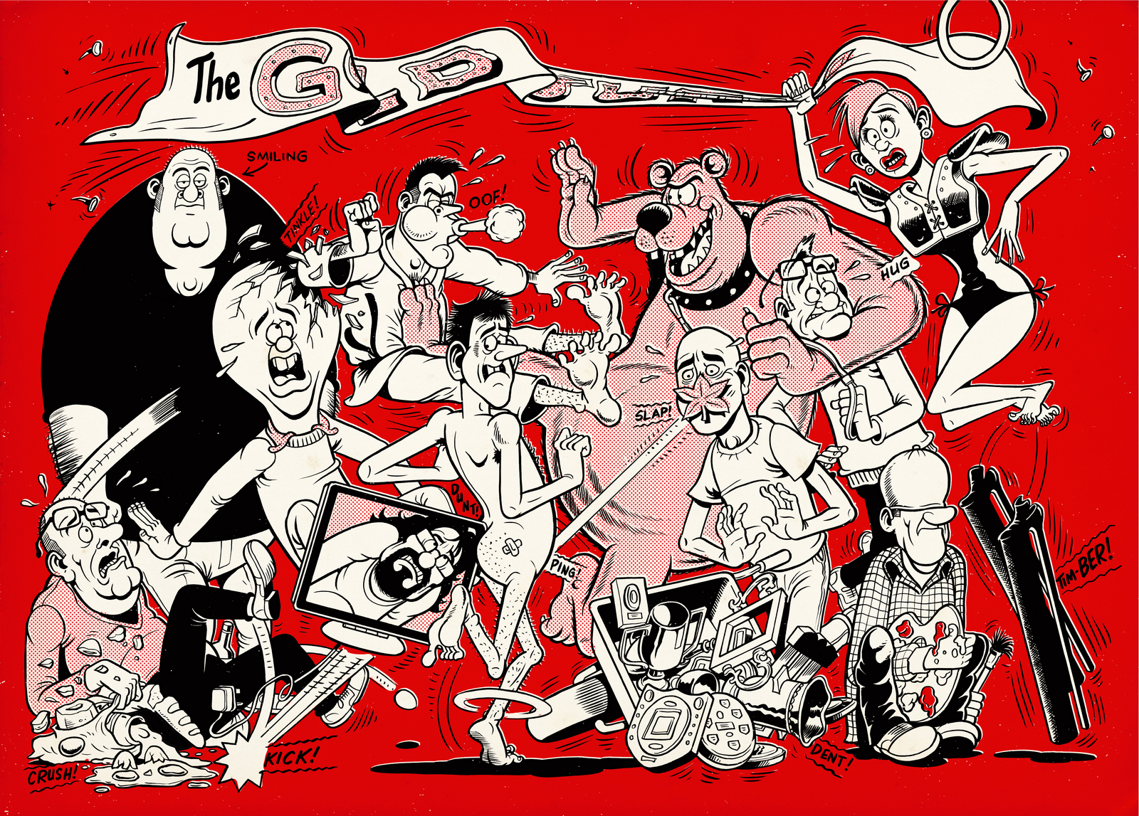
 BACK.
The same image was the start point for the back endpapers, only this time the room has descended into chaos.
BACK.
The same image was the start point for the back endpapers, only this time the room has descended into chaos.
 ANNUAL DESIGNERS PAGES.
This time I wasn't depicted as Hitler. Which was nice.
ANNUAL DESIGNERS PAGES.
This time I wasn't depicted as Hitler. Which was nice.
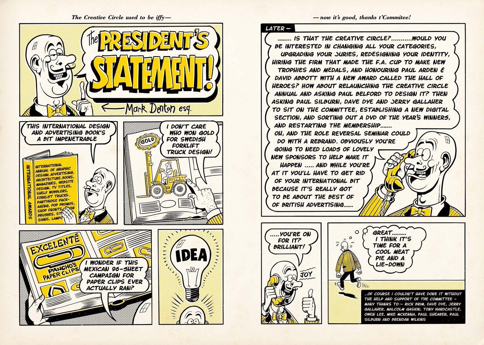
 THE PRESIDENT'S STATEMENT.
Mark lays out his philosophy, Mark-stylee.
THE PRESIDENT'S STATEMENT.
Mark lays out his philosophy, Mark-stylee.
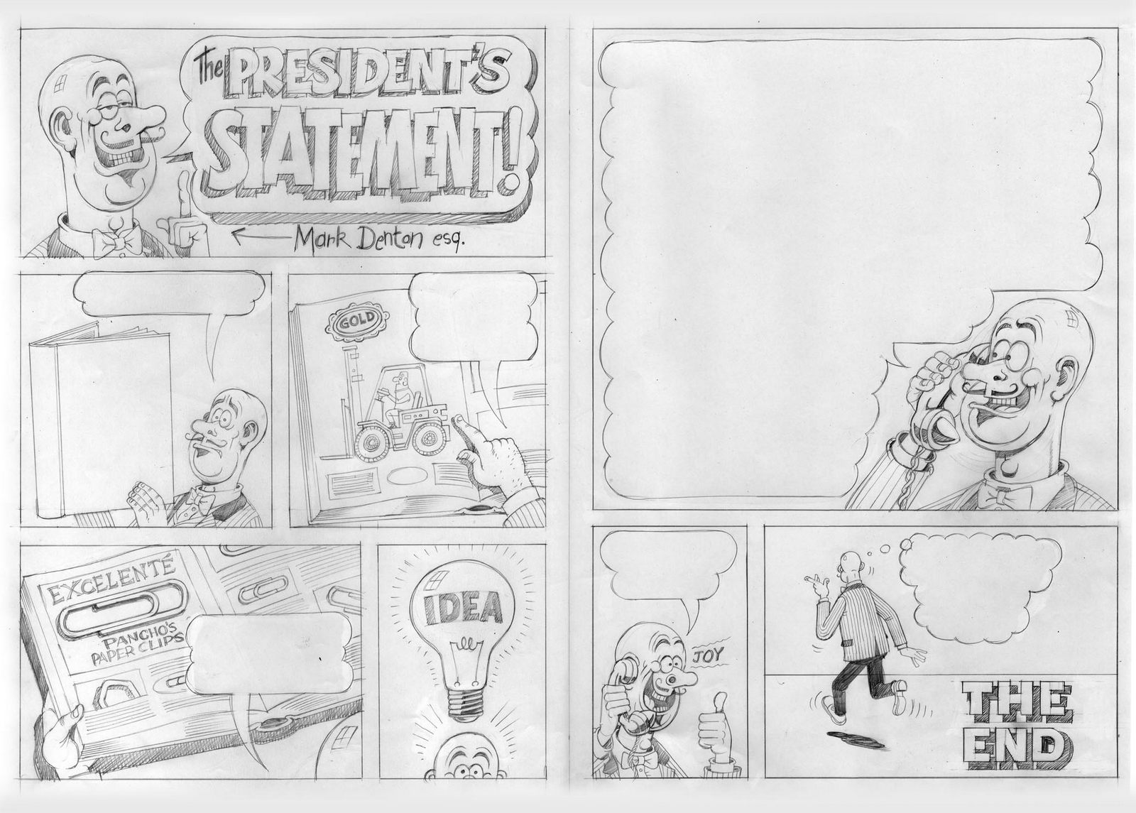
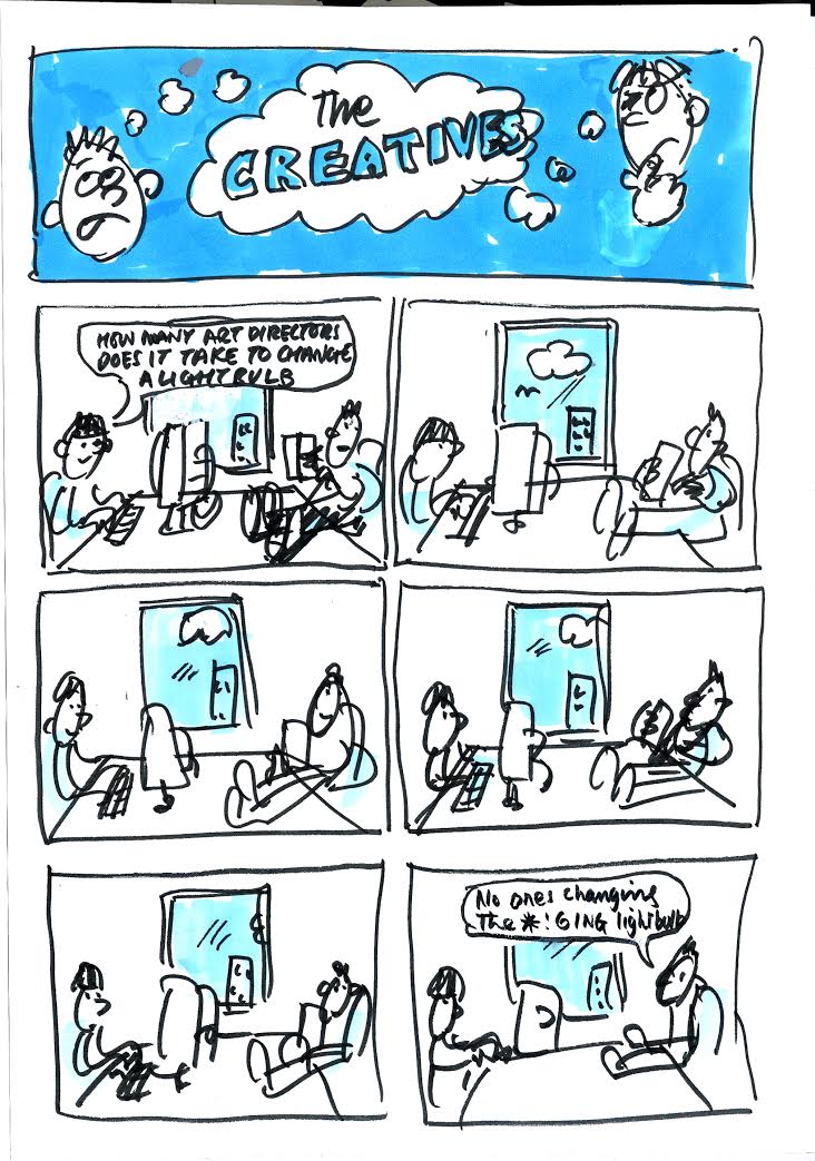
 THE CREATIVES.
Sean Doyle pitched in some comic strips.
THE CREATIVES.
Sean Doyle pitched in some comic strips.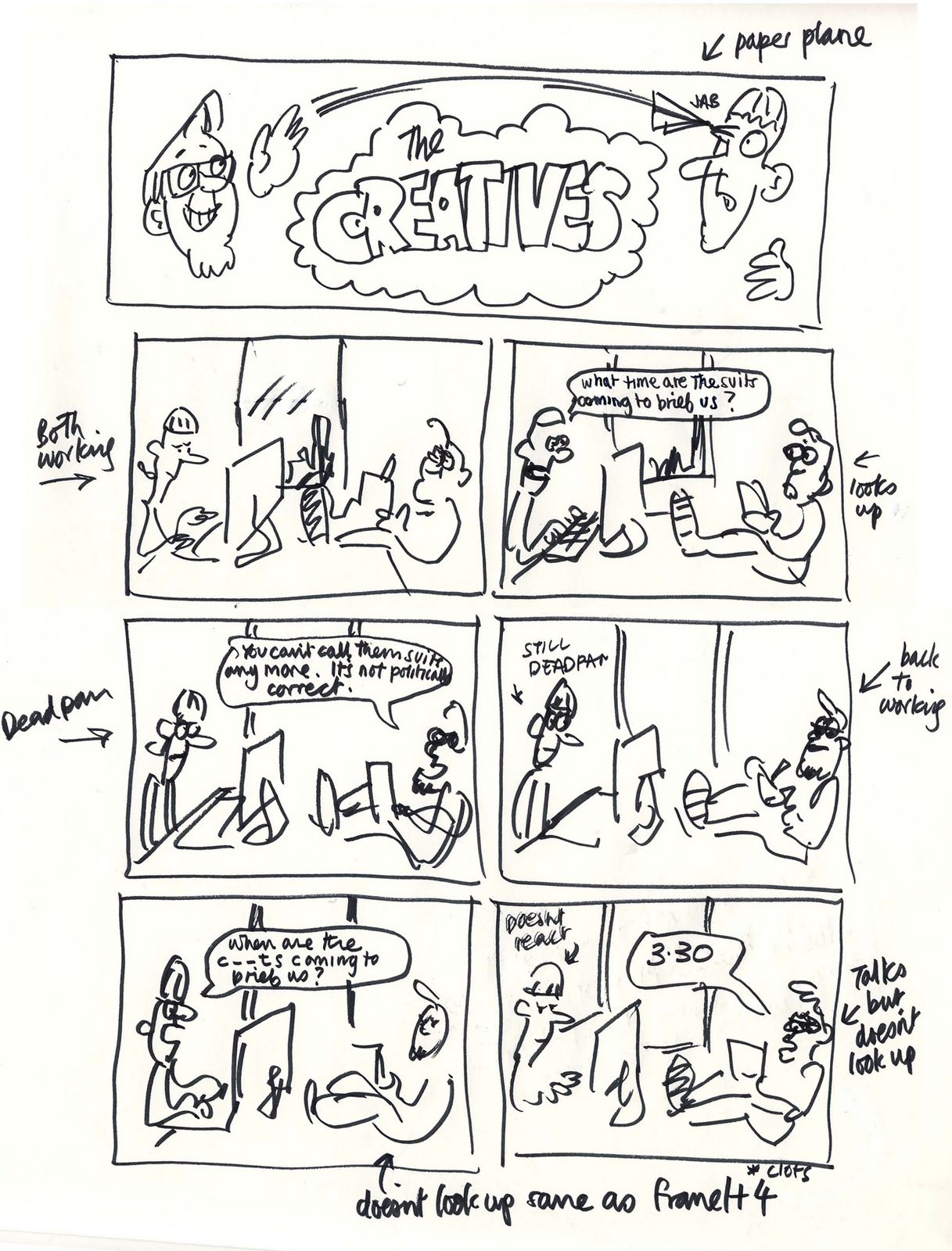
 THE HALL OF HEROES.
In sections like this, the pie theme really came into its own.
THE HALL OF HEROES.
In sections like this, the pie theme really came into its own.
 Steve's pencil is great.
Not very David Abbott, but very Beano.
Steve's pencil is great.
Not very David Abbott, but very Beano.
 It's done.
I thought.
But then Mark had an idea - 'Let's write a little rhyming line at the top of every page, like they do in real comics.'
We divide the pages in two and each start writing.
It's tough, because theres no brief, not specific messages you need to get over, it's a bit of fluff, just a few words that sound like the kind of silly rhymes you get in the Beano.
One of my 50% was David Abbott.
I wrote a bunch, my friend Billy Mead read through and laughed at one in particular, we put it in.
Again, not very David Abbott, but very Beano.
(What happens next is in the podcast. It's squirmy.)
It's done.
I thought.
But then Mark had an idea - 'Let's write a little rhyming line at the top of every page, like they do in real comics.'
We divide the pages in two and each start writing.
It's tough, because theres no brief, not specific messages you need to get over, it's a bit of fluff, just a few words that sound like the kind of silly rhymes you get in the Beano.
One of my 50% was David Abbott.
I wrote a bunch, my friend Billy Mead read through and laughed at one in particular, we put it in.
Again, not very David Abbott, but very Beano.
(What happens next is in the podcast. It's squirmy.)
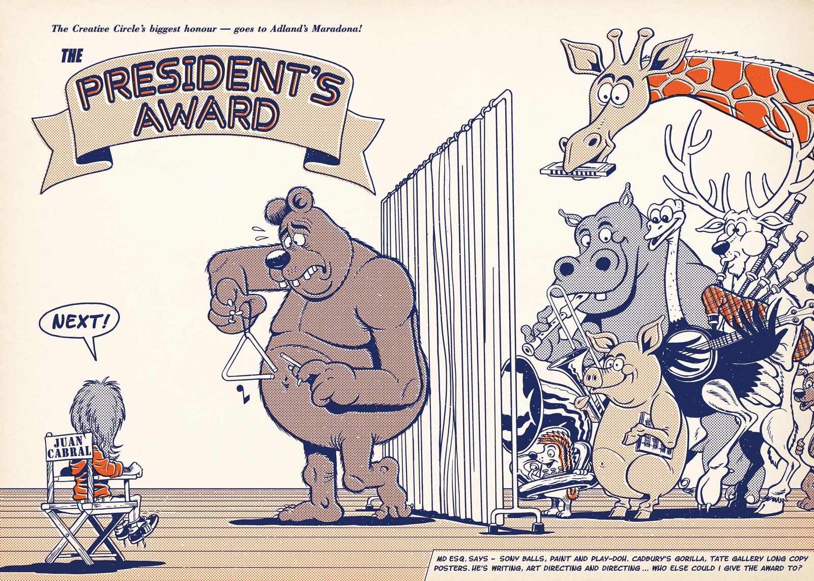
 THE PRESIDENT'S AWARD.
Given to Juan Cabral, it captures him auditioning animal for his up-coming Cadbury's ad. (Eventually he settled on a Gorilla. Playing drums.)
THE PRESIDENT'S AWARD.
Given to Juan Cabral, it captures him auditioning animal for his up-coming Cadbury's ad. (Eventually he settled on a Gorilla. Playing drums.)
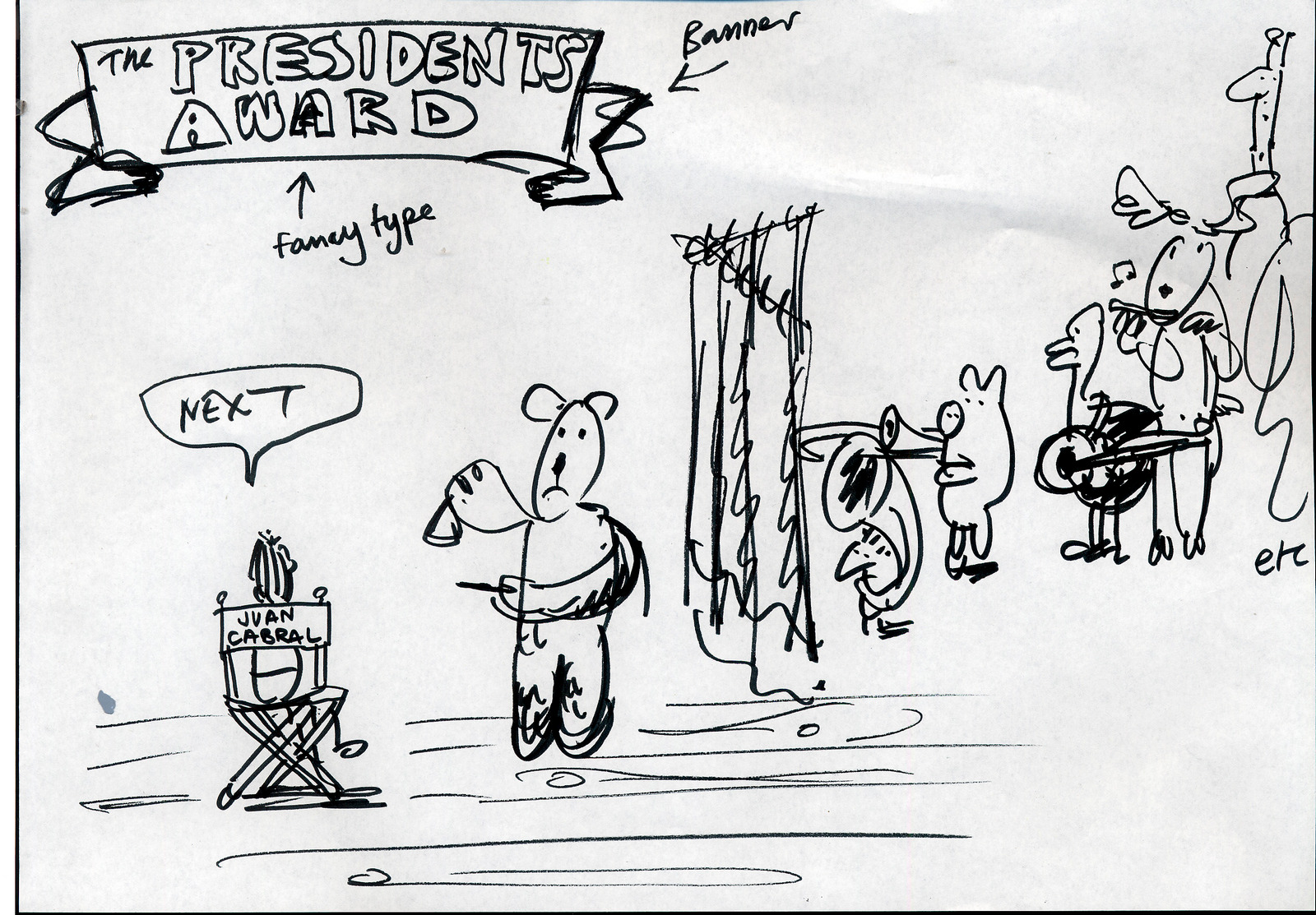 Steve went a bit too serious again.
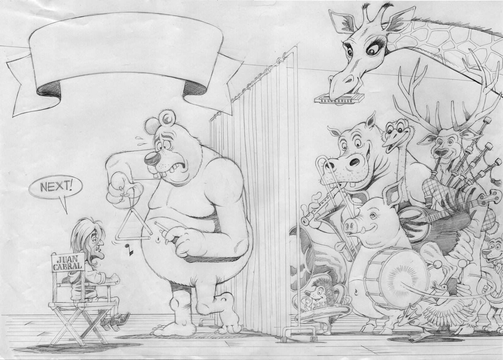 He was dragged back and reminded that our reference was the Beano. Not Michelangelo.
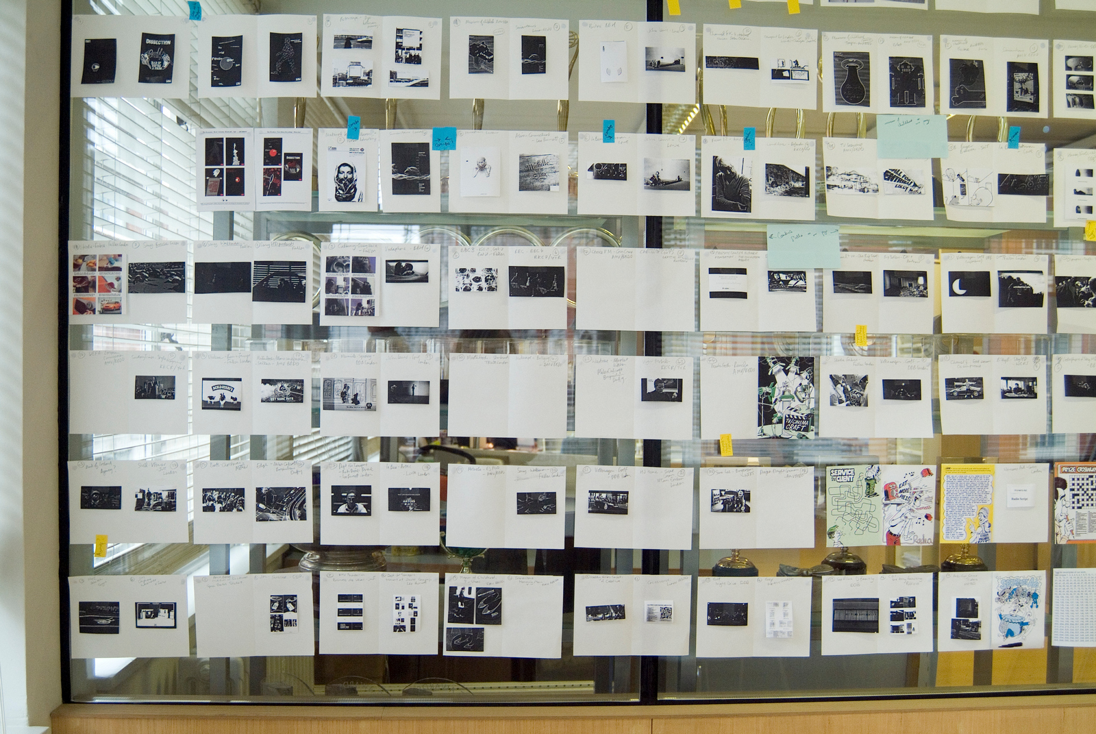
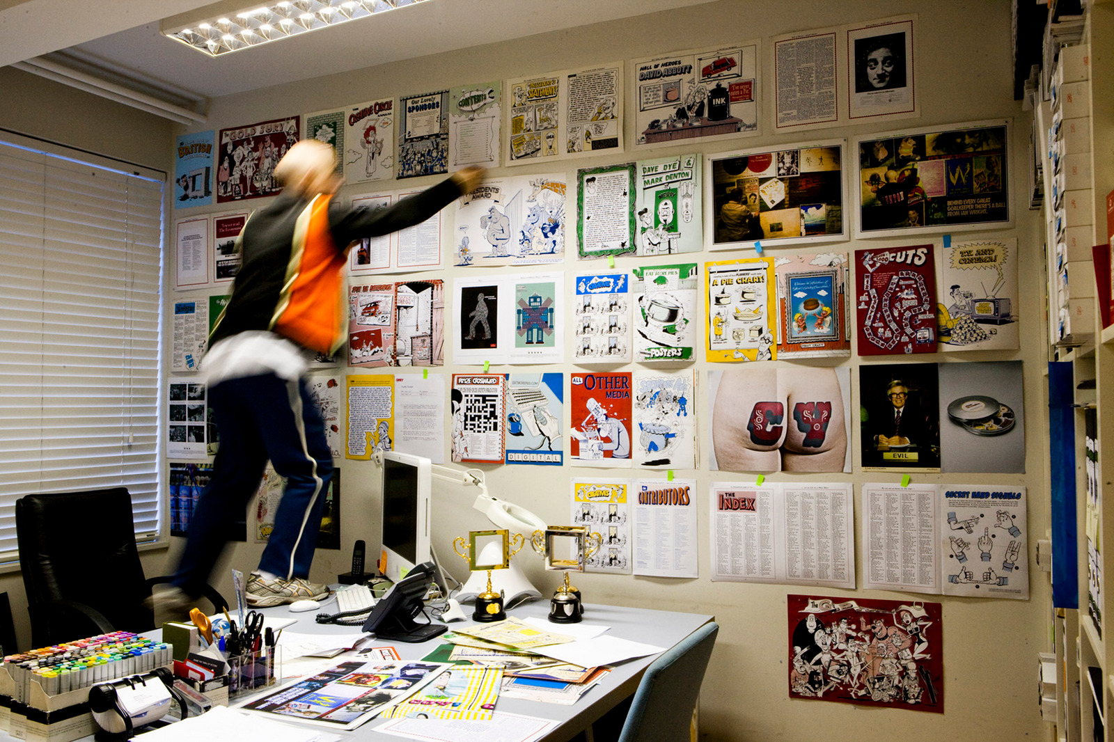
 Throughout the process Mark had a wall which showed of every page of the annual in progress.
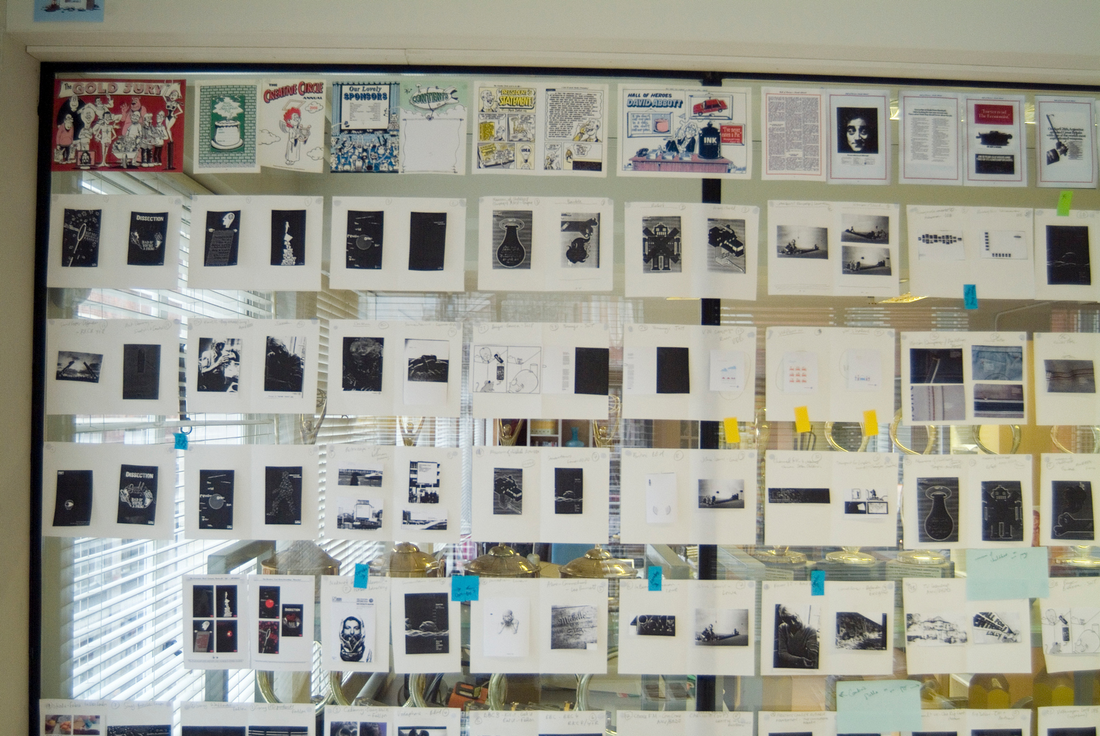
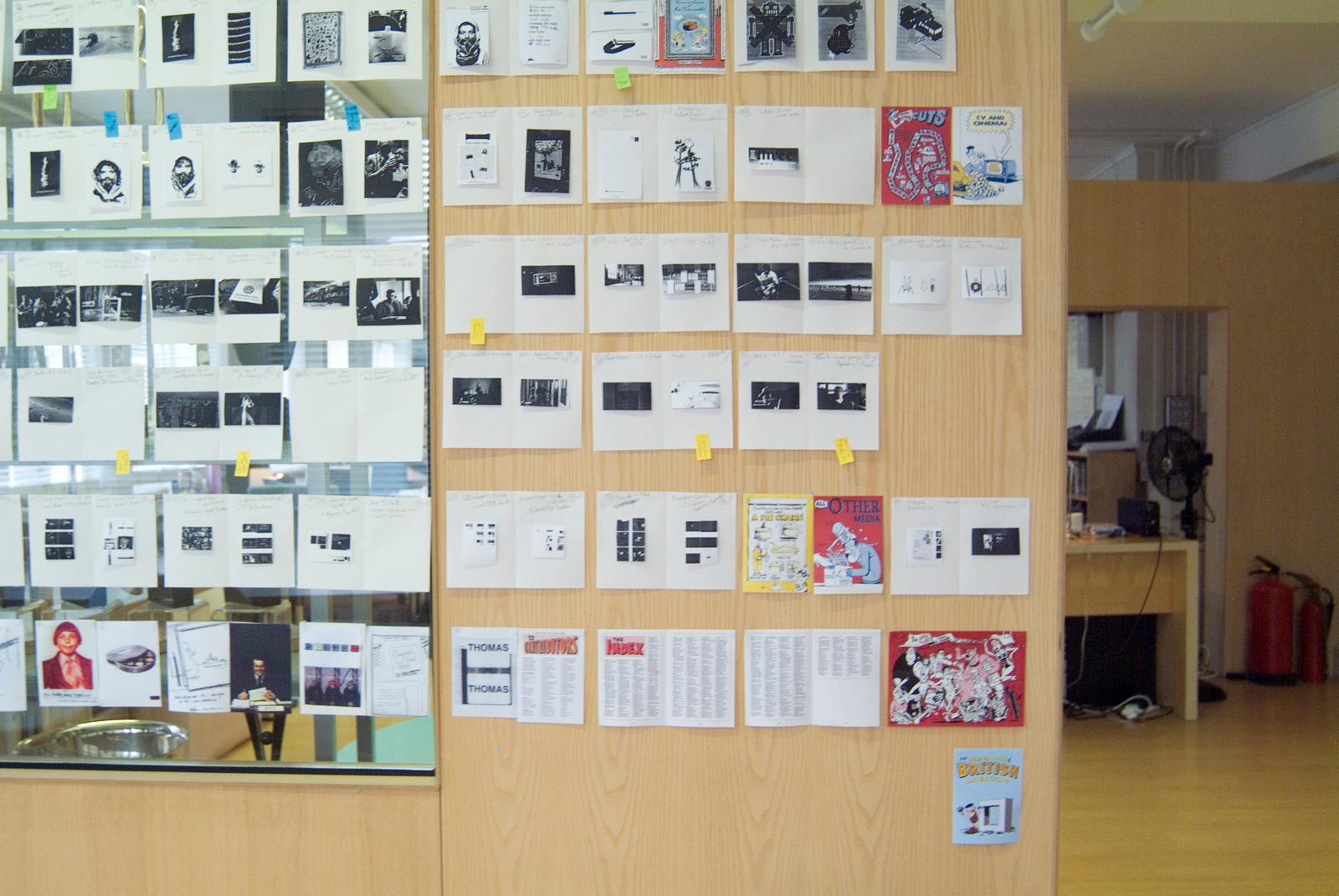 Here's Mark in action swapping out pages.
(The blur gives you some idea of the speed he's travelling.)
Here's Mark in action swapping out pages.
(The blur gives you some idea of the speed he's travelling.)
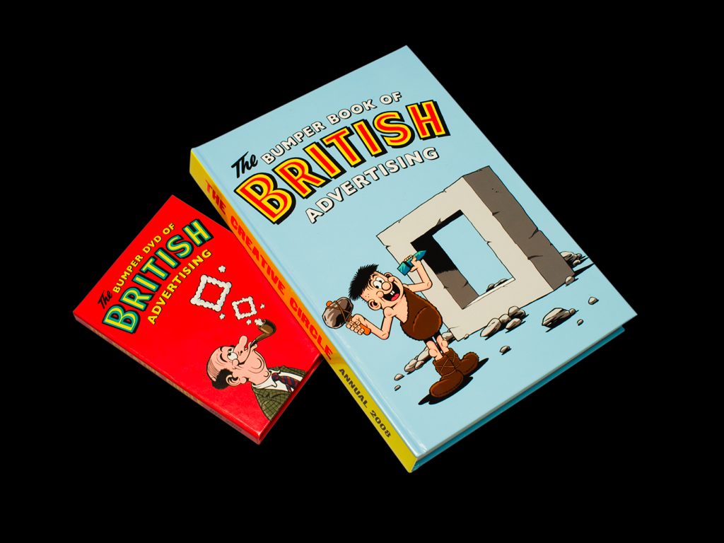
 THE FINISHED ANNUAL & DVD.*
*Remember them?
THE FINISHED ANNUAL & DVD.*
*Remember them?
 STEP 15: 2009 CALL FOR ENTRIES.
Stunts were were all the rage in 2008.
So rather than run a DPS in Campaign, we did a stunt that got picked up and reported in Campaign.
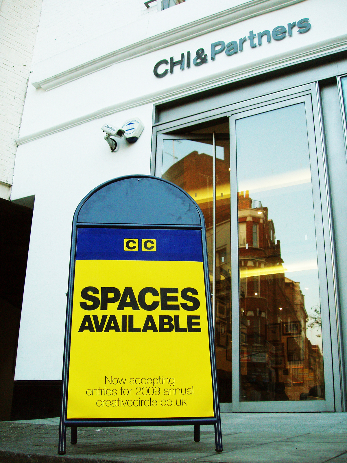
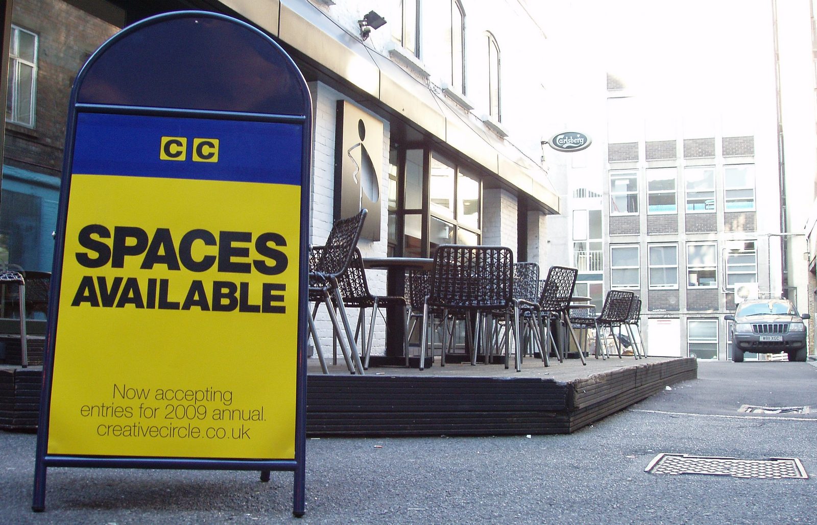
These signs were placed outside all of the big agencies in London.
(For all you Johnny Foreigners; They are styled like NCP car parking signs.)
STEP 15: 2009 CALL FOR ENTRIES.
Stunts were were all the rage in 2008.
So rather than run a DPS in Campaign, we did a stunt that got picked up and reported in Campaign.
These signs were placed outside all of the big agencies in London.
(For all you Johnny Foreigners; They are styled like NCP car parking signs.)
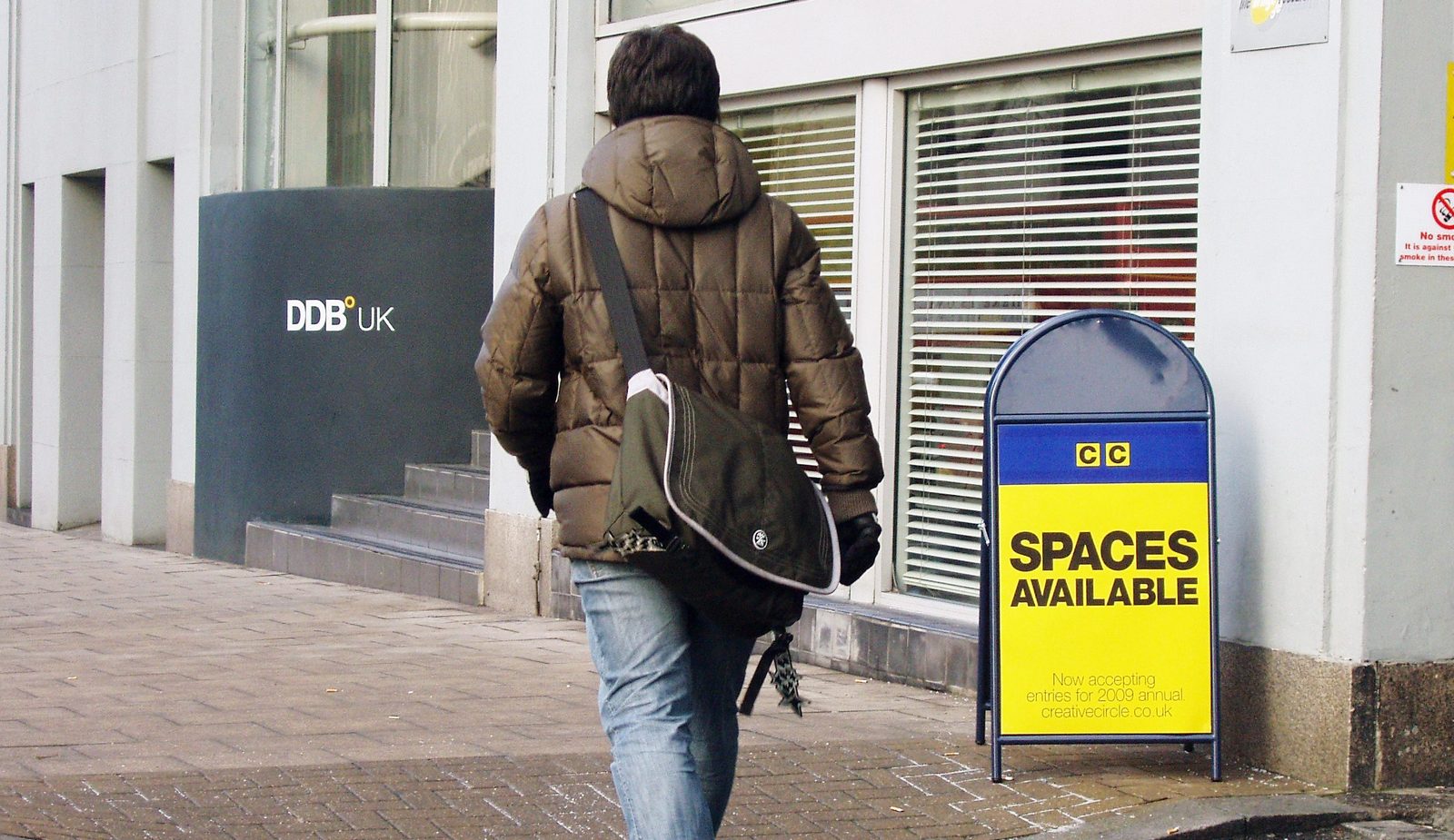 AMV/BBDO.
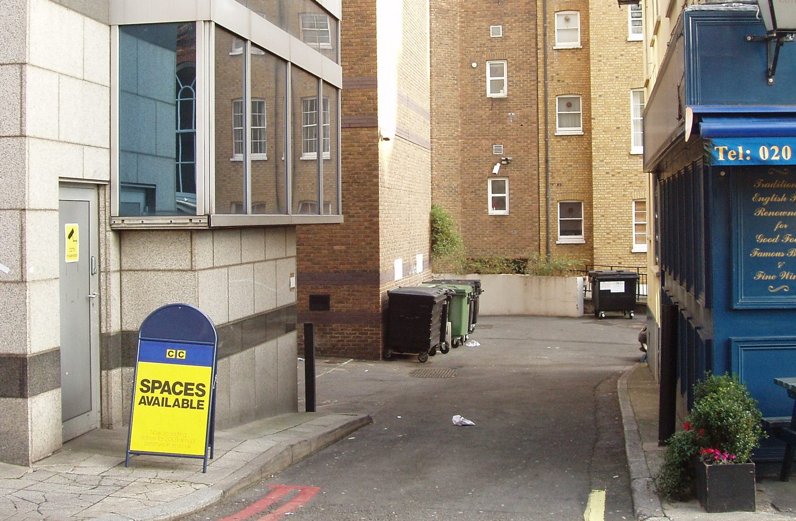
 Saatchi & Saatchi.
The famous, now demolished, Pregnant Man pub in the background.
Saatchi & Saatchi.
The famous, now demolished, Pregnant Man pub in the background.
 STEP 15: THE 2009 AWARDS ANNUAL.
Mark asked AMV/BBDO to create the annual.
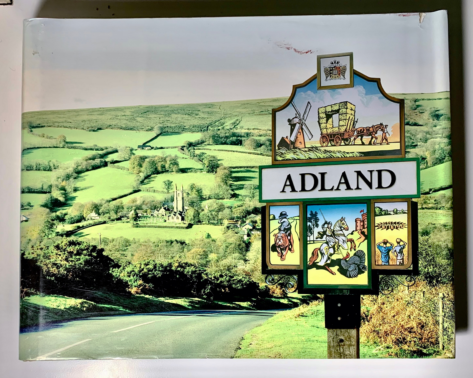
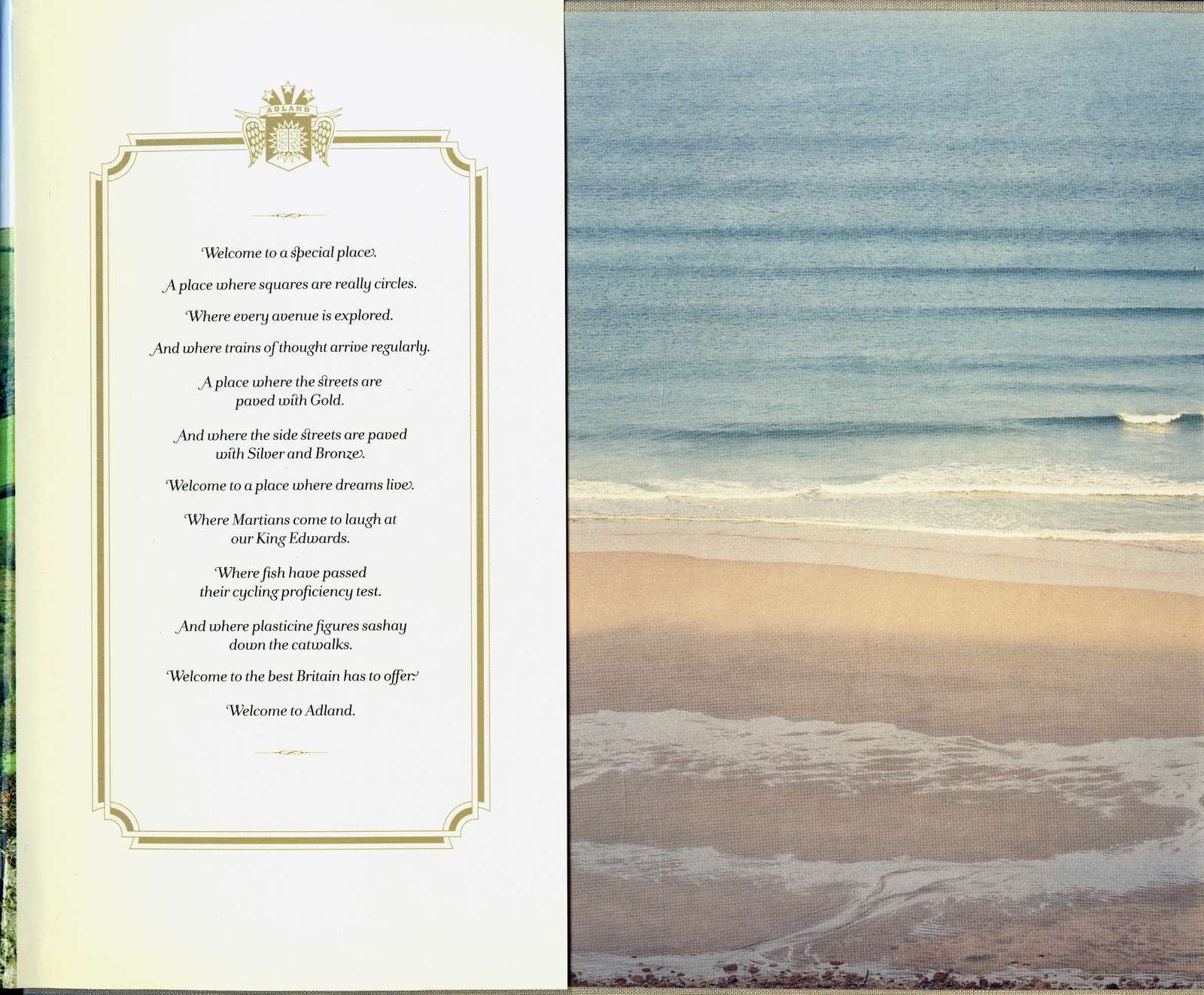
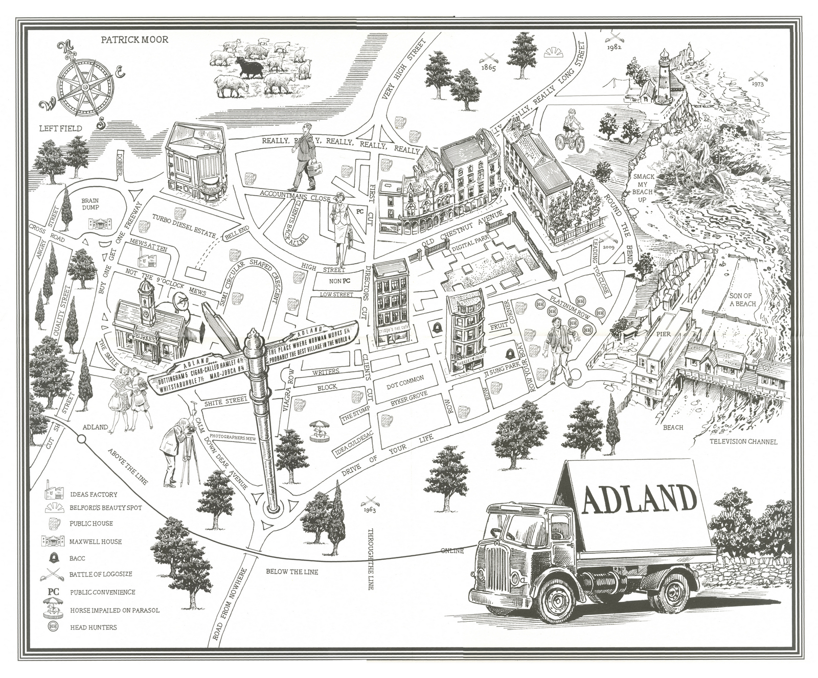
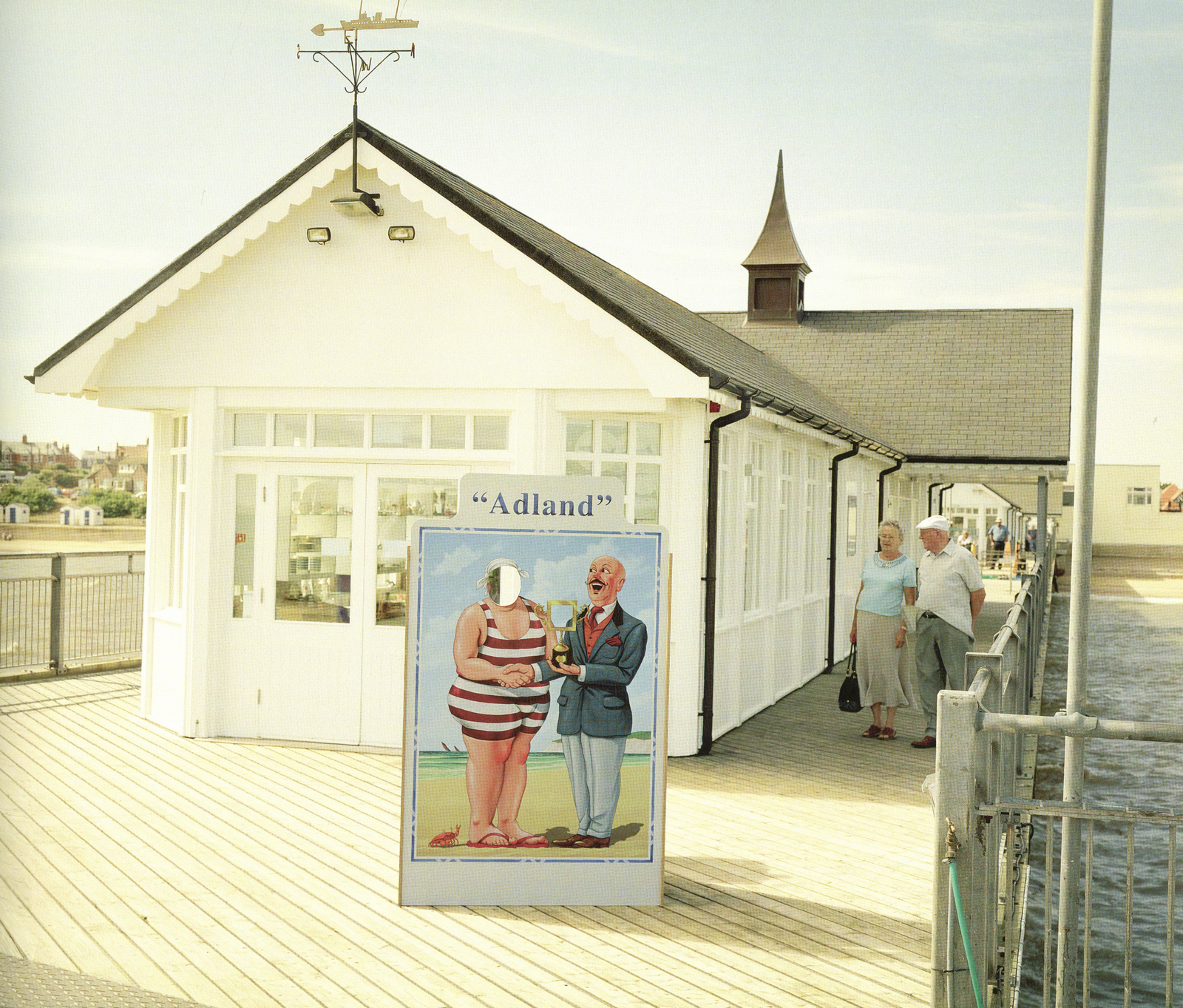
Mark Fairbanks lead the team with a neat idea; Adland.
Turning that phrase, which refers to our industry, into an actual location.
STEP 15: THE 2009 AWARDS ANNUAL.
Mark asked AMV/BBDO to create the annual.
Mark Fairbanks lead the team with a neat idea; Adland.
Turning that phrase, which refers to our industry, into an actual location.
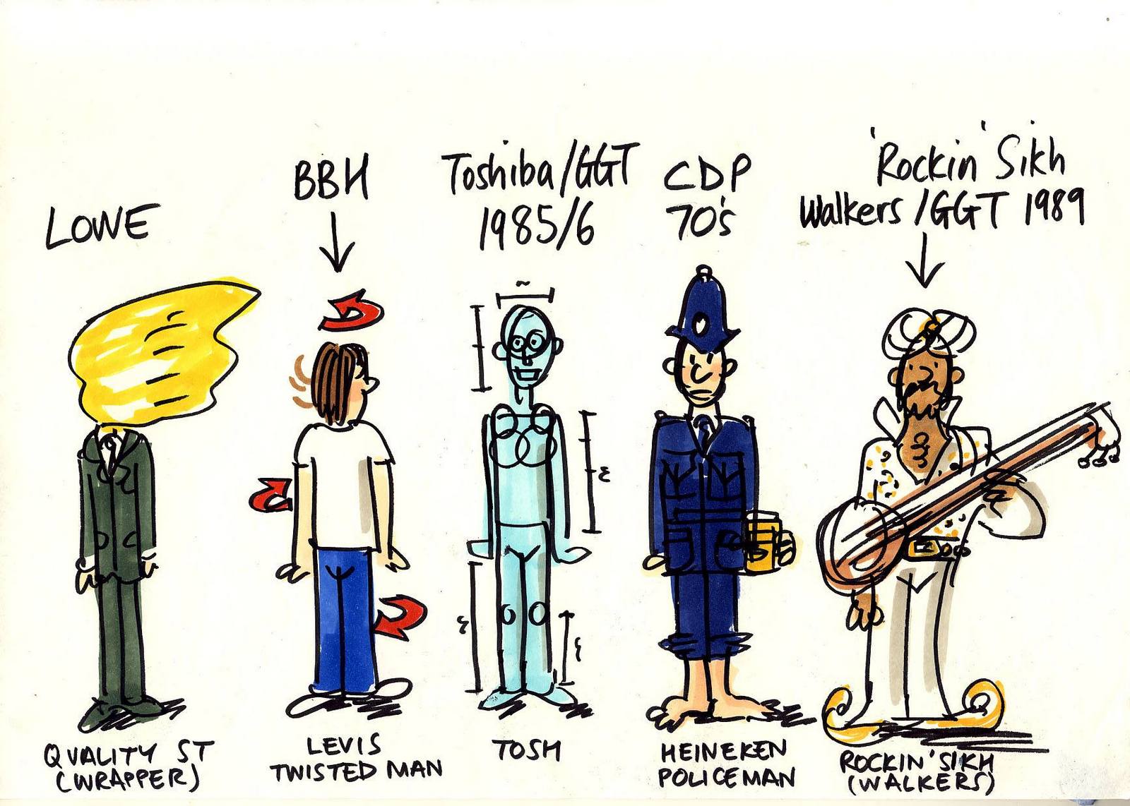
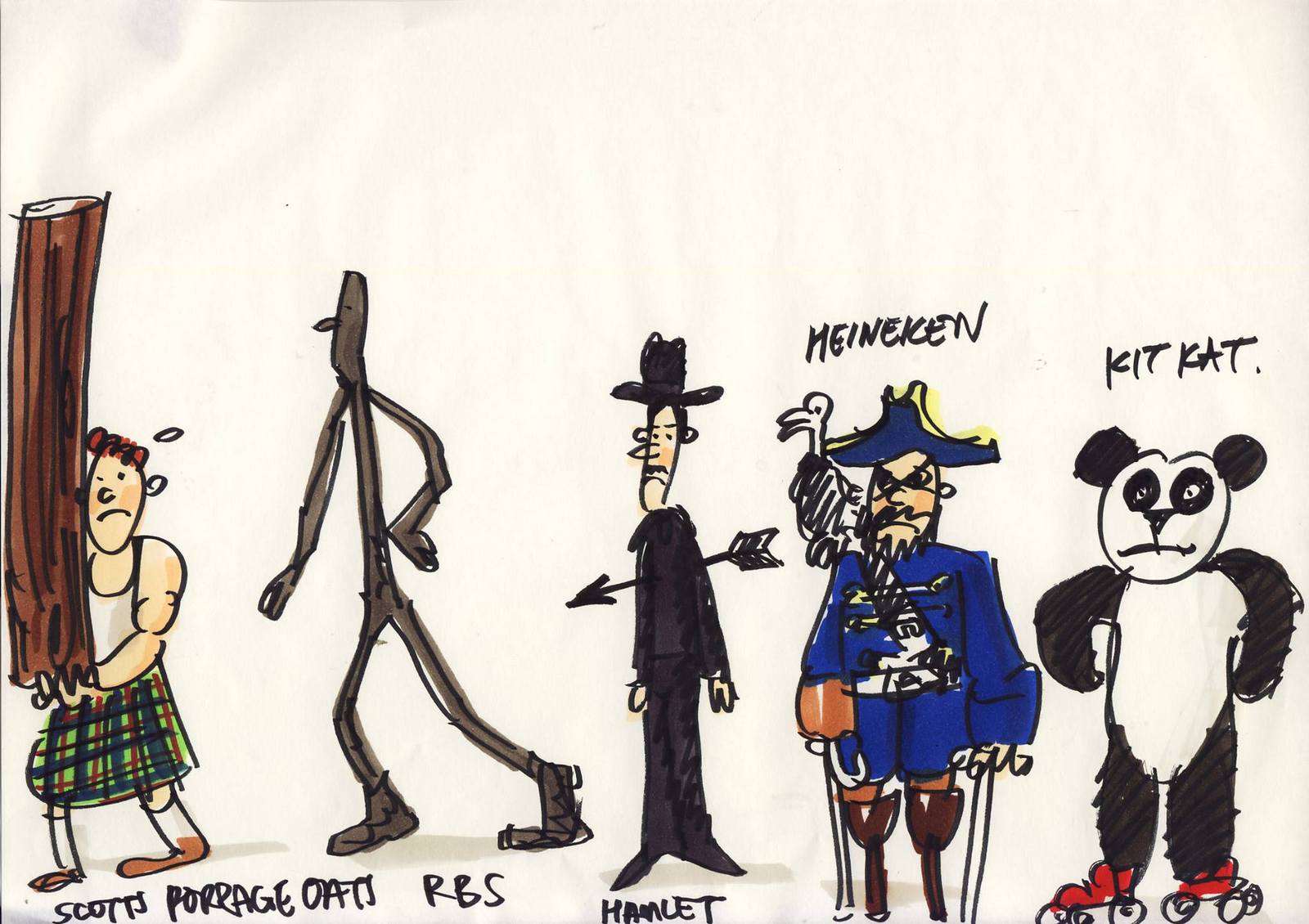
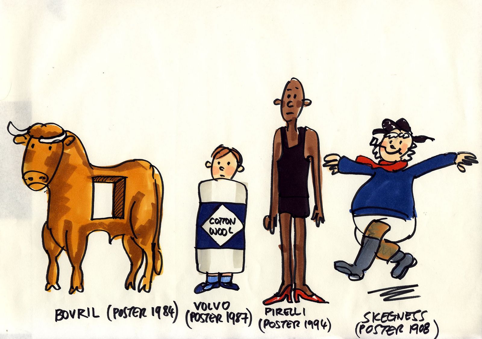
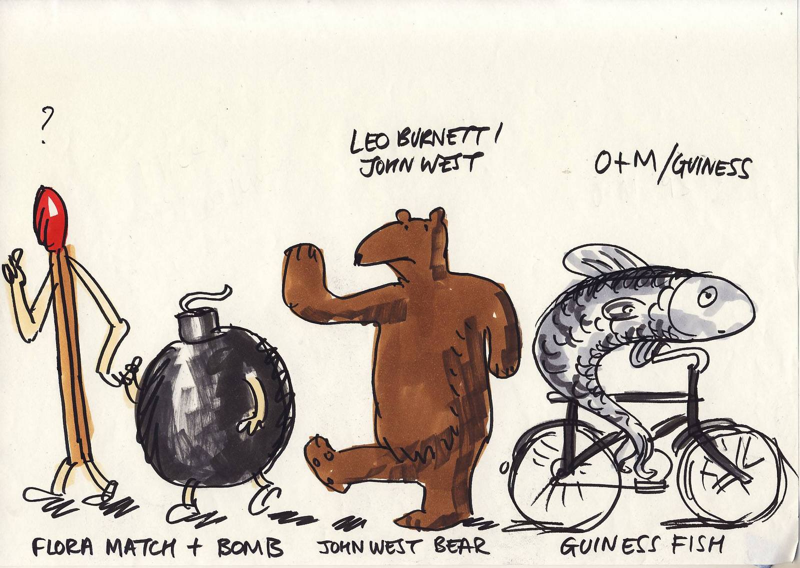
 STEP 19: ADLAND! THE FILM.
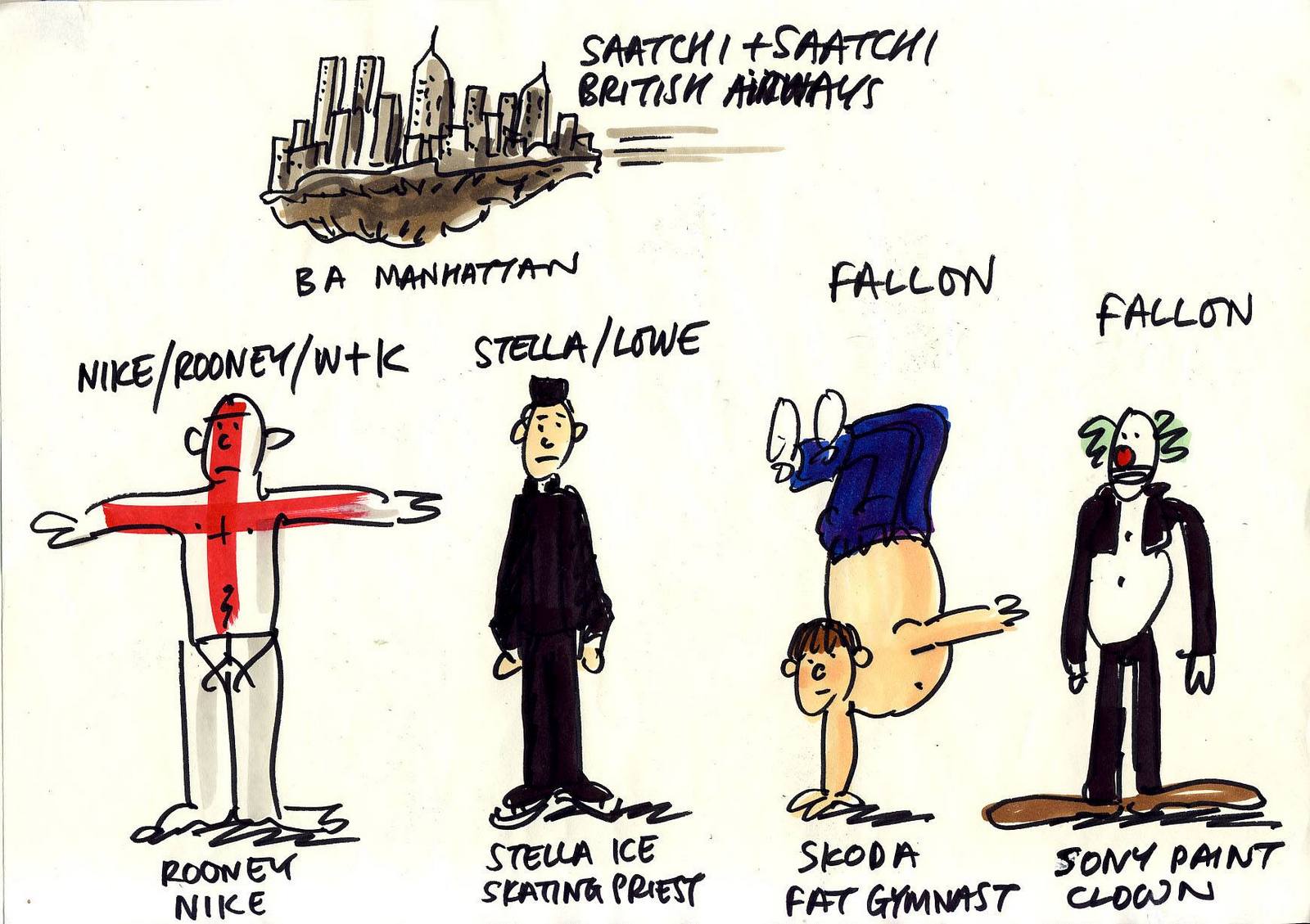
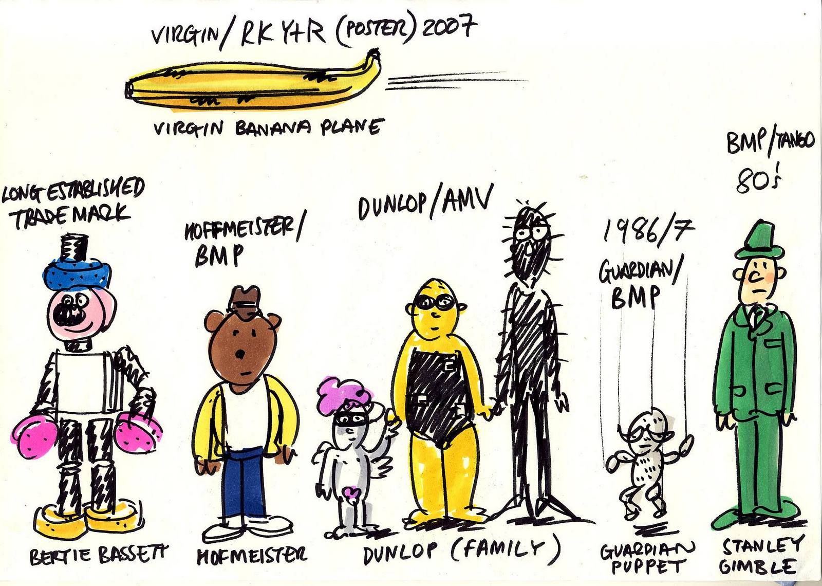
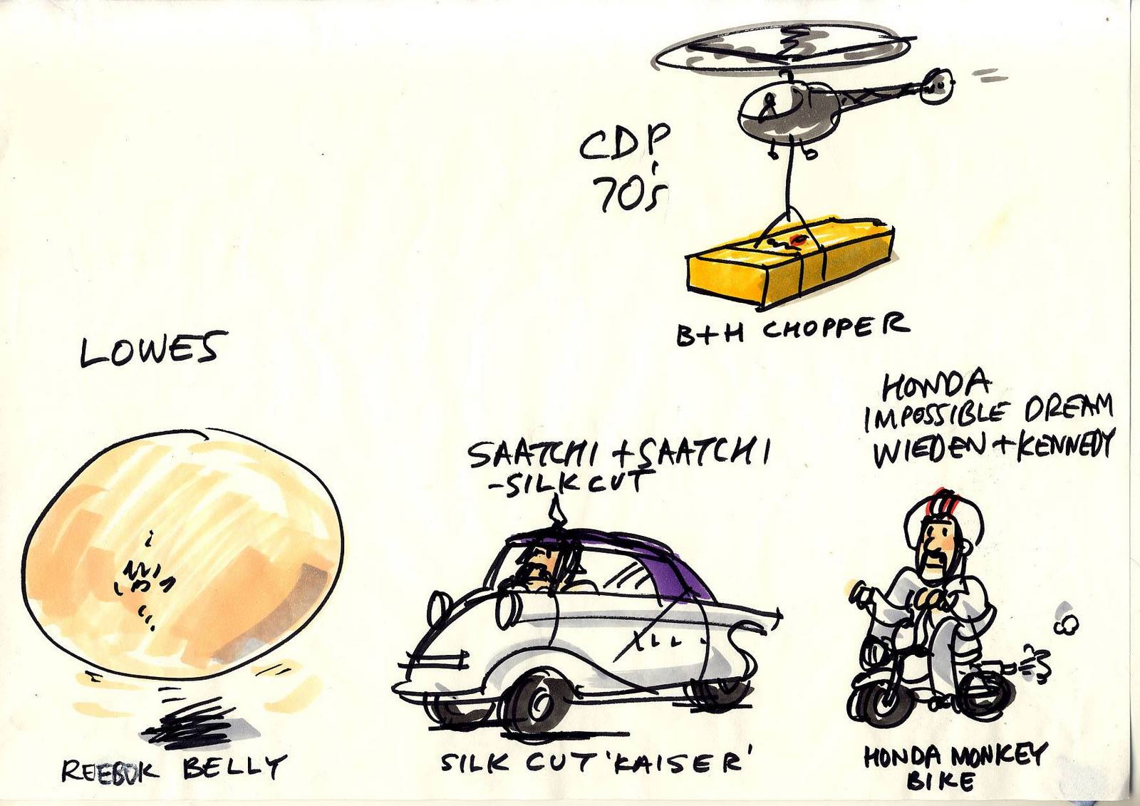
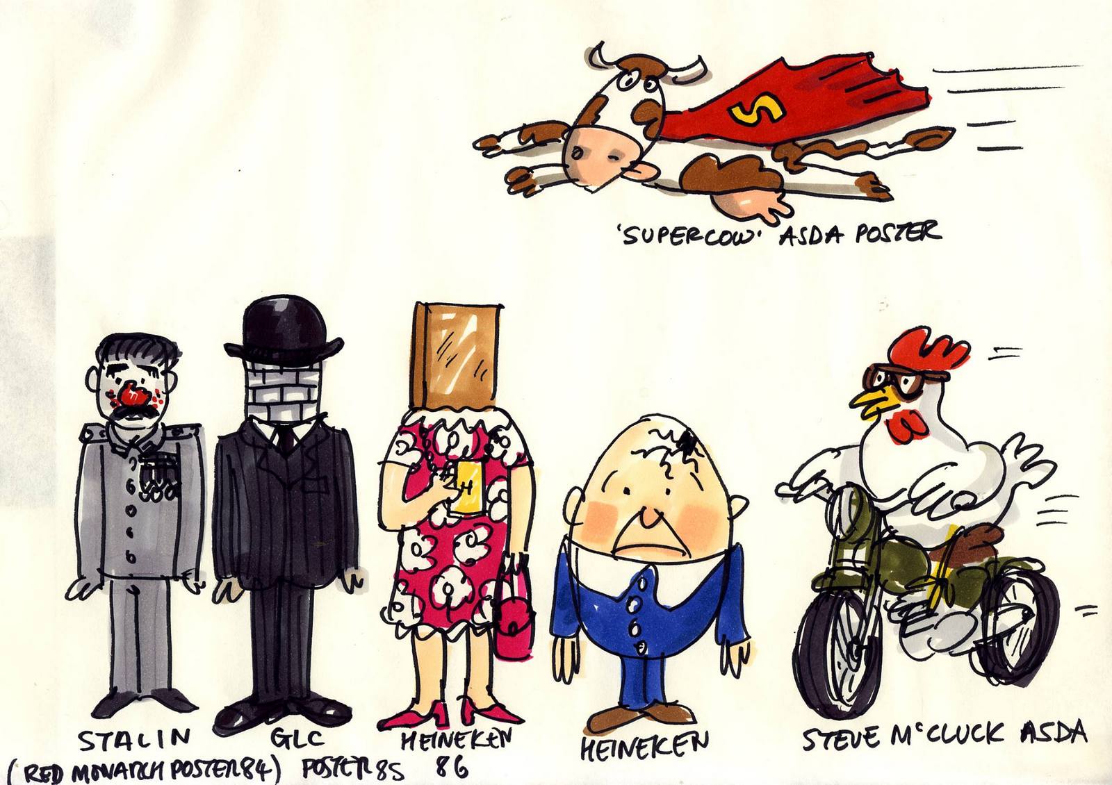
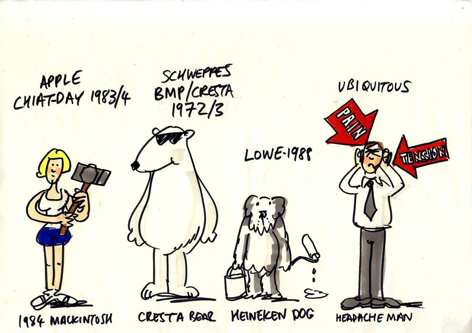
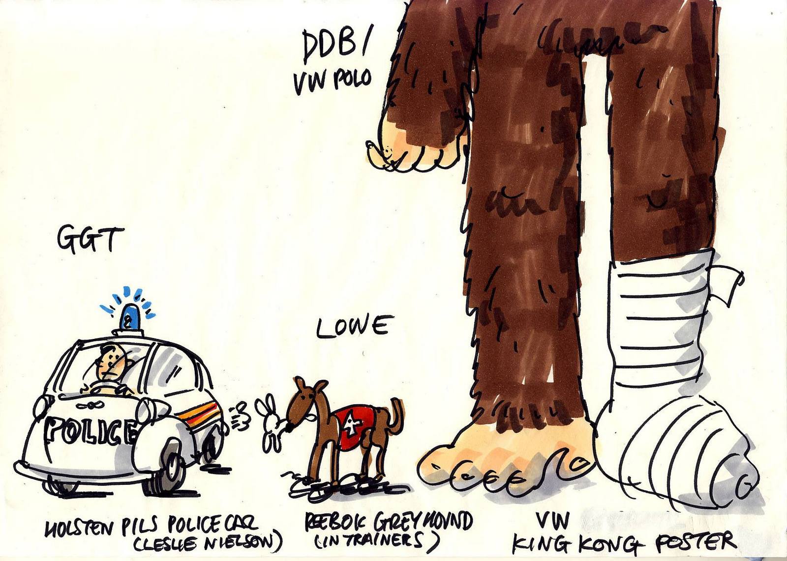
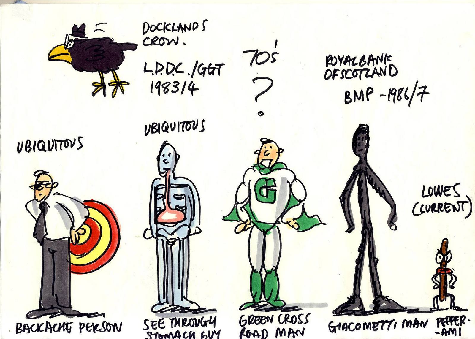
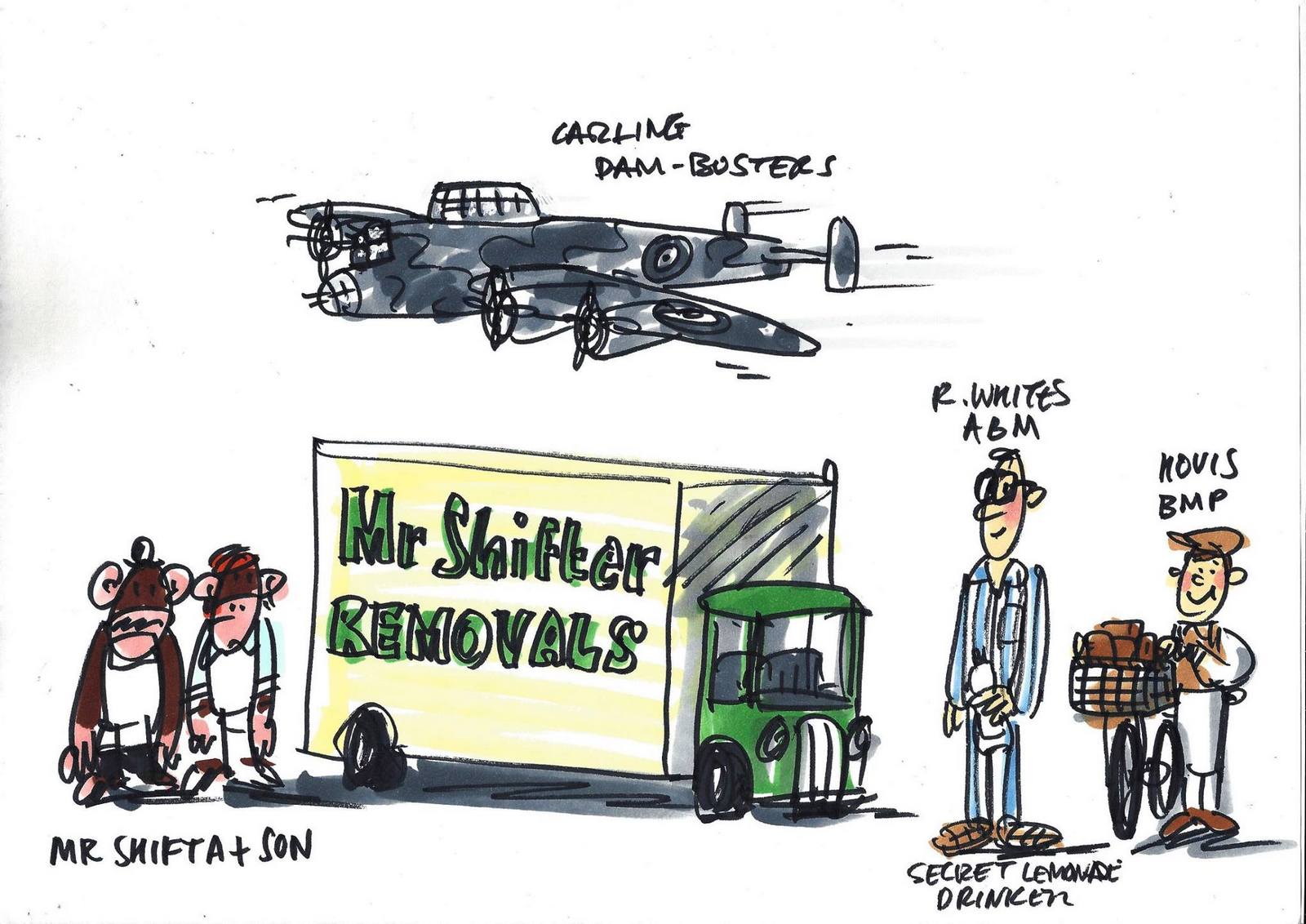
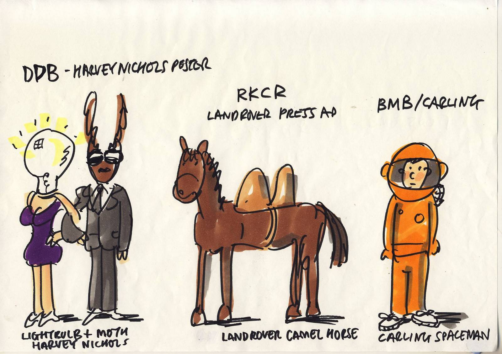
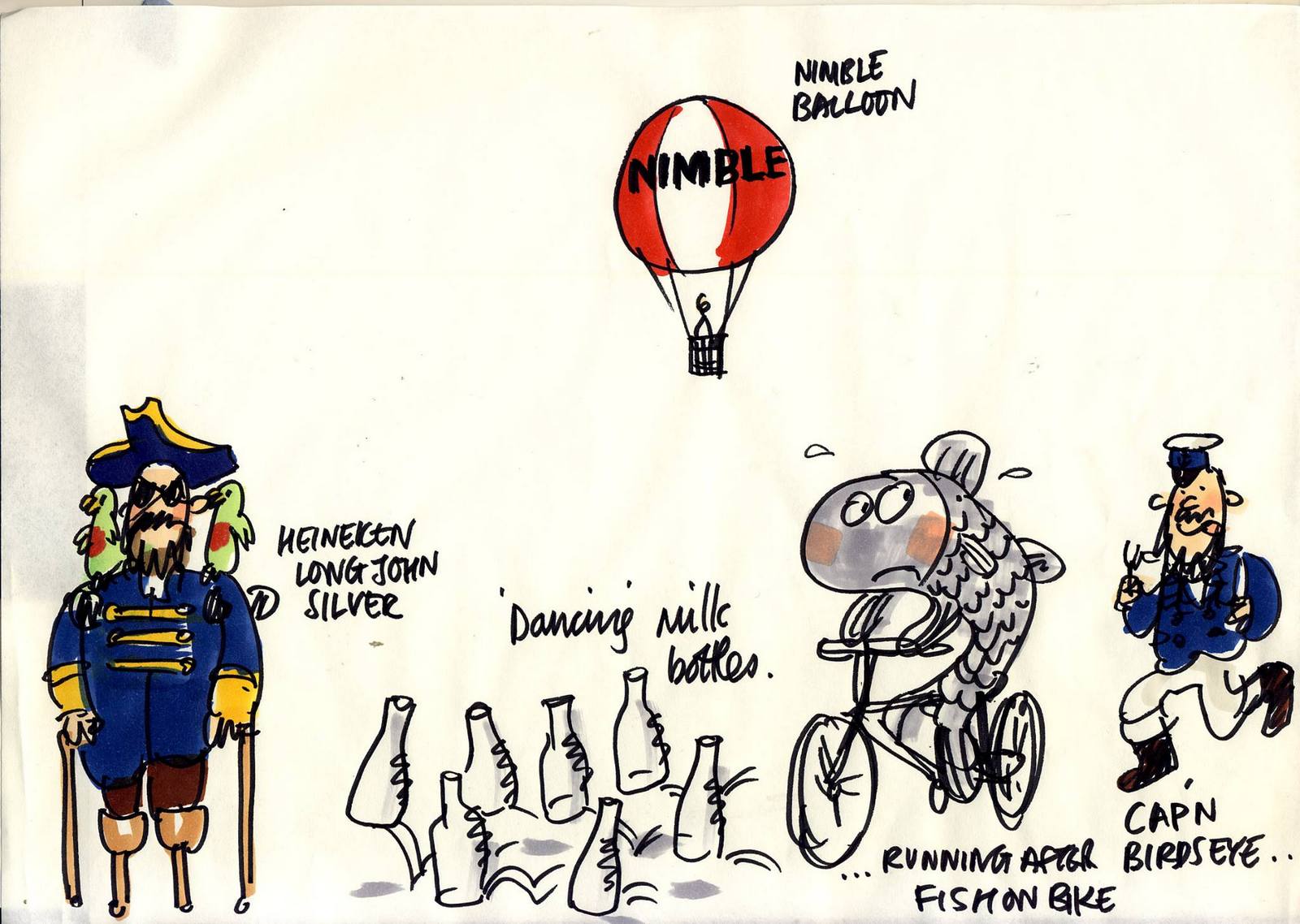
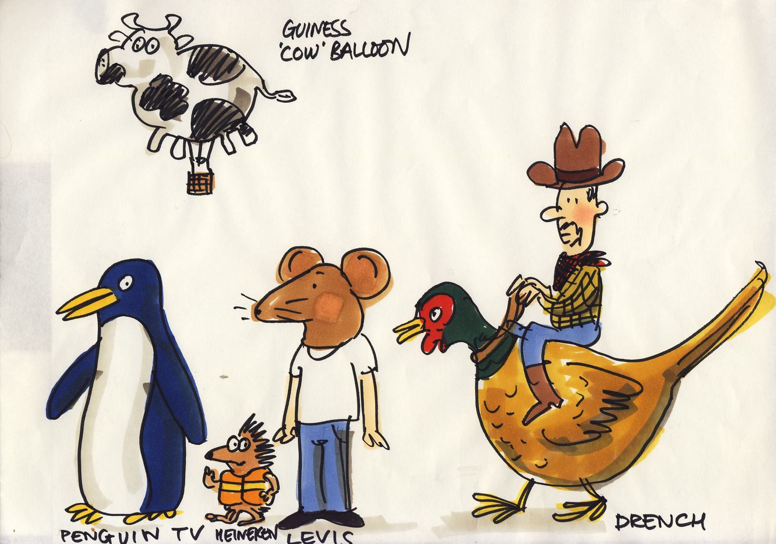
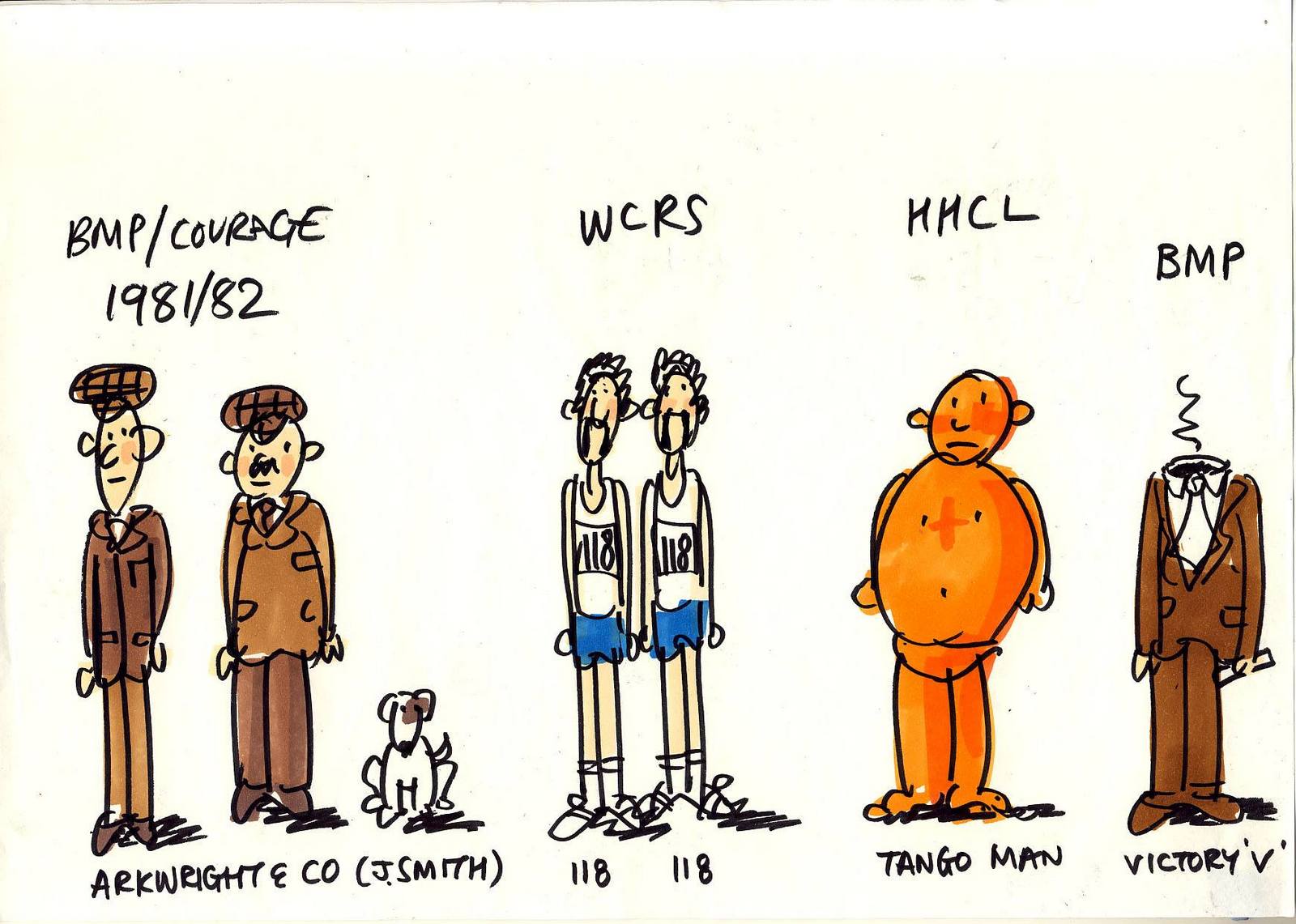
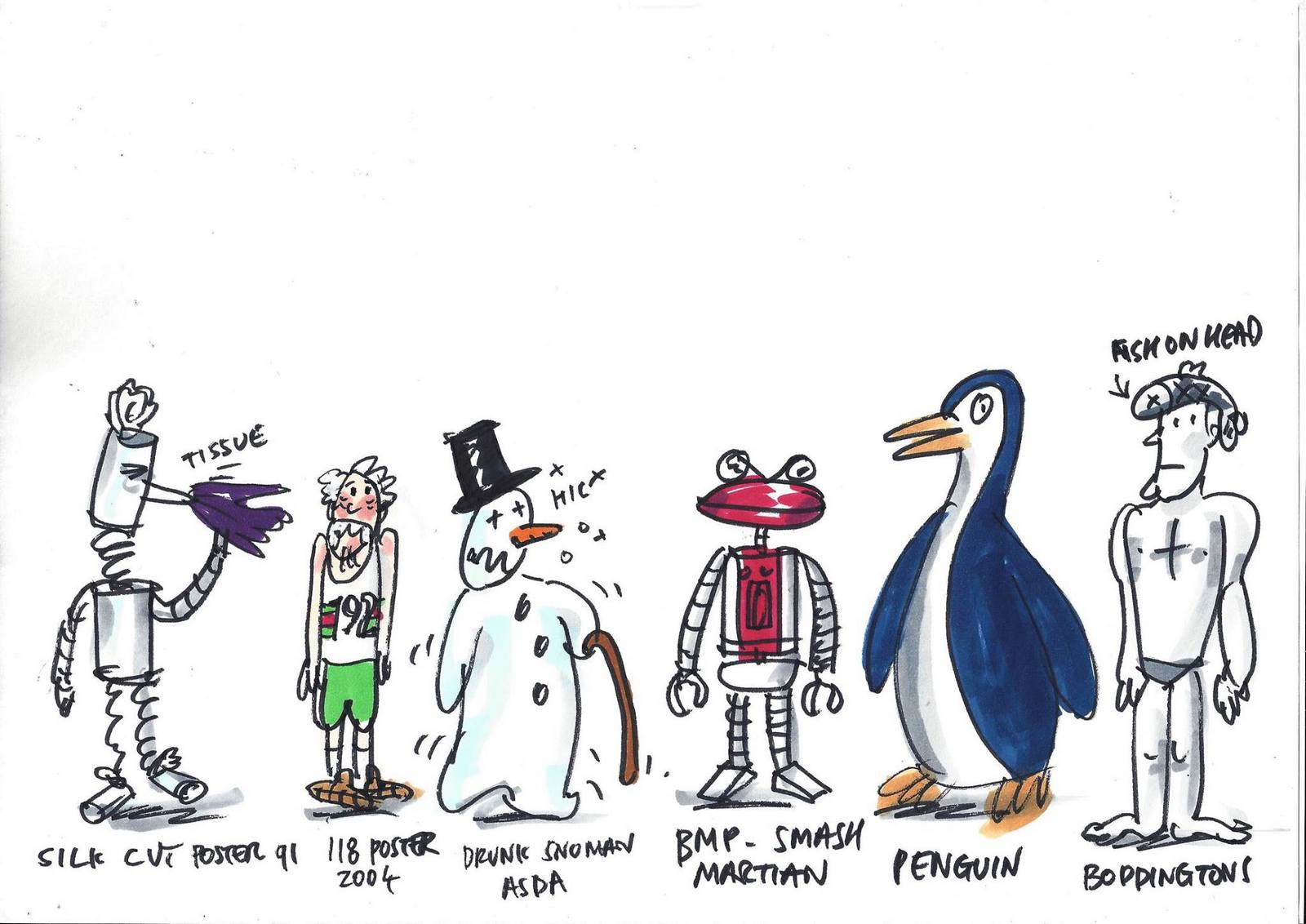
Mark populates Adland with ad icons or characters from the last fifty or so years of British advertising.
Then persuades an animation company (A Large Evil Corporation) to donate their time and energy to it.
I could show a couple of pages of these, you'll get the idea, but I think they're great, so I'm showing them all.
STEP 19: ADLAND! THE FILM.
Mark populates Adland with ad icons or characters from the last fifty or so years of British advertising.
Then persuades an animation company (A Large Evil Corporation) to donate their time and energy to it.
I could show a couple of pages of these, you'll get the idea, but I think they're great, so I'm showing them all.
 FINISHED FILM.
STEP 17: MARK GETS FIRED.
THE END.
FINISHED FILM.
STEP 17: MARK GETS FIRED.
THE END.
'We want a Patek Philippe!'.I'm told intermediaries hear that phrase on a regular basis.The problem is, most ad agencies can't do it.Most are unable translate the signals and nuances of the world's of premium and fashion.It's why the majority of advertising in those categories is produced in-house.But that's not perfect either, they may capture the right vibes but they rarely create anything with substance.They rarely position a brand or create long-term adverting campaigns.Much of it being indistinguishable from the editorial that surrounds it.One agency has operated in the sweet spot between the two; Leagas Delaney.Over the last forty odd years, they've produced long running campaigns for everyone from Harvey Nicholls to Porsche, from Garrards to Pictet, from Dom Perrignon to Harrods.Patek Phillipe is a perfect example.The advertising has the right look and feel, which is gently evolved year on year, but for the last 27 years it's been based on a single thought; 'You never own a Patek Phillippe, you merely look after it for the next generation'.It's why people now ask for a Patek Philippe - they want a property that lasts.So I thought I'd ask Tim how he goes about creating a long-term campaign for a premium brand.Rather than a scattershot of brands I thought it would be more helpful to focus on the detail of one, I chose Harrods.Full disclosure: I used to work on Harrods at Leagas Delaney back in the 90s.Every square inch of the agency's walls were covered in ads, not digital print outs - expensively framed high-end proofs.A walk up the stairwell, from the basement to the top floor, was like flipping through the last ten D&AD annuals.On the 4th floor, outside my office, was the Harrods campaign.As much as we admired it, it wasn't the kind of work you aspire to do when you're in your 20s.Who wants posh, elegant and timeless when you could have punchy, different and cool?At the time, the ads seemed too mannered - 'Dare we suggest this', 'May we recommend that'.Why be so snooty?Why not be chattier?They also seemed to have this kind of 'knowing' tone, one said 'Prove the Beatles wrong'.(Every time my partner Sean would walk past he'd give a different interpretation - "What? Strawberry Fields isn't Forever?", "So...You can hide your love away?" or "She didn't come in through the bathroom window?".)Then there were the sale ads; they didn't change for about fifteen years.Same headline in ever media channel.Same photographer year after year.The only thing that changed were the shots. (Which were basically products shots.)I remember Tom Carty scanning that wall, taking in all those sale ads, from ceiling to floor, then reading the headline 'There's only one Harrods. There's only one sale'.After a beat, he added 'There''s only one fucking ad!'But as you clock up the years, your goals change.Crazy, cool and punchy are no longer the North Stars.They maybe be for one brand, but not every brand.People put a variety of personalities in the same shopping basket.They may buy a science fiction phone and put it in a case made by a 200 year-old leather company.They may juice from a kooky, knockabout start-up and wine from pretentious, unfriendly wine company.So you start trying harder to create work that reflects the businesses personality, not your own.You avoid the temptation to starting from scratch every year (because it's fun), putting your energy into building and refining what you've started.Nurturing it.Because long-lasting campaigns are far more valuable than endless short-term firework displays.They should be listed alongside the rest of a companies assets, like warehouses, machinery and staff.How much is 'Just do it' worth?Or, getting back to Harrods, how much is 'There's only one sale'?35 years after it was written, it's still running (albeit in a bastardised form).So how did it start?There were 3 key ingredients:Language.Tim describes it as 'nose up, arms out'.Meaning, upper-class, but welcoming.The language became more formal, proper.'Starts 3rd Jan' was replaced with 'Commences January 3rd.'Many headlines would begin with a 'Harrods announces...' or a 'Harrods politely suggests...'.Sometimes they'd directly reference their status, e.g. 'How the other half gives'.Unusual, almost Dickensian words started to turn up - 'For his nibs.'My personal favourite would be 'In a momentary lapse, Harrods invites you to come on down.'Put it this way; using Xmas instead of Christmas could get you fired.Font.Baskerville.A great, classy, traditional English font.For a great, classy, traditional English shop.But not just any Baskerville.Art director Steve Dunn tracked down a very particular, very nice cut.(One that I've never been able to find since).This is it.
To most people, it will look exactly like the Baskerville below that you'd find on any Mac.And, to be fair, it is very similar.
But put them next to each other and you start to spot lots of small differences.The weight of the thin and thick lines are more extreme on the digitised cut (blue).The angle of the 'A' is different.The 'J's are different lengths.As are the 'Q's.That nice curly bit on the 'R' has been straightened.But most importantly, the digitised version hasn't got ink squash, the imperfections that come from actually being printed, like the slightly fattened serifs .Also, the digitised version looks spikier and harsher on the eye.

Look at the close-up below.Who doesn't prefer the more human, imperfect 'R' on the left?Is it because it's more elegant?The ink-squash?The fact that it's wobblier, not as machine-made?Who knows?It's just feels better.More traditional. More Elegant. Which is good news if it's representing a traditional, elegant store.
DANIEL JOUANNEAU.He was a great choice as photographer.At the time he was shooting for French Vogue.Anytime I came across a copy, which was rarely, I'd rip his shots out.(Hence the cello-tape below.)He gave the ads class.A kind of effortless, French style.


The agency chose to feature the cheaper, everyday objects available; glasses, tea towels, cups, knives and forks, etc.Delivering on the the 'Arms open' bit of 'Nose up, arms open'.Most could afford to treat themselves that kind of stuff in the Harrods sale.But what makes the shots, and therefore the store, less intimidating, was how informally the objects were presented;the cups are separated by straw, the glasses are still in cellophane, the plates have brown tape holding them together.It also makes the ads more confident, stylish and contemporary.The Sale.
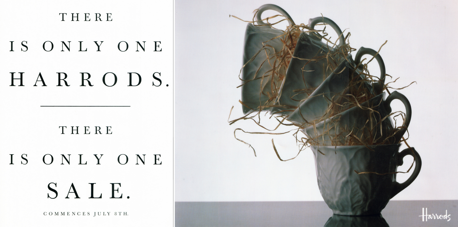
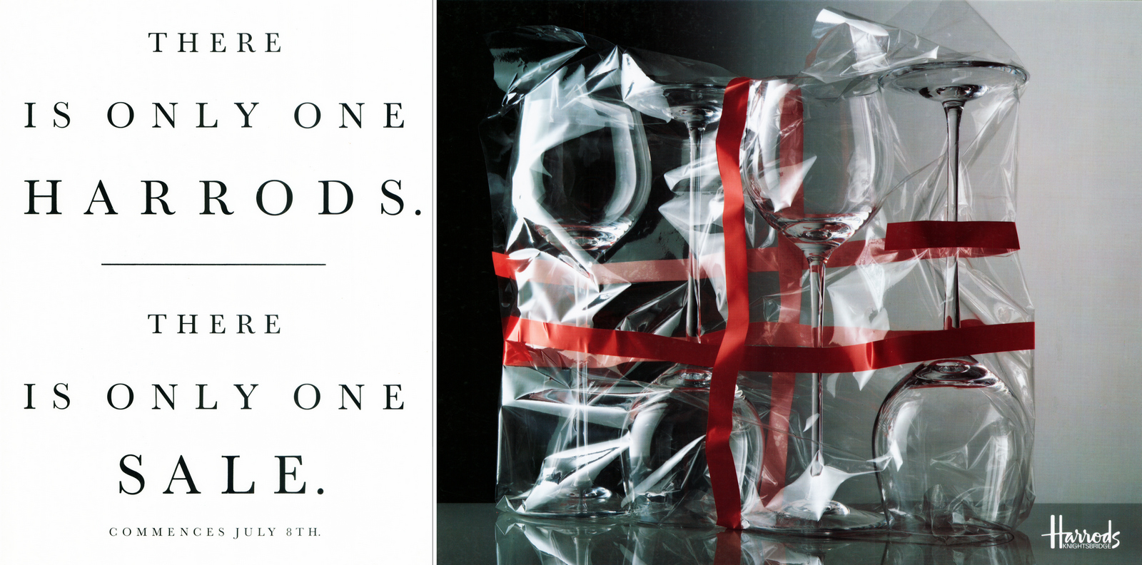
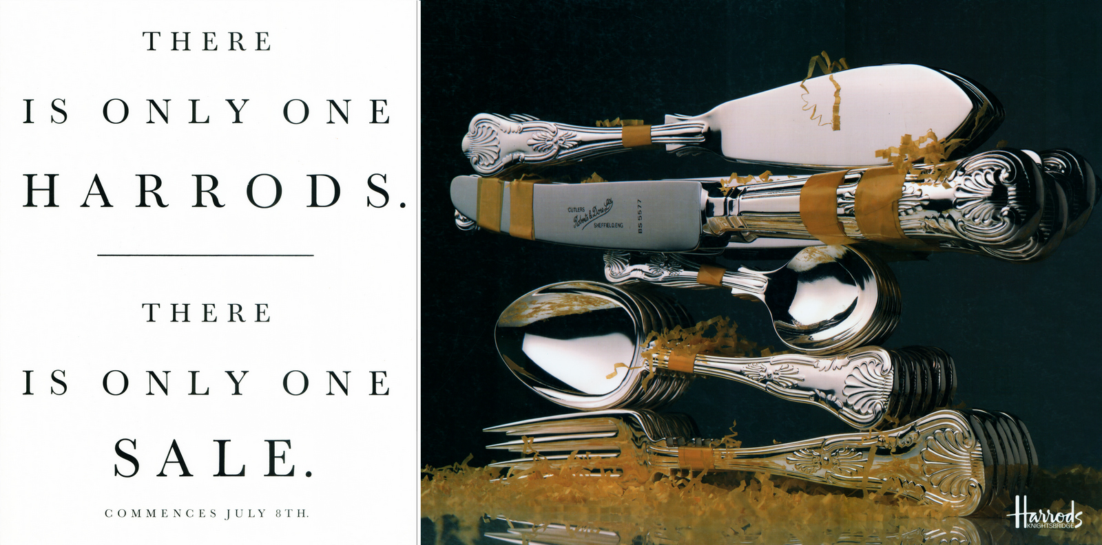
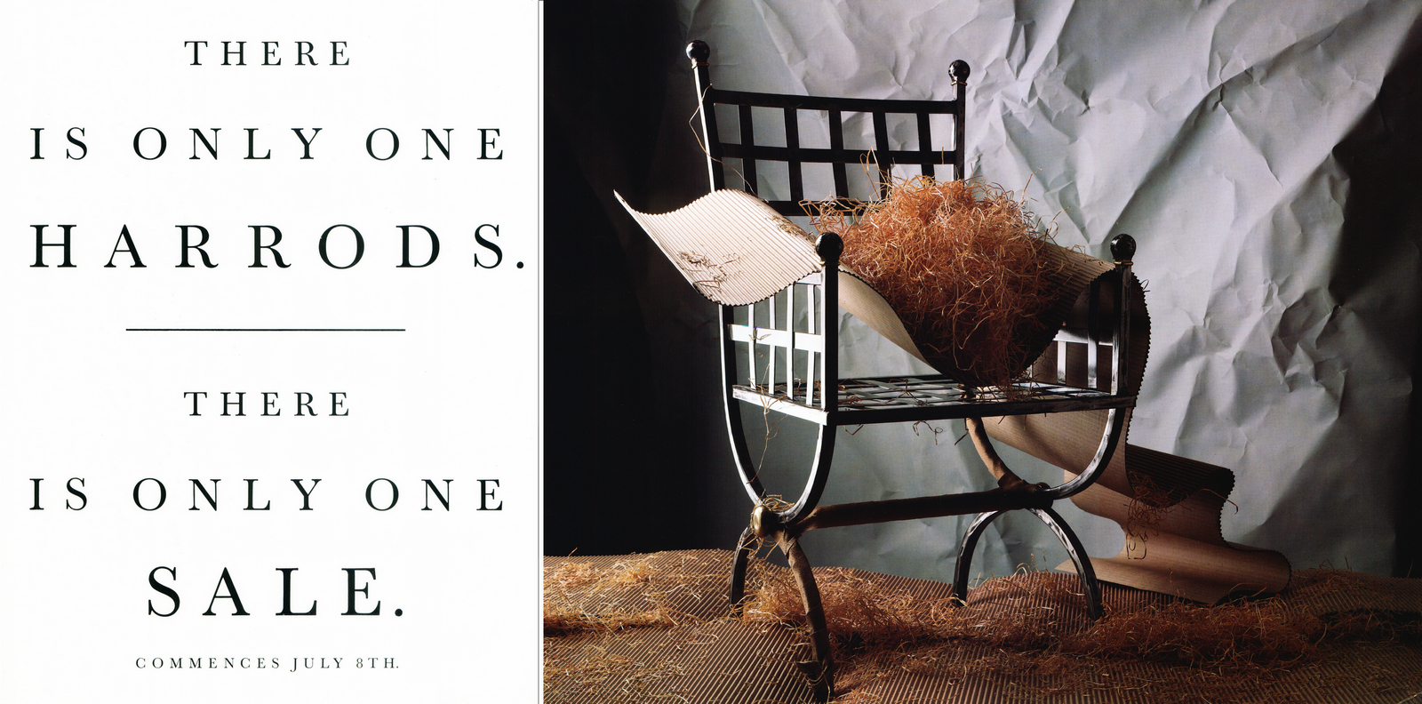
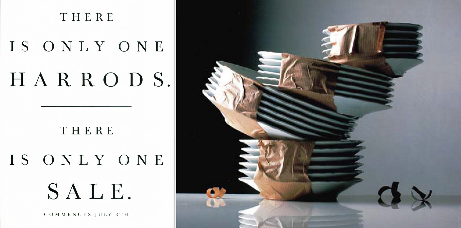
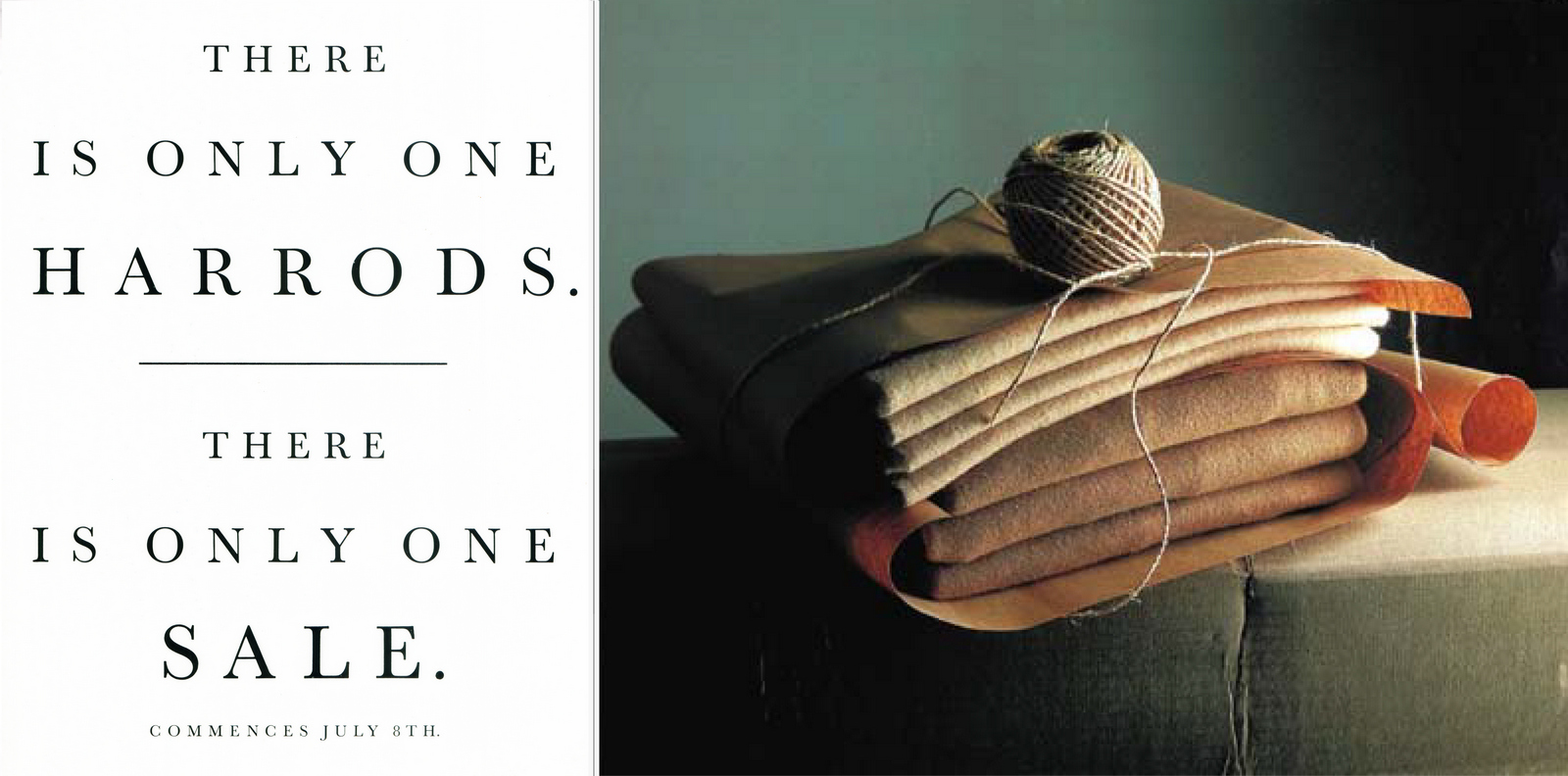
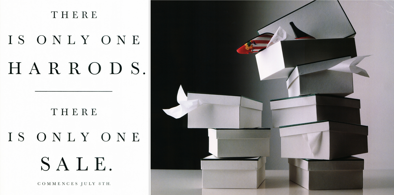
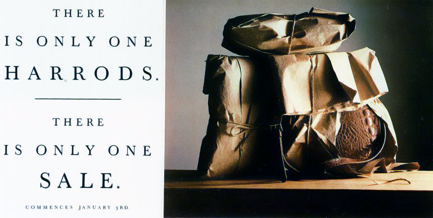
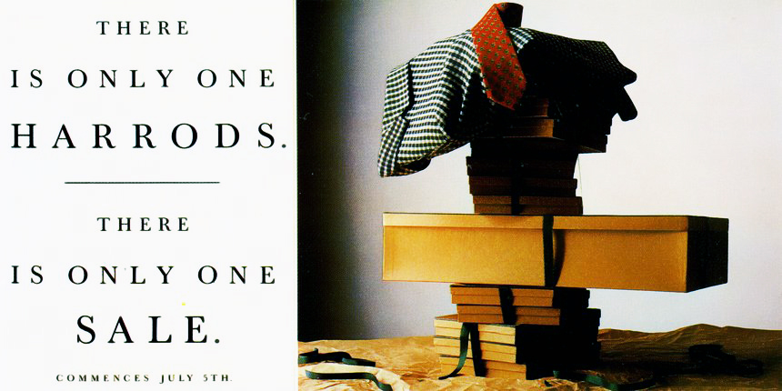
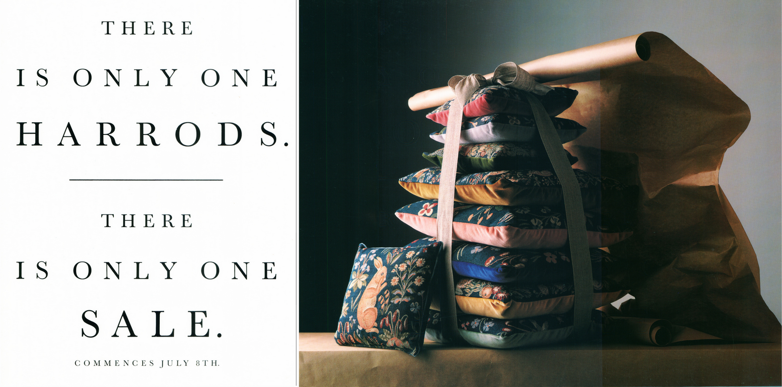
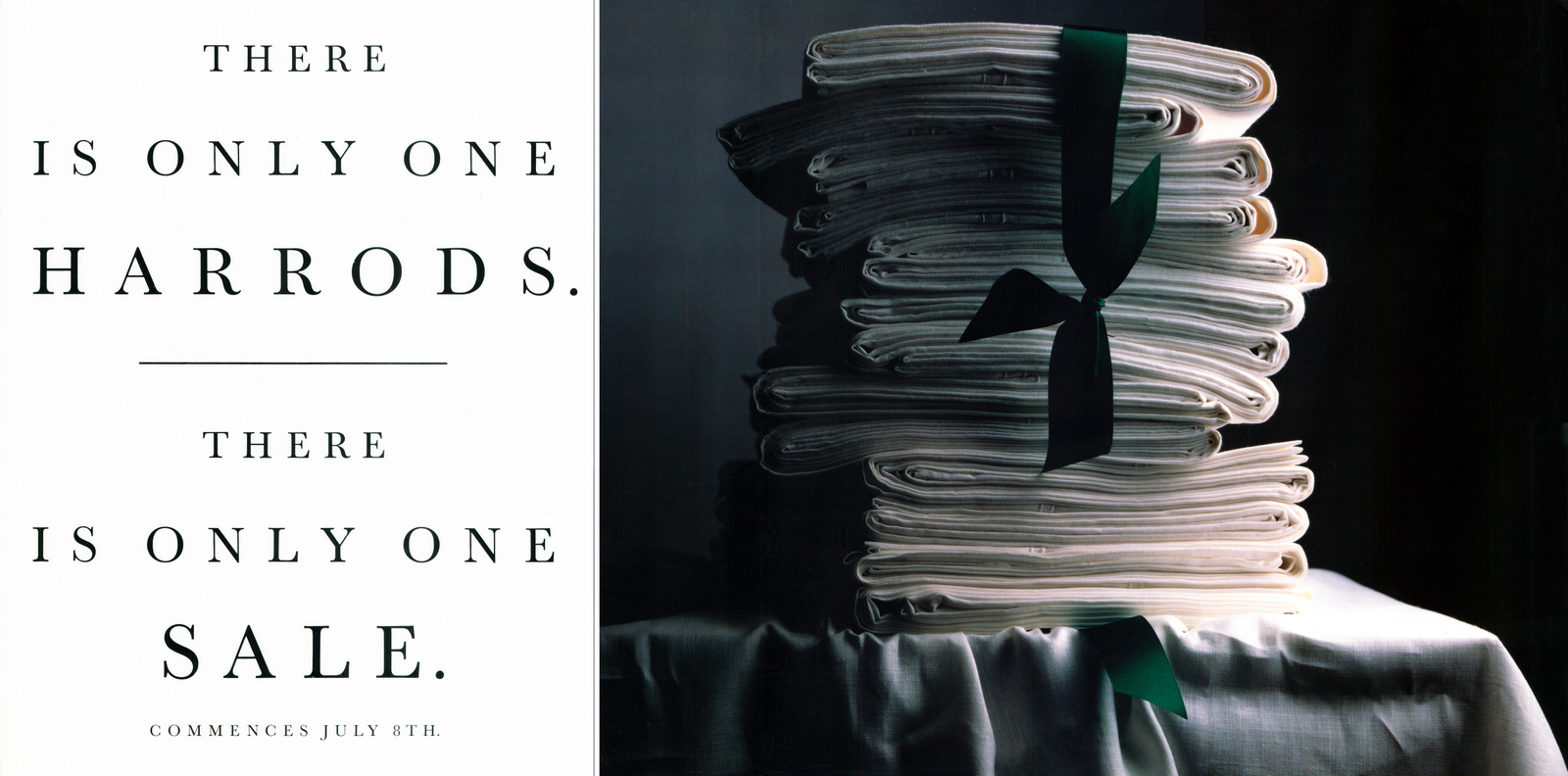
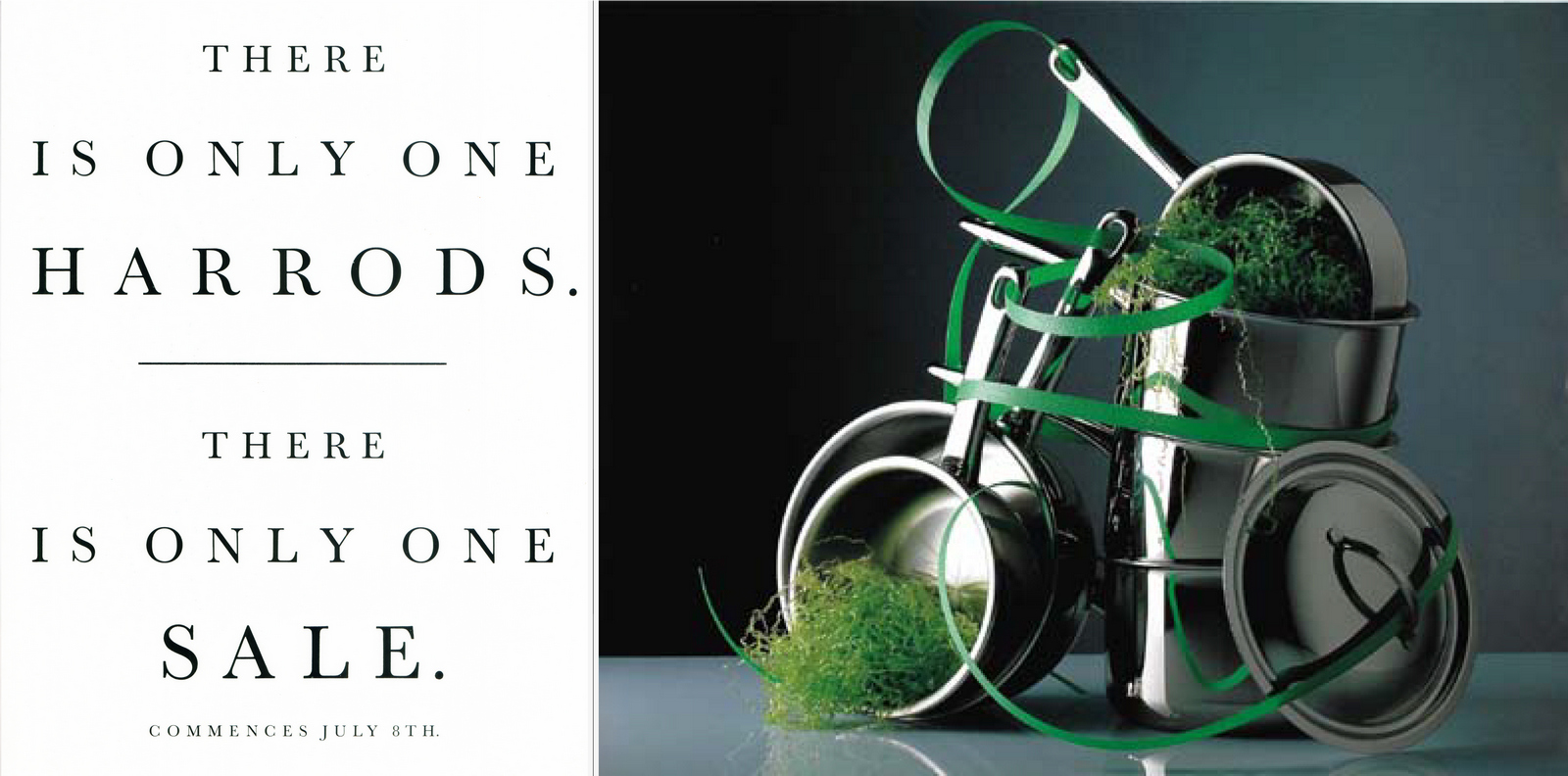
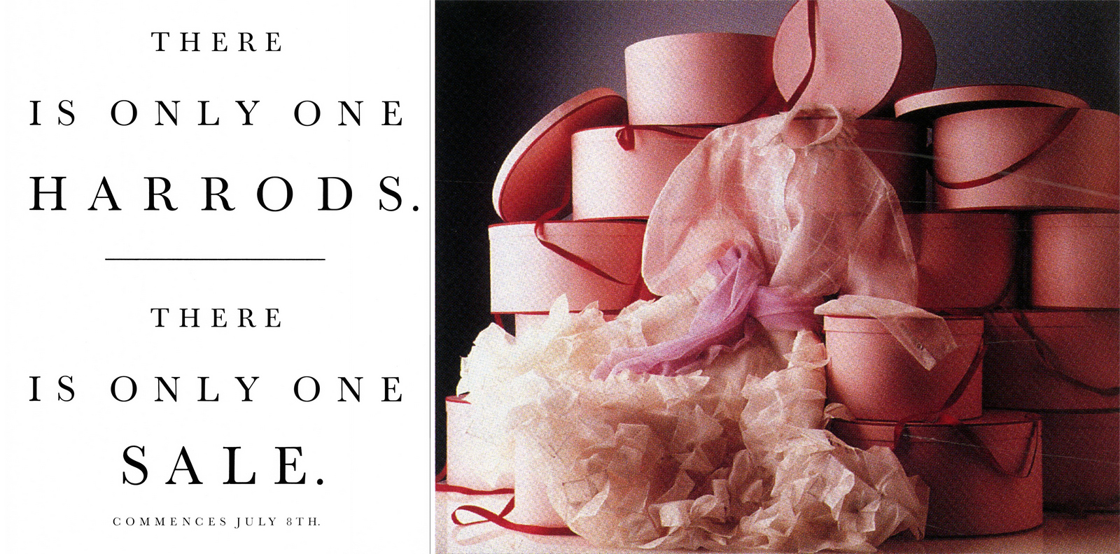


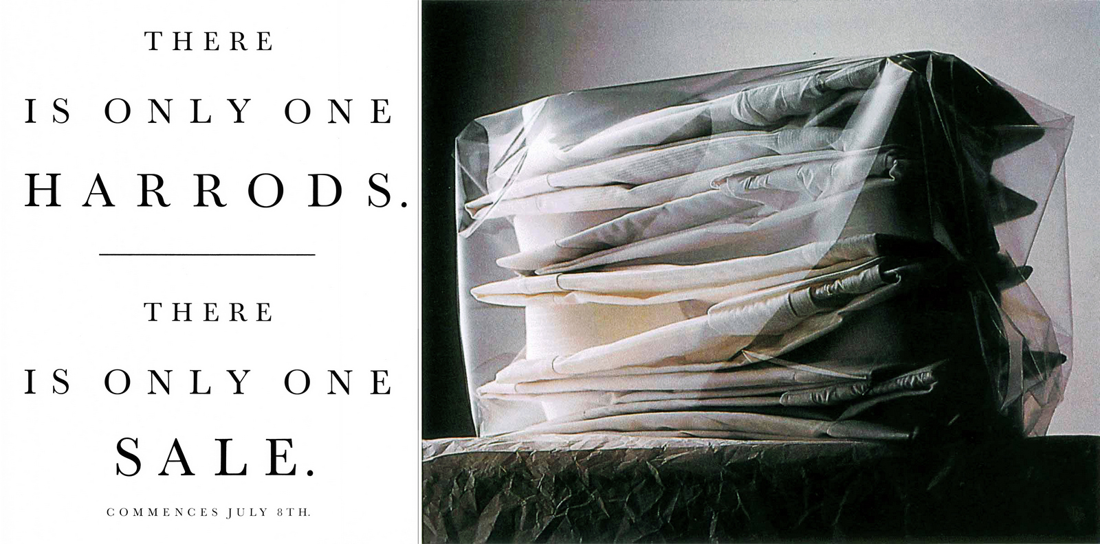
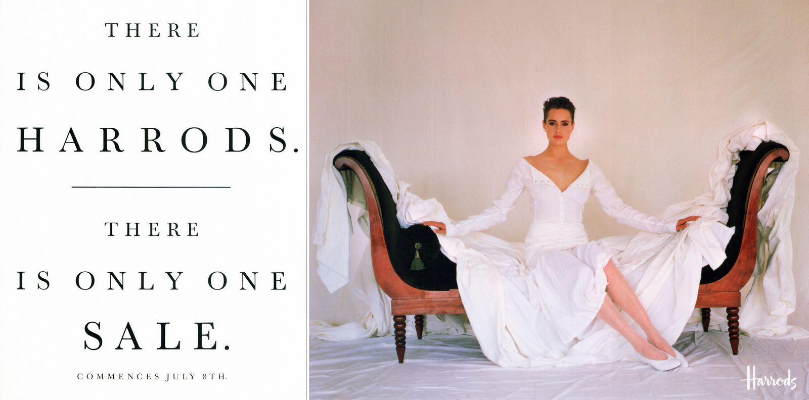
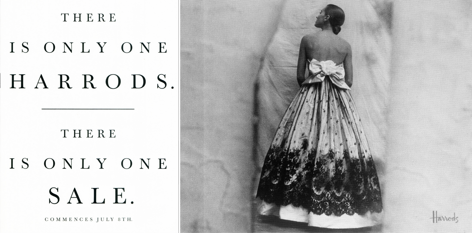
The Sale. The TV ad.The same assets were sweated to great effect.
Non Sale.They did hundreds of these black & white ads all through the year.They projected a company comfortable in its own skin.Not trying to be cool.Or look cool.But showing a store that was part of the establishment, only now it seemed a little more gregarious, witty.
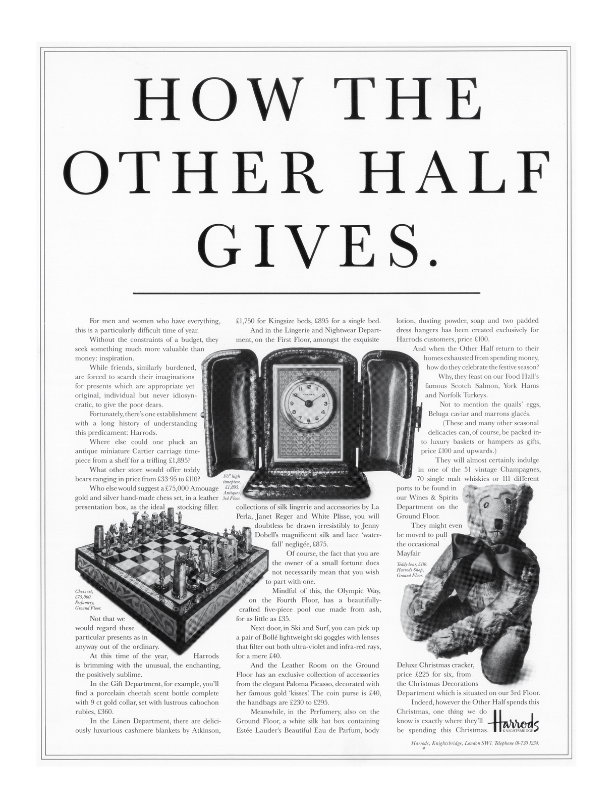
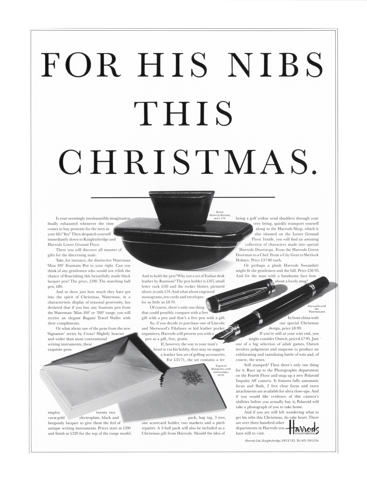
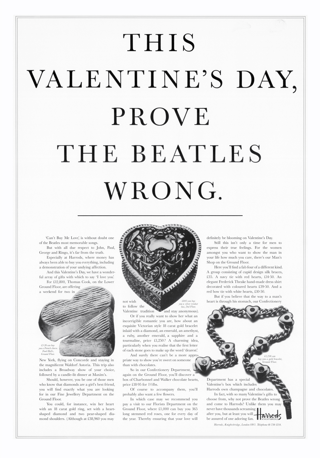
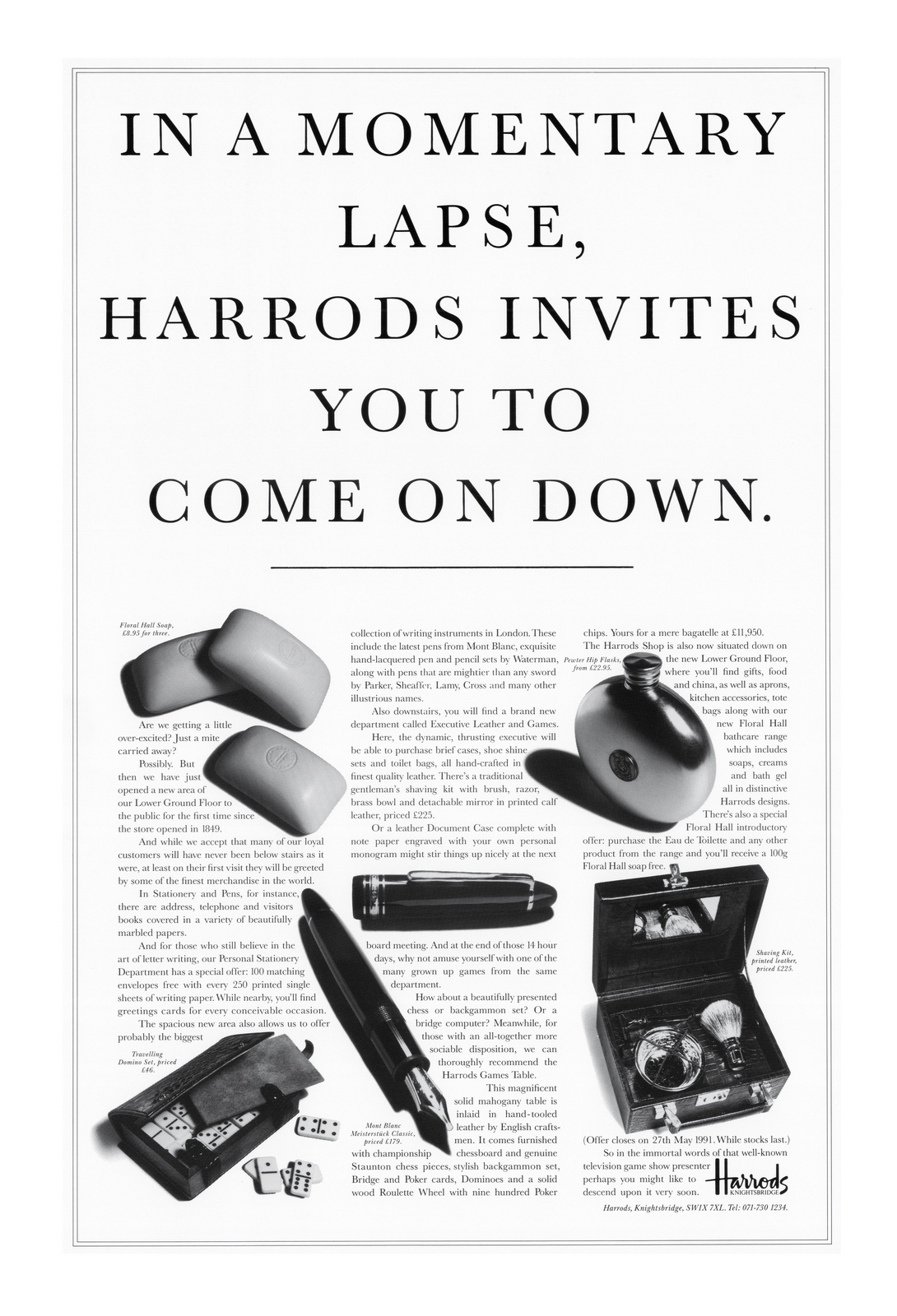
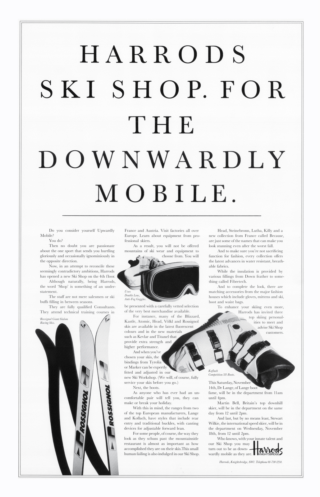
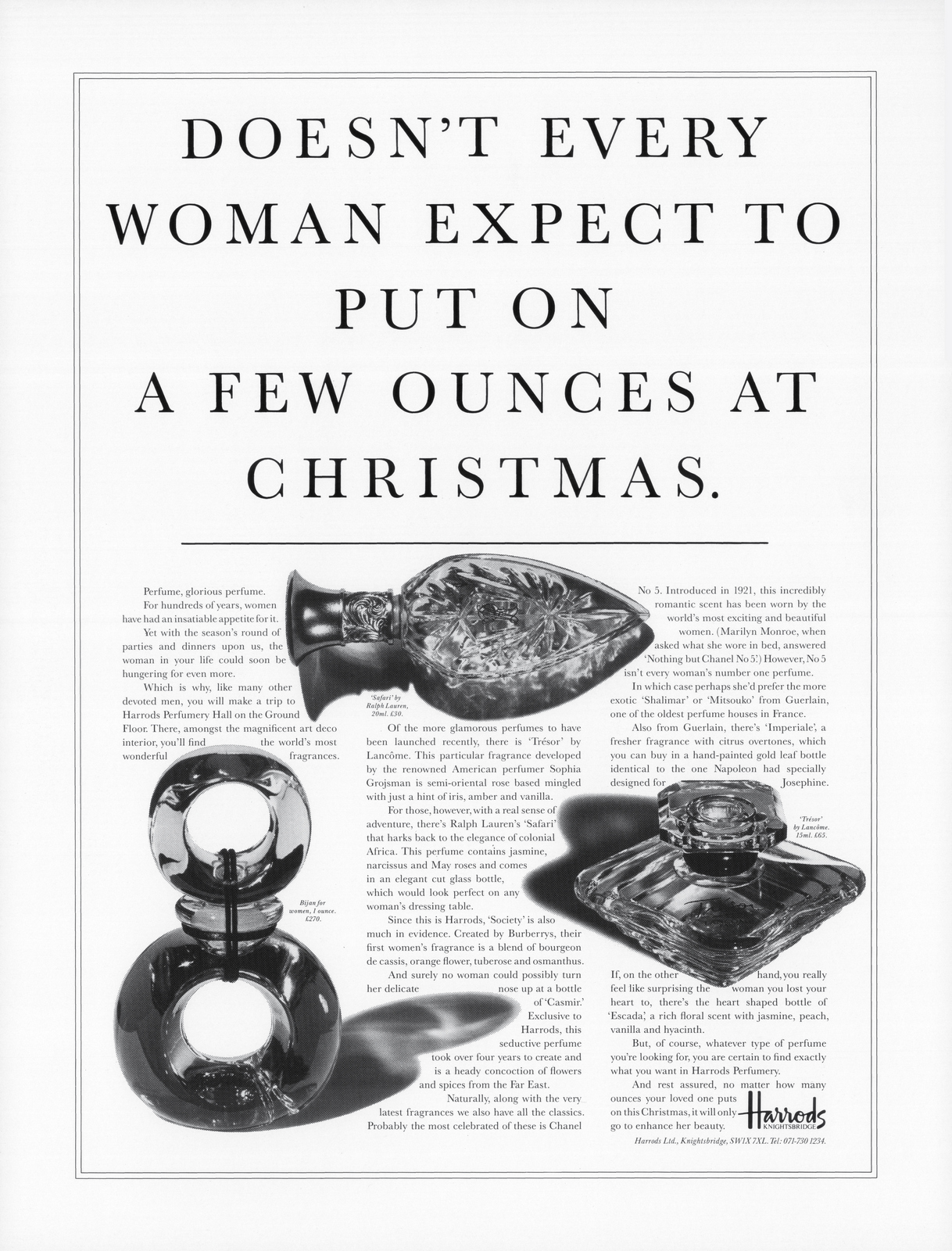
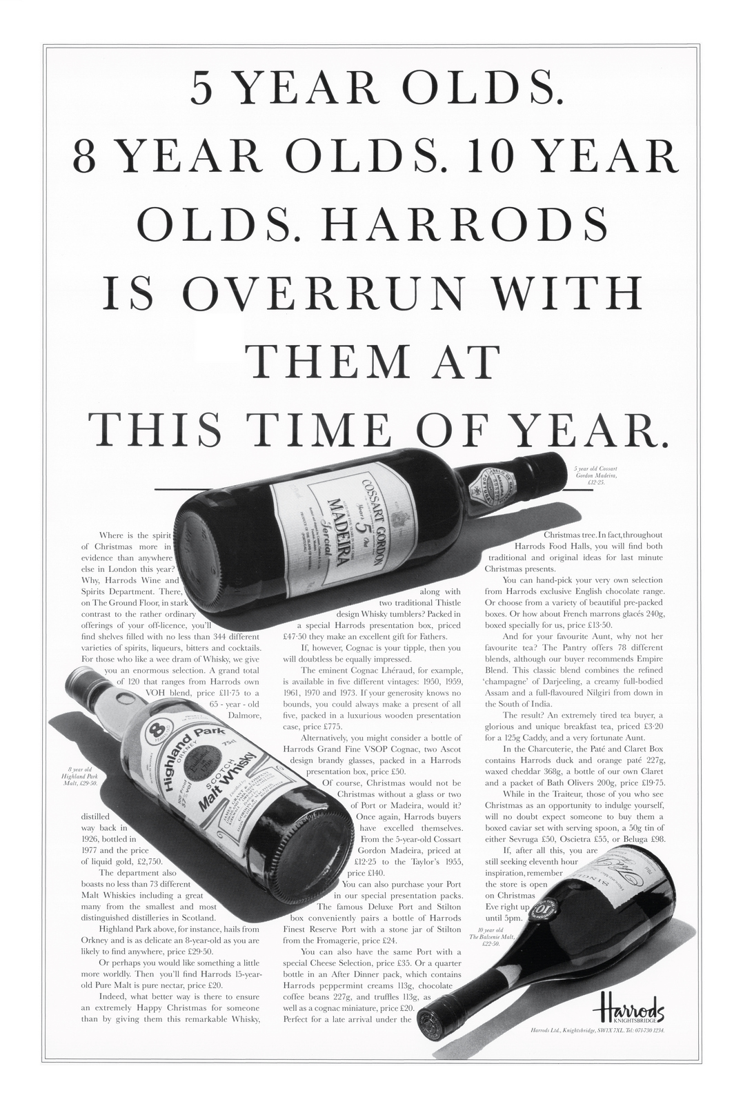
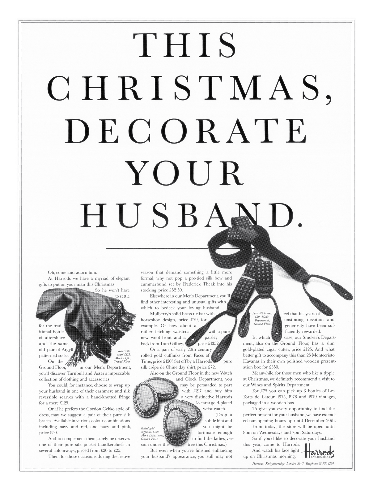
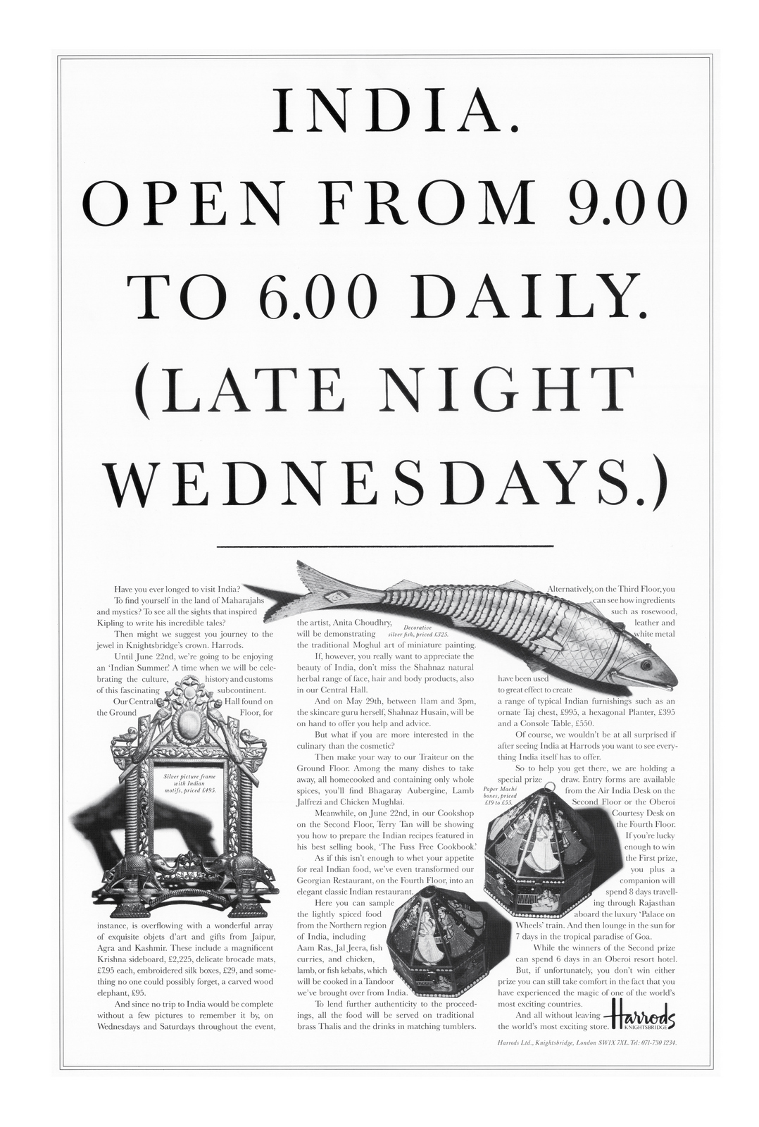
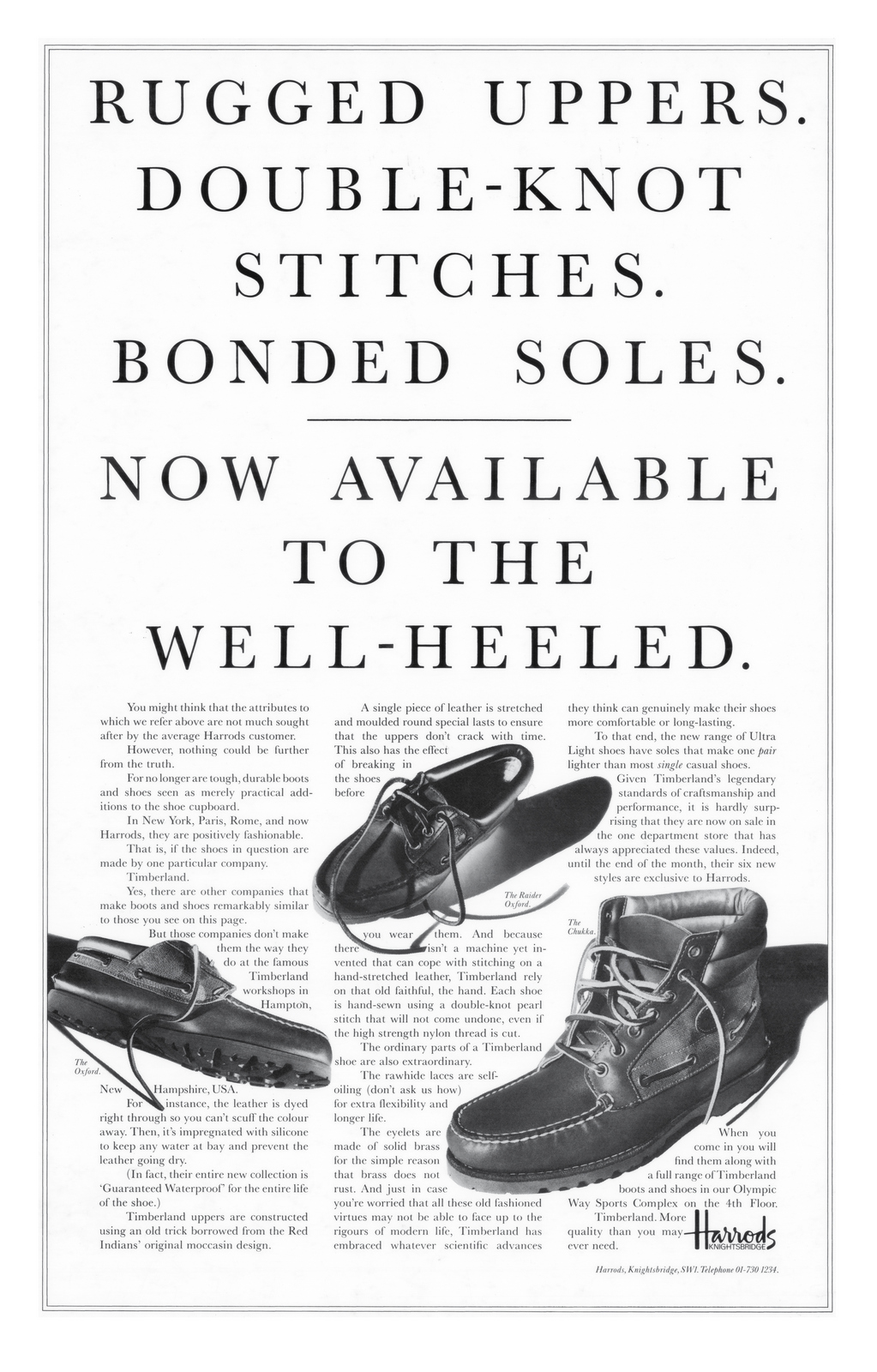
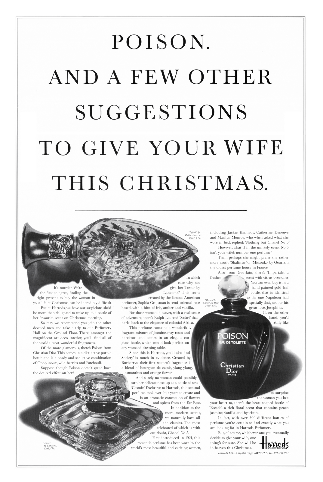
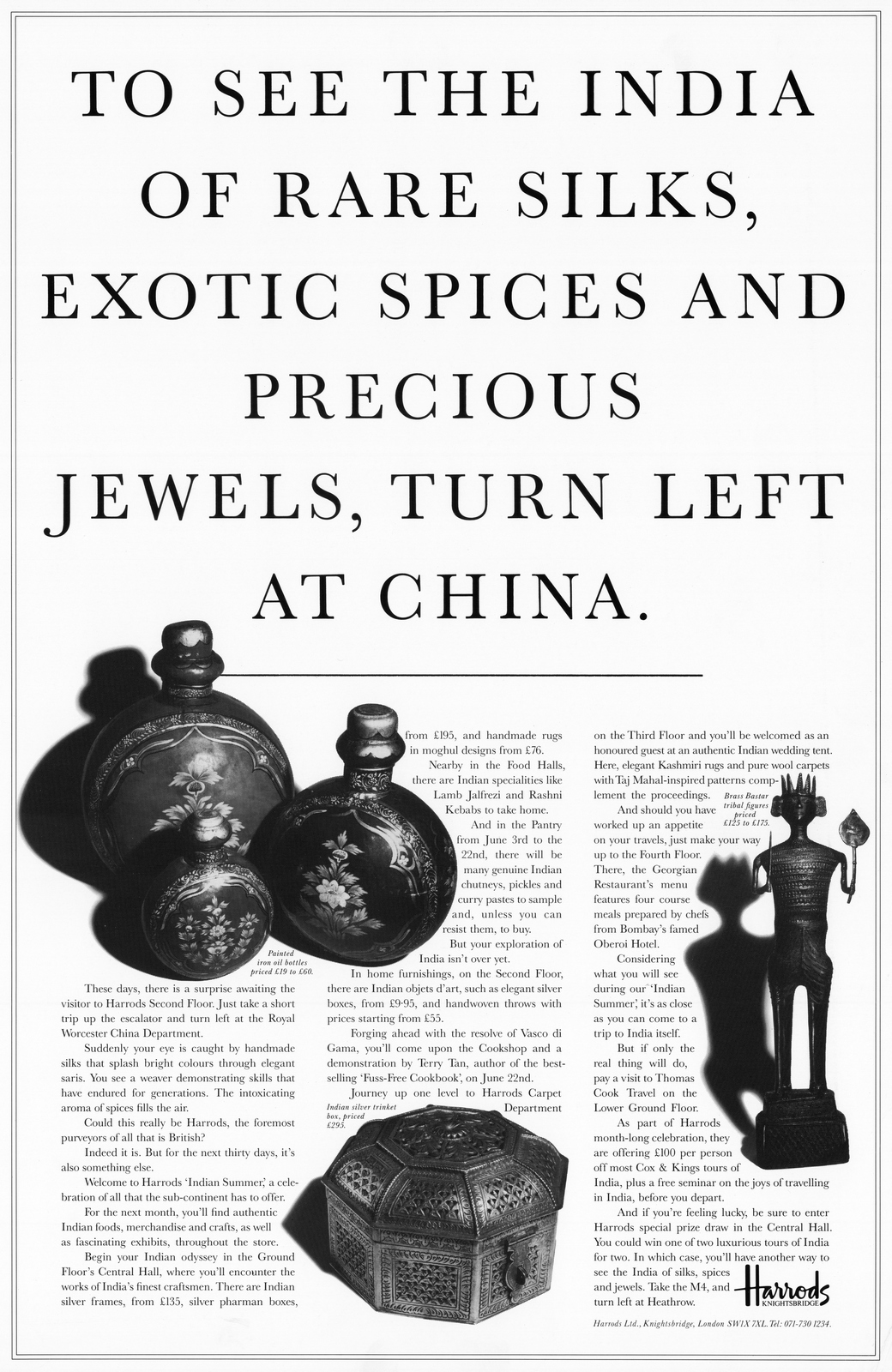
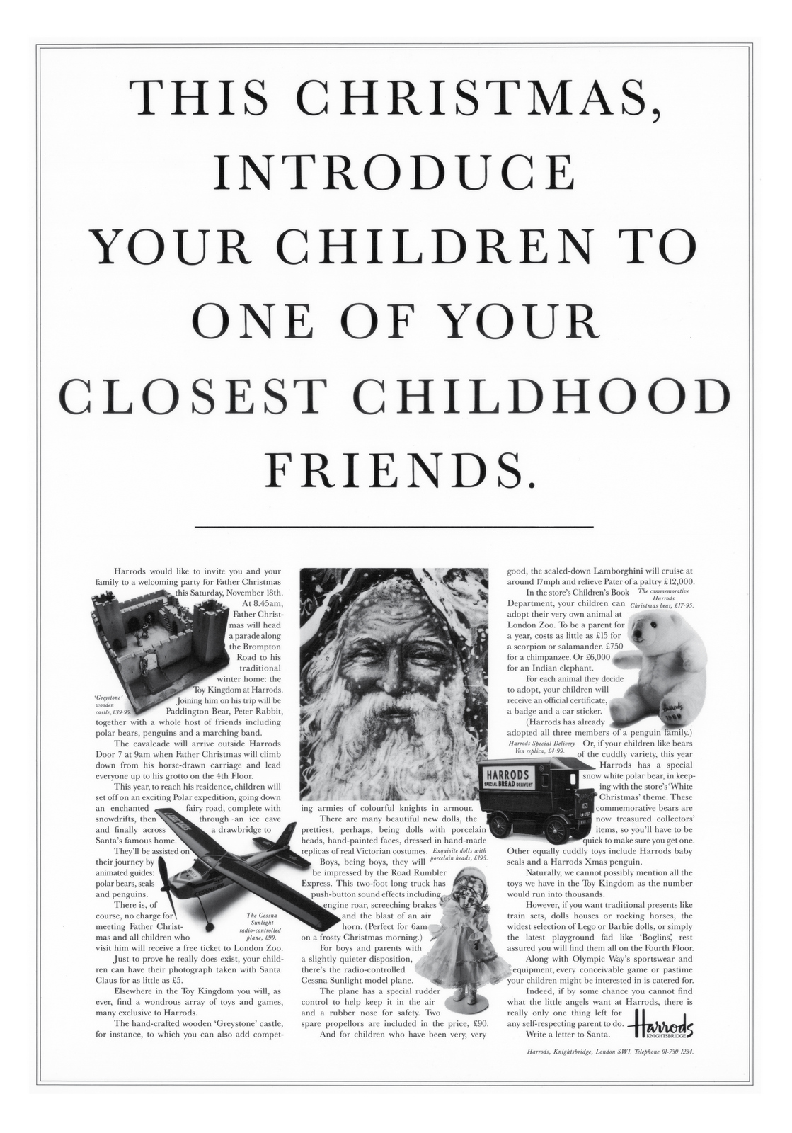
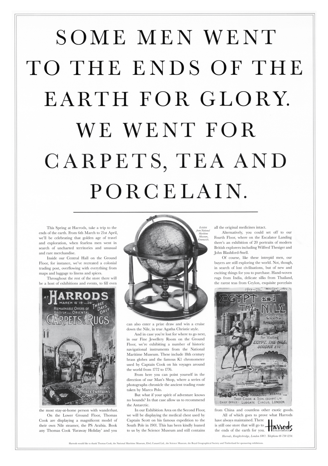
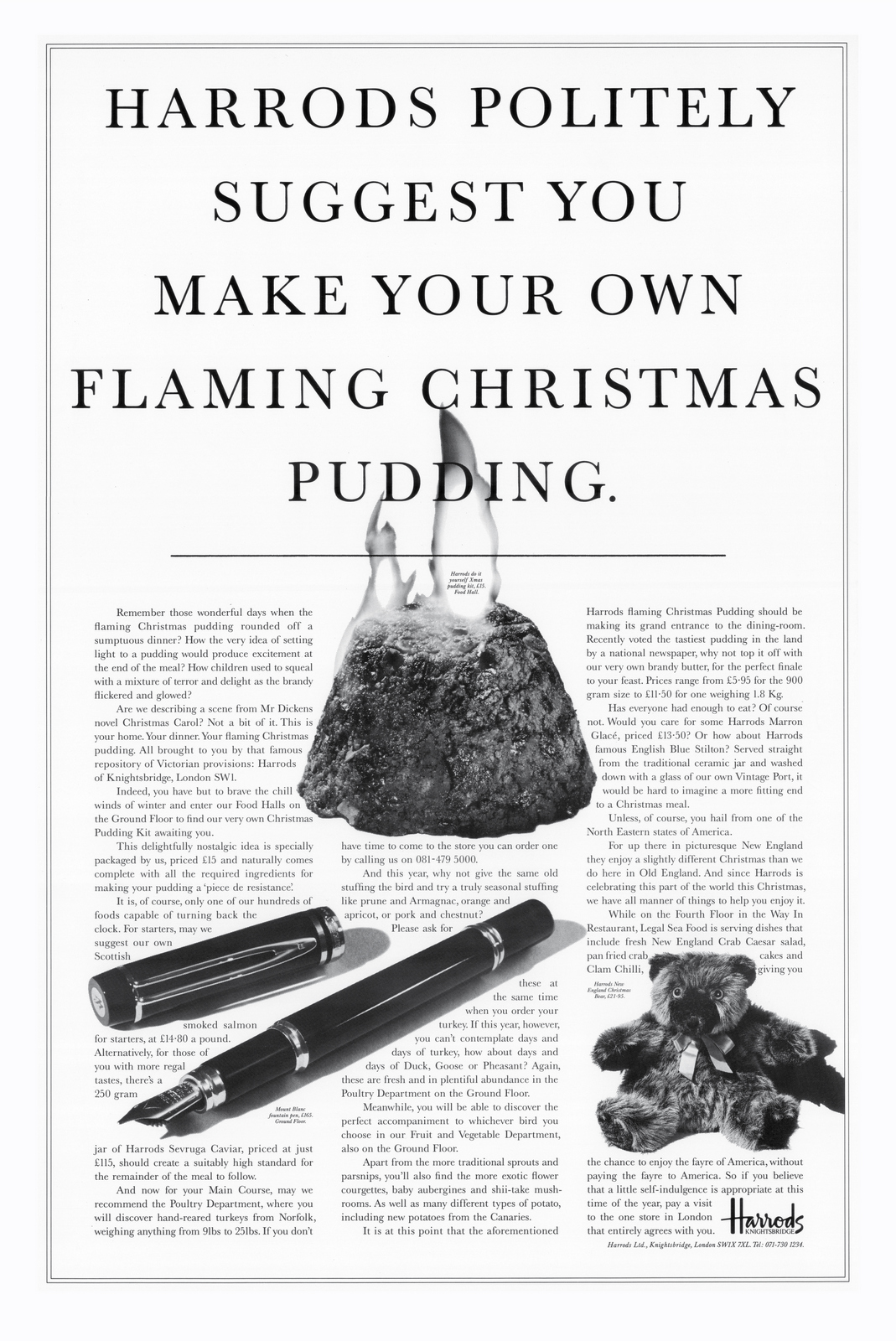
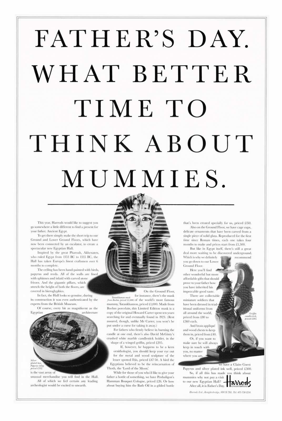
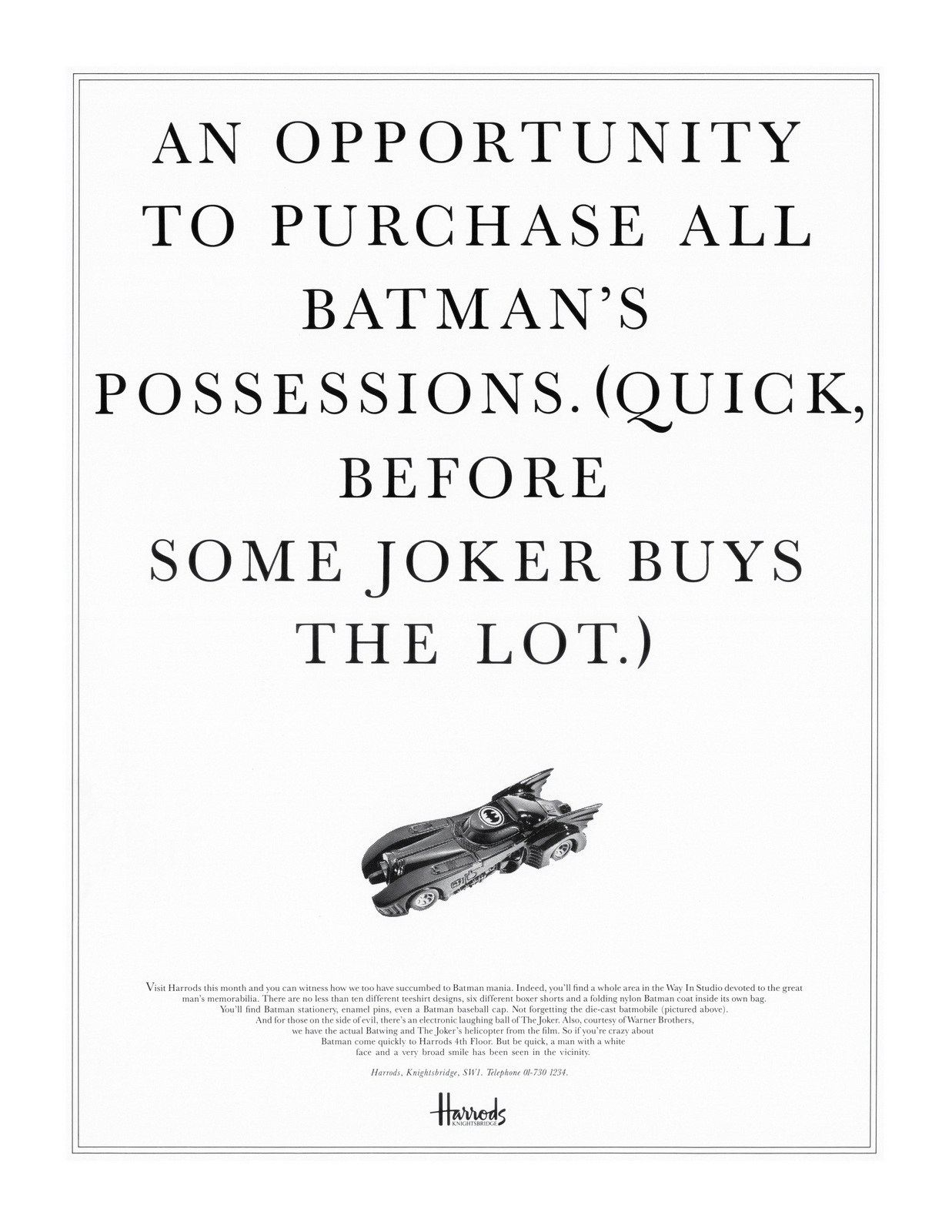
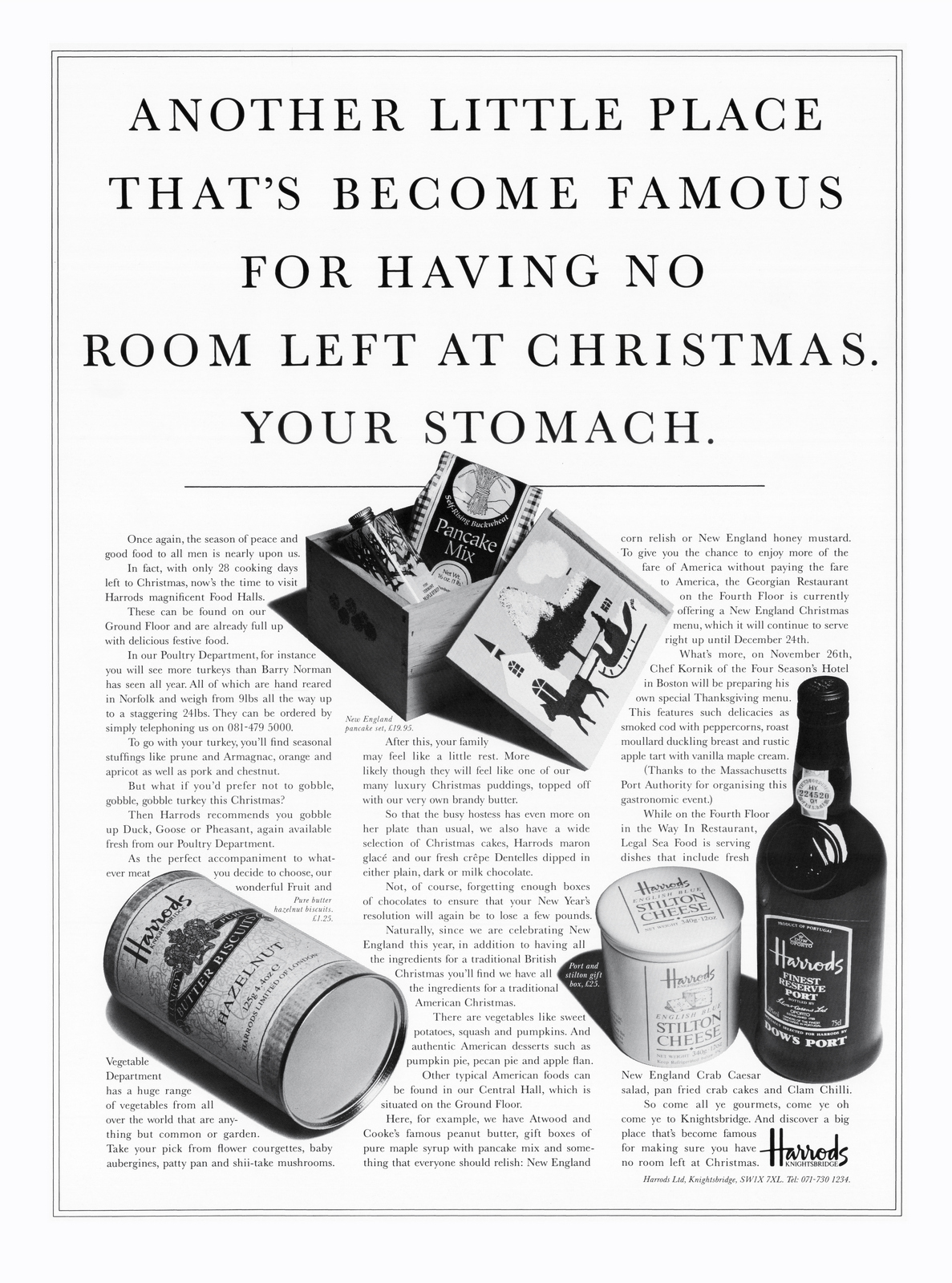
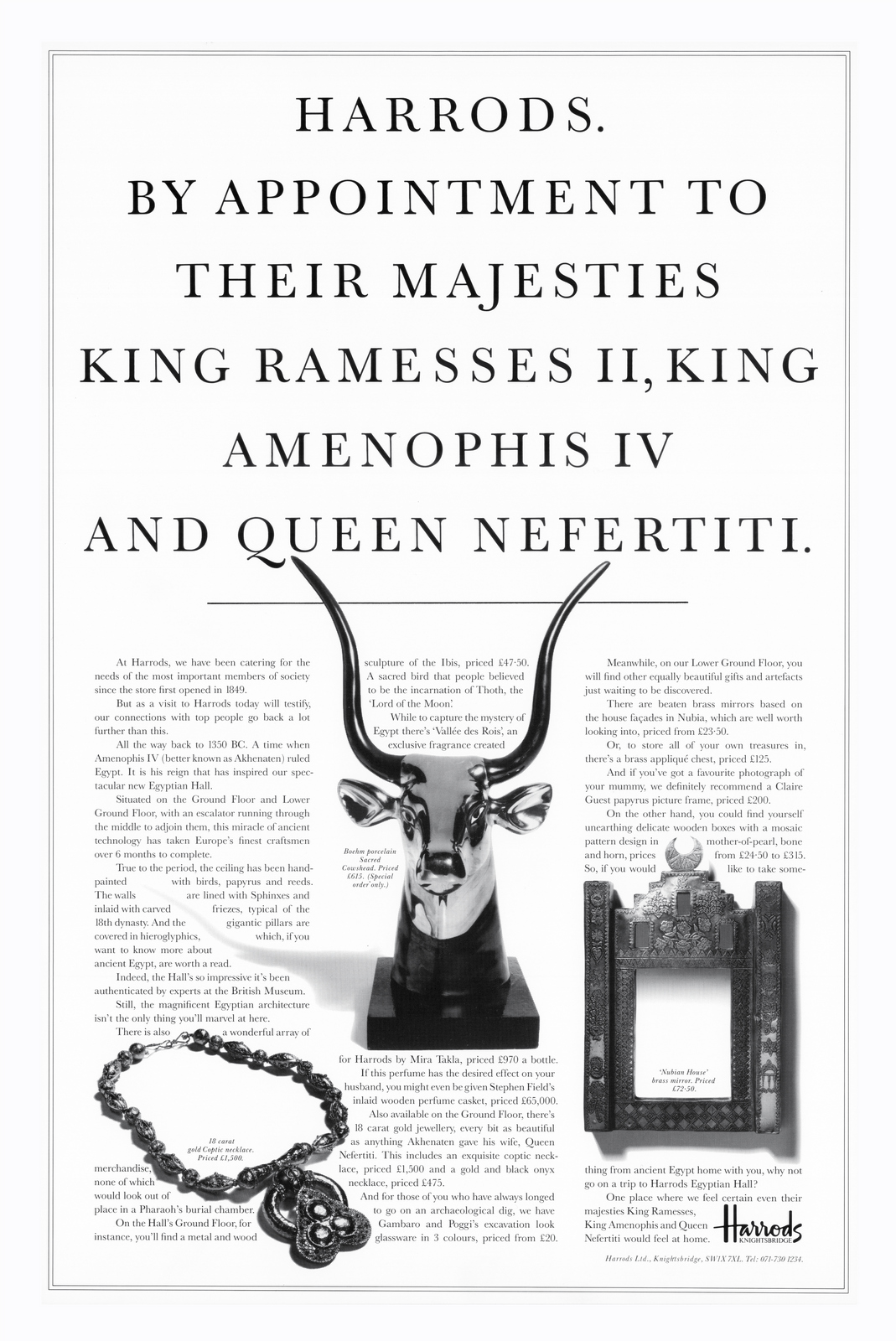
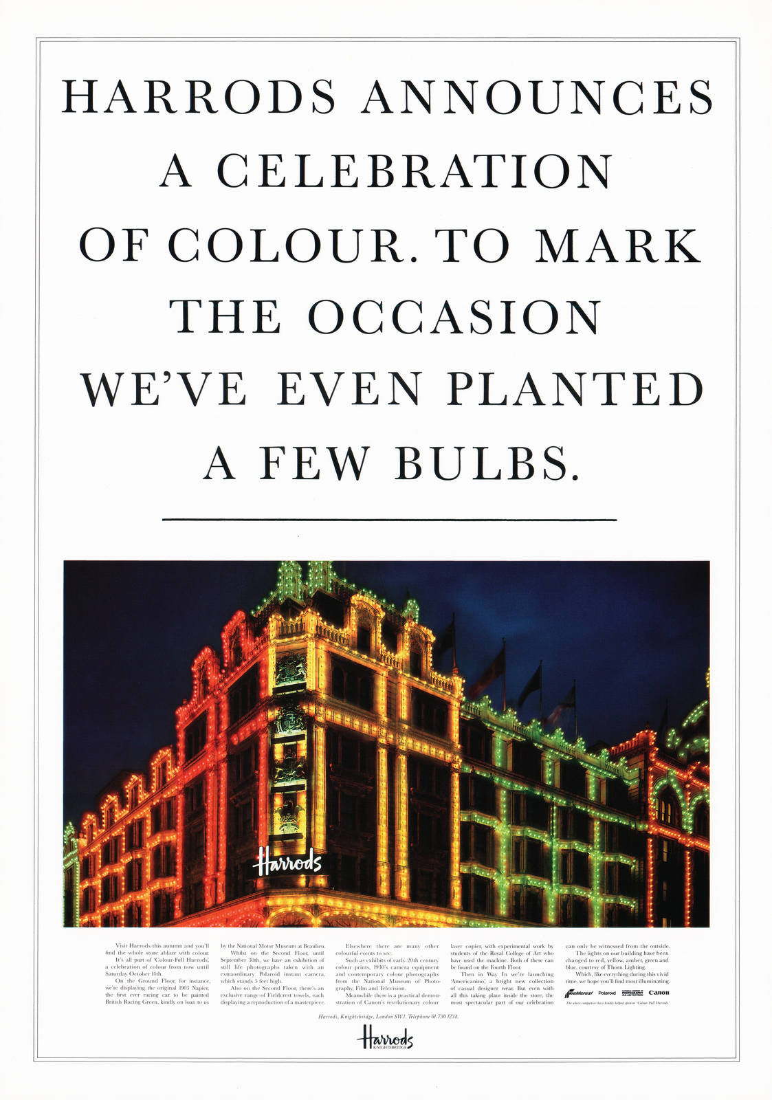
Even the dead straight announcements oozed class and authority.
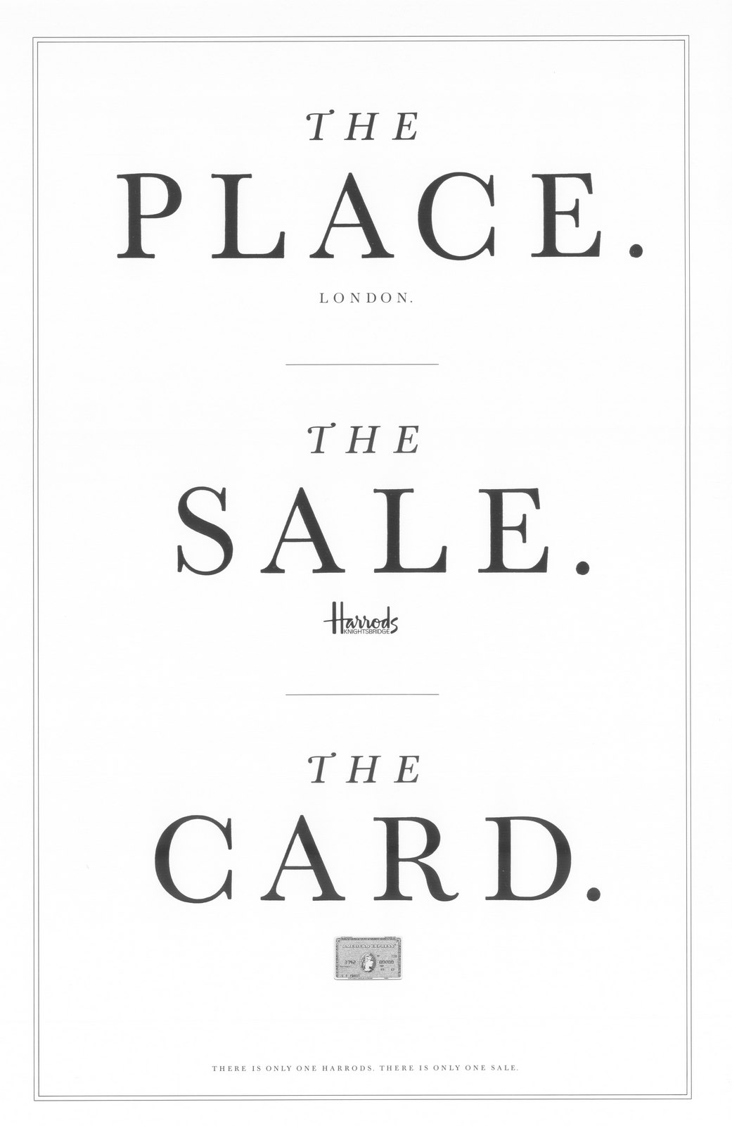
Small space.The font and acres of white space style ensured the small space ads were instantly recognisable as Harrods ads.
Fashion.Obviously, with fashion you need to see it, which means big pictures.So the same ingredients - language, font and border were reconfigured, resulting in a fresh layout that connects back to the rest of the work.
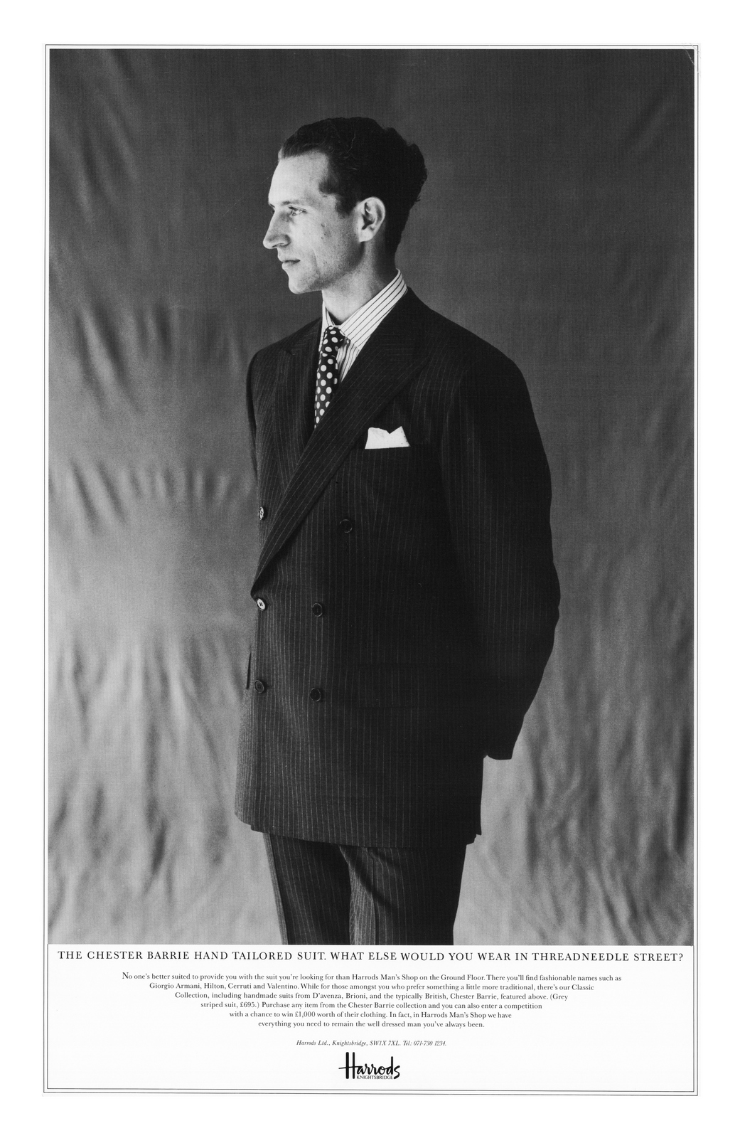


Looking at this work again is odd, it feels like work from another age.Irrelevant to todays marketing landscape.Press ads?Long copy press ads at that.That formal language seems odd when today every ad seems to be so chatty, trying best friend.And what about all those long words, like commences, momentary and appointment.But, 35 years later, Harrods continue to use the same ingredients - the line 'There is only one sale' and a Baskerville font.But the ads no longer make the store feel special.Or classy.It doesn't conjure up a unique, upmarket English store.It just feels....meh?The kind of off the shelf sale ads that every store uses.Is it that they no longer are so picky about that 'nose in the air' language?The lack of a stylish Frenchman shooting their products?The Baskerville sans ink squash?Maybe it's that they now feel the need to colour the sale words in bright red?Like everyone else.Or that they no longer presume their customers are smart?Exhibit A: Pointing out that their Christmas sale doesn't last for 13 months.
It could be that they've stopped tempting people with specific, gorgeous looking products they can actually buy at discount? Instead, they tempt them with white boxes. (Is there a market for plain white boxes?)

It could be that they break the 4-letter word 'sale' in two - presumably to jazz things up?

Or that they've relegated the brand line to an after thought?Believing that when somebody sees a big 50% they'll think 'Great! 50ff off... something or other'
It's difficult to pin it down.But if pushed, I'd have to say I prefer the original, Leagas Delany work.Tim and I talk through it on the podcast, hope you enjoy it.
OTHER ADS REFERENCED:Harrods PKL. & BBDO.

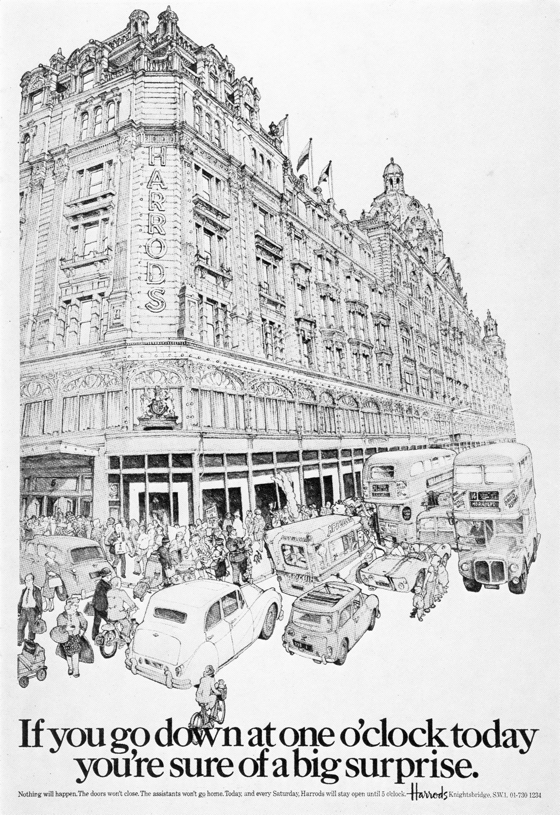
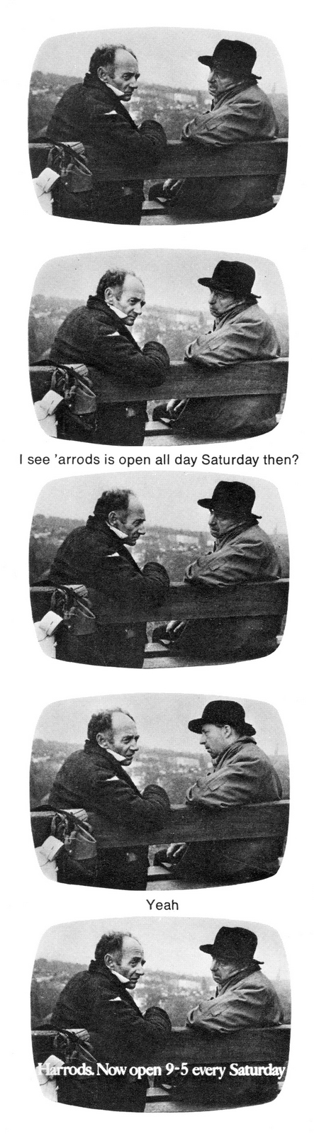
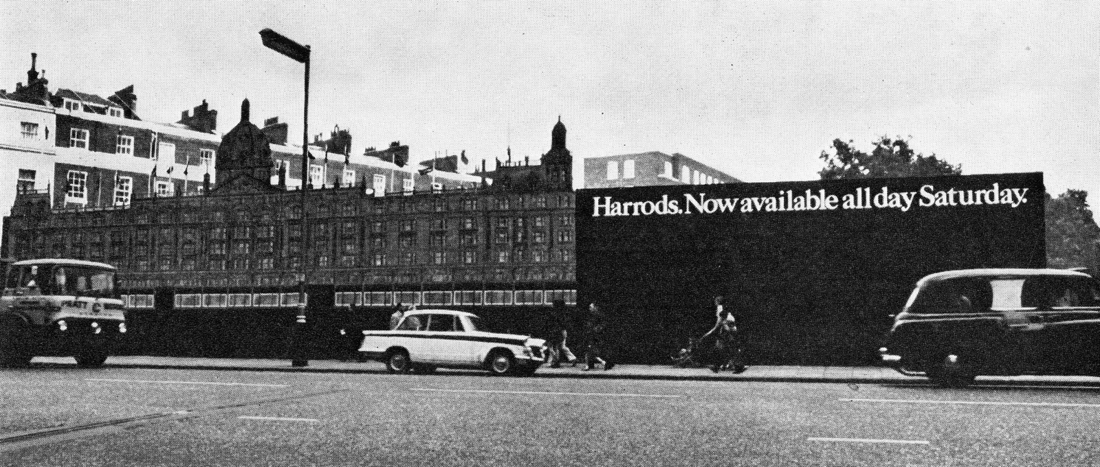
Harvey Nichols.
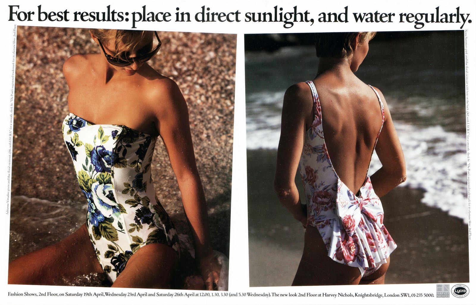


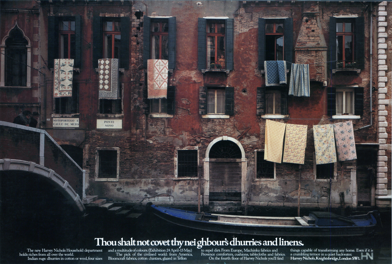
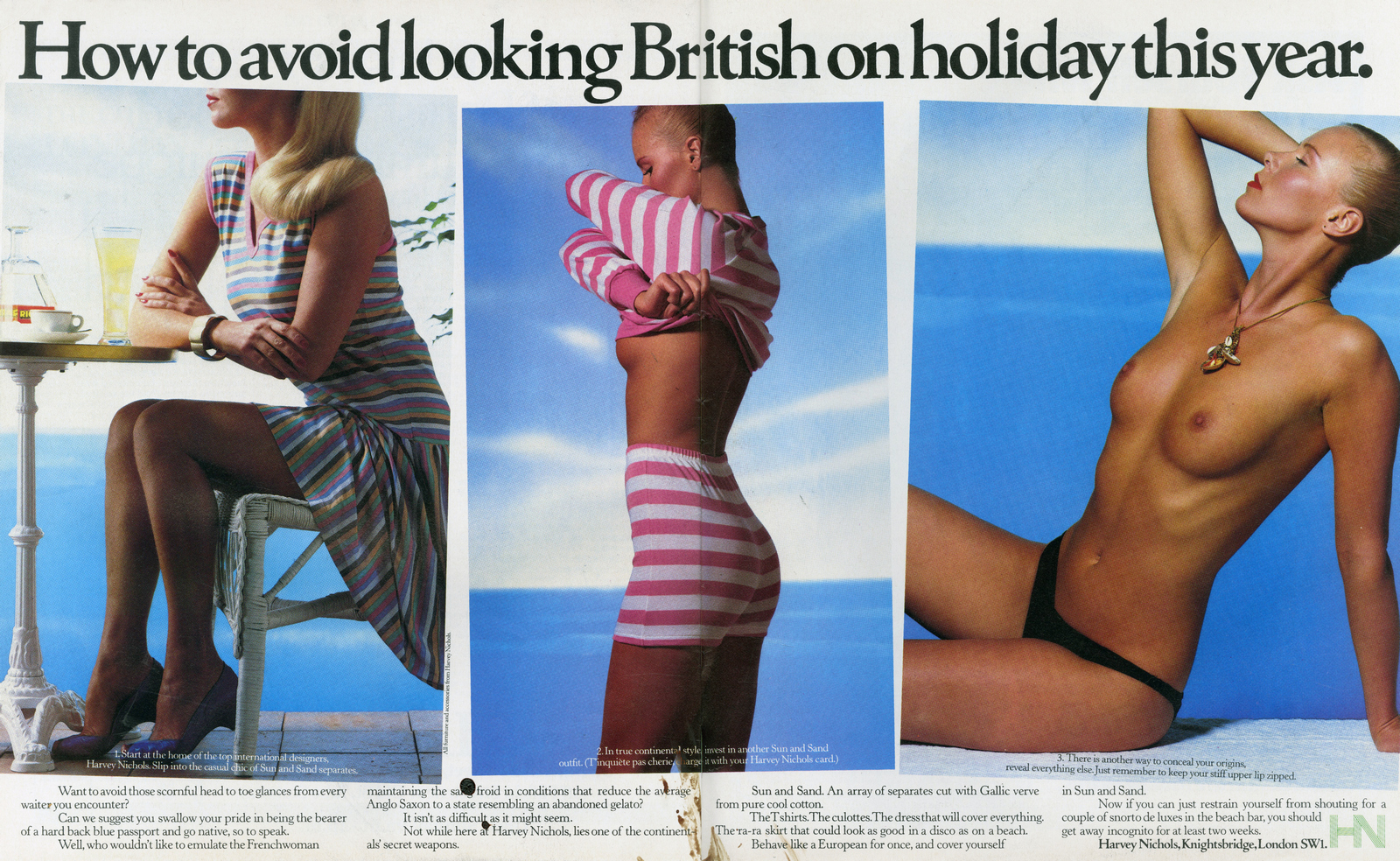
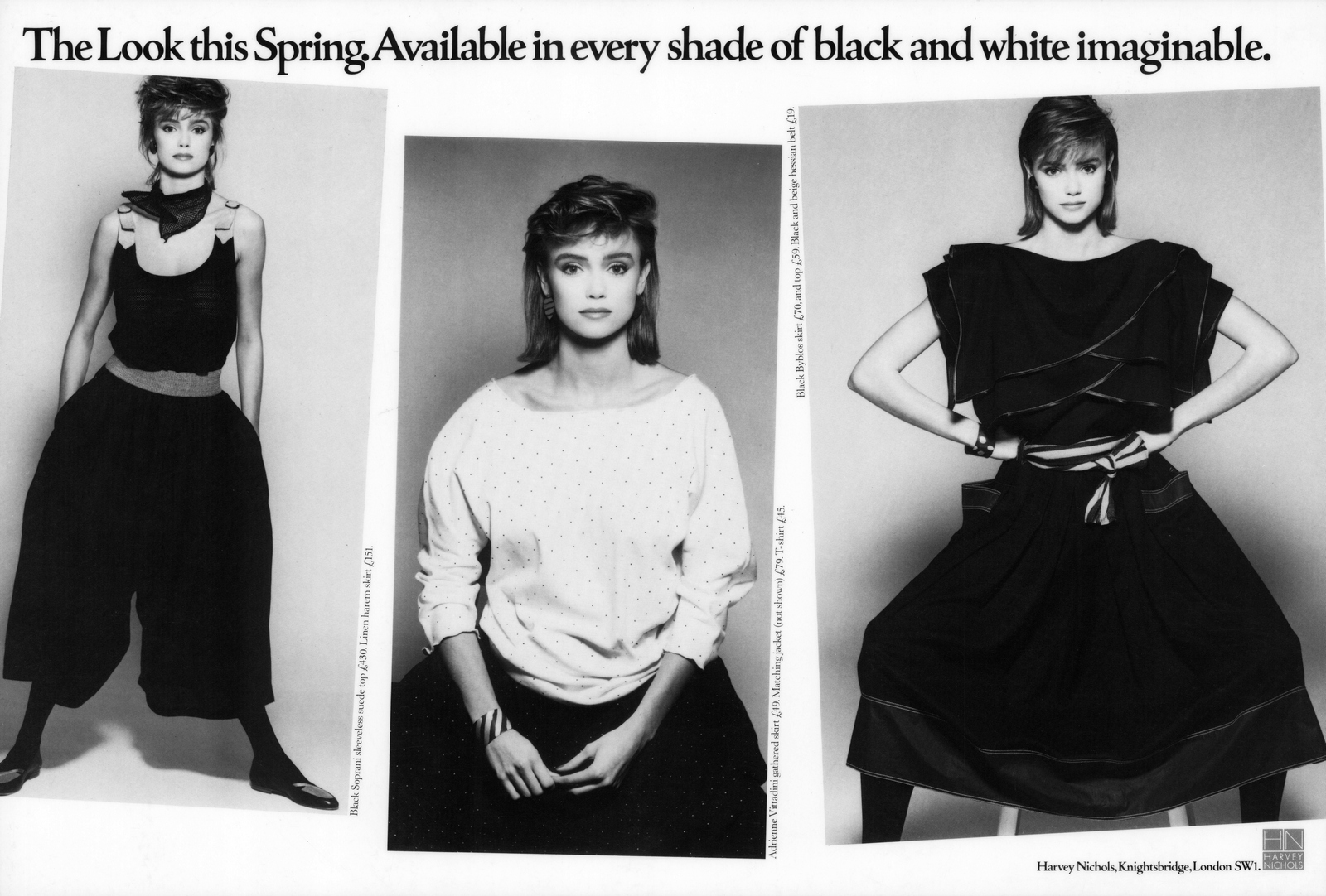


Harrods PKL:Harrods BBDO:
Every year I forget.But this year, finally; a Christmas related post in time for Christmas!Does blogging get any slicker?For most people, Christmas cards are an opportunity to reach out to family and friends to let them know you're thinking of them.For Creatives they're an opportunity to win yourself an award.Here's a few examples.
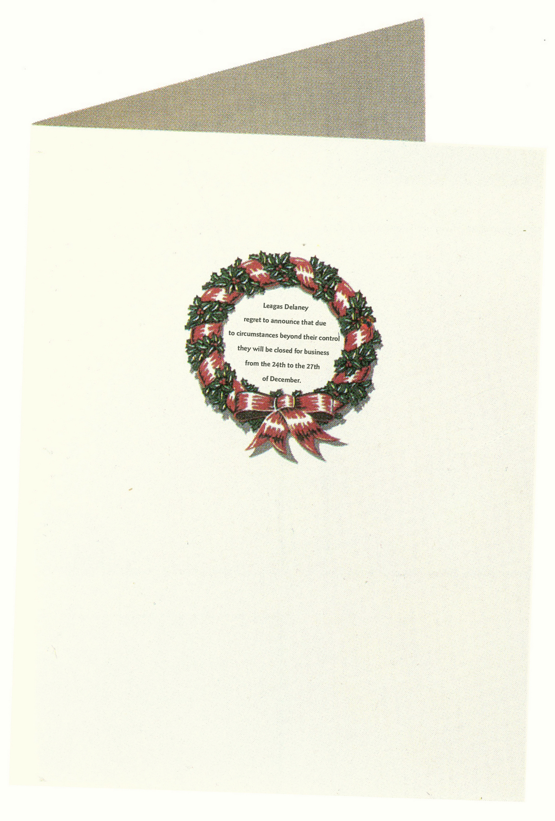
My agency was no different.We'd find a bit of budget to help us send out season's greetings to all our friends, clients and suppliers.Some creatives would view being given the agency Christmas Card brief a punishment, but being a giddy-eyed optimist, I always saw it as another creative opportunity.But it's a tough brief.The brief isn't too bad; come up with some smart arse, sassy observation on Christmas.The tough bit is that thousands of creative teams all over the world have been working on that brief for the last 100 or so years.The best, maybe a dozen or so, are dotted around awards annuals, so those observations have been closed down, so you're left to come up with something that army of creatives couldn't.Plus, if you're a creative agency, there’s no point paying to print anything unless it’s creative.Ideas from the creative department started rolling in - 'Been done...Been done...Been done...Don't get it?...Been done...Boring...Been done...Ooh, that's good!''Give your mantlepiece a bit more class with DHM's fake Xmas cards’.What a nice idea; we create a set Christmas cards from the great and the good to.That could be funny.It was 5 cards not 1.It also needed a box.So we made nonsense of the estimated budget.And it risked the agency being sued by a bunch of multi-millionaires for 'passing off'.And forging their signatures.But it's a nice idea – so fuck it!The trickiest bit was trying to sit the cover designs on the border between real and fake, the sweet spot would be for people to wonder whether it's from Sir Paul Smith for a few seconds and then cotton on that it was a joke.Figuring out the insides was fun too, making them just sound just that bit wrong, E.g. Sir Paul Smith 'Beerz soon?' or Damien Hirst signing off 'Laters - Damien X'.(It occurs to me that this must be where I got my Wave idea.Whenever I'd record a podcast I'd there leave a D&AD annual in Parv's collection, inside , badly written with my left-hand, would be written a message as if it was a gift from some luminary, like 'To Parv, the best earholes in the business, love, David Abbott'.I just liked the idea of some semi-bored creative chancing upon it and thinking 'David Abbott...is that his handwriting, bit childish?...'earholes'?'.)Anyhow, this is how they ended up.THE BOX.
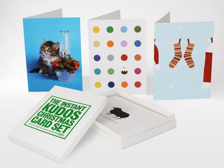
Sir John Hegarty.
Sir Martin Sorrell.
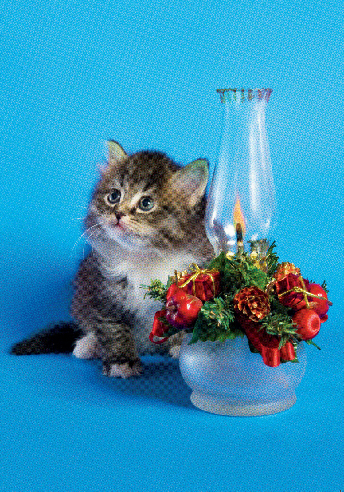
Damien Hirst.
Charles Saatchi.

Sir Paul Smith.

It got a nominated for silver at D&AD.The following year we thought we’d try to go one better – silver.Obviously we had the The card project had set a new, expanded budget.The five card box idea had set an expectation that we were unlikely to go the one piece of cardboard folded over route.We needed something novel.So off we set.After weeks of complicated, contrived ways to waste agency money, an idea turned up that I liked; ‘A fake bag to smuggle your real bags of Christmas presents into your house’.Most people will have experienced that awkward moment of smuggling say, an Apple bag past their spouse or kids in December, (particularly when they discover it's something you bought for yourself).If, on the other hand, they spot a bag from ‘Malcolm’s Sock Shop’, their hearts sink as they hope it's not a present for them.Usefully lowering expectations.It’ll also give us a good opportunity to make up some funny shop names and spoof graphics.The brief went out to all departments: What’s the worst place to get a present from?1st ROUND:
They worked.They were believable.But not great.They didn’t have that 'smile in the mind' element.I give my usual guidance in this kind of situation – be more specific.Rather than The Cake Shop, The Battenberg Cake Shop or even more specific - Bridlington’s Favourite Battenberg Cake Manufacturer.It often helps.2nd ROUND:
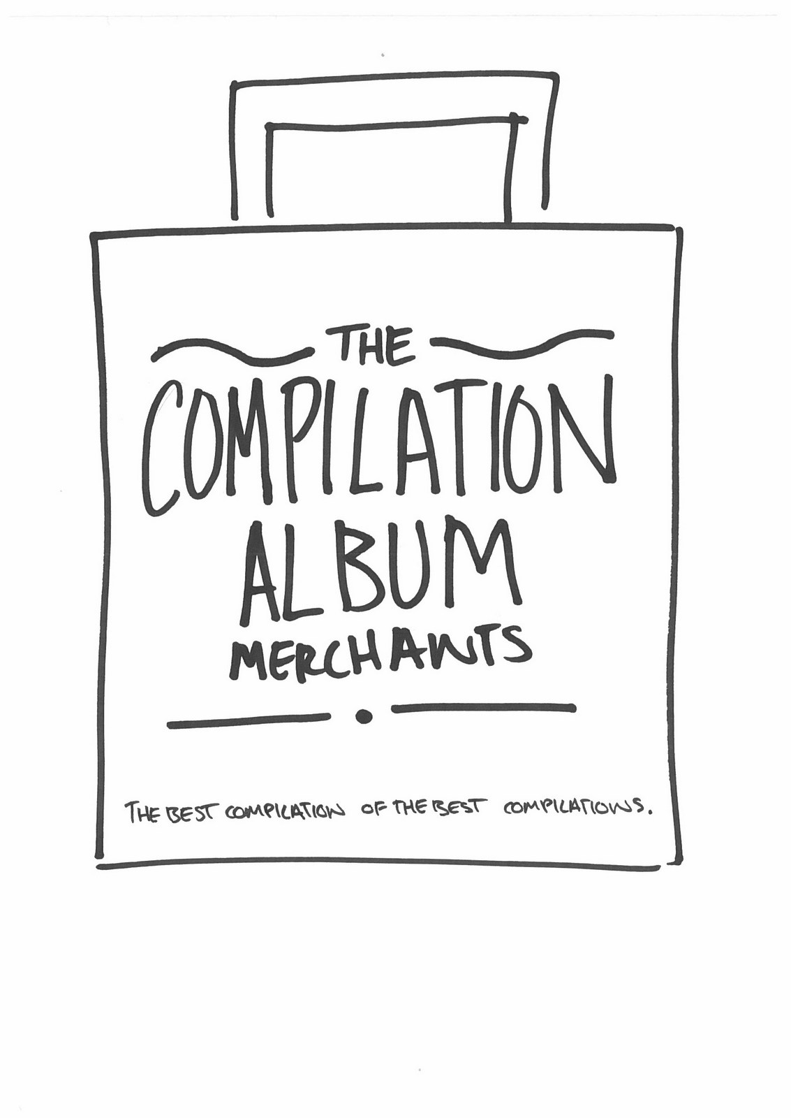
A definite improvement. I like the argyle one.The compilation album one's not too shabby either.Maybe we should think of very specific bad presents and then back fit a shop into them, like the compilation album?3rd ROUND:
The Book Token Warehouse tickles me - the idea of a shop not selling books, just tokens.Also, tokens are tiny, so 'Warehouse' and having a big paper bag is funny.Also, Tattoo's While-U-Wait - how else are you going to get them? But not a bag-type shop.The Left-Handed Pencil Store isn't bad either.There’s a few others I like, but they’ve all gone a bit too meta.Maybe there's something nearer the brief, maybe we admit what it is, but make it look like a bag from a shop?4th ROUND:
Maybe for a single bag, but we want to do a bunch.Perhaps there’s something simpler, with funny names, the kind of shops you see in the background of The Simpsons?5th ROUND:
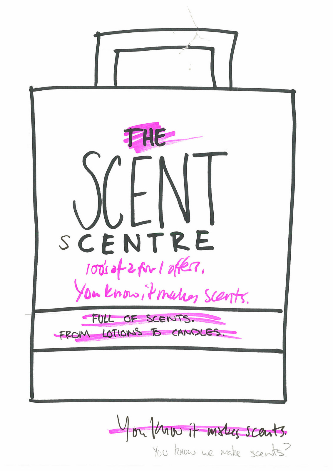
Quite like them.But they seem to be trying a too hard.Trying to be comedy bags.The idea is ‘A bag to smuggle in your Christmas presents’, which I like, so simply writing funny stuff on bags seems off brief.Maybe we shouldn't be so knockabout?Maybe we should be more observational?6th ROUND:
There’s some good and funny ideas there, but they’re more like headlines than shops.Maybe we keep the humour to the sub-line?7th ROUND:
Funny, but too contrived.Like the store name is just there to lead you into the sub-line.They don’t seem remotely real.If the idea is ‘A bag to smuggle in your Christmas presents’ and we’re trying to lower expectations, maybe it’s as simple as coming up with a lot of shops that sell cheap tat?8th ROUND:
Better.Some are still a bit weird though.Maybe it'll be funny if we print the names of shops selling ludicrously heavy things on these paper bags?9th ROUND:
Quite like the Anvil one.Maybe the whole heavy object idea is different from bad Christmas presents?There must be something in Bag For Life?They’re all the rage at the moment, ours are paper and obviously won't last long, we can spin off that?10th ROUND:
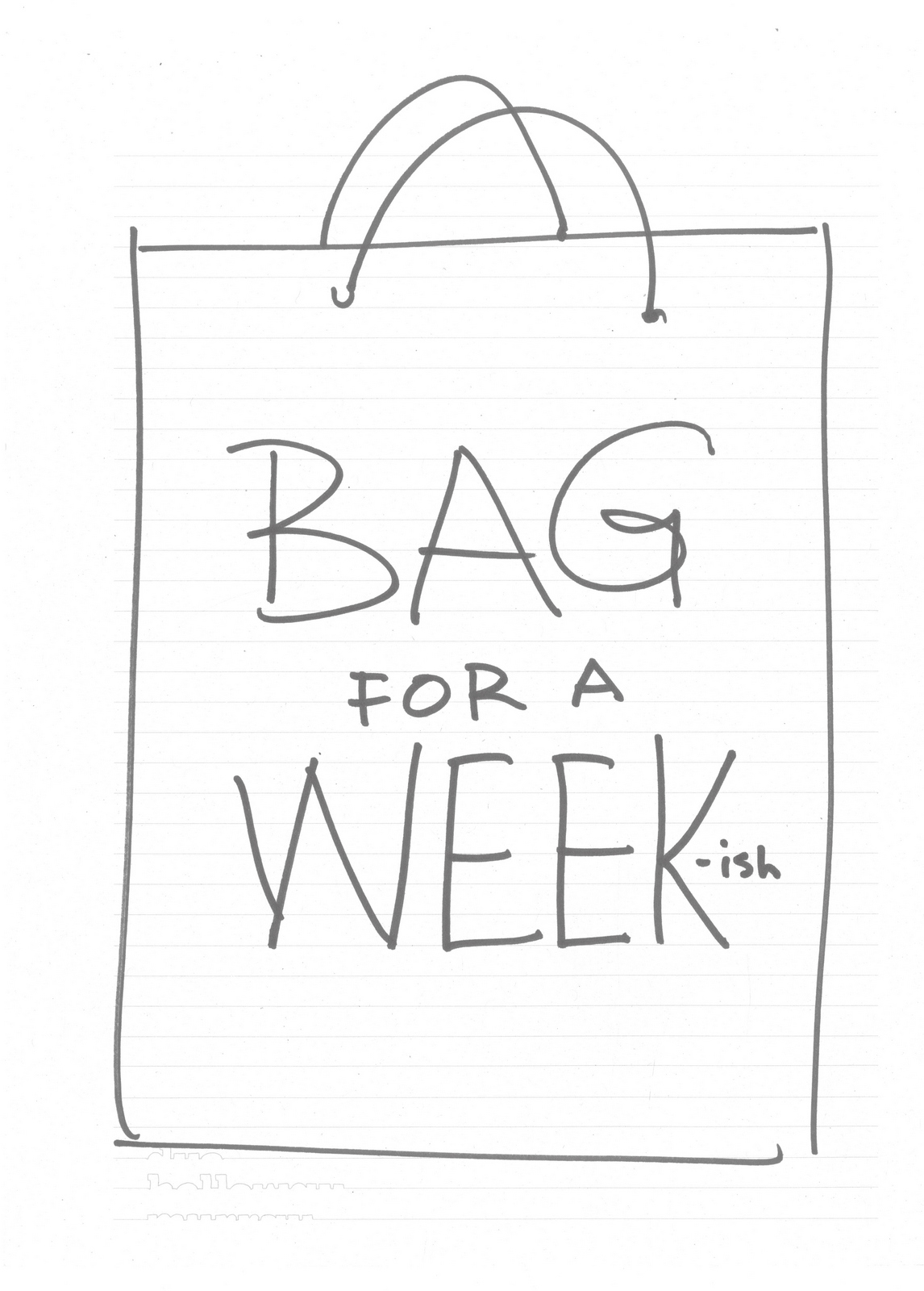
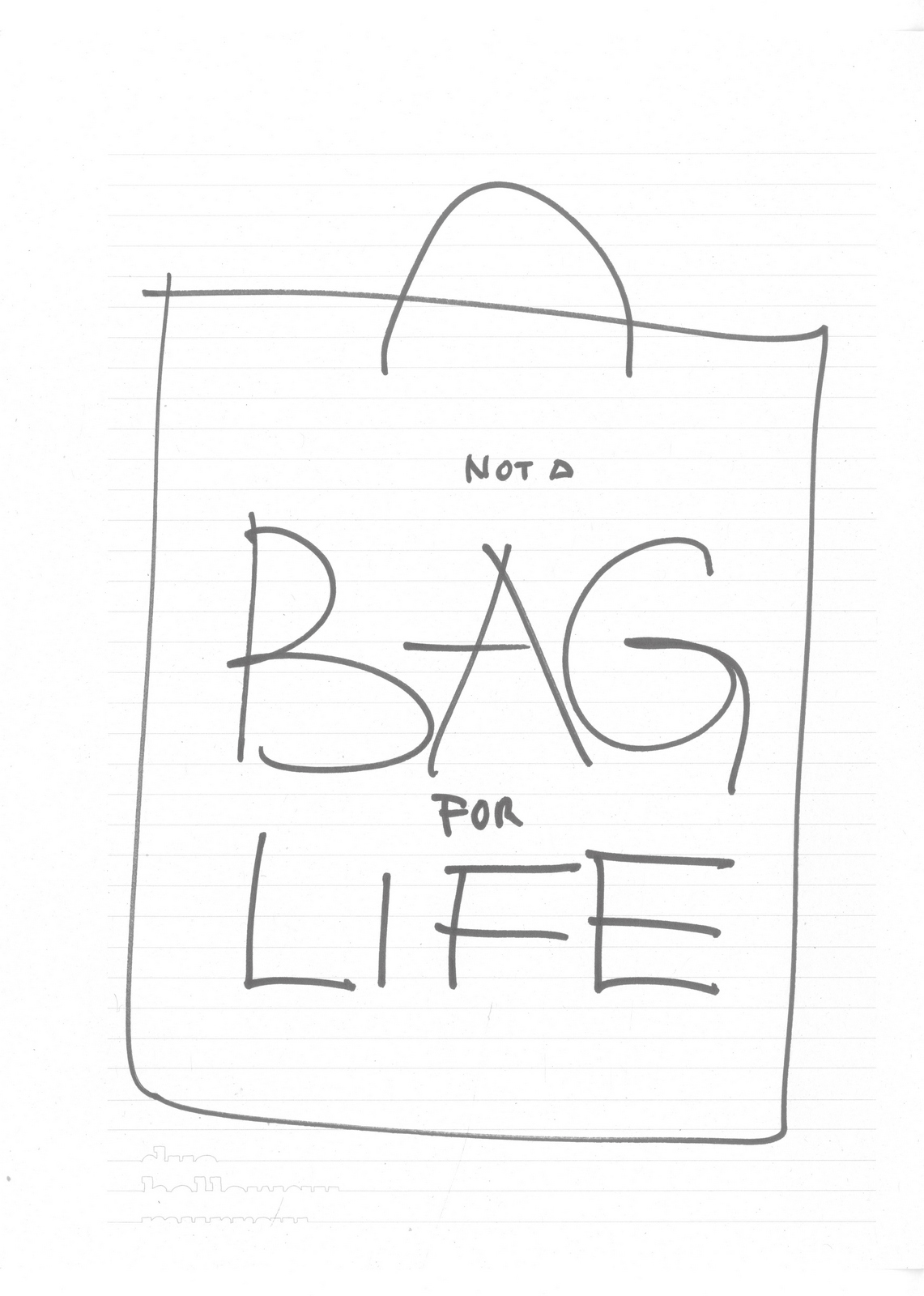
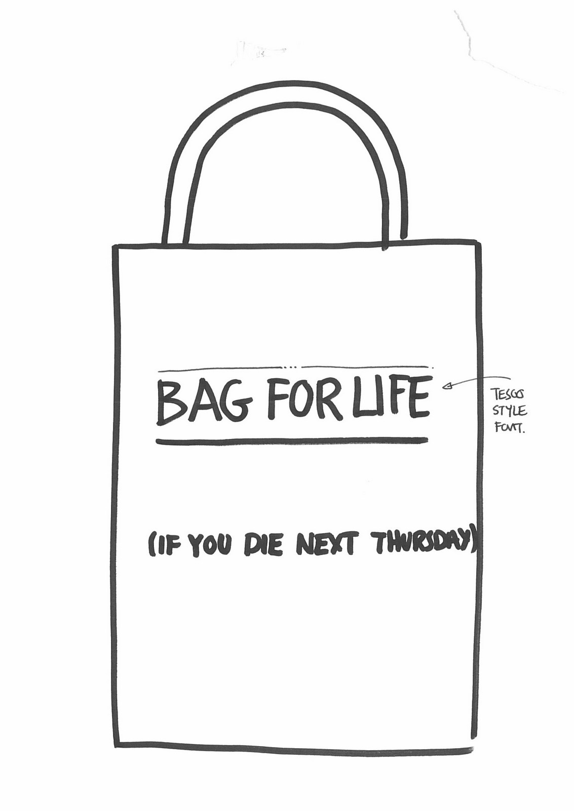
They seem a bit obvious.Also, off brief, the goal should be a shop that would disappoint your partner.Maybe if we go edgier, spikier, more controversial?11th ROUND:
Nope, Mother did something similar.
As above.
Mmm…probably as above.
No shop is ever going to be called Ball Bag.
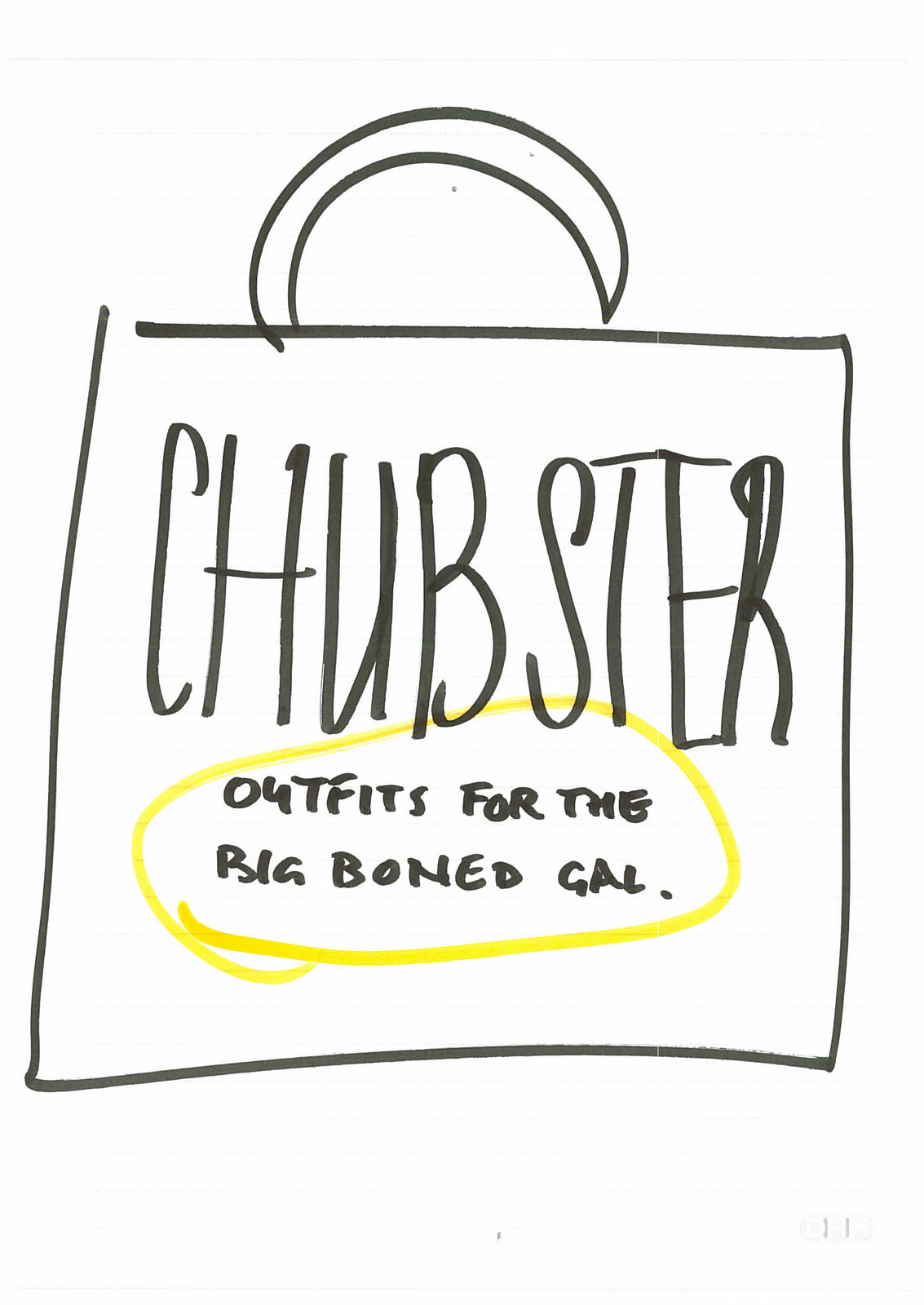
Maybe in 1976.
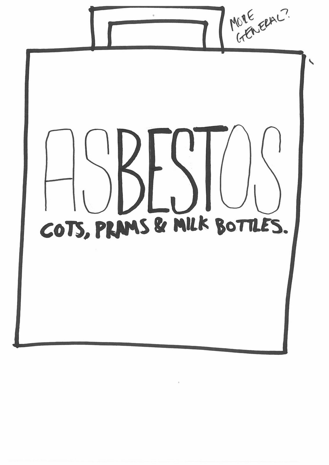
Jesus! No.
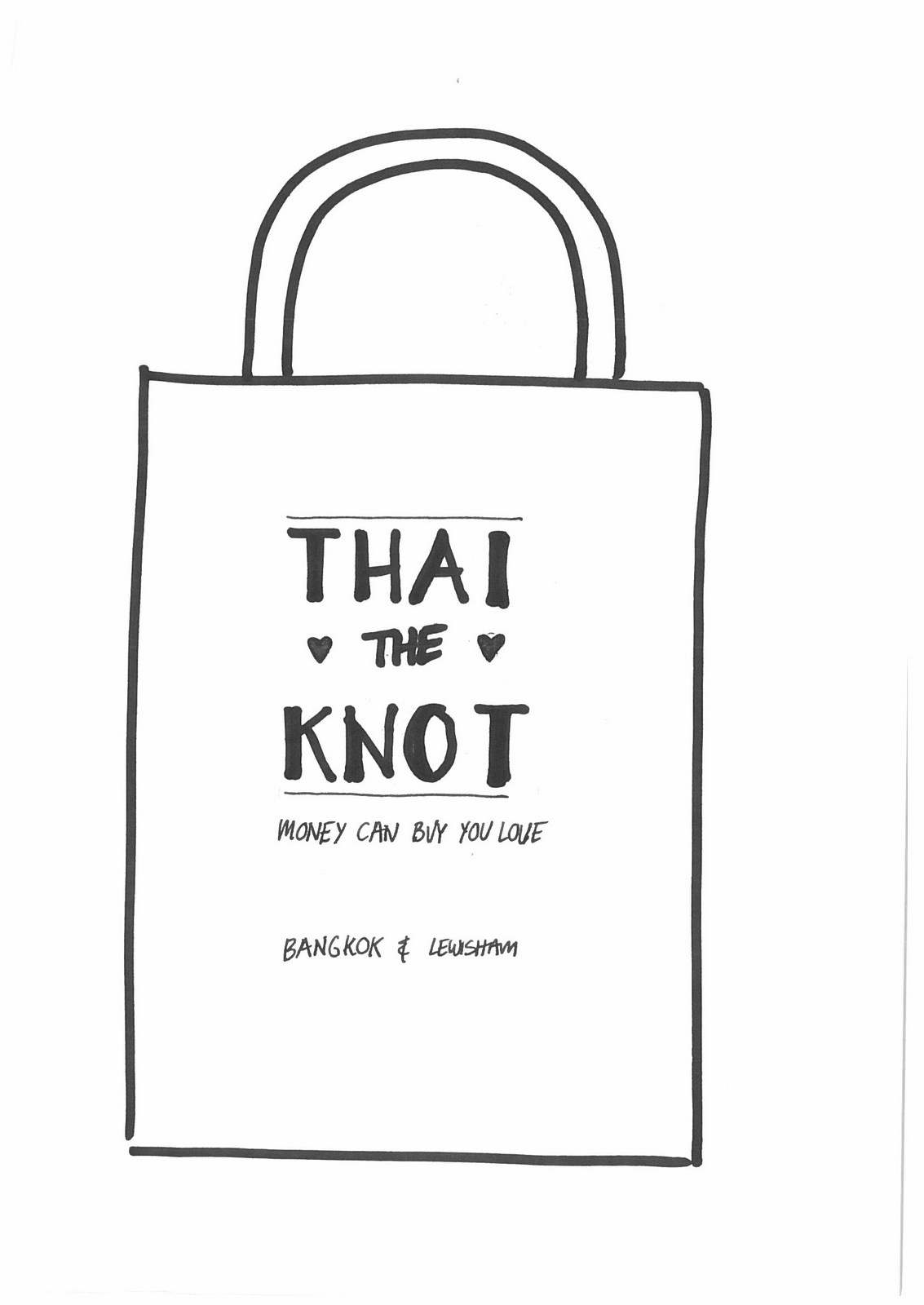
What do they need a bag for?Or shop for that matter?
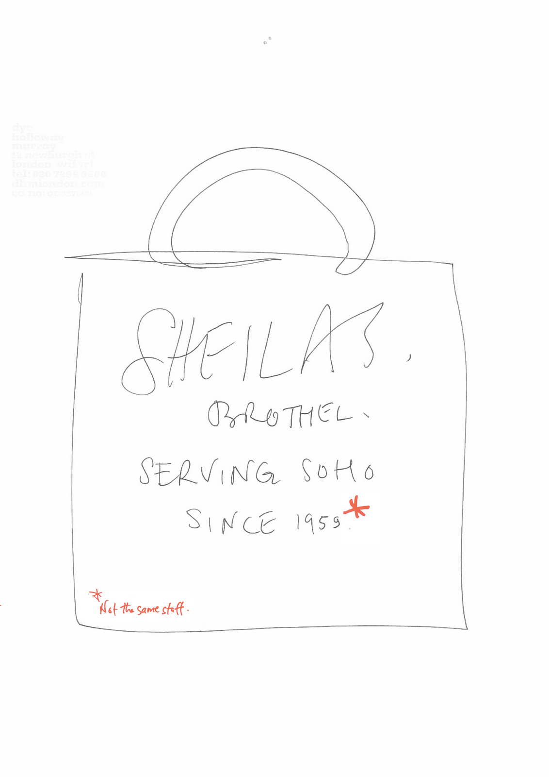
As above.
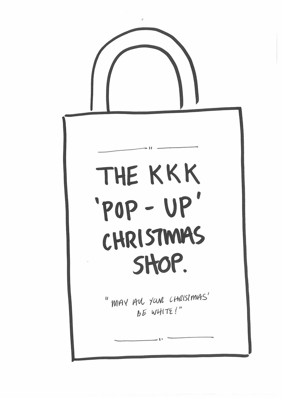
See Mother comment.I decide I’m too close to it - not seeing the wood from the trees.I spread all the ideas across the boardroom.There are 245.(I didn’t just remember that number, that's how many were in the PDF I took these from. I spared you a hundred or so.)I decide that they should be semi-believable as shops.The kind of shops you may buy very average Christmas presents from.on a criteria: semi-believable shops related to possible presents.So not just funny, weirdy or meta.Also, if we're going to print five, each should come from a different category of present.FINAL:We created a wrapper to explain the idea and tell people who it was from.
People give books at Christmas, so we did a book-based idea.
People give socks at Christmas, so we did a sock-based idea.
People give DVDs at Christmas, or at least did, so we did a DVD-based idea.
People give toys at Christmas, so we did a toy-based idea.
People give knitwear at Christmas, so we did a knitwear-based idea.
We send them out to clients, friends, suppliers and, more importantly; D&AD.It’s a more lateral solution than the cards, maybe it'll go one better than last years nom?Flip! Didn’t even get a com.Maybe it was too lateral?Maybe the Latvian judge didn't get it?Maybe I took it too seriously?Maybe I should’ve just picked the funniest bags?Maybe I shouldn’t have wasted so much time on it?Maybe it'll come in useful one day?Seems unlikely.
Is there another industry with a bigger disconnect between supply and demand?One side continually supplying what the other side won't buy.“We serve them smoked salmon, they ask for fish paste.” was how copywriter Malcolm Gluck described the situation.Marketing Directors may describe it as 'We ask for smoked salmon, they serve us fish paste'.Regardless of who's right or wrong, why the disconnect?Why are their criteria for judging creative work so different?Put clients and agencies in the same room to agree on what makes good advertising and they'll be agreeing and high-fiving in no time.Lob a piece of creative work and you'll see the two sides separate like oil and water.It's not just the subjective nature of the business, if it was it would be harder to predict which side of the table will be pushing for what.It's like one side are shopping for apples, the other oranges.I've spent the first half of my career arguing the case for apples and the second half trying to understand this addiction to oranges whilst explaining the benefits of apples.It's lead to all kinds of tests and experiments to bridge that gap.Like a co-creation away day I tried with Nestle, back at an agency called JWT (remember them?).Not long after joining the MD popped in to ask if I could help with Nestle problem 'They think we don't get outdoor, nothing's getting approved'.Odd, together they'd produced great in the 80s and 90s.I thought remind them of this, so booked a train to York to give a talk.I gathered a bunch of my favourites.
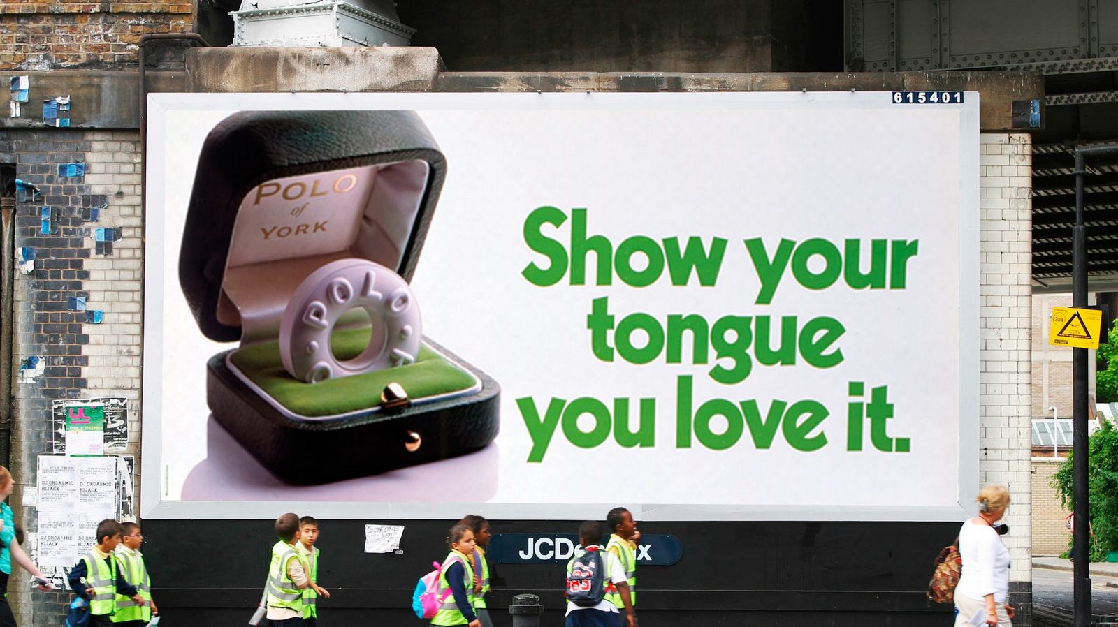
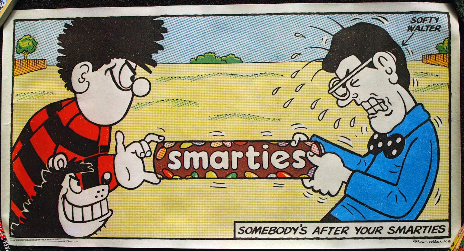
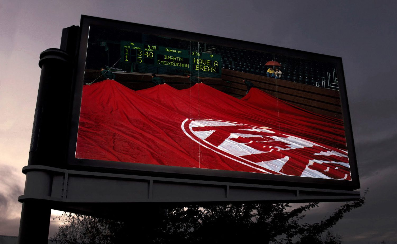
They loved all their old work, as did I.I pointed out that a lot of their recent work was very basic and functional and copy-led, whereas the work that they loved that I'd just presented was witty, stylish, visual.Interesting.I pointed out that, particularly in their category, products aren't always bought for rational reasons - "Let me see - chocolate bar A has 56% cocoa, chocolate bar B has 62%, so it's chocolate bar B for me please shopkeeper."How people feel about it is important.I quoted the peerless Binet & Field 'Emotional campaigns are 30% more likely than rational campaigns to show large profit effects' and 'Fame campaigns, those that set out to achieve fame, (awareness, buzz, talk-ability) are 80% more likely than rational campaigns to achieve large profits.'My point was that advertising isn't just a place to update the public on your production process.I ended with a slide on what would help us.
It was well received.Two weeks later we get a brief: ‘Milkybar's No.1 ingredient is milk.’That's more like it.But, having previously worked with Britain's No.1 property company, I remembered all the debates about the term 'No.1'.Rightmove would've preferred to say biggest, best or something tangible, concrete, but the only thing they could get approved was 'No.1'.Because it was a bit vague.With this in mind, I asked what No.1 meant.'There’s more milk it than any other ingredient.’Great! Sounds better than 'No.1'.They agree.It's a great fact, it's changed my perception of these sickly little chocolate bars, maybe it'll change others?Simply printing that fact on posters would be an improvement on their last campaign.But how do we make it better?Using milk as a visual.It's a positive thing to look at, wholesome, goodness, pure-looking, graphic and white.I love words, but some messages are more powerful when turned into pictures.E.g.
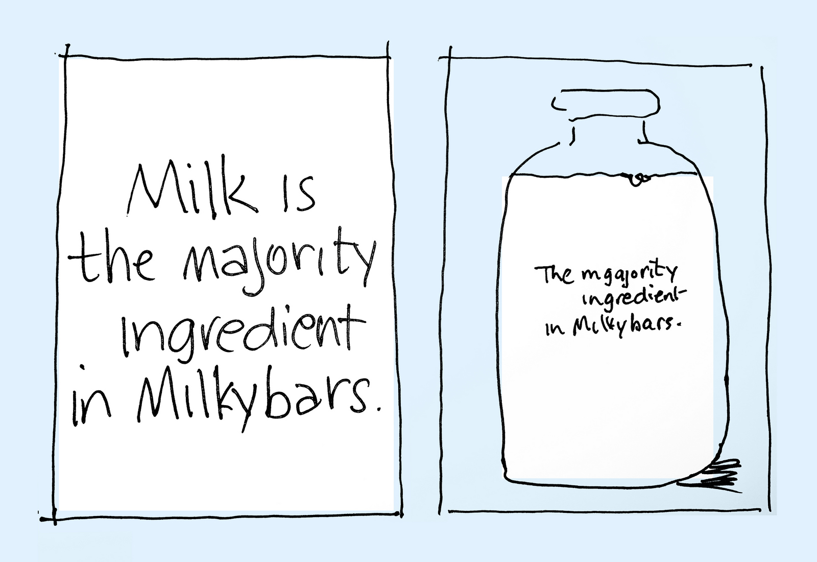
CAMPAIGN 1.Milkybars are no longer just bars, they're now buttons and eggs too, we need to show them all as related to milk.'There’s more milk it than any other ingredient’ is condensed into 'Mostly Milk', only two words and alliterative, but it bugs me it's not as clear as 'There’s more milk it than any other ingredient.’We'll revisit it down the line.
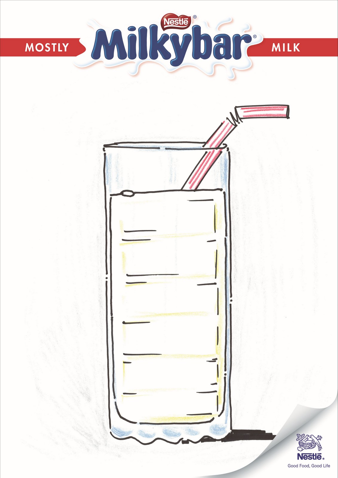
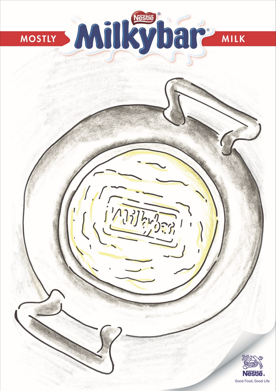
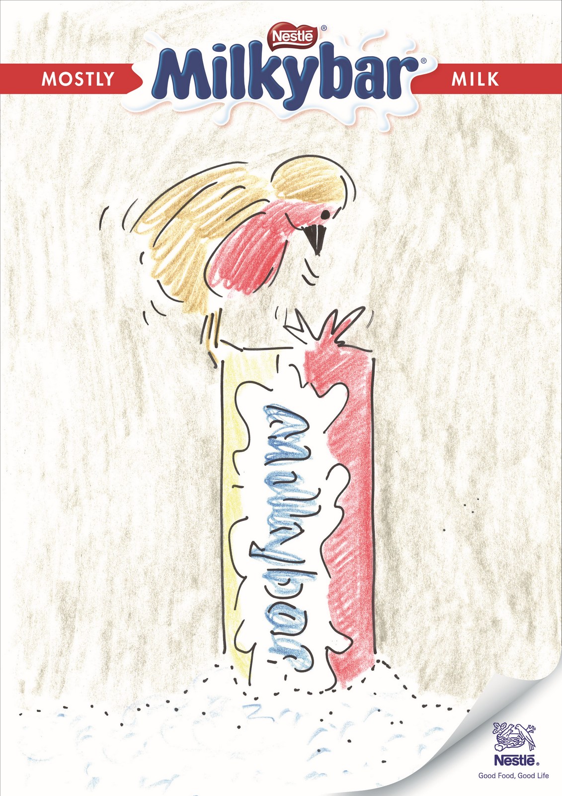
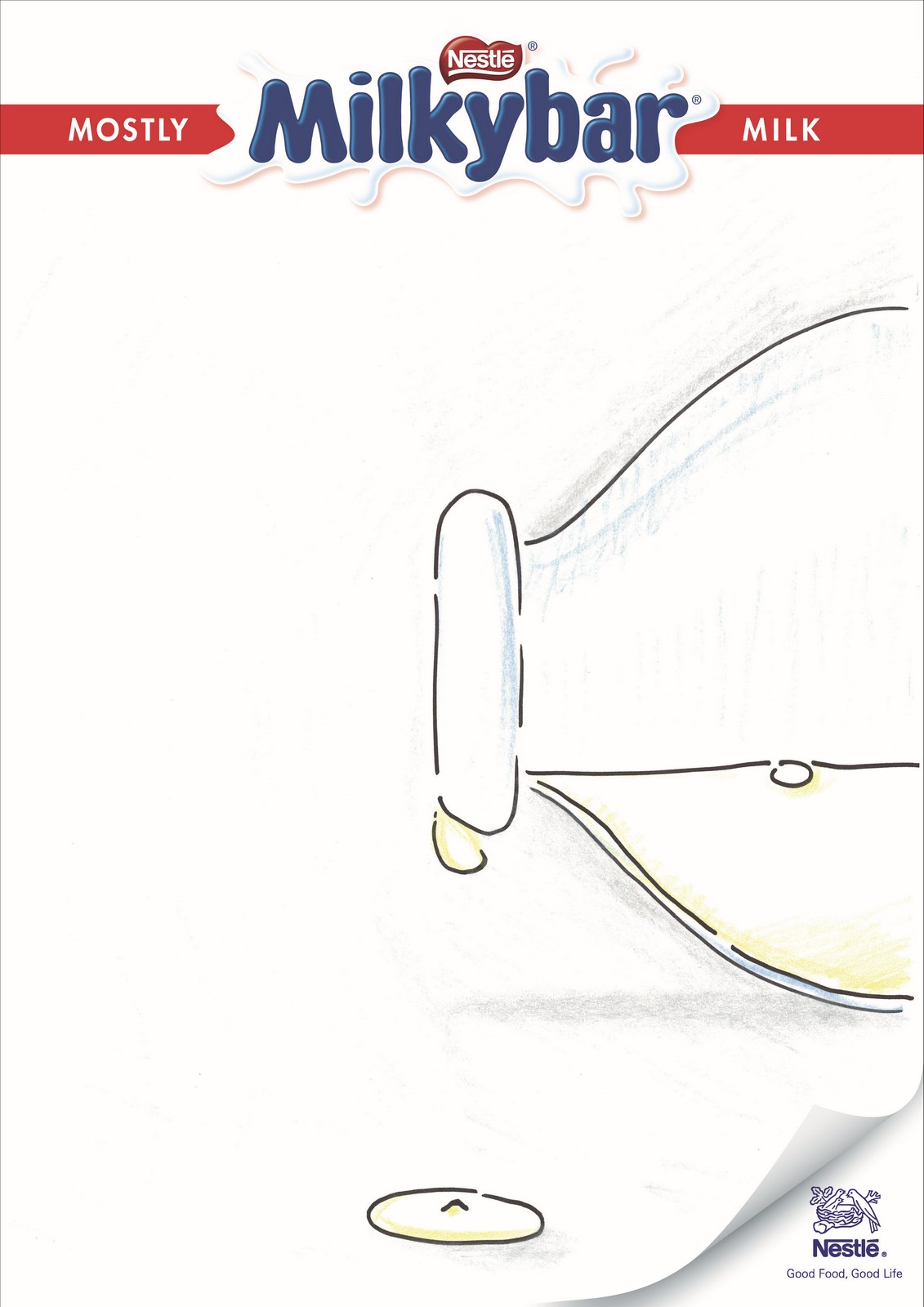
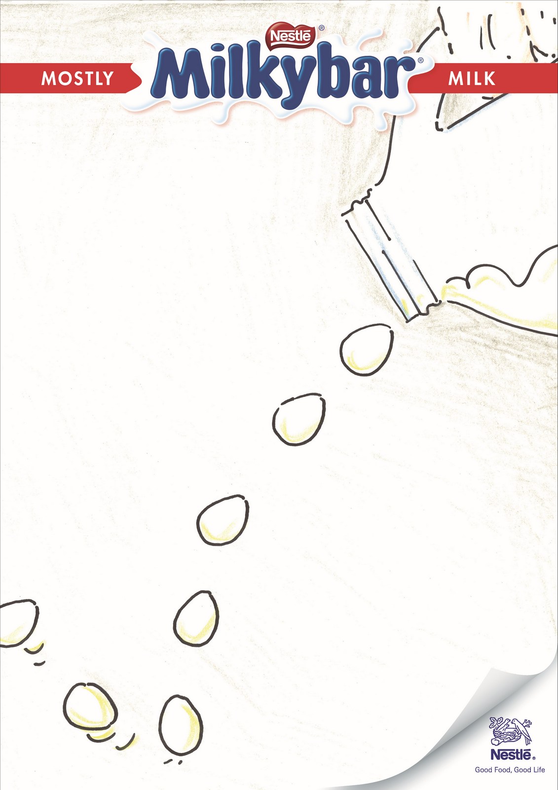
They love it.Wow! This is easy, like shooting fish in a barrel.Their only concern is that there's not enough red - 'the pack is almost 50% red'.I also have a concern 'mostly milk' looks more like a bit of design than an actual message.It's a good message, so it should be more prominent.
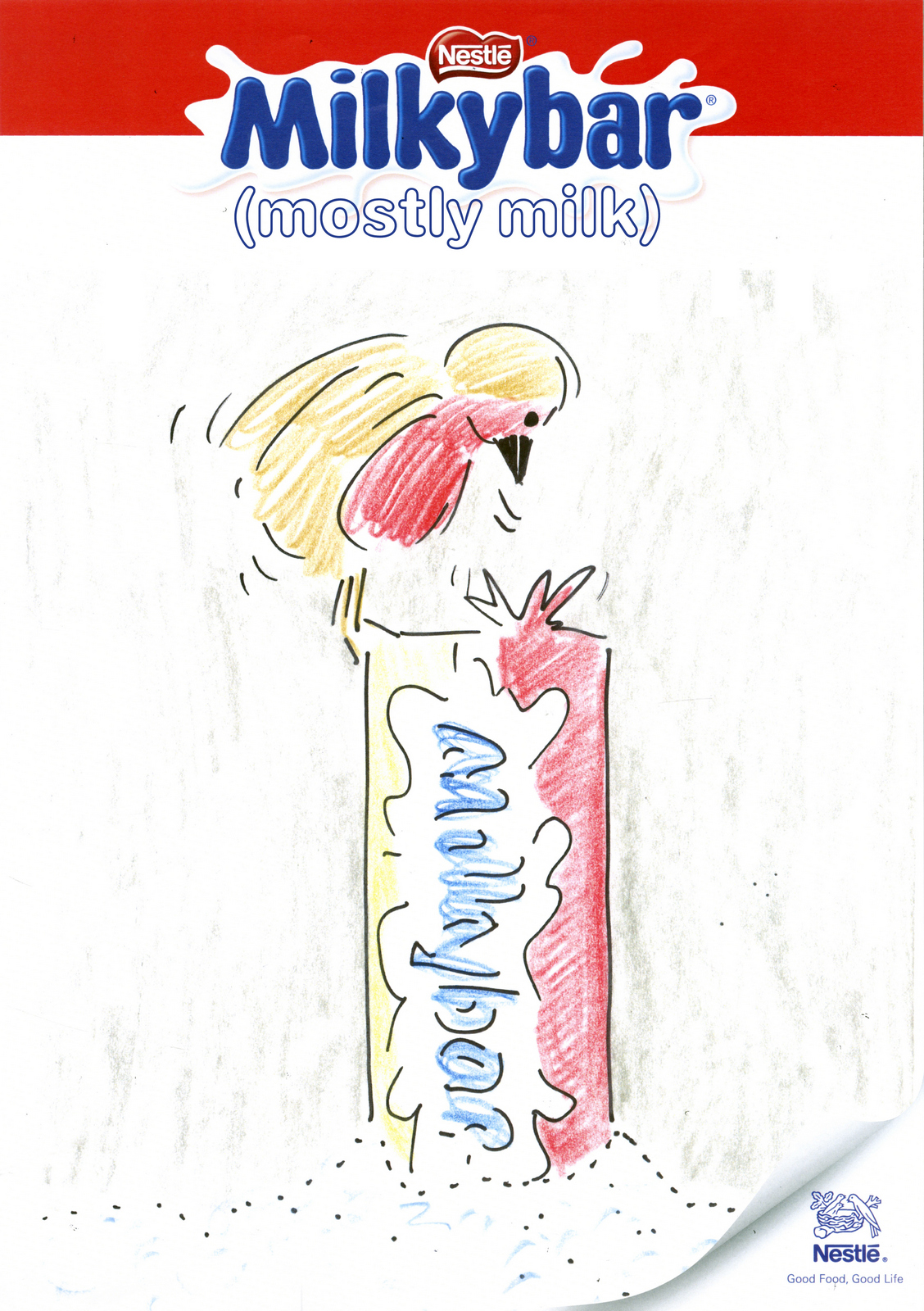
I like the brackets, it feels less like a brand line and more like a descriptor of Milkybars, like Milkybar =.We show the client.'Bad news; legal says we can't claim Milkybars are mostly milk'.Bloody legal, so over-cautious, what's their reasoning this time?'It's not true.'Oh...ok, fair enough.A range of possible claims from the marketing department is rustled up to run by legal.
Yeah, but maybe it only had 0.5% milk in the first place?
Same as above.
Not bad, if we can say it.
Damn, that again?In worrying about what we're going to be allowed to claim, so I come up with one of my own.
Silly, but quite like it.Probably not going to be able to say 'full of', but even 'Made with' might work.Starting off with such strong milk claim about seems to have spooked the Nestle legal department; now mentioning milk off the table, 'But we can still use the images, we love them.'Weird? The pictures imply it's made from milk, it's called Milkybar, what can we say about milk that isn't milk-based?What can I say about milk? It's simple, honest food, not a complex mix of chemicals.
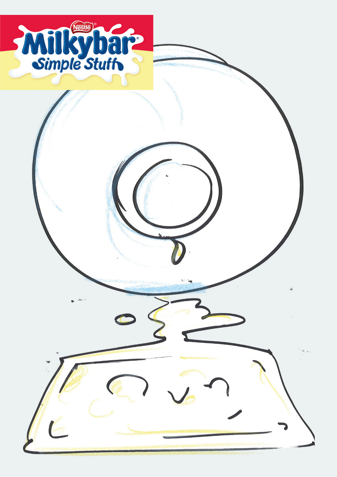
(I put a tint on the non-milk elements of the roughs to make the white milk pop.)
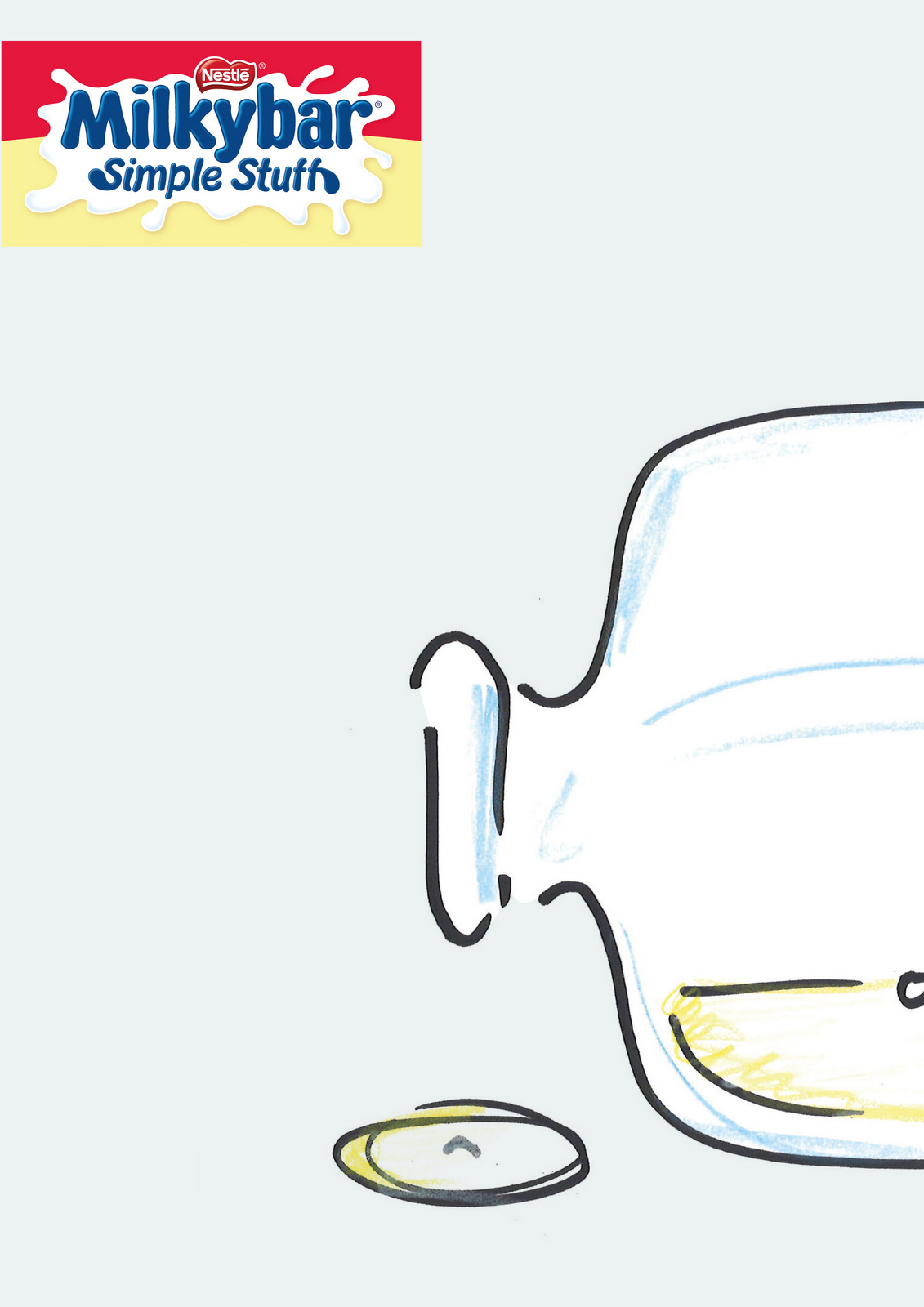
We're informed that they do ice-creams too.
'Legal have told us we can't show those images; they're implying it's made from milk.'I thought we wanted to do that? 'We'd love to do that, we just can't with its current formulation, maybe next year.Love 'Simple stuff', can we build on that?'CAMPAIGN 3.Simple Stuff? Confectionary brands usually shout from the rooftops about added this or extra that, maybe we make fun of that whole genre of marketing by celebrating Milkybar's lack of that stuff?If we do, we need to be ludicrously bombastic - ‘Guaranteed no nougat bits’.Like it's some kind of breakthrough in confectionary manufacturing.
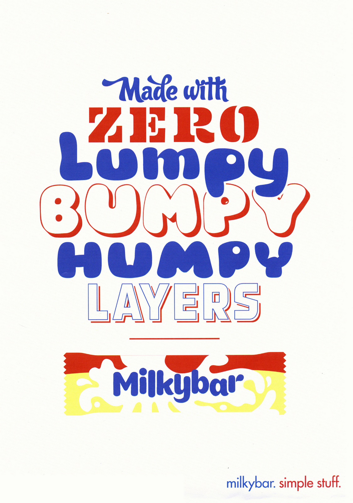
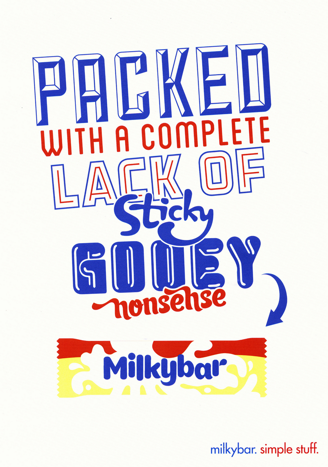
'Seems a bit complicated.Shouldn't we celebrate simplicity rather than bang on about what it's not.'CAMPAIGN 4.Ok, we want to own simple, what does it mean?...Minimal?...Elegant?...Dumb? Calling someone 'simple' means they're thick or dumb.At least it does in the U.K.Is that still allowed or is it now offensive? It's probably ok if it's referring to a chocolate bar.We'll call the Milkybar 'simple stuff' and show it as a character being dumb.It'll be fun.Could work in any channel.It'll be charming.Although I know it's going to lead to a conversation about logos and branding, I can't help but want to do a super-stripped back layout; to look simple.Besides, who wouldn't understand what a Milkybar was bya) Seeing a picture of oneb) With the words 'Milkybar' underneathandc) The words in the brand colours.No one on planet Earth.
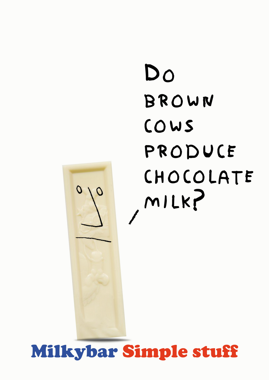
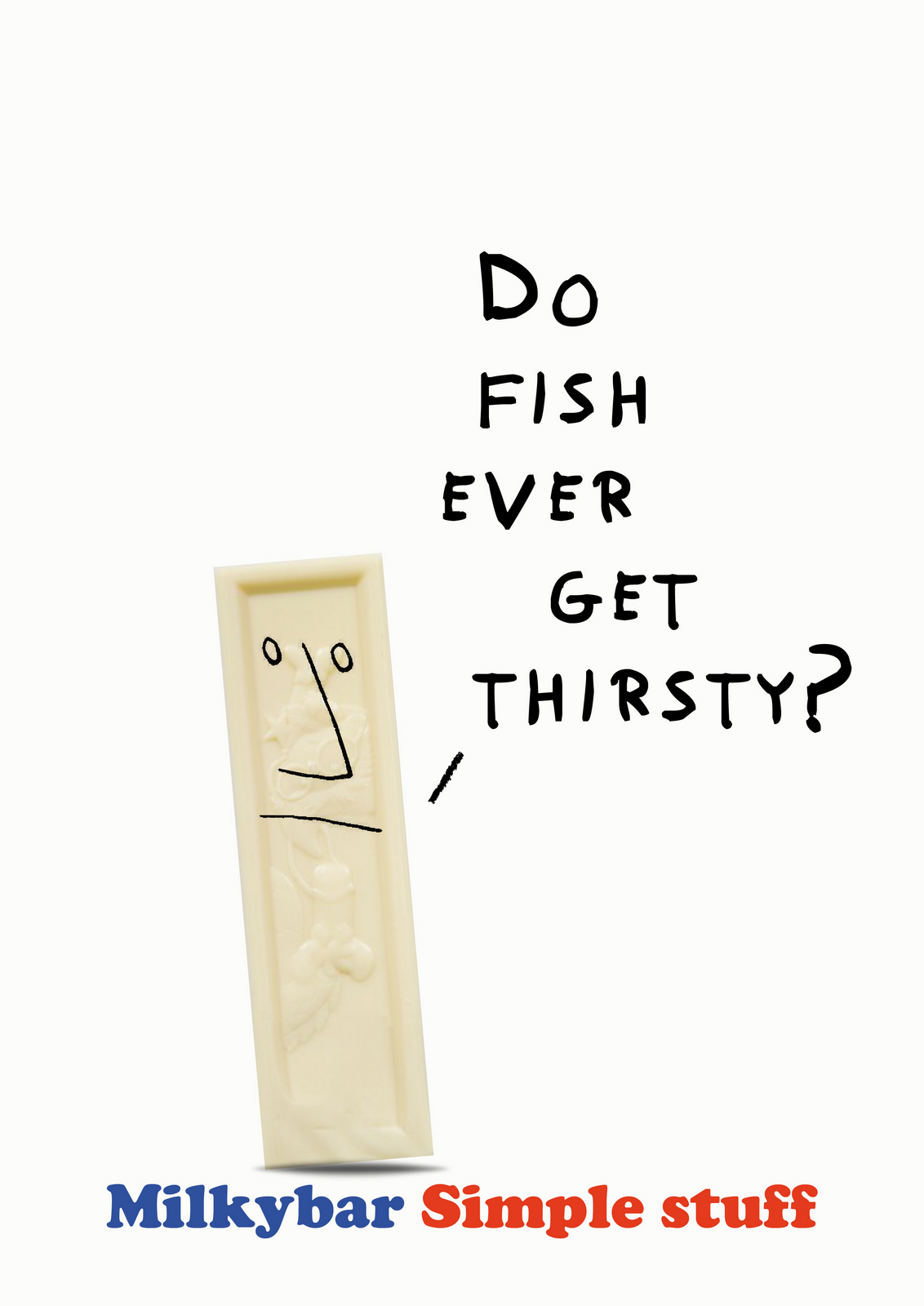
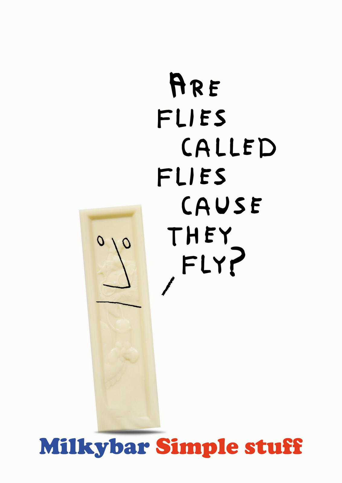
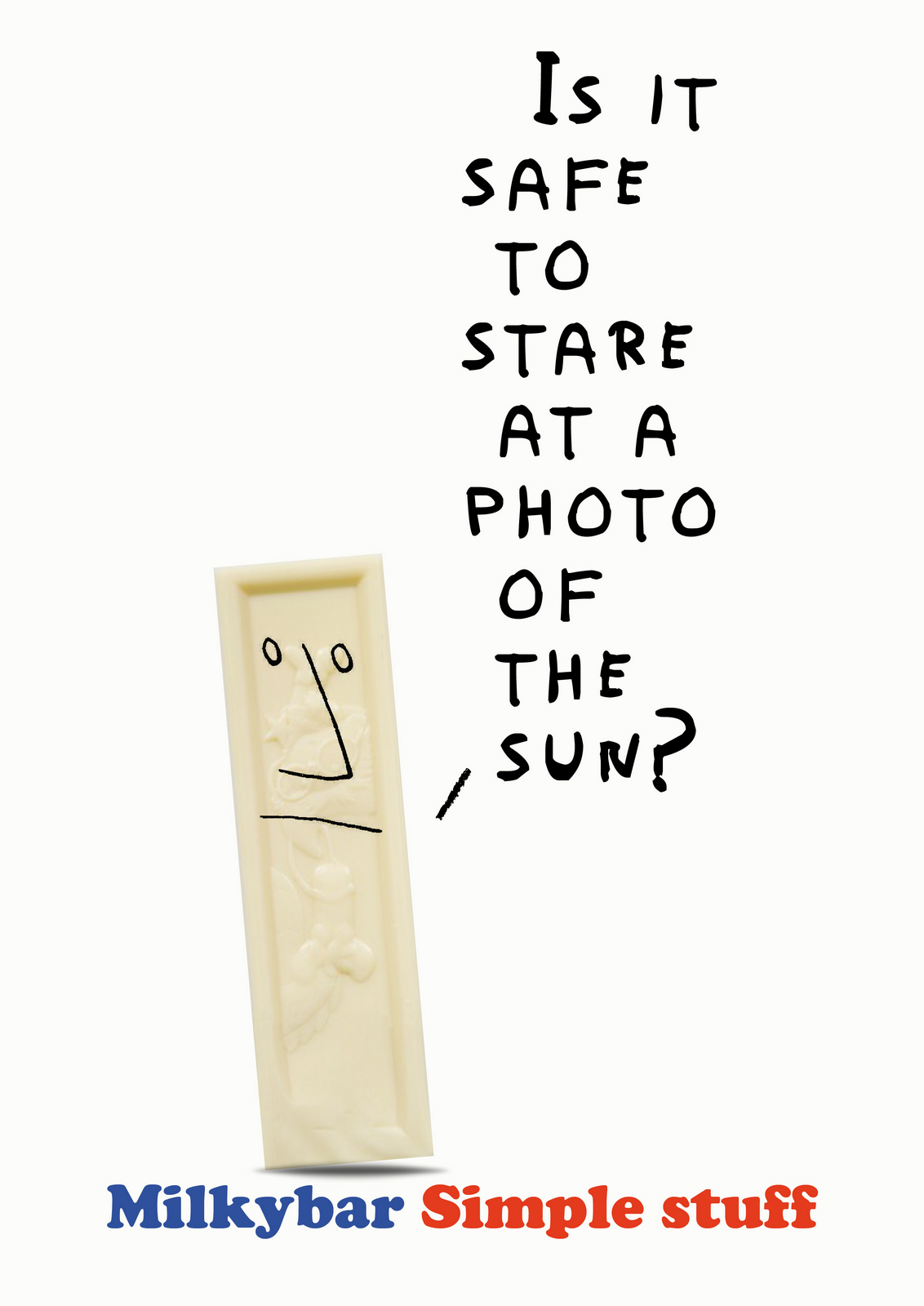
'Should we be criticising our own products?'Er, it's not a criticism, it's a chocolate bar, even the competition couldn't claim their bars are intelligent - they'd get done by the ASA, it's being playful.'I don't think so.'The MD pops into my office after the meeting 'Do you want us to get you out of this?''No, I went up there and said, a bit like Donald Trump 'I alone can fix it, I'm not bailing out now.'But it's tricky, it feels like we're starting to divide, we need to break down some barriers.I decide we should co-create in the beginning and move forward together rather than just get together at the end, in a formal boardroom, for final judgement.A workshop day is arranged.I take two creative teams and a designer up to a hotel in York.I start the day by telling the assembled group that we aren't here to create an amazing campaign, we're here to find a way forward, a route or way of interpreting 'simple stuff' we can all agree on.Then we'll go back and create and refine.We divide into groups and proceed to jot down anything that pops into our heads, this is a trusting, nothing's wrong day, let's just get it all out there.At the end of the day we start sifting.There’s a surprising amount of nuggets on the wall, good nuggets.The clients fall head over heels in love with one.CAMPAIGN 5.
The next day back at the agency, I try to figure out how we’re going to engage kids, do we speak to schools? Is it better to give the kids an idea to draw or let them come up with the ideas? The latter is preferable, but there’s no guarantee we’ll get anything useable back.As I’m turning over these questions, Nestle inform us that legal has told them we can’t use or be seen to be using kids.Is the idea dependent on kids?Maybe not, the name and age say kids, the simple idea of a Milkybar with something drawn around it isn't and that's the ‘Simple stuff’ bit.Maybe the kids thing is corny anyway? And calling their drawings 'simple stuff' is a bit of a diss isn't it?A potentially un-PC diss at that.Maybe this is good news, I can get a bunch of good illustrators to create things around the chocolate.Who can draw and think?Paul Bower, Paul Davis and Simon Spillsbury.I brief them, they send in their ideas.Here's some of Paul D's:


Some of Paul B's:
Ans some of Simon S's:

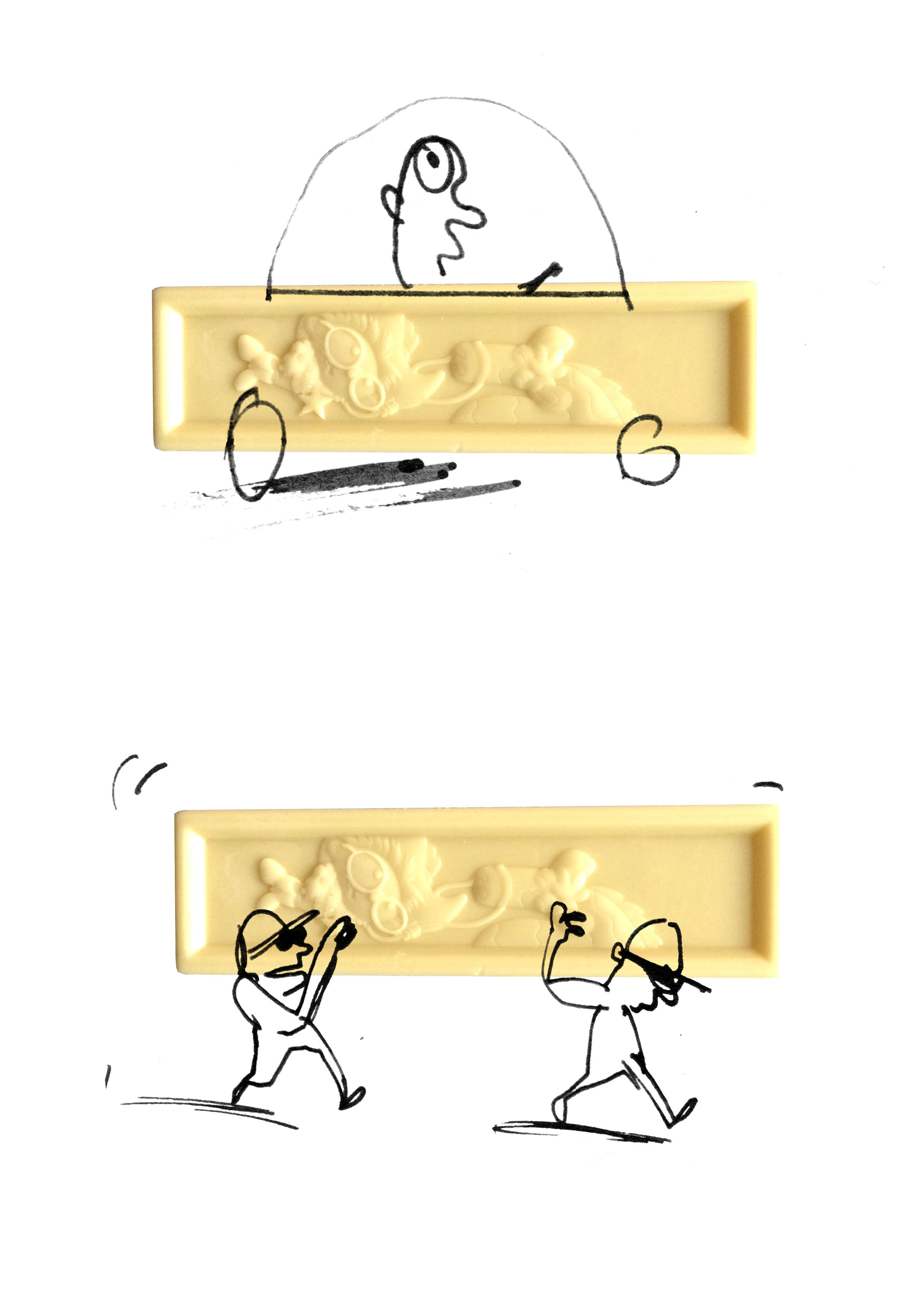

I rustle up some layouts, starting with the simplest, most basic.Initially the layouts don't work, it's only when I keep the product exactly the same size and in the same position does it feel like someone has grafittied on or around it.
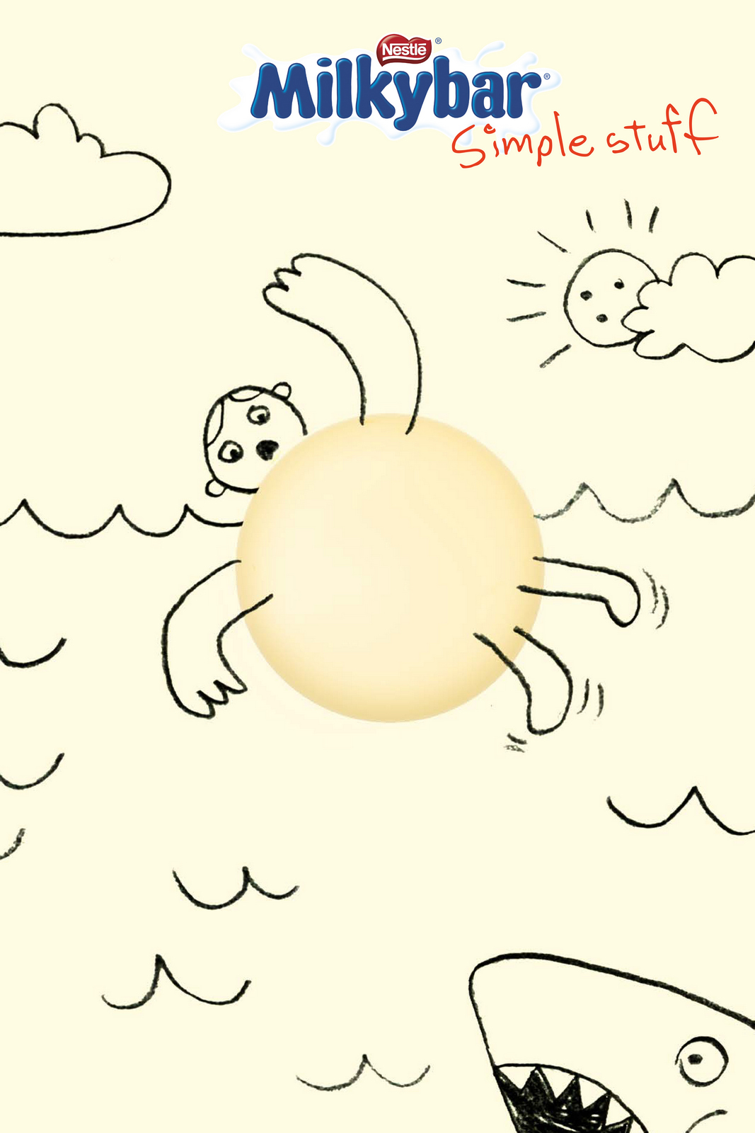


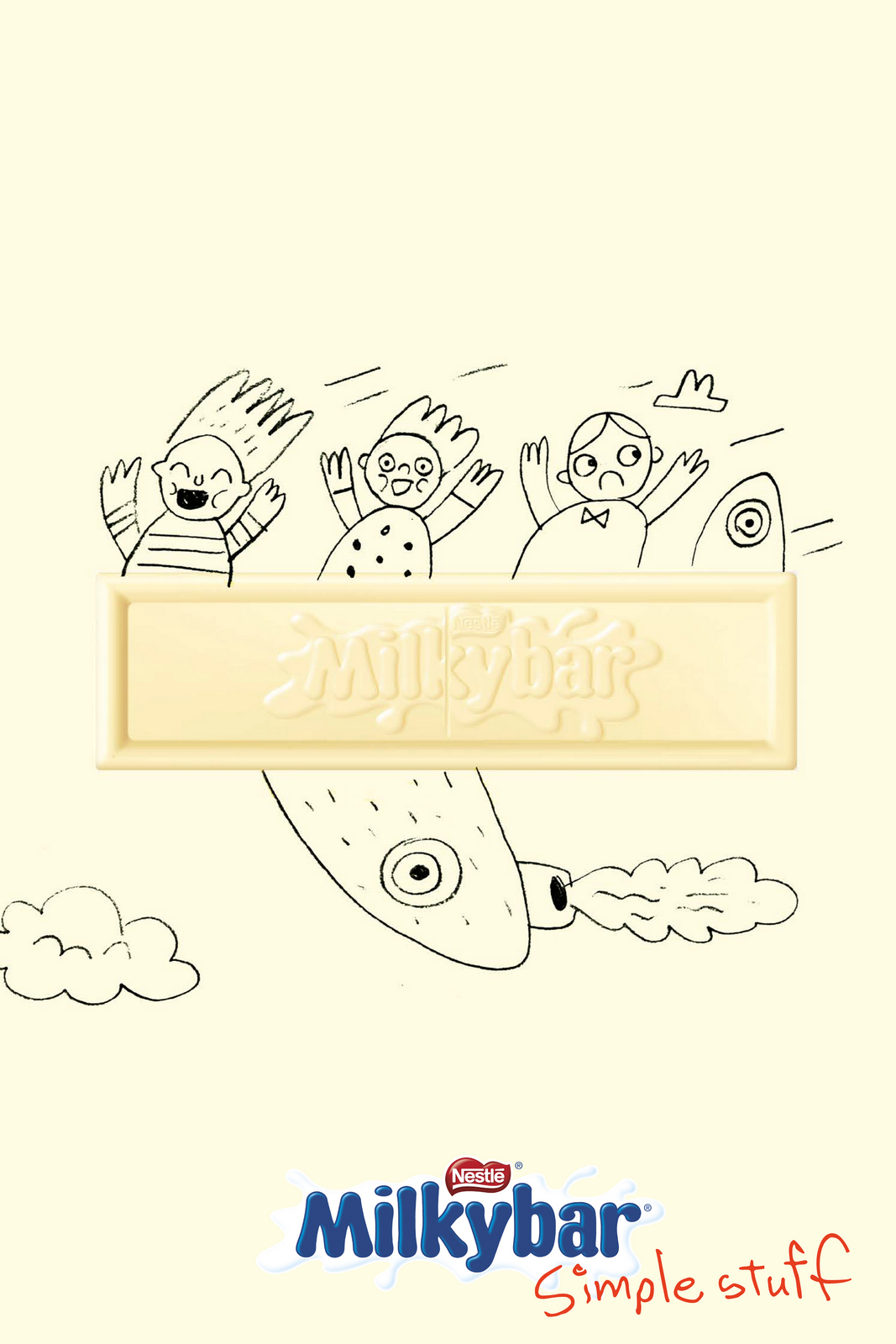
In the time it's taken to get it together the clients have fallen out of love with the campaign - 'Maybe it's that it's not kids drawings?'.CAMPAIGN 6.‘We need a large pack, not a little one in the corner’.Rather than end up with an ad with two focal points, I decide that the image will be the pack, so I'll have to come up with an idea that works around a pack-shot.So what can we do with the pack?
Quite like it.But it feels a bit like an ‘in-joke’, also, what’s the next one in the campaign?…’Eat’…and then er?Maybe a bit too basic.Maybe there’s locations that we could place it, related to simplicity?A Snakes and Ladders board,Maybe the bar is attached to the poster with one simple thing; a bit of Sellotape, a drawing pin, paperclip?BINGO!
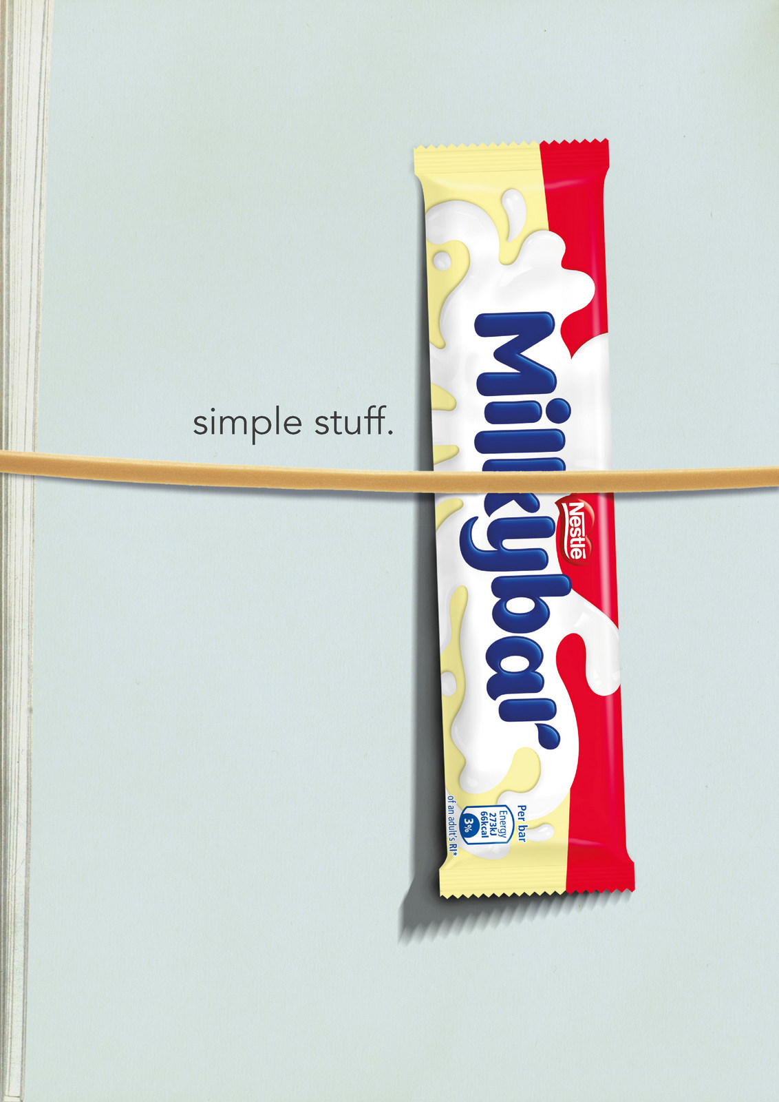
BINGO!Impossible not to buy, basically big pack shots but still with an idea, elegantly presented.It couldn’t be simpler.Which seems appropriate.Rejected – ‘too cool, too Soho.’.With the deadline looming, we’re asked to focus on a one off execution to buy us more time.That feels like a polite way to say ‘let’s forget it and move on’.We seemed to have gone from having a great message to simply showing the pack.If branding is everything, maybe we visually brand it?
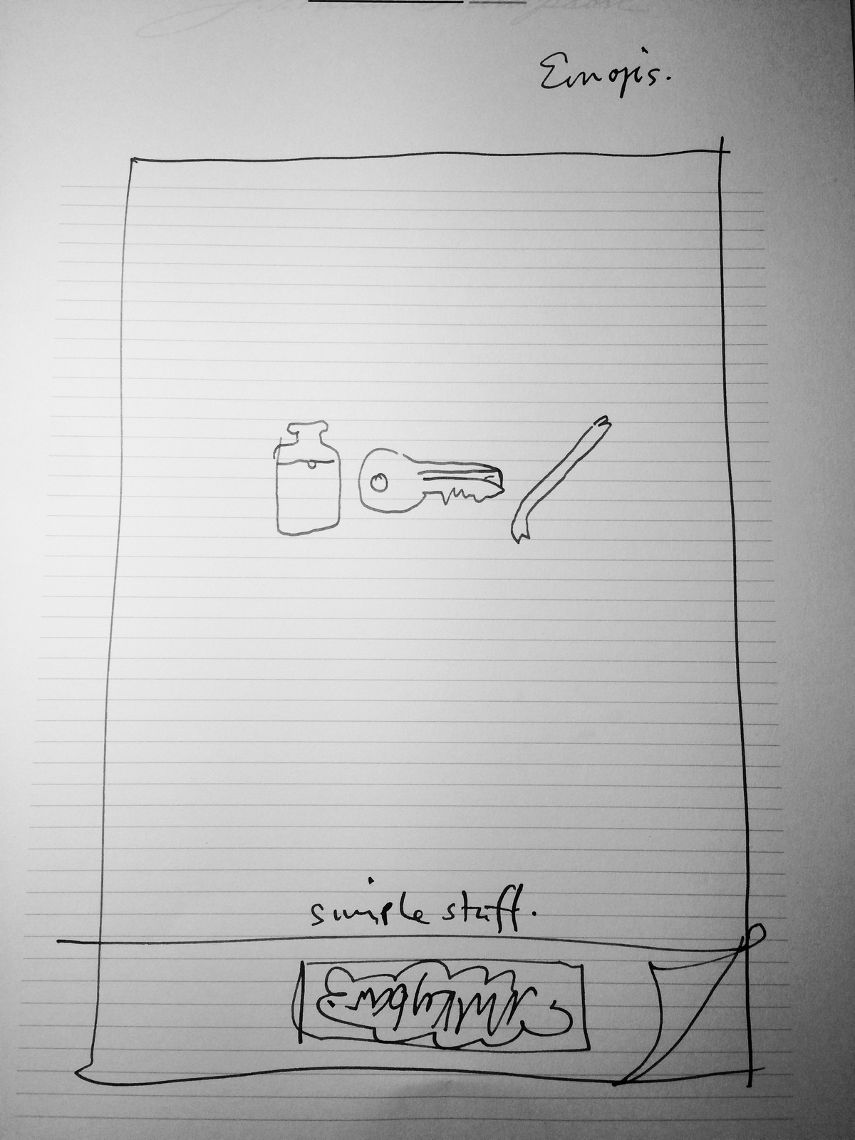
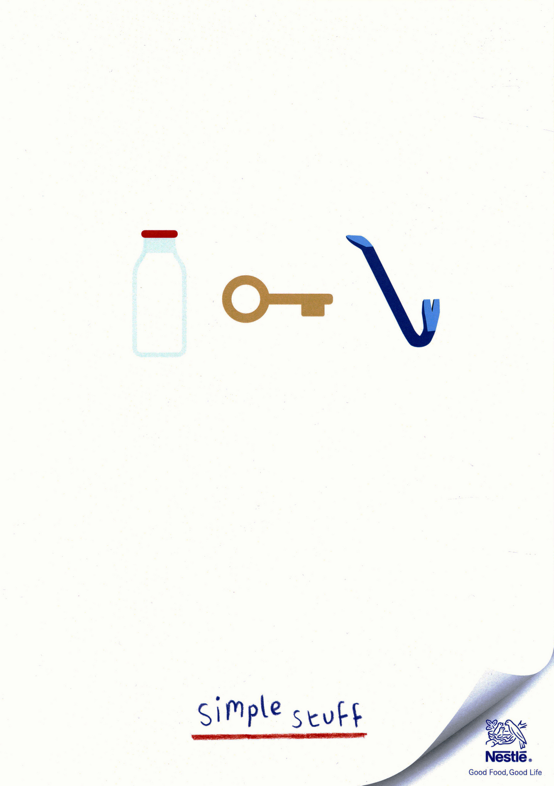
‘Mmm... where’s big pack?’Kind of defeats the purpose.Ok, forget everything we've done - what are they known for?The Milkybar kid.We can’t use children.Let's remind them of the Milkybar kid without showing or saying kid?
Quite like it, now what others can we do?The Milkybar…Arachnid? Do Primary School kids know what arachnids are?Orchid? Yep, that would make for some very exciting commercials – The adventures of the Milkybar Orchid.Ok, it's a one off.I bin it and decide to ask the client where we are and what exactly they want.Irritated, they reply 'a poster with "Milk is our No.1 ingredient" written on it'.What?I bow out.Shortly after, this runs...
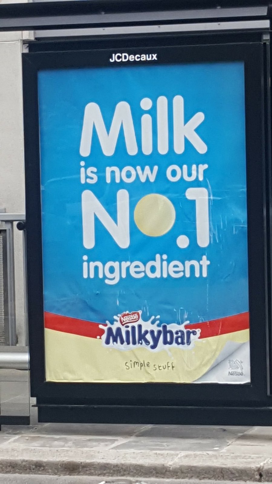
How did that happen?How did we drift apart?No one is happy.Actually, that’s not true, WPP shareholders are happy.We may not have produced a great campaign, but we produced a mountain of time-sheets.

Before I became a Copywriter, I just liked popular ads.I didn’t know they were popular ads, of course, they were just the stuff that was visible and fun and spoke to me.The more I worked in advertising though, the more it seemed to me that the industry had a real problem with popular ads.A snobbery that mass-market work was dumbed down. And, conversely, a belief that the work without wide appeal was way cooler and cleverer, and more worthy of admiration (and awards).I always thought this was a bizarre mindset.The same crooked thinking that led to Booker prize-winning novels being viewed as great works of art, while Stephen King novels were just the easy scribblings of a pulp hack.So, yeah, like everyone else in this series, I just liked what I liked. How can you do anything else?The following are the brilliant ads I remember from when I was young and also from my early years in the industry, when I hadn’t quite realised that there was, apparently, a right way and a wrong way.I thought then, as I think now, that these are the ads that truly connect with people. And surely that’s the point. Easily understandable entertainment as an arrow into the brain – and the shopping cart.So, where do we begin? Well, of course, we must start with the mightiest, most popular ad of all – the jingle.Birds Eye Potato Waffles.
Crass, but great.The cheapo production can’t take away from the irritatingly catchy jingle and the deceptively clever lyrics. Especially, the killer line: ‘Eggs on…gammon.’ (In another version, 'You can put ham on…gammon.’)A line of such beauty that Bob Dylan himself weeps on hearing it, knowing he is just a pretender in its presence.Lyrics that just about make up for the worst pun in the history of advertising slogans: ‘Bird’s Eye Potato Waffles. They’re waffley versatile’.Lyle’s Golden Syrup.
Here we go. This is what the people want. This is how to do a serving suggestions jingle.Marching spoons, a nursery-rhyme, ear-worm song, a no-nonsense call-to-action end line…AND SPIKE MILLIGAN, FERCHRISSAKES! Jingle jenius!Yogo - WCRS.
Right, you’ve got to find a way of selling a new yoghurt-flavoured chewy sweet called Yogo.So, you give it a neat end line: ‘Yogo is two of my favourite things in one’, and you create a really catchy jingle with lovely playful lyrics.And, lastly, you shoot a bunch of silly, inventive scenes of unlikely things joined together.IS THERE A BETTER WAY OF GETTING PEOPLE TO REMEMBER – AND POSSIBLY BUY – A NEW YOGHURTY CHEW? NO, THERE IS NOT! SO WHY DO WE NOT MAKE COMMERCIALS LIKE THIS ANY MORE? WHY? WHY? ANYONE? BUELLER?McDonald’s Big Mac.
You wouldn’t think that a jingle with no tune to speak of and whose only words were the ingredients of a hamburger could capture a country’s imagination.But that’s what happened in America in 1974.The genius bit was in turning the lyrics into one long tongue-twister line and challenging people to say it right.Not only does this make for a great TV spot but they made it a real-life challenge too: if restaurant customers could say the entire line correctly in under four seconds, they got a free drink.And millions had a go.All of which turns a seemingly ugly and hard-sell jingle into an irresistible human idea.But ask yourself, would any UK Creative have this idea today? No chance – far too uncool.Triumph Bras.
On the first day at the Watford Copywriting Course in 1983, we were asked what our favourite ads running at the time were.I said mine was this ad for Triumph Bras, which I’m sure just made the other students and our tutor Maureen Purbrook think I was a creepy perv – but it was the song and the sass that I loved, not the bosom close-ups. (See? Even now nobody believes me.)But check out that tune! Now that is proper songwriting. If the Brutus Jeans jingle could become a pop hit, then why didn’t they release this?And is it me, or is that synched camera jiggle + model hand move at the end not seriously cool and stylish?Sorry, Miss Purbrook. Not sorry.Cadbury’s Fudge - FCB.
This campaign really jumped out when I was younger. Sweet little stories; great tune; and memorable lyrics.But one thing confused me for years: the song said that a finger of Fudge was ‘full of peppery goodness’.What was that all about?Why would they put pepper in a finger of Fudge?It sounds horrible.It was years before I realised they were actually saying ‘…Cadbury goodness’.But how was I supposed to know? I was a kid – I’d never heard of Cadbury. I didn’t care about the companies that made my favourite sweets – just the sweets.But then again, I did have a history of cultural misunderstandings as a child.I knew that the ‘L’ on a car meant ‘Learner’ so, I genuinely thought that the ‘GB’ on other cars meant ‘Getting Better’.Punk band Snuff.[audio m4a="https://davedye.com/wp-content/uploads/2021/09/SnuffShake-N-VacDo-It-AllBran-Flakes.m4a"][/audio]You know your ad has cut through when a band does a joyful, rip-roaring cover of your jingle.Punk band Snuff were famous for doing these covers and they were a fan favourite at gigs.Here are three short, sharp jingle bangers from the boys.The first one is a little obvious but do you remember the other two?If one day Snuff could reform and have a crack at Honda ‘Grrr’ I’d die a happy man.Yellow Pages - AMV.
‘Soap’ ad campaigns have always resonated with the public but never really captured the industry’s love. Very uncool. (Think the OXO family.)And this kind of real-life campaign storytelling is rarer than hen’s teeth now.But why?The set-up is rich with promise: we get the chance to write charming and witty real-life stories using the brand/product/service as it is used in life, and people can get to know a character over time (or a group of characters), developing an emotional bond with them and, by association, the brand.You even end up actually looking forward to seeing the next instalment. (People looking forward to an ad! How bizarre does that sound?)My theory is that Creatives and clients actually think this kind of work is boring now. Slice of life? Who wants that?It also makes no use whatsoever of CGI effects, which is how you’re supposed to do ads these days, right?Plus, of course, there are fewer writers around who can even write such glorious stories. (Take a bow, Mary Wear, for writing this f***ing funny tale with the brilliant James Nesbitt.)Heinz Soup - Dorlands.
This was a campaign that featured a grandad and grandson going about their lives, occasionally having soup together and giving us a charming glimpse into their close relationship. (Again, name me a single campaign these days that takes this repeatable, emotional, character-driven, story-telling approach.)The ad I remember best is this powerful, pared down story from way back.A story that also opened this copywriter’s eyes as to how sometimes it’s what you don’t write that matters most.McDonald’s.
Actually, there IS one campaign that consistently tells charming emotional stories about normal people and their normal lives and their genuine, natural love for a particular product.Take a bow, McDonald’s (and Leo Burnett London).Here are just three examples of the kind of witty, beautifully crafted stories they have been telling for decades.Indeed, it is my belief that McDonald’s is the best UK brand campaign of the last thirty years – by a mile.D&AD should give it a special Lifetime Achievement award for its incredible body of work (like Hollywood gives to legendary directors).Cadbury’s Smash - BMP.
My first copywriting job was with Andy McKay at BMP and our office was the one next to John Webster.(Imagine: one minute I’m at Watford College, the next I’m working next to John Webster. That’s like a teenage trainee footballer being thrown into their first match and partnering Messi up front.)In my first week, I nicked a compilation reel of his best work and was blown away by a brilliant ad for Cadbury’s Smash.But no, not that one – not the Martians ad.It was the ad that came before that campaign; the one that explained this weird new product with a simple and compelling logic twist.It was a stupid idea and an intelligent idea, all at the same time. (Cadbury’s Smash isn’t a rival to the potato; it’s the other way round).The words are so beautifully written and the logic is so ridiculous, yet strangely true.One of the ads that shaped me, I think.St. Ivel Cream - BMP.
How great was John Webster?Well, this charming spot didn’t even make it onto his Best Of reel…and there’s 84 ads on there!Why they left this off, I’ll never know.A lovely human story, woven directly around the product, and told with beautiful restraint.Aviva Life Insurance - AMV/BBDO.
If you asked people to name their 10 favourite movie scenes, I’ll bet you that pretty much all of them will have a powerful emotional moment at their heart.Even if it’s a science fiction film, or a horror, or a comedy. (What’s the most remembered scene in Star Wars? “Luke, I am your father.”)The Aviva campaign where Paul Whitehouse played a different character each time ran for years and went largely unnoticed by the industry.Which must be the reason why this incredible execution also seemed to pass ad people by.It’s all nice and fluffy and then – wham! – it ends with one of the most heart-wrenching moments you will ever see in an ad.Still gives me the chills.(Written by Mike Hannett and the late, great Dave Buchanan at AMV.)Cacharel.
Perfume ads are crap, aren’t they?Beautiful crap, but still crap.So, how come this one has stayed in my head for forty years? (“LouLou? Oui. C’est moi.”)Why is this ad more appealing and stylish than all the rest?Even now, I can’t quite put my finger on it.Guess it’s just got that ‘je ne sais quoi’.Ronseal Quick-Drying Woodstain - HHCL.
Let’s be honest, this is one of the most famous and iconic ads ever made.You might not want it to be, but it is.It’s thirty years since it ran but stop anyone in the street and they’ll know it.In fact, they won’t just know it, they’ll have said it!This startling ad pulls off the almost impossible trick of being seriously odd yet also enthusiastically embraced.But never by the industry, it seemed to me.I think it just fried their brains. It followed no existing idea structures and was maybe the most hard-sell ad ever made – which meant it was the most uncool ad ever made.I just think it’s a one-of-a-kind masterpiece.The words look even weirder written down.‘This is Ronseal Quick-Drying Woodstain. You can’t miss it – it comes in a tin with Ronseal Quick-Drying Woodstain on it. It protects, and it’s rain-proof in about 30 minutes. Which means in about 30 minutes your wood’s rainproof and protected. So, if you’ve got wood to stain and you want it to dry quickly…use Ronseal Quick-Drying Woodstain. It does exactly what it says on the tin.’God bless you, HHCL. We will never see your like again.Esso.
This old b/w ad has appeared on these pages before (in Mark Denton’s take on ‘What I liked…’) but I wanted to pass on the true story behind a brilliant moment within it.A quirky thing that I definitely remember going around at the time: something silly and naughty that just really appealed to people.Basically, the VO actor playing the Esso Blue dealer character was late to the recording session so one of the ad guys stepped in, just to get the sound balance right.When it comes to the bit where the character gets flustered by the woman on the phone, he accidentally said, ‘I’m your Esso Blee Dooler’.Everyone thought this was hilarious so they stuck it in the actual ad and it became a big hit with TV viewers who would say it real life.Honestly, when will we ever learn? When it comes to ads, boys and girls just wanna have fun.Perrier - Leo Burnett.
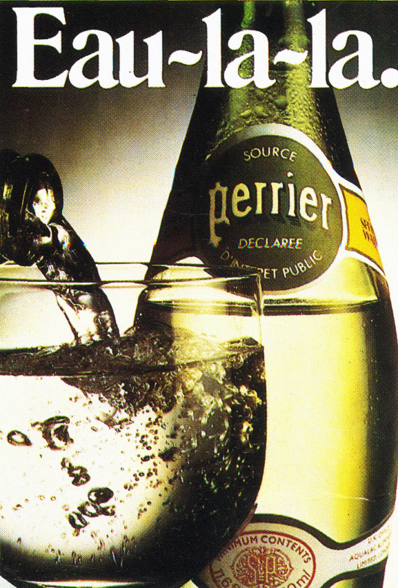
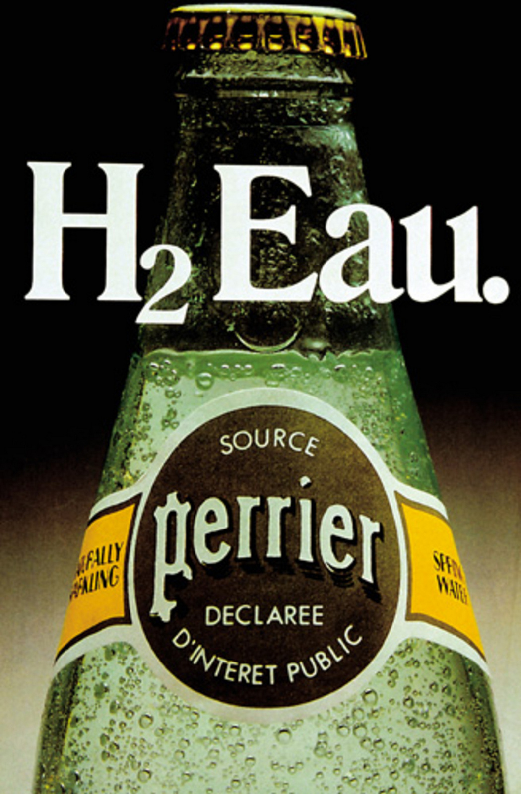
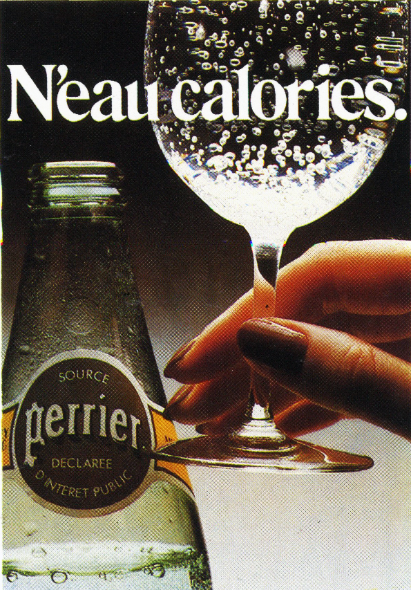
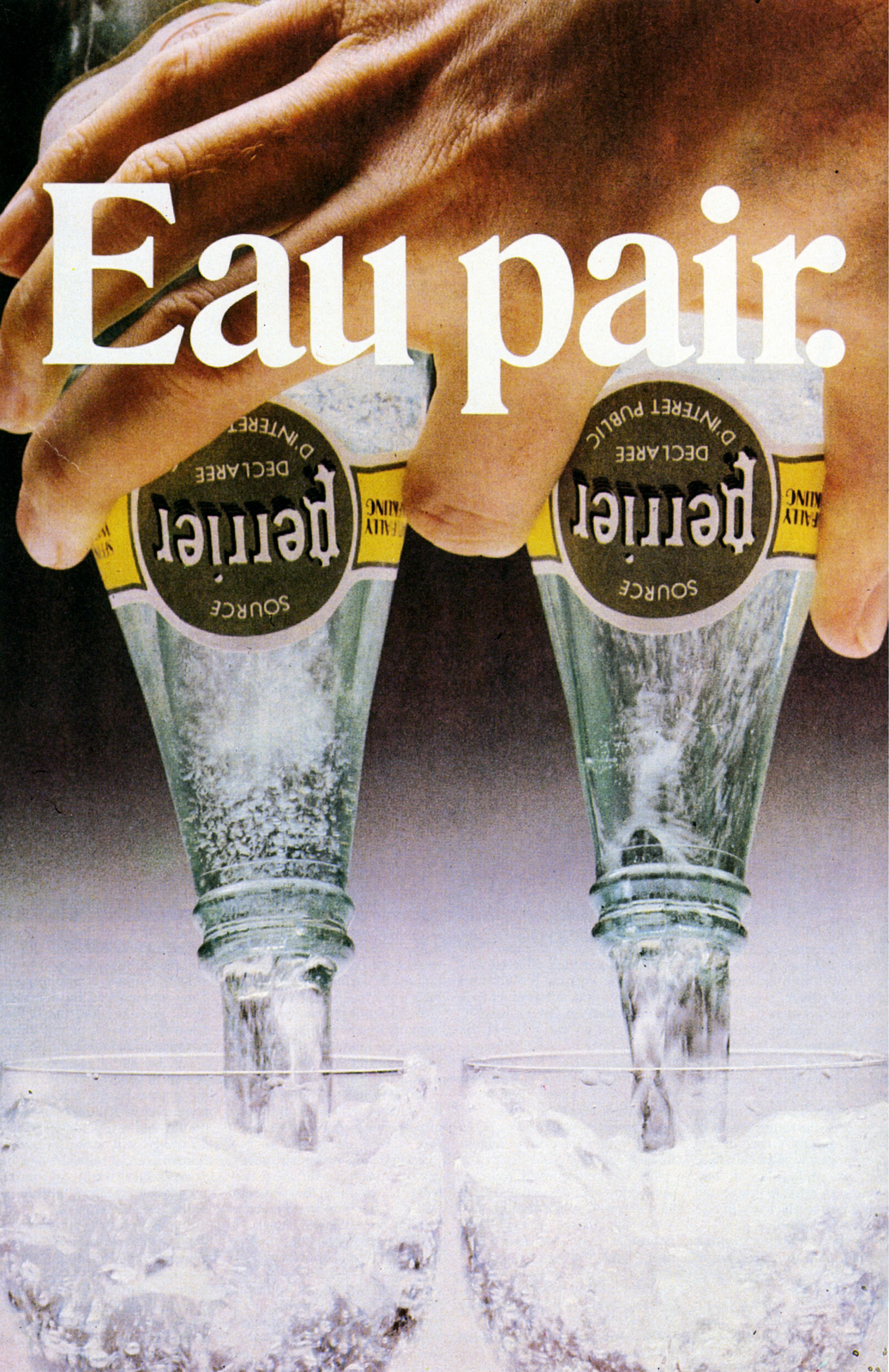
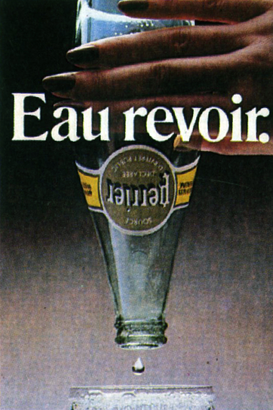

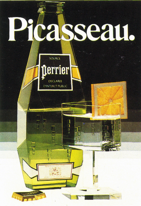
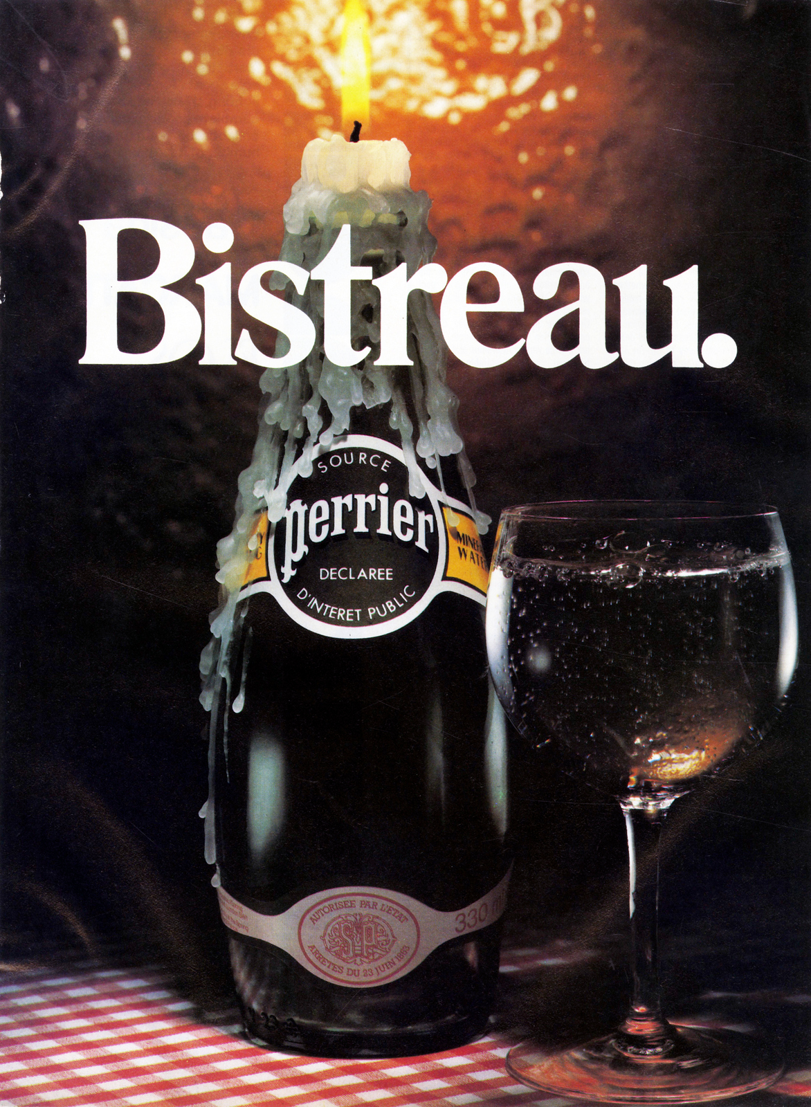

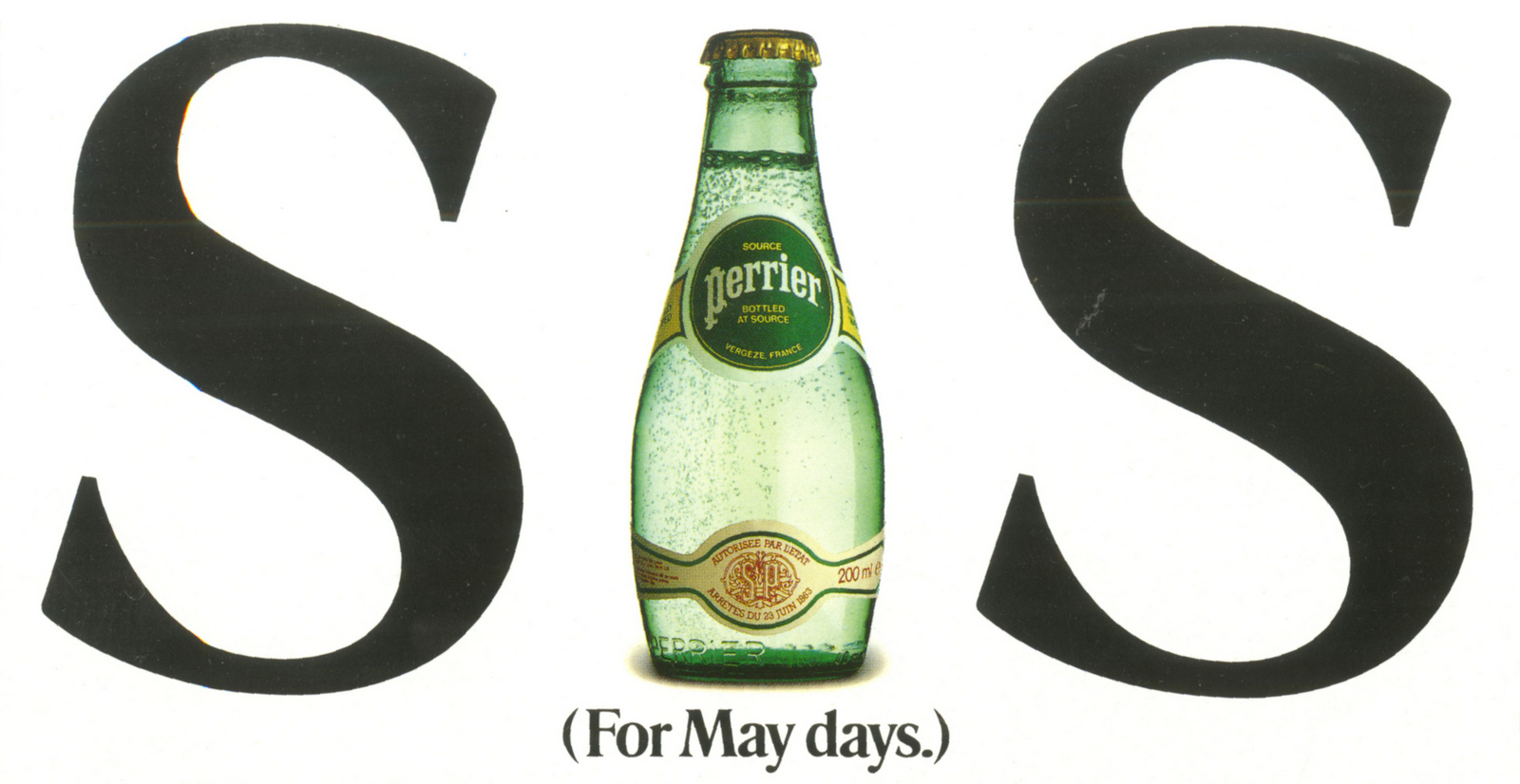

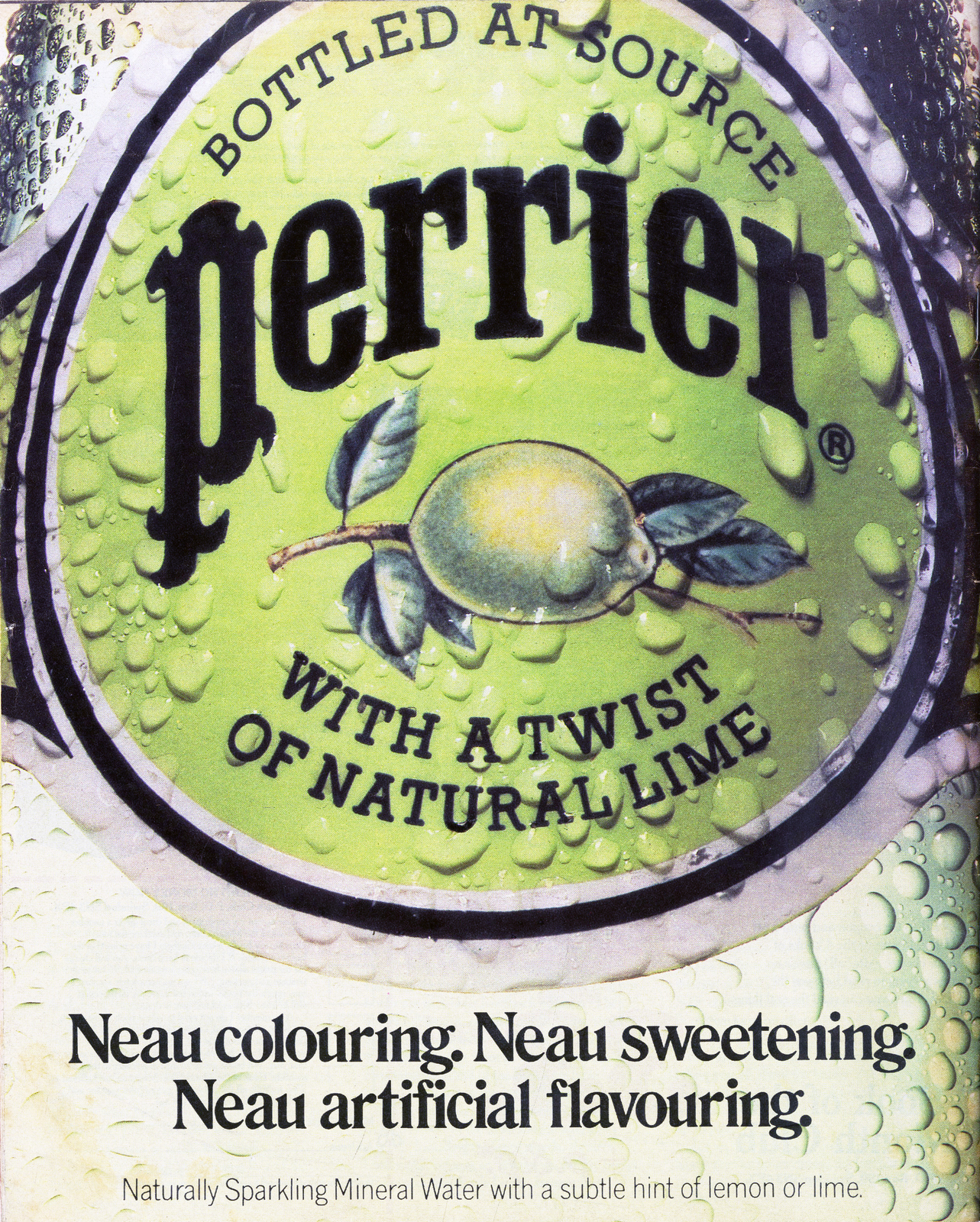
In the late 80s my second copywriting job was at the deeply unfashionable Leo Burnett.But on arrival I discovered that it was Leo’s who did the simple and iconic ‘Eau’ campaign for Perrier.I loved this campaign: a simple, smart idea and lovely big branding.Just how an ad should be.Maybe it’ll be okay here, I thought. And it was, in its own deeply unfashionable way.Indeed, over the next few years, the department became a breeding ground for stellar talent, such as Neil Dawson & Clive Pickering, Ben Walker & Matt Gooden, Nick Kidney & Kevin Stark, and my partner, Mark Tutssel.My stay at Leo’s taught me that poor places can still have great people working in them, and not to be an advertising snob.Gordon’s Gin - Leo Burnett.


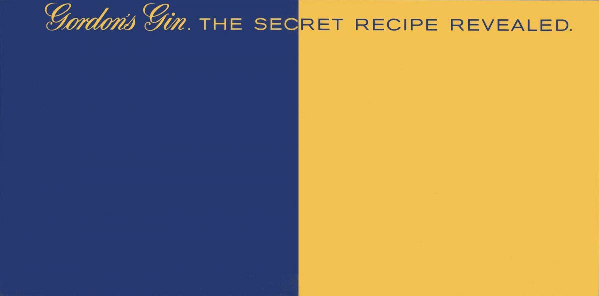
Forgive me for finishing with some of my own work – not really in the spirit of this terrific series. But it strikes me that this whole thing of ‘liking the work you like and not necessarily what you’re supposed to like’ should also help guide a Creative throughout their career, not just their life before advertising.For me, the most satisfying thing I’ve ever done is still the Gordon’s Gin ‘Green’ campaign that I created with Mark Tutssel.It was so exciting to get this out of Leo’s and see it get richer and richer over time.It was everything I’d ever hoped to be capable of doing when I was at Watford only four years earlier and it was amazing to see it get such a great response from the national media, and from the public. (Applauding the cinema ad! Requesting life-size copies of the 48-sheet posters!)Which meant it was also hugely disappointing (and baffling) to see it so consistently snubbed and ignored – and criticised – by the industry.No awards or mentions of any kind, at any show, in its entire five-year run.Lots of Creatives said they liked it, but the ‘tastemakers’ knew better.Still, I’m clearly over it now.N.b.John Webster on 'Serious Rival'.
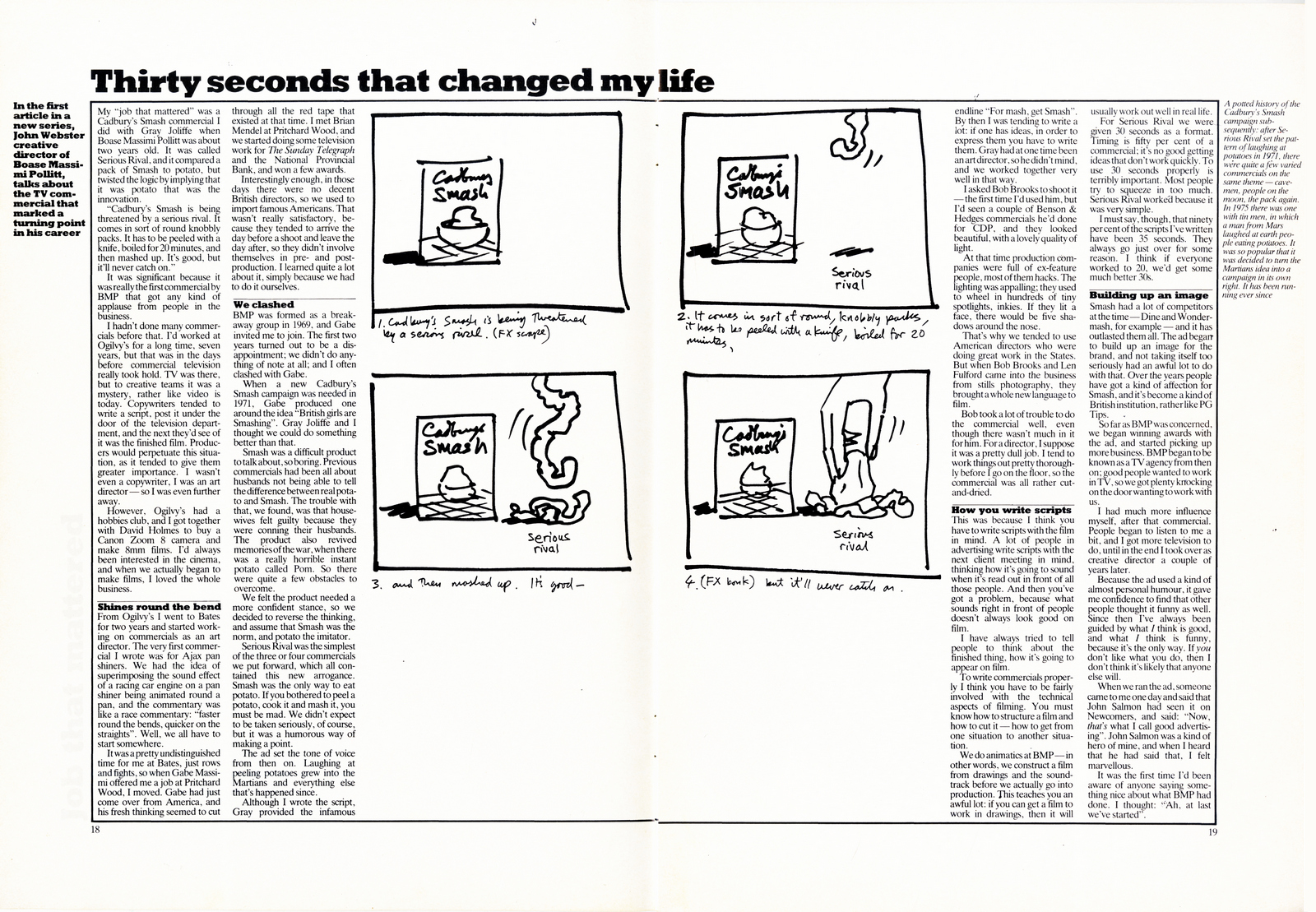
An ad by Leo Burnett on their first 10 years pushing Perrier.
A review of the first 10 years of the 'Eau' campaign.
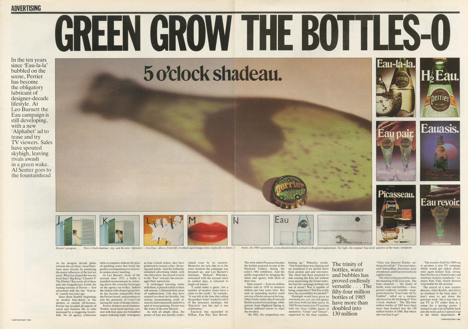
As a kid I loved anything that was ‘wrong’.Funny stuff. Dark stuff. Magical stuff.The stuff I wasn’t allowed to watch.Stuff that did something fuzzy to your brain.I’d pick the London Dungeon for a family day out.I’d ask for Viz over the Beano.Anything that was naughty and went against the grain.Anything that stuck in your head for all the wrong reasons.It’s of no surprise then that nearly all the ads I liked before I knew what I was supposed to like fall into this ‘weird/magical/funny’ category. I’m getting dark flashbacks. I need a whisky and a hug from mother.FISHER PRICE MAGIC SET.
I got really into magic as a kid.I loved the mystery around it and trying to creatively solve how stuff was done. This was the ad that started all that off. A young kid with the Fisher Price Magic Set impressing his family with an array of tricks. I got that set for my fifth birthday and immediately dictated a letter to my dad to send to the Surrey Mirror.In it, I rather arrogantly claimed that I, Dan Watts, was the youngest magician in Surrey (I assumed this to be true as no one else I knew was doing it) and would they like to do an article about it? They sent a photographer round to our house the next week and I recreated that Fisher Price ad with my sister and Gran. Everyone was suitably impressed, and I ended up on the front page sandwiched between “New books in Sutton Library” and “Woman finds hat in tree”.CHAMBOURCY REAL ORANGE MOUSSE.
I mean…its obviously not a great ad. Nor did I think so as a child.But the endline DON’T TELL THE CHILDREN was the first bit of reverse psychology I ever truly fell for.How do you get kids to persuade their mums to buy a cheap chocolate mousse? Tell that kid they can’t have it.Those mousses became a staple at our house.Don’t think I ever saw either of my parents eat it ever, but I felt like I’d beaten the system.PLAY SAFE - FRISBEE.
Fuck me. Seriously. This left a mental scar in my brain as a child that’s still pretty fresh.I’ve seen a lot of abhorrent things in the last 41 years; from terrorists on the internet to the movie Beaches, but nothing, NOTHING has had the same effect as watching a happy child climb a metal pylon to get his frisbee down before being obliterated into the cosmos via 4000 volts.I have never gone more than 20 meters near a pylon since nor confidently thrown a frisbee.Fact.KINDER SURPRISE.
I know there were a lot of drugs being passed round in the 80s.Without them we wouldn’t have had Joy Division's ‘Closer’ or this children’s advert for Kinder Eggs.I don’t know if the agency was genuinely on a mission to terrify children directly or whether there was a loss in translation between the prosthetics team and the creatives, but either way this was another one that created a strange dark and creepy desire for kinder eggs.No Germanic looking mother and child laughing over a kitchen table in this one.Those were the days.TRIO.
Slightly less dark was this advert for TRIO bars. Less dark…but still rather aggressive and spikey. Sandwiched in-between child friendly kids TV shows like Rainbow and Button Moon this would often come on and jar you out of your calm state.I never quite understood what Suzie’s problem was. Why all rudeness and anger?But it made me a little frightened, and a lot curious.She had a massive angry shouty mouth.She was ruining the nice calm hippy’s music.Suzie didn’t say please like us kids were always being told to say, SHE WANTED A FUCKING TRIO NOW!She was scary and manic but ironically illustrated in the same style as the relatively peaceful Henry’s Cat cartoon.So confusing.Of course, I had to demand a TRIO bar whilst shopping with my Mum.Just see what all the fuss was about.UM BONGO.
Ok, so maybe this hasn’t aged particularly well, but cultural appropriation aside (pretty sure they never drunk this in the Congo or anywhere outside of the UK) I loved this.I loved the slightly drunk animation, the hypnotic song, and the fact that there was an alligator at the end that aggressively clamped its teeth over everything and made the ad explode.We all bought it at school.We all sang the song.We all used to get told off for puffing up the empty carton up with the straw and stamping on it in the playground to make it go BANG, just like the end of the ad.So, the ad definitely worked.Maybe just tone the racist undertones down next time, yeah?AQUAFRESH.
Ok so I have no idea why this in here, but I remember loving it.It’s the opposite of dark and funny so in hindsight I’m not sure why it stuck out. Maybe it just worked on a very simple level.My toothpaste as a child was dull and samey and this promised three different colours.Yes, I’m that easy to sell to.CASTELLA CLASSIC CIGARS.
As a 10-year-old I used to love Russ Abbott.My Grandad used to hate Des O’Connor.So we kind of bonded over this advert.I remember it coming on TV whilst we were both watching and both of us finding it hilarious.Me because it was Russ Abbott and anything he did made me laugh, my Grandad because it cruelly and cynically mocked Des O’Connor.I clearly wasn’t the target market for cigars but if I had been, I would have bought some.HEAT ELECTRIC.
I remember telling everyone to SHHHH when this came on because it was as funny as some the comedy on TV at the time…indeed it became its own TV show Creature Comforts.What ads do that today?This work was before Aardman was an overused bit of borrowed interest.Animals talking like voice of the public was really fresh and funny.It’s the little gulp of the tortoise, kind of panicking in front of a camera, but trying to keep it together, that really got me.Attempting to say something smart but it all coming out as mild jibberish.We’ve all been there.“Turn off and on-able” is still hilarious. It was kind of Karl Pilkington everyman humour before it was a thing.STILL TANGO.
As young teenagers, this was one of the ads that made us all buy more Tango.It was before the time of Punk’d and prank style internet videos.So, we believed it.An official man saying official things about a soft drink.This spawned many an urban legends around the playground.That still Tango was fake – that still Tango’s black bottles were turning the sugar into alcohol in warehouses and the Feds were on the case.We felt naughty drinking it.Of course, in hindsight, it was clearly bullshit, but at the time we all thought we were being well naughty drinking it.Well naughty drinking…flat Tango.We were suckers.RESIDENT EVIL.
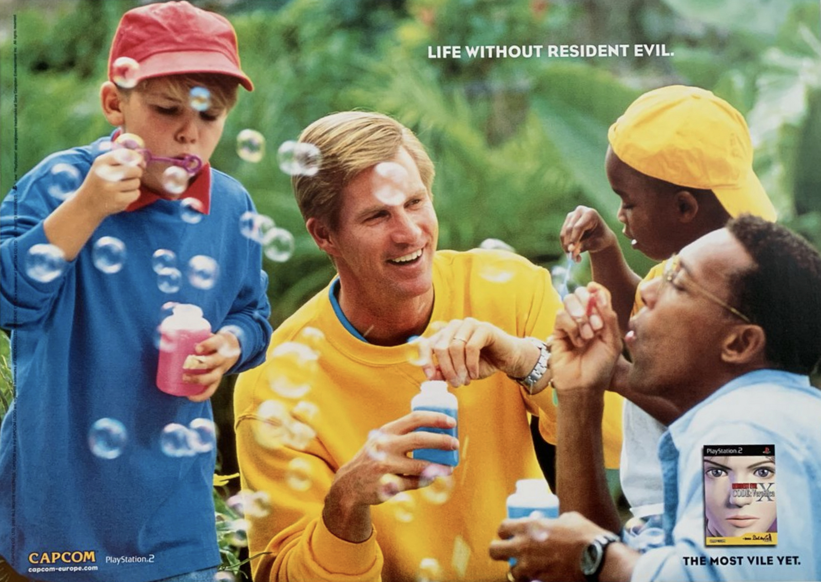
This one is blurry.I THINK I saw this before applying to Watford, therefore technically…it fits into the W.I.L.B.I.K.W.I.W.S.T.L. category.Or it might have been just after.But it was one of the first posters I remember seeing that made me want to be a creative.It was a massive billboard right next to my mum’s house.It was so chilling by being so sweet and lovely.It left your imagination to run wild ‘just how fucked up must that game be?’As an avid gamer growing up, I’d never wanted to buy a game more.ALKA SELTZER TWO MEN IN A BOAT.
My Dad practically lived on cigarettes and Alka Seltzer (which in hindsight should have been a bit of warning sign) and it was one of those brands that were part of the household growing up.And it’s ads I always remember as straight forward and hilarious.But this was the one that stood out – in fact it was another one of those that made me want to do advertising, coming out around the time I was leaving school and getting into D&ADs, Watford courses, and meeting agencies.Of course, I later learnt it was heralded in the industry as the sort of work every creative should aim for.Super simple.Brutally funny.Held together by a brilliant campaign thought.And causal cannibalism.What more could you ask for?It was co-written by Pat Doherty (and Greg Martin) who years later helped train young creatives like me on how to present their work.Dave, you should get her to do one of these - she was ace.This has been like a weird advertising therapy session.It’s funny how things stick in your head for different reasons.There’s so much content and stuff nowadays you’d think you’d remember more of it.I rarely do.Maybe its because I’m hitting that age where my memory is declining (I’ve started doing that thing my Nan did where I get my kids names the wrong way round) or maybe it’s because 99% of advertising is one massive mood-film manifesto, intent on saving the world through a hashtag for spreadable butter?Anyway, this exercise has proved that I STILL remember Um Bongo and drinking it solidly for 3 years (just to clarify I am in no way a racist, I just liked the taste).I STILL have post-traumatic stress witnessing that young boy exploding on a pylon.And I STILL remember the day, 36 years ago, that I was put on the front page of the paper thanks to Fisher Price.Sometimes…just sometimes…advertising works.
“It relies on me finding people who aren't afraid to be honestand not too worried about looking cool.”This is what Dave said to me when asking if I’d like to gather together some of my favourite adverts from that distant yet golden time before I knew anyone had ‘favourite adverts’.Well Dave, you got me.Honest? Deeply uncool? Two of my top personality traits, seeing as we’re dealing in preferences here.As someone who spent their formative years in a green jersey tracksuit (no branding, even less shape) and whose best friend was a hamster with stomach cancer, let’s just say I'm ticking some boxes.My sister hated that tracksuit.It used to personally offend her that I just wanted to wear my green tracksuit and I didn’t seem to care about all the other clothes I *could* be wearing. Brighter, tighter, shorter, newer, better.I wasn’t an idiot, I knew other things I could shod my body in existed, but I liked my green tracksuit.It wasn’t because it was a tracksuit of any utility – unless systematically glue-gunning glass beads to your bedroom carpet is a sport – and to be clear, I understood it was ugly. But I liked it.That tracksuit made me feel like me, it rejected falsehoods and in doing so allowed me to fully revel in other ‘Very Me’ pursuits.I transcended eating Mini Kievs in front of Garfield in that two-piece.I read my Grandma’s Take A Break magazine (Paranormal Green Goo Paralysed My Cat!) and my library books about the beast of Bodmin Moor, intensely comfortable in it’s soft green mesh.Whilst others thought I wore it because I didn’t know better, I wore it because I did. In short, liking shit you’re not supposed to like is powerful.So here’s my power list:Mobil – 24 - 'Toasters'.
I'm not starting lightly, so strap in.Like an Elvis Costello fever dream, this is an ad about a petrol loyalty scheme, loosely based on Dad Who Works(™), turning his long, long hours of driving and family absence into plastic gifts for his children because that is what love is.Perhaps this transactional familial exchange appealed to my young mind as I wondered if this was the opposite of having a permanently absent father, but that’s why I’ve never been to therapy.Because what you don’t know can’t hurt you.But this isn’t about that, it’s about THE SONG.And That Song is, unquestionably, up there with the songs I have sung most in my life. And it’s not a quiet song either, like the original Gene Pitney hit it bastardised, you’ve really got to belt it out in order to hit the note on ScunTHORPE.But by god does it engulf this ad. The incongruous choreography? The kitchen sink of visual styles? The overly performative expressions? Doesn’t matter. You buy it all because that song is Driving Home For Christmas for every single goddamn day of the year.Weirdly, some people seem never to have heard of it, The Toaster Song. But then I move in different circles these days post-tracksuit and this is an ad about petrol stations and coupons and Argos, and given I have a friend who up until recently had not even heard of Centre Parcs (“probably have just gone to Nice”), I’ll let you make what you will about the so called benefits of social mobility.Power rank: Maximum. An actual power ballad.Metz – 'Judderman'.
Fast forward 3 years and we’re out on the town where your one-drink-in-each-pub selection was key – after all, not every boozer did Red Square or based it’s thriving bottom line solely on underage Smirnoff Ice purchases.Yet despite the cloying choice of alcopops in the late nineties, for me there was one ‘pop to slosh ‘em all – Metz.I cannot tell you what it tasted like.What is a schnapps?I don’t care.I didn’t care.Because I loved this ad.Turns out creepy Nosferatu-esque German expressionism was exactly my jam mid-teens, I just didn’t know it til I saw it.Which I suppose is exactly how good advertising should turn up and make you feel.A mini horror story, crafted in a manner that was totally at odds with the glossy lad culture of its time, it felt strange and dangerous.No alcohol ad has had the same effect on me since, meaning I haven’t ever felt as dangerous with a drink in my hand as I did at 15 – which most of my friends and all of my exes will tell you is incorrect – but Metz meant I too felt like a cool, mysterious creep in the woods, and I happily spent my cash every Friday night chasing that icy high.Power rank: 8/10 finger-on-the-button Cold War levels.Scotch VHS – 'Never Fade'. (WCRS)
“You Can Watch Scotch Forever”A VHS tape that lasts so long and so well you can still keep using it even when you are literally dead.This is the sort of ‘big idea’ marketers today would laugh along with in the meeting but talk each other out of on the slow train back to Derby and ultimately discount via email as being ‘a bit dark for us actually that, Steve’, never letting it reach the execution stage where it clearly becomes anything but...Who knew the afterlife could be so snappy!?Of course, Skeleton was a returning character for Scotch in the 80s, but this is the ad that left an indelible print on my brain.The hypnotic loop of rhythm, vocal and picture made me bop along in a way a charming fleshless corpse wouldn’t usually command.That this might have had something to do with the reworked lyrics of The Stones’ ‘Never Fade Away’ is a less accepted theory in my family given the swift dismissal of ‘those soft Londoners’.Power rank: 6.5/10 for the dead parrot’s kinetic energy alone.T-Mobile – 'Dance'. (Saatchi & Saatchi)
I looked this up expecting it to be about 20 years old – because Flash Mobs – turns out it’s only 12 years ago, which, frankly, wow. If only from a sartorial standpoint.Anyway, I include it because this is just before I fell into advertising, during a long and illustrious period in my life where we didn’t own a telly. But I still knew about this ad. It somehow made its way into my eyeballs despite me not partaking in the nation’s favourite commercial vehicle, and I admired it for being the first of its kind to do that.It’s worth noting that being caught up in a flash mob of professional dancers is my own personal hellscape, yet I remember thinking at the time that it was a bit big and a bit fun. And back then, that’s all I really needed an ad to be. Probably in truth that’s all anyone ever needs an ad to be (see also: Sony Balls/Paint) and maybe we’re all overthinking this entire business, but I for one am prepared to continue in this lucrative charade if you are.Power rank: 3/10 (no Michael Flatley).Dime Bar – 'Armadillos'. (Y&R)
They’re now called Daim bars and are only available as shrunken, individually-wrapped versions of their former full-size, anglicised selves.But despite the Scandi make-over, let’s remember that Dime Bars were once sold to the masses by a Harry Enfield character shouting about a shelled animal.Again, a returning character, but again, my pick of the bunch.As a rule I don’t love catchphrases nor catchphrase adverts, I find them to be on the wrong side of patronising your audience.But then, what do I know? Because they bloody work, don’t they?What I do know is that kids used to shout ‘I like Armadillos!’ all the time at school, like the parroting idiots most children are.Of course now I see it for what it is, which is a very cleverly constructed piece of subversive product description snuck inside a loved and versatile comedy vehicle of its time. So I can’t help wondering if the final line, “You’re a bit thick really, aren’t you?” may have been purposely levelled at my immature temporal lobe that was straight down the shops for a Dime.Power rank: 6/10 I’m not sure Armadillos are supposed to move that fast.Guinness – 'noitulovE'. (AMV/BBDO)
This sticks with me as the first time I thought “fucking hell, that’s an advert?”It just looked so expensive, so BIG.This huge, huge subject of evolution, whittled down to it’s (various, gloriously non-scientifically accurate) bones.I think it’s the first time I understood that someone had had this idea and then someone had said yes and then someone had made it, which I know sounds ridiculous, but as someone who never studied advertising or really understood that this world existed, I just thought that was brilliant.I wonder if this ad would get made now?There’s (thankfully) no purpose, no grand plan. It’s almost too big, there’s a fucking T-Rex in it mate. But in the end, it’s just a reptile who reckons there might be something better out there for him once he’s grown into things a bit… much like me and my tracksuit.Power rank: 9/10 There is no better song than Rhythm of Life. Drink two glasses of wine, turn it up, and tell me I’m wrong.Thanks Dave – this was fun.
Finally!Not exactly hot on the heels of Part 1 - it's been eighteen months.I wonder whether the fresh-faced, pre-pandemic Rory would’ve answered those questions in the same way today?The last eighteen months have probably changed us a bit.Just a reminder, the questions I asked back then were built around the idea of a new agency, as these are, like 'how would you hire?', 'what kind of atmosphere would you want?' etc.But rather than ask them in an open way, like that, I thought it would be more interesting to force a choice between polar opposites.For example - Hire well-adjusted people or misfits?Obviously, being a marketing podcast some subjects were unavoidable:The savviness of the Knesset.The carvings of Grinling Gibbons.The cunning of Harris tweed.The demise of Billy Batts.And of course; the importance of elves.Y’know, the usuals. Nevertheless, it’s Rory - so worth a listen.RORY SUTHERLAND: PART 2.
p.s.If anyone yearns to listen to that fresh-faced, pre-pandemic Rory from back in the day, he's here...RORY SUTHERLAND: PART 1.
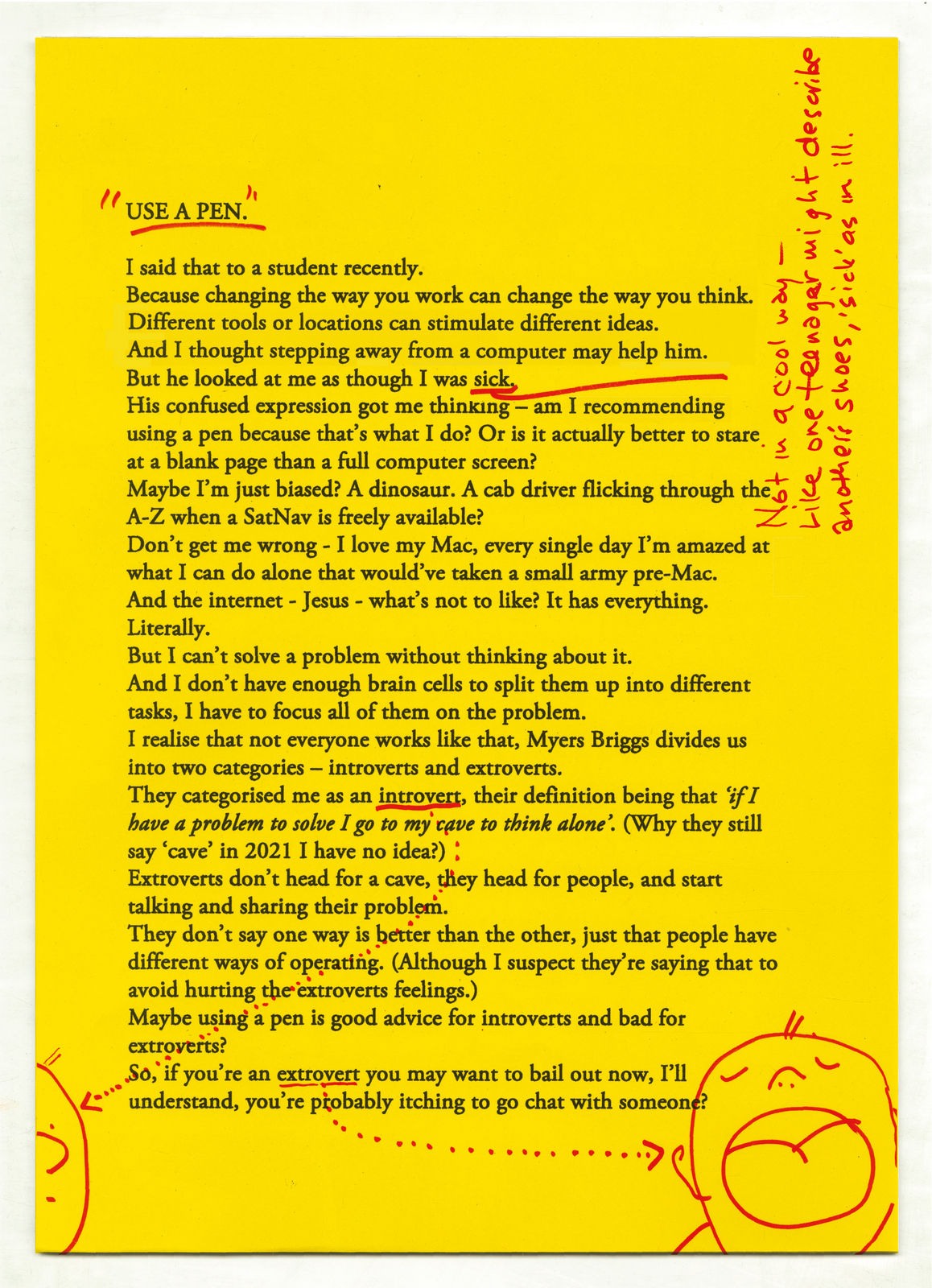
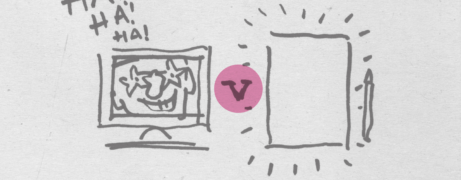
I grew up in an advertising household. My father was a copywriter at a large, mediocre agency called Kenyon & Eckhardt. He lays claim to having written Brylcreme's US slogan, "A little dab'll do ya." Later he rose to Chairman of that agency.Accordingly, even at a very young age, we paid attention to TV commercials.We watched them and often commented on them.My father also did work for Nabisco, now the horribly named "Mondelez."Way back in black and white TV days, when even New York had just six stations, Nabisco sponsored an early-morning TV showed called "Sky King."This commercial was a mixed-metaphor of magnificent proportions--combining the adventure of flying, with the old cowboy west, with...cookies.I don't remember anything of the show--I think it was something like an aerial Lassie--but I could go for an Oreo.
When I was a kid, people had one-TV (black and white) and it was in the living room. On Saturday and Sunday mornings, my parents slept in--and my older brother, younger sister and I would gather around that set and watch cartoon after cartoon. It was something we looked forward to each week and sometimes we were up before the shows started and we'd stare at a test-pattern waiting for the channel or network to go on the air. I remember something like this:
The first commercial I remember was for HO Farina Hot Cereal. (Children were starving in Europe.) It's been about 60 years, and I still remember every word of the lyric. Also, though I eventually became a copywriter, I've always loved to draw and I wanted to be an animator. I liked these because I liked these. The little H O mouths is a nice touch, as is the see-saw.
Of course, growing up in the shadow of Yankee Stadium when the Yankees were at their peak, every boy wanted to be Achilles in the form of Mickey Mantle.I didn't know of George Lois in those days--and for whatever reason my mother refused to buy us May-Po, but if she had, I might be a retired baseball star today rather than an ex-copywriter.
The last bunch of my "kiddie cycle" were for some forbidden fruit, namely gum. (Only ruffians chewed gum in those days, and we weren't ruffians. Yet.)Again, I loved the animation. And to a kid, these were like the Pirelli calendar--they caught my eye and made me smile.
From early childhood to my teens, I don't really remember liking any commercials. Things like Josephine the Plumber or Madge the Manicurist were dumb even to a child. And I was too young to understand the appeal of Jane Russell in a cross-your-heart-bra.The first commercial I saw that made me jump through my skin with "I WANT THAT," was this one for the politically-incorrect Johnny Reb Cannon.I wasn't by any stretch choosing the Confederate side in America's deadliest war, but how could any six-year-old boy (or Republican senator) resist the martial glory promised by this spot.
Later, this commercial for Tonka trucks made an impression on me.Tonkas were the Rolls-Royce's of American toys. I had exactly one during my childhood. It was not destroyed by an elephant but stolen by a ruffian down the street. A gum-chewer, no doubt.
This was the first commercial I remember to blare the trumpets of lust for me. A combination of a sexy woman, a sexy voice and a downright prurient piece of music.When I'm lonely, I still today shave with Noxema. And hope.
I've always been someone who's liked information.Maybe it's a side-effect of beings a baseball fan.I grew up evaluating things based on relevant data.I like facts. And even in the "Don't trust anyone over 30" era, I still believed.Being a city kid, I never really knew what Sears stores were. But their commercials were always brusque and business-like. I believed in Die Hard batteries--and what a great name for a sub-brand. And painting the historic houses of America, also seemed like a good way to underscore the quality and durability of Sears' paints.
When I turned 16 and was allowed to drive a car, these print inserts from Shell gasoline were really valuable. They taught you things about driving and auto maintenance that no one in my citified family knew before me.I valued these not as ads--but as information I could use.Given that most gasoline is perceived as parity--this work created brand-preference for me.I'm not 100 percent sure why brands and agencies don't do work like this today. Except it wouldn't for whatever reason win awards.
Oh, a couple more specifically New York things. I remember them because they were woven into the fabric of my life and the life of the city. They seem to have a New York accent to them.This jingle for a non-Coke/non-Pepsi was the soundtrack of my scraped-knees years.
This commercial for Fram Oil Filter is tough as nails. Like my shop teachers.
I remember this White Owl cigar ad really great. The acting, the music, the humor.
Flying A gasoline was the official gasoline of the Yankees. Naturally, it smelled like peanuts and crackerjack. Becoming a Yankee bat boy--can you imagine?Flying A also had a mascot. A forlorn basset hound named--appropriately--Axelrod.He starred in a lot of commercials. But I could only find this ad. BTW, when I was 22, I met an older woman named Maxine Axelrod. We fell immediately in love.
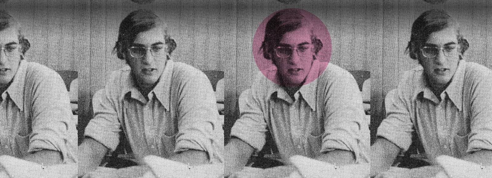
Dave asked me to contribute to another one of his brilliant ideas – a series of posts by people in advertising talking about what ads they liked before they learnt what they were supposed to like. I never learnt what I was supposed to like. I didn’t study advertising at uni – I didn’t even go to uni. And I didn’t go to ad school – I didn’t know it was a thing until I started mentoring at School of Communication Arts 2.0. I suppose after two and a bit decades in advertising, I’ve learnt what I’m supposed to like on the job. The thing is, I don’t always like what I’m supposed to like. I don’t always like the big, sexy and stylish stuff. I get it – it’s big, sexy and stylish – but sometimes I like the really silly stuff. The jokes, the jingles, the clichés and the puns.Anyway, what did I like before I knew what I was supposed to like?Silk Cut ads.I don’t think I knew what the ads were for, but I remember regularly seeing variations on a theme. There were lots of them in what I now know as print and OOH.Google shows me there were TV ads too, but I don’t remember seeing those. Just pages filled with a rich colour and a luxurious-looking fabric.Of course, I wouldn’t have said those words back then – the ads first came out in 1983, so I was five years old – I probably would’ve thought ‘pretty’ and ‘silky’ and that would’ve been as far as my creative judgement would go.Alexandra Taylor’s tales of getting the print ads signed off by Saatchi are brilliant – listen to her talk to Dan Dawson and Hugh Todd on their podcast Get Behind The Billboard.
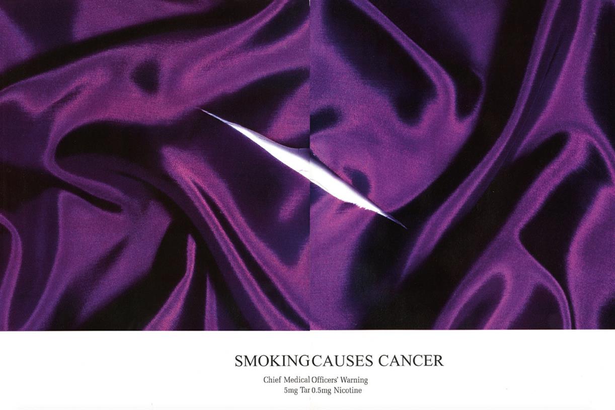
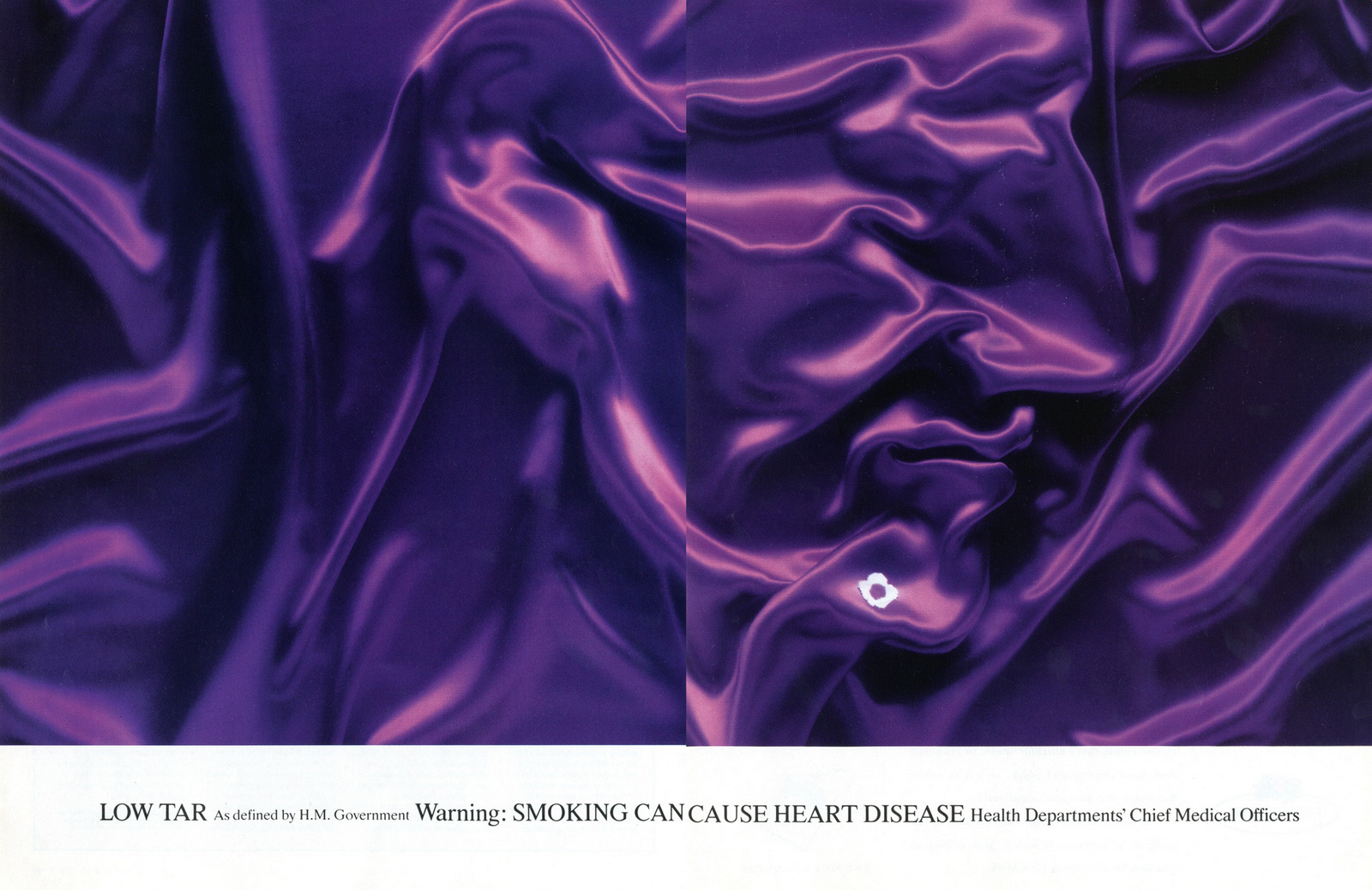
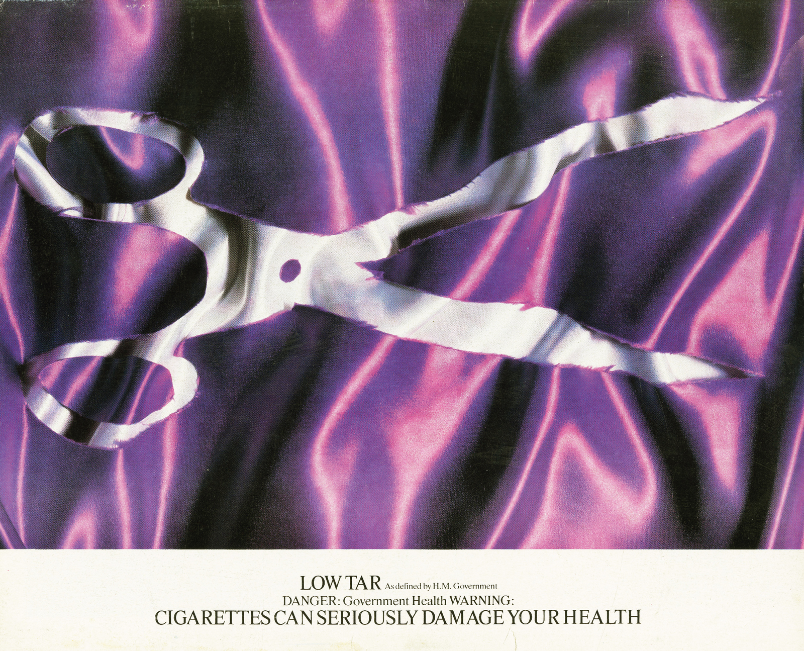
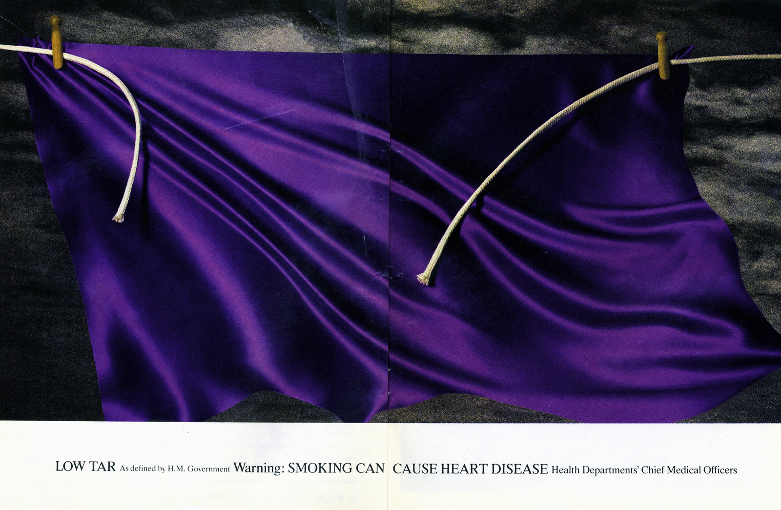
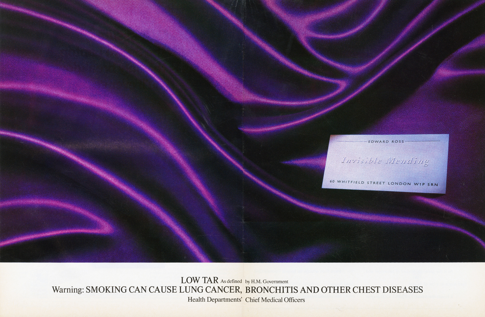
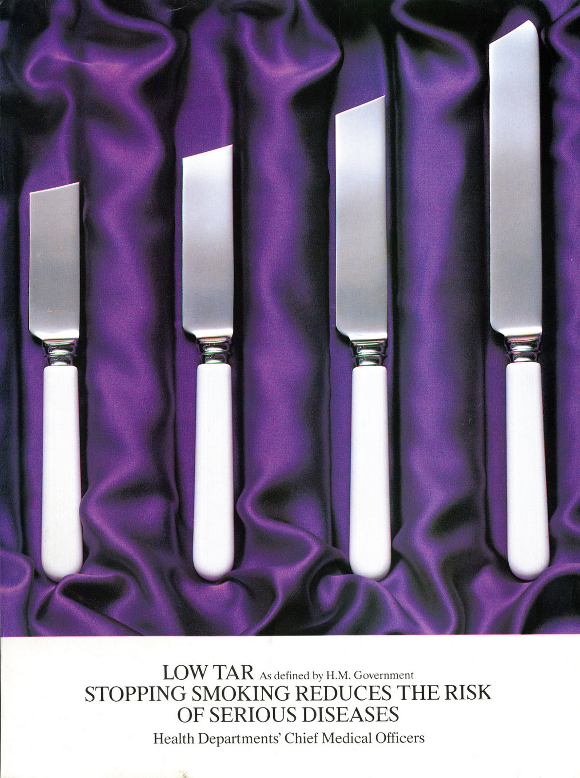
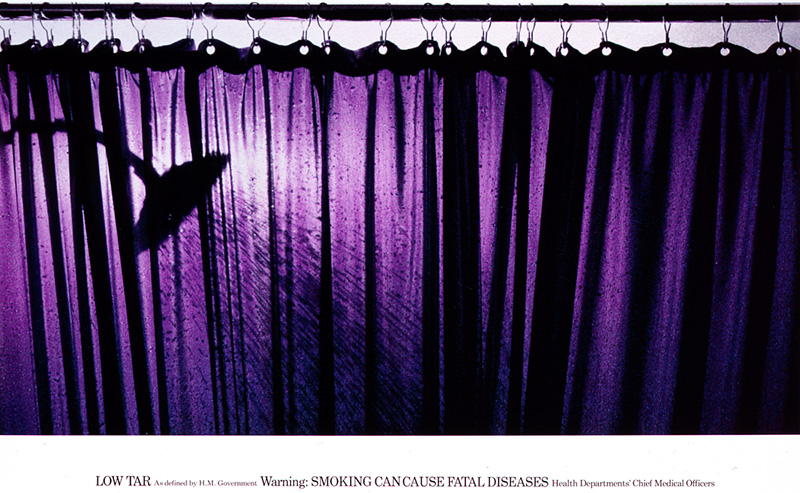
While I may not remember seeing Silk Cut ads on TV, I do remember plenty of other TV ads.“She’s like Ariston” my grandma used to say every time my mum nagged at my brother and me.We thought she was hilarious, using the funny song from the advert to describe our mum.She even gave mum the nickname Ariston and would ask, ‘How’s Ariston? Still going on and on?” when she phoned us.We had no idea she was reinforcing the brand name and the product benefit at the time – neither did she, I imagine.I’ve told Dave Trott this story a number of times – last time we talked about it, I shared what he said on Twitter, if you’re interested. (Gold Greenlees Trott.)
Still on songs, “If you like a lot of chocolate on your biscuit, join our Club” was a fun one to sing.I know nothing about music so probably won’t say what I mean here, but the tone goes up and down and in and out when you sing it, giving your mouth and your voice a bit of a workout. Now imagine running around the house singing it really loudly. What a laugh.
(A few years later this ran in Scotland - excellent.)
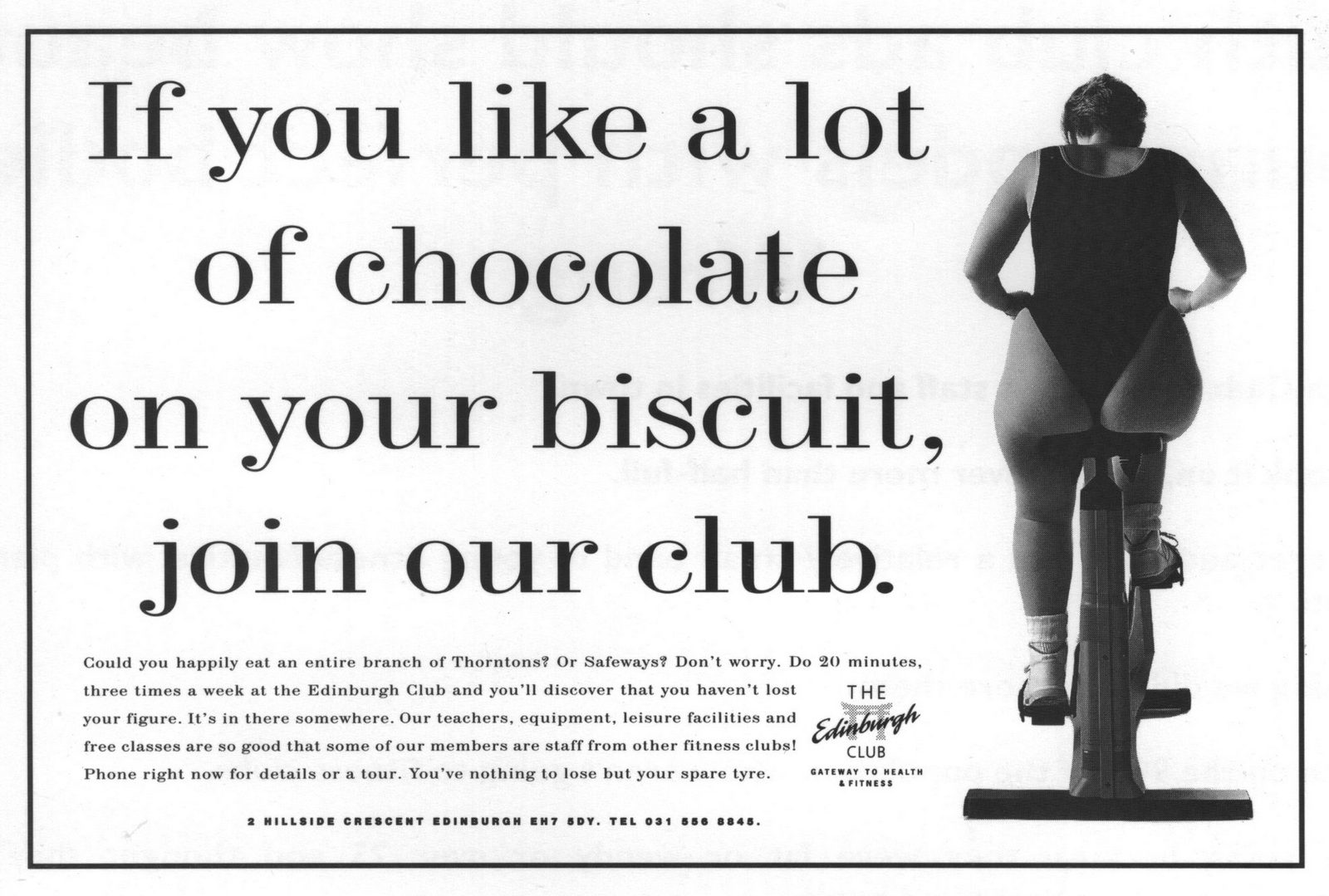
Same goes for “A finger of Fudge is just enough to give your kids a treat.”Watching it now, and ouch my ears. It’s so high-pitched. My ears must’ve heard differently back then because it was another fun song to sing.It’s interesting seeing the brand name in the line for this and for Club. You don’t see that much now, do you? (Foote Cone Belding.)
And still on songs, I still know all the words to this Milky Way ad.It was big and bright to look at, and the words all rhymed in a song that wouldn’t have been out of place in the pop charts.I couldn’t sing (still can’t), but I did like to sing that a lot.
JR Hartley. Remember him? He was the posh old man in the Yellow Pages advert looking for a book by guess who? JR Hartley.He said his name so many times, I’ll probably never forget it.I said it so many times myself – it was fun to say because I had to put on such a posh voice.I’d never heard someone speak so posh before then.Now I think about it, it’s a weird thing for an ad to do – repeat the character’s name, not the brand or product name.Anyway, it worked. I remember the man and the ad, and that the ad was for Yellow Pages. A product I had no use for at five years old, but I knew it existed – like most people, we had one of those big yellow books stuffed in a kitchen cupboard. (Abbott Mead Vickers.)
Do you know what else I used to love saying? “Accrington Stanley? Who are they? Exactly!”Oh, that accent. I still love listening to it.Football did – and does – nothing for me, and I wasn’t much interested in milk either, but I loved that ad for those three sentences. I’d say them all the time and have no idea what I was saying, but it sounded fun. It was fun. (BMP Davidson Pearce.)
Same goes for “‘An ology”.Maureen Lipman played a proud and loving grandma (she was younger than I am now at 43) back when BT ads were brilliant. Beattie (get it? So good) sounded so funny and said funny things that again, I liked to repeat. And my family would laugh at me like I laughed at her. (J. Walter Thompson.)
So it’s clear I liked an ad with words that sounded good to say or sing.Here’s another, but this one has a dance too.This Kwik Fit ad was so entertaining.Another word I wouldn’t have said at 11 years old, but saying ‘fun’ every time is getting very repetitive.It’s showing a theme though, isn’t it? I liked ads that were fun. (Halls.)
Around ten years after seeing JR Hartley in the Yellow Pages ad, this Werther’s Original ad came out. And I liked it.I wonder now if I liked it because the nice man was just like the other nice man.At the time, I liked it because it was like watching my nice grandpa give my brother sweets.We had really nice grandparents who we were close to. Actually, Maureen Lipman’s Beattie wasn’t too far off what my grandma was like.
Later, those Gold Blend ads were good, weren’t they?Like a romantic drama, but ad-sized. I liked that each ad continued the story – I don’t remember any other ads doing that. And it was all so grown-up and glamourous. (McCanns.)
I probably liked the Milk Tray ad for similar reasons.It was more like an episode from a drama than an ad.I suppose that’s what people mean when they say the ads used to be better than the TV shows. And if I liked the word, I’d say something about storytelling, but I would never have said that back then. I might’ve just said I liked the story. (Leo Burnett.)
So what has all this told me? That I liked ads with words, and ads that told a story. And that ads with catchy phrases and songs sink into the mind and stay in your memory for over 30 years and counting.My husband just asked what I’ve been writing. I told him, and I told him the ads I remember liking before I knew what I was supposed to like.He noticed that none of them were for toys – things kids were supposed to like.Which reminds me of the Toys R Us ad – every kid remembers the song, don’t they? I still remember all the words.
I didn’t like the ad though.And it’s odd that I can’t remember any ads for the toys I liked, like Care Bears or Barbie, so I’m off to look them up.
A funny thing happened the other day…I saw an advert on the internet and I went out and bought something.Don’t laugh, IT’S TRUE!The advert was for a TRIO bar and after seeing it I urgently needed a toffee/chocolate hit.Of course I couldn’t find a Trio anywhere (do they still make them?) so I had to make do with a Toffee Crisp.They (I bought a multi-pack) were very nice.I can’t remember what their advertising was like tho’- maybe that’s the reason I’d never tried one before.THAT’S HOW ADVERTISING IS MEANT TO WORK (apparently).So when Dave asked me to put together a list of my favourite adverts I thought rather than put together a reel of the likes of Guinness ‘Surfer’, Guardian ‘Points of view’, and VW ‘Snowplough’, it might be interesting to list some of the adverts that have actually influenced me for real over the years - as an ordinary punter.I wasn’t trained in advertising, my first job in Commercial Art was as a paste-up artist on ‘Knitter’s Digest’.So when I managed to secure a post as a visualiser at Leo Burnett back in the 70’s, I didn’t know that the trendy agencies were CDP and BMP and it wasn’t cool to like anything from Allen Brady & Marsh, McCanns or indeed Burnetts.On my first day, I was told I’d be sharing an office with a Senior Art Director by the name of Norman Icke.It turned out that Norman was the inventor of the Milk Tray Man, the Curly Wurly schoolboy (played by Terry Scott of course) and the Flake Girl.In my ignorance I was star struck; they were the adverts that I loved as a kid.I didn’t know that they weren’t groovy enough to get in the D&AD Annual, in fact, at that point, I’d never even heard of the D&AD Annual.So, back to my list…They’re in no particular order and they haven’t all influenced me to put my hand in my pocket and buy the product being advertised (but btw - quite a few have).But with or without a sale, they’ve all taken up residence in my bonce for the last half a century or so, mainly because they were entertaining (remember entertainment?).A funny sketch, a memorable tune (I can’t say ‘jingle’, it’s NOT cool) or a brilliant slogan, sometimes all three.I can’t imagine a modern audience recalling ‘Find Your Happy’ or ‘The art of Excellence’ in 50 years time - or even a minute after they’ve heard it.Anyway, here goes in no particular order (except the first one).JOHNNY SEVEN OMA.
Yes, this really was the first advert that worked on me. Coming up to Christmas 1964 this was on the telly all the time.The ‘Johnny Seven O.M.A.’ (One Man Army). “It’s seven guns in one!…Let’s count ‘em”…After seeing this ad I wanted a Johnny Seven more than words could explain.I never got one tho’, much to my disappointment. What I did get was ‘The John Bull Printing Outfit’ and probably a ‘right hander’ (or, “something to cry about” as my mum would have put it).STOP PRESS! - Don’t worry, I picked one up on eBay about 15 years ago and it only cost £375!ESSO BLUE.
“Bum, Bum, Bum, Bum…ESSO BLUE!”I loved this campaign as a kid. Great jingle, and fabulous animated character.I’ve never owned a paraffin heater since I’ve been old enough to be trusted with a naked flame but had I’d been lucky enough to get one I’d have filled it with ‘Esso Blue’.Mainly because the ‘Esso Blue Dealer’ was about a squillion times better than the rival Pink Paraffin ‘Pongo’.FARROWS PEAS.
The Farrows peas Crow was another terrific animated character (to a five year old).He flew into a field and yelled “CAW! Where’s my dinner?” Off screen the VO replied - “Sorry mate, you’re too late. The best peas went to Farrows”.You’ll have to trust my memory on this one “caws” I can’t find a copy of the advert.It obviously had a big impact on me because ‘Farrows’ is still the pea of choice around at our house.(TOP TIP - When me and the Missus are at Waitrose I often pick up a tin and say “Give peas a chance“…it keeps her amused for a little while).GLENRYCK PILCHARDS.
The ‘Glenryck Pilchard’. Guess what? It was yet another animated character (remember I was only a kid at the time).We definitely got through a few tins of these back in the 60s. Usually on toast, for tea - especially when my Mum had hammered the housekeeping a bit and meat was off the menu.I remember saying to her one teatime “ere Mum, this breads hard” She said “It’s harder when there’s none Son”…I think she should have been in advertising.PLUMROSE CHOPPED HAM WITH PORK.You’ll have to use your imagination again with this one because we can’t find it anywhere.Picture a little boy in black and white (everything was black and white in the 1960’s).He’s running down to the shops for his Mum.He’s only got one thing to remember but just in case, he keeps repeating it out loud as he runs along the pavement…“Plumrose Chopped Ham with Pork, Plumrose Chopped Ham with Pork, Plumrose Chopped Ham with Pork” etc, etc, etc…That’s it. The clients dream idea. The product name being repeated over and over and over for more than 20 seconds. Then, the twist -The cute kid finally runs into the shop and loudly proclaims to the shopkeeper “PLUMROSE POPPED HAM WITH CHALK!” …Funny.WARNINKS ADVOCAAT.“Eveninks and Morninks, I drink Warninks" …said the pretty Dutch lady in the Warninks Advocaat advert.What I didn’t know then was that the poor woman was probably an alcoholic. Even so she did a great job for Warninks, in fact I can’t even think of another brand of Advocaat.“Bols” you say…But it’s true!We’ve always got a bottle of Warninks behind the bar (but despite the advertising we never drink it in the Morninks).Sing - “Warninks Advocaat!”MIDLAND BANK.
Remember when you used to turn up at the pictures early to make sure you didn’t miss the adverts?I used to do exactly that before I was in advertising. Mainly because the adverts were sometimes asgood as this one.The Midland Bank advert by the celebrated designer Robert Brownjohn.As a kid I thought it was dead clever, I still do now.HP BAKED BEANS vs HEINZ BAKED BEANS.
My favourite Baked Bean commercial was for HP Baked Beans.As far as I can remember it started with a solitary kid marching down the street singing “HP BAKED BEANS, they’re the beans for me, HP BAKED BEANS etc, etcBy the time he gets to the end of the song the camera has pulled out and a whole crowd of people have joined him and are singing along too.I can’t find a copy of this one either but not to worry, I also LOVED the Heinz Baked Bean song…“A million housewives everyday everyday, pick up a tin of beans and say, BEINZ MEANZ HEINZ”.Heinz are still the beanz on my shelvz at home and “BEANZ MEANZ HEINZ is still the best advertising line ever written (he said provocatively).
WONDERLOAF.
“Nice one.”That’s what EVERYONE said back in 1969 at school when anything was in the least bit ‘nice’.It was a “Nice one” epidemicWe caught it from an advert on the telly for Wonderloaf.Apparently the Wonderloaf Baker’s palettes were so discerning that only they could tell who baked each individual loaf of bread.At the end of the advert two of the the bakers sample a slice and turn to the camera and say “It’s one of Cyril’s…Nice one Cyril”.It not only became part of the language it became a football chant for Spurs player Cyril Knowles, then a number one hit pop song by ‘Cockerel Chorus’.Nice one.PEPSI.
Lipsmackinthirstquenchinacetastinmotivatingoodbuzzincooltalkinhighwalkinfastlivinevergivincoolfizin PEPSI.The smart kids at school could say it.I was one of the smart kids (even tho’ I failed my 11 plus).COINTREAU.
I would never have owned up to liking this one as a youth.It was a bit slushy.But every Christmas they seemed to wheel out this commercial with the posh lady and the French bloke.I don’t know why I liked it. It was like a scene out of a film but not the sort of films I liked.No, tanks or planes, or explosions.Just a man and a woman and lots of atmosphere and again, a clients dream - The French bloke reads the label out loud and the lady hangs on to his every word!CADBURY’S WHOLE NUT.
As written by my old boss Norman.I remember my mate Terry Jones at school, coming in one morning and saying, “did you see that advert last night?”Then he went on to describe the Whole nut ad - he even sang the “NUTS, WHOLE HAZELNUTS” bit.He thought it was absolutely hilarious. And at the time he was right, it was.CADBURY’S FRUIT AND NUT.
“Everyone’s a Fruit and Nut Case”…Great jingle, funny visuals, Frank Muir…what’s not to like?R WHITES LEMONADE.
Now this is one of these adverts that I didn’t know it was wrong to like.That’s because it came from the most uncool agency in town ABM.Ignorance really is bliss, because I just liked it because it was FUNNY.TROPHY BITTER.
Here’s another one from the same agency.There’s no doubt about it - This one really is shit.So why did it make me smile then? And why do I still remember all the words and sing the song now, nearly 50 years later?PG TIPS.
Next time you’re round at my place open the cupboards and you’ll find plenty of PG Tips.I like tea (a lot). I wouldn’t dream of buying anything but PG tips.It might be the advertising, I used to like that too.The funniest one ever (before they had to knit the monkeys) starred Mr Shifter & Son.And I think the voice of Irene Handl (if I’m not mistaken).TREBOR MINTS.
A half decent jingle “Trebor Mints are a minty bit stronger”.Not one of my favourites I admit but it moved up into a different league when the public got hold of it and added a second line…“Stick ‘em up your arse and they last a bit longer”.Classic.TOPIC.
It’s the same deal with Topic.Bit of a crap animated character ‘Toby’ who asked the important question - “What has a Hazelnut in every bite?”Of course the official answer was “Topic” but in the playground the alternative answer was -“SQUIRREL SHIT!”.Now all this chat about Topic's has made me want one (that’s how advertising works apparently).HAMLET.
Every now and then, in my ignorance, I liked an advert by a ‘trendy’ agency.In this case it was CDP - One of the one’s that were approved by the cognoscenti.This is the first Hamlet commercial that I can remember seeing and I thought it was hilarious.The piano teacher was an actor called Patric Cargill - this is his finest work (he was crap in everything else imho).MARTINI.
I bet this campaign never won an award.I didn’t care, I’d never heard of advertising awards.I just wanted to grow up fast and join the beautiful people (it never happened btw) quaffing Martini in all those fabulous locations.It just looked bloody exciting, especially up in hot air balloons and (my favourite) hurtling along on one of those hovercraft things with the big fan on the back.Did I mention the theme tune?That should have won an award in its own right.CRESTA.
The Cresta bear, written by John Webster (I know that now).At the time I thought it was a funny advert and an intriguing product.If it could do that to a Polar Bear then I had to give it a bash.It was vile.So I tried a different flavour…that was vile too.Now that’s GREAT advertising.HOMEPRIDE.
Not another cartoon!Sorry, I liked cartoon characters (still do).Fred and his flour graders were first class.It’s hard to say if I would have liked them quite as much if the agency hadn’t picked John Le Mesurier to be the voice of Fred?Probably not.HOVIS.
Another CDP/Ridley Scott advert chosen by a member of the public (me) who didn’t know any better.I loved this one, again it was like a scene from beautiful a film, all in 30”.Nowadays they’d probably have the kids bike morphing into a plane and doing a loop-de-loop around the Hovis factory.SUNSILK.
I’ve never been in the market for this product.We used Fairy Liquid to wash our hair when I was a kid and now I use Mr Sheen.BUT, I thought this was a magical advert.What a sensational original soundtrack (oh, why do they make us use library tracks now?).The girl with the sun in her hair’ by John Barry and it got in the charts as a B-side to the theme tune to the Persuaders.MAXWELL HOUSE.
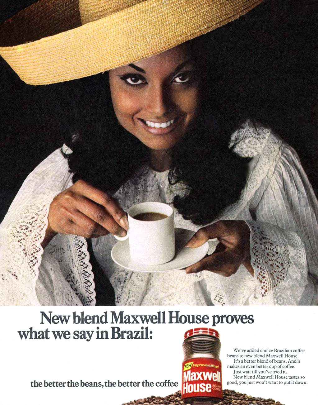
I fell in love in the 60’s.It wasn’t the first time, that was back in 1959, with the Beverley Sisters.

Not all of them, I didn’t fancy the one in the middle, just Babs and Teddie.Anyway, they had to move out of the way in 1966 when I my eyes fell upon the vision of exotic loveliness that was the South American lady in the Maxwell House commercial.I was only 9 but I was smitten. In those pre VCR days I watched every ad break hoping she was going to appear again.As it turns out I wasn’t the only one who’d taken a shine to her…Micheal Caine had spotted her and fallen head over heels too.He thought he’d have to jump on a plane and fly to her in Brazil but luckily she lived a little bit closer to home, in Fulham.Her name was Shakira and he married her (the bastard).CADBURY’S FLAKE.
Another one of Norman’s.Flake ‘Poppy field’Nothing much happens. Beautiful Flake girl starts painting in a poppy field, she eats a Flake and it starts raining. The paint runs a bit and she looks at and smiles.All in 30 seconds.I don’t know why I just liked it. (I’ve had more than my fair share of Flake’s too so it works).GOLDEN WONDER PEANUTS.
Tarzan swings thru the jungle, wrestles a lion and stuff and then delivers the string bag of peanuts he’s been carrying to a Golden Wonder representative.They’re ‘Jungle Fresh’.Then they followed it up with an animated version with the ‘Jungle Fresh’ theme woven into a jingle based around ‘The Peanut Vendor’s Song’.I liked that one, it was catchy.But what I liked best was when the Golden Wonder Tarzan character was nicked by the comedian Freddie Starr and appeared regularly on one of the countries favourite comedy shows - ‘Who Do You Do?’I bet the Golden Wonder Nut people loved that.DOUBLE DIAMOND.
“A Double Diamond Works Wonders” and an even better line “I’m only here for the beer”.It caught on. People said it in the real world.They even used it in other adverts. An early Hofmeister ad featured a Zookeeper after an escaped bear in a pub and he said “I’m only here for the Bear”…My favourite was the ‘Wedding’ commercial. I thought it was funny.And when I turned 18 I took to drinking Double Diamond for a while.I can confirm that it did work wonders.SMASH.
Everyone at our house thought this was a funny advert.Given that, the instant potato of choice was Yeoman.We tried both but preferred Yeoman.Sorry, you can’t blame the advertising for that.JACOBS CLUB.
If you like a lot of chocolate on your biscuit join our club”…catchy jingle that implies that other biscuits haven’t got as much chocolate on them.We see lot’s of different people enjoying the product…why’s that clever, I hear you ask?I don’t know, it just is.And since you asked - the mint one is my favourite.
So, there you have it - 30 adverts as selected by the unenlightened punter - Master Mark Denton.The sort of advertising that I enjoyed (yes, ENJOYED) well before I became an ‘expert’.When it occurred to me to pick the ads I liked ‘before I knew any better’, I wouldn’t have guessed there would be so many.Give me a bit more time tho’ and I probably could give you 100, maybe 500? On top of that,I bet I could still sing most of the jingles and recall most of the catchy, corny, alliterated end lines too.I know they’re from a different era but I’m pretty certain I wouldn’t have Fast-Forwarded any of ‘em…even if remote controls had been invented back then.I also know that things are a bit different nowadays and there are a lot more distractions, along with a more cynical, media savvy audience. But shouldn’t that mean that ads need to be even more entertaining and definitely not so bloody complicated?Anyway, is that the time already? Where’s me Warninks?
STUFF I HAVE IN MY HOUSE BECAUSE OF ADVERTS...
One of many boxes - PG Tips (The tea you can really taste).
THINGS IN MY BAR BECAUSE OF ADVERTS...
No Double Diamonds (unfortunately)…BUT I have got a Double Diamond Man (My most treasured possession).
I took this picture this Mornink.FYI - The Beverley Sisters - We’re talking the twins Teddie and Babs NOT Joy (who incidentally married England Captain Billy Wright and starred in the adverts for Wright’s Coal Tar soap - we had that at home too).
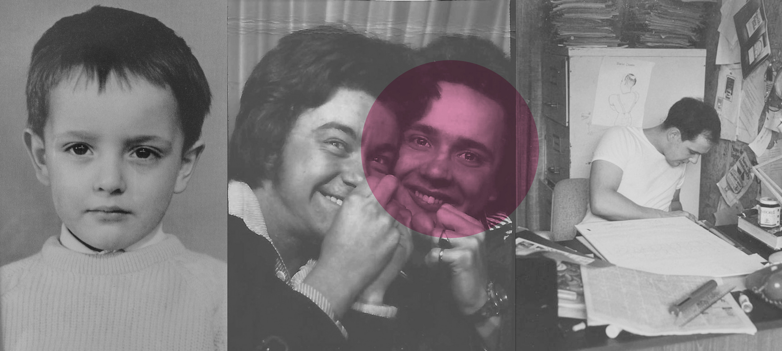
After the first post in this series a friend got in touch to say he liked it, but wasn’t that ‘built’ a bit of an exaggeration?
No.
Look at ‘Bill Bernbach’s Book – The advertising that changed the world of advertising’, written by Bob Levenson, a 30 year veteran, both writer and Creative Director. (When Creative Director meant head of all creatives.)
EXHIBIT A: The picture above, it’s from the cover of that book (women involved in all six ads featured on the book jacket).
EXHIBIT B: The picture below, it’s the contents page from the same book (11 of the 18 campaign’s chosen were written by women).
Not to say the women did it alone, (although they were all writers and generally the writers seemed to carry more sway than Art Directors in those days.)
But it was a better balance than any agency has today?
It raises two questions:
1. Why did it change at DDB?
2. Why have I never heard of of Rita Selden?
Most of these posts about individuals are a journey of joining dots.
‘I didn’t know that was hers’, ‘I’d forgotten he’d written that’, that kind of thing.
But Rita’s dots are huge.
It turns out she got the writer the first batch of great VW work, Julian Koenig, into DDB.
Amongst the roughs in that first batch was an ad that said ‘This one missed the boat’.
Rita suggested to Julian that it should simply say ‘Lemon’.
Julian loved the idea, his Art Director didn’t.
Only after being talked off the cliff by his previous writer (Bill Casey) did Helmut Krone come around to the idea.
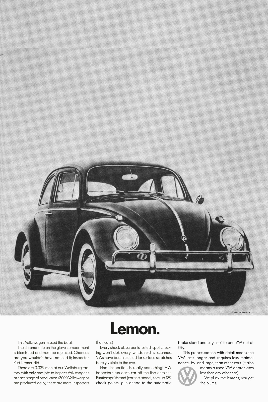
The word lemon was harsher back then.
One commentator at the time said only communist was a greater insult.
When the ad was presented to the client they didn’t like it, DDB offered to pay for it to run.
The compromise was to test it in research.
It was found the most persuasive ad VW had ever produced, so it ran.
Sixty years later, is there a more famous ad?
It’s still being spoofed today.
(I spoofed it myself once, 30 years after it ran, my friend was leaving Publicis to run the VW business, so Mike McKenna and I turned to their most iconic ad as inspiration for his leaving card.)
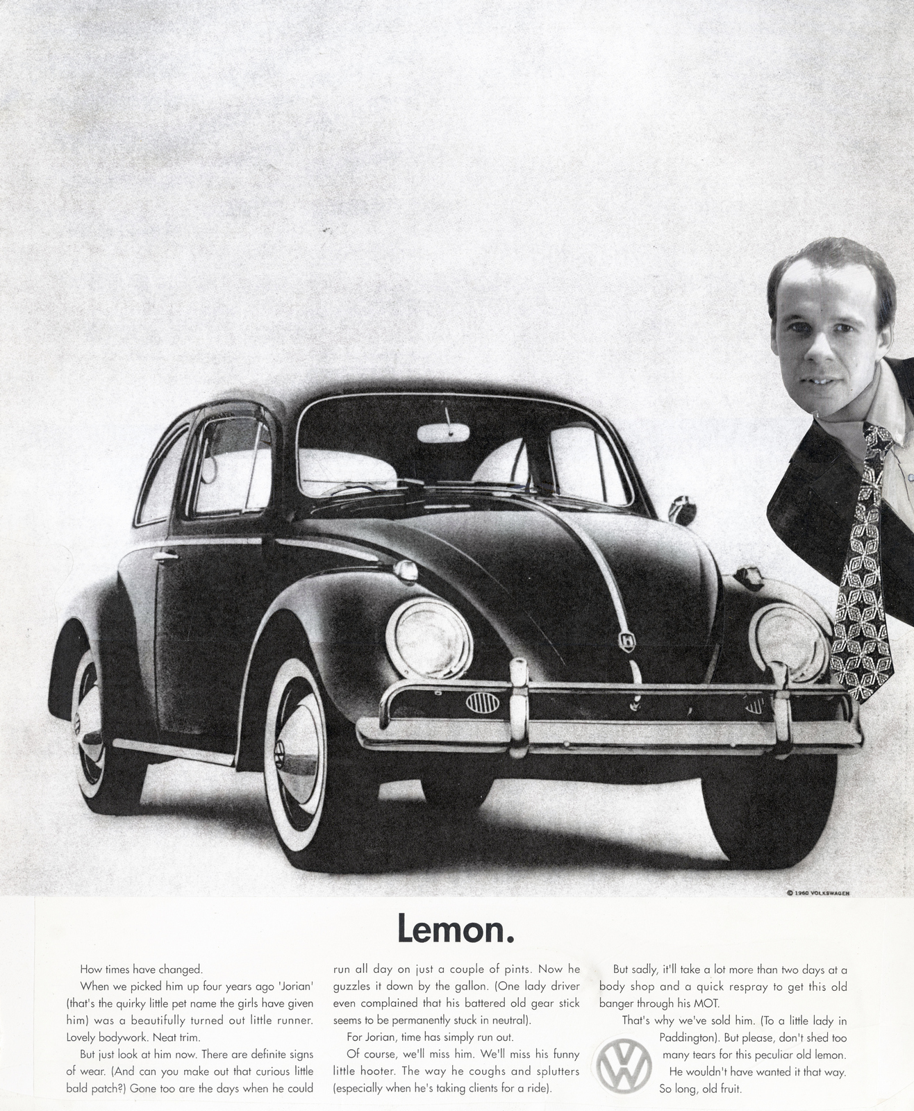
Would anyone have even remembered the Julian’s original run?No. (I don’t think the ad below would’ve made it into the VW book, let alone folklore.)
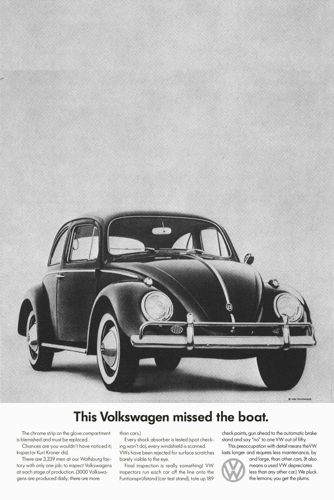
Or what about if DDB had listened to the client concerns and softened the ad?
(‘We love the single word approach, we like the fruit angle, we just wanted to lean into the world of positivity. Tell people what they can buy, not what they can’t.’)
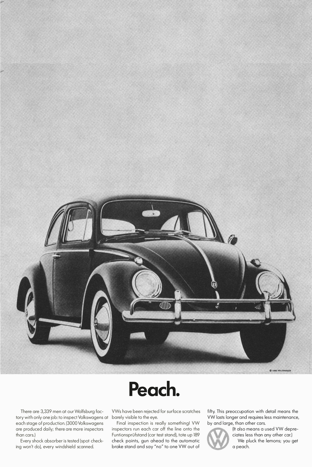
No.
Words are important, they don’t just carry meaning they set a tone.
‘Lemon’ represents what most of us in advertising aspire to do; produce provocative, honest work that assumes the public are smart.
That headline change of Rita’s is important.
If Volkswagen hadn’t dared to call one of their products bad, would Avis have dared to admit they they were only No.2?
Without VW and Avis would Hamlet have felt comfortable enough to parade such a long line of losers in their ads? Or Guinness; would they feel as confident to base an entire campaign on how bloody long you have to wait for their product to be poured?
Who knows?
But Rita’s suggestion is bigger than just a headline change, it’s also an attitude change.
‘Missed the boat’ is gentle and charming, ‘Lemon’ is punchy and provocative.
Which brings me to another of her ads.
It turns out that Rita wrote the ad above, another punchy classic.
She, along with Art Director Bert Steinhauser, also created the Chivas campaign.
You can’t look at ad above without thinking of the endless suggestions that must’ve been made to tone it down a fraction. (‘Idiots’? Really? Come on they buy whisky too. ‘How about ‘Which well meaning, but ultimately misguided staff member, changed our packing?’)


Sadly, these are the only two other ads I can find of hers.


Which is annoying.
I know she did a Volkswagen Karmann Ghia TV ad in 1960.
And a ‘5 Day Deodorant’ ad in 1961.
But I couldn’t find any pictures of her or information except this:
She was in her fifties when working at DDB.
She sadly committed suicide.
Her niece is looking to write a book about ‘her glam aunt’, she remembers Selden once arriving at their Jersey Shore summer house in a yellow cab she’d hailed on Madison Avenue.
So if anyone knows any other work or information on Rita I could add, please get in touch. She deserves to be better known.
LOST AND FOUND.
By Alfredo Marcantonio.
I first saw the name Si Lam alongside “We’ll never make it big” a Volkswagen poster that appeared in 1967’s New York Art Directors club Annual.
It was produced by DDB’s Los Angeles office and I reasoned that Mr Lam would be one of the many talented Californians who boasted Japanese extraction.
It was a misapprehension that I fostered for 40 years or more.
DDB New York’s legendary Beetle and Bus ads lived on inside many thousands of vintage US magazines and can be easily viewed and bought on a bunch of internet sites.
Sadly, feasting your eyes on DDB LA’s equally cool billboards has been another matter. They led a fleeting life. One or two made it into award annuals but most were pasted up and after a month or two, came down, never to be seen again.
When the latest edition of “Remember those great Volkswagen ads?” was being put together, I resolved to try and find some reference to the posters via the man who the annuals credited with creating most of them.
A comprehensive trawl of the internet revealed a 2005 article about Si Lam in ADWEEK. Sadly, it was an obituary, so any hope of meeting the great man was gone. However, a funeral quote from his son Perrin Lam gave me what the boys in blue call ’a line of enquiry’.
I contacted Perrin through a social media link and joyously, he confirmed that he had an archive of his father’s advertising. Even better, he offered to get the Volkswagen work copied for me and was happy to chat through his dad’s involvement.
As luck would have it, I was due to shoot a TV commercial in LA the following month, so we set a date to meet up.
My assumption that Lam was an oriental surname was well wide of the mark. Over breakfast at my hotel, Perrin’s photographs revealed a stocky half Jewish Art Director with a long-broken nose. Better still, Perrin conjured poster after poster from his bag, each one a sixties or seventies LA street scene, with a VW billboard almost filling frame.
Lucky for me, his father had always ensured that each of the agency’s posters was photographed while it was up.
Some of the VW billboards were simplified versions of DDB New York’s ads, but most were created by Si locally. Award winners, like Mass Transit, I had seen before but many of them were entirely new to me.
Perrin also had a copy of Communication Arts from 1971 which outlined the great man’s career in some detail.
Uninspired by the Los Angeles advertising scene and bewitched by the output of DDB New York, Si had flown there with the hope of landing a job at what was then the USA’s hottest hotshop.
“I showed my portfolio to Bob Gage, DDB’s head Art Director. He said ‘Keep in touch’ and I figured he meant it. So I called him every Friday for 23 weeks.”
“No-one told me a hundred bucks didn’t last long in New York. What I wanted was DDB what I got was YMCA. They gave me work in the kitchen and a meal every night. Every night the same thing, chicken croquets and two veg.”
“I didn’t like New York much and I still don’t. I like what it generated in terms of advertising. I like what gets done but not how they do it.”
He was eventually hired by two agencies but lasted only a week at each of them and ended up back in the YMCA. But Good Friday 1952 turned out to be a very good Friday for Si. He was offered jobs at both Cunningham Walsh and Ogilvy. He rang Bob Gage for that twenty third time. “He didn’t say Keep in touch he said Can you start Monday?
“He was a wonderful man to work for. He saw to it that DDB sent me to study one night a week with Alexey Brodovich.” Quite a tutor to have – Brodovitch was the highly acclaimed designer of Harper’s Bazaar and is widely regarded as the father of what we now know as Art Direction.
After 18 months at the agency, his wife, who was as unhappy as he was in New York, became pregnant. They decided to return to LA.
Gage and Bernbach were impressed by his work and encouraged him to contact Ted Factor, a scion of the Max Factor family and boss of Factor-Breyer the agency DDB was lining up to become their LA office.
No doubt keen to impress his new partners, Factor took Lam on. But it was hardly a meeting of minds. Factor was an entrepreneur, a businessman who, unlike Lam saw advertising as commerce rather than a calling.
A number of DDBers told of Lam’s directness. He was clearly a man who ‘called it as he saw it’ without fear or favour. Not surprisingly he argued with Factor on a regular basis with one altercation seeing Lam chase Factor with the building’s fire axe.
Factor avoided giving Lam the Creative Directorship on two occasions, but the Art Director’s impressive output saw him buckle on the third.
The man who worked with Lam to help DDB Los Angeles take off was Monty McKinney. He cared a lot about advertising and was a great champion of the agency’s work and like Lam he was something of a thorn in the side of the money-driven Factor.
As might be expected, Factor retired McKinney off just as soon as he could. But it is a mark of the man that he was immediately snapped up by Jay Chiat of the fledgling Chiat Day agency in nearby Venice.
Over his two decades as Creative Director Lam hired and partnered some outstanding copywriters, including Janet Boden, Ed Bigalow, Stan Jones and Ron Rosenfeld. Our own John Withers also worked alongside him in Los Angeles on Paul Masson wines.
It was a line-up that created great work, not only on Volkswagen but on American Airlines, Bekins Moving and Storage, First Western Bank, General Telephone, Hill’s Brothers Coffee, The Gas Company and the pest controllers Termanix.
For me, Lam’s partnership with Ed Bigelow on the Transamerica campaign is arguably the agency’s best work. The eschewing of the traditional headline/copy layout and the conversational tone of voice Bigelow bestows on the Company President John R Beckett certainly prevent it from being a faceless corporation.
However, it was California’s outdoor advertising that provided the agency with its most memorable canvasses and Lam was justly crowned king of the billboard.
The high cost and low availability of roadside posters on the East Coast prevented New York Agencies from recommending them. But on the West Coast these giant, often hand painted ads were a powerful and popular medium.
“We did all the billboards for New York” said Charline Elfeldt, a 30-year veteran of DDB’s paste-up and traffic departments. “In those days New York didn’t have a clue about outdoor.”
The simplicity that that a poster imposes on its creator chimed with Lam’s no-nonsense approach to life. Colleagues joked that he’d worn the same suit for the 12 years that the agency had been open. He never wore a ring or even a watch. “I bought some funny shirts recently but I still reject ornament in ads, words and pictures, it hides bad thinking or no thinking.”
As his longtime colleague Bob Matsumoto said of Lam’s remarkable poster output “His personality came out in that work: It was straightforward, humorous, bold and memorable.”
Simon “Si” Lam died in June 2005. He was 80 years old and living in Santa Monica, a couple of billboards away from the agency at which he worked for more than thirty years.

DDB’s Si Lam – widely acknowledged as the king of LA Posters.
Volkswagen.
(The first two were reworked by Si from DDB New York’s ads.)


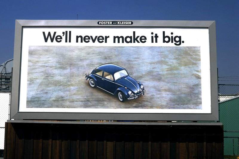
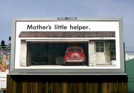
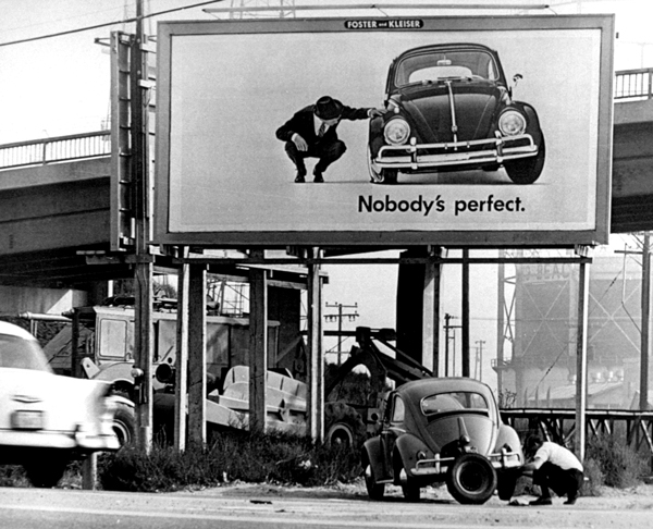


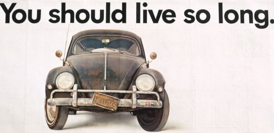


Terminix.
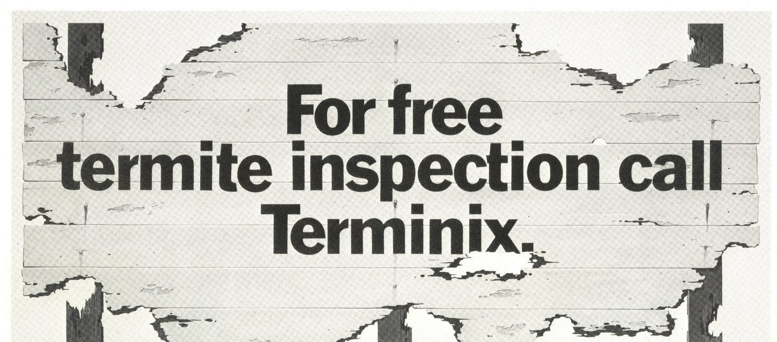
Southern Gas.


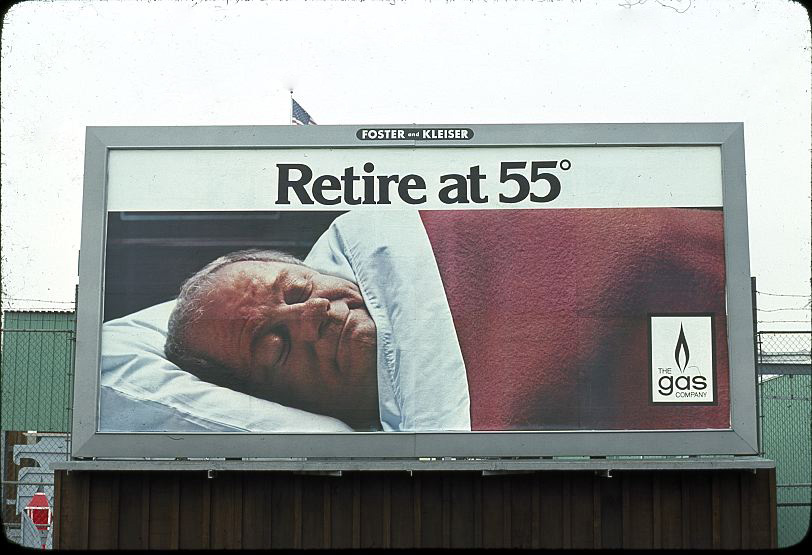
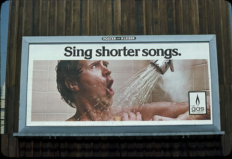
Bekins.
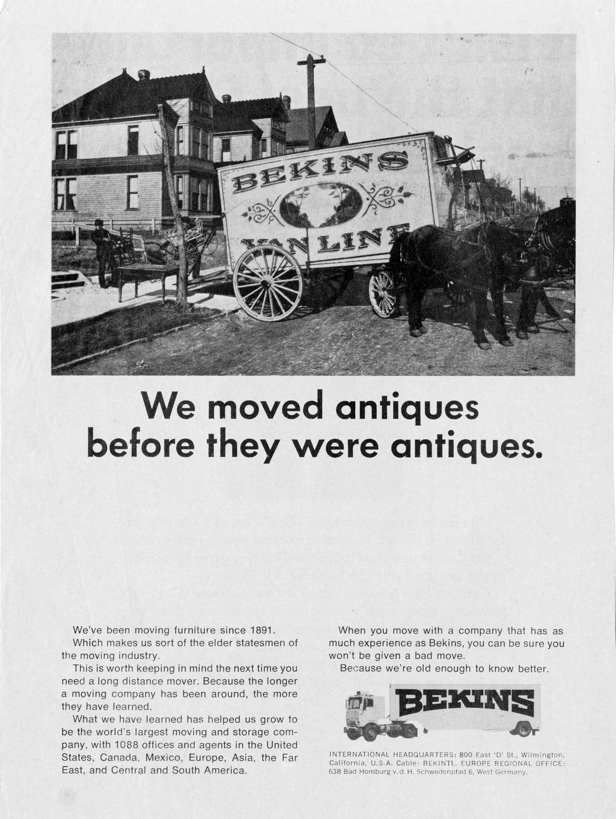


General Telephone.
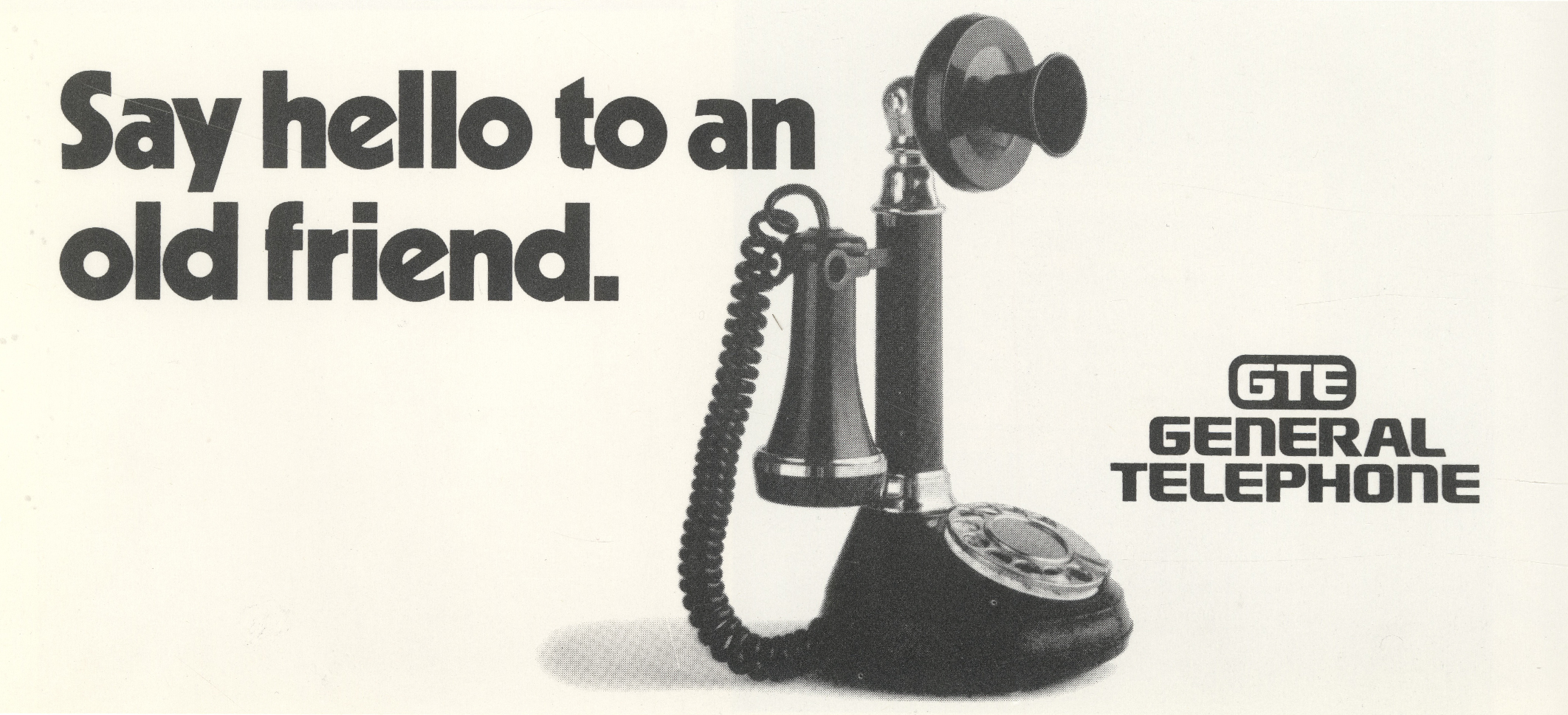
Paul Masson.
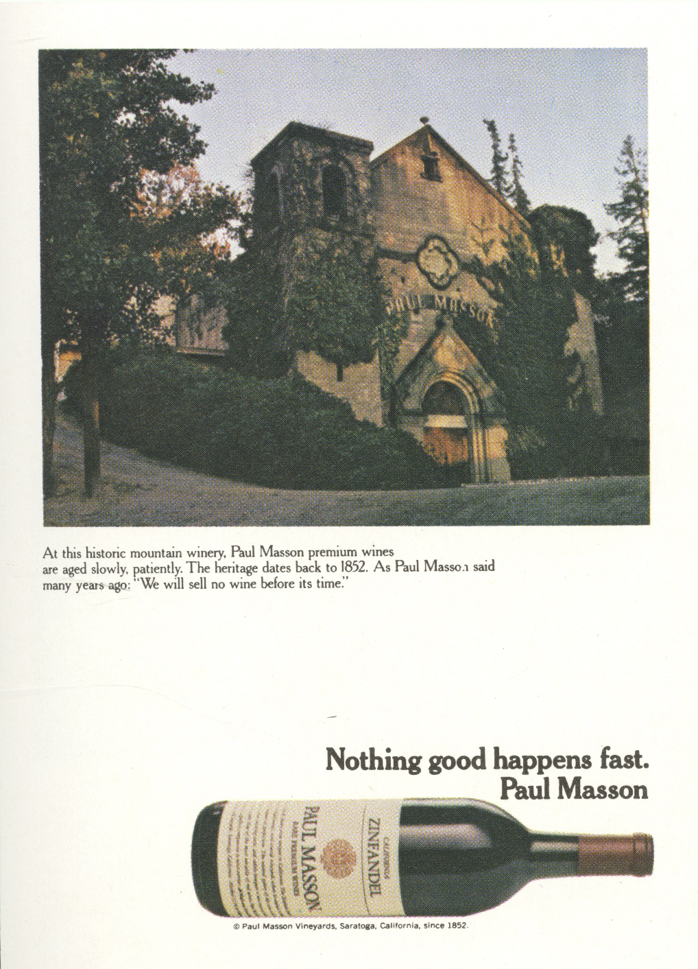

Transamerica.
American Airlines.


More Si…


In 1990, the U.K. had just four tv channels.Only two aired commercials.In that year the BBC aired this five part series about advertising.They didn’t skimp on time or money and aired it in primetime.I wonder whether this could happen today?True, they were only competing against three other channels.There was no internet back then.No Netflix to compete with.The gaming industry was like an amoeba at this point.There were no mobile phones.Barely anyone had computers.So in retrospect, maybe the lack of entertainment available made a 5-part documentary on advertising feel like something that might interest the general public?mainstream tv.Or maybe it was down to the public’s view of advertising at that time; they liked it.Maybe not as much as their firstborn, dog or chocolate, but it was often considered entertaining, funny and clever.In his excellent book ‘Why Does The Pedlar Sing?' Paul Feldwick recounts “Thirty years ago, the majority of the British public agreed that ‘Sometimes the ads are better than the programmes’ - the proportion that agree today is vanishingly small.”Maybe that lack of Youtube, Netflix, Twitter and the rest meant that even adverts seemed entertaining?Or, maybe it was because entertaining was considered part of the process of advertising at the time?When I signed up, in 1985, one of the first bits of advice I was given was to ‘make sure you always give a spoonful of sugar with the medicine’.Sounds a bit creepy now, but the basic premise still holds – if you make ads that people like watching they’ll hear your message.Maybe multiple times.Last year, Orlando Wood wrote ‘Lemon’, an IPA backed study on the state of our industry, Adam & Eve's Global Planning Partner Sarah Carter described it as ‘an urgent wake-up call and a simple rallying cry for us all – ‘we need to entertain for commercial gain’.’’The notion that the public may choose to watch a documentary on advertising in primetime isn’t the only aspect of this series that feels a bit out of time.Some of ads would lead to custodial sentences today, the shoulder pads would be considered harmful to the public at large and the haircuts are particularly problematic.But it does a great job of capturing British advertising from 1955 to 1990.So at this point, 2021, the series is like a halftime assessment of the business.With everyone blissfully unaware of the changes to come, both good and bad.EPISODE 1: She's Not a Moron - She's Your Wife.Looking at how adverts for cleaning, shopping and cooking products have, or have not, changed over the past 35 years.
EPISODE 2: Big! Big! Big!Examining the portrayal of men from the 1950s to the 80s and beyond.
EPISODE 3: Buy Some For LuluA look at the changing face of children and teenagers in adverts, from the vulnerable, cossetted infants of the 1950s to the tough sophisticated kids of the 1980s.
EPISODE 4: Sixpence Worth of Heaven.Exploring the use of fantasy and aspiration to sell products such as Babycham, Camay, Flake, Palmolive, Sunsilk, Renault, Charlie and Chanel to women.
EPISODE 5: The Getaway People.Discussing how advertising in post-war Britain can be viewed as a barometer of the pendulum shifts in national mood and the way we perceive ourselves.