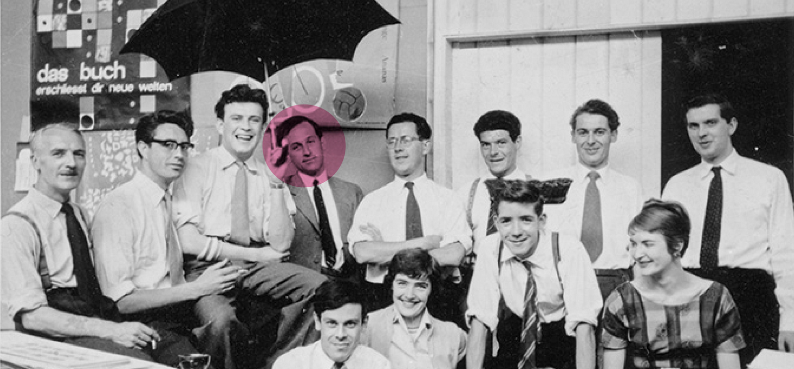
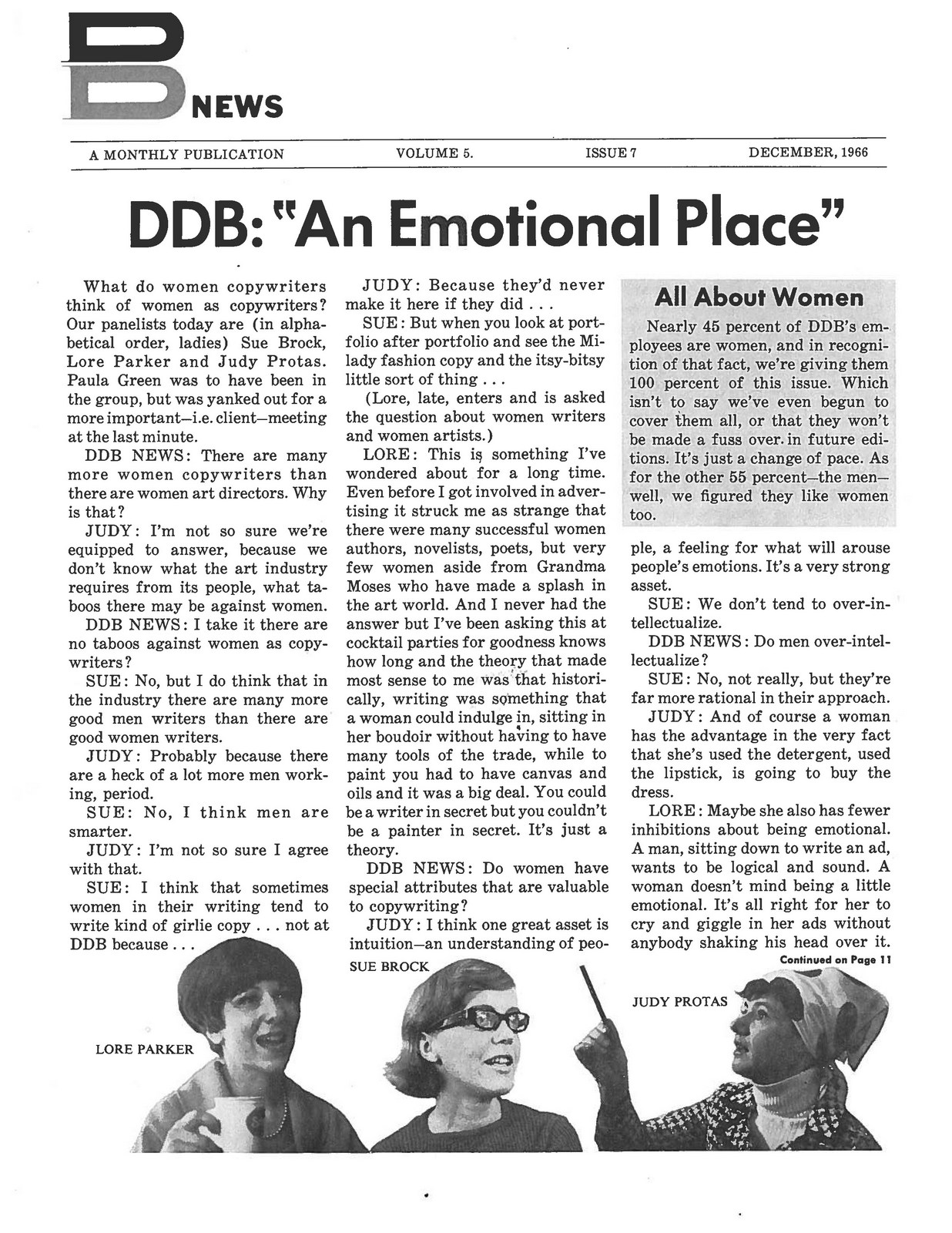
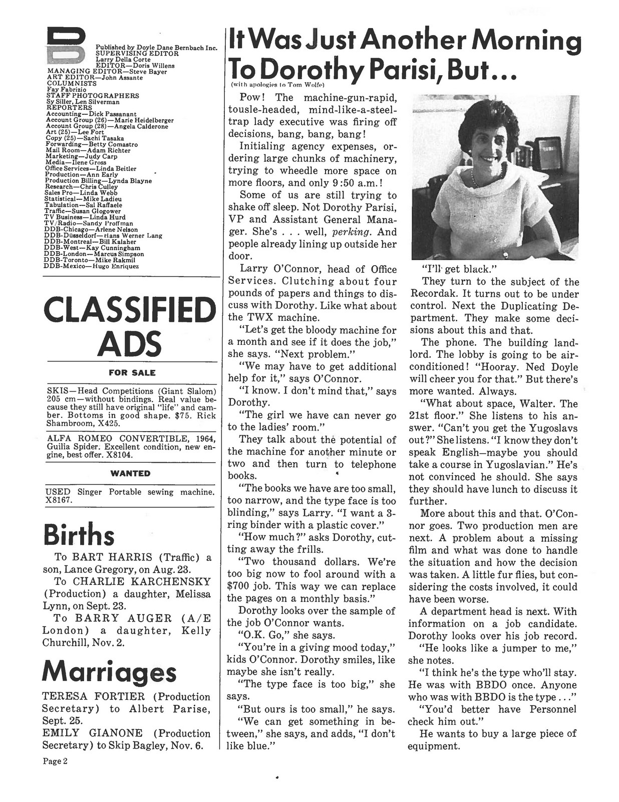
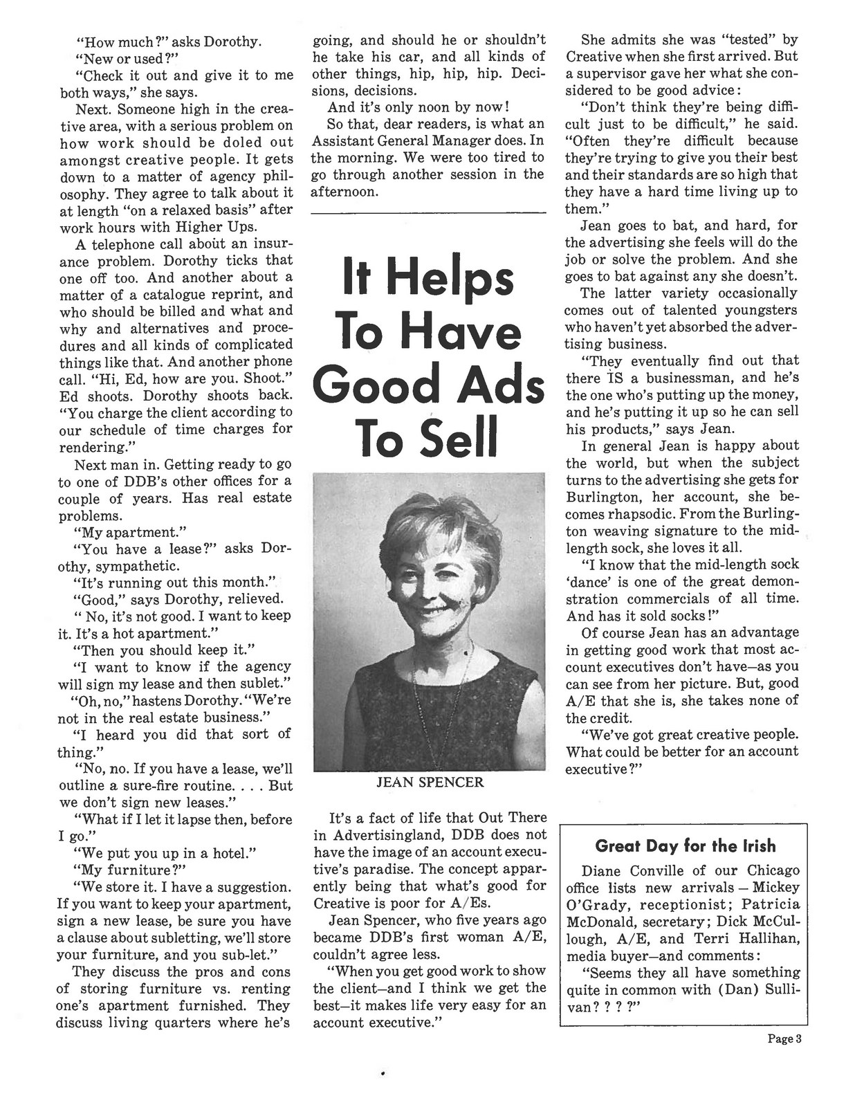
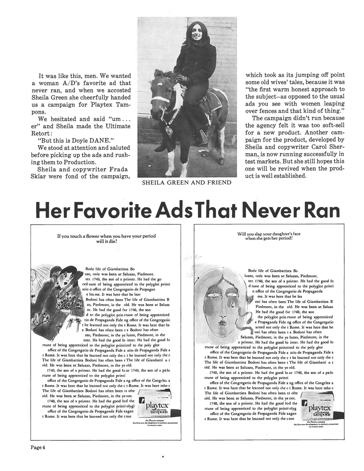
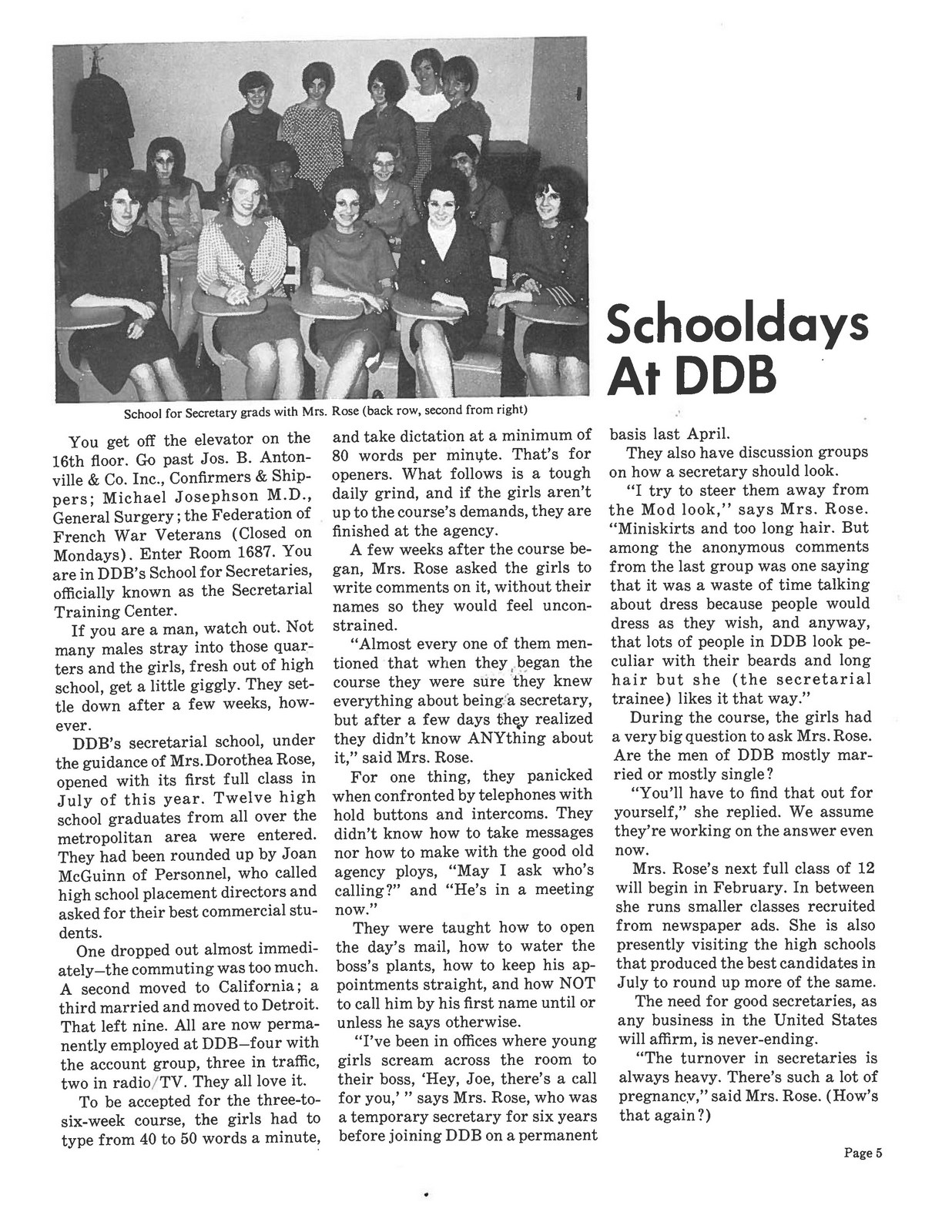
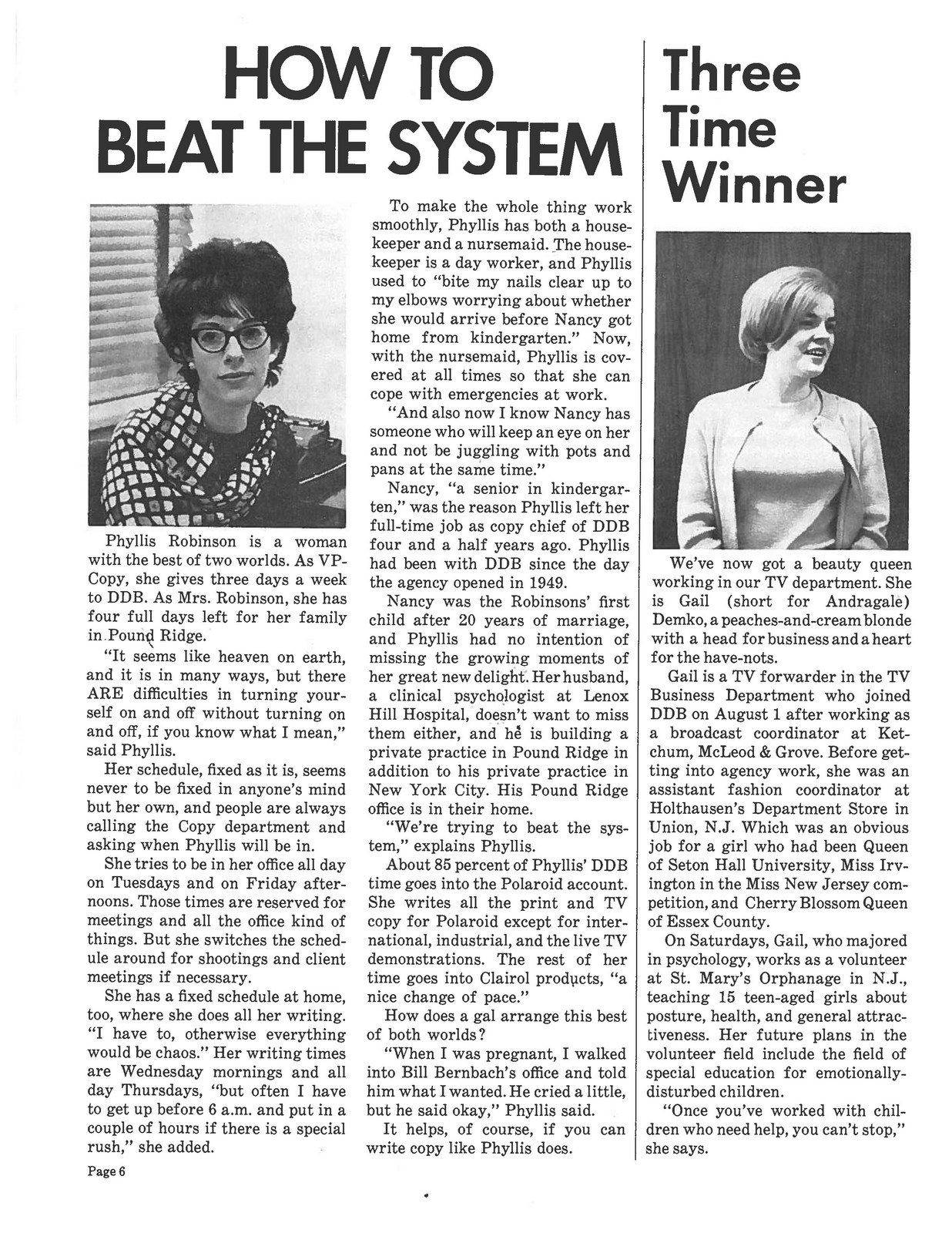
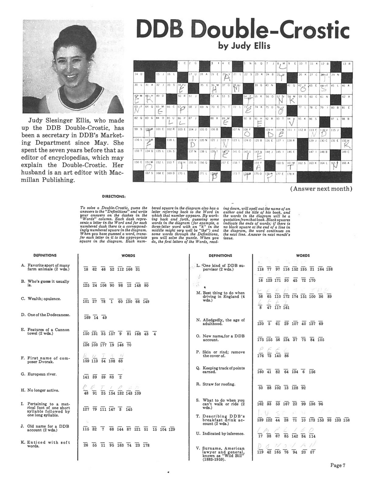
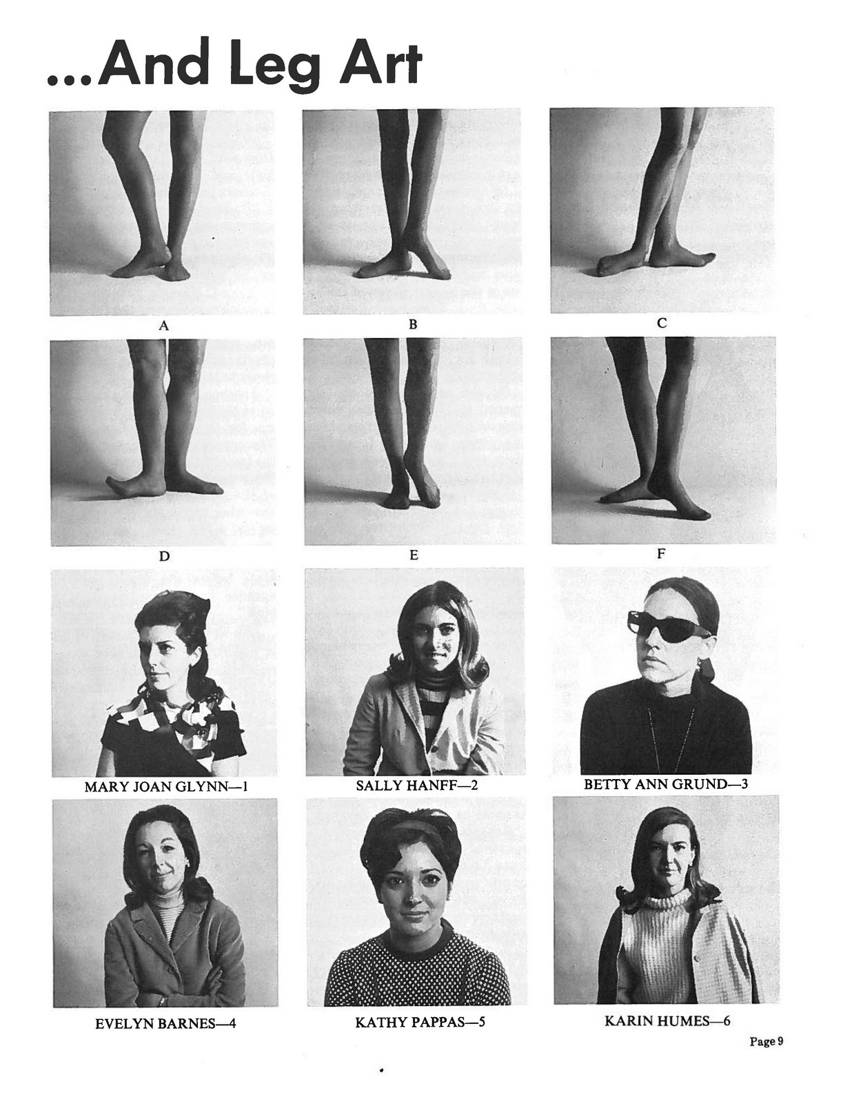
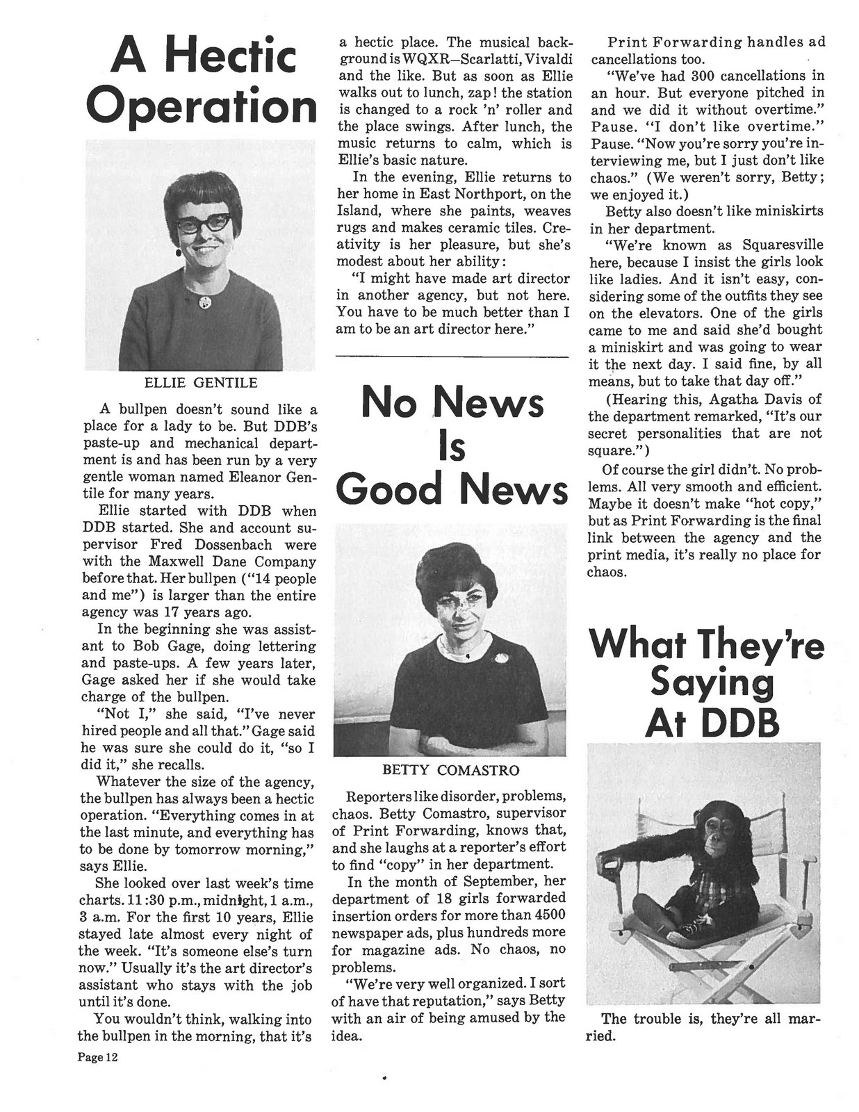
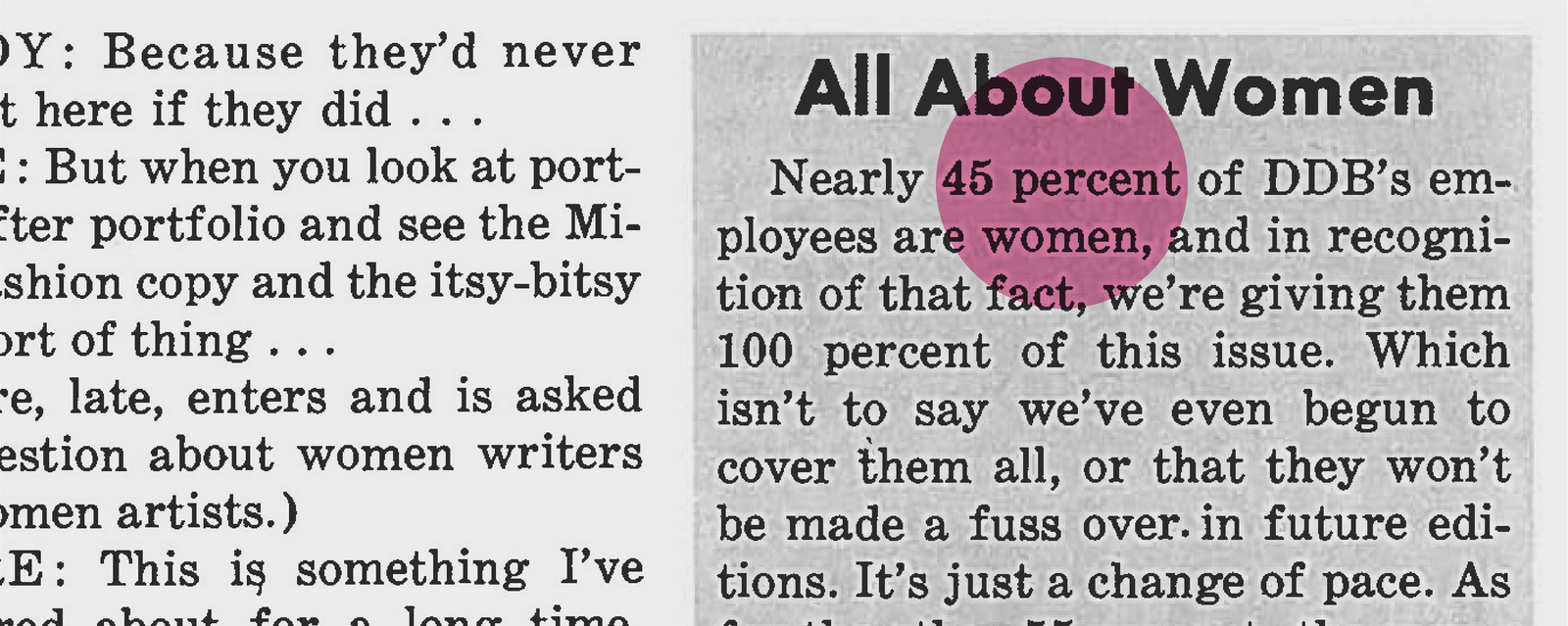
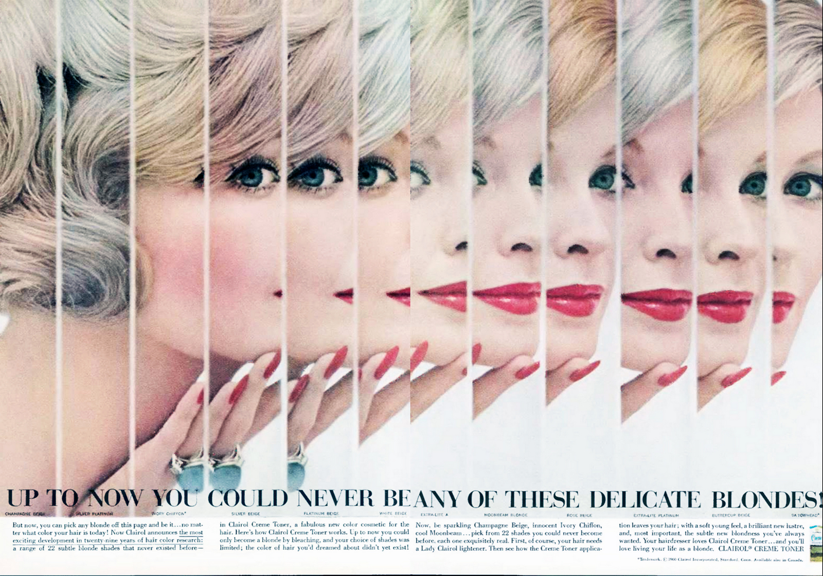
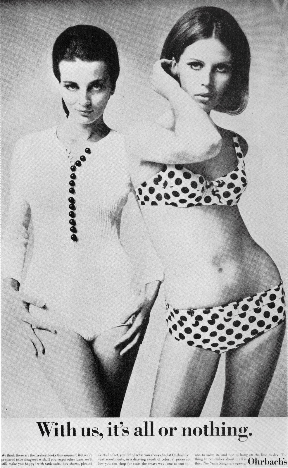
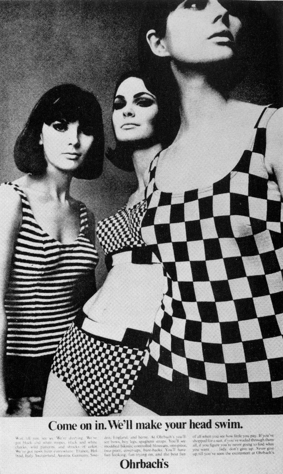
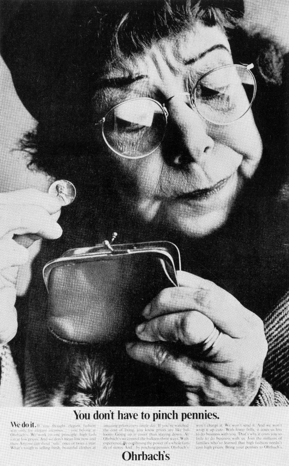
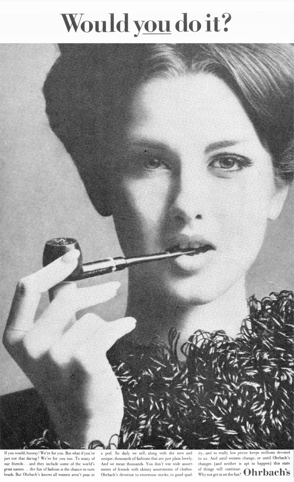
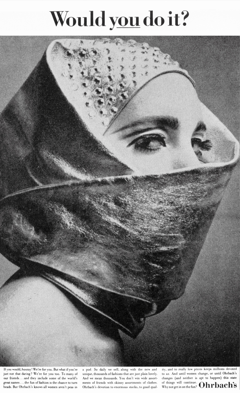
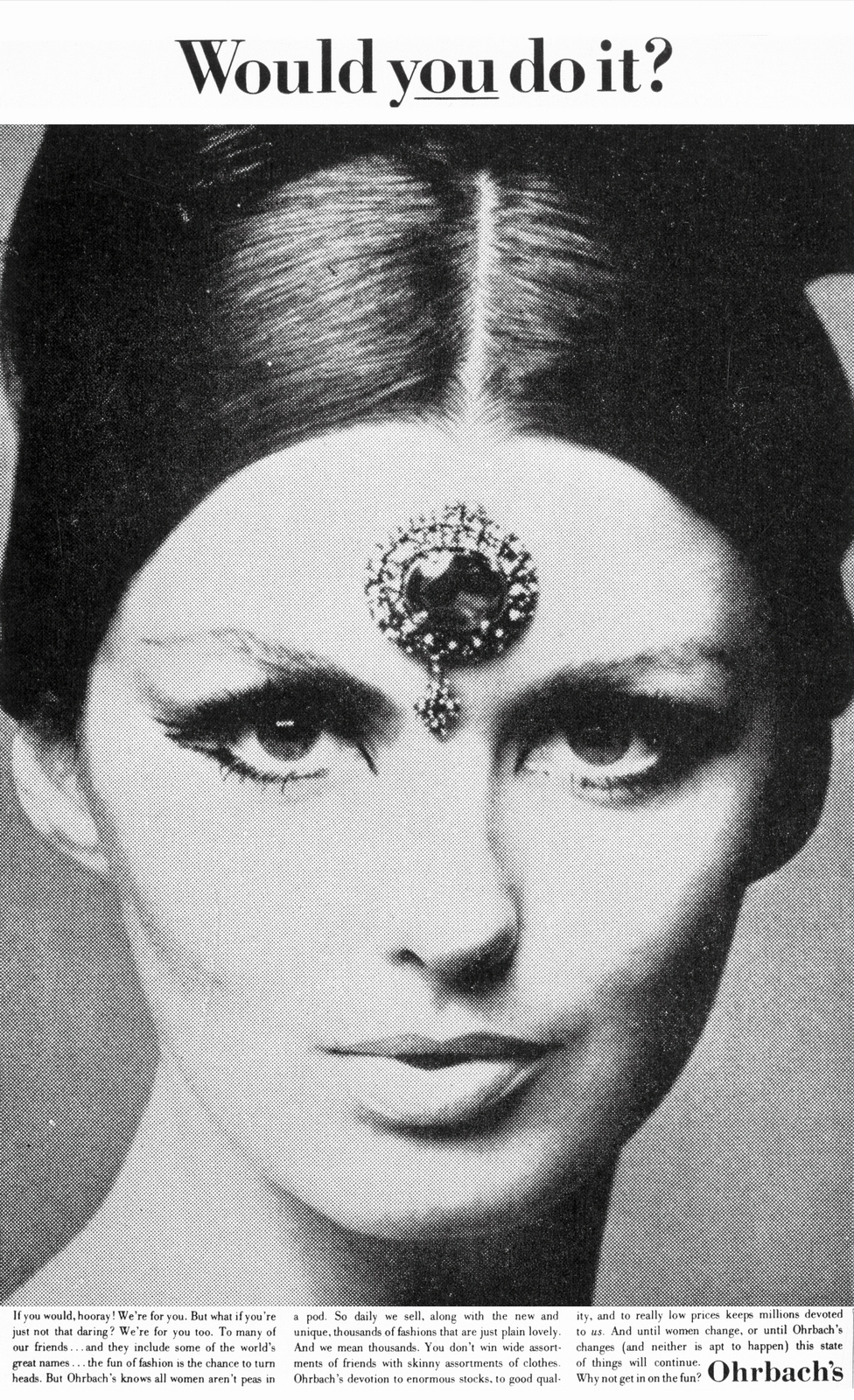
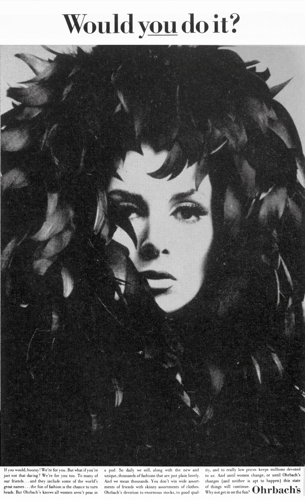
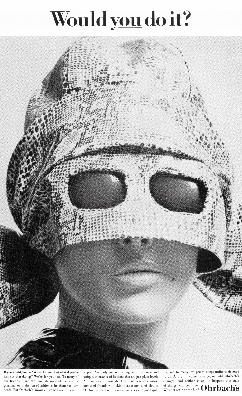
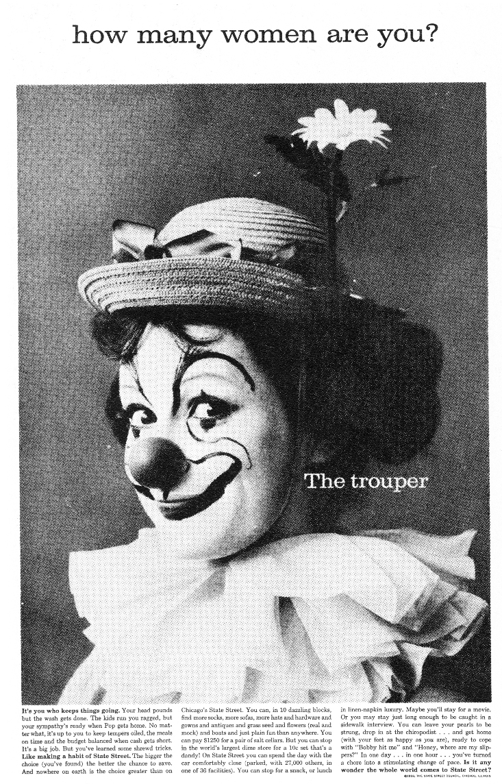
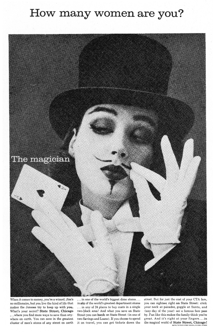
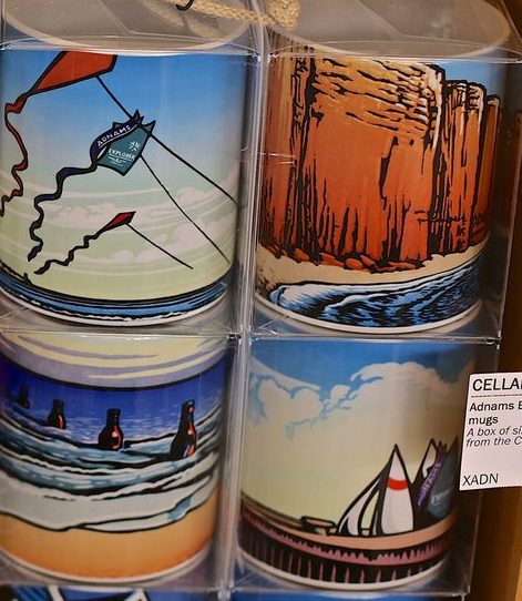
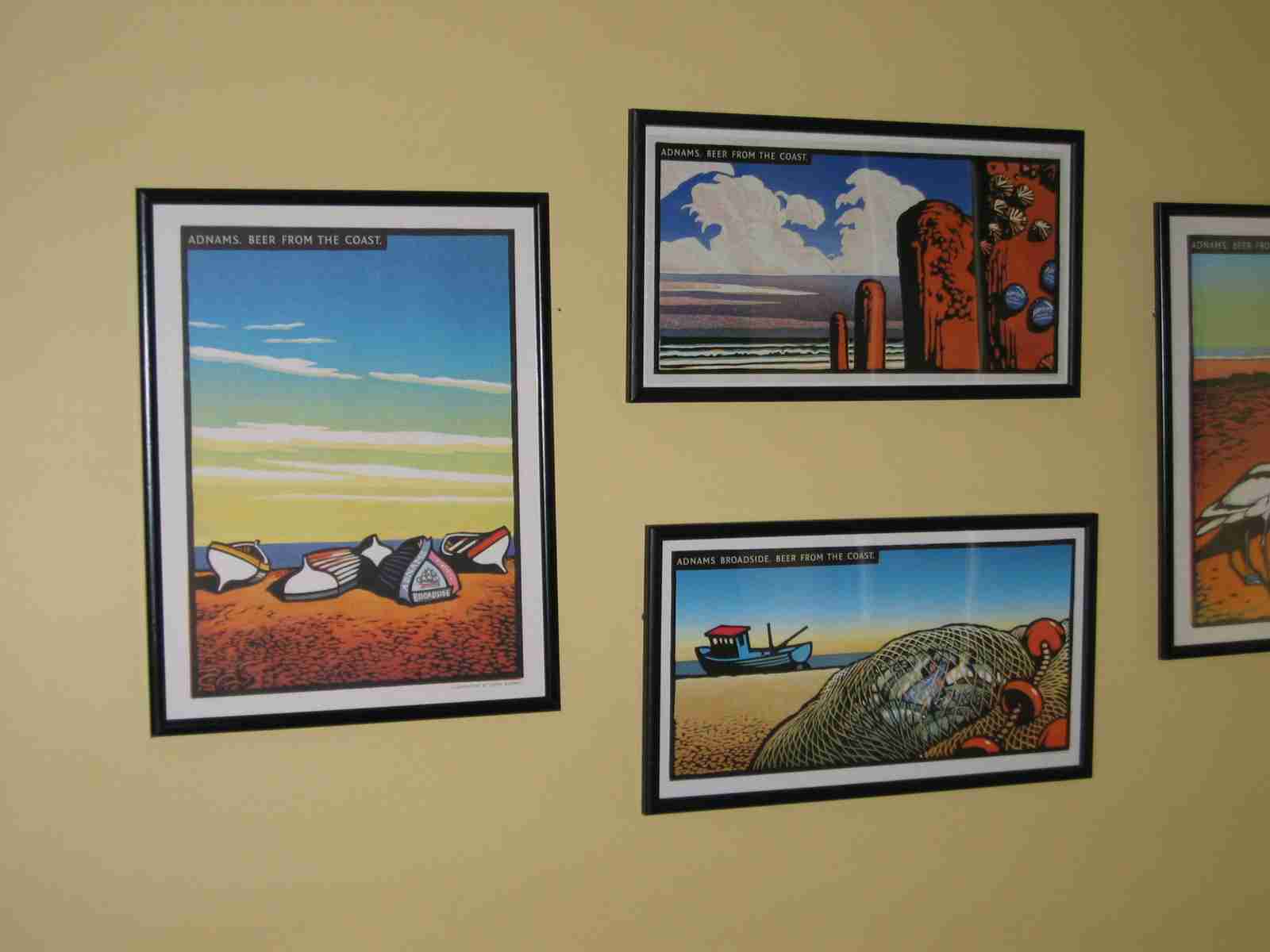
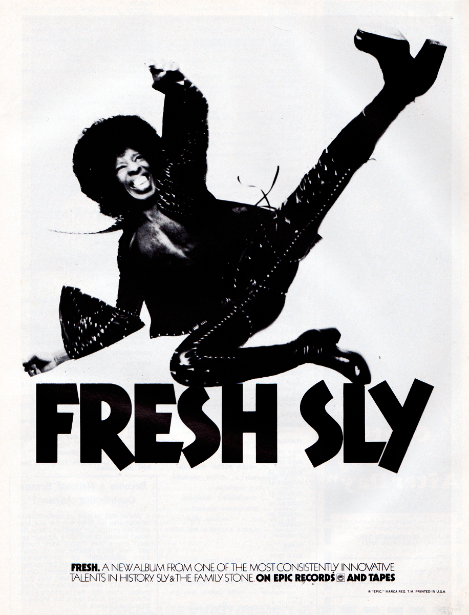
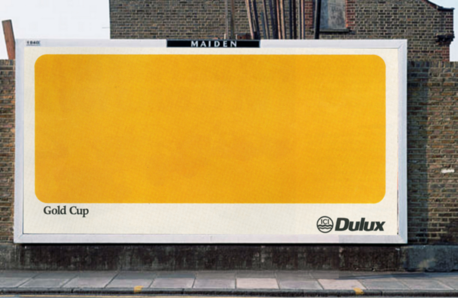
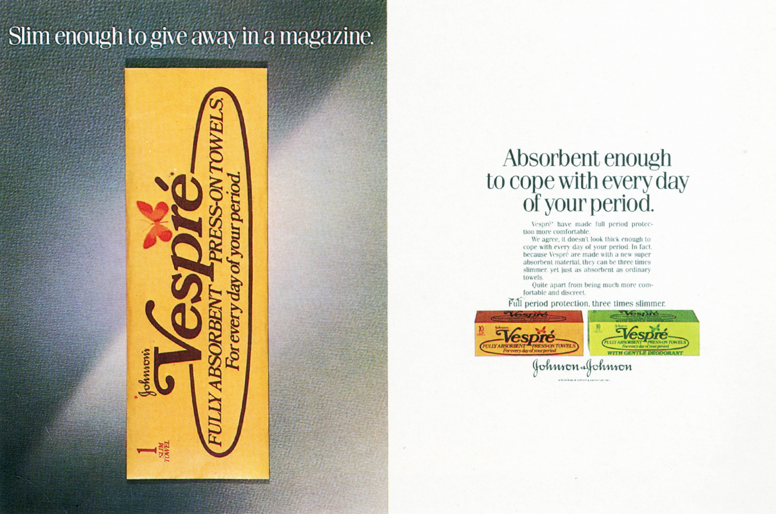
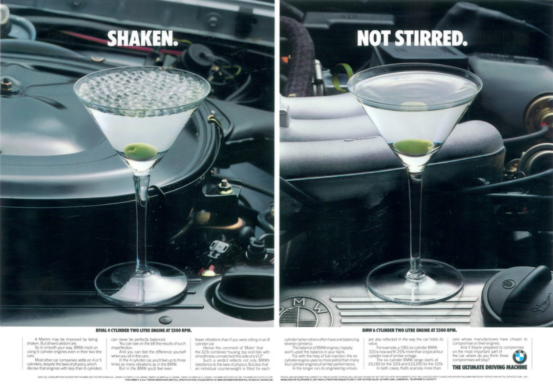
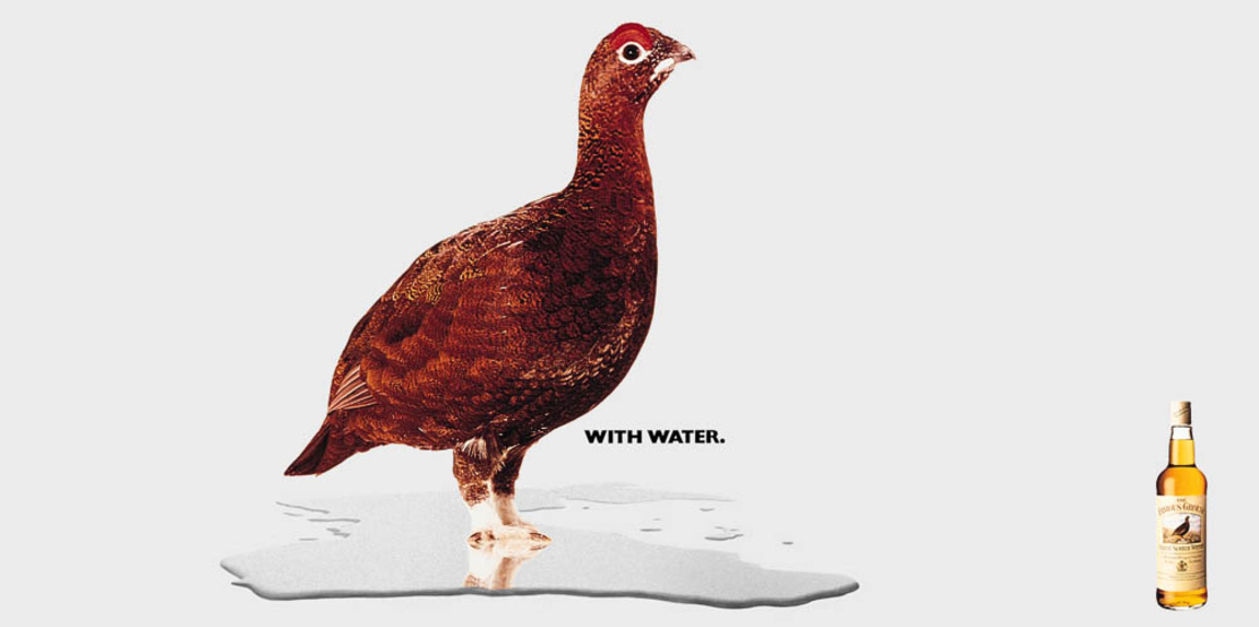
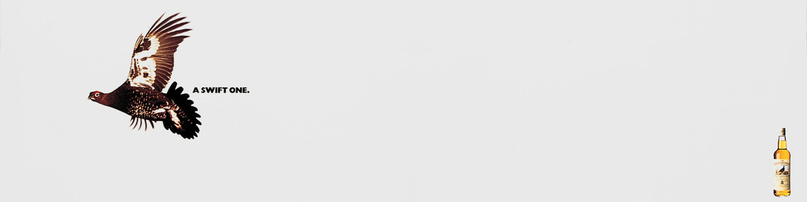
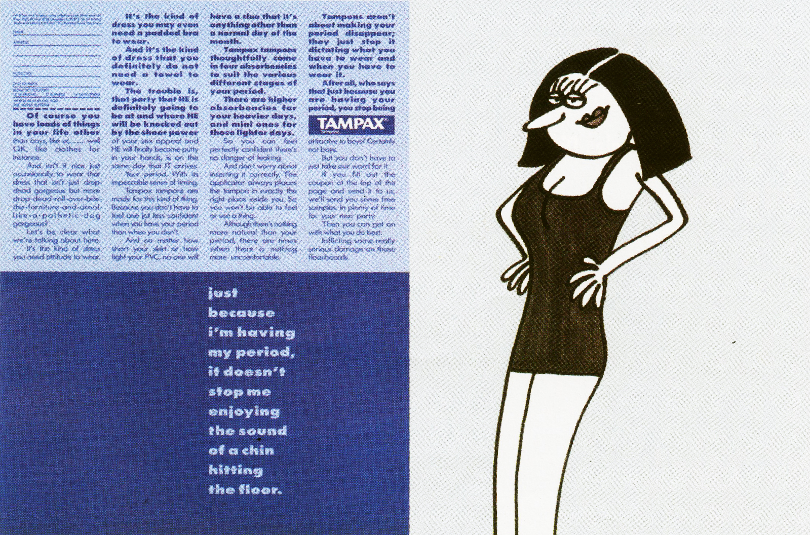
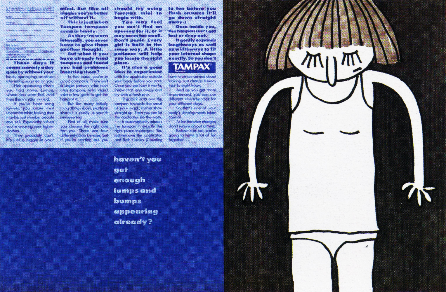
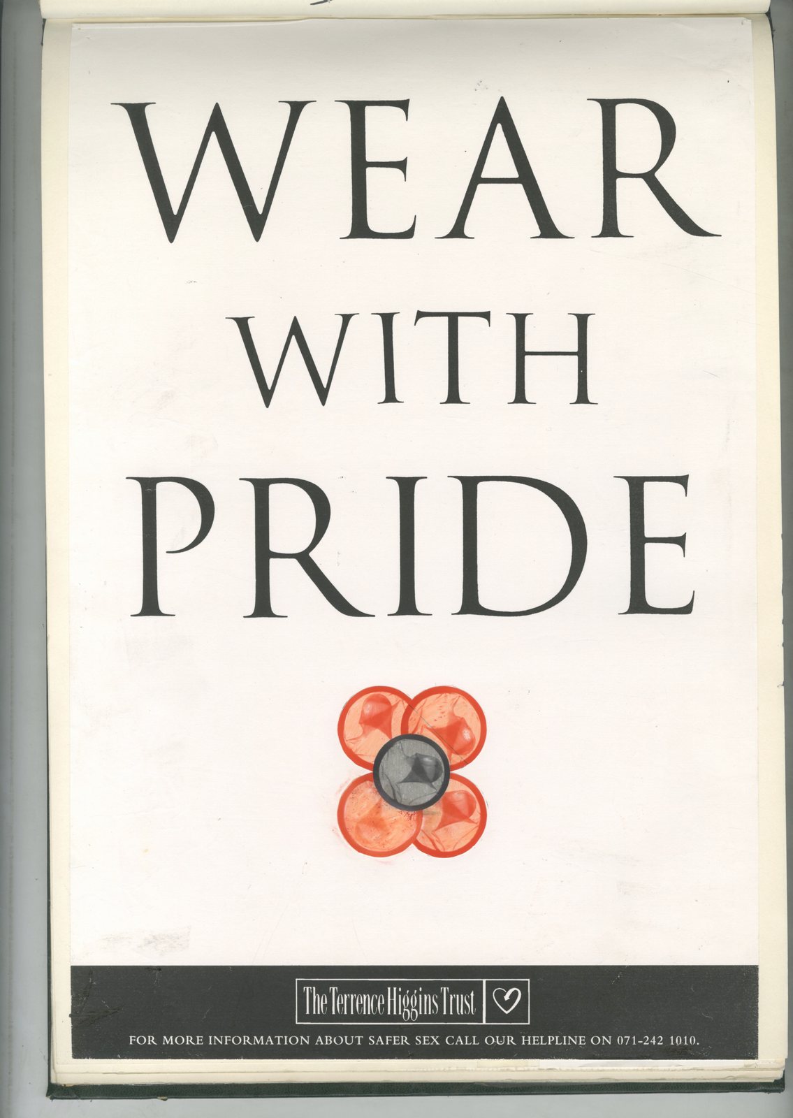
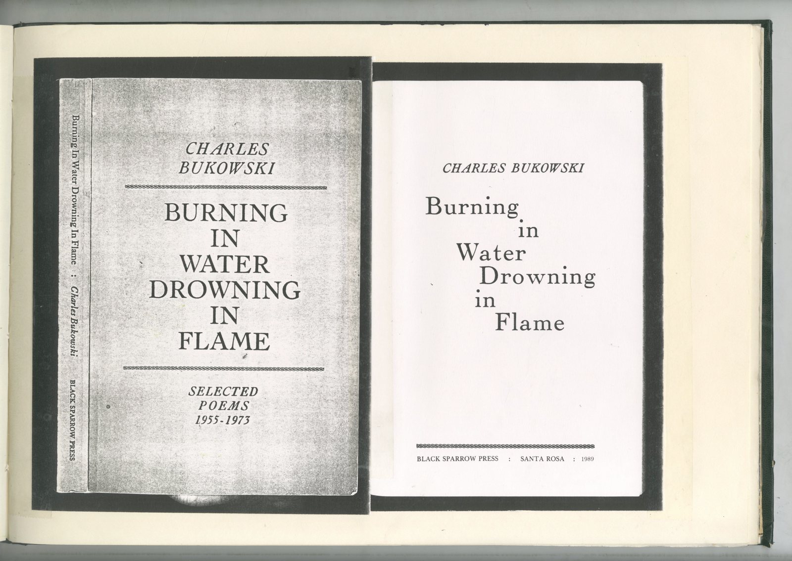
I chanced upon this whilst researching this series.DDB News, 1966 - The Women's Issue.It's an odd little thing; one minute it feels progressive, the next..not*. (*Yes, I'm talking to you Legs Page.)But it's a useful snapshot of the environment the women I've written about were working in at the time.Also, DDB would've been one of the most progressive agencies. (See previous posts for details.)

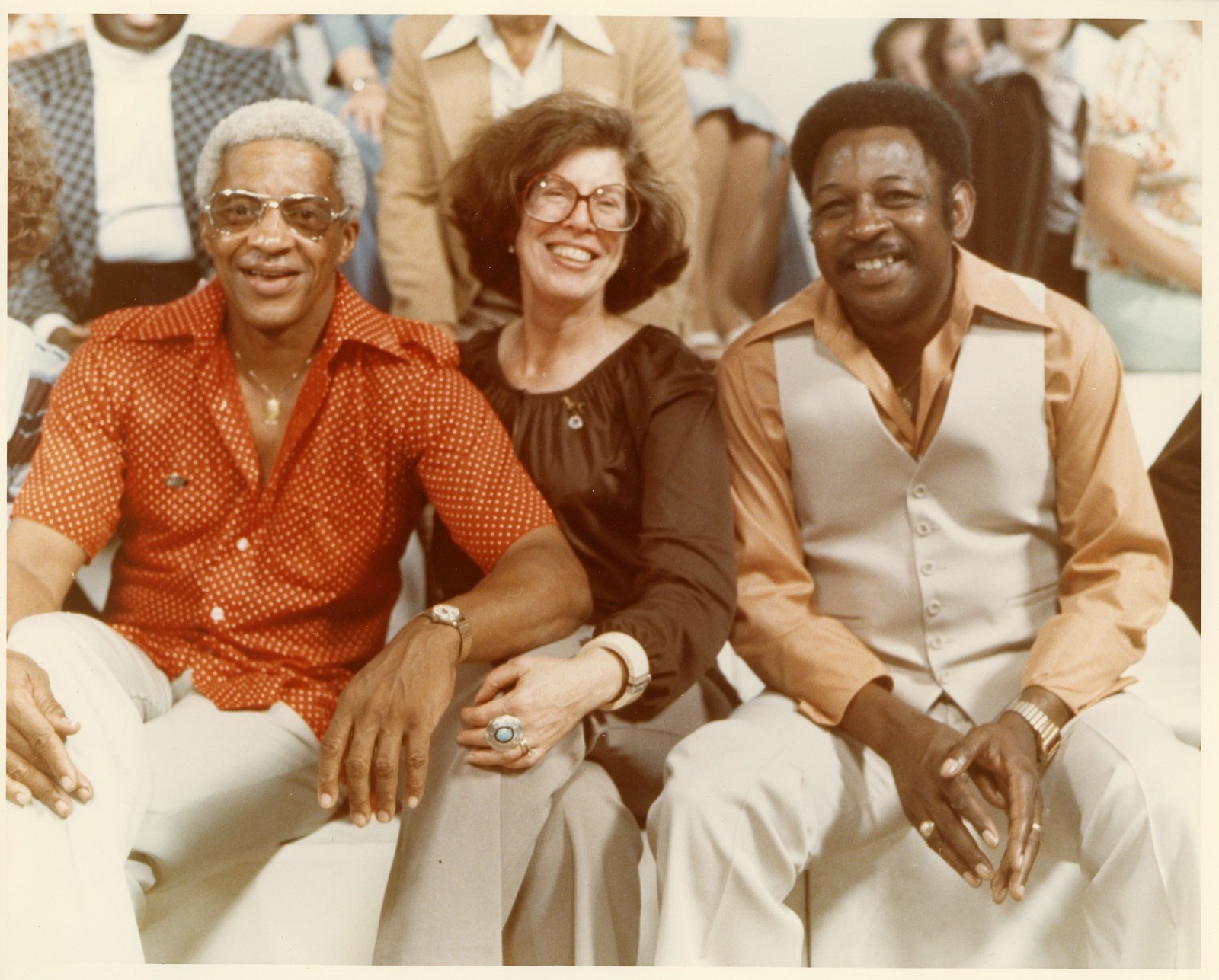
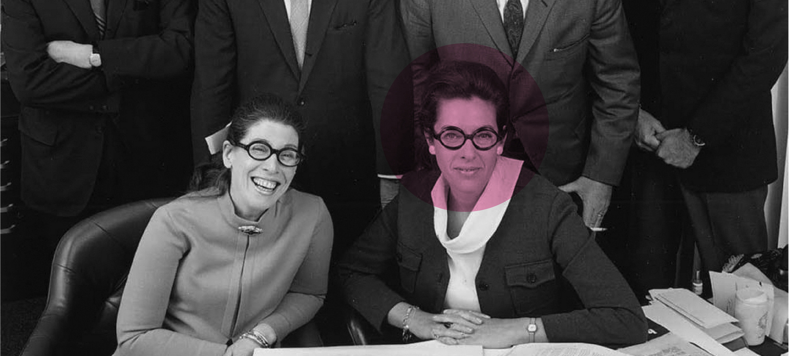
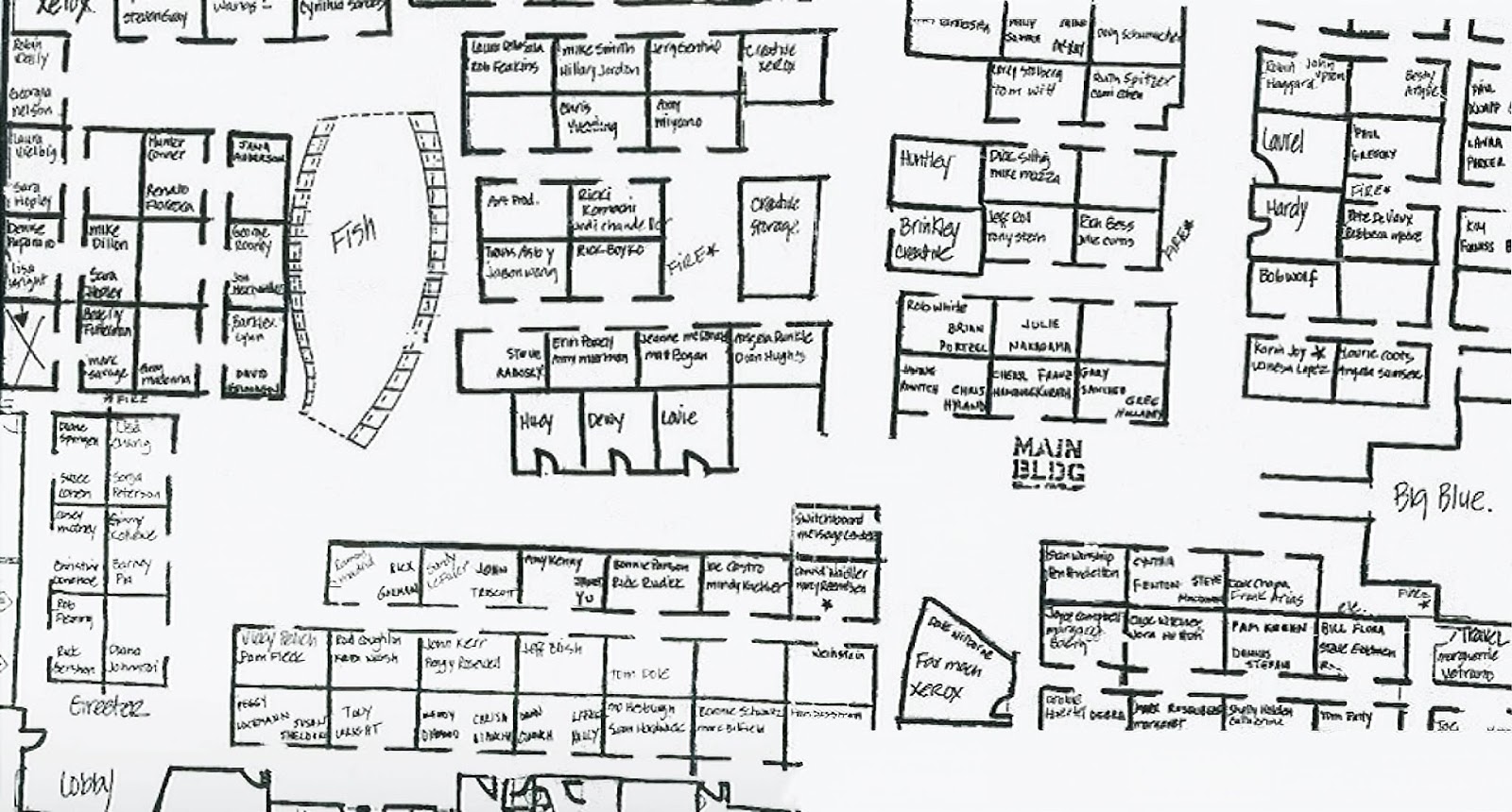
One of the frustrations of putting together these Women Who Built DDB posts is trying to track down their work.The journey starts with scouring old copies of The New York Art Director’s Club Annual and Communication Arts magazines.After that, it's a desperate flick through the random old books and magazines my wife is forever on at me to get rid of.With a bit of luck I'll find a bunch of grainy little back and white squares with the appropriate creative's name in the credits.If its press or poster; I can scan it and show it here.If its tv; forget it. (I figure you (yes you) can live without seeing a picture of a 1960s chef with the word 'Buitoni' enigmatically written underneath it.So then it's onto Youtube.Then Vimeo.Then a last minute scramble on Google.One search term is never enough, so after 'Buitoni chef ad 1967', 'Buitoni tv spot 1967', 'Buitoni commercial vintage' and any other combination I can think of we have our haul.If you're lucky, the ad you're looking for pops up and it's like winning a raffle, but mostly it doesn't.(Not exactly the glamorous world of advertising I thought I'd signed up for in 1985.)Unfortunately, in Carole Anne Fine's case, very few of those little black and white squares turned into Quicktimes.Frustrating, but on the upside her interview is great - she's very frank.It was given in 1970, a few months after she'd joined Wells Rich Greene from DDB, where she'd worked for the previous decade.

AN INTERVIEW WITH CAROLE ANNE FINE.(Vice President & Copy Supervisor of Wells Rich Green & DDB).Japan's IDEA magazine, 1970.What time do you get to the office and what time do you leave?Between 9:30 and 10 o'clock and I leave my office around 6:30 or a little after. I get home 6:30 or 7 most nights.How do you juggle being a mother and a copywriter?I don't think I even work at it any more.I've worked ever since my kid was born, which was nine years ago.He just knows that I go to work, when I come home in the evening I spend as much time with him as I can. How do you make the two jobs work?One day an incident came up. I had a housekeeper taking care of my child, but when he got sick I had a very important client meeting, so I had decide whether to go or not? As my career had developed, I been given more money, better jobs and more responsibility, so I had to make up my mind which thing do I do?I talked to my husband about it and he said something that was really very good, he's not like a typical male who thinks it would be better if I didn't work at all, I work and he accepts it.He said, "Listen, are you serious about your job or are you not serious about it? John (that's my child) doesn't always come first."Since his temperature wasn't terribly high anyway I knew he wasn't that sick, so I decided to go to the client meeting and let my housekeeper take care of him. If anything bad came up, I could always come home. And I did that. I think it really was the first time when my job became equal to my child and since then, I think, I've become more and more intent on doing my own thing.I'm not answering this in 1,2,3,4... logical steps 'cause I can't. In the very beginning, I'd feel guilty, because when my kid was very little, about three years old, he grabbed me when I came home at night. I was very tired and was still thinking about something that happened in the office, but he grabbed me and wanted me to play a game. I would do it anyway 'cause I felt I ought to.I went through that for about a year but I just got angry with him because I was tired.What I wanted to do was sit down and have a drink, like Scotch, and relax.Then I decided that I had to be straight with him 'cause he was an intelligent child and he would understand. And I just said, "I want to be with you and play with you but I'm not going to be phony about it, 'cause I'll just get mad in the end". Whether he's totally accepted or not I don't know, but he takes things out on me that I think kids with mothers at home may not do.He never has been able to totally get my total attention, I'm aware of it and he's aware of it, but it just worked out. If I were the kind of writer who wrote novels, I'd really love to do a book about the serious career mother, because I think that it's only in this generation, it's only in the last maybe fifteen years, that you have more and more women really dedicated to the job.I am accepted emotionally.I mean, for all practical purposes, I work just like a man.I'm not a man emotionally or in my actions or maybe I do a different kind of work in the sense of where I express myself. But I work just like a man. Are there many mom-copywriters in America?I think yes, but I'm not sure.
Oh, really!Because what happens is that they start young very often, by the time they get married they're making $20,000 a year, maybe a little more. They're involved in it ‘cause it can be a very exciting job as they move along.So they just stay home for a couple of months while they're having the baby.They're making more money than most women make, (we do make a lot of money) so they're able to hire people to stay home and take care of their children. So they just go on working.Do you draw any advantage for copywriting from being a mother?Yes.One great thing is discovering how a child thinks, and I use my child all the time for this.A kid thinks very clearly and very straight, no nonsense. If they see a fat lady they say, “Hey, look. There's a fat lady”. They don't try to cover up and weasel, they're just very straight and very simple.So just seeing the way my kid thinks and the way my kid talks is a kind of great thing for me to be around.I feel that if I could speak as simply as he does, I could communicate perfectly on television.So you get your ideas from everywhere, including your home?Yes, everywhere.What is your official title in your agency?Also, what accounts do you handle now?My official title here is Copy Supervisor. I have people working under me.At this agency (Wells Rich Greene) we have very small groups because it’s a small, young and growing agency.Now I'm working on Love, which is a cosmetic, Samsonite luggage and Personna, which is a razor blade.How many years were you at DDB?Ten.Describe your career history and why you chose this career.Well, I'm not going to tell how old I am.I was born in Chicago in the Mid West and I went to school there, I went to college.I didn't like Chicago and I came to New York.First of all, I went to the Coast, to California but it wasn't quite what I was looking for, so I came to New York. I was going to be a writer, like a lot of people I had a little talent and sold few stories.Then I met a guy, got married and stopped working.Student marriage?No, I met him when he was in the Army.After a while, we ran out of money and I had to start working.I just sort of fell into writing copy. I'd never, in my life, had any intention of going into advertising.An accident?Oh yes, just a pure accident.I worked at Ziff-Davis (Flying 1 magazine) for a very short time and then left for another place. Within the space of about a year or a year and a half that, I went from one job to the other, each job was better than the last and each time I was getting experiences and learning more.Was your writing ability recognised?I always had two qualities.One was I always had a talent for writing.The other was that I was a sound thinker.I didn't have training in anything, but I could fasten myself onto a problem.As soon as I began to get training the two things started to happen together.What did you learn at DDB?Oh, that's a hard question to answer.Because I learned everything there. DDB is the only other agency I've ever worked at.I'm sure that so many writers before me have talked about Bill Bernbach and the whole DDB school of advertising.How shall I put this?DDB was, and still is, the most swinging of all the American agencies.(My agency is also great but in another way. It’s smaller, it’s a little wilder.)But I think that advertising is a funny business - probably 97% of advertising is really bad, no I won’t be so hard on it, let’s say 90% is really bad, it’s bad because the agencies are really afraid to be free and argue with the client.They’re afraid to explain to the client.The client knows how to make a product, fine, but you know how to make advertising.probably kind of feudal.People being afraid of what the people above them think, that’s why 90% of advertising is bad. They're all these old standards and all these old rules that are supposed to be true and are really untrue.It’s like, you can say this and you can’t say that. That’s not true. There’s nothing you can't say.But somebody’s got to do it first, somebody’s got to innovate. I think Helmut Krone, whom you know about, was the one of earliest people to start really doing his own thing. Somebody said, “You can't use that typeface in this ad” and he said, “Of course I can use this typeface and it’s beautiful”. And he did. I think at the beginning with me at Doyle Dane Bernbach, I was afraid too because first of all I was so impressed by the agency and by Bill Bernbach, by the whole thing that I said, “Oh, how can I be working here, I'm the dumbest one here, everyone else here must be great to even be here, but not me.”But after a couple of years I started to really do my own thing, because Bernbach may believe in hard sell, sound sell, but also in tremendous freshness.Can talented copywriters do good work in bad agencies?If they keep being rejected, then they will get out of that agency fast.Talented writers are always recognized and will always find places where they will feel free.Which agencies do you think provide copywriters with the best atmosphere?Please name as many of them as possible.DDB of course.This agency, Wells, Rich, Greene, Carl Ally, Smith Greenland and there are some boutique, as they've been calling themselves in the advertising columns, like Case Krone and Curt Canvenison Simon.Y&R has some bad things, but many good things too.Jack Tinker of course, before they had problems.Lois Holland Callaway.That’s as many as occur to me right now, I'm sure there are lots more.


It's interesting to hear that you didn't include Thompson.In Japan, even a huge company like Dentsu is so bureaucratic that nobody really wishes to go there, unless he needs security. That's in Dentsu?Yes, but I heard even in Thompson?Yes.Well, I don't know, I really don't know much about Thompson.Ron Rosenfeld went to J. Walter Thompson and anybody really creative, there aren't too many in New York by the way, suddenly anyone really creative got interested in J. Walter Thompson.And then, of course, Ron’s leaving now, I don't think the creative atmosphere there was ever creatively free.You mean it's a sterile organization?Yes, exactly. Who are the copywriters you respect? Please name as many as you want to, active or retired.I think my number one all-time favorite copywriter is Gene Case.But there are lot that I respect and think are great, Ron Rosenfeld is great, I think Jack Dillon is great in his own way, I think Dick Rich is great. Let's see who else, let’s think about Doyle Dane, there are so many., Bob Levenson, although great, he’s probably not my favorite, Phyllis Robinson, of course, who’s great.I also like Al Hampel who is in Y&R.

Of your own work, what do you like best?Usually, when I finish something, I don’t like it. It’s a very common reaction.I always think “Why did I do it that way? Maybe I should have done it this way."A lot writers think this way.I always think I could've done it better. Now, one of the ads that I like best is a commercial for Love, which I've just done, it's running on television now.It's a whole new kind of concept that hasn't been done before.The problem that Love cosmetics had was that they were appealing to very young kids; teenagers between 14 and 20, but they couldn't make enough money that way. So they wanted to change the whole thing.They needed to appeal to between 25 and 30, take a slice out of the bigger cosmetics market, out Revlon, Revlon.Giving a very clear idea of what the product is, that's a hard sell.I think cosmetics should be sold on sex, I think that's really the feeling of the age, I mean that's like what it is today.The simplest way I can describe Love is based on sex.It's a kind of sexy commercial that's never be done before, without being dumb sex or boring sex.I'd need to show it to you right now to describe that feeling.It's the people that we picked to be in it, the kind of the situation that we picked. It’s really is one of my favorites.The other one was a campaign I did about a year and a half ago for Buitoni.It was very bold, very crazy, we took a very ordinary selling point and turned it into something very fresh.I really had a lot of fun with it and it just hit the Americans with a kind of boldness and that worked.
What do you think is the most important skill of a copywriter?The first thing is you have to have a very sound thinking mind. Not even a lot of people have one.Talent is something you don’t even count because you shouldn’t be doing it if you can't write or communicate in words. So I don't even count that, as talent is absolutely in born. It’s something you can’t learn.Making people buy something by the words that you use to describe the thing? On a printed page, radio or tv spot? That’s talent. You can't teach anybody, you just can't.I could take the world’s greatest thinker, or an astronaut, who has a tremendous engineering mind, but I just could never make a copywriter out of them.Do you think soundness of thinking is a priority? Yes. I think that's the most important thing.I think soundness probably comes after the talent.Soundness is probably the most important thing you can have, just to being able to communicate in words isn't enough.You have to figure out what aspect of this product is going to be the most appealing to people.And in order to do that, you have to really know the product thoroughly.You have to be able to zero in on the product and realize what aspect of it you can best communicate to people.It sounds easy, but it is the hardest thing in the world. I mean to just sit down and do it is not so easy.A great example is that you very often see great public service ads, because public service is a kind of human thing. You know kids are starving in Biafra. It isn't very difficult to write a very emotional ad about starving kids, it’s something most writers can do.But if you have to sell a wire cord hanger to somebody - that's not so emotional, or exciting.You have to know how you can communicate the story of the most miserable, unimportant things to people, like toothpaste. Or soap and detergents, which is awful, because nobody cares.And that’s when you need really the sound thinking.Also, you have to have a feeling for what people really want.It’s not as simple as reading a psychology book.Like Mary Wells, I think one of the secrets of her success is that she just has this feeling of what’s going to work, what’s going to sell to people.She has a kind of unfailing in that instinct.
Like a divine quality?I don't know?Bill Bernbach really has it. Thinking also counts, I mean you really have to think it through. One thing that's happening in advertising is that it's getting less and less phony.People see through it right away. I'm talking about Americans, you really do have to be honest. I can't say that a lipstick is going to make you the most beautiful woman in the world, but I can make you feel it.But I'd never say it because it's phoney.People are getting more sophisticated and seeing through dishonesty. So you can't trick consumers with words, you have to appeal to their feelings? Yes, absolutely. I think that all the most successful campaigns and advertisements that have ever been done appealed to feelings first, then minds.I think Volkswagen is a great example of that - it reaches you just emotionally and then it really says something.What’s your teaching method? You mean if I have somebody in my group or teaching in a class?I taught last year at the School of Visual Arts, where I taught advertising with an art director, it was just as if they were here at the agency in my group.We give them an assignment and we explain the problem, such as it’s a thirty second commercial – that’s all they have money for – and it’s for TWA who want to announce that they’re now flying non-stop to Tokyo.So they do the commercial and then we put the commercial up on the board in school and we talk about it.And students talk about it.We try to point out to them why we think it’s bad or why we think it is good or what they could do to make it better.I try to find out what they were thinking.So they begin to think more clearly and more carefully. Are you adopting a one-to-one relationships rather than one to many relationship? Oh, you mean in the class. Yes, I can't really get up and give a lecture on advertising because that's not how anybody ever understands anything.It's not like when you're giving a course in Shakespeare. It's more personal.So I would take one student at a time once in a while.and say, for example is, in a commercial if your picture is saying one thing and the words are saying another, that it's very confusing. People can't relate.I'll discuss the commercial with the student. And then I'll show it in the class and will say, "You can't go two directions, for people can't do both things at one time".So that's how I do it in the class.They argue and I like to argue with them.How do you observe the future trend or fate of copywriter? That's a hard one to answer.I'm not very good in verbalizing things.Maybe because I'm a writer.I think the older structure, where management supervisors or account executives had the last words, saying, "Oh no, we can't do this" is slowly going out.I mean, everybody wants to do his own thing, something new.So I think it's going to become a lot more swinging, maybe the way this is going to happen is an awful lot of new places will open up, a copywriter and art director getting together?Maybe not terribly young, because when you are 21, you don't really know anything.

Do you have the desire to have your own agency? Yes, I've been thinking for a while about having an agency in Europe.I know it's very difficult, and if I were strong enough to have it now, I would have it.Most people would.You have to reach your certain level.This is not a pompous statement, it's just a statement of fact; I'm probably one of the highest paid writers in New York. So it gets harder to move agency and make a lot more money, even if you do, you have to give so much back in taxes. When they give me a raise now, even if it's a good raise, I'll get very little left for myself.So the next step is to make real for money, a lot of money.I would like to have my own agency but I'm conflicted, they're treating me very well here.But the only way to really make a lot of money is to have your own place. How would you find business? You have to start with an account.It's that simple.Although I've never really had the discussion with anybody who did it, but I think if you have just one account, maybe if you're working at an agency with a client who's unhappy with the agency but happy with the writer and the art director, maybe you go and talk to them?You get one client interested in you and then you can start an agency.If you're going to bill $2.5 or $3 million a year, that's enough to start an agency.It's kind of like doctors; it's all about reputation, do something good and that's how it starts.More Carole...Carole went on to found her own agency - Baron, Costello & Fine.(Work below.)


She is also credited with creating the iconic Absolut campaign whilst Creative Director at TBWA.

Once again, thanks to Vikki Ross for her help with this post.
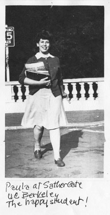
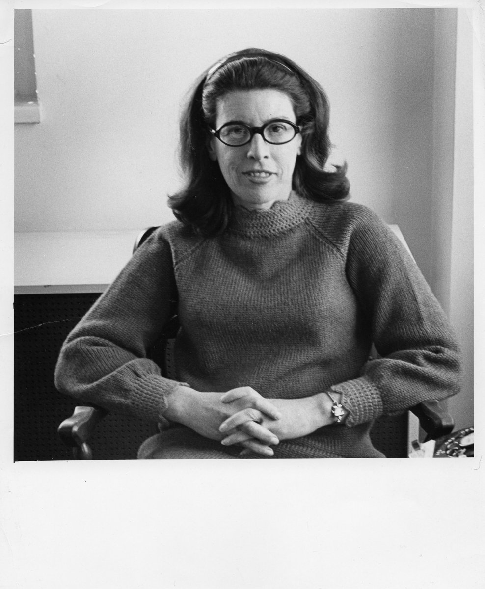
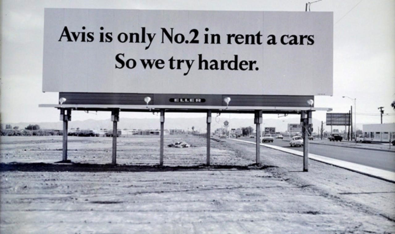
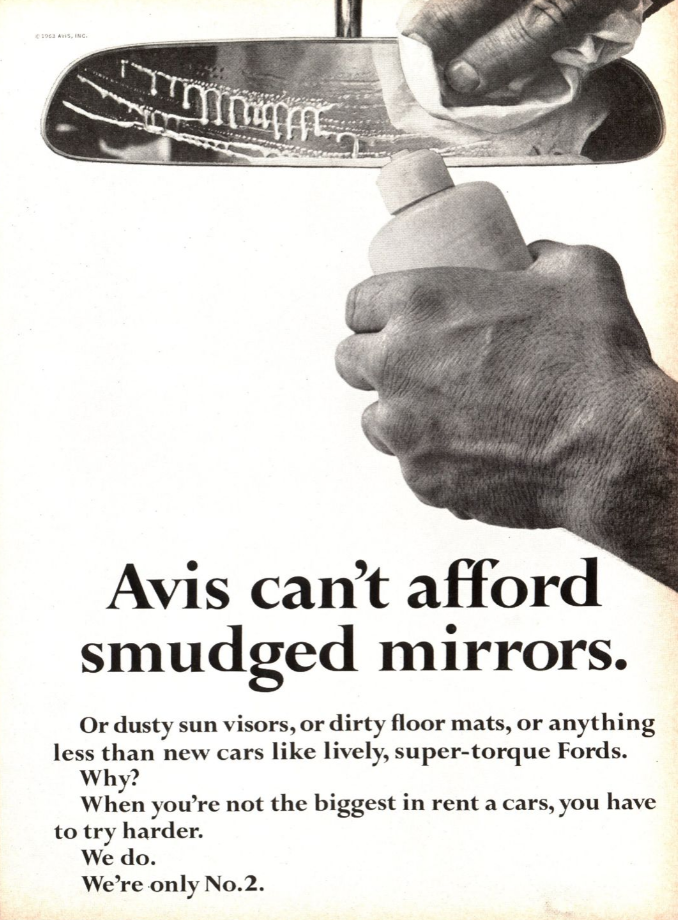
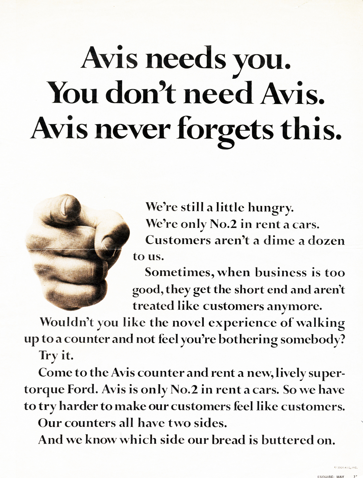
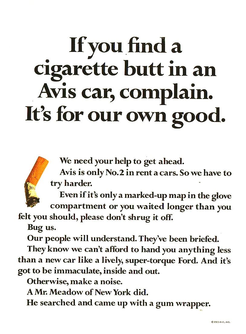
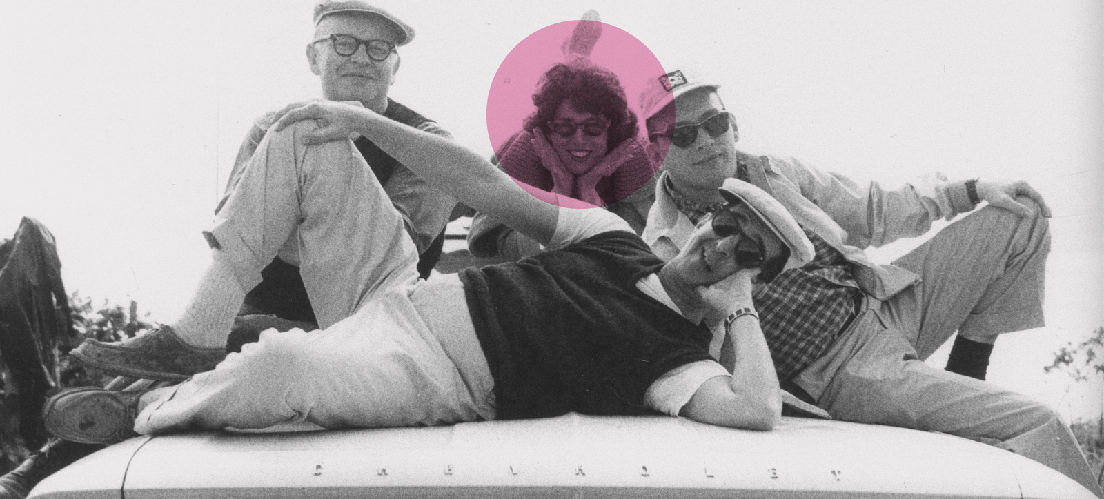
"It’s not the size of the budget. It’s the ferocity of the idea" – Paula GRRRRReen.I'd seen that name underneath some Avis ads. But Helmut Krone's campaigns tend to be referred to as Helmut Krone's campaigns. (See what I mean?) The spotlight rarely makes it past him.So the writers, and often originators, of much of his most famous work get forgotten.Avis is a prime example.I love the art direction of the Avis campaign, but I love the thinking behind it more.The Volkswagen campaign may be a more famous, but in terms of thinking, I prefer Avis. Come to think of it, what is the idea behind the Volkswagen campaign? Hundreds of great one-offs unified by a great (and breakthrough at the time) tone of voice.'We're No 2, so we try harder' positioned a company, inside and out, getting employees to work harder and the public to root for them. No mean feat.Who could fail to empathise with the truism that if you're not the biggest, richest or most famous, you have to try harder? Everybody loves an underdog. Paula Green wrote it, describing it this way "We were really creating an operating manual for the company, saying you had to give customers a clean car, windshield wipers had to work, cars had to have a full tank of gas." Many in the agency objected to the idea, feeling that No. 2 was a put-down, so Green sent the researchers down to airports to get feedback on the ads. They came back to report that 50% of people thought that No. 2 meant "not as good as." That kills most campaigns. But Bill Bernbach piped up "What about the other 50%?" and the campaign ran.(It's a great reminder; we aren't seeking broad agreement that a campaign is ok, we're looking for a small constituency to fall in love.) Four years later Avis had increased its market share from 11% to 34%. They used the line for the next 50 years. (And they'll use it again, I guarantee.) Paula also wrote and oversaw great work on Heinz and Quaker before, in 1969, setting up her own agency Green Dolmatch.(Later changed to Paula Green Advertising Inc.)She funded it with the money she'd made on her Avis shares, she’d bought them soon after being assigned to the account.She felt she needed independence, saying “Years ago when I was working on detergents, I would be the only woman in a meeting with the production manager, account supervisor, art director and so on, but I couldn’t get them to listen.On one occasion I was the only one in the group who had any experience in doing wash, but they didn’t care because it did not fit into what they had already planned to do. One man practically hissed ‘you sound just like my wife’.”Her agency did mainstream work for the likes of The New York Times, Subaru and Goya beans (“There’s a bean for every girl and boya, in the food store section known as Goya”) but most of the agency’s work was cause driven. This was partly because that was her preference and partly because she refused to work on products she didn’t believe in.One of the first ads she wrote for her new agency was a tv ad promoting self-examination for The American Cancer Society.(Paula had survived breast cancer as a young woman.)

She described her approach like this "I believe in words, they should come from the heart of the matter, I always feel I must first make a sensory connection, a gut connection, about how I feel about something before I do it."
(AN INTERVIEW WITH PAULA FROM FROM JAPAN'S IDEA MAGAZINE, 1970.)How did you come to DDB?I'd been working at an agency and I had taken the summer off to join my husband in a job at children's camp.He'd been working very hard. He had just finished school again. And the agency I had worked with would not give me a leave of absence.So I had had no job when I came back.At that point I called Ned Doyle. Actually I'd known him at Grey Advertising, where he'd originally been. I'd known all these people and had yearned to come work for them years before.And he had suggested "You know our Mrs. Robinson? Why don’t you come in and see her?” I got my book together and I came in and met her, we struck it off very well and she hired me. Originally, I was hired to work as a writer for the Chemstrand account.DDB was about twenty million dollars at the time, on two floors, art and copy on the 25th, administration on the 26th. That's now the size of copy alone. Then, I guess I was one of 8 or 9 writers.
What year? 1956. And one of the nicest things happened when I was hired. I was joining around Christmas and Mrs. Robinson (she was a copy chief at the time) called me and said "Look Paula, you're going to come to work for us, anyway; come to the Christmas party, meet everybody before you start."So I started on a very happy, generous note, which by the way, I think has been true for the twelve years I have been here since.

How many people were there when you came to DDB? I don't know? I think the Christmas party had about 200 people, something like that. I mean everybody, clerk, secretaries, writers, art directors, bullpen, account executives, the entire agency consisted of about 200 people.What motivated you to be a copywriter? I was born in Los Angeles and went to school in California.When I was through, my mother, having just got back from a trip to New York, said "Why don't you go to New York, Paula?"I asked "For what?”"I think you'd like it" she answered.So I came and I fell madly in love with it.I had a few friends that I had met on the coast, men from New York.I was talking with one of them and he said "Why don't you get a job in an advertising agency?”I thought that it was a nice idea, so I got a job as secretary to a promotion director of a magazine.He was a great fellow, a marvellous teacher, a very bright man with a great knowledge of graphics and writing.It was a very small operation, so we did everything, and he let me do writing, layout. This was a magazine for men called TRUE Magazine, which has been quite successful. He taught me all along the line. He let me help him writing letters, he helped me learn how to do these things mostly by example and by saying "Write this" and showing me whether it was right.I'd been involved in writing of one sort or another, all my life. I just liked to write. I'd been writing in elementary school, junior high school, in little newspapers and putting on programs. It became a part of me.But I'd never considered it as a job, certainly not in connection with advertising, because I didn't know anybody doing that sort of thing in Los Angeles.So it wasn't until I came to New York that I got into the merchandising and sales promotion end of magazine work.When my boss left, I was made Promotions Director, which permitted me to meet agency people, one day they called to say "I think there's a job over here for you. Come on over."So I was introduced to the people at Grey Advertising and went to work there in the Sales Promotion department, I started writing sales promotion for an enormous list of accounts. I left them after I married and had my child.But when my child was very small I did freelance for them all the time, it gave us extra money that we needed at that time.My husband then decided to go back to engineering school, so I went back to work for a magazine, in the promotions department of SEVENTEEN magazine, eventually I became the Promotions Manager, handling and writing pamphlets and ads. I found the job unfulfilling, so I left them after a while.And a friend of mine, who was working in an agency, said "Won't you come over and talk to people here. We do very nice work".That was the LC Gumbinner Agency, they were very nice and hired me.At that particular agency, I did copy contact, account work, a little copy that was not much like publicity, the thing that clients really like.So when I came to DDB I was not even sure that I wanted to be a writer, I thought maybe I would be an account person because at that time we did not have any account women. But they weren't interested in me in that way. Mr Doyle soon said "I really think you should look into the copy part."That's how I got into it.


Why do you continue? I like it.Of the number of things that I can do, it's the most rewarding.At this point, with my background and experience, it brings me into direct and interesting contact with so many facts of just plain life and business.Through the creative part, I'm involved in the most alive and interesting things in the art world today; in graphics, in film, in music, in acting, in the talent that is engaged in all sorts of activities, the best actors, actresses around, the best cameramen, the best directors.Also, because you deal with people who run large corporations, you speak to them about the most exciting things happening in business too. And I don't know any other job that would put me in touch with so many facts of American life, both artistic and economic. That's why I'm in it.
Why DDB?It has one of the best atmospheres you'll find.Basically, it comes from the top, they have a philosophy of open-mindedness and nourishment of creative activity and diverse ideas.They nourish and encourage you to be as good creatively as you can.There's never been a dictum sating "You must write this way because I would write it this way."But rather "What can you do that will best solve the problem?"They have encouraged diversity.They encourage you to be as good as you can be.And that's a rare thing.Also, you're never penalized because a client did not like something.It's both reward and responsibility.It is a unique place because the people who run this place are unique.Atmosphere does not percolate from bottom up, it comes from the top down.And you can only be as good as the people at the top let you be.Here, they let you be very good indeed. I've worked in a couple of other agencies; certainly this is the best. And from what I hear from outside, even though we've grown very big, it continues to be the most open, most encouraging. Generally speaking, growth tends to make things less possible, I've not found that to be the case here.


Do you think talented writers can write good ads anywhere?No, I do not think a talented writer can do a good job regardless of the agency.They can only do as good a job as they're allowed to do.They may fulfil their agency requirements, but that's not the same as doing the best they can do.It's very frustrating to know you can do something and not be allowed to do it, due to client or agency pressures.And that's why, when hiring people, we ask them to show us what they wanted to do but was not accepted.It allows us to judge how far and how brilliantly they had thought, what they could've done, not just what they'd been allowed to do.We think that is very important.By the way, I think the copywriting should not be called copywriting.It's an unfortunate title.I think you first must be a thinker, a thinker about the problem of selling.Then, when you can really put that into words, then you become the person who puts the words of the idea down.Too many people think that to be a copywriter they simply need to be able to write clever and bright words.That's not the case.Our sole purpose is to sell.First you have to be a salesman.You have to have good merchandising and sales concepts.Good psychological insights and motivations.When you can put good words to them, then you become a so-called copywriter. I think many people get misled.They think if they can write, they can be an advertising copywriter.I do not believe that.
How do you lead and teach your young writers?Let me see, I hope I encourage them to be fresh and bright and to face the real problem of the assignment, not to face the problem they prefer.I think the most important problem in growing up in this business is "are you dealing with what the problem really is" or do you say "I don't like that problem. I'd rather do this."I really do not know how I teach.I hope with enthusiasm and a firm viewpoint, but not dogmatic, and by being very demanding.I like preciseness. I do not like vagueness. I like clarity, I like simplicity, I do not like cleverness for the sake of cleverness.I like clear-minded people who have a mind of their own; open-minded at the same time.And this is a hard combination to find.But I taught in the past.


What is your secret of making your career and housekeeping compatible? I'm not sure they are.I think my secret is my marvellous husband and marvellous housekeeper.I think they are more compatible as I am better at home as mother and wife.I think the economic security allows you to do so many jobs better because you worry so much less when you make a decision.You're no longer concerned if it's wrong.It's harder to correct a mistake with little money to spend.As the economics have improved, so too have my relationships.And I have a great son. That helps.I think the other one thing I do is that I try very hard to be at home as mother and wife, I try not to let business wash over into my social relationships.
Do you have a knack to getting along well with art directors? I do not know.I think the knack is always how to get along with anyone.You have a point of view but you are open to their point of view.You understand in their way who they are.They have their needs and wants and you try to work with those.Just as they try to work with mine.I think perhaps a woman has the advantage in a sense of being able to be understanding in this relationship.Without trying very hard, if she is a woman and understands she is a woman, she gets along with a man non-competitively, hopefully as a companion.By the way, I think they react the same way. I do not believe it is ever one-sided. As much as I give, obviously someone else is equally giving.The knack is, I think, to treat them as good friends with a single-minded job to do, it's not a matter of ego but a matter of professional man craft. I hope that’s true.Please tell me your favourite ads. I like the Avis campaign. I was the original Avis girl, the original writer on the Avis campaign.Obviously it was a milestone in my career, in advertising, in the industry, in almost the world.I don't think we dreamed what would happen.Nobody said "Oh boy, this is going to set everybody on his car."We hoped to do a job.We thought it was a great thing.We had no idea how absolutely far-reaching it was going to be.We thought we had something, obviously, or we wouldn't have done it.But we could never have realized what was going to happen when we did it.With the first ads, we were really creating an operating manual for the company, saying you had to give customers a clean car, windshield wipers had to work, cars had to have a full tank of gas.Although it ran later, the first ad was "Avis is only No.2 in rent a car business. So why go with us?" So that is obviously my absolute favourite.


Four years later the rent-a-car company's market share had increased from 11% to 34%.Avis used the line for the next 50 years. (And they'll use it again, I guarantee.)
She went on to do great work on Heinz and Quaker before seWhat advice by Mr Bernbach has impressed you most? My very first experience with this company, which absolutely amazed me, was the extraordinary straight-forward dealing with clients, their conviction and honesty, I was terribly amazed. I didn't know it existed. It was always coupled with great intelligence, keen-ness and wit.From the very beginning they allowed me to be honest and open with clients.No one ever told me "Don't say anything at a meeting, Paula. Don't give your opinion."Never.They always presumed me to have judgment and allowed me to contribute as much as possible, ask questions and be forthright.The second thing that impressed me about Mr Bernbach is that he said "Advertising is not just strictly science that you can put numbers to, but is an art and a talent. And to be fresh and provocative, always do a solid job."And to trust your intuition and experience.
(From 2015, upon being inducted into The One Show Hall of Fame)To what do you attribute your success? I don’t deny I have talent, I do; I don’t deny I’m hardworking, I am, but I’m also lucky.I’ve been fortunate in the people I’ve met along the way who have encouraged me and opened doors—most of them men.
As a woman, what has been your biggest challenge? From the beginning, I never just thought of myself as purely a woman.I always thought of myself as a writer, a copywriter, who could do a job.I suppose the biggest barrier could have been being hired in the first place.There had to be a kind of openness on the other side for me to have gotten hired in the first place.I worked at Grey, and they had women there; there were women who had their own smaller agencies—Bernice Fitzgibbons did all the ads for Gimbles.There were not so many women in management or account work and certainly fewer in art direction.But women writers did pretty much OK, depending.You never did or did not know why you were being hired.I would walk in to a reception area and see the receptionist and assess, is this a place where I’d be comfortable?I could pretty much tell you places I didn’t want to work even if I went in for an interview.At DDB, there was a kind of proud modesty to it and I liked that.And I knew I’d fit and I also knew I’d do the kind of work that they wanted.I came to the conclusion somewhere along the line when I was dealing at a fairly high level with male clients that they were not comfortable with women.Not so much prejudice, but just discomfort.They had a lack of knowledge of women; they were men of their own convictions. I went on to my own agency, and I dealt with men all the time.It was kind of maybe self-selecting. Clients didn’t come to me if they didn’t want to deal with a woman.The New York Times did, Goya certainly did, because they had women there, Subaru had no women but I had no problem with that.Is ‘Mad Men’ true to form?Oh, bull. No. I hate it. I find it just soap.The agencies I worked for, none of that went on.People didn’t sit around drinking in their offices.If they did, they did it on their own time.I had no sense of that kind of byzantine—there was competition, but among us writers.We all wanted to do well and be recognized. But there was none of that crappy stuff.At least to my mind.Paula passed in 2015, she was 92.More Paula...
Thanks to Vikki Ross and Alfredo Marcantonio for their help with this post.
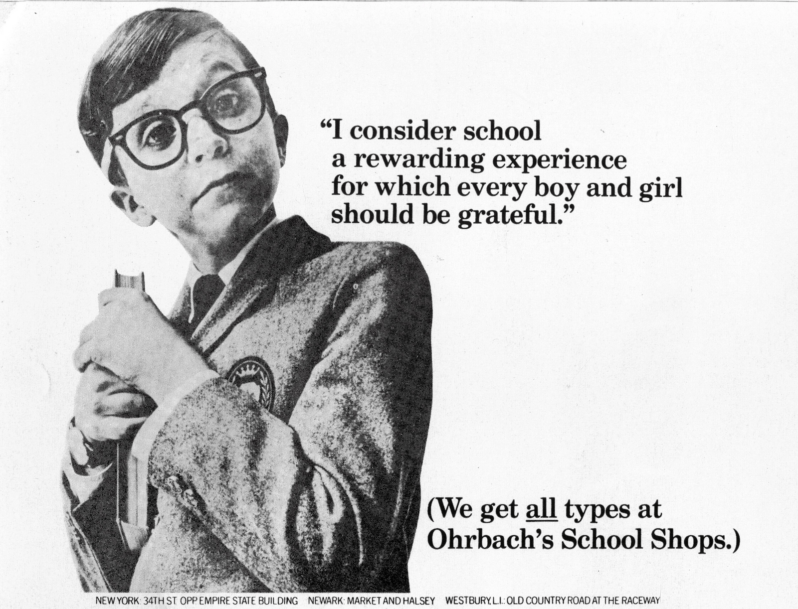
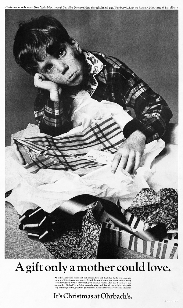
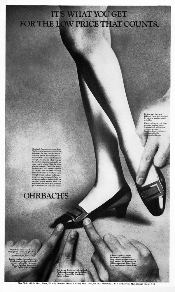
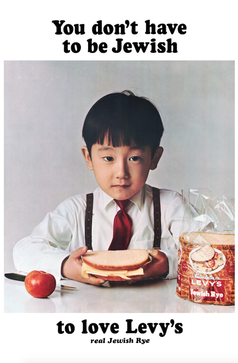
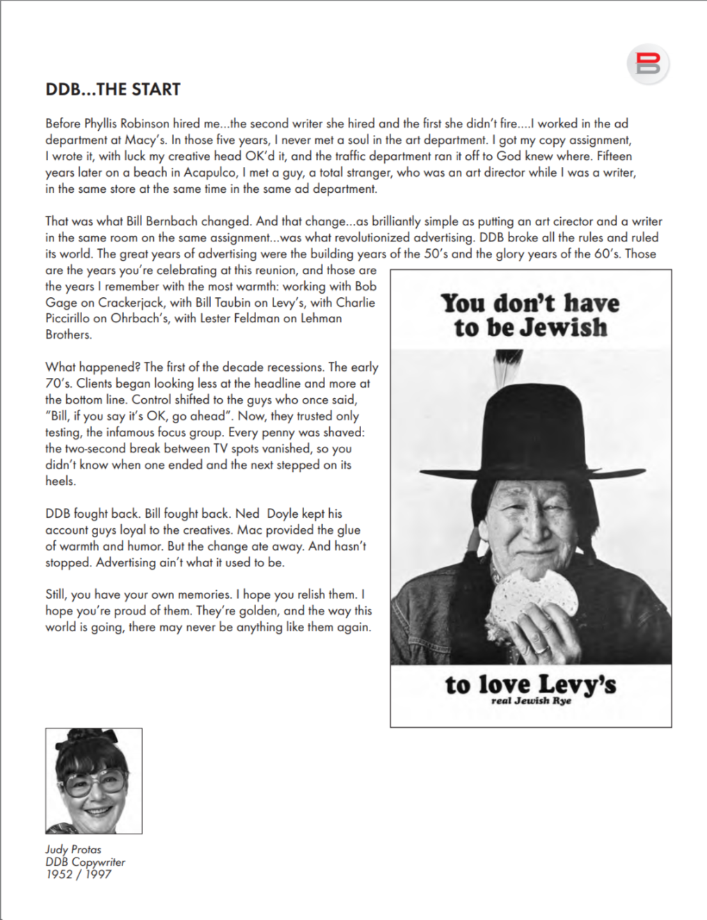
Unusual names are more likely to be remembered.So I knew that the writer of the Levy's campaign was called Judy Protas.I didn't know she'd written one of my favourite ads - Ohrbach's 'Back to school'.I knew the Crackerjack ads but didn't know she'd written them.I didn't know she'd written the Ohrbach's cat ad (probably the most famous DDB before VW came along).I'd seen the funny Crackerjack commercials on a 100 Greatest ads reel back in the day, I didn't know she'd written them.I also didn't know she was the first writer Phyliss Robinson hired, making her the agency's second copywriter.And who new she worked there for 45 years? Starting in '52, leaving '97.
JUDY PROTAS INTERVIEW WITH JAPAN'S IDEA MAGAZINE, 1969.

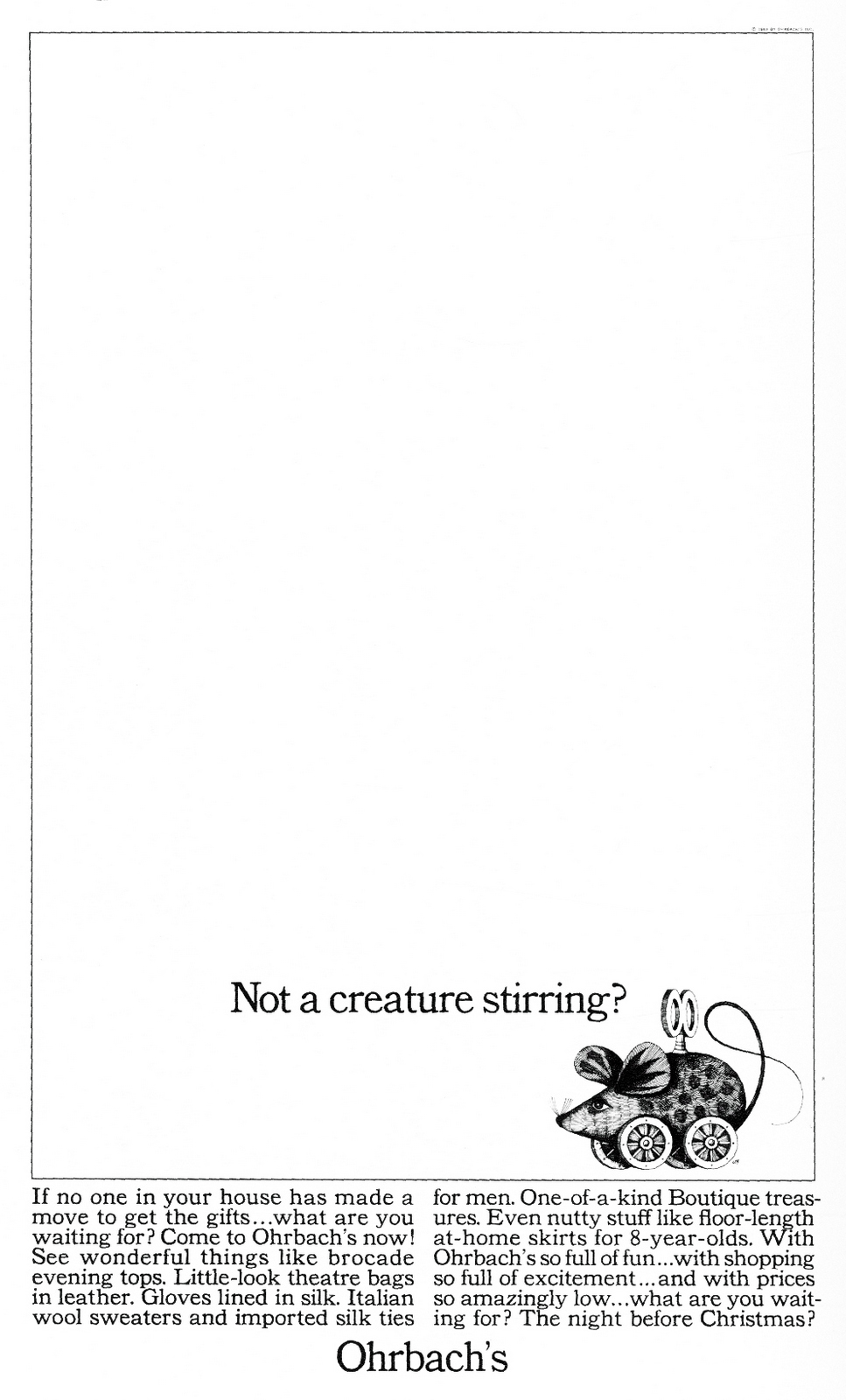


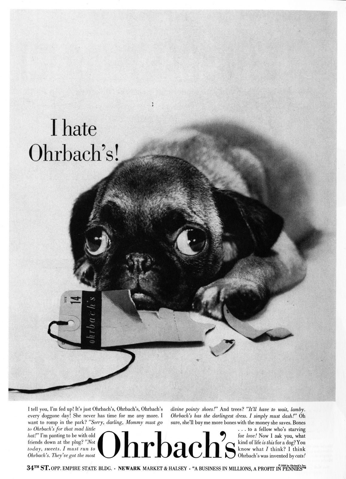
You’re famous for being the copywriter for Ohrbach's.Do you still write for Ohrbach's?I took myself off the Ohrbach's account in December 1968.How long had you been writing for Ohrbach's?Since...let's see, 1951? That's longer than I've let myself remember! For a good many years Bill Bernbach and Bob Gage did all the concepts.
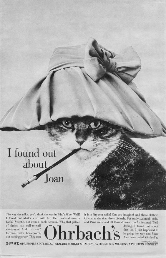
As a matter of fact, the Cat ad, which is very famous as you know, was their concept; my contribution was the body copy:“The way she talks, you'd think she was in Who's Who. Well! I found out what's what with her. Her husband own a bank? Sweetie? Not even a bank account. Why that place of theirs that has wall-to-wall mortgages! And that car? Darling, that's horsepower, not earning power. They won it in a fifty-cent raffle! Can you imagine? And those clothes! Of course she does dress divinely – a mink stole, all those dresses, and a Paris suite – on his income? Well darling, I found out about that too. I just happened to be going her way and I saw Joan come out of Ohrbach's!”
Gradually as the account grew and as Bill Bernbach's time became more crowded, he gave me more and more responsibility and I began to do the ads from scratch.
Did you feel stagnant on the account? Was that the problem?It wasn't so much a matter of getting tired of Ohrbach's. It became an increasingly complex job, a really enormous account. The store began pushing a great many departments for which it never had done ads before. It became more than one person could handle.Now; I had a choice of directions; I could either set up a group, ask for more copywriters, give some of the smaller jobs to them and keep the good things, the delightful things, the subway posters and institutional ads for myself, which would have been unfair to the juniors.Or I could do what it was time for me to do in the long run anyway, which was to ask to be relieved of the account.It wasn't the easiest decision. I was associated with Ohrbach's, my name meant something, but it was time for a fresh team.The institutional stuff that's coming out today is very exciting and has, in fact, been mopping up prizes.The store I'm sure is enormously pleased and I know the agency is too.
When you first joined DDB, what was the size of the agency?How many copywriters were there?I first joined DDB in year one, literally. DDB was a year old. I came in 1950 and there was only one copywriter before me. My bones creak when I think of it.


At that time, who directly taught you to write?I was the first copywriter Phyllis Robinson hired. She was my Copy Chief.What was her teaching method?She was absolutely marvellous. She tried to bring me out, to remind me that copy is not a question of writing cute stuff but of selling hard and being fresh while you sell, she kept me to the point, refused to let me go off into detours; she taught by correcting goofs rather than by setting rigid principles.She was an excellent teacher, and I'm delighted to see her around as often as I do, now that we're as big as we are.While you kept writing for Ohrbach's, how many different art directors did you have?Well, not too many different ones. I'd say there were probably four altogether. Charlie Piccirillo, who is back on the account now, worked with me for a while.So did Gary Geyer.
When you have a new art director to work with, do you somewhat change your way of doing things to suit him?I work with an art director as a friend. And as a laughing companion in fact. I've found it's important to laugh as much as you worry in doing ads.Charlie and I had a marvellous time together. Gary and I had perhaps less laughter and more work as the account grew more complex, but we still had a lot of fun.I've never had a problem with this change of art directors.A lot of the credit I give to them, of course; but in general, if you're mature enough, and if you understand people enough, you can adapt.It really doesn't matter what the personalities are as long as there is some kind of mental rapport.There's a kind of happy challenge, in fact, in adjusting to a new combination of talent and temperament.
Please describe in detail how you proceed in your teamwork with the art director?The teamwork with the art director, I think, is paramount. That's probably true for most of the people around here.The first thing you and the art director do when you get a requisition is to look at each other and say "My God, we'll never get it."After that you sit and you come up with some ideas that you think are perhaps OK. You look at them the next morning and you think "How could I have liked that? It's awful!".And you keep going until something happens.There really isn't much difference, I shouldn't think, in the way most of us work. What the best teams have is the good sense to do what has to be done first: get the story.Digging for background. And I'll never do that alone.A friend of mine at another agency recently said "I took my art director to a client meeting today." It was obvious he had condescended to do something different.I will never, as a copywriter, go off to the client to get the story and bring it back and feed it to the art director. The art director is 50% of the muscle; a good art director is as apt to come up with a smash headline as a good writer is to come up with a visual.As a team we go off together to dig out the facts.And we want everything.You've got to get a headful of information: the background, the client's thinking, the feeling he has for his product, every last little thing he can tell you.A client will sometimes answer a question with "You don't have to know that. You're not going to put it in the ad." Not true. We have to know everything, whether it goes in the ad or not. It's all part of the texture of the problem we're working on.Anything and everything may feed into the final idea.As a matter of fact, the client may trigger an ad without even realizing it.Clients, I've found, must be encouraged not to censor the material they give us.Most of the time, of course, they understand this; in fact, you sometimes have a problem turning the faucet off once you've turned it on.
In case the opinions of you two split, how would you solve the problem?One of us waits out the other. If there's a real split in opinion, we let it sit for a couple of days. Either the art director will begin to understand what I see in it or I'll begin to understand what he doesn't.Occasionally when you come up against an inseparable, difference and you really are at a stand-off, you ask somebody else's opinion, but there I think you have to be careful whom you ask. I'm not about to take a census of the secretaries, but a Bob Levenson or a Leon Meadow would be another matter.But I've never reached a breaking point with an art director.I just find that the challenge of the job and the problem you have to solve in the ad are a lot more important than the challenge of the personality. There really wasn't a personality problem, never while I was on Ohrbach's.What is the reason you've stayed so long at DDB?Well, obviously it's because I like working here; I've been very happy. You've heard it from other copywriters: the freedom to think, to be fresh, to be original, to be yourself as long as you never forget that the main purpose of an ad is to sell.Second of all, over and over again as writers have left and gone off to other agencies, you hear sad stories of the difference in working conditions.During your long association with DDB, you must have seen a lot of copywriters come and go. Among those writers, is there anyone that left you with a strong impression?One of the writers whom I remember best and have the greatest respect for is Ron Rosenfeld. I miss him as a friend, follow him as a writer, I'm proud and fond of him. Bob Levenson and Leon Meadow fill out my favourite triumvirate.
Tell us about your background up to the time you joined DDB.I remember one Christmas I had finished Graduate School; I had a Master's Degree in English and I thought I would like to write.I came back to New York and went around to magazines with my Master's Degree in my hand and found that with luck I could get a job at $25 a week doing research on a magazine. It was during the holidays, and being female, I decided to do what females do when they feel blue. I'd buy something to cheer myself up.I happened to be near Macy's, I went in, and bumped into a booth they'd set up to recruit temporary help for Christmas.Well, I wouldn't mind working for Macy's just for Christmas, but could I do something where I could write?They sent me up to the advertising department and I was hired to file proofs.From time to time I wrote little bits on housewares and turned them in and they decided to give me a chance as a copywriter. And that's where I learned about research.It was close to Passover, a Jewish holiday, and the Jews, of course, do not eat bacon or ham---not where the Lord can see them, at any rate. Well, we were going to advertise a carving knife on a page which sold Passover items, and I did my research and figured out how you sell a carving knife and got all enthusiastic over the things you could carve with this wonderful knife for Passover and in the middle of the list was the word "ham". And the next thing I knew, the Copy Chief was roaring "Protas, come in here!".It was an early lesson in over-enthusiasm and sloppy thinking.Anyway, after five years at Macy's, in which I specialized in furniture and some fashion, I decided it was time to move on.I remember when I first got to Doyle Dane Bernbach, we were on the top floor of a building on Madison Avenue, squeezed, as a matter of fact, into the penthouse, and Ned Doyle looked at me and said "Kid, can you work hanging from the chandeliers?"
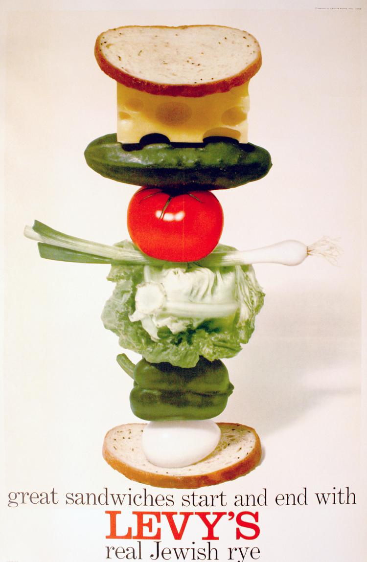
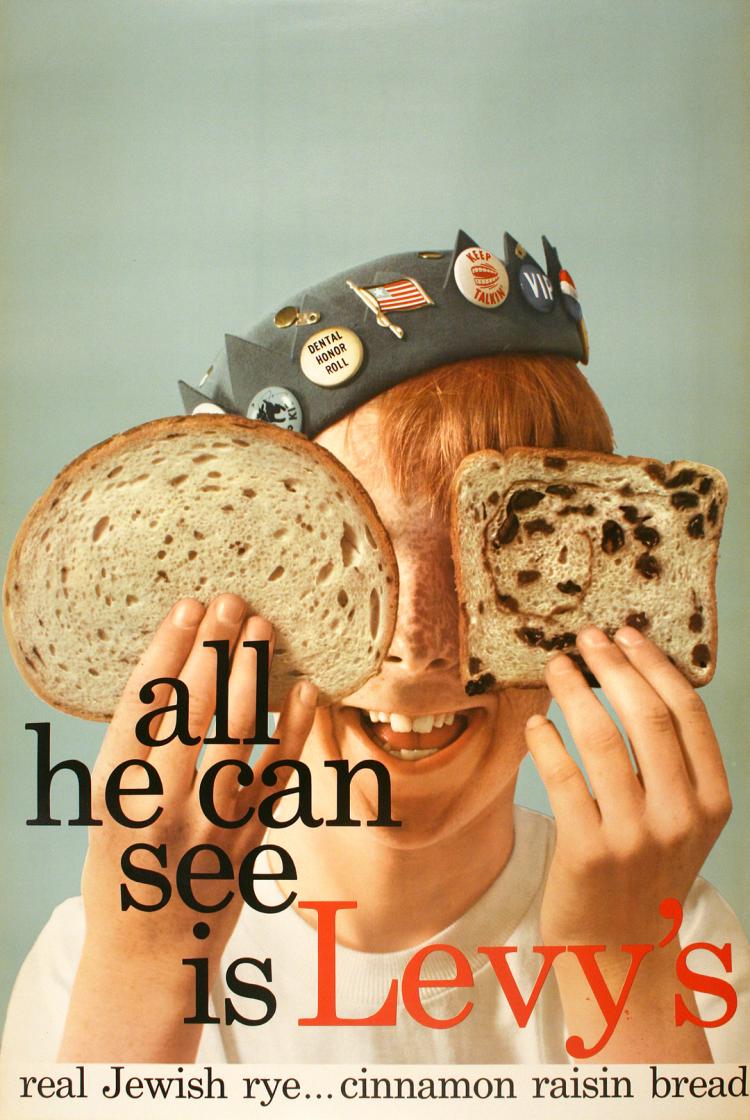
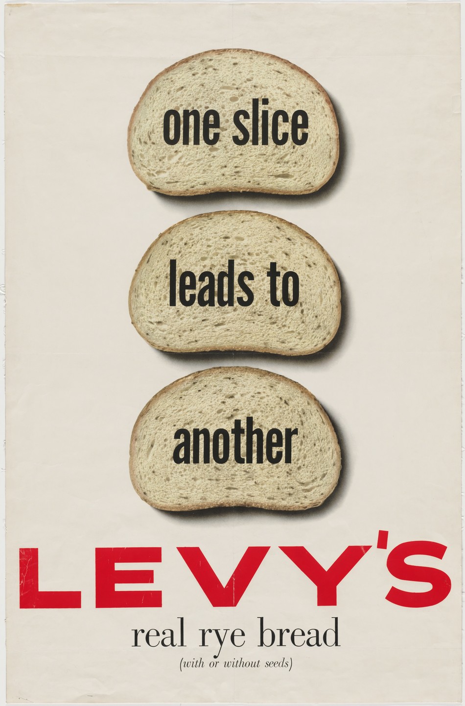
Out of the work you've done so far, name two ads you like best and tell us why you like them. Any episodes concerning the creative work of the two ads?Now that I'm off Ohrbach's, I look back over the years with a new perspective and I realize there are other things I'm happy with.One is the campaign for Levy's real Jewish rye bread, which I did with art director Bill Taubin. "You don't have to be Jewish" took a regional product, a bread known only within a few hundred miles, and made it an international by-word.One of the things I'm proud of is the fact that when we first did it, the overt approach to an ethnic or religious group was quite a shock. That it is accepted nowadays, I think is in large part because of this campaign.


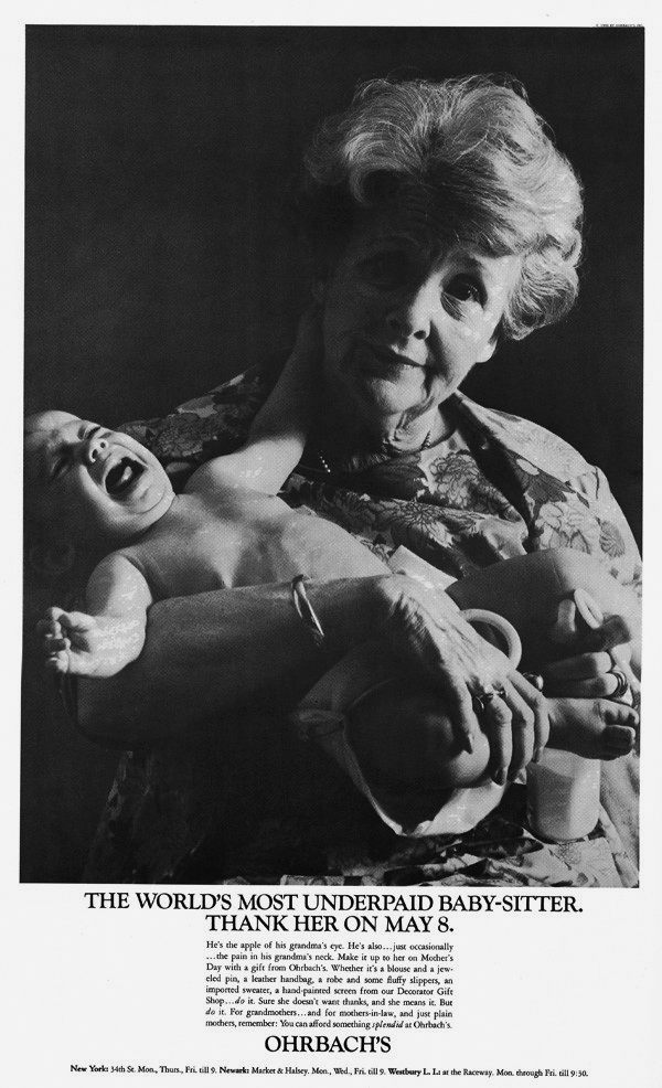
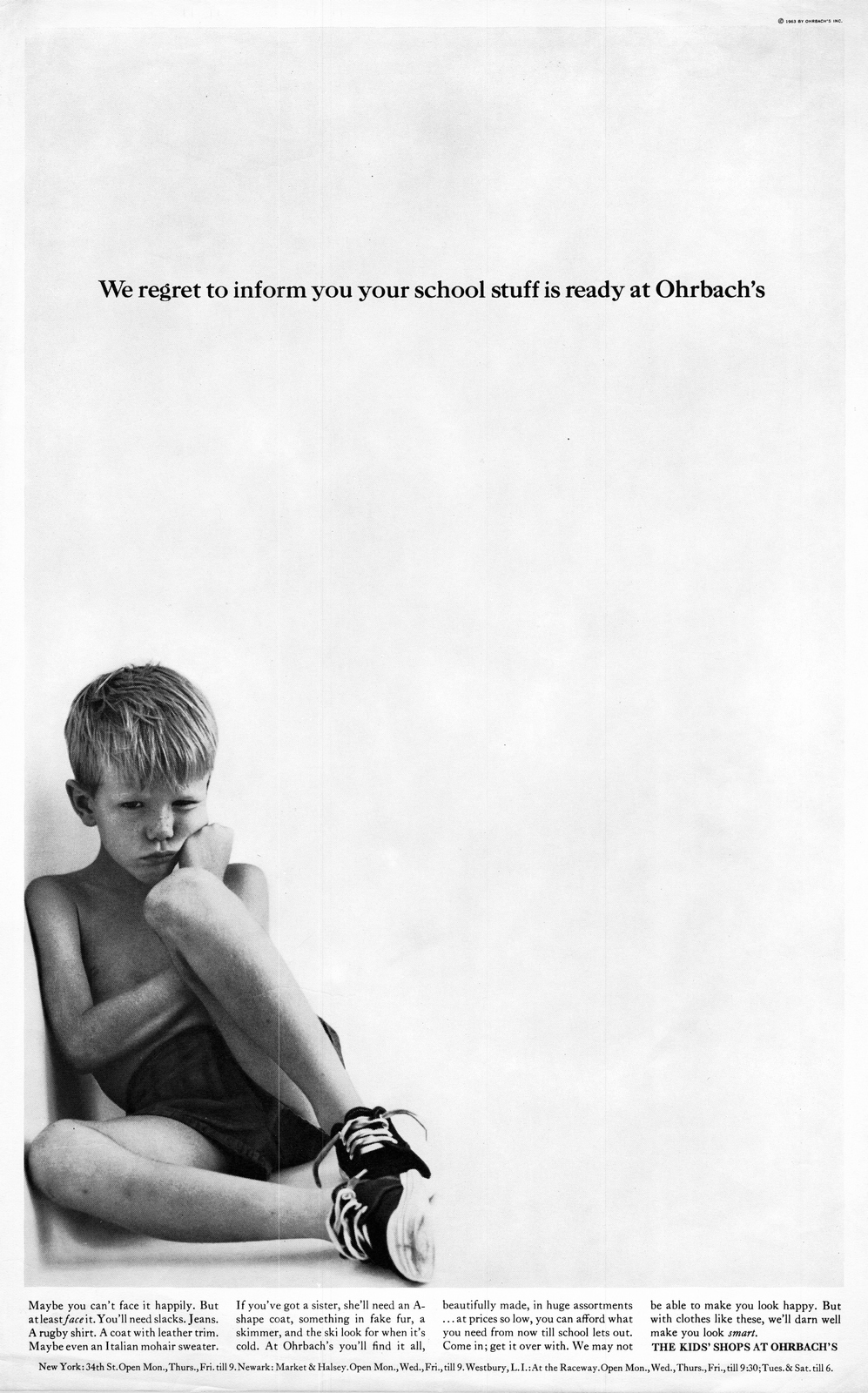
No matter where I go, if I'm asked "What do you do?" and I say "I've worked on Ohrbach's and I work on Levy's", the reaction is a delight to my ego.These days as I look back at Ohrbach's, my favourite ad is the one with the little boy sitting in the corner, very grumpy; the headline reads, "We regret to inform you your school stuff is ready at Ohrbach's". I love that one.
And I love the Crackerjack commercials, on which I worked with Bob Gage.You worked on Crackerjack TV commercials, did you say?Yes. For the first five years the agency had the account, I was the copywriter with Bob Gage.The first thing that we decided to do was to write a jingle, and it caught on. I haven't seen the jingle spots for a while, but I can tell you my very small friends still come up to me and say "You're the Crackerjack lady!"Did Mr Bernbach give you any advice that particularly impressed you? And how do you apply his advice to your work?Advice from Bill Bernbach? Well, the one bit I remember most was his advice on believability. Find a sound selling point, do a fresh and provocative ad, but always remember one guide-line; believability.One illustration he's often used is the man upside down on the page. Do it just for the sake of catching attention and you've got nothing more than a gimmick.If, on the other hand, you're selling men's clothes with pockets from which nothing can fall out, then you're being provocative and you're selling at the same time.More Judy.
Thanks to Vikki Ross for her help with this post.

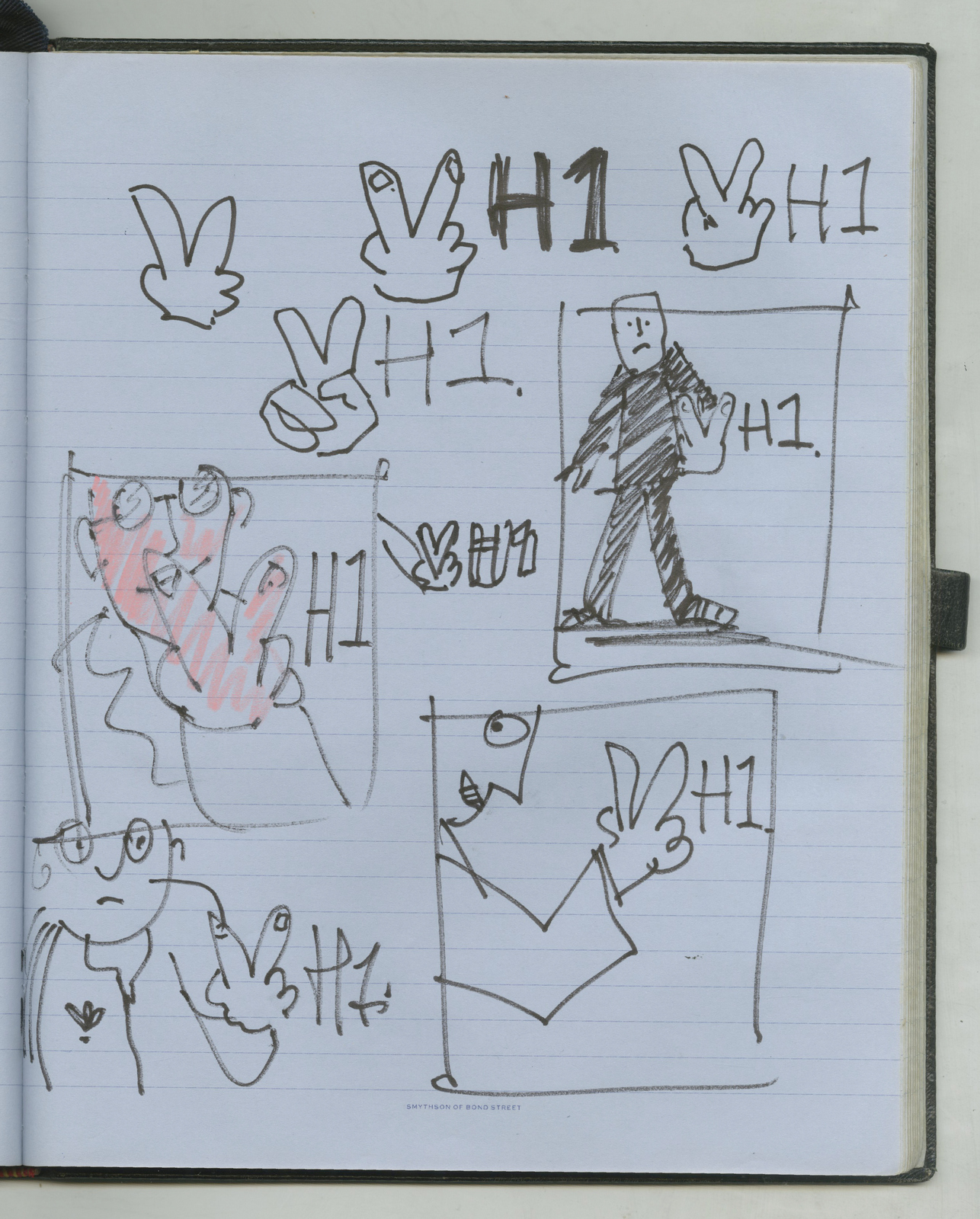
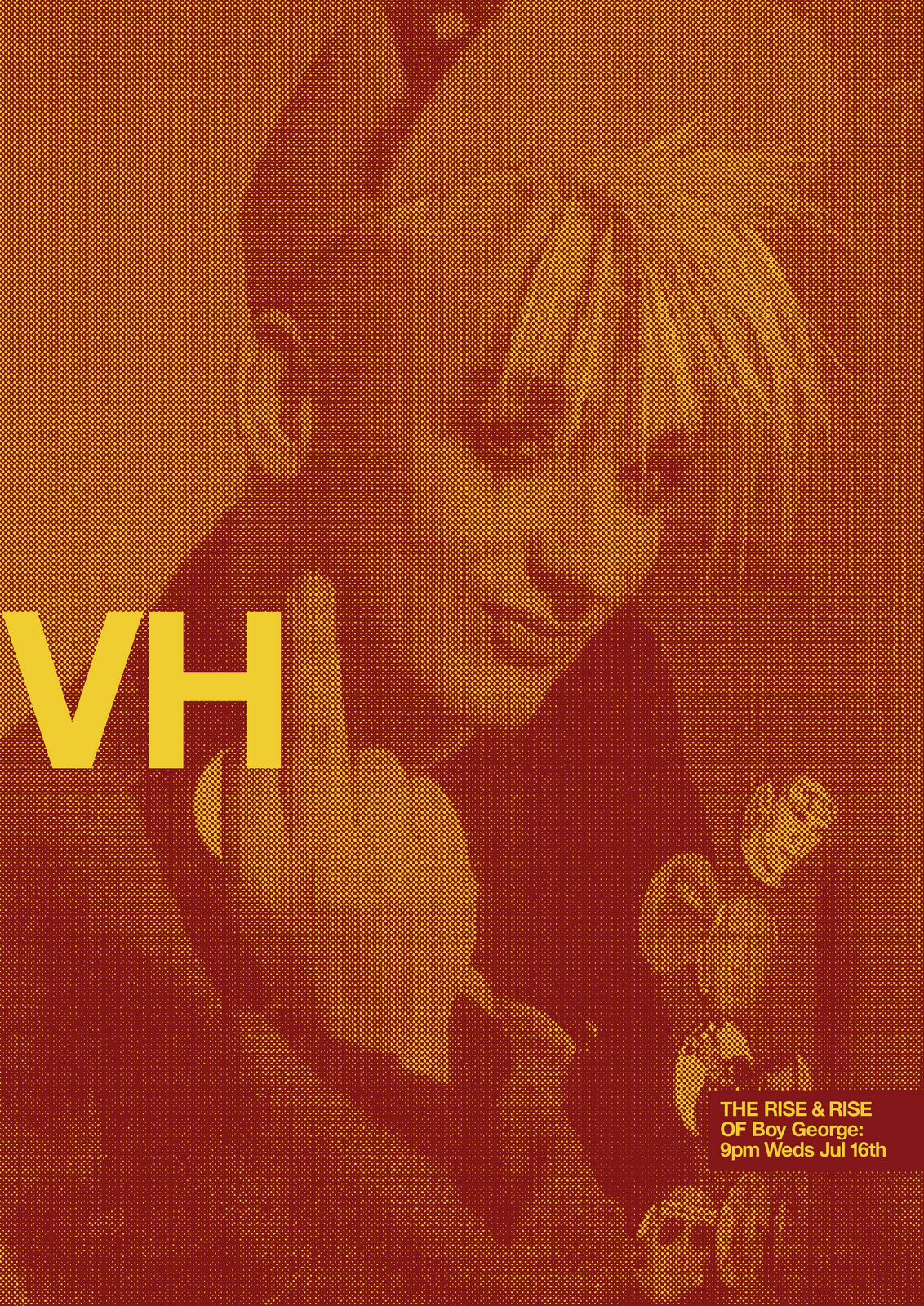
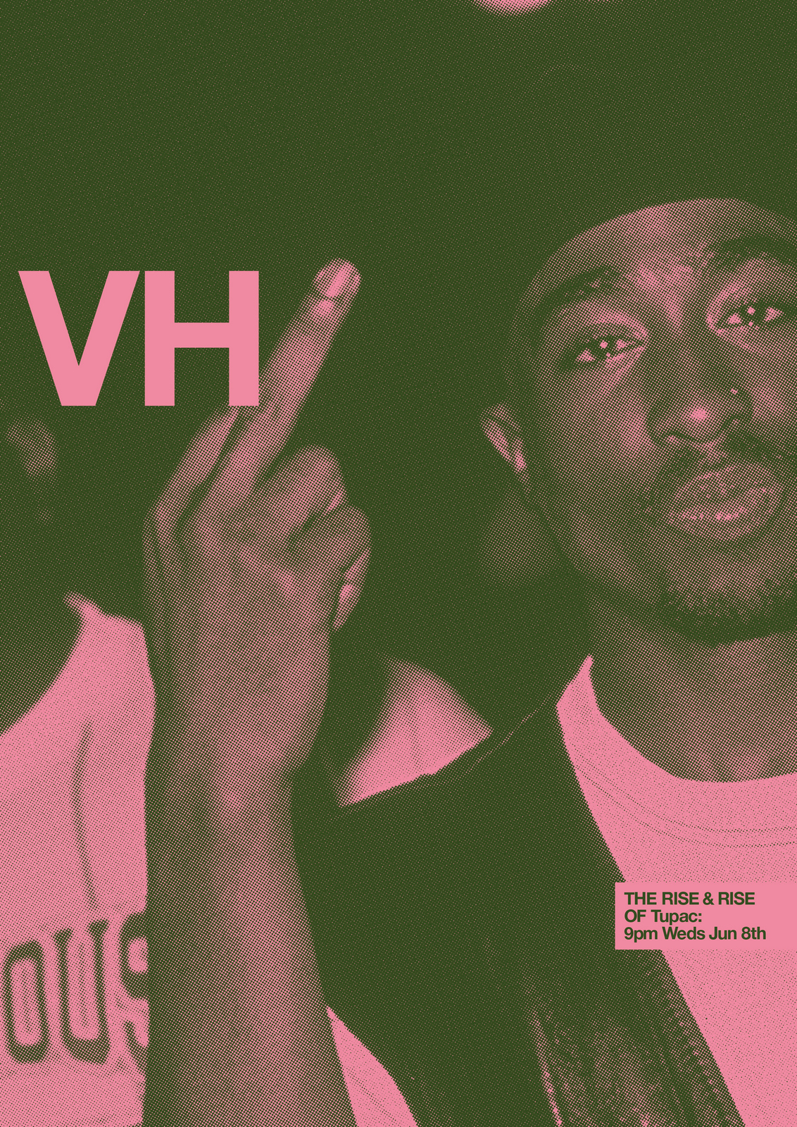
NEXT DAY: I can't help but wonder whether the idea will work - will the 'V' H1 read clearly?I've got the images, let's mock a couple up.Just to see what they look like.
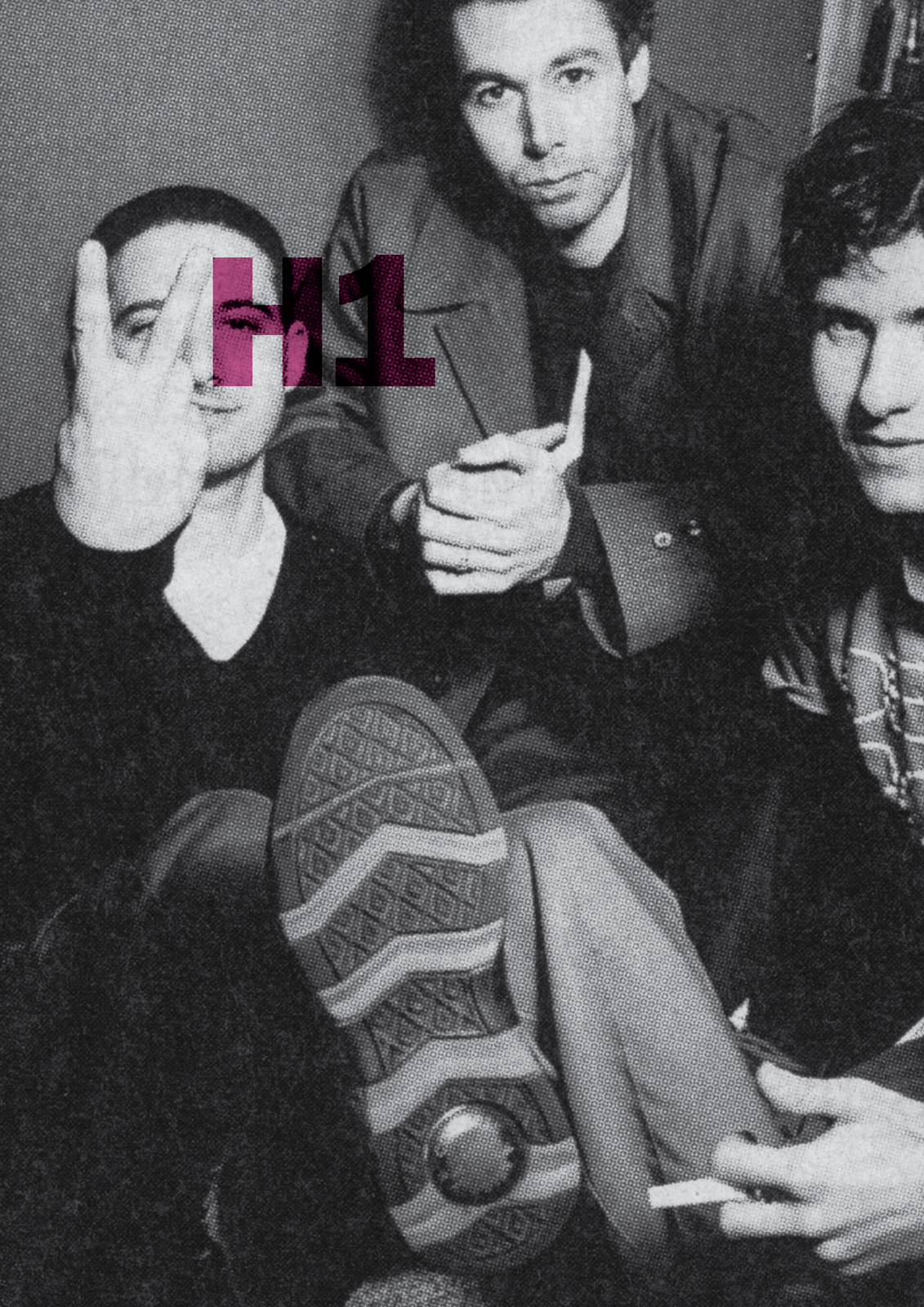
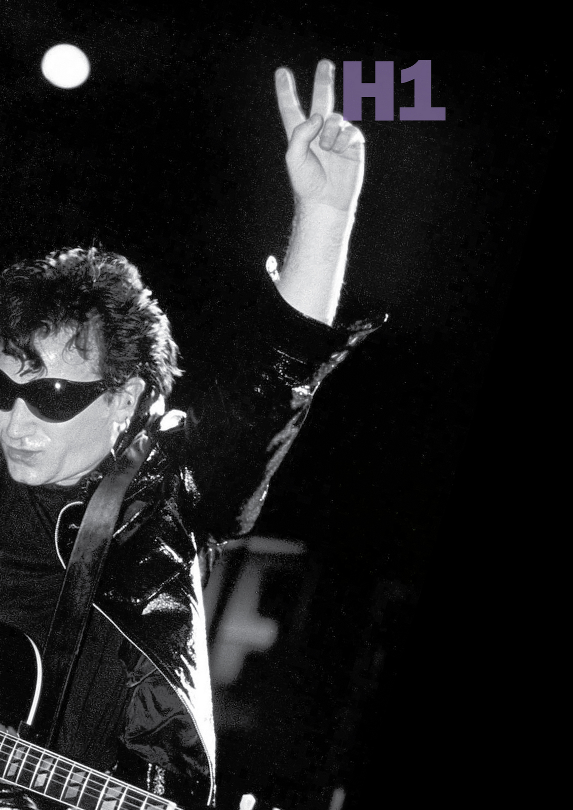
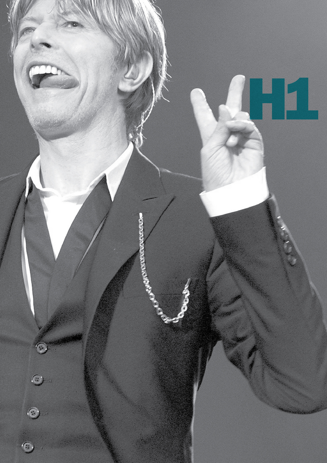
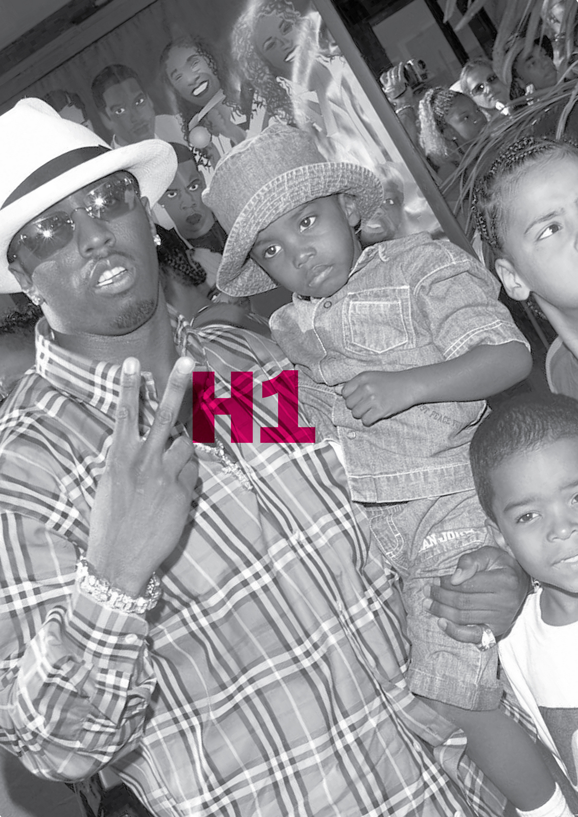
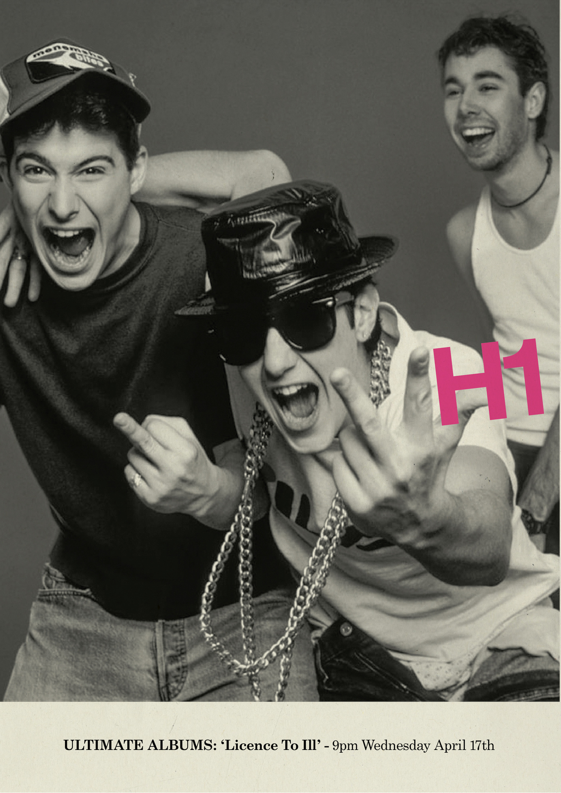
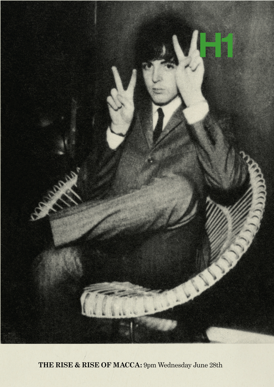
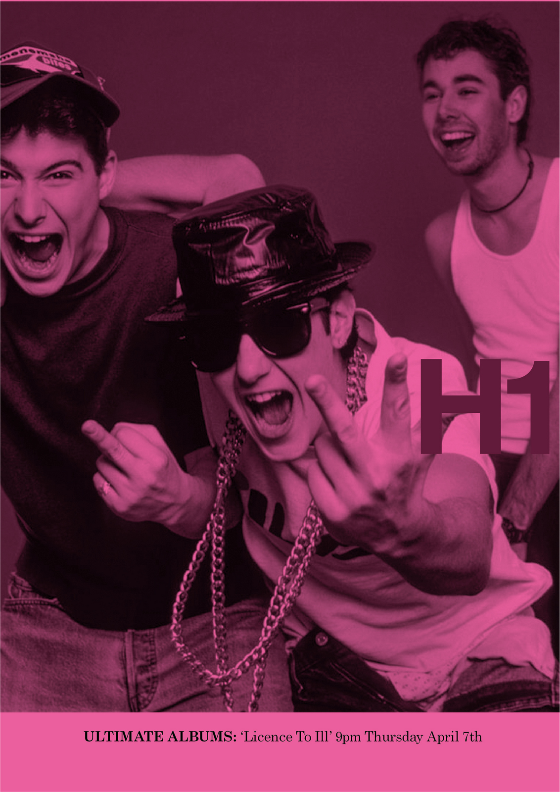
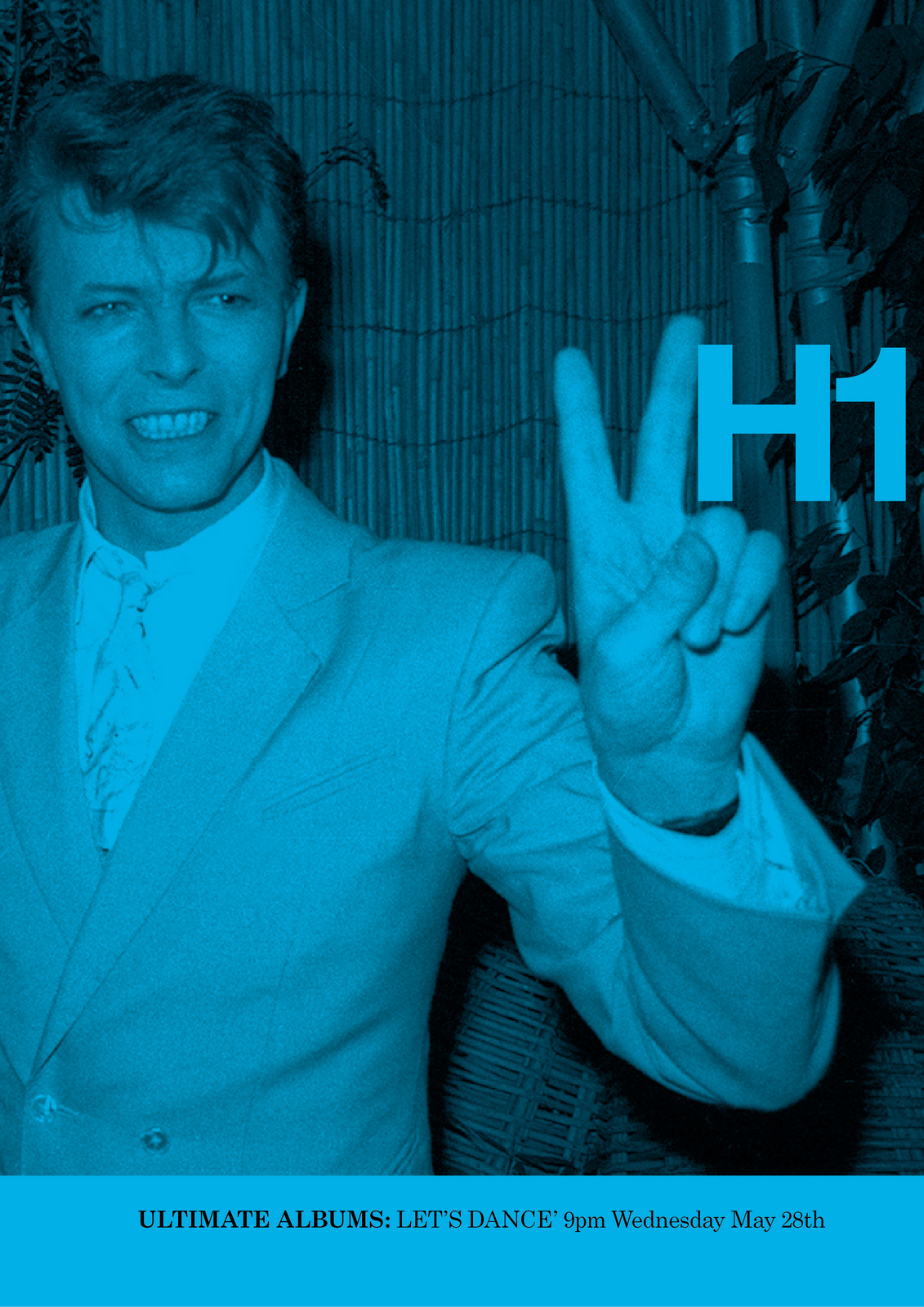
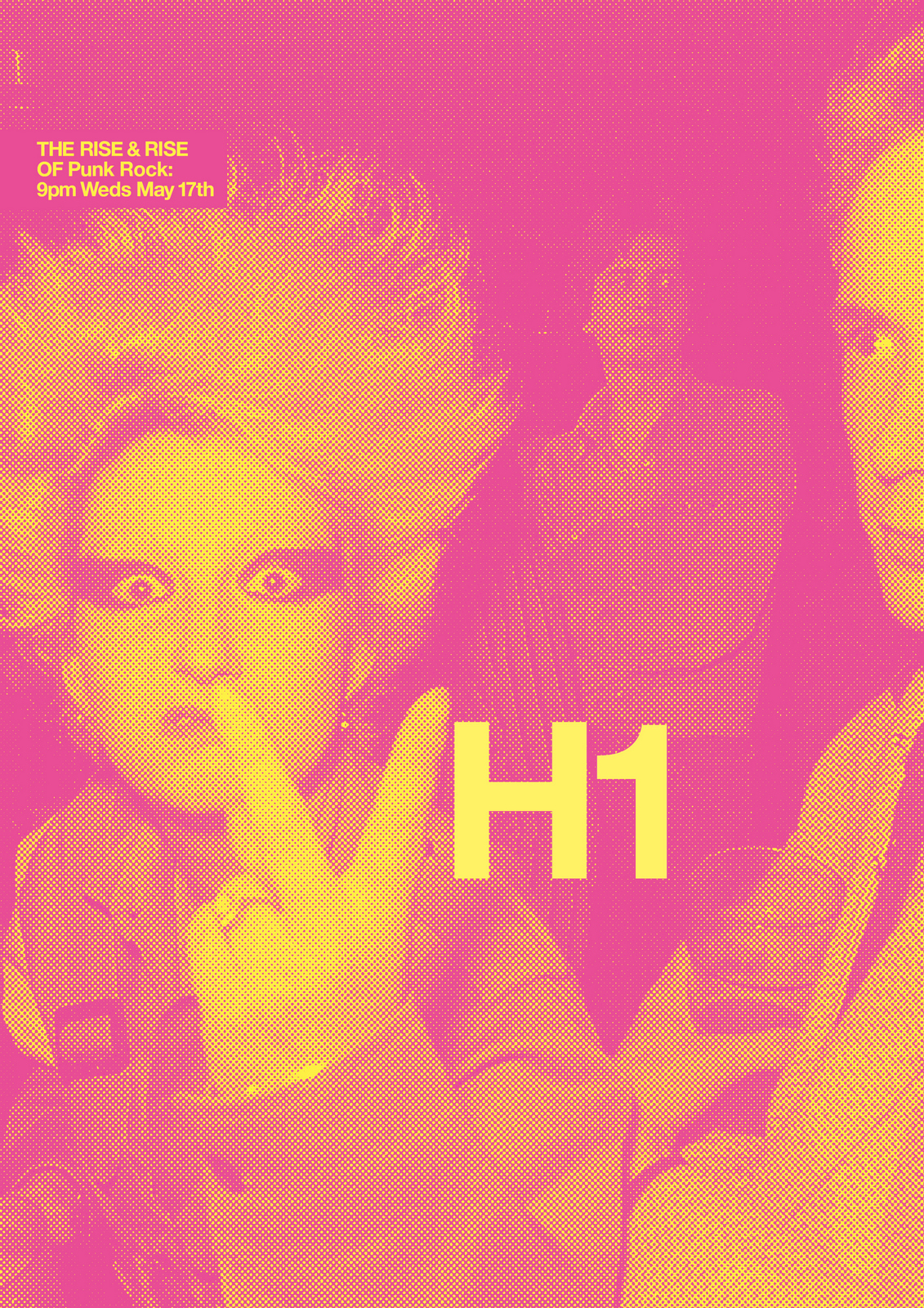
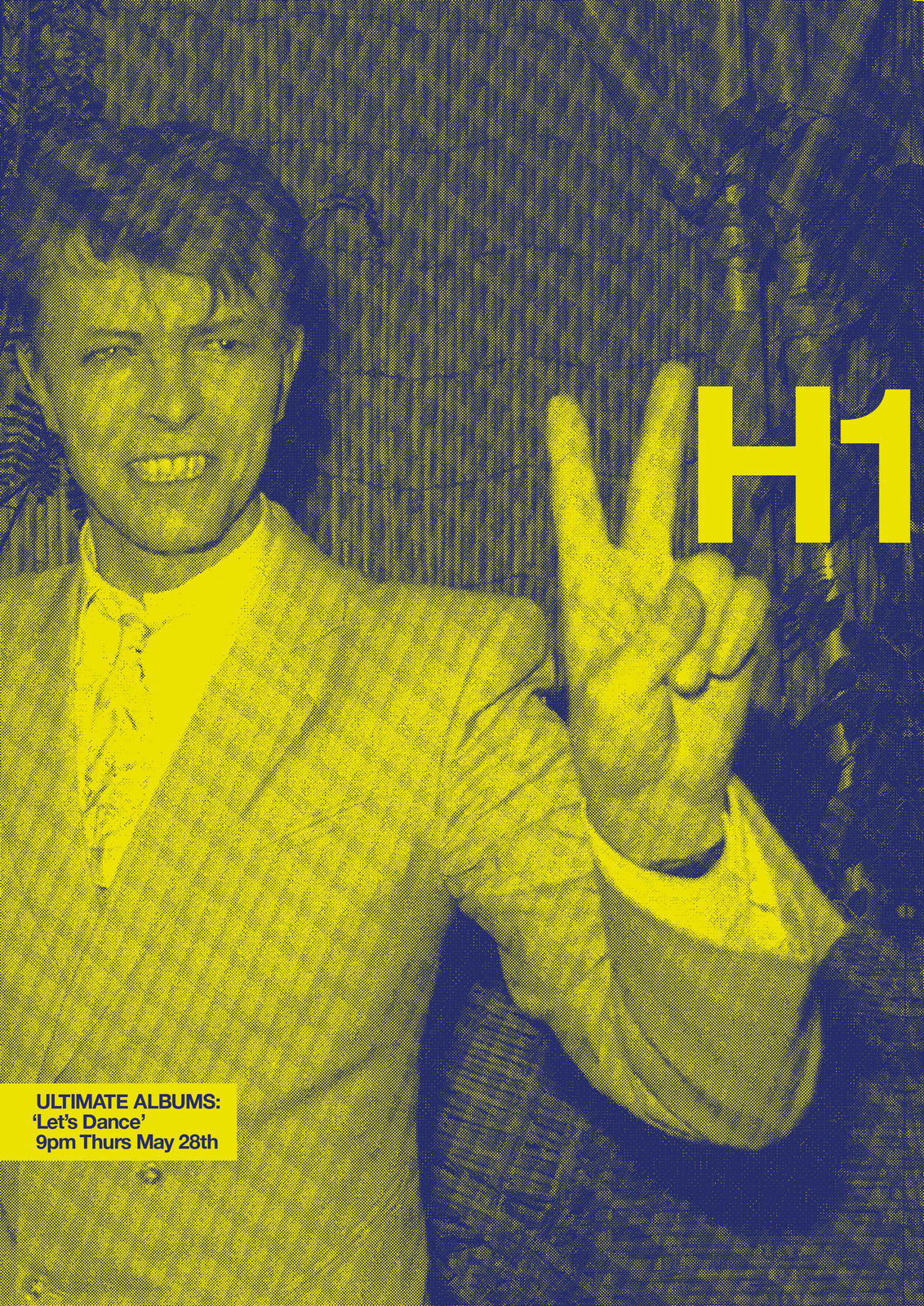
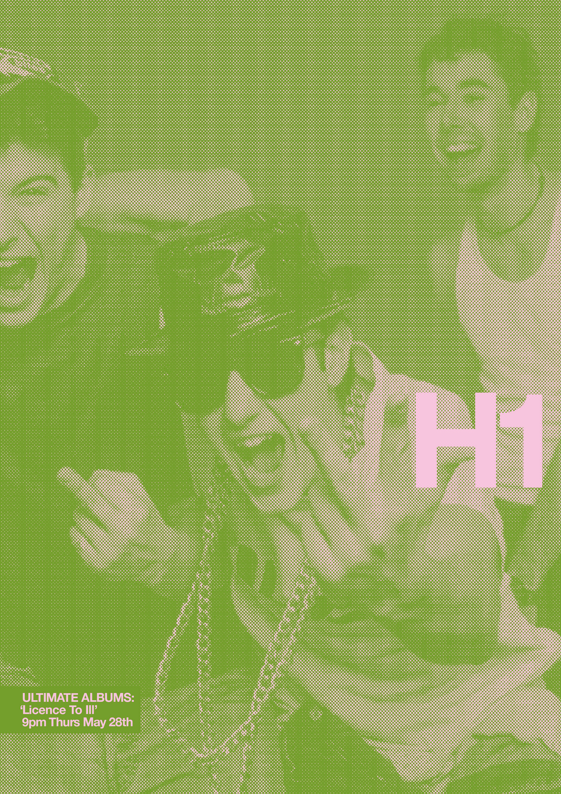
NEXT DAY: I look at my pin-board; the ads look cool, but is just two letters too random?Maybe it's too stripped back?Maybe we should tie the branding idea to specific programmes?The biggies seem to be on at 9pm Wednesdays and Thursdays; Ultimate Albums and The Rise & Rise Of.We look into which artists are coming up in future programmes, leaning towards those that would be more surprising for VH1.
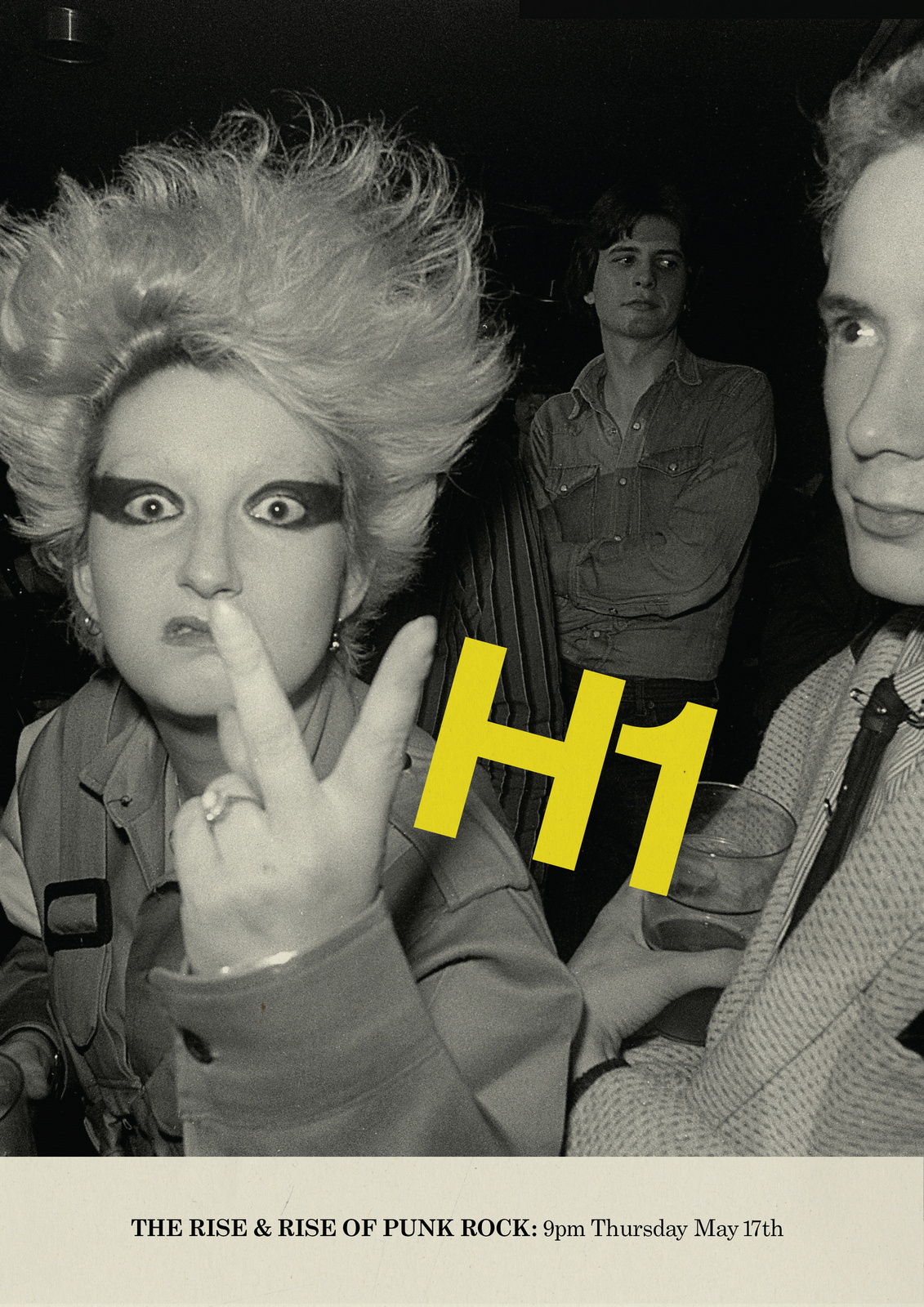
NEXT DAY: Caspar pops in ‘Ooh they look good…but I thought we weren’t showing any ads?’‘We're not, we'll just have them in our back pocket’.I like the black and white images, but it makes the programmes appear like they're about the olden days, which they are, but we don't need to rub it in.Unfortunately the images aren't available in colour, so I put colour washes over the pictures, to add a bit of energy.Also, I don't like the VH1 element changing size and angle, so decide to keep it a consistent size and straight.
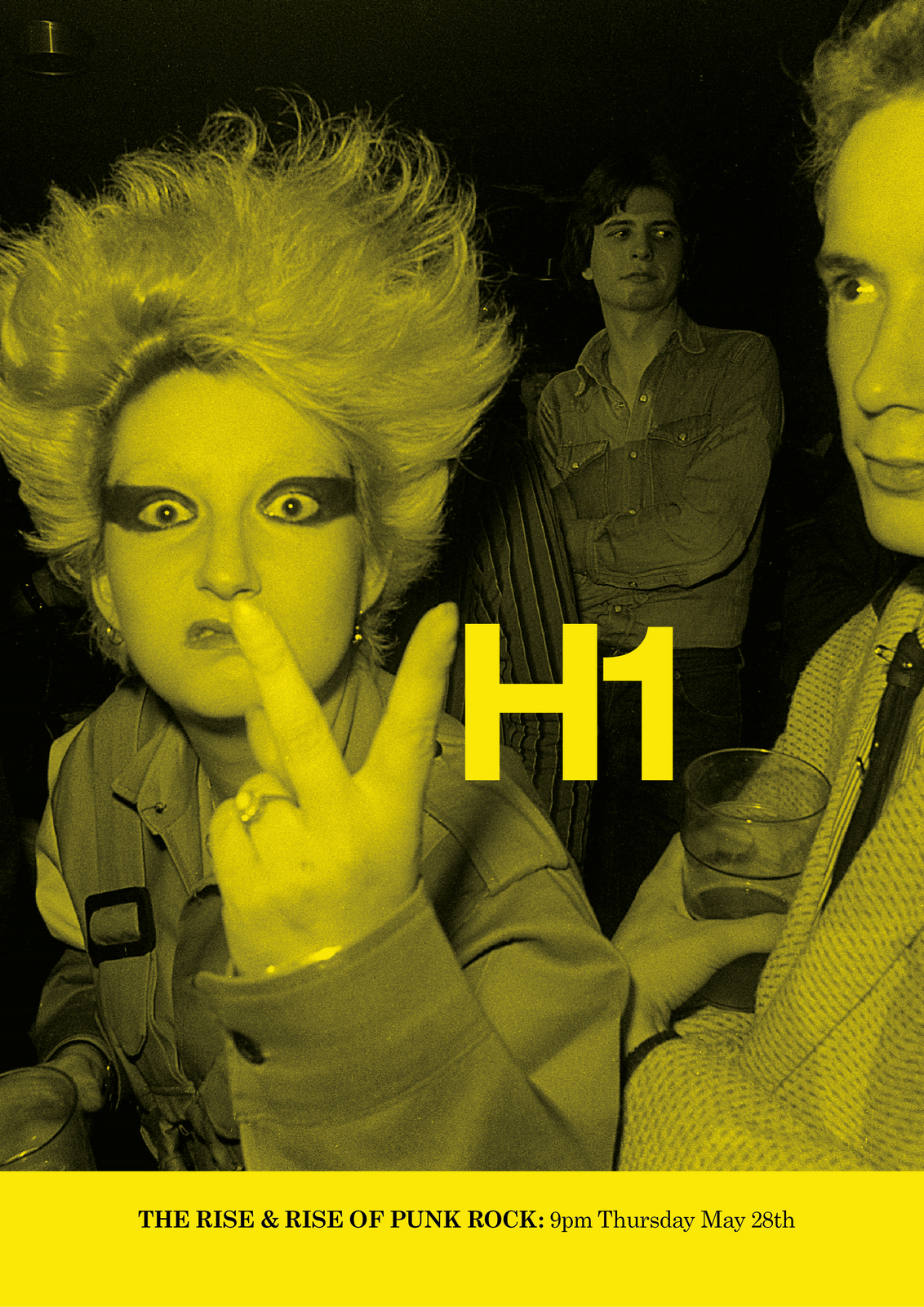
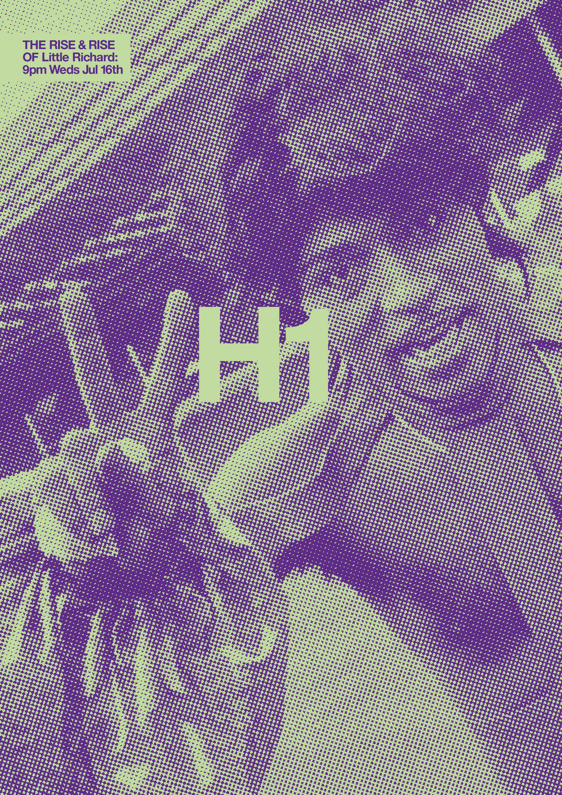
NEXT DAY: Better. But the layout looks a bit sensible, too corporate.Maybe it needs a bit more energy and attitude to make it less formal.Rips and a harsh dot screen over the images might do it?
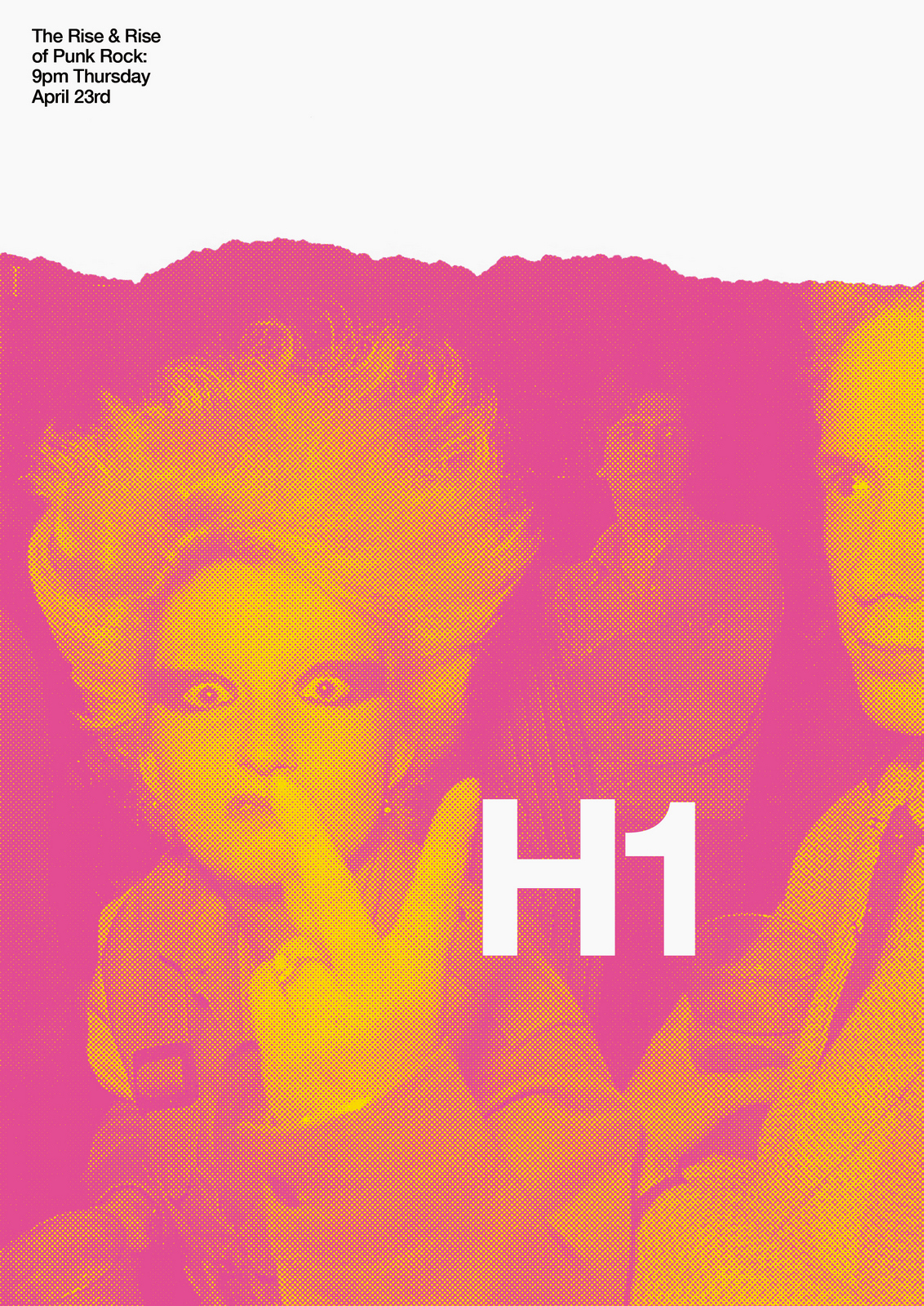
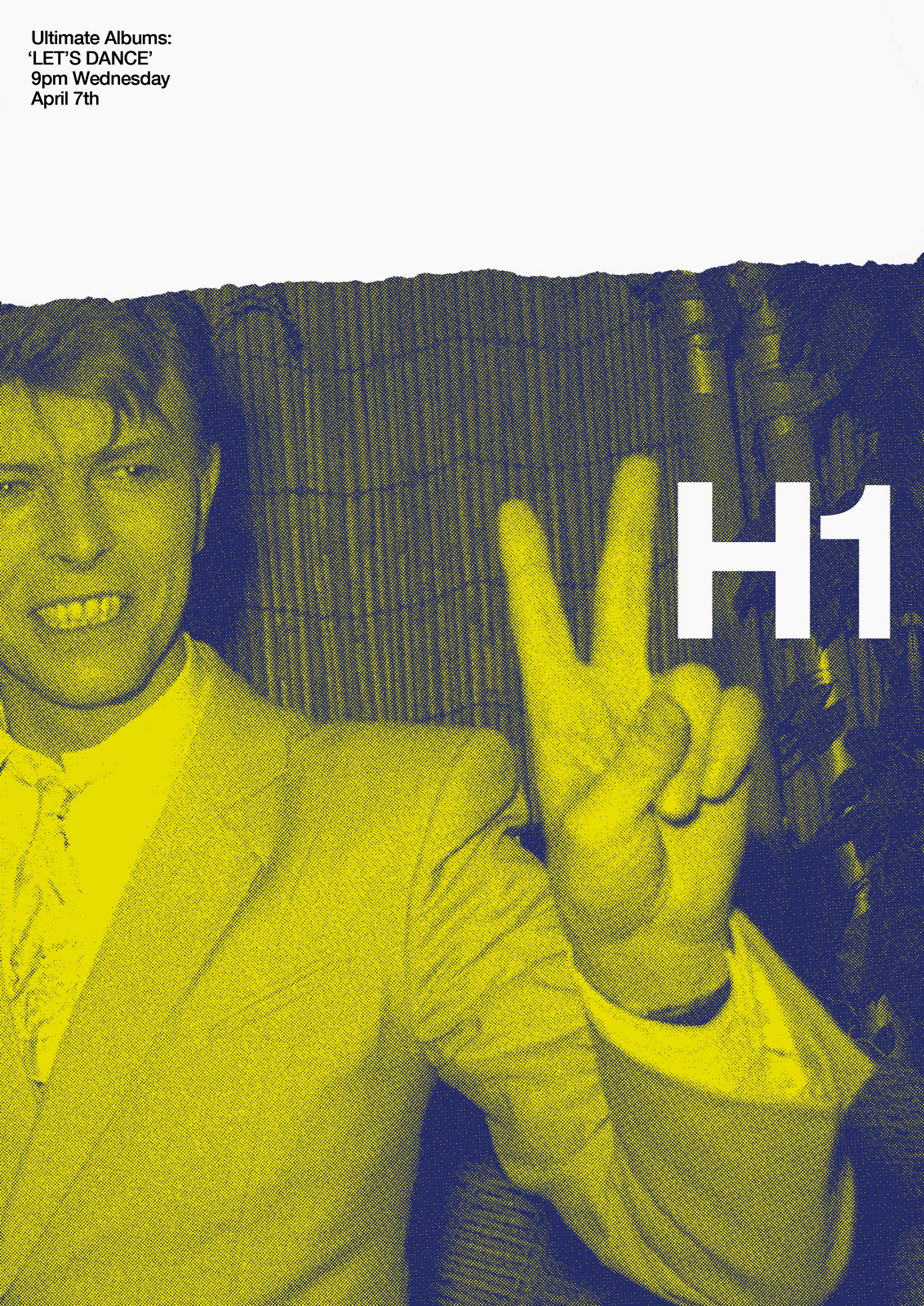
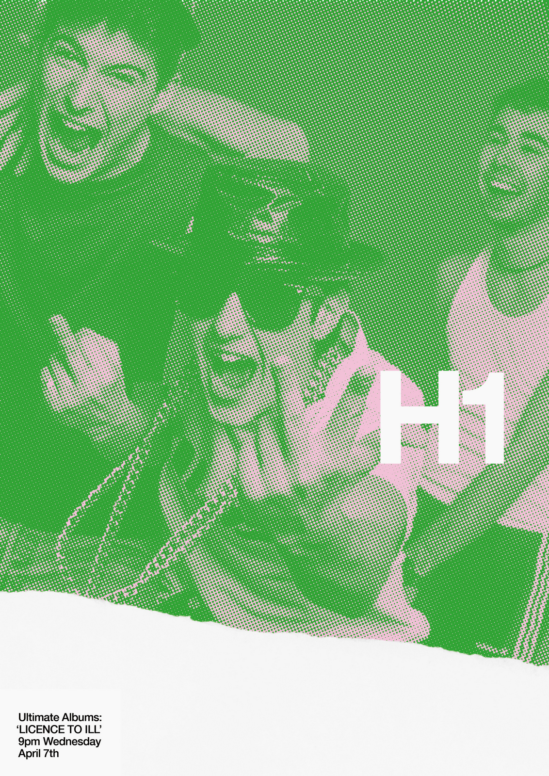
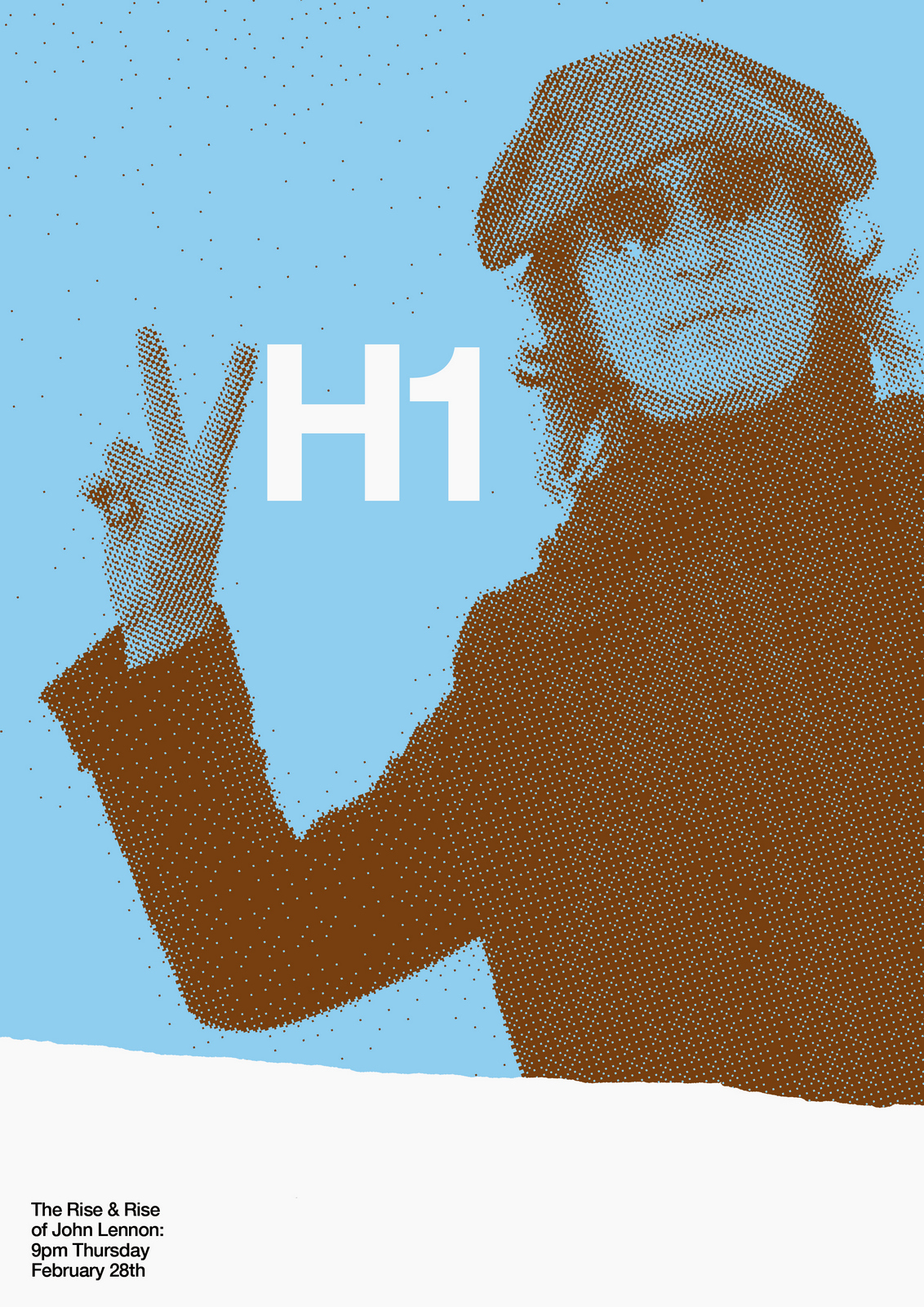
NEXT DAY: The first thing I see are rips?Rips are less interesting than rock stars, let's minimise them.Also, that white 'H1' seems too loud, it should feel like part of the image.
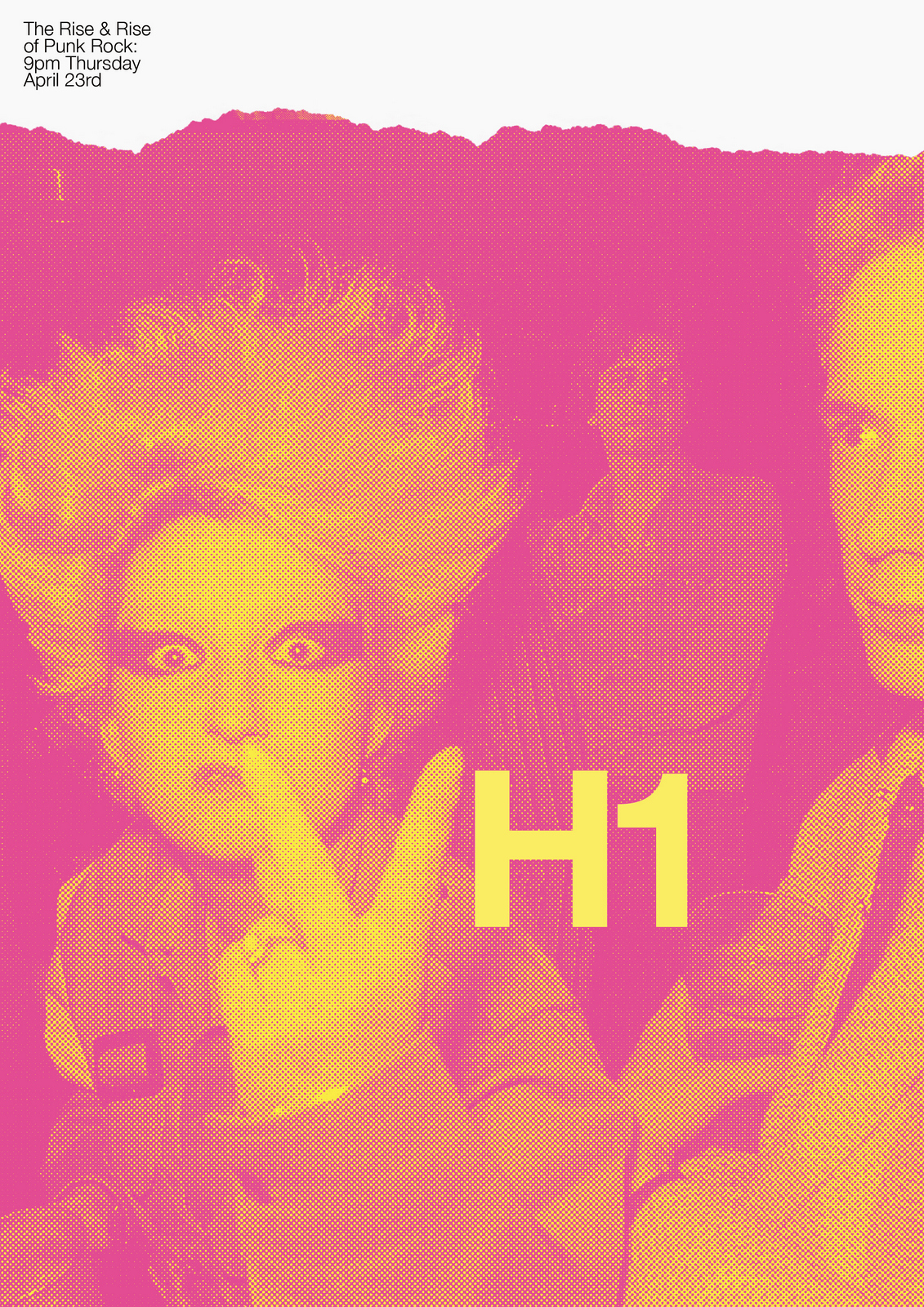
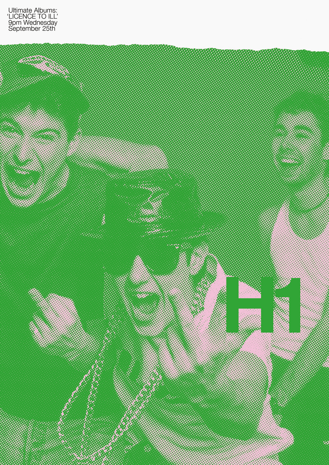
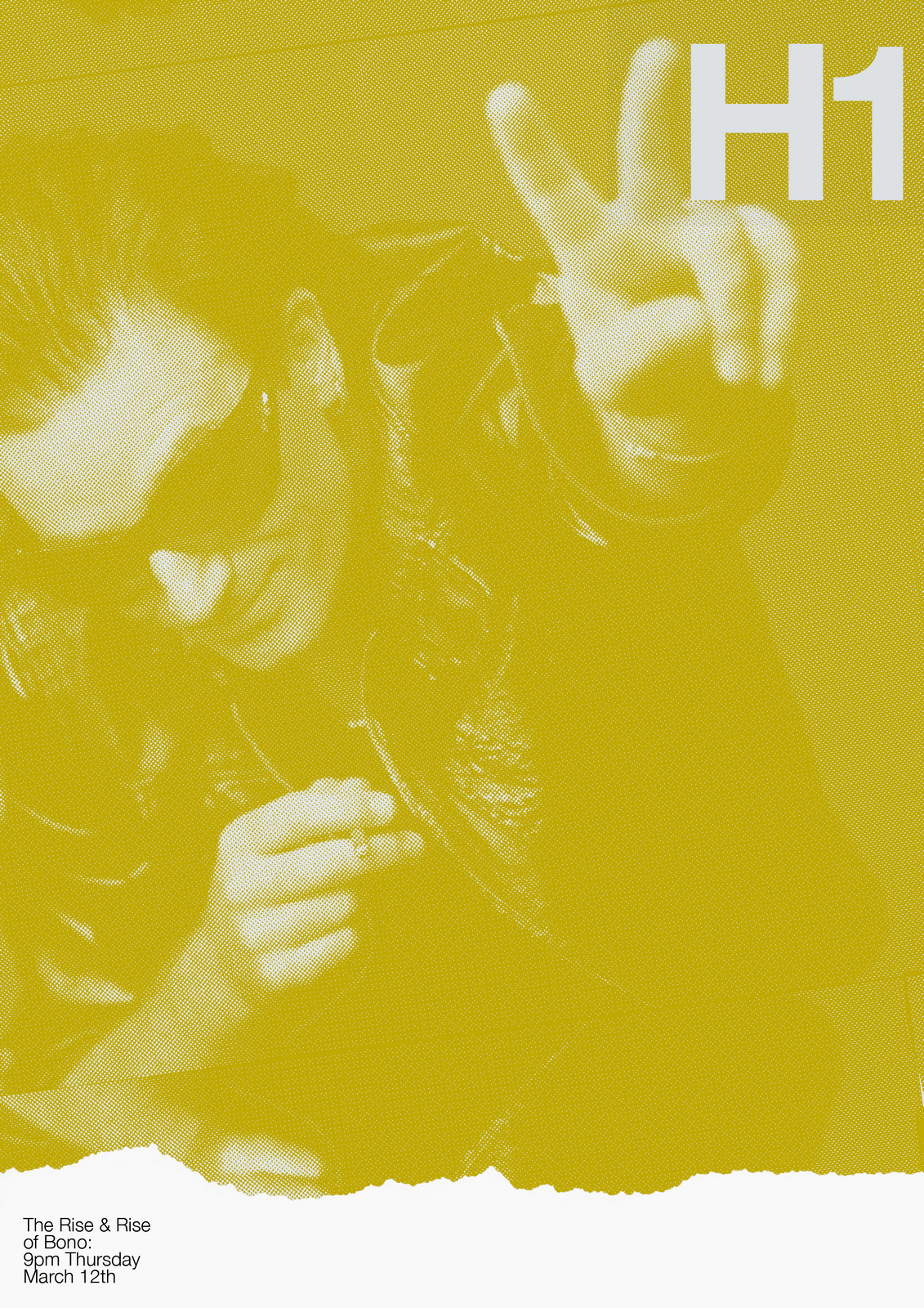
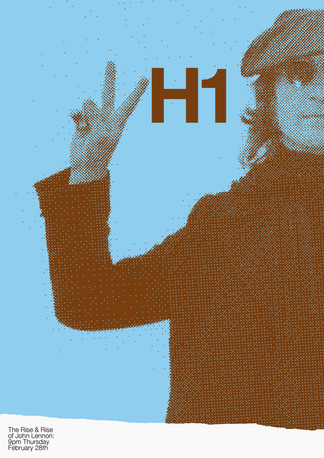
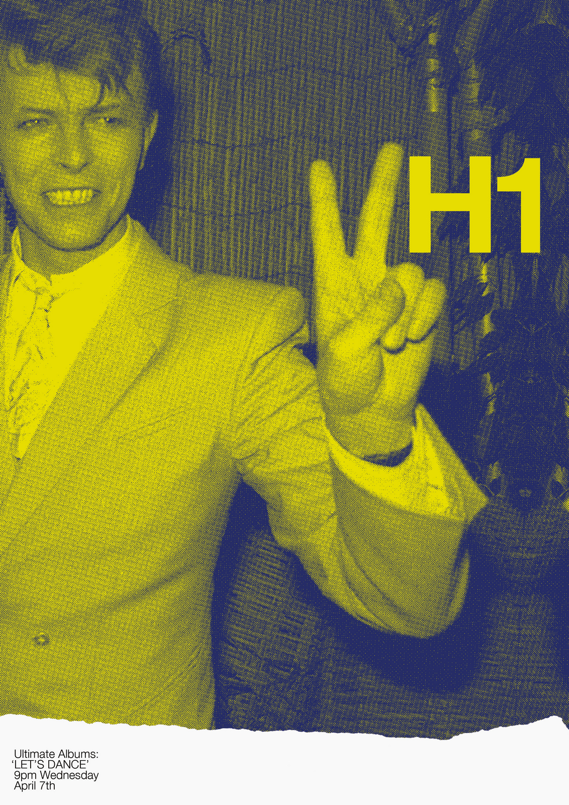
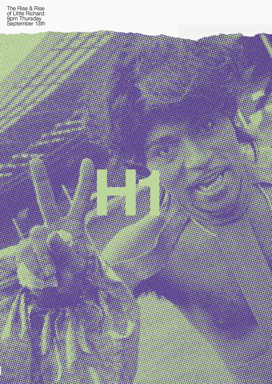
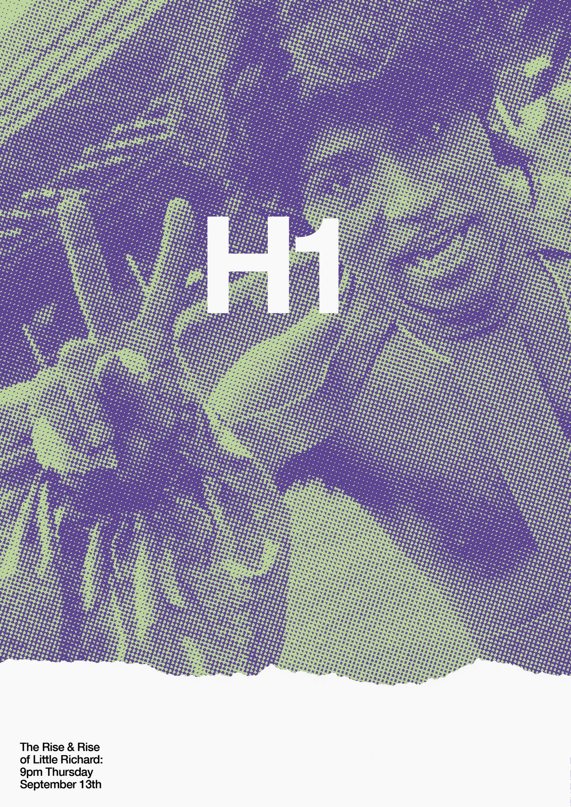
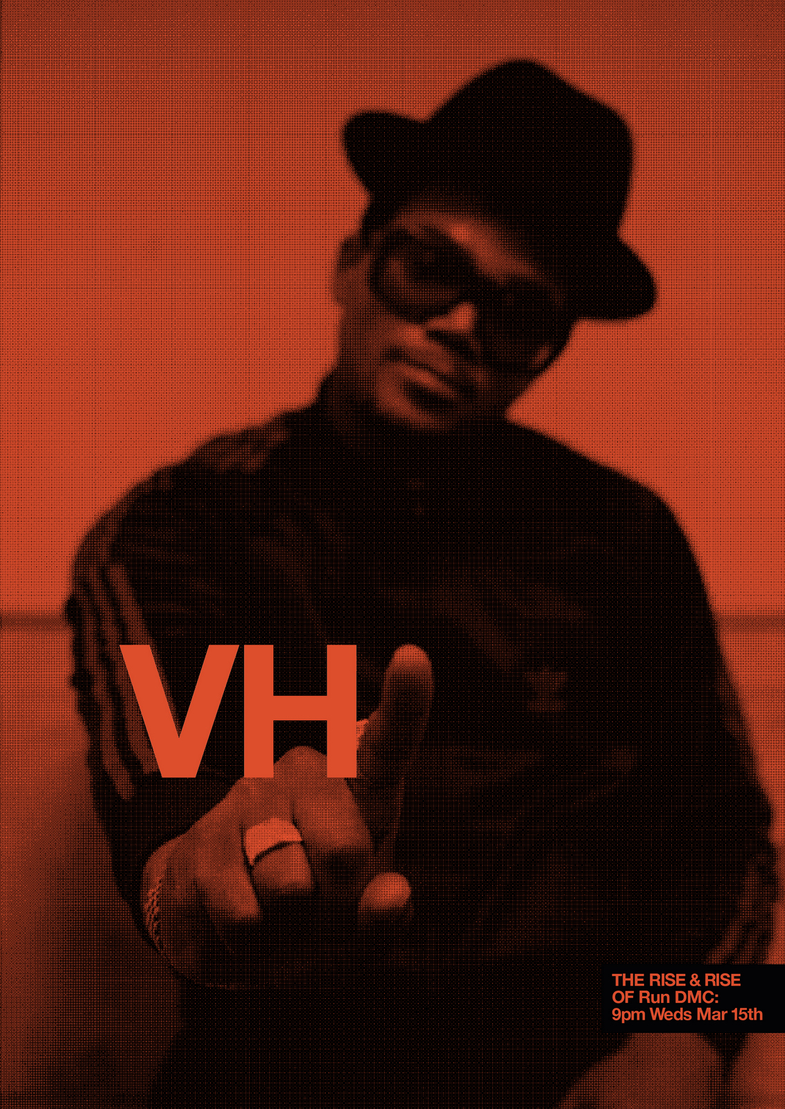
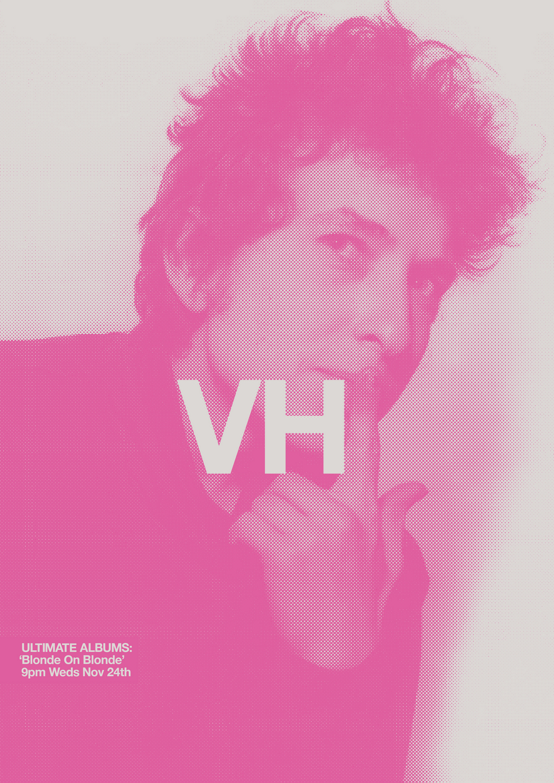
THE NEXT DAY: Better still. But why have a rip at all?The stars shouldn't have to compete with the graphics for attention.If we want to create iconography fans will want in their homes let's minimise the bits they don't want.So bigger pictures, simpler layout.
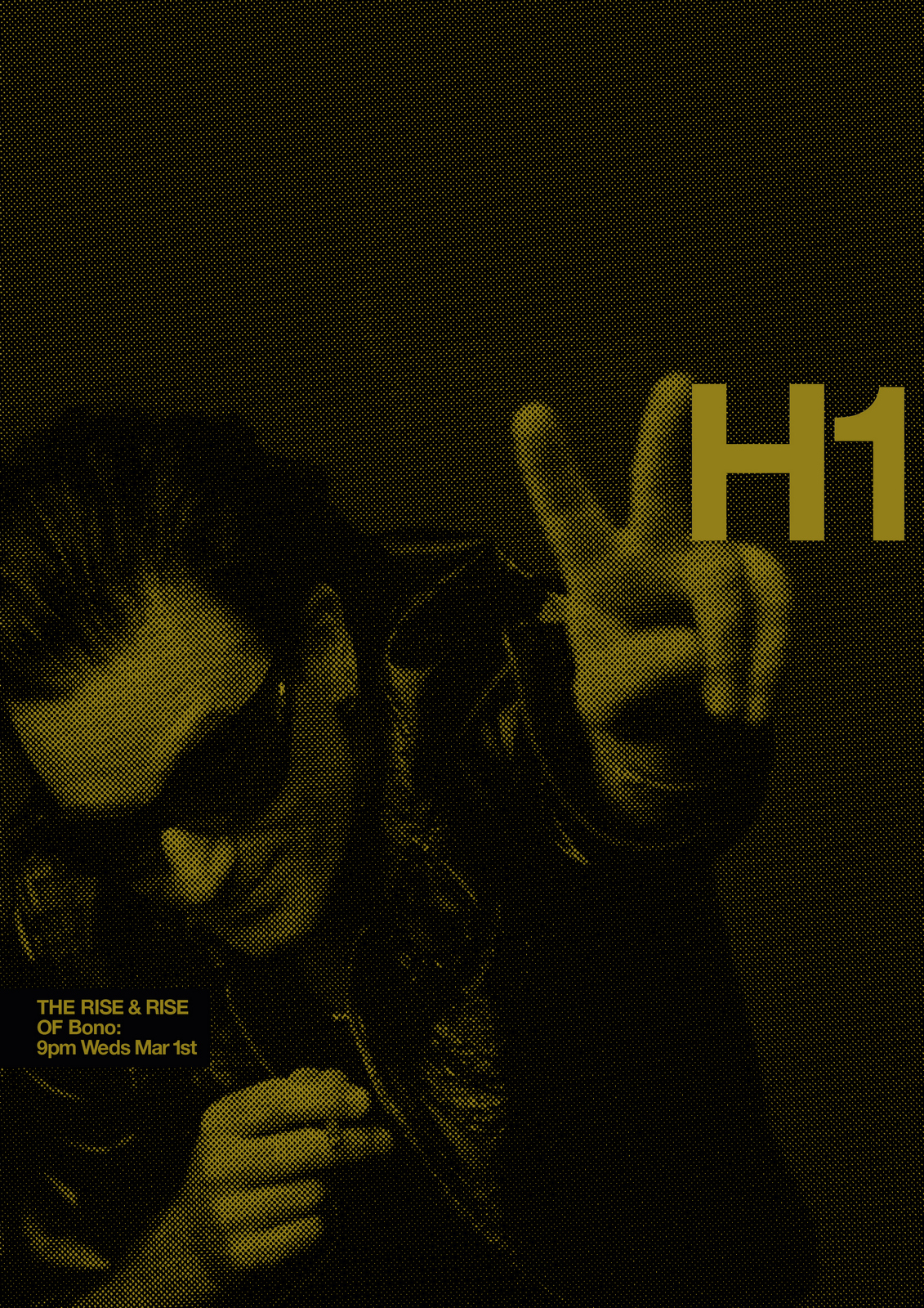
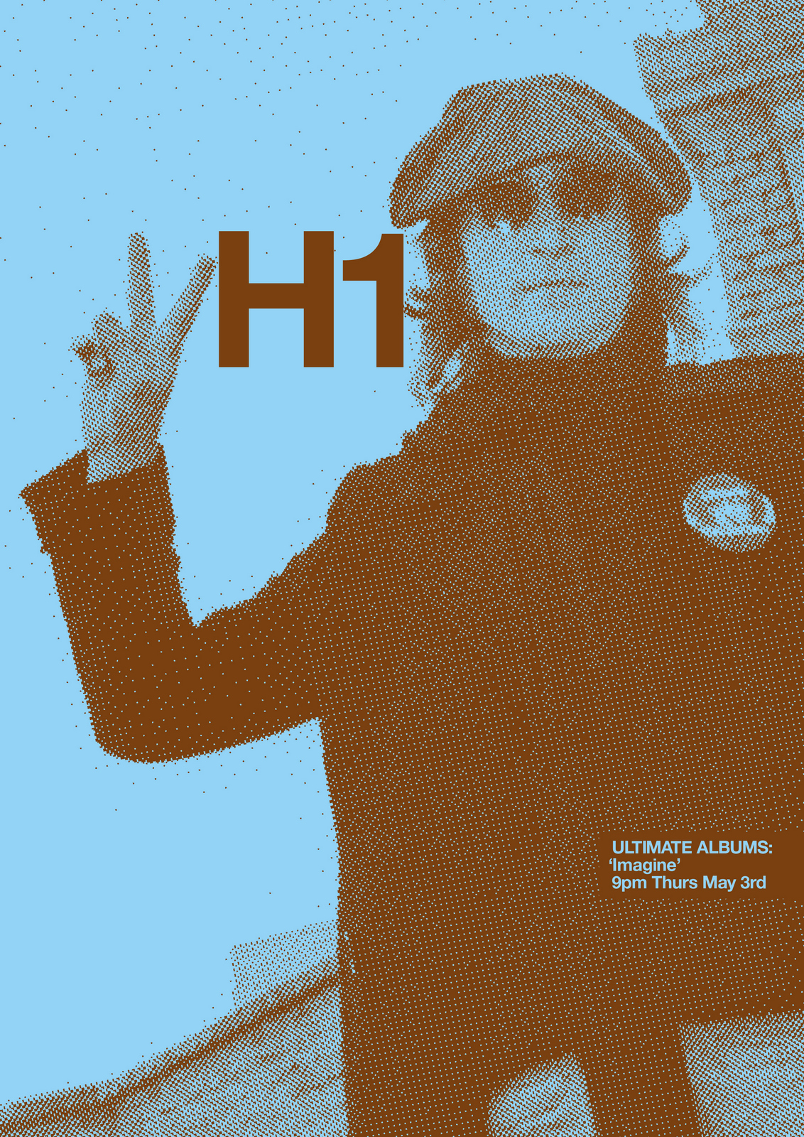
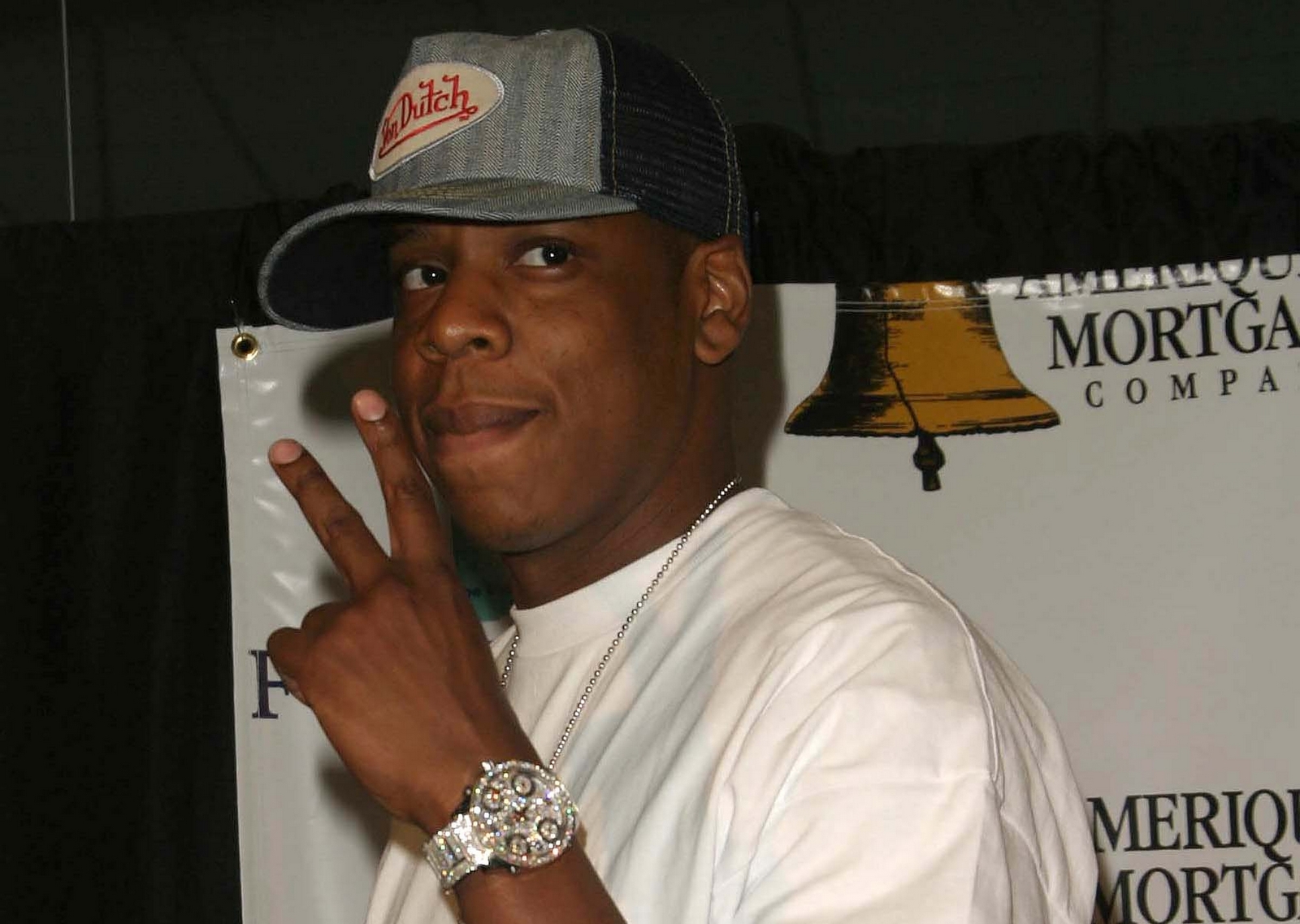
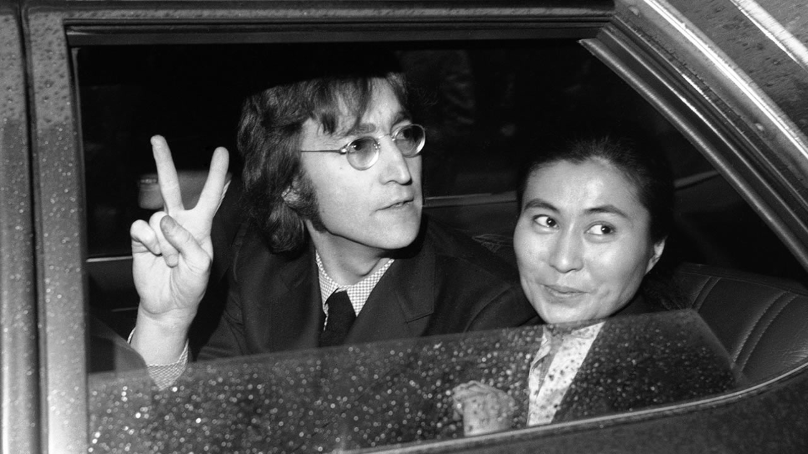
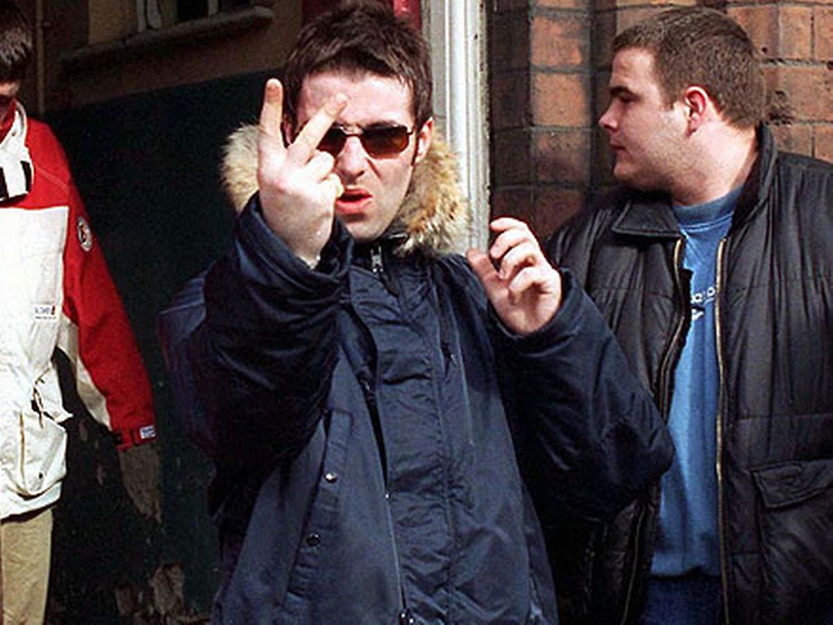
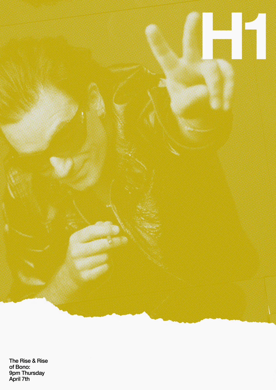
NEXT DAY: I have an idea for year two: Rock stars giving the finger.
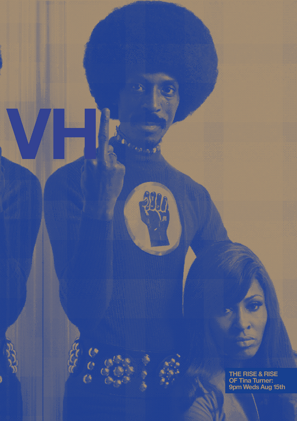
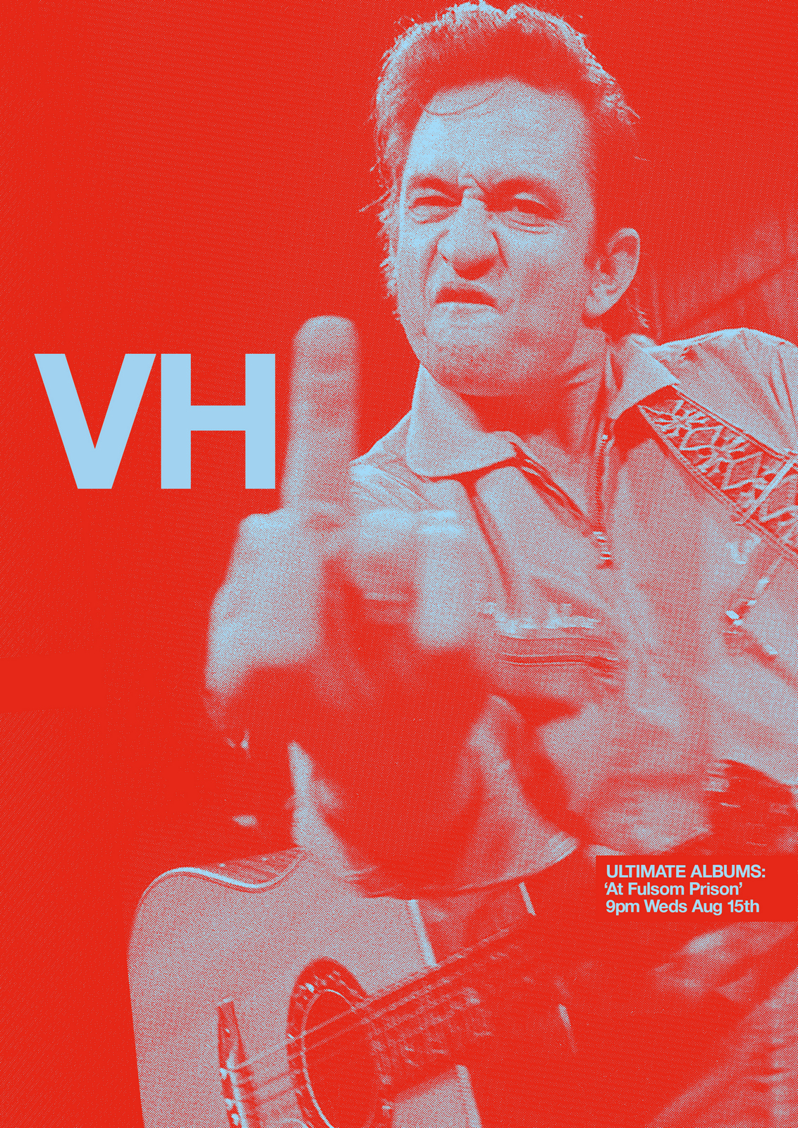
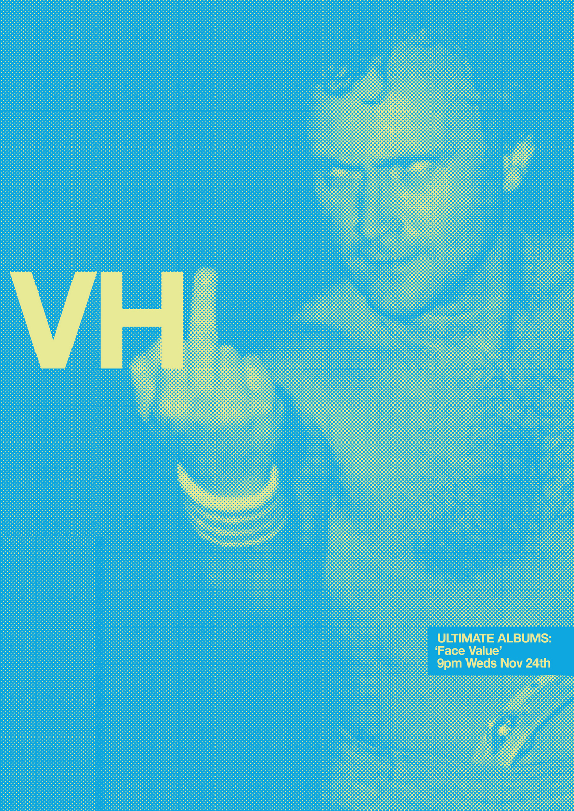
I Love them.Caspar comes in, 'Oh my god, what have you done?'He's looking at twenty or so A2 polyboards scattered around my office.No need to tell him they're now too big to put in our back pockets.CHEMISTRY MEETING: After brief introductions to the two young, female clients, I enthusiastically launch into selling our solution.Without knowing their problem.Rather being held aloft and cheered, I'm told 'We don't need a brand campaign'.Their problem, they explained, was time; they needed a campaign to promote a specific show very, very quickly.That was their problem.But, I was in too deep.I explained that this wasn't just a brand campaign, it could flex to any programme.I reiterated my concerns with their dowdy brand image.I talked about the benefits of bespoke ideas that can only be done by your brand.I reminded them of the power of simplicity.I told them that challenging their current brand perception could bring in a new audience.Whatever, they weren't interested.They were, by now, irritated.They'd just come in for a chat.I wasn't in a great mood either, I'd worked my ass off for the last week, for free, got to a solution I loved and they were refusingto even understand it.They didn't even want to talk about it.We waved goodbye, knowing we'd never meet again.Some may say that's a successful chemistry meeting in that both parties came to understand there was none.But I'd say not.MORAL: Next time you go on a blind date, don't turn up with a wedding ring. You'll seem weird.
It doesn’t have to be a ribbon.
Could be anything really – a pattern, shape, lemon, hedgehog, just something visual associated with your brand.
It’s beyond a logo.
It should run through your communications like the name of a seaside town through a stick of rock.
Not appearing alongside it, but informing what ‘it’ is.
Why?
It increases your chances of your messages being remembered as yours.
The boffins at the Ehrenburg Institute call them ‘Distinctive Assets’.
The bottle says Absolut, those checks announce it’s Burberry’s and that white line twisting through a red background tells you it’s Coke.
All before you’ve read a word.
You can invent them, like Aleksandr, that Russian vermin who fronts the Compare The Market ads, but generally they’re more resonant if they’re excavated from the company.
More likely to be relevant, unique and have a bit of integrity.
They may have a bit of awareness already built in.
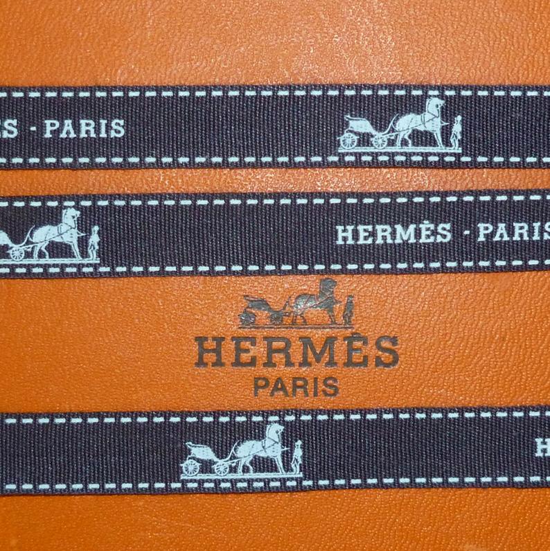
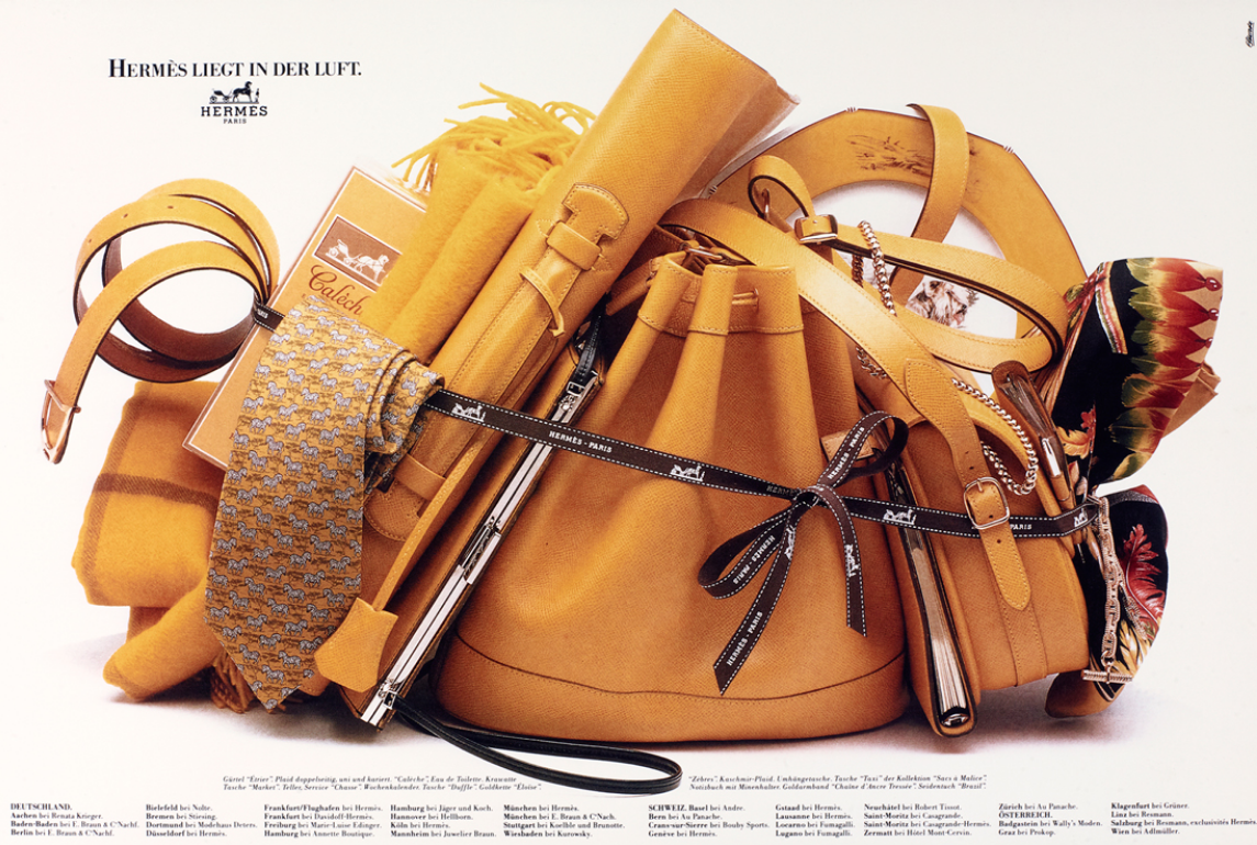
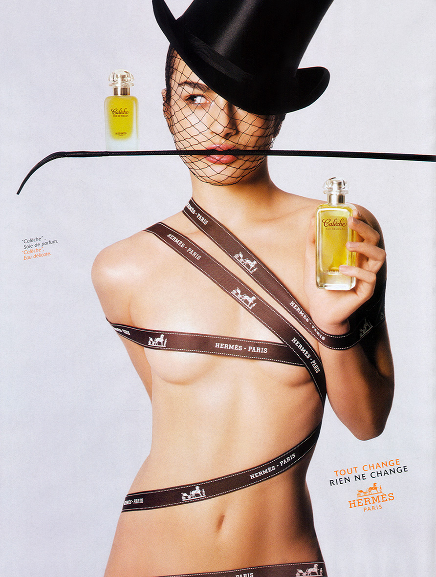
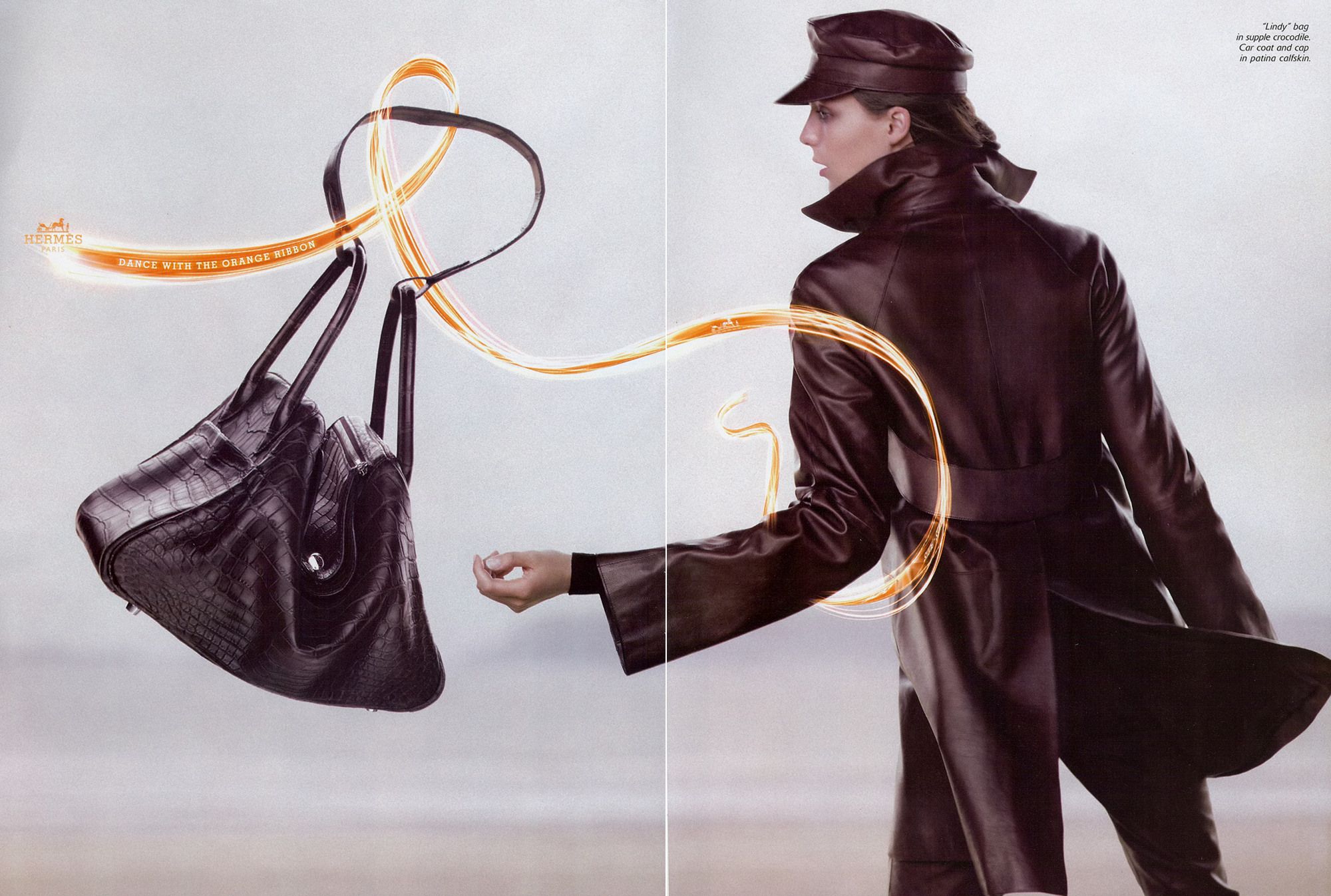
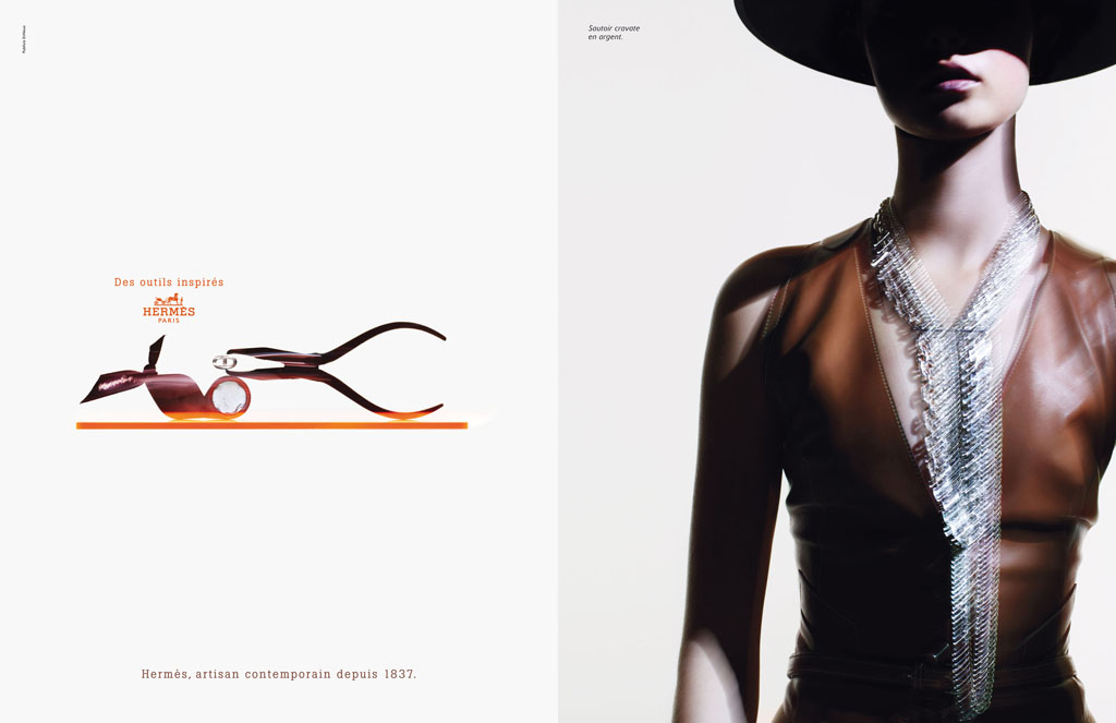
Take Hermes, they operate in a category where being distinctive is crucial; fashion.
Fashion houses follow similar trends, use similar materials and run ads featuring similar looking human beings.
Sometimes the exact same human beings.
(Yes I’m talking to you Ms. Moss.)
Their ads never feature words, so there’s no differentiation there.
They rarely use what we stumbling around Adland call a ‘big idea’.
So making YOUR picture of Kate Moss different from THEIR picture of Kate Moss is everything.
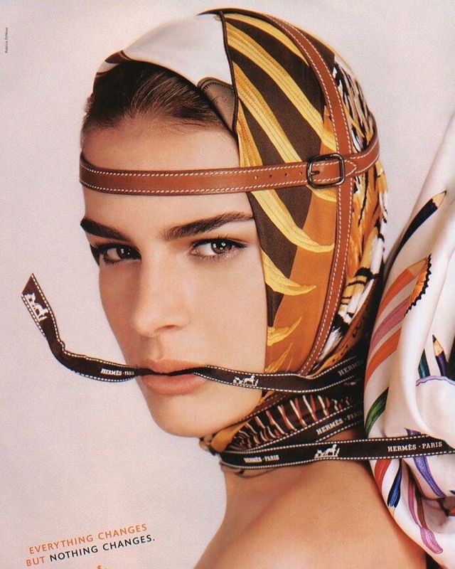
In the early 80’s, someone at Hermes had the idea to feature their ribbons in their ads.
I doubt this idea was greeted with whoops and high-fives around the office.
It wasn’t a big idea.
It just made the pictures feel a bit more… Hermes.
But ribbons have connotations.
They make things special.
They suggest a courtesy from bygone age.
They remind you of presents.
They indicate that a little extra effort has been made.
Extra effort that only a shop with few customers could afford to make.
An expensive shop.
(At the time of writing, Aldi and Lidl are still not using ribbons.)
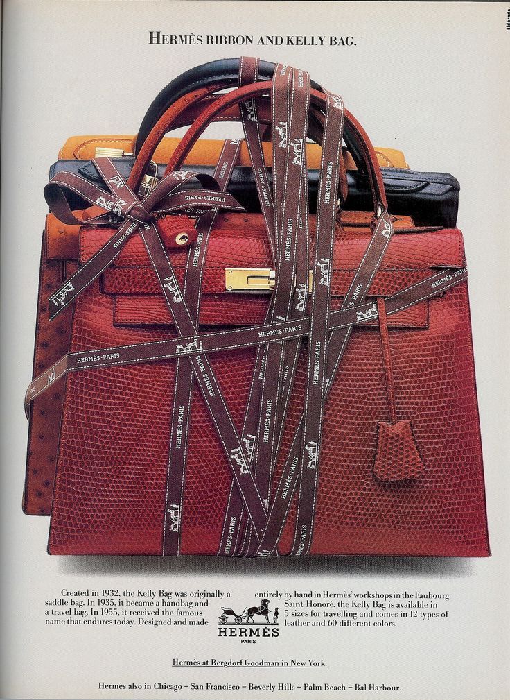
But like all these distinctive assets, their power doesn’t come from the brilliance of the idea, it comes from the consistency of use.
Sticking with them year after year.
Ignoring the requests for ‘blue sky’ from the creatives come into contact with the brand for short periods of time.
The Marketing Directors, Creatives and Photographers eventually move on to another brand demand ‘Blue Sky’.
Blue sky is easy, reinventing what a brand stands for is hard.
The ads below show how Hermes evolve their distinctive asset from the straighter than straight product shots at the beginning, to the cooler than cool Nick Knight shots.
You can see the ribbon twist and turn its way through the decades, constantly being refreshed.
Like the umbilical cord.


Beauty may attract, but it also repels.
Look at the impossibly gorgeous, 0% body-fat models in most fashion ads and you’re confronted by how different you are.
So rather than the desired response ‘that could be me’, you may think the opposite ‘no way is that me’.
It’s like a gang rejecting your membership application in real time.
The nuances of how these gangs present themselves is important.
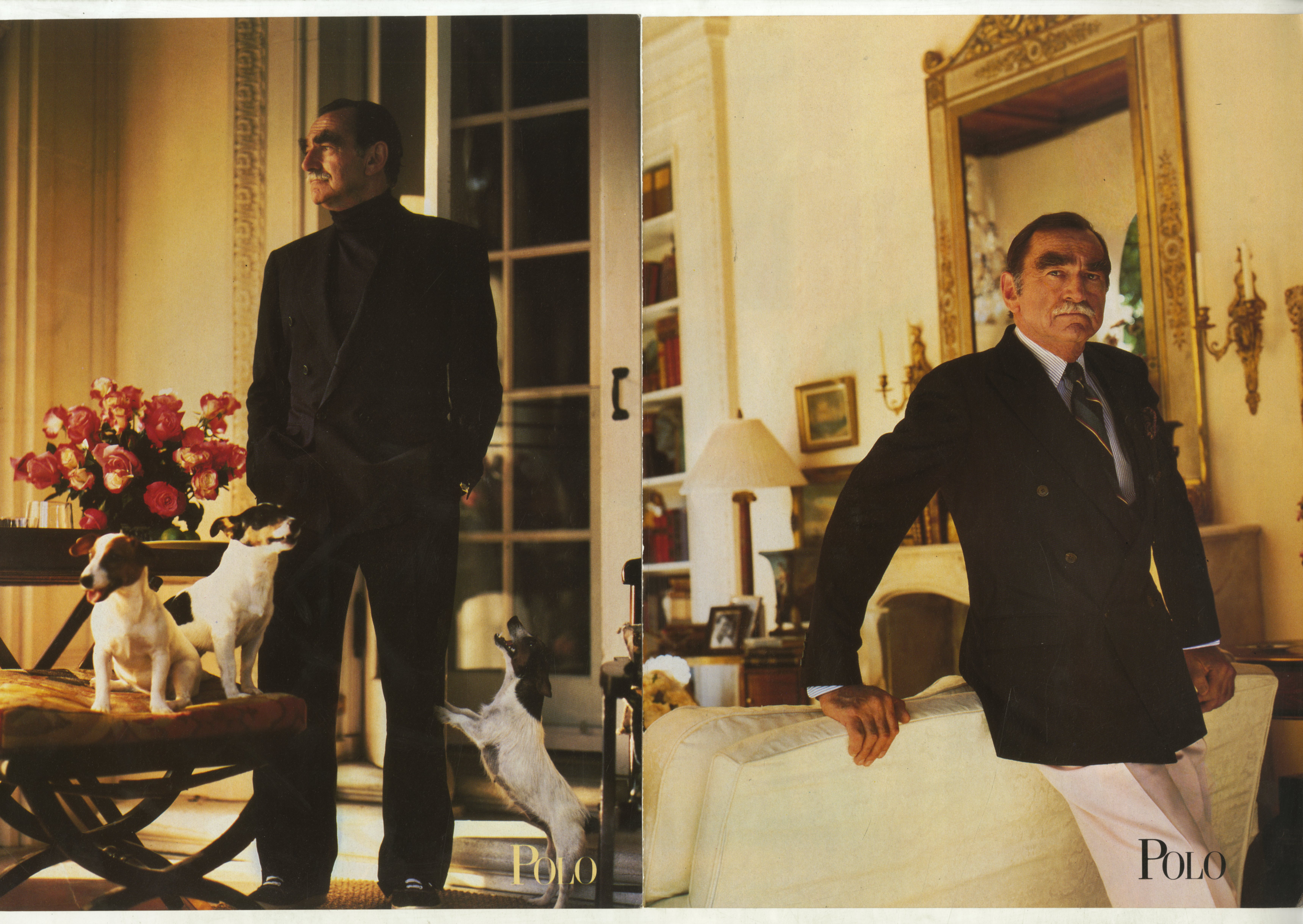
A recent documentary showed how Ralph Lauren puts his gang together, and it wasn’t how I’d imagined.
For a start there are no mode
l books.
Many of the folks drifting through his old-money locations aren’t even models, they’ve been plucked from a variety of real life situations.
He’d spot a surfer who he felt had the right look, rub the zinc off his nose, brush the sand out of his hair and dunk him into a shiny new tuxedo.
A stone-faced Navajo Indian may be plonked onto a field dressed in Cricket Whites.
An elderly, real-life college professor was separated from his leather patched cardigan and dressed in a smoking jacket, portraying the patriarch of a vast estate in the Hamptons.
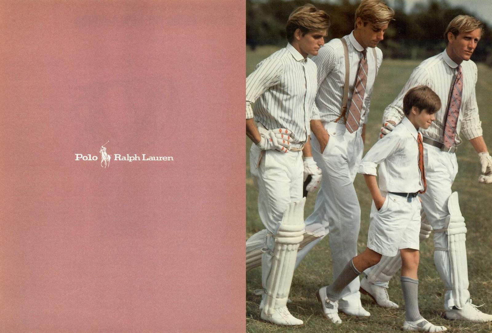

This kind of upmarket version of street casting has a lot of benefits.
The people in your ads are less likely to be in other ads, so they feel more believable.
The strange assortment of characters inhabiting that lifestyle makes it feel more believable – the real world is inhabited by a strange assortment of characters, not models.
Don’t get me wrong, nobody will mistake these guys for anyone in a Ken Loach film, they just feel a tad more real
than the gorgeous folks in other ads.
The documentary places a lot of the credit for the success of Ralphie’s company down to this kind of advertising.
The creation of these unattainable worlds.
But I prefer the pages that follow.
Often, after you’ve seen what you can’t have, the billion dollar yachts, a smile made up from more teeth than one person should own, enough hair follicles to burn, they let you in.
Because those ads with a cool product shot with the models head lopped off.
So that I can imagine myself into that suit, shirt or whatever.
Like a million dollar version of those seaside things you stick your face through.
Making membership to that gang possible.


Streaming killed Blockbuster.
iPhones killed Nokia.
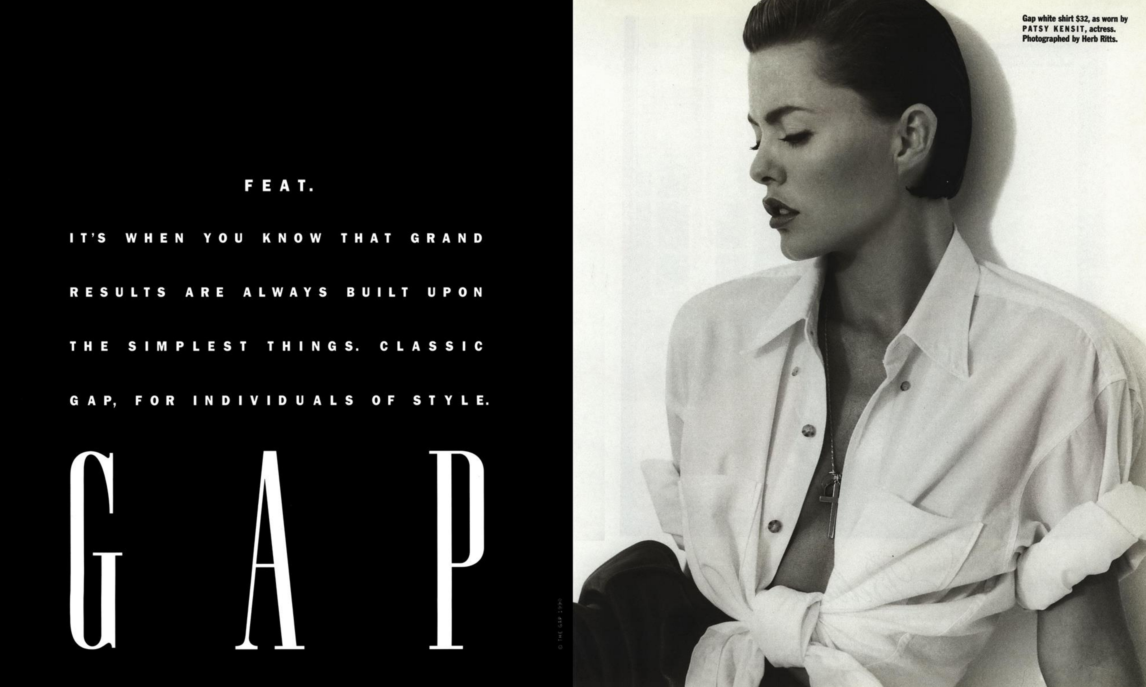
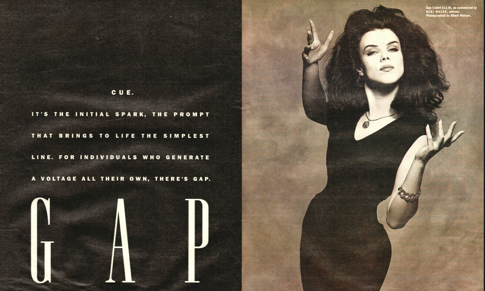
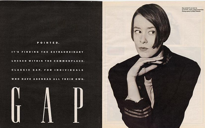
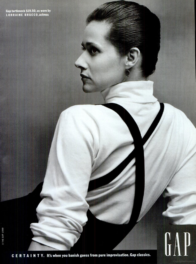
What killed Gap?I know, I know, technically they’re not dead, but boy are they diminished.
Back in the day, everyone I knew had something with Gap written on it in their wardrobe.
Not any more.Did they just happen to be in the right place at the right time?
Or maybe it was their advertising?
Put simply; when ran good ads they were successful when they didn’t they weren’t.
I realise that’s not the kind of rigorous market analysis you may be used to receiving from a McKinsey or Bain, but it’s bloody true.
Why were the ads good?
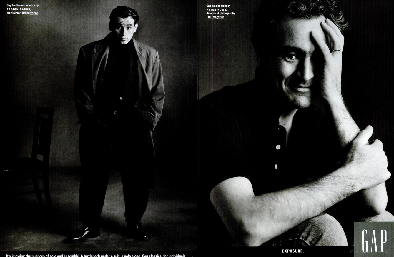
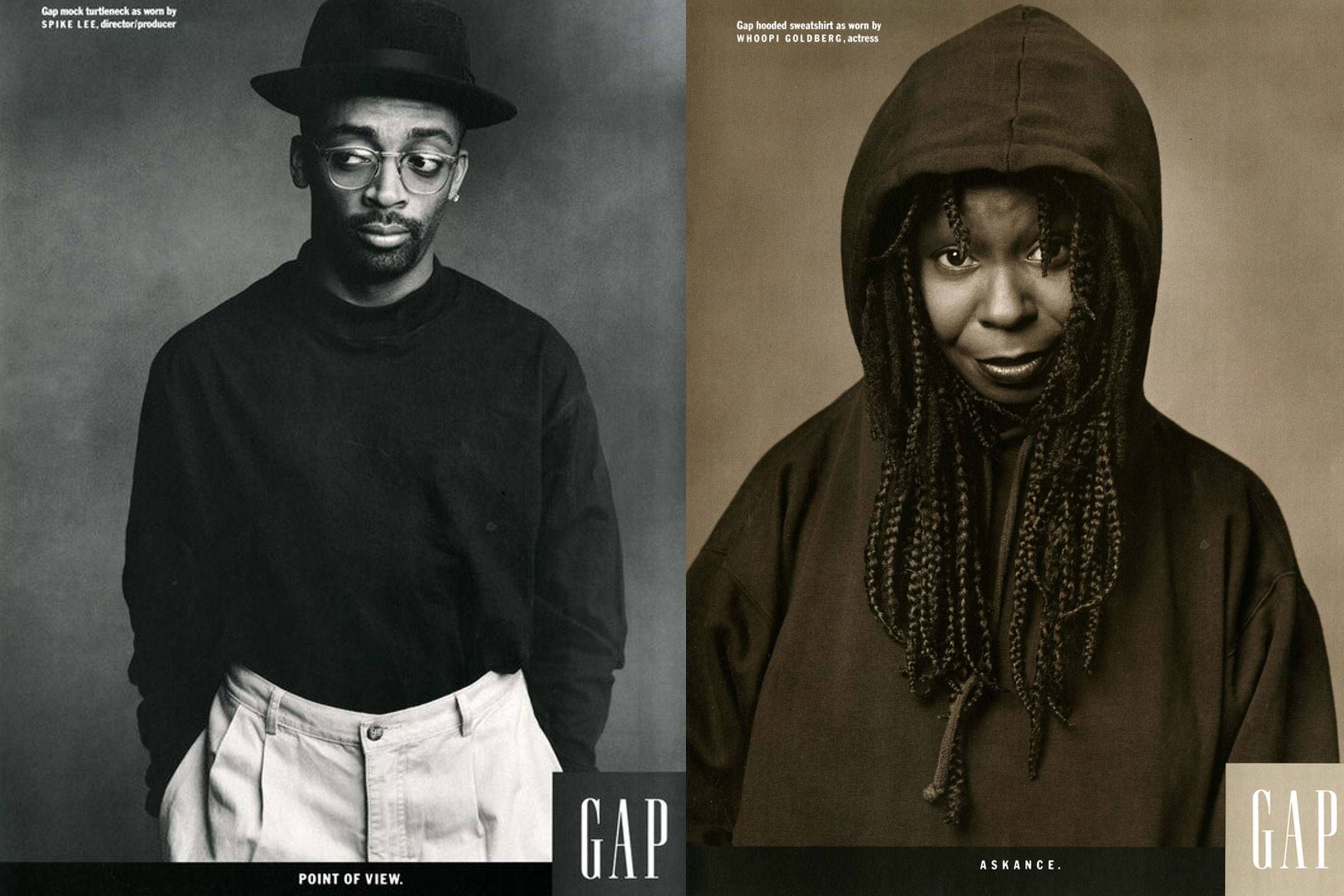
First, because they made the unusual call to not focus their advertising dollars on their most fashionable, most unique items.
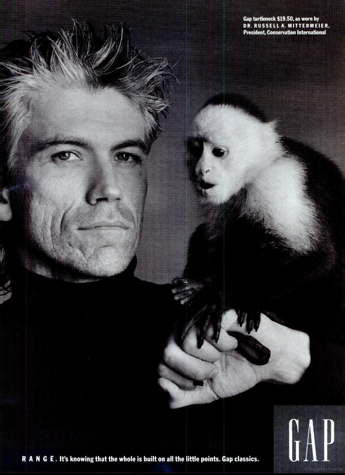
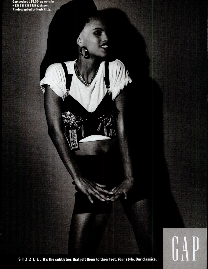
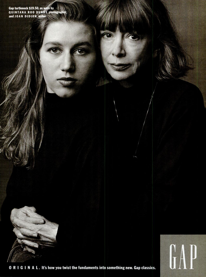
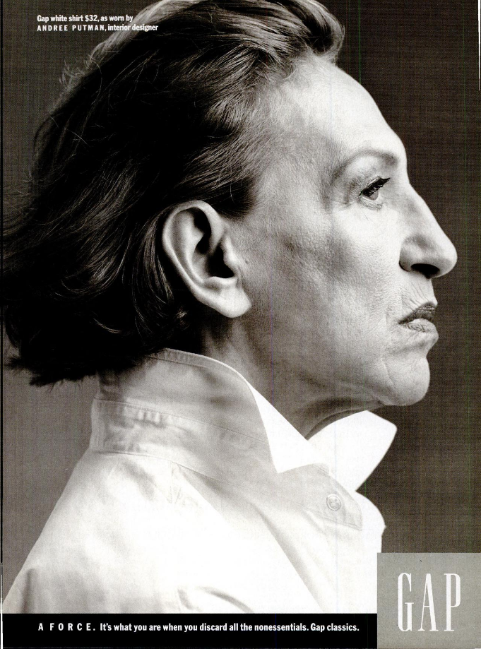
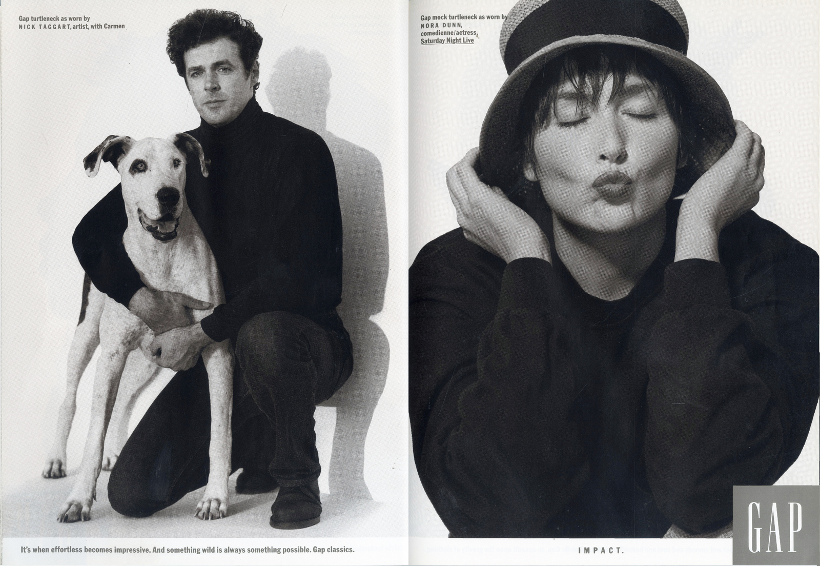
Instead, then President Millard Drexler, chose to focus on their least unique, those everyday basics like plain T-shirts, turtlenecks and chambray shirts.
The potential upside is that the market is bigger for that stuff, the down side was handed to creative head Maggie Gross a problem; how do you make Gap’s $10 white t-shirts look better than everyone else’s $10 white t-shirts?
How do you make basic special?The first decision she made was to ditch tv and radio in favour of up market magazines and newspapers.
Where a company runs its ads can say more about it than the ads themselves.
But what do you fill those spaces with?
Maggie remembered the Blackglamma campaign.
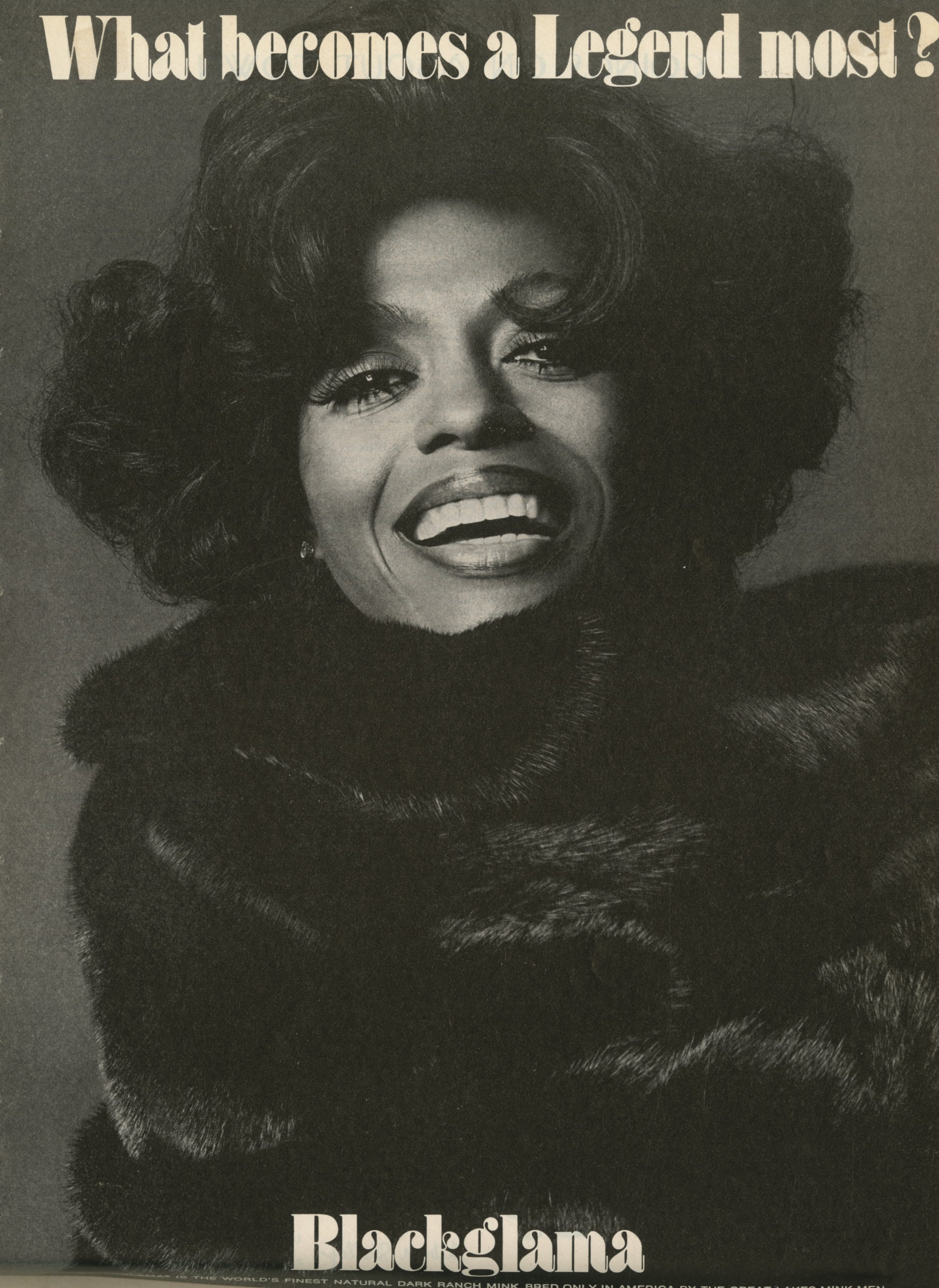
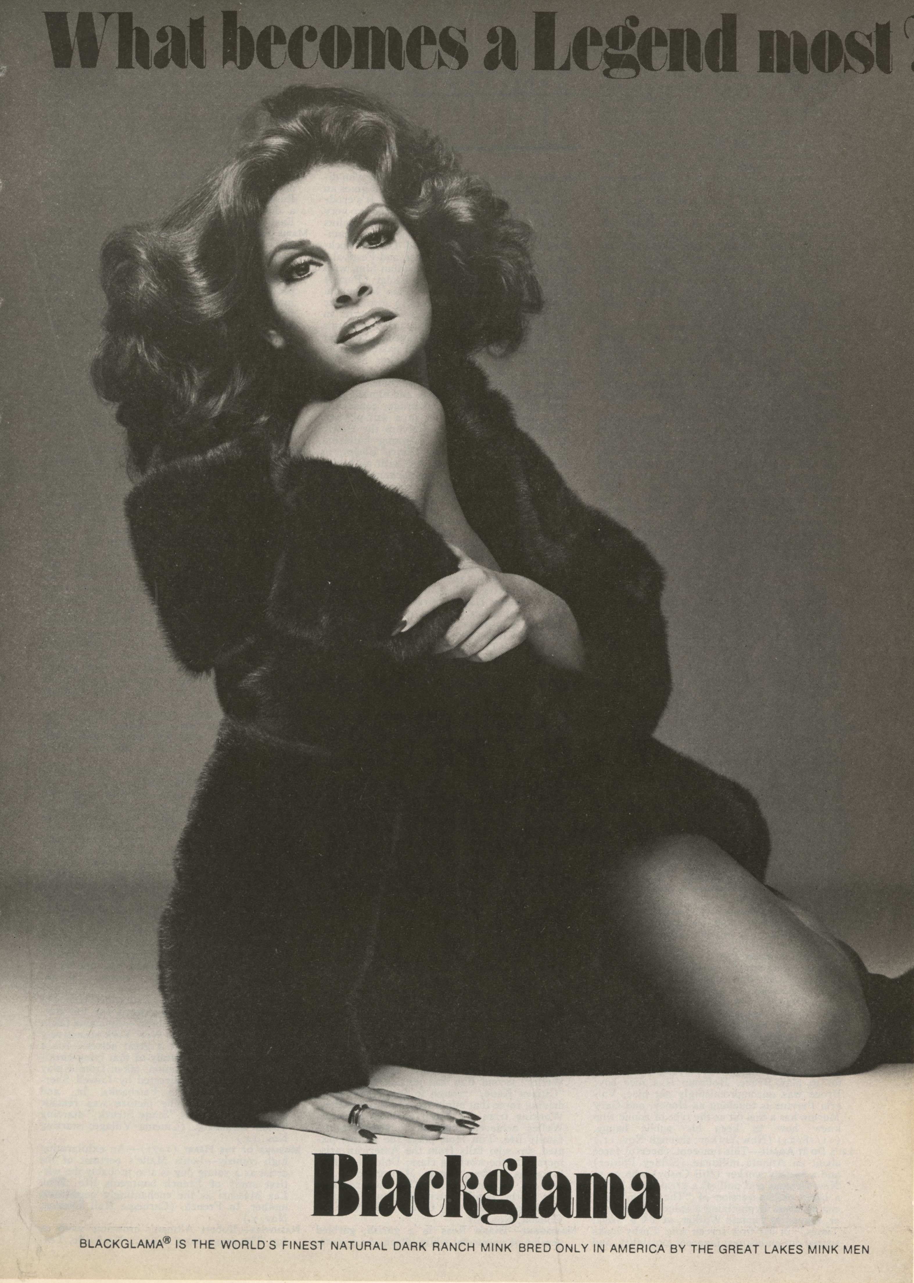
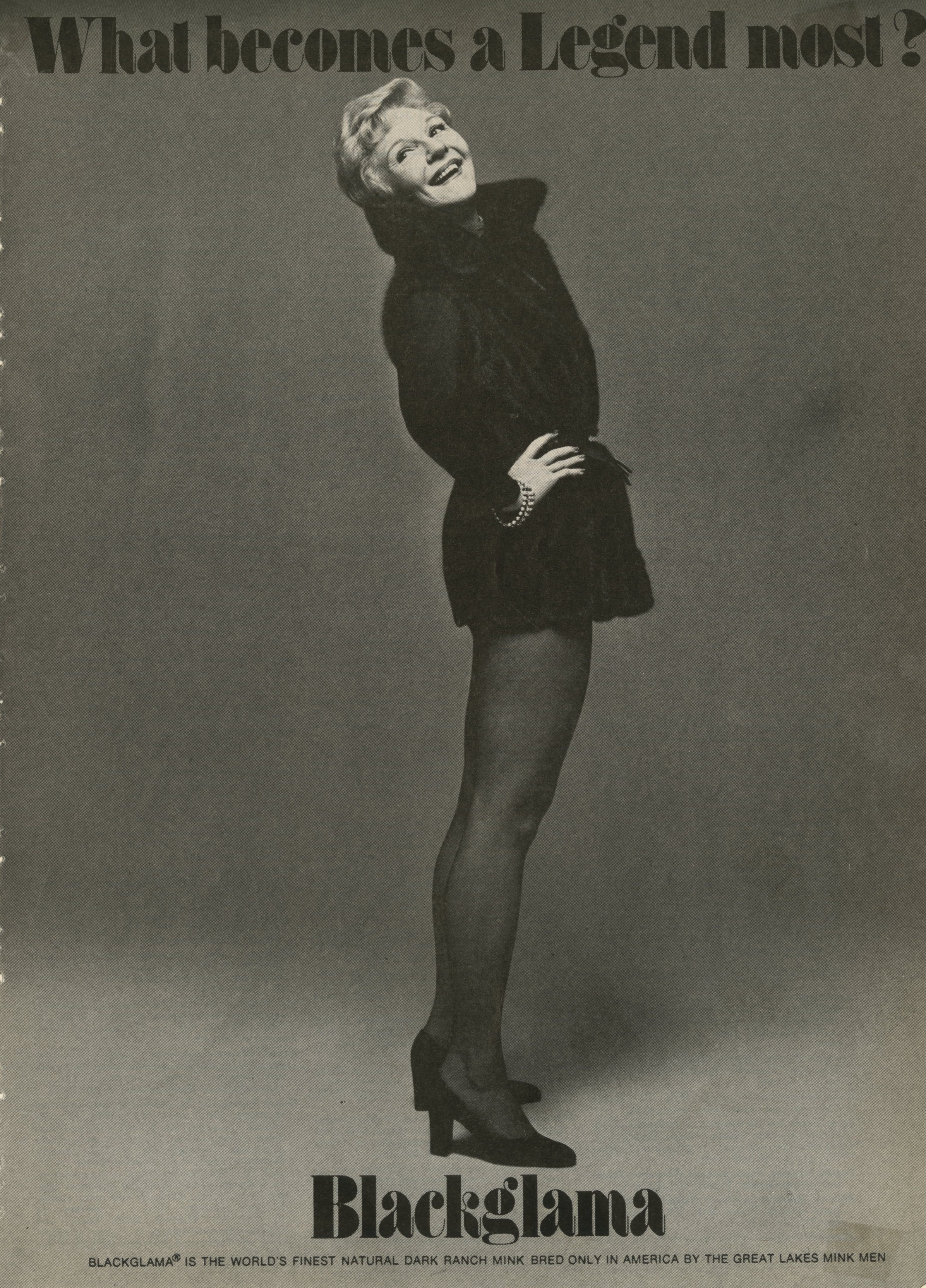
It featured the famous, but they didn’t feel like celebrities, they felt like people with jobs, albeit high profile ones.
Also, they weren’t the kind of faces-for-hire that appeared in ads.
Maggie opted for a similar approach.She also decided not to follow the youth culture route, instead went for older models.
The campaign broke in L.A, coinciding with various store openings.
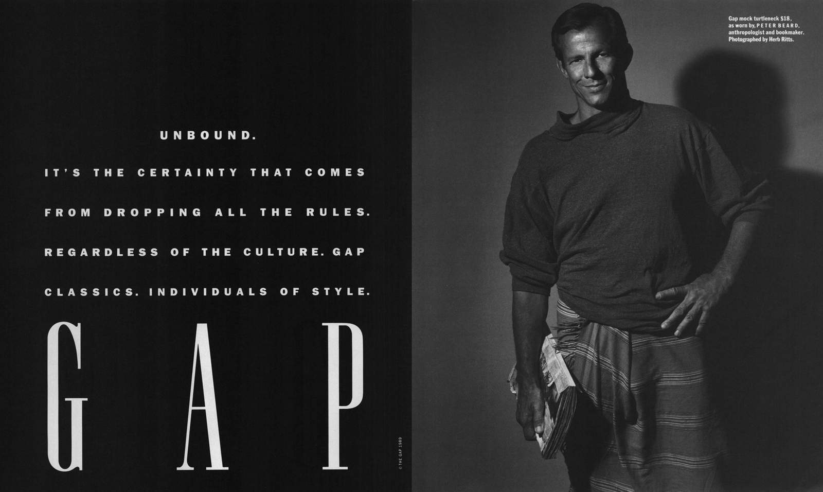
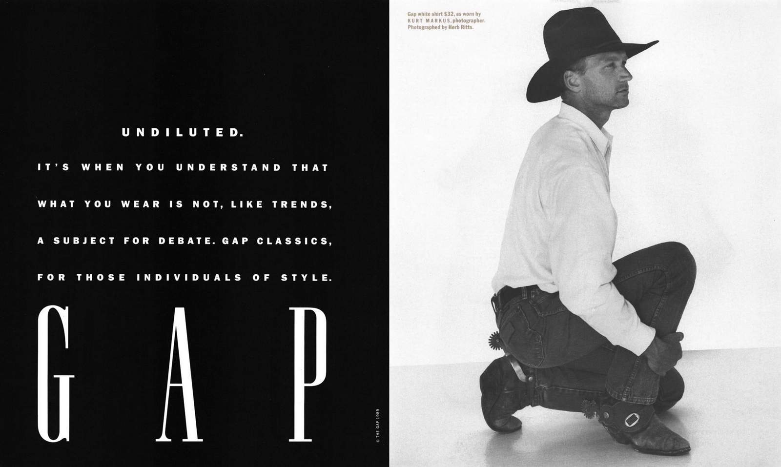
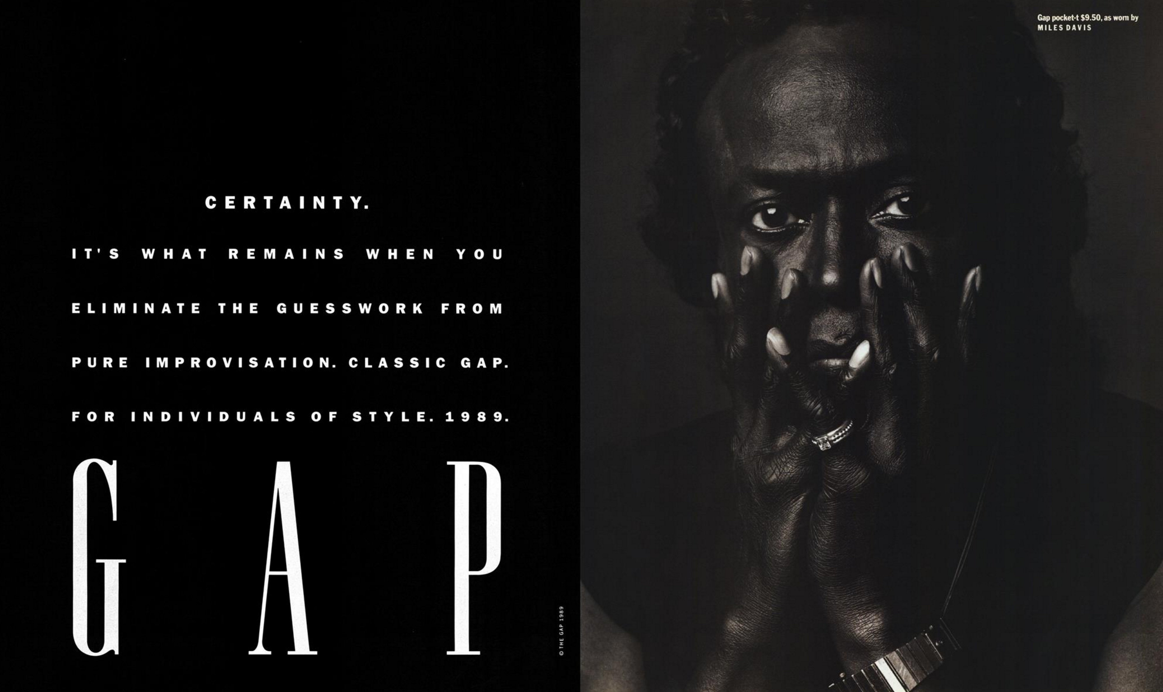
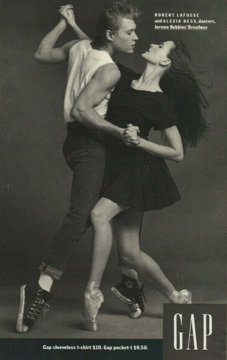
Herb Ritts shot “people recognised for what they do, and appropriate to L.A.”, people like of photographer Matthew Rolston, actress Claire Hall and architect Bryan Murphy.
The campaign not only brought customers into stores, it brought requests for copies of the ads.
L.A. was followed by N.Y.
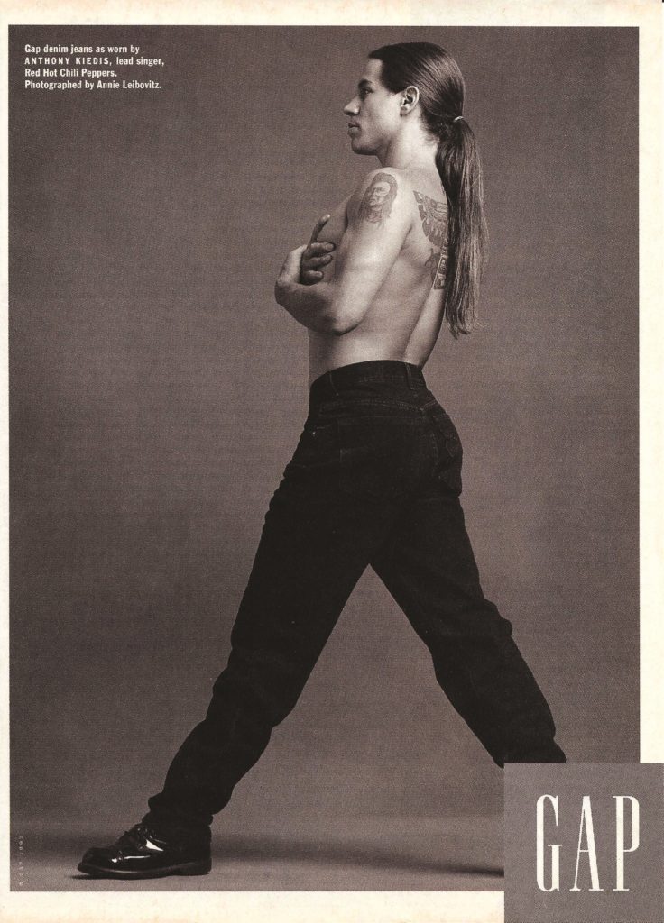
This time the “most New York photographer” was chosen to shoot – Annie Leibovitz.Next stop the world.
The Gap campaign is deceptively simple.Most low end fashion brands couldn’t credibly feature movie and rock stars.
Who’d believe Brad Pitt trawled through the racks at TK Maxx for a top?
Or that Beyonce would pop down to Zara for a frock?No one. (In-case you weren’t sure.)
But ‘basics’ are a different matter.
Not only is it believable they’d get everyday basic items there, it makes them smart.
It’s like those Chefs that take out a small mortgage to pay for certain special ingredients, like saffron and truffles, but don’t waste money on the everyday basics, like flour.
Somehow, Gap managed to use the most expensive photographers on the planet to shoot some of the most famous, wealthiest people in the world to create a campaign that felt basic and utilitarian.
Maybe it was the black & white?
The giant logo?
Maybe because they didn’t try to tell you how ‘awesome’ the clothing was?
Or that the people featured didn’t feel like people who appeared in ads? (Joan Didion, Dizzy Gillespie, Jack Kerouac, etc.)
Maybe it was a combination of all of the above?
But for a moment, the campaign below made Gap basics feel like a vital ingredient in expensive and cheap wardrobes alike.
Look at them; black & white picture, big logo, a few words.
It’s not rocket surgery.
Until you try and replicate it.
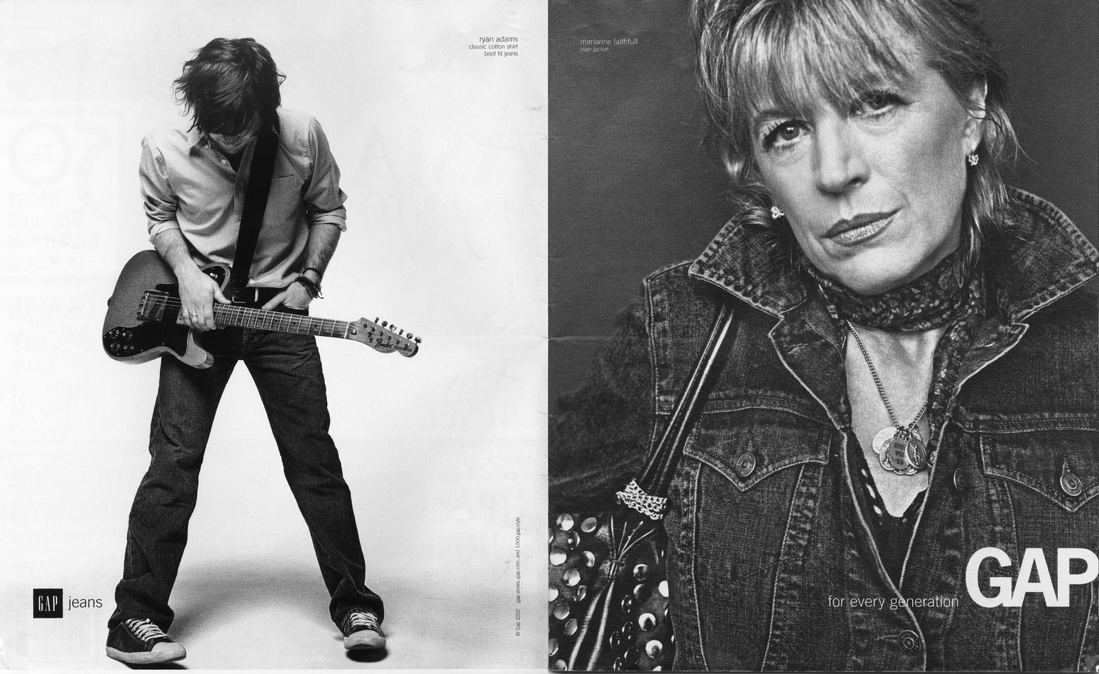
As Gap will no doubt verify.


.jpg)

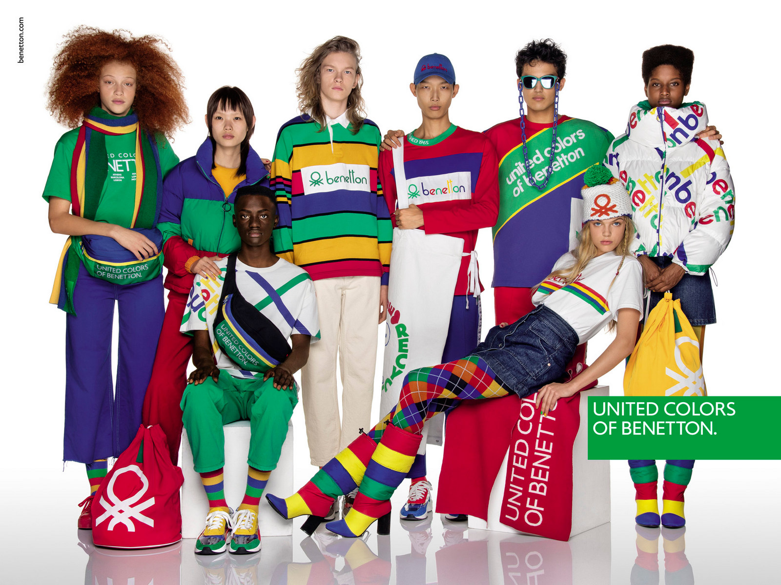
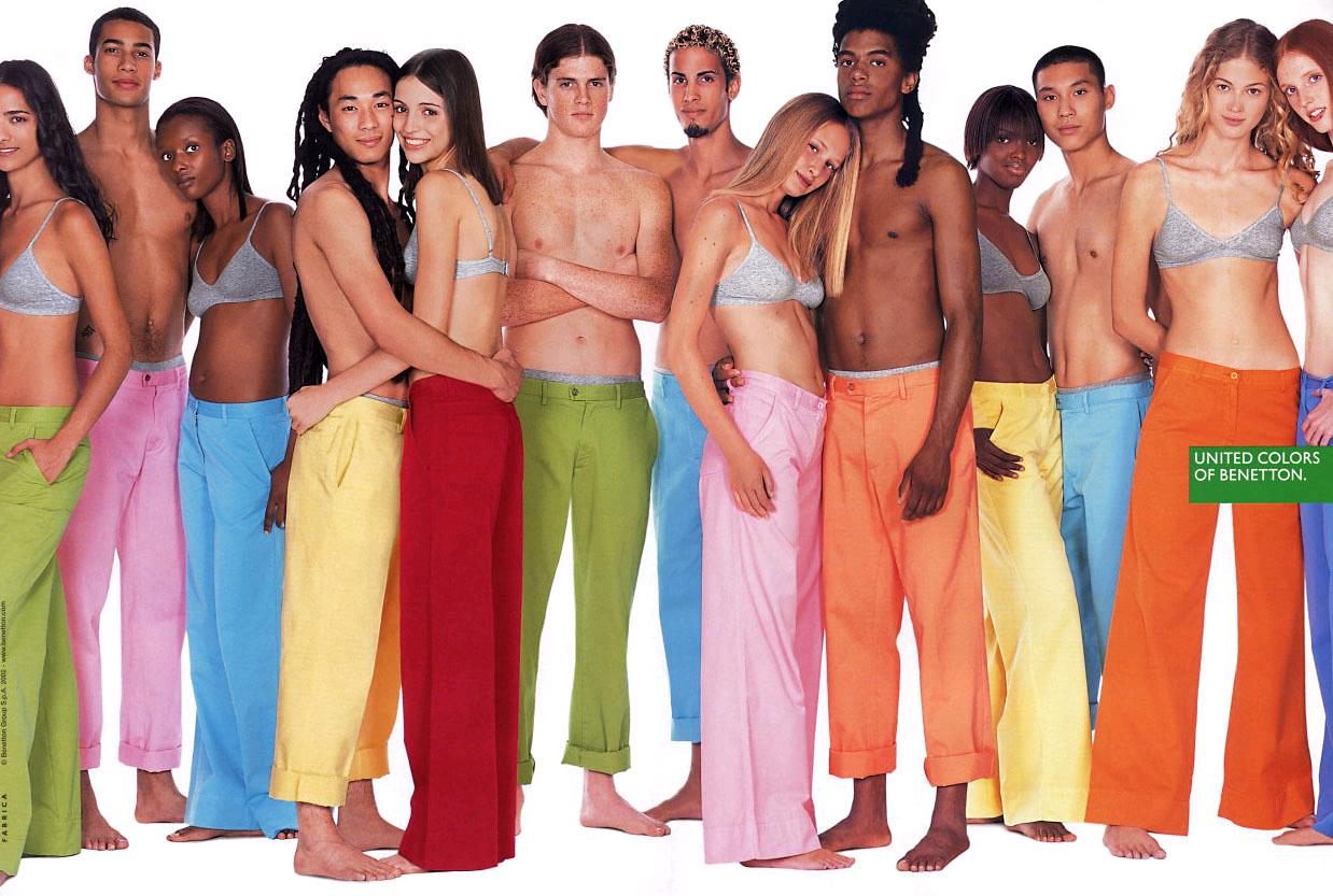
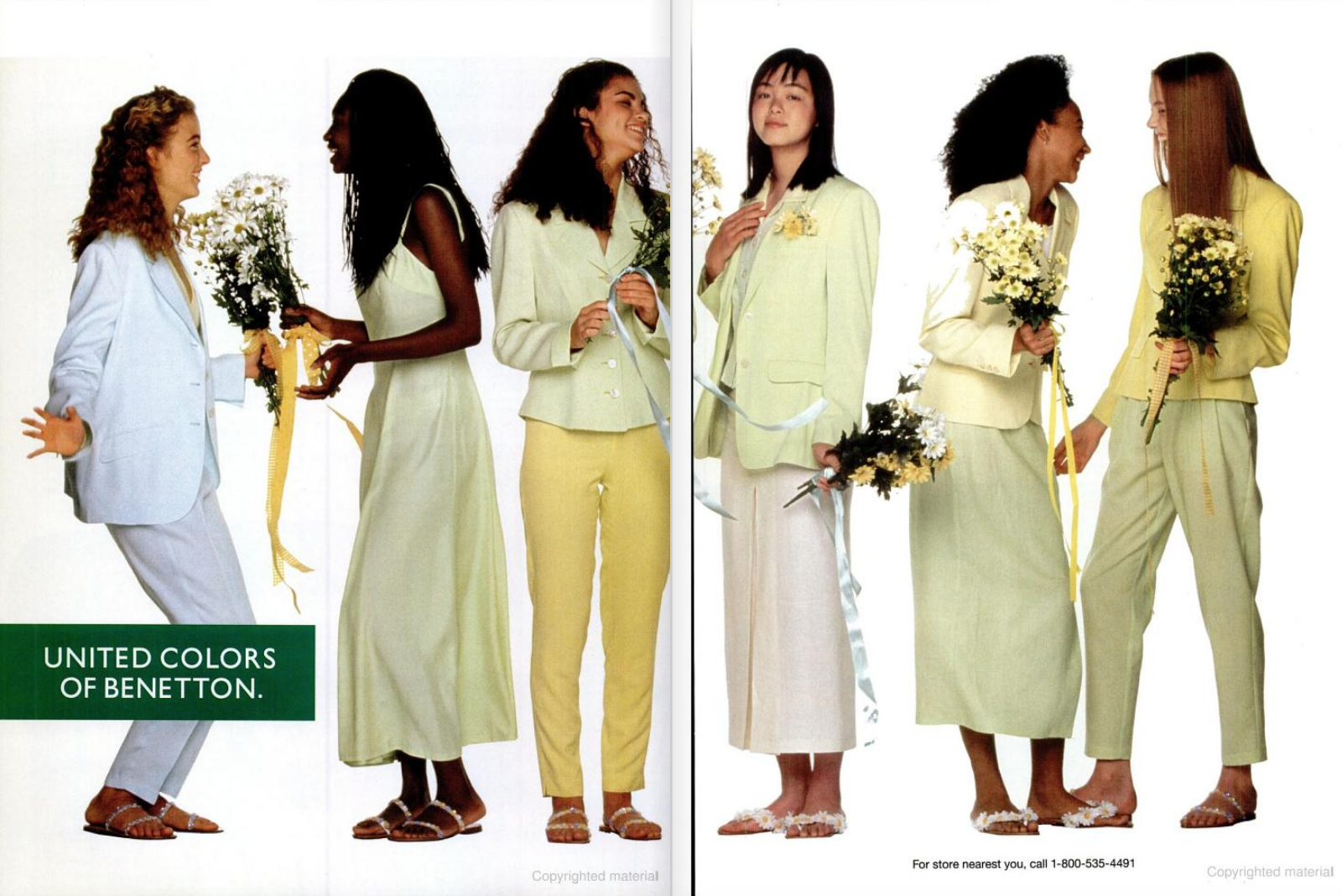
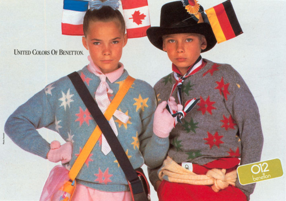
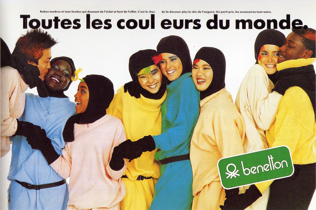
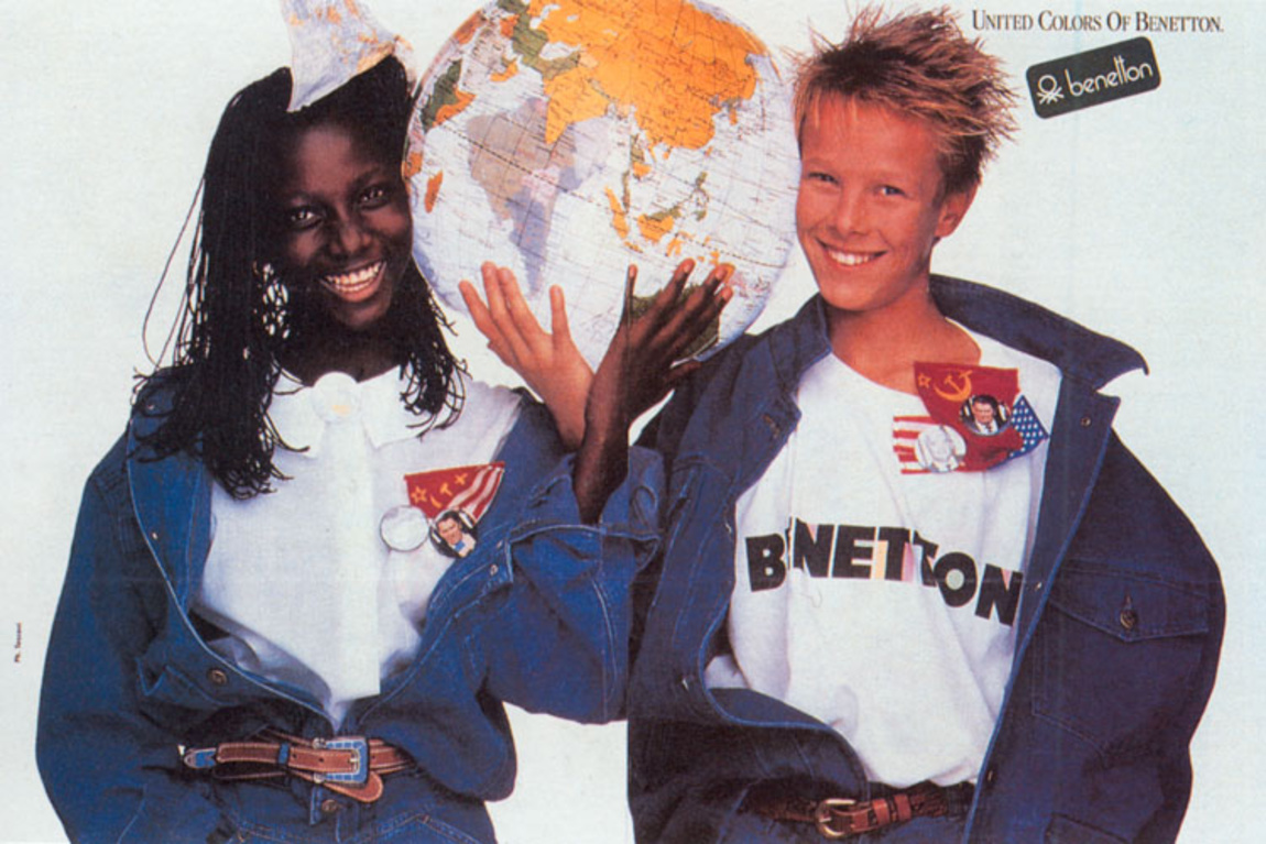
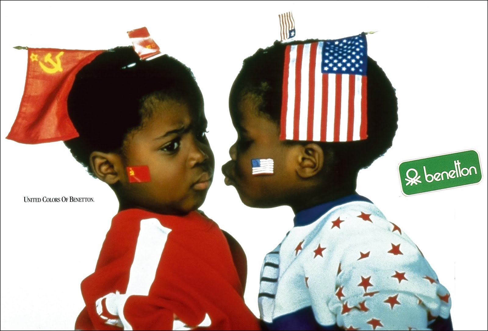
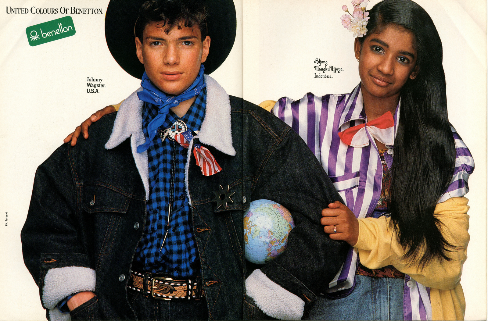
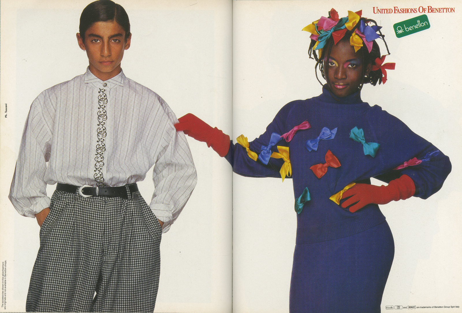
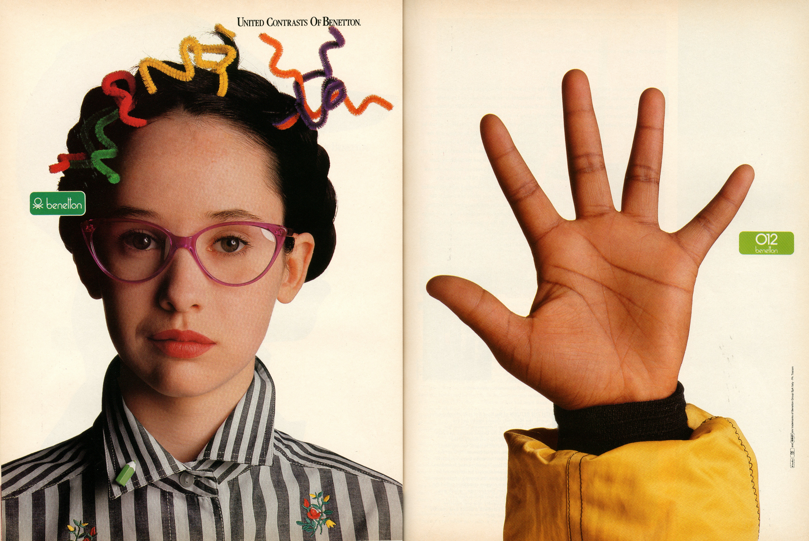
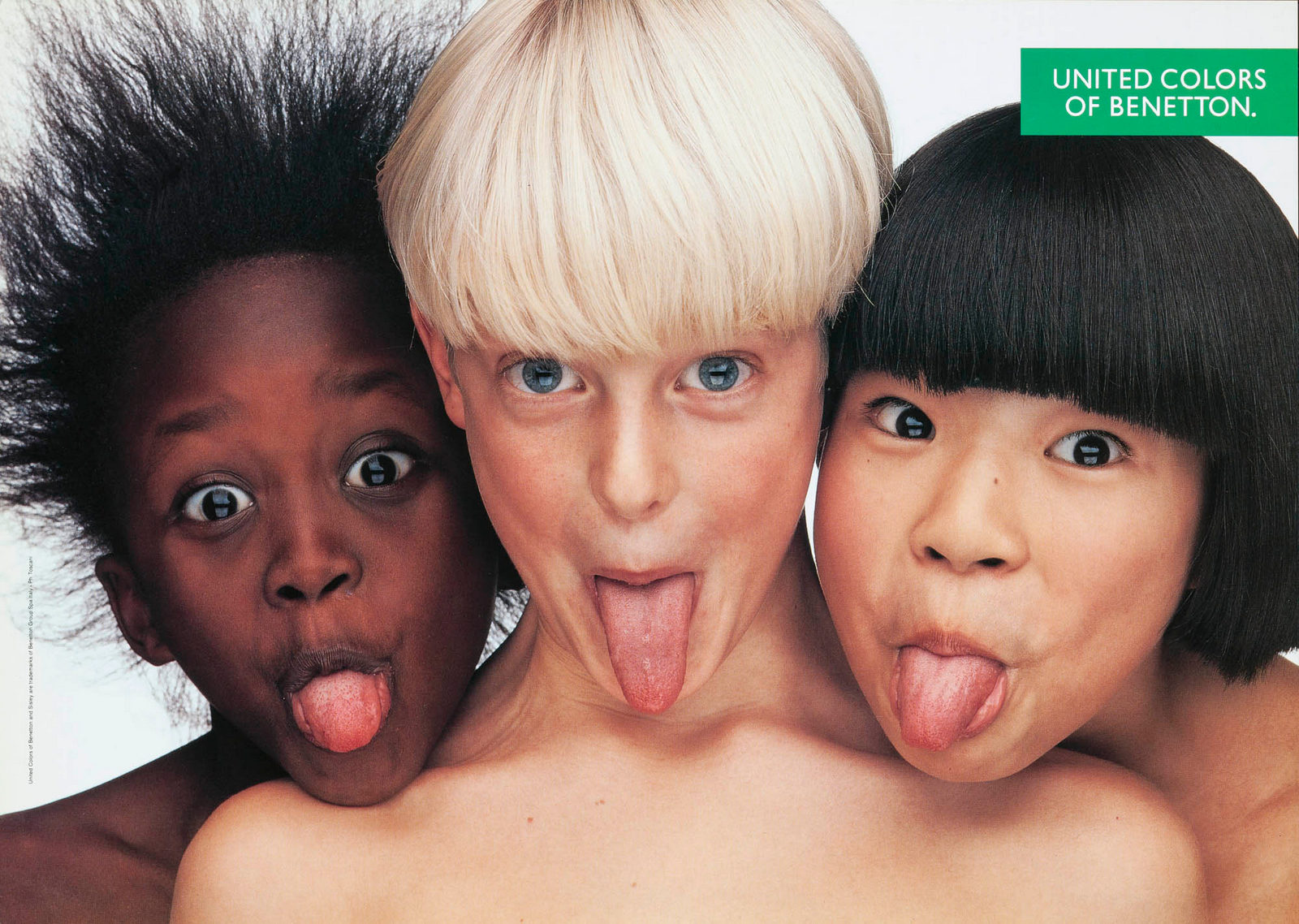
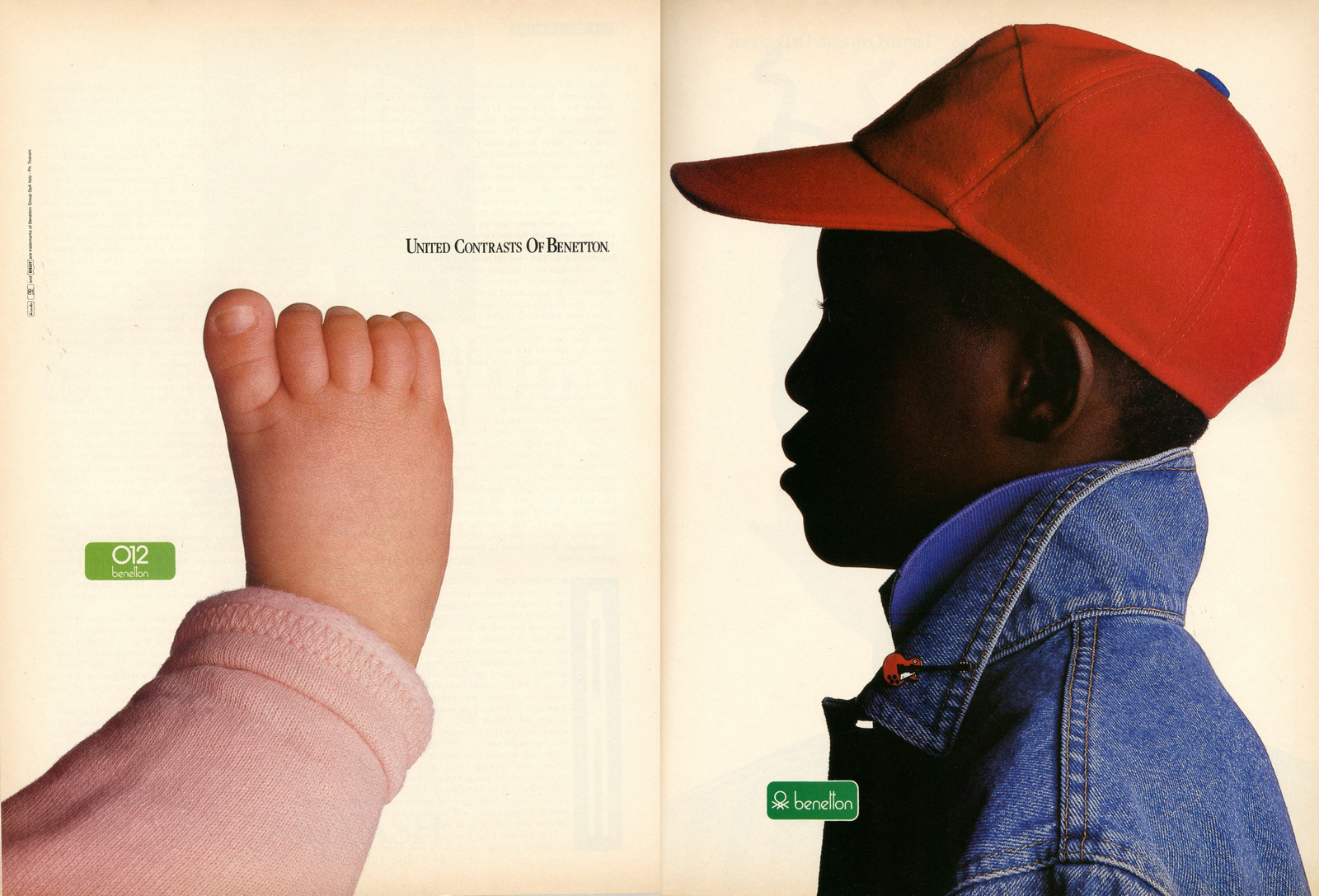
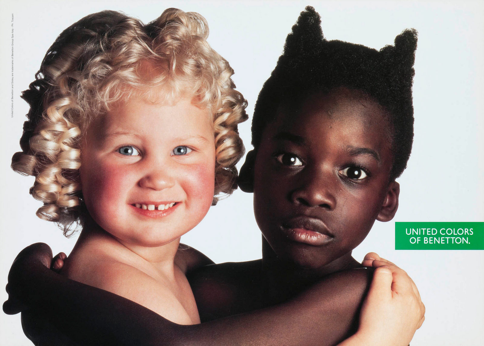
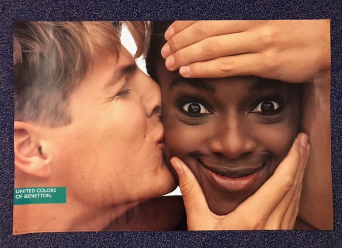
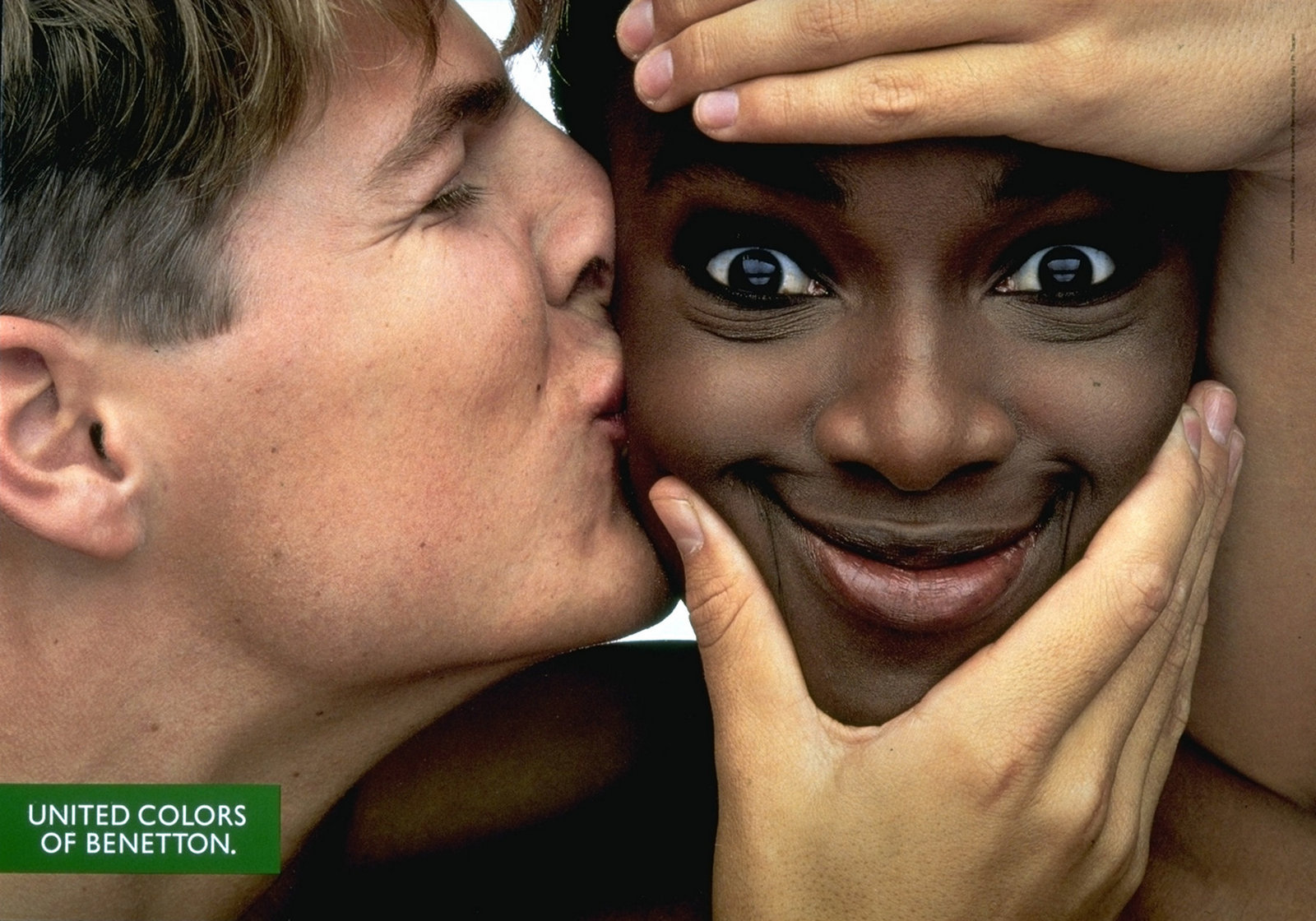
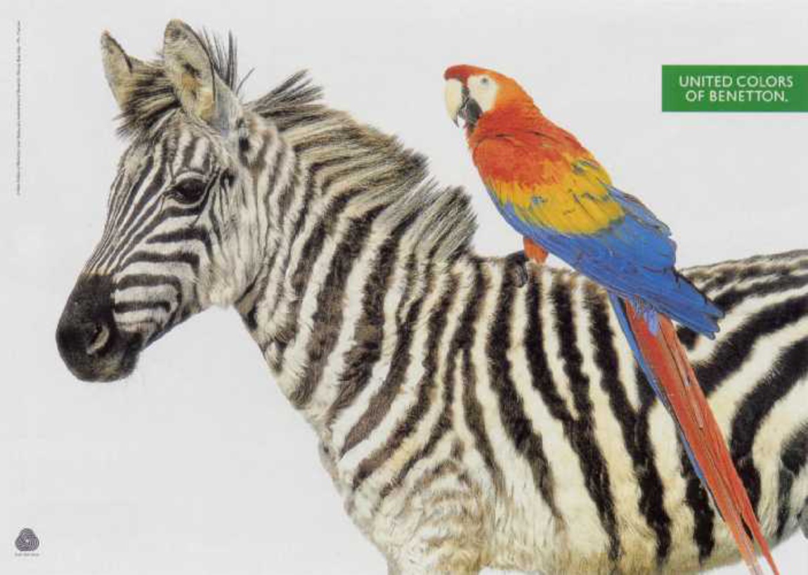
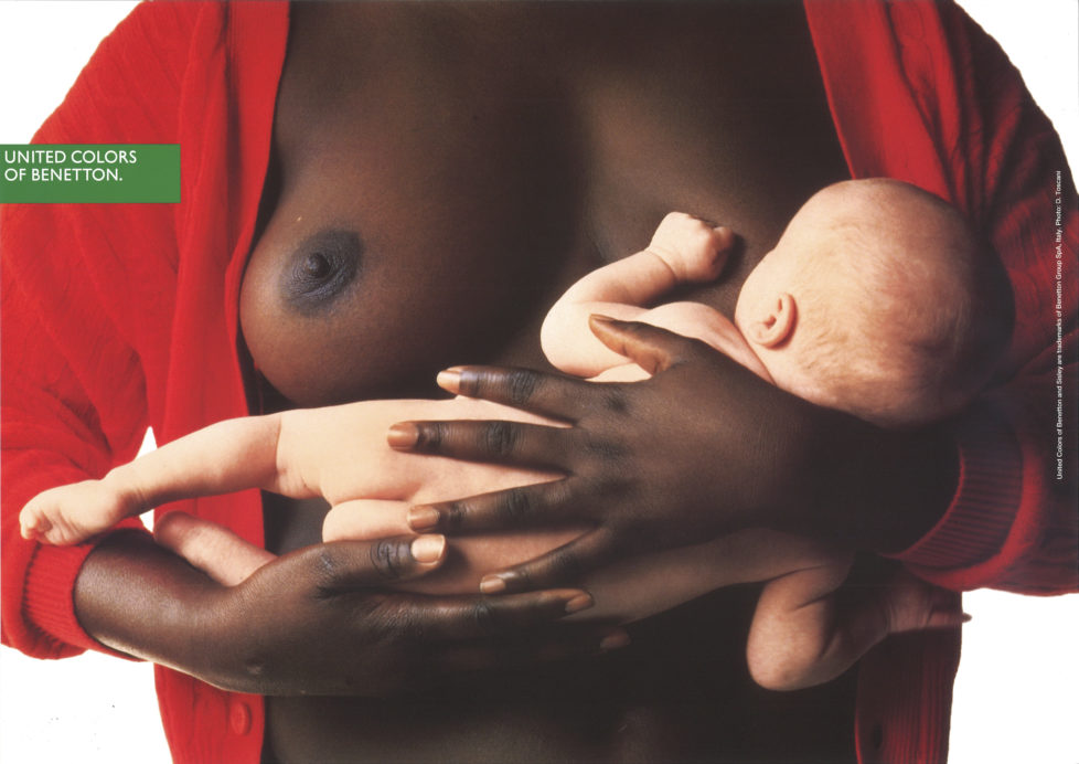
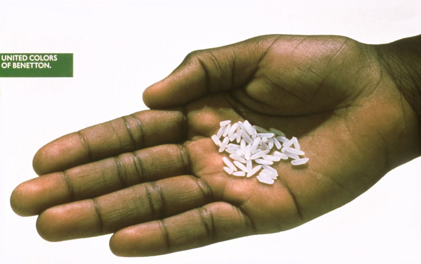
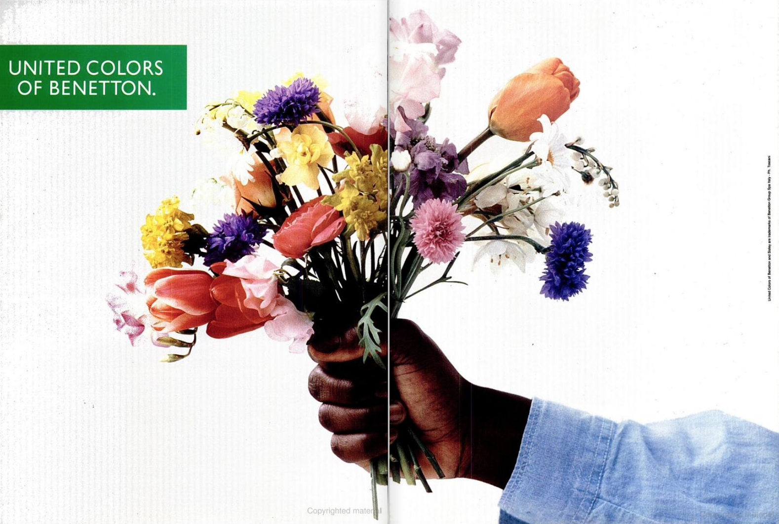
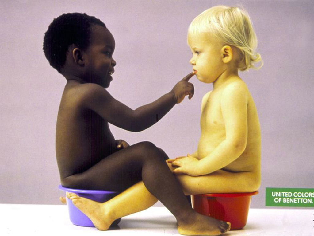
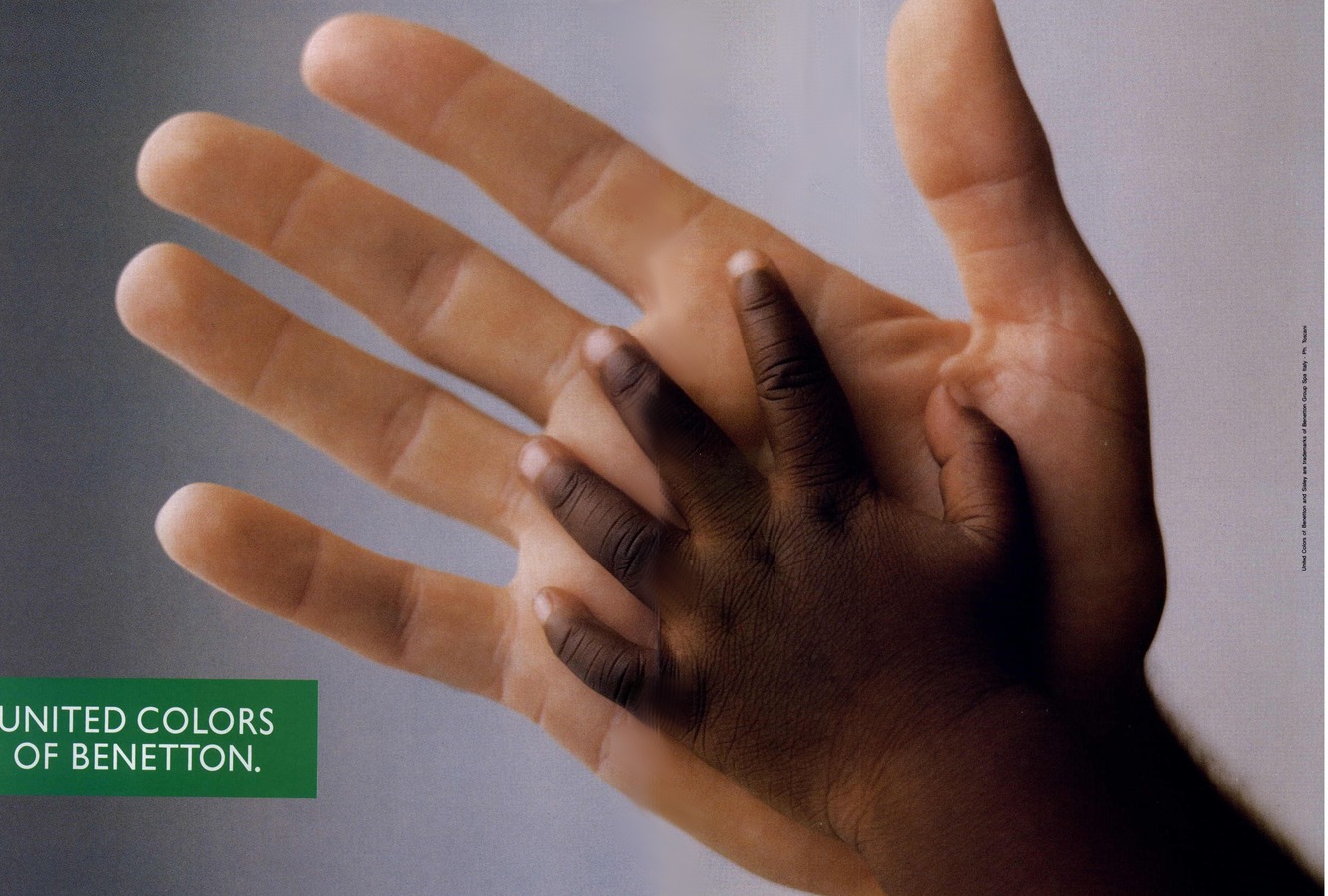
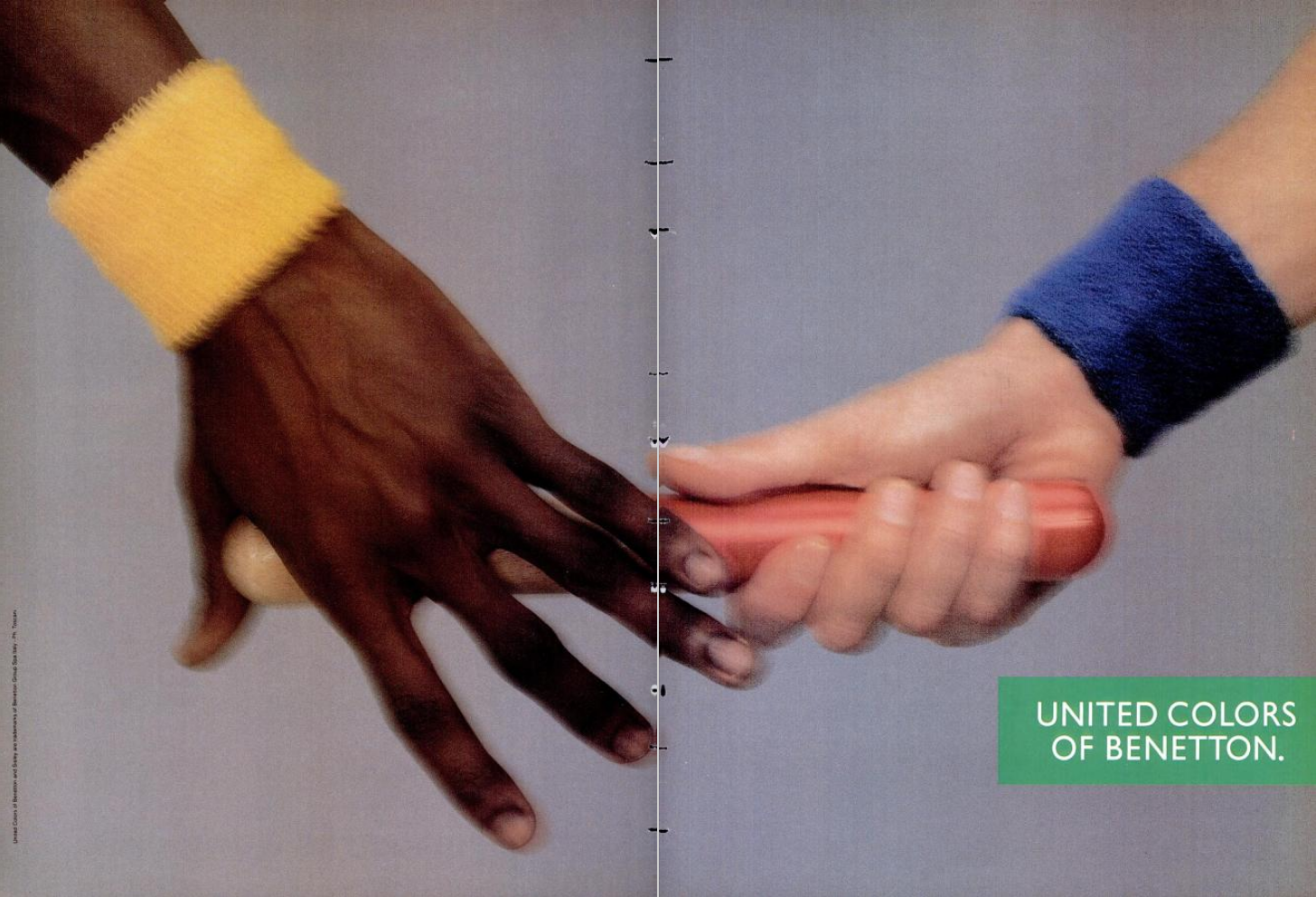
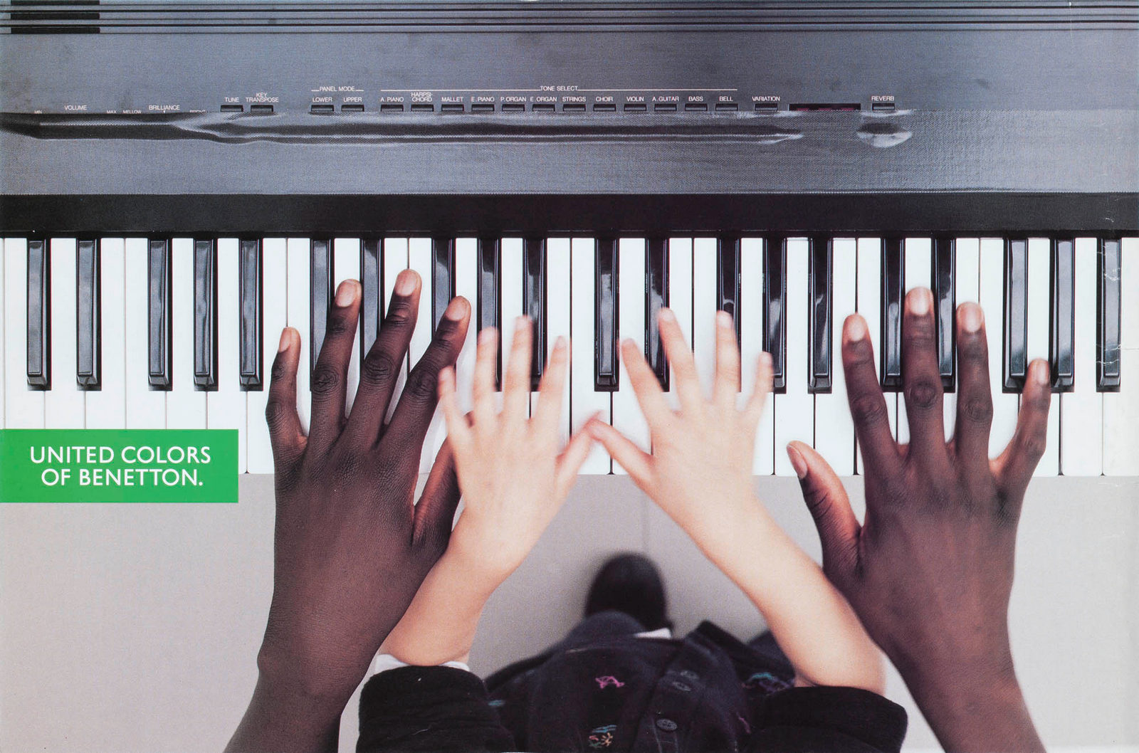
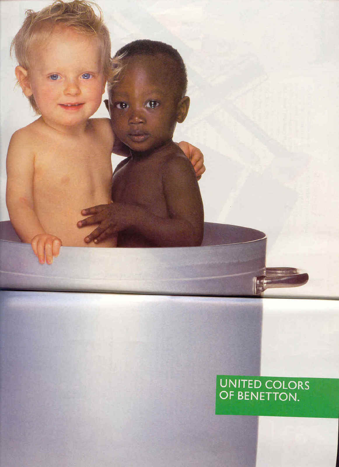
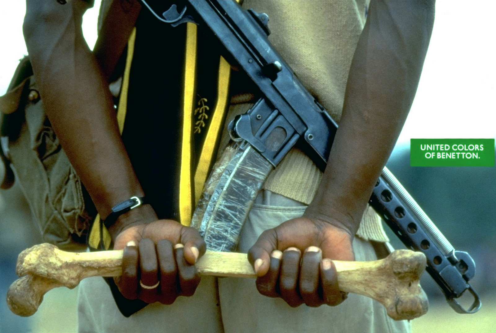
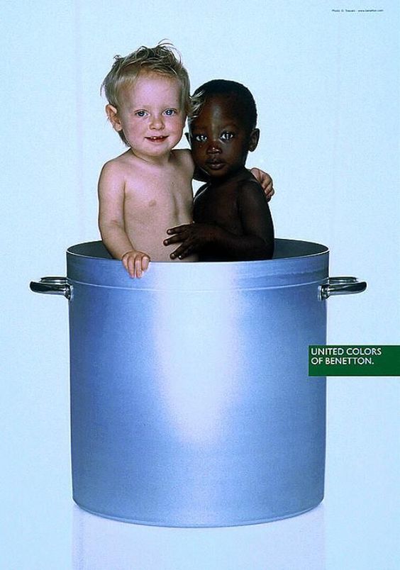
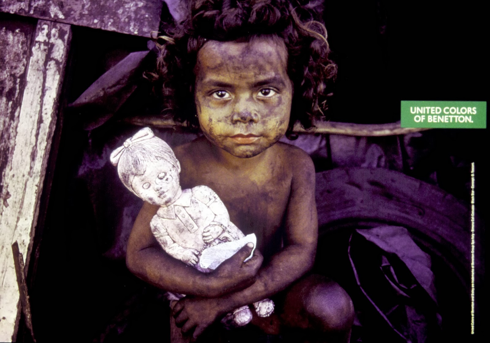
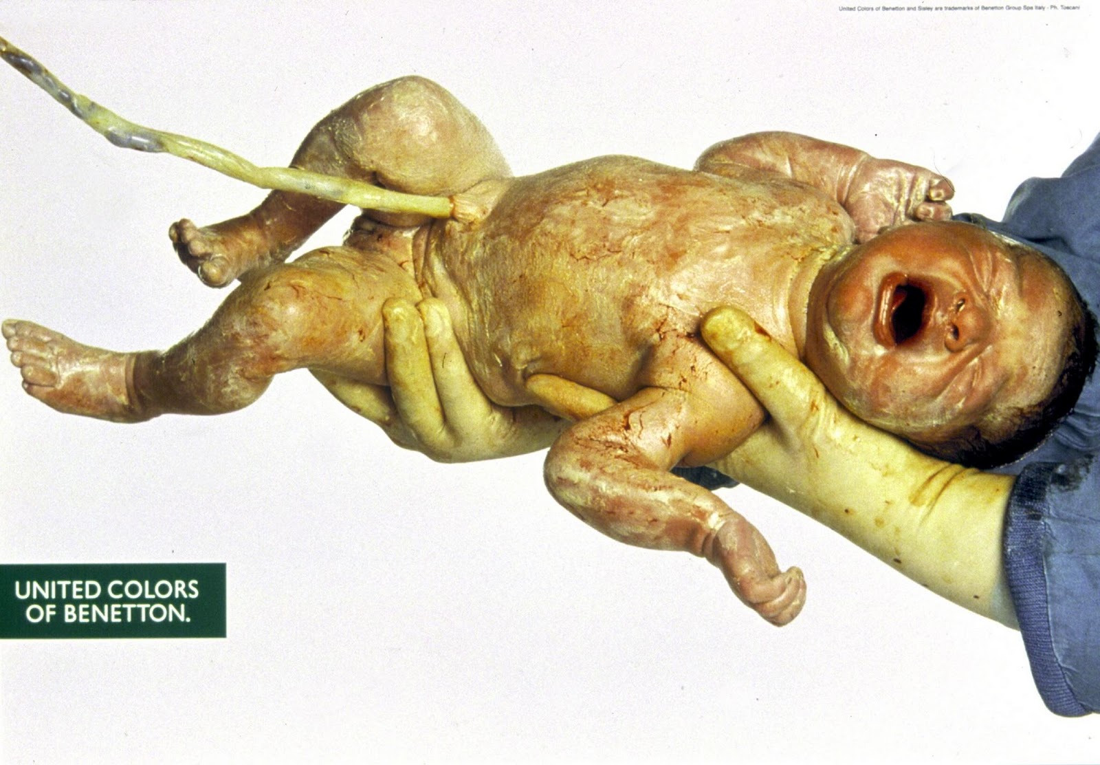
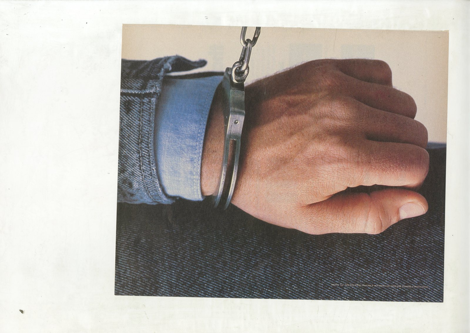
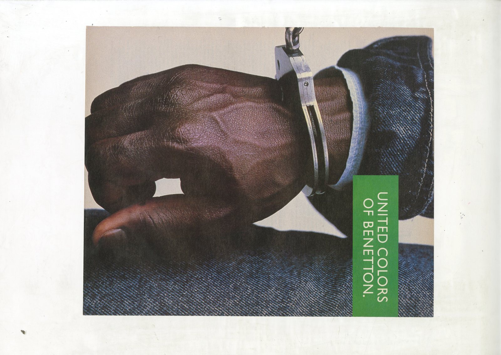
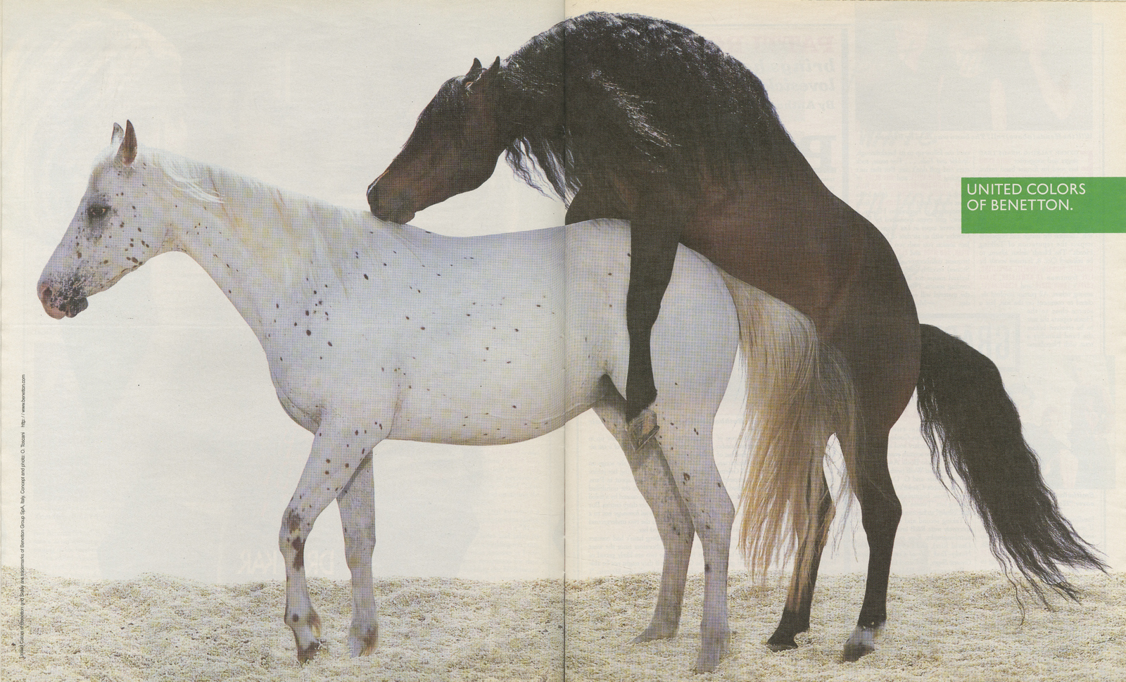
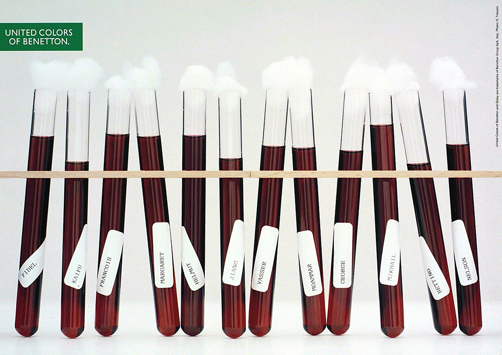
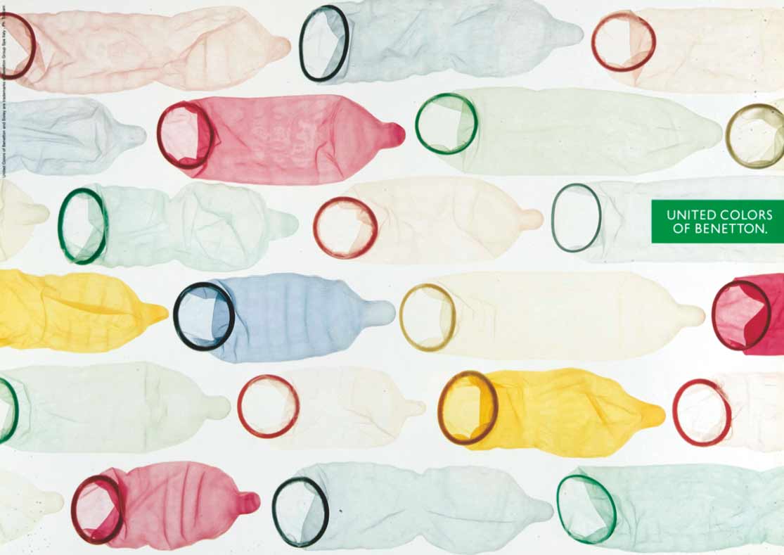
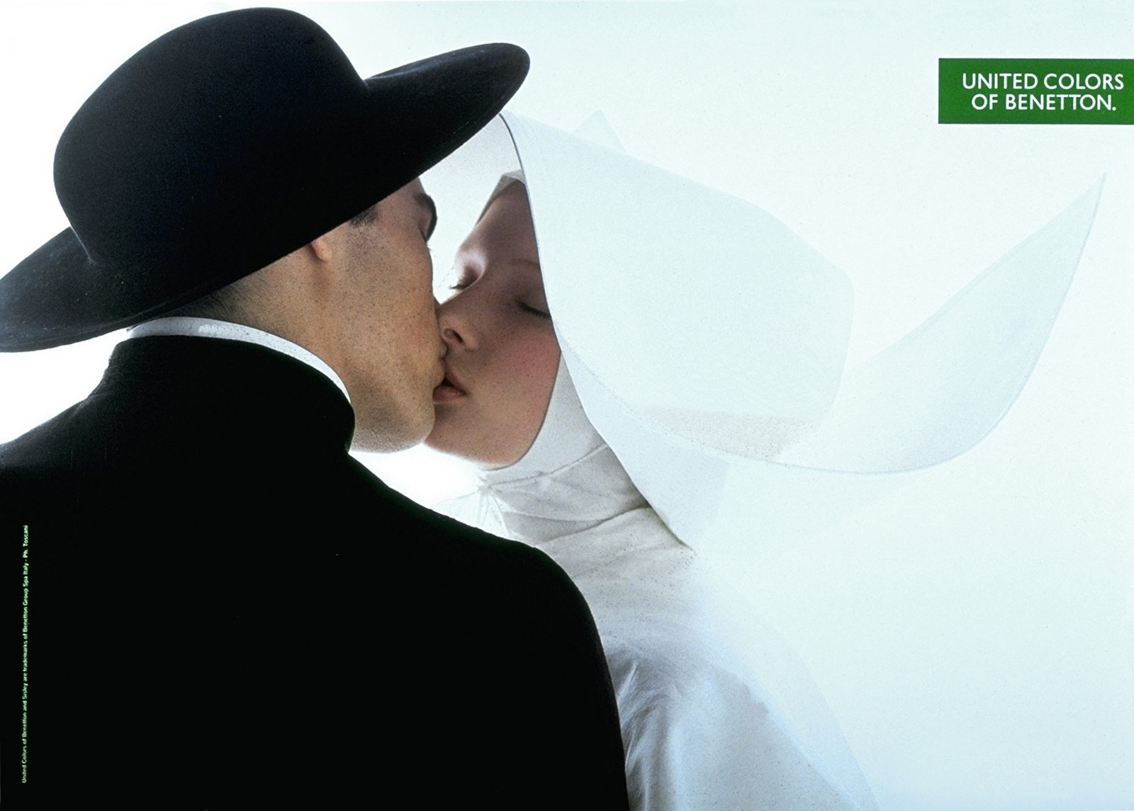
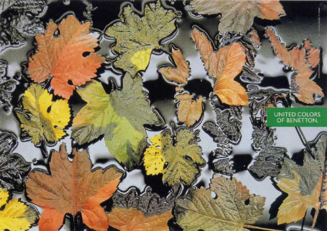
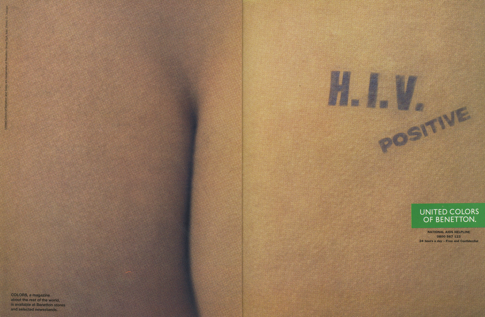
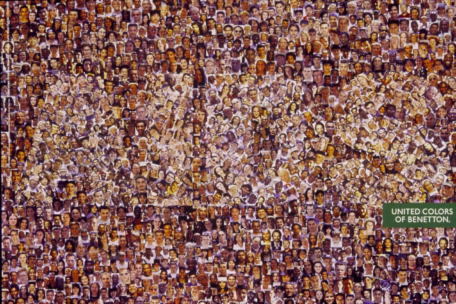
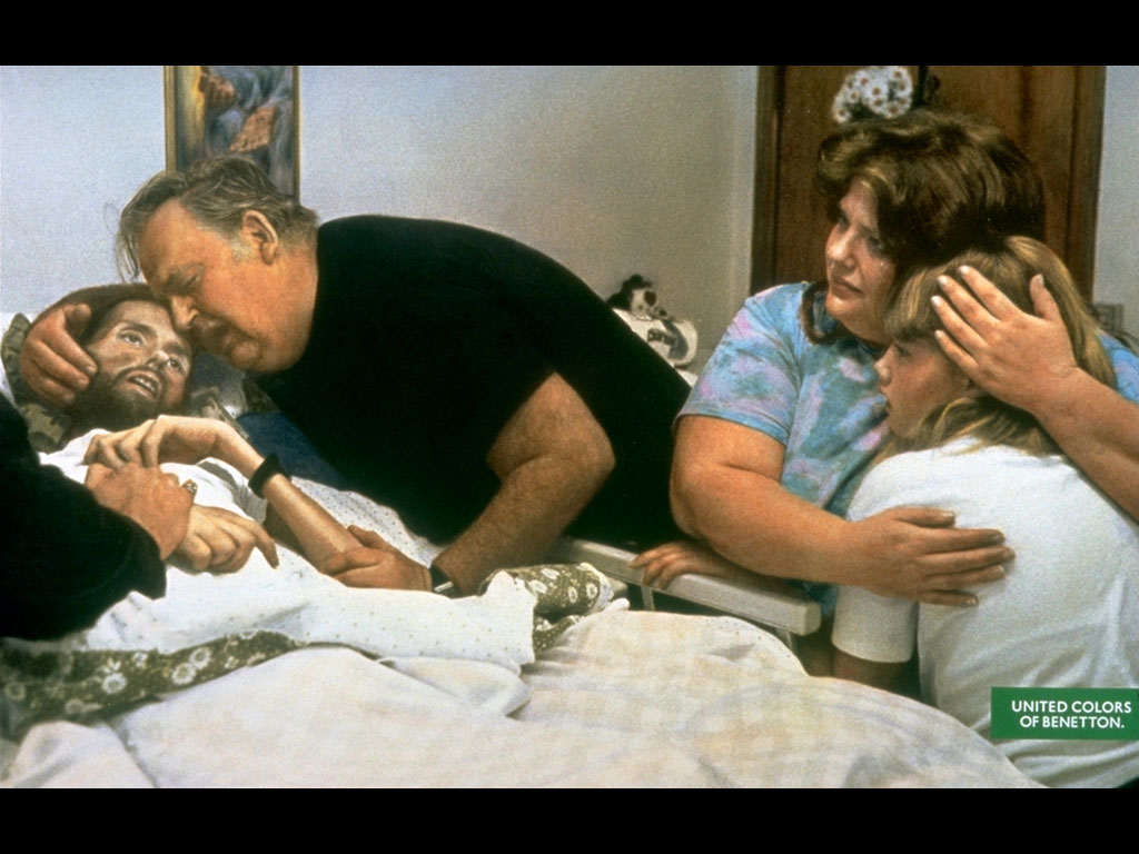
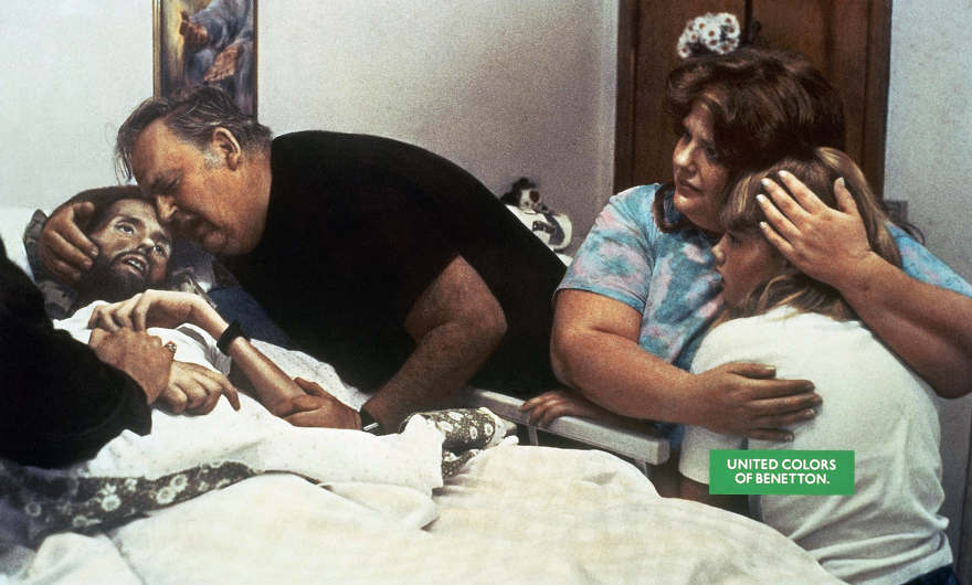
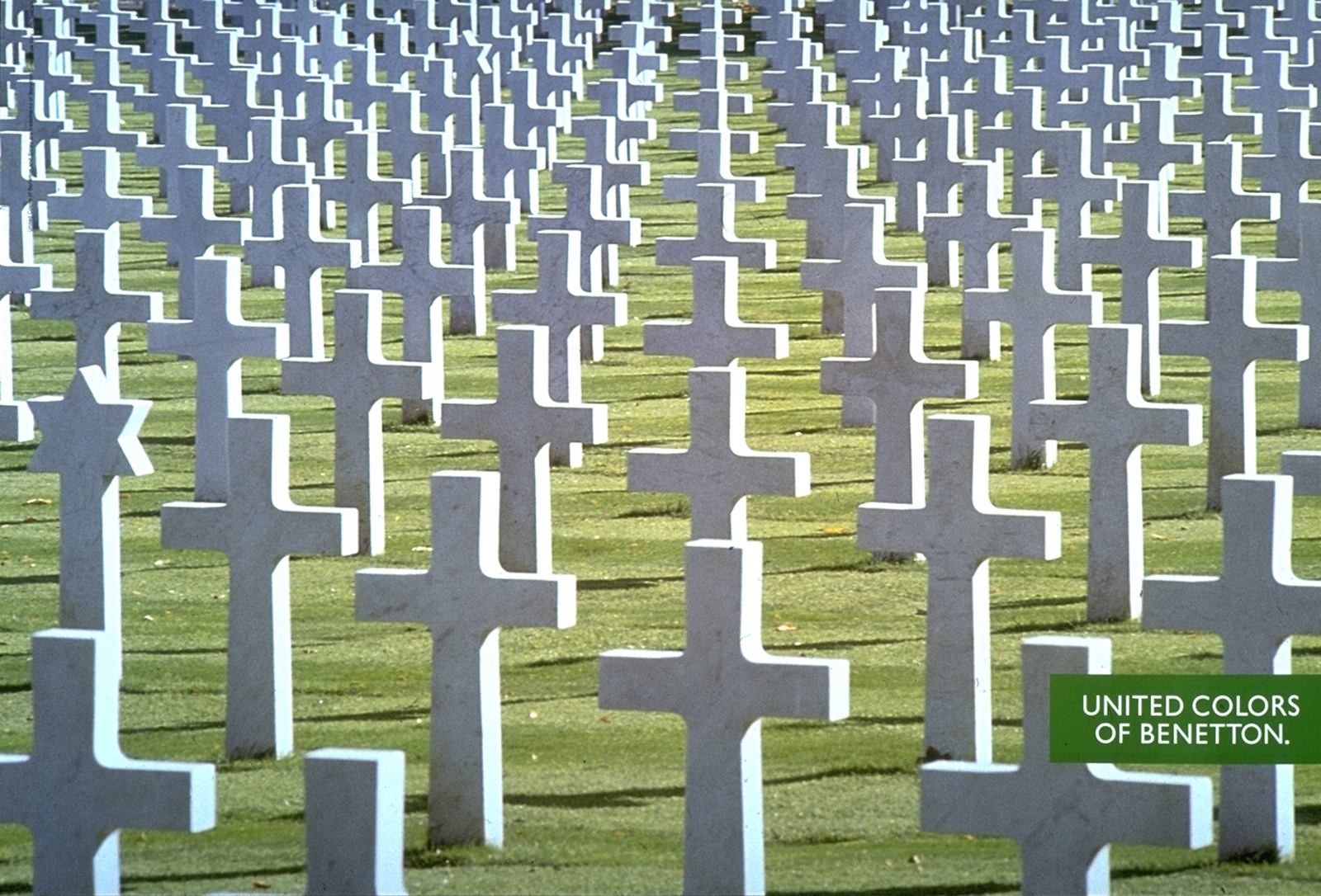
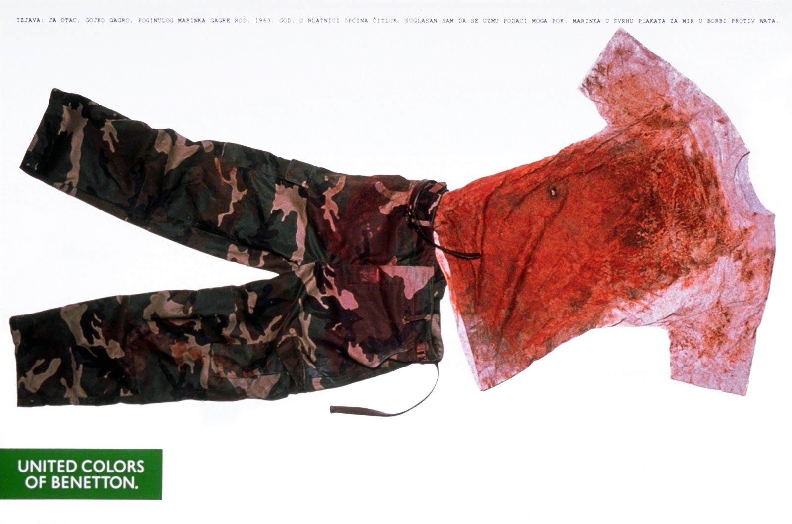
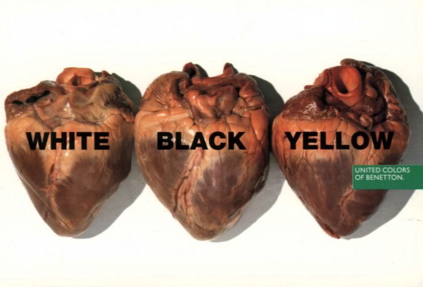
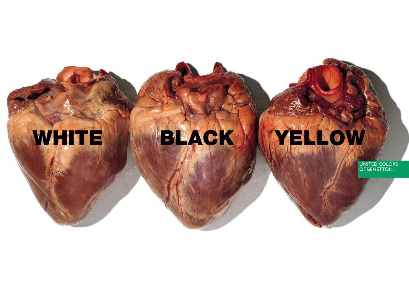
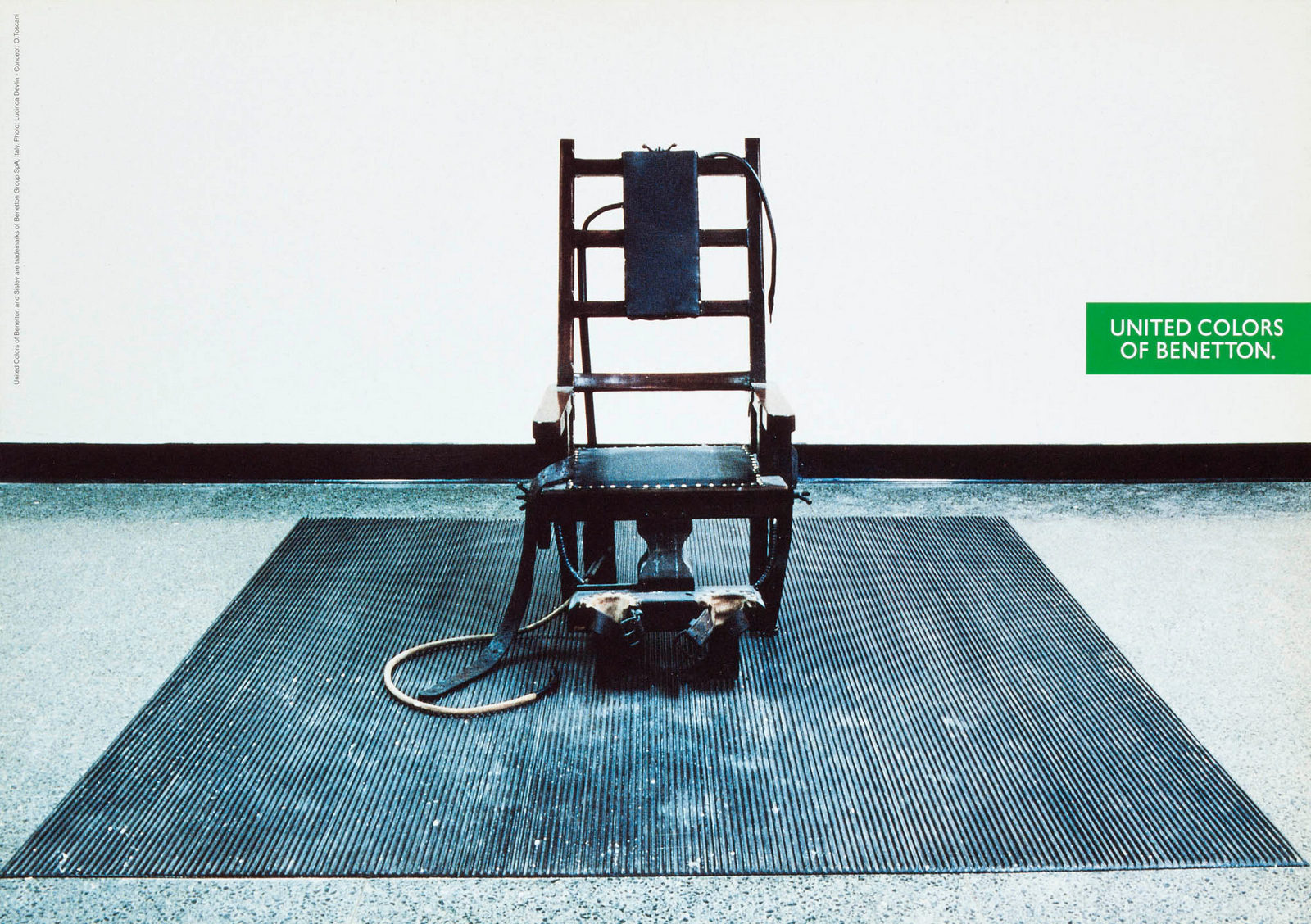
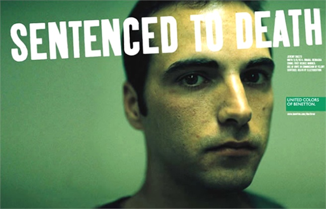
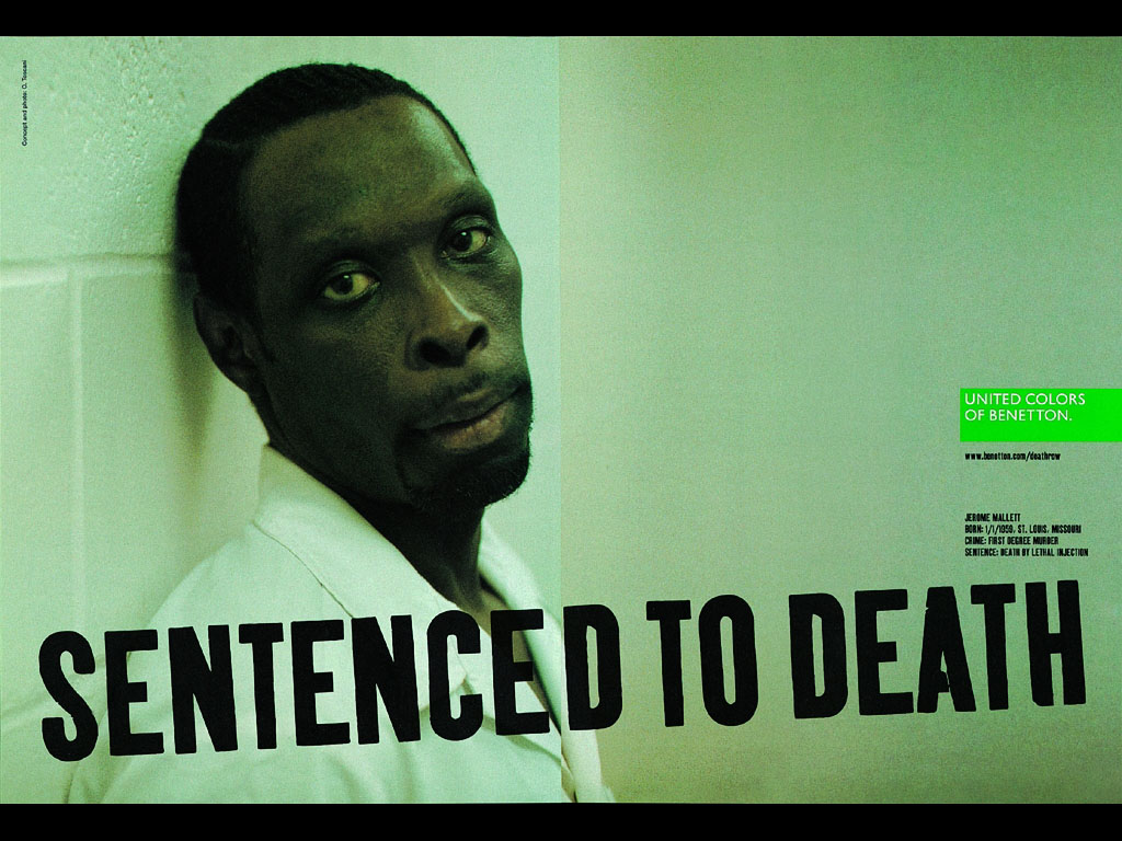
I hated this campaign.It didn’t follow any of the rules we were supposed to follow at the time.It didn’t focus on something uniquely Benetton. (History, products, ingredients, process, etc.)It didn’t even attempt to persuade anyone their products were better than the competition.And frankly, it didn’t seem very clever.It felt like a generic solution that just happened to have a Benetton logo stuck to it.In retrospect, I was wrong.It wasn’t generic, it shone a light on something uniquely Benetton; their attitude.Name another client who’d have the cojones to run this campaign?Then or now.Few run advertising that breaks from the norms of their category, but how many are willing to thrust their companies into the middle of issues like racism, religion and capital punishment?You can count them on one finger.Backed by owner Luciano Benetton, Creative Director and photographer Oliviero Toscani (below) created a campaign that made Benetton, within a handful of years, one of the most famous brands on the planet.
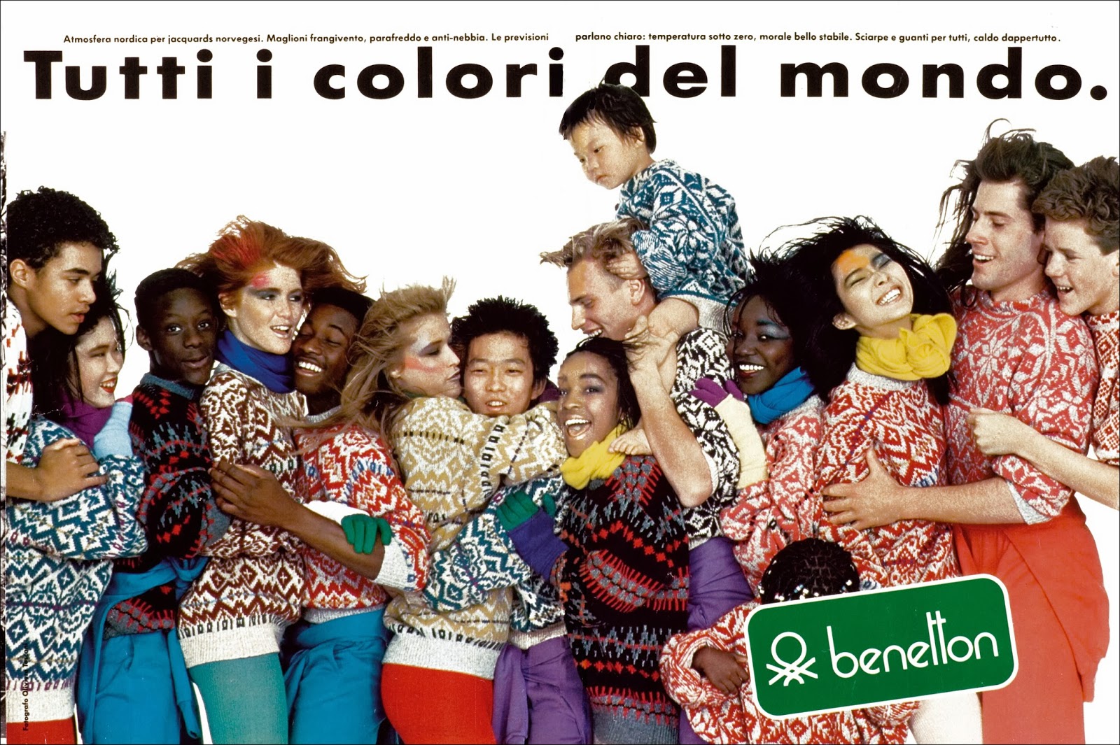
With the benefit of time we can lay it out chronologically and see it evolve.Each year, Toscani pushed the envelope further and further, until, arguably, he pushes it off the edge of the…table? (Is the envelope on the table in that analogy? I can’t remember.)In the beginning, they start by linking the wide variety of colours they offer to the wide variety of humans mooching about the planet.'The United Colours of Benetton'.Gentle.Ish.Using multi-cultural models would've been unusual at the time, but probably didn’t present itself as a brand idea.I've always found it odd when presenting 'big' brand ideas, that we'll show how they'll roll out in years 2, 3, 4, to give the client confidence that the idea ‘has legs’.But I've never, ever seen all those years 2, 3 and 4 get used.Most campaigns evolve as they go, shedding the bits that don't work, building on the bits that do.I'd be willing to bet that there was no long-term plan, no year 2, 3 and 4.My guess is that the plan was whatever Toscani felt like at the time.The plan is him.Socially and culturally aware.Provocative.Graphic.(They look simple, but being able to capture social issues in such simple images is a rare skill.)He shot and oversaw all of them.From cute model shots to grim death row ads.From gentle to provocative to...well, whatever word is for provocative turned up to 11.Or, to put it another way; from unknown to world-famous.Handy if you’ve got a lot of coloured jumpers to sell.


There may even be another one, along with Paul Burke I'm trying to track down the 100 best radio ads.(If you have any send them in.)But onto this one, one of the surprising joys of doing this blog is unexpected things that turn upon my doorstep.Proofs, agency brochures, old DVDs, all manner of ephemera. (Or 'crap' as my wife calls it.).It's lead me to post blogs on David Abbott's BT Pitch, Fallon McElligott's Rolling Stone campaign (thanks for the tear-sheets Brian Burch, posting soon), and this one: ‘21 Years Of Radio Advertising'.A one celebration of the best of the U.K's radio advertising, it includes advice and reflection from some of its best practitioners; Tim Delaney, David Abbott, John Hegarty and more.Interestingly, it says on the cover 'Commercial Radio. It's time has come.'I wasn't aware of that in 1994.It came in this...
No note was attached, so I've no idea who sent it. They may have forgot to include one or remain anonymous, who knows?I can't help but stare at that envelope for clues.I don't think I know anyone from Windsor? The wildly varying type size suggests it isn't from an Art Director.I'd say the @ points to someone under 35, but this thing was produced in 1994, it's unlikely someone at Primary school would've hung on to a CD about radio advertising for the next 26 years?So, whoever you are; thank you.For the rest of you; enjoy.
What was the last product demo you saw?Not on Facebook, Twitter or Instagram, they're all over those, but on tv, billboards or press (does press still exist?).You just don't see agencies doing them anymore.Odd, because, and I hope I’m not giving away any trade secrets here, the goal of most advertising is to persuade people that the product featured is good.Ideally, REALLY good.So showing it in action, performing well, seems like it might be a good way to go?Because most purchasing decisions are based on what a product does. But sometimes in ad agencies, we can get too distracted with our own fancy theories and philosophies.Not just in agencies, sometimes when I teach I’ll review work that, although clever, doesn’t feel like it'll sell anything.It doesn't feel like it's trying to sell anything.Would you buy that cereal because you're told it’s what the cool folks eat?Or a computer because the company that makes it has some very progressive social policies?Maybe.But most wouldn't, they want to know what's in it for them.My advice when such a situation arises is always the same; imagine you’re with a friend, face to face, how would you persuade them to buy this product?.They know they can't waffle and bullshit friends, so they stop trying. Instead, they start thinking about why their friend may actually part with money for this product.Focussing on what it does.How it may help them.The ideas often become less grandiose and more like common-sense advice.Which is more persuasive.As the saying goes – Don’t tell me you’re funny, make me laugh.So why are we producing less product demos?Less products to warrant that type of advertising today?Would that kind of 'hard sell' advertising reflect badly on a brand today? Or that it would reflect badly on us?(Answers on a postcard, etc, etc.)p.s. I couldn’t help wondering if the British Government spent less money telling people what to do about Covid-19 and more on demonstrating the benefits of wearing masks and washing hands, the situation may be a bit better?E.g. 1. Masks.
E.g. 2. Soap.
When I gathered together this bunch, I didn’t look through awards sites or annuals, I just tried to remember product demonstrations, ones that had stuck with me.Consequently, there are some ads in here that I couldn’t tell you when or where they were done, like Tonka and the nail varnish ad.But having collated all of this 'unfashionable' work, it dawned on me that most of it was created by the most fashionable agencies.At least, the most fashionable in their of the day.DDB, PKL, WRG, GGT, BBH, WCRS, DDB, AMV, APPLE.Written by the likes of George Lois, Roy Grace, Dave Trott, David Abbott, John Webster, Ron Collins.Maybe they knew something we don't?

TV.
Reader suggestions:

‘Remember how seriously we all took it?Not that we took ourselves seriously or that we didn’t have fun, but we just tried so, so hard to make great work.It may be chip paper to most people, but we’d really sweated every last detail.Even on the bad ads, we'd stay lat trying desperately to improve them.Like we were on a mission.It seemed so important.’I enjoyed chatting to Mary.Although afterwards, I must confess, I was a little irritated; why on earth had she never set up her own agency?Or run her own Creative Department for that matter?(And why wasn’t that one of my questions?)She was born to do it.She’s such a clear thinker, funny, ballsy and confident, as you’ll hear.Also, and this is often gets overlooked - in 1987 Mary picked up the coveted Whitbread Most Promising Beginner Award at The Creative Circle.Hope you enjoy it.
HOUNSLOW COLLEGE.
FOOTE CONE BELDING.London Underground.
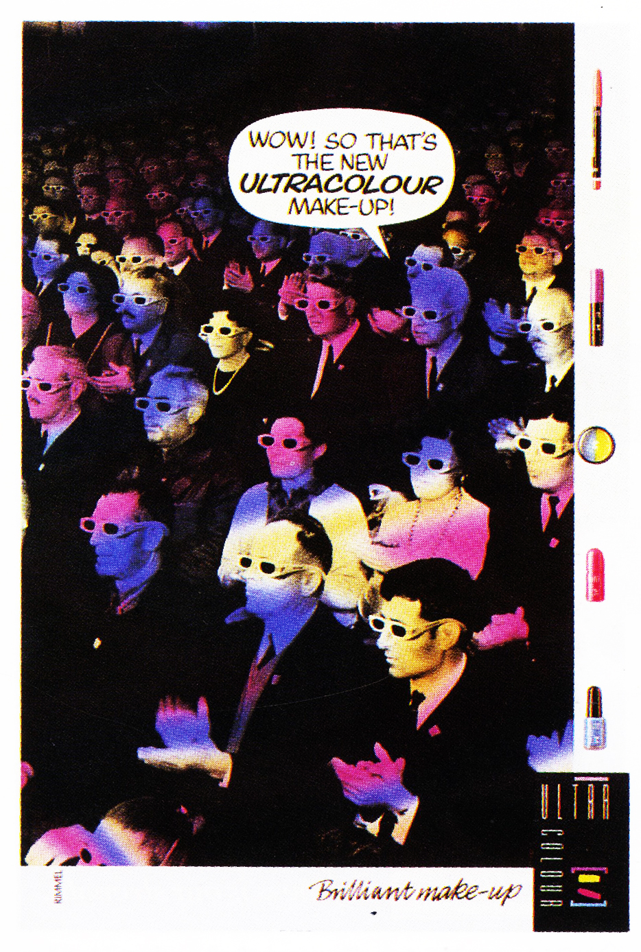
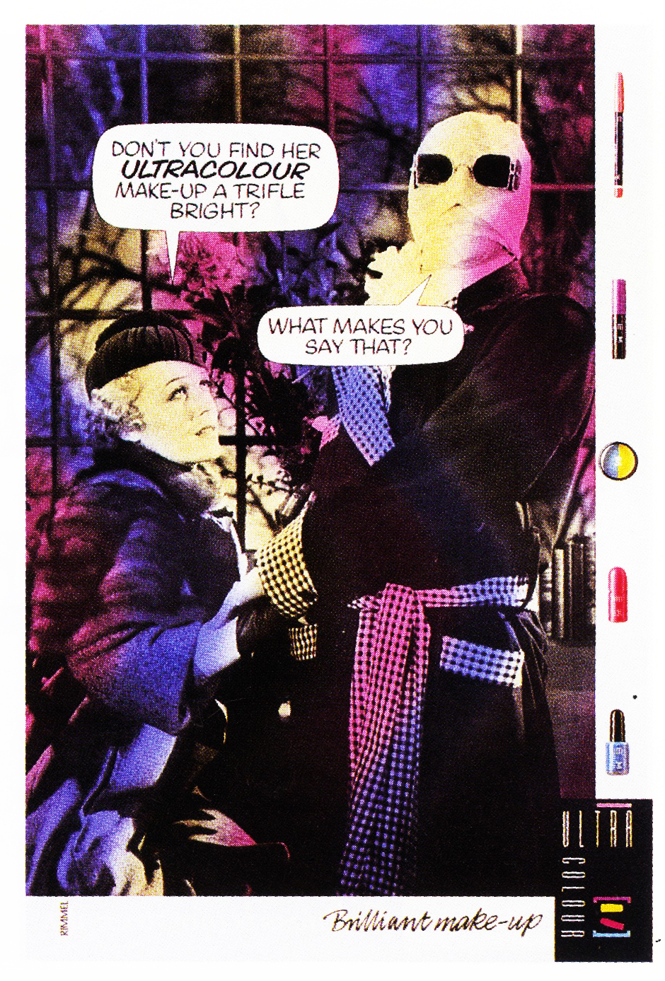
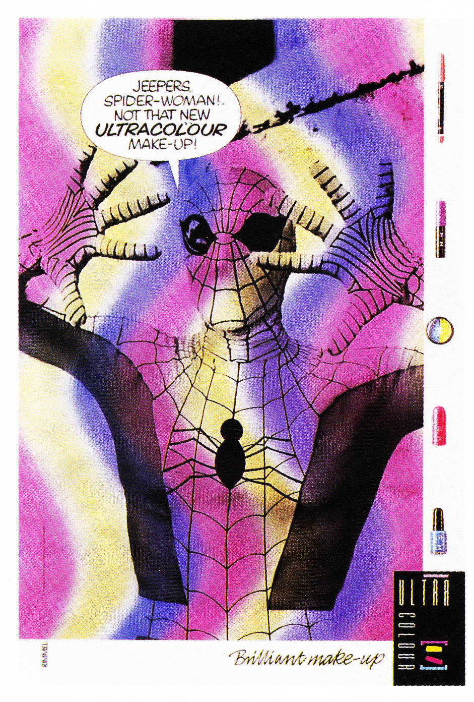
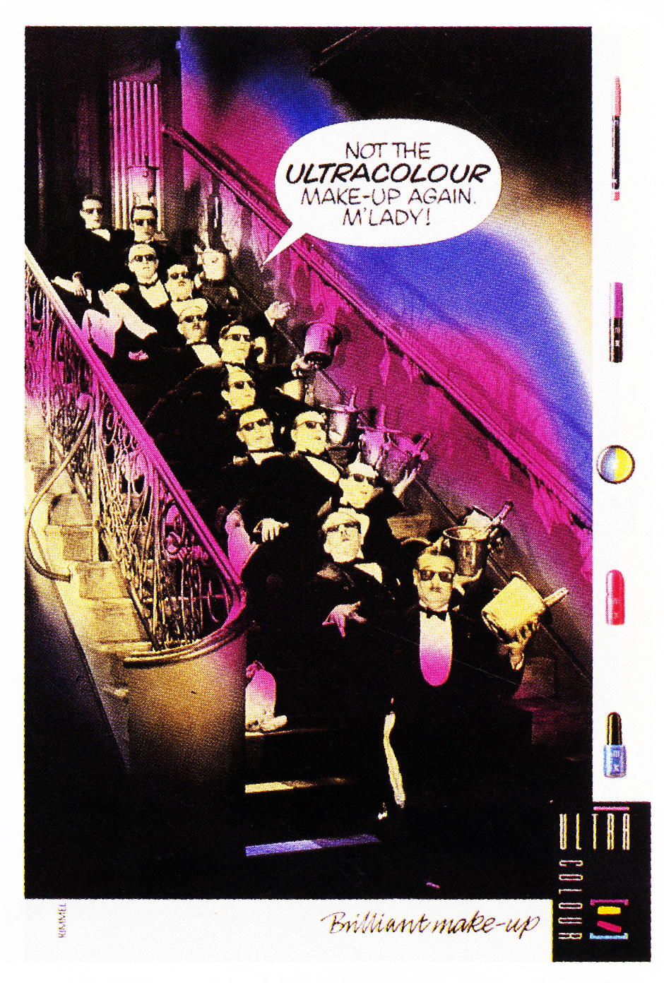
Rimmel.
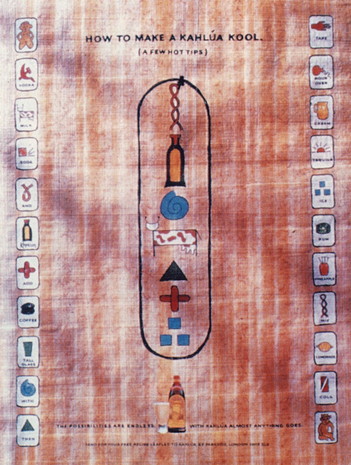
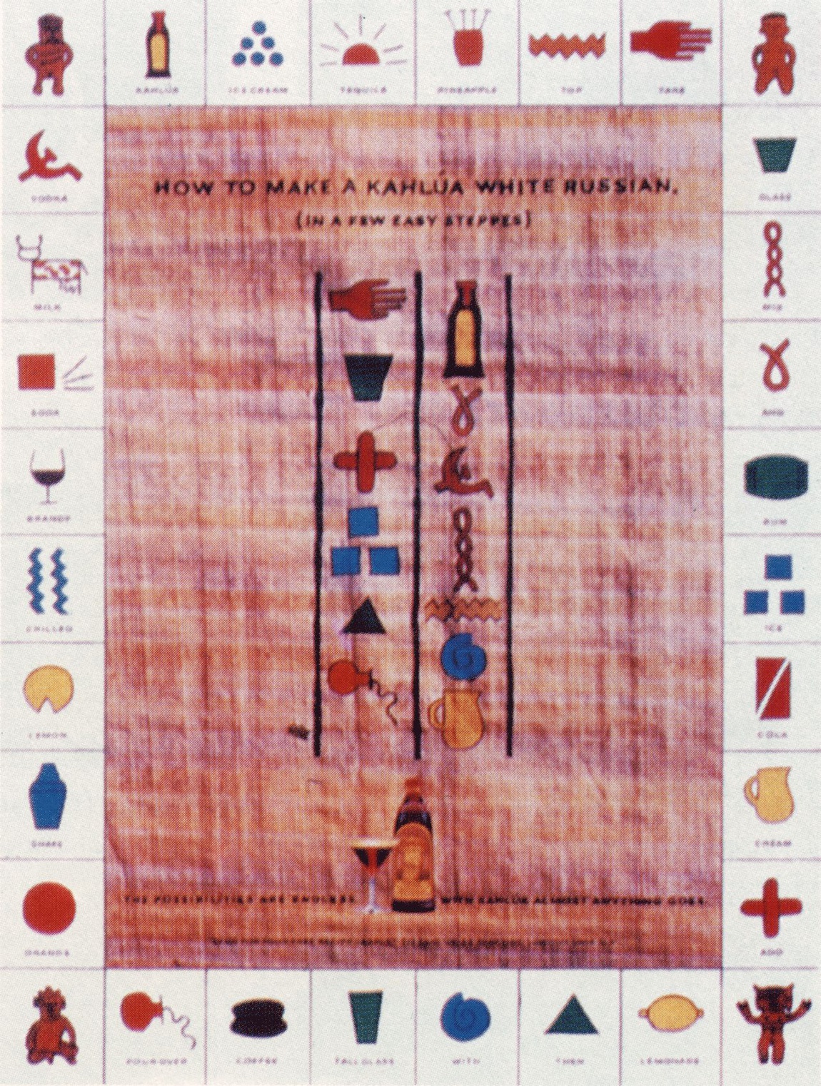
Kahlua.
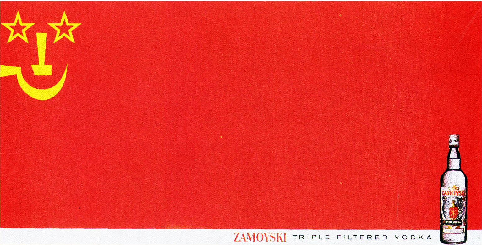
GOLD GREENLEES TROTT.Zamoyski.
Post Office.
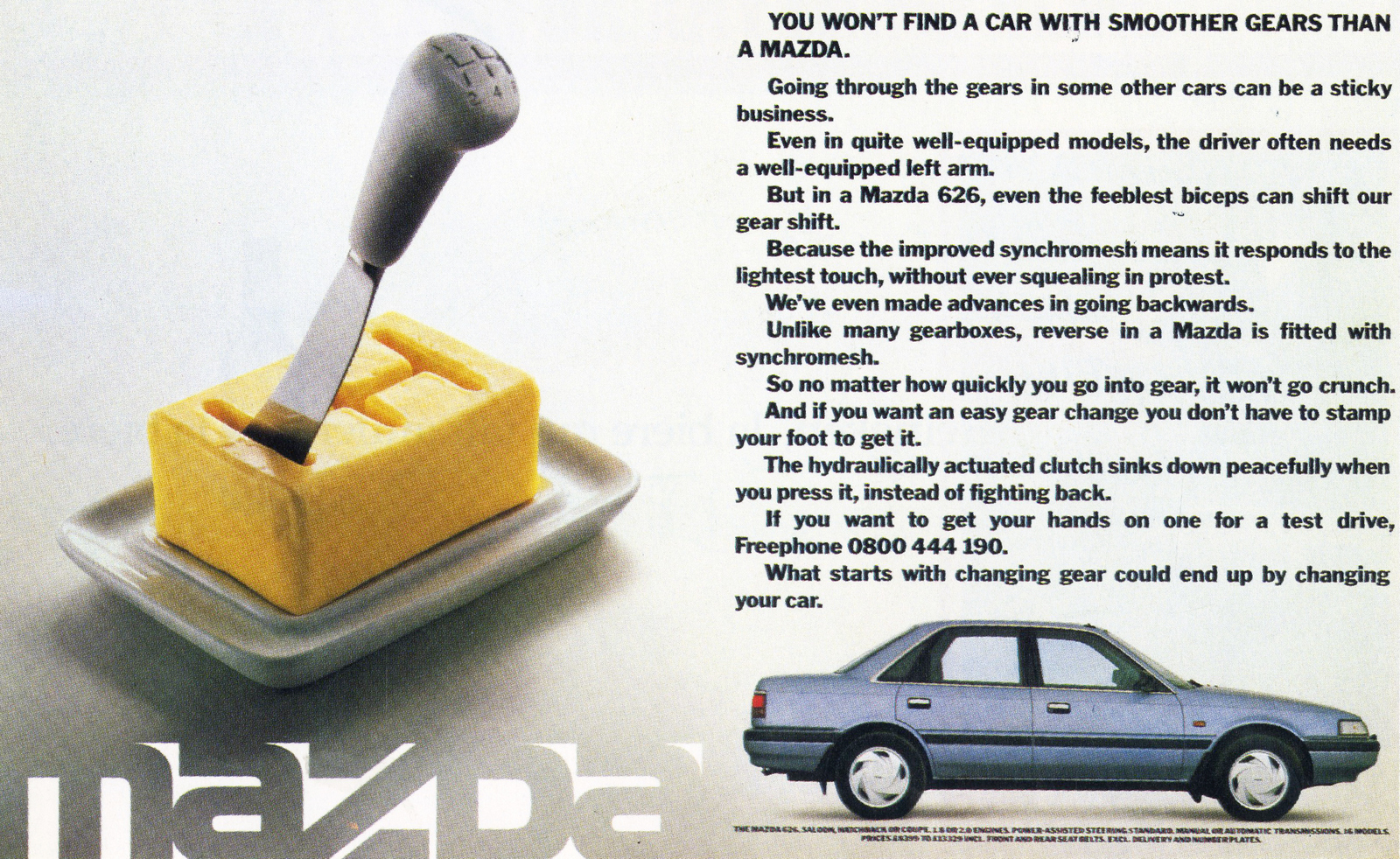
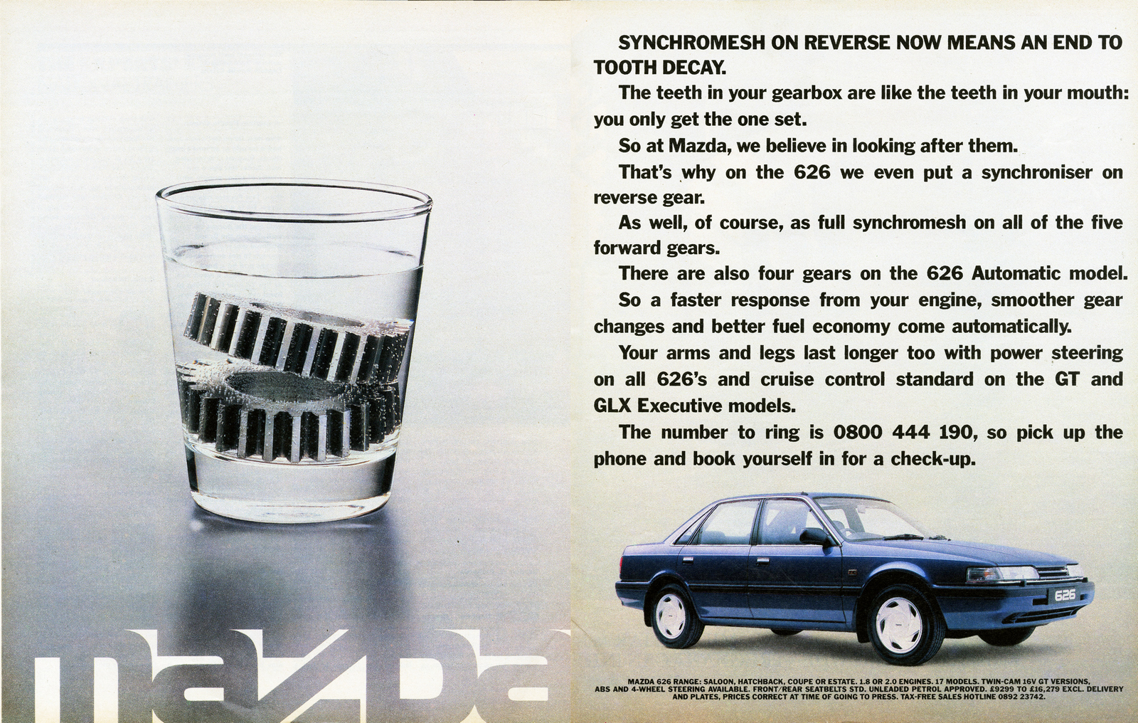
Mazda.
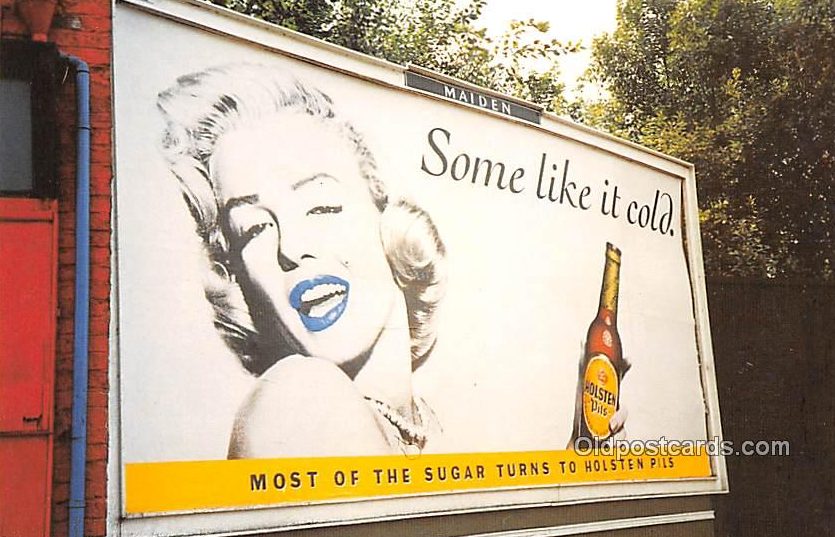
Holsten Pils.
The Daily Mirror.
ITV.
Cancel The Third Word Debt.
Cadbury's Wispa.
Toshiba.
LEAGAS SHAFRON DAVIS.The Sunday Express.
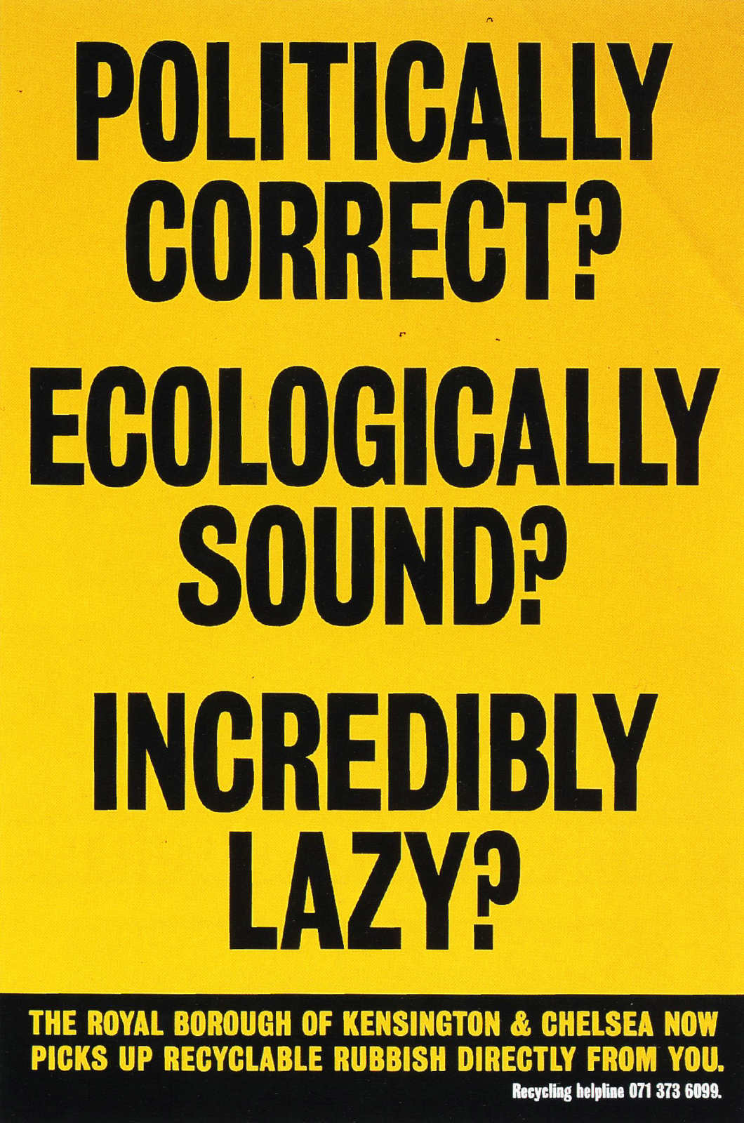
SAATCHI & SAATCHI.Royal Borough of Kensington.
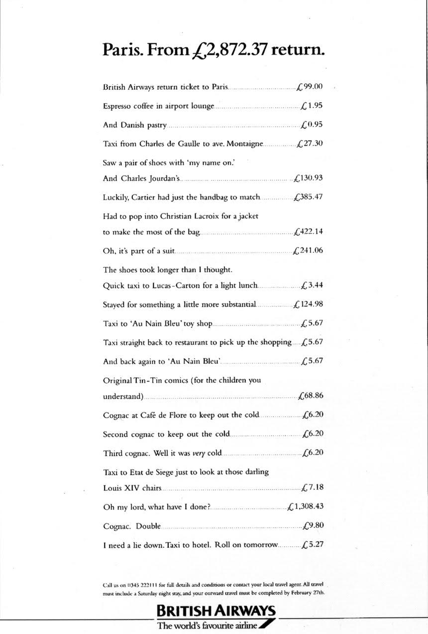
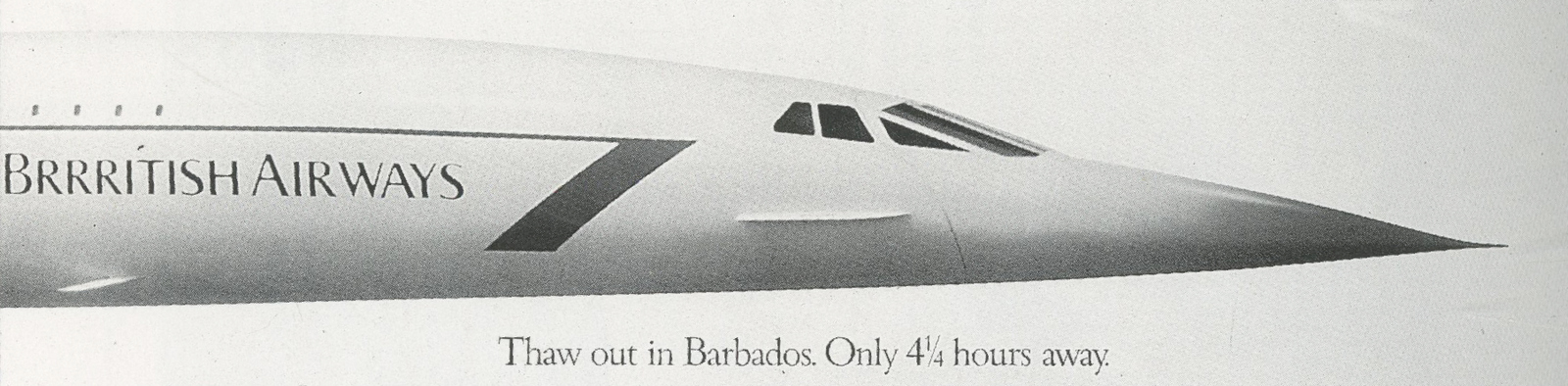
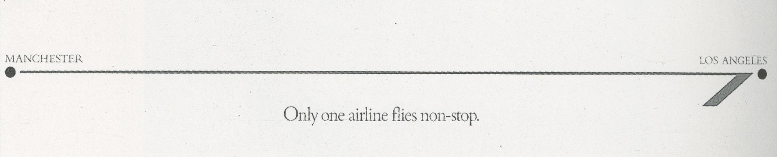
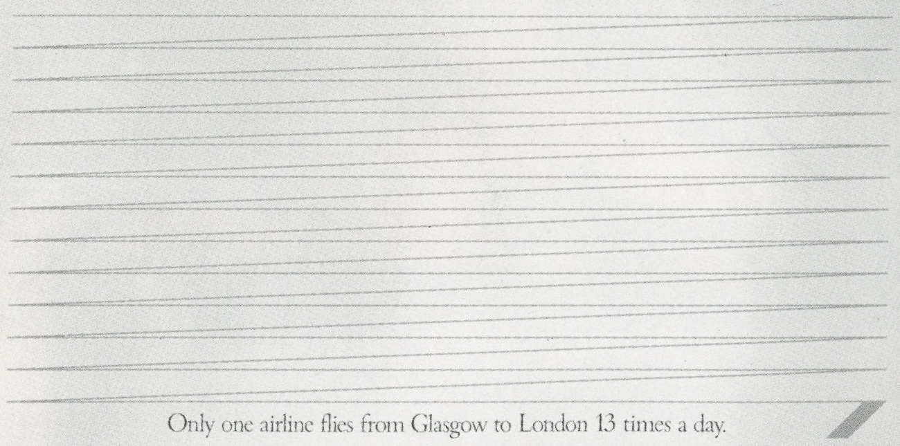
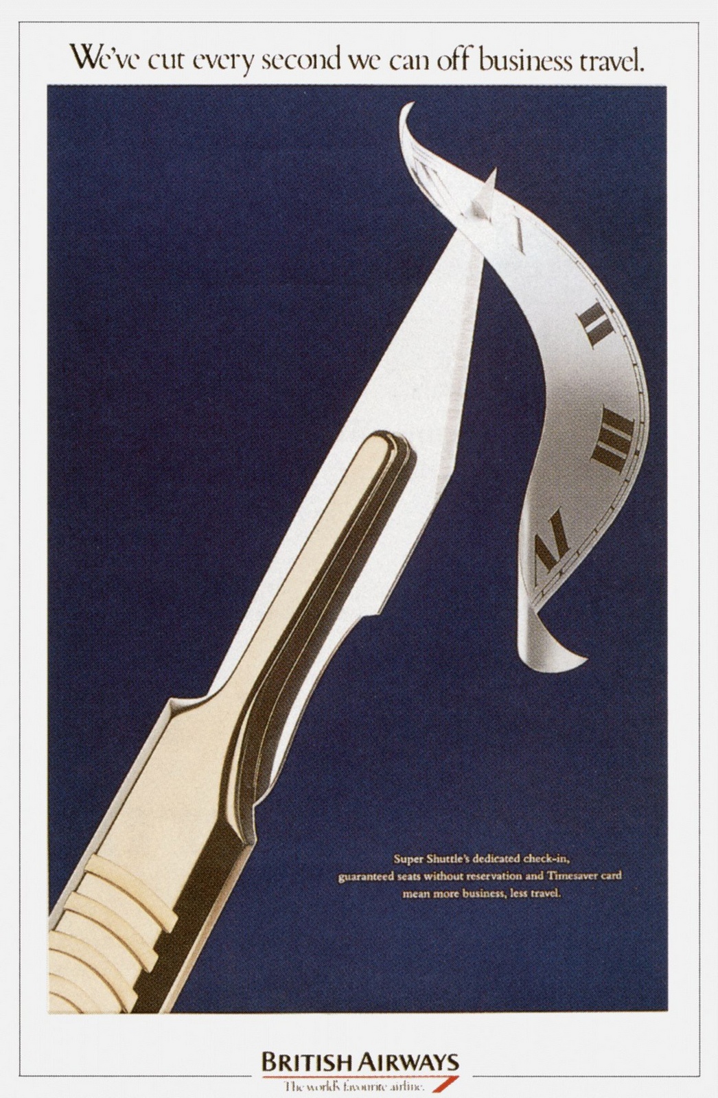
British Airways.
Visa.
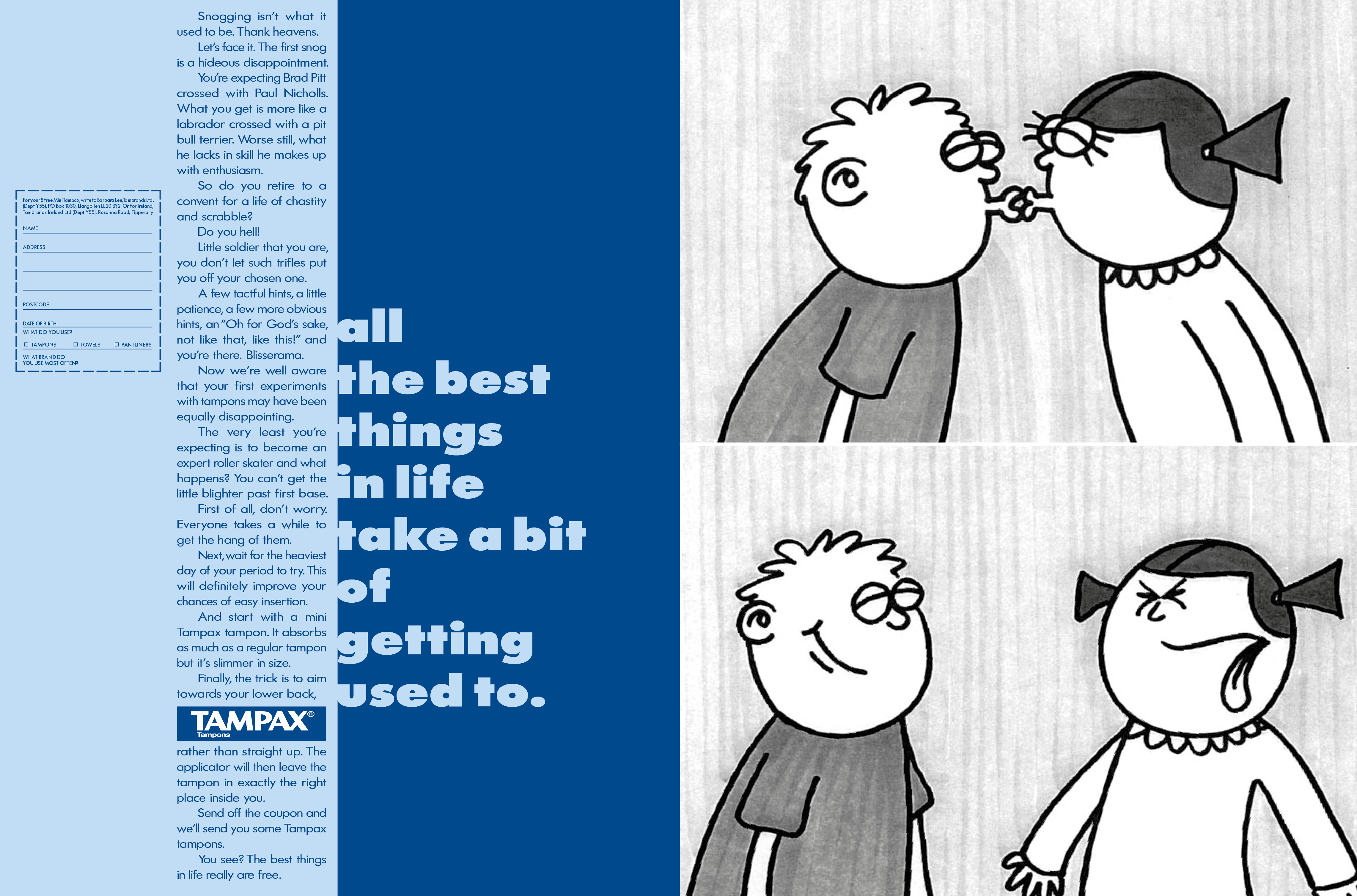
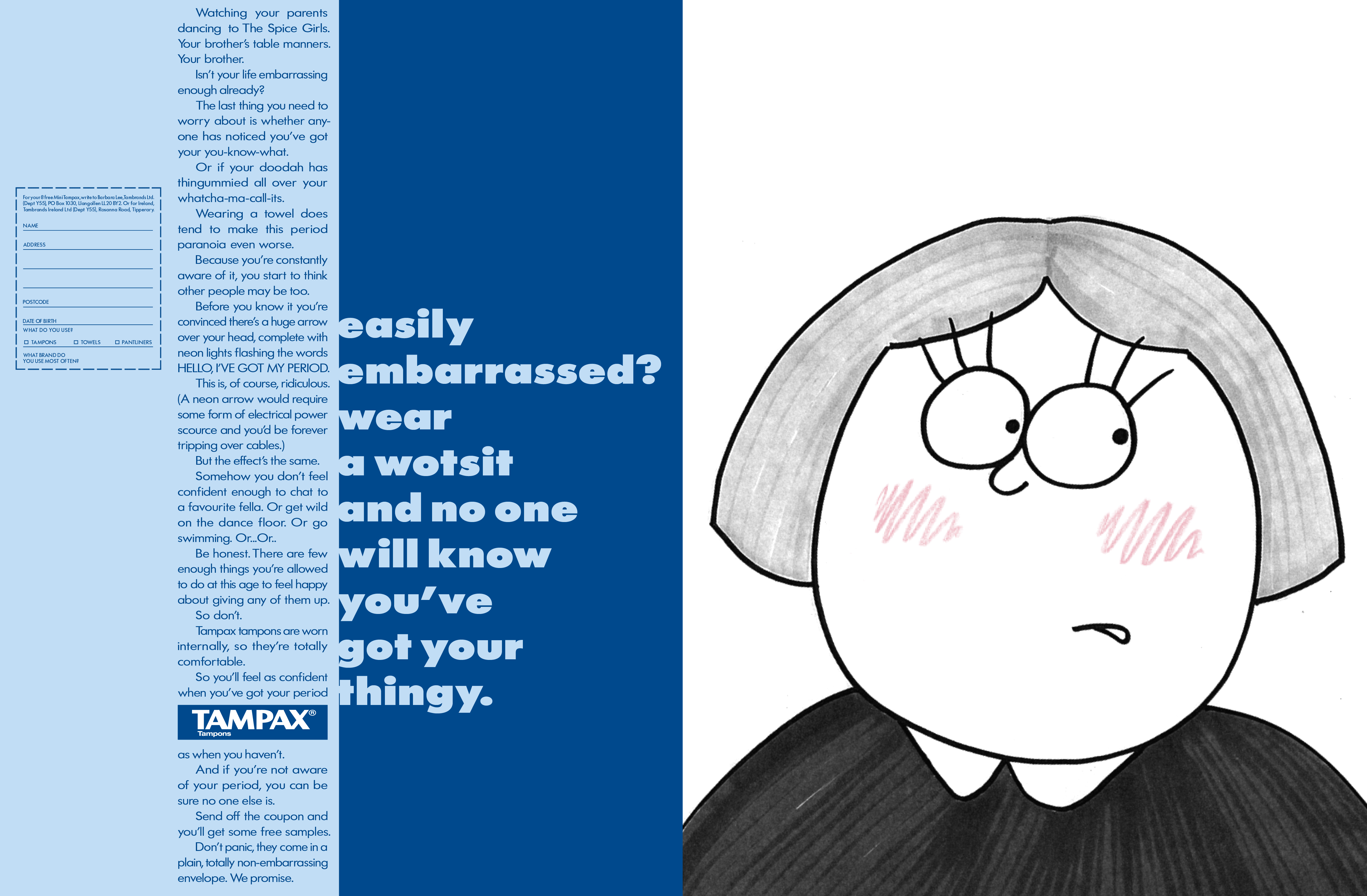
ABBOTT MEAD VICKERS.Famous Grouse.
Tampax.
Reed Employment.
Anti-Smoking.
British Telecom.
The Economist.
Yellow Pages.
Ikea.
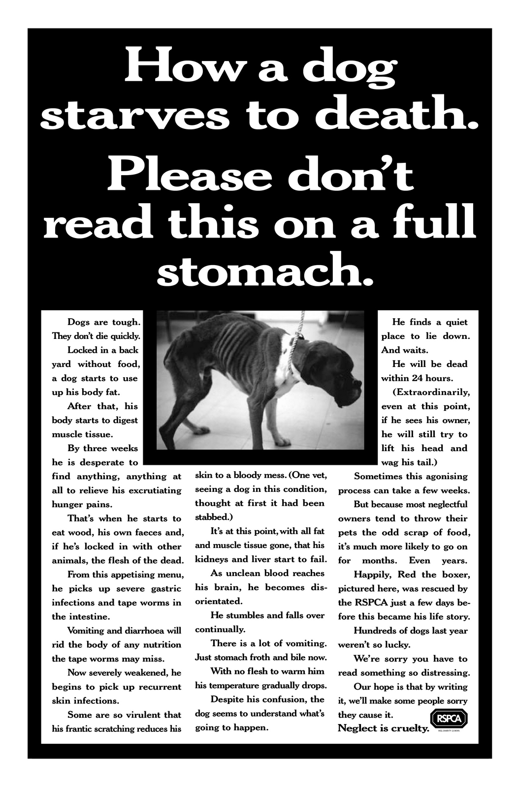
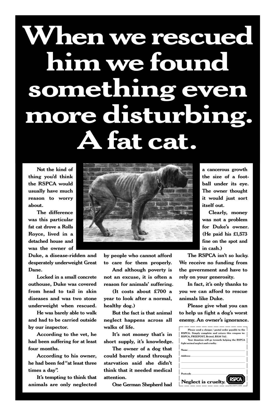
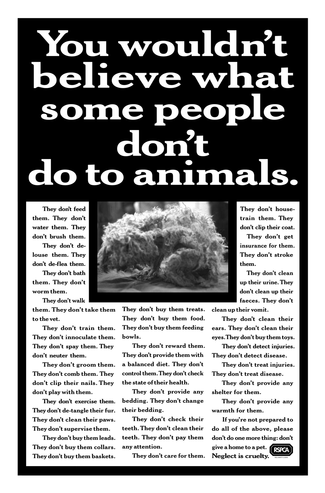
RSPCA.
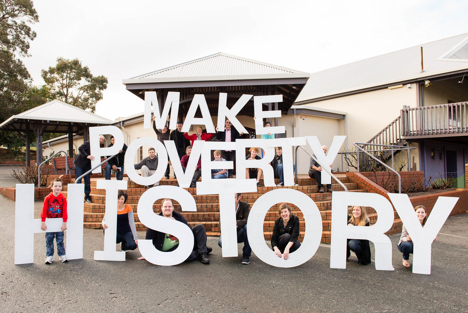
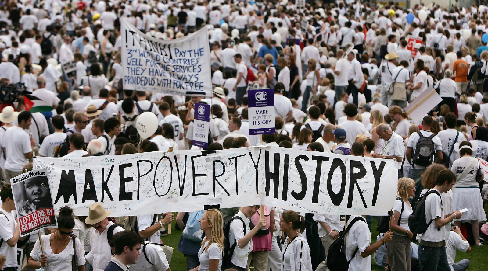
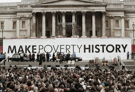
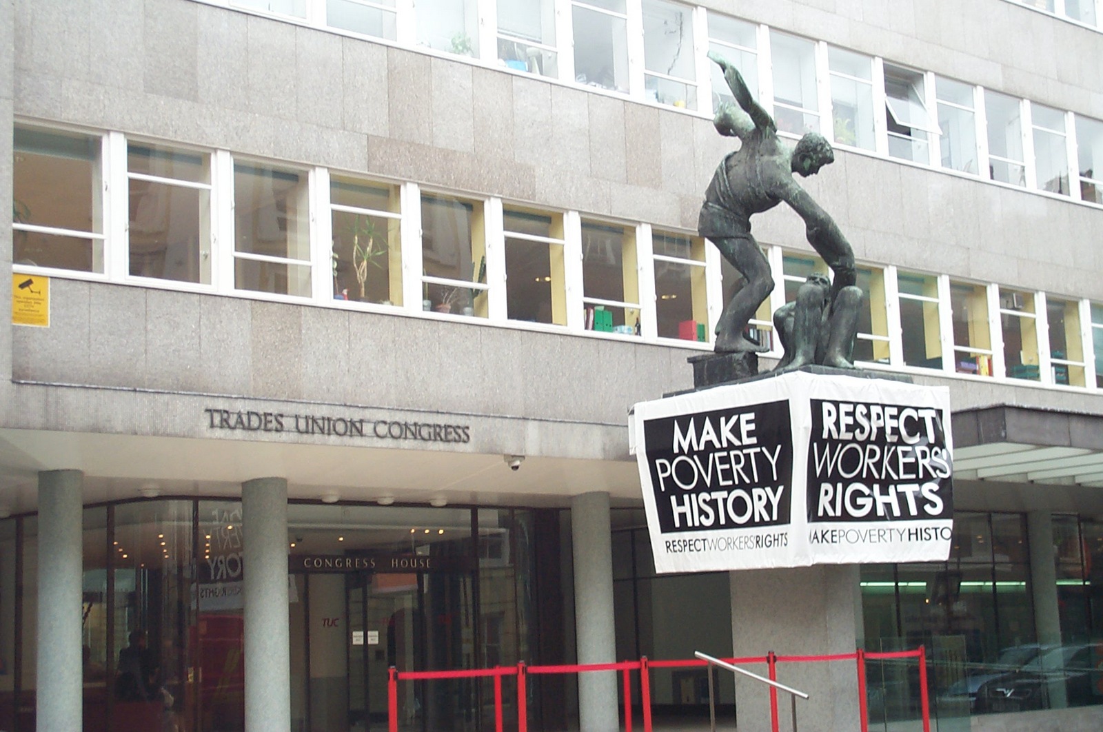
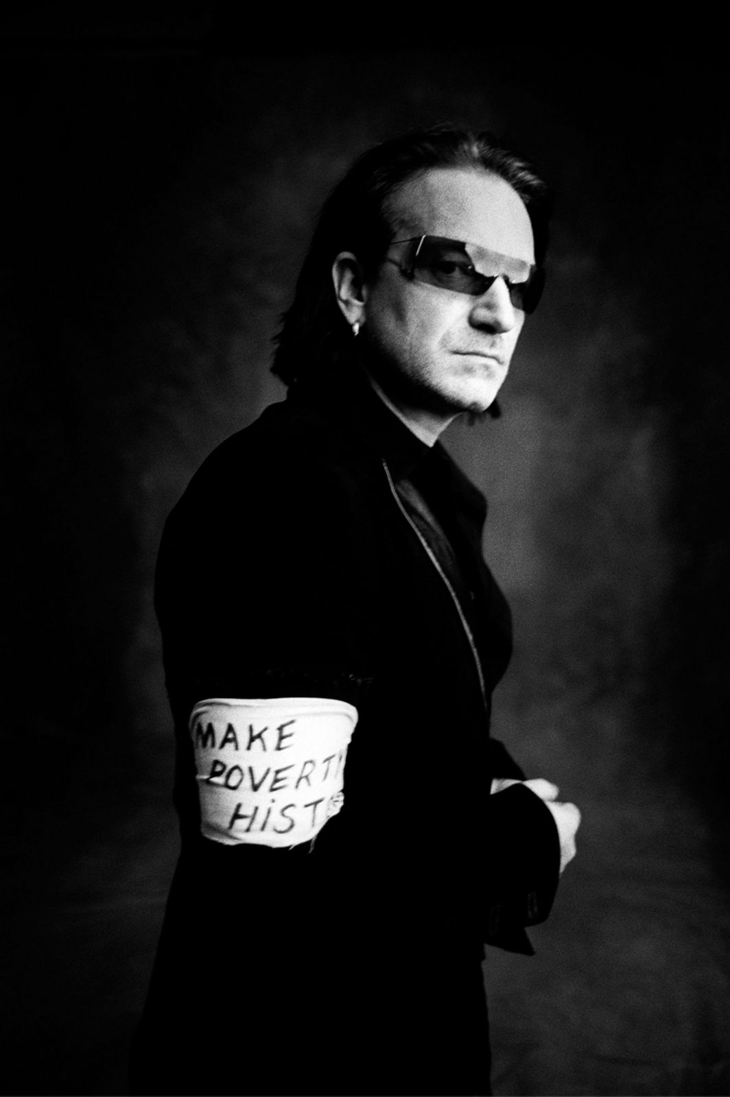
Make Poverty History.


Department of Transport.
Maltesers.
Mary's 5 copywriting tips:

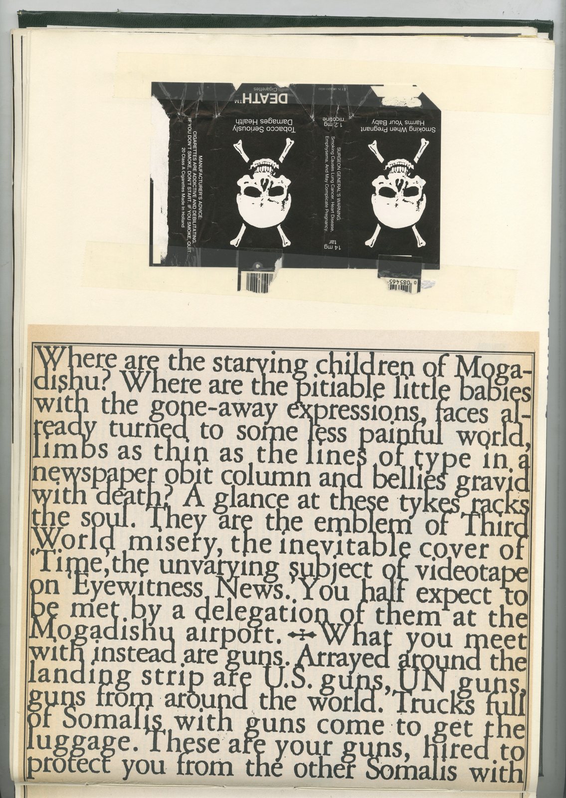
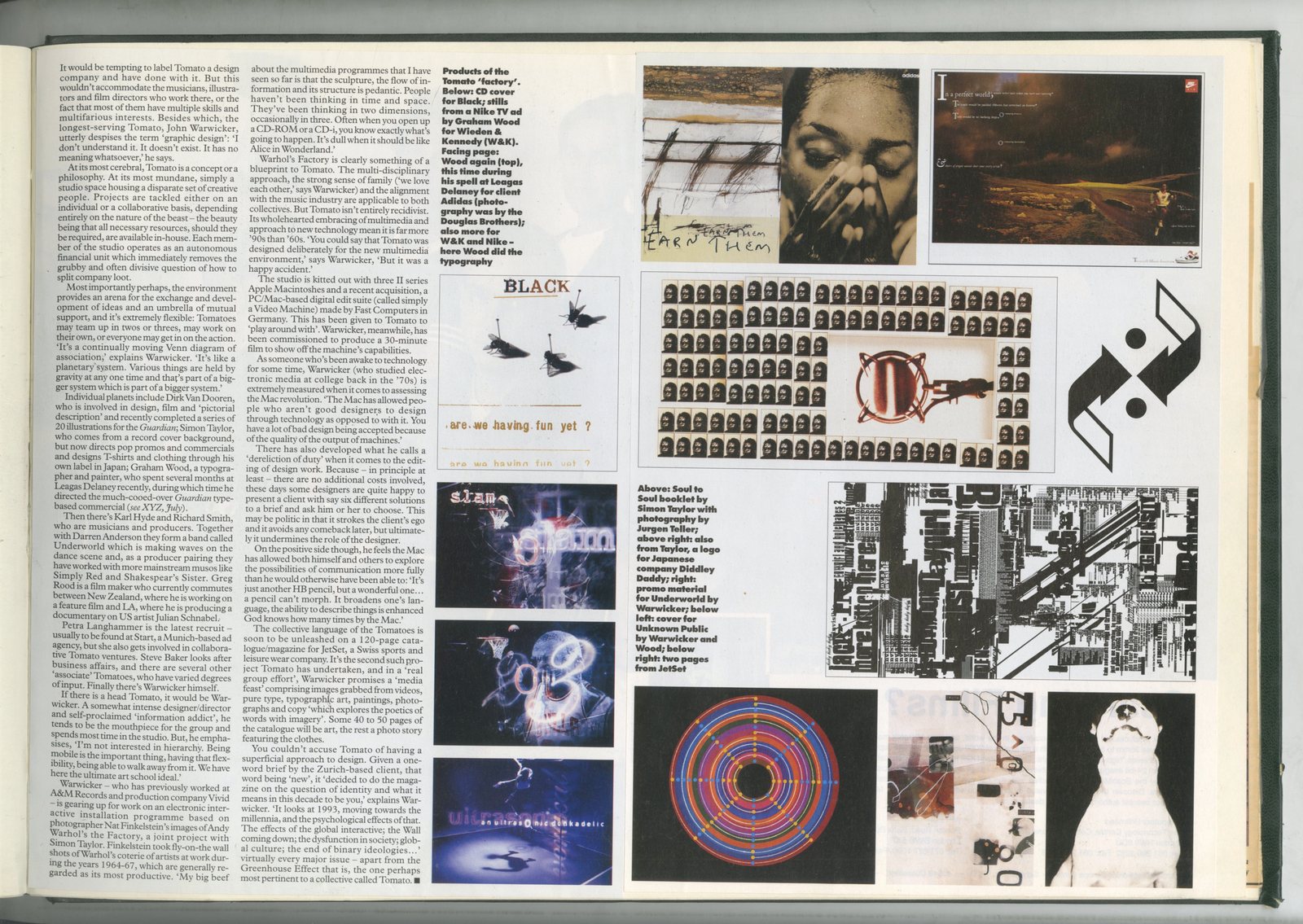
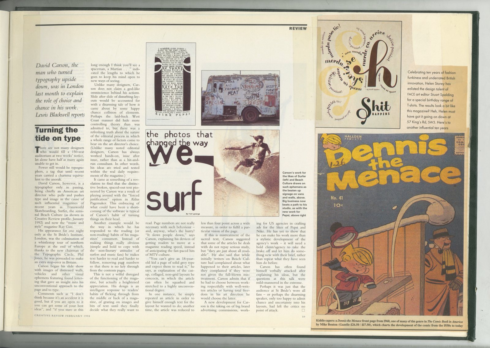
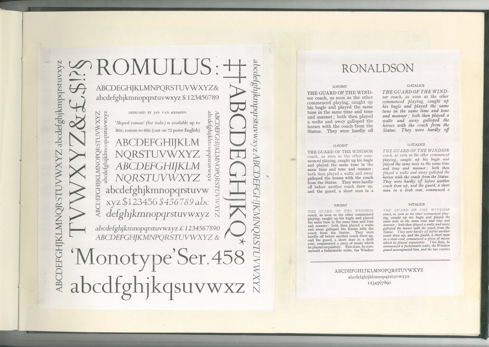
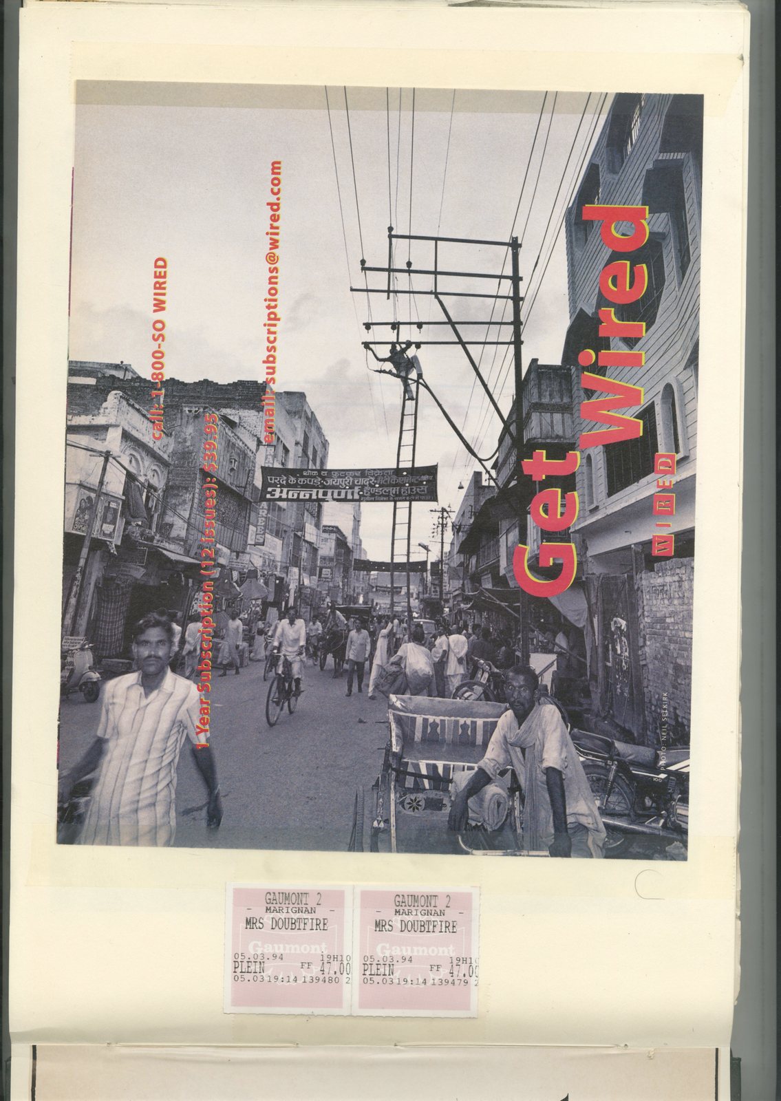
It’s always weird looking back through these books.Like looking at those insects trapped in a chunk of amber. There they were, right in the middle doing something, simply walking or picking their nose, frozen in time.These books are a bit like that, a snapshot of what was happening at a certain moment in time, captured chronologically.(Encased in green this time, not amber.)This moment is '93 to '94, type & graphics, and what an odd moment it is too.Starting with classically crafted pages ripped from Fred Woodward’s Rolling Stone and Fabien Baron’s Harper’s Bazaar.Ending, little more than 12 months later, with the scruffy, deconstructed mess that was David Carson’s Ray Gun & Surfer magazines, Tibor Kalman’s Interview and the output of Tomato Design.What a shift in aesthetic over such a short time?A complete 180 degrees.But we ate it up, especially in London, even the older art directors, like my mate Derrick Hass.Every so often I’d be sitting in my office only to hear ‘WOW!’, I’d look up to see Derrick, like a kid after too many fizzy drinks, holding up one of these odd-looking, totally unreadable layouts.Layouts, I might add, that were totally against everything he’d believed in for the previous ninety five years.I’m not knocking him, I was the same, swept up by this exciting, new and progressive style.It was the way forward, who said words had to be legible anyway?Only squares and dullards; wankers!Looking at this stuff now, it’s hard to see why were we all so intoxicated.Your enjoyment of these magazine pages will be interrupted advertising, stuff I’d created and Chris & Mark had rejected (Simons Palmer (Denton Clemmow & Johnson).Also by some ephemera from the period, like two ‘Mrs Doubtfire’ tickets (from Gaumont Cinema), there’s a flattened pack of Death Cigarettes and a handful of semi-cool skateboard stickers.There's also a bunch of alphabets photocopied from a Monotype specimen book. (Jesus those old photocopiers were shit!)Presumably, I must’ve been convinced that these bits and pieces were crucial to the development of my career, sellotaping them into a book for speedy access.So, here you go, be my guest.(A £5 prize goes to anyone finding a use for those ‘Mrs Doubtfire’ tickets.)


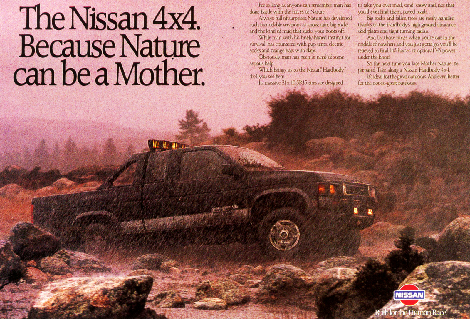
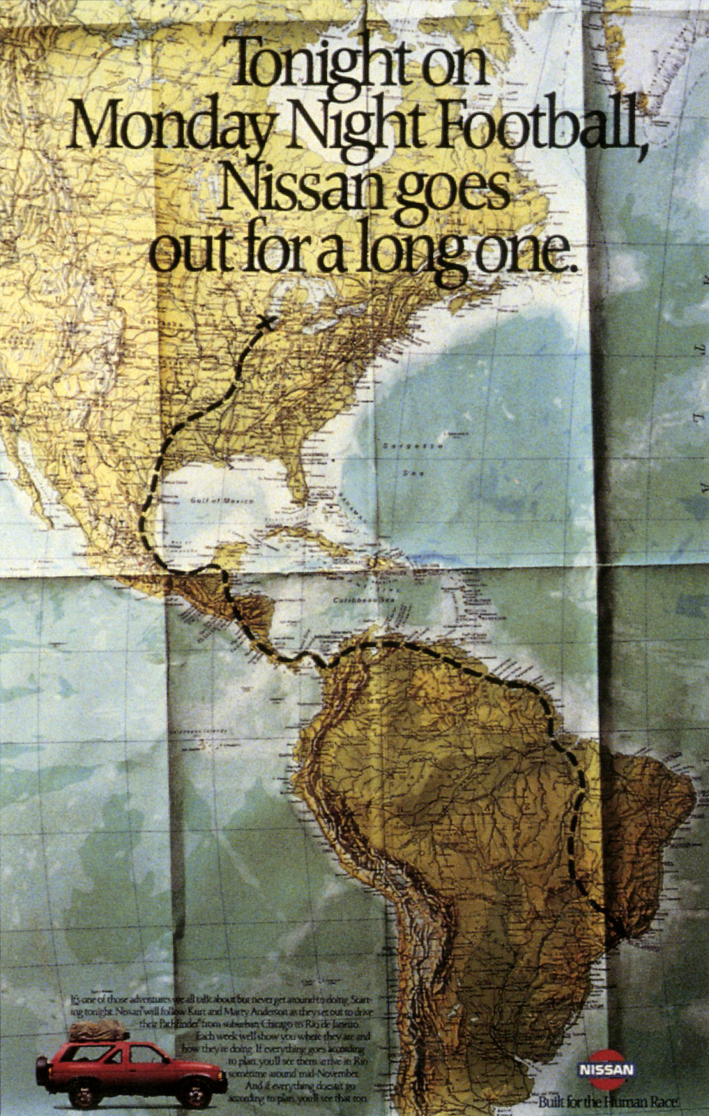
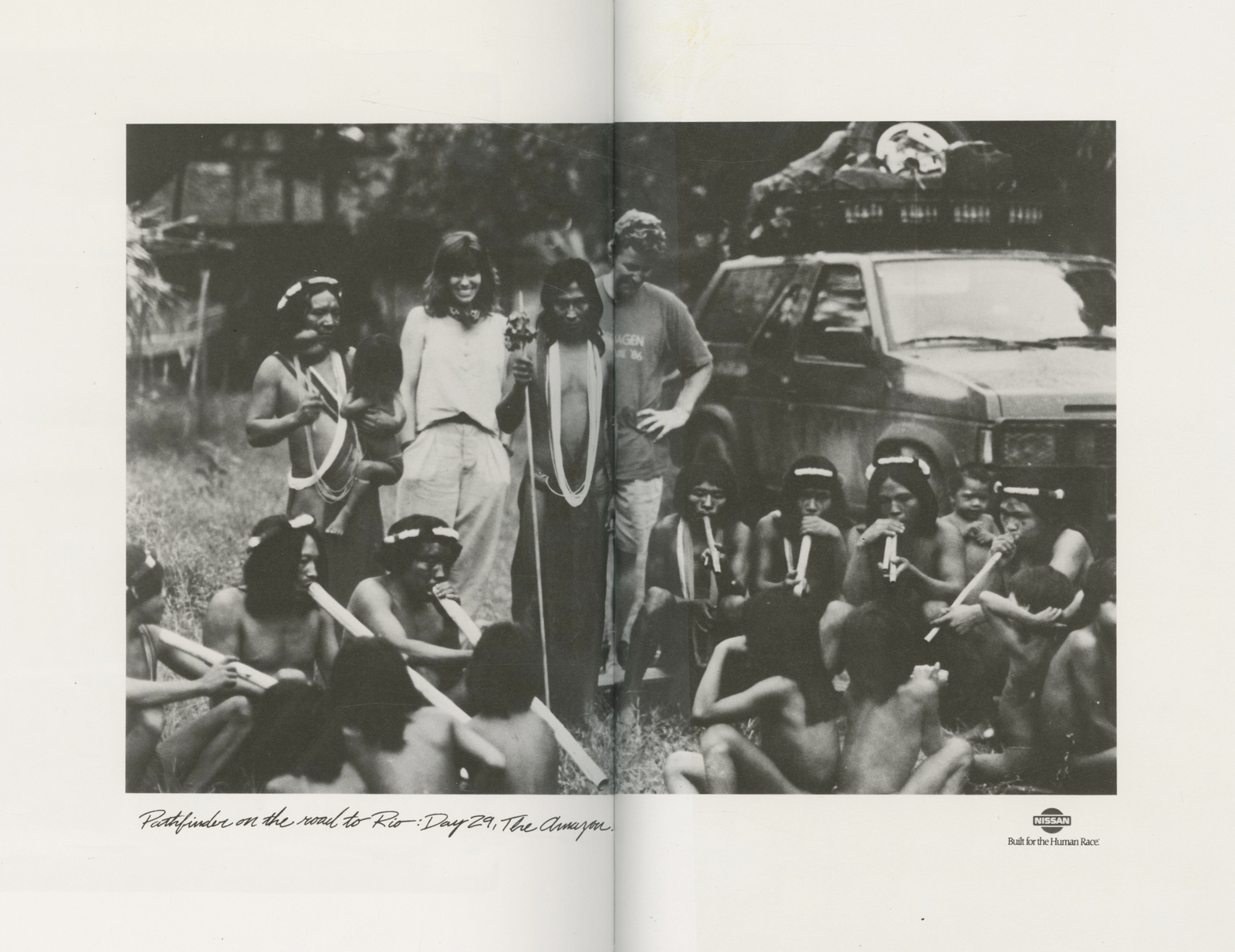
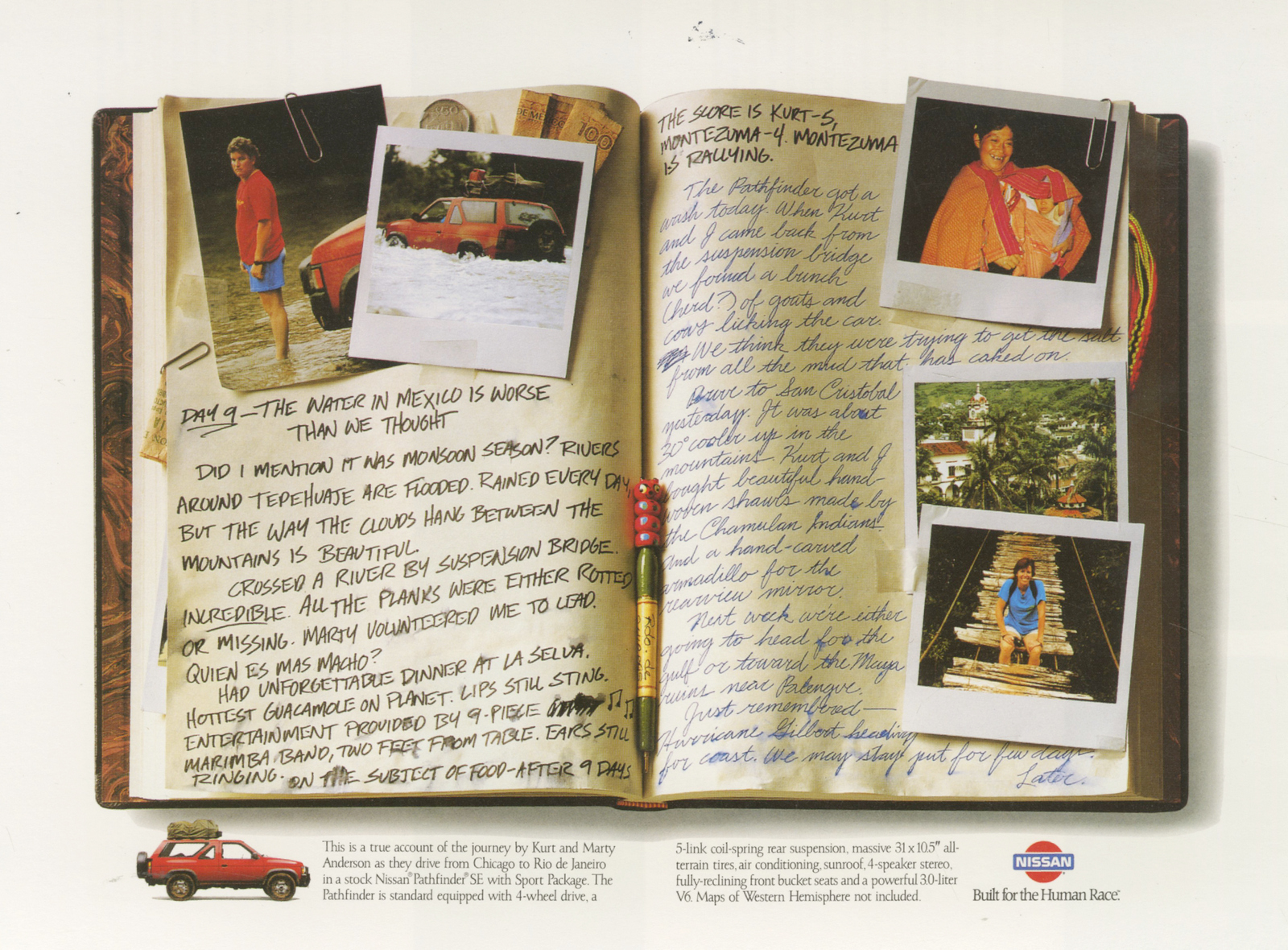
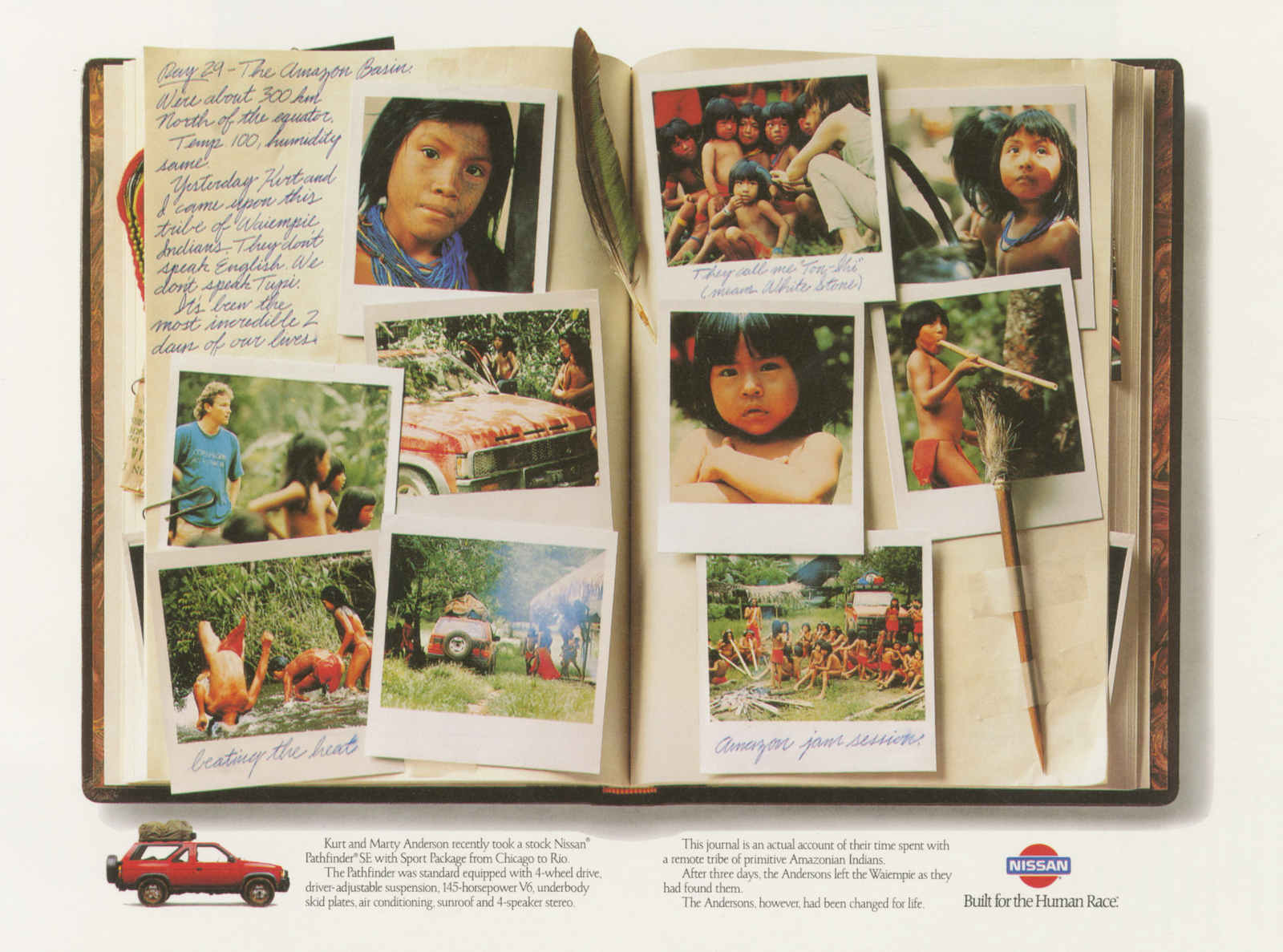
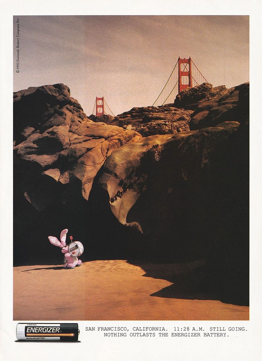
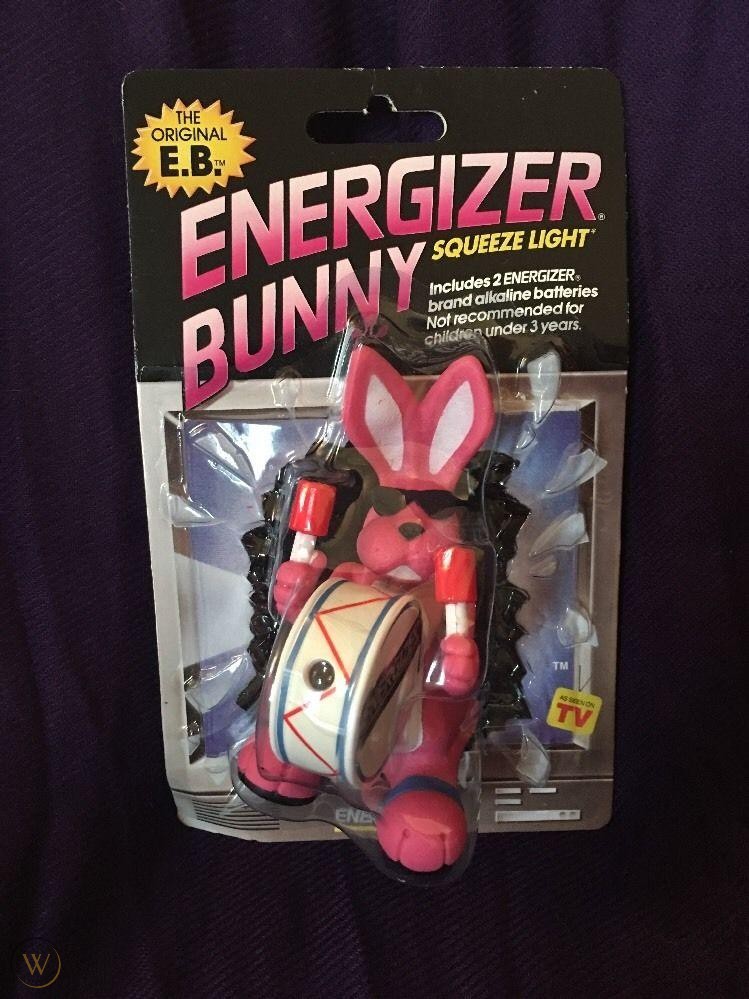
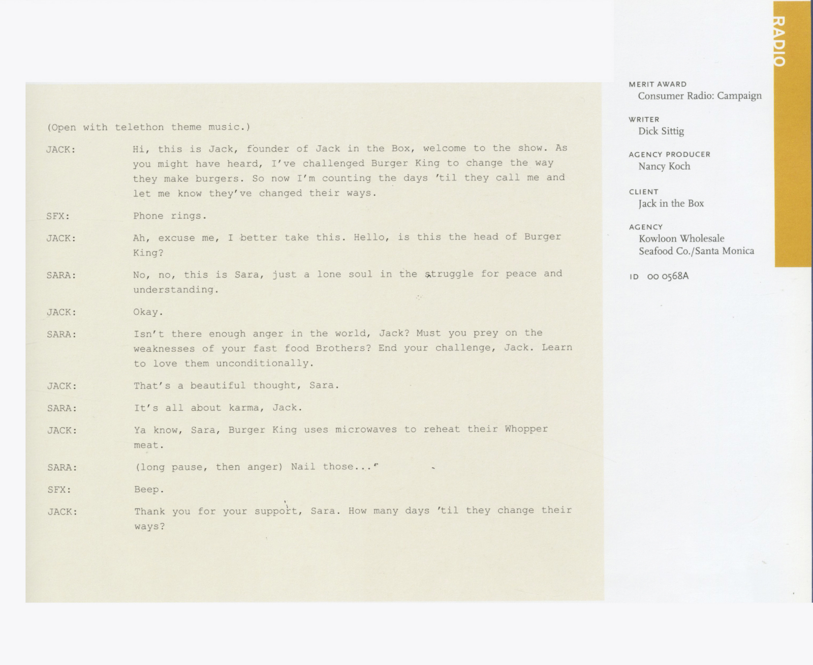
Many of you won’t recognise that name.You won't find it attached to tweets his latest 'hot' campaign, or next to a picture of his latest lunch; he doesn't do social media.You won't find his agency in any new business tables; they only handle three clients at a time, so tend to have long client relationships.You won't find their scripts in any production companies; they direct them in-house.This is because, when, 23 years ago, the goal for his new agency was that the clients should be in the limelight, not the agency.While I've heard many say that kind of thing, I've never seen anyone actually do it.They gave themselves an undercover name; The Kowloon Wholesale Seafood Co.Then disguised the outside of the agency like a run-down seafood operation, just to throw off any potential clients who happen to be in the area.And just to be awkward, he changed his name from Dick to Rick Sittig.You won't find either of them in any of advertising's Hall of Fame's.Which is weird.Because between them they’ve done some of the best, most famous, longest running ad campaigns ever.Jack In The Box, Joe Isuzu, the Energiser Bunny and the Nissan Pathfinder campaign to name but a few.So at the risk annoying Rick by bringing on some unwanted adulation - if anyone out there works for the One Show, Art Directors Club or Clios; come on, induct this man immediately.It’s embarrassing.(See below for details.)Wed had a great chat, I hope you enjoy it.
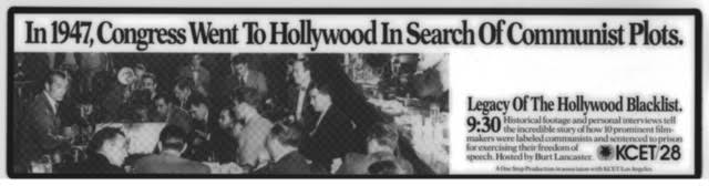
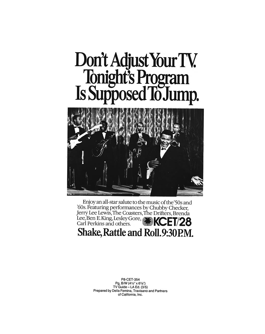
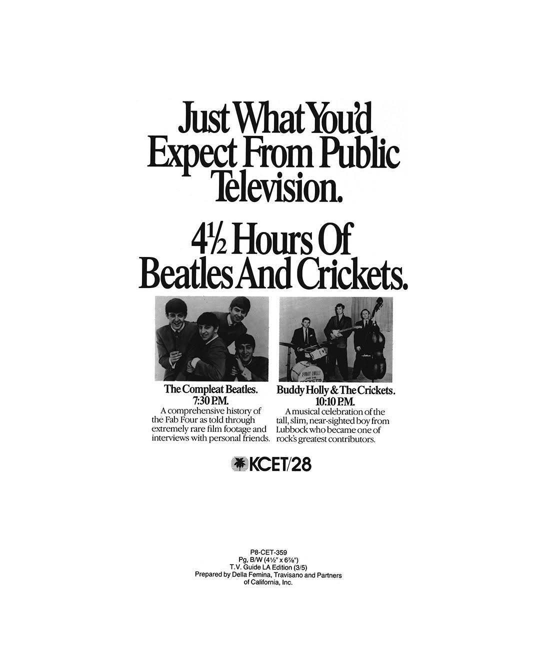
DELLA FEMINA TRAVISANO & PARTNERS.KCET/28.

Don't Drive Drunk.

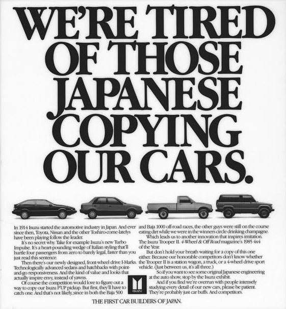
Isuzu.

CHIAT/DAY INC.
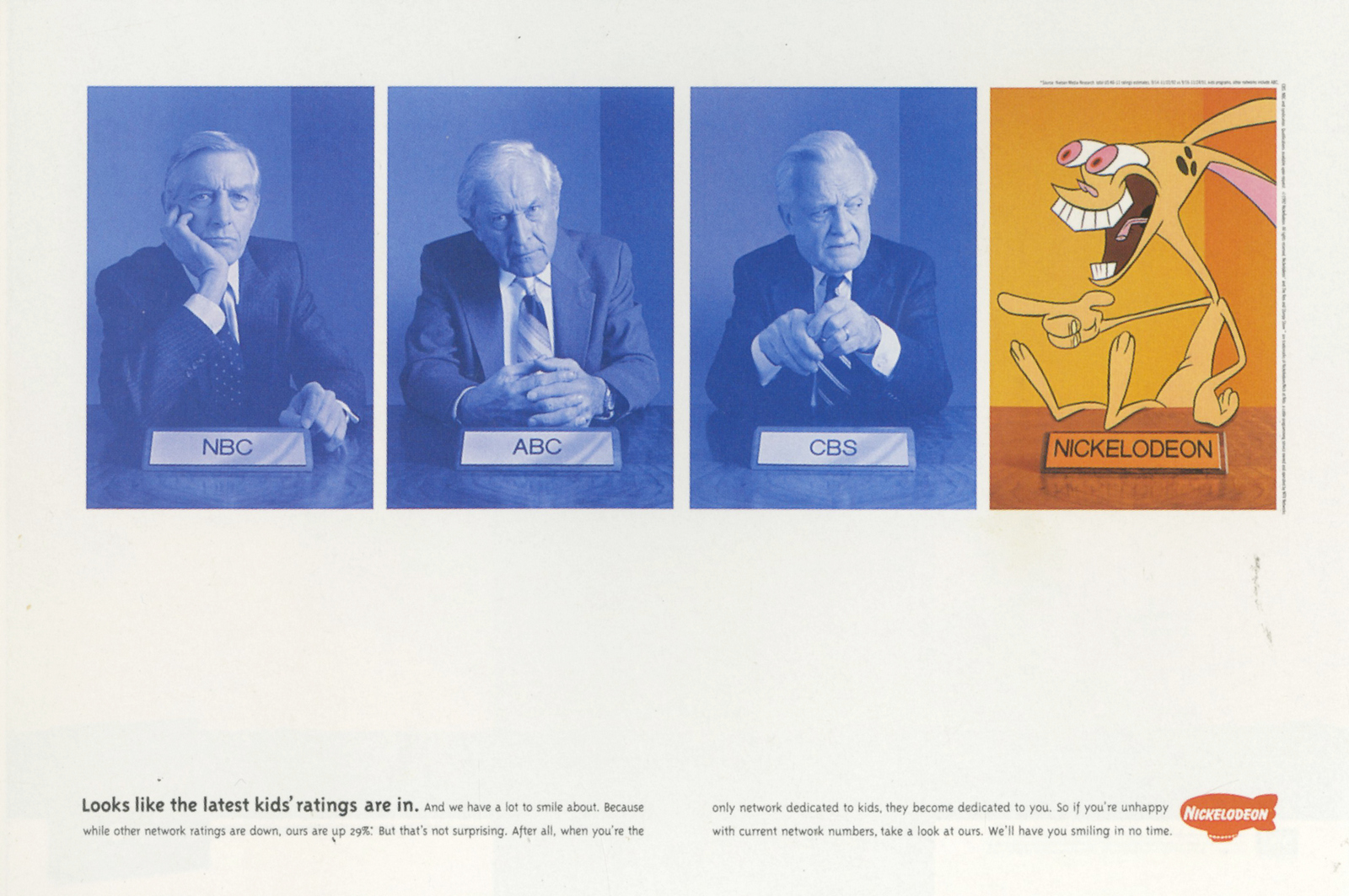
Nickelodeon.
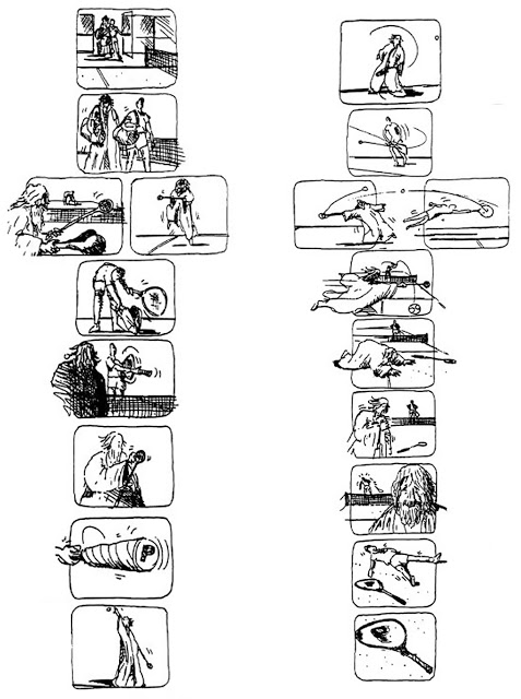
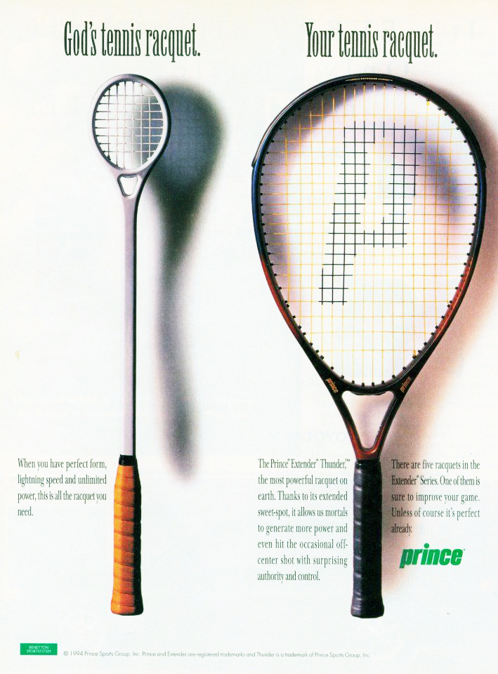
Prince.
Nissan.
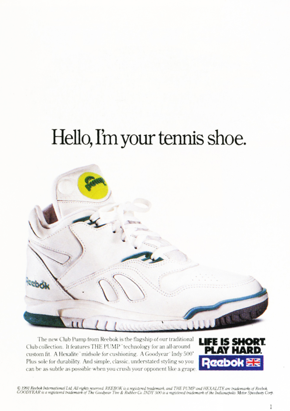
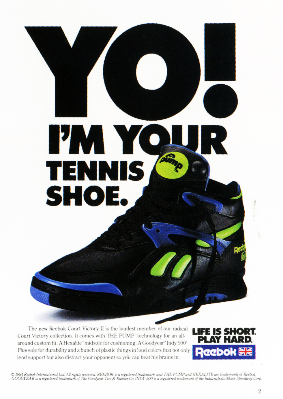
Energiser.
Reebok.
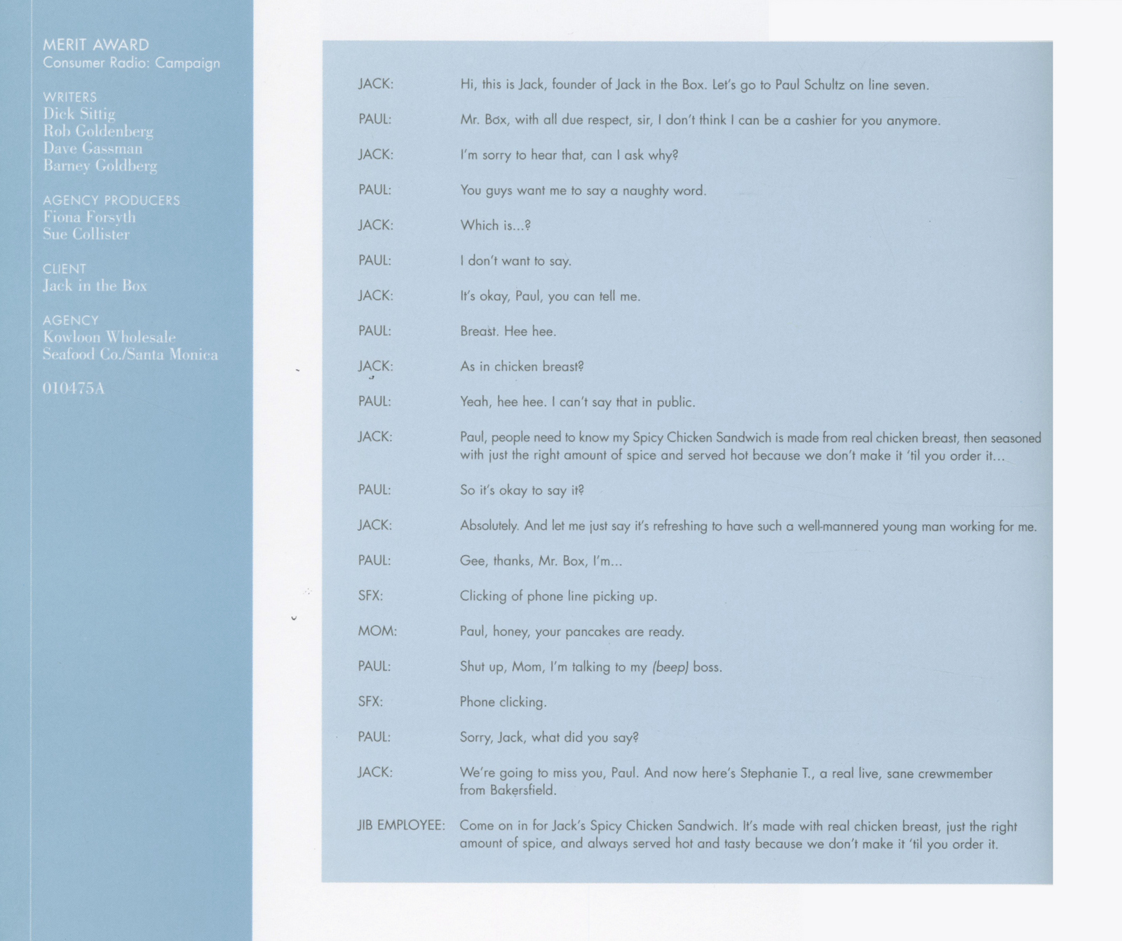
Jack in the Box.
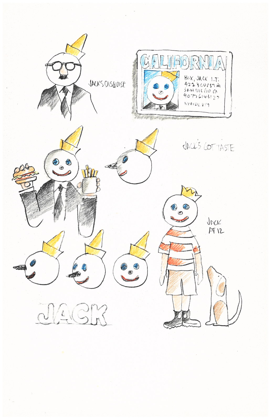
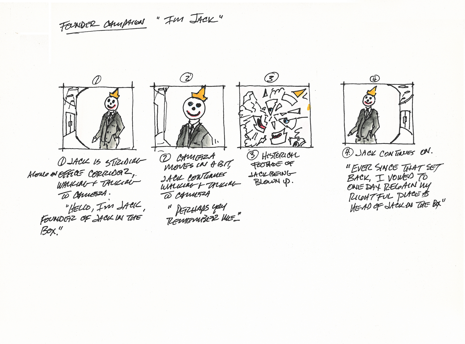
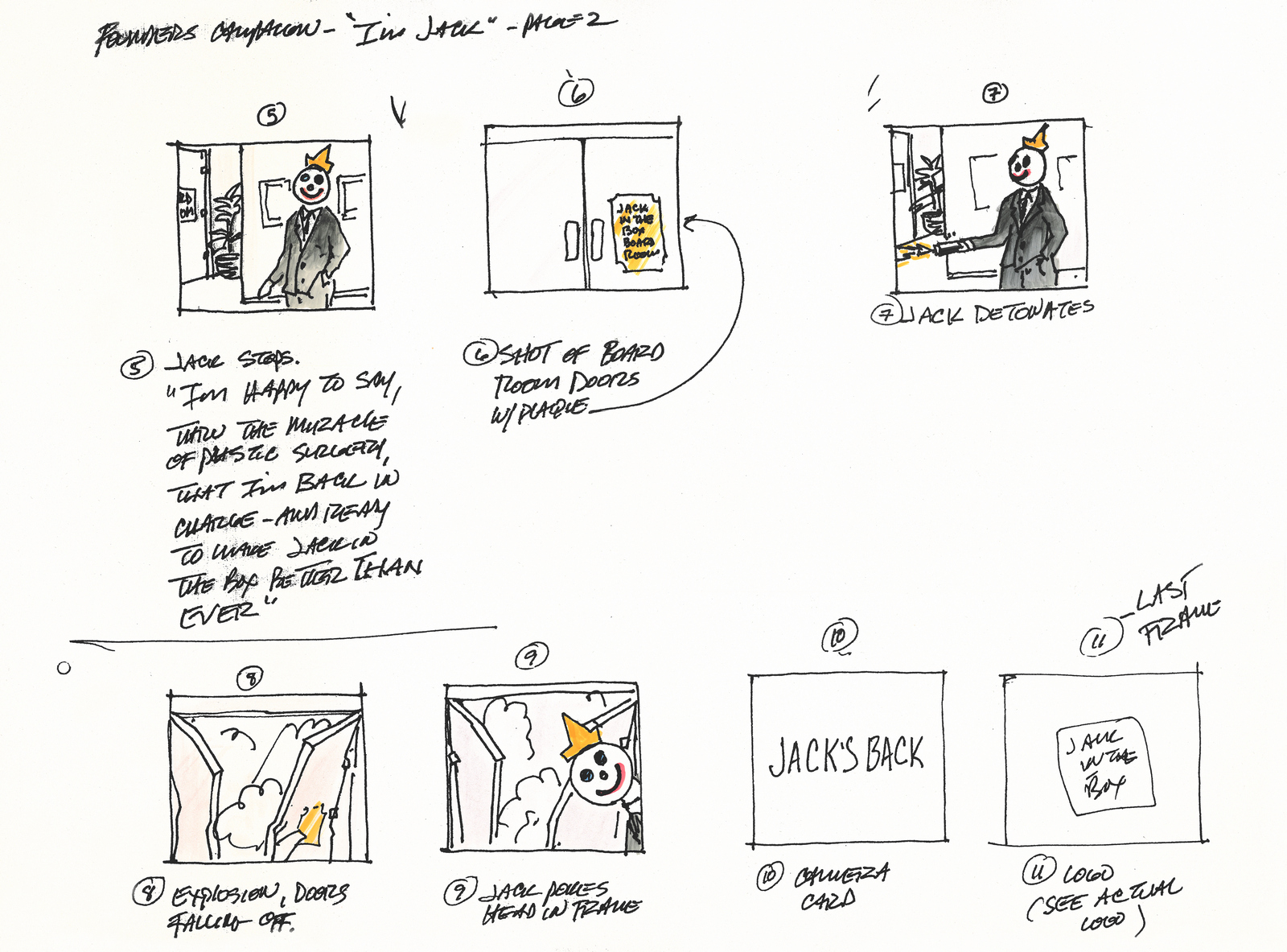
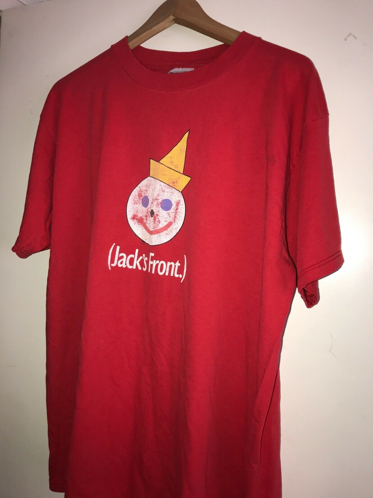
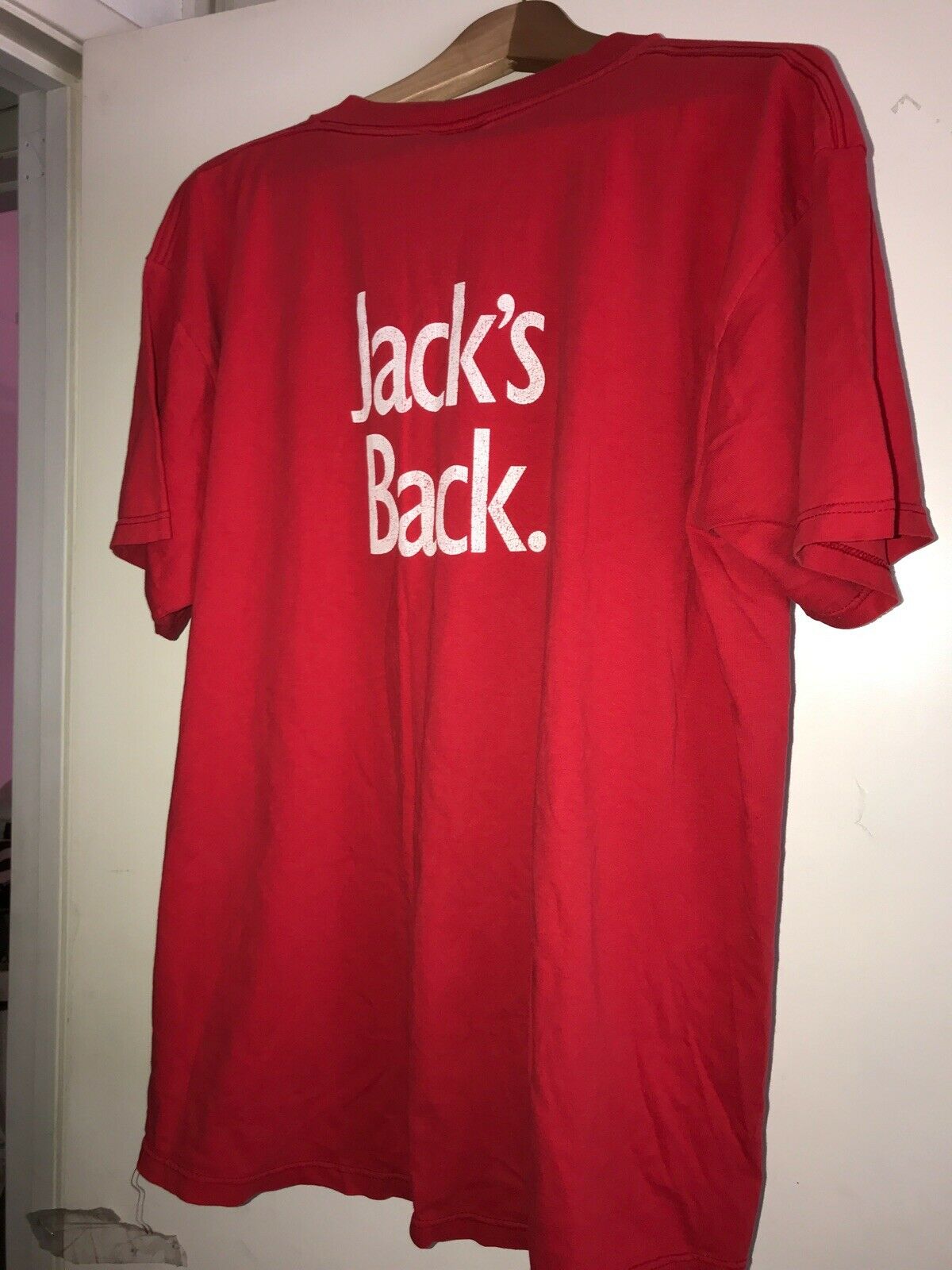
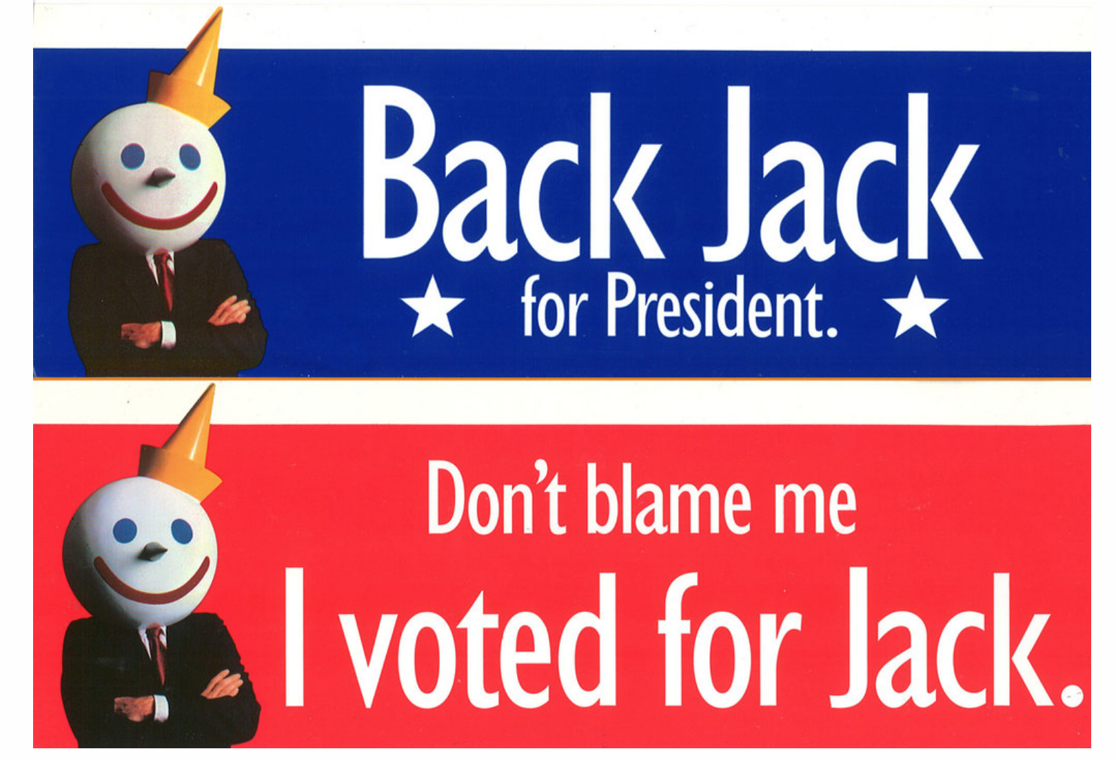
KOWLOON WHOLESALE SEAFISH Co.(Later changed to SECRET WEAPON MARKETING.)Jack in the Box.


Ikea.
Honda.
Clear.
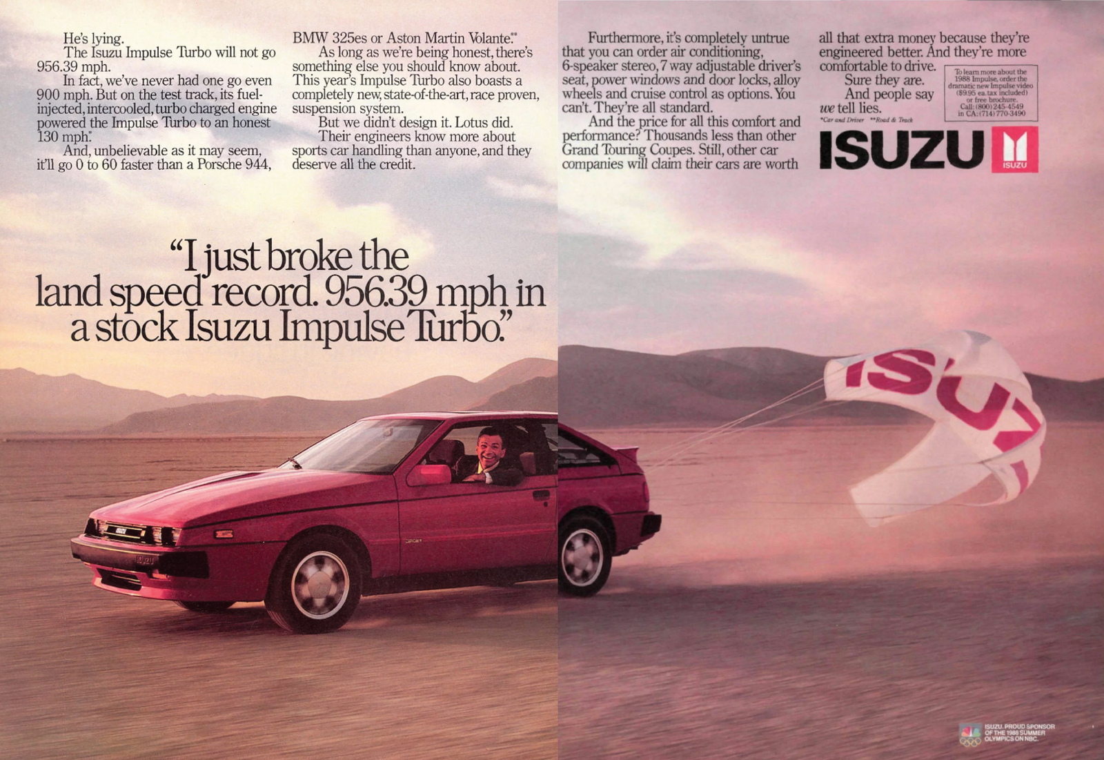
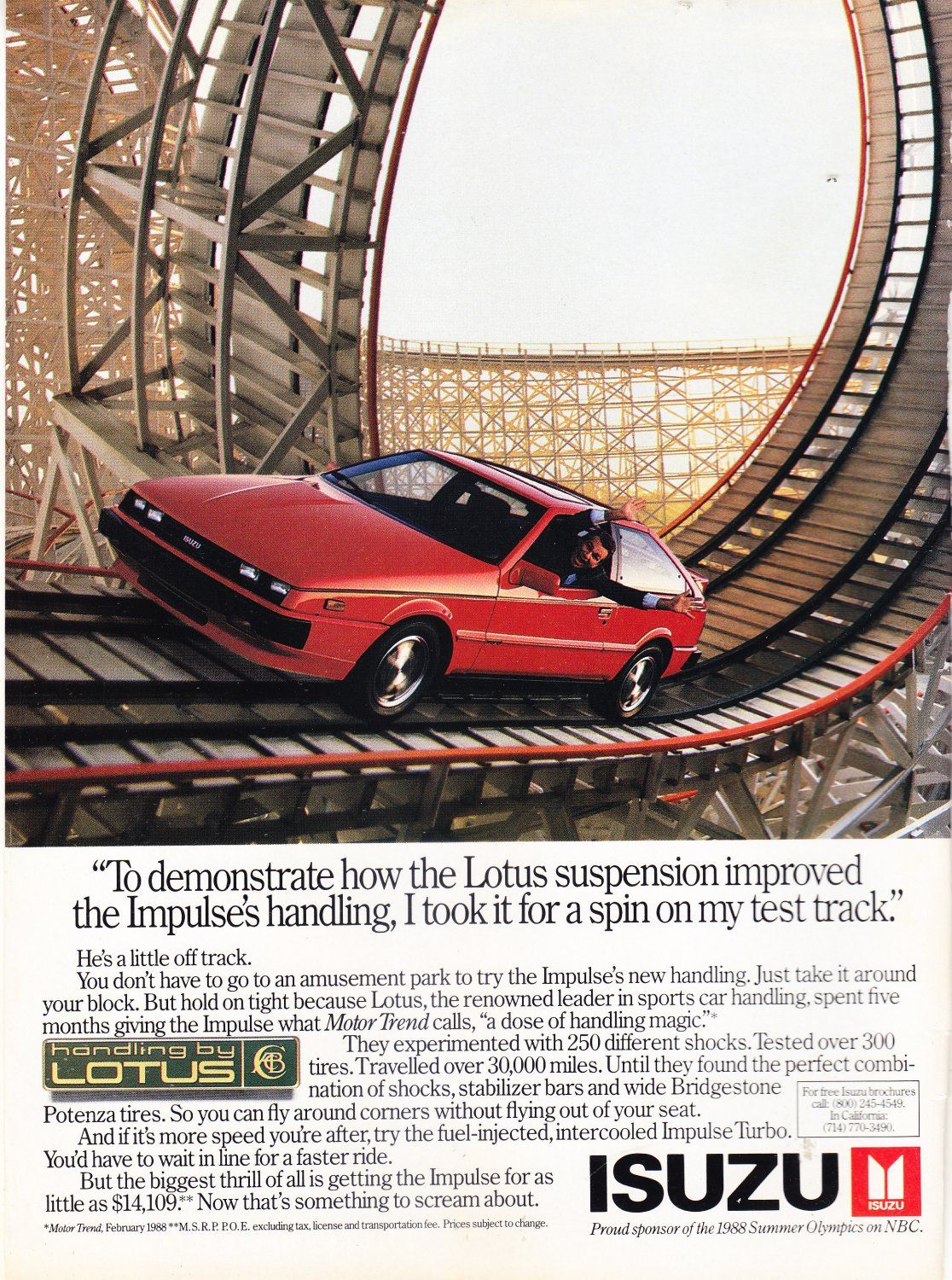
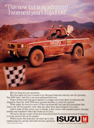
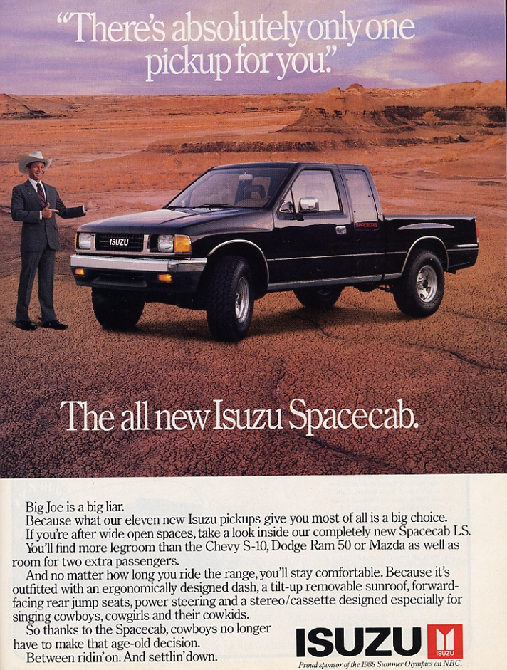
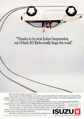
Advertising is like kryptonite to us human beings. Just as our instinct kicks in to ensure we don't look directly at the sun, we now do the same when advertising appears in our peripheral vision.We know it's there; jumping up and down desperately trying to get our attention, but we manage to shield our eyes from it.Like everything else, the internet can throw us a bit of data on this - last year, '25.8 percent of internet users blocked advertising on their connected devices'. Obviously, that number doesn’t include our own in-built adblockers.What percentage of advertising that never even gets seen would we get to if we added those?Then, we have the small percentage that does get seen.Owners of the eyeballs that have seen it report back that's dull, patronising, irritating and not to be trusted.Is this confined to the internet? Lordy, no.Tv, outdoor, radio, anything that comes under the heading of advertising is likely to be judged in the same way.One of the issues is that the human nose has evolved to the point where it can smell bullshit a mile off.It's not a nice smell, so that's a problem when it comes to us folks in advertising.They’re on to us. They know we’re trying to get them to buy things.They know our claims aren’t to be trusted.They've seen it all their lives.So putting out ads full of half-truths and ‘overly optimistic’ claims about what a product will or won’t fool them.We need to figure out new ways to talk to them.Radical honesty is the obvious way.A less obvious way may be extreme lying.Using a brand spokesman who could not be trusted.Not the obvious solution.Imagine presenting that idea to your brand new car client?Della Femina Travisano and Partners did just that for a me-too Japanese car brand called Isuzu.For a tiny brand like Isuzu trying to break into a well-established market, the first goal is to get onto people's radars.So it helps to run advertising that is:1. Unusual - so it stands out from the competitions.2. Tied to your brand name - because people may never have heard of it before.3. Entertaining - because smaller budgets mean less airtime, so you need people to want to watch it.Introducing Joe Isuzu. (Superbly played by David Leisure.)Everything that came out of his mouth was a lie.Within a year sales had gone up 16%.In the process, Joe, and therefore Isuzu, had became supremely famous.Even turning up in ads for other brands like Burger King and AW Soda.He started being referenced by politicians, Ronald Reagan compared Nicaraguan leader Daniel Ortega to Joe Isuzu, Michael Dukakis said "If George H Bush keeps it up, he's going to be the Joe Isuzu of American politics" during the Presidential debates of 1988.In 1993 Joe Isuzu was killed.But, seven years later he was resuscitated for a couple of years.In 2012, nearly 25 years after he first turned up, a Daily Finance poll voted Joe Isuzu 15th Top Celebrity Spokesperson of All Time and turned up in Mitt Romney’s 2012 presidential campaign.Possibly most impressive of all, in 2016 a guy from Queens stole Joe Isuzu’s whole schtick and became President of the United States.Next brief; don't follow the footpaths, you're more likely to stumble upon gold.
CULTURE.
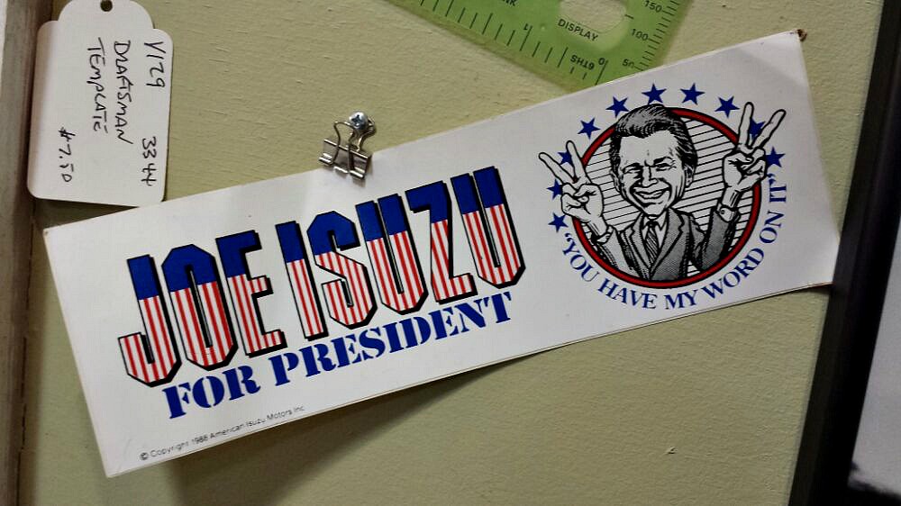
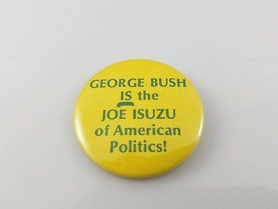
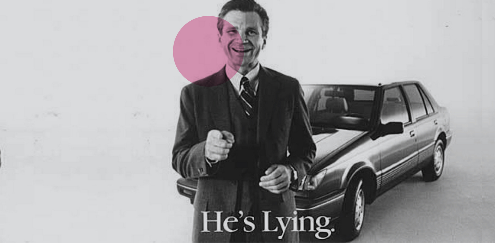
That's not a mistake, it's my attempt to graphically warn you that this podcast ends abruptly.The idea was that I'd grill Rory on some of the issues facing ourbusiness today.He is easily one of the most thoughtful, smartest guys in our business, just check out some of his quotes below if you don't believe me.But rather than ask softball questions that were too broad, I thought it'd be more interesting to make it binary.Forcing a result.I framed the questions in terms of hiring for a new agency.For example, would it be better that people felt relaxed and comfortable in the office or fearful? Should we prioritise diversity over ability? Would misfits be more valuable in developing work than the well-adjusted.That was the plan anyway.But, firstly, I wasn't at Wave, I was on away territory (Sea Container’s House) so I didn’t have control over the tech and interruptions.Secondly, I asked a warm up question to get the ball rolling - ‘What is Advertising?’.I’d imagined three, four, maybe even five minutes before we got to the interview?Wrong.Fearing we wouldn't get to any of the pre-prepared questions, we abandoned it after 45 minutes.The upside is that it lead us down some interesting avenues, the downside was that you’ll hear a record scratch type ending as a lady kicks us both out of our room.Nevertheless, I thoroughly enjoyed recording it, hope you enjoy listening to it.
Some of my favourite Rory quotes:
"Military strategy is in some ways very much like marketing - you can't be conventionally logical as a military strategist, because the enemy will be able to predict what you are going to do."
“A flower is a weed with an advertising budget.”"It doesn't pay to be logical if everyone else is being logical.''''Dare to be trivial.""Google understood that if you're just a search engine, people assume you're a very, very good search engine."
"Once you have a very, very large budget, you actually look for expensive things to spend it on."
“If you had retroactively applied the rules of scientific rationalism to all of the major scientific discoveries of the past 500 years you would have invalidated most of them. Perhaps most (penicillin, the X-Ray, the microwave, Aspirin, radio, Archimedes in the bath) were the product of “inspired opportunism”.As he once put it: “a methodology was an ideology Galileo could not afford.”
“The human mind does not run on logic any more than a horse runs on petrol.”
“It’s important to remember that big data all comes from the same place – the past. A new campaigning style, a single rogue variable or a ‘black swan’ event can throw the most perfectly calibrated model into chaos.”
“Henry Ford’s reaction to a consultant who questioned why he paid $50,000 a year to someone who spent most of his time with his feet on his desk. 'Because a few years ago that man came up with something that saved me $2,000,000' he replied. 'And when he had that idea his feet were exactly where they are now."
“It is much easier to be fired for being illogical than it is for being unimaginative.The fatal issue is that logic always gets you to exactly the same place as your competitors.”
"The problem with logic is that it kills magic."
“To put a value on the digital world by only tallying the money that changes hands is a little like trying to place a value on sex by simply measuring the amount spent on prostitution.”
“I think the first role of marketing is to make a decision easy to make.And that means firstly clarity in terms of choice, and secondly it means lack of anxiety."
"Solving problems using rationality is like playing golf with only one club.""A good guess that stands up to observation is still science. So is a lucky accident.""What the spreadsheet has done is to create in organisations and governments an over-reliance on numbers (by no means always meaningful or even accurate) with result that often spurious numerical targets, metrics or values invariably override any conflicting human judgement.This has given rise to what a colleague of mine, Anthony Tasgal, calls 'The Arithmocracy': a powerful left-brained administrative caste which attaches importance only to things which can be expressed in numerical terms or on a chart."
"So the first role of marketing is not actually getting preference, it’s not actually getting someone to prefer a Philips TV, it’s getting someone non-anxious about buying a Philips.”
“No big business idea makes sense at first.Imagine proposing the following ideas to a group of sceptical investors:
‘What people want is a really cool vacuum cleaner.’ (Dyson)‘. . . and the best part of all this is that people will write the entire thing for free!’ (Wikipedia)‘. . . and so I confidently predict that the great enduring fashion of the next century will be a coarse, uncomfortable fabric which fades unpleasantly and which takes ages to dry. To date, it has been largely popular with indigent labourers.’ (Jeans)‘. . . and people will be forced to choose between three or four items.’ (McDonald’s)‘And, best of all, the drink has a taste which consumers say they hate.’ (Red Bull)‘. . . and just watch as perfectly sane people pay $5 for a drink they can make at home for a few pence.’ (Starbucks)”
“Remember, if you never do anything differently, you’ll reduce your chances of enjoying lucky accidents.”
“It is perfectly possible to be both rational and wrong.”
"There is one place in the industry that could use more fear.In the way we sell ourselves.I met someone from the IT industry who was asked to sit in on several ad agency presentations.He thought they were brilliant.The slides, the stagecraft, the quality of argumentation was higher than anything he'd seen in his industry.'But you ad guys all made one terrible mistake.''What was that?''You sold positives.'In IT, he said, only in the direst cases would you ever sell a solution by detailing the benefits.'We sell on fear. If you don't buy this solution, the following bad things will happen.'I've never seen an agency argue it's case this way.By selling the positives we frame advertising as an 'optional extra'.It isn't.""Test counterintuitive things only because no one else will.""The ethnographer Tricia Wang suggested in her TEDxCambridge talk that the quantification bias created by big data led to the near death of Nokia as a handset manufacturer.All their data suggested that people would only spend a certain proportion of their salary on a phone handset, so the market for smartphones in the developing world would be correspondingly small.Wang noticed that, once people saw a smartphone, their readiness to spend on a handset soared.Her findings were ignored as she had 'too few data points'.However, in reality, all valuable information starts with very little data - the lookout on the Titanic only had one data point...'Iceberg ahead', but it was more important than any huge survey on iceberg frequency."If you liked those words, you'll find thousands more just like them in here... https://www.amazon.co.uk/Alchemy-Surprising-Power-Ideas-Sense/dp/0753556502
I worked with Sean Doyle for roughly 12 years.One morning, about six years in, Sean threw a scruffy ball of paper over to my side of the desk – ‘I did us a logo’.It was like a miracle; Our names fit together perfectly, symmetrically, what were the chances?It was worth putting it together even if just to enter for awards.
I turned the scribble into type.
That wasn’t how Sean had imagined it.
DYE was too dominant.
He suggested we separate the names not by size of font, but by weight.
I mocked it up.
I thought it looked too basic.
Also, DOYLE looked too dominant.
We couldn’t agree, so the letterheads were never printed.
(Shame, as it was nailed on for a bronze at the Eurobest Awards.)
But the big question was why had we never noticed it before?
We’d been linked for over two thousand consecutive days, why hadn’t we spotted the link in our names?
At least Sean spotted it eventually, I never spotted it at all.
Surely the most important thing when brands run an ad is that people remember it was THEIR ad.
No matter how beautiful, disruptive or exciting your ad is, if people can’t recall whether it was for Nissan, Volvo or Davidoff, it won’t sell your cupcakes.
Ensuring that people remember that your ad was for YOUR company is crucial.
‘Branding’ I think the ad boffins call it.
Branding discussions in most agencies tend to get reduced to two areas a) logo size and b) Do we need to say the brand’s name in the voiceover if we’re already showing it in the end-frame?
Clients and agencies take their positions and off they go.
Here’s an example from last Tuesday, this happened in Shoreditch…
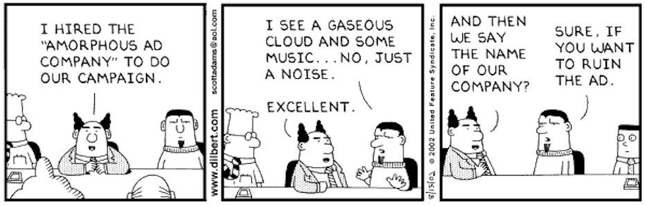
But rather than assuming that our ad is so awesome that the public will simply hang in there and try to figure out who ran it, shouldn’t we try to make it easier for them to recall it?
Maybe give them tools like Teachers give Students to aid memory?
Getting people to recall the name of your company used to be all the rage.
Try as I might, I can’t see ‘For mash get ……….’, , or ‘………an on, and on’ without mentally filling in those gaps, decades after some of them stopped running ads.
Jingles were a great way to aid name recognition, but seem to have been cancelled.
Another way is to create a distinctive asset, something unique and own-able by that brand.
The bullseye for these kind of ideas is the brand name.
To create one you have to resist getting distracted by all the cool (irrelevant) stuff on the horizon and focus on what’s right under your nose.
Here’s my diagram, hope it’s not too technical. (Les Binet, you can have this if you want?)
When first unearthed these ideas tend to appear almost boringly obvious.
But with a bit of work they start to look like a miracle.
The benefit is that they leave a trail of breadcrumbs between your message to your brand name.
Done well, they can get you to an idea that can’t be separated from your brand.
To start, here’s a few logos that fit this rule.
Richard Russell worked in advertising for 30 years before he spotted this.
It’s so perfect you that if you didn’t know him you’d think he came up with the logo first then changed his name by deed poll to make the logo work.
Or this one, designer Gary Gray’s logo.
He can never replace this logo, ever, it will only be worse.
(The wavy line means ‘swap’ for all you non typographers and designers out there.)
What about this one for Joe Biden?
Fortunately, every human being on the planet knows that Joe Biden is running against DONald Trump for the Presidency of the United States in a few months, otherwise you’d assume it’s a scam logo from some designer looking to win an award.
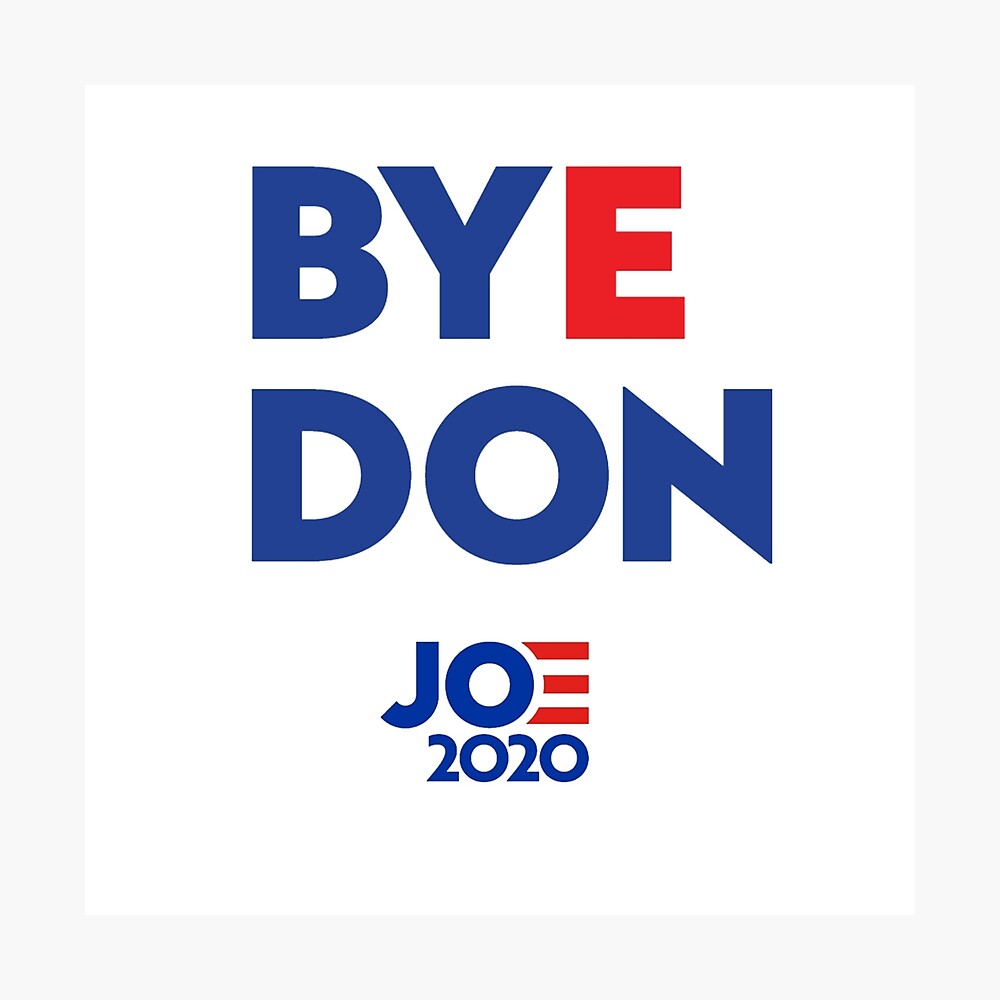
Who knew Manchester United had ‘NHS’ smack-bang in the middle of their name.In the right order.With an identical gaps between each letter.(The placement of those three guys reading and saluting it isn’t bad either.)

Another for the NHS.My guess, based on no evidence whatsoever, was that someone said ‘Let’s brand our line by using the letters N, H and S’.

A focussed brief, but very restrictive.After getting in some lines that felt a bit too contrived (another complete guess, I’m making this stuff up), they’ve rejected the likes of ‘Now Hibernate Sweetie’ or ‘Need Humanity Shutdown’ and the like to regroup.Then someone, risking sounding like an idiot spoke up ‘Those letters work upside down…they spell SHN’.

So they go again.They get to ‘Stay Home Now’.Perfect.Exactly what you want to say in an effortless, obvious sounding way.It became the centre of a very focussed, well branded NHS campaign.
I can no longer see anything relating to ‘Friends’ without thinking of this ad.
(That’s a pretty good return on their investment in a half page ad in the Evening Standard back in 2004.)
To spirits companies, Christmas is their biggest opportunity of the year, so they all advertise.
Standing out amongst the Santas, Christmas jumpers and snow is hard.
How do J&B Rare say we they are more Christmas than the others?
Bingo!
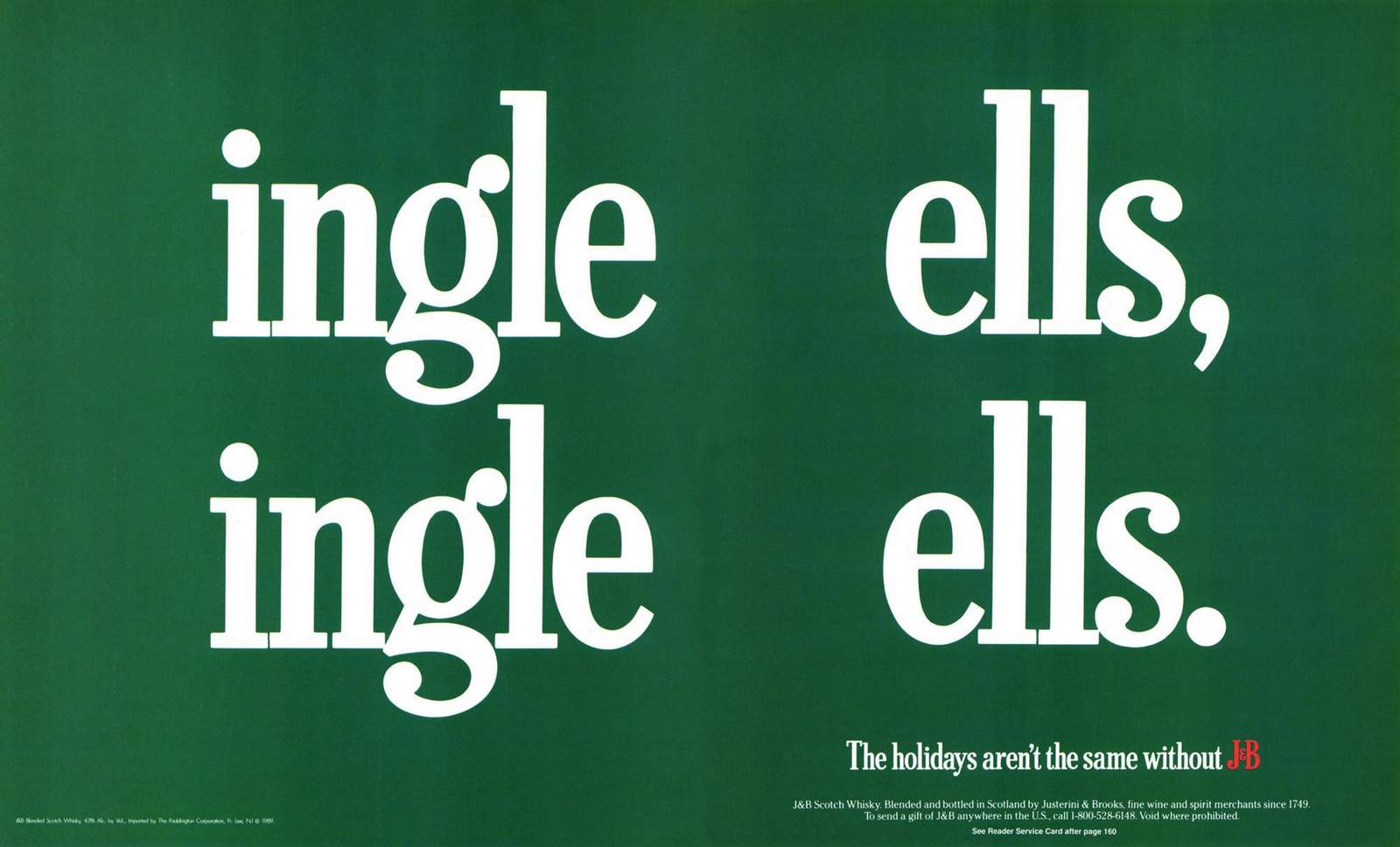
You’re Nike, Arsenal go a whole season without losing.
It’s never been done before.
As their sponsor you have to congratulate them, but what do you say?
How do you fit all those superlatives in a single headline?
Awesomenal?
Fortunately not, someone, (could’ve been Tony sitting at his desk, could’ve Guy sitting under his), someone spotted that Arsenal has an ‘L’ in it.
Why is this important? ‘L’ is the abbreviation used in the premier league tables to denote to ‘Loss’, which they hadn’t done.
‘W’ is used for a win, ‘D’ for a draw.
So restrained, so cool.
You are in power and you want to remind people that your rival party have no experience governing.Simple, replace the ‘L’ in Labour with an ‘L-Plate’.

Conversely, if you’re Labour and you want to brand the Conservative Party as untruthful.
Pull out the first three letters from Conservative.
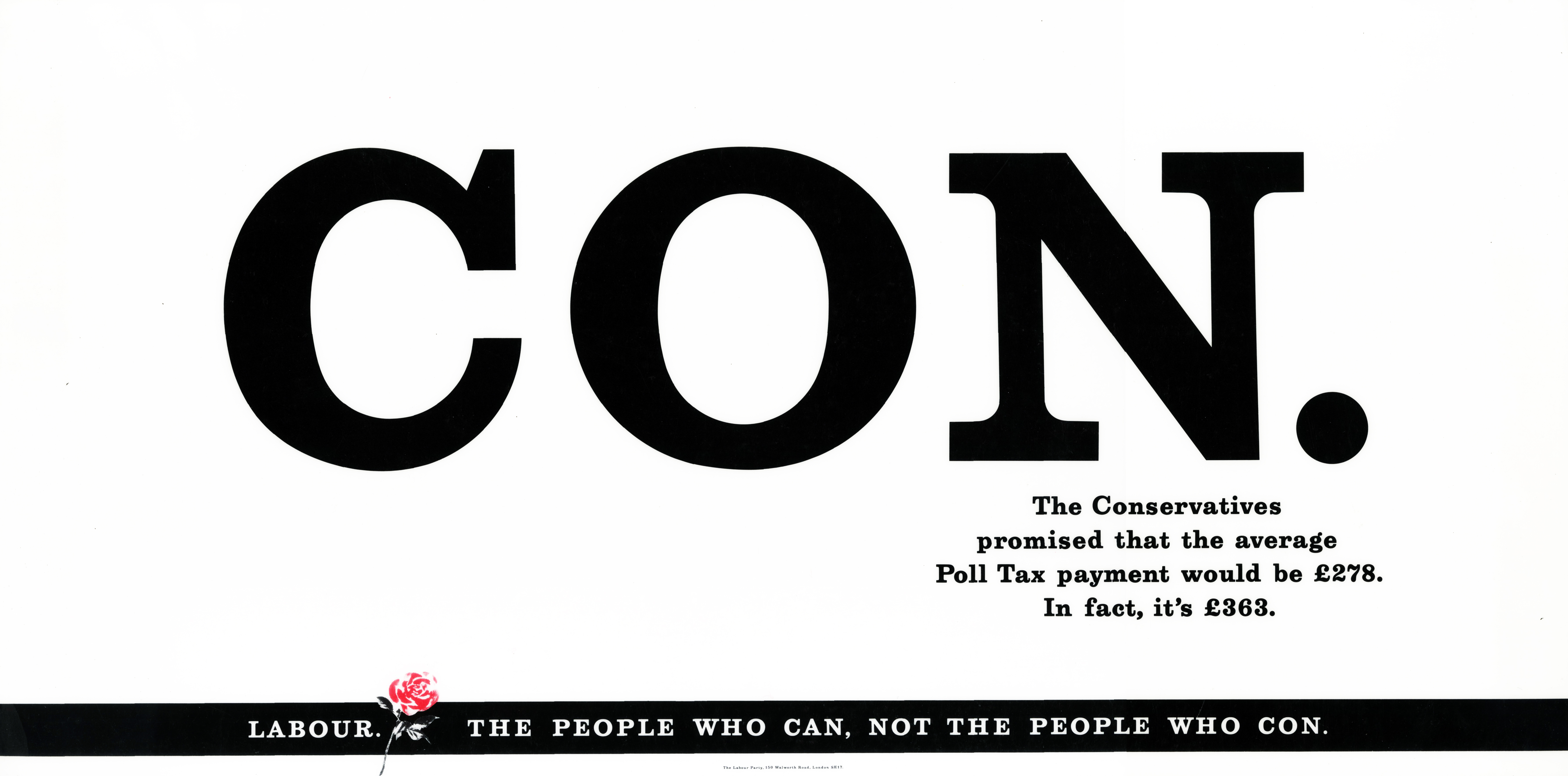
Or what about this one; The deadline for entering D&AD is looming, we need to remind people that if their work isn’t entered it may as well not exist.
It’s basically dead.
Swap that & for an E.
Couldn’t be for anyone else.
Job done.
This one starts, as legend has it with a fax. (It was like an email but made of paper.)
The story goes that Trevor (Beattie) spotted one coming out of the fax machine at the French Connection offices.
Because it was an internal communication, instead of being headed ‘French Connection United Kingdom’, it was simply abbreviated to ‘FCUK’.
“Ooh! Looks like that well known swear word’ I’m presuming Trevor thought.Bingo! An unbelievably famous campaign that ran for 10 years and totally transformed French Connection’s business.Good spot Trev.
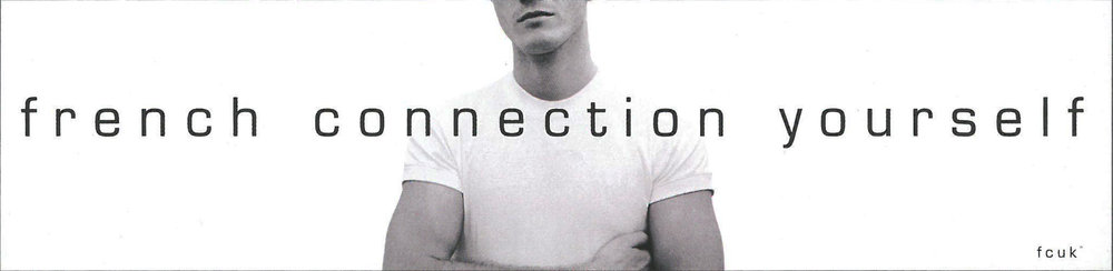
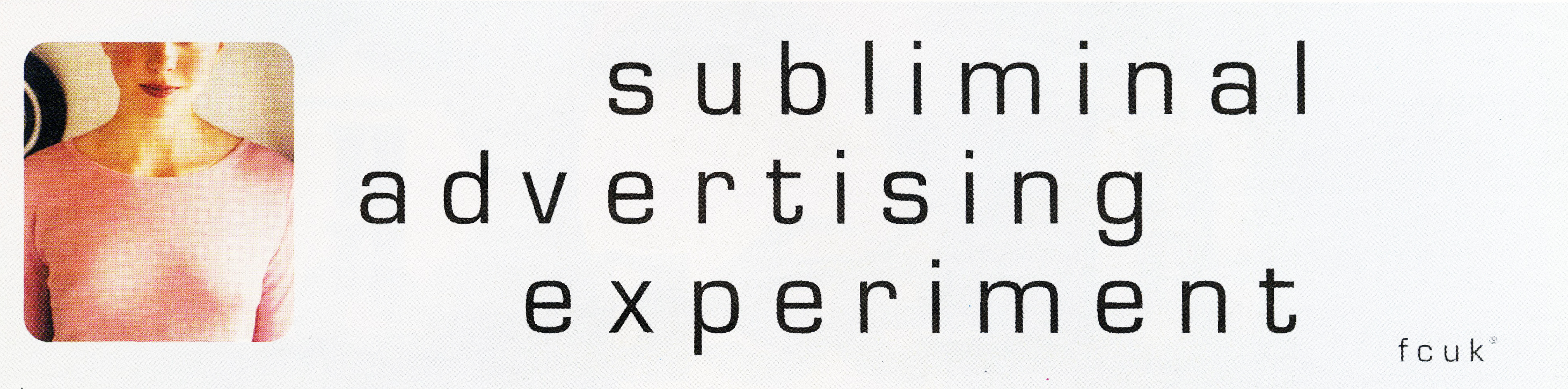
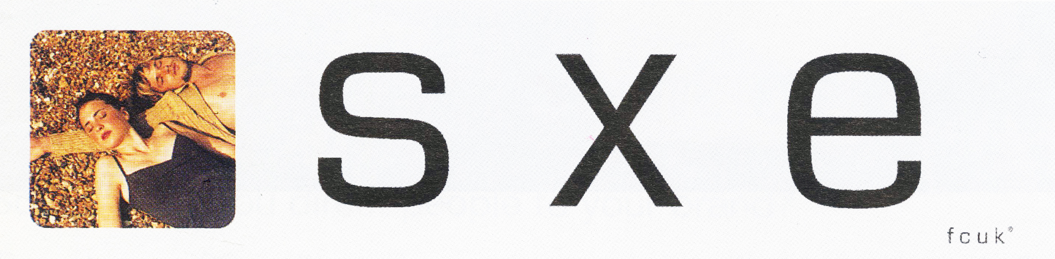
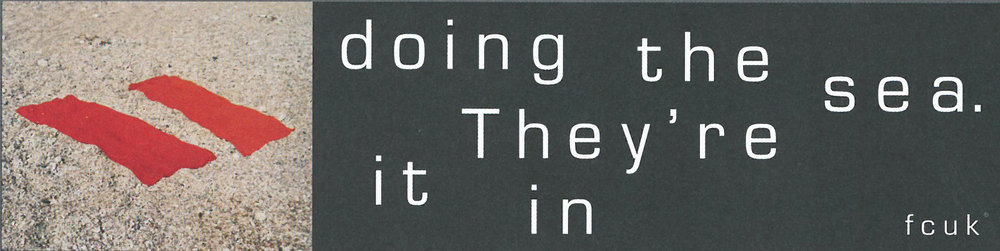
Ironically, Regal cigarettes were the least regal cigarette brand in the U.K.
They were very working class.
But in this category, you weren’t allowed to talk about anything to do with product, so how on earth do you begin to create a campaign?
You start by splitting that brand name in two.
You two names; Reg and Al.
Make them working class guys who spout their opinions on the issues of the day and you’ve got yourself a campaign.
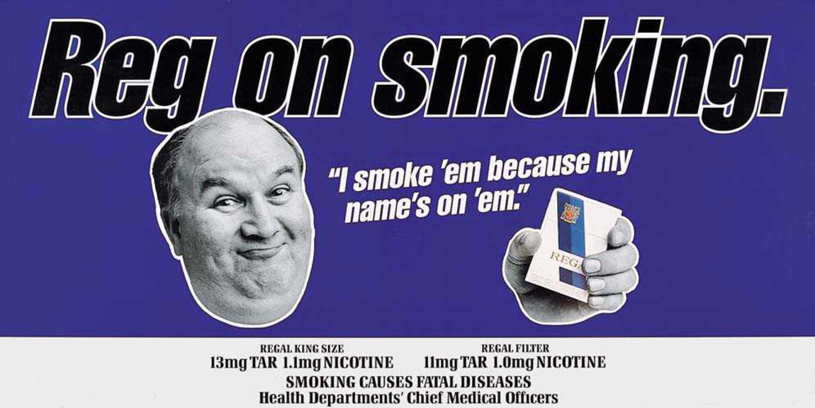
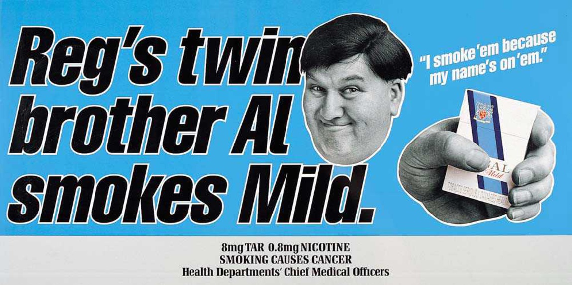
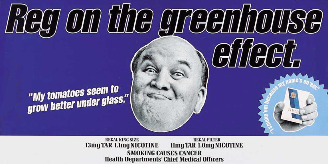
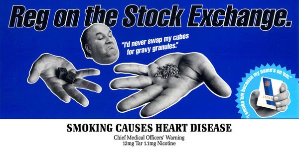
I’d been aware of VW since I was a child, but I’d never considered that those letters were next to each other in the alphabet.Until Tony and Kim pointed it out.We were all at Leagas Delaney and had been put on a pitch for VW Germany.Tony had drawn an alphabet and replaced the V and W with the VW logo.I loved it.But what was it?Tony & Kim didn’t know, nor did Sean and I, but we all liked it.While we were musing on whether this was a doodle or the start of a campaign, Tony and Kim flew off somewhere exotic for a shoot.Sean and I said we’d babysit their idea for them, try to turn it into some ads.What we do with it?You needed to see the alphabet for the idea to work, I liked the idea of running ads that looked like a type specimen sheets.
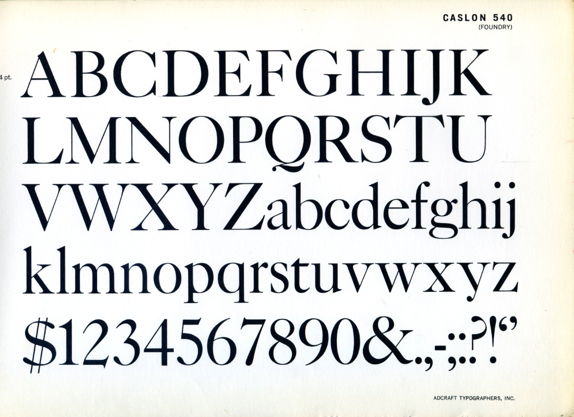
They’d look cool, attention-grabbing and, as the kids say ‘disruptive’.But they wouldn’t say much?Maybe we could find ideas in the alphabet, like those word puzzles?I put together a blank.

After reading the briefs supporting points, we both stared at our alphabets.Gradually, we started spotting ideas.This was my favourite.

I think we squeezed about 20 out.
I can’t remember whether these were what was presented or whether we ended up putting a car in the corner.
Looking at them now, they look pretty radical.
VW Germany presumably agreed, we didn’t win.
This last one took minutes to spot.
After being briefed I jotted down ‘MERRY (Happy), DOWN (sad)’ and drew a face that worked both ways up.
Again, I thought it was neat, but wasn’t sure what it was.
It’s not an ad campaign because…well, it doesn’t tell you anything about the product.
So I pinned it on my wall and ignored it for a couple of weeks, while I tried to come up with something more…meaningful.
So what can we say about the product?
Made from apples?
Made in Dorset?
100 years old?
Alcoholic?
Who gives a shit!
Everything seemed so boring and generic.
So after a couple of weeks, I thought sod it, let’s just brand the ads and make it fun.
I then wondered how we could make them more relevant to cider.
Maybe the Merry way up a hand is holding a full glass (happy), and the Down way up the hand is holding an empty glass (sad)?


It turned out that other people disagreed with me, they thought it was an ad campaign.
It won a ton of awards.
Ran for 5 years, across 50 posters, 5 films and about half a dozen pack designs.
Re-energising and transformed Merrydown’s business.
That little doodle.
Who’d have thought?
It used to annoy me that I didn’t have a big bottom drawer like other creatives.
They’d dip into it theirs, pull out one rejected idea after the next saying ‘Let’s just swap that logo for this one’.
I mean, I keep more stuff than most, I should have a huge bottom drawer.
After a while, I realised it was good thing, it reflected the kind of work I wanted to do.
Bespoke.
Try repurposing any of the ideas in this stream for another company.
Maybe a clothing brand could turn their initials into a swear word?
Perhaps an alcohol brand could split their name into two conflicting moods?
Or maybe a creative team could integrate their names into one, it looks really cool.
They can’t.
But they may well have their own branded ideas within their name or logo waiting to be found.
The tough thing is spotting them.
Even when they’re right under your nose.
In 1961, notoriously hot-headed photographer Bob Brooks arrived in London.The advertising scene he stepped into was a very poor relation to the one he’d left in New York.His biggest grievance was it’s annual advertising awards “it was put on by a printer, whose clients were the major agencies, so the ads were often credited as being ‘designed on a group basis”.
No names were mentioned, and nobody knew who designed anything.”Rather than except the situation, he got in touch with London’s top Creative Director, Colin Millward, to pitch him an idea; ”Let’s set up an awards show where creatives are named’.
The whole business of naming names is that, if you do something successful, and it gets into the show, and everyone sees that you are the art director, designer, writer, photographer or whatever, the chances are that you will make a bit more money the following year.
And that is what the business is about.”
By 1963, they’d got a posse together, it now included the country’s top designers.One of those, Bob Gill, knocked up this logo for the new enterprise.
It looked cool, but had no particular meaning, Gill explained “We just tried to get the letterforms as close together as possible”.
Over the years this jumble of letters was imbued with meaning, it represented excellence.
If you were a creative, you were in one of two groups – those who’d ‘been in the book’ and those who hadn’t.
(It’s an awards show, it’s supposed to be elitist.)
Being asked to be a judge was like an award in itself.
Winning a pencil would be followed by a pay rise and a few job offers.
Creative Directors looking to hire would go straight to the index of the last annual.
I’ve read at least four on Facebook recently saying ‘Decided to chuck all my awards (except my D&AD pencils)’.
When I decided to bin all my certificates, writer Nigel Roberts came by and said ‘You do realise that some of those are D&AD?’
The point is, that little logo was precious.
Coveted, not just in the U.K. either.
One year, 2005 I think? Whilst judging The One Show in New York, I couldn’t help but notice that all the American jurors kept referencing D&AD, so I asked the group which pencil they’d rather win, the one we were judging or D&AD?
They looked at me like they didn’t understand the question – D&AD!
Why? They’re so rare.
While we handed out 102 One Show advertising pencils, D&AD handed out just 15. (And eight of those were for craft, The One Show didn’t even have craft sections.)
This year D&AD handed out 371 Pencils.
I find it hard not to care about this stuff, D&AD has been really helpful to me over the years and it’s an organisation I feel I’ve invested in.
How?
I’ve handed over hundreds of thousands of pounds in entry fees.
I’ve given 20 or 30 days to judge over the years.
I’ve done my time on the Committee, sneaking out of my day job once a month to argue about jurors, goals, positioning, etc.
I’ve donated hundreds of hours designing two Annuals (’04 and ’12), four ads (two of them are below, ’98), one book launch invite and one poster.
I don’t say this to suggest that I’m owed anything or that my opinion is important, just to explain why I have one.
Besides, there are literally hundreds of people out there who could write much longer lists than me.
But having just read that the Type Directors Club of New York has shut up shop, it got me thinking about whether D&AD would one day go the same way?
It made me wonder whether now might be a good time to have a kind of brand audit.
The two toughest questions a brand can face is: What are you for and who are you for?
They sound innocent enough, but they aren’t.
What is D&AD for?
To inspire people to produce better work?
To promote the communications industry to the business world?
To be an alternative to Cannes?
To be a public record of the industry’s finest work?
To entice people into our industry?
To, as Bob Brooks said, help the good people get paid a bit better?
To teach people how to communicate?
To be a meeting place for global communication companies?
To reward those who make our industry look better?
Who is D&AD for?
The staff?
The membership?
Creative people?
The winners?
The communications industry?
The business community?
Future generations?
People with eyes?
Humans?
The temptation is to tick all of them. (Don’t do that in a brand workshop, they’ll make you sit in the corner facing the wall.)
You need to reject some and give the rest in a hierarchy.
Try to be everything for everyone and you’ll end up being for no-one.
Maybe the best place to discover what they stand now is to look at what they’ve stood for previously.
Their Call For Entries campaigns are the ideal place to start, when you’re trying to part people from their cash you’re forced to consider what you’re offering them in exchange.
Some of the following ads are great, some are awful.
But lining them up, in chronological order, you can’t help but notice one thing.
They used to be created by the the best minds in the business; Bob Gill, Charles Saatchi, Tim Delaney, etc, now they seem to be done in-house.
So they don’t have ideas, insights or reasons why they deserve a bigger slice of an agencies awards budget than Cannes.
That may seem harsh, but if there’s one organisation out there you’d hope would choose excellence over the convenience of bringing things in-house, you’d hope it would be D&AD.
1963.
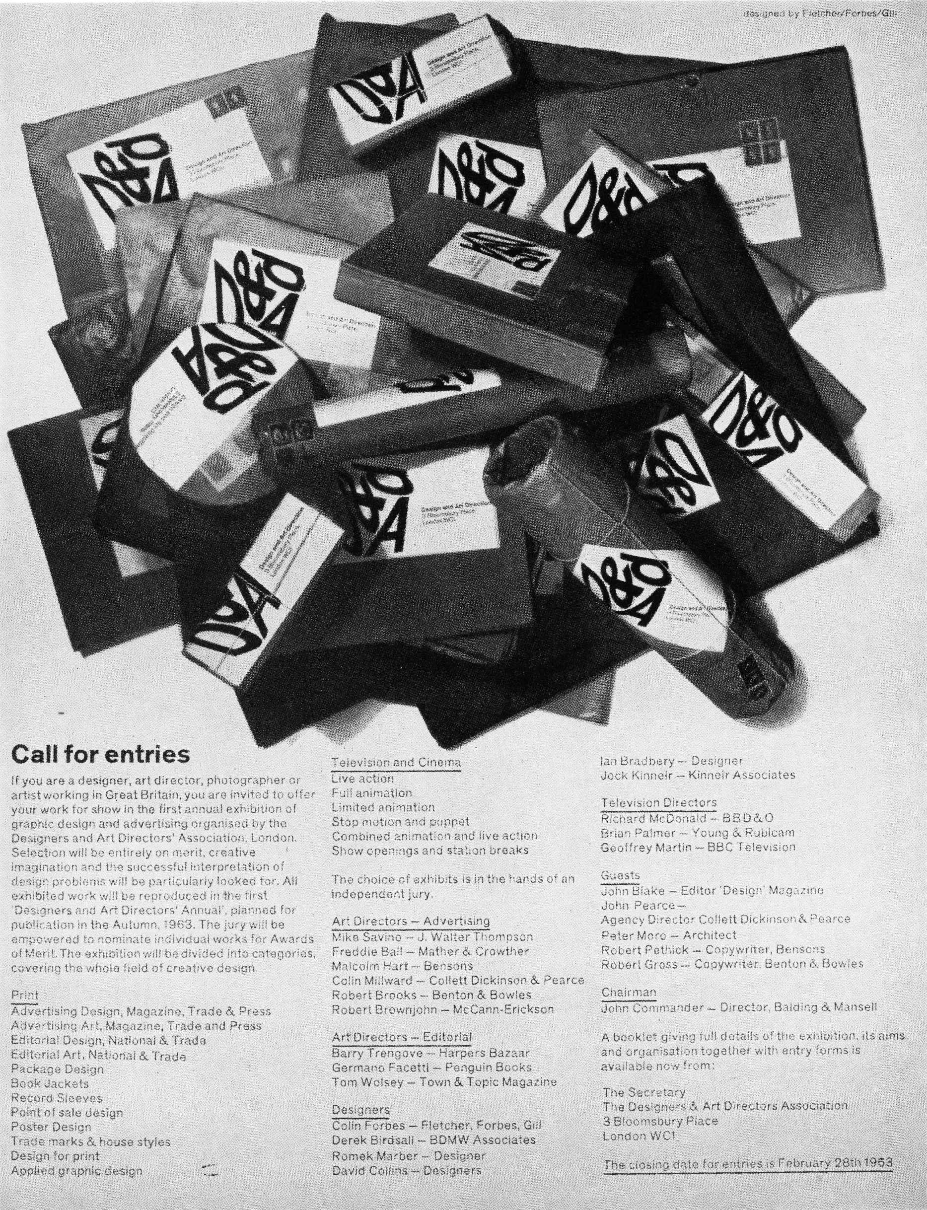
1965.

1966.

1967.


1969.


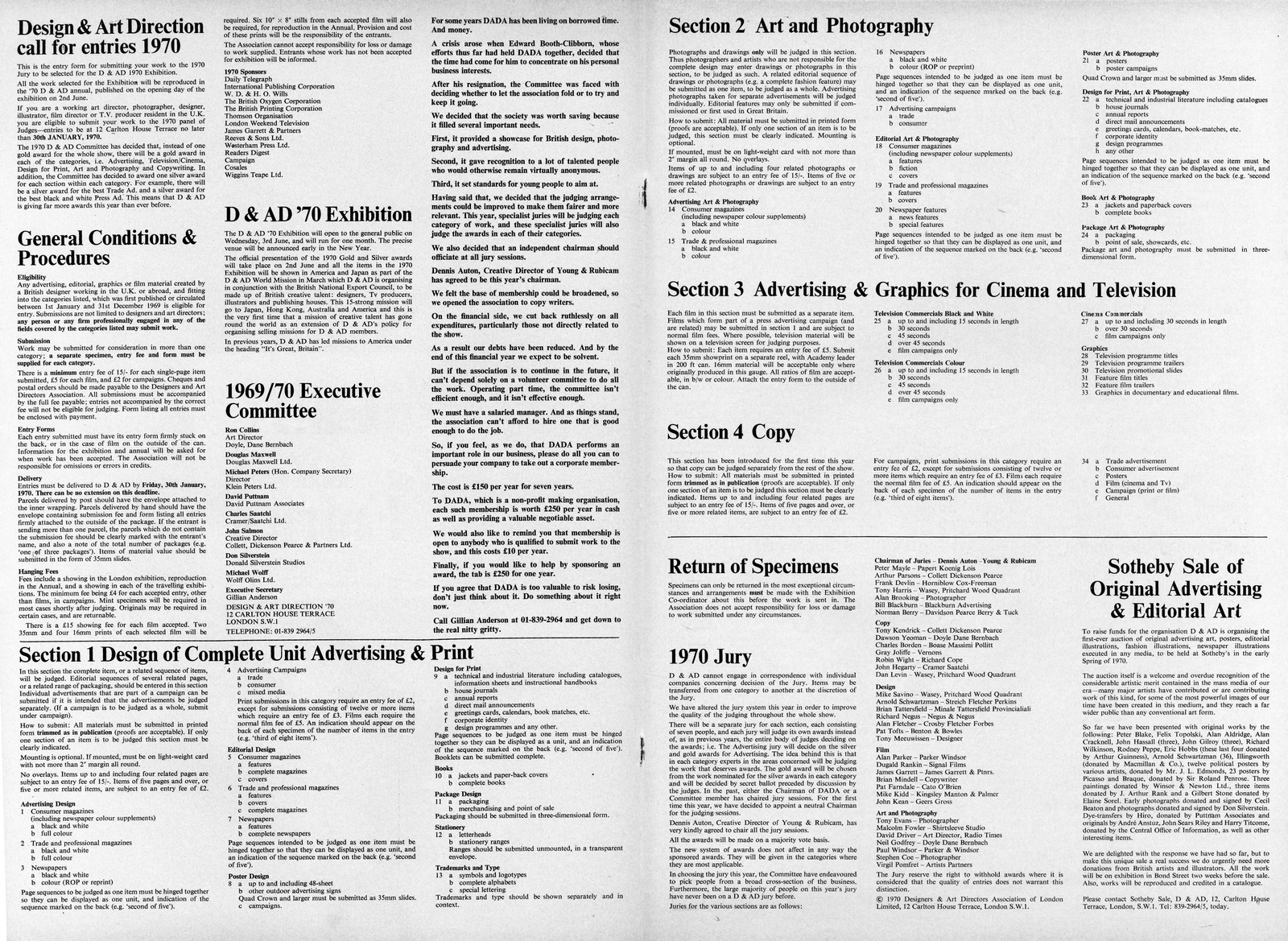

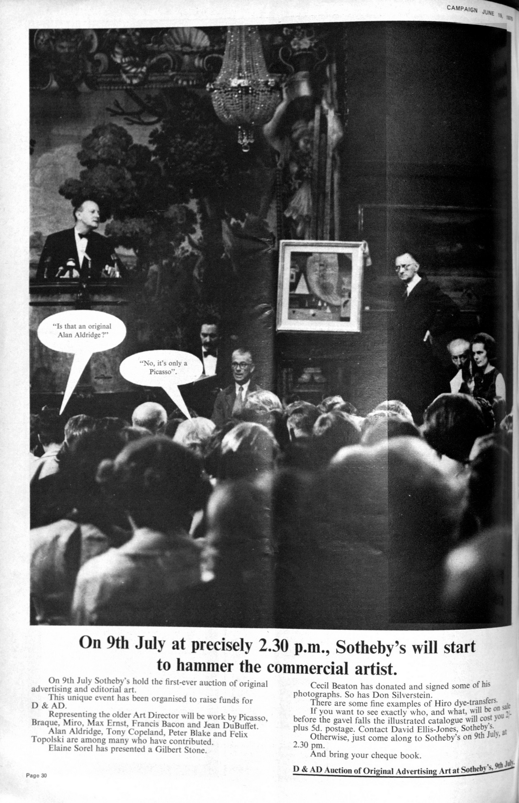

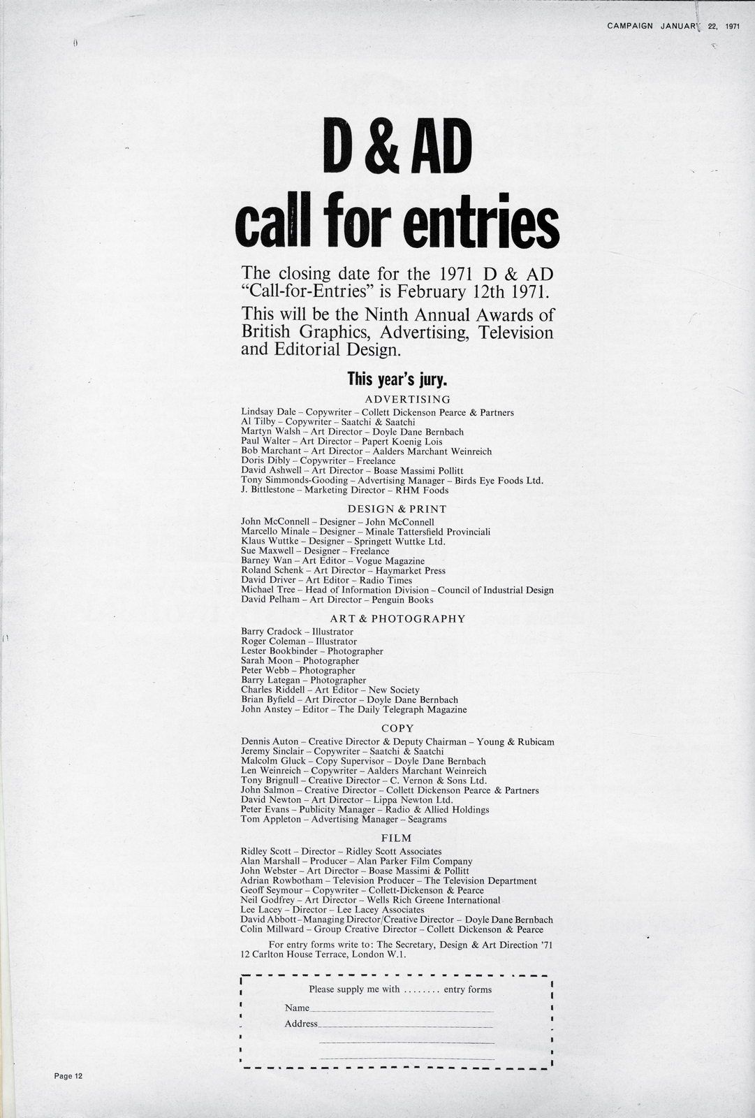


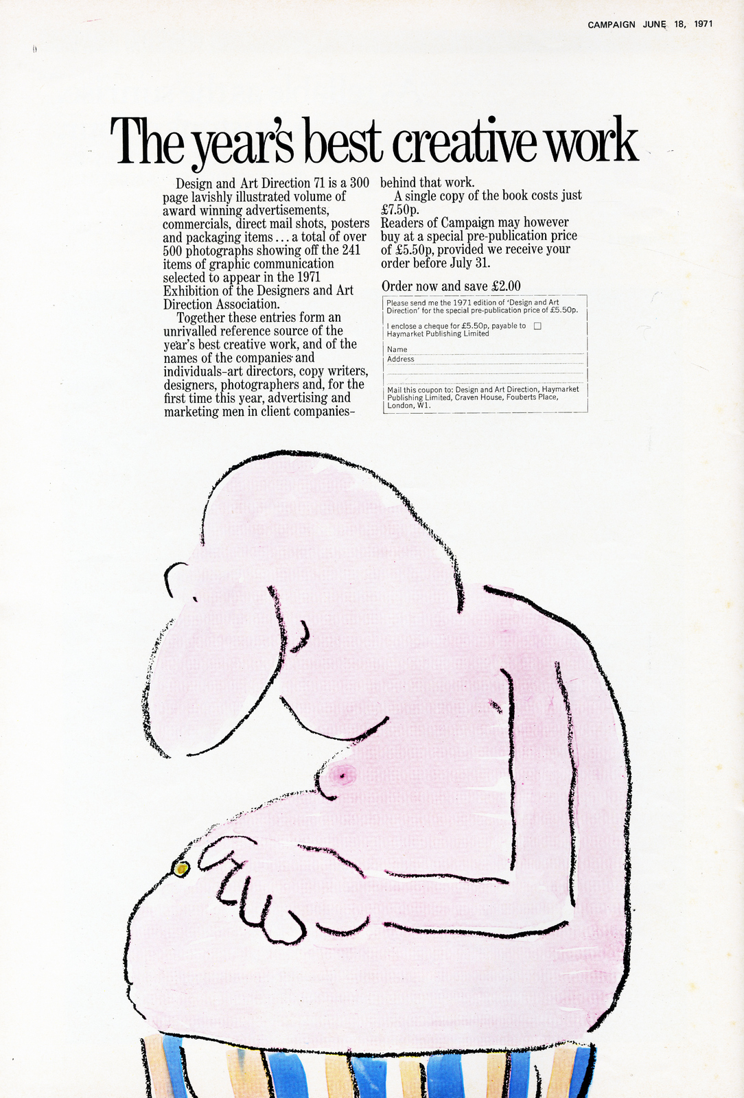
1972.

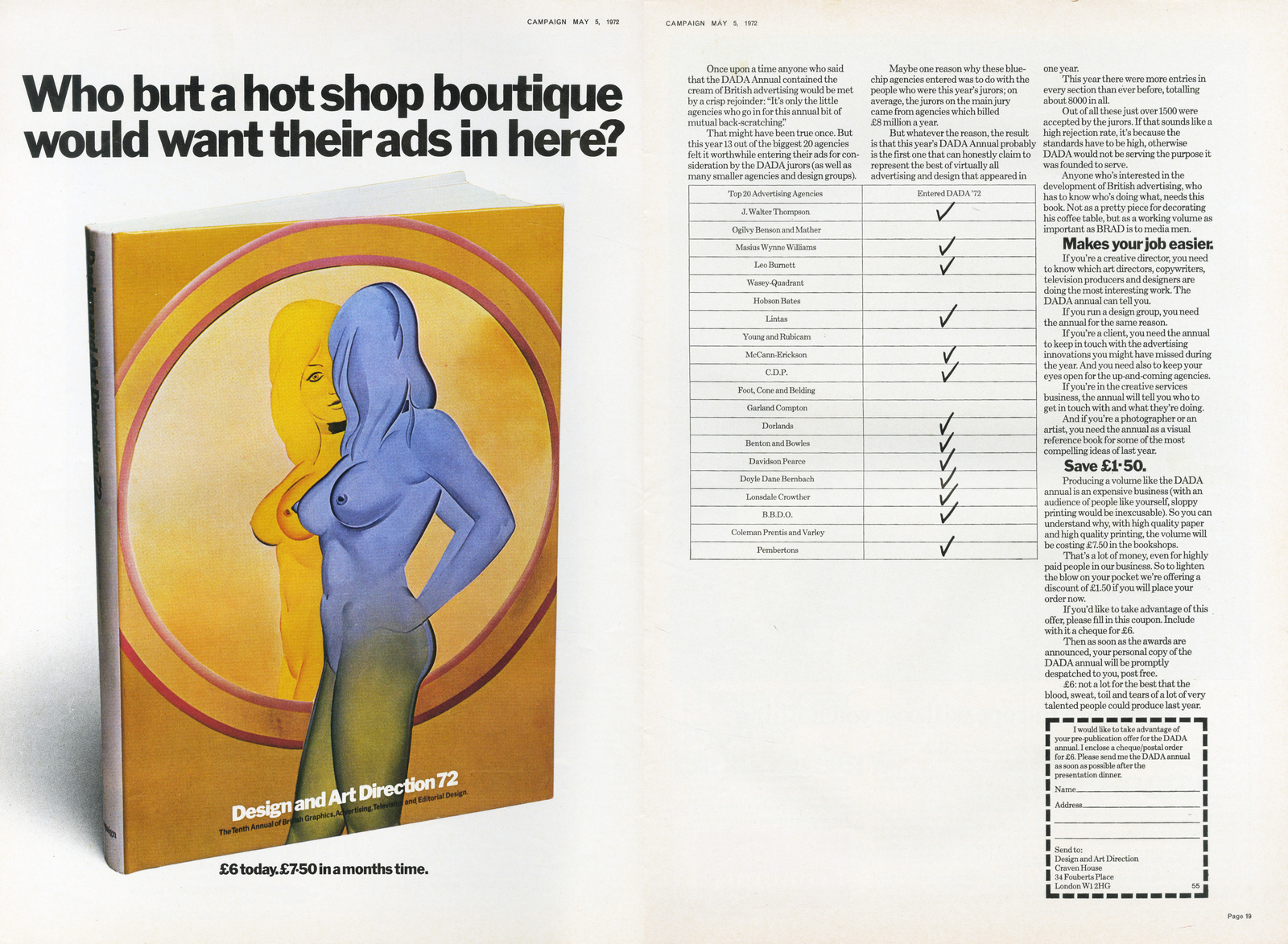
1973.
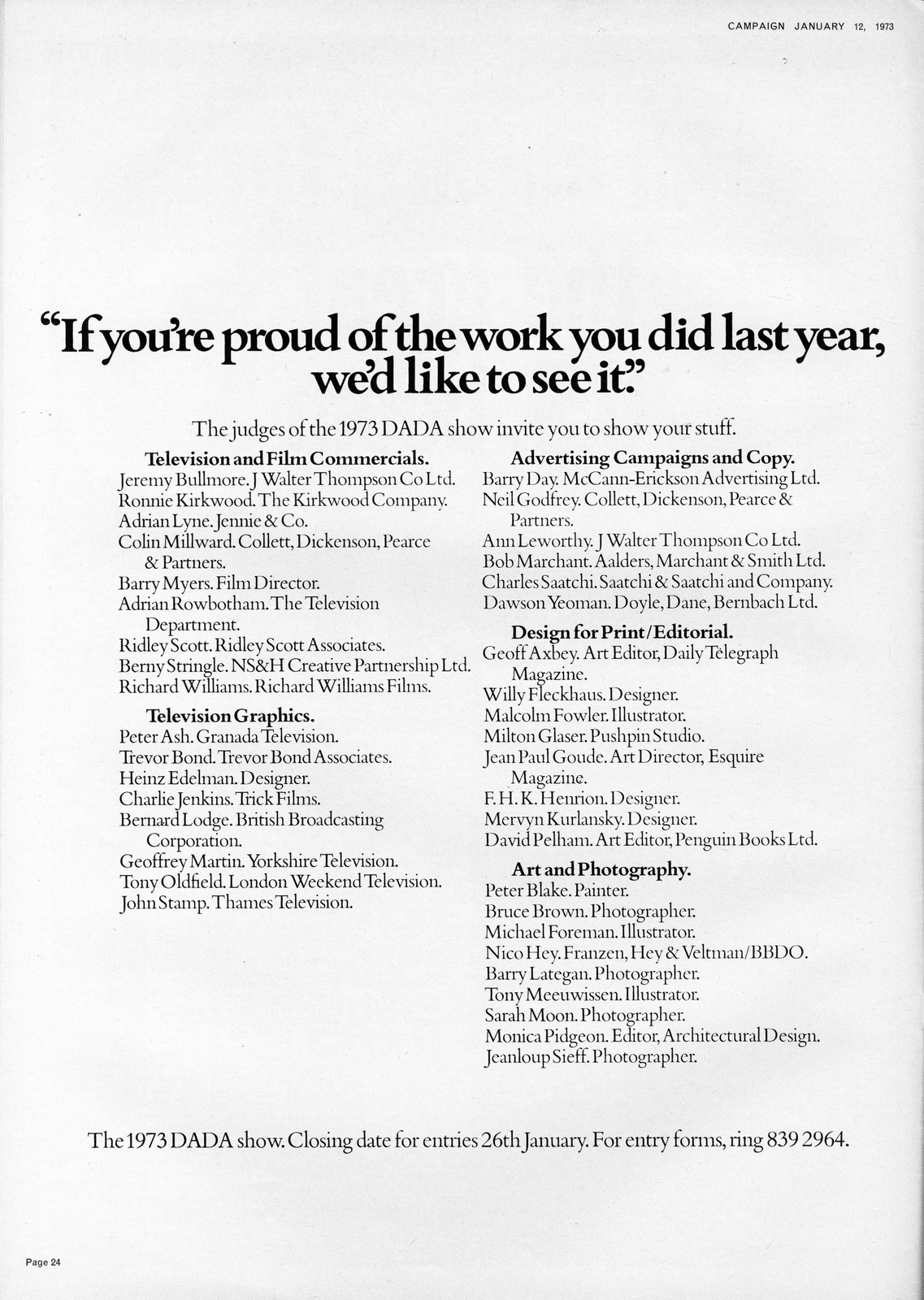

1974.
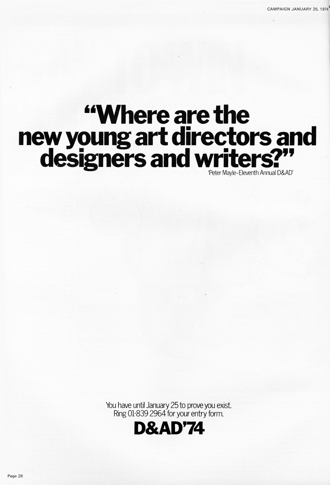
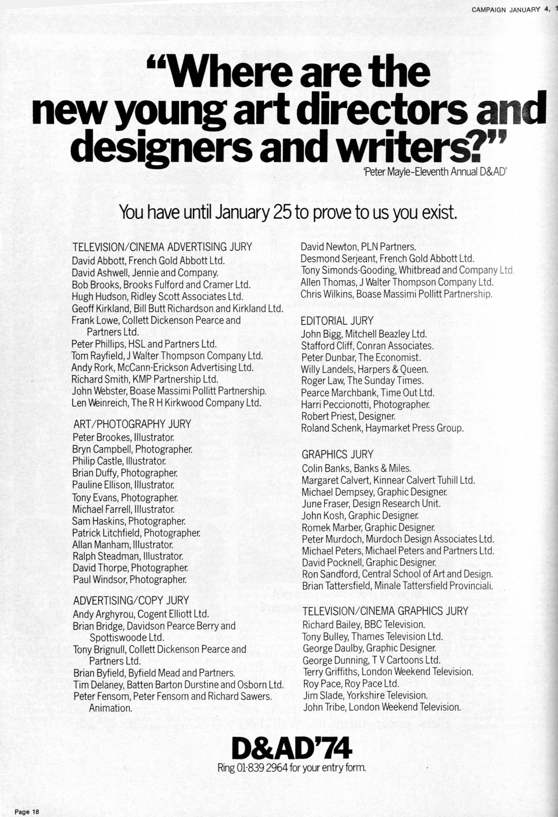

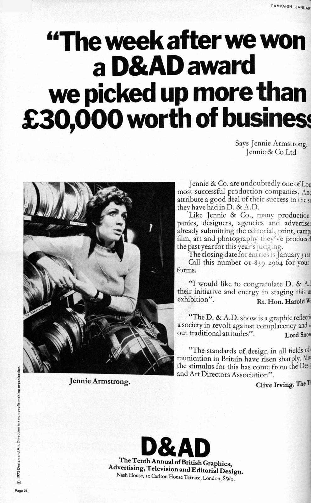
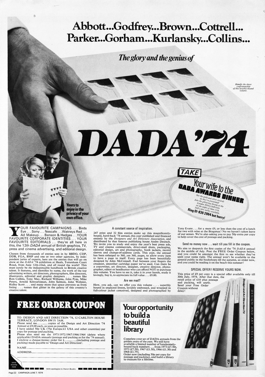
1975.
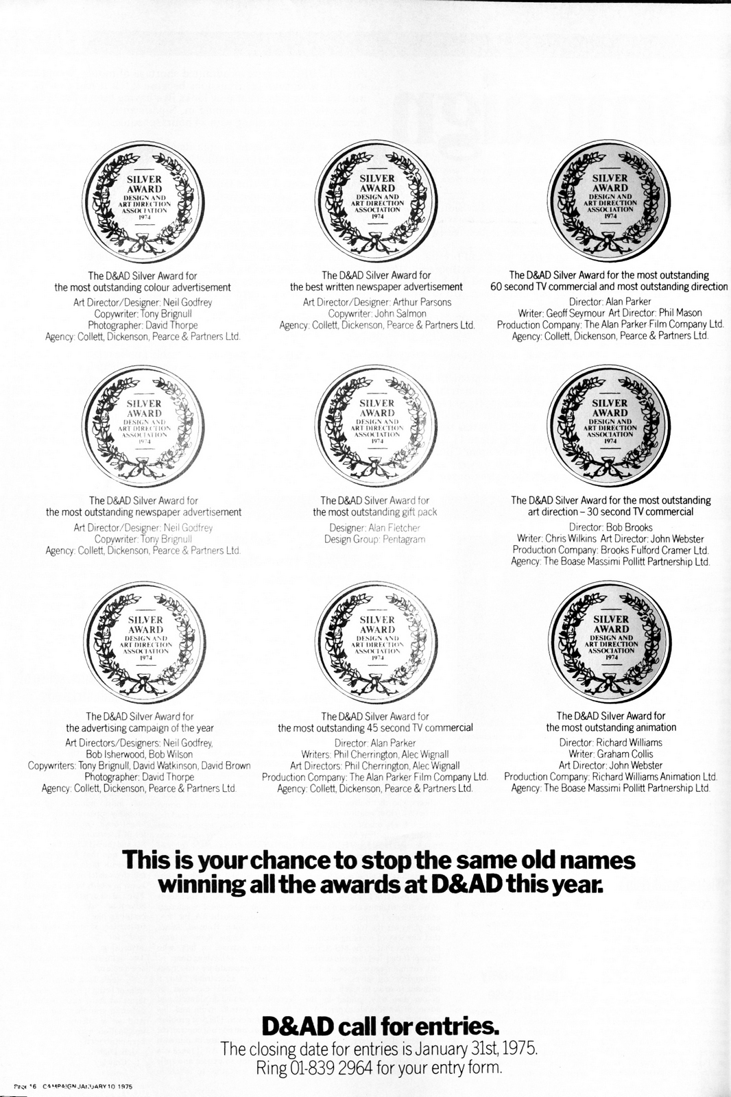

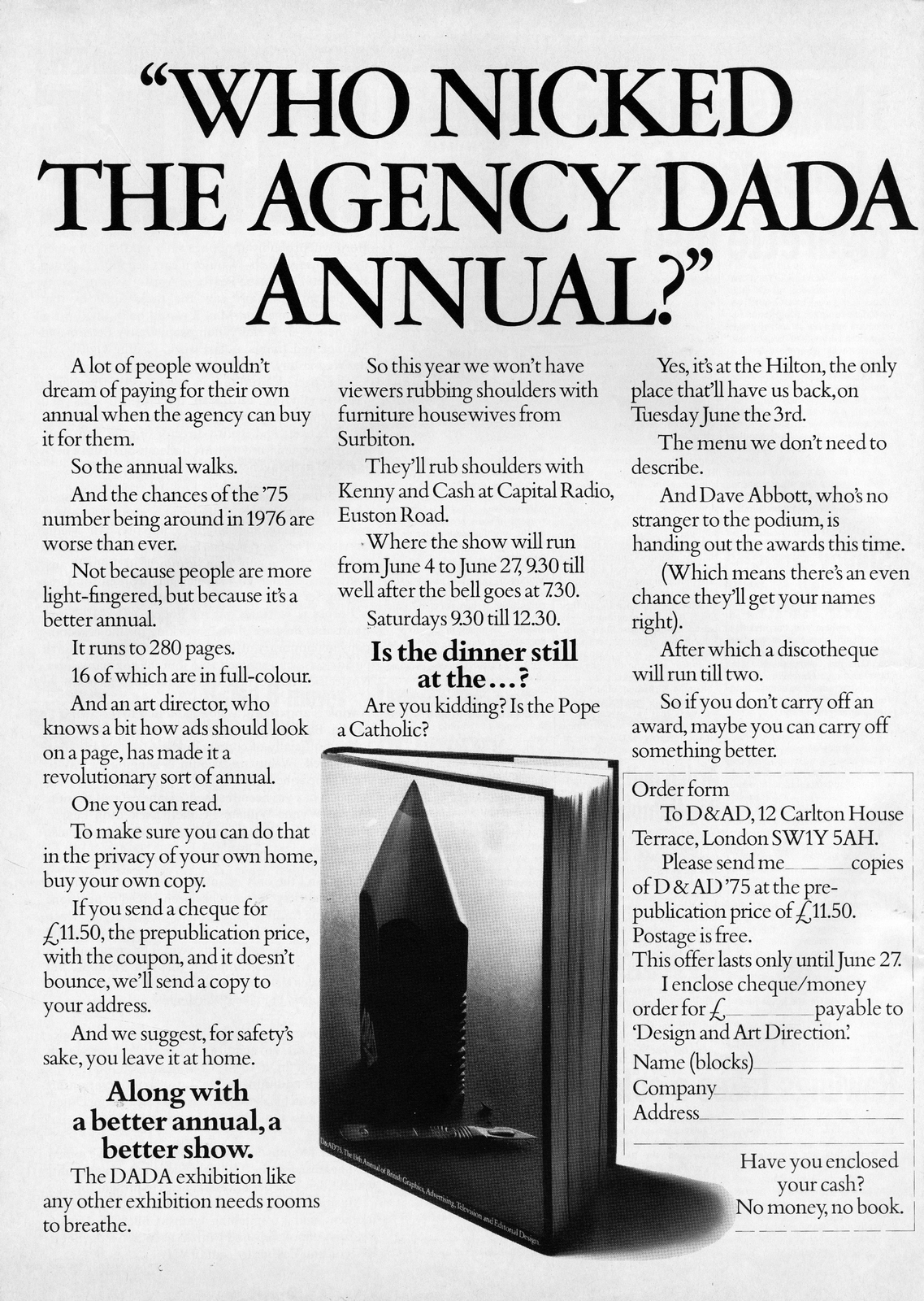
1976.
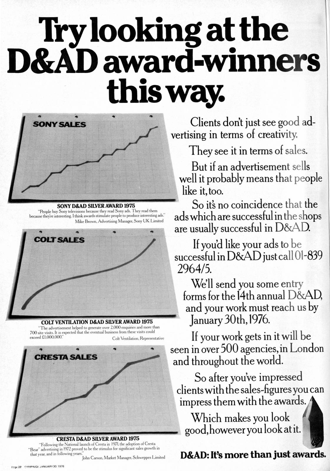
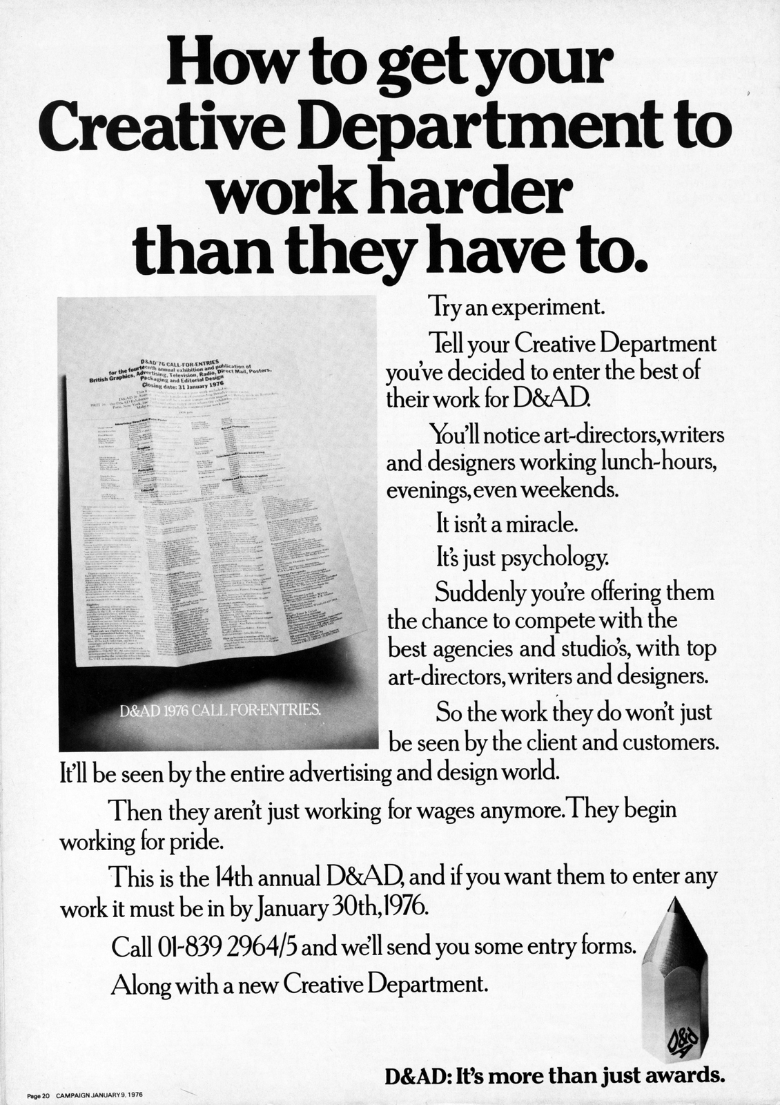


1977.
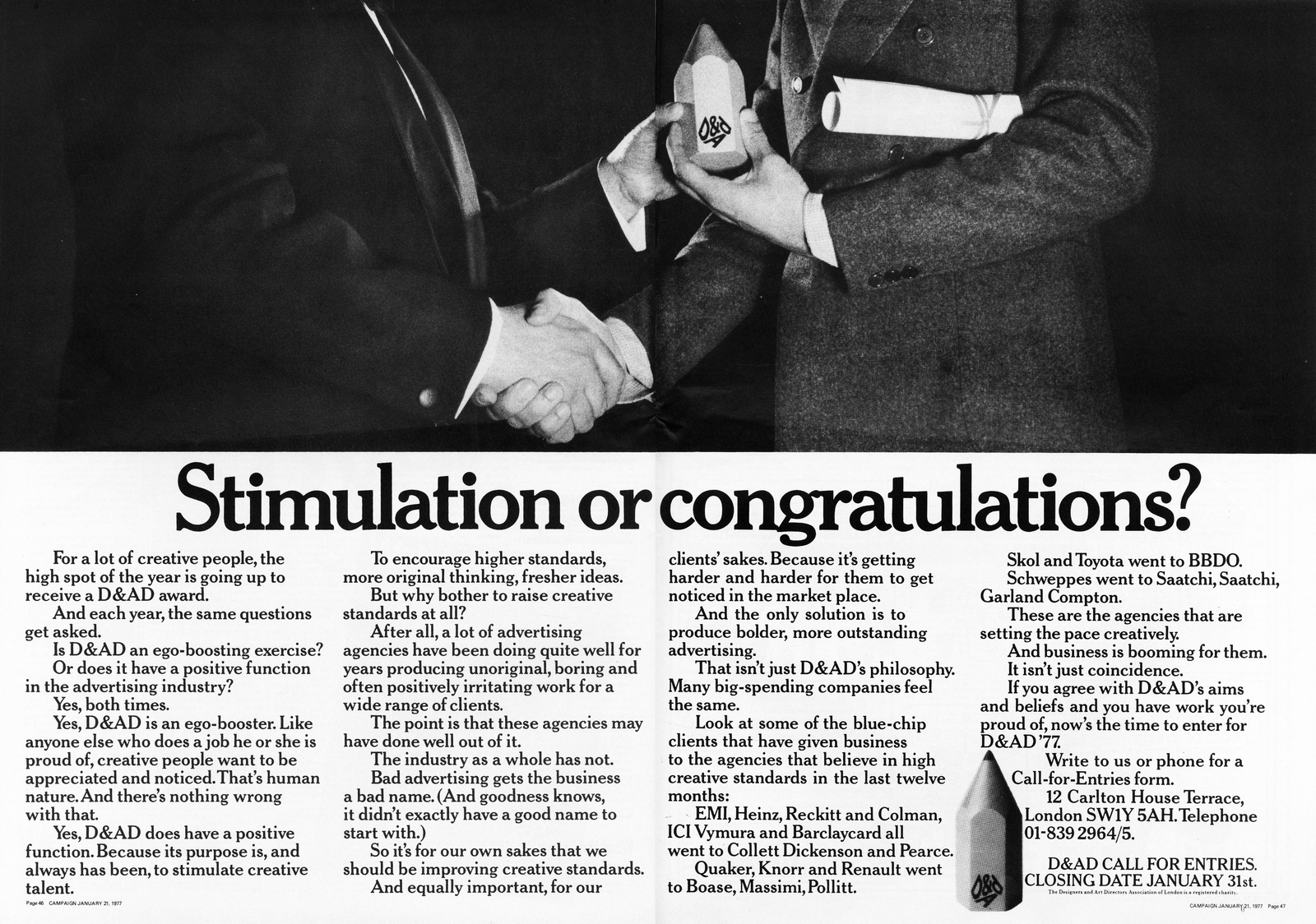

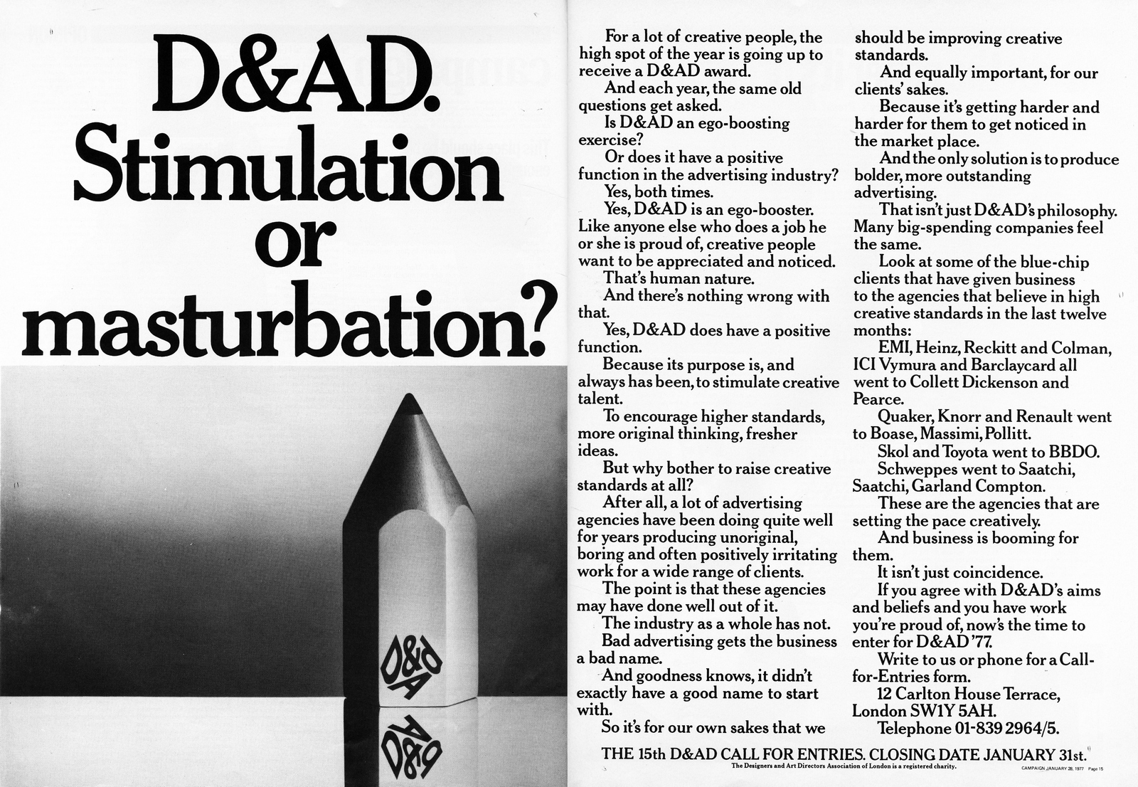
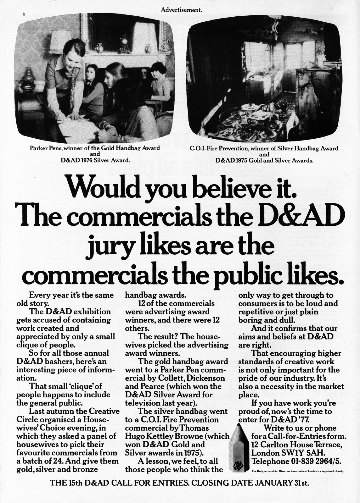
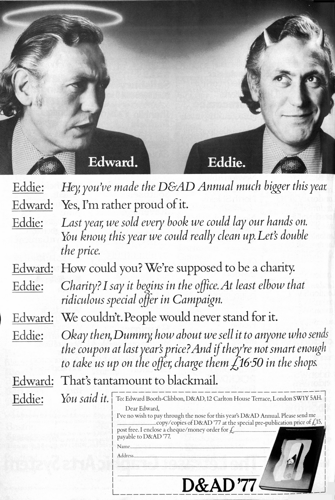
1978.


1979.


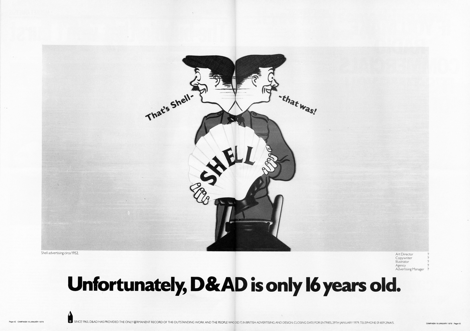
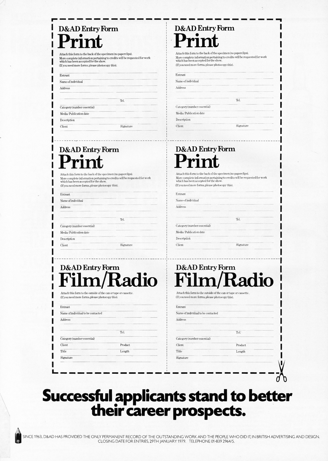
1980.

1981.

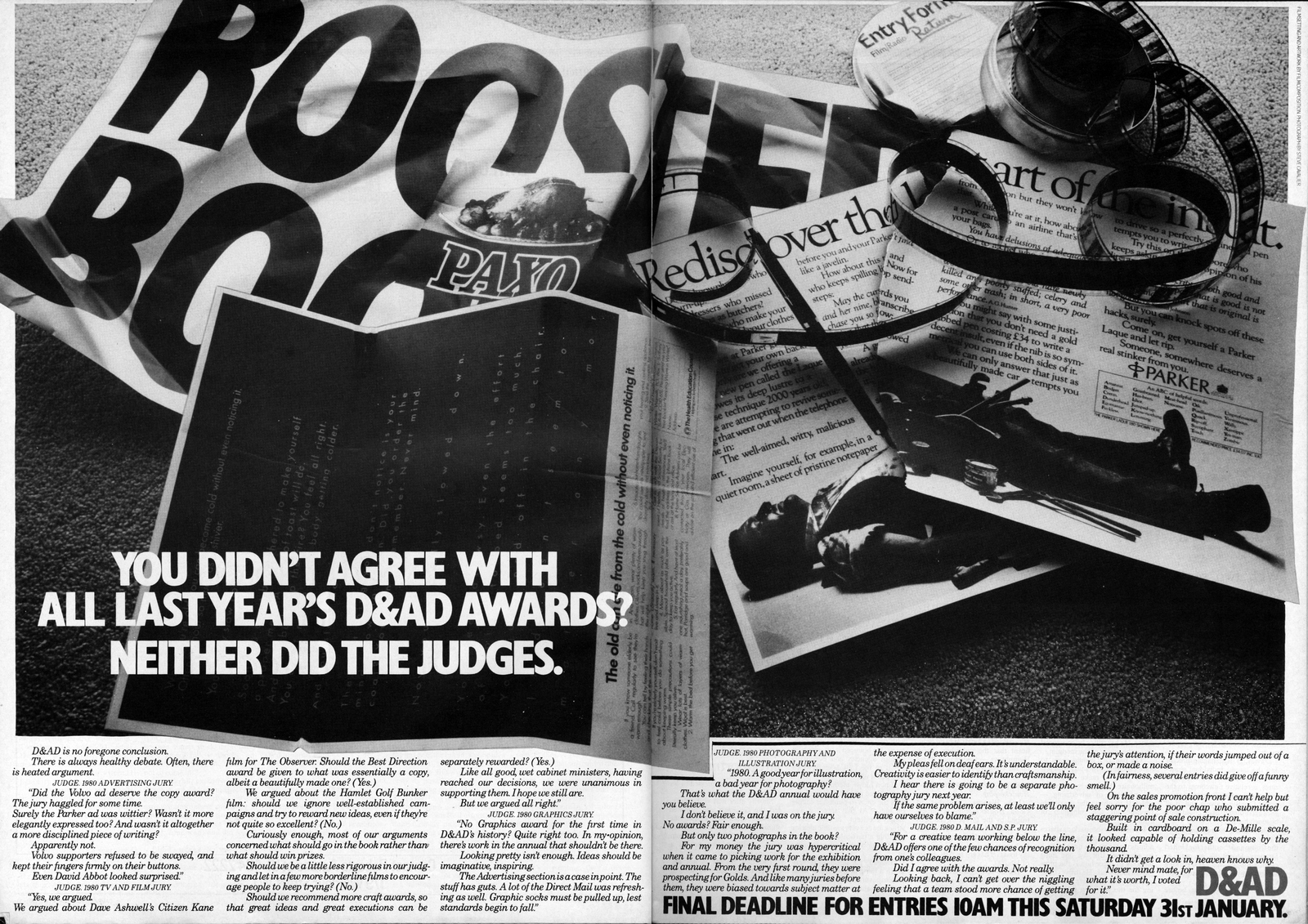

1982.
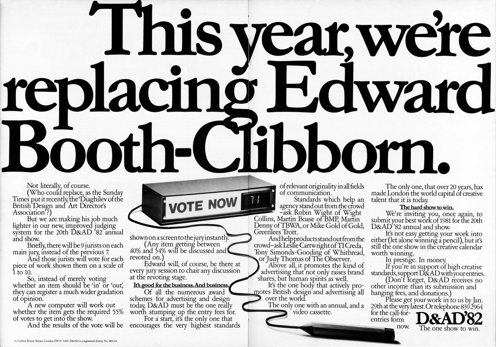

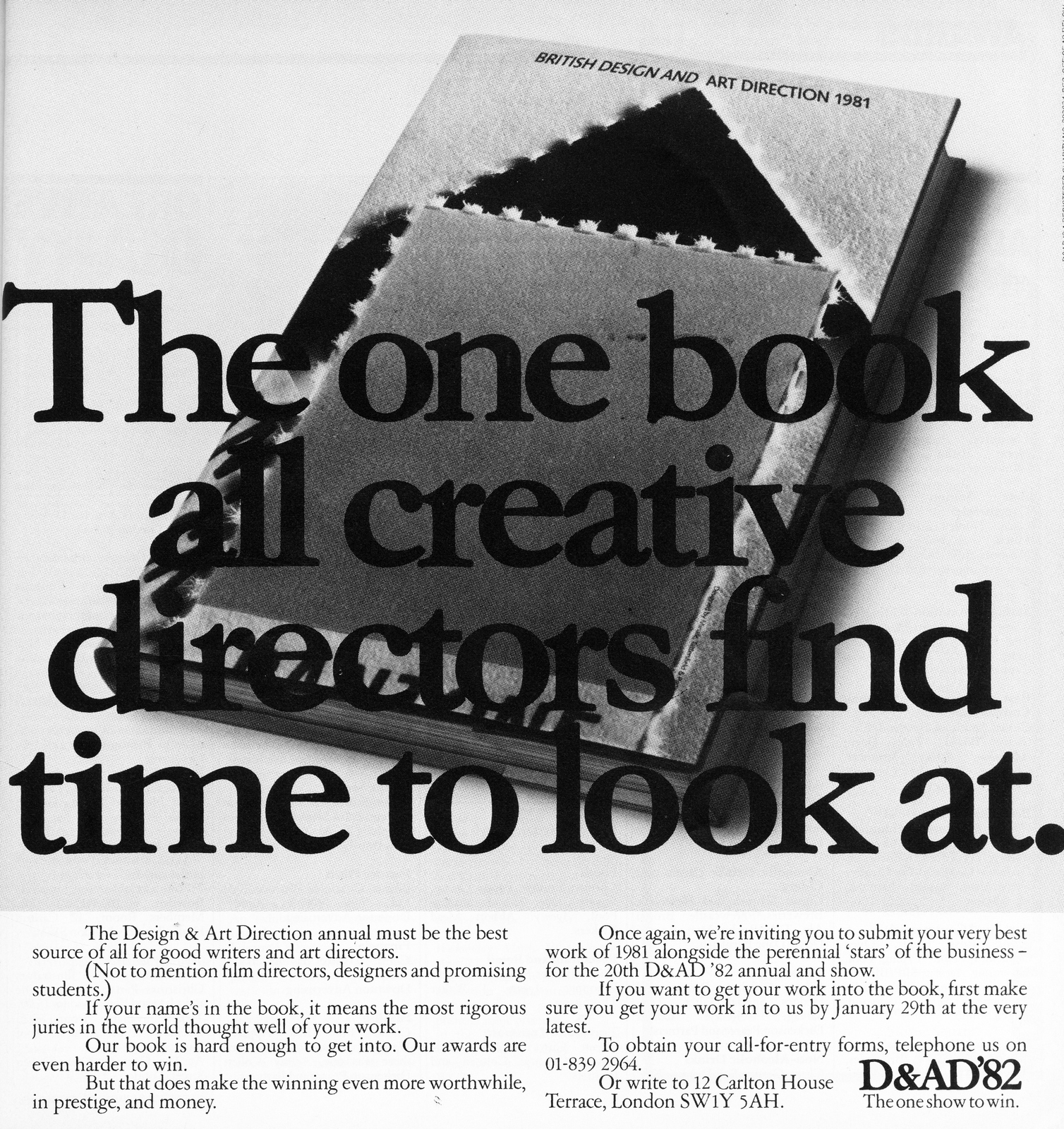

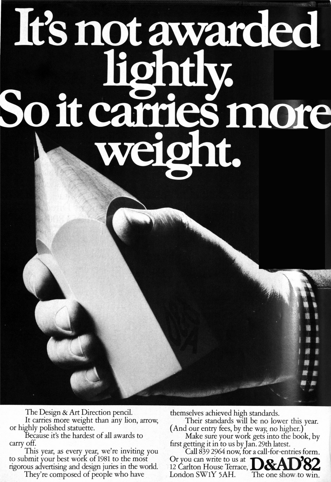
1983.


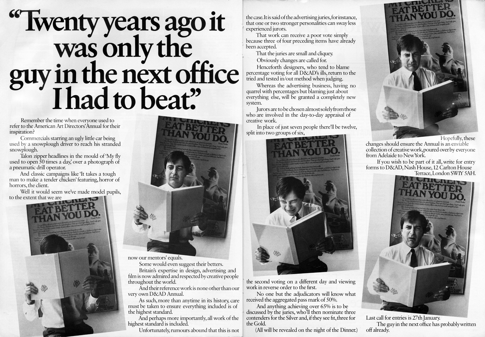


1984.

1985.


1986.

1987.


1988.


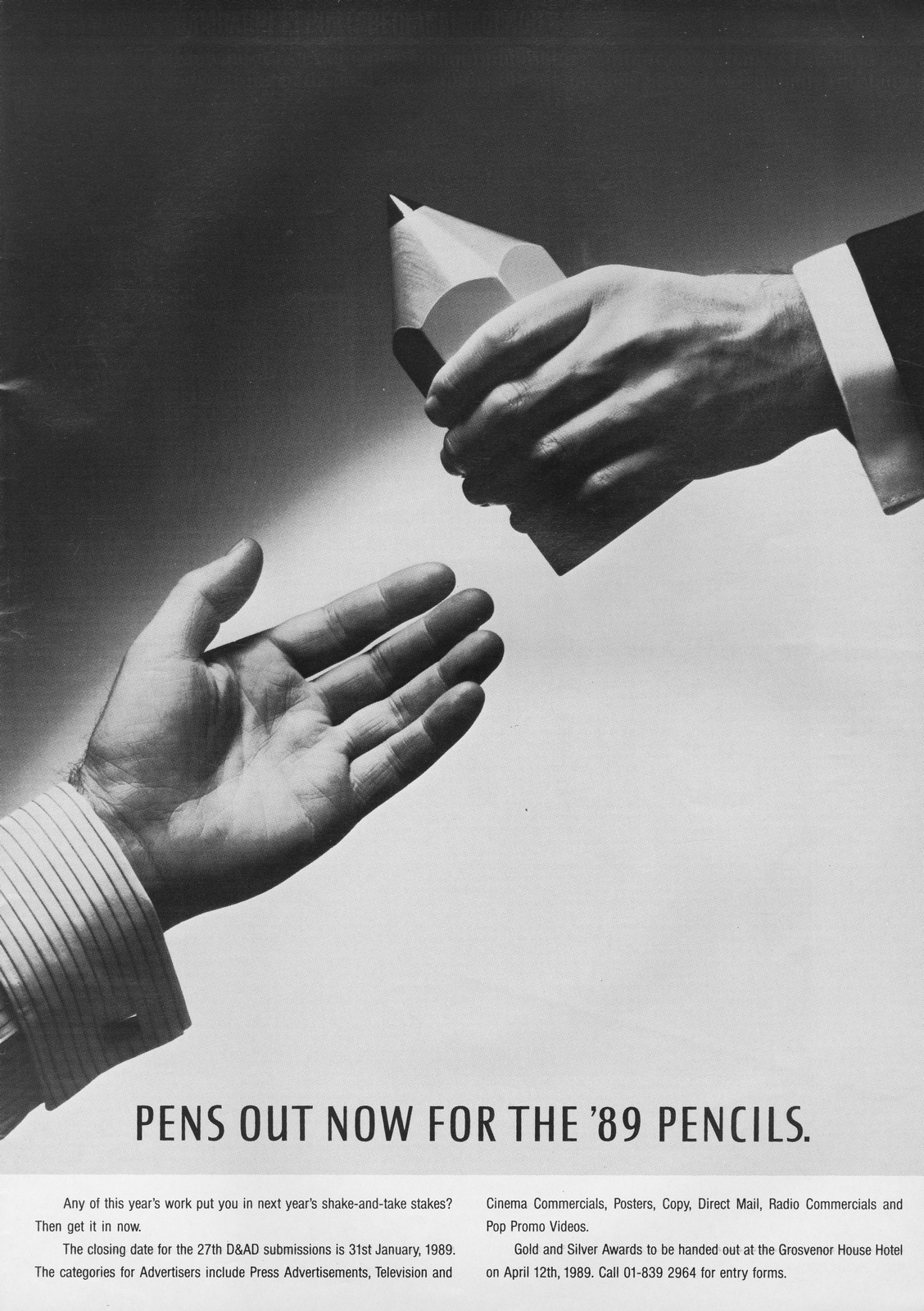
1989.

1990.


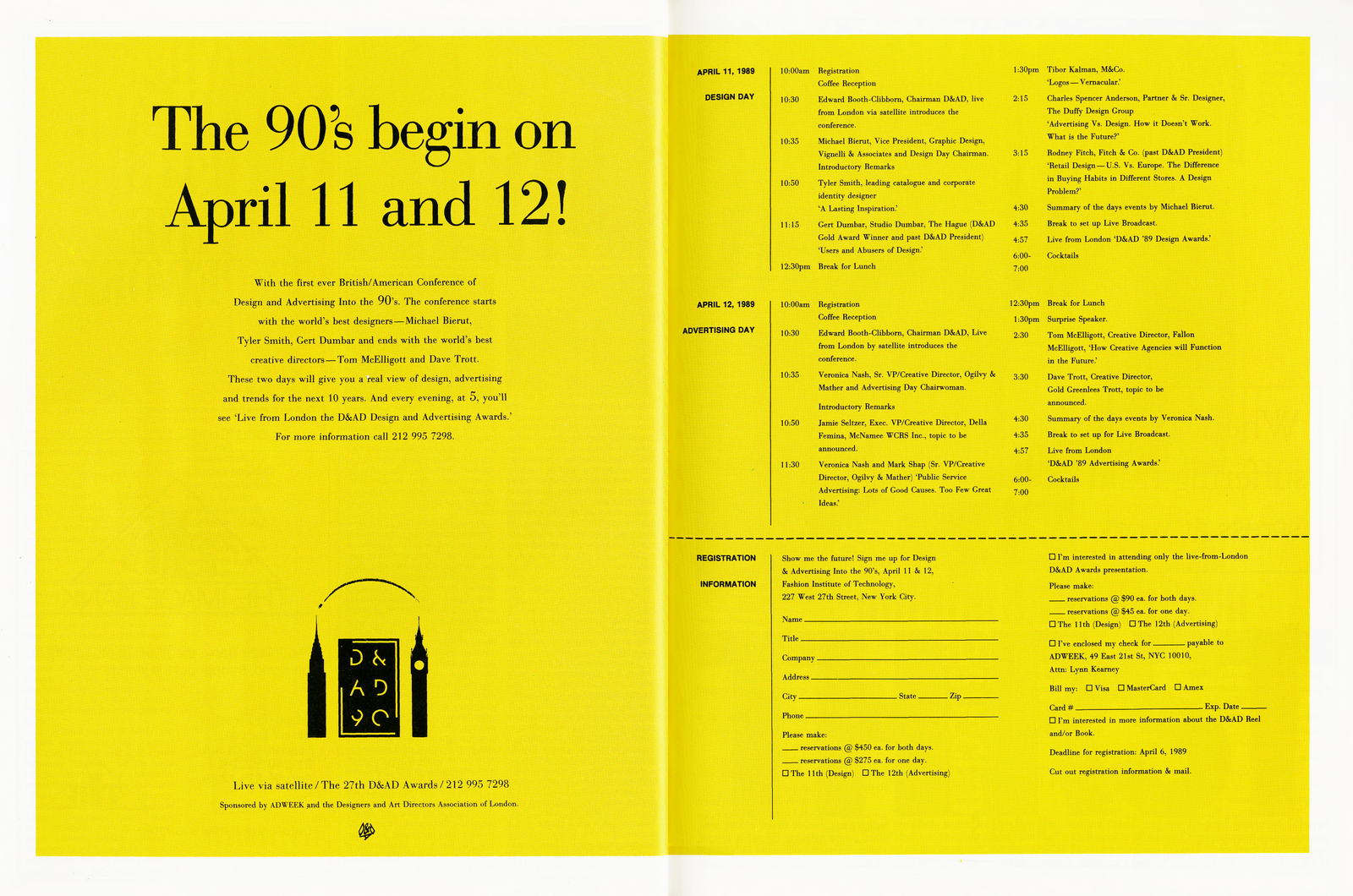
1991.

1992.

1993.
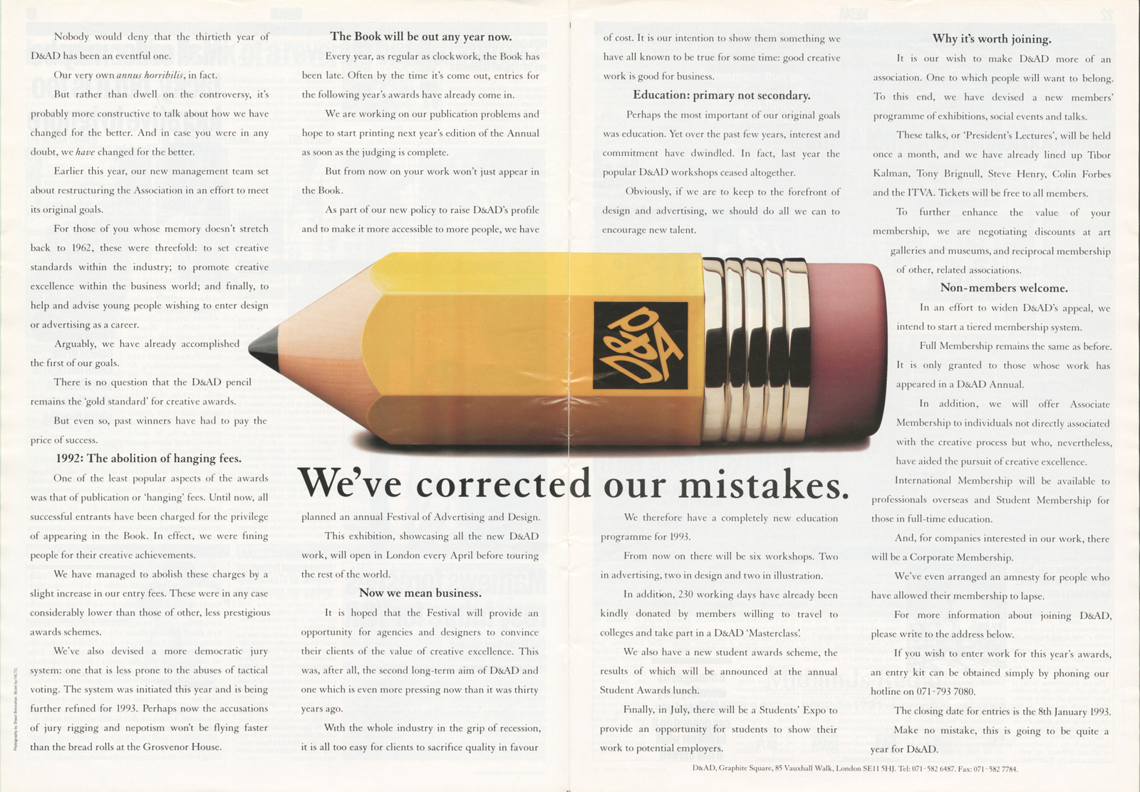
1994.
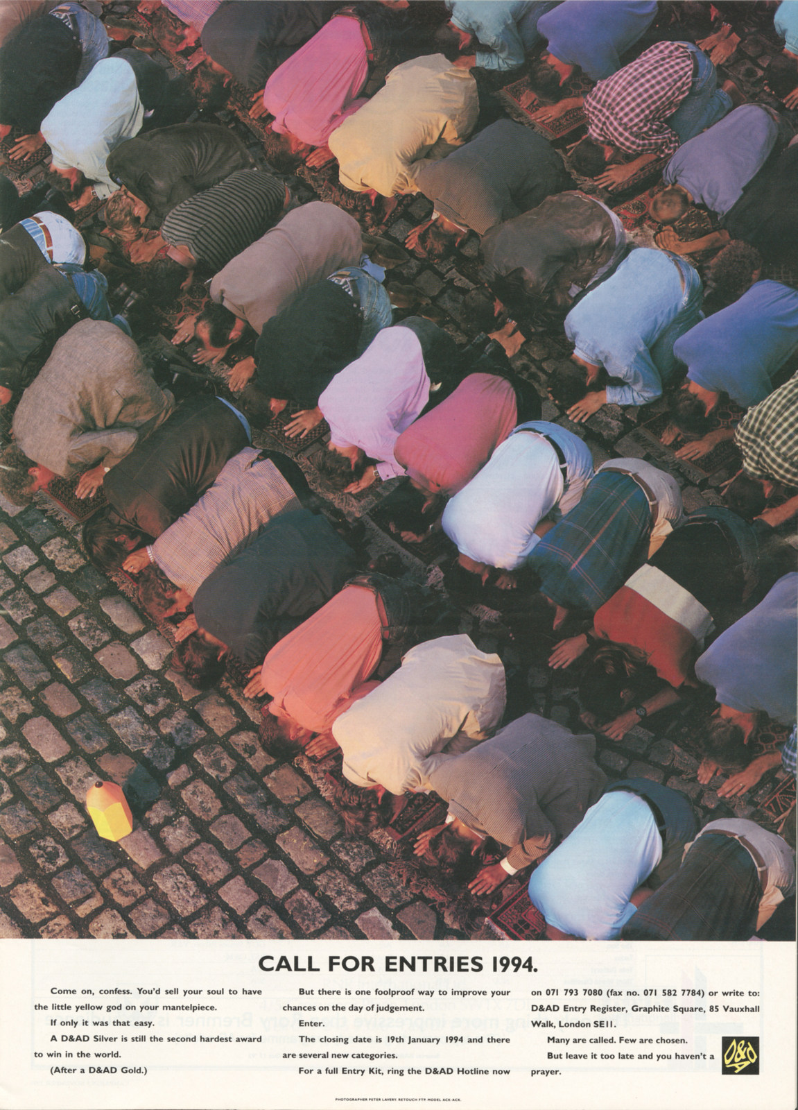
1995.

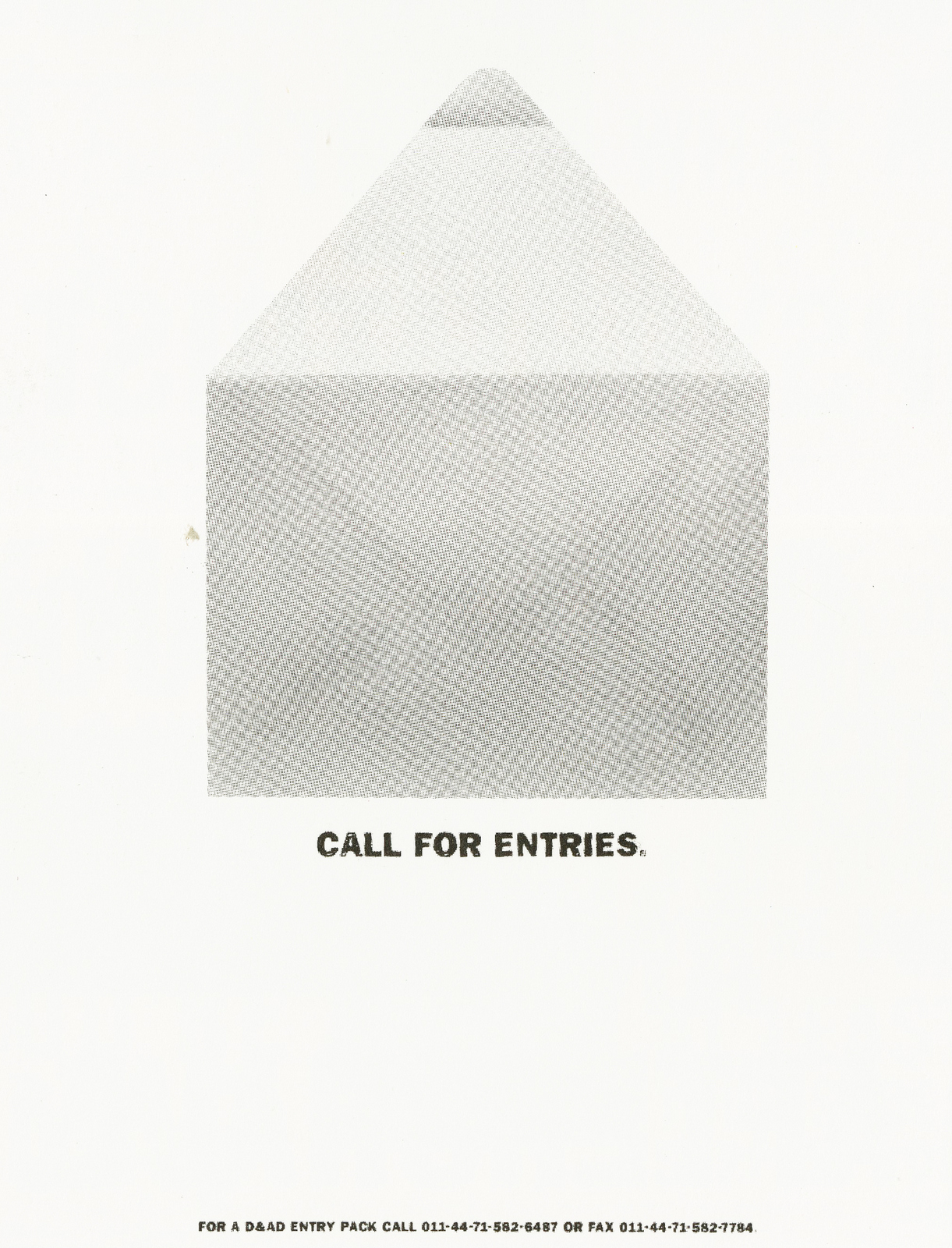
1996.
1998.


1999.

2000.
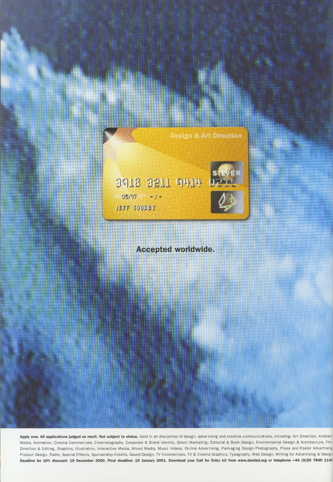


2003.
2004.
2005.


2006.
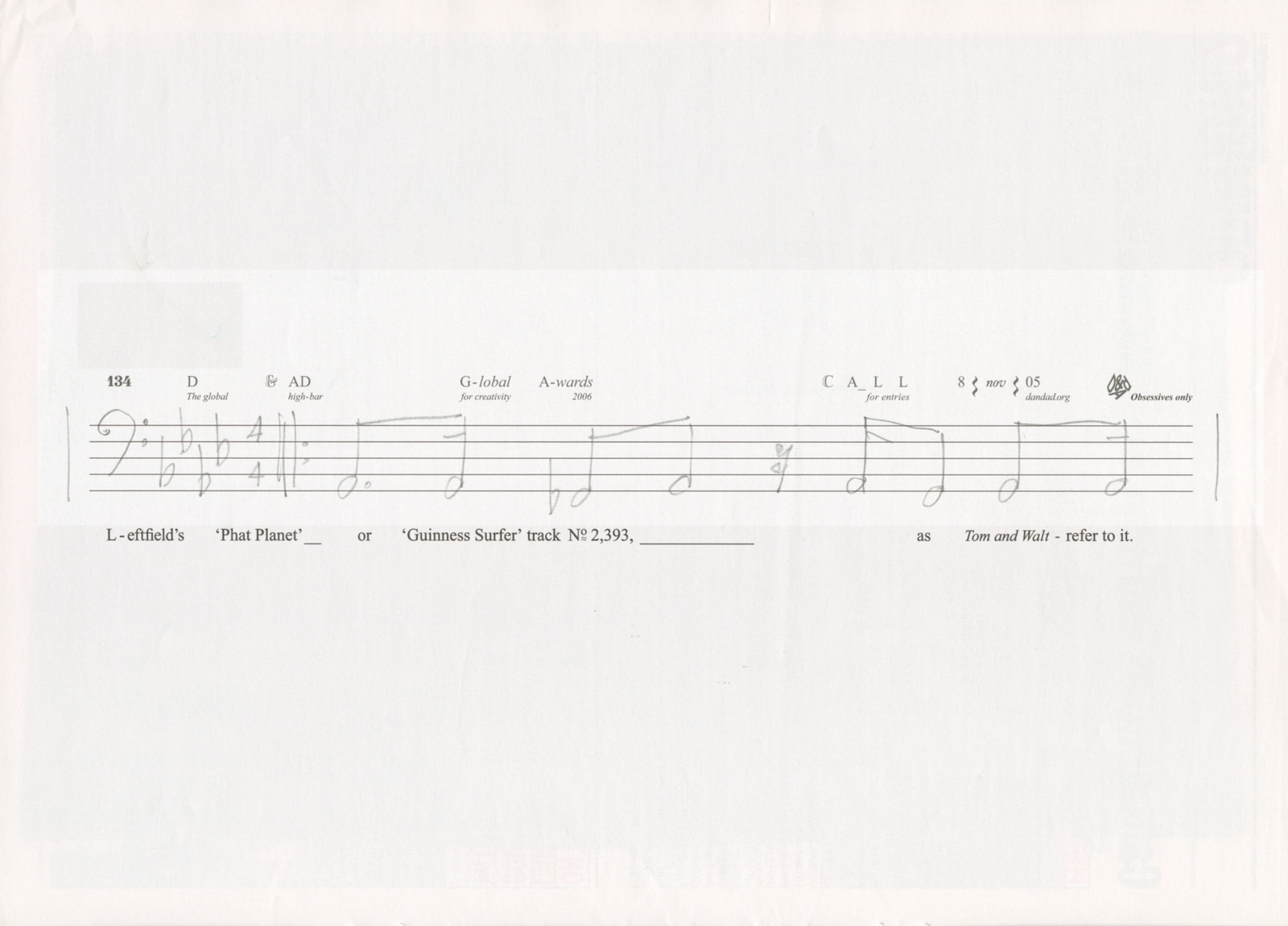
2010.
2013.


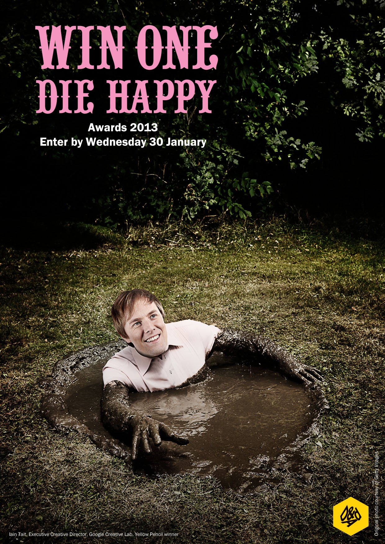
2015.
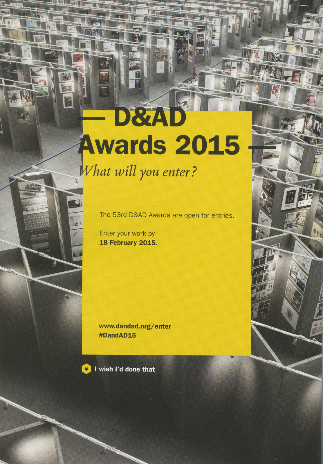
2016.
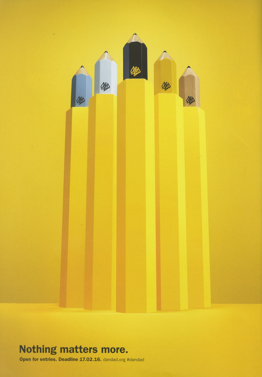
2017.

2018.
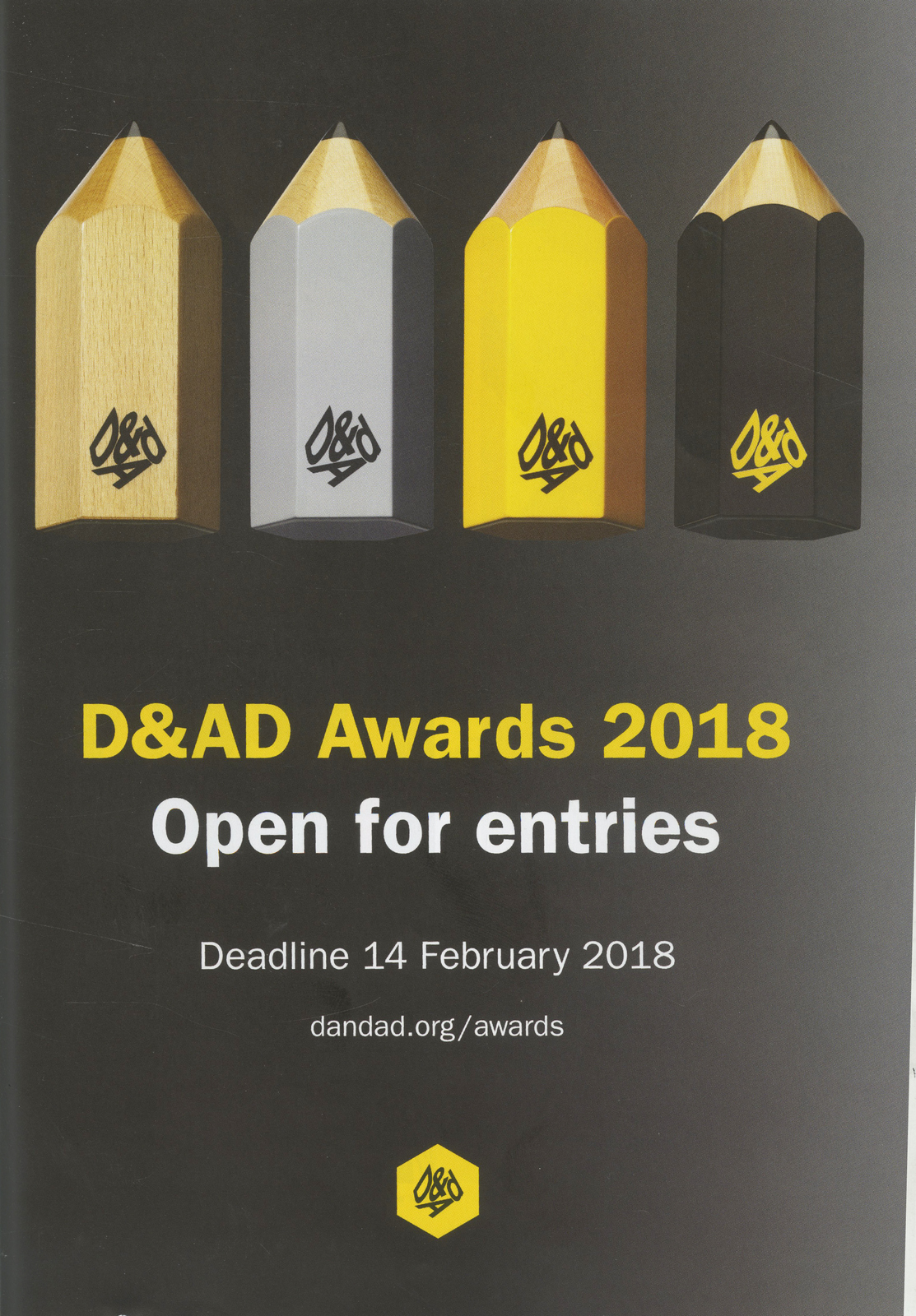
2019.

Thanks to The History of Advertising Trust for helping me track down some of these blighters.
Before we start, full disclosure: I’m not anti old ads.
I quite like them.But weirdly, a surprising number of creatives leaders don’t.At least, they say they don’t in public, I’m sure in private they must have a cheeky flip through the odd One Show annual now and again?They put out phrases next to their profiles like ‘All about the new’, ‘Future facing creative’, ‘Forwards, not backwards’ ‘I never look back’.
It sounds so cool.
Frankly, it makes me want to be part of their gang, just imagine how much ass they must be kicking?As we speak they’re probably creating ideas, so fresh, so original, that exposure to them will have you questioning your very existence on this planet.
Who wants to look at old ideas?For a start, they’ve been done.
Also, they were created for a different generation, what relevance would they have to people’s lives today? Afterall, we’re more woke, recycle more often and have better Uber ratings.
Why look at outdoor made up from printed sheets and a pot of glue when you work in pixels?
Or read print ads that looks like a pages from books when you have a global brief?
Why watch a cigarette ad made for cinema screens when your brief is for phone screens?
In April 2010, this wasn’t just a philosophical question, it was a brief.
Barry Cox had written it, I’d known Barry from my time at Publicis, he was Head of Account Management and therefore my partner Jorian Murray’s boss.He was now C.E.O. of The History of Advertising Trust, who had a problem.They’d been gifted thousands of old U-Matic tapes by The British Television Awards Association, who’d found in lock-up in Lewisham, that they didn’t know they owned.They were the tapes entered by agencies to the annual BTAA awards since 1977, not just the winners of every category, but all the near misses, long-shots and no hopers too.Basically, the last forty odd years of anything ad agencies and film companies thought was half-decent or better.What a treasure trove.And U-Matics too, so very high quality.The U-Mat mountain took up a lot of space and wasn’t exactly user-friendly.So they’d got together with a digital asset company, Chillibean, who turned their tape mountain into a bunch of gigabytes, then into a website; Arrows Archive. (As Pencils are given out at D&AD, Arrows are handed out at the BTAA.)

Having got this far, Barry called us at Dye Holloway Murray to ask us to promote the site.
His big question was ‘Is anyone interested in this old stuff?’
It was a good question, at the time, 2009, the industry was split into ‘traditional’ and ‘digital’ agencies.
The feeling at the time was that the traditional ones would probably die out in a few years, once clients had been weened off archaic things like tv ads.
It meant our potential audience were viewed as either ‘digital natives’ or dinosaurs, the latter desperately trying to avoid the axe by pretending to be excited by ads the size of credit cards, QR codes and the term ‘rich media’.
What better way to speed up their own demise than get caught watching old tv ads?
Not the ideal time to launch this site.
But, as a creative, you don’t get to pick and choose your problems, so we got to work trying to solve this one.
Our top team, David & Phoebe set to work, producing cool campaign after cool campaign.
But as cool as they were, they seemed to simply announce the existence of this archive.
They didn’t give a reason why any of today’s ad people might want to go there to look at yesterday’s ads.
Why should they?
What’s in it for them?
The process was different.
The techniques were different.
The audiences were different.
Even the shape of the tv ads was different; square not oblong.
They went away to figure out what link this old stuff to today’s shiny, new creatives.
Are these new creatives different from their ancestors?
Do they have different goals?
David and Phoebe, being barely out of their teens, were ideally situated to shed light on what creatives aspired to today.
They confirmed that they still stared at blank pads.
They still wanted to win awards, be Creative Directors, earn more money and be famous.
(It seemed only the haircuts were different.)
Out of this came a thought ‘Find out what the best creatives were inspired by’.
That’s a reason.
Maybe if you find out what’s in their head and it’ll be in yours, which might help?
The numbers worked out perfectly; an ECD is about 40-ish, so would definitely have been influenced by our U-mat mountain.
It’s the stuff they use as shorthand, a benchmark and to annoy younger creatives when giving feedback.
We decide to get influential ECDs to appear in our ads
saying our mountain had influenced them, so, y’know, visit it.
How do we make them go from the ad to the site?
Phoebe and David suggest we create some content for Arrows Archive, excited, I replied ‘Great, that would be very cool…What’s content?’.
The explain that we could ask the ECD’s to pick their favourite ads from our mountain, then post them up on the site.
Excellent, people love seeing favourites lists and Top 10s, let’s intrigue the fuckers into visiting.
SO WHAT ARE WE GOING TO SAY?
‘Find out what the best creatives were inspired by’ sounded more like an end-line than a headline.
But not a good end-line.
It was refined into ‘Find out what influenced those who influenced you’.
Should we have headlines, endorsements, a bit like Tim Delaney’s Punch ads?
Or maybe these ads should feel more like content (which people like) than ads (which they don’t).
So what should it look like?
David found an interesting reference in an old D&AD annual.
, maybe we base our layouts on this?
Yes it was old.Yes it featured renowned square Frank Bough.But I liked the technical, semi-scientific look, it didn’t look like an ad.And the two completely contrasting pages either side of the gutter looked almost like a mistake, in a good way. First layouts.


Maybe a black & white portrait would simplify the ads a little? It may throw out the coloured column of ads?


Great, full of potential.Had second thoughts on Alan Parker, he’d influenced my generation, but probably not this new, digital generation.Can’t remember why Richard Flintham didn’t do it.Paul Silburn said yes.
Maybe we need to call out exactly what we’re talking about, make it clearer?

It’s clearer, but feels a little dry.Maybe we could show other stuff in these ECDs heads, hopefully funny stuff.I remembered an old ad I’d done for The Guardian whilst at Leagas.
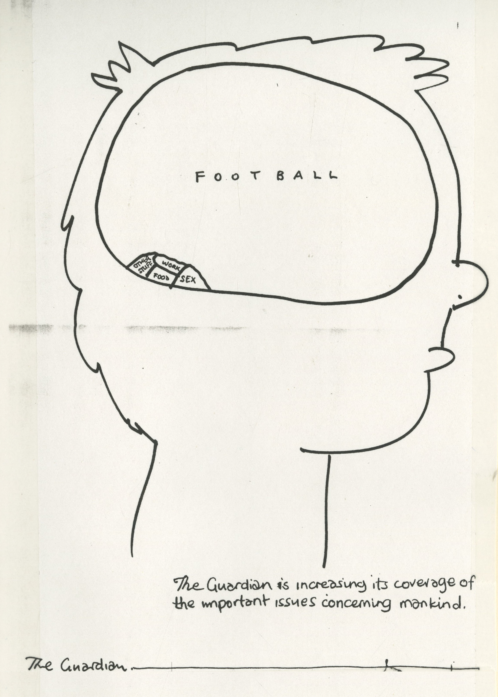
David & Phoebe got their pens out.


Yep, could be interesting.I lined up a photographer who’d deliver six portraits on our minuscule budget, then started phoning around for our six.Robert Saville said ‘No, I don’t do that sort of thing.’Juan Cabral was about to disappear on a long shoot.John Hegarty was in New York.David Abbott had retired.Can’t remember what happened with Trevor Beattie.
Tony Davidson said yes.
So did Nick Gill.
David worked up the layout once more.
It’s a bit busy, little pictures and words all over the place.
Should we lose the little words we’d added inside the brain, maybe they’re just complicating matters?
Or maybe we lose the little pictures?
Maybe ‘Watch Tony Davidson’s chosen 10 from 25,000 commercials online at arrowsarchive.tv/tony’ is more intriguing?
Also, having received Nick, Tony and Paul’s top Tens, there was a lot of overlap and the ads, not surprisingly were very well known, there’s a risk that people look at the ads, take in the selection then don’t go to the site because they’ve seen the ads.
In some cases, hundreds of times.
We decide to drop the images of ads, the line is more intriguing.
Still can’t decide whether we crop horizontally or vertically.
Also, I’m not convinced that the extra words we’re putting into the heads are paying their way, they’re not adding enough humour and insight to offset the extra complication they bring with them.
In fairness to David & Phoebe, they’d been in advertising about two years at this point, so they didn’t have a tremendous amount of knowledge or insight on the individuals to draw on.
I tried to explain that the words didn’t feel true, they just felt a little contrived, not believable enough.
David, or Phoebe, said it was difficult to know what might or might not be in their heads, as they didn’t know them.
Fair point.
Then, David, or Phoebe, suggested we get them to write what’s in their own heads, as they’d know for sure.
Perfect.
Not only would it be accurate, they are all highly creative, so would make it work.
Dave Trott says yes.
Ringan Ledwidge says yes.
Mark Denton says yes.
We have our six.
We ask them to write down what’s in their heads and post it to the agency.
One night a friend of mine (Brian Stewart) asks if I want to be his plus one at the opening of Brian Griffin’s exhibition.
I love Brian Griffin, we go.
Looking at how interesting, clever and cool Brian’s portraits are, I can’t help reflect on how staid our side on portraits are.
I tell Brian this, he suggests I ask Brian to shoot them, he’s not busy, I spoke to him earlier.
I tell him our budget wouldn’t cover his lunch bill.
‘Brian’s not like that, if he likes the layouts he’ll shoot them’ Brian assures me.
The next day I send Brian the layouts and an apology for the tiny budget.
He agrees to shoot them.
I stand our previous photographer down.
V. excited.
Panic.
Having got Brian Griffin, I now feel guilty that we’re wasting his talent; admen looking sideways? Big wow!
We could give him free reign, but then we’re asking him to do even more work for that tiny budget.
Maybe we give him a different option for each shot AND the freedom to build or evolve them?
David starts coming up with a different ways to shoot each person combined with a different picture crop.
Harder than it sounds.
Nick Gill.
Nick sends us a map of what’s in his head besides old telly ads.
It confirms that we made the right decision in getting the individuals to do our work for us.
The thoughts are more bespoke, are more surprising and feel more human.
Plus, Nick being creative, plays with the construct.
(See the question mark, the doubling up of coffee and the non-specific ‘Too many films to mention’.)

Seeing Nick’s thoughts in his own hand makes us think we should ditch fonts and scan in each persons scrawls, to make it more bespoke, a bit like Martin Galton did with his Levi’s ads back in the day.
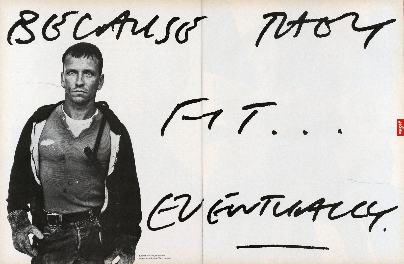
They still look amazing today.
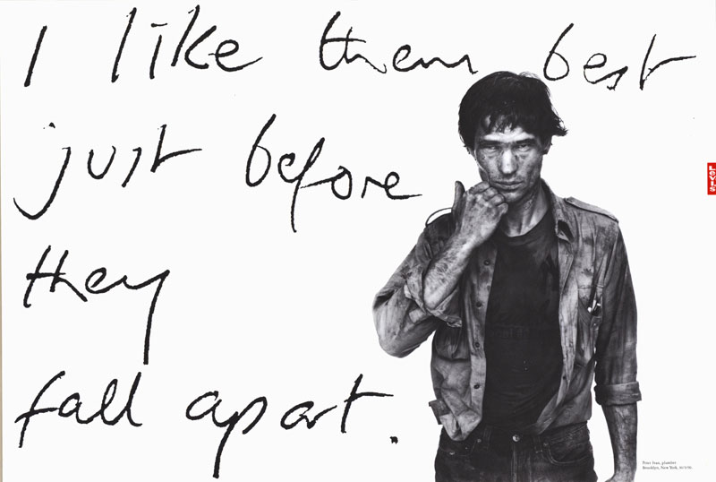
Having worked with Nick at BMP, I knew him to be decent, talented and own a pair of sticky out ears.Consequently, I thought we should shoot him from behind, he’d still be recognisable and it would make a more unusual shot.Nick turned up with an Echo & The Bunnymen album for Brian to sign, (he’d shot the cover).
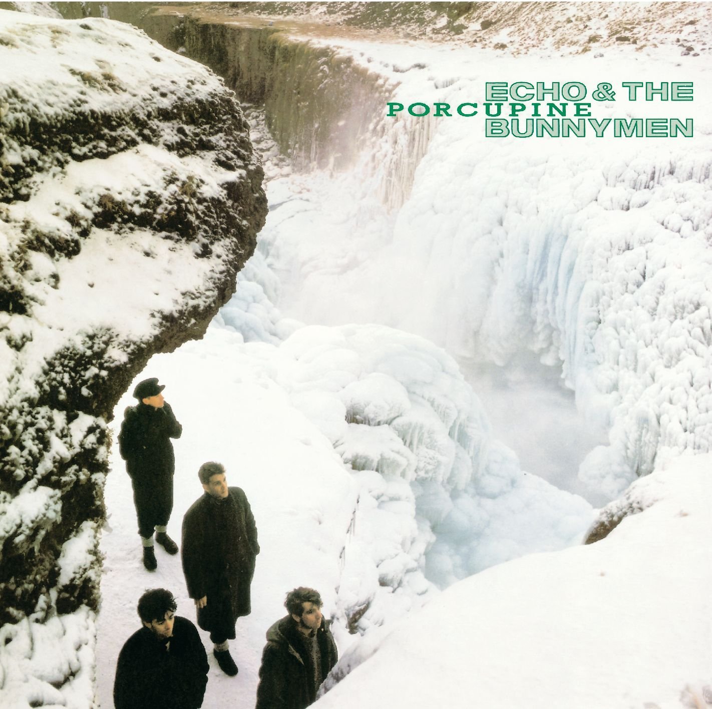
Nick stood on his mark, Brian asked him to turn around, back to camera.‘What? This isn’t about my ears is it?’.DAMN! He was onto us.We all studied our shoes.He didn’t want to do it.No amount of reason, creative bullshit and emotional blackmail could shift him.It was awkward.So Brian shot him front on.


They shots were fine, they were just from the wrong side.Wrapping up, Brian asked him again.Nick relented.
We mocked up our ad.
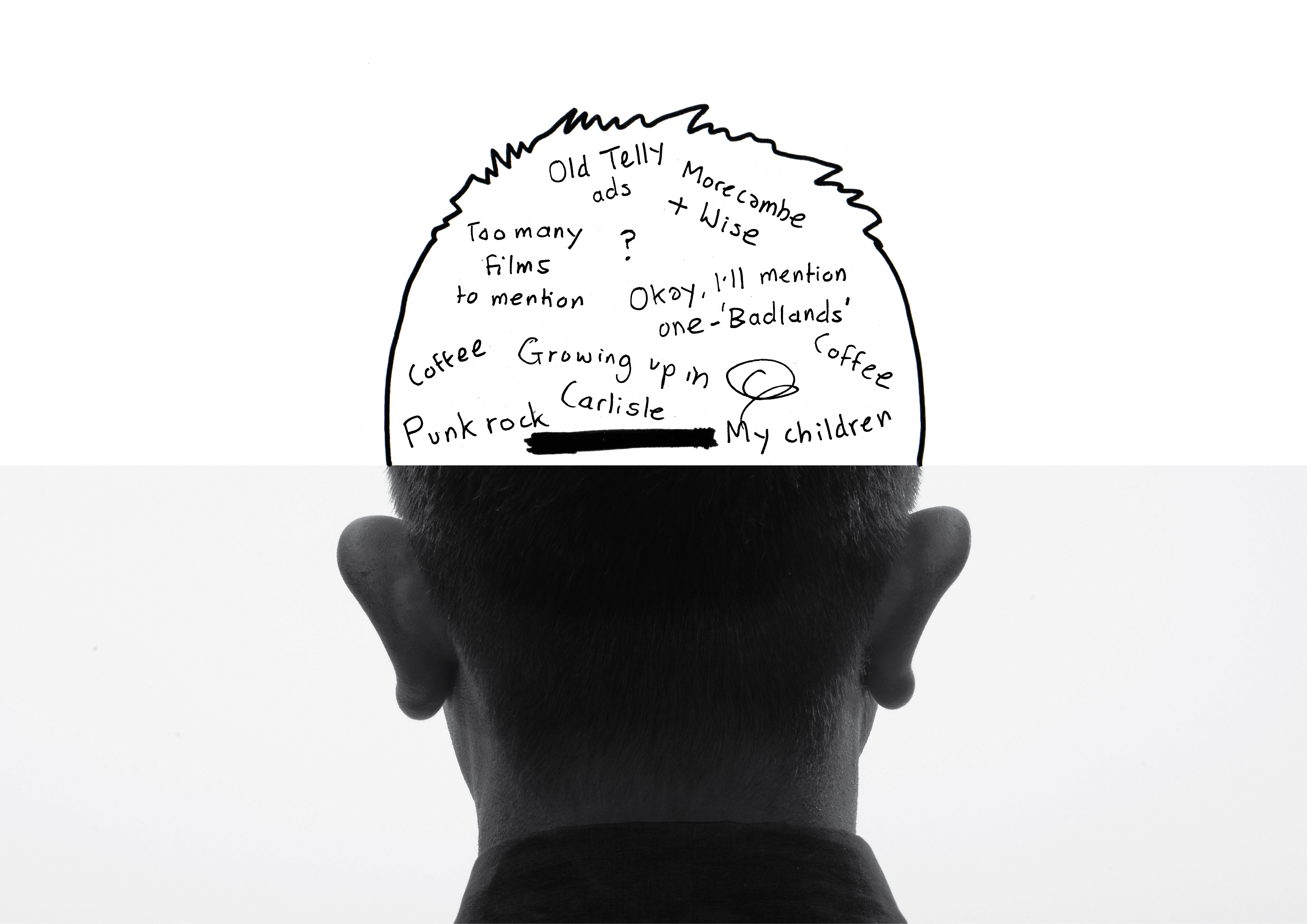
Having a mistake, something crossed out, seemed to loosen the layout up, and mistakes are a big part of creativity, so it seemed appropriate.But the words were too small, floating in too much space.Plus, the outline of the head looked too cartoony and wasn’t needed.
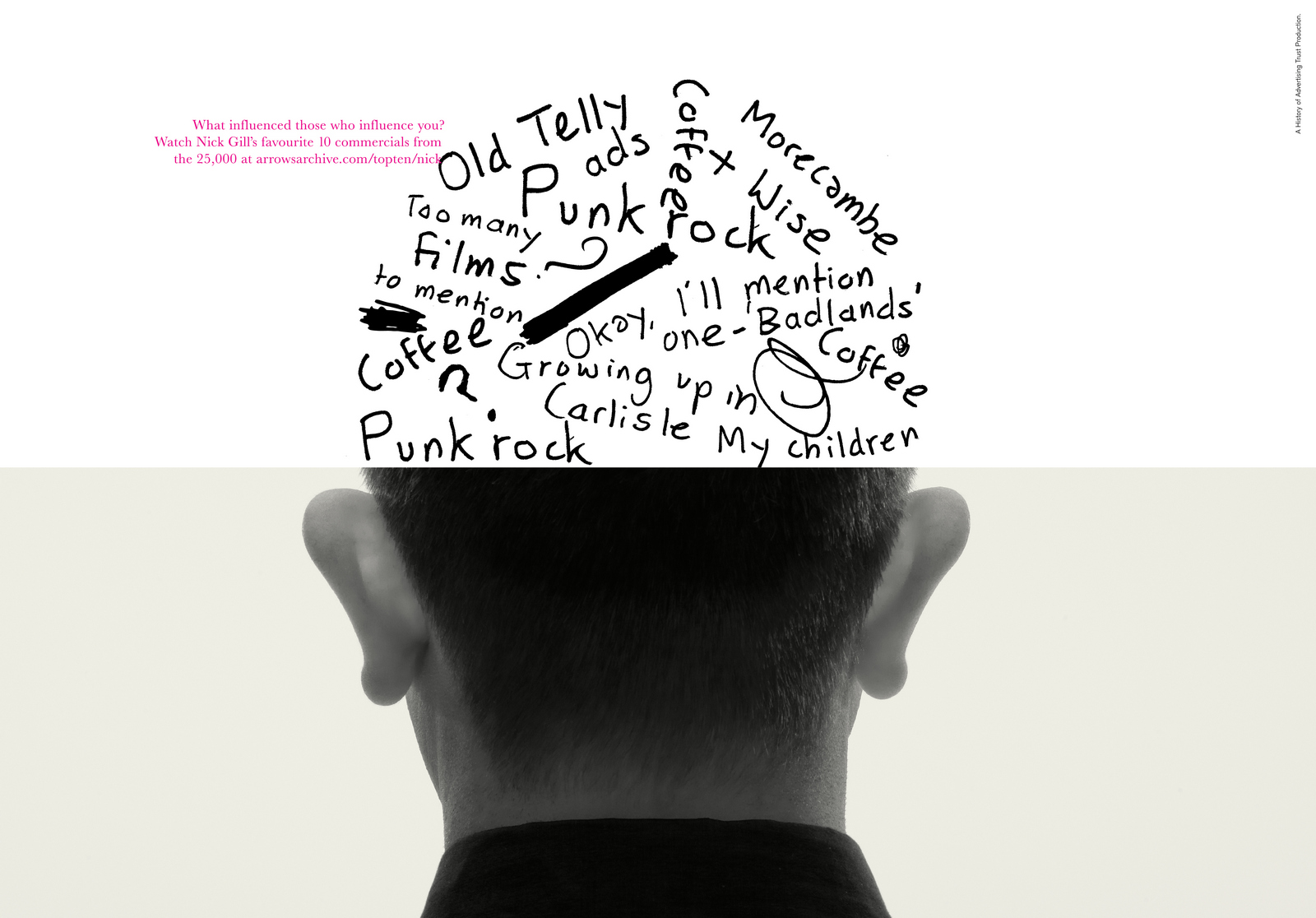
Tony Davidson.
We received Tony’s words, like Tony, they radiated energy, looking like they’d been written fast and excitedly.
It’s decided that the layout would show exploding out of his head.It seemed appropriate, as anybody who’s worked with him will verify.So the main question was how will he be reacting to that?Recognising it as a regular occurrence?
Happy it’s happening?

Straining them out?
We decided on him reacting to this phenomenon as if he has no control.
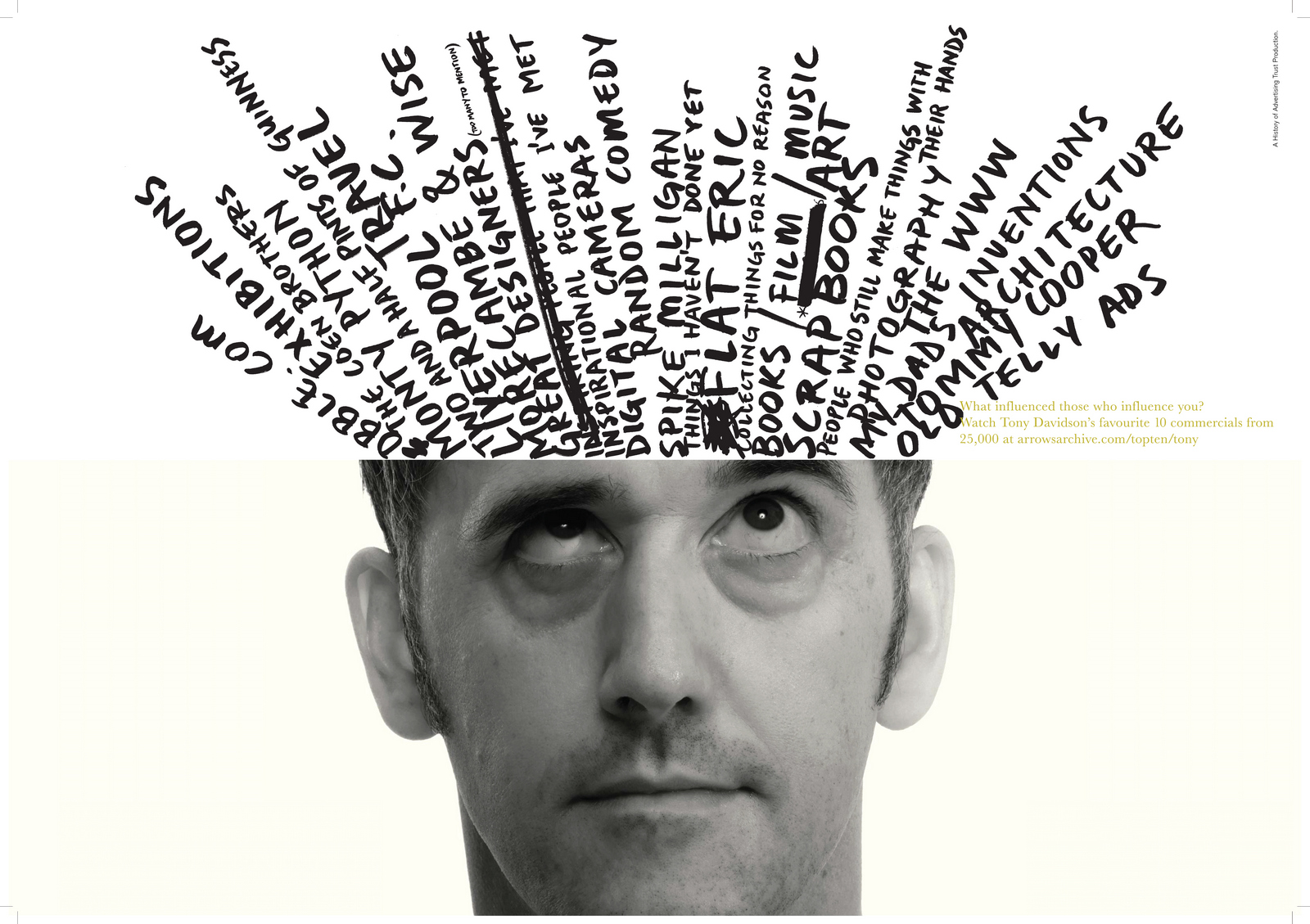
Mark Denton.
Mark, being an art director himself, and knowing it will be really helpful, offers us lots of options.


Although handwritten, he even offers up different weights of font.
What a gent.

David zoned in on Mark’s two distinctive assets; that curly moustache and his bald head.
Brian loved it.
Mark was shot and dismissed very quickly.
His distinctive silhouette was a gift, a neat use of negative space.

Ringan Ledwidge.
A mind map comes back (predictably, Kenny Dalglish is in the dead centre).Tommy Cooper pops up again.
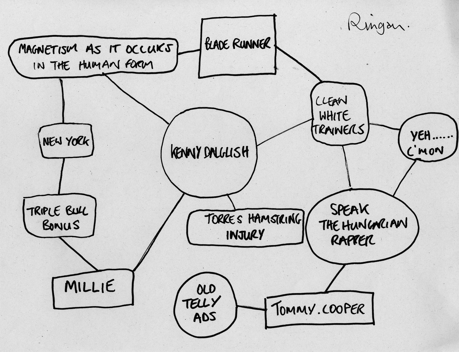
We like the mind map, but feel it’s a bit complicated for our layout, so we strip out the words.
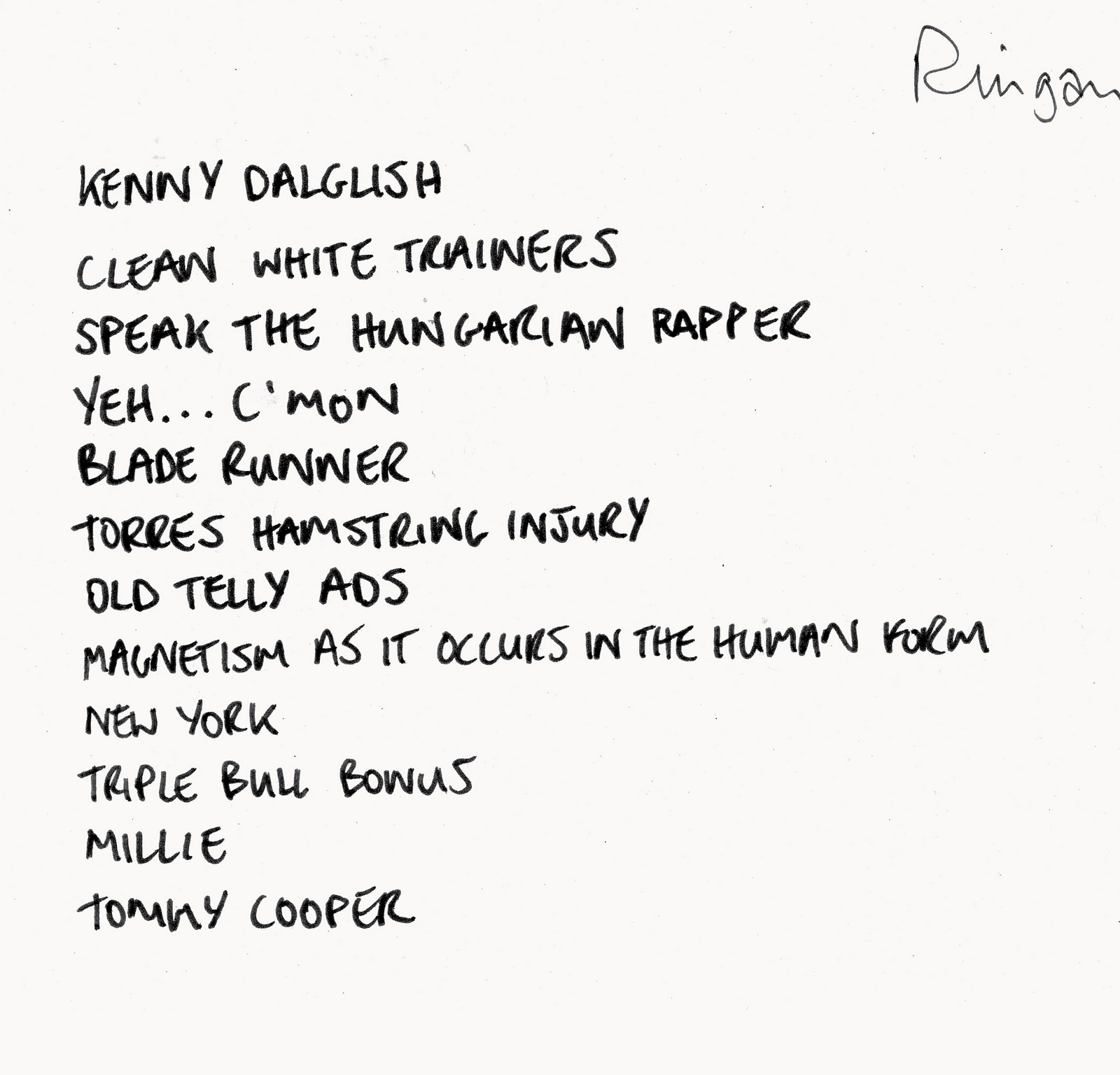
We’d shot from the front, back and a three quarter angle, so decide to shoot side on.

(Let the record show that Brian talked Ringan out of his shirt.)


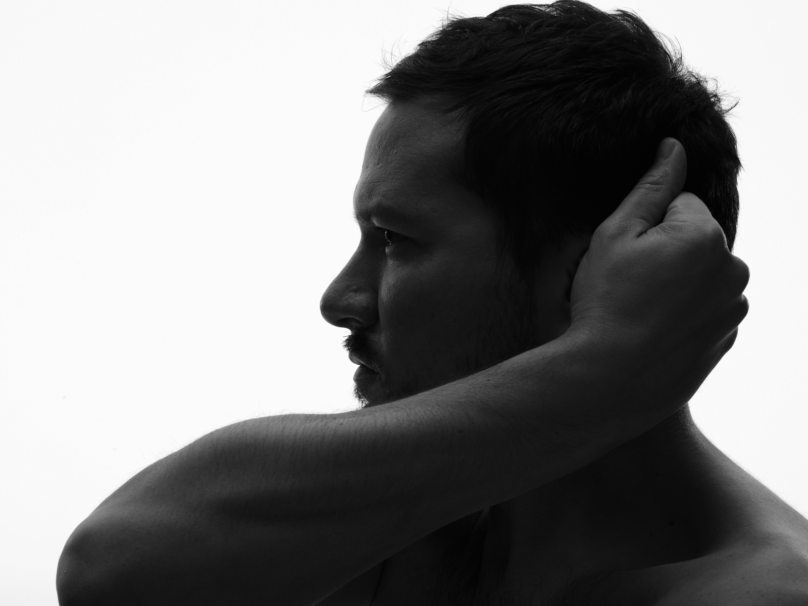
Probably due to Ringan being a handsome devil and having no top on, the shots have a perfumey vibe, so we pick one where he looks like he’s thinking and crop out his naked body.

Dave Trott.
I notice that Dave’s words were scribbled onto a Dye Holloway Murray notepad, so he must’ve popped by the office to give use his thoughts live.
Interesting to see that The Marx Brothers and Brian Clough get a shout out (Clough being at the top with possibly the biggest bubble too).As a piece of ephemera now, they look great, in terms of what we needed graphically back then, they were a problem;
he’s scribbled them onto a lined pad, in pencil with lots of rubbing out.
Writer!

The studio traced, cleaned and buffed up Dave’s handiwork.

I could’ve been imagining this, but when Dave walked in the studio he and Brian seemed to know each other, but not in a good way.It felt chilly, but as I say, I may have imagined it.Anyway, the awkward vibe carried over into the shoot, it was difficult with Brian not quite knowing what to do with Dave.He tried this way…

and that way…

and this way…

and that way…

Nothing seemed to please Brian.

Then he started trying props, in this case black leather gloves.

Then, inspiration struck Brian ‘Wheres the nearest sports shop?’‘Dalston High Street’ his assistant Johnnie replied.‘Great, right Johnnie, pop on down there and buy a box of ping pong balls, we’ll pop ’em on Dave’s mouth’.‘Don’t do that Johnnie’ Dave said ‘That’s not happening.’
Once more, it was a time for us all to examine our shoes.We tried to use Dave’s quirky bubbles.
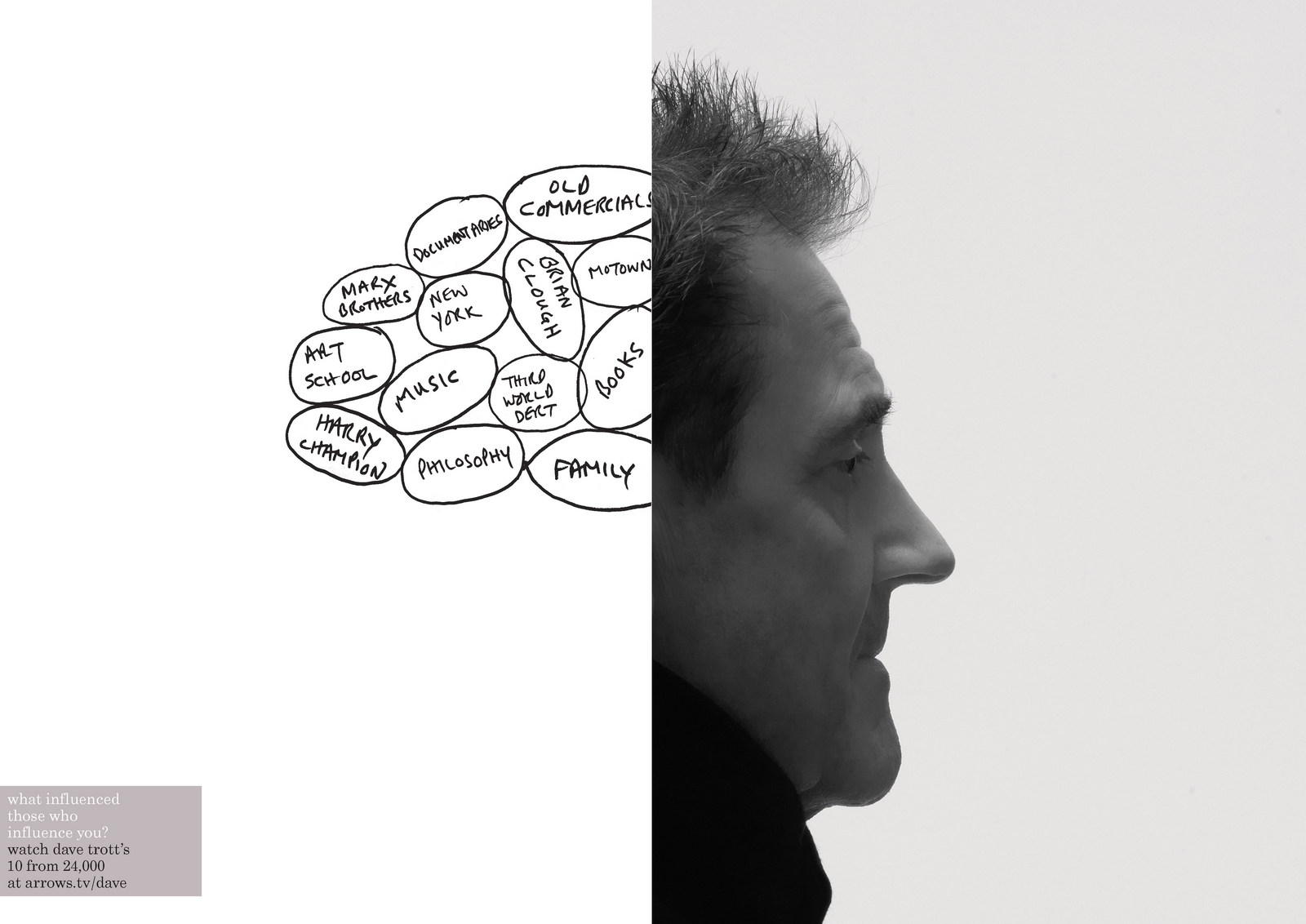
That just looked weird, hanging out of the back of his head.

That made Dave look like one of those WW1 survivors who’d had their nose blown off.

Quite liked that one, but the gloves gave him a burglar vibe.We settled on this one.
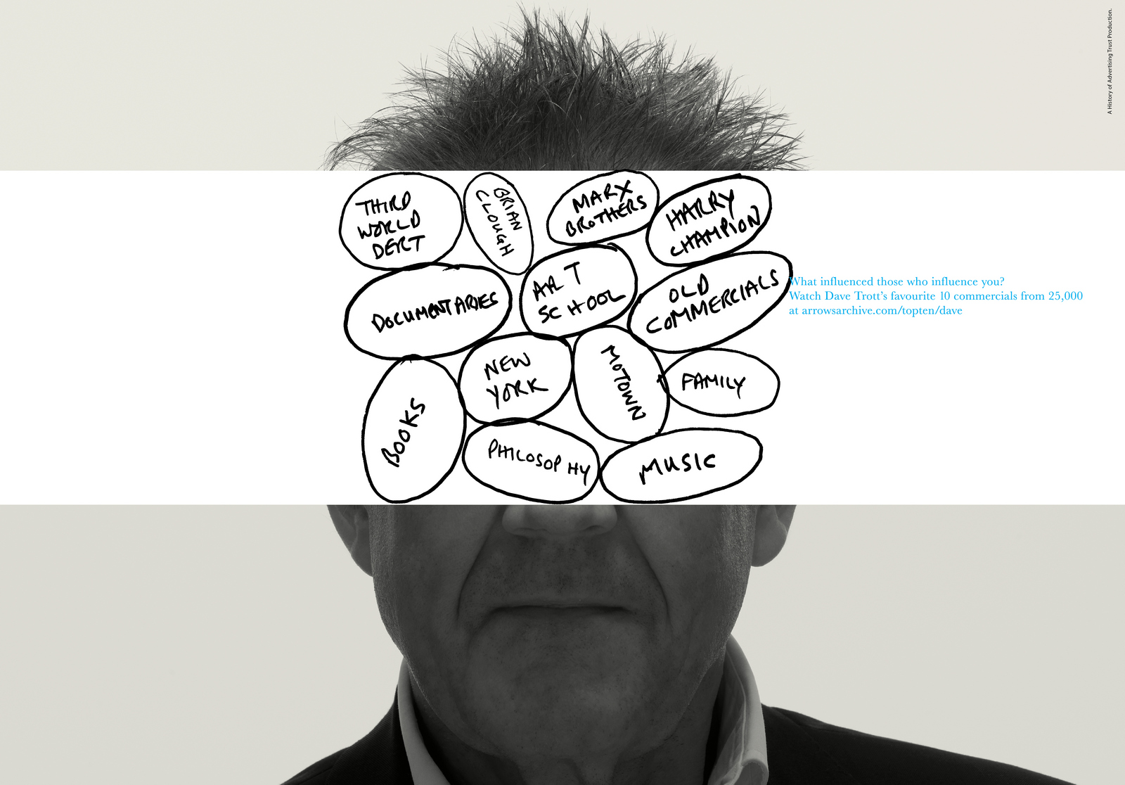
Paul Silburn.Again, Paul being highly creative, funny and great at giving ideas humanity he plays with the construct.E.g. 1: Take That crossed out.E.g. 2: ‘Louvisa, Jacob, Esther and our mortgage’.E.g. 3: The specificity of adding ‘On cold, wet, Tuesday nights’.
.jpg)
Again, we wanted to keep the quirky boxes that he’d drawn, so amended them to fit our layout.
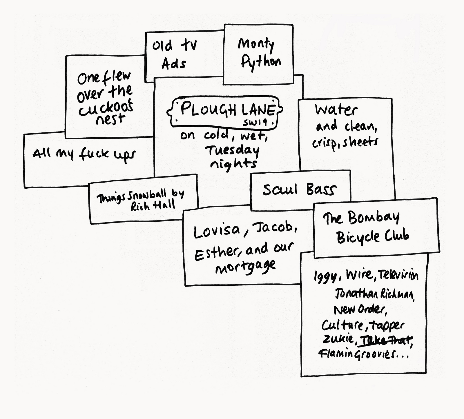
.jpg)


We chose one of Paul looking into the middle-distance thinking. Very him.

You may have noticed that this post features a lot of old stuff.
Aside from the ads themselves (12 years old), there are references to 50 old tv commercials, there’s an old rough for The Guardian, an old press ad for Punch, an old Levi’s ad by BBH, an old tape format, old album cover, old pictures of pop stars and politicians, old comedians, old agencies, old people, I could go one.
But hopefully, if you’ve got this far, you’ll store all those bits in the back of your cranium, and some point in the future, one of those bits will pop up and help you create something fresh and new.
Because that’s how creativity works.
P.S.
The ads they chose to be featured on the site.

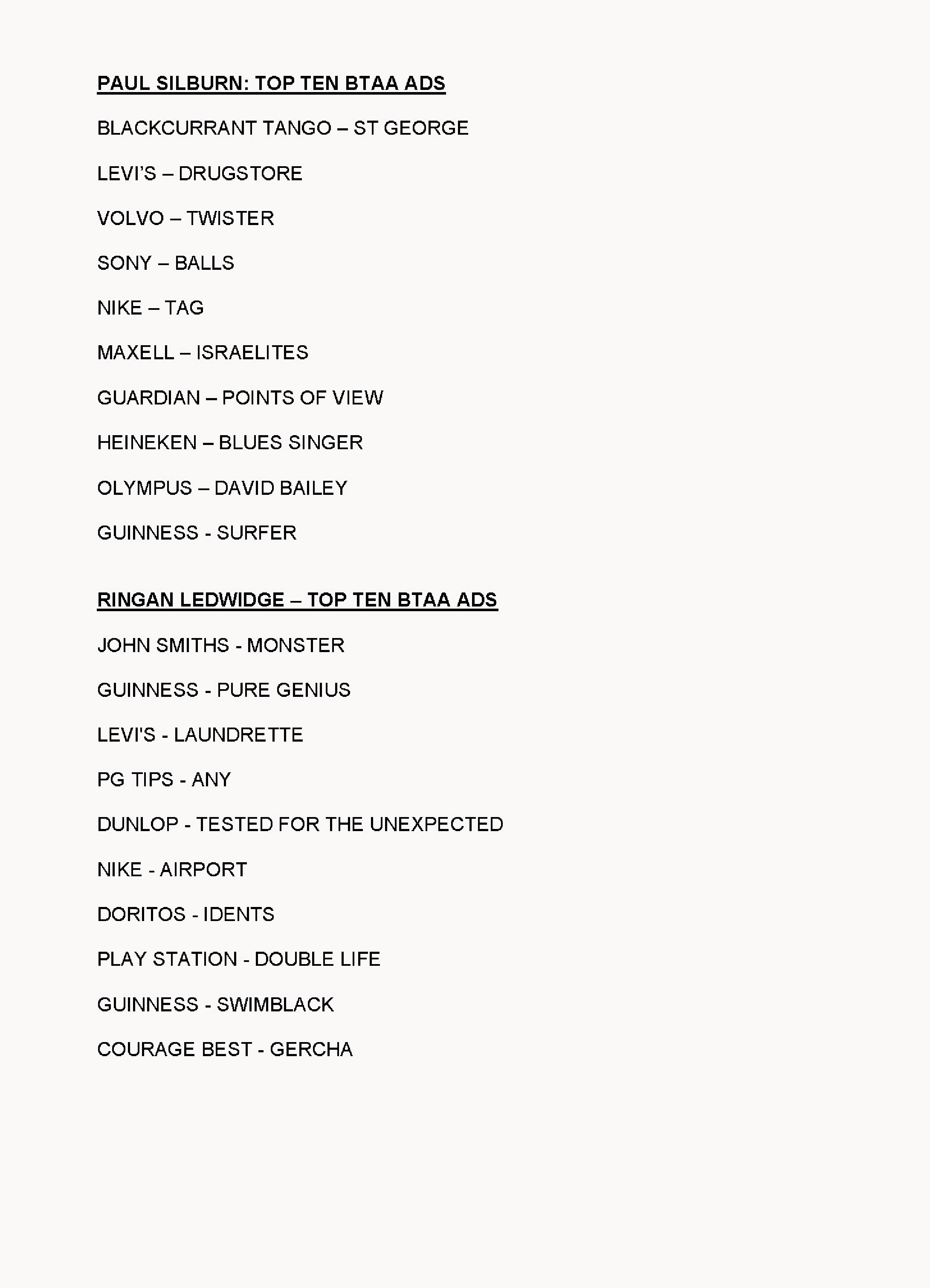

Most popular ad was BMP’s ads for The Guardian ‘Skinhead.
Most popular agency was BMP with 17 ads (16 written by John Webster.)
Most prolific creative was John Webster, (25% of the ads chosen were by John, across 8 different accounts).
Pps.
We used the idea in a competition.

P.P.P.S.
Some other History of Advertising Trust bits we did.
A printed poster offering students free access.
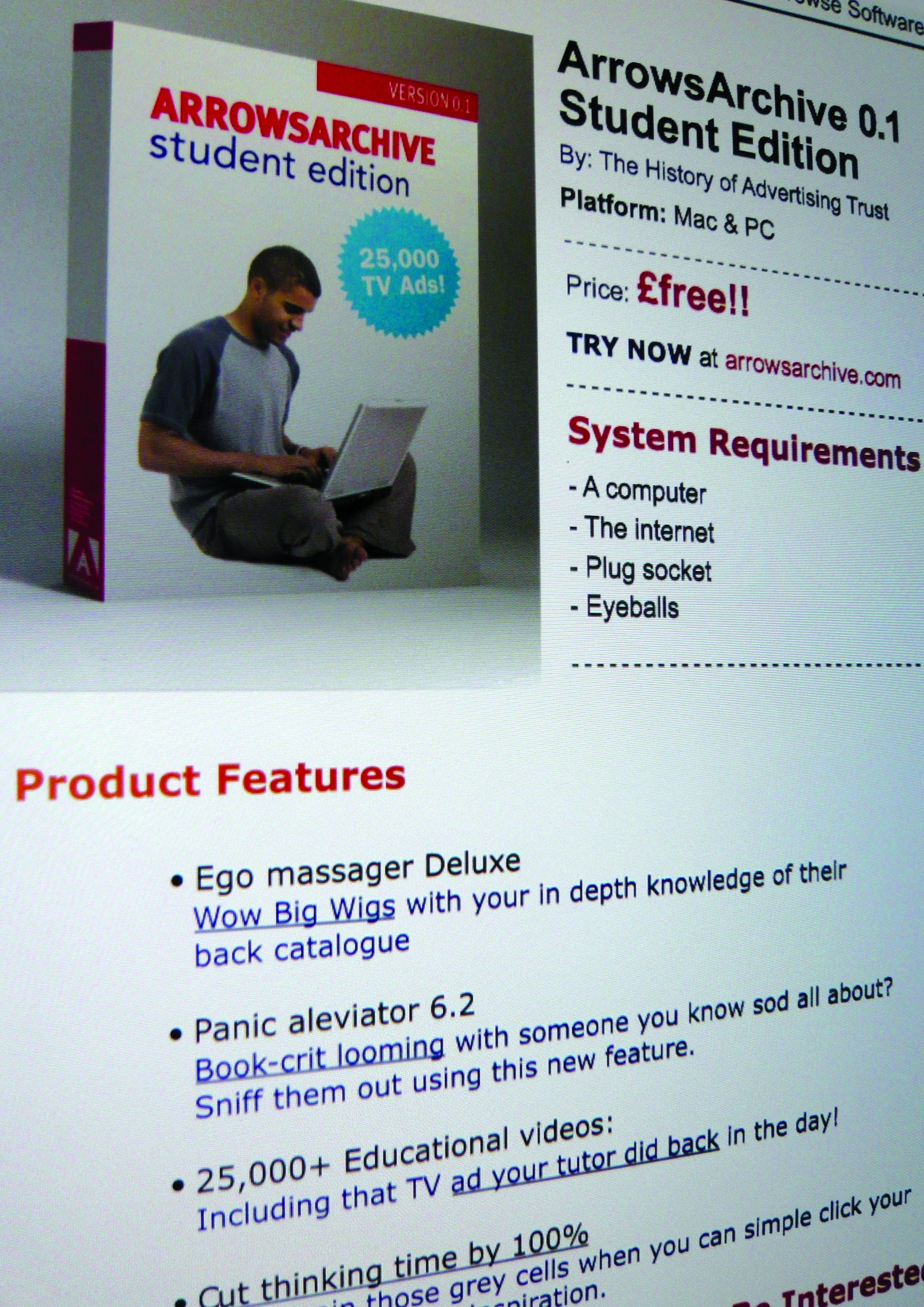
An ad for the D&AD Awards Night brochure.
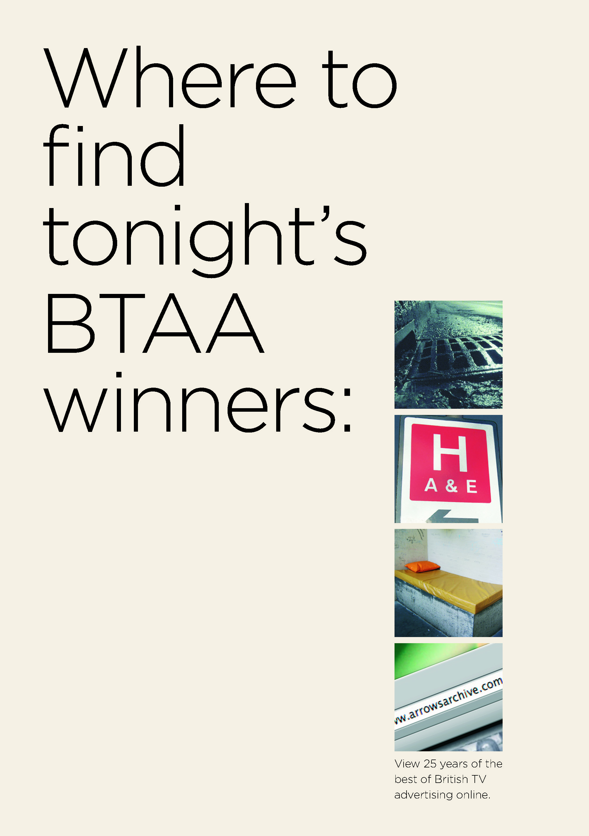
Poster.
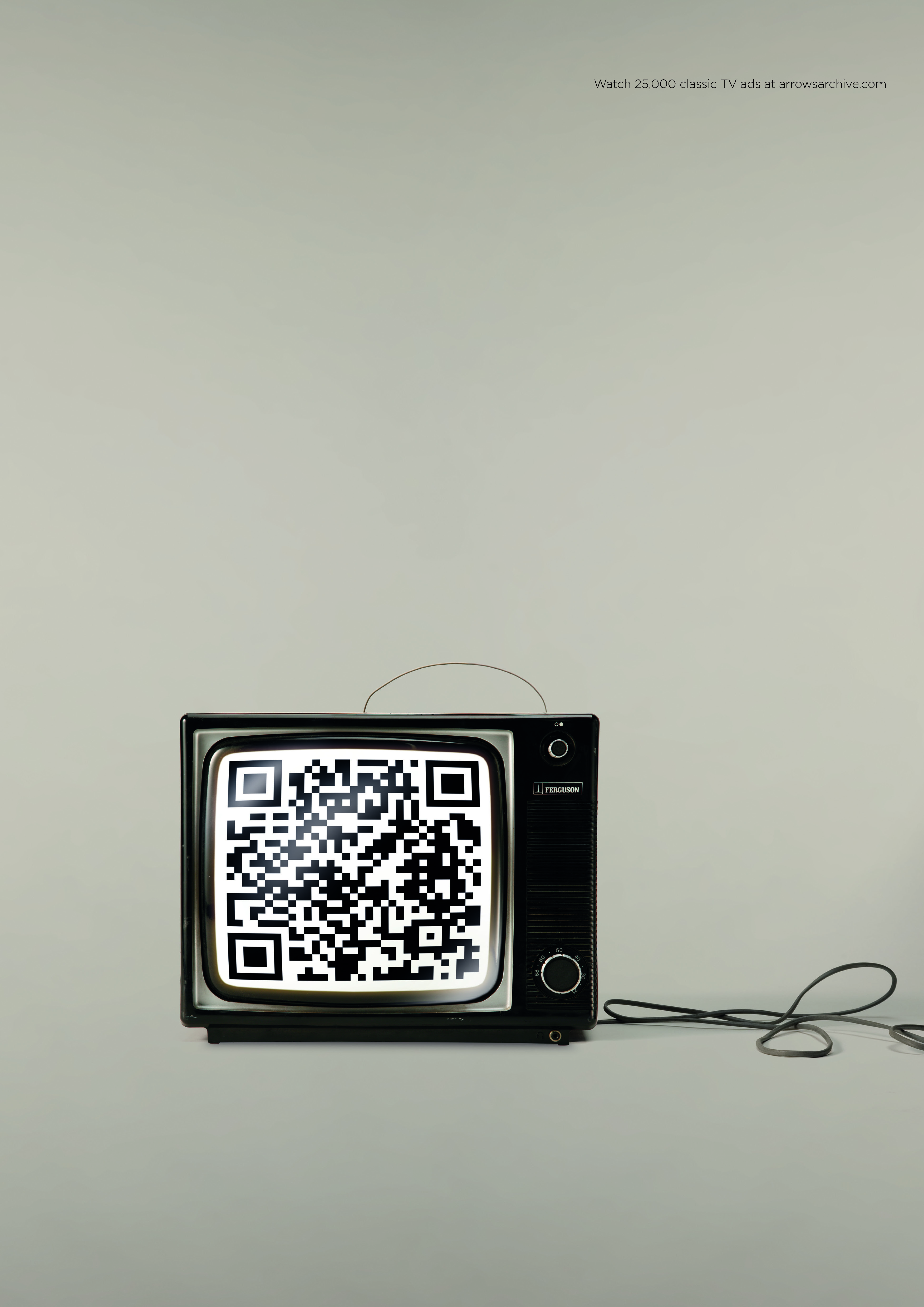
A talk.
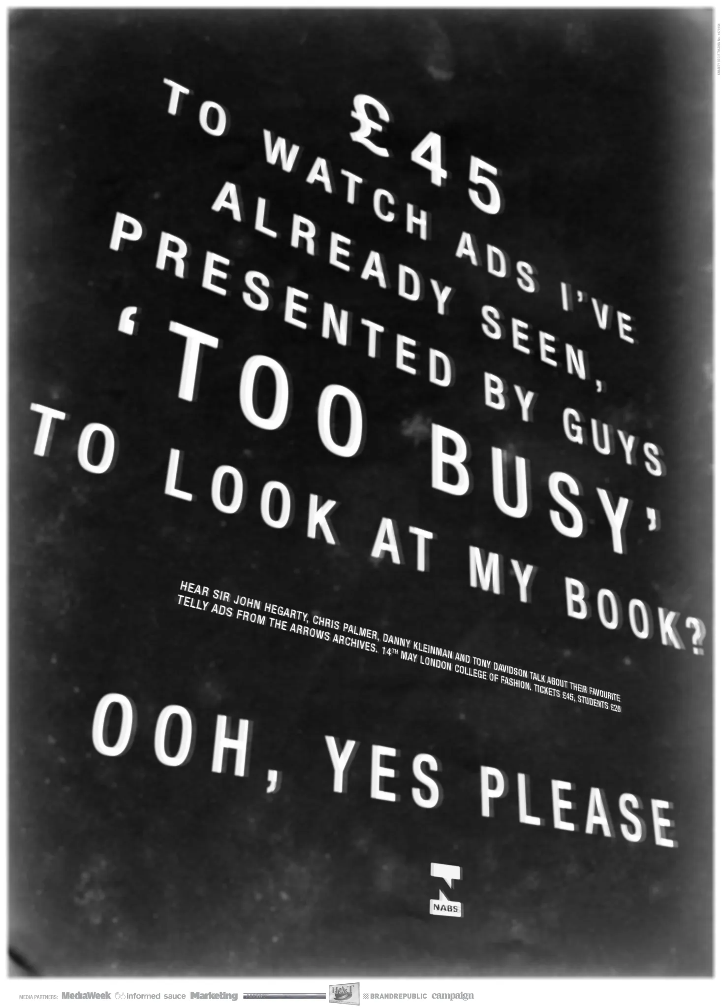
Ad in the back of D&AD
Rough for possible ad.
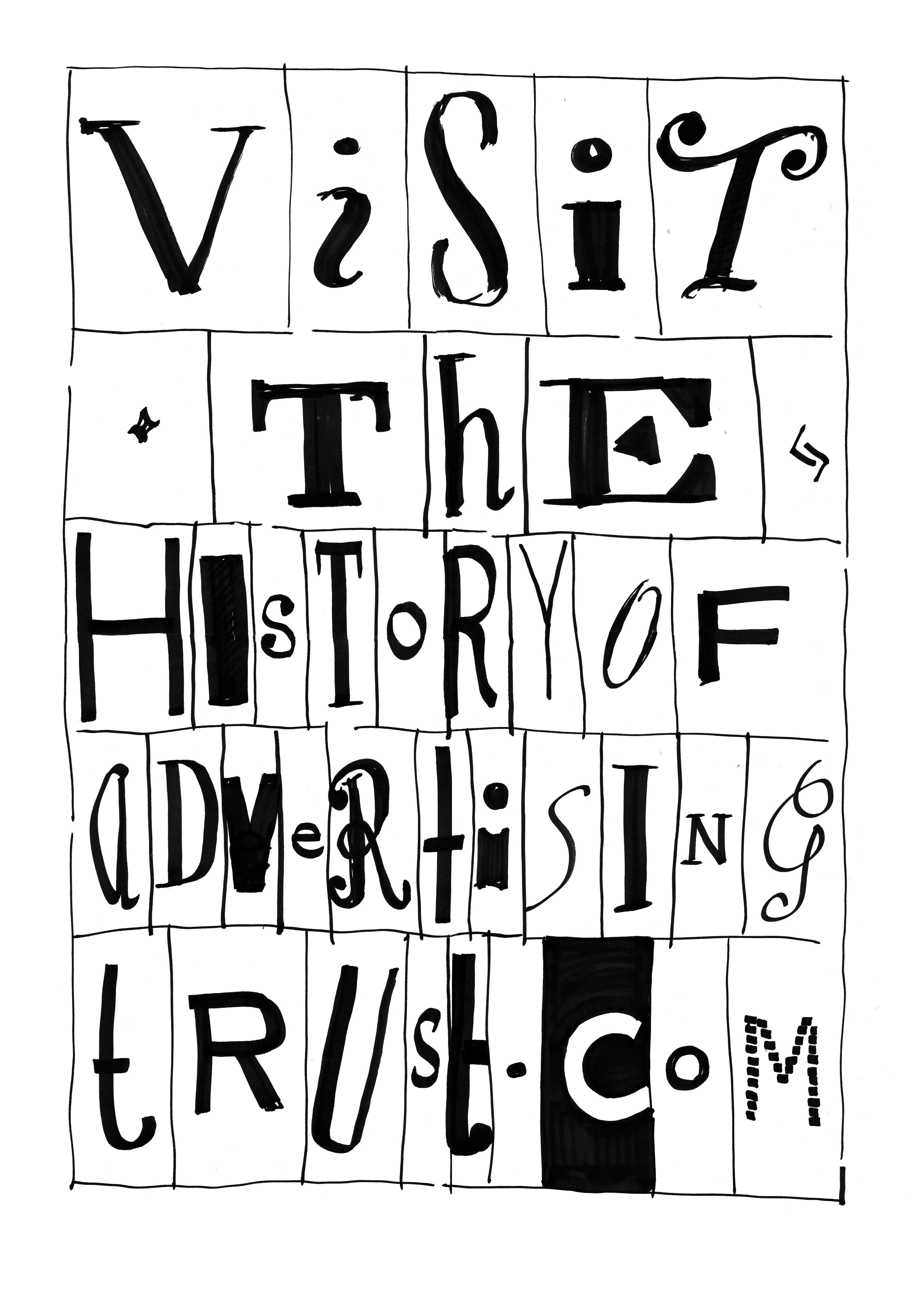
Dave Wakefield pouring cold water on the notion of knocking it out quickly.

If you lived in Britain in between 1937 and 1958 there’s a reasonable chance you were spied on.It wasn’t called spying, it was called Mass Observation.
Armies of clip-boarded volunteers quietly observed Britons, recording their behaviour in the most minute detail, unearthing invaluable insights on our society.
Like this one, "the average time taken to drink half a pint of beer in pubs on a November Saturday night in Brighton in 1938 was 7.3 minutes." (It also discovered that pints were drunk slowest on a Tuesday evenings and fastest on a Friday evenings. Gold!)Their many polls helped us understand areas of human behaviour that had previously confused us, like ‘What keeps couples together?’ (It turned out that "Liking your partner was the top factor. (61%)". (In real life, not on social media.)They answered the questions nobody was asking, like exactly how popular is the 'Lambeth Walk?It noted that it was 'so popular that you could find people doing the Lambeth Walk in Mayfair ballrooms, suburban dance-halls, at Cockney parties and village hops. An observer who visited the Isle of Arran noted its popularity there, while another observer reported that it caused a stir in the dance-halls of Prague".Arguably, the world wouldn't be in such great shape today without the benefit of this kind of insight.Inspired by this, I thought I'd do a bit of Mass Observation of my own.Well, not mass, targeted; ad folk.And actually, when I say 'I thought', I mean 'my mate Parv thought, and asked me to help'.Together, we've been scraping data from the movers and shakers across all areas of our industry; Directors like Juan Cabral, CCO’s like Nils Leonard, Editors like Paul Watts, Bloggers like George Tannenbaum, Producers like Chalkley and Sirs like Sir John Hegarty.The list goes on.We've put out about 40 so far.Already it's bearing fruit, offering valuable insights that may give clues and guidance as to where our industry is heading:1. The majority of ad folk believe Birds sing louder nowadays.2.We've learnt that you can live ‘in the sticks’ or ‘in the middle of nowhere’ but not ‘in the middle of the sticks’ (Sean Doyle).3.As an industry, we'd choose Joe Exotic over Donald Trump to handle the response to the global Covid-19 pandemic.4.Every time Tim Riley forced into isolation, he chooses to read Camus.5.It was agreed (unanimously) that Michael Jordan was really good at basketball.6.Media types drink like crazy at the beginning of pandemics, but then take control, eventually drinking less than before.7. Owning 90 loo rolls is too many (Tony Barry), 1 is too few (Yan Elliott).8.Moving forward, influencers are predicted to become less influential.9.Nobody wants to go back to working as they did previously, (a mix of home and office is coming through strongly).10. Introverted creatives are missing people more than they’d imagined.It's called Wave+Dave.It's posted daily.It can be found on Spotify, Soundcloud, iTunes and your local podcast dealer.Look out for the pink squares on social media!E.g.

I've no idea where this came from.I've had it for at least twenty or so years.Looking at that high-class screw holding it together and thick cell cover, it probably once belonged to a Creative Director.(Me and my friends didn't have access to that kind of luxury at the time.)If you recognise it, get in touch and I'll return it.It's one of the best, most thorough interviews I've ever read with Uncle William.So thanks and apologies.AN INTERVIEW WITH WILLIAM BERNBACH.
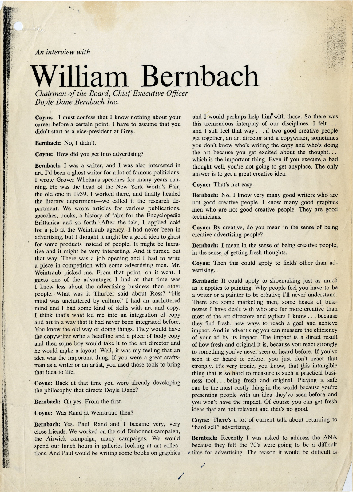
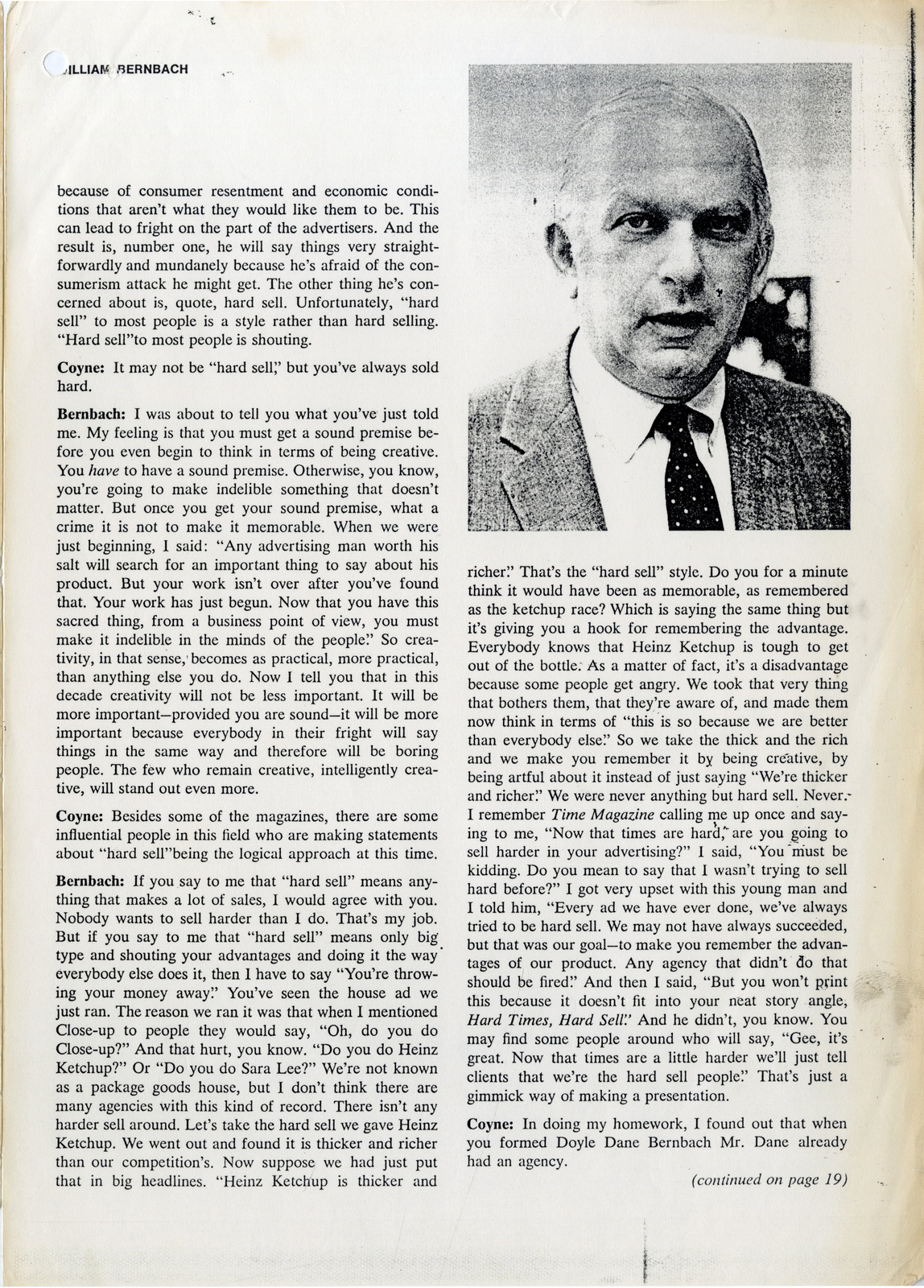
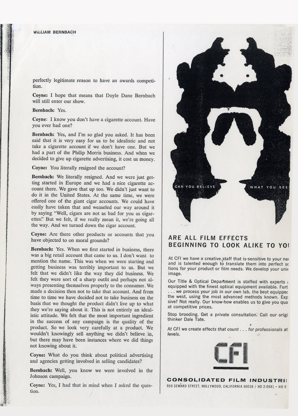
DOYLE DANE BERNBACH.
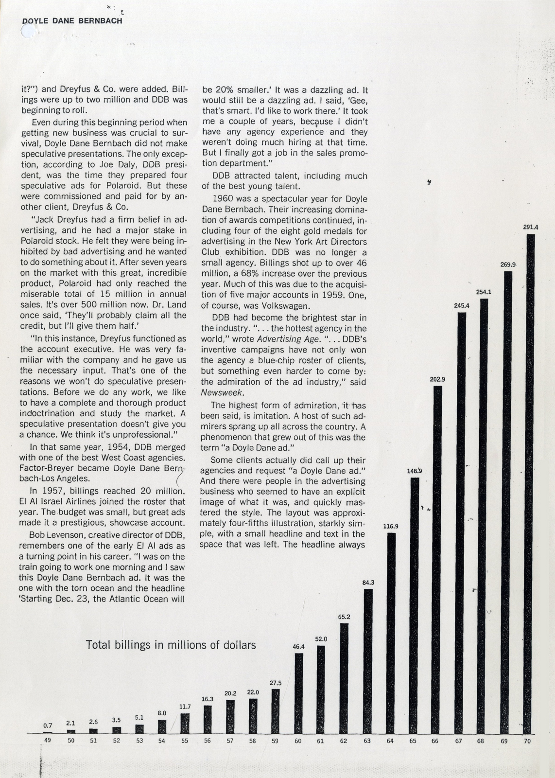
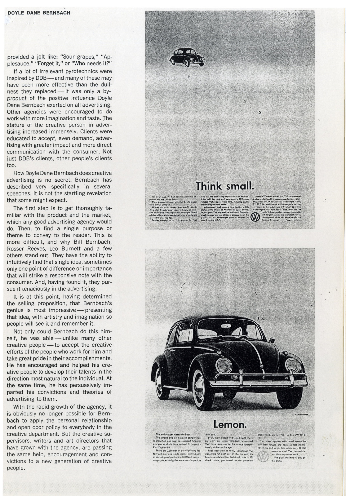
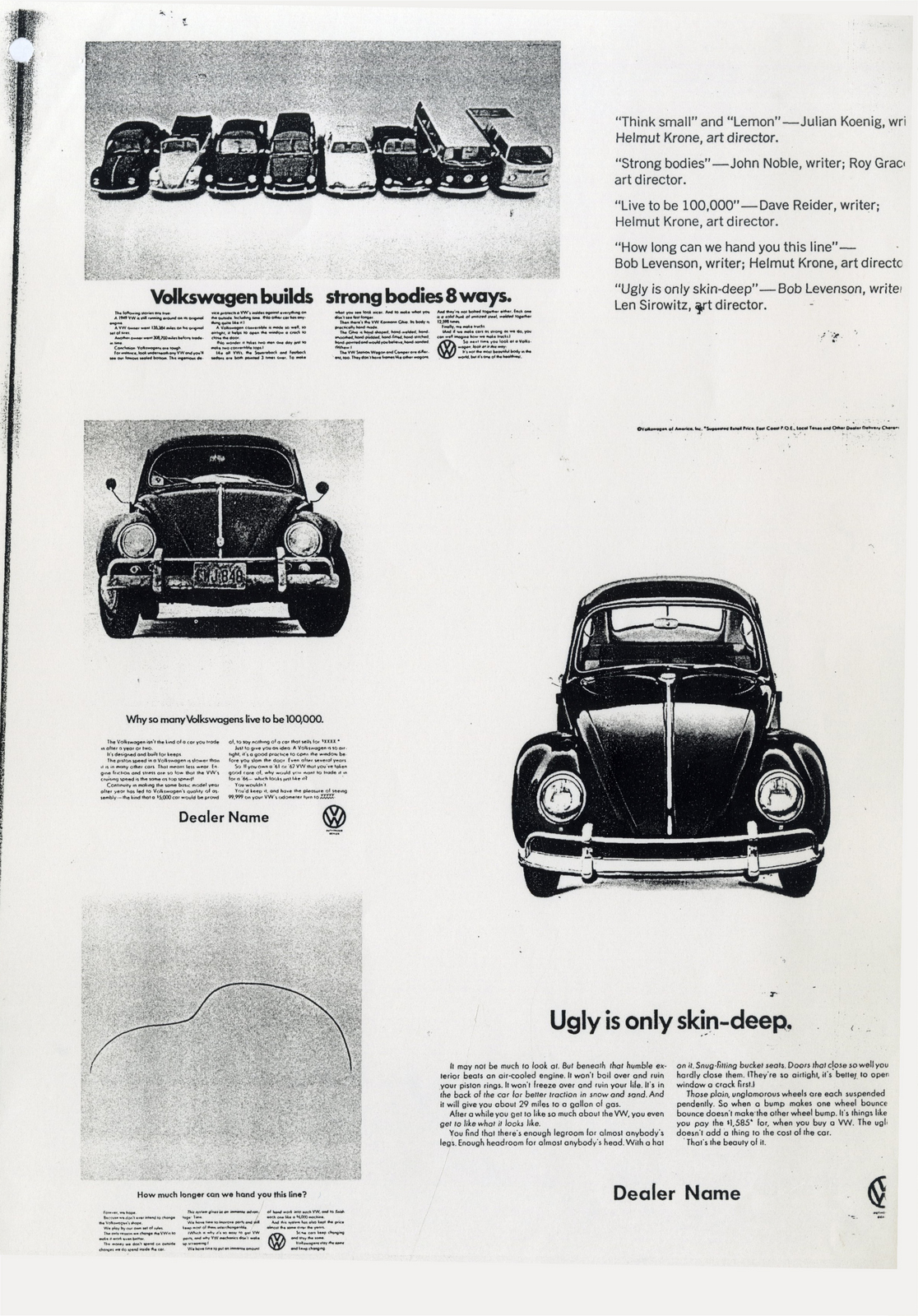
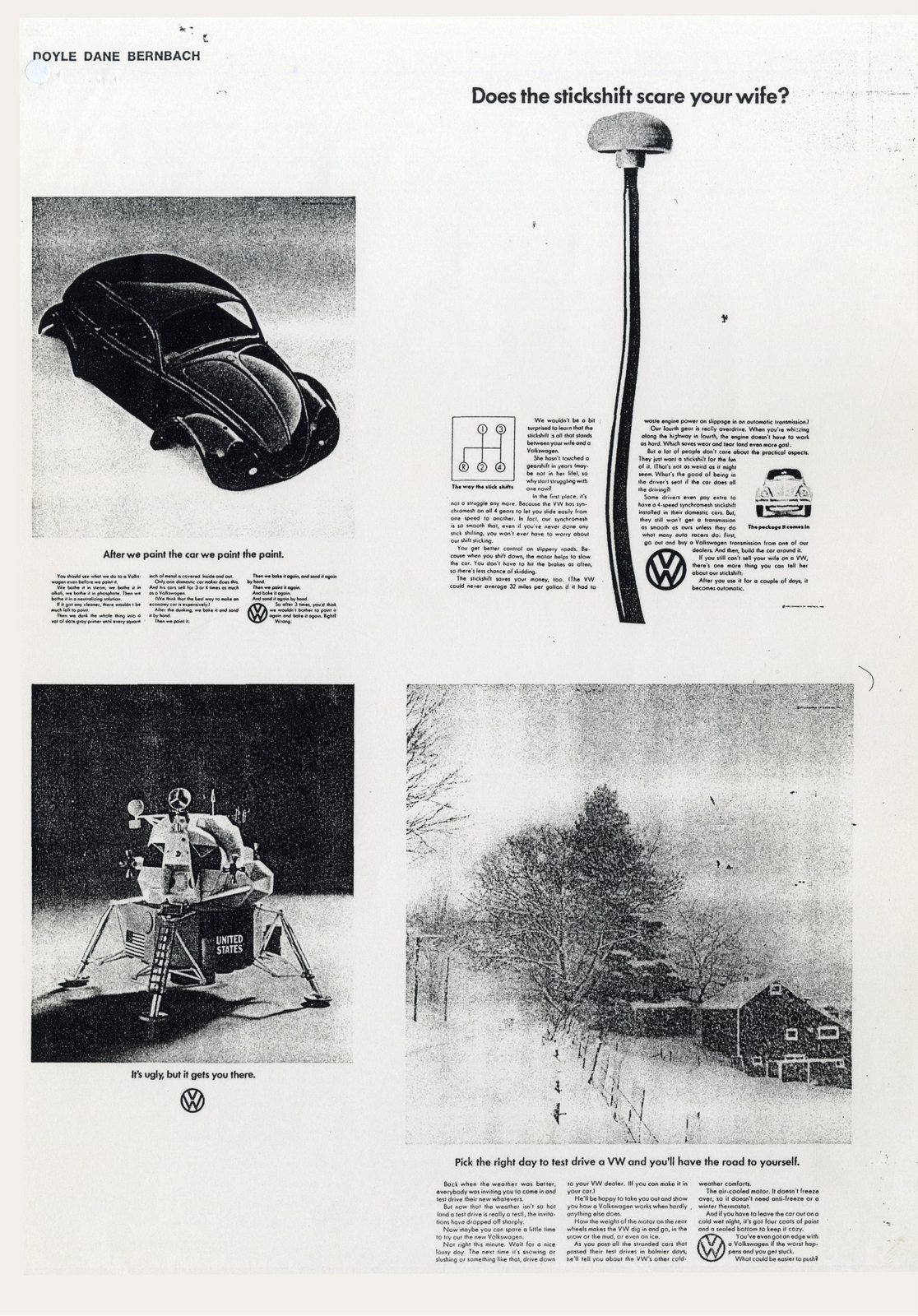
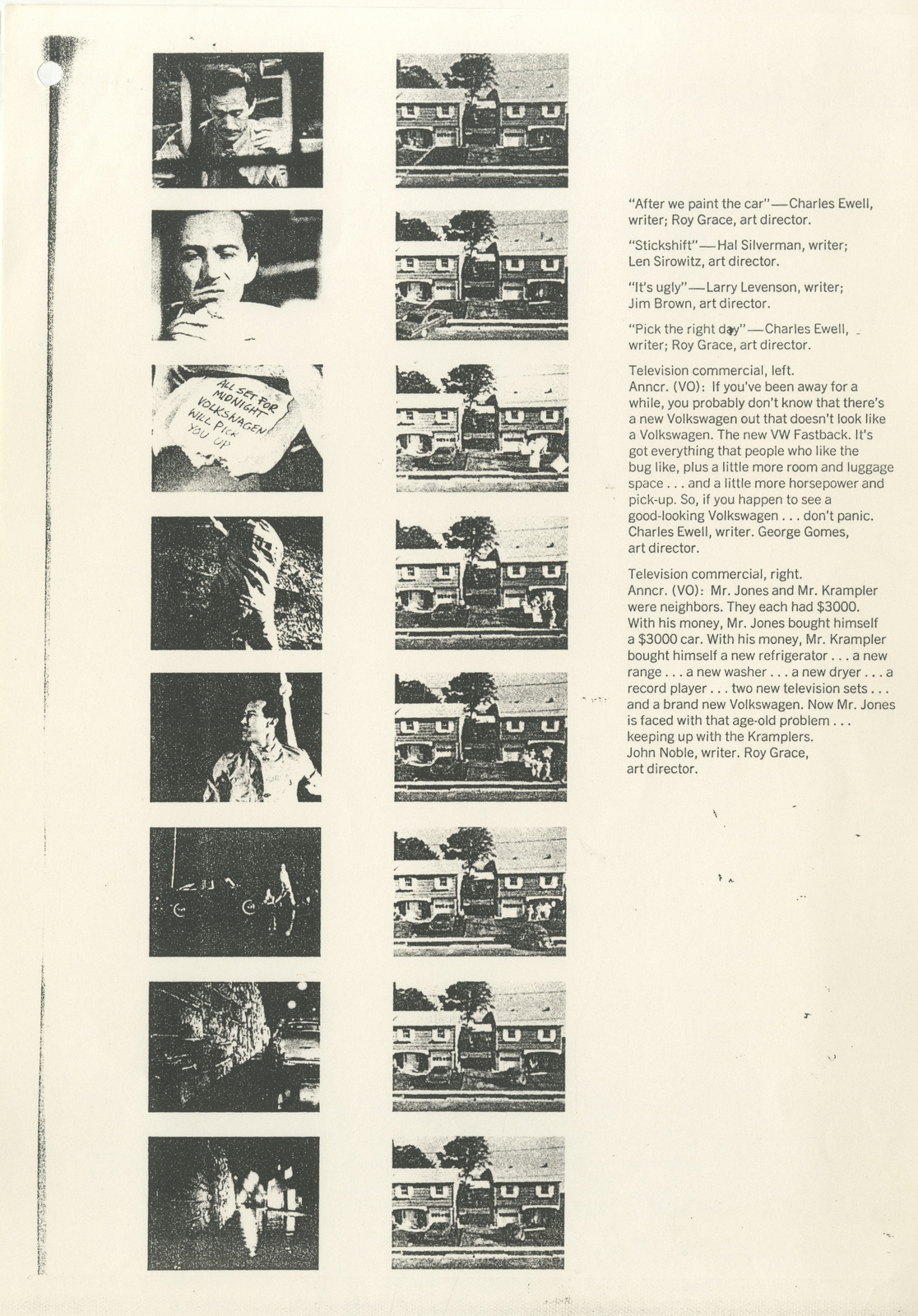
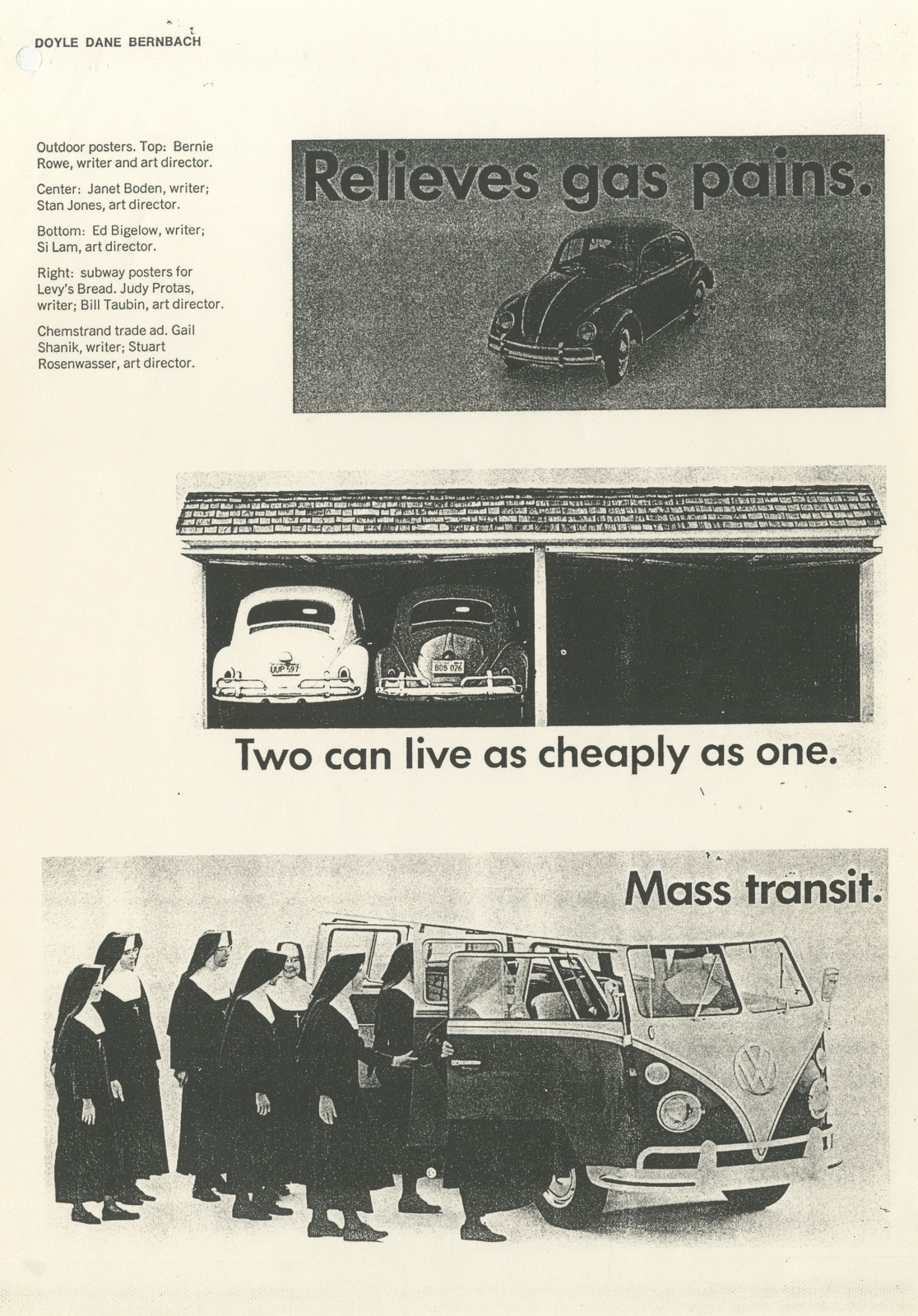
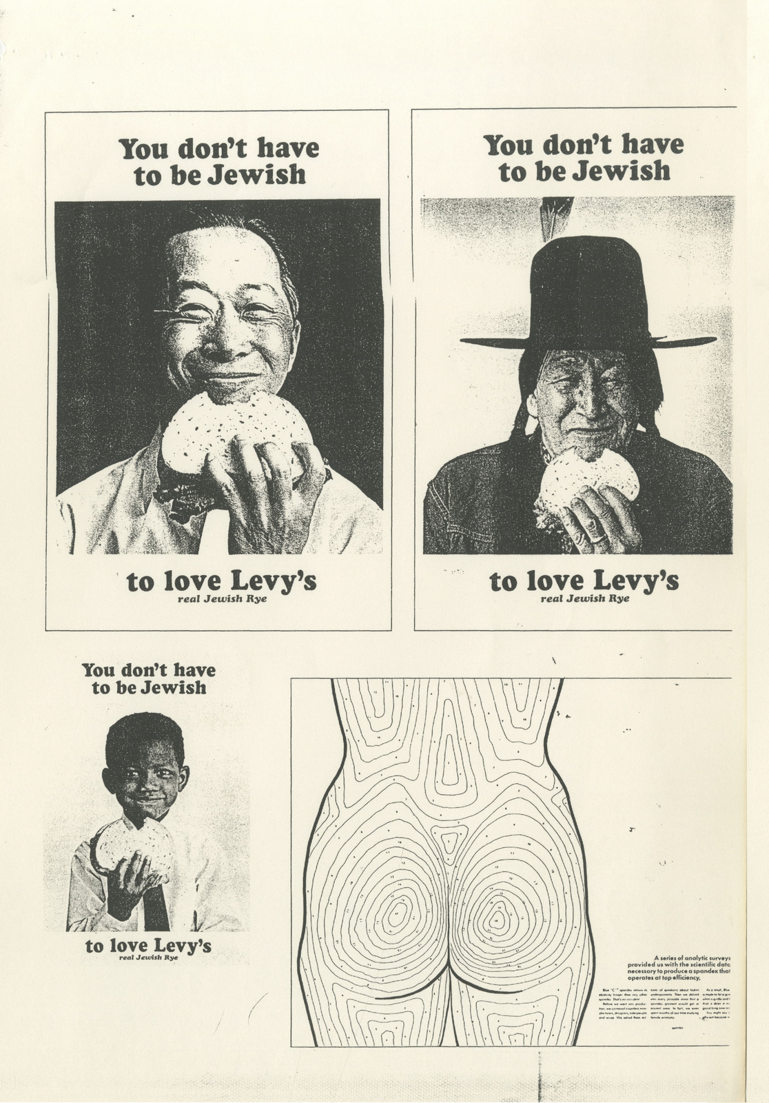
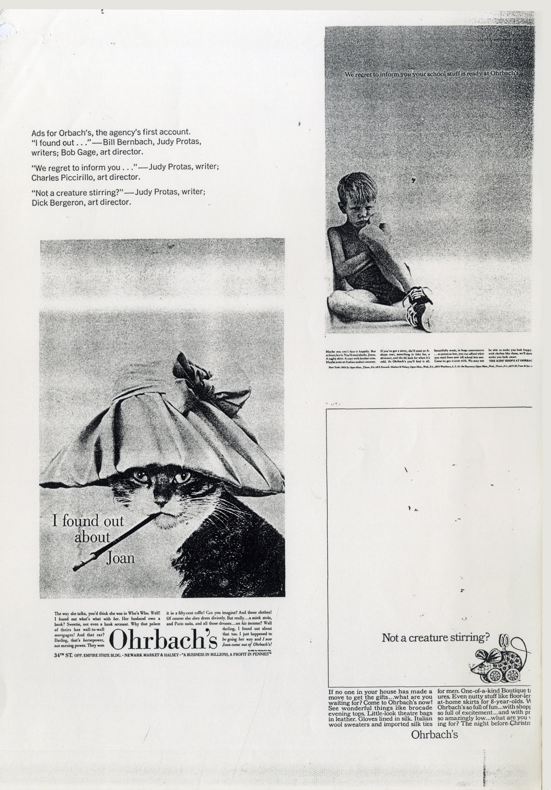
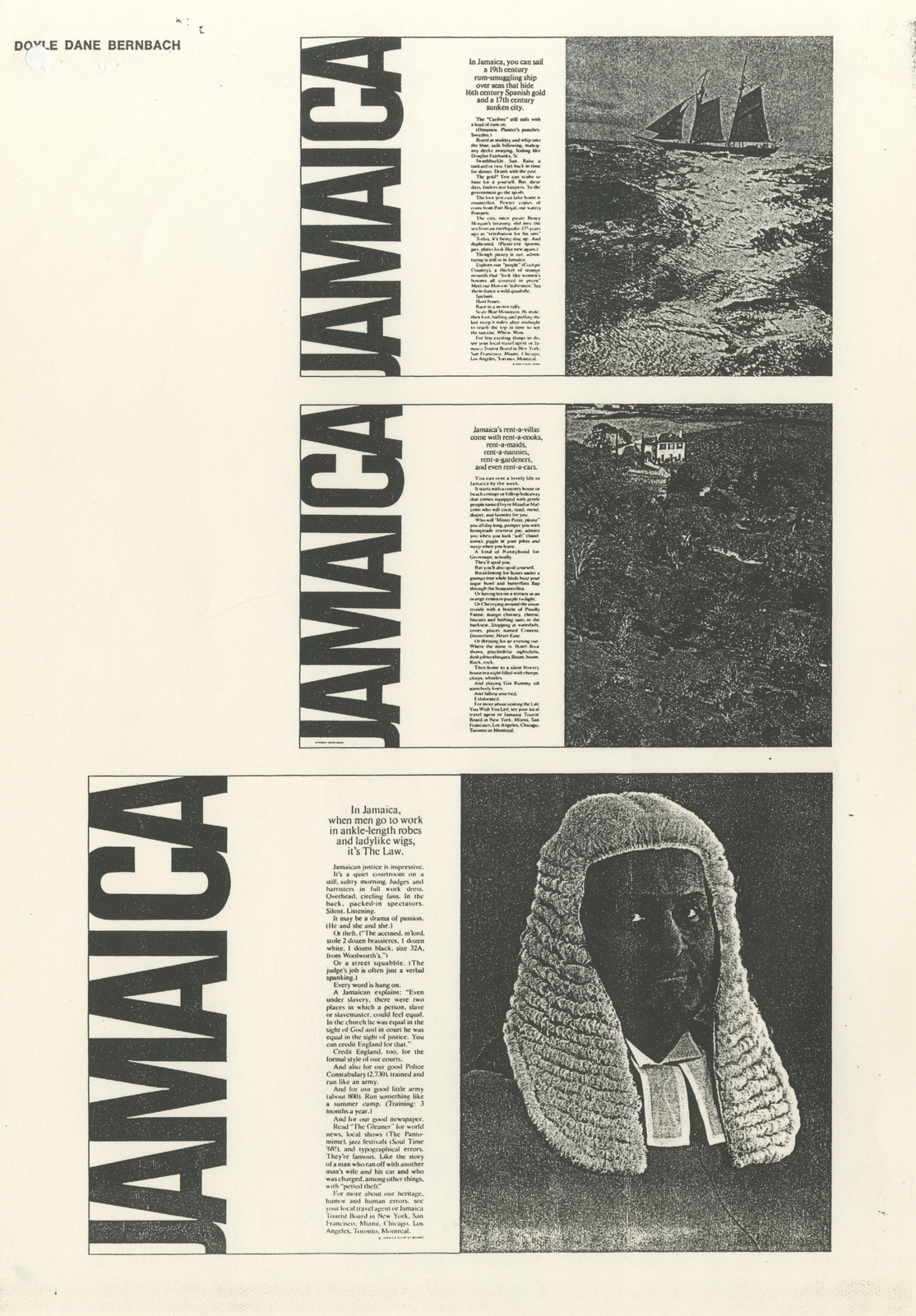
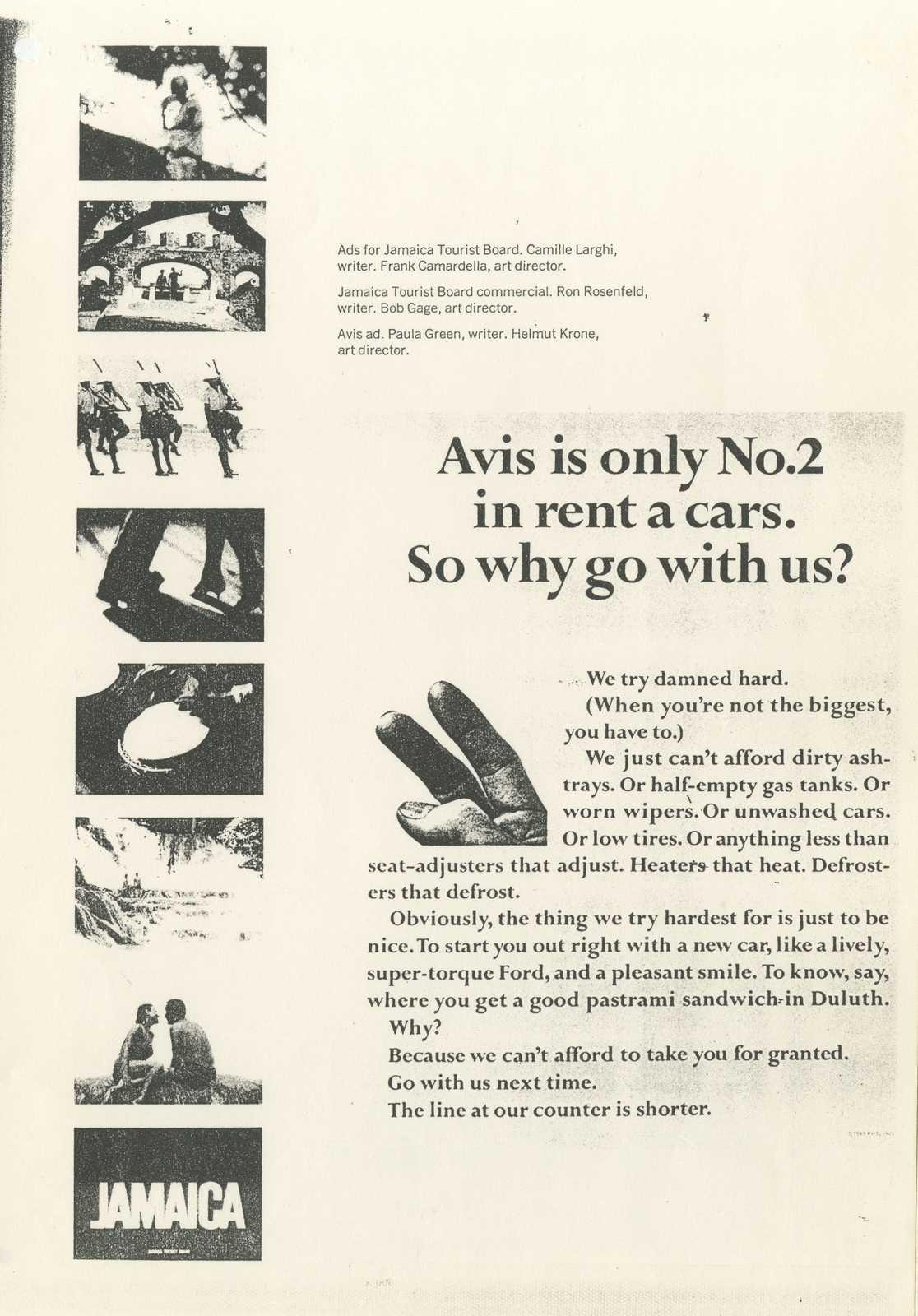
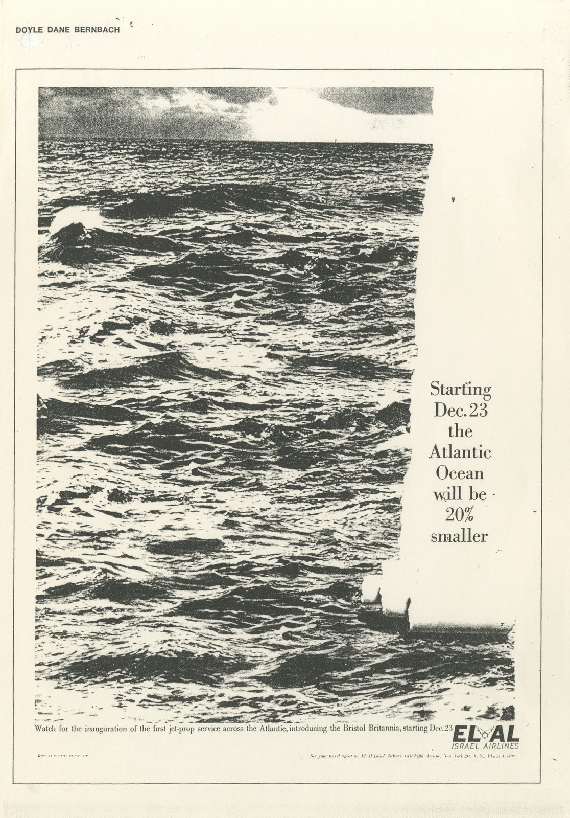
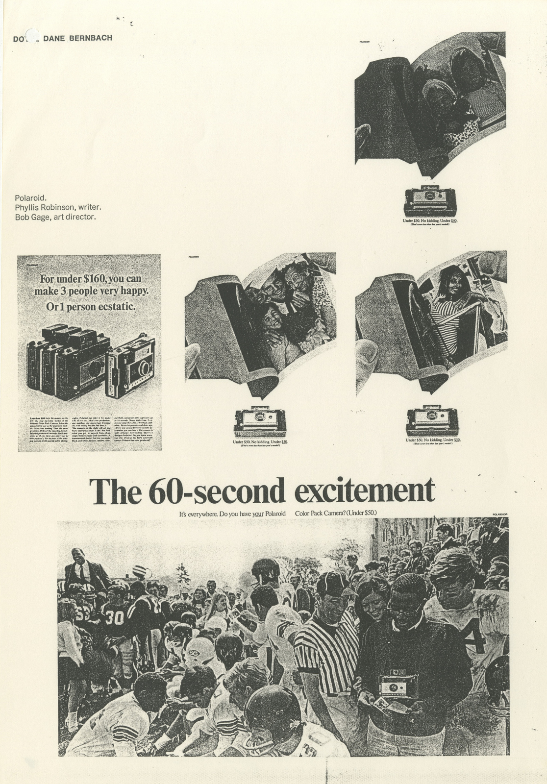
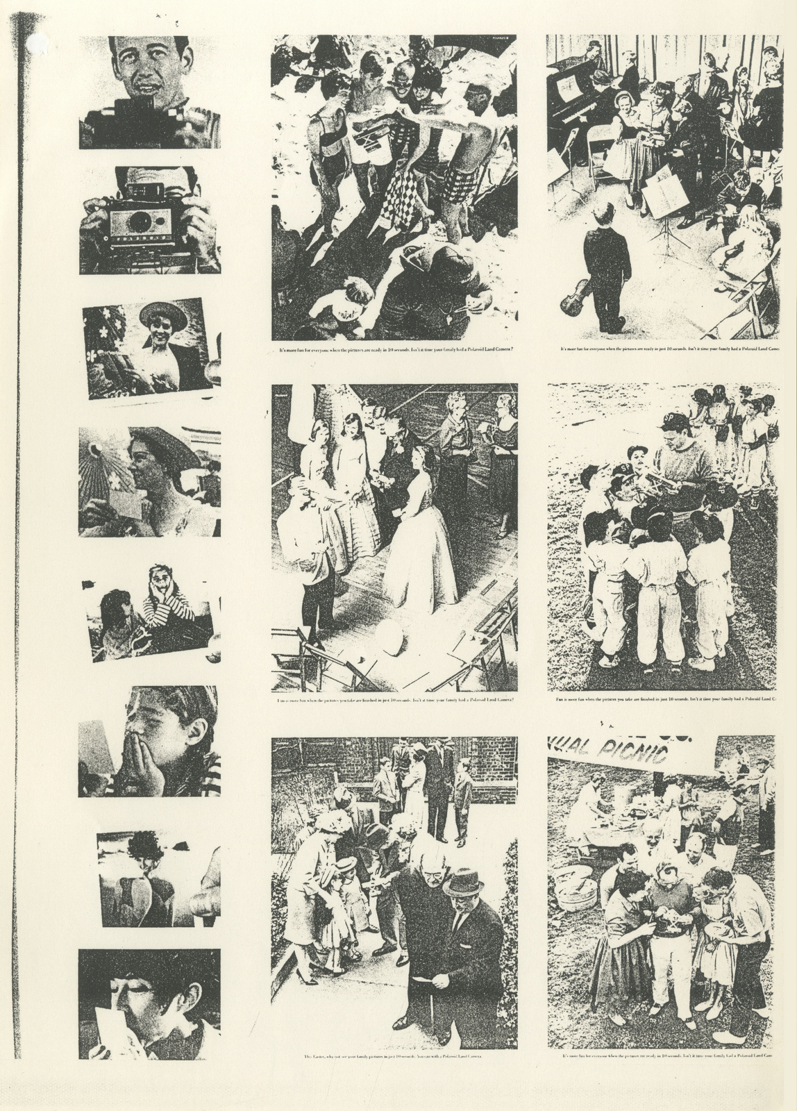
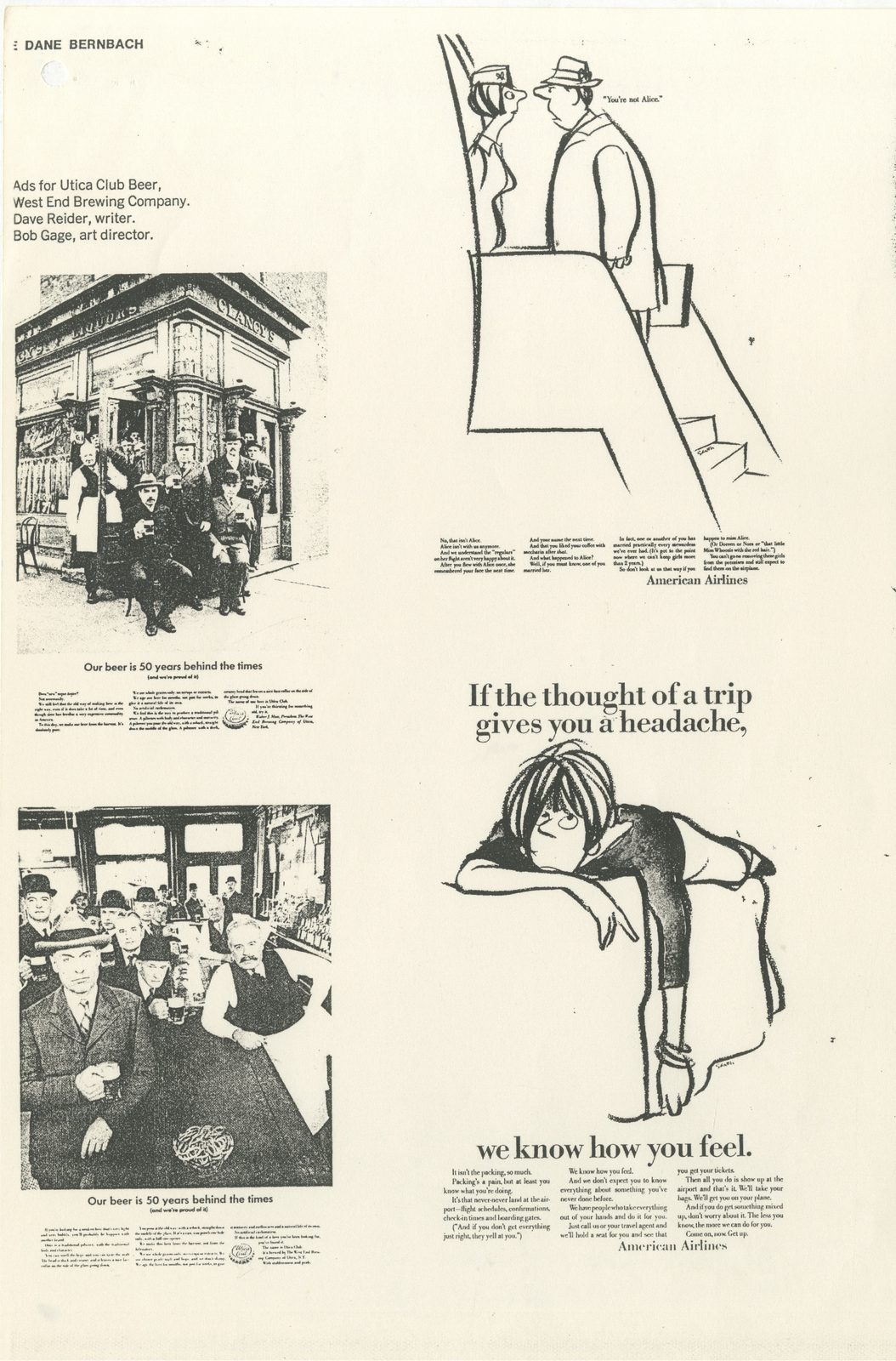
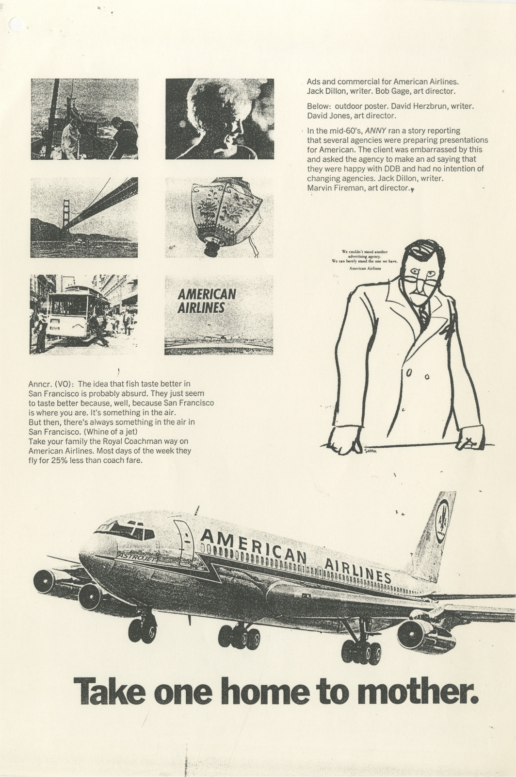
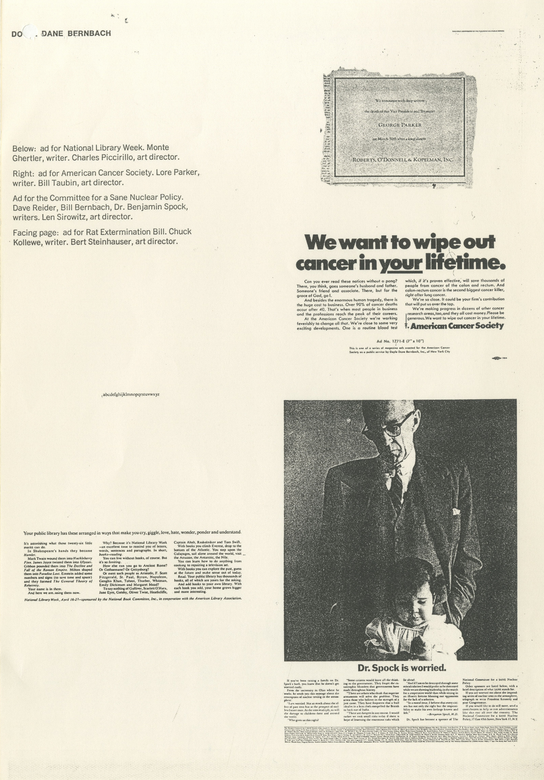
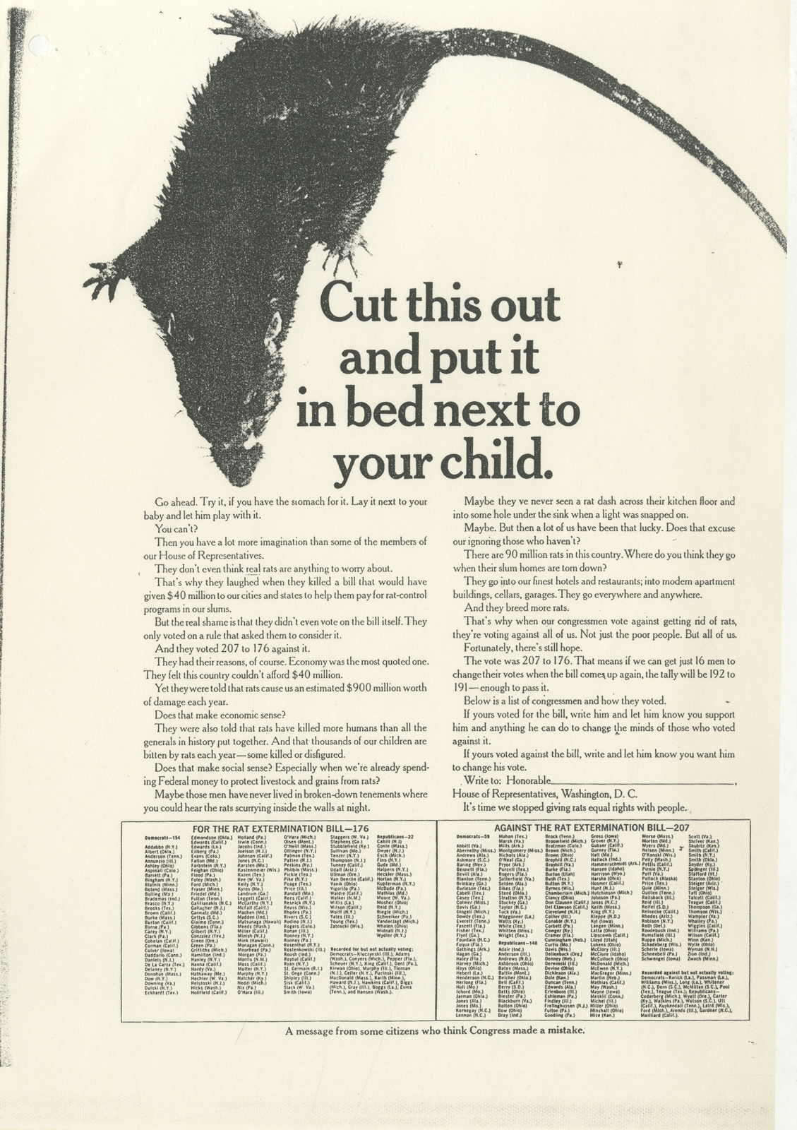
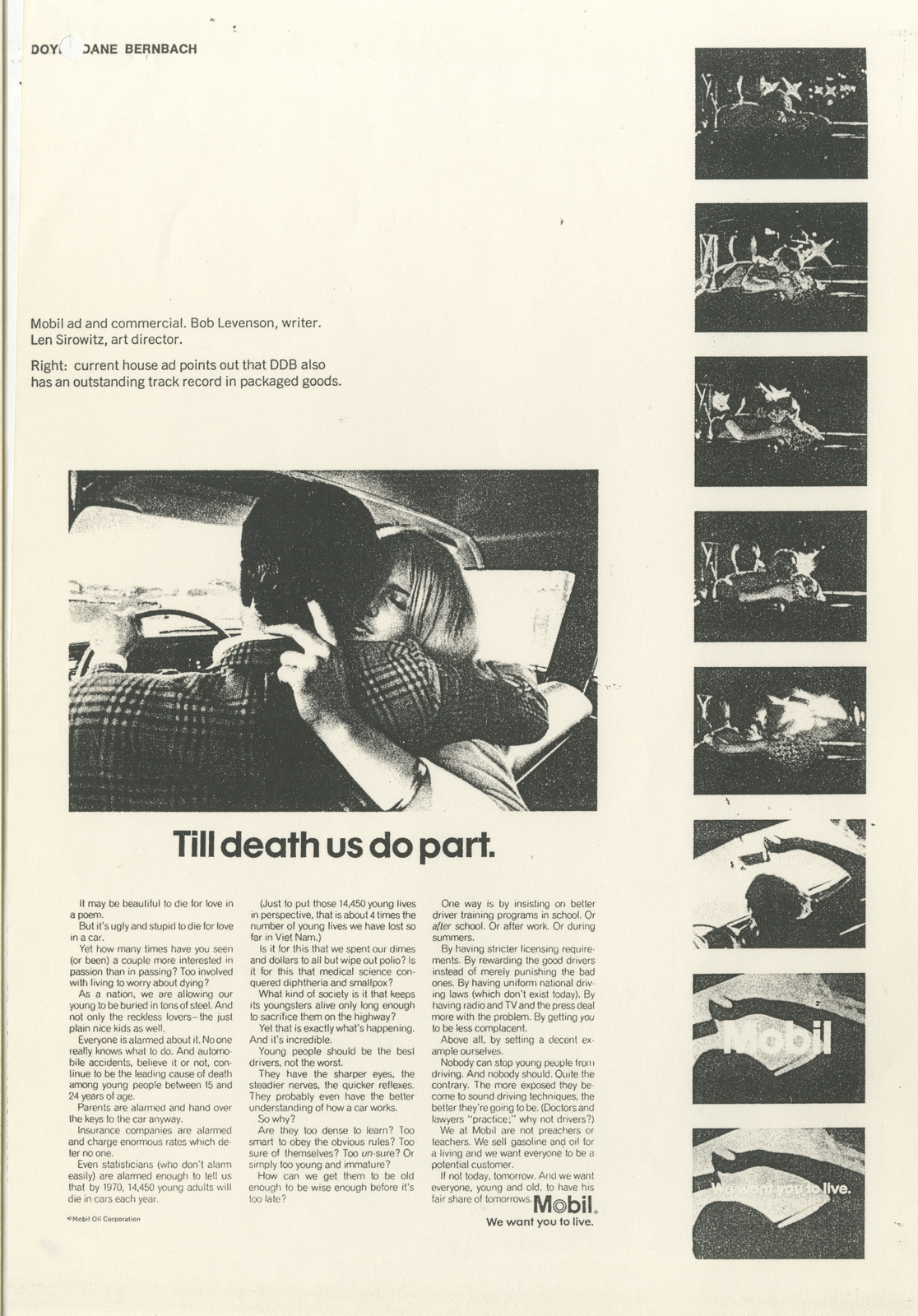
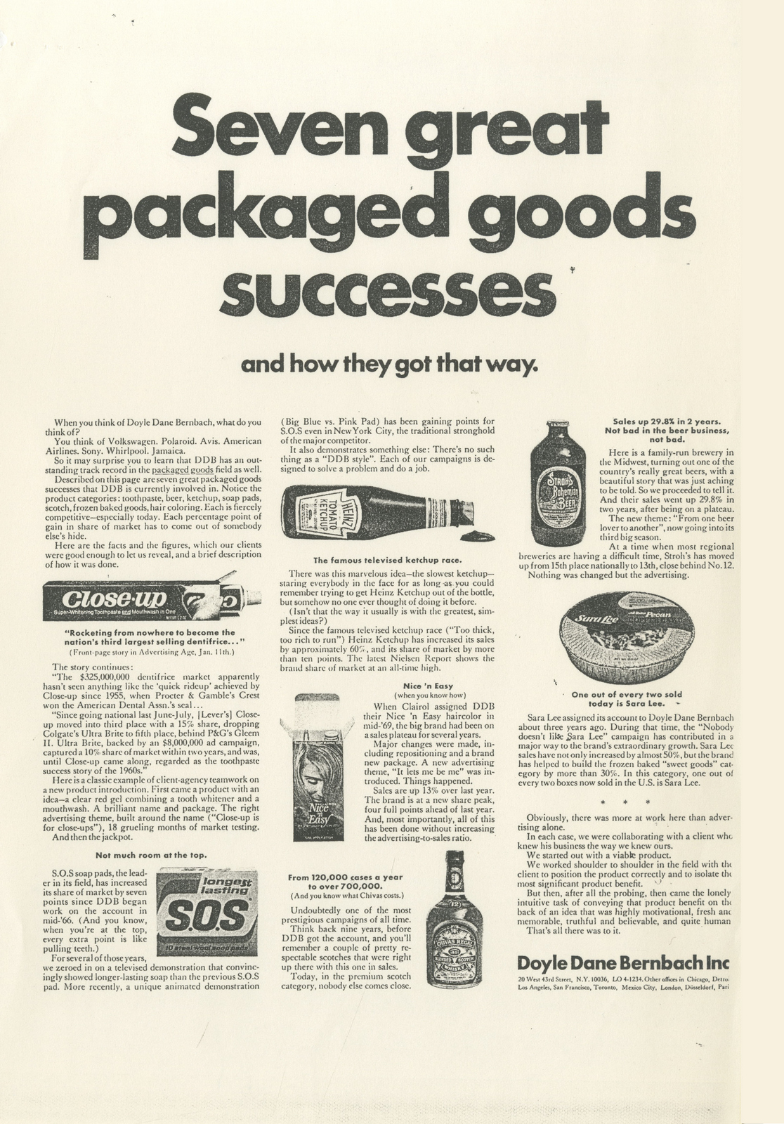
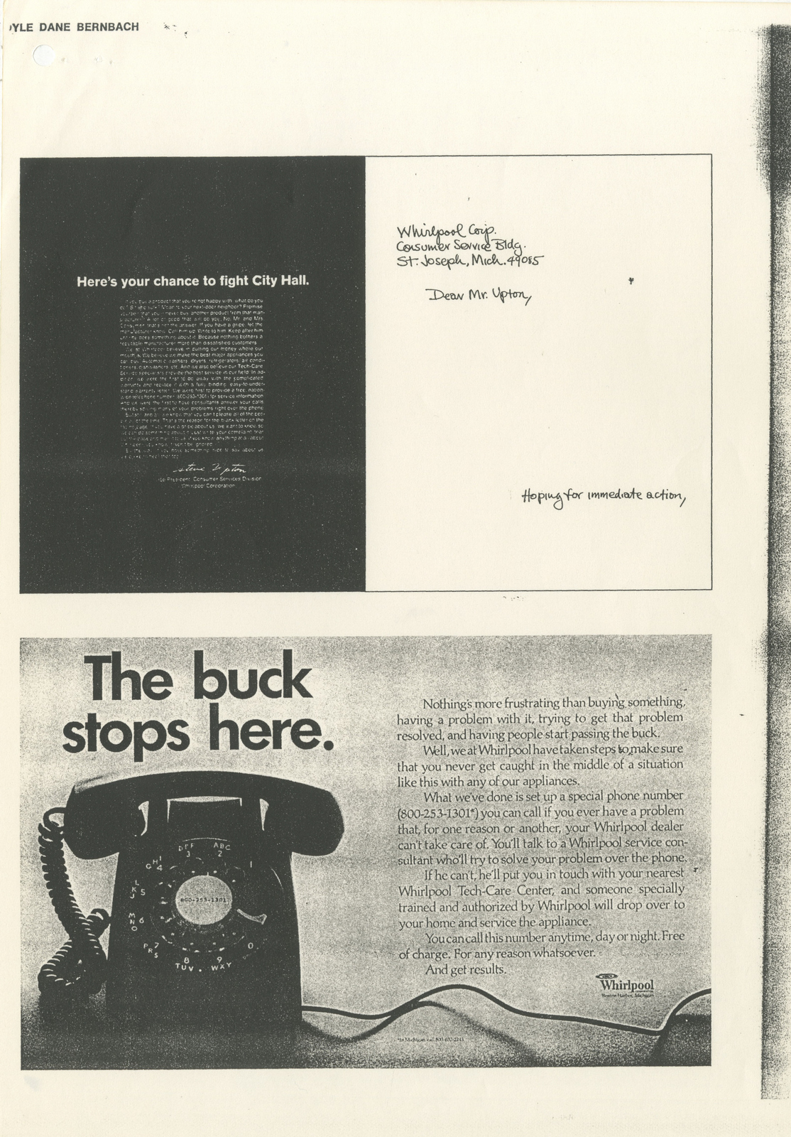
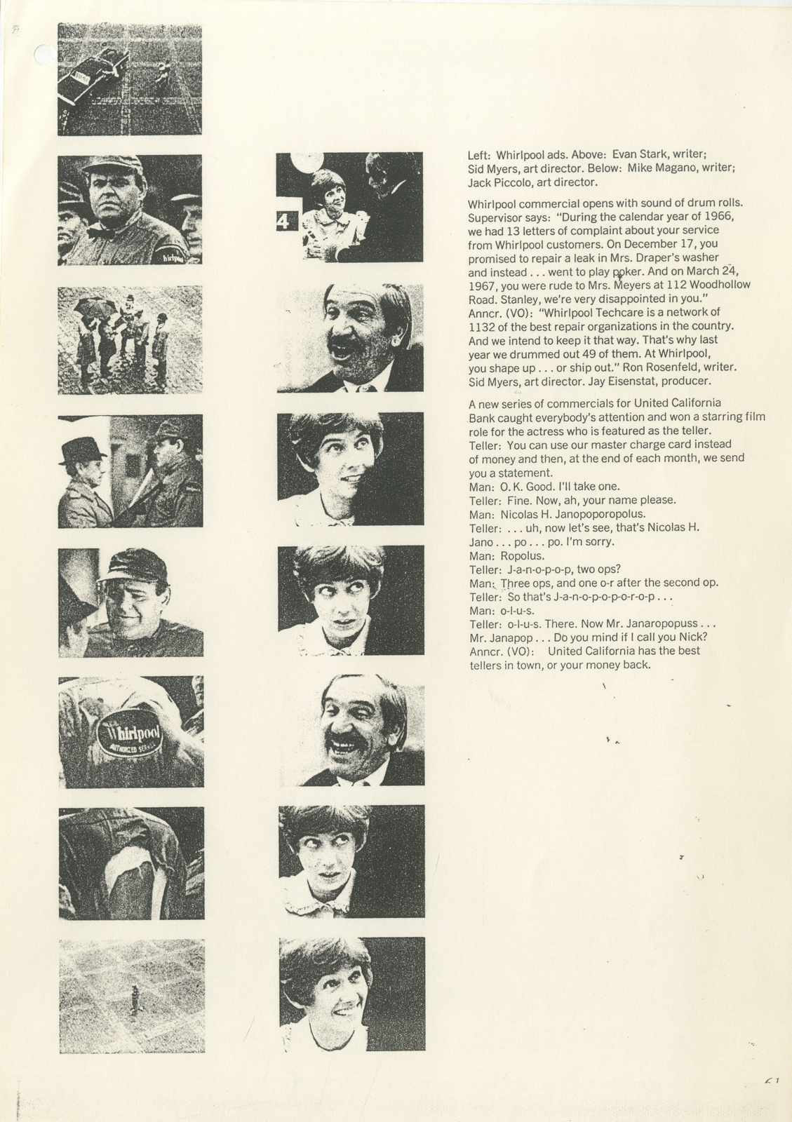
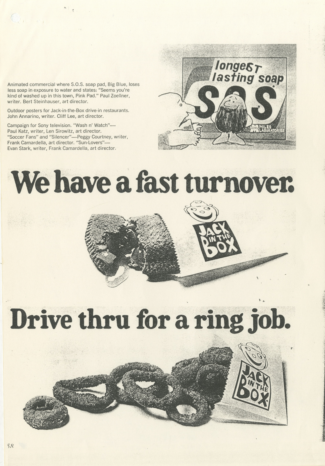
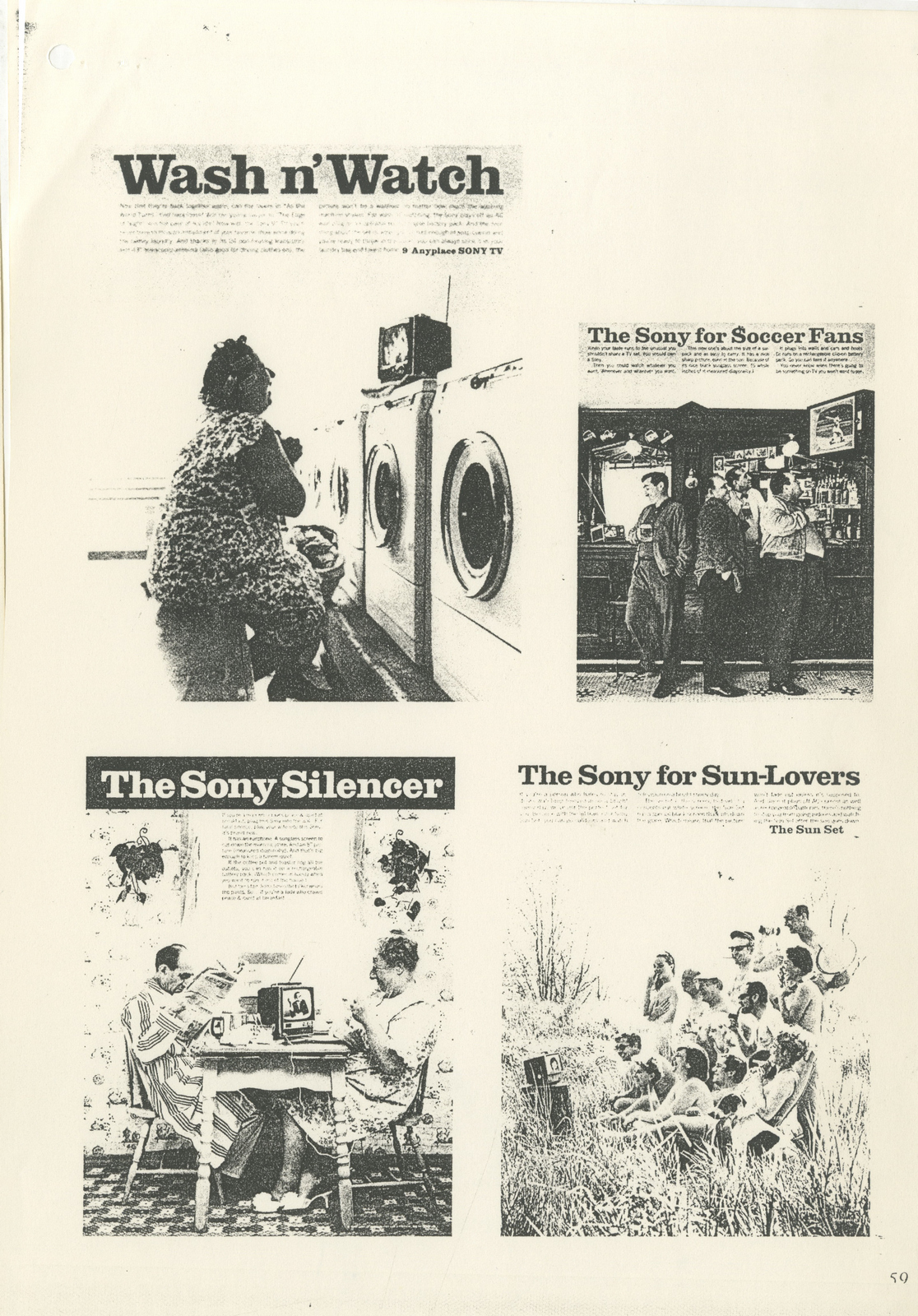
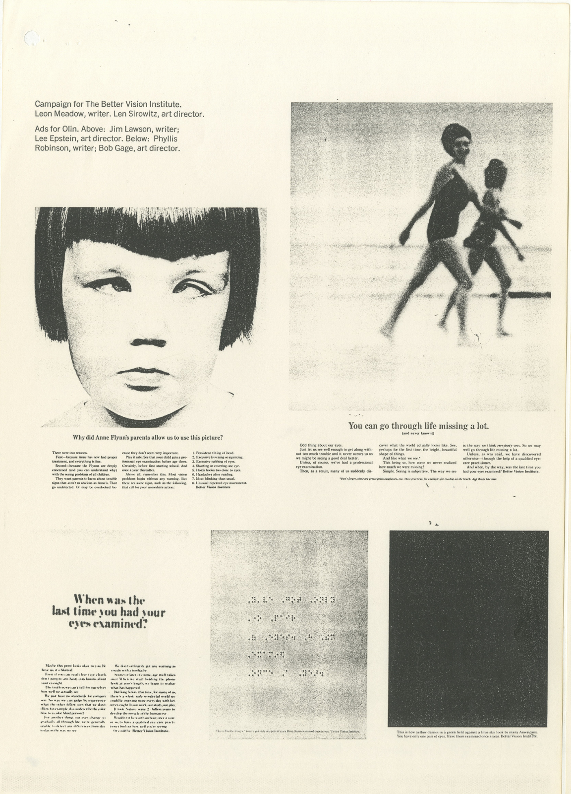
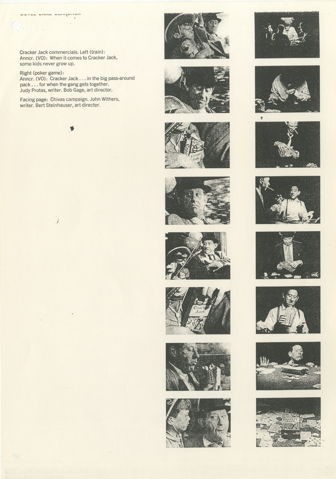
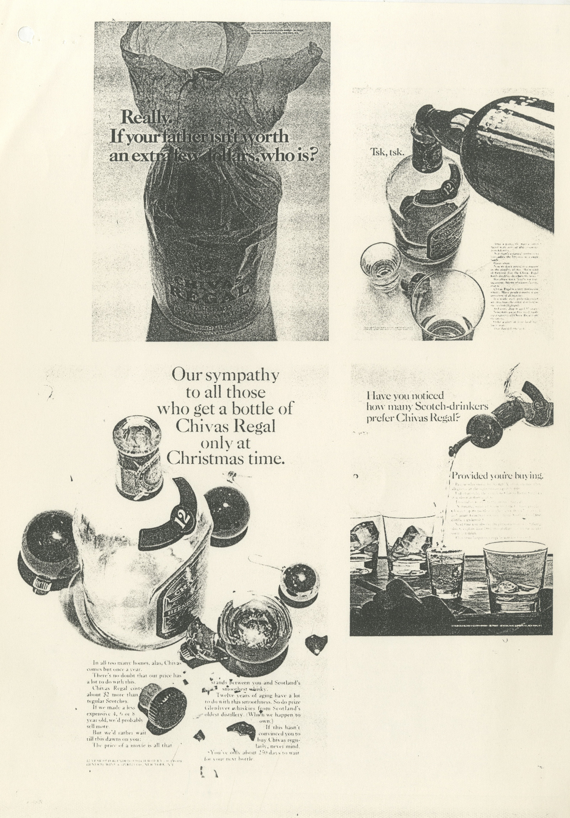
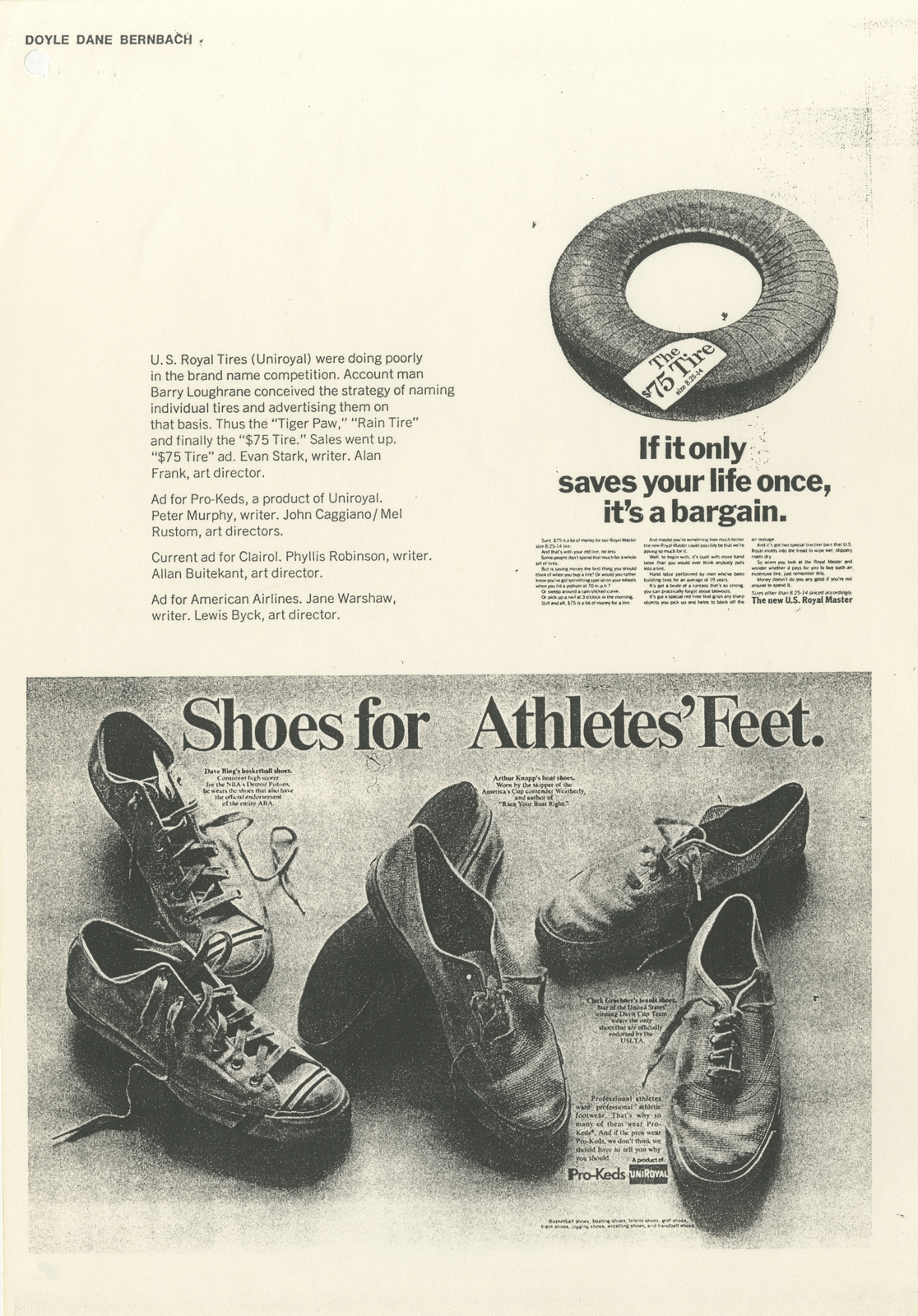
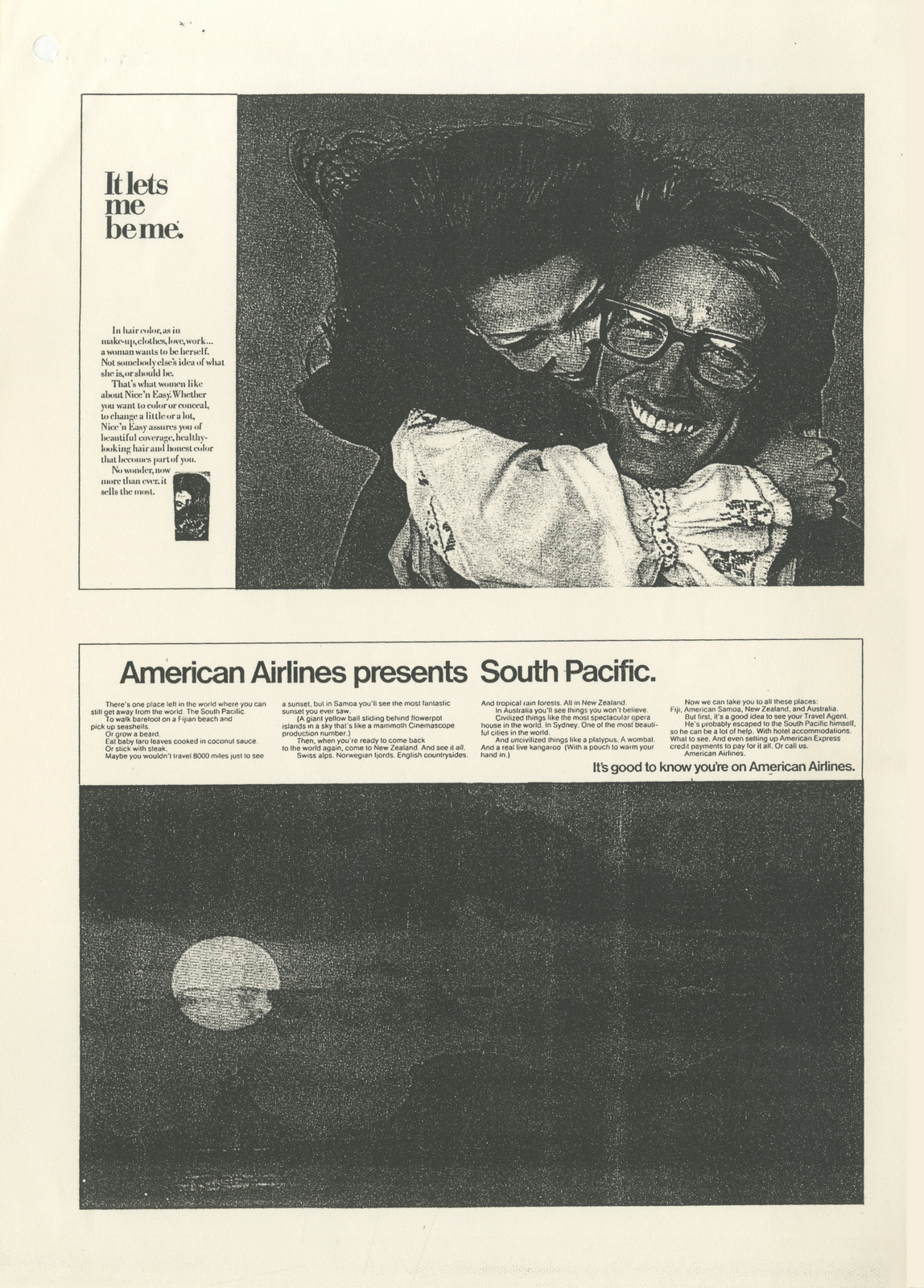
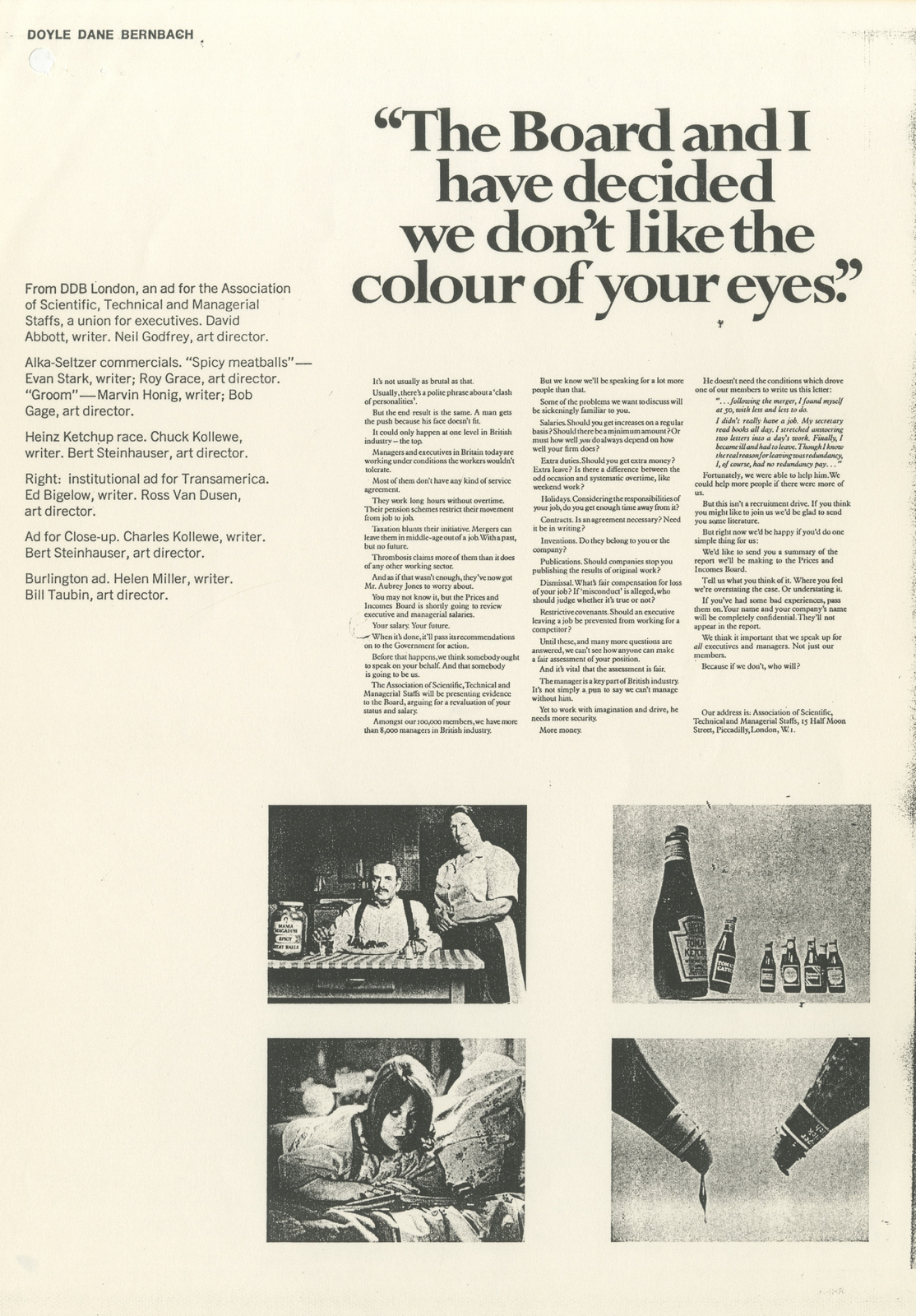
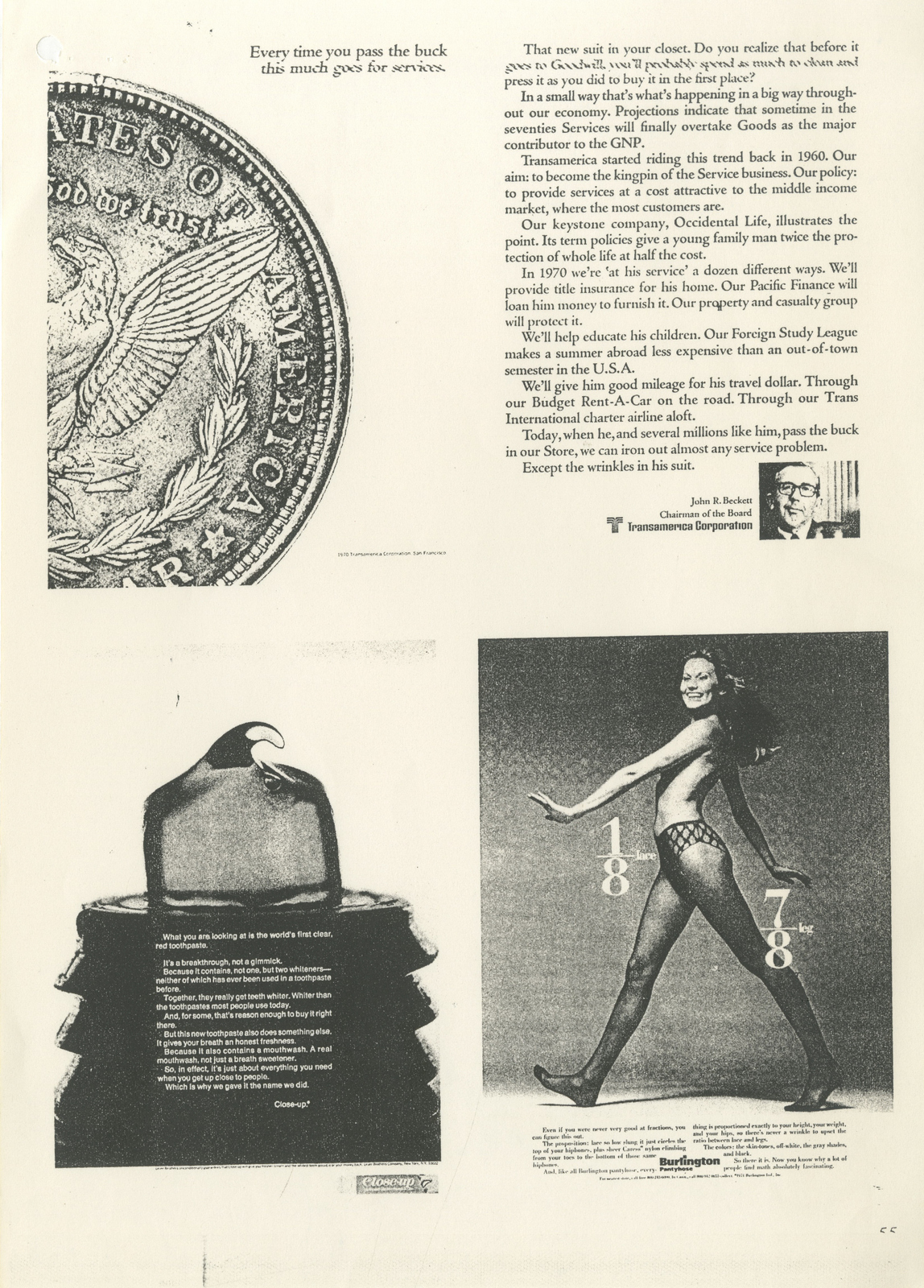
AN INTERVIEW WITH BOBBY K.
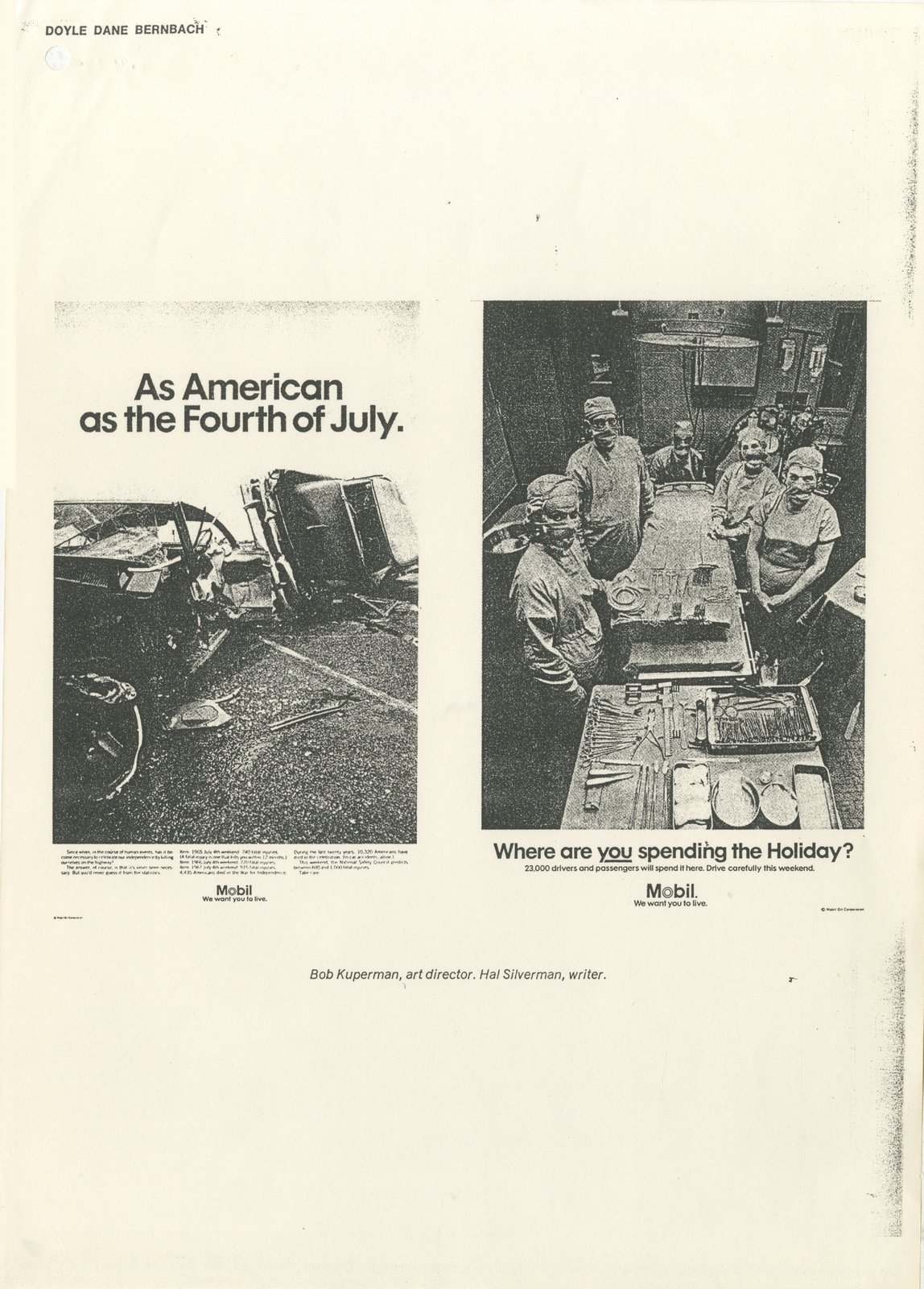
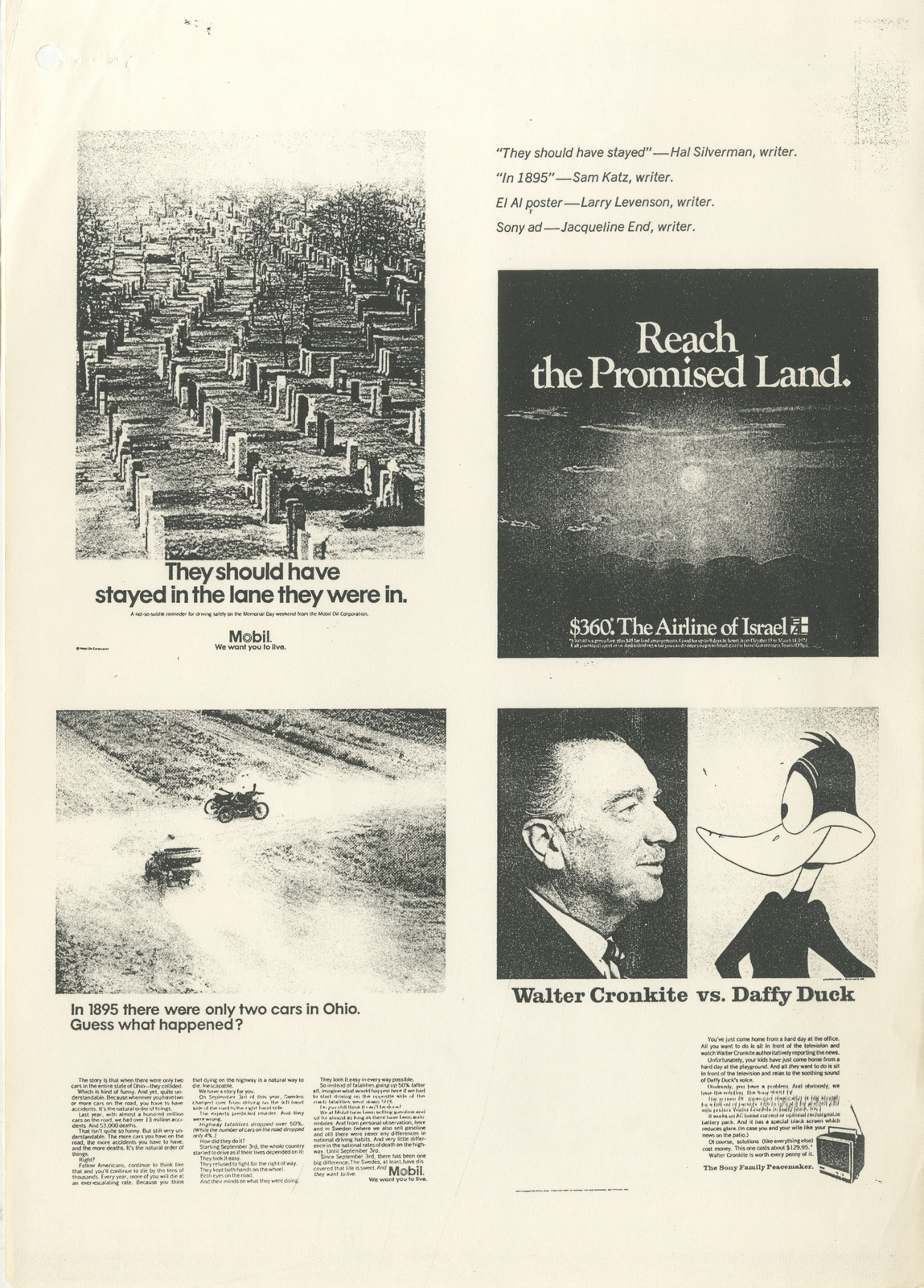
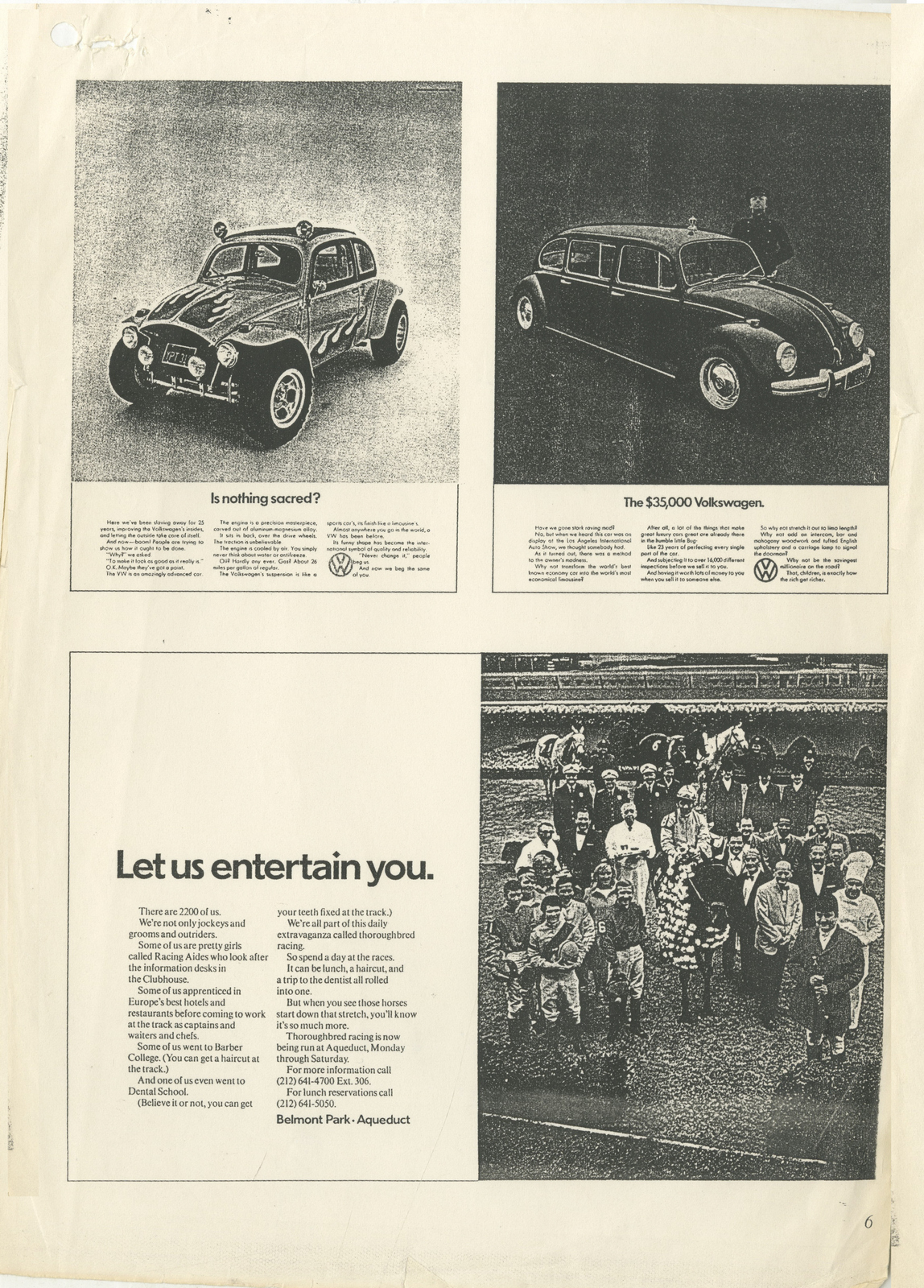
When you start out in your advertising career, Pentel in one hand, MacBook in the other, you seem to be surrounded by good work.Awards books are choc-a-bloc with it.As you go on, year by year, you seem to see less and less.For example, the first D&AD Annual looked at probably had an 80/20 ratio of good to bad.10 years later those percentages are likely to have flipped.As you move on you become less swayed by awards, famous names or cool agencies, you now have 10 years of data to compare any new idea to - Is it as fresh as A? As funny as B or, actually, isn’t it just a reworking of C?It’s hard not to.You’re no longer that naïve, impressionable young thing you once were.In the music business they believe that our musical taste can be tracked back to our 16th summer; that's when we were most impressionable and hungry for experiences.As you get older it gets harder to find that tingle of excitement you feel when you experience things for the first time.In advertising, not being easily excited can be seen as being jaded.In fashion, architecture and many other creative they have different name for it; knowledge.I say this for two reasons;a) I’ve seen A LOT of stuff.b) David's stuff always causes a tingle, (not a minty-fresh, mouth tingle, but a work-fresh, excitement tingle).Somehow, he manages to produce work that feels like it's avoided committees, cliches and compromises.Whereas most work can be quickly categorised as good or bad, with David’s I often have to think about first.The Orange spot with the couple dancing; Is that good?The Guardian ‘3 Little Piggies’; Is that good?The Coal Drops Yard Branding with the seemingly random bunch of shapes, pictures and colours; Is that good?None are what you’d expect.Each take balls to go with.All are hard to ignore or forget.Much of the work he’s created and overseen at Droga5 London feels as though the team enjoyed thinking it up, then just couldn’t wait to make it and show the world.Good work tends to have that vibe.Unfortunately, we recorded this a while back, and David being David, he came up with a cunning way to make this podcast not only unusual, but complicated to make.Eventually, for reasons that would take too long to go into, it's coming out in a non-unusual, uncomplicated, familiar format. (Soz David.)It means that we don’t cover the great work Droga5 have been knocking out over the last year or so, like their exceptionally tingley Super Bowl ad for Amazon.Enjoy.

TBWA\Toronto.AGF.
GOODBY SIVERSTEIN.Logitech.
Denny's.
MOTHER.Orange.
BBH.Weetabix.
The Guardian.
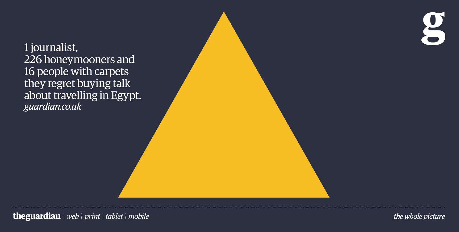
Axe.Apollo.
ITV.
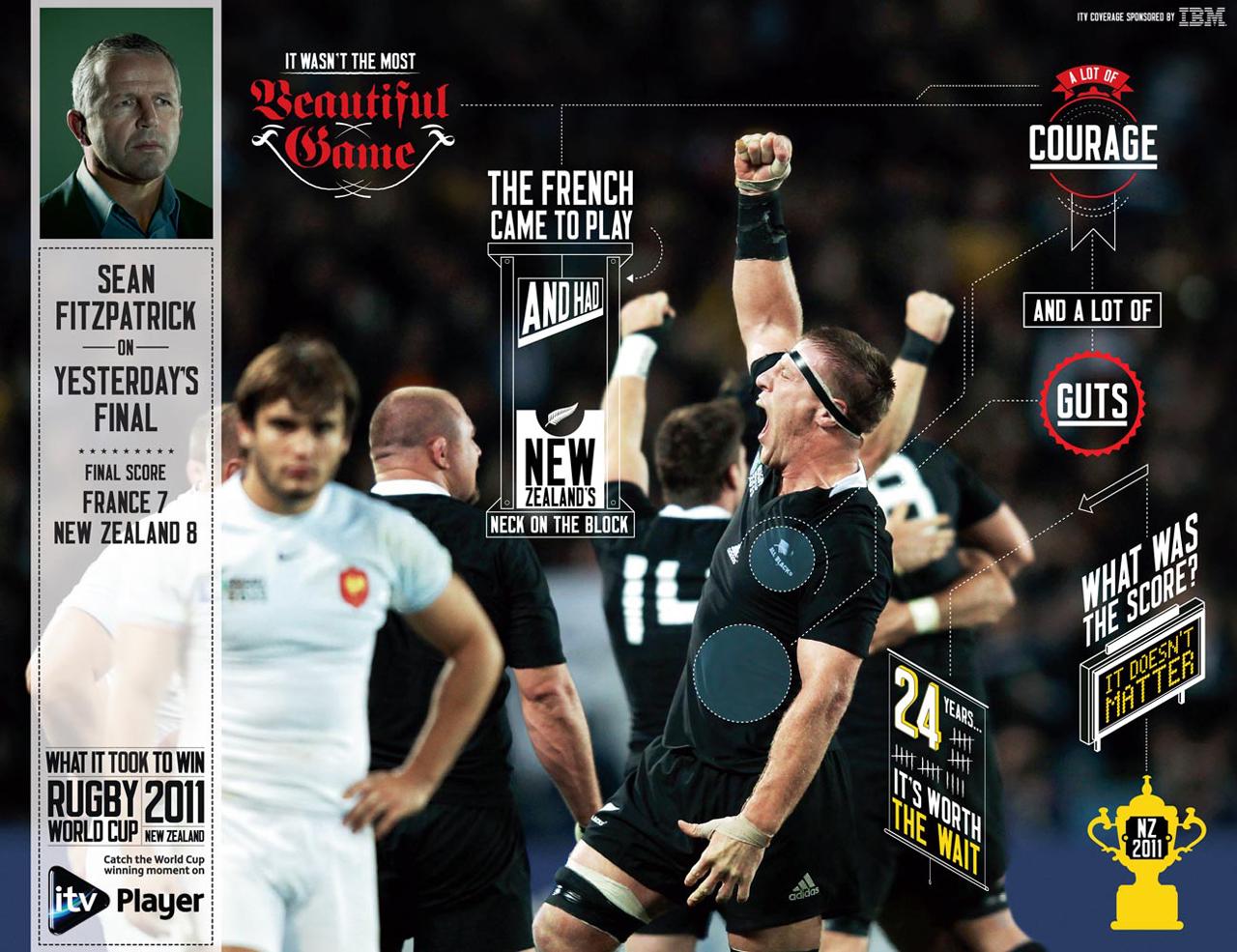
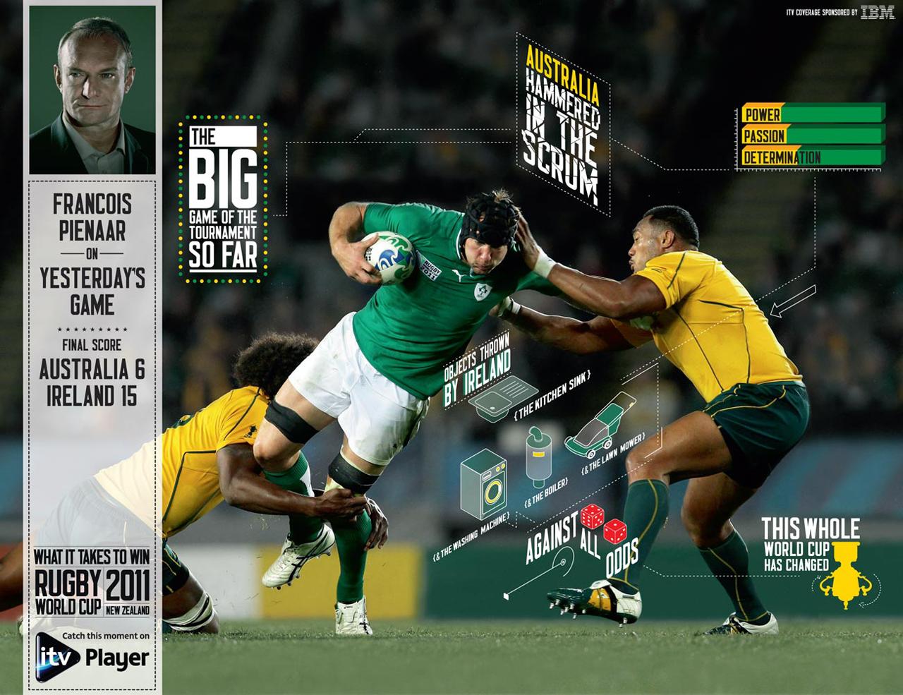
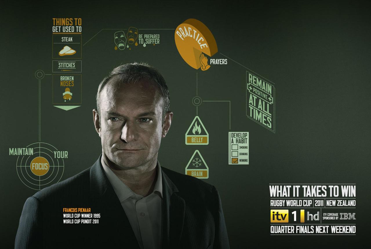
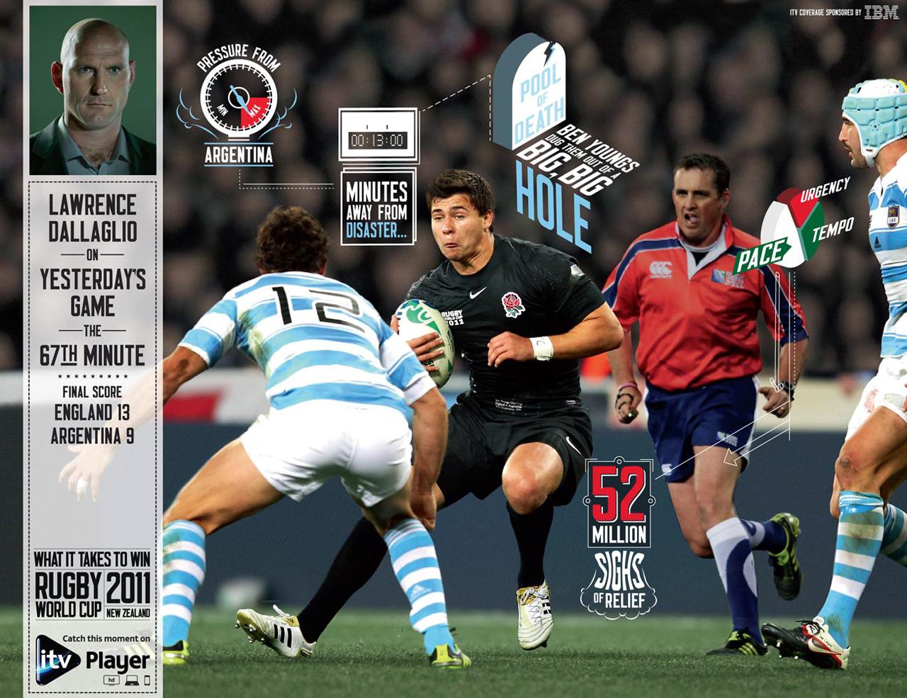
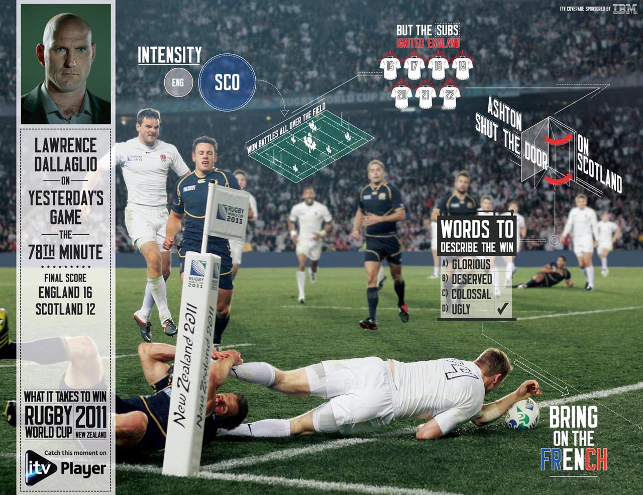
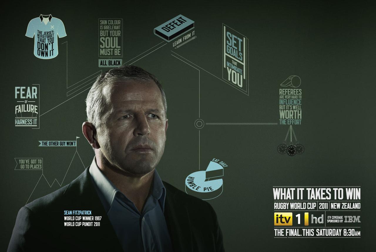
Shower Gels.
URL for Jeff Bridges Sleeping Tapes (includes ads + full album) from W+K New York
http://www.dreamingwithjeff.com/
WEIDEN + KENNEDY NY.Gap.
Southern Comfort.
DROGA5.Kwiff.
Belstaff.

Rustlers.
Hobbs.
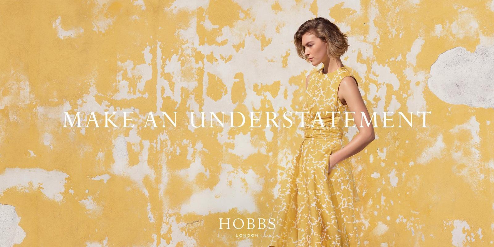
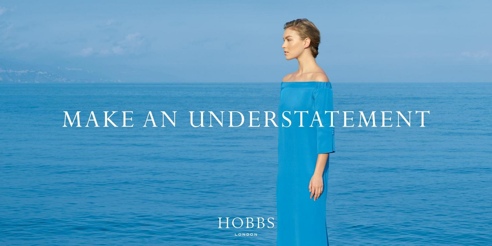
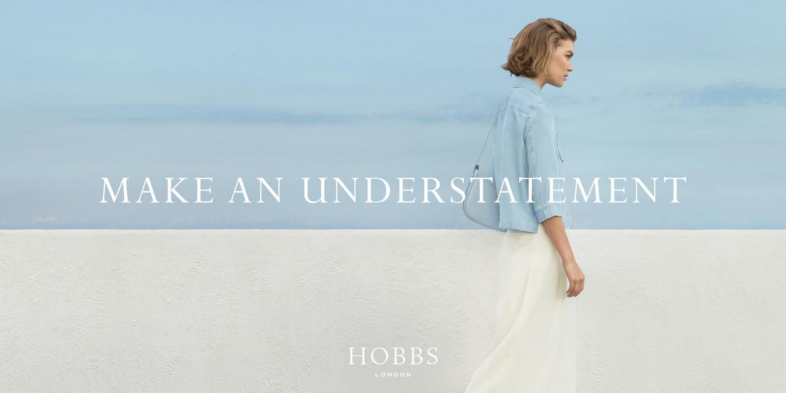

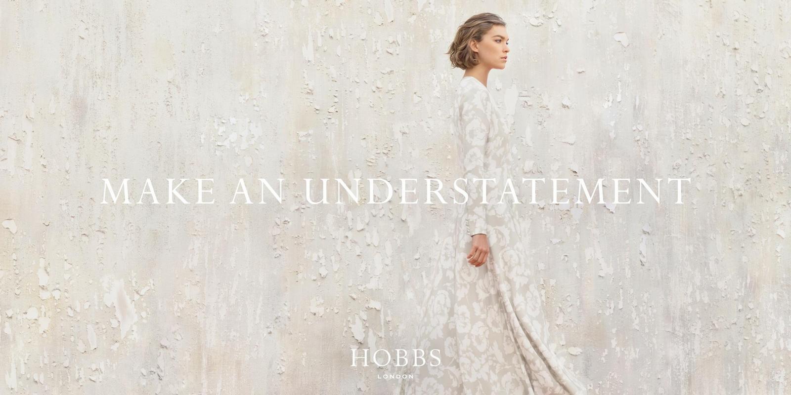
Barclaycard.
Coal Drops Yard.

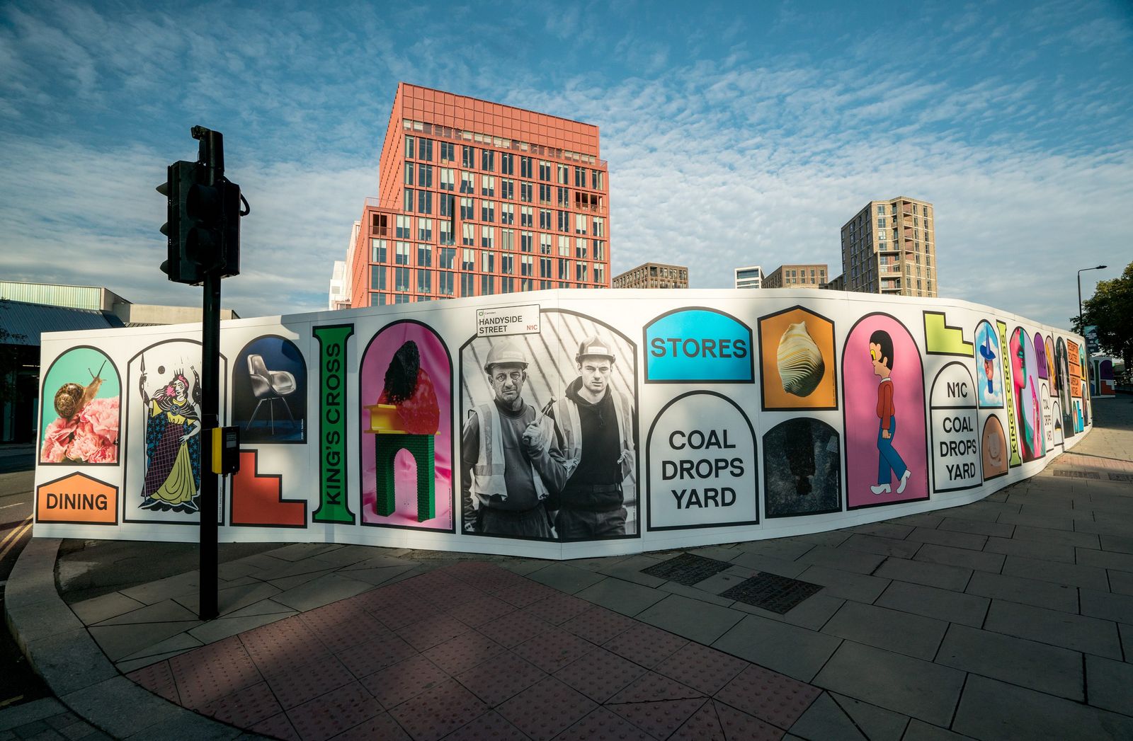
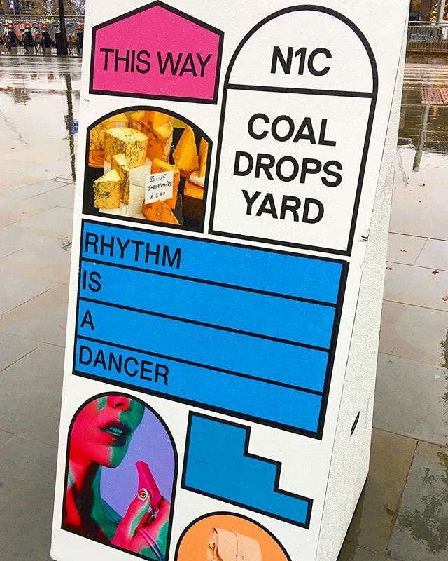
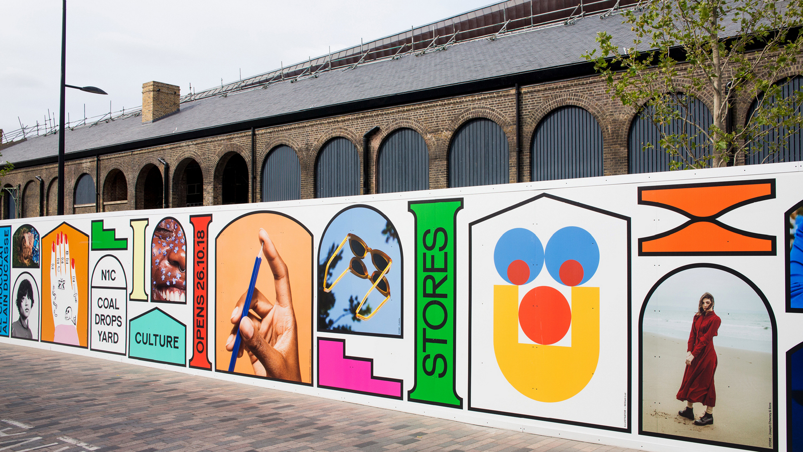
Go Compare.

Amazon.


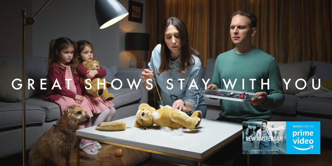
More David.With balloon puppet.
Hanging with Maya.
Being slapped.

As hippie.
Ready for the kill.
Chillin'.
I'm guessing you're not as familiar with that name as were with others I've posted?But you'll be familiar with his work.Saatchi's 'Pregnant Man'?BBH's 'Black Sheep' poster?CDP's 'Wolf In Sheeps Clothing'?Yes? All shot by Alan.Because they're such a fantastic ideas, they look as though anybody could've shot them.The images are so simple and clear you can't imagine done them any other way.But each is the end result of a series of choices.Take a look at the casting contacts from the the 'Pregnant Man' ad, the alternative models look ridiculous, but they didn't on January 21st 1970.Look at the 'Black' sheep ad Alan shot for John Hegarty (and Barbra Nokes), just a bunch of sheep with a black one plonked in the middle?Nope.If shot side-on, they'd blend into each other after the first row and not fill the poster.If shot from above you wouldn't see them in that classic, side-on profile.So Alan used his map reading skills (acquired through Rally driving) to find a steep incline, so that the sheep rose up, filling the poster with graphic sheep profiles, almost like cut outs, but better for being shot for real.Then there's the 'Wolf In Sheeps Clothing'; How hard can it be to fling a sheep's pelt over a wolf?Very, as it turns out.Wolves don't like modelling, so Alan borrowed some sheep pictures from a friend, photographer Adrian Flowers, then comped the two together.In Alan's words, he wasn't a photographer, he was 'an adman with a camera', simply trying to bring the ideas to life.He'd learnt how to do this from his years as a top art director at CPV and CDP, getting to work on a regular basis with photographers like Elliott Erwitt, Duffy and Terrence Donovan.We had a great chat, hope you enjoy it.
ART DIRECTOR.Colman Prentiss & Varley.BEA.
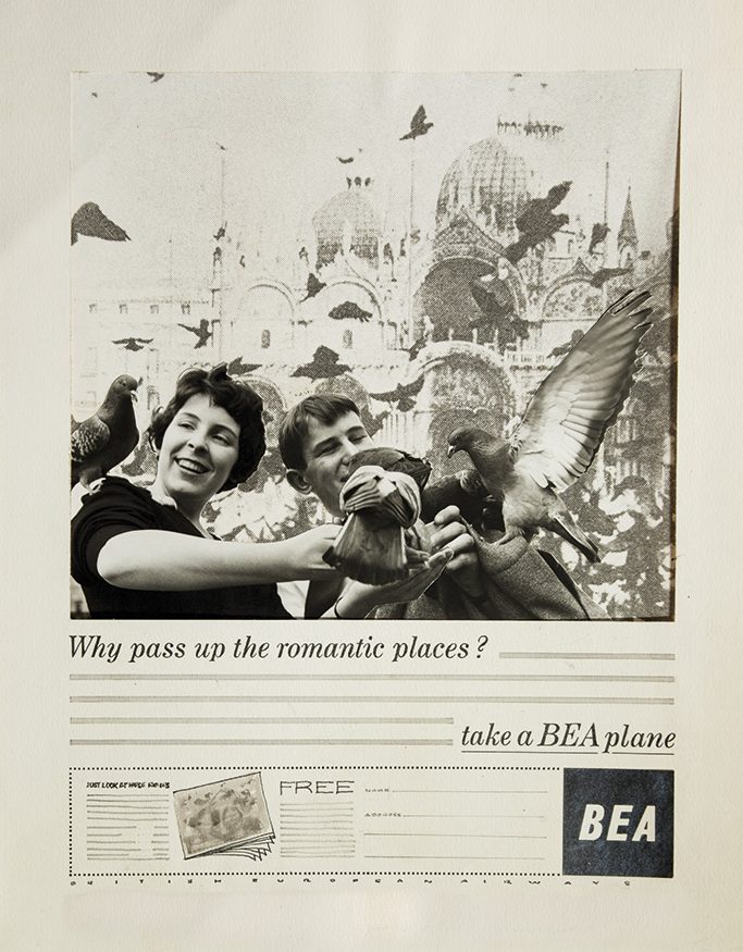
(A young studio boy stands in as a model, his name was Paul Arden. Below, you can see them both at work at CPV.)
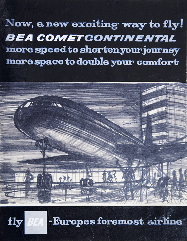
Carlsberg.
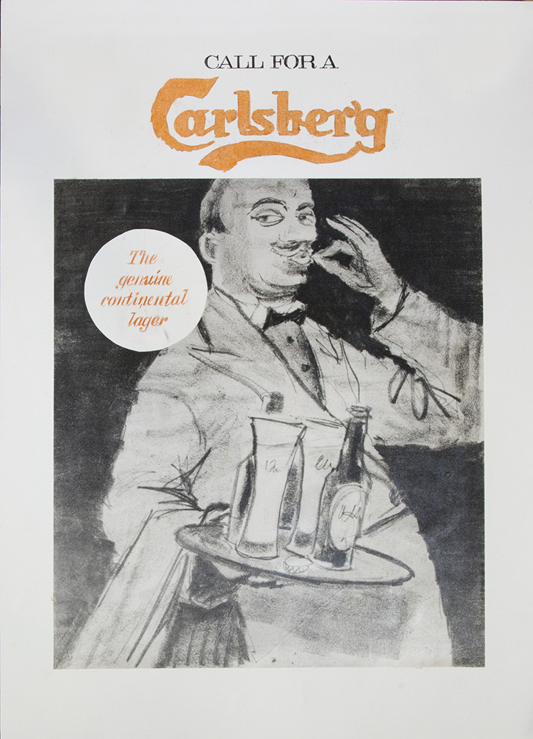
Collett Dickenson Pearce.Lancia.
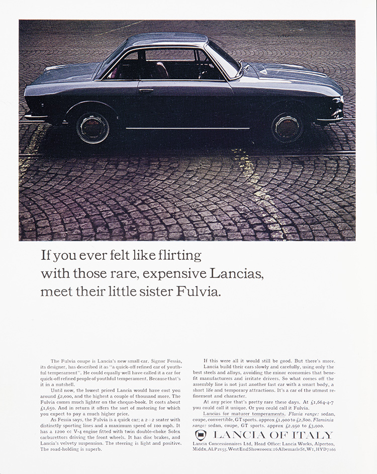
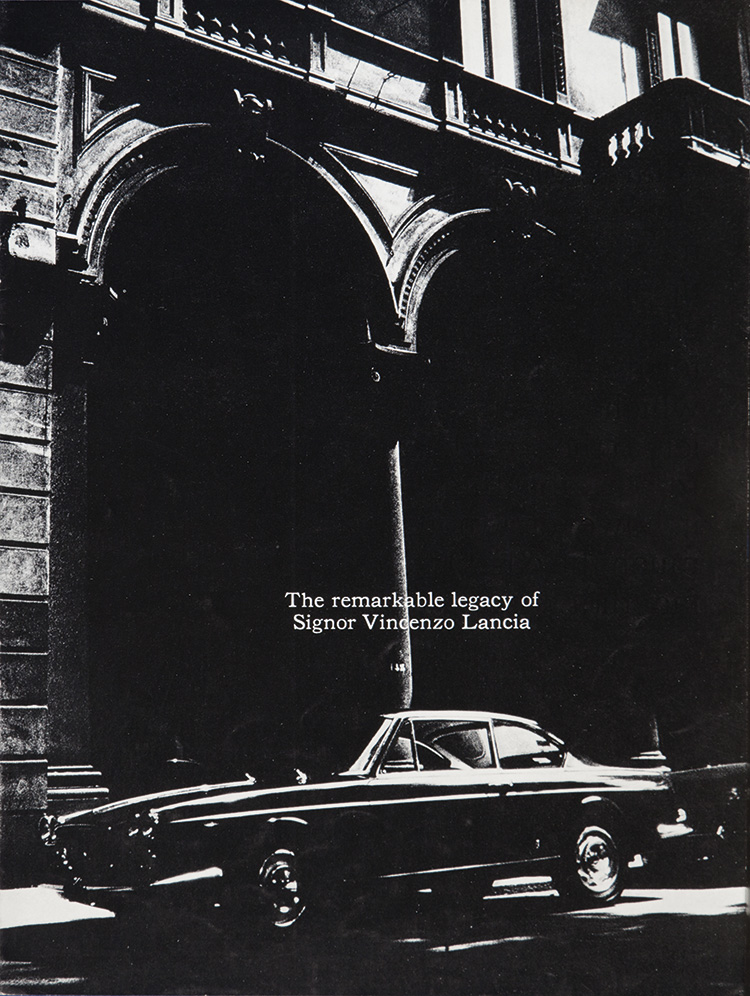
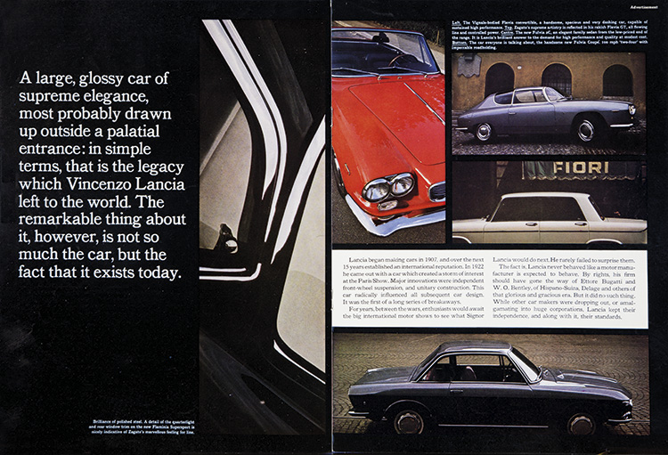
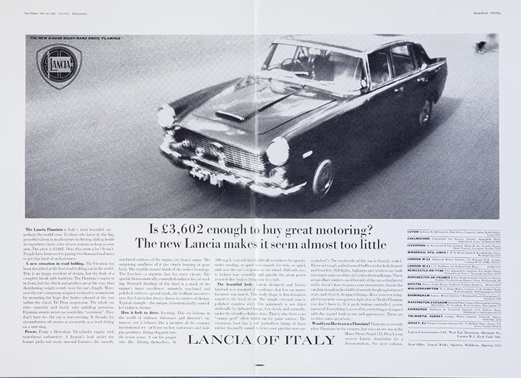
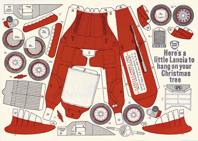

Aer Lingus.
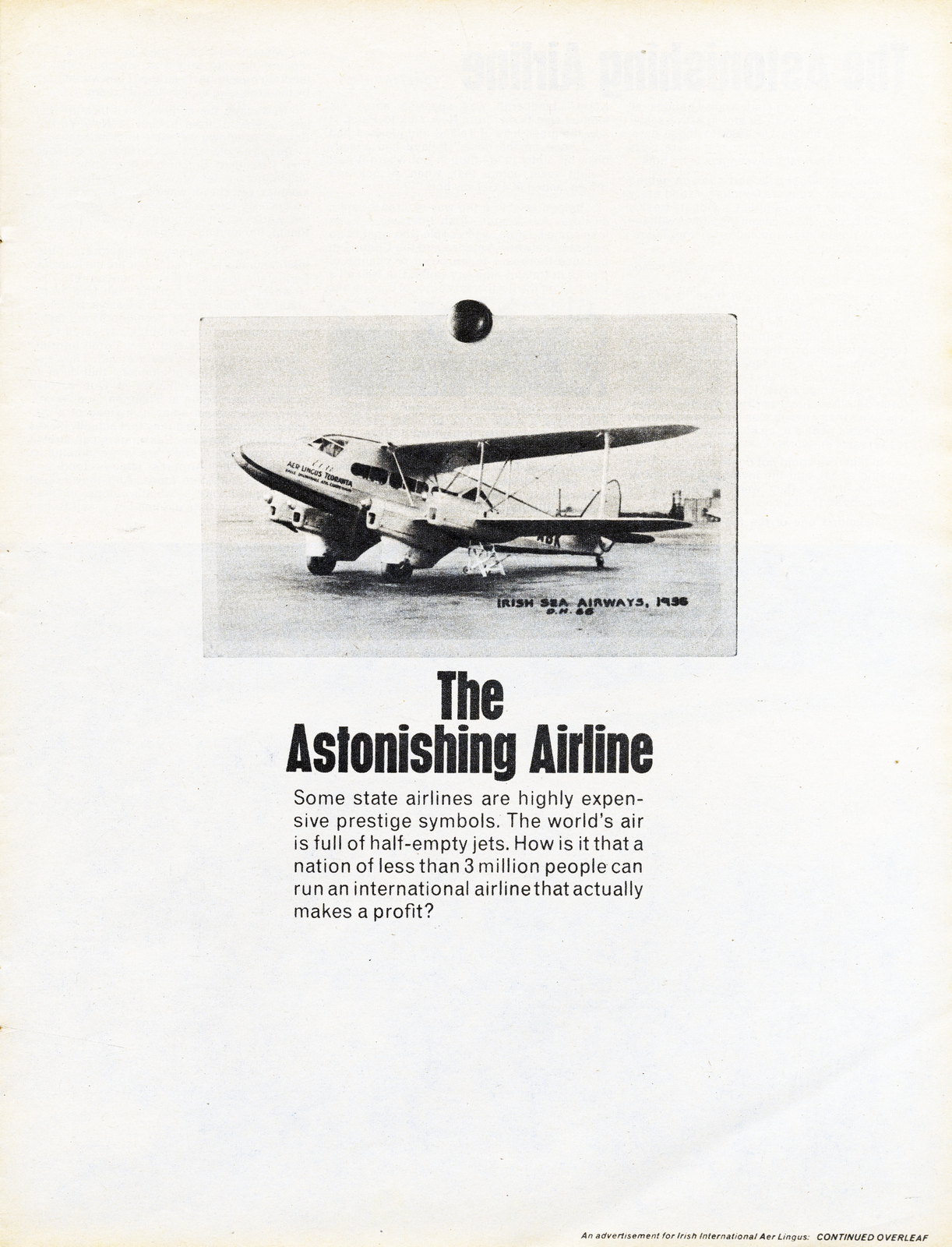
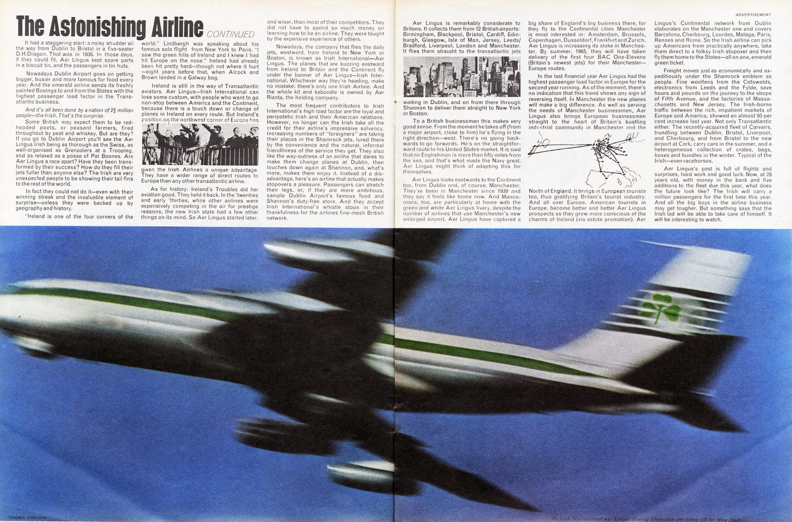
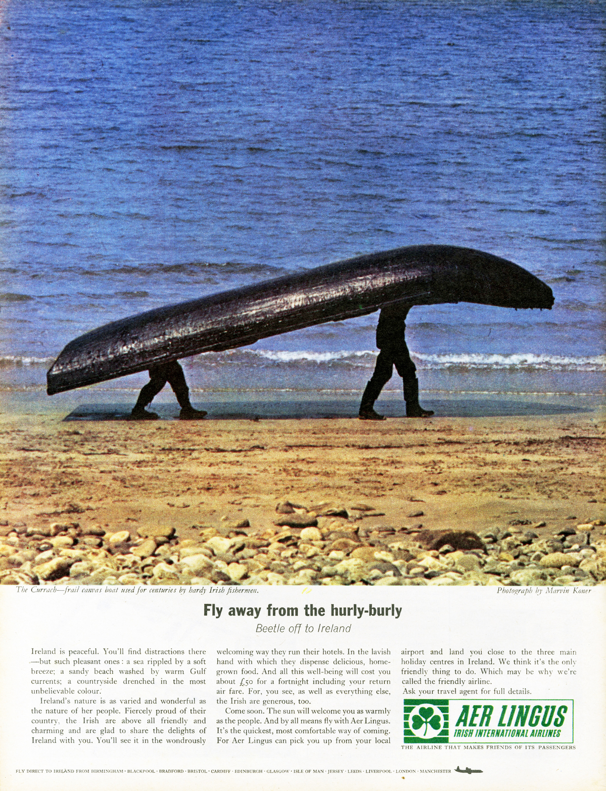
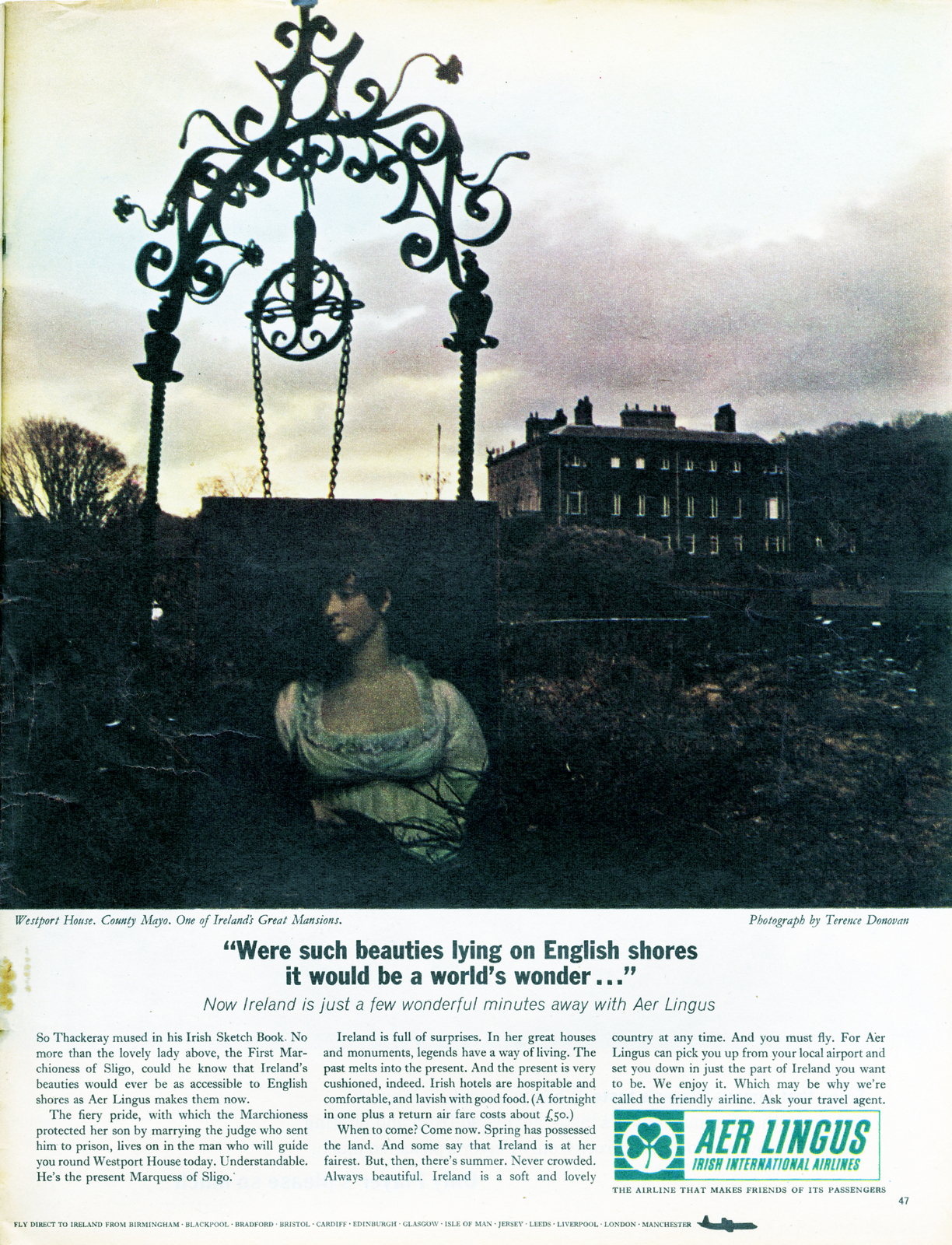
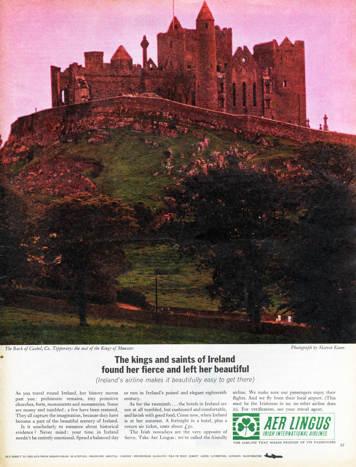
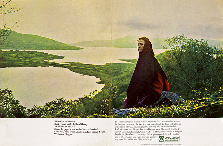
(Terence Donovan shooting the above ad.)
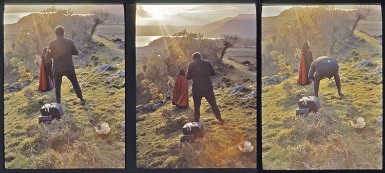
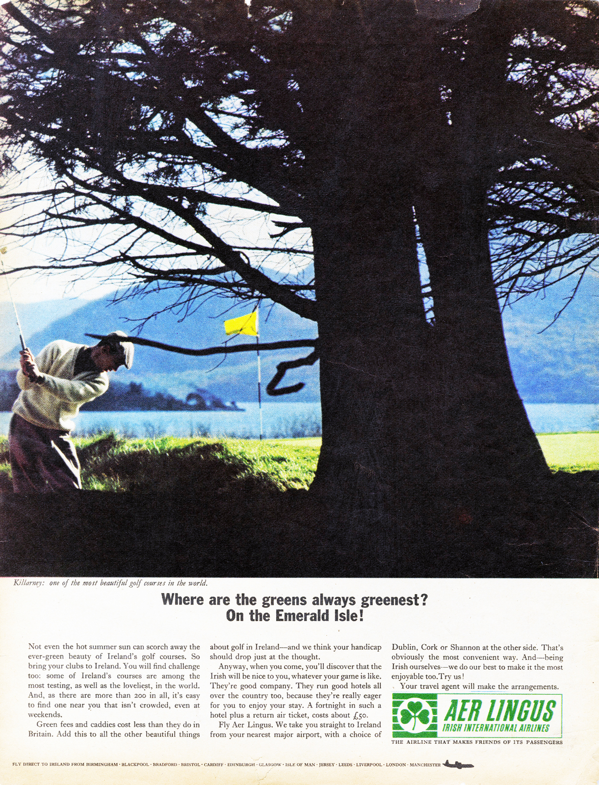
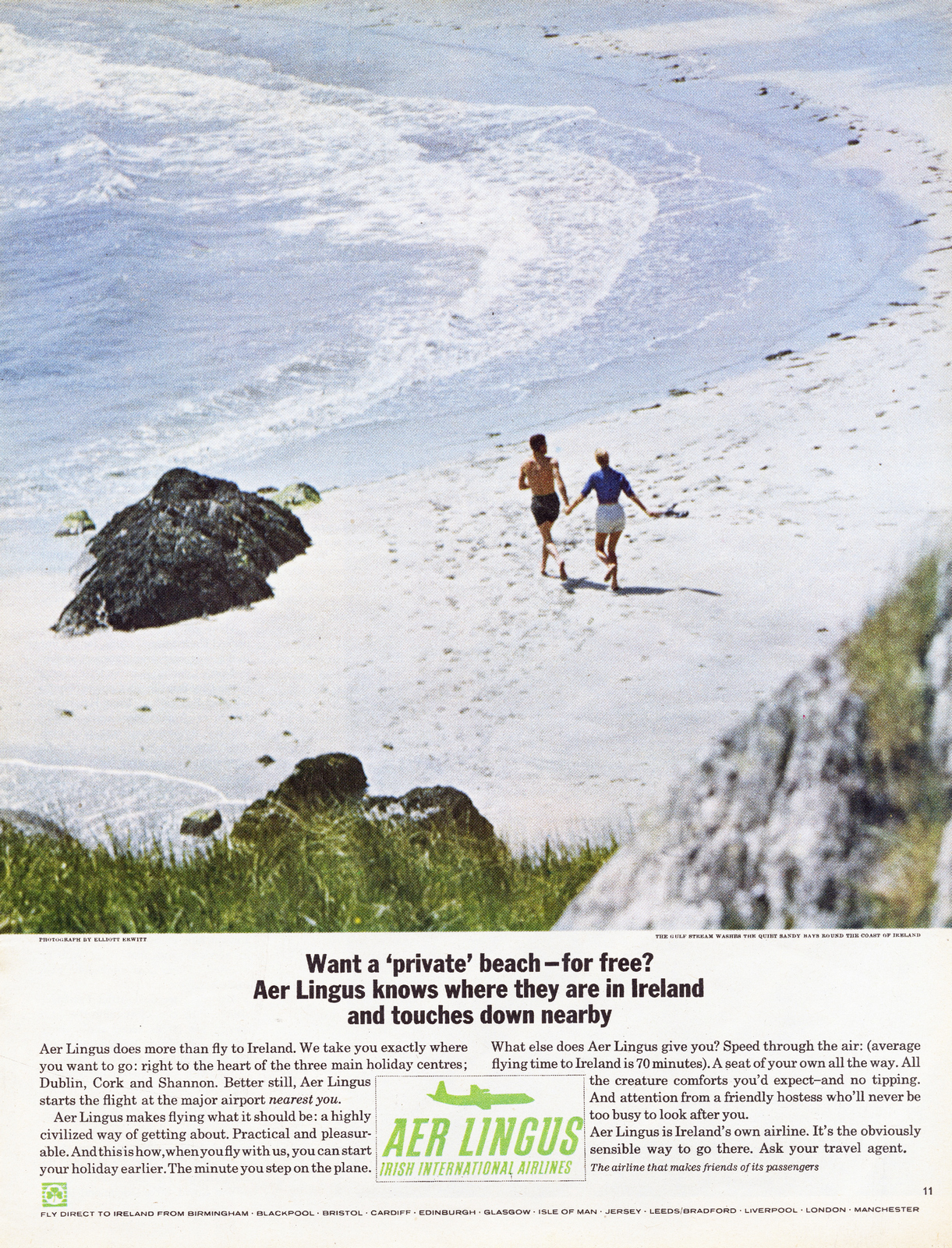
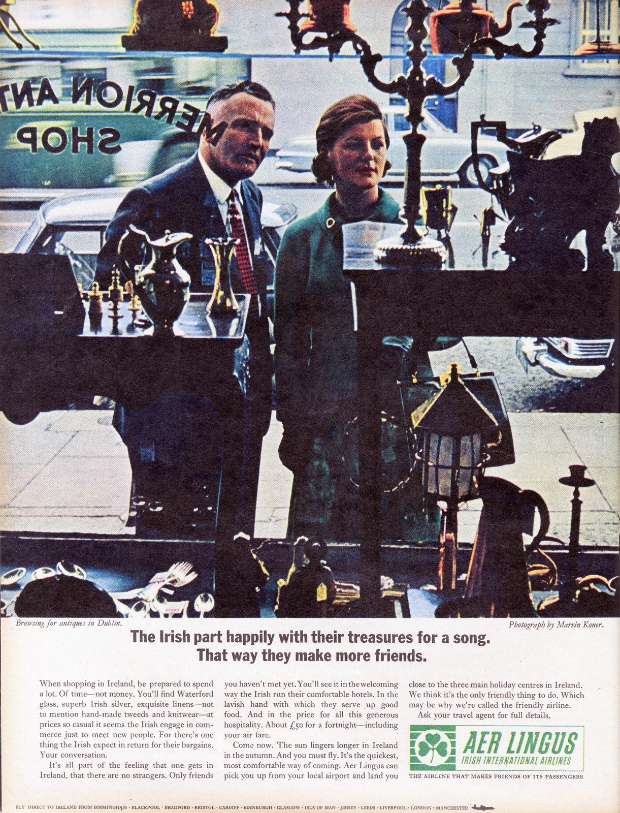
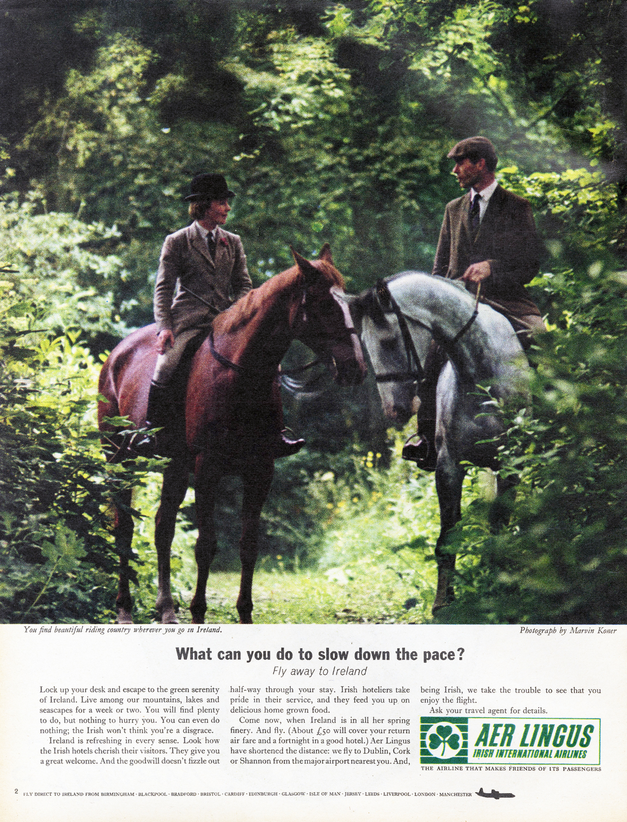
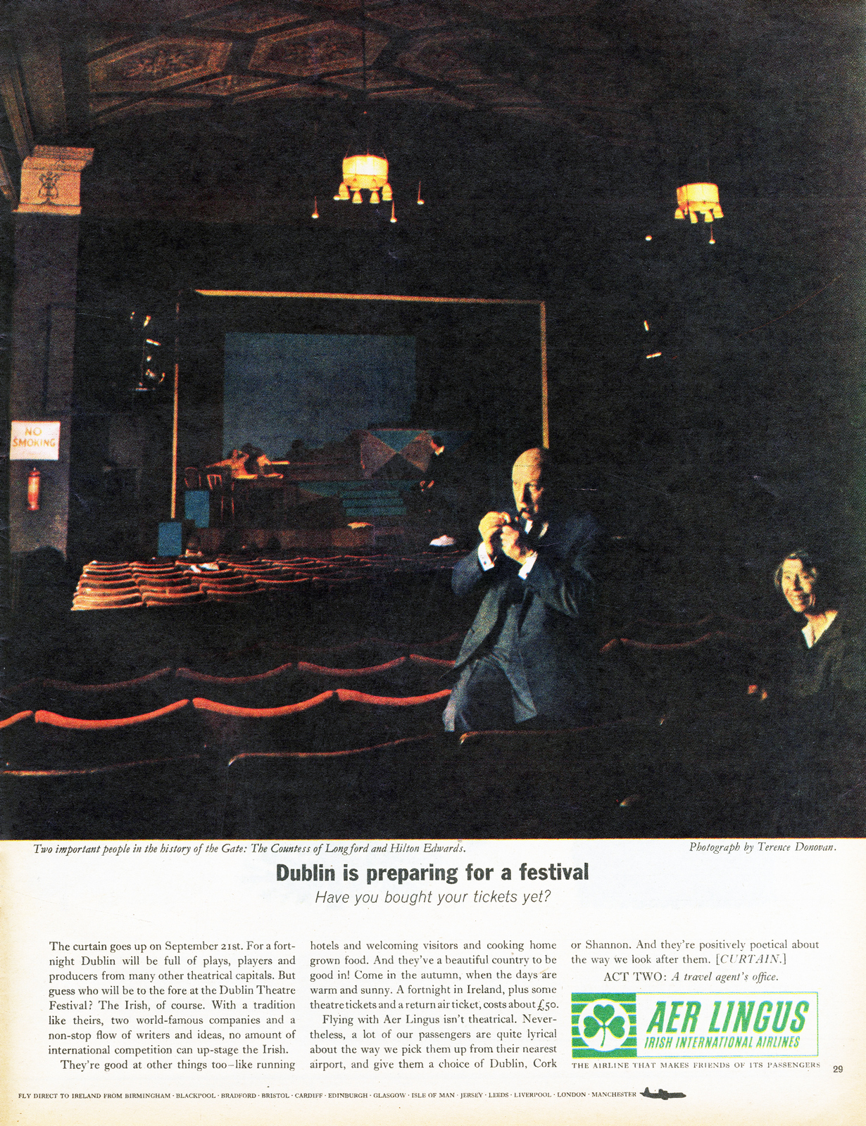
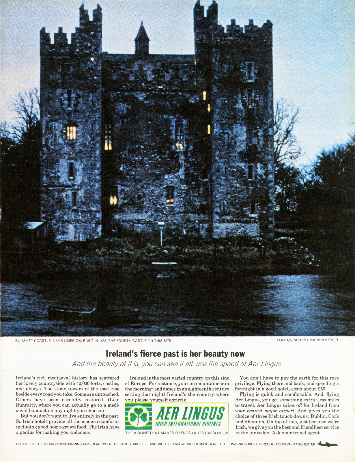
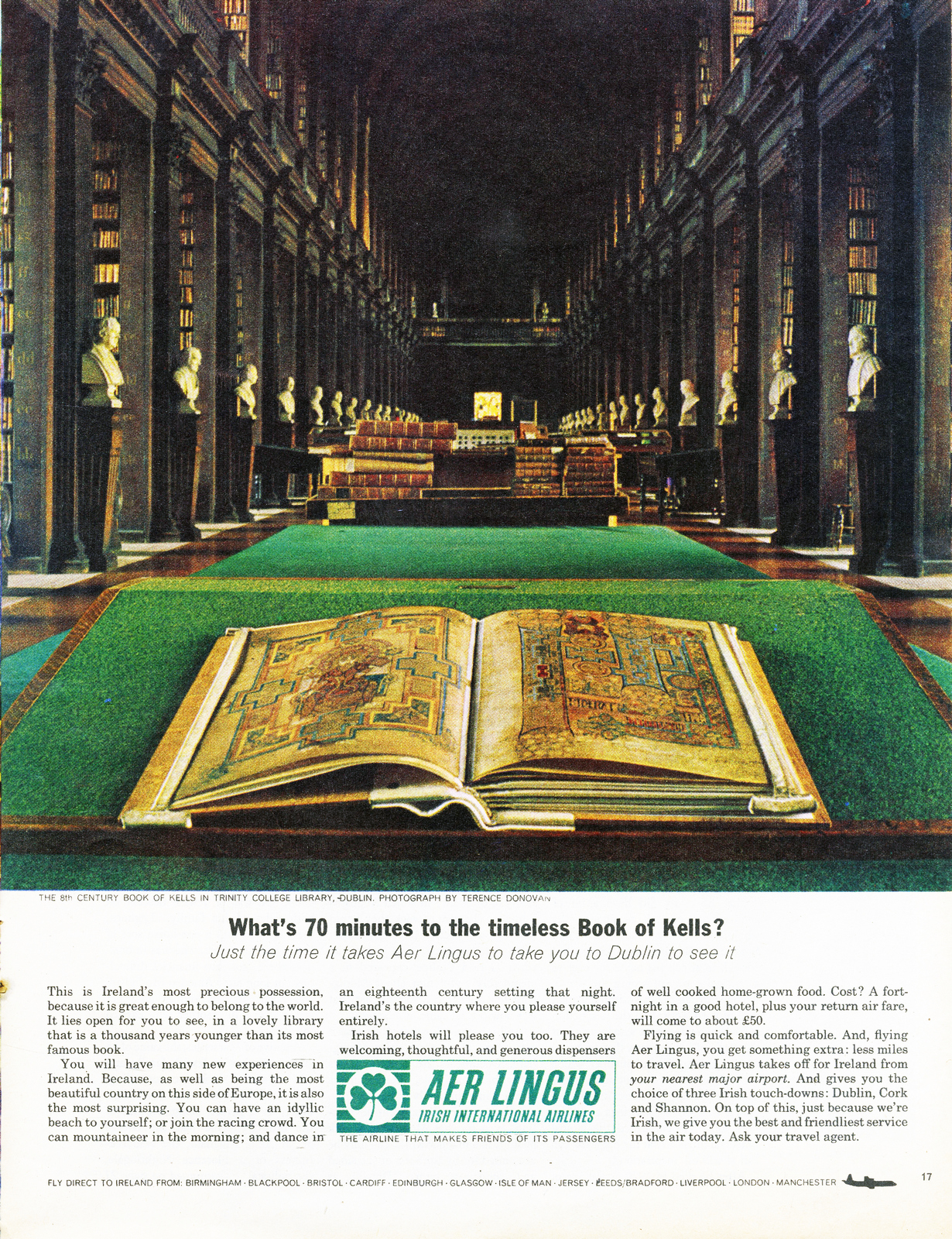
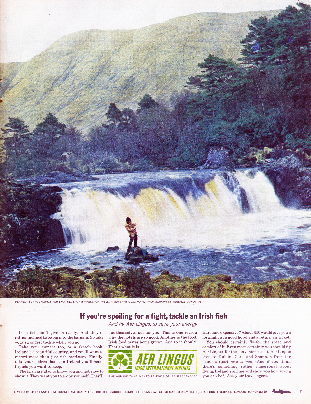
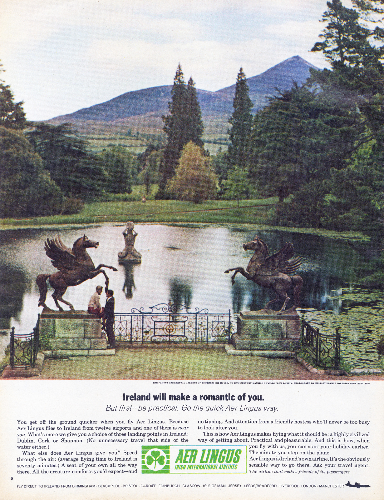
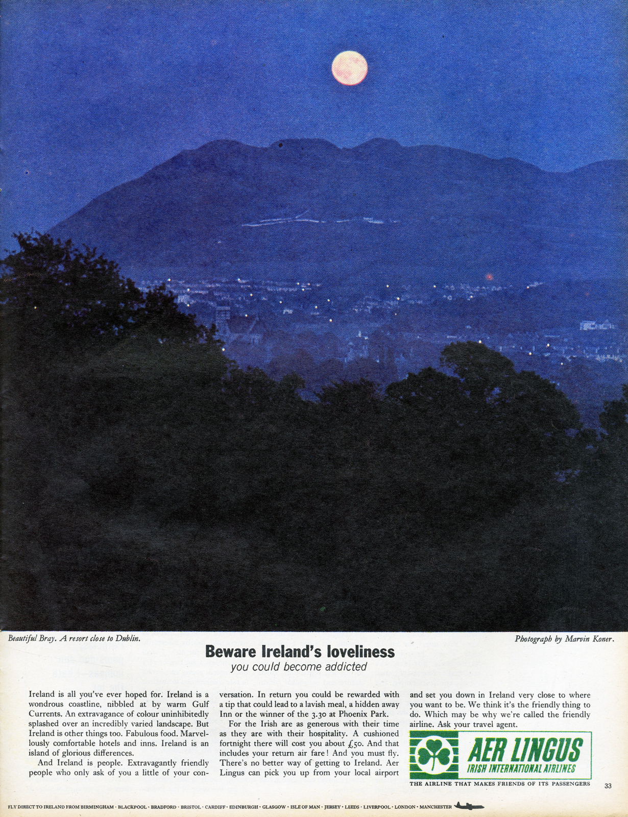
Ronson.
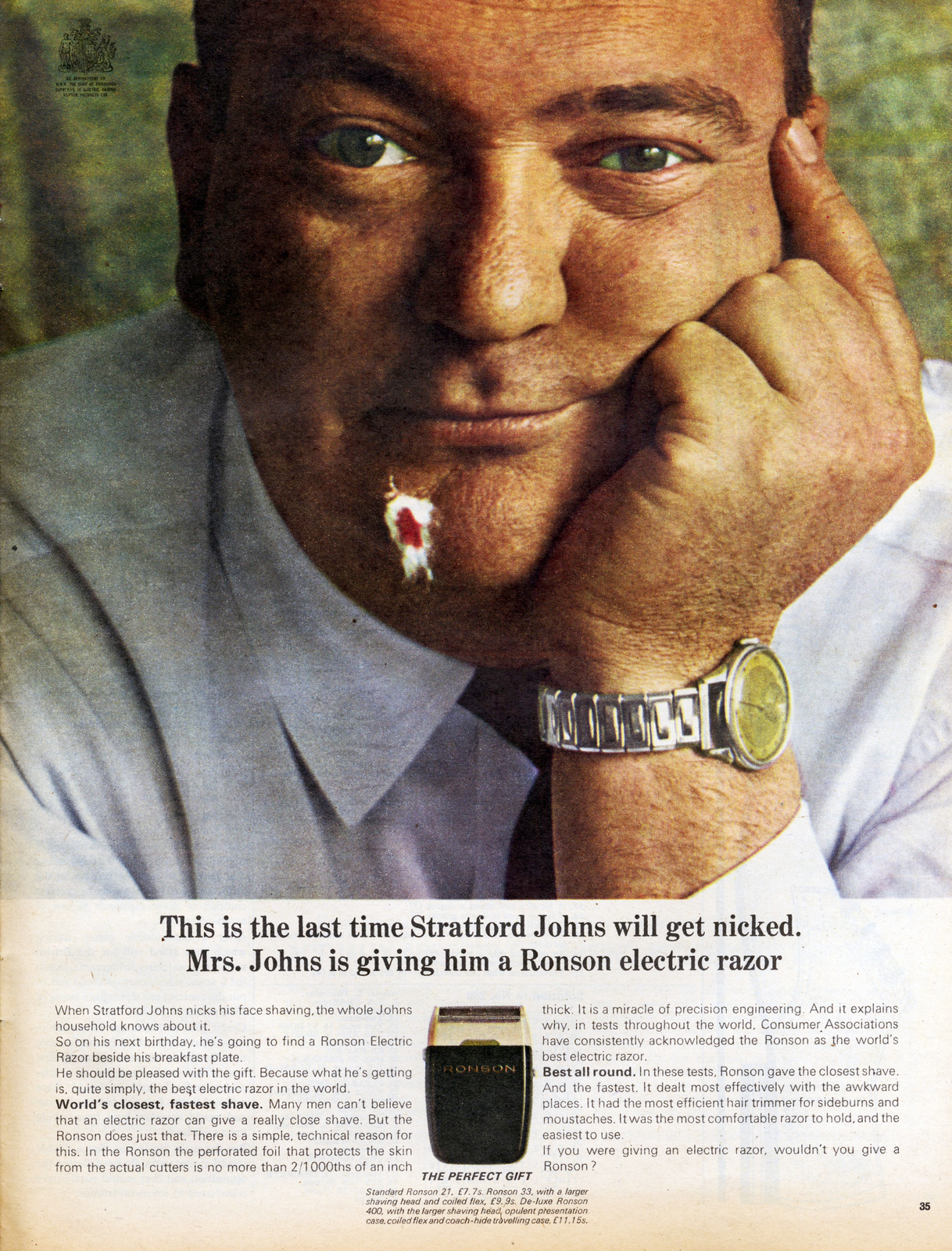
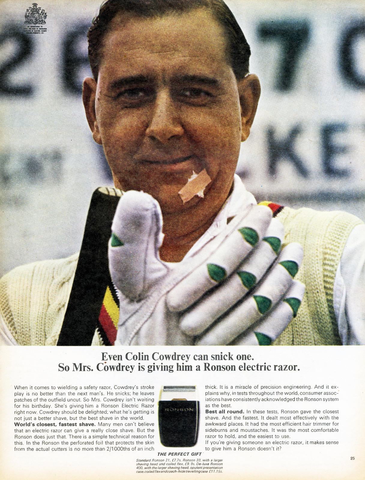
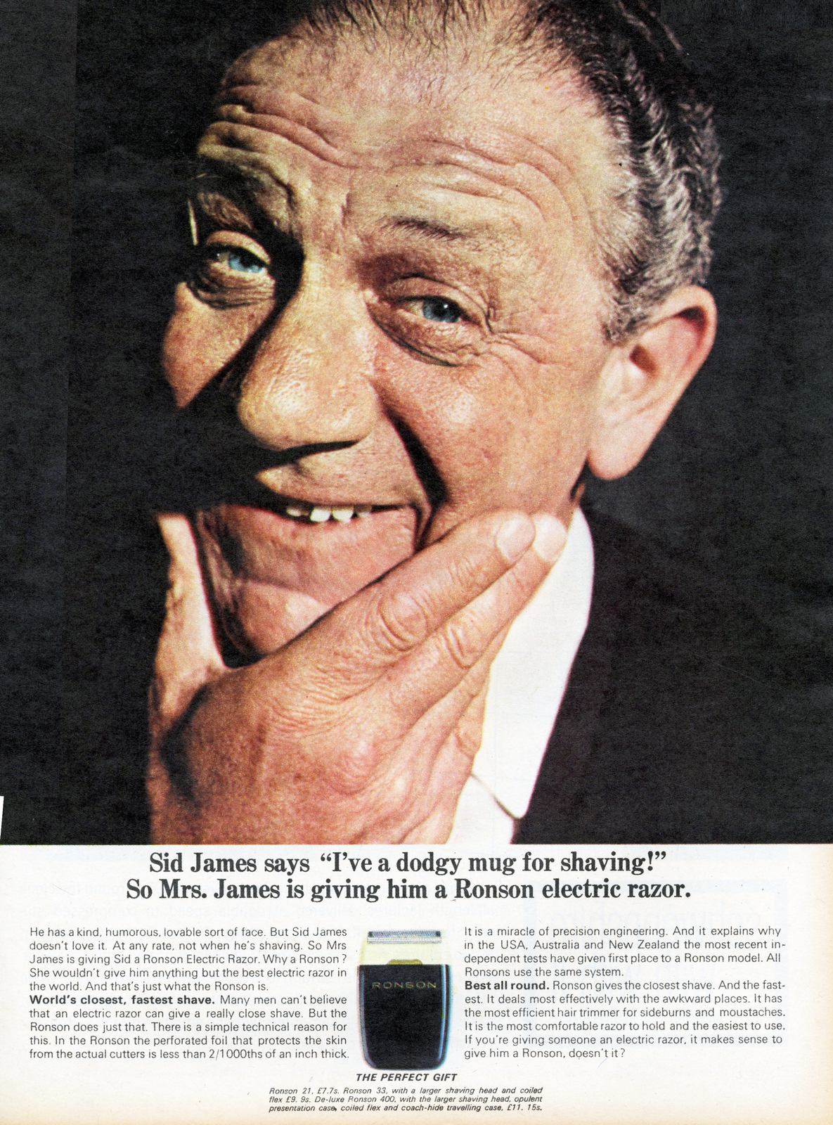
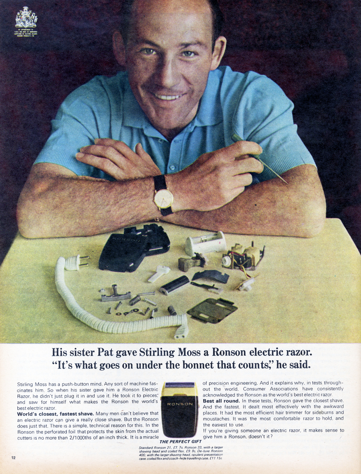
Lady Ronson.
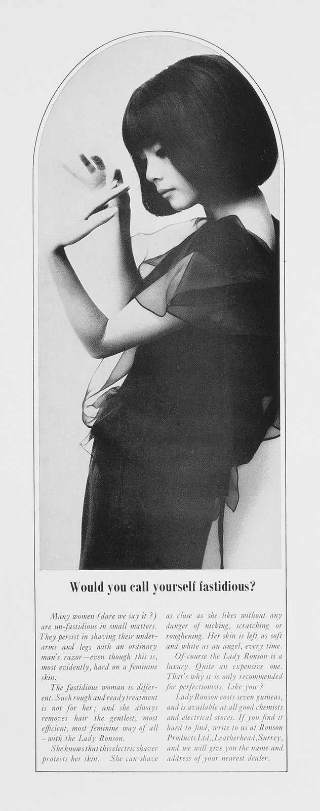
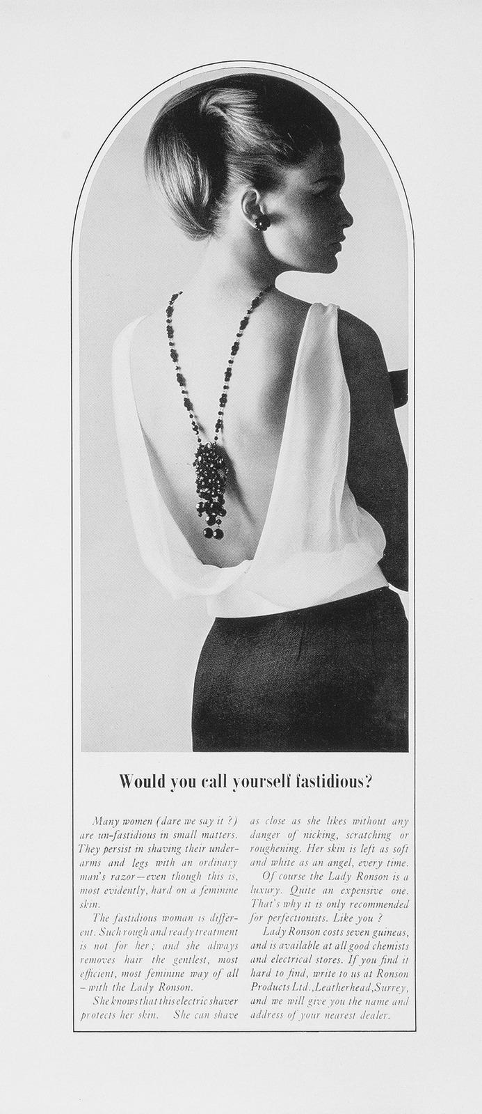
Flu-O-Pep.
Chemstrand.
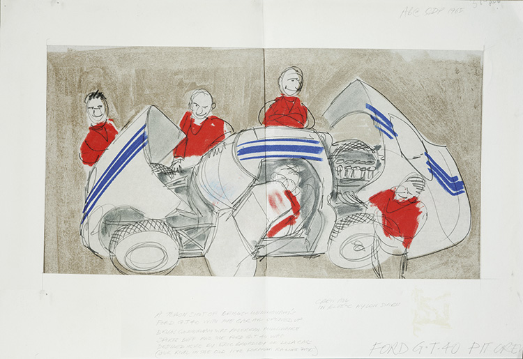
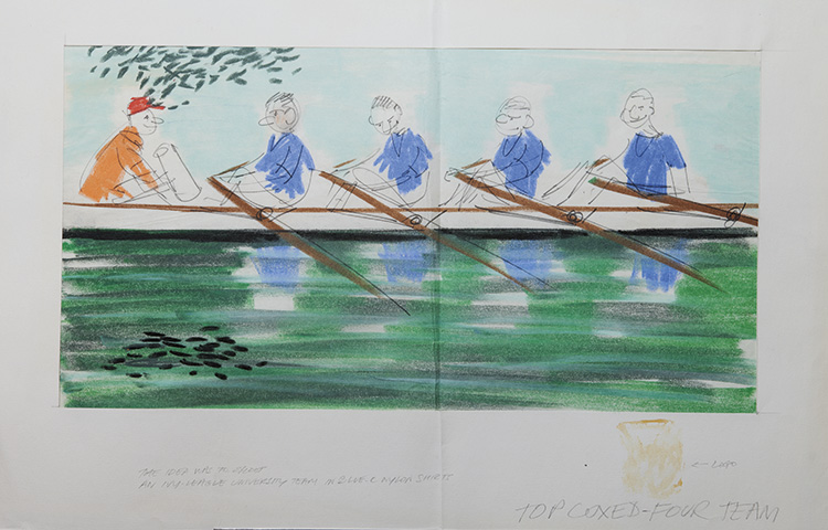
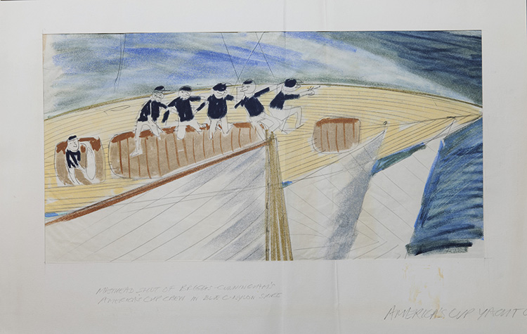
Just one ad ended up being made from that campaign, it featured a car.So Alan, being a car nut, decided to design a car for the shoot.This one.
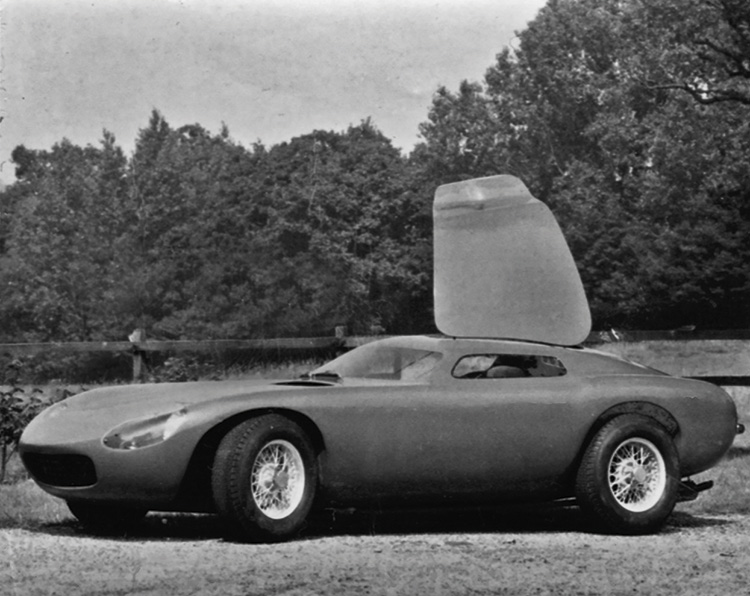
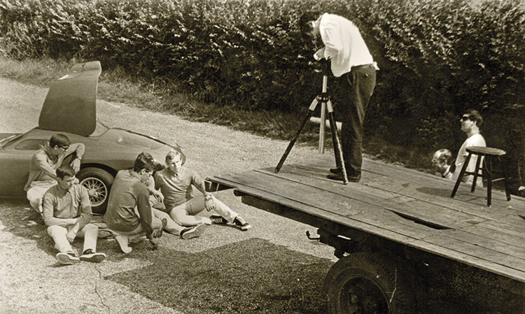
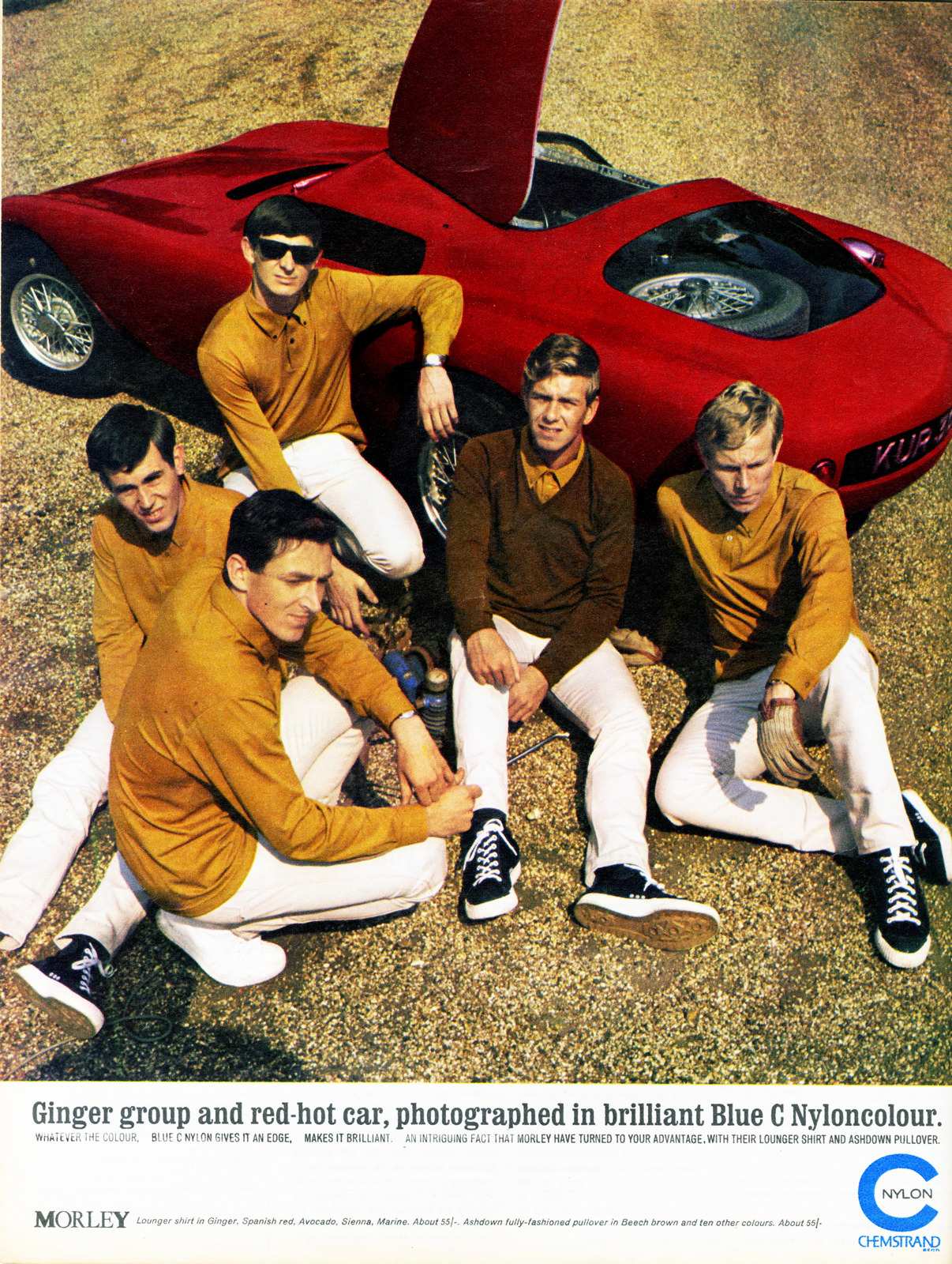
PHOTOGRAPHER.Studio.
ROCOLA SHIRTS - Bridge-Levin.Writer: Dan Levin, Art Director: Brian Bridge. (Shoe guy Manolo Blahnik is the first model, copywriter Andrew Cracknell the second.)
HARROD'S - Papert Koenig Lois.Writer: Tim Delaney, Art Director: Phil Mason.
NOVA - Collett Dickenson Pearce.Writer: Charles Saatchi, Art Director: Ross Cramer.
FORD - Collett Dickerson Pearce.Writer: Dan Levin, Art Director: Brian Bridge.

LEWIS'S - Collett Dickenson Pearce.Writer: Charles Saatchi, Art Director: Ross Cramer.
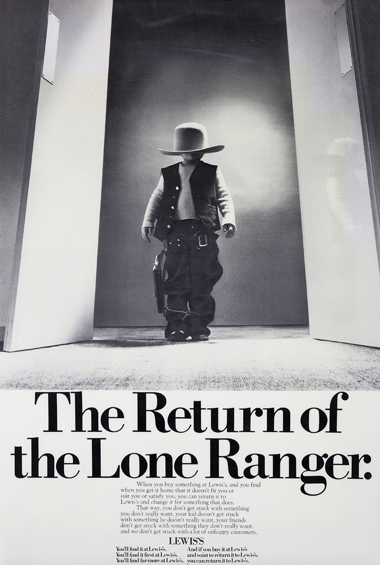
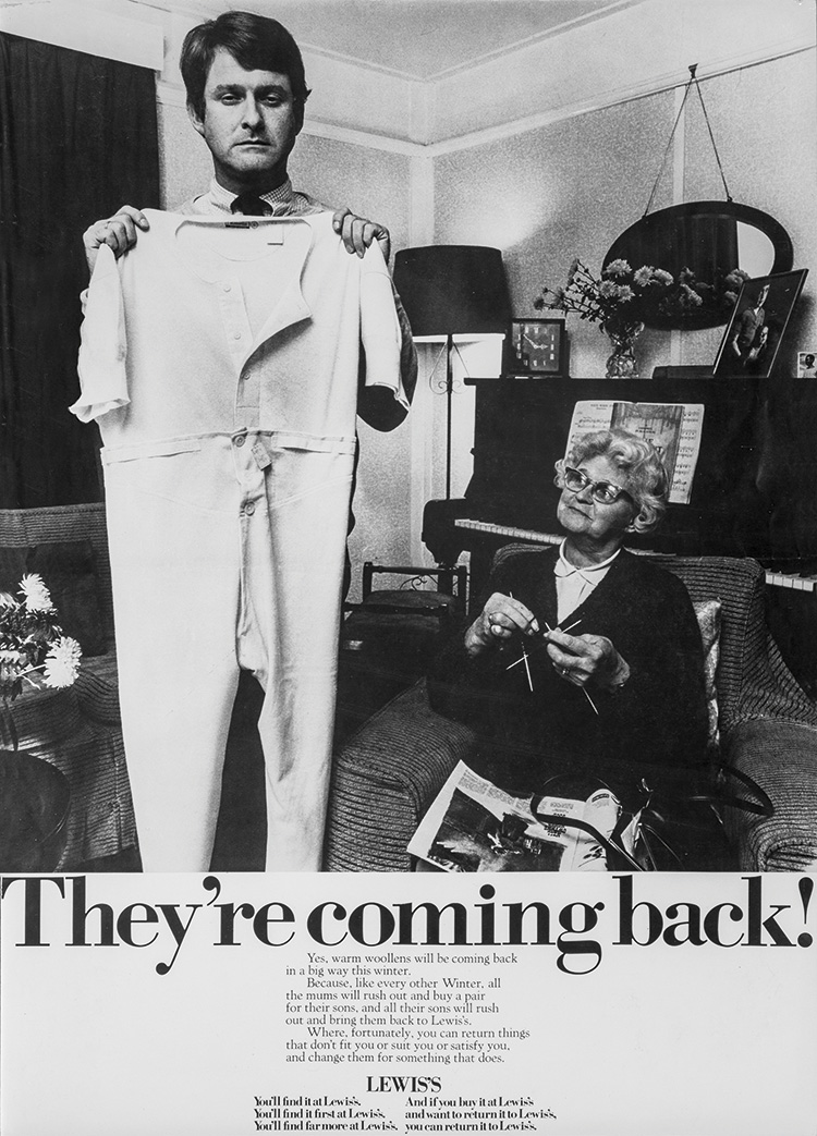
SOMNUS - Cramer Saatchi.Writer: Mike Coughlan, Art Director: John Hegarty.
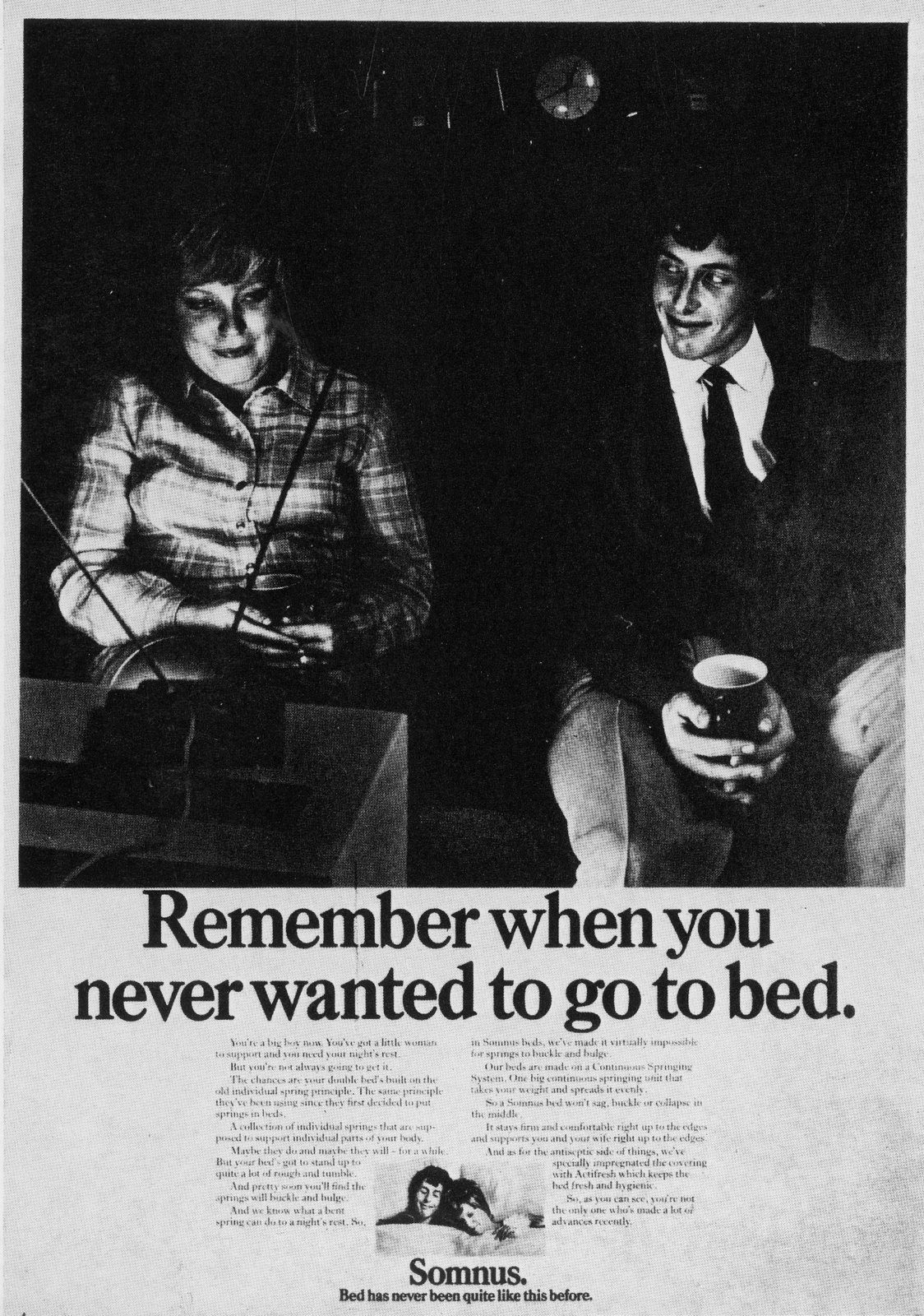
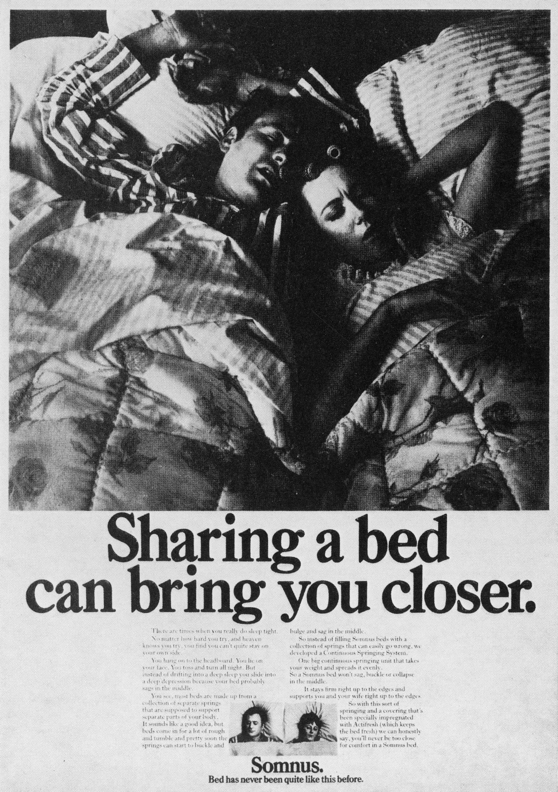
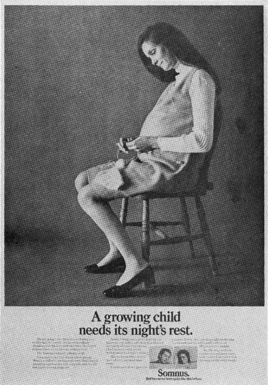
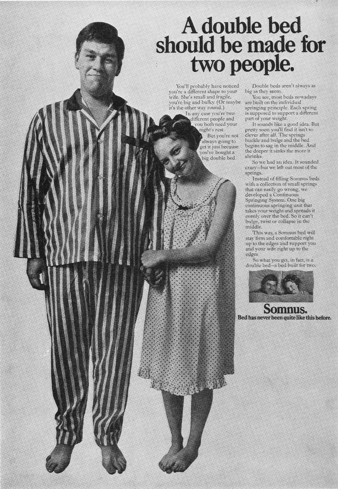
Health Education Council (Cramer Saatchi).'Bleach' Writer: Charles Saatchi & Michael Coughlan. Art Director John Hegarty.
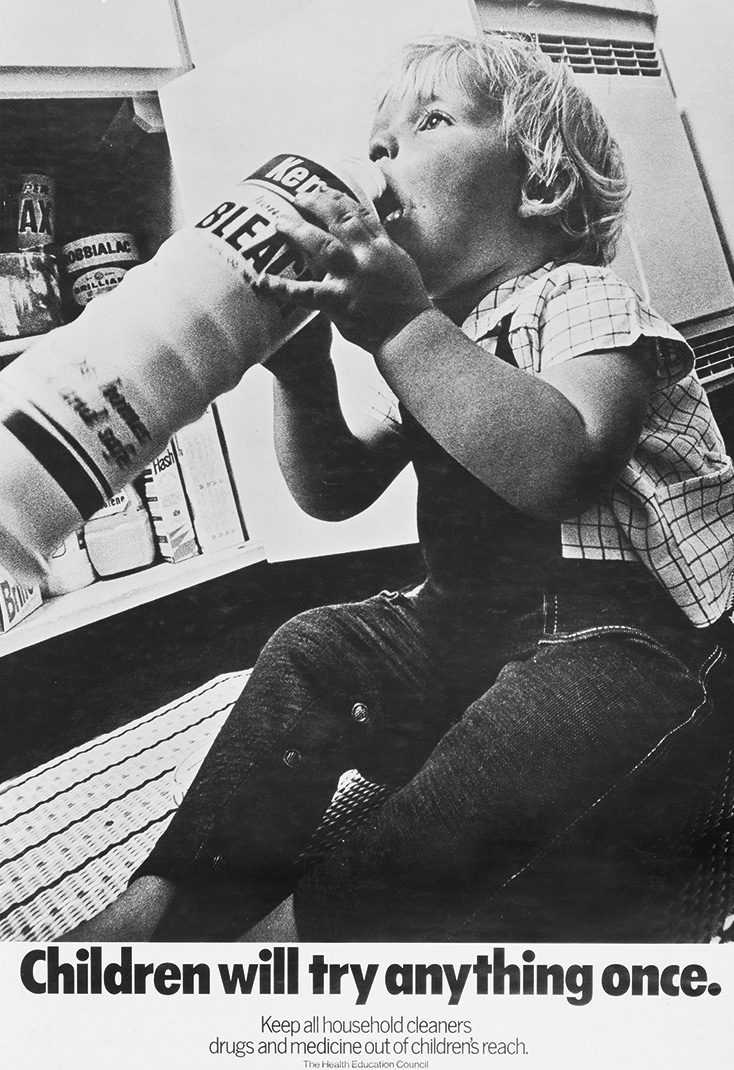
'The Pregnant Man' - Writer: Jeremy Sinclair, Art Director: Bill Atherton.
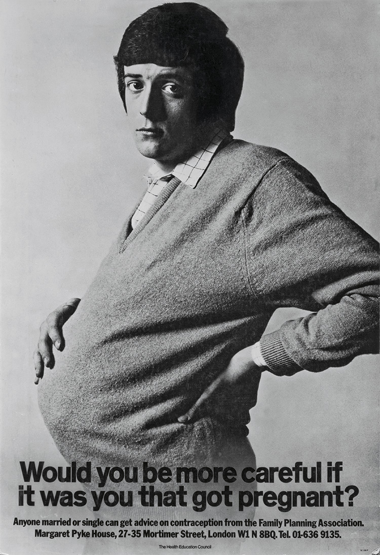
Casting.
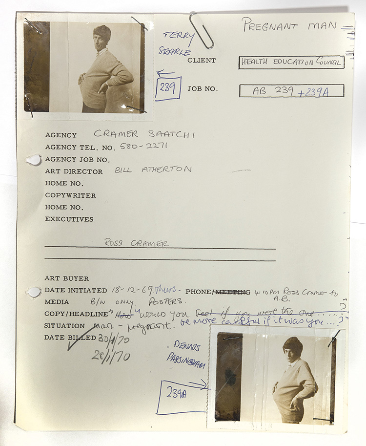
Shoot day.
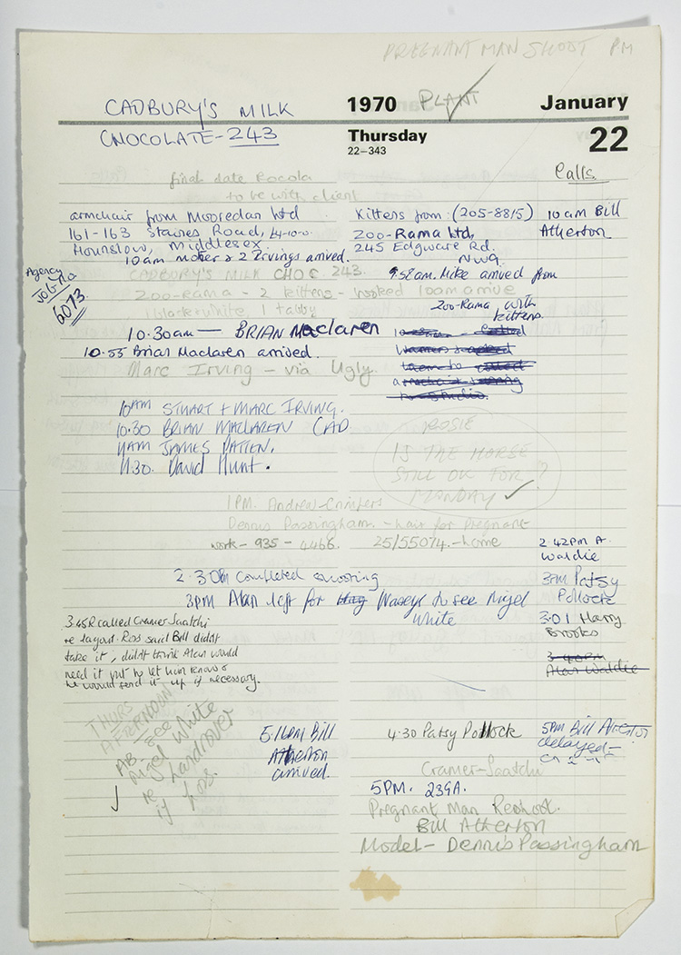
Outtakes.
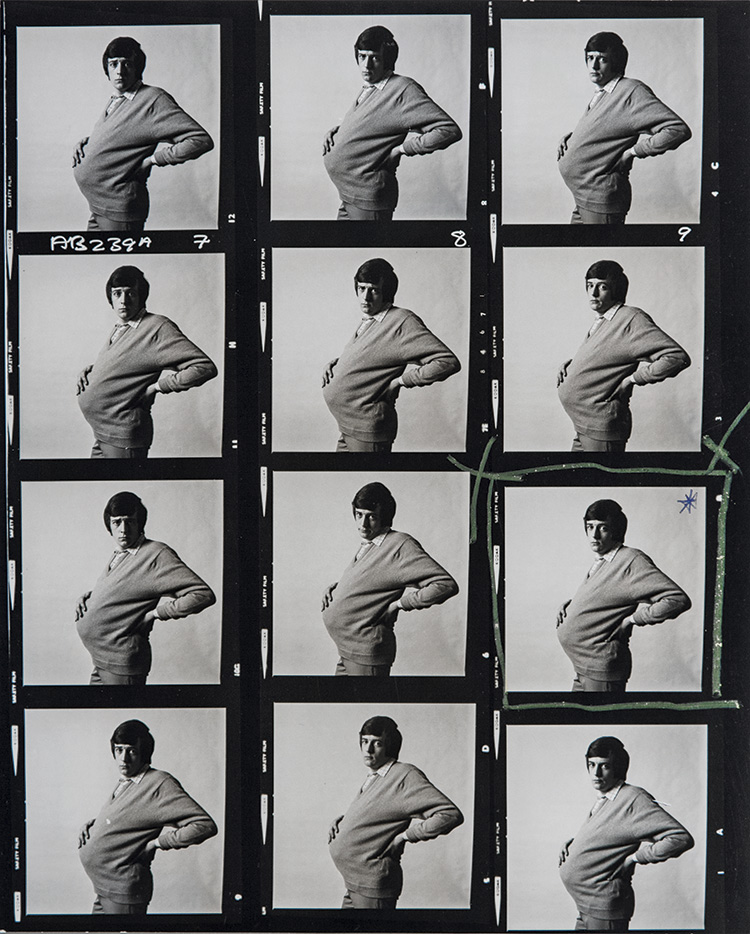
The bill.
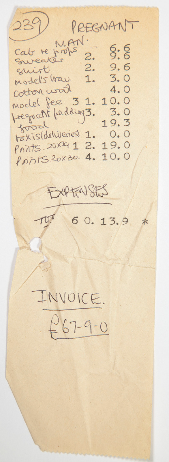
First bits of P.R.

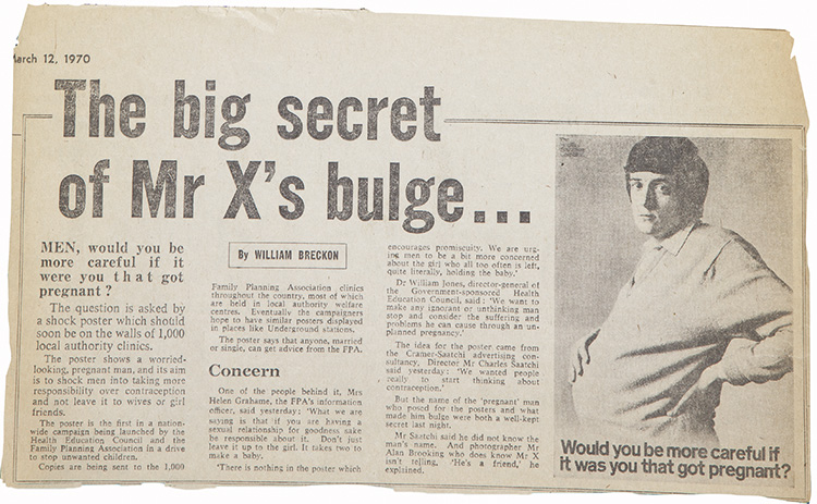
HEADLINERS - Bridge-Levin.Writer: Dan Levin, Art Director: Brian Bridge.
RANGE ROVER - Pritchard Wood.Writer: Dan Levin, Art Director: Brian Bridge.
Aer Lingus - CDP.'Tipperary' - Writer: Lindsay Dale, Art Director: Alan Waldie.
BOAC- FCB.Writer: Tim Mellors, Art Director: Martin Reaveley.
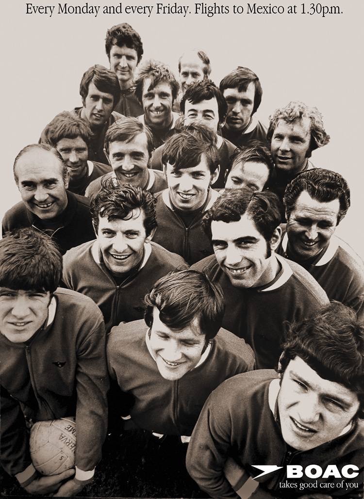
BRITISH LEYLAND - Saatchi & Saatchi.Writer: Chris Martin, Art Director: John Hegarty.

DUNN & Co. - Collett Dickenson Pearce.Writer: Terry Lovelock, Art Director: Dickie Dearing.
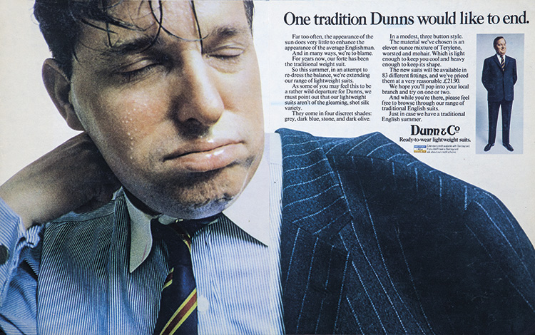
SCHICK - Saatchi & Saatchi.Writer: Chris Martin, Art Director: John Hegarty.
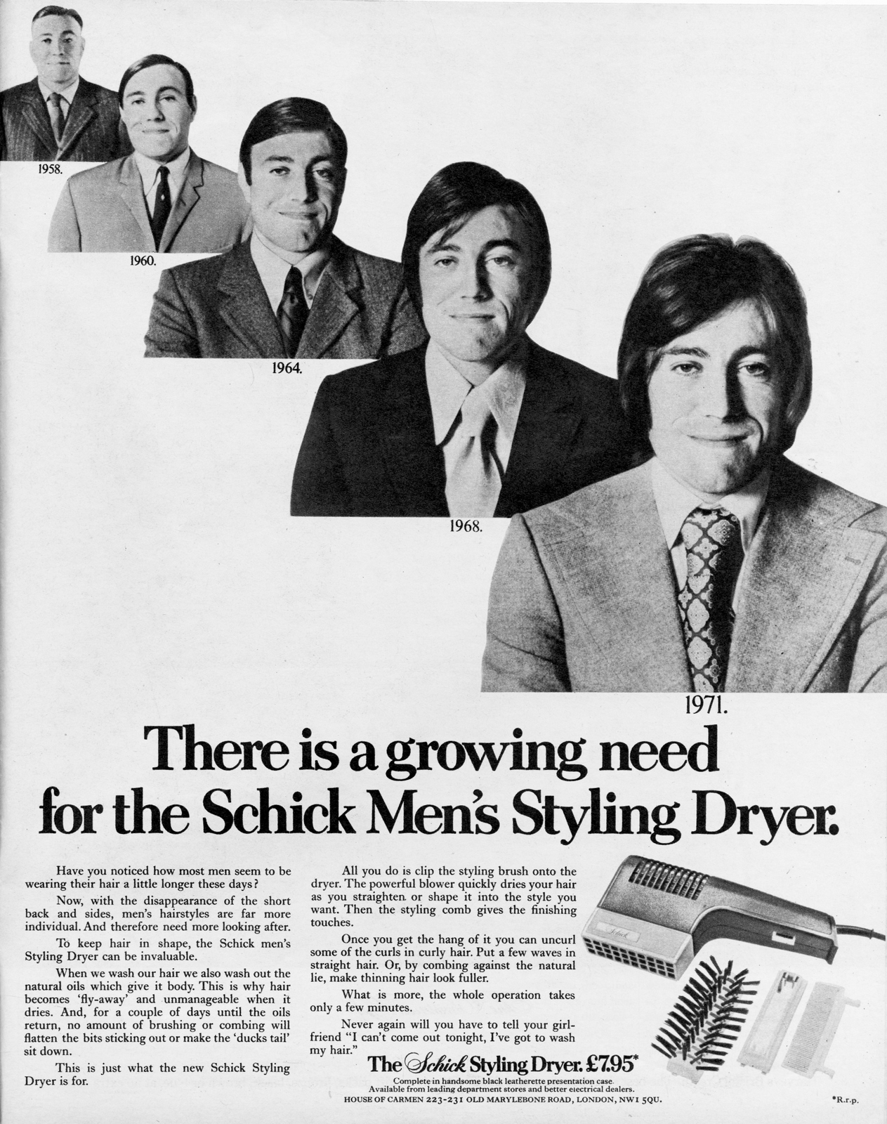
P&O - DPBS.Writer: (Unknown), Art Director: Bob Nisbet
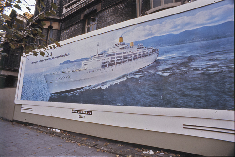
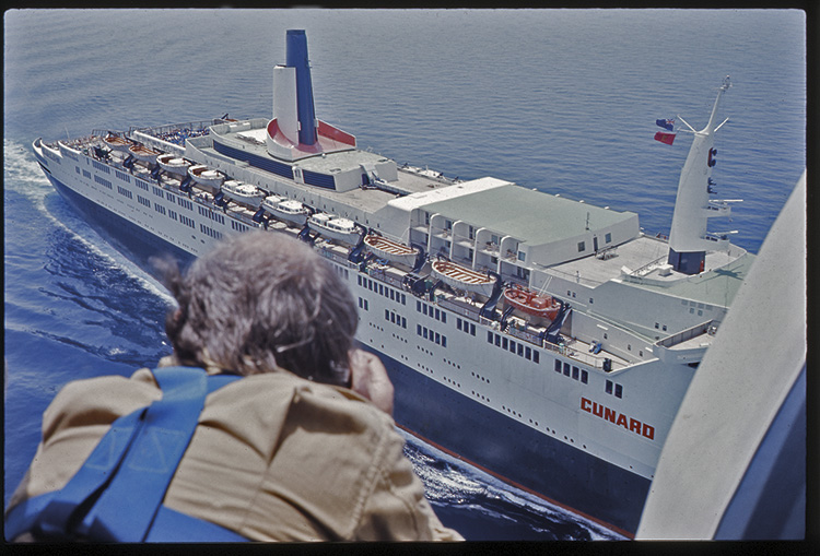
ALAN BROOKING - Bridge-Levin.Writer: Dan Levin, Art Director: Brian Bridge.
PIRELLI - Collett Dickenson Pearce.Writer: , Art Director: Bob Isherwood.
UNIROYAL - DDB Paris.Writer: (Unknown), Art Director: Alain Mounier.
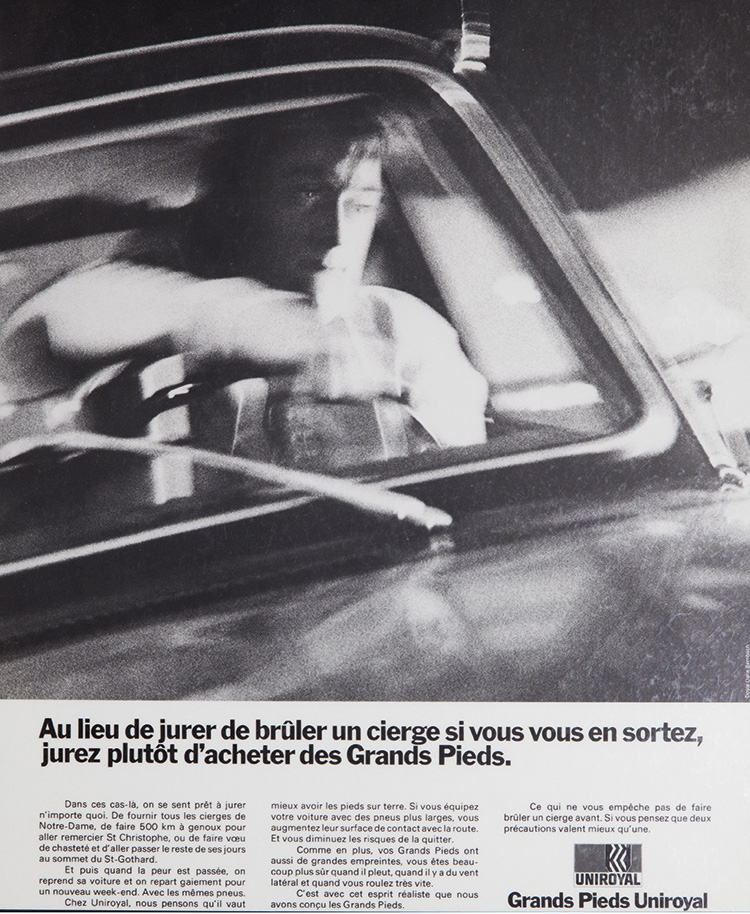
ARMY - Collett Dickenson Pearce.Writer: John Salmon, Art Director: Arthur Parsons.
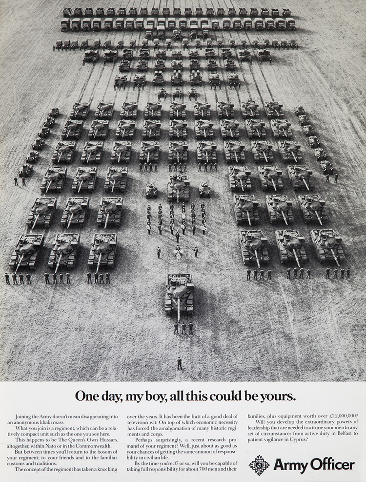
There's something very pleasing about that ad; the photo.In particular, it's order, but it was a reshoot, the first shot was this.
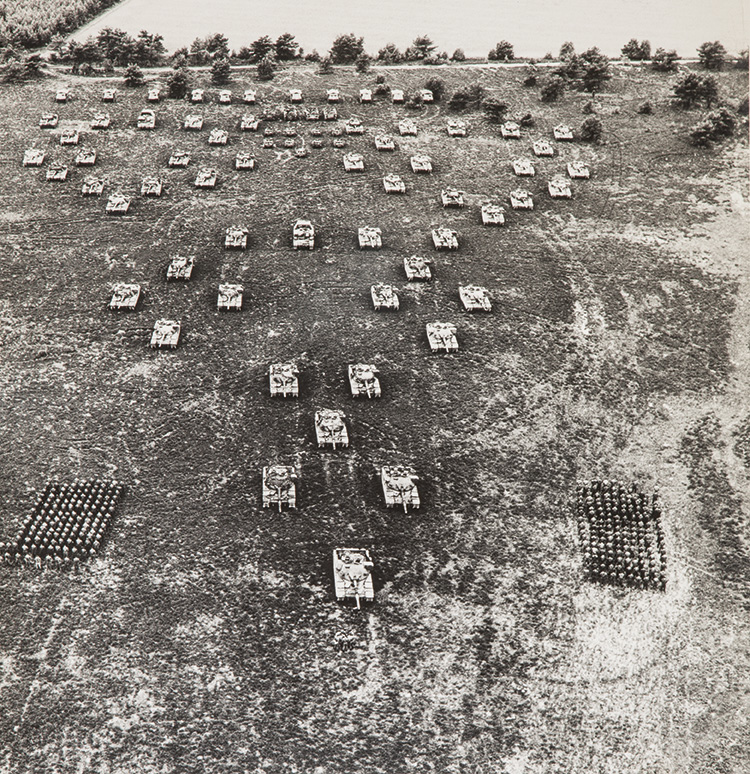
A year later, Alan got a chance to reshoot it.So he bought all the vehicles as Dinky toys and plotted it out in minature.
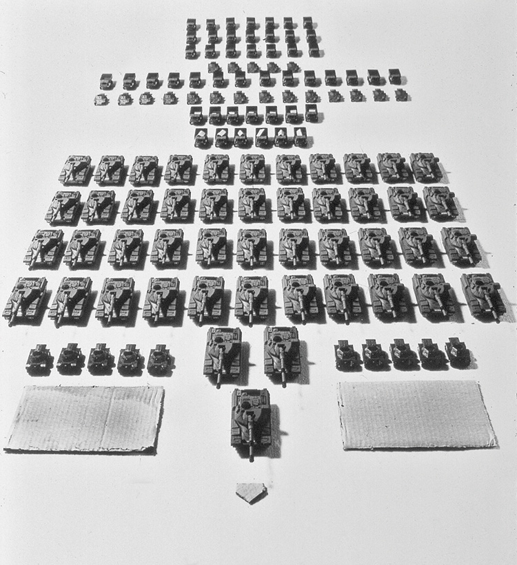
Scaled up the measurements then reshot it.
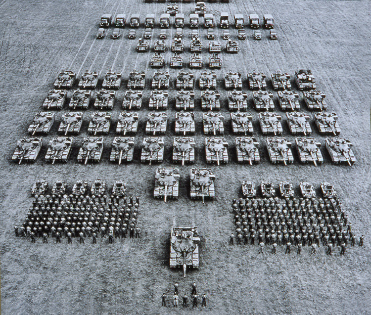
TEXACO - Collett Dickenson Pearce.Writer & Art Director: Rion Collins.
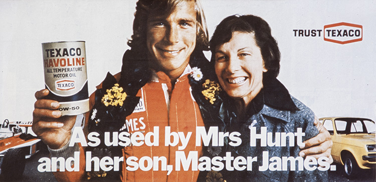
(The assistant stand in for the lighting tests.
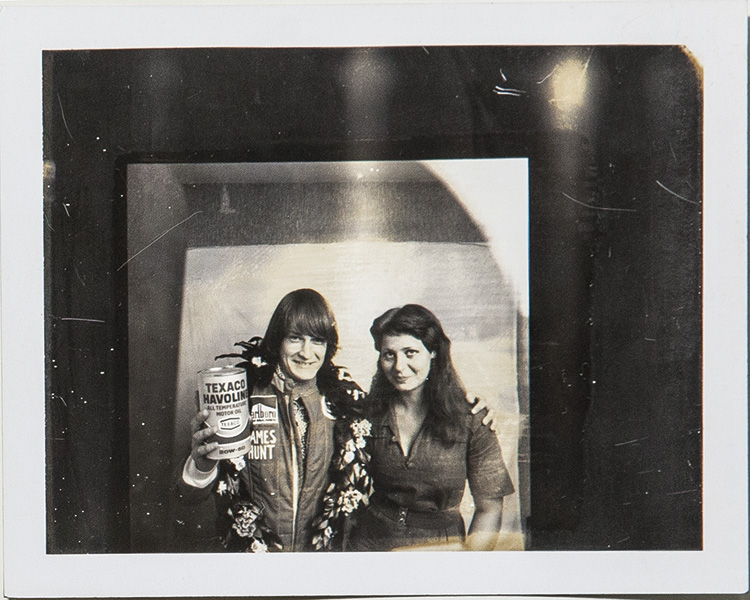
(They are then replaced by James and his mum.)
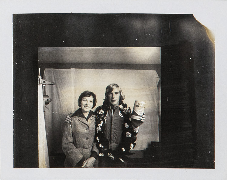
ROYAL NAVY - KMP.Writer: Alan Tilby, Art Director: Jonathan Hall.
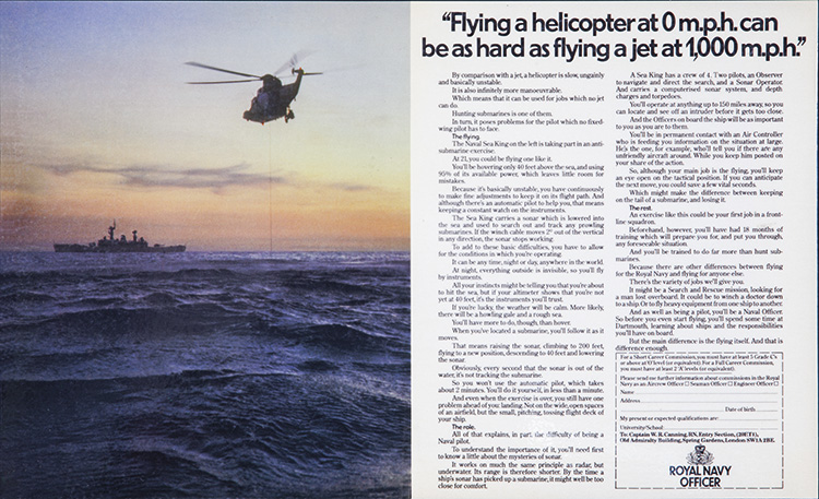
THE METROPOLITAN POLICE - Collett Dickenson Pearce.Writer: John Kelley, Art Director: John O'Driscoll.
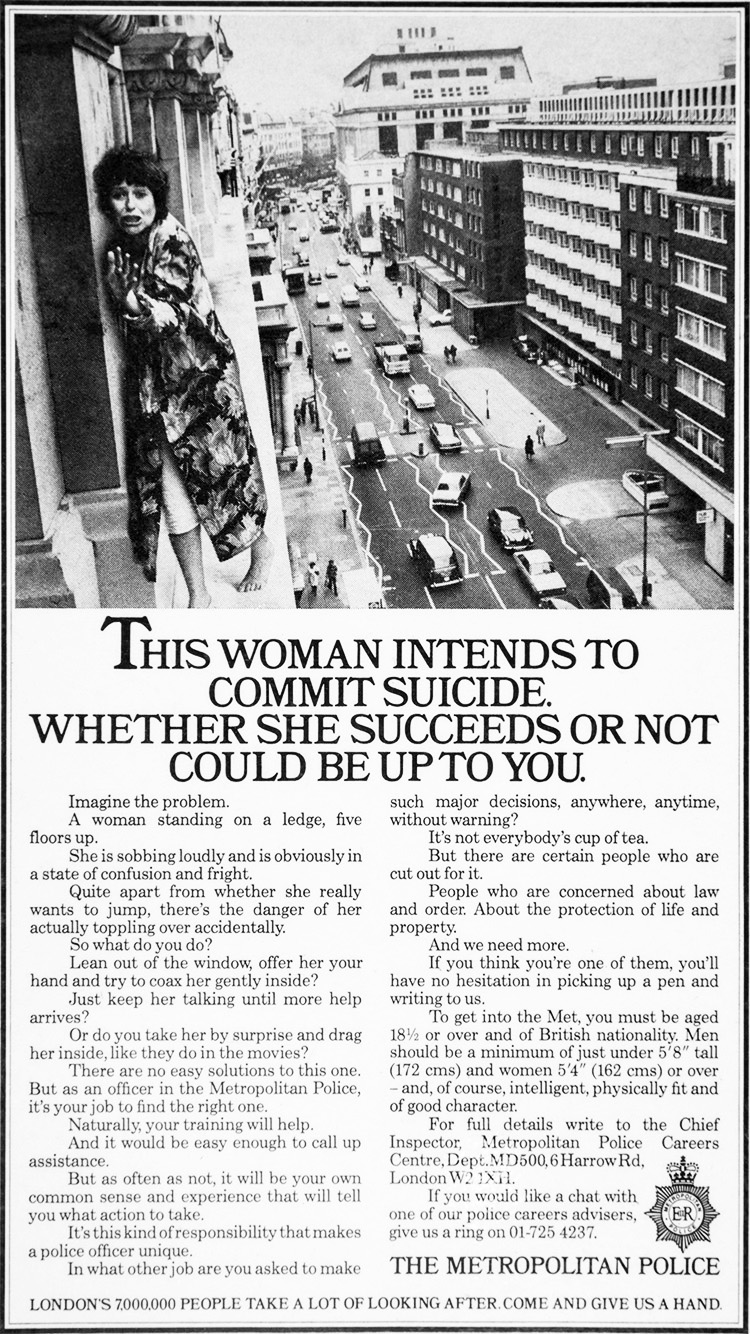
FIAT - Collett Dickenson Pearce.'Wolf' - Writer: Tony Brignull, Art Director: Neil Godfrey.
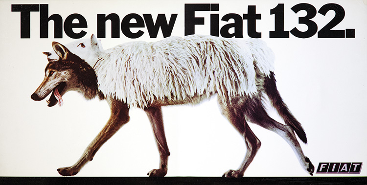
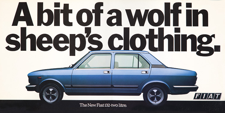
'Grrrr!' - Writer: John Kelley, Art Director: John O'Driscoll.
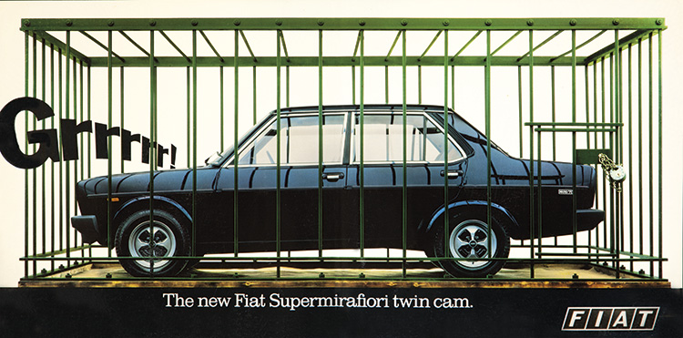
'Italians' - Writer: Tony Brignull, Art Director: Neil Godfrey.
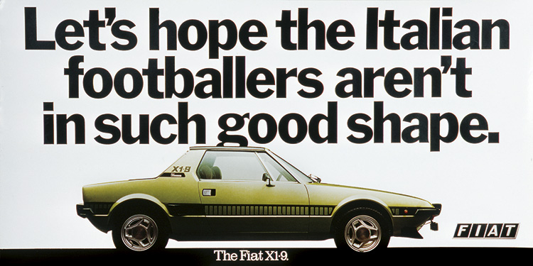
BMW - Wight Collins Rutherford Scott.Writer: Robin Wight, Art Director: Ron Collins.
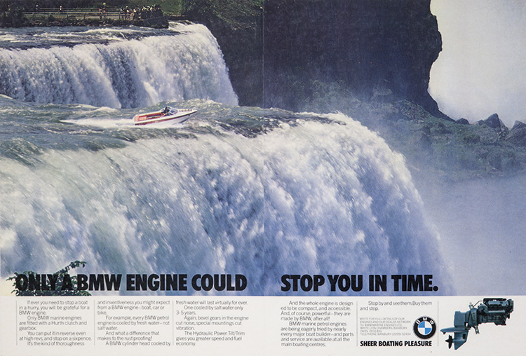
BENSON & HEDGES - Collett Dickenson Pearce.Writer: Alfredo Marcantonio, Art Director: Dave Horry.
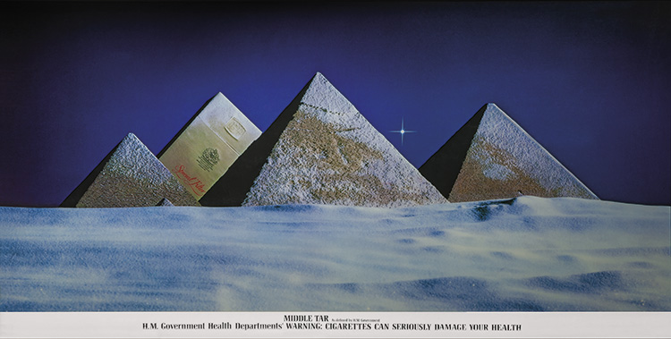
The model. (Guy Hodgkinson.)

The studio.
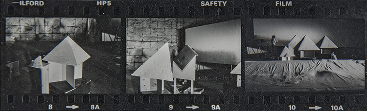
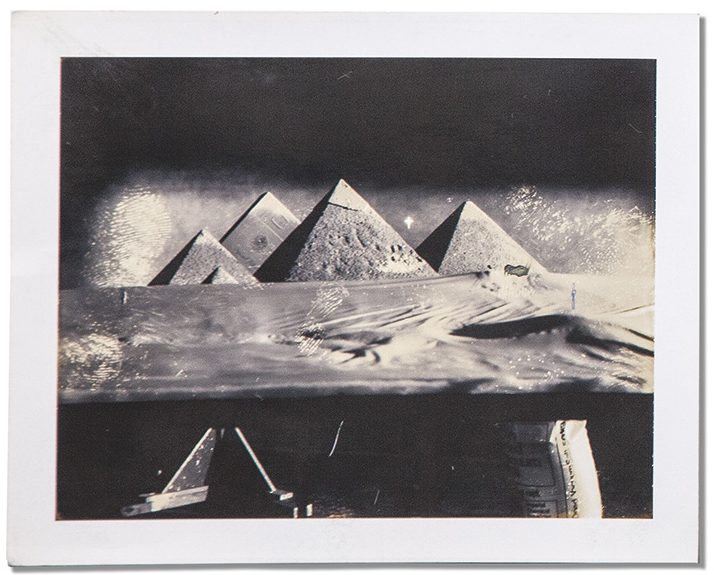
Before photoshop, yep, there was a time before Photoshop, photographers would often have to capture the image on one sheet of film.Like this.
HONDA - Needham Harper Steers.Writer: (Unknown), Art Director: Paul Walter.
To get this lighting on the car required an enormous studio, (Alan talks about it on the podcast).
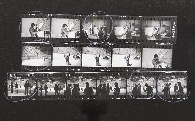
LONG JOHN WHISKY - Abbott Mead Vickers.Writer: John Kelley, Art Director: John O'Driscoll.
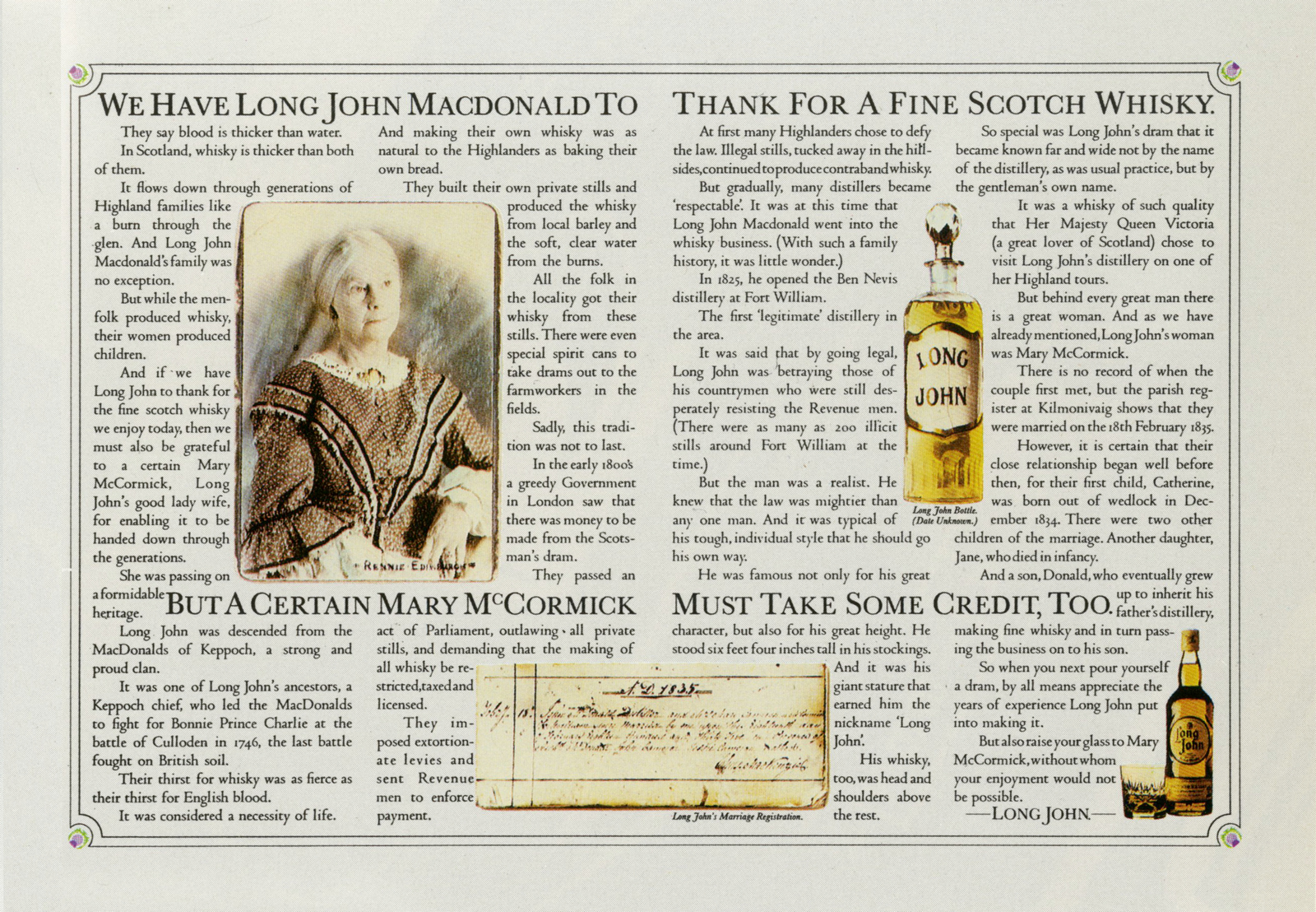
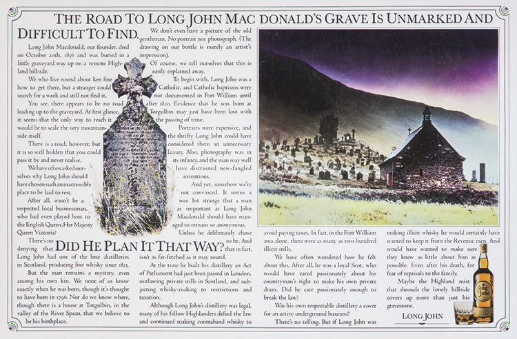
BIRDS EYE - Collett Dickenson Pearce.Writer: Tony Brignull, Art Director: Neil Godfrey.
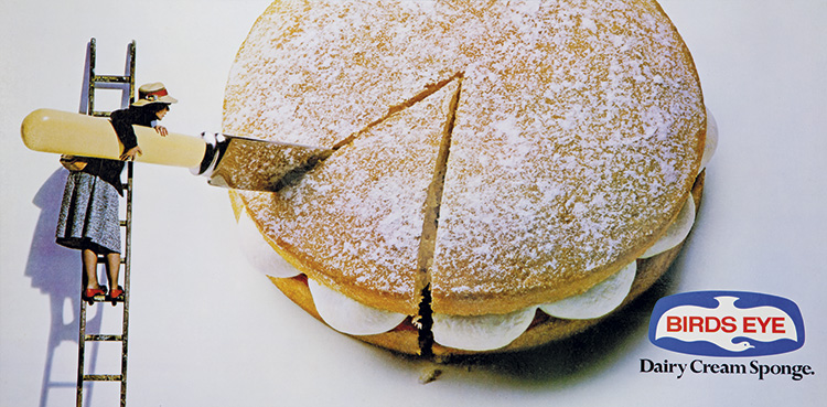
LEVI'S - Bartle Bogle Hegarty.Writer: Barbara Nokes, Art Director: John Hegarty.
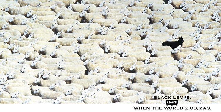
The creators check out the finished result. They look pleased.
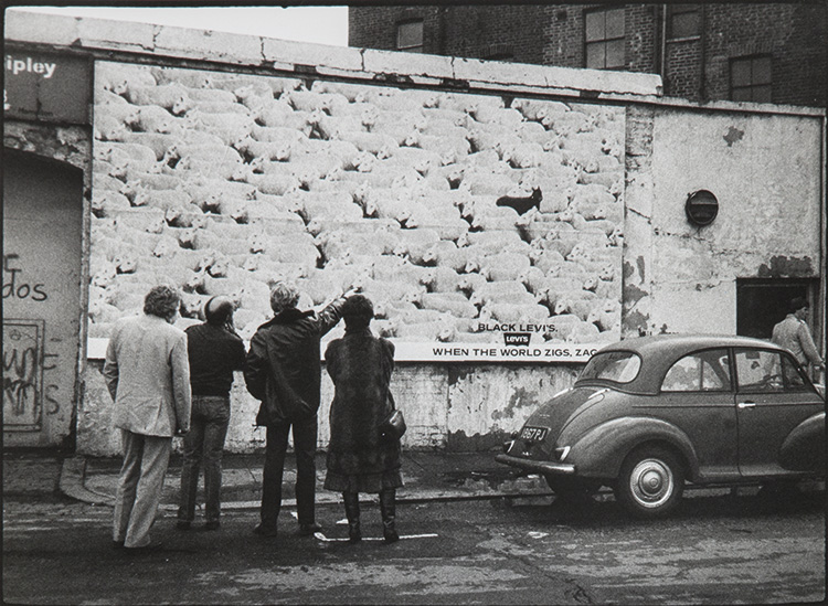
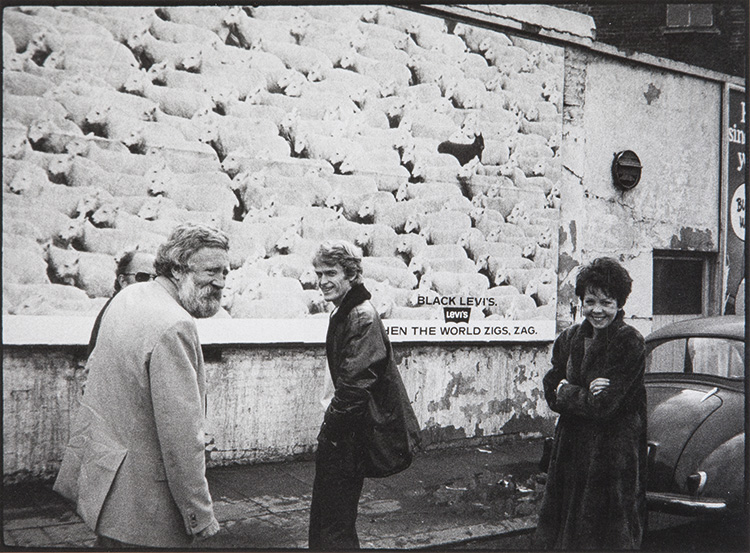
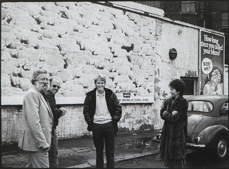
LAND ROVER - Collett Dickenson Pearce.Writer: Lynda McDonnell, Art Director: Nigel Rose.
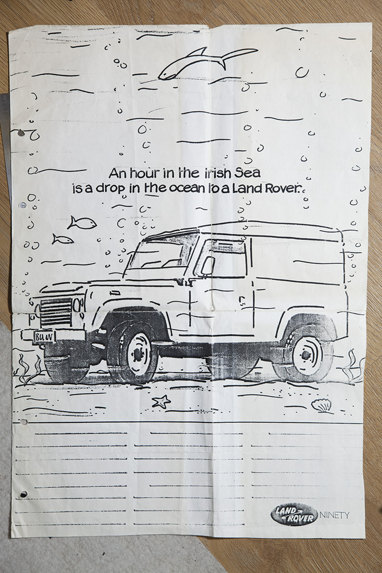
After seeing the layout Alan decided to shoot it in the studio. (Not an obvious choice.)
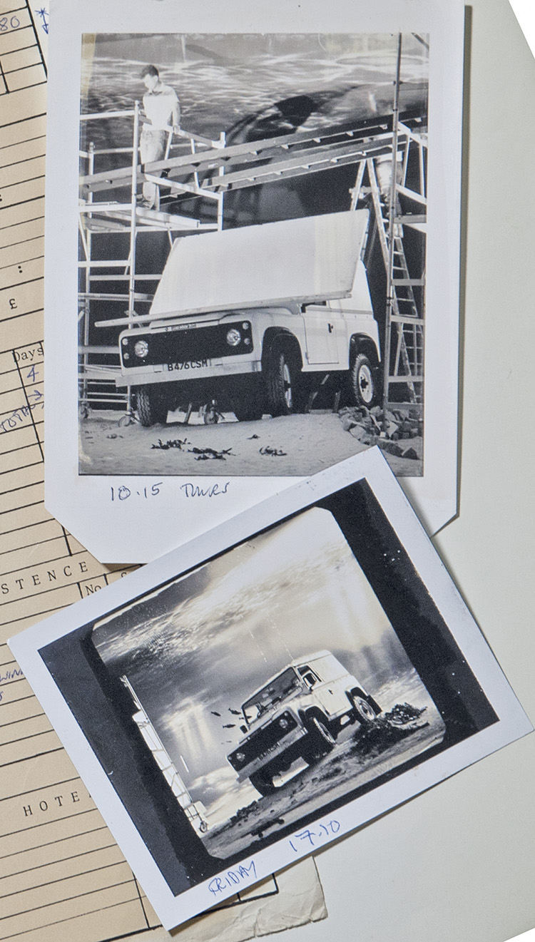
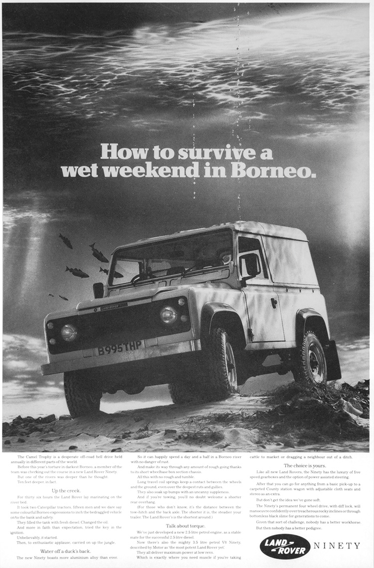
CITROEN - Colman & Partners.Writer: Malcolm Duffy, Art Director: Paul Briginshaw.
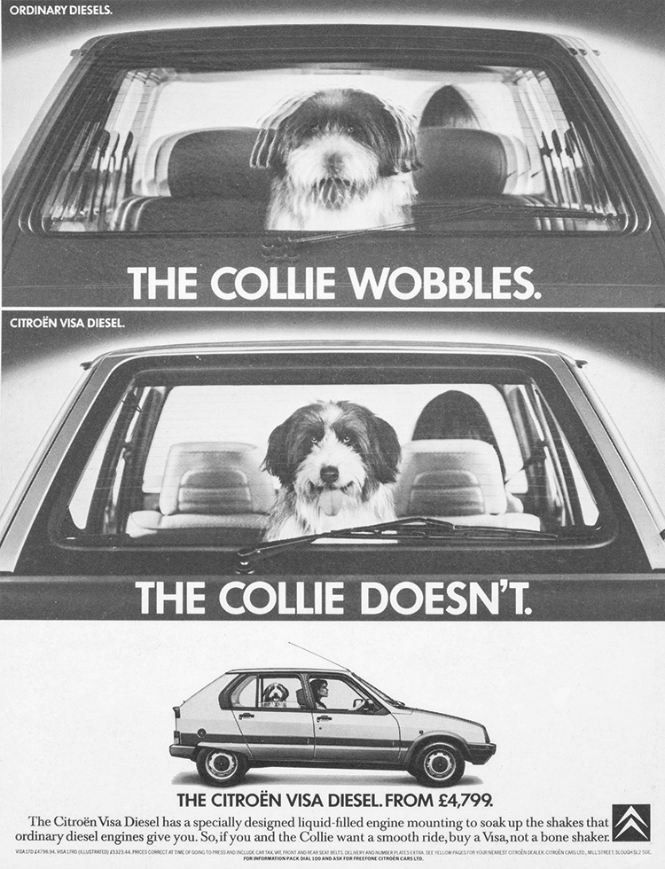
TETLEY'S BITTER - Leagas Delaney.Writer: (Unknown), Art Director: Anthony Stileman.
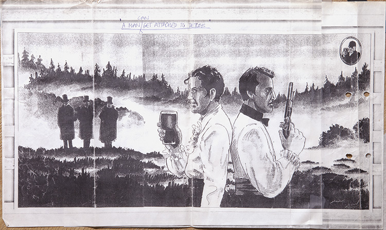
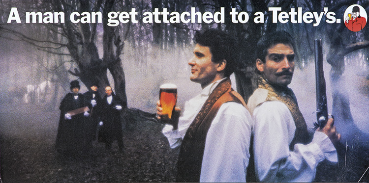
Alan has a book out:
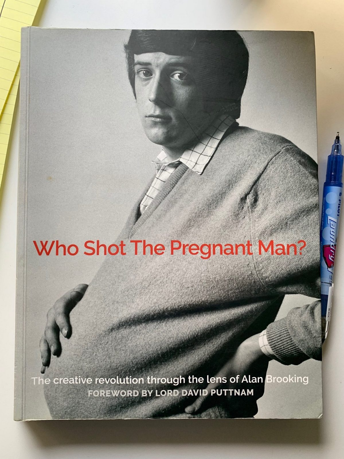
It's available at Amazon.co.uk and here:https://www.ypdbooks.com/792_alan-brookinghttps://www.ypdbooks.com/792_alan-brooking