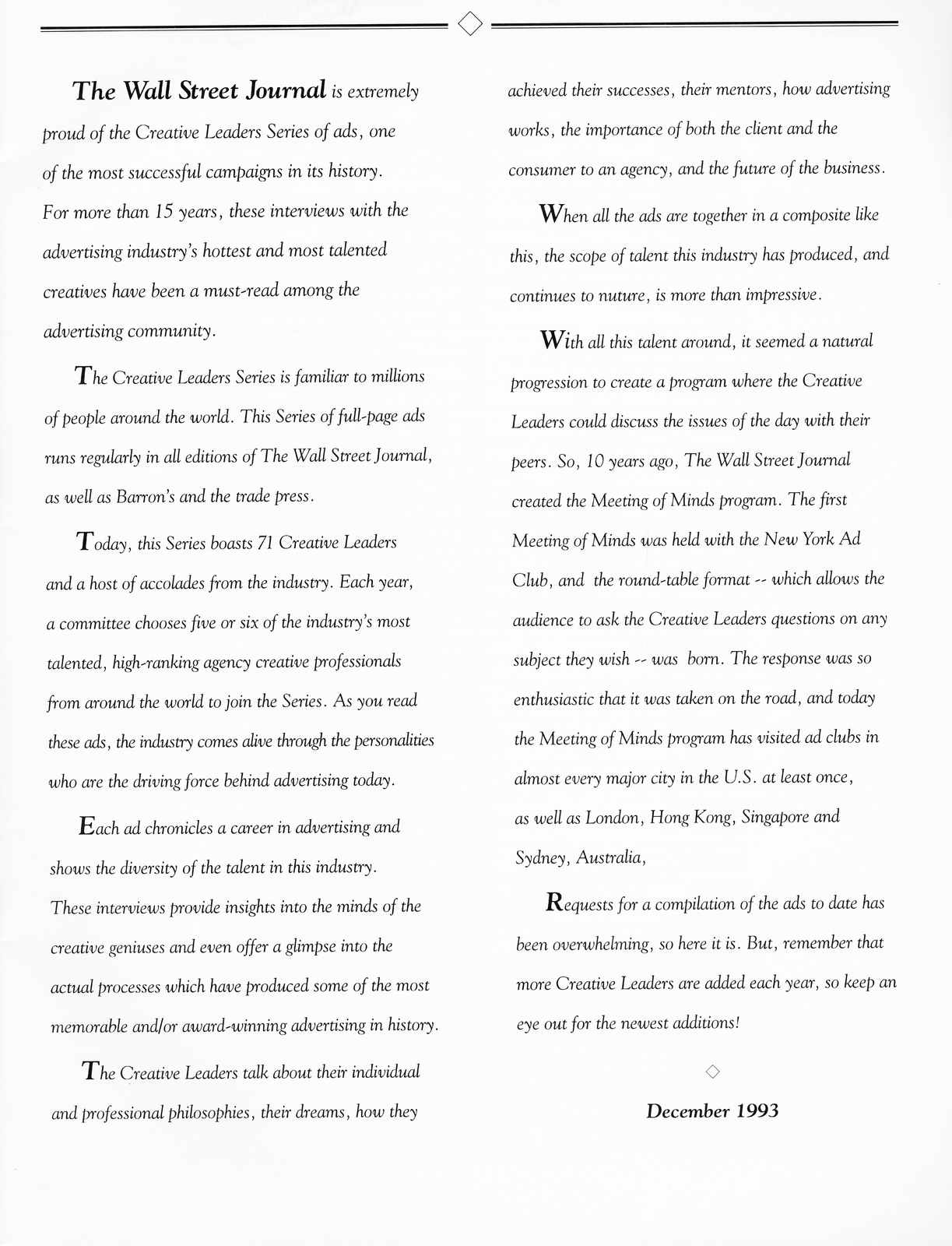
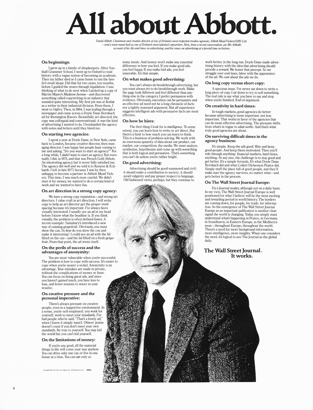
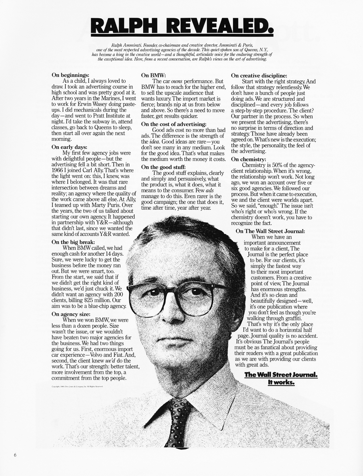
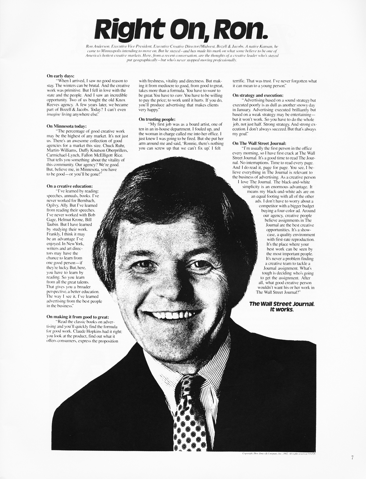
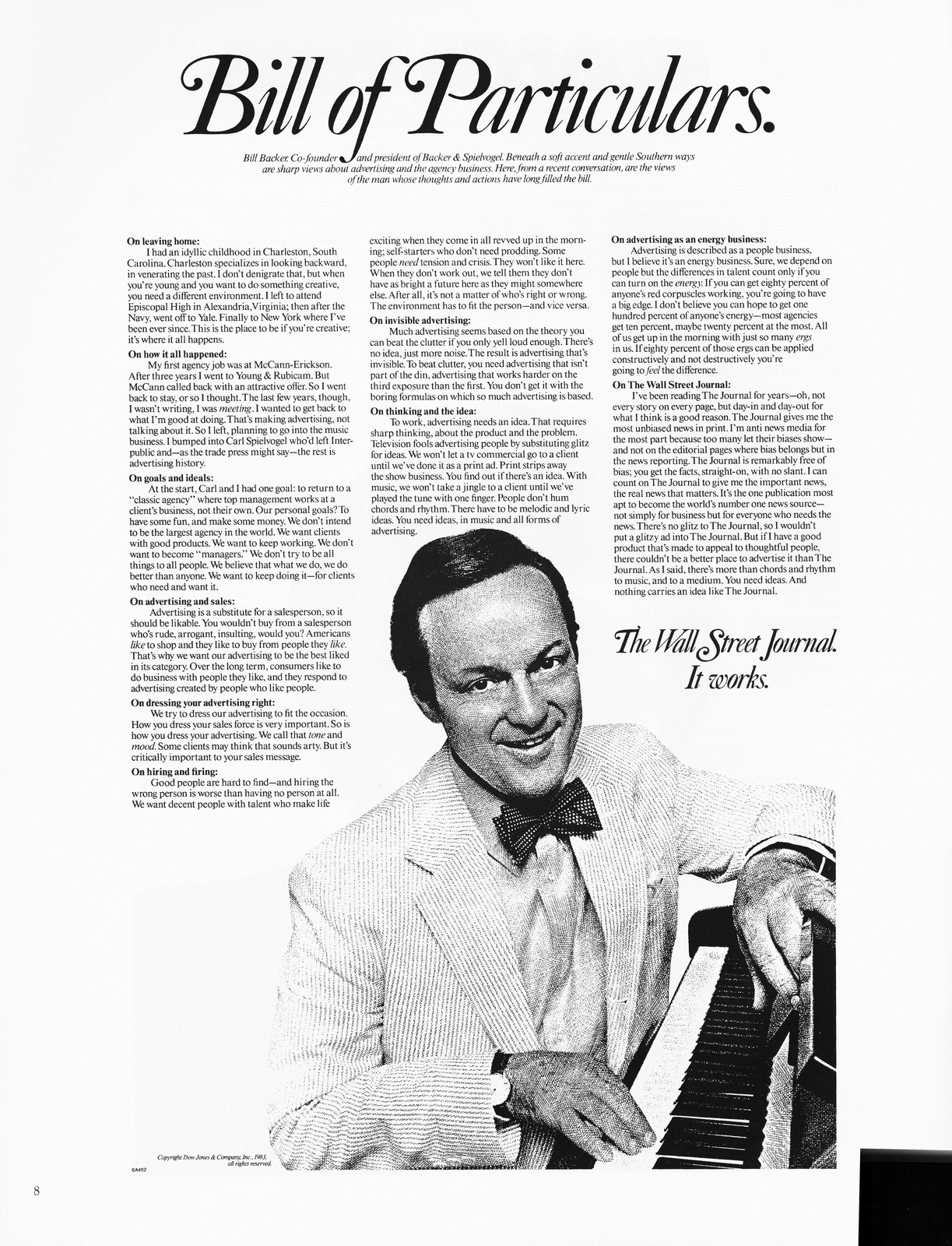
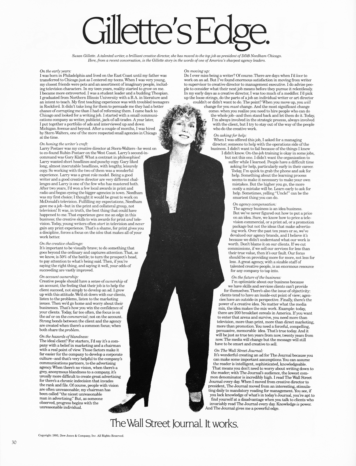
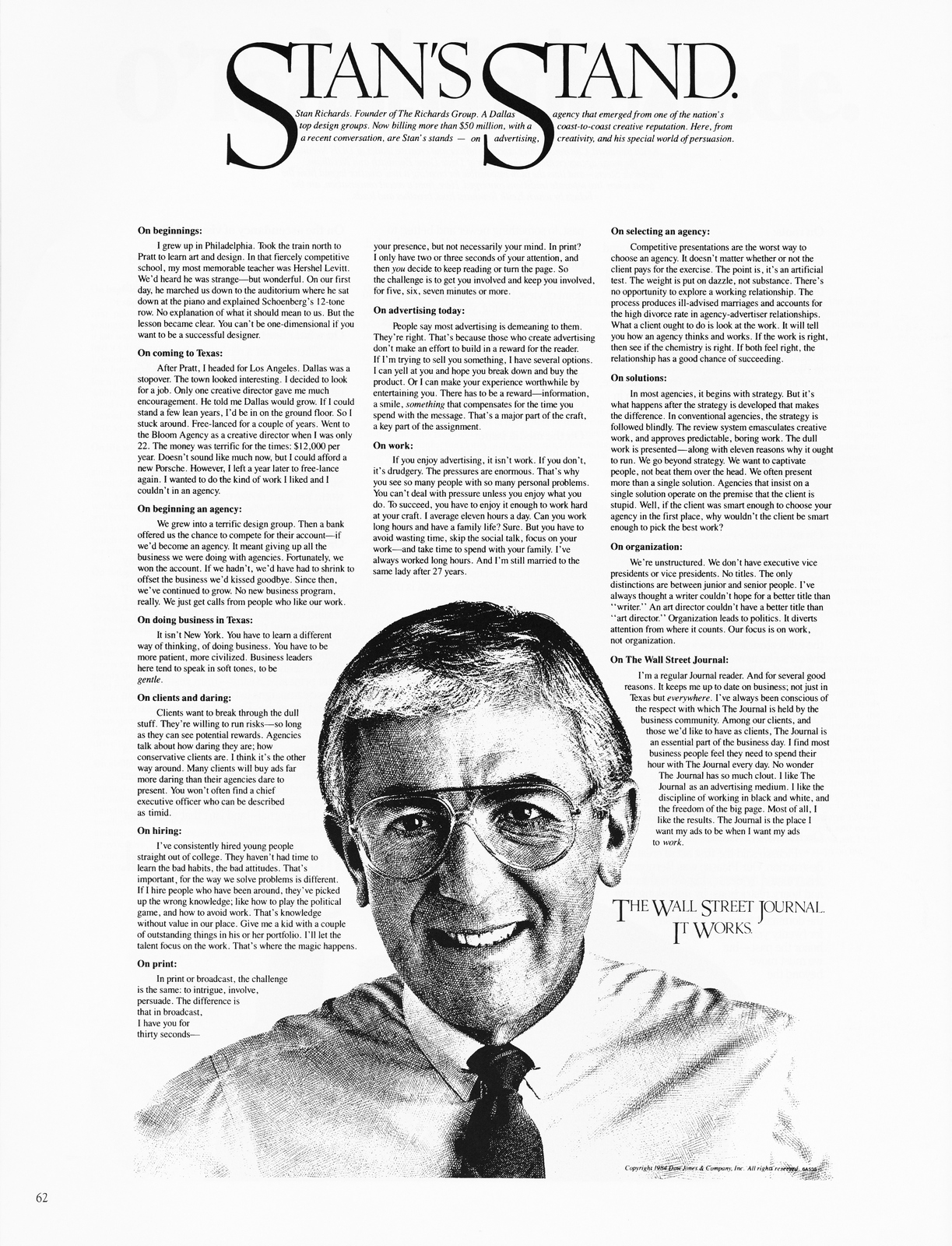
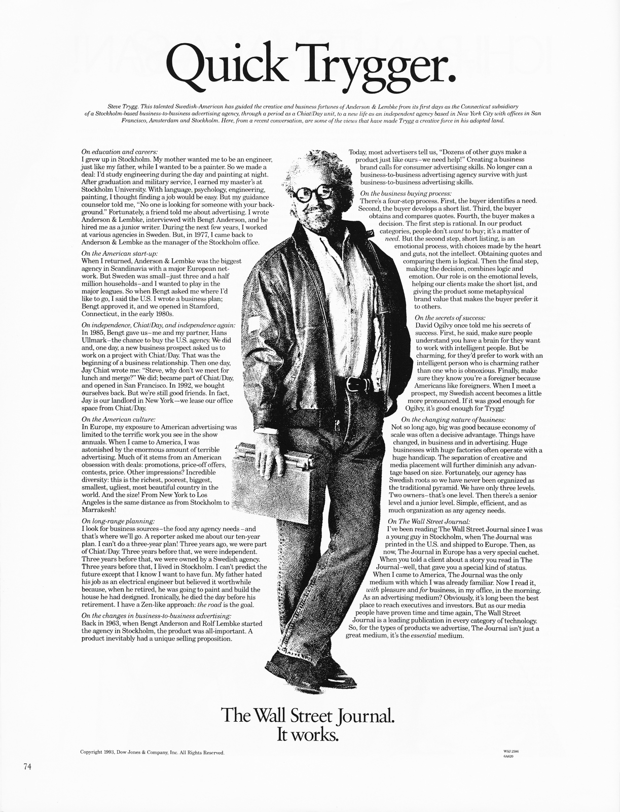
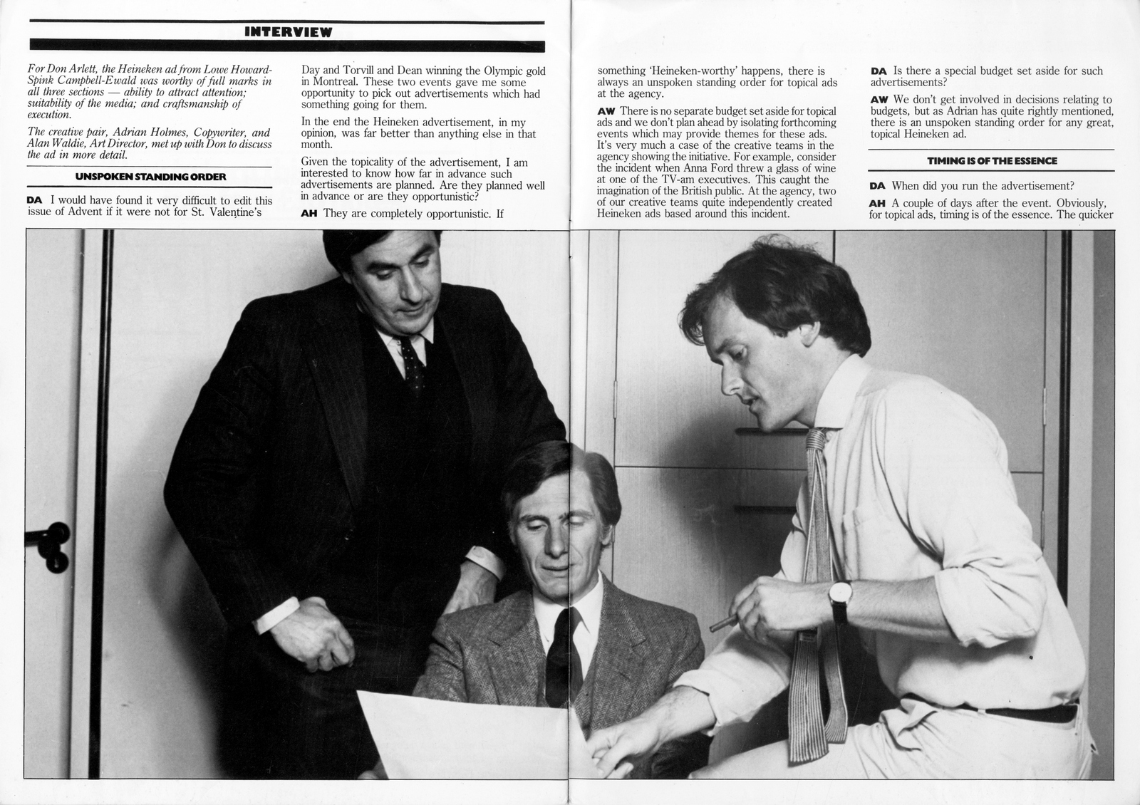
I have a confession to make; not everything on this site is from the loft.
Apologies to those of you who feel cheated.
I feel such a fraud.
The good news is that this post is 100% loft.
Not mine, my old partner Mike McKenna’s.
I started putting these green books together when Mike and I worked as a team at Publicis, back in the early 90’s.
They were our internet.
We’d split the cost of the pricey books from Cornelissen’s.
Being the art director, I did all the cutting, arranging and sticking.
As I was in charge of the cutting, sticking and arranging many had copywriter-unfriendly titles like ‘photography 5’ or ‘Typography 2’.
It meant when we divorced I was awarded full custody of them.
(Well, I got 10, he got two.)
What would a writer want with books full of photography and typography?
Nearly twenty five years later, in a post-divorce house clearance, Mike’s two have just turned up.
As I said to Mike ‘It’s a bloody shame about the divorce and everything… but every cloud…’
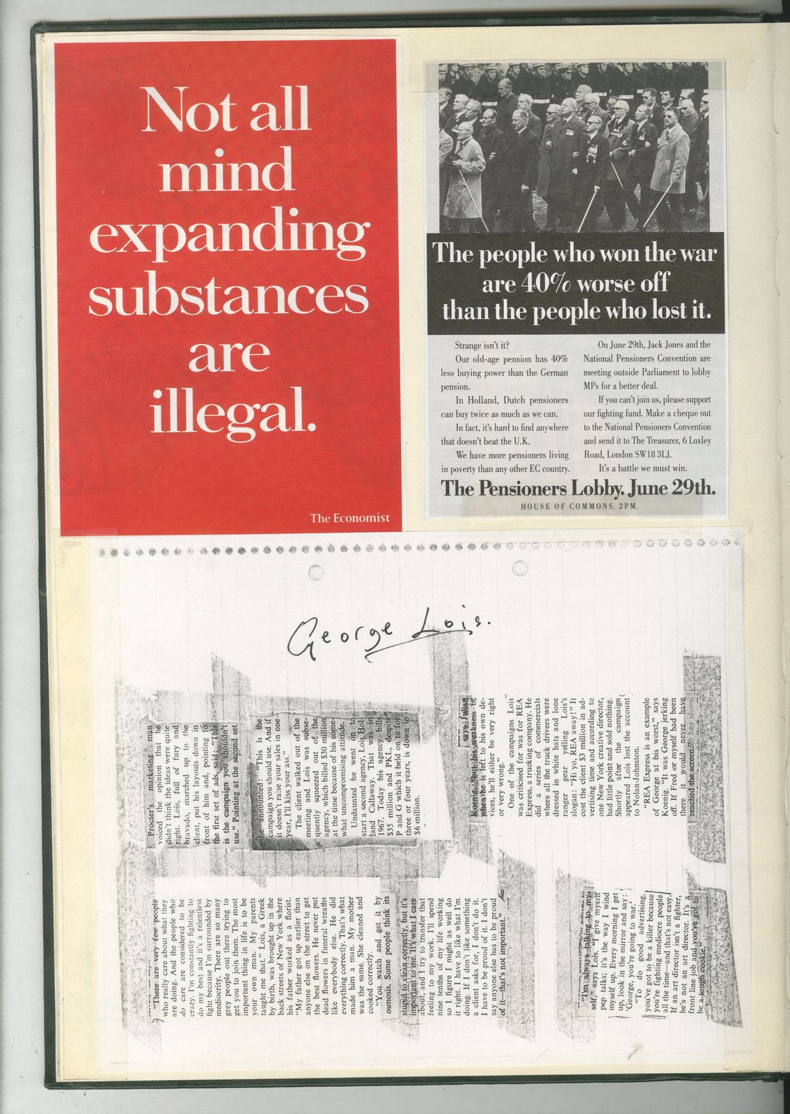
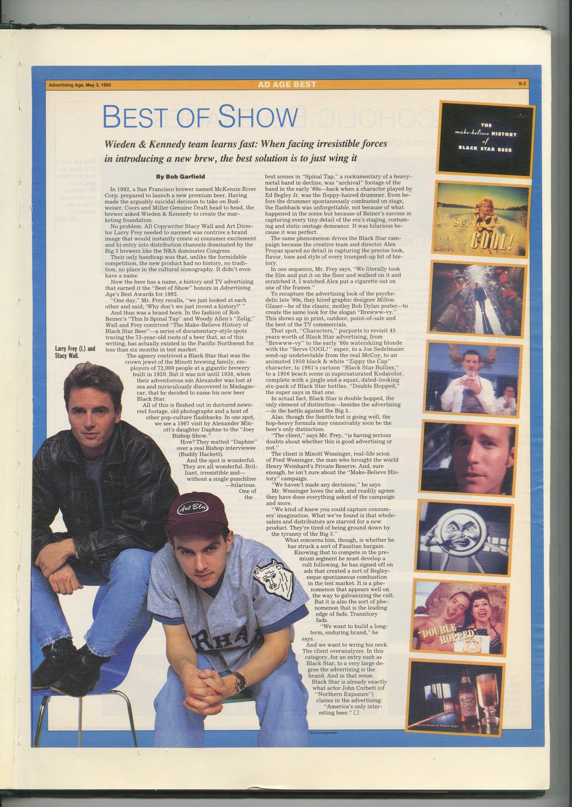
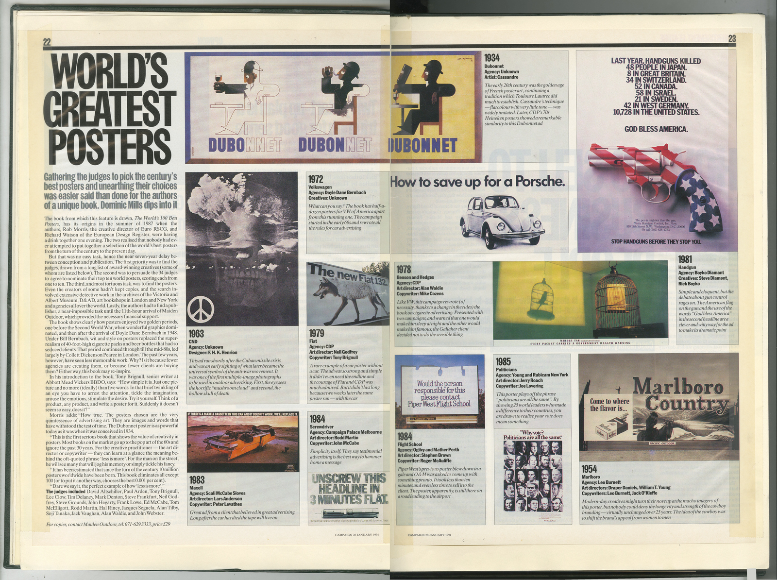
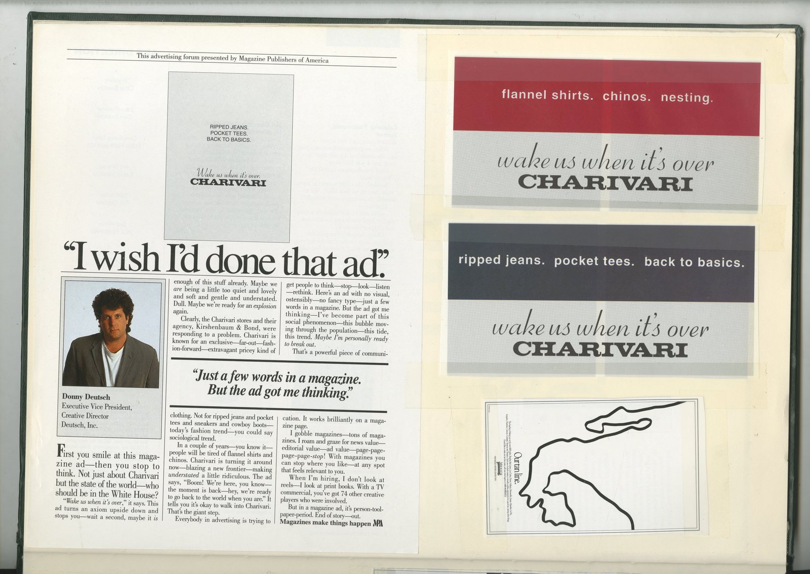
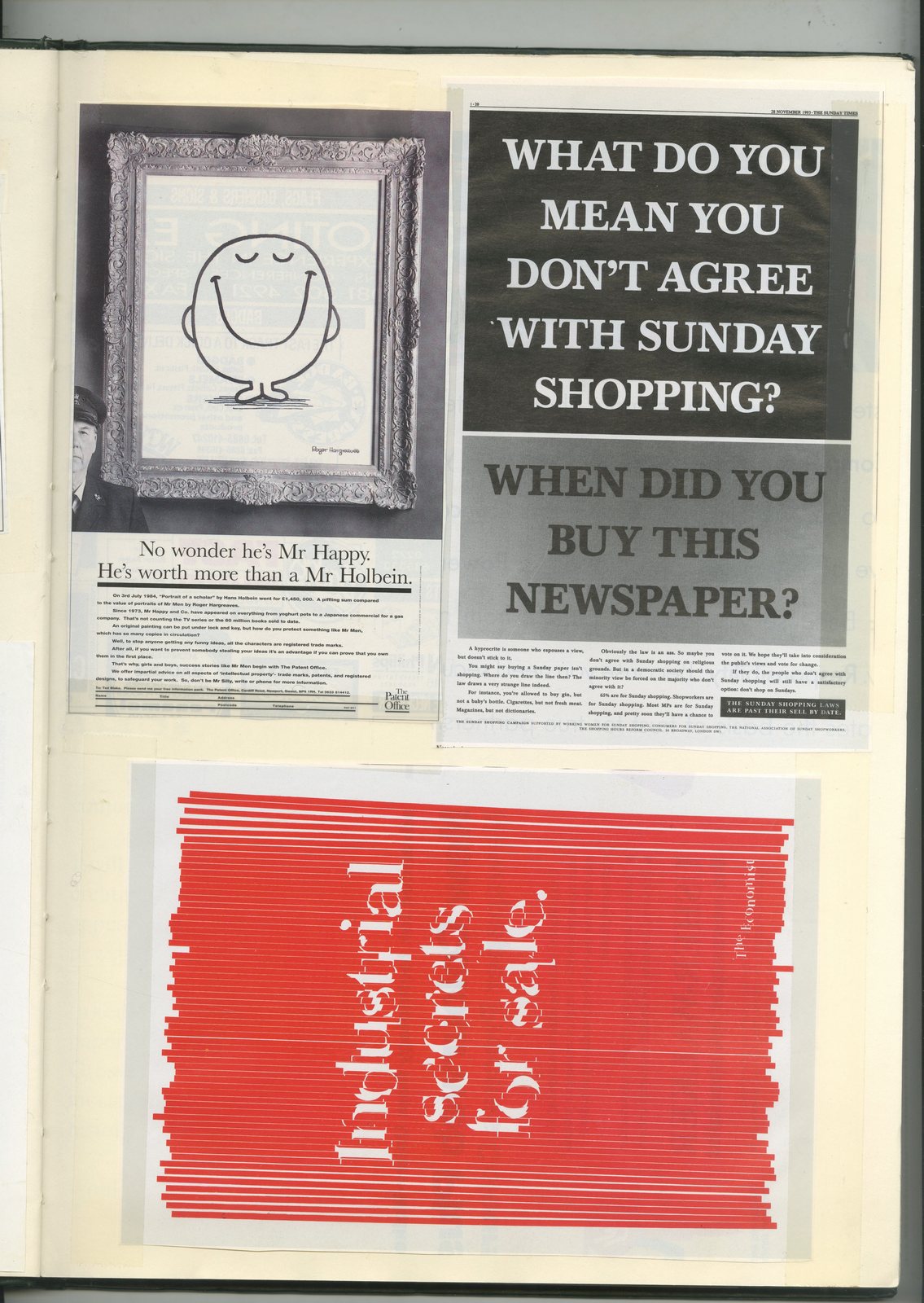
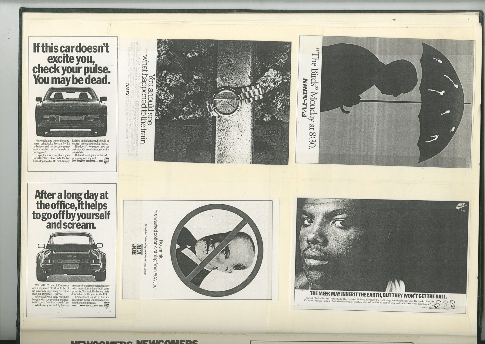
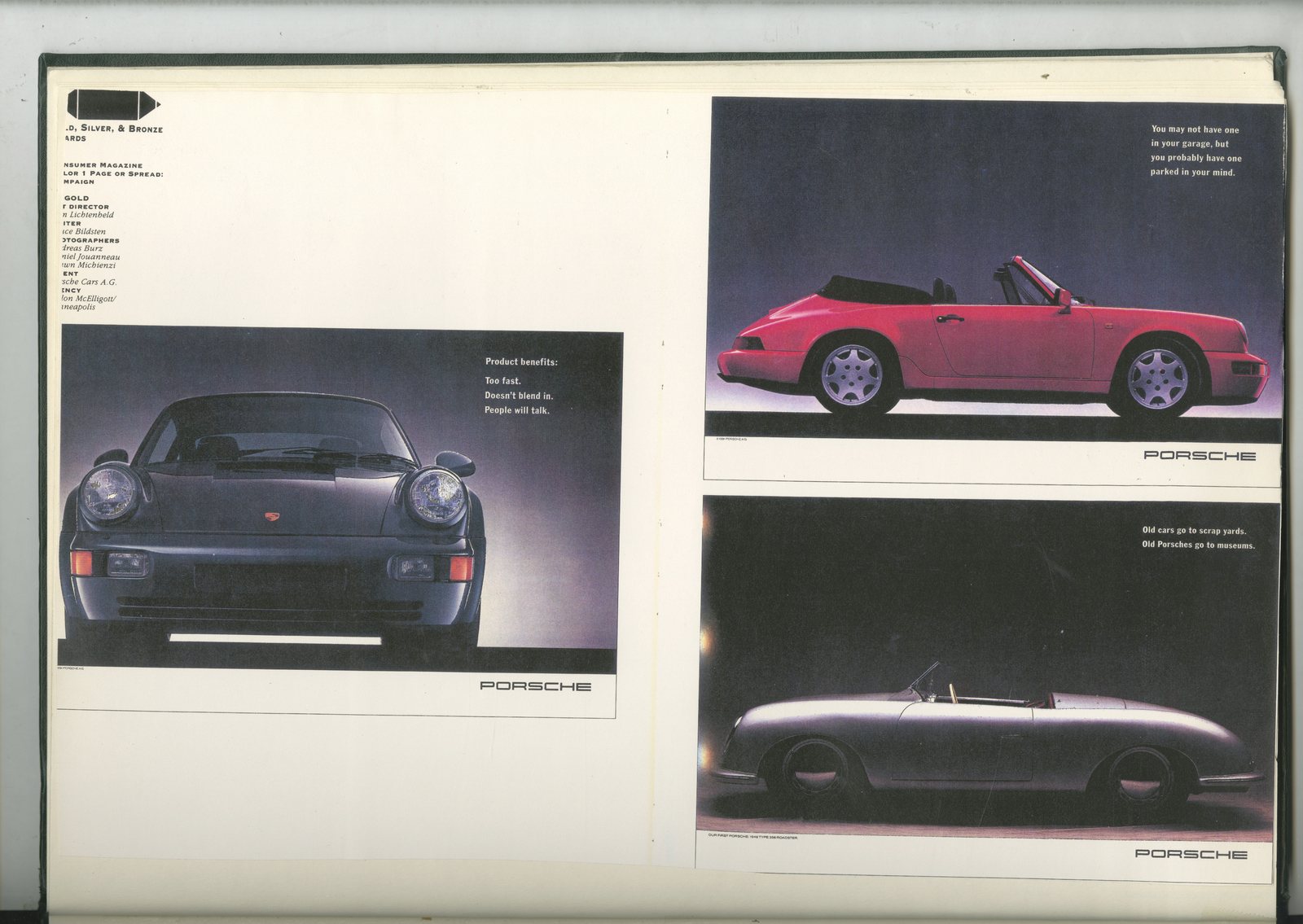
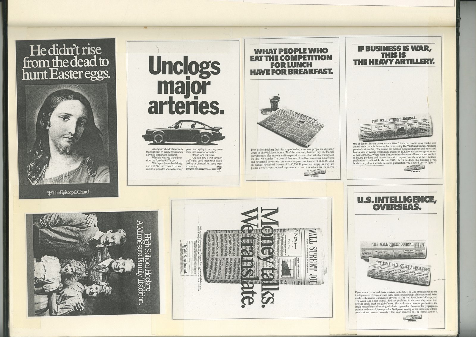
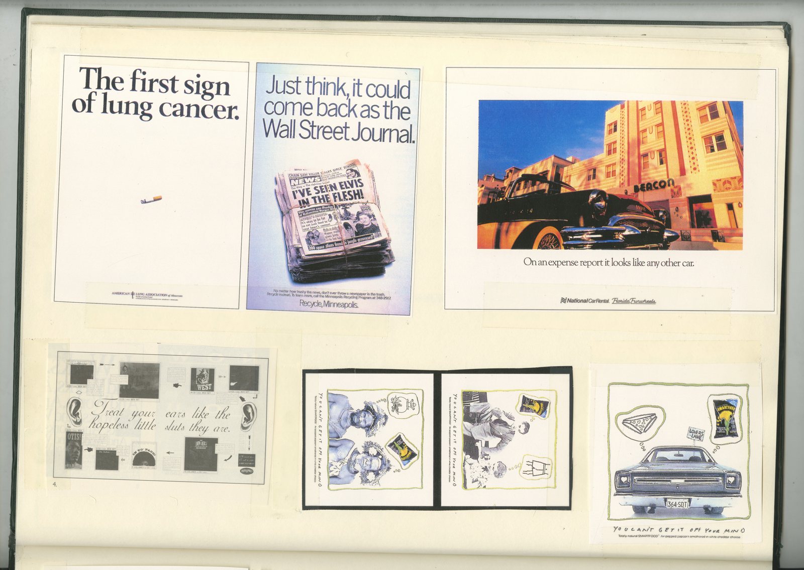
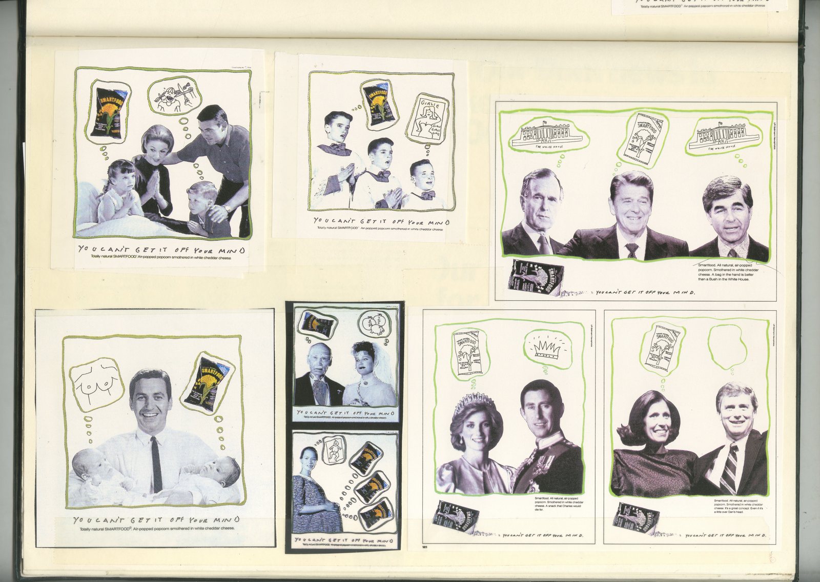
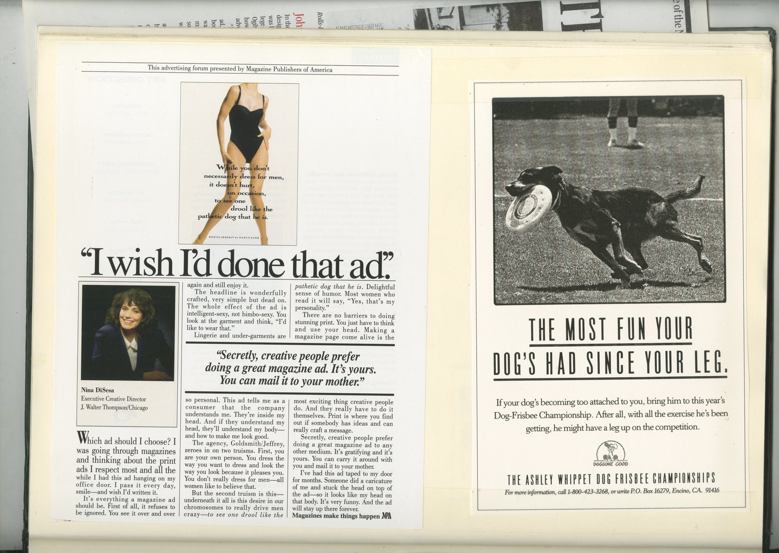
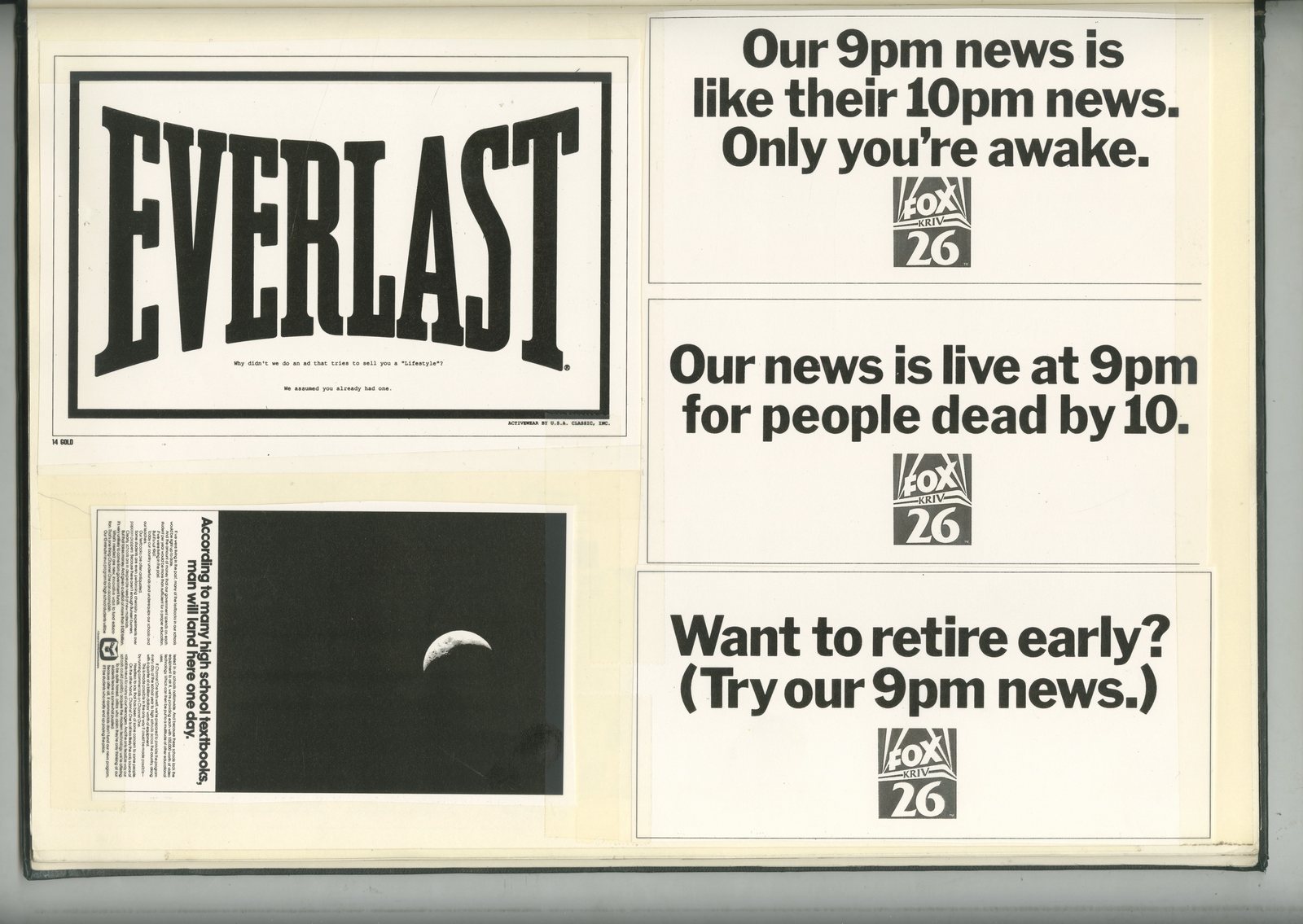
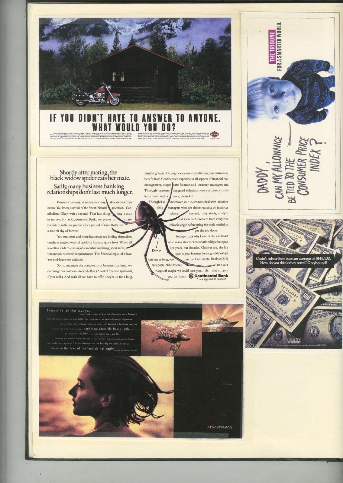
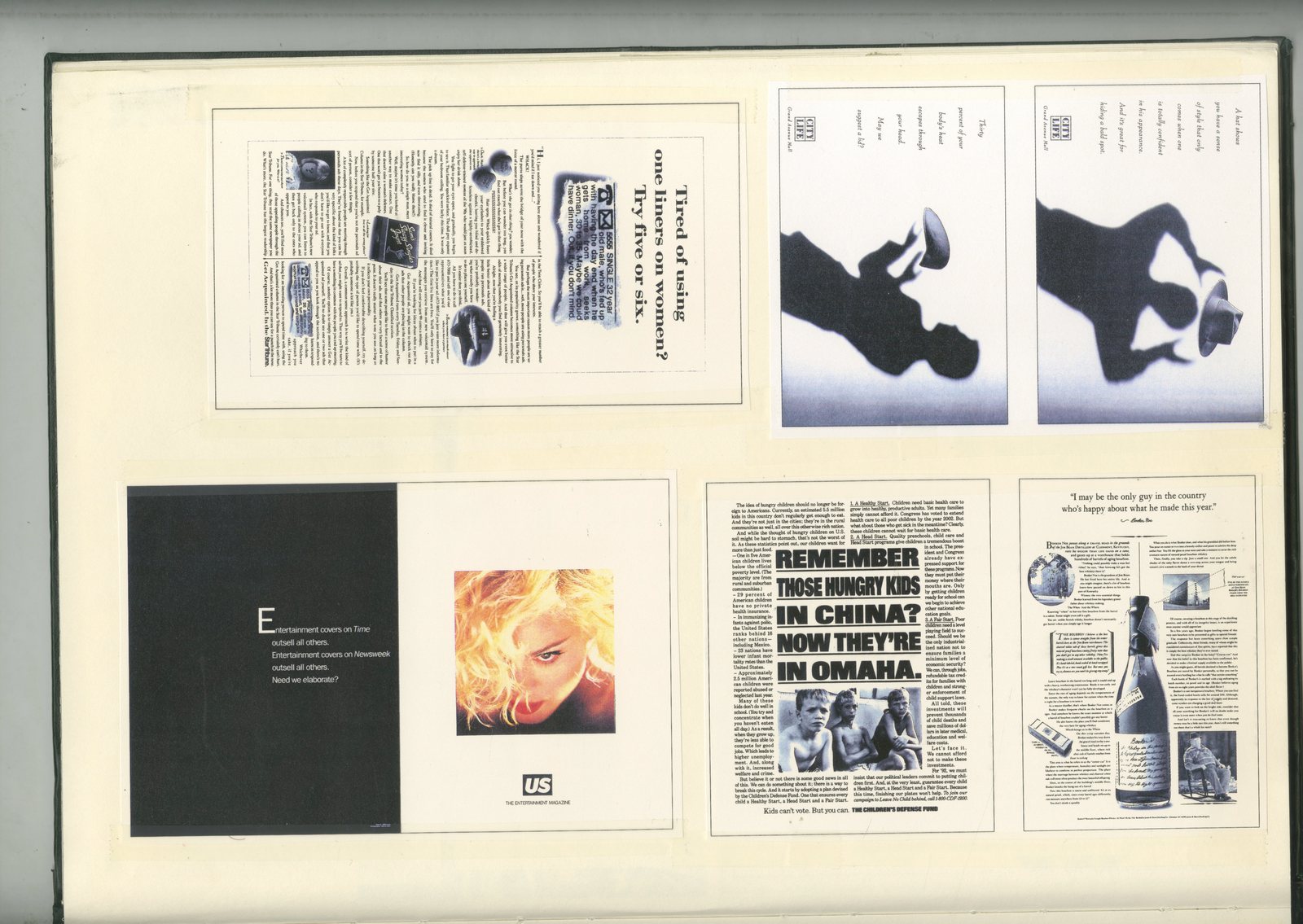
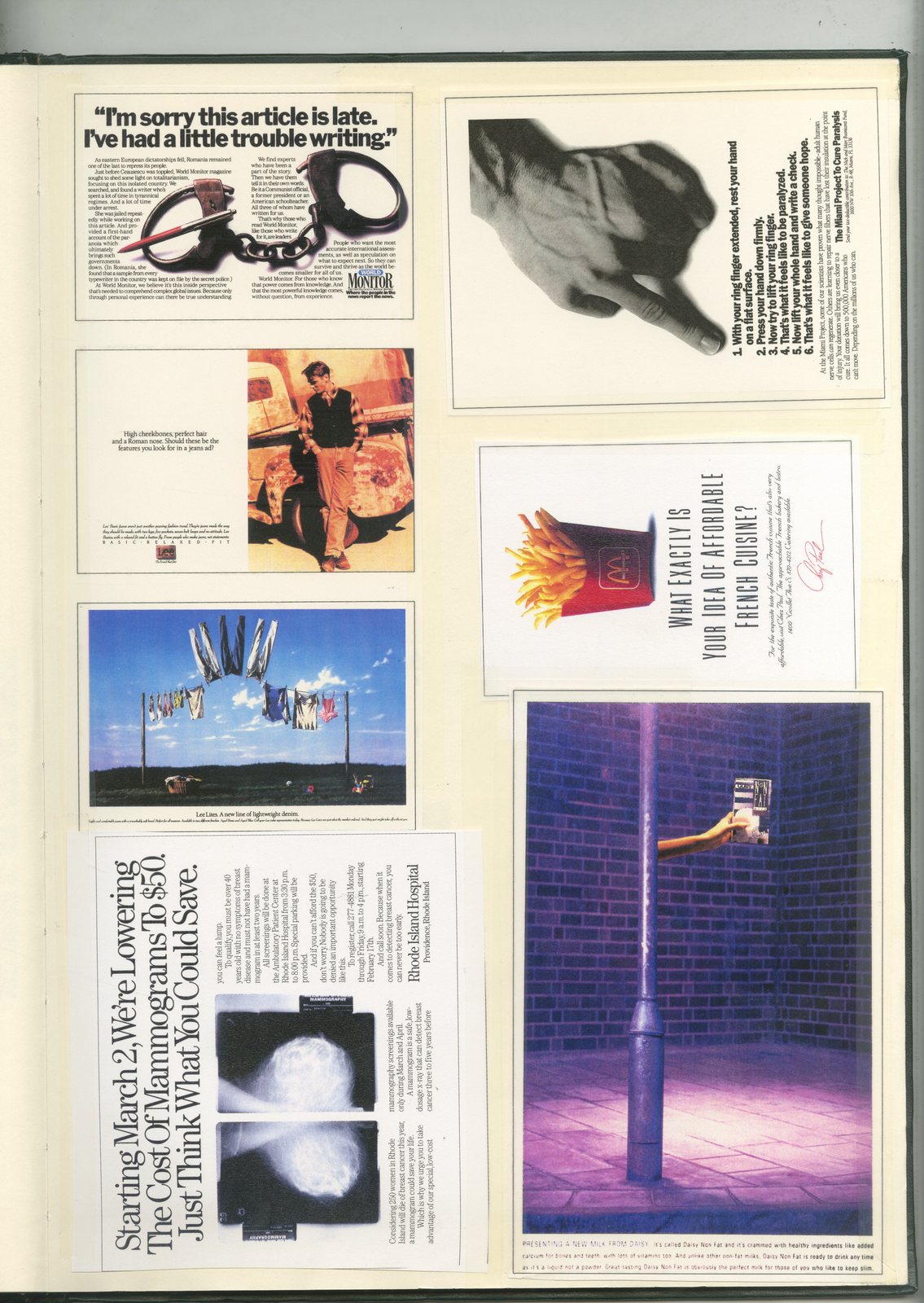
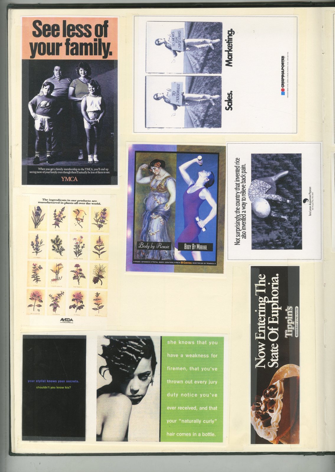
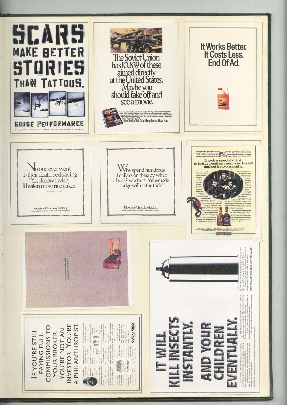
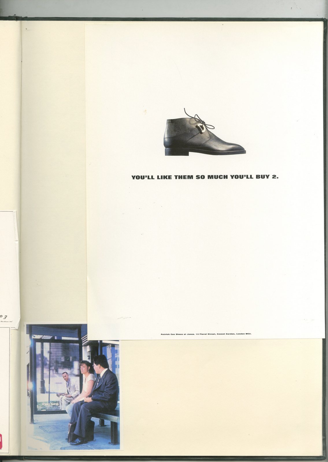
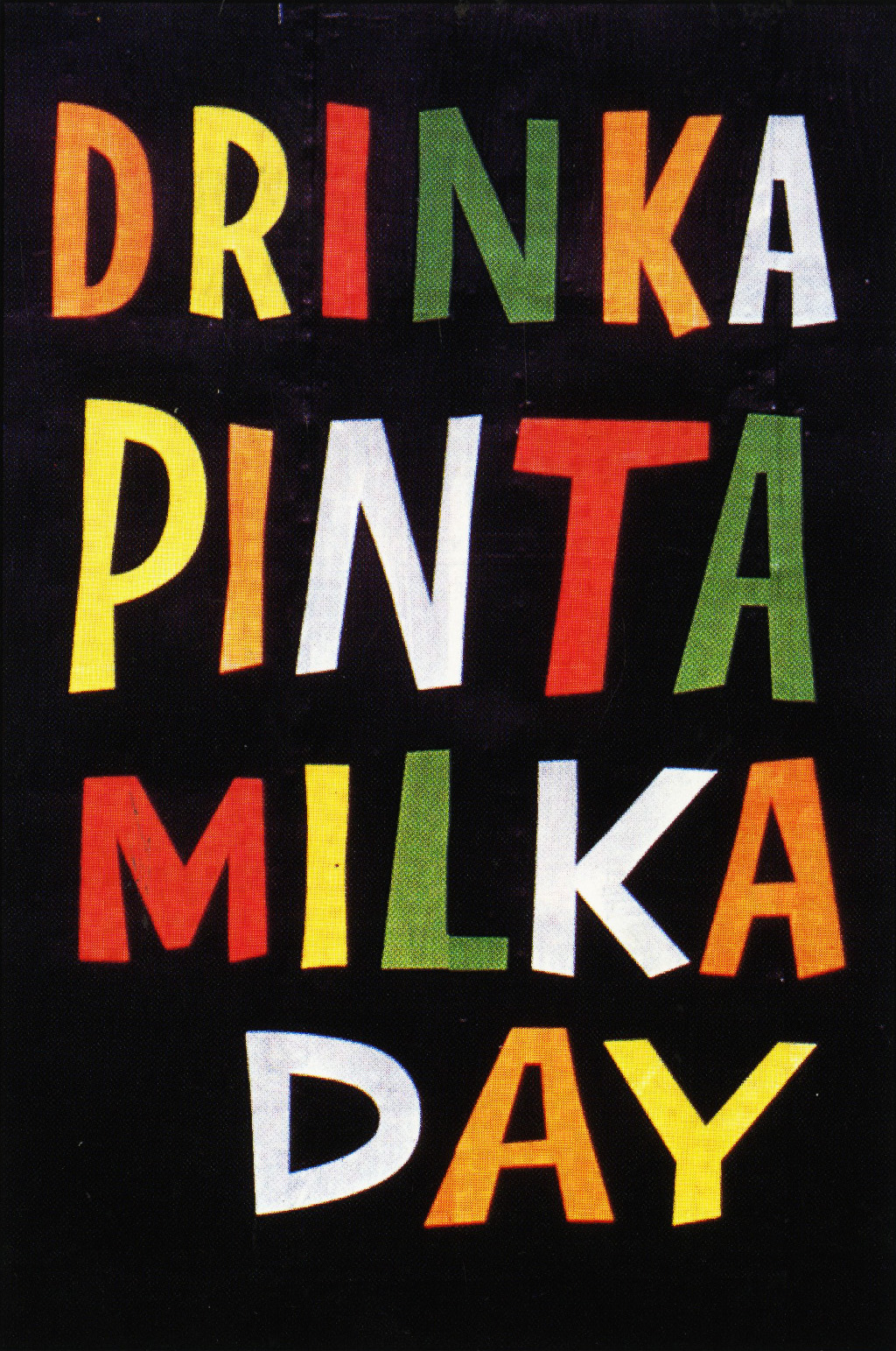
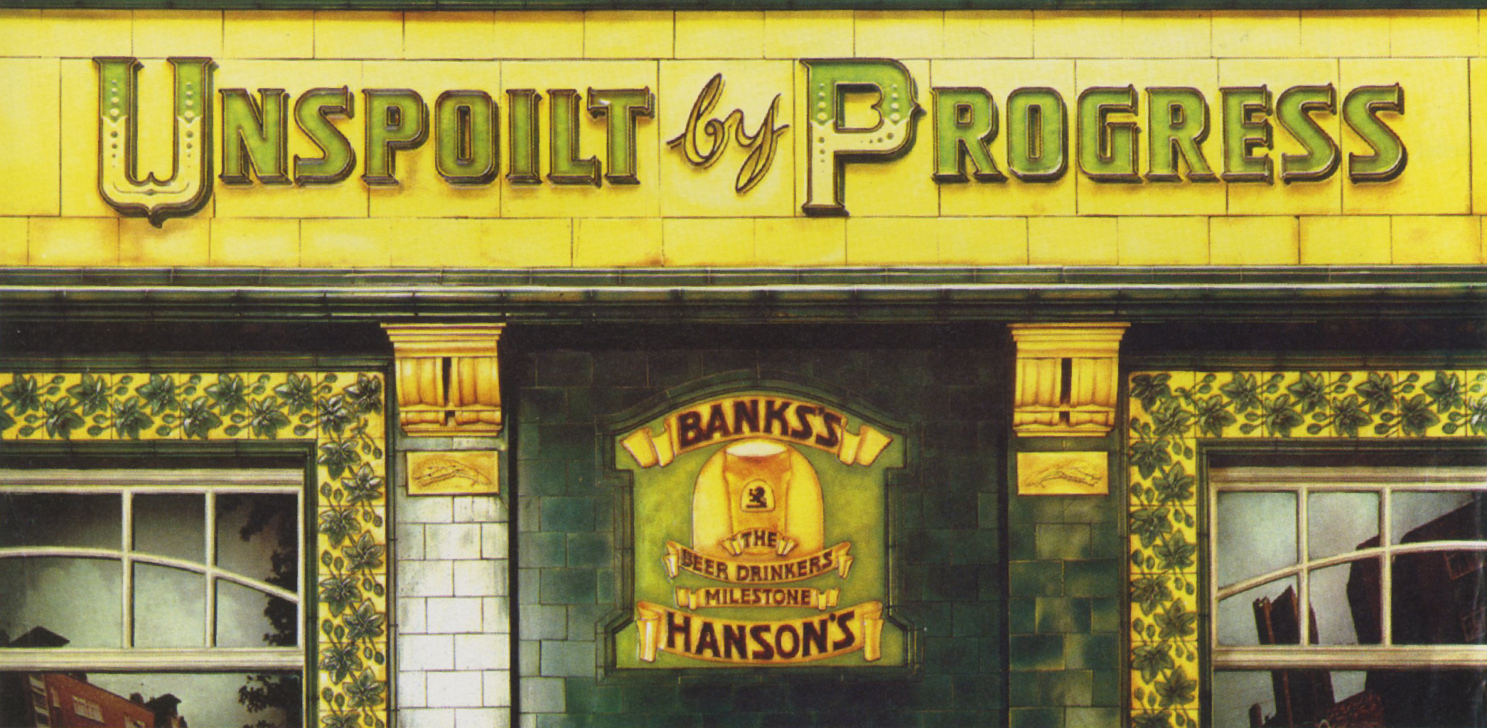
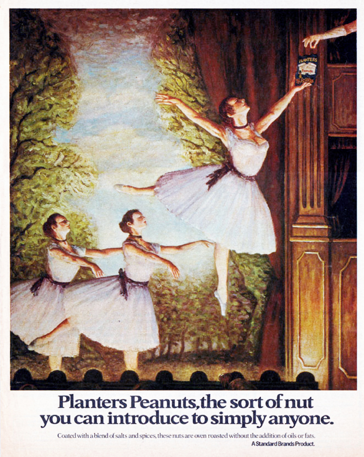
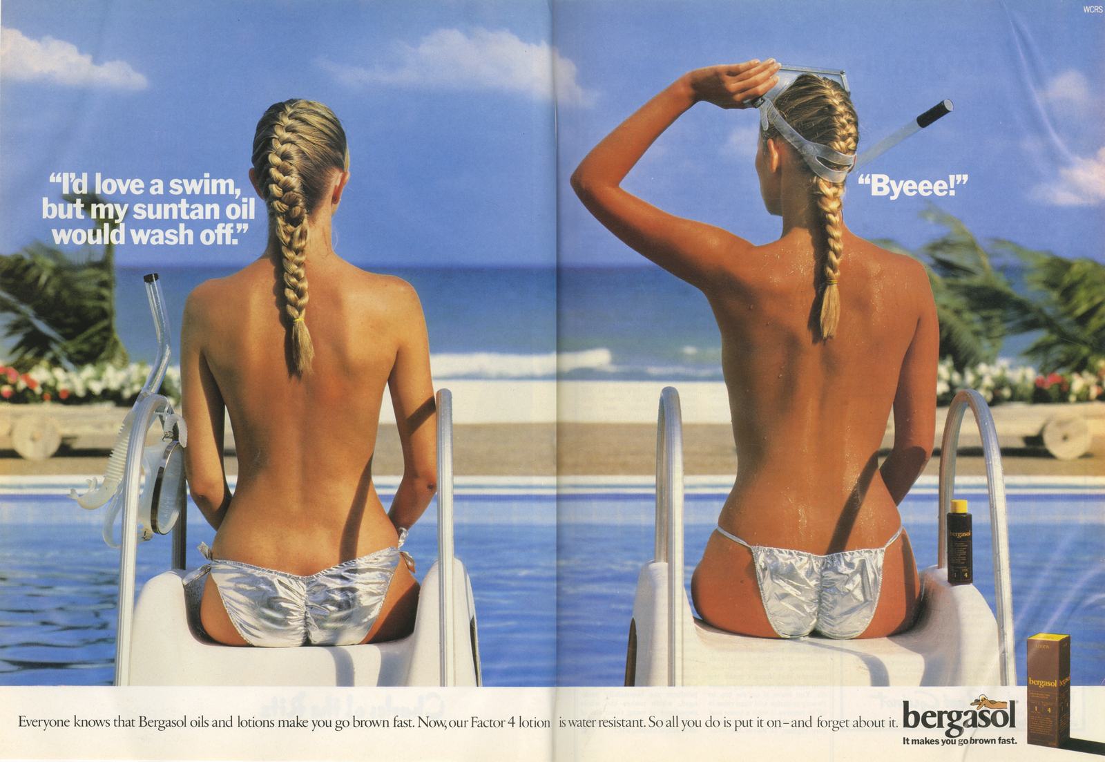
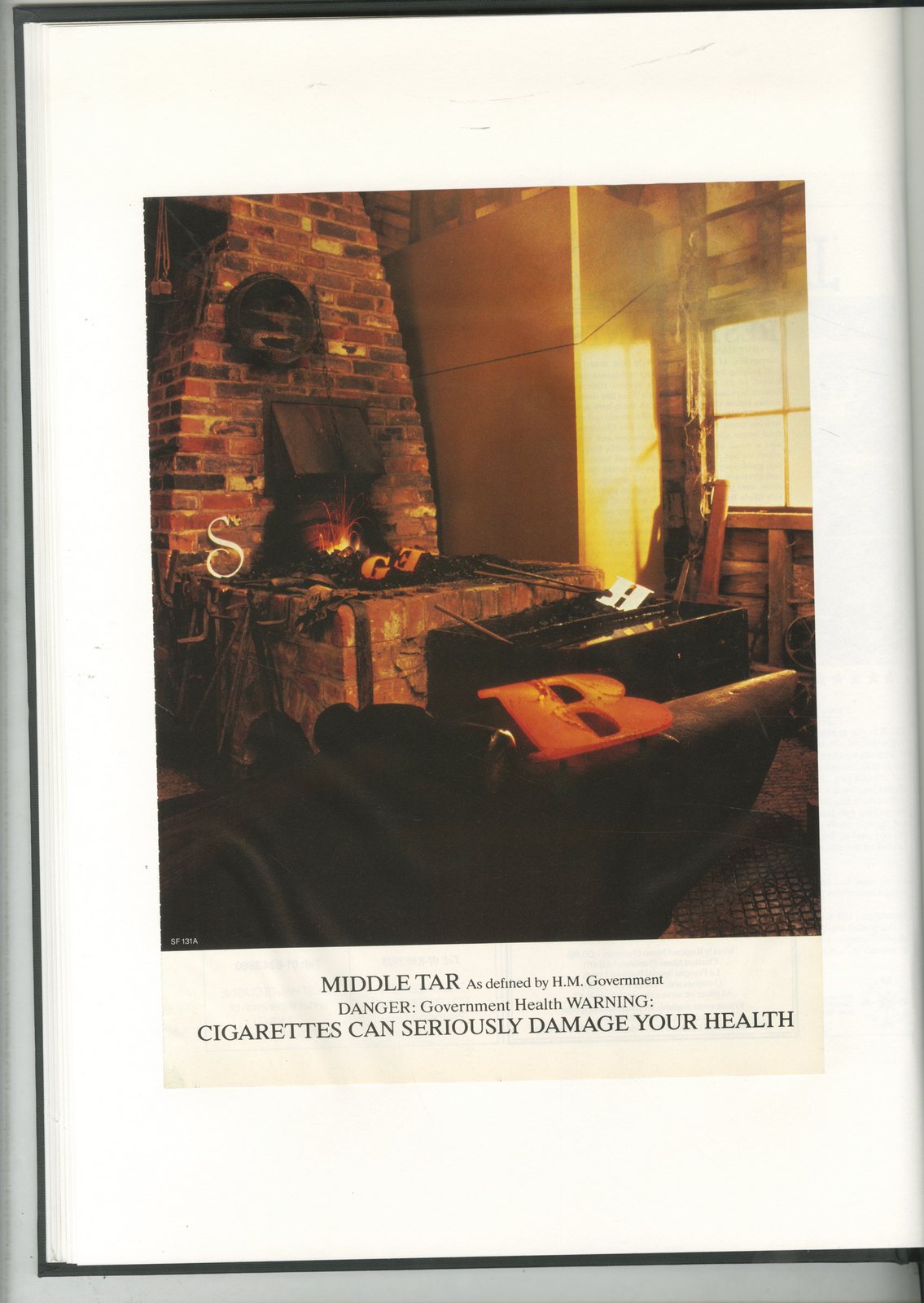
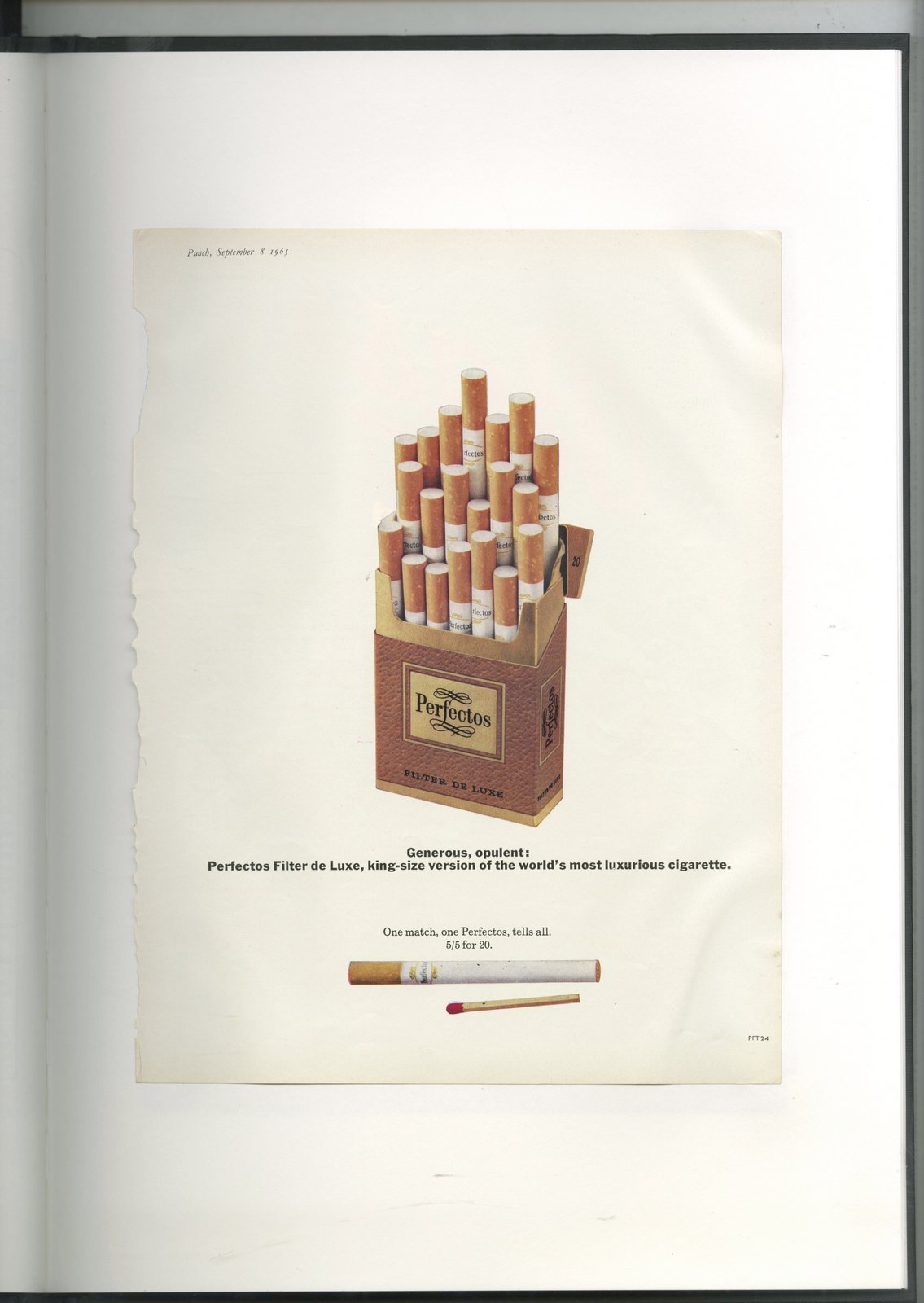
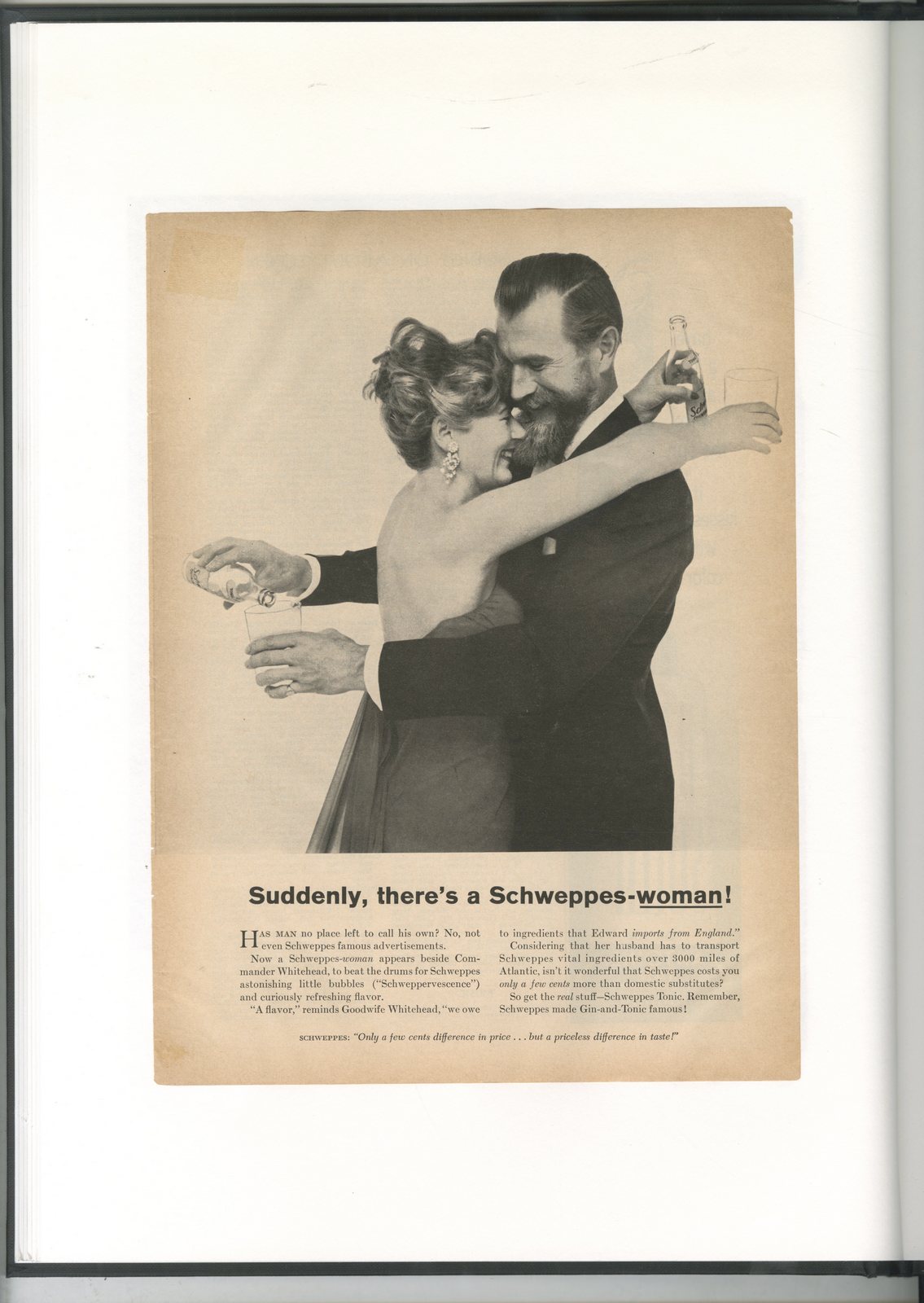
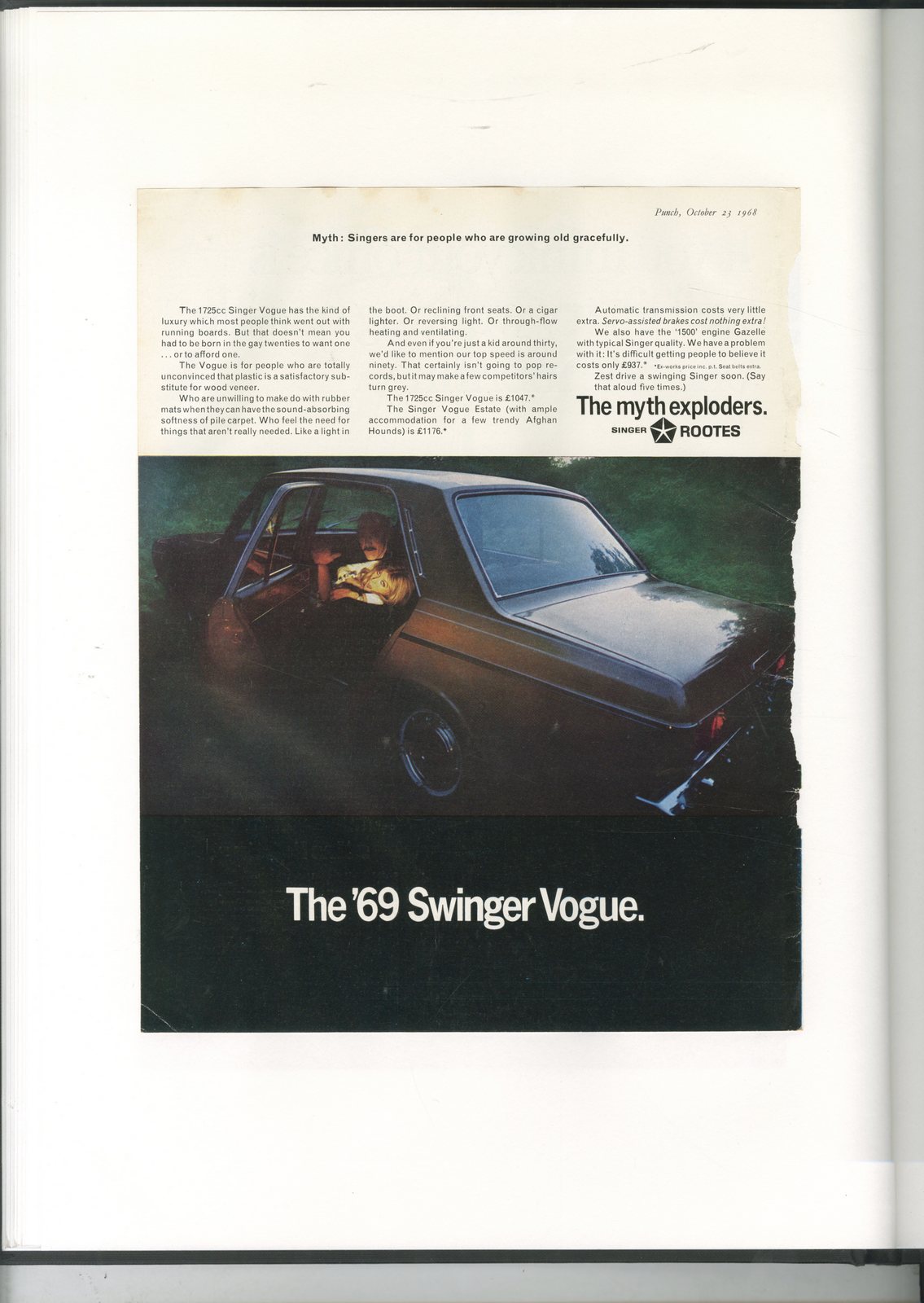
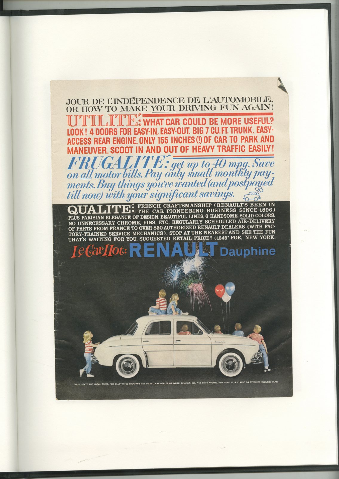
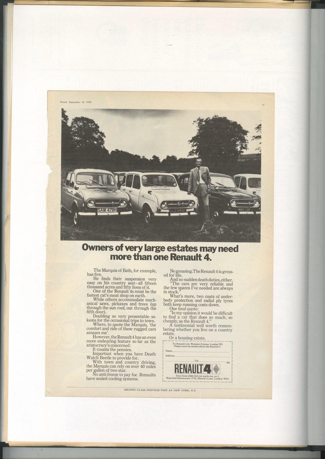
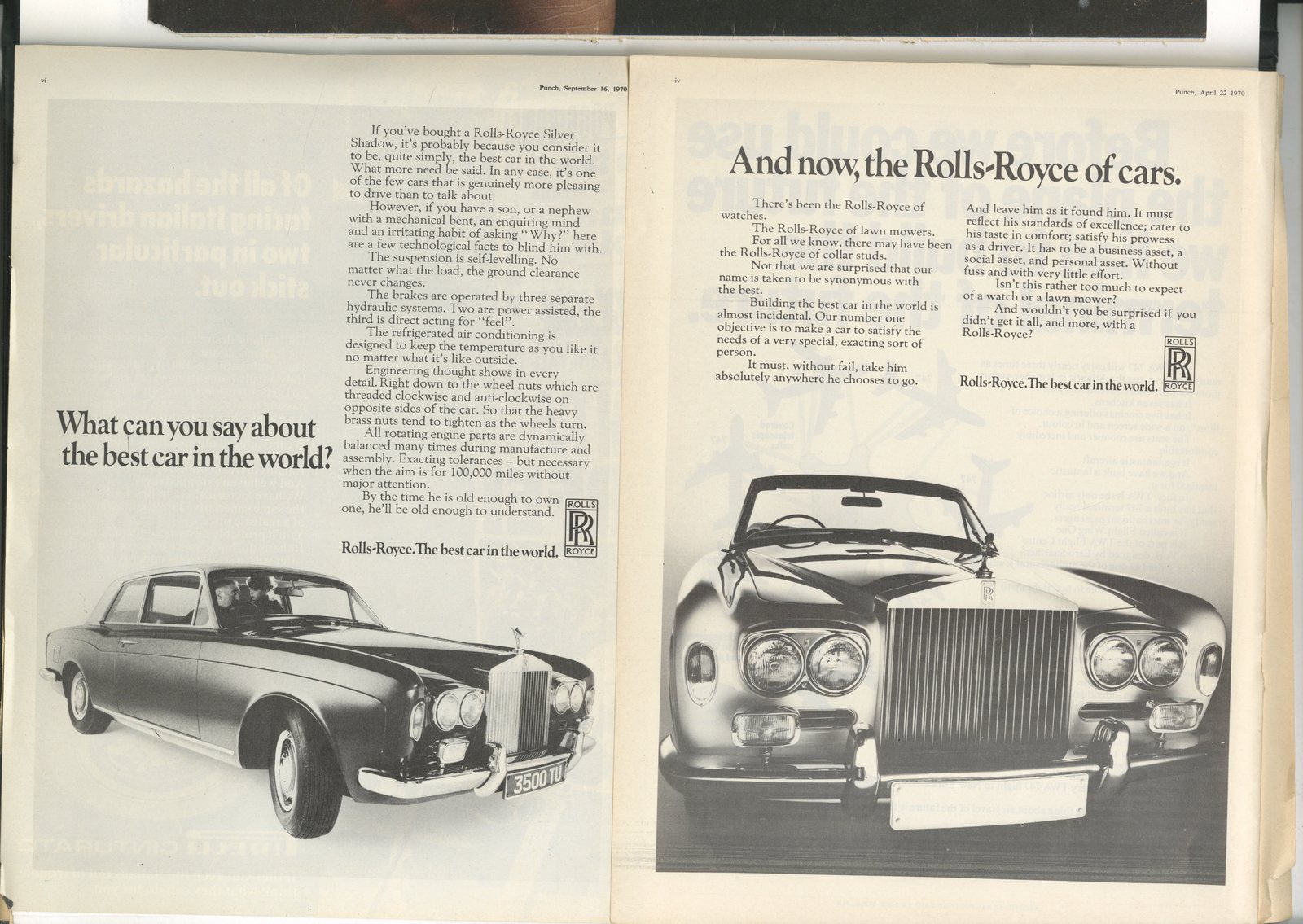
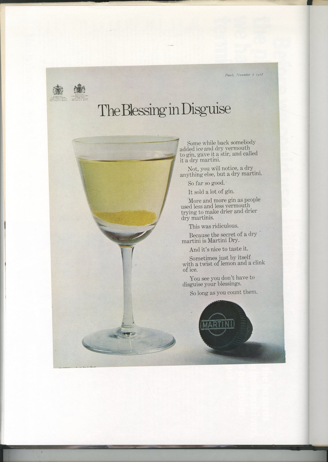
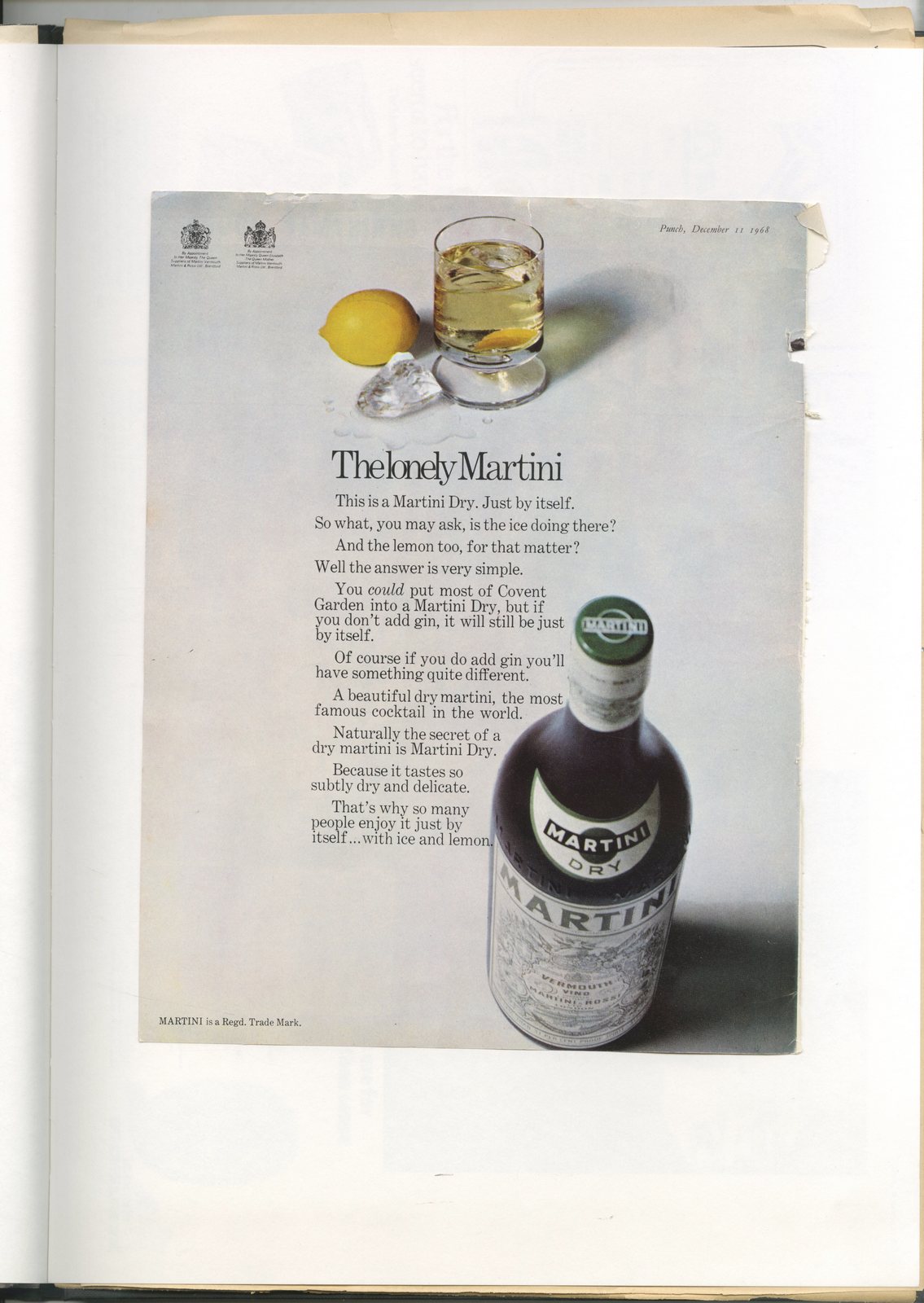
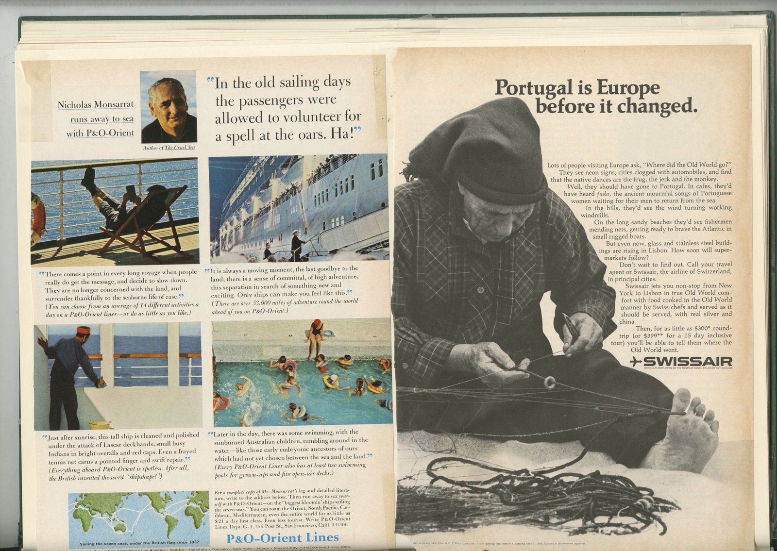
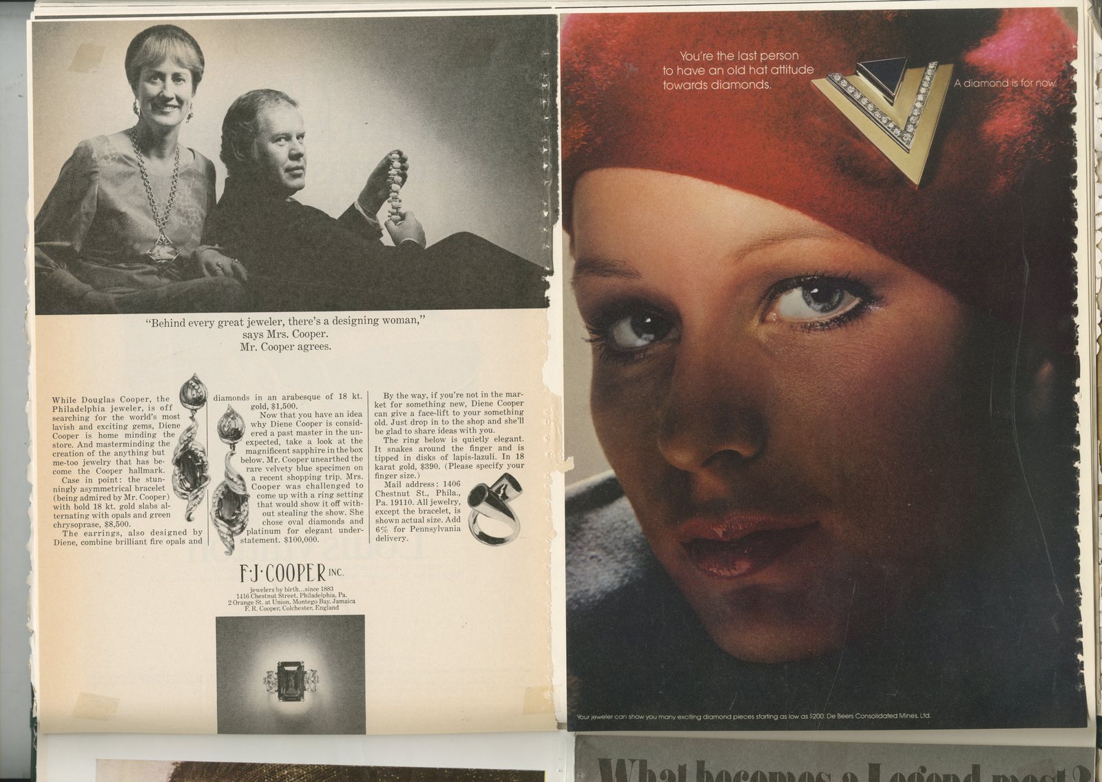
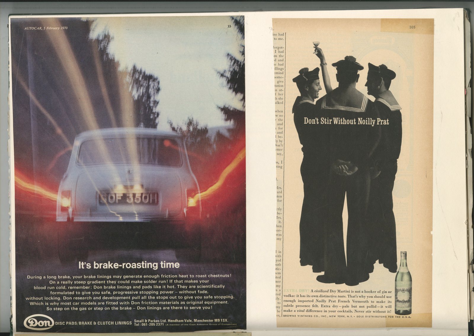
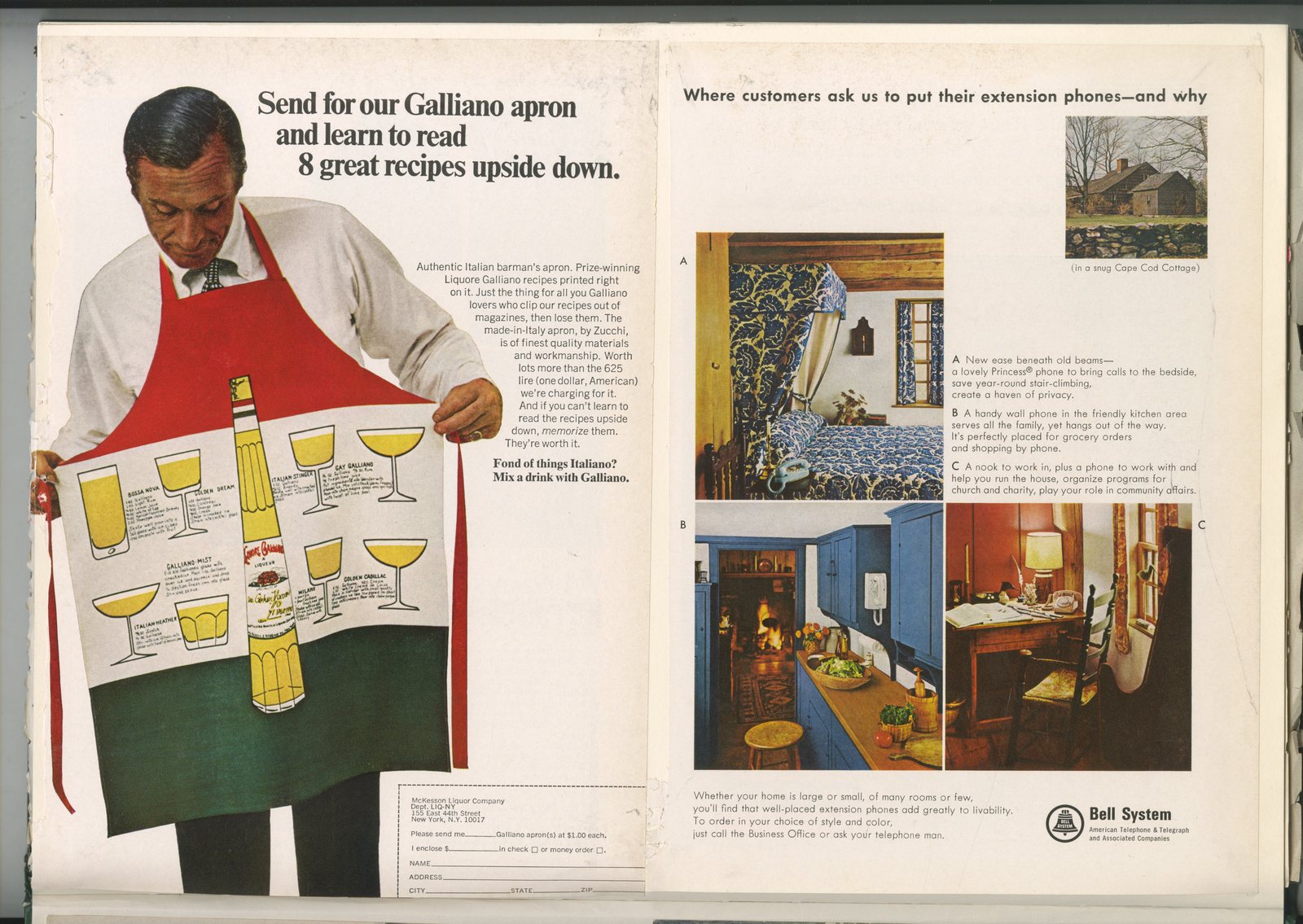
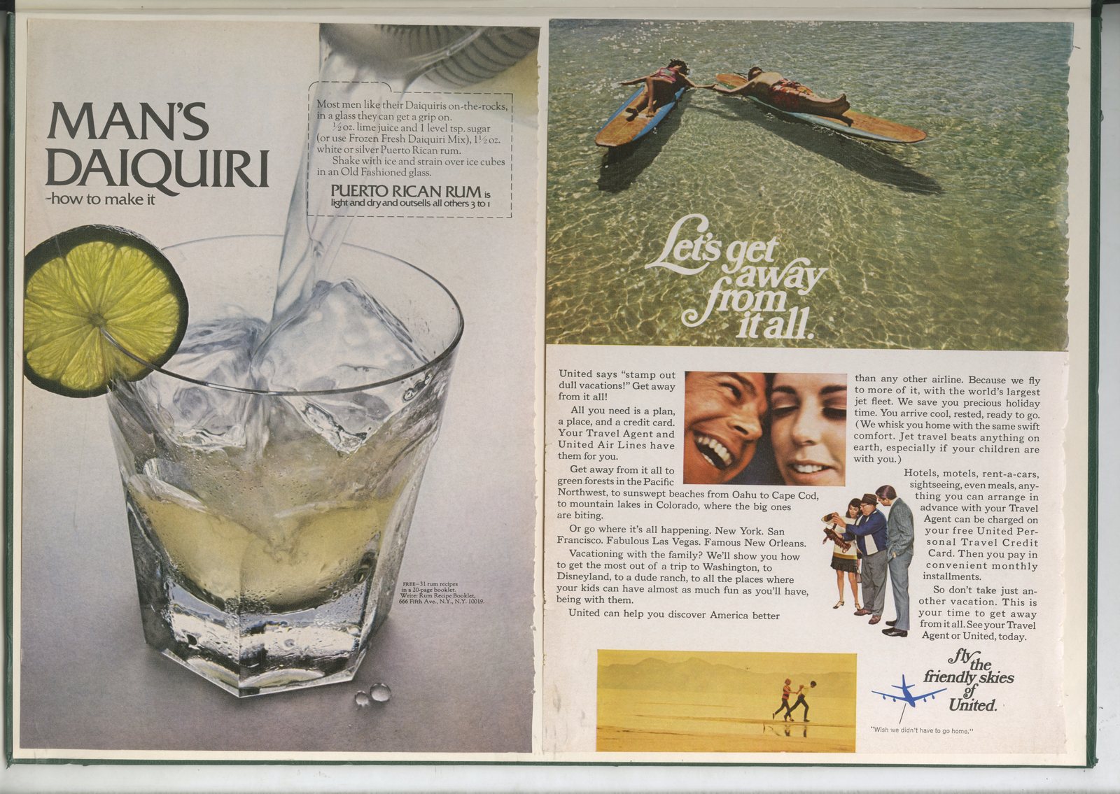
This one is ‘Ads 2’, a snapshot of everything I could cut out or photocopy from trade magazines and awards annuals from around 1992.
Consequently, Fallon McElligott appear on virtually every page.
David Abbott, Tim Delaney and Kishenbaum Bond seem to pop up on every other page.
On the one hand it feels like a time capsule from another age.
On the other, does advertising get much better than Kirshenbaum’s ‘Wake us when it’s over’ campaign for Charivari, Wieden’s ‘Make Believe History Of Black Star Beer’ or the endless stream of Porsche ads manufactured in Minneapolis by Fallon’s?
Enjoy.


.jpg)

.jpg)


.jpg)


-min.jpg)


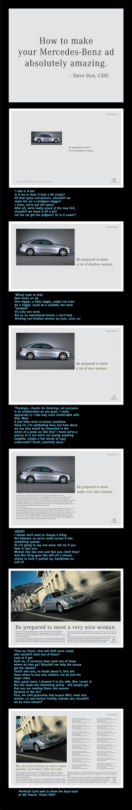
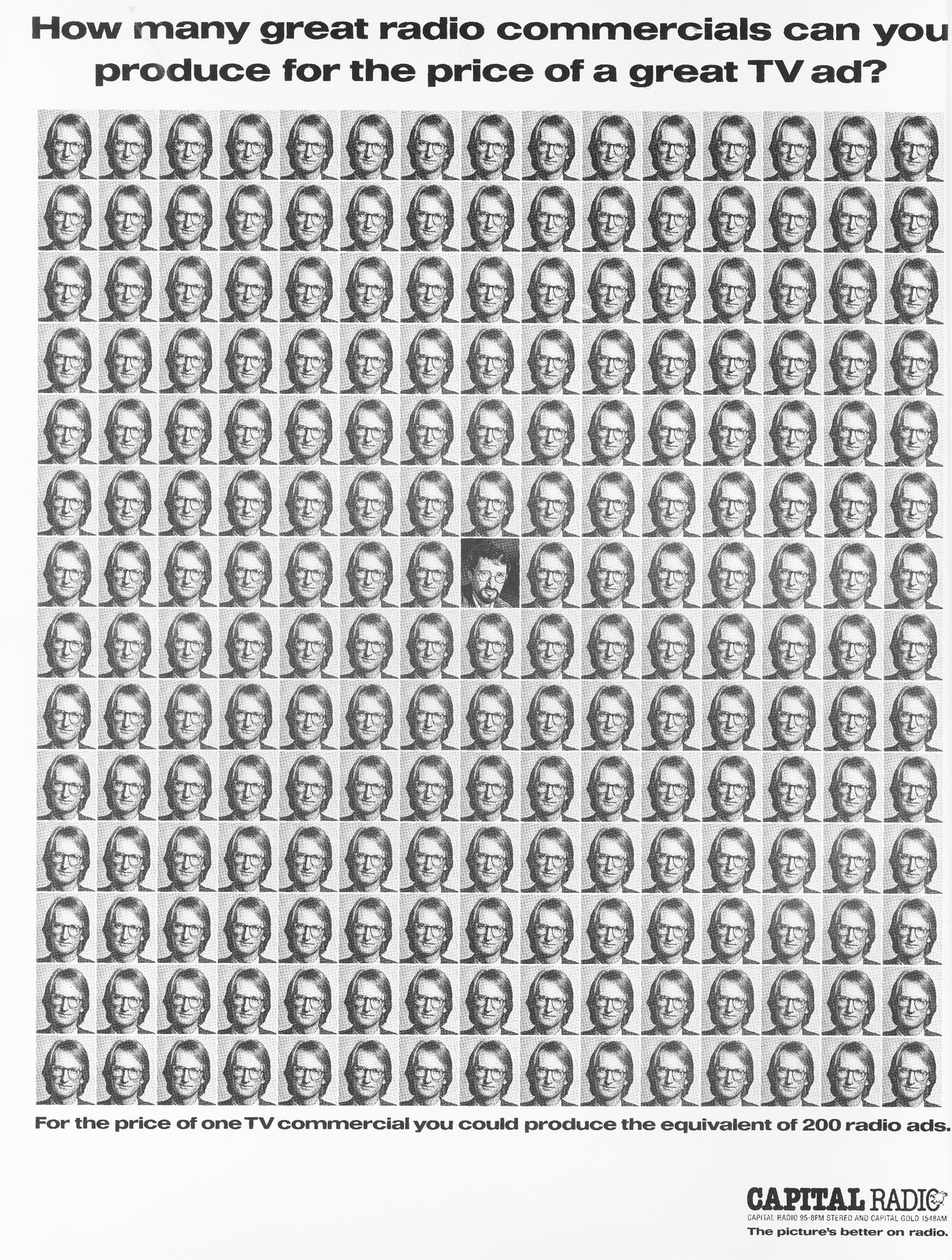
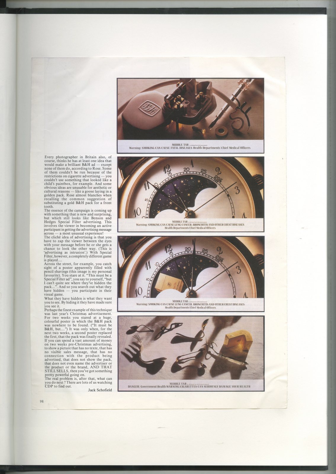
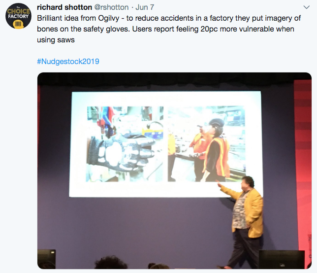
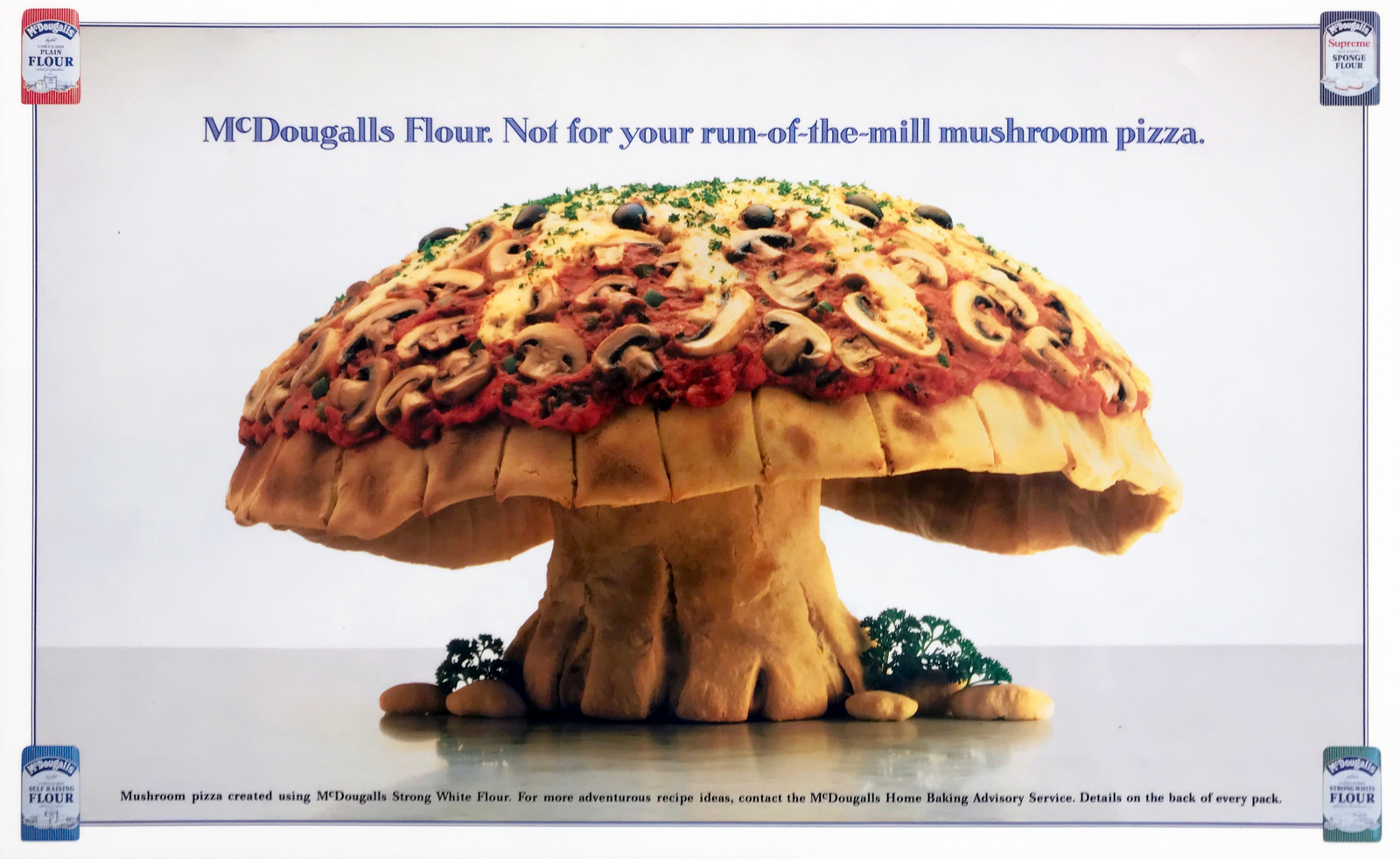
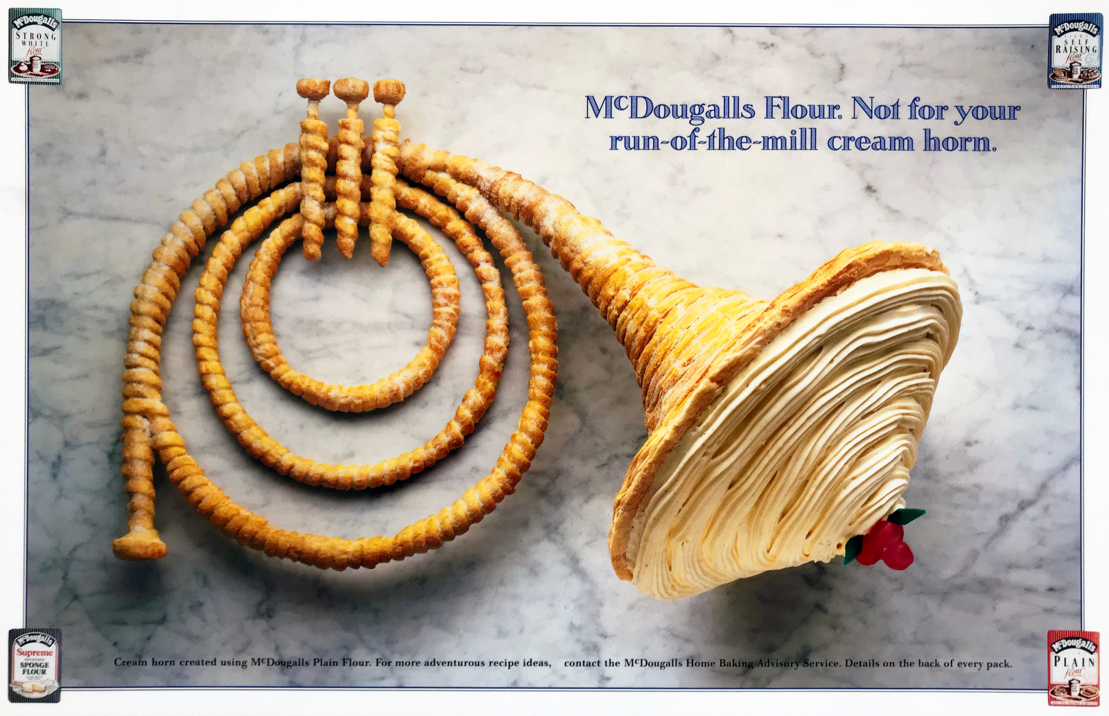
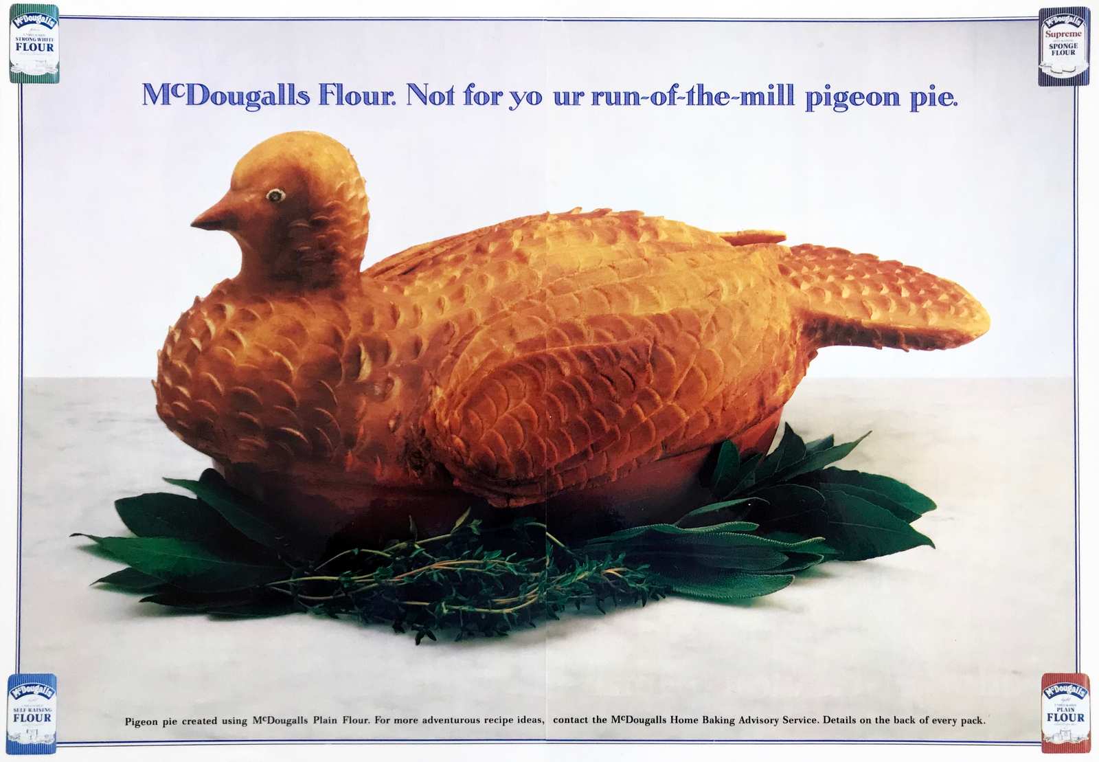
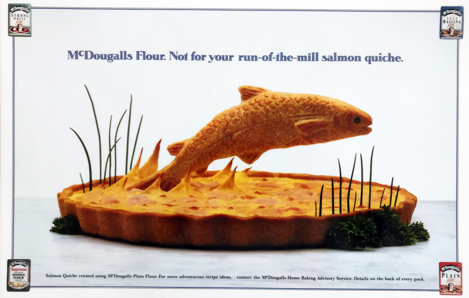
Whether it’s qual, quant or O.T.S, ROI, A/B testing or big data, when numbers turn up in marketing they must be obeyed.They're distilled and translated into 'rules'.Everyone wants their next campaign to be better than their last, but applying these 'learnings' to creative work often kills it.It can feel uncomfortable, because what's being said makes total sense, but the effect is to complicate and make your ad more like every other ad out there.The ones you and 90% of the public ignore every day.But weirdly, running ads like those getting ignored is considered 'playing it safe'.Whereas breaking away from that losing formula is viewed as risky.Common sense tells you this is wrong, the people writing the cheques tell you this is right.Unfortunately, numbers can kick the shit out of common sense.It's not even a fair fight.So ideas that divided people get turned into ideas that everyone feels the equally about.Nobody hates them, nobody loves them and everyone can understand the logic behind the changes, even if they disagree.But if nobody behind the work loves it, why would they imagine the public would?In the 1990s, half of the top ten biggest grossing films ever were directed by Steven Spielberg and was asked how he picked such popular scripts - “I look for scripts I like, I like them others might too.” The best demonstration of this battle between gut and logic was written by Rob Morris, back in the 80s, it showed the effects of client feedback to a Parker Pen ad, it gets worse with each piece of feedback.What I liked about it was that the feedback wasn't stupid, mostly, but the effects were catastrophic.A few years after reading it I discovered Rob had based it on similar article by Fred Manley, in the sixties, using the VW 'Think Small' ad.Since then I've done my own versions of the article for clients I've worked with, it's been useful in demonstrating how well-meaning, thoughtful input can lead to less effective advertising.That small changes can have big consequences.It’s the classic frog boiling experiment - they don't notice the temperature increasing until they're dead.Below are four frogs being boiled.FRED MANLEY'S GREAT,ORIGINAL IDEA.

ROB MORRIS'S RIP OFFOF FRED MANLEY'S GREAT,ORIGINAL IDEA.
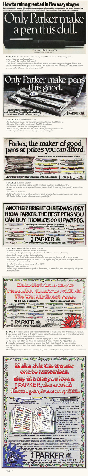
MY RIP OFFOF ROB MORRIS'S RIP OFFOF FRED MANLEY'S GREAT,ORIGINAL IDEA.
MY RIP OFF "OF MY RIP OFFOF ROB MORRIS'S RIP OFFOF FRED MANLEY'S GREAT,ORIGINAL IDEA.

It’s what you hit when you run a marathon.A sudden loss of energy followed by your body telling you ‘I’m done, it’s all over’.But keep putting one foot in front of the other and pretty soon you’re through to the other side, with renewed energy.I was teaching students at the SCA2 last Friday, and was reminded that as creatives we also face a walls, (not physical ones, obviously, they were torn down years ago to make room for ping pong tables and cappuccino machines).Our walls are in our heads, mental blocks that appear impossible overcome.Never is this more apparent than when you're starting out, searching for solutions is a bit like trying to make your way through a jungle; if one pathway is blocked you turn around and look for an unblocked one.But when you’ve been doing this thing for a while, you expect to hit a wall, it’s not a glitch in the process, it is the process.So you don't panic, turn back or give up, because the best solution may well be on the other side.You also know that things change.The same brief on a different day can create a different outcome.Sometimes you can force a change, swapping rooms, locations, music even pens can have an effect on your thinking.They can mean you look at the problem, or wall, from a slightly different angle.It's where the old cliché 'ideas in the bath' comes from, it's not the water or soap, it's the giving up worrying about it, you relax, so your brain leaks out a solution.The key point is that when you face a wall, embrace it. Don’t take no for an answer.Keep chipping away, it, suddenly you'll see a chink of light, then before you know you’re through to the other side.What can look seem impossible today can be obvious in the morning.Who knows why? The brain is one weird organ.But have faith, it'll happen.I tried to give the students an example of where I'd gone through a wall.This was the first wall that sprang to mind.I remember it seeming impossible. (Or impenetrable if we're going to keep using wall-speak.)Back in the '90s I sat on the D&AD committee, we’d meet once month to debate the major issues of the day; should we change ‘The Design & Art Direction’ to ‘The British Design & Art Direction’? Do tv ads need a whole page each in the annual or could we squeeze two on a page? Or whether copywriter A or B should replace copywriter C on the Copy jury.It was gruelling.One month I turned up to hear that was facing a big problem.It sounded ominous.‘The jury pictures we’ve had taken this year are rubbish.'Not as big as I'd imagined, I continued listening.'They're just...well...…everyone looks weird.’Ok, what does that mean? A reshoot?‘We’d never get the jurors together again.’How bad can they be?Whoa!There was a mix of gasps and giggles as we went through the pictures.Everyone just looked... weird.Either awkward...
bemused..
stoned...
supercilious...
drunk...
sneery...
anxious...
or like they wanted to murder your family.
Only my old mate Sean Doyle came away unscathed.
What the hell had happened?‘We need to do something…it’s very awkward.’ said the lady from D&AD.I don't know whether it was because I was the only art director on the committee or I was feeling a bit cocky, but I said I’d take the problem on.I took all the evidence back to BMP with me.Right, let’s have another look.Wow!What the hell had happened?Did the photographer think it would be interesting to shoot all these slick, superficial marketing types in the grungiest way possible?Or did he think advertising is evil, so tried to capture that vibe in the shots?Was it just his style? (In which case why was deemed appropriate?)Maybe we all being a bit sensitive about a few portraits?Maybe they look like that in the flesh?I compared the jurors in our pictures to their portraits in the previous annual.
Jeez! That's one year, if they’d been shot 20 years apart, it’d be understandable.I set off.1st IDEA:We give them to an illustrator as reference to illustrate them, BOOM!‘We don’t have any money, there are hundreds needed.'2nd IDEA:What’s the exact problem? Maybe it’s the universally yellow skin?

Maybe we can colour correct them?

Maybe less pasty?
Mmm, no, too much. Plus, it’s not just the skin tones.3rd IDEA:Maybe there's some kind of graphic, paintbox* technique, to blur our detail? (*Computer the size of a wardrobe, back in the day.)

Too cheesy.

Quattro Fromaggio.This is the D&AD Annual, it should be sans cheese.4thIDEA:Maybe we can do something with film grain, like that photographer David Fairman?
We had a go.

Garbage!You either need to do it in camera, be David Fairman or both. We couldn't and I'm not.5th IDEA:Maybe black & white would be more forgiving?It'll sort out the yellow and weird blemishes and patches too.Might look a bit more sophisticated too?

A bit.But it's not just a colour issue, it's the weird angles and shot choices.6th IDEA:Maybe we blow out all the detail by making them graphic and contrasty?(Who needs detail? Readers don't need to pick them out from a police line-up.)

Too crude, this is D&AD, not a local, badly printed newspaper.7th IDEA:Maybe a duotone would look cool?It'd look like a style choice, not a fix.

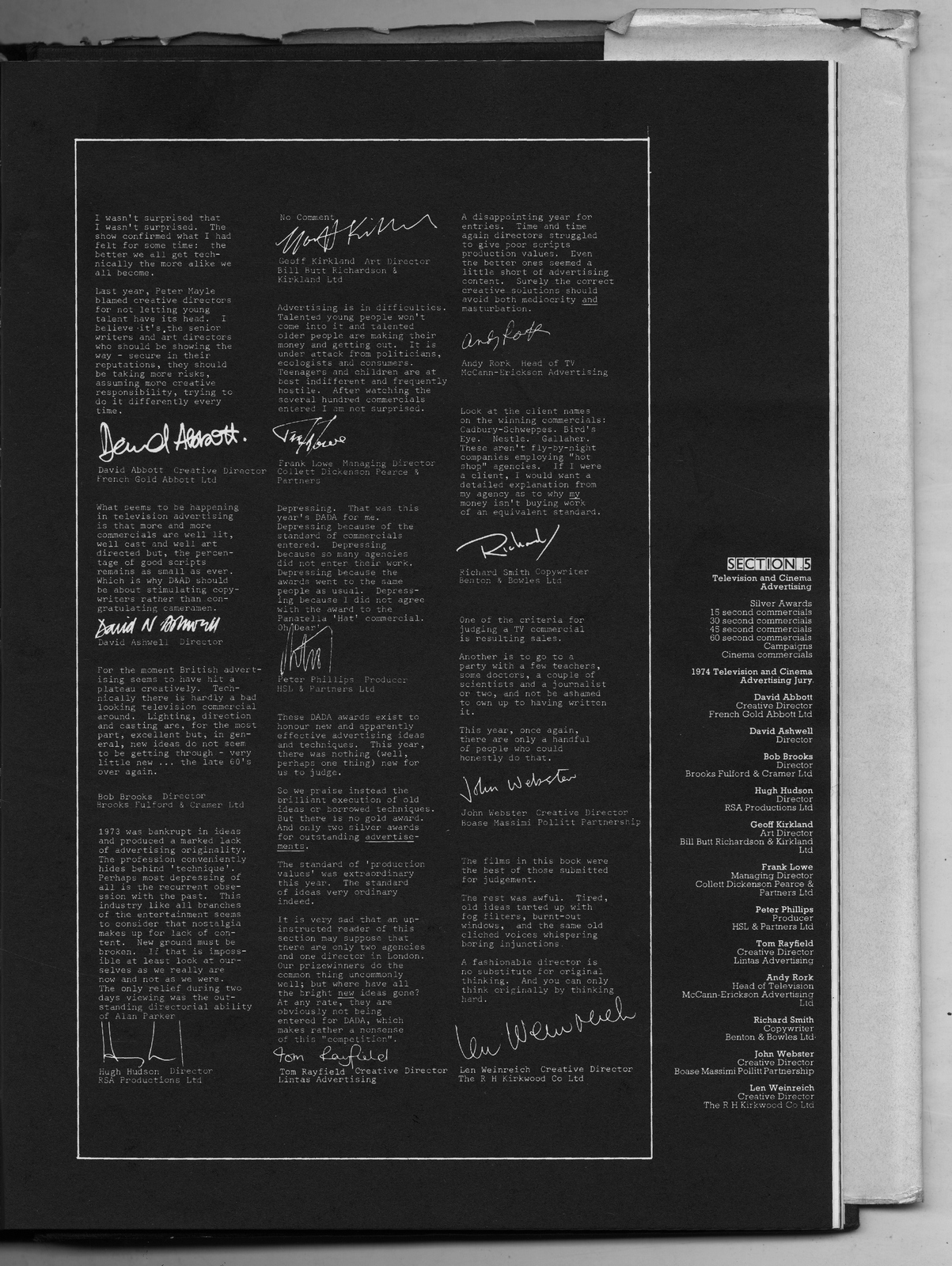
But why? It looks like we're doing it for a reason and we're not.8th IDEA:Stuck, I flipped through some old annuals to see how they used to treat the jury sections.One year, 1974, they had statements and signatures, instead of photos.I liked it, it was interesting to see the signatures of the likes of David Abbott and John Webster.Maybe we use signatures instead of photos? It's still personal.
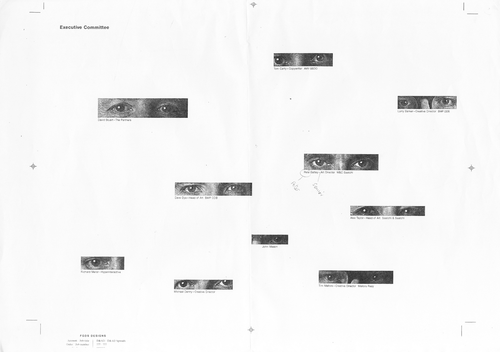
'No, we need to use the pictures, we’ve paid for them.' BUT. YOU. HATE. THE. FUCKING. PICTURES!Jesus!Ok, so let’s recap:We can’t reshoot because we can’t get the jurors again.We can’t turn them into illustrations because we don’t have any money and there are hundreds.Black & White makes little difference.Techniques either look cheesy or render the person unrecognisable.We can’t use signatures because they aren’t the photos.The photos we all hate.But have to use.So, there’s the wall.A big, granite, electrified, immoveable wall.Ok, let's have another go.So, let’s get this straight; we have to use the pictures that we don’t like but I need to make them more likeable…without changing them.Ok.Tricky.Ok, nothing is impossible, as the kids around at Saatchi's say, so, we have to use the pictures that we don’t like but I need to make them more likeable…without changing them.Ok.Got it.Why the hell do we need to use pictures anyhow?Who cares about the faces?Why do we need to see what the people looked at the work look like anyhow?Oh, hang on, the people who looked at the work?Eyes.Maybe we crop the shots so tight that we only see their eyes?That’s what they judge with?Cool, there’s a reason for doing it.
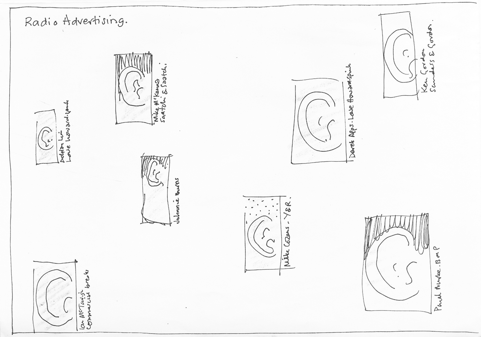
Oh, hang on, are all the juries things you look at?I check last years annual.DAMN! Radio.What to do?What to do?BINGO! We just reshoot their ears!
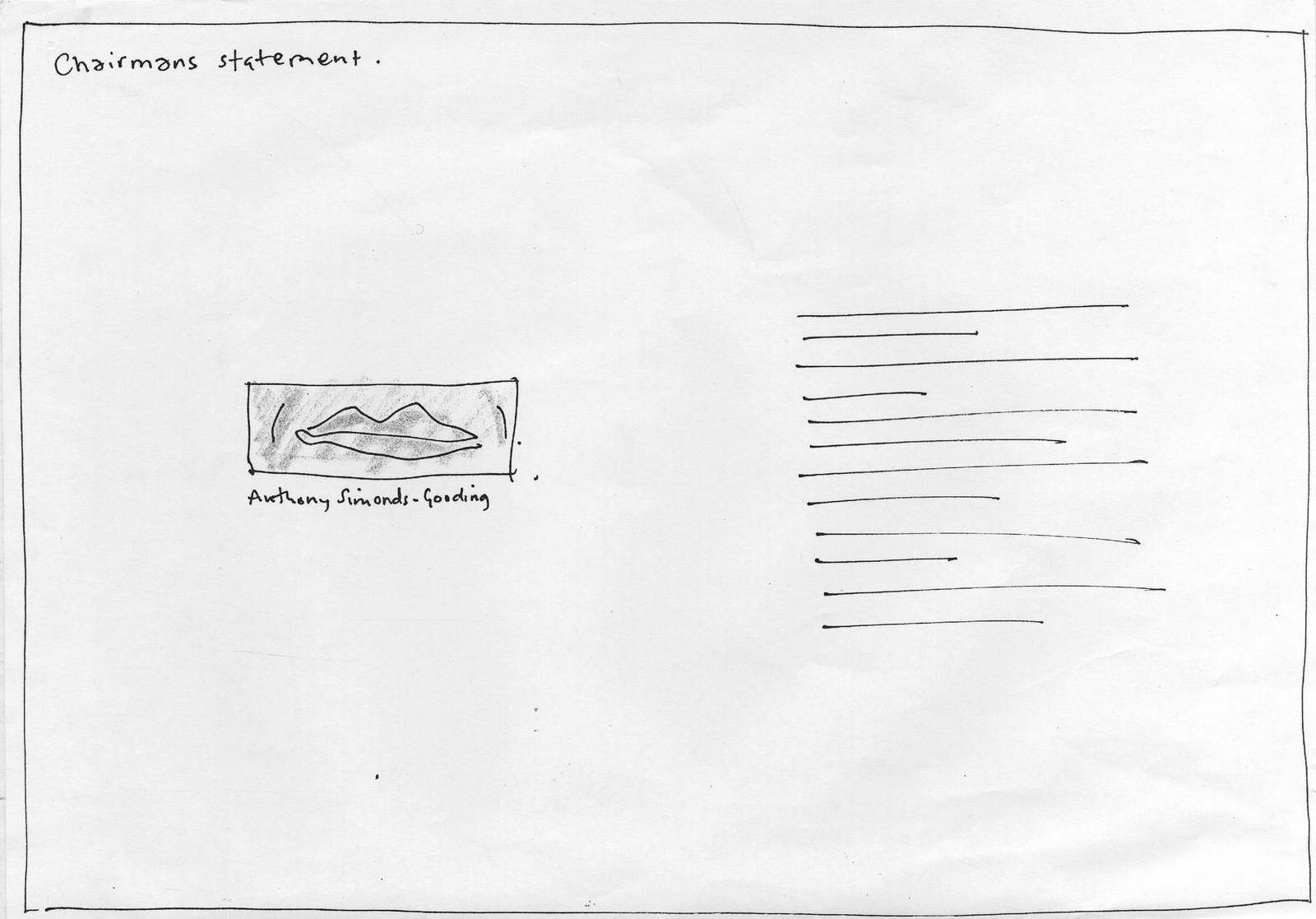
DAMN!The Chairman's Statement?What to do?What to do?MOUTH!
Love it!It's actually better with the mouth and ear additions.I go down to Vauxhall.I turn up at D&AD headquarters feeling pretty-fucking-clever.Can't wait to see their faces.I smashed that wall to bits.Think it can't be done? Think AGAIN.I present my solution.‘Oh, you can’t see their faces?’“Exactly! Clever huh?’.'Oh?''And on Radio; Ears! Chairman's Statement - Mouth!' ‘Oh no, we have to use the photographer’s shots, we've paid him for them.'But you don't like them?'Yeah, but it’ll be a bit awkward if we don't use them, he did them cheap.'OH FUCK OFF THEN!E.g. A page from the 1998 D&AD Annual.
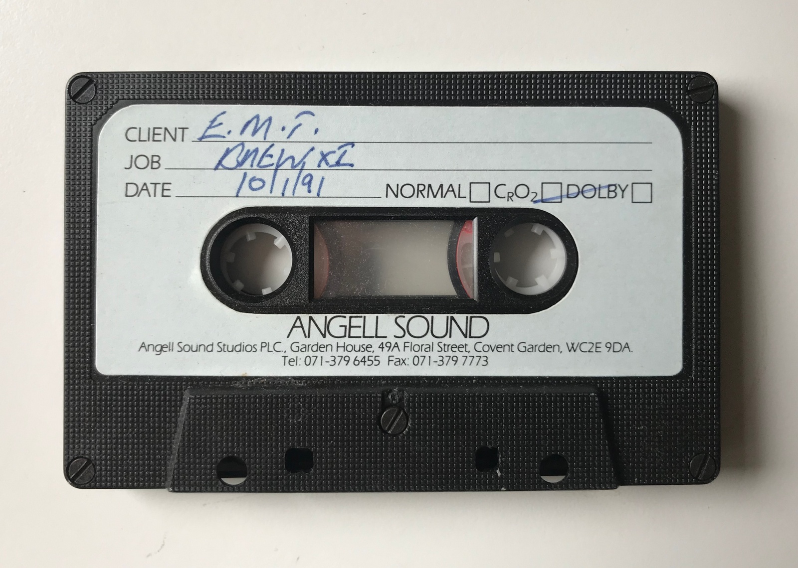
Back in the seventies there was a tv show called The Waltons.A depression era family mooched about Virginia's Blue Ridge Mountains dealing with various social and moral issues. It was very wholesome.At the end, after some member of the family had realised the error of their ways, they'd cut to their familiar end device: A shot of their quaint wooden house at night. We'd hear a voice ‘Goodnight John Boy’, then gradually we'd hear all the other members of the family shout their goodnight.It was slightly chaotic and you were reminded that there were a lot of Waltons living cheek by jowl in that house.A decade later I was given a brief for The Observer Newspaper - a 48 sheet poster to promote their property section.Bingo! Show that end shot with ‘Goodnight Jon Boy’, ‘Goodnight Mary Lou’ plus another fifty goodnights and names, underneath was ‘If you’re looking for a bigger home, take a look in The Observer.’ The Creative Directors loved it.The Account team presented it.The client bought it.Kind of.They thought it would make a better radio ad.
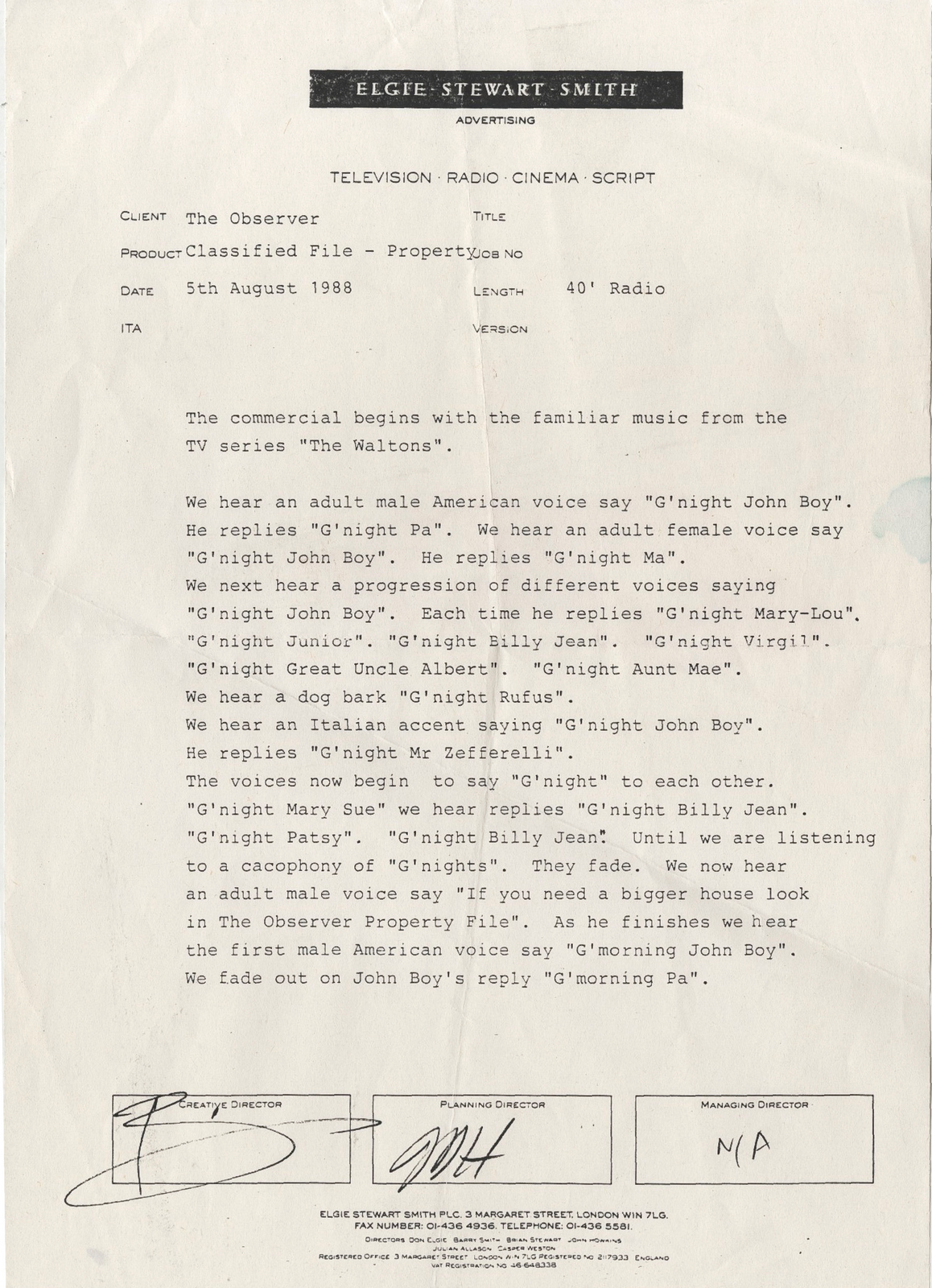
Heartbreaking.Rather than have a big, glorious proof to put in my book, I’d have a little cassette.It got made.It got into D&AD, my first entry.It won gold at Creative Circle, my first award.Maybe it'd worked out best after all?I added the little cassette to my book.It was the only thing in there that had won an award.
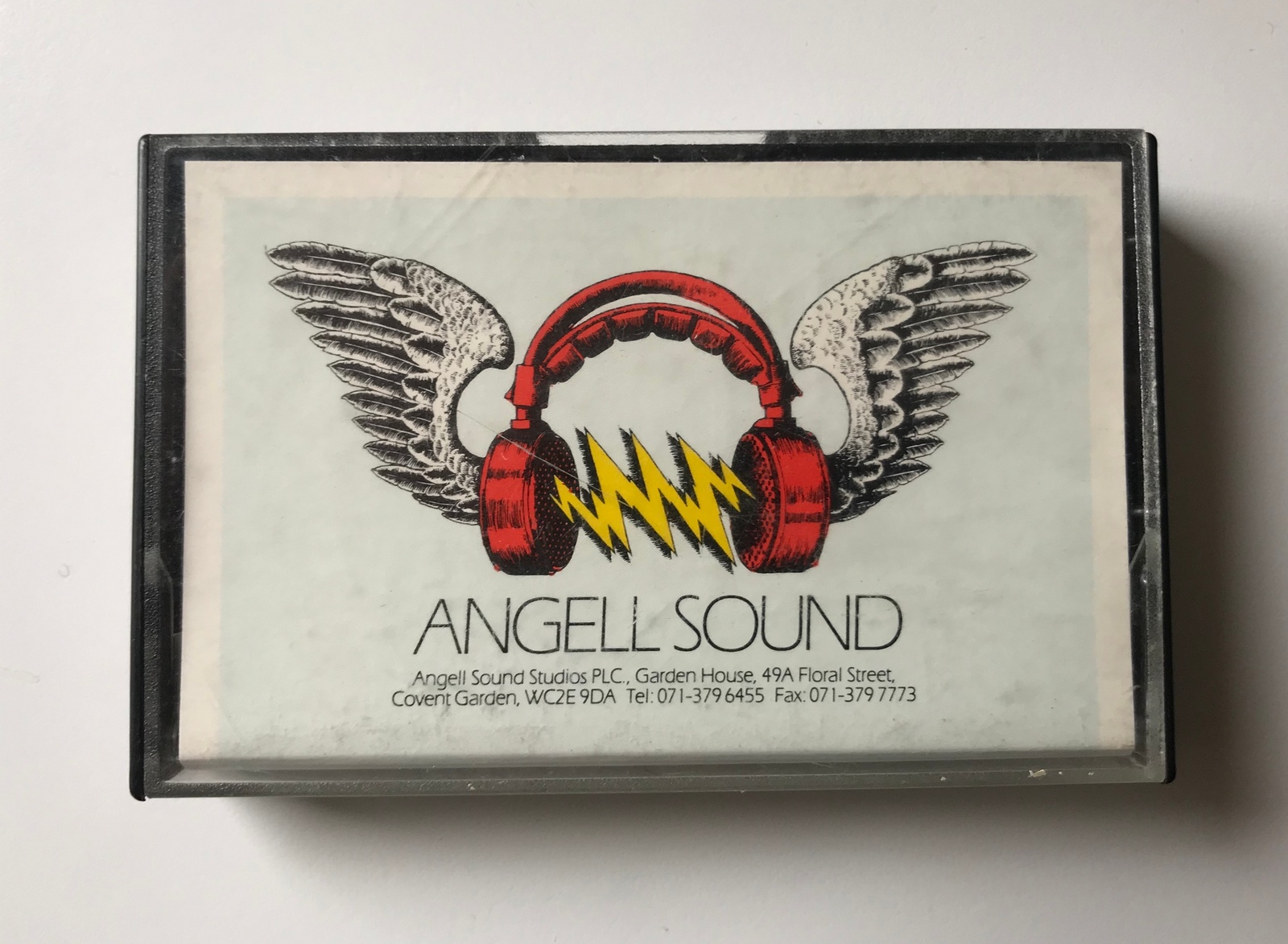
I’d show my book to the great and the good at the agencies I hoped to graduate to, and without exception, they’d get to the end, see the cassette and start zipping the book up.I’d say ‘I have a radio ad…it’s won an award’.'Great' they'd say, continuing to zip.I’d push a bit further ‘Would you like to hear it?’The answers would range from ‘I’ve got a meeting I have to be at’ to ‘No...I’m sure it’s pretty good if it’s won an award.’No fucker would listen to it.My only award winning piece of work.What is it with radio?Why do we treat it like the runt of the media litter?It can be amazing.E.g.
It’s one of the most intimate ways of communicating.E.g.
And they're dead cheap to make and run.E.g.
But generally, creatives try to avoid radio briefs.E.g.

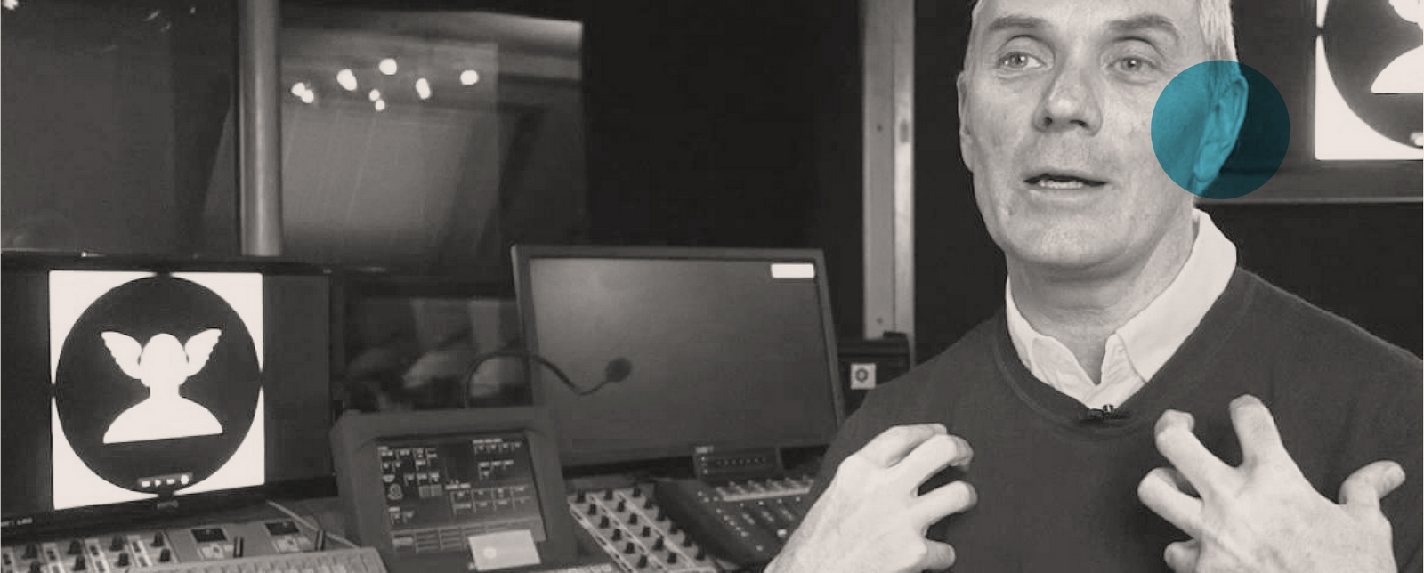
A few months ago I thought it would be good to post something on radio advertising, partly because I think it'll start to grow due to the booming podcast world, partly because it's the perfect subject matter for a podcast.Whilst thinking about how Angell Sound had closed, maybe I could interview Nick?
But for a decade or so after the whole Walton’s episode (or Waltongate as I refer to it), I’d avoided radio briefs whenever possible, so didn’t feel sufficiently knowledgeable to grill Nick.Fortunately, I have a mate who's more than qualified, this guy, casually looking off into themiddle distance.
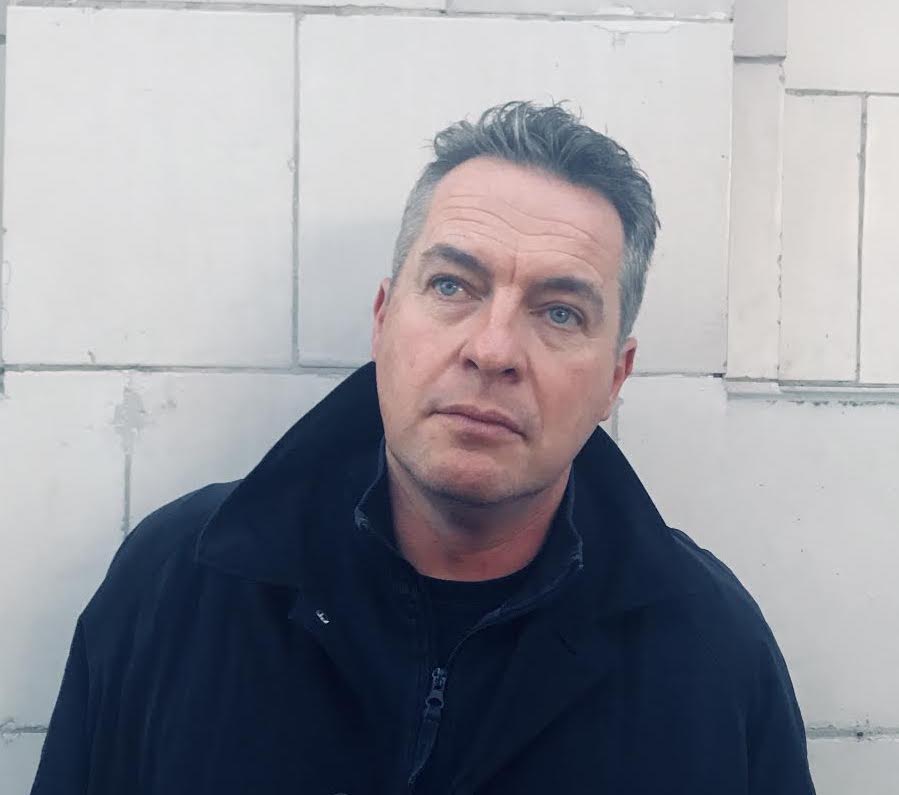
Paul Burke, copywriter at BMP/DDB, JWT & AMV/BBDO.I was going to say he's one of the few creatives to truly embrace the possibilities of radio, but I can't think of who the others would be? So maybe he's the only creative to truly embrace the possibilities of radio.It's lead him to set up his own radio production company, teach and promote the joys of radio.Not only that, like the man from Delmonte 'He say yes!'.So here they are.Enjoy.[audio wav="https://davedye.com/wp-content/uploads/2019/10/Paul-Burke-Interviews-Nick-Angell_126.57-1.wav"][/audio]

Nb. These will make more sense after listening.a)
b)
c)

d)

e)


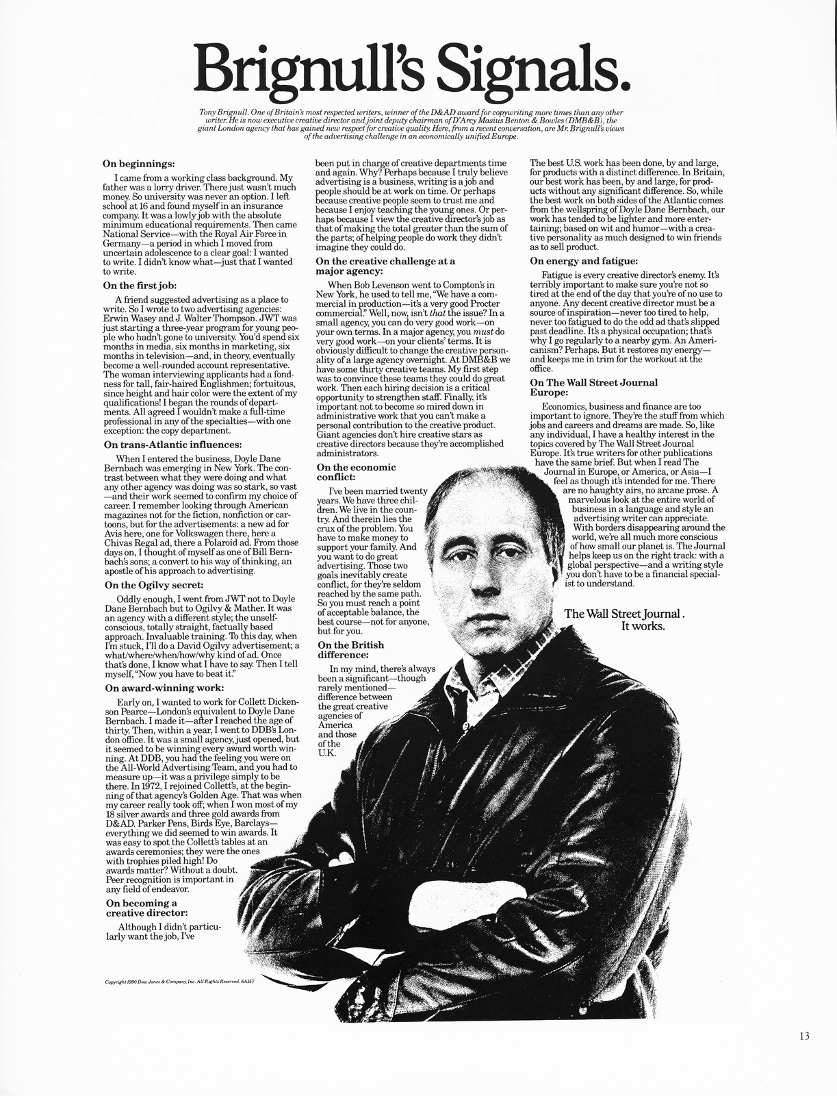
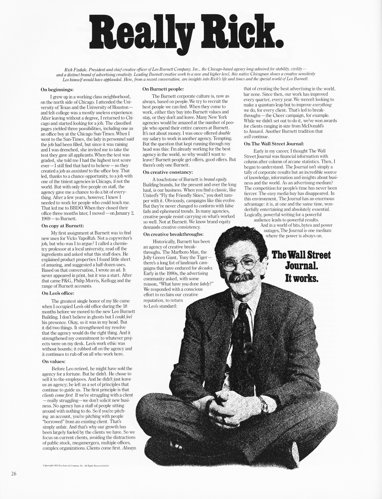
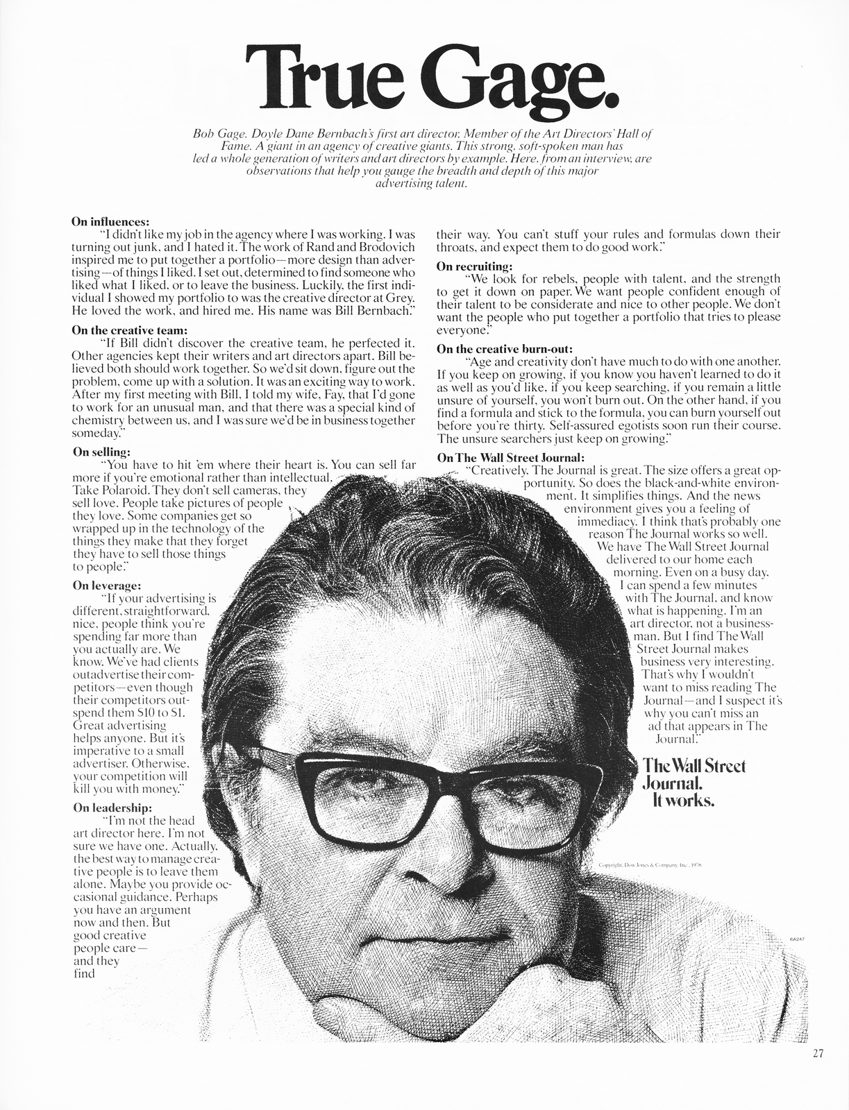
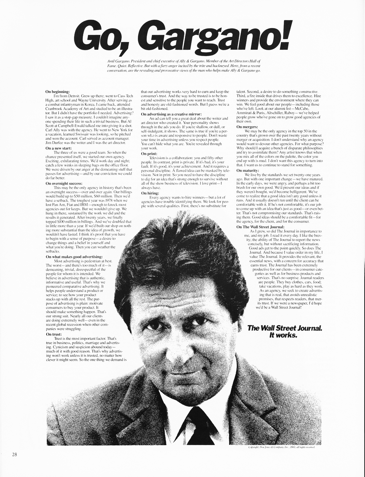
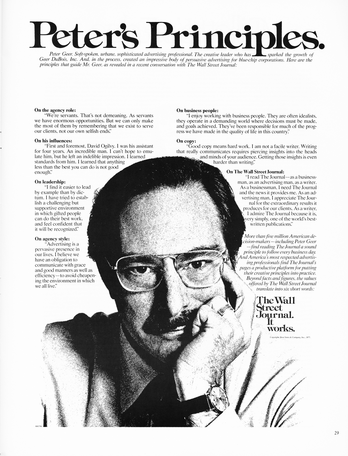
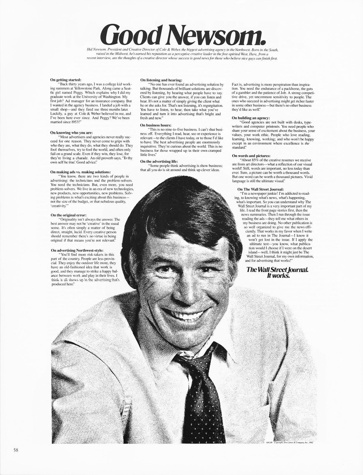
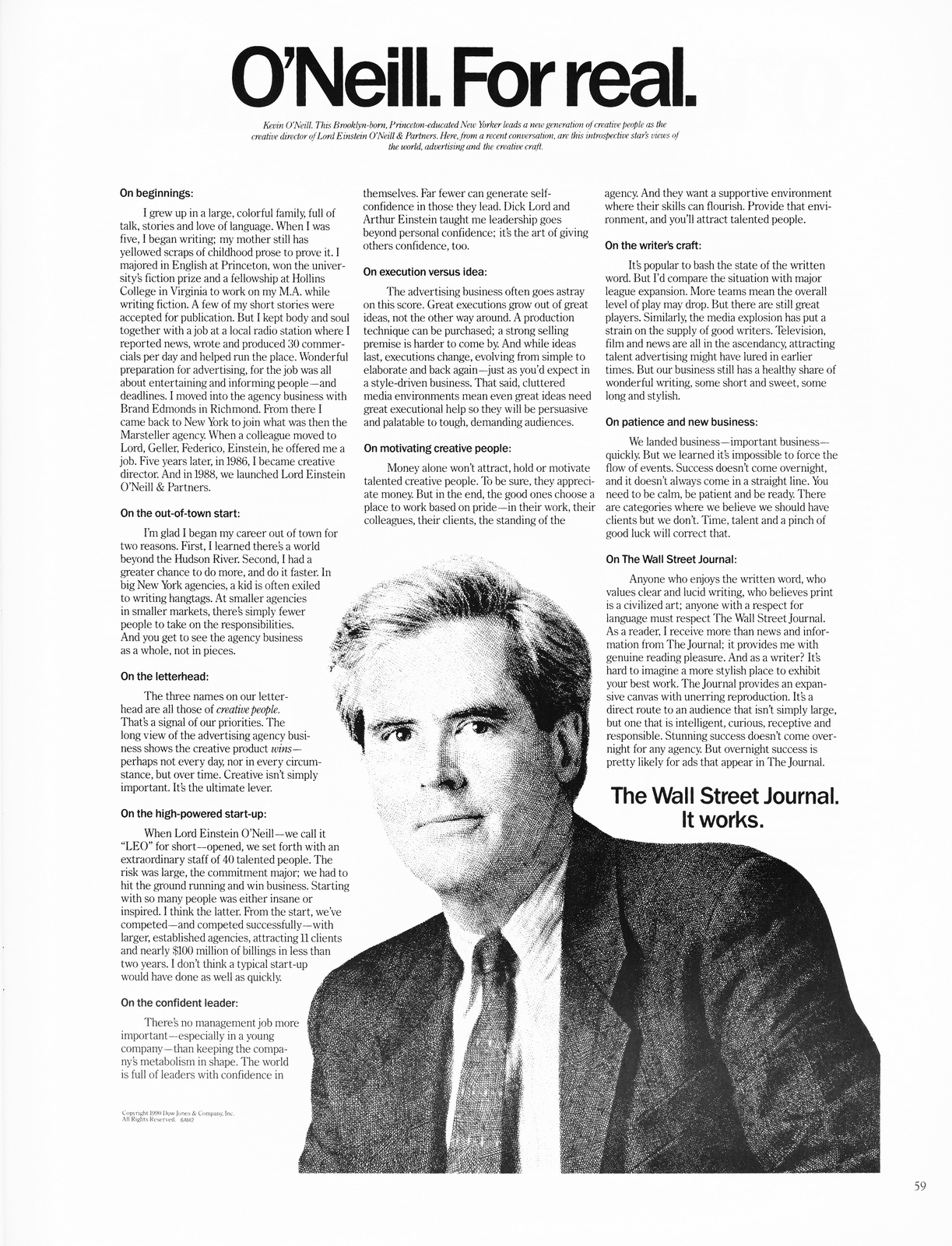
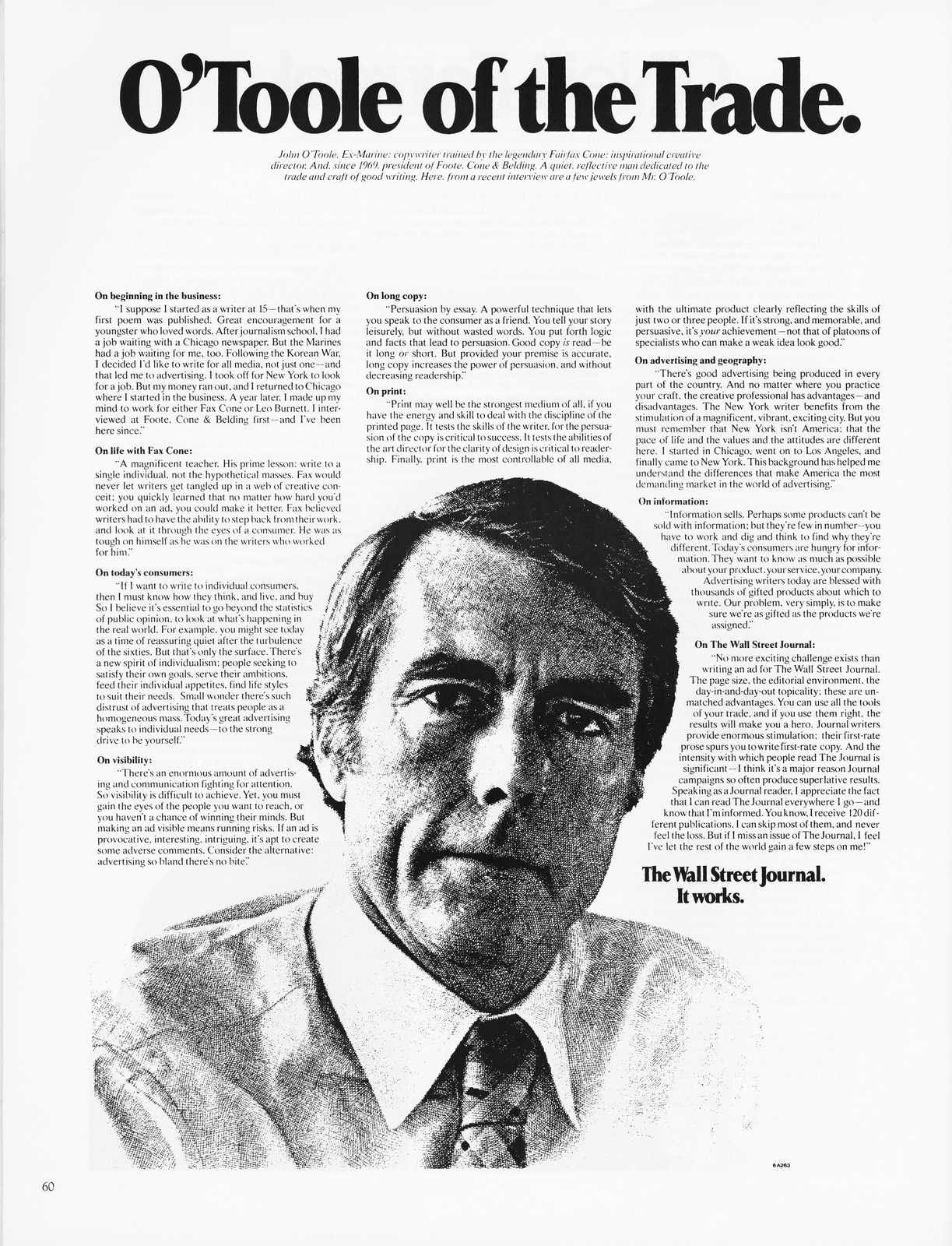
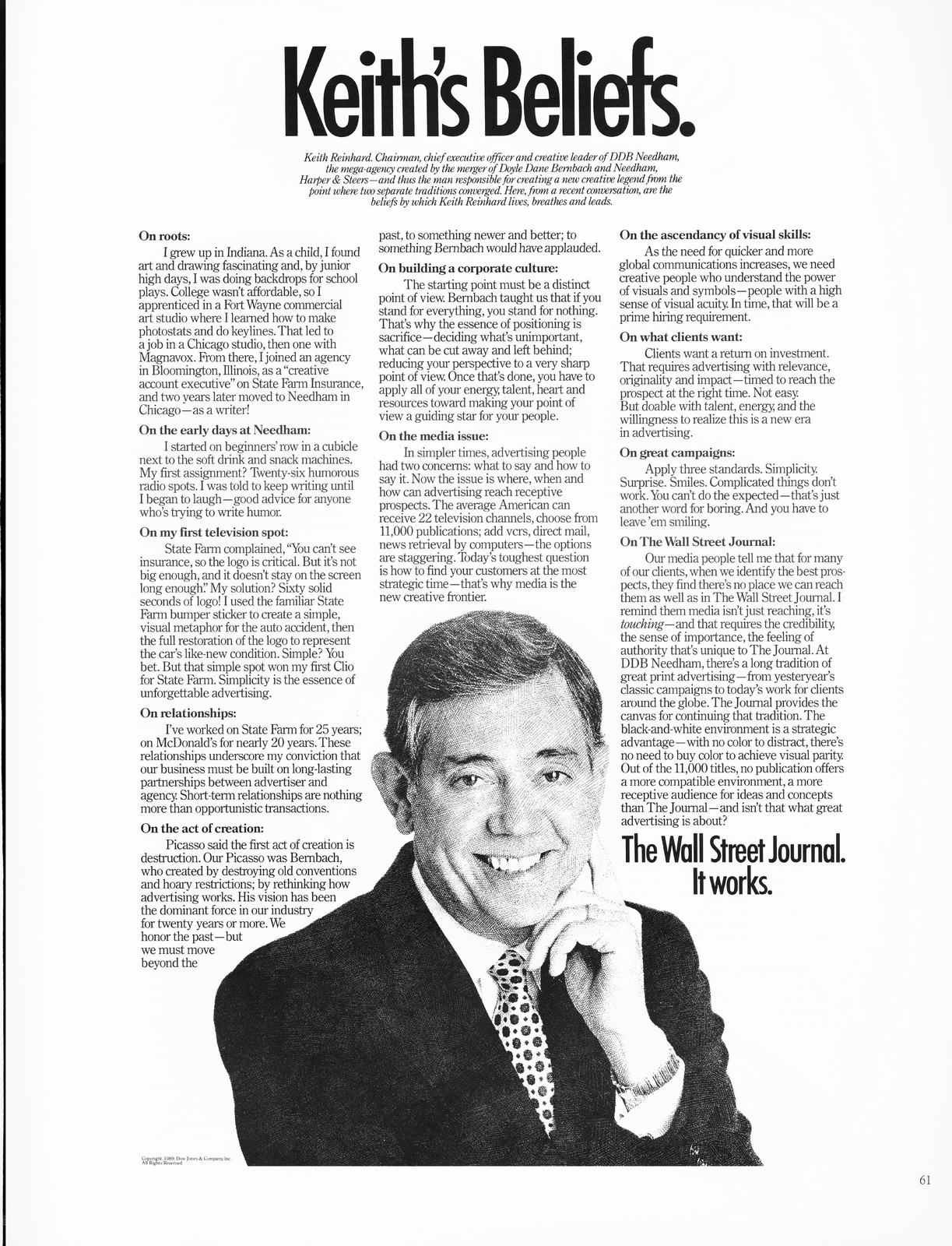
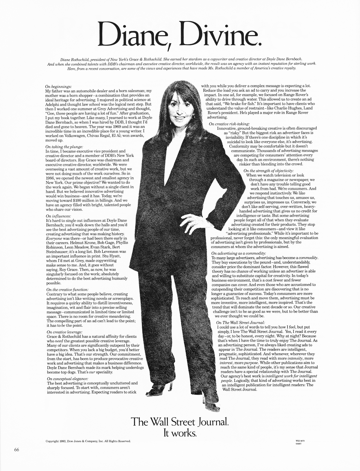
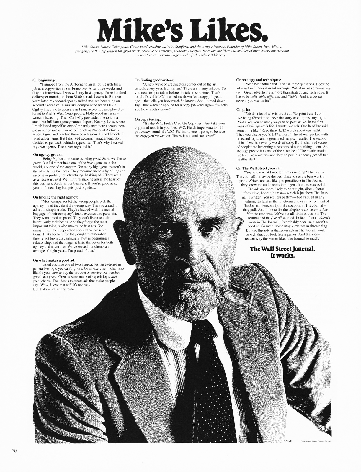
ADVERTISING'S OSCAR WILDE.
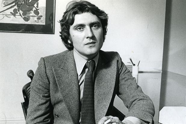
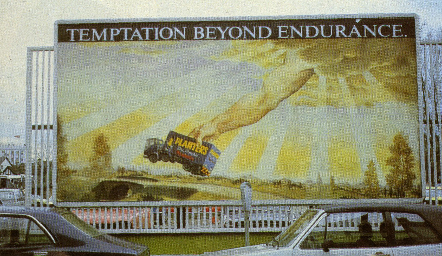
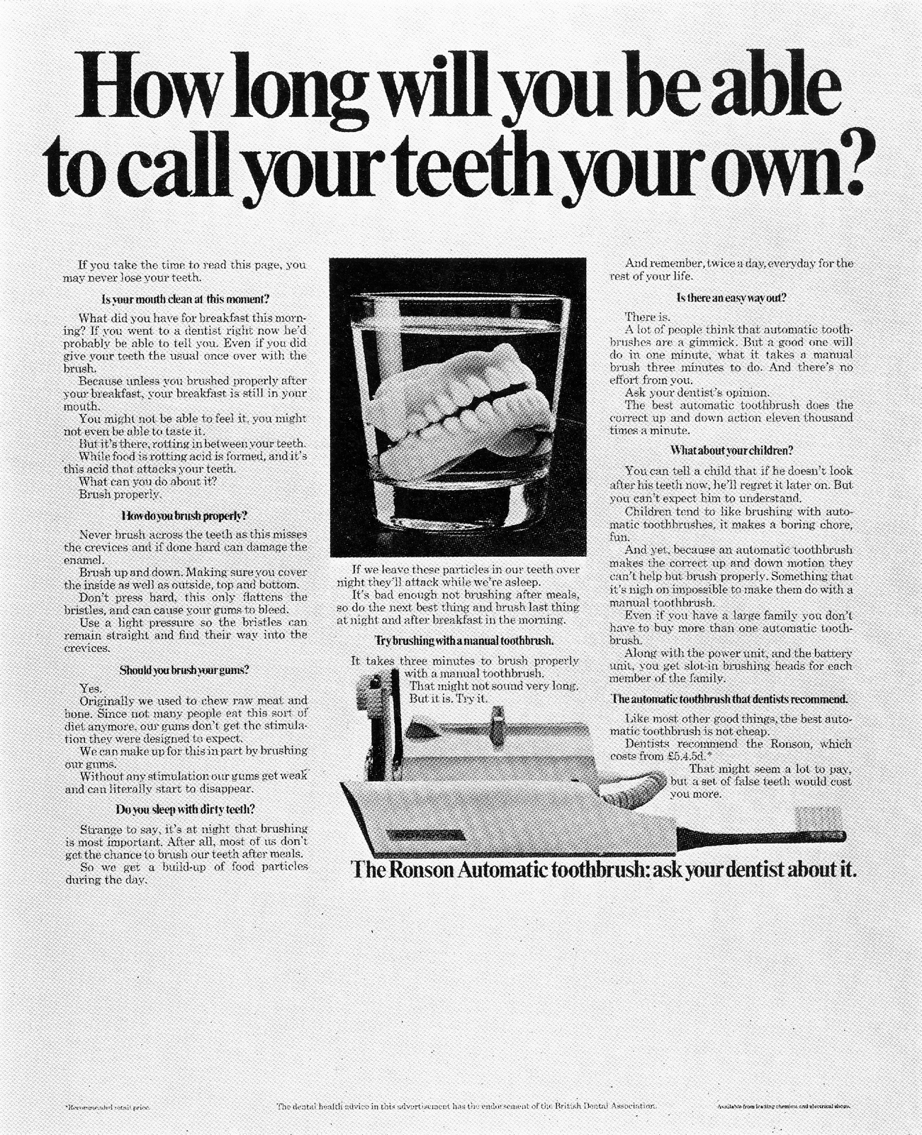
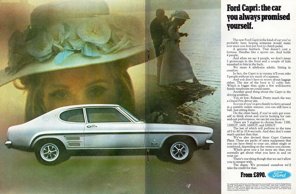
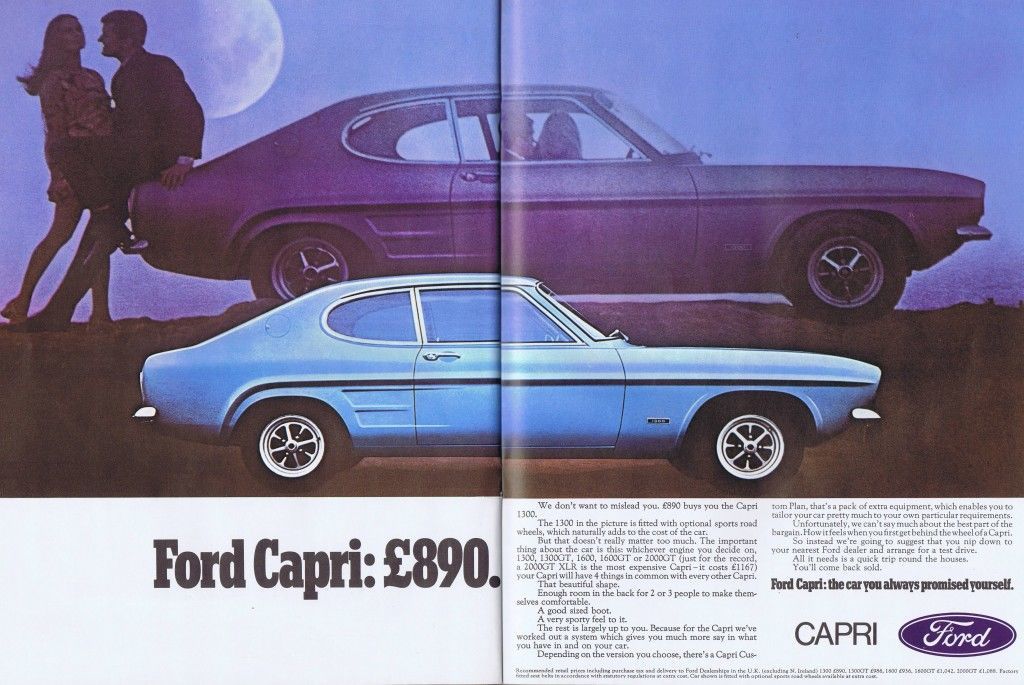
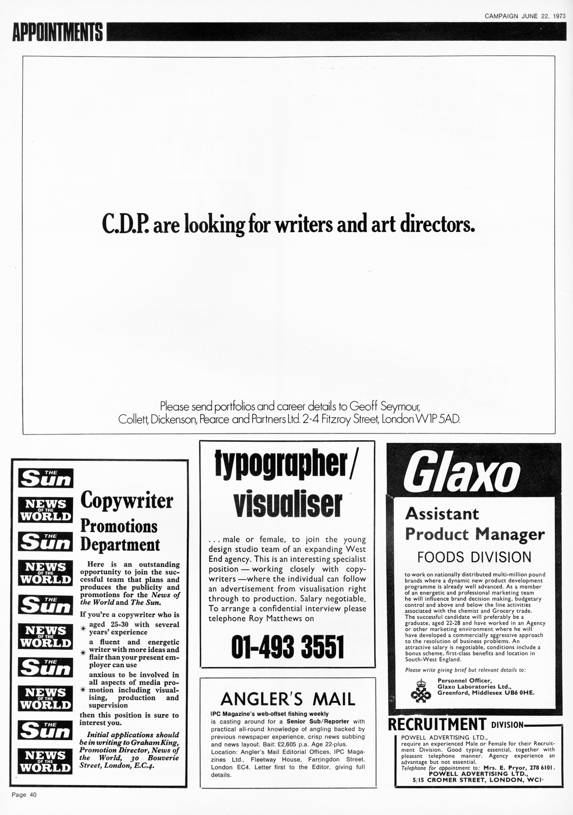
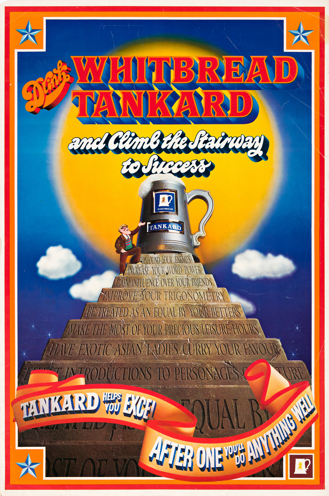
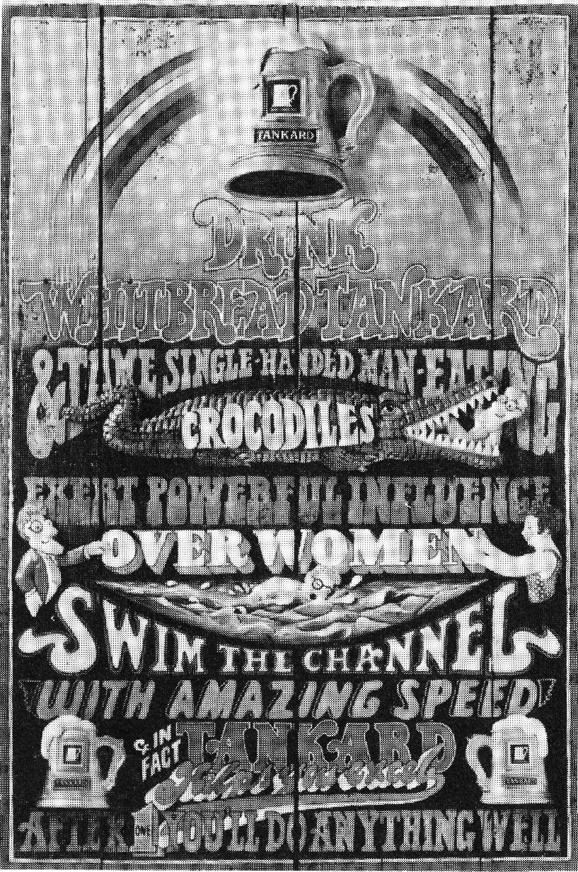
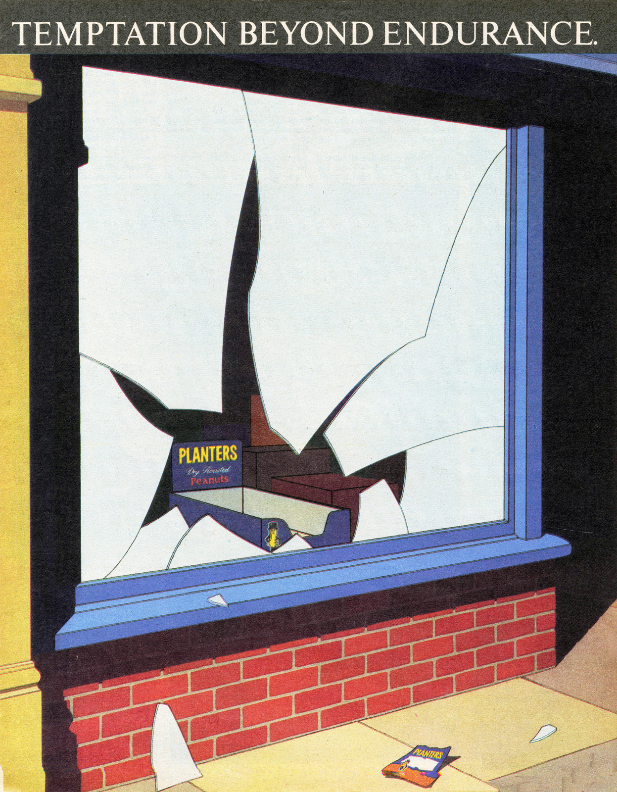
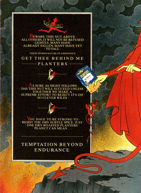
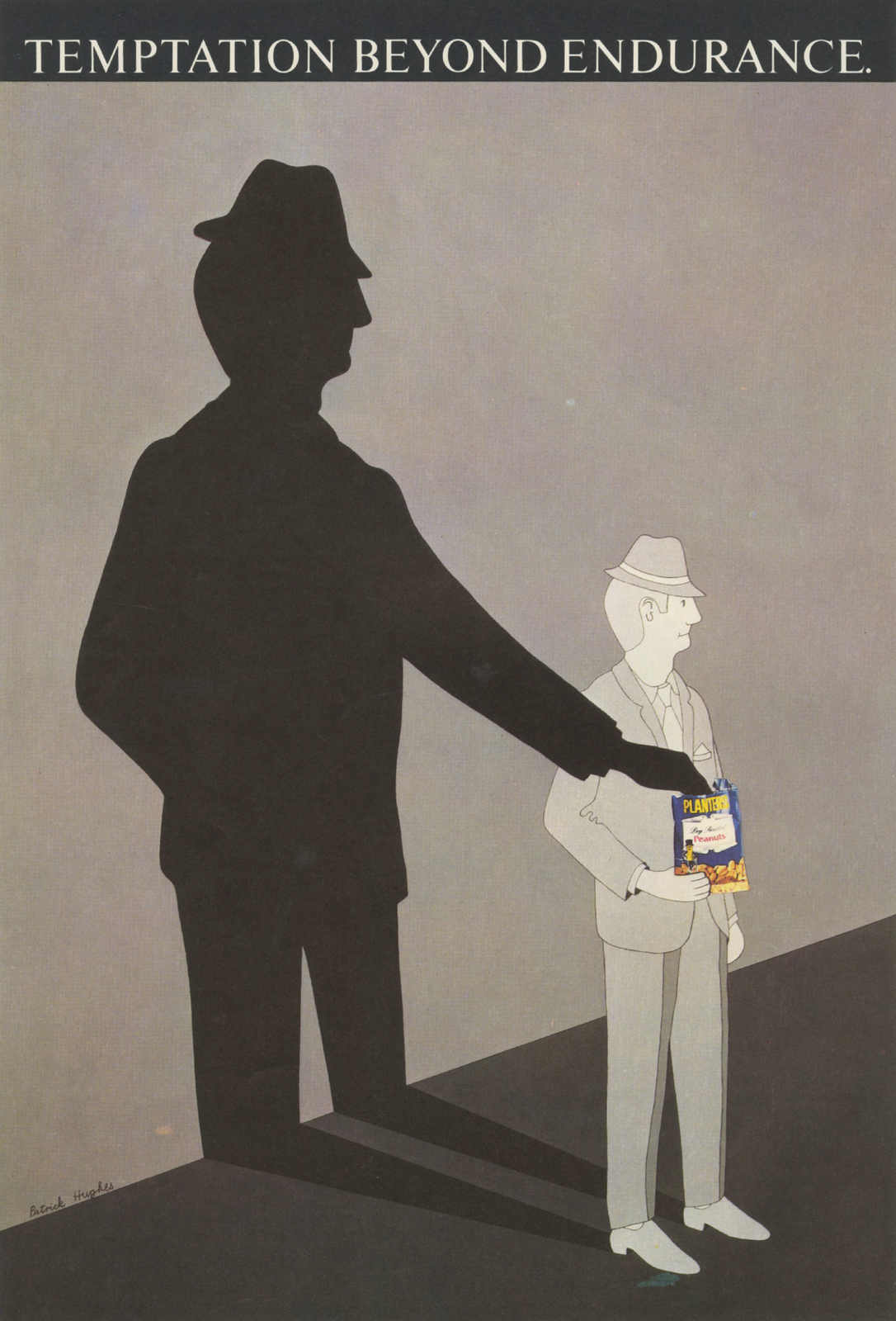
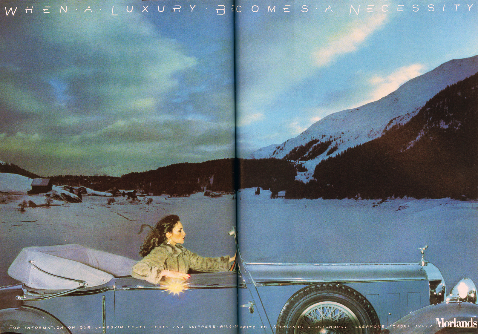
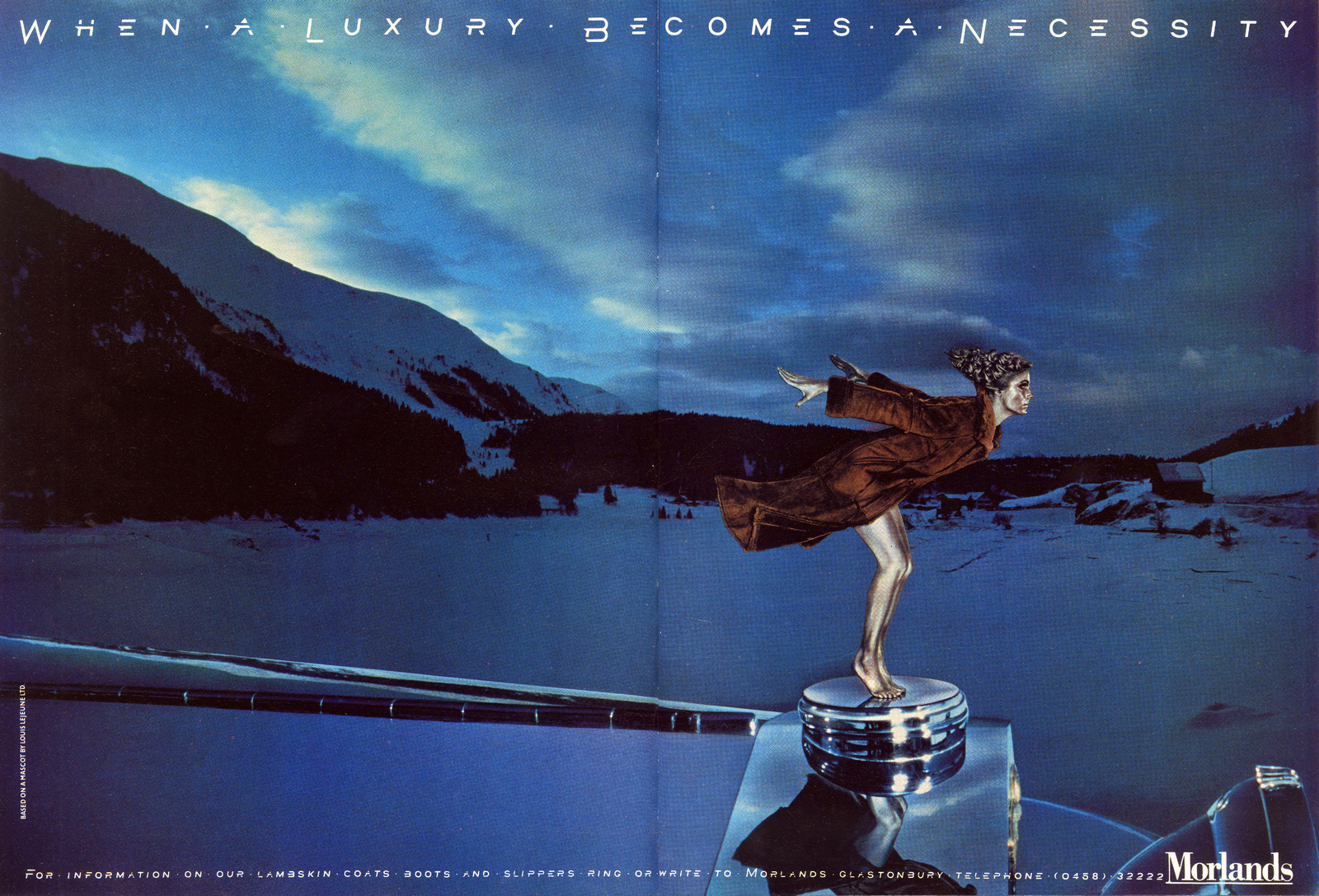
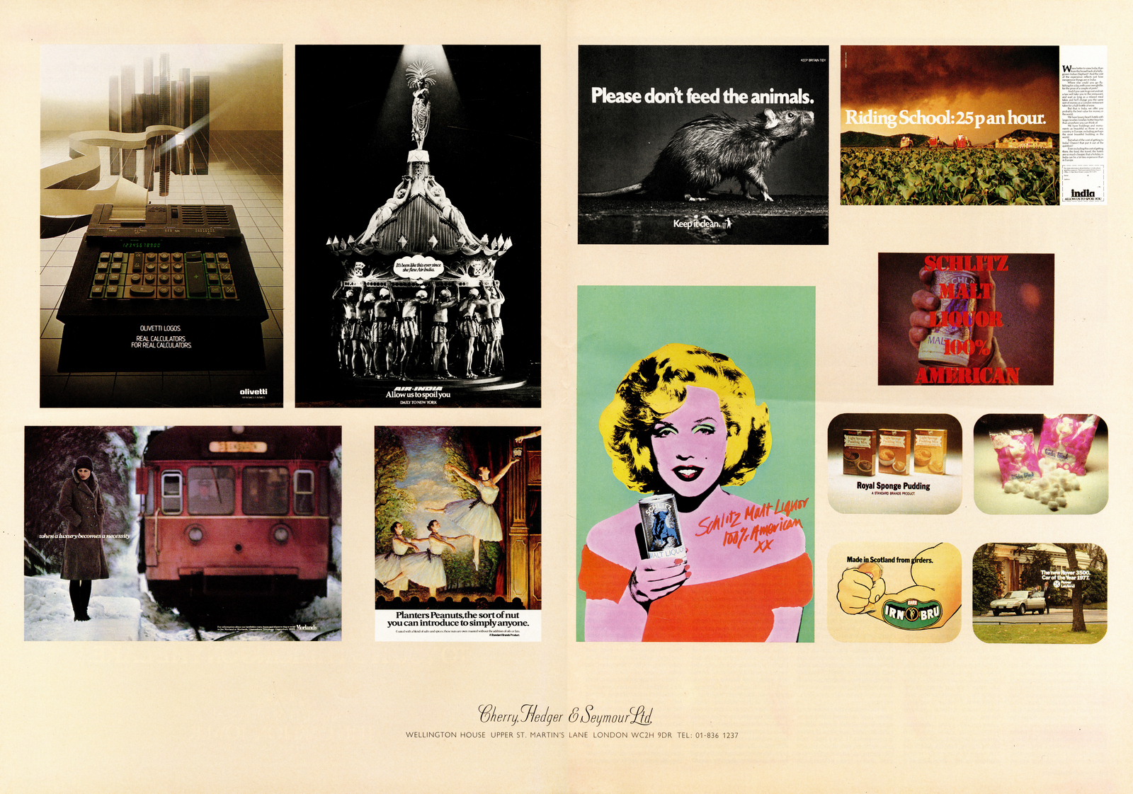
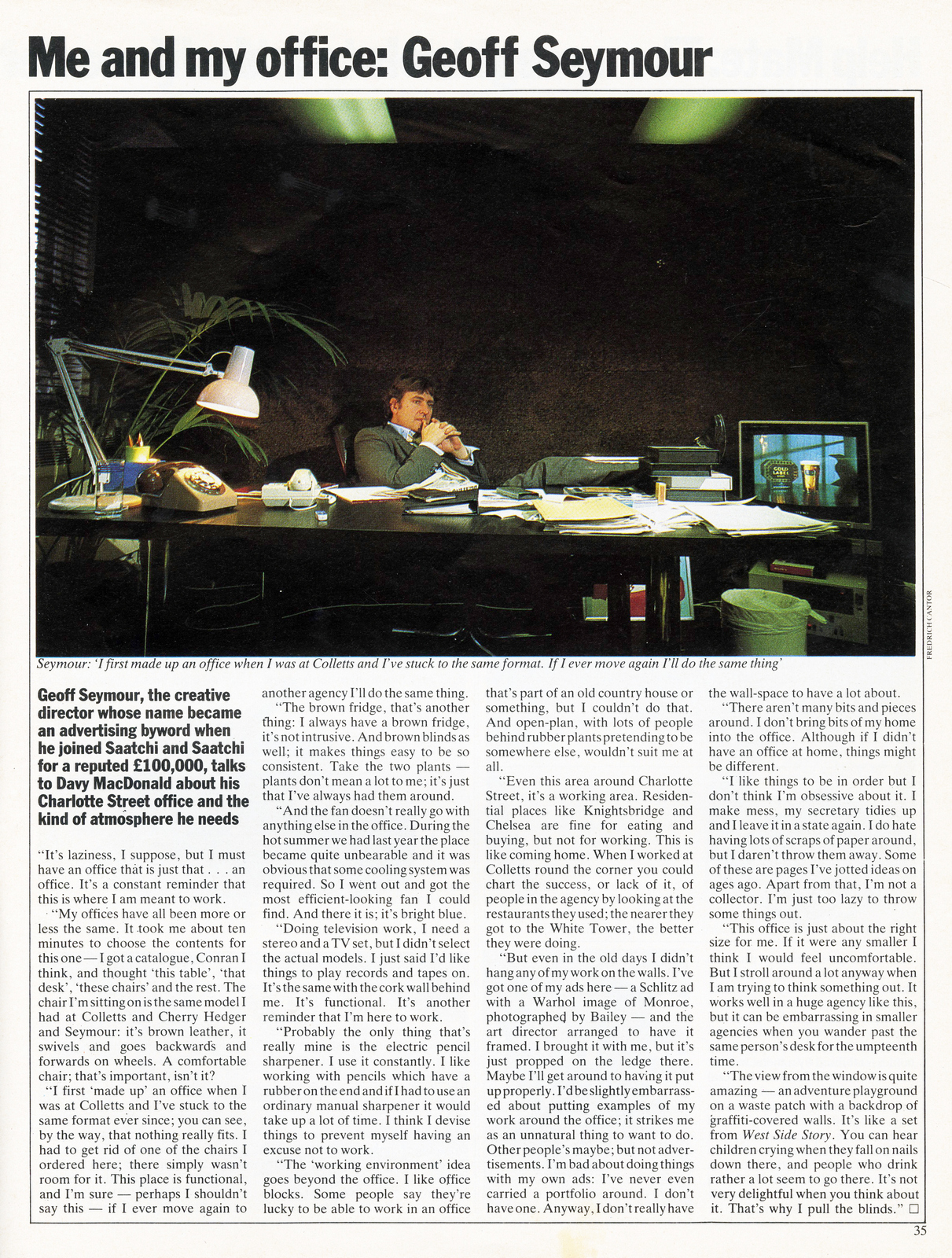
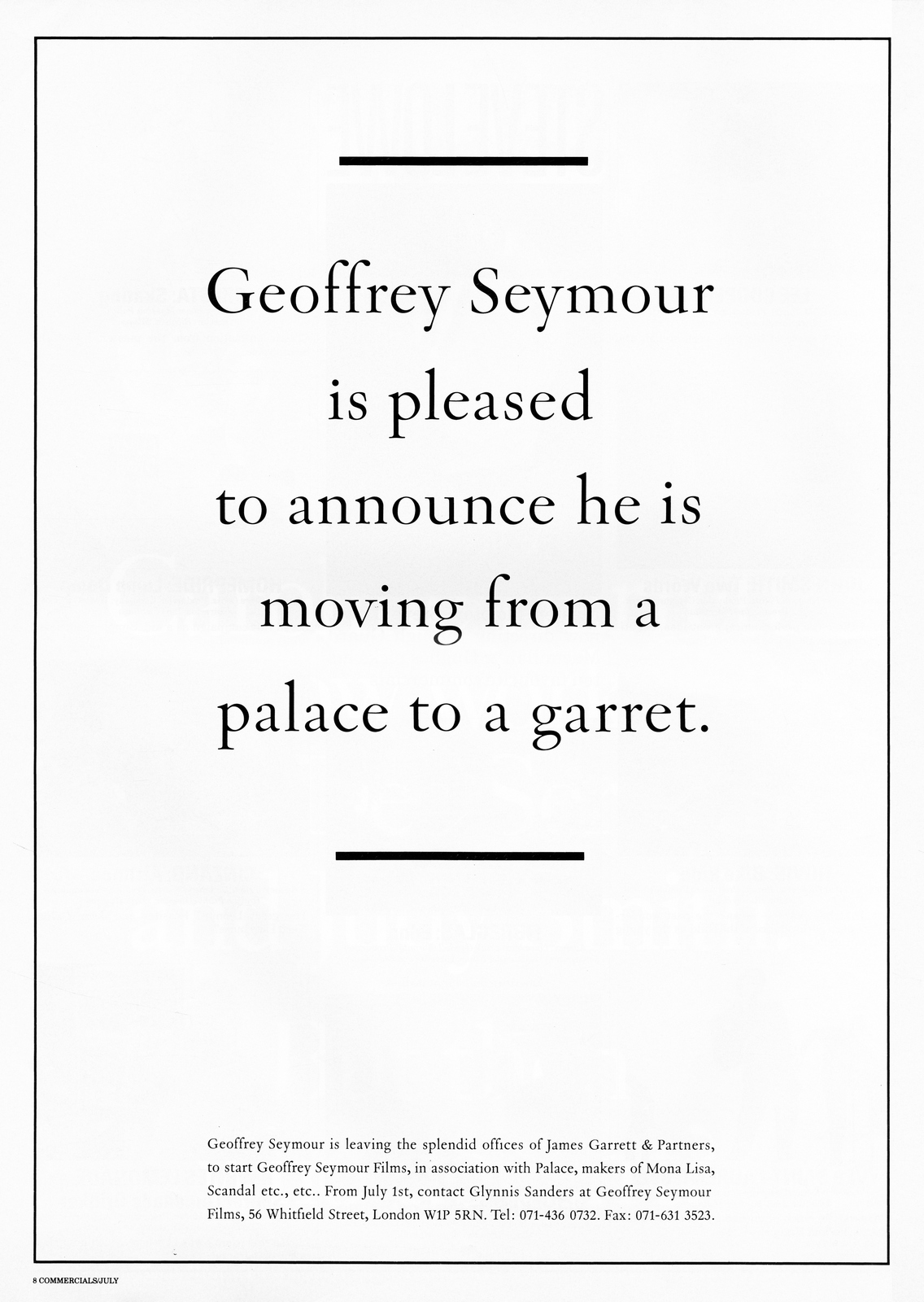
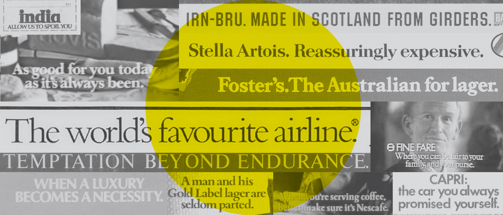
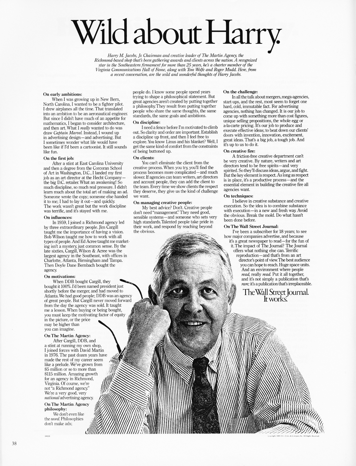
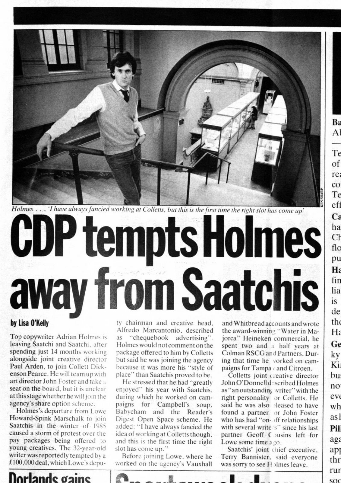
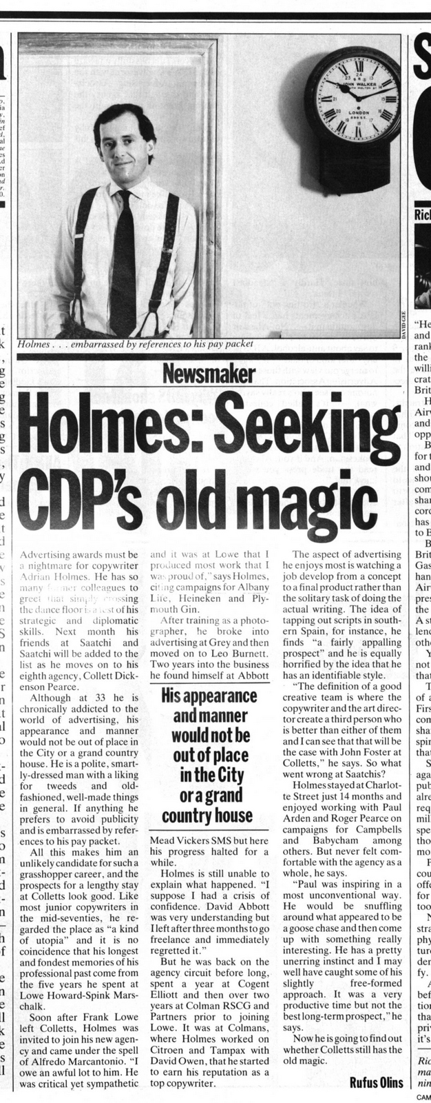
An appreciation of the work of Geoffrey Seymour. By Mike Everett.It is one of the great ironies of the advertising business that one of its most talented writers is better remembered for his salary than his work. When he joined Saatchi & Saatchi in 1982, Geoff Seymour was paid £100,000 a year, a sum of money that soon became known in advertising circles as a ‘Seymour’. It may have been as an eye-watering amount at the time but, to pinch L’Oreal’s famous end line, he was worth it. In the 14 years leading up to 1982 he had been responsible for some of the most ground breaking and original work ever seen on the TV screens of Britain.As Sir Alan Parker has said, “Geoff was quite brilliant. He was one of the best thinkers of his generation of ad men and responsible for some seminal work, which helped revolutionise British and world advertising. I have to say my memories of working with him were completely pleasurable - invigorating, anarchic and fun”. If that endorsement wasn’t enough, what about this from Sir Ridley Scott: “Anything that Geoff Seymour wrote I verymuch paid attention to because he was kind of special. The main draw to direct Hovis was working with Seymour”. So what was this work?Let’s start by going back to 1968. A twenty-one year old Geoff Seymour is handed a brief to write a TV campaign for Bird’s Eye Dinners for One by Frank Lowe. ‘Let’s do some famous work’ Frank tells Geoff. Frank remembers that Geoff was unfazed by this exaltation and soon did something that Frank clearly remembers about Geoff. “He had a great facility for writing good lines, which I often thought of as based on the strategy we agreed, before he wrote the actual commercial”.In the case of Dinners for One, Geoff fretted that the product name would work to its disadvantage; that the name might suggest that it was a product for sad bastards, who live alone with no mates. Geoff got round this by writing the line ‘especially good for those who aren’t used to being on their own’. He brought the line to life with scripts that spoofed two feature films, Desert Song and Brief Encounter. Alan Parker shot them in glorious black and white. If you were to ask Alan Parker today which of the many commercials he directed is his favourite he would tell you Brief Encounter.Another irony that concerns Geoff Seymour is that he is credited with writing many commercials that he didn’t. In his obituary in the Guardian, for example, he is cited as the author of the famous Hovis Bike Ride commercial. He is not. David Brown wrote the script for that commercial. However, Geoff did write the end line ‘As good for you today as it’s always been’ and wrote two commercials that preceded the Bike Ride commercial, Seaside and Northern. In other words, he wrote the campaign, a far harder task than the writing follow on commercials, no matter how good they might be, as David Brown would surely concede.The Guardian also credits Geoff with writing ‘It makes a dishonest woman of you’ for Bird’s Eye pies. Not so. Tony Kenrick and Vernon Howe wrote that campaign. Likewise, ‘When you’ve got to make it something fast’ for Bird’s Eye Beef Burgers was also written by Tony Kenrick and Vernon Howe, not Geoff. Not only are these credits inaccurate, they belie the vast amount of work that Geoff actually did for Bird’s Eye.After his success on Dinners for One, Frank Lowe kept feeding Geoff Bird’s Eye briefs. A couple of notable examples are More for Bird’s Eye Deserts, an Oliver Twist spoof, and Princess for another range of Bird’s Eye deserts known as Hidden Centres. There were many more.Geoff also wrote the campaign line for Nescafé, ‘If you’re serving coffee, better make sure it’s Nescafé’, together with a number of commercials to accompany it. In 1972 he was asked to create a campaign for an ersatz sports car that Ford was launching, the Capri. His slogan for this campaign ‘The car you always promised yourself’ was far more elegant than the car it advertised.Talking of elegance, there is one commercial that Geoff wrote that illustrates his apparently effortless ability to parody the British class system, Lifeboat, for Cockburn’s Port. This sixty-second one act play was shot by Alan Parker in Malta using the tank that had been constructed for the sea sequences in Ben- Hur. To sublime comedic effect it shows the survivors of a shipwreck being more concerned with their after dinner drink and the pronunciation of its name than their immediate and highly inconvenient plight.He was no slouch when it came to writing print advertising, either. An early example of Geoff’s prowess in print is an ad for the Ronson electric toothbrush. It shows a set of dentures in a glass of water with the headline ‘How long will you be able to call your teeth your own?’ He also wrote ads and posters for Whitbread Tankard beer using the line ‘Tankard helps you excel, after one you’ll do anything well’. The posters were in the style of circus advertising, as were the commercials that Geoff wrote to promote Whitbread Trophy.All this work, of course, was done at Collett, Dickenson and Pearce, just as it was entering its creative heyday. Geoff was a significant contributor to CDP’s creative success – and boy, did he know it. He was often to be seen flouncing around the corridors of the agency with an insouciant swagger, his flowing locks leading him to look like a latter day Oscar Wilde.Under Frank Lowe’s patronage he was made deputy-creative director, a promotion that before long led to trouble. He mounted an unsuccessful bid to usurp John Salmon from the role of overall creative director. This move and Geoff’s increasingly errant behaviour started to disrupt the smooth running of the agency. So Frank Lowe convened a board meeting to discuss how to deal with Geoff. Colin Millward, CDP’s original creative director was present at this meeting. After listening to Frank talk for a while about the difficulties Geoff was causing, Colin spoke. “Well as far as I can see, Frank, he’s your monster. You created him so you have to destroy him”. That was the end of Geoff Seymour at CDP.Well, if he couldn’t run the creative department of one agency, he could jolly well run the creative department of another. Thus, Geoff moved to Royds as creative director, charged with re-invigorating the agency’s staid creative product. Looked at whichever way, this was a mistake, both for Royds and for Geoff. He soon went elsewhere.In partnership with art director Peter Cherry (also ex-CDP) and account man, Dick Hedger, Geoff set up Cherry, Hedger, Seymour. This proved to be a more productive time for Geoff. He resumed his practice of formulating the strategy by writing the strapline first. For Morland’s Sheepskin Coats he coined ‘When luxury becomes a necessity’ and under the banner ‘Allow us to spoil you’, he created a campaign for Air India. Another end line written by Geoff at Cherry, Hedger, Seymour was one that later survived transition through several other ad agencies: ‘Made in Scotland from girders’ for Irn Bru, a fizzy drink enjoyed north of the border.But perhaps the best regarded of his straplines is ‘Temptation beyond endurance’ for Planter’s Peanuts. In combination with art director Glen Clarke, and using illustrator Patrick Hughes, Geoff created a poster showing a huge shadow reaching out to steal a peanut from the man whose shadow it was. This poster went on to win the 1982 D&AD Silver Award for a 4-sheet.A further notable campaign that Geoff created during this period was for Foster’s Lager, featuring Paul Hogan reprising his Crocodile Dundee character as a galumphing, unsophisticated Aussie trampling over British traditions. These extremely funny commercials were signed off with a devilishly simple but clever strapline, ‘Foster’s, the Australian for lager’.Time moved on and so did Geoff. His old boss from CDP days, Frank Lowe asked him to join the agency he’d just set up with Geoff Howard-Spink. It was while he was here that Geoff came up with the end line for the Stella Artois campaign, ‘Reassuringly expensive’, although at first he didn’t know that he’d come up with it. Frank Lowe fished the line out of piece of body copy that Geoff had crafted for a Stella print ad. Unfortunately, this serendipitous discovery has given rise to another misattribution concerning Geoff Seymour. He did not originate the Stella Artois campaign, only the end line. The credit for creating the campaign and its strategy falls to David Watkinson and Bob Isherwood at Collett, Dickenson and Pearce eight years earlier.As well as gifting the Stella Artois end line to Frank’s agency, Geoff Seymour did a memorable Heineken commercial with Alan Waldie, Windermere based on Wordsworth’s famous Daffodil poem. Despite these successes, his time at Lowe Howard-Spink was far from turbulence-free. Many members of the creative department resented the way Geoff had been parachuted in by Frank Lowe. This caused tensions, that along with other matters related to the share allocation at LHS, eventually led to the resignation of the founding creative directors, John Kelley and John O’Driscoll. Not surprisingly therefore, Geoff’s tenure at LHS was short-lived. He moved to Saatchi & Saatchi and the famous £100,000 a year salary.When he joined Saatchi, Geoff stipulated in his contract that he would never work on the agency’s Procter and Gamble business. He feared that working on such a client would contaminate his creative flair. Instead he was put to work on Saatchi’s British Airways account. Geoff’s method of working – writing the strapline to inform the strategy – once again came into play. Buried in some research that he was given to read was the fact that British Airways carried a greater number of passengers than any other airline on earth. Geoff took this fact and turned it into a phrase that has since passed into common memory, ‘The world’s favourite airline’. That line alone probably went a long way to paying Geoff’s salary for the first year.But before long, Geoff’s feet began to itch again. He decided to become a commercials director, setting up Geoffrey Seymour Films. This was never entirely successful. Some might say that this was due to the fact that Geoff had upset so many of his potential clients that they were unlikely to favour him with work. It’s true to say that Geoff could be acerbic and had got on the wrong side of quite a number of people. However, it’s also a fact that Geoff had entered a crowded and competitive market. There were plenty of more accomplished directors around. Geoff was a long way down the pecking order, so he ended up doing most of his film work abroad, far from the plum London scripts. Increasingly, though, Geoff was falling victim to ill health.In 1997 he was diagnosed with a non-Hodgkin’s lymphoma and later was discovered to have a brain tumor. This led to his untimely death in December 2009 at the age of 61. It is a final irony in his story that it was his brain, one of advertising’s finest and most original, that ended up killing him.COLLETT DICKENSON PEARCE.Ronson.
Birds Eye.
Ford.

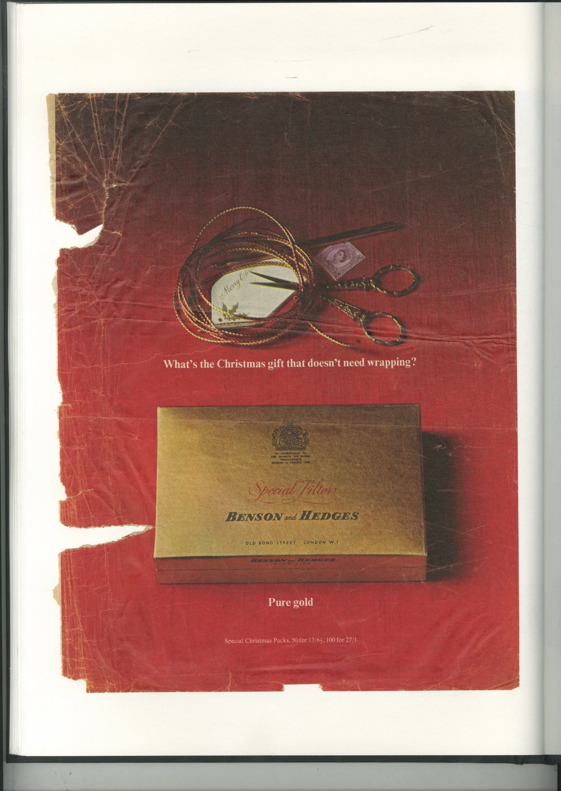
Benson & Hedges.
Hovis.
Collett Dickenson Pearce.
Whitbread.
Cockburn's Special Reserve.
ROYDS.
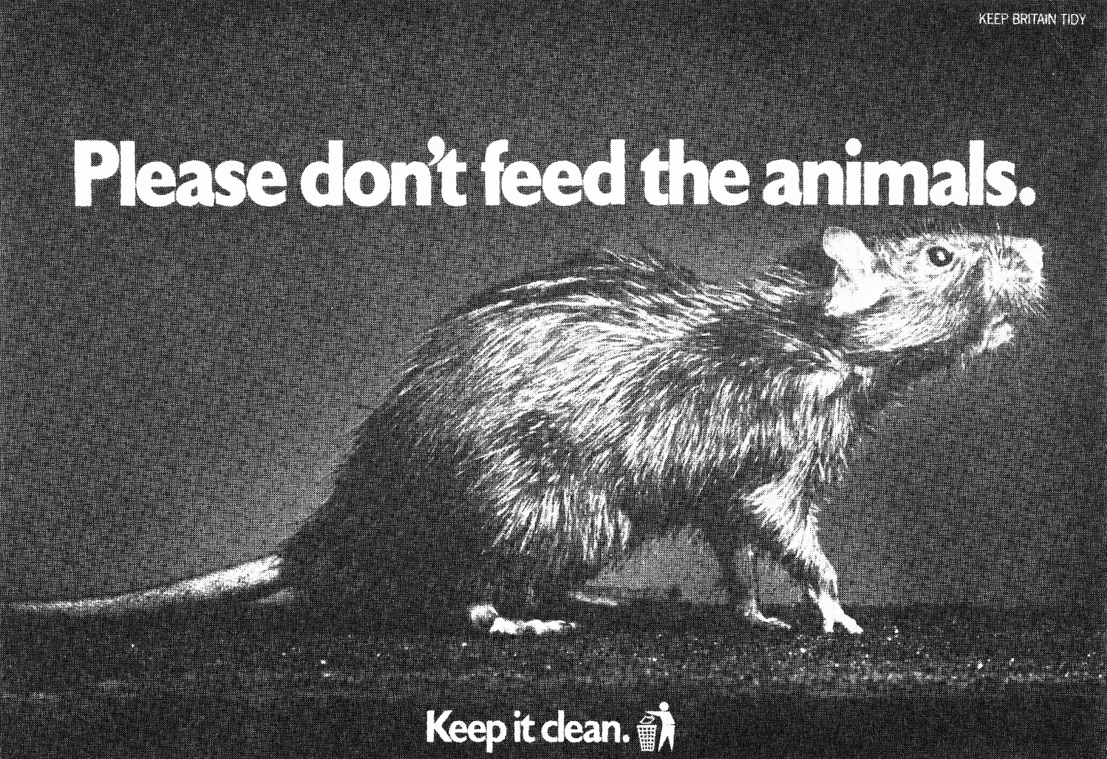
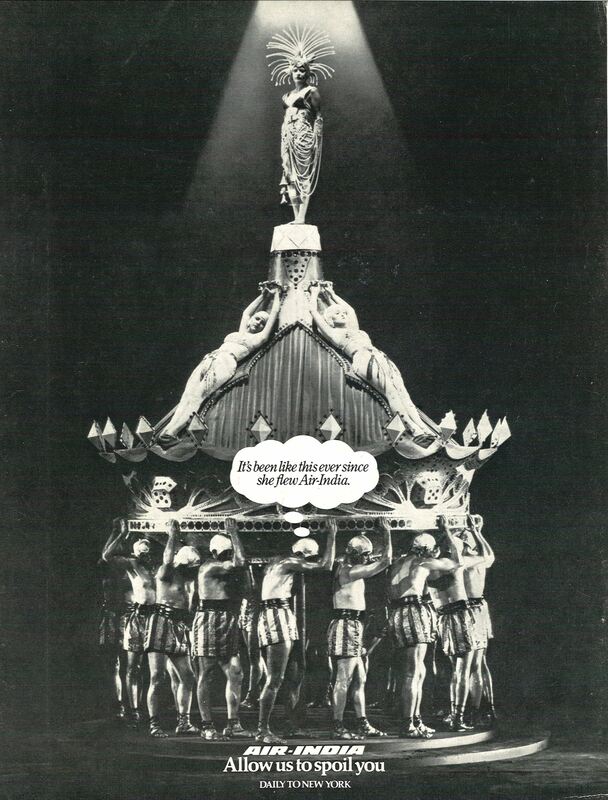
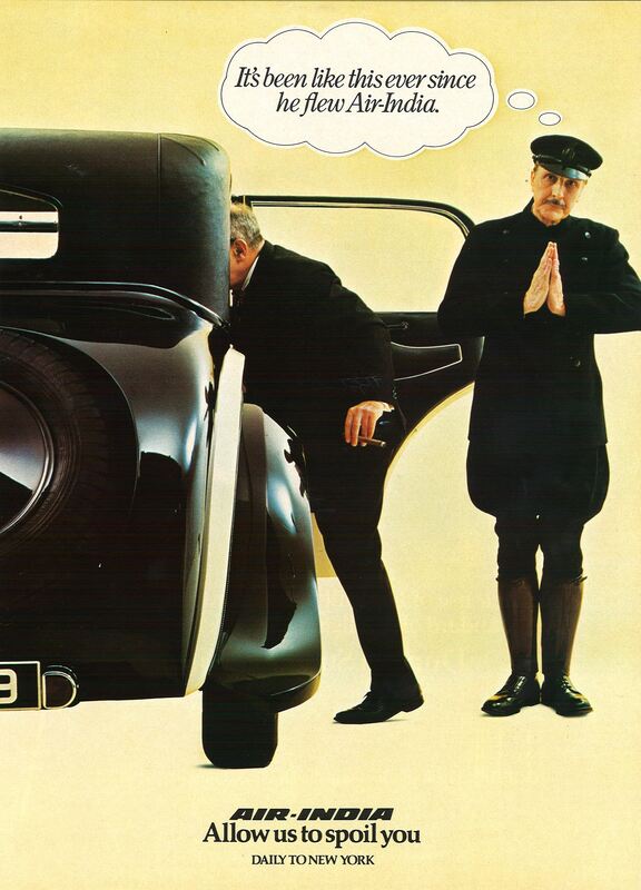
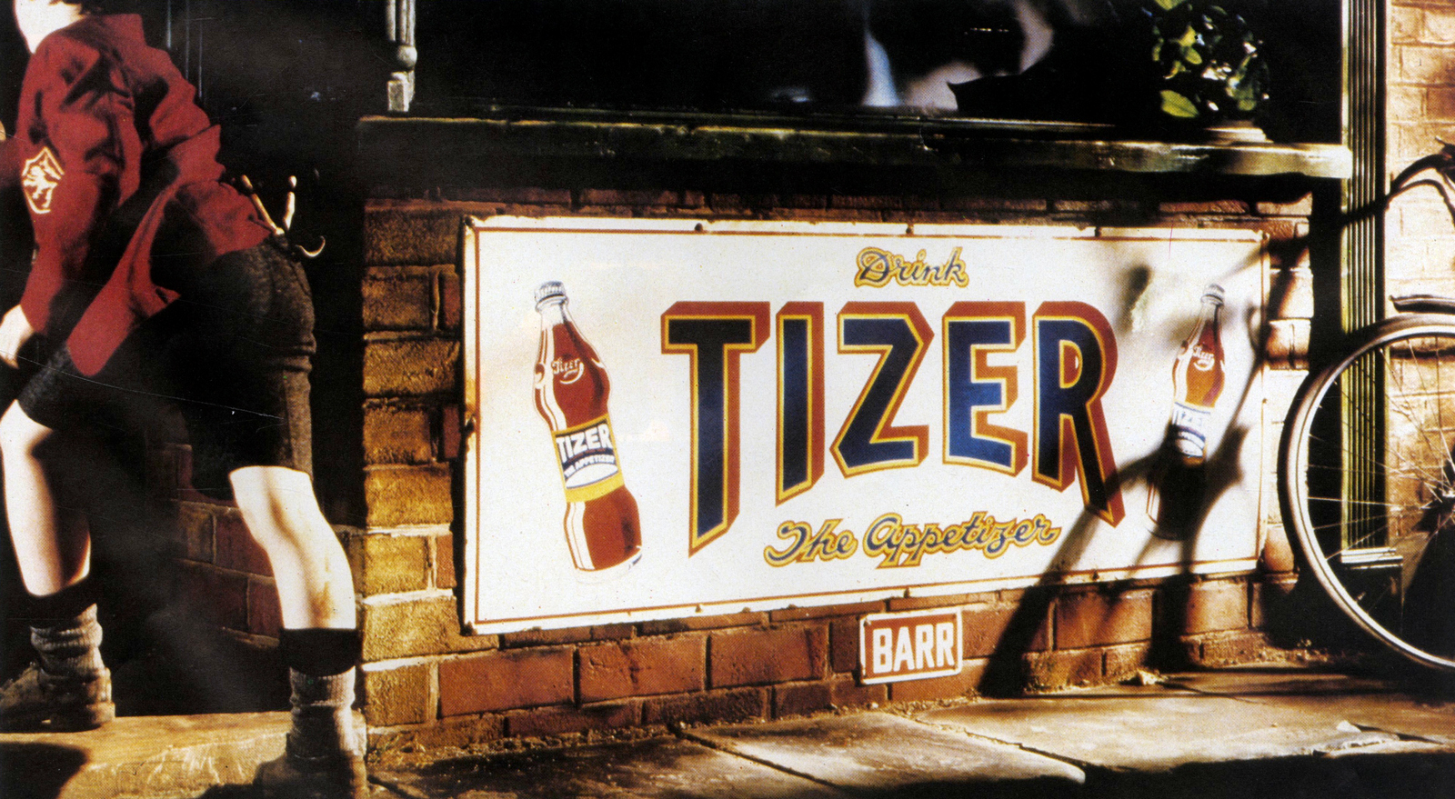
CHERRY HEDGER & SEYMOUR.Keep Britain Tidy.
India.
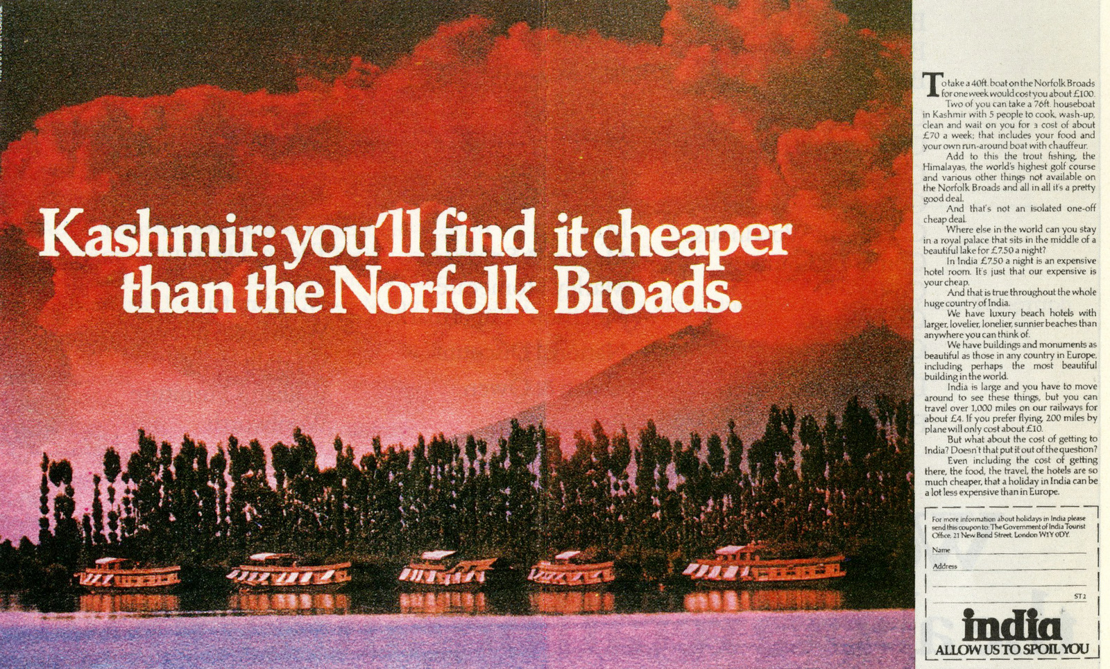
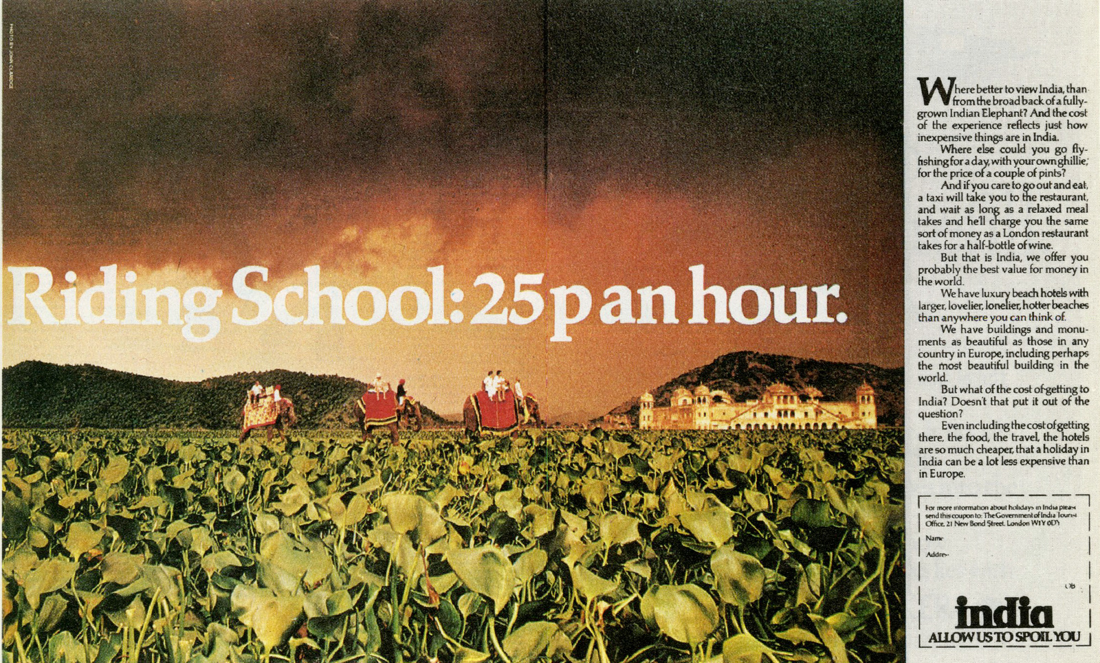
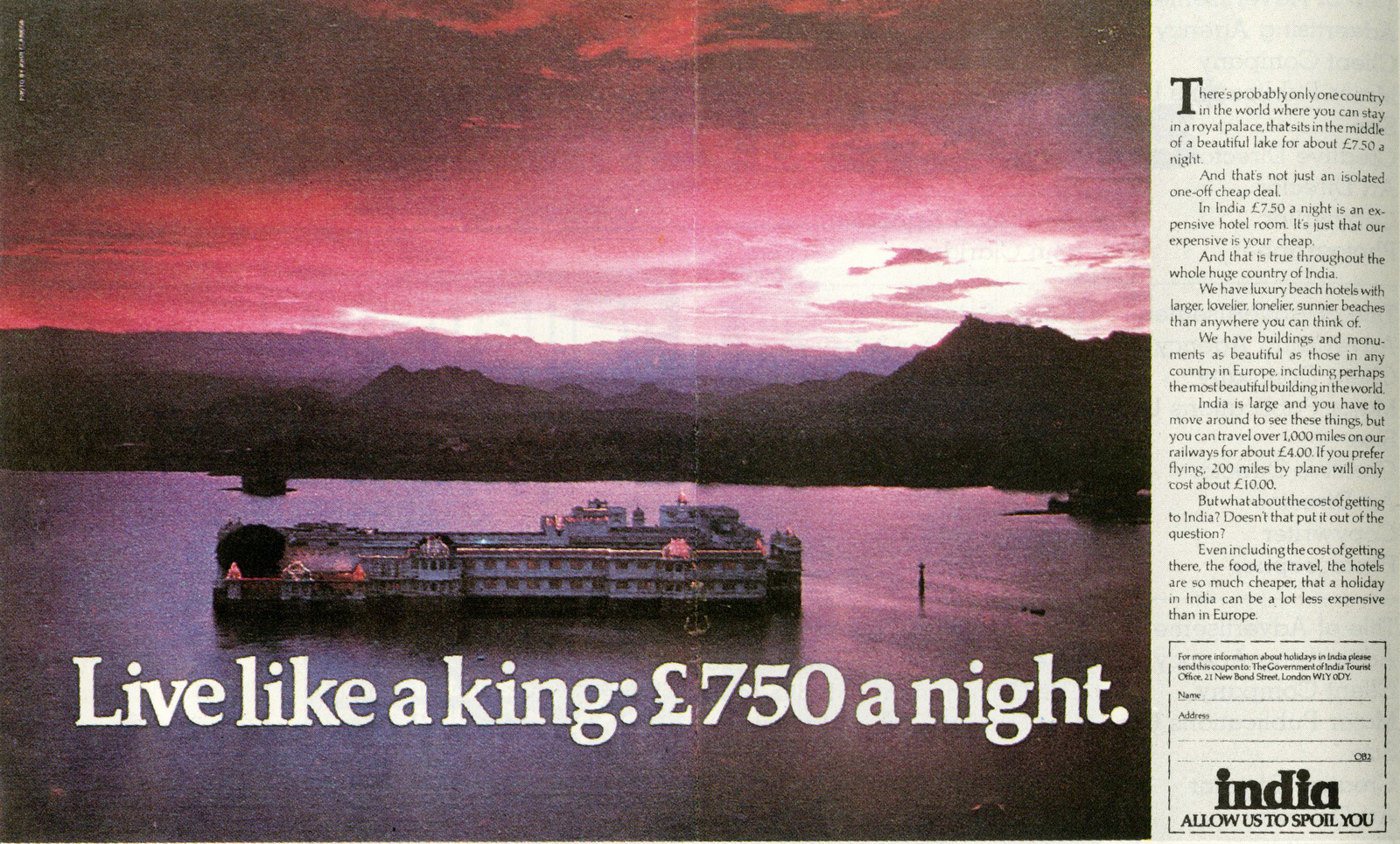
Air India.
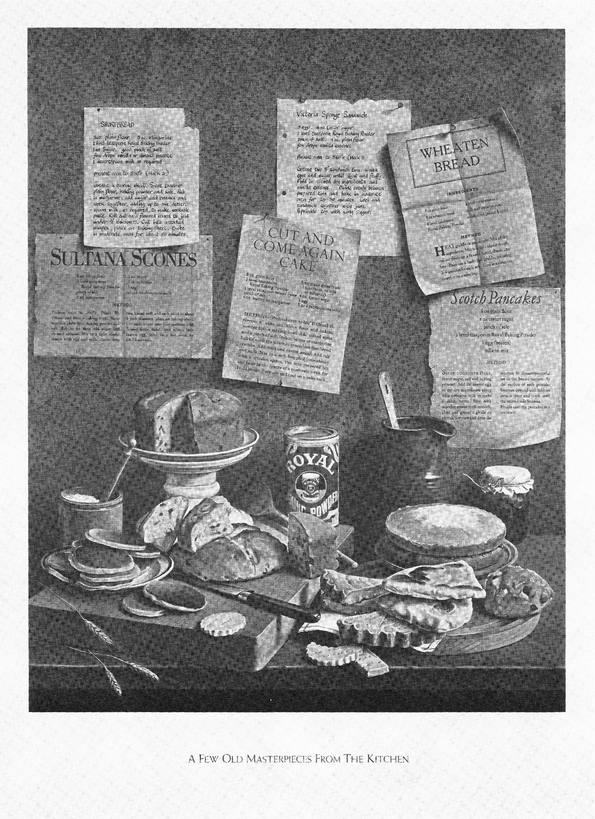
Royal Bakers.
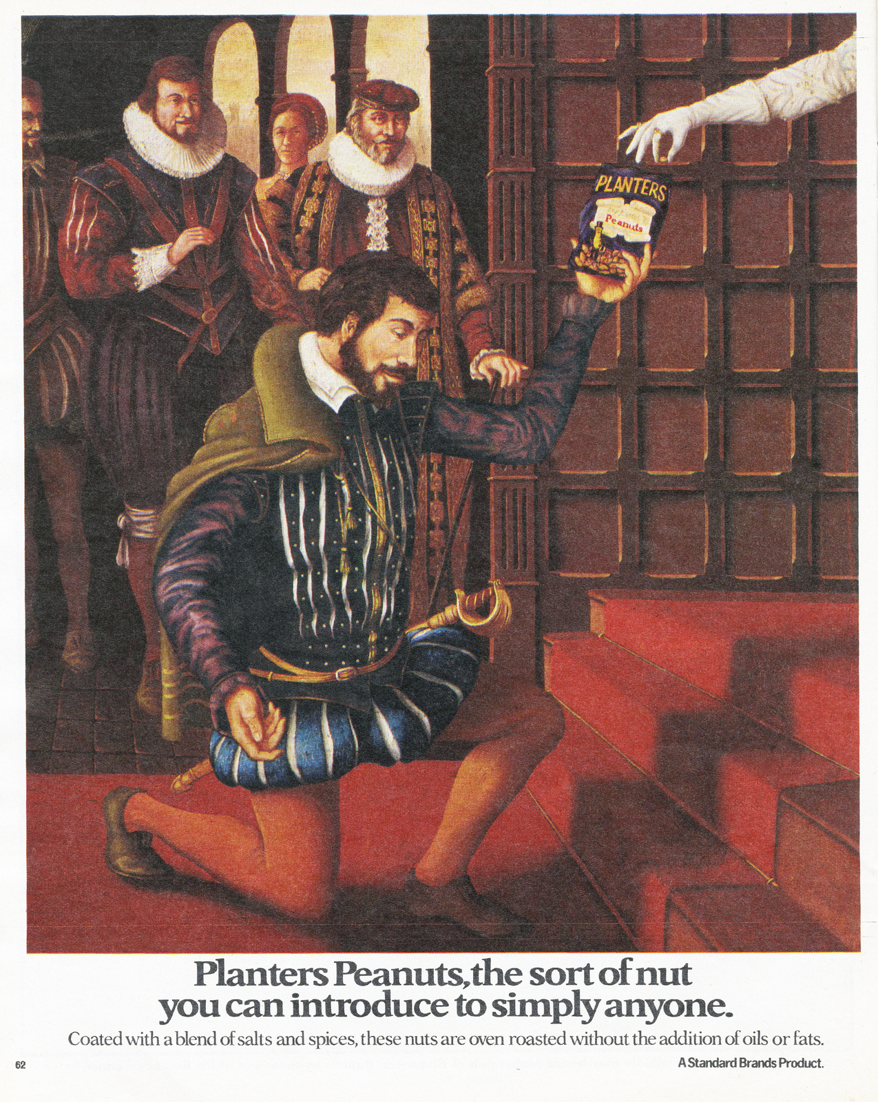
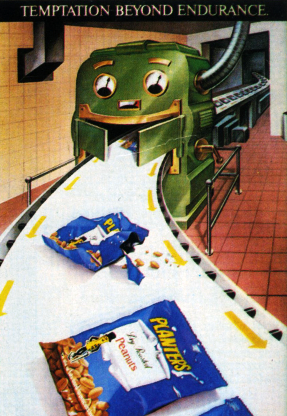
Planters.

Irn-Bru.
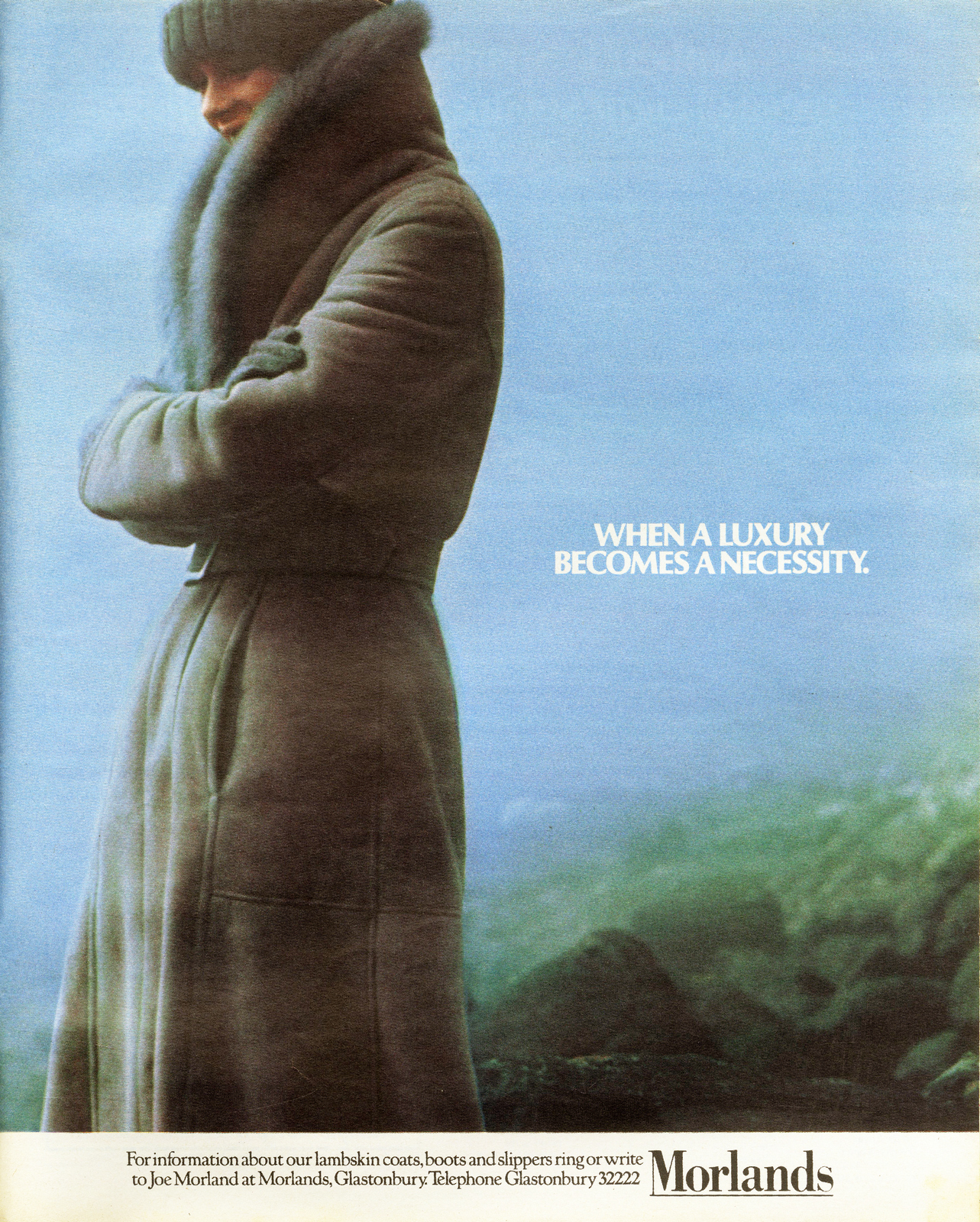
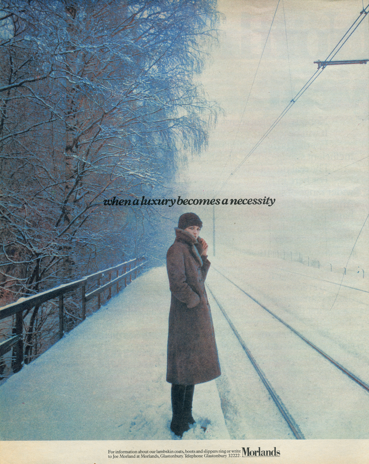
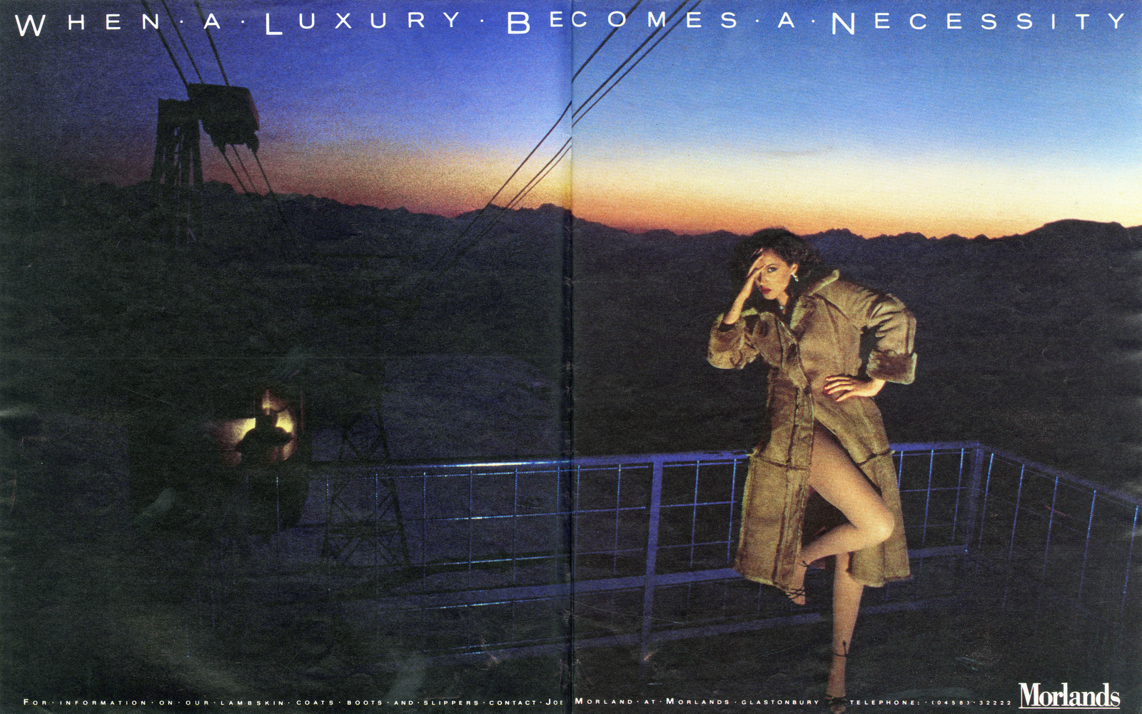
Morlands.

Fosters.
Schlitz.


Tizer.
Cherry Hedger Seymour.
LOWE HOWARD-SPINK.Heineken.
Gold Label Lager.


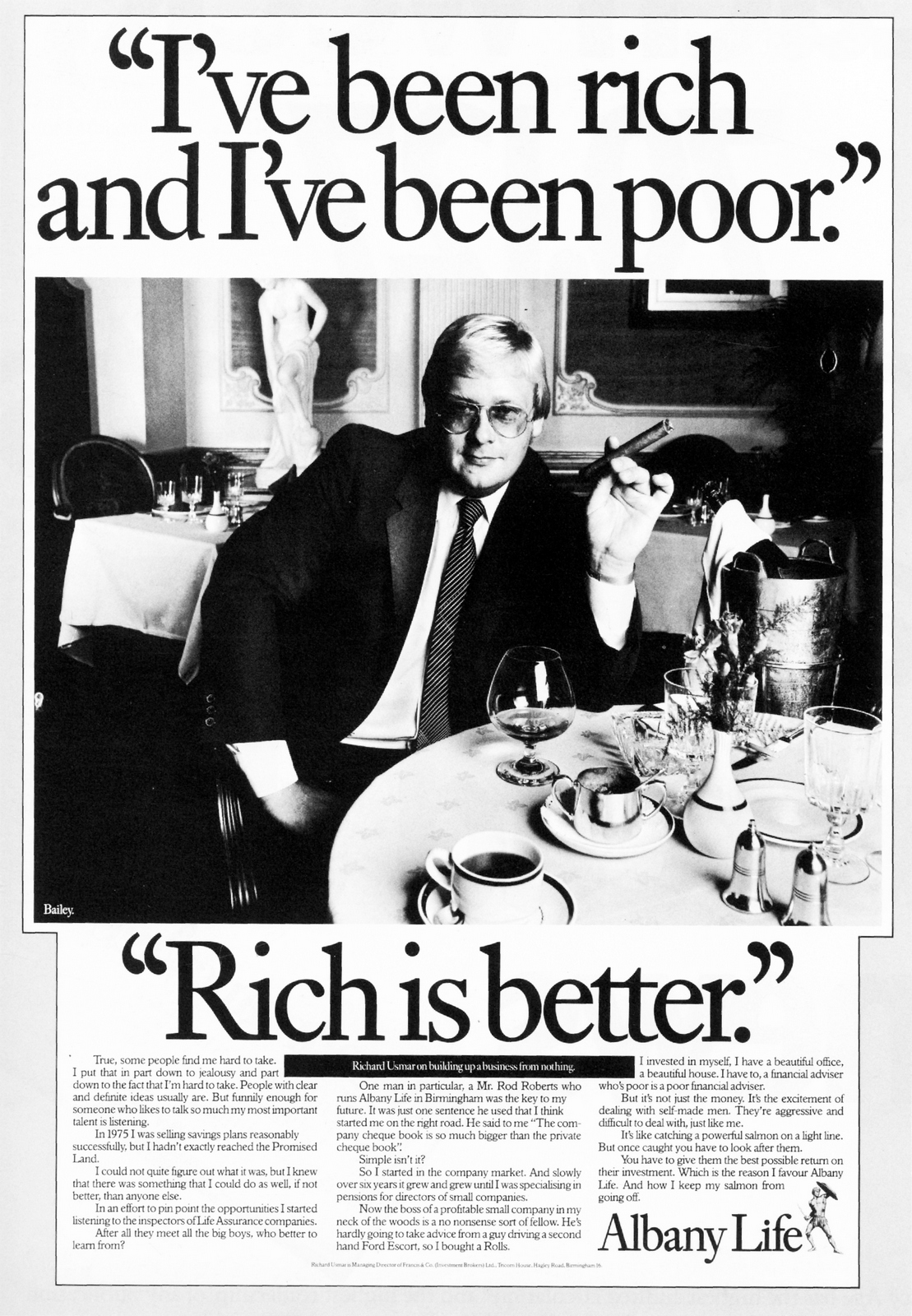
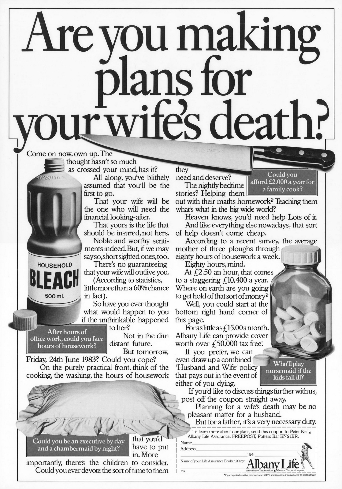
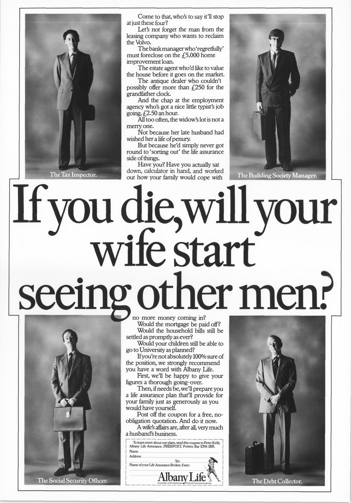
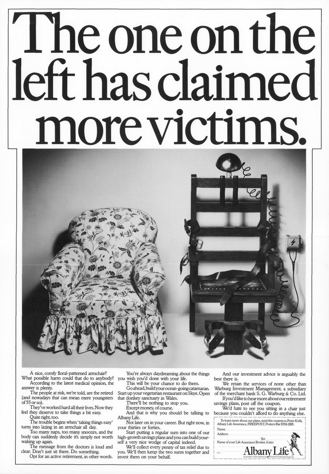
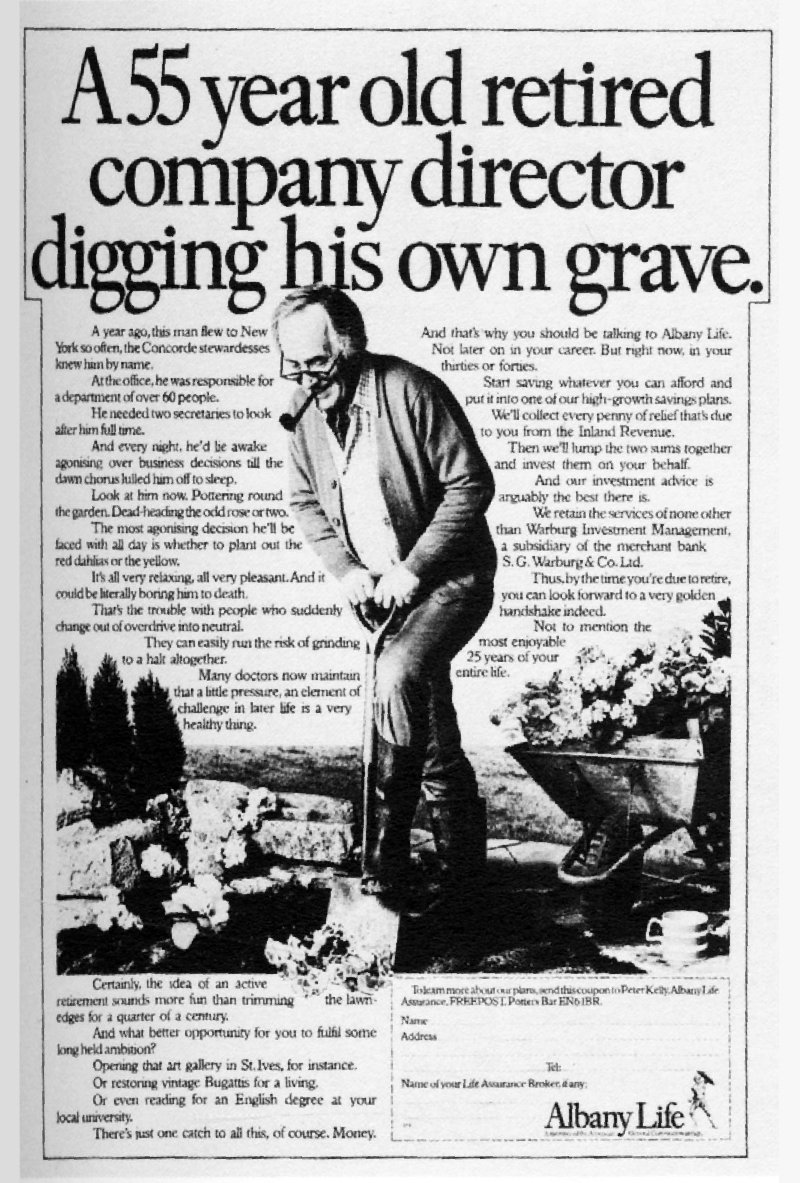
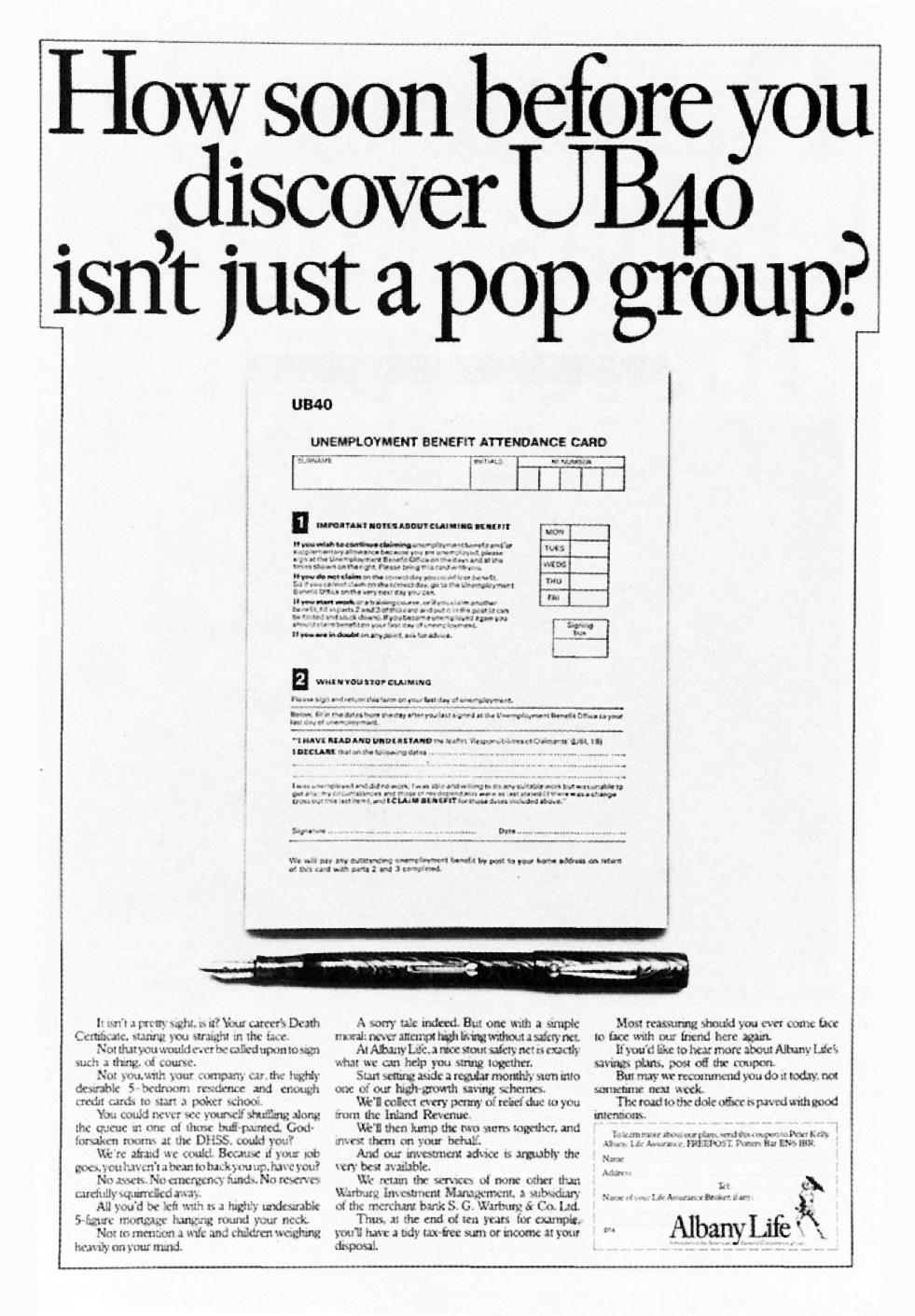
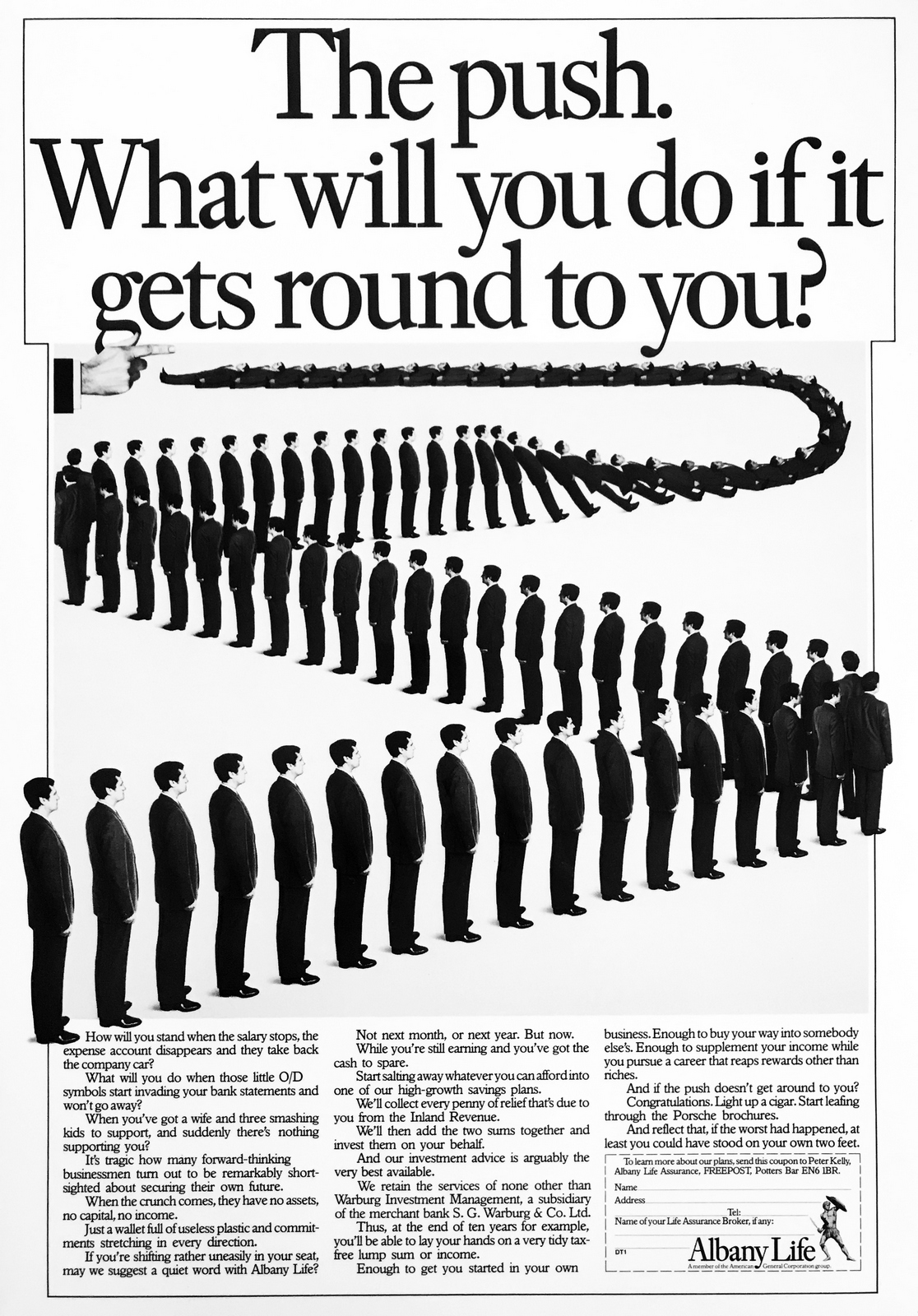
Albany Life.
SAATCHI & SAATCHI.
British Airways.
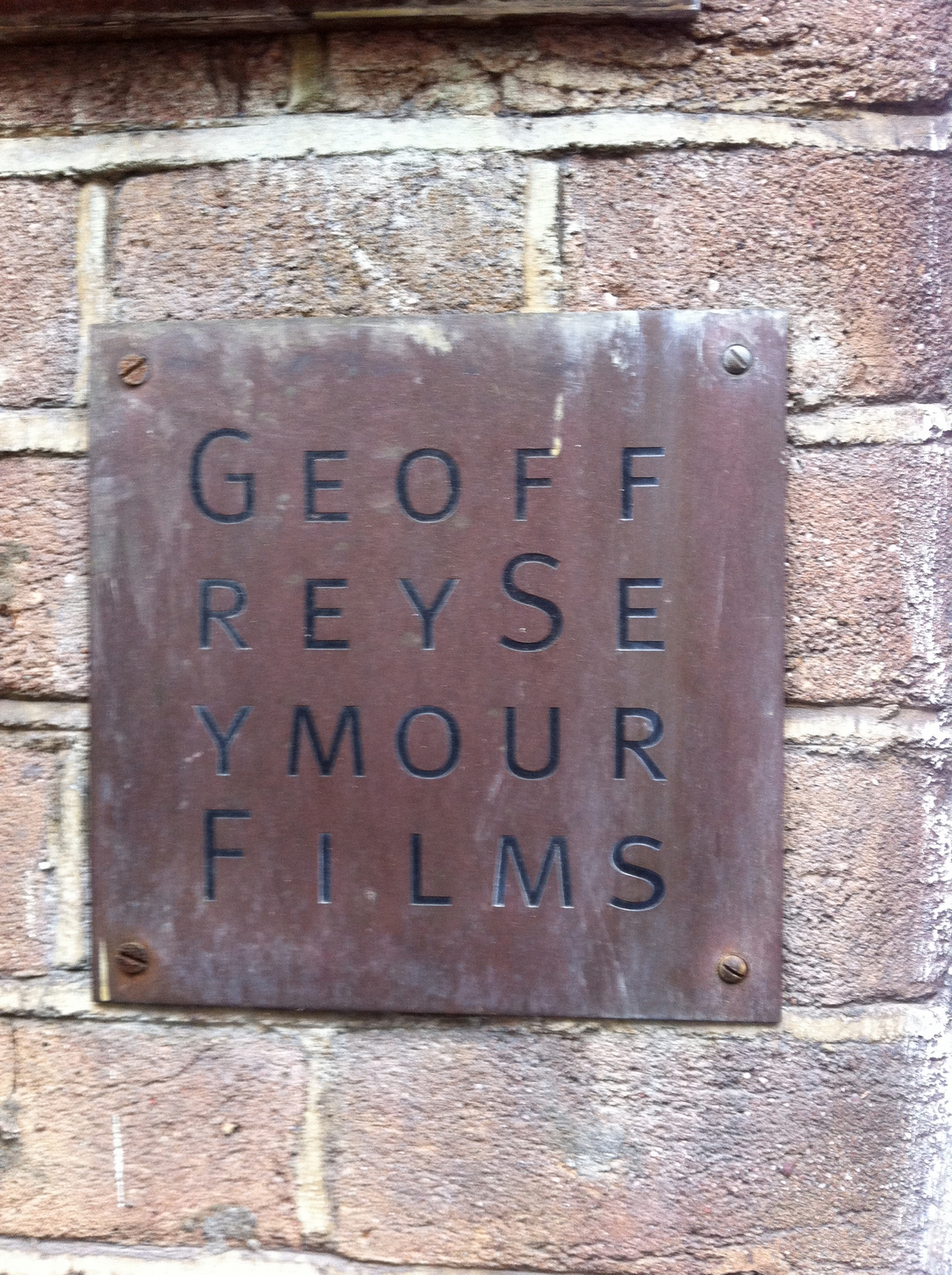
GEOFFREY SEYMOUR FILMS.

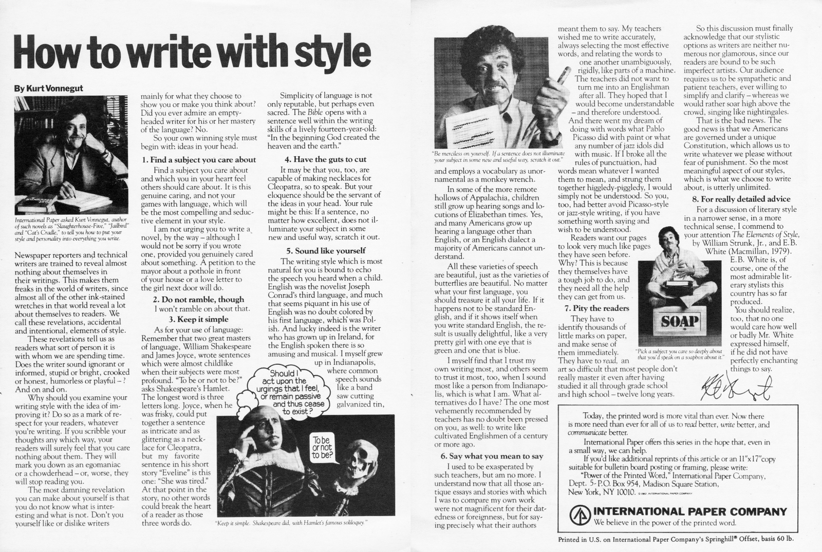
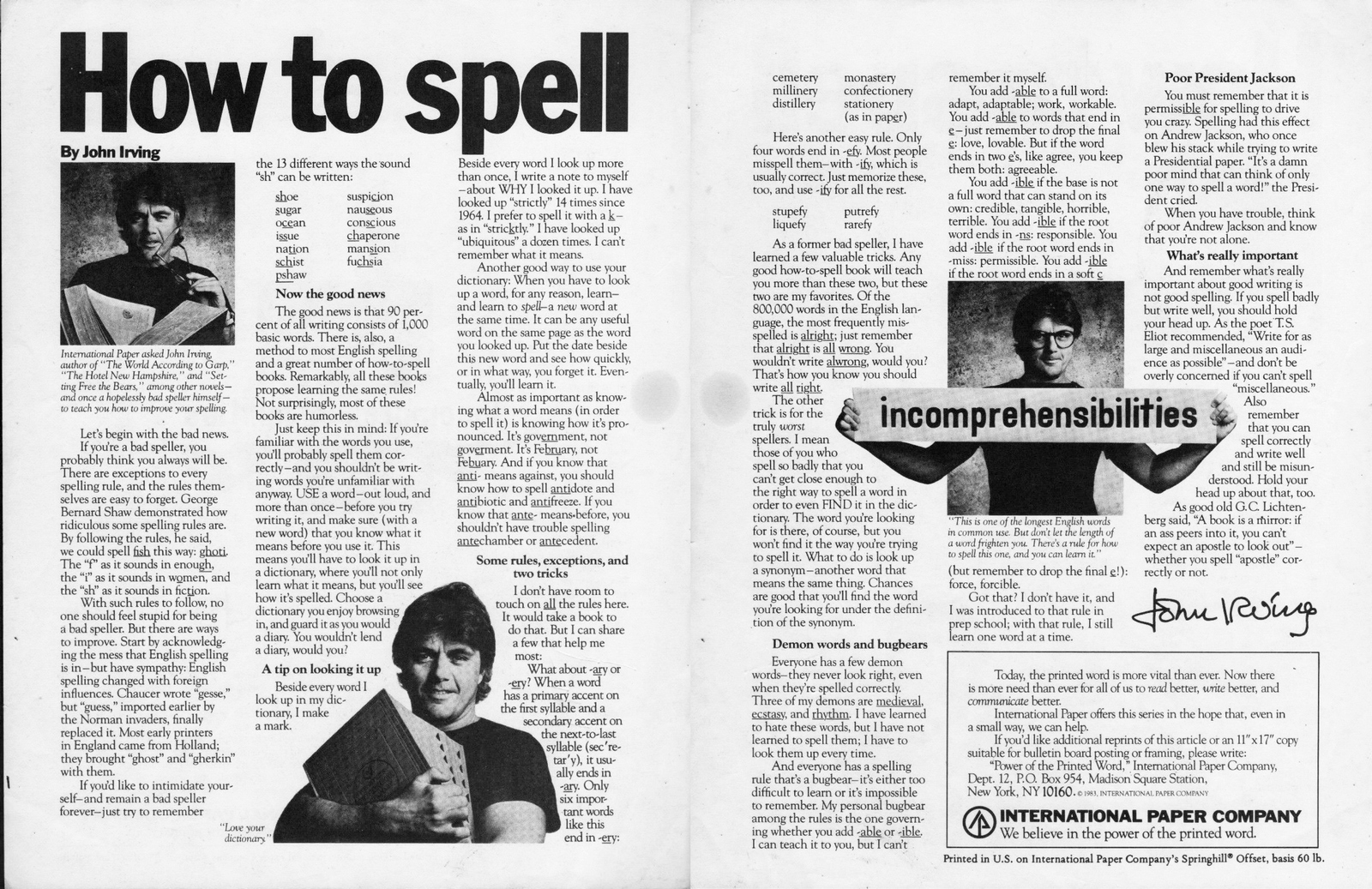
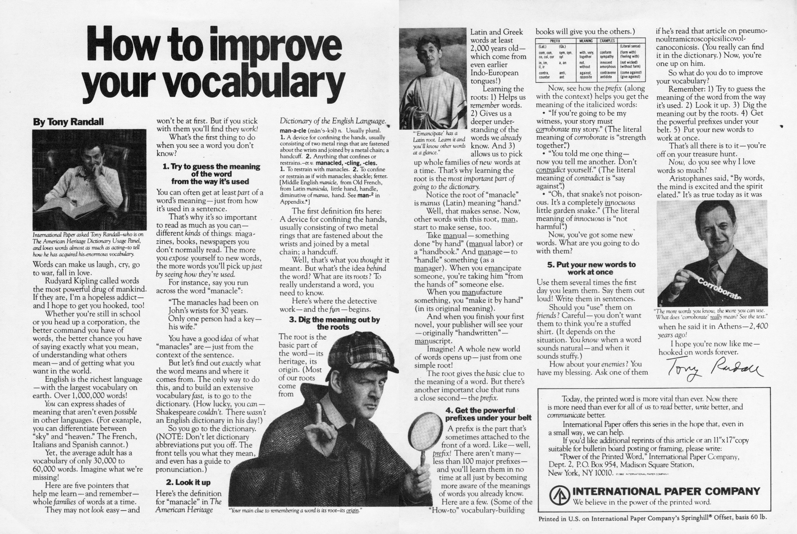
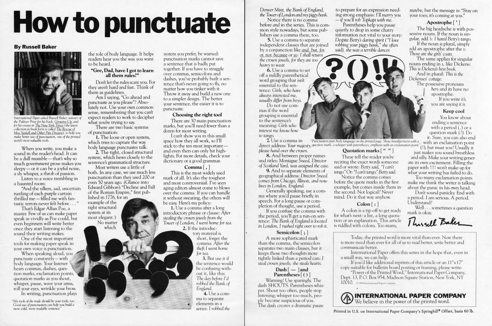
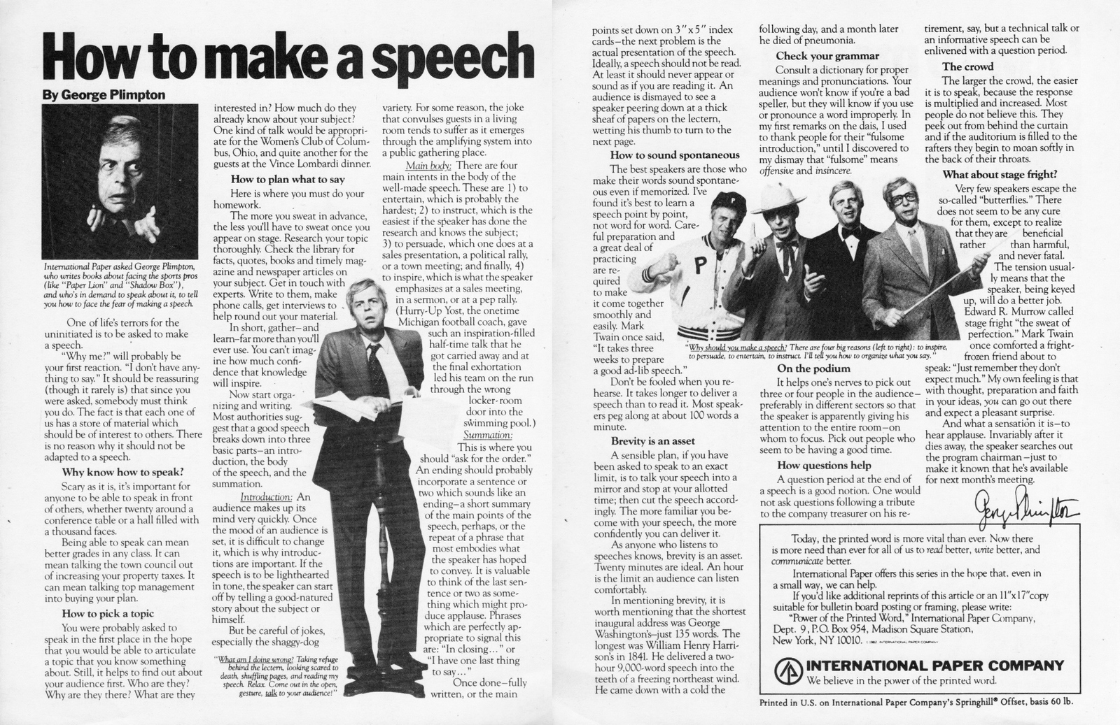
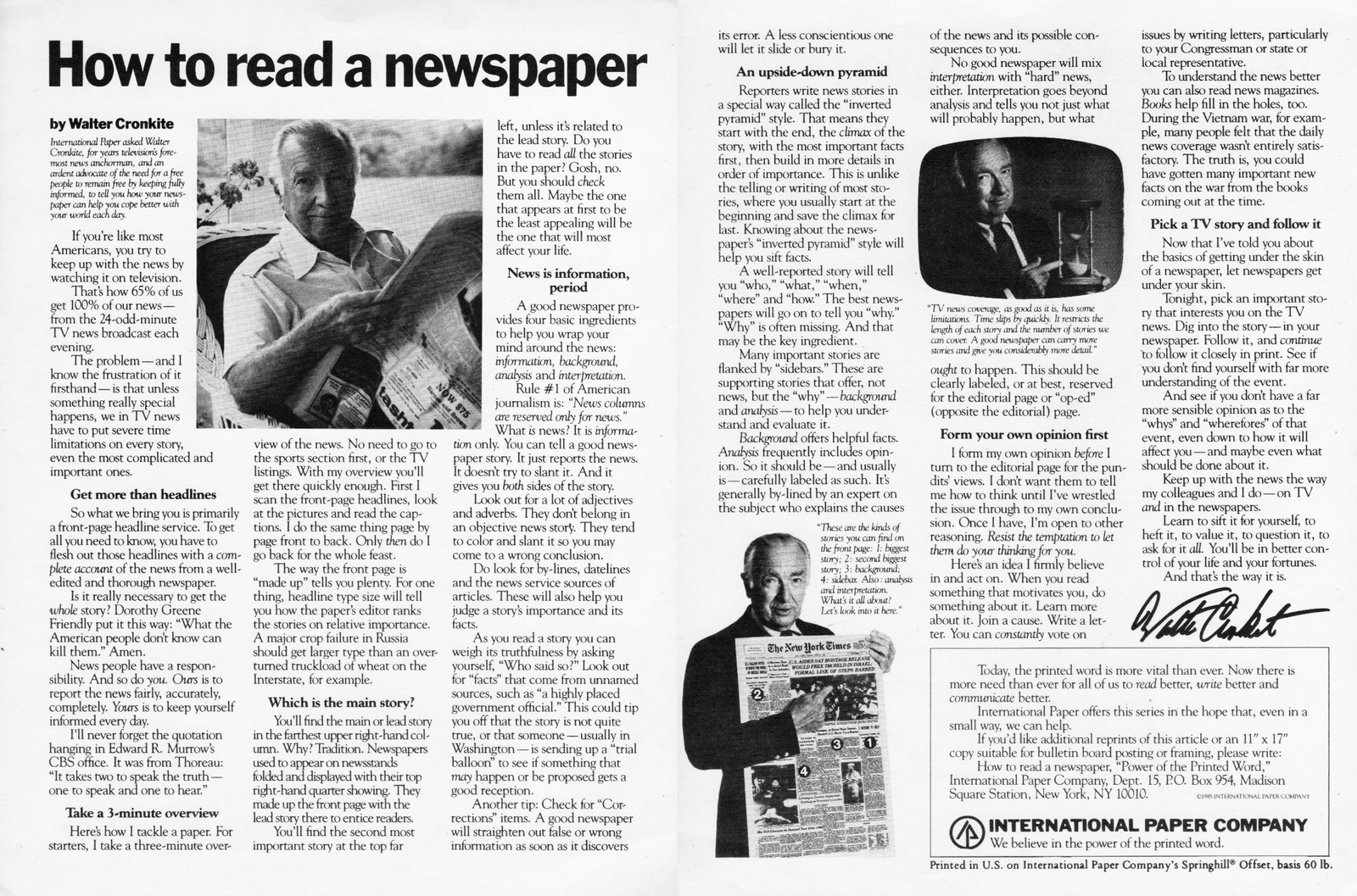
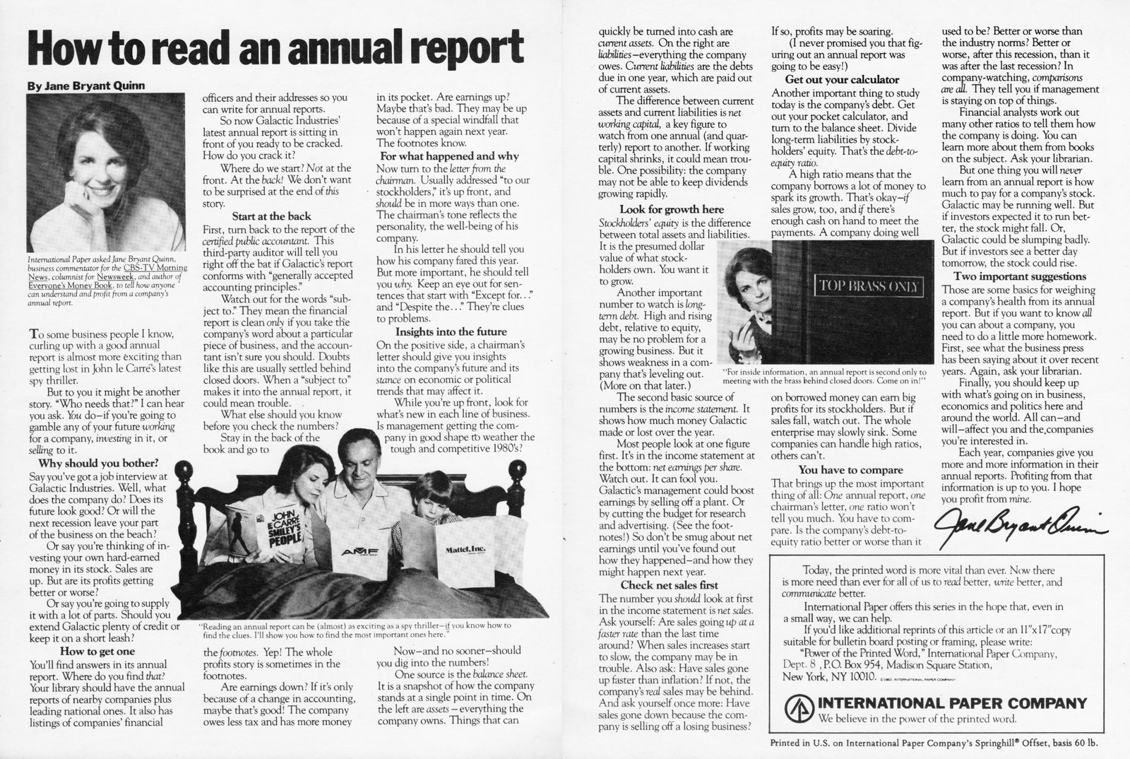
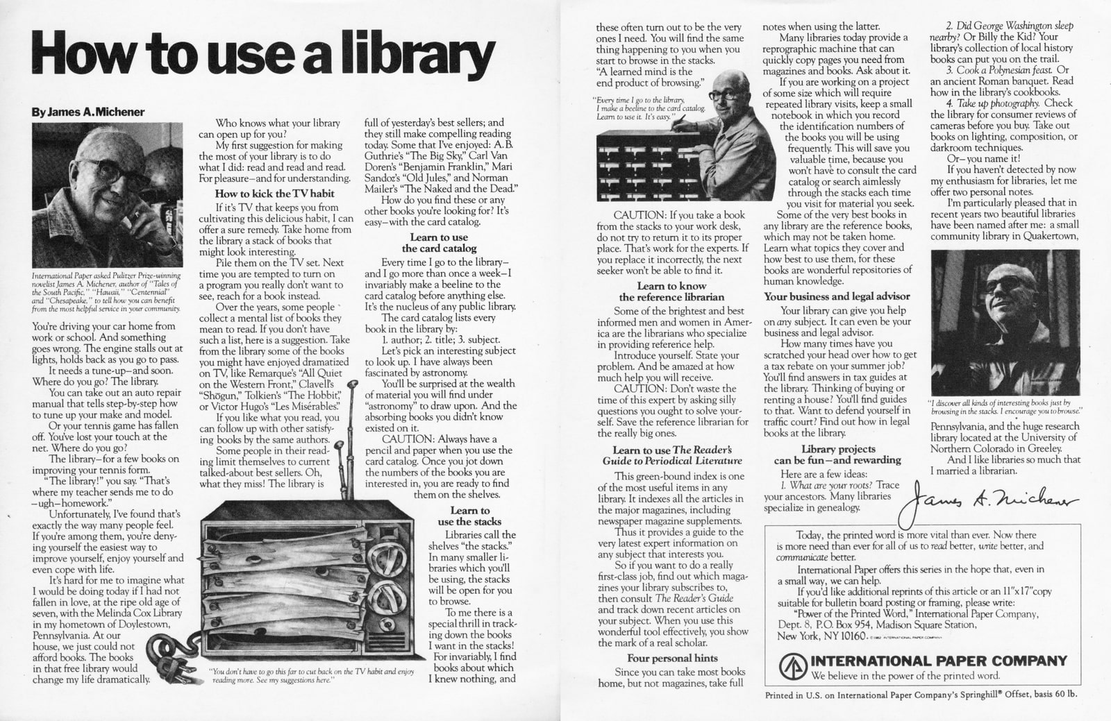
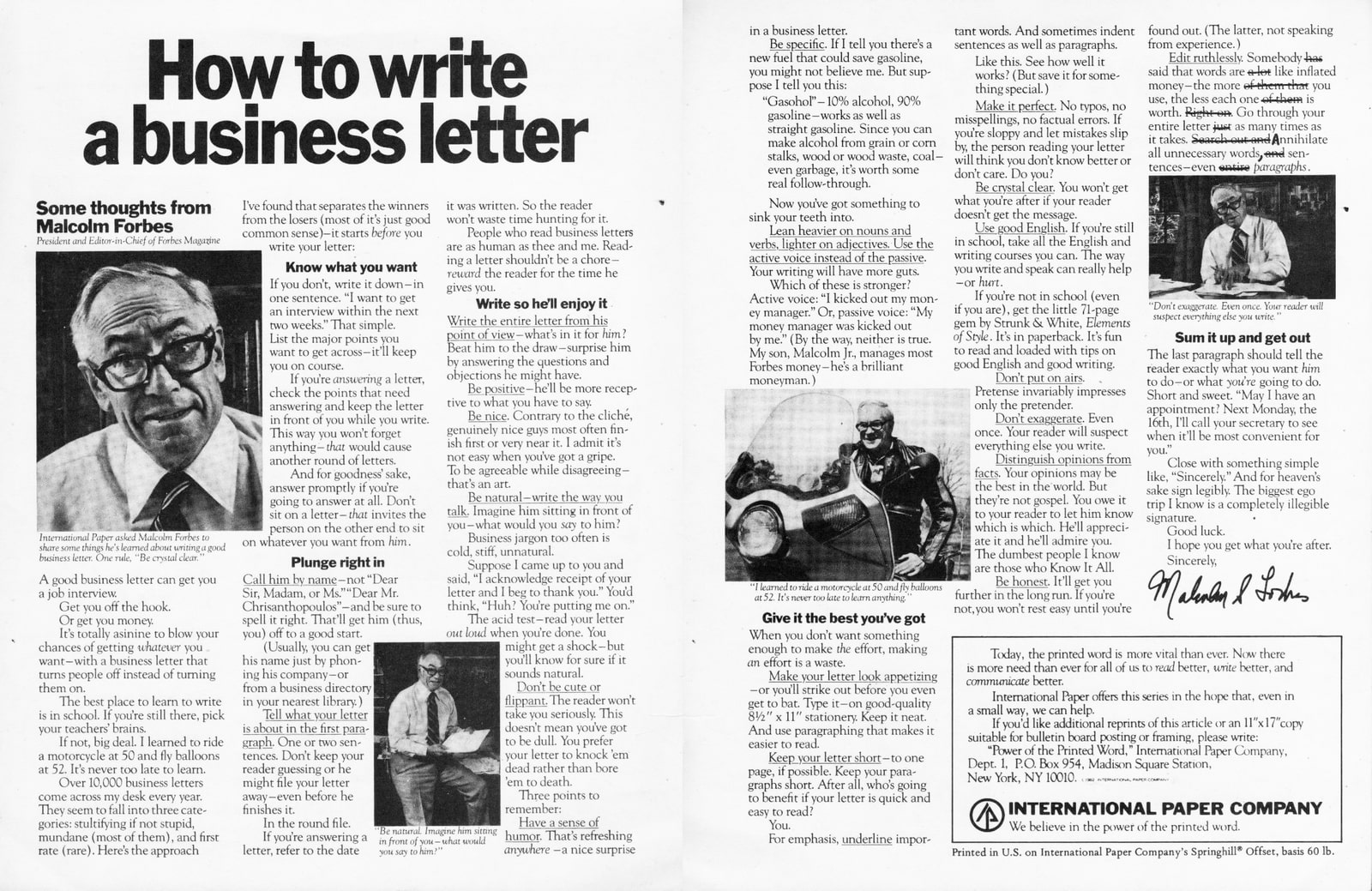
“What the public has been free to peruse in pieces since parts began running in 1979 is now selling en masse for $14.95.”
That’s how the New York Times greeted the publication of the book ‘How to Use the Power of the Printed Word’. (Looking at that sentence they may have benefited from reading it.)
The reason for that flowery comment was that the book was built around fifteen ads created by Ogilvy & Mather for the International Paper Company.
Why would Doubleday think there might be a market is such a thing? The ads had generated 27m requests for copies of the ads.
Twenty. Seven. Million.
The campaign was the brainchild of Ogilvy & Mather’s Billings S. Fuess Jr., (that’s not a mistake, that’s his actual name).
The International Paper Company was one of six large paper companies that dominated the market.
As paper is pretty much paper, it was difficult for any of them to stand out based on their products, so The International Paper Company decided to stand out by high ground by ‘reaffirming it’s historic commitment to printing and publishing’.
Rather than talk to potential clients, they chose to talk to the potential clients of potential clients; college educated 15-to-30 year olds.
First, they asked them what advice they’d like to hear on writing? ‘Things that would help us make money’ they were told.
Then they were asked which famous people they’d like to tell them? They’d expected a list of the popular names of the day, Muhammad Ali, John Travolta, etc, instead they got idiosyncratic, second tier celebrities who they thought more appropriate.
Billings, (perhaps I should call him Mr Feuss Jr, it sounds less formal), anyhow, Billings did all the research, spending about three weeks per ad, wrote the first drafts for the celebrities to make their own, then he edited their efforts.
Today, The International Paper Company is the biggest in America.
Here are a few of my favourite tips:
‘Punctuation puts body language on the printed page’
– Russell Baker, How To Punctuate.
‘Keep it simple. Remember that two great masters of language, William Shakespeare and James Joyce, wrote sentences that were almost childlike when their subjects were most profound. “To be or not to be?’ asks Shakespeare’s Hamlet.’
– Kurt Vonnegut, How To Write With Style.
‘Don’t waste words telling people what they already know.’
– Edward T. Thompson, How To Write Clearly.
‘Words can make us laugh, cry, go to war and fall in love. Rudyard Kipling called words the most powerful drug of mankind.’
– Tony Randall, How To Improve Your Vocabulary.
‘Be natural-write the way you talk.
Imagine him sitting in front of you-what would you say to him?’
– Malcolm Forbes, How To Write A Business Letter.


'I’m trying to do a deal with the guys at Piebury Corner.’Former boss, mentor and mate, Mark Denton continues ‘If they supply pies for my book launch I'll supply ads for free. Can you do me some free ads?’Mark has lined up a photographer to shoot them for free 'So we just need a few idea, hopefully with nice pie shots in.’Piebury Corner?That's right up there with Exmouth Market hairdressers Barber Streisand.Puns make me wince.Anyway, nice pie shots?I think of a nice pie shot.
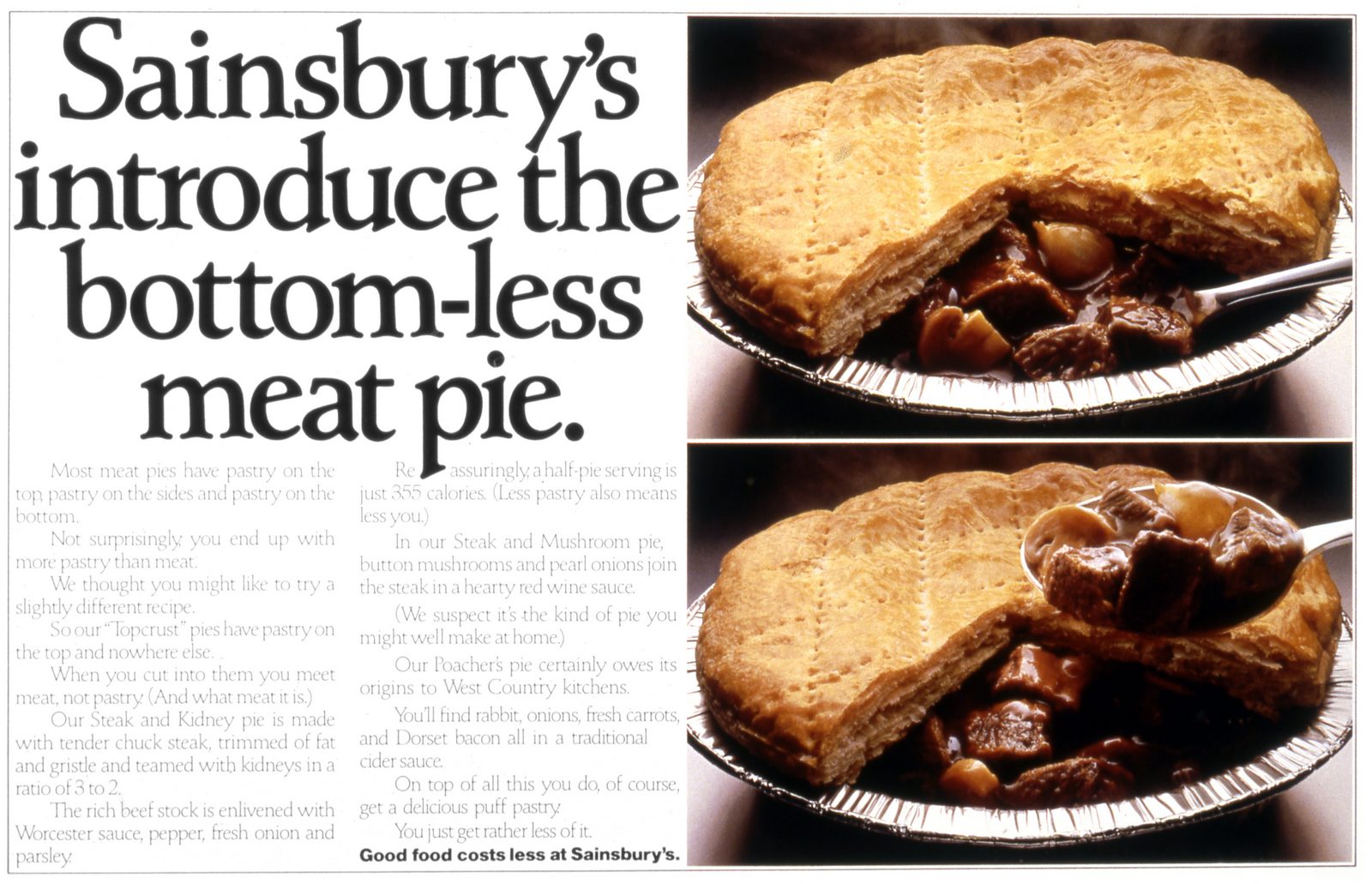
That's what Ron Brown & Martyn Thompson did with pies, one of the best art director/photographer combos of the last century, nice, but not amazing.But then again, how else are you going to shoot a pie?I ignore that question and start thinking about another one - What the hell can we say about our pies?I guess they feel a bit olde-worlde, a traditional British alternative to the invasion of new-fangled foreign foods? Pies like the old days? Old-fangled pies?
The more I thought about it the more I felt like I had to address the elephant in the room; the pun.It's a distinctive name, very London, maybe we address the name?
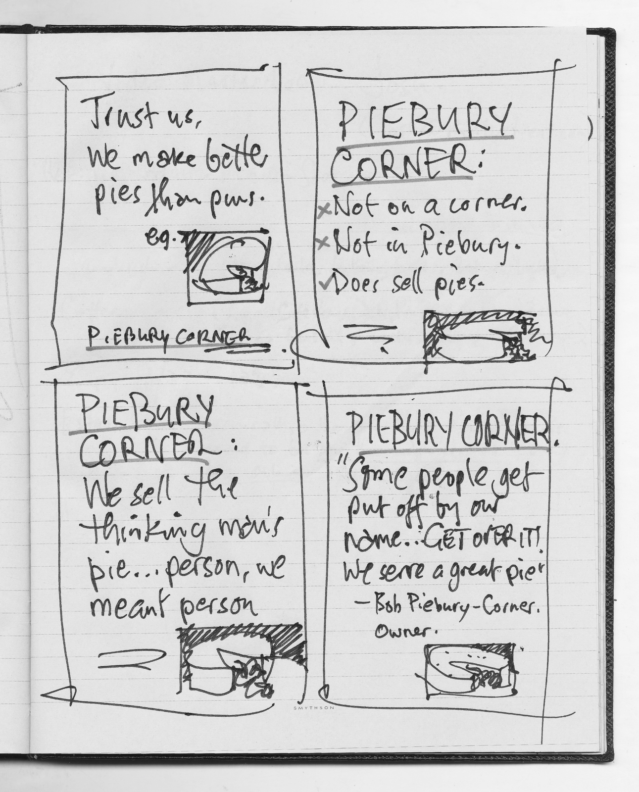
If we're going to talk about the pun, instead of apologising for it, perhaps we should embrace it?Focus on getting people to remember our name rather than justifying our pie ingredients.The only problem; I hate puns, they make me wince. (I've just written an article for Shots about why puns are such a low-rent advertising solution.)But then again, they're called Piebury Corner.Sod it, I'll write some puns.
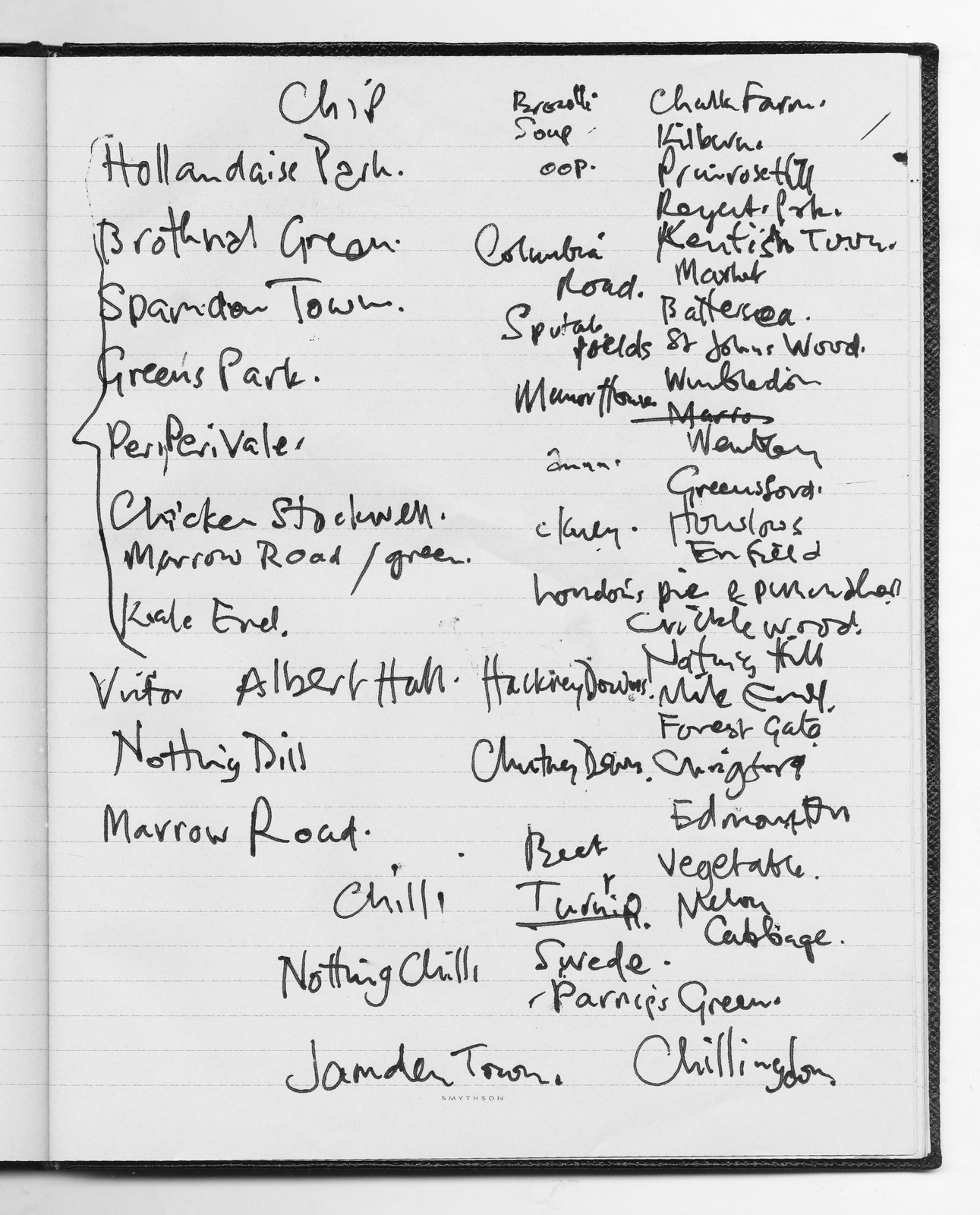
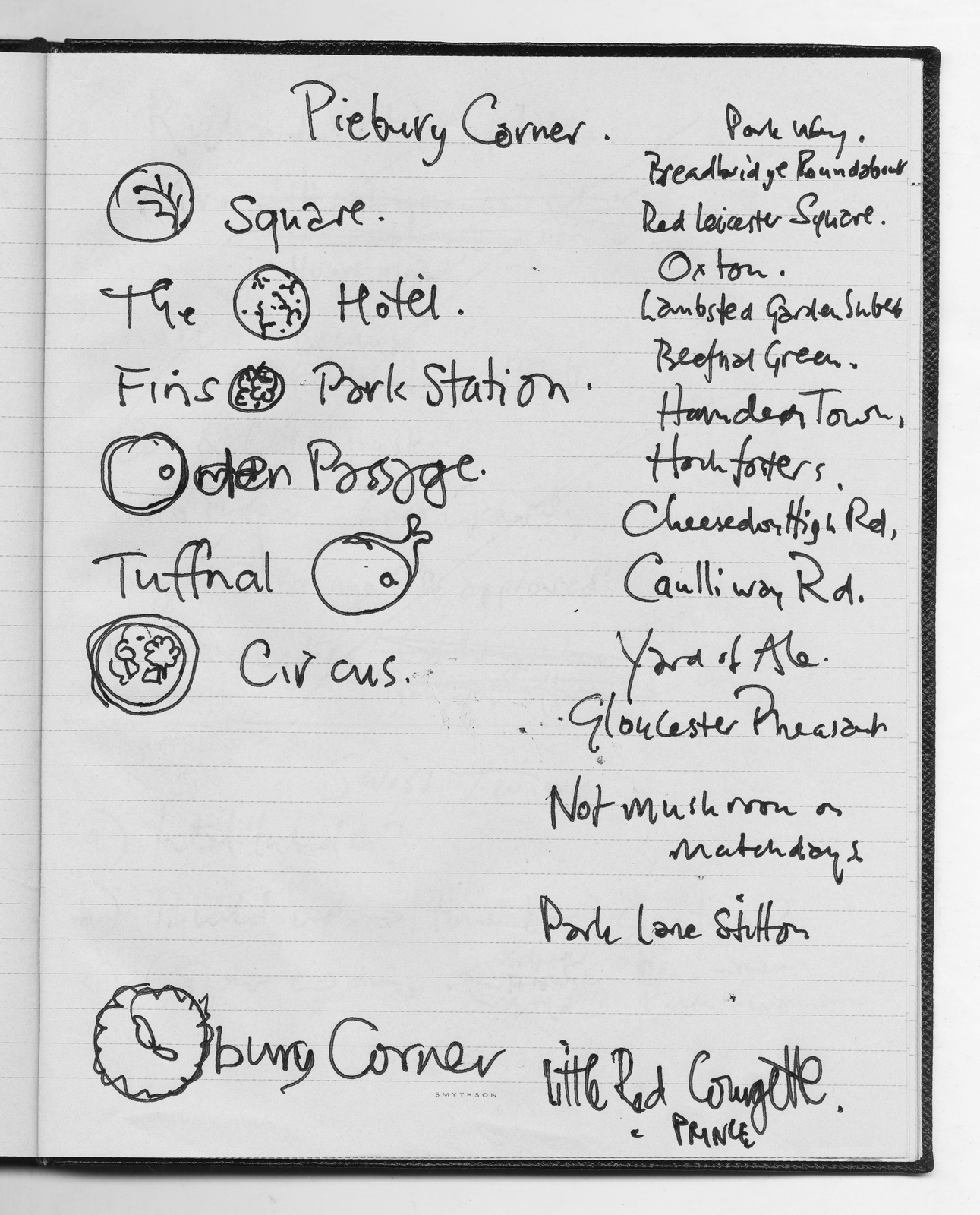
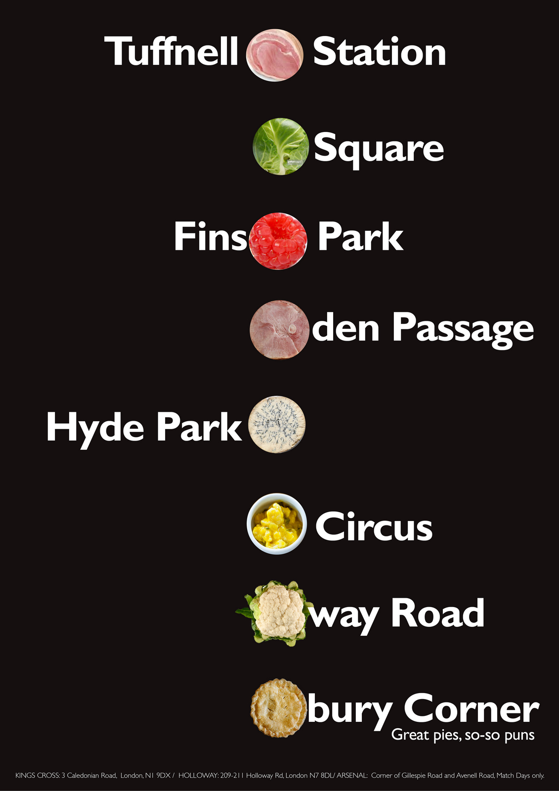
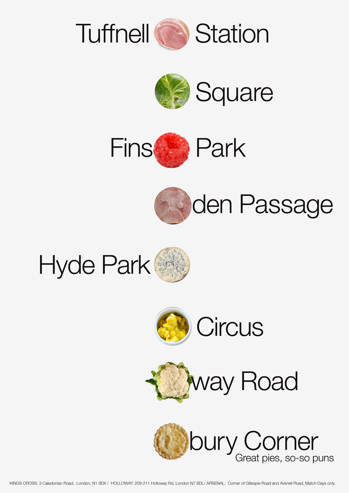
Maybe a list of London locations turned into puns?More like a poster you'd buy than an ad?Hang on, what about the photographer? He needs specimens for his site.Let's have small pictures of the pun element next to the words. E.g. A picture of a pie next to ‘bury Corner’, a picture of a brussel sprout next to ‘Square’, etc.
It could be engaging, well branded, very Londony.Ok, the vomit draft.Lets bash one of these things together, it's gonna look great, I just know it!
Terrible.Is it the black?Is it the font?Is it the puns?Maybe we need a more neutral font?Maybe a simple white background?
The white is better, easier to get at the elements.But the font, Helvetica Light, makes it looks a bit too precious.Maybe a bolder Helvetica would make it look more functional, less like it's trying to look cool?
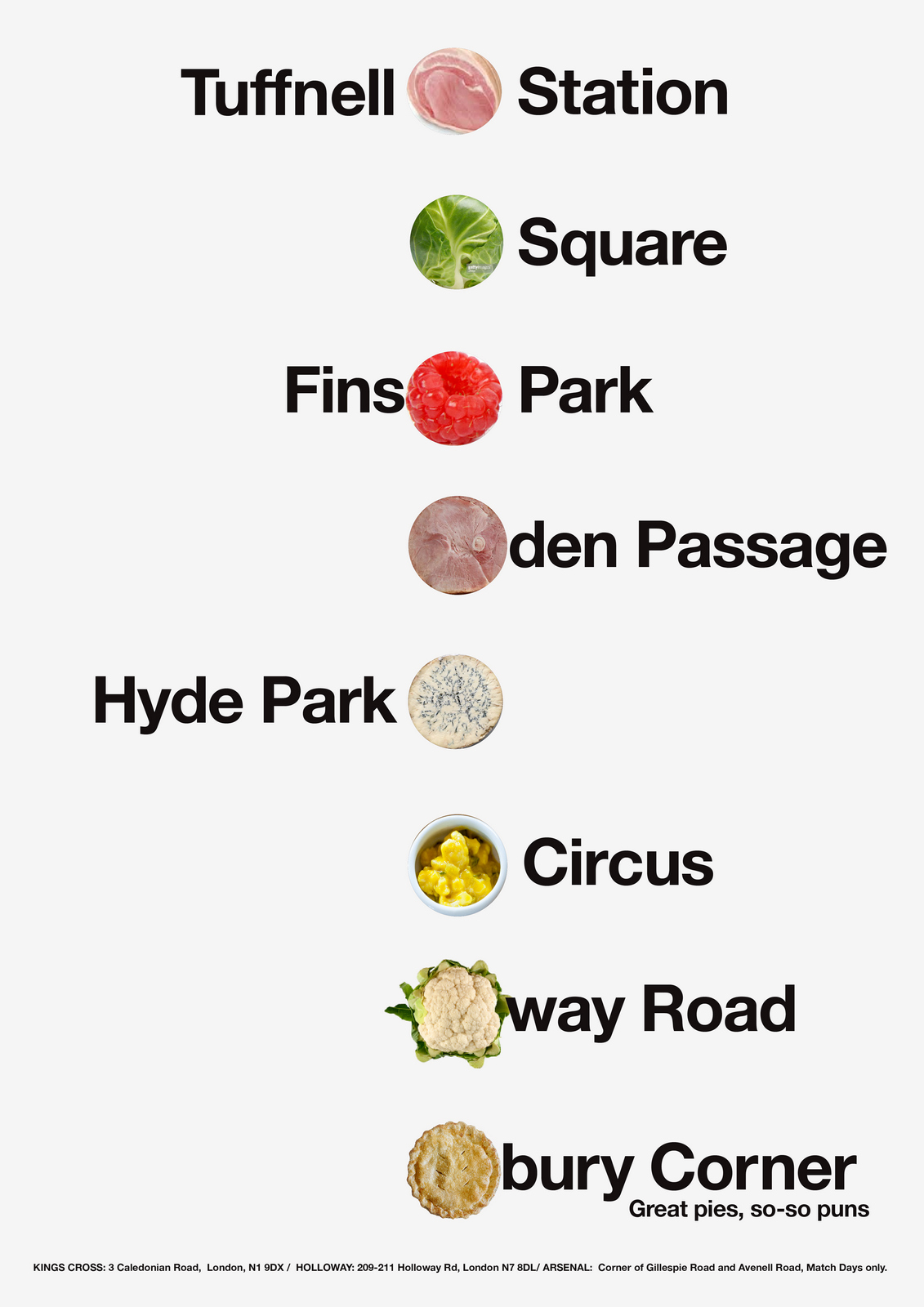
Better, but it still doesn't look like it's a quality item.These pies are dear, high-end pies, perhaps it should look classier.Dare we go serifs?
Century Schoolbook is a nice font, one of my favourites, (and Paul Arden and Massimo Vignelli's), but maybe we need something more characterful, more distinctive?As pies aren't some new-fangled invention, maybe we make the posters feel traditional.Also, we'll be positioning ourselves against all those johnny-come-lately's to the British diet, suishi, burritos, falafel and the like, so let's look traditional and authentic.
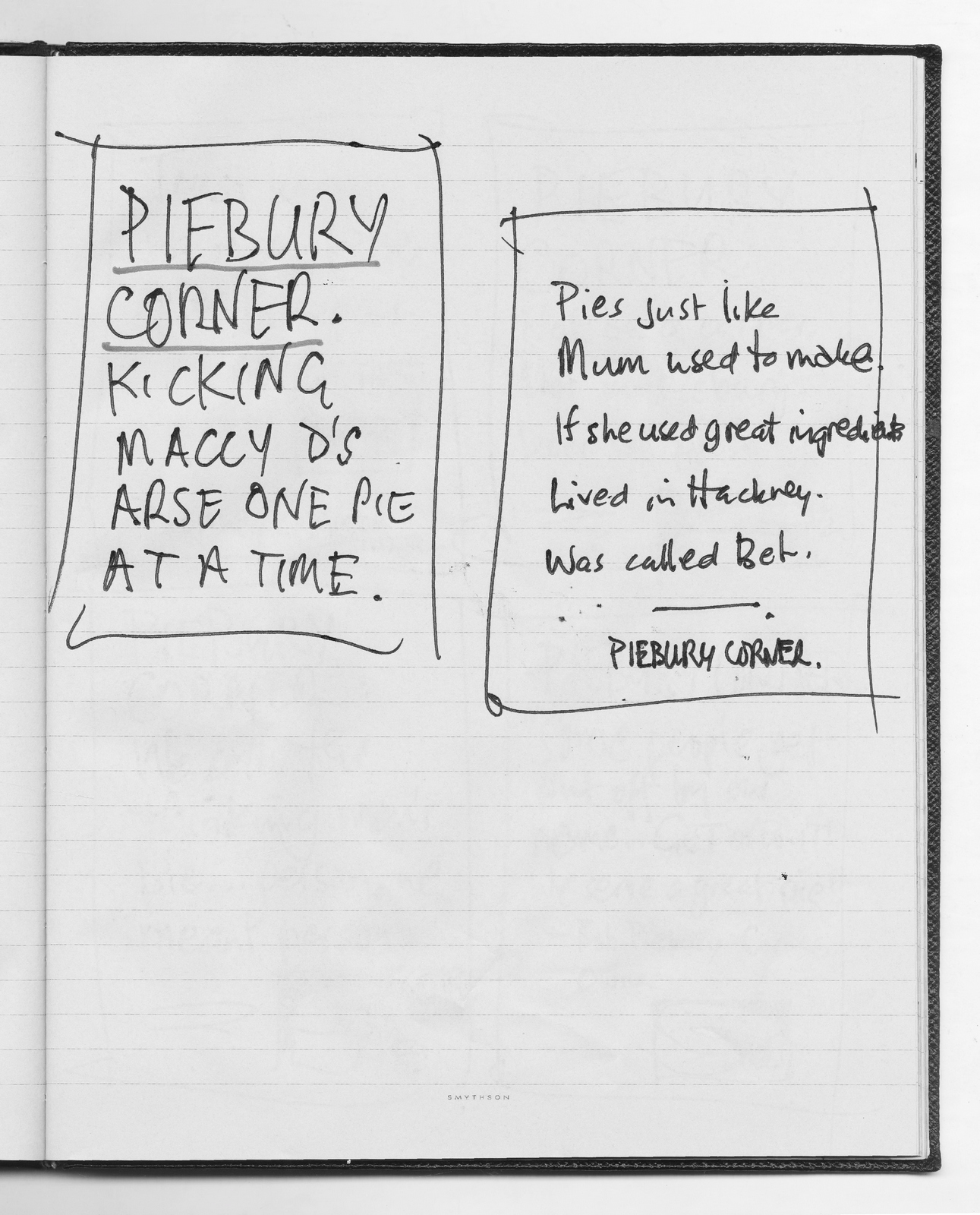
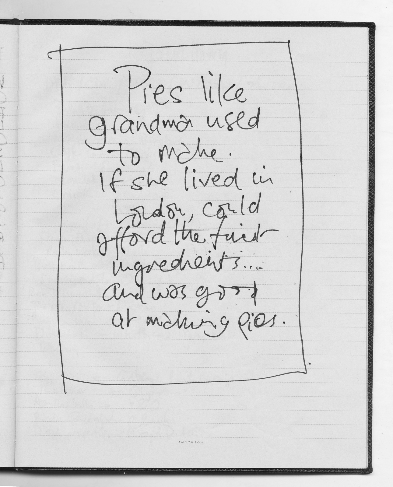
It's ok.But I think the little images are causing the problem, they look crap.Sod the photographer, let's bite the bullet and embrace puns.Maybe an all type poster could look cool, like the kind of London posters you buy, not like an ad.
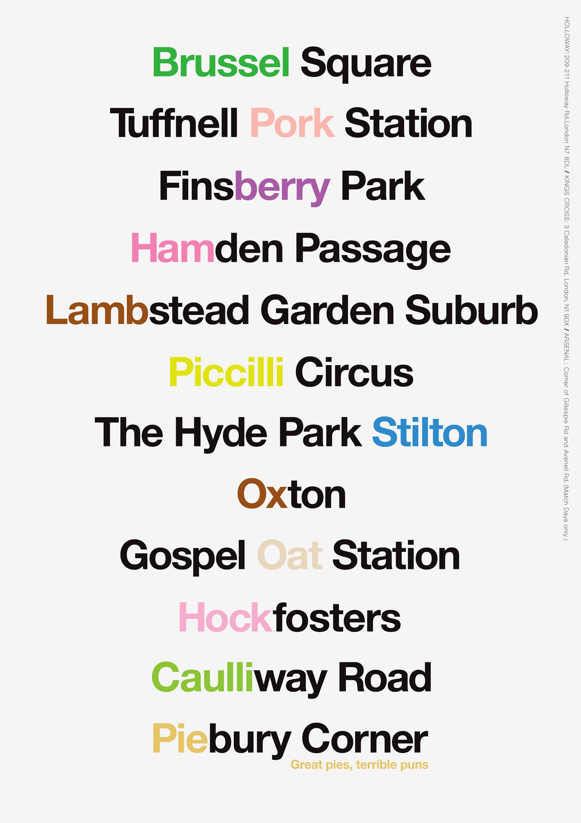
Looks way better.The words are a bit small though, let's make them bigger.The longer place names are sacrificed to give us an increased the font size?
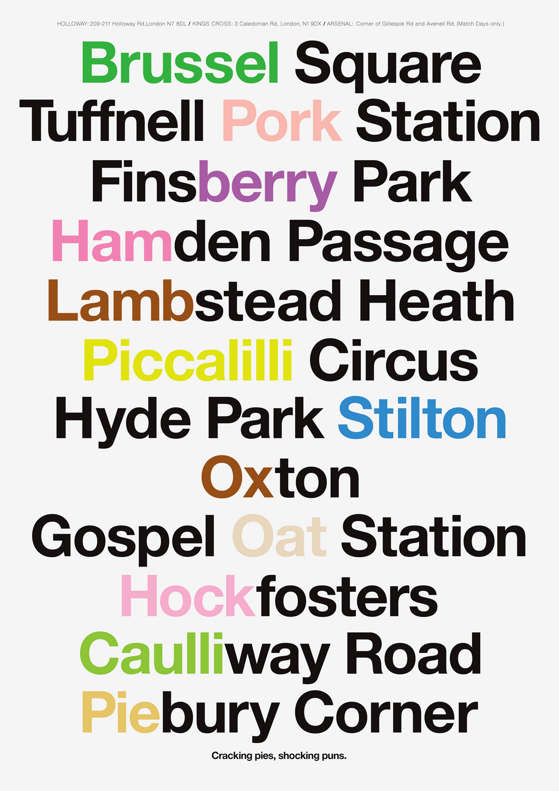
Don't like the line at the end, It feels like a punchline.Which makes the whole thing feel very contrived.I think we should trust people to get the link between Piebury Corner and the other puns.Let's weave it into the text at the bottom.Also, 'Shocking puns'? What's our brand personality; Wallace & Gromit?I Keep thinking of more names, it's addictive, I now have enough for three executions.
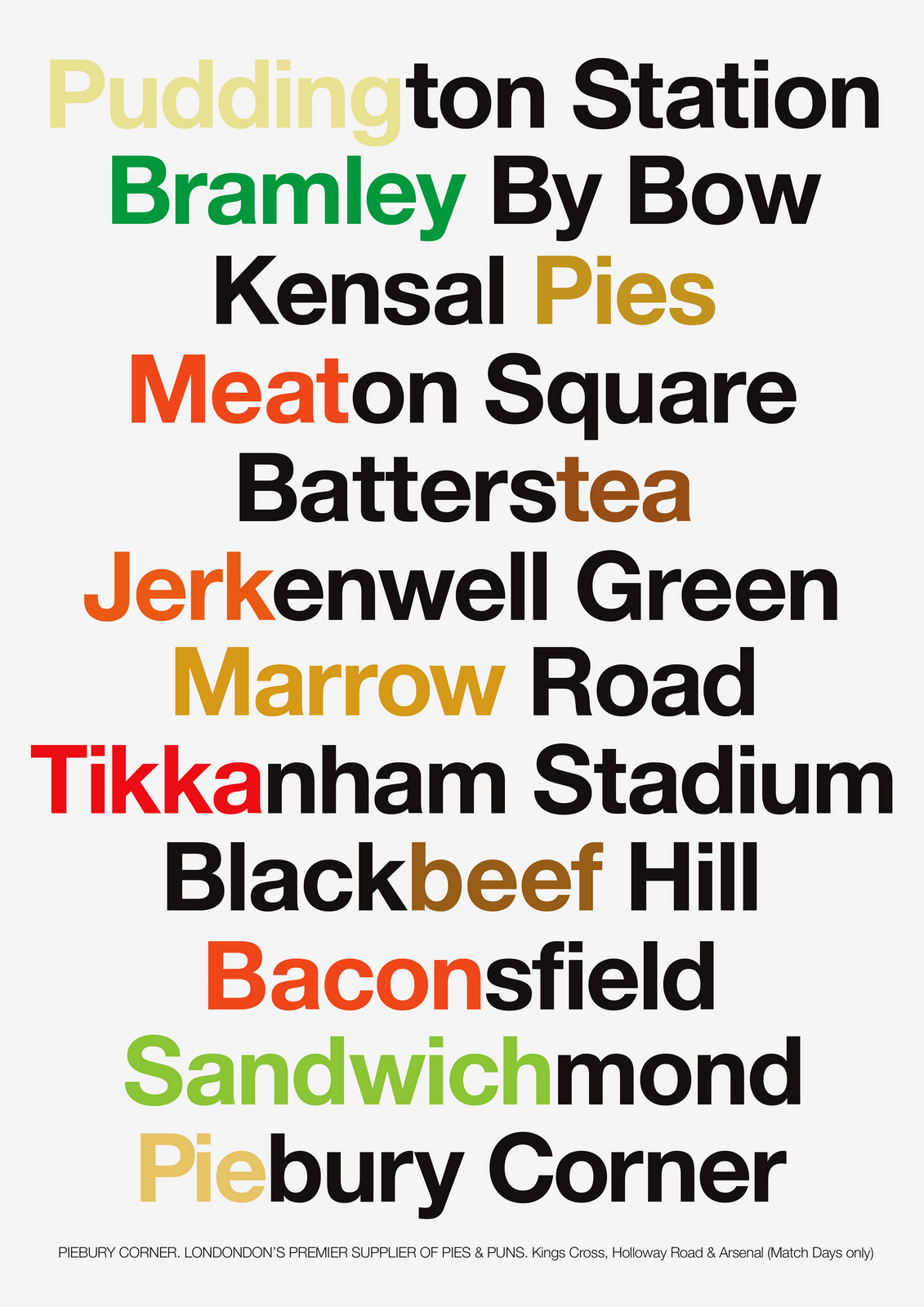
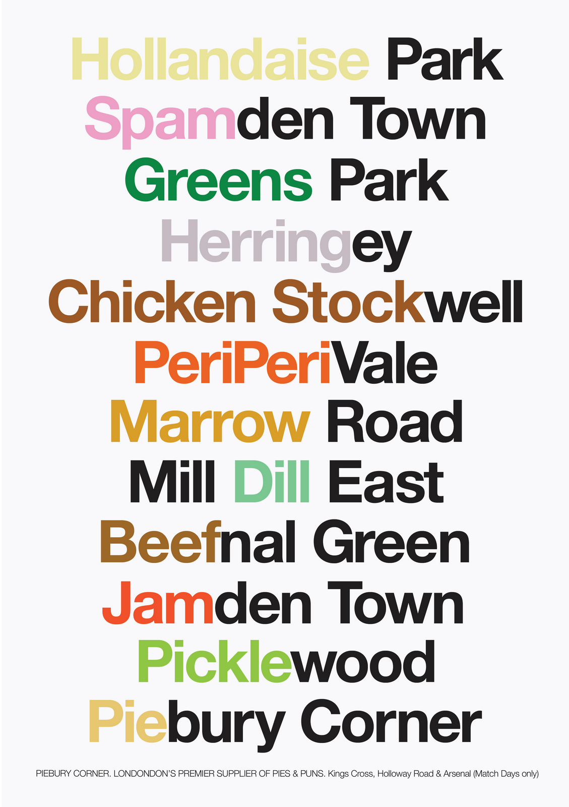
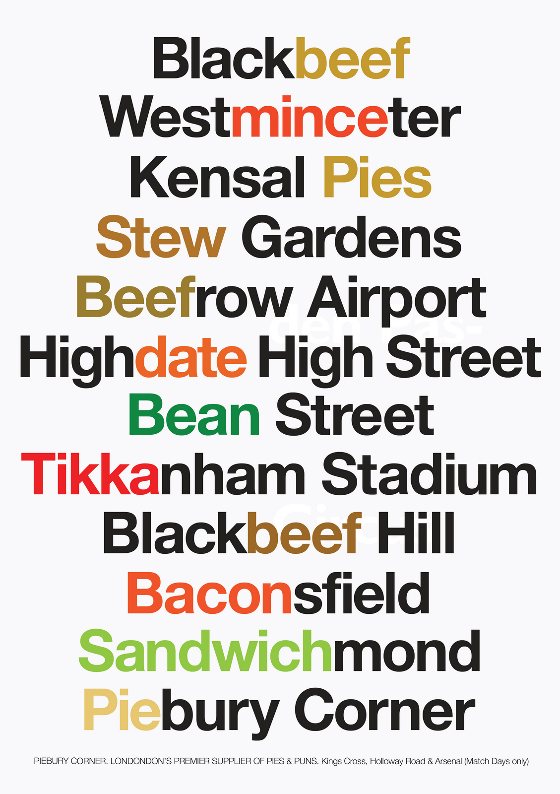
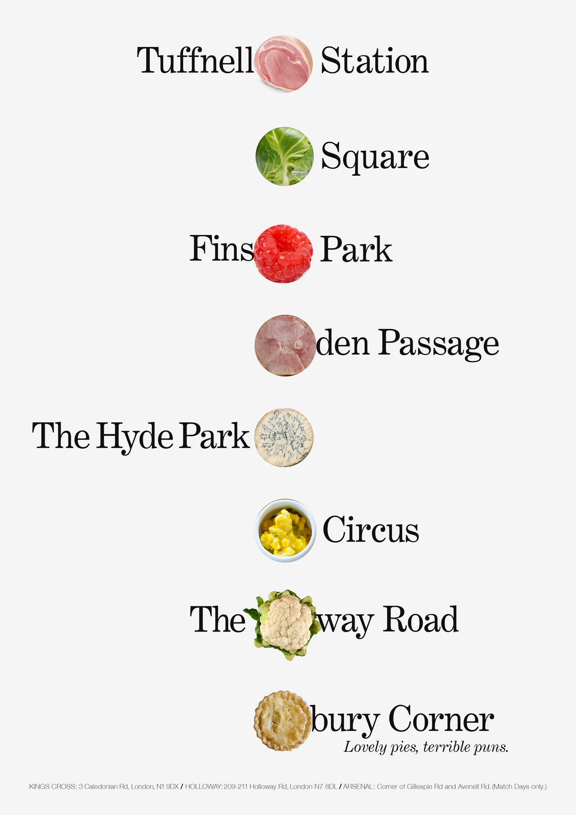
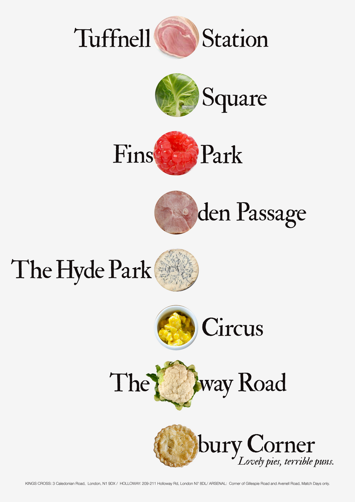
They're starting to look good. But are they a little too cool for school? It's a chain of pie shops after all.Maybe Helvetica is just too clean and clinical for pies?Hang on...Johnston!Surely we should use the London Underground font?It's a London based chain of pie shops featuring London destinations; Johnston!
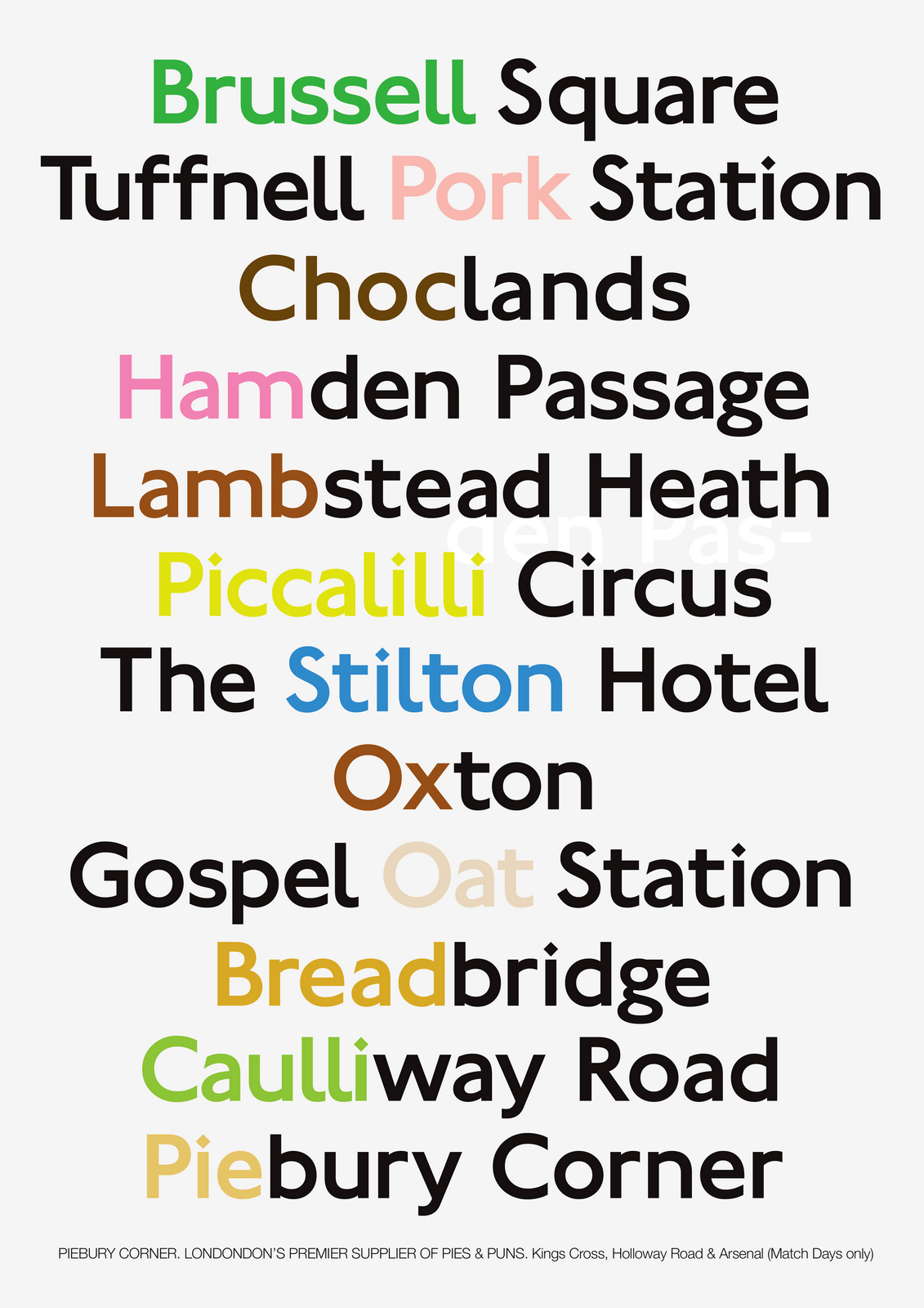
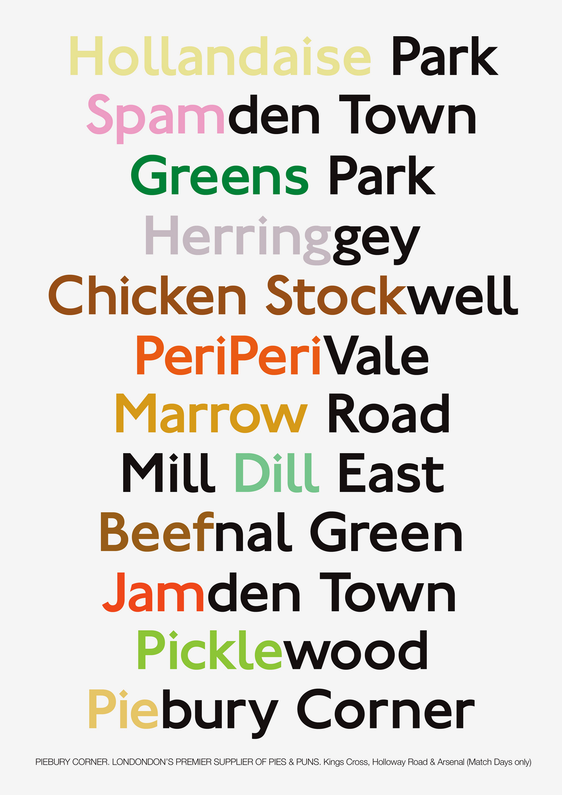
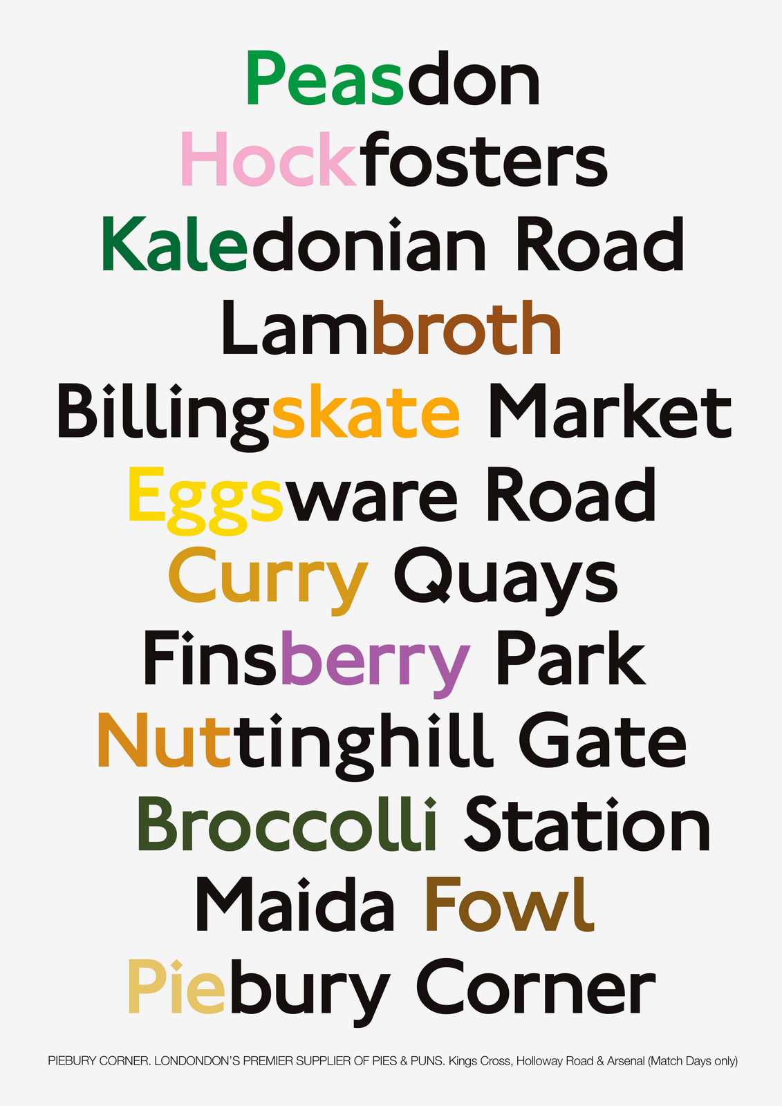
Much better.But maybe we should use a heavier weight?It would mean a more colourful poster, (thicker lines hold more colour).
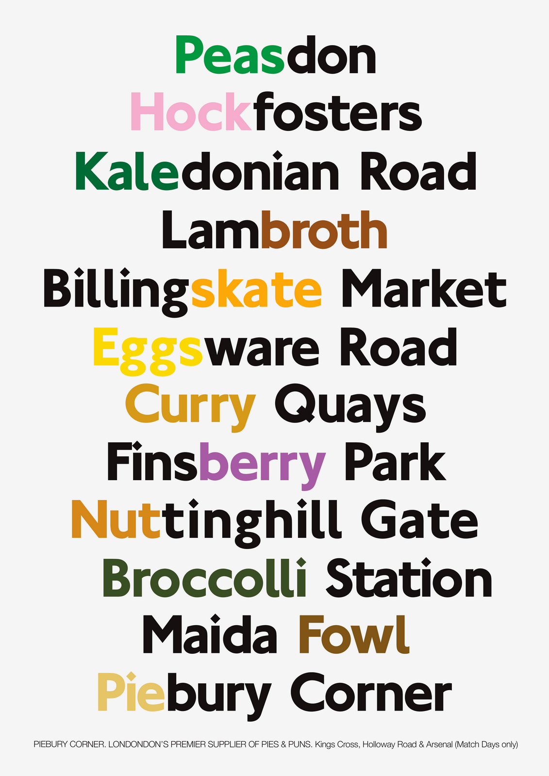
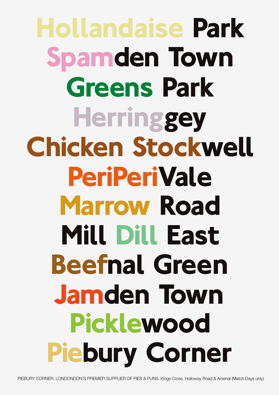
The colours are a bit of a mess, too random, not easy on the eye.Maybe we group the colours to tidy it up a bit?The 'Pie' in 'Piebury Corner' should be a consistent colour every time. The colour of pie.
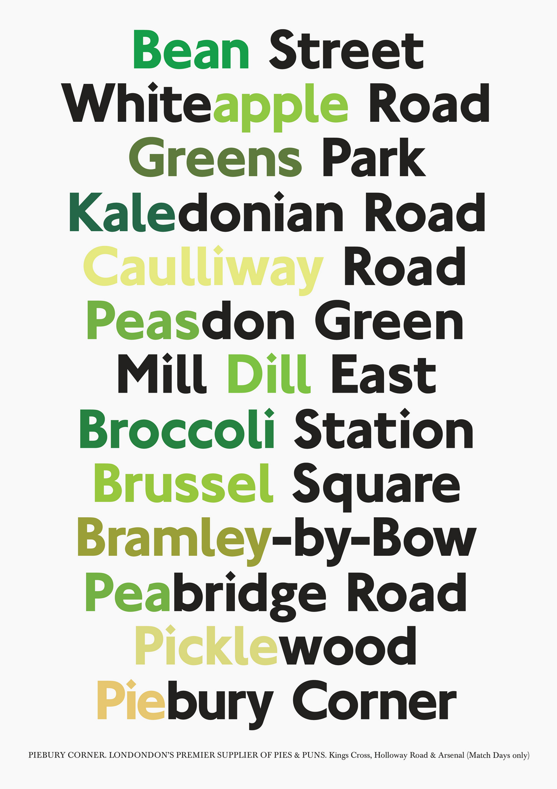
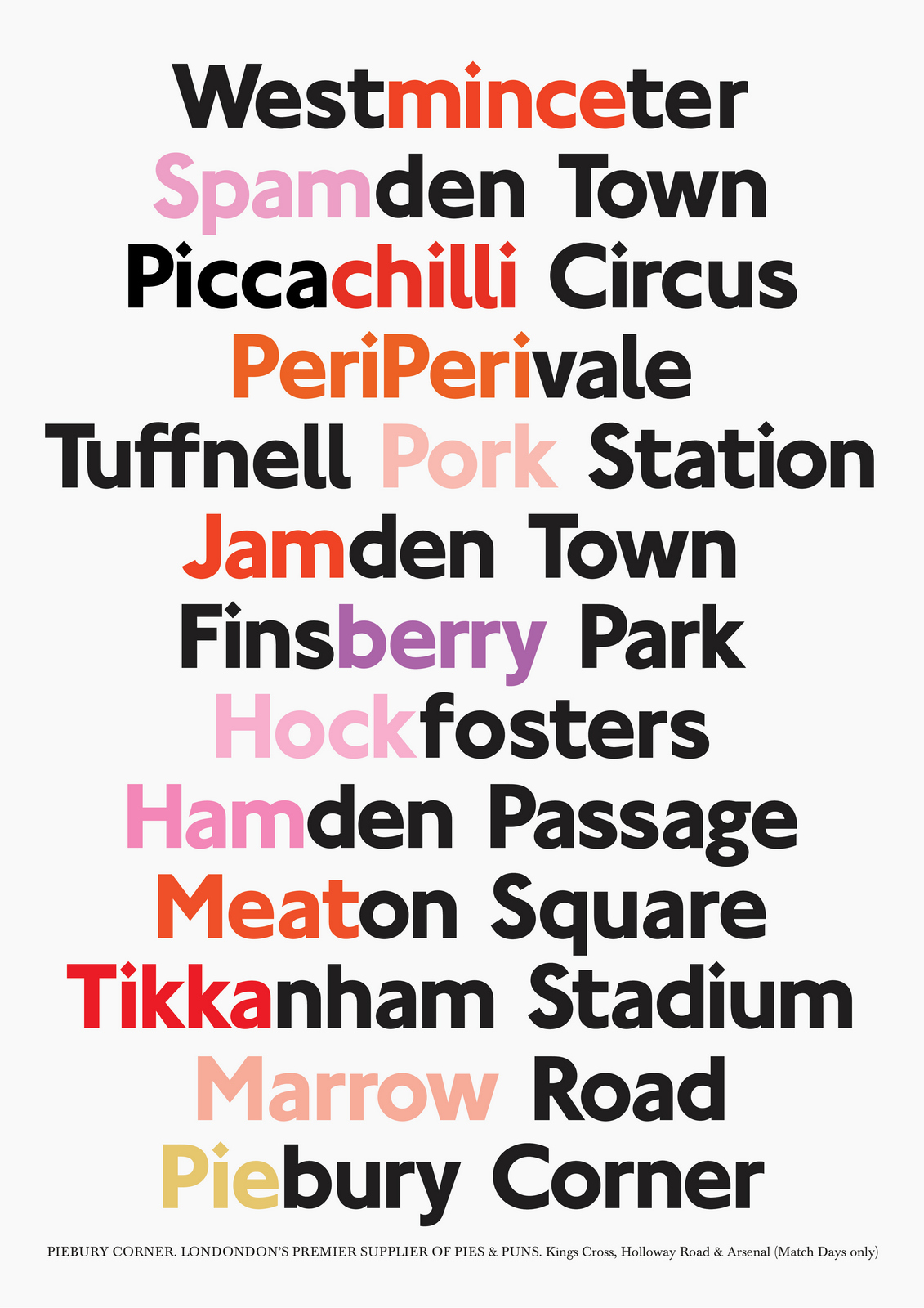
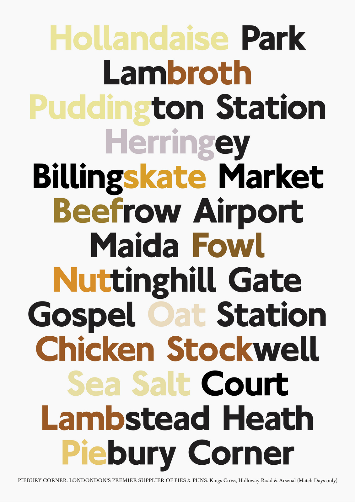
I notice that the greens were all a bit similar.It's because I've guessed them, mixed them from four colours.Colour looks different when placed next to another colour, so when you make up a colour you are too influenced by what's next to it, which is generally good, but not if you want it to accurately reflect a colour.To do it objectively, I decide to find pictures of the objects mentioned, then sample the colours.Some were very similar to my guesses, some were miles out, (check out the pickle and Bramley for example).Also, it's nice to know the colours are accurate.
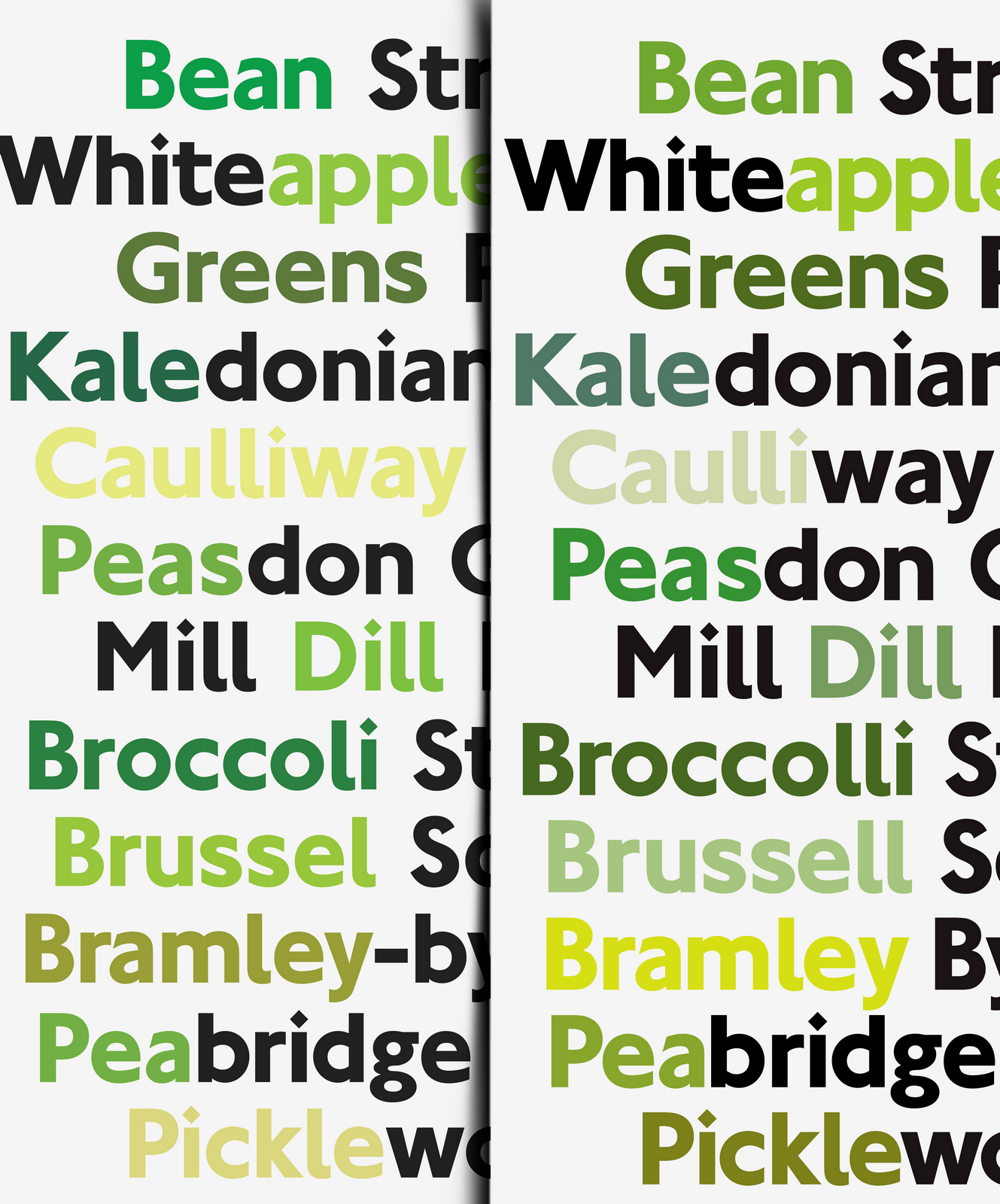
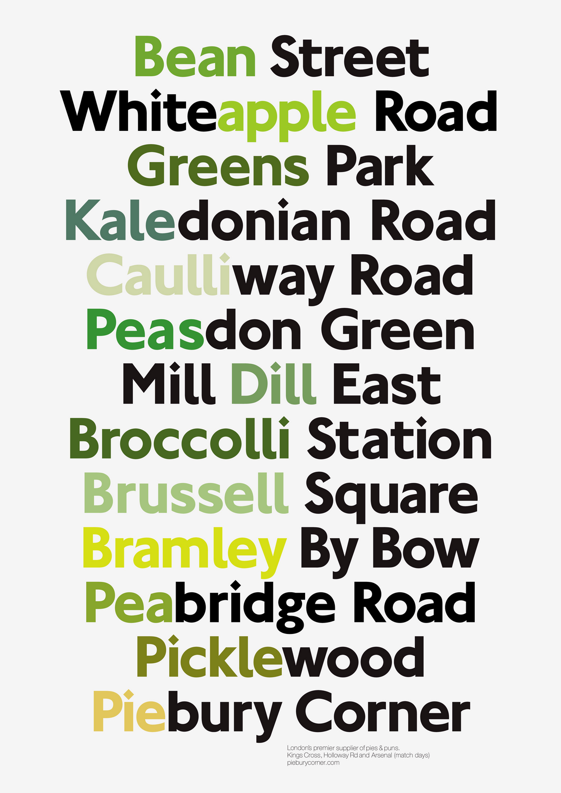
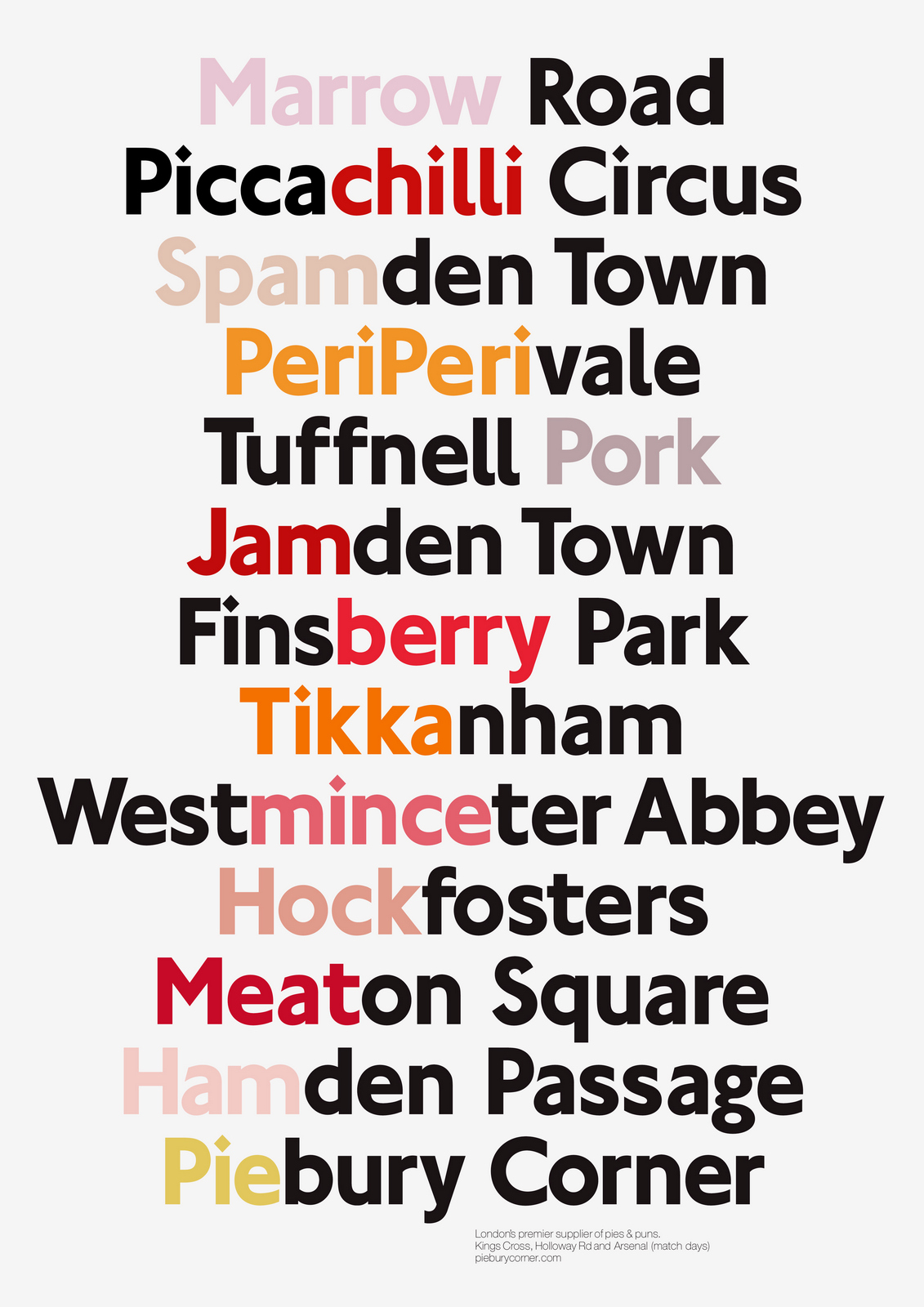
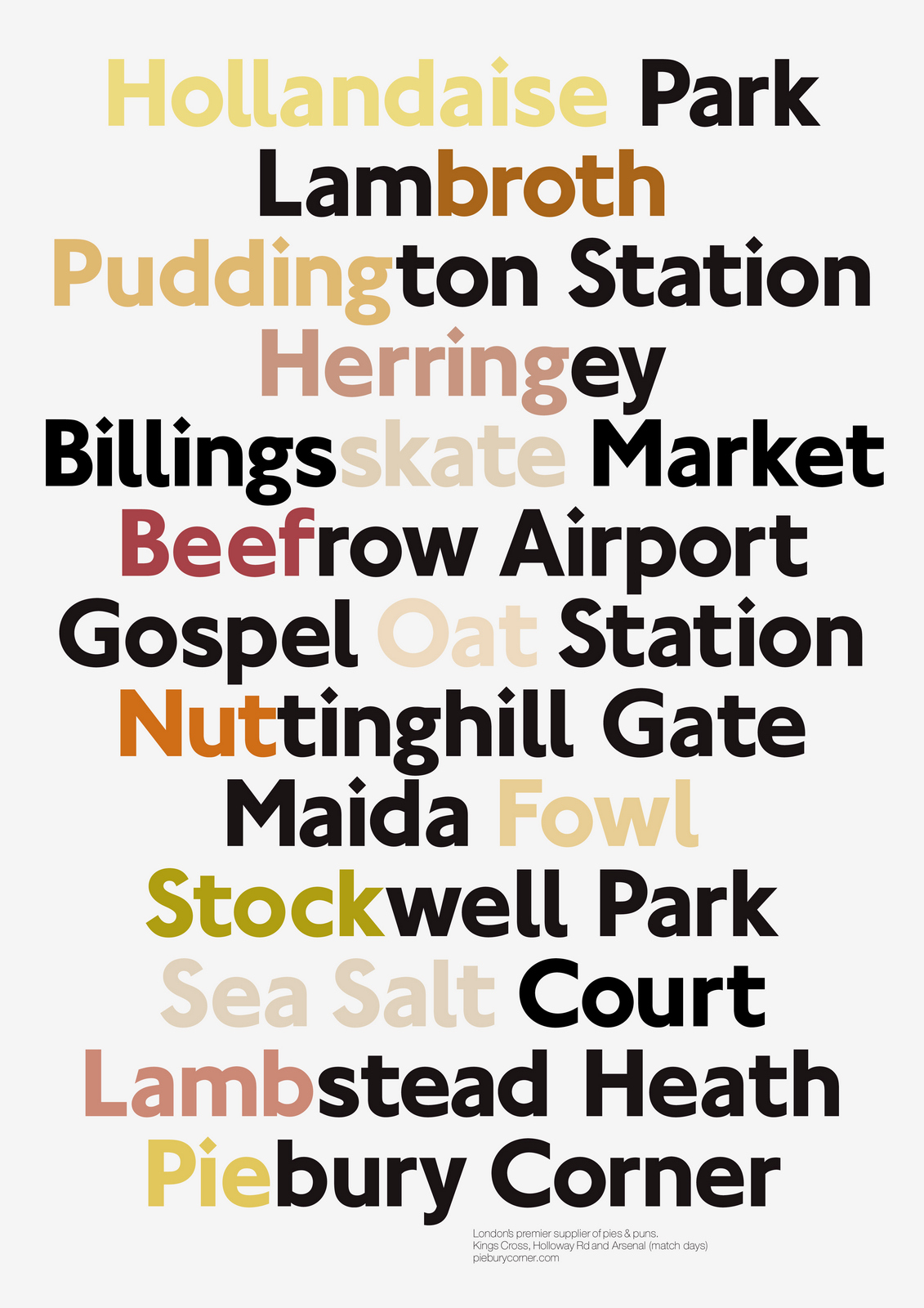
I can't think of anything else to change, they must be finished.
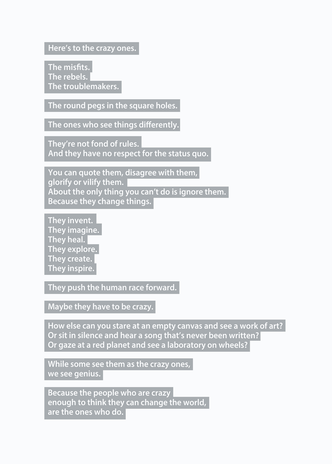
Pictures are great.As everyone knows, they’re worth a 1000 words, but they offer so much more; emotion, drama, humour, shock, surprise, information, style, etc, etc.So what do you do if you can't use one?If you’re an art director it’s especially tough, because your job is to make people engage against their will.So the temptation is to overcompensate with graphics.But it's a risk, as Bill Bernbach warned ‘Merely to let your imagination run riot, to dream unrelated dreams, to indulge in graphic and verbal gymnastics is NOT being creative.’The very process of pushing words around, changing fonts, colours and sizes can distract you from what you set out to do; deliver a message.It’s surprising how quickly people in our business move on from the message.Particularly on awards juries.Sit on an awards jury and the chances are you'll hear someone championing an cool looking campaign with language like ‘this is what our industry should be doing, leading not following culture, ripping up the rule book’.If you ask them what their favourite line or idea was, you often get responses like ‘Err…the blue one’, ‘The one where the words go up the side’ or ‘The one with the coloured squares’.Basically, they can't recall any of the messages in the ads.To be fair, awards juries are looking for fresh, new and unusual, so the feel becomes disproportionately more important than message.But, if you're in the business of communicating, it's worth checking in every so often to make sure you're communicating what you set out to communicate.When limited to graphics only, I often lapse into this process:STEP 1: Try to convey message simply and appropriately.STEP 2: Get distracted by trying to do something cool. STEP 3: Get back to trying to convey message simply and appropriately.It made me want to post a couple of examples.Part one is a bit weird.A few years ago, a guy from India got in touch saying he liked my work and would I create a poster for his company.He wanted me to use the text from Apple’s ‘Here’s to the Crazy Ones’.I love that ad.Whilst mulling over whether to do it or not, I ended up doing it.I couldn’t resist.THE VOMIT DRAFT.That's what screen writers call it, just put it down, don't over worry about it, get something down so that you have something to judge.Let's use Baskerville, that's a nice, readable font.
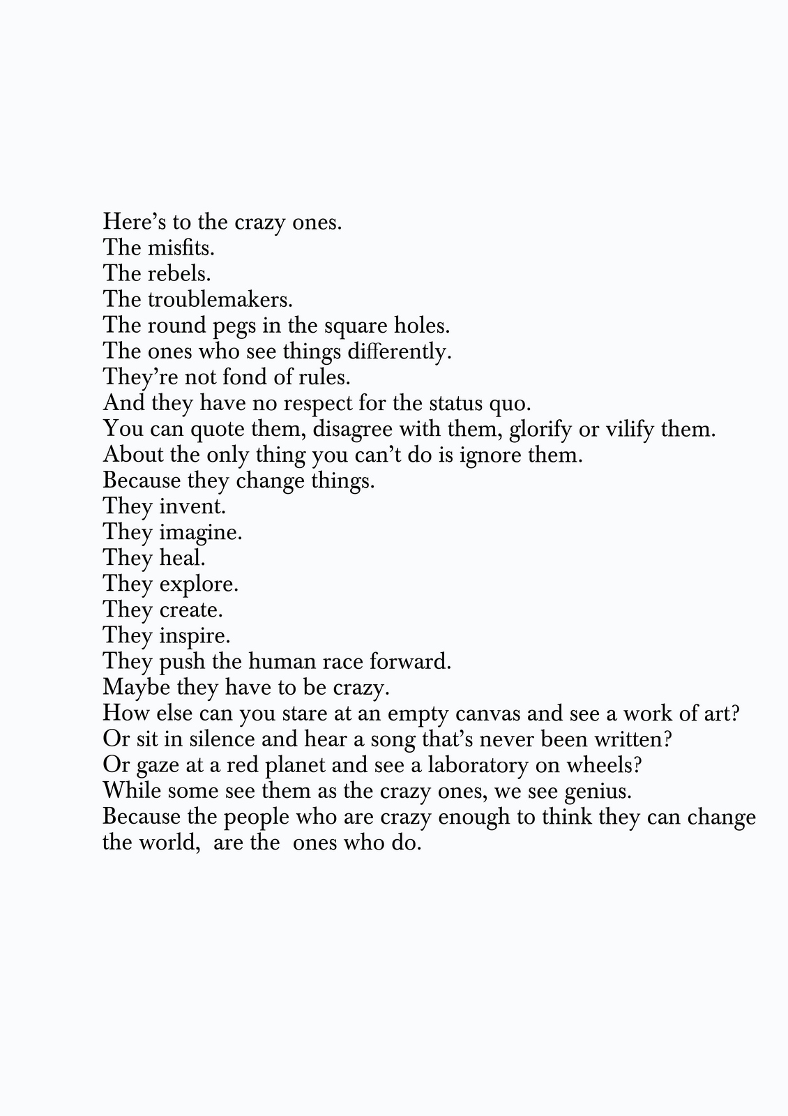
Looks dull, maybe we can increase the size of the words?We'll have to break some of the longer lines.
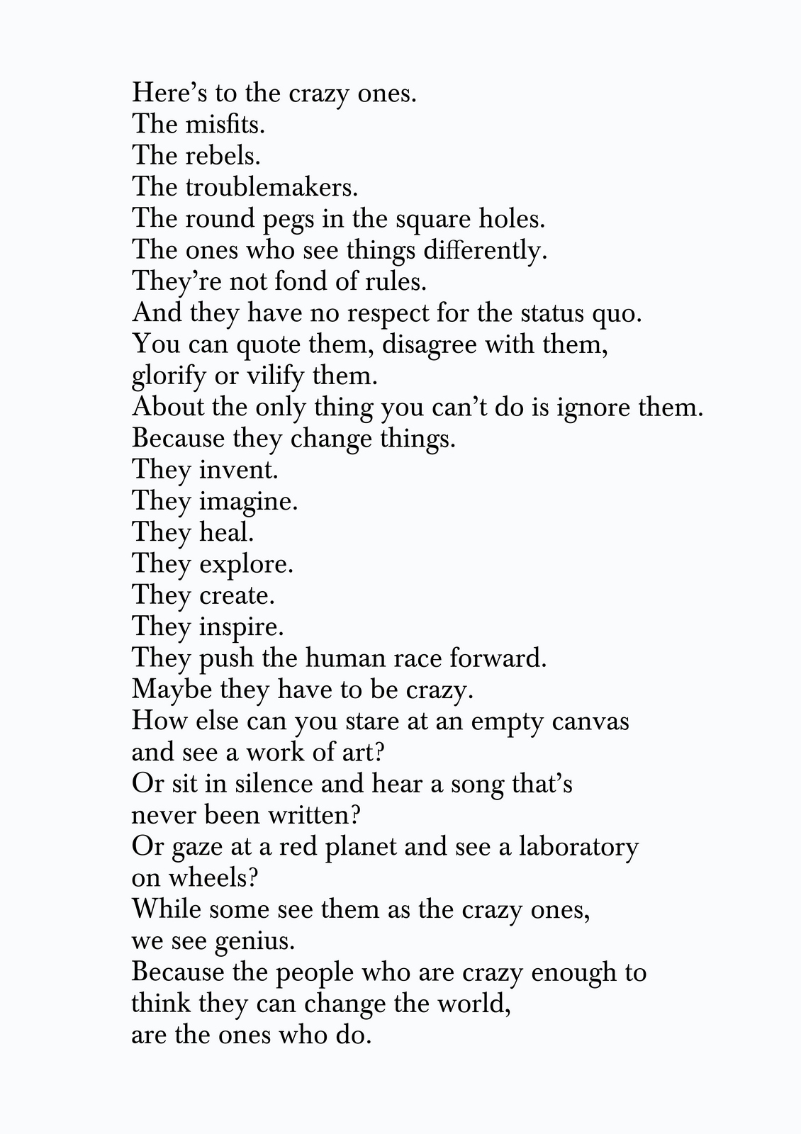
Looks like some old poem.Maybe it should be reversed out of black?
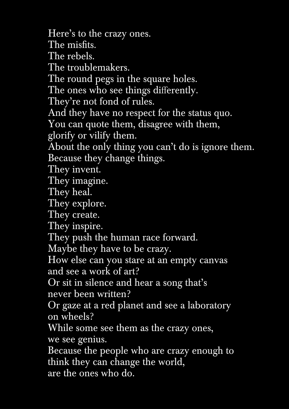
Maybe that font is too old-fashioned?It is Apple after all.Maybe we use Avant Garde; not new, but cool.
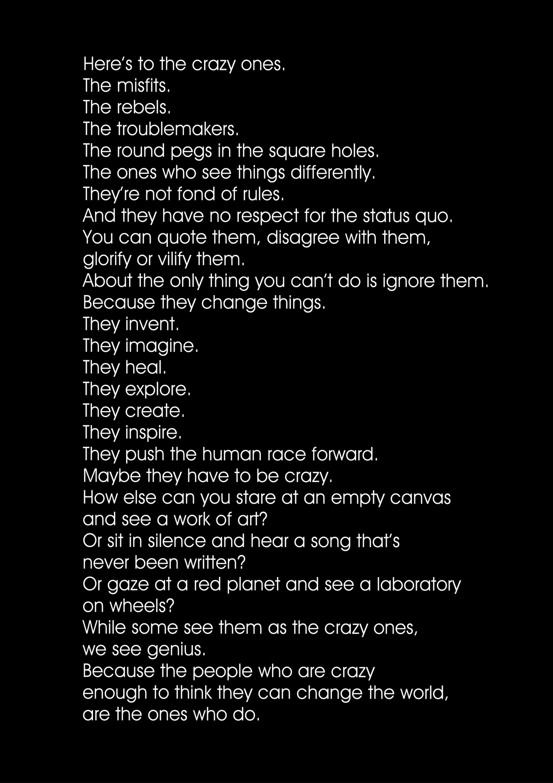
A bit bland, and kind of retro, too 70's.What's a bit more distinctive?Pensyvannia? (Dave Wakefield used that, so it must be good.)
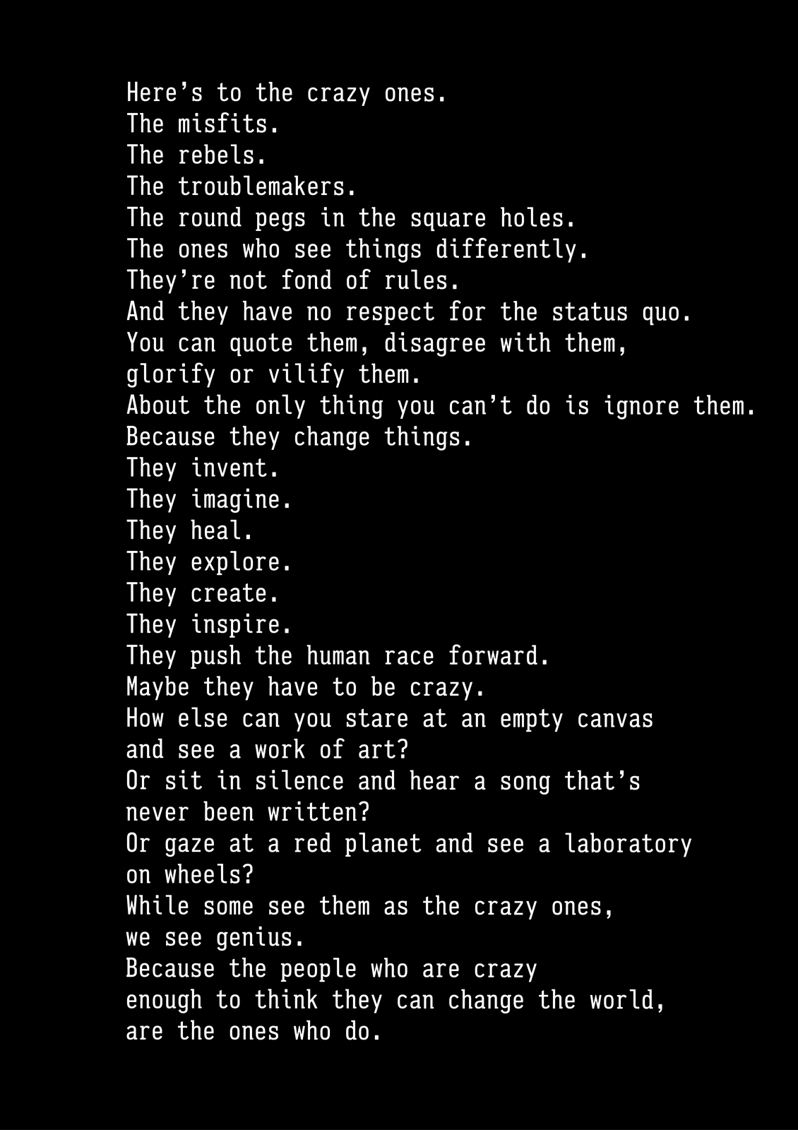
Better, but a bit hard to read.Maybe we should break to help people take in the sections?
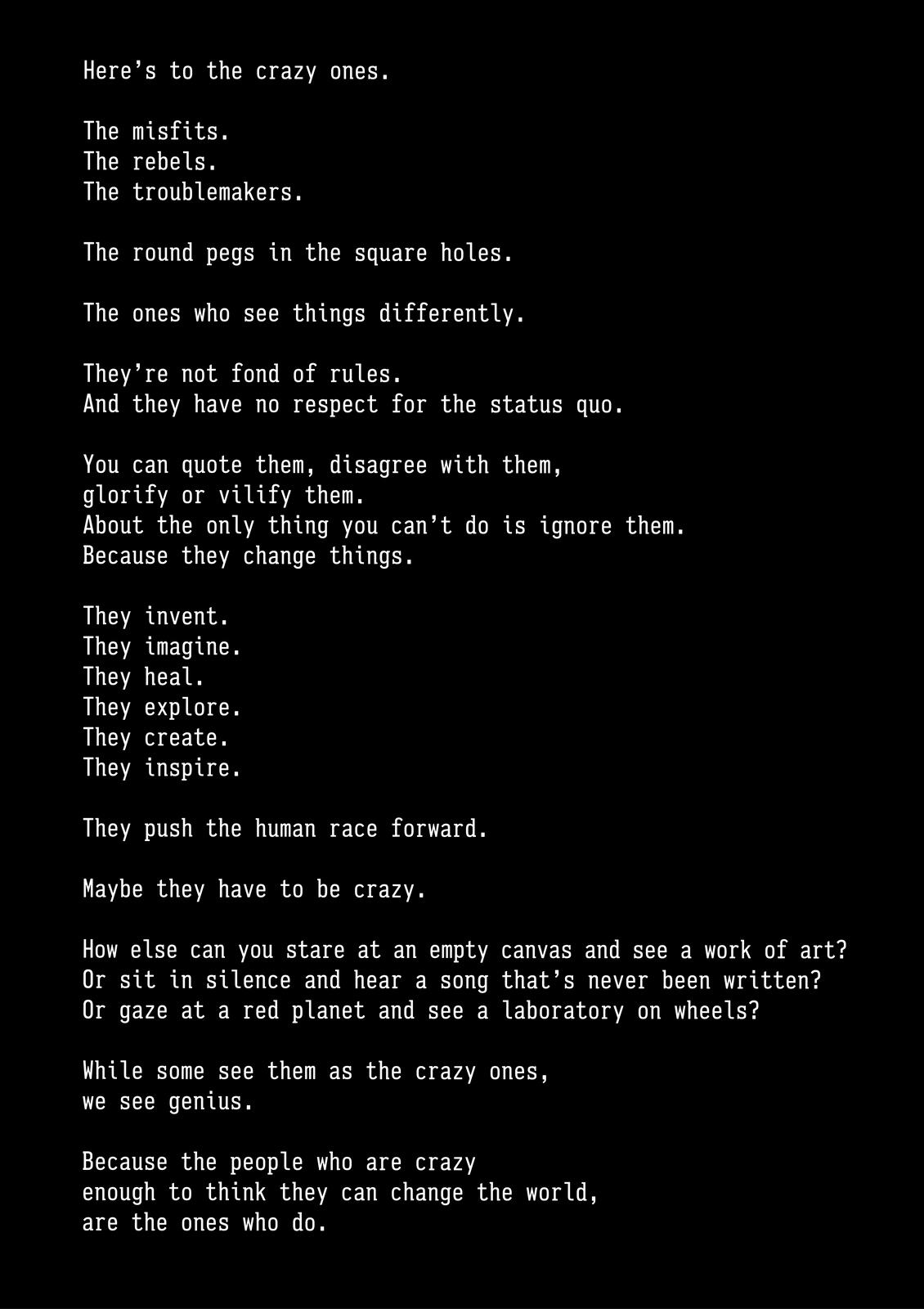
That's better, much easier to take in the thoughts.Looks a bit doomy though, yet the text is vey positive an upbeat.Maybe we replace the black with grey...it's probably more Apple?
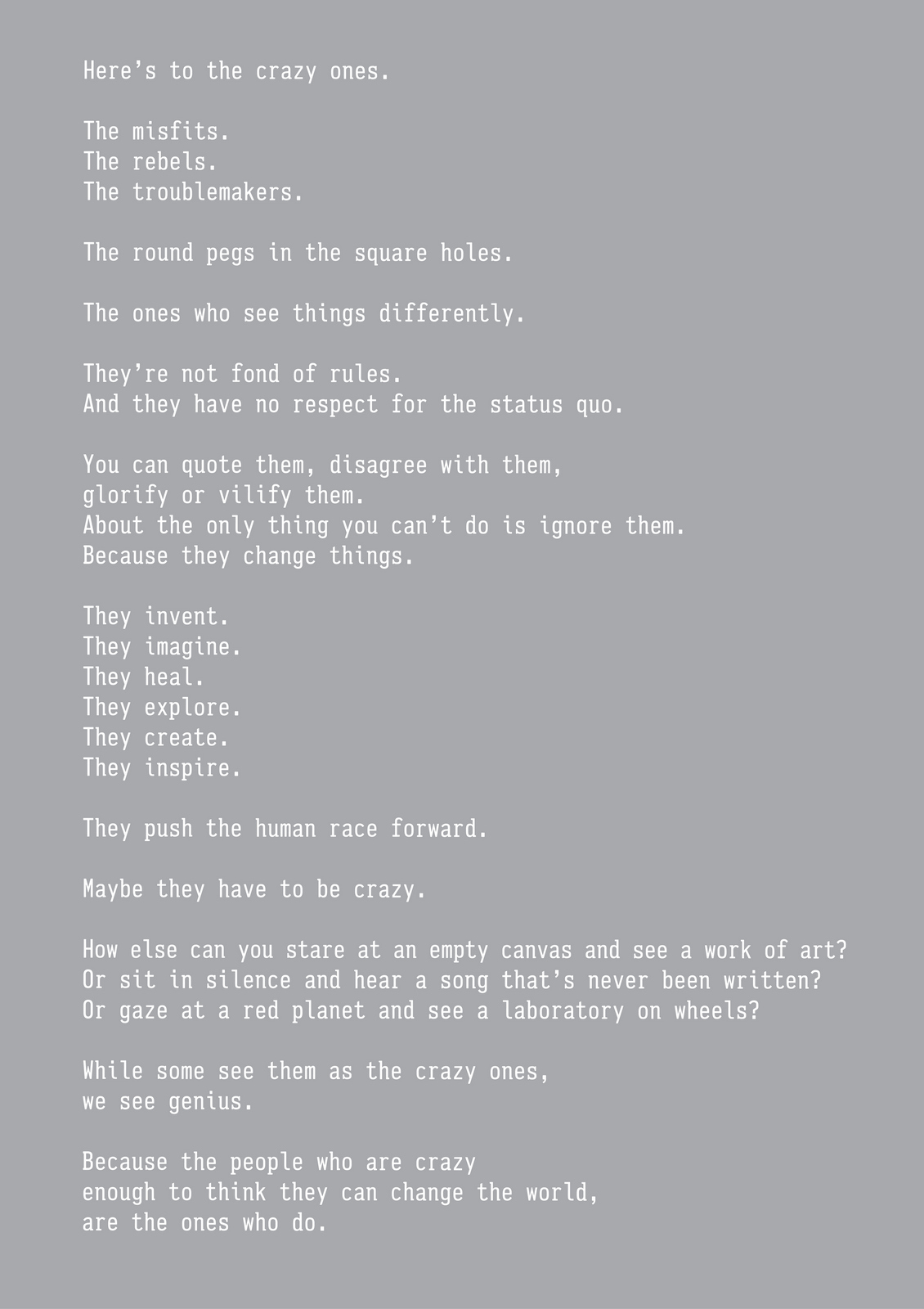
Better. But a bit nothingy...a bit bland looking.Maybe we pull in a texture, something related to Apple?
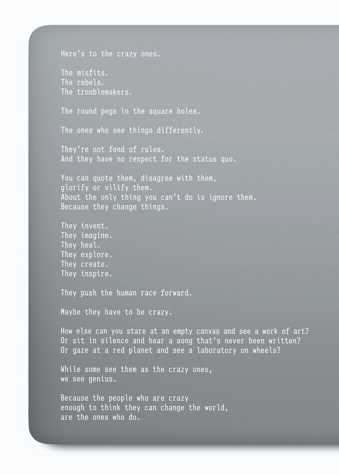
Shouldn't we use the Apple font? It is for Apple?What's the Apple font? Mythiad? Ok.
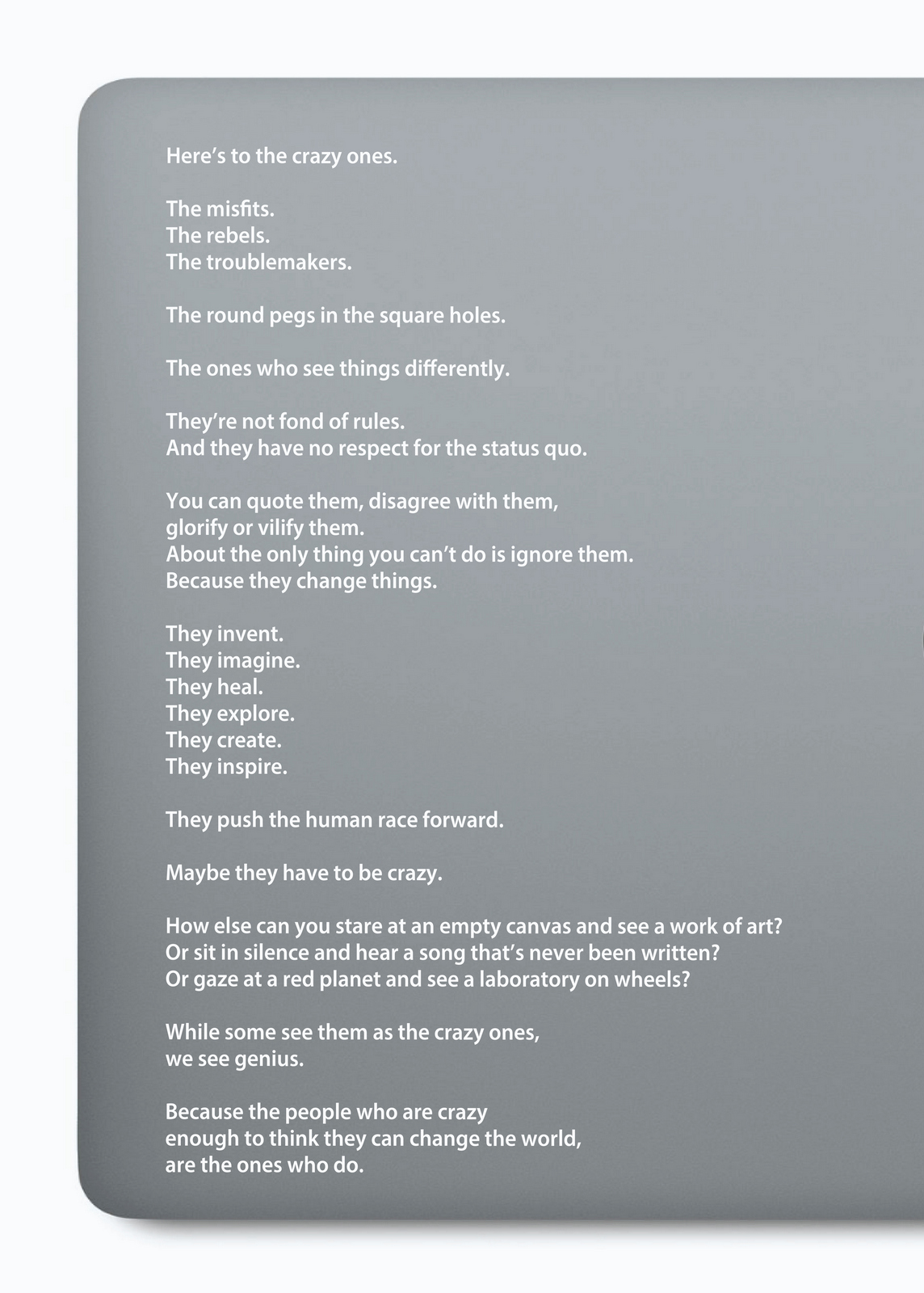
I like it, but maybe it feels a bit too Apple? A bit like an Apple ad. That therefore makes the text look like ad copy. I love the words, they're more than 'ad copy'.Maybe we keep the text as it is and break up the sections with bars?
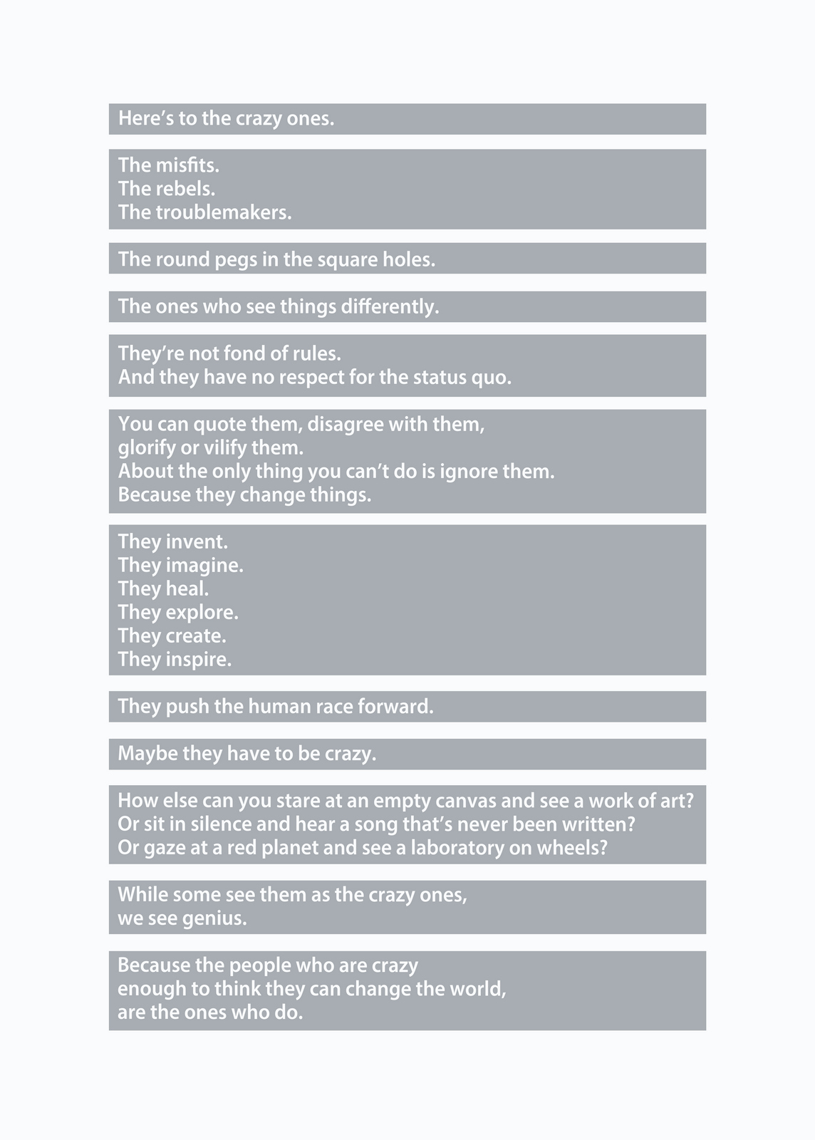
Too blocky.It's the first thing I think when I look at it.Maybe it would look cooler to highlight the words in blocks like a Word document?
I like the fact that it looks a little odd, off-centre and random.Maybe we should we break up the blocks with colour?
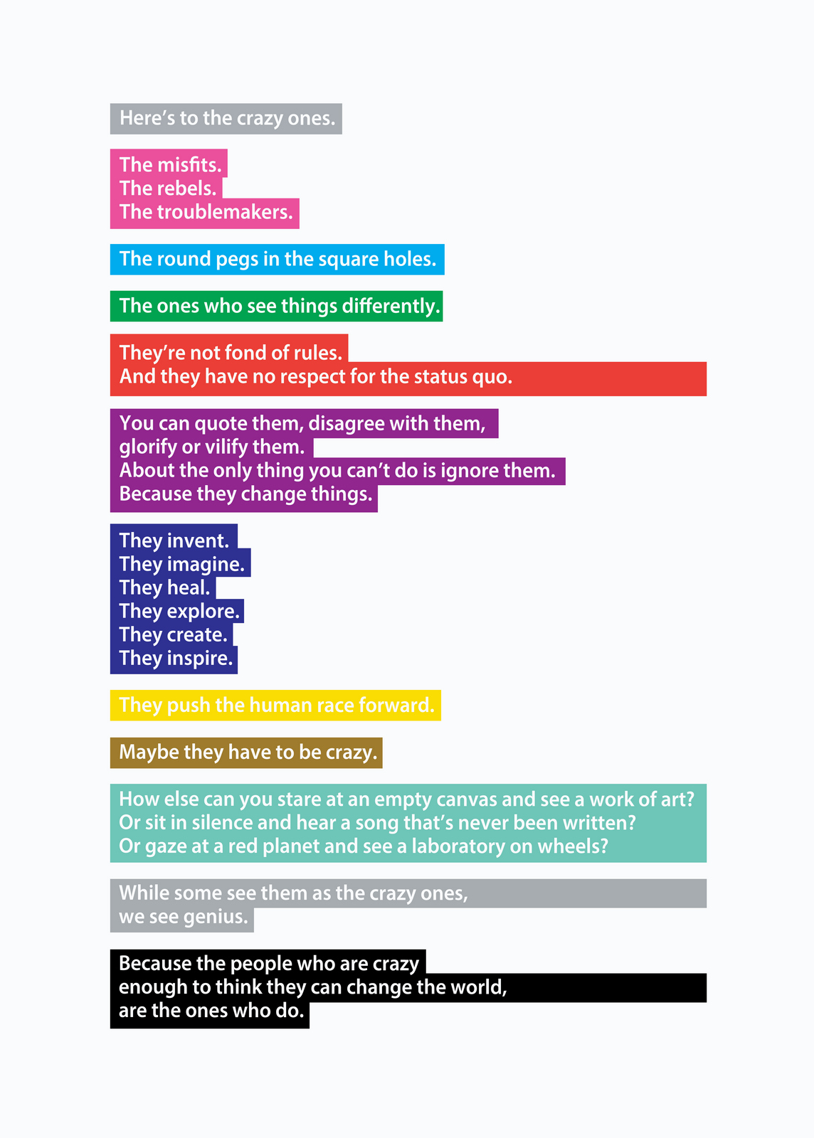
Does it now look a bit too fiddly?Too complicated?Maybe we should go back to simpler blocks?
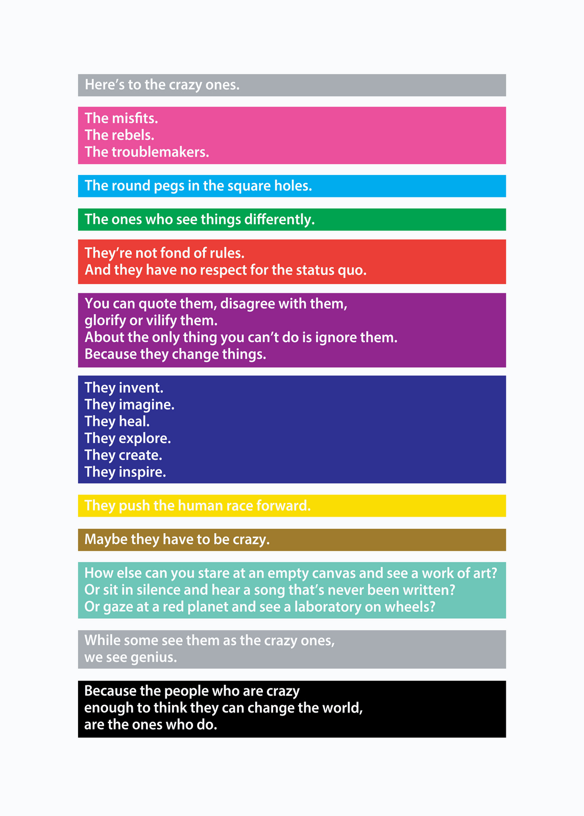
Mmm...colours are a bit...colourful.Looks like a tube map.Maybe we use more sophisticated colours, less brash and cheap?
Maybe each line should have it's own colour?We could group sections in a similar tone when they run on.And maybe we try to emphasise the ideas within each line with some typograhical device?
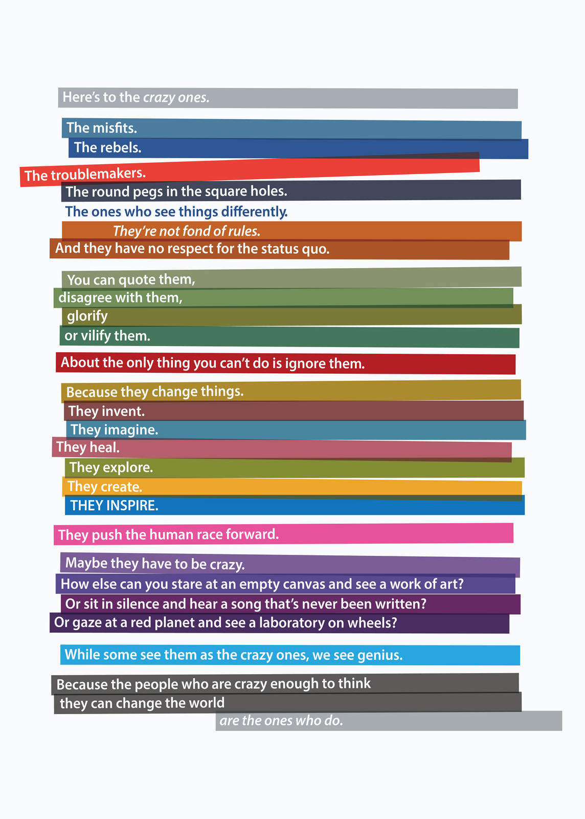
Looks cool.Hang on...would the takeaway be 'that cool-looking colourful stripey poster'.Probably.It's not really doing Craig Tanimoto's words justice.Maybe we make the words the hero and relegate the graphics?Use an ocassional typographic idea, just not like a punchline every few seconds.
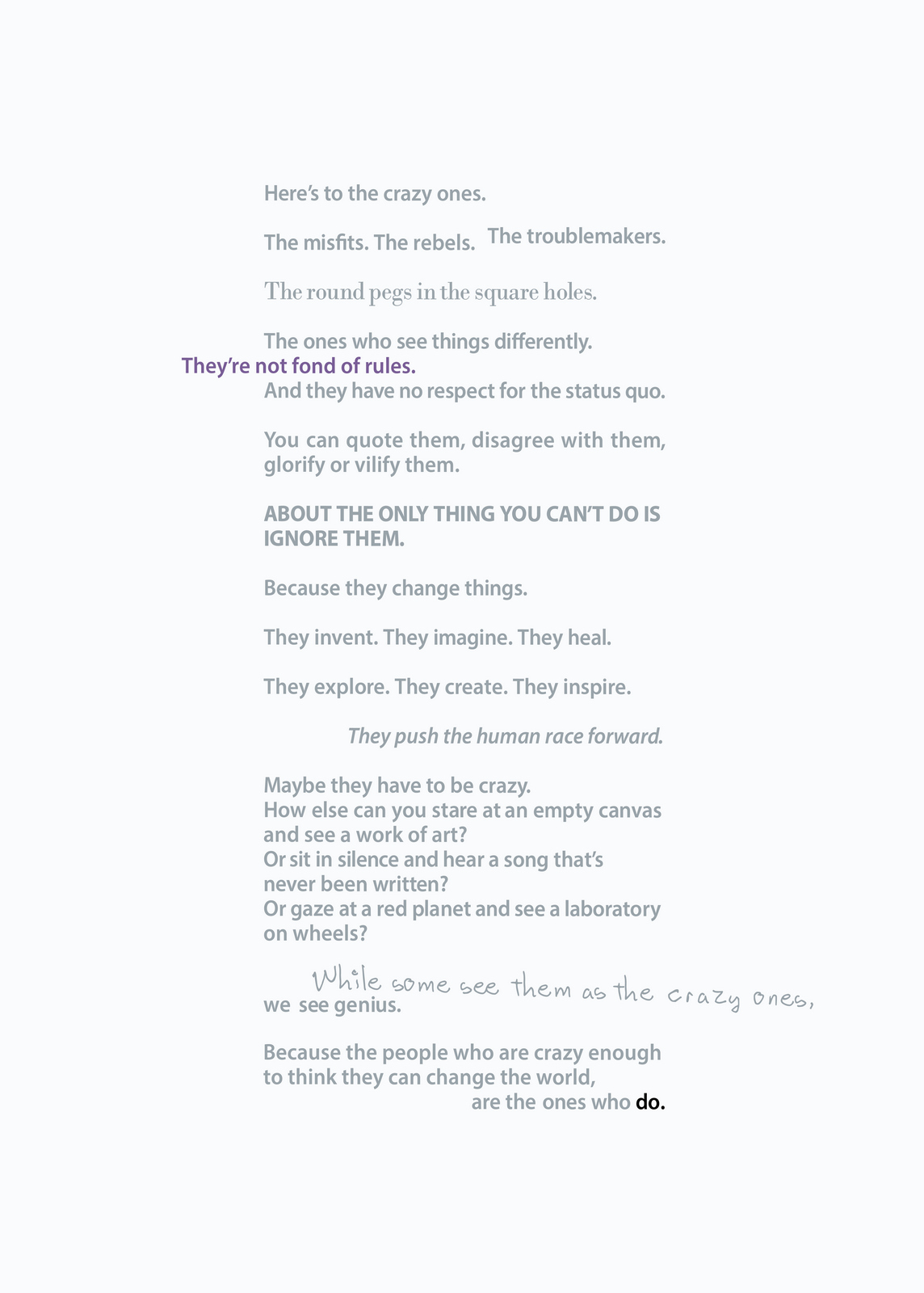
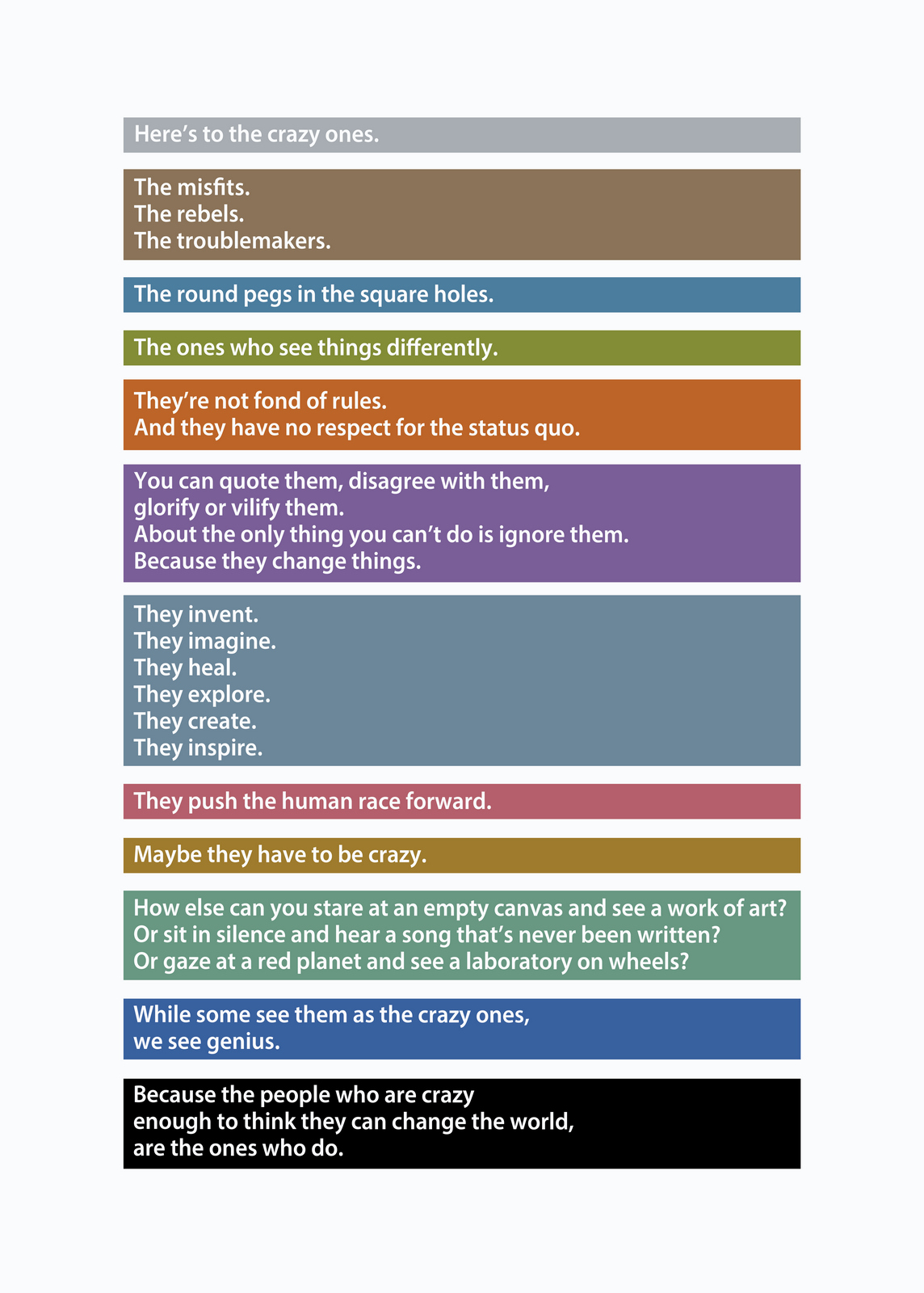
Better.Maybe it still messes with the reading too much?Dare I say we use black type?Maybe grey type is a little addy, a bit contrived?
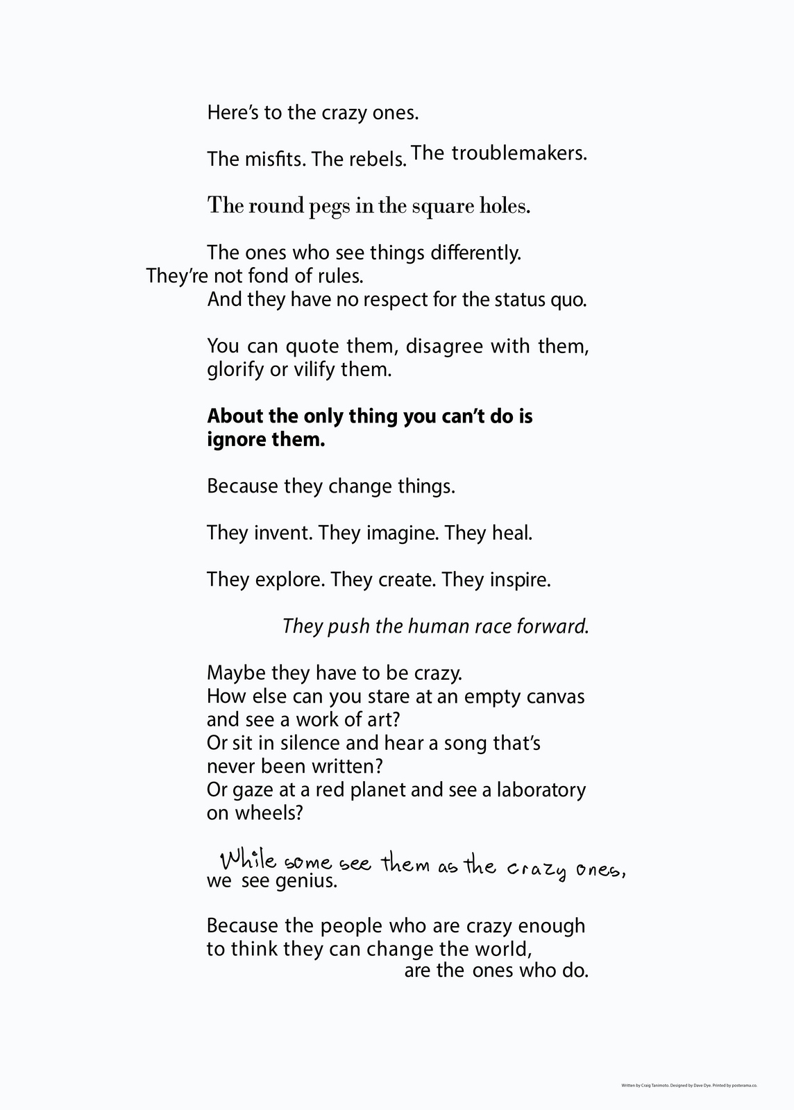
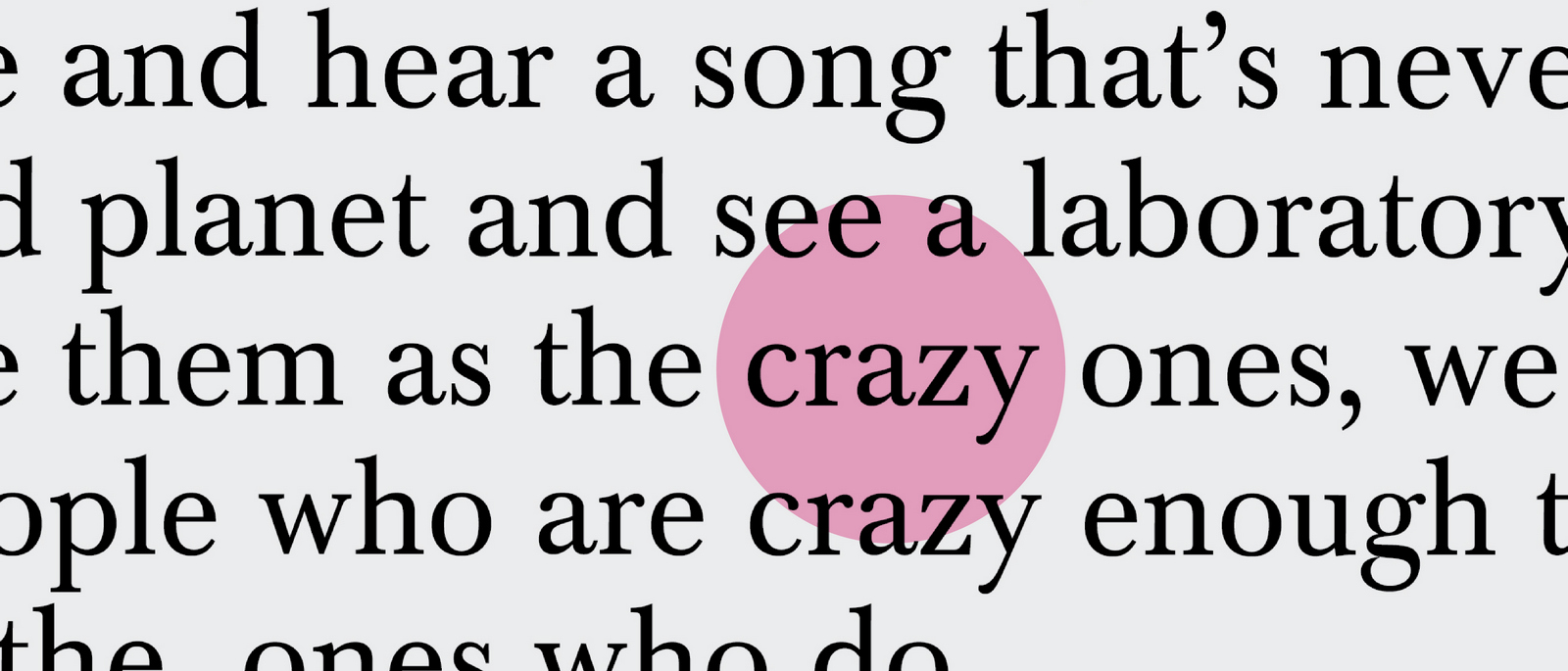
Perfect.What? You like the colourful stripey one?Did you read the words?
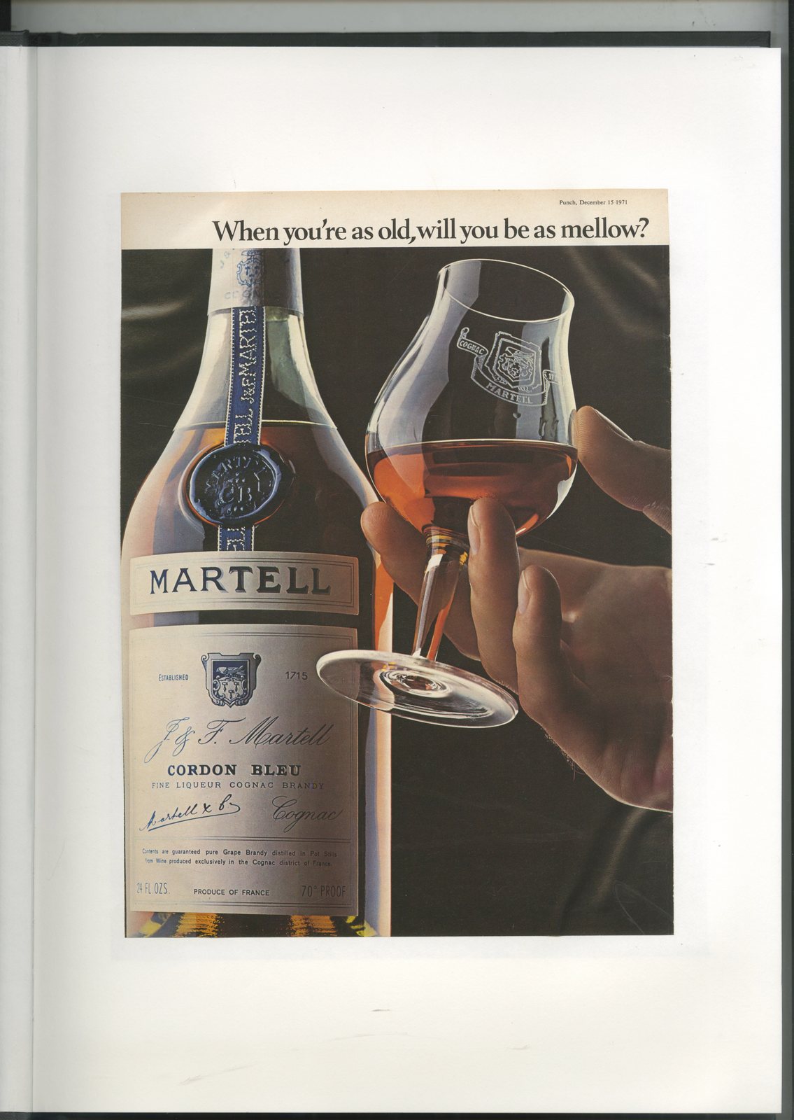
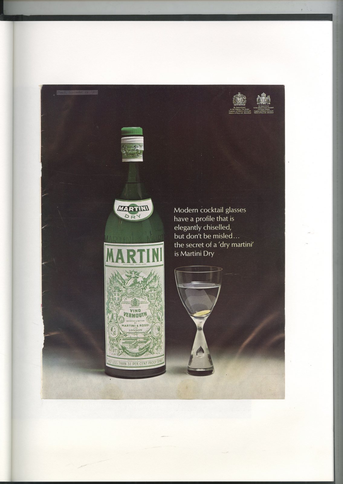
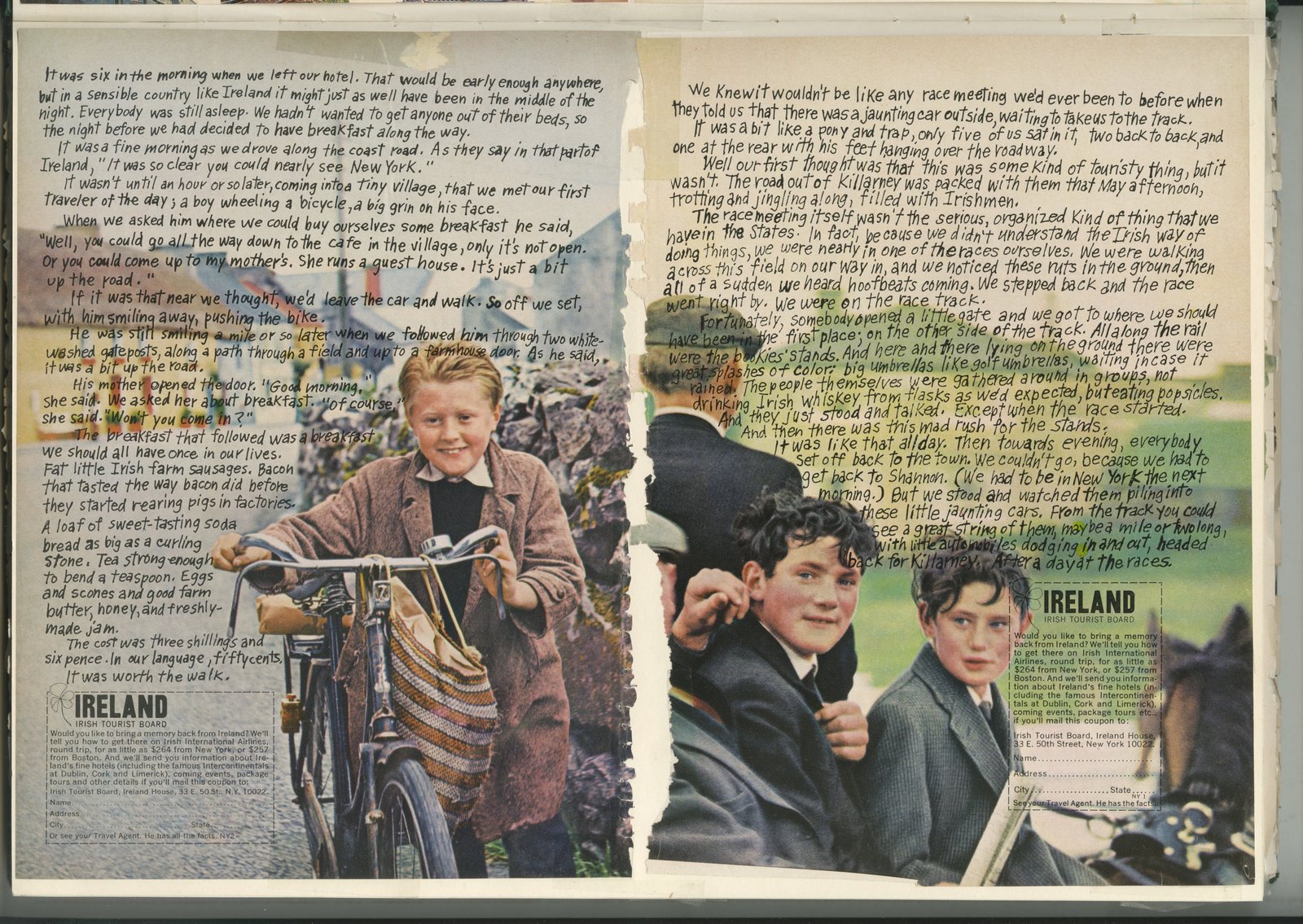
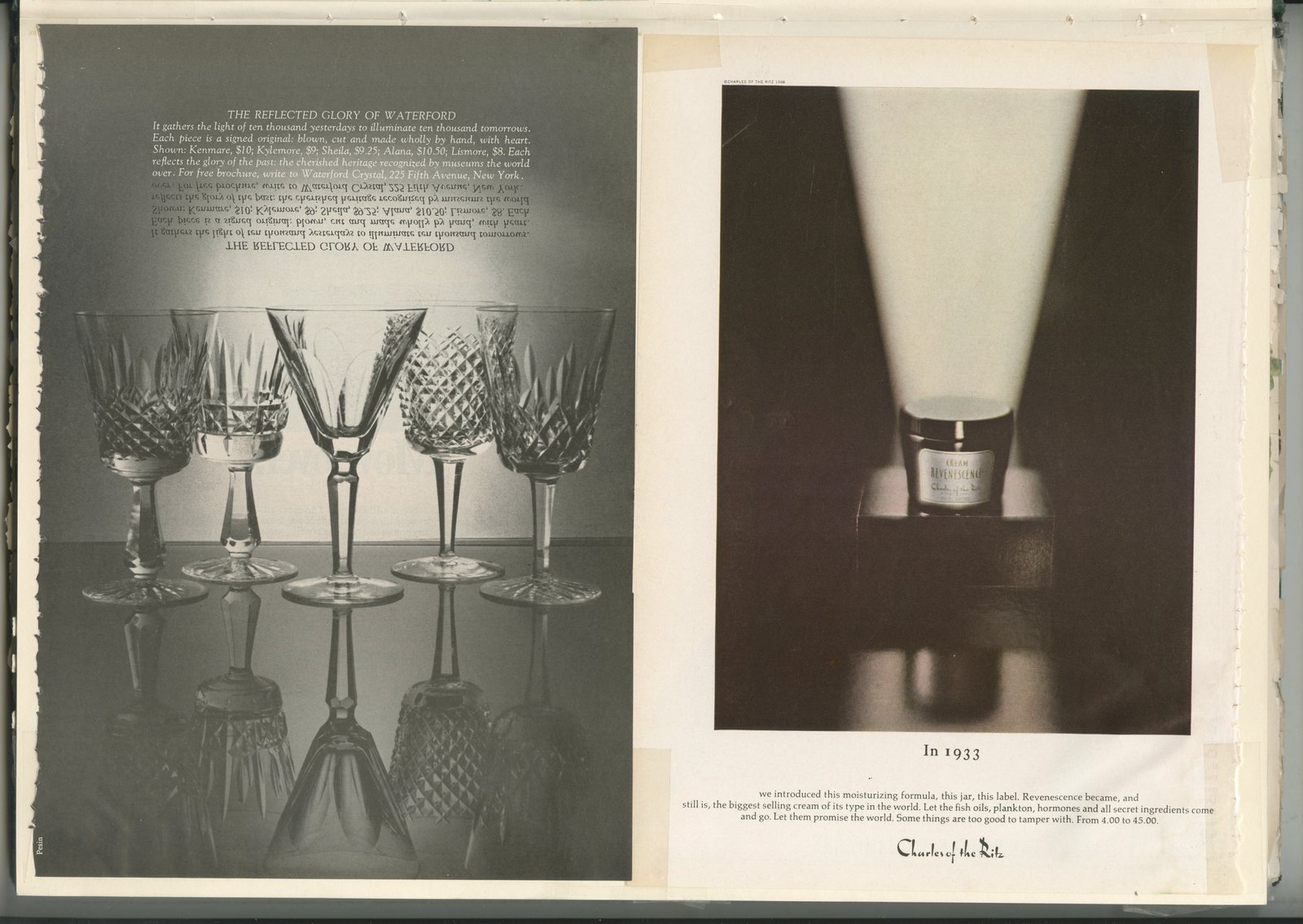
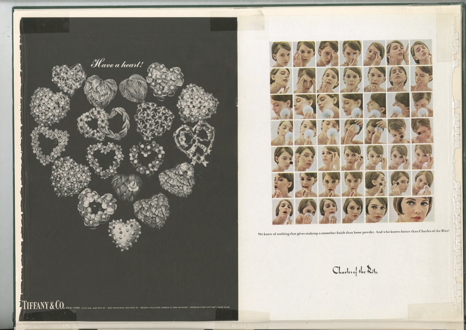
The Advertising Standards Council wouldn't let that title pass.I guess it was my intent when I cello-taped it to the cover.There are a few old New Yorker ads in there, but the majority are English, from the early seventies.It’s odd collection, looking at it now is a bit like wandering through a car boot sale.
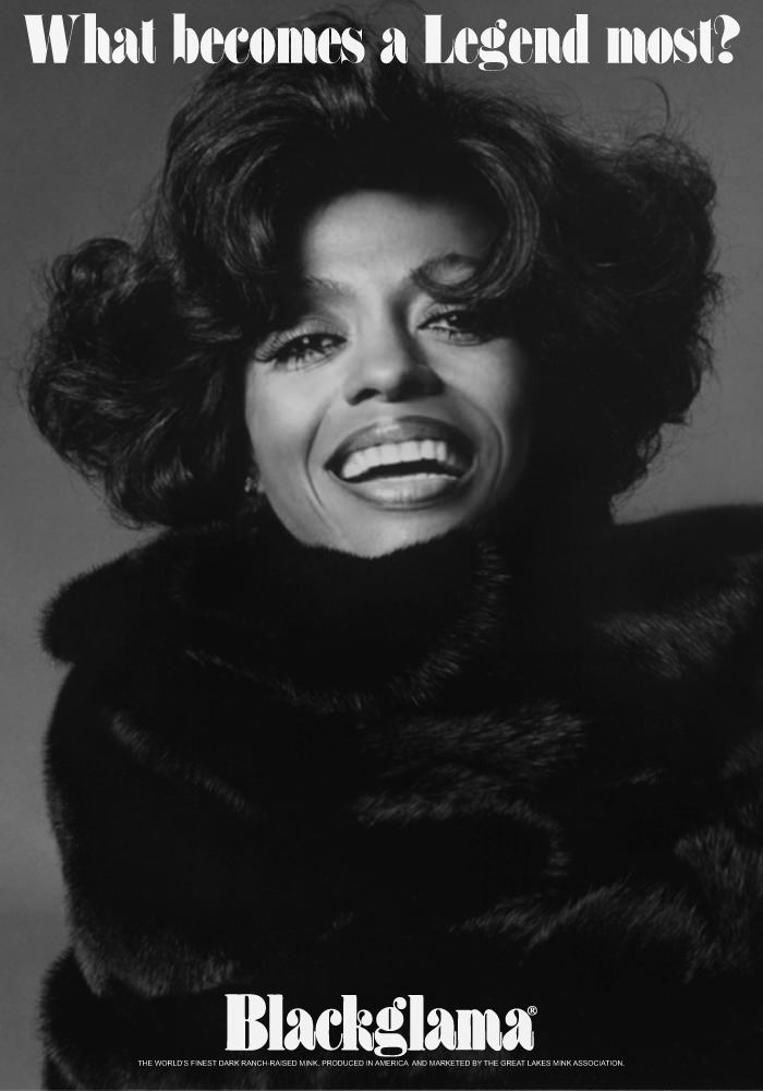
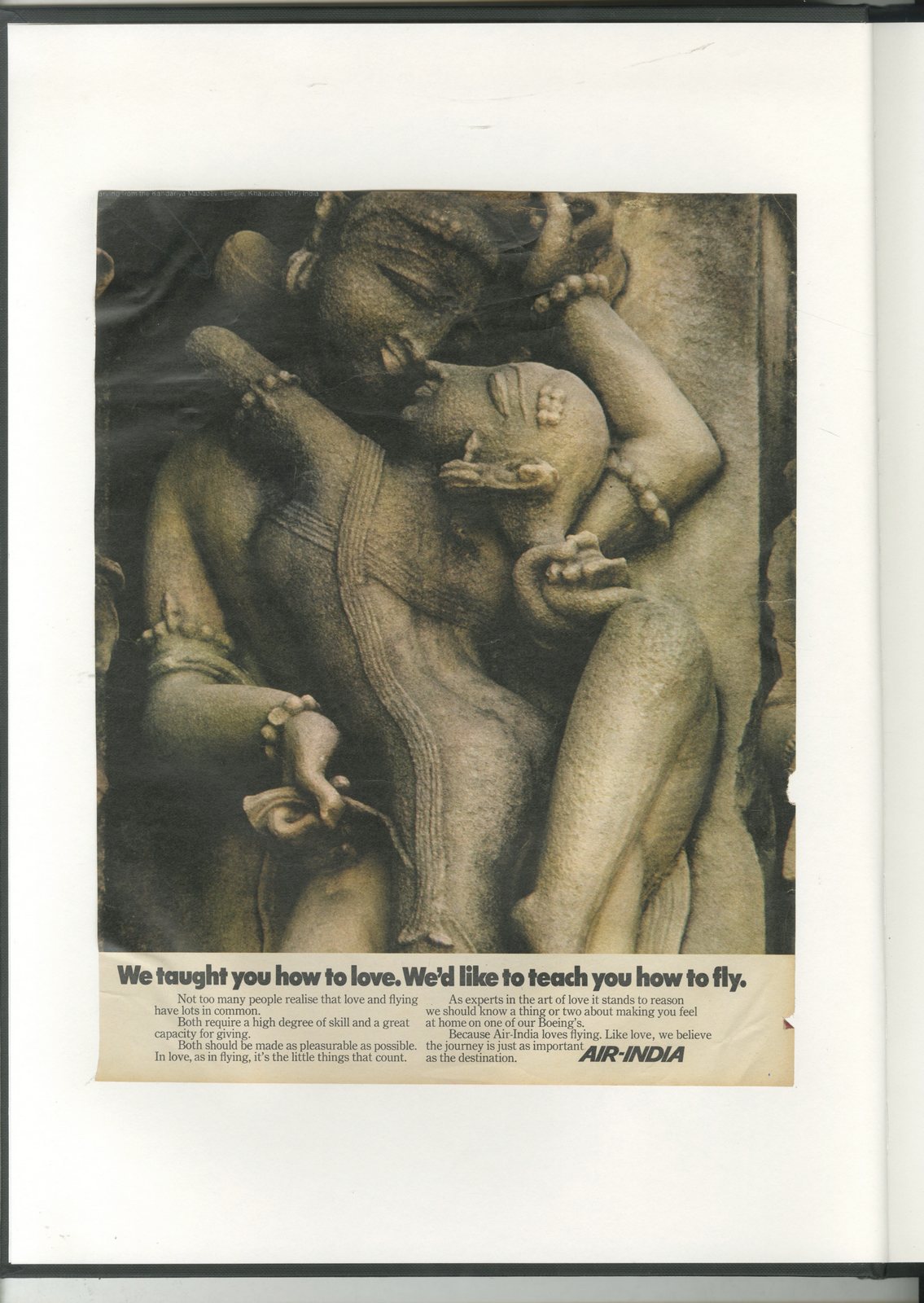
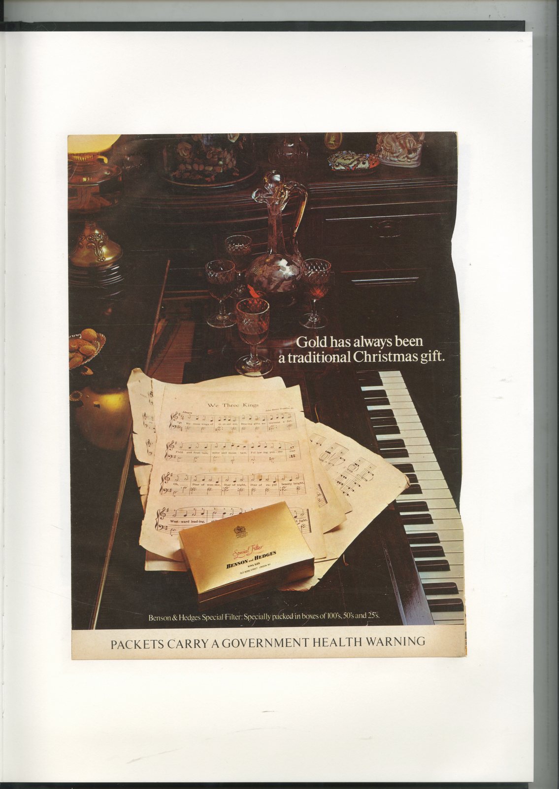
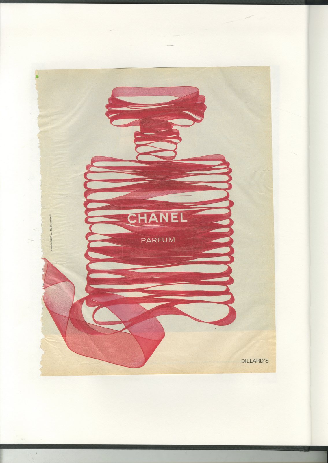
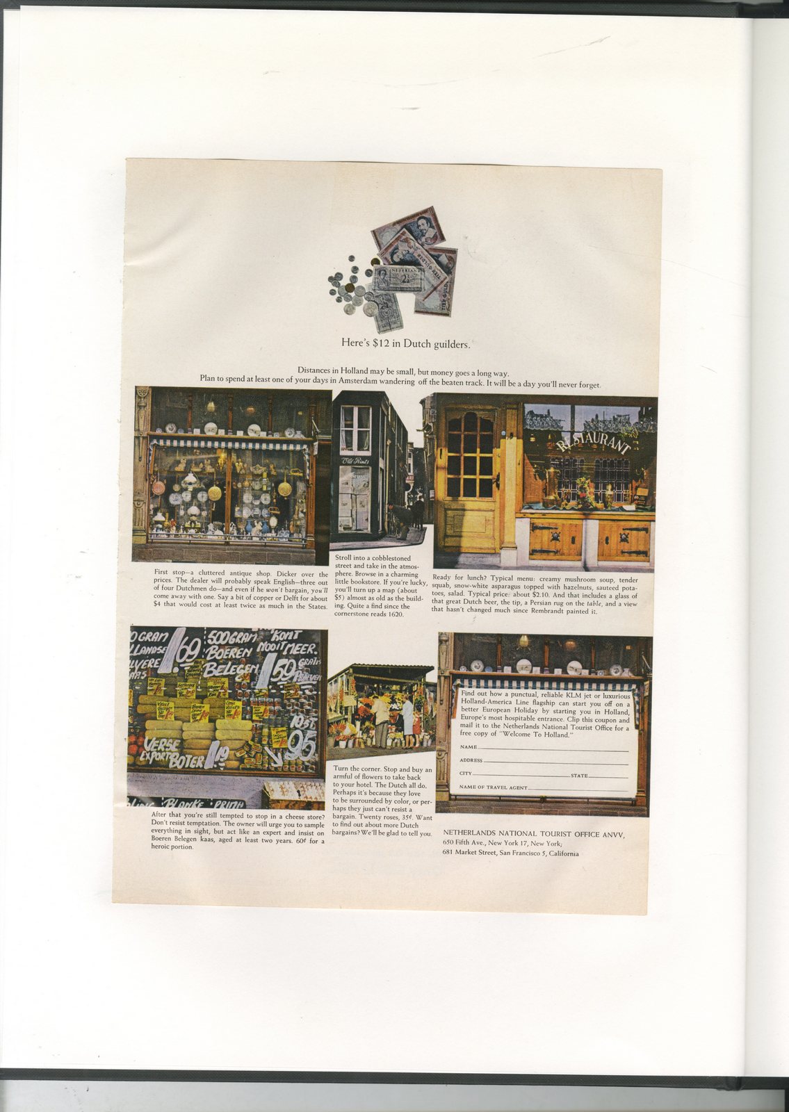
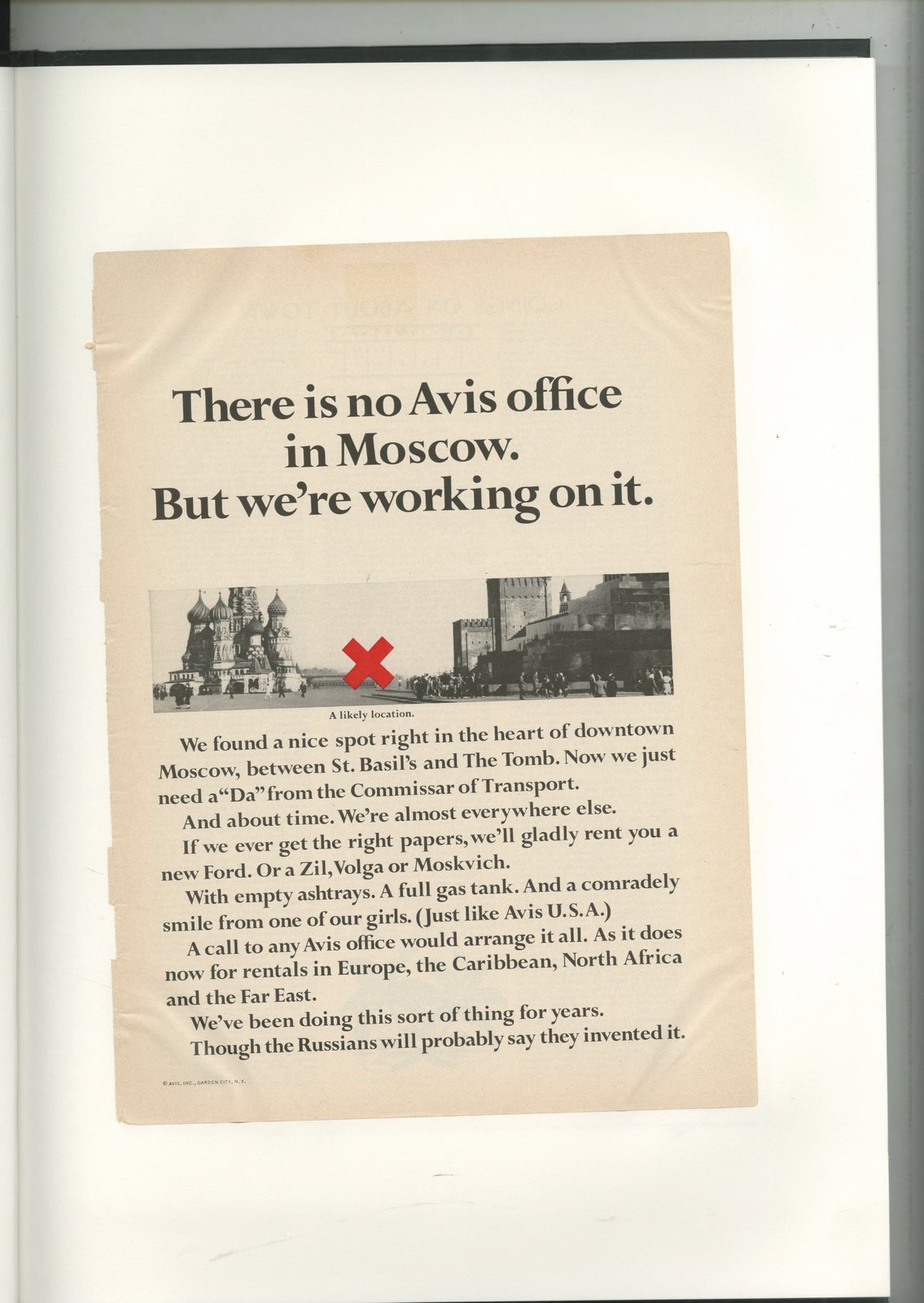
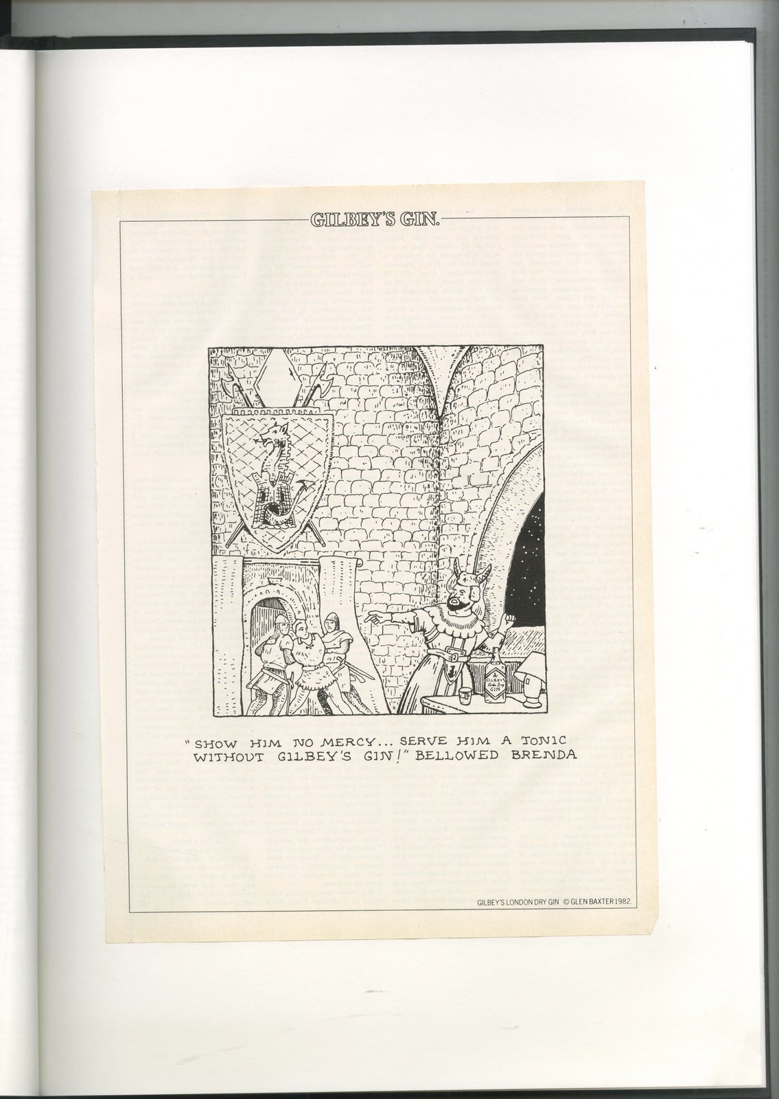
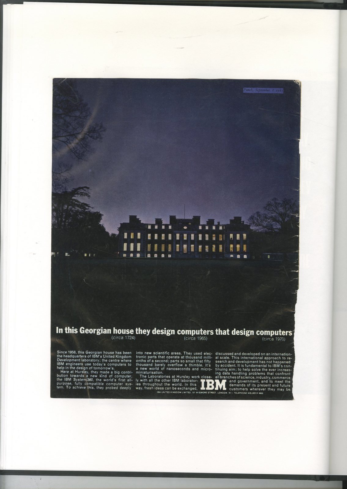
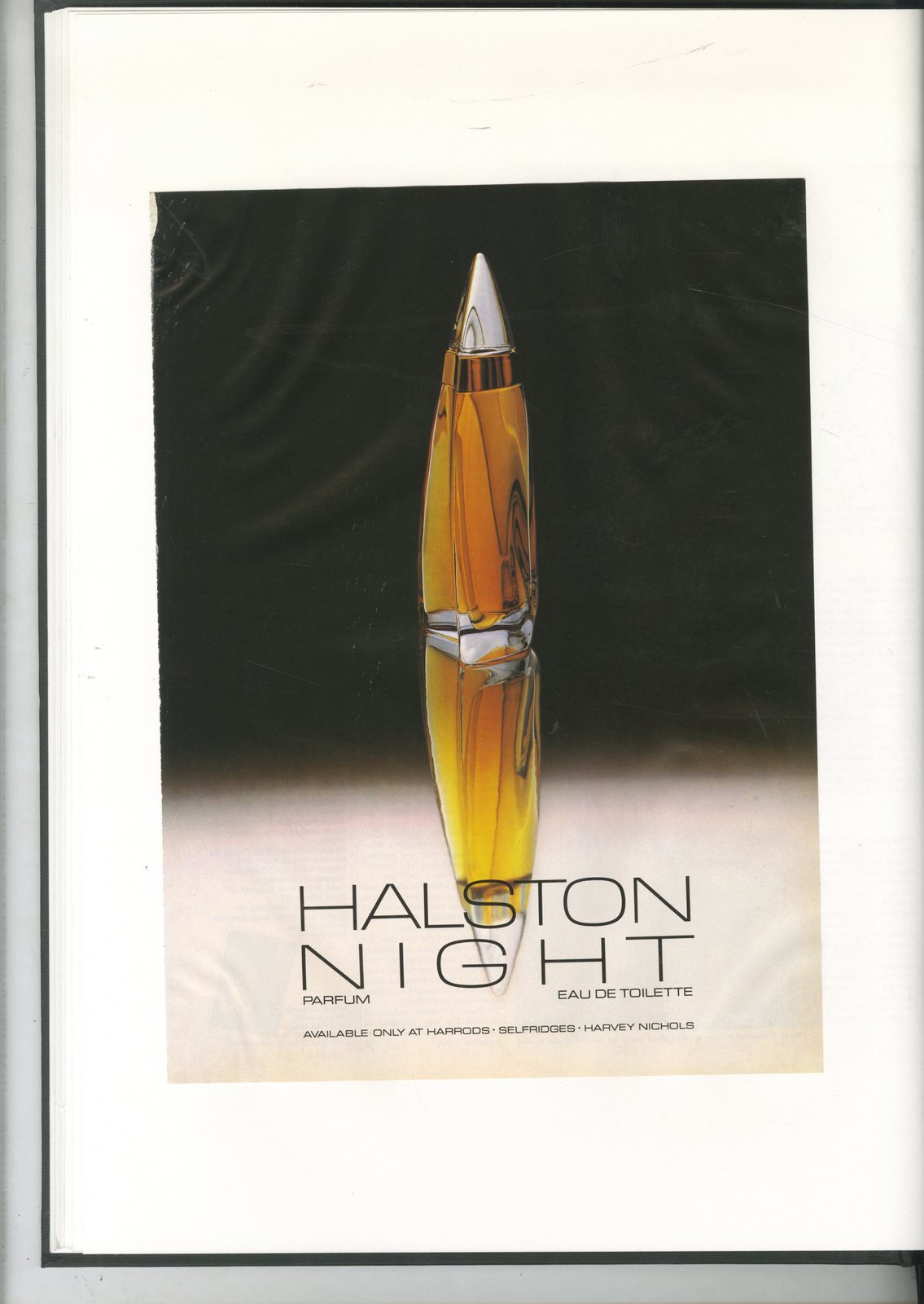
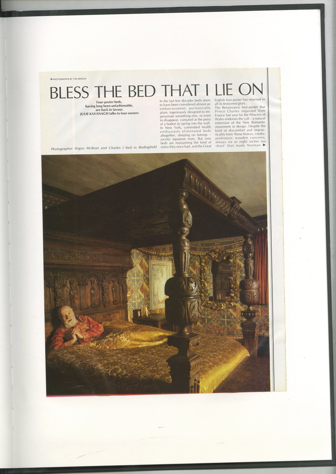
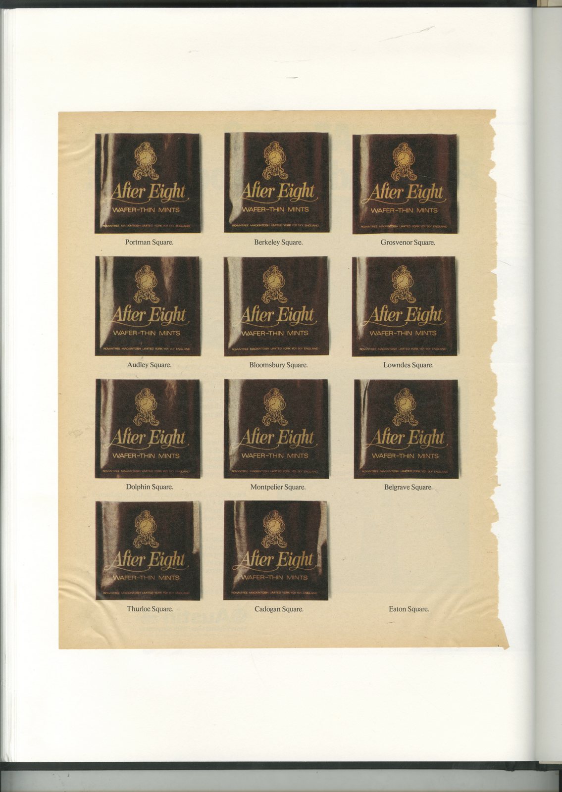
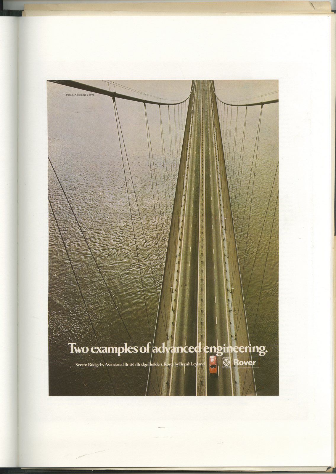
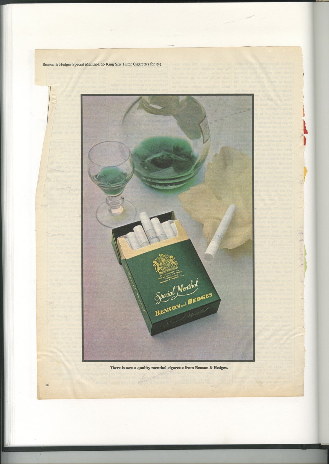
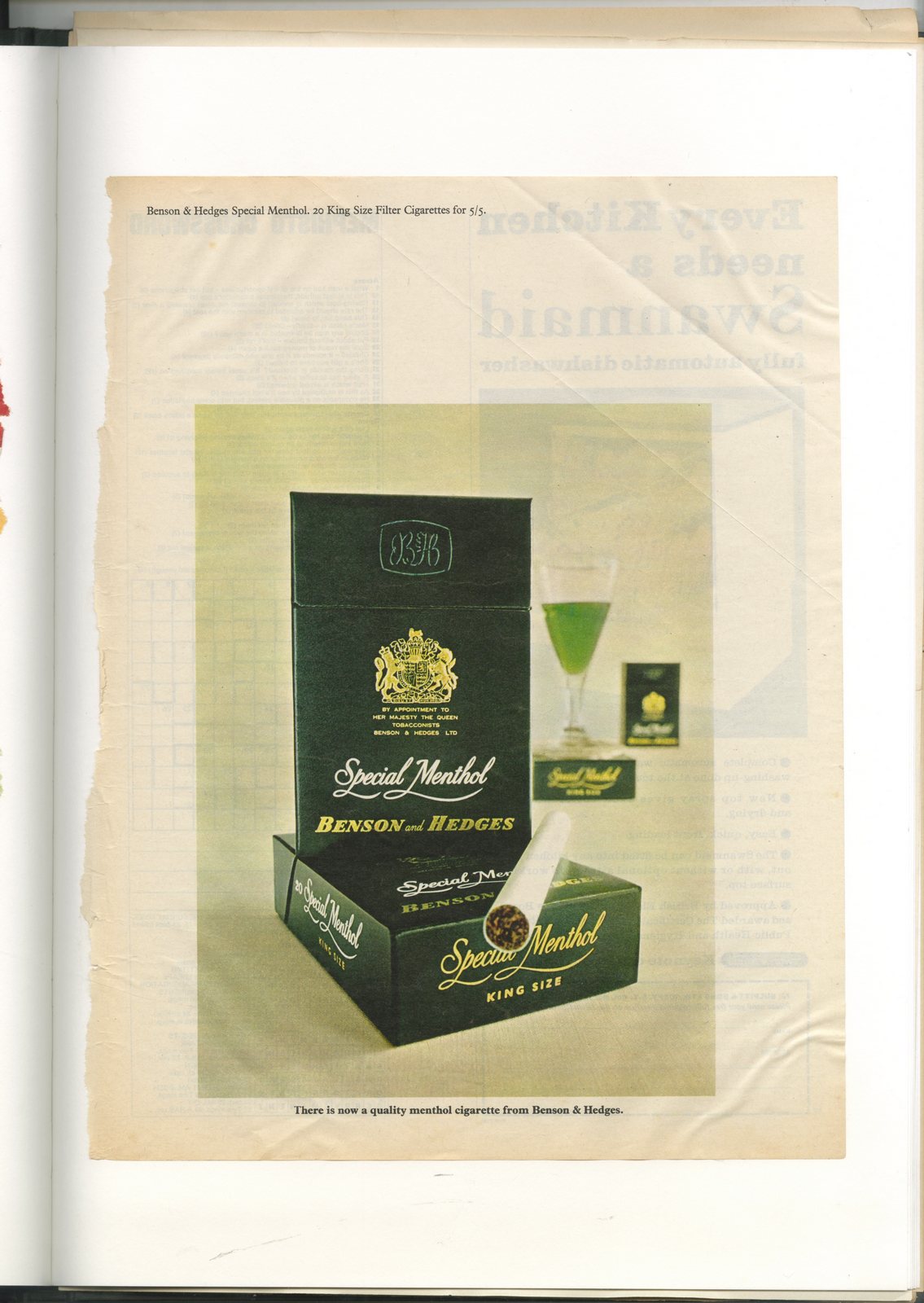
There’s the finds that have famous attached, so may be worth something: 1. Illustrator/Artist Glen Baxter’s Gilbey’s Gin ads.2. Photographer Art Kane’s ‘Sip it with respect’ Martell ad, (written by Tony Brignull). 3. An original by Art Director Helmut Krone, (Avis).4. Actual, original text written by Howard Gossage, (Irish Whiskey Board).5. Richard Avedon’s ‘Julie Andrews’ Blackglama ad. There’s the stuff you like, but aren’t sure anyone else would:1. A cool ribbony ad for Chanel.2. An interesting looking tourist ad from the Netherlands National Tourist office.3. An ad I remember loving as a kid, it just seemed so clever! (After Eights ‘Eaton Square’).4. A couple of nice pack-shots for B&H Menthol.5. A great shot of a Rover driving over a bridge.Then there’s the stuff that may have historical value, but but you wouldn’t pay for:1. Evidence of The Jolly Green Giant smoking.2. A long-forgotten Tony Brignull campaign for Renault.3. An article about Angus McBean’s Bed.4. David Ogilvy’s ‘Commander’ character in old Schweppes ad.5. An ad for Halston’s perfume, (Studio 54’s ultimate lounge lizzard).Have a browse.


One of my favourite tweeters.Always insightful, but more than that, Richard always seems so excited to share each idea or thought.He writes his tweets like they're Breaking News.Richard, like all of my favourite tweeters nowadays share the same job title; Behavioural Insight Bod.(Or some version of.)Traditionally, planners looked at behaviour, but not in the same way, not with such insight and usefulness.Which is weird.Why, when your whole business is built around communicating with human beings would you not have a whole department set up to understand human beings?Well now they are out on the net, sharing observations on how humans work for free, just check out Richard at https://twitter.com/rshotton Hang on! Hang on! Not now.Listen to this first.It’s different from my usual, chronologically structured podcasts, this one's all over the map.You can hear in real time as Richard and I try to get our heads around what's happening with humans and ad agencies today.The result is that there are:a) Far more thoughtful pauses than usual.b) The number of 'Mmmms' is off the charts.c) Julius Caeser features more than Bill Bernbach.d) If you're in the creative department, I'm afraid there's a whole bunch of difficult to pronounce European philosopher's names you'll need to google.But on a lighter note, listen out for Richard crunching his way through a Bourbon biscuit about halfway through.Enjoy.
The book.
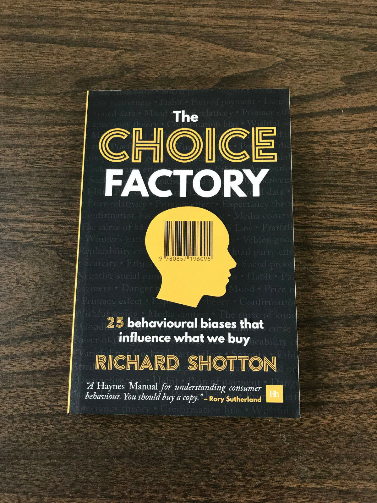
The link:https://www.amazon.co.uk/gp/product/085719609X/ref=dbs_a_def_rwt_hsch_vapi_taft_p1_i0Some tweets.
FINALLY, A POST ABOUT AN AD THAT'S CAN BE SEEN TV TODAY.CHAPTER 2 OF MIKE EVERETT'S BOOK ON ADVERTISING.
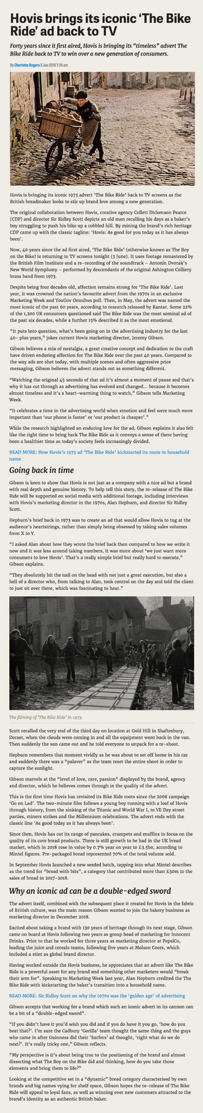
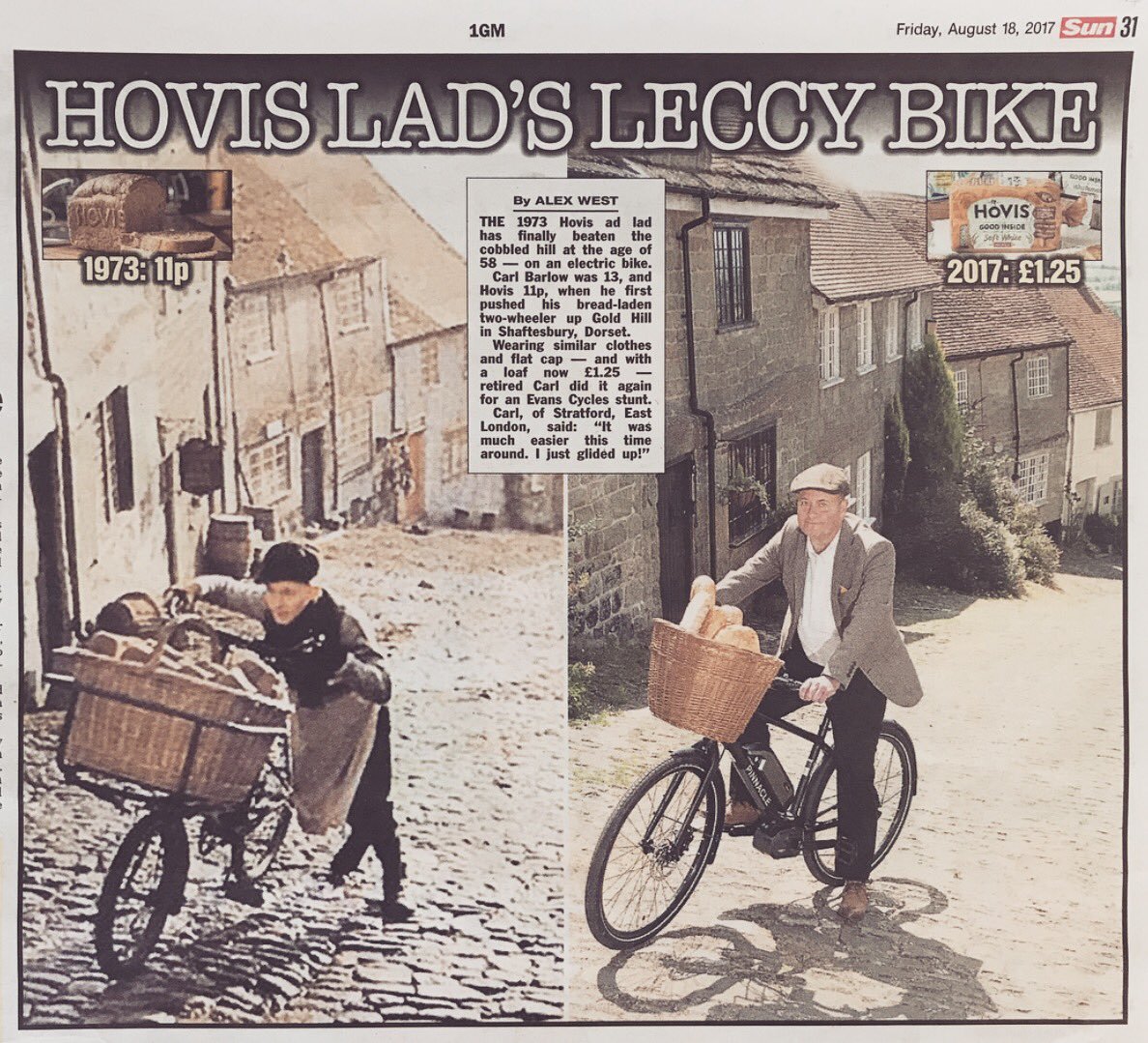
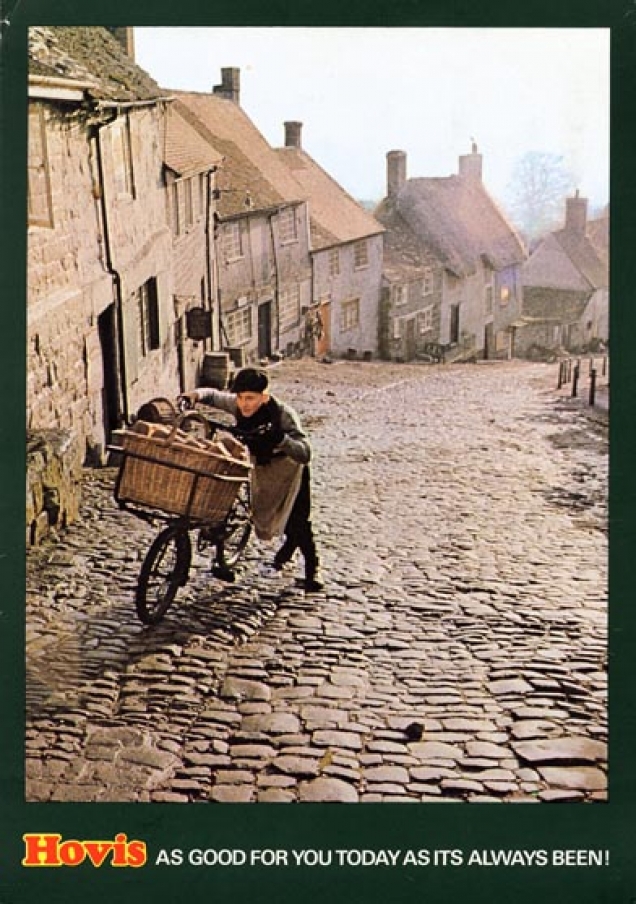
The famous Hovis ‘Bike Ride’ commercial was relatively easy to write.But, boy, did it take perseverance to find somewhere to film it.
In order to understand why the famous Hovis campaign was created it is necessary to return to the dark days of the early seventies.This was a time when Britain was in a mess.Its slow post-war decline had yet to be halted.Strikes and unemployment haunted the political landscape.And then, in 1974, the Prime Minister, Edward Heath, introduced the three-day week in a desperate attempt to prevent striking coal miners from holding the country to ransom.
Like all businesses, CDP was affected by the three day week. In essence, this was an emergency measure introduced by the government designed to ration electricity. It demanded that all British companies turn off their lights for two working days each week. With impeccable timing, this measure was enacted just as winter approached. So, for at least a couple of days a week, the CDP creative department would pack up working when it got dark, just after four, and all go home.However, very soon we discovered that the light boxes used to view transparencies – illuminated devices rather like the ones doctors use to use to study X-rays – were classed as industrial equipment and were therefore exempt from the measure.This extended the working day as we stuck any old transparency on the light box and used the ambient illumination it provided in place of the office lights.
The three-day week also led to at least one good joke.In those days, the managing director, Frank Lowe roamed the corridors and offices of CDP wearing a cricketing jumper and carrying a cricket bat.On one of the dark evenings, when CDP’s lights were turned off, a young account man encountered Frank on the stairs.Frank looked very serious and thoughtful. ‘What’s the matter, Frank’, asked the account man, ‘bad light stop play?’The young account man left the agency shortly afterwards.
As you can imagine, in those gloomy times neither present nor future were held in much optimism by the British public. So when the agency was briefed to write a series of commercials for Hovis, it was decided to go back in time and exploit the past.After all, Hovis had been around since anybody could remember. And surely a good dose of nostalgia was just what the people of Britain needed to cheer them up.
Geoff Seymour got the job.He wrote two commercials that exploited nostalgia in spades. One showed an Edwardian family on the beach at a seaside picnic, the other, a mother and son returning from a shopping trip in a Northern town, also set in the same period.Geoff had written the voiceovers as elderly men fondly recalling the days of their youth.The films were beautifully shot by Peter Webb, but Geoff wanted music to hold the films together – music that would evoke the period and the location of the films.
Alan Marshall, Alan Parker’s producer, had seen a TV programme filmed by the accomplished documentary maker Frank Citanovich. Its subject was the footballing brothers, Jack and Bobby Charlton. The film used brass band music as its soundtrack.Marshall suggested the idea of brass band music to John Salmon, CDP’s Creative director, who had written a commercial with Arthur Parsons for a new Bird’s Eye pie. But the pie was never launched and the commercial was shelved.It fell to John Salmon to suggest to Geoff Seymour that this music might be suitable for Hovis.
In the end, Geoff recorded two tracks. On the ‘Seaside’ commercial he used a brass band arrangement of ‘I do like to be beside the seaside’, slowed down to fit with the commercials languid pace. But, on the other commercial, which was called ‘Northern’, he chose to record the adagio from Dvorak’s ‘New World Symphony’. This was a staple of the many brass bands that exist to this day in northern England.
The commercials were well received and earned their fair share of praise and awards. They certainly exploited nostalgia and, if nothing else, served to remind the British public of the existence of Hovis. But, apart from nostalgia, the films gave no real reason to consider buying Hovis in place of a regular loaf. This is what led to a brief being issued for a new series of commercials in the early part of 1973.
This new brief made much of the product characteristics of Hovis. But there was one of these characteristics that stood head and shoulders above the others. Because it was brown bread, and therefore less refined than white, Hovis contained more wheat germ than other breads. Wheat germ was synonymous with goodness, so it was also ‘good for you’. At least, this appeared to be the case to David Brown and Ronnie Turner, the creative team charged with writing the new campaign.
It’s a terrible phrase, but doing a job like this – where more has to be made of a product’s characteristics – is described as making it more ‘product-focused’. But just talking about the wheat germ in Hovis didn’t seem enough to David and Ronnie. They felt that in some way they needed to show the bread being good for you. Lesser agencies would resort to what are known as ‘product demonstrations’ at this point – but not CDP.David and Ronnie decided the best way to accentuate the goodness of the product was to set the commercials in a bakery, as opposed to the seaside or a northern street. They would retain the nostalgia of the Edwardian period, but write commercials more directly related to the baking of bread.
With this thinking in place, David Brown remembers the two commercials that he and Ronnie conceived being relatively easy to write. Geoff Seymour had, after all, laid superb groundwork for the campaign. And it’s a damn sight easier to follow in somebody else’s footsteps, and write follow up commercials, than it is to start a campaign from scratch. Even so, the scripts that Ronnie and David wrote had merits of their own, not least by placing more emphasis on the product without it being obvious.
The first idea they came up with featured a young lad whose dad was a baker. The young boy and his family lived above the bakery and the young lad would be woken up every morning by the smell of freshly baked Hovis. ‘It were better than any alarm clock’, as the voice over said. Not only was this script evocative, but also it was totally centered on the product and its story of goodness. David Brown loved it, and so did everyone who saw it.
The brief, however, asked for two scripts, so David and Ronnie looked around for another way to feature a bakery, without repeating themselves. Instead of the baker’s son, why not use the baker’s delivery boy? They could show him out on his rounds and then, at the end of the commercial, bring him back to the bakery to enjoy ‘doorsteps of hot Hovis’ and a cup of tea. All well and good, but they also wished to demonstrate the health enhancing benefits of Hovis, particularly as they applied to growing kids. So they chose to show the young baker’s boy pushing his delivery bike up a steep hill, and then freewheeling back down. Hence the famous opening line ‘Last stop on round were old Ma Pegarty’s place…it were like taking bread to the top of the world’.
As well as locating the two commercials in and around bakeries, David and Ronnie beefed up the end voice over: ‘Hovis has many times more wheat germ than ordinary bread…it’s as good for you today as it’s always been’. This line is still as good as it’s always been: it continues to be used today by Hovis in a slightly modified form.
Unlike Geoff before them, David and Ronnie chose a different director to shoot the commercials, Ridley Scott. The ‘Alarm Clock’ film was shot at Isleworth Studios in London. But obviously, ‘Bike Ride’ needed an exterior location for the lion’s share of the film.
Remarkably, these two Hovis commercials were the first commercials that David and Ronnie had ever made. David had previously been at Doyle Dane Bernbach, which was justly famous for its print advertising. But the London office of DDB wasn’t exactly renowned for its film output. In fact, the agency made very few commercials. So David and Ronnie were film virgins when it came to finding a location for the ‘Bike Ride’ film.
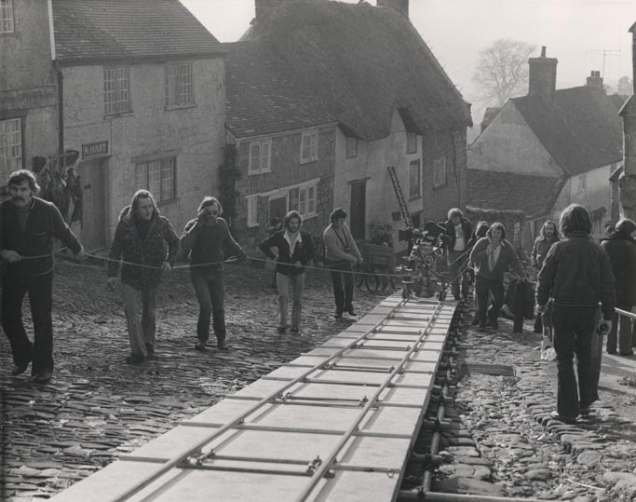
They couldn’t believe what was happening to them. There they were, being chauffeur driven round the north of England on an all-expenses paid jaunt, looking for the perfect hill. The pair held the brief for this hill very clearly in their minds. They were searching for a 1 in 4 incline, that faced South (for lighting reasons) had a cobbled surface, authentic, old cottages, and a view from the top that was free of all twentieth-century clutter. Ideally, their chosen hill should also lead to nowhere in particular, to allow the local council to close it for a couple of days without anybody objecting too much.
But could they find that hill? They spent three weeks visiting the northern counties of England. They drifted through Derbyshire, looked all over Lancashire, yomped round Yorkshire and went as far North as Northumberland. As David Brown has said, ‘after three weeks all we’d come back with was a taste for Tetley’s Bitter and Harry Ramsden’s famous fish and chips’.
It was the film company art director, Michael Seymour, who found a way round the problem. He figured out that if a hill like this existed, somebody somewhere would have photographed it. And very likely, this photograph would appear in a book. So he confined his reconnaissance trips to his local public library. And, sure enough, in an obscure book on landscapes, he discovered an old black and white picture of Gold Hill in Shaftesbury, a small Dorset town. ‘I think you’ve been looking in the wrong place, he said to David and Ronnie, ‘you need to go south, not north’.
Once again, the pair set out on their travels, heading down to Dorset. The hill turned out to be exactly what they’d been looking for. But they felt slightly uneasy about the fact that they were re-locating the film from what was fast becoming the heartland of the Hovis campaign, the North of England, to the shires of the South. It was, however, the perfect hill so they stuck with it.
What was interesting about Gold Hill was the fact that few people outside Shaftesbury knew of its existence. David and Ronnie confidently expected coach loads of American tourists to be swanning about when they went to reconnoitre it. But no, apart from a few locals, the place was deserted.
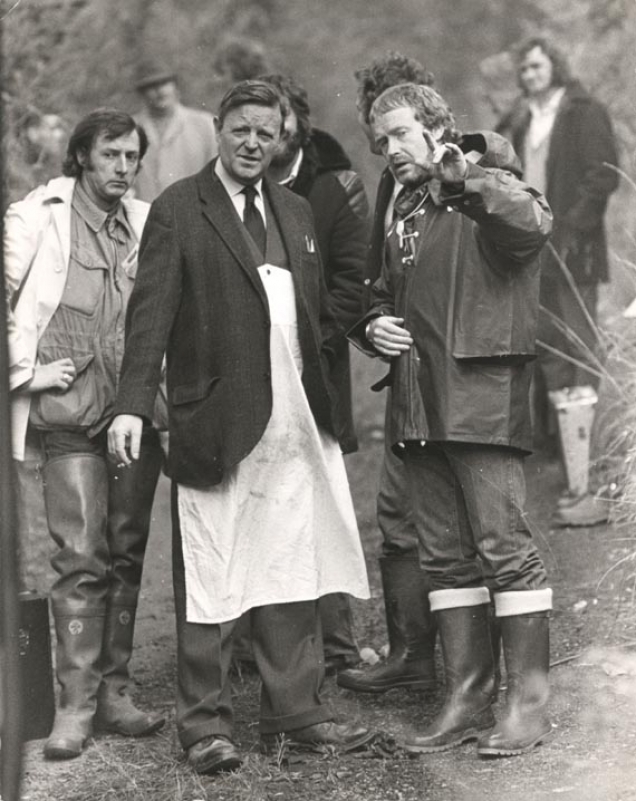
The shoot took place over two days, two days when the weather was perfect. Ridley Scott could, in the words of David Brown ‘be heard having multiple orgasms’ as he peered through the camera and marvelled at the light. Ridley shot take after take. The poor boy pushing the bike up the hill had to repeat the action twenty times before the great man was satisfied that he’d got what he wanted in the can.
Back in London, with the commercial now in the form of what’s known as a ‘rough cut’, David Brown turned his attention to the soundtrack. He felt that using the same music as Geoff Seymour – a brass band version of the adagio from the New World Symphony – was too mournful for the film and would leave viewers feeling miserable. So he commissioned Joe Campbell, a prolific producer of music for commercials, to come up with something more upbeat.But when David showed the result to Frank Lowe, Frank was adamant that David had made a grave mistake, and should persevere with the Dvorak music. Frank’s point of view was that the New World adagio would, in time, become inextricably linked to Hovis in the same way that Bach’s ‘Air on a G String’ was synonymous with Hamlet. Frank was, of course, right and David bowed to his judgment.
What continued to bug David – and still does, over 40 years later – is his choice of voice over. Because the film was shot in Dorset, David and Ronnie succumbed to the idea of using an actor with a West Country accent, rather than Yorkshire or Lancashire. Even today, David Brown says that every time he sees the ‘Bike Ride’ commercial, he wants to rush into the studio and re-record the voice over.
Gold Hill, of course, has now become famous as the location for the ‘Bike Ride’ commercial and attracts many more tourists than it did when David and Ronnie discovered it. A gold loaf has even been erected to tell visitors that they are standing at the spot where bread was taken to the top of the world.
Many years later, David Brown was amused by an article he saw in a national newspaper headed ‘The Harlot of Hovis Hill’. This was the story of an enterprising lady who was running a brothel on Gold Hill in order to pay for her daughter’s private schooling. The article was illustrated with two pictures, one of the woman, and one of the young Hovis delivery boy, Carl Barlow, who went on to become a fire fighter in London.But what interested David most was the description ‘Hovis Hill’. He suddenly felt that his long career in advertising hadn’t been in vain. At least he’d bequeathed something to posterity. Most of us would probably agree that he’s left behind more of a legacy than the vast majority of advertising writers could ever hope to.
Other ads in the campaign.
The haircuts have dated.The clothing looks dated.The puns feel very dated.The page layouts look dated.The screen treatment of the photographs look dated.But a lot of the thinking, not so much.As Bill Bernbach said “It took millions of years for man’s instincts to develop.It will take millions more for them to even vary. It is fashionable to talk about changing man. A communicator must be concerned with unchanging man, with his obsessive drive to survive, to be admired, to succeed, to love, to take care of his own.”Ron Anderson's views on creative education, below,are probably the best explanation as to why I've posted these yellowing pages from the last century.ON CREATIVE EDUCATION:“I’ve never worked for Bernbach, Ogilvy, Ally. But I’ve learned from reading their speeches.I’ve never worked with Bob Gage, Helmut Krone, Bill Taubin.But I’ve learned by studying their work.The way I see it, I’ve learned from the best people in the business.”- Ron Anderson.ON THE PERSONAL CREATIVE IMPERATIVE:“In a sense, you’re self-employed; you work for yourself, work to meet your standards.Others praise doesn’t count if you don’t meet your own standards.You may kid the world but you can’t kid yourself.” – David Abbott.ON MAKING GREAT ADS:“The real trick is figuring out what the substance of an ad should be, and then in handling that substance in the best way possible.” – Carl Ally.ON CREATIVE DISCIPLINE:“When we present the advertising there’s no surprise in terms of direction and strategy.Those have already been agreed on.What’s new is the execution; the style, the personality, the feel of the advertising.” – Ralph Ammirati.ON THE OGILVY SECRET:“I was an agency with a different style; the unselfconscious, totally straight, factually based approach. Invaluable training. To this day, when I’m stuck, I’ll do a David Ogilvy advertisement; a what/where/when/how/why kind of ad. Once that’s done I know what to say. Then I tell myself, ‘Now you have to beat it’.”- Tony Brignull.ON GOOD WRITERS:“Good writers come in all shapes and sizes. What they seem to have in common is an ability to hear, to listen, to understand – and to distil what they hear and learn into something that’s human and persuasive”– Jay Chiat.ON THE CREATIVE OBJECTIVE:“We don’t just deal in executional technique. There must be something of substance beneath it. As Steve Dunn, my art director puts it, we seek to provide the cake, not just the icing.”– Tim Delaney.ON BELIEVING:“Advertising is an act of faith. You think everything out, you write and rewrite, you research and re-search. But at some point, you have to swallow hard and run the stuff.”– Jeff Goodby.ON HIRING TALENT:“We wanted people who could do the kind of work no one was doing. We had to look for potential. I found it tucked away in the back of portfolios, ads that never sold, ideas that had been killed.I also found it by poring through hundreds of ugly little ads, looking for that spark, the willingness to take a great leap.”- Phyliss Robinson.ON SELLING IDEAS:“Selling is an act of passion. When you’re passionate about an idea, it shows – and it’s easy to sell it.I find it impossible to be cool and reserved – I won’t present an ad or campaign unless I really believe in it. And when I believe, I can be pretty persuasive.” – Tom McElligott.ON MAKING IDEAS WORK:“You need to know about the tools. Type, photography, illustration, are tools. You need to know how they work, to know nearly as much as the people who specialize. For if you can’t use the tools, you can’t really make a good idea work”– Helmut Krone.
It seems WSJ tried to get Creative Leaders off the ground in the nineties, I found these...(If anyone has any that I've missed, please email them, I'll add them.)


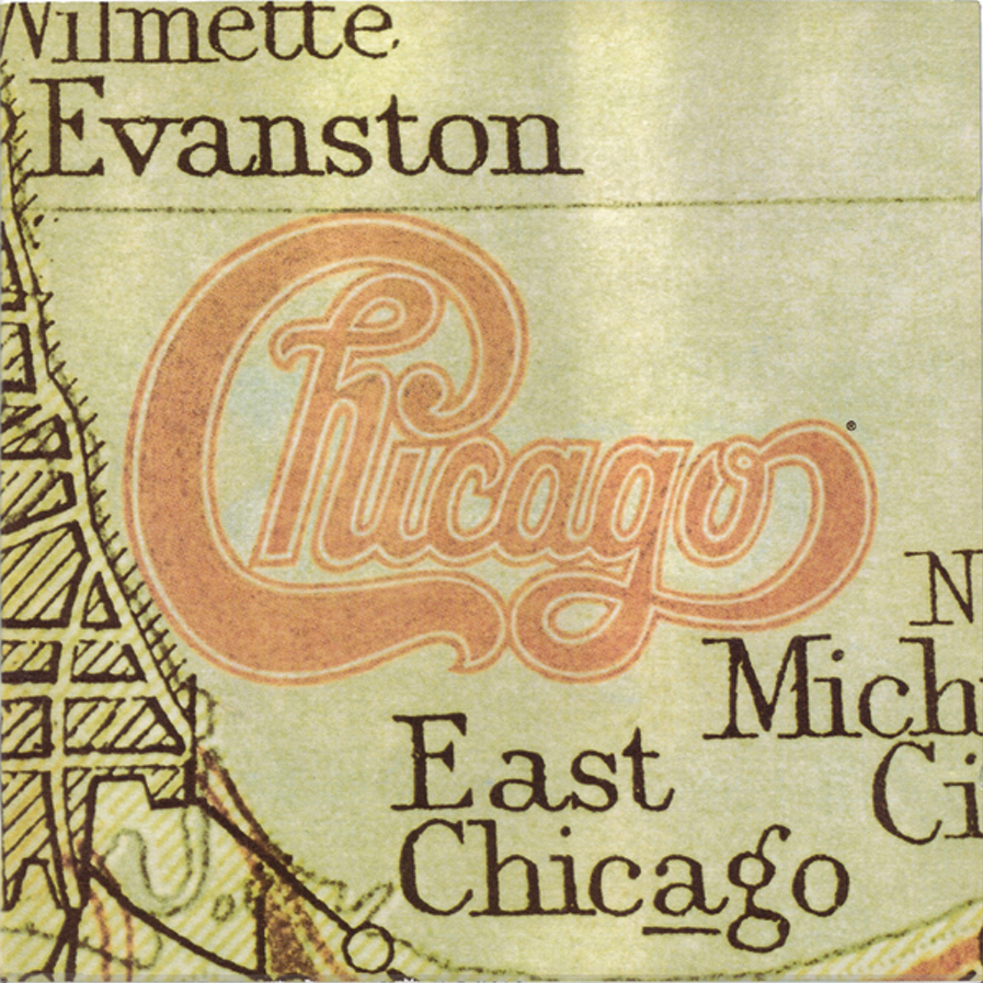
Played at 78rpm, one side of a 12’’ shellac disc could play up to five minutes of music. In 1948, Columbia Records came up with an alternative; a PVC disc with finer grooves that, played at 33rpm, could play up to 22 minutes a side.It not only changed the way we listen to music, it change the music we listened to.First, these 'Long Players' were seen as ideal for theatre musicals and film soundtracks.Consequently, one group dominated the album charts in the fifties; Original Broadway Cast.Their album 'My Fair Lady' was not only the best selling album of 1957, but '58 too.Even in the sixties, the decade 'belonging to The Beatles and Stones, they released the biggest selling albums in three separate years, a feat matched by their big rivals; Original Soundtrack.But by 1970, the biggest selling albums were altogether more personal, an artists thoughts and personality committed to vinyl.Album sales were exploding; Simon & Garfunkel's 'Bridge over Troubled Water' and Carole King's 'Tapestry' each selling over 40 million copies.Record companies had never seen so much cash.Hit singles were still fine, but artists who could put out album after album, year after year, that's where the real money was.To put it another way, instead of creating short-term tactical ads, they started building long-term brand campaigns.Artists, like products, were distilled down to their essence, that essence was turned into imagery and graphics.No more shape-shifting to follow the latest fad, instead, a consistent visual personality.Helpful when you're selling albums, because you want to remind people that they'd enjoyed spending time with these people before. Plus, in a crowded market, (or 'record stores' as they are known in the business), being recognised from the other side of the room is useful.Record companies began putting out long-term campaigns that used all the tricks and learnings of ad agencies.1. 'WE NEED TO GET OUR PRODUCT NAME OUT THERE'.Basic, but crucial for any artist.Or product. (It used to be popular with P&G, particularly with soap powders.)If your campaign is built around the your brand name there's less chance of your product being mistaken for someone else's.Plus, it needn't be dumb, it's possible to make it sophisticated and enjoyable, like this campaign for by designer John Berg.

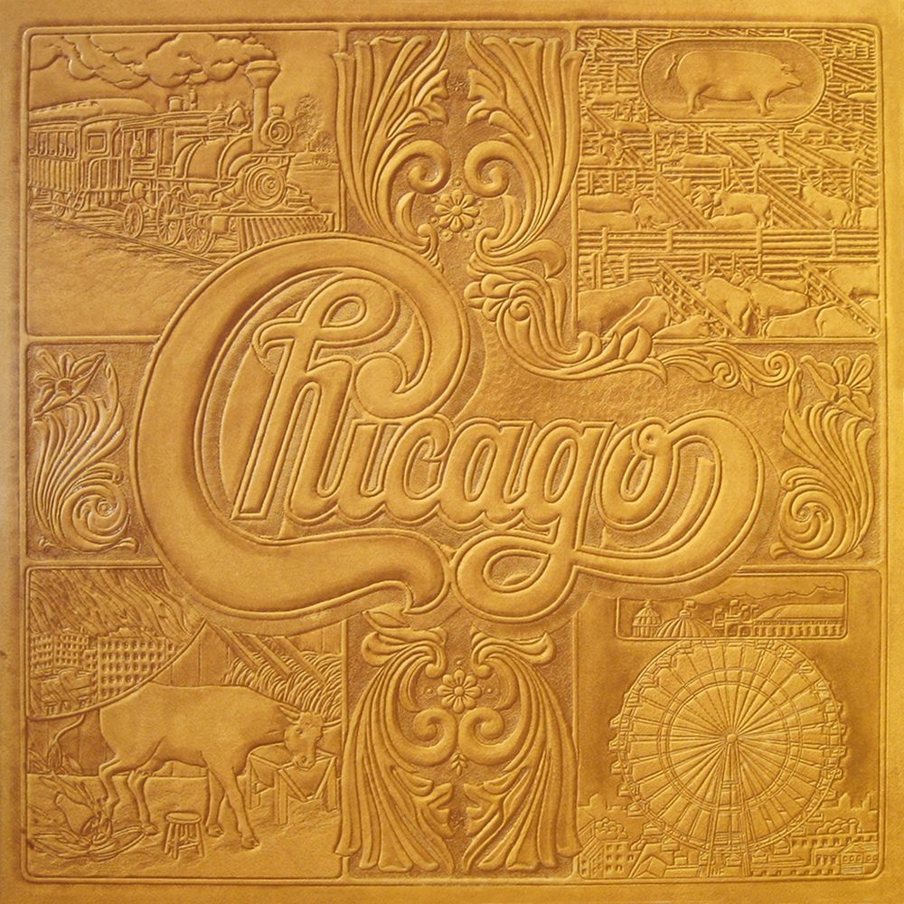
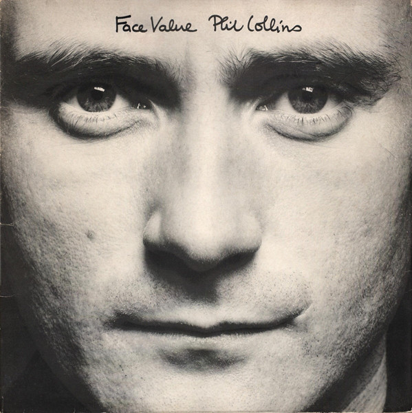
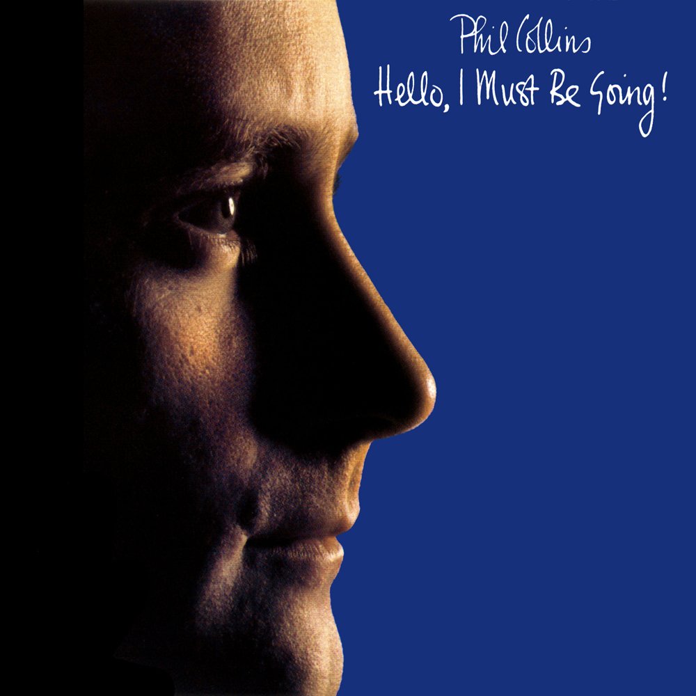
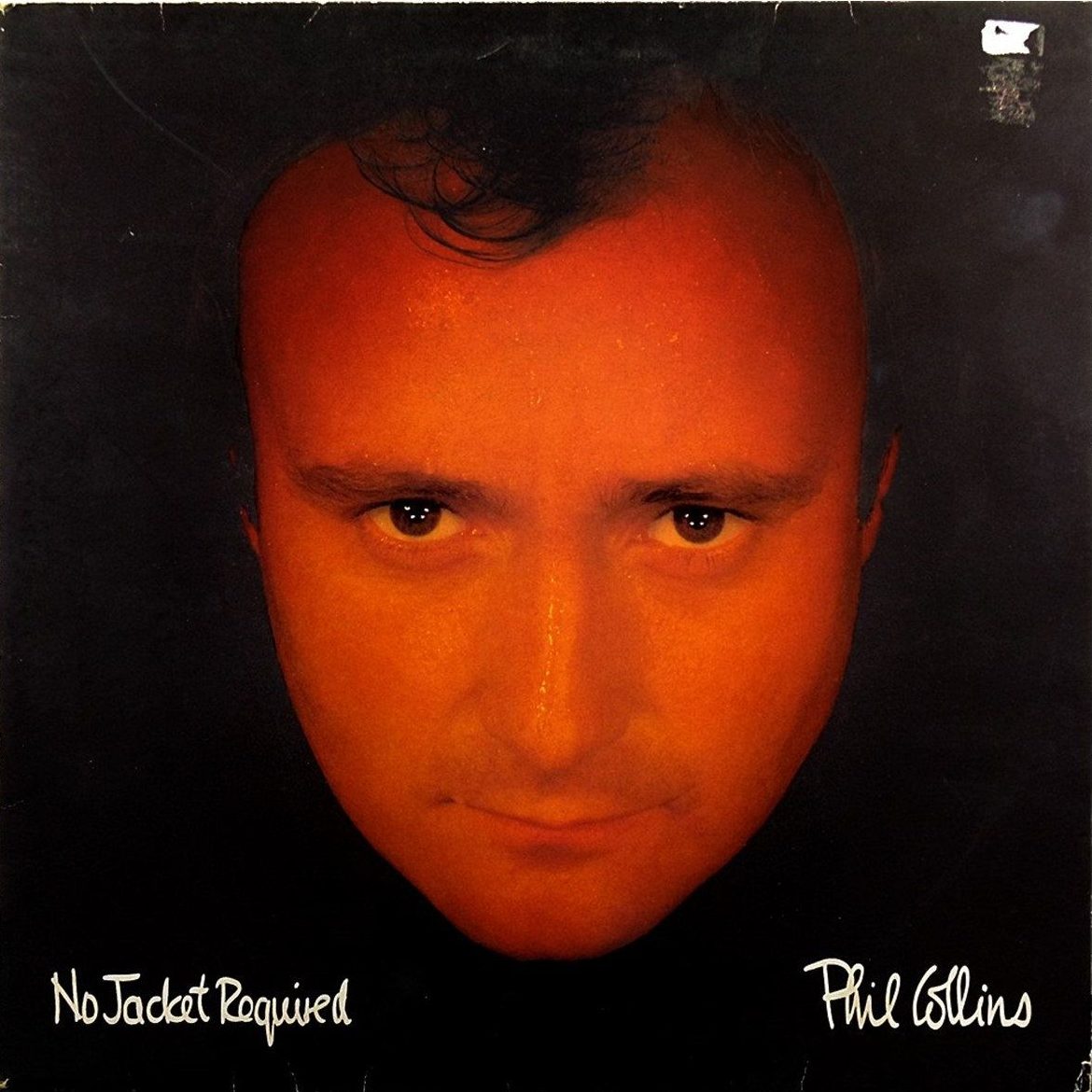
2. 'LET'S JUST SHOW THE PRODUCT...HUGE.'Another popular route, but few use such big a product shots as Phil Collins.No locations, environments, torsos, spectacles or facial hair, nothing in the photo that's non-PhilSimple, small text and a huge product.A bit like the Apple approach outdoor.Doesn't seem to have done them any harm?
3. 'WE NEED AN ICON.'When your band looks like the teachers band at the end of term disco, create an icon.Not only will it unify everything, it'll never lose its hair or get wrinkles.It's also useful for companies without a tangible visual product, like insurance, hence Direct Line's use of the red phone icon.

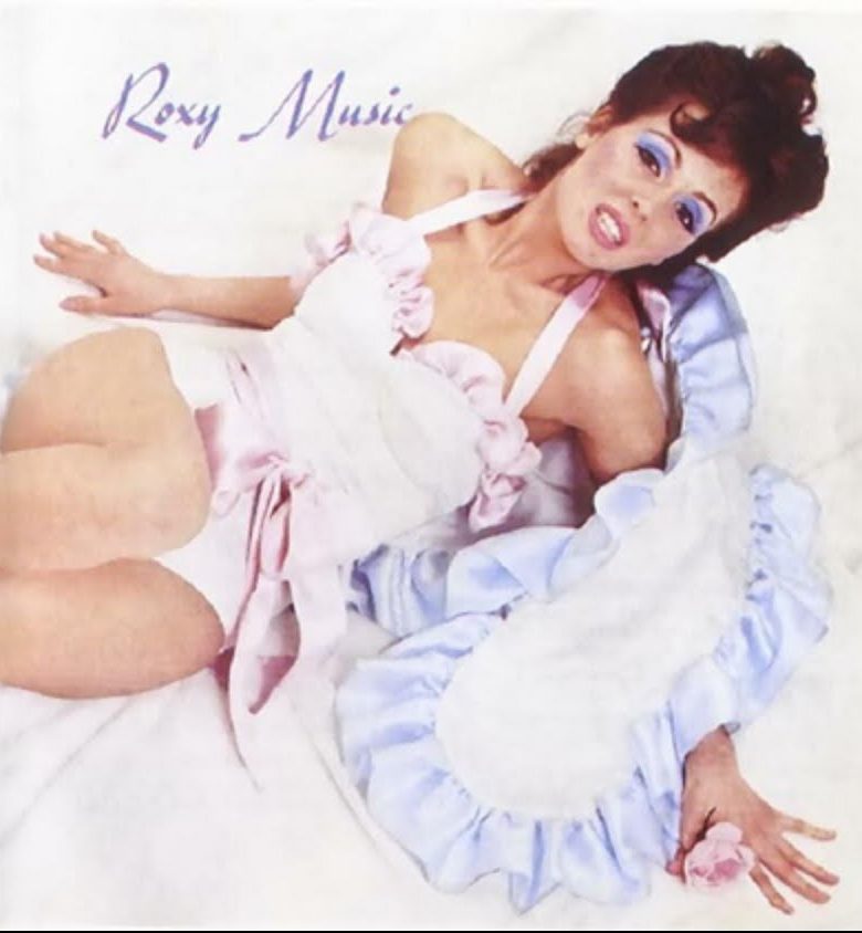
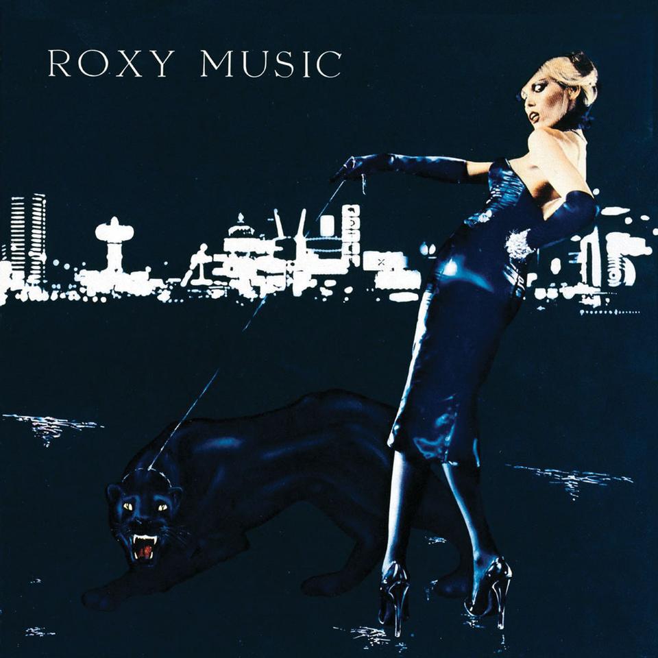
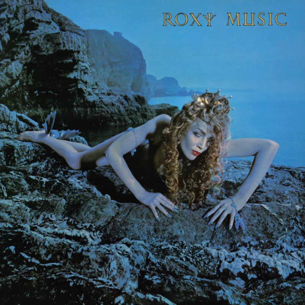
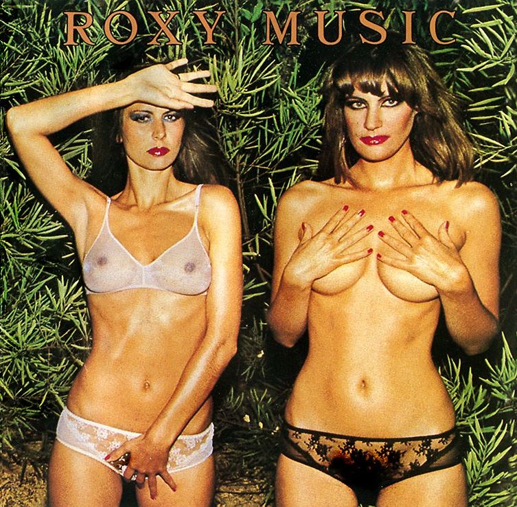
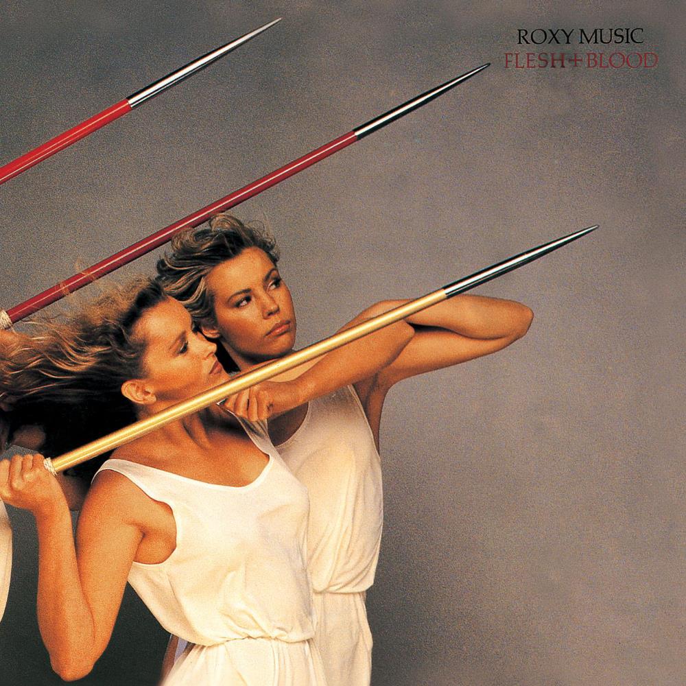
4. 'LET'S USE BEAUTIFUL MODELS.'Not a fantastically original idea, but like all ideas, it depends on how you do it.When Roxy Music started they looked similar to the rest of the groups wearing spandex and glitter, so they, or should I say Bryan, decided to put their dreams and aspirations on their covers.Updating the models each year to whoever was the new flavour of the month.Not unusual in the wider world, more unusual in record store racks.Burberry, Prada, Tom Ford, virtually every fashion campaign out there does the same thing.
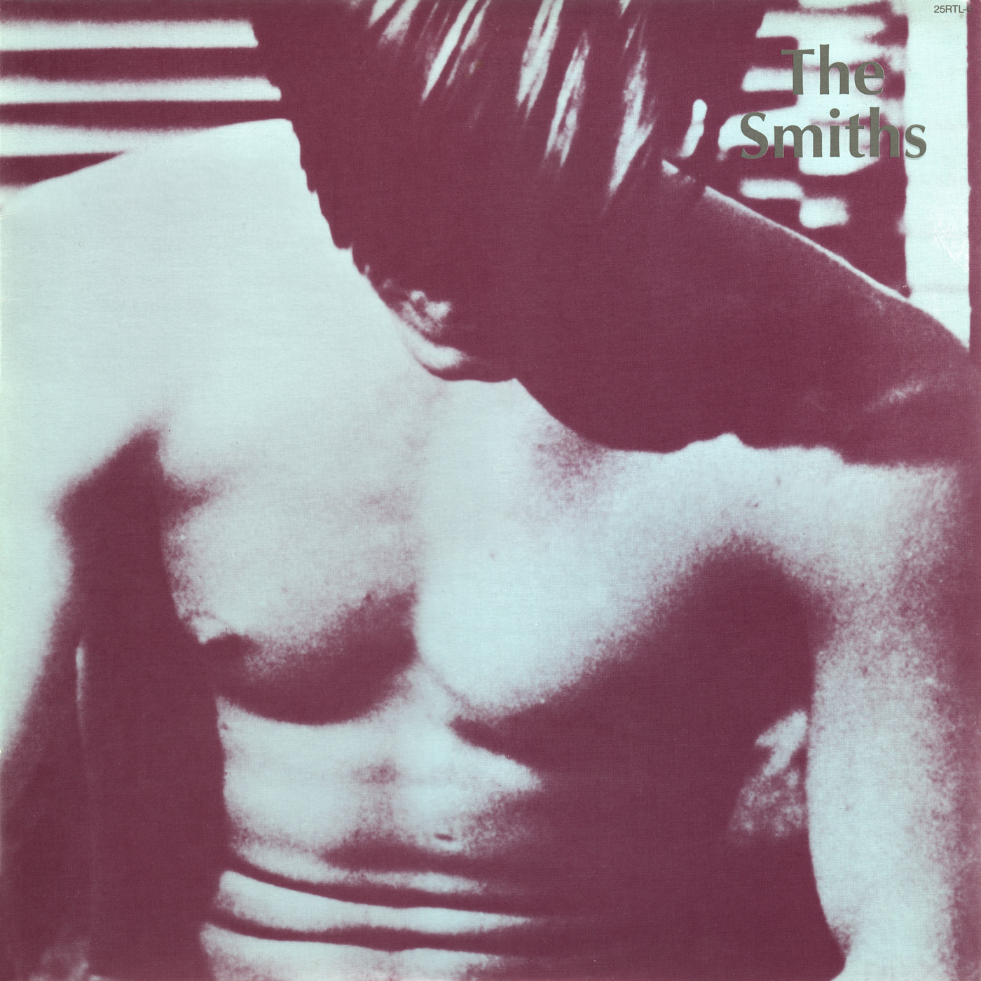
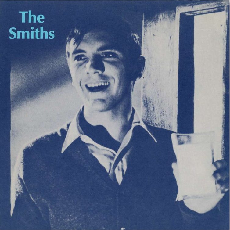
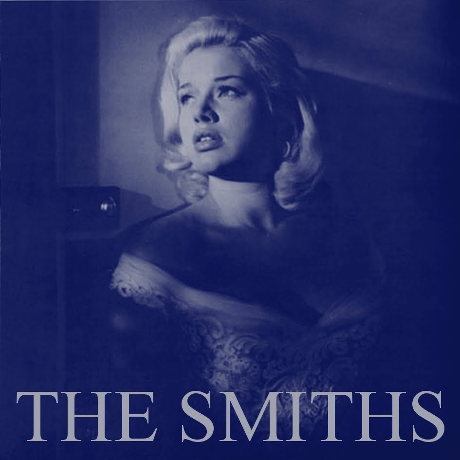
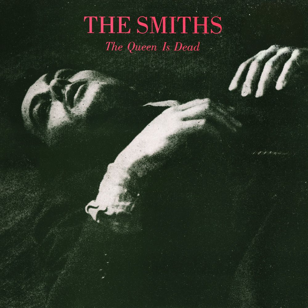
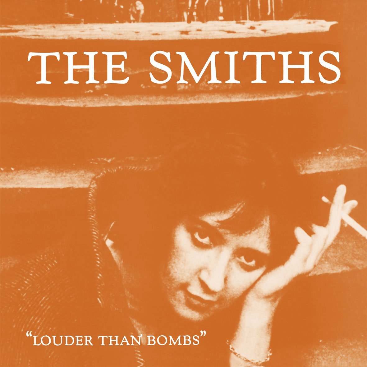
5. 'WE NEED SOME DISTINCTIVE GRAPHICS.'Graphic treatments can be a great way of being recognised.Take The Smiths, same ingredients every time; An old black and white photograph, (ideally from the 1950s). Turned into a duotone.(Be sure to use two of the most downbeat, muddy colours known to man.)Make the picture as big as possible.Put your name* on it.*Be careful not to make it too bright a colour, it'll stand out.I used a similar technique on an Adidas campaign, I was trying to capture an that insular running vibe.
6. 'WHAT'S OUR OWN-ABLE PHOTOGRAPHY STYLE?'Sometimes the record label is as important as the artist, it becomes like an endorsement to the artist.In this case, Tappan Zee needed a style that would be seen as theirs but also accommodate a wide variety of artists, titles and subjects.This problem was solved simply; extreme close ups.It doesn't sound like a 'big idea', but it was surprisingly effective.Again, how you do it is everything.Or, who does it is as important as what they do, these were done by the great Paula Scher, so not surprisingly, they're excellent.In advertising terms, this is Sainsbury's, John Lewis and virtually every supermarket going.A style that allowing them to promote a huge variety of disparate brands but under one, recognisable roof.
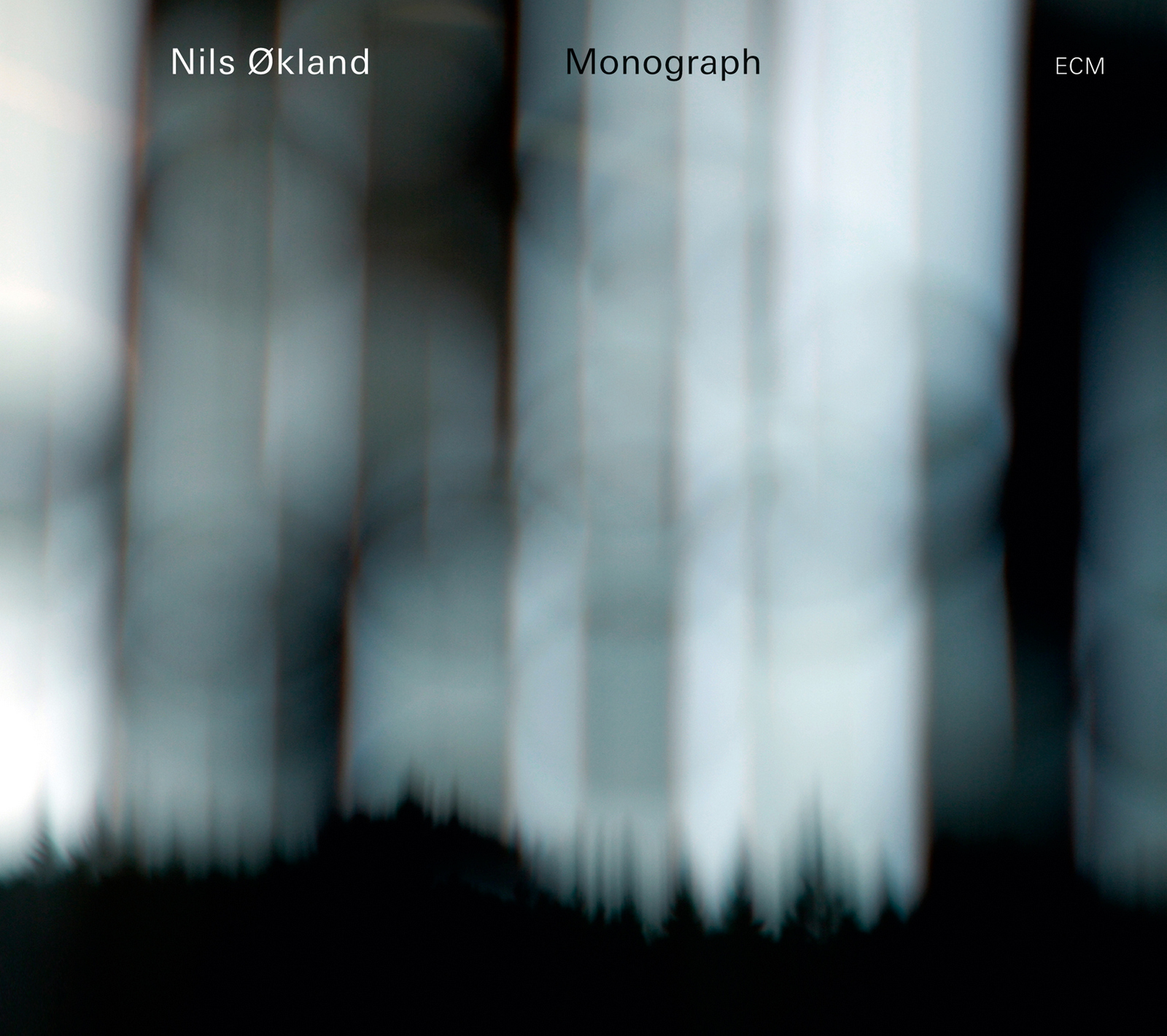
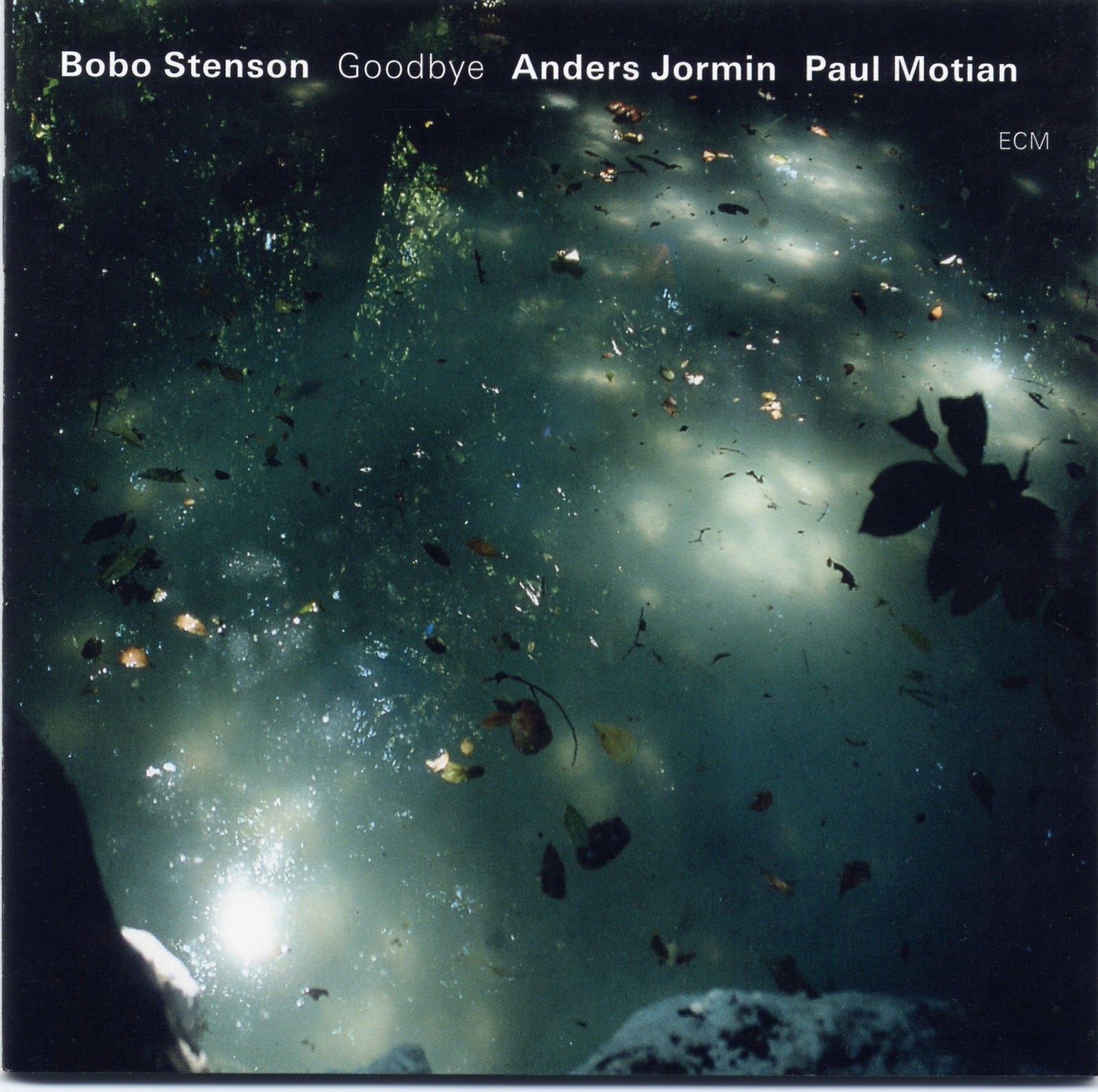
7. 'WE NEED TO CAPTURE OUR VIBE.'There's a cliched old advertising phrase that says 'don't sell your lawn seeds, sell their lawn'.Yes, you are buying an artists music, but often, you are buying a mood.ECM sold a mood.A new agey/jazz/ambient type mood.The ECM logo becomes a bit like the Intel Inside logo; offering reassurance that it'll deliver what's expected.What's expected is visualised using storms, rain, blurs, shadows mixed in with a dollop of melancholy.Davidoff, Chanel and all manner of perfume brands do a similar thing; not being able to let you smell their perfumes they give you weird, abstract mood pieces to give you a vibe.

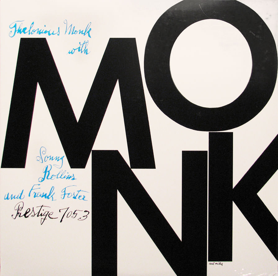
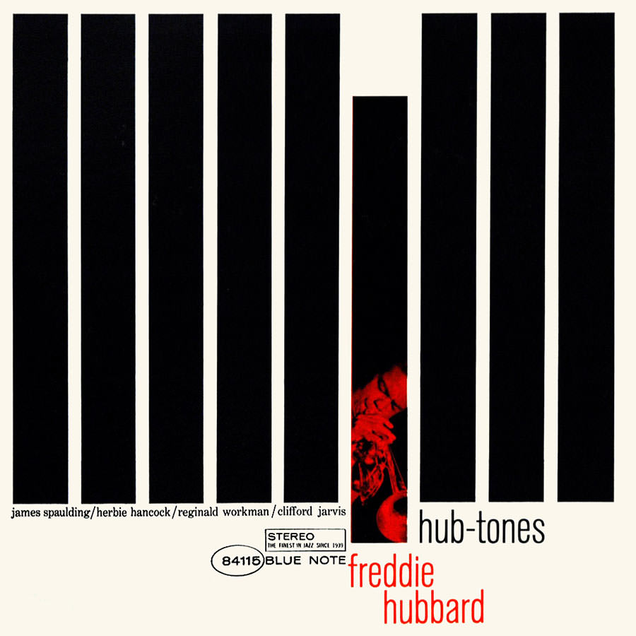
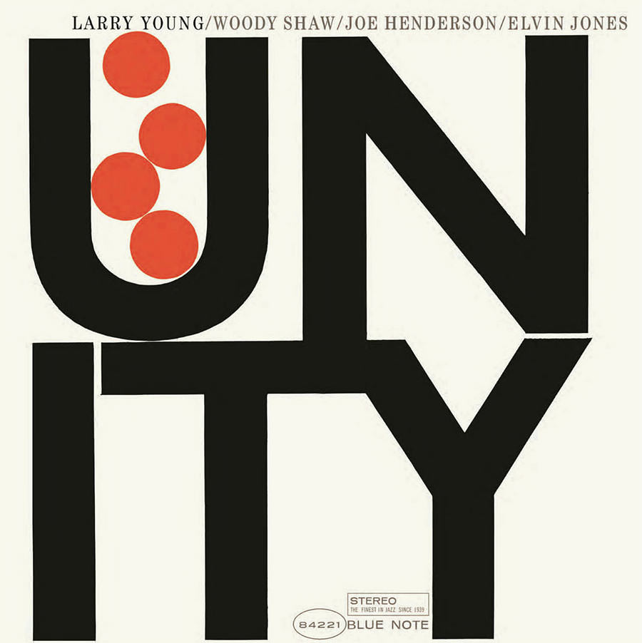
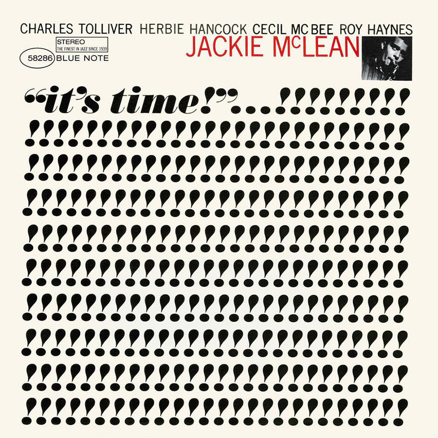
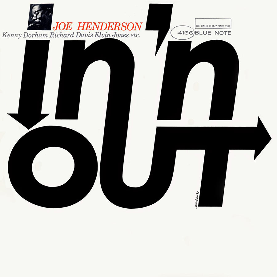
8. 'WE HAVEN'T GOT MUICH CASH...CAN'T WE DO SOMETHING WITH TYPE?'If you're putting out hundreds of albums a year commissioning photography is a big expense.But albums with just a name and title printed on them look cheap, hardly an endorsement from the label.Blue Note, and Reid Miles in particular, turned this on its head.Simply using an alphabet, some coloured inks and an exceptional eye, he created album covers that not only jumped out and felt like a family.Ironically, their aesthetic made them feel more special than their expensive cousins.A bit like The Economist campaign, it beat up all those expensively produced ads with nothing more than red ink, white words and a bit of grey matter.
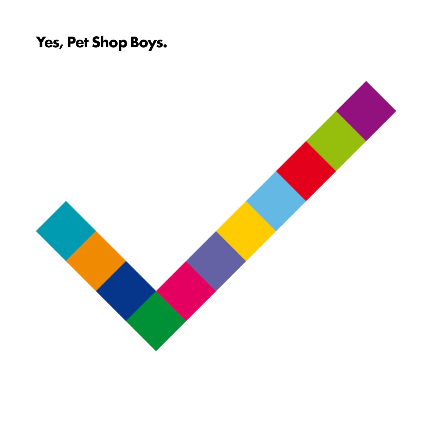
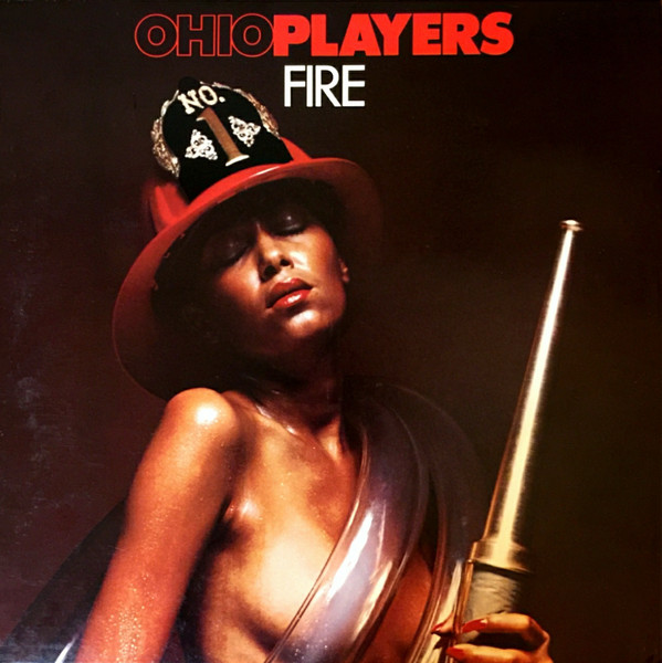
9. 'WE NEED TO GET OCER OUR AESTHETICS.'It's always right to do the opposite of your surroundings.So, if you're surrounded by crass, complicated imagery, sophisticated, minimal aesthetics will really jump out.The stripped back, considered graphics that Mark Farrow has created year after year for the Pet Shop Boys, not only hold together visually, they say scream intelligence and style.Weirdly perhaps, this puts me in mind of the Lurpak, frankly, a a chunk of yellow fat, but the aesthetics of their advertising; the cinematography, sound design and metronomic editing is so pleasing, you can't help but liking and admiring that particular chunk of yellow fat.

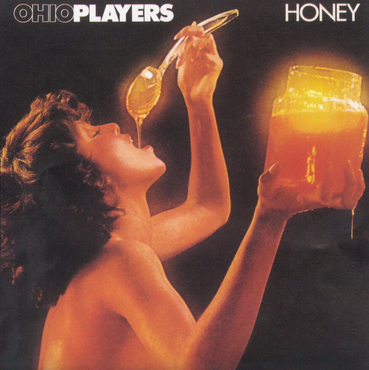
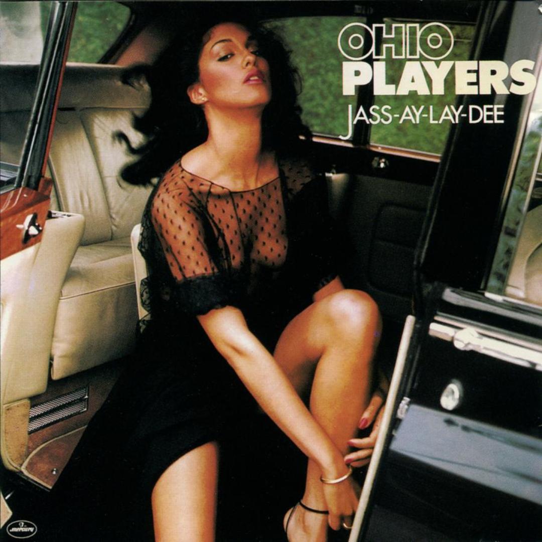
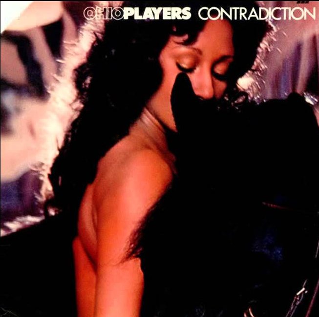
10. 'WHY NOT USE SEX....PEOPLE LIKE SEX.'The oldest strategy in the book.But one that's always difficult to ignore.The Ohio Players used it and their logo throughout the seventies, I'd put money on the fact that more people knew the Ohio Players for their covers than their music.BBH used a similar strategy to great effect with their Haagen Dasz campaign back in the day.

Visual consistency helped place artists in the heads and hearts of millions of people.Selling millions of albums along the way.The instant measurability digitisation has bought us has lead to our industry to focus on the short-term.Consistency has been replaced with flip-flopping, done under the illusion that we’re being ‘nimble’ or ‘reactive’.But the people we're talking to don’t care.They either recognise a company or they don’t.They won't recognise a new personality over night, it takes time for them to connect our dots.It’s an investment.One that will be rewarded when a brand can be picked out from the crowd.As an industry, we need to stop flooding the market with singles, hoping to luck out with the next ‘Gangnam Style’, we need to be plotting out the careers of the next The Pet Shop Boys, Roxy Music or, dare I say it; Phil Collins.
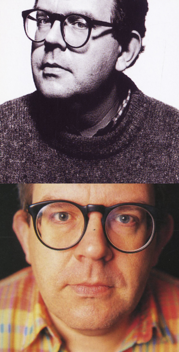
One of the nice things about doing these interviews is getting to know people who you’ve only previously knew though their work.So, when I write one of these intros I try to reflect on what I've learnt about the interviewee, to capture the characteristics that have helped them create such great work and succeed in such a competitive business.But as different as they all are, they all share the same characteristic; They care.When they commit, they’re all in.Whether making an ad or a cup of tea they want it to be as good as possible. They keep pushing when others decide ‘that’ll do’.A few years back, a friend of mine wandered into Adrian’s office to leave a message, he found that the desk was filled with random sets of letters and numbers. Some were ticked, some crossed and one had a question mark. He stood there looking at them trying to figure out what fiendish creativity was going on.Until, a few weeks later, when he bumped into Adrian, who’d just taken delivery of his new BMW, it turned out that Adrian had been trying to pick the most visually pleasing arrangement of letters and numbers before committing to a number plate.Then there was the time that Adrian, irritated at having to fold his copy of Campaign to fit into his briefcase, found someone to make him a new, bespoke briefcase, unfolded Campaign size.Also, you’ll notice something different when you look through Adrian’s work, along with the names of the agencies and clients, you’ll also see the year it ran, the art director, director, illustrator, photographer and typographer. You’ll see subheads.You won’t hear the sound of my phone beeping or Adrian not being able to recall a Creative Directors name. (It was edited, re-recorded and fixed.)And at the end of this post you'll see an article titled 'My Portfolio', look closely at the first line and you'll notice that the word firing' is fractionally bolder than the rest, that's because underneath is the word 'giving', Campaign had misquoted him, Adrian and his scalpel fixed it.I'm not sure you can learn to care passionately about the details, but if you do, your work be better for it.We had a great chat, hope you enjoy it.

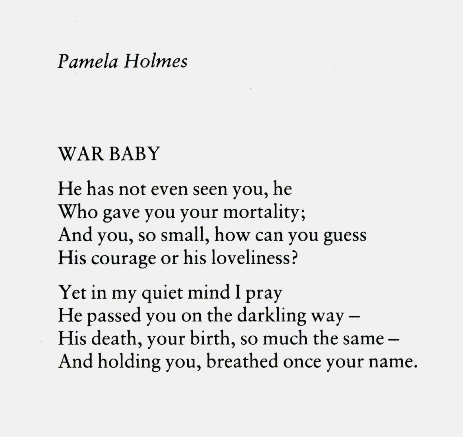
Written in 1944 by my mother, a gifted amateur poet. Her first child (my half sister) was born around the same time her husband was killed in North Africa.Father and daughter never met, except in this amazingly touching short poem.
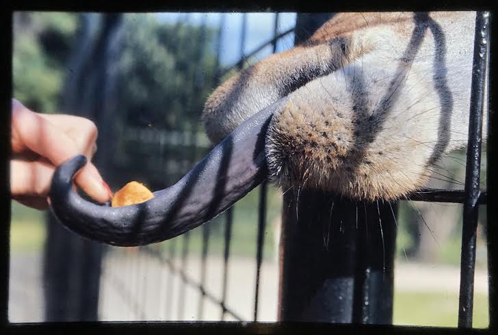
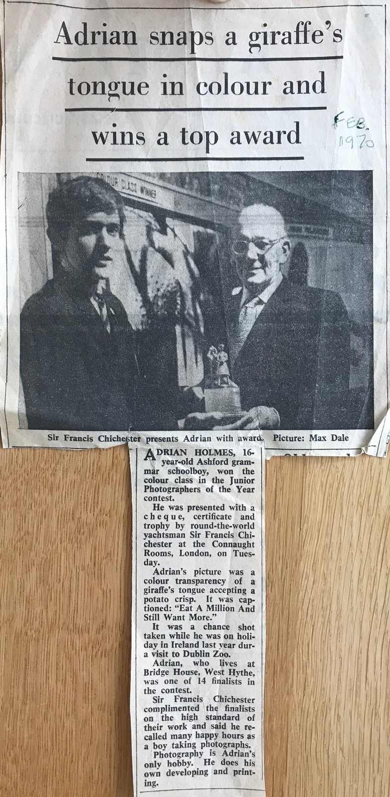
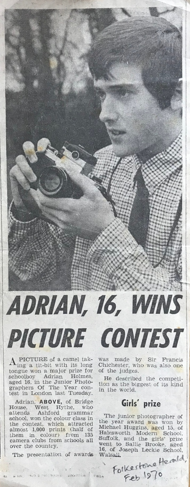
My first award-winning work was actually a photo, taken on holiday in 1969 when I was 16.The newspaper article sadly notes ‘photography is Adrian’s only hobby...
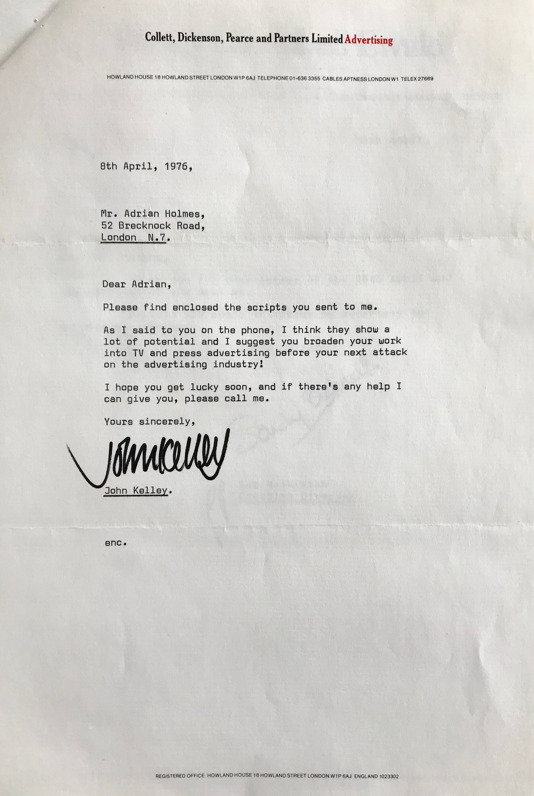
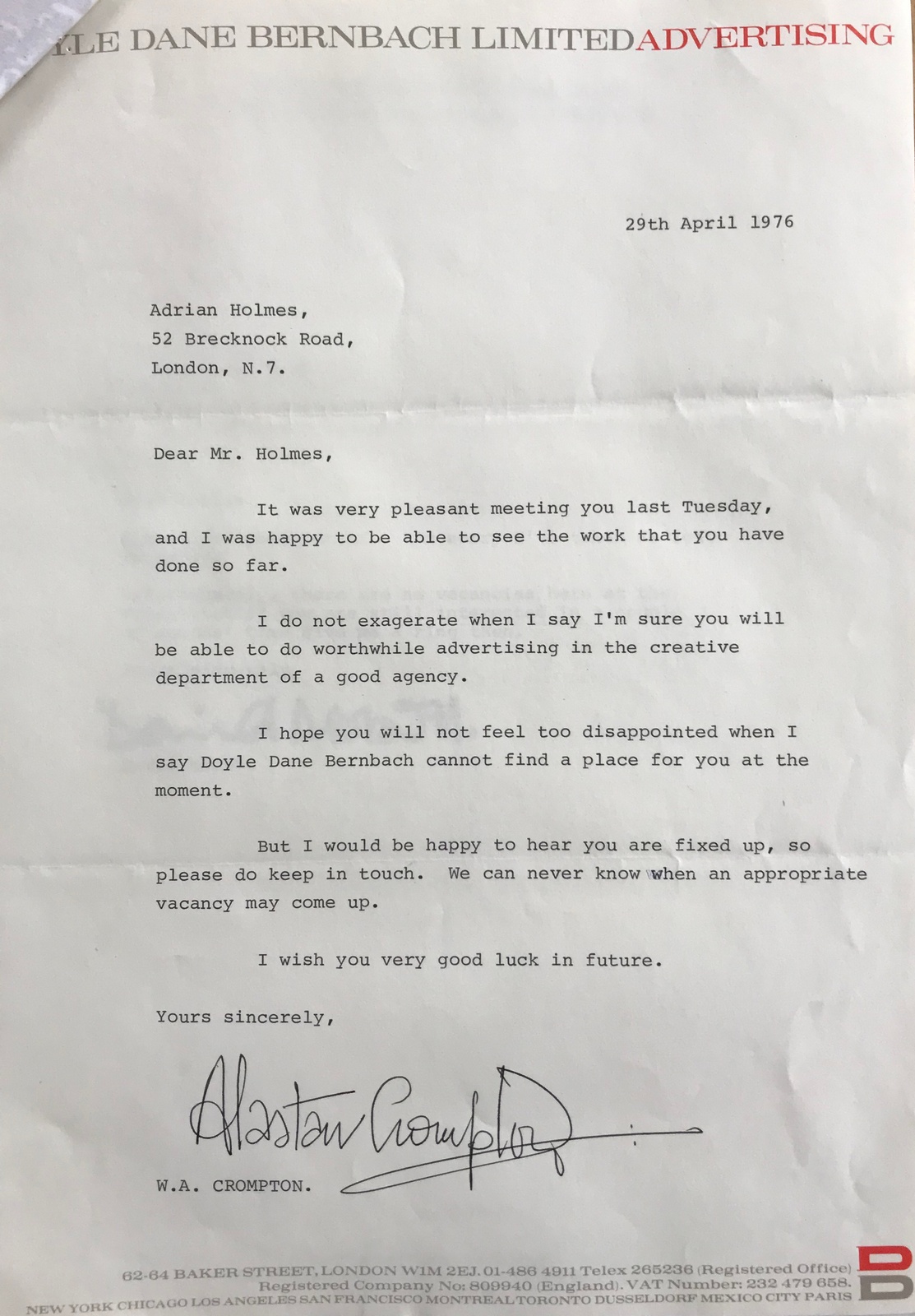
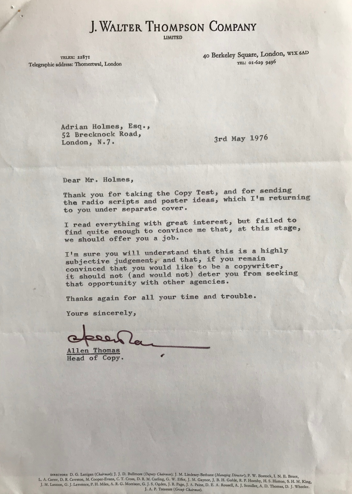
Written in my Central London Poly days for the student magazine ‘McGarel’ around 1974, spoofing one of those Sunday Times magazine direct mail ads.The chair was well known and much derided fixture in the student common room.Letraset and layout by Adrian Holmes - yes, I know, if only I had become an art director ...Interview lists...
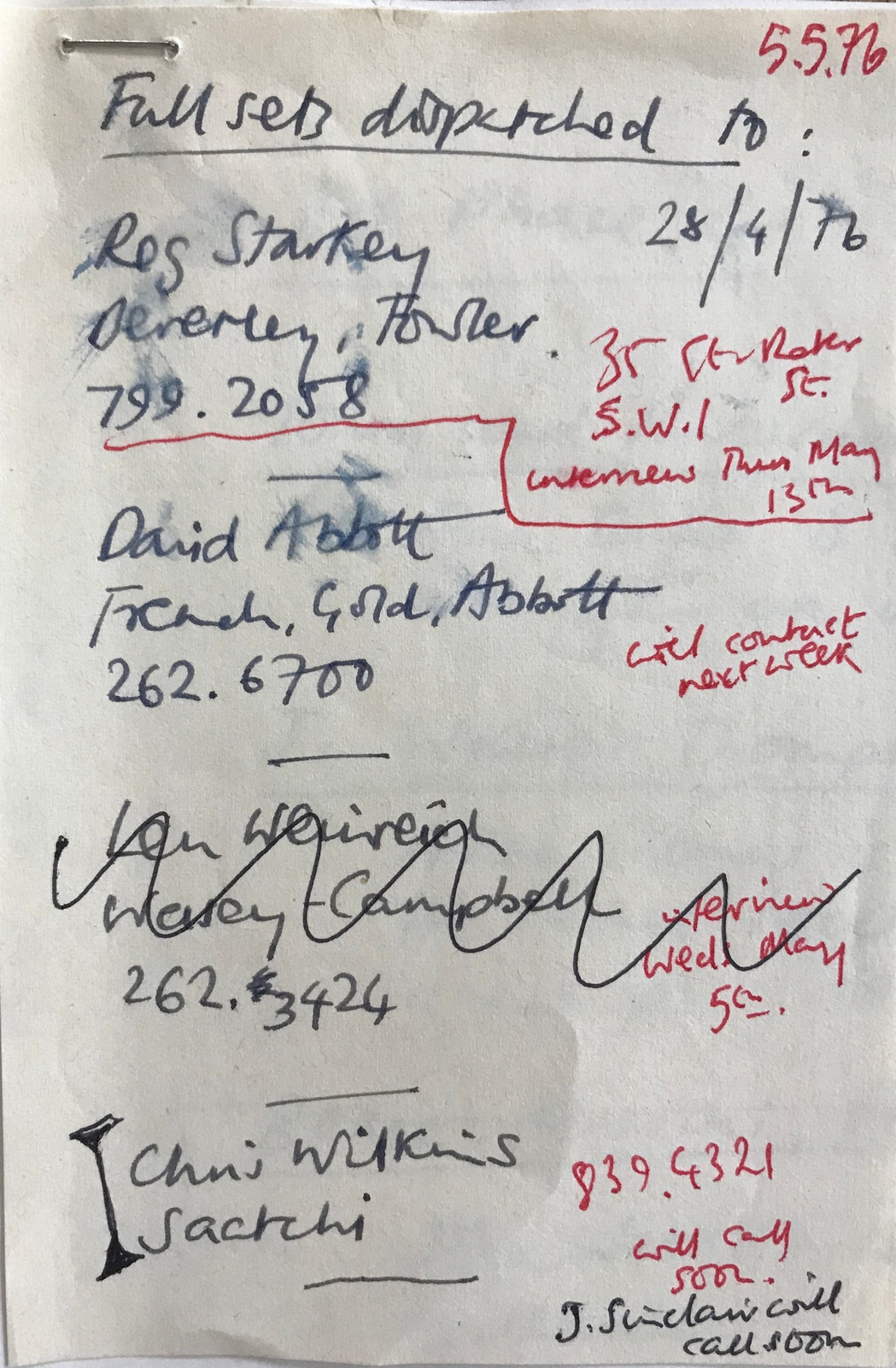
The rejections...
Finally...
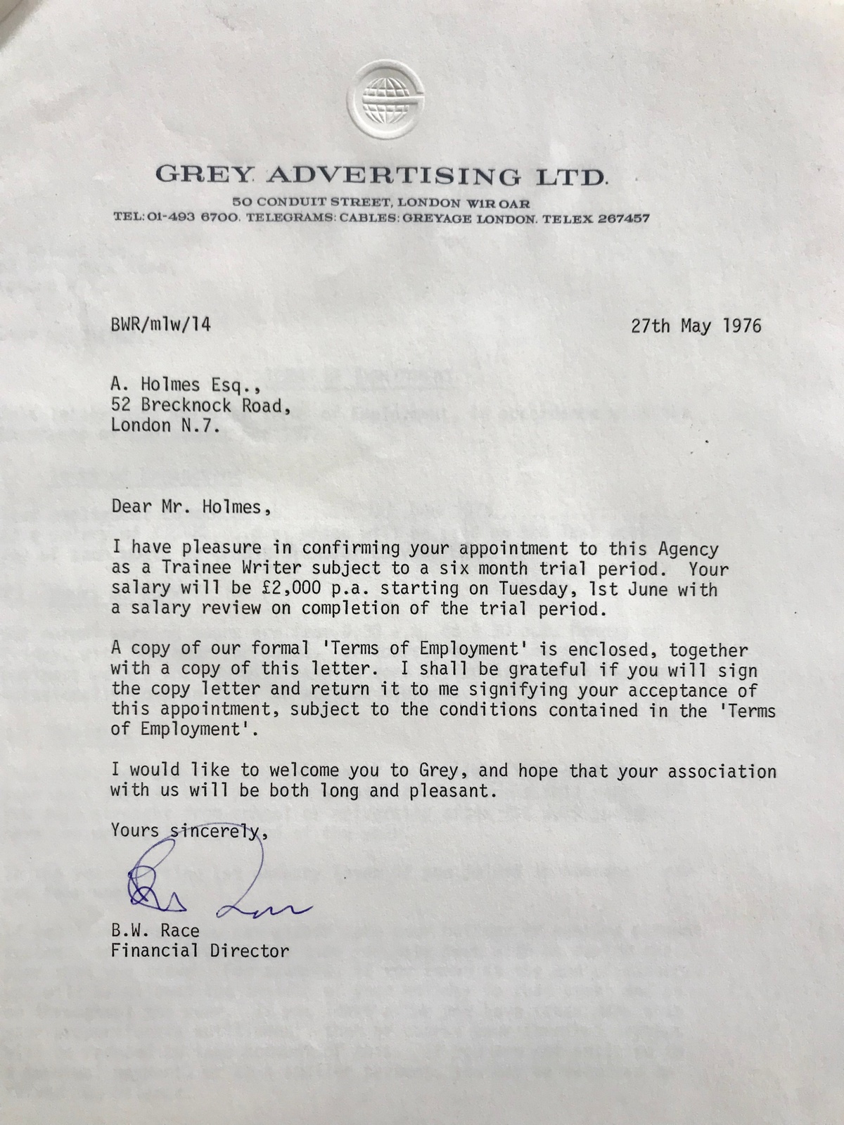
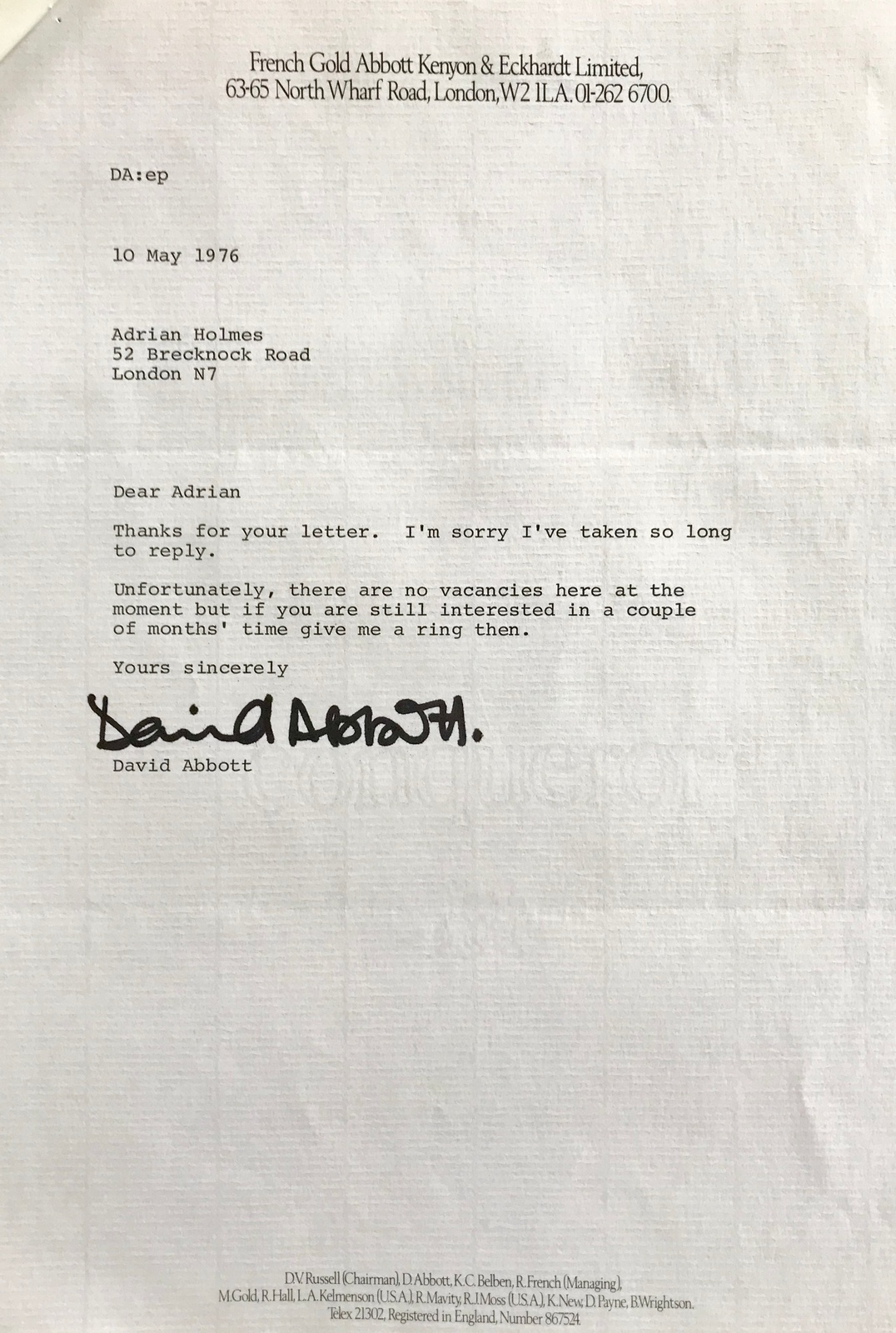
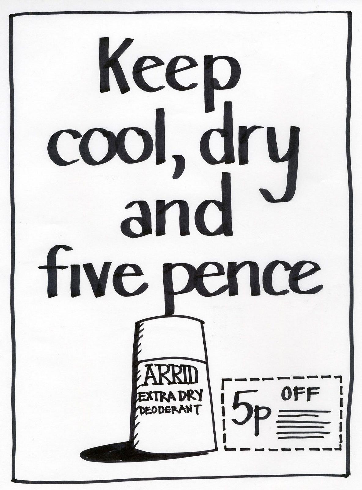
GREY.ARRID EXTRA DRY. (1976. Art director Richard Tennant.) The first time someone said ‘that’s nice’ about one of my headlines - thanks, Dolly Beashel!
LEO BURNETT.COI, 1978. (Art director Steve Hopper, director Bob Bierman.)Weren’t we lucky to get Roy Kinnear?
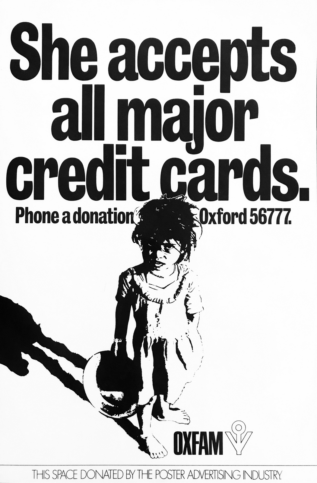
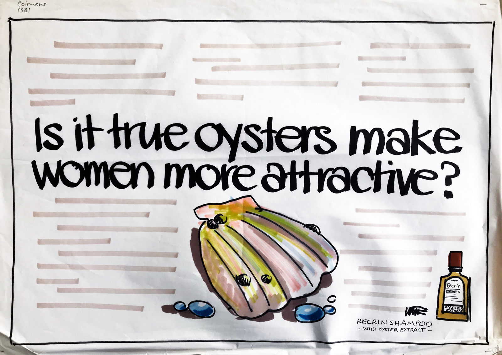
COLMANS.Oxfam. (1980. Art director David Owen.)
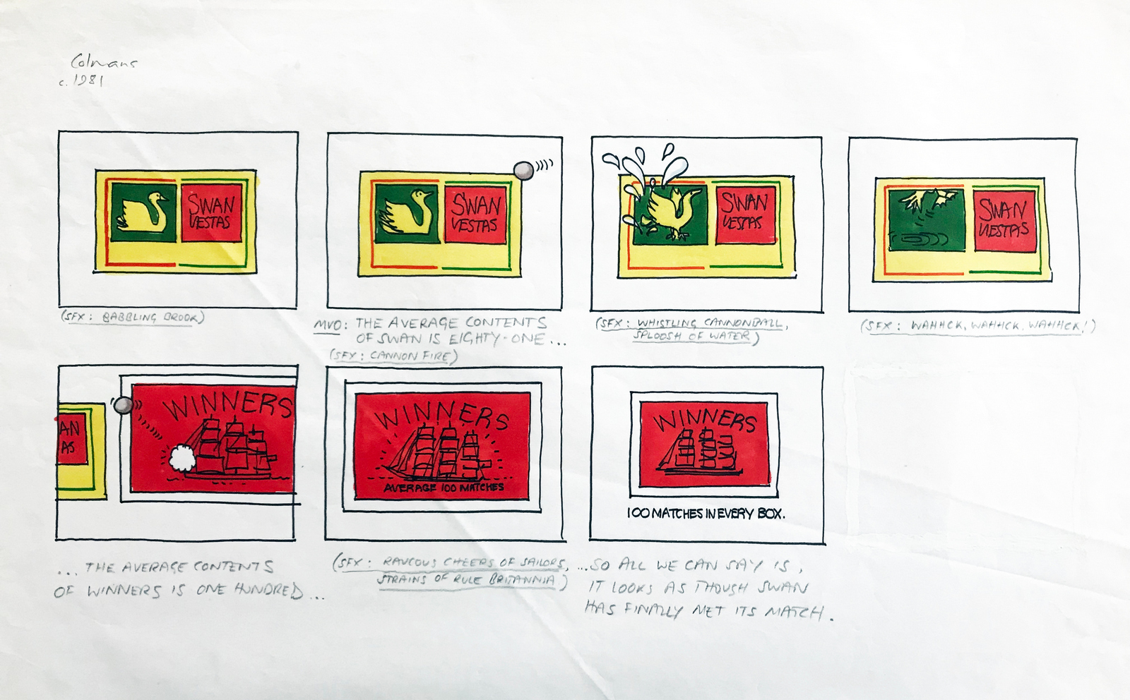
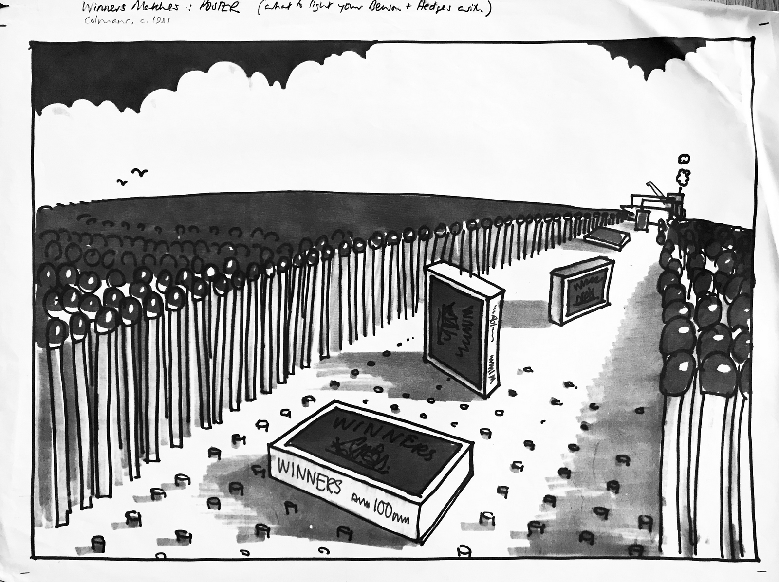
Winners Matches. (1981. Art director David Owen.) Never made. (Can you imagine commissioning a TV commercial for a box of matches today?)
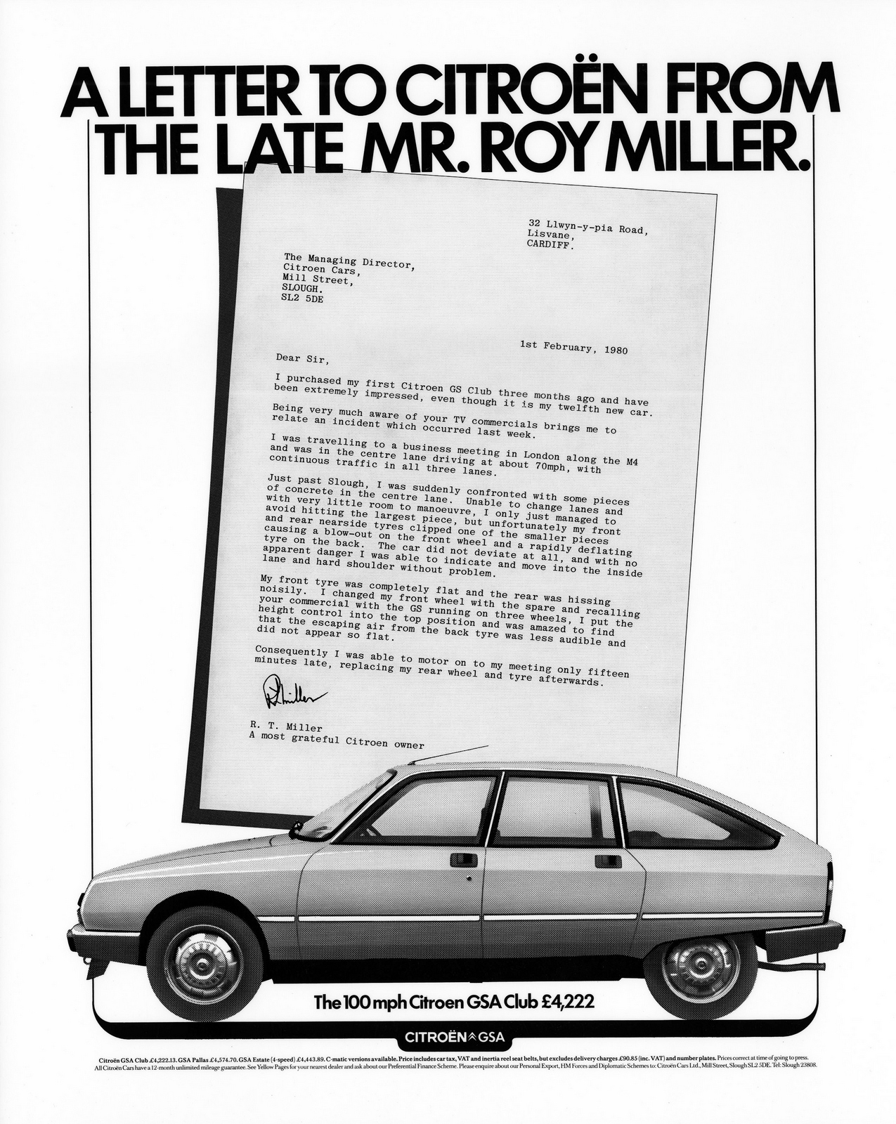
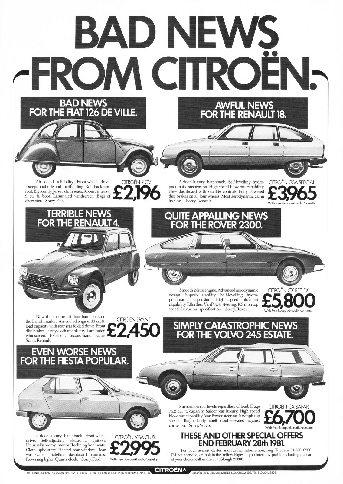
Citroen. (1980. Art director David Owen.)
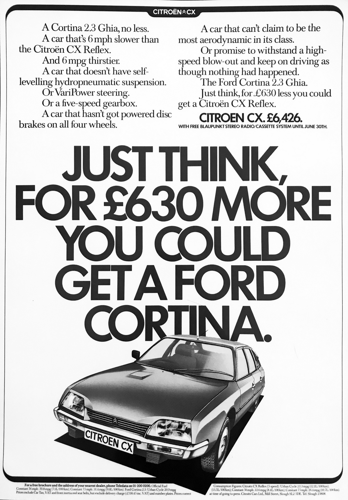
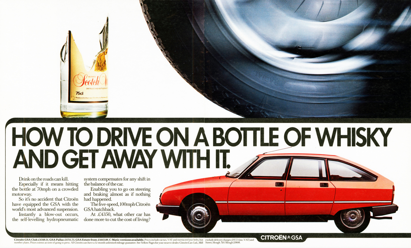
(1980. Art director David Owen, director Mike Seresin.)My first bit of work in the D&AD annual.
(1980. Art director David Owen, director Mike Seresin.)We desperately wanted a bright red car, but this ‘meh’ metallic green was all the client could come up with.
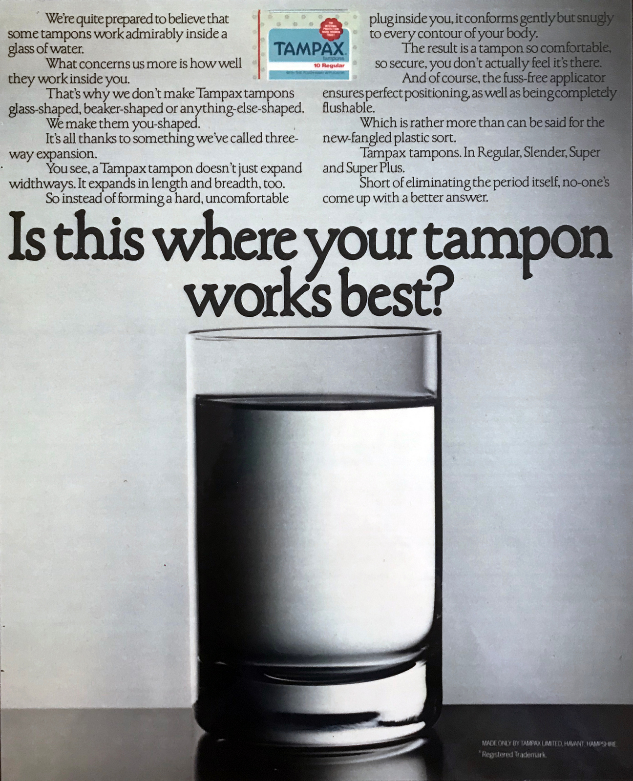
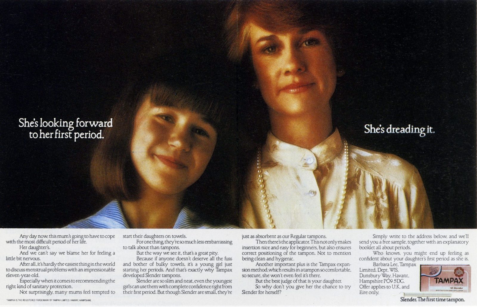
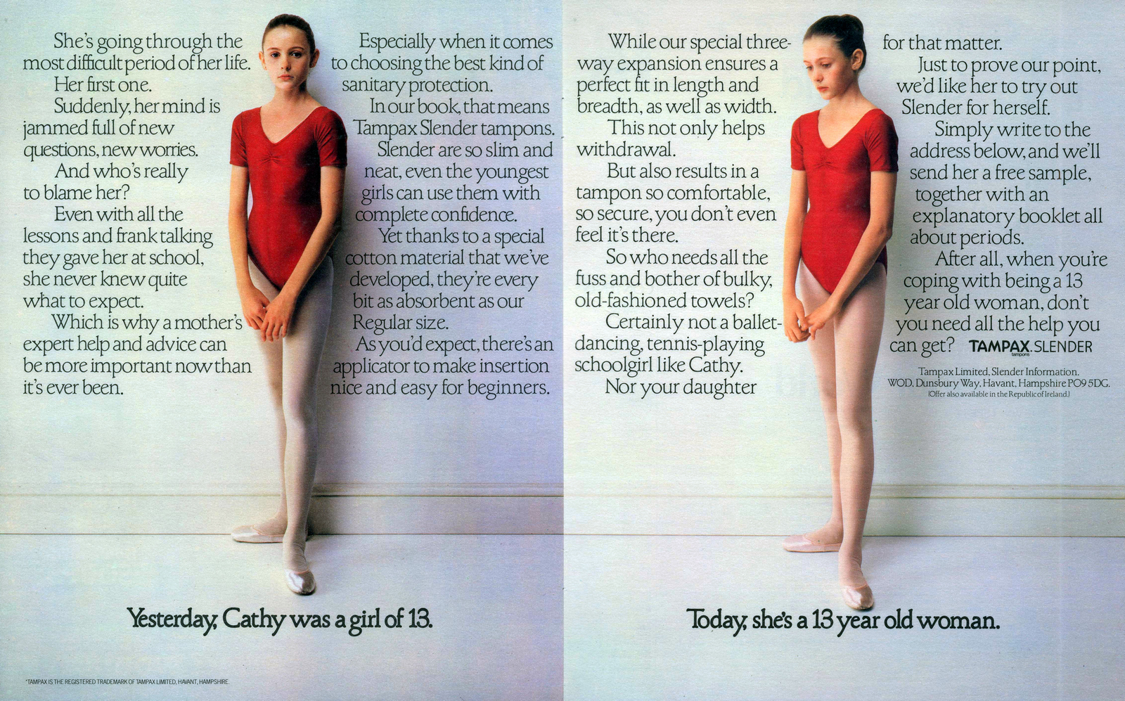
Tampax. (1980-81. Art director David Owen.)Originally we wanted these to be like ‘Home Sweet Home’-style tapestry samplers, but for some reason the client said no.
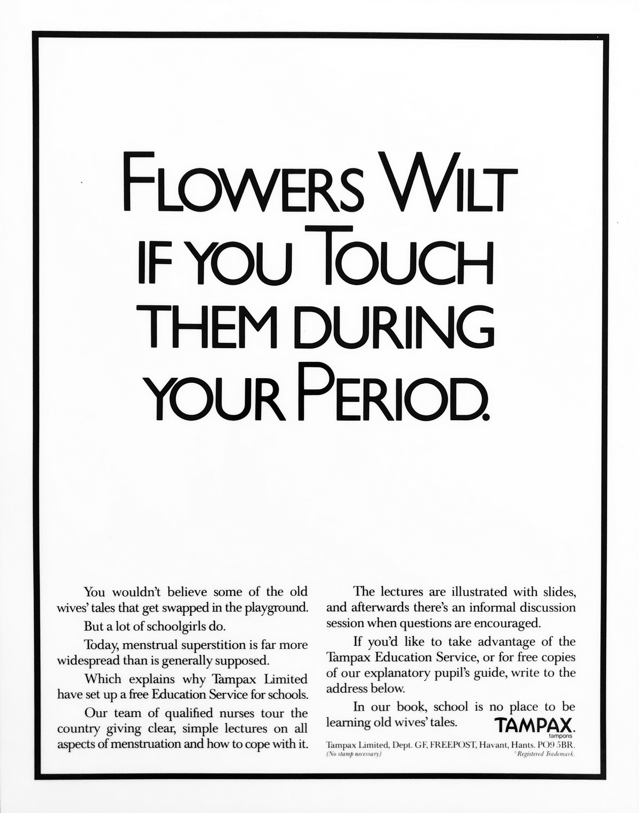
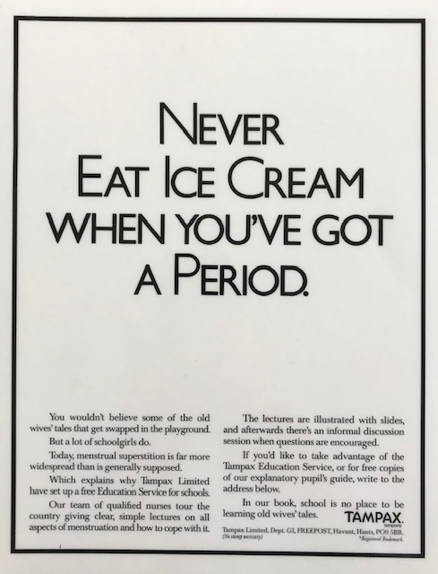
This was Tampax having a pop at Lil-Lets, who used this glass of water demo in their ads.
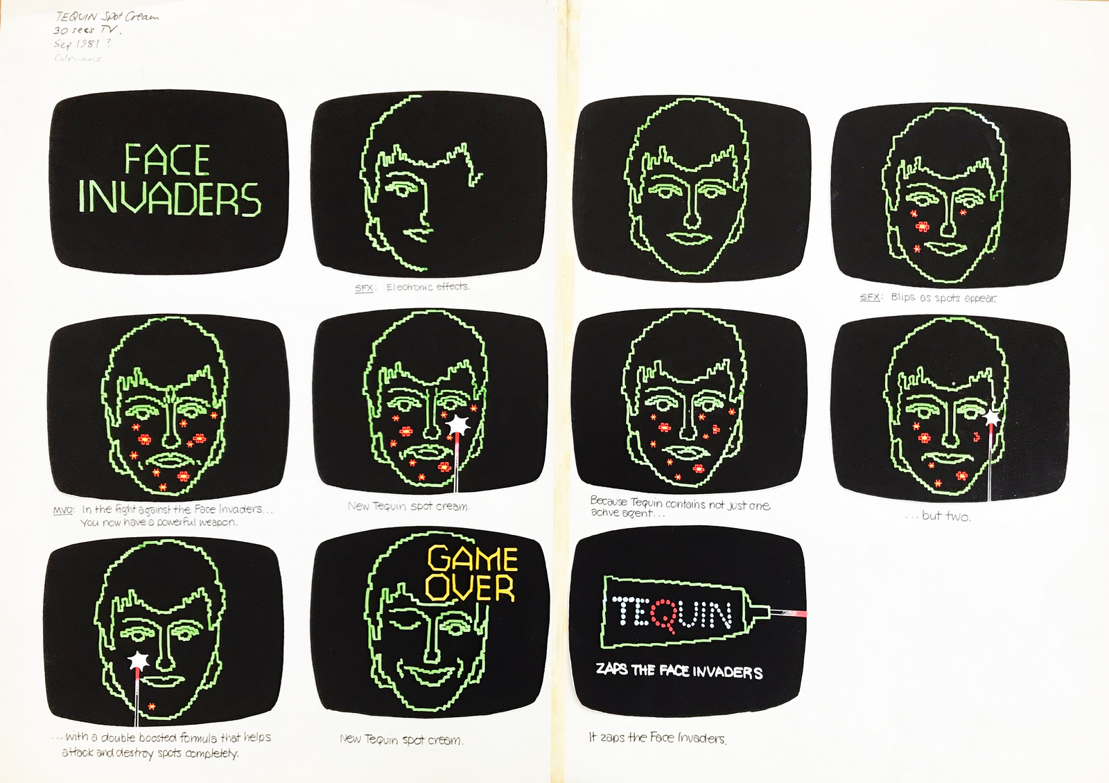
Tequin. (1981. Art director David Owen.)Either spec work for our book, or a pitch.
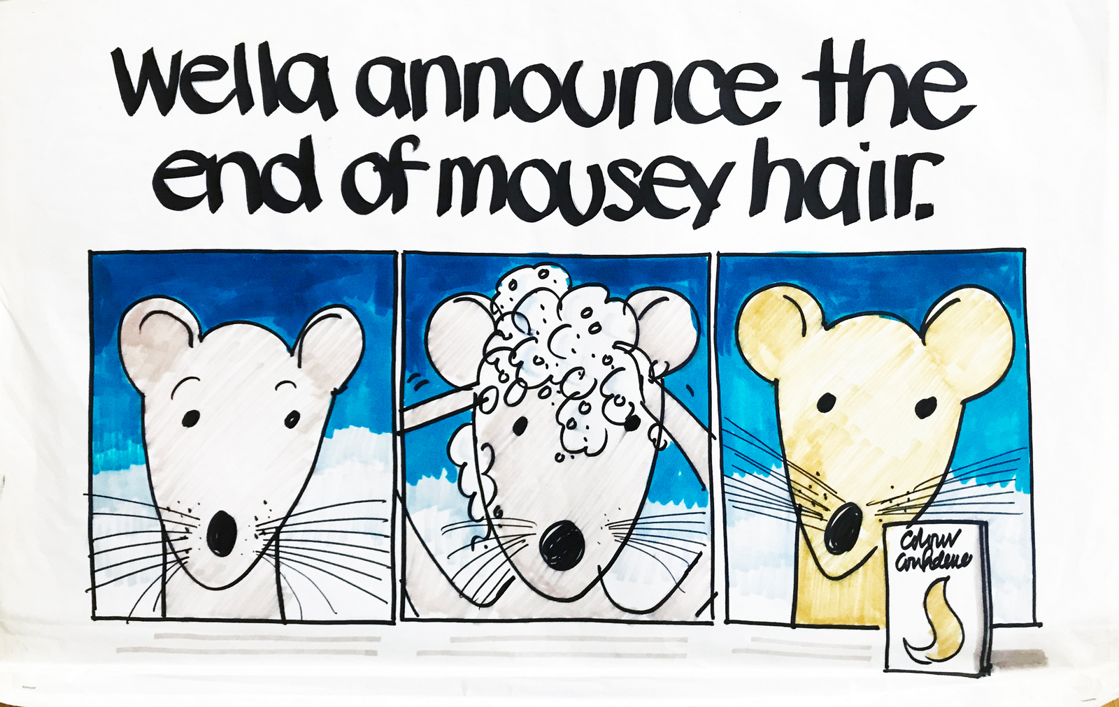
Wella Pitch.As above.
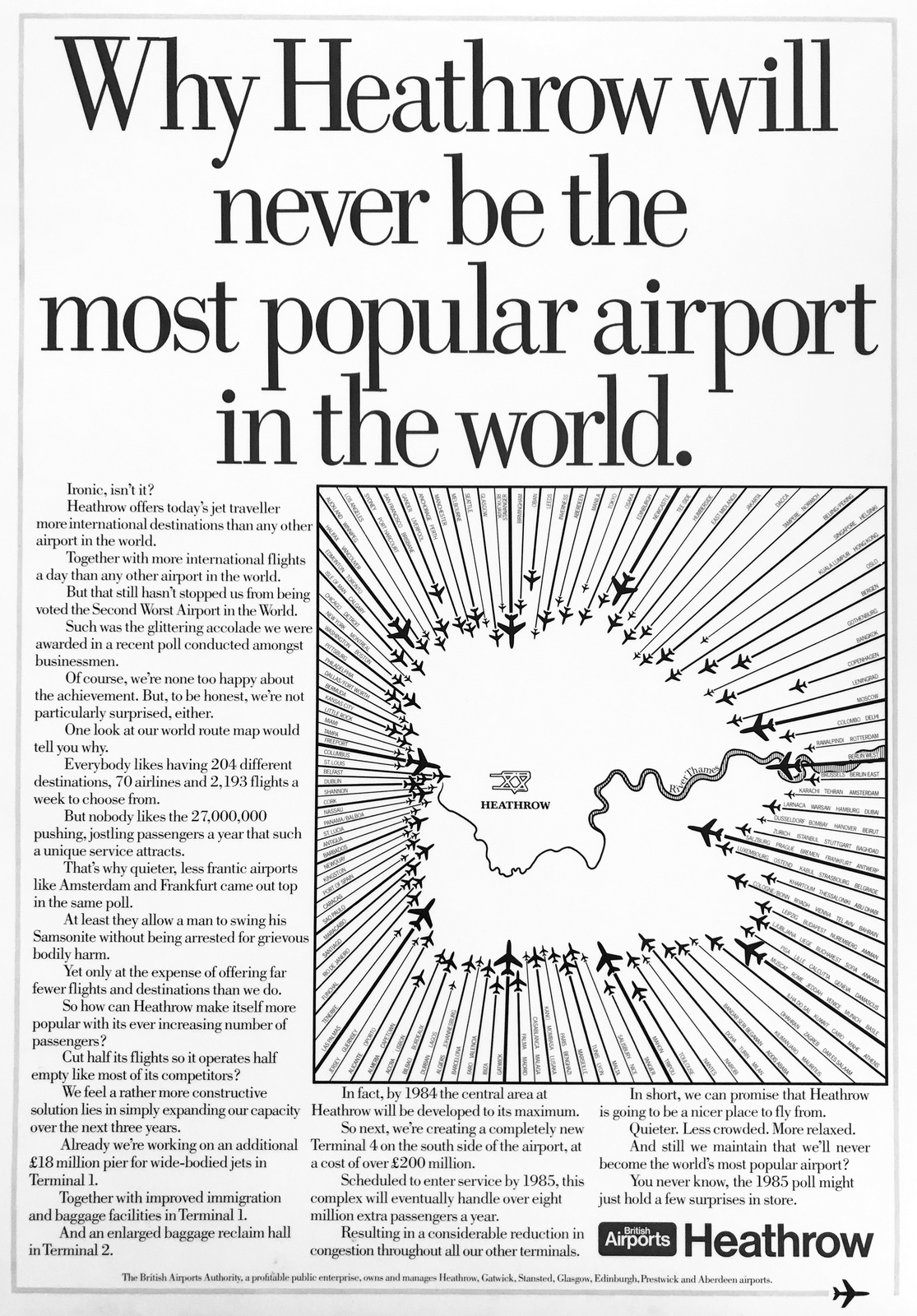
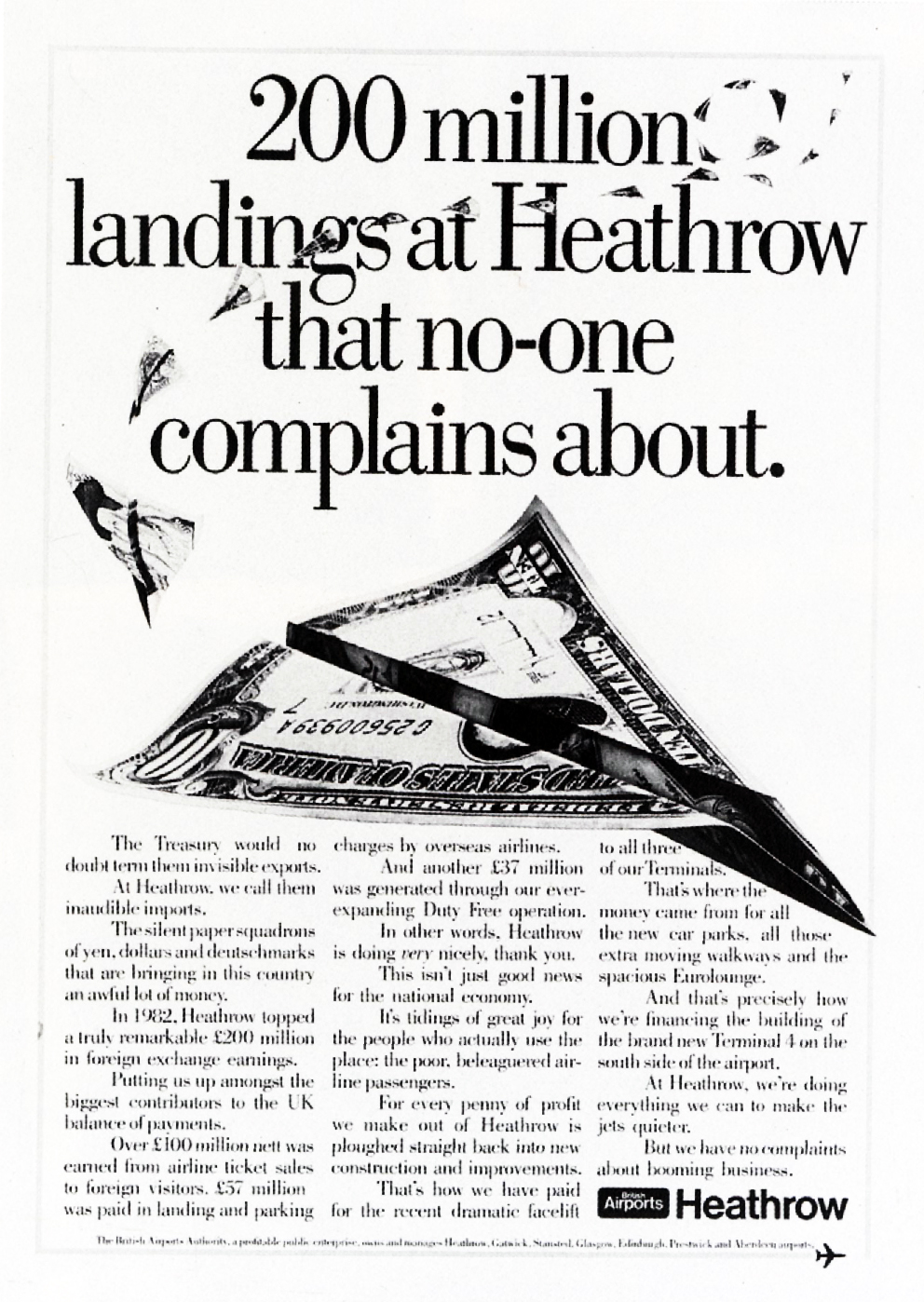
LOWE HOWARD-SPINK.British Airports. (1983. Art director Dave Christensen)
Albany Life. (1983. Art directors Andy Lawson, Dave Christensen.)
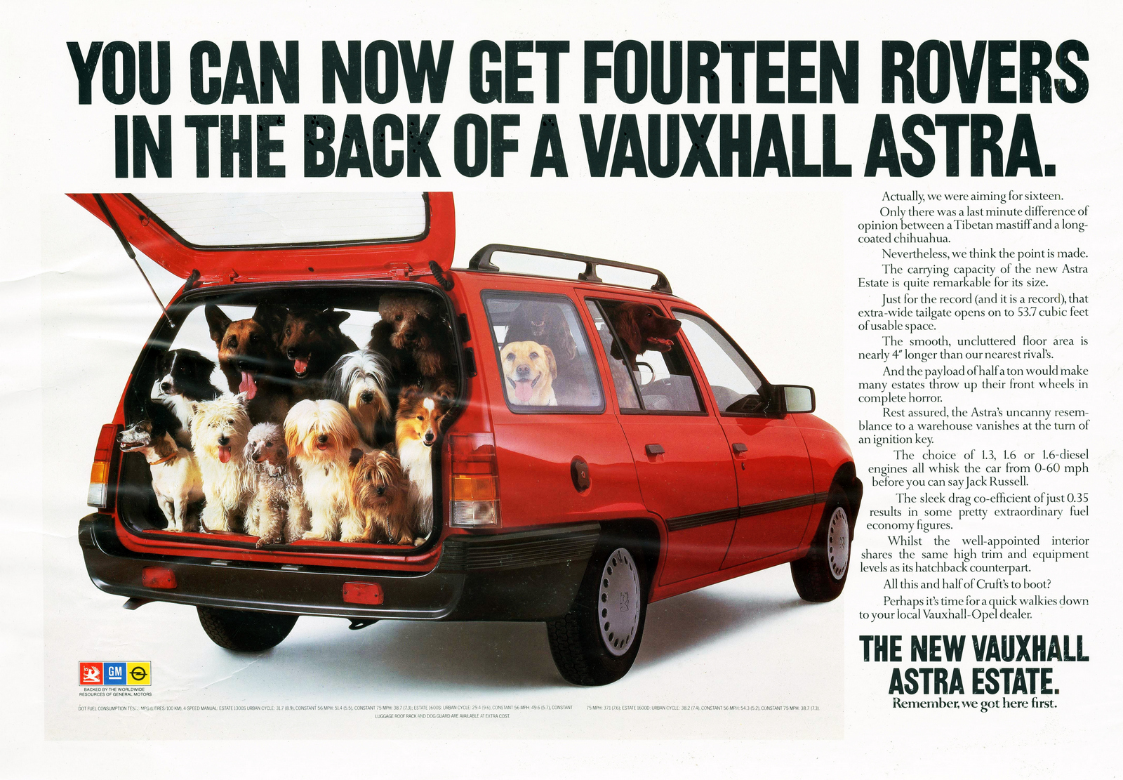
Vauxhall. (1985. Art director Alan Waldie, director Peter Levelle.)
(1984. Art director Alan Waldie.)
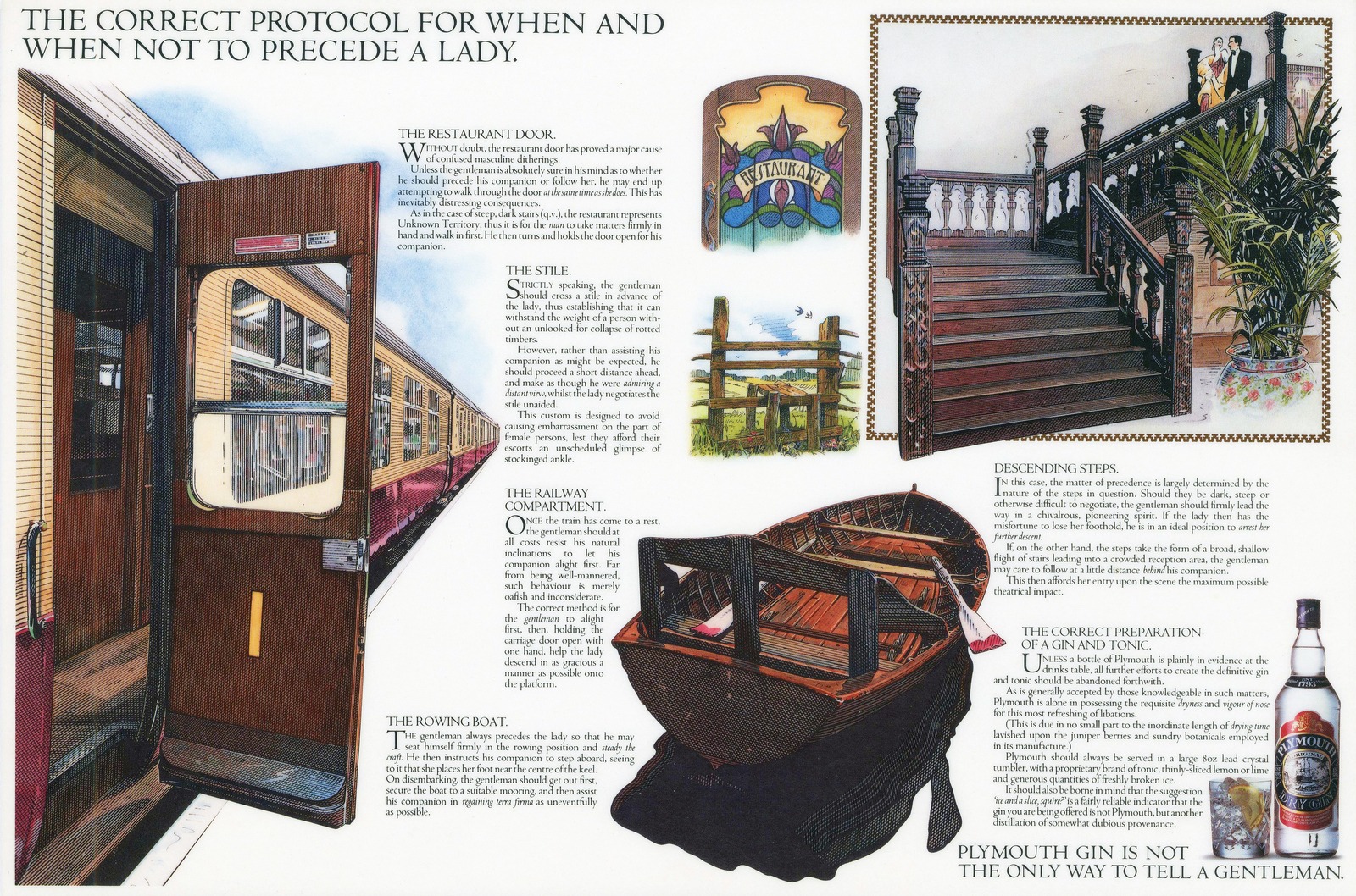
Plymouth Gin. (1984. Art director Alan Waldie, illustrator Roy Knipe.)
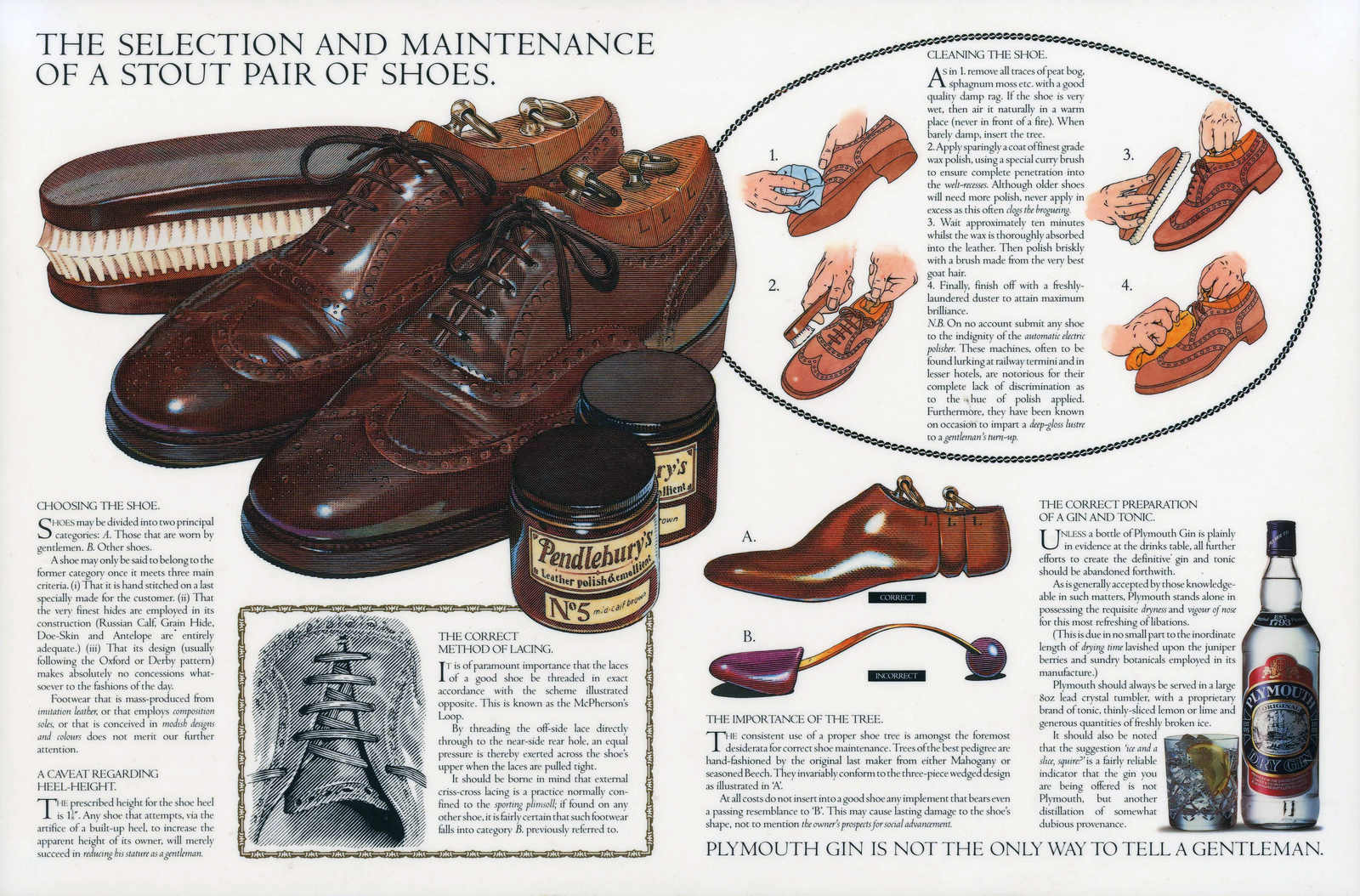
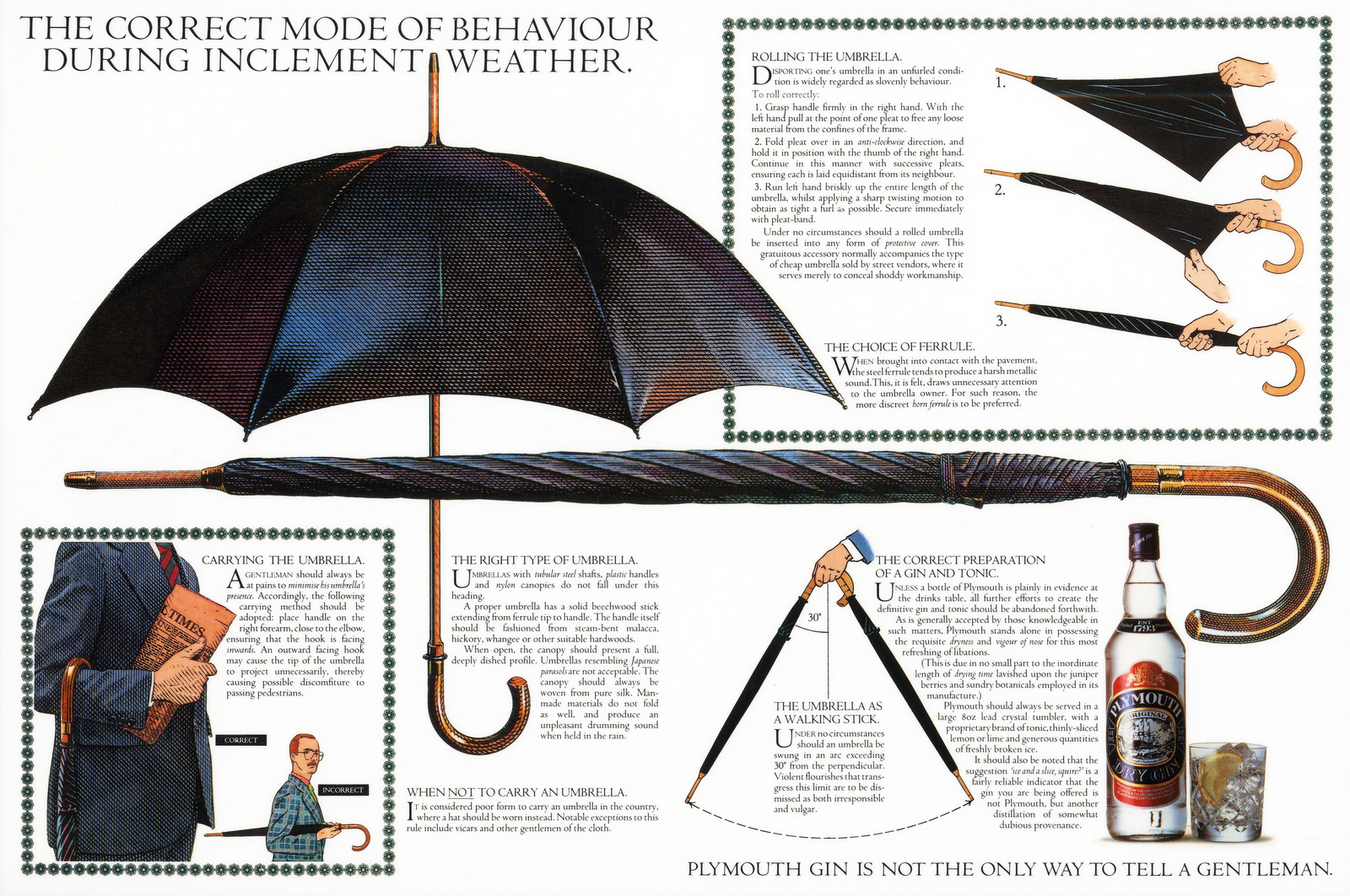
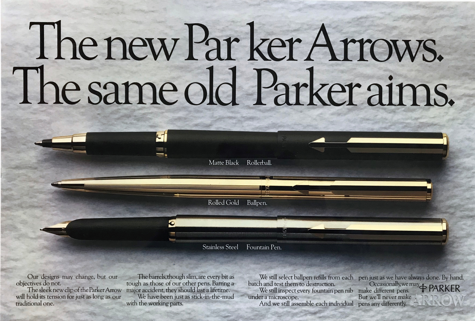
Parker. (1982. Art director Dave Christensen.)
Heineken. (1985. Art director Alan Waldie, director Paul Weiland.)
(1984. Art director Alan Waldie.)
(1982. Art director Tony Kaye.)
SAATCHI & SAATCHI.
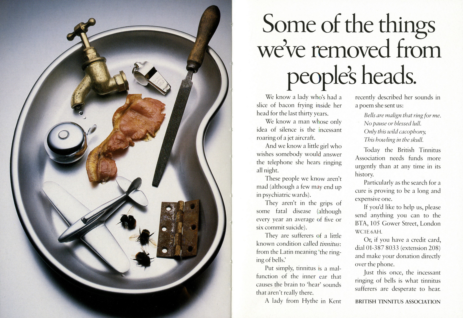
Tinitus Association. (1986. Art directors Paul Arden and Roger Pearce.)
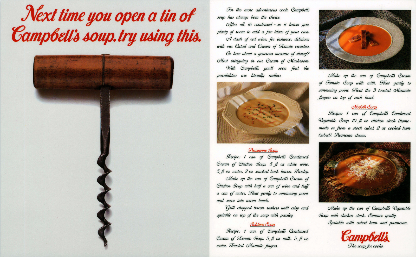
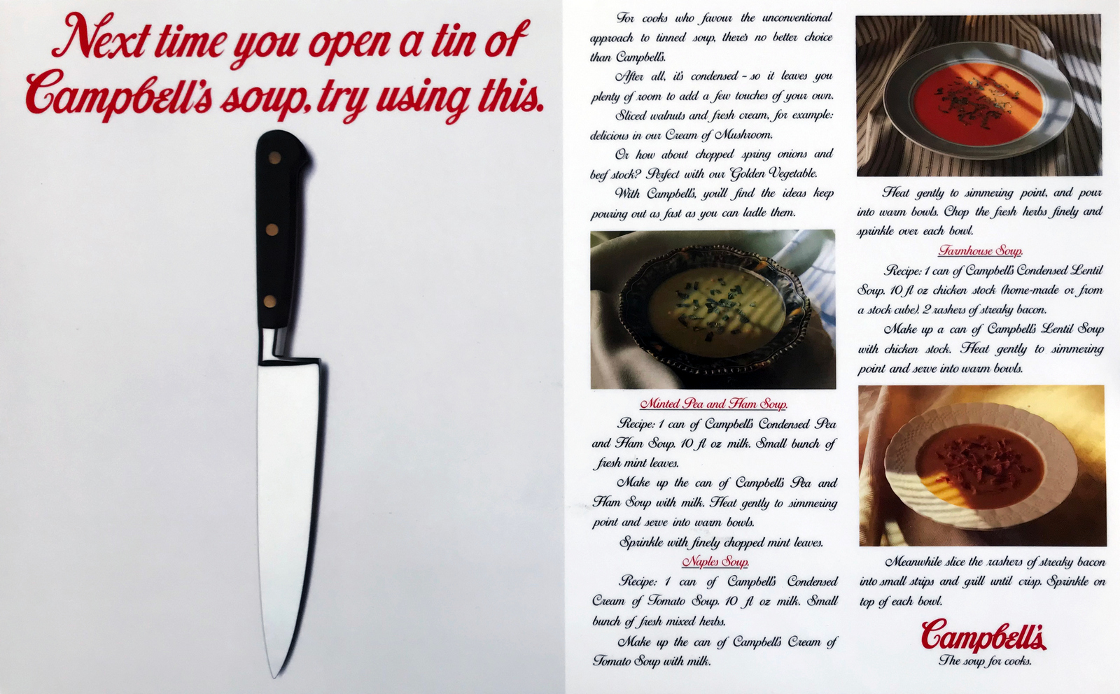
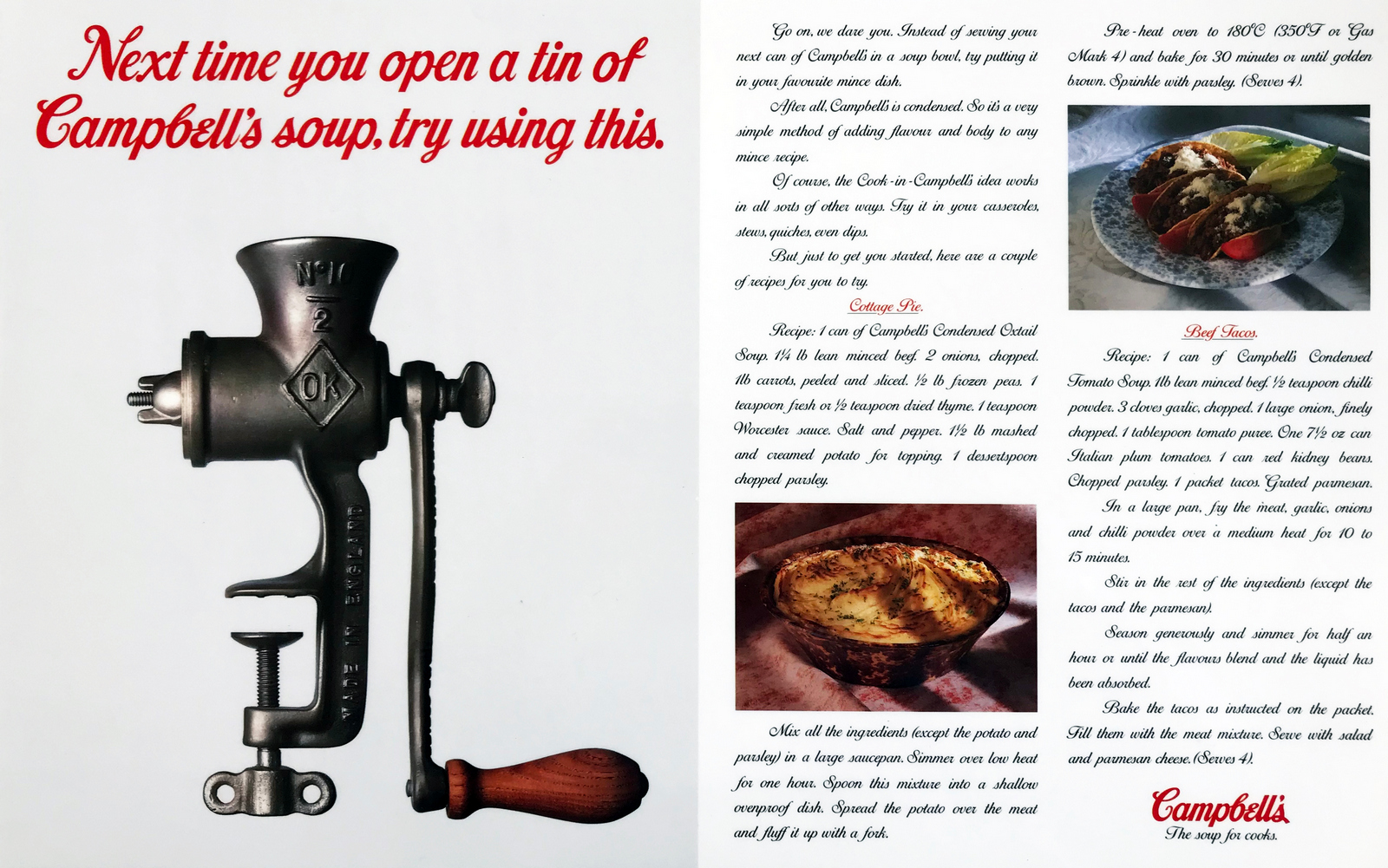
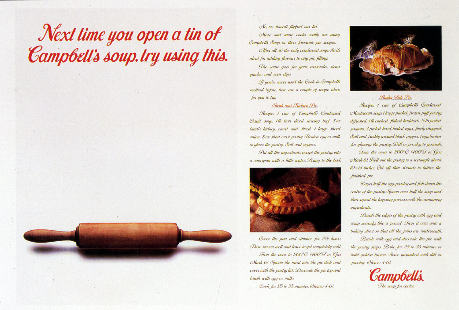
Campbell's. (1986. Art director Paul Arden.)
Anchor Butter. (1987. Art director Paul Arden, director Mike Seresin.)
(1986. Art director Paul Arden, director Terry Lovelock.)
(1986. Art director Paul Arden.)
COLLETT DICKENSON PEARCE.
Hamlet. (1987. Art director John Foster, produced overnight by director Bernard Lodge.)
Army. (1988. Art director John Foster.)
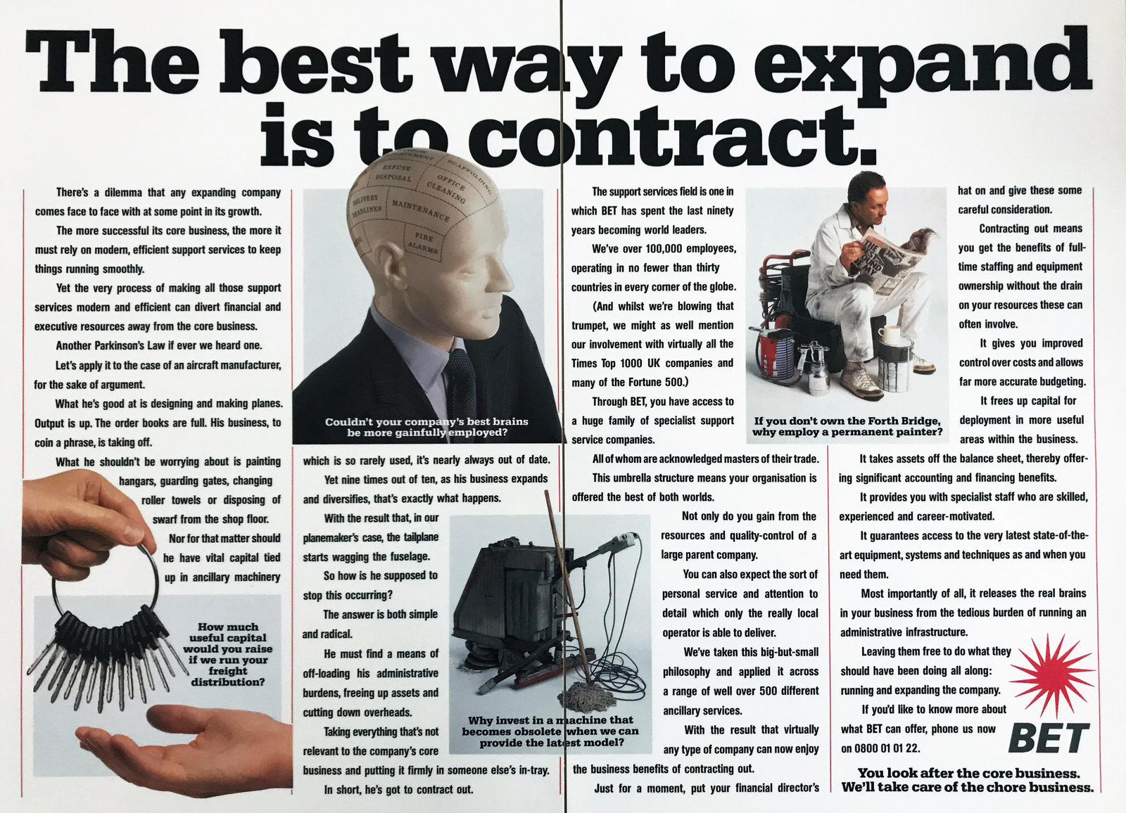
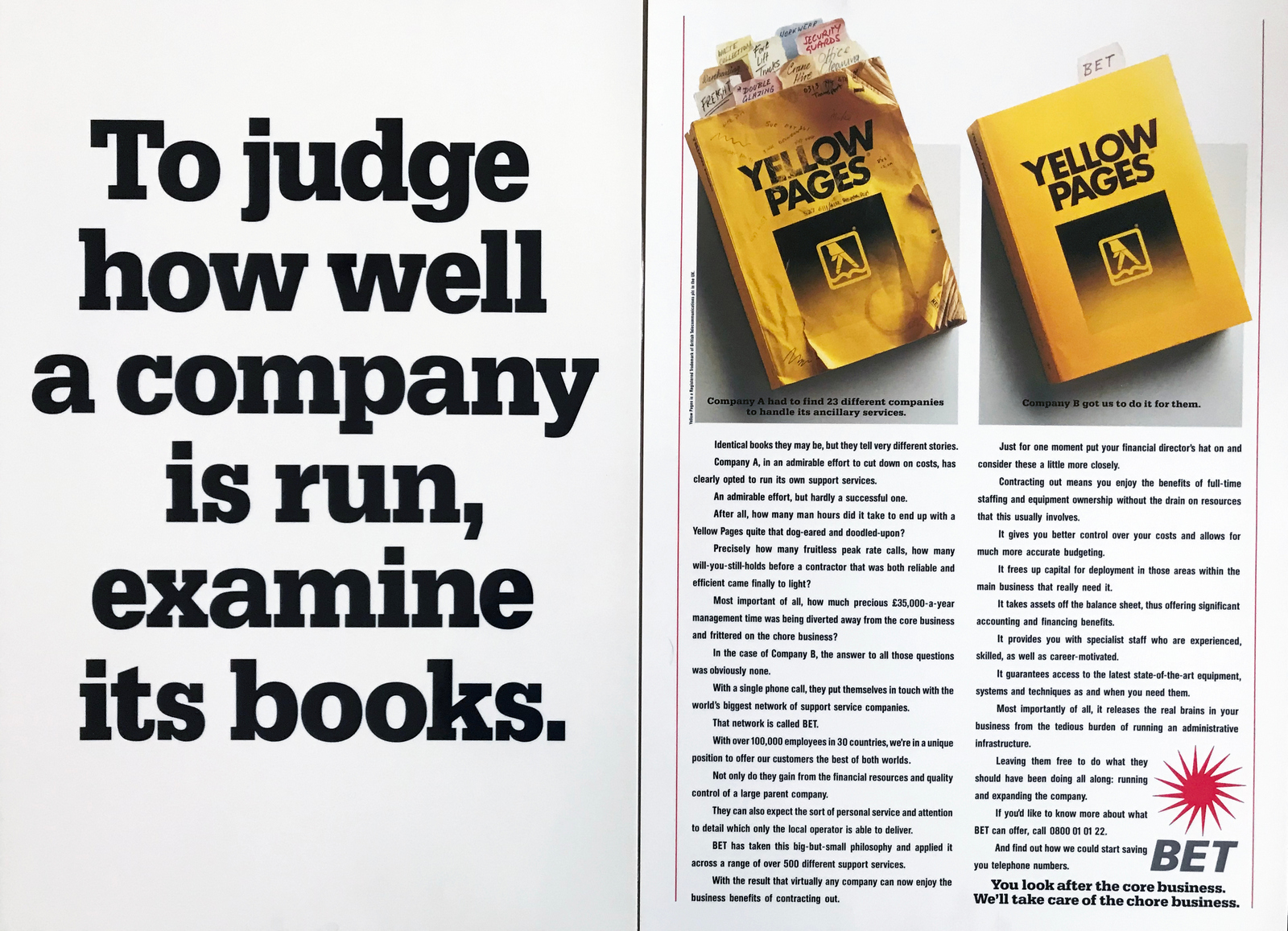
BET. (1988. Art director John Foster, director John S. Clarke.)
Hamlet. (Art director John Foster, director David Garfath.)
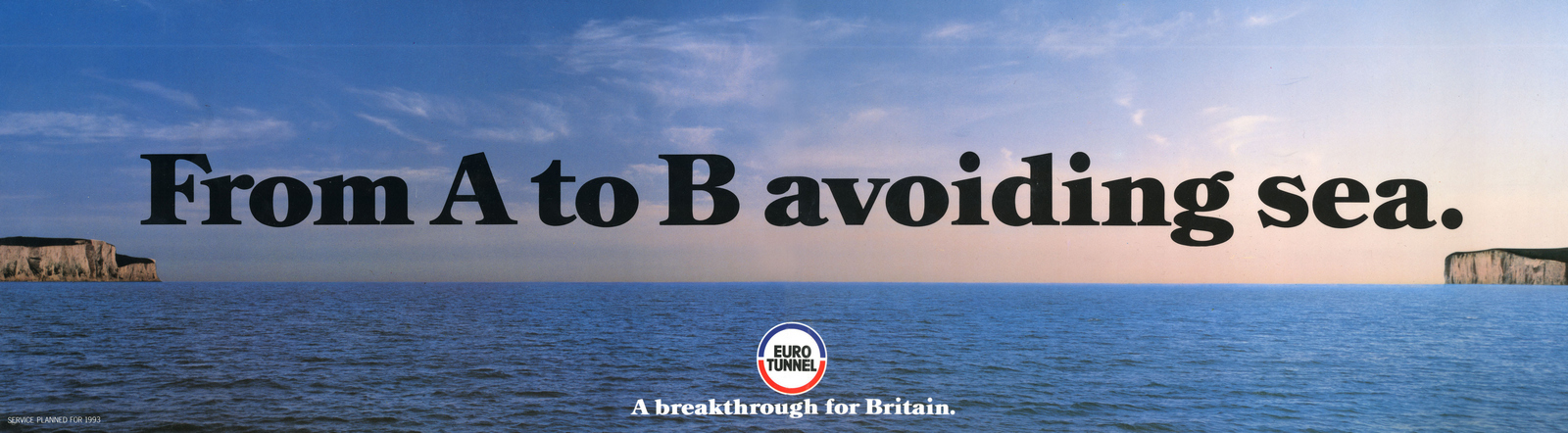
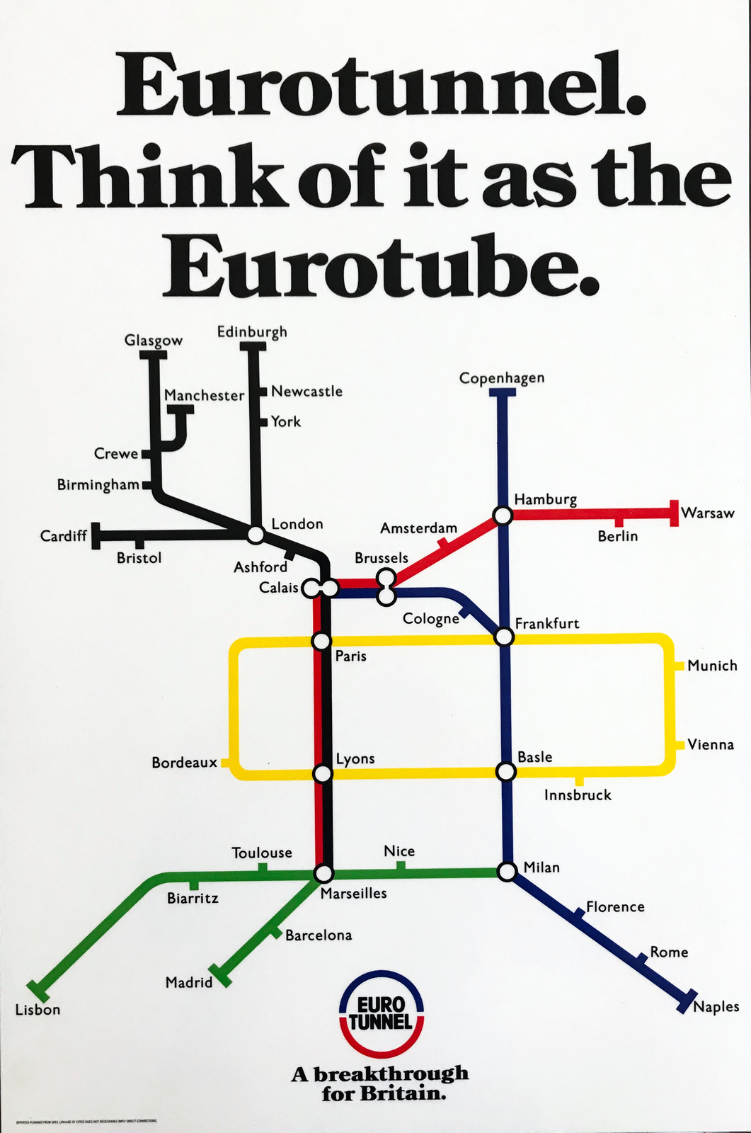
Eurotunnel. (1988. Art director John Foster.)
McDougall's. (1987. Art director John Foster.)
Condor. (1988. Art director John Foster, director Simon Delaney.)
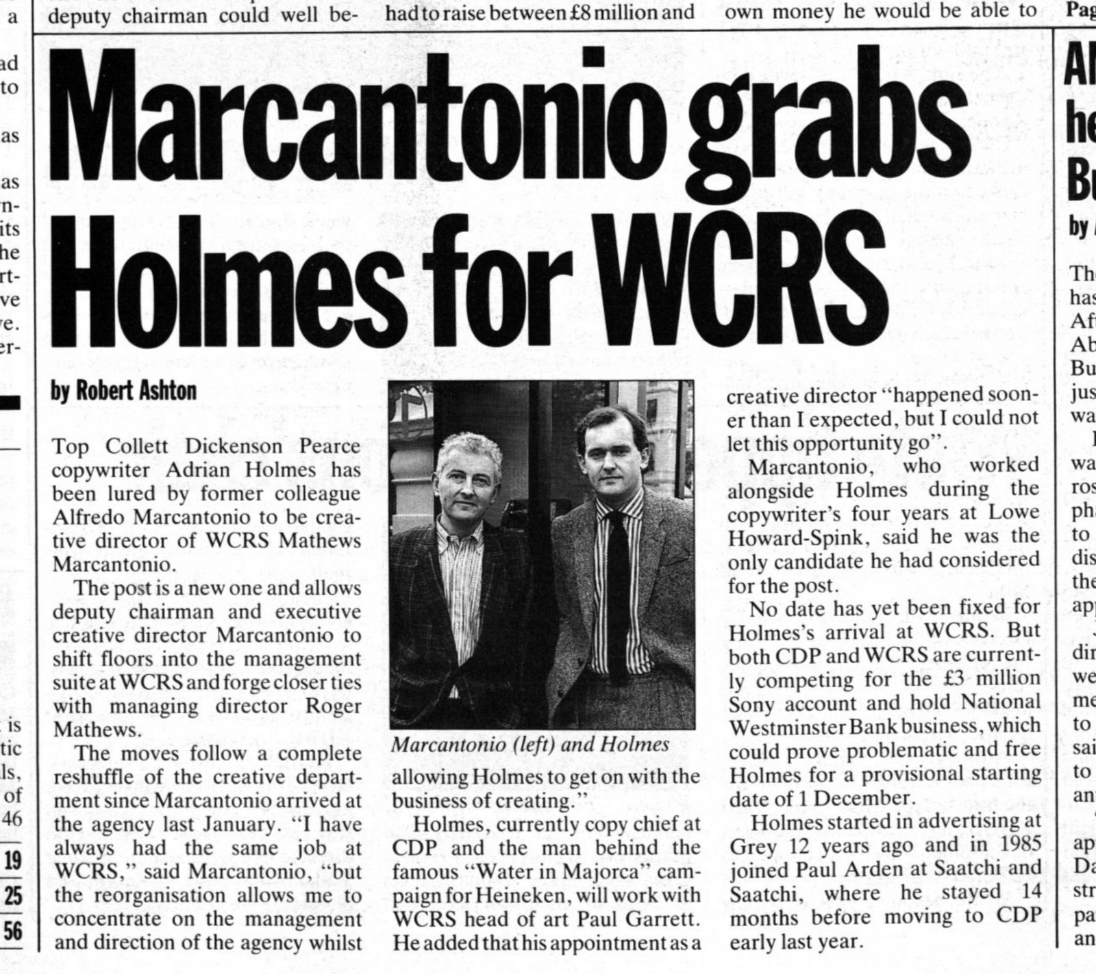
WCRS MATTHEWS/MARCANTONIO.
LOWE HOWARD-SPINK.Canon. (1991. Art director Rod Waskett.)
Melody. (1990. Art director John Foster, director Barry Myers.)
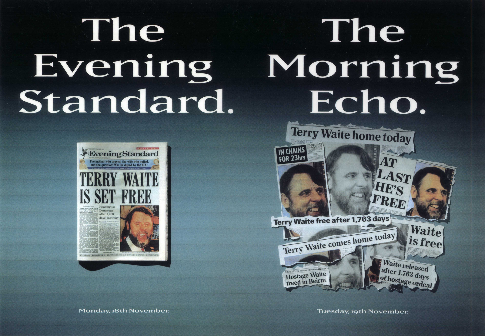
EveningStandard. (1991. Art director Rod Waskett.)
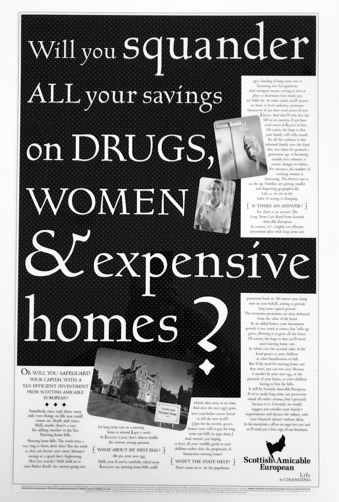
Scottish Amicable. (1995. Art director Steve Dunn.)
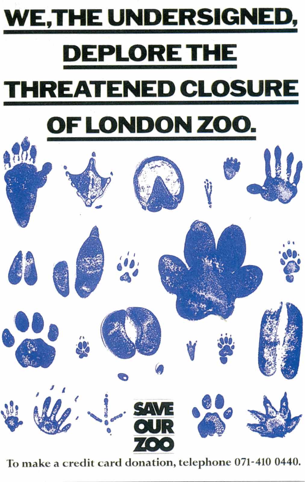
London Zoo. (1991. Art director Rod Waskett.)
OMO. 'Dirt Is Good'. (2003. Art director Dave Christensen, director Gregor Nicholas.)
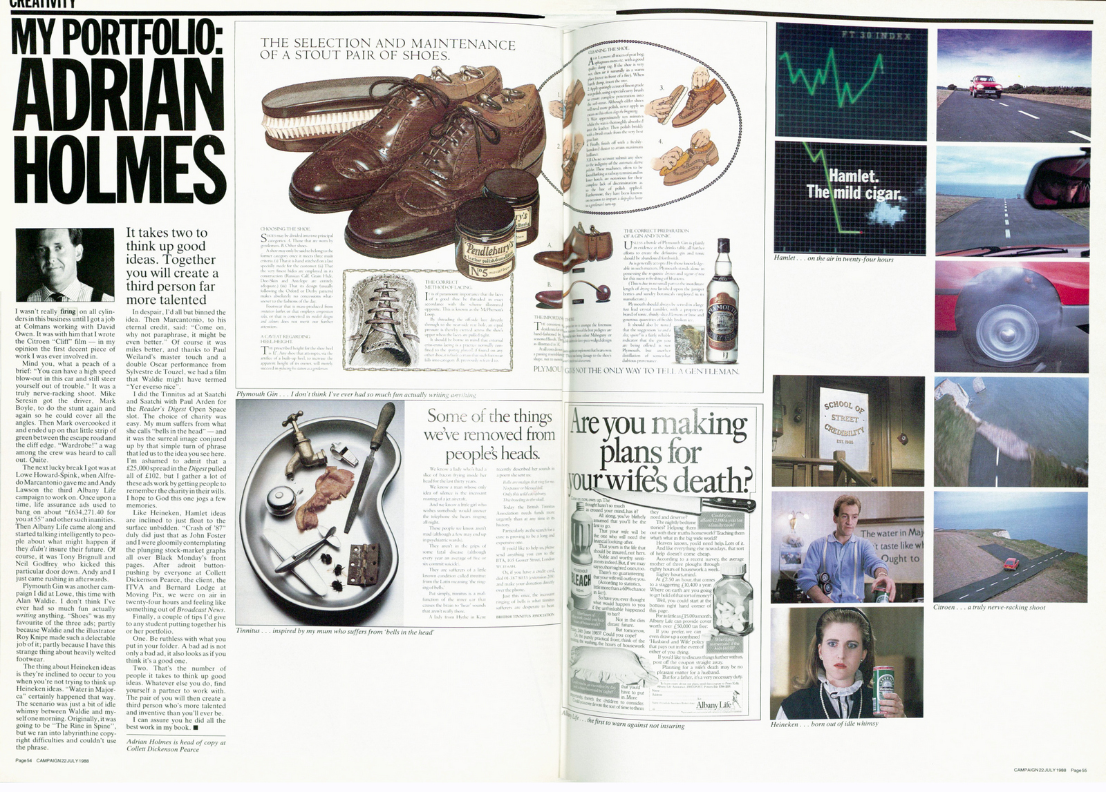
ARTICLES.Campaign.
D&AD Copy Book.
D&AD Annual, 1994.
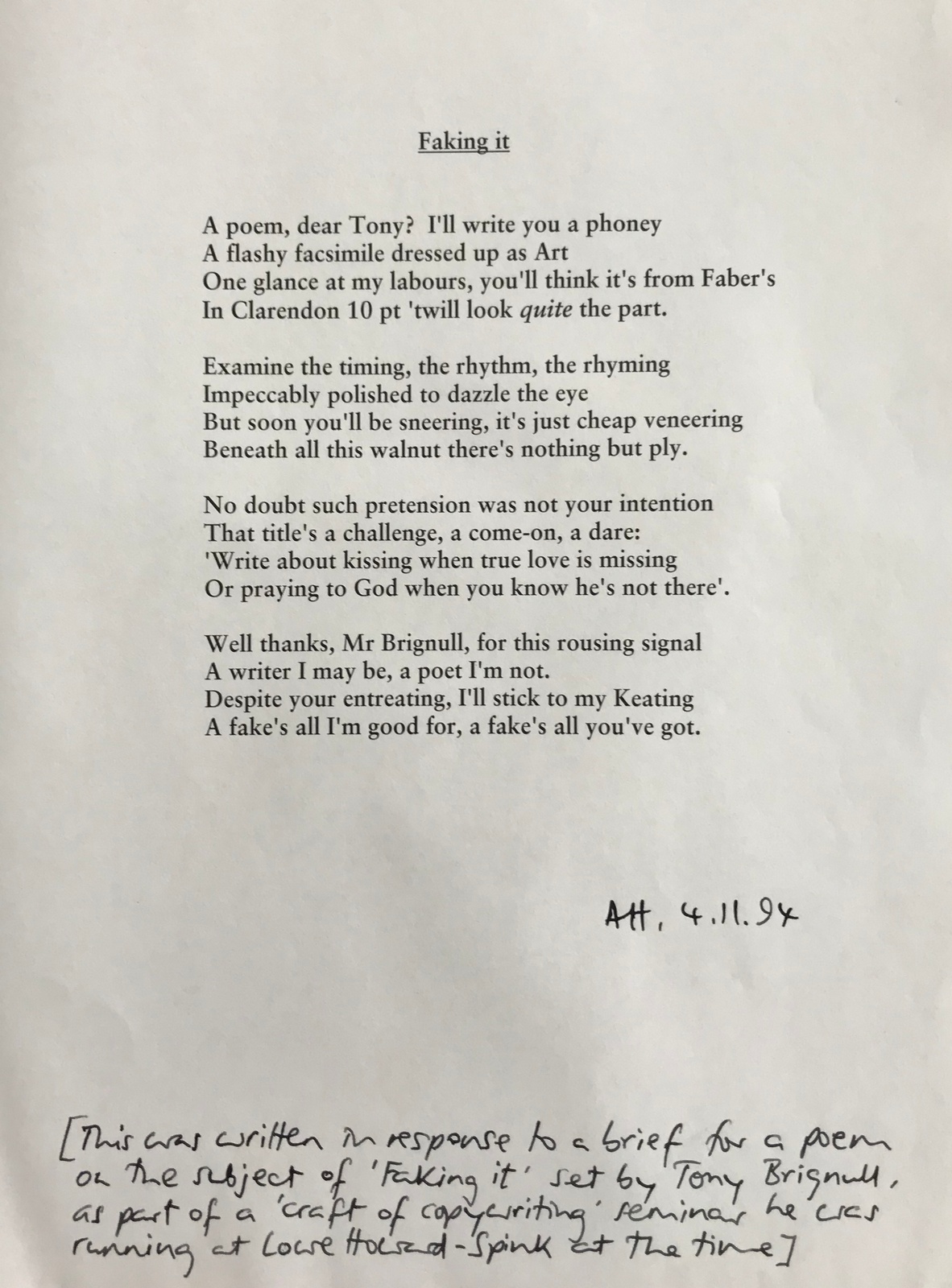
Poem I wrote in response to a brief set at one of Tony Brignull’s copywriting seminars, held at Lowe Howard-Spink in Nov 1994.
Unilever Interview.
Control Magazine.
Speech To Conference.
‘‘Alright fatty, what you after?”How do you react?I'm guessing it would taint your opinion of that particular bookshop, making you less inclined to buy.Nobody likes being disrespected or patronised.What about if that bookshop owner had said “Oh, just to let you know; the new Proust collection is just in”.Sure, you'd look behind you to check that they were talking to you, but you couldn’t help but be pleased that they’d presumed you were intelligent.It may even make you more inclined to go back. (It would me.)But, since it wore small pants, advertising has talked at people as if they're dumb.Why?There's no evidence that talking down to people is some kind of magic selling bullet.Yesterday I walked the length of the platform in Archway tube station, studying the endless parade of 16 and 48 sheet posters, by the end I couldn’t help wondering why they all looked so trashy.They seem to have had the same production budget as the direct mail that I sweep from my doormat every morning, so, not surprisingly, shared a similar vibe.Each dominated by big words, (in the brand colour).Each written to the same brief: ‘We’re awesome!’.Each featuring a cut-out product shot the size of a small car. (Generally on the right.)Then; words, words, words, everywhere.Visually, this gives the impression of afterthoughts, a kind of ‘Oh yeah, before you go, we've just remembered; we’ve got 4% off until June…AND…hang on, we're not finished; We've just opened our 57th store…in Croydon…it's open ‘til 8 Sundays…'.The net affect of this says to its audience 'we can’t be arsed, you’re not worth it’.We can’t be arsed to distil our thinking.To figure out why it’s relevant to you.To say it succinctly.To say it in a way that you may enjoy.To make it look nice.And we certainly can’t risk giving you the truth; YOU CAN'T HANDLE THE TRUTH!It's disrespectful.Why does that make sense?If you're asking people to give you their attention at least have the decency to give them something in return. Useful information, a fresh point of view, an observation on their life, a smile or even just something nice to look at, but give them something, throw them a frickin’ bone.By contrast, these New Yorker ads seem to assume, rightly, that their audience is smart. Just looking at them makes you feel more intelligent.If you're trying to win someone over, to sell them something, it helps if they feel that you respect them.Once, in a Mercedes meeting with Peter Mead, the client wondered whether the ads were too clever for their audience.Peter said he’d been in a similar meeting 20 years earlier.In that instance the client had said "I like the ads, but, most of my customers are more likely to be chip shop owners than executives like me, maybe the ads are just too clever?".Peter replied "In my experience, chip shop owners don’t mind being talked to as if they’re executives, but executives don’t like being talked to as if they’re chip shop owners".(Apologies to any chip shop owners out there who may find that quote offensive…apologies on behalf of Peter.)[contact-form][contact-field label="Name" type="name" required="true" /][contact-field label="Email" type="email" required="true" /][contact-field label="Website" type="url" /][contact-field label="Message" type="textarea" /][/contact-form]


"Hey Dave, I’ve got something you might want to share on your blog.It’s 30 minutes of David Abbott pitching the famous BT Bob Hoskins campaign, direct to camera, apparently for some BT big-wigs who missed the original presentation.Not only is it a lovely piece of advertising history, it’s also a masterclass for any creative about to step into pitching.I found it when I was at AMV and had to present a re-pitch for the entire BT account. Frankly I was shitting myself, and I can’t tell you how much this helped.You’re watching probably the world’s greatest copywriter, presenting what became one of the era’s best-loved campaigns, to what was then Britain’s biggest client.No fuss, no gimmicks, no mega-bucks mood-films. Not even that many executions of the ads.I love the quiet authority and the modesty that almost completely disguises the salesmanship laced all the way through.Anyway, it’s been sitting in my bottom drawer for over a decade. I’ve no idea if any other copies have survived, so hopefully this one can become another lasting tribute to the great man.Cheers,Markham."
Thanks for lugging this DVD around for a decade Markham, and thanks for sending it to me, I wouldn't mind betting that AMV/BBDO don't even have a copy of this.This was my favourite from the campaign that followed.
P.s. A big thanks to the good folks at Tenthree, they kindly converted the DVD from some antiquated, last century format into the splendour that you see before you today.
These ads from 1960's copies of The New Yorker are weird.They’re just so, well, New Yorker ads from the sixties.As evocative of their era as a Blockbuster membership cards and the sound of fax machines were of theirs.That’s not a criticism, some are great.But it’s striking just how different they feel.So different that it got me thinking why and what unifies them?1: $’s.Look at the ads and you’ll notice that they have all the corners; none have been cut.In the sixties, millions of people bought the New Yorker every week, so it would cost a King’s ransom to buy a single page.As a rule of thumb, 15% of the media cost is allocated for production of the ad that will fill it.So if your media costs a King’s Ransom you’ll have a Prince’s Ransom to produce your idea.Some will say ‘A good idea can cost nothing’, and that’s true, you could produce a dozen Economist posters for the price of a small cappuccino.But having a wider range of options, not just red ink, will always improve your chances of creating something good.The options here include commissioning Avedon, Penn or Warhol for an image of Streisand, Hepburn or Fonda.Handy when you’re trying to interest people.2: ‘THE NEW PAGE.’It was the talk of Madison Avenue at the time.VW had done it, Avis had done it, art directors were desperately trying to find new ways dividing up their pages, so that people would recognise the page as theirs before spotting their logo.As a consequence, these layouts seem particularly varied.3: TIME.We can now produce ads hundreds of times faster than these ads were produced.Unfortunately, the human brain hasn’t kept pace with technology.The speed we have to work today can have benefits, it can stop us over thinking, gets our adrenalin flowing and those things can give our output a certain energy.But generally, if you have time to reflect, rewrite and rethink, the work will be better for it.4. INTELLIGENCE.Probably the thing that ties these ads together most is their tone; thoughtful and witty.It makes total sense; they’re from the New Yorker, a thoughtful, witty magazine.But as a subscriber to the New Yorker, I can tell you that those pages aren’t used that way by advertisers today.Which is a shame.It’s nice to feel that others think you’re intelligent and have a good sense of humour.Rather than a schmuck.5. WORDS.Boy, there’s a lot of them.We’ve got used to the idea that a good press ad is a poster; big visual, as few words as possible.That’s not the case here, the creatives know they're talking to readers, people who aren't scared of words, so they try to engage them with what they like; words.It makes total sense, it’s for the New Yorker reader.The 1960s New Yorker reader.Today's New Yorker ads don't appear to use the same tactic, I checked, although there were so few of them in the latest issue it’s difficult to be sure.Maybe the two things are linked?
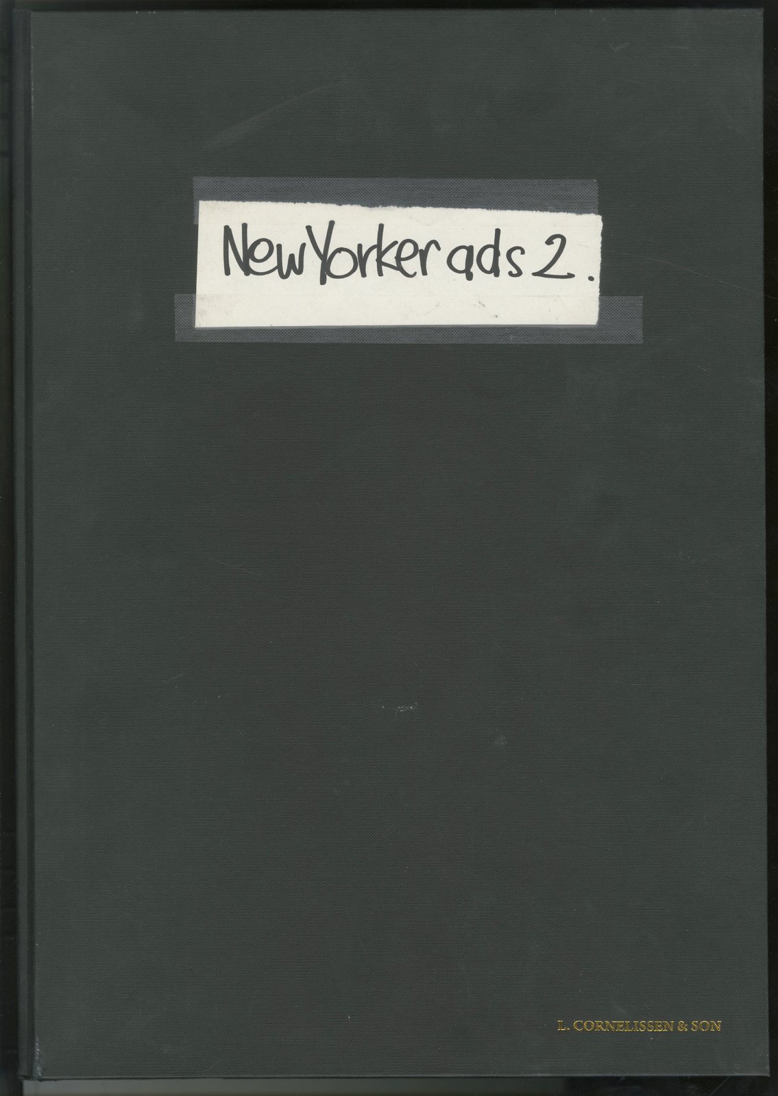
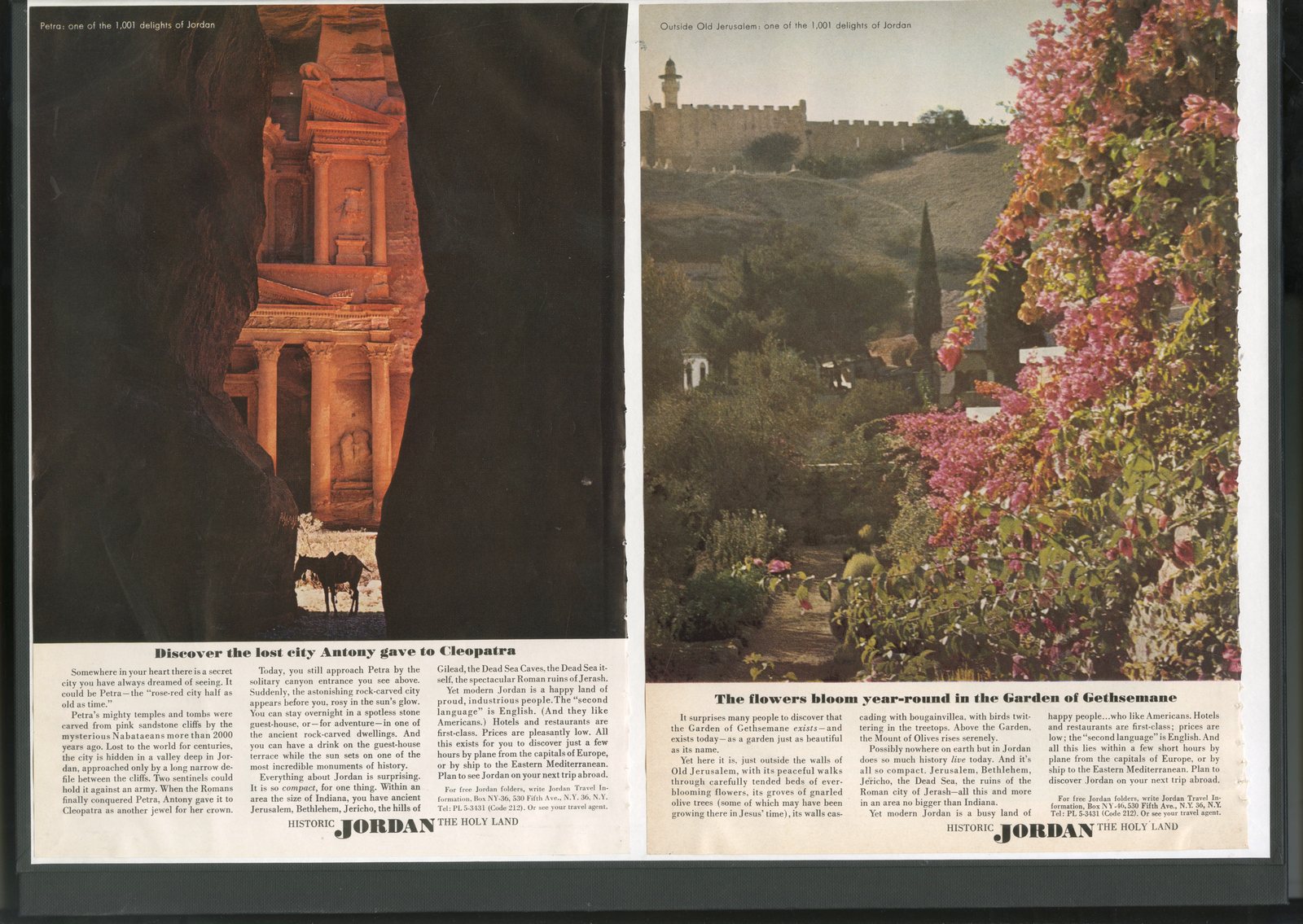

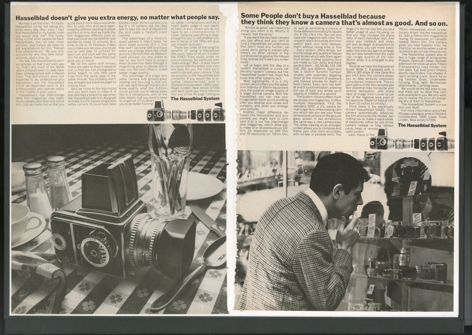
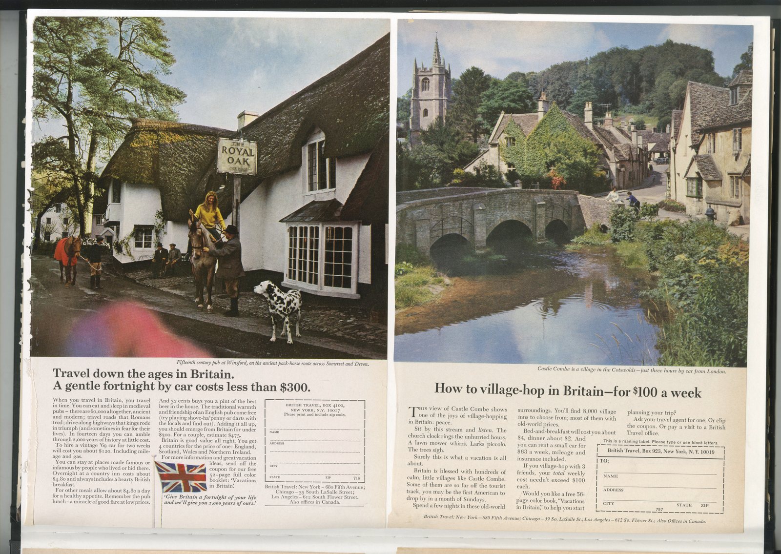
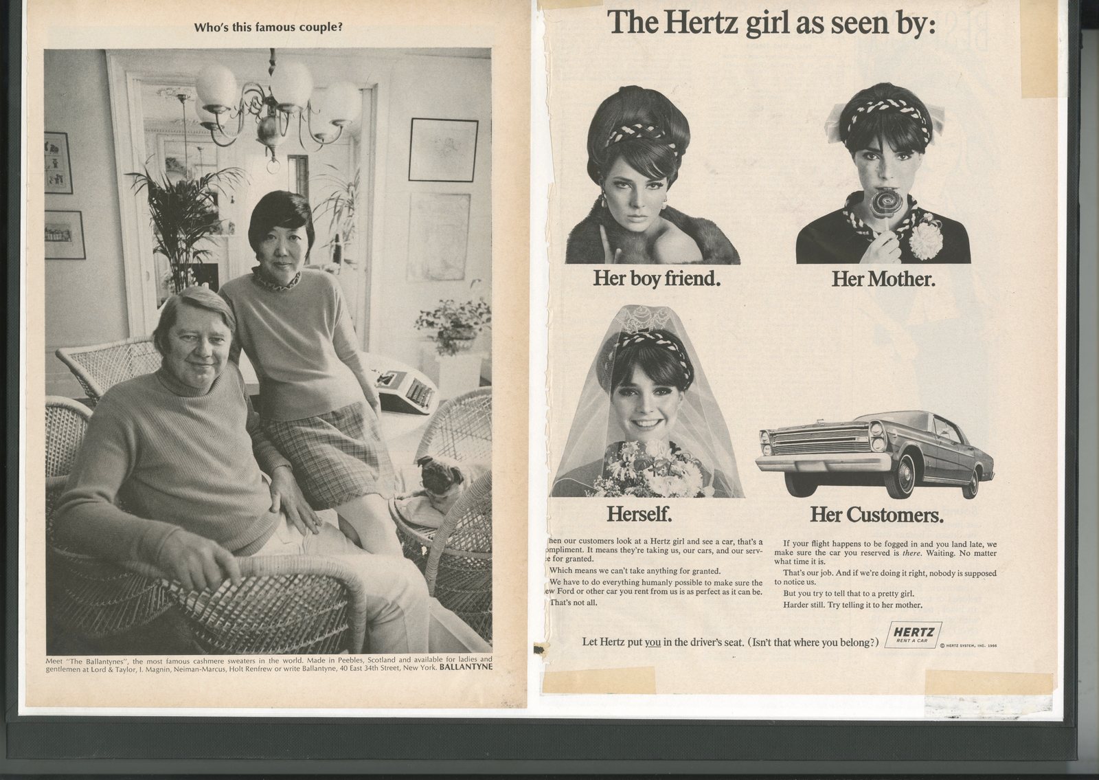
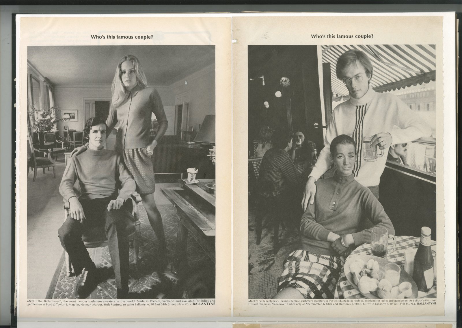


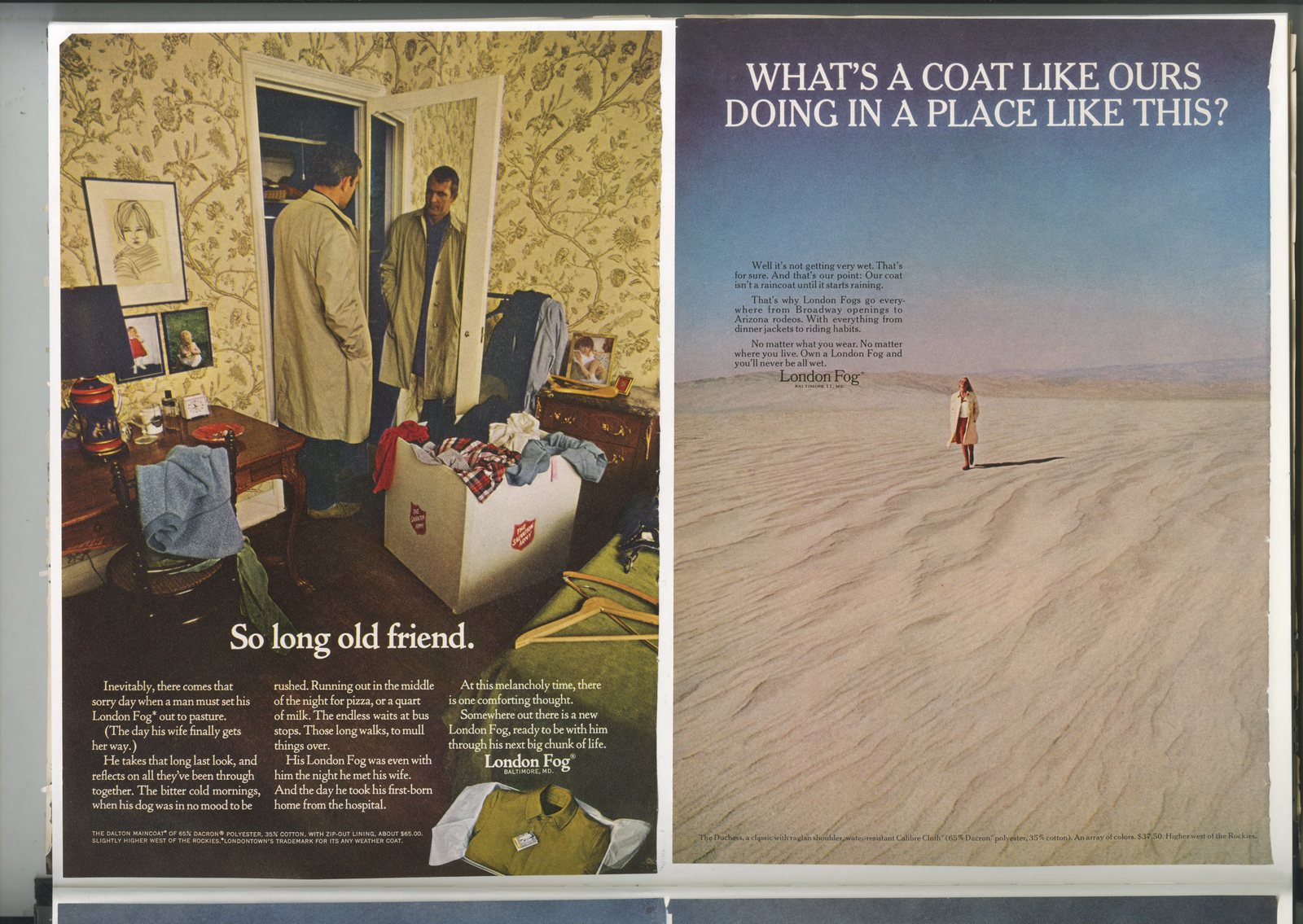
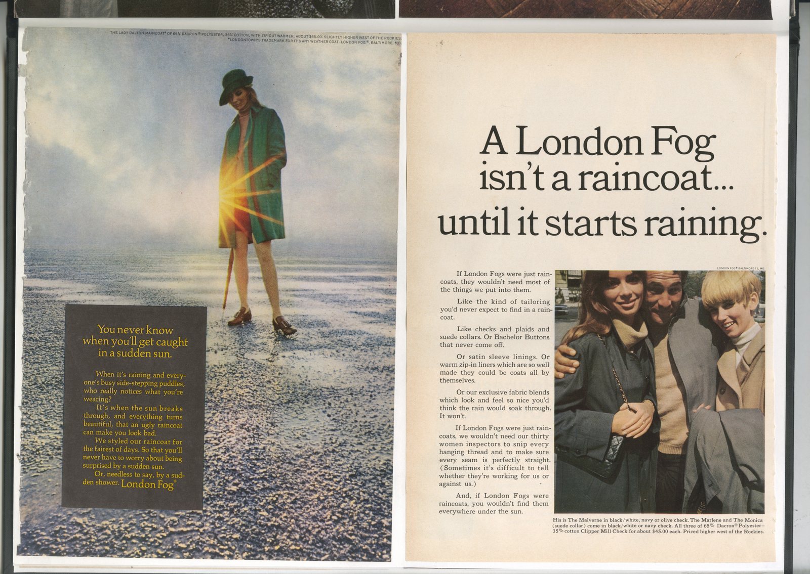
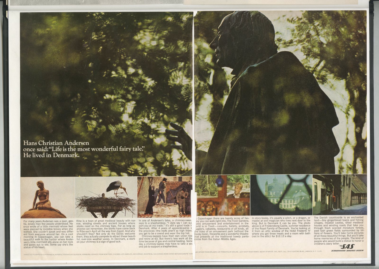
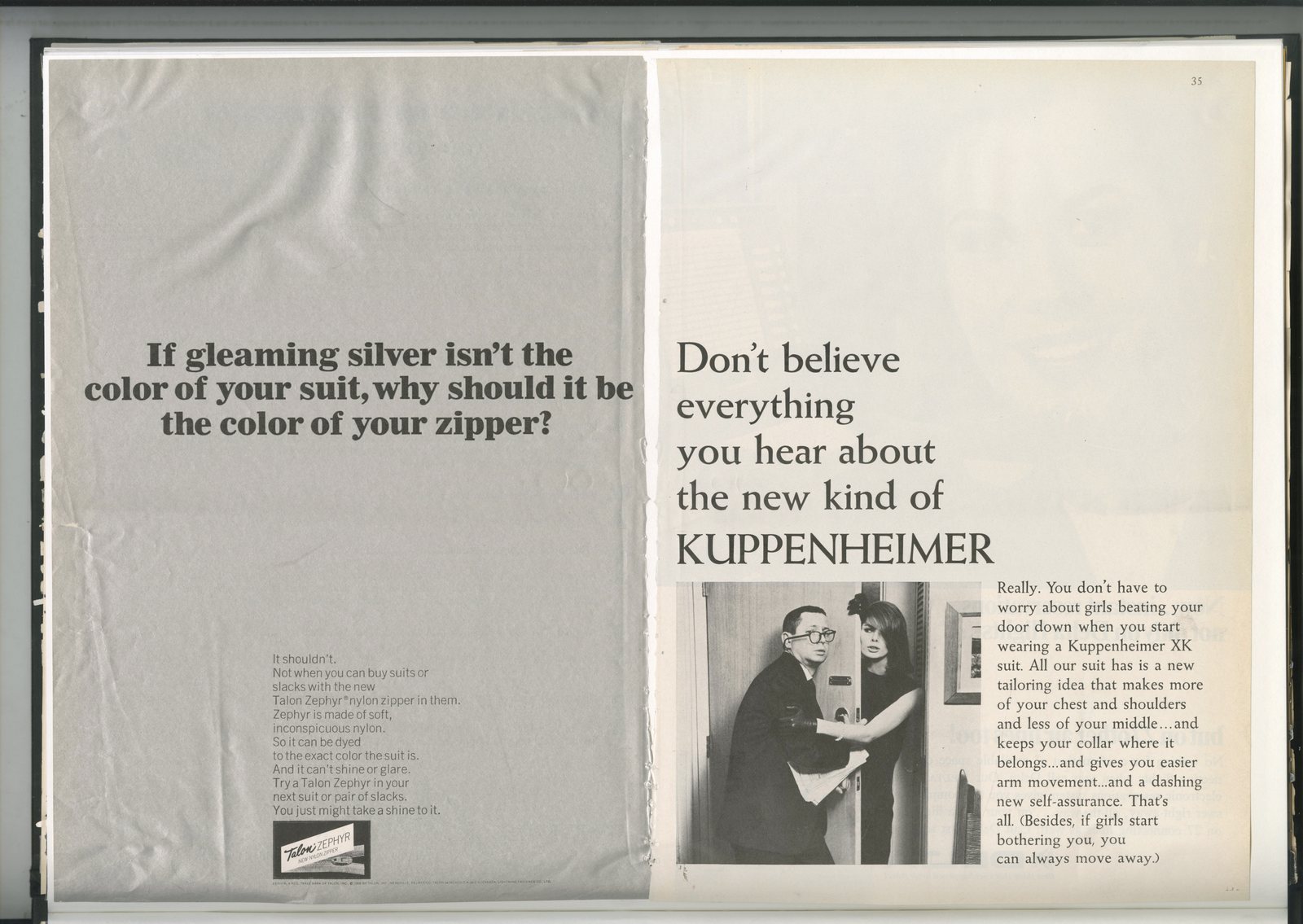
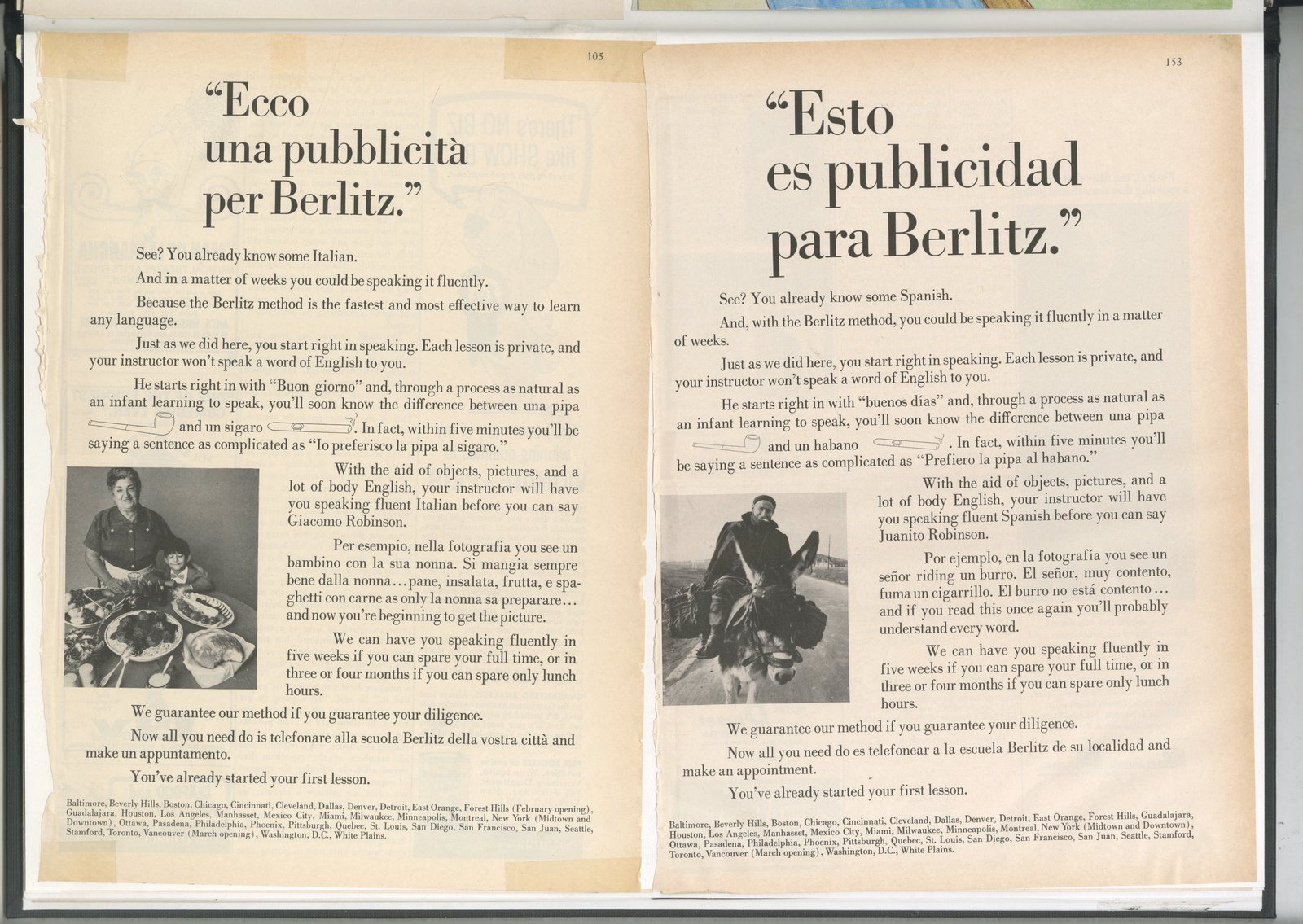

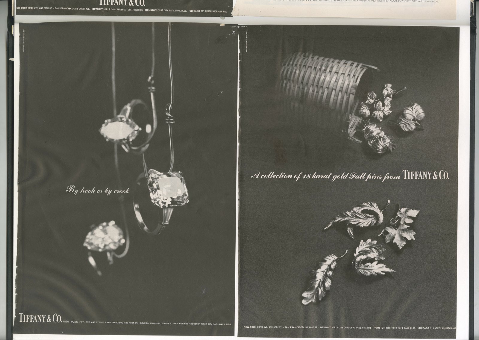
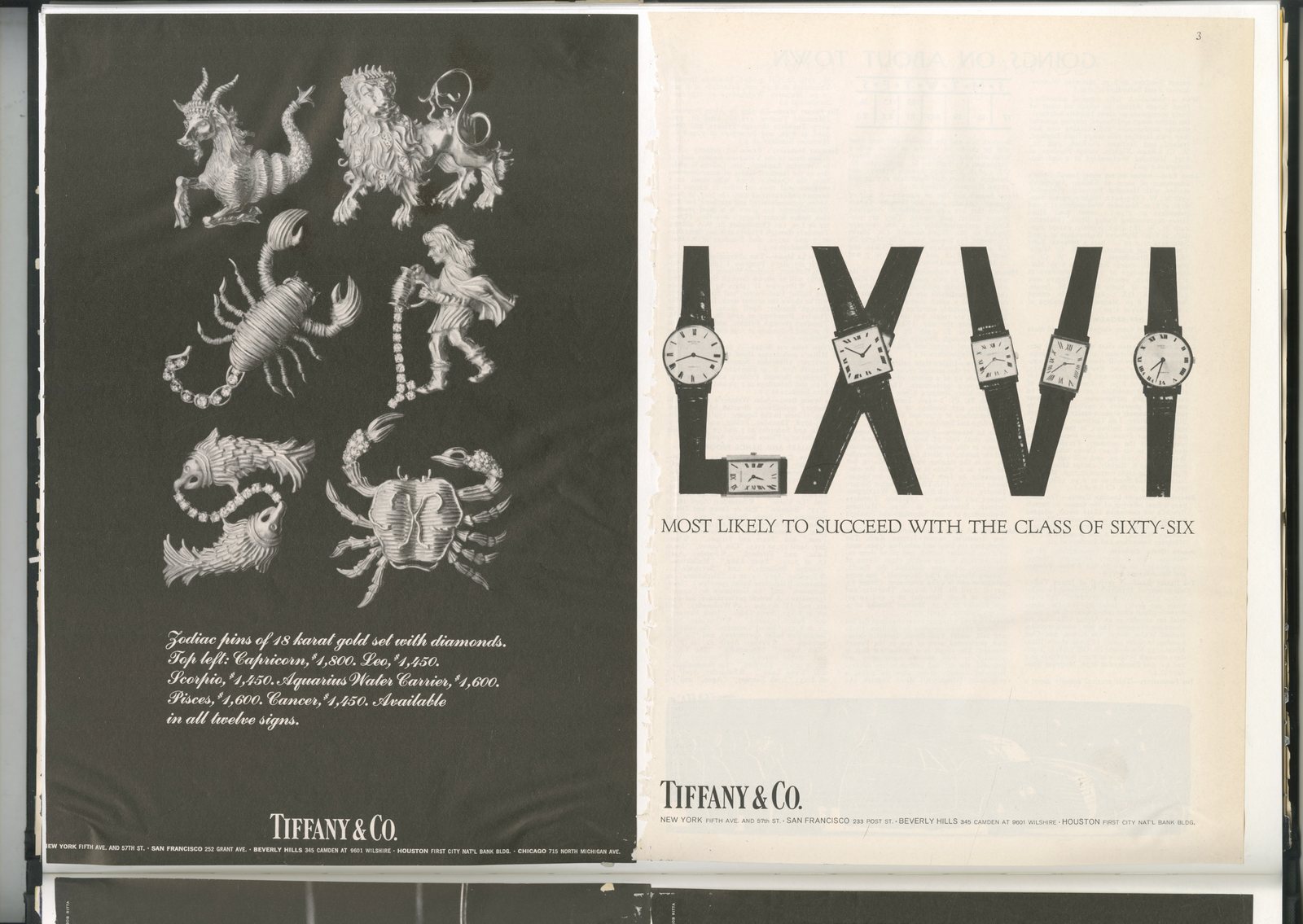
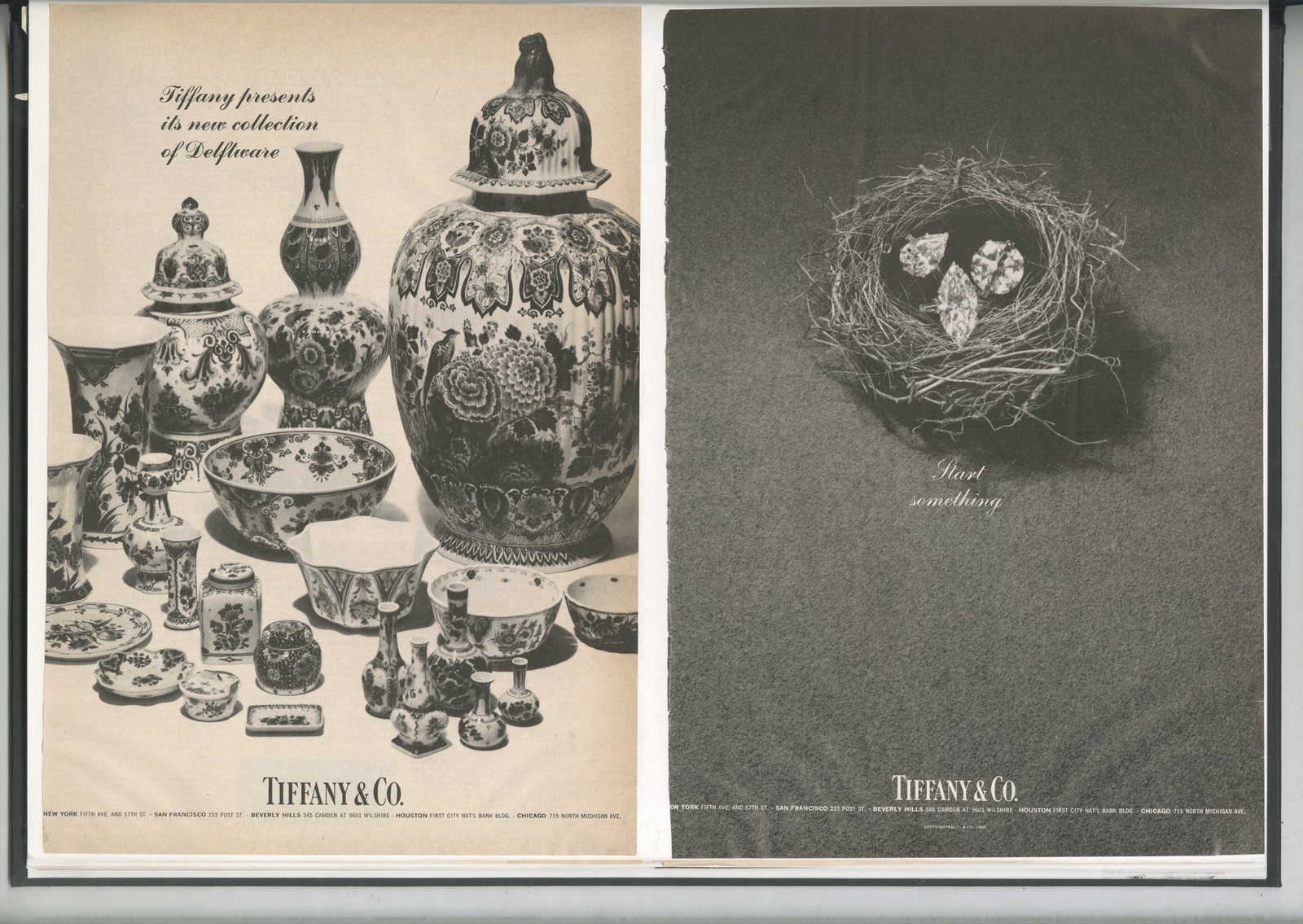
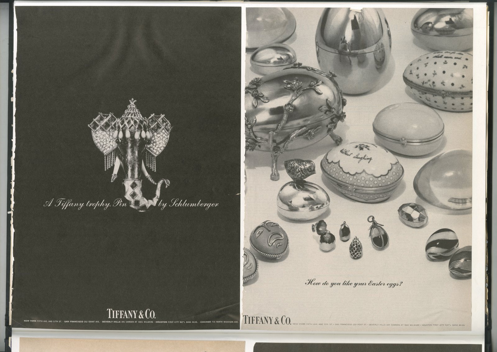
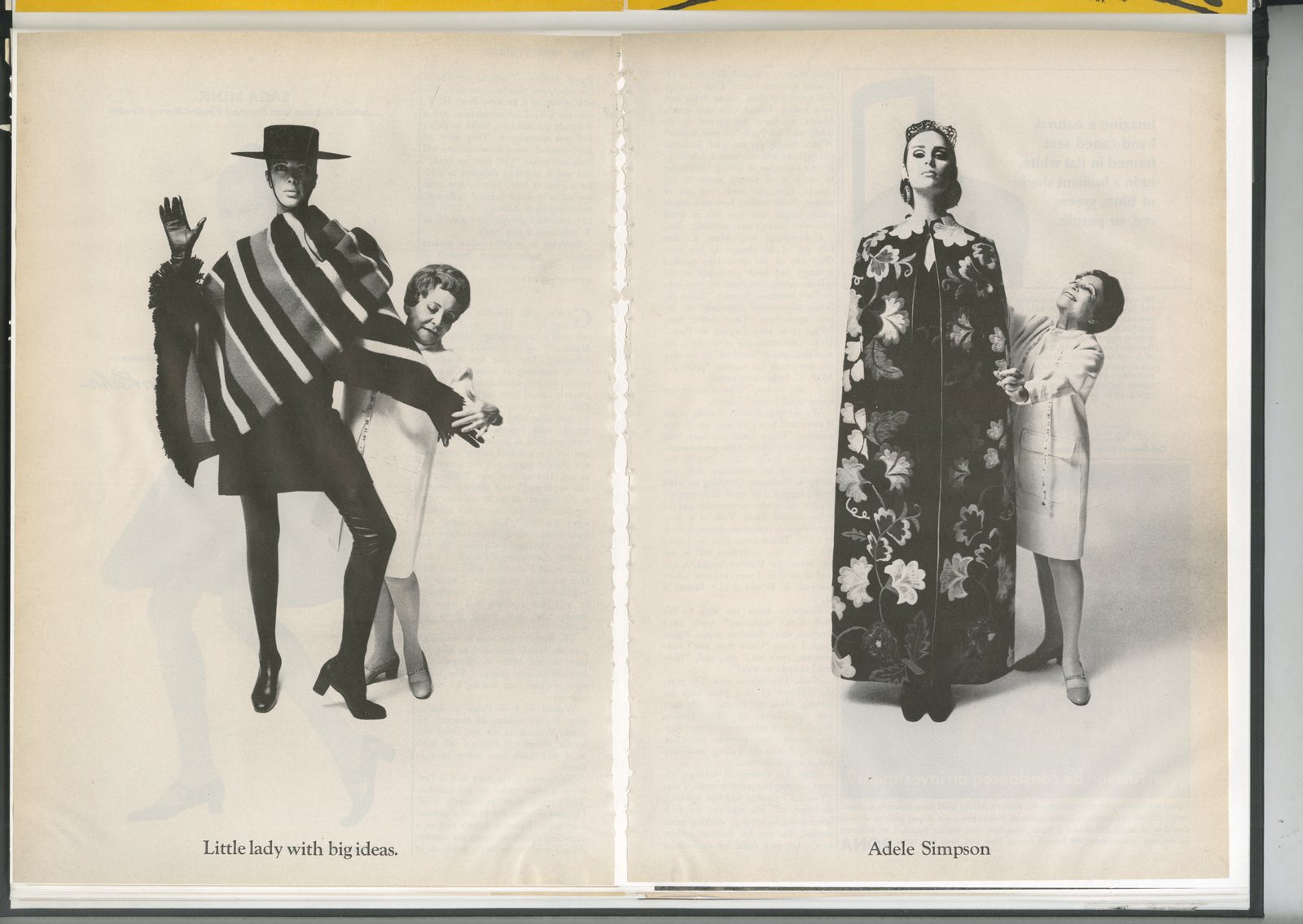
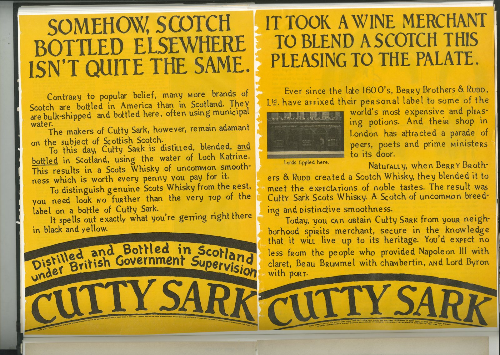

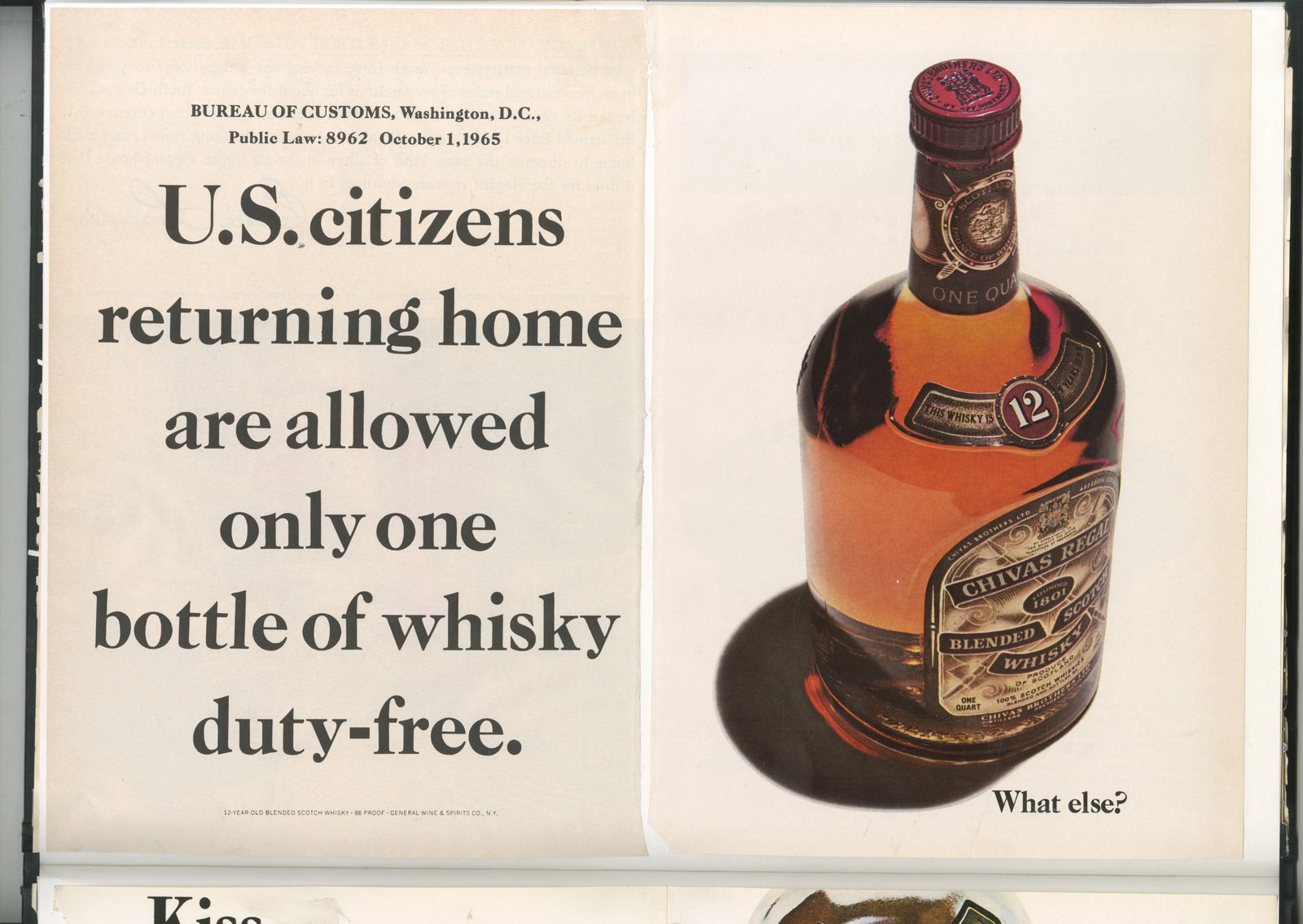
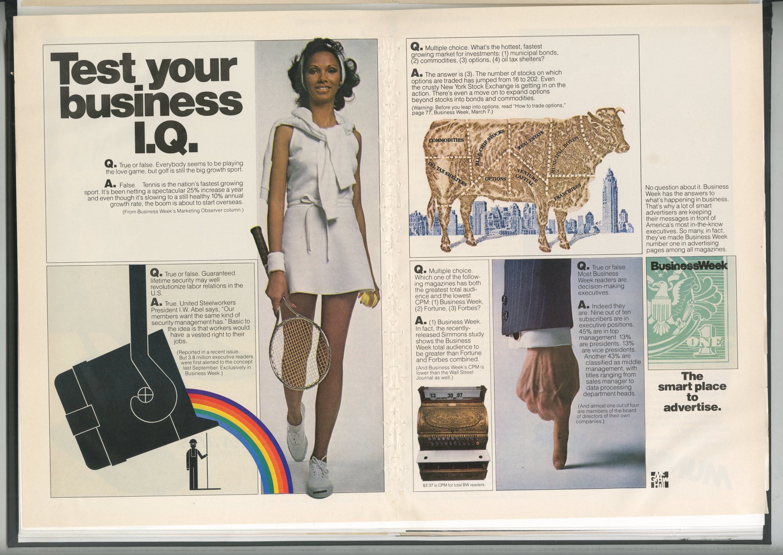


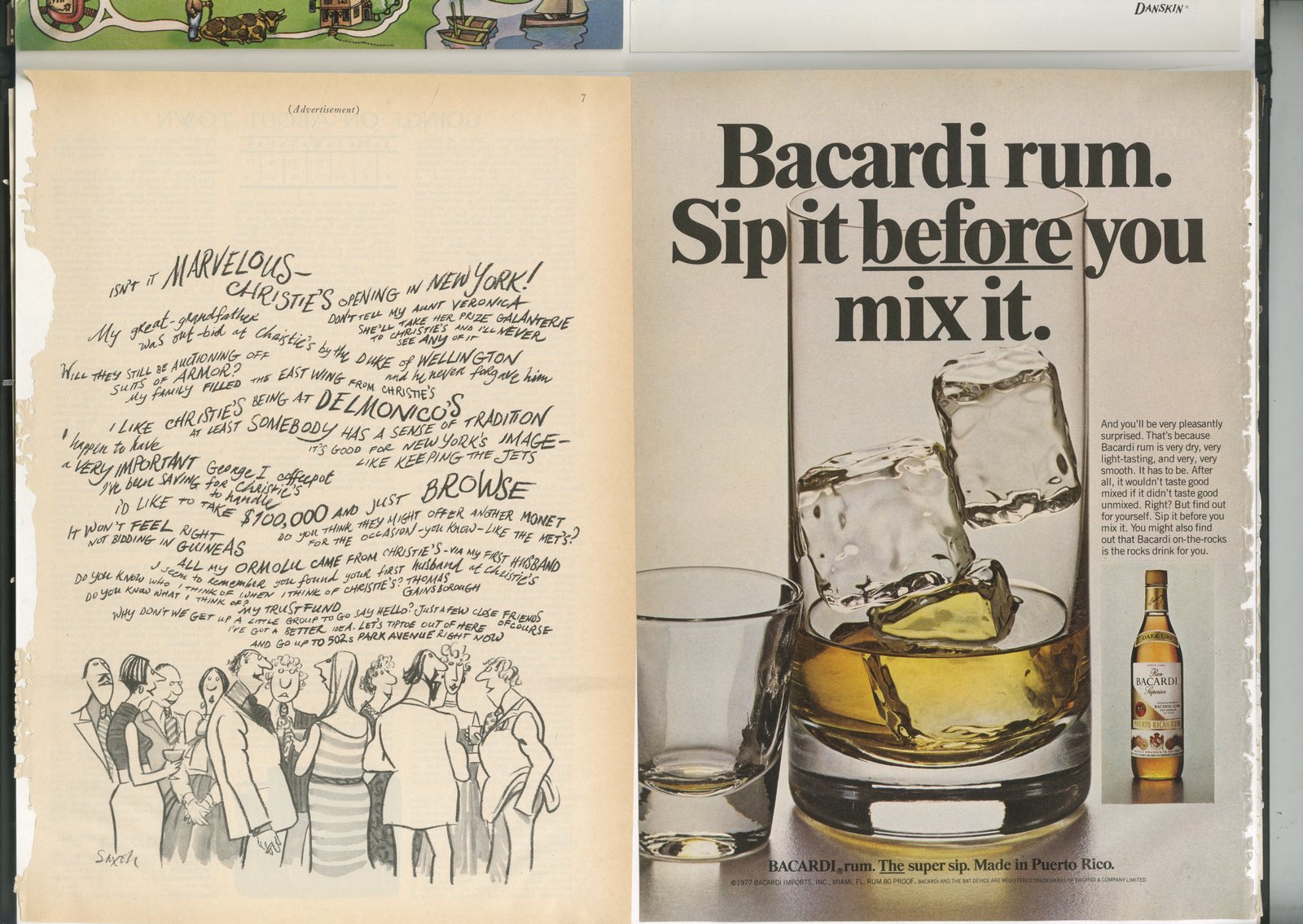
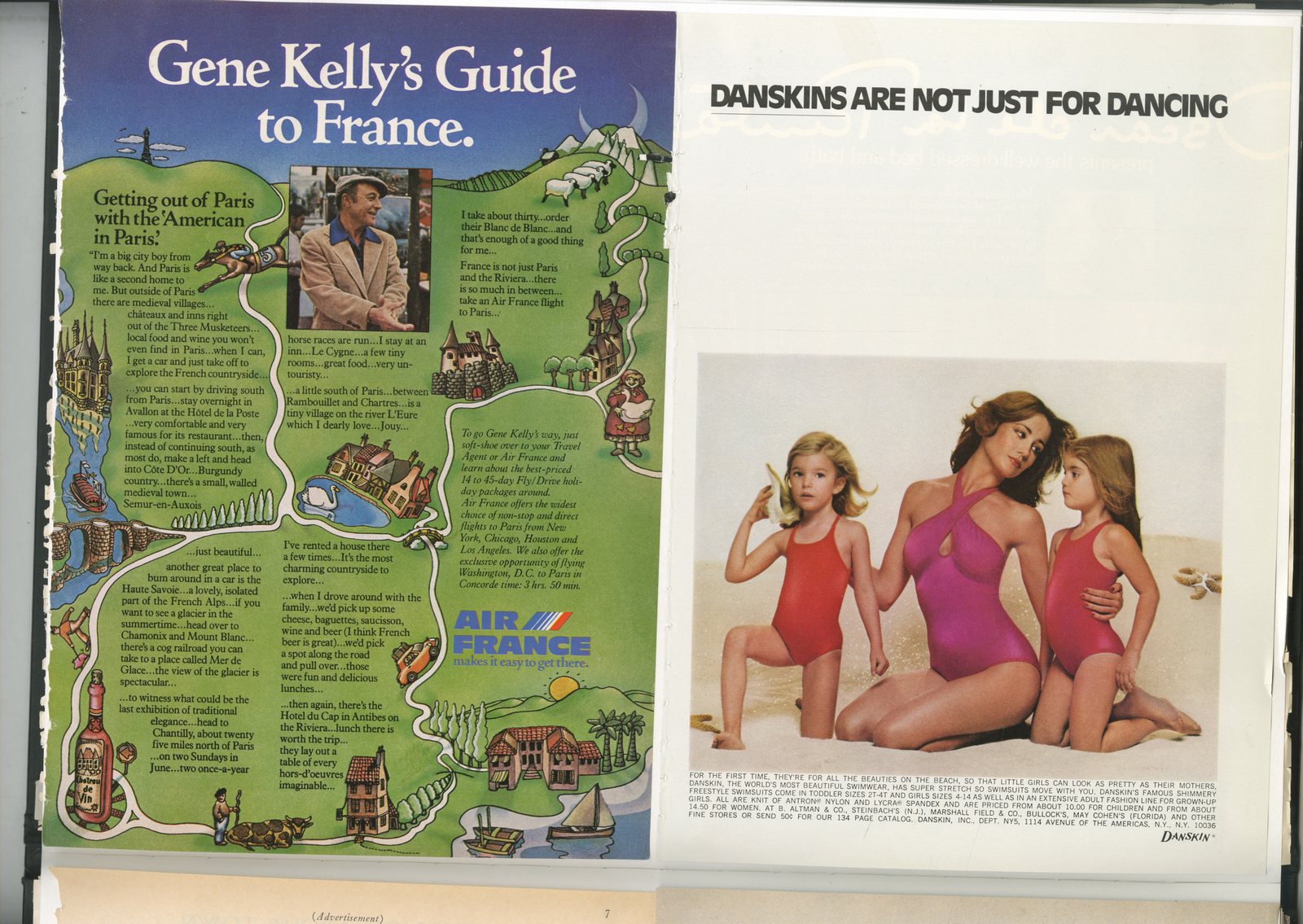
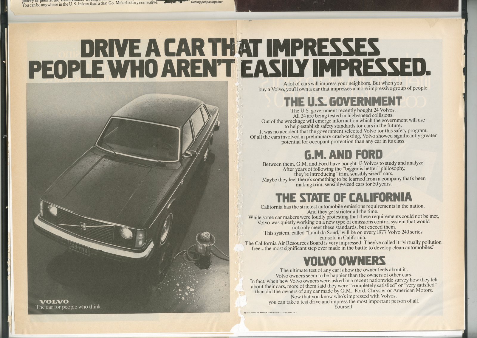
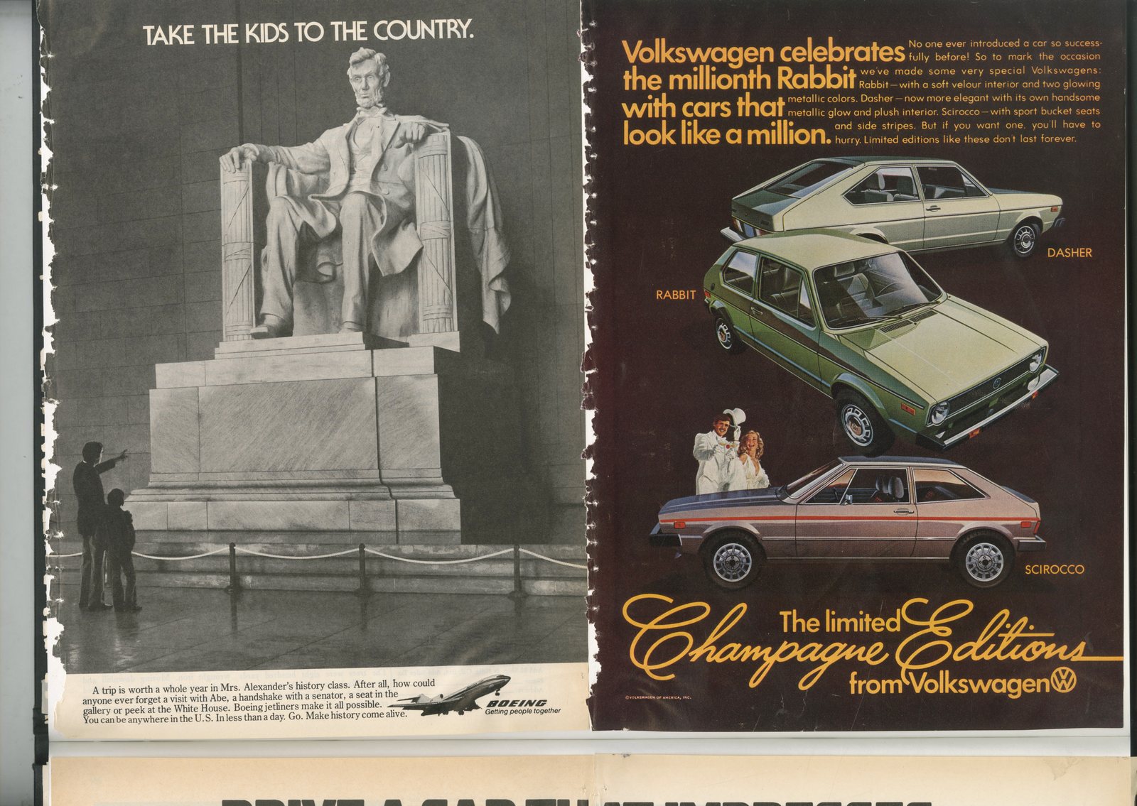
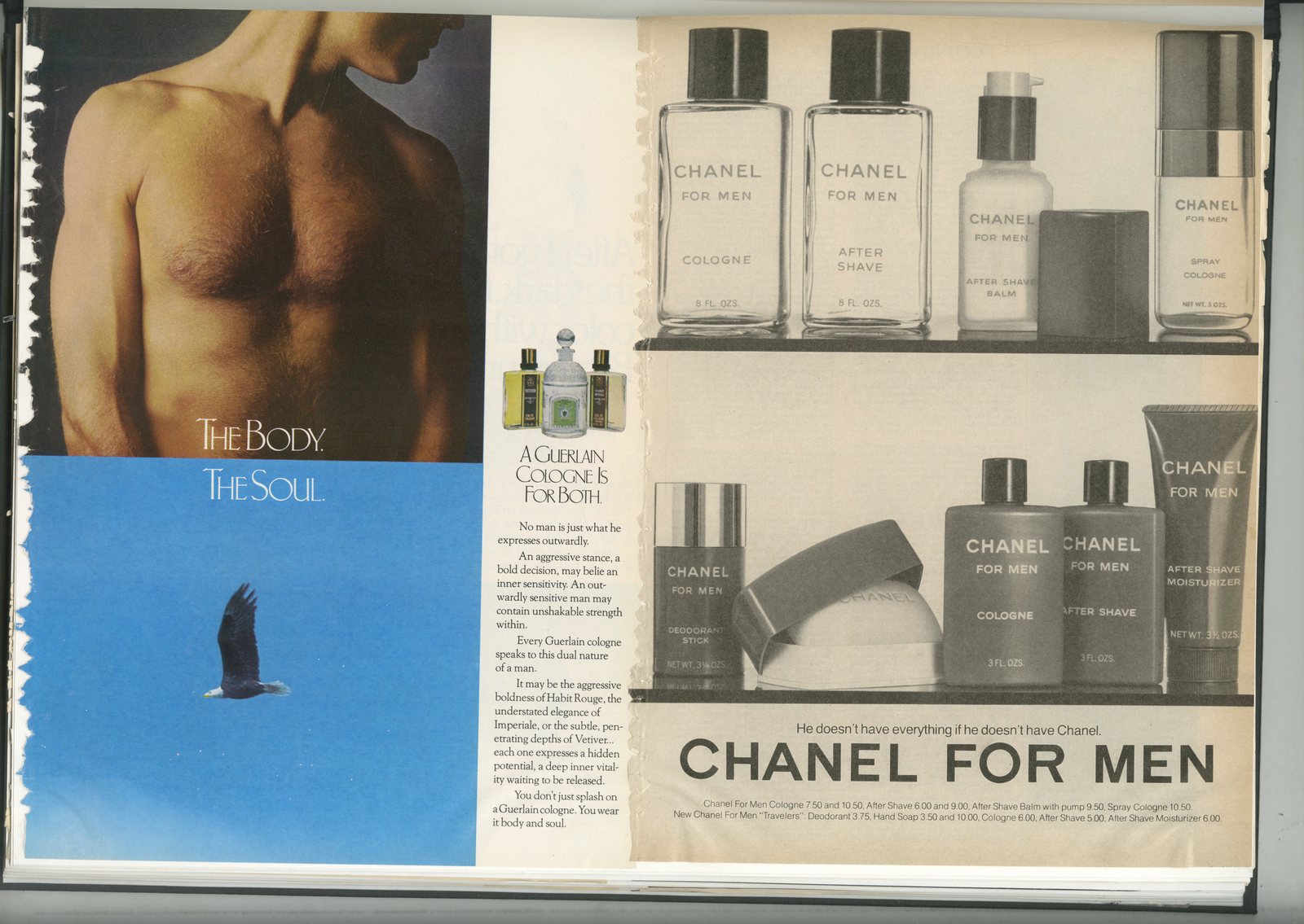


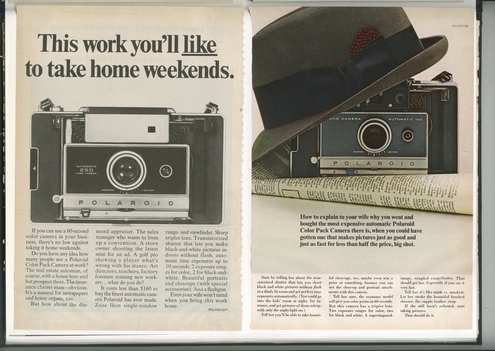
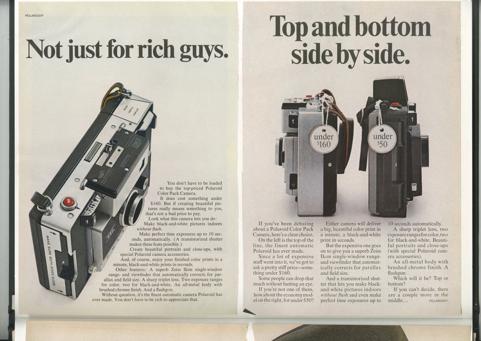
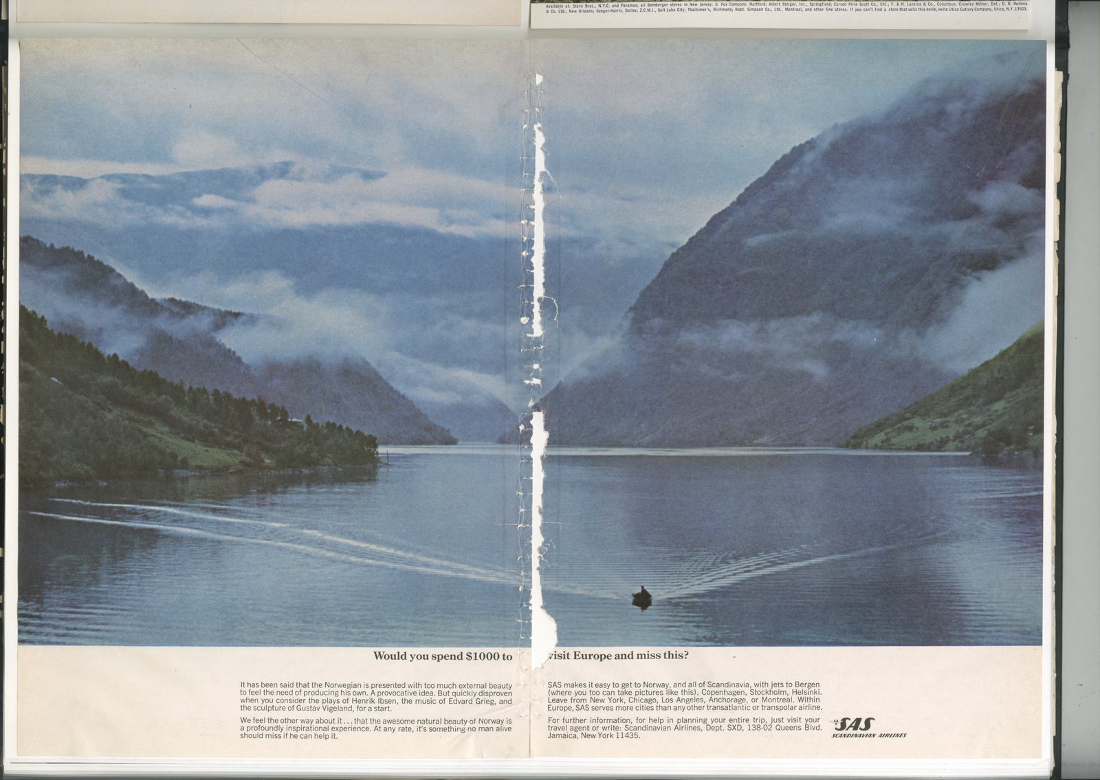

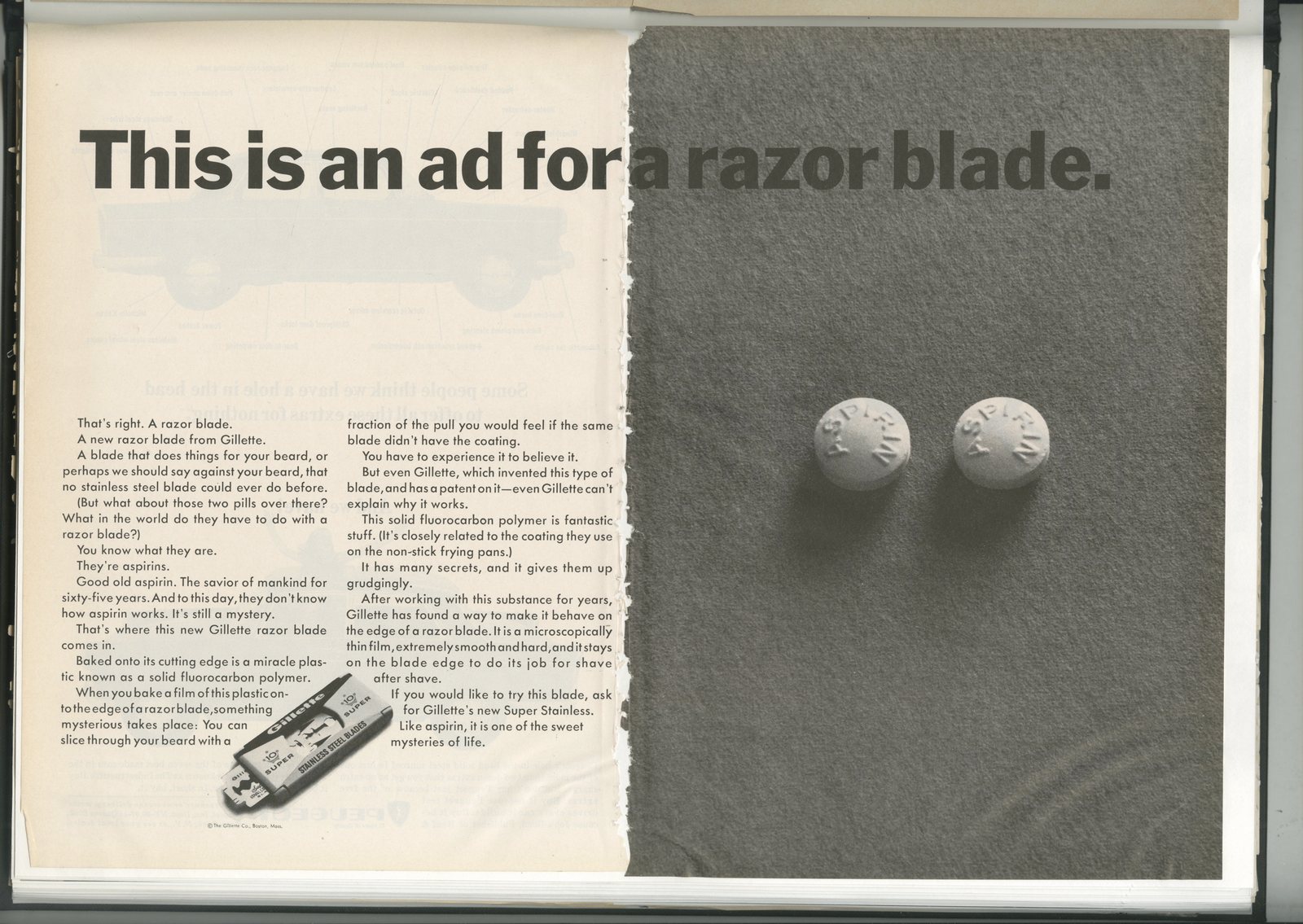

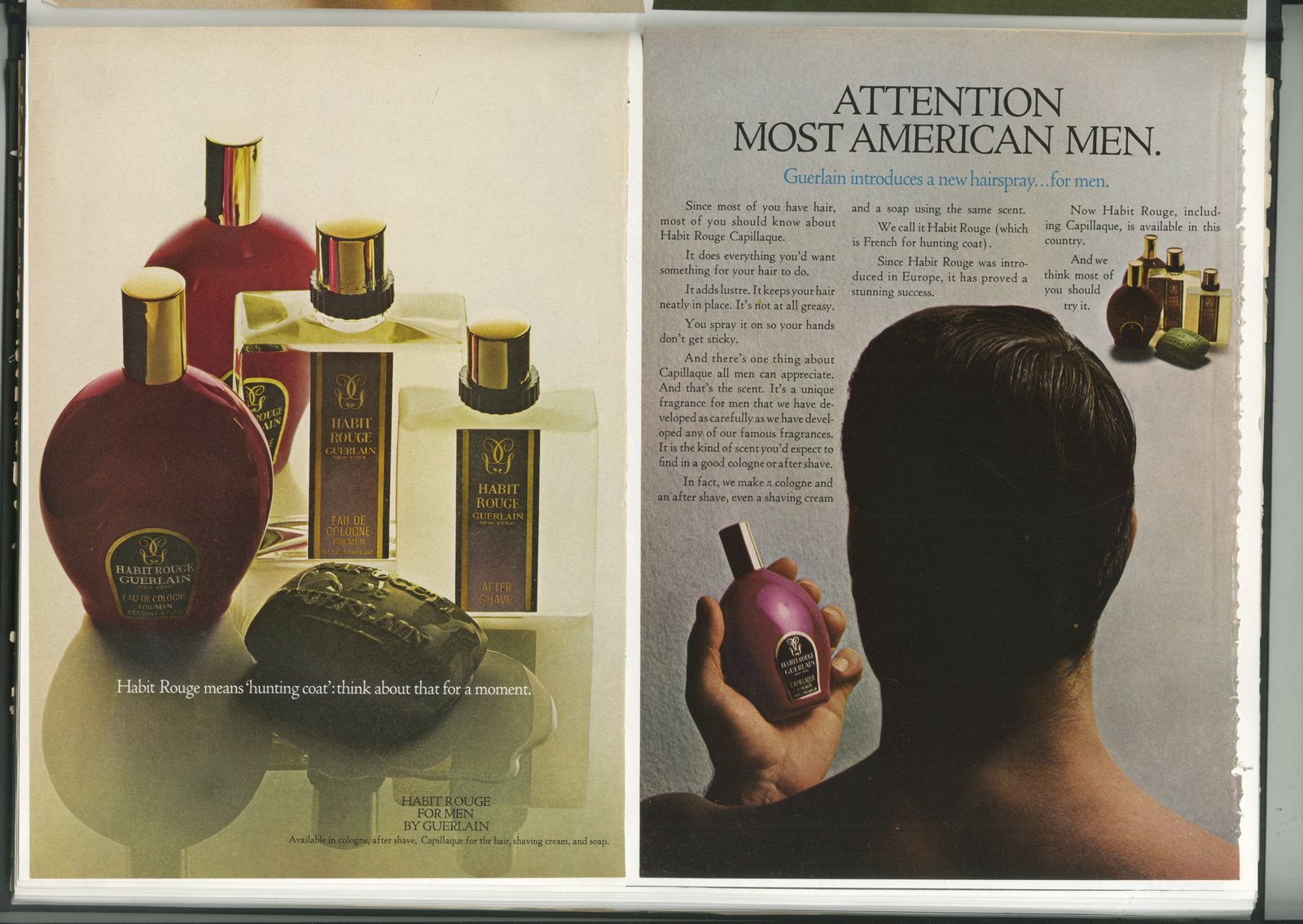
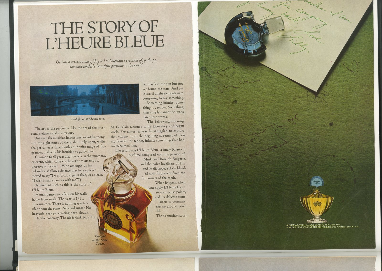
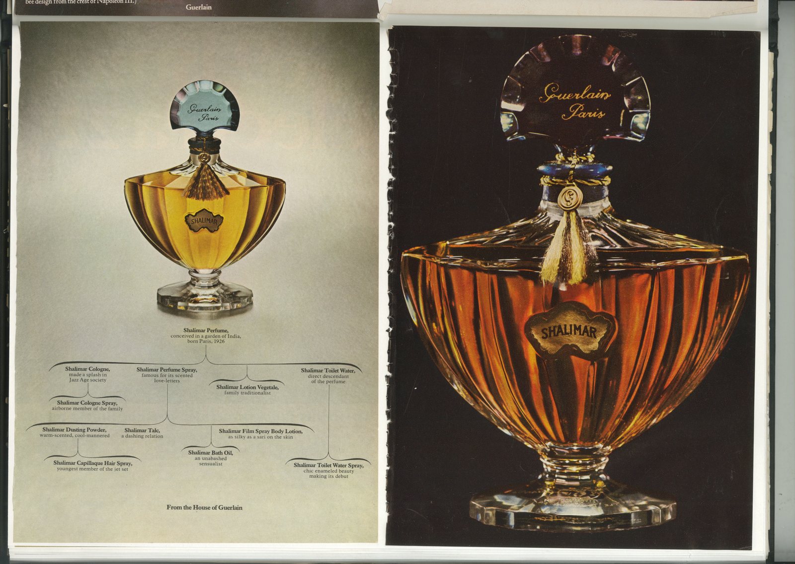


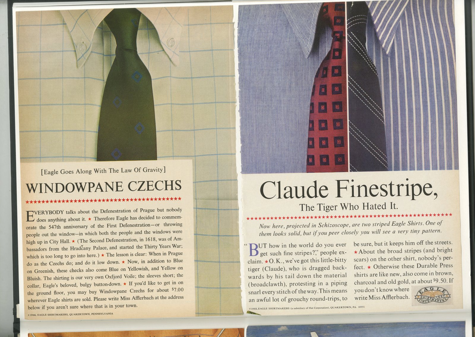
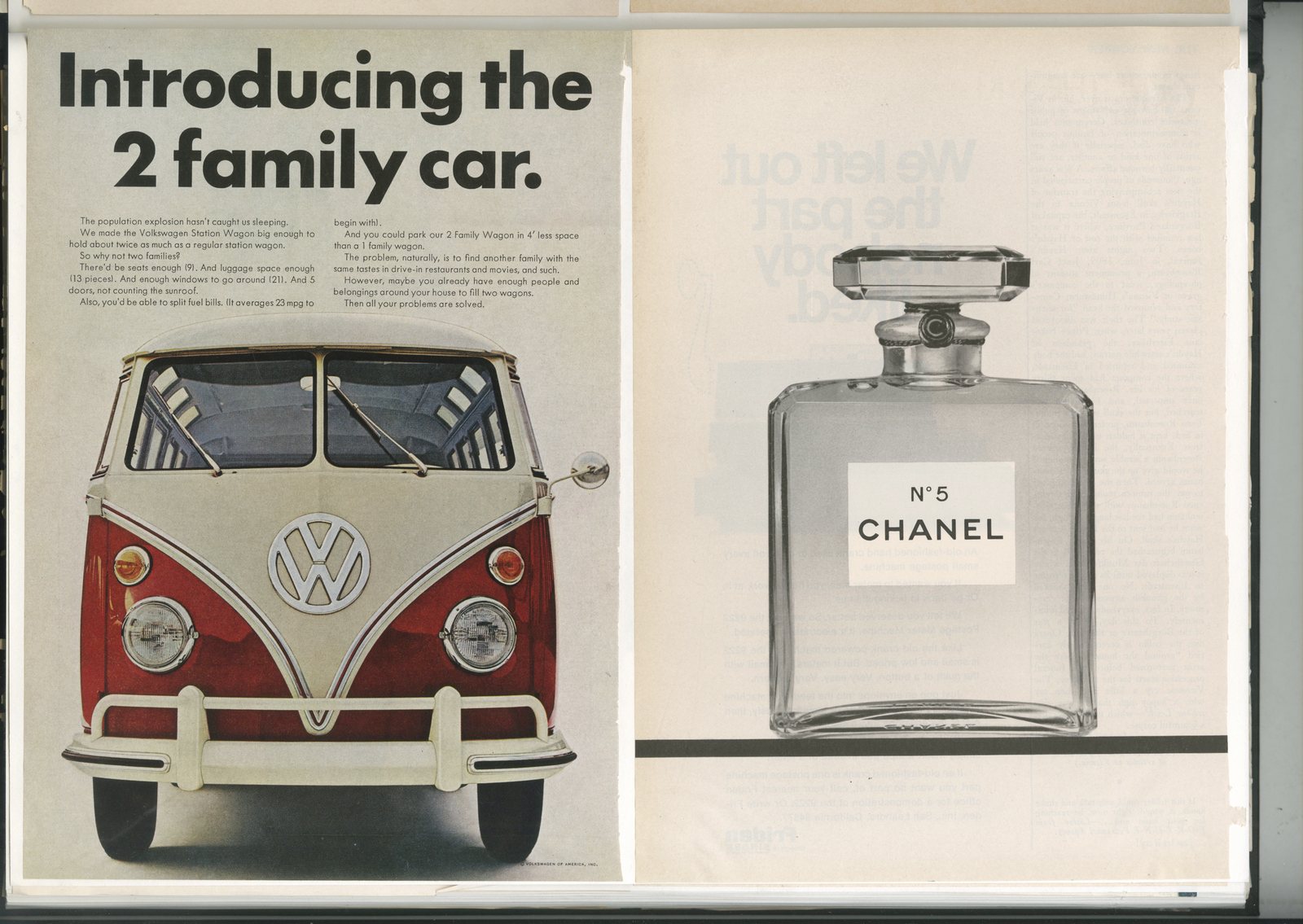


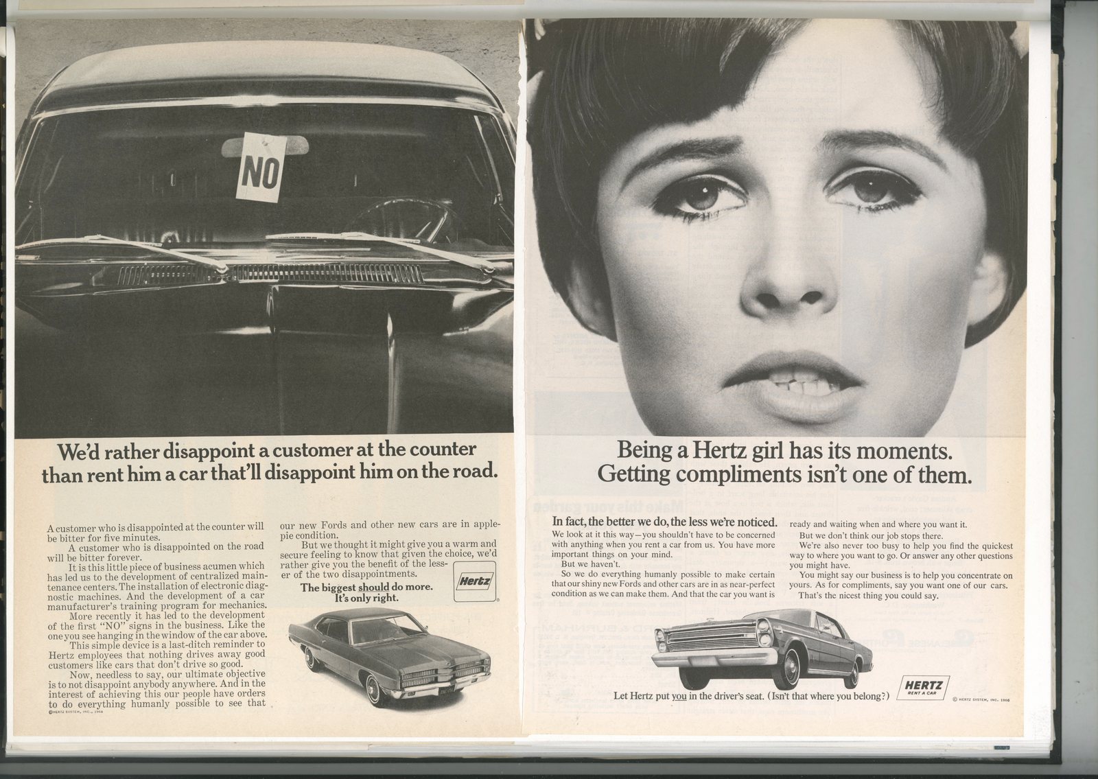

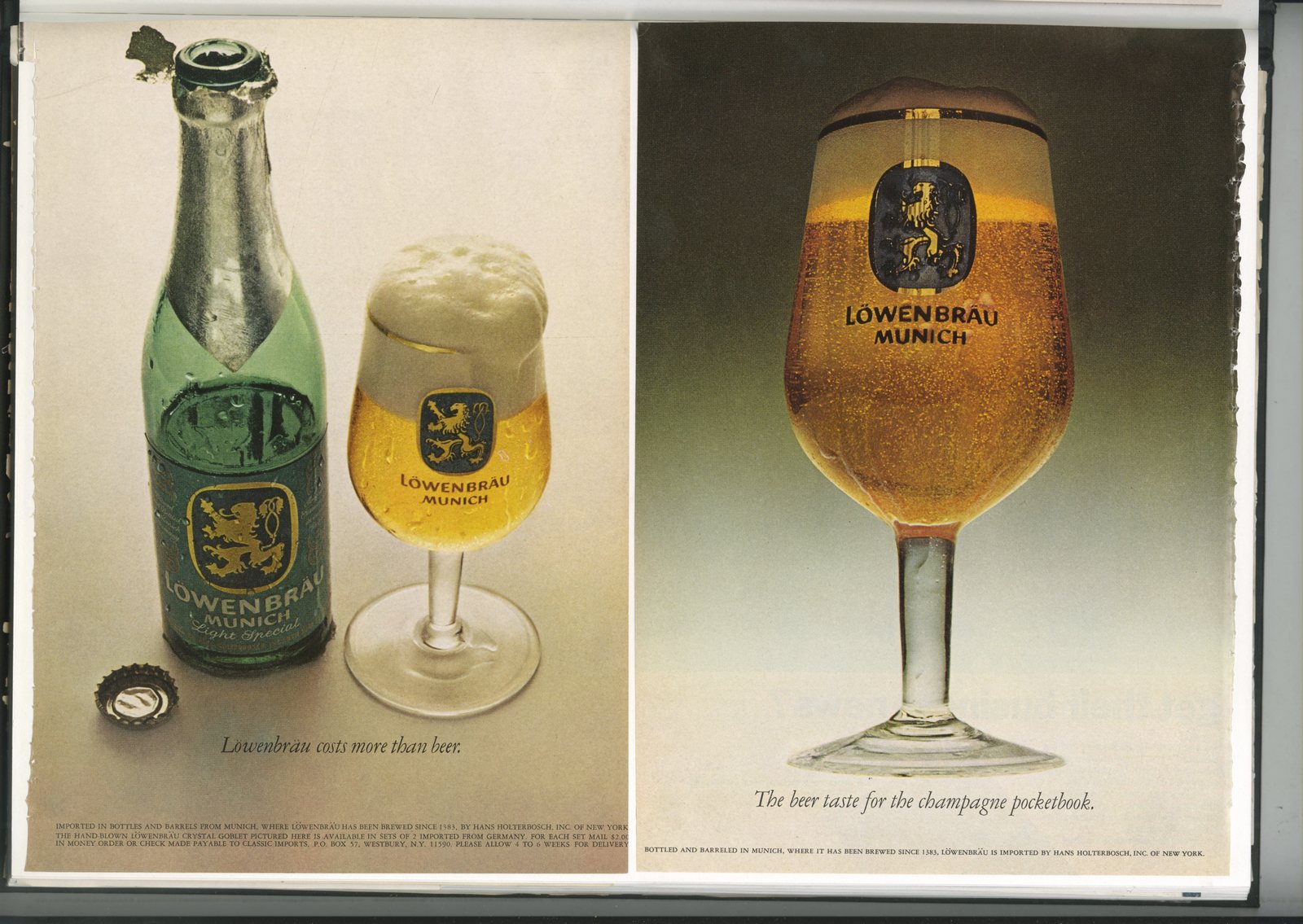
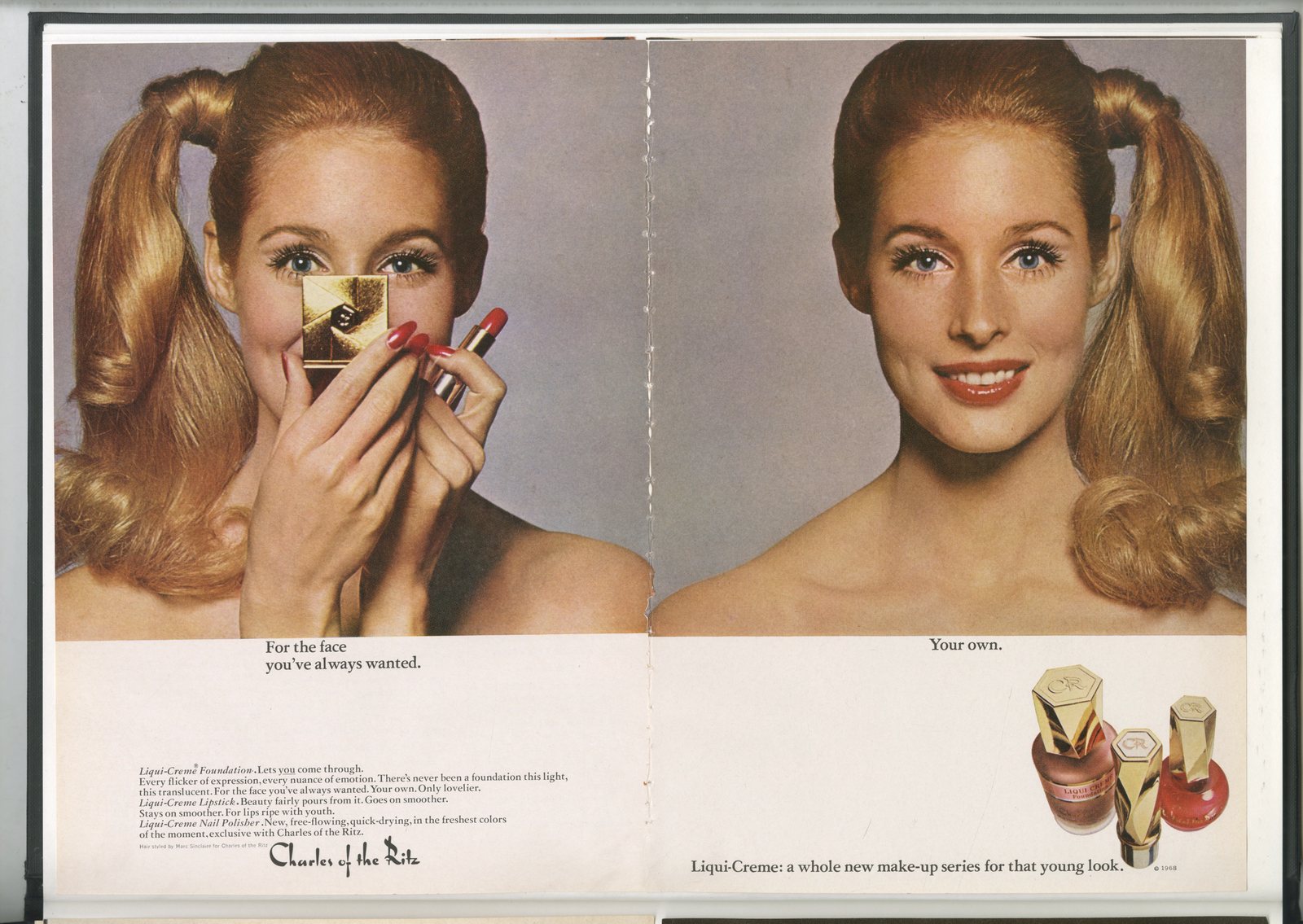

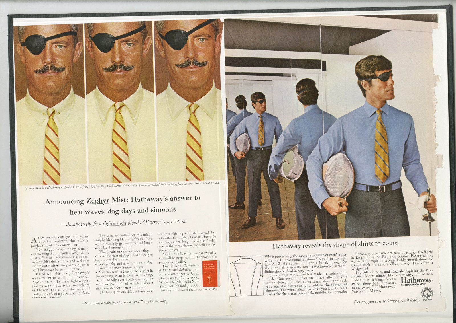
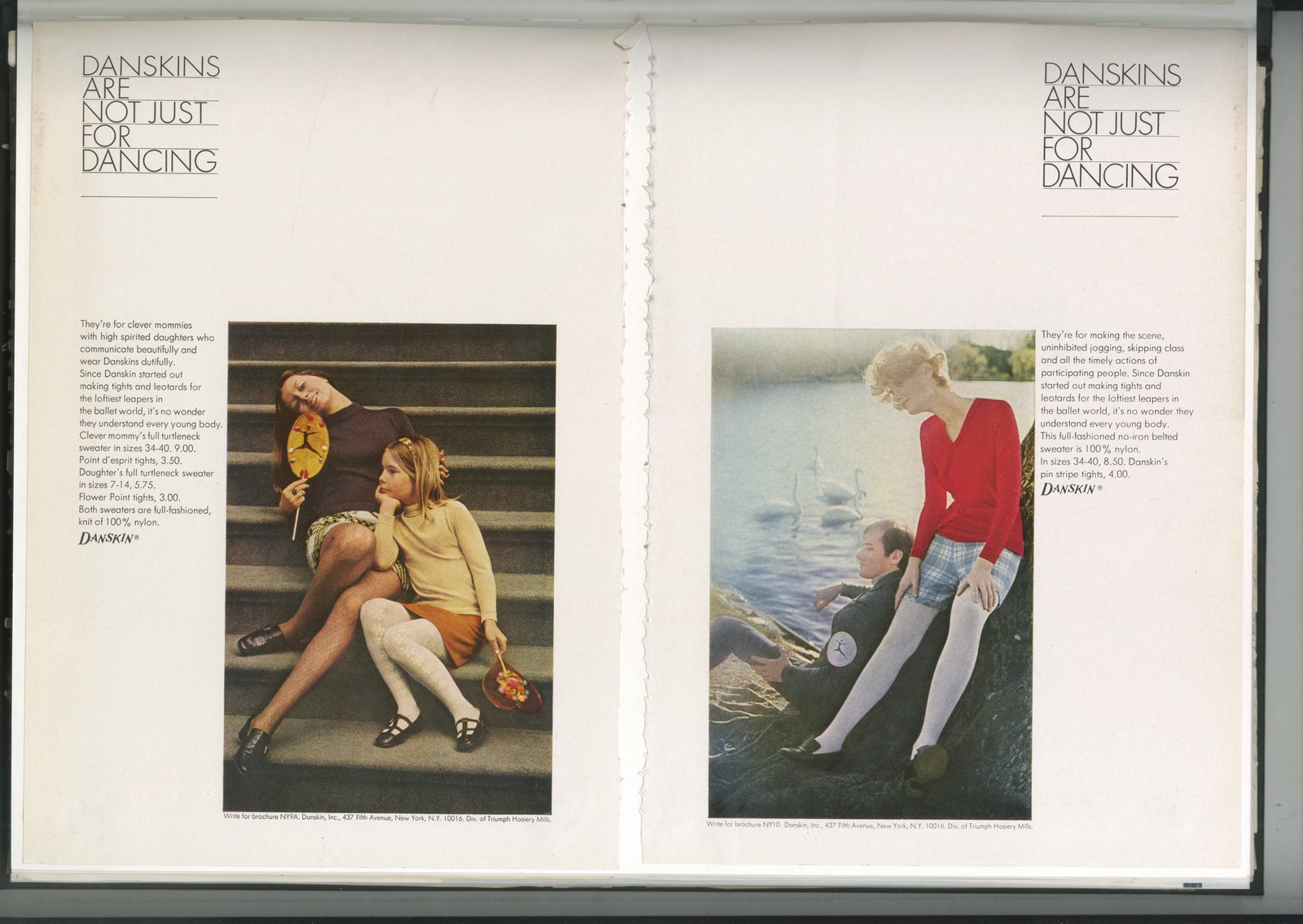


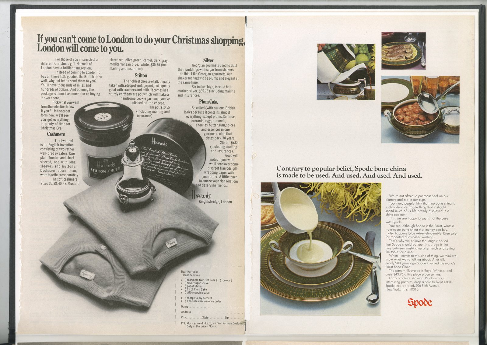


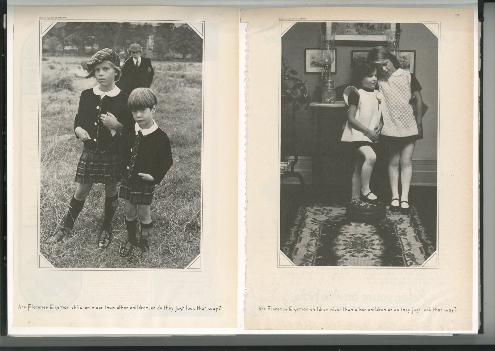

Another batch of fertilizer.That’s not a euphemism by the way, just a reminder that ideas grow from ideas, they rarely appear out of the blue.I sometimes hear people say ‘I’m all about tomorrow, I never look back…I’m like an arrow heading towards the future’. It sounds bloody exciting.Then I look at their output, and it often feels so...so, soul-less gimmicky...nothingy.Like it or not, the truth is that jobs, like most jobs, are less about inventing than improving.Elon Musk is currently refining an idea Ford had a hundred years ago, Jeff Bezos is refining the supermarket and James Dyson is refining the Hoover (or vacuum as he calls it).The same in our business, to quote Coco Chanel: ‘Only those with no memory insist on their originality'.Most 'new' work is old work in a new pair of pants.It’s not a negative, or a positive for that matter, it’s just a fact.Consequently, it’s helpful to expose yourself to as many previous ‘Hoovers’ as possible, because, although technology may have moved on, the chances are you’ll stumble across thinking that will inspire or improve your thinking.Good luck.
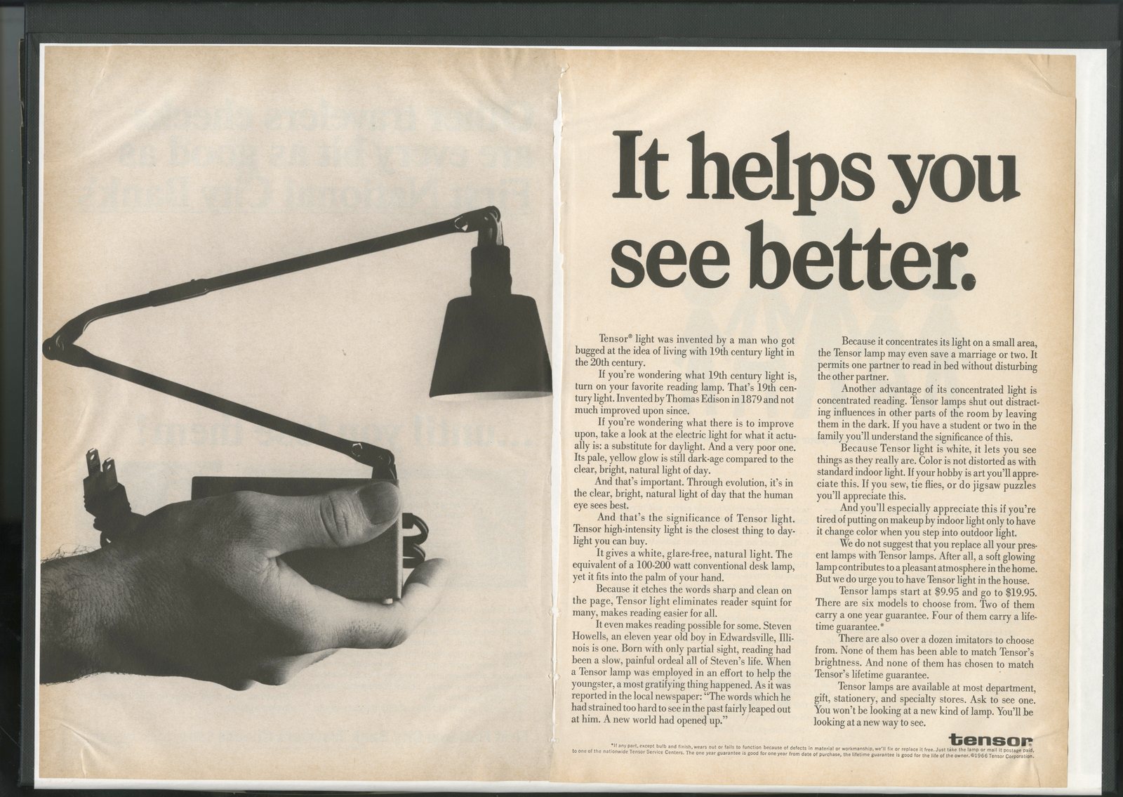

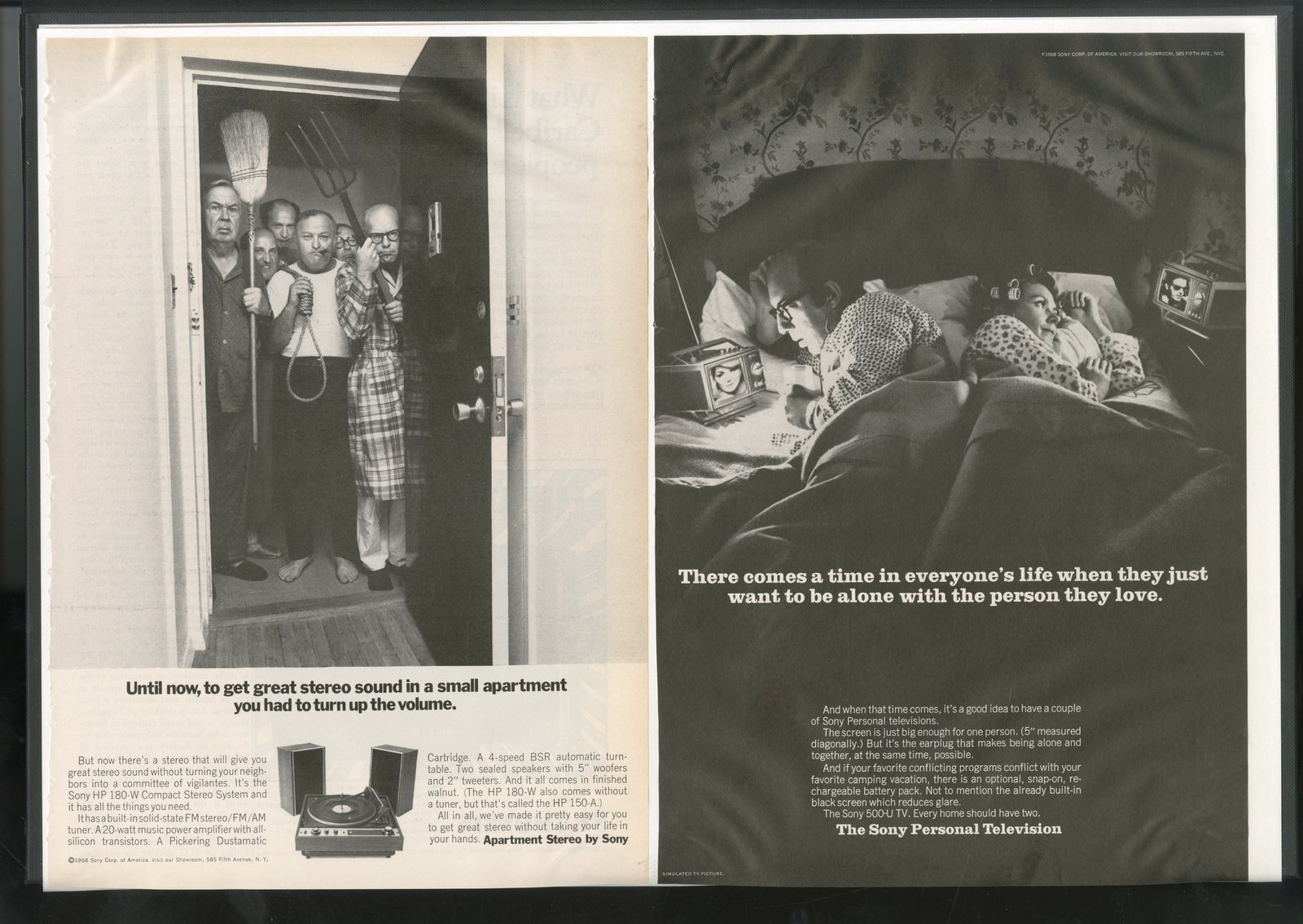
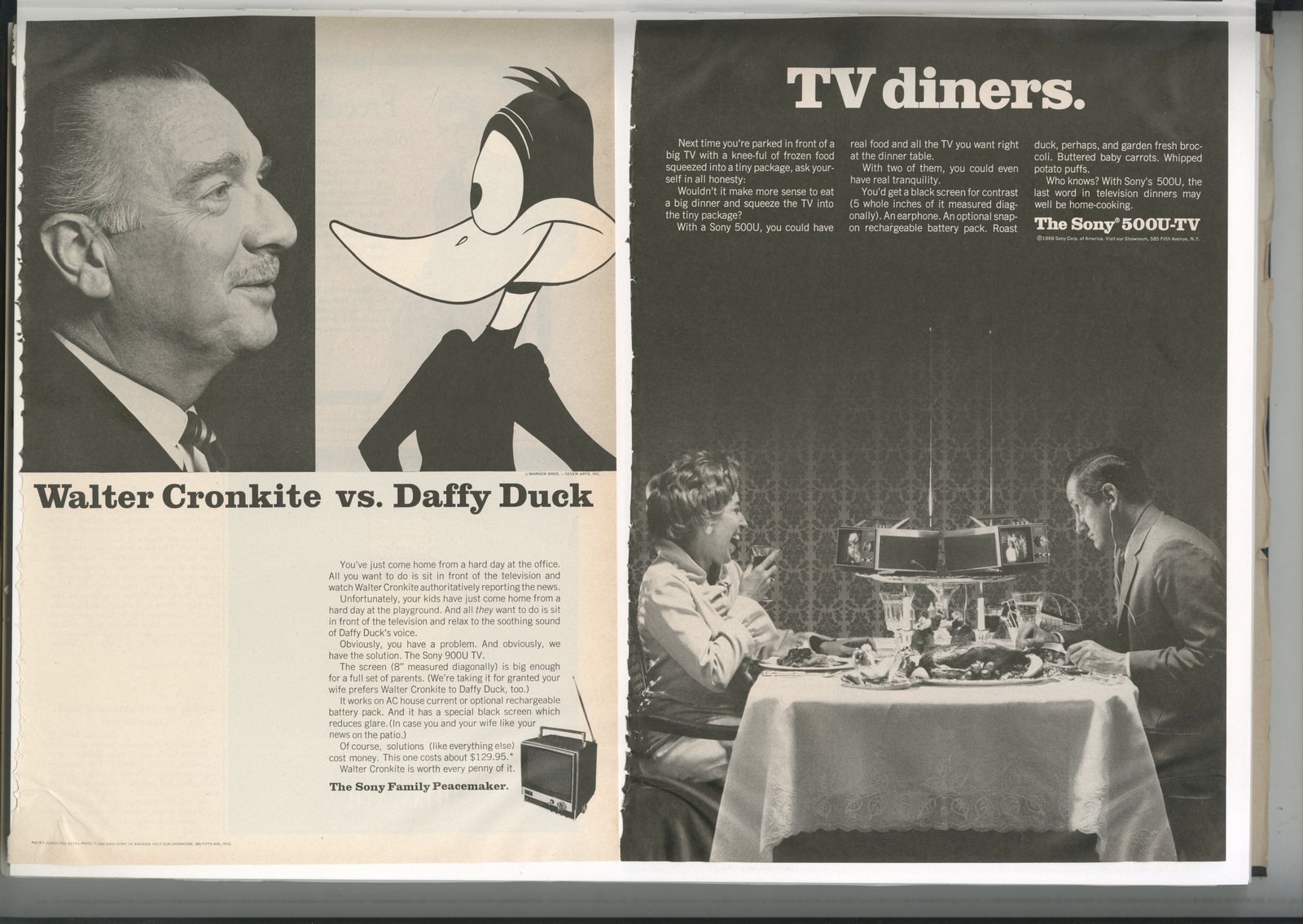

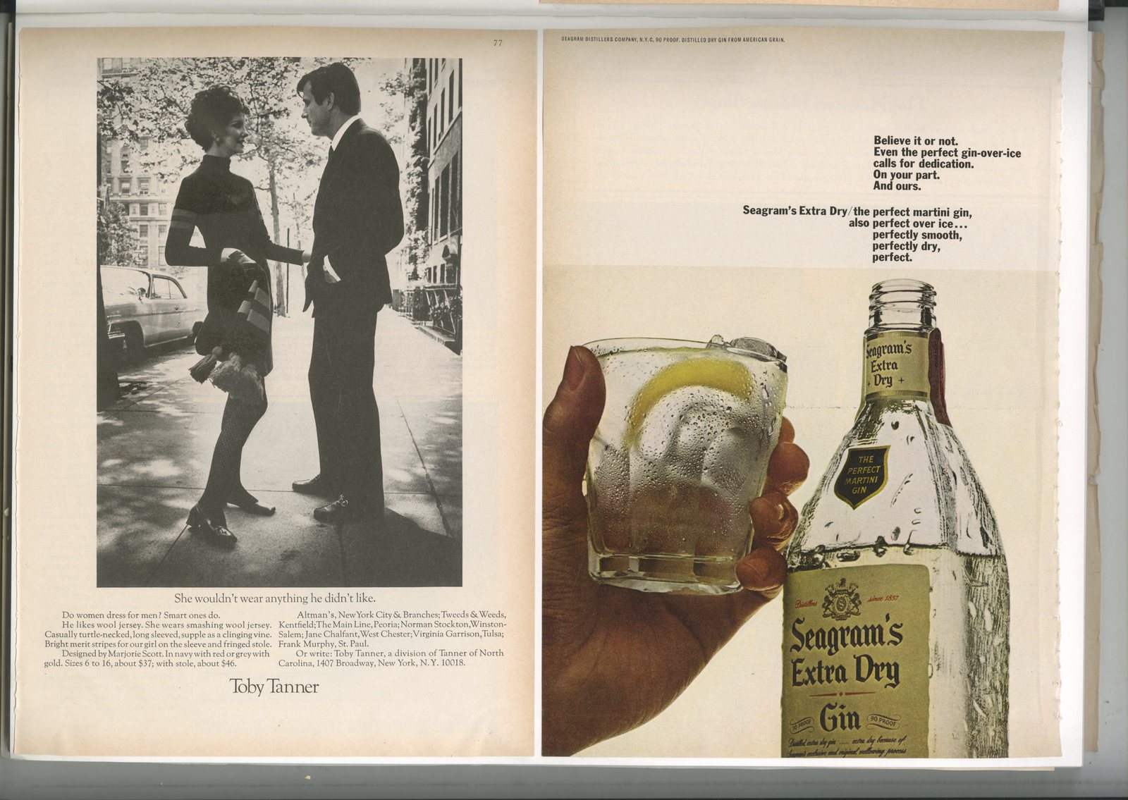


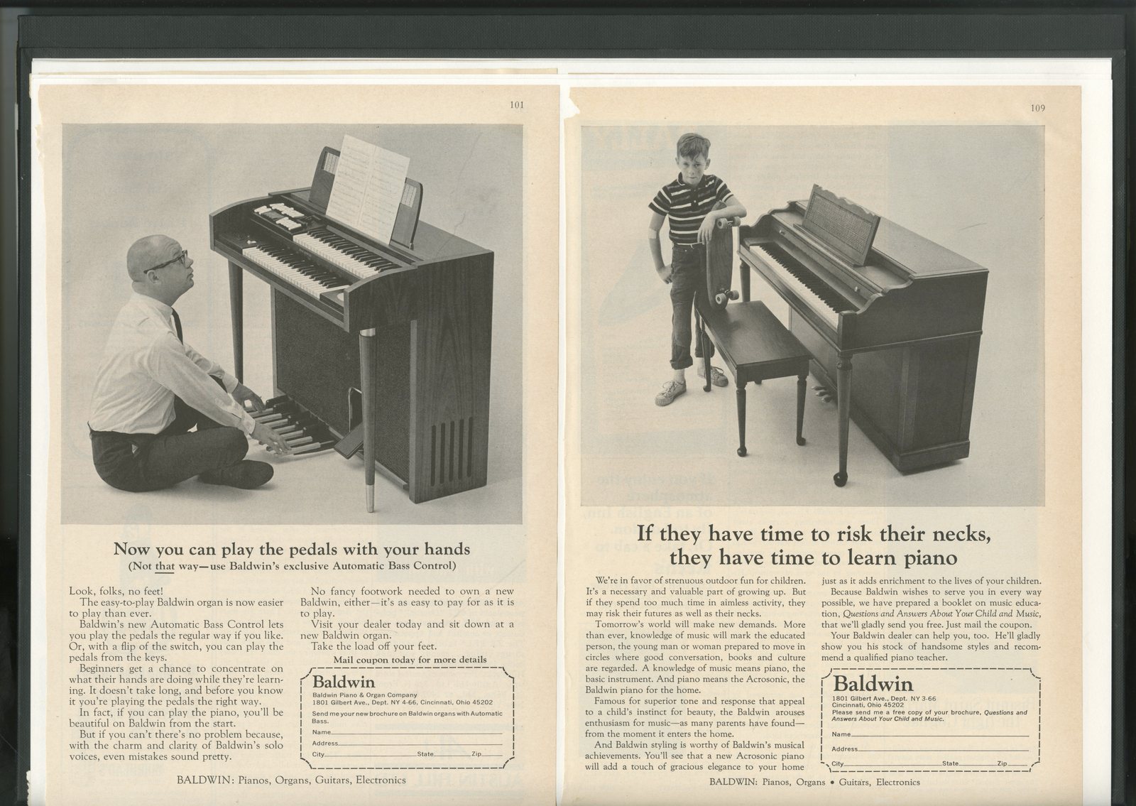
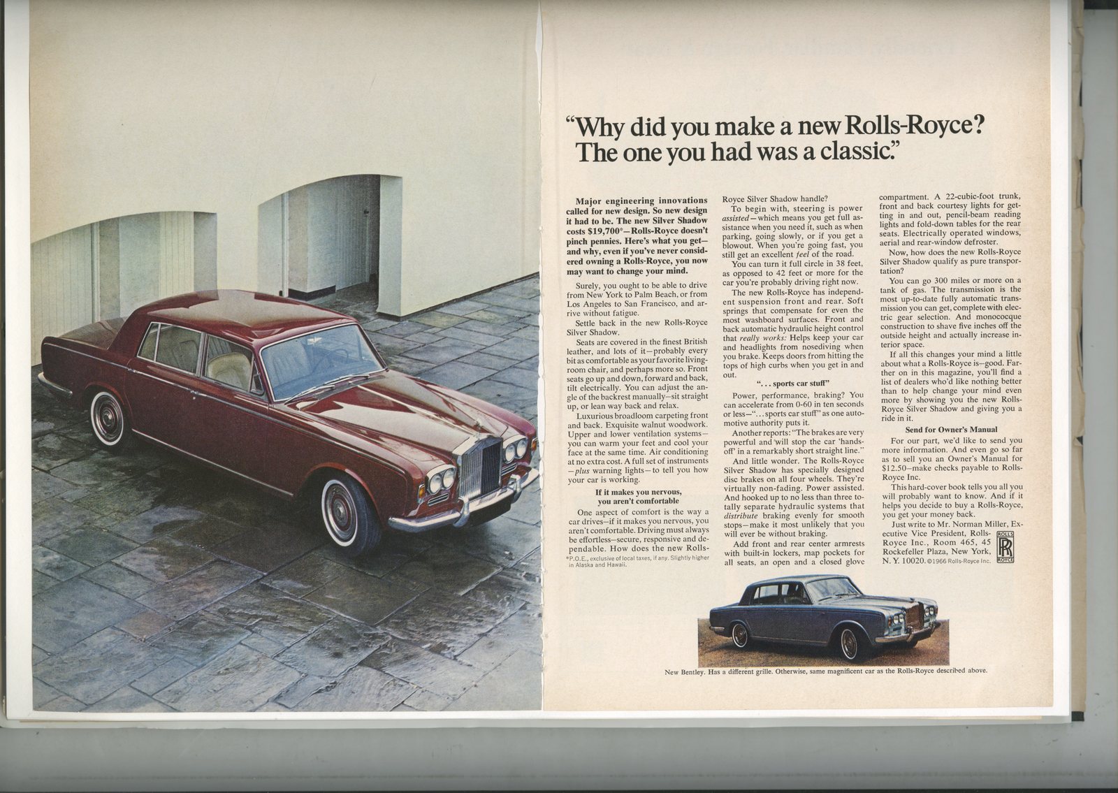
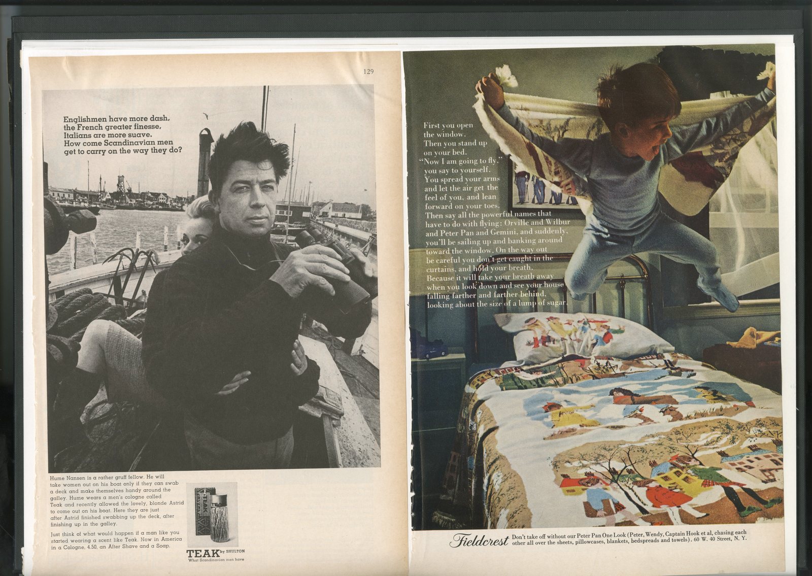

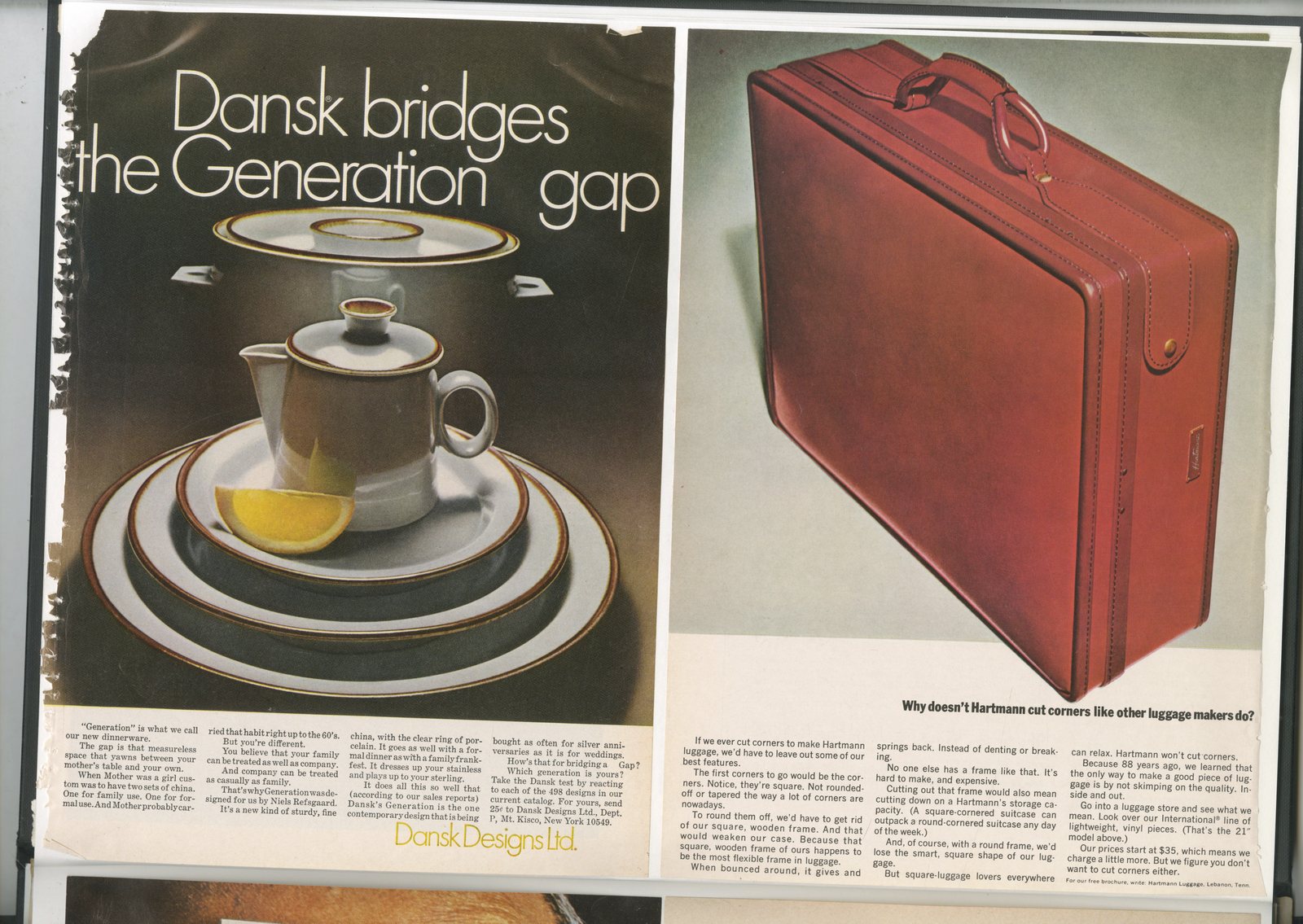
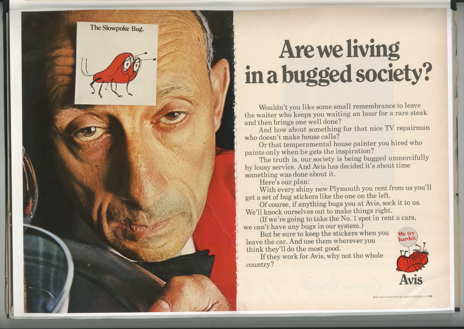
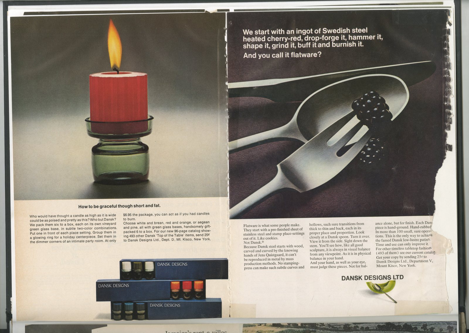
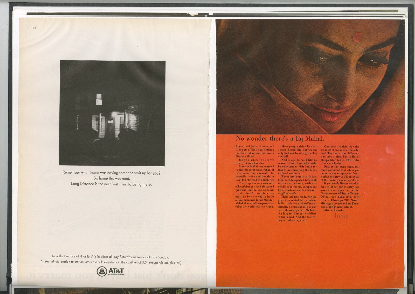
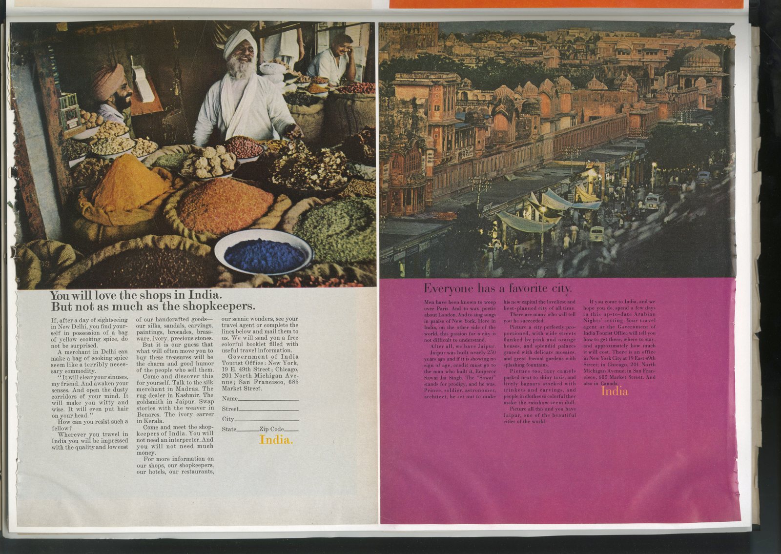

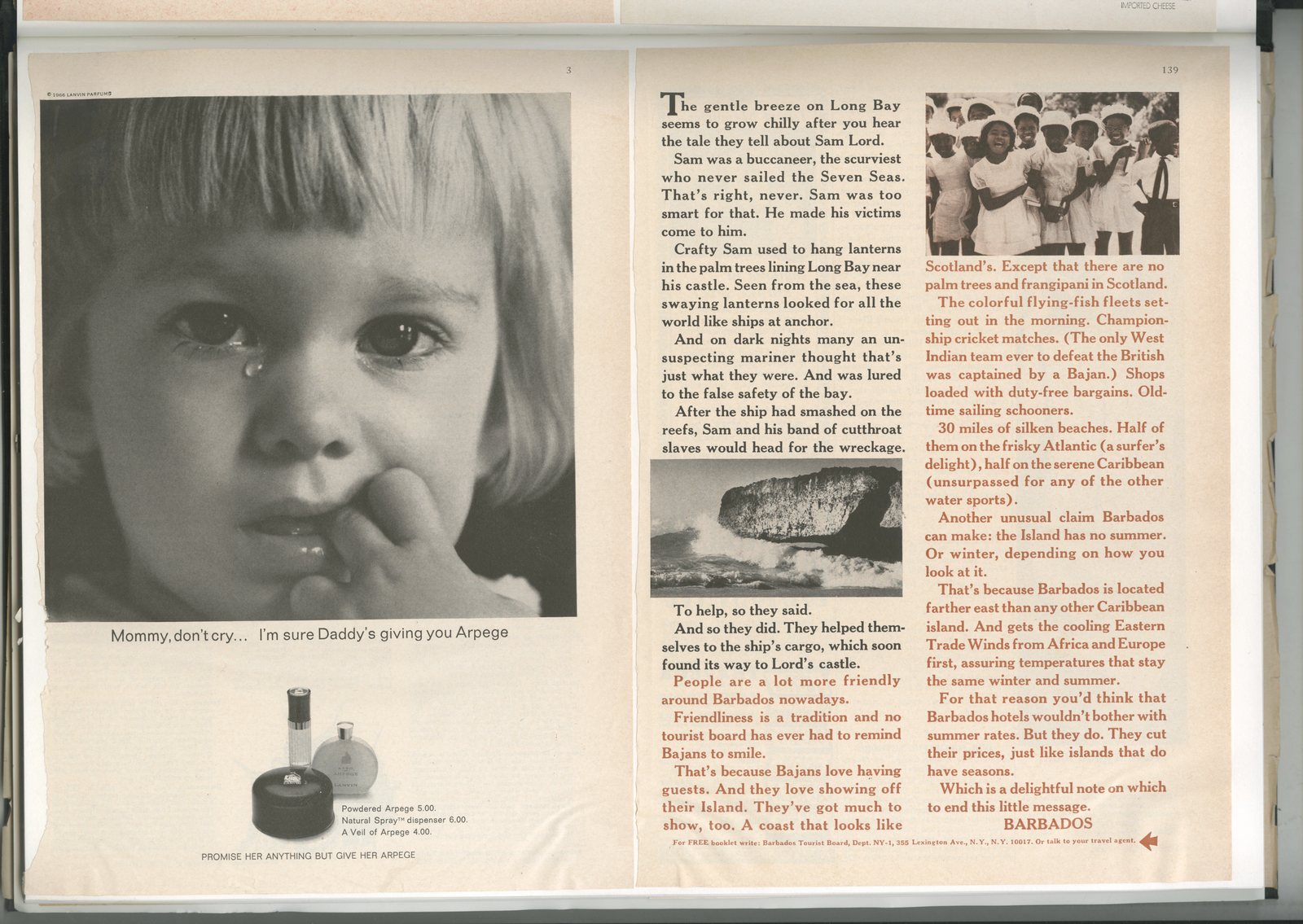

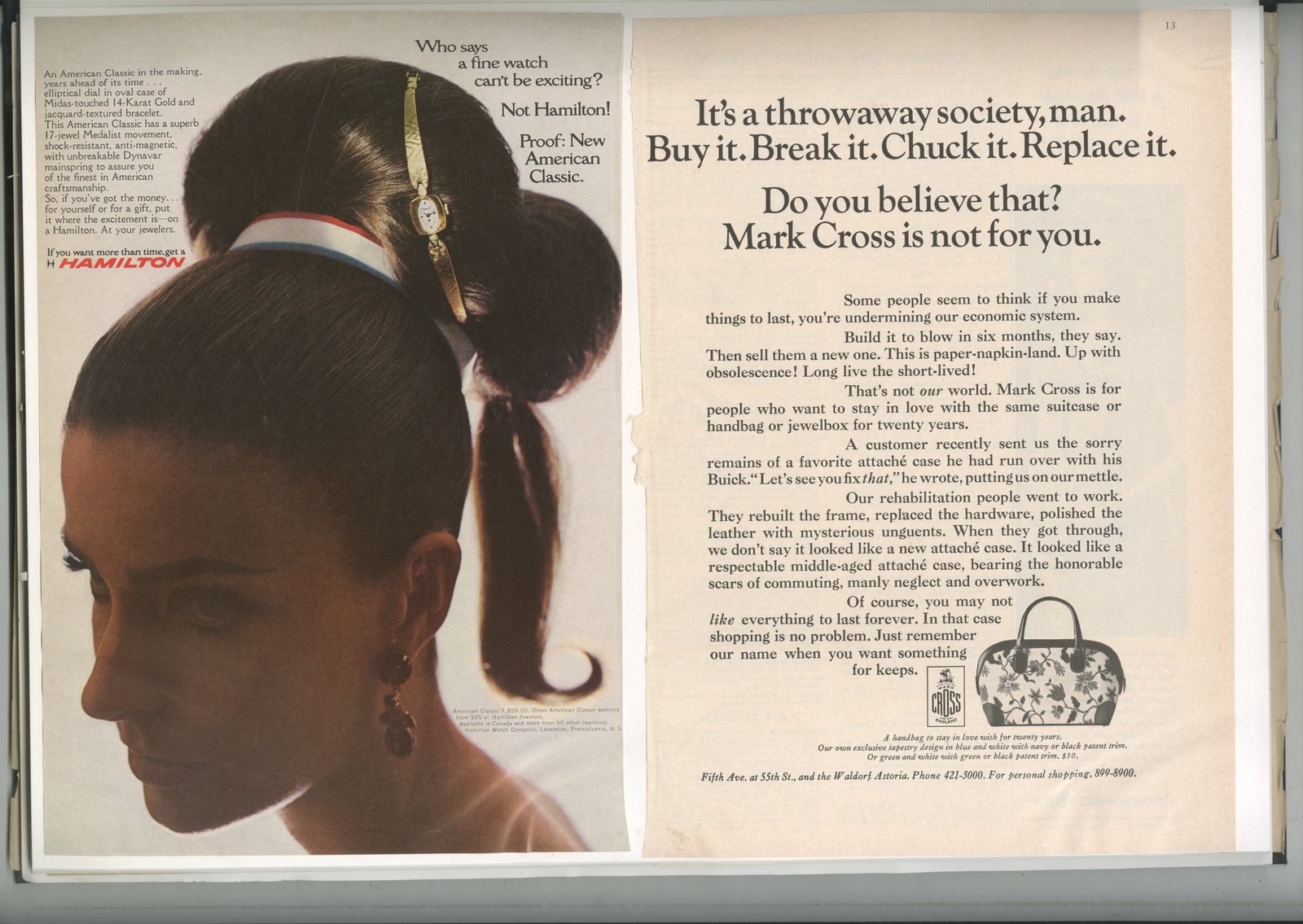


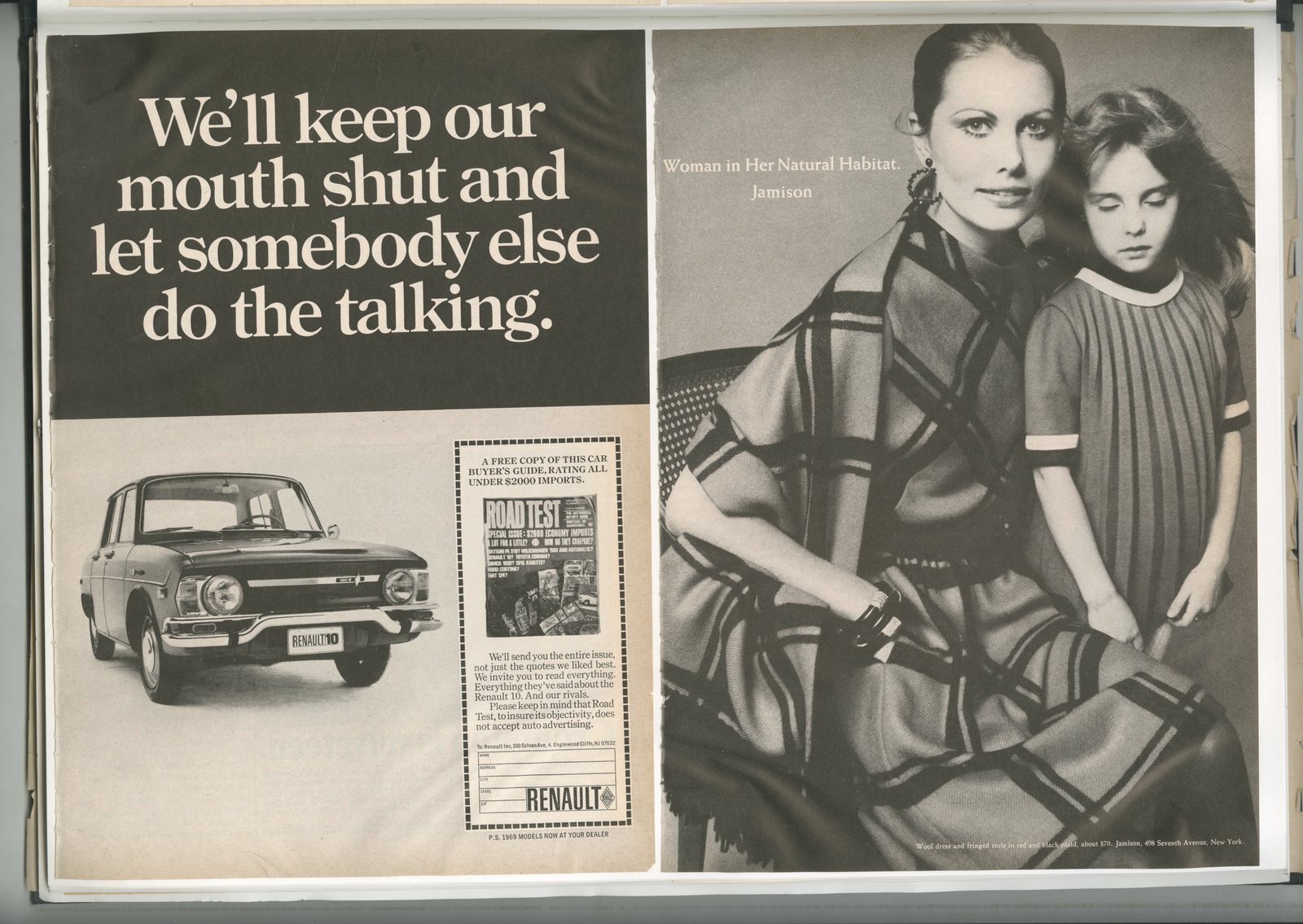

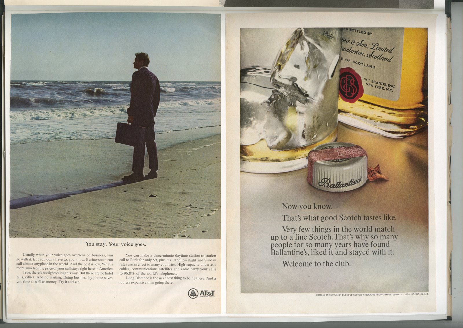
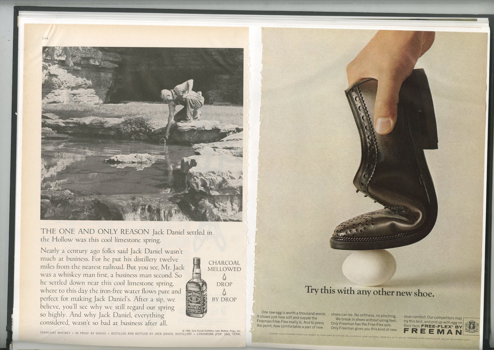


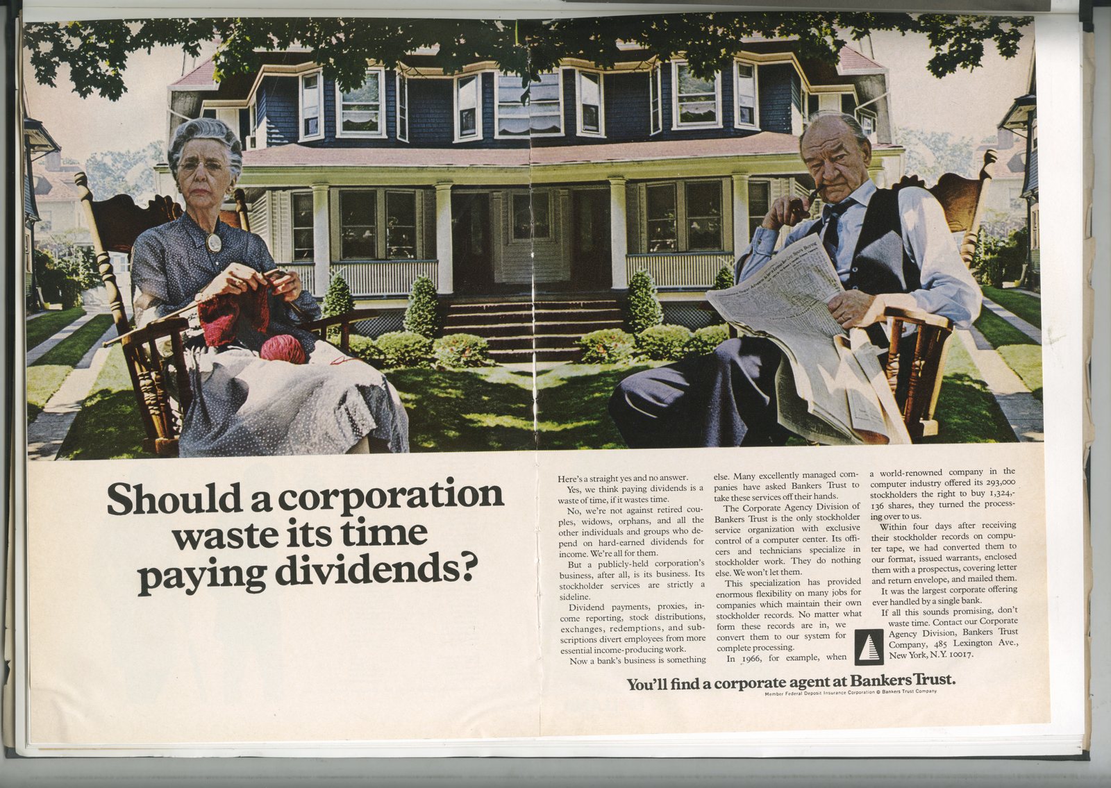


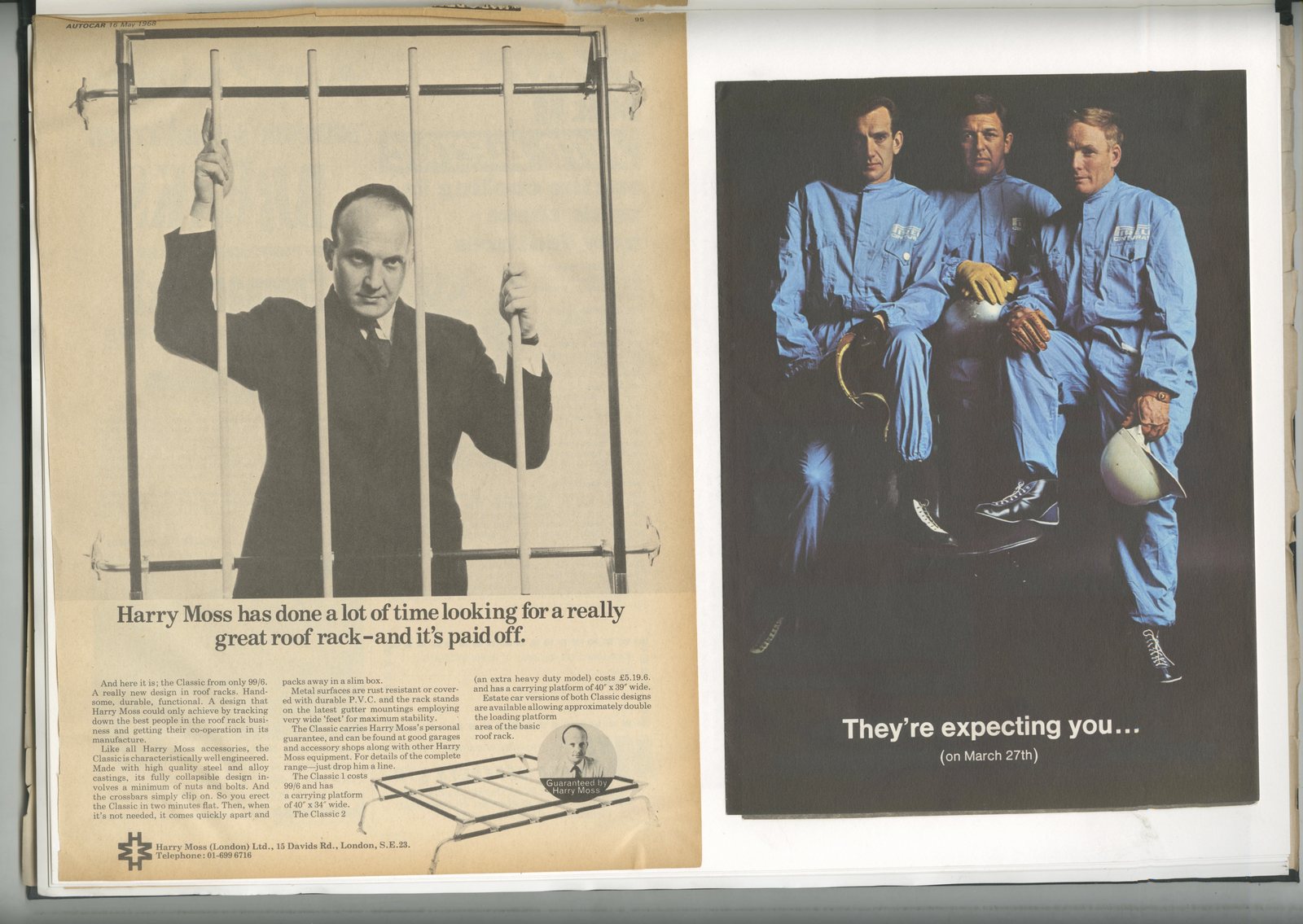


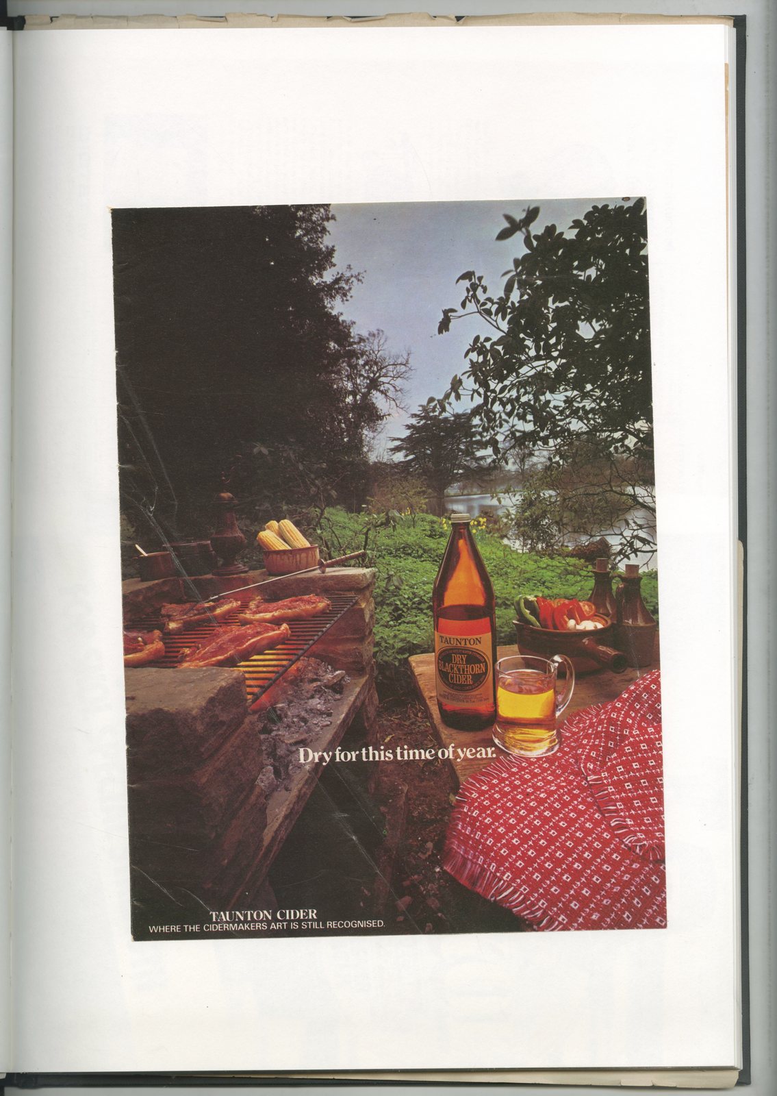
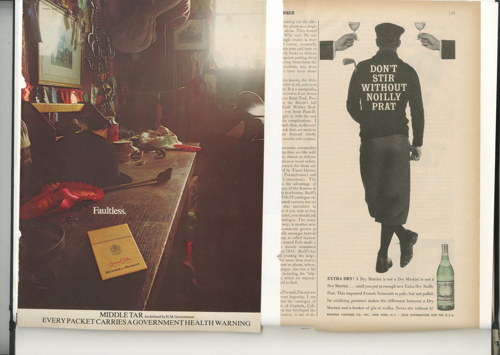


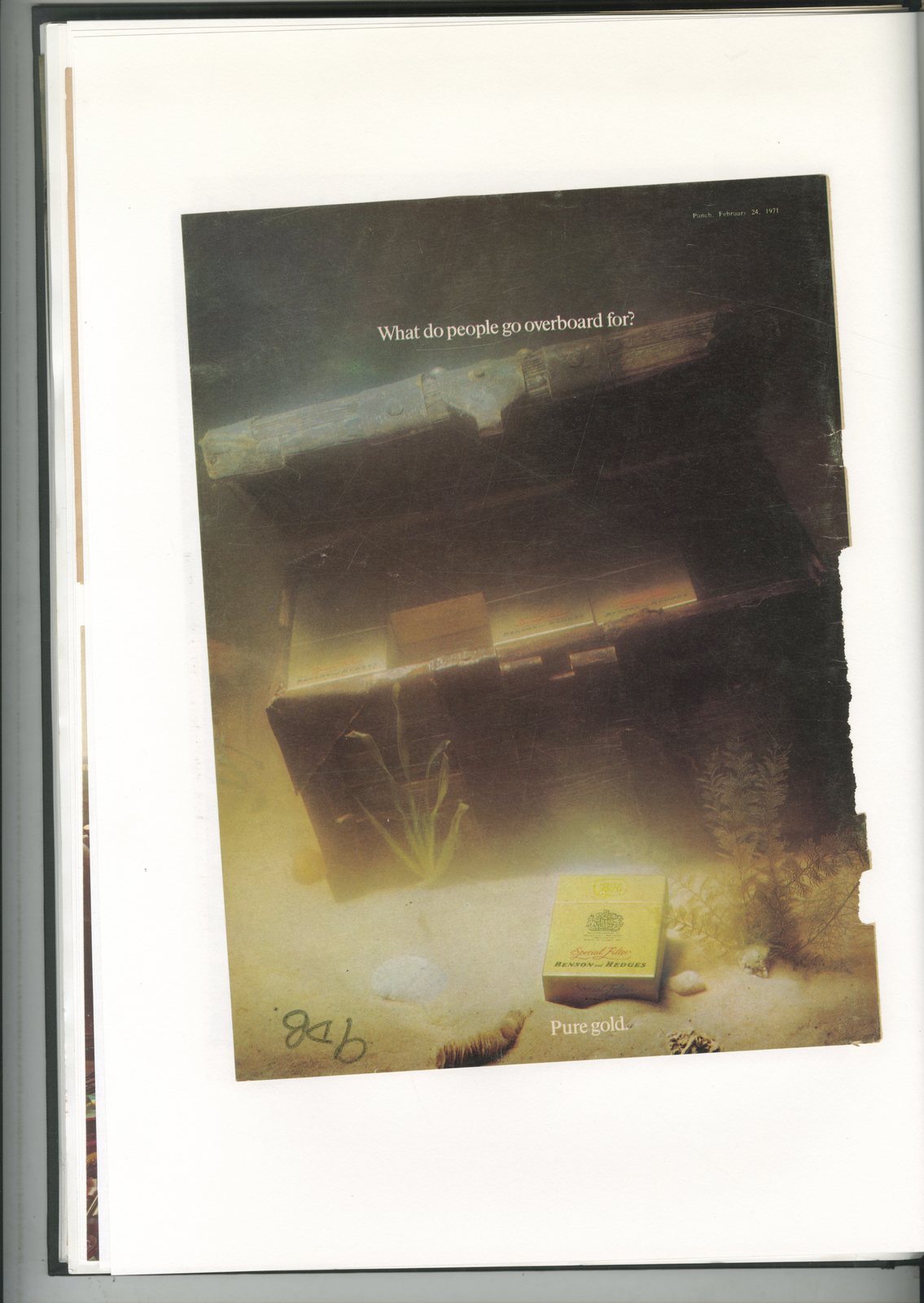
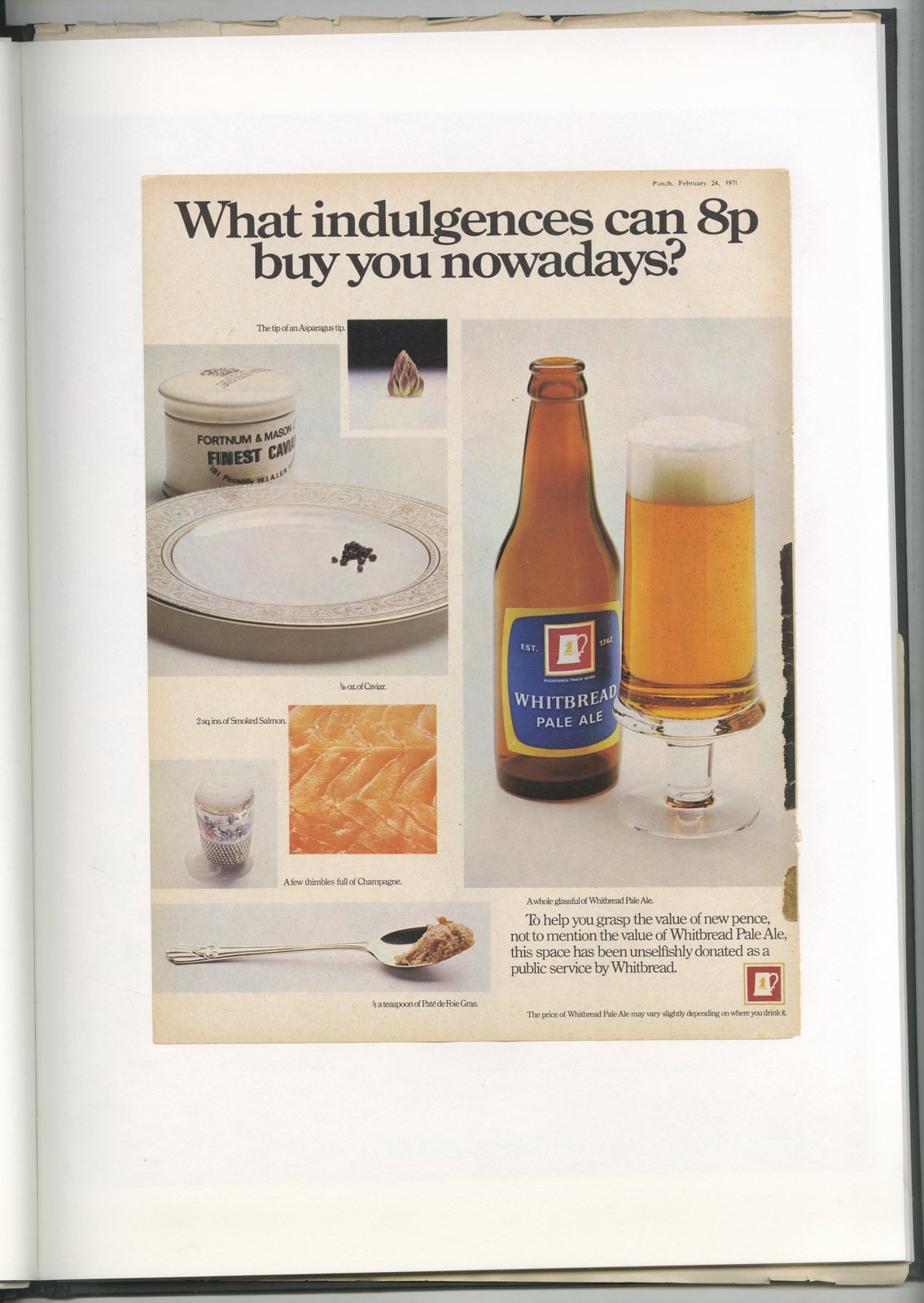
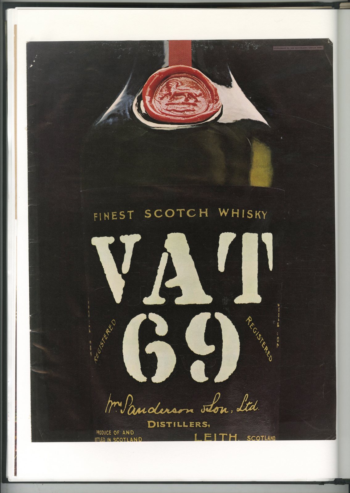

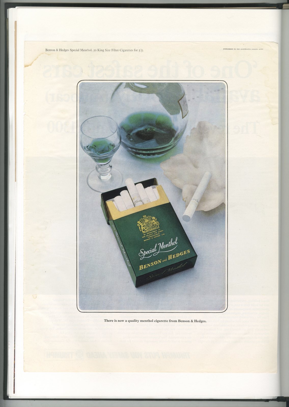
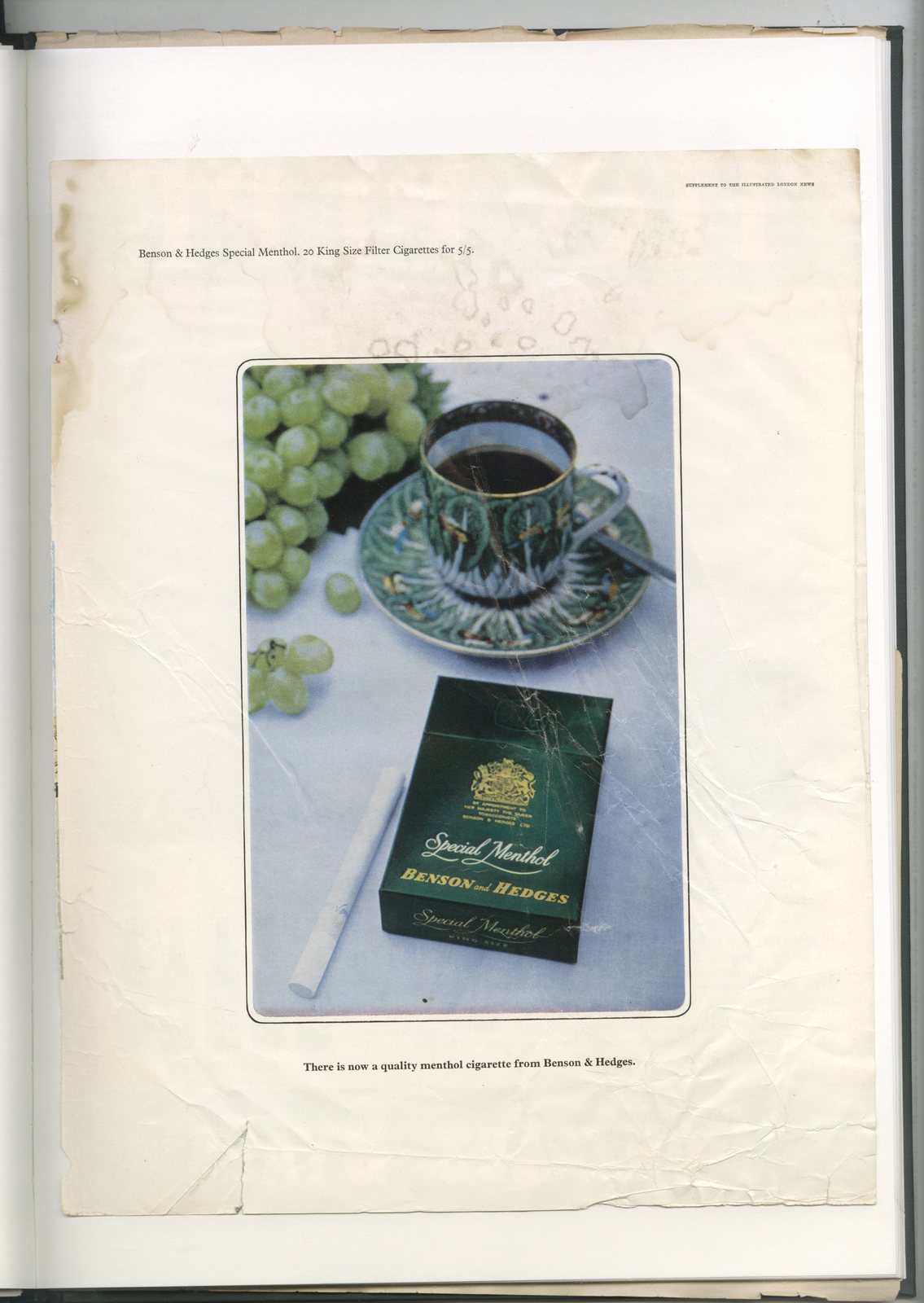
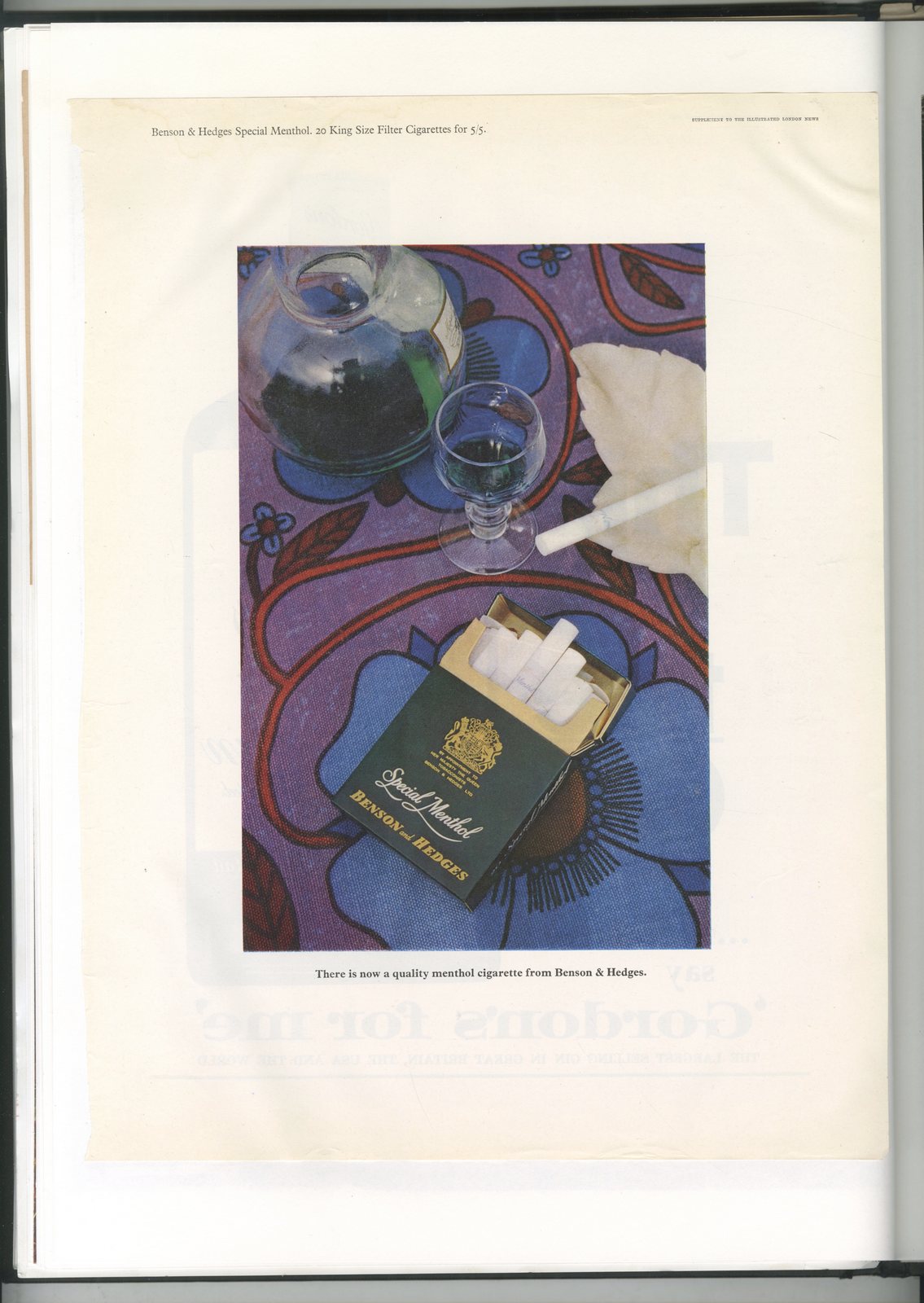
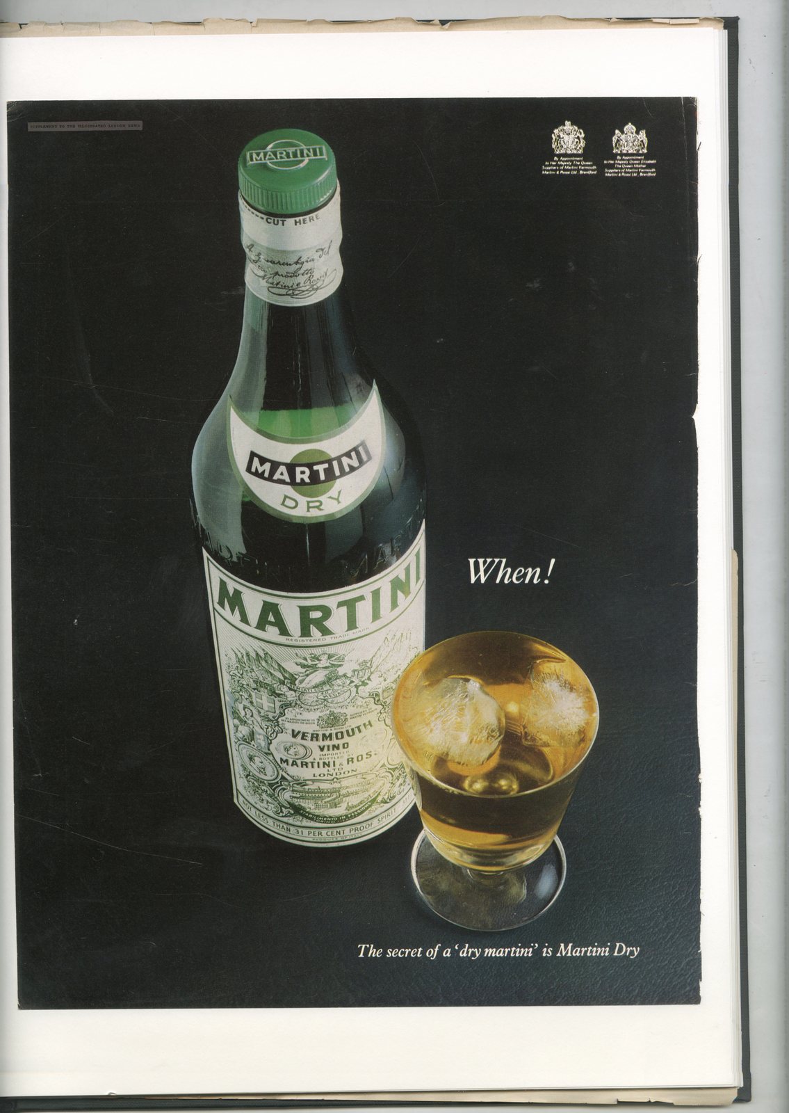
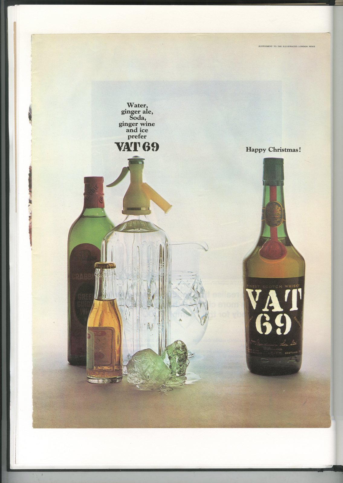

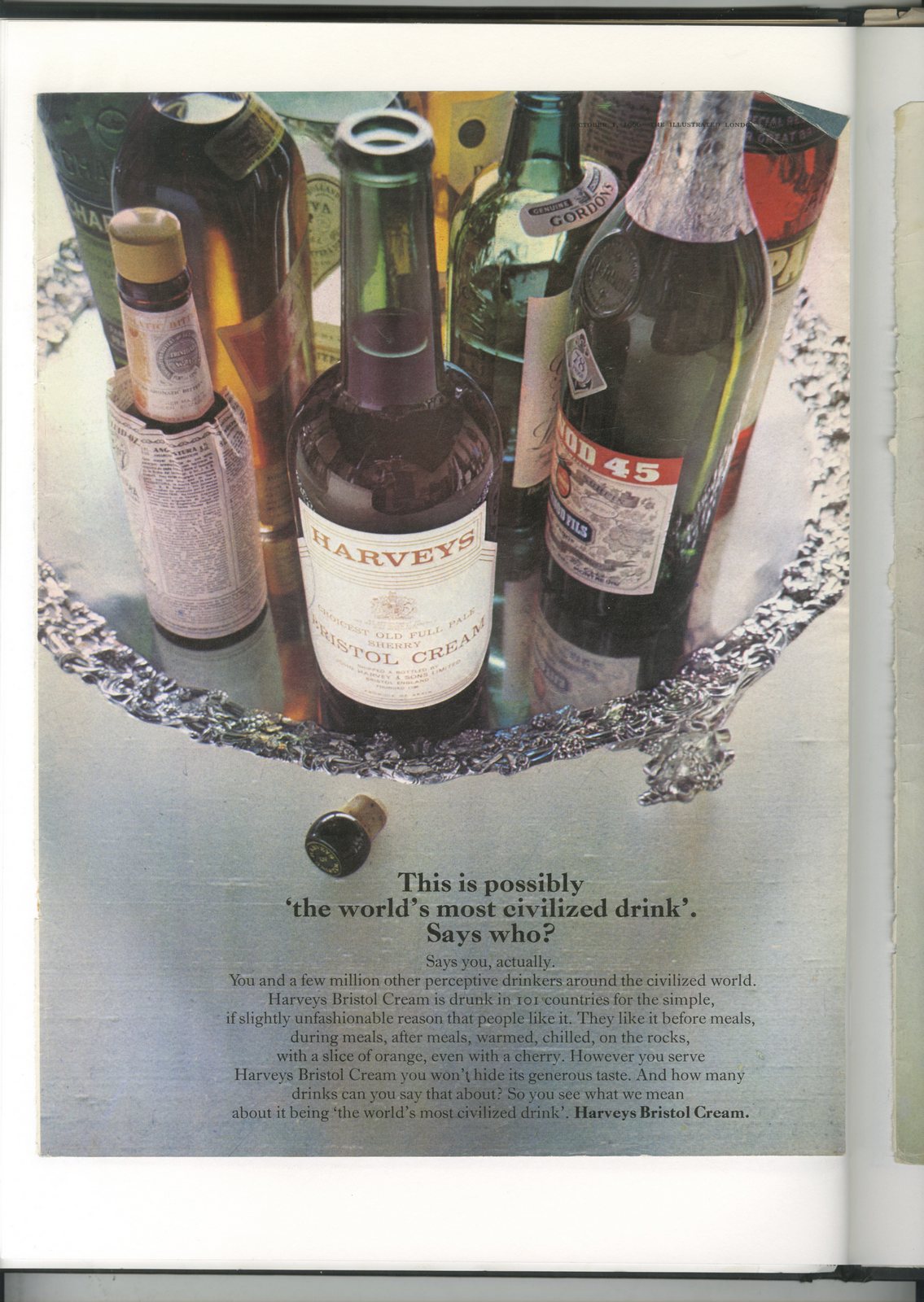


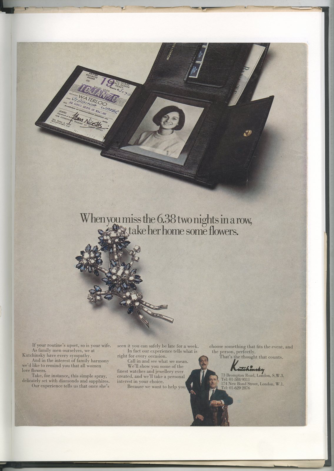
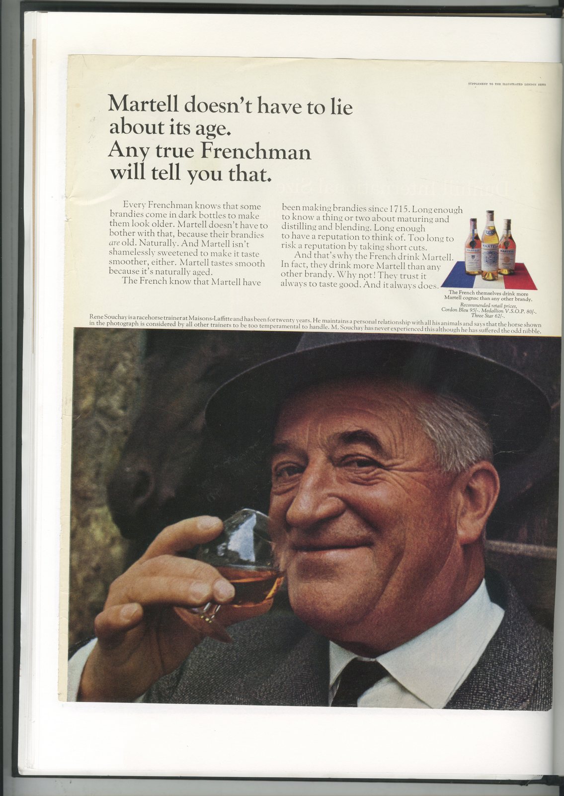
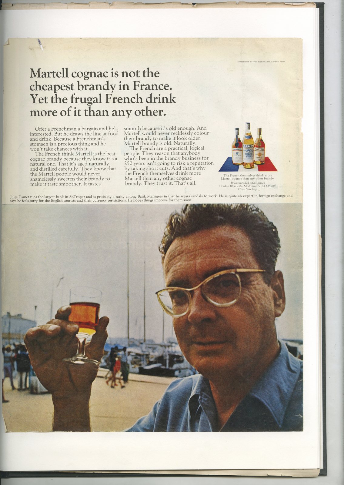
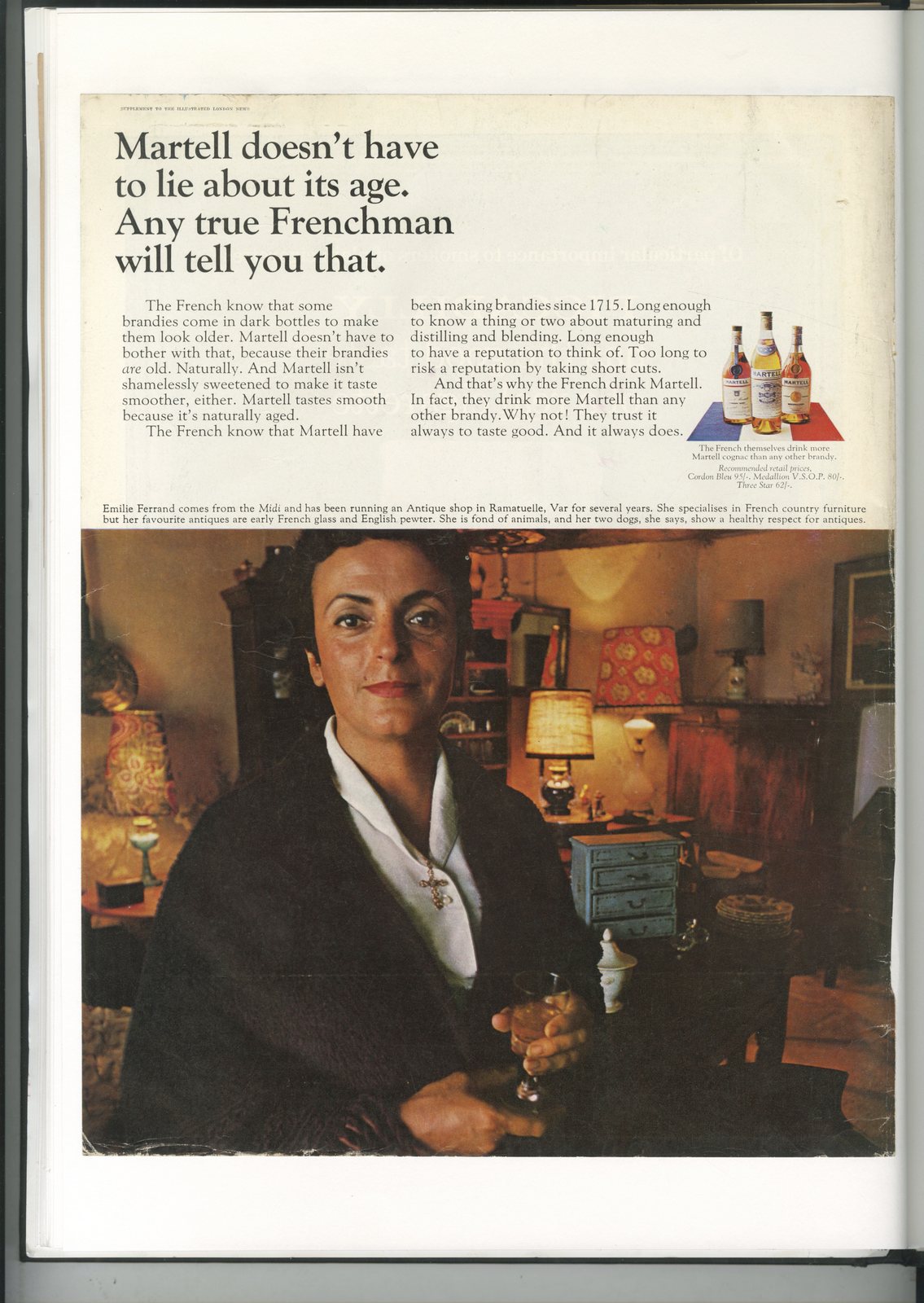
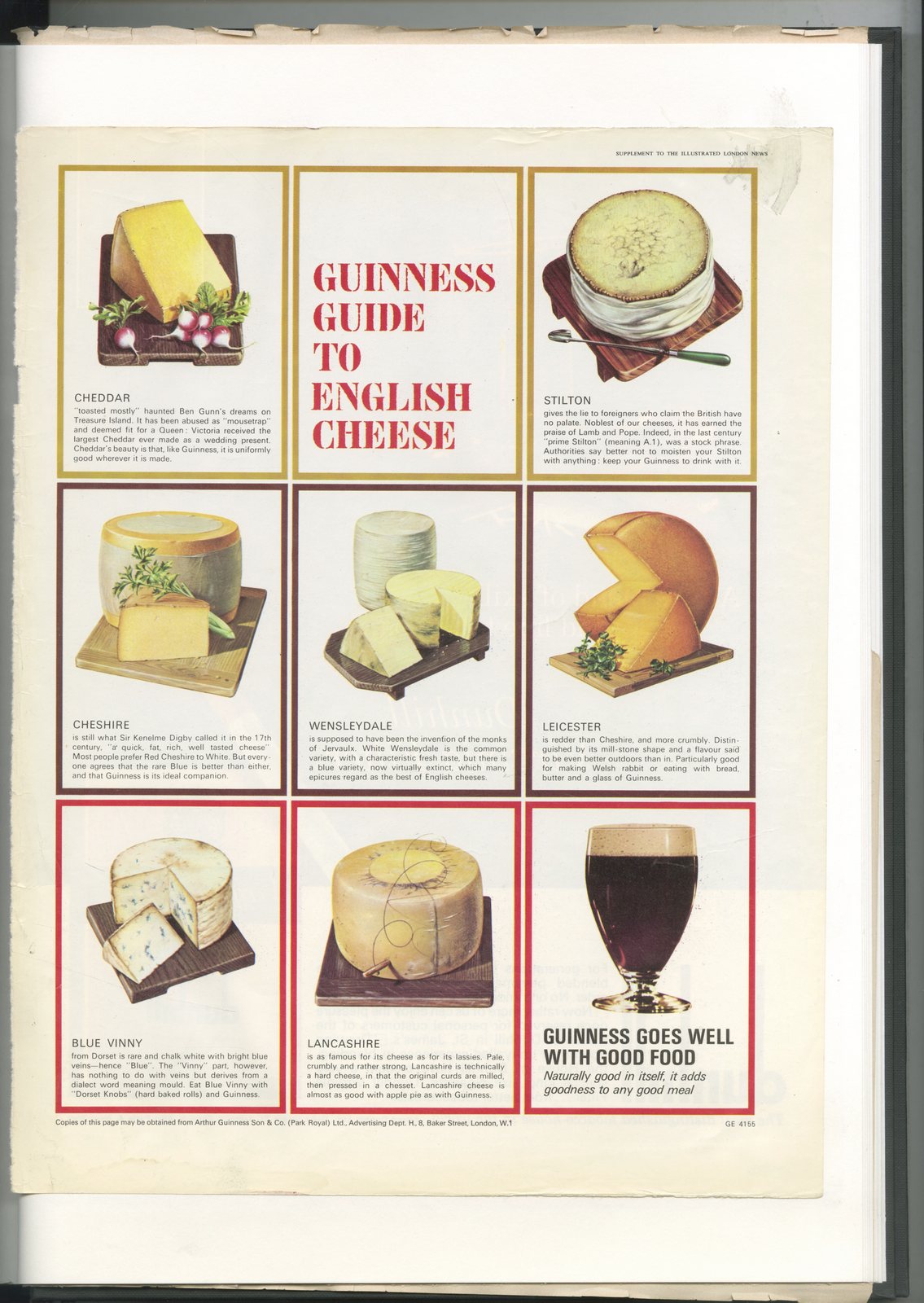
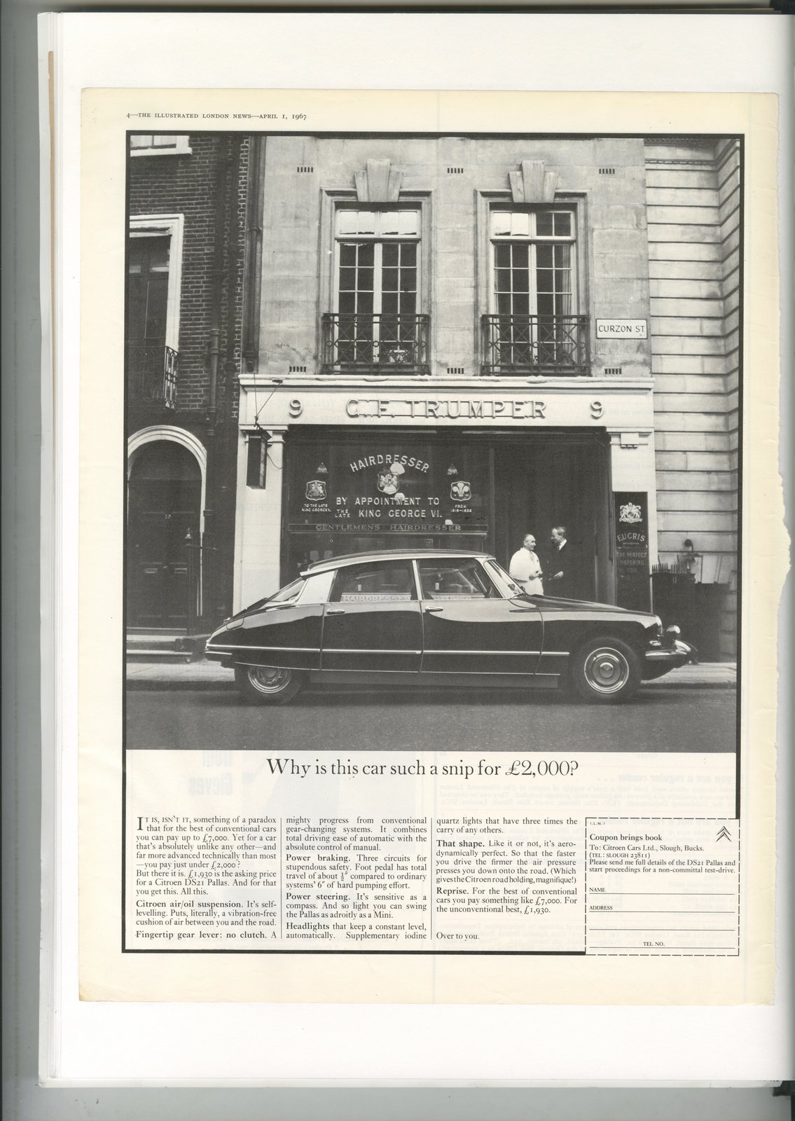
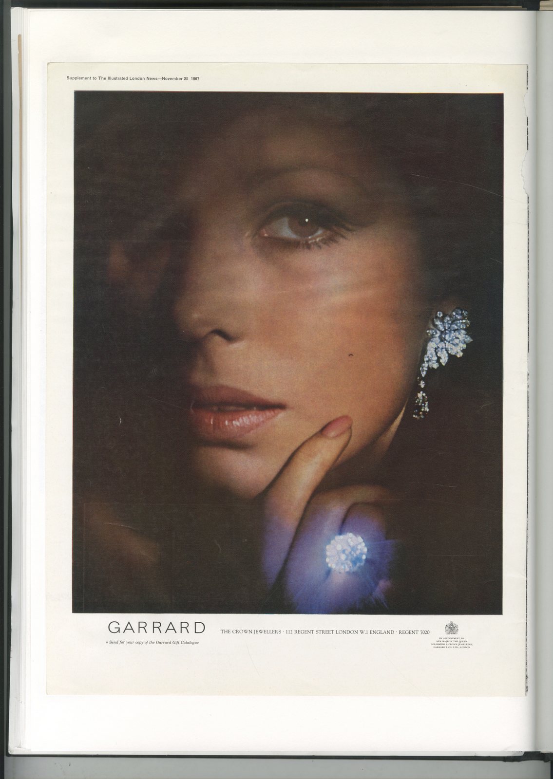


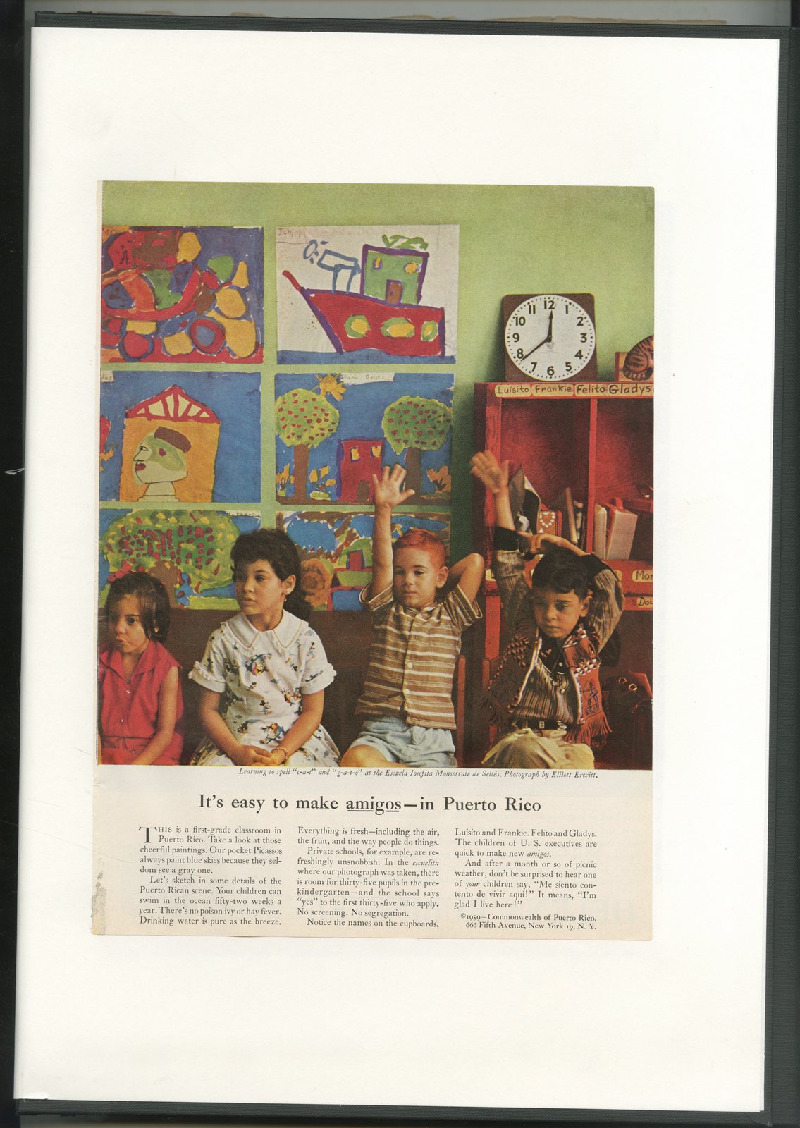

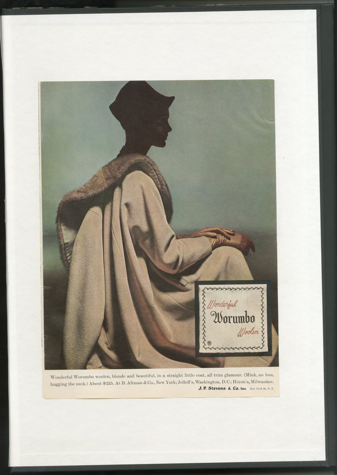

First, it seems that Part 1 hit a bit of a nerve.I got a way more feedback than I usually do.Maybe it was a contrast to the science, pseudo science and plain bullshit around our business at the moment?But reducing the process down to a simple, human form seemed to really resonate, one person said it was like 'advertising unplugged'.Which was the point.But you never really know how people will respond, often the posts I like most are the least viewed.Also, I really wasn't sure whether to do that or not; Would people relate to such a basic form of advertising? Would the boards have any effect? Would I look foolish in the process?Second; I got some data; December 2017 v December 2018.(I started putting out those boards three weeks before Christmas.)Sales in 2018 were up 9%.Hurrah!Anyone who's been around advertising for a while will know that it's very hard to directly attribute sales to ads, or even A-Boards.People always cite the warm weather, cold weather, low price, high quality, and a whole bunch of other factors before crediting the advertising.But in the absence of those people, I'm claiming it.+9% is very encouraging.(Although, being an art director, I'd have preferred double figures, 11% looks more than 2% more than 9%, don't you think?).So, what did I learn from Part 1?a) The first job is to jump out and grab passers-by.b) The fewer words and pictures you use the more chance you have of jumping out and grabbing passers-by.c) Be clear, not open to interpretation.d) Make the messages relevant to passers-by.Jesus! Is that learning?I was told that 30 years ago and the people who told me that were probably told that 30 years before.Looking at the positive; what I was taught 30 years ago is as relevant today as it was then.So perhaps it's been a useful reminder.WEEK 3 CLIENT FEEDBACK:
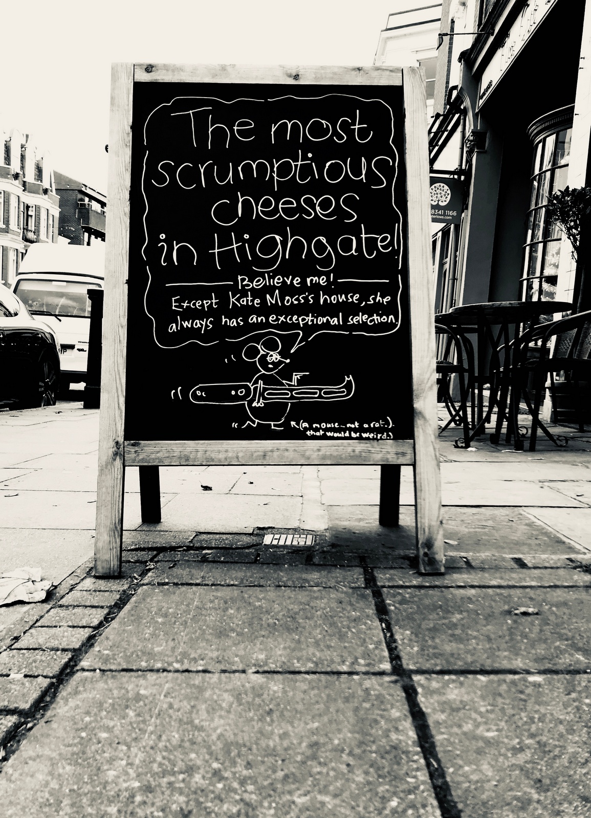
CLIENT FEEDBACK: "Cheese continued to sell well."Looking back, it's far too complicated for an A-Board, too many small words, plus; I buried the most interesting bit; 'Kate Moss'.Maybe we could call out famous local residents/customers?It may get picked up on social media...or actual media.E.g. 'HEY JAMIE OLIVER! We've got some of that Italian cheese in that you like.'The client rejects the idea, worrying that it may put famous customers off coming in.
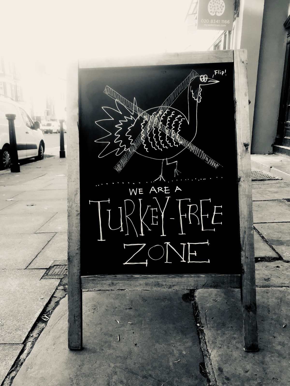
CLIENT FEEDBACK:"People didn't get it."Well, to be more precise; some people came in and said they didn't understand it, the people who did understand it probably didn't feel the need to pop and announce that they understood it.In retrospect, it's topical, but not particularly motivating or relevant to people.
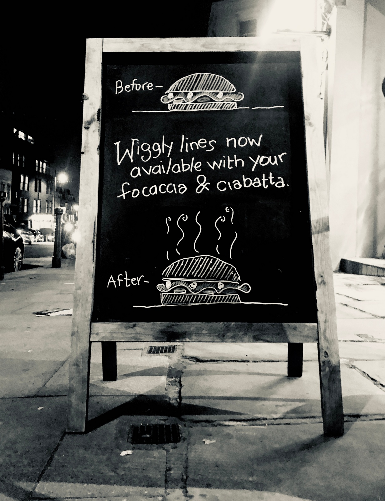
CLIENT FEEDBACK: "Sales weren't bad, a couple of people asked for wiggly lines with their ciabatta."Shame, I quite liked that one.
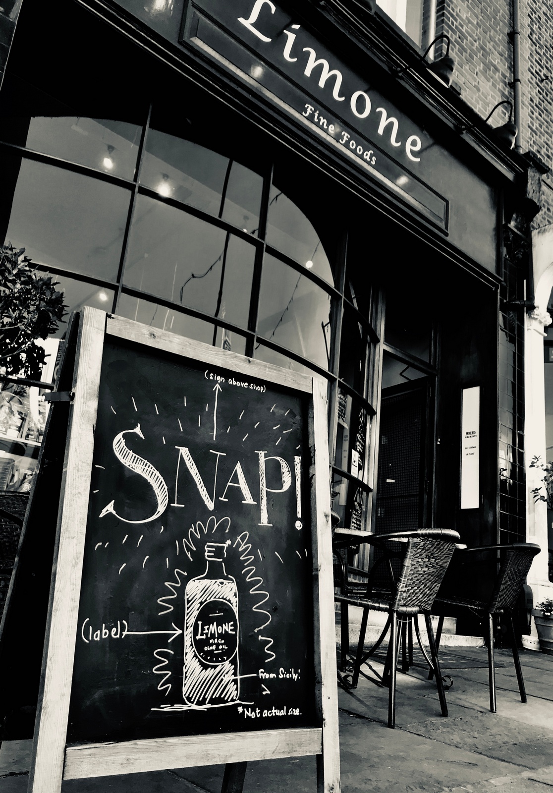
CLIENT FEEDBACK: "Sold quite a lot, I spotted quite a lot of people reading it and looking up at our sign."Good, but no 'Pannetone''.Maybe it's just too abstract, 'We have our own brand of olive oil' would be clearer, but dull.WEEK 4.CHEESE.A short-hand has developed; I'll occasionally walk past and notice a board is missing, this is generally due to some client discomfort with a message, e.g. 'our stuff is pricey'.In this instance it was because the client was amending the creative work, without warning, discussion or contact reports.Kate Moss and her mouse have been axed in favour of a cheese and some new words.If you're in the creative department it's in your contract to find fault with client amendments.But not being in a creative department I decide to ignore the tiny Action Man sized knife, the angle of the line crossing out 'Switzerland' and the weird blob purporting to be 'Toast'.Instead I look on the positive side; it kind of works, it's fewer words than before, it's better for selling a specific cheese, let's see what happens.
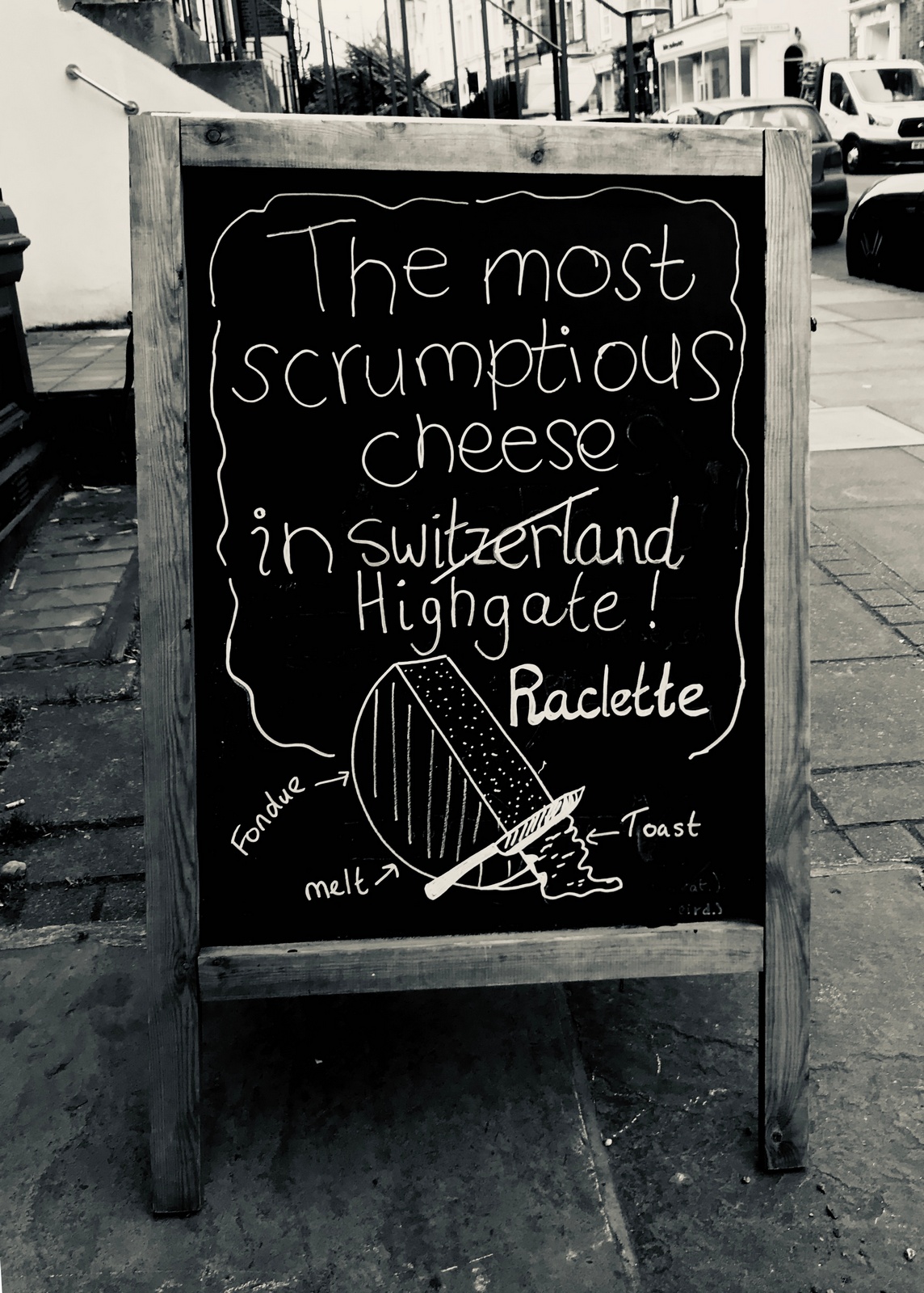
CLIENT FEEDBACK: ''Cheese continued to sell well''.OWN BRAND OLIVE OIL.I was disappointed with the results of the last execution, it's a big-ticket item, a good product, a new product and it's exclusive to Limone.I have another chat with the client.Again, she regales me with stories about how good it is, the part of Sicily it came from, how she'd spent seven years looking for a virgin olive oil to put their name, how many she'd tried and rejected before choosing this one.It's very convincing but difficult to distil that down to a few words.Also, it's better when delivered by a human being who believes it than a two-dimensional blackboard.The client also mentioned that people often come in and ask her for recommendations, maybe we use the board as one big recommendation?
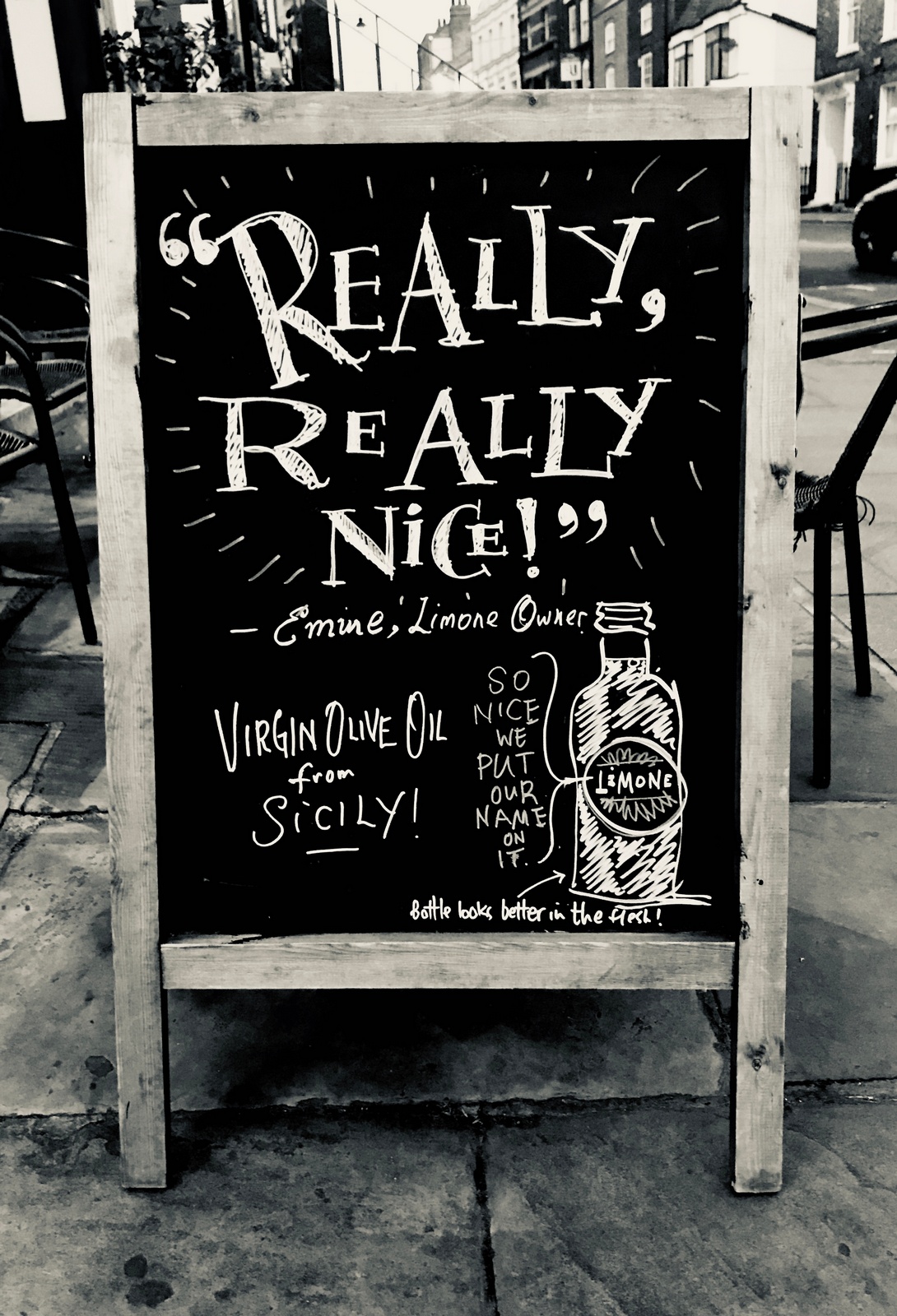
Walking past it the next day two things occur to me;1. It's the same as an ad I did with Sean back at AMV/BBDO.
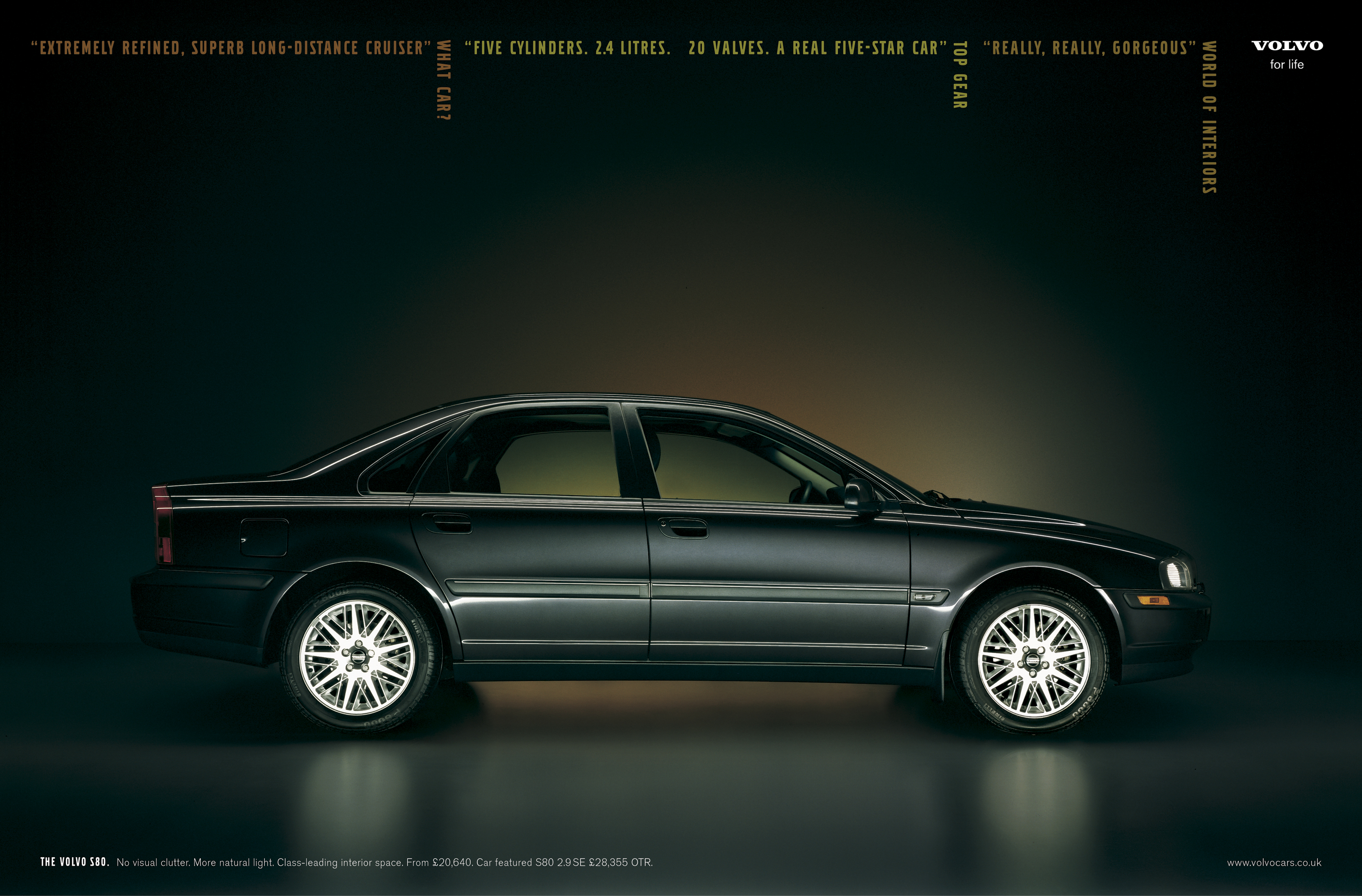
2. It's rubbish.The issue is media; in mass media, like the Volvo ad, being so chatty like that is a contrast to all the bombast around it, so makes it charming, on a chalkboard it feels normal, possibly even under-selling it.What to do? What to do?One of the things that's been in the back of my mind has been the price; £16.99, pretty expensive, not perhaps in the world of fancy virgin olive oils, but it is in the world of wandering down the high street to pick-up a nice olive oil.I know the client doesn't want to talk about stuff being dear, but perhaps we need to mention it.I have an idea I like; the client can sell the olive oil better than any chalkboard.ME: Why don't we invite people in to talk to you about your olive oil and why it's so expensive?CLIENT: I didn't really want to mention the price, some people will think it's expensive.ME: It is expensive...but there's no way you can make a sale without the price coming up?CLIENT: Yeah...but some people can't afford that.ME: We're not talking to them.CLIENT: I don't know...do we have to say expensive?ME: Maybe we just say ask me why it costs £16.99?CLIENT: Mmm...ok, I'll trust you.ME: If they come in and talk to you about it, we're half way there, maybe even 53% there?
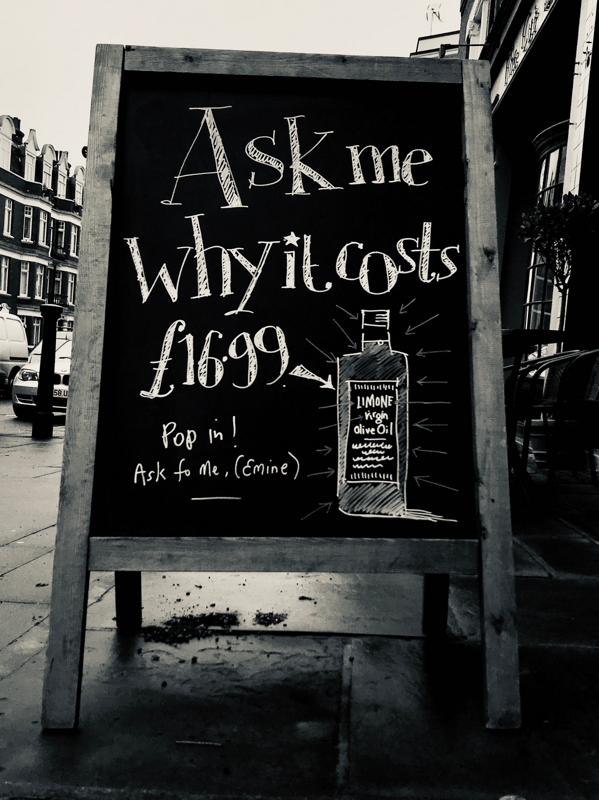
CLIENT FEEDBACK: "Mmm...about the same as last week".Damn! I had high hopes for that one, who could going in to find out more? Many people, it turns out.BRAND.As often happens, a client has fallen in love with a particular execution, so runs it again and again and again.Sometimes the client will mention that people often say they like that one, as if to pressure me not wipe that board clean and start again.
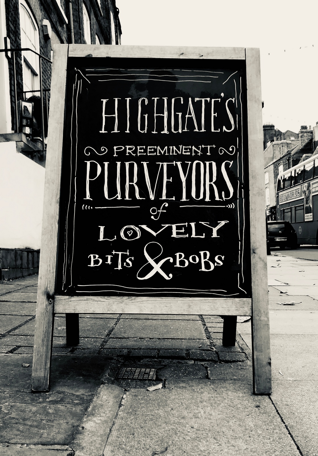
CLIENT FEEDBACK: "People seem to really like that one".WEEK 5.Weird one this.In the middle of a conversation my Abundance Investment client Matt, he tells me he's just had a terrible cruffin.I didn't know how to respond, was it something that needed treatment?He informs me that it's a muffin/croissant hybrid they're selling in Brighton.I decide to use it, maybe it's good to appear as though you have your finger on the pulse of food, even if you think it's crap.(Spend too long, about an hour, trying to think of pretentious food hybrids that may be sold in Shoreditch.It's a fun thing to do, but a single A board doesn't deserves that amount of time.)
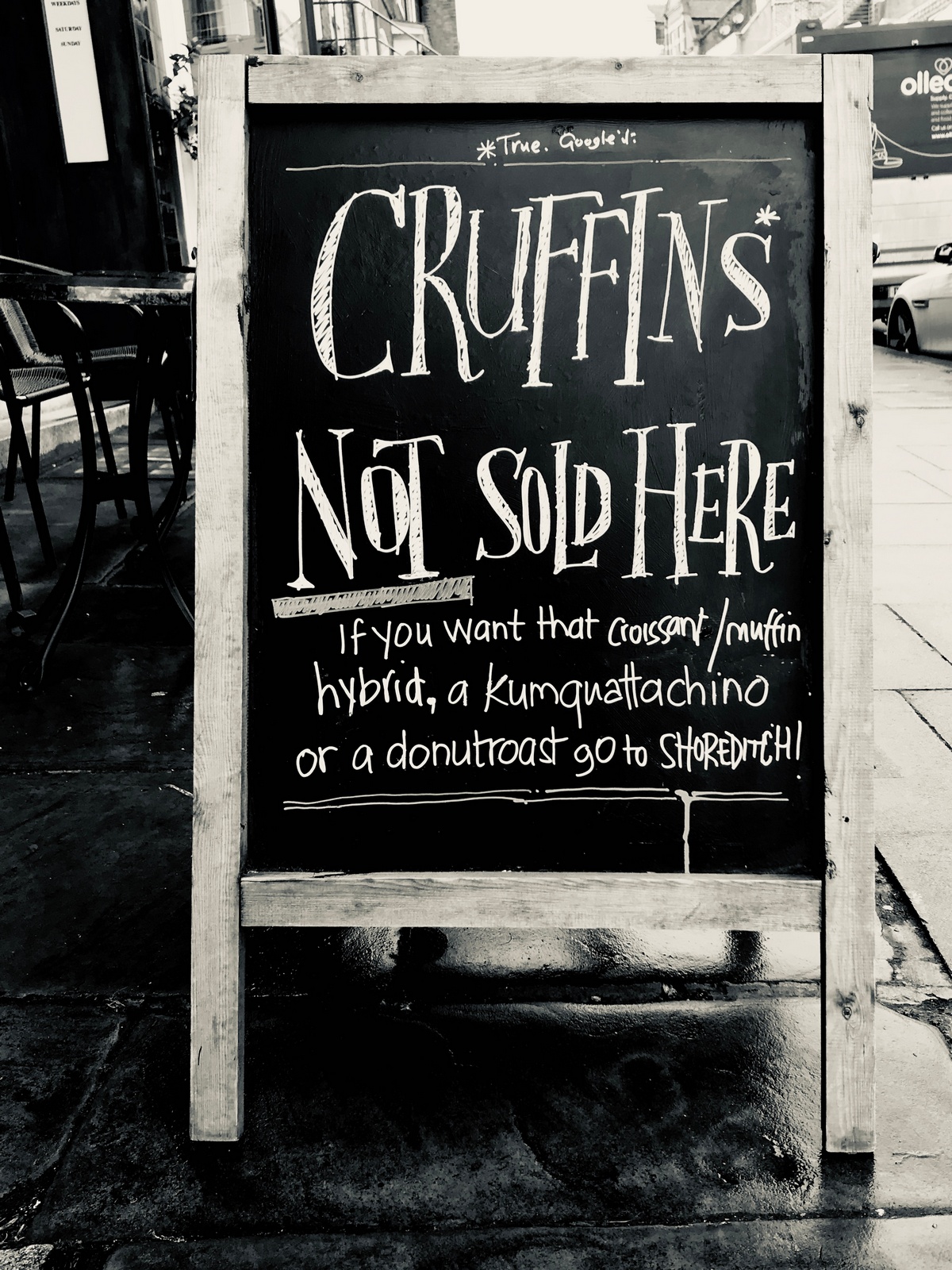
CLIENT FEEDBACK: "Mixed, I had a lot of people saying they thought that board was funny...and probably the same amount ordering cruffins...which I don't sell."Wow! Humans; what a bunch of nutters! It literally says 'we don't sell cruffins' in big words.It's the kind of feedback you get when being debriefed by research companies and don't believe.CHEESE.Generic cheese; what do we say?I like the idea that cheese you buy from a deli comes in exactly the size you want, not a predetermined block.Bespoke sizes?We cut just the amount you need?I know we're not solving a problem people have with cheese, but it reminds them its fresh cut, not pre-packaged supermarket cheese.
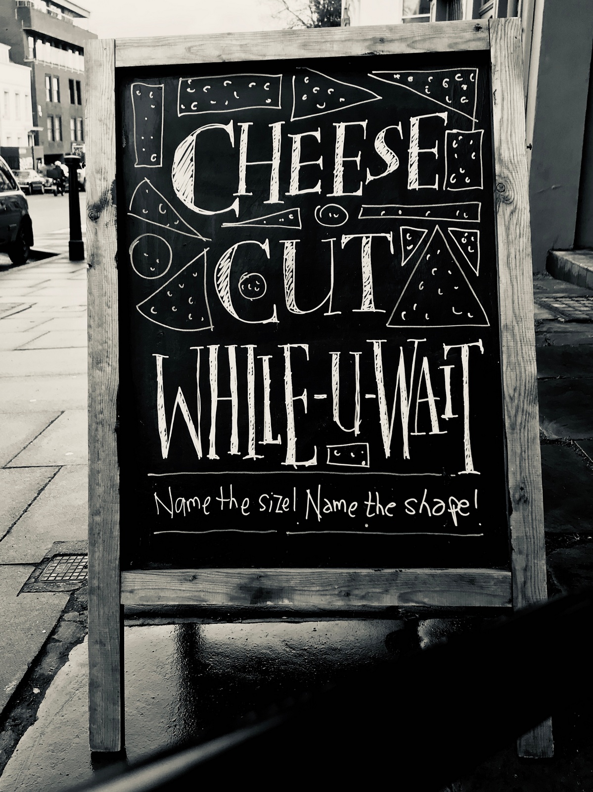
CLIENT FEEDBACK: "Cheese sales continued to be strong."Blimey, I wonder what difference the executions are making? Is simply calling out cheese enough? Would sales be just as strong if just wrote 'Cheese' with an arrow next to it?COFFEE CUP ISSUE.Just up the road is a Fancy Dan branch of the Gails chain, they've just introduced a new, ecologically sound coffee cup which seems to have hit Limone's coffee sales.The client has suggested giving 20% off to people with their own cups, that's even more ecologically sound than Gails offer.I sketch out a big call to action idea.
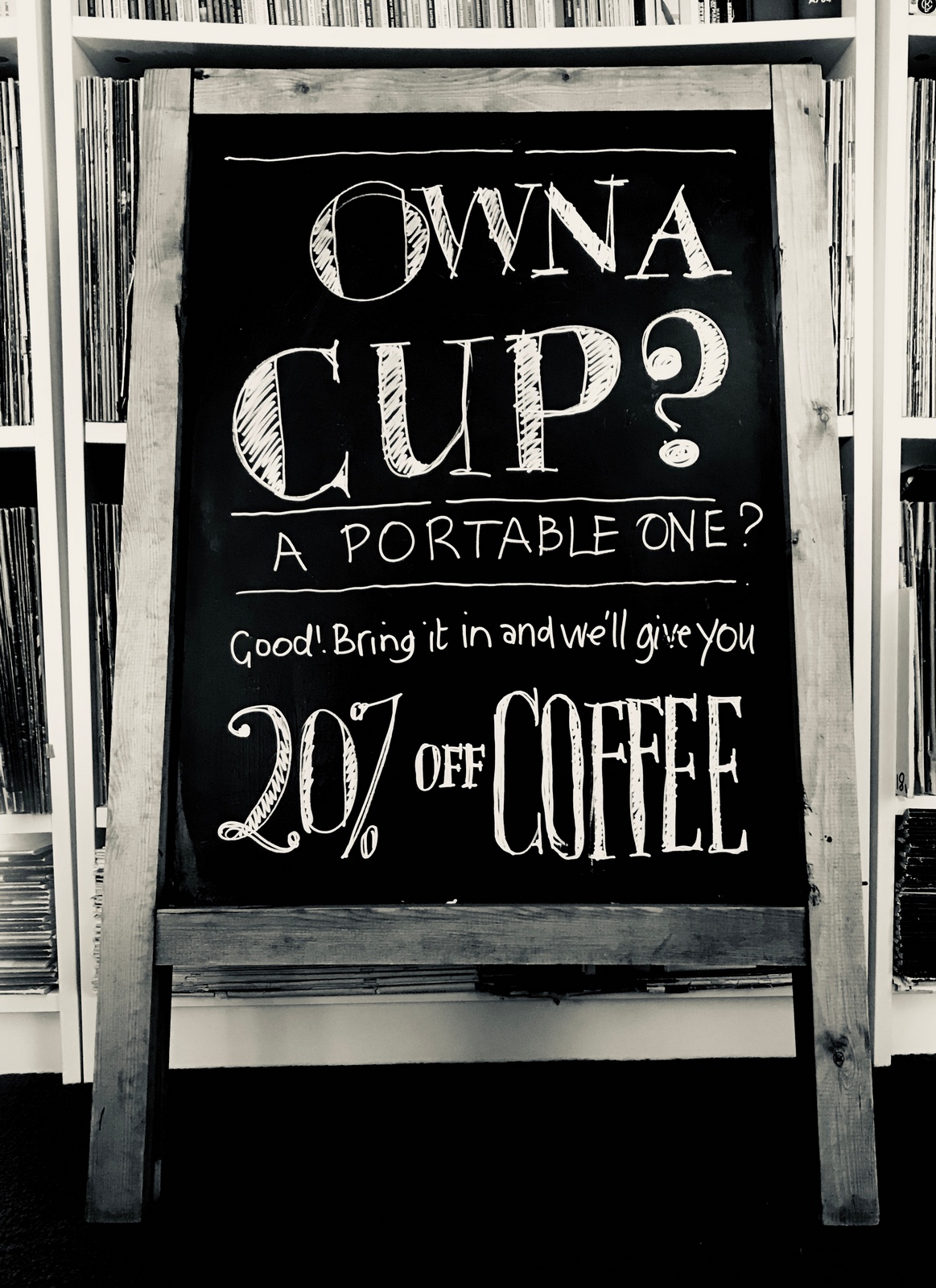
Whoa! Hang on a minute; too many words, too serious looking.I draw a cup and some T'dah! lines.Better.
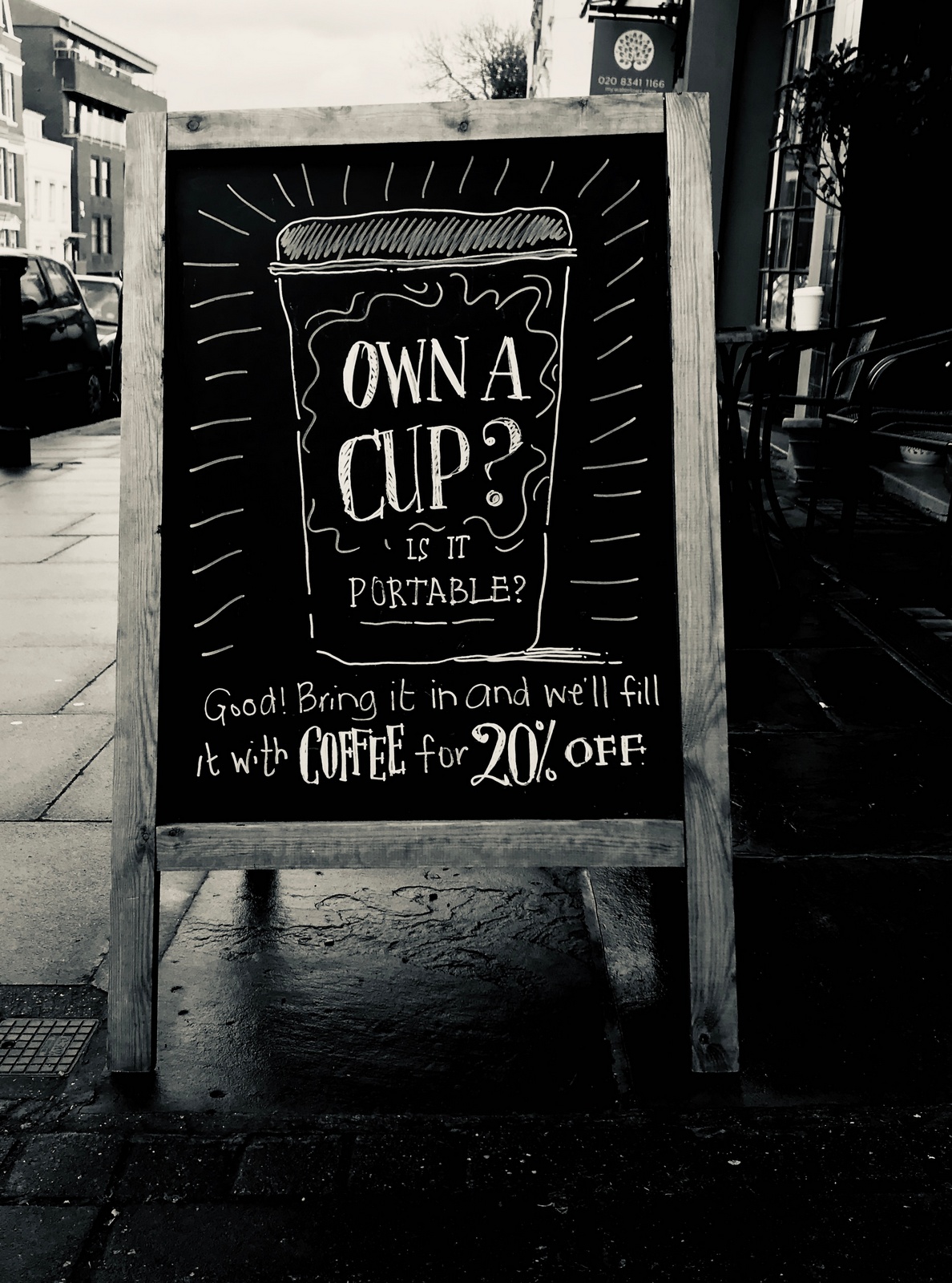
CLIENT FEEDBACK:"Not bad, bit of an improvement in sales, sold a few plastic cups too.One bloke came in to ask who did the signs as 'all cups are portable, I know about these things...I'm an author' ".Not sure about the portable thing, it was supposed to be a joke?But the thought isn't motivating enough?WEEK 6.COFFEE CUP ISSUE.A new push to sell coffee without the paper cup.So, 20% off.Initially I come up with an idea for a cup of coffee loose, wobbling around like liquid in space, with a line like '20% OFF COFFEE, YOU'LL NEED YOUR OWN CUP THOUGH!'But then I think; 20% didn't move people last time, why should it this time? The cute wobbly coffee visual? I don't think so.Taking your own cup to and from the store is a pain in the arse, the only reason people do it is to do their bit for their planet; we need either:a) Picture of their planet.b) The word 'SAVE!'orc) The word 'HELP!'.Initially I write 'Save this and 20% off this' next to a picture of Earth and a cup of coffee.Bit serious.
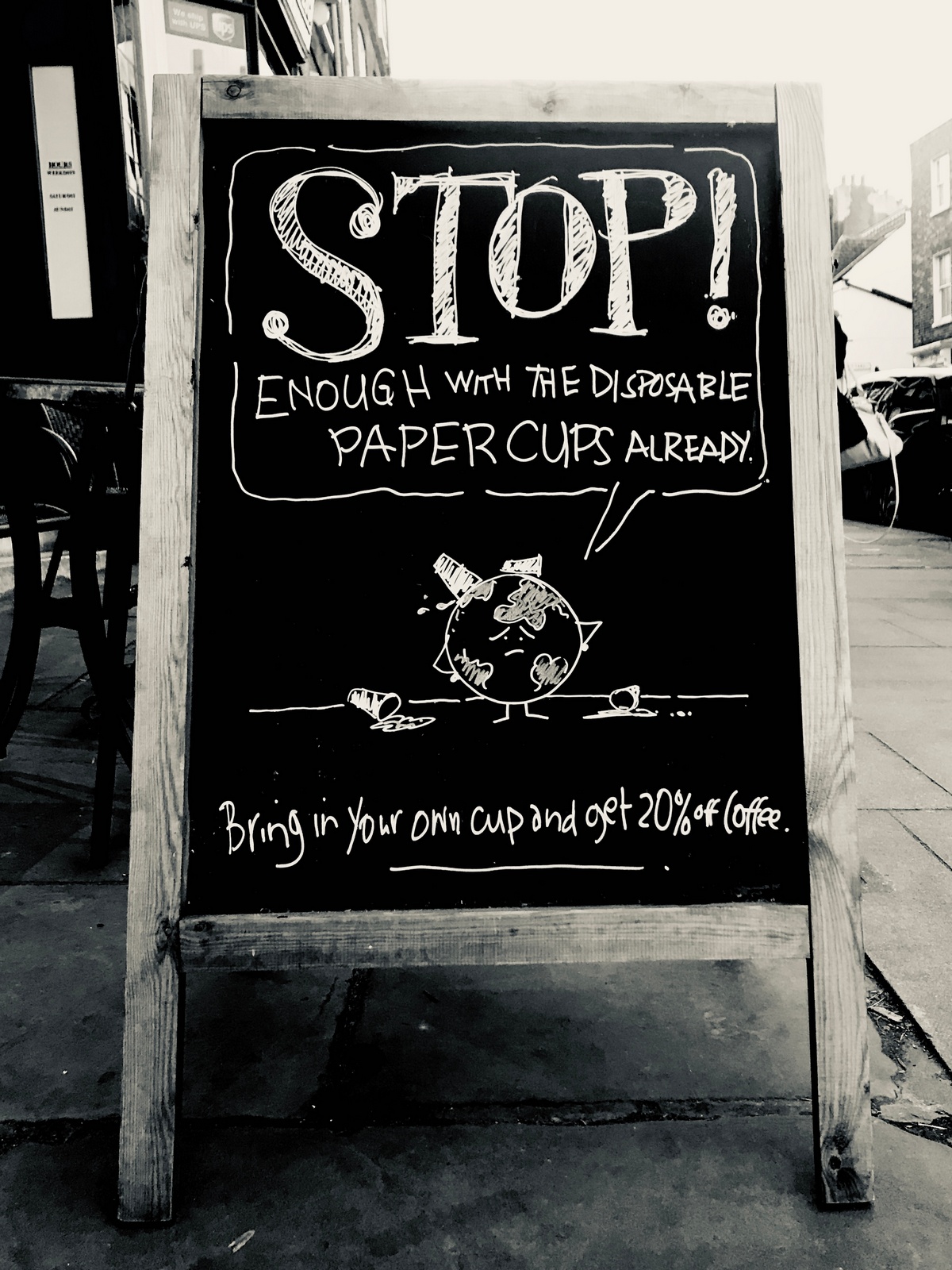
Not sure whether to use the word 'already'.I like it because it makes Earth sound more characterful, like it has an accent.The accent may be Jewish, is that bad to sound Jewish? Or is that just a more characterful voice?It's not derogatory, I'm over-worrying.A.M. QUIETER THAN P.M.Who could we appeal to in the mornings?Young mums; there seem to be a lot of them, many having just dropped older kids at one of the many schools in Highgate.Although they tend to go to the coffee chains further up the hill.We need to invite them in, Deli's can come over as a bit serious and grown up, maybe we can send out a signal that 'You and your baby are welcome here'.Let's give them a discount at a particular time.
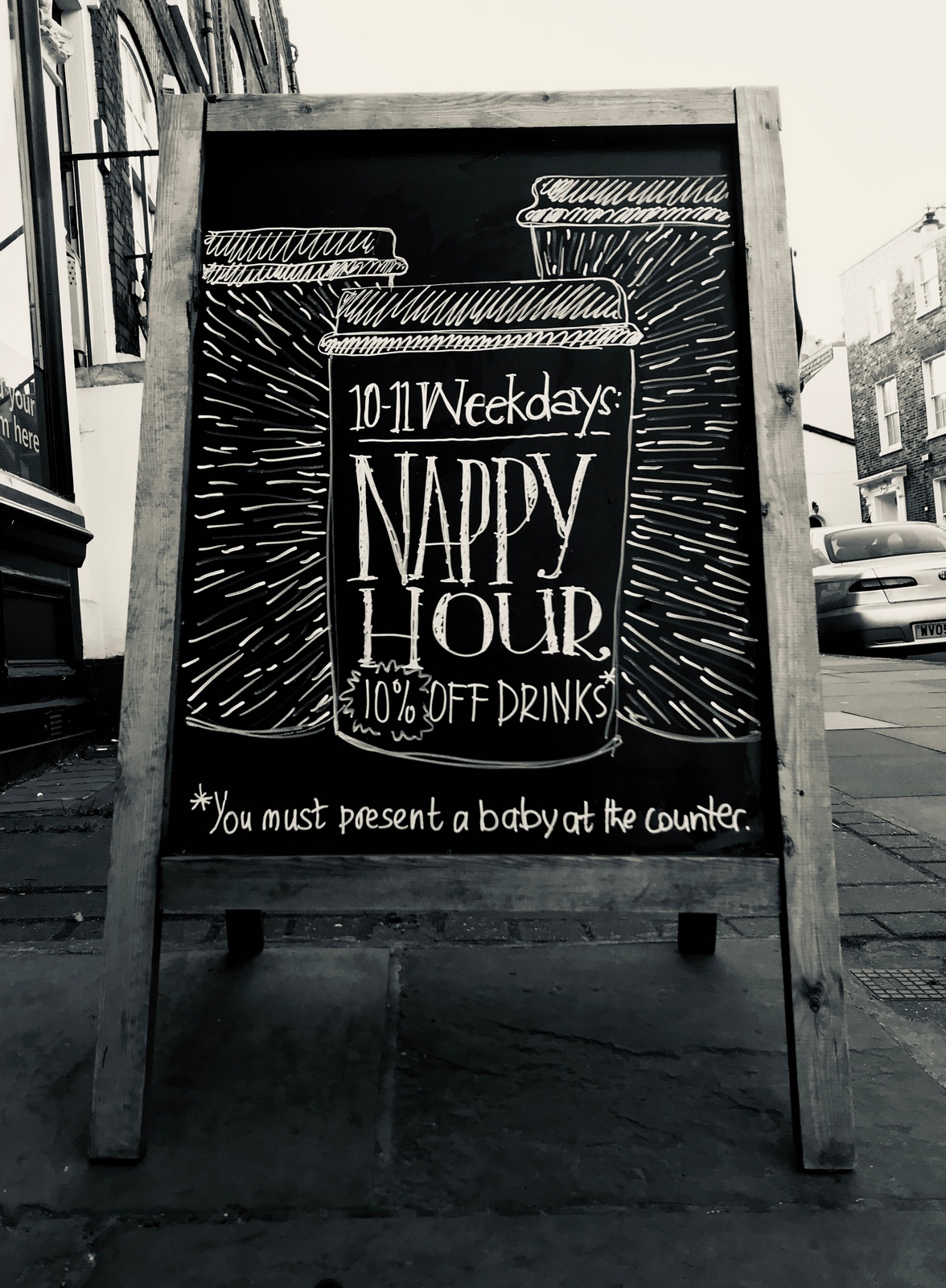
(Like 'Nappy Hour', possibly should've saved it for something bigger, oh well, let's just keep it between us.)CHEESE.Is it selling because we're singling out cheese or are the executions helping?Let's find out whether it would sell just as well by simply writing 'CHEESE!' next to an arrow pointed at the shop.
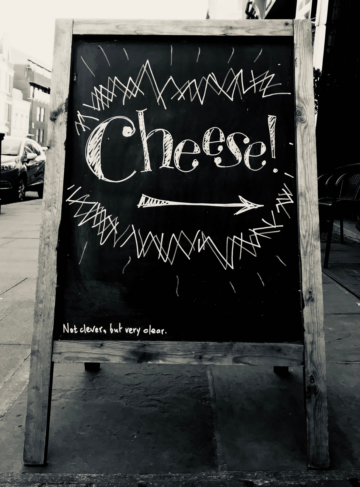
PART 3 NEXT MONTH...

"Frank Lowe single-handedly cajoled a whole generation of writers, art directors and film directors into revolutionising British and world advertising.” - Sir Alan Parker.It seemed a bit over the top.I know he was very good and had a big impact on the business, but 'single-handedly'?I guess Alan is his mate, so probably bigged him up a bit.Having just spent three hours nose to nose with Frank, I got a taste of what Alan was talking about.I can't think I've met anyone who's as sure of their own opinion.That may read like a back-handed compliment, it's not meant to be.Just that he totally believes in the power of advertising, he's so unwavering that it was striking.Especially today, when nobody seems be very sure of what advertising even is.It's easy to see (and hopefully hear) how generations of clients and agencies would've been persuaded, cajoled or battered into aiming higher.Higher to Frank meant "not just achieving sales success, but ensuring any advertiser entering people’s lives uninvited, left them a little better or richer for their visit”.Enjoy being cajoled.
PRITCHARD WOOD.National Provincial.The little girl needed the loo, she twists and turns trying to hold it in until someone shouts 'cut'.The result was charming. (Although people would probably locked up for that today.)But there was a problem; it was one take, a 67" take, the agency had booked 60 second spots.They didn't want to cut it to a 60" and it wasn't long enough to fill a 90", (the only available time lengths being sold for cinema at the time).Frank 'cajoled' the media company into running 67" ad.
(Frank is on the left, spotted looking bored by a producer at the agency, then cast.)COLLETT DICKENSON PEARCE.
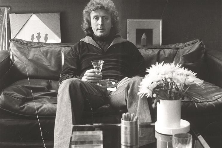
CDP was Britain's DDB.It revolutionised advertising in this country, producing campaigns that the public loved; Hovis, Hamlet, Heineken, Harvey's Bristol Cream. (That's just the 'H's.)You may have noticed that I'm not shy of posting a very long stream of work, but trying to figure out what to show here was tough as the volume of good work was just incredible, way more of it than I'd remembered.So I tried to impose a bit of discipline, I figured the best way to judge an agency is to look at what they do across all their clients.Anyone can hit it out of the park once, but year after year, client after client, category after category, that takes skill.So I've tried, but didn't always succeed in picking one ad per client.So here we go...Army.
Barclaycard.
Barclays.
Benson & Hedges Gold Box.
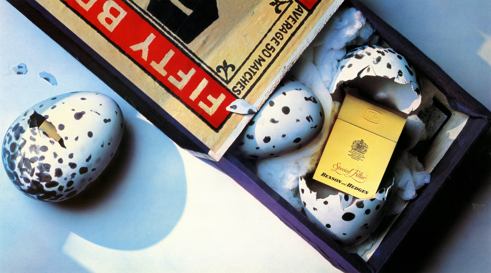
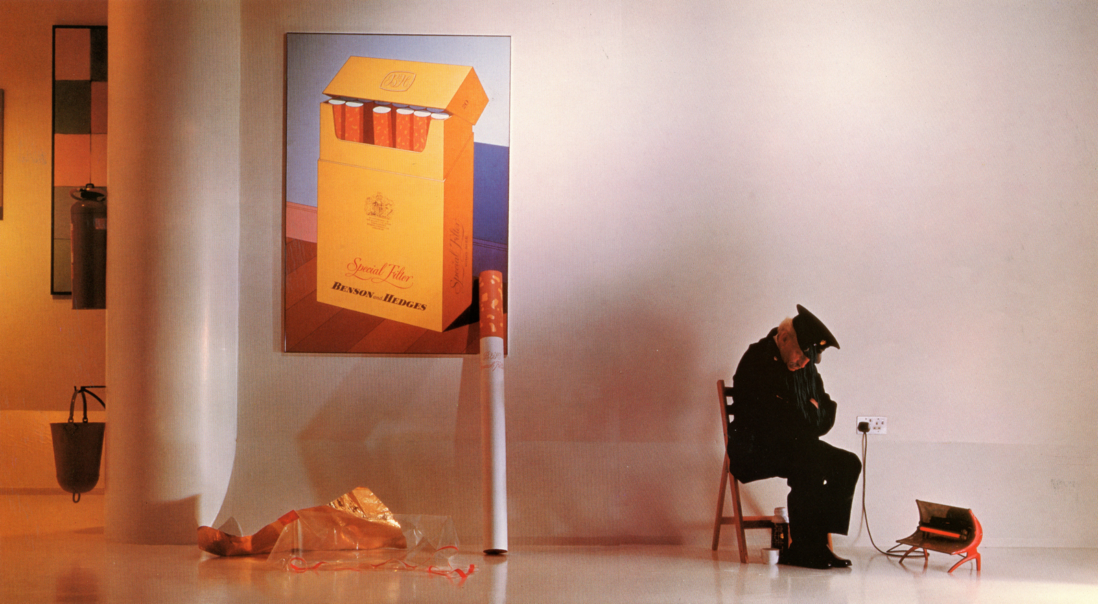
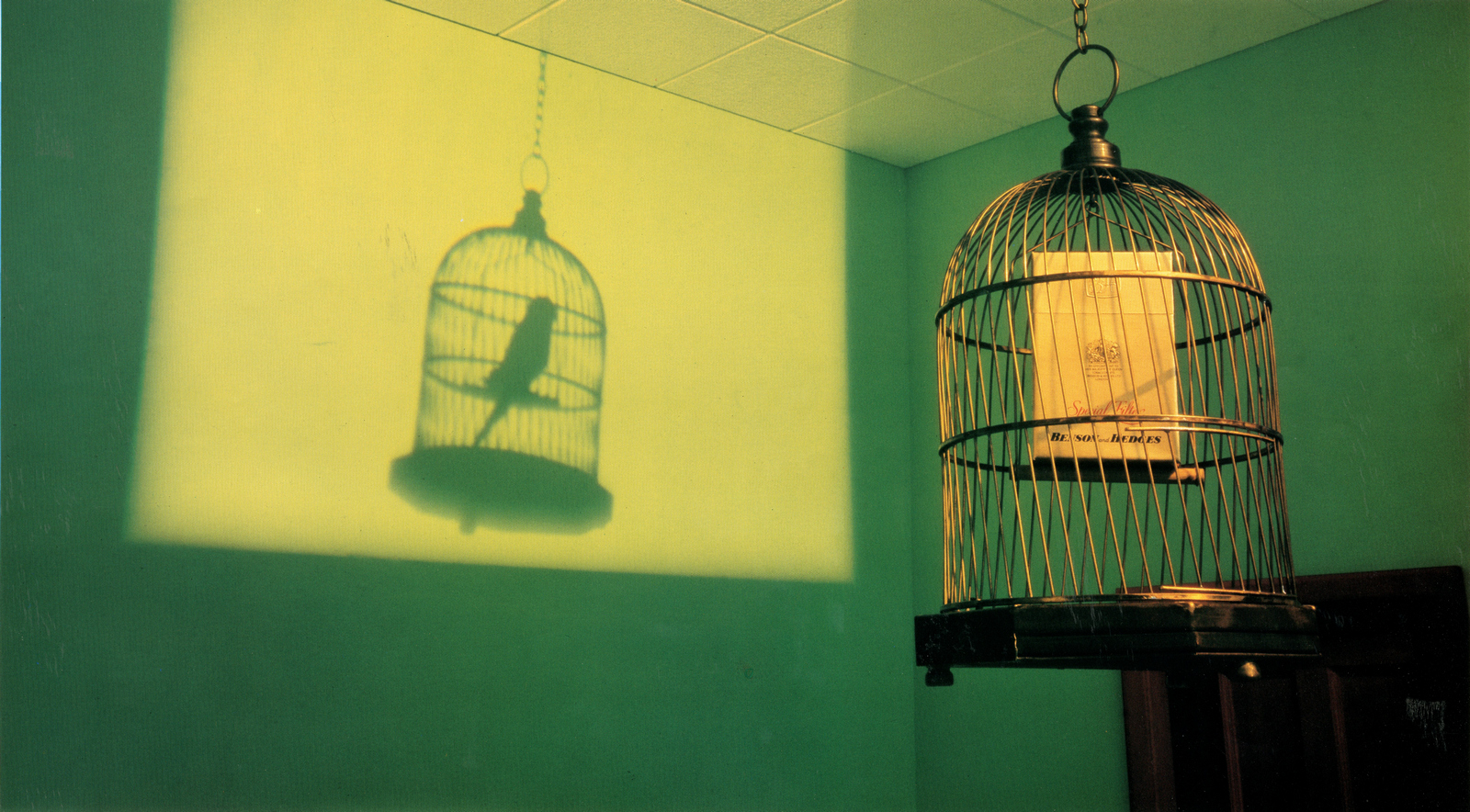
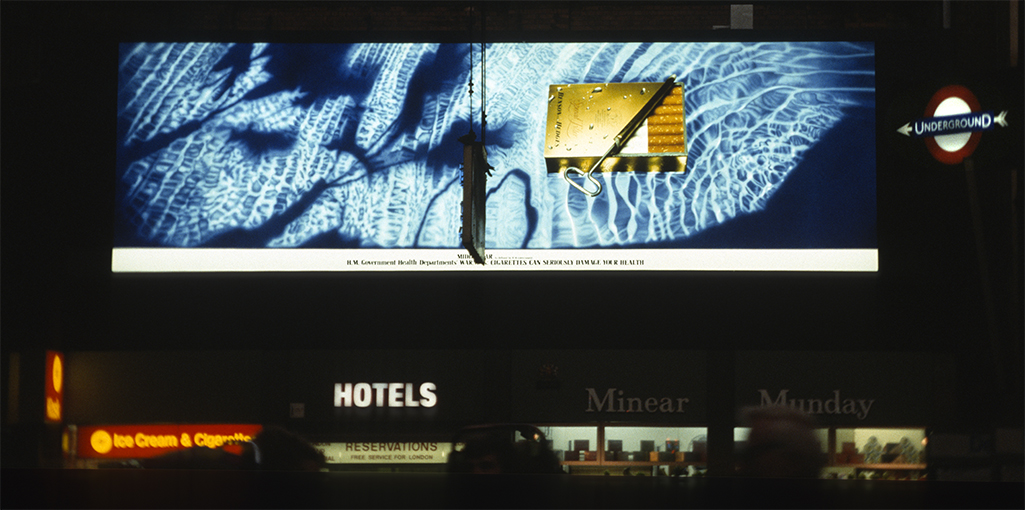
Benson & Hedges Small Cigars.
Birds Eye.
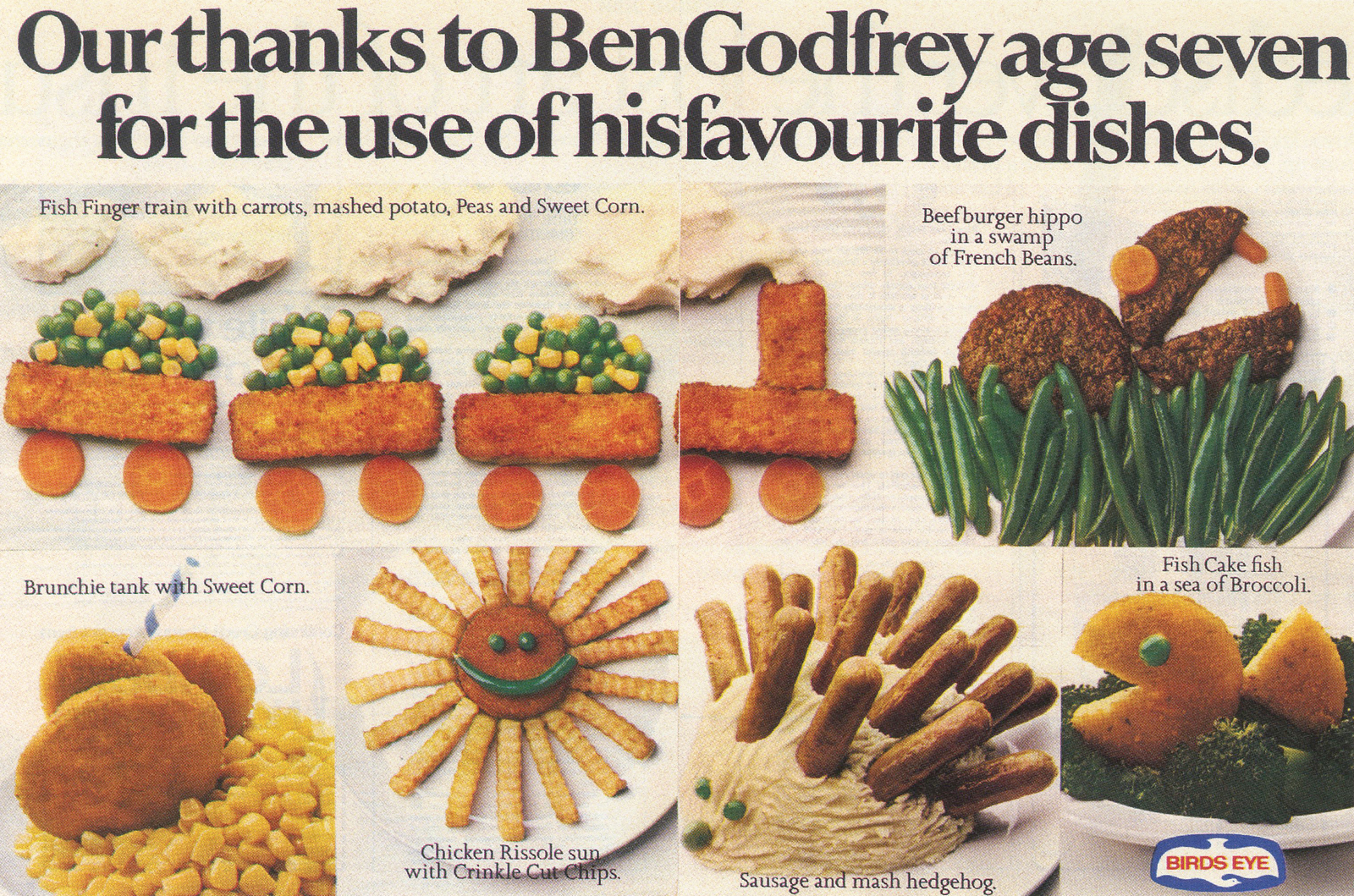
Cinzano.
Citizen.
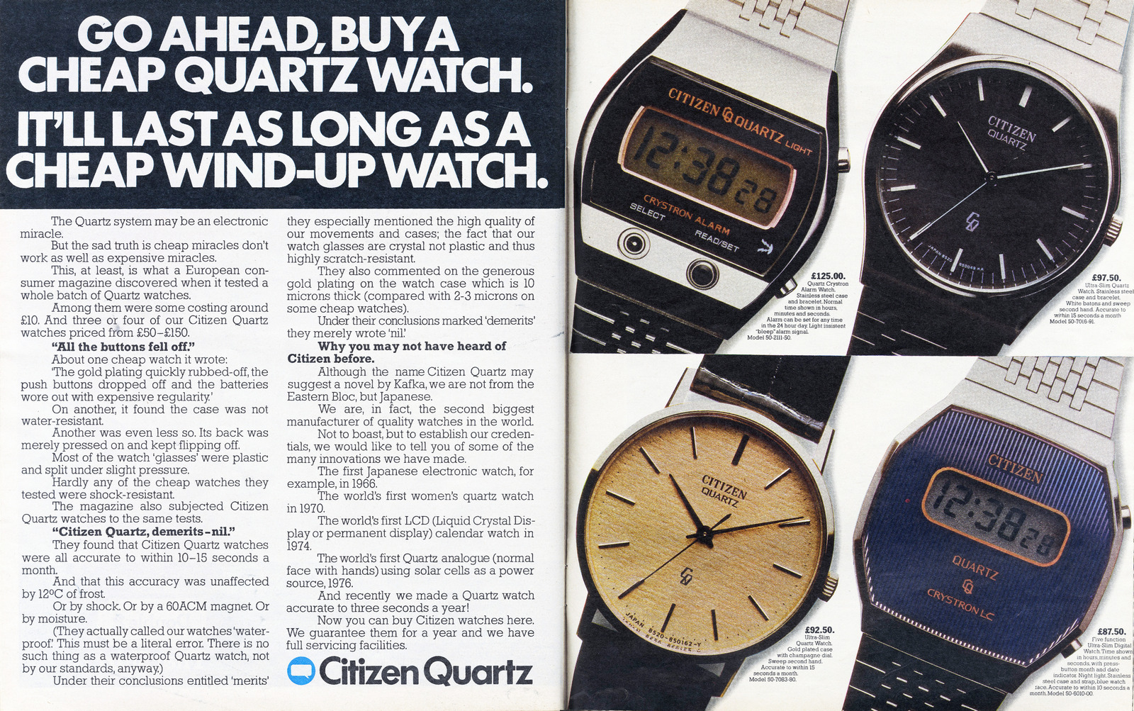
Clarks.
Cockburns.
Daily Express.
Dunn & Co.
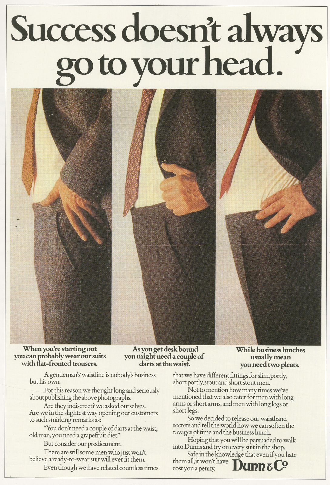
EMI.
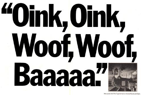
Fiat.
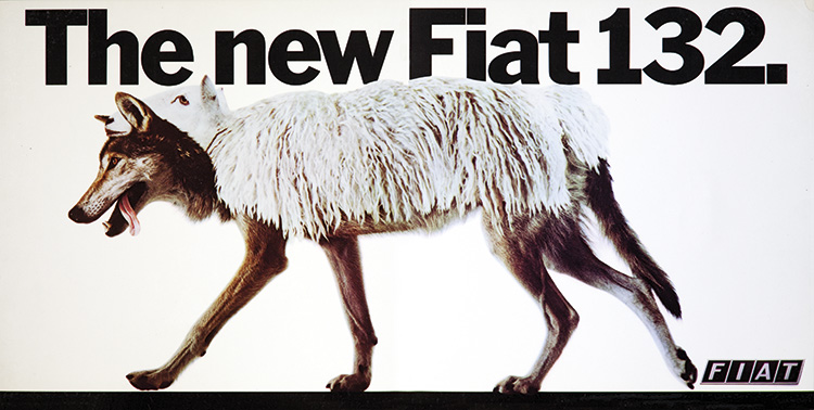
Hamlet.
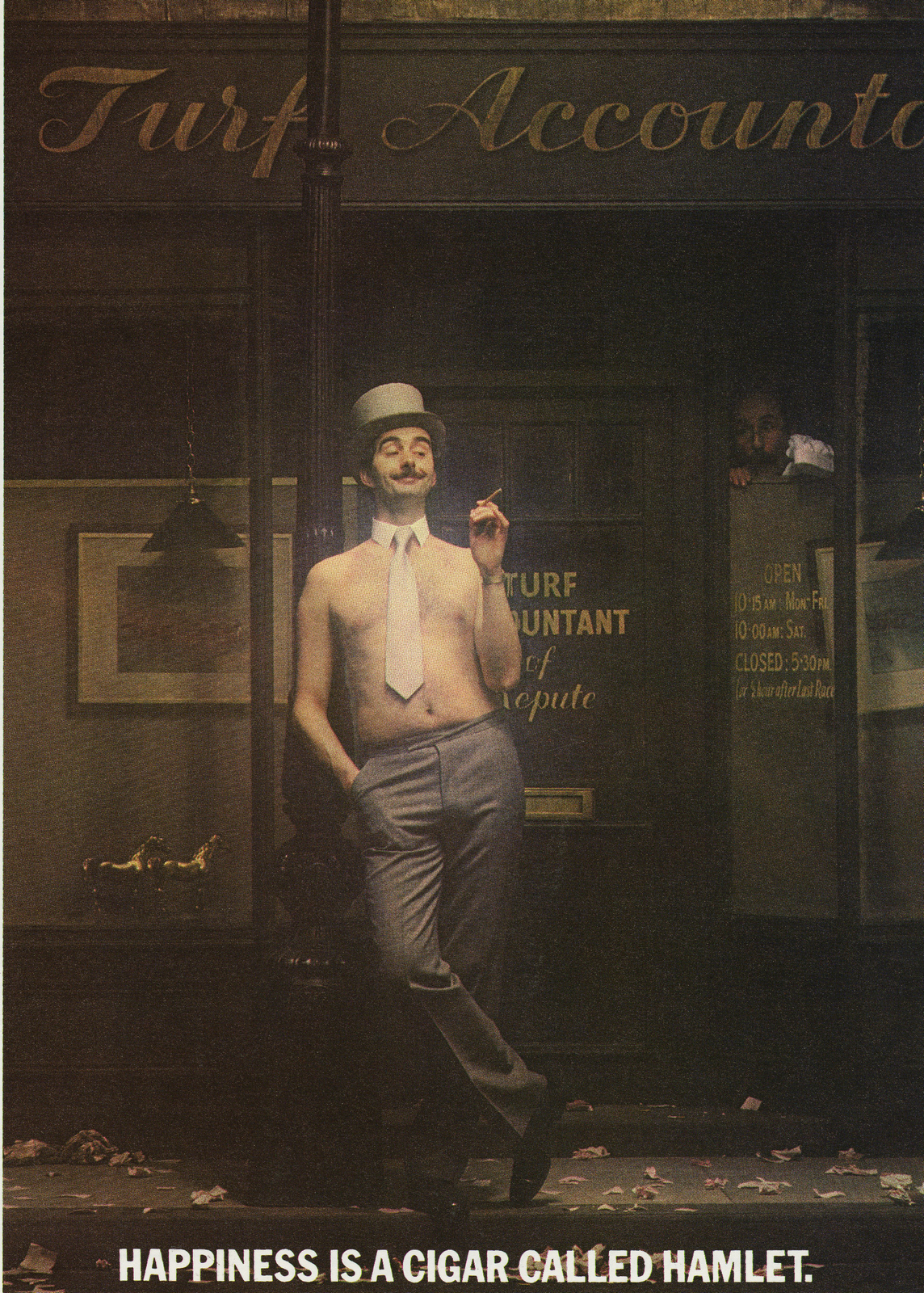
Harvey's Bristol Cream.
Heineken.
Hovis.
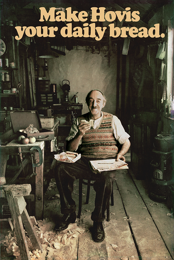
J&B Rare.
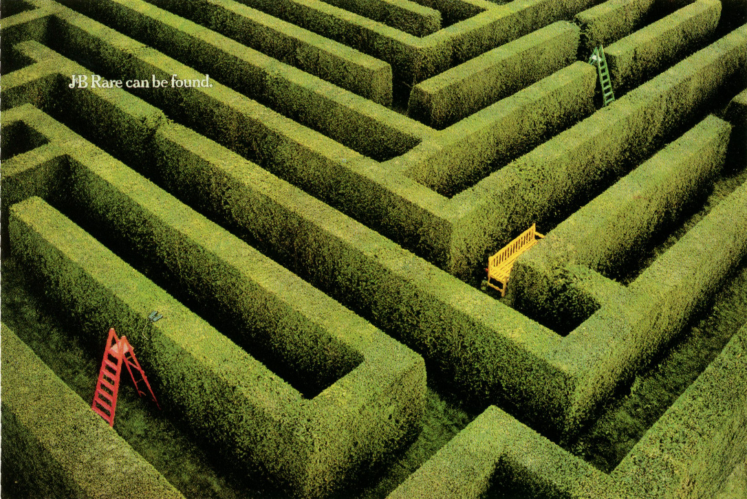
Nescafe Coffee.
Olympus.
One Hundred Pipers.
Parker Pens.
Rawlings.
Silk Cut.
Senior Service.
Special Panetellas.
Texaco.
Walls.
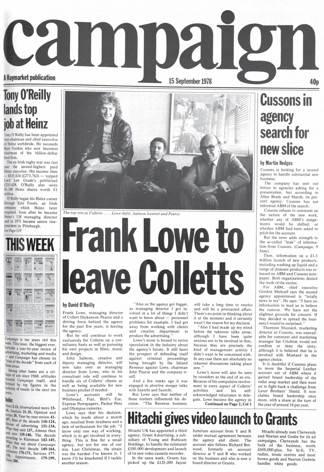
LOWE HOWARD-SPINK.
Albany Life.
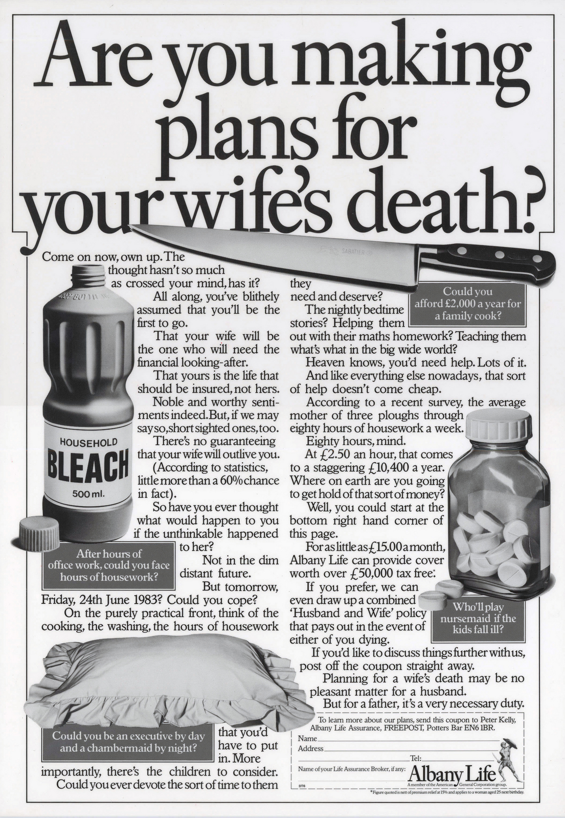
Applejacks.
Bell's.
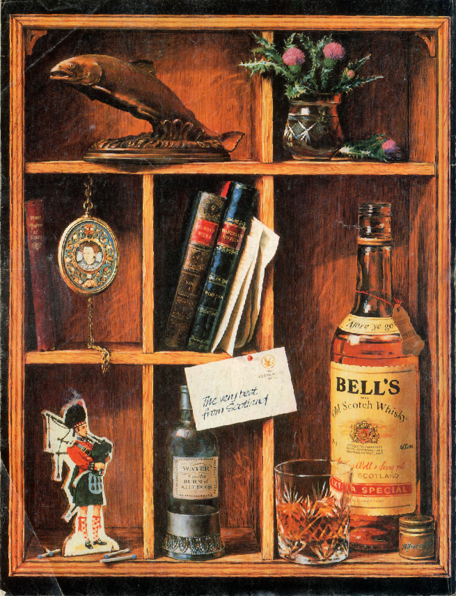
Castella.
Flowers.
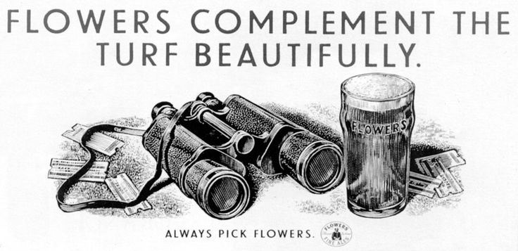
Hanson Trust.
Heineken.
Hula Hoops.
The Independent.
JVC.
Lloyds.
Long John.
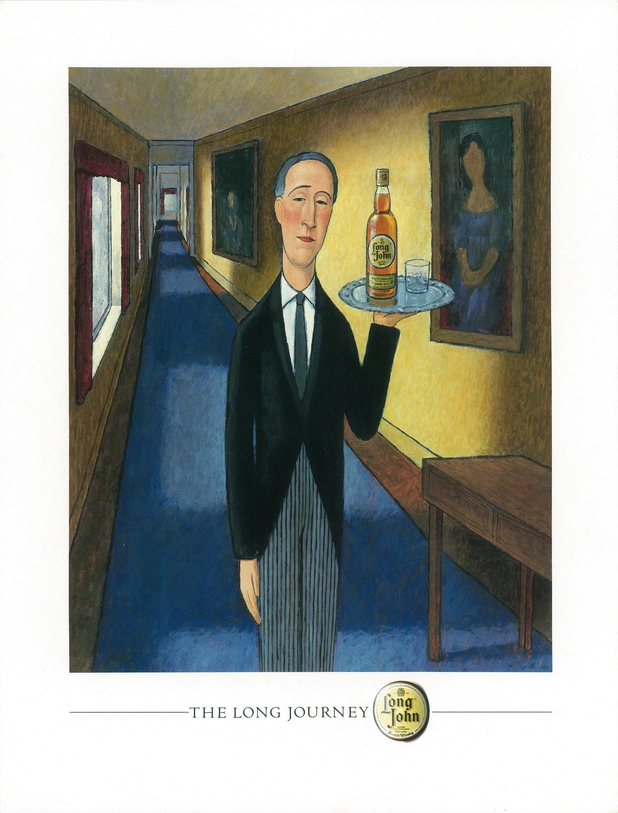
Mail On Sunday.
Malibu.
Plymouth Gin.
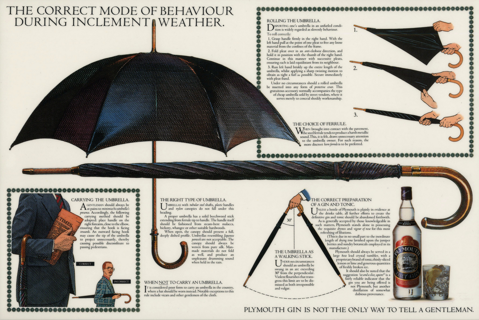
Reebok.
Scalextric.
Stella Artois.
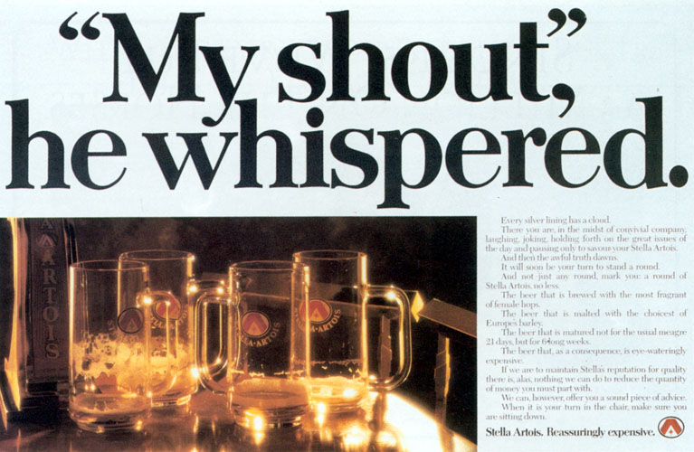
Tesco.
Vauxhall.
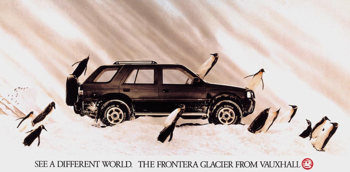
Weetabix.
Whitbread.
You Magazine.
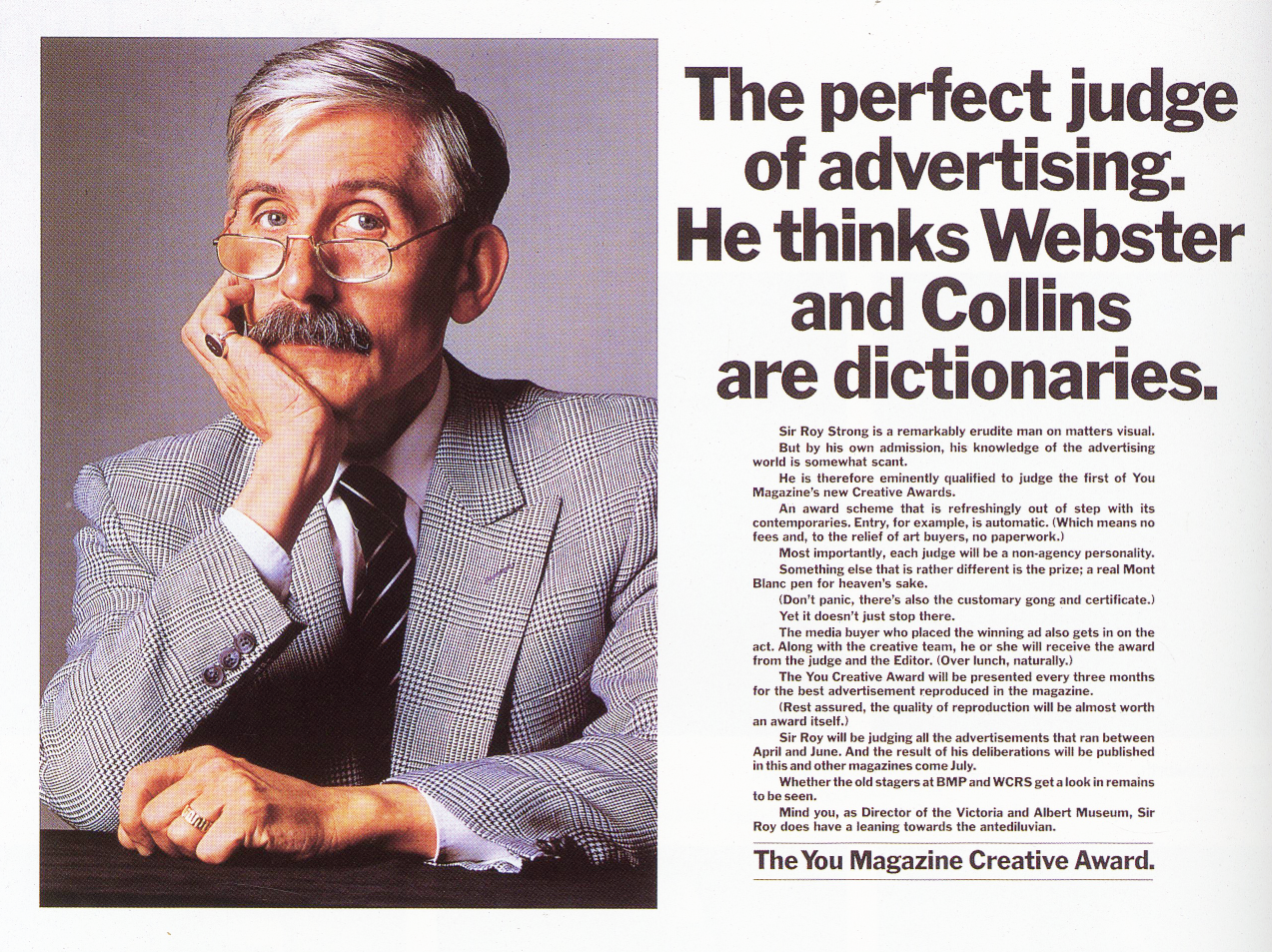
Articles about Frank.

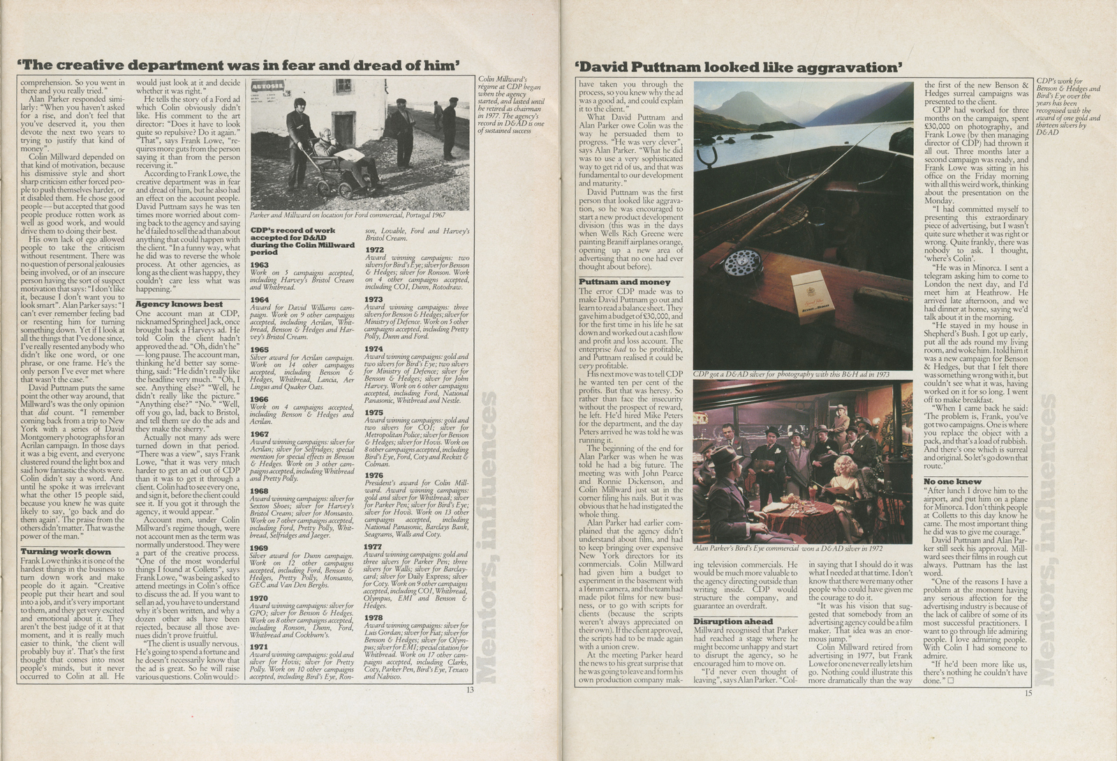
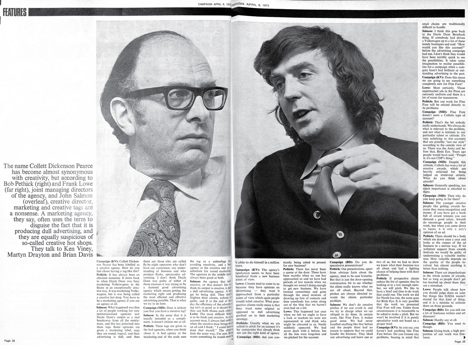
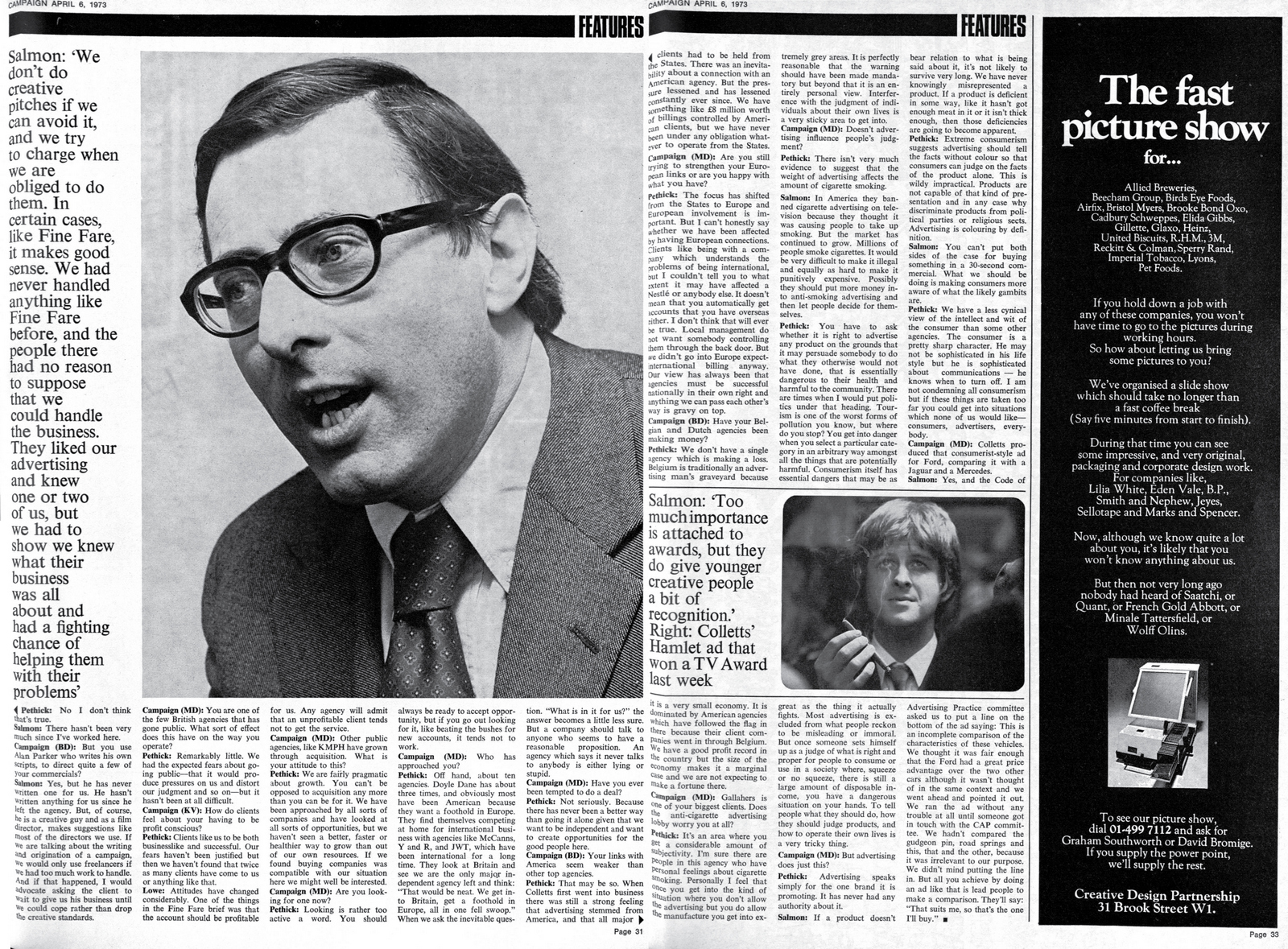
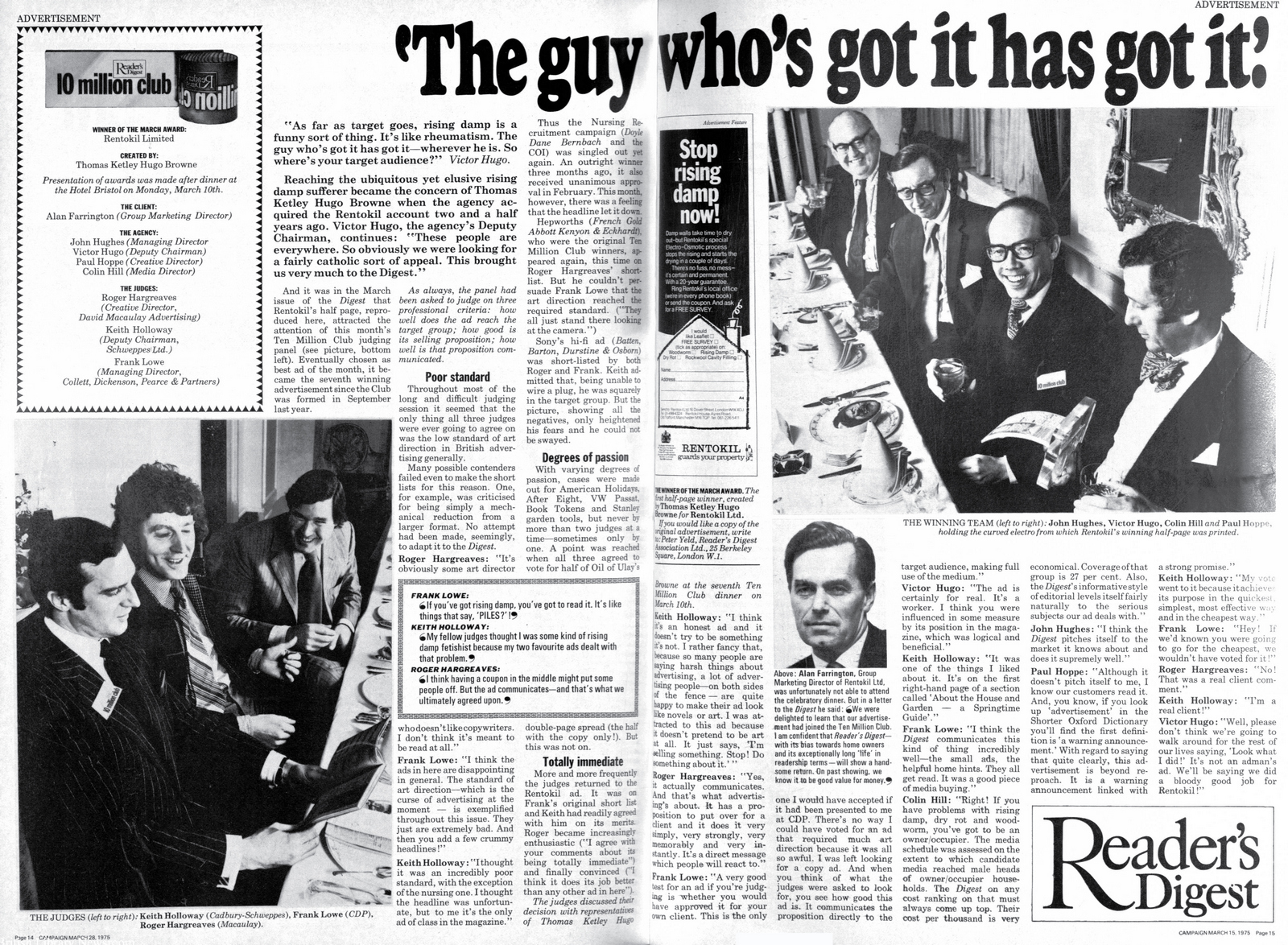
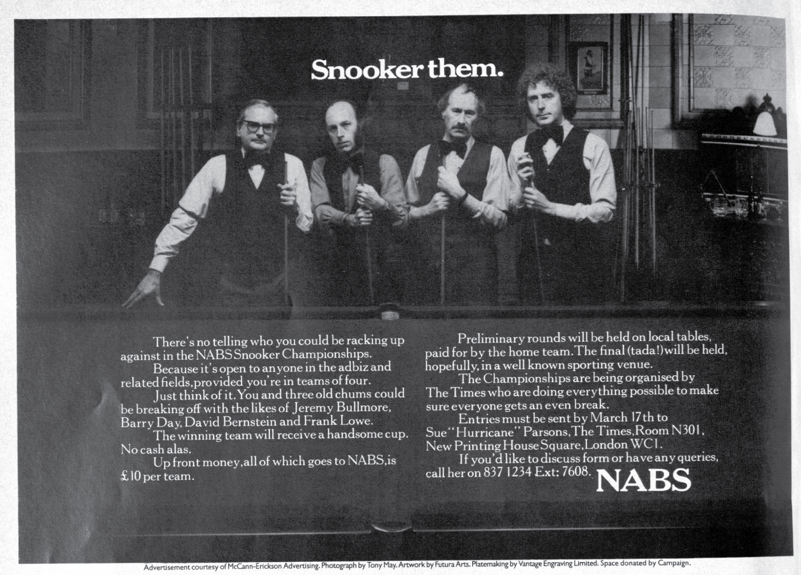
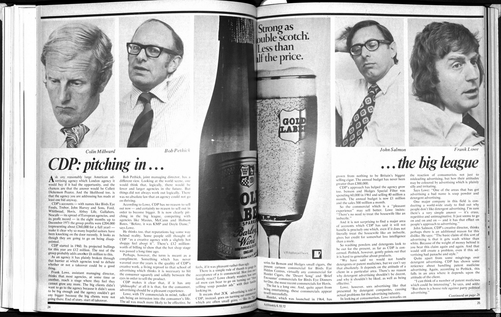
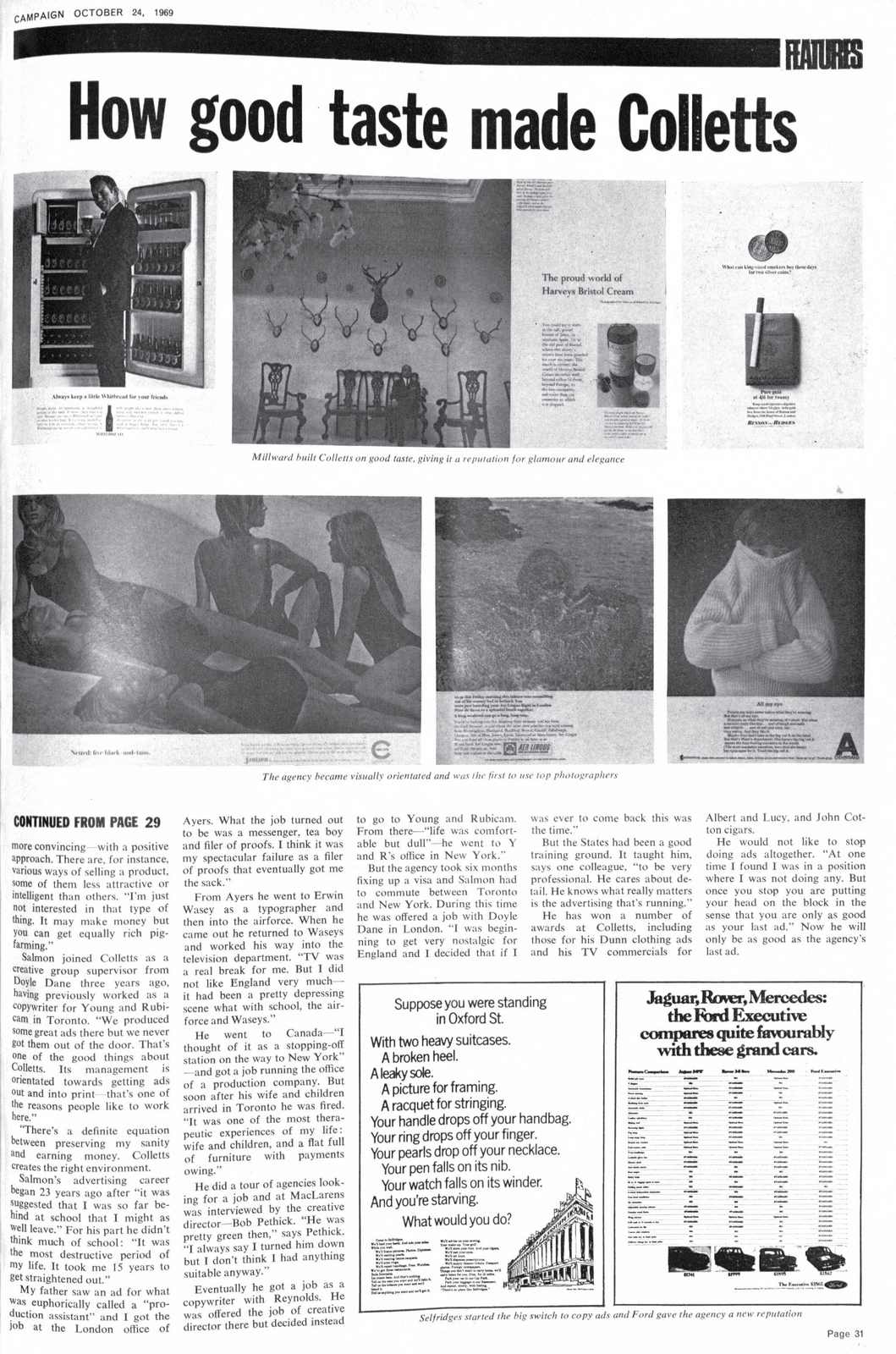
'Dear Mr Leverhulme, I Think We May Have Solved Your Problem' - Frank Lowe.
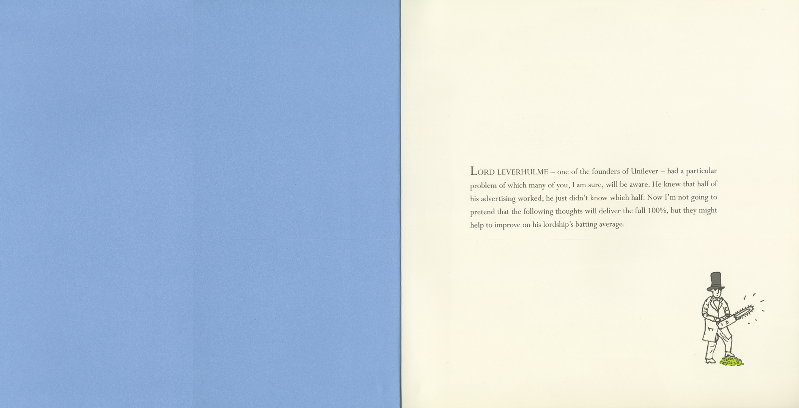
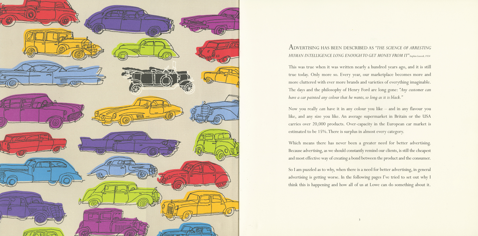
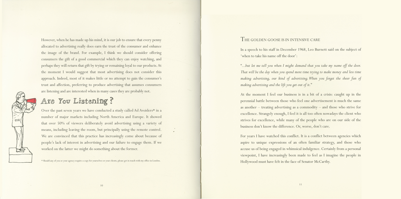
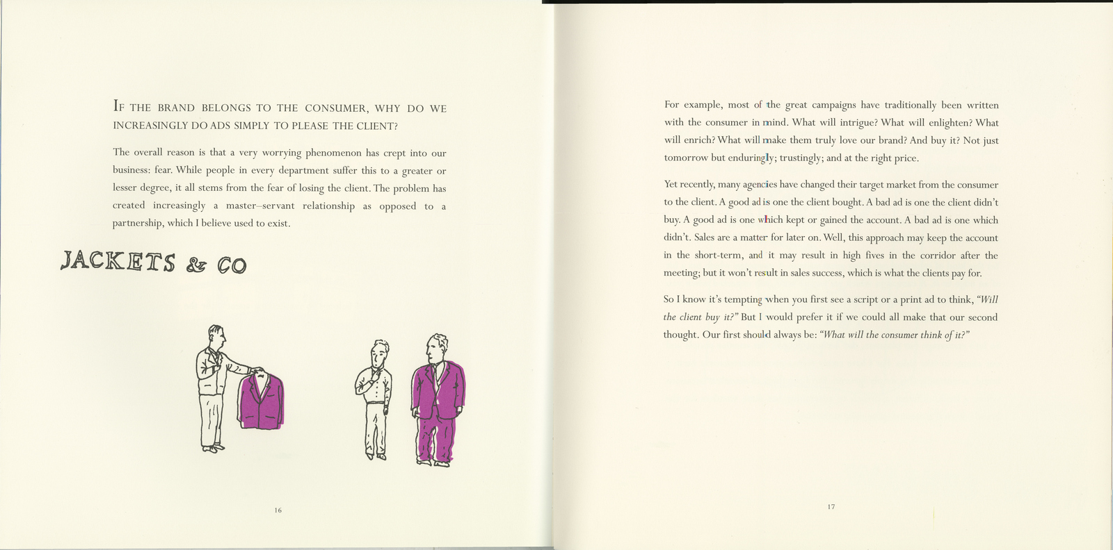
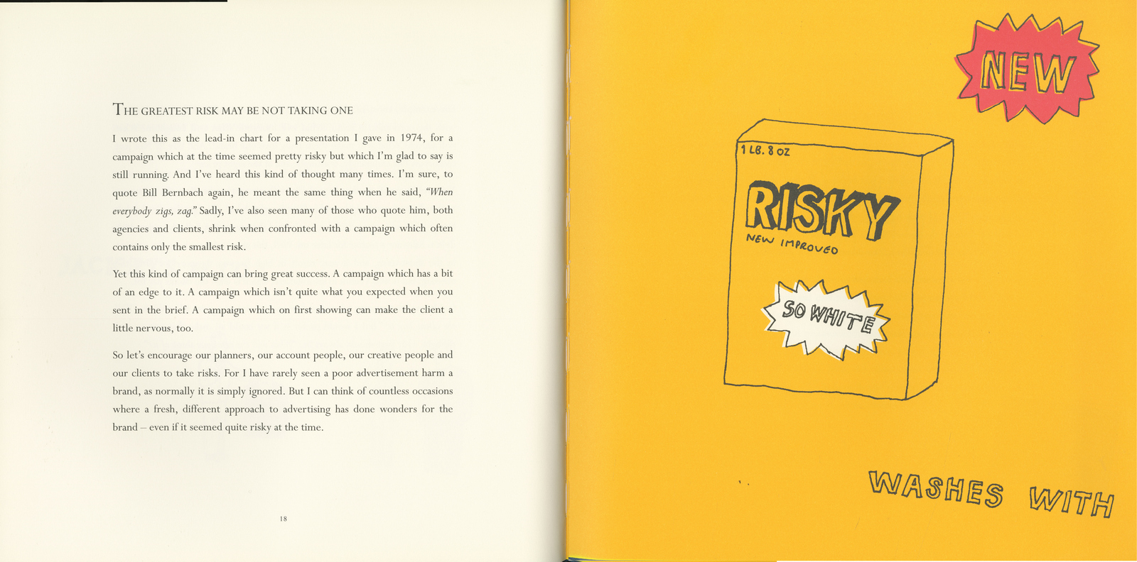
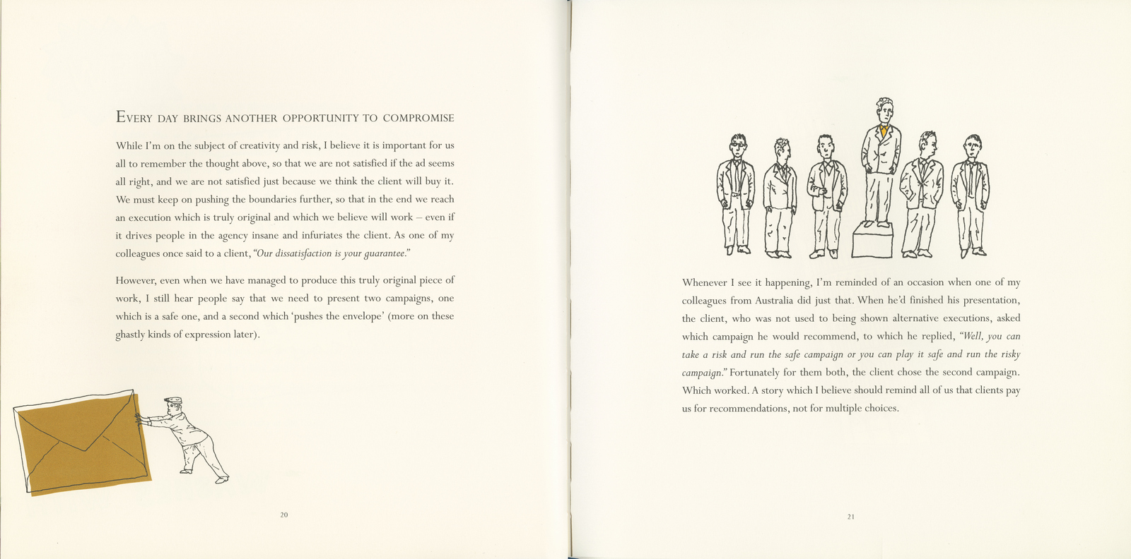
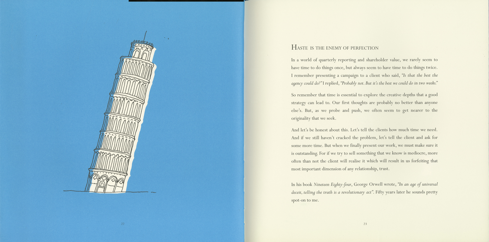
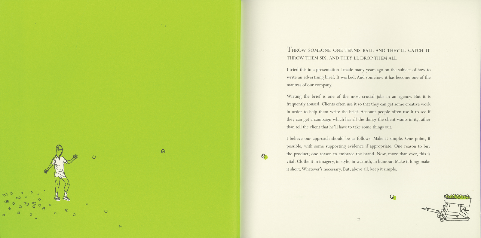
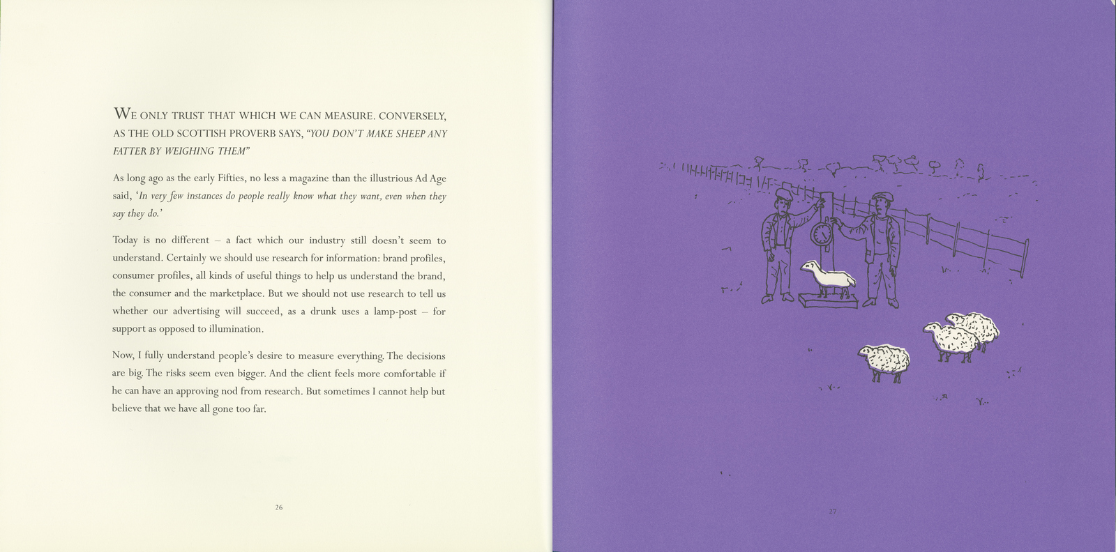
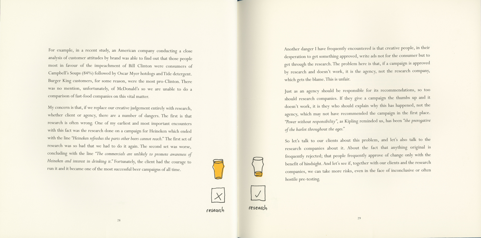
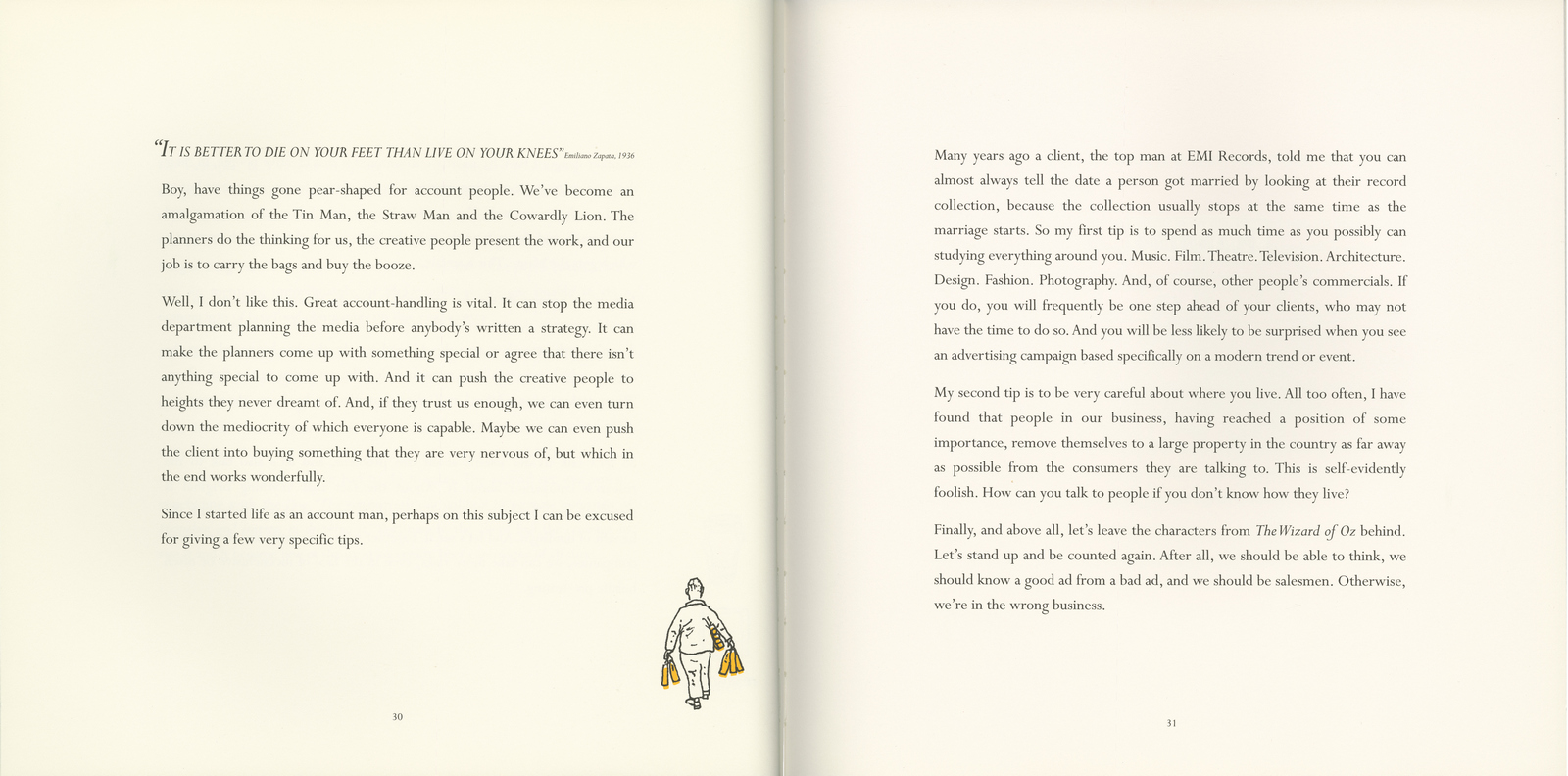
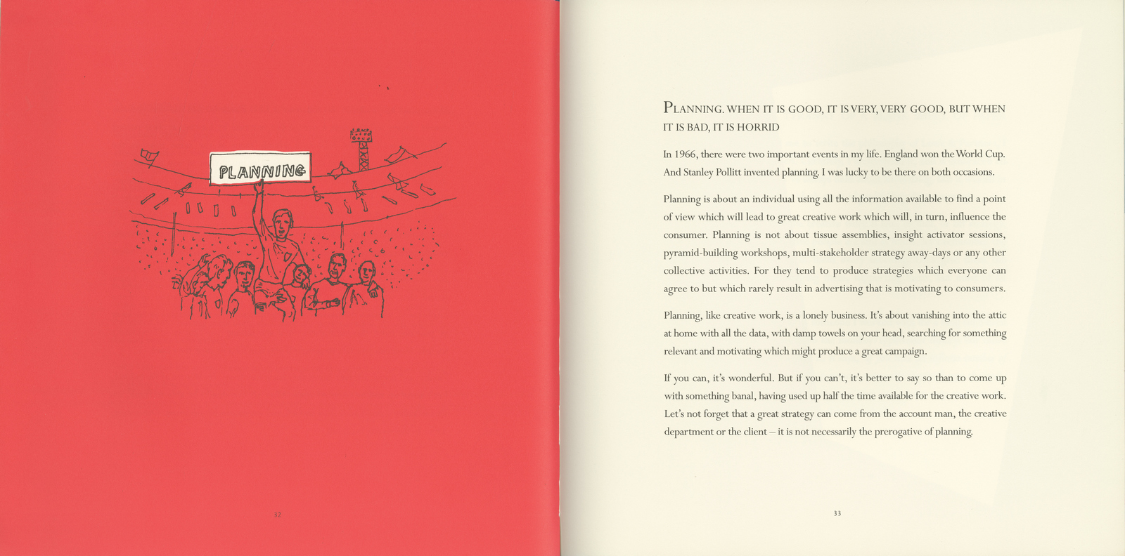
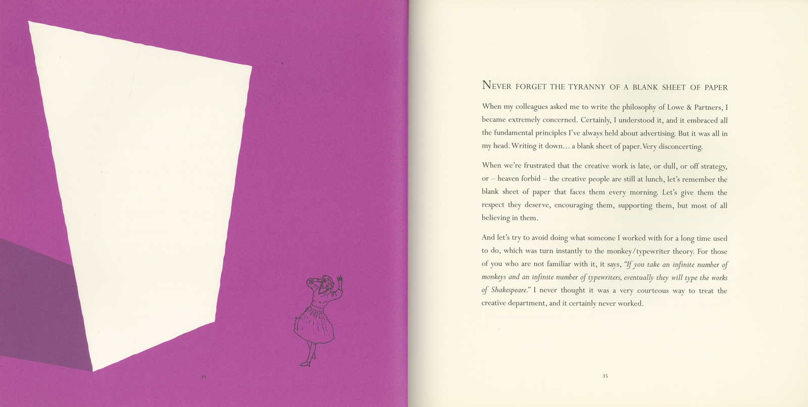
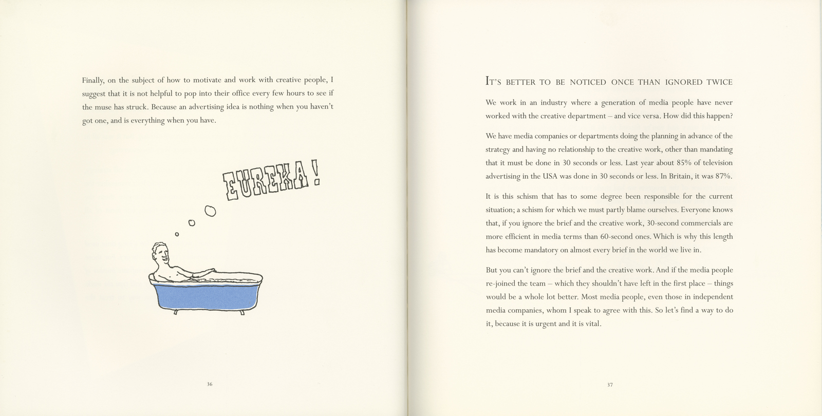
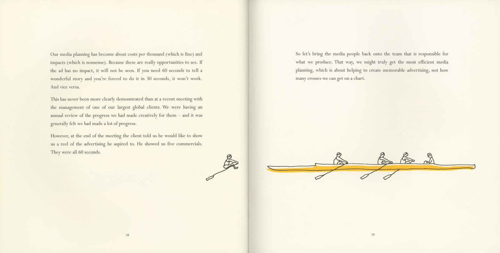
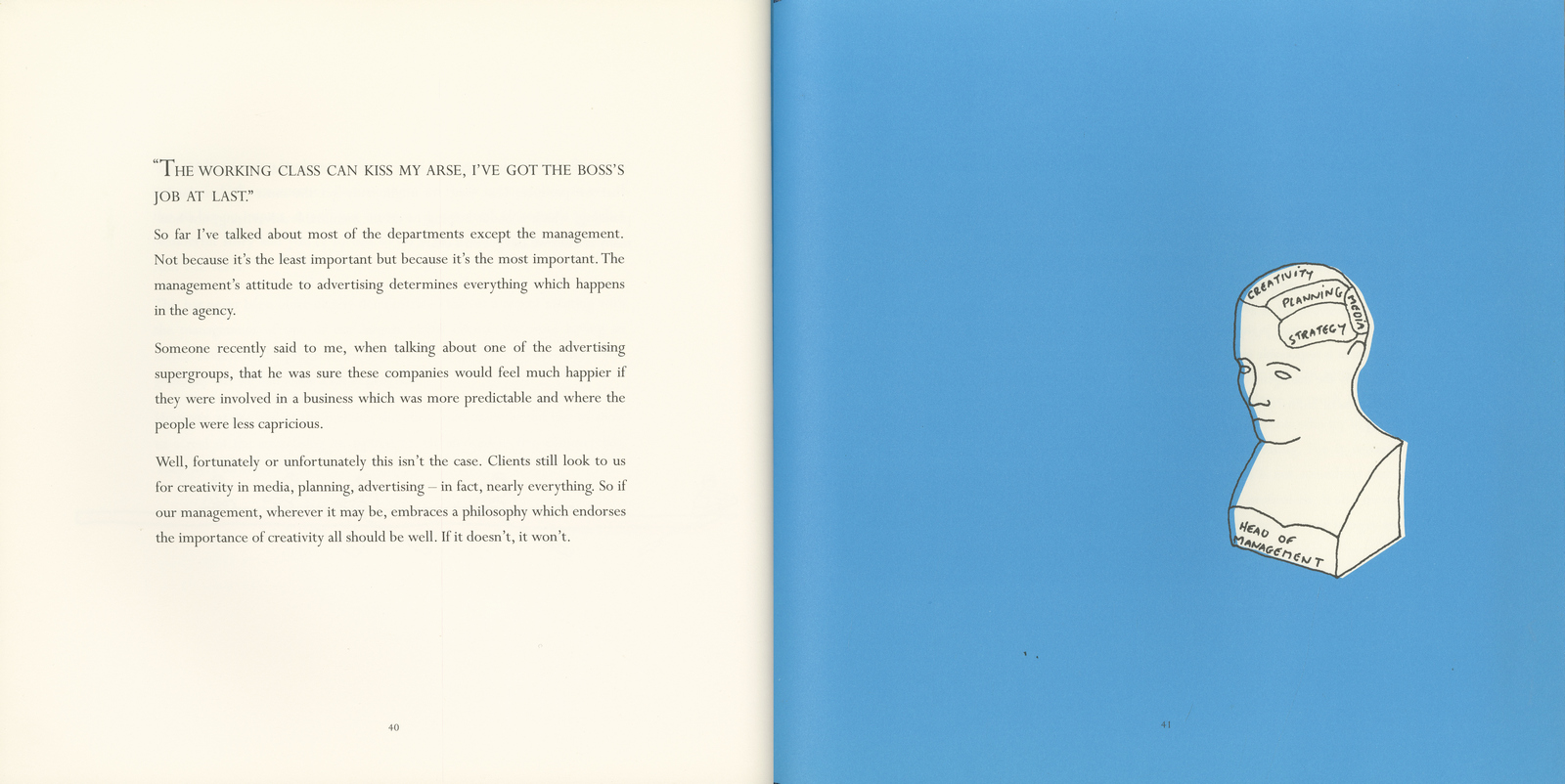
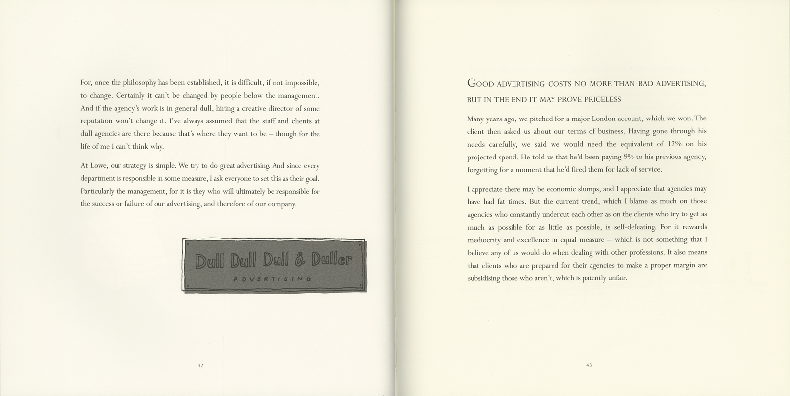
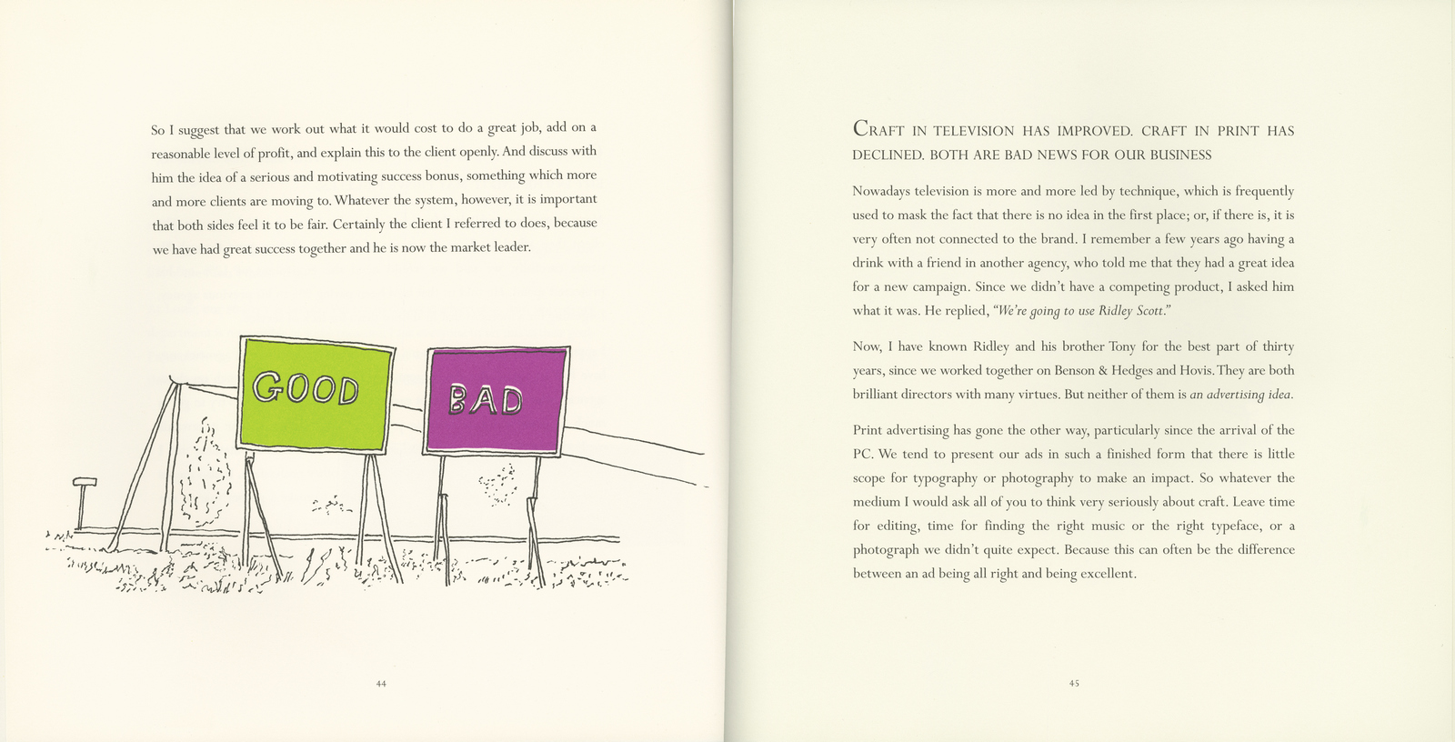
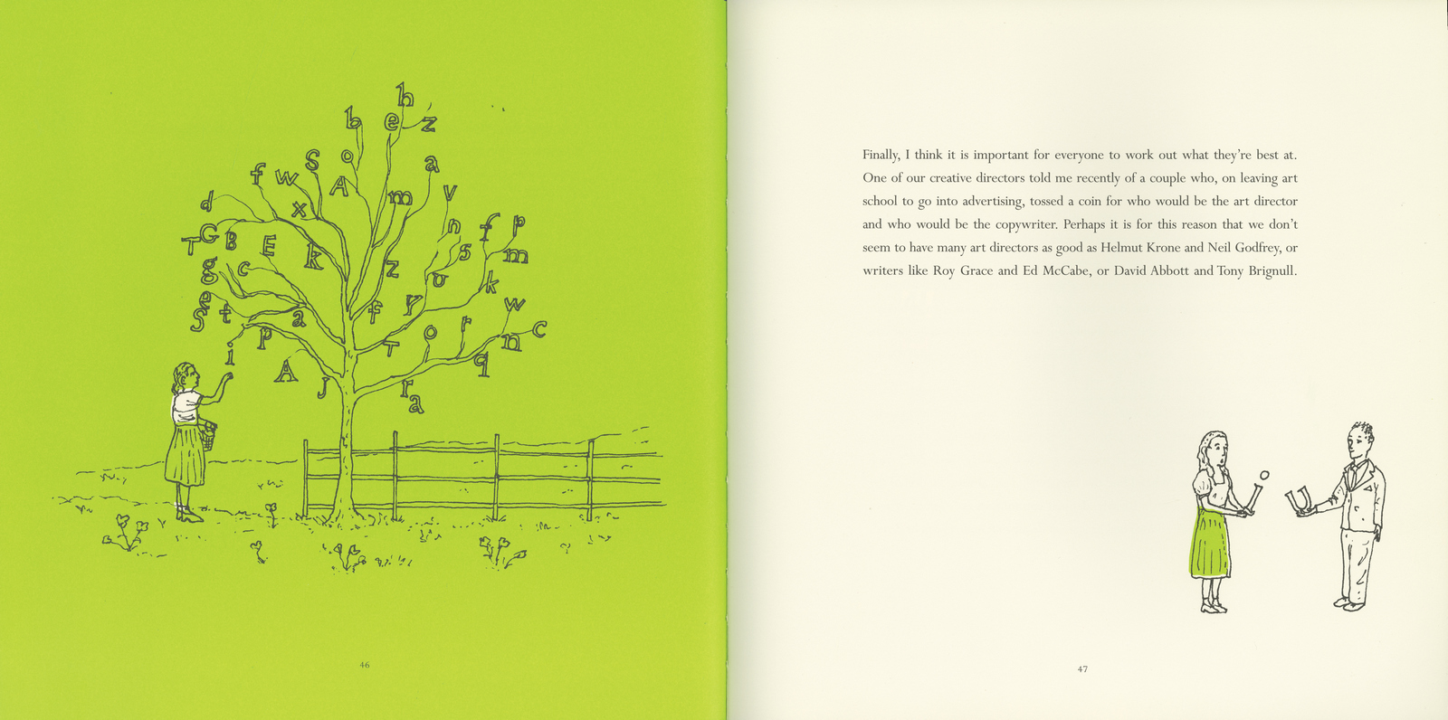
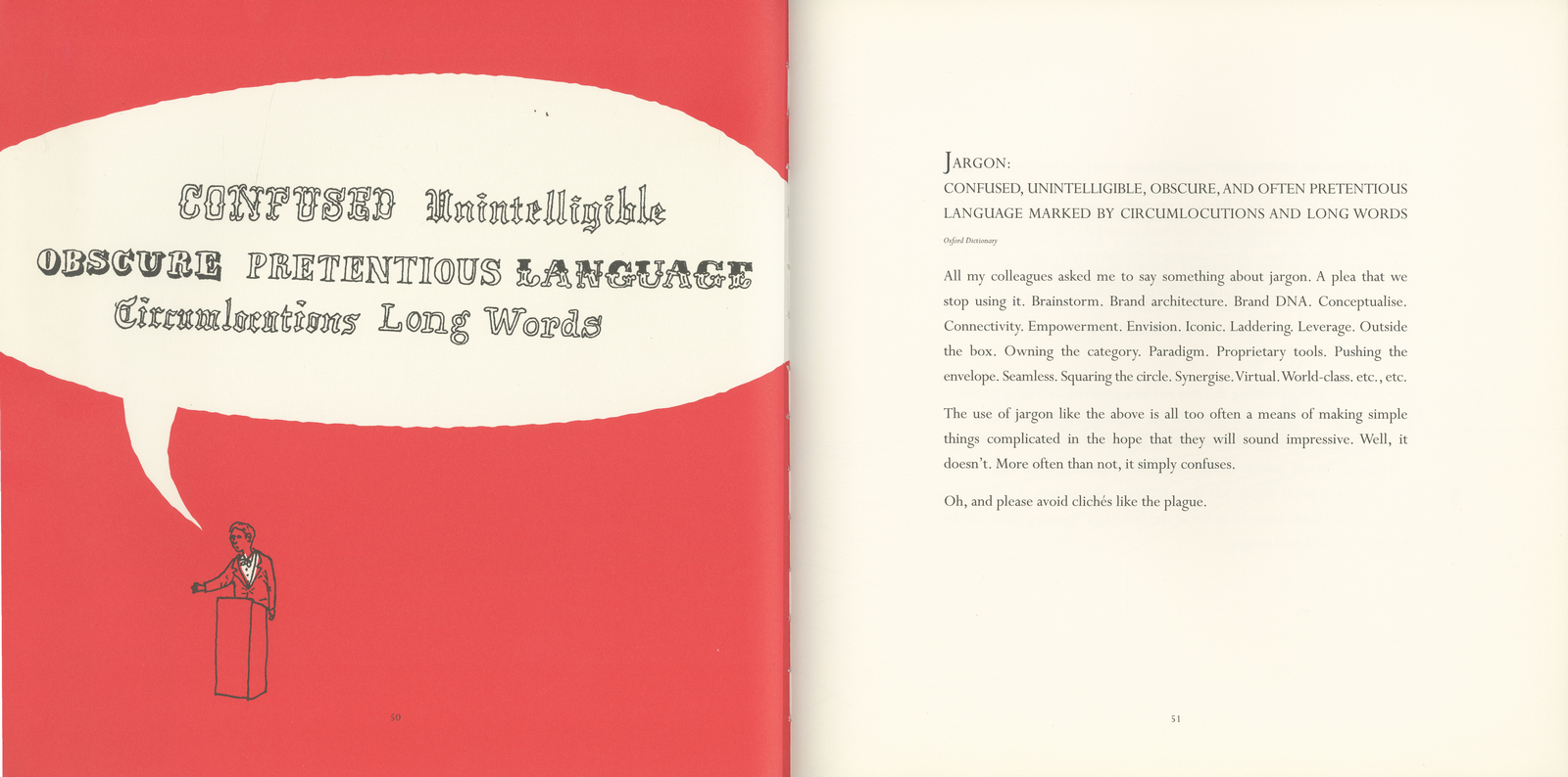
(Thanks Grant, it'll be back soon.)
Some things are made for each other.
Roast beef and Yorkshire pudding. Strawberries and cream. Parma ham and mango (see below).
To this list of perfect partnerships we must add another: Sainsbury's and Abbott Mead Vickers.
It all started one afternoon in 1979 when David Abbott's secretary put a call through to him saying there was someone from Sainsbury's on the line. David thought it was his local Sainsbury's, where his wife regularly shopped.
It wasn't. It was Peter Davis, the Marketing Director of Sainsbury's, who said he had a project he thought David might be interested in and could they meet. Just the two of them. In the Putney store.
The two men walked around the store (we don't know if they had a trolley, or, if they did, who was pushing it), with Peter pointing out various products of interest and explaining to David that he wanted to do a quality press campaign for their fresh foods and own label products.
He wasn't happy with the work his agency Saatchi & Saatchi had produced, and would David like a crack at it?
Peter was going on holiday for three weeks and wondered if David might be able to show him some ads on his return.
He gave David a contact in the marketing department who could fill him in on product details.
In truth, client and agency needed each other. The previous year, AMV - or Abbott, Mead, Davies & Vickers, as it was then known - had run a house ad in Campaign magazine showing the smiling agency principals with the line A horizontal product demanded colour on both pages.
The ad was a naked appeal for a food account.
Left to right: Peter Mead, David Abbott, Peter Mayle (part-time chairman, soon to become full-time author), Adrian Vickers and Guy Davies (the agency's first planning director). Mayle and Davies quit the agency shortly afterwards, leaving the triumvirate A, M and V.
Sainsbury's meanwhile had been engaged in an advertising price war with arch rivals Tesco, conducted mainly on TV through their agency Saatchi & Saatchi.
It was Saatchi's who had invented the line "Good food costs less at Sainsbury's", but their ads had been much more about "costs less" than "good food". Peter Davis wanted to redress the balance with a high-profile press campaign to reinforce Sainsbury's quality credentials.
To David Abbott and his art director Ron Brown, this was manna from heaven - the chance to do a big, beautiful, colour press campaign for the bluest of blue-chip clients, with carte blanche to pick the products they thought would make the best ads. And just to put the cherry on the cake, there was no other agency involved. This wasn't a pitch, it was a proposal of marriage.
The campaign was scheduled to run in all the quality Sunday supplements and upmarket women's magazines. David and Ron wanted to do double page spreads, in colour of course, but even with Sainsbury's substantial budget a campaign of colour spreads would run to only a few ads a year. And David wanted to do lots of ads a year.
It was AMV's senior media buyer Paul Gummer who came up with the ingenious (his word) idea of the colour/mono spread - one page colour, for the product, the other page black and white, for the copy.
The ads would have all the impact of colour spreads but at much less cost.
Before putting pentel to layout pad, David and Ron spent many hours with Sainsbury's buyers, gleaning the nuggets of product information that would form the basis of the ads.
Three weeks later David met with Peter Davis again - again just the two of them - to present the fruits of his and Ron's labours.
There would have been a dozen or so concepts, with two or three pieces of body copy to establish the tone of voice.
Peter must have liked what he saw because he awarded AMV the account there and then - even though David was the only person from the agency he'd met.
There was only one point of discussion - Peter wanted a large Sainsbury's logo on the ads. David had agreed to use the Good food costs less at Sainsbury's line, but no logo.
He argued that since the line included the brand name it would be superfluous - and inelegant - to also have a Sainsbury's logo on the ads. Instead, to ensure the campaign was strongly branded, he promised to include the word Sainsbury's in every headline.
And so began one of the longest-running and most successful press campaigns in British advertising history.
The ads assembled below are a selection, in approximate chronological order, from the first 10 years of the campaign. All but two were written by David and art directed by Ron, and all but a dozen or so photographed by the meticulous Martin Thompson.
Looking at the campaign now, forty years on, one is struck by the sheer beauty and elegance of the work. The photography is luscious, the typography big, bold and authoritative.
But it is the words themselves that separate this campaign from any other. They speak to you not as a consumer, or even a customer, but as a friend. They speak with authority, but also with warmth and wit.
The headlines are intriguing, engaging, compelling. The copy, intelligent and informative, always charming, never condescending. Every ad presents a strong product story. Many incorporate a recipe. There's usually a value message to go with the quality. And sometimes you get a history lesson into the bargain.
You may have neither the time, nor the inclination, to read six hundred words about a hot cross bun. But you know that if a hot cross bun is worth six hundred words, it must be some hot cross bun. The copy becomes part of the visual.
Conversely, the shortest ad in the campaign is possibly the strongest. The copy is as lean as the mince it describes. (As David once said "I never sit down to write a long piece of copy. I sit down to try and sell something. The rule is, say what you have to say and stop when you've finished.")
Some of the copy may seem a little quaint in today's gigabyte world, but David's gentle persuasion is as effortless and rewarding to read now as it was then. Gentle the persuasion may have been, but the results were startling. The mango ad increased sales from 1,000 cases a week to 10,000 cases. The ad for sparkling Saumur did even better - sales up by a factor of 14. And Sainsbury's entire range of speciality pasta sold out within a week of the ad announcing it.
Only after 5 years and 60-plus ads did David feel he could entrust his baby to another creative team. I'm proud to say John Horton and I were that team. (No pressure.) The campaign continued for many more years, with other teams, as well as David and Ron, contributing to the pot.
From time to time (usually coinciding with the appointment of a new marketing director), the ads went through various different "looks" in an effort to keep the campaign "fresh". But none of these were as pure, as powerful, or indeed as fresh as the original.
Enough of my words. Time to enjoy David's.
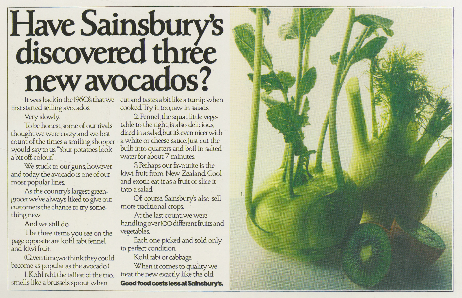
The essence of Sainsbury's - introducing new and sometimes unpronounceable food items to the British shopping list.
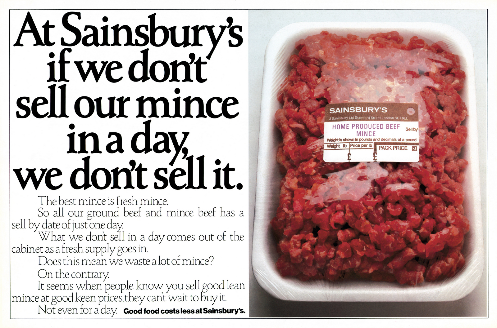
A pound of raw minced beef. And not an ounce of fat in the copy. (Remember pounds and ounces?)
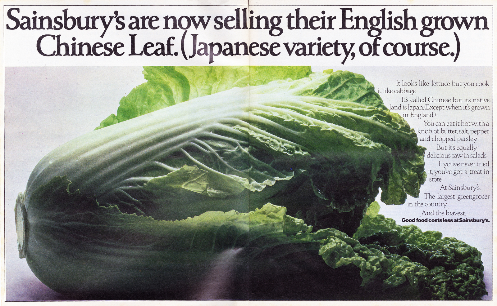
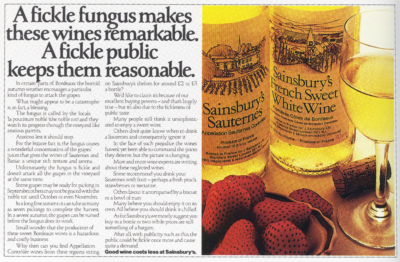
The Sainsbury's-in-the-headline rule didn't apply if there was branding in the visual.
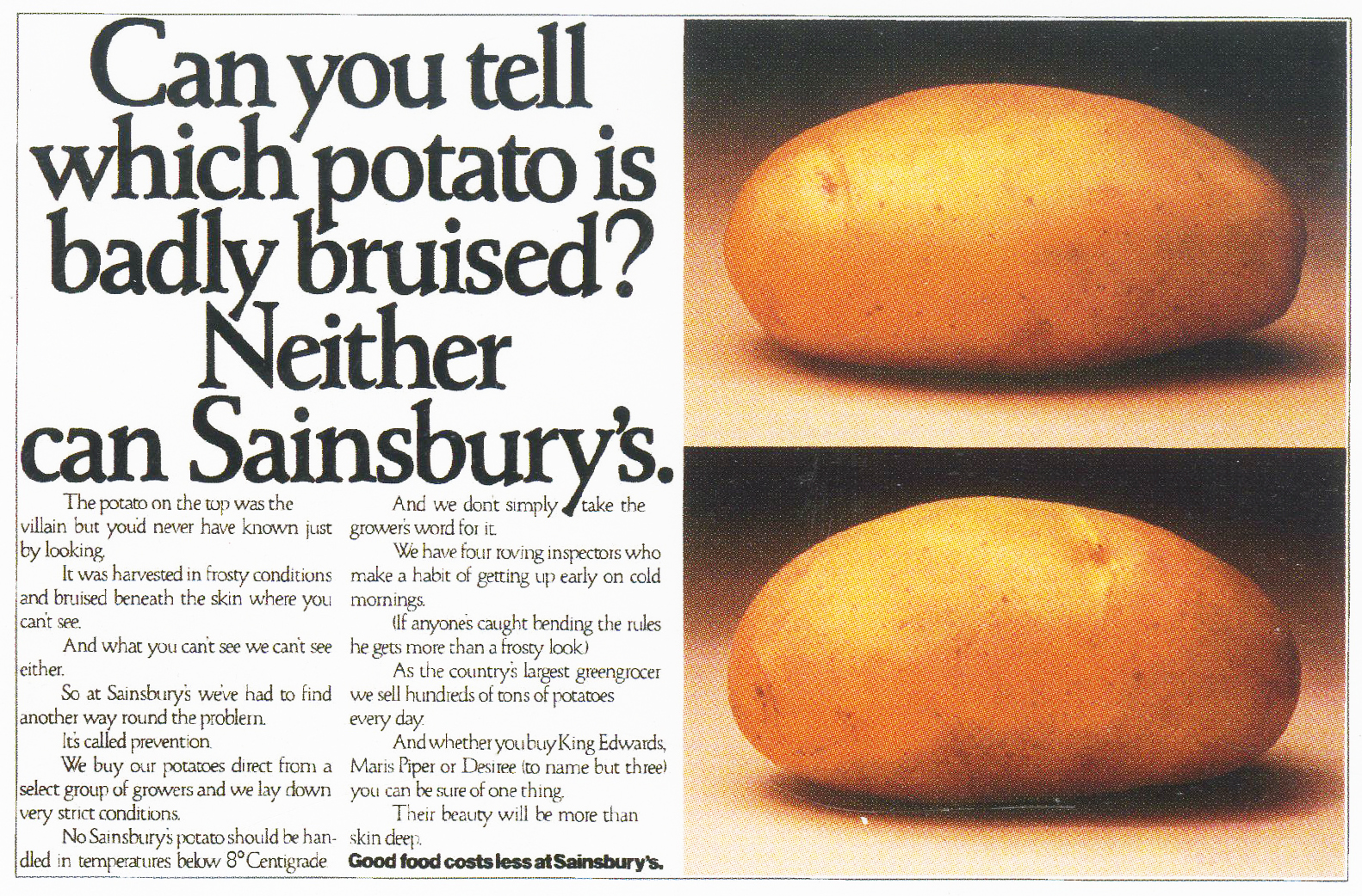
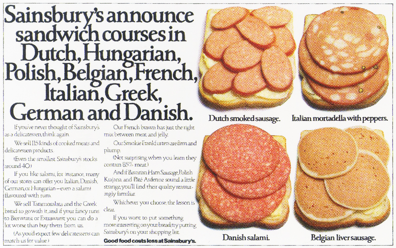
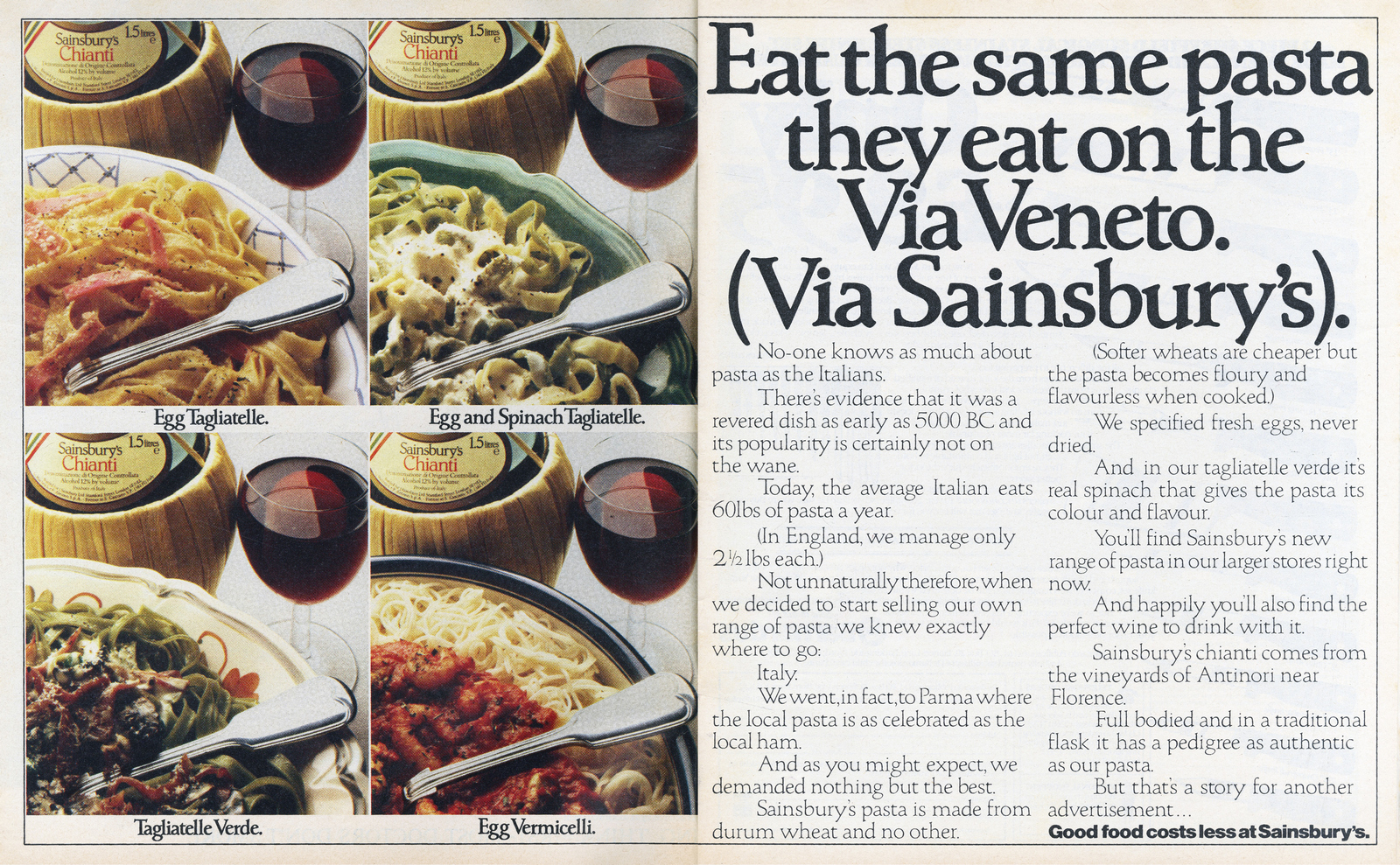
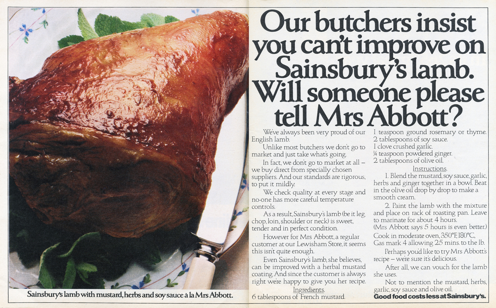
An ad that demonstrates Sainsbury's love of their customers - and David's love of his wife.
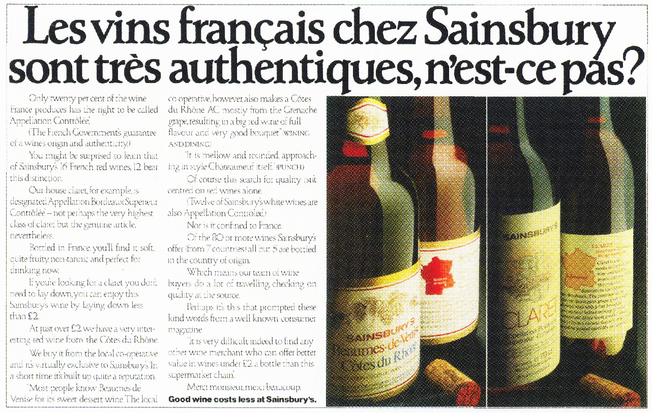
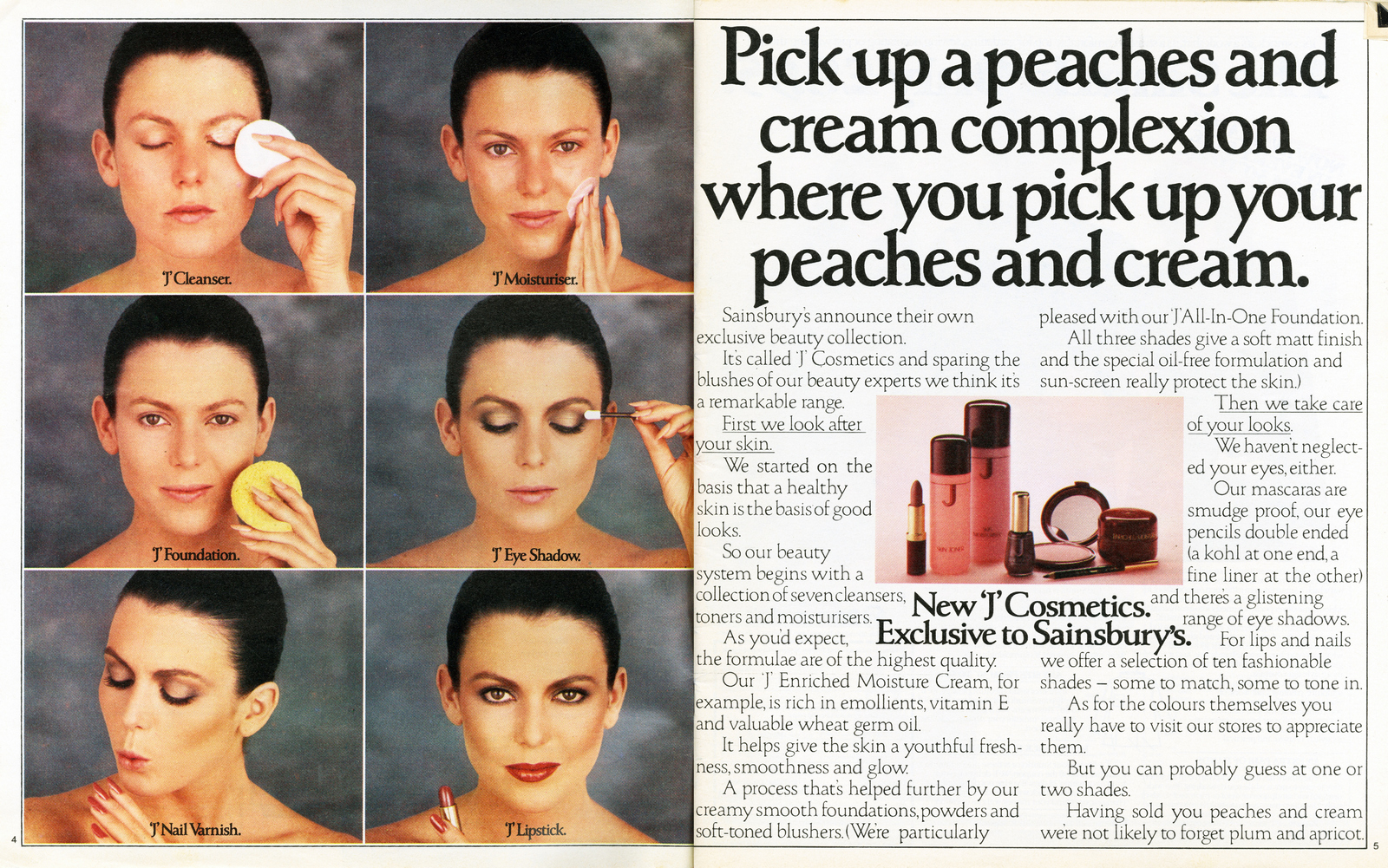
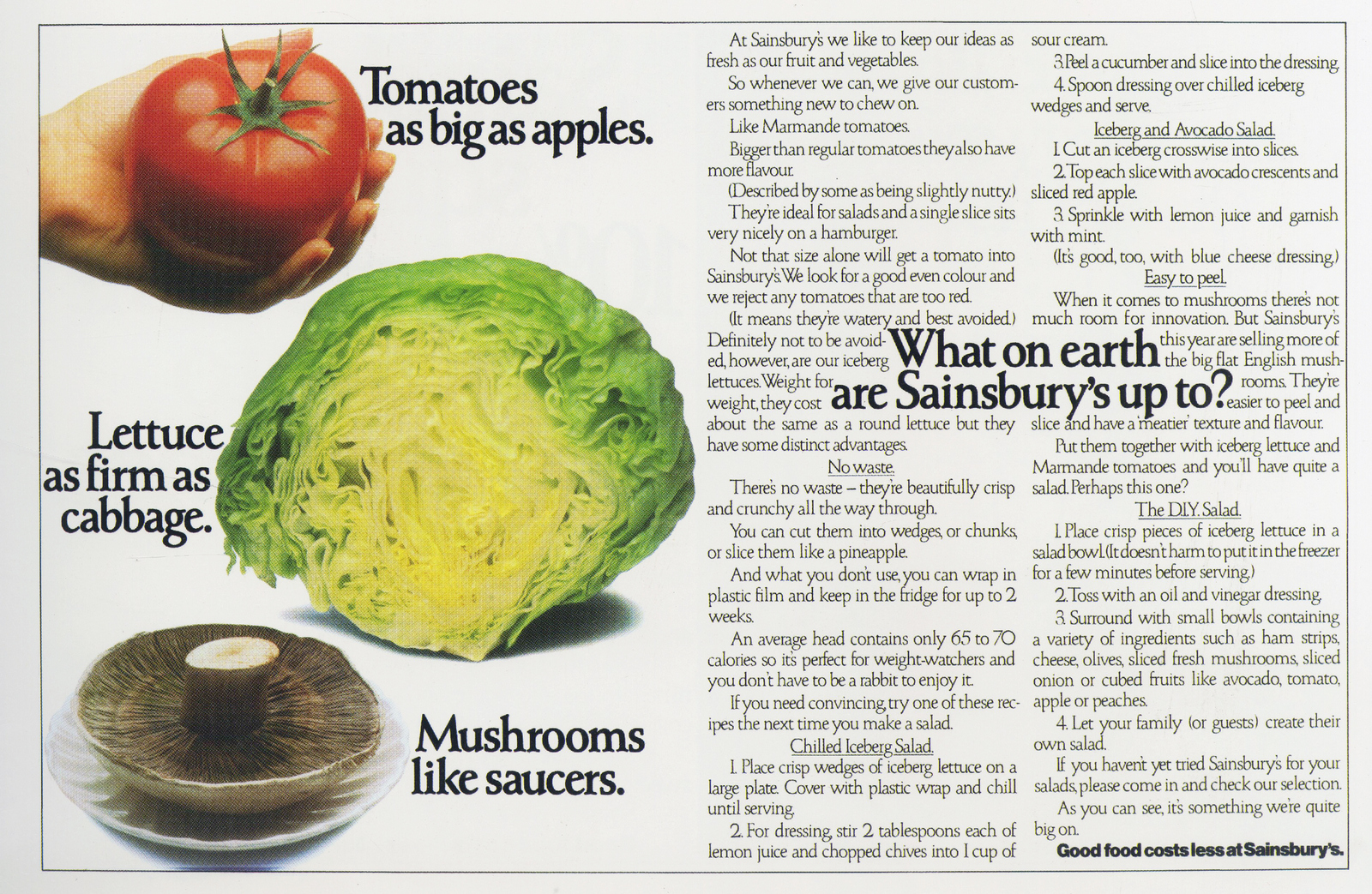
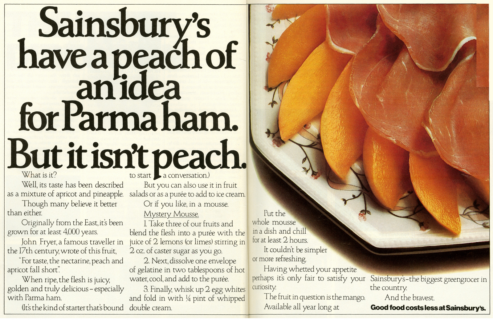
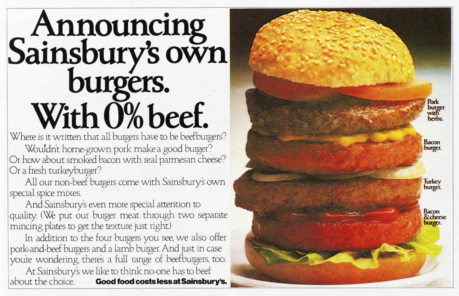
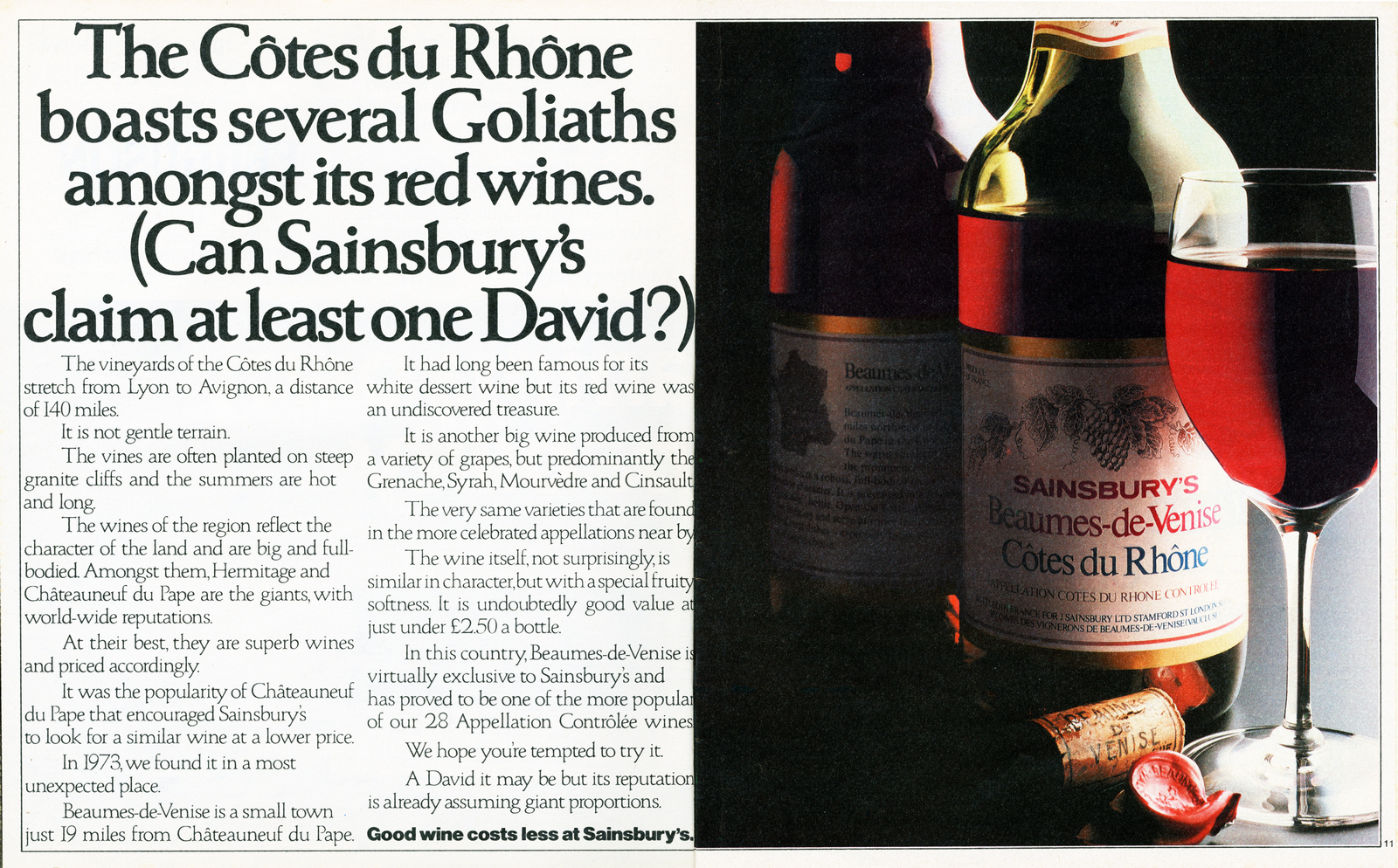
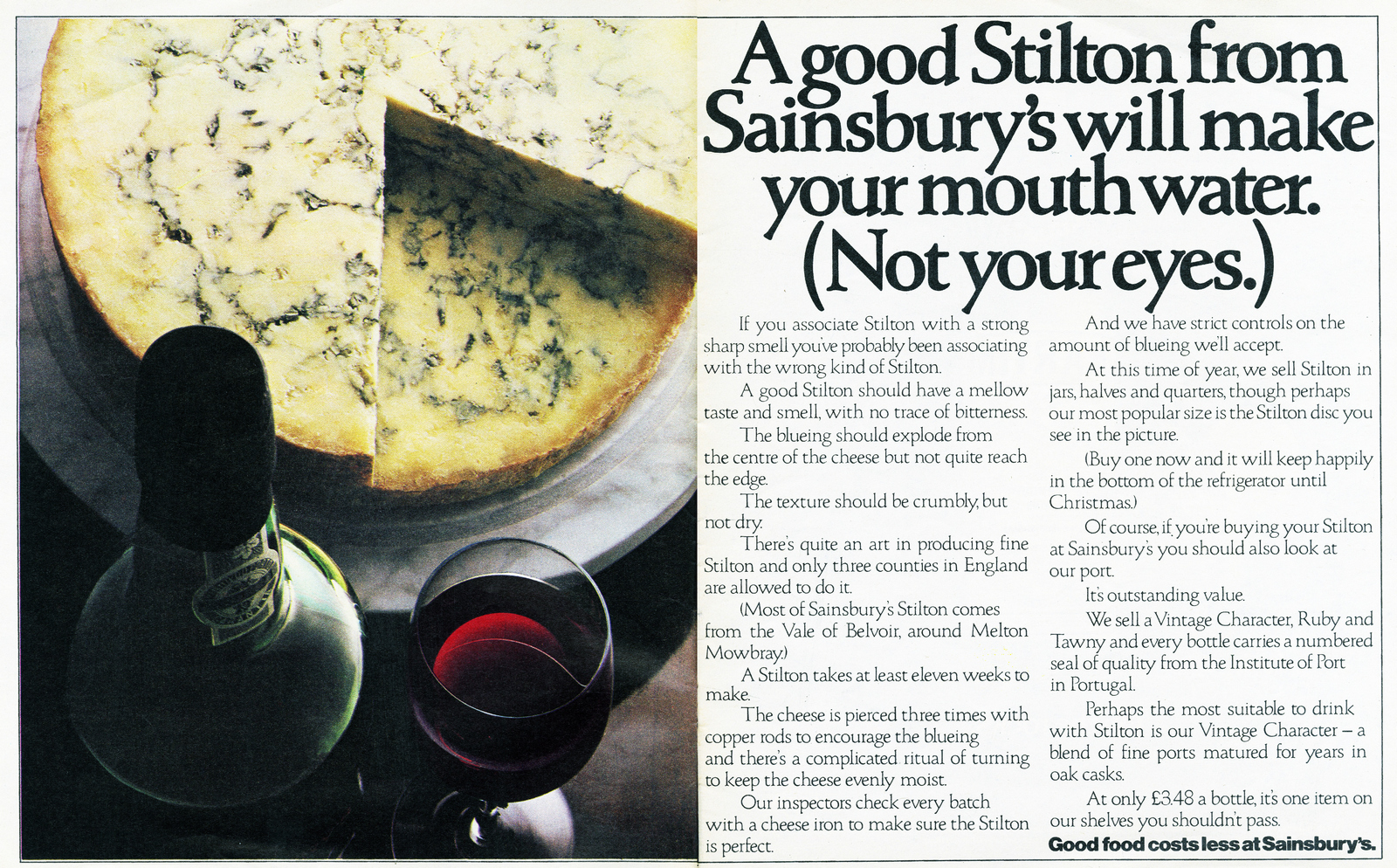
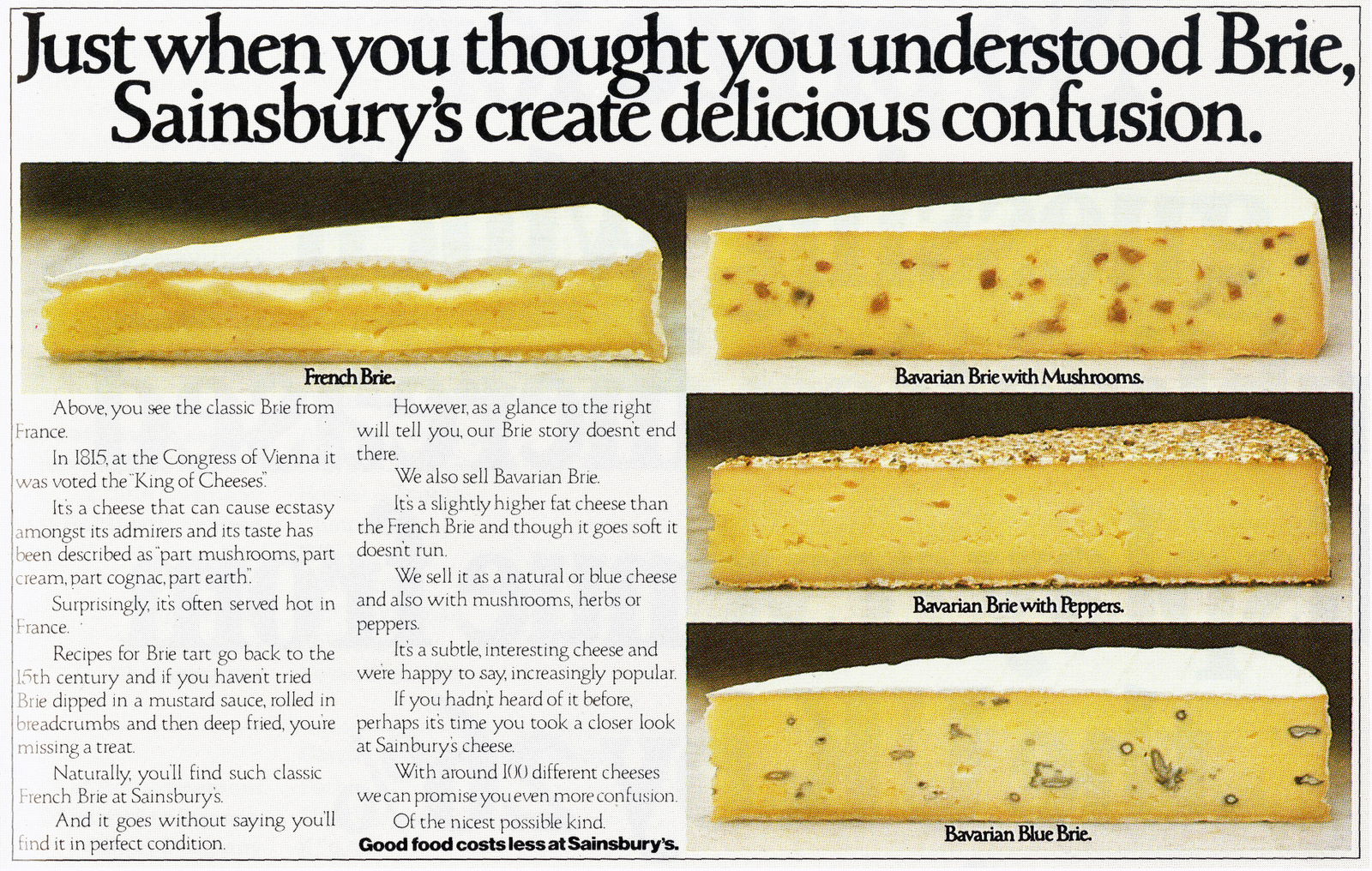
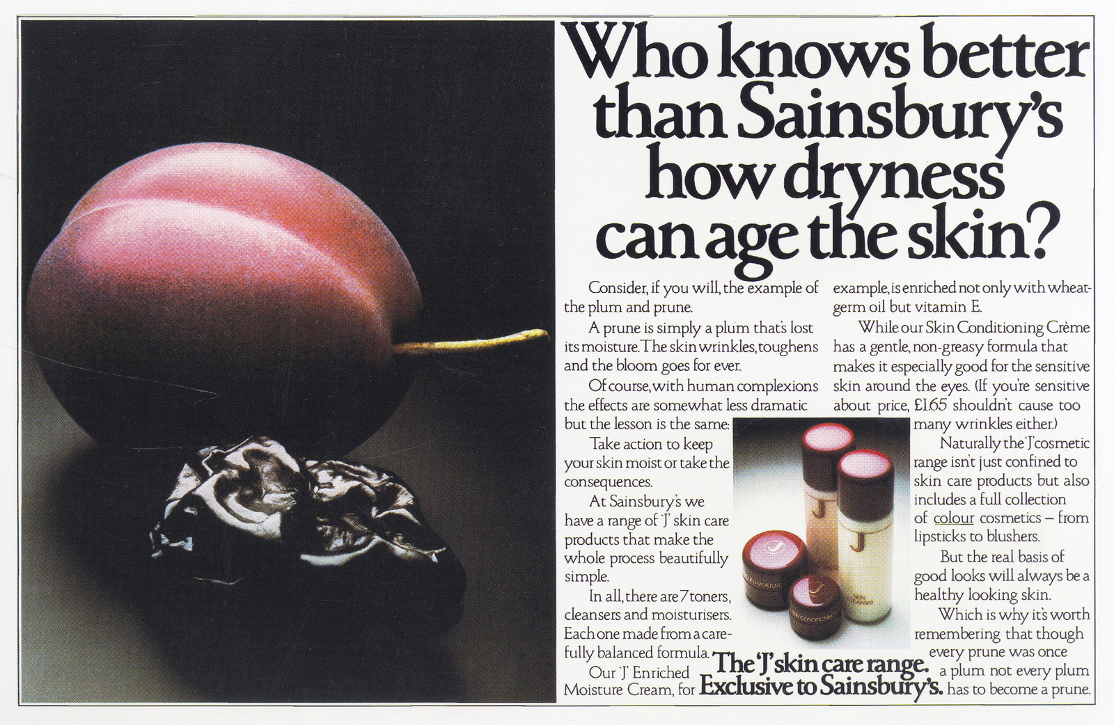
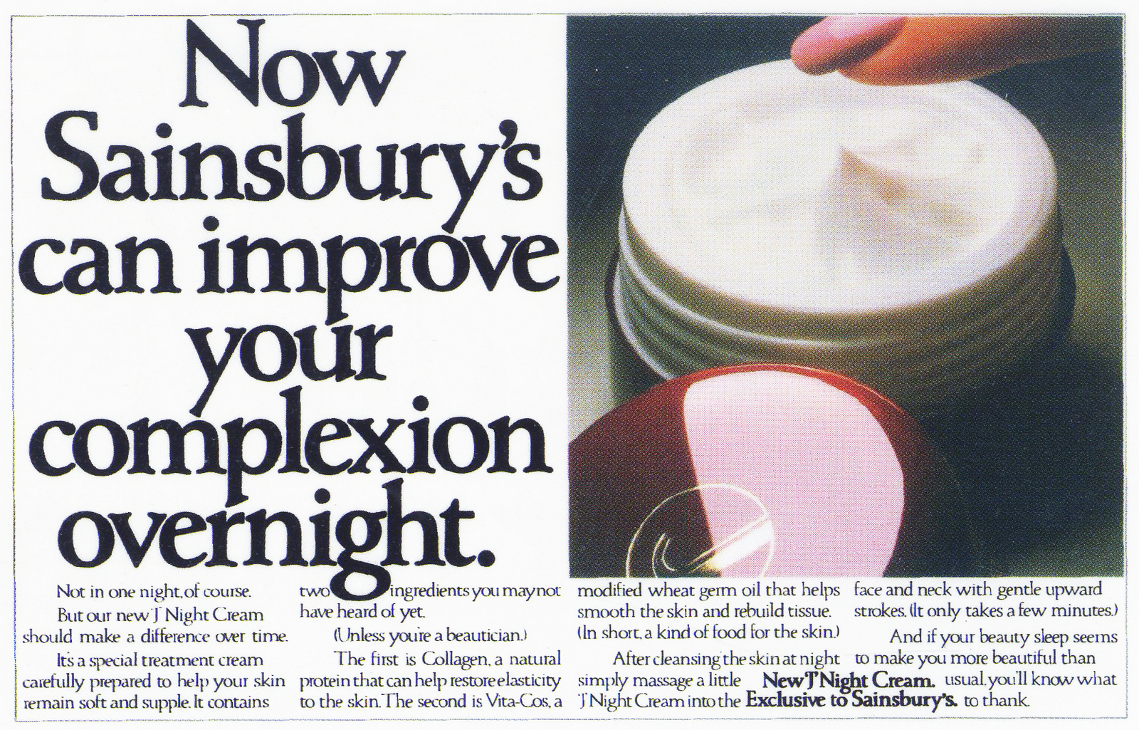
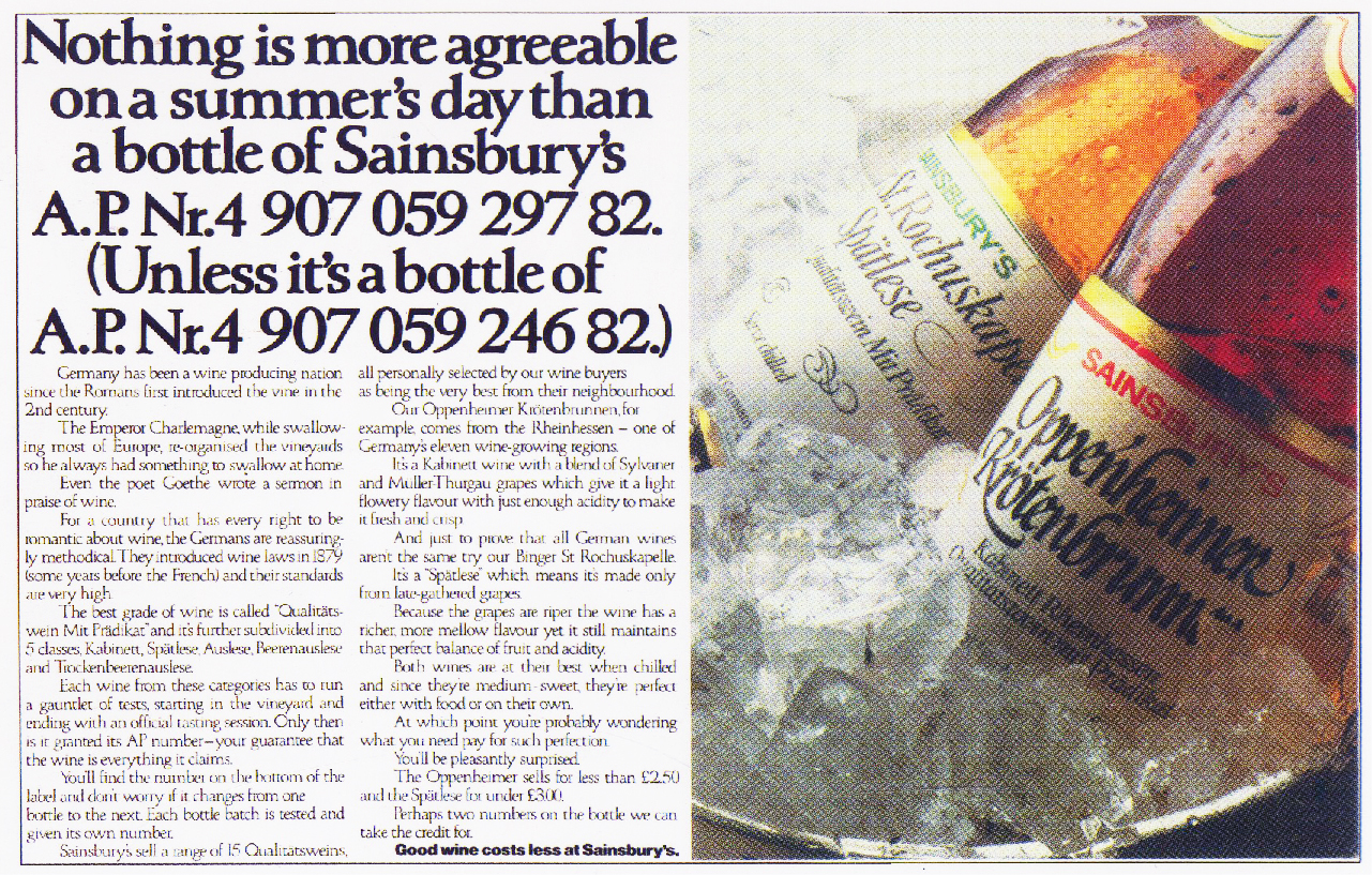
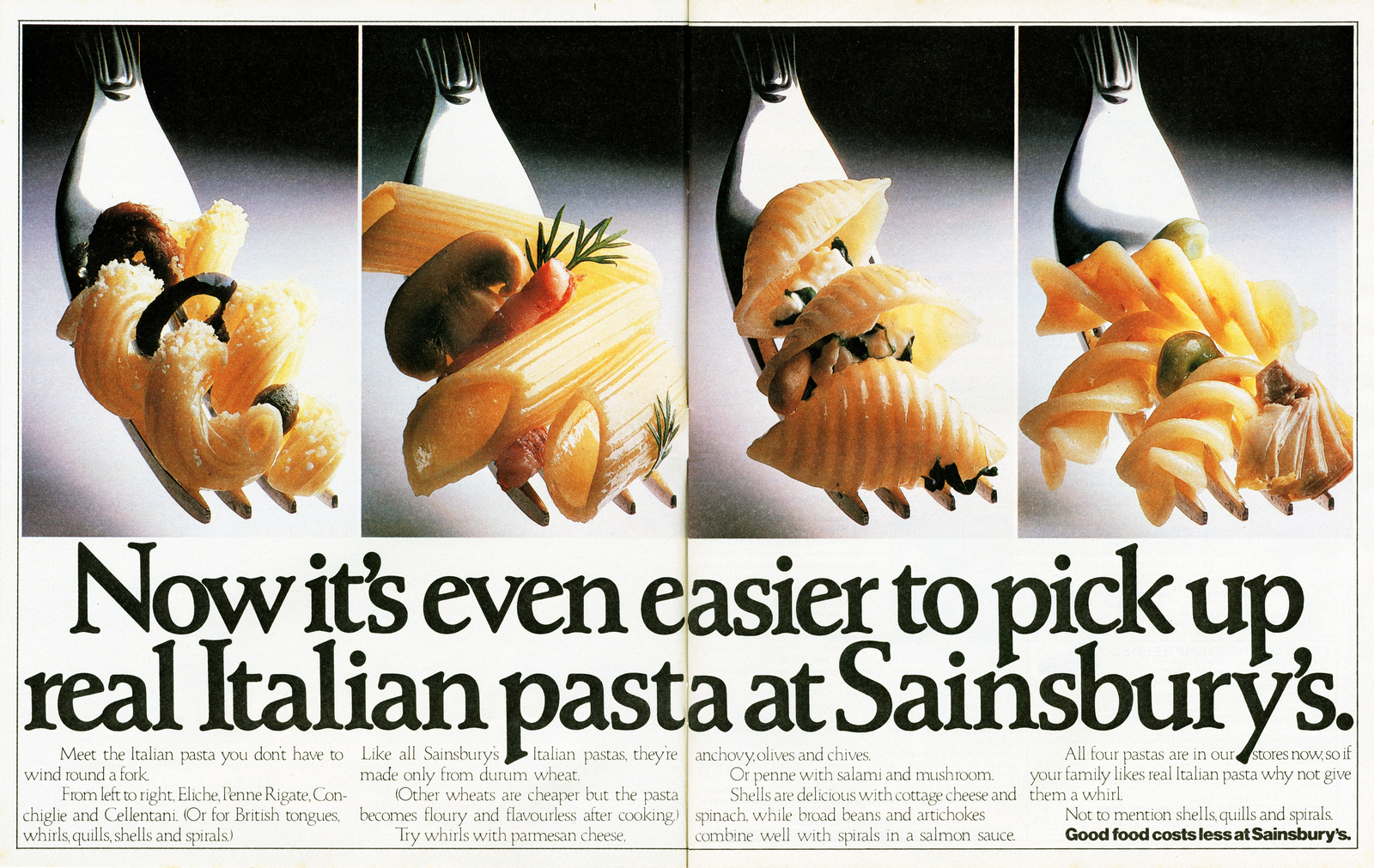

According to Jeremy Miles, the account director, David did this ad in the taxi on the way back from the briefing meeting. Sales of the house claret increased by 270%. The Haute Medoc by 430%.
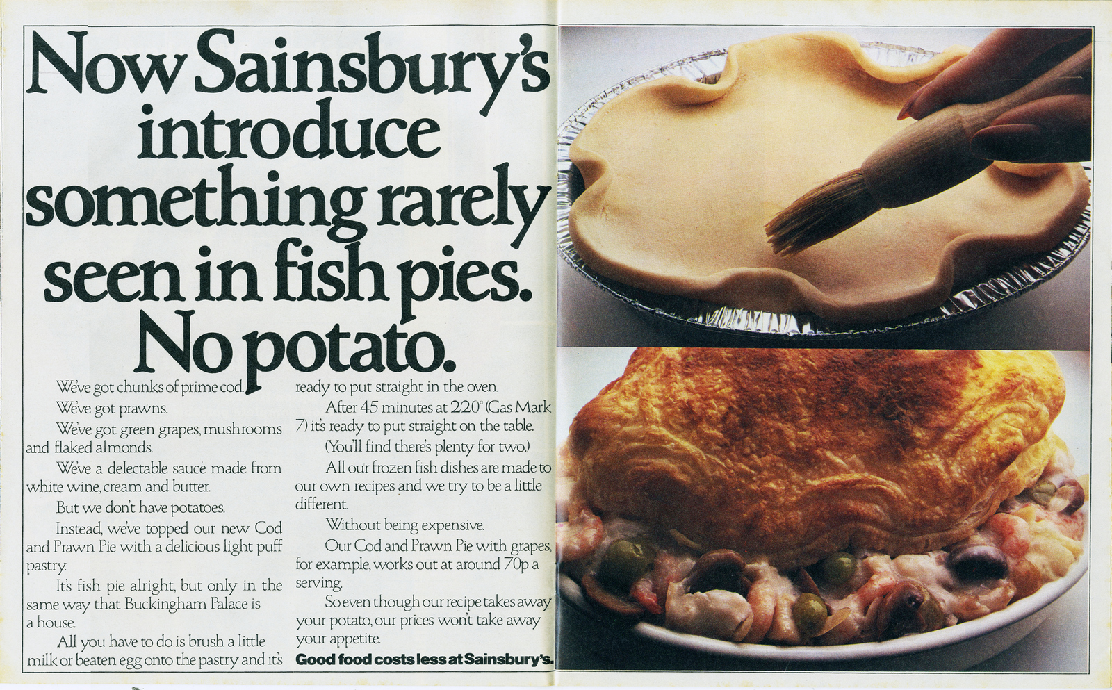
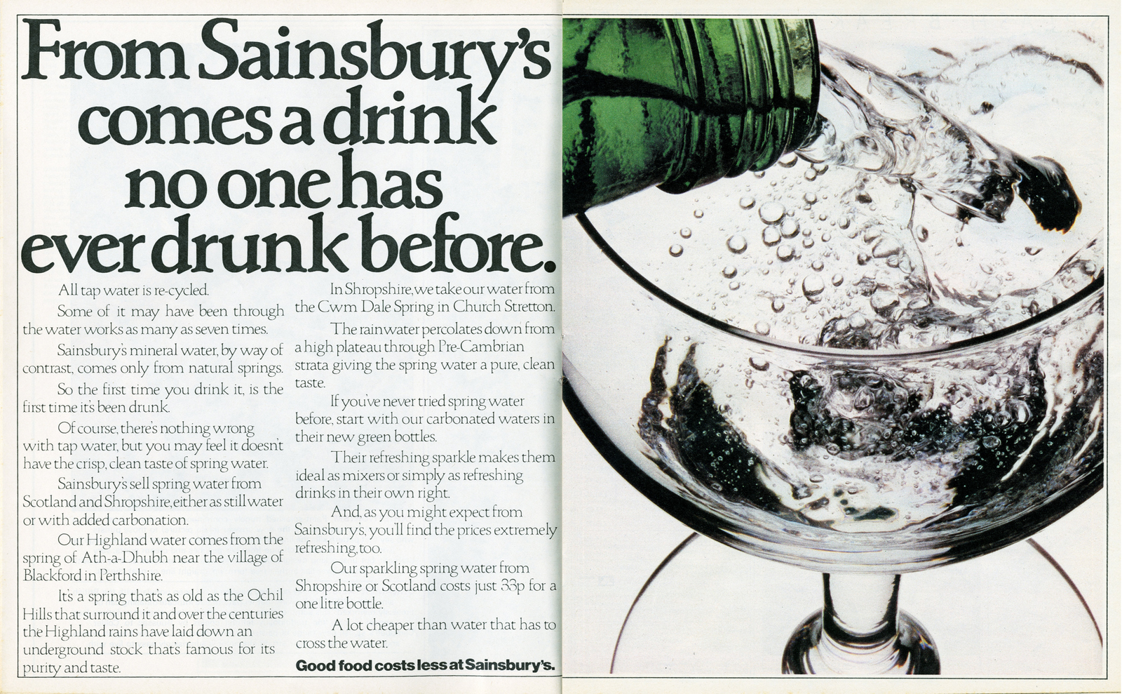
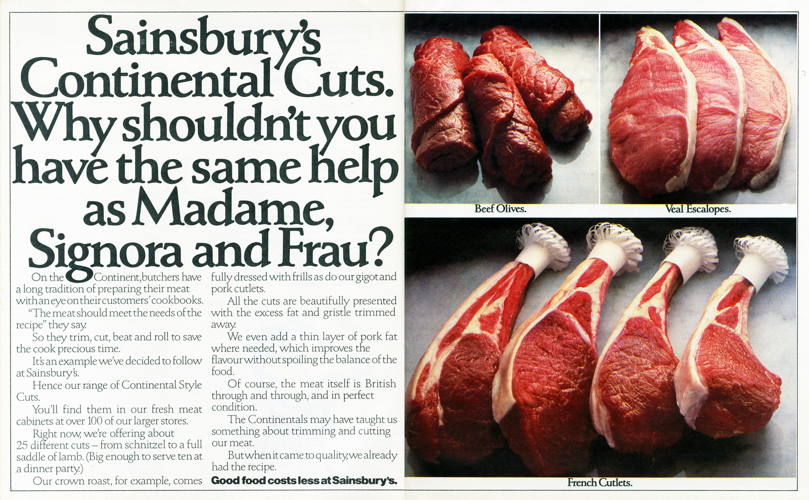
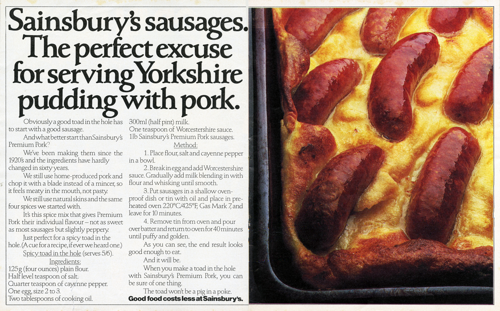
Every time I see this ad I want to eat it.
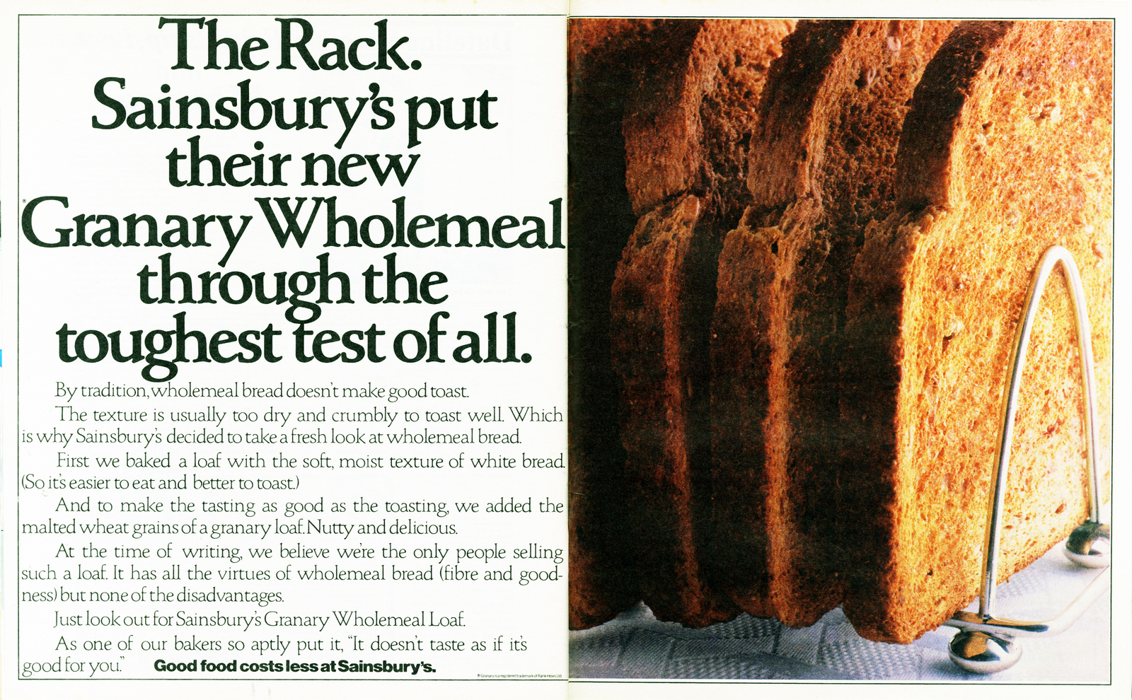
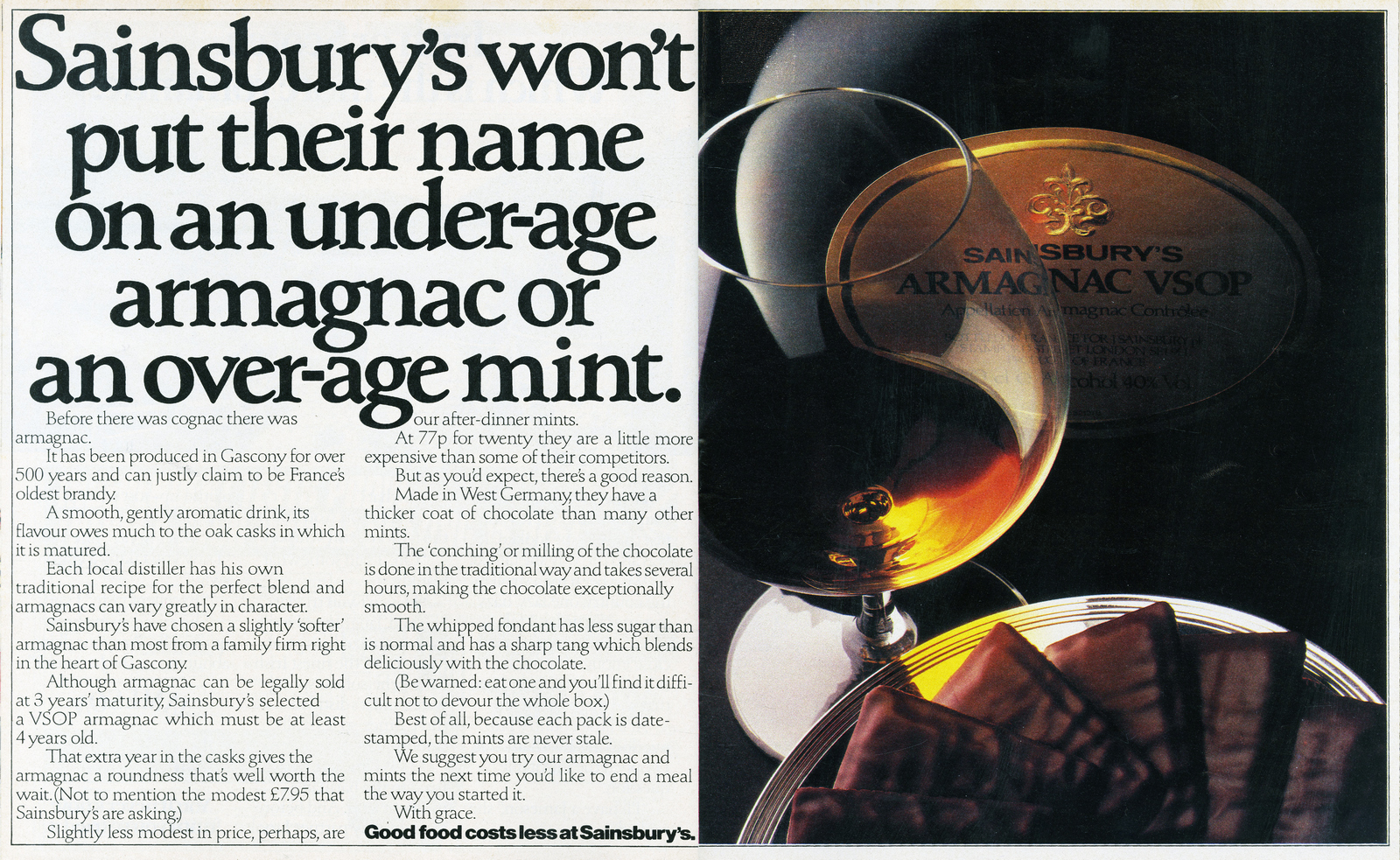
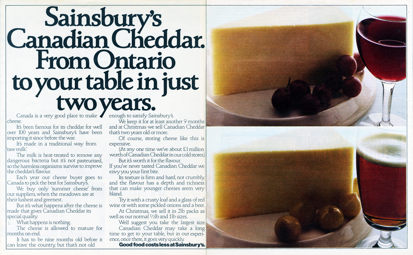
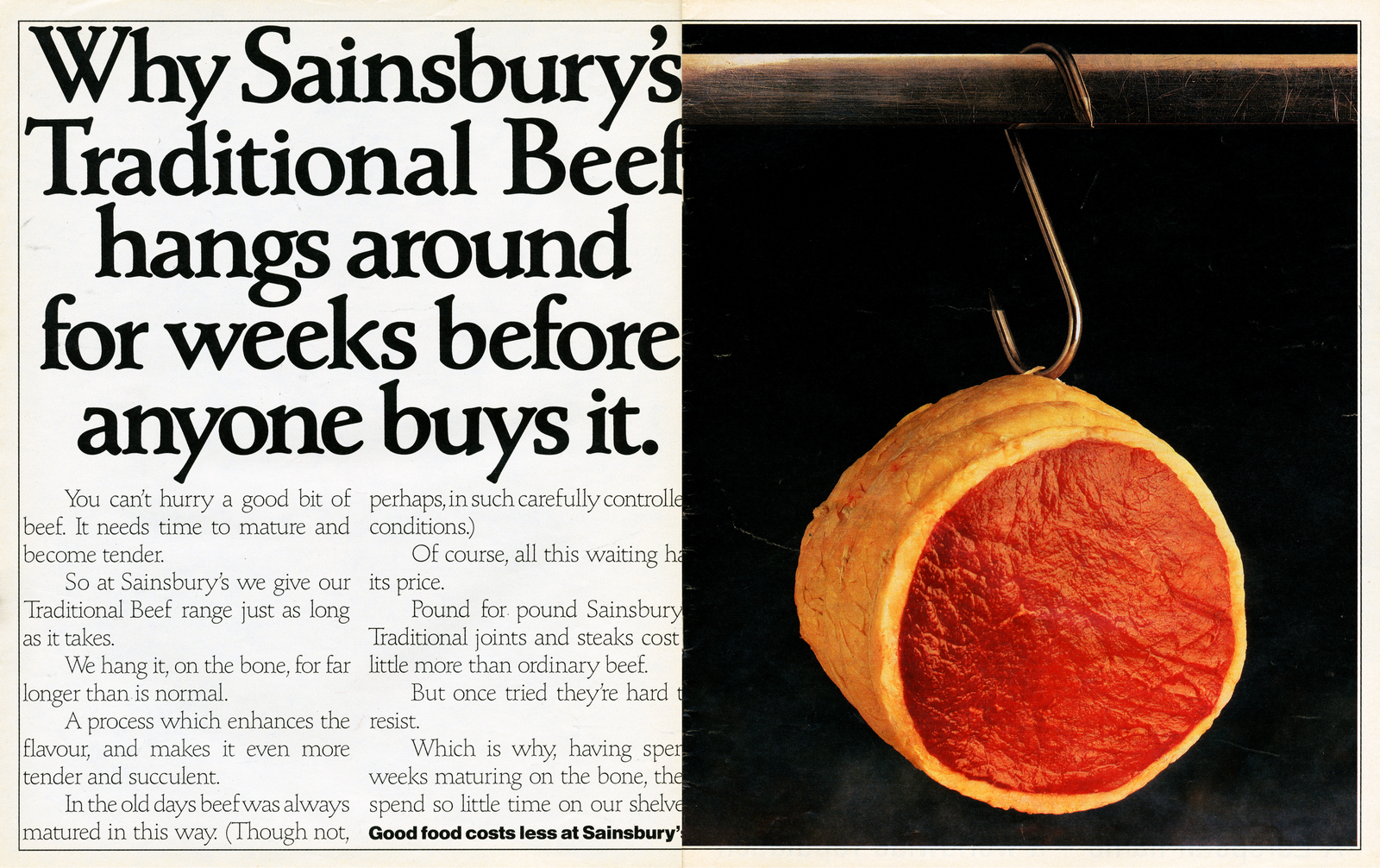
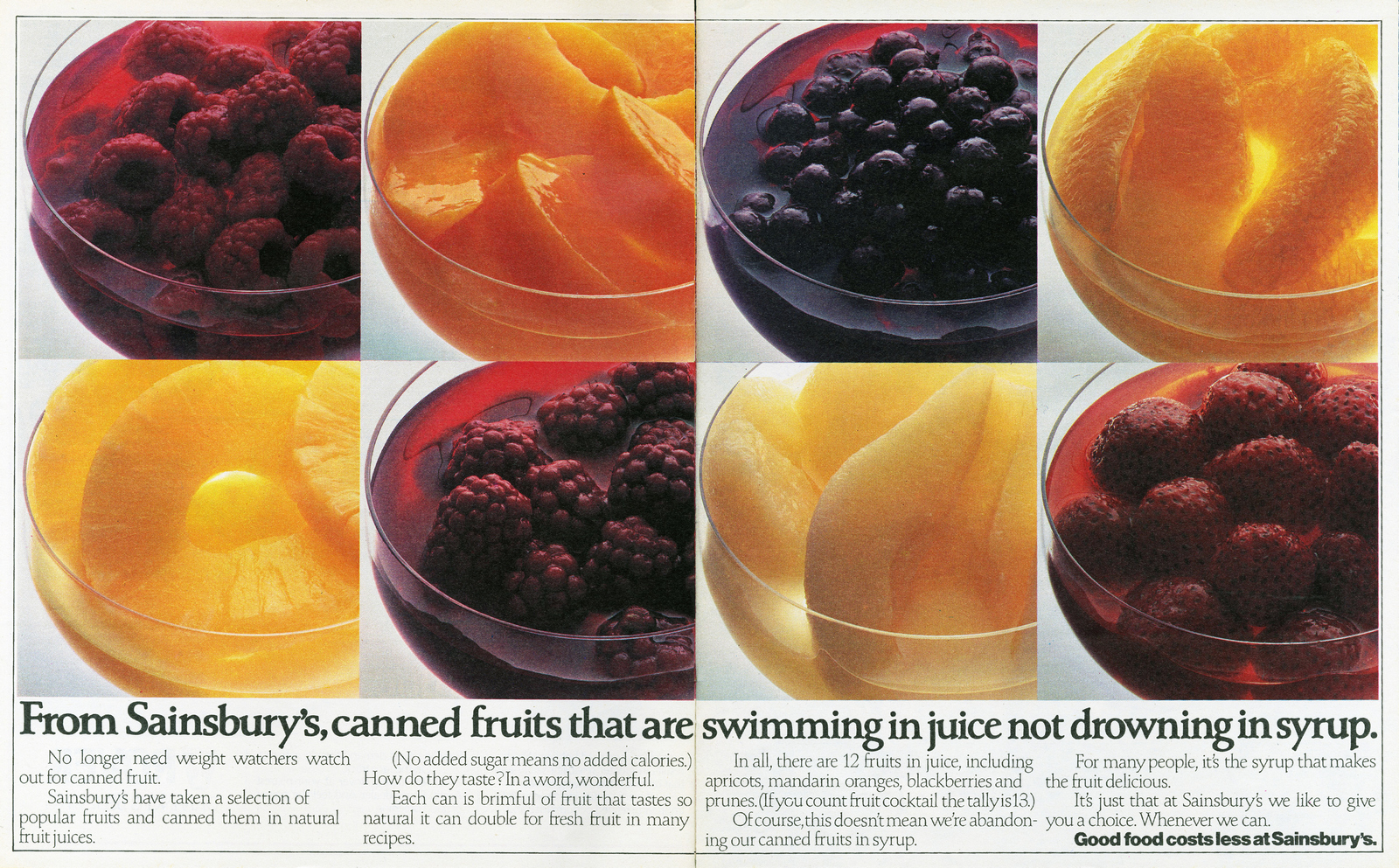
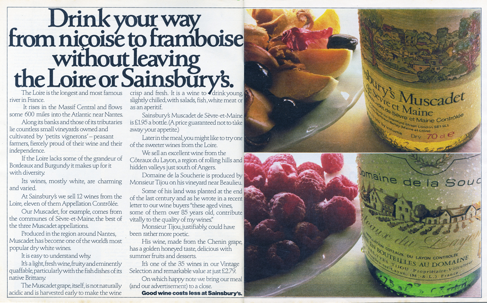
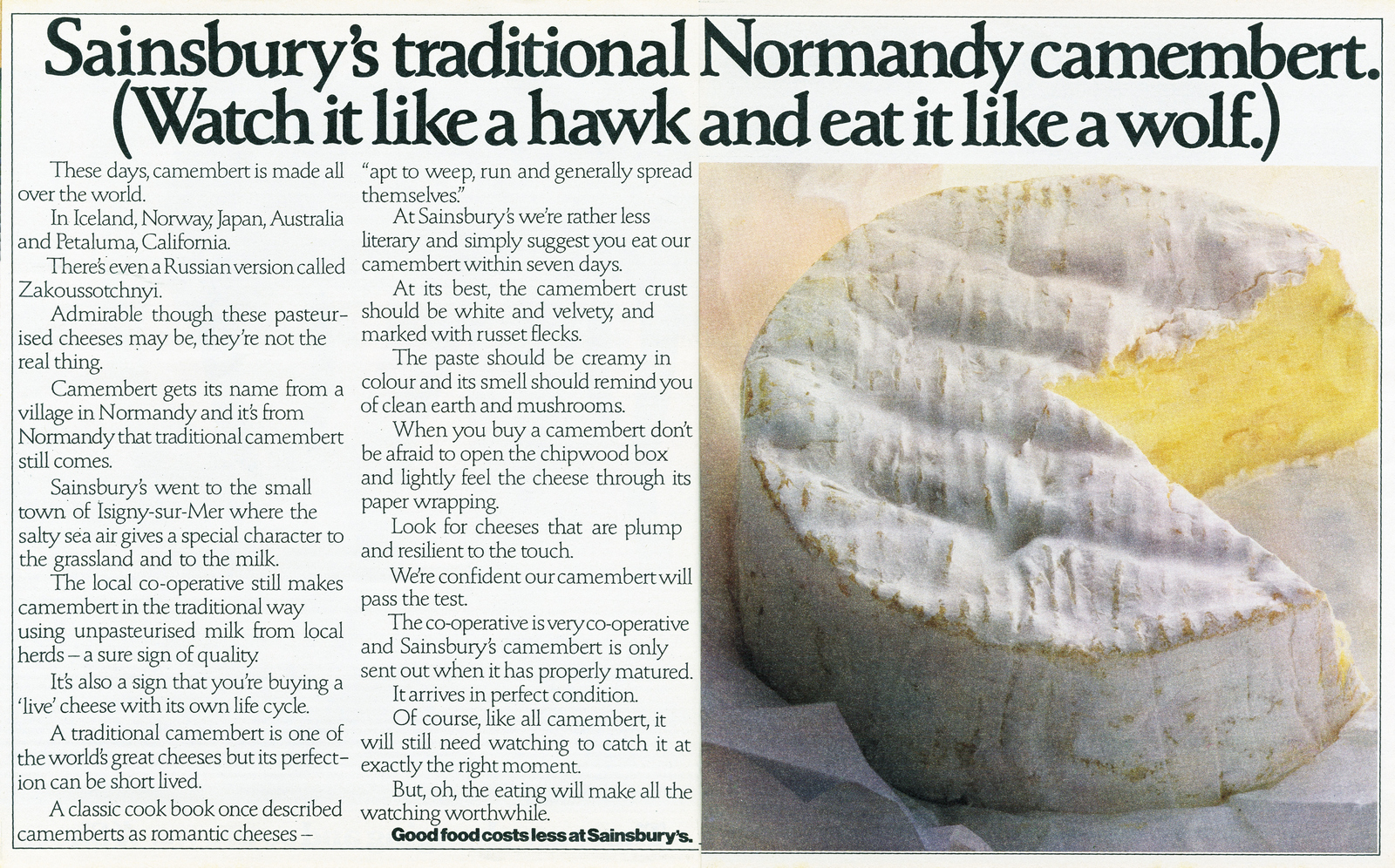
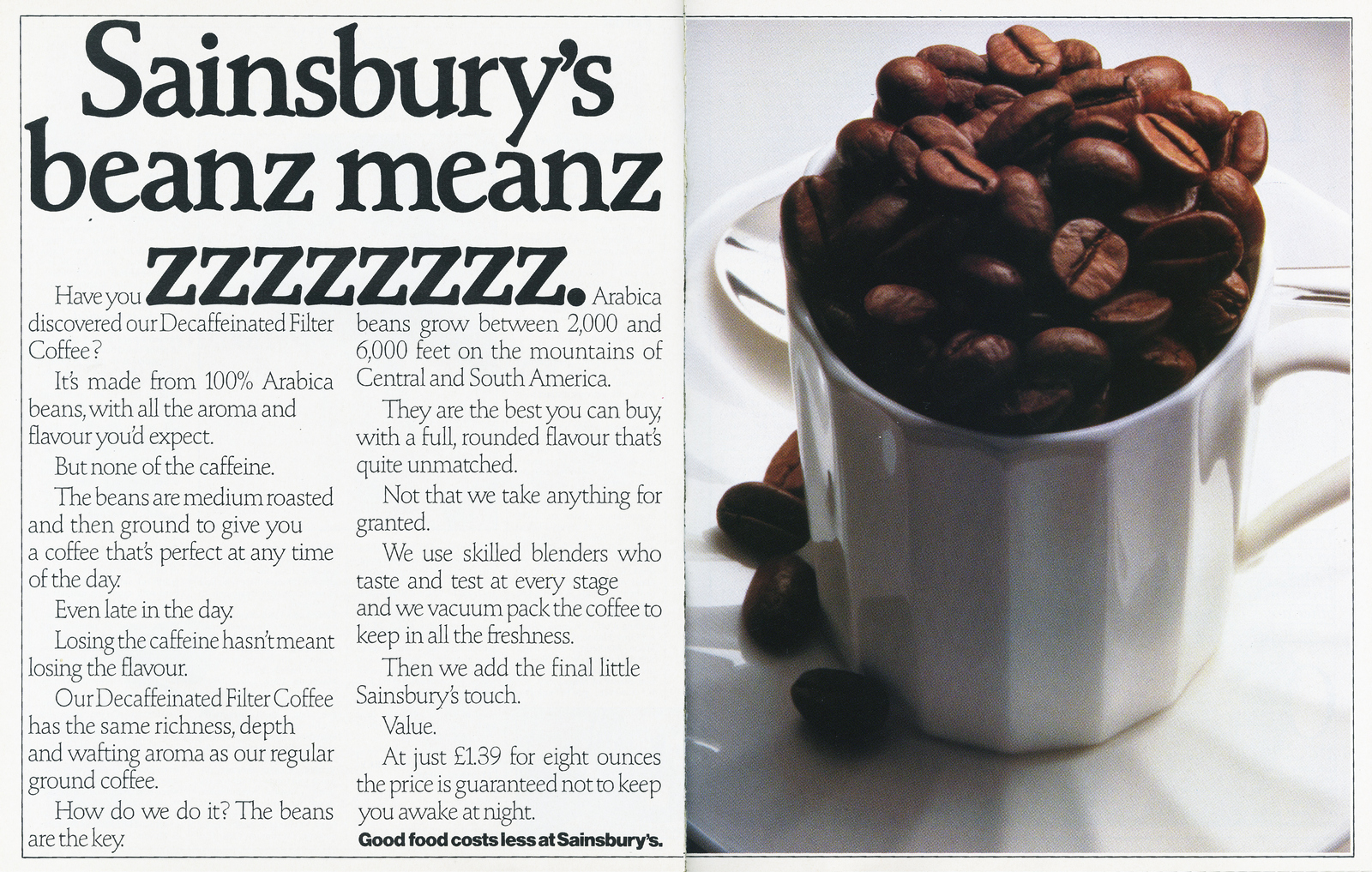
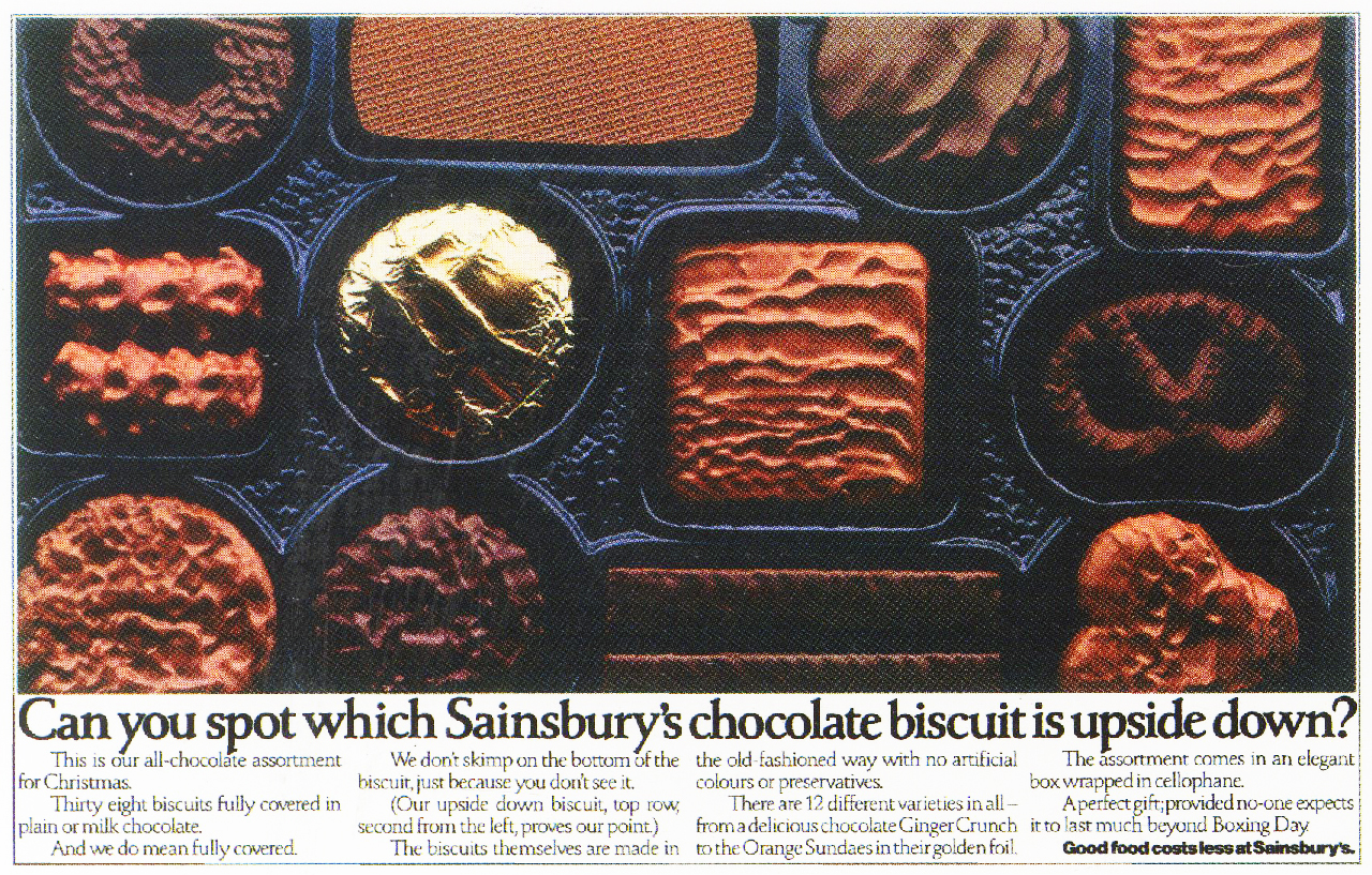
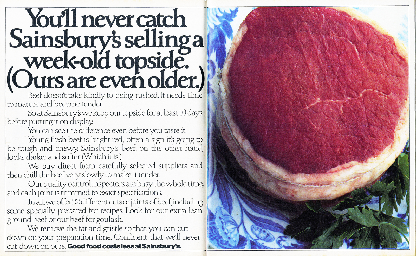
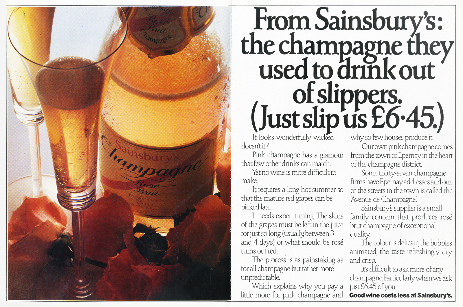
Inside every copywriter there's a toe-curling pun just itching to get out.
It's a testament to the client's good humour that they let this one escape.
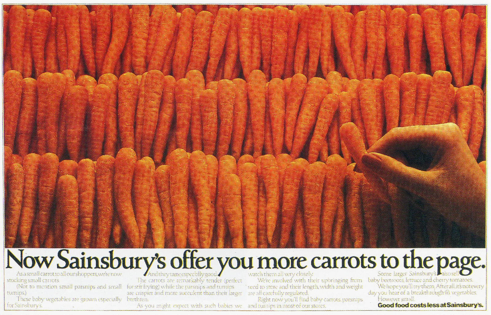
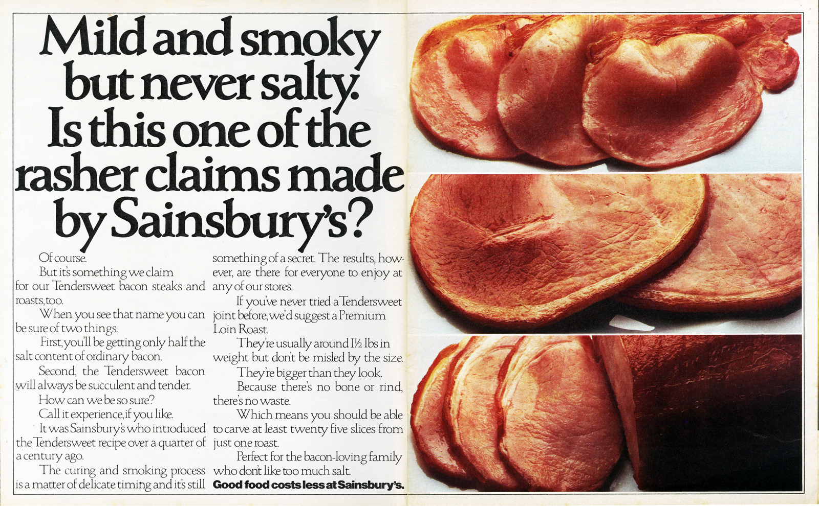
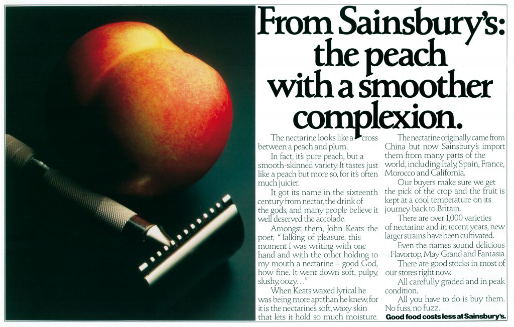
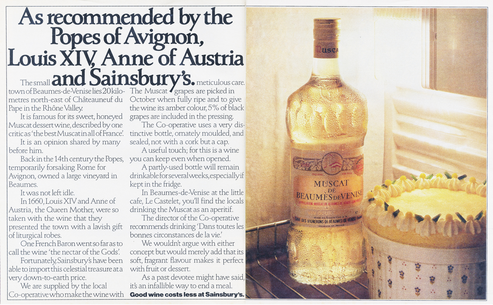

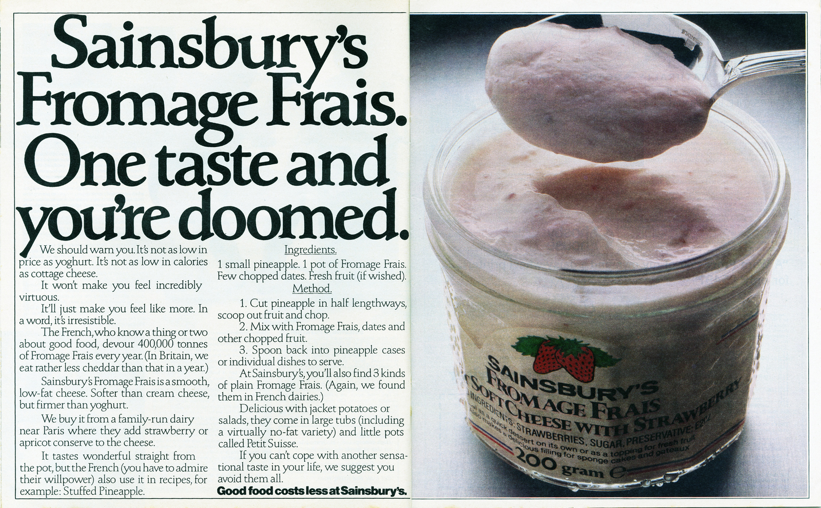

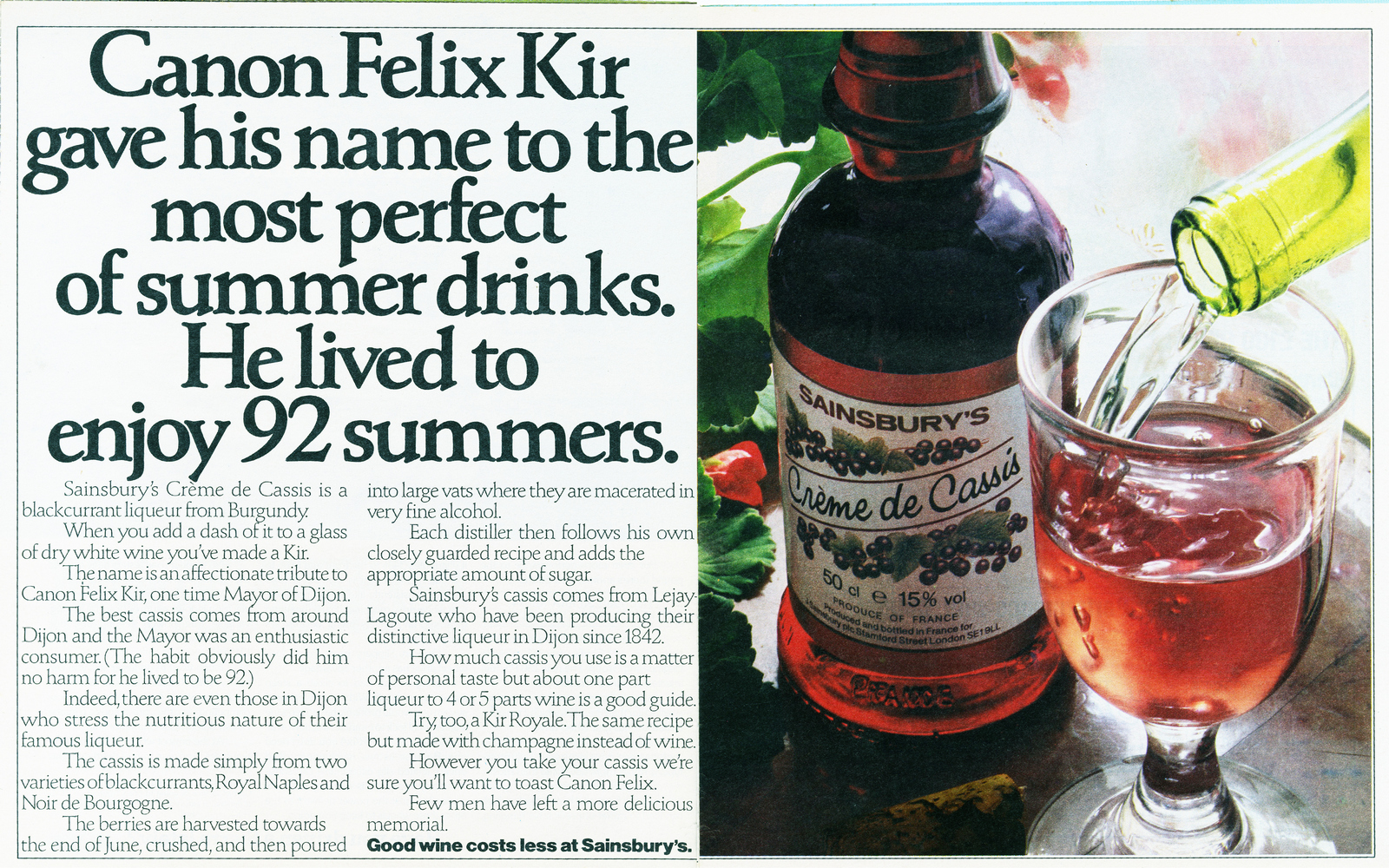
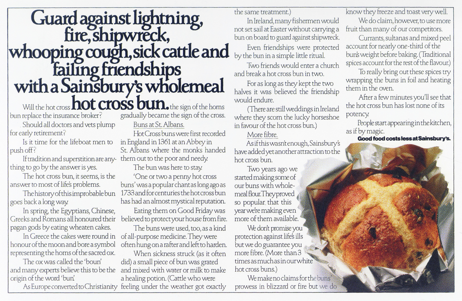
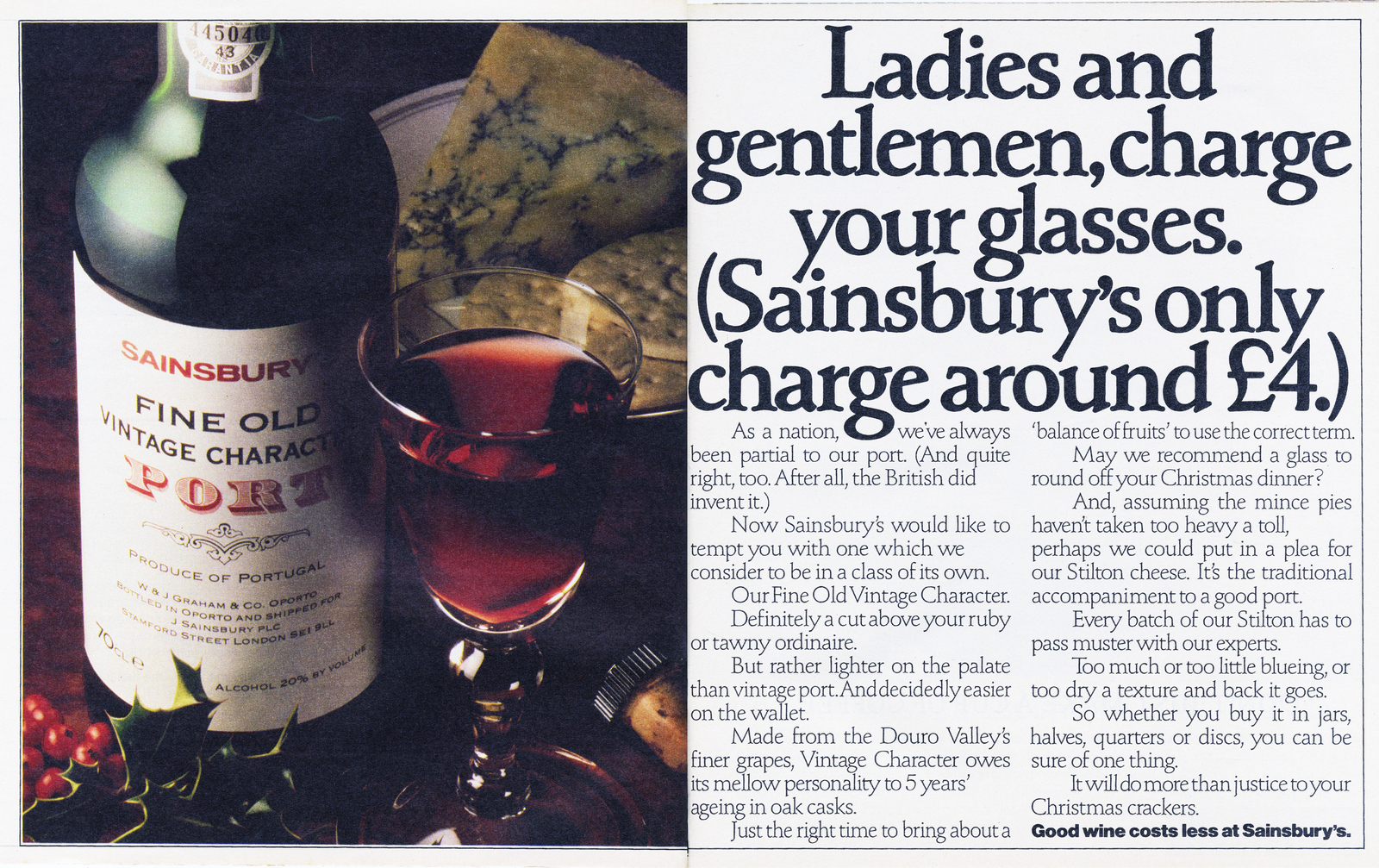
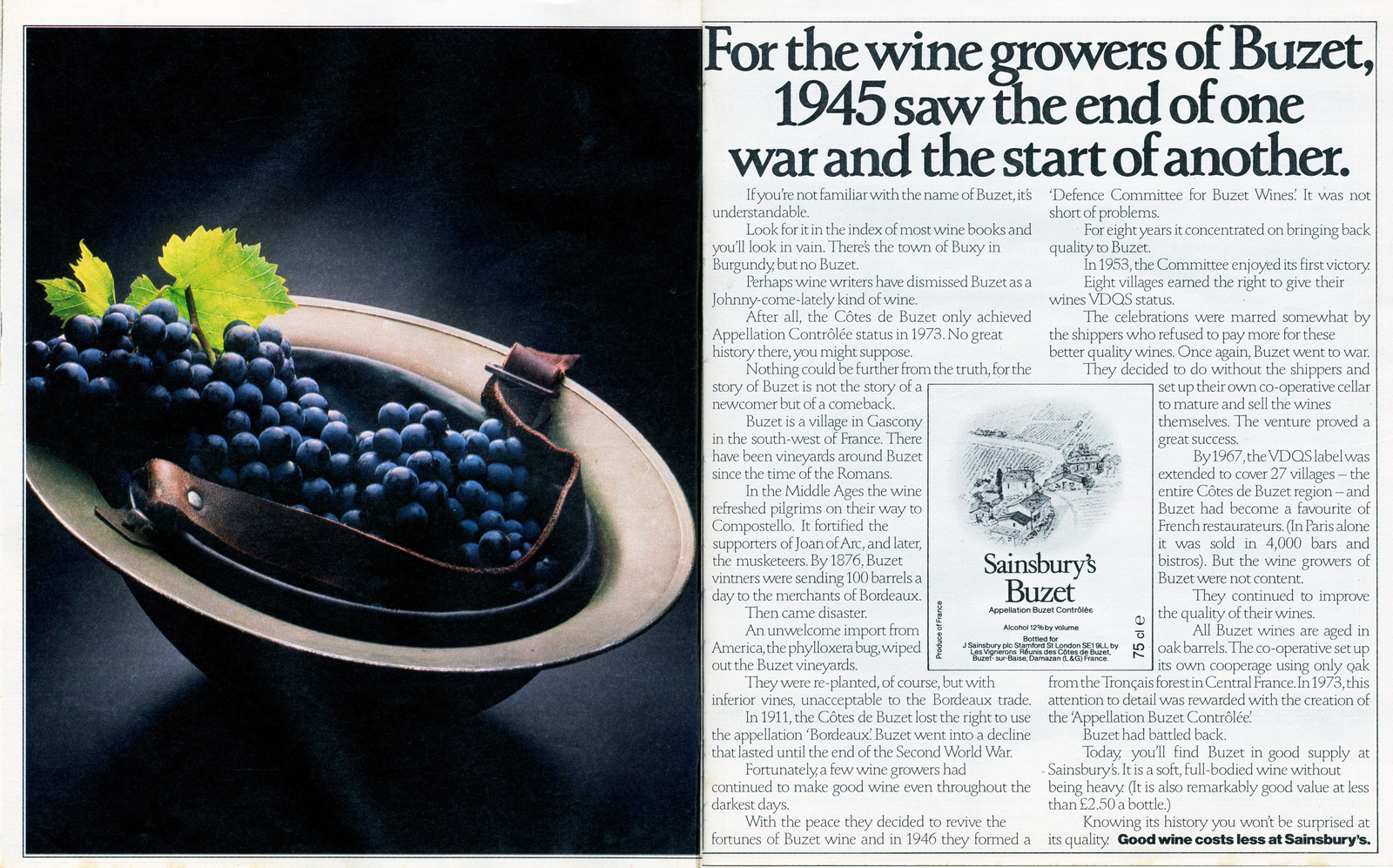
I have taken the liberty of including my first Sainsbury's ad, done with John Horton, and the first not done by David & Ron.
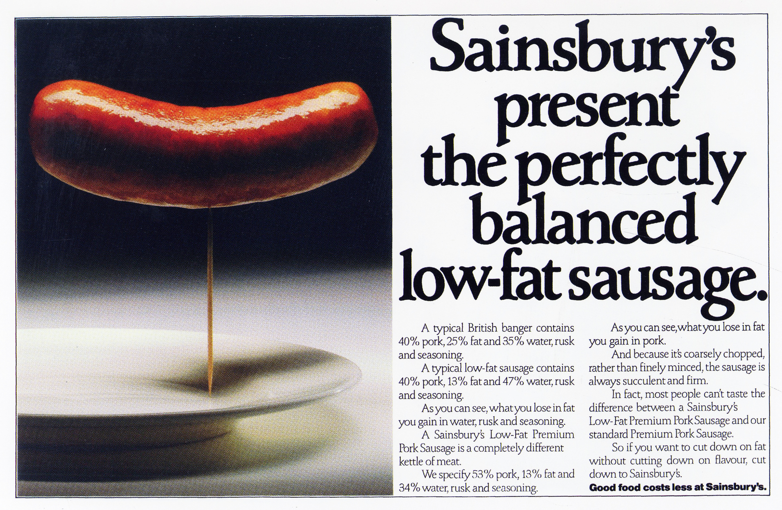
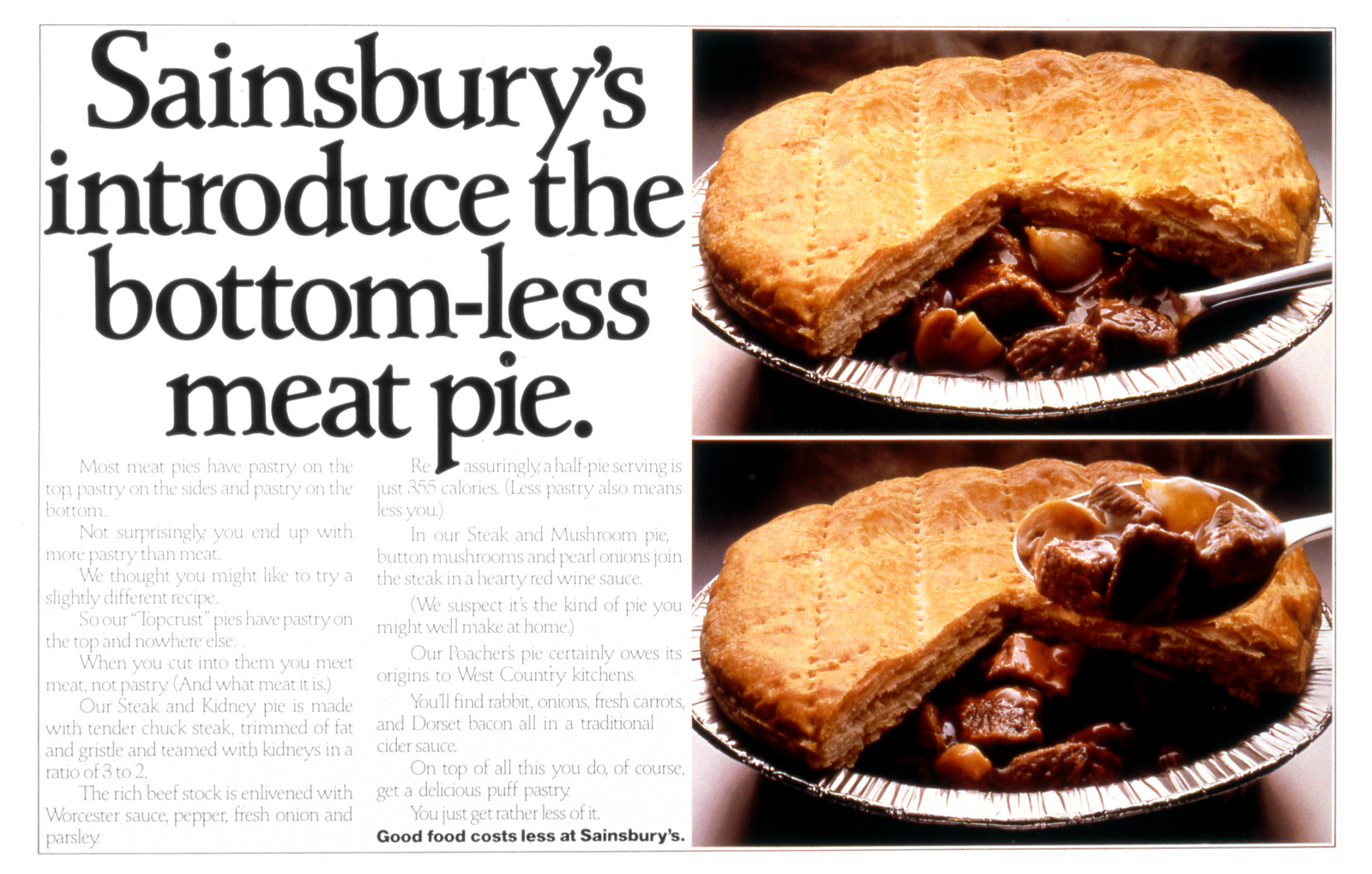
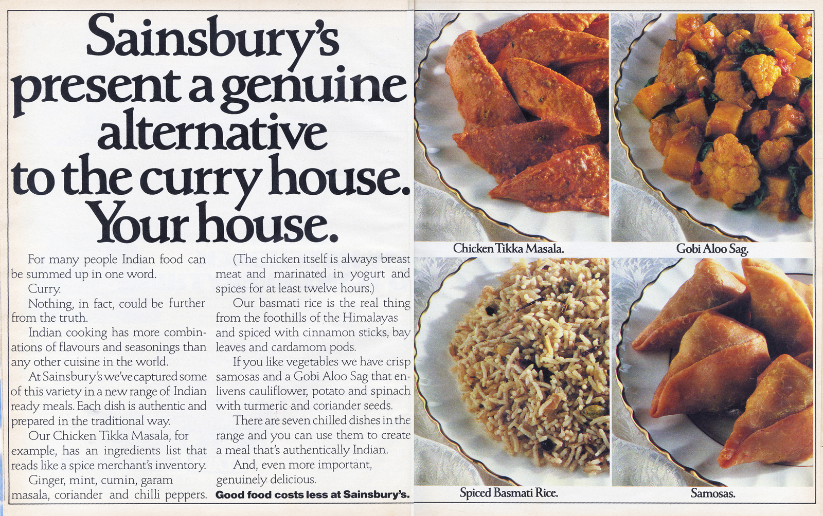
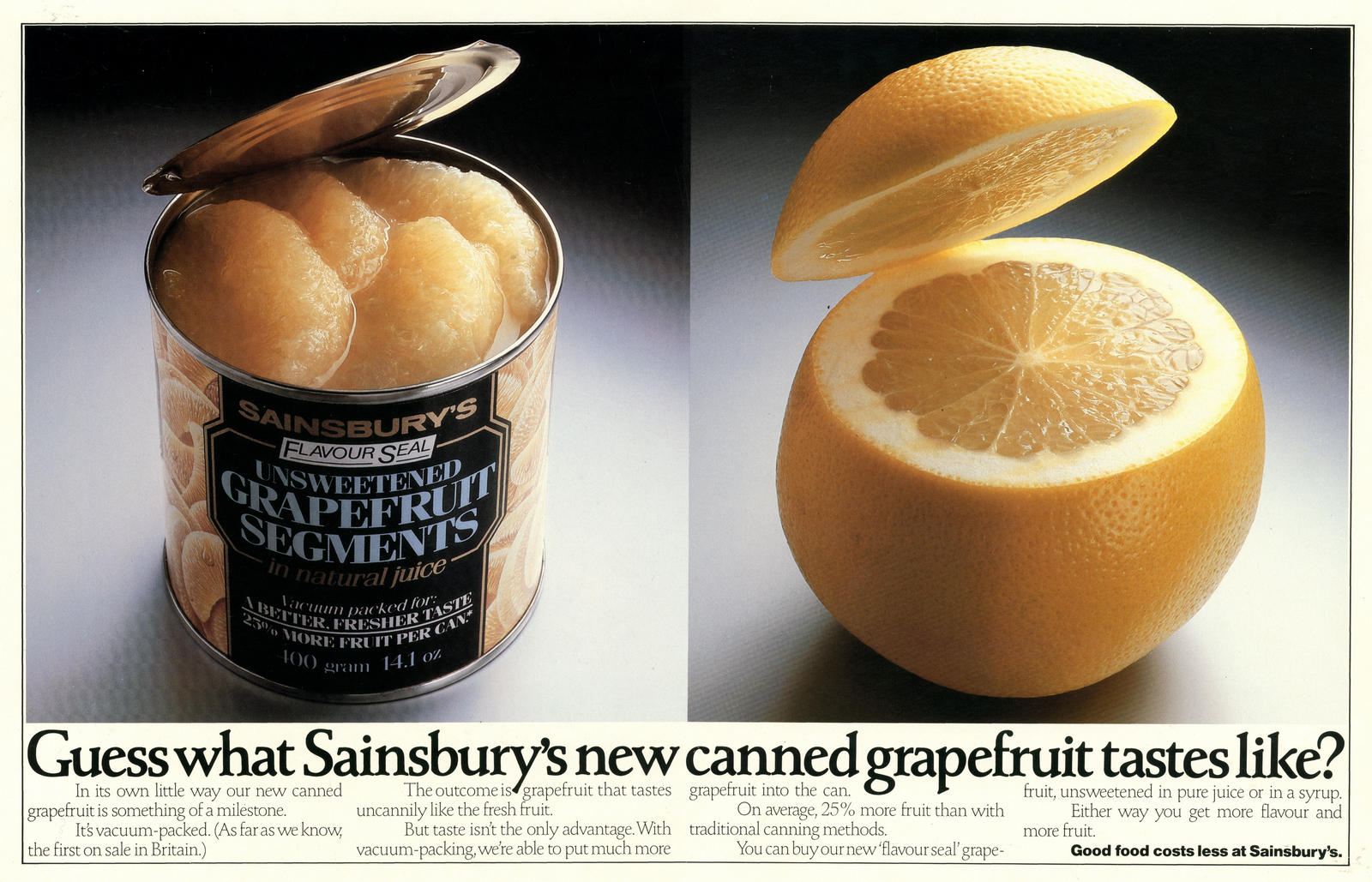
David always said he resisted using "tastes uncannily like fresh fruit" as the headline. My line, dare I say it, would have been "The resemblance is uncanny."
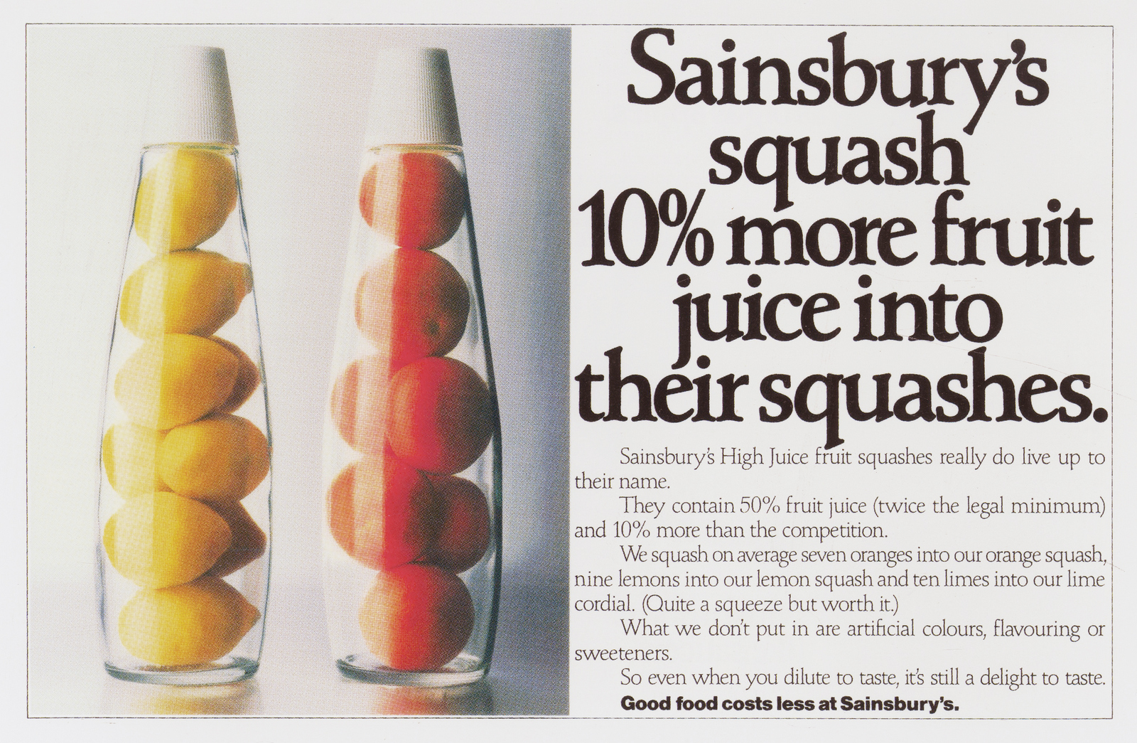
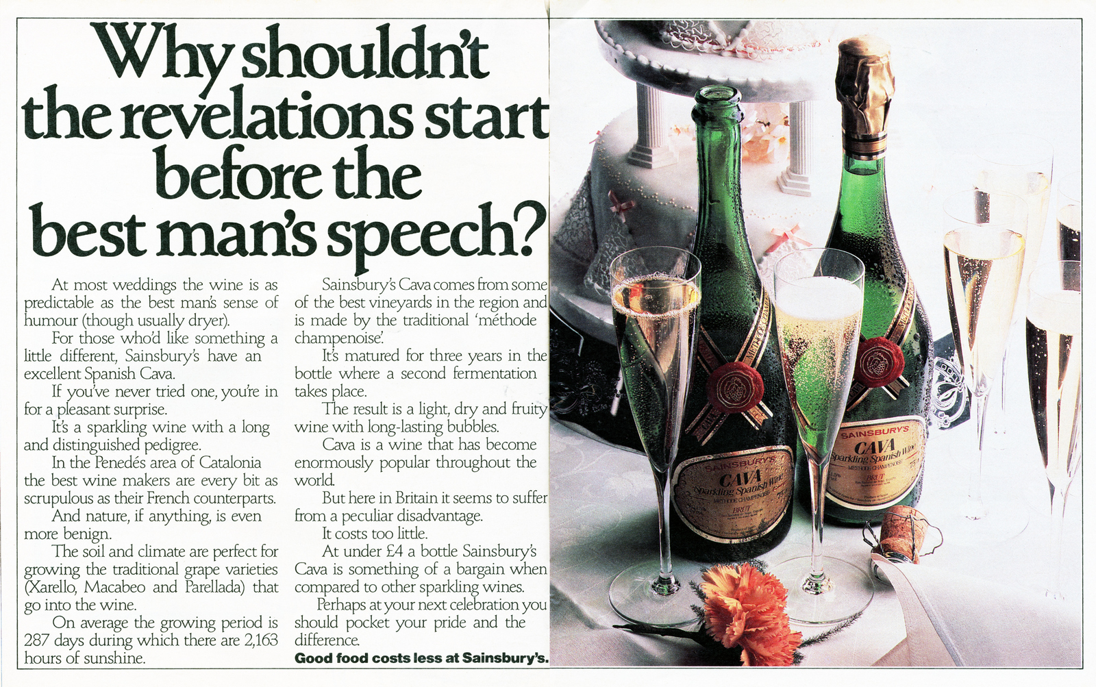
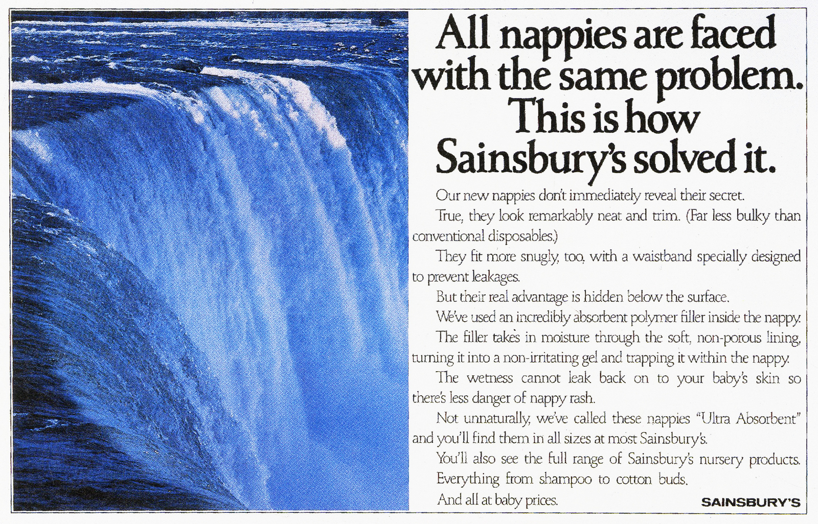
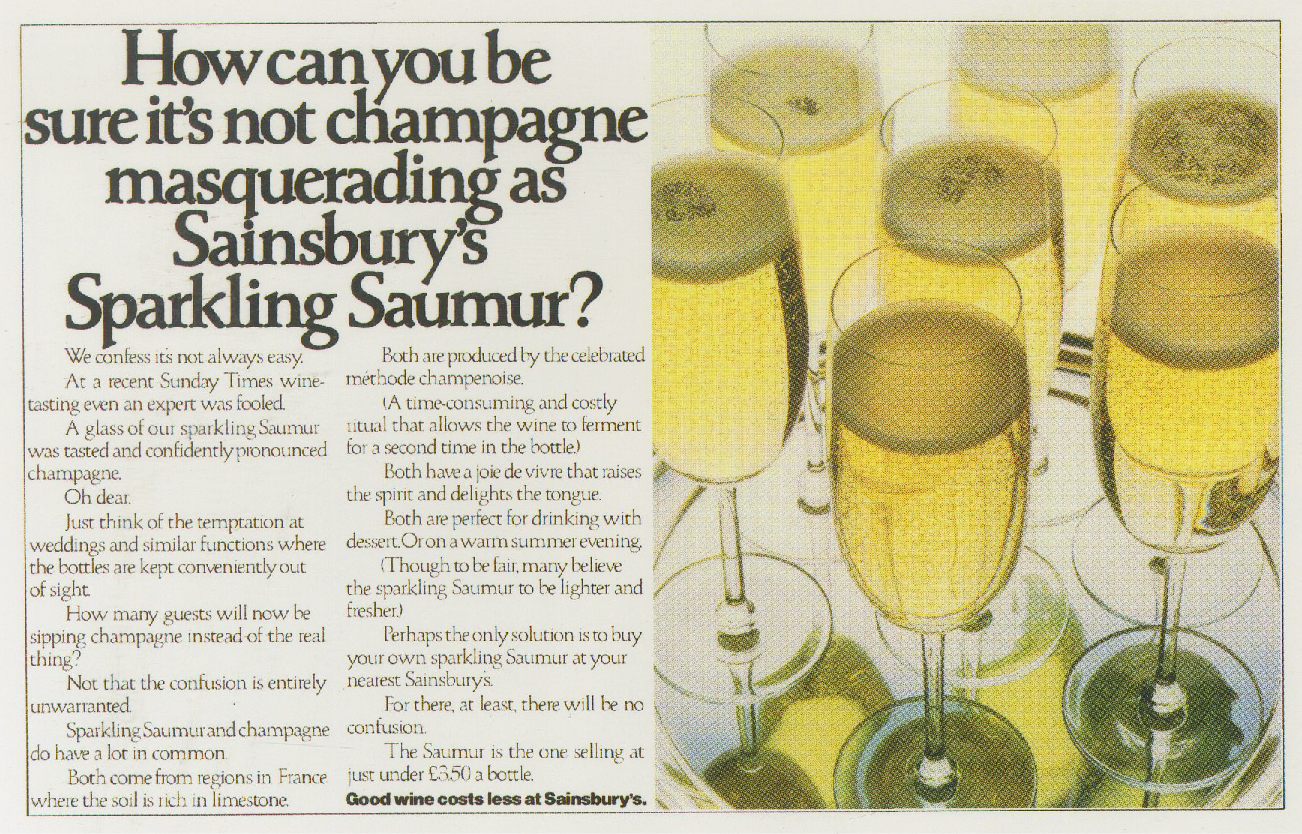
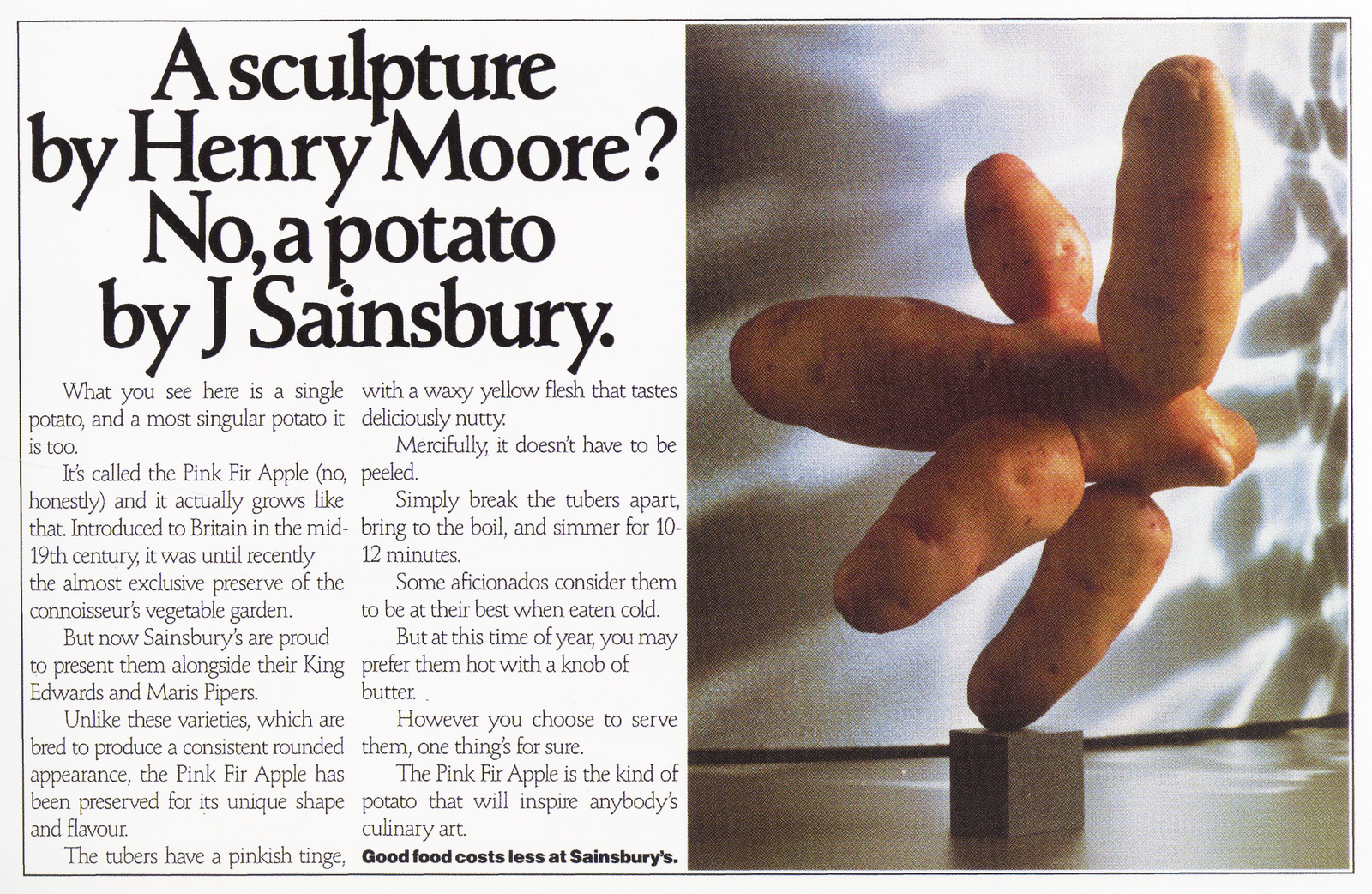
Another Foster & Horton ad, included here purely for egotistical reasons.
David's last Sainsbury's press ad.
In his own words: "Oh, the joy of it! On the afternoon before Budget Day, the Evening Standard prints a photograph of the Chancellor of the Exchequer in Downing Street.
Some of his papers are stuffed into a Sainsbury's bag.
Wonder of wonders, the slogan is clearly visible.
I write a line and we move fast to produce an ad - the client says yes and we run the ad on Budget Day and I fall in love again with this crazy, wonderful business."