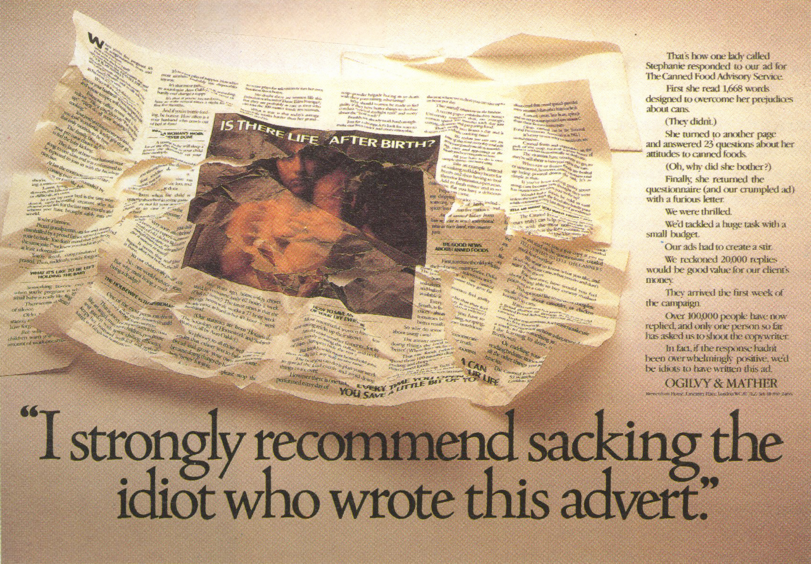
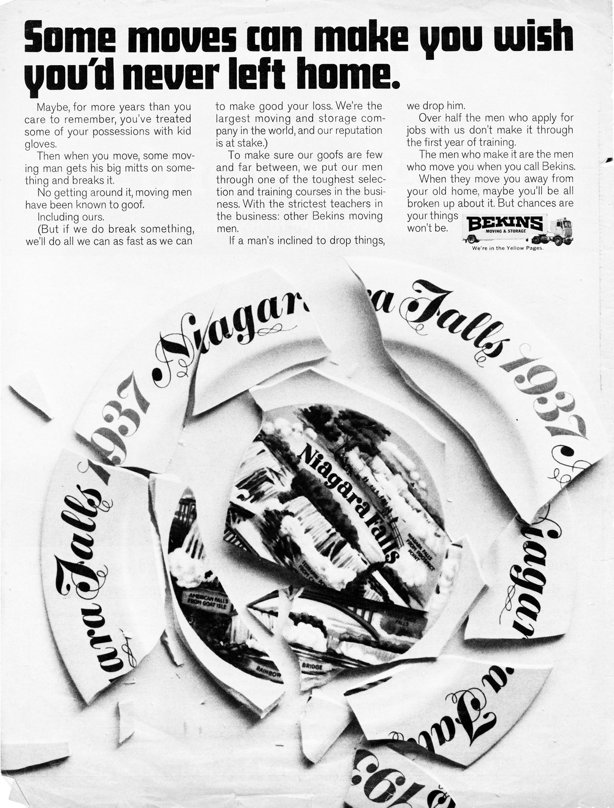
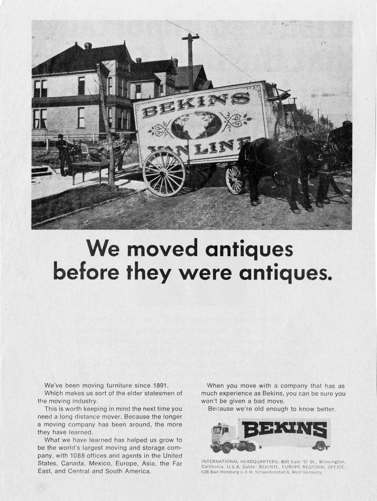
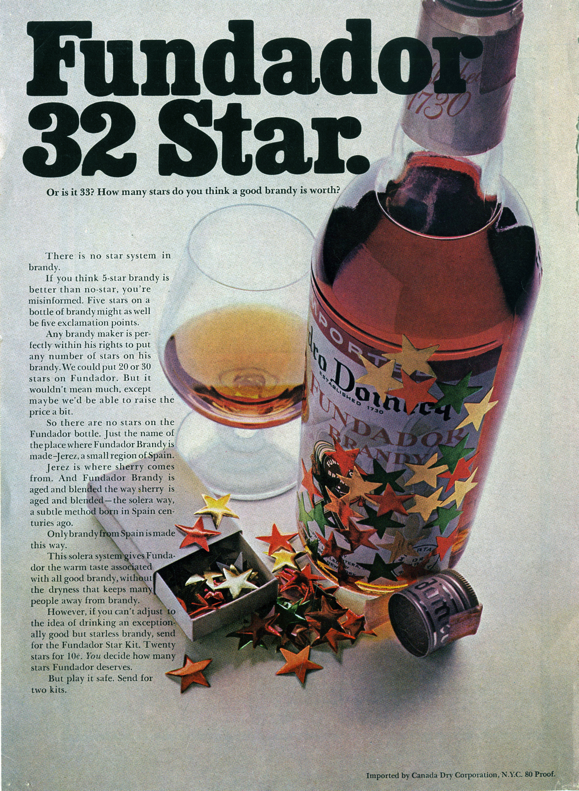
This book was glued and cellotaped together before Hiut Denim, The Do Lectures, Do Books and Howies were even a glint in Dave's eye.
It's nearly 30 years old.
But it's so them.
It features the same ingredients that shine through those companies today - humanity, ecology, wit, positivity, a wide-eyed curiosity and a kind of folksy down home vibe.
In fact, if you wanted to make a Dave Hieatt pie, here's the recipe book.
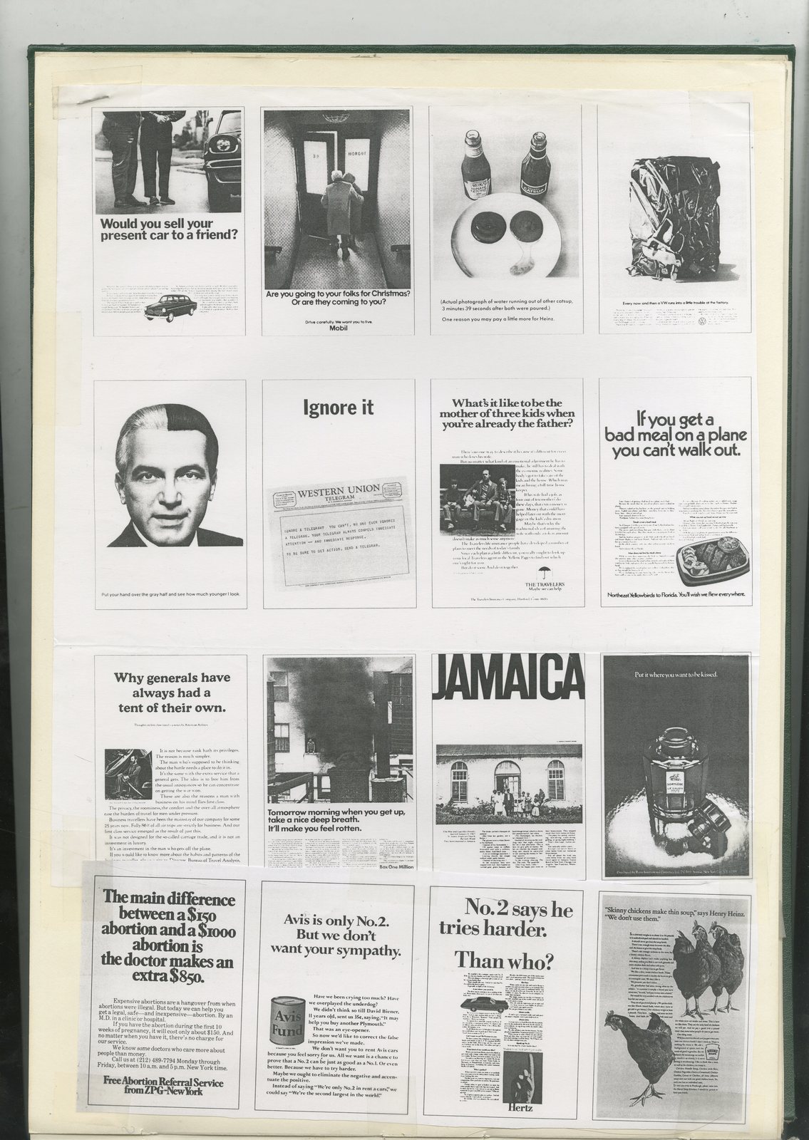
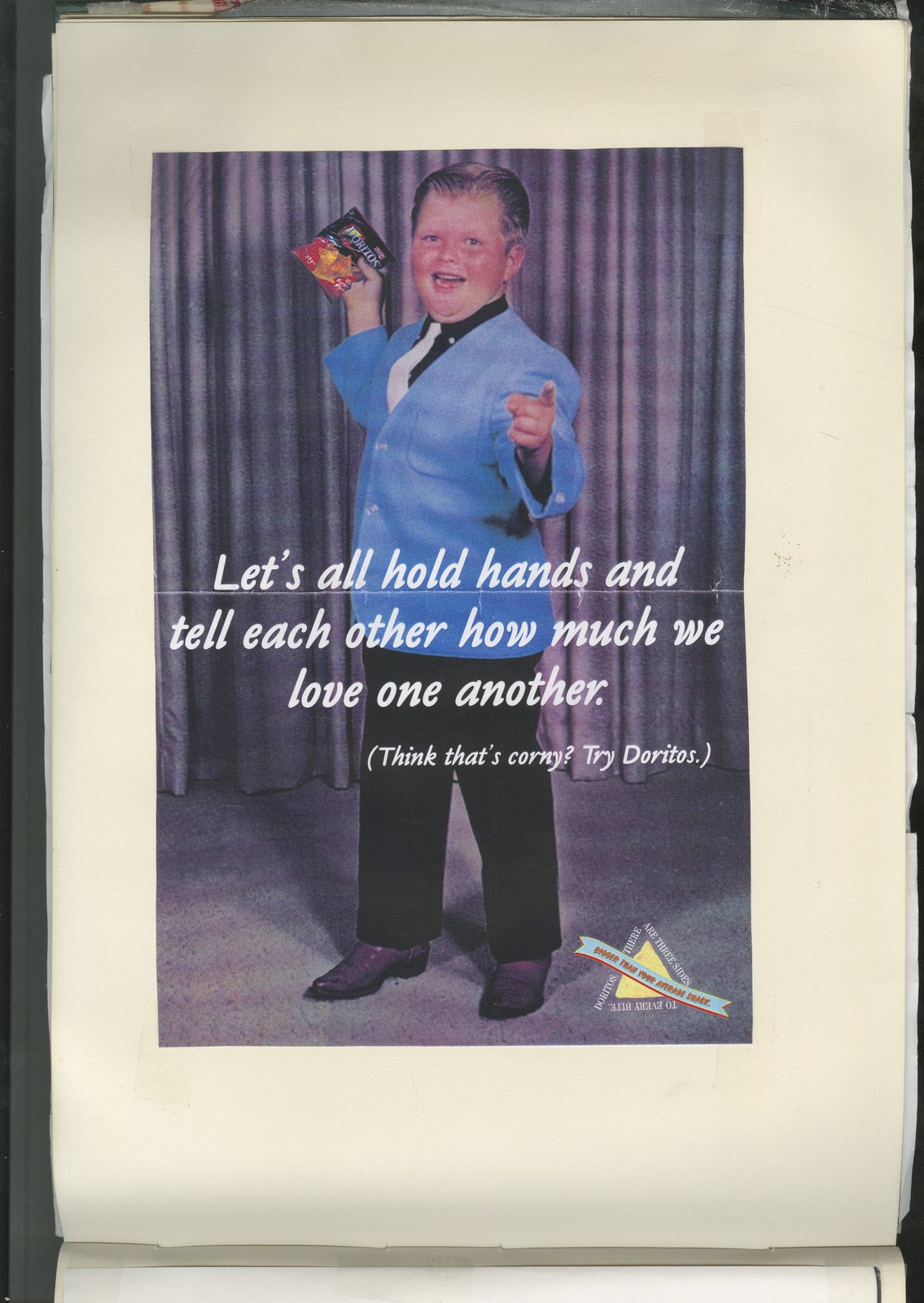


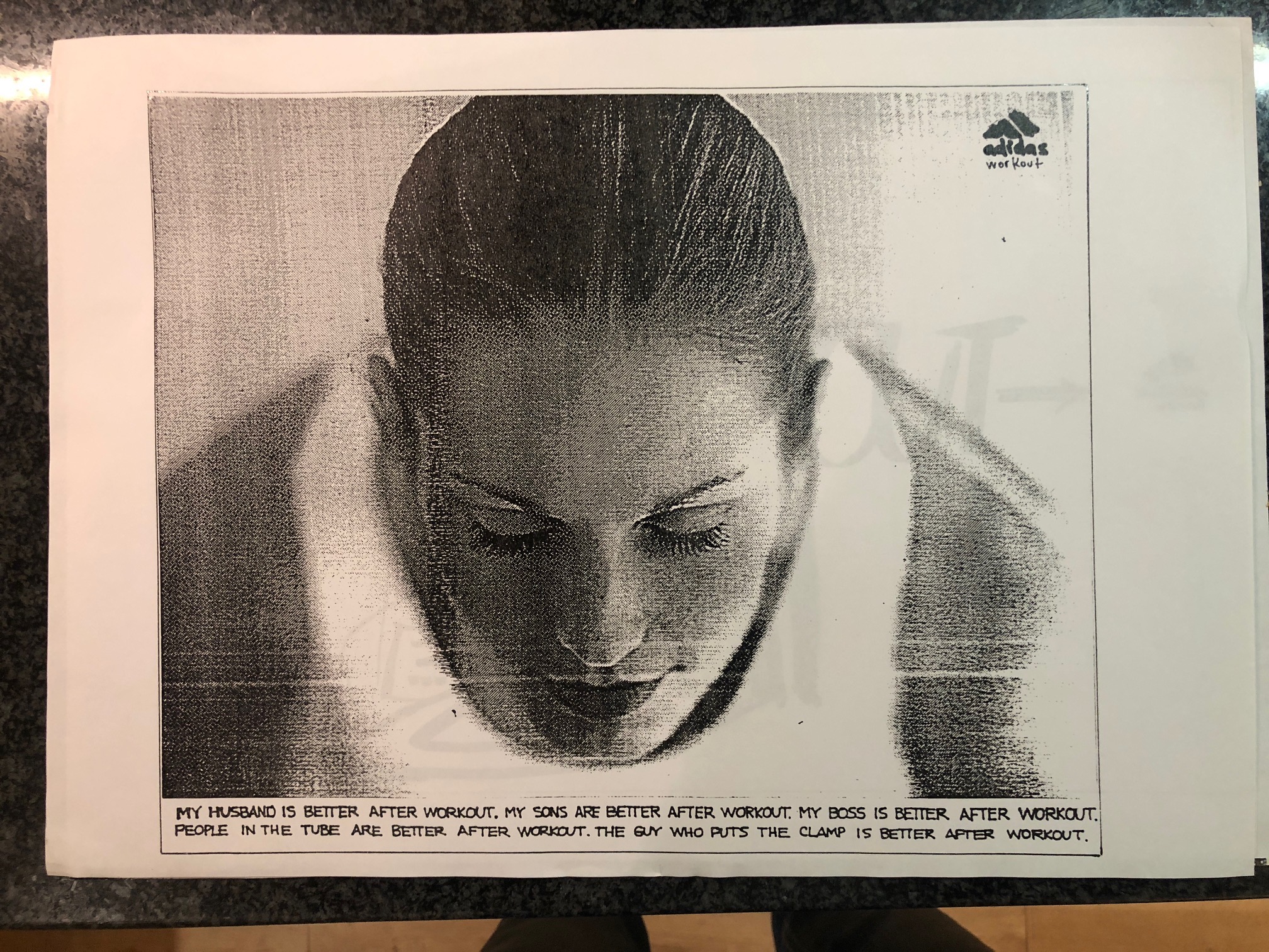
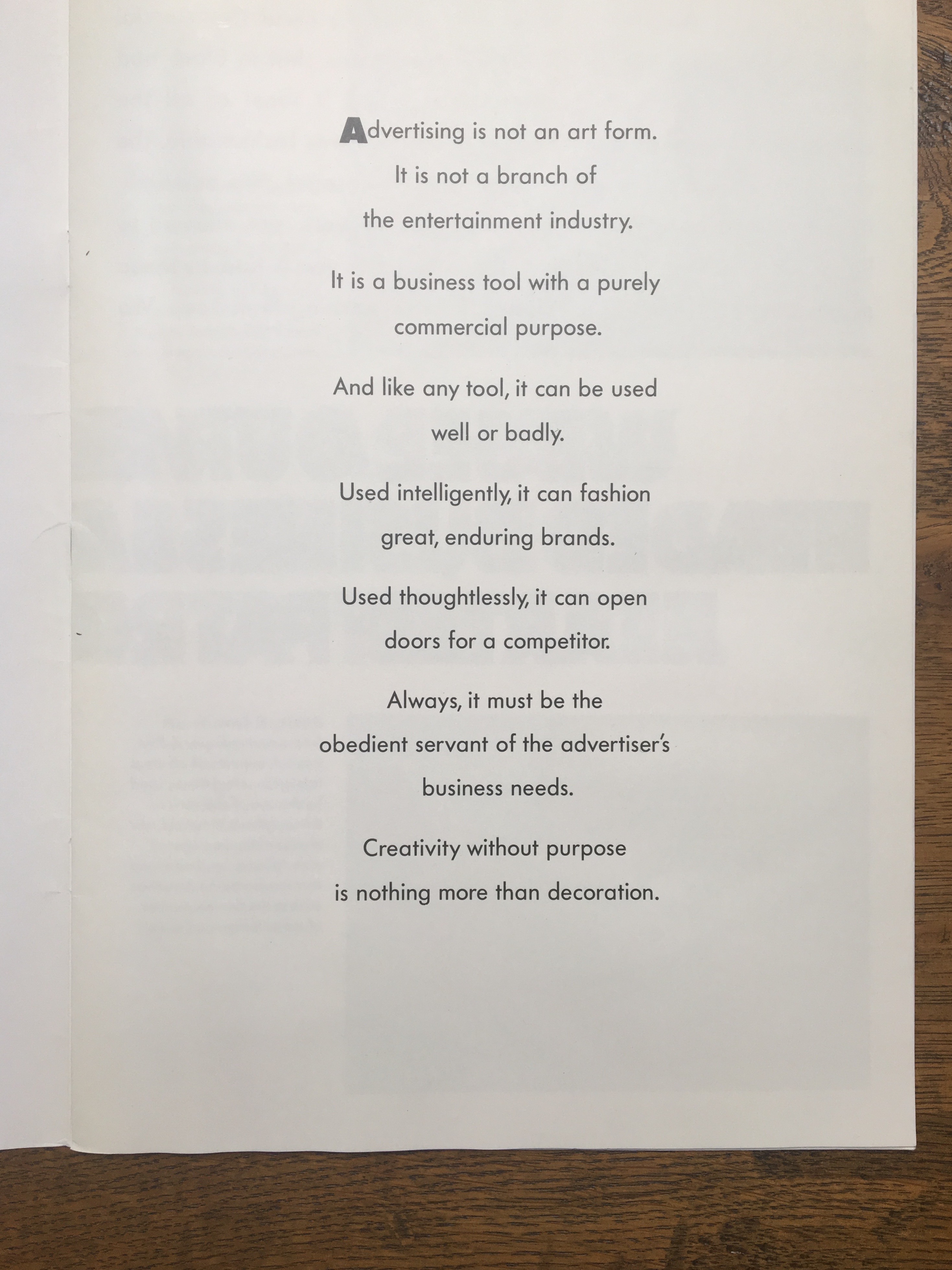
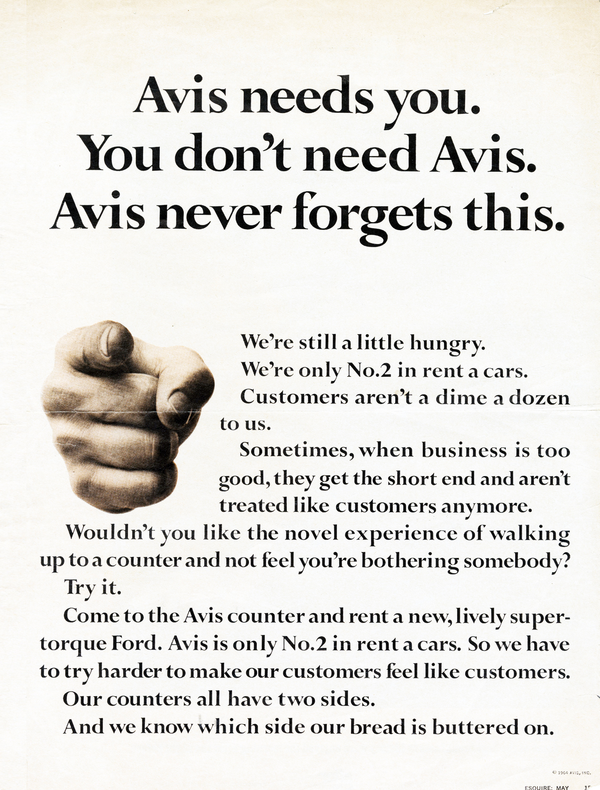
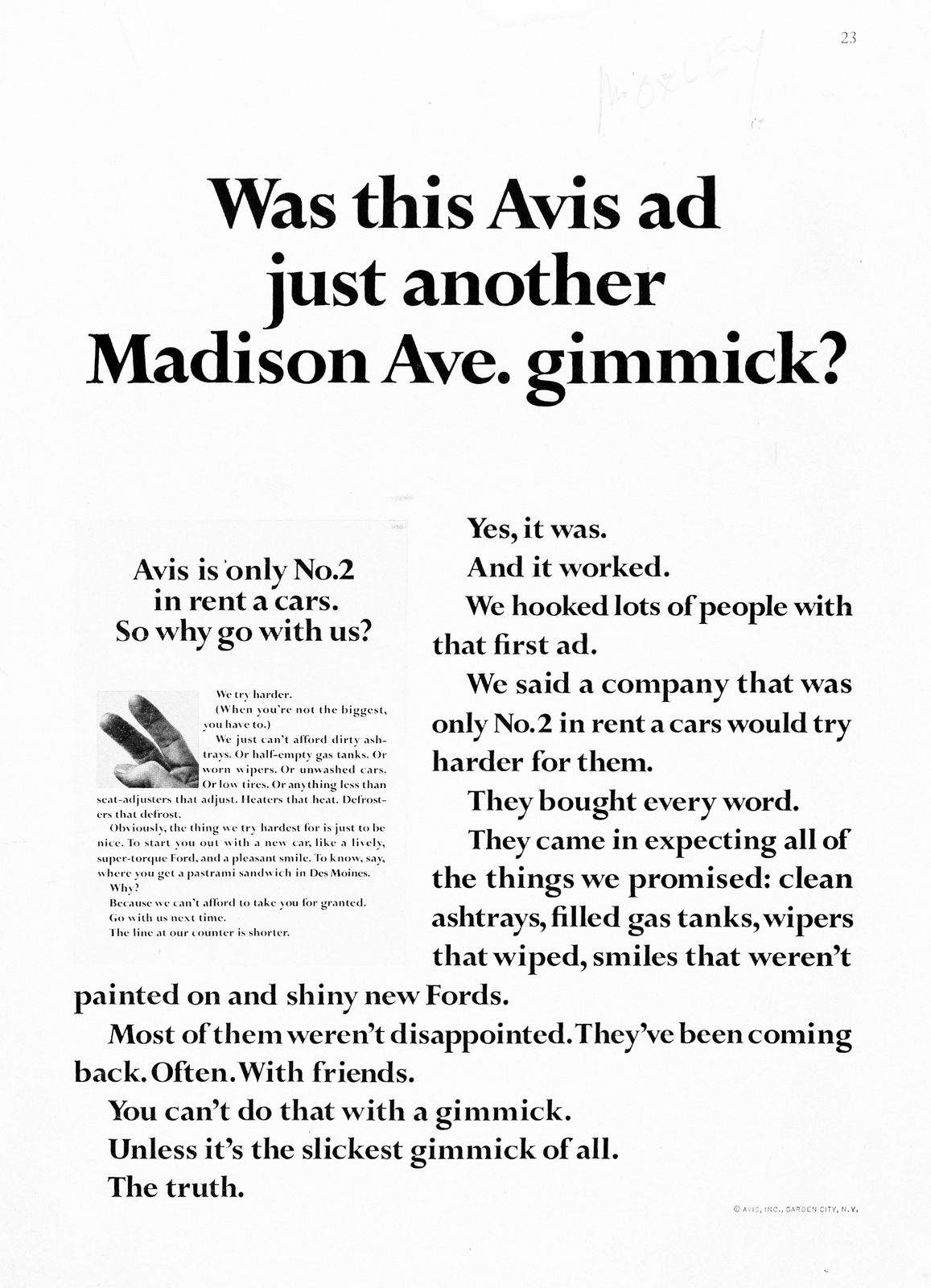
I'm not a big fan of 'BRAND PURPOSE'. It seems to replace specific reasons for buying a product with generic claims that aren't even specific to the product category, let alone the product.It leads companies to make claims that make them seem nuts.Charcoal insoles that 'stop sneakers from smelling' get elevated to 'Creators of a nose-friendly planet'.If you can't say it to someones face without feeling embarrassed, don't say it.'DISRUPTION' is another popular word.But it's a $10 word for 'different'.'Different' gets noticed, a huge part of advertising, also, I get why TBWA rebranded the word to 'disruption', it's been good for them, but it's spin, it's part of the job, not THE job.(It's also generally the executional part of the job).'STORYTELLING' is another.It just seems so indulgent, I might decide to buy a pint of beer because the brewery was set up by three ambidextrous vets from Nantwich, but equally, it could be it because it was cheap, had a nice bottle or because it tastes nice.I'm not against 'disruption', 'brand purpose', 'storytelling' or any number of these $10 words currently doing the rounds, but they aren't the answer, they're an answer; different tools in the toolbox.On the front of that box is the word 'selling'.I know, I know, such a coarse word.We avert our eyes from it the same way we do when looking at the sun, preferring to look to the sides.Is it too basic? Too low rent? Not intelligent sounding enough?Who knows?We're allowed to reframe in more flattering, more high-brow terms because we're not at the sharp end, we're insulated from the harsh financial realities of by layers and layers of people.Consequently a layer of space junk has built up around the world of advertising that's obscuring the very point of it; communicating to the public on behalf of businesses to sell their stuff.It's a proper job, it can be amazing, creative and fun.I've been thinking about putting a post together on these basics; getting attention, making a message simpler and more engaging. I thought I'd choose the most basic, amoeba-like form of advertising to show how a bit of creative discipline can help.Maybe a 'guitar lessons' ad from a news agents window or a 'Lost dog' poster from a tree?For example, a 'Lost dog' poster would be if it was more specific and said 'Lost Labrador', it may be improved again by making it more emotional 'Lost Labrador, answers to 'Eric', and so on.But I didn't get around to it.Then, whilst waiting for my flat white to be made, I spotted these:
'Jesus! Who could be arsed to read all those little words?'.Perfect! Rather than deconstruct something in theory, maybe I can construct something in reality?I pitch the owner; Emine, the idea of trying to drum up more business via her A-boards.She says yes, I will refer to her from now on as 'the client'.I like the fact that there's nowhere to hide, it'll either make a difference or not.Also, maybe I'll learn something. Ok, so here we go...What's our media?Two black & white A Boards, (4 sides in total).Do we hammer one message 4 times or have four messages?We've got a pretty captive audience; they will pass our ads repeatedly, so let's start with 4 separate executions.People see them on the move, walking past, so like posters, the number one issue is to stop them.So we have to be simple, use bigger words and/be unusual, (or 'disruptive' as they'd say over at TBWA towers).What can we learn from the previous work?
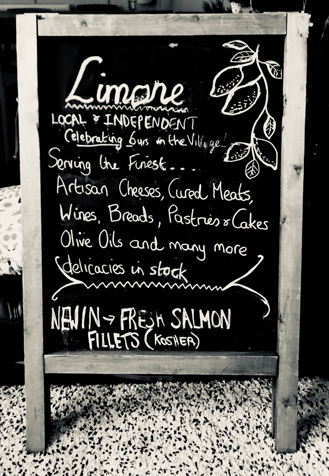
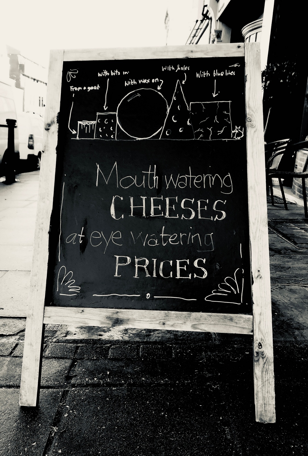
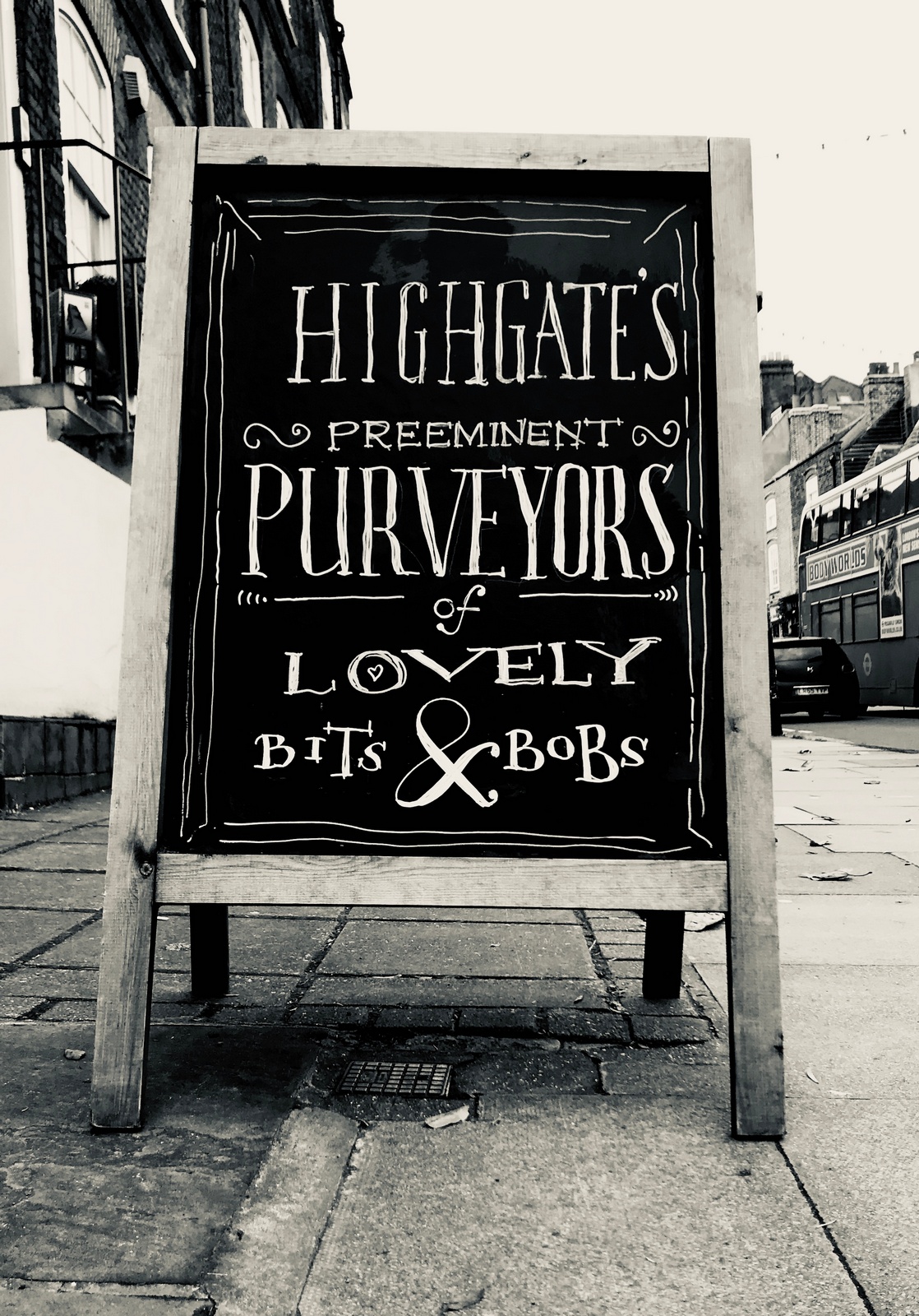
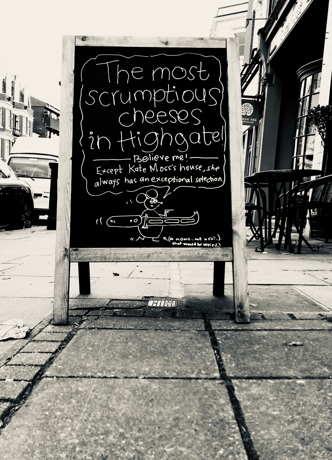
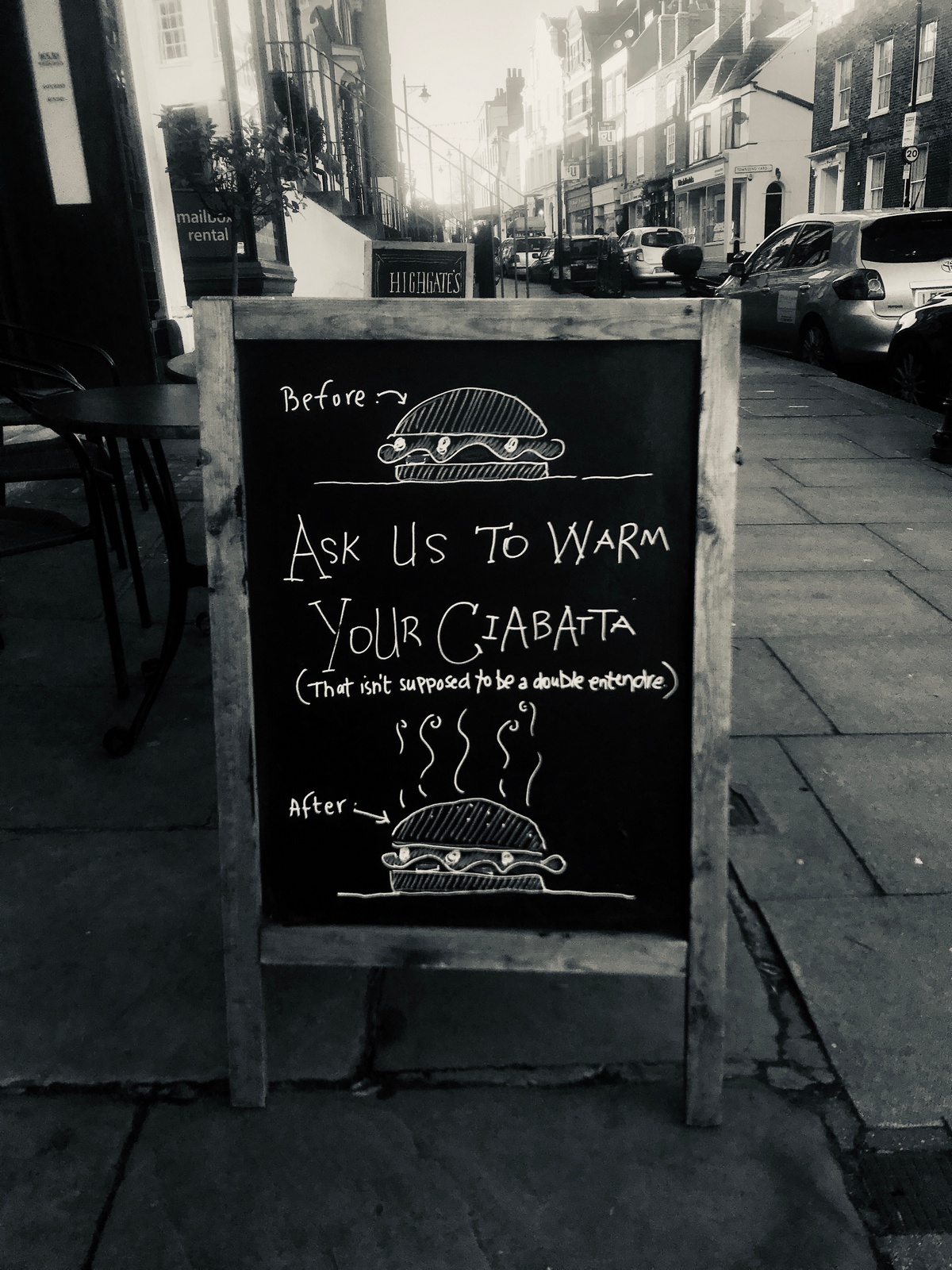
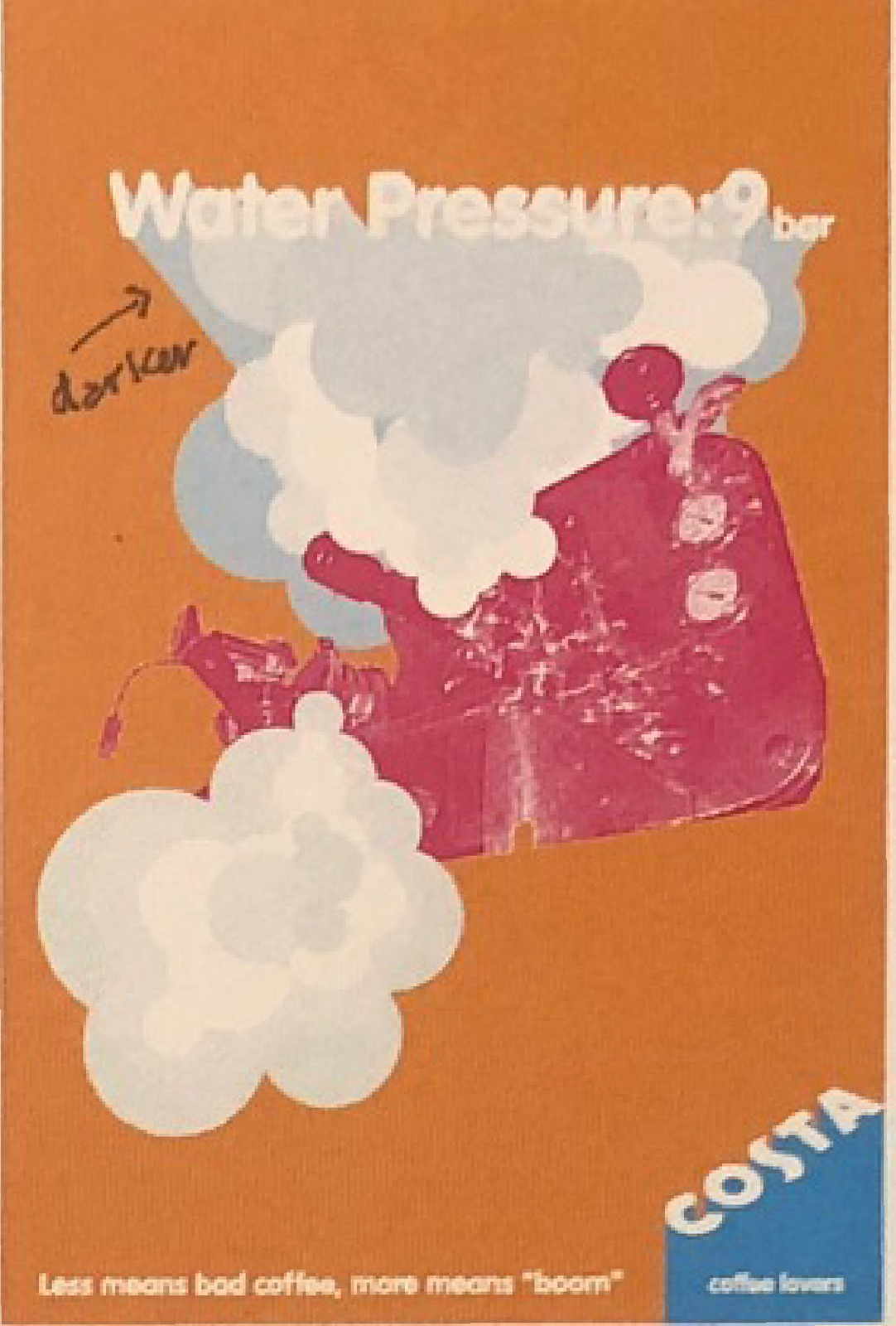
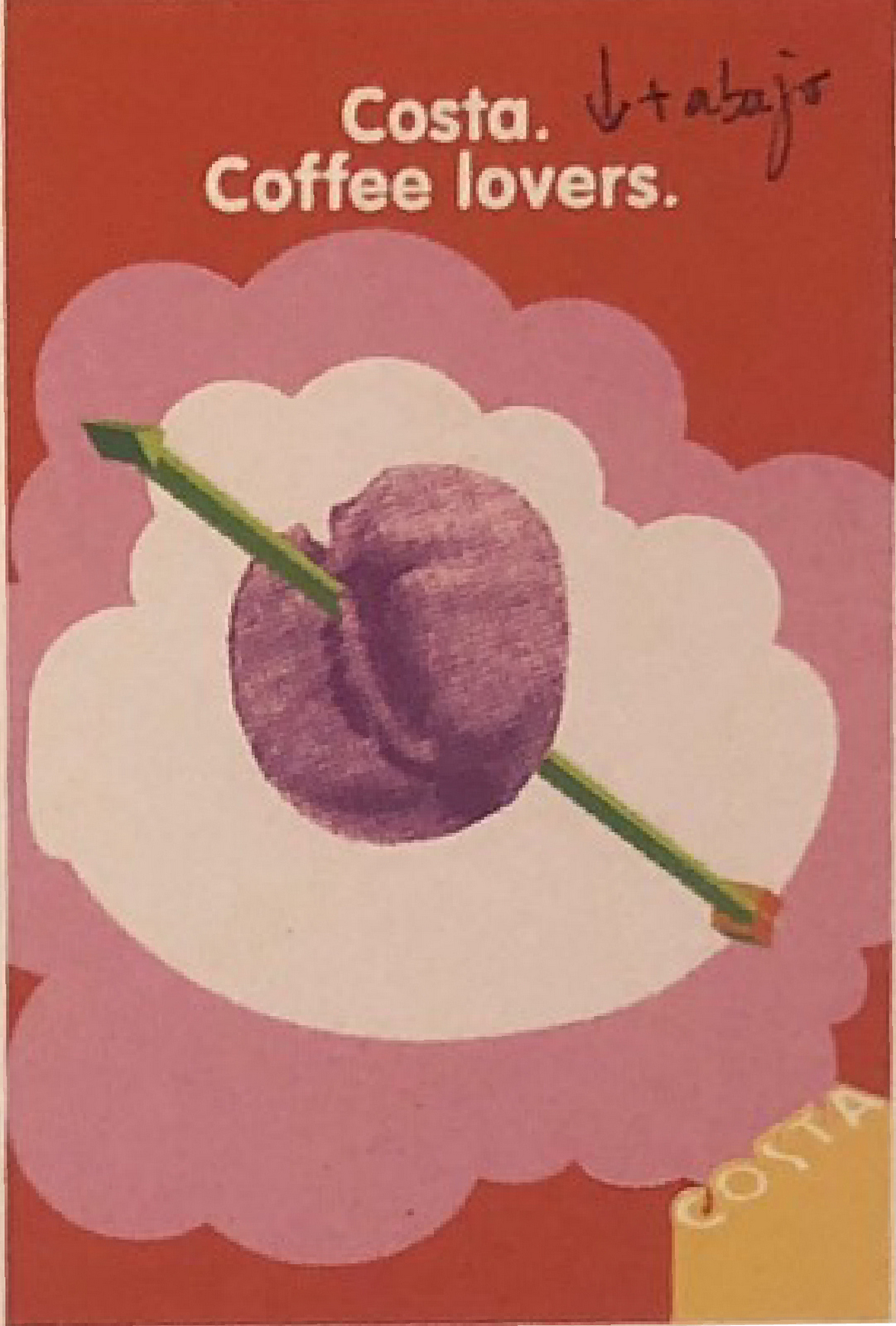
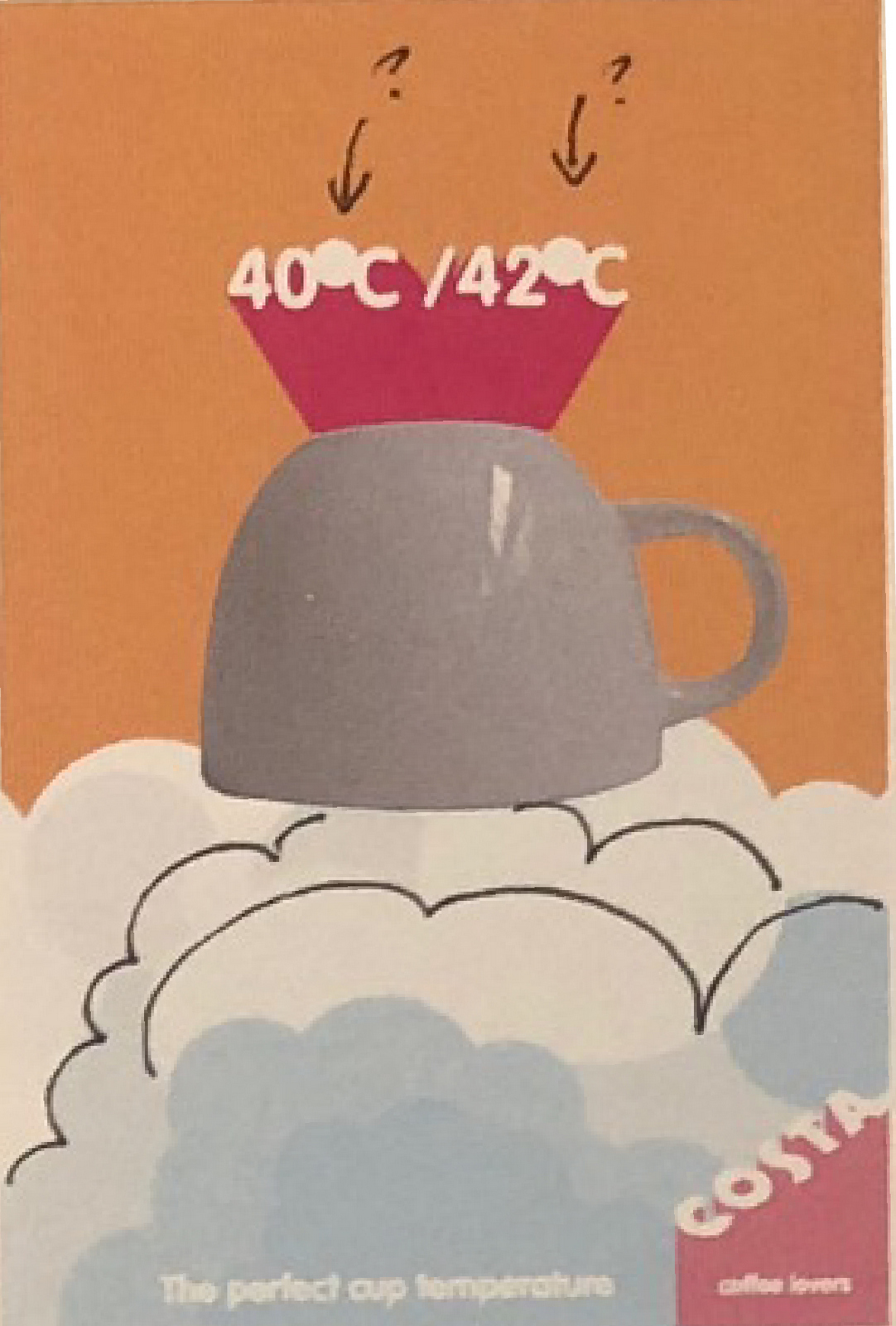
Firstly, there are far too many points being made. That not only makes it hard for people to focus on each message, it means the words have to be very small, making them harder to read and less likely to get noticed.So what can we lose?THE LOGO?The board is placed outside the shop, I think people will connect the two, so that can go for a start.THE BRANDING?Or 'Lemons' as they're sometimes called. They're not doing any heavy lifting, they can go.'CELEBRATING 6 YEARS IN THE VILLAGE'?100 years might be worth shouting about, but six? Gone.'LOCAL & INDEPENDENT'?Well, it's obviously local, I'm standing here looking at it, that's a point that doesn't need making.'Independent' seems like a good thing to push, there's been an explosion of corporate coffee shops, there seems to be a trend towards all things bespoke, unique and quirky, whatever the category.'SERVING THE FINEST...ARTISAN CHEESES, CURED MEATS, WINES, BREADS, PASTRIES & CAKES AND MANY MORE DELICACIES IN STOCK.'?Maybe we tackle them one by one, I've forgotten about 'artisan cheeses' by the time I've read 'delicacies', although that could just be me.'NEW IN - FRESH SALMON FILLETS (KOSHER).'?I like that, the very specific item, it forces you to consider whether you are interested in salmon fillets...or not.I also like the fact that they are kosher, not because I like kosher salmon fillets but because it's a very niche product, it makes me think that this deli may stock other very niche products that may surprise me.Products I may not be able to buy elsewhere.So what should our messages be?1. COFFEE.It's an everyday purchase, there are six other coffee shops in the village, so there must be a lot of local coffee drinkers locally, let's try to flag them down.2. CHEESE.Feels like it could be a small impulse purchase,3. BRAND.This is a fancy deli Highgate, not Tesco's.We are not offering everyday value, we sell fancy things that are quite dear. Let's be true to who we are.4. TOPICAL.Static isn't a good look for any brand or company, it's always good to appear current, evolving and moving forward, so maybe we could use one board for this?We could pick up on the calendar, Christmas, Easter, or whatever, we could reference the news or 'Kosher Salmon Fillets - in stock until Weds'.How do we speak?We're independent, so whatever corporate-speak is, we should be the opposite.Also, we're talking latte and dolcelatte, not life and death, so let's be fun and cheeky.WEEK 1:CHEESE:They're the only deli for about 4 miles.
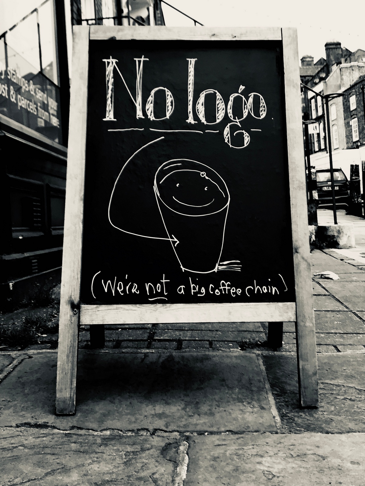
BRAND:Let's say 'We're independent'. Saying we're not one of the chains sounds pious and off-putting, 'Our coffee is better than coffee chain coffee' sounds like bullshit, probably because it is? Also, the Costa mob up the hill might put a brick through our window.We just need to signal we are different from them because we're independent.
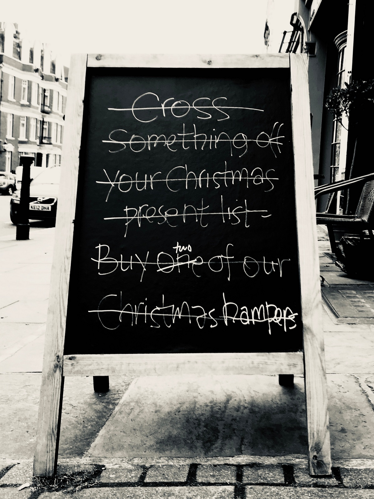
TACTICAL:Try selling a Christmas Hamper after December 24th plus they are a big ticket item.Maybe they're Christmas presents? For late present buyers, or 'men' as they are more commonly known.
LOCATION:Everyday, at 8.30 and 3 the streets are flooded with Lycra-clad mums dropping or picking up their girls from Channing's School.Let's ask them if they want a coffee.It's better if we are specific, what coffee would they drink? Skinny latte?
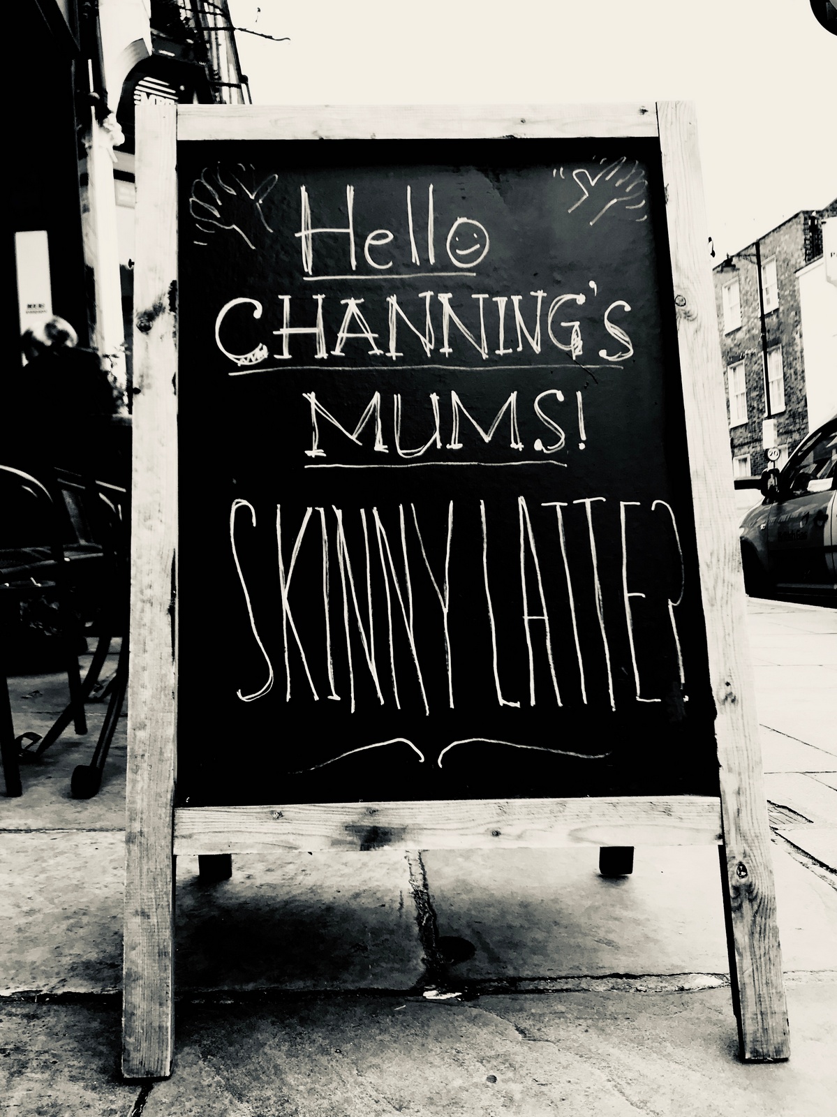
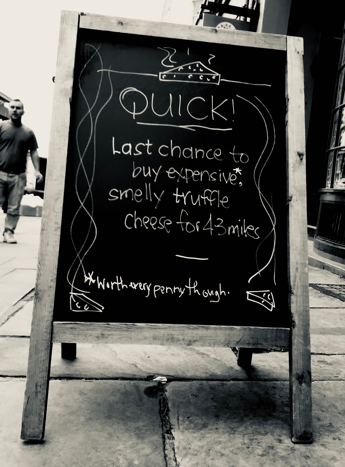
CLIENT FEEDBACK:CHEESE: We sold a lot, many buyers specifically asking for that 'smelly cheese'.INDEPENDENT: Nothing to report, but who's going to say I've just read your sign and would like to buy one fo your coffee's without a logo on the cup?LOCATION: Disaster; a handful of mums found our sign offensive, one citing that she worked with anorexic girls.I tried to look at the positive, saying it's great that our messages are getting noticed and bringing customers into the store.Client frowns.I then suggest swapping 'skinny' for 'fat'? Deeper frown.HAMPER: No sales bump, hamper sales went as expected. ad is probably too wordy to jump out.Maybe it's too wordy, must try harder.WEEK 2.CHEESE. Maybe we show our range?With a bit of self-deprecation.Mark Denton's phrase 'eye-wateringly expensive' springs to mind.
BRAND:Let's try to sum up our 'purpose'.
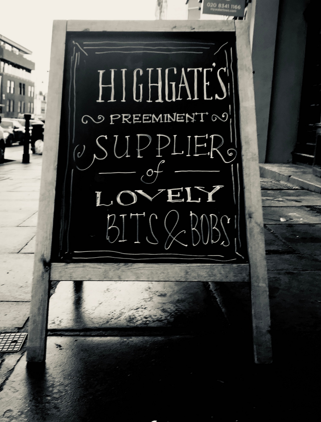
'Supplier' irritates me, 'purveyor' is more appropriate, a better, more formal contrast to the ultra informal 'bits & bobs'.
COFFEE: How the hell do I lure people in to buy a coffee just using chalk?Maybe we fess up about our aim?
TACTICAL. The client has just taken stock of some Christmas Hampers, they need to be gone, nobody buys Christmas Hampers in January.What do you say? Maybe they are a good Christmas present? Especially for those leaving their present buying to the last-minute, or 'men' as they are more commonly known as.
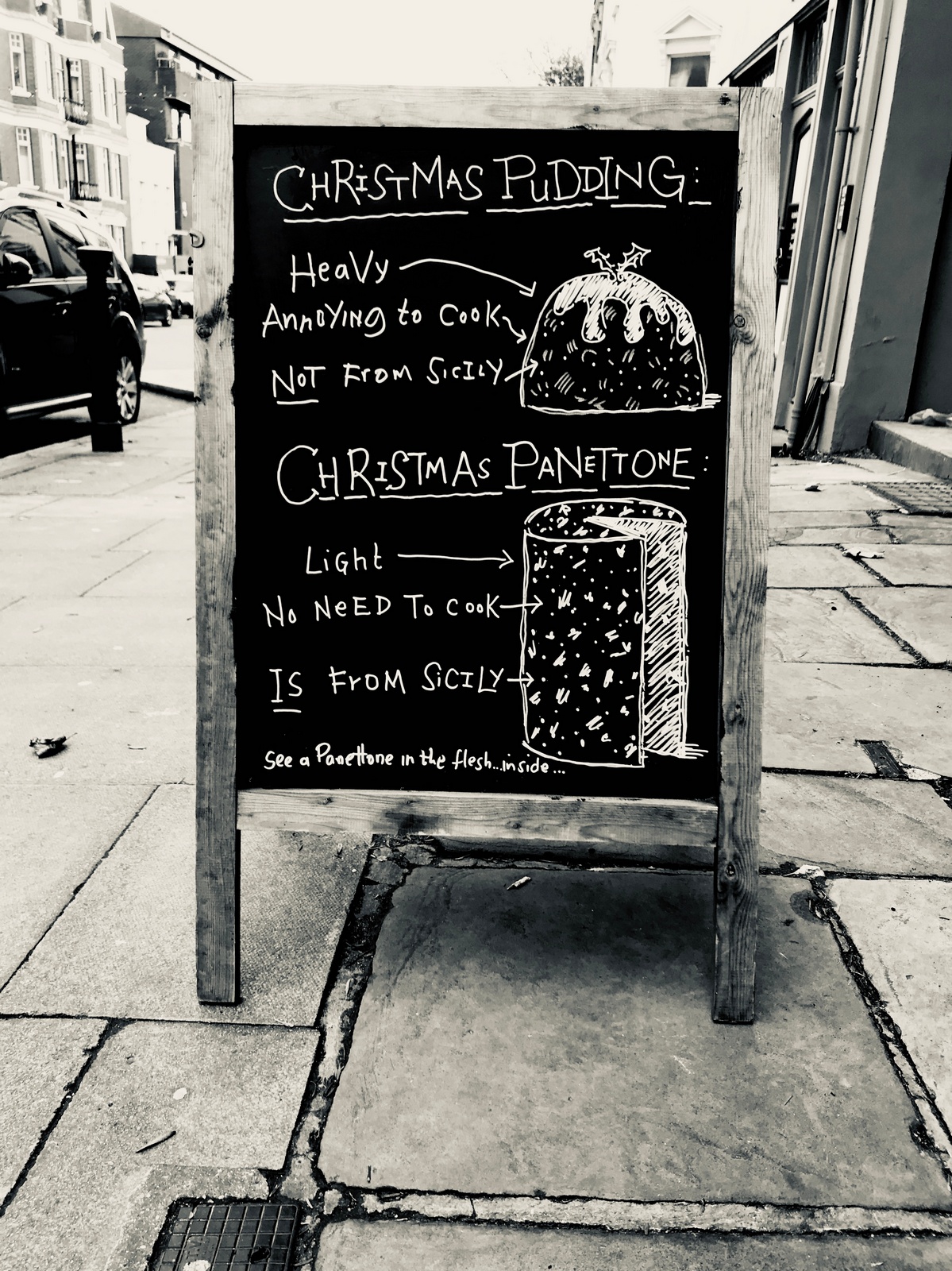
CLIENT FEEDBACK:CHEESE: Sales of cheese continued to be up.But on reflection, I feel it's too addy; the layout, the wording, these boards should handmade, not professional.Client feedback - 'Do we have to keep saying that everything is expensive?'BRAND: Weirdly, lot's of customers mention that they like that message.The general feeling is because it's accurate and charming.Client mentions that she particularly likes the look of this one - 'classy'.As I mentioned in 'Cheese', I think they should feel imperfect, as if the client has written them herself, if it looks like a professional has been called in we fail.COFFEE: Nothing to report, except the Dry Cleaner liked it.TACTICAL: Boom! Panettone sold out, ordered more.Again, the most specific thing seemed to work best.Next, a lot of people said they liked the 'purveyor of bits and bobs', when pressed why the clients said they thought it was true. TACTICAL: The bit between Christmas and New Year? What do we say? We don't sell turkey.

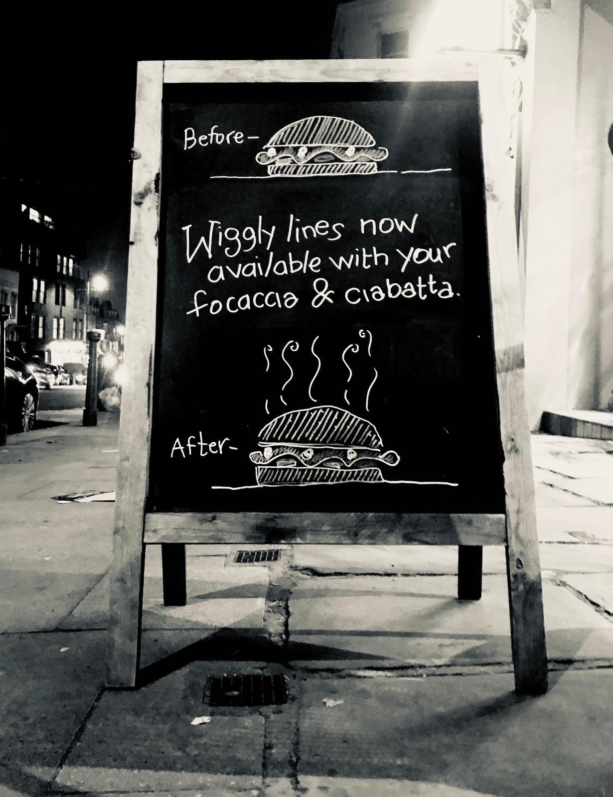
LUNCH: The new 'coffee'. What do we say? We'll warm it? People probably aren't aware that it's possible to heat, also, it sounds personal, friendly.
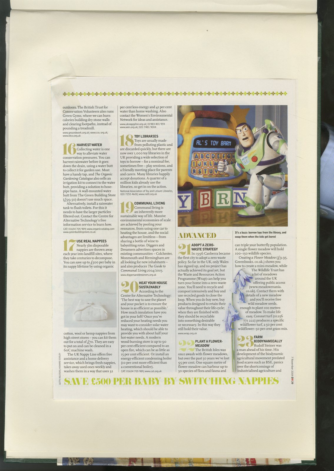
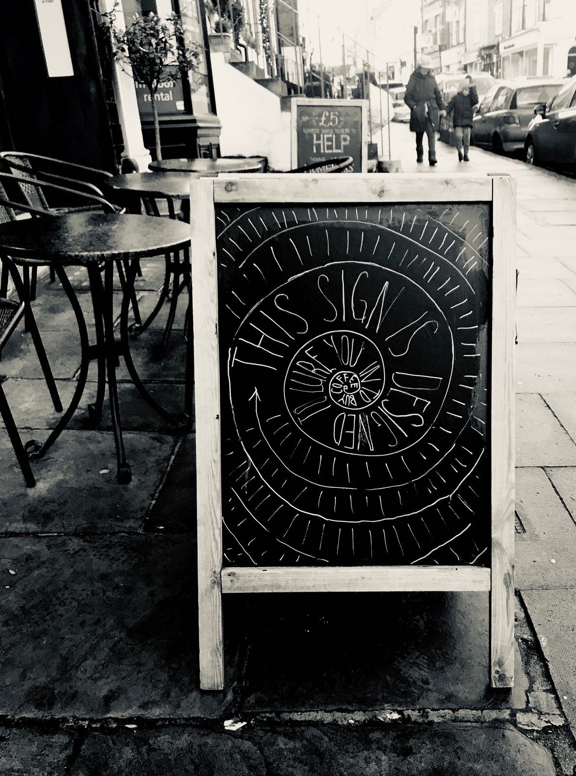
Whilst waiting for my coffee the morning after the client mentions that few people have asked the client what a double entendre is.I look at it again; shit joke, too complicated and the idea is really the wiggly lines, which is lost.
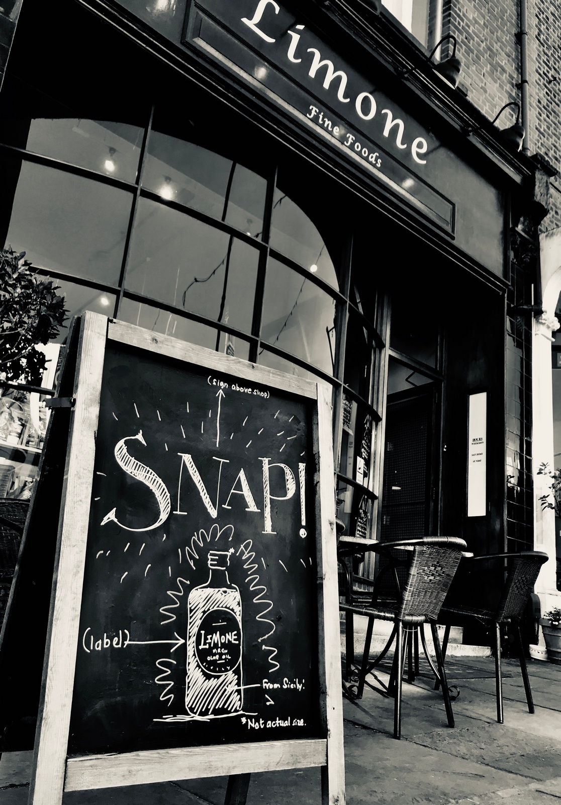
BRAND: The client has just taken stock of some own-brand virgin olive oil. It apparently took 6 years and over 200 samples before she found one she was happy with, before settling on one from Sicily.Sounds impressive, so I try to take the essence of that information and condense it into a message.It's long and starts to sound like an advert.I figure the job is to make people aware that there is now a virgin olive oil that bears the shop name, she can talk the rest, face to face.
To be continued...

My first South American.One of the most thoughtful creatives I've come across.We worked together for a bit at Mother and I loved that he was forever curious about what the people in the real world were thinking, would they give a shit about our little product or dumb ad?Not surprisingly his new agency is different, its New.That's not a typo, that's its name.It's also appropriate because he's teamed up with a Rocket Scientist from... actually, not a rocket scientist, 'a founding Faculty Director of MIT Connection Sciences', similar, to me, (although ironically one of their clients are actual rocket scientists; NASA).We had a great chat, in fact Beresford, our young recording engineer at Wave, came in afterwards to tell me it was his favourite one he'd done, hope you enjoy it too.
THE EARLY DAYS.

LEAGAS DELANEY. (1 month.)
MOTHER.
WIEDEN + KENNEDY.Nike.
(C.D.)
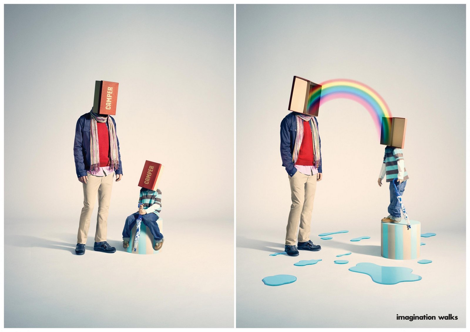
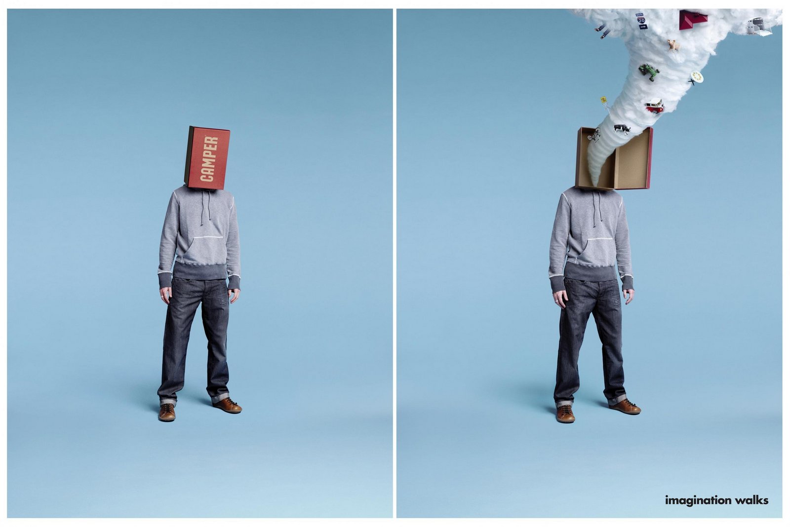
MADRE.
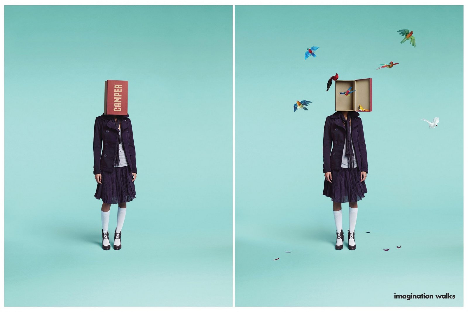
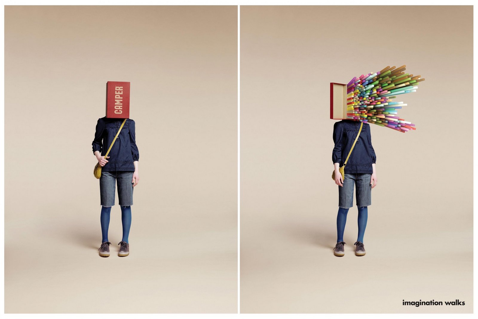
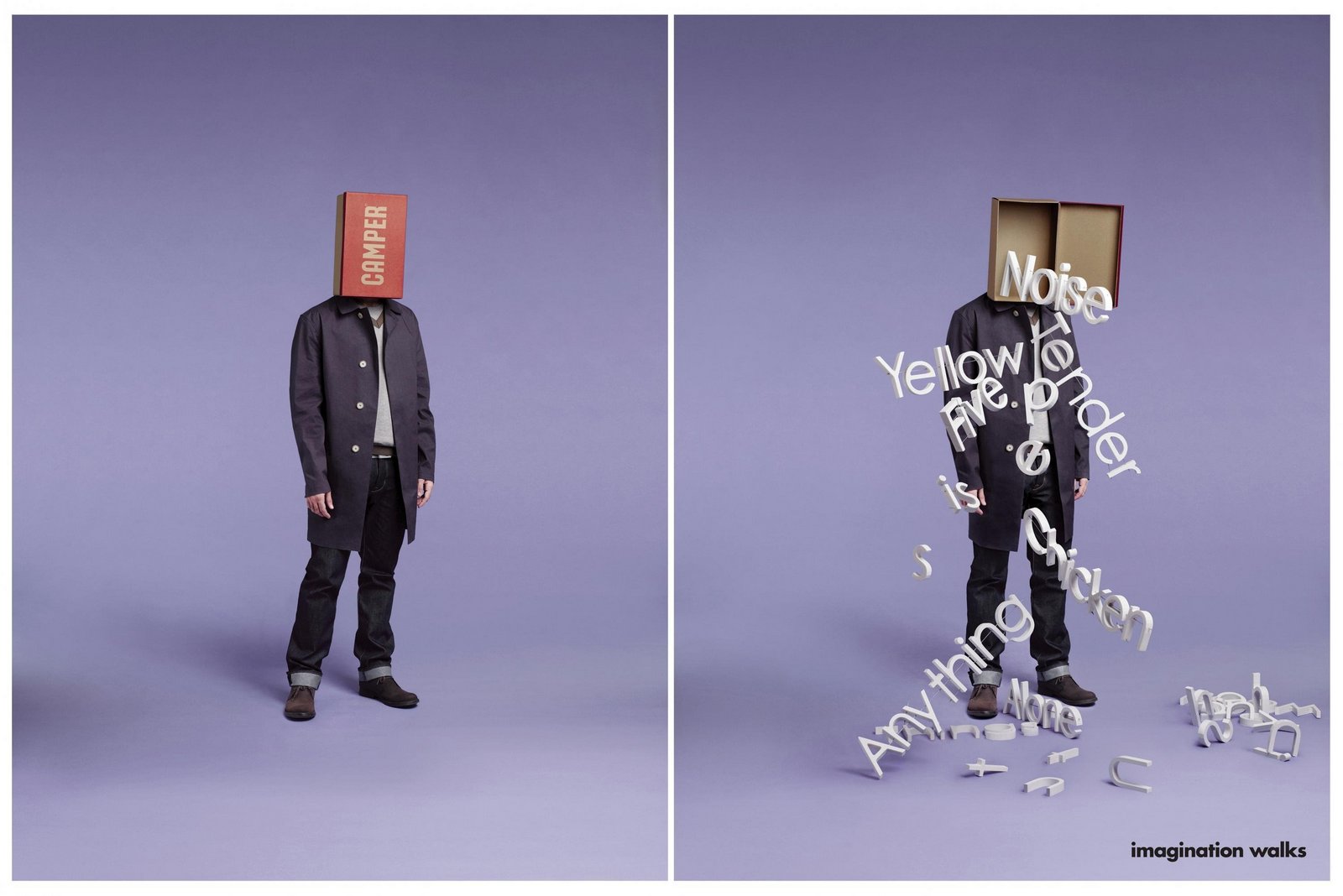
Camper.


Fernet 1882.
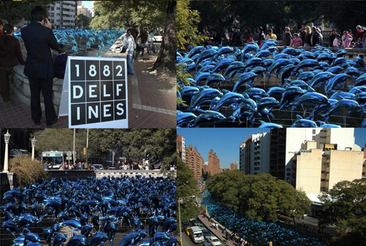
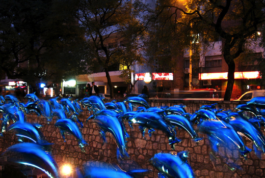
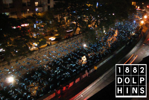
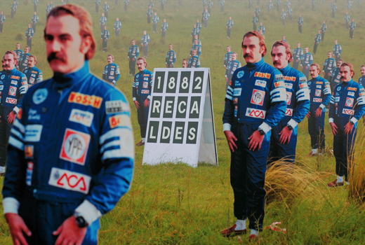
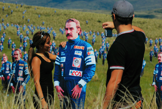
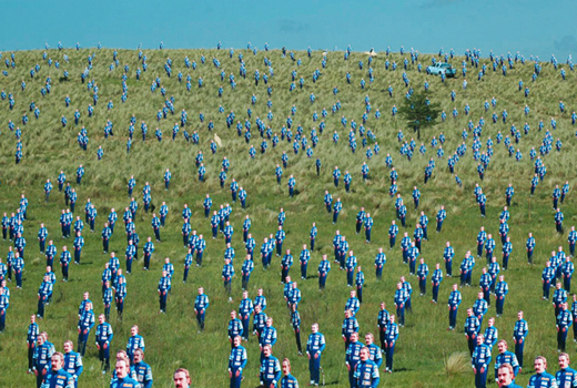
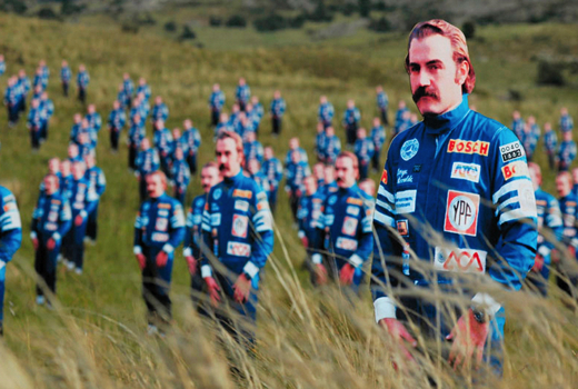
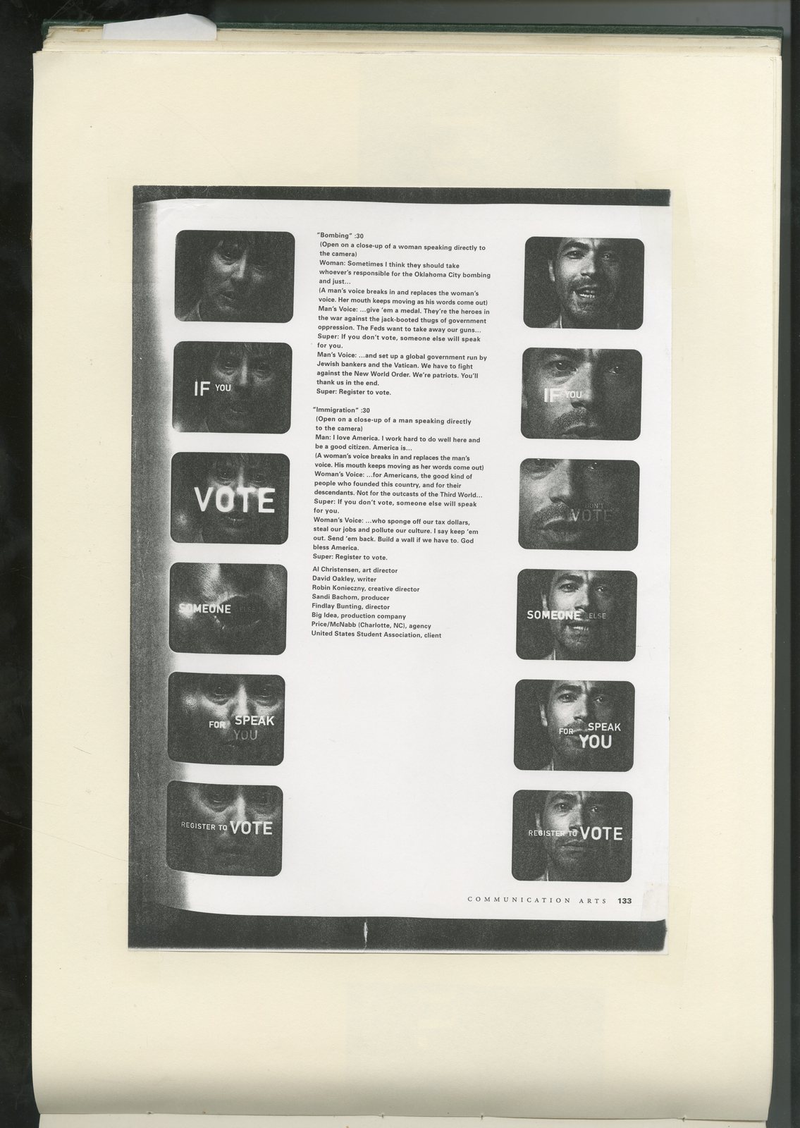
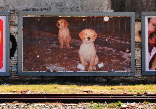
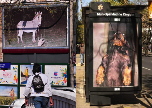
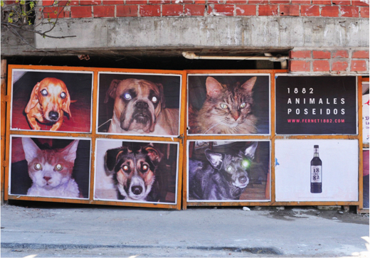
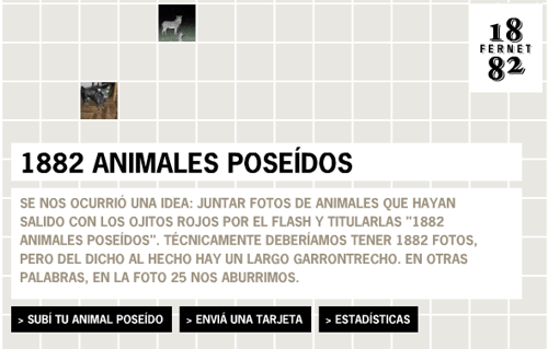
"We did this for 1882 Fernet.We gathered what we thought were the best pictures of pet and animals with red eyes, (the classic unwanted effect), and we baptised this series ‘1882 possessed (or haunted) animals).It was mad, we had loads of these pictures all over Cordoba CityIt looked strange... and beautifulNo logo needed on most of them but a reminder here and there that this was a 1882 thing.People loved/hated/complained/detested it, but no one doubted which brand was behind it."
Molinos Rio De La Plata.
Casalta.
Commercial Aerlineas Argentinas.
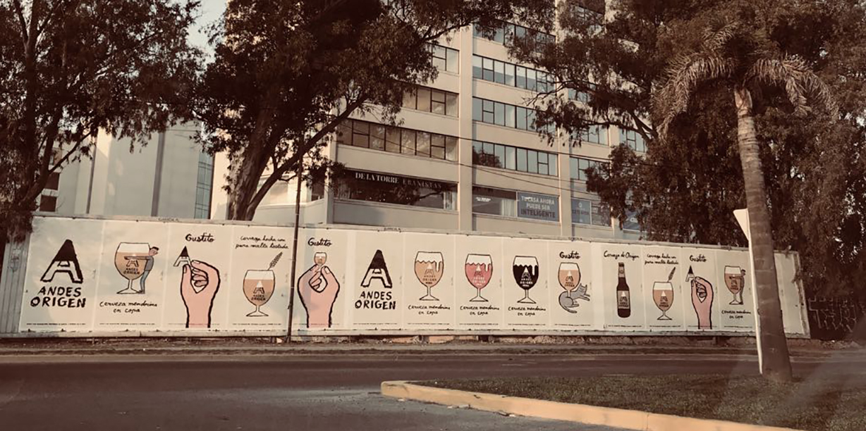
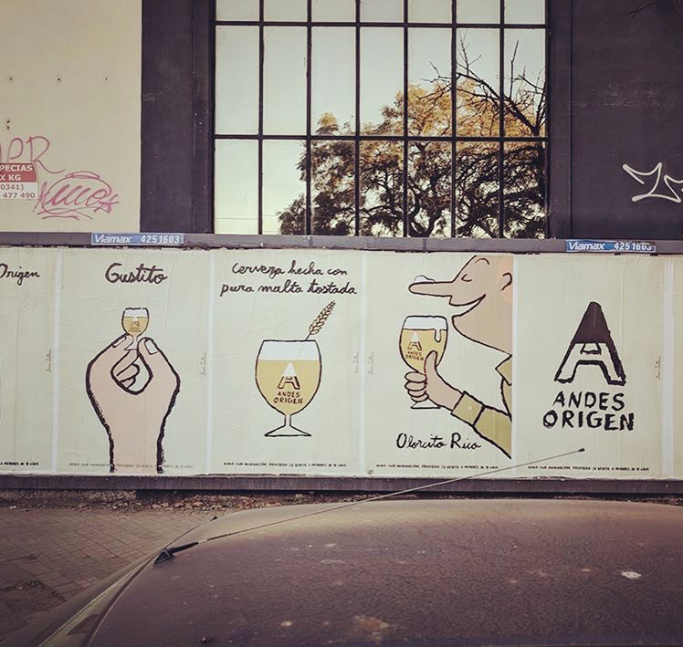
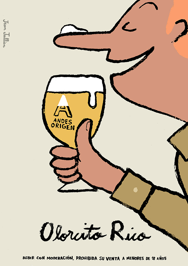
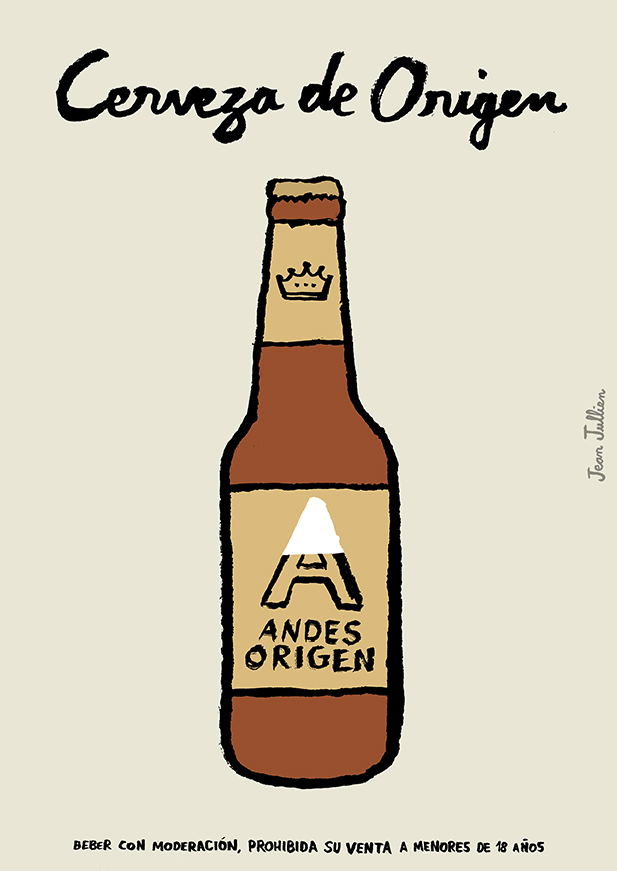
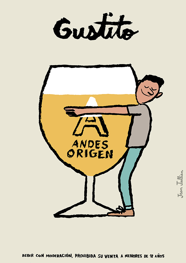
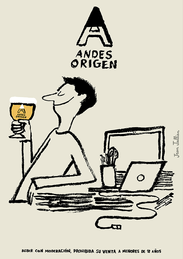
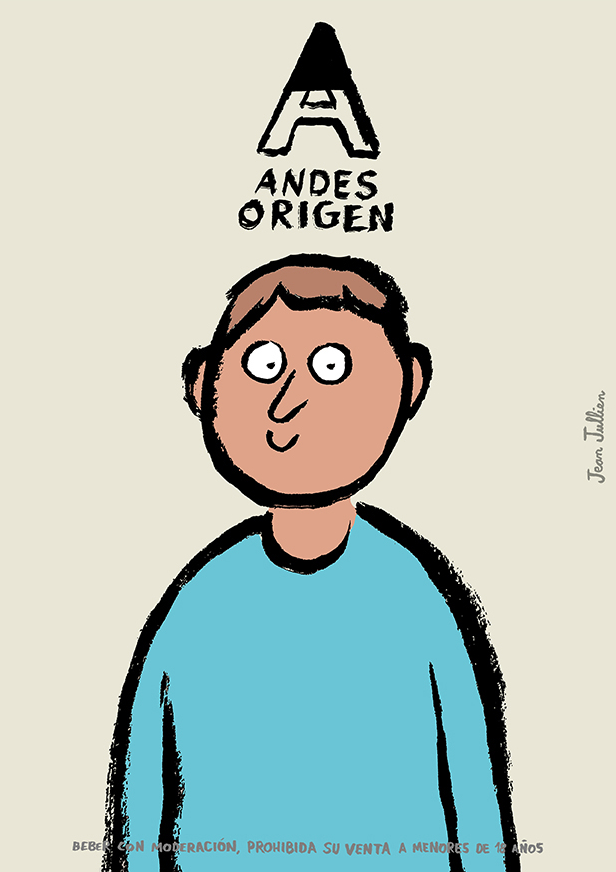
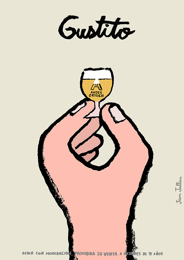
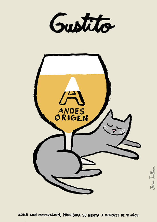
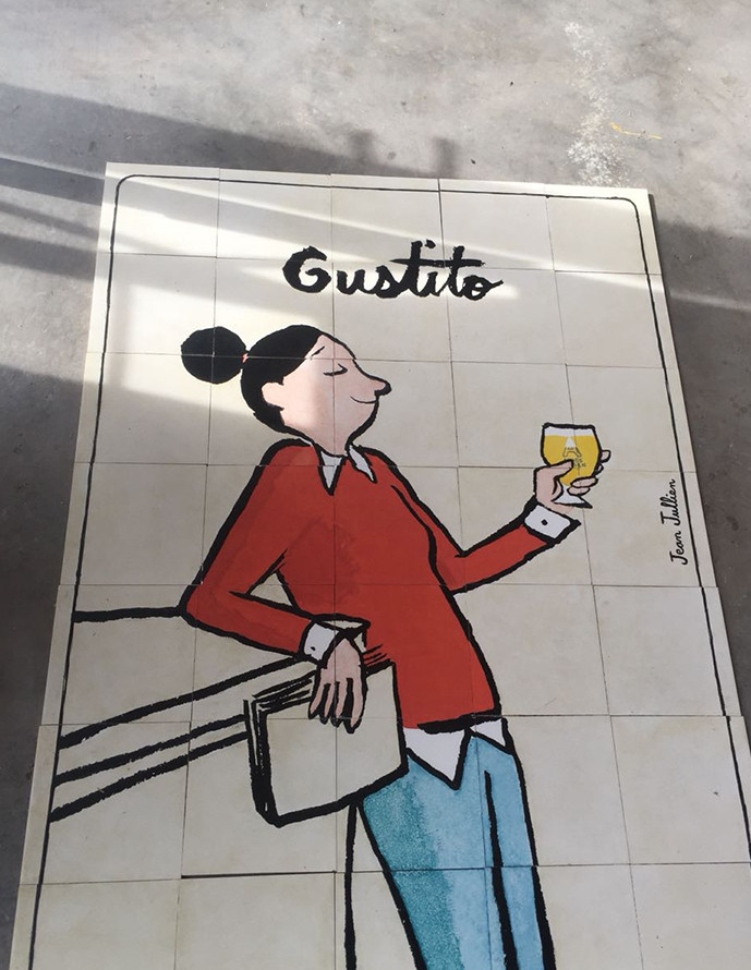
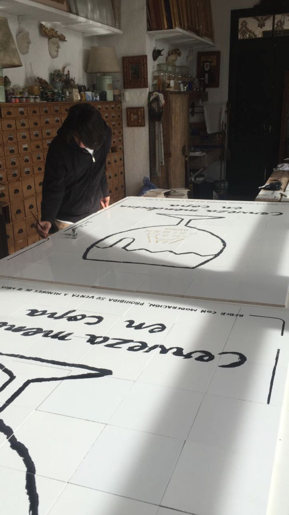
NEW.Andes Origen.

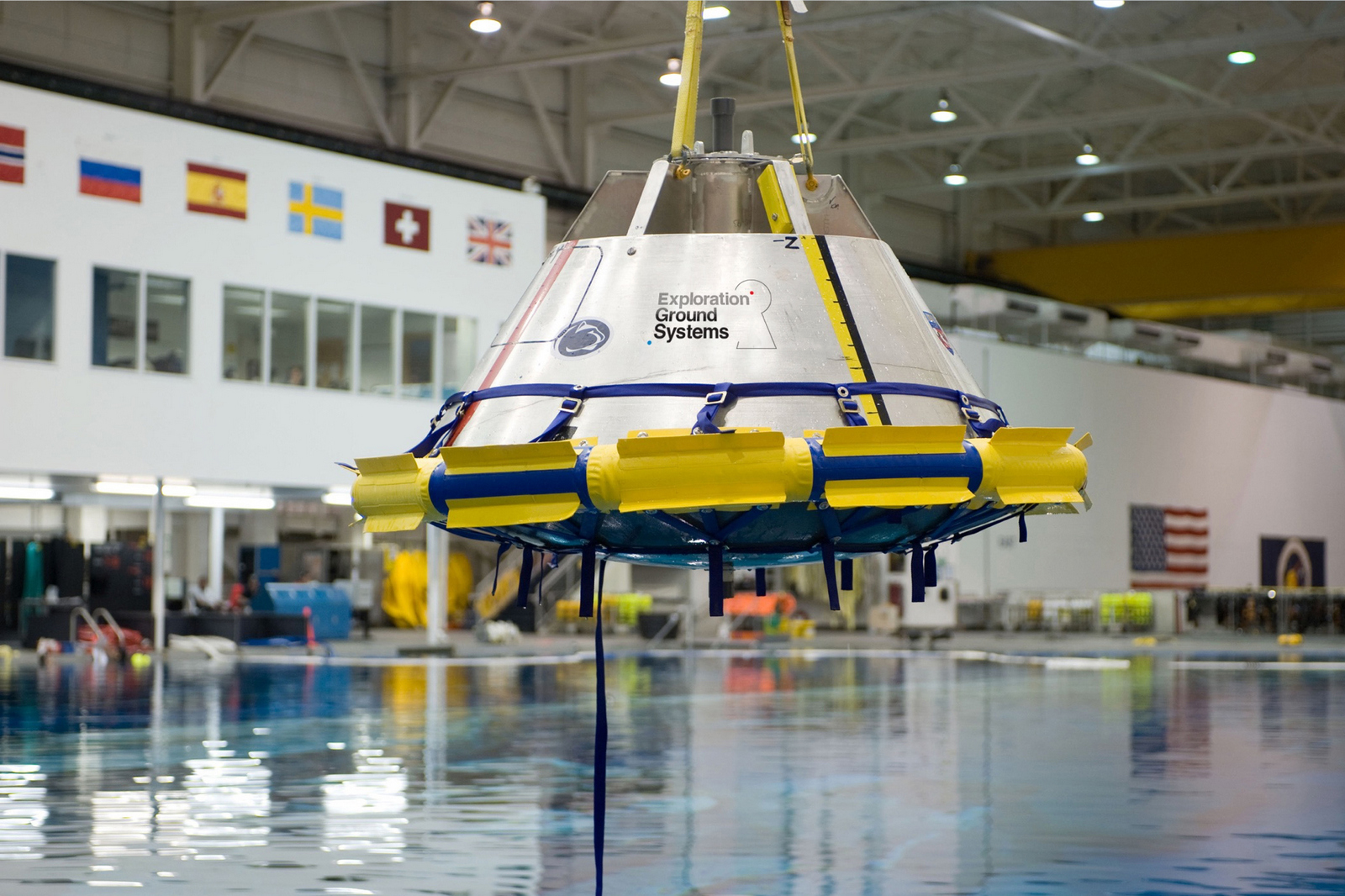
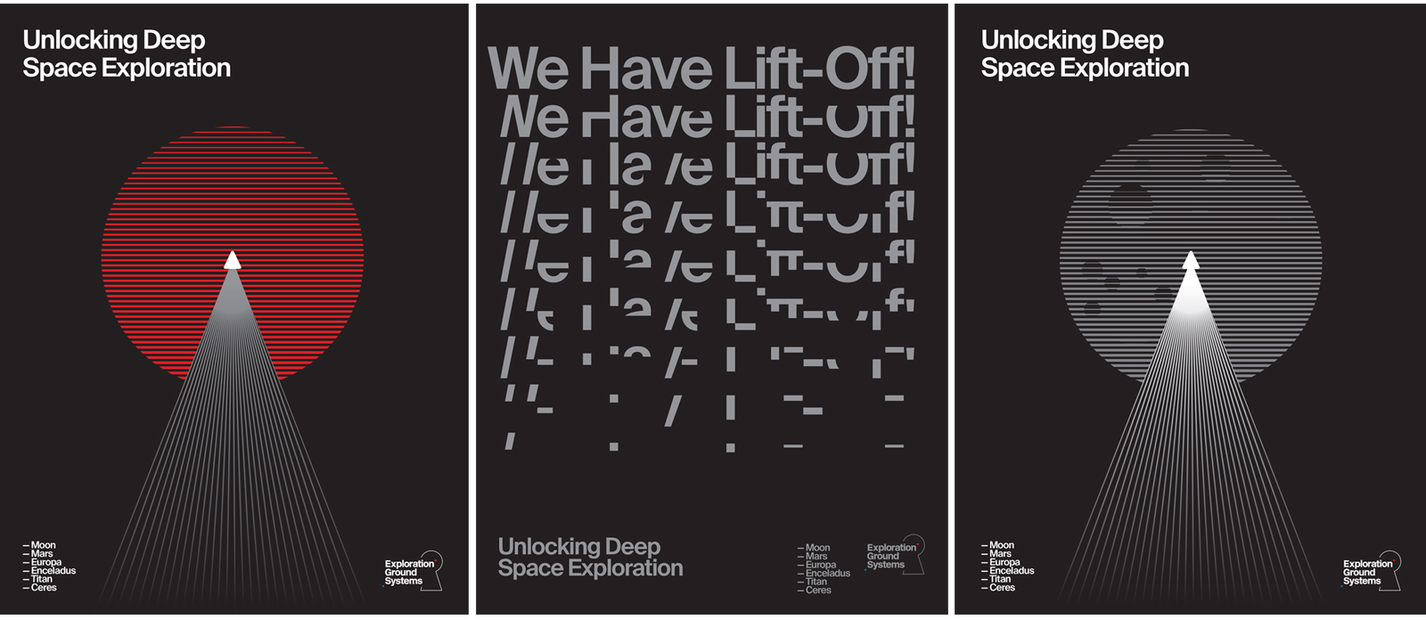
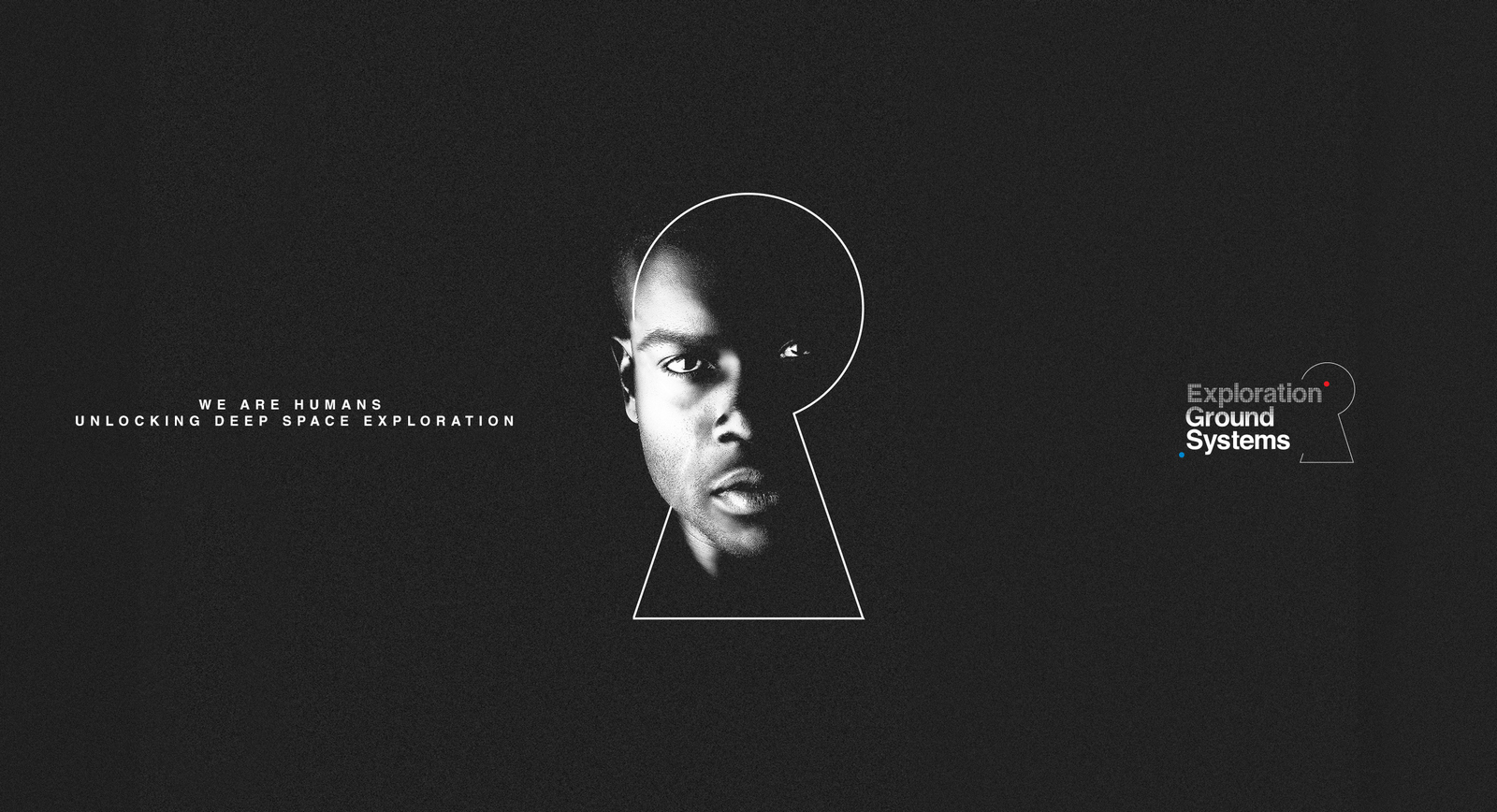
NASA.


I've found a great book on advertising; ‘Methods of the Madmen’.The only problem is it's not available.It's been written by a friend of mine, Mike Everett, as well as writing the book Mike wrote many great ads whilst at Collett's and Lowe's, including the Olympus David Bailey campaign, the freaky 'Wrangler. That's what's going on', Birds Eye's 'Dishonest woman' and a bunch of Hamlet ads to name but a few.He's kindly allowed me to feature a few chapters here while he seeks a publisher,Hope you enjoy.
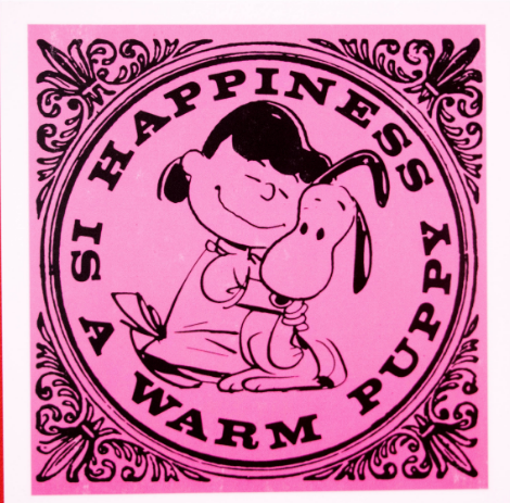
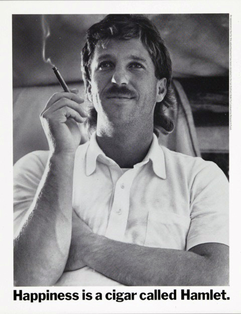
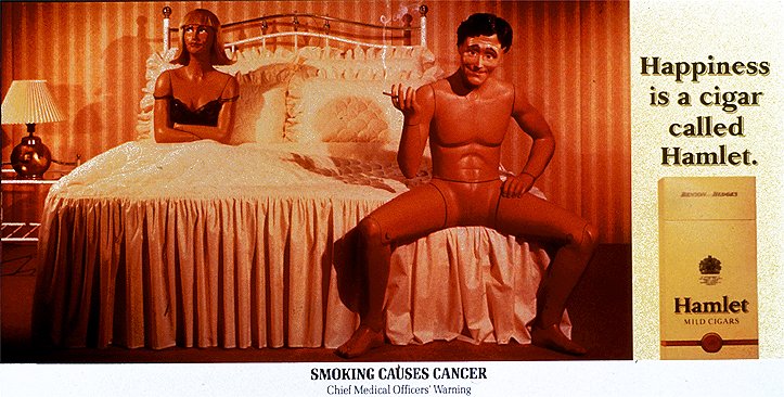
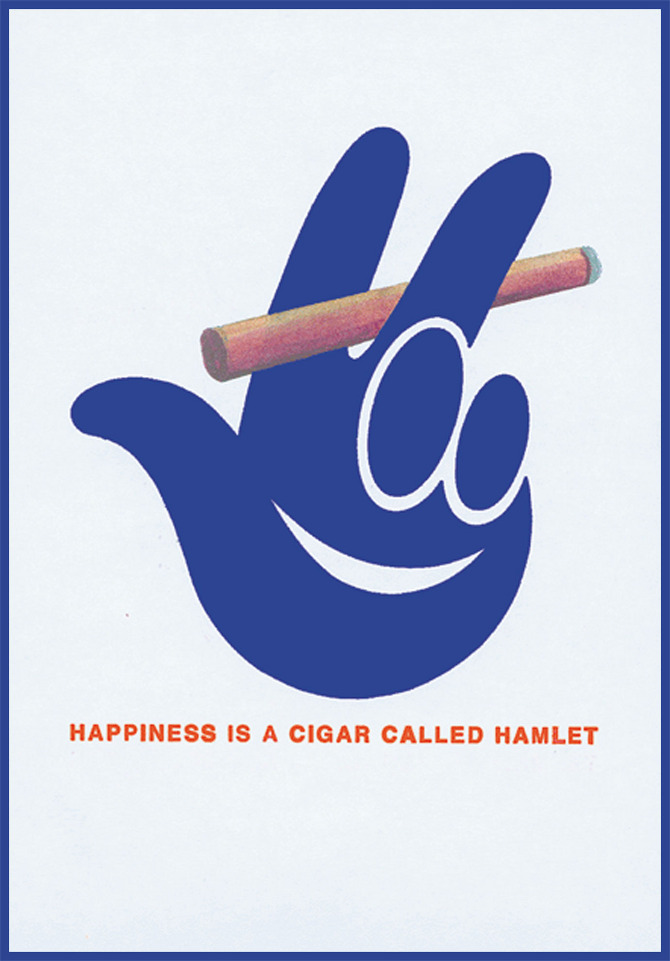
CHAPTER 1.The Hamlet campaign ran for a quarter of a century.Yet the way in which it was conceived could hardly have been more humble.About the hardest job any advertising writer and art director can be given is that of creating a new television campaign. Once you’ve got your head around the product, the target market, the product’s competition, and the competition’s advertising, you and your partner are left alone, staring at a blank sheet of paper. In theory, what you now have to do is simple: work out a structure that nobody has ever used before, say something that nobody has ever said before, in a way that nobody has ever said it before. And don’t expect the creative brief to be much help, either. Usually, this piece of paper raises more questions than it does provide answers.Imagine, then, being Tim Warriner and Roy Carruthers. They are sitting in their shared office on the fourth floor of CDP’s Howland Street building staring at a brief that asks for a TV campaign for a new small cigar that is being launched by Benson & Hedges. It is 1964 and the name of this cigar is Hamlet.Tim and Roy are in good company. Arthur Parsons, John Reynolds and Alan Brooking sit along the corridor; Mike Savino is opposite. In fact, they are surrounded by a galaxy of creative stars presided over by the brightest star of all, Colin Millward, the creative director.You might think that being amongst all this talent would help the creative process, but not necessarily. The intense competition of your peers can inspire, but it can also stifle. Tim and Roy have to overcome their fear of failure and bring their confidence to the fore. They must determine to produce one of the finest campaigns of their lives. But, as is often the case, when you try that hard, nothing comes. Well, nothing good, anyway.You can work your balls off and still end up doing average work. This is why creative people develop techniques to provide themselves with inspiration. Some do these things instinctively; others have to learn. Generally, it has to do with what John Salmon, creative director of CDP in the seventies, once memorably described as ‘displacement activities’. As its name suggests, this is doing something that displaces what you are supposed to be doing. For example, writing a TV campaign for Hamlet Cigars. It could be going to the pictures, going to an art gallery, or going to lunch. Or it could be when your working day is over, when you start to relax, and so does your brain. The most famous example of a displacement activity is, of course, the literal one of Archimedes. He cottoned on to his famous principle that a body displaces its own mass in water when his own body was doing just that, as he lay in his bath. Tim and Roy had been working for a few days on Hamlet, but didn’t have anything yet that they considered good enough. It was the end of another miserable day during which they had made little progress. To add to their gloom it was dark, cold and pouring with rain as they traipsed down the steps of 18 Howland Street and headed for the bus home.The bus arrived and they climbed the stairs to the upper deck. In those days, the top decks of London buses were the preserve of smokers. Hard to imagine today, but the seats were filled with people puffing away on cigarettes and, in some cases, even pipes. It may have been misty outside, but inside the bus could be a real peasouper of a fog, if you were sitting upstairs.Tim and Roy gratefully settled into their seats and each lit up a cigarette, something they hadn’t been able to do in the wet outside. The bus passed a poster of the Shultz cartoon character, Charlie Brown. The poster had a caption that began ‘Happiness is…’, taking this in, Tim settled back in his seat and said ‘Happiness is a dry cigarette on the top deck of a 134 bus’.
The pair soon realised that if they changed what Tim had said to ‘Happiness is a cigar called Hamlet’, and put a suitably funny, but unfortunate event or situation in front of that line, they might have the campaign they’d been looking for.And so it proved.Well, that’s one version of how Tim and Roy did Hamlet, the generally accepted one, the official one, if you like. But there is another story.Vernon Howe, one of CDP’s senior art directors told a friend of his, Steve Harrison, that Tim Warriner had been trying to sell the idea of ‘Happiness is…’ to any client who’d have it. It just so happened that Hamlet bought it. You can choose which version you prefer.I know which one I do.The first commercial, filmed in glorious black and white, showed a man in a hospital bed with his leg in traction, happily puffing away on a Hamlet cigar. Tim and Roy did others: a music teacher, played by Patrick Cargill, whose pupil only plays the piano tunefully when his teacher smokes a Hamlet.
And ‘Launderette’ – yes, launderette – more or less the same idea used by Bartle Bogle Hegarty for Levis more than a dozen years later.
Instead of casting a hunk in the form of Nick Kamen, as Levis did, this being Hamlet, Tim and Roy filmed a meek looking city gent, complete with bowler hat.
Of course, the Hamlet campaign wouldn’t be the Hamlet campaign without the music, and we have Colin Millward to thank for that.Colin had served in the Royal Air Force. Shortly after the end of the Second World War he was posted to India where he lived in a hut for six months. The previous occupant had left Colin a gramophone, but only one record.On one side of this disc was Debussy’s ‘Clair de Lune’. On the other, Bach’s ‘Air on the G String’.Colin remembered the Bach music and suggested that it should provide the commercials’ soundtrack.In 1959, a French Jazz Musician called Jacques Loussier had formed the ‘Play Bach Trio’. They released a series of albums under this name, featuring the simple combination of piano, bass and drums performing improvised versions of Bach.Amongst these was a jazz version of ‘Air on a G String’.OTHER HAMLET STUFF.1. Facts.The cigars come individually wrapped in cellophane. In many commercials, the cigar is seen in close up being removed from the pack with the cellophane intact, then in the actor’s mouth with the cellophane removed. Nobody seemed to notice this continuity error, which was intentional. The end line changed subtly in the early eighties to satisfy regulators who insisted that ‘from Benson and Hedges’ at the end of the line was selling cigarettes, rather than Hamlet. The words were dropped so that the end line became simply ‘Happiness is a cigar called Hamlet, the mild cigar.’ The commercial created in the shortest time was ‘Crash of ‘87’ written by Adrian Holmes and John Foster.
From conception to broadcast took just over 24 hours. The longest Hamlet commercial was ‘Photo Booth’ at one minute long.
The vast majority of Hamlet commercials were only 30 seconds in length. One Hamlet commercial, ‘Sidecar’, was written by a member of the public.
John Salmon oversaw the filming. John Carson voiced all Hamlet commercials, except those shown in The Republic of Ireland, which used Fergus O’Kelly because he was a member of Irish Equity and John Carson wasn’t.John Ritchie, who at that time was the account handler on Hamlet, was duly despatched to Paris to pursuade Jacques Loussier and his trio to record a 30 second version for use in the commercials.Ritchie tracked down Loussier to his apartment on the outskirts of Paris.Loussier wasn’t home so Ritchie camped outside for three days until the muscian turned up.To keep himself going, Ritchie had been popping uppers, so when he finally met Loussier he was hyper, unable to sit still, and conducted the negotiation with Loussier while running around the room.Nethertheless, he was successful and Loussier agreed on a £1,000 fee.As I struggled to explain why the Hamlet music is so apposite, I sought the help of a musician who was a friend of mine, the late Mike Townend. Mike had worked with people like Smokey Robinson and Burt Bacharach, so he knew what he was talking about. As well as pointing out that the correct title of the piece is ‘Air from Suite No 3 in D Major’, he told me to study Bach’s original version. He said it is typical of Bach’s early work in as much as it builds tension, then moves towards a release, or ‘climax’. When I heard this, it sounded just like the structure of a Hamlet commercial – tension in the form of an unfortunate event or situation, followed by release as the protagonist smokes the Hamlet – so that may be why the music is so apt. That, plus the fact that it’s a damned good tune, of course. Frank Lowe, managing director of CDP in the seventies, tells a story about Jacques Loussier and the music.“The music track was getting worn out so we had to go to Paris to re-record it with Jacques Loussier – John Richie, the TV producer and I went over and met with Jacques who played it several times… each time it was different and none of them were quite like the original.I had forgotten that jazz musicians normally extemporise differently every time they play any piece of music. We went to lunch at a very nice brasserie and during the lunch I challenged Jacques that he couldn’t play it in exactly the same way as the original - nonsense he said (or the French equivalent) and went back and played it exactly as we wanted it - whereupon we dashed back to London.”Tim and Roy’s legacy left those of us who worked in the creative department of CDP a lot to live up to. Year after year, teams of writers and art directors received briefs to write Hamlet commercials. Some of these follow up commercials came to be regarded as classics and became popular with the general public. And, as with the repertoire of a well-liked recording artist, everybody has his or her favourite.A film that many people cite, including Frank Lowe is ‘Bunker’.
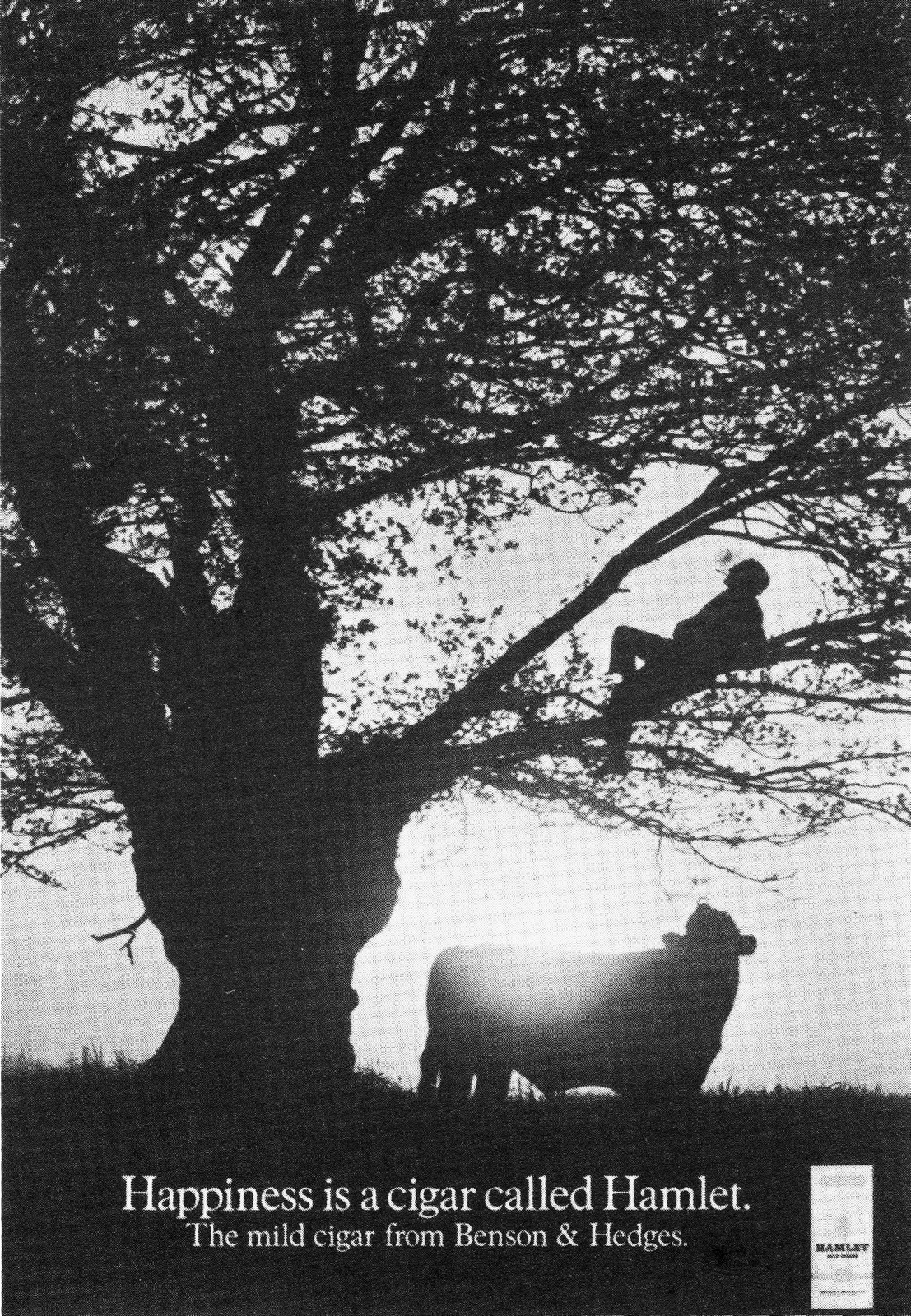
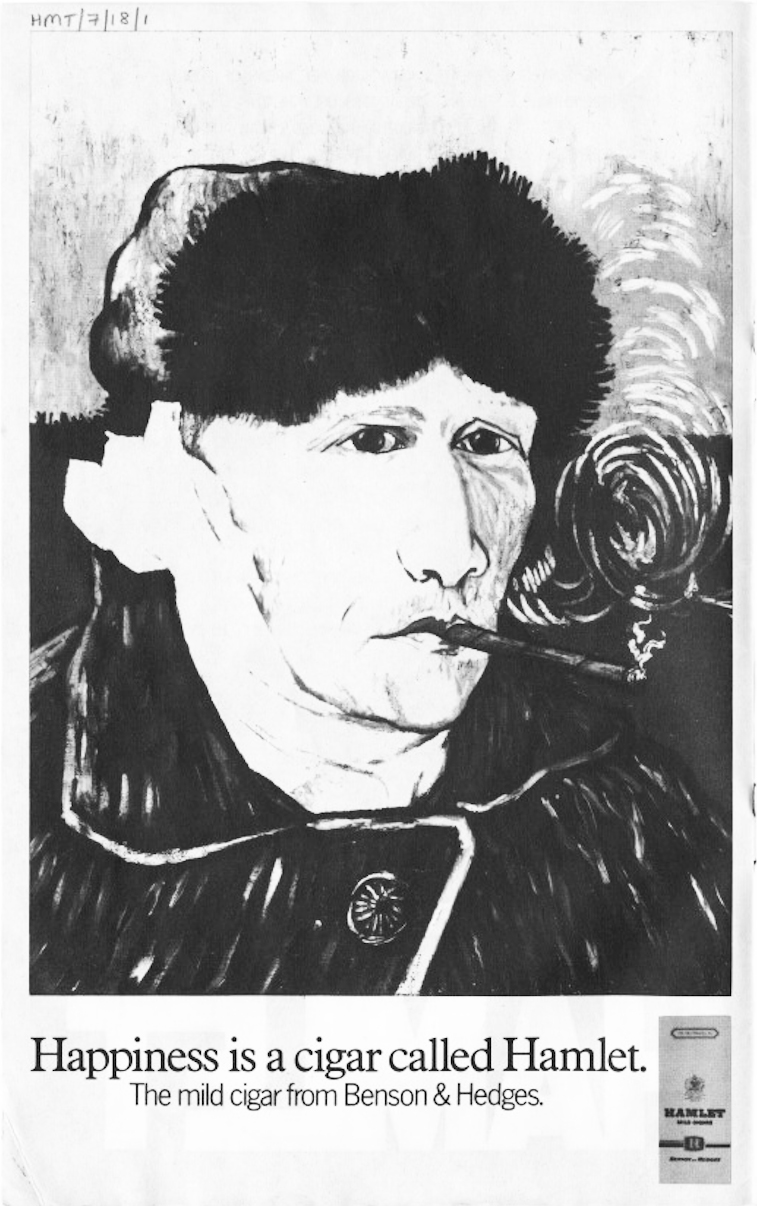
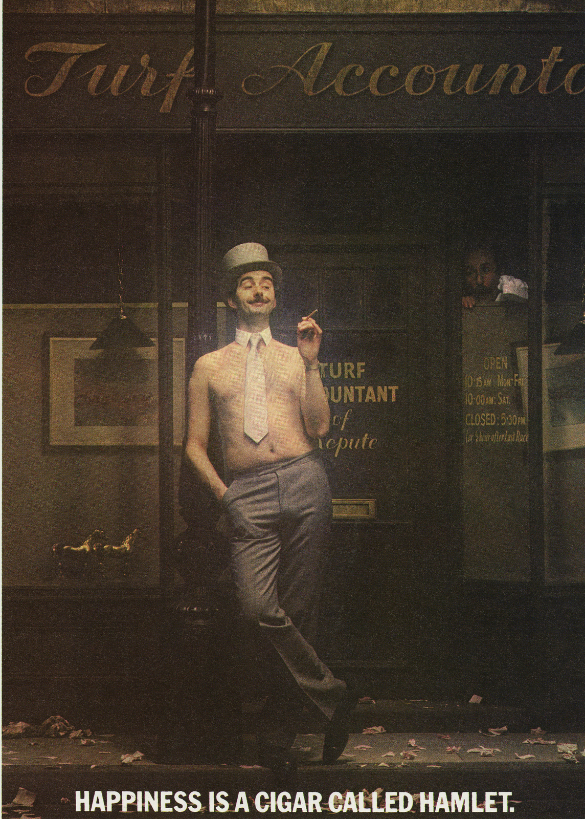
This is the commercial that doesn’t show an unfortunate golfer whose ball has become lodged in a sand bunker. Neither does it show the cigar, nor the pack. All we see is smoke rising from below the rim of the bunker as the unseen golfer consoles himself with his Hamlet. By the time this commercial was made in 1980, the campaign was so well established that the creative team, Rob Morris and Alfredo Marcantonio, and the director, Paul Weiland, could get away with this cavalier approach to the client’s product.Interestingly, when I spoke to Mike Townend about the music, this was one of the two Hamlet commercials he mentioned spontaneously. The other was what is undoubtedly the public’s favourite, Gregor Fisher in the photo booth.What is undeniable is that this commercial is an outstanding piece of advertising, the brainchild of the creative team involved, Rowan Dean and Gary Horner. They spotted a sketch on a BBC programme called ‘Naked Video’. In this sketch, ‘Baldy Man’, a character created by comedian and actor Gregor Fisher, posed in a photo booth, only to be thwarted in his attempts to get the perfect photograph by series of mishaps culminating in the stool he is sitting on collapsing beneath him. Rowan and Gary immediately saw the potential for turning it into a Hamlet commercial, which they duly did.There’s no getting away from the fact that it worked – and promptly became the most memorable Hamlet commercial ever.Not for the first time, the Hamlet campaign had proved itself to be unstoppable.As Peter Wilson, a marketing manager at Gallaher in those days, says ‘the advertising for Hamlet was incredibly successful.It built the brand into the best-selling cigar in the UK market. Four out of every ten cigars sold was a Hamlet’.Were it not for the European Union or, as it was then, the EEC, who banned all tobacco advertising in the 1990s, it’s tempting to think that the Hamlet campaign could still be running today.As it was, the campaign took a dignified bow, and left our screens for good at the end of that decade, 25 years after it had begun.In all, CDP had created over 80 commercials, every one of which was a funny, beautifully told story of disaster followed by the happiness of smoking a Hamlet cigar. I wonder if back in 1964, those two blokes sitting in a dingy office, staring at a blank sheet of paper realised what a wonderful monster they were on the verge of creating. I doubt it. In all probability, they saw it as just another day’s work, albeit a pretty good one.2. Other commercials.
3. Print.
4. Mike on 'Venus De Milo', (1976).
The summer of 1973, Paul Smith and I were a couple of months into the job that was to have a profoundly beneficial effect on our lives: working as a creative team at Collett, Dickenson, Pearce.We’d got our first ad approved, a full page black and white effort for the Salton Hotray, a device designed to keep food warm until the person hosting a meal wished to serve it.Hence our ad’s headline: ‘Eat when you’re ready, not when the food is’. We’d also been given Silk Cut cigarettes to look after.Something that the account director on the business, Colin Probert, was a bit miffed about at the time, as he considered us to be too young and inexperienced to write and art direct the many ads demanded by such a large piece of business. (We went on to have a great working relationship with him.)But, so far, we hadn’t been asked to write any commercials. Then a brief for Hamlet arrived in our office.Hamlet was the agency’s most famous campaign. Not only was it successful at generating sales, it was also popular with the public.So much so that members of the public often sent in ideas for scripts.On one occasion, the idea was good enough to be used and a fee sent to the author.Still, for a young creative team faced with their first TV brief, the prospect of writing a Hamlet script remained daunting. On the face of it, Hamlet commercials are simple: something goes wrong, a Hamlet cigar is smoked, and all’s right with the world.But try writing one.Oh, it’s easy enough to find a situation that goes wrong. But to dream up one that’s funny as well, that’s the difficult bit.Especially after you’ve watched every Hamlet commercial that’s ever been made, as Paul and I did before we began work. If we didn’t know it before, we knew it now. There was a lot to live up to. We spent days writing scripts, or rather not writing them, as we searched for an idea that would tickle the funny bone of Vernon Howe, then our creative group head, John Salmon, the creative director and finally, Frank Lowe.In the case of all TV scripts that passed through the agency, Frank was God on High.Nothing was allowed out of the agency without his signature, plus those of John and Vernon and that John Ritchie, the account director.Eventually we managed to tease from ourselves a number of scripts that we considered good enough to show Vernon.But two stood out. One depicted a sculptor putting the finishing touch to a piece of his work, only to ruin it; the other was about a young man looking through a beach telescope whose money ran out just as the pretty girl he was ogling began to remove her bikini top.Vernon liked both, but suggested that the sculptor might be funnier if he was creating a famous piece of sculpture like the Venus de Milo.That was it, the Venus de Milo. Why didn’t we think of that? We could show the statue complete with arms. The sculptor would stand back to admire his work. He spots a small imperfection, takes hammer and chisel to one of the arms, and lo and behold, knocks it off. We’re left with the Venus de Milo, as now we know her. Bingo! We now had two great scripts.Or so we thought. There was still the agency approval system to get through.John Salmon had gone on holiday, leaving Geoff Seymour to approve all TV scripts, while Neil Godfrey and Tony Brignull were in overall charge of print.John usually did both. This meant that our two Hamlet scripts landed on Geoff’s desk for approval, instead of John’s.Almost immediately, Paul and I were summoned to Geoff’s office. He told us he liked the Venus de Milo idea, but thought that the beach telescope script was off strategy.Now the Hamlet strategy can be summed up in one word: ‘consolation’. And the guy who is robbed of the chance to see the bikini-clad girl disrobe certainly needed to be consoled. So we were confused by what Geoff had said.But we had two scripts on the table. Geoff asked us how many we needed. It was just one.So Venus de Milo went forward and Beach Telescope didn’t.I had never been involved in the production of a commercial before and Paul had only been through the process once. So when the approved script came back from the client and we were asked to make it we didn’t really know what to do.But we needn’t have worried. Barry Mathews was then head of TV production and he oversaw a team of brilliant producers.Almost immediately, one of these turned up in our office and asked us who we’d like to have to direct the film. Paul and I looked at each other. We had no idea. So our producer suggested we look at some show reels to help us decide.Looking at show reels is a great way to while away a couple of hours. It requires no real work and if you are watching the reel of one of the better directors, it can be highly entertaining. I have to say, though, it did help with our decision.We chose Sid Roberson and a meeting was set up to meet him.Sid had displayed a great sense of humour in the work we’d seen and the man himself didn’t disappoint.Among other things, he was famous for playing the archer in a series of Strongbow cider commercials that were then running on TV.His biceps were the size of rugby balls and he had a sense of humour to match.The shoot was scheduled to take place at the old Lee Studios in Ladbroke Grove shortly before Christmas.As it was our first CDP shoot, Geoff Seymour was sent along to the studio to watch over us.But we weren’t the ones who should have been watched over.Sid had hired as his director of photography somebody who was often referred to as the ‘Prince of Darkness’.We soon found out why. The filming went by swimmingly, as Sid got shot after shot into the can.Then, around six o’clock, when there was just one shot left to do, the Prince of Darkness sidled up to Sid.His Highness had just realised that he’d shot the entire film using the wrong exposure for his lighting. This meant that all the footage that Sid had shot was useless. We had no alternative but to film the whole commercial all over again. Imagine how Paul and I felt.Our first-ever CDP commercial and before we’d even finished it we were going into a re-shoot.Not exactly auspicious.5. Mike on 'Telescope', (1980).
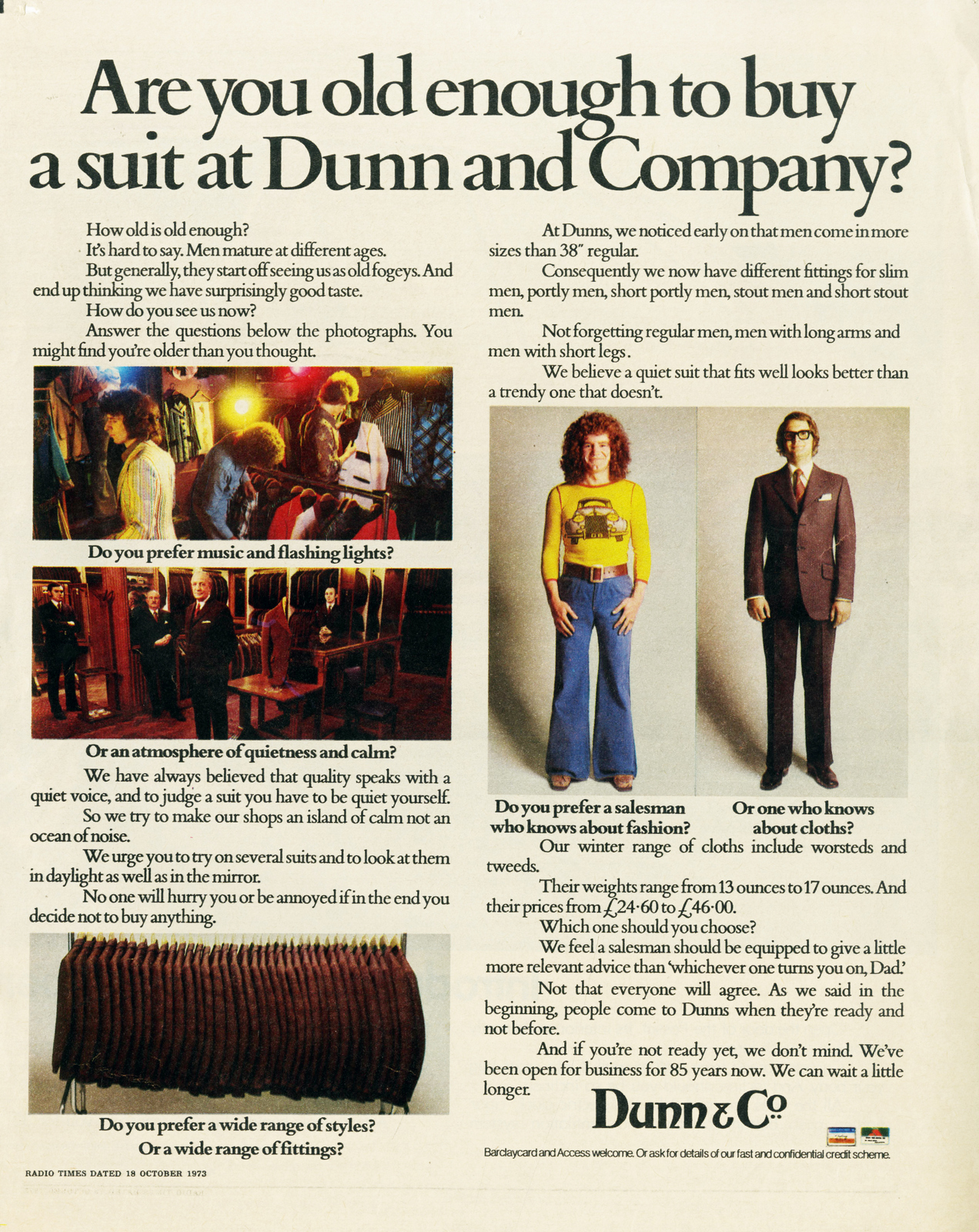
Monday July 16th, 1973 was the day that Paul Smith and I started at CDP.We’d arranged to meet at Tottenham Court Road tube station and arrived at the agency on the dot of nine, the agency’s official start time. Sergeant Hambleton, the Corps of Commissionaires doorman, gave us permission to go up the fourth floor, home to the creative department. Nobody was there. We didn’t quite know what to do, so we wandered around the empty offices looking at the work. The first office we walked into belonged to Tony Brignull. There, staring us in the face was a pile of concepts for Dunn & Co, the men’s clothier. The topmost concept, ‘Success doesn’t always go to your head’, showed a triptych of three men’s waistlines, one slim, one starting to develop a fat stomach, and one with a stomach that had already developed. We looked at the second ad in the pile: ‘The life of a designer for Dunn and Company is one of continual self-restraint’. We couldn’t look any further, we were terrified. If this was the standard of work the agency was producing we’d be lucky if we lasted a week. As it happened, we lasted 14 years.As if this wasn’t bad enough, the special effects didn’t work as well as we all hoped. Venus de Milo’s arm was supposed to be dislodged by the merest tap of the sculptor’s hammer on his chisel. In the event, it took a huge whack from the actor before the arm fell to the ground. As you can imagine, this rather spoiled the joke because it looked as if the sculptor was deliberately trying to smash off the arm. Eventually, we shot a take that didn’t look too bad and we moved on. But when we saw the rushes the next day (remember, in those days there was no video playback) the shot just didn’t work. Being inexperienced, Paul and I allowed the shot to go into the cut and showed the cut in the agency. Both Vernon and John Salmon spotted it immediately. John also asked if we had filmed anything after the sculptor lit his Hamlet where the actor looked at the one remaining arm as if to consider removing that one to match the fallen arm. Luckily, we did have such a shot and we cut it into the commercial. But there remained the question of the pivotal piece of film in which the sculptor accidentally removes the arm.There was nothing remotely useable in the footage we had shot, so John Salmon decided that we should set about re-filming that part of the commercial. The way this sort of thing was undertaken at CDP was to piggyback the re-shoot onto another CDP shoot if it was a short sequence like this. This was exactly what happened in this case. I can’t remember which shoot we invaded, but rather incongruously the sound stage had a flat (a wall used as a background) that represented the studio of an ancient Athenian sculptor, and three flats that made up the walls of a modern kitchen. The special effects boys had done some work and this time the arm severed itself without the actor having to take a lunge at it.The shot safely in the can, we presented the finished film to the agency. We asked our producer what would happen if Frank Lowe didn’t like it. She assured us he’d like it, it was a good film. But if he didn’t, she’d give him a blowjob, then he’d love it.As it happened, she wasn’t called upon to go beyond the call of duty.Frank loved the film anyway.So did the public.And so did the awards juries.Our first CDP commercial and our first Hamlet commercial safely on air and on our show reel.What a relief.Now let’s fast-forward to 1980.Here we are, still working at CDP, only now at Euston Road instead of Howland Street.We occupy an office on the 15th floor with glorious views over London.The only downside of our marvellous location is that the next room to ours is John Salmon’s private toilet.But that’s a small price to pay to be near John, who was now the agency’s managing director.However, being close to the boss didn’t mean we could put our feet up.Brief after brief was landing on our desks. We had never been busier.One of these briefs was awfully familiar: write a 30 second commercial for Hamlet using the Happiness end line.So the Hamlet campaign had made its way round the creative department back to us again after an interval of seven years.In the meantime, many more great commercials had been made. For example, Rita Dempsey and Phil Mason’s tennis commercial, which showed John Bluthal in a neck brace vainly attempting to watch a match at Wimbledon, unable to turn his head from side to side to keep track of the action.And Paul Weiland and David Horry’s robot commercial, made to coincide with the screening of Star Wars, where a C3PO type robot emerges from the production line with his head on backwards.Yes, we were faced not only with the same brief as seven years earlier, but also the same problem.Write a Hamlet commercial that’s so unexpected, yet so funny, that it stood a chance of getting made.Now if you’re in advertising you will know what I am about to tell you.Creative people never throw away a good idea. When it gets turned down, they keep it and try and use it again, usually for a different client or even in a different agency.John Webster, creative director of Boase Massimi Pollitt and probably Britain’s best ever writer of TV commercials, did this with a Volkswagen commercial that featured a driver being annoyed by a constant squeak as he drove his sleeping wife through the countryside.He stops at a service station and puts a drop of oil on his wife’s earring, end of squeak.John had apparently written this idea for British Leyland years before when he was at Pritchard Wood but the client had rejected it.Probably quite rightly, as in those days British Leyland cars were full of all sorts of squeaks.Another example is the Carling Black Label campaign, ‘I bet he drinks Carling Black Label’, which was originally written for the Milk Marketing Board as ‘I bet he drinks milk’.And guess what? Paul and I had never thrown away our beach telescope script.Geoff Seymour had long since left the agency. John Salmon had never seen the script, because he was on holiday. Vernon, too, had moved on to other pastures. He was now a successful film director.We got out the script and looked at it. Well, the paper it was typed on may have looked faded and dog-eared, but the idea was as shiny as ever.It still made us laugh.So we wrote it out again and had it re-typed.We didn’t even have to do what most people do, change the name of the product.The only change was the date at the top of the headed script paper.This time it sailed through the approval system, without a mention of strategy from anyone.One or two people may have been astonished at the speed at which Paul and I turned round the job.But if they were, they never showed it. It went to the client and straight into production.We chose Paul Weiland to film the script.Paul had been working as a commercials director at the Alan Parker Film Company and had recently left to start his own firm.Before that, he was a fellow copywriter at CDP. At one of our meetings with Paul, he had suggested that we needed something to lead the guy looking through the telescope to discover the girl as she took her bikini top off.What about a sailing boat, somebody suggested. No, we all decided, that would take too long.In the end, we hit on the idea of a water-skier. A water-skier would be able to travel faster through frame as the guy with the telescope tracked his progress.At the end of this tracking sequence, we could have the guy do a double-take with the telescope, then settle on the girl undressing just as his money ran out. Cue Hamlet moment. Perfect.If special effects are unreliable, try using a stunt man. Particularly, one who assures you he can water-ski.One thing you learn is that when people at casting sessions tell you they can do something, there’s a good chance they can’t.Can you drive? Yes. It’s a stone cold certainty that they don’t have a licence. Can you ride a horse? Yes, of course.They’ll fall off at the first opportunity, that’s assuming they can get on the bloody thing in the first place. Can you water-ski? You guessed it. We chose as the location for the shoot Durdle Door in Dorset. Apart from alliteration, it provided a perfect place to film the commercial.And we were lucky with the weather: a beautiful summer’s day with blue sky from horizon to horizon.All went well until the time came to film the water-skier.A mask was put over the camera lens to simulate the view through the telescope. Paul Smith, Paul Weiland and I were beside the camera, which was sited on top of the cliffs. Far below, the water-skier was bobbing up and down in the sea, awaiting the command via walkie-talkie to do his stuff.‘Turn over’, the instruction to start running the film through the camera, came from the ‘first’, the assistant director.The camera operator shouted ‘Speed’, the reply when the film reaches the correct velocity.‘And action’ yelled Paul Weiland into his walkie-talkie.But there wasn’t any action.In fact, there wasn’t much of anything. Just the water-skier being dragged a few yards through the briny, spluttering out mouthfuls of water, and losing his skis in the process.This scene was repeated a couple of times before Paul Weiland became frustrated and sent his first assistant director down to find out what was going wrong.What was going wrong was quite simple. The water skier couldn’t water- ski. In fact, he’d never water-skied before in his life. He had hoped to bluff his way through it and somehow or other get the scene filmed. But, of course, this was foolhardy. In a belated act of wisdom, he chose to throw in the towel. It was either that or drown.We may have been unlucky with our choice of water-skier, but we were extremely fortunate in our choice of focus-puller, Trevor Brooker.Not only was Trevor a dab hand at his job, he happened to be a keen amateur water-skier. So he took over the part.Paul Weiland filmed three perfect passes of our new water-skier, who showed no signs of faltering or, indeed, of drowning, and moved on to the next shot.The film was in the can long before sun down.What these two stories illustrate – apart from the fact that a film shoot is rarely a straightforward endeavour – is that perseverance can take many forms.If at first you don’t succeed, try and try again, was CDP’s ethos.Try again to have a better idea.Try again to think of a better way to film that idea.Never give up. In this case, Paul Smith and I clung to a script for many years before the chance came to use it again.Cheating? Maybe. But why struggle to write something else when you have something good already – something that went on to win a gold award at BTA and flew into the D&AD annual.Save your energy for where it’s needed. For all the other briefs for all the other products you’ve never worked on before.Were he still alive, I like to think that John Webster would agree.
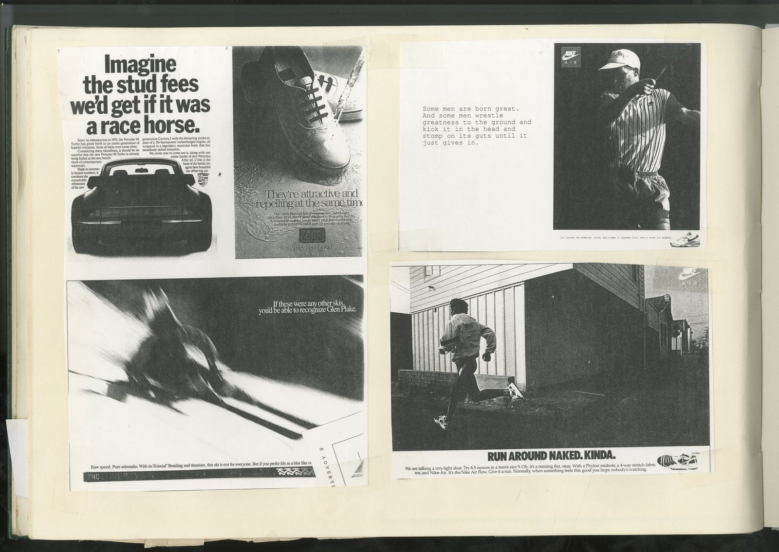
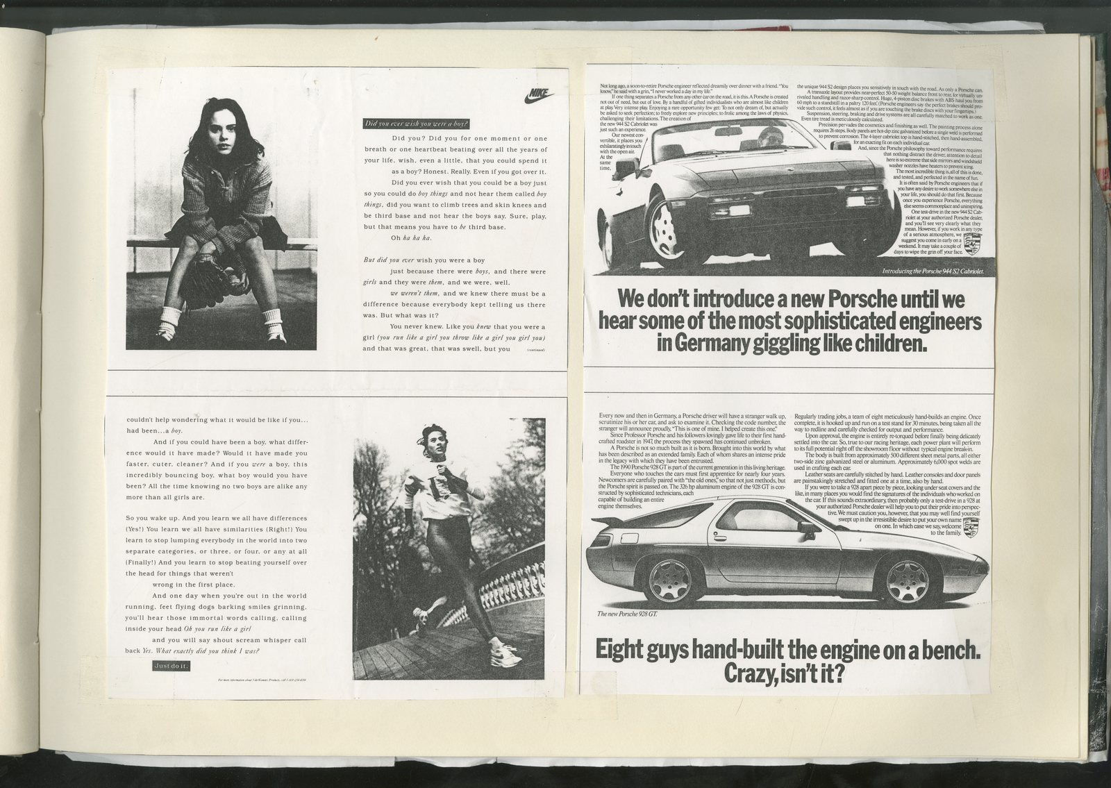
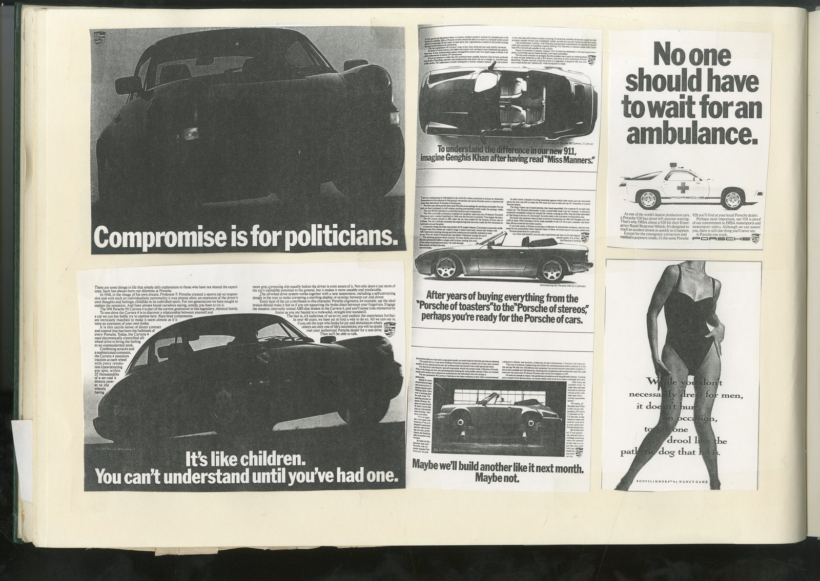
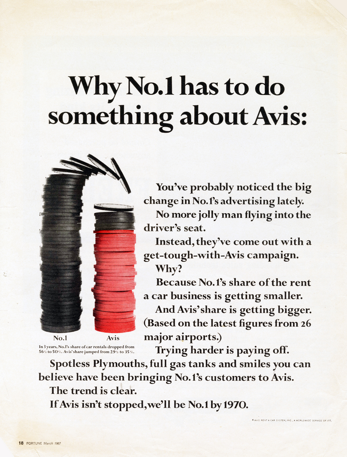
Successful companies rarely take chances.Why would they?Often, it's hard to pinpoint why exactly why things are going well, so they're careful not to rock the boat.It makes advertising them tricky, because the whole point of advertising is to stand out.To do that you have to be different from the things you are trying to stand out from.But looking different can feel risky.'Why take a risk? Especially now, when everything's going so well?'It's why the companies that produce 'different' advertising are the ones that need to; the ones that have a problem.Maybe it's their last throw of the dice, so they need to win big.Take Apple, they've done a lot of great stuff over the years, but my favourite campaign is probably 'Think different'.In retrospect, it looks like it looks like an easy campaign for Steve Jobs to buy, because we all know how successful it was.But the work was very unusual at the time.
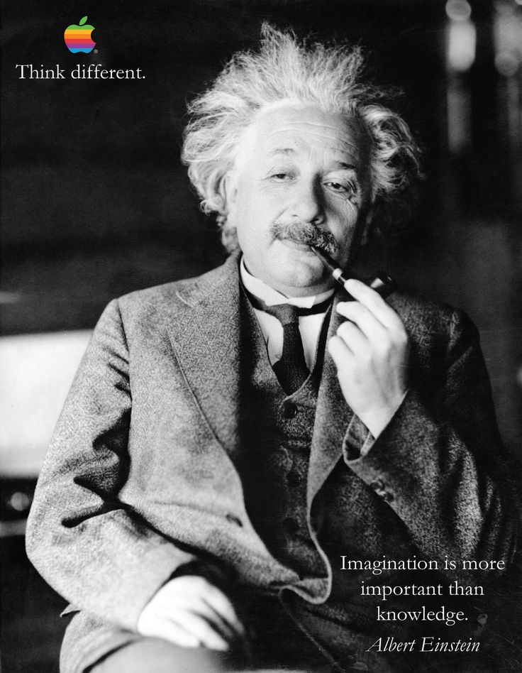
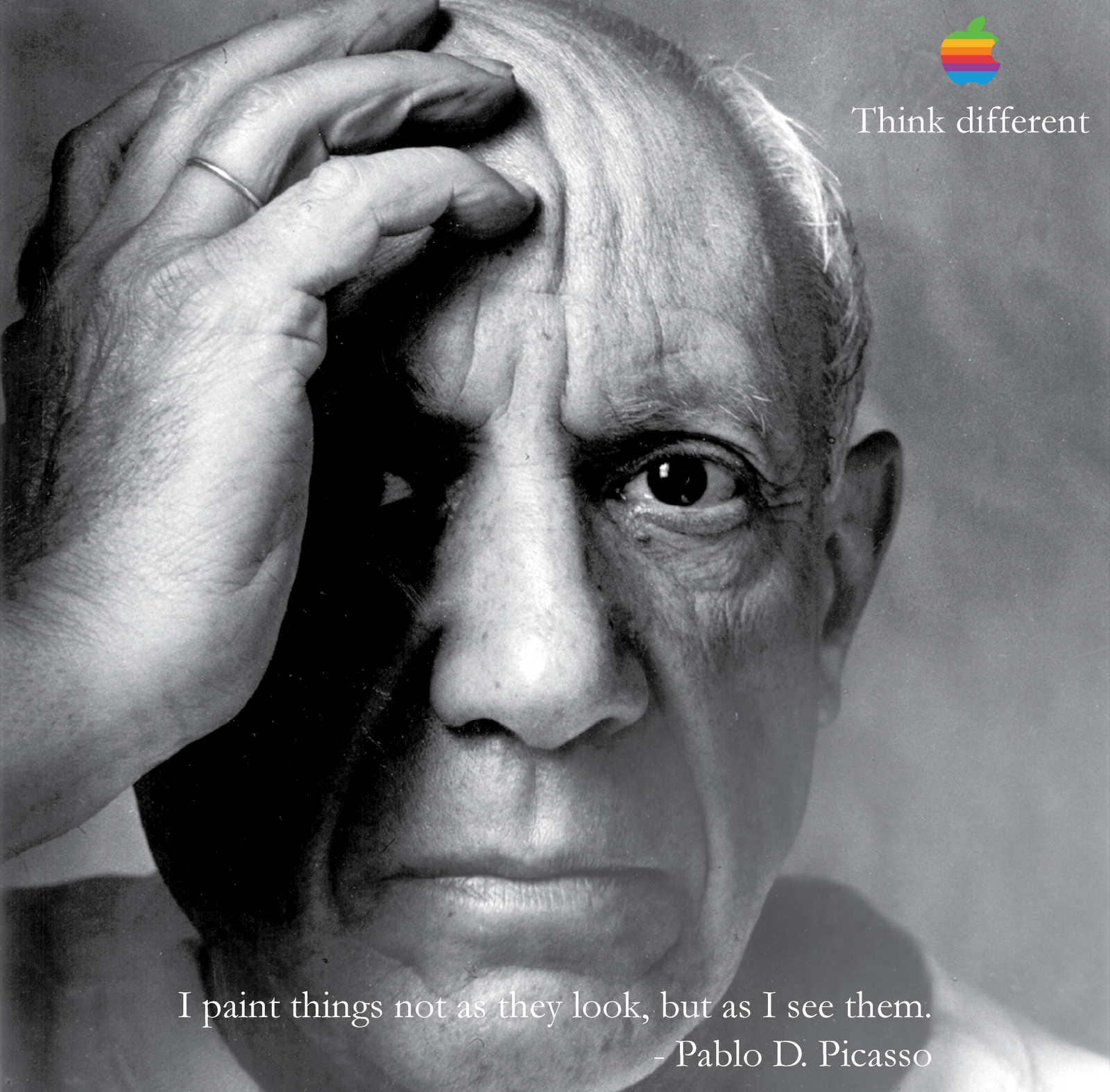
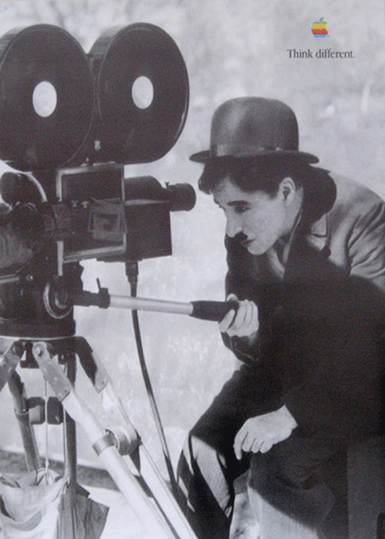
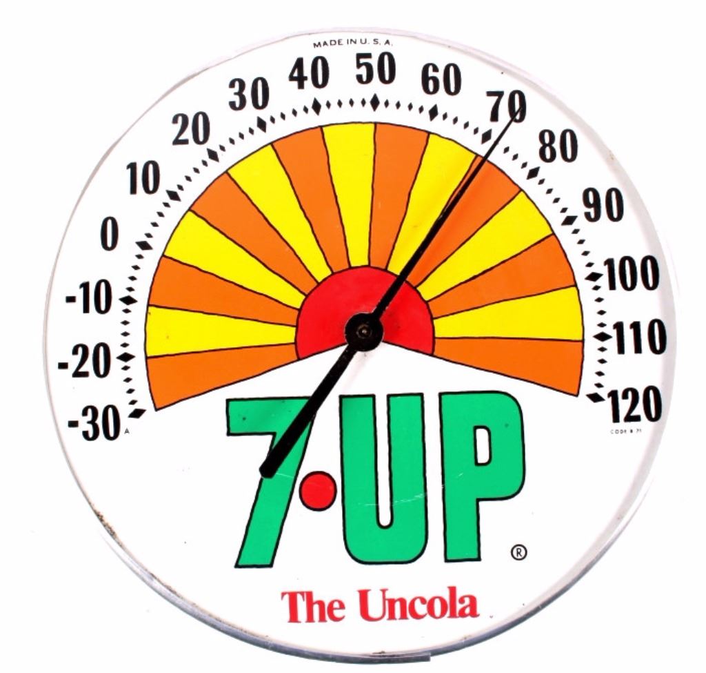
a) It told you NOTHING about the products they needed to sell to survive.b) It didn't show products.c) It featured a bunch of old dead people.d) 'Think different' was ungrammatical.e) They used old-fashioned looking black and white stock-shots and archival film to represent a state of the art product.Steve Jobs made a big call, which proved to be the right one.John Hegarty once told me 'truly breakthrough creative work never wins awards, it splits juries, people don't know what to make of it.'So true, Ironically, I was on the One Show jury that judged the 'Think different' campaign, we gave it nothing, the discussion was around execution; 'like a mood film', 'Think different sounds ugly', 'Old stock shots' etc.Meetings about creative work with successful companies tend to get bogged down with minutiae; Is that actor too handsome? Should the bottle have more spritzing? Are the room sets too opulent?Companies that are desperate are more focussed; Will people notice it?They're forced to run work that stands out, which means they have to try something different, or think different as Steve Jobs might say.Take 7-Up.In 1920, a chap named Charles Leiper Grigg launched a company to sell a new, fizzy orange drink he called 'Howdy'.
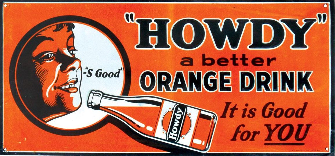
It didn't take off.He had another go in 1929, two weeks before the Wall Street Crash, launching a new drink with health properties; it contained lithium citrate, a mood-stabilising drug.Having learned a valuable product-naming lesson with 'Howdy', he decided he needed a name that gave you a clue as to what you were buying, something descriptive, not some random word like 'Howdy'.Bingo! ‘Bib-Label Lithiated Lemon-Lime soda’.‘Bib label’ because it had a paper bib label.‘Lithiated’ because it contained lithium.‘Lemon-Lime Soda’, because, well, that’s what it was.They hung in there with that cumbersome name for six years,Then they changed it; 7 Up. (Rumoured to be a reference to its seven main ingredients.)
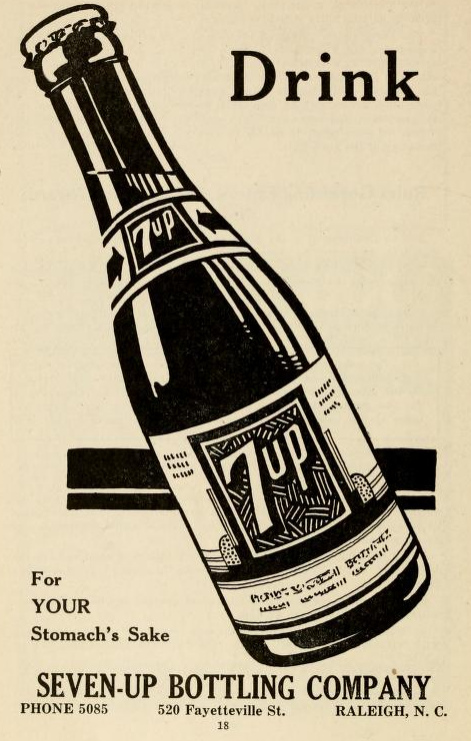
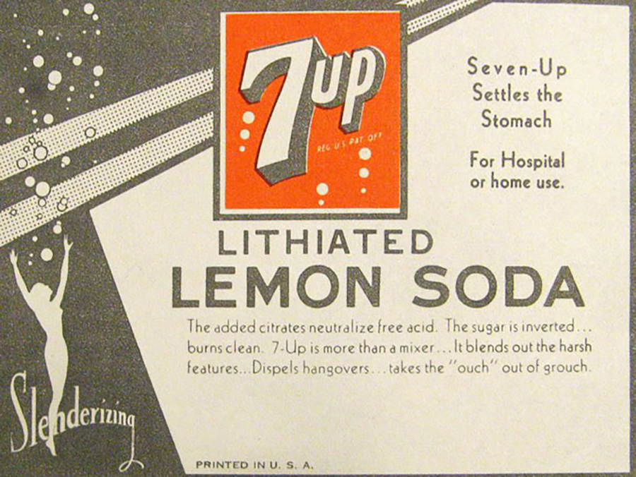
Unfortunately, they start marketing again, coming up with the line ‘Seven natural flavours blended into a savoury, flavoury drink with a real wallop’.Over the next thirty years they produced endless bland campaigns.They bounce from being a stomach settling drink...
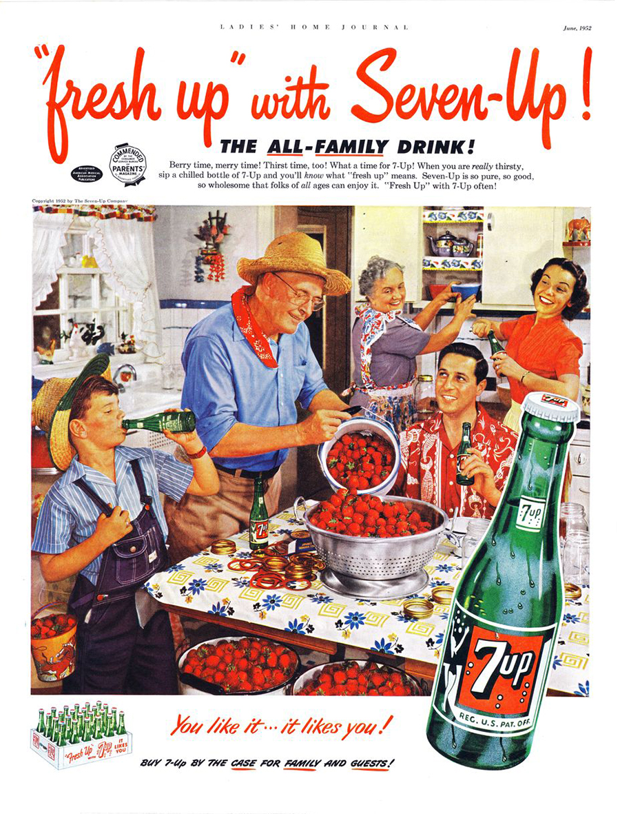
...to an 'All-Family Drink'...
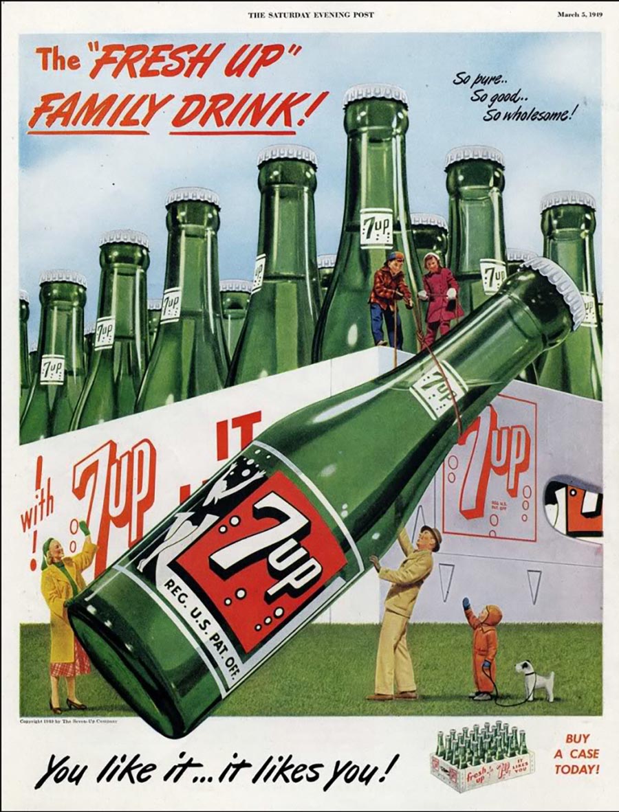
...to a 'Fresh Up' drink...
...to a wholesome drink for an 11 month old...

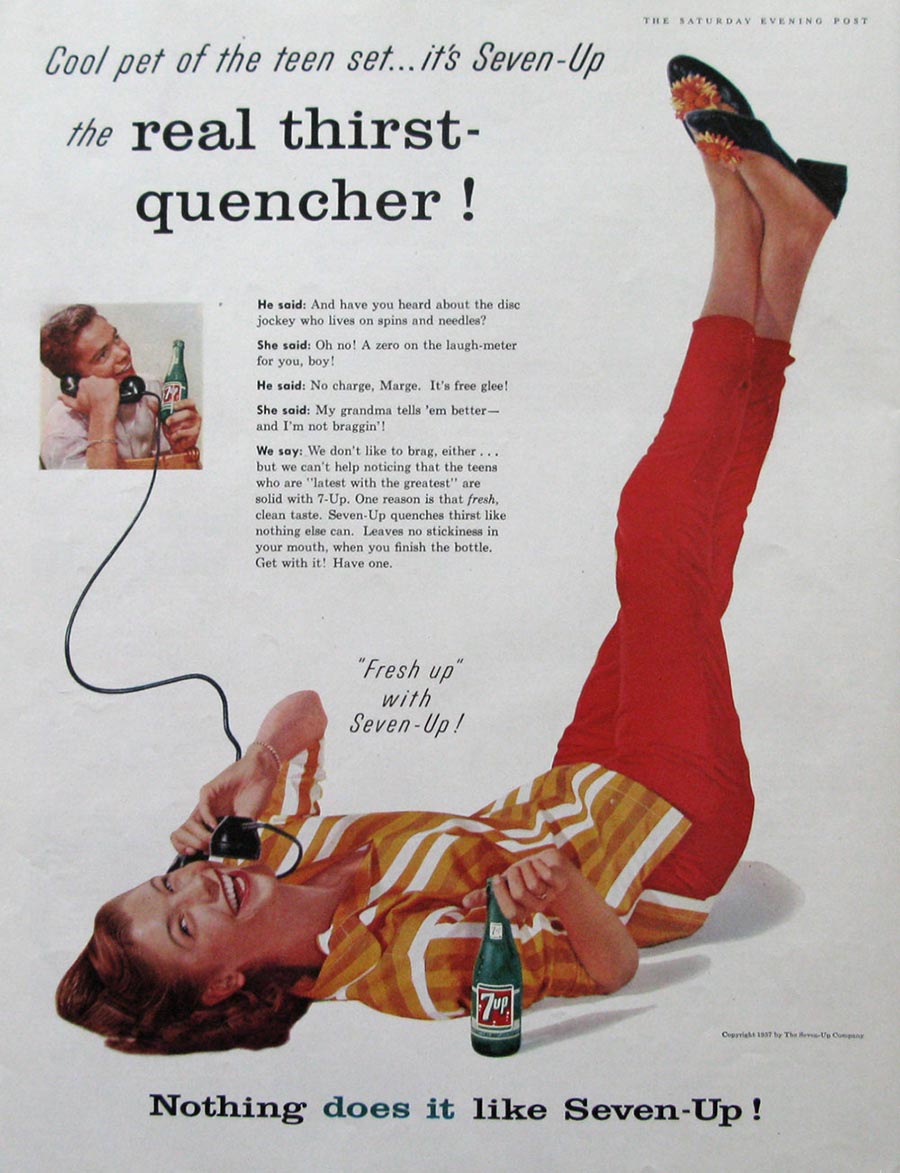
...to a 'Real Thirst Quencher!'...
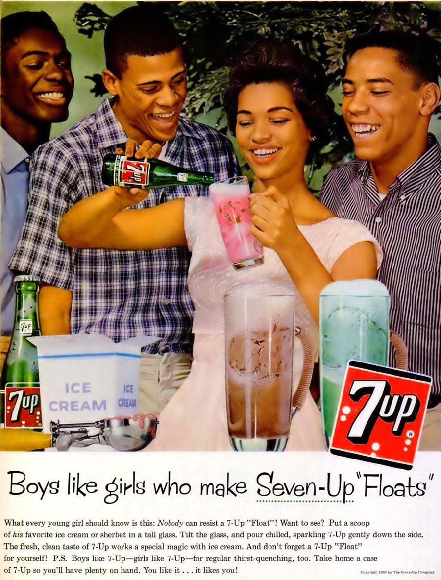
...to betting the house on it being an ingredient in floats...
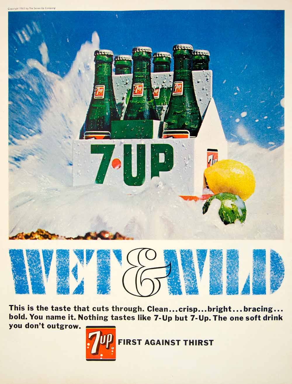
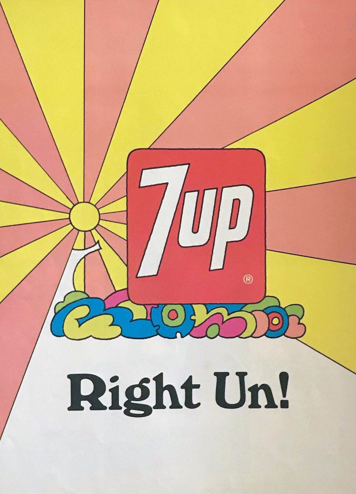
...to being the 'Wet & Wild' one.
Even utterly shit puns didn't help them.
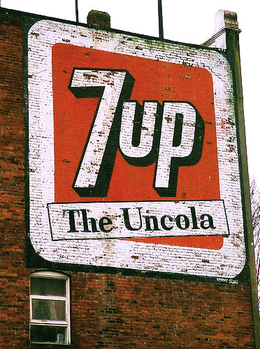
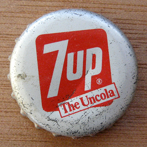
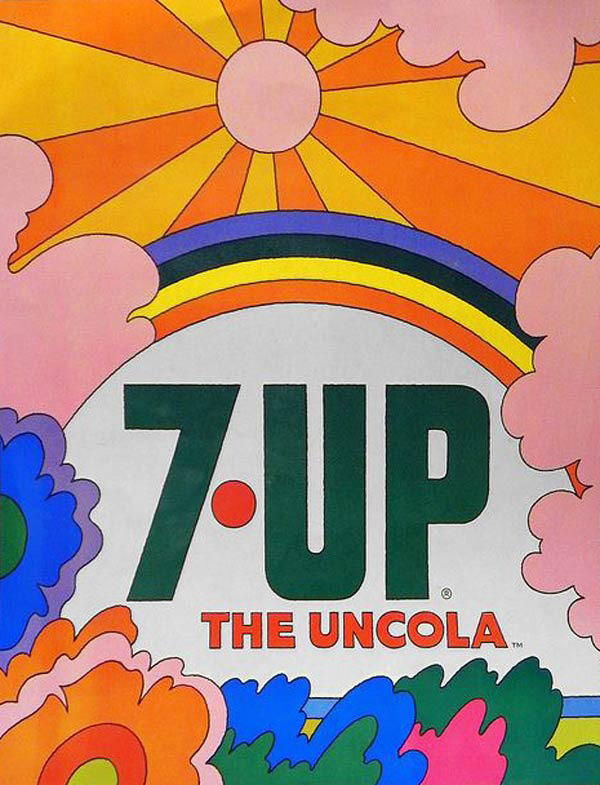
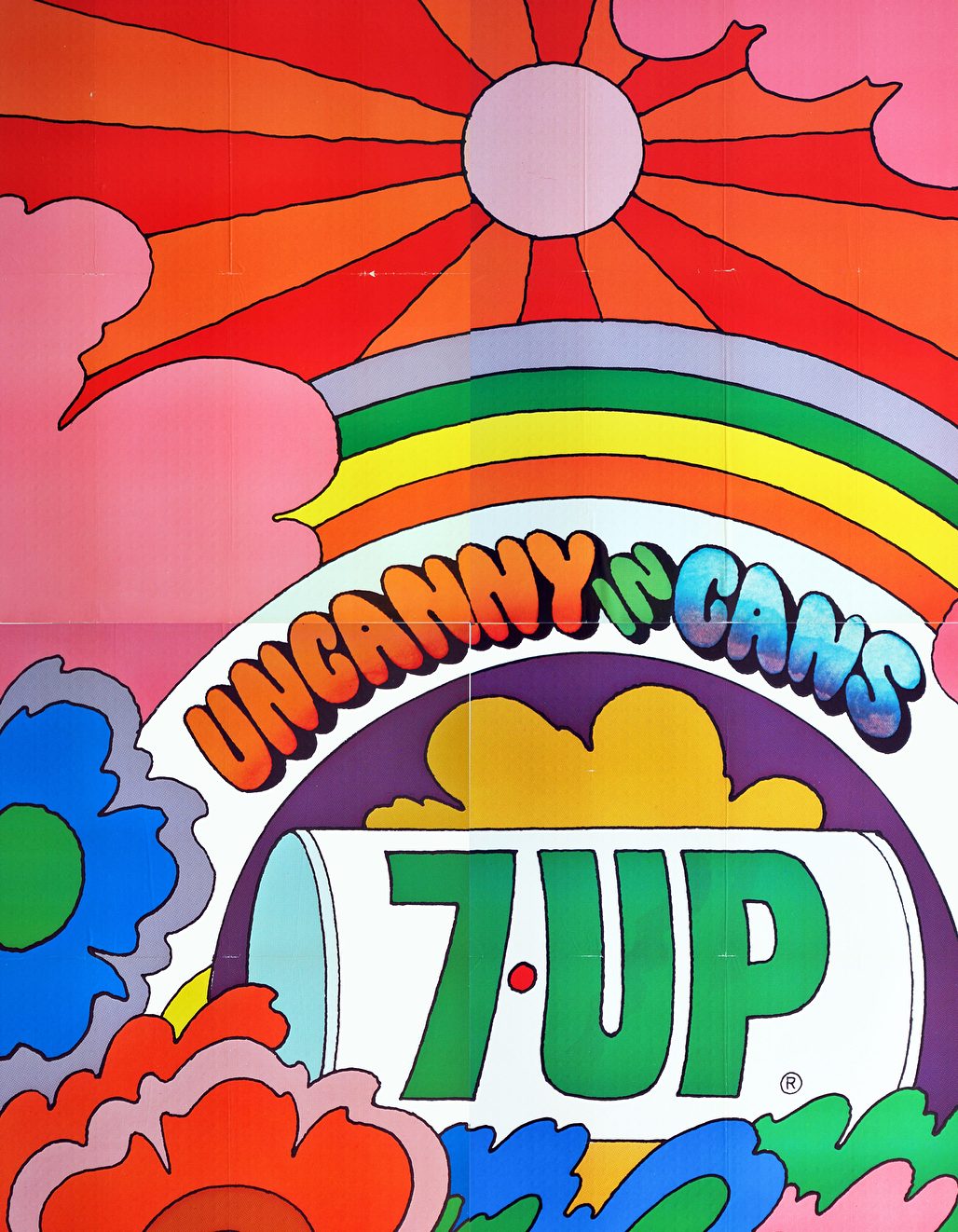
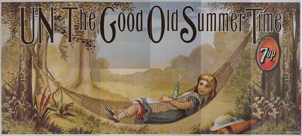
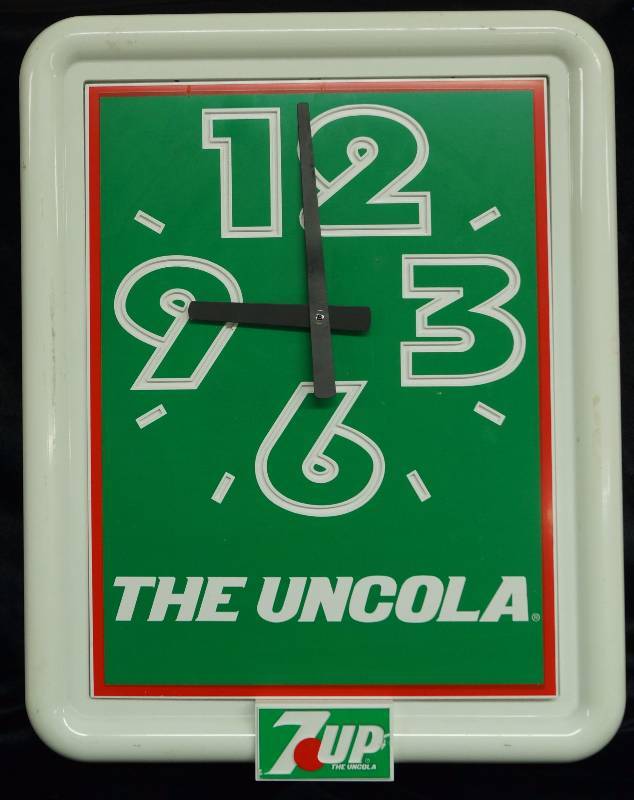
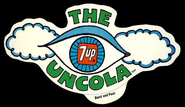
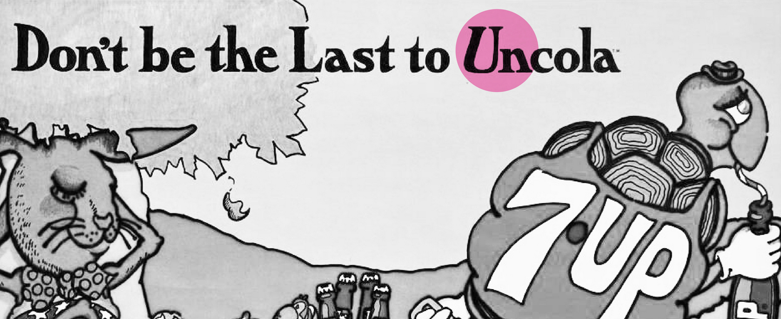
Nothing stuck, nothing worked.By the late sixties they were in trouble.In desperation they appointed a new agency; J. Walter Thompson, Chicago.Advertising was now important to them.This wasn't a time for rearranging deck-chairs, they needed to stop the ship sinking.Refreshing, fun, fresh, thirst-quenching, baby-pleasing weren't going to do it.They needed to be different.There's a saying 'if you want a positioning take a position', most people don't, because they worry that people may disagree with that position.But 7 Up had to gamble.It must've irritated the hell out of them that the whole world drank those brown fizzy drinks when they were struggling to find a market for their see-thru fizzy drink.You can imagine the thinking:Why does everyone drink cola?Why are they all such a sheep?Why can't people make their own minds up?Be different?Maybe we're the drink for those people?Individuals, outcasts, hippies, the anti-war, drop-outs, draft-dodgers, the flower-power lot, people who aren't sheep.We AREN'T cola, we're the ANTI-COLA.At the time, outcasts, hippies, the anti-war, drop-outs, flower-power and the like were derided as un-American.So echoing that 'un' was a powerful signal.'Uncola' was born.What a weird, odd-sounding, non-grammatical line. (Like 'Think Different')It was perfect, it totally positioned 7 Up as part of counter-culture and depositioned cola as old-fashioned, conservative and establishment.
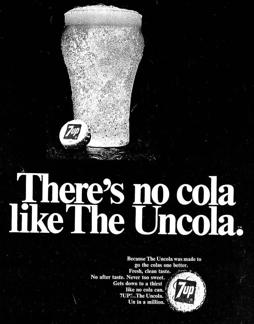
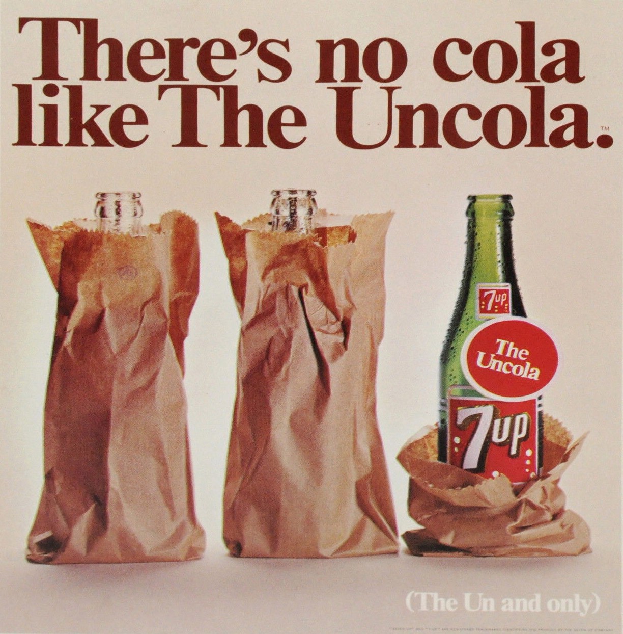
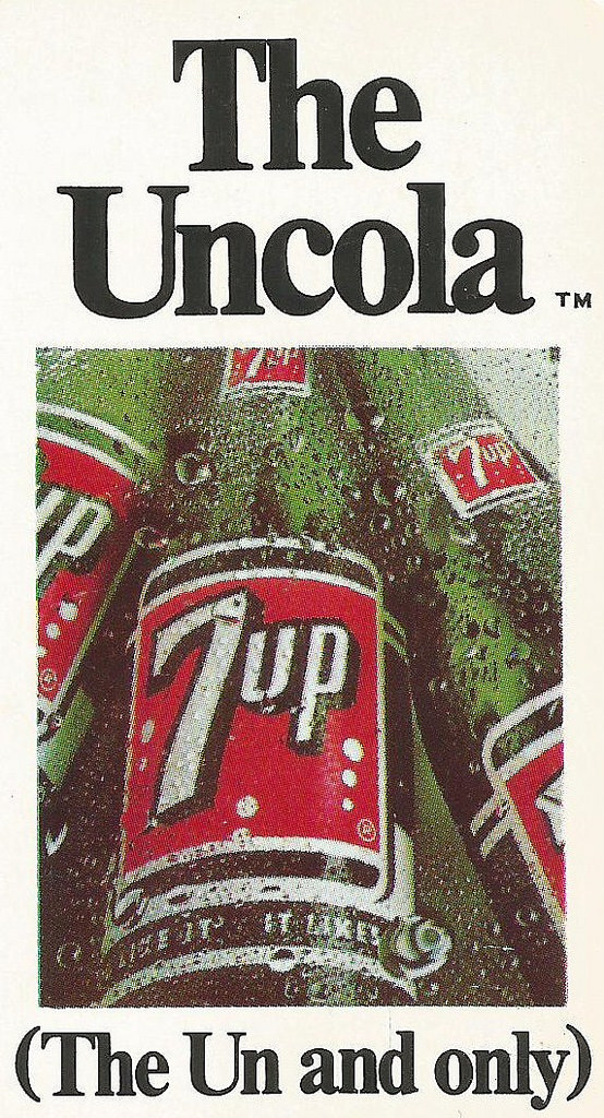
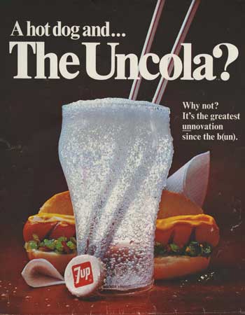
Sales double within a year.I'll repeat that because it sounds ridiculous; sales double within a year.With momentum behind them, they decide to evolve the campaign.I presume that the thinking was; if we're going to say we're the opposite of cola, let's feel the opposite too.So rather than producing ads that felt like they've just arrived from Madison Avenue, they wanted to produce 'stuff' that was more like the culture their audience was consuming; anti-establishment, counter-cultural...different.The stuff parents didn't get, or loathed.


Compare the the images above the some of the best ads of the period.
Although they're great ideas, good tone of voice, simple art direction, they just feel so damn corporate by comparison.So 7 Up went full hippy.
Radio.

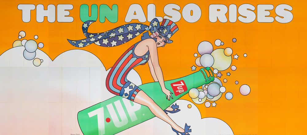
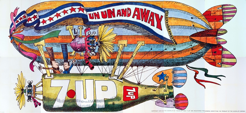
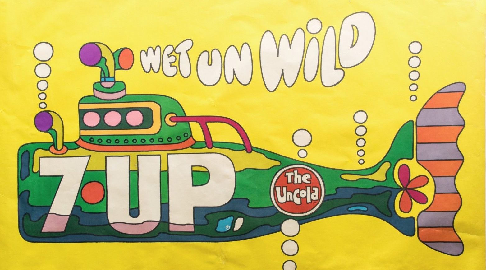

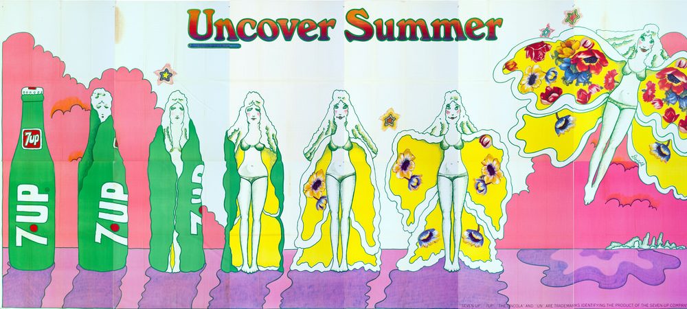
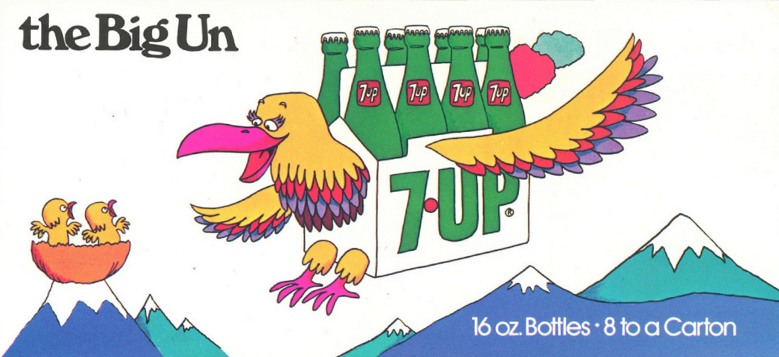
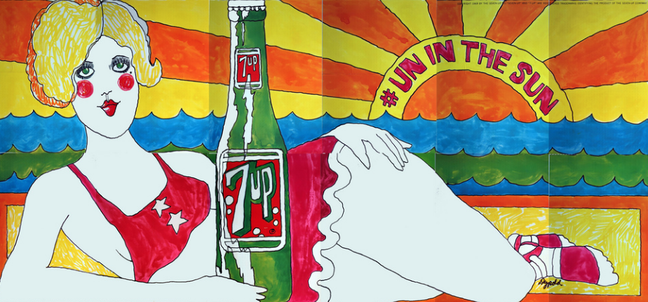
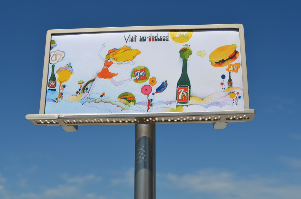
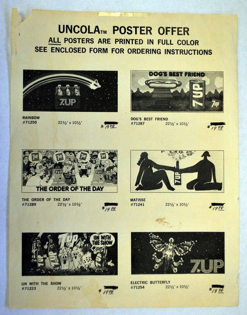
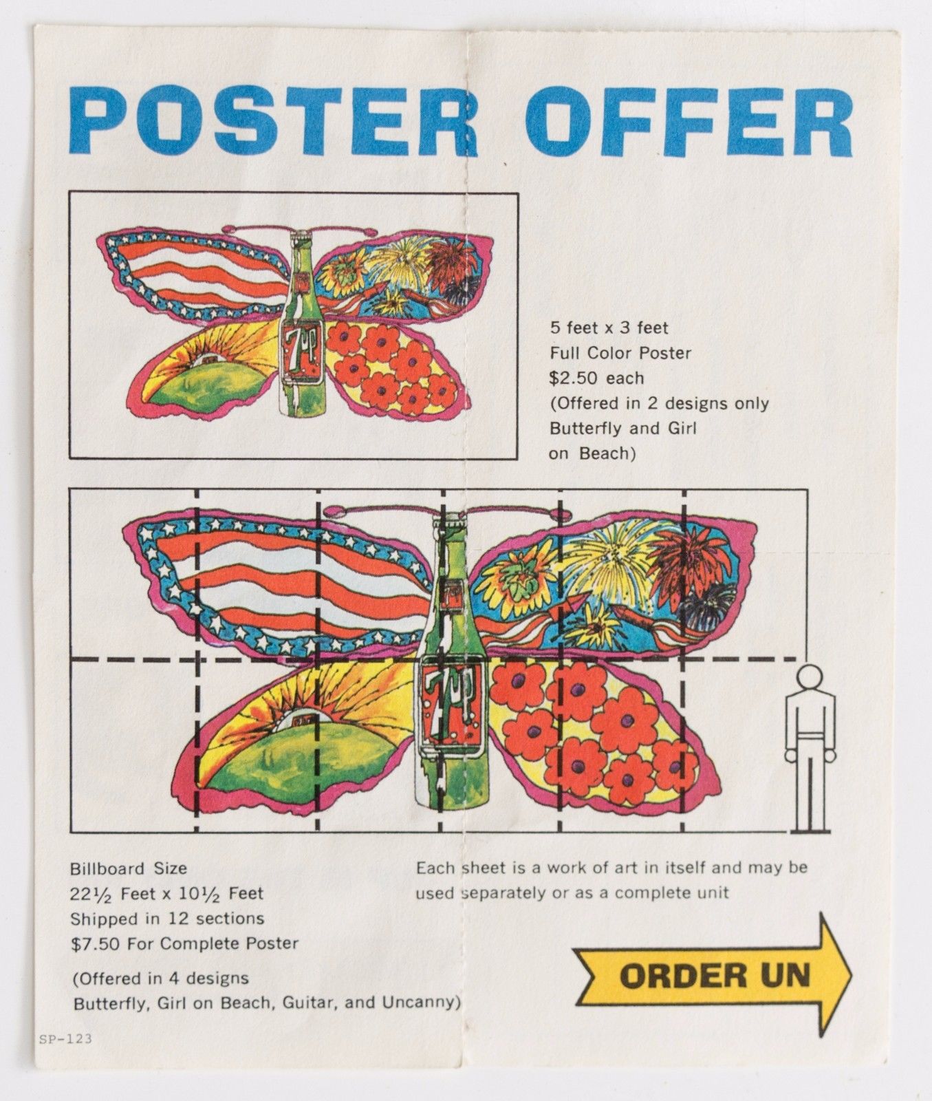
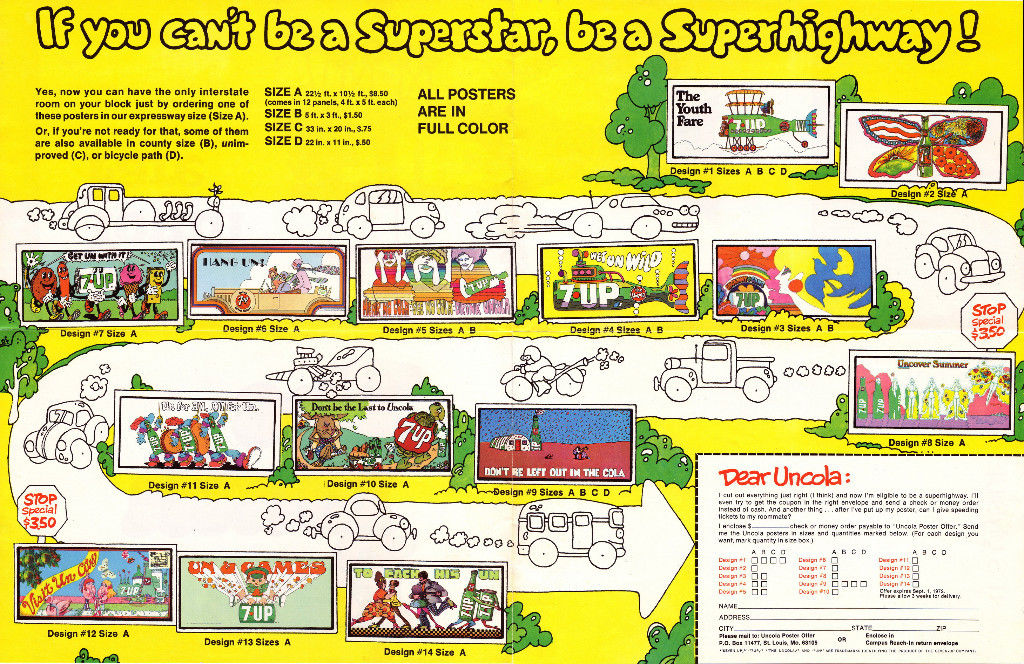
'Un' was rolled out across everything.
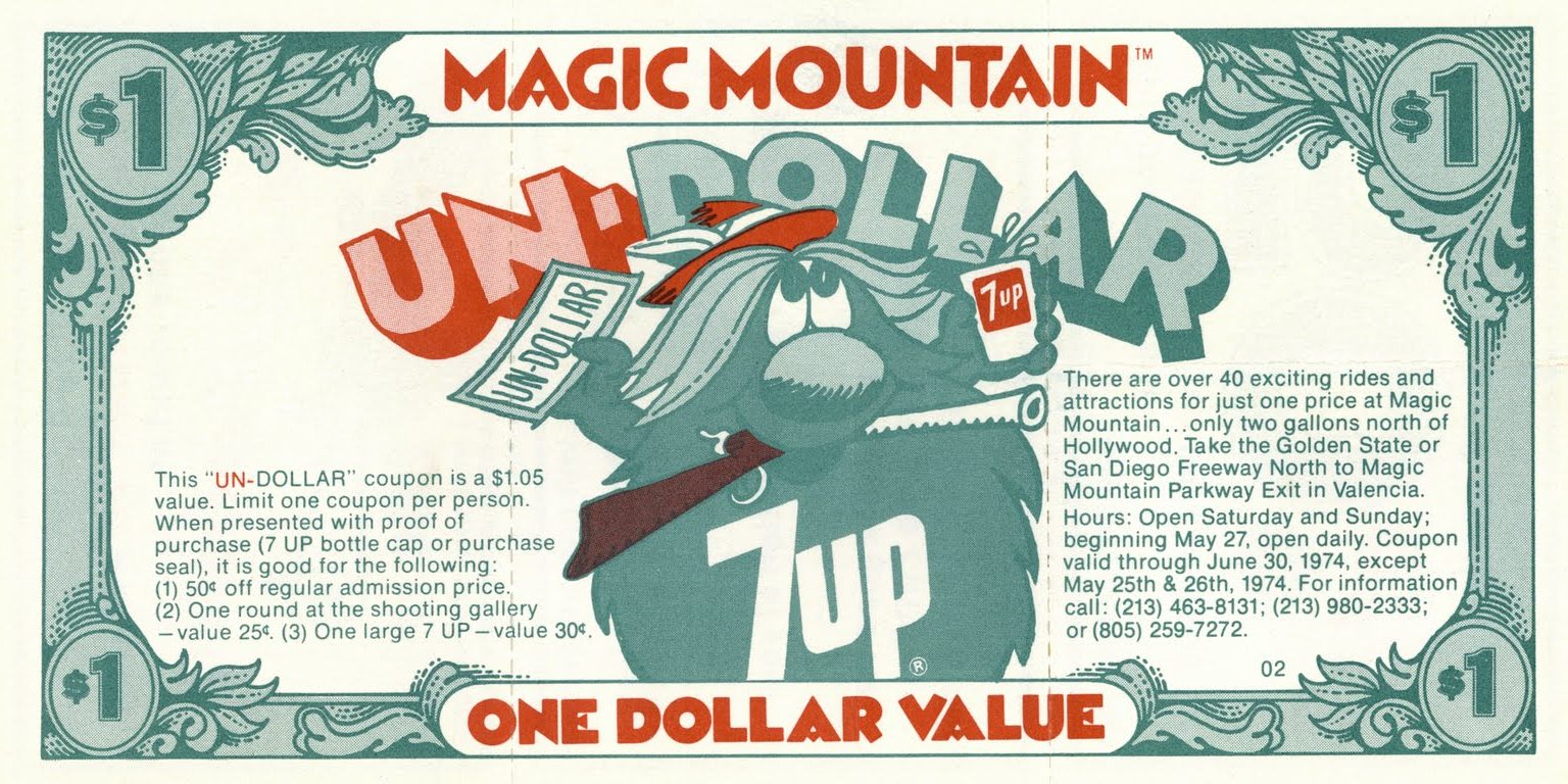
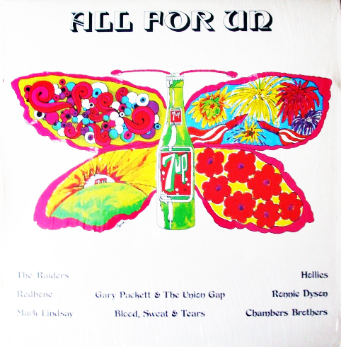
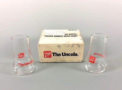
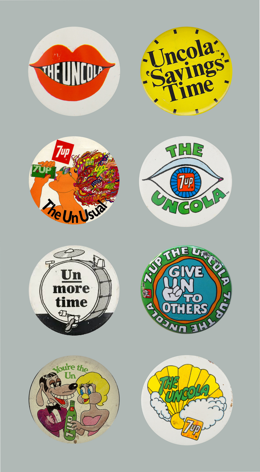
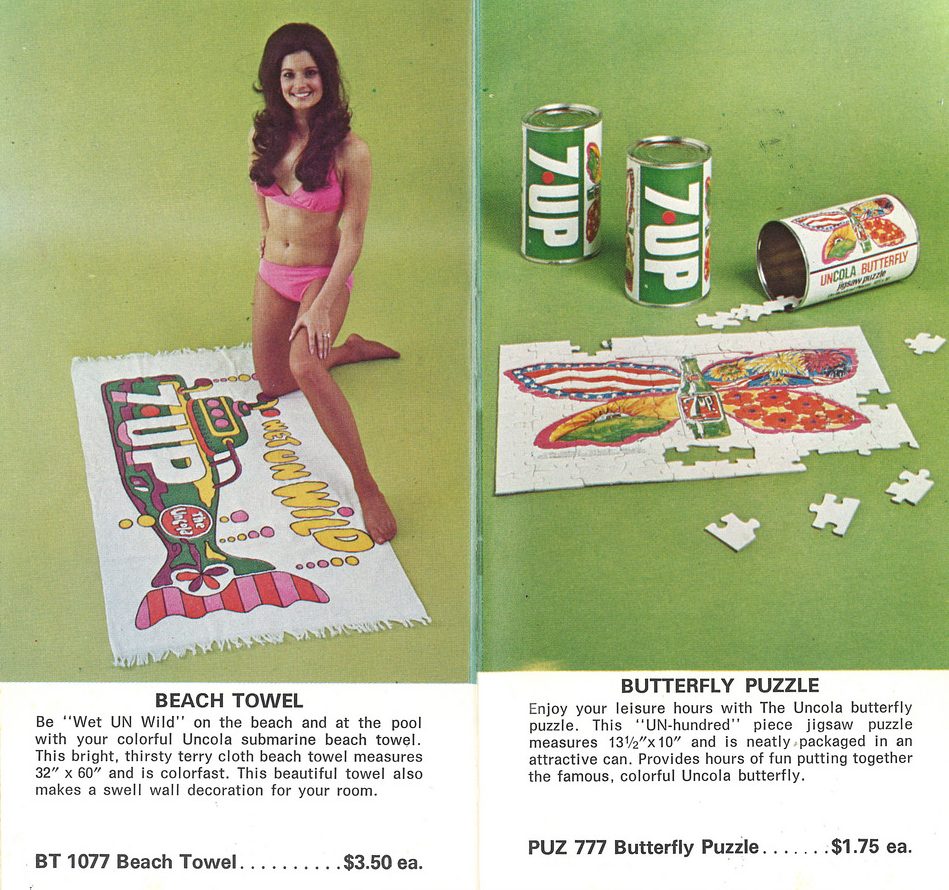
Because the advertising didn't force sales messages down it's audiences throats or patronise it's audience, because it gave them stuff THEY liked, they loved it, so much that they bought it.As posters, badges, albums, t-shirts, jigsaws, beach towels and in many other forms.
Embroidered patches.
T-Shirts.
Postcards.
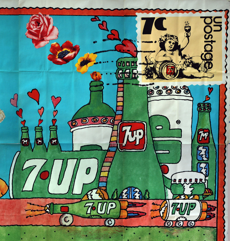
Beach Towels & Jigsaws.
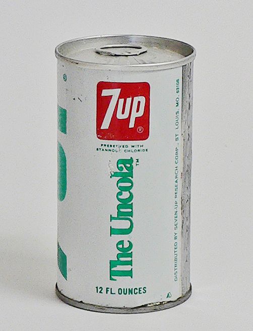
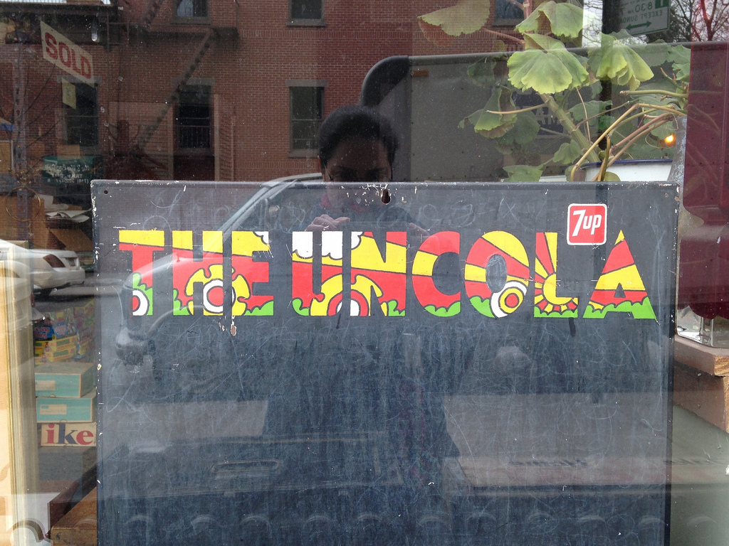
'Uncola' saved 7 Up.It became part of the culture.Got people to buy their advertising.Ran for 20 years.Entered the dictionary*Maybe there's something to this fringe idea of making stuff that stands out?* ("Nickname for 7-Up, a lemon/ lime flavoured soft drink, given to it for marketing purposes. Meant to remind people that it was not, in fact, cola.")
Not for the first time, a tweet by Richard Shotton got me thinking - 'A rare example of an ad agency advertising themselves well'.(It showed an old Fallon McElligott house ad.)When was the last time I saw an agency advertising itself?I couldn’t think of one. It’s a shame, because as well as helping clients get a sense of an agency, house ads were a great way for people like me to a snapshot of the culture within the agency.For example, I'd come across an ad like this, and although I liked their 'Secret Lemonade Drinker' ad, I'd know, without a shadow of a doubt, it wasn't for me.
Whereas I'd come across an ad like this and think 'I want to be in that gang!'.
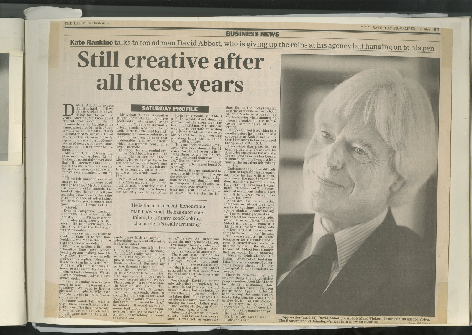
So why have they vanished?Could it be that in these austere times it simply feels too reckless to spend part of your recently reduced fee on an ad promoting yourself?Surely not? What would be a more damning indictment of our business than that the companies that make ads don’t value them enough to spend their own money on? Maybe it’s now harder to find your audience?Virtually all the ads here ran in Campaign, pre-internet, it was the only place to discover what happening in the world of advertising. Thursday mornings wouldn't start until it had been read from cover to cover. That’s no longer the case, no publication that has the dominance and influence that Campaign once had.But it must be possible to find our industry? If there’s one thing online is good at it’s targeting small groups.It could be that it’s just too hard to be the agency AND the client.One of the reasons clients hire agencies is their objectivity, if you want an objective view of a particular child don't ask the people who made it.You need a bit of distance to offer opinions like ‘no-one cares about that’, ‘too much information’ or ‘ten product points is nine too many for a 20 ad”.But, is it really harder now to create an ad for your agency today than it was then?Maybe.Agencies used to have a wide range of personalities and philosophies.These generally reflected the people who started them.Generally the people responsible for creating the work, if was said that an agency’s client list would mirror the Creative Partner’s shopping basket. Imagine David Abbott wearing a pair of Levi’s? John Hegarty driving a Volvo Estate?Dave Trott wearing a Patek Philippe or Tim Delaney watching a Toshiba tv?Such clearly defined agency personalities made it easier to draw up appropriate pitch lists, choose agencies and write house ads.But in the last decade, as ad agencies chased the latest shiny new object, world-class communication agencies have willingly turned themselves into third-rate tech companies.In that time, tech has gone from specialised black art that clients were willing to pay a premium for to an everyday commodity that’s bought like bog rolls or tea bags.It's meant agency positionings have convergedBespoke agency positionings like BBH’s ‘We don’t sell. We make you want to buy’ have been replaced across the board with a version of ‘Give us some money and we’ll do what you want’.It’s hard to charge much for that and even harder to write a house ad for.E.g. Here's my house ads.Campbell Doyle Dye.Having had a complicated stop-start beginning, we wanted to thank all those people or companies who'd offered space, investment or good wishes.We wanted to buy them a beer.In retrospect we got too creative, perhaps 'artsy' is a better word.It looks unusual and cool, perhaps people might be intrigued to look into what it's about?Big words saying 'we'd like to buy these people a beer' next to a list, and a date would've been better.
About a year or two later we had another go.We'd done some nice work and wanted to show people.The thing that seemed to connect all the work was that it felt confident, so we wrote a line about confidence and put this rough together.
Then it occurred to me that although all the ads within our ad exuded confidence, the ad they were within, our ad, wasn't confident at all, it did what we talk clients out of week in week out; show every product they made.We needed to take our own advice; Make a relevant point as simply and powerfully as possible.I'd been made aware that each of our clients had grown in the over the last year, true, we only had seven clients at that point, but it still a neat fact.I mocked up this.
It seemed a bit straight, there was no clever writing, no clever visual stuff, but I liked it.Then I worried it was a bit like this ad our friends had run.
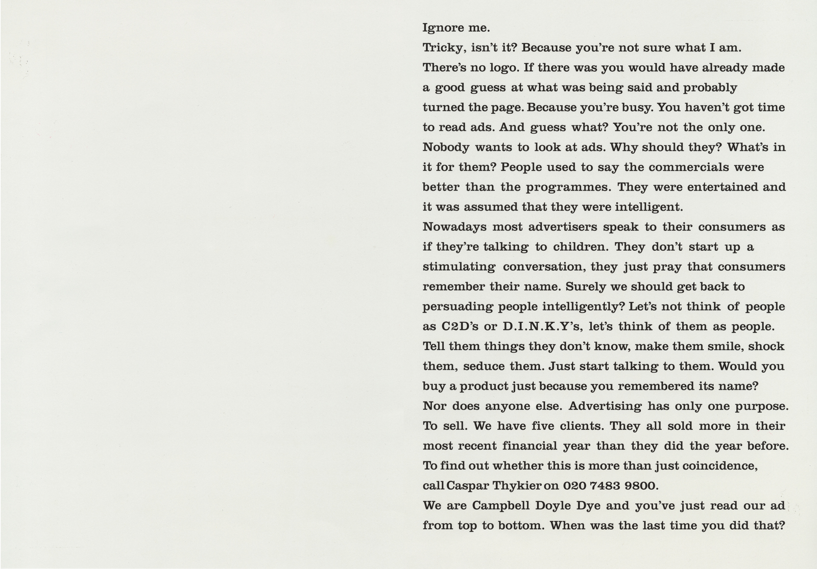
It had the same bald, non-clever headline, the same minimal art direction...sod it, let's have another go.Maybe we could give our view on advertising, maybe we could be bold and brave and get people to take in more than an eight word headline?I wrote this.It did a two things most clients would never do; print nothing on a full page you've paid for and it didn't feature a logo. Is that brave or foolish?
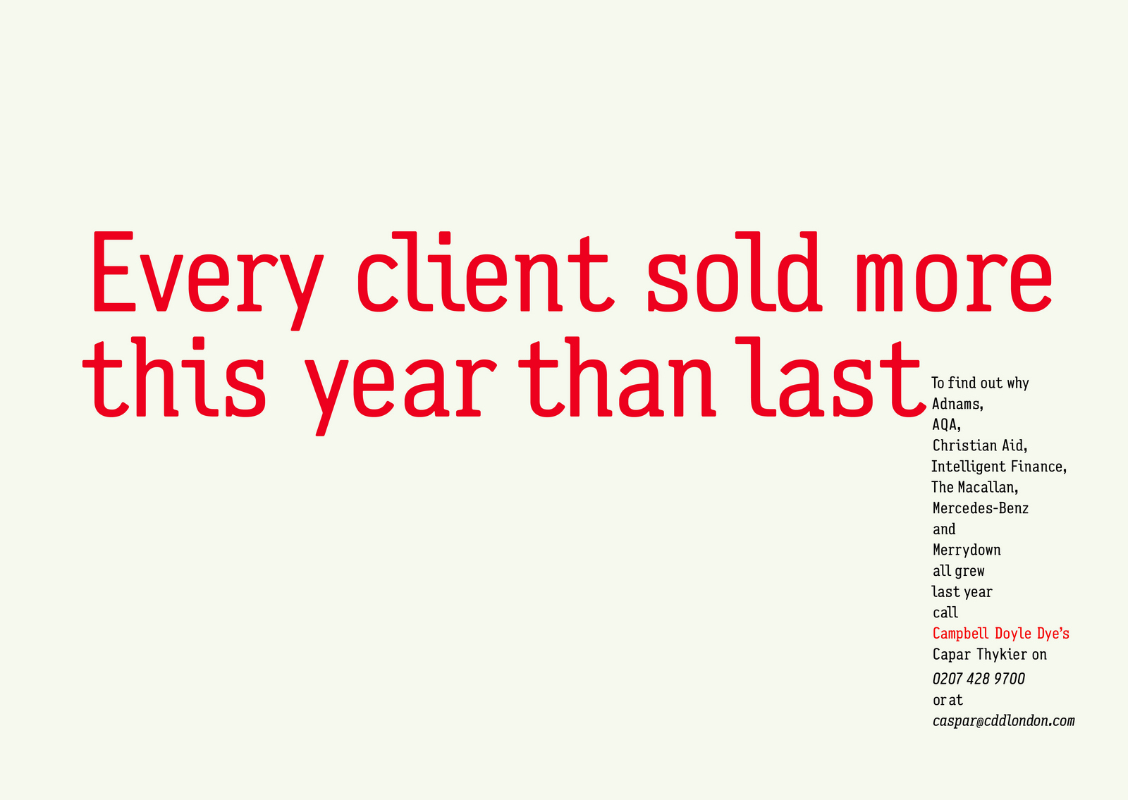
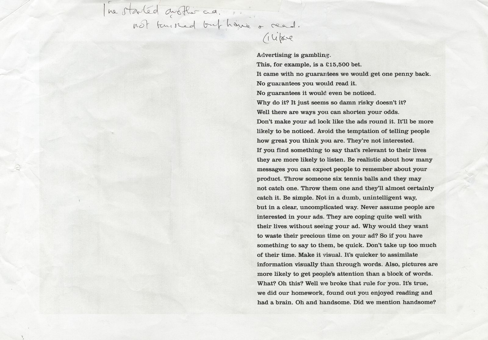
It won a couple of awards and lead to a couple of conversations with a tractor importer in Norwich.(I found another one I was working on that we didn't end up running.)
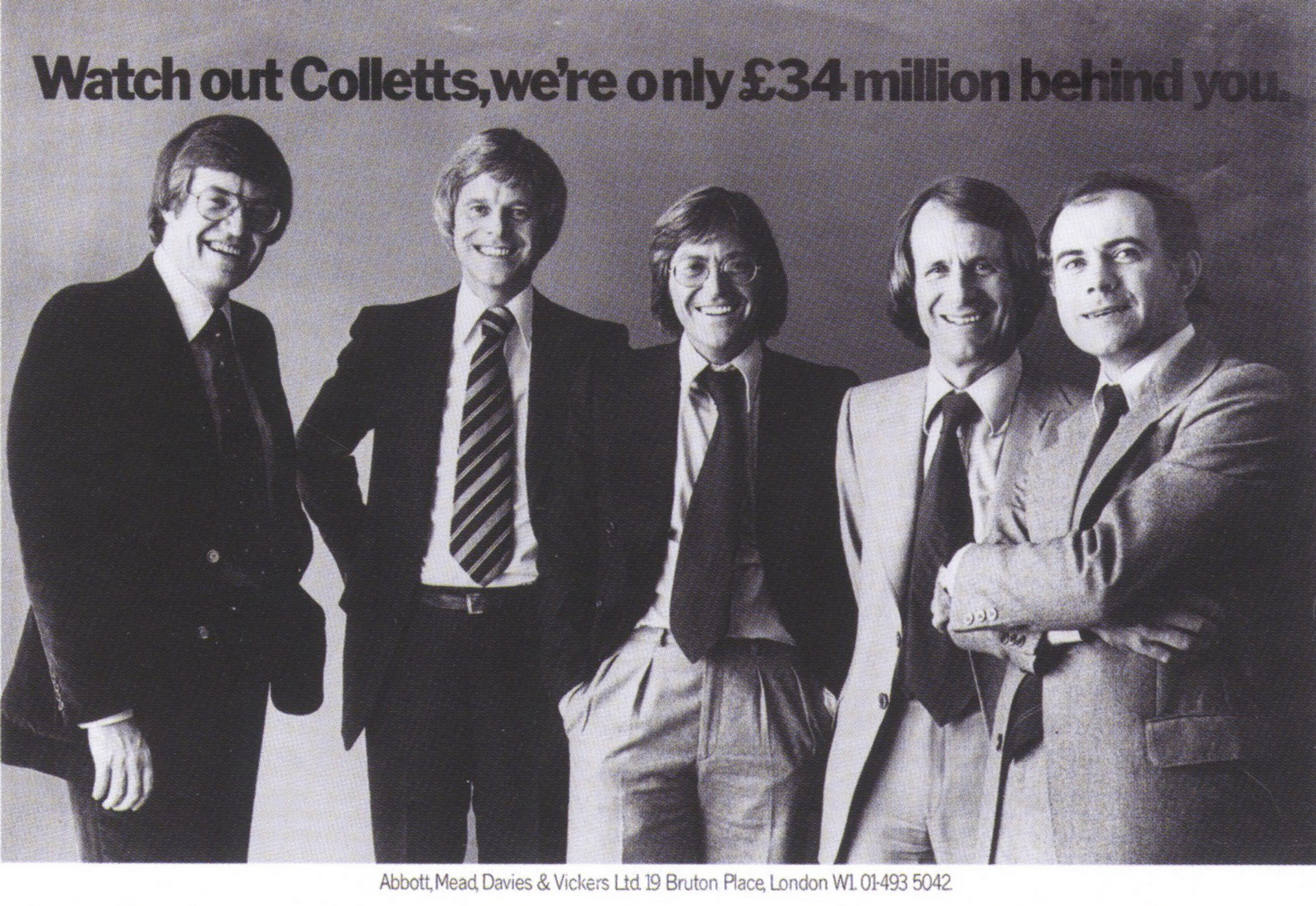
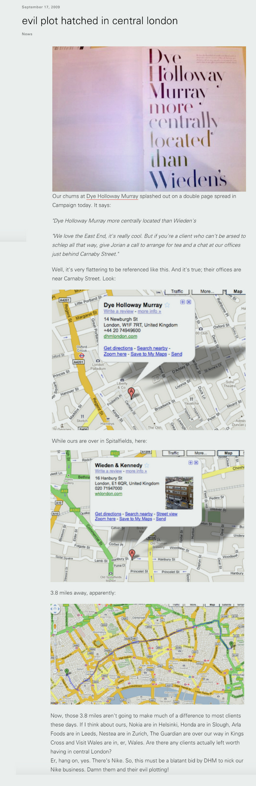
In retrospect I should've coloured in the 'Sold more' headline in blue and run that.What an idiot!It's the most relevant to someone looking for an agency.Dye Holloway Murray.In 2009, we managed to bludgeon our way onto the Volkswagen Commercial Vehicles pitch, it was 6 months into the global financial crisis, Volkswagen Commercial Vehicles were dearer than most of the competition and Volkswagen had spent decades building up an honest, totally non-bullshitting tone of voice.I figured we needed to talk business with businessmen, explain why it's worth paying more for a Volkswagen than a Vauxhall or Renault.To cut a long story short, I ended up working with David Abbott on the pitch. (The long story is here: https://davedye.com/2013/11/29/abbo/)Whilst at lunch with David one day, probably whining about a lack of new business, David said 'you need some positional ads, when we started we ran an ad that said "Watch out Colletts, we're only £34million behind you." We did it because we liked Colletts, we wanted to think we were like them...a smaller version of Colletts. You need to align yourselves with the agencies you admire, so that people know that you're a creative agency like them.'The idea made me feel a bit uncomfortable.'We've run a lot of ads, I can trace a new piece of business to every ad' he told me.Sod it! I found David's ad.
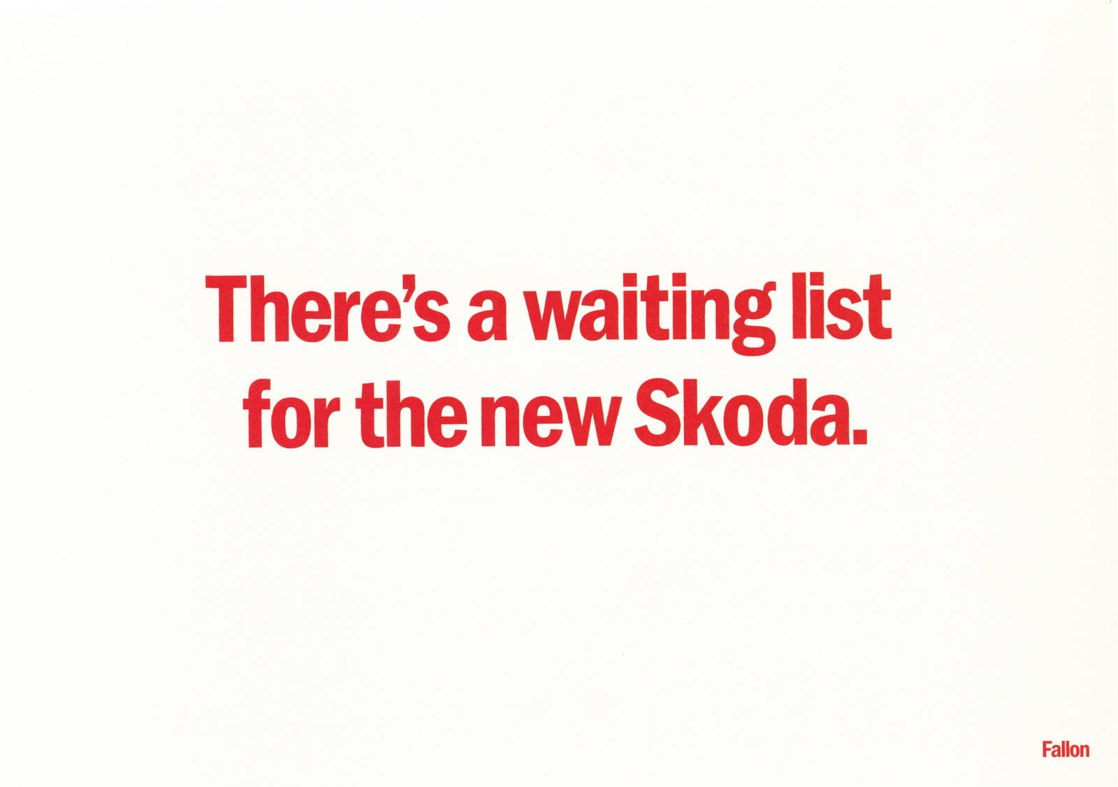
How do I copy that without copying it?For a start, we don't want to appear in it, that just seems weird.Ok, so no picture.We seemed to be getting premium business, Vertu, The Macallan, The Economist, so I thought it should look premium, stylish, but fun premium, not all black and serious.So I picked a stylish font and picked words out in different colours.But what do we say? I made a list of agencies I admired; Mother, Wieden Kennedy and Fallon.I didn't want to copy, but even the sentiment 'Watch out Mother, we're only £200m behind you', it sounded so cheesy... and ludicrous.Perhaps if we were self-deprecating?Maybe we should pick out good things about them and say we don't have that problem;a) Fallon - tons of accounts.b) Mother - Multi-cultural.c) Wieden's - based in uber-cool Shoreditch.That seems like a more contemporary, tongue-in-cheek way of doing that 'Collets' ad.We ran these three.
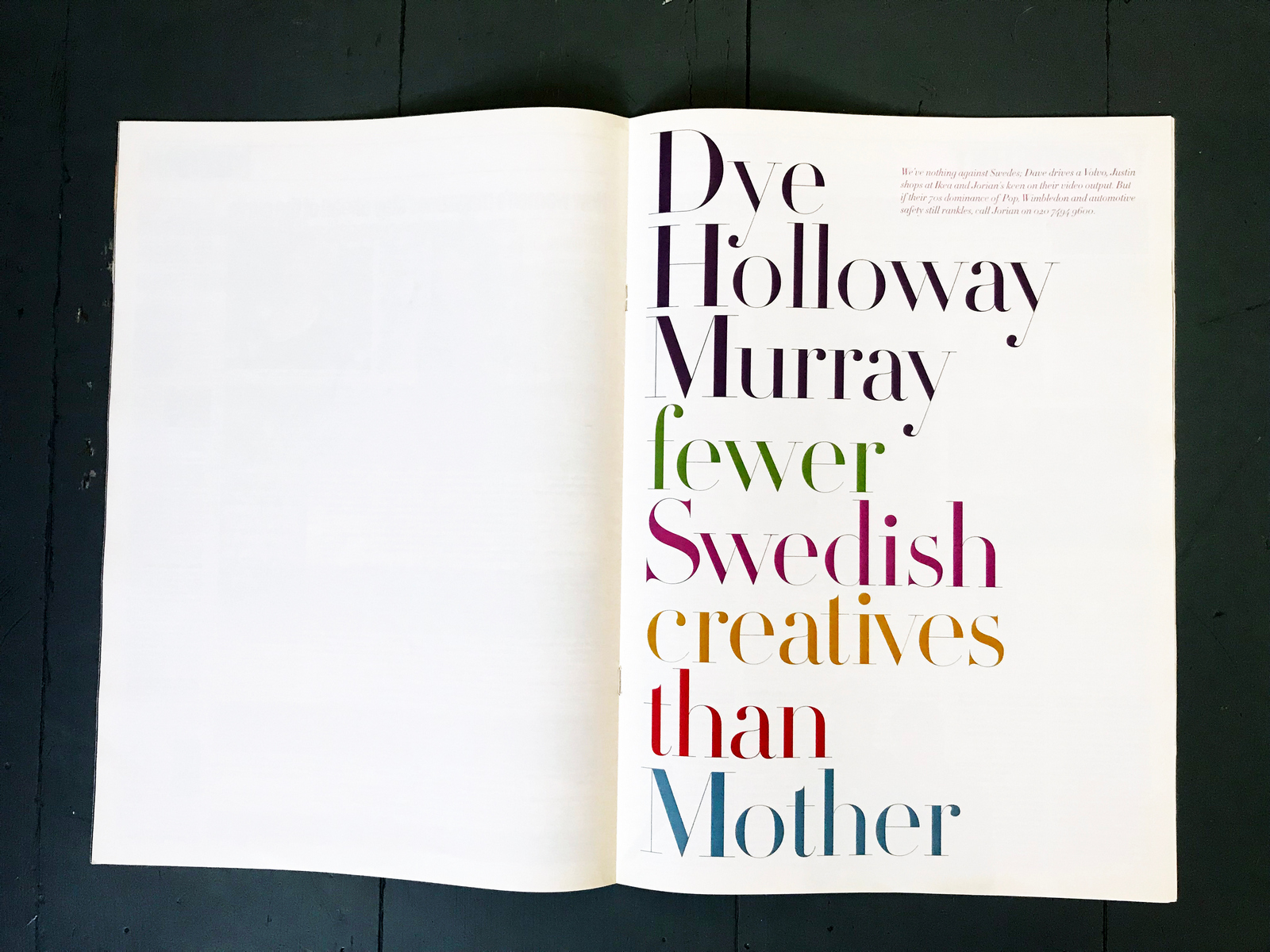
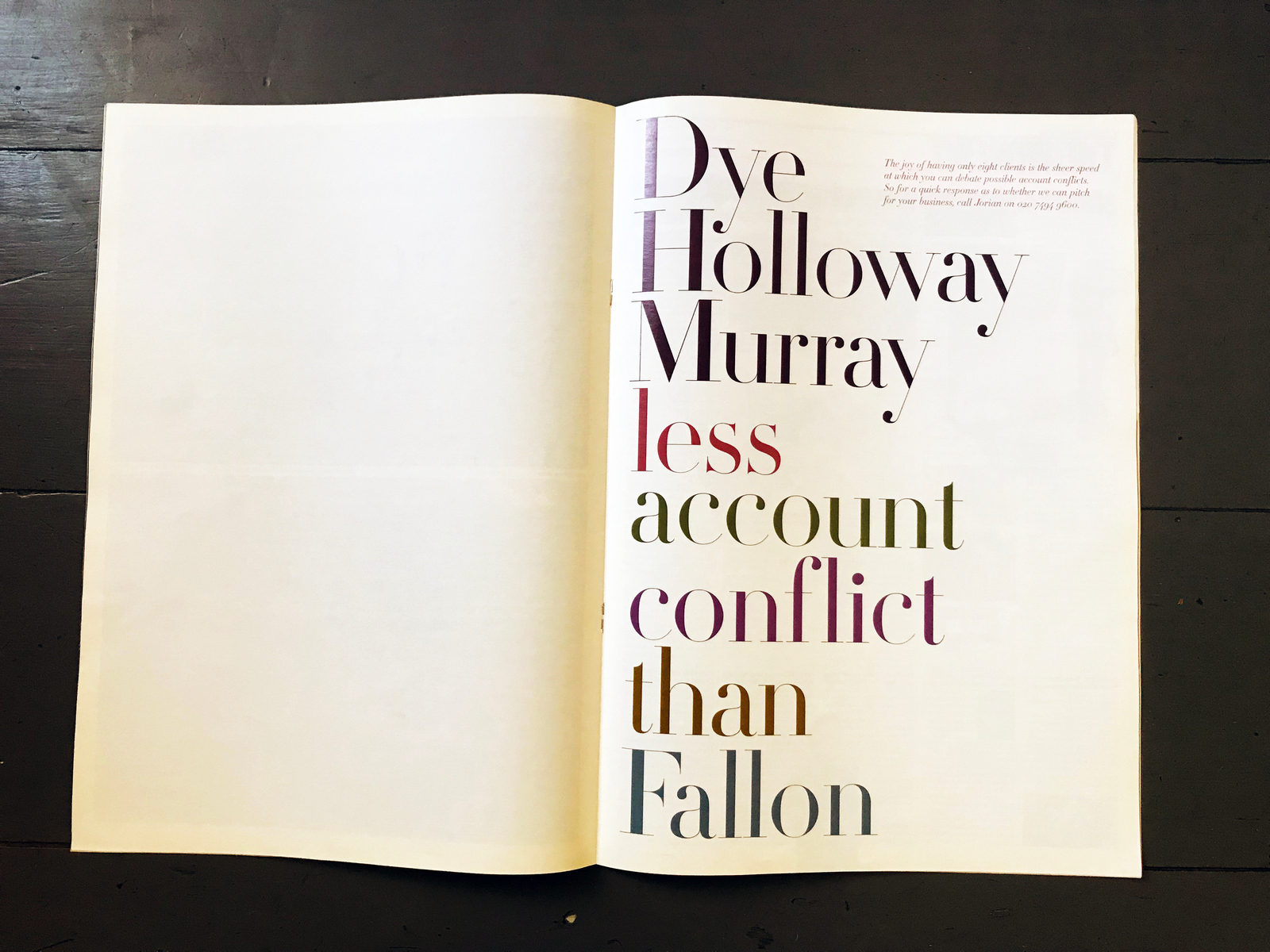
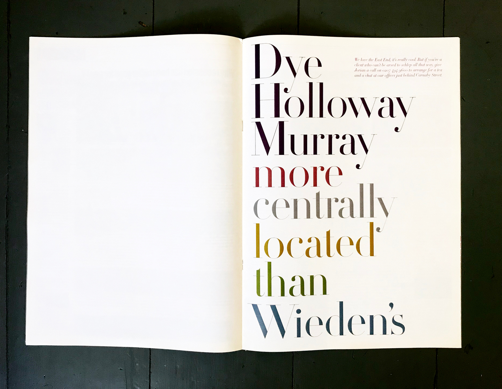
Nothing.Nada.Zip.Not even a call from an East Anglian tractor importer.The only response was this good-natured blog post from Wieden's.
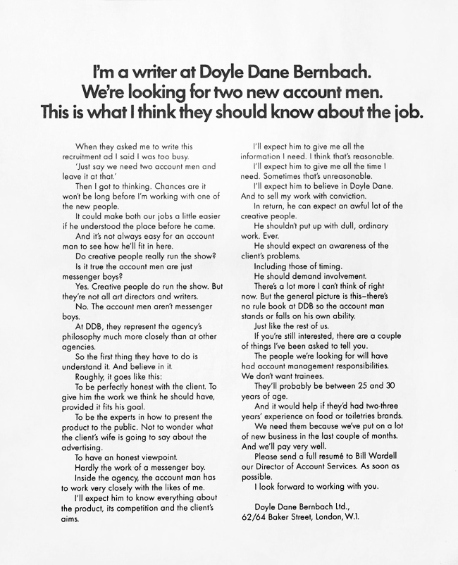
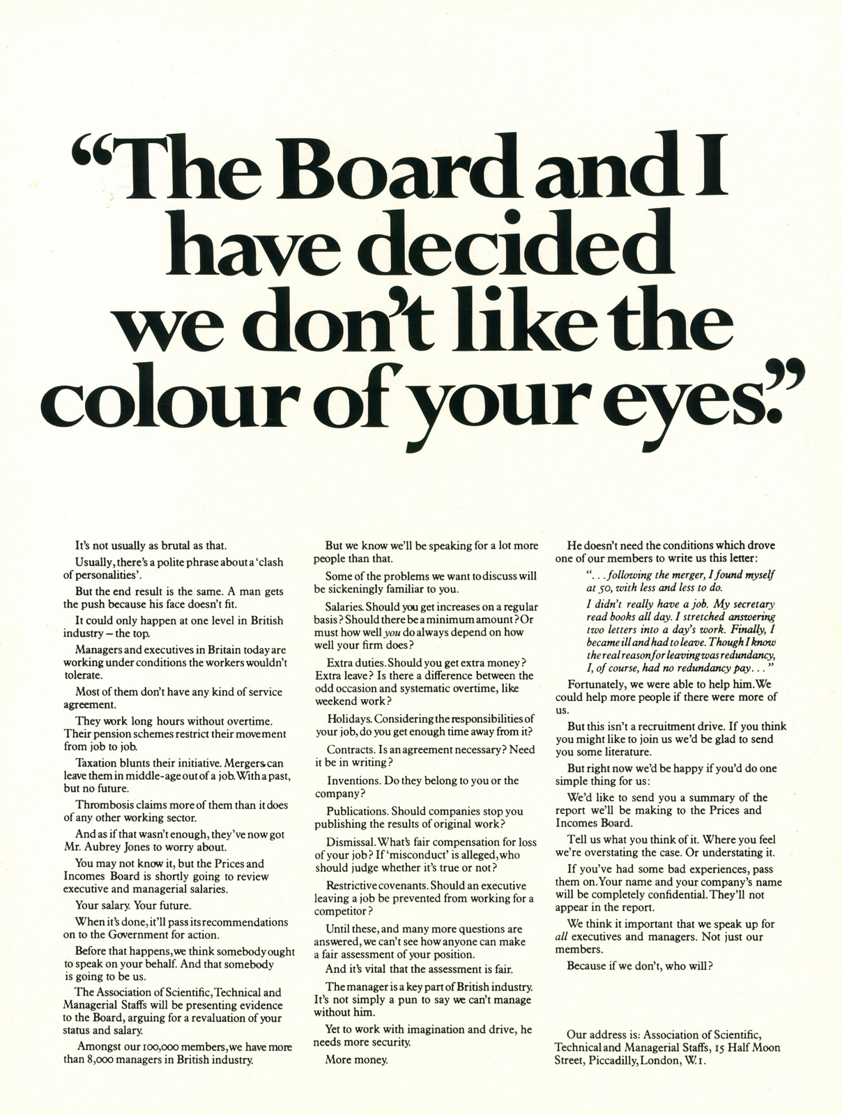
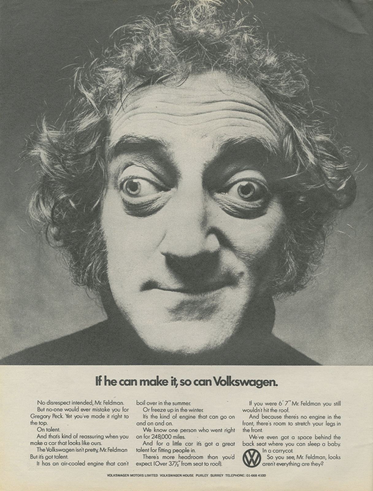
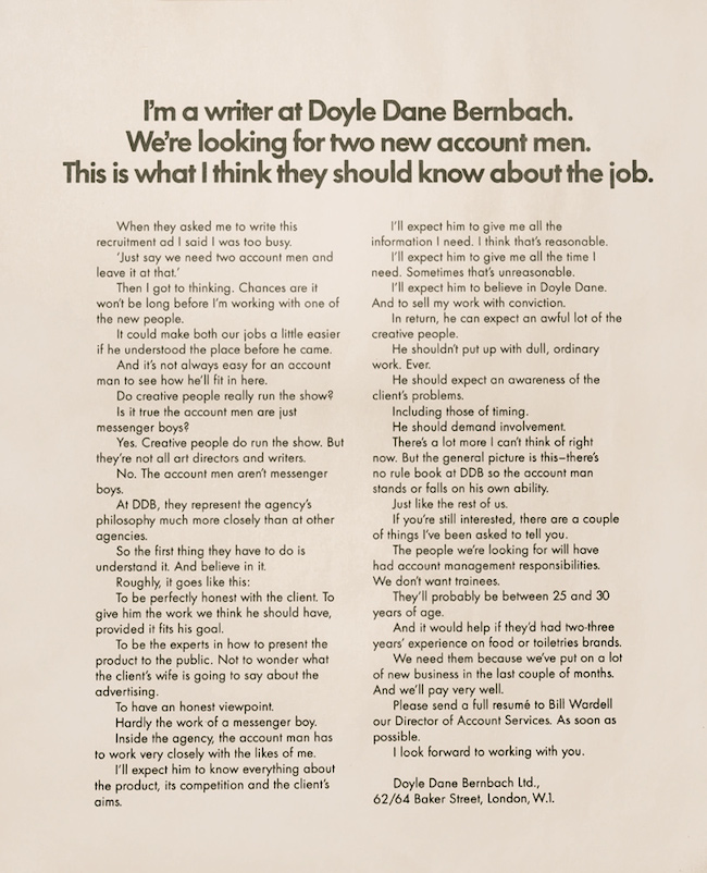
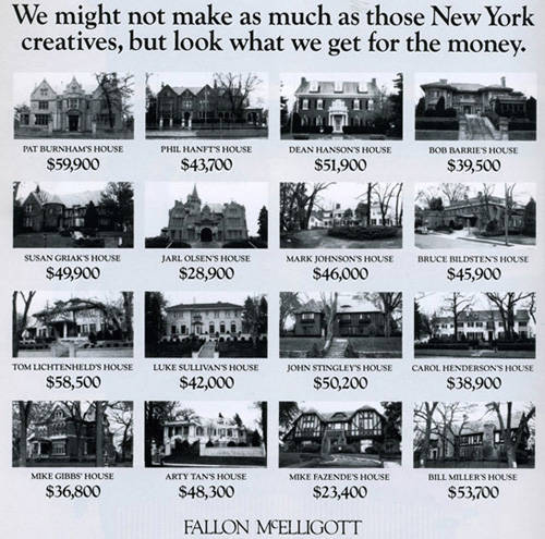
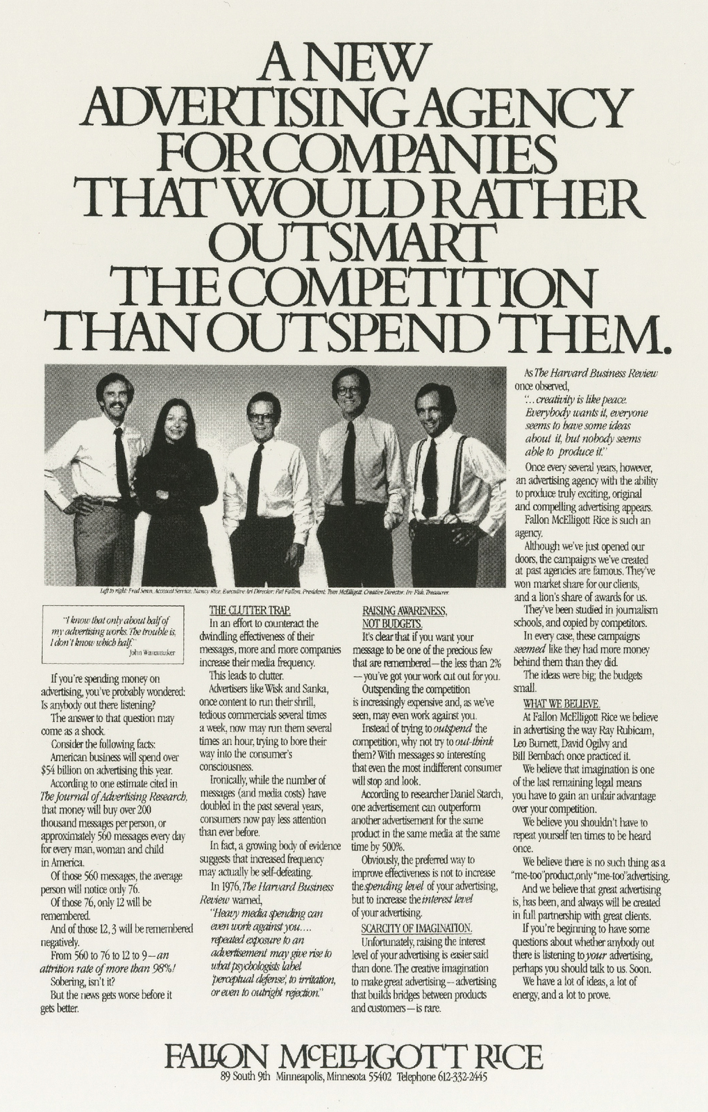
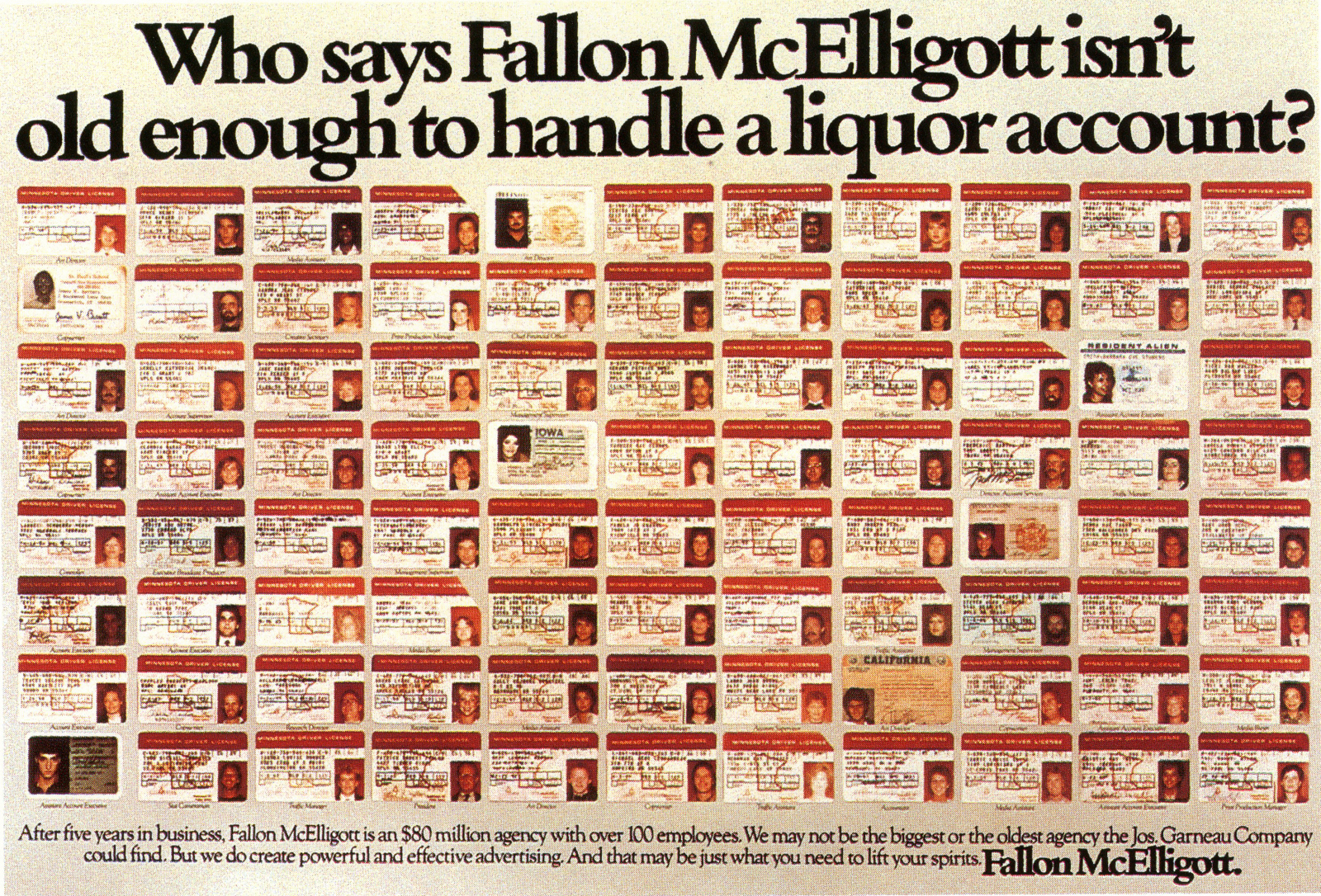
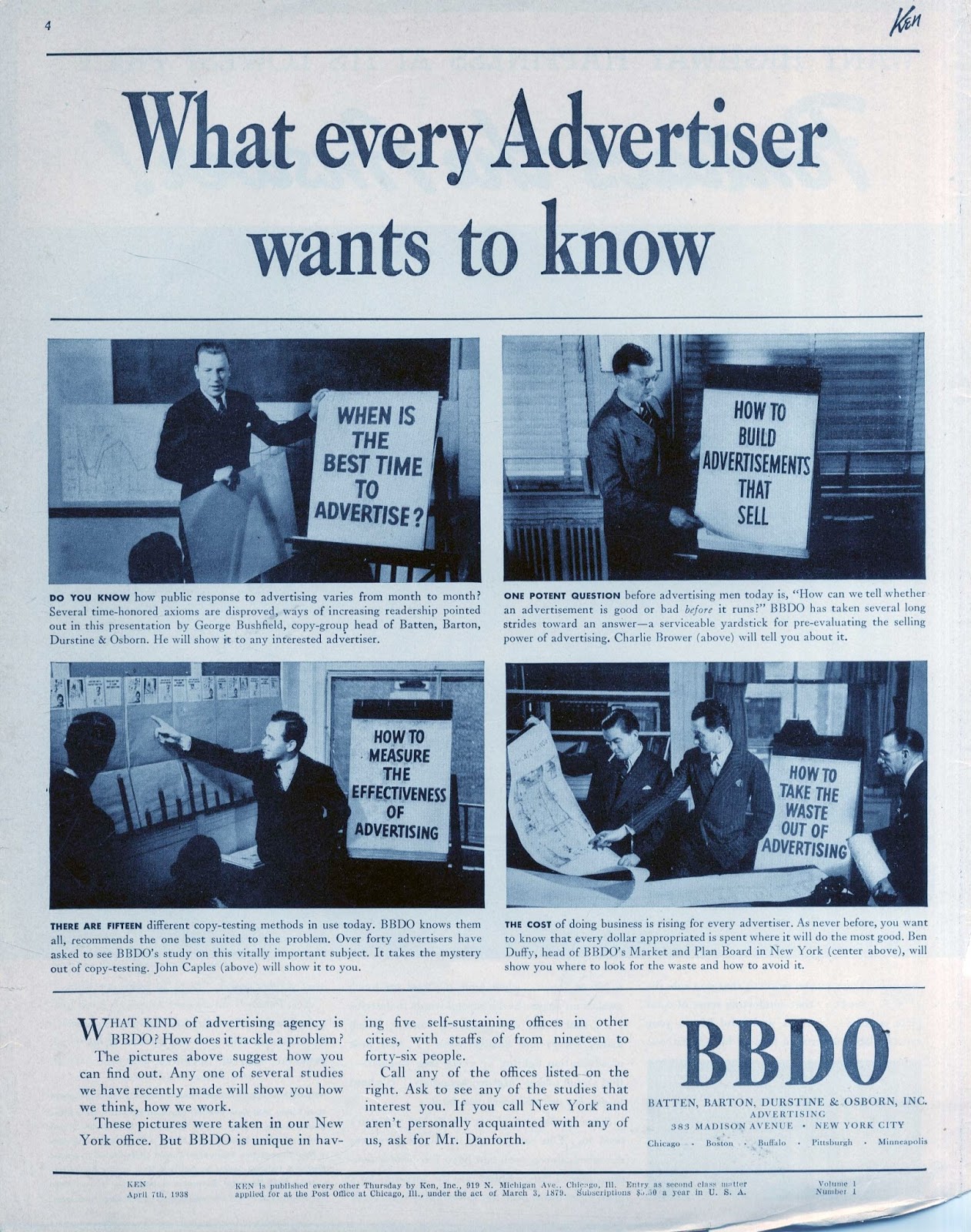
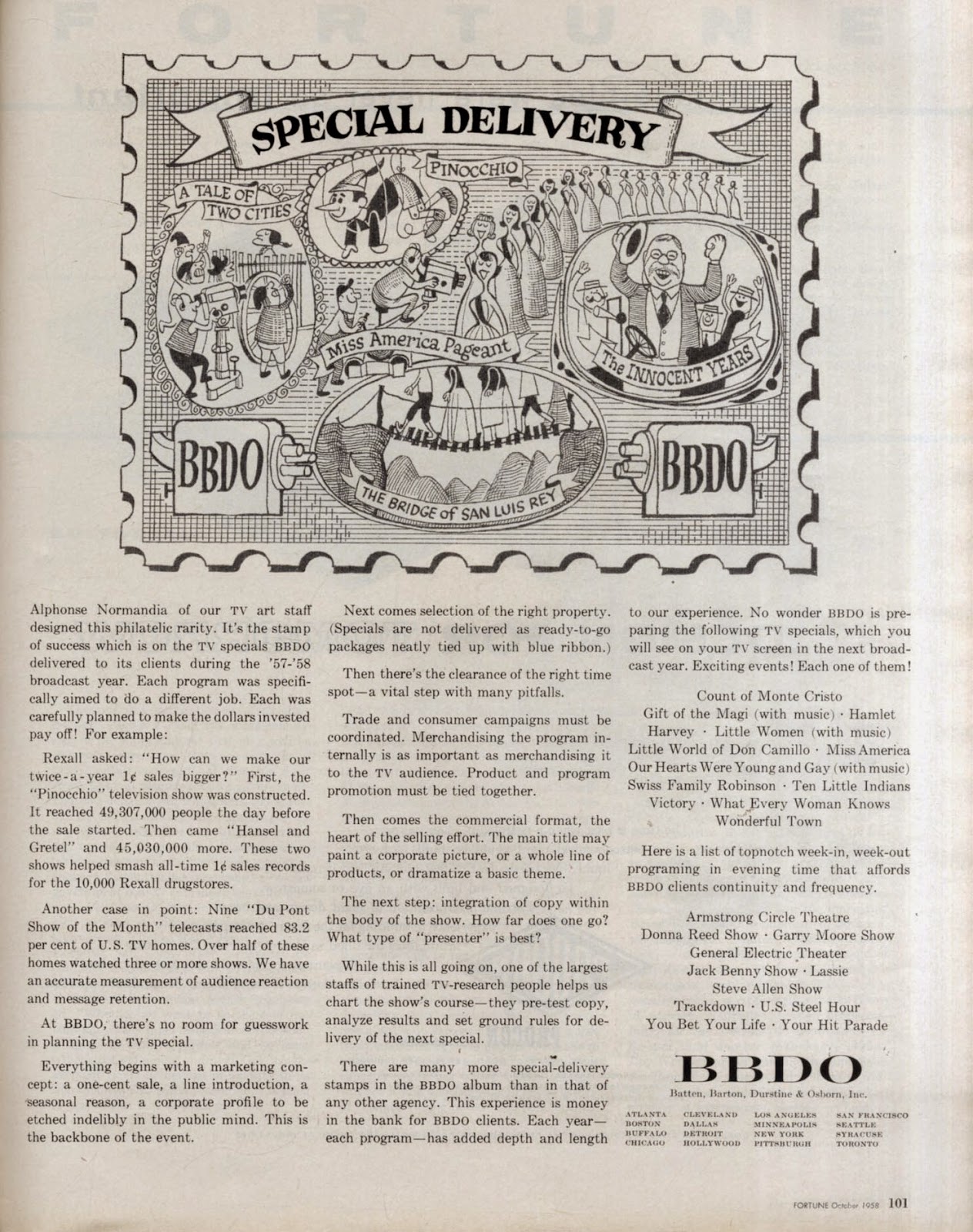
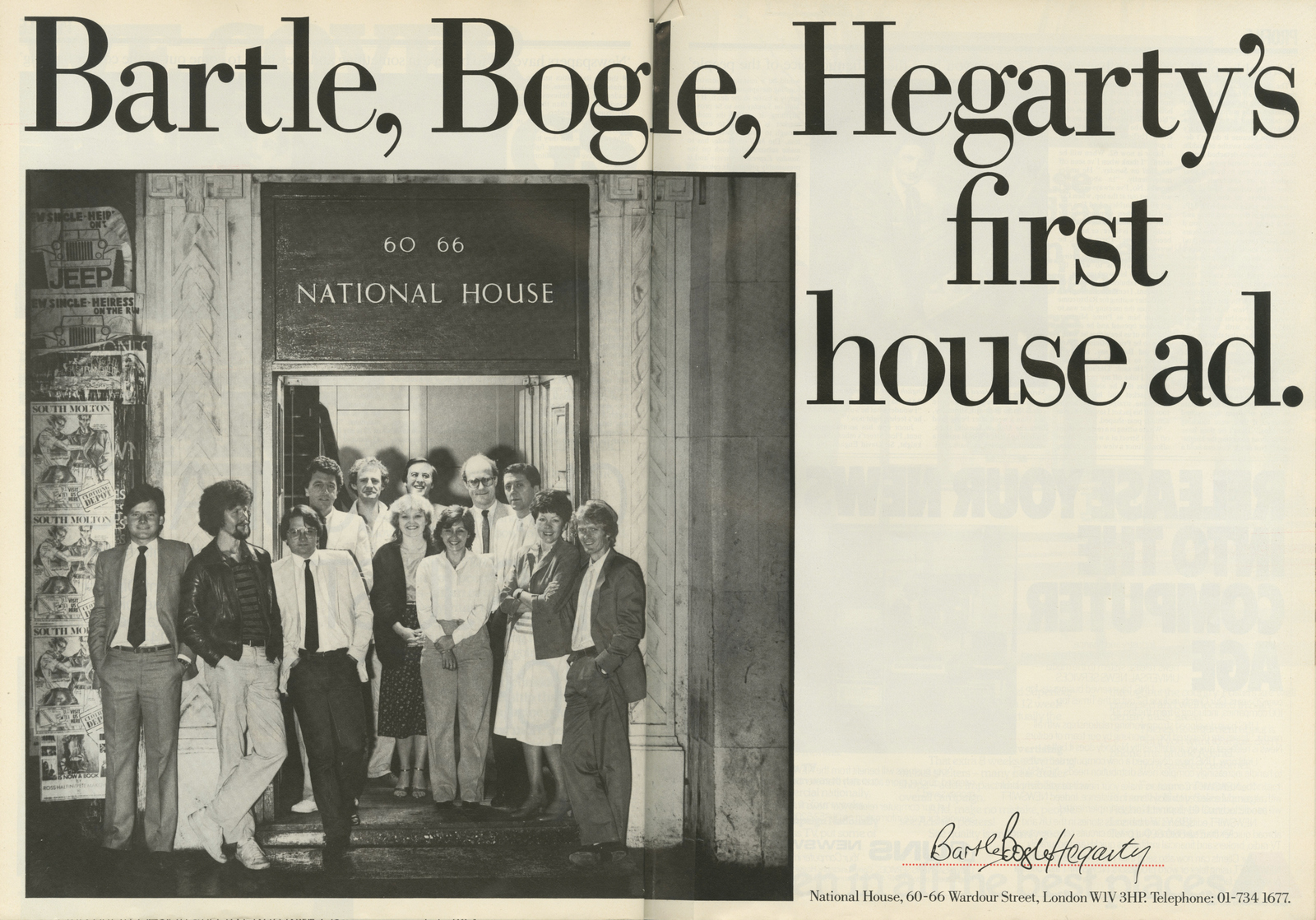
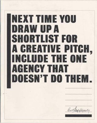
Here's how others agencies did it.Some great, like the DDB ads below, (the 'Account Man' one was written by David Abbott), some less great, like the Allen Brady Marsh ads way below.DDB.
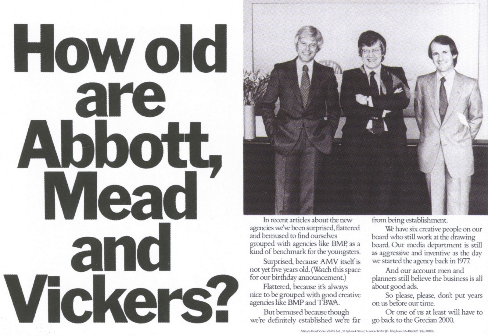
Abbott Mead Vickers.
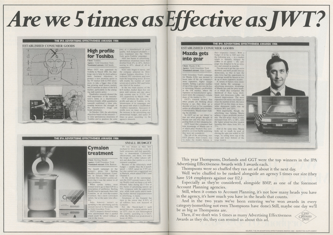
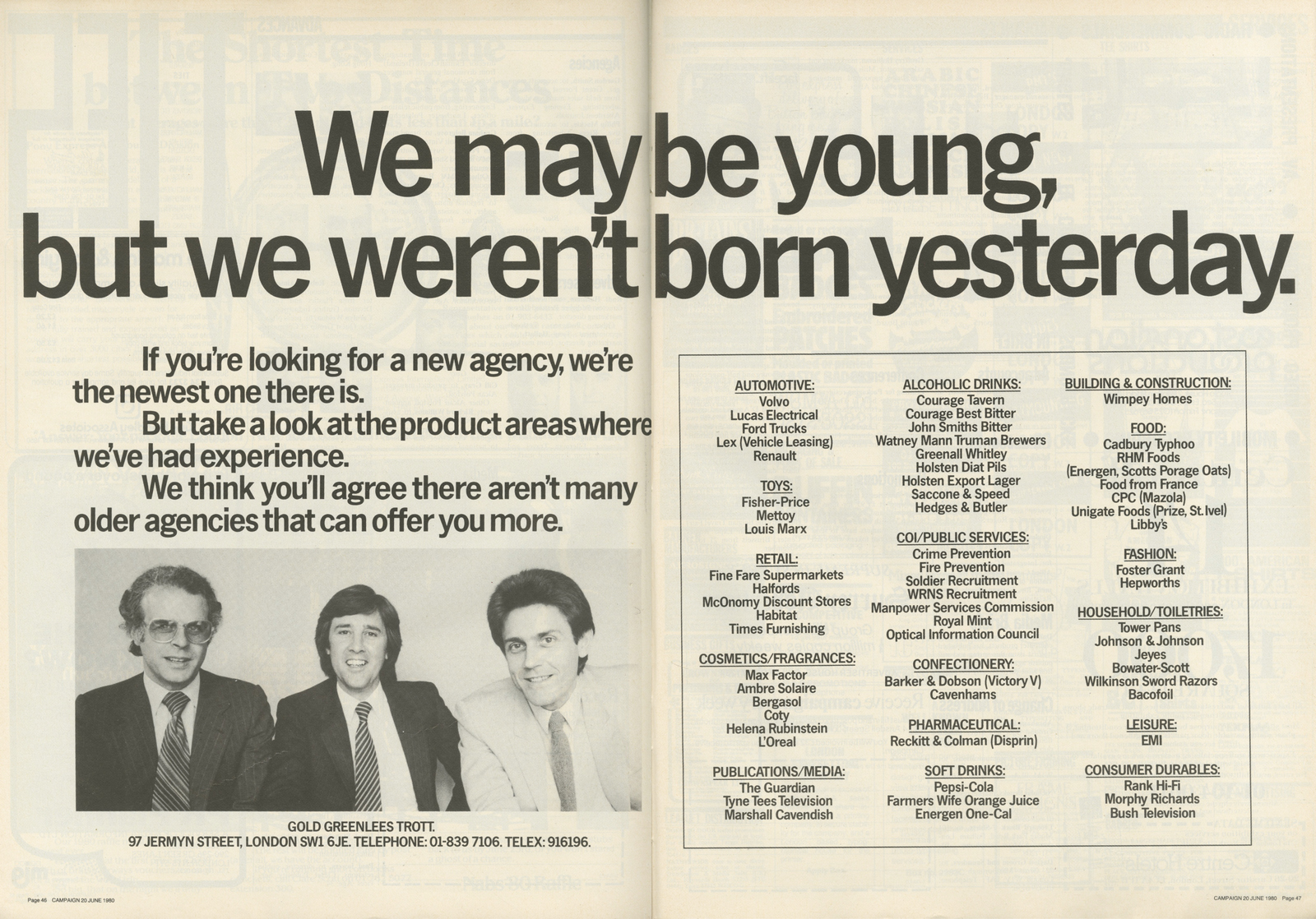
Gold Greenlees Trott.
Hedger Mitchell Stark.
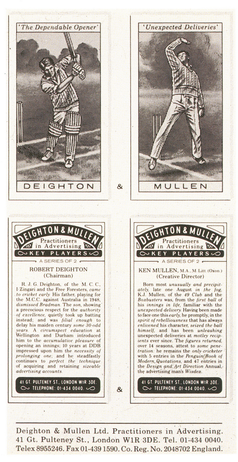
Deighton & Mullen.
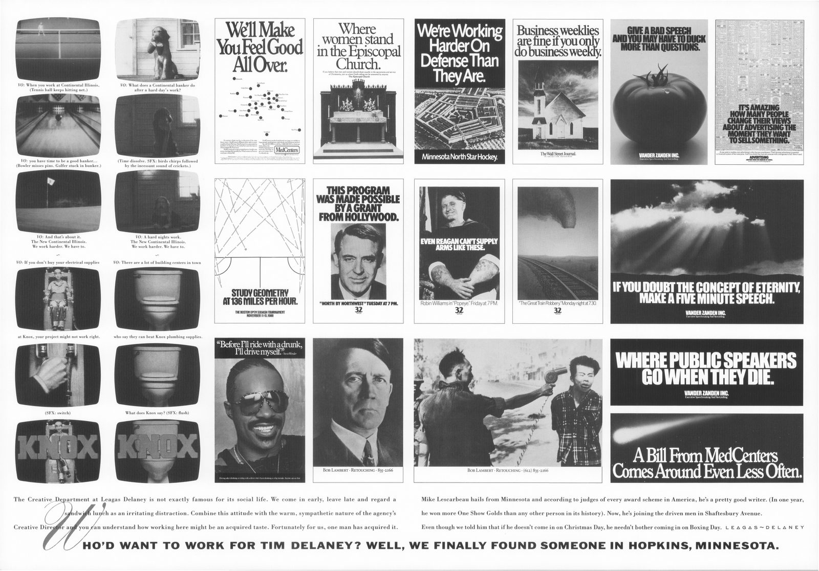
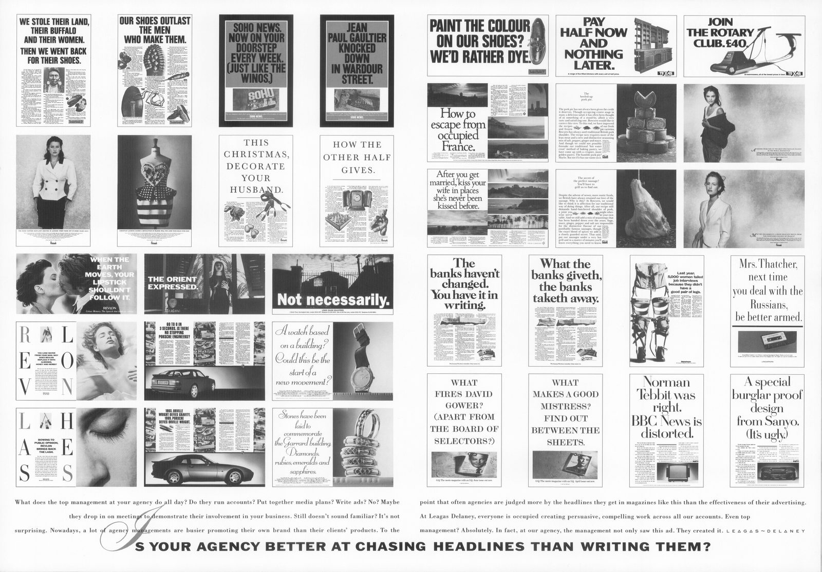
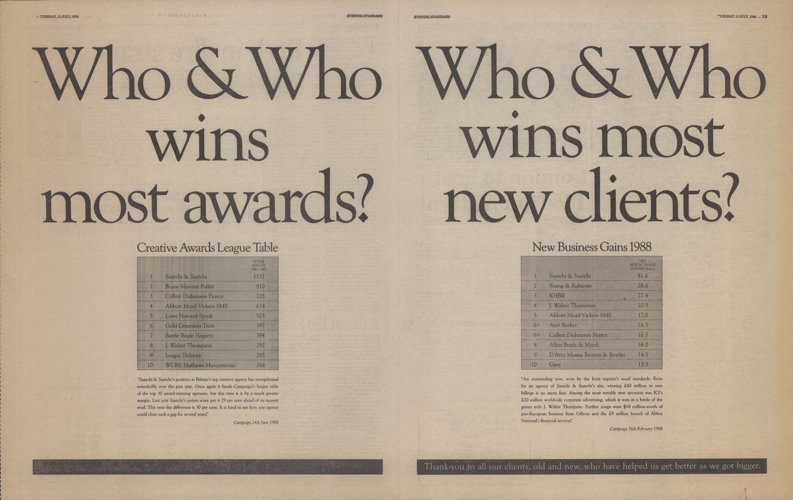
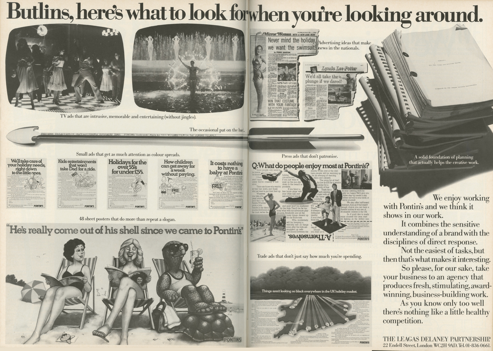
Leagas Delaney.
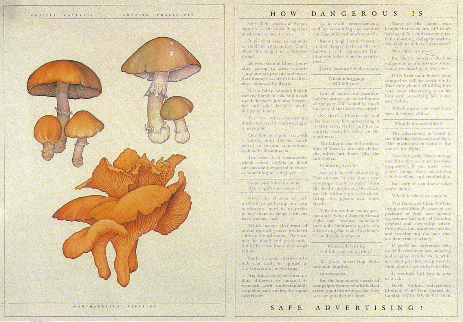
Davis Wilkins.
Fallon McElligott.
BBDO.
BBH.
Ogilvy & Mather.

Davidson Pearce.
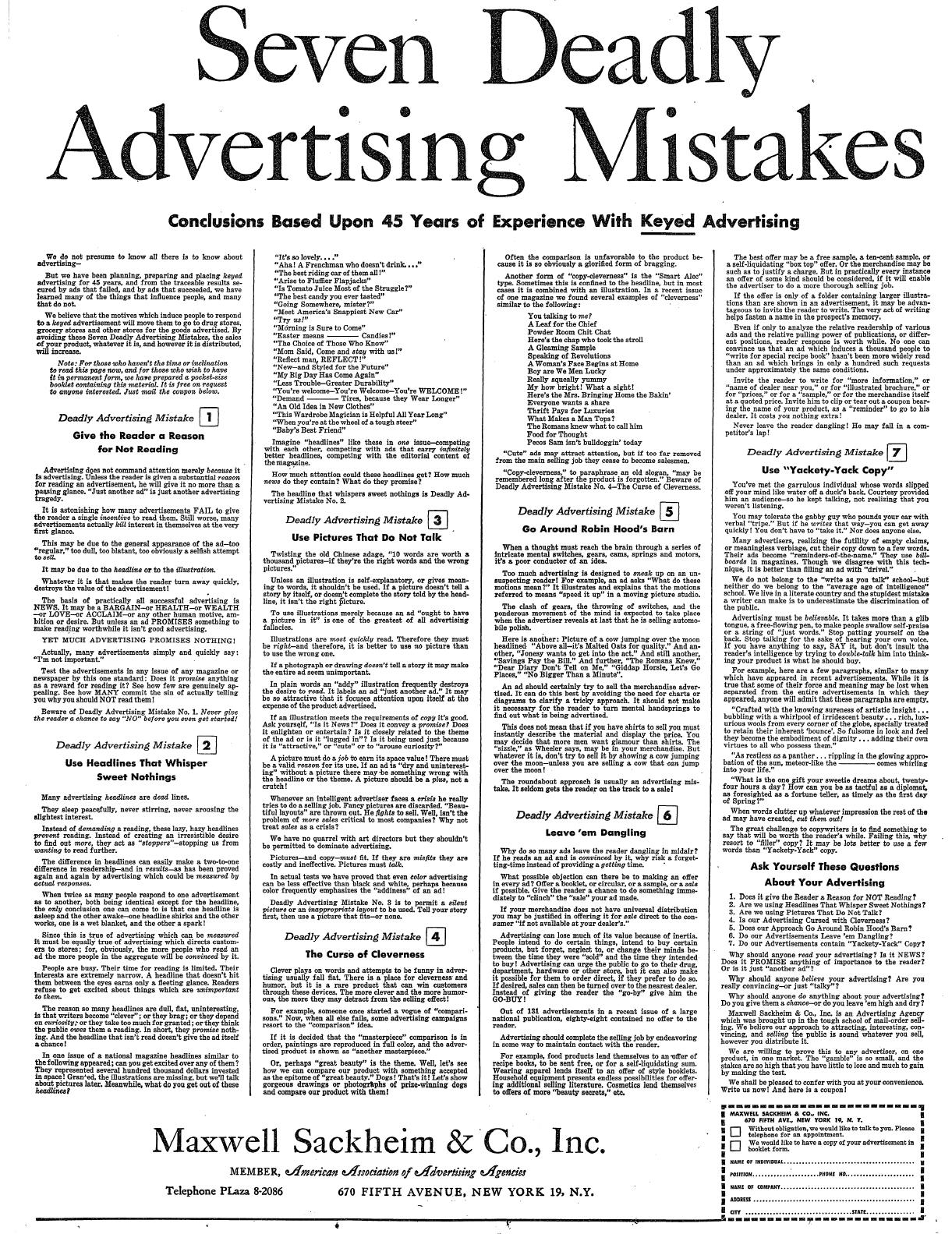
Maxwell Sackheim.
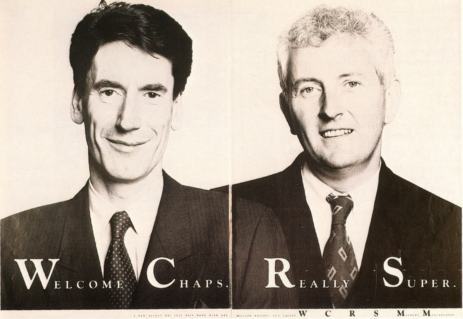
Wight Collins Rutherford Scott Matthews Marcantonio.
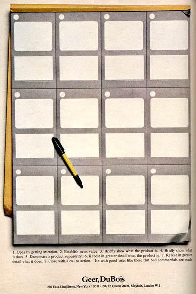
Geer Dubois.
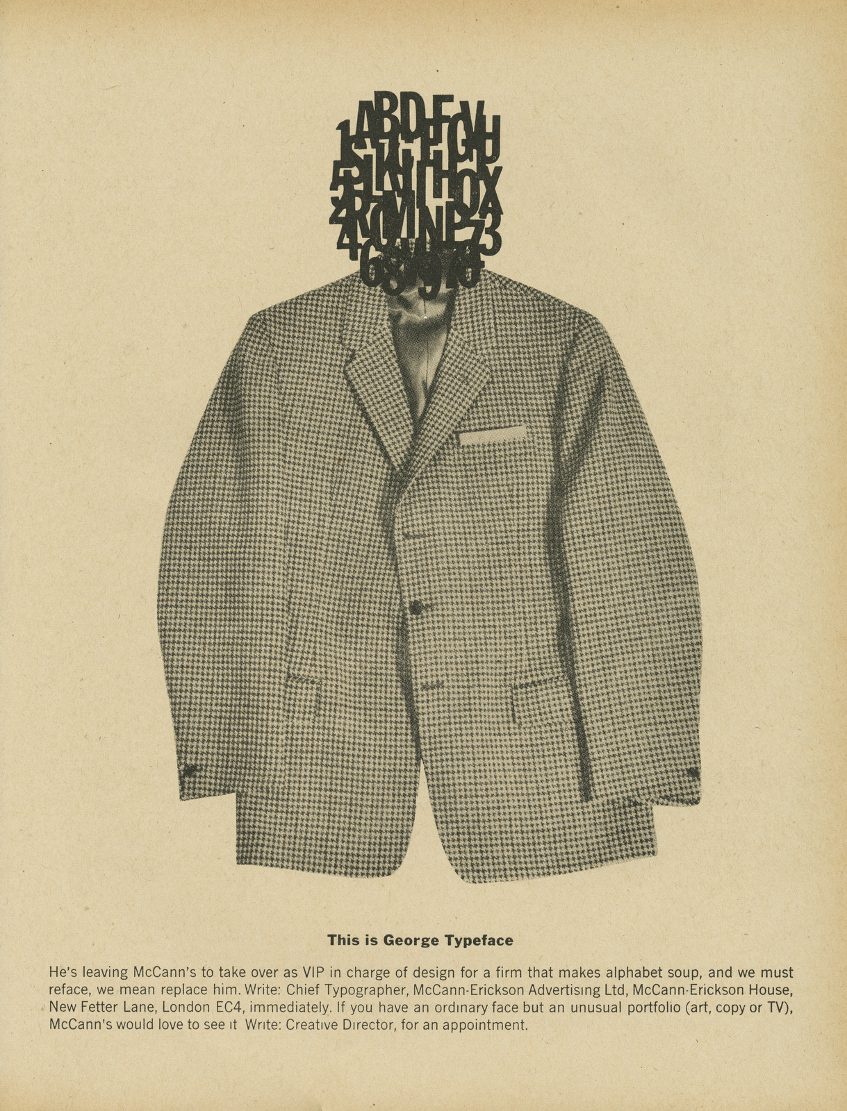
McCann-Erickson.
Love this one, presumably the idea is to say 'We're creative too! Honest!'.So they do the least creative ad known to man.
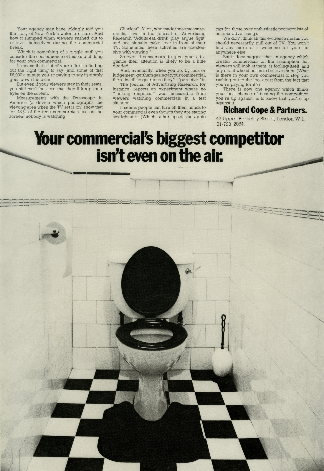
Richard Cope & Partners.
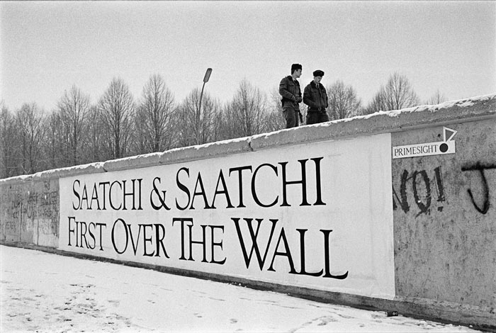
Saatchi & Saatchi.
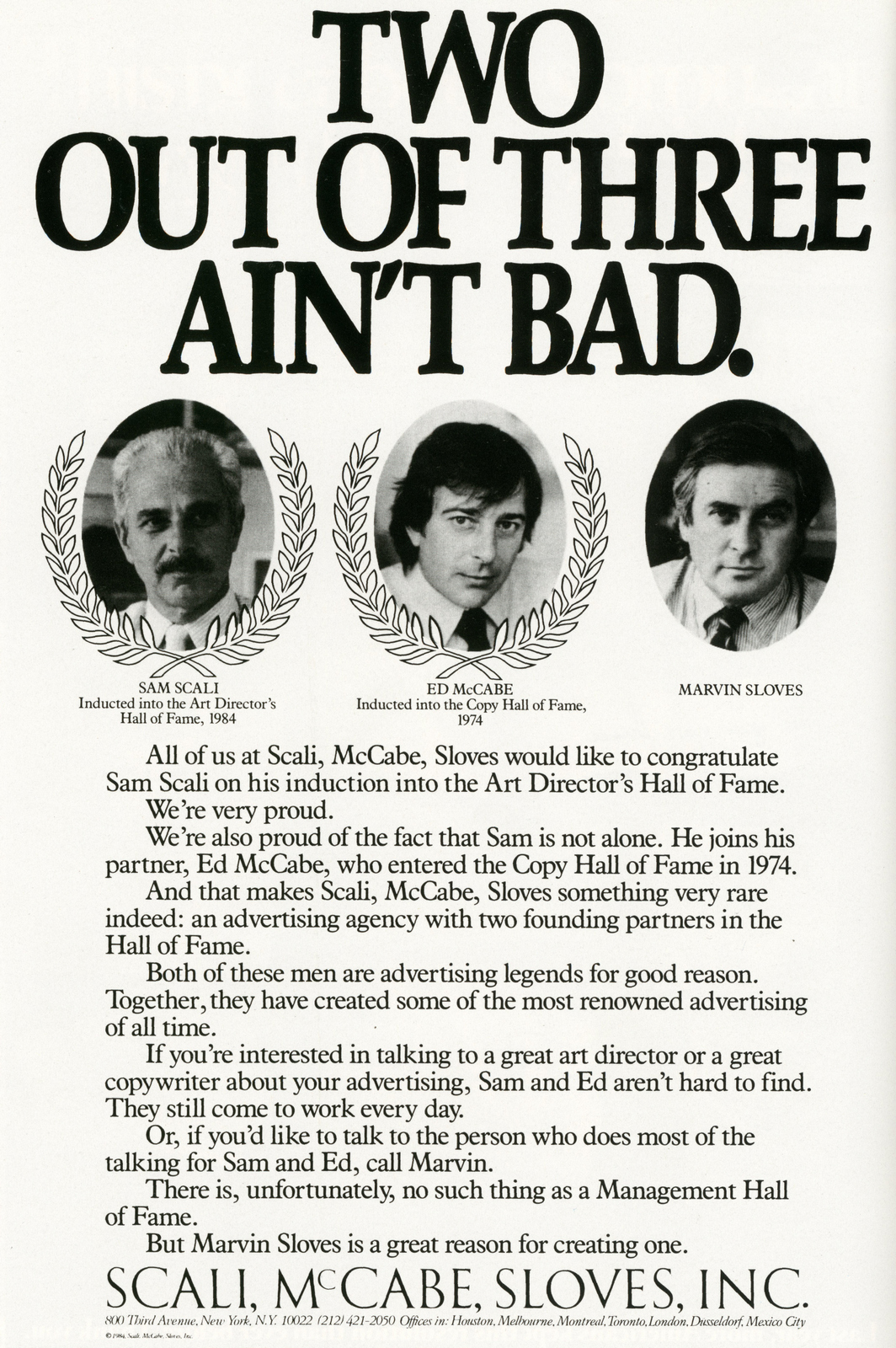
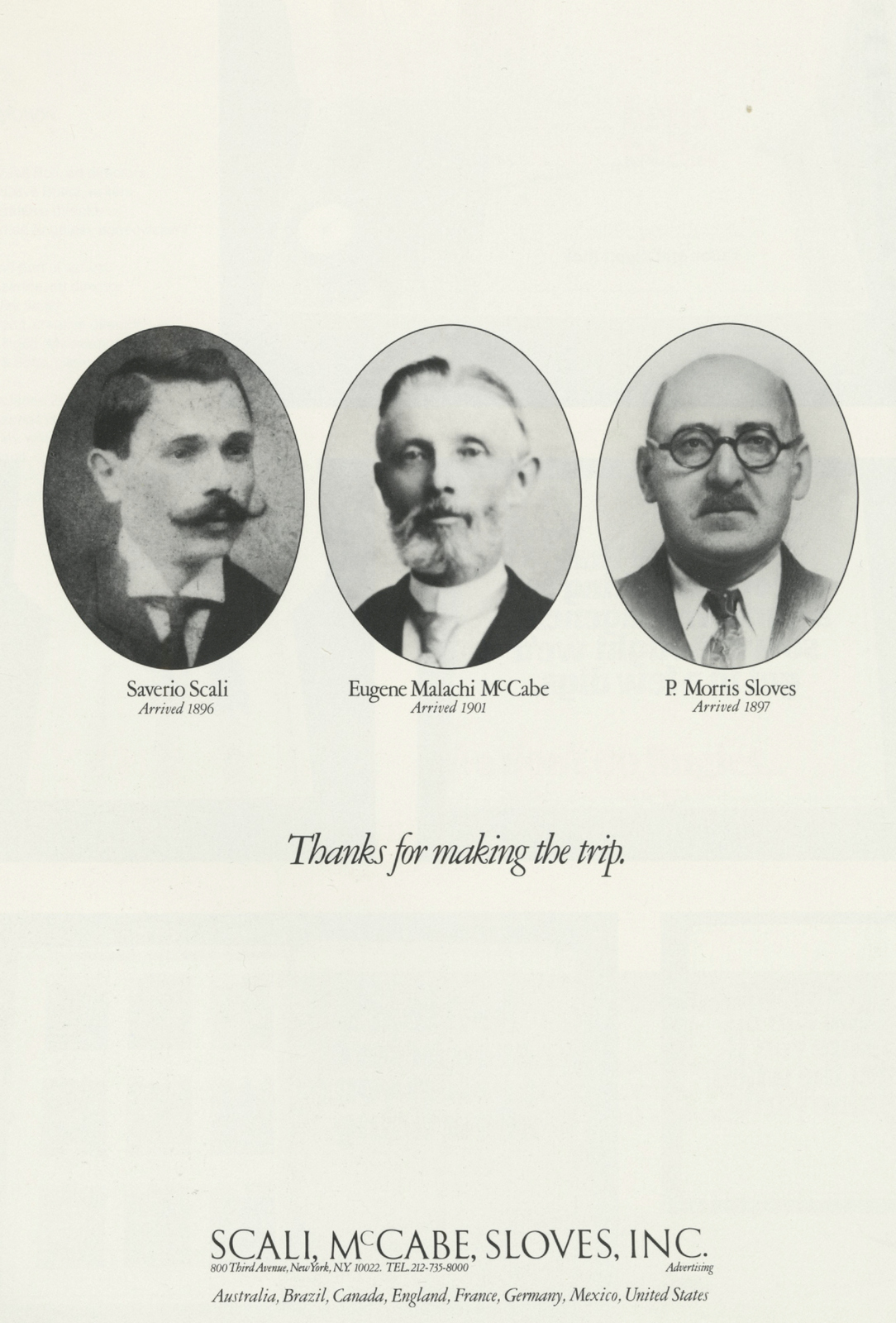
Scali, McCabe, Sloves.
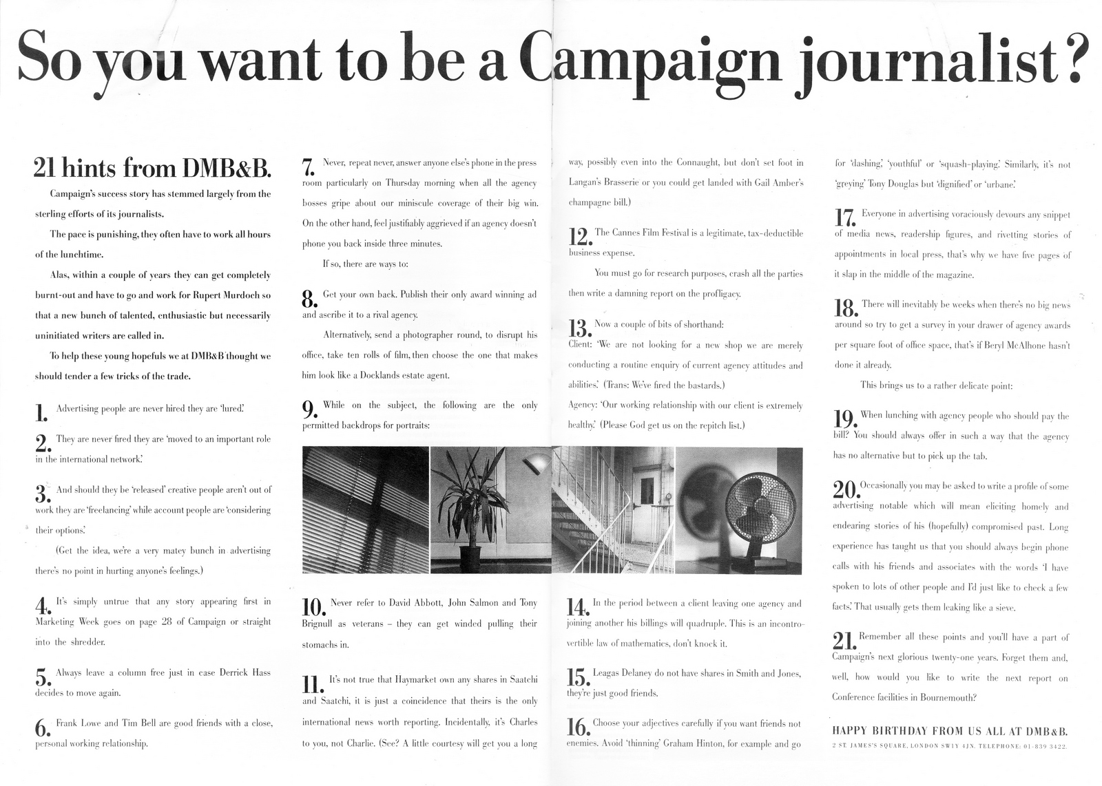
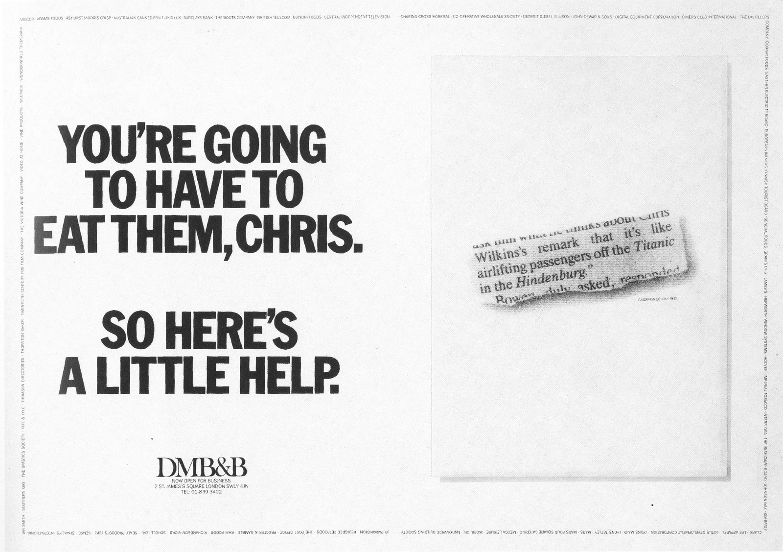
DMB&B.
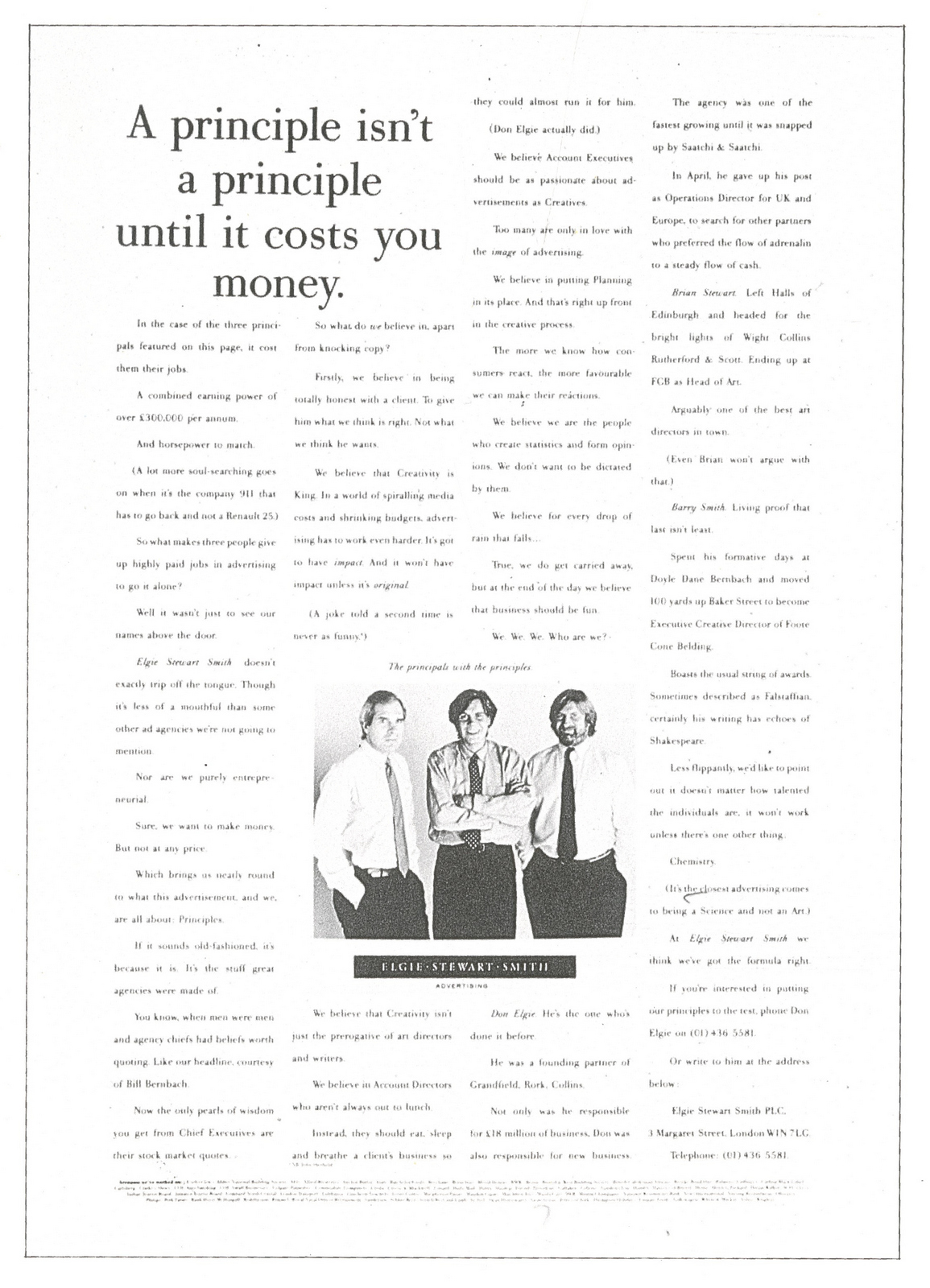
Elgie Stewart Smith.
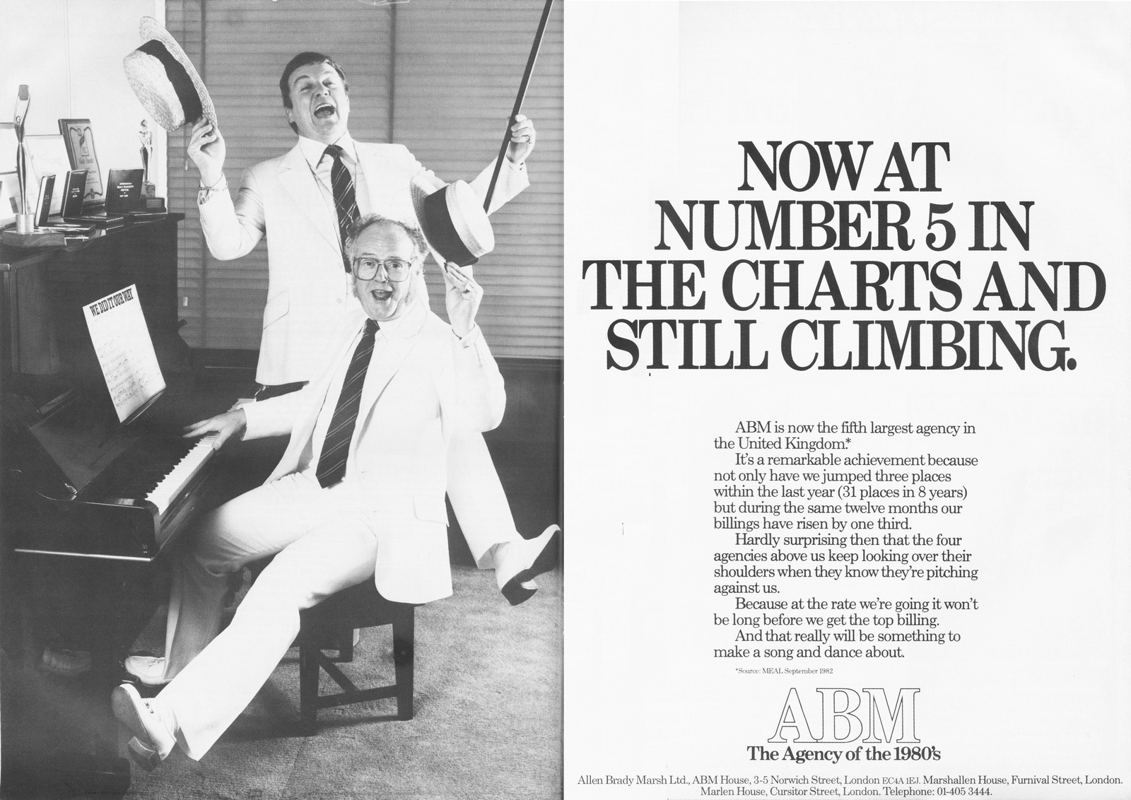
Allen Brady Marsh.
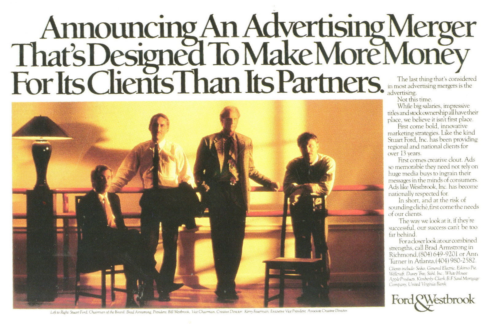
Ford & Westbrook.
Lintas.
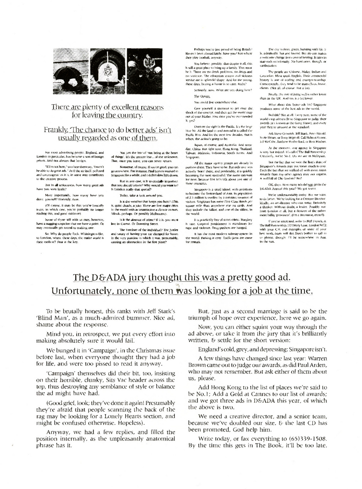
Ball Partnership.
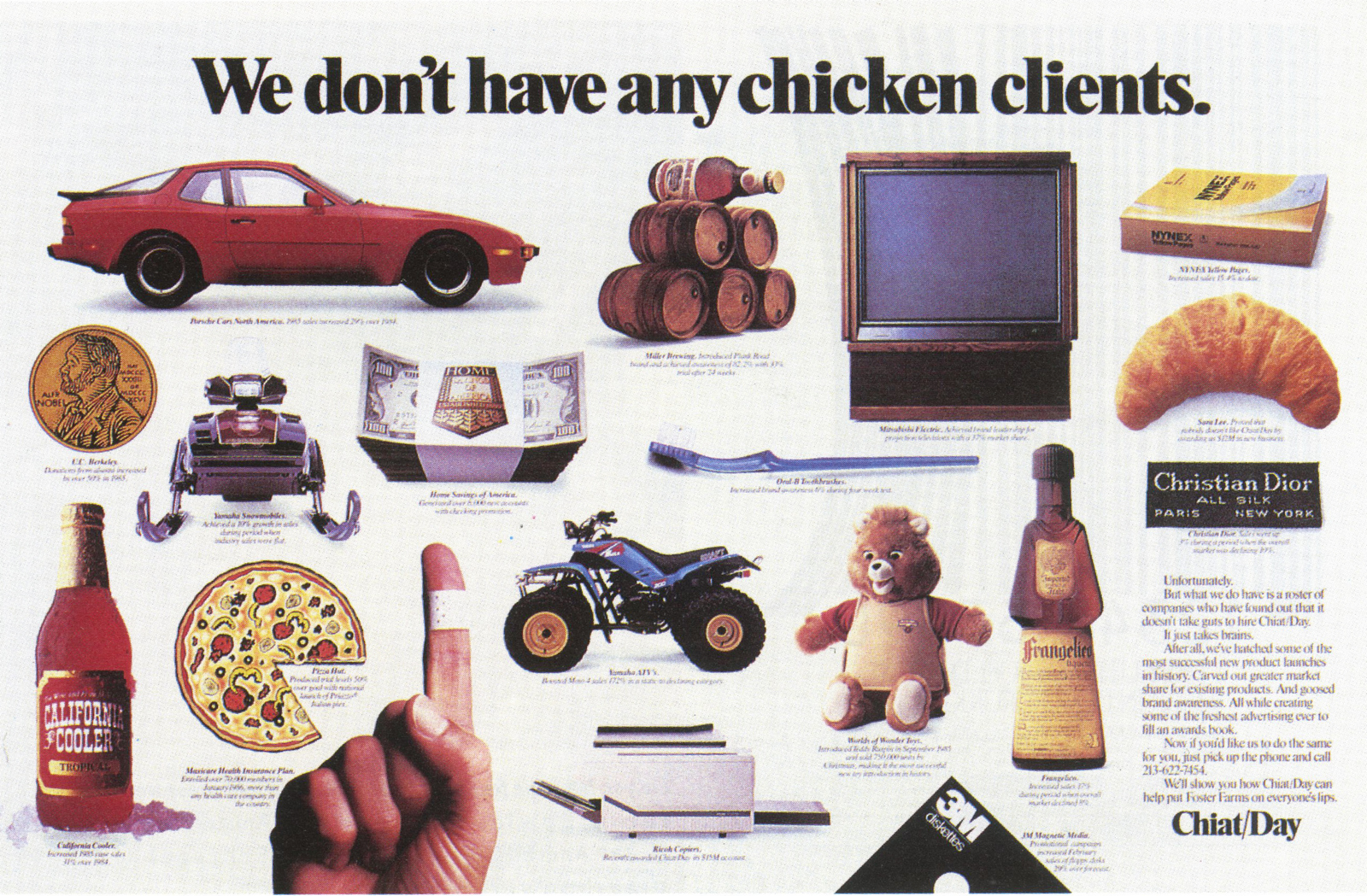
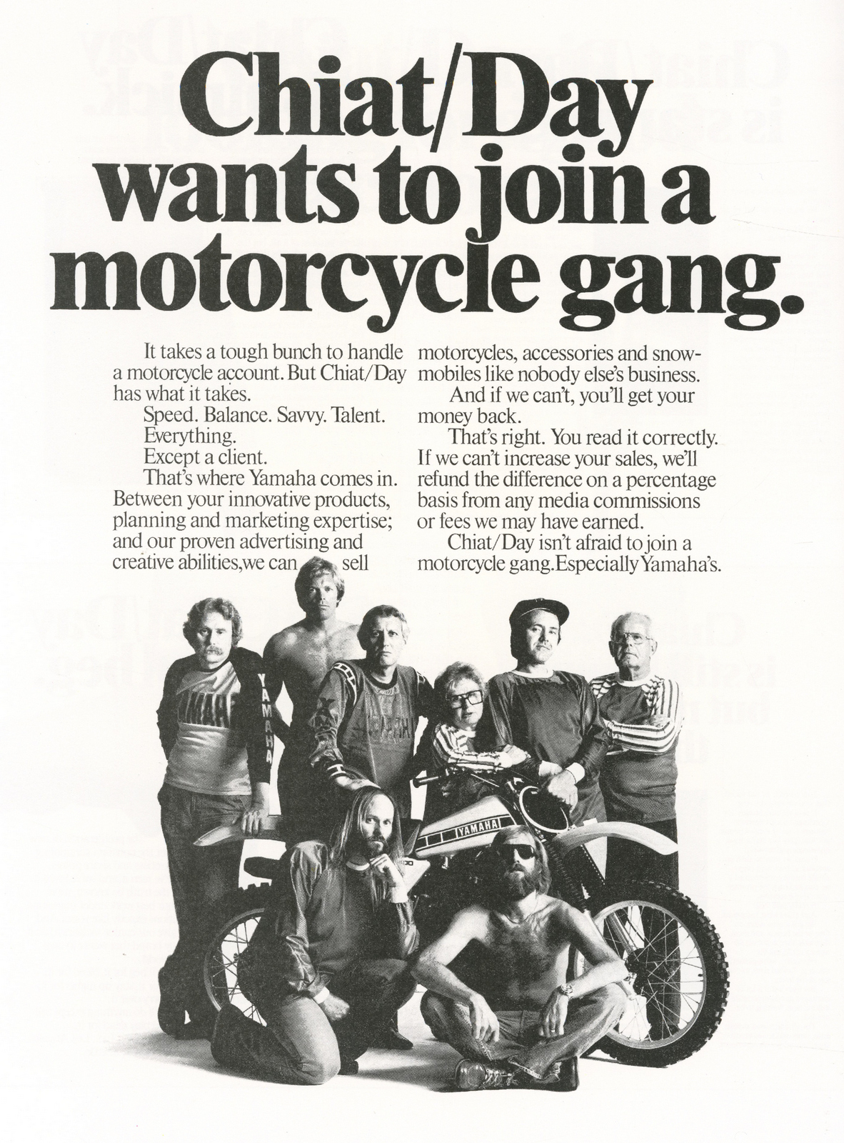
Chiat/Day.
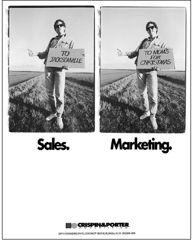
Crispin Porter.
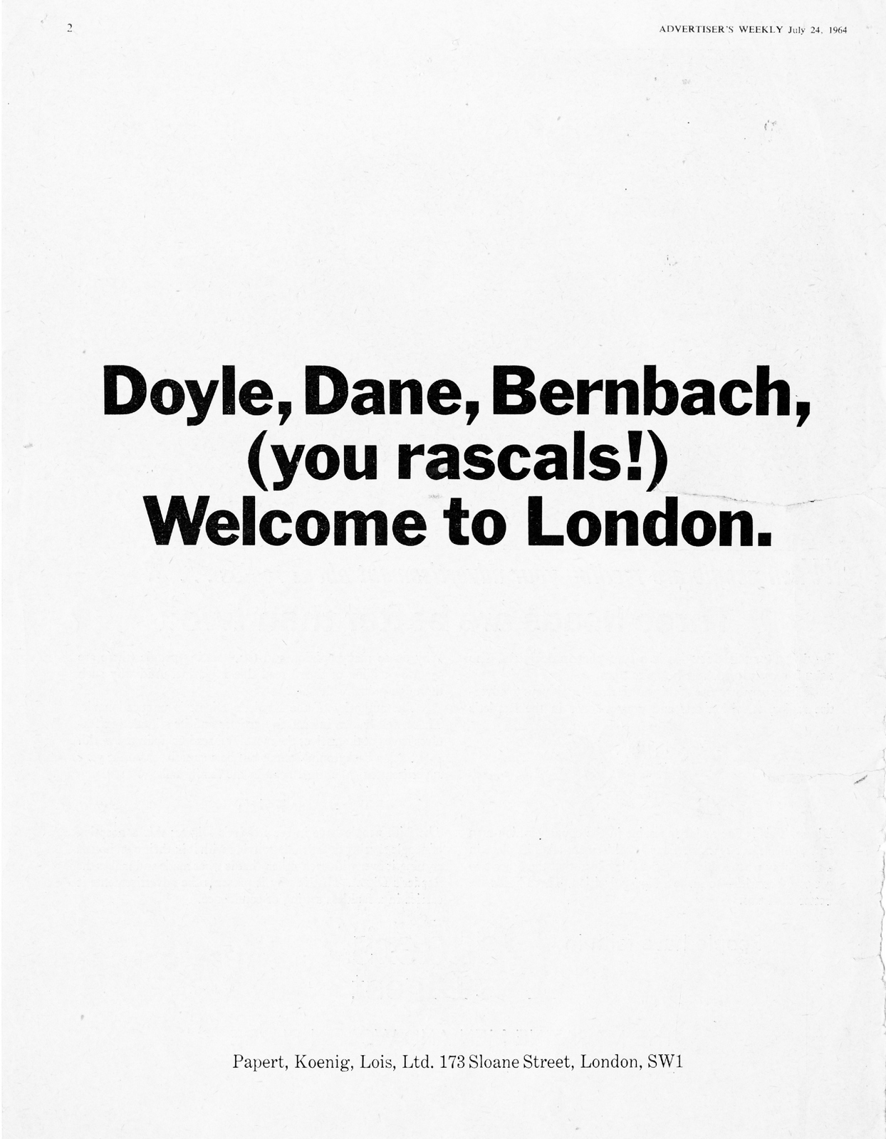
Papert Koenig Lois.
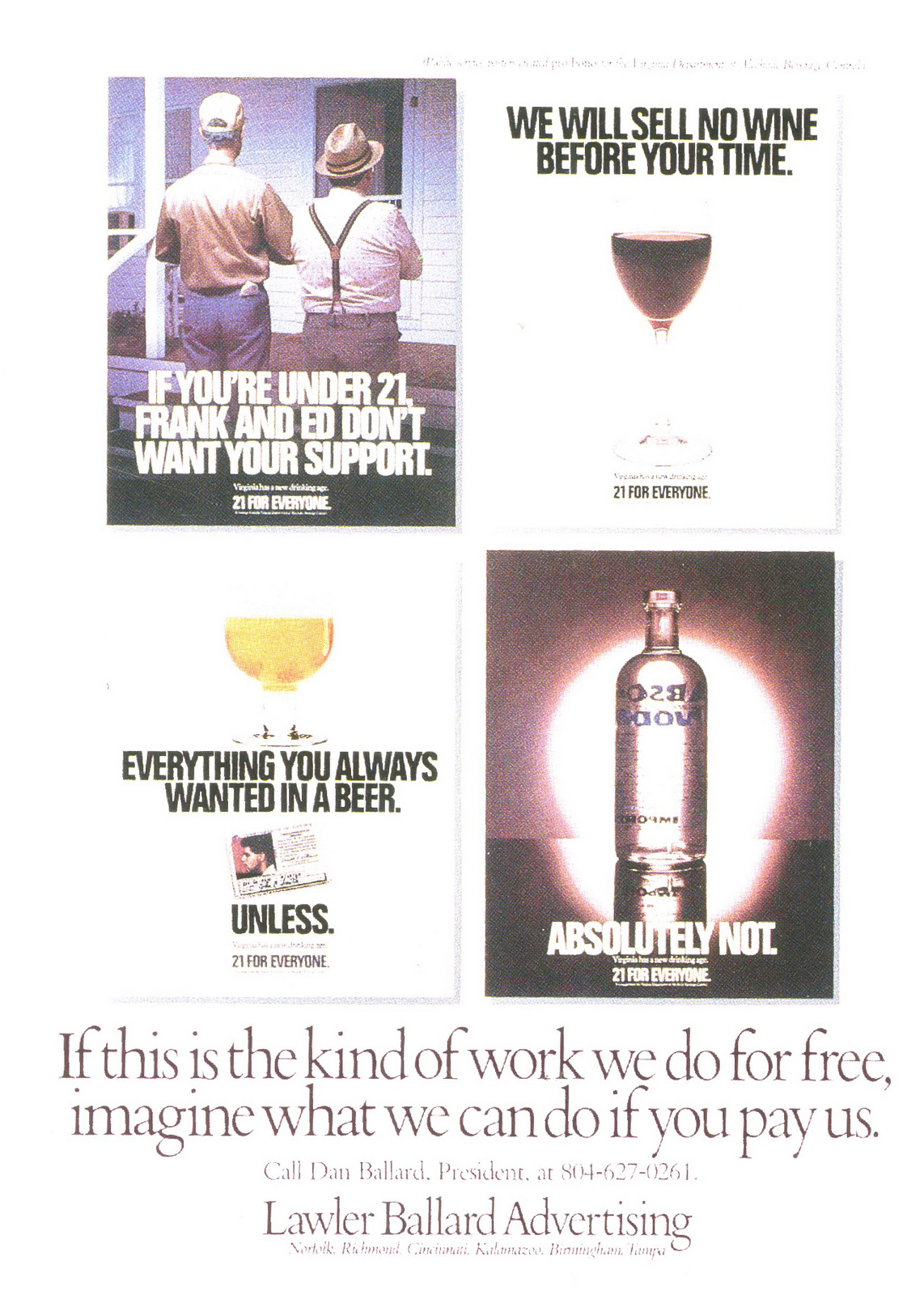
Lawler Ballard.
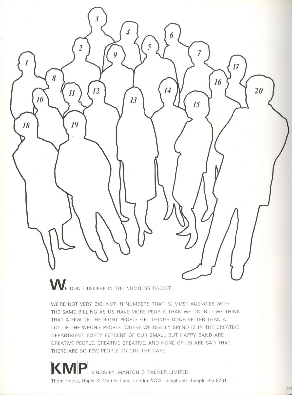
KMP.
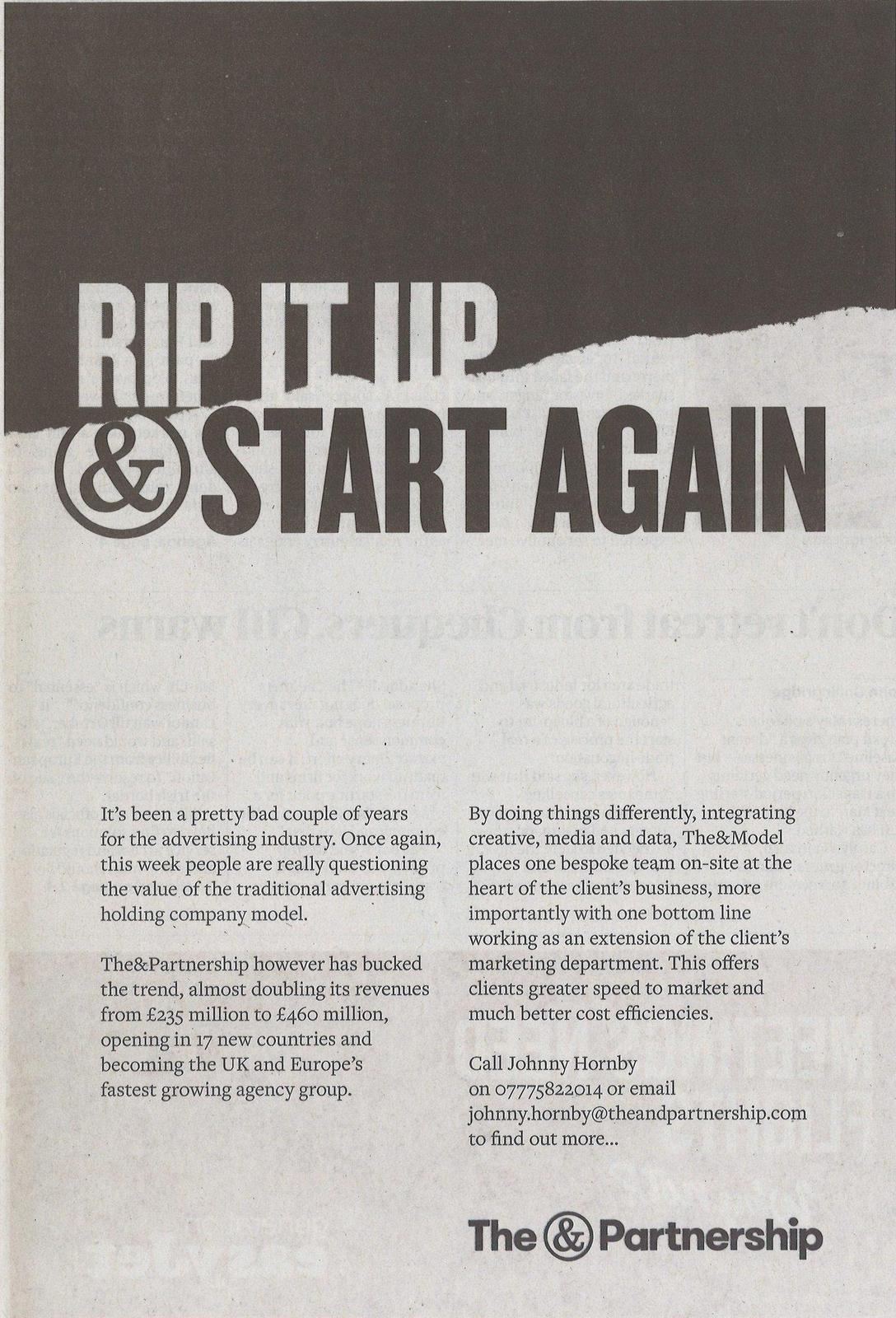
The & Partnership.
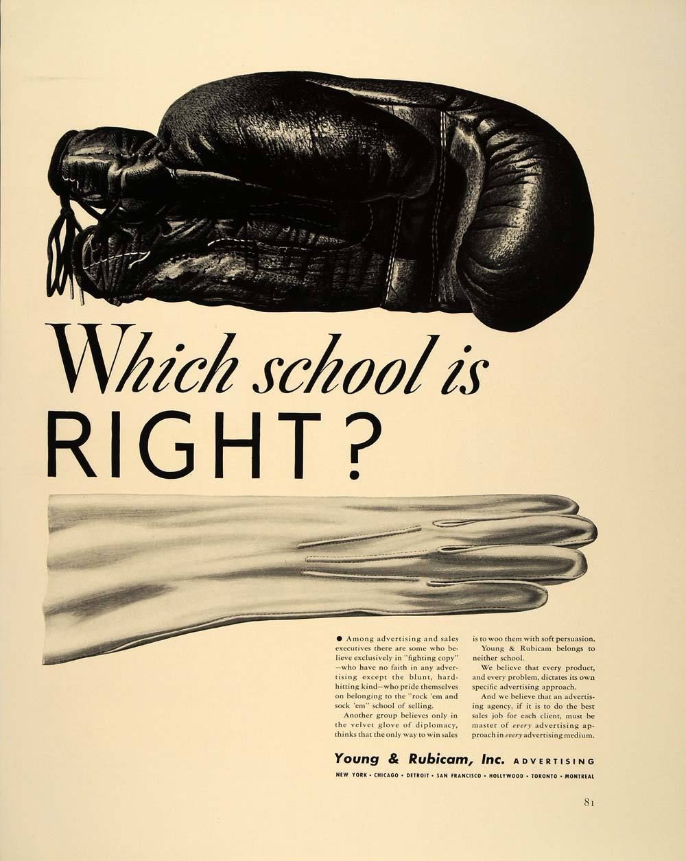
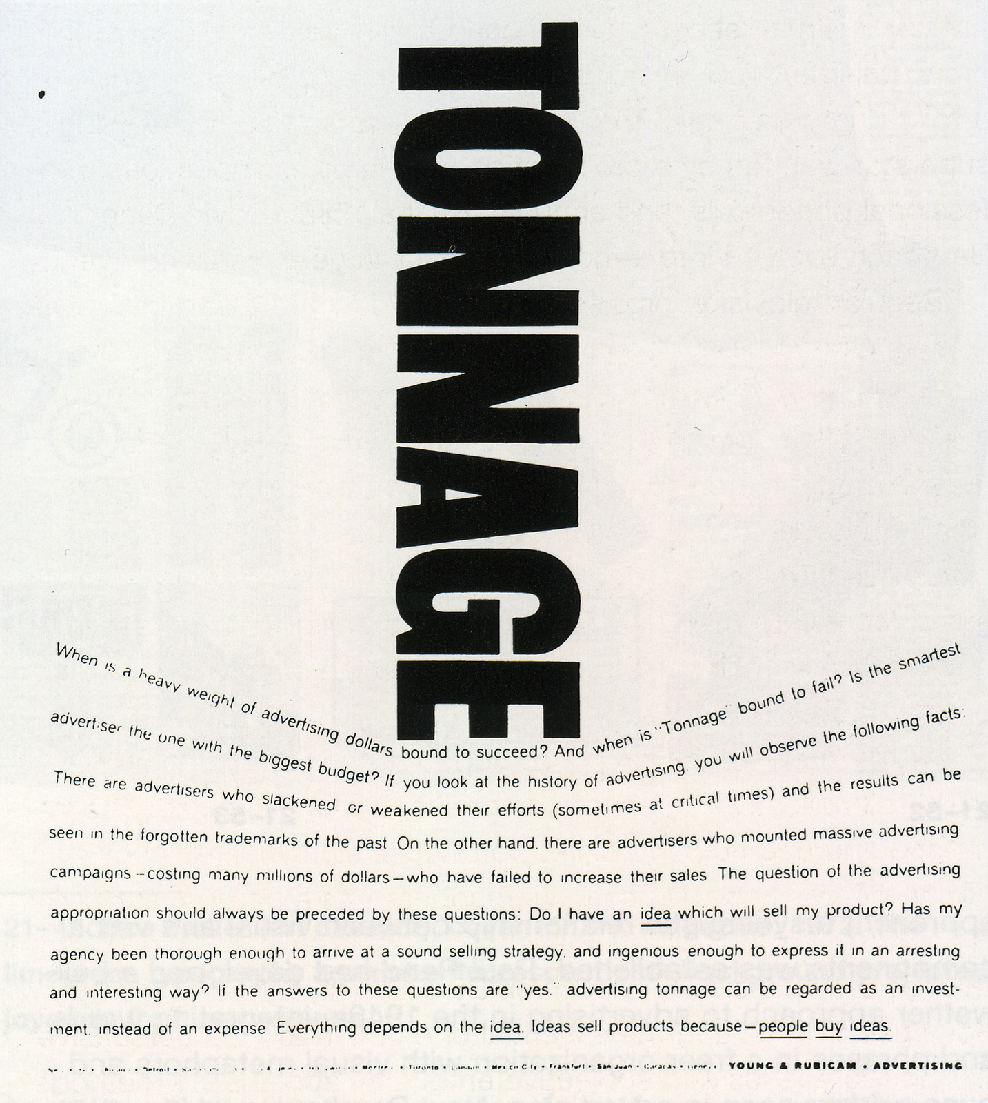
Y&R.
Leo Burnett.
Campbell Ewald.
J. Walter Thompson.
‘Chris is one of the few very, very bright people around.’
– CHARLES SAATCHI.
‘On his day he’s a much better writer than I am.’
– DAVE TROTT.
‘He is intelligent, witty and versatile and I’d say he’s probably one of the best three copywriters in the country.’
– JOHN WEBSTER.
‘He’s just done a podcast with me!’
– DAVE DYE
[INSERT AUDIO PLAYER]

J. WALTER THOMPSON.
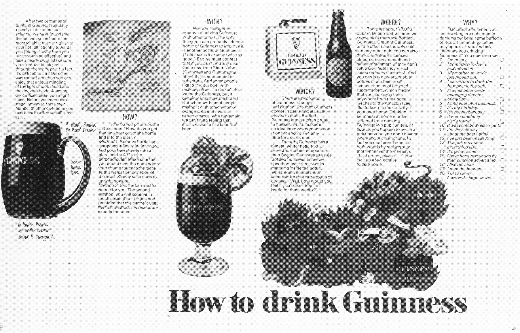
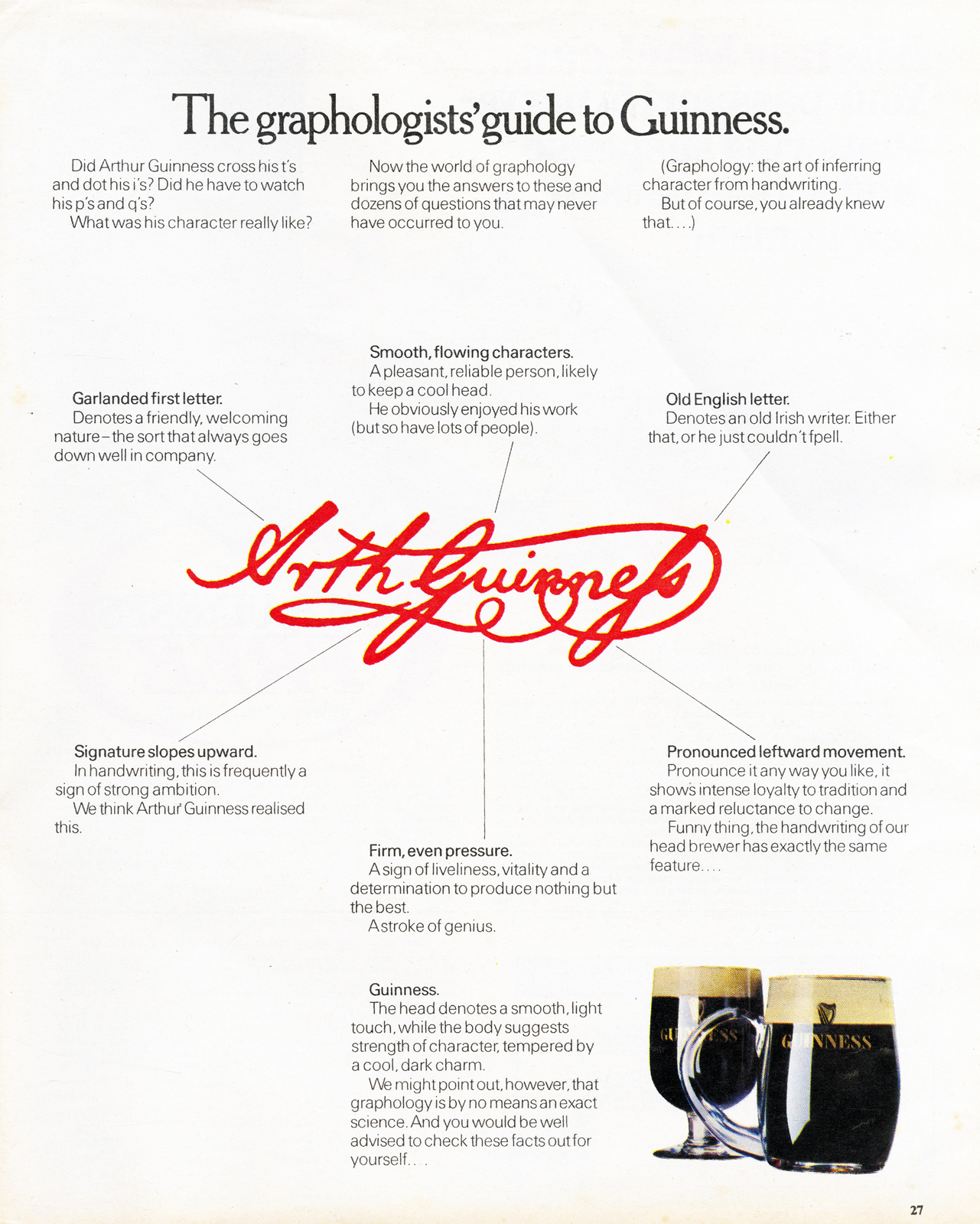
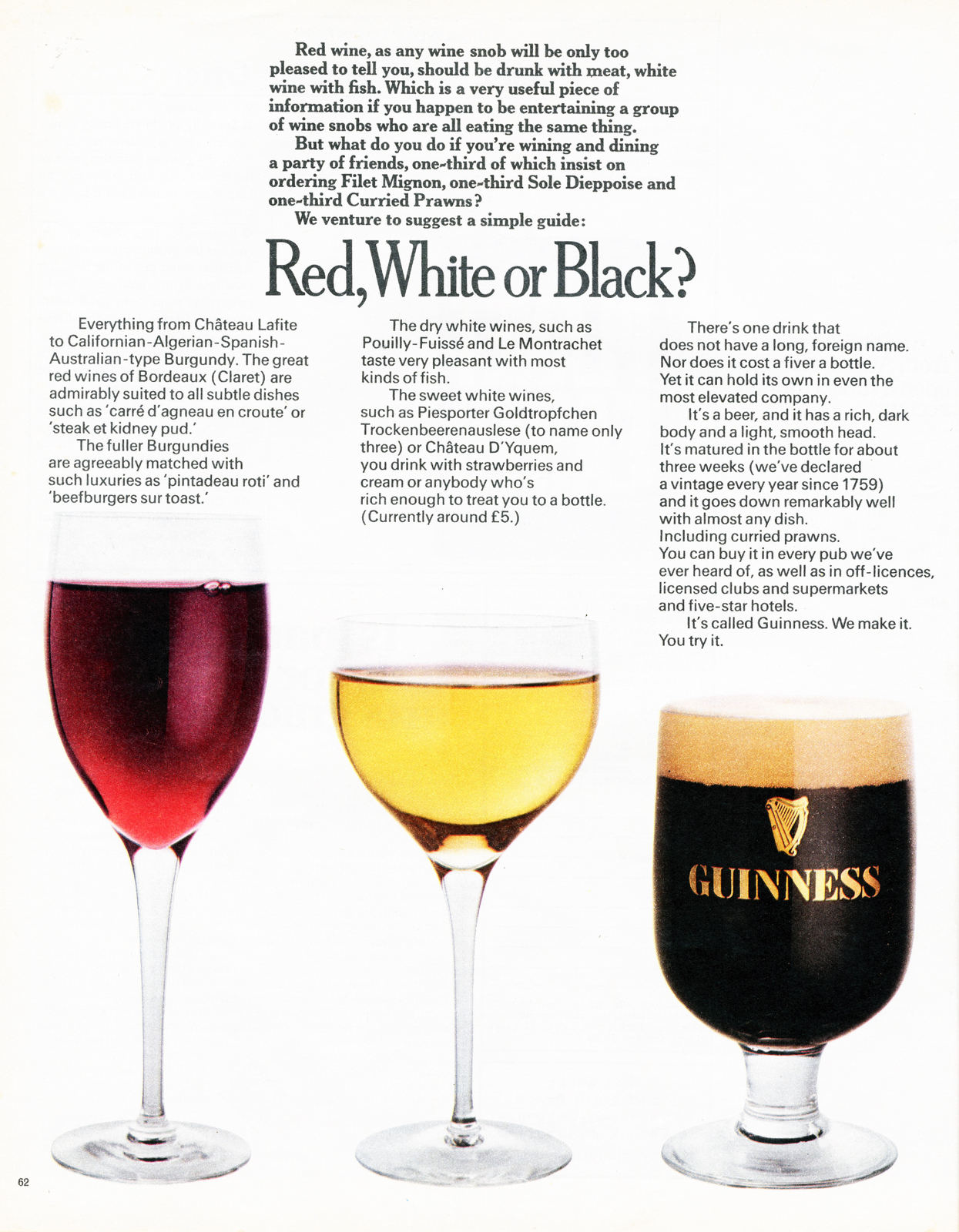
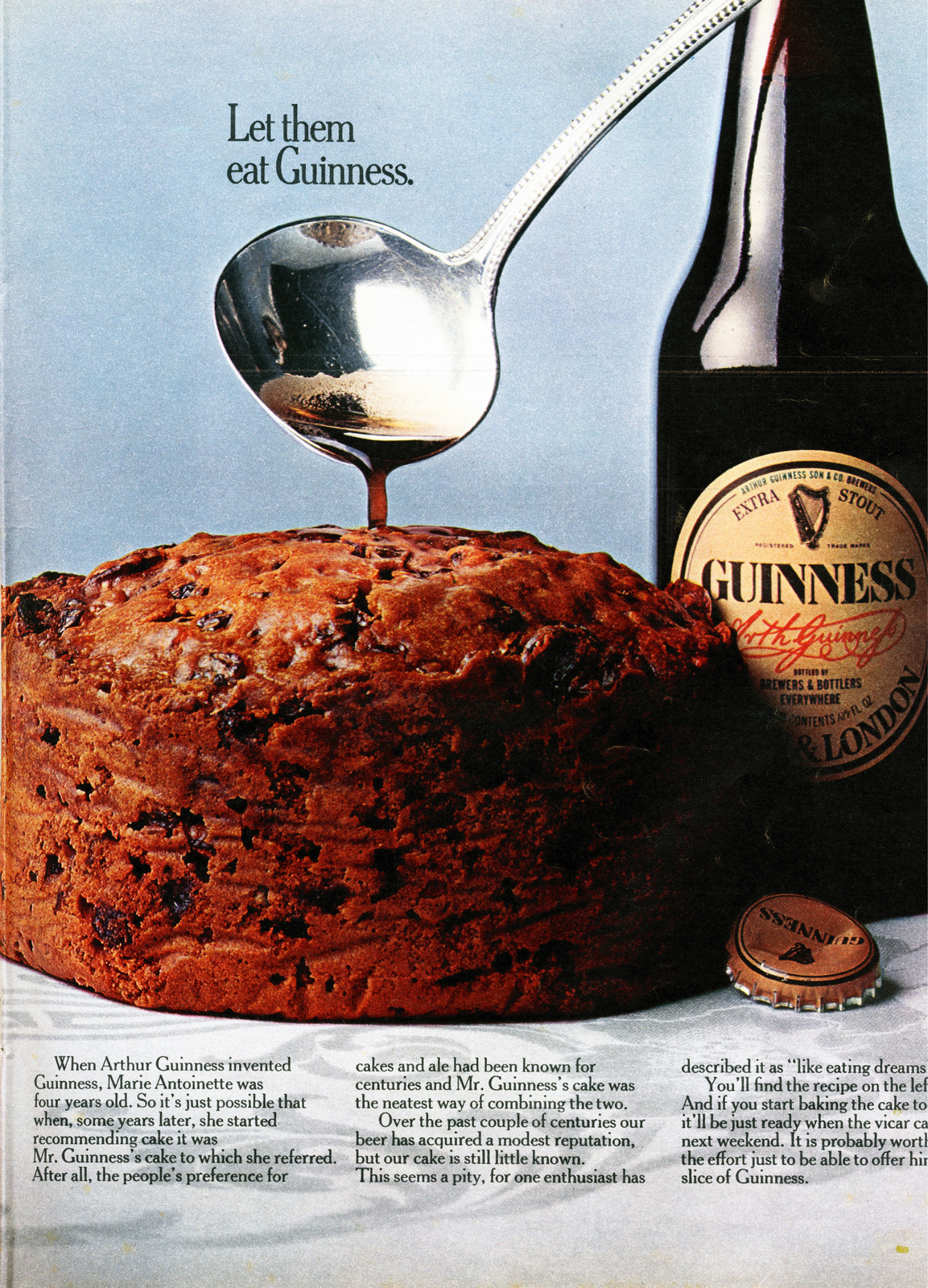
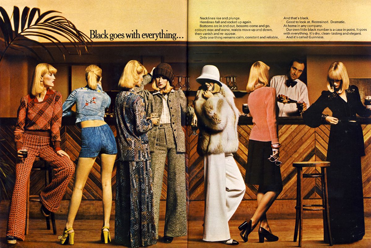
Guinness.
.jpg)
-min.jpg)


BOASE MASSIMI POLLITT.
Bambi Nappies.

Pepsi.

The Labour Party.

Cresta.


Cadbury’s Smash.
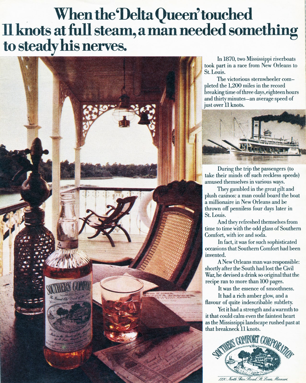
Southern Comfort.


SAATCHI & SAATCHI.
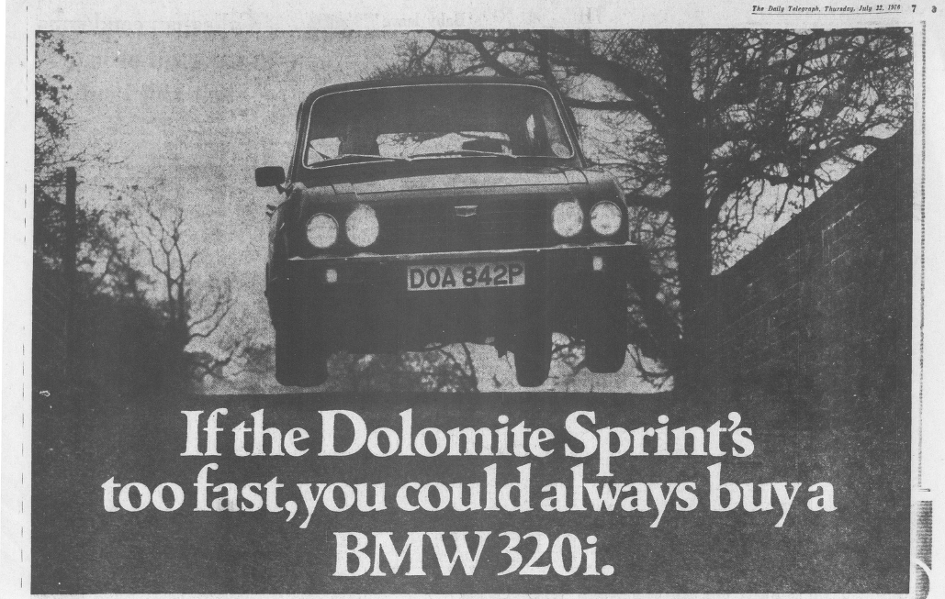
Triumph.
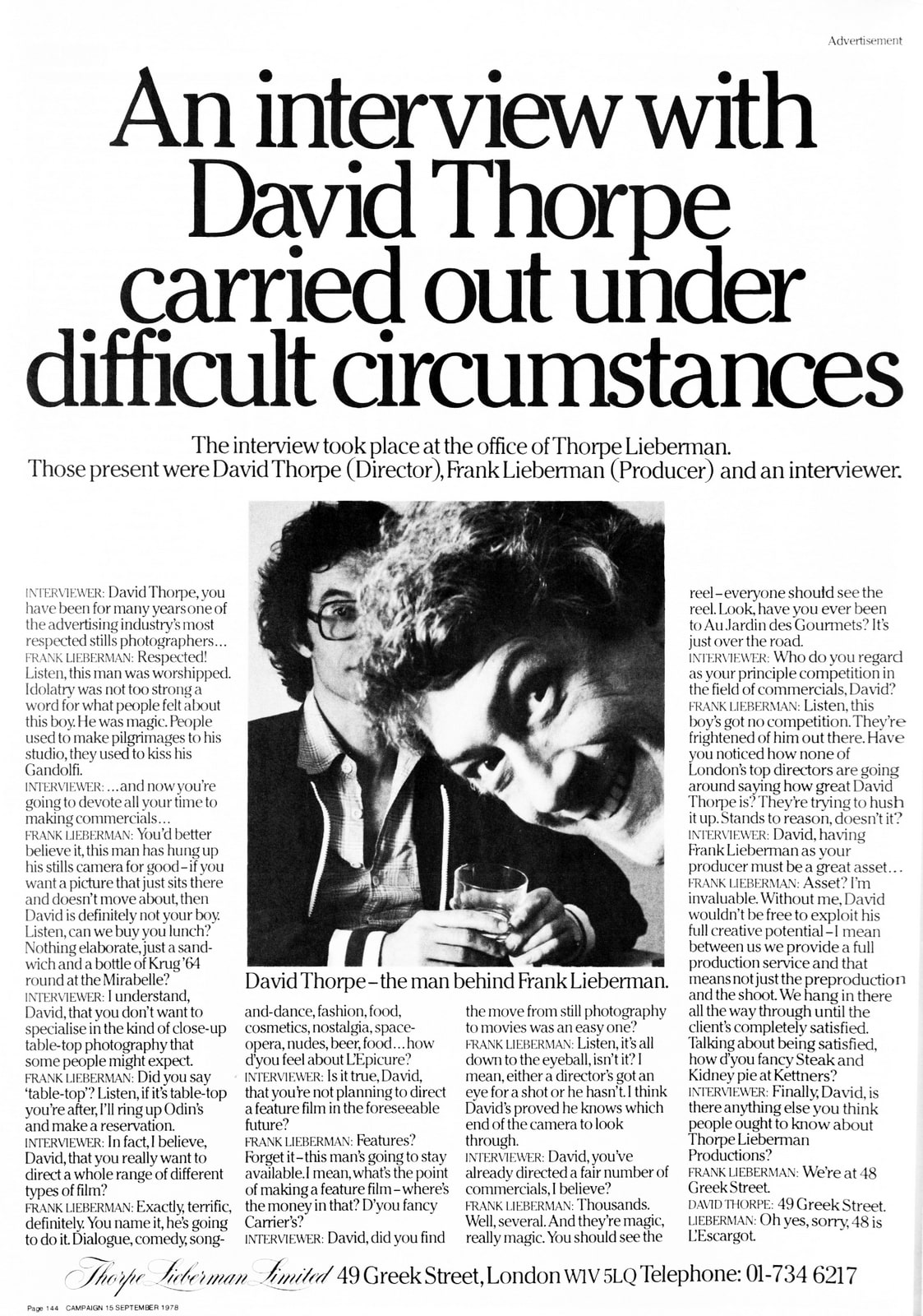
Thorpe Lieberman Ltd.
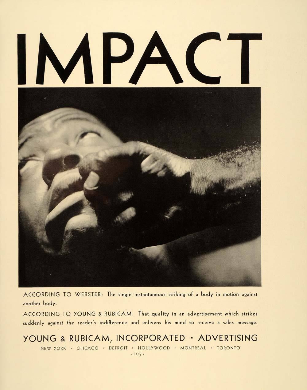
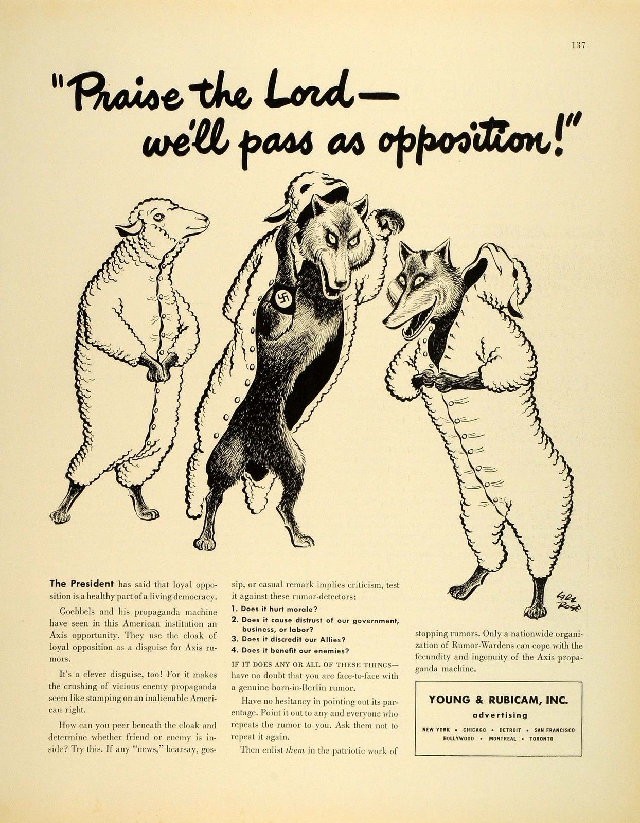
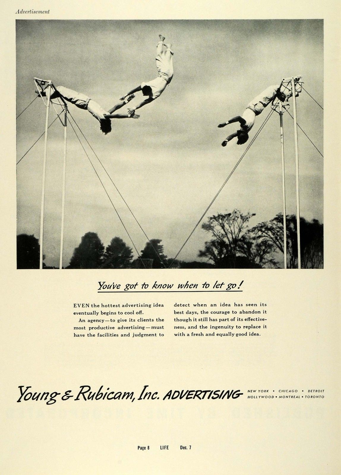
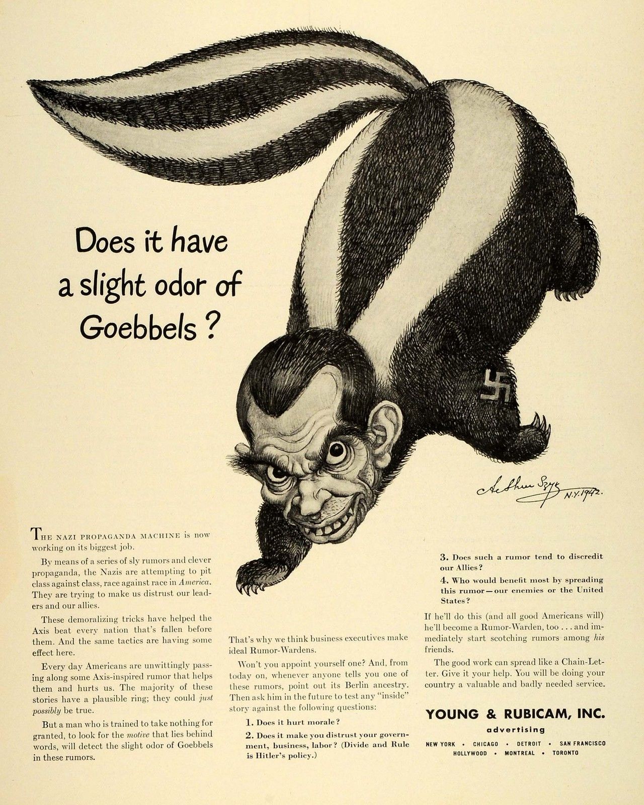
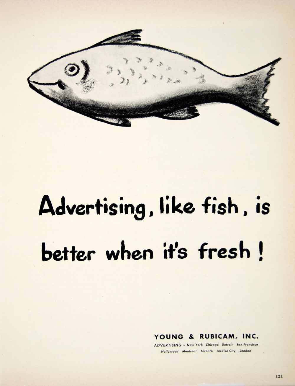
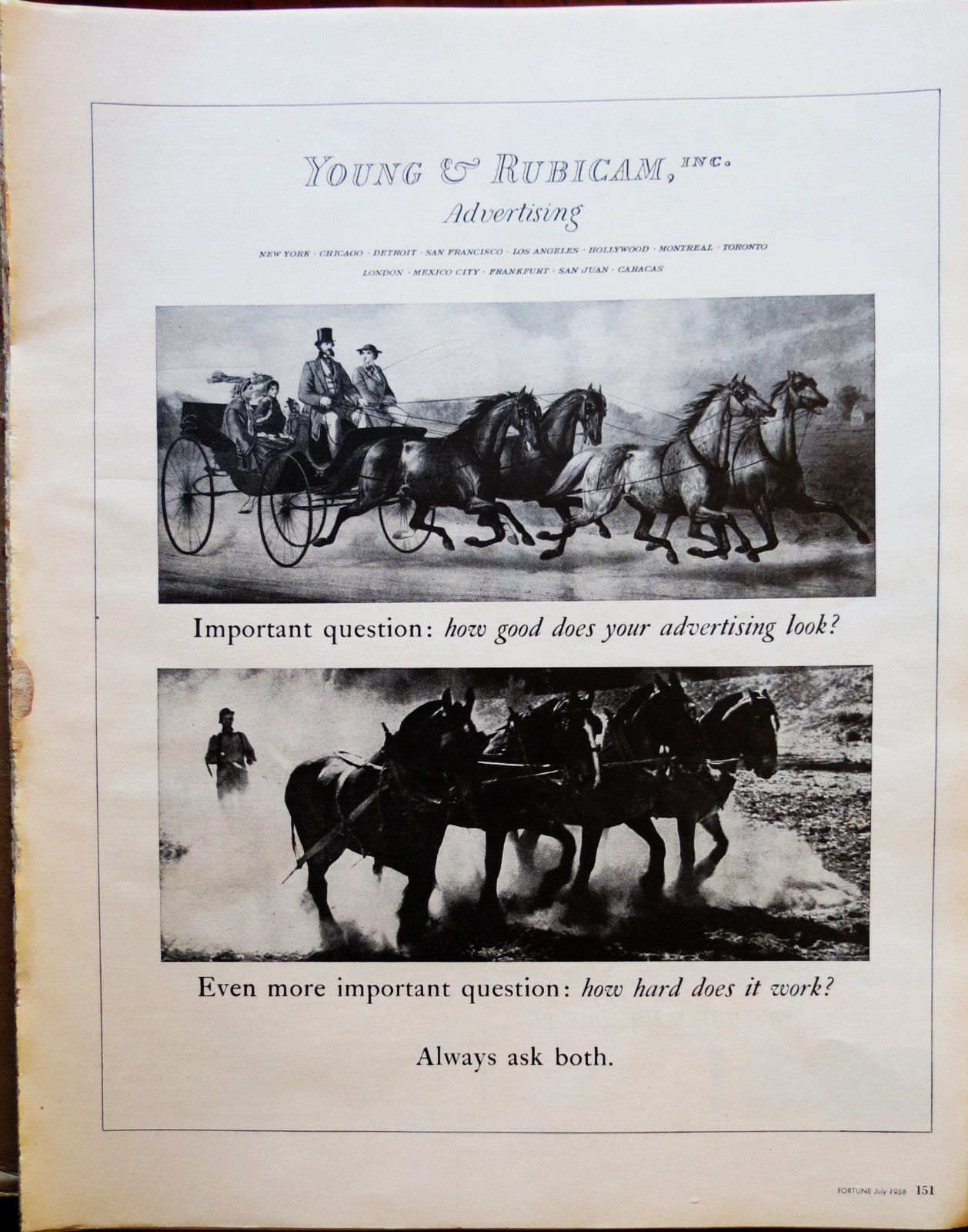
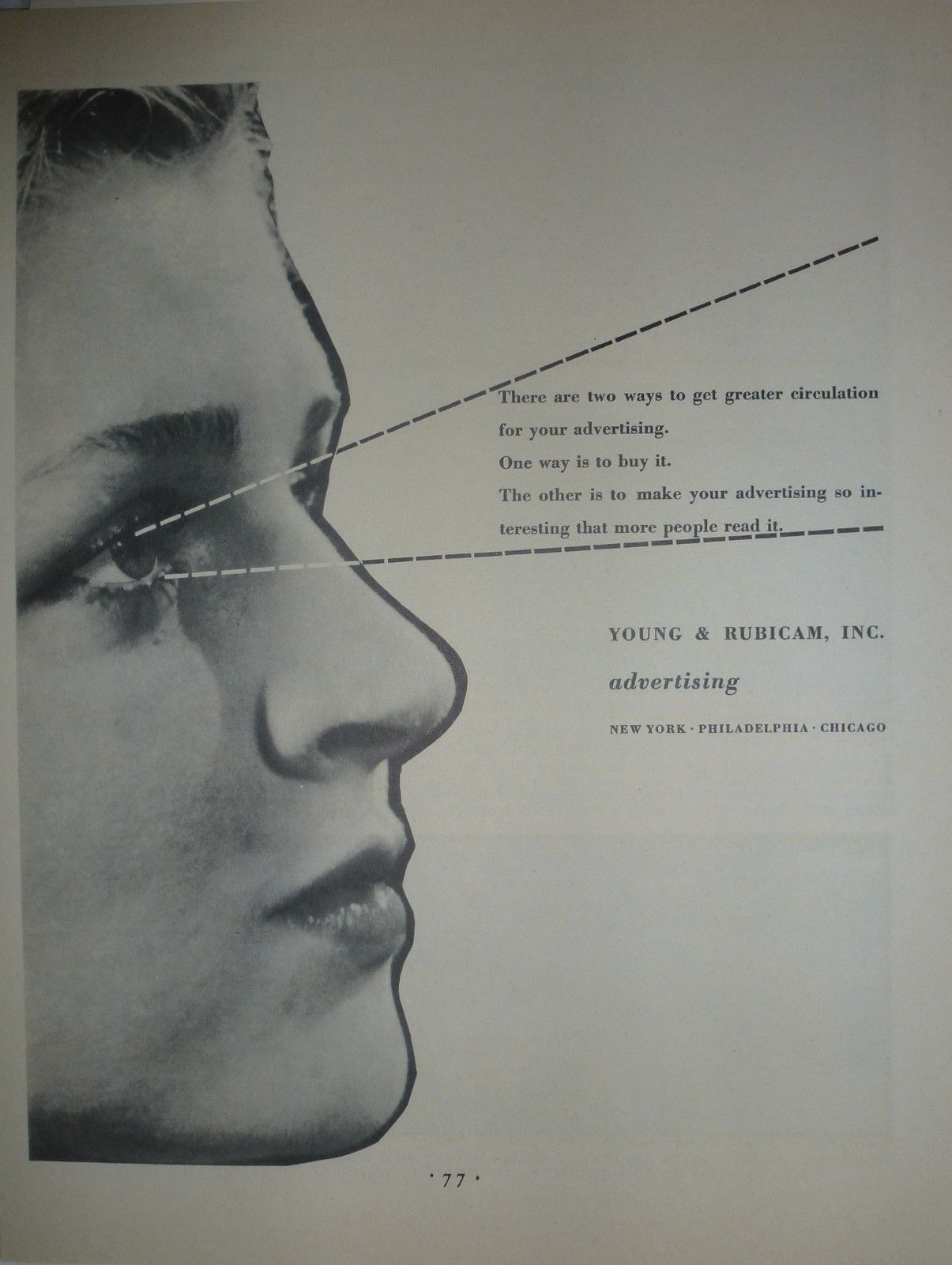
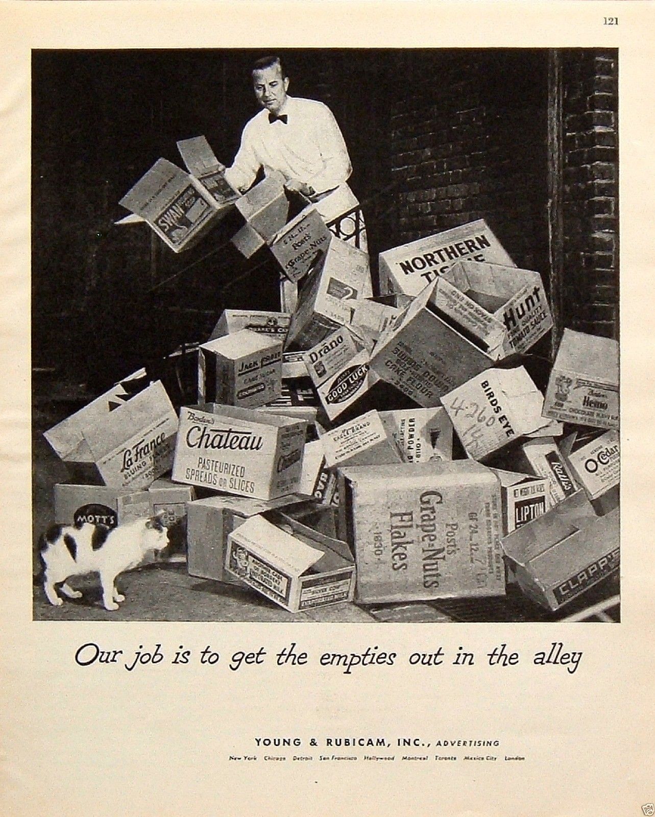
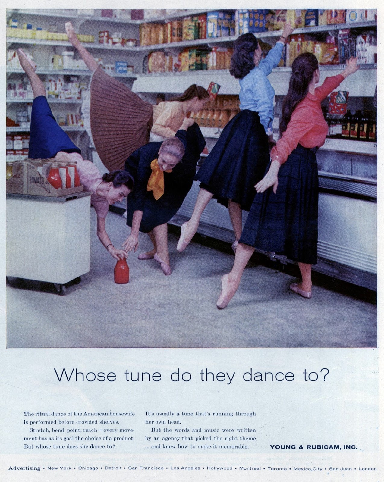
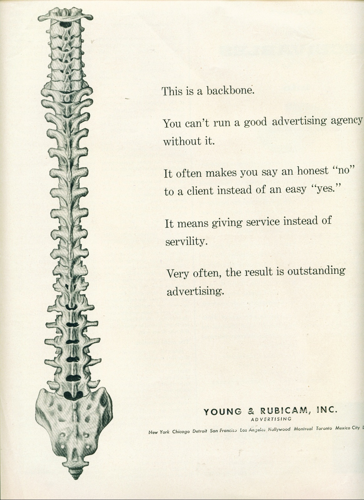
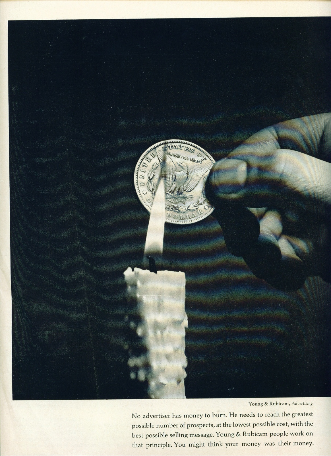
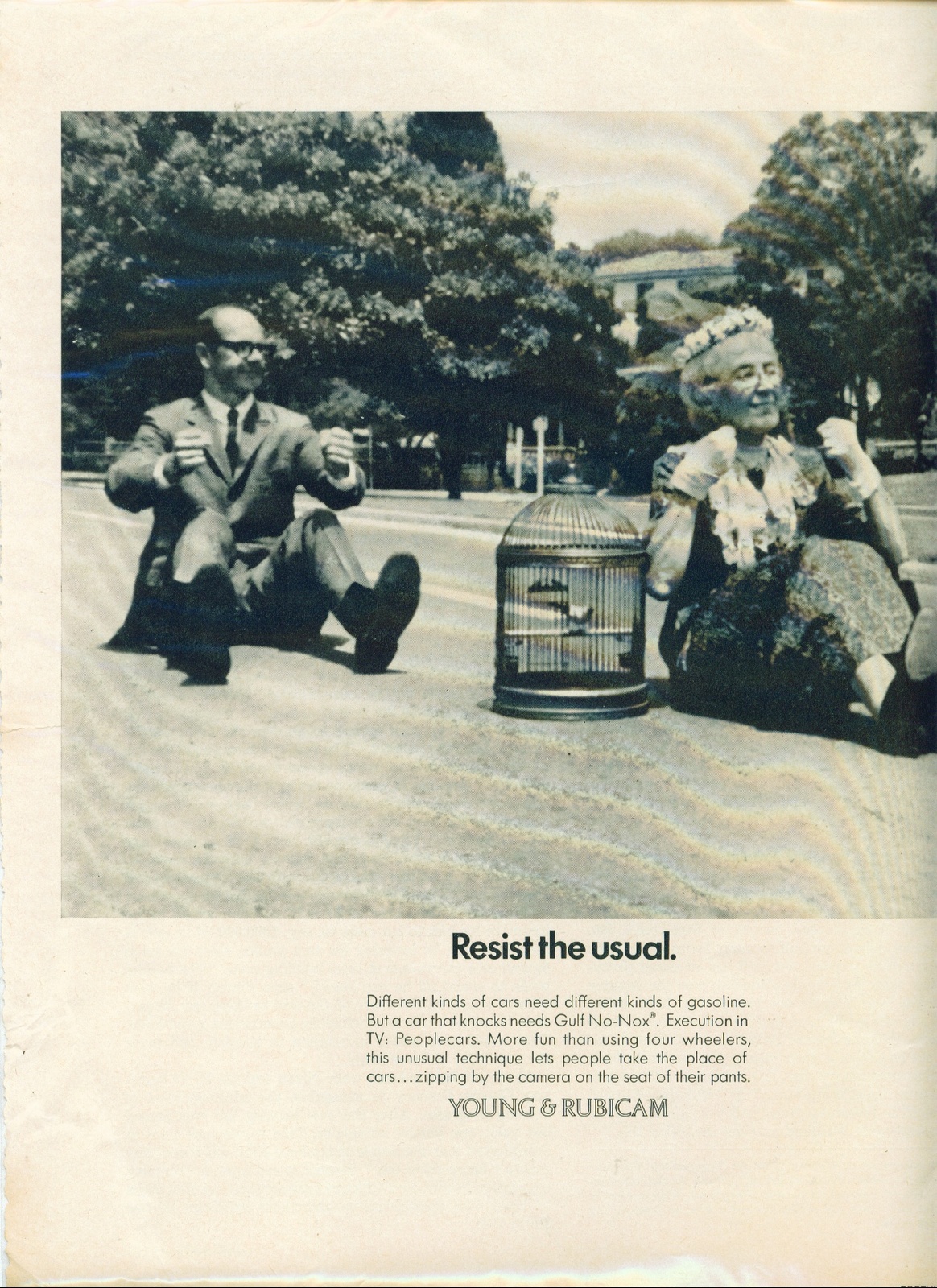
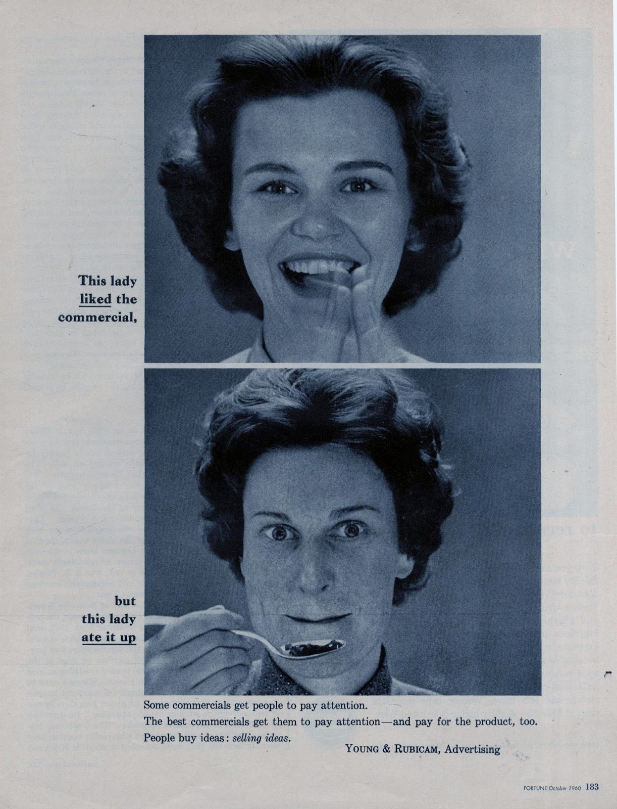
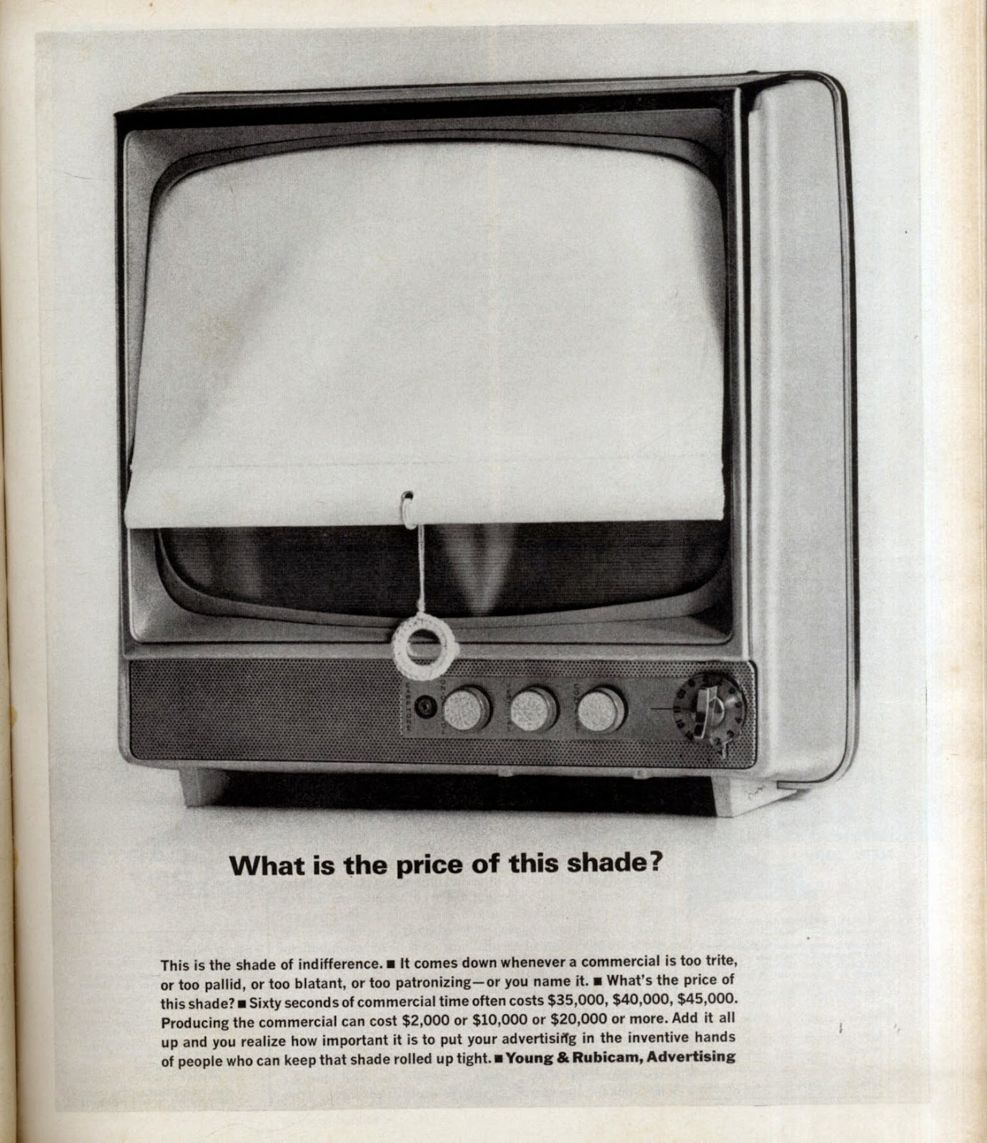
YOUNG & RUBICAM.
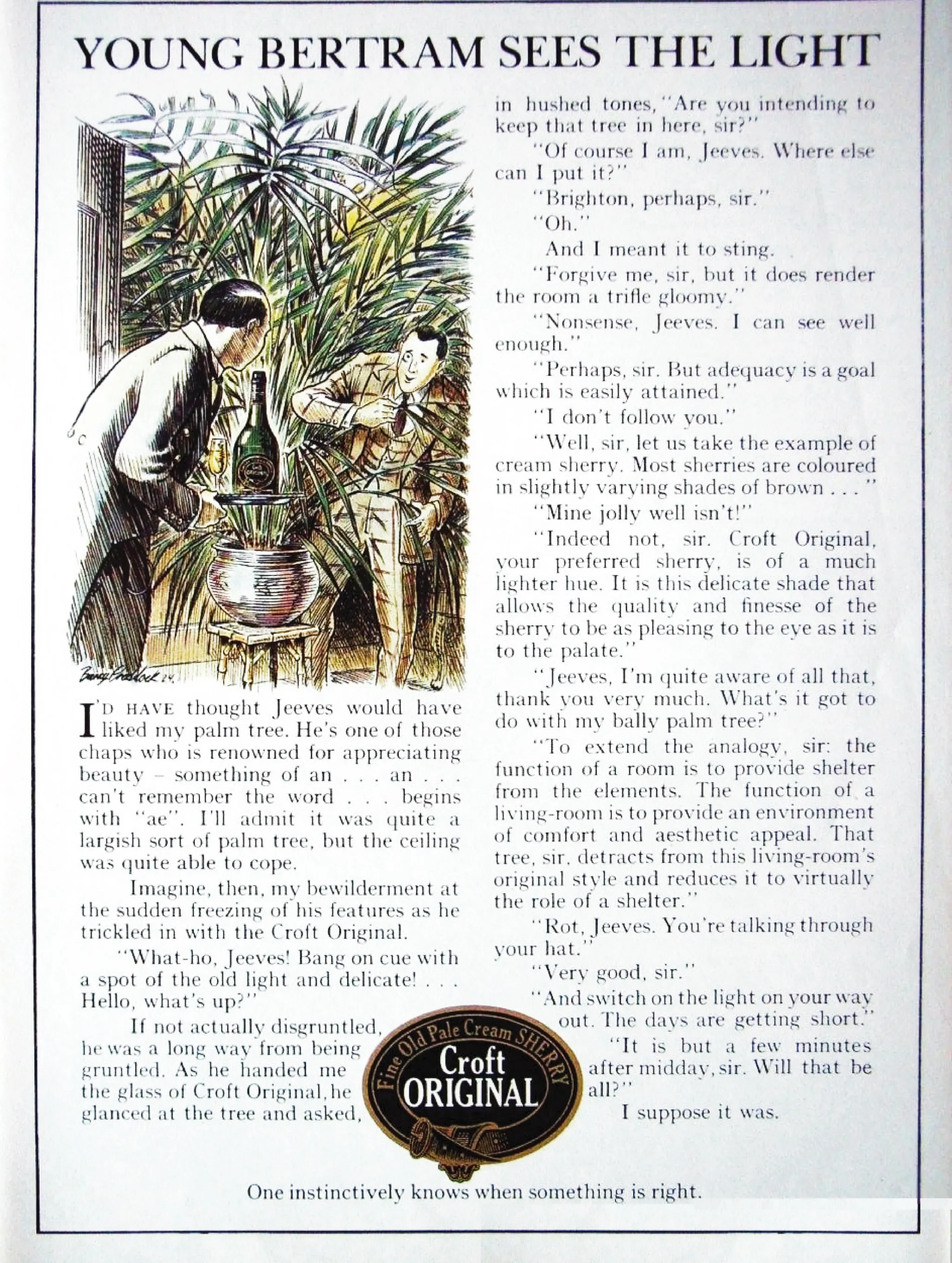
Croft Original.


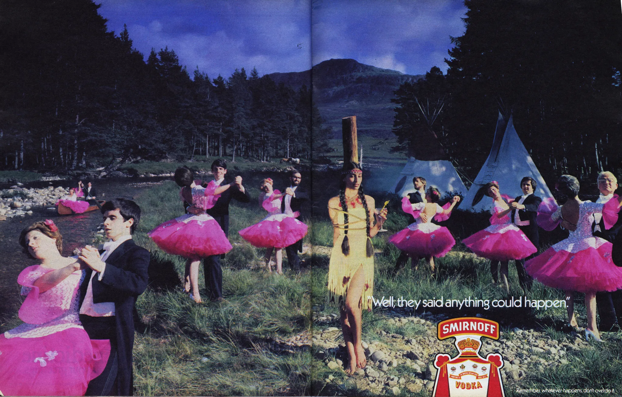
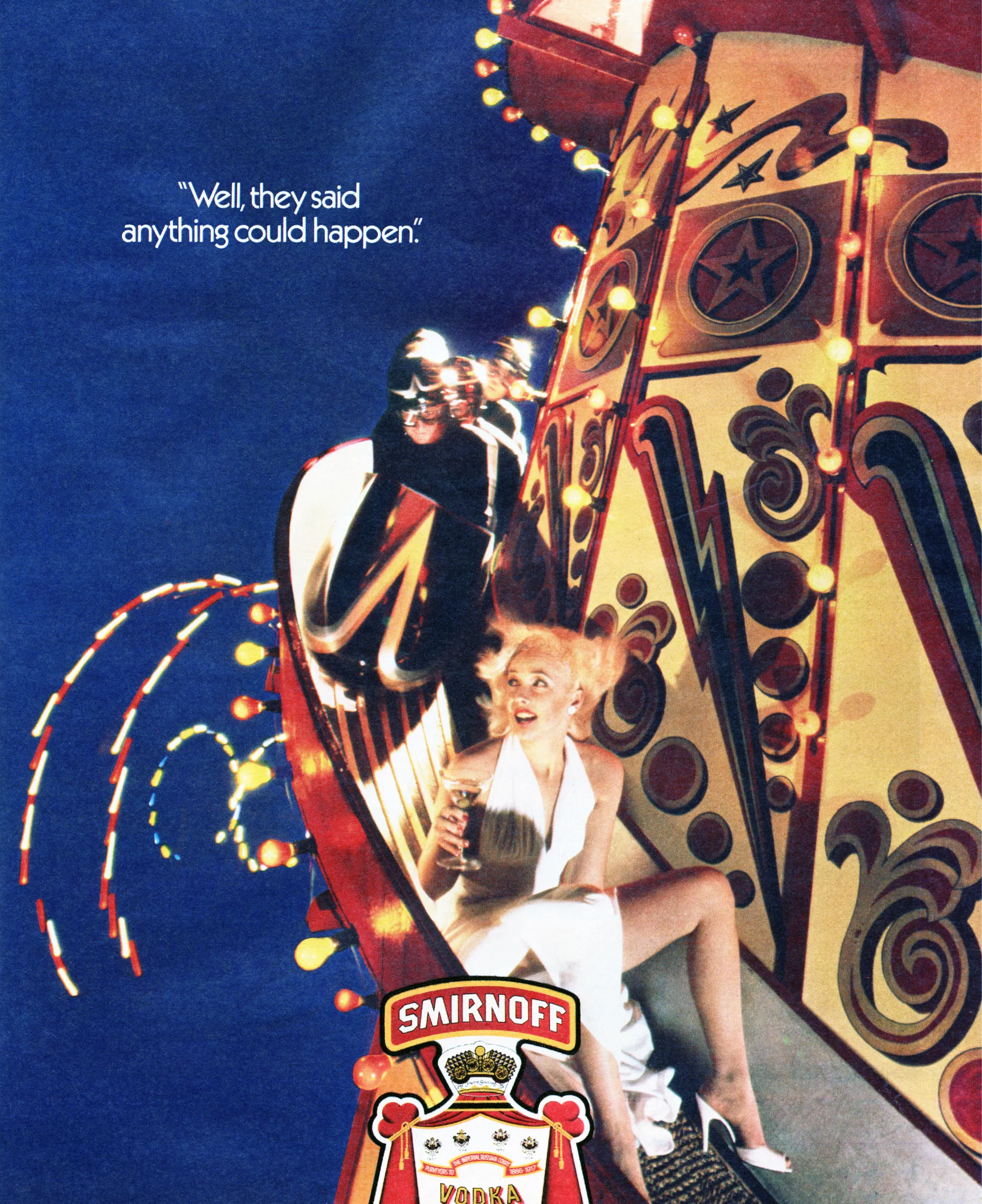
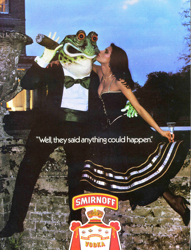
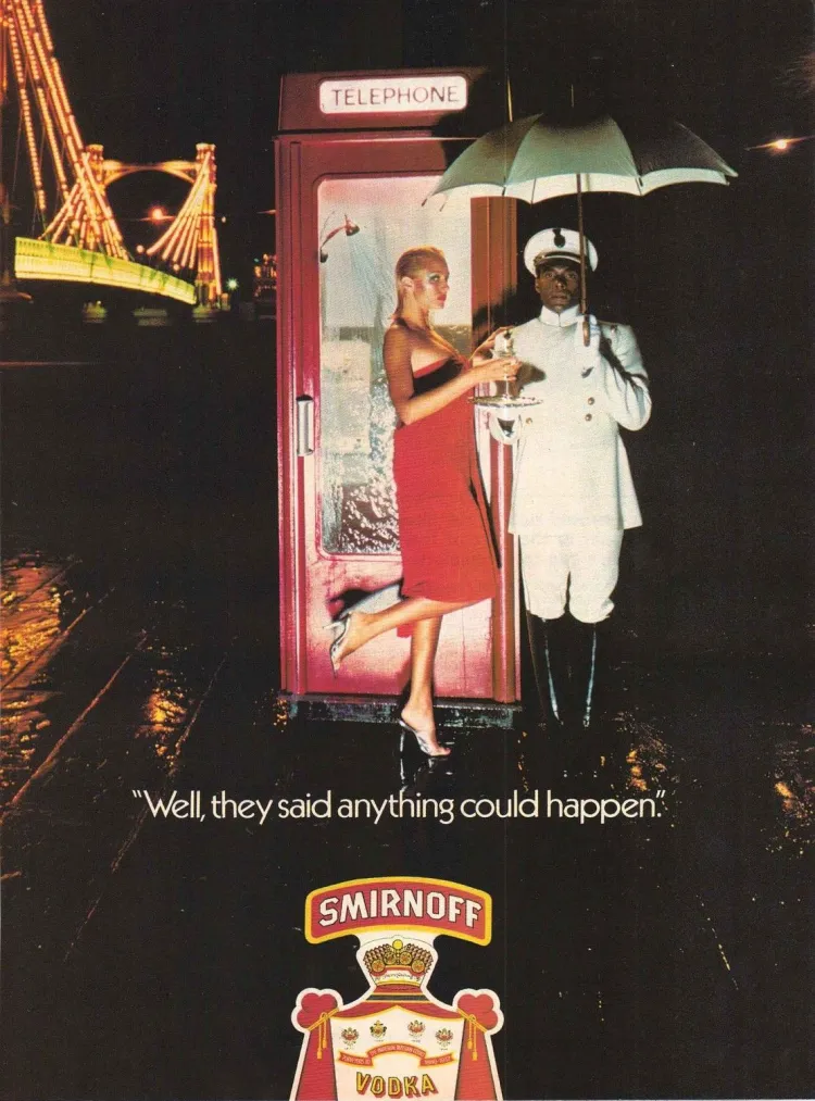
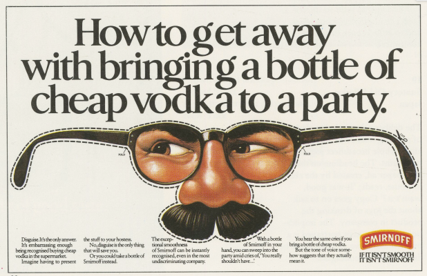
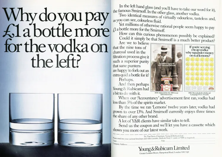
Smirnoff.


Wispa.
Johnnie Walker Red Label.


Smirnoff. Round 2.


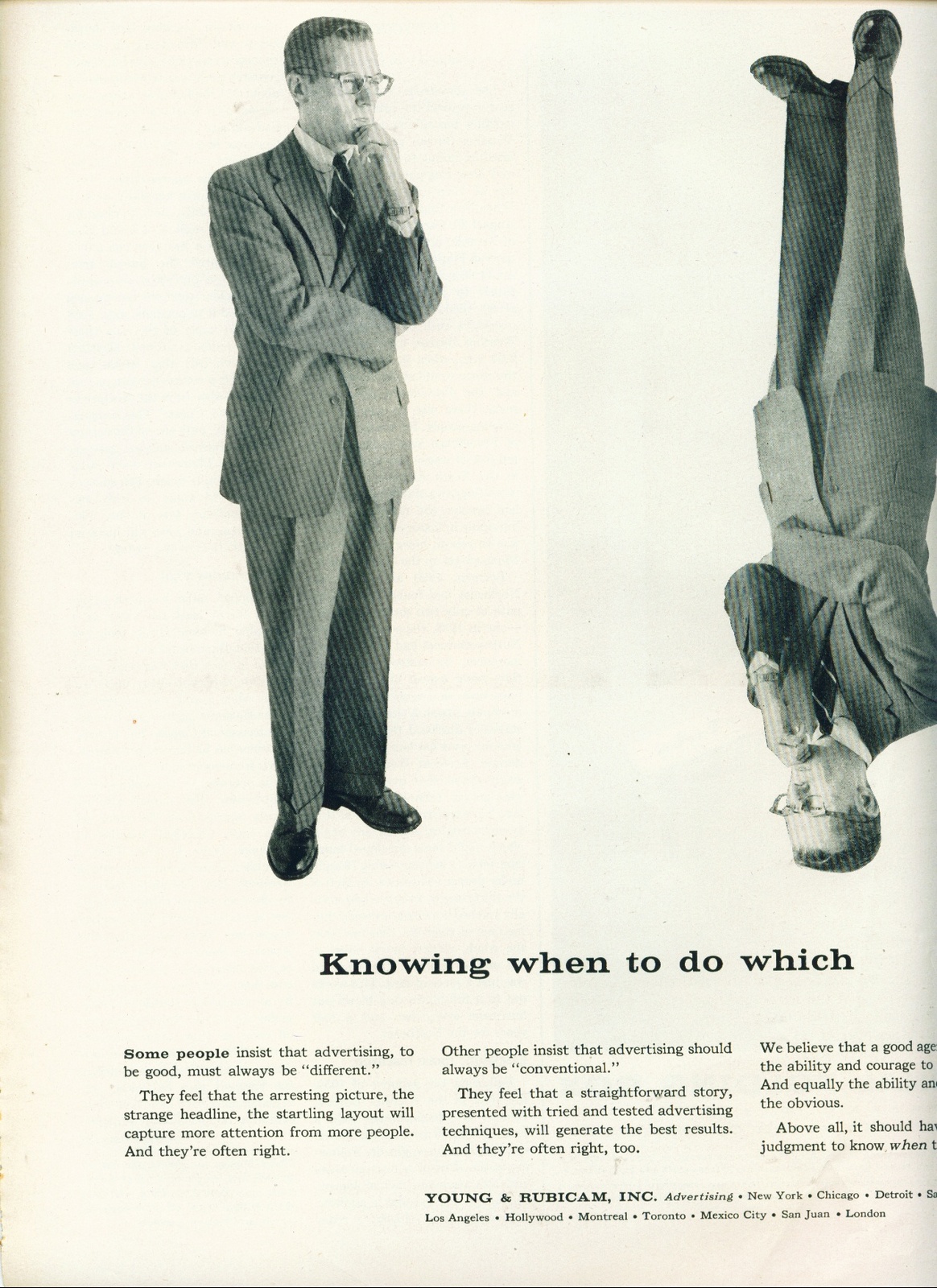
Young & Rubicam.


Appletise.
DAVIS WILKINS.
The Radio Association.
[insert audio here]

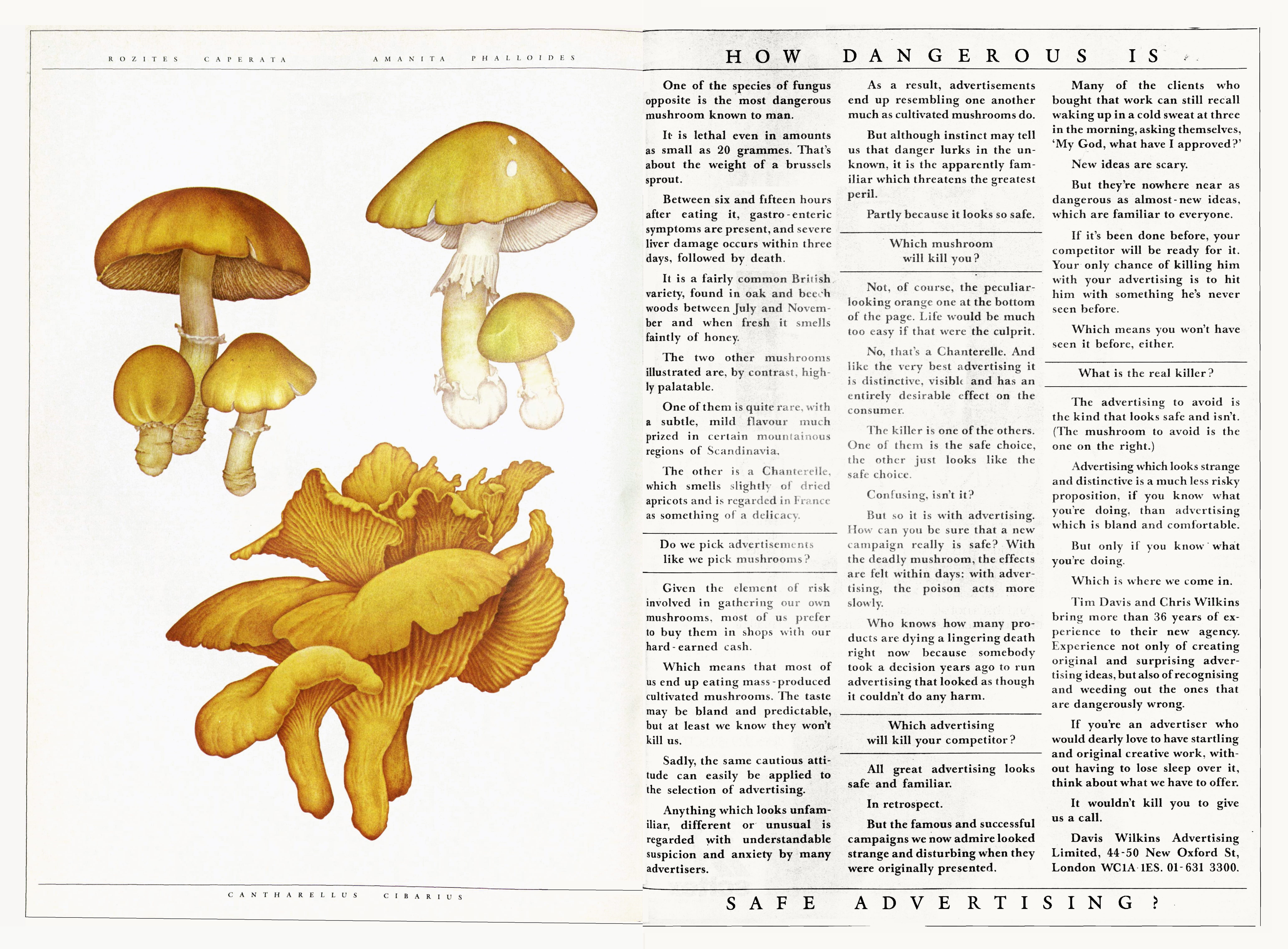
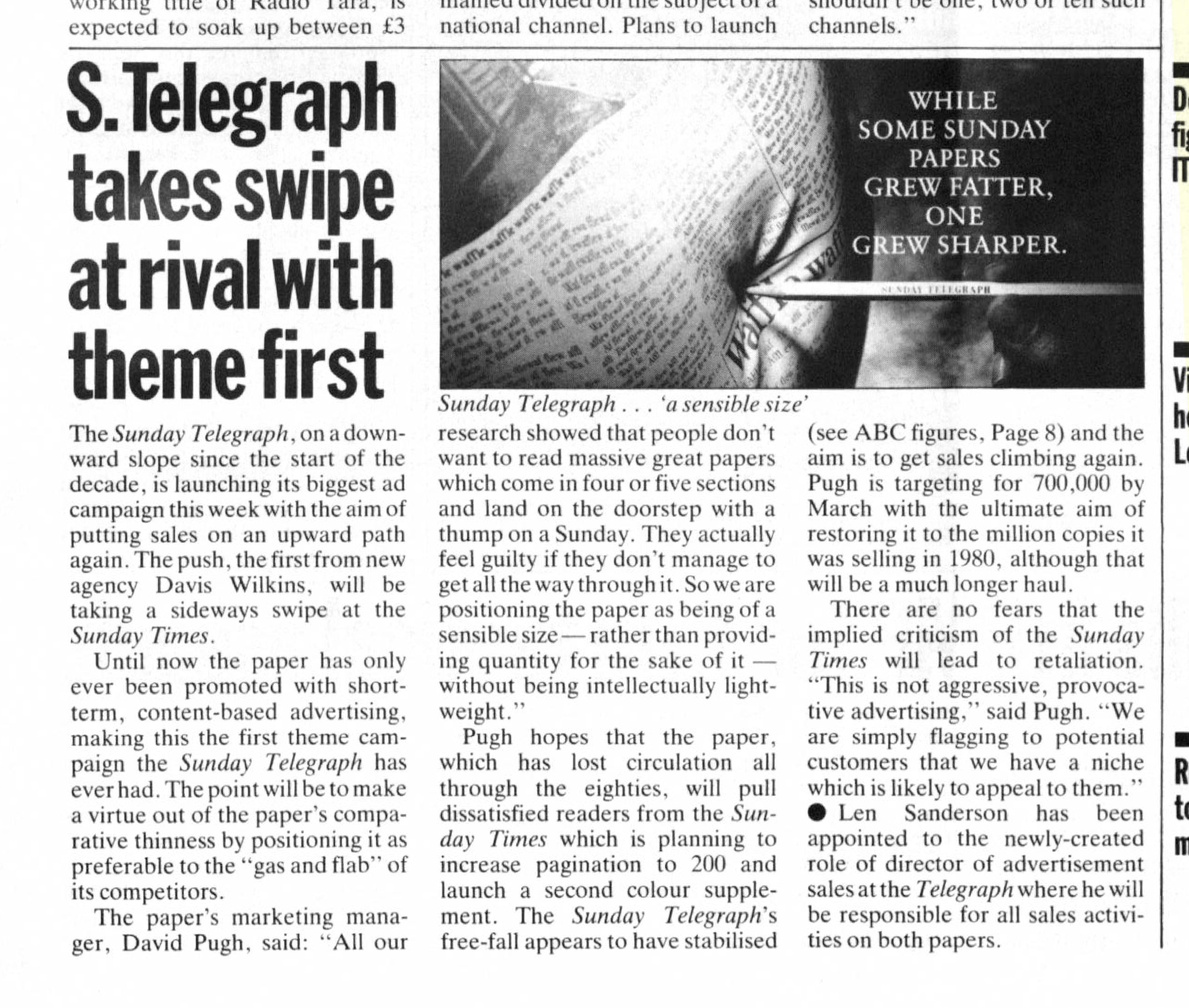
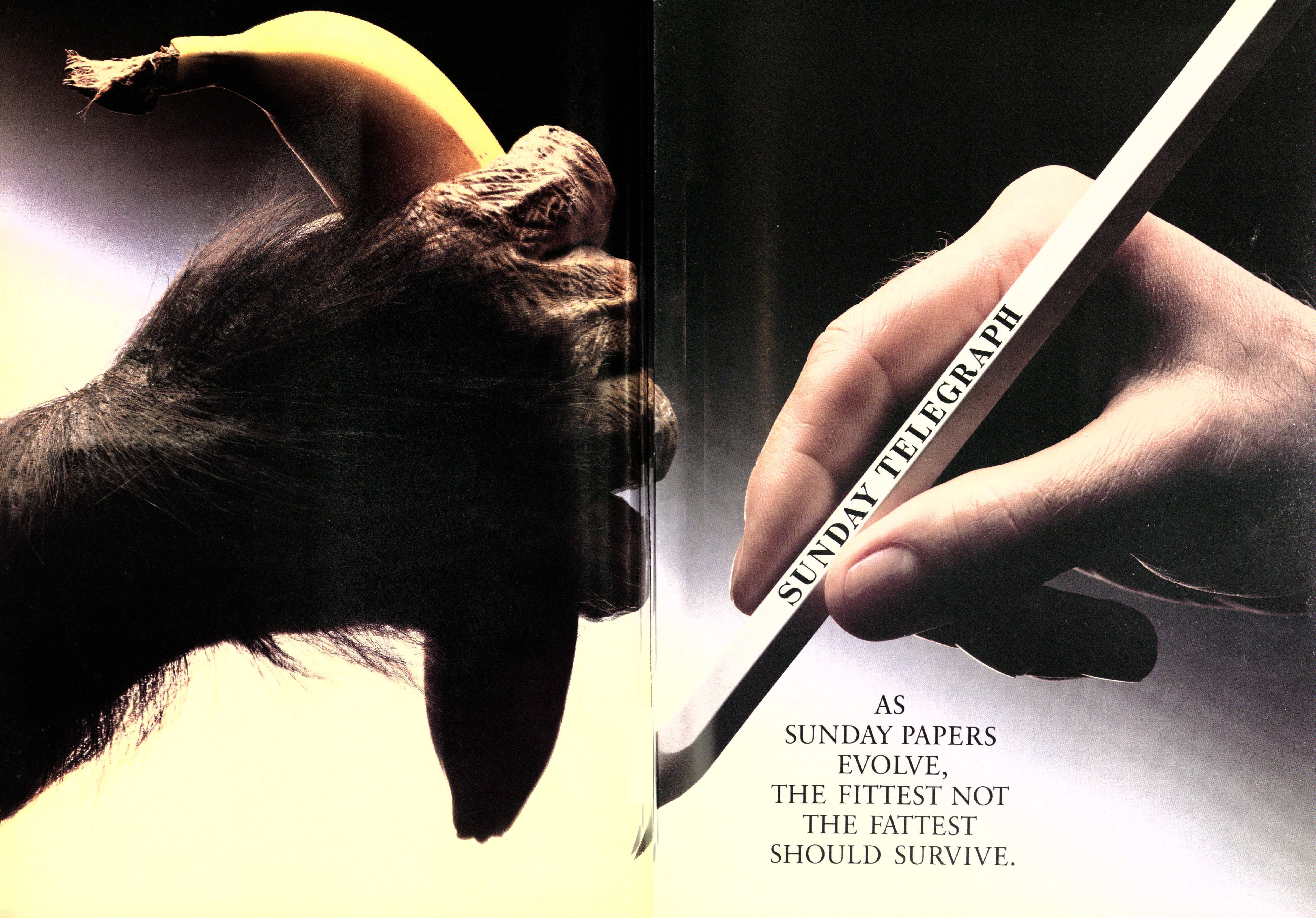
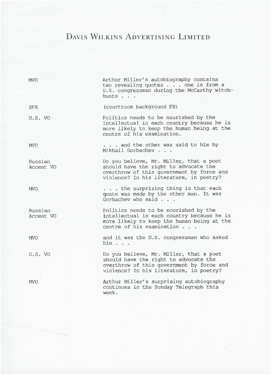
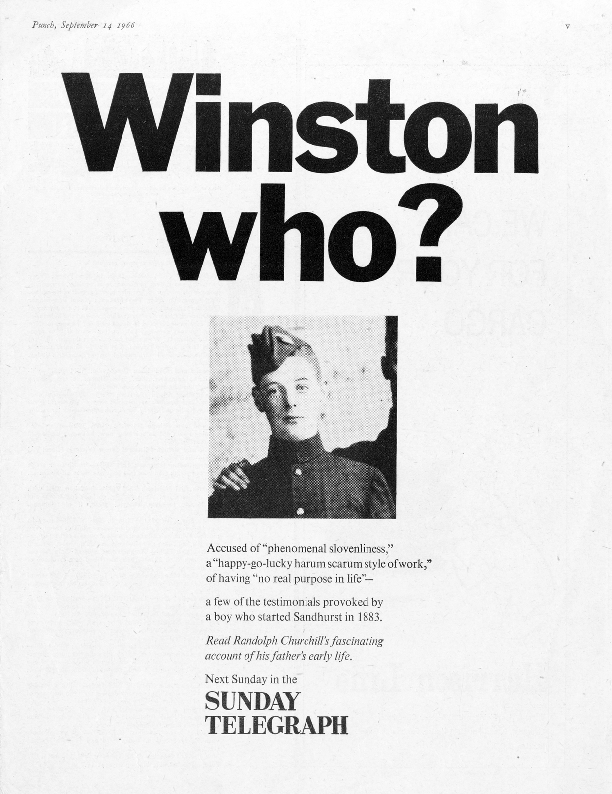
Daily Telegraph.
The Sunday Telegraph.

.jpg)
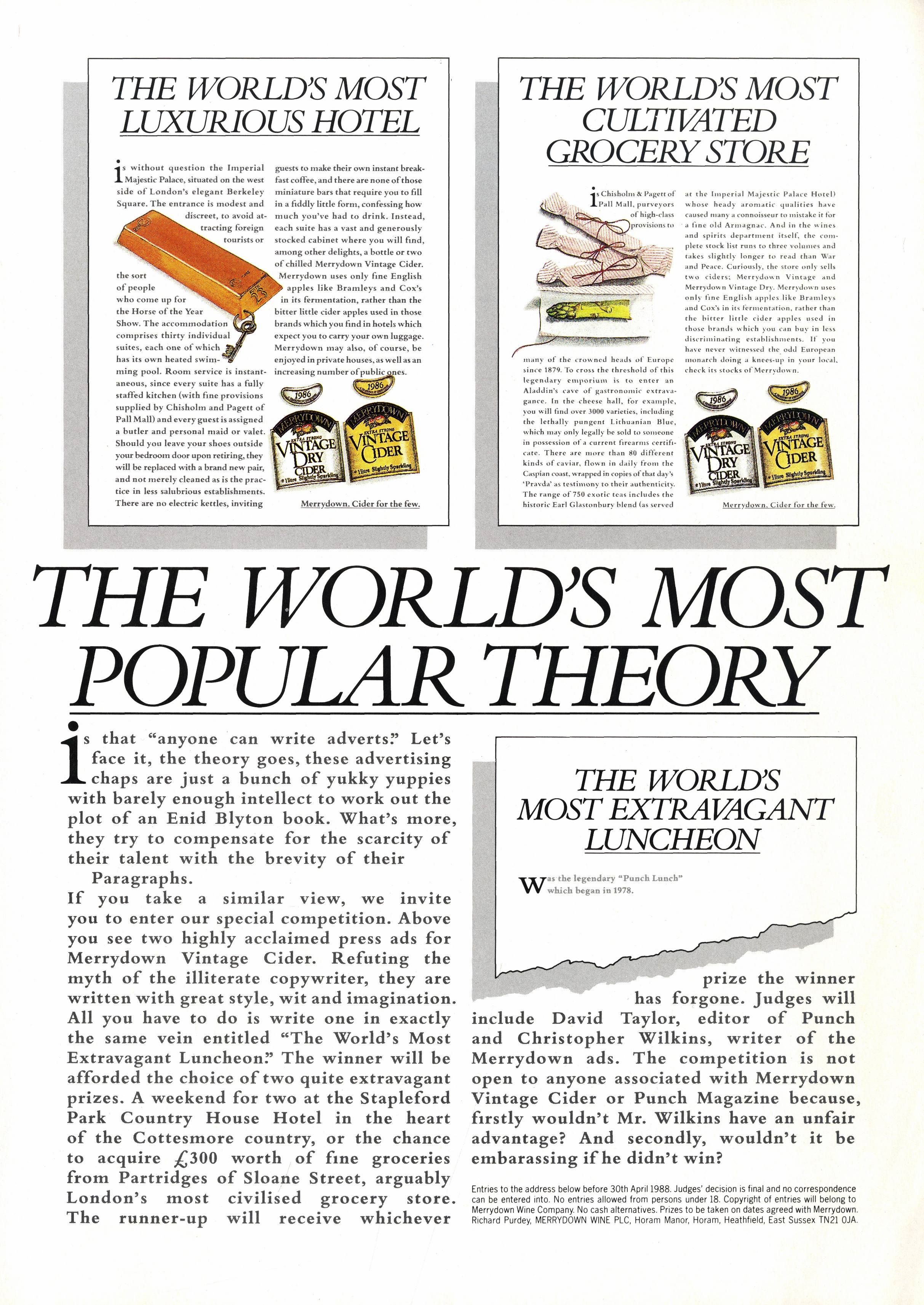
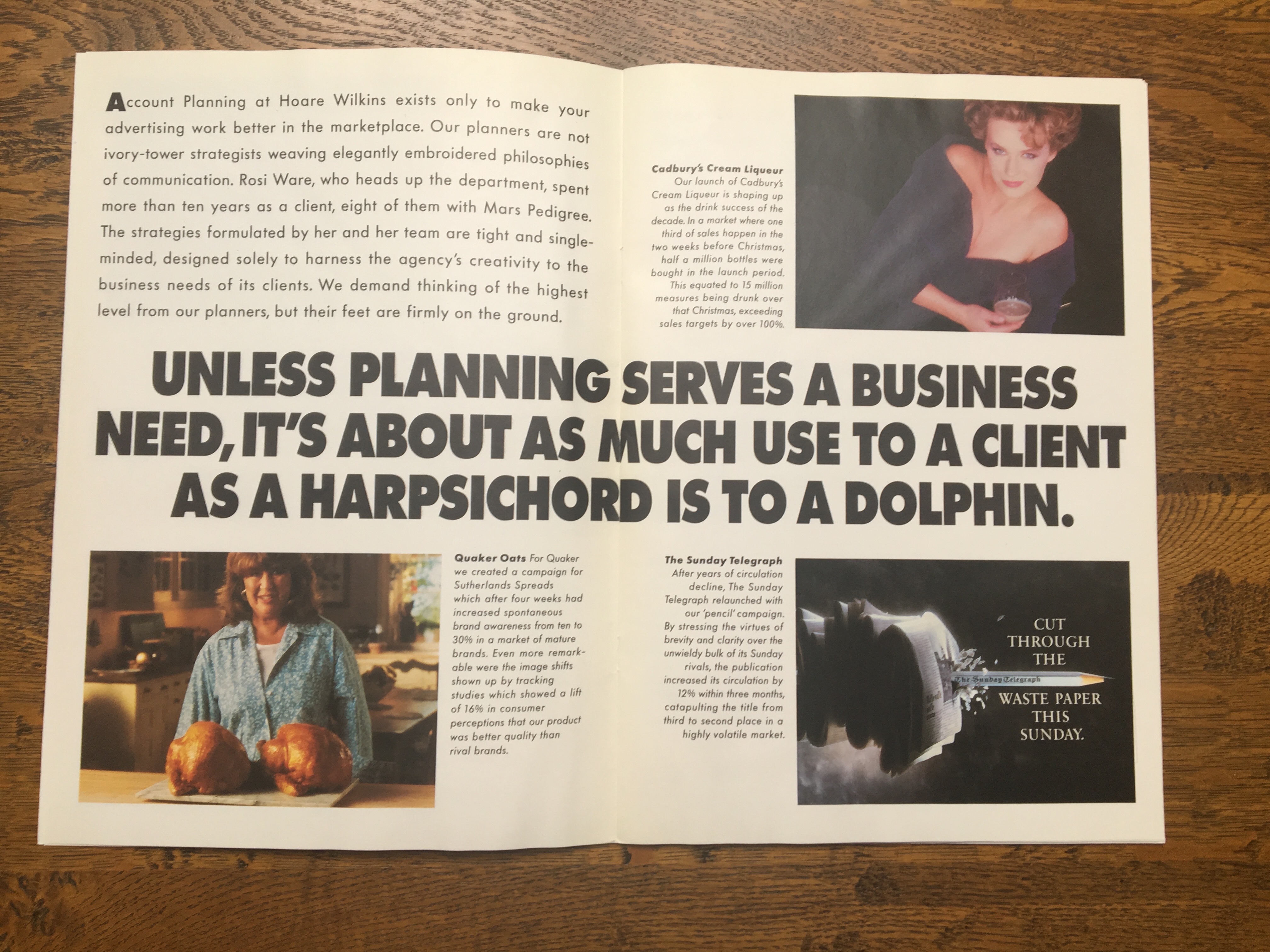
Merrydown.


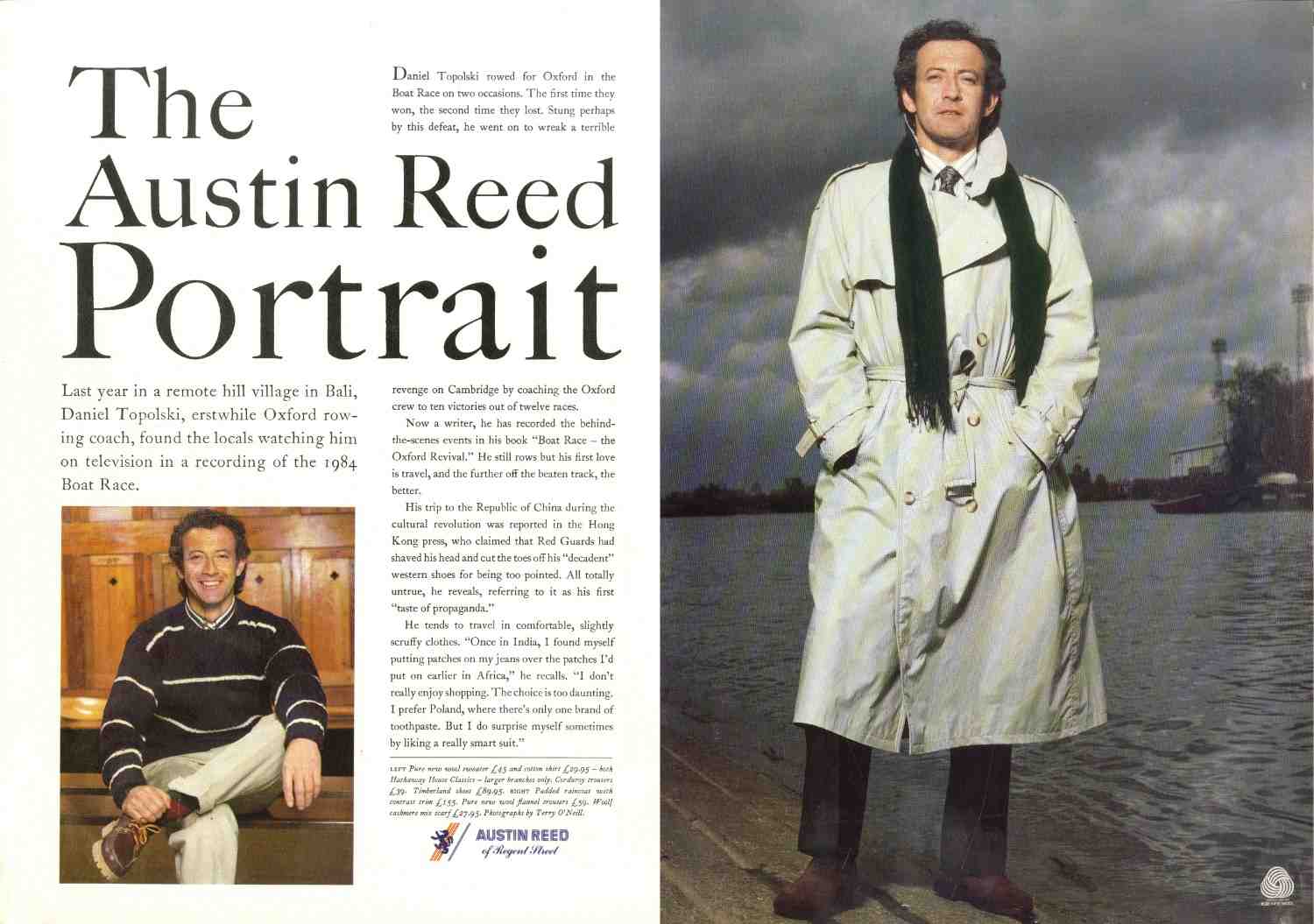
Austin Reed.


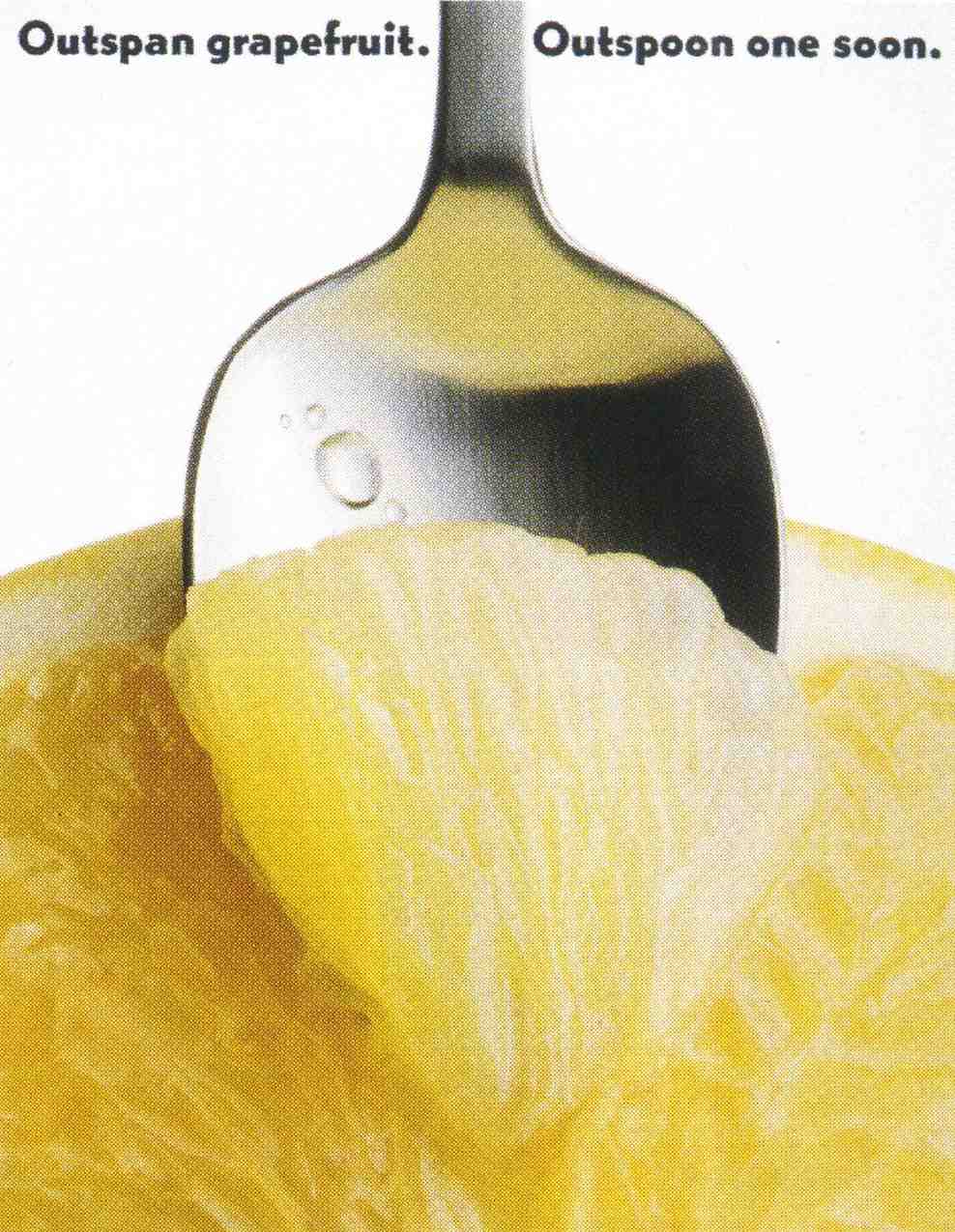
Outspan.

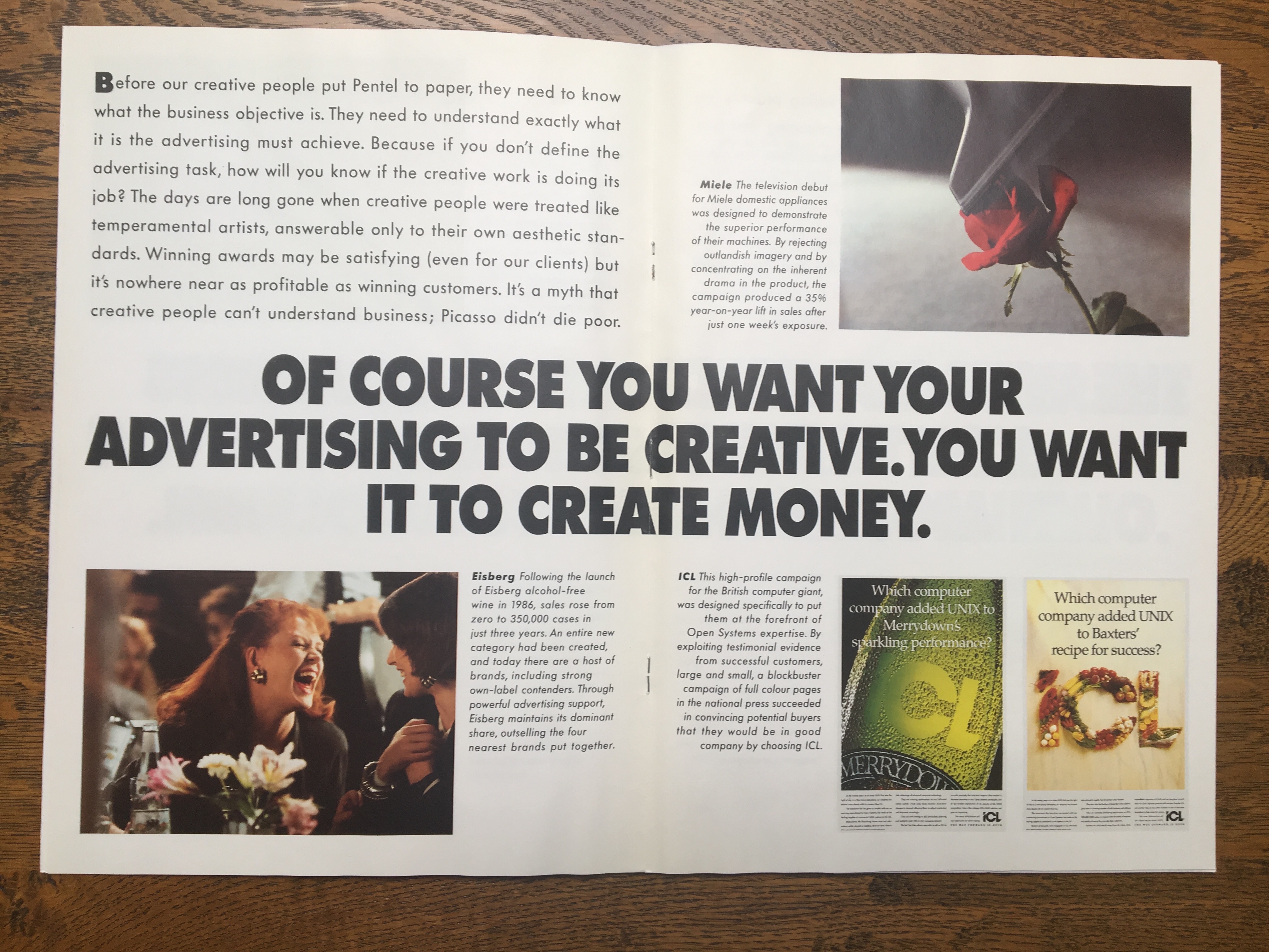
Miele.
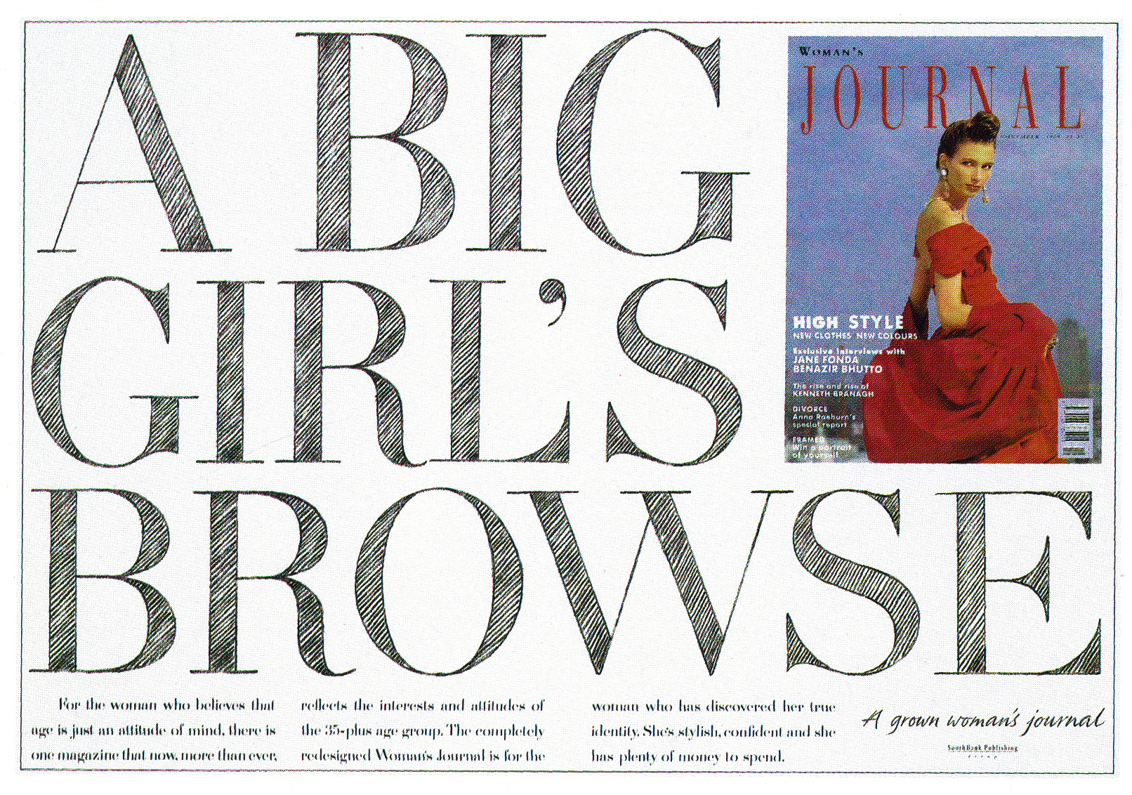
Woman’s Journal.
Taylor’s Port.


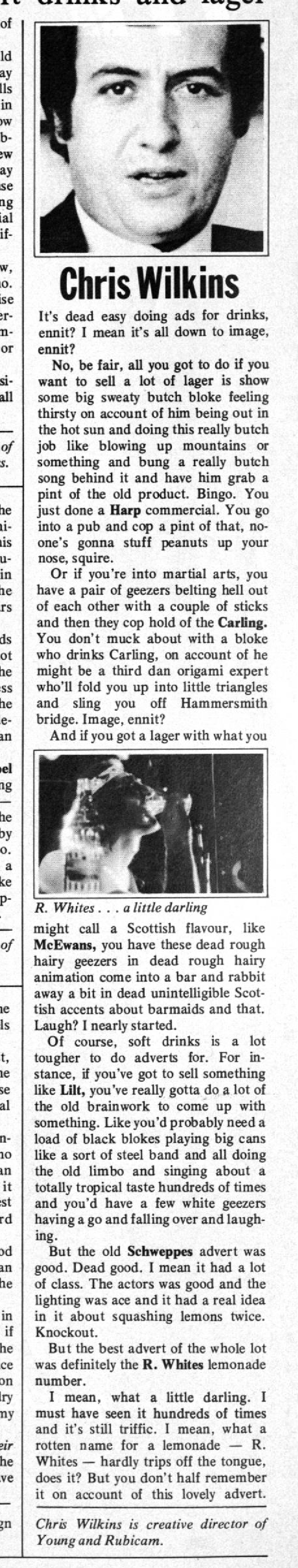
CHRIS & SIAN WILKINS DIRECT.
Sheila’s Wheels.
Go Compare.
More Chris..
CREATIVE REVIEW.

DIRECTION.

CAMPAIGN.


.jpg)
.jpg)
ZOOM.

MARKETING WEEK. (Chris had a regular column, everyone I knew read every last one of them back in the day.)


[insert audio here]


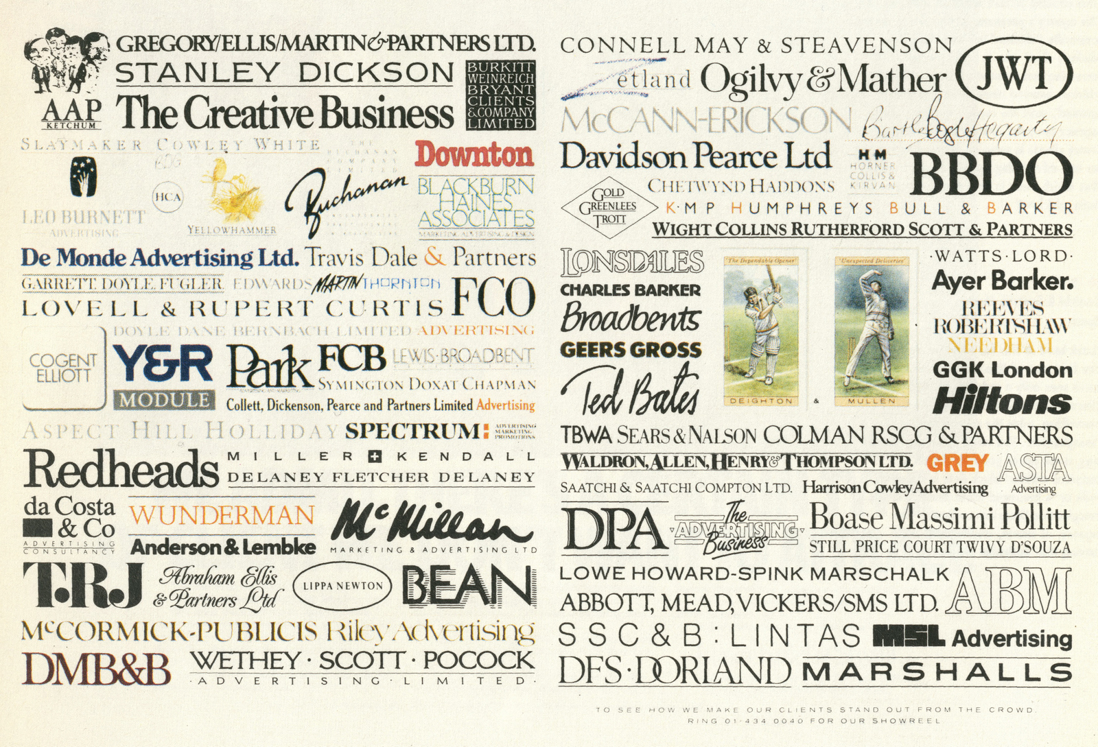
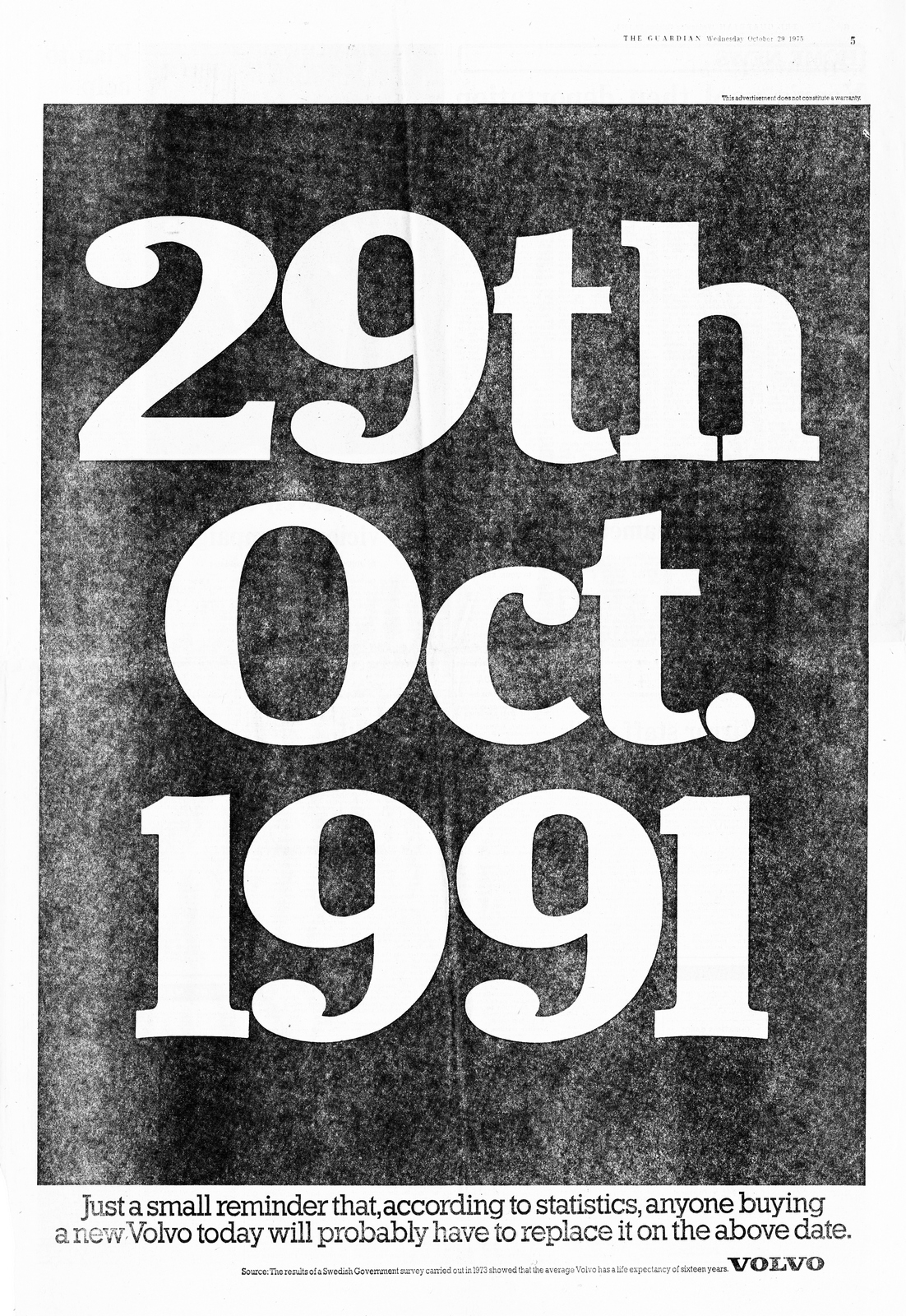
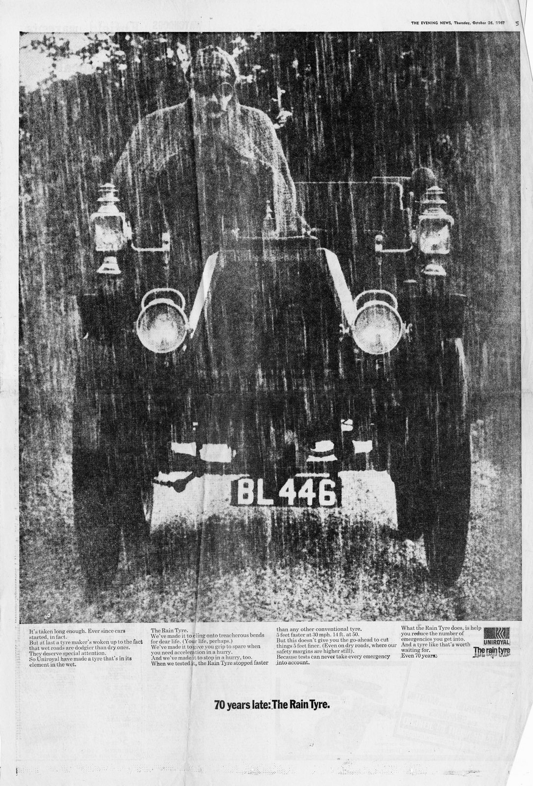
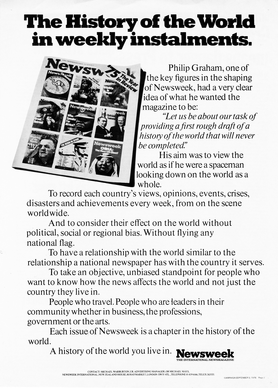
One of the side-effects of putting out this blog has been the people I've met.Take Len Weinreich, whilst trying to find Paul Leeves work for an upcoming podcast, I came across Len, it turns out he lives down the road from me.Alan Parker had referred to him as 'the bloke who taught me everything I know about advertising', Dave Trott said he gave him the best piece of advice on advertising he ever got and Paul Leeves simply said he was 'very, very clever'.Len had set up two agencies; sixties hot-shop Alders Marchant Weinreich and Burkitt Weinreich Bryant in the eighties.It turned out that not only did Len have the ads I was looking for, he also had the ads I wasn't looking for.He explained that, like most creatives in the sixties he used to cut out and pin-up his favourite ads, he then reached for a giant envelope and there they all were. After a bit of negotiation, he reluctantly let me take them home to scan.Looking these ads, with their little pin-holes in each corner, that had been carefully stored over the years got me thinking. There used to be a more public appreciation of advertising. I'm not talking about awards, I'm talking about people actually liking and admiring the creativity that went into advertising. I visited virtually every agency in London in the eighties, in the hope of escaping the one I was in at the time, and I'd assess each one the minute I stepped through their doors; their output covered every inch of the walls, whether it'd won awards or not, it was who they were and they were proud. It's hard to find an agencies output today, it's certainly not on their walls, sometimes it's not even on their site. When I'd arrive at the creatives office back then I'd be presented with a wall covered with a mixture of work they were proud of and work they admired. It was like looking into someone's wardrobe or Spotify playlists, it gave you a little insight into their personality. The work they'd pinned but not created was viewed with a mix of admiration and envy, it may even irritate them into working late that night to try reach those heights. Unfortunately, creatives no longer have corkboards, because they don't have office walls to screw them to, so it's tougher to get a snap shot of who they are and what they aspire to. This is what Len Weinreich aspired to in the sixties and beyond.Here are the bits I found interesting in this batch:a) A John Webster press ad; 'Churchill' for The Telegraph.b) An ad for PKL welcoming DDB to London, 1965, I think?c) I'd forgotten how enormous broadsheets used to be, each need to be done in four quarters on an A3 scanner, look at the size of the name of the paper on David Abbott's '29th Oct' ad for Volvo, tiny, but probably the same size as it'd be printed today.It makes you realise just how powerful that or the ads around them would've been.d) Boy, newspaper printing was bad back then, take the ad above, it looks like a potato print.e) The earliest ad from Len's corkboard is probably the PKL one, about 1964, the latest is probably John Hegarty's Newsweek ad; 'The History of the word in weekly parts', 1983.They don't look twenty years apart.I wonder whether ads saved to a creative's desktop today be as similar to those from a creative's wall in 1998?It's tempting to say no, because the business is so radically different, but I suspect the answer would probably be yes, the reason it'd be saved would be the same; the words and pictures created a smile in the mind.


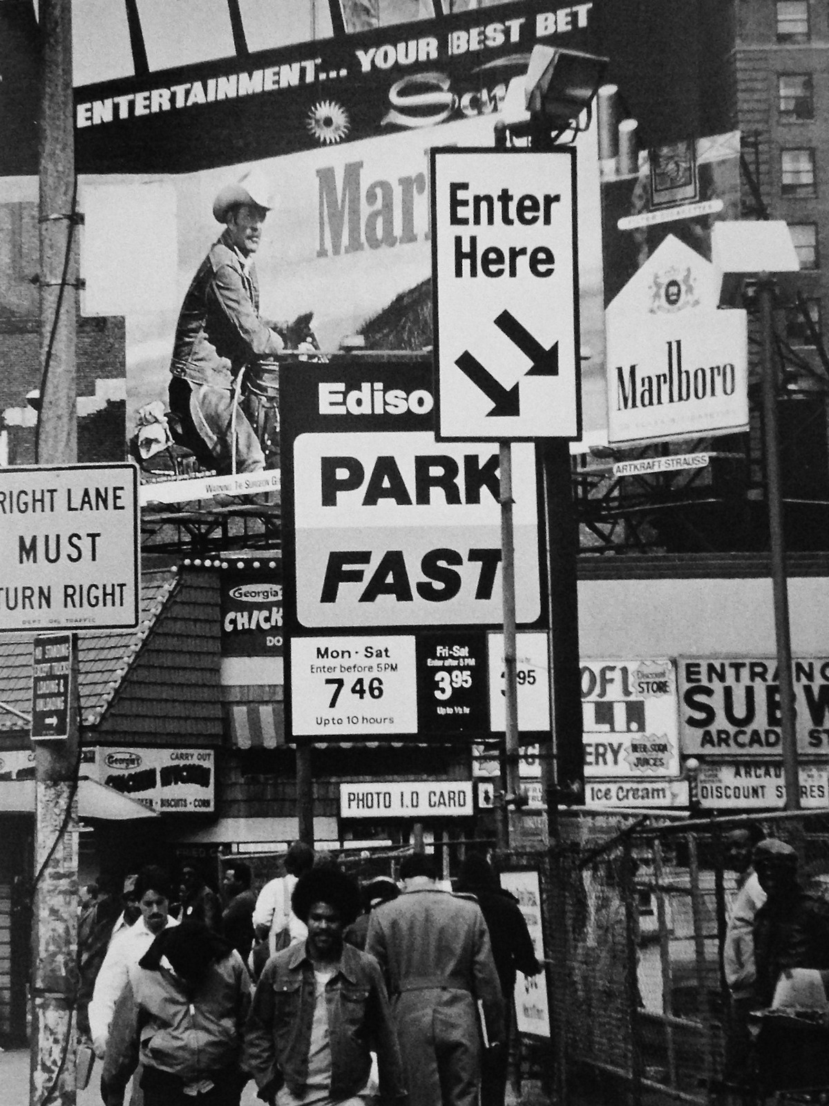
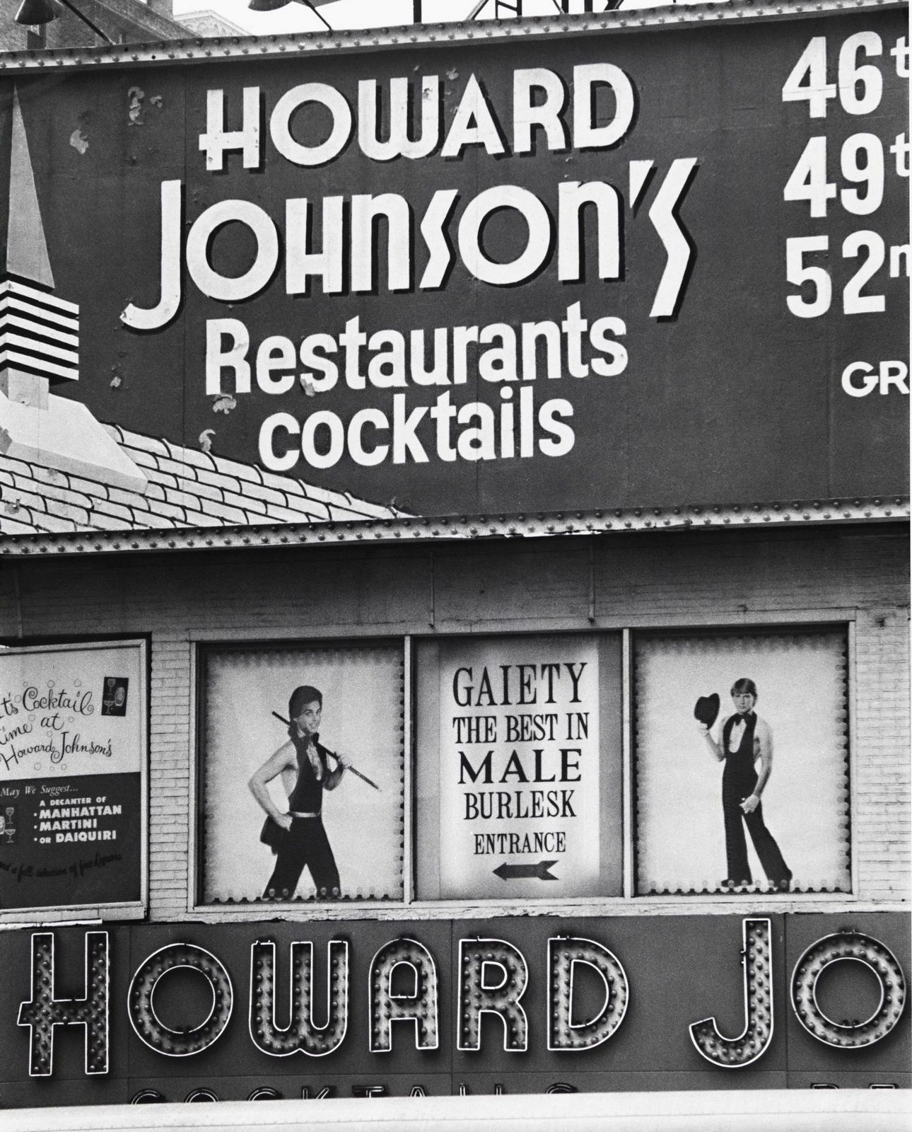
Thanks for hanging onto them Len.
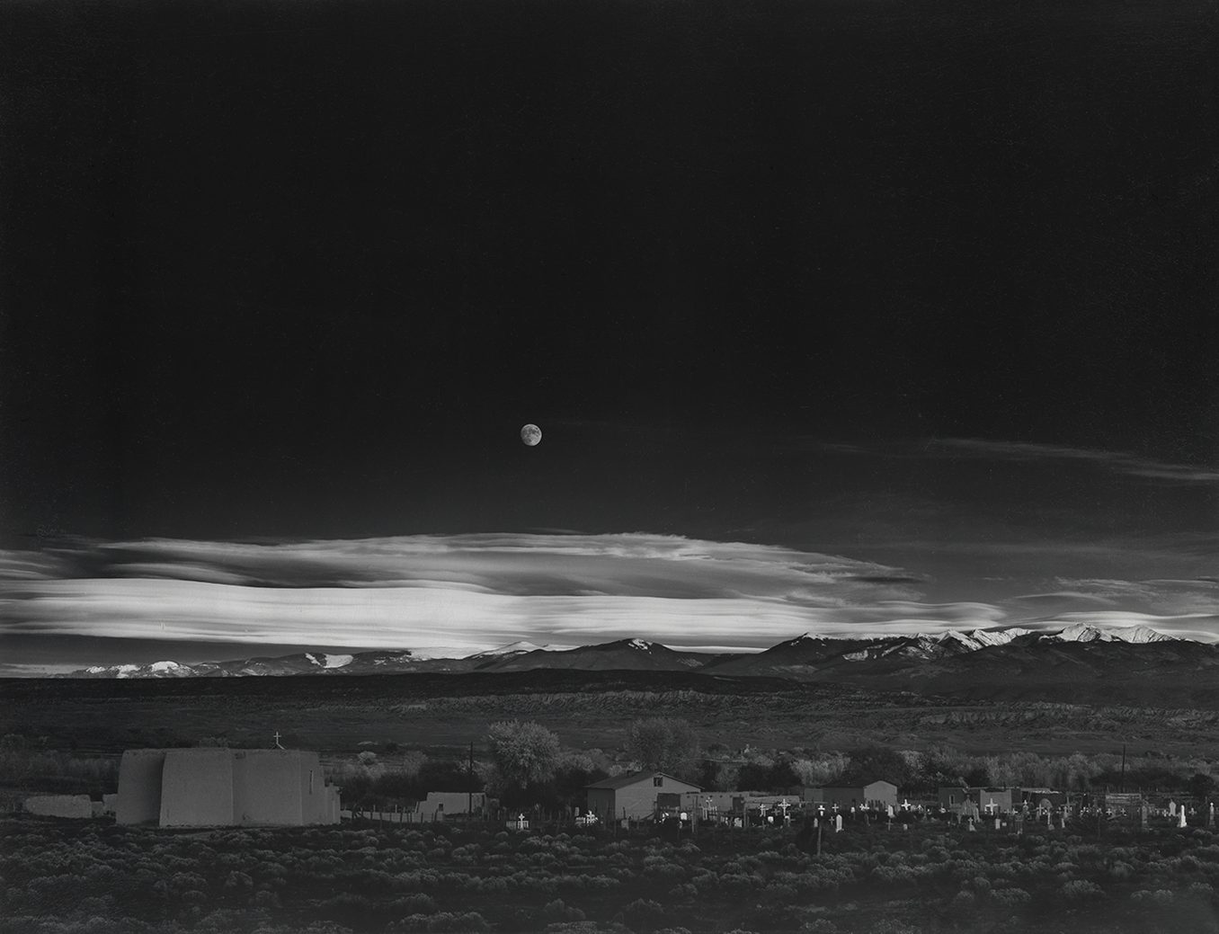
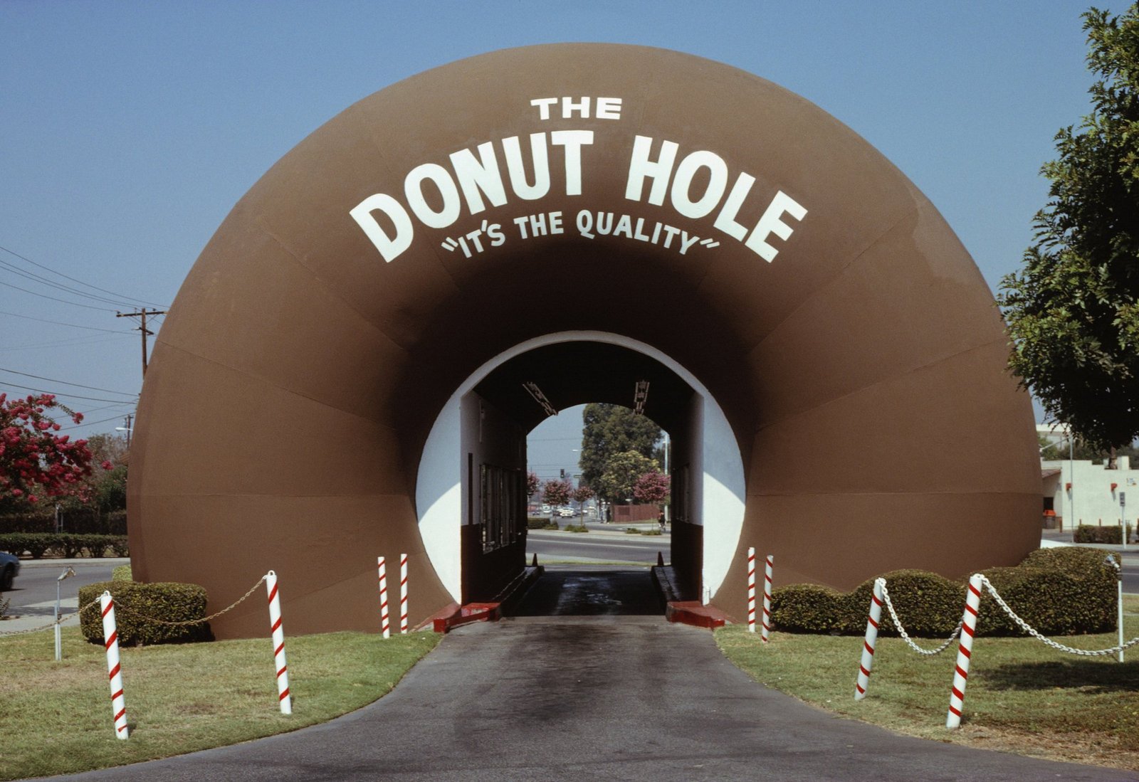
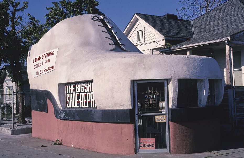
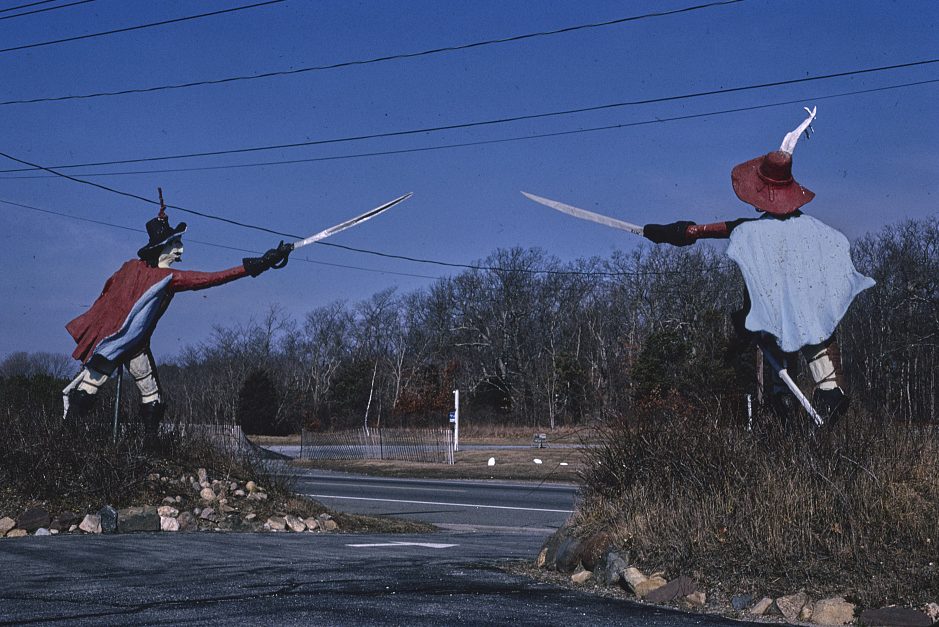
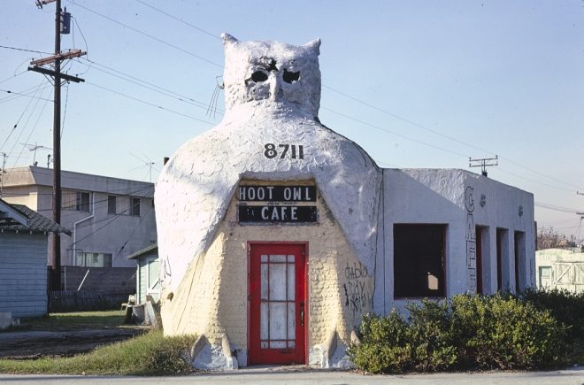
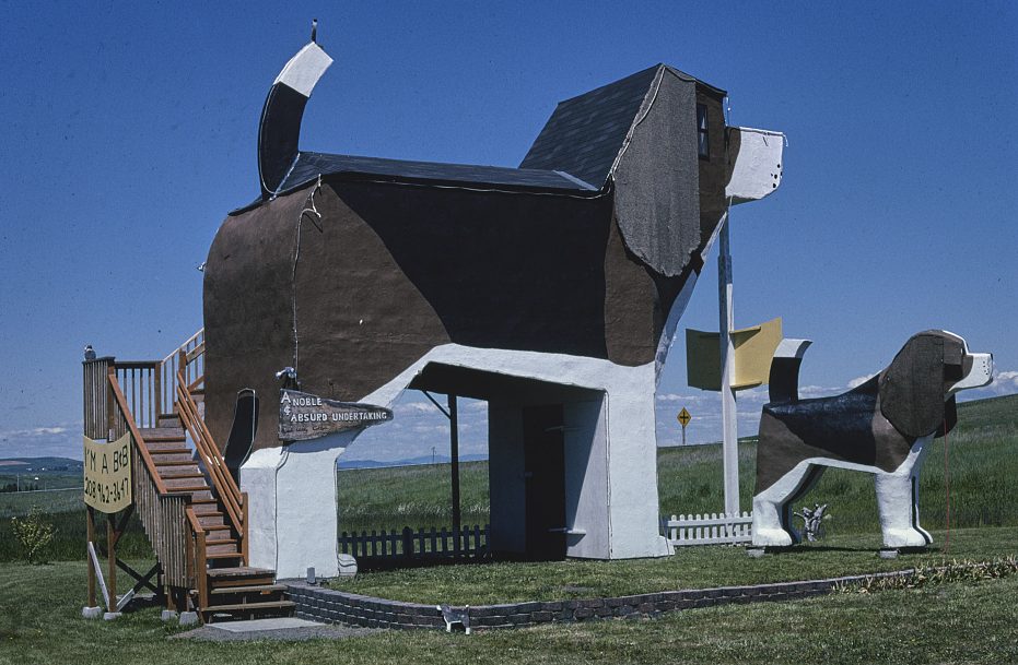
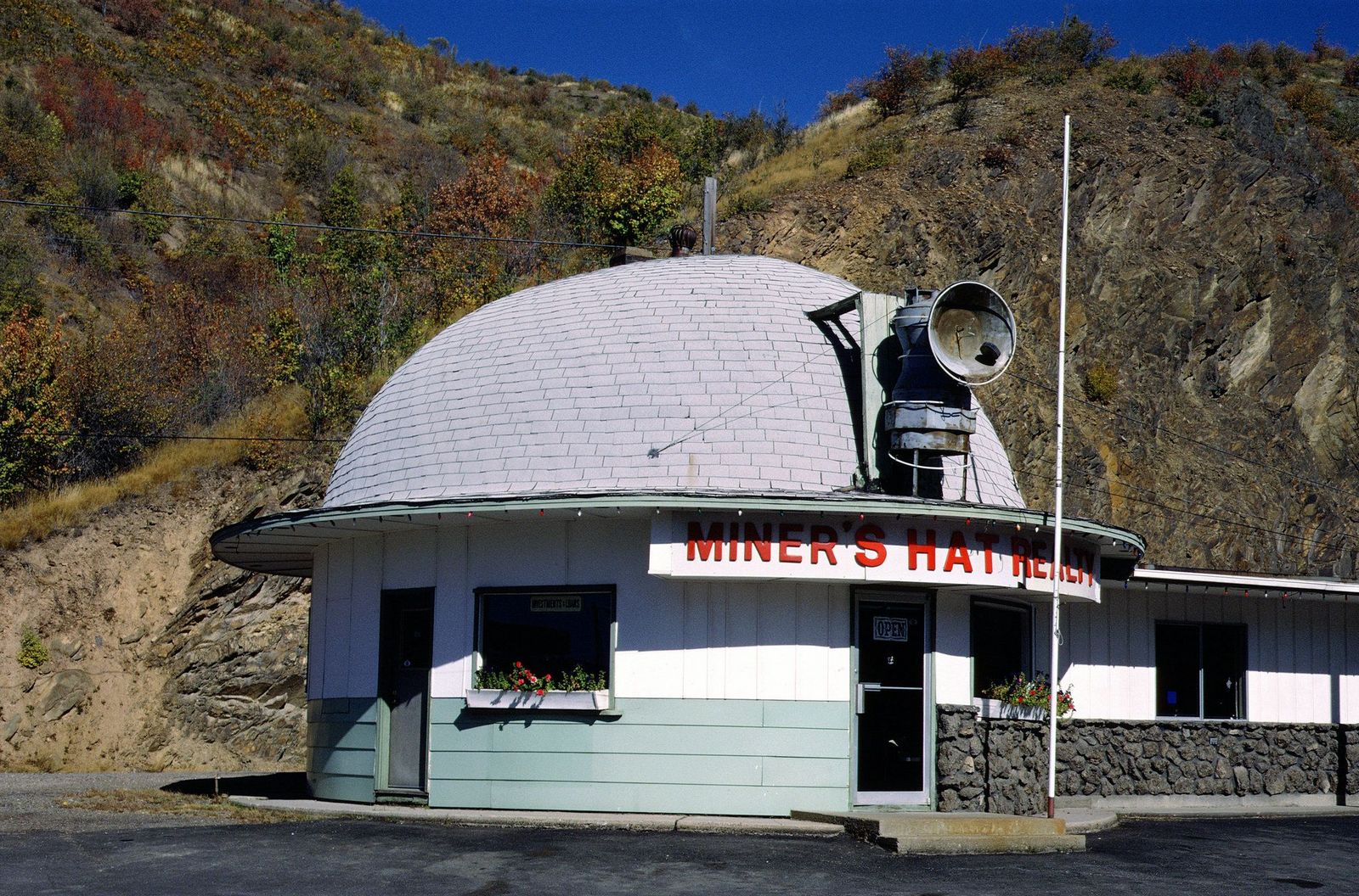
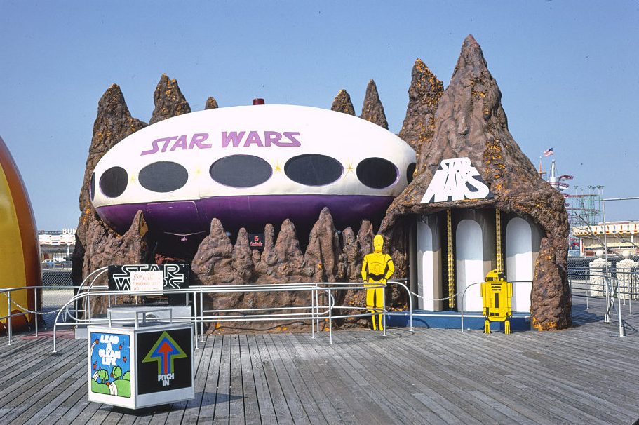
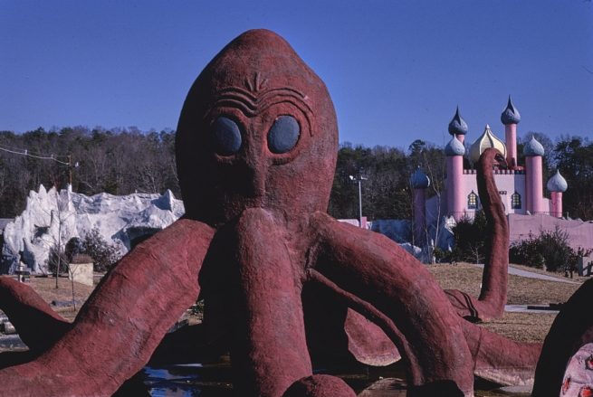
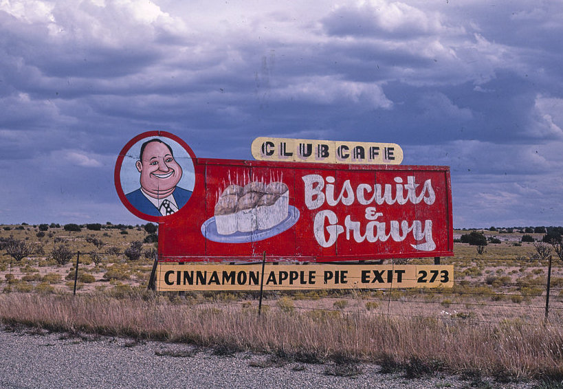
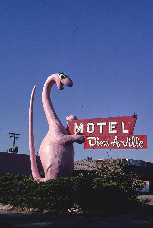
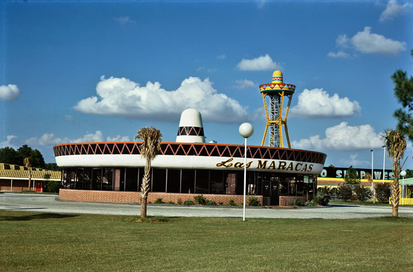
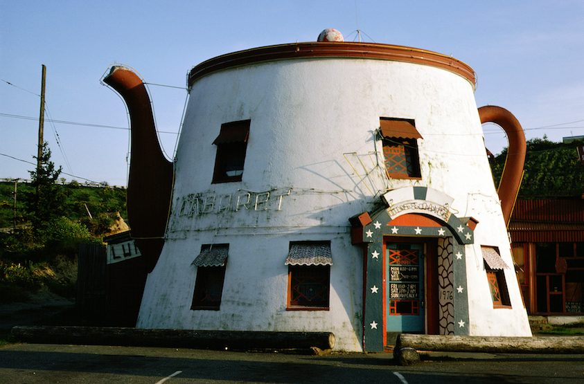
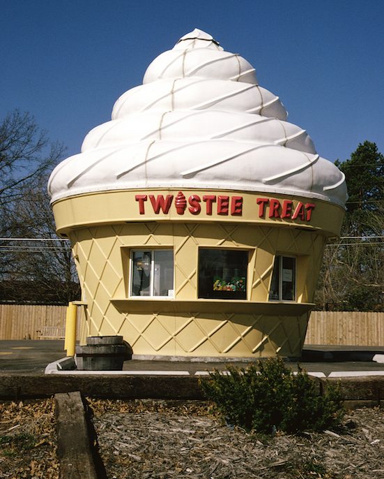
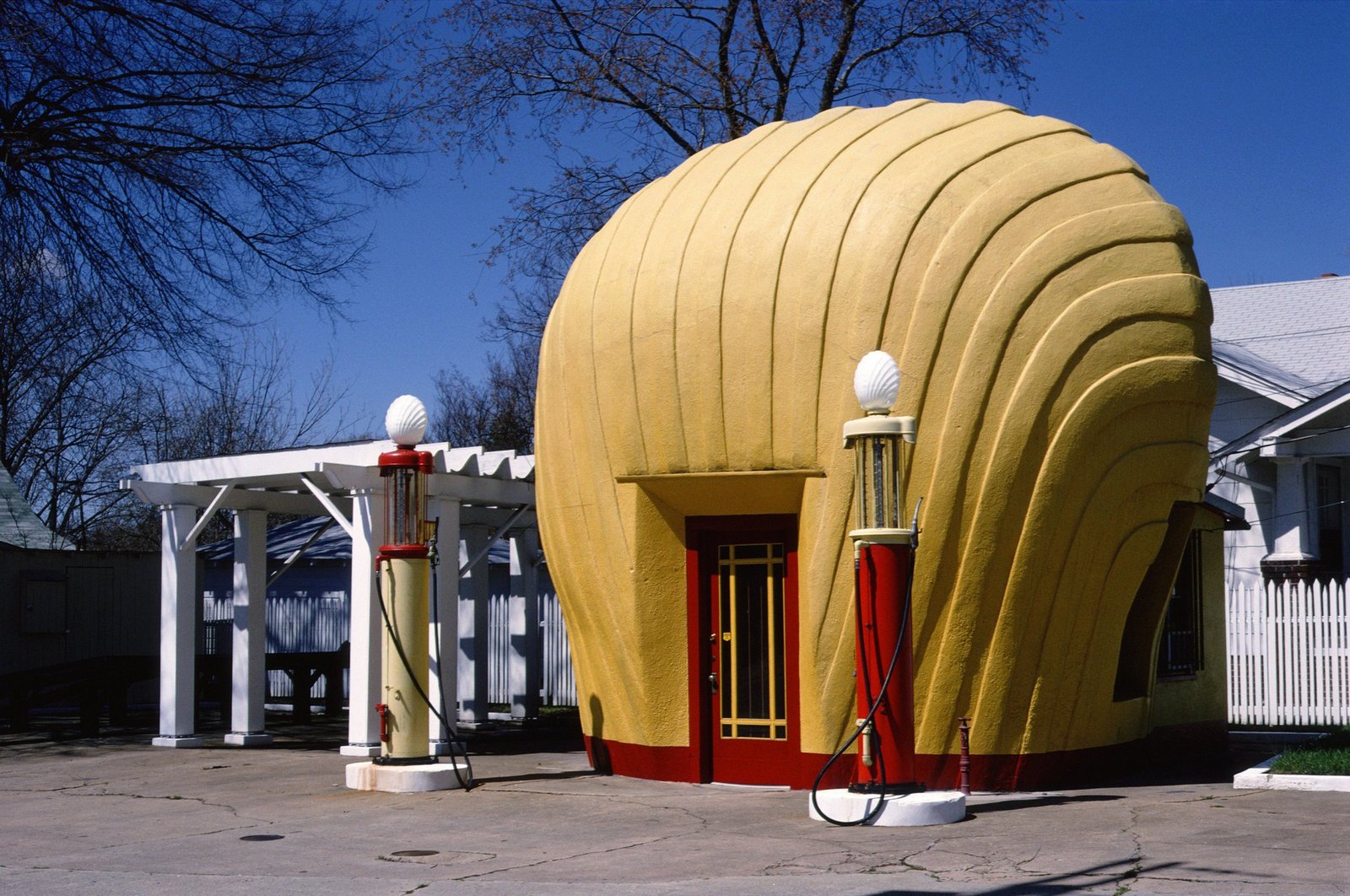
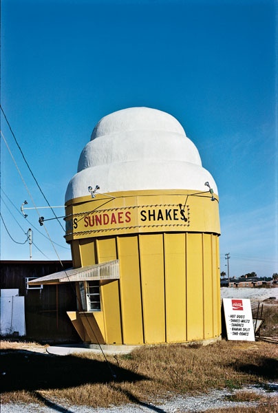
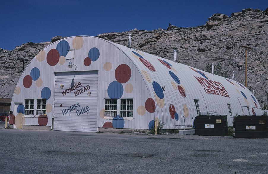
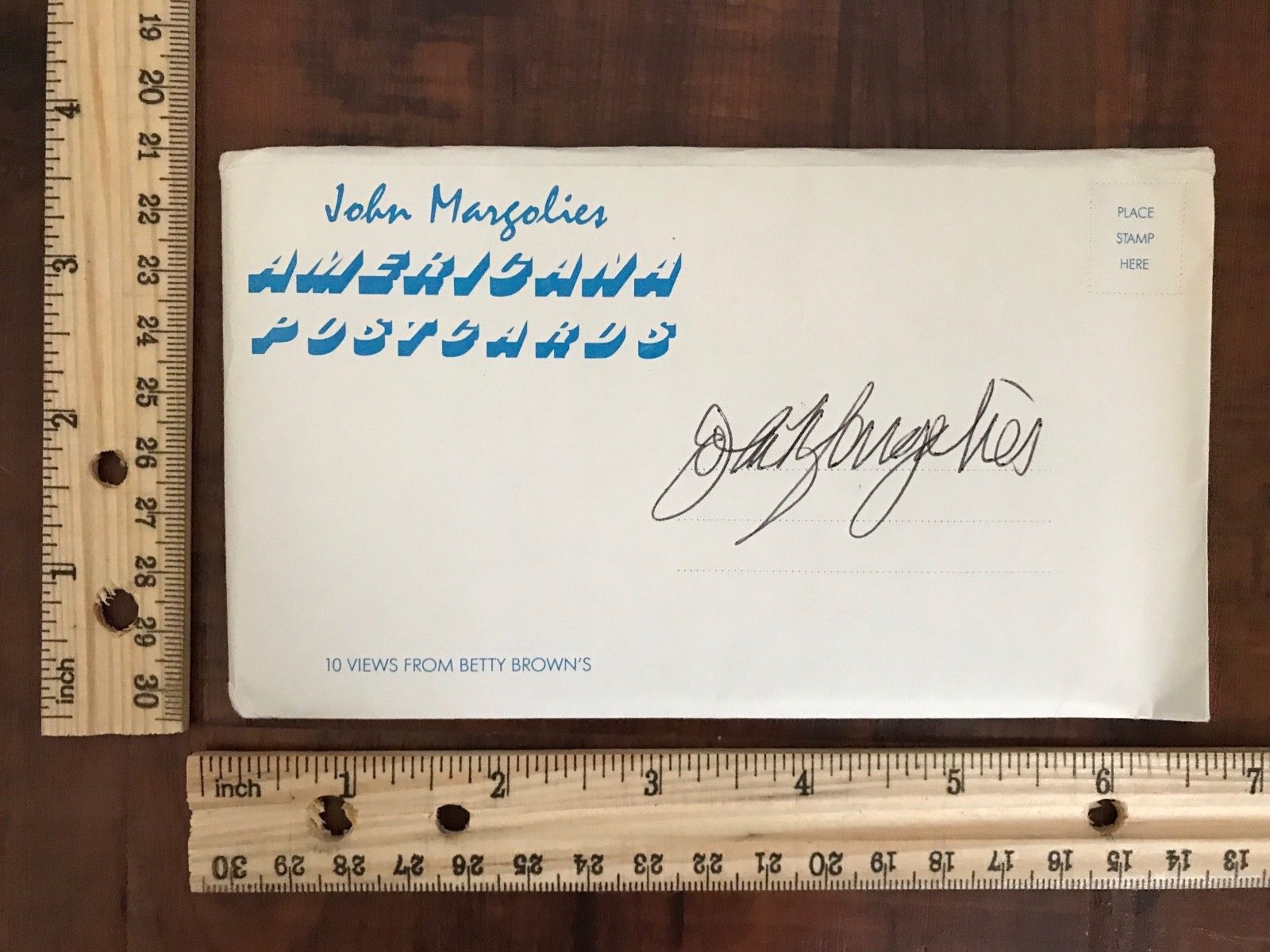
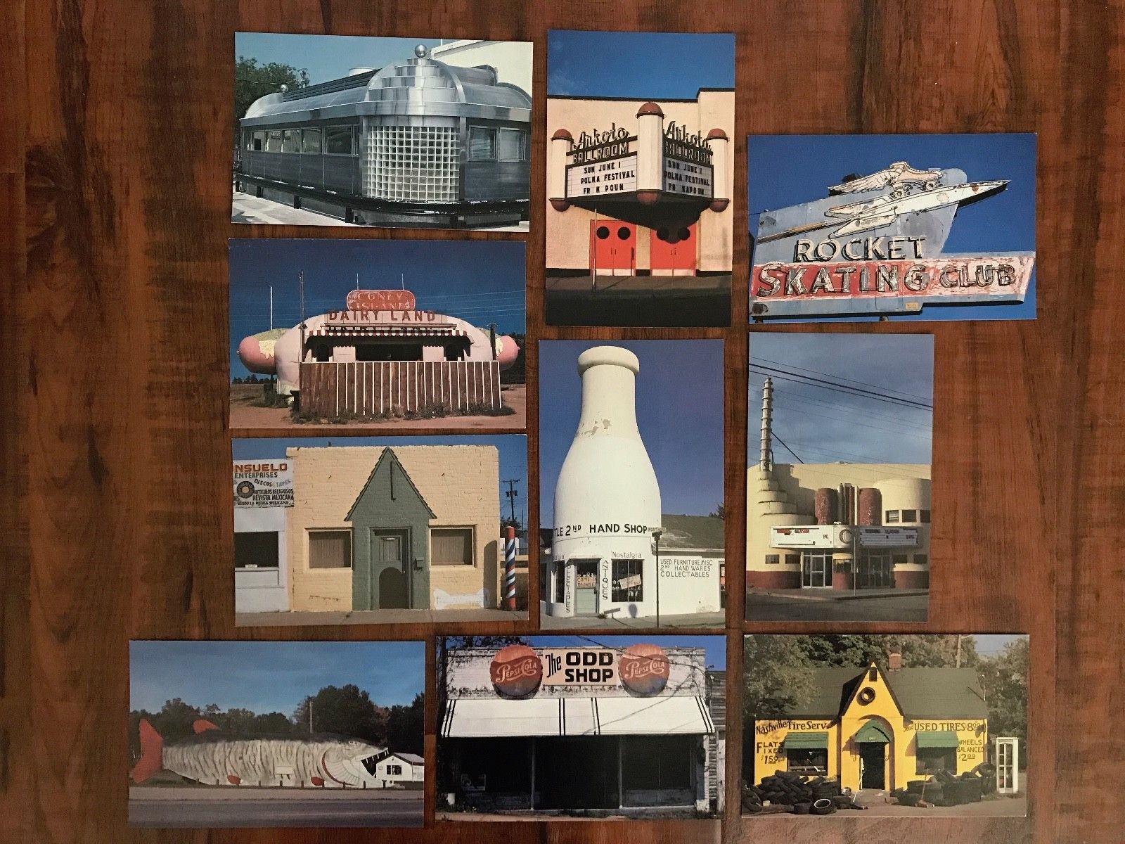
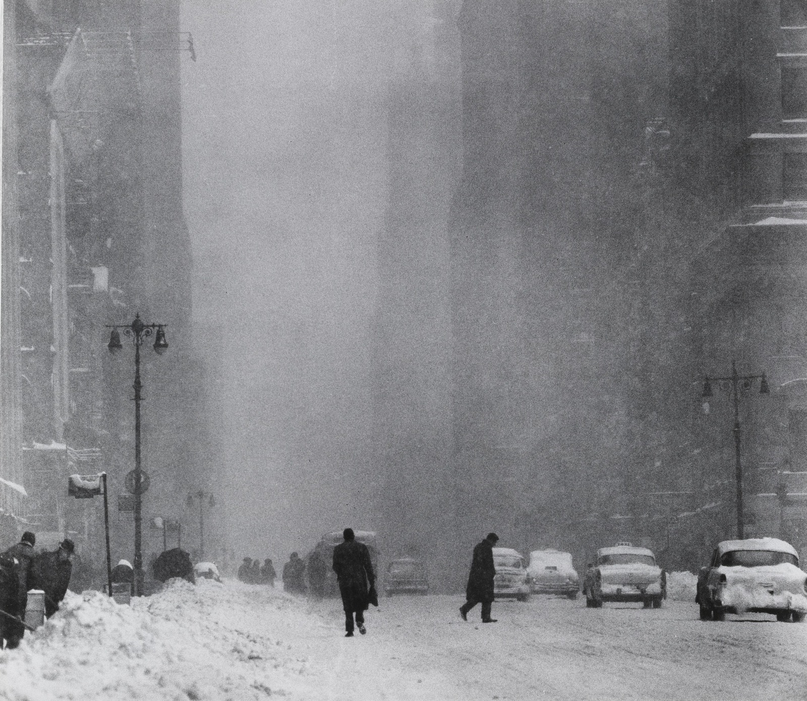
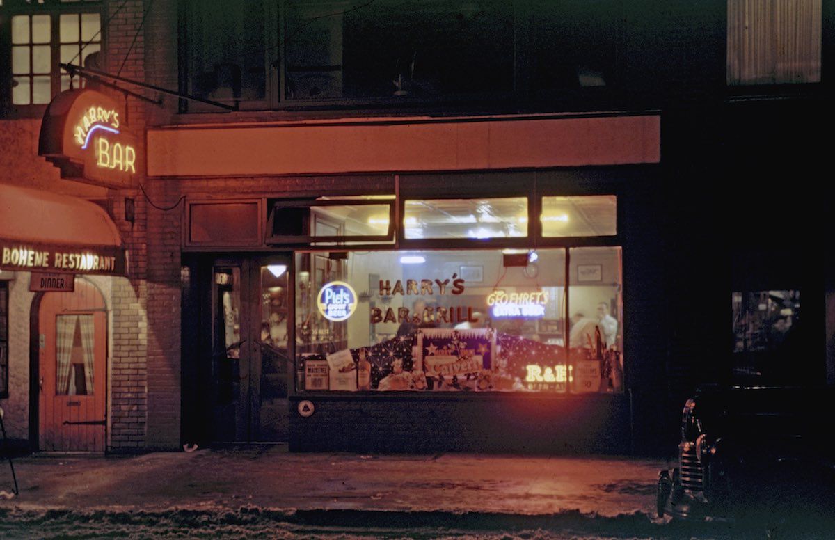
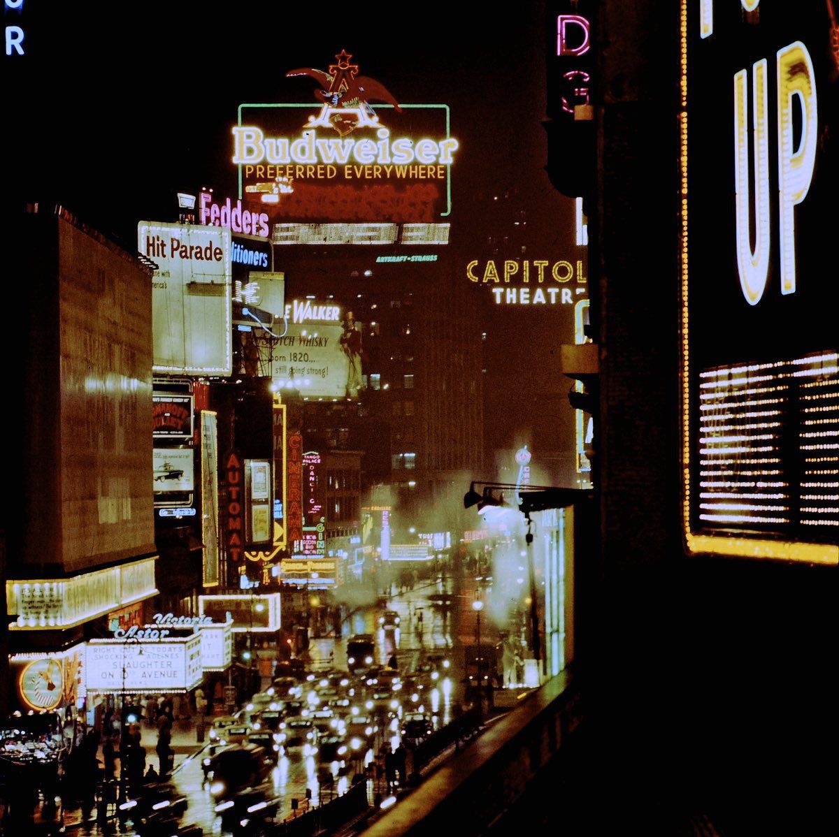
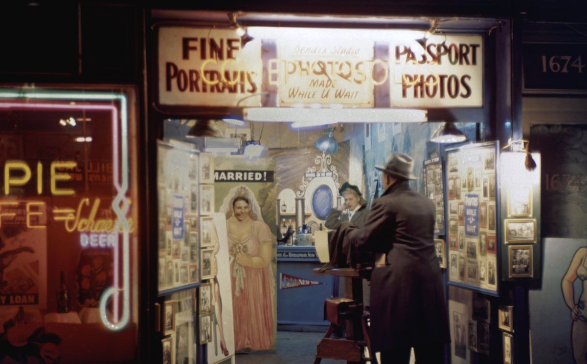
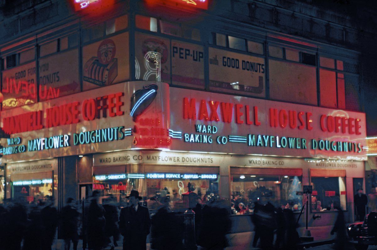
“In this, one of the most epic of Adam’s landscapes, humanity is signalled by a field of scattered crosses in the near foreground.The settlement itself makes an irregular diminishing rhythm from left to right, in contrast to the flowing horizontals of the mountain range and the swift, painterly markings in the sky.The whole of this musicality is related to the imperceptible slowness of the moon rising.” - Ian Jeffrey.I don’t know whether I agree with that, but it’s very nice. It’s called ‘Moonrise, Hernandez, New Mexico’, and it’s by Ansel Adams, probably his most famous picture. Adams is widely regarded as THE landscape photographer. Legend has it that the picture above was taken at the end of a very frustrating day, he’s been trying to capture the beauty of the US landscape for the Department of the Interior, but it’d in failed exposures and missed opportunities. Then he spotted the scene, not a problem today, just whip out your iPhone and bingo! (Or, if you’re on Facebook, stick your face in front of that moon, pull a funny face, then bingo). But in 1941 it wasn’t that easy. For a start, his camera was the size of a small suitcase, every shot required loading a separate sheet of film, but by far the most tricky element was the maths. Adams had perfected a new style of broad, sharp, long-exposure landscape photography. Assessing the light to time to aperture ratio was crucial to this style of photography, so a light meter was vital. But once he’d screeched his car to a halt, set up his suitcase-sized camera he couldn’t find his flippin’ light meter. The sun’s going down fast, the light’s changing, it was already going to be a challenge, now it’s an impossibility. But Adams knew his stuff, so he thought he’d give it a go. He knew that the moon threw off approximately 250 c/ft2 of luminescence, so working with this figure, he calculated that a shot such as this would require a one-second exposure and an aperture setting of f/32. Not convinced he’d got it, he started loading up more film, but by the time he’d finished the sun and the moment had vanished. The detail, composition and technical brilliance of the shot influenced a generation of landscape photographers.Without the technique there would be no picture.John Margolies wasn’t great technically.To me, his images often look too dark, there’s no discernible composition, some look wonky, not cool, deliberately angled, just not lined up properly.They look like just recorded what happened to be in front of him.The things he chose to record were the things that his parents wouldn’t let him study as a kid. Whilst on family road trips he’d see these odd, quirky bits of American commercialism and would ask to stop and look, only to be turned down, “My parents’ generation thought it was the ugliest stuff in the world, I liked places where everything was screaming for attention: ‘Look at me. Look at me.’”So when he grew up he’d rent Cadillacs and head for the flyover States, often for as much as eight weeks at a time.When he wasn’t in a Cadillac he was the editor at Architectural Record, but his views of what was or wasn’t of value didn’t always go down well with the establishment “they think Toronto’s City Hall is important, but not those wonderful gnome’s-castle gas stations in Toronto.”When he put on a show of his pictures in 1970, they were appalled at his cheap 35mm images of the crass commercialism of America. Where’s the technique?As much as I admire Ansel Adams’ technically perfect pictures of mountains, I can only look at a handful before I start wondering who the next Arsenal manager might be or what Donald Trump has been up to, whereas I can spend at all day looking at cafes in Utah shaped like Guppy.They’re just more human.

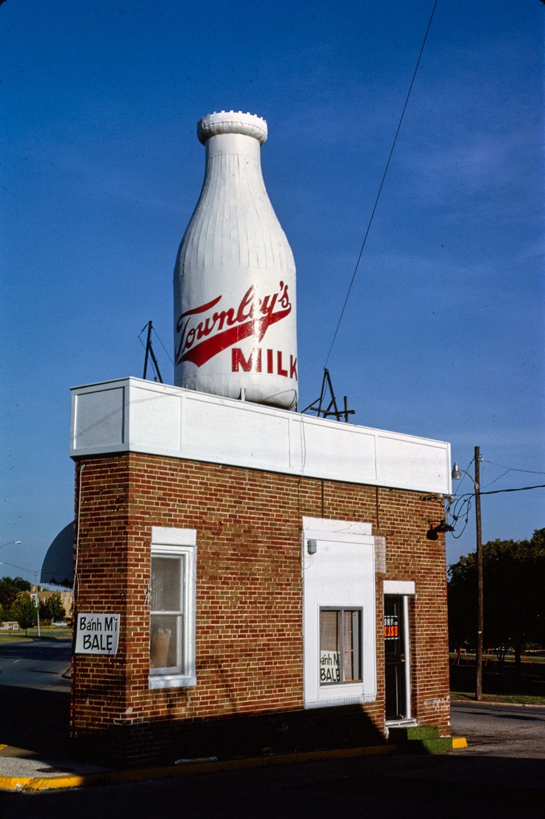
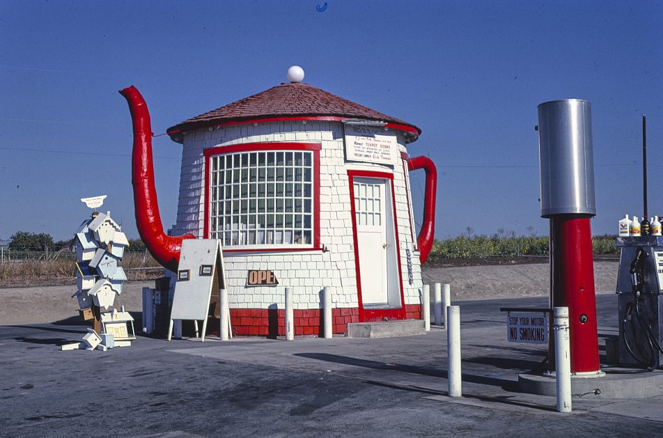
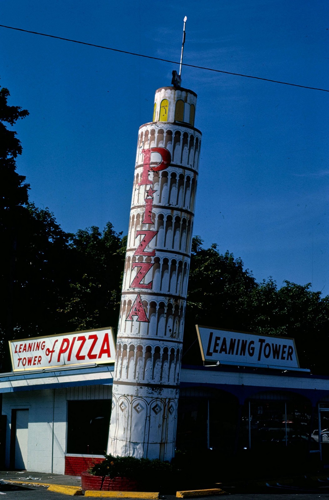
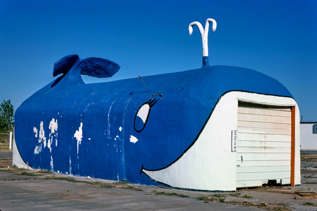
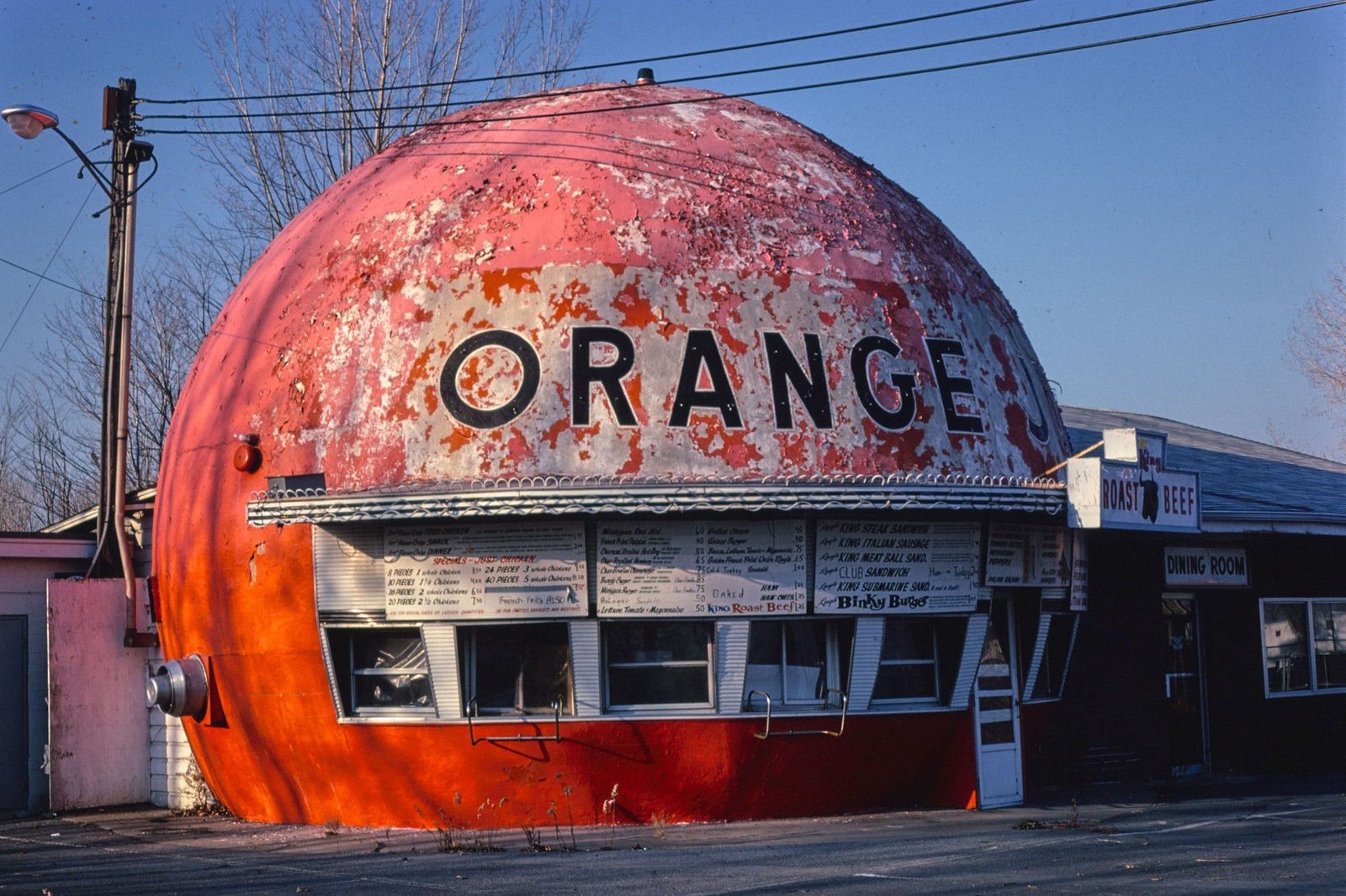

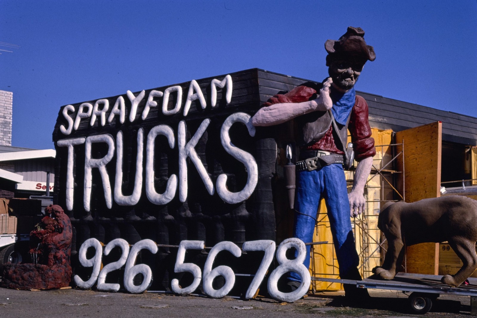

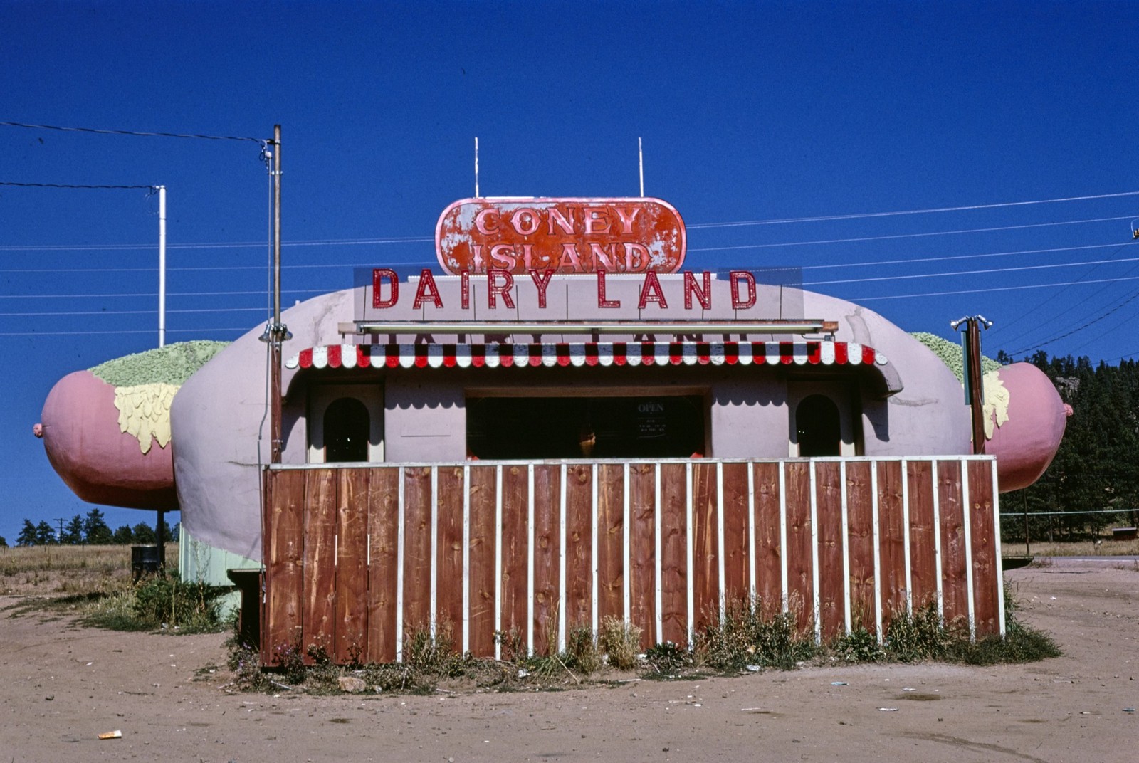


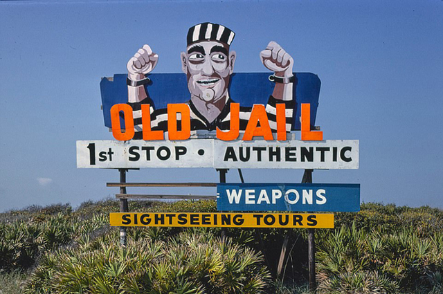


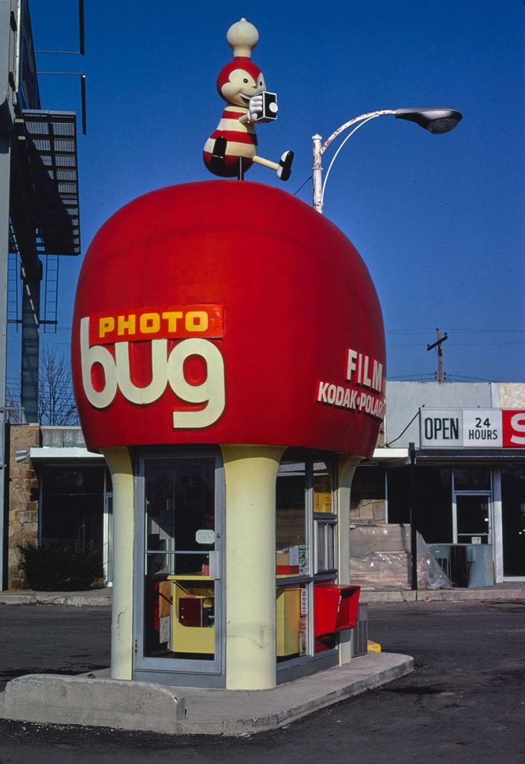
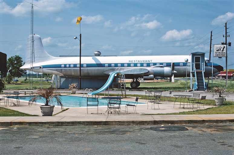
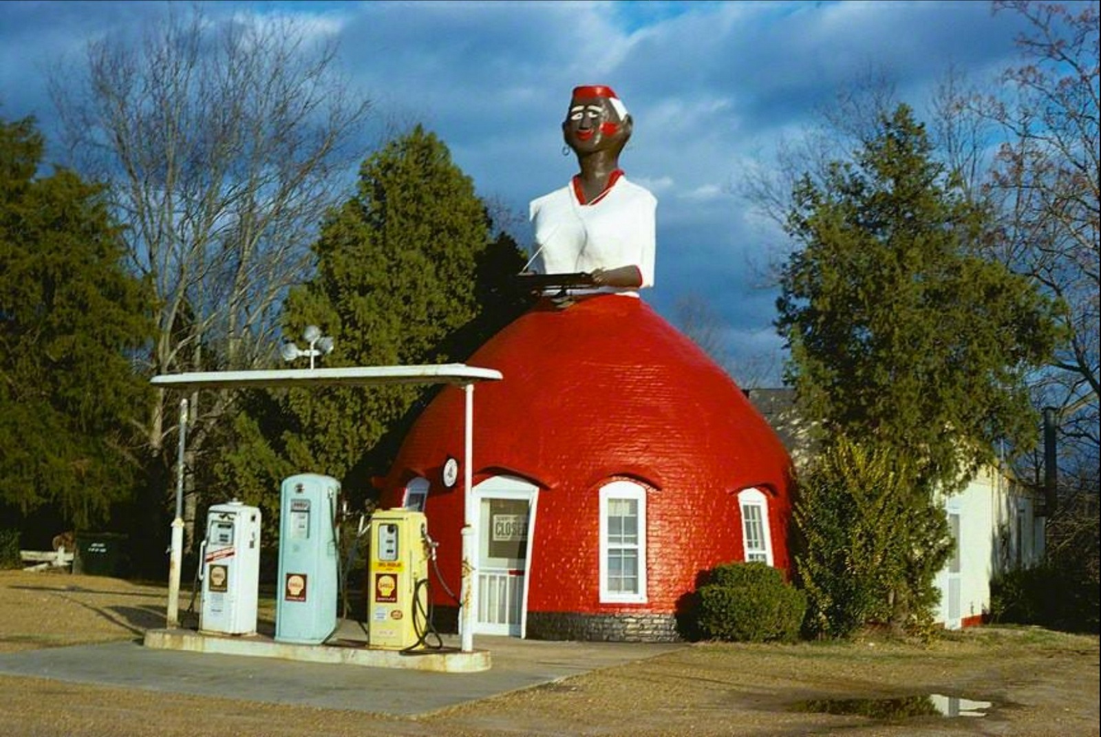

Nb. Postcards sold by Margolies.
A few months after setting up Campbell Doyle Dye a publisher came in for a chemistry meeting.Before we'd set up I'd been at AMV/BBDO, The Economist was one of the clients I looked after, so I was excited to share the work Sean and I had produced as it was not only relevant, it was arguably the best campaign for a publisher ever?"Did you do those here?""Er...well, no, that was at our last agency, Abbott Mead Vickers"."Oh?""We've only just started, but we wrote, art directed and creative directed them all, so...y'know.""I see, could I see some work you've created here?""What...in this building?"We didn't make the pitch list.This question would be asked again and again throughout our first year.I was conscious of this when I started DHM.I tried to generate work created in 32 Southampton Street as quick as possible.Consequently, anyone walking past our front door were offered free creative work. I've always been an easy touch for empty-pocketed types needing something creative.I can't help it, people generally seem nice, (as they do when they need something for nothing), and I'm optimistic, so the minute people start talking about their problem, I start thinking, I begin scribbling and before you know it I'm phoning others to let them in this glorious opportunity to work for absolutely nothing at all.So it wasn't a problem when, just after opening our doors, we got a call from a client saying 'We don't have much money, but we'd love to talk to you about our product?'. My new partners and I schlepped up to Birmingham to get briefed. We arrived to find an enormous building, ch-ching! Maybe we have different ideas on what constitutes 'not much money'?Once inside, the receptionist seemed to have trouble finding the names we'd been given.Eventually, we were introduced to two people sitting at a work bench in the warehouse.Maybe they'd come down from the management floor to deal with a stock issue?Nope, we were looking at the whole company; Andrew, Hayley and the wooden work bench.Flip! We'd spent £500 train tickets and burned three full partners days to talk to a company that was smaller than ours.Although you couldn't doubt their honesty, they didn't have much money.We tried to hide our feelings as we were taken through the ins and outs of the world of dried fruit.I made notes.
By the end of it we were won over, they were both thoroughly decent and incredibly charming.Hayley in particular, she seemed obsessed with fruit, where it's from, when it's best, she talked about 'chasing the sun throughout the year' to get the best, ripest fruit.How could we not help this lovely husband wife team?Besides, we had some capacity, (as people call it when they're not busy).'Do you have any money...for our time?''No.'Jeez! Technically, that's even less than 'not much'.'We could send you some fruit? Maybe if you just tell us what you think of our pack and name...and anything you think would help?'Sod it! We agreed and gave an address to send the fruit to.
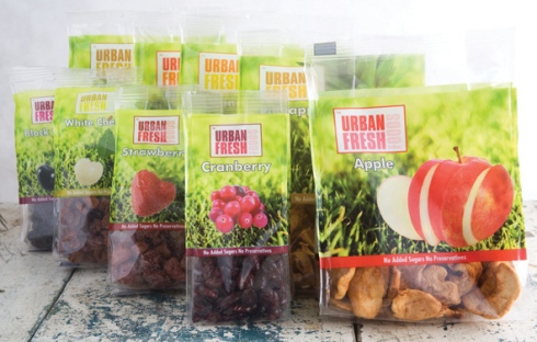
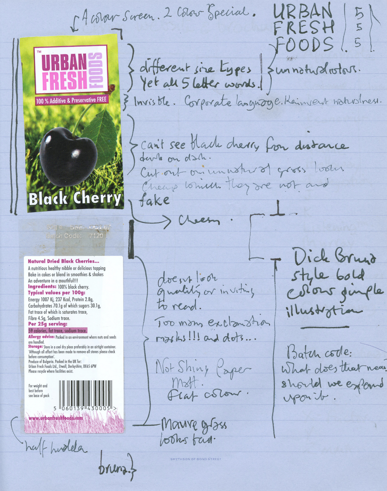
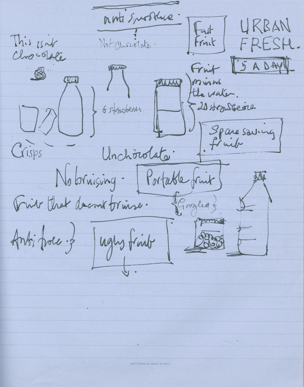
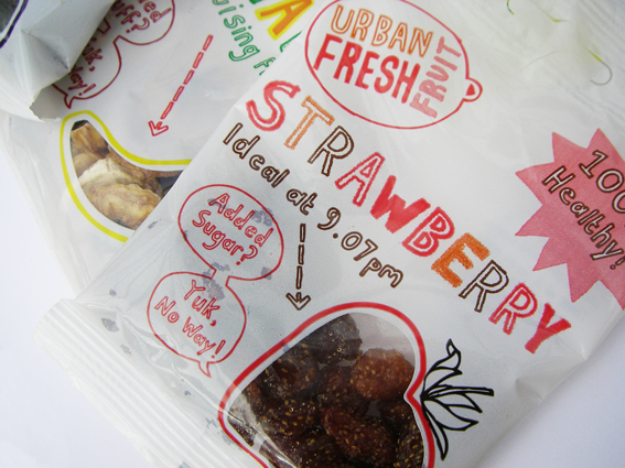
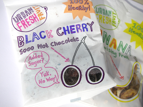
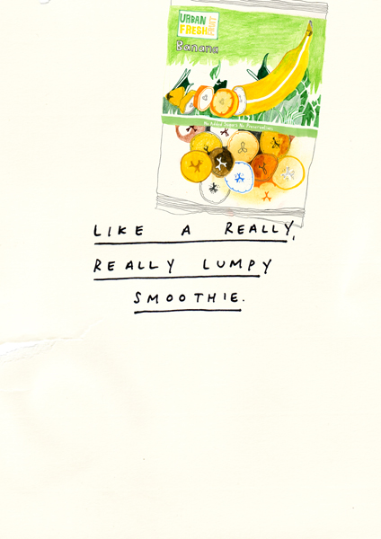
THE NAME: Terrible. The fruit wasn't 'urban' or 'fresh'. Only one of the three words was true.THE PACKS: Terrible. Bland, cheap-looking and they carried the lie 'Urban Fresh Fruit'.A shame, because it was a very high quality product, it just didn't come across.Hayley laughed and politely thanked us for our insults.She said we wouldn't be able to address those issues until the next packaging print run, about three months.A few days later, a bundle of dried pineapple turned up, it was the size of a small child.In our next meeting Hayley told us the one thing that was really driving her nuts; supermarket's wouldn't put her products in the snacks aisle, they insisted on putting them with the baking ingredients, (ironically, next to the nuts).She felt it was a healthy snack, so wanted it to be in the confectionary aisle, near the competition; chocolate, crisps and the like.Everyone looked blank as we all tried to think how the hell we could change that?Maybe we print something on the trays in-store?It's the only 'media' we had.I wrote a bunch of messages pointing out that either these trays contained snacks or were in the wrong aisle.Things like 'Not chocolate','Snack not ingredient', 'Delicious at 9.07pm' or simply 'In wrong aisle', these were in printed in the brightest neon inks across the fronts.(I guess they'd call this disruption at TBWA.)
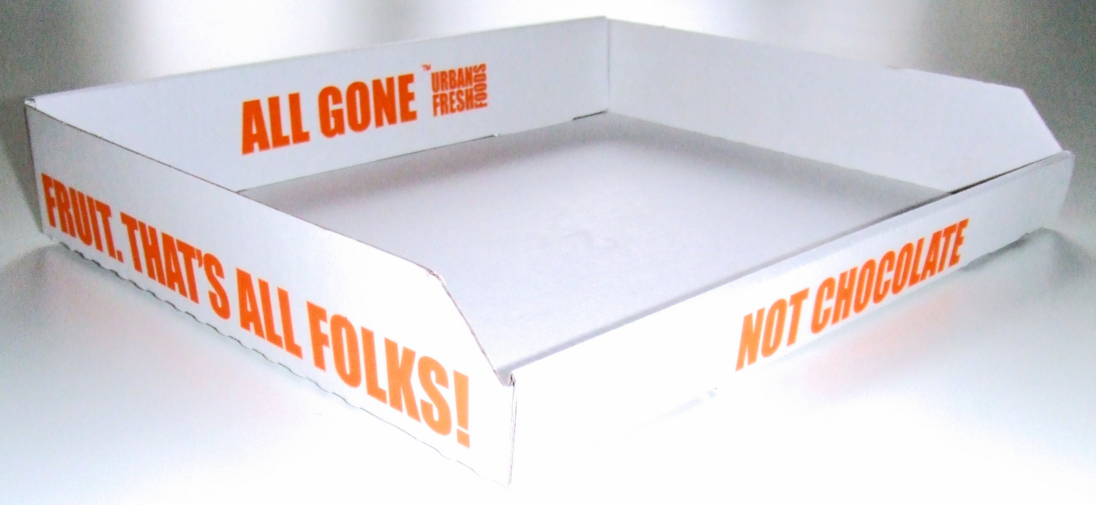
Within a couple of months they were moved to the snacks aisle.I can't remember how much of this was down to the trays and how much was down to Hayley's ongoing campaign, but they certainly helped.Next, Hayley had an idea; 'Could you write a manifesto, to give us a bit of a personality?''Sure, do you have any money yet...for our time?''No. We could send you some more pineapple?'Er...ok.So, what are Urban Fresh Fruit about?I couldn't really get past the fact that Hayley was so into fruit, she seemed so obsessed, charmingly so.I remembered a thought I'd had whilst pitching for Innocent.
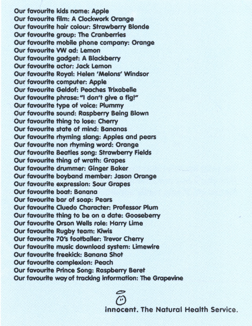
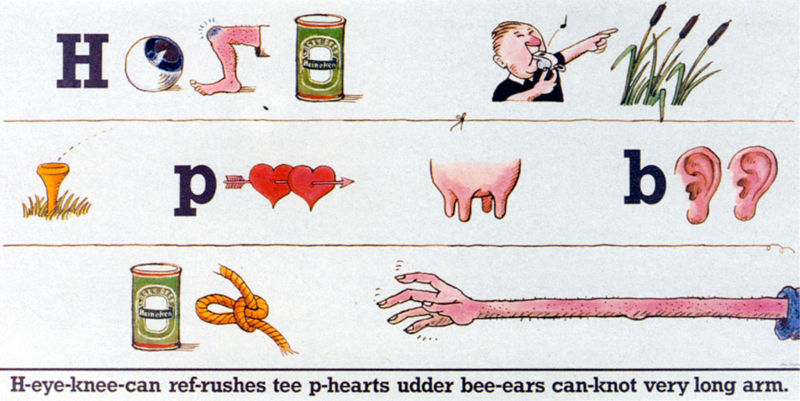
Maybe we could print them as posters and send them out as shops or get people to put them up in-store?I enlisted our brand new team, David and Phoebe, to come up with more ideas for favourite fruit things.If we wanted to get people to put it up in-store we'd have to make it look more attractive, more visual some-how.Maybe I could mix in little pictures with the words, like that old Heineken poster?But more home-made.Not corporate.
Hayley and Andrew loved it.I asked if they could raise a bit of cash to get a decent illustrator involved.They said they could.I asked if they had any money for our time yet?'No. We could send you some more pineapple?'Another baby-sized batch of dried pineapple arrived in Covent Garden.
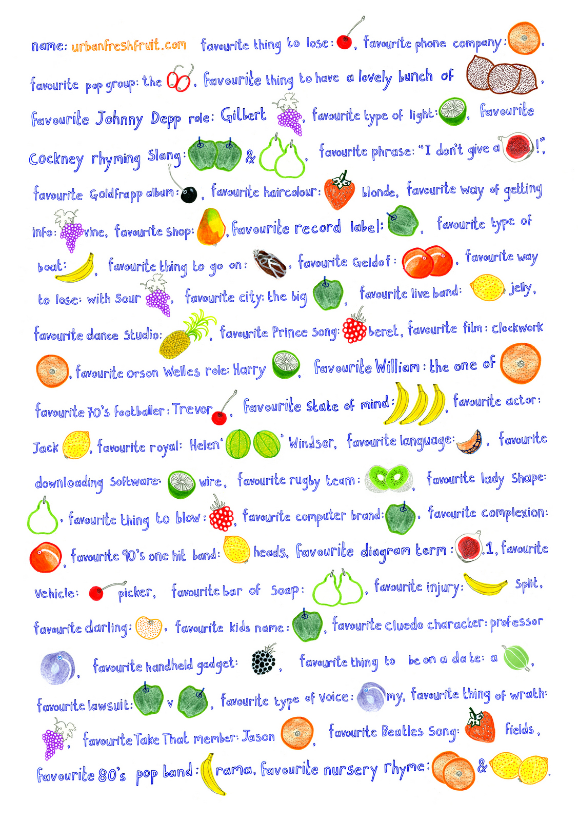
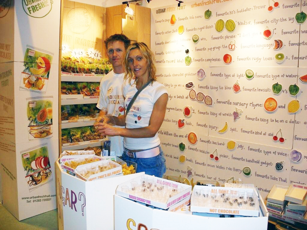
We printed a lot of them.They were sent out to supermarkets, corner stores and head offices.It became the 'warmth and personality' of the new stand at trade shows and festivals.Hayley even sold the posters at both, for £5 a pop.
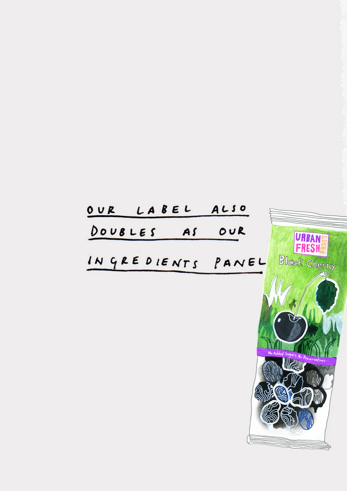
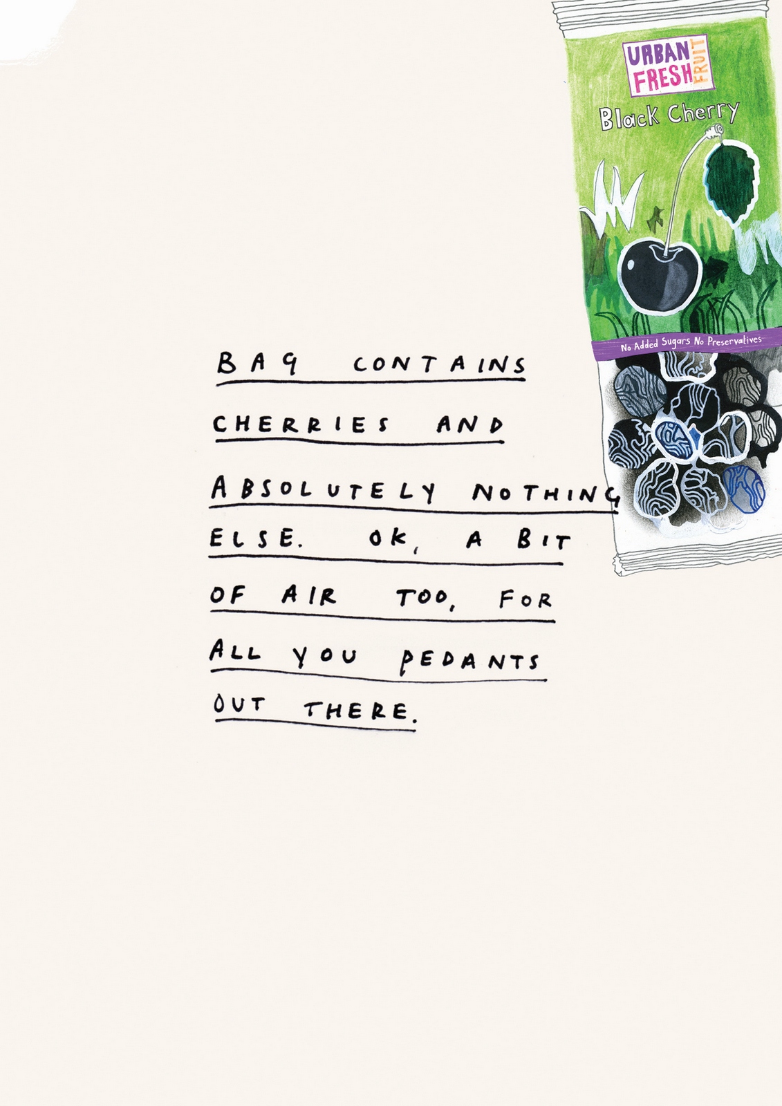
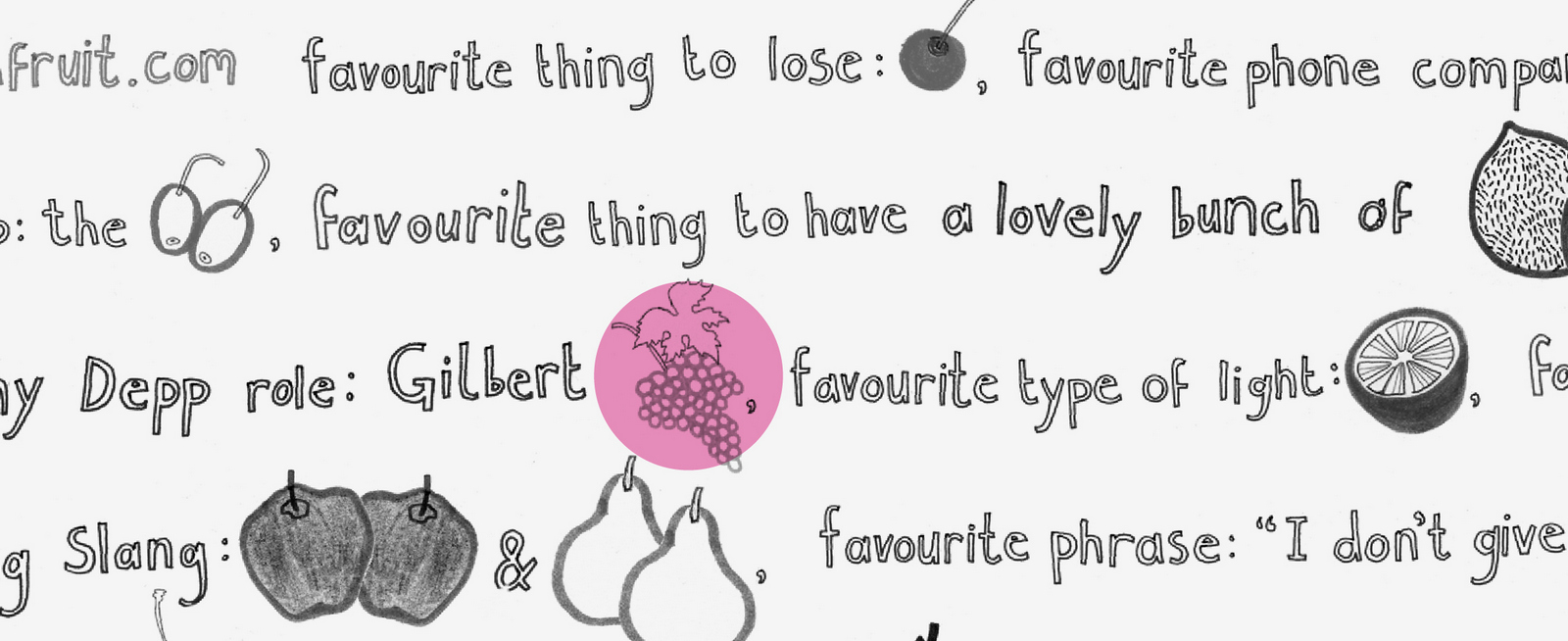
The visual style, wording and phrases used on the new pack design.
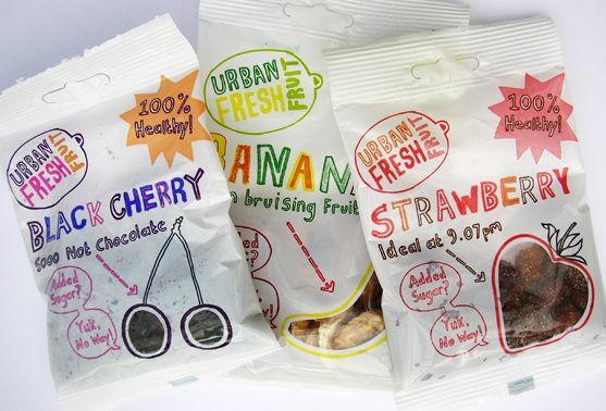
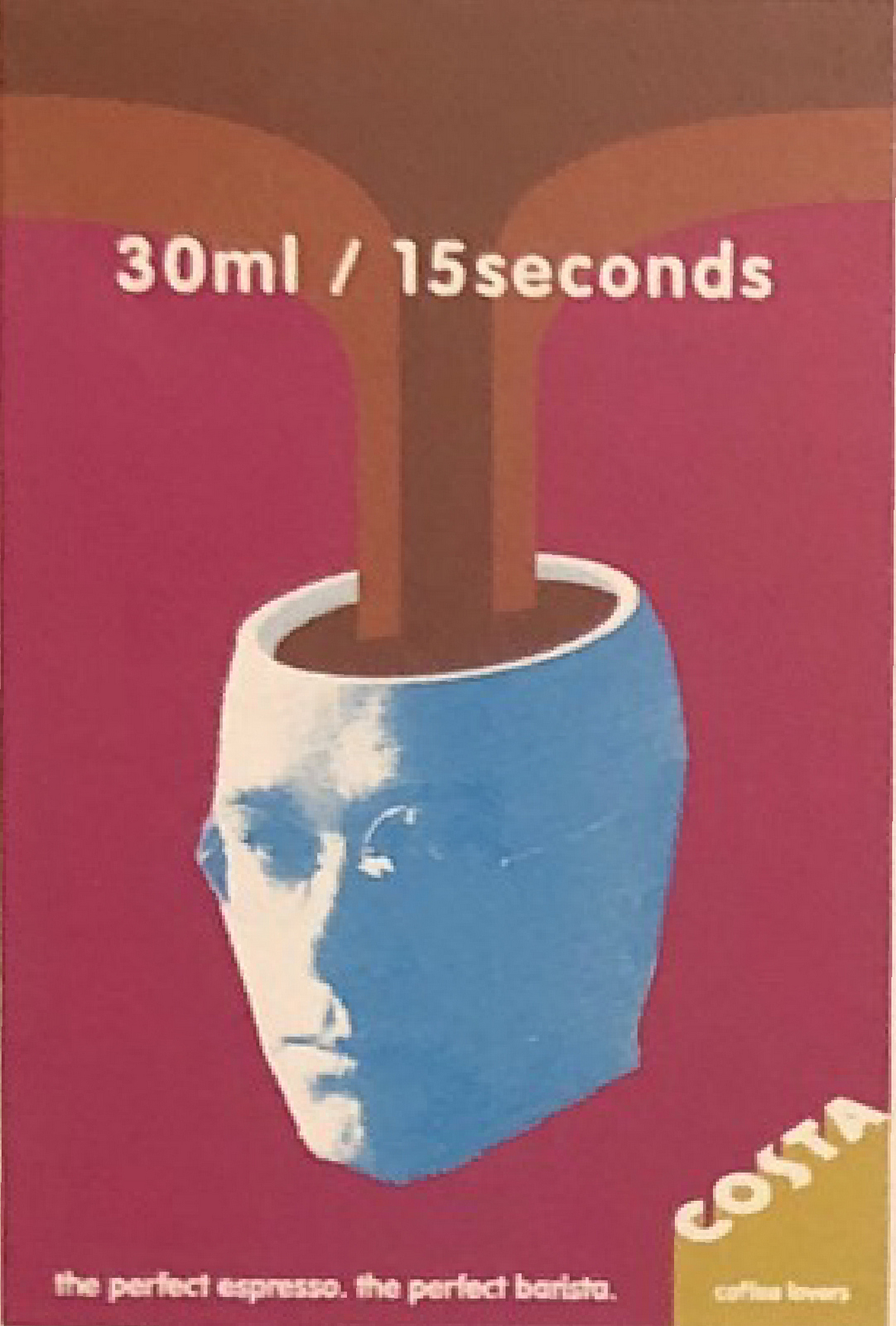
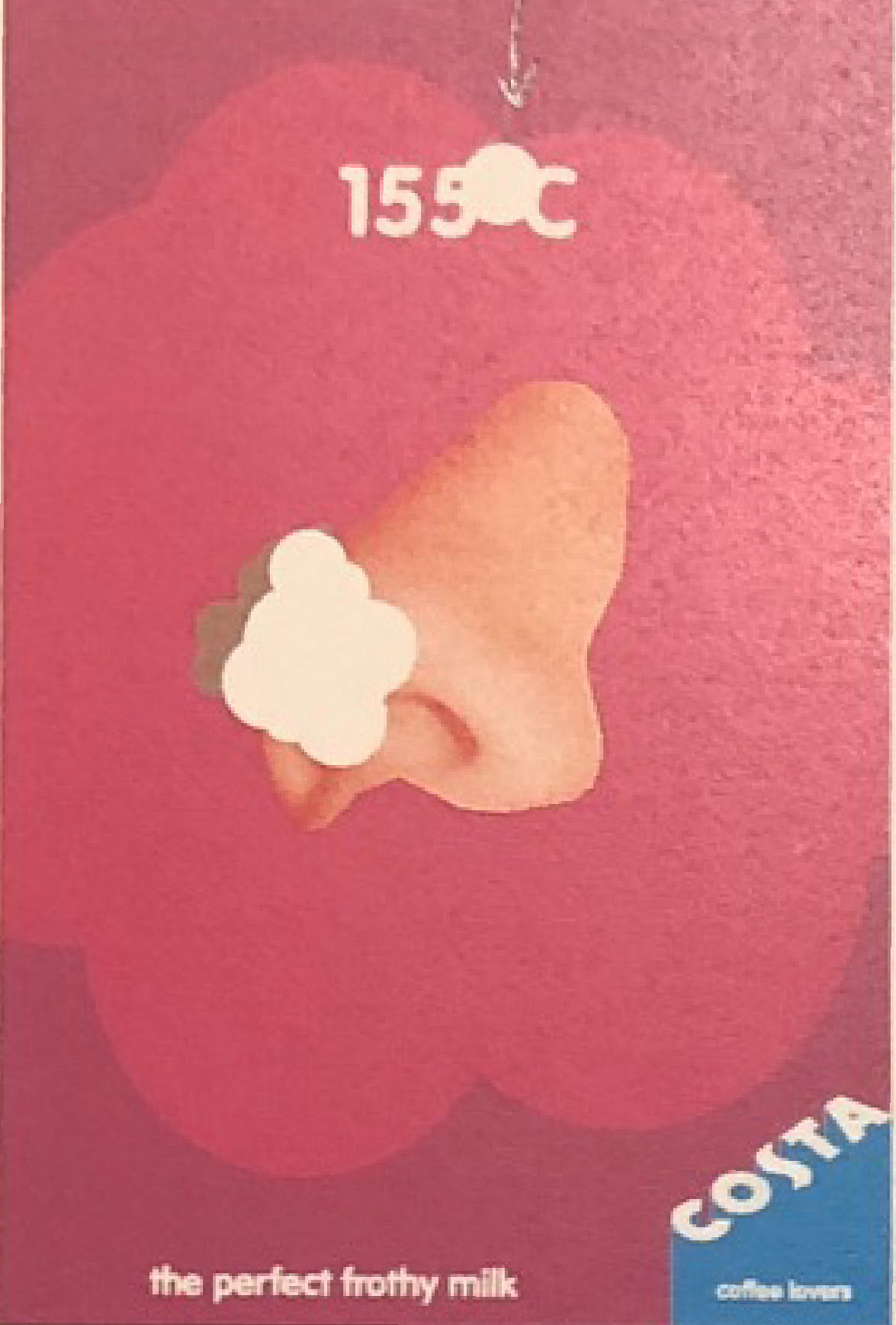
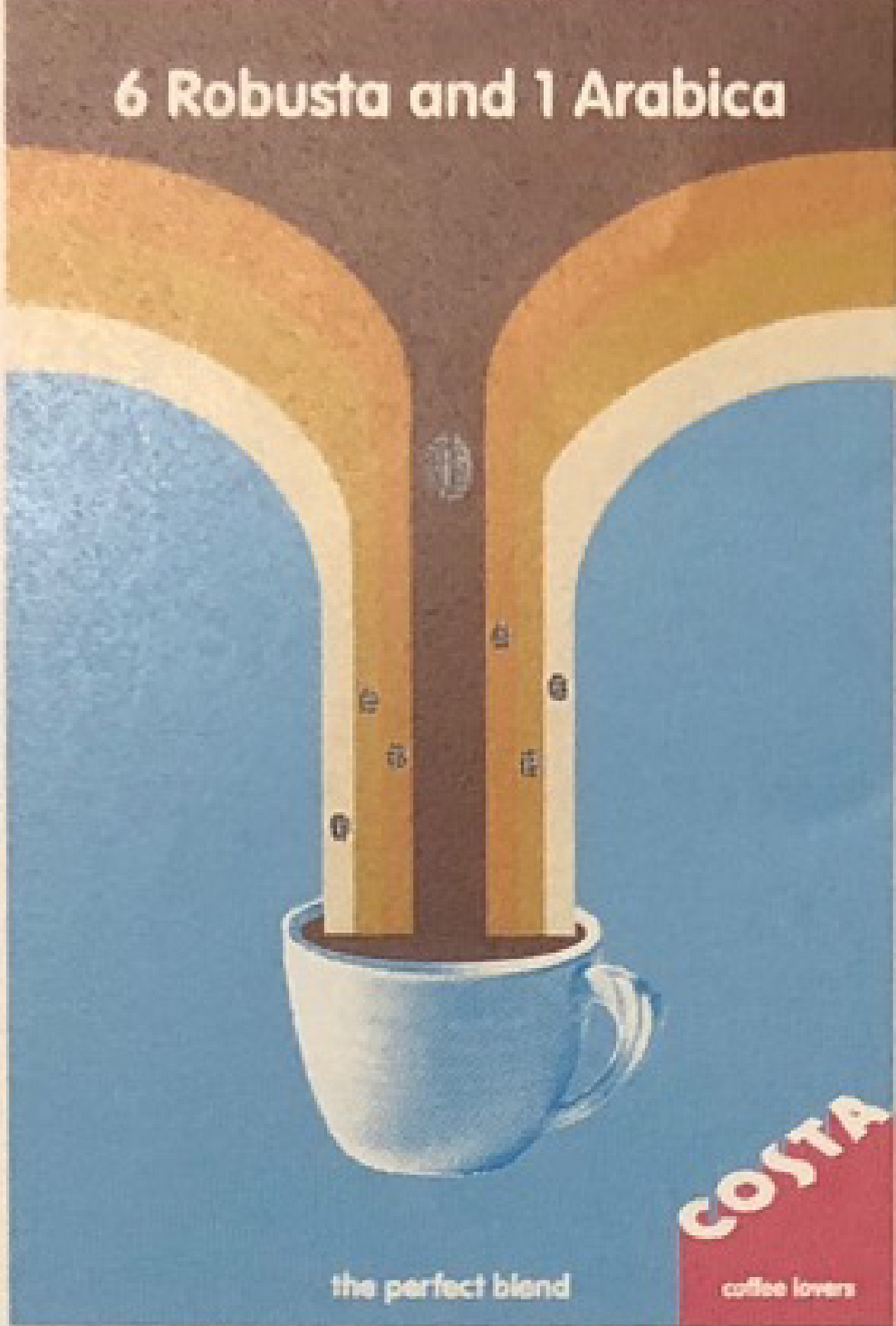
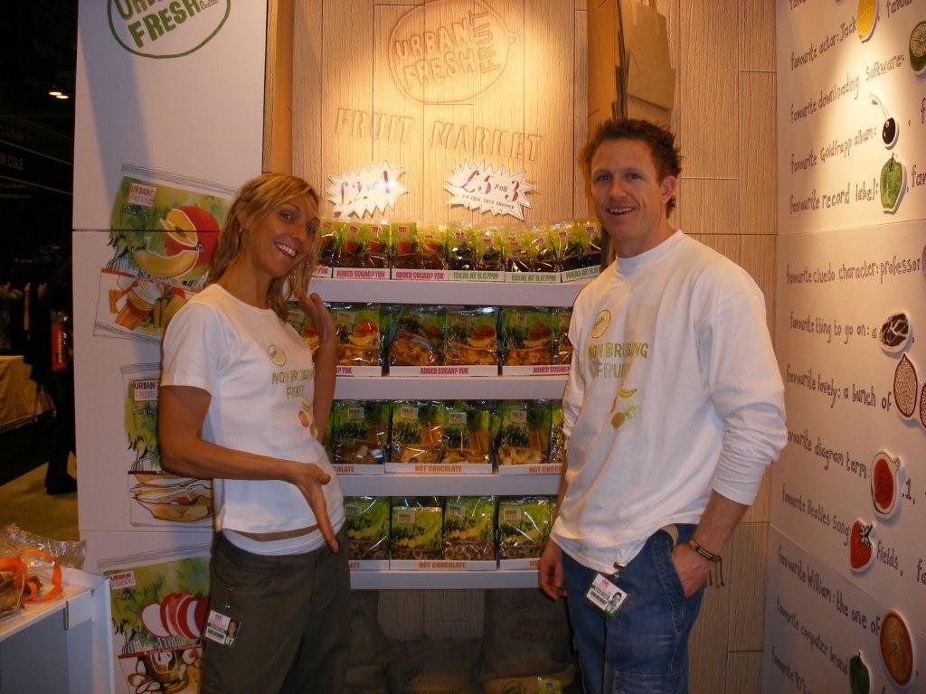
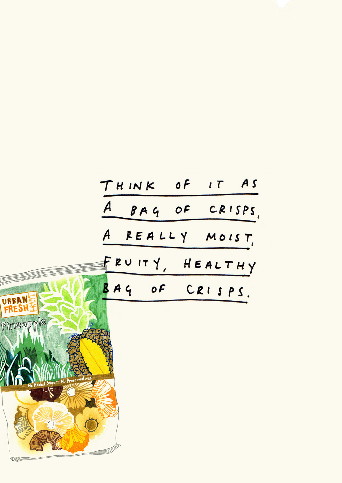
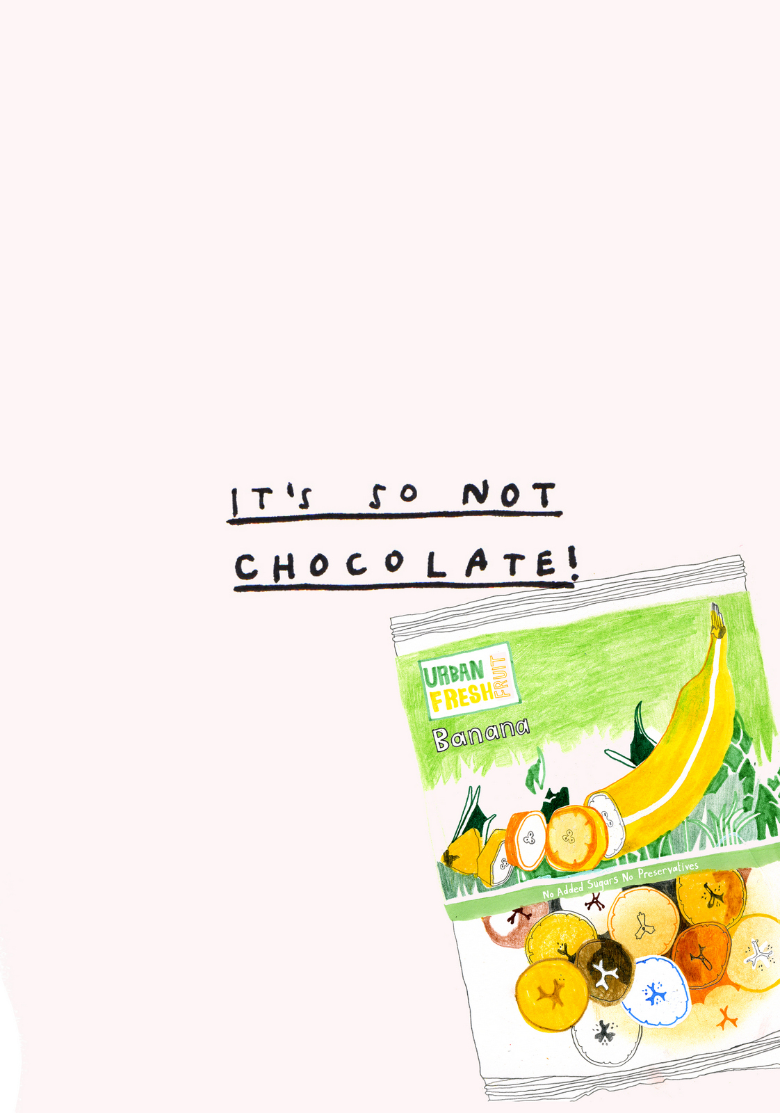
The next phase was actual, paid for media!Cool, should be fun.'Do you have any money yet...for our time?''No. We could send you some more pineapple?'Ok.Right, how do we make these things come over as a healthy alternative to chocolate and crisps?It's probably best to mention the opposition so that we can give them some context.Also, we need to make them really pop, oh, and look natural, keep that home-made, un-corporate vibe we had in the poster.
As time went on DHM started to pick up clients who actually paid, it was getting difficult to justify being paid in pineapple. Hayley said she loved our work and would love to find a way to continue working together.We talked about taking a small percentage in Urban Fresh Fruit as compensation for our time moving forward.The sticking point was whether 1% or 2% was fair, and also how much time would that buy going forward?It wasn't a stand off, Hayley and Andrew were in no rush to give away any equity and we were doing it simply to justify giving away so much time, not because we thought it would be worth much.We also had to justify to our accountants, very dyed-in-the-wool, buttoned-down types who were insistent that it's better for a businesses to be paid in actual money than fruit, old school.About a year to 18 months in, we reluctantly told Hayley and Andrew we were just too busy to keep working for fruit.We wished them well.I hadn't heard much from them since.I just came across this.
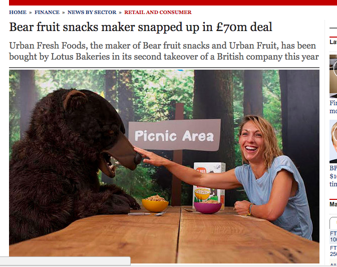
Flip!
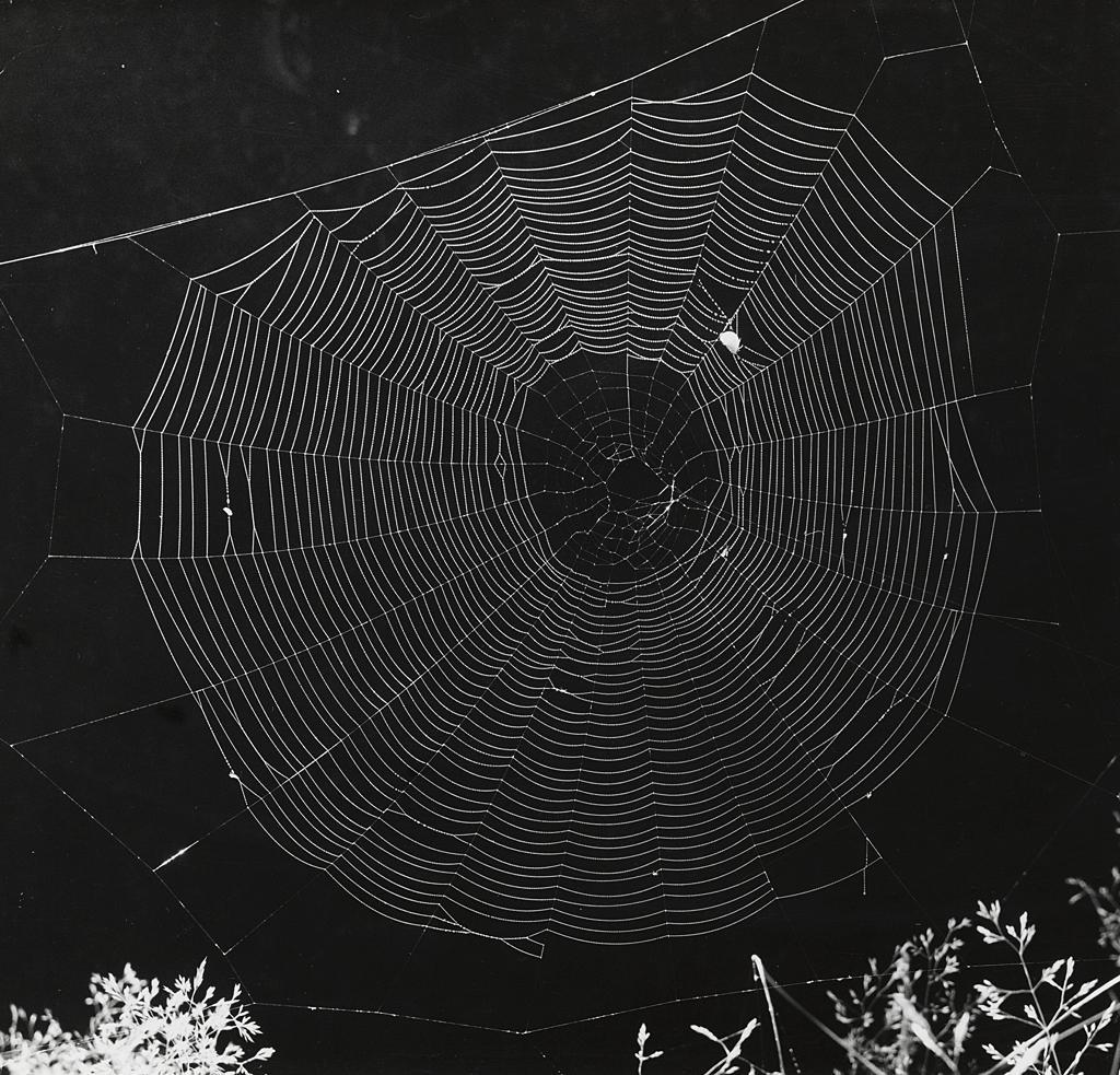
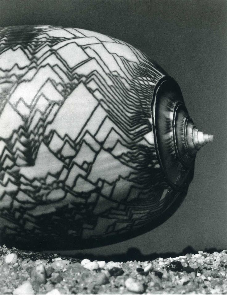
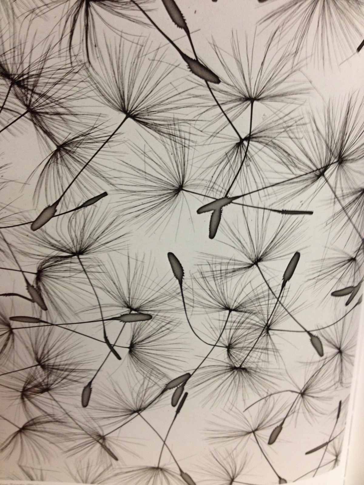
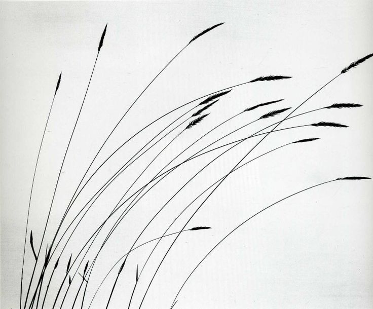
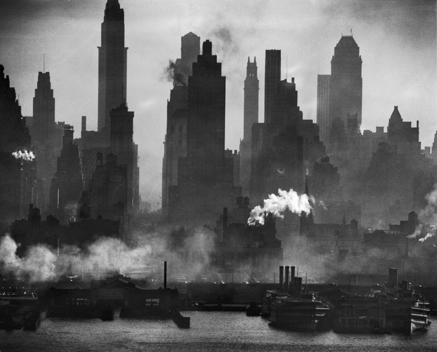
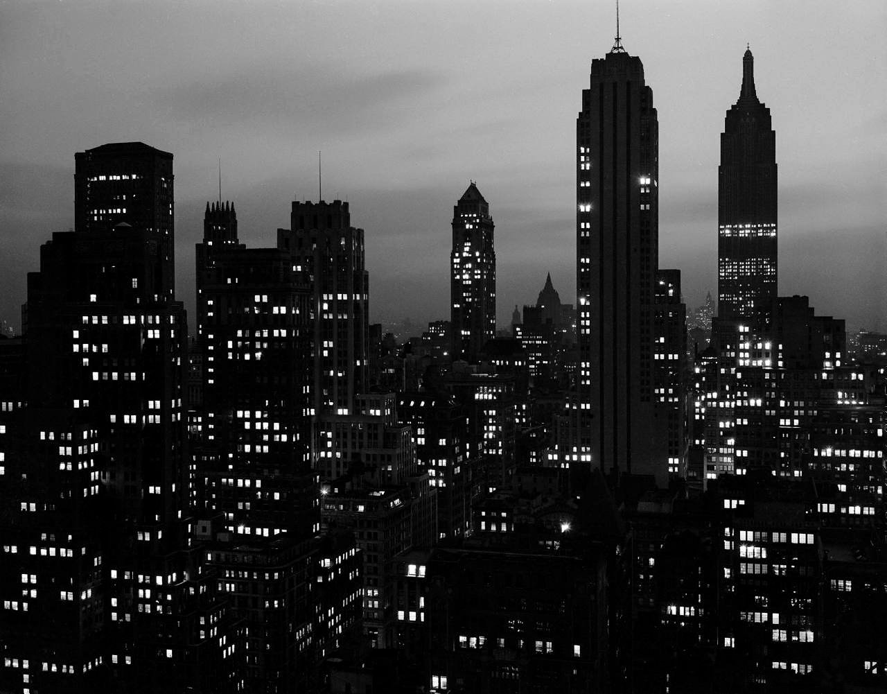
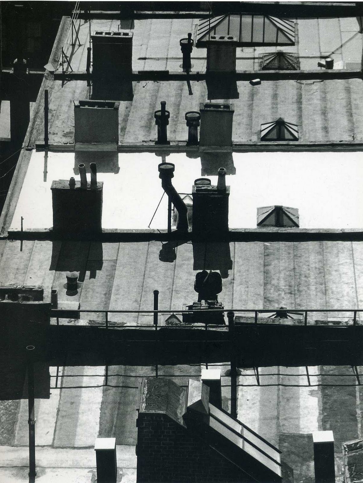
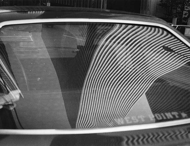
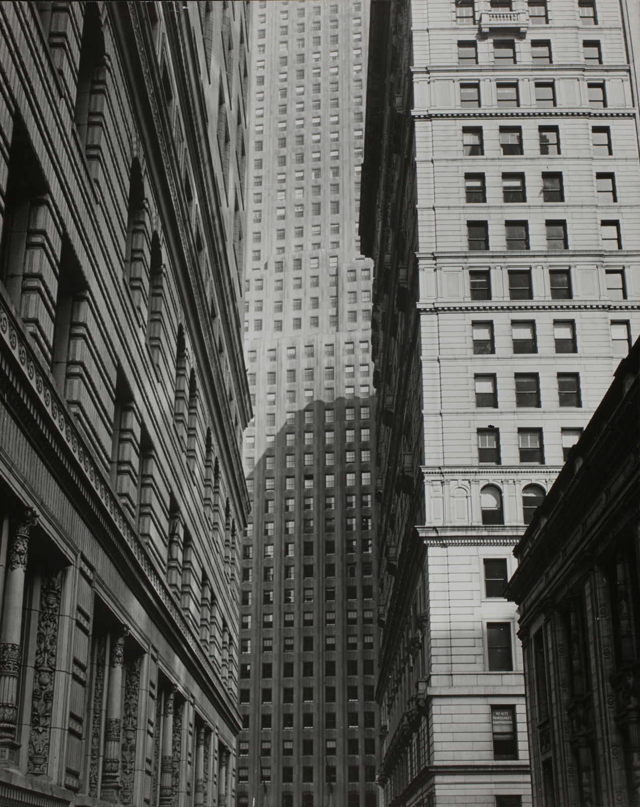
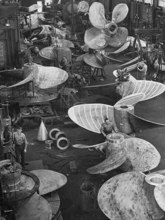
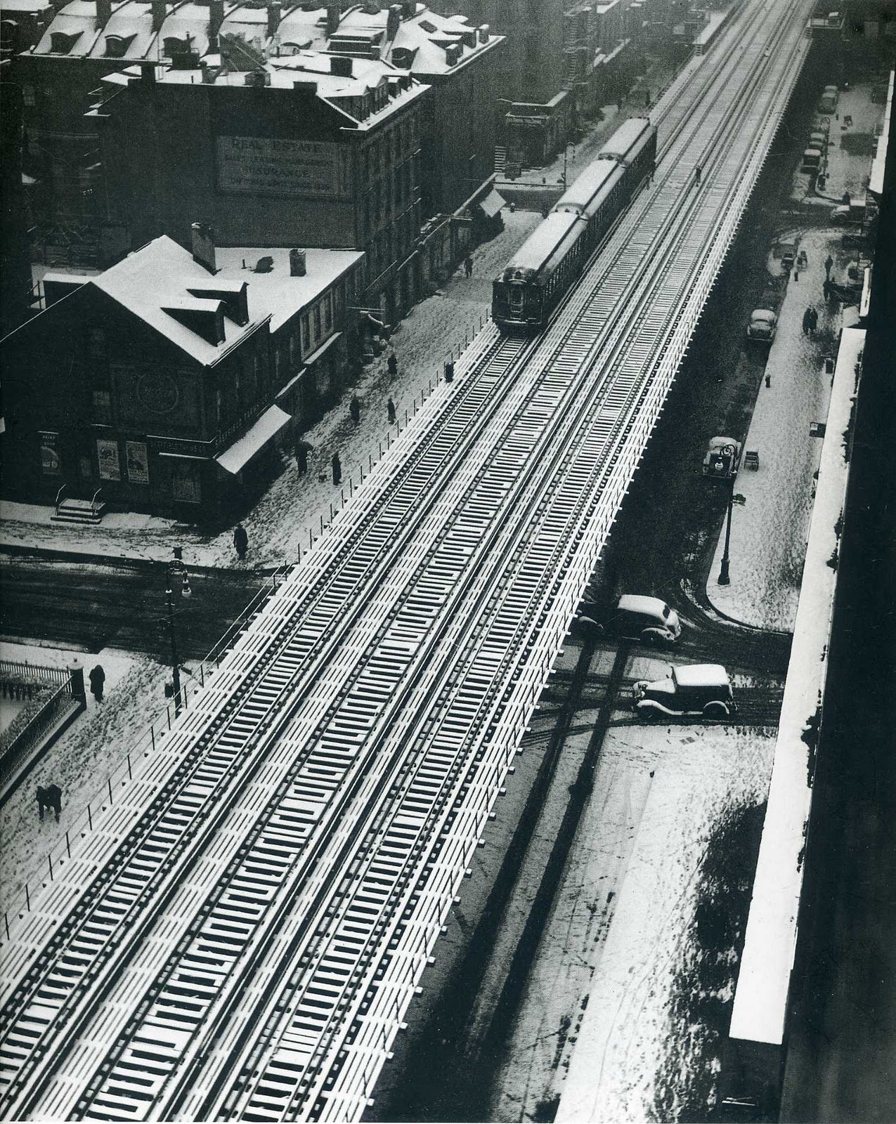
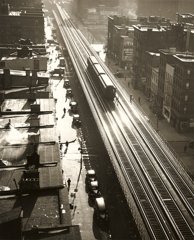
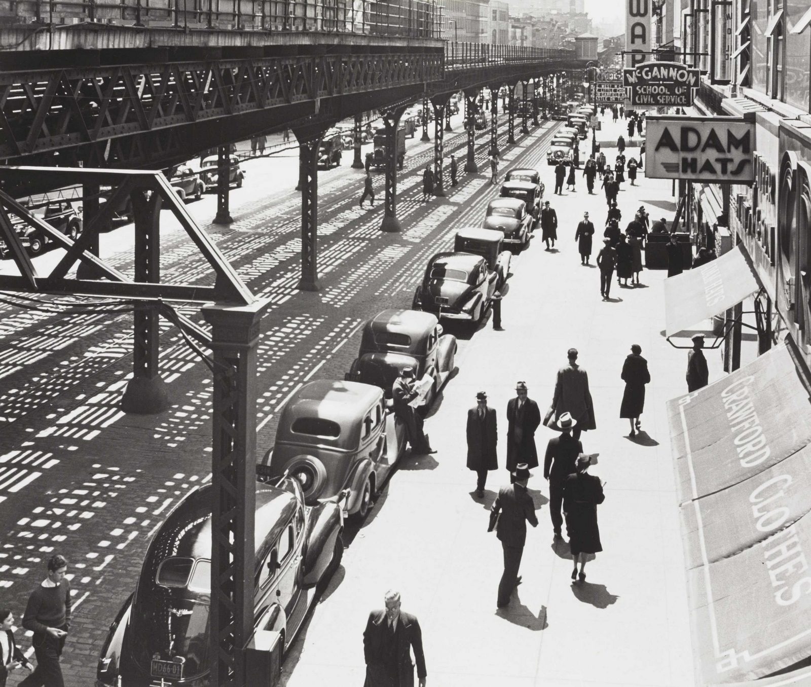
My first office didn't have a computer on the desk.The key piece of kit Art Director's needed to operate in those days was a pen.The people who were best at drawing were generally the best at Art Directing.It probably seems like a weird coincidence now; what has drawing go to do with Art Directing?It wasn’t the drawing.Because they could draw they ended up in art colleges, the better they could draw the longer they got to hang around.The longer they hung around the more they’d be forced to learn about composition, colour and proportion, the more people they'd have to listen to people wang on about underlying ideas and the hidden meanings in the compositions.It probably sounds like hell?But after having this stuff beaten into you it’s impossible for it not to come out in your work.Take the photographer Andreas Feininger.Like most great photographers he has a link to Art, his was through his dad,Lyonel, the expressionist painter.But the biggest influence on his photos was the stuff that was beaten into him at college: Architecture.He studied it at the Bauhaus.Whilst there he got into photography, he got so into it that when he left he had two jobs; Architect and Photographer.He later moved to Paris to work in Le Corbusier's studio.In 1939, when war broke out, he fled to New York, working for the U.S. Office of War Information.The reason I go through all that background guff is that you can see his background in his images.They aren’t human, they’re clinical.He's not trying to capture emotion or a fleeting moment, he's documenting and organising.Whether he shot nature, machinery or anything in between, it’s if the elements have been arranged on one of those weird architects desks.With a sharp scalpel and ruler.1. NATURE."Things under our nose invariably look good when blown up really big."


2. SIGNAGE.“Experience has shown that the more fascinating the subject, the less observant the photographer.”

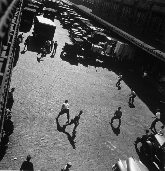
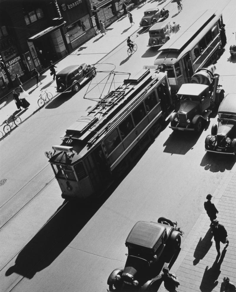
3. STREET.“Photographers — idiots, of which there are so many — say, “Oh, if only I had a Nikon or a Leica, I could make great photographs.” That’s the dumbest thing I ever heard in my life."
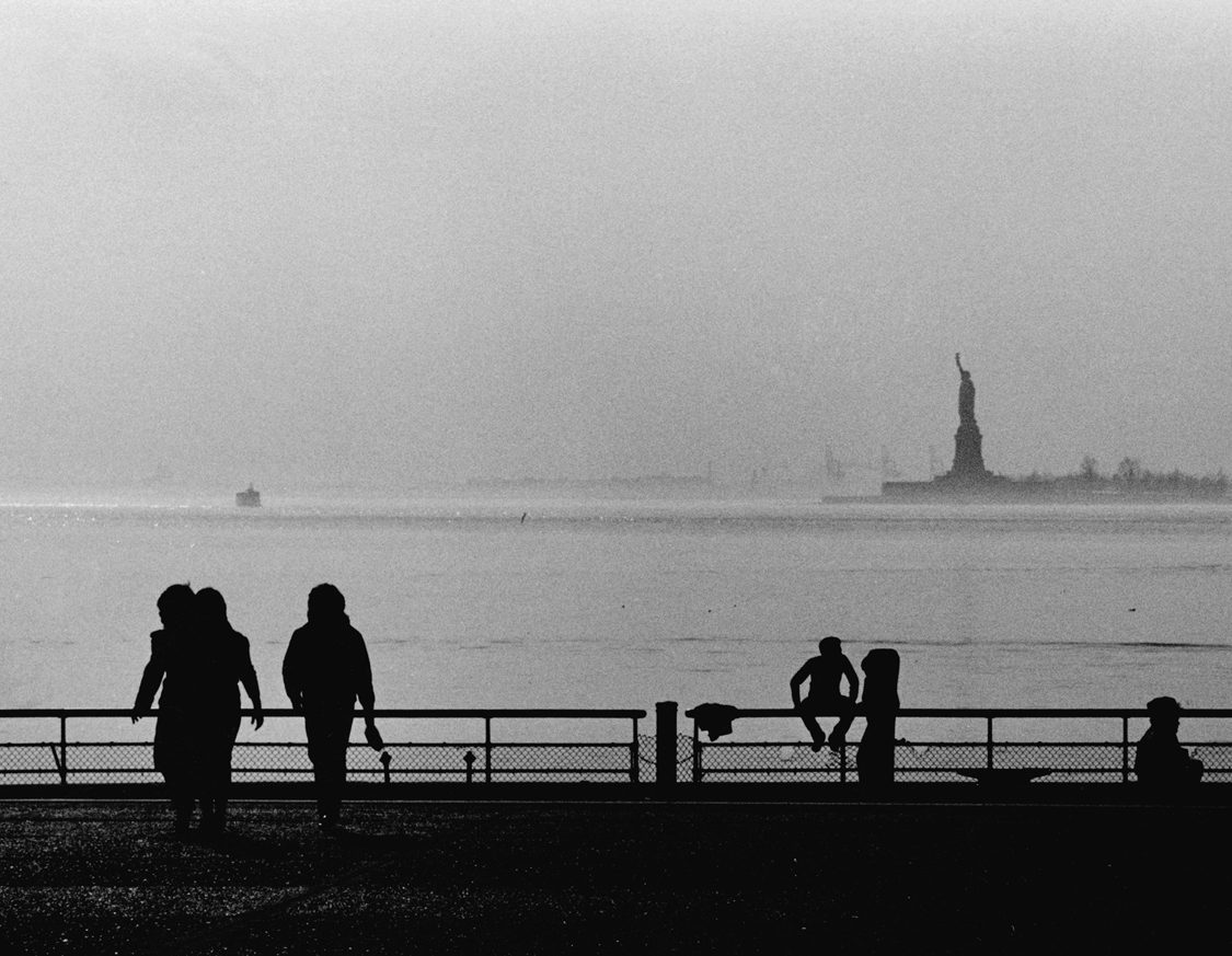
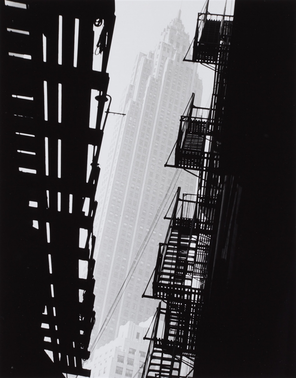
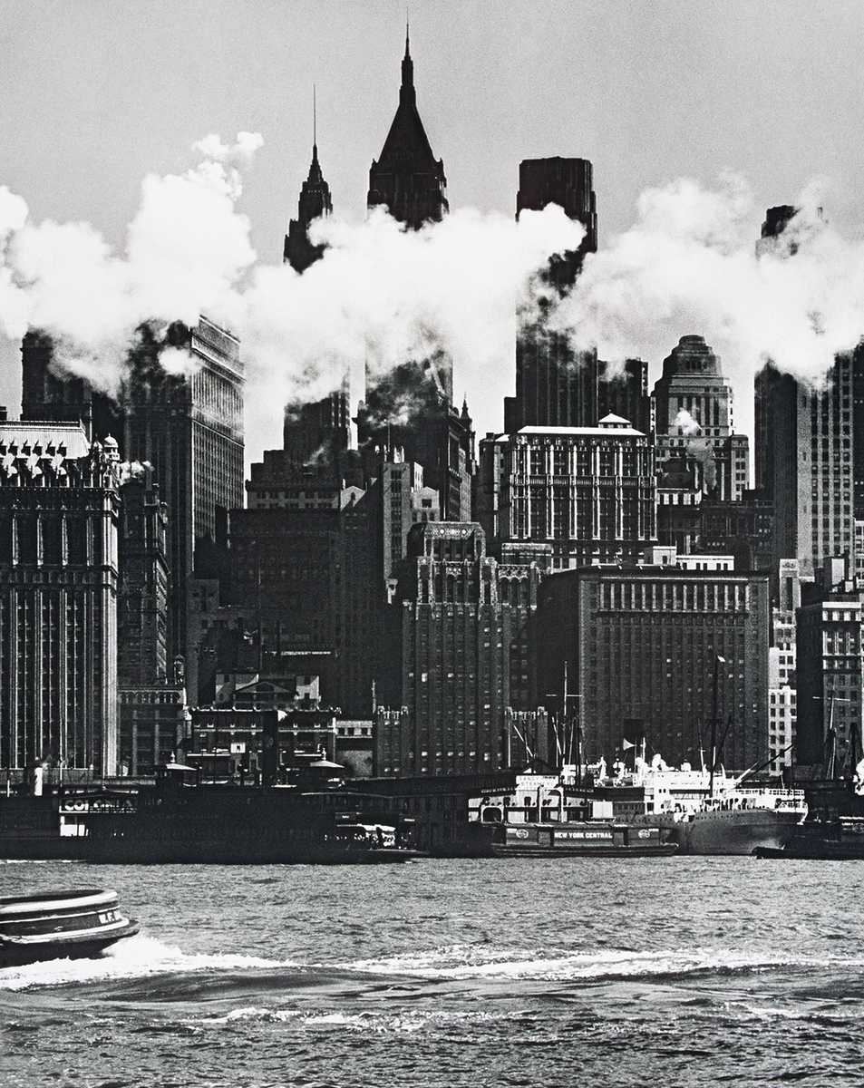
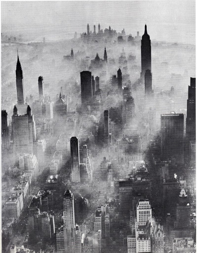
4. NEW YORK.''This world is full of things the eye doesn’t see.It’s nothing but a matter of seeing, and thinking, and interest.”

5. LANDSCAPE.“The first impression of a new subject is not necessary the best. Seen from a different angle or under different condition it might look even better. Always study a three – dimensional subject with one eye closed.”


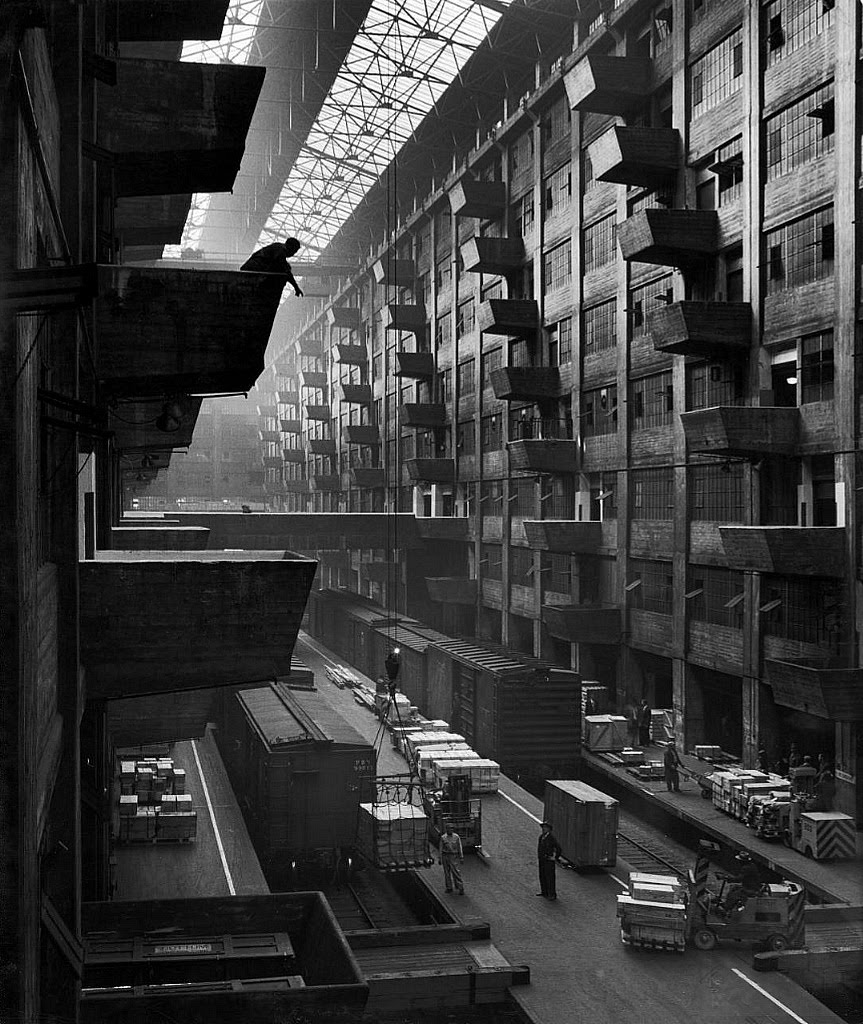
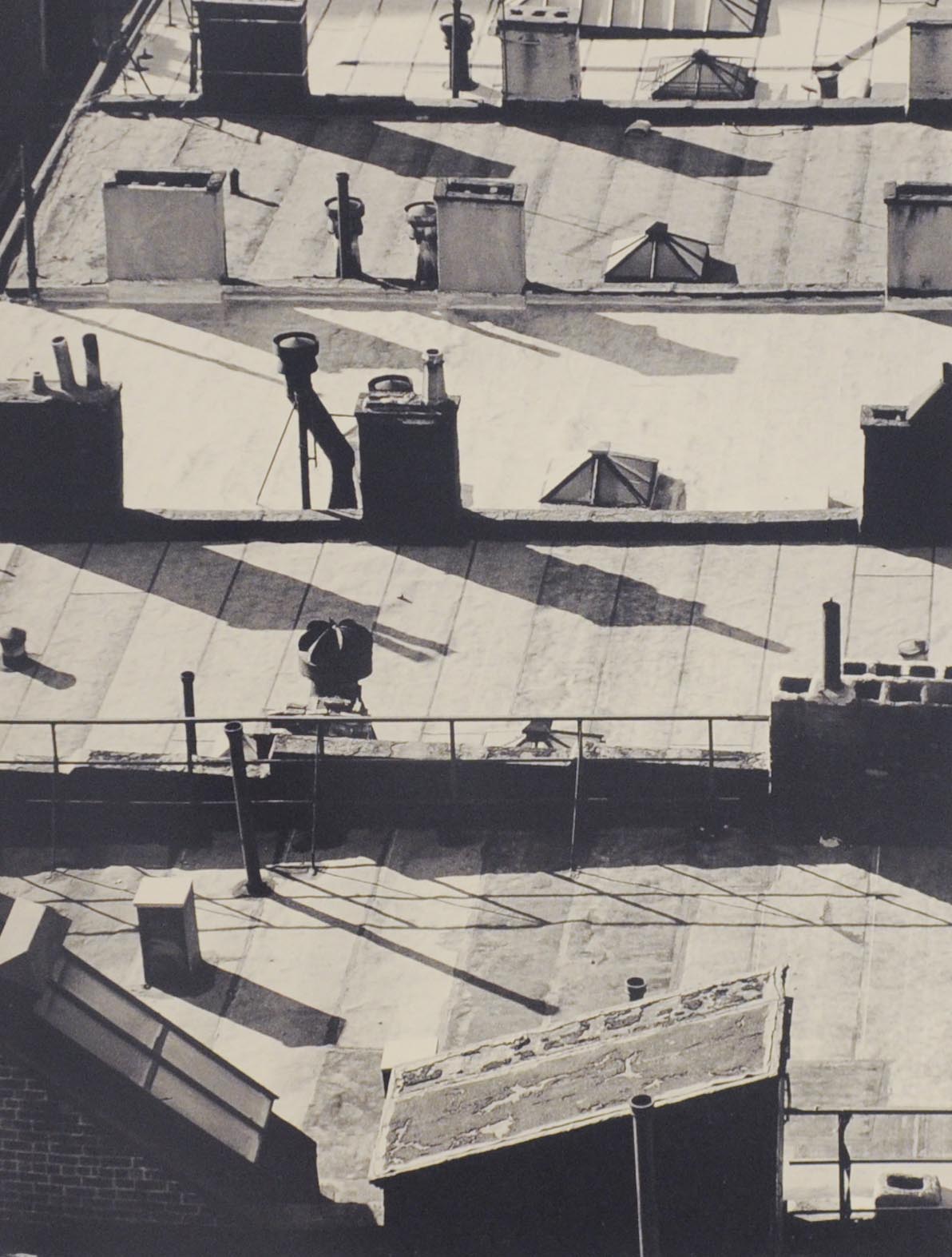
6. ARCHITECHTURE.“Before you shoot an irresistible subject, mute all your senses except sight to find out how much is left for the camera to record.”
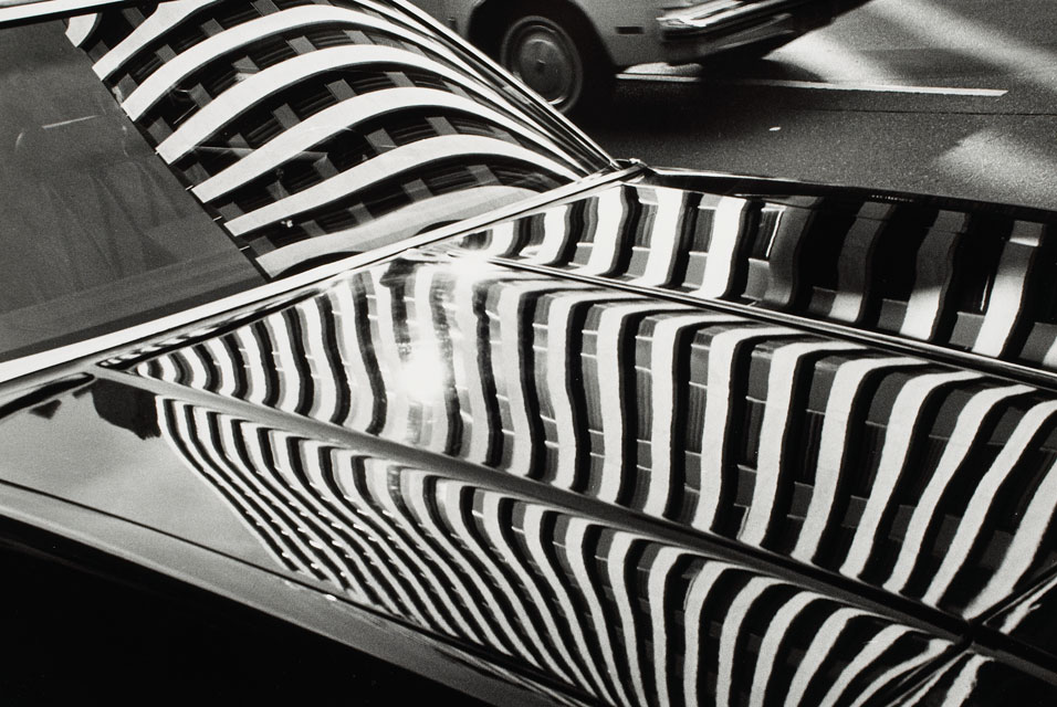


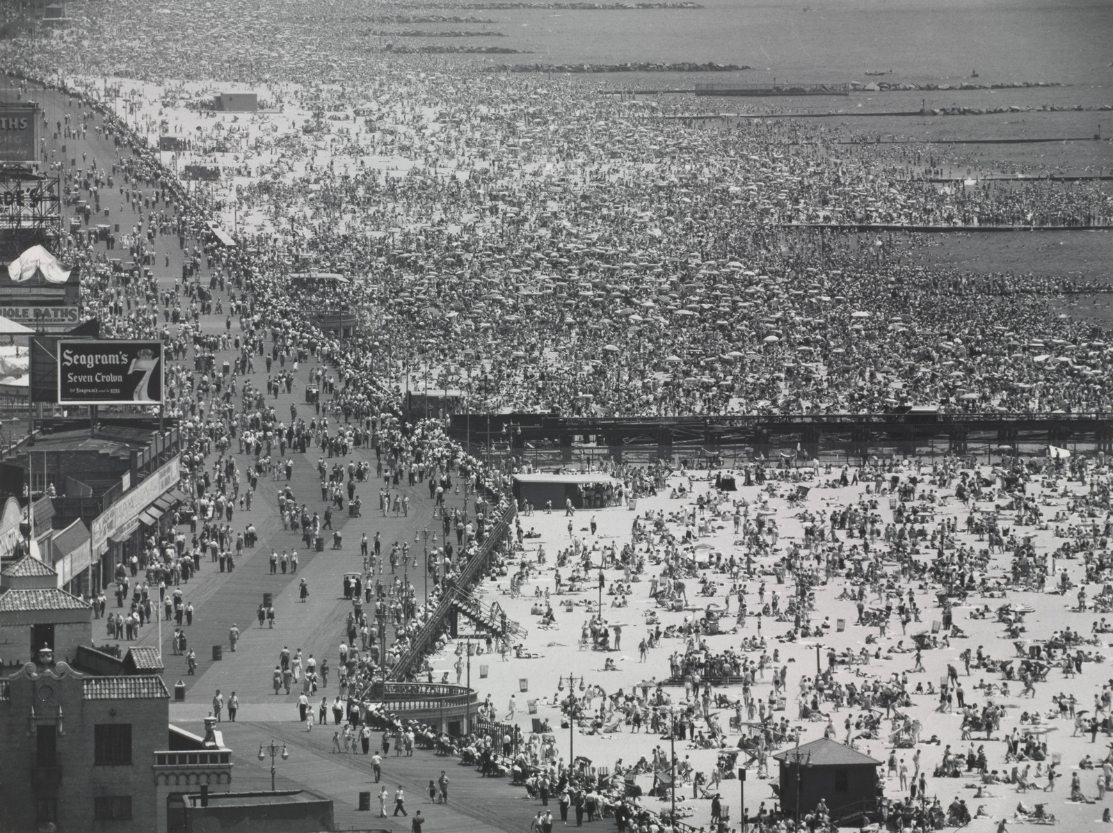
7. SCALE.“No one can do inspired work without genuine interest in his subject.''

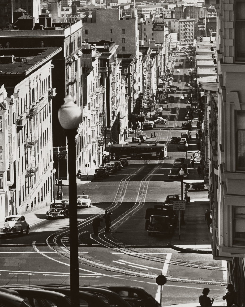
8. AERIAL.“The more thoroughly a photographer explores his subject with the camera (i.e., the more pictures he makes), the more he sees and the better his chance of getting good results."


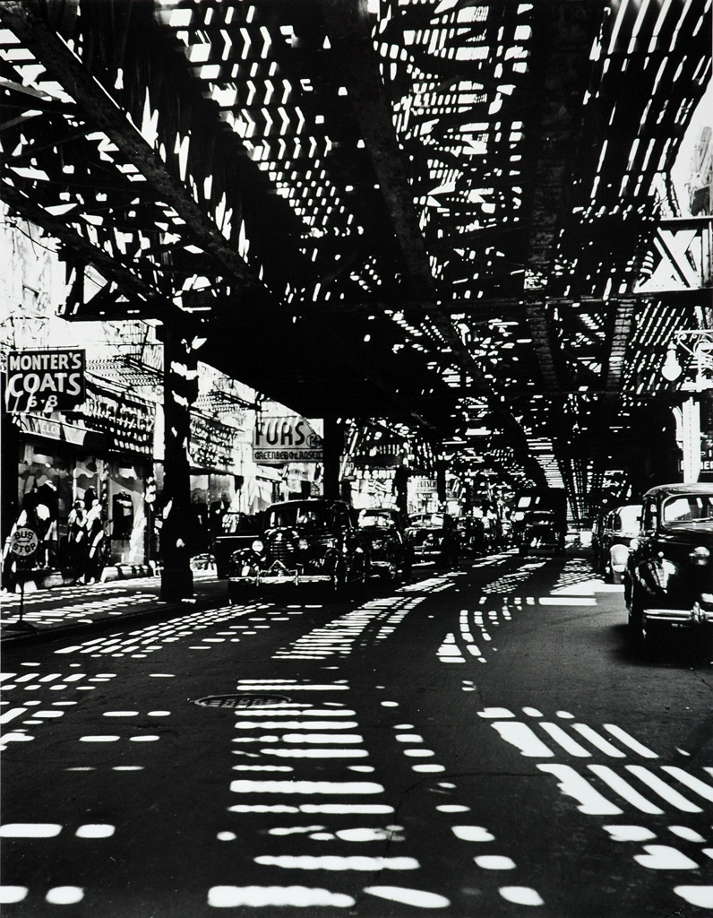
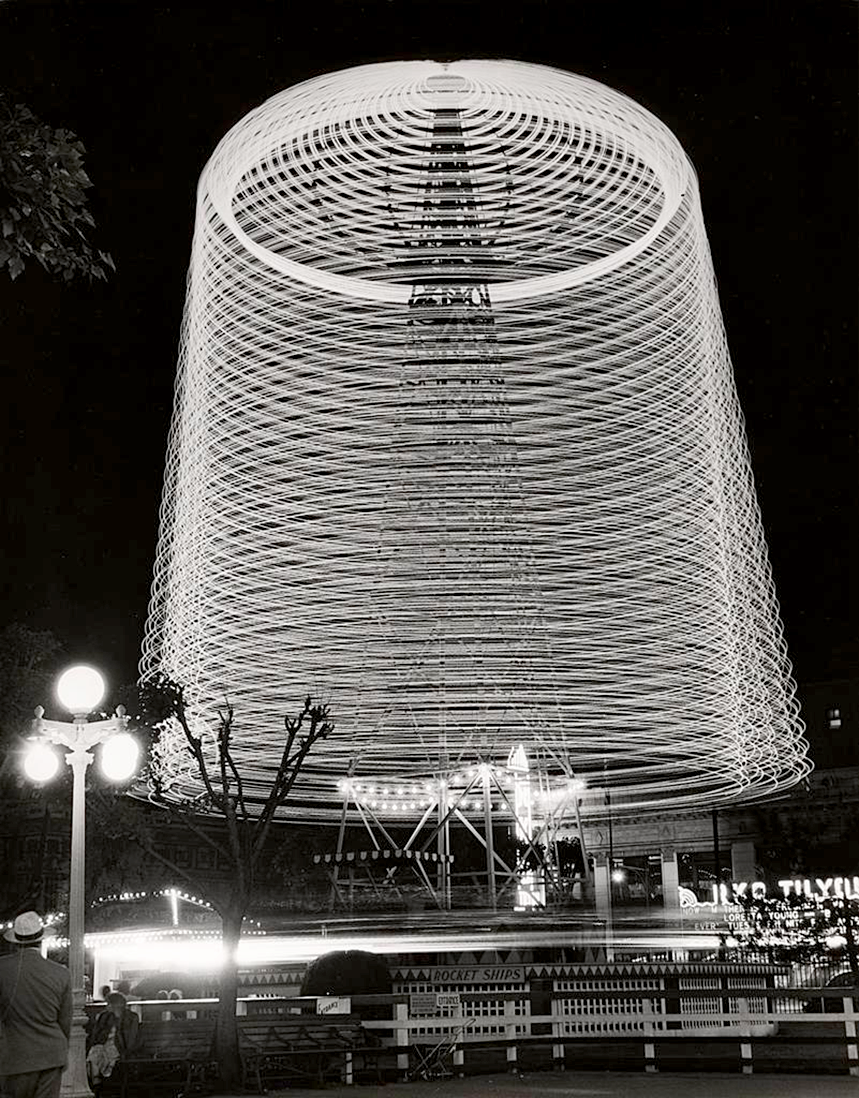
9. SHADDOWS.“Light is the photographic medium par excellence; it is to the photographer what words are to the writer; colour and paint to the painter; wood, metal, stone, or clay to the sculptor.”
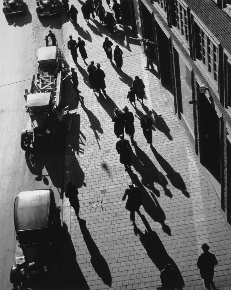
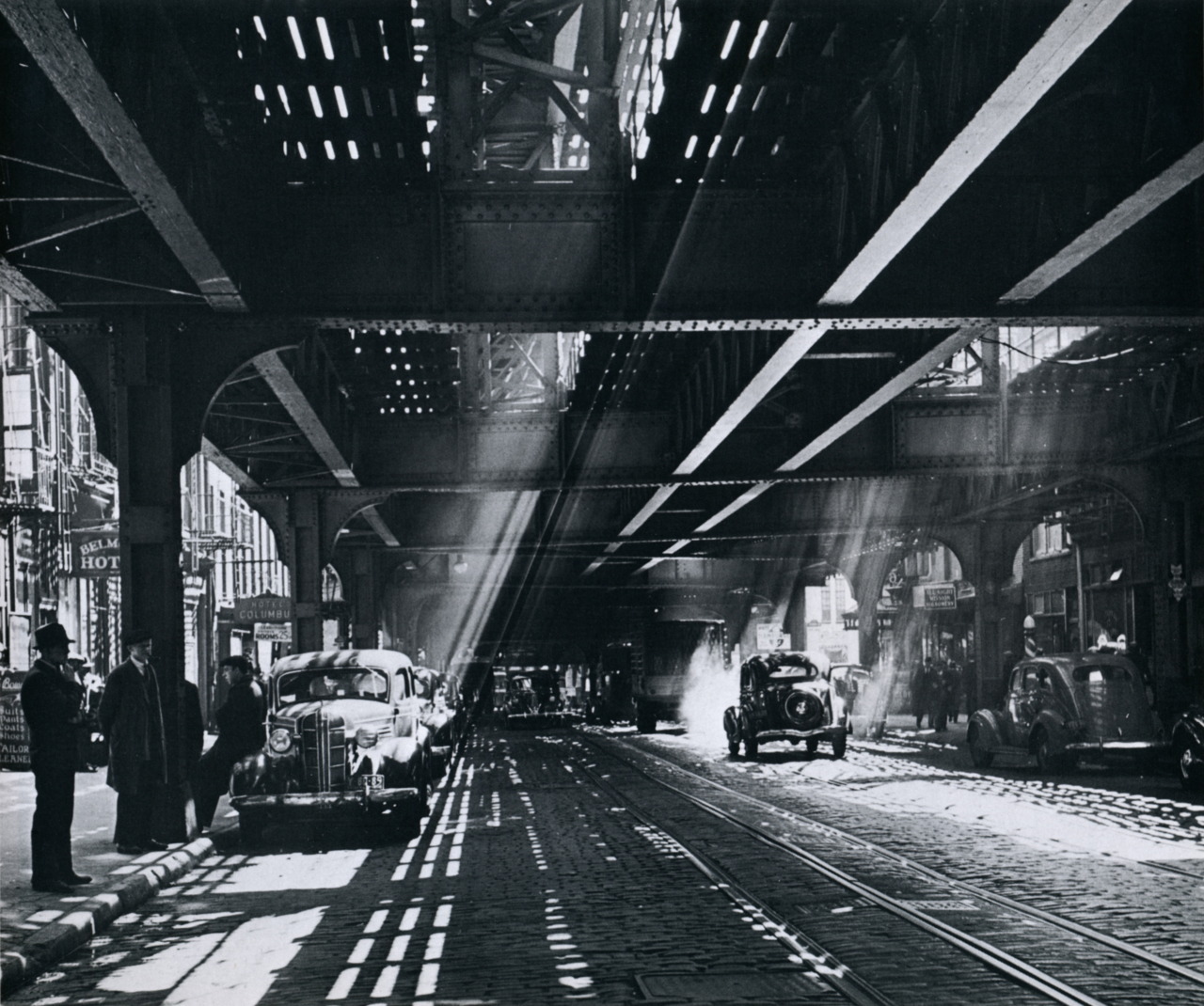
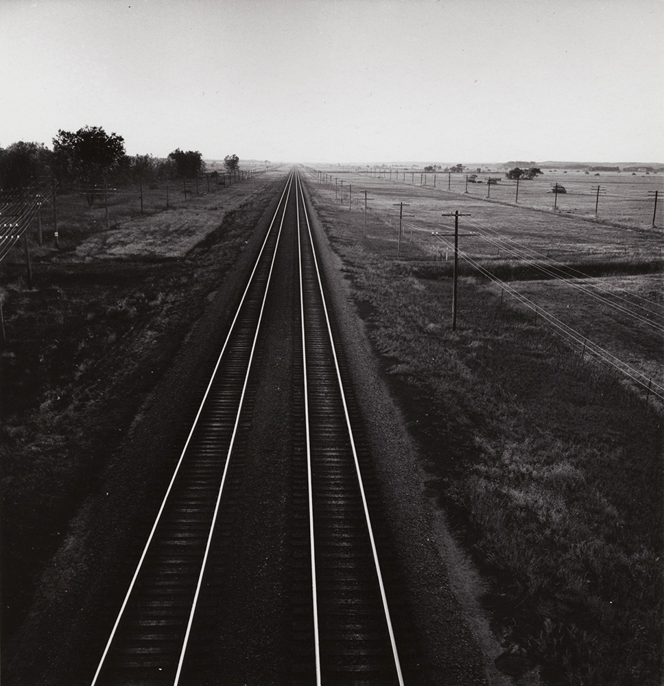
10. TRAINS.“As an amateur you have an advantage over photographers – you can do as you wish… This should make amateurs the happiest of photographers.”

11. TECHNICAL.“Every successful photograph, except for lucky shots, begins with an idea and a plan. The more precisely a photographer knows what it is he wishes to do, the better the chances are that he will do it.”


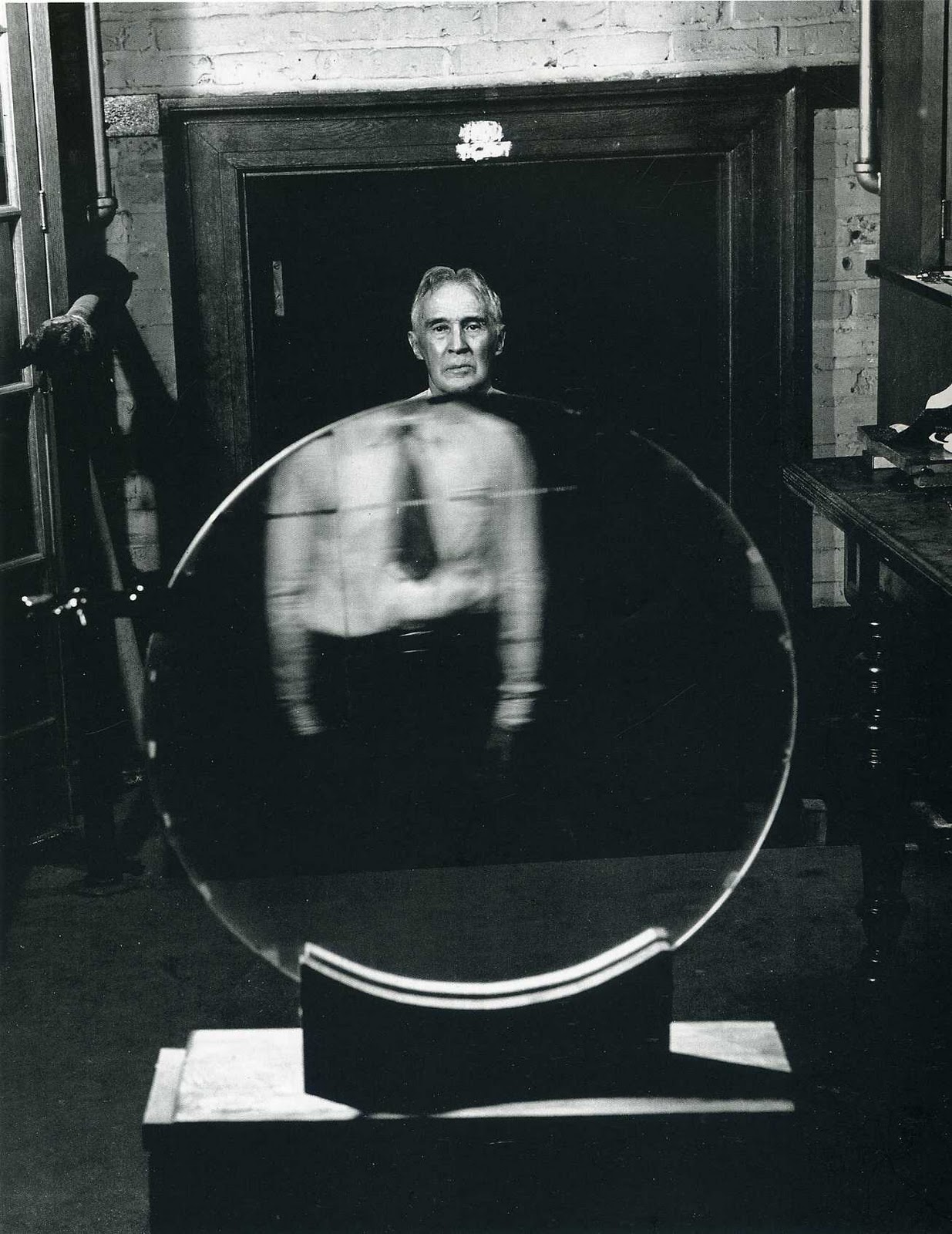
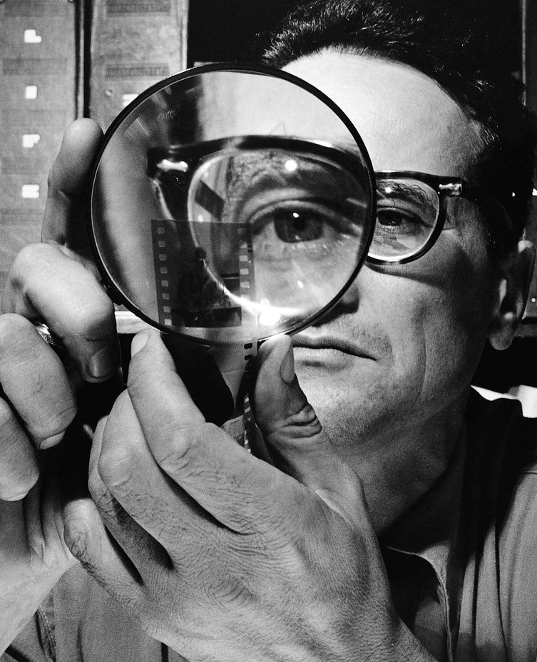
12. PEOPLE LOOKING THROUGH THINGS.“A technically perfect photograph can be the world’s most boring picture.”
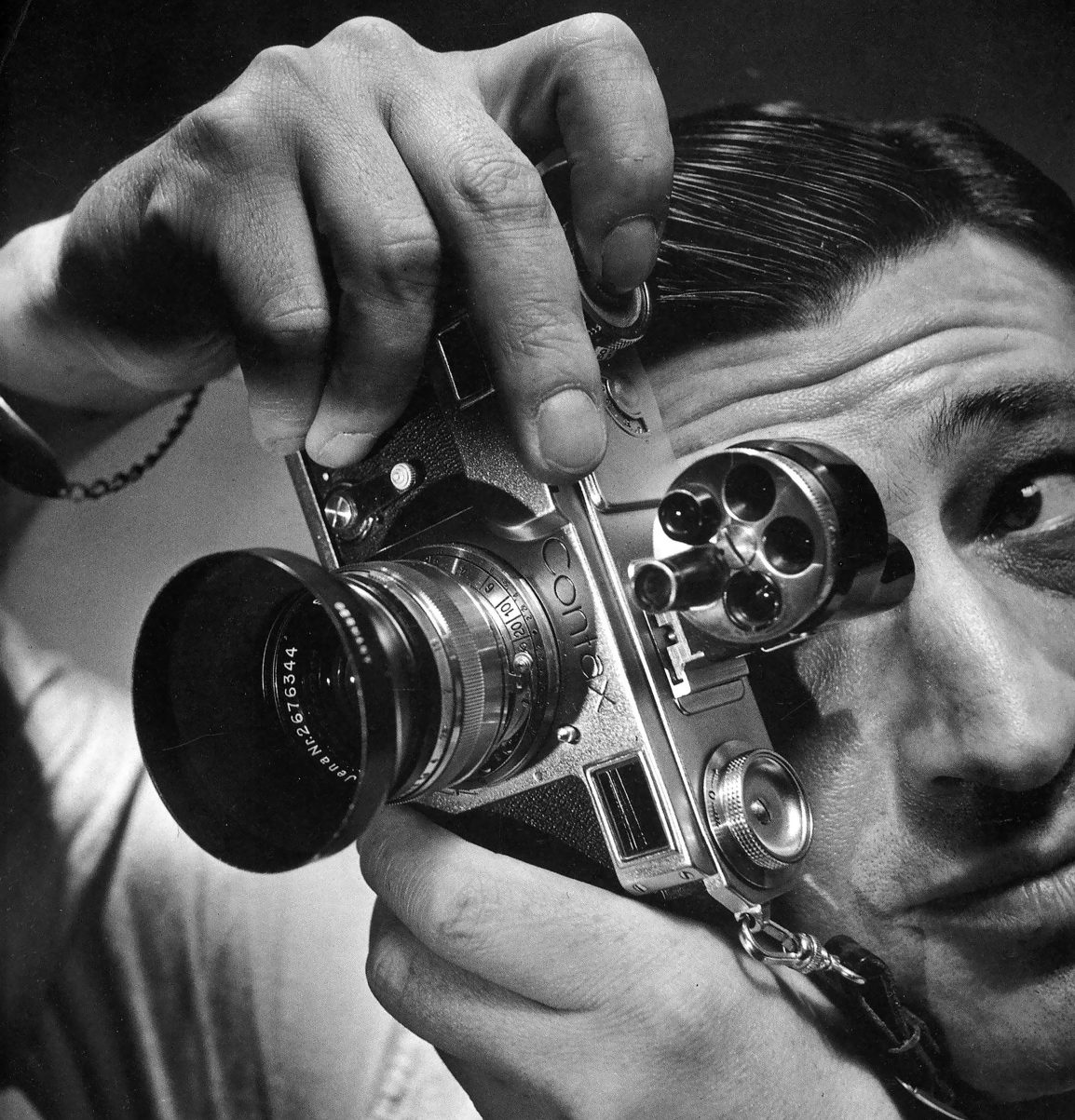
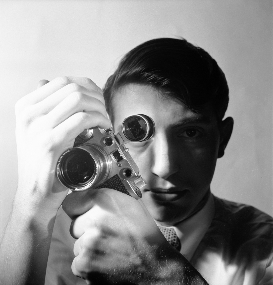
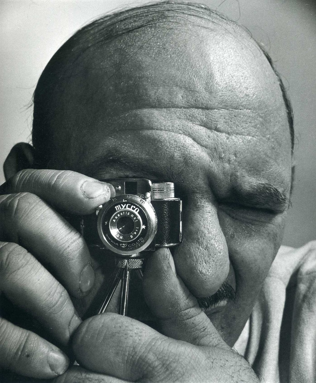

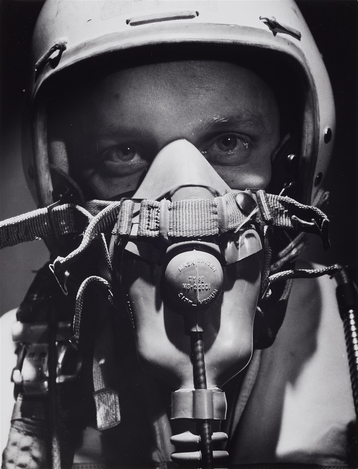


13. PEOPLE LOOKING AT THINGS.“No one can do inspired work without genuine interest in his subject and understanding of its characteristics.”
14. COLOUR.“What matters is not what you photograph, but why and how you photograph it. Even the most controversial subject, if depicted by a sensitive photographer with honesty, sympathy, and understanding, can be transformed into an emotionally rewarding experience.”
N.B. Here's a great documentary about Feininger.
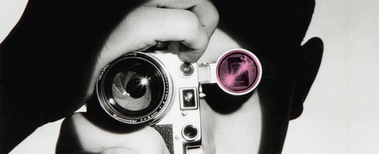
I prefer this blog to be about stuff I like.To be positive, a refuge from the endless whingeing and complaining you find on every street corner of the web. But something caught my attention that got me thinking. I’ve often wondered how a business based on creating words and pictures came to be run by people more comfortable with numbers.Scroll back to the eighties and we’d find Sir Martin Sorrell and John Wren sitting in finance departments, whilst Maurice Levy sat in the I.T. department. I'm not knocking those departments, but they aren't at the core of what clients want from agencies.Usually, career paths are based on matching the strengths of the individual to needs of the business, so how they think is important. People's brains come in two very distinct flavours; left-brain, (facts and logic), or right-brain; (intuition and imagination).Is it good to have a few left-brainers in charge of millions of right-brainers? Think of it this way; remember that kid at school, the one who was top of the class at maths? Imagine them being put in charge of the English and Art kids. I think there would be issues. The maths kid is unlikely to understand why all the Art and English lot never seem to be working, appearing to just chat, moan and make wisecracks. As for listening to their endless opinions, theories and demands for extra time because ‘it just isn’t there yet', don't ask. The Art and English kids would also have issues. They’d resist the move to bring in process and order, complaining that you can't be precise when estimating how long it takes to have a good idea, or that it's hard to correctly score how much of someone's heart you've captured, how much you've touched them or made them think. It's tough to turn feelings into numbers, It’s why it's always made perfect sense to me that people above would be so much more excited about the arrival of digital, big data and all the associated businesses over advertising; it’s numbers, it's their playing field. (At one point, when I was working at one of Sir Martin's companies, advertising agency JWT, he declared 'We are no longer in advertising', like a mob boss telling people 'Today, we're a legit business, no more drugs, killing and prostitution'.) The problem is, the most important part of the communications business is the communicating. And if you want to communicate your message to people you’ve never met, the public, intuition and imagination are more useful than logic and facts. So I’ve often wondered what those left-brainers running things made of us right-brainers creating things.Having to listen to people double-down it being Dougal not Feargal to shoot the goddamn script, that 'cheeky' was a better description than 'awesome' or whether the thing even works now with all these bloody changes.I suspect it's painful to watch.All that pfaffing about over words and pictures - 'GET A LIFE!'This week a bit of evidence came out that backs up that theory."WPP isn’t just a matter of life or death, it was, is and will be more important than that." – Sir Martin Sorrell. It was based on this one: "Some people think football is a matter of life and death. I assure you, it's much more serious than that." - Bill Shankly.I don't highlight it to criticise him, what Sir Martin says or does is none of my business, but I do wonder whether it offers up an insight into what he values, or doesn't, in communication.If, in the unlikely event he'd popped into my office for advice, Id say:1. 'Don't use that quote, you've run a massive communications company for donkey's years FFS, it looks bad to nick someone else's quote, and it's famous!, let's come up with something original?'SIR MART: 'I like it.'2. 'Don't use that quote Mart, the structure doesn't fit you're message, it feels sellotaped together.'SIR MART: 'Not bothered.'3. 'Don't use that quote, you're coming off a bit tone-deaf Mart.Bill Shankly comes across as funny and self-deprecating, because it's ludicrous to suggest kicking around a bag of air is more important than life itself.You're coming across as self-regarding and pompous, you're saying your life’s work is more important than life itself.Not good.'SIR MART: 'Whatever!'4.'Mart! Mart! Mart! Well,You're killing me here! Well let's at least sort out the structure? The Shankly quote works because he buried the lead, we think he’s going to knock those foolish people who think kicking a football around is more important than life and death, only to make a left turn at the end saying ‘it’s more important’.SIR MART: 'Geek alert! Geek alert!'5. 'You don't want to change the structure either? If you're going to insist on using that bloody quote we have to fix the “it was, is and will be” bit, it's a car crash!SIR MART: 'But I want to thank ex-WPP-ers, I want to big up the current WPP-ers and imply that WPP won’t collapse once I've gone.''Finally! Well why not just say that then! Muppet?'No-one had more imaginative, intuitive communications professionals at hand to help him out, over 2000,000, but presumably it wasn't felt necessary, it's only a bunch of words?NB. I feel I should point out, in the spirit of full disclosure, that Sir Martin Sorrell has made £495m from the communications business. That is, and I checked my bank balance this morning to make sure I was factually accurate, more than me.
The of most important part of photography isn’t anything technical, it’s where you point the camera.
It’s why 99% photos look dull, everybody points in the same direction.
Often it’s because people don’t think that they have other options, or they feel too self-conscious to point their camera in the ‘wrong’ direction, it feels so unnatural.
“Seeing is a neglected enterprise.” as Saul Leiter put it.He must’ve looked weird whilst doing his seeing; his camera would be pointing in all the wrong directions; inches away from a shop window, pointing at someones shoulder rather than their face or with something in the way, like a wall.
Because he’s trying to find things that haven’t been seen, shining a light on objects and angles that have spent their lives in the shadows.
Seinfeld is often described as ‘a show about nothing’, Saul Leiter’s shots could also be described as pictures of nothing.
Both descriptions would be wrong.
“Everything is suitable to be photographed” said Leiter “I happen to believe in the beauty of simple things. I believe that the most uninteresting thing can be very interesting.” He said.
1923: Born in Pittsburgh. The son of a rabbi and distinguished Talmudic scholar.
1935: Gets his first camera, from his mum.
1945: Quits rabbinical school.
1946: Moves to New York City to pursue painting in 1946.
1947: Meets the Abstract Expressionist painter Richard Pousette-Dart, who was experimenting with photography. Leiter’s friendship with Pousette-Dart, and soon after with W. Eugene Smith.
1947: Discovers the work of Henri Cartier-Bresson. Inspired.


1947: Included in a MOMA exhibition curated by Edward Steichen.


1948: Swiches to colour photography, starts experimenting with Kodachrome 35 mm film that’s past its sell-by date.


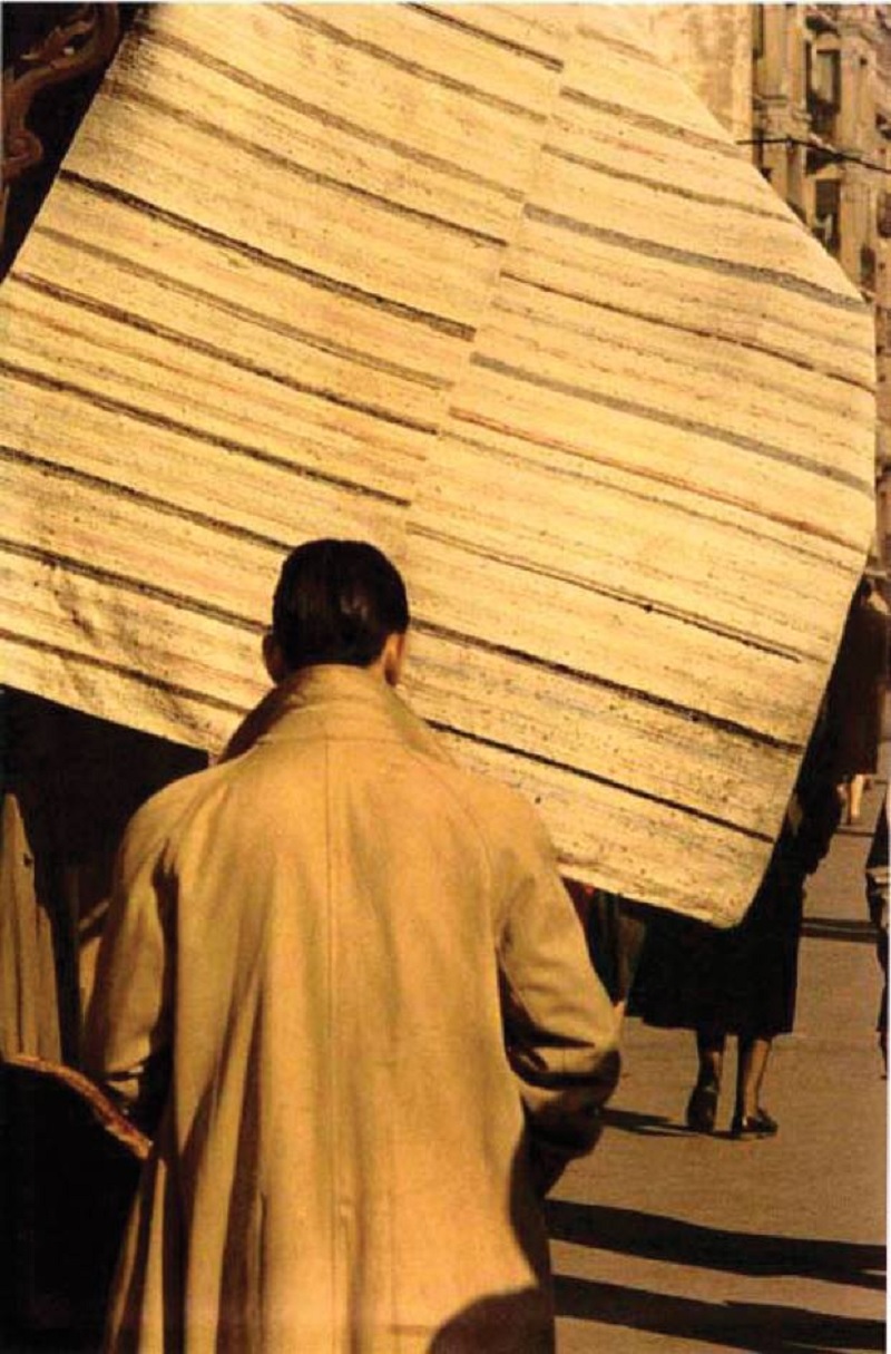
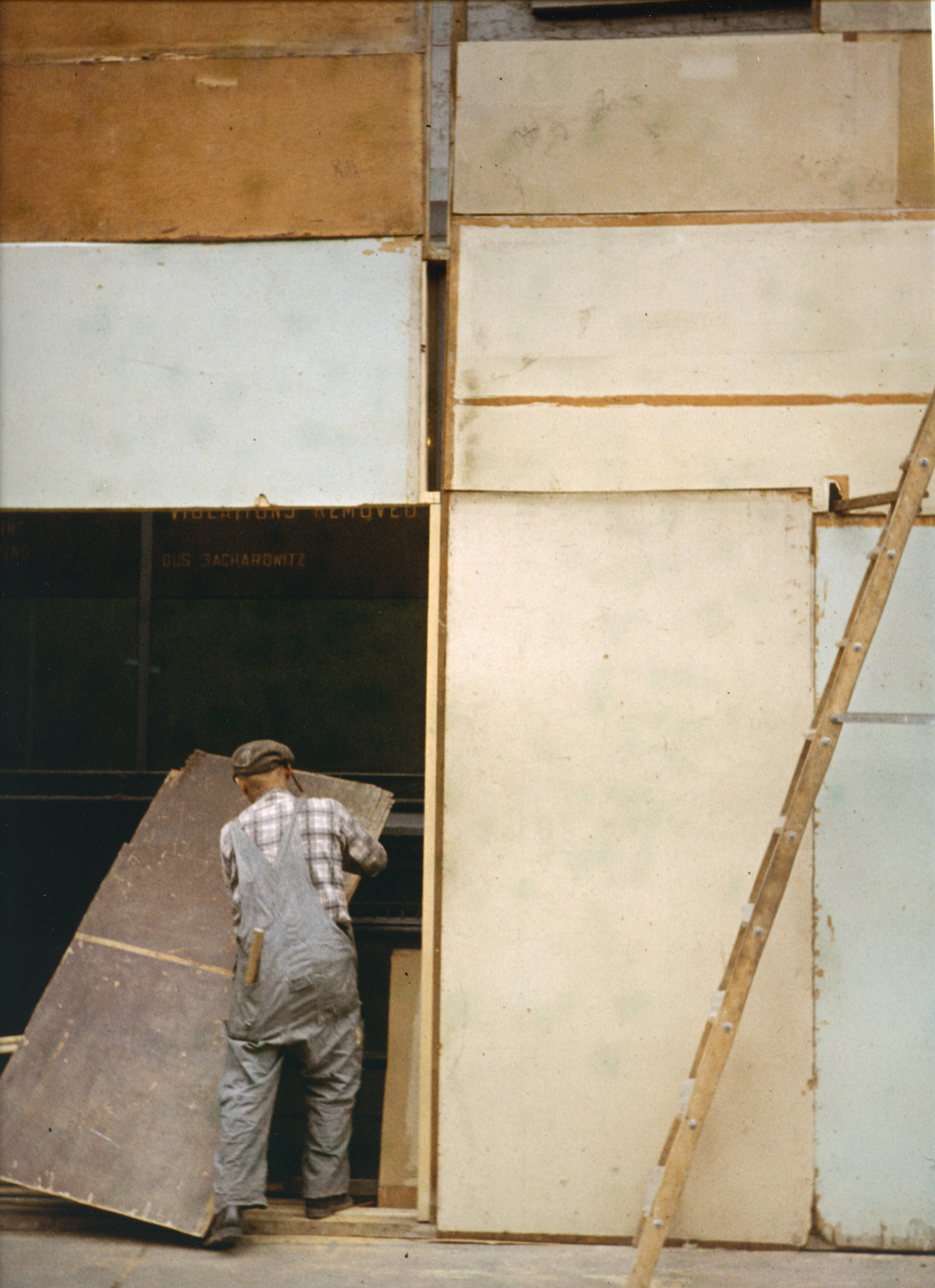
1950’s: Leiter’s street imagery gets him noticed and commissioned by magazines like Life, before long he was shooting celebrities and stories too.
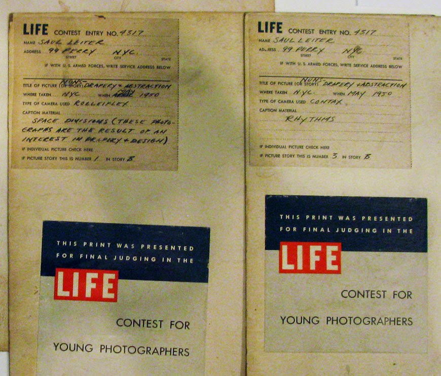
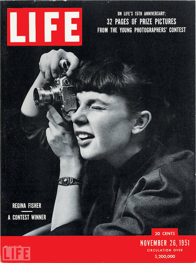


By the late fifties he was nagged by self-doubt, so would never reply to gallery invitations or hobnob with curators, but desperately short of money he began taking fashion pictures.
“I don’t have a philosophy. I have a camera.”


1958: Esquire published Leiter’s first colour fashion work, it would lead to work for Harper’s Bazaar, Show, Elle, British Vogue, Queen, and Nova and all the major fashion magazines of the day.


“Some photographers think that by taking pictures of human misery, they are addressing a serious problem. I do not think that misery is more profound than happiness.”


Here’s an ad where Leiter explains ‘bounce lighting’.

The images look so loose, random almost, that it’s hard to take in.
They can look like a series of happy accidents, so I thought it’d help to break them down into things that Leiter liked.
1. CROP OBJECT OUT OF FRAME.


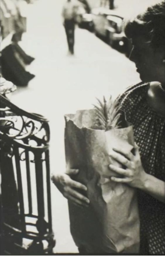
2. SHOOT INTO REFLECTIONS.


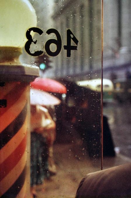

3. SHOOT THROUGH SOMETHING.


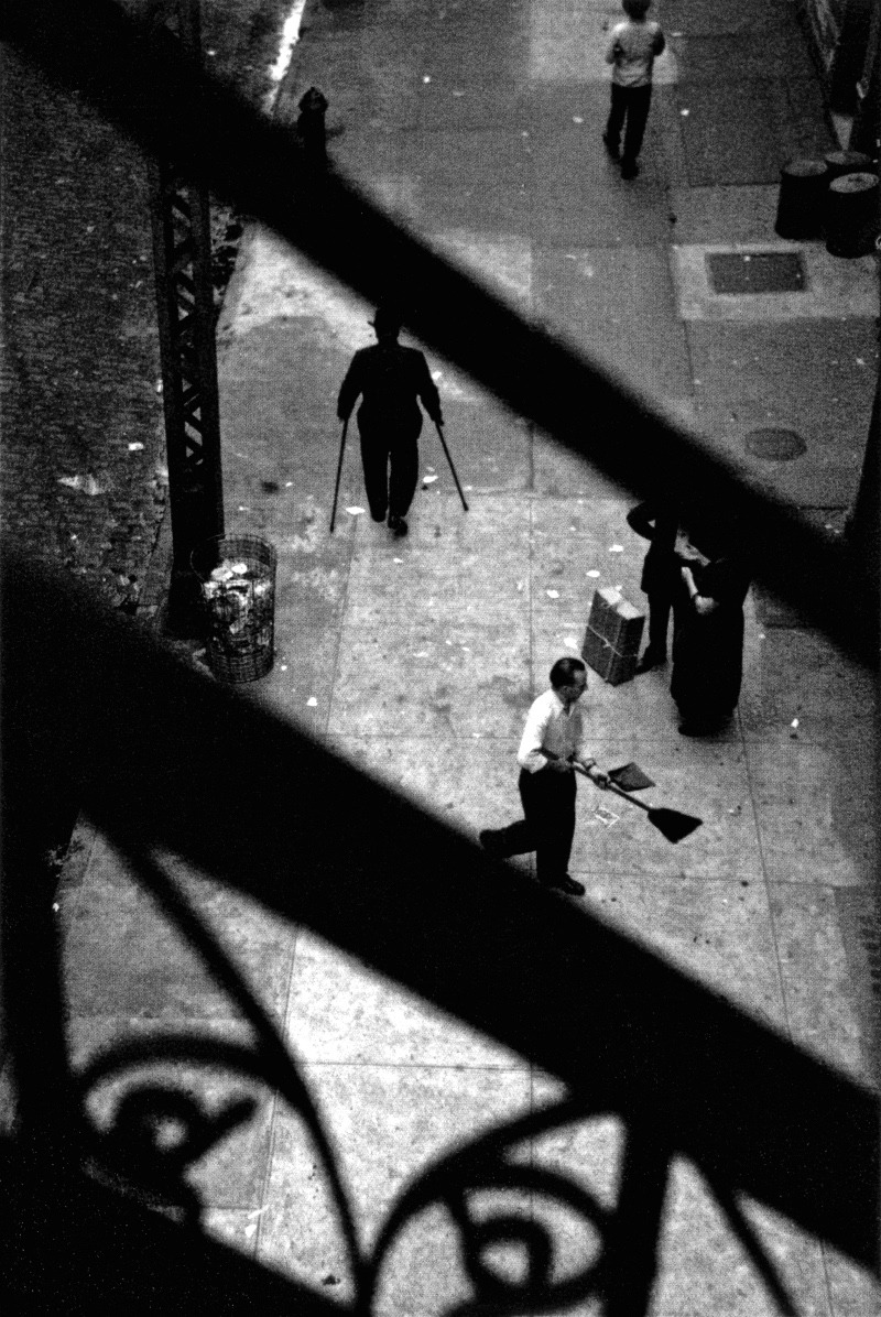

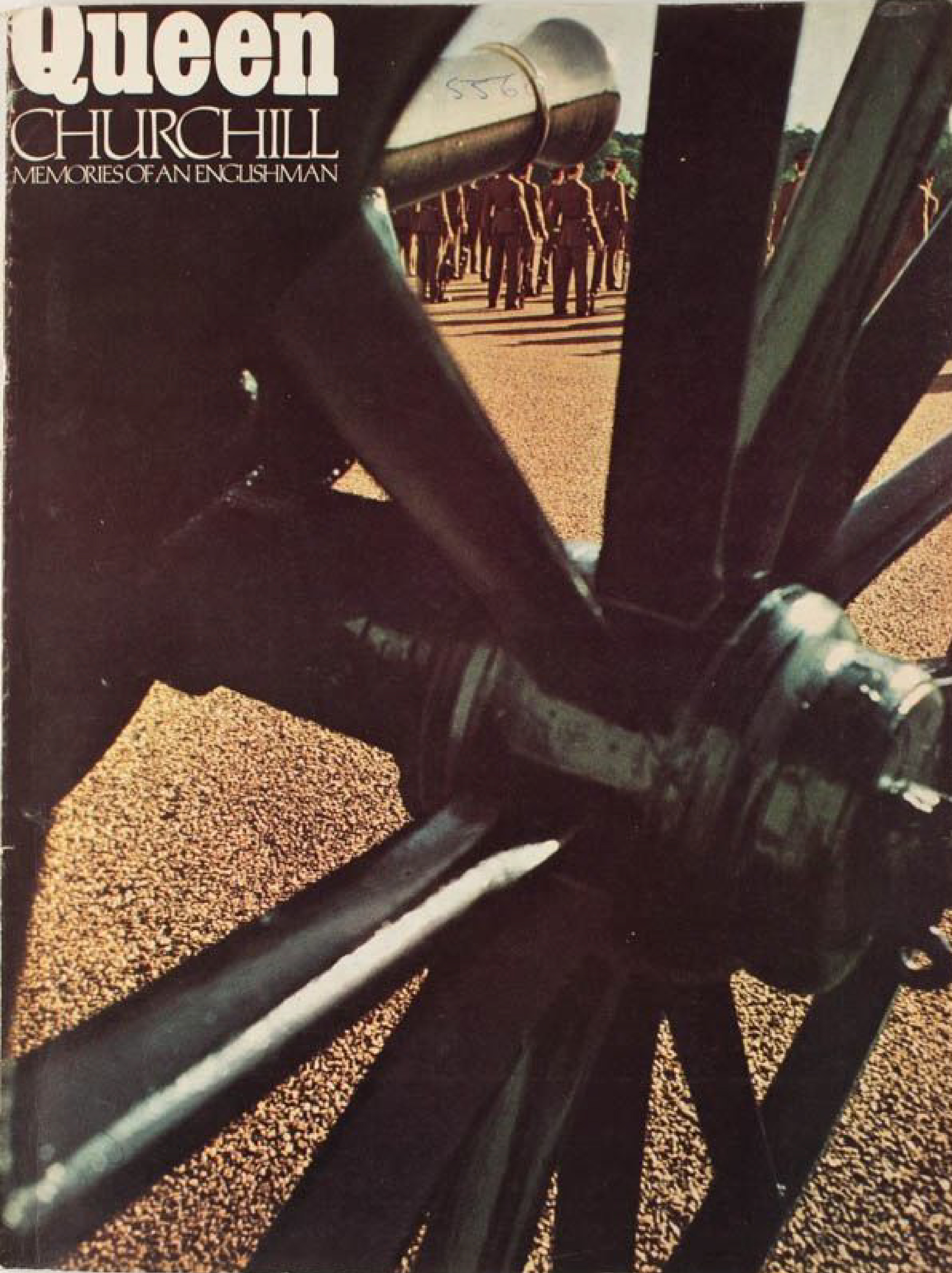
4. TEXTURE CAN HELP CREATE AN OTHER-WORLDLY FEEL.


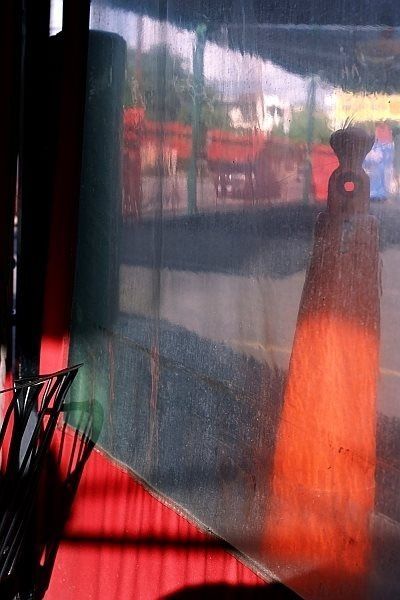

5. THE WORLD LOOKS DIFFERENT AND PEOPLE CUT ODD SHAPES IN SNOW.

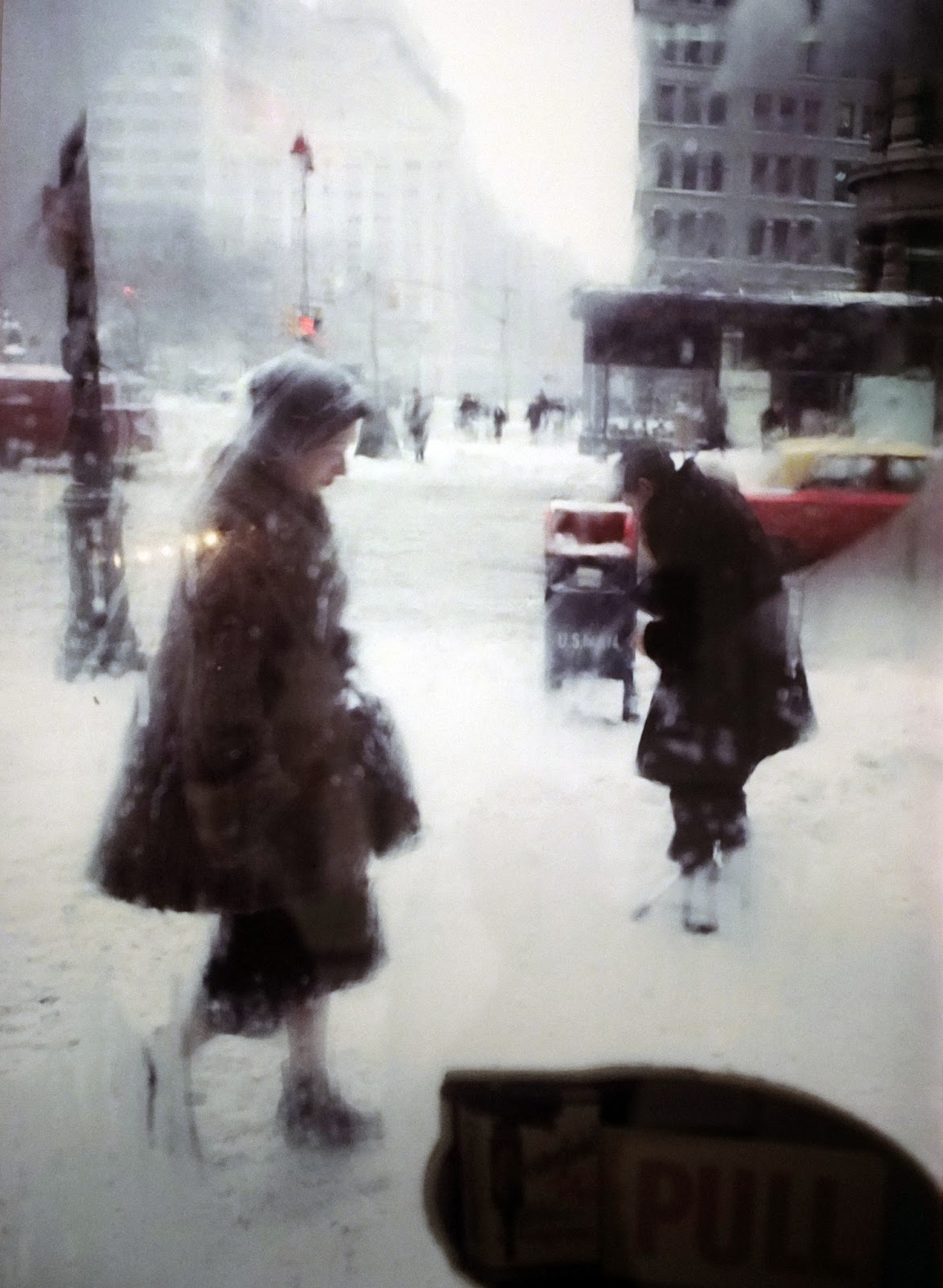


6. KEEP AN EYE OUT FOR UMBRELLAS.


7. MAKE WORDS THE STAR.


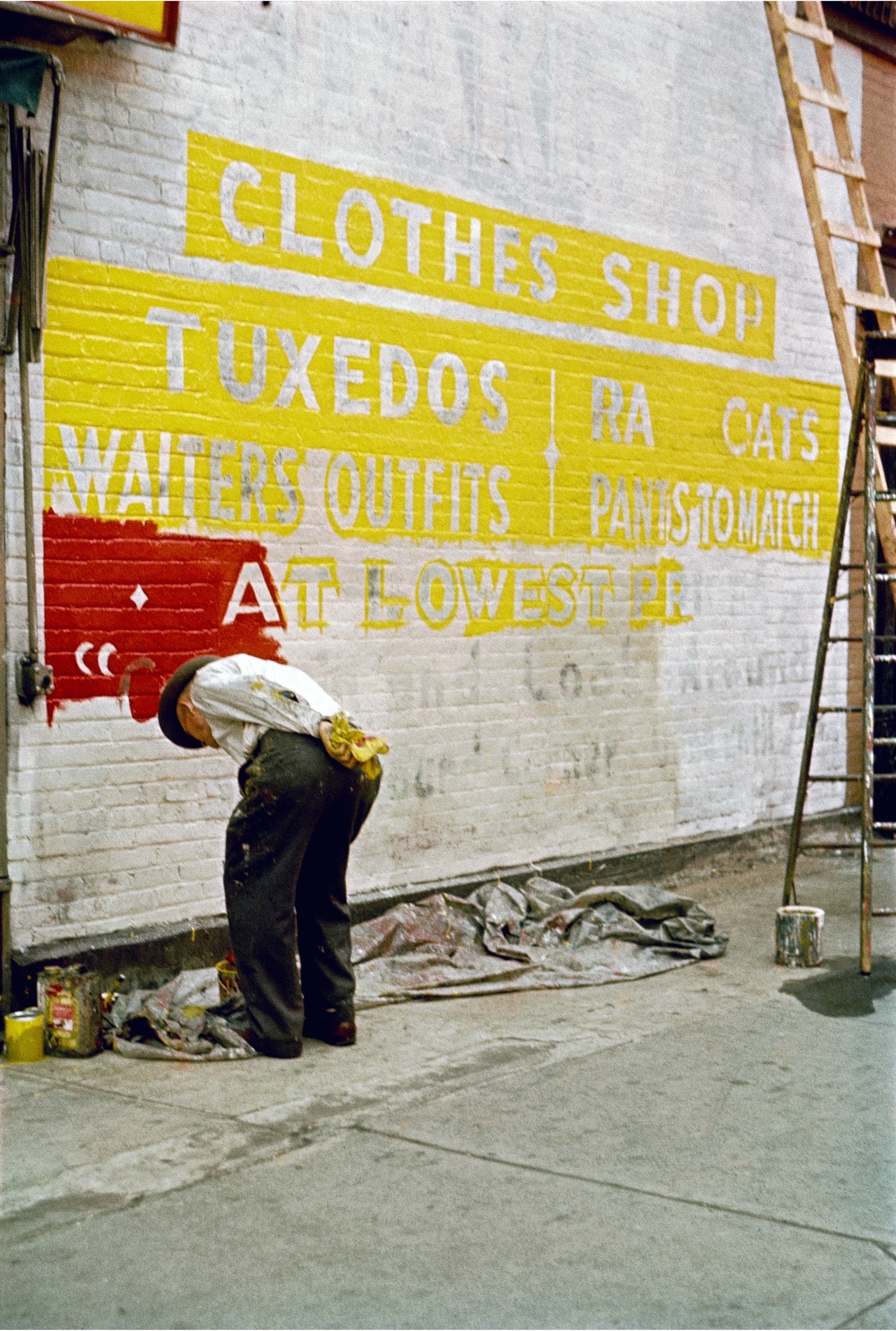

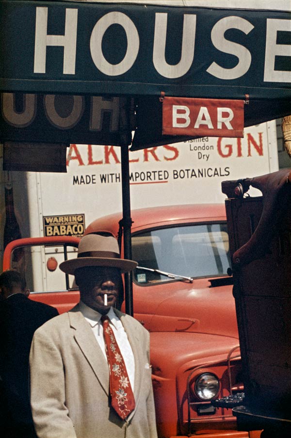
7. SHOOT FROM ABOVE…WAY ABOVE.


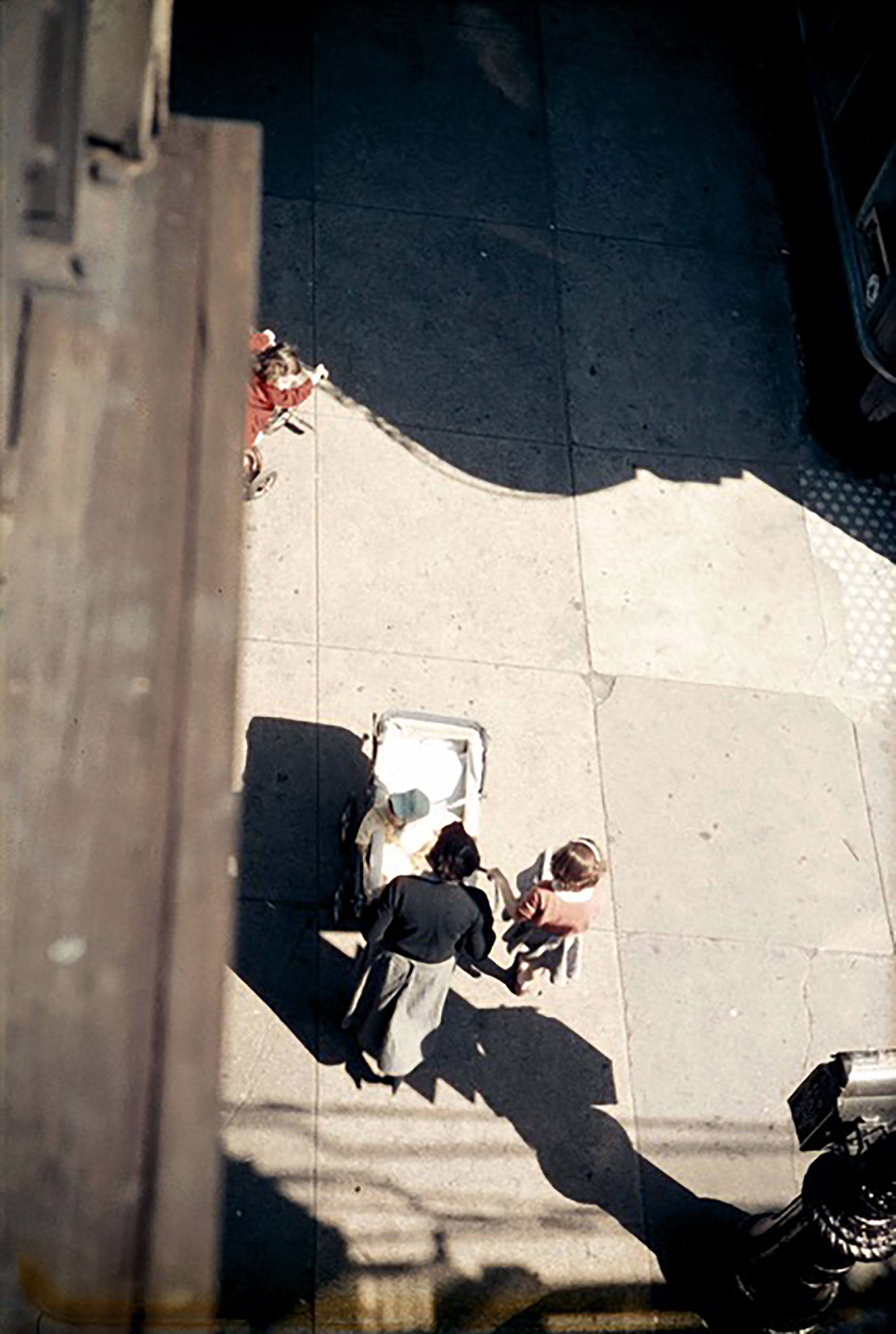

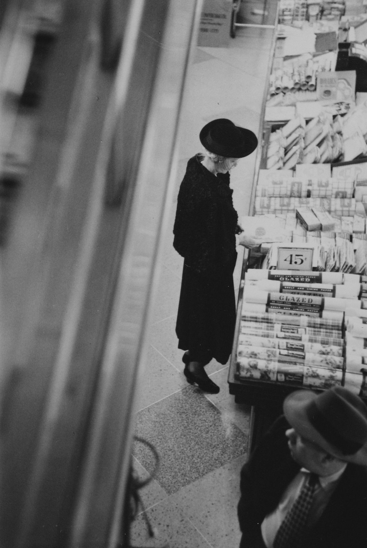
8. PUT SOMETHING IN THE WAY OF THE IMAGE.
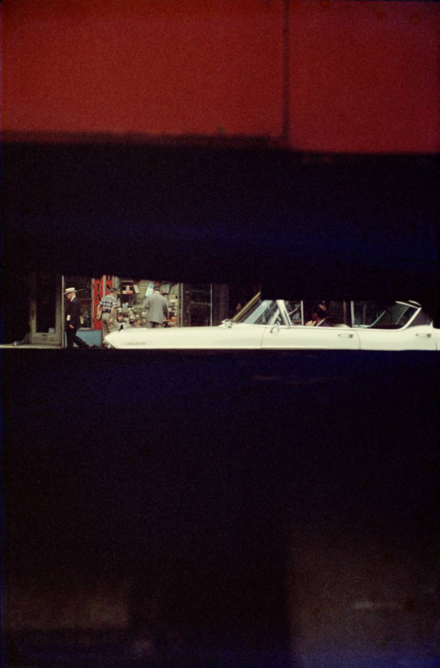


9. SHOOT THROUGH THE ROUND WINDOW…OR SQUARE, OR OBLONG.
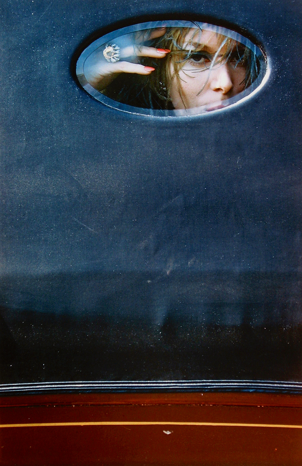
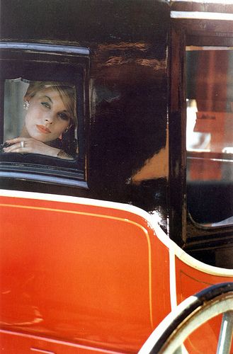

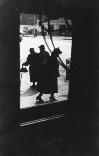
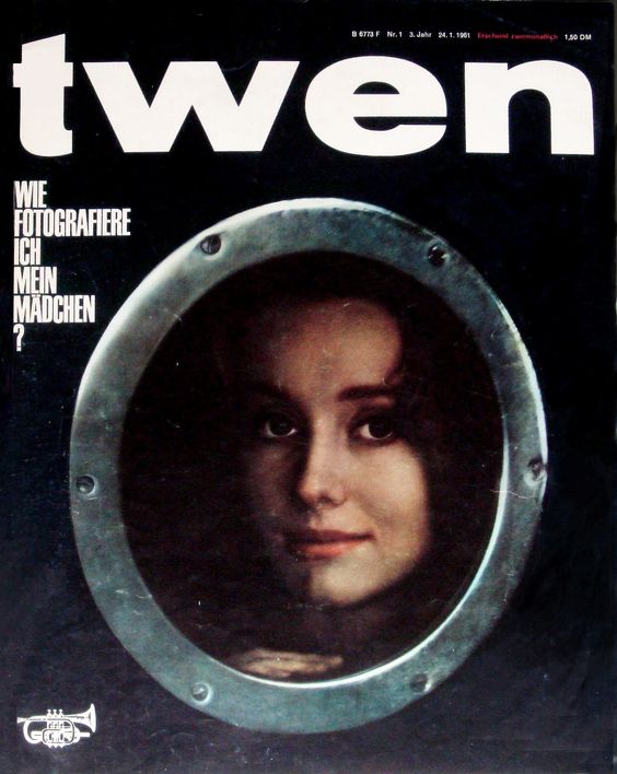
10. LET THE SHADOW FALL IN THE WRONG PLACE.


Here’s one of his contact sheets, it’s interesting to see what he’s pointing his camera at.

When he started shooting with colour film, 1948, it wasn’t taken seriously, even by the photographic community, it was considered garish and superficial.
Leiter’s subject matter probably didn’t help either.
I would take another twenty years for colour photography to be taken seriously.
It took ’til 2006 for Leiter to be given his first solo exhibition.
Leiter was hailed as a forgotten pioneer.
He remarked “when I am listening to Vivaldi or Japanese music or making spaghetti at three in the morning and realise that I don’t have the proper sauce for it, fame is of no use”.
In 2015 filmmaker Todd Haynes used Leiter as a visual reference for his film ‘Carol’.

“That muted colour palette spoke very specifically of the 1950s, which was well before the shiny, cleaned up, chrome-y period of the Eisenhower era” said Haynes.
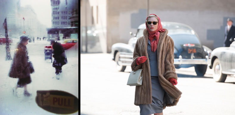


Ironically, the Oscar nomination for it got cinematography may be the most recognition he’s received,
He died in 2013, one month shy of his 90th birthday.
Nb.
There’s a great documentary about him here.
http://watch.innogreathurry.com/
In conversation.
I find this whole Facebook situation really disappointing.Sometimes you just have to do the right thing, regardless of cost. I mean, how much money do they need?FACEBOOK: YOU HAVE A MARKET CAP OF $494bn, hire yourself a typographer!
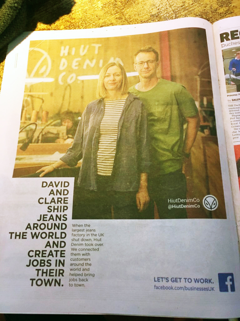
I keep spotting my mate Dave, (a future podcast guest, when I can pin the fucker down), and at the bottom of the ads I'm reminded that overhanging punctuation hasn't hit Facebook yet.It got me thinking.Maybe someone else out there hasn't heard come across overhanging punctuation?What other typography basics have Facebook been deprived of?Who's passing this stuff on?So I thought I'd put down ten basic typography tips.Actually, tips is overselling them; basics.(I wonder whether Facebook's market Cap is still at $494.82Bn?)
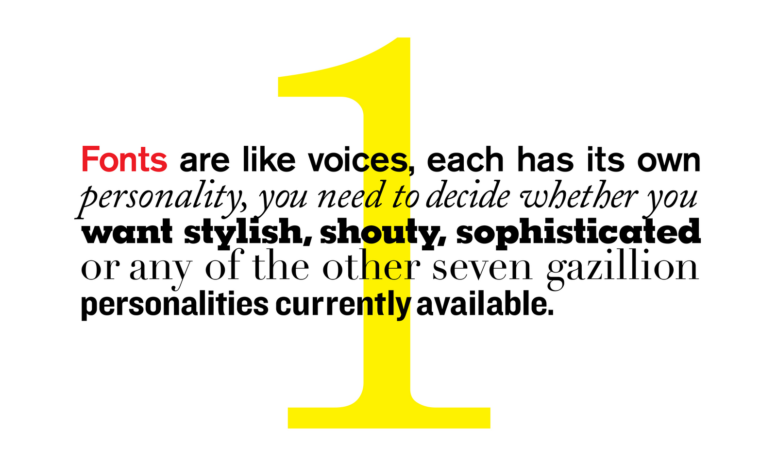
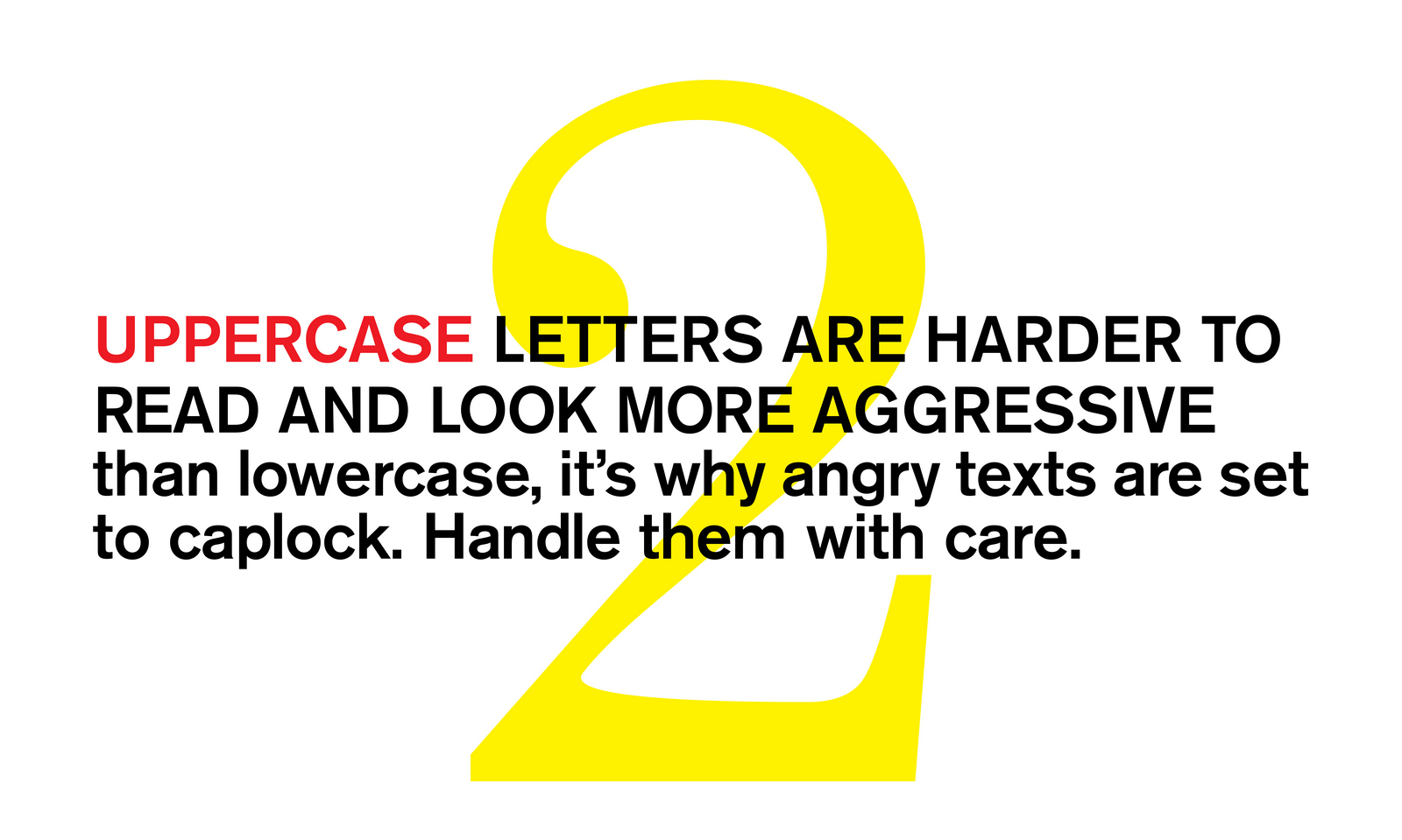
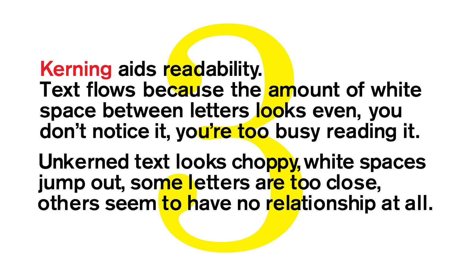
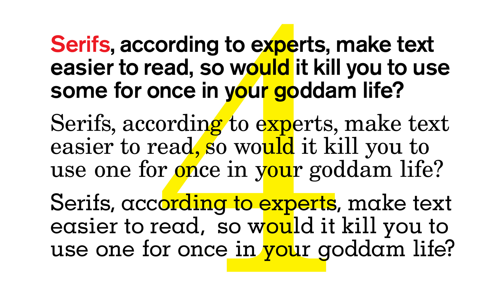
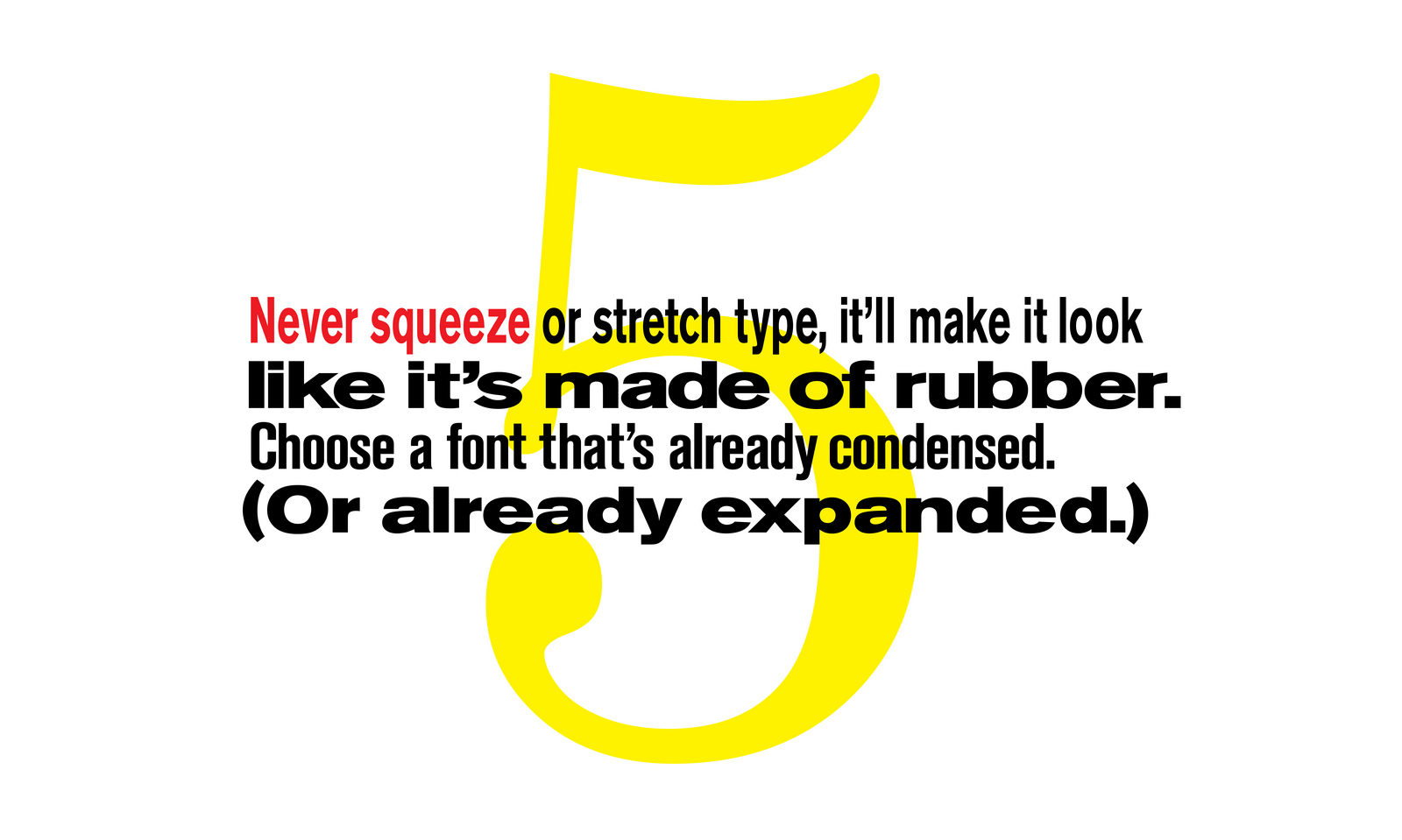
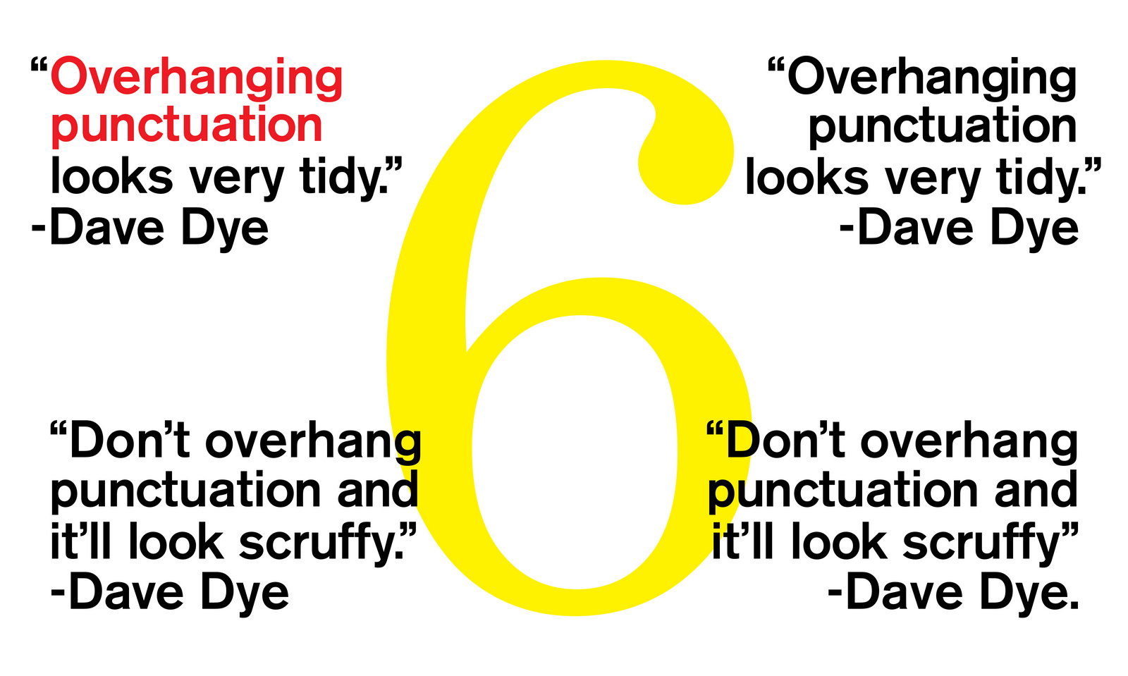
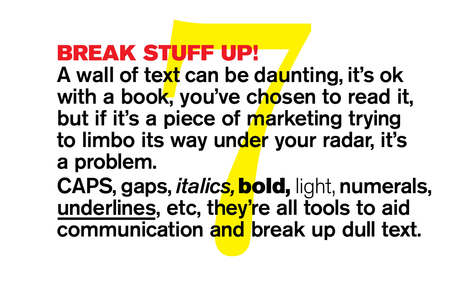
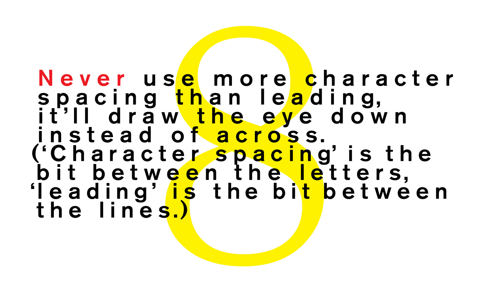
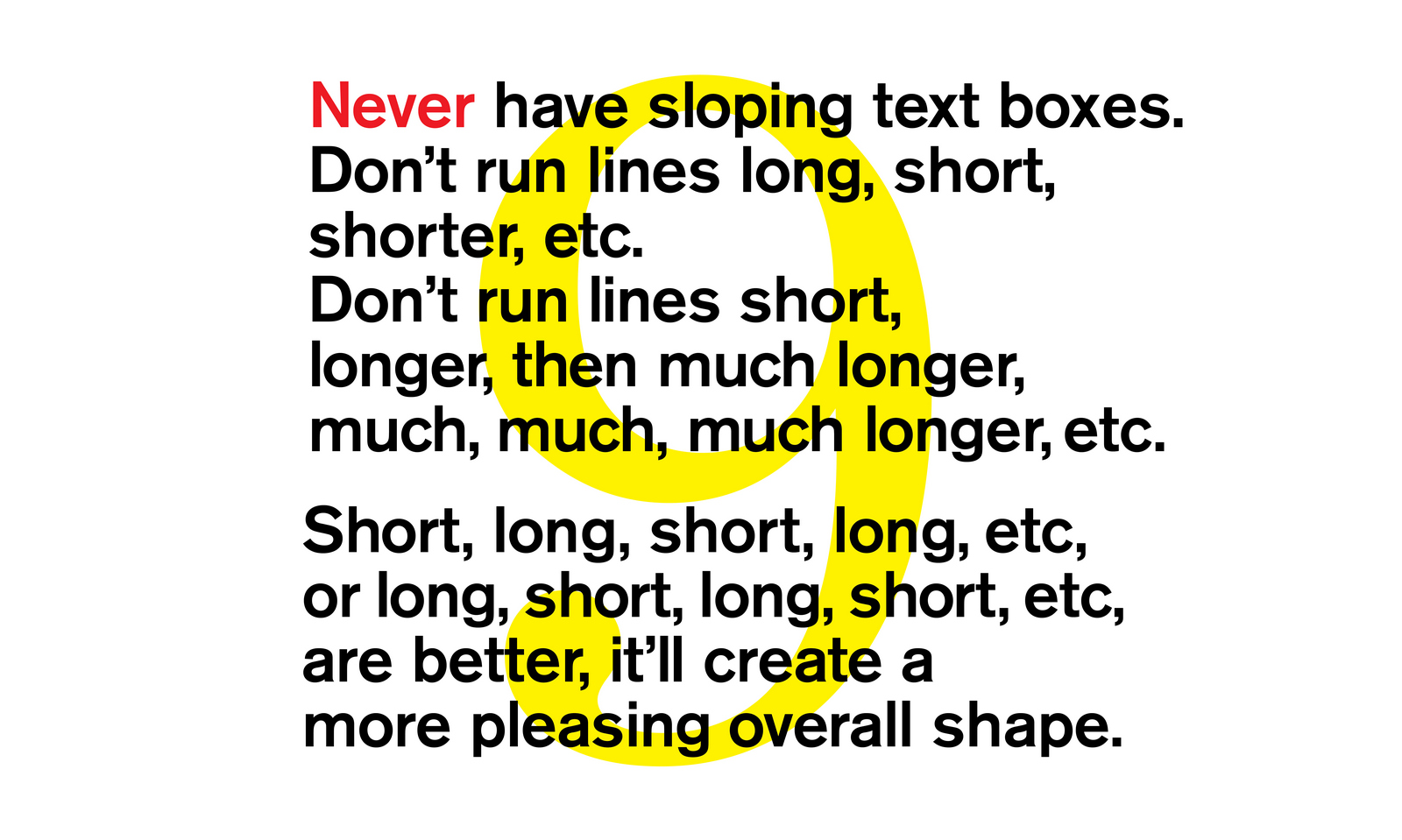
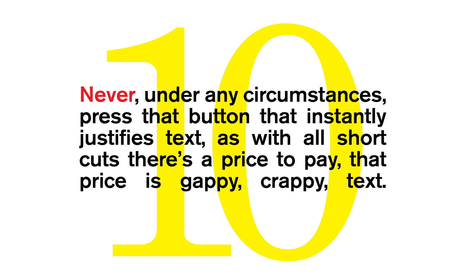

Most graphic identities are a better representation of the people who created them than the companies that paid for them. Consequently they are very ‘of the moment’, because their creators want to look cool. The process will start with a quick trawl through the coolest sites, magazines and blogs, checking out what the cool kids are up to. Gradually, patterns emerge; certain colours, photography styles, fonts, etc. If you're in that process today, you’ll get something that’s very 2018. Great in 2018, less great in 2020, worse in 2022. Two or three years down the line someone’s going to say ‘our marketing is looking a bit tired, we need to refresh it’.You can refresh a point of view, but if there isn't one, if it's just whatever felt good a few years back, it's hard to refresh.If you stand for something you can interpret it a thousand ways, if you don't you can't. So the process will start again; a quick trawl through the coolest sites, magazines and blogs to check out what the cool kids are doing. Over time, the impression is that of a brand has no sense of self, a bit schizophrenic.Also, and probably worse, the most basic of marketing requirements is that people know who’s doing the marketing, so making it more difficult to recognise is unhelpful. Take Apple, they evolve their look and feel about once a decade, maybe a slightly different sans-serif will turn up, or maybe new logo treatment.They don't reinvent the wheel, they refine it.It means you always know Apple are talking to you.So when creating a personality for a brand, rather than looking out for what's hot, look into who it's for.Last year the good folks at Anomaly asked me to help out on a task like this for Virgin Trains. Some work had been done where the graphic identity was based on speed, lots of Virgin Train lines had been electrified, so were quicker, so it made sense.
The problem was, it was very ‘trainy’. whether they were quicker or not, lot’s of train companies talked about speed and therefore used the graphic language of speed. So there were two options a) Find a distinctive, Virgin Trains way of doing speed. b) Don’t do speed. So rather than base my thinking on the second word from the Virgin Trains logo, I began looking into the first. I was lucky, if it'd been Southeastern or Arriva Trains it might have been tough, but Virgin? They have an incredibly rich history.1: THE SHOP. In 1972 record shops were formal places, often selling radiograms and other electrical devices.Virgin offered listeners free vegetarian food and bean bags.
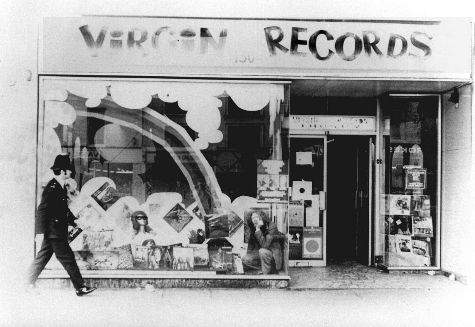
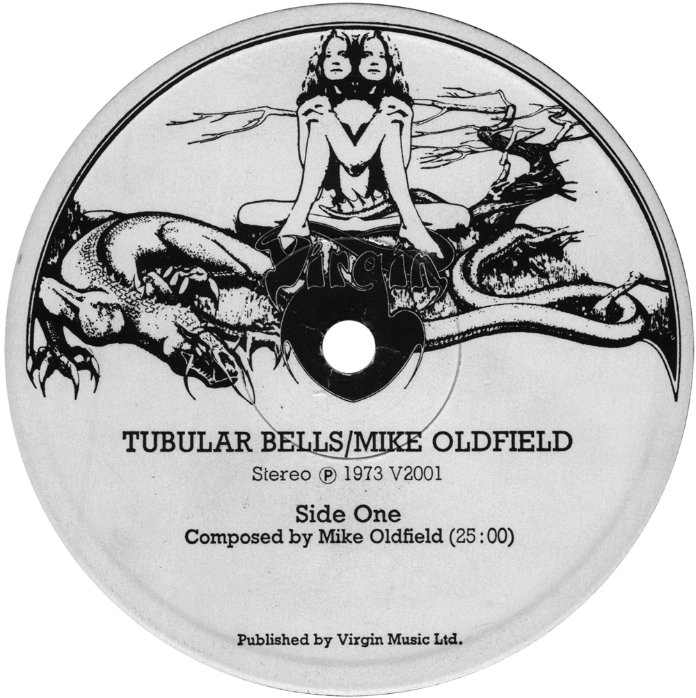
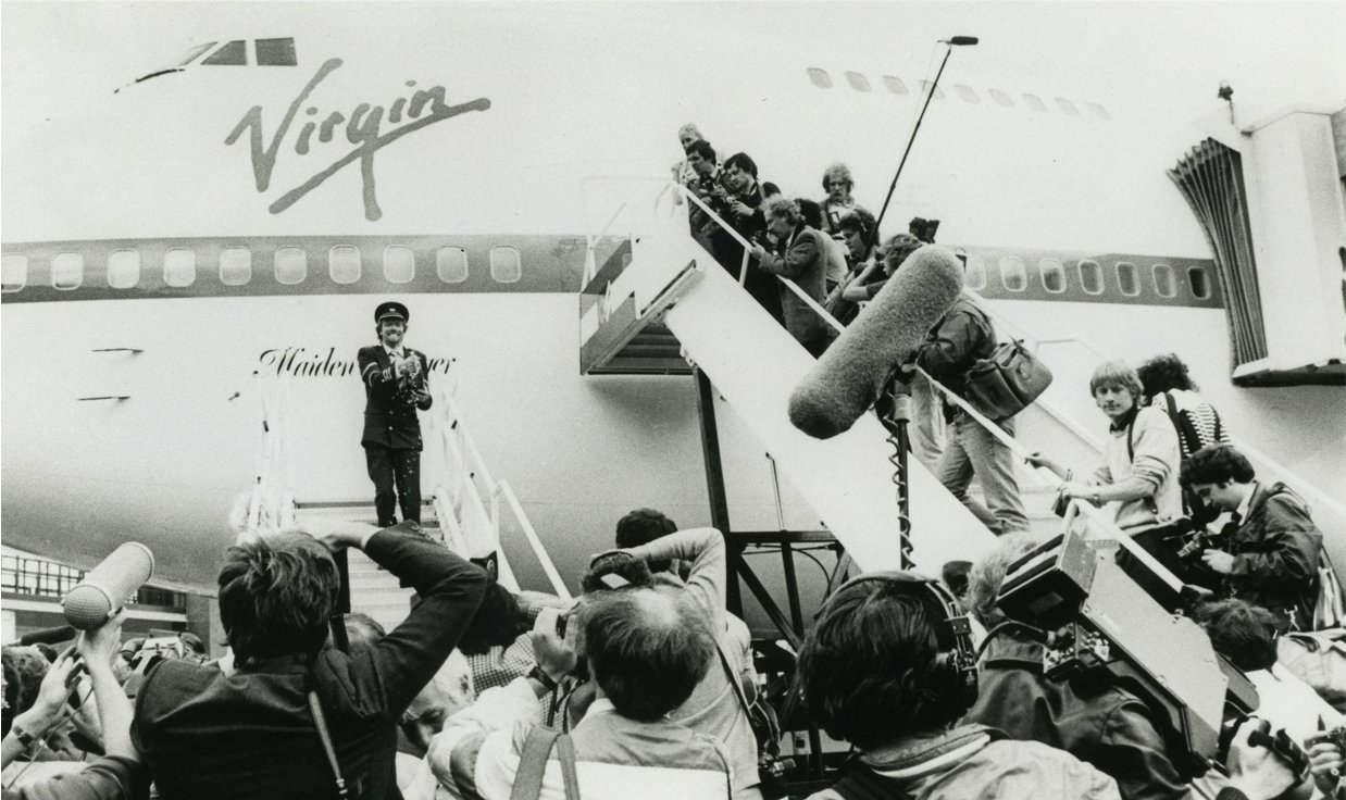

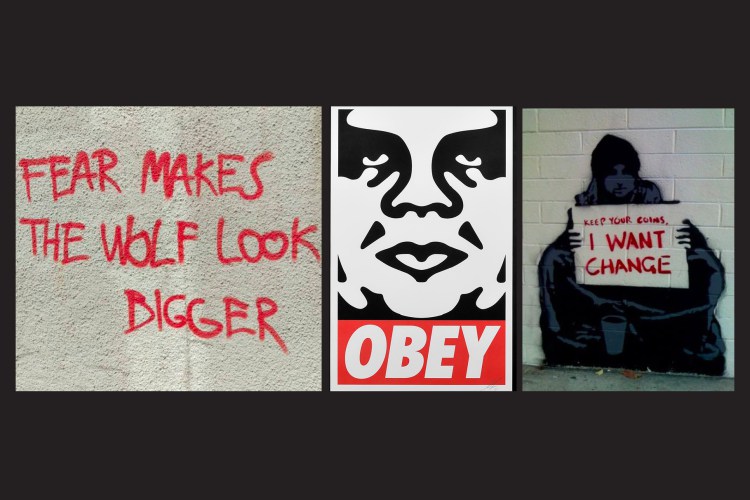
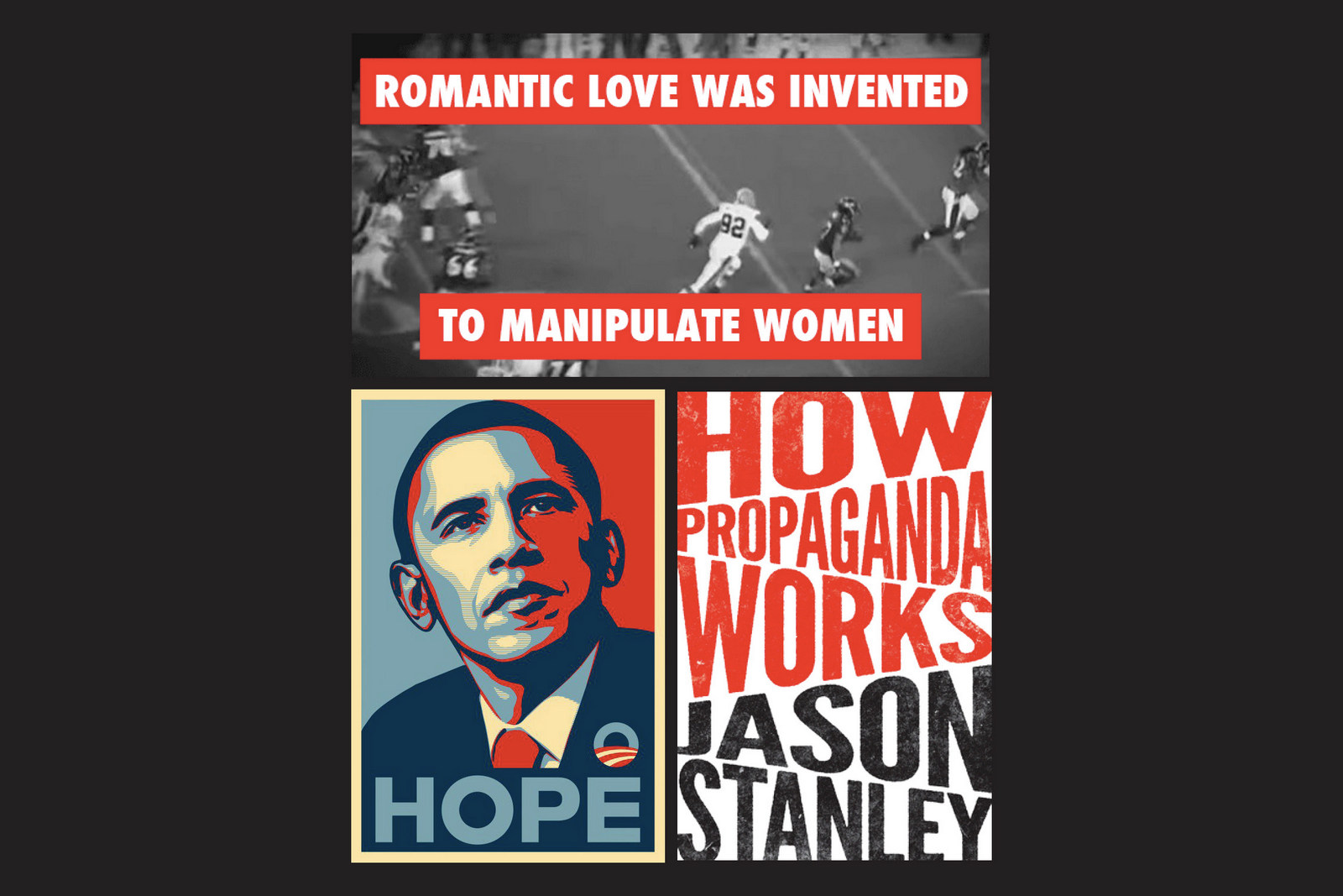
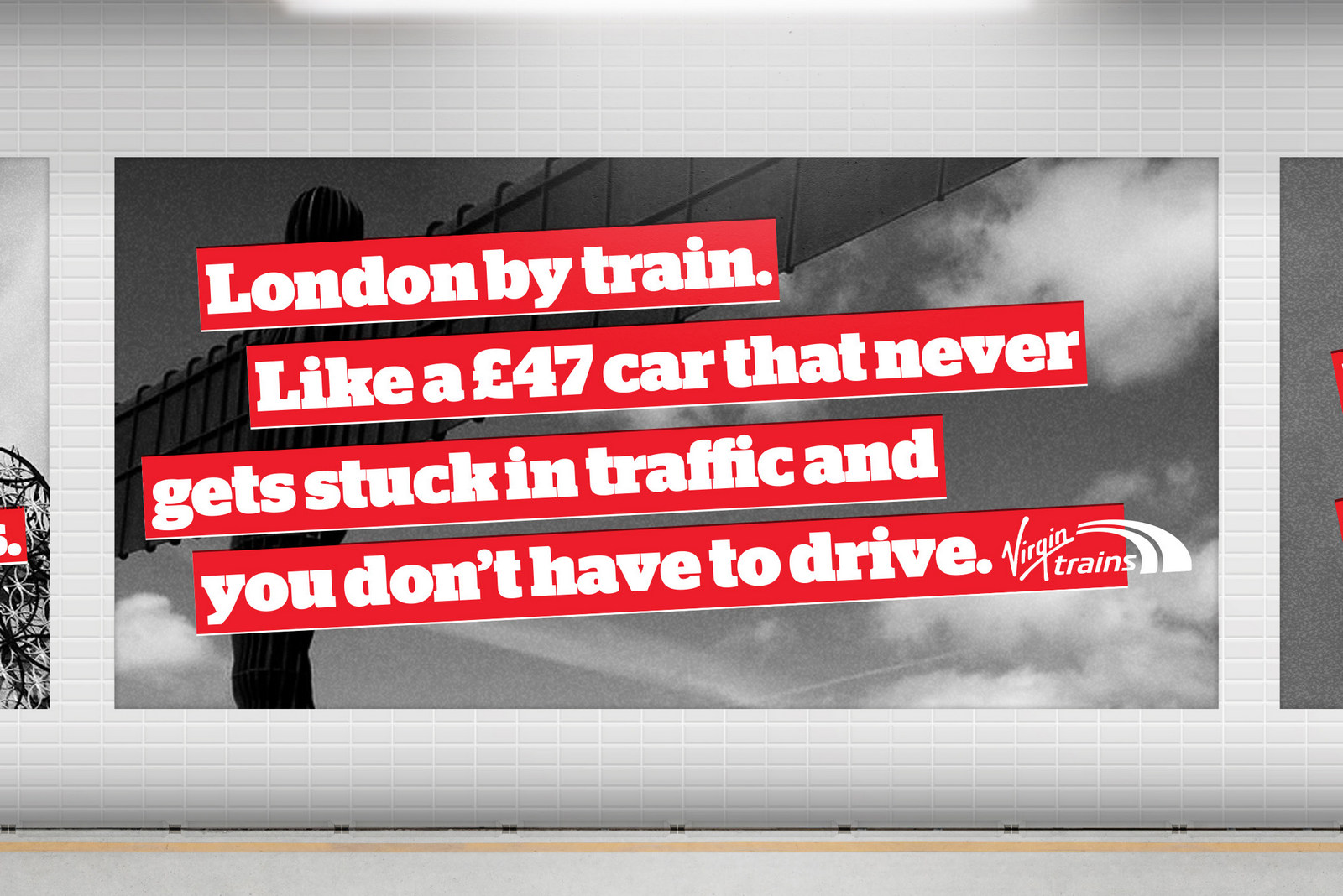
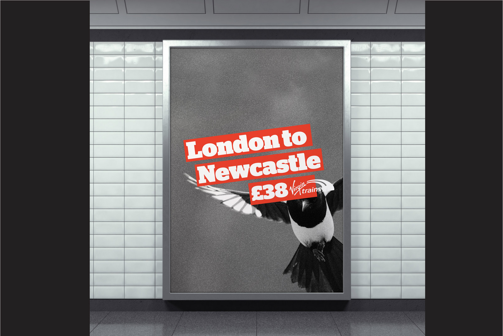
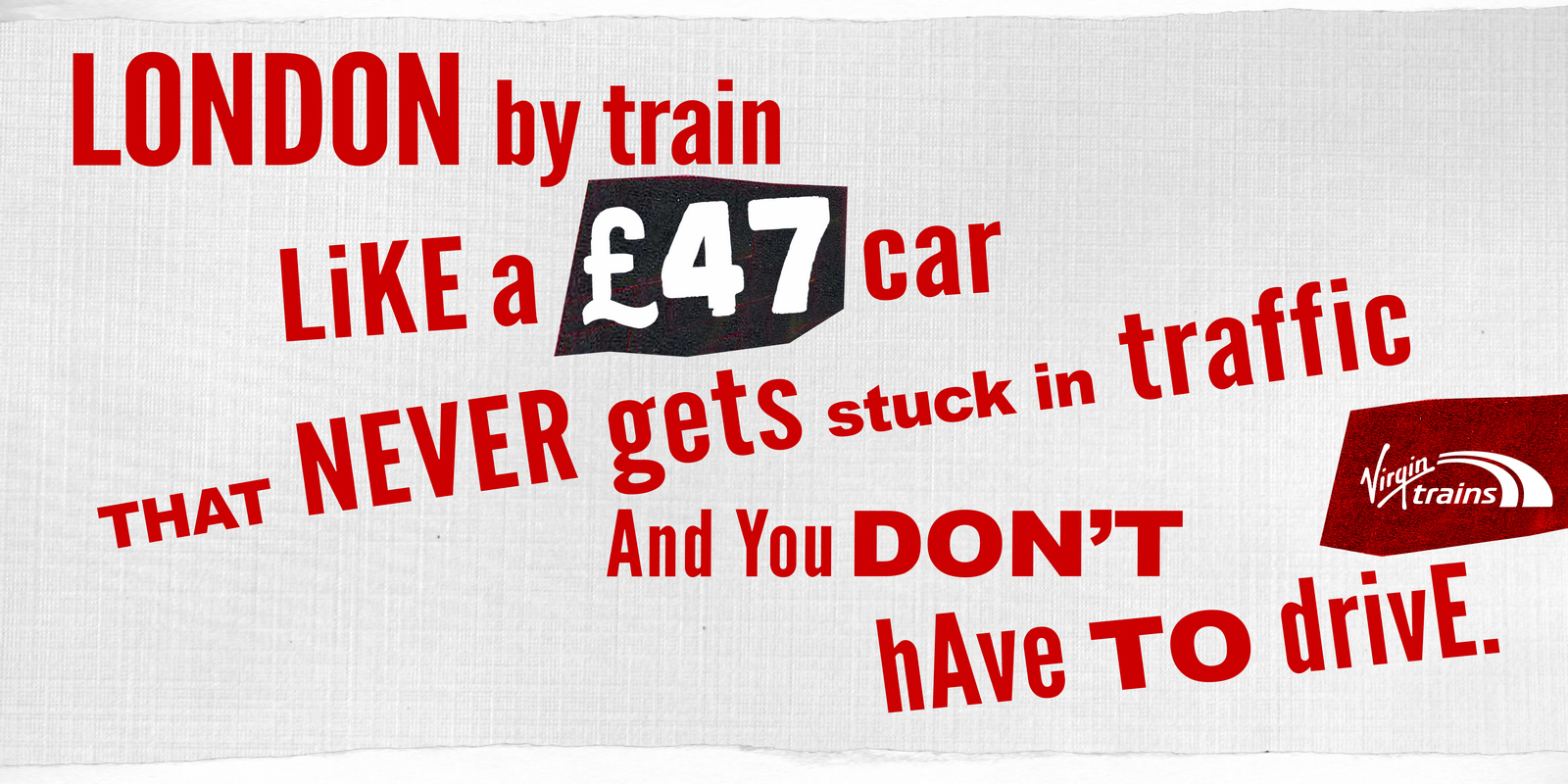
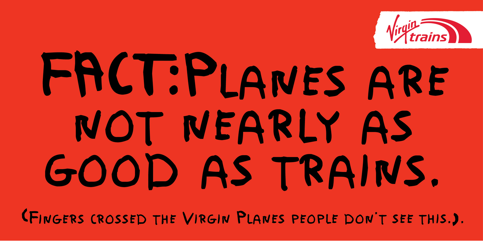
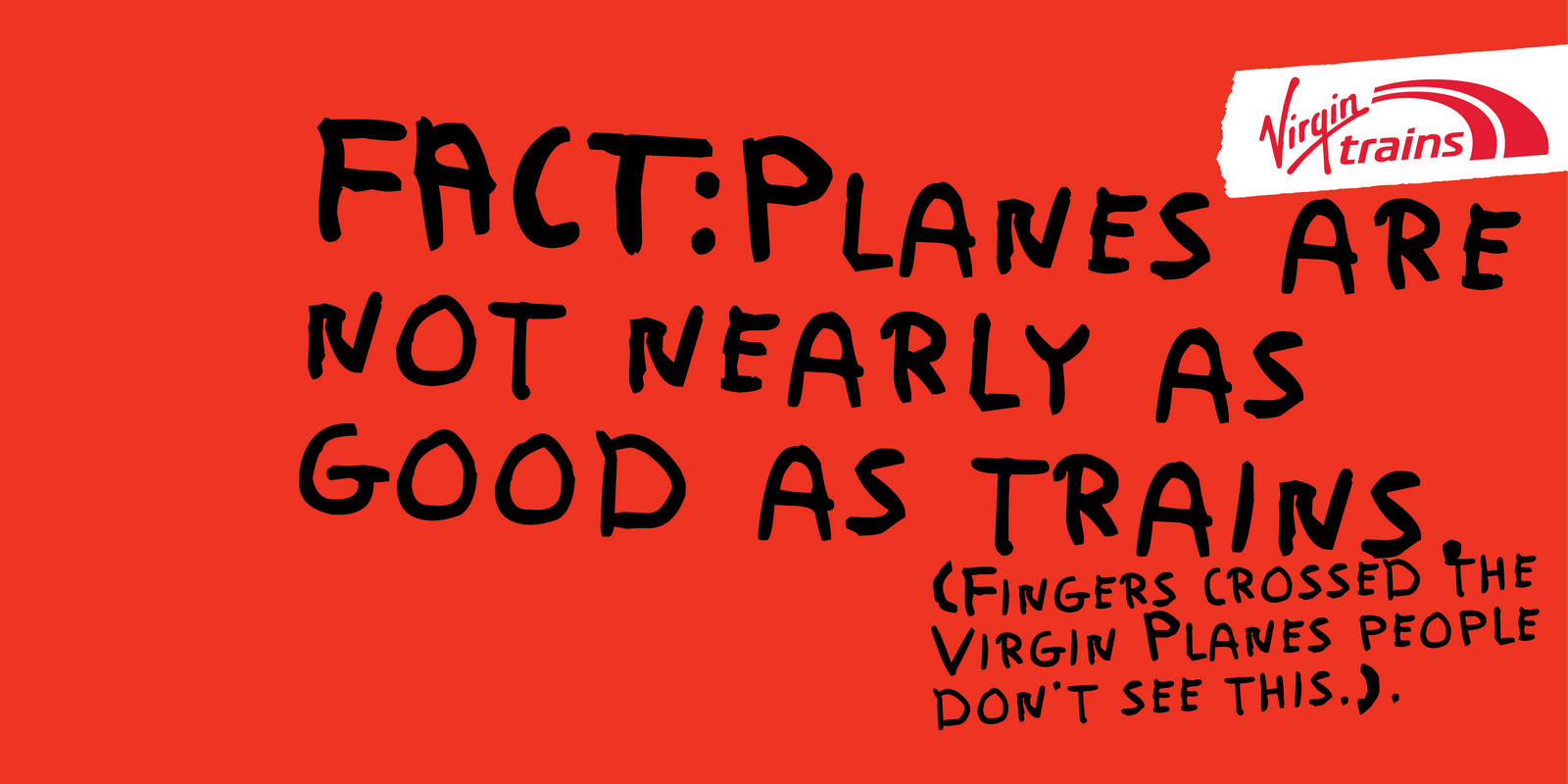
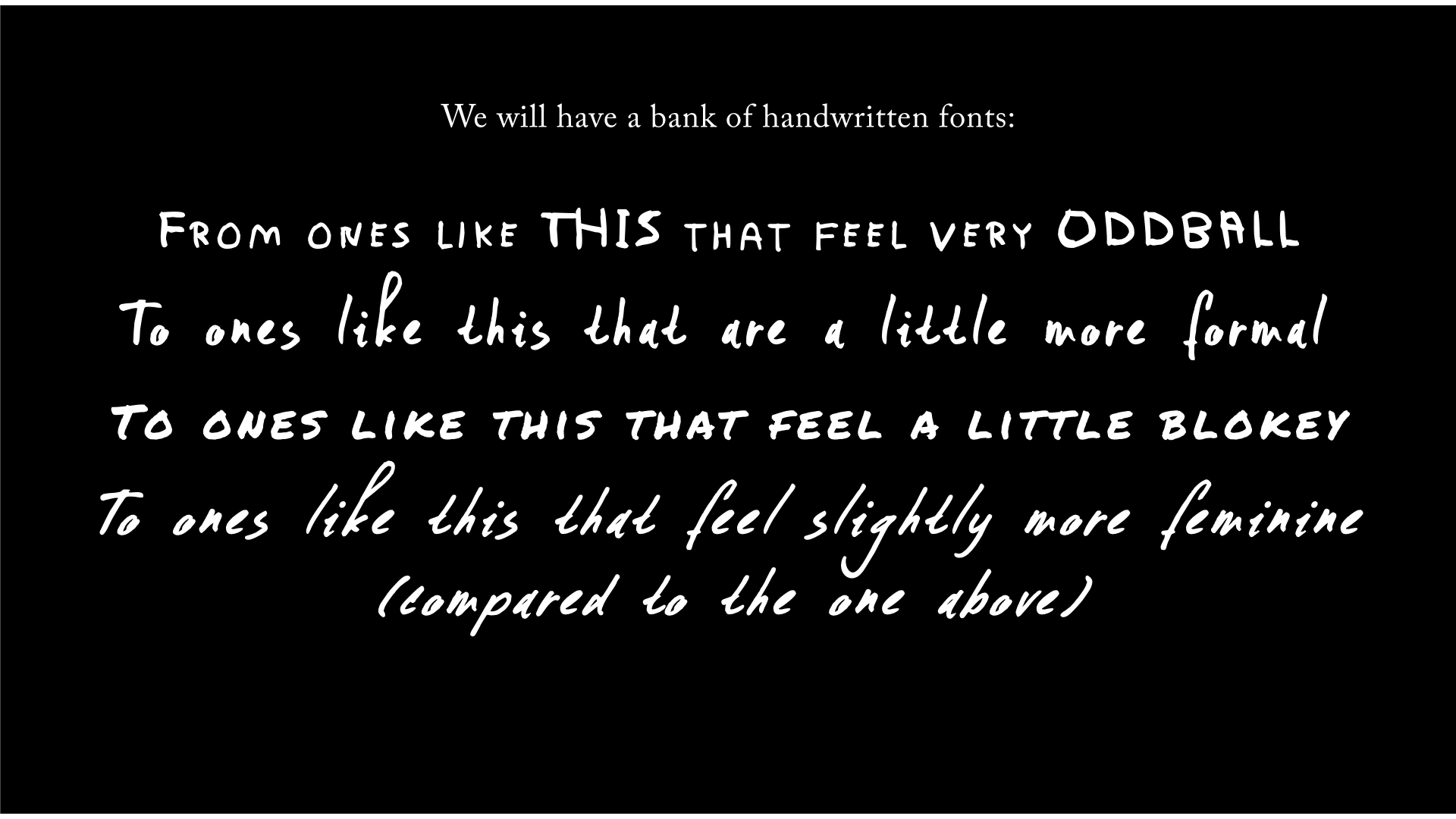
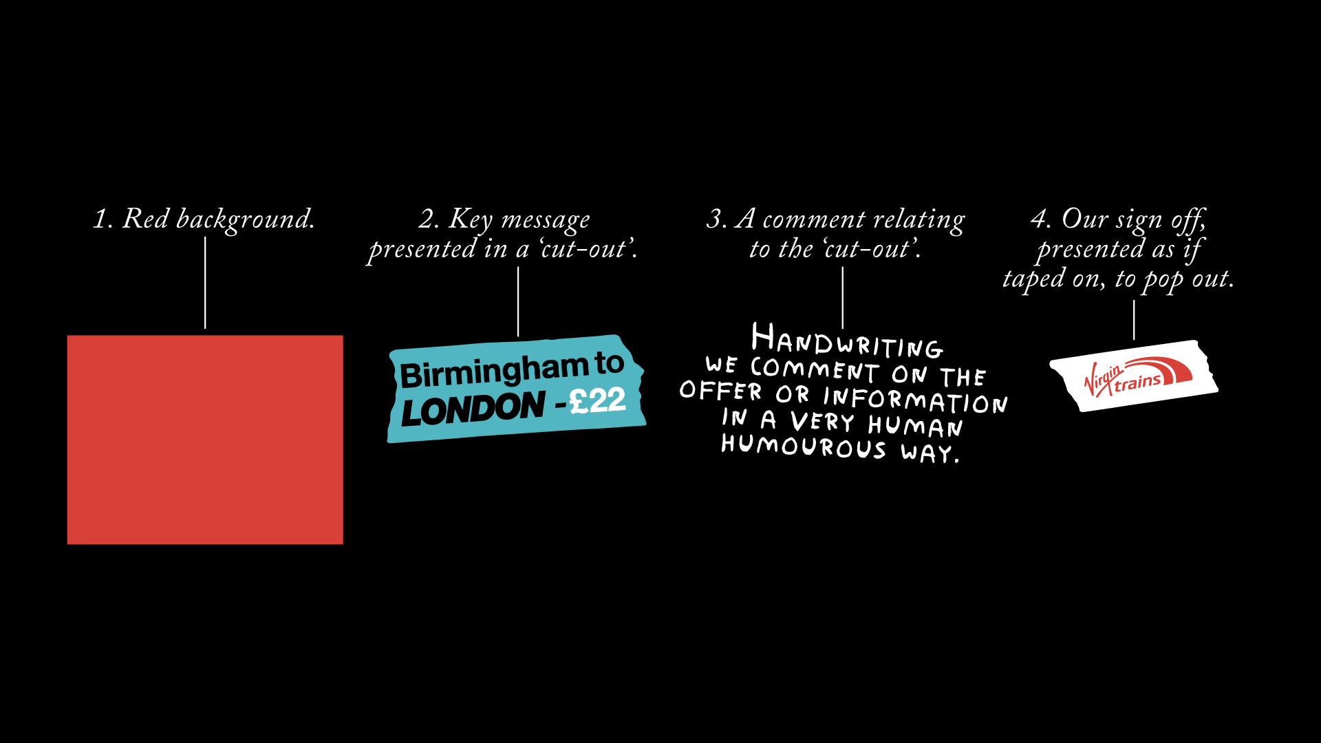
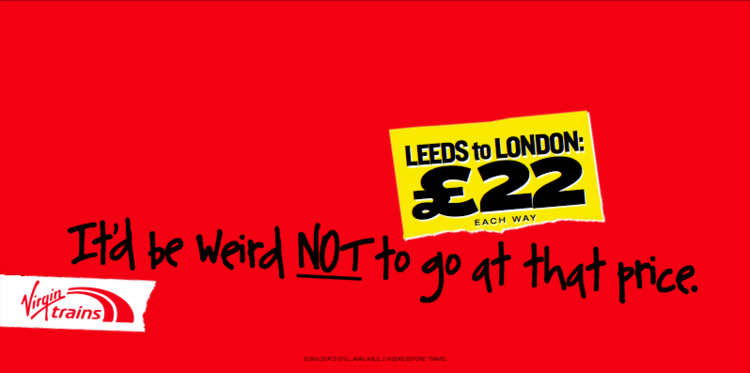
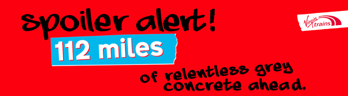
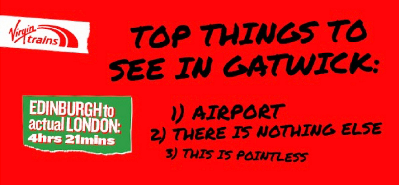
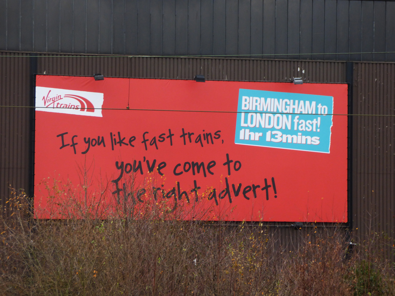
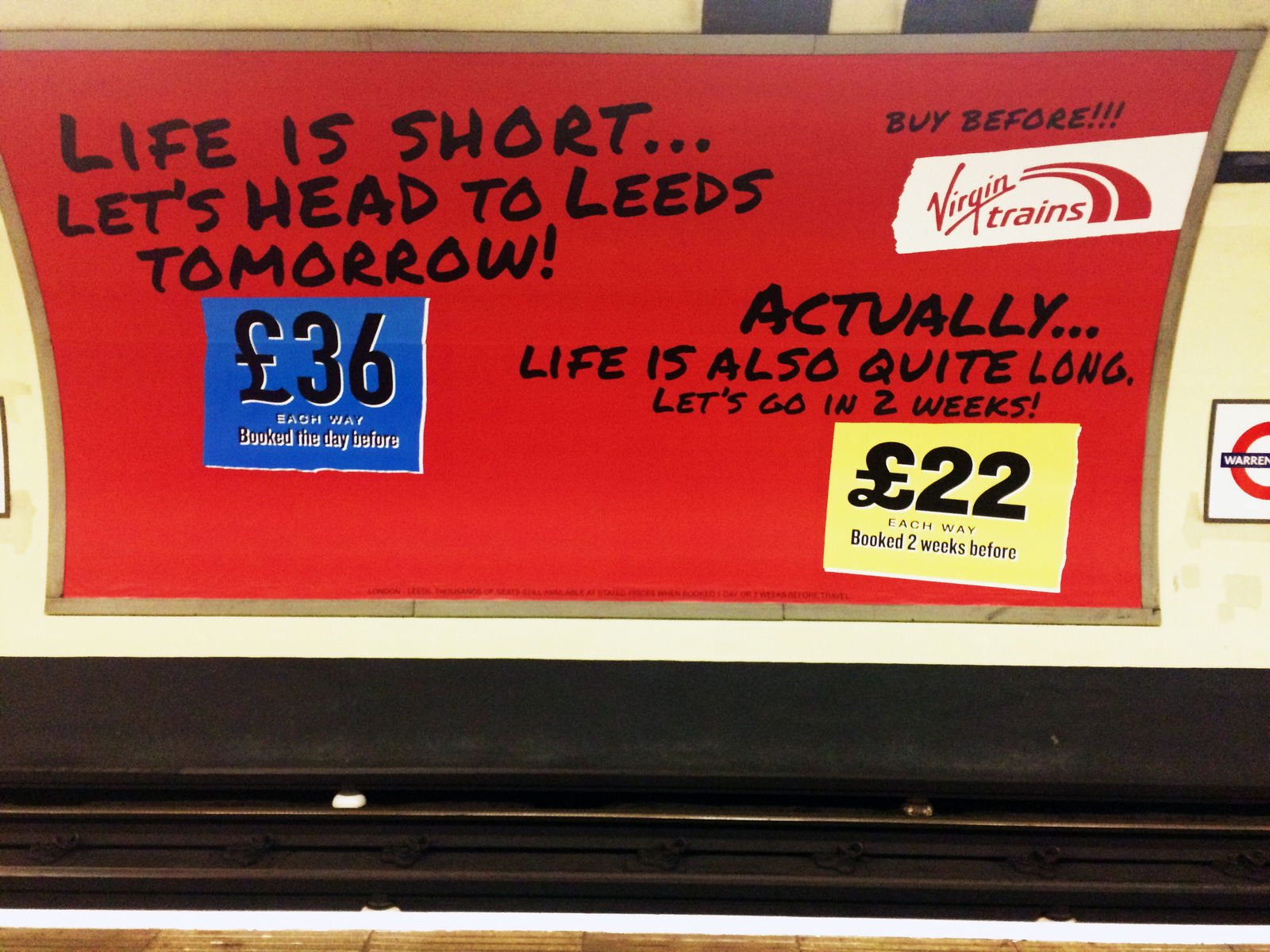
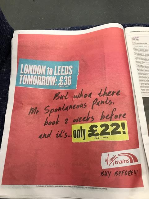
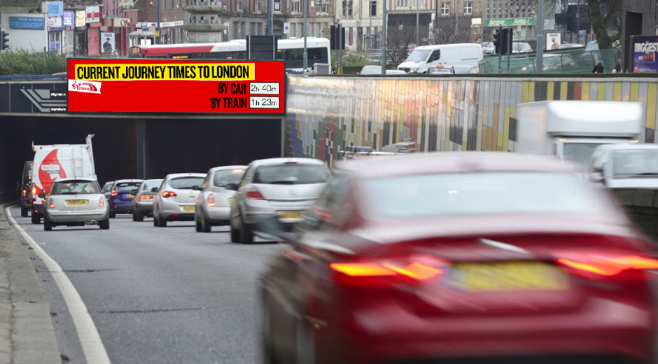
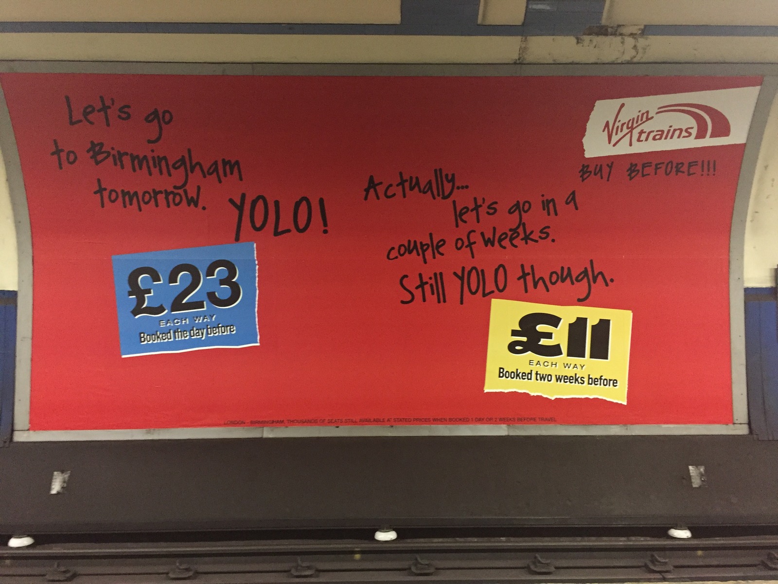
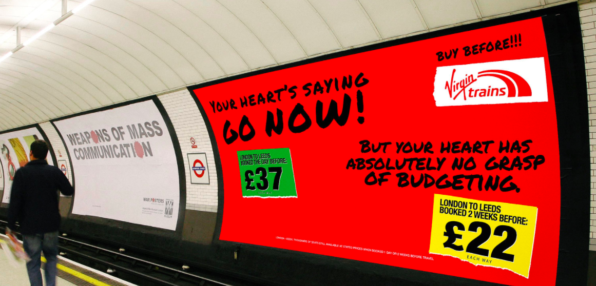
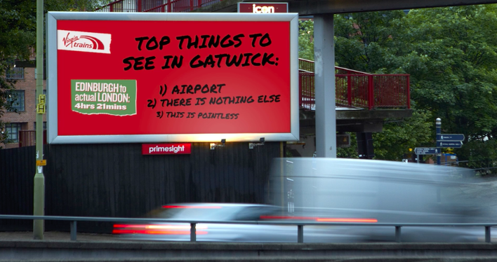

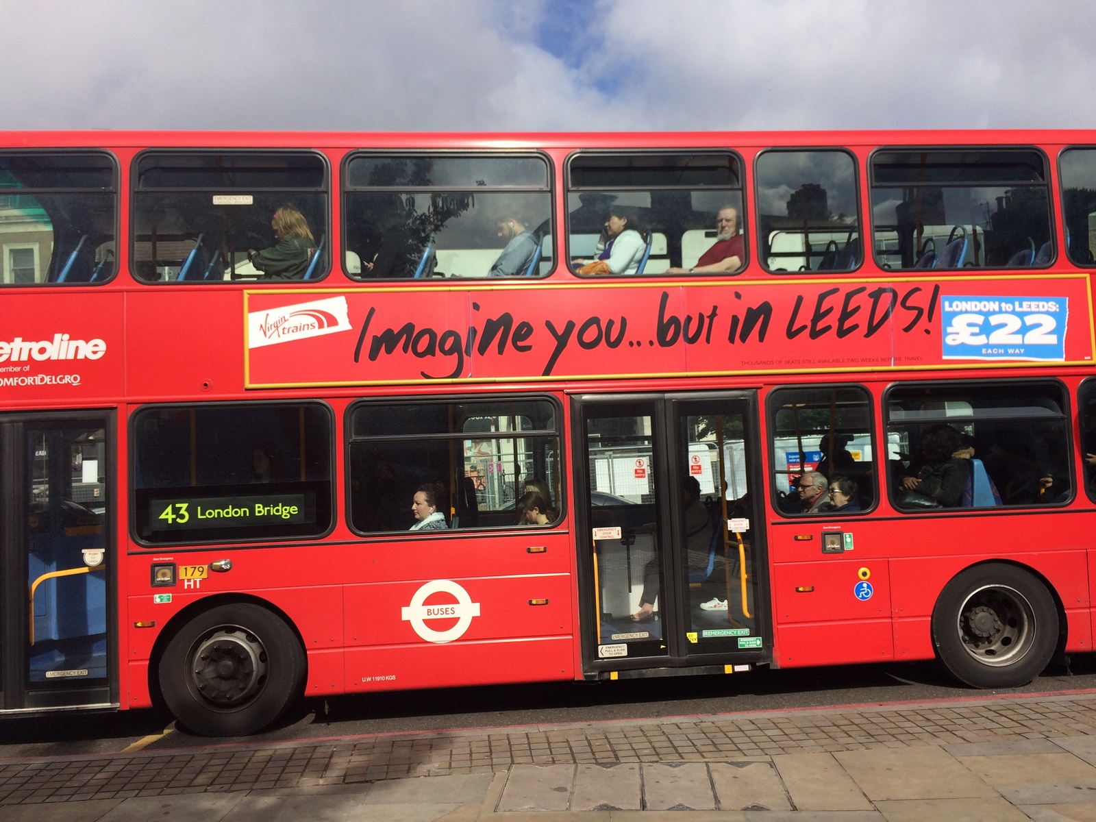
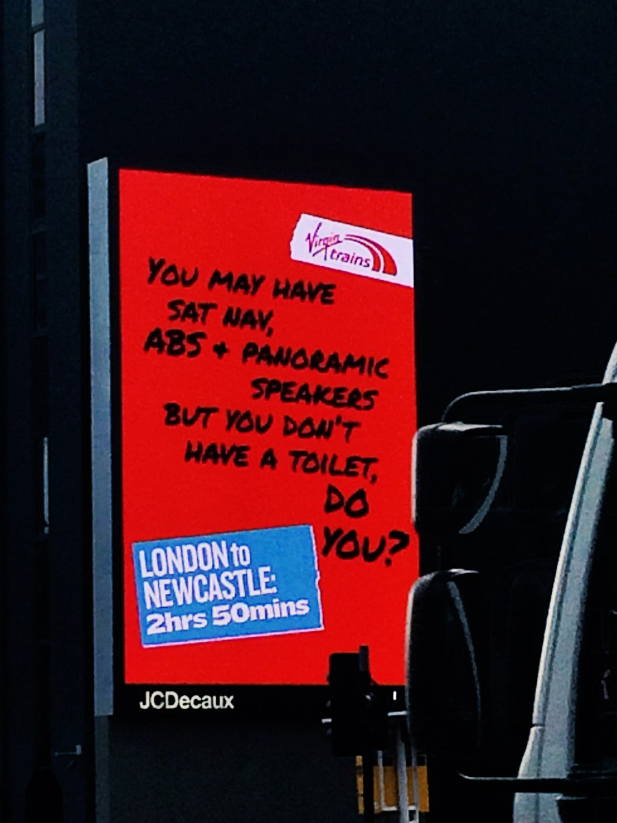
Unfortunately I seem to keep writing the same intros to these interviews; 'Wow! I knew Person X was good, that's why I wanted to interview them, but having gone through their archives I'd forgotten just how much great they'd done'.But never has this been more true.Today, in the ad world, Paul is best known as the director of the Walker's Crisps ads featuring Gary Lineaker. (He's shot about 150 of them over the last 20 years.)It's probably the longest running tv campaign in Britain and possibly the best known ad campaign amongst the British public.There are obviously plenty of upsides to this, the downside is that it can mask everything else he's done.I did consider trying to put all of them together on one reel, but then decided the work would be too weighted towards Walkers, So I've only included a handful.We had a great chat, I hope you enjoy it.[audio src="https://davedye.com/wp-content/uploads/2017/11/Paul-WeilandFinal.mp3"][/audio](I couldn't find a scrap of work from Paul's time at either HORNIBLOW FREEMAN & COX or ROYDS.)BBDO. (Writer)

COLLETT DICKENSON PEARCE. (Writer)
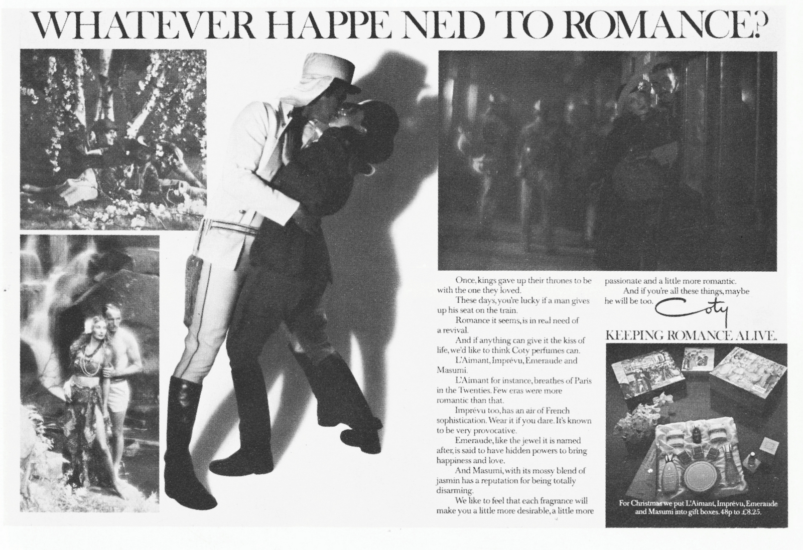
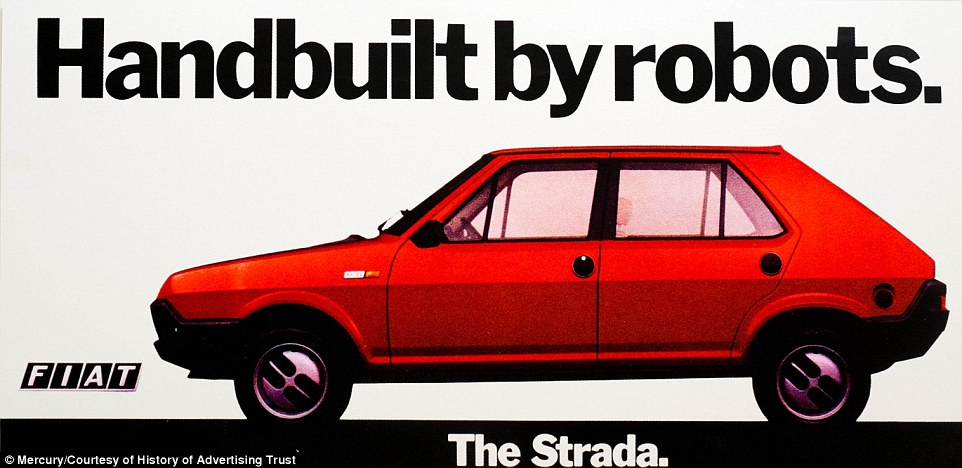
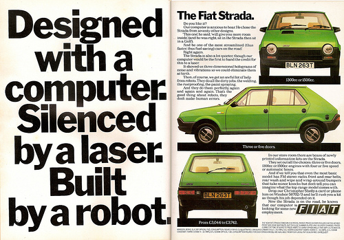
A spoof of the above ad by the Not The Nine O' Clock News guys.
THE ALAN PARKER FILM COMPANY&THE PAUL WEILAND FILM COMPANY.(Director)
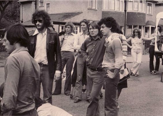
Hamlet Cigars.
British Telecom.
Bamboo Steamers.
Knirpps Umbrellas.
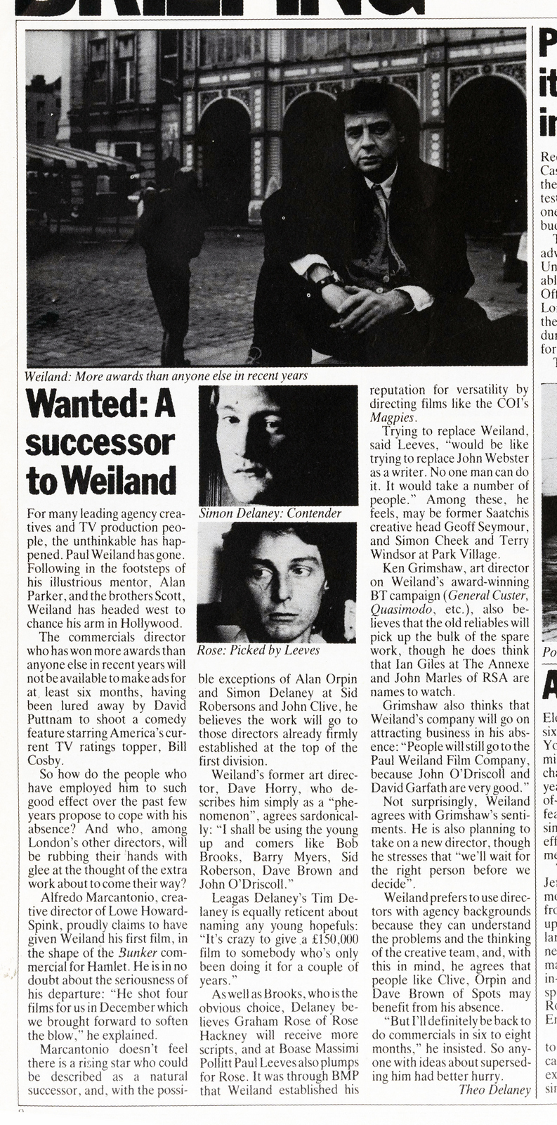
Heineken.
The Guardian.
G.L.C.
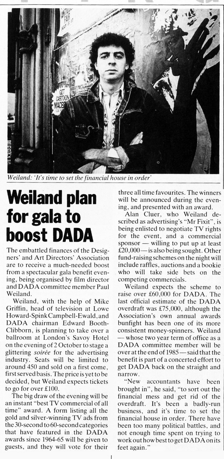
Schweppes.
Levi's.
Holsten Pils.
Fosters.
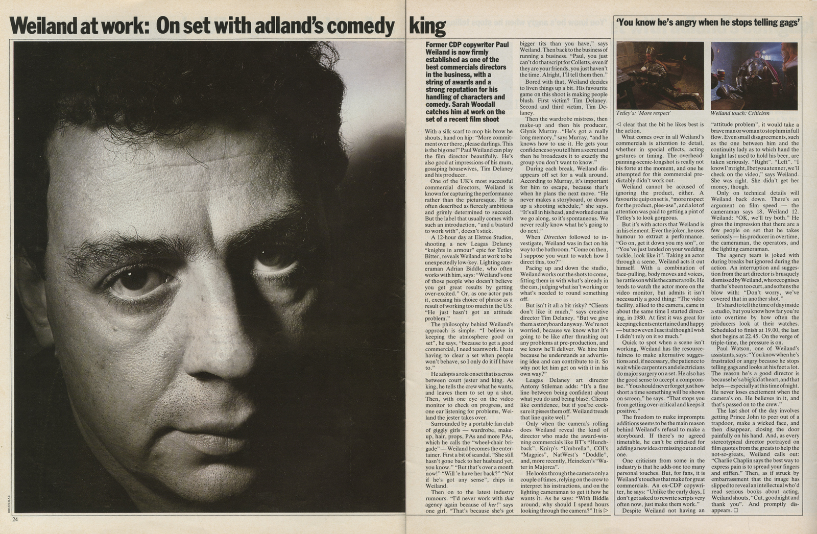
Comic Relief.
McEwans.
Walkers Poppadoms.
Walkers Crisps.
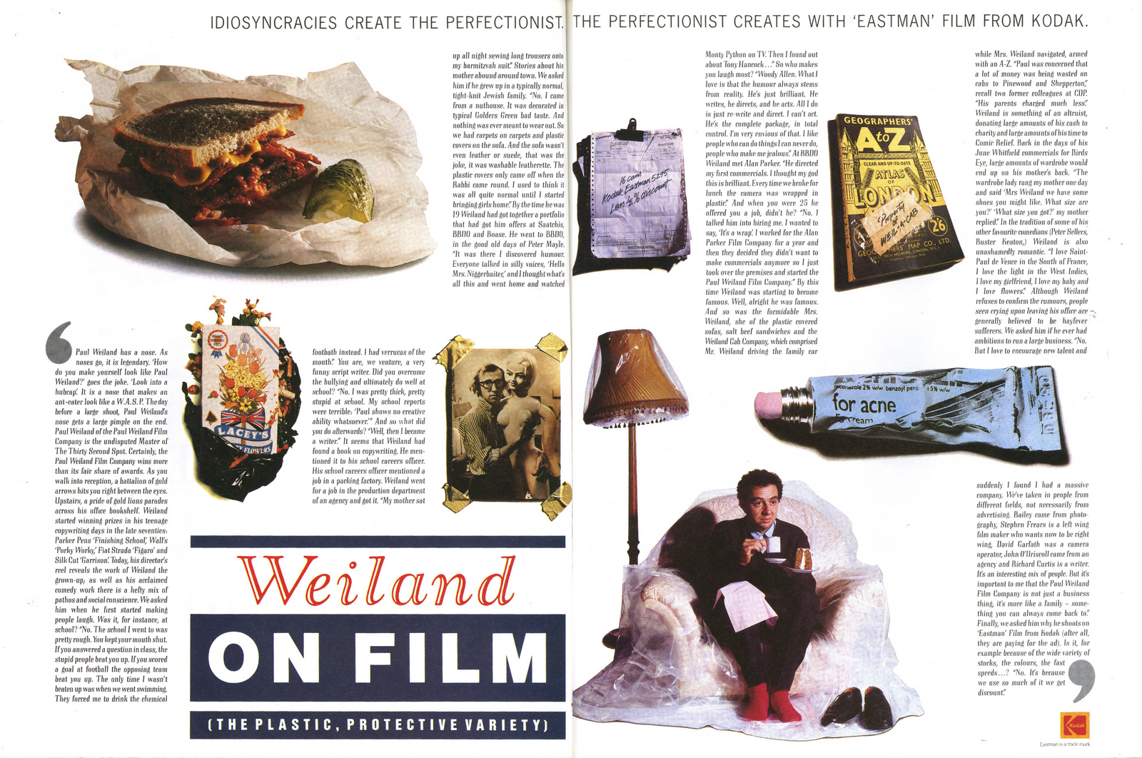
FEATURE FILMS:'Leonard Part 6'.
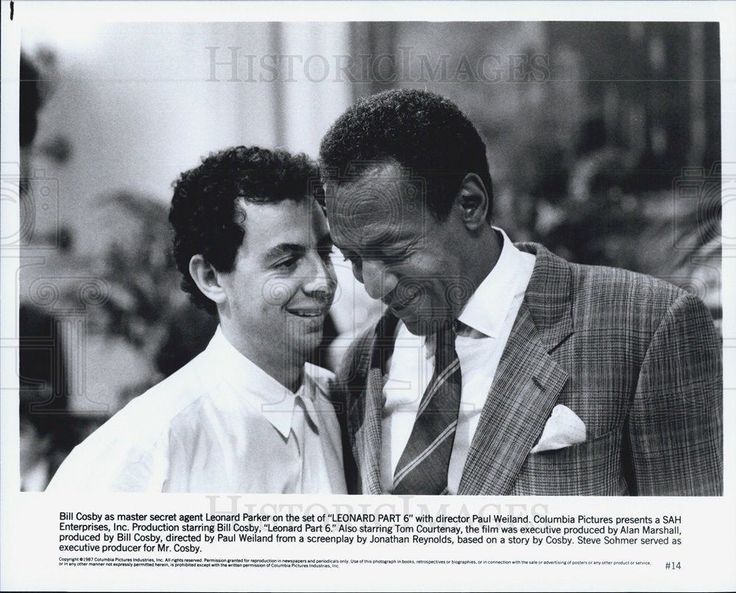
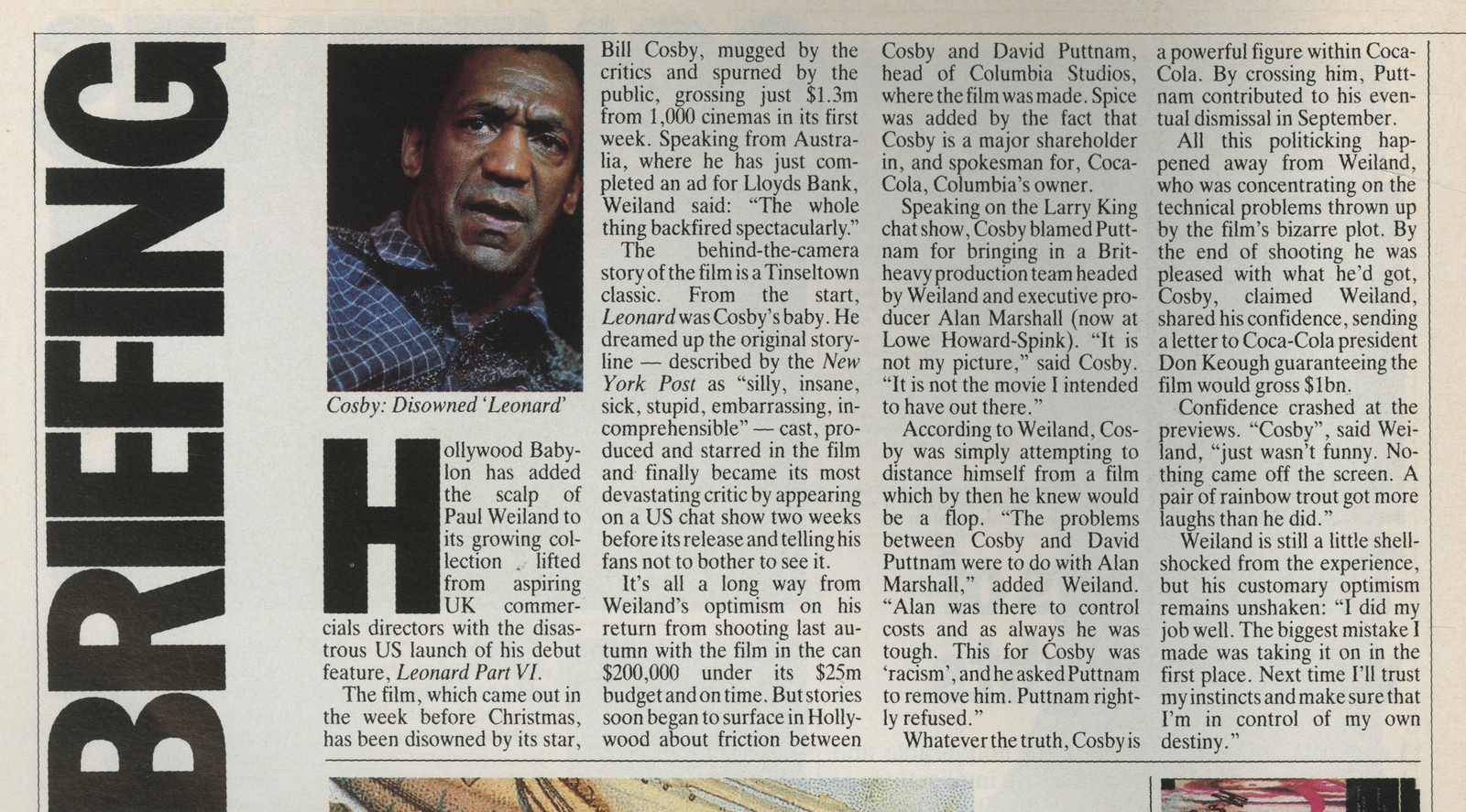
'City Slickers 2'.
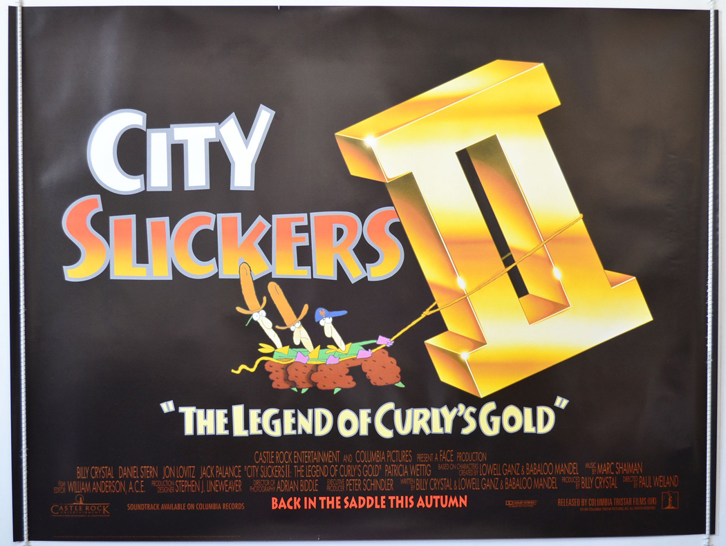
'Roseanna's Grave'.
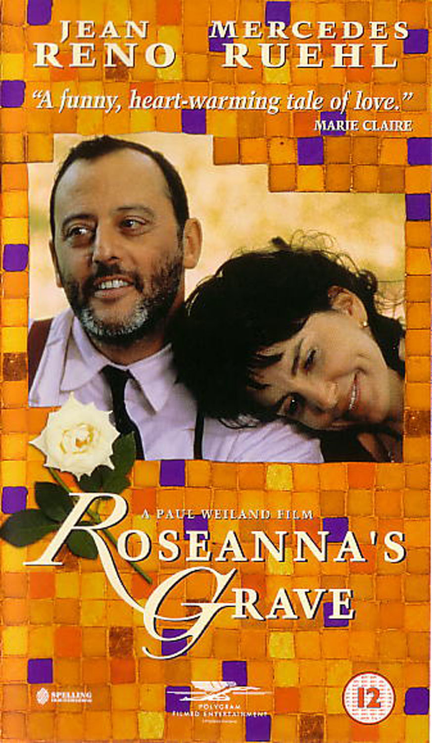
'Sixty Six'.
'Made Of Honour'.

Words.
Boy, they’ve really fallen off their perch.
They used to be so respected, as were the people who knew how to use them.
They could breathe life into cold, dead facts, in their hands ‘our beer costs a lot’ could become ‘Reassuringly expensive’.
Better and shorter.
Writers would often burn the midnight oil in an effort to get the maximum meaning from the minimum word count.
It’s odd, because people have never read more than they do today, Facebook, Twitter, Snapchat, Google, emails, texts, not to forget books, magazines and the odd newspaper.
In fact today, there’s no part of the communication process that doesn’t rely on words, including the deck that explains the communication process.
But for some reason, the skill of using them effectively is no longer being taught or even valued.
Tim Riley has been choosing his words carefully for three decades now, we had a great chat about his time using them at some the best agencies in London.
Hope you enjoy it.


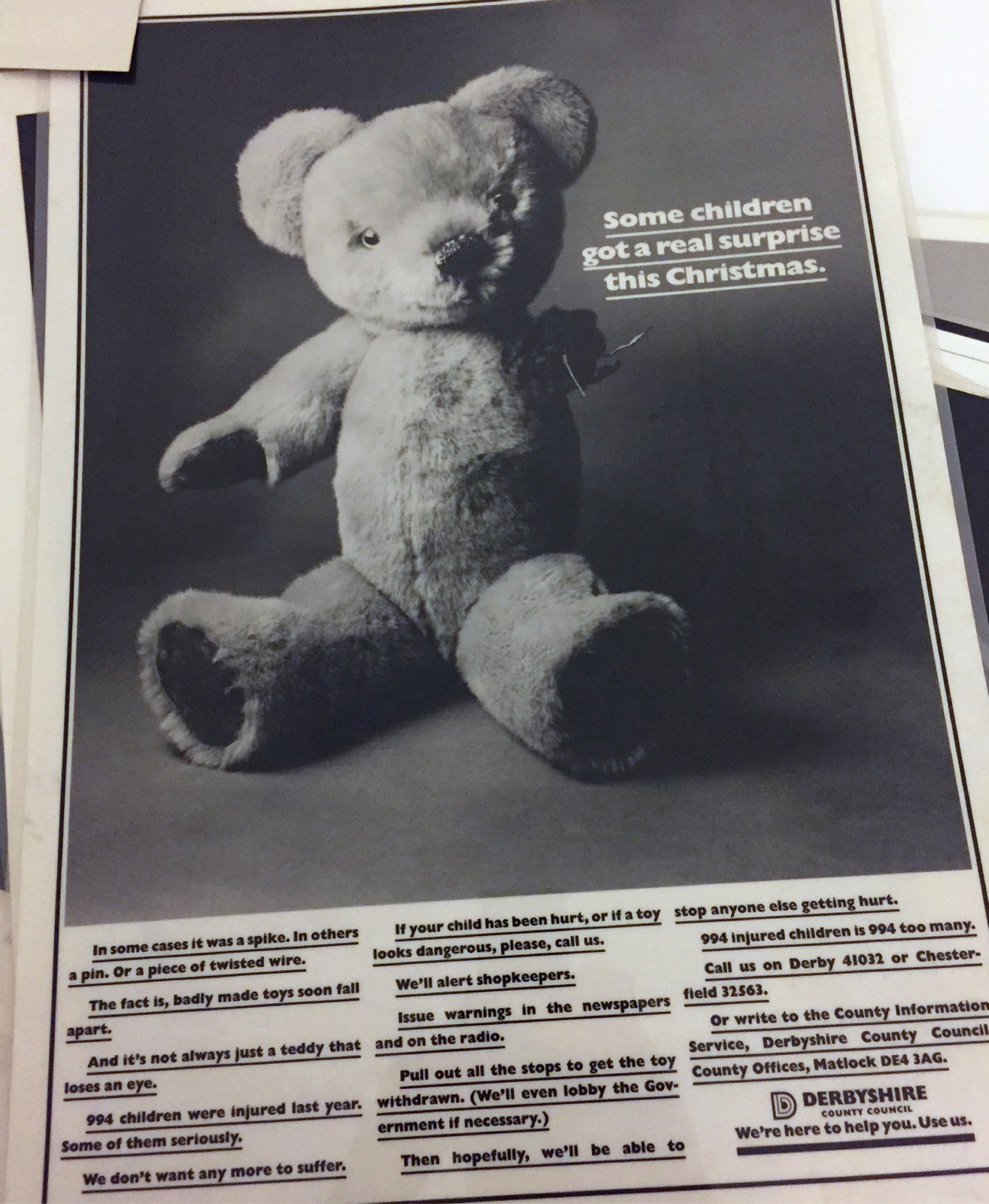


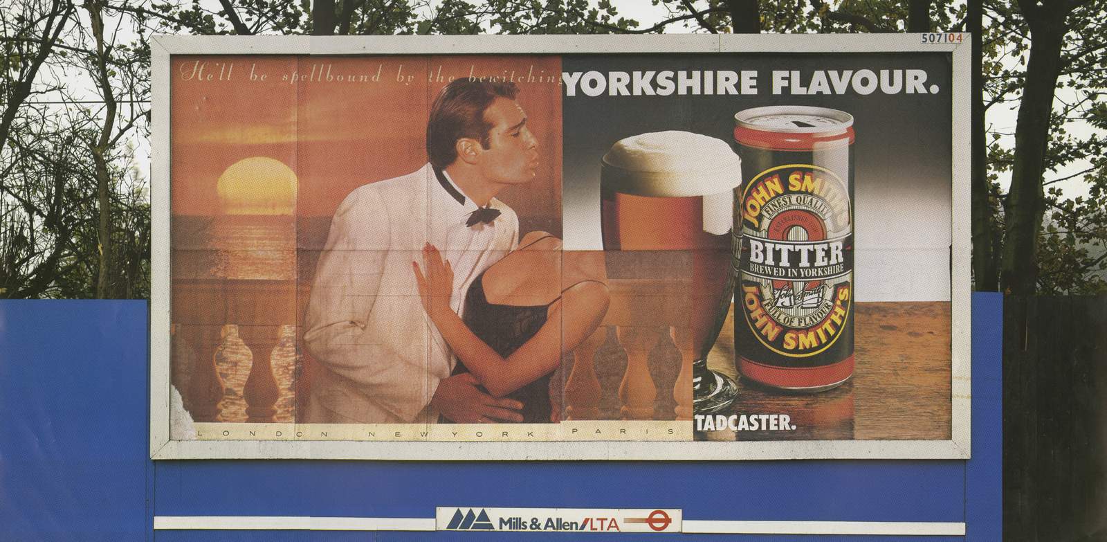
Leagas Delaney.
Simons Palmer Denton Clemmow & Johnson.
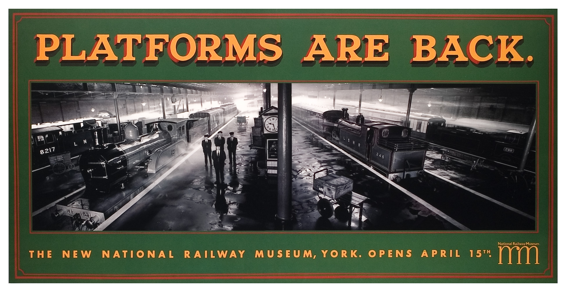
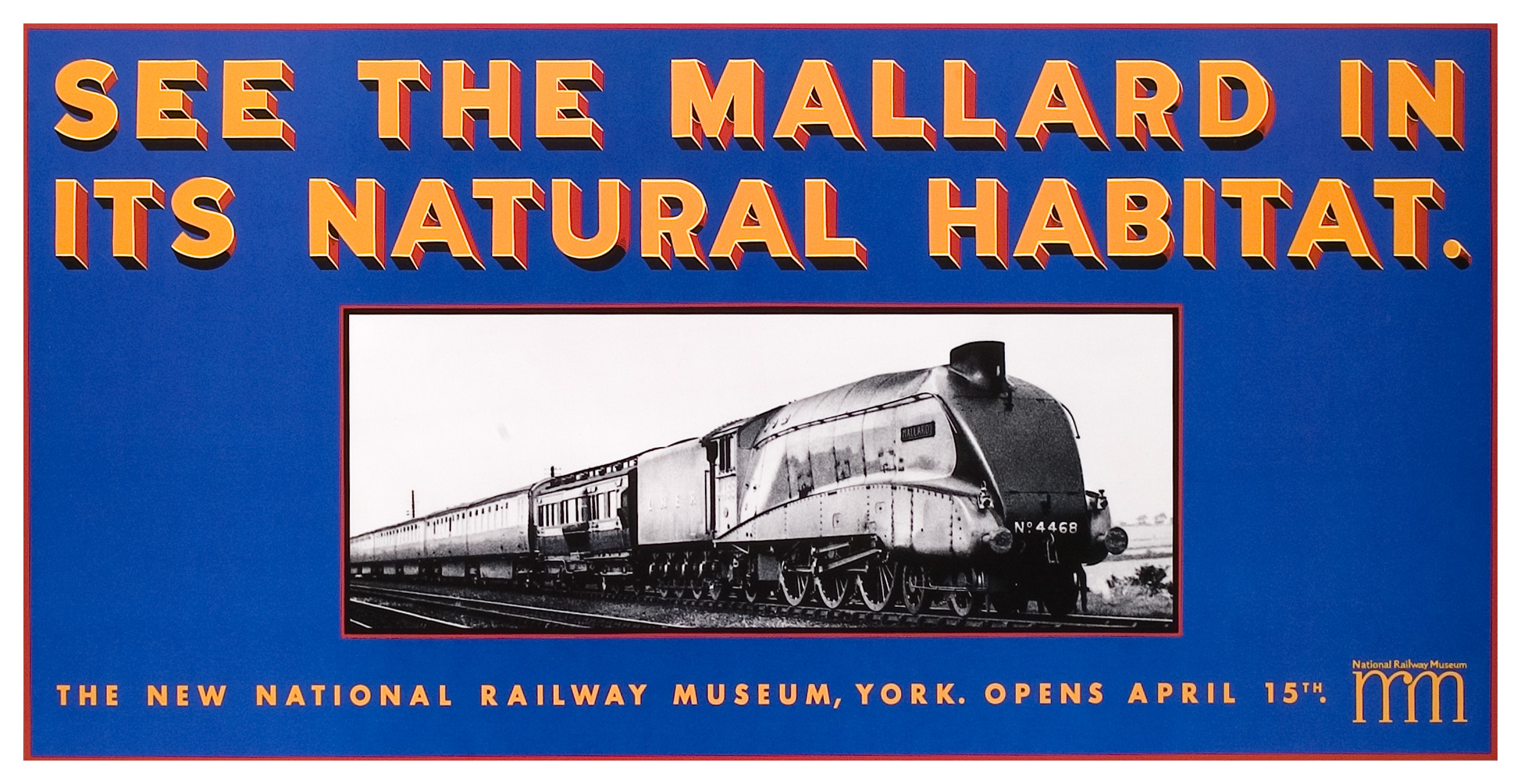
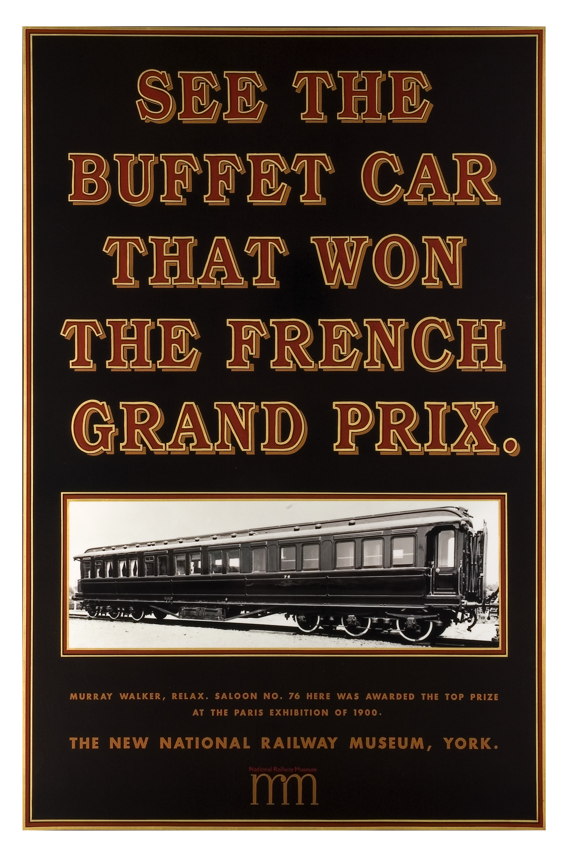
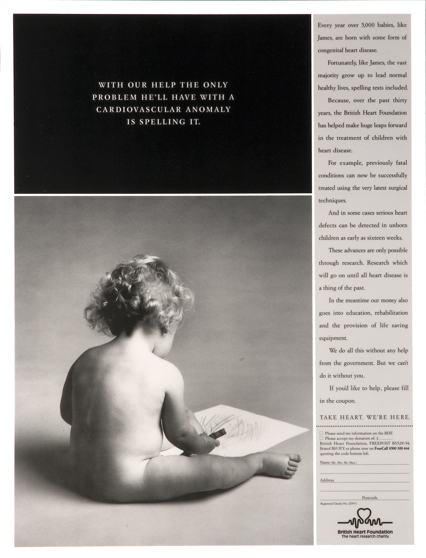
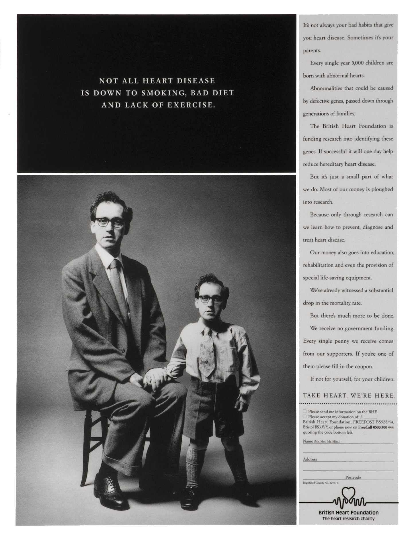
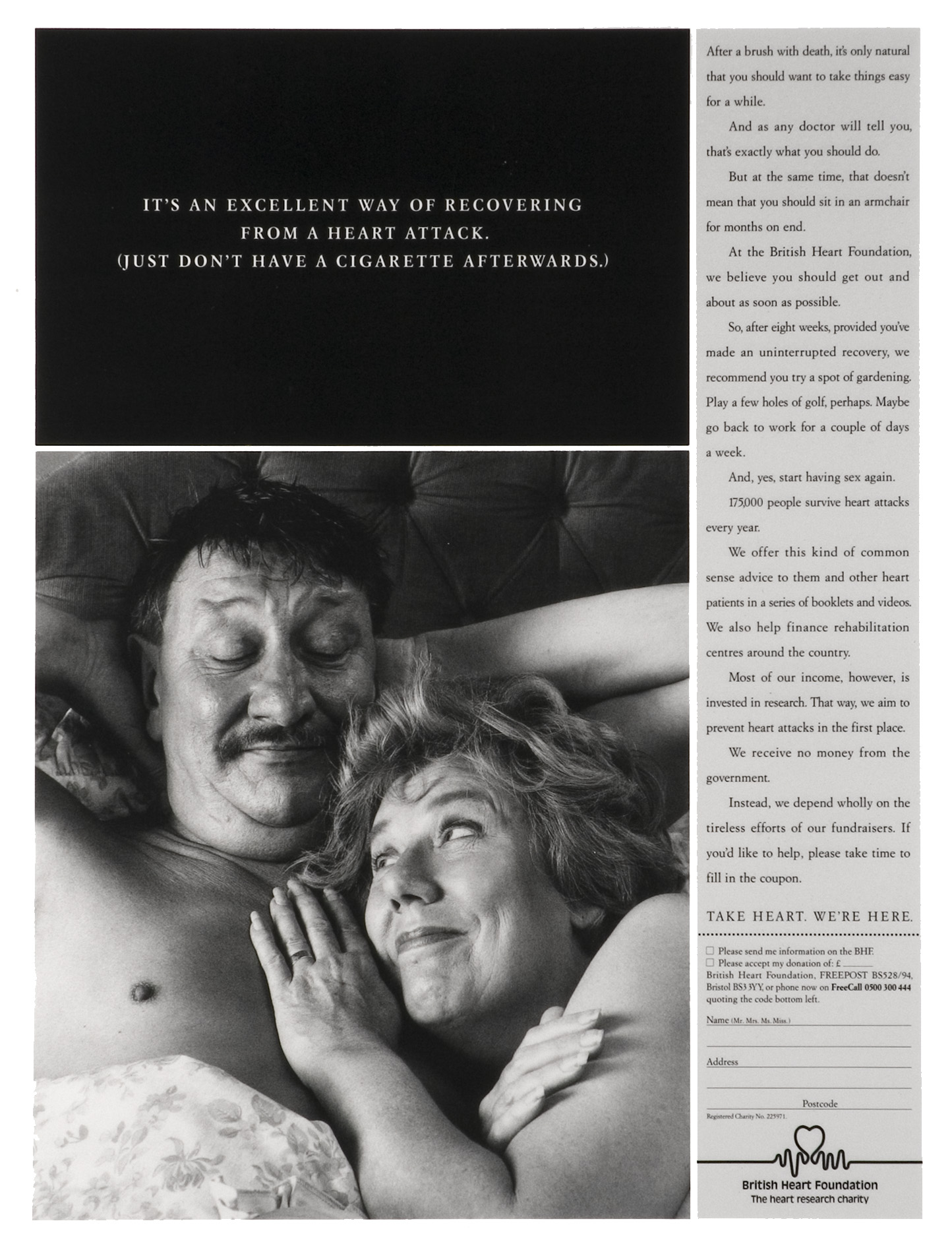
BBH.
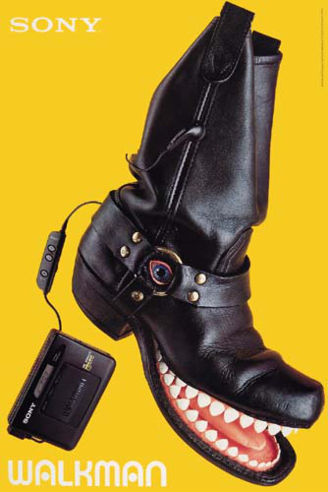
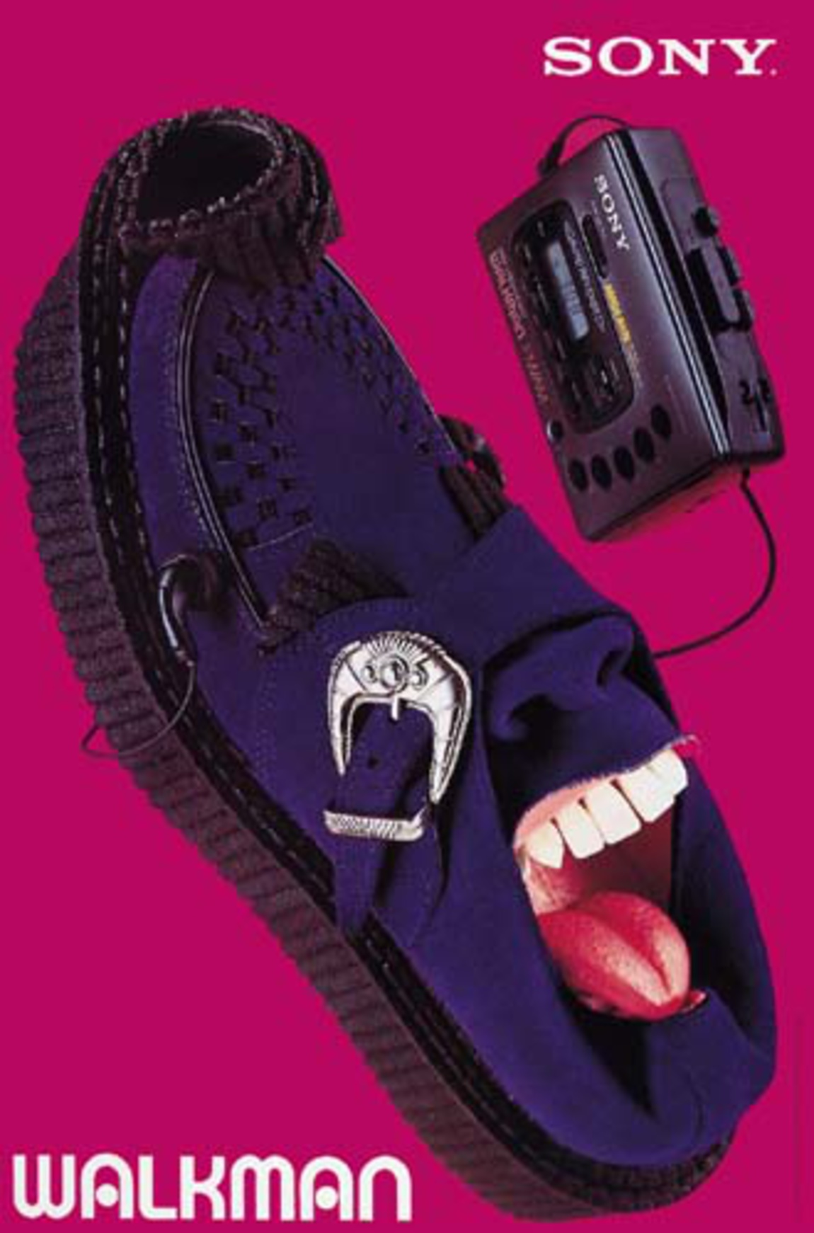
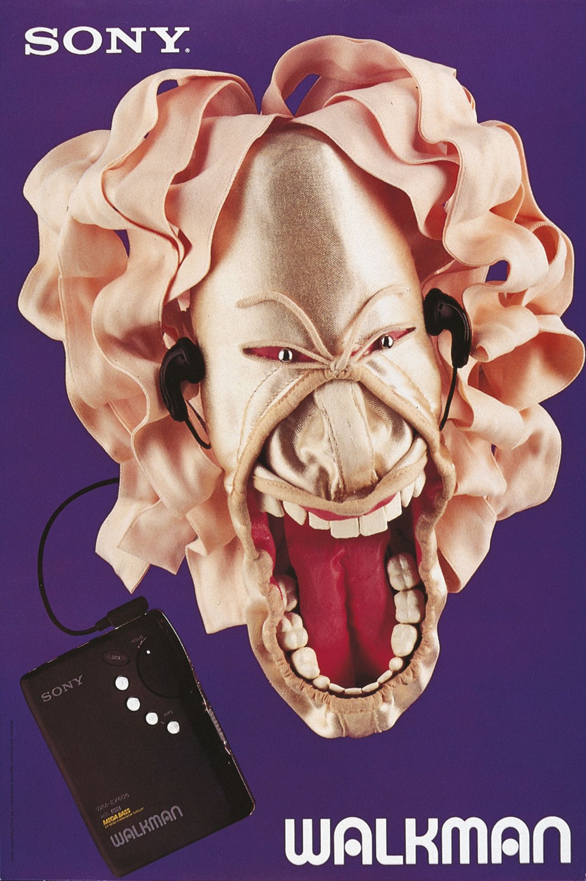
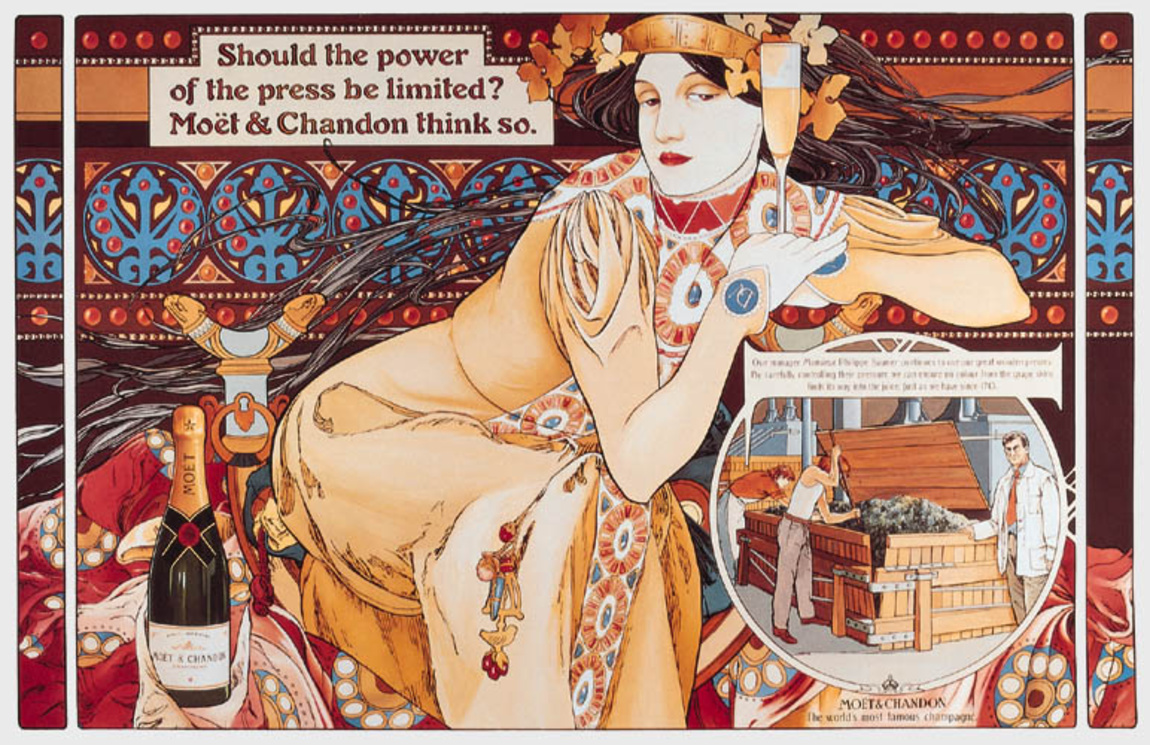


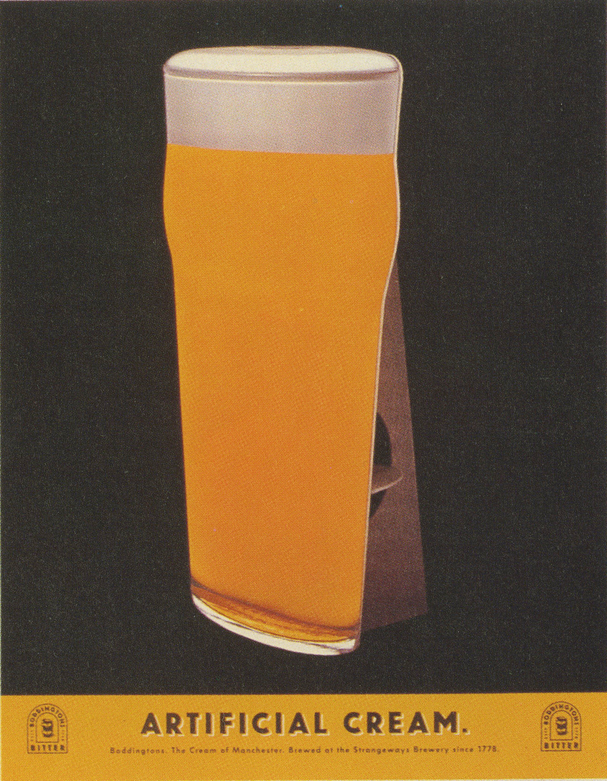
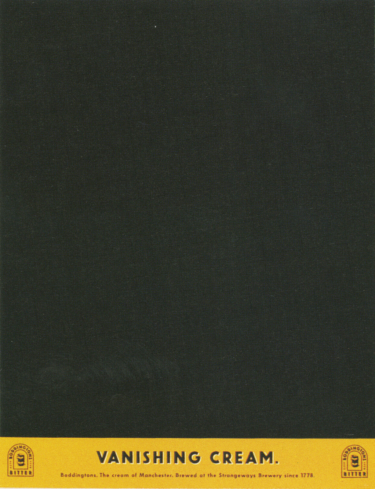
AMV.
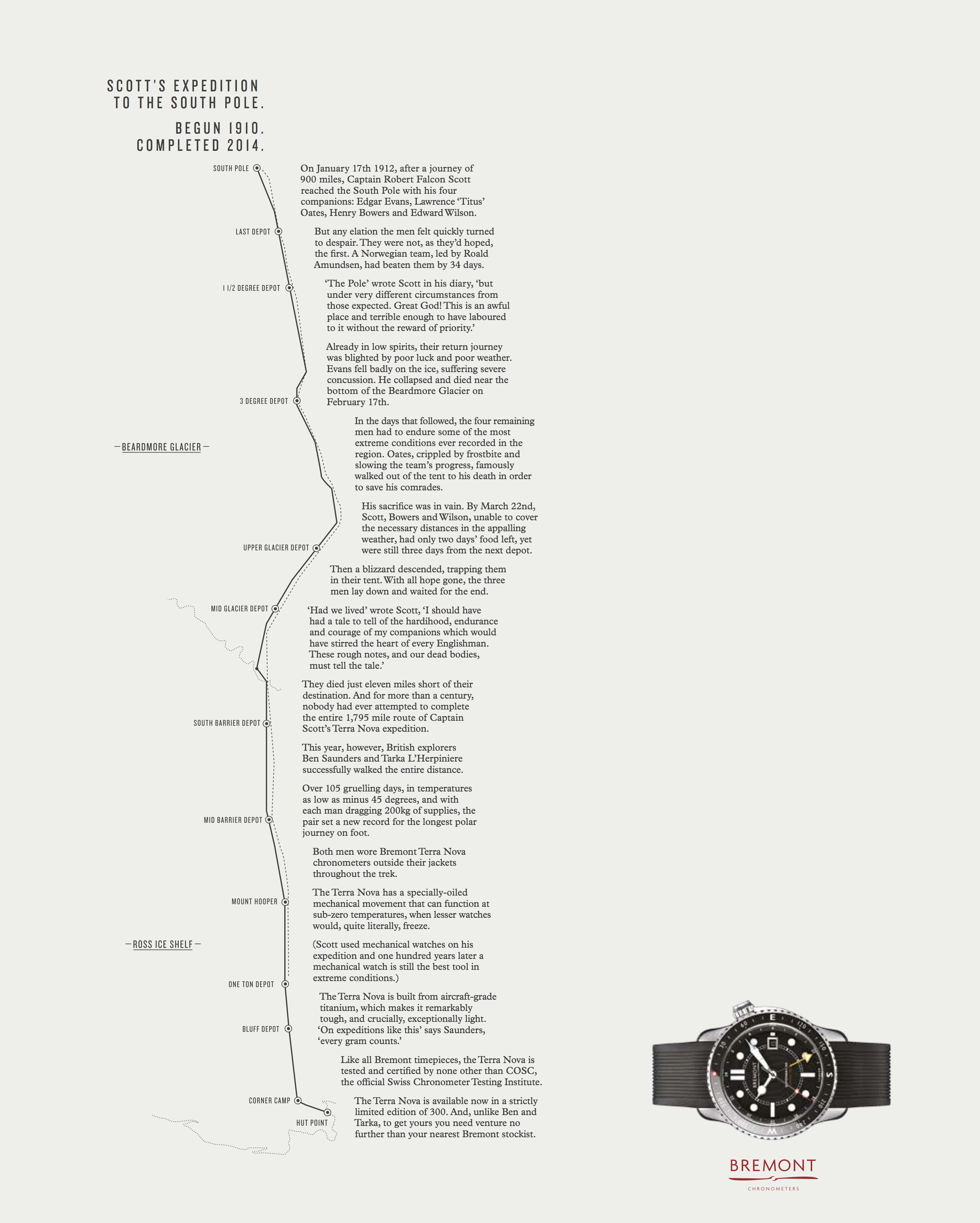
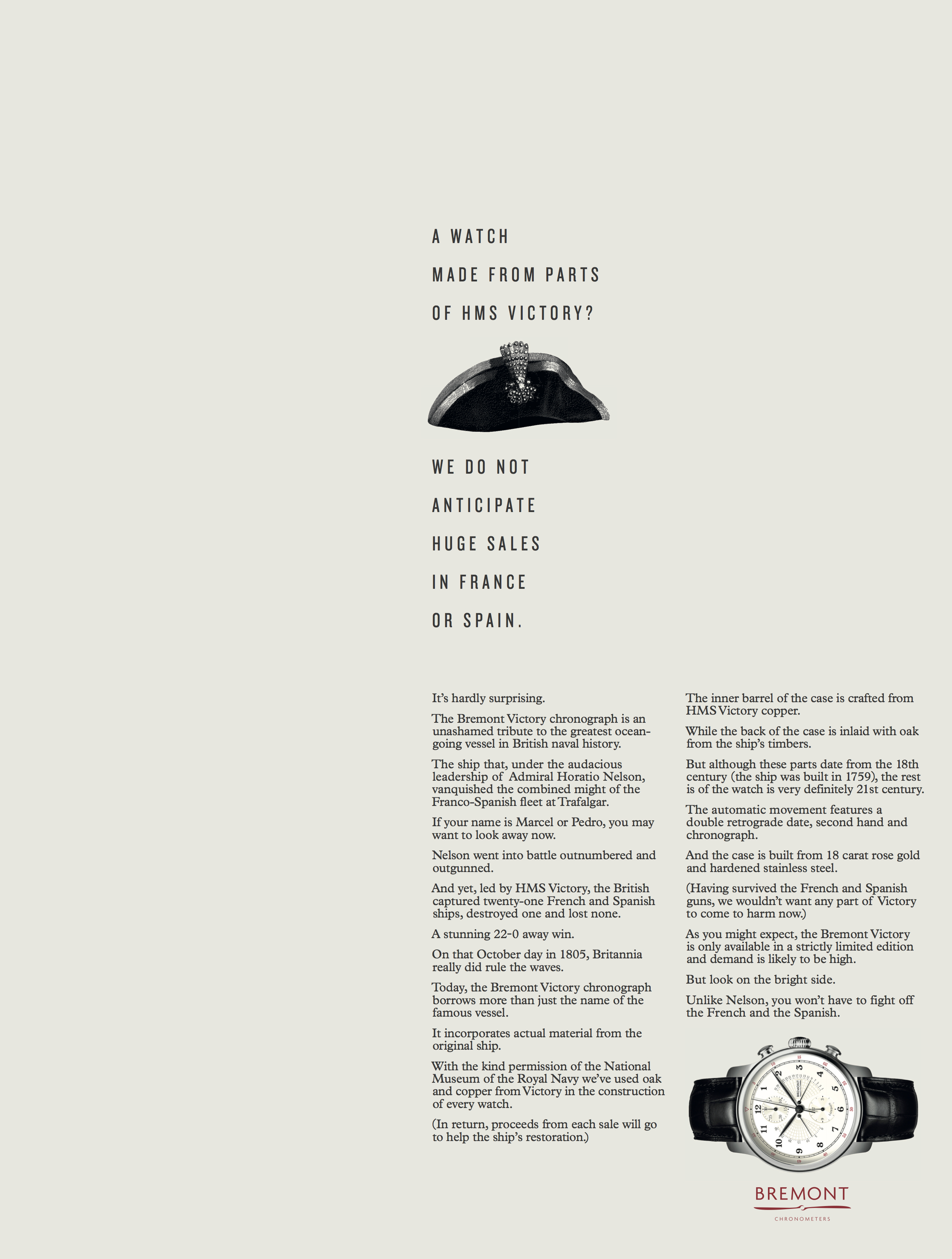
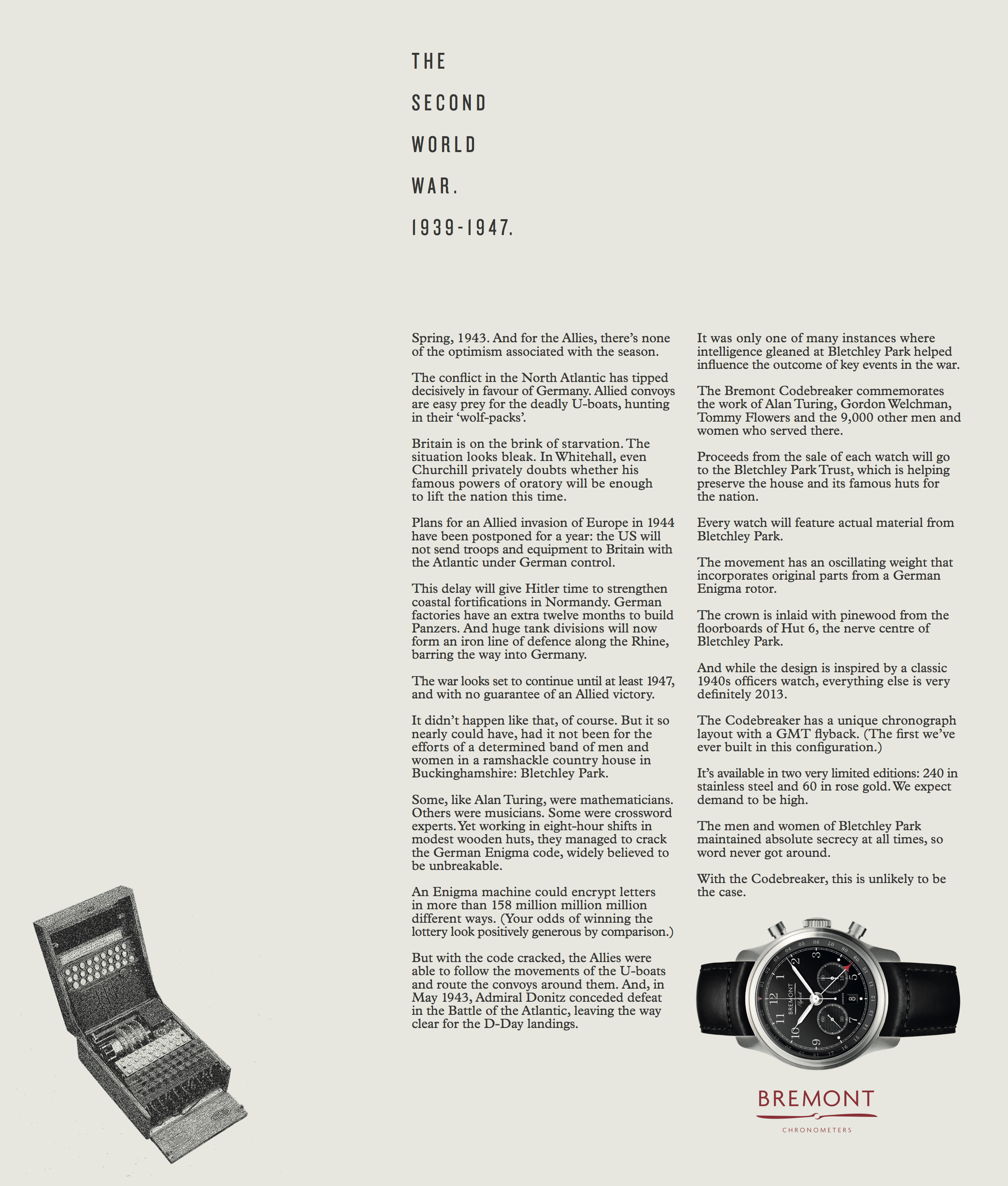
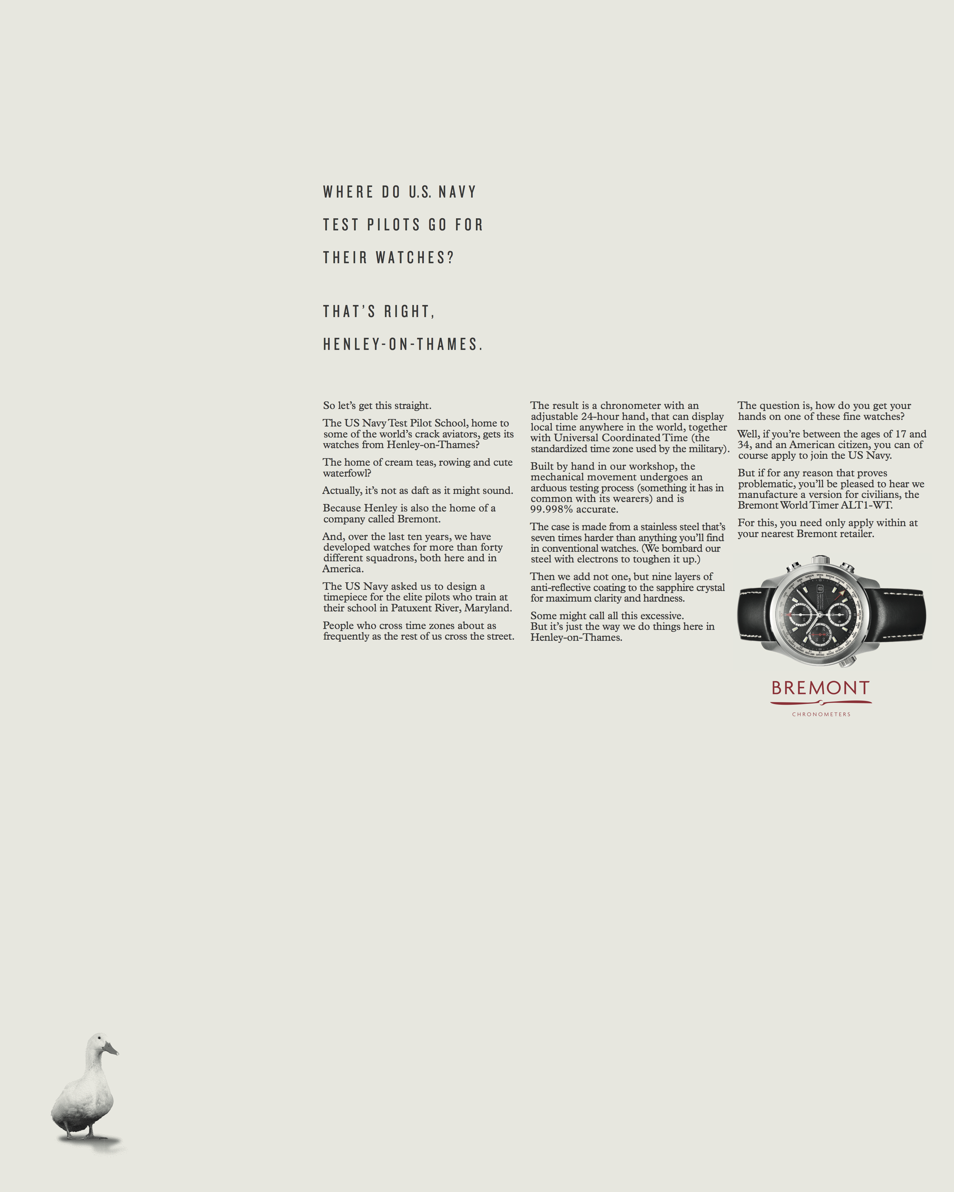
Sad to read of the passing of Pete Turner, one of the early pioneers of colour photography.He pushed the limits of film, colour and lab technicians to produce some of the most vivid, colourful images ever committed to film.

He started early, developing colour pictures by age 14, ‘I love black and white photography, but somehow I got seduced by colour, I remember going to the art supply store as a kid and looking at water-colour paint boxes and thinking, “These are beautiful”’.
He developed his skills further, like Howard Zieff, in the military; The Combat Photographic Centre in Astoria, Queens, NY.Occasionally he’d be sent by the Army on assignments, like photographing rockets in Florida, but most of his time was spent in the lab at Queens, whilst there he experimented with all the new types of films becoming available.Weekends were spent finding subjects to photograph in Manhattan, ‘The colour palette I work with is really intense, I like to push it to the limit.’
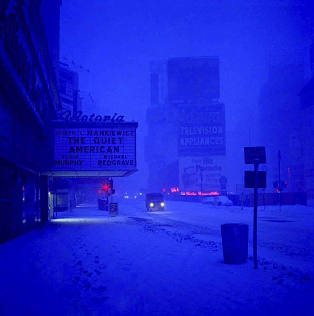


After leaving the Army he joined the Freelance Photographers Guild, one of his early commissions was from the Airstream trailer company, he followed a caravan of 43 of their vehicles from South Africa to Egypt.The assignment gave him a love for Africa and a portfolio full of vivid African imagery.


It got him an assignments from Hollywood, covering the films ’Cleopatra’ and ‘The Night of the Iguana‘.

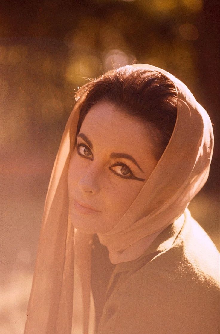
It also lead to a ton of magazine work for the likes of Look, Sports Illustrated, Holiday and in particular Esquire.


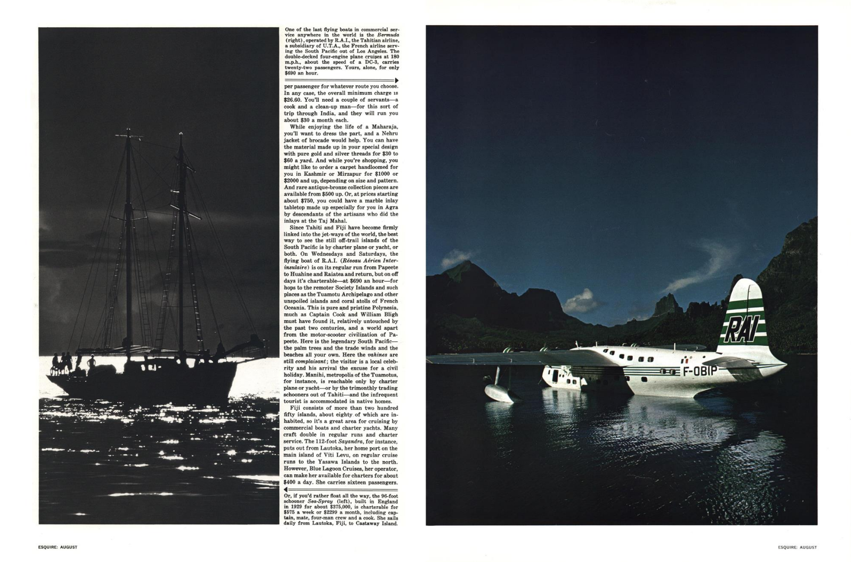

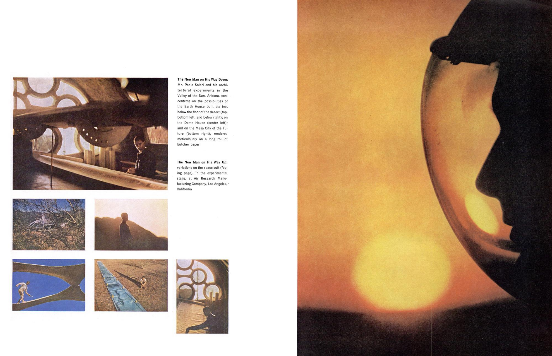
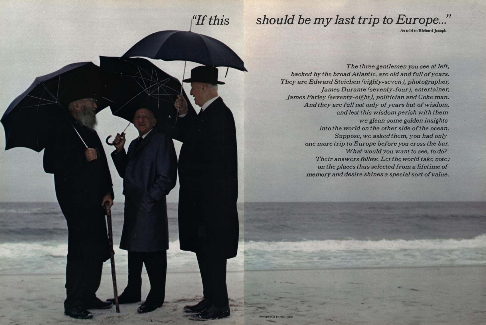


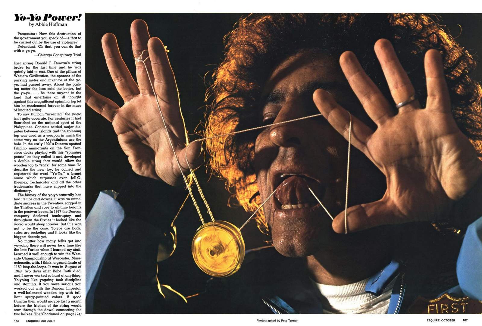


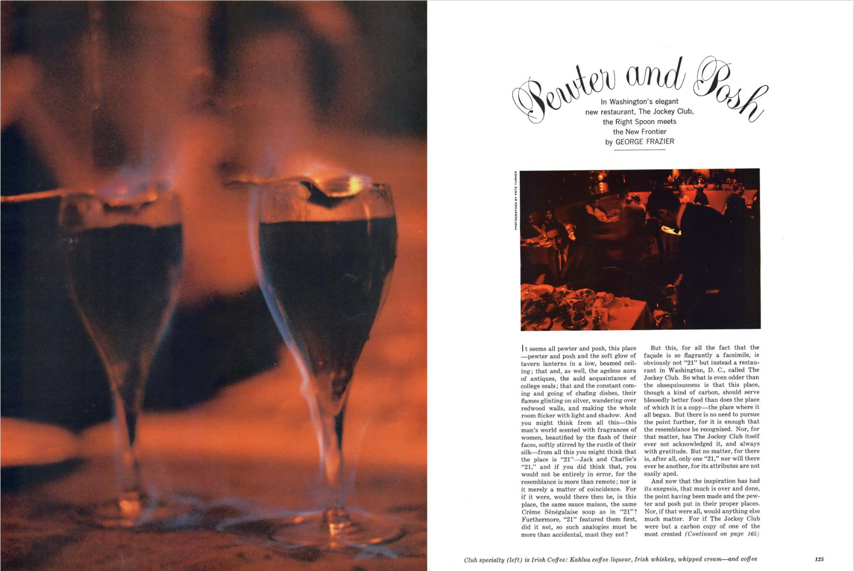
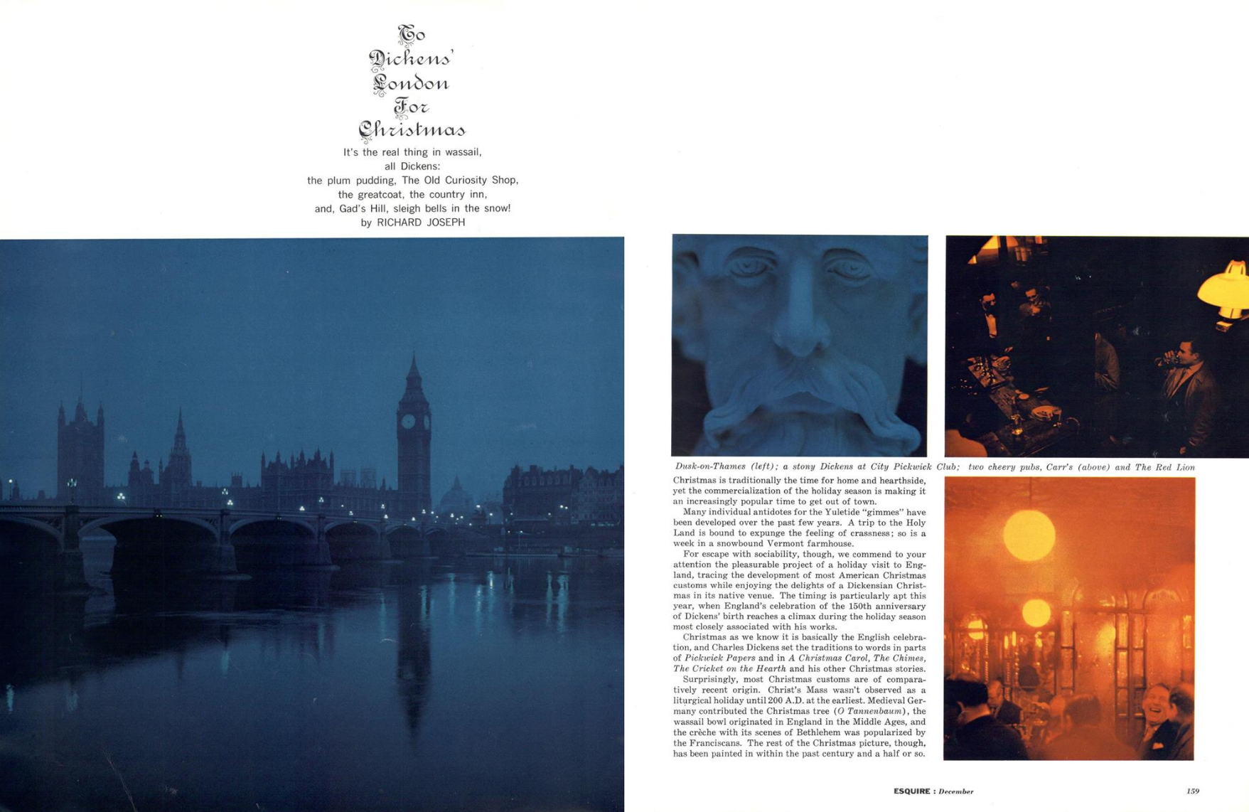
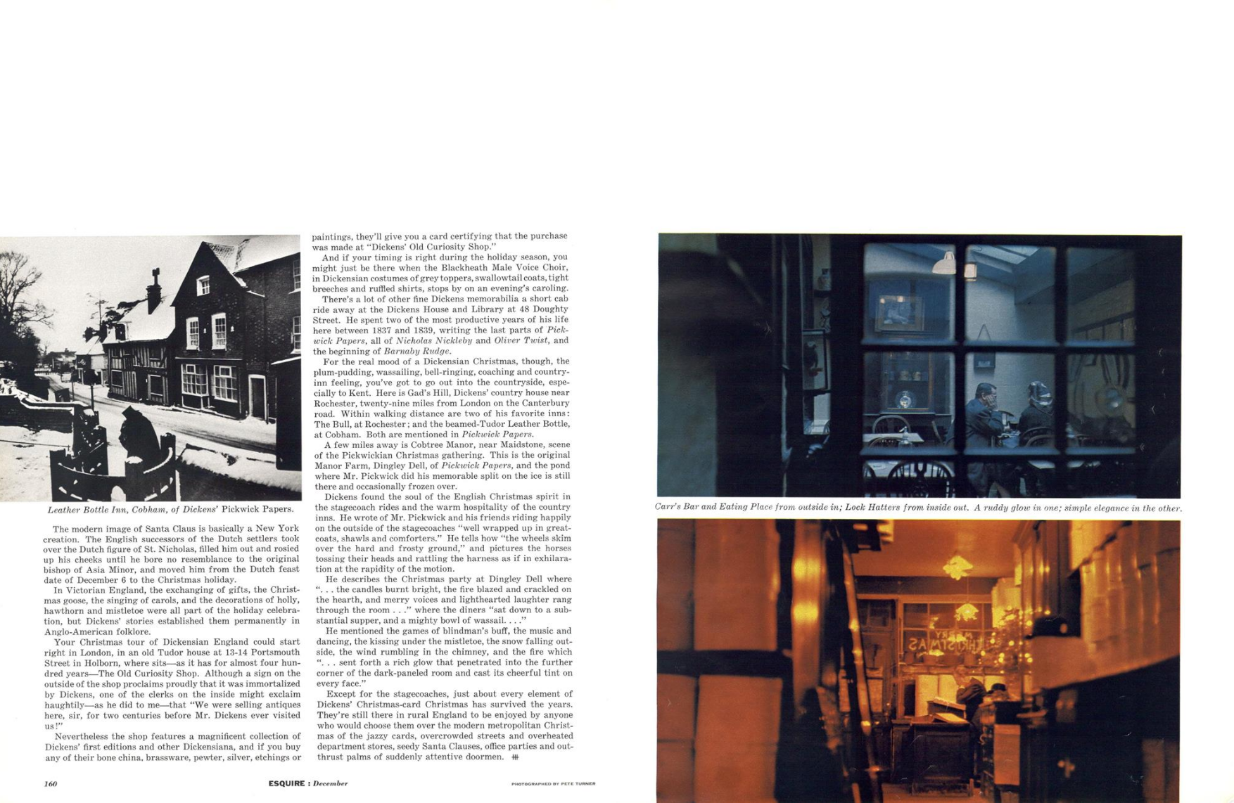
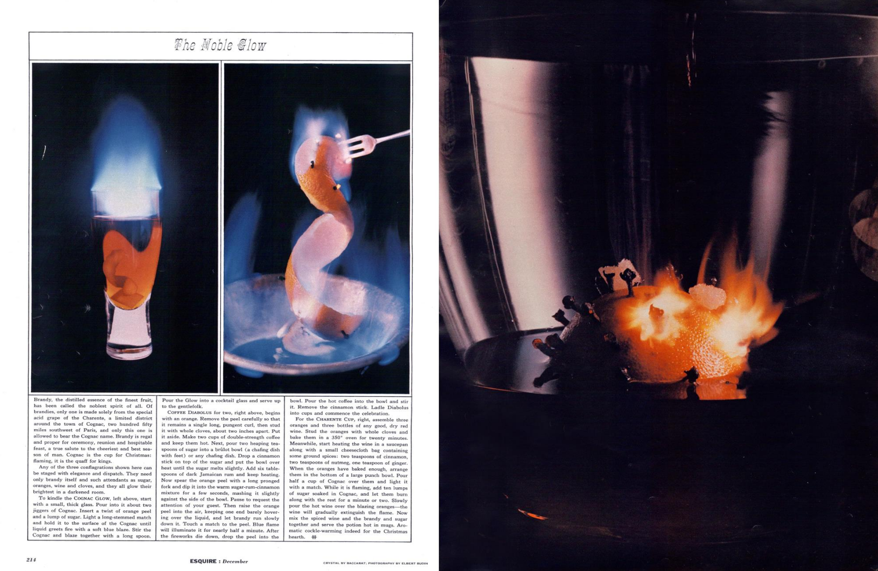

But perhaps the most important person in Turners’s career was Creed Taylor.Whilst rummaging through records Manhattan he noticed that all the album covers that caught his attention had the same name on them; ‘Producer Creed Taylor’.He called Taylor, pretty soon they were working together.Initially, raiding Turner’s folio for images.


Turner couldn’t find anything appropriate in his portfolio for the cover of ‘Trust in Me’ an album by the Soul Flutes, “I said to Creed, ‘What about shooting a beautiful pair of lips? Not the kind you see in Vogue, let’s get a black model with great lips, and we’ll paint them so we’ll have a really different look.’Creed said, ‘I love it.’ ”

He began shooting bespoke shots for the covers.


‘I’ve always been drawn to the colours of nature, and nature is a wonderful teacher, look at the colour coding of a bee; yellow and black stripes, or of a cardinal with different shades of red.It’s rare that nature is in colour harmony, go out there and look.Although a lot of my pictures are not taken from nature, I use nature as a colour source.’
But over time Turner began shooting the artists too.
His portraits were just as graphic and distinctive.
a) Up the nostrils.

b) Side-on, rendering the subject almost two dimensional.


c) More abstract, using colour.

d) Just good portraits.


In later life, Pete‘s pictures became less extreme, not quite as saturated, grainy or abstract.But just as colourful.


One of his most enduring images is ‘New Dawn’.Shot in 1973 on the Icelandic island of Heimeay whilst on assignment for Esquire.7,000 people evacuated the island expecting the volcano Helgafell to erupt, Turner stayed, spending the night in an abandoned house, ‘kept awake by lava bombs beating on the roof’, at dawn he moved to the backyard to photograph the volcanic explosion.By underexposing his shots, he made the colours become more saturated.“It was like being in the center of a science fiction” he told Time Magazine in 1973.

It was later used by Jazz boffins Weather Report as a cover for their album ‘Night Passage’.
R.I.P Mr Turner.

N.B.
Unfortunately I could only find one ad, but it’s a good one.
