

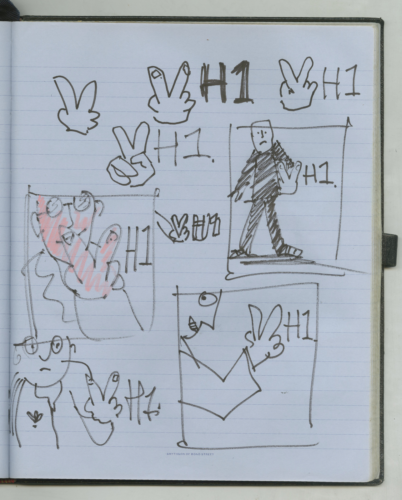
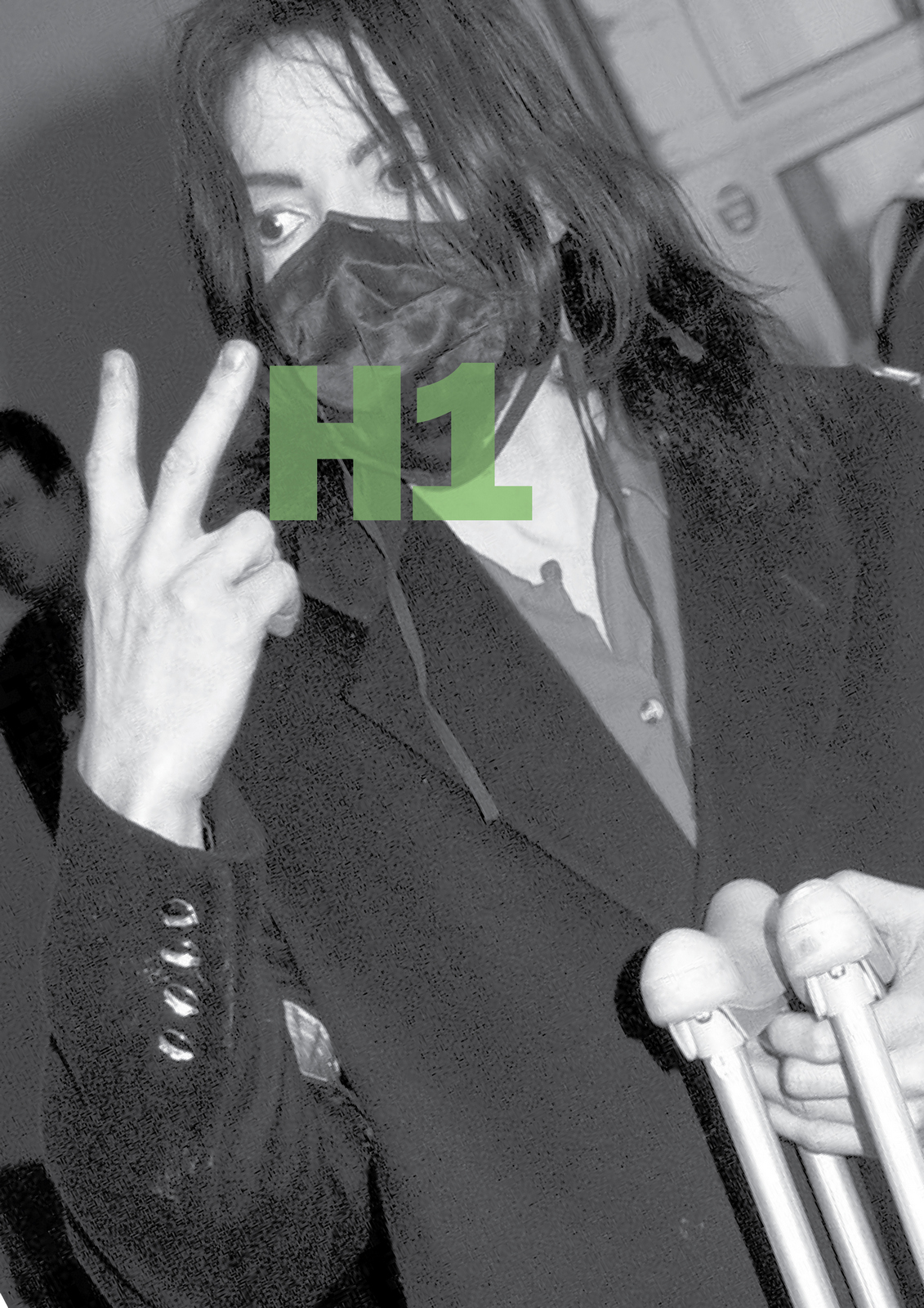
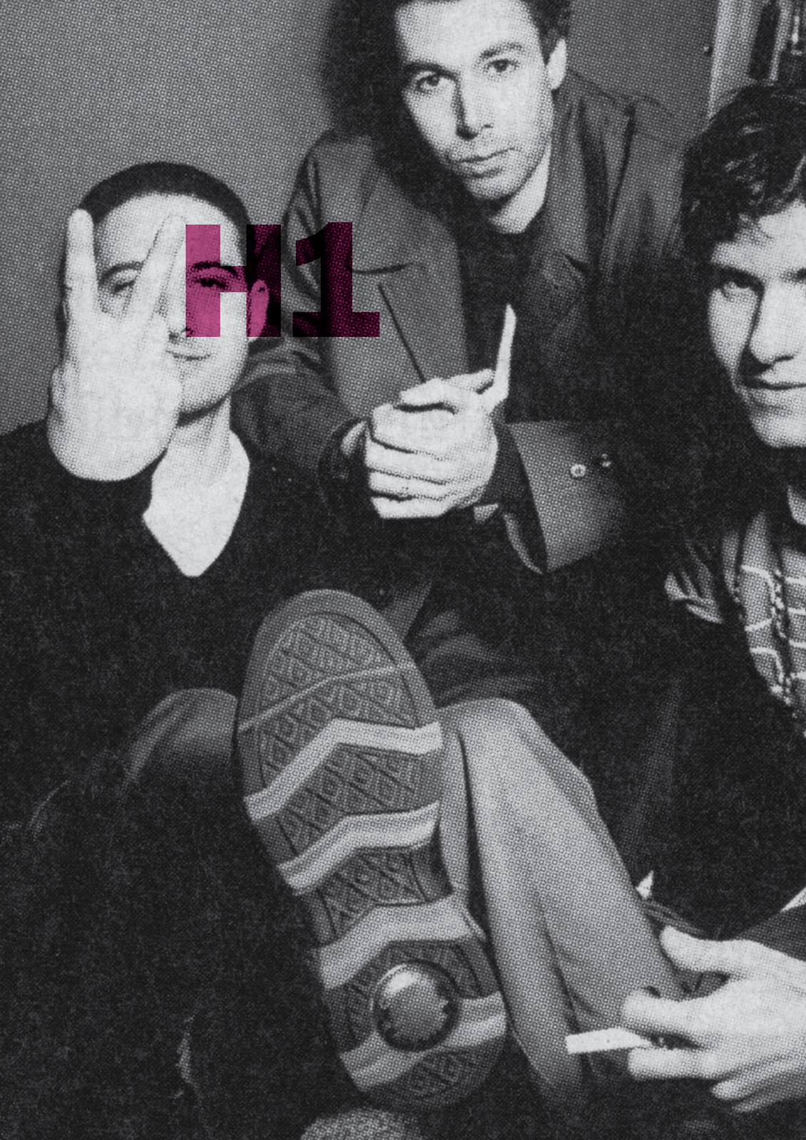
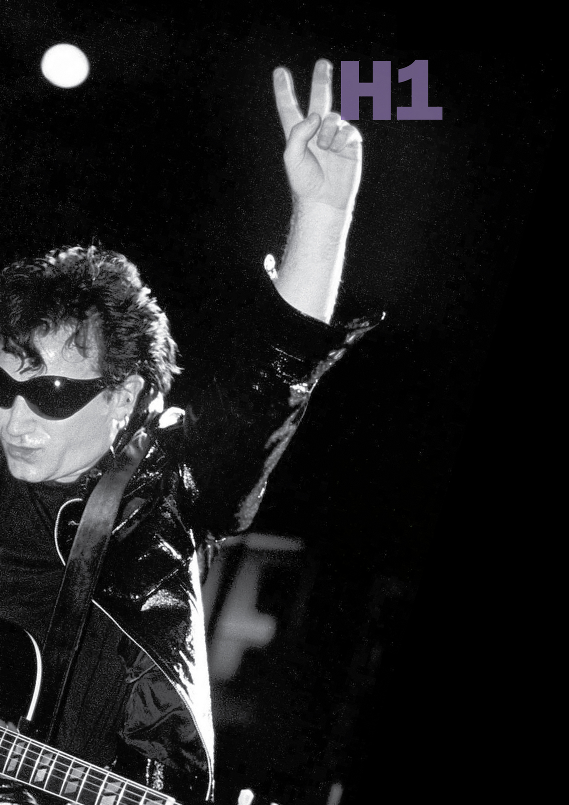
NEXT DAY: I can't help but wonder whether the idea will work - will the 'V' H1 read clearly?I've got the images, let's mock a couple up.Just to see what they look like.
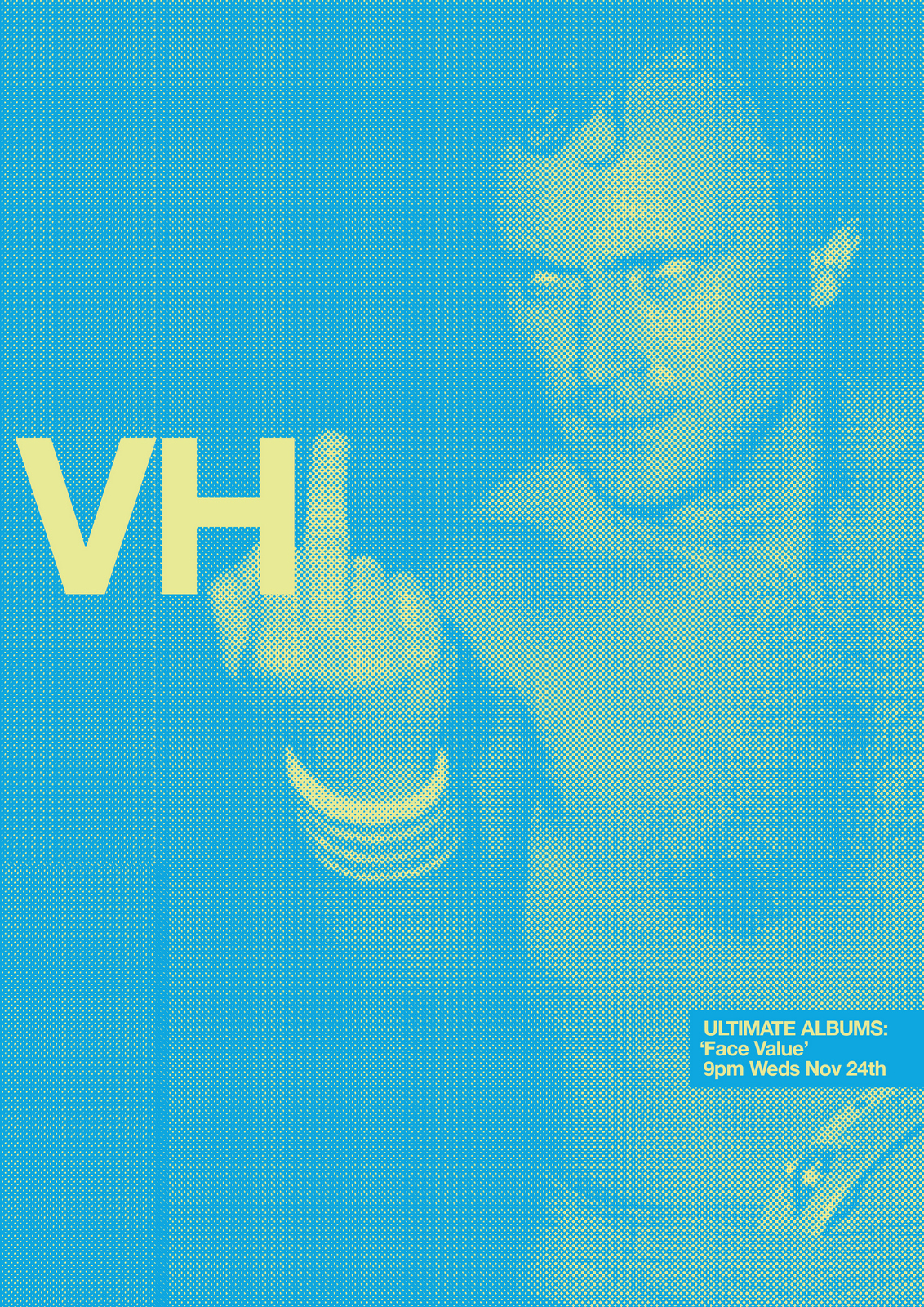
NEXT DAY: I look at my pin-board; the ads look cool, but is just two letters too random?Maybe it's too stripped back?Maybe we should tie the branding idea to specific programmes?The biggies seem to be on at 9pm Wednesdays and Thursdays; Ultimate Albums and The Rise & Rise Of.We look into which artists are coming up in future programmes, leaning towards those that would be more surprising for VH1.
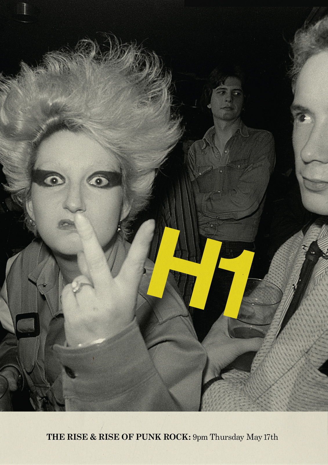
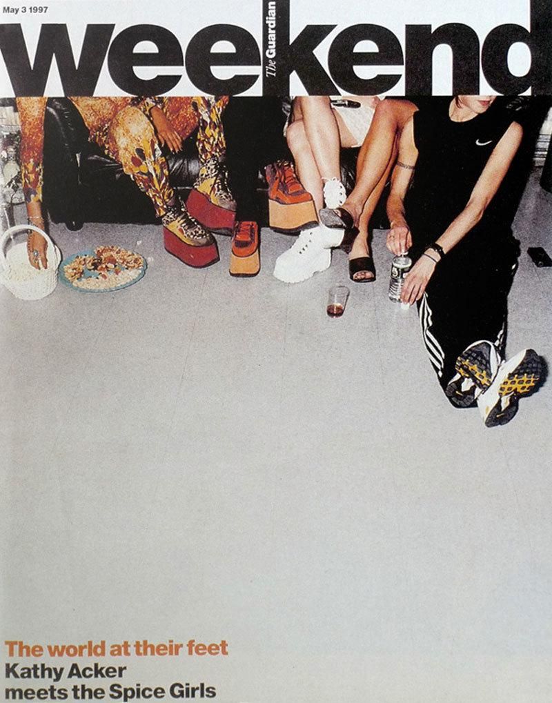
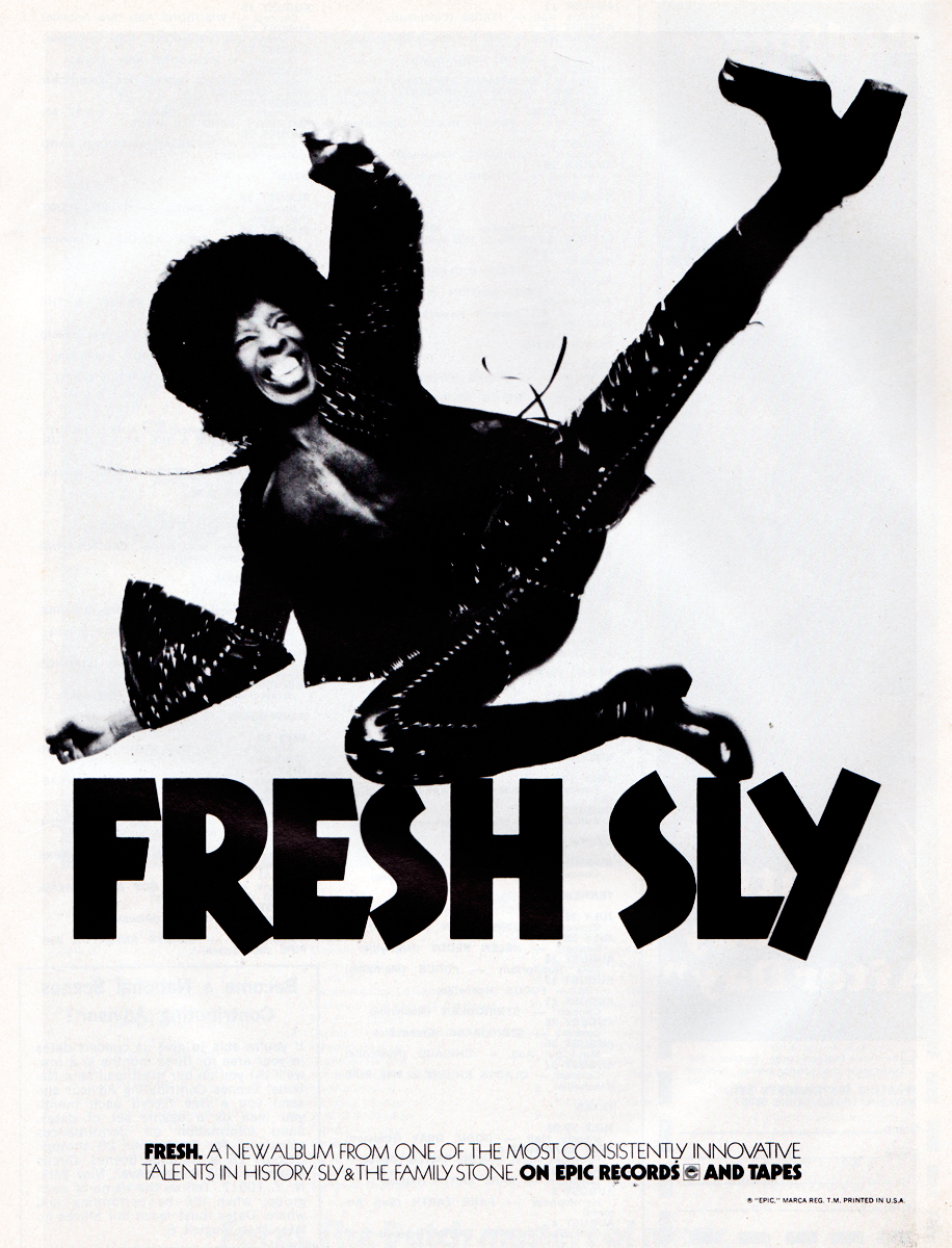
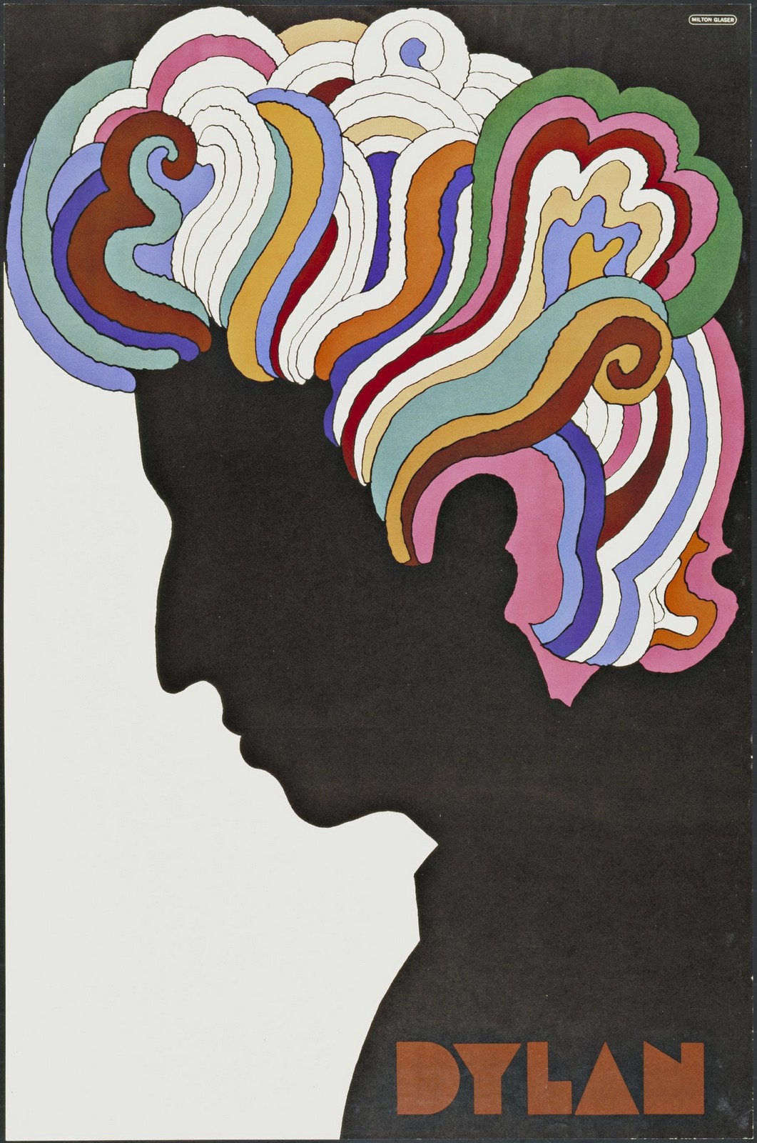
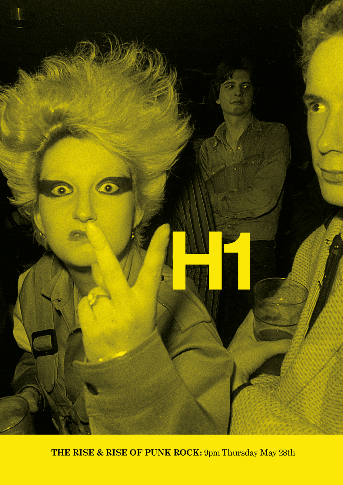
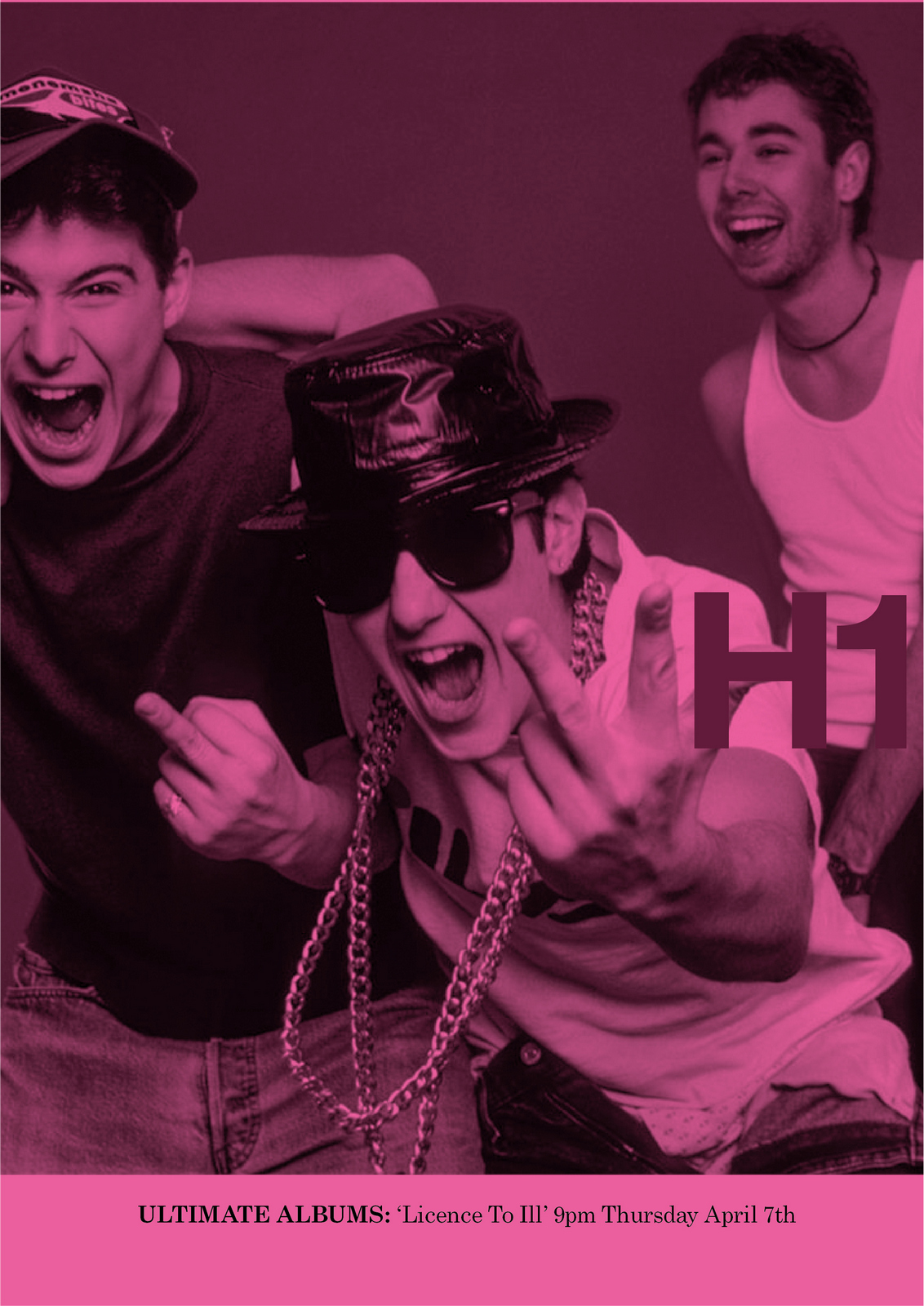
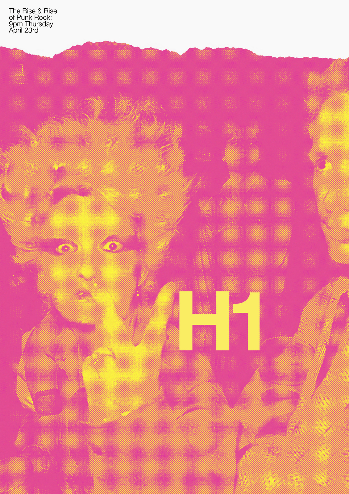
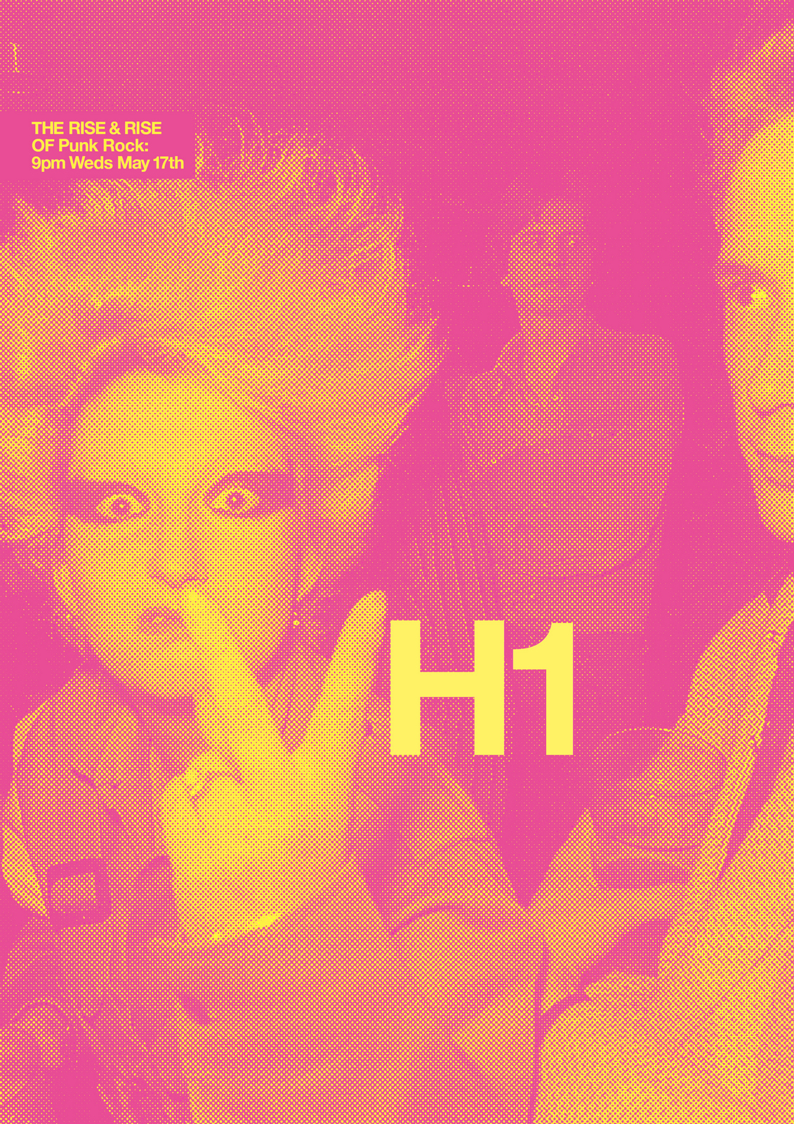
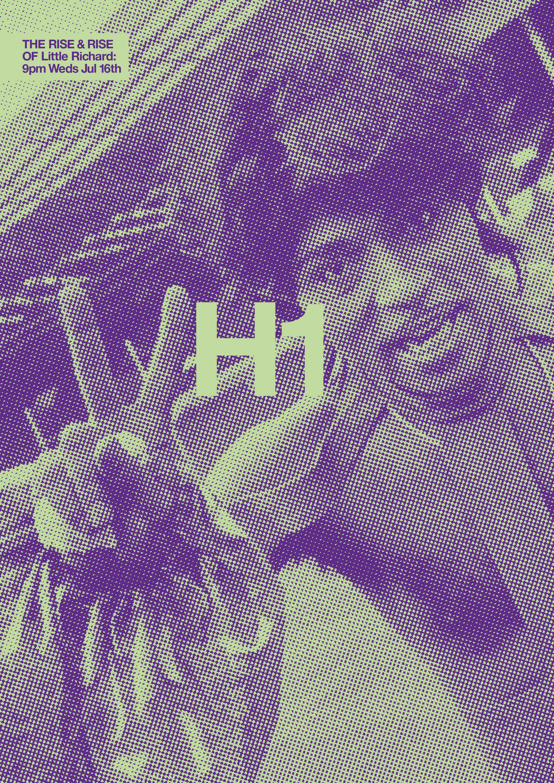
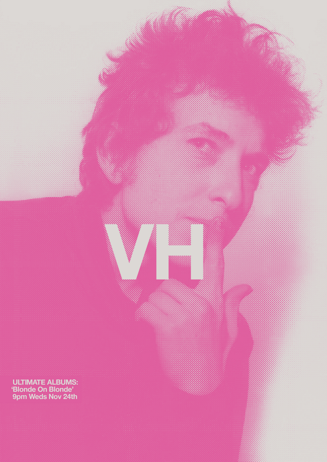
NEXT DAY: Caspar pops in ‘Ooh they look good…but I thought we weren’t showing any ads?’‘We're not, we'll just have them in our back pocket’.I like the black and white images, but it makes the programmes appear like they're about the olden days, which they are, but we don't need to rub it in.Unfortunately the images aren't available in colour, so I put colour washes over the pictures, to add a bit of energy.Also, I don't like the VH1 element changing size and angle, so decide to keep it a consistent size and straight.
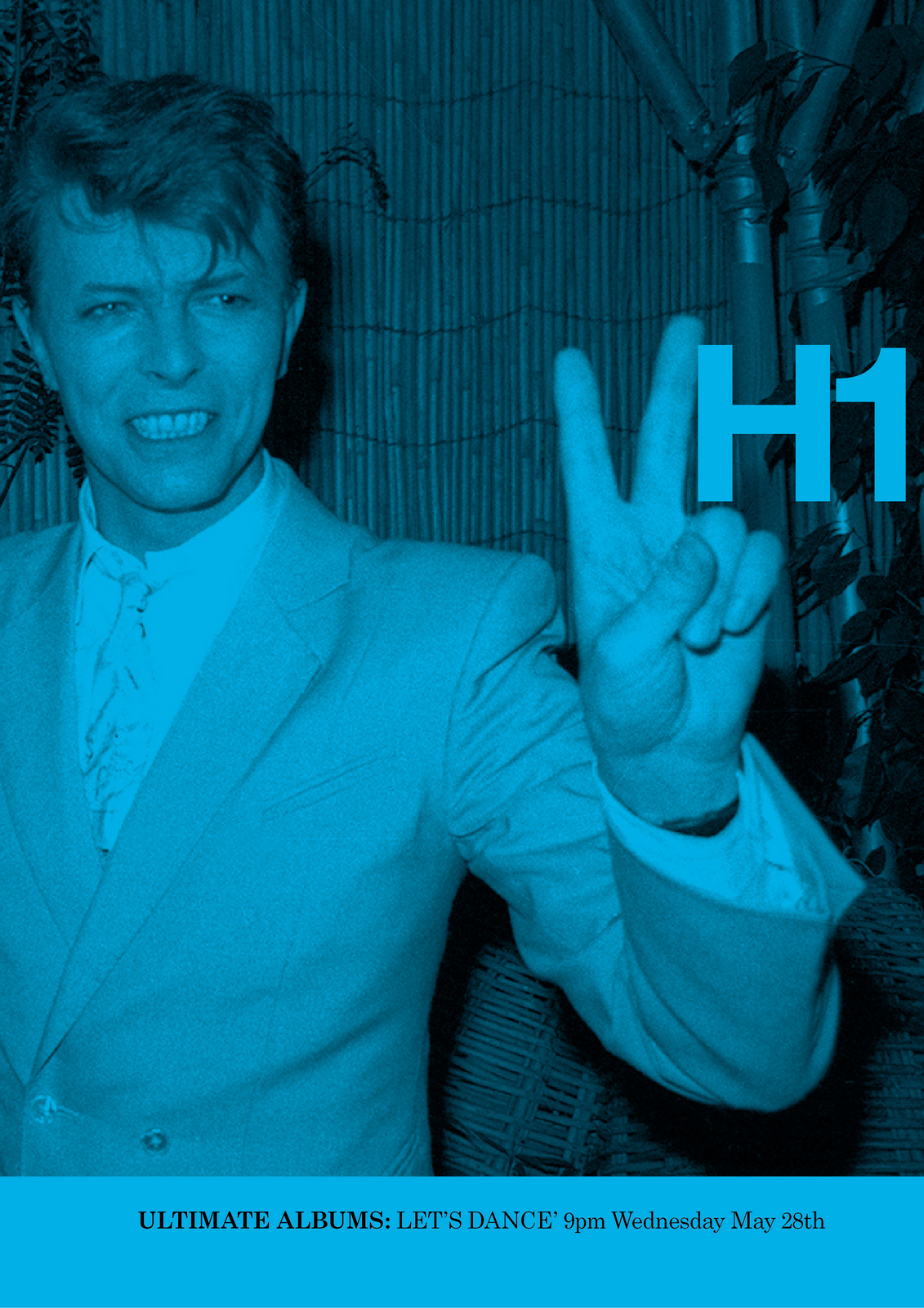
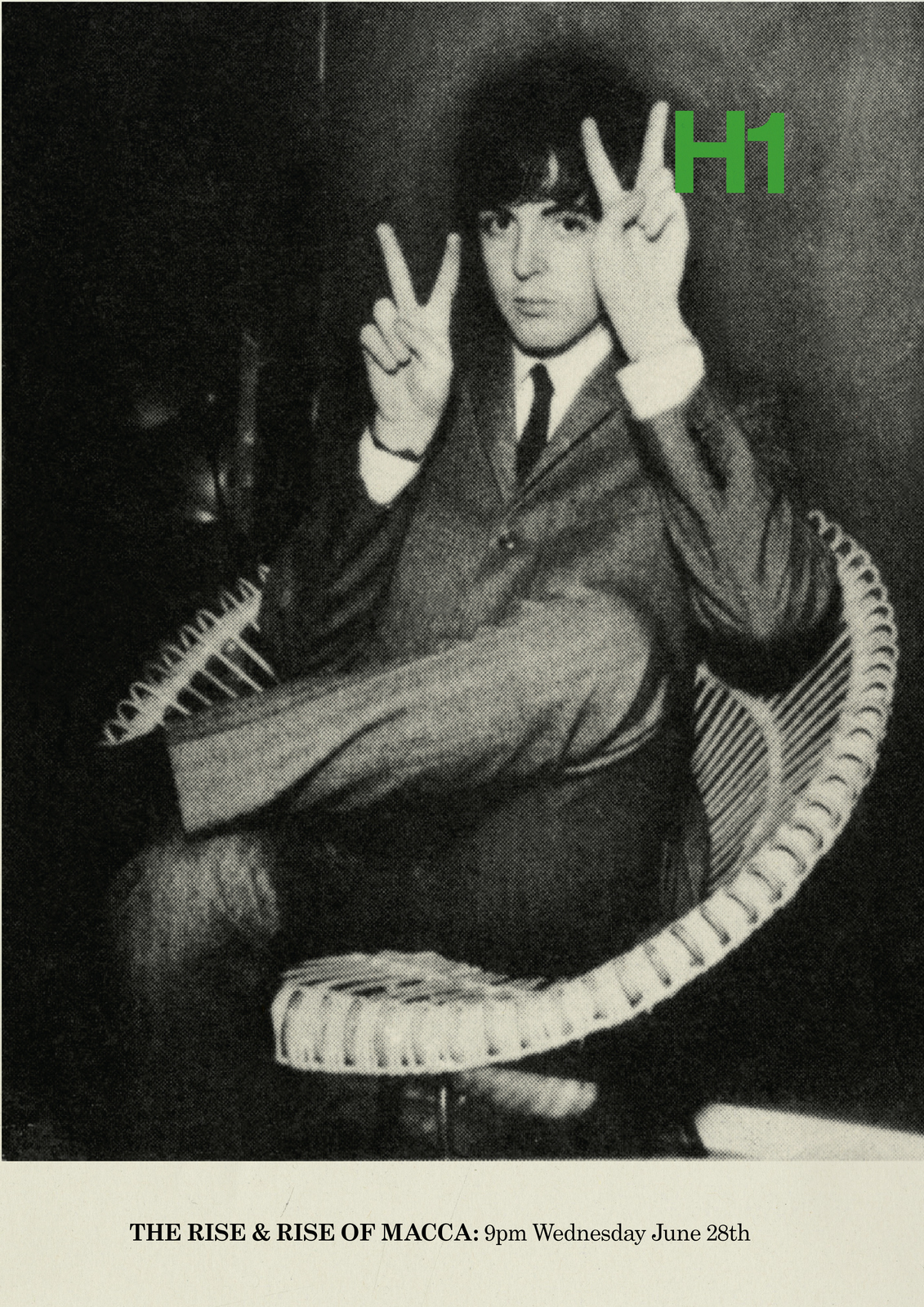
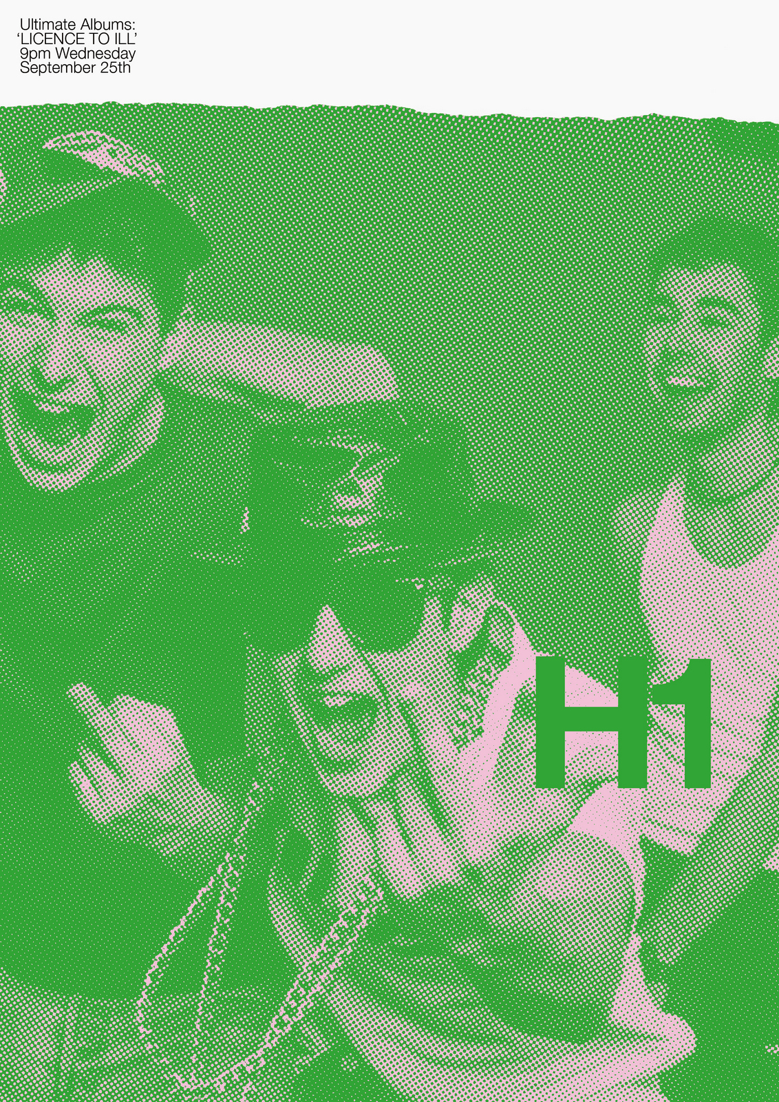
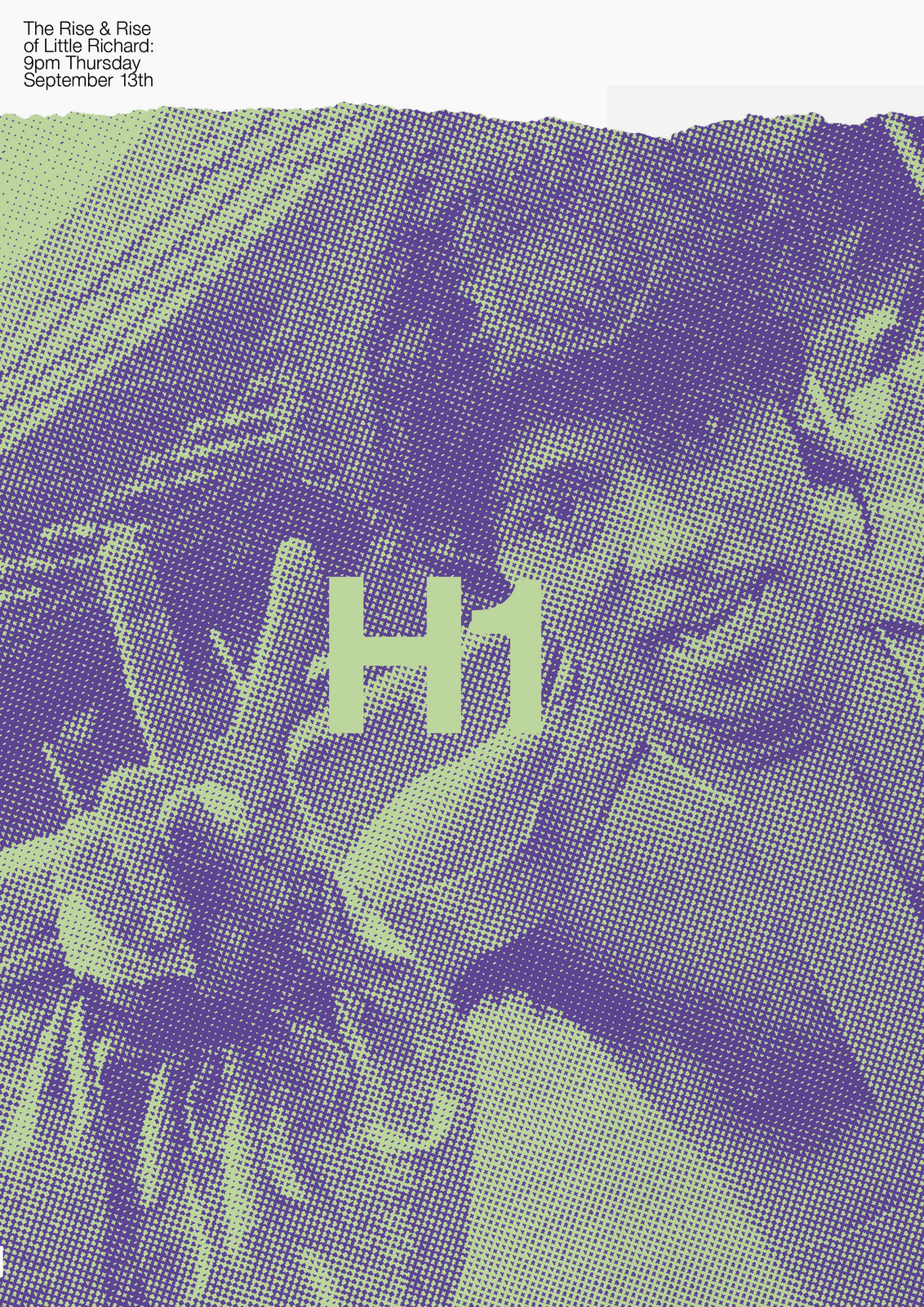
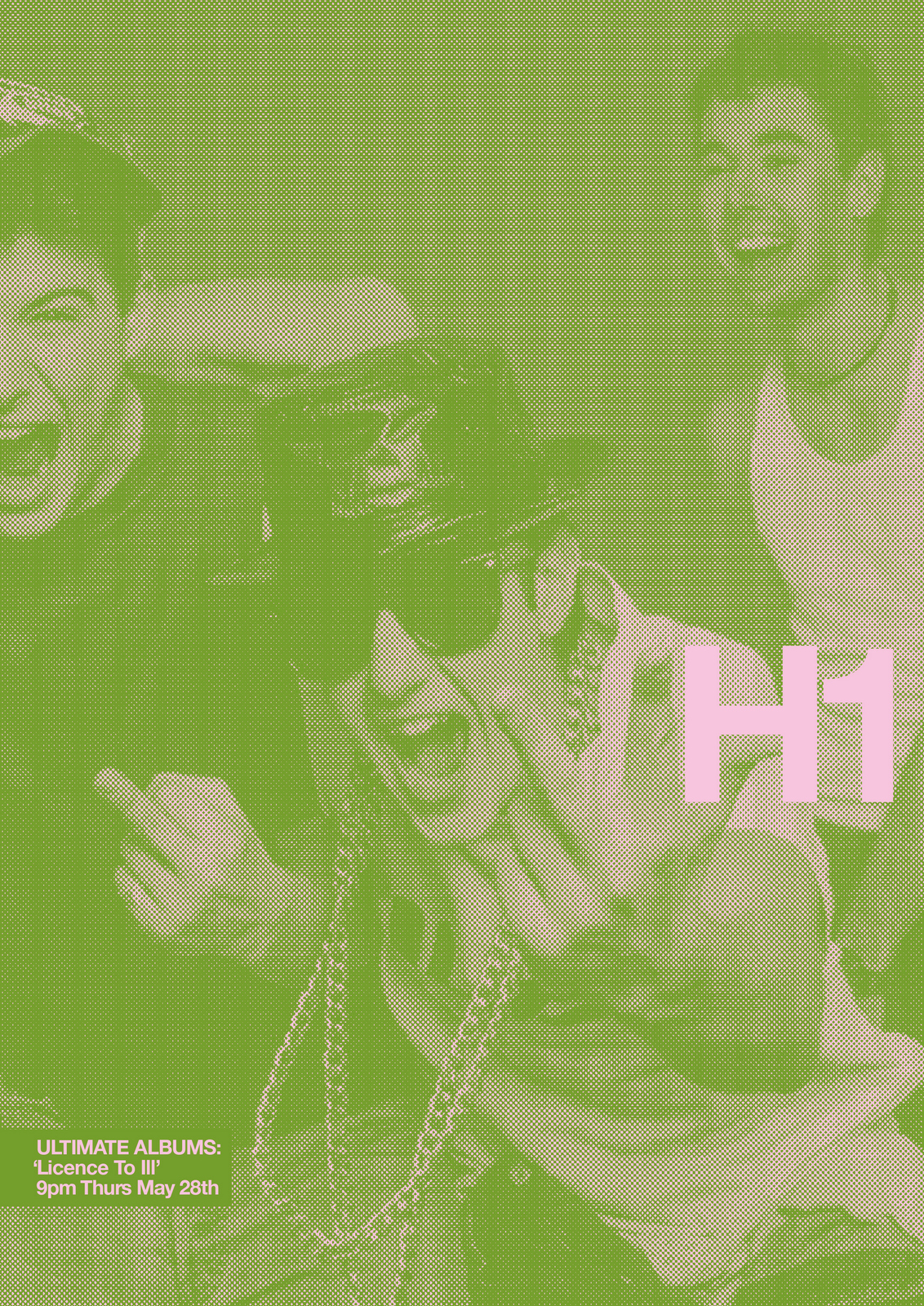
NEXT DAY: Better. But the layout looks a bit sensible, too corporate.Maybe it needs a bit more energy and attitude to make it less formal.Rips and a harsh dot screen over the images might do it?
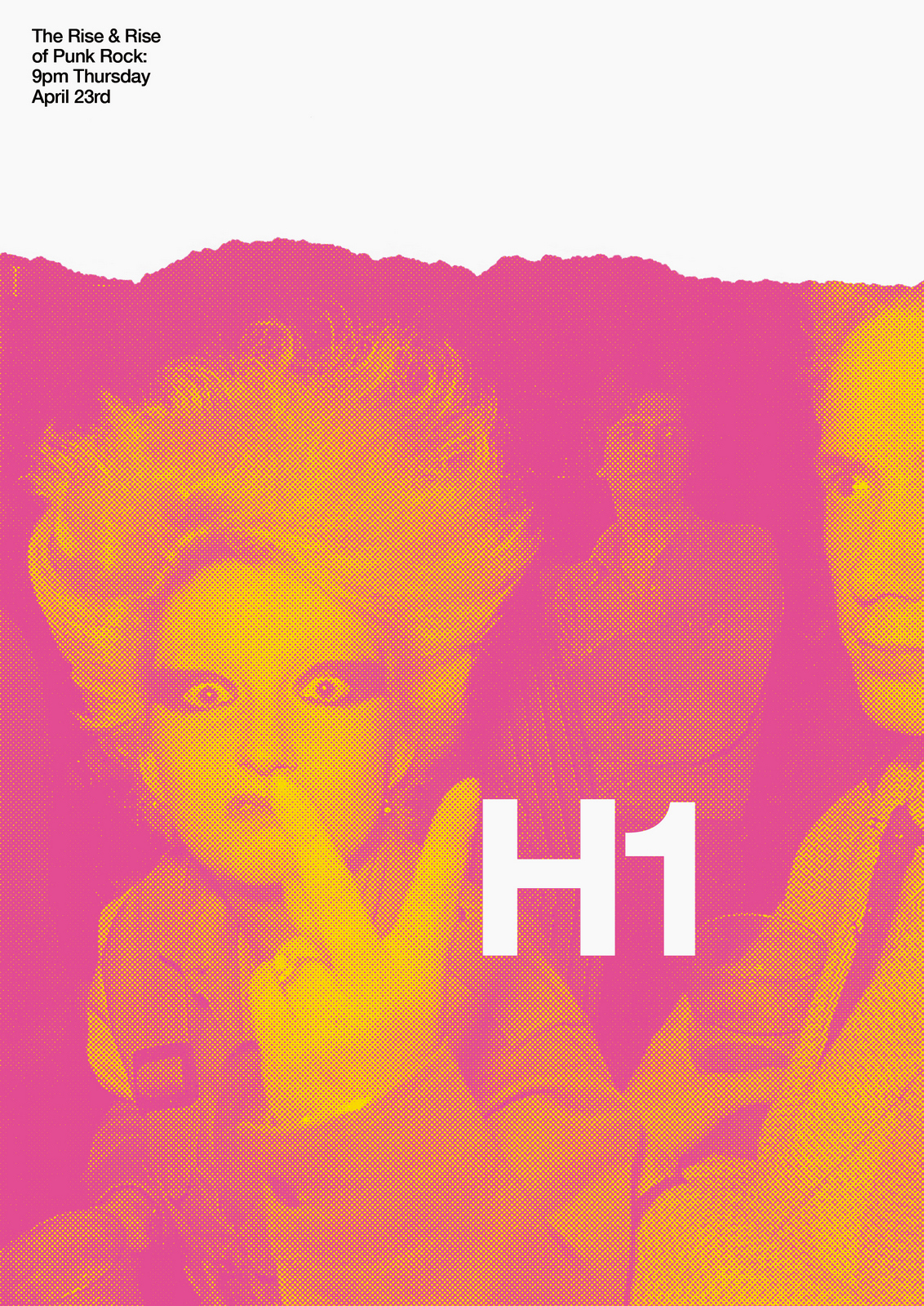
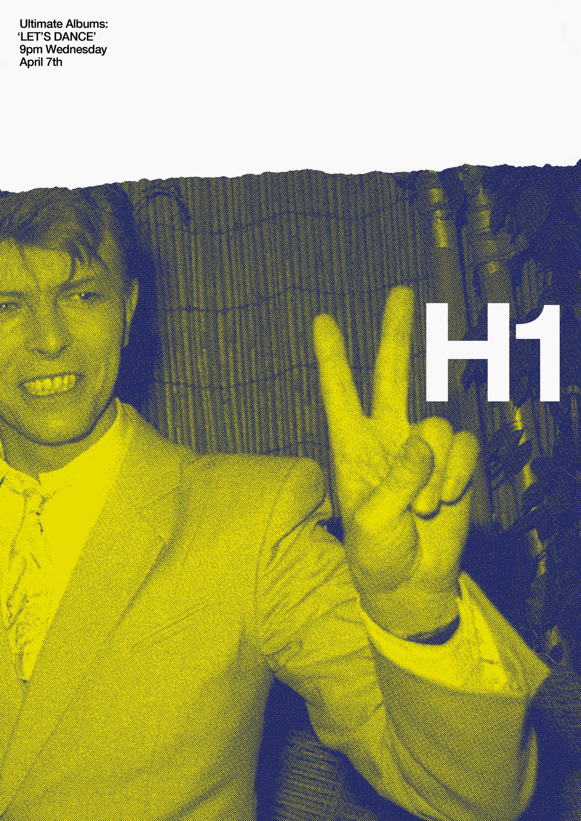
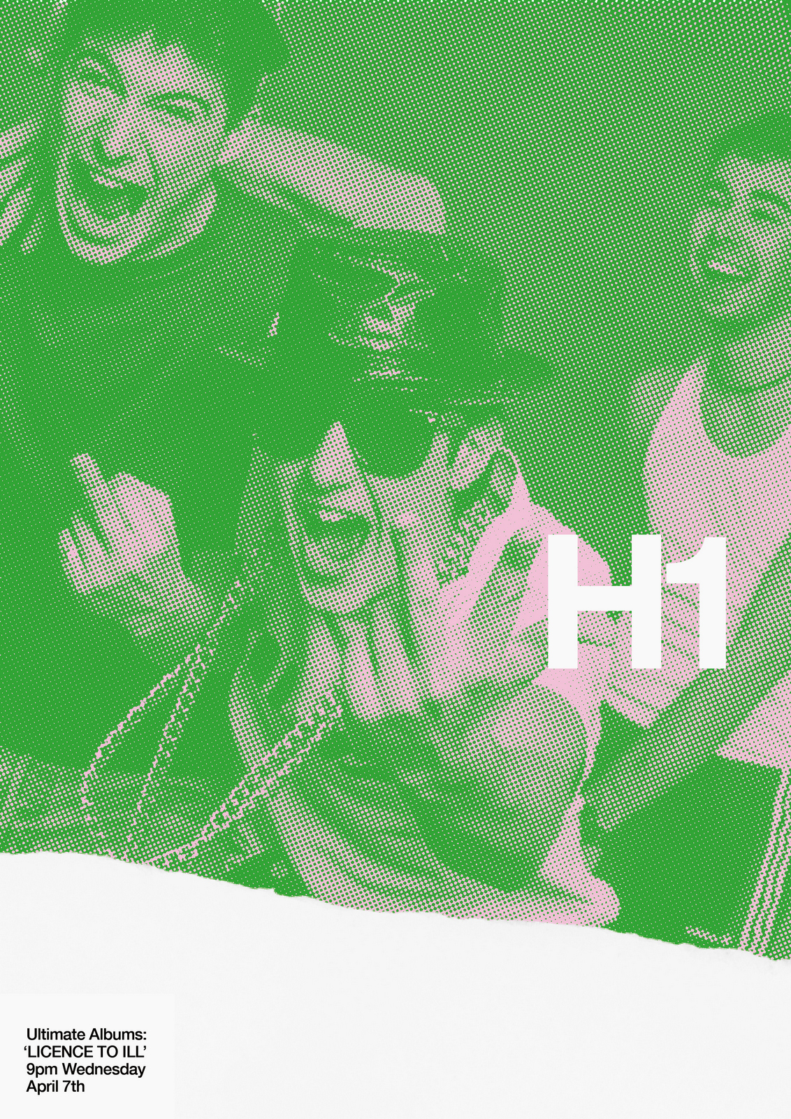
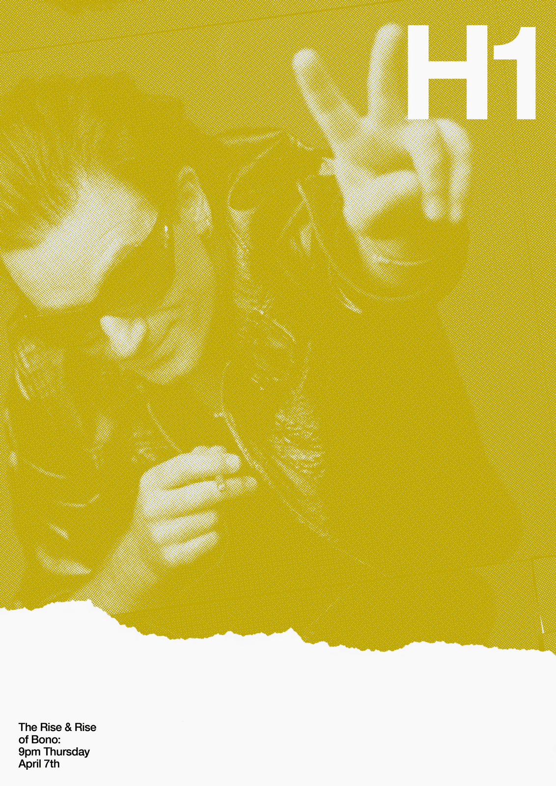
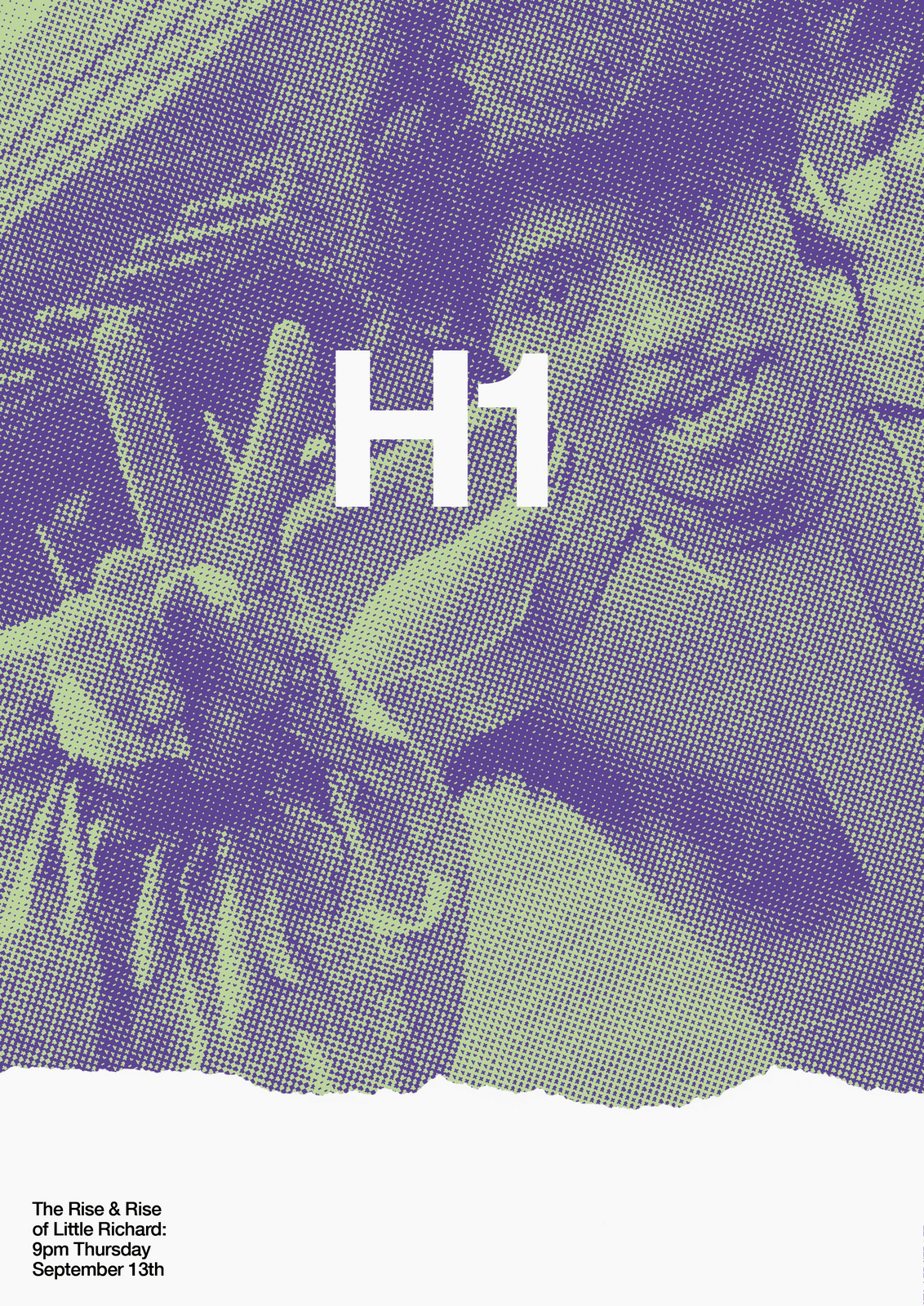
NEXT DAY: The first thing I see are rips?Rips are less interesting than rock stars, let's minimise them.Also, that white 'H1' seems too loud, it should feel like part of the image.
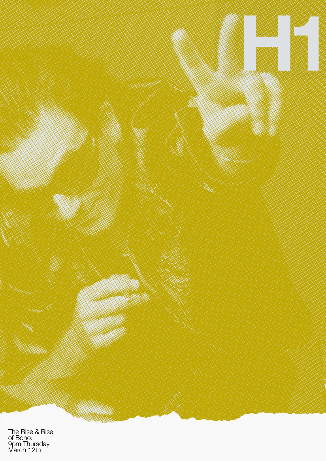
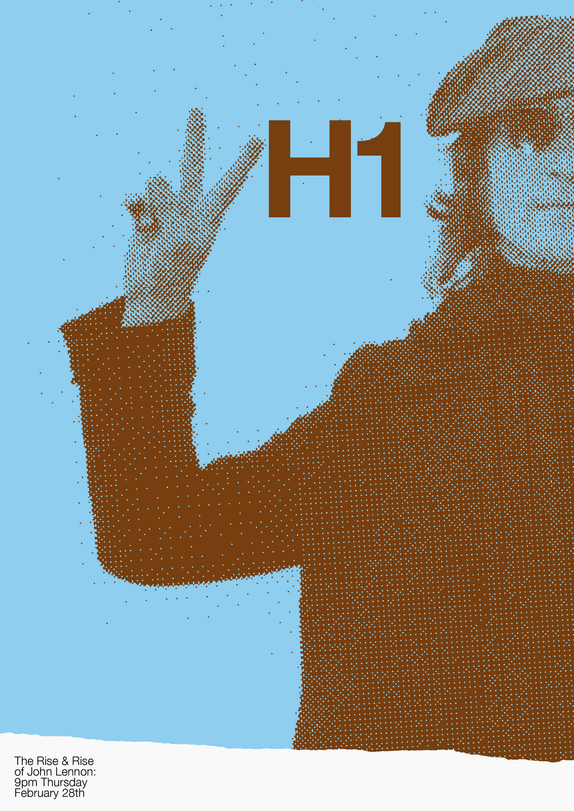
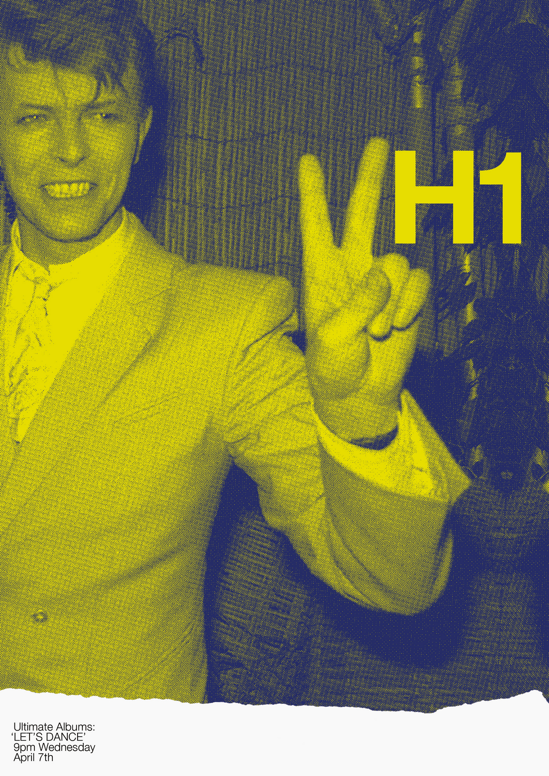
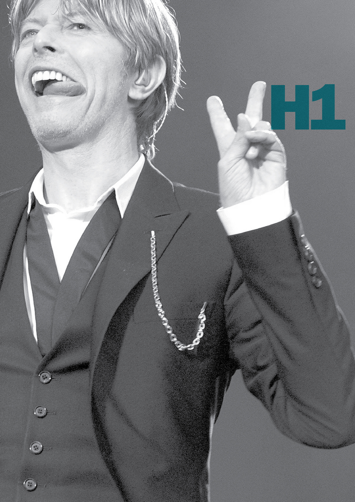
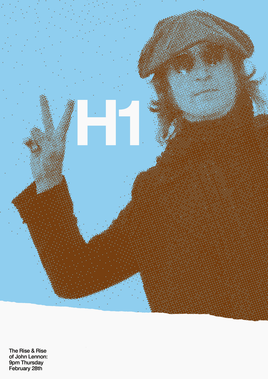
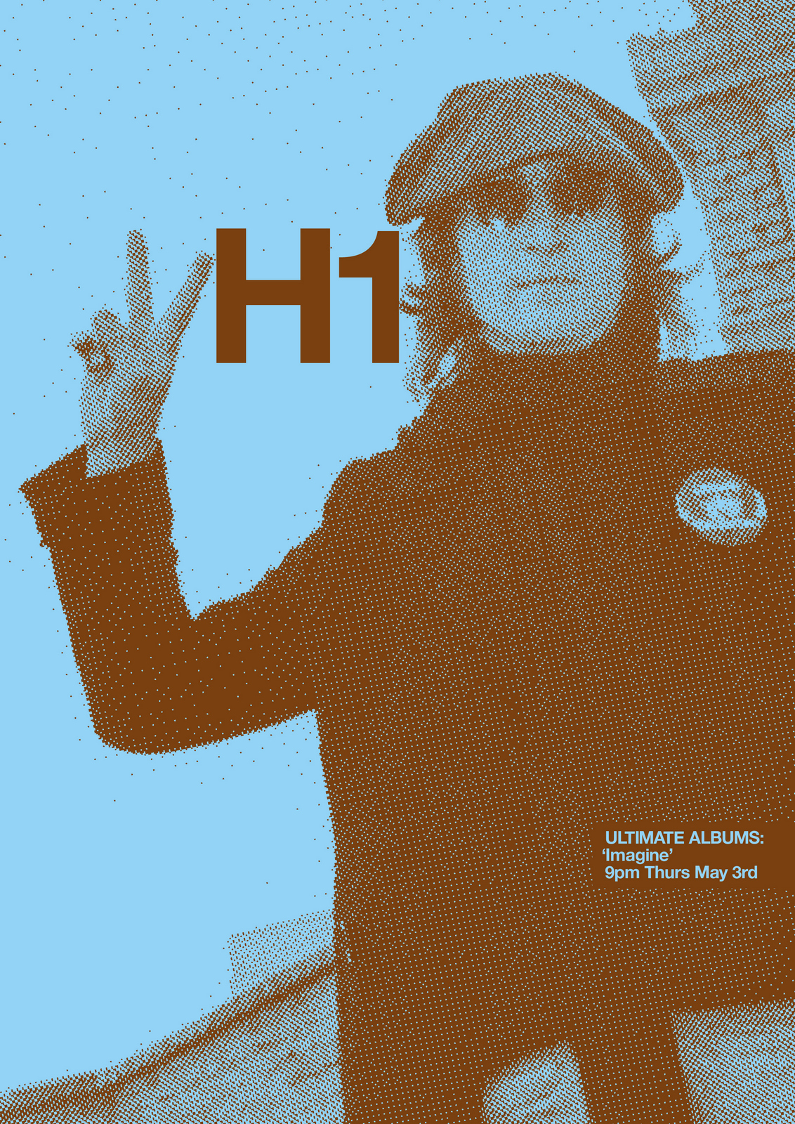
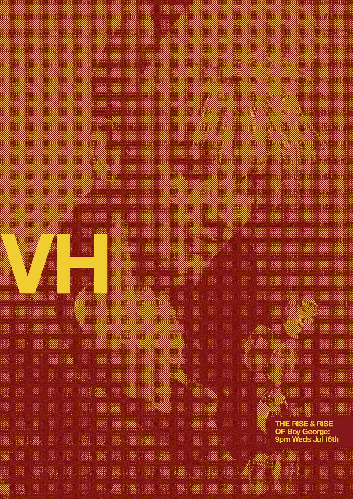
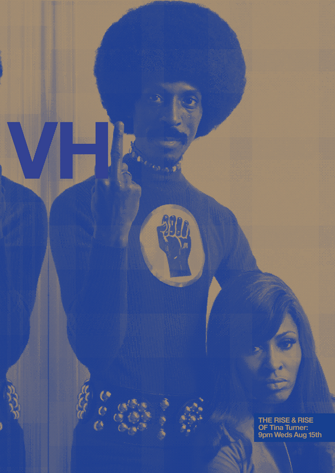
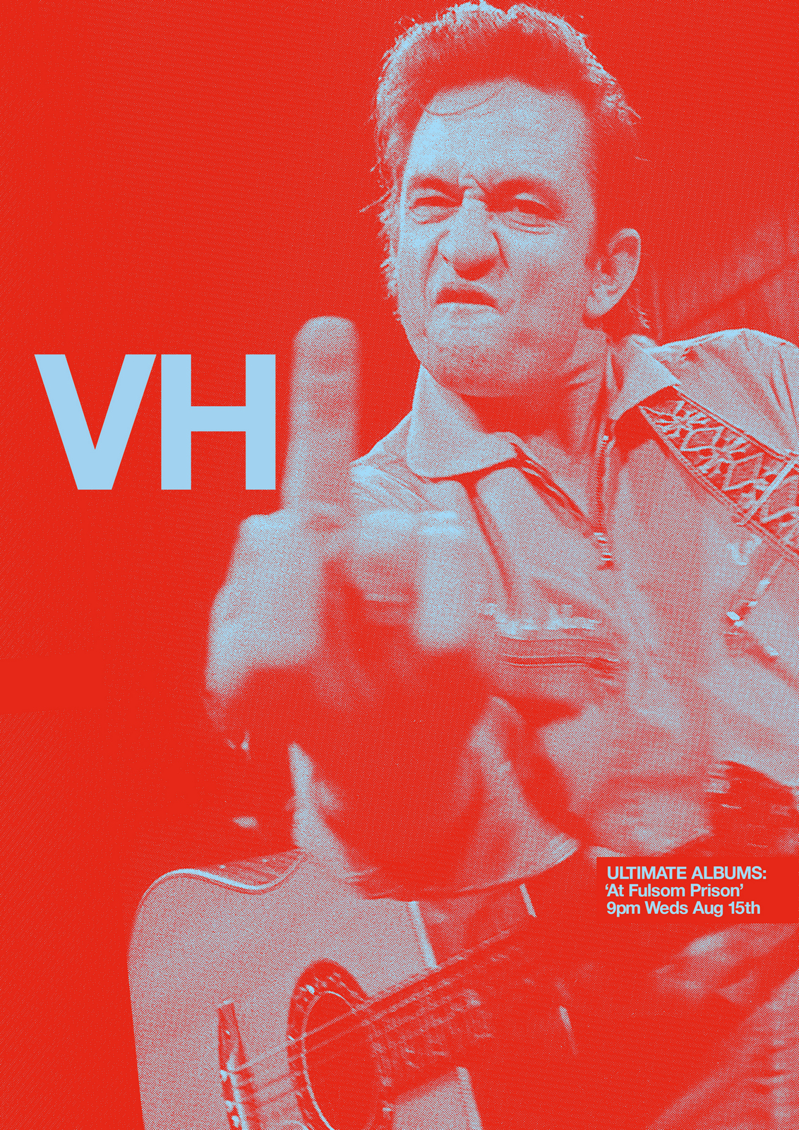
THE NEXT DAY: Better still. But why have a rip at all?The stars shouldn't have to compete with the graphics for attention.If we want to create iconography fans will want in their homes let's minimise the bits they don't want.So bigger pictures, simpler layout.
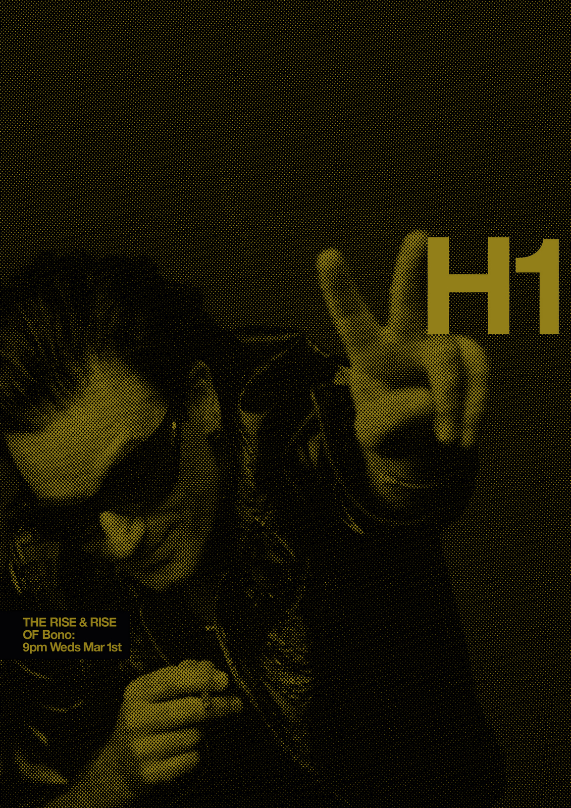
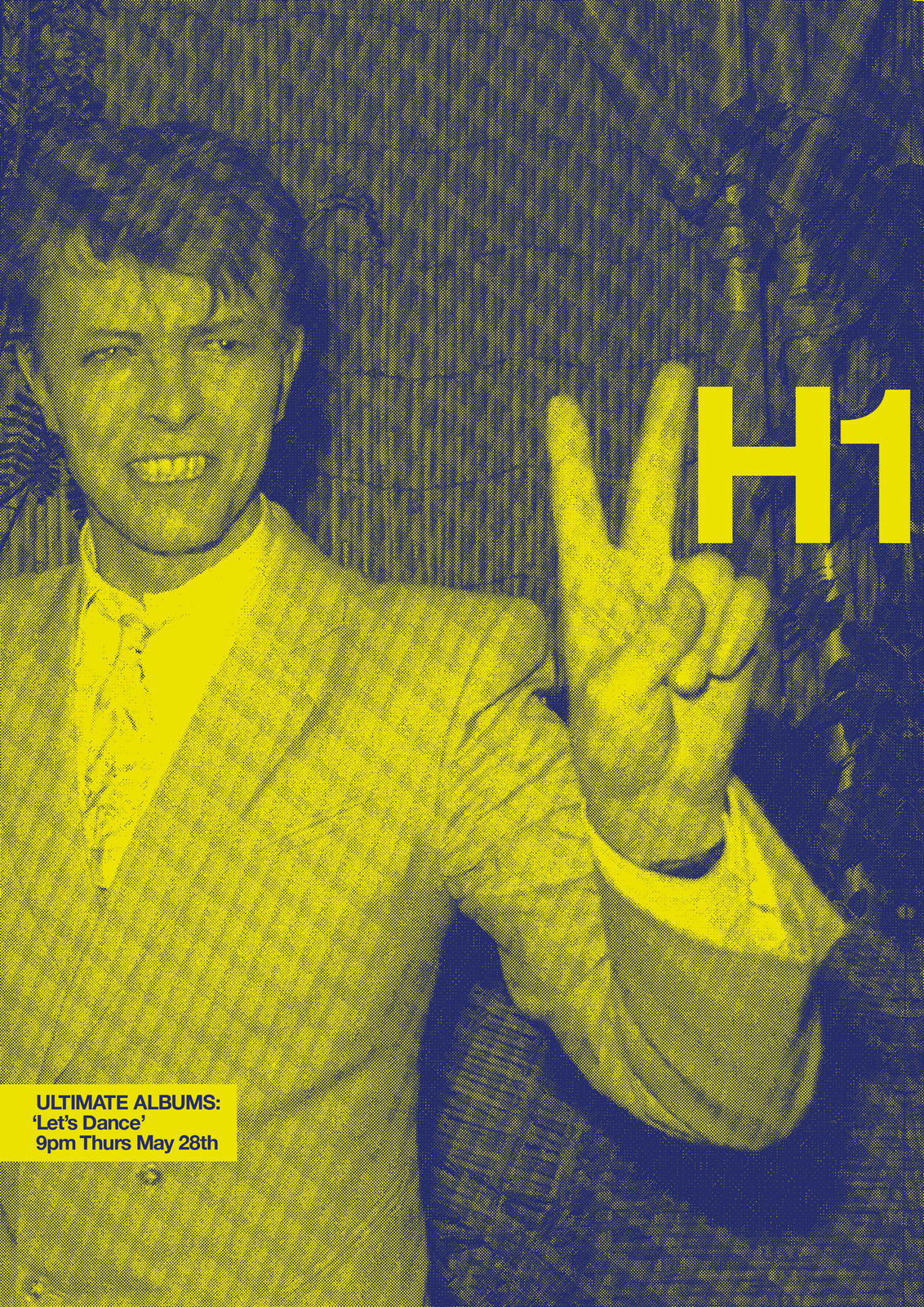
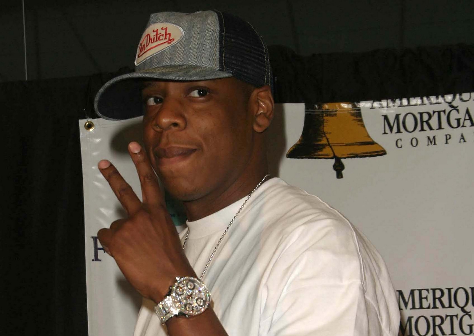
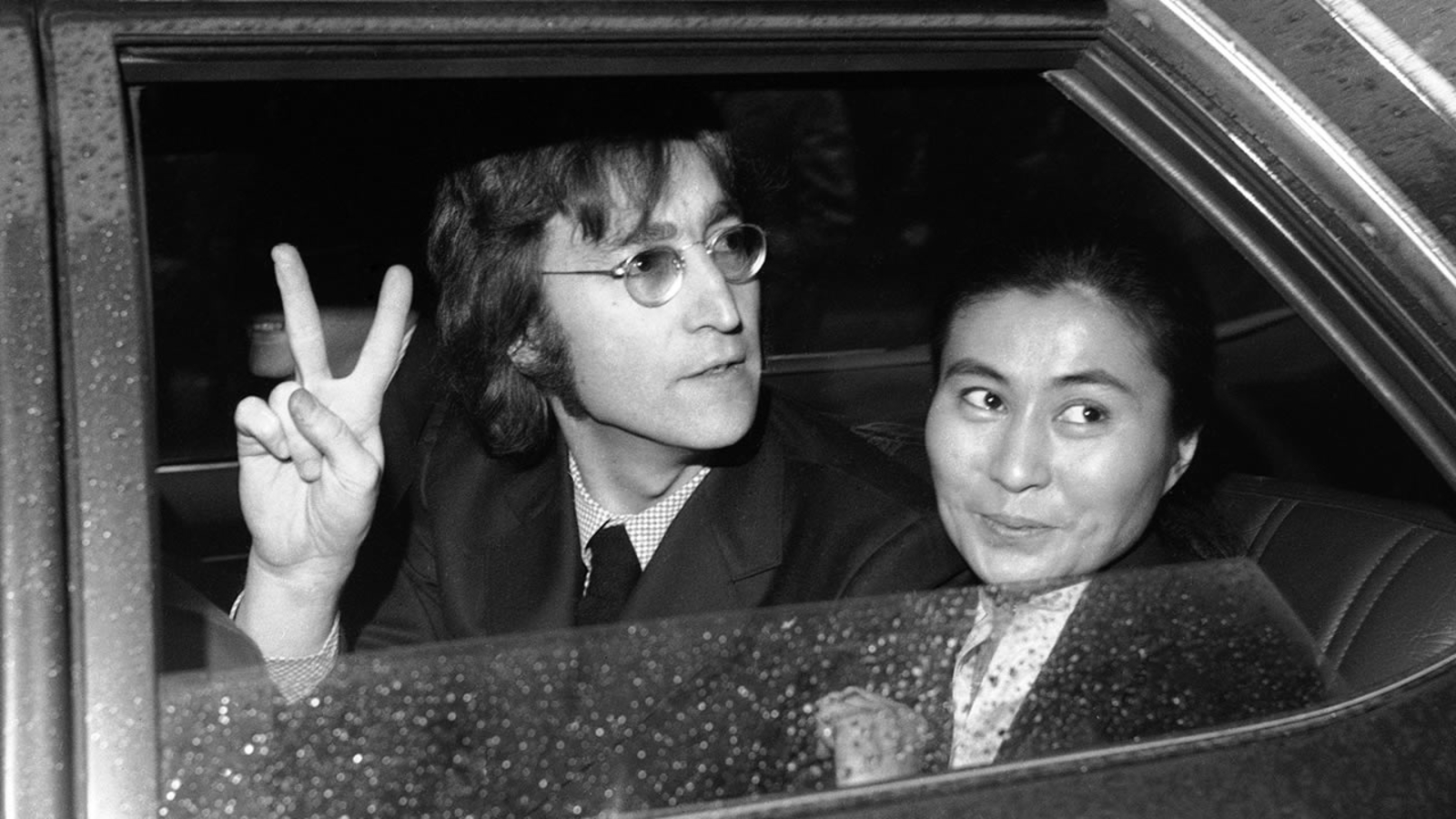
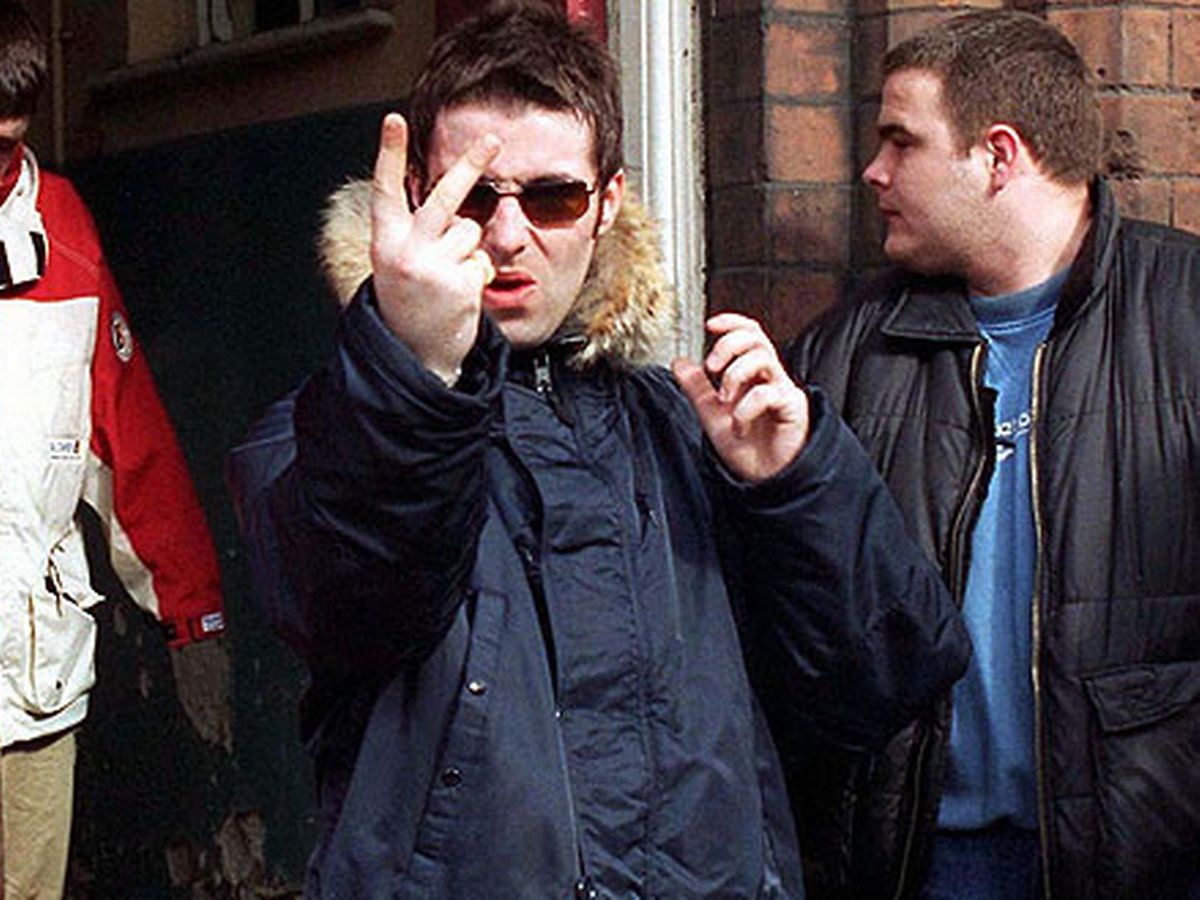
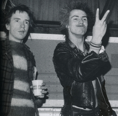
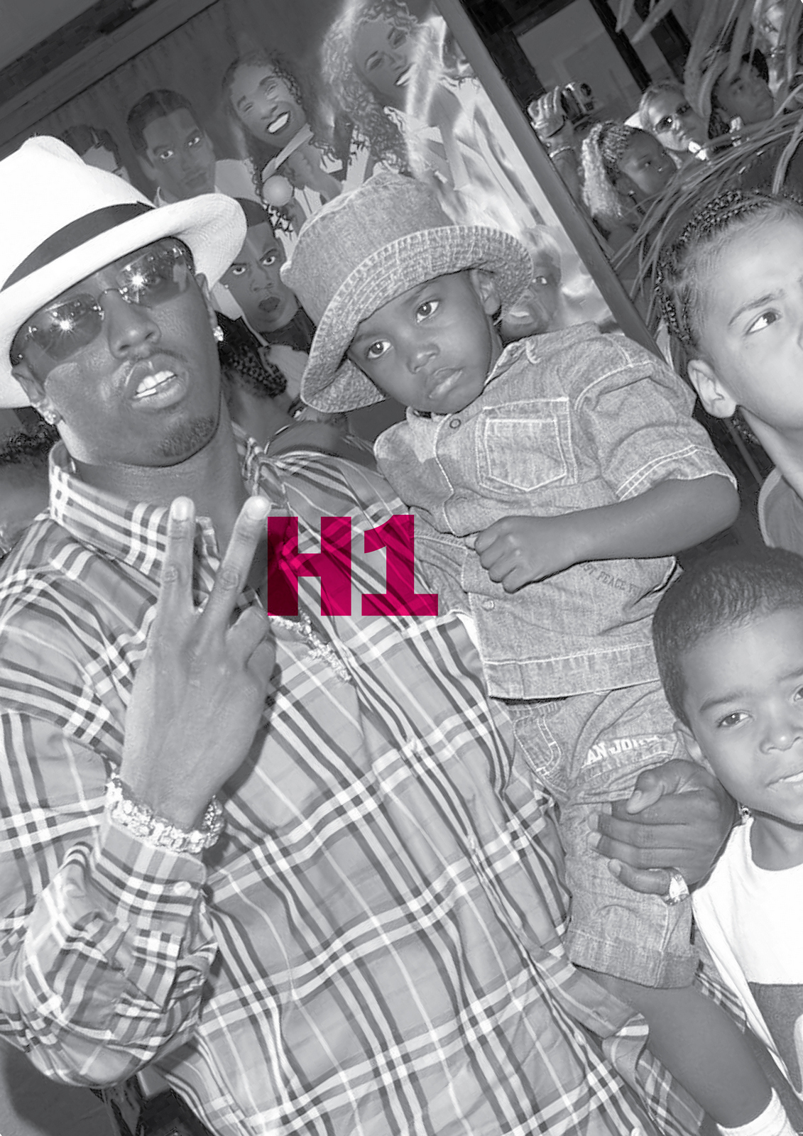
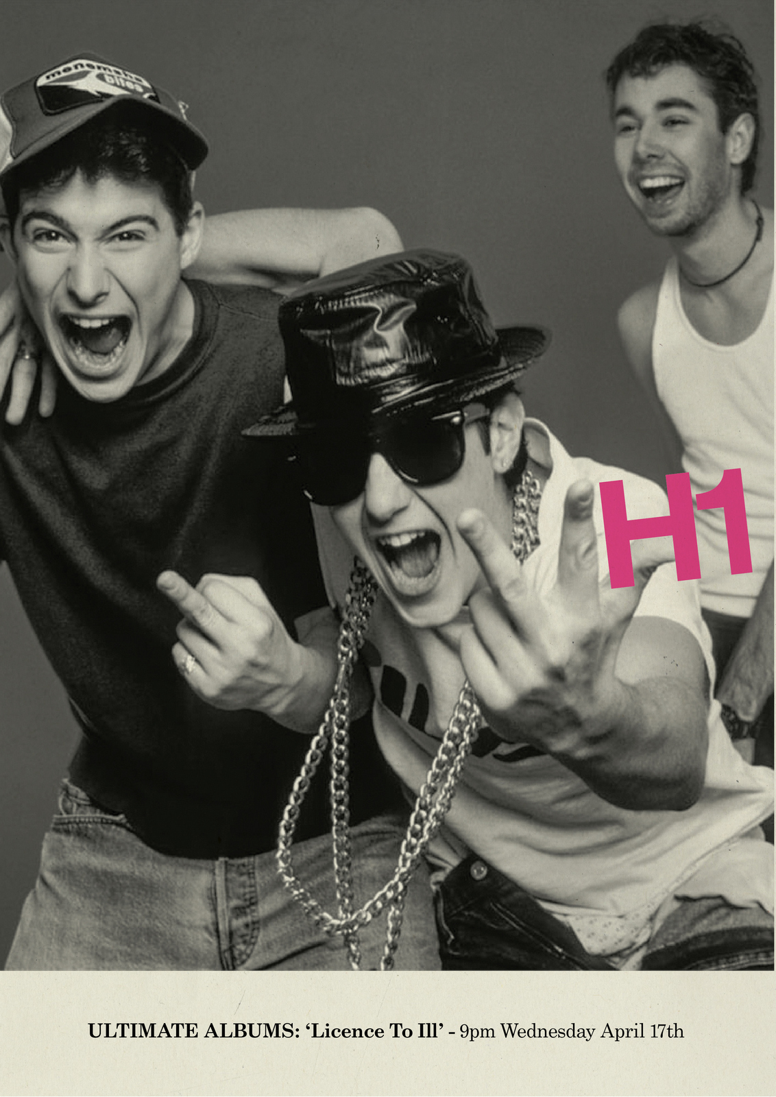
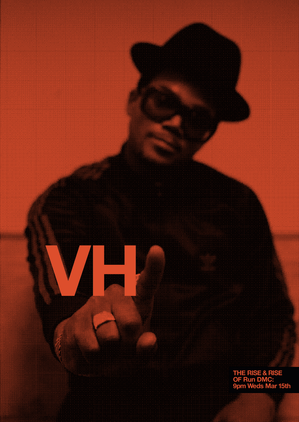
NEXT DAY: I have an idea for year two: Rock stars giving the finger.
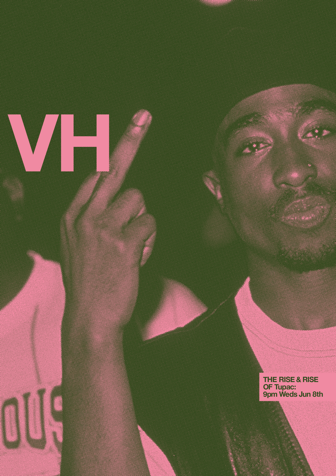
I Love them.Caspar comes in, 'Oh my god, what have you done?'He's looking at twenty or so A2 polyboards scattered around my office.No need to tell him they're now too big to put in our back pockets.CHEMISTRY MEETING: After brief introductions to the two young, female clients, I enthusiastically launch into selling our solution.Without knowing their problem.Rather being held aloft and cheered, I'm told 'We don't need a brand campaign'.Their problem, they explained, was time; they needed a campaign to promote a specific show very, very quickly.That was their problem.But, I was in too deep.I explained that this wasn't just a brand campaign, it could flex to any programme.I reiterated my concerns with their dowdy brand image.I talked about the benefits of bespoke ideas that can only be done by your brand.I reminded them of the power of simplicity.I told them that challenging their current brand perception could bring in a new audience.Whatever, they weren't interested.They were, by now, irritated.They'd just come in for a chat.I wasn't in a great mood either, I'd worked my ass off for the last week, for free, got to a solution I loved and they were refusingto even understand it.They didn't even want to talk about it.We waved goodbye, knowing we'd never meet again.Some may say that's a successful chemistry meeting in that both parties came to understand there was none.But I'd say not.MORAL: Next time you go on a blind date, don't turn up with a wedding ring. You'll seem weird.


Lorem ipsum dolor sit amet, consectetur adipiscing elit. Suspendisse varius enim in eros elementum tristique. Duis cursus, mi quis viverra ornare, eros dolor interdum nulla, ut commodo diam libero vitae erat. Aenean faucibus nibh et justo cursus id rutrum lorem imperdiet. Nunc ut sem vitae risus tristique posuere. uis cursus, mi quis viverra ornare, eros dolor interdum nulla, ut commodo diam libero vitae erat. Aenean faucibus nibh et justo cursus id rutrum lorem imperdiet. Nunc ut sem vitae risus tristique posuere.
Delete