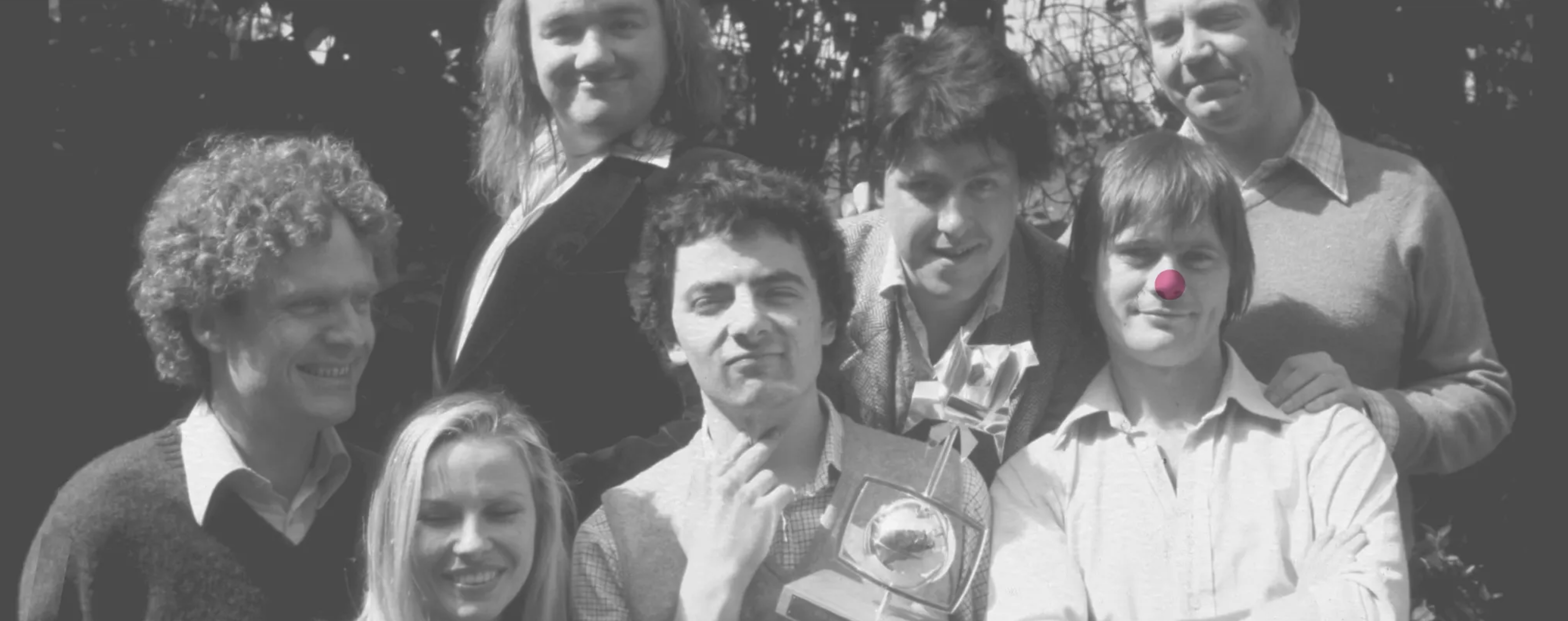

Love that quote.It’s by Abram Games, one of the best designers to come out of Britain.His specialty was posters, and you can see he listened to his own advice.

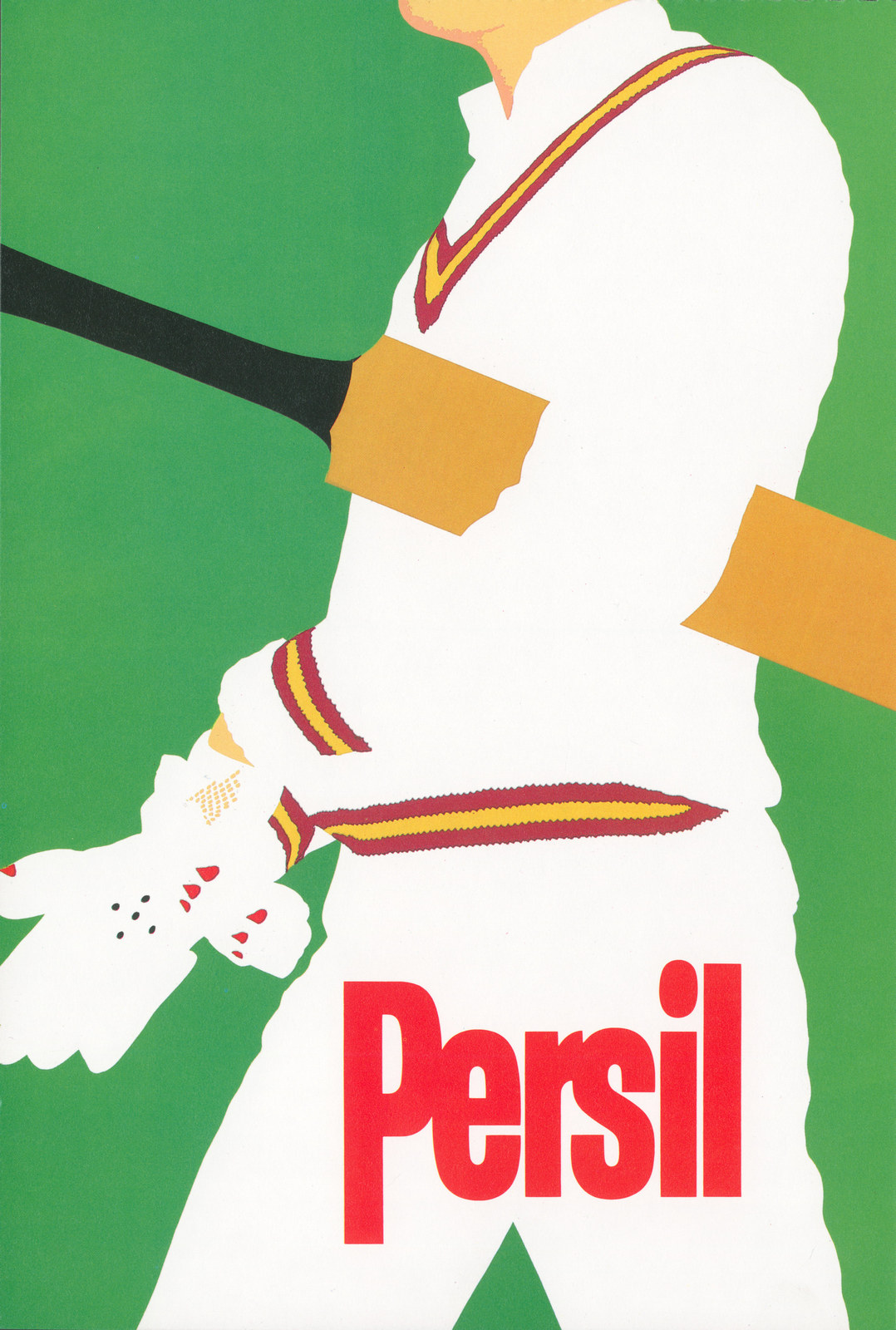
Also, he managed to make it engaging, charming.It used to be a goal everybody in advertising aimed for, the reason being that the people we were trying to talk to didn't like us or our advertising.They weren't charmed by Neville Brody's post modern letterforms or entranced by Leslie Dektor's grainy, wobbly camera-work, and they certainly didn't give a shit that this ad was produced by BBH and that one was by GGT.Advertising was that annoying stuff that was like drunks in Soho on a Friday night; You just had to ignore or step over it on your way to your destination.In other words; They were normal. To make it worse; they already had enough stuff to consume, they weren't on the lookout for more.This was widely known.What was also widely known is that the best chance you had of getting these civilian types to take in your message was to make it as concise as humanly possible.Then, maybe they couldn't help but take it in.So if you were creating a poster, the best kind would be totally visual.If you had to say 'Persil washes clothes to keep their brightness,' rather than saying that you might do this...1. VISUAL ONLY.
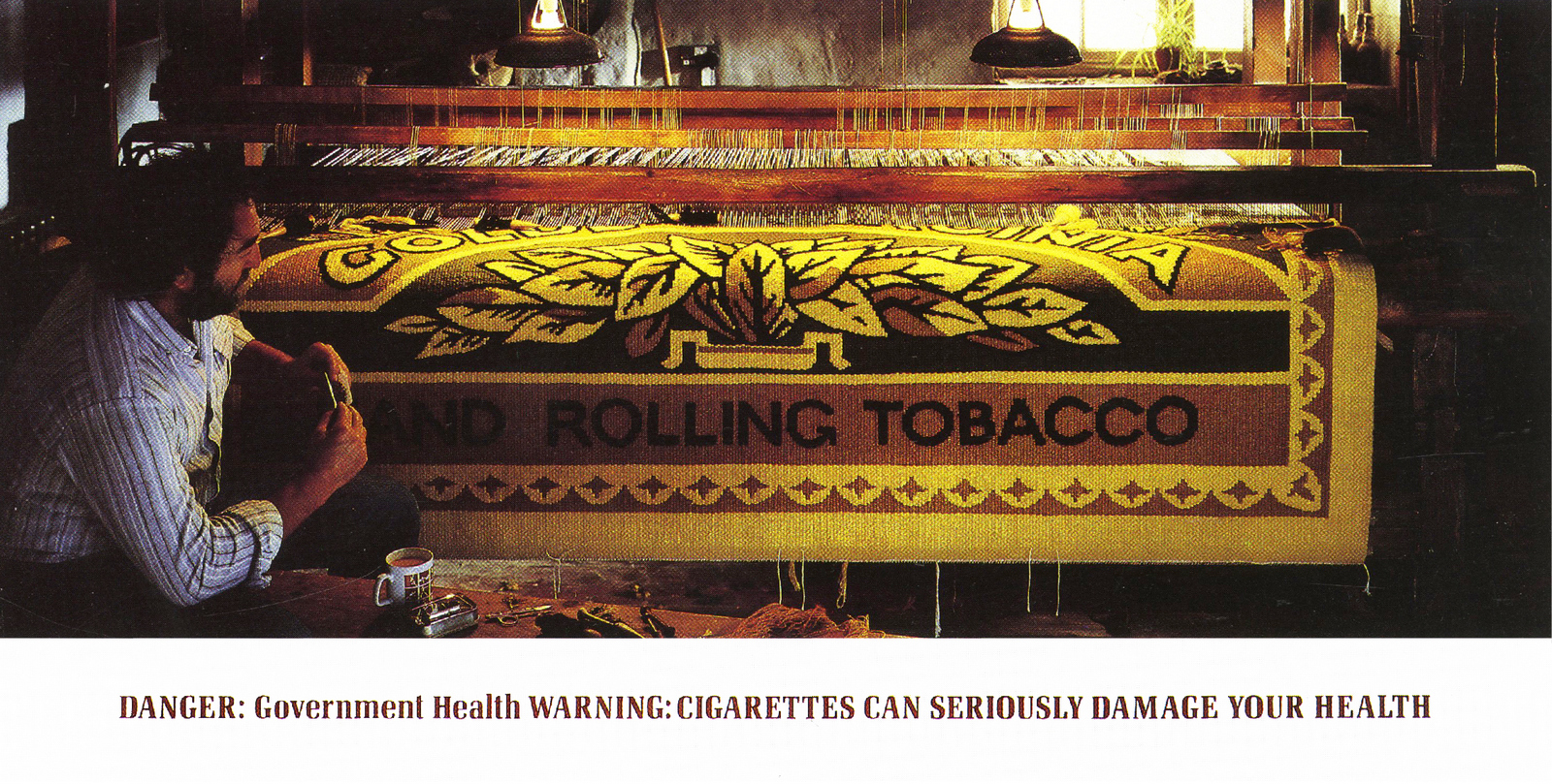
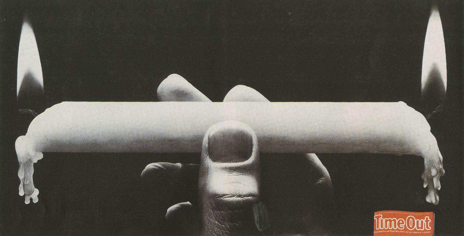
Maybe you want to say Golden Virginia Rolling tobacco is hand crafted...
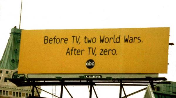
Second best is all words. Firstly because words take longer to take in than pictures, (remember that old 'a picture is worth...'? Exactly.But both are secondly because having to look at a picture AND read words takes longer than that, and will also mean the picture and words become smaller to accommodate each other.But some things can't be said in pictures.2. WORDS ONLY.
It should be a goal for all forms of communication, but it’s particularly apt for posters. Which was Games’s specialty. is this more relevant than in posters, a medium people are moving past as they see them. That’s if they even bother to look up. It was the primary goal when I got into advertising in the the eighties. The reason was that it was widely known that people, normal people, those outside soho who wouldn’t recognise the smell of a magic marker, didn’t like advertising. It wasn’t important to them, it was an irritating interruption to their life. So be concise. Don’t look like you are asking for a lot of time. If you could say our washing powder washes colours brighter, without using a wordHere's an example, a visual execution, more or less, it could've been if they'd put the Volvo logo under the words 'COTTON WOOL'.)And here's the same thought by the same creative team in words.
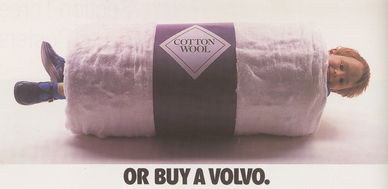
And here's the same thought by the same creative team in words.
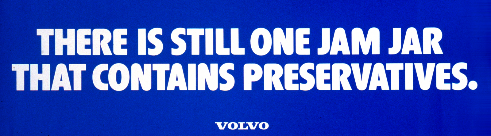
Both good, but the top one is quicker. (And more arresting.)
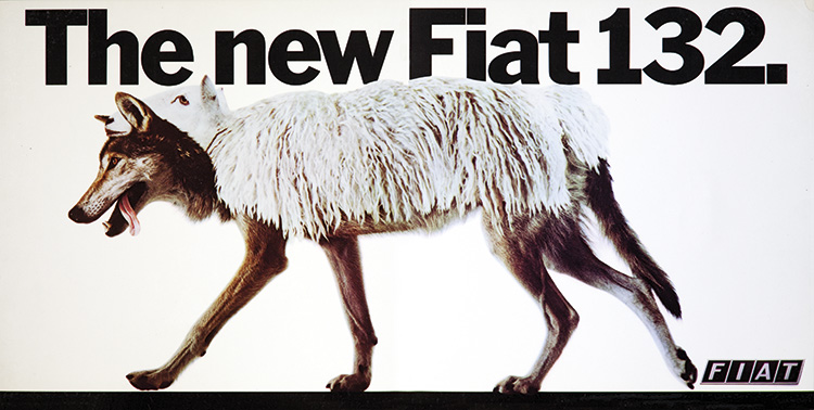
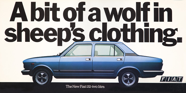
3. BIG PICTURE, EXPLANATION IN THE SMALL WORDS.4. BIG WORDS, EXPLANATION IN THE PICTURE.5. GRAPHICS INSTEAD OF WORDS & PICTURES.


Lorem ipsum dolor sit amet, consectetur adipiscing elit. Suspendisse varius enim in eros elementum tristique. Duis cursus, mi quis viverra ornare, eros dolor interdum nulla, ut commodo diam libero vitae erat. Aenean faucibus nibh et justo cursus id rutrum lorem imperdiet. Nunc ut sem vitae risus tristique posuere. uis cursus, mi quis viverra ornare, eros dolor interdum nulla, ut commodo diam libero vitae erat. Aenean faucibus nibh et justo cursus id rutrum lorem imperdiet. Nunc ut sem vitae risus tristique posuere.
Delete