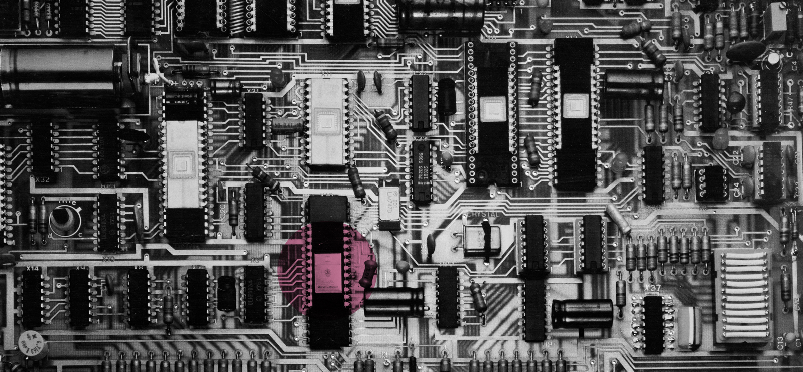

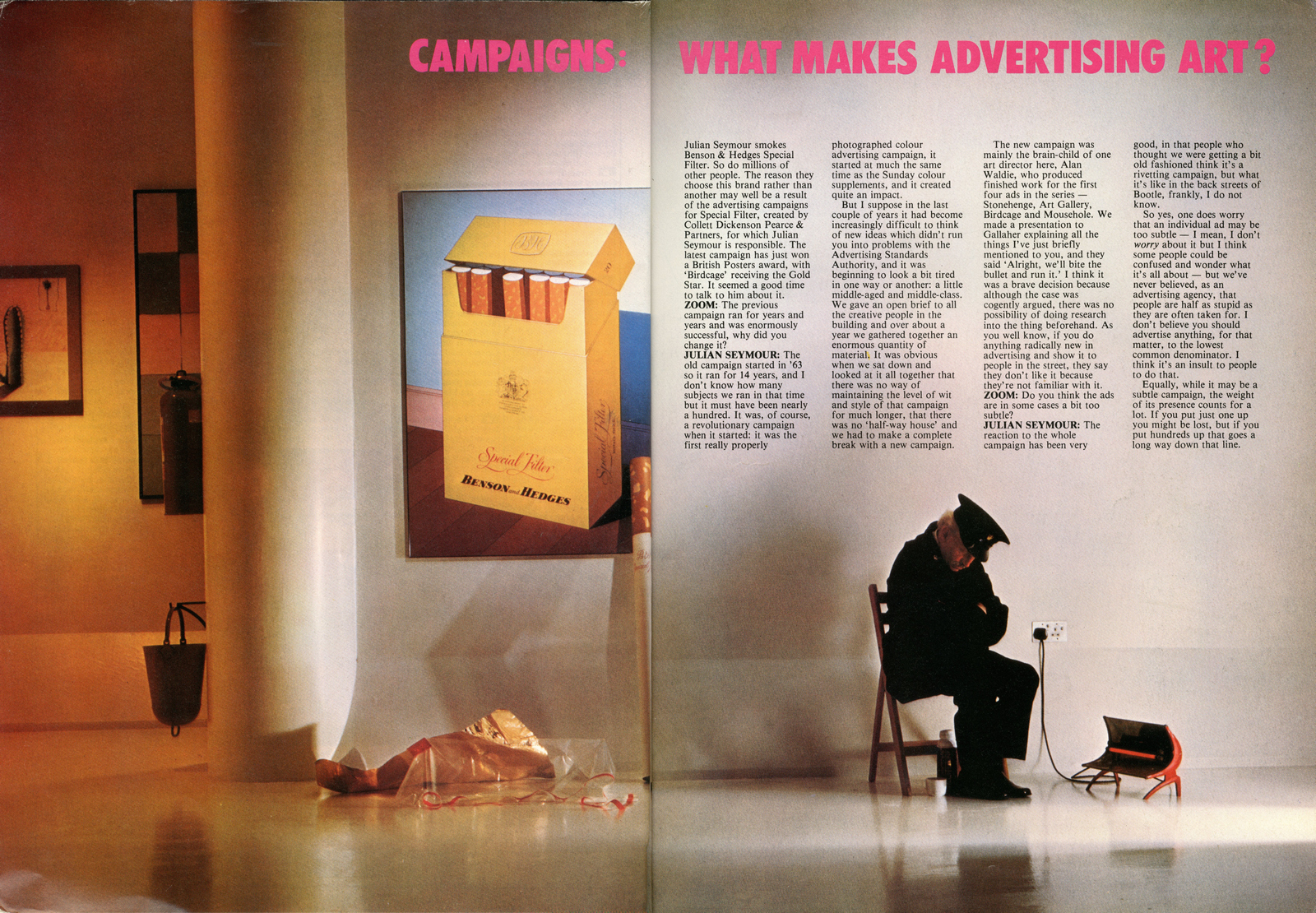
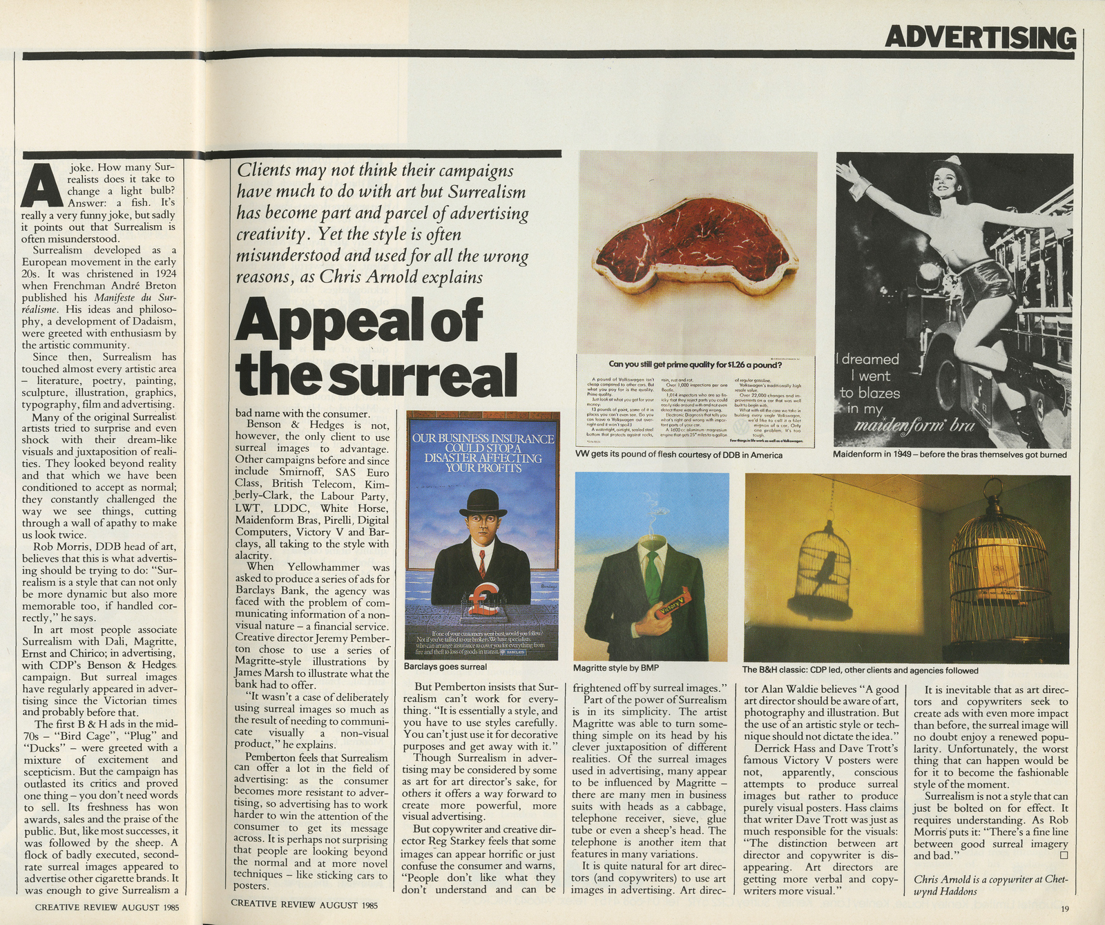
I used to walk past this poster every week for about a year.I was fifteen, my Art teacher had got hold of a life size billboard poster, a 48 sheet, or I should say 48 sheets.It was twenty or thirty foot long, and papered the entire corridor that lead to our classroom.We were all bemused by it at first, just a close-up of an electric circuit board? weird? Was it even an ad?Then we found the gold pack-shot.Who knew adverts could be so cool, sophisticated and playful?I walked past it every week for about a year, it made a lasting impression.
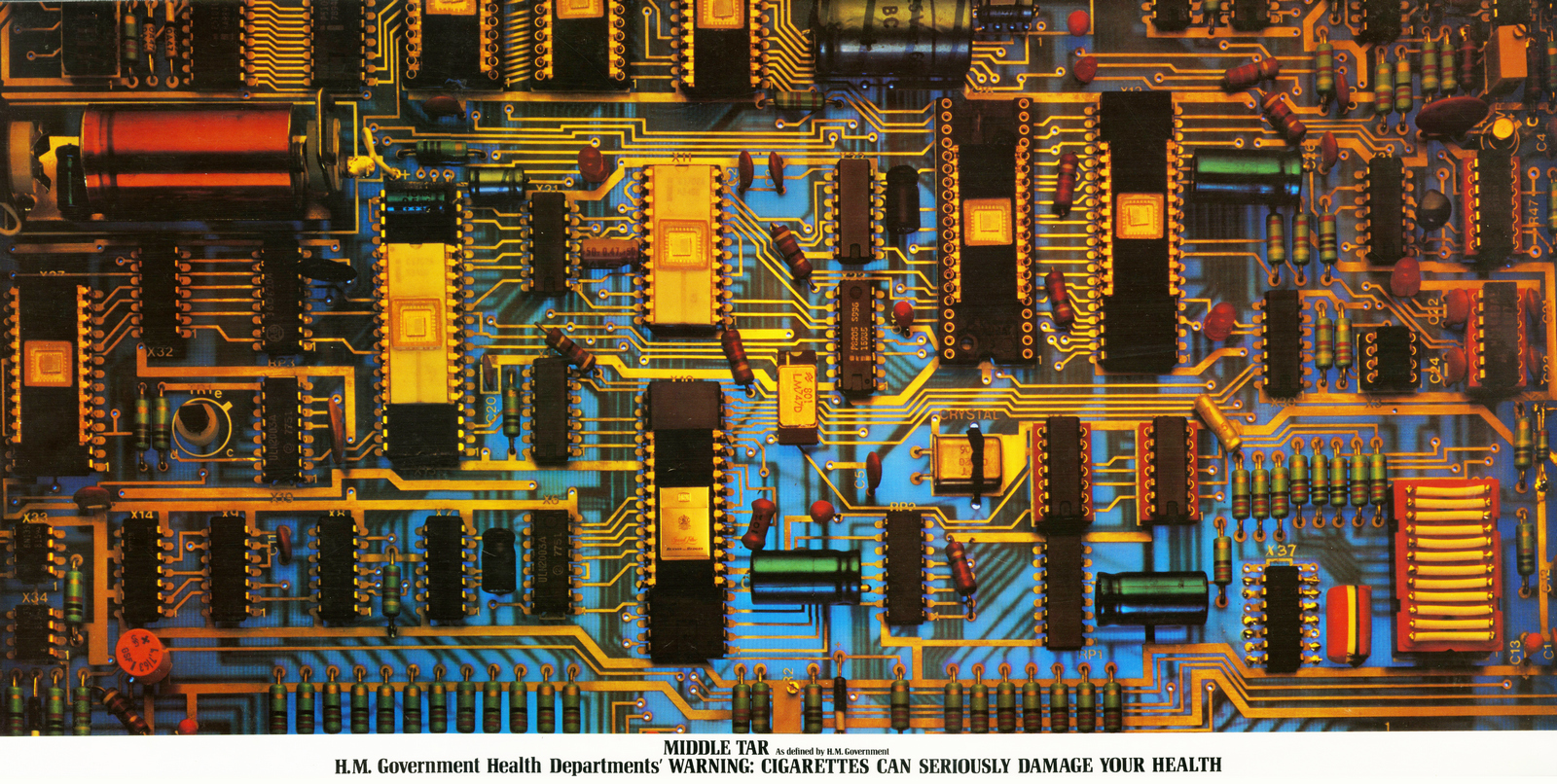
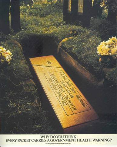
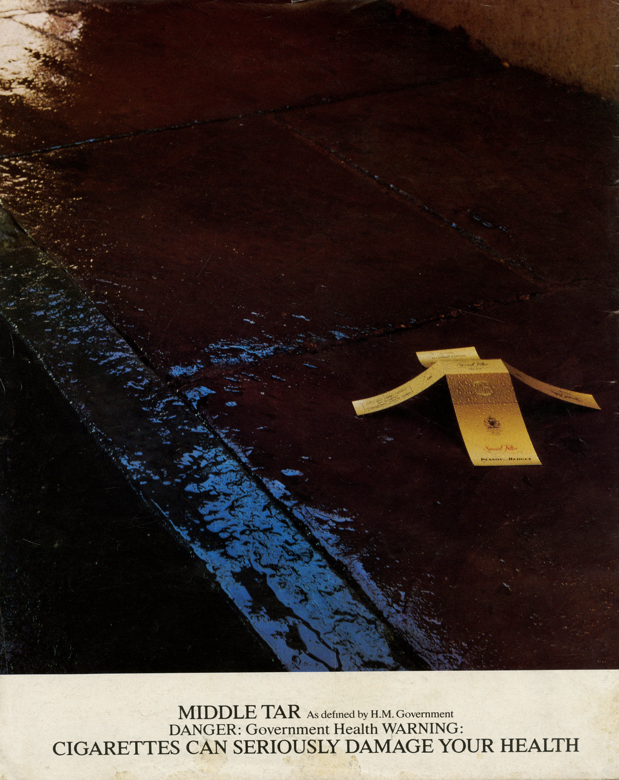
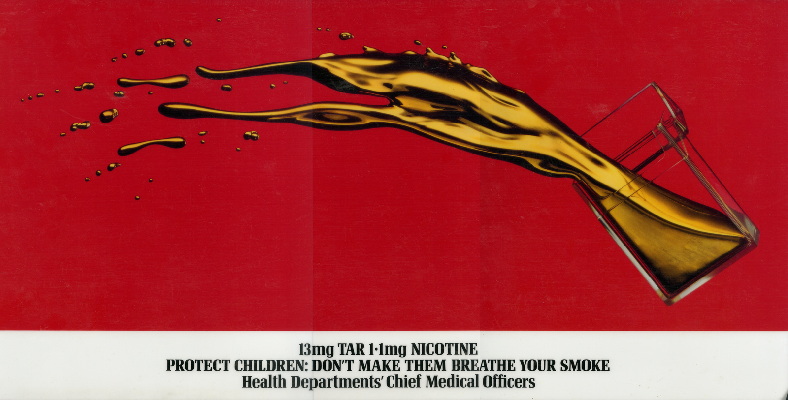
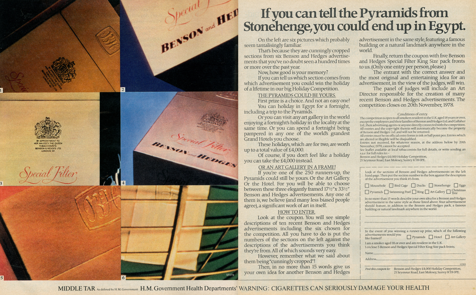
1965: The Government banned cigarette companies from advertising on T.V.Press and posters become crucial to Tobacco companies.1971: The Government declares that cigarettes must carry a health warning, and that press and poster advertising must donate a strip at the bottom of their advertising to print the message 'Every pack carries a Government Health Warning.' In retrospect, that's the least they could've done, but at the time it must've caused outrage in agencies with cigarette accounts; 'You mean we need to take a piece of OUR pages and posters, space that WE'VE paid for, to say bad things about our product?' So you'd have all the creative bods in an agency trying to say good things about their brand of tobacco in the top bit of the ad, and effectively, at the bottom it would say 'Yeah, whatever, we think it's RUBBISH. signed THE GOVERNMENT.'1976: The Government come up with some more rules for the Advertising industry: 'If you're advertising Tobacco DON'T feature people using the product, in fact, DON'T feature people at all. DON'T say anything about the product, don't even mention it, DON'T even write it's name on the ad, DON'T even think about its name when you are creating these ads.Come to think of it, the only words we want to see, and we want them in black on white, clearly legible, nice and big, saying "This product gives you lung cancer or can kill you". Capiche?'1977: Benson & Hedges agency, Collett Dickenson Pearce, are increasingly irritated by the number of companies aping their original Gold Box campaign.It meant that B&H advertising was starting to get lost in the crowd.The account guy on the business, John Ritchie, made a big call; 'Forget all we've done! we need something completely new!'It was a big ask; the 'Gold Box' campaign was famous, award-winning and had turned a niche product into the brand leader.As if that wasn't pressure enough, the new Government rules meant you couldn't show or say anything about the product.So not only have you got your hands tied behind your back, you have one leg tied too.
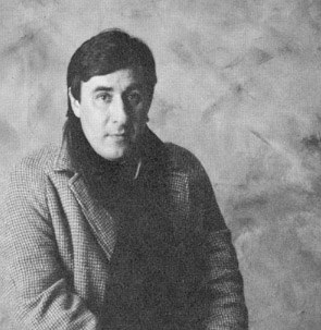
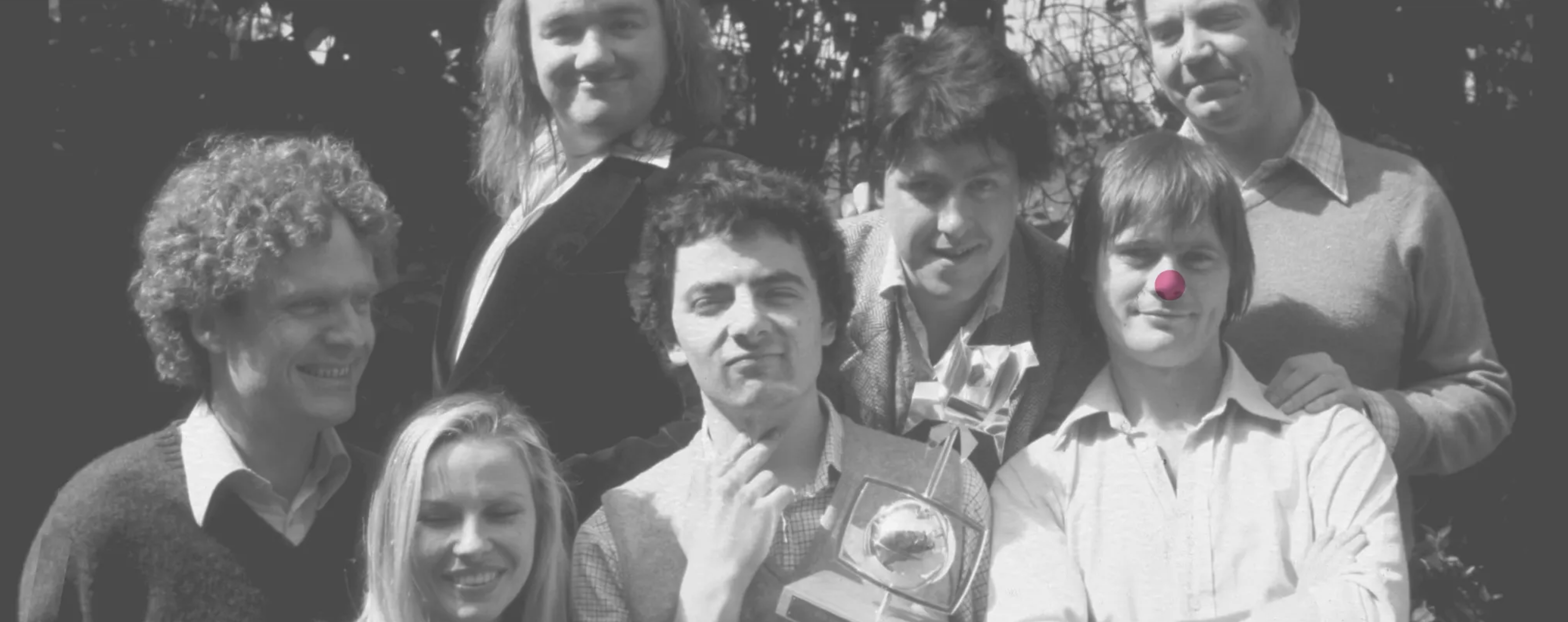
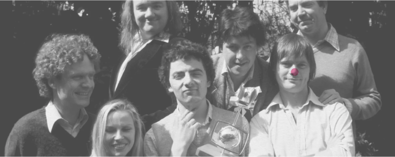
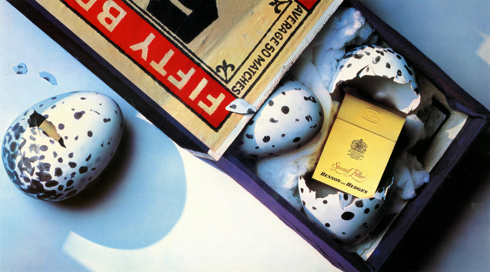
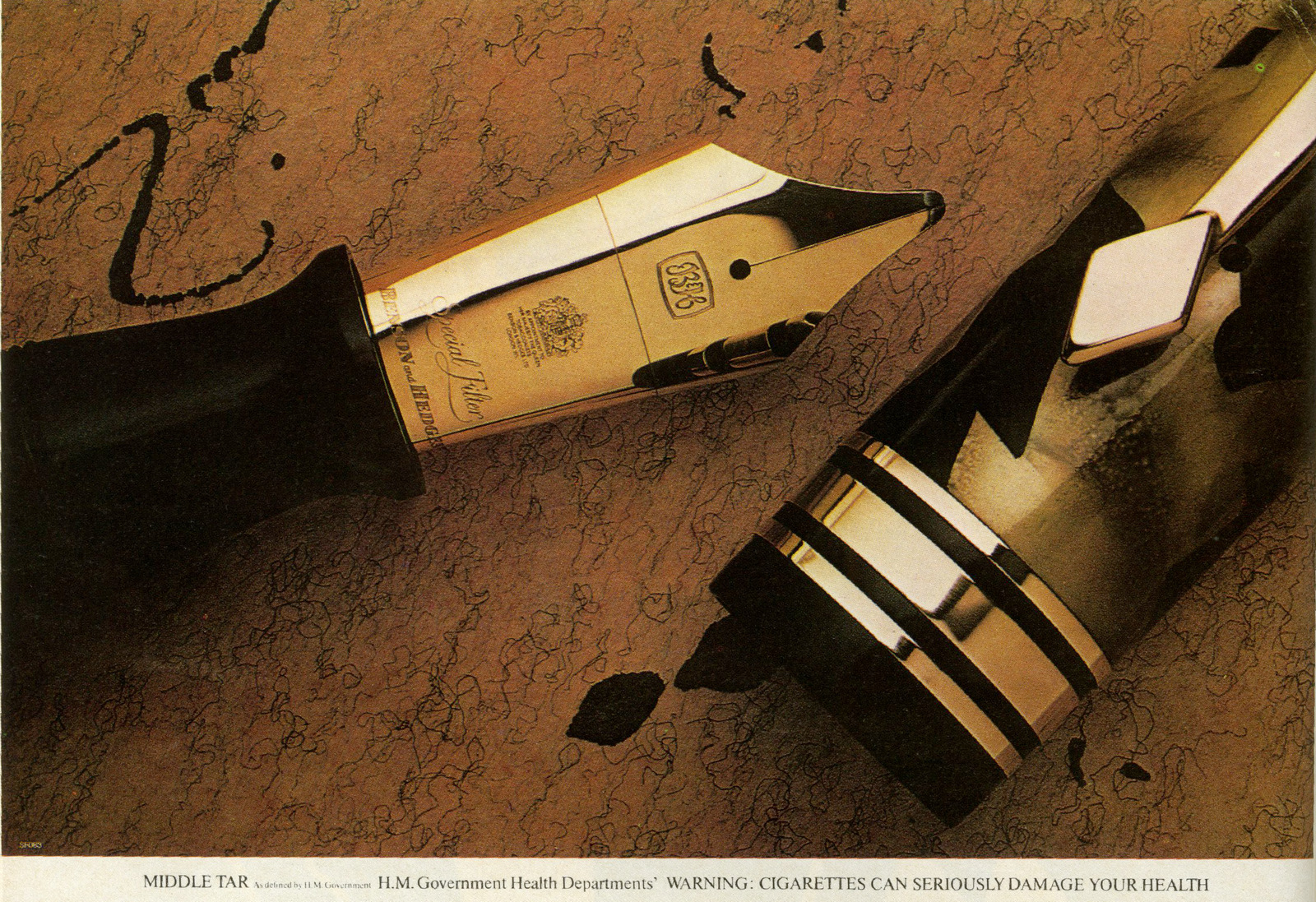
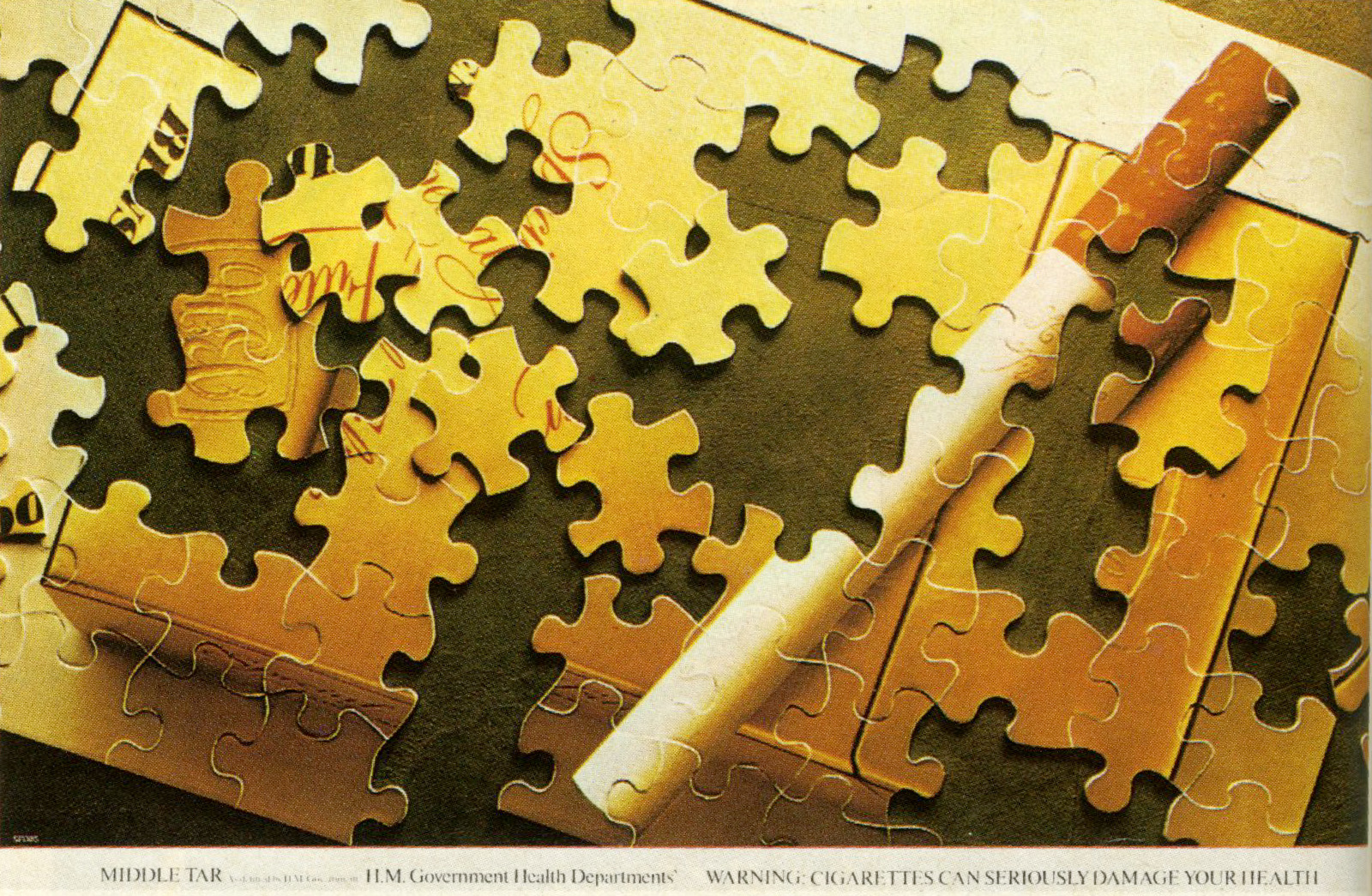
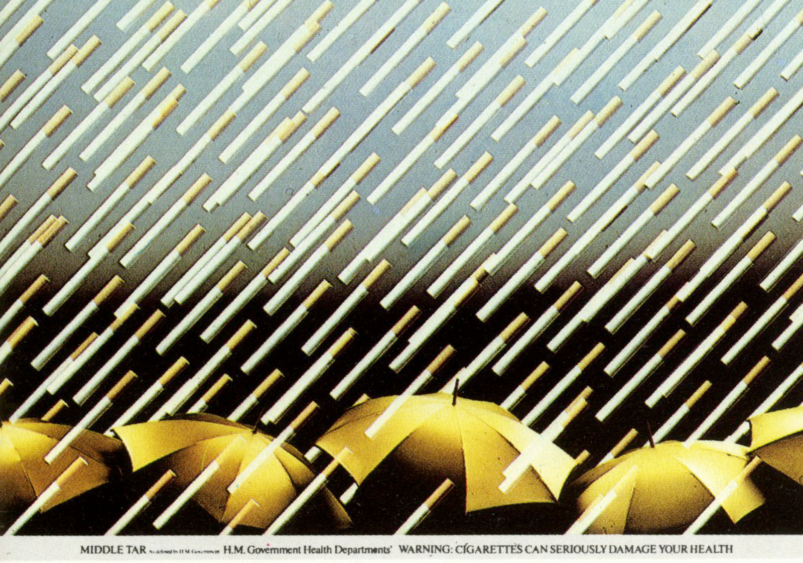
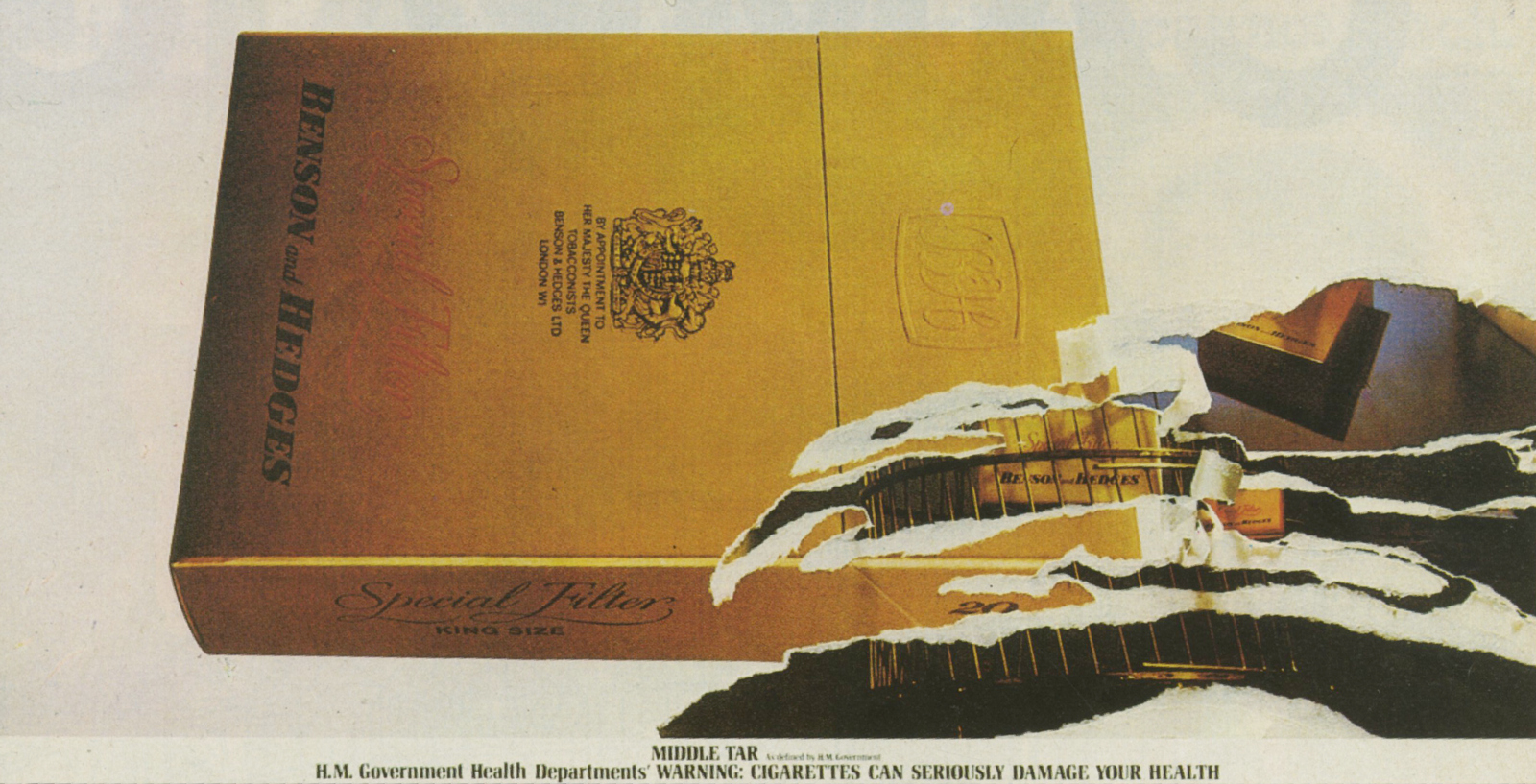
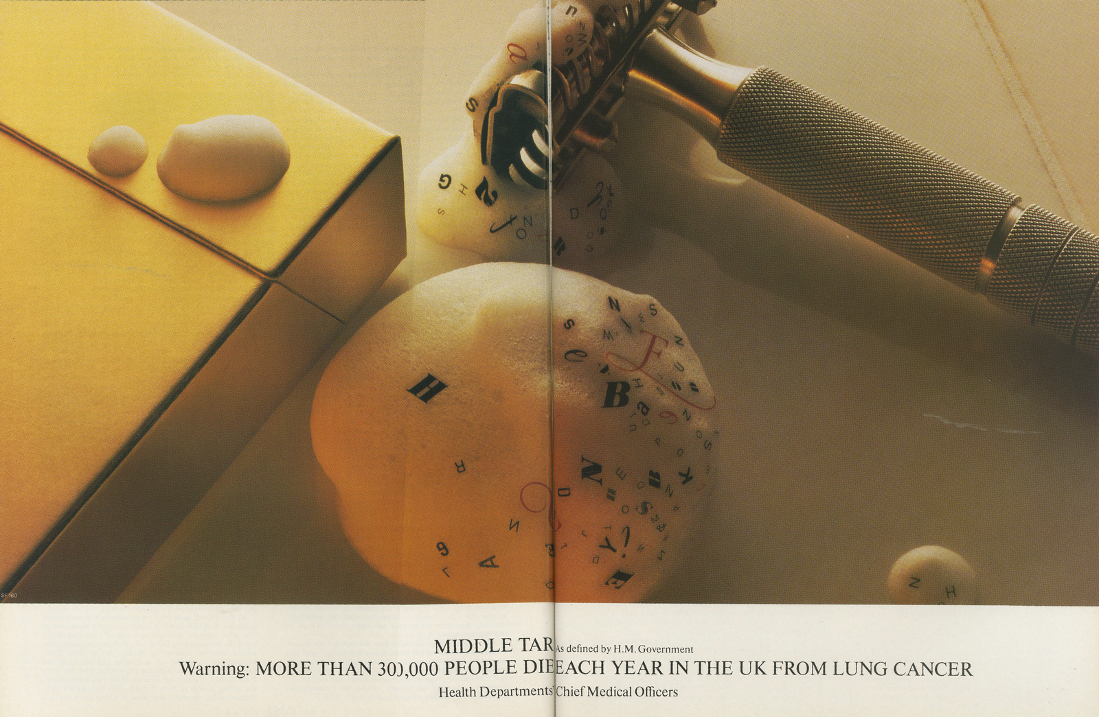
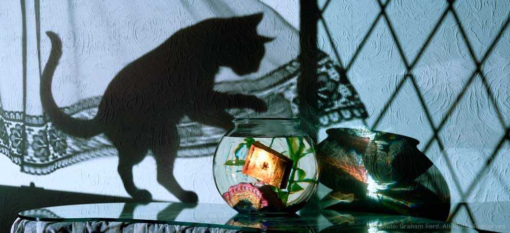
Art Director Alan Waldie and Copywriter Mike Cozens were one of the teams given the task. WALDIE: ‘Days drifted into weeks and Ritchie, who was forever chasing me, said “What have you got?”I said “we’ve got something, but it’s probably not quite ready, it’s a bit different.It’s dare I say, a bit advanced. I’ll need to explain it”.“You won't need to explain” said Ritchie “Let‘s have a look”.Silence descended on the room as they gazed at some totally incomprehensible layouts of birdcages, mouse-holes, eggs, sardines.No messages.No words at all.Unified only by a solitary gold pack.A rival team had also created a campaign, unsure of which to go for, CDP M.D. Frank Lowe takes both to his mentor, former CDP Creative Director Colin Millward, for his view.‘One will let you sleep at night, the other will make you famous’ was Millward’s verdict.Sleep wasn't a priority for Frank Lowe or CDP, so the famous campaign was presented to the B&H Chairman Stuart Cameron and Marketing Director Peter Wilson.They loved it, telling the agency to spare no expense in photographing the ads.
When money was no object Brian Duffy was the guy, he was promptly called upon to turn Waldie's drawings into photographs.
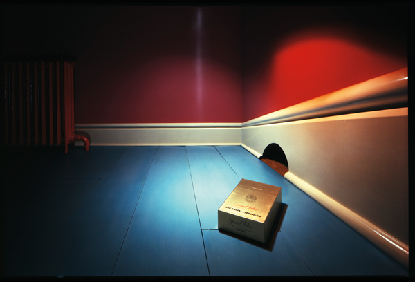
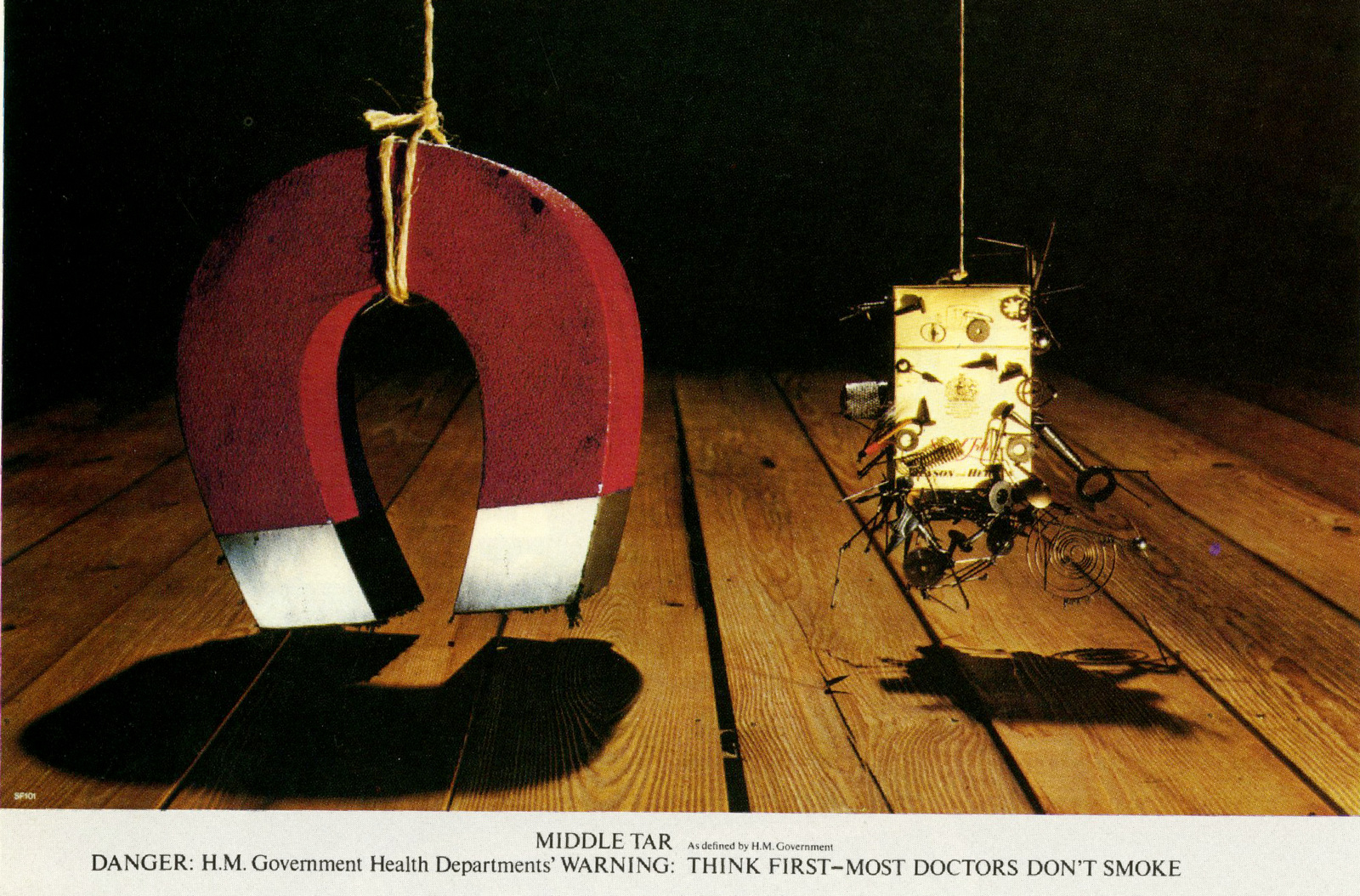
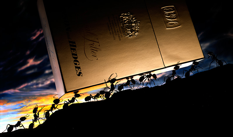
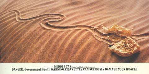
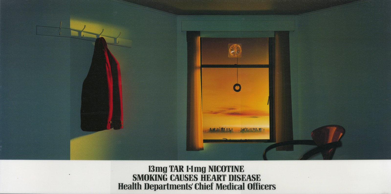
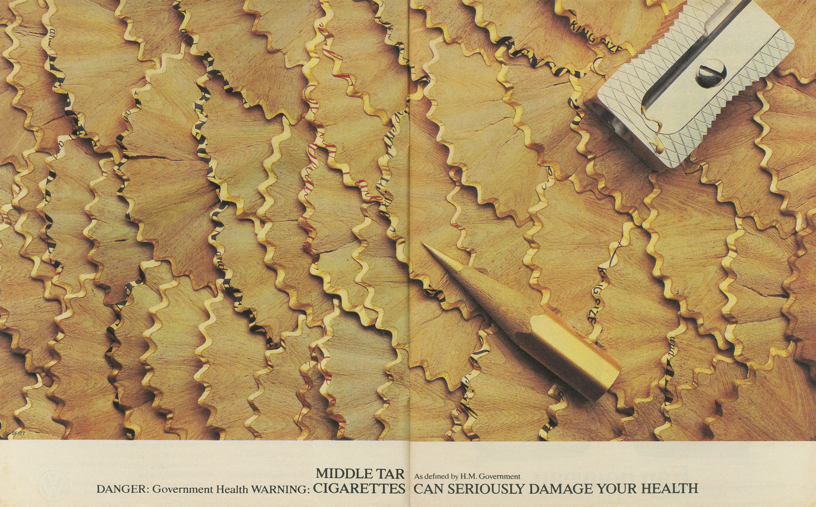
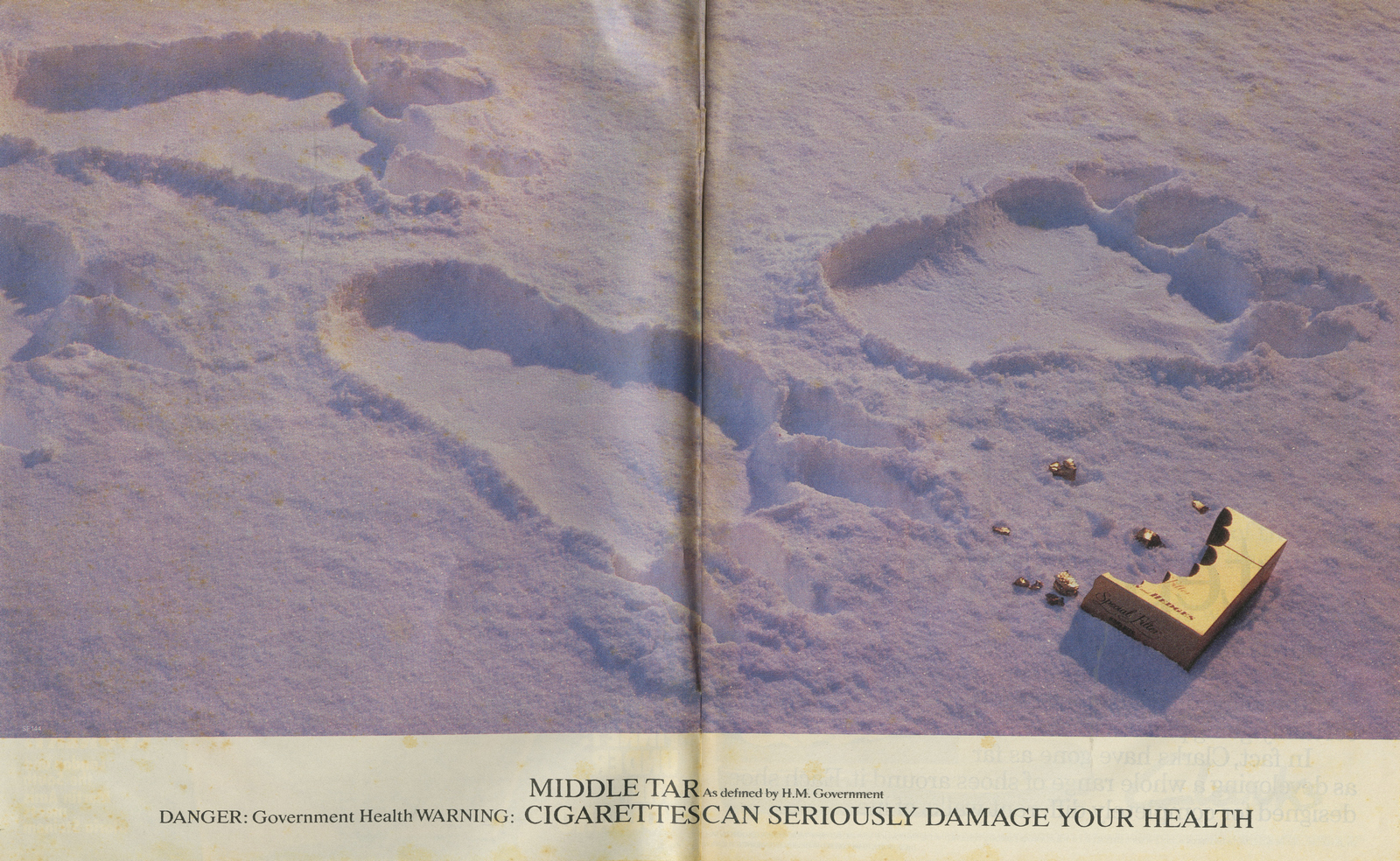
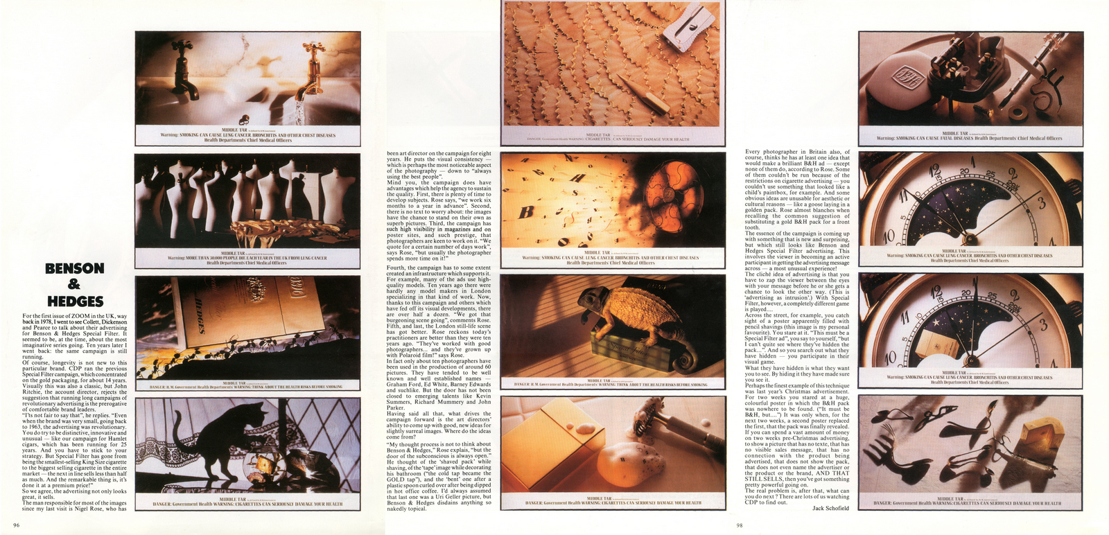
An arty choice.He wasn’t the consummate commercial photographer.He was opinionated, experimental and very creative.Brian Duffy was one of the trio of famous cockney snappers, (the others being David Bailey and Terrence Donovan), probably the least known, arguably the most talented.Duffy went to work and had the sets built in his Primrose Hill studio. DUFFY: ‘I changed the colour and scale of everything, which looks pretty weird today.I played with optical illusions, since I know enough about what lenses can do and plate cameras and changing perspective.They’re real photographs and it’s quite complex to do things like that, which look like trick photography.They’re not phoned in from the coast, it’s all done in the camera.’ The first shot was ‘Mousetrap’, showing a pack replacing to lure to a presumably nicotine addicted mouse from its hole. He tried five different lighting set-ups before settling on the final image.It set the style for the campaign.
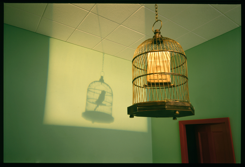
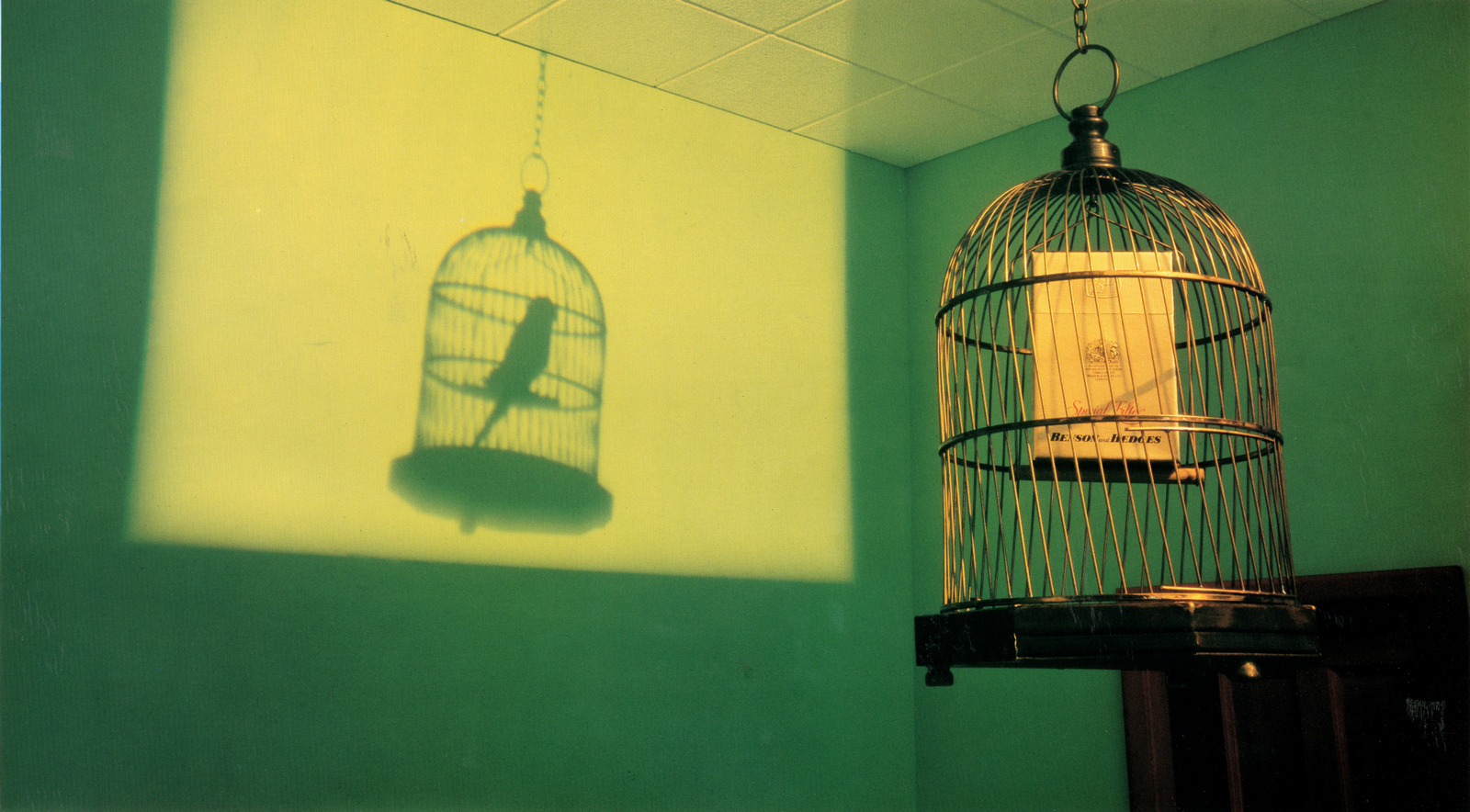
Duffy’s son and assistant Chris remembers that ‘Birdcage’ was a very simple set unusually lit, ‘We lit it with an old Rank projector light and through it we projected an image of a bird that we had reversed out on a negative’.
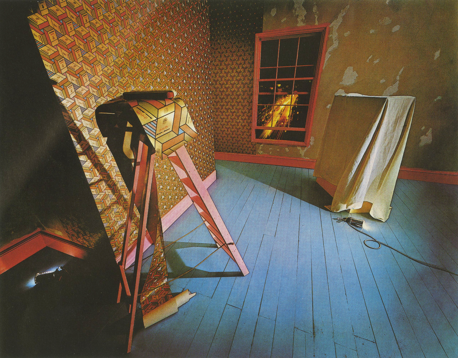
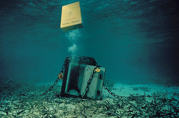
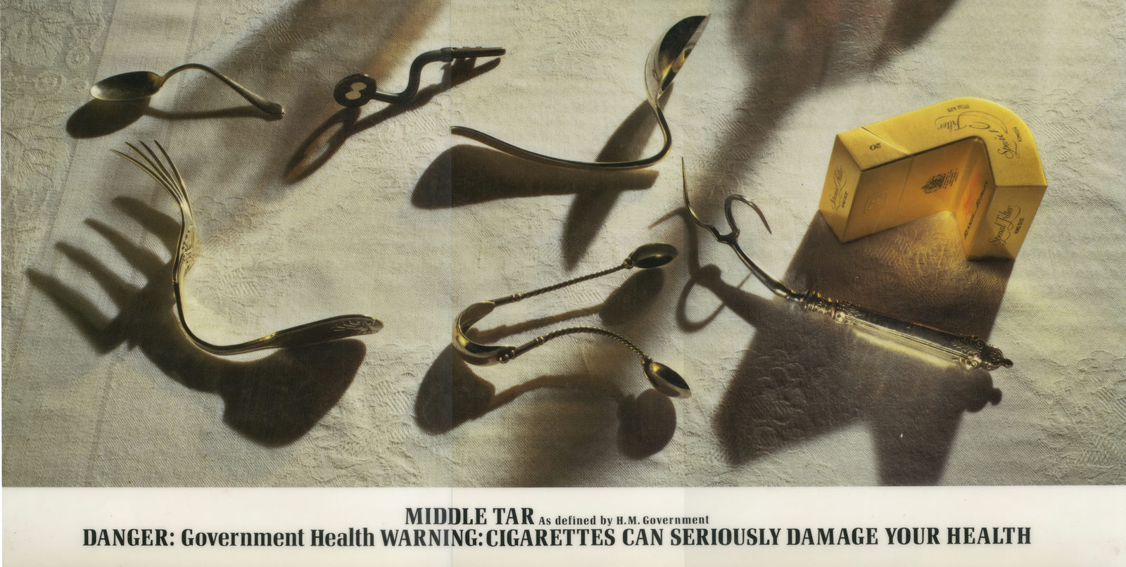
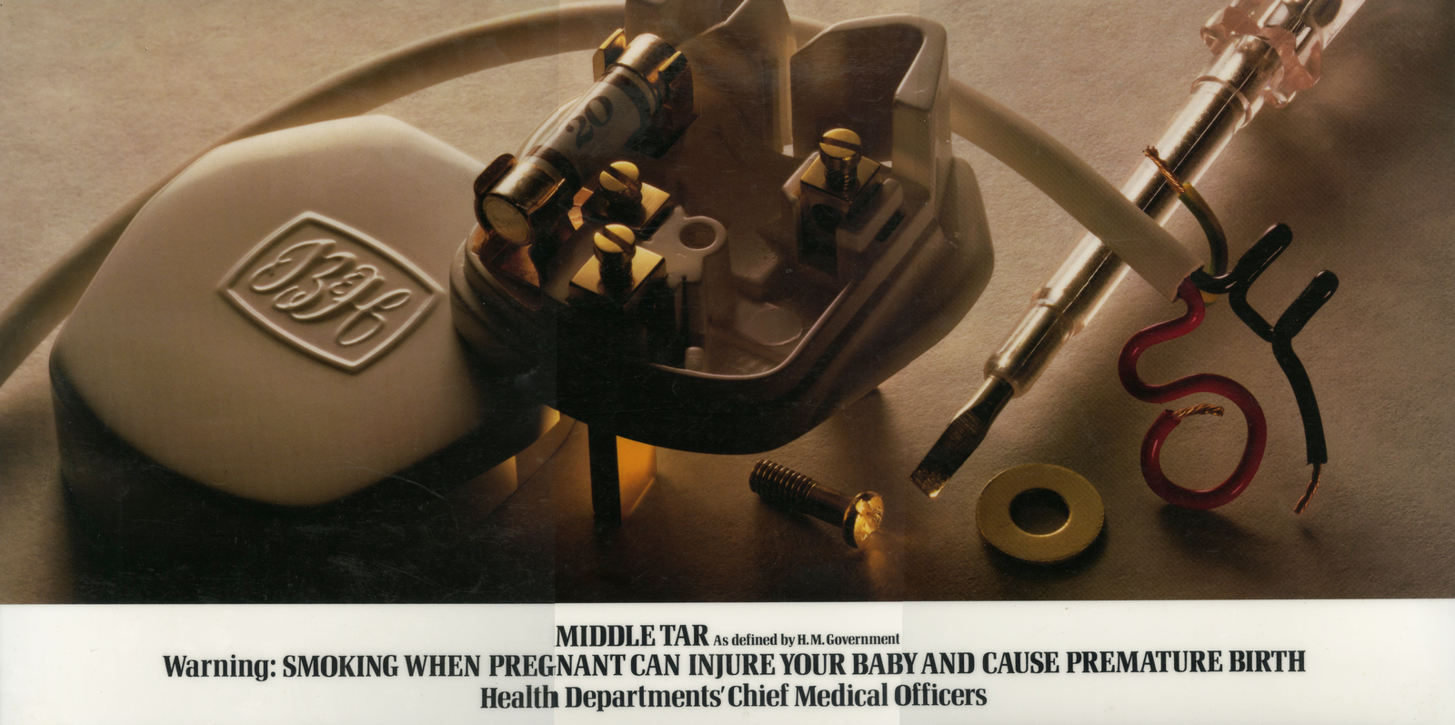
David Montgomery was then called in to shoot these two.
Adrian Flowers shot the last of the first years campaign.
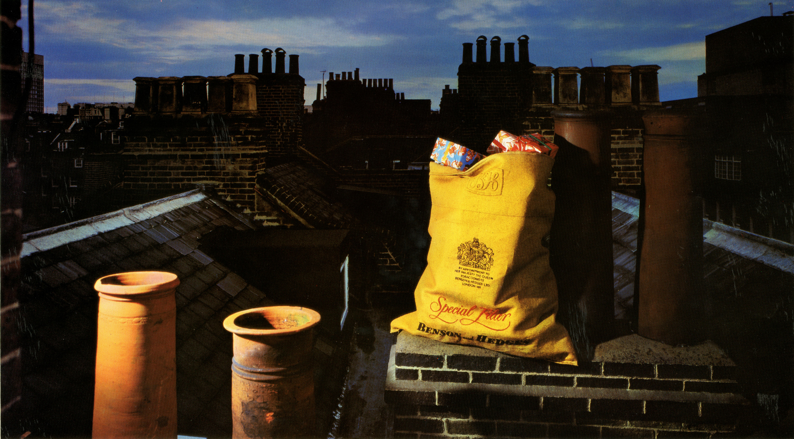
The shots still look amazing. They looked even better when blown up and put on billboards. They were like nothing people had seen. If they ran tomorrow they would still be like nothing most people had seen. Here's an from of one at Victoria Station in 1978.

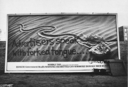
The campaign became so famous even the Government spoofed it.
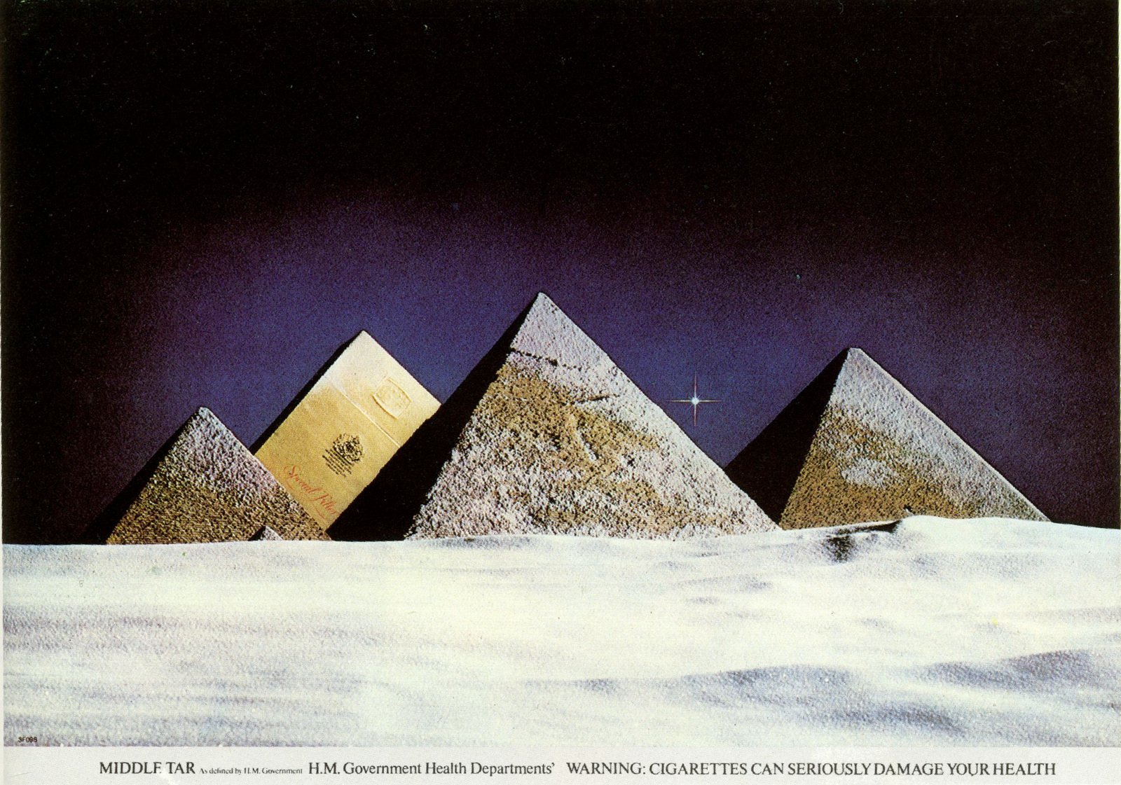
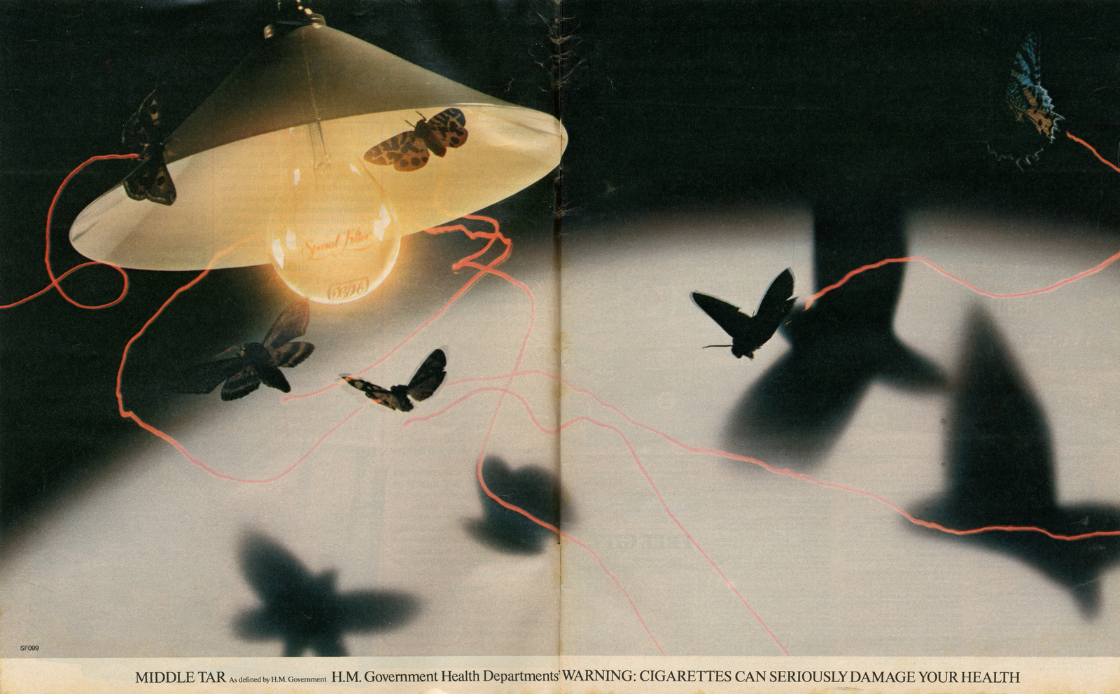
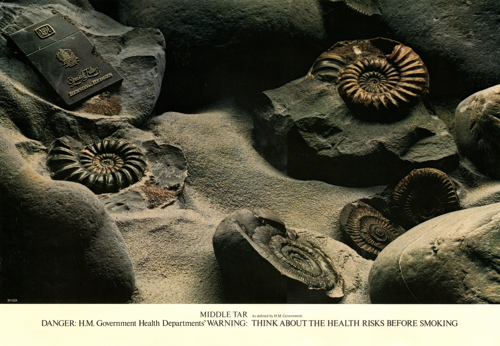
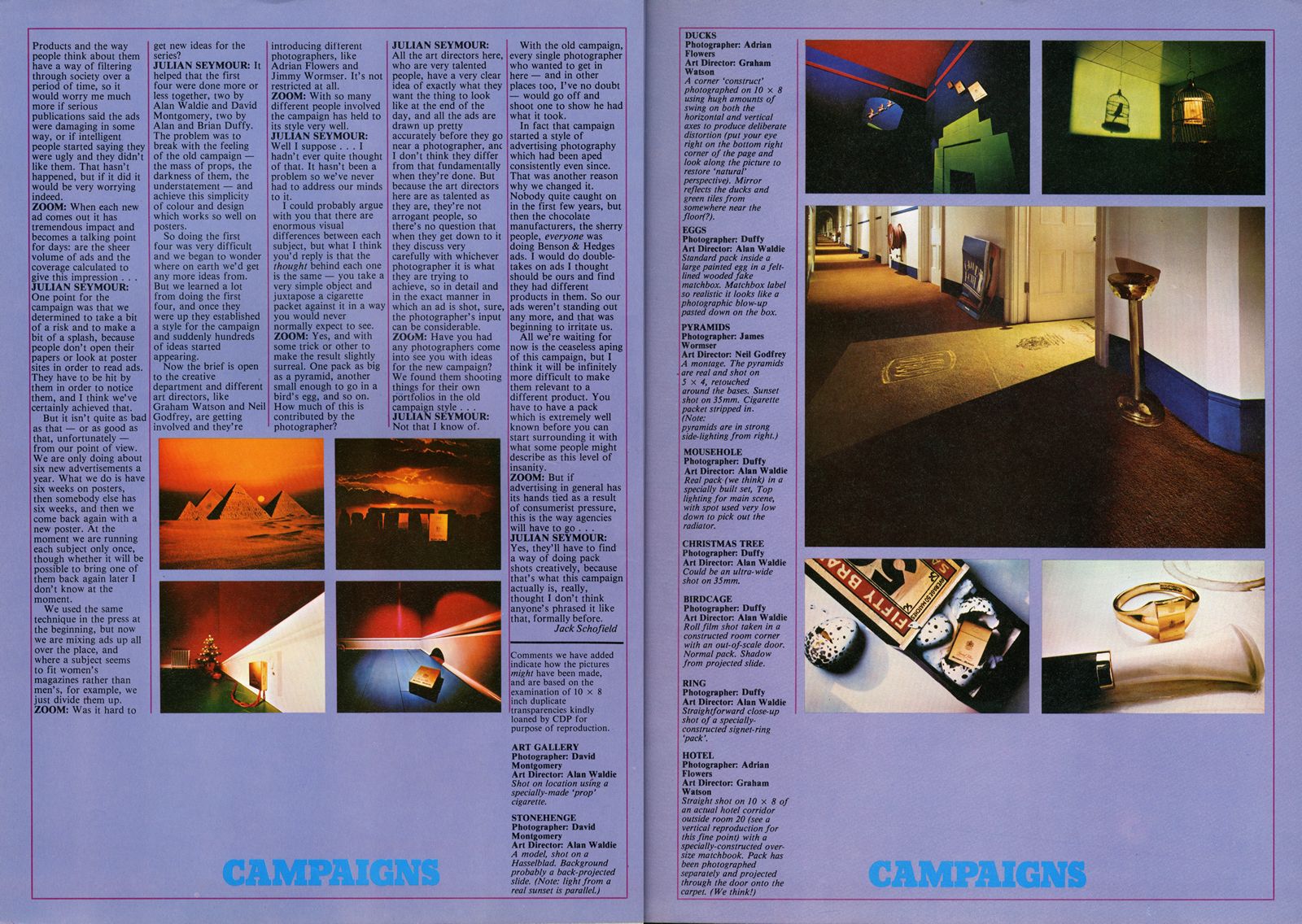
The brief was then opened up to the whole creative department.Here’s what Neil Godfrey and Tony Brignull made of it with photographer Jimmy Wormser.
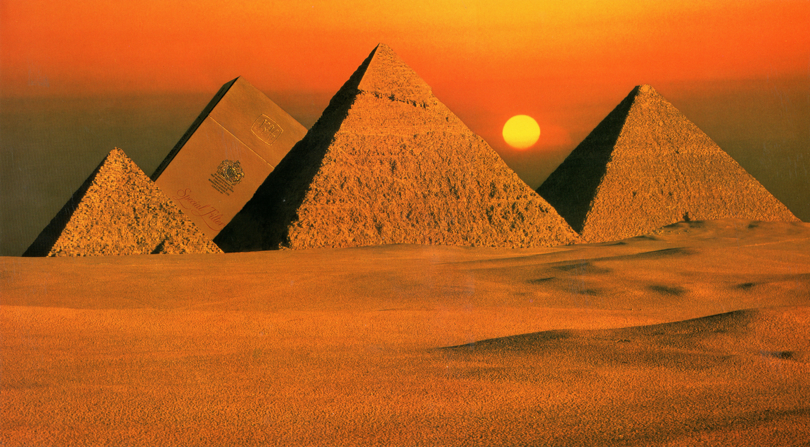
Pre-CGI, pre-austerity, it was shot for real, this is how the shoot went:The agency and photographer turned up in Egypt on Sunday.Scouted the location on Monday morning; perfect.Turned up Tuesday to shoot; too hazy.Turned up Wednesday; too hazy.Thursday; too hazy.Friday; too hazy.Saturday; too hazy.Sunday; too hazy.Monday; perfect.(It turned out the hazy effect was pollution from the local factories, only after a weekend of not pumping out crap was it shootable.)
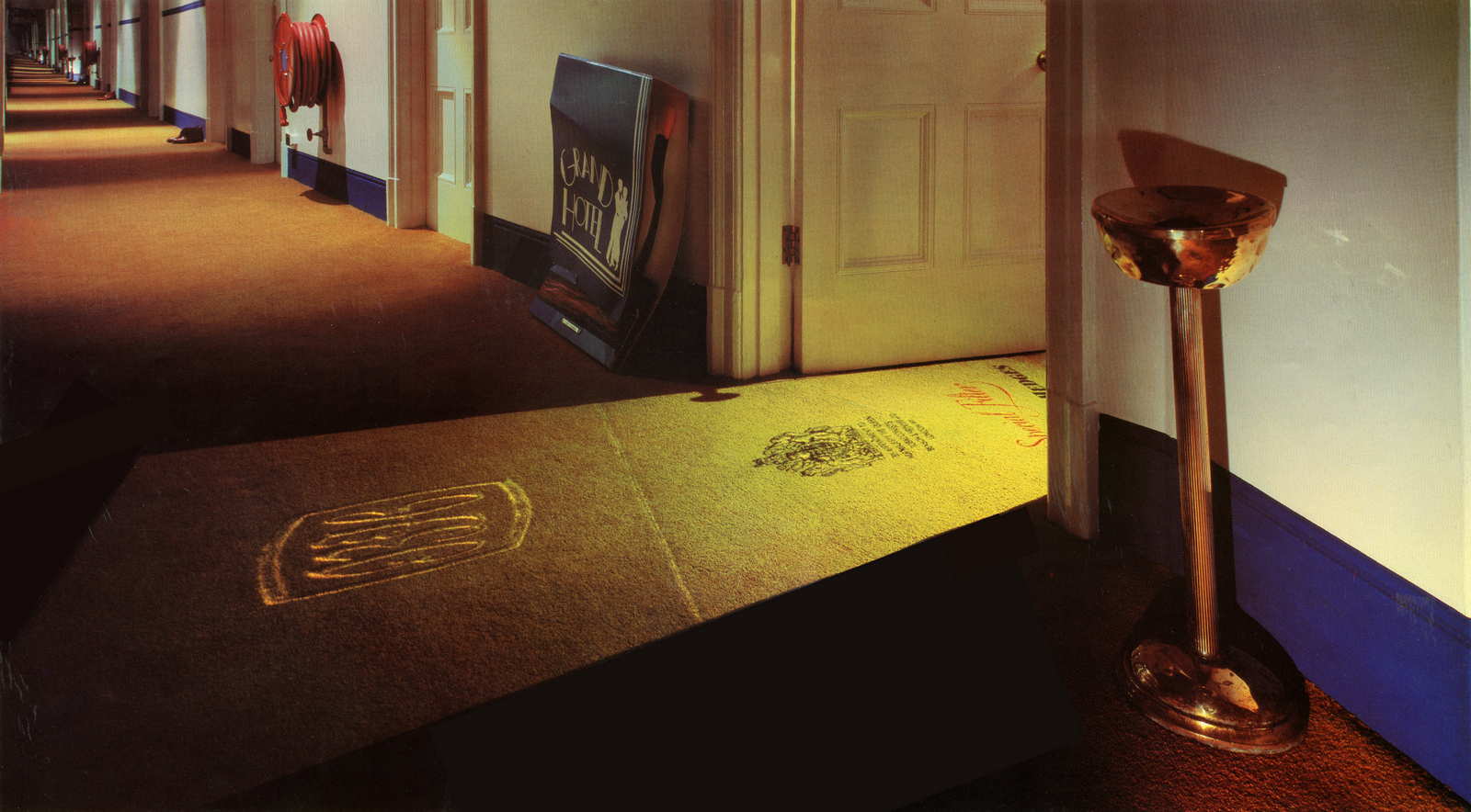
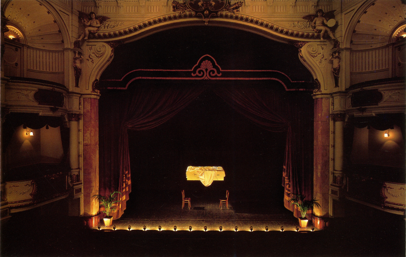
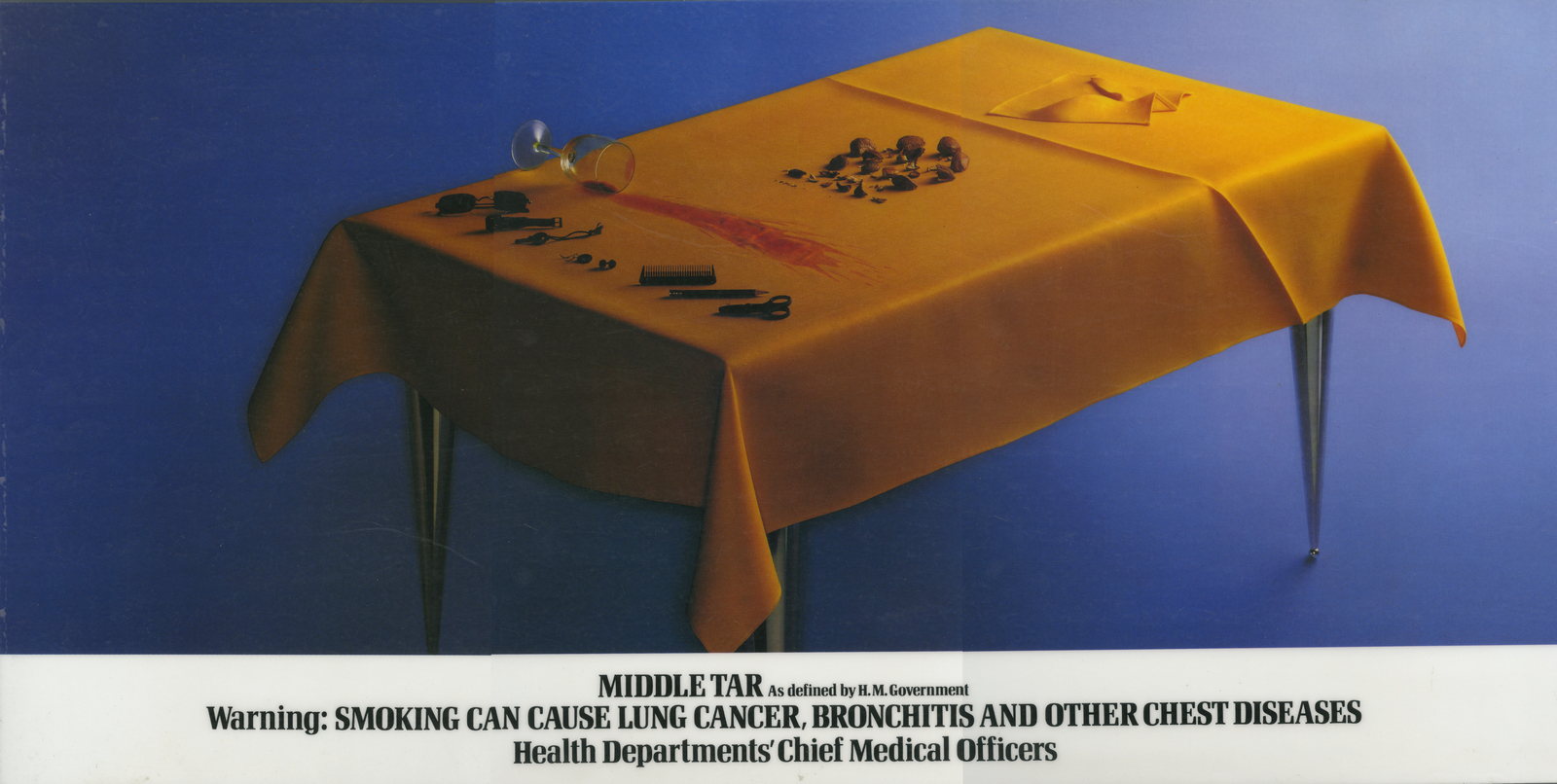
This one was shot on the top floor of the National Liberal Club, the payment was the luxurious fitted carpet used for the shot. Because the young people were in and out of each others rooms all night, photographer Adrian Flowers used a ‘20 - 30 minute exposure, so that they wouldn't show up on the film’.Again it took a week to get a result they were happy with.
Two years in, the question was asked how would this new surreal B&H behave in film?The answer, created by Waldie, and Mike Cozens was shot by Hugh Hudson.It was also featured in the Guinness Book of Records every year until the mid-eighties as the most expensive commercial ever made.Worth every penny.
This was followed by another Hugh Hudson epic, this time created by Johns O'Driscoll and Kelley, not as famous, equally mesmerising.

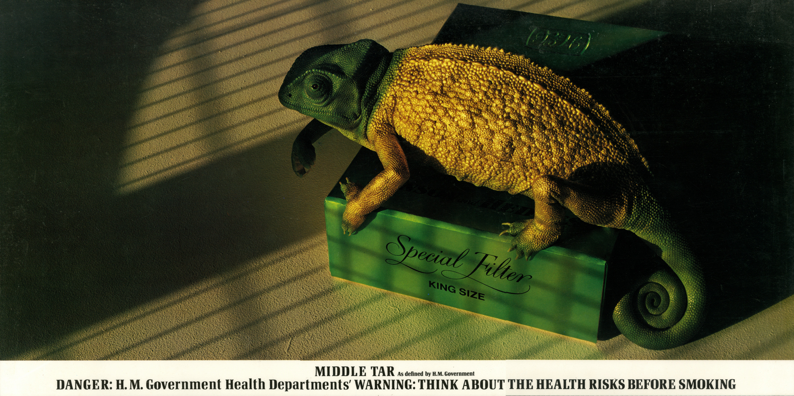
The photographer of this one; Max Forsythe recalled: “The finished shot looks very much like the original layout, but the struggle was how to light it. No conventional lighting seemed suitable.After about two days of messing about I finally settled on sunlight coming through the studio window with a bit of BBQ grill to cast the shadows.The Chameleon and the pack were both models, we did get a real one in the studio, but soon realised that it was not possible to work with it, it kept disappearing.They were about five times actual size, which made it possible to shoot on 10×8.”
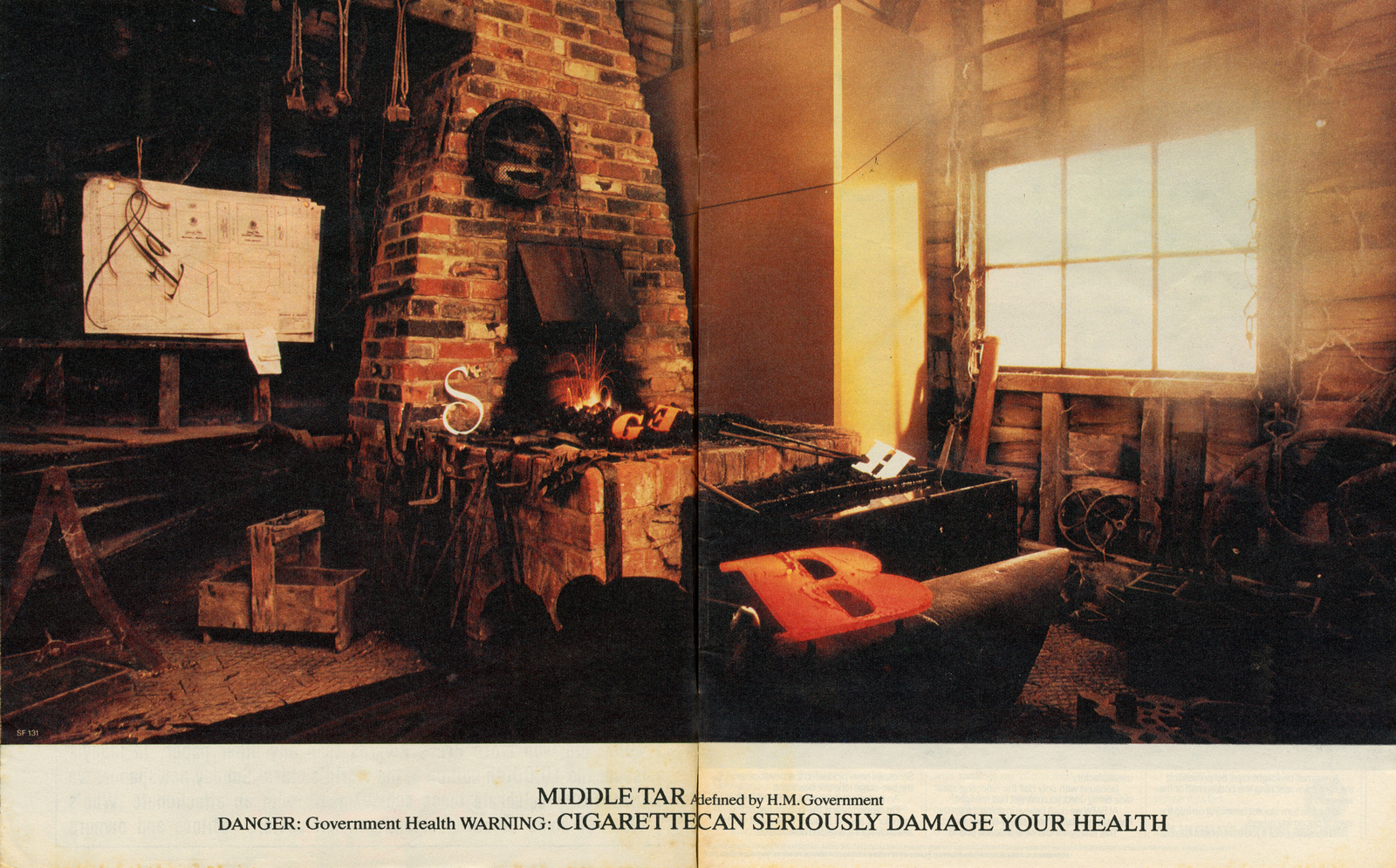
The writer of this one is unknown.
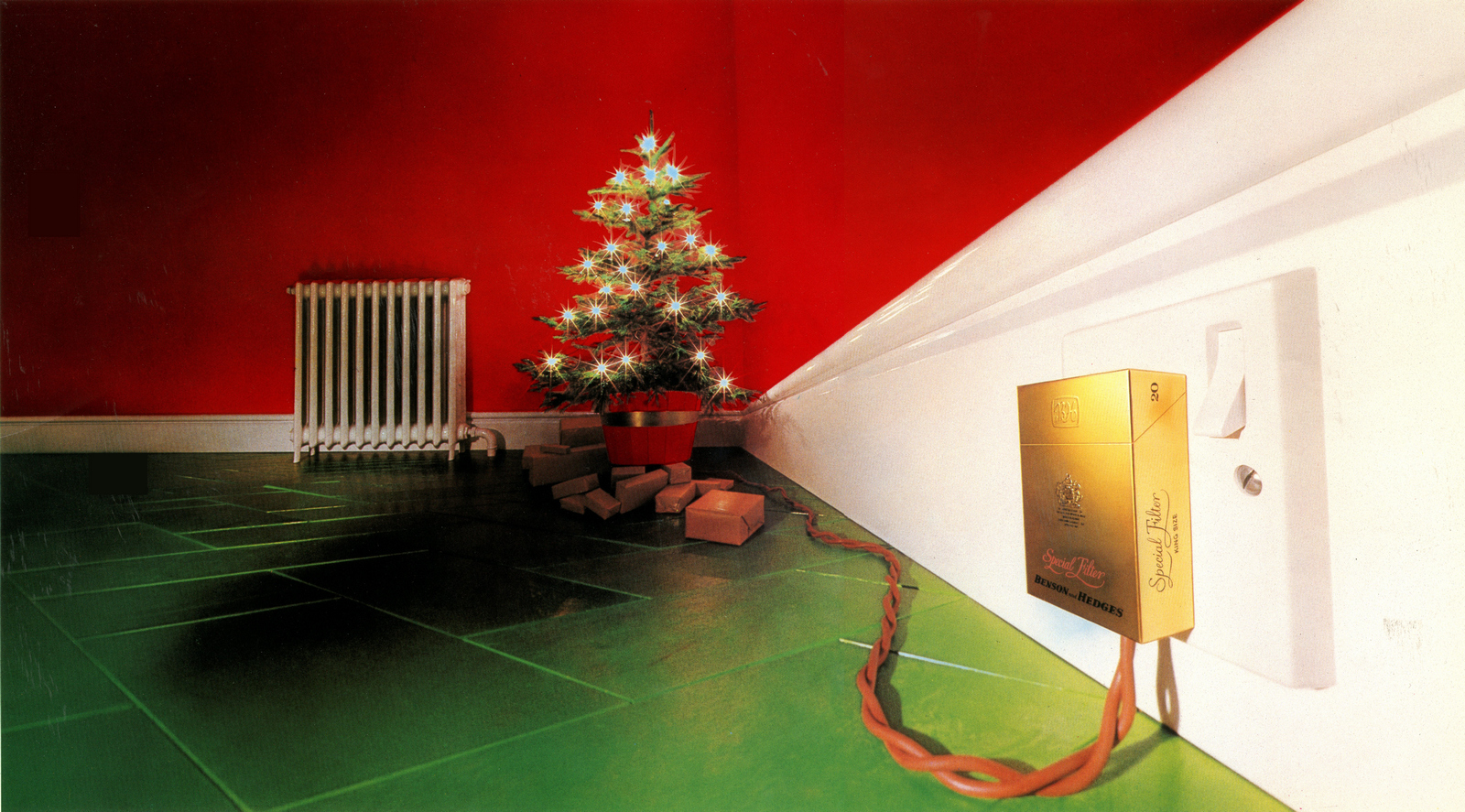
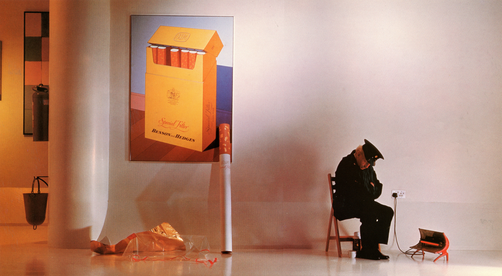
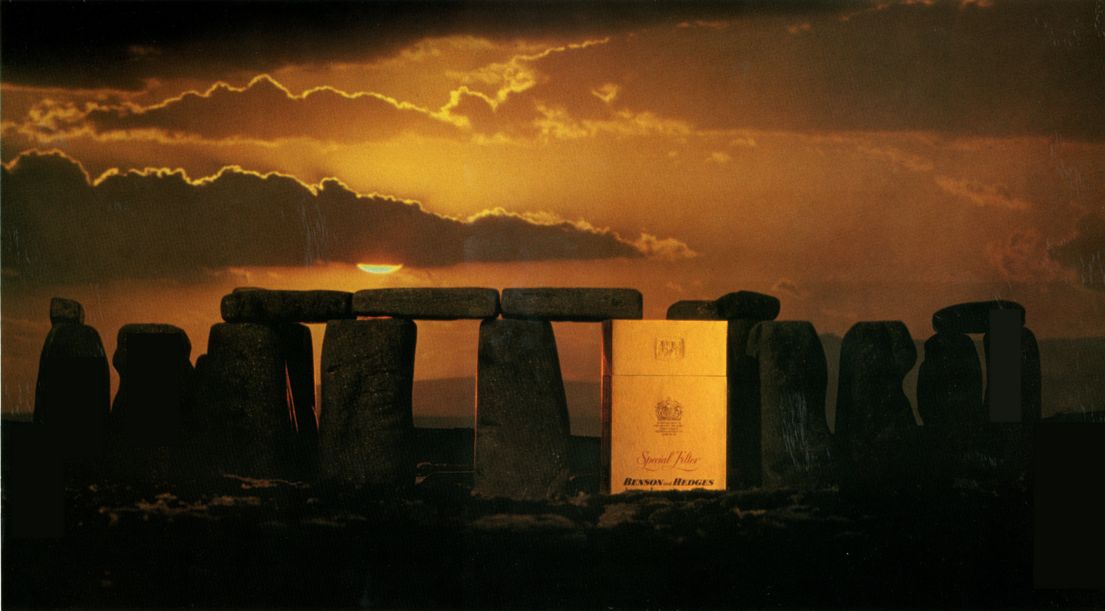
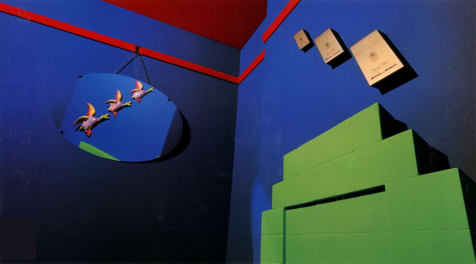
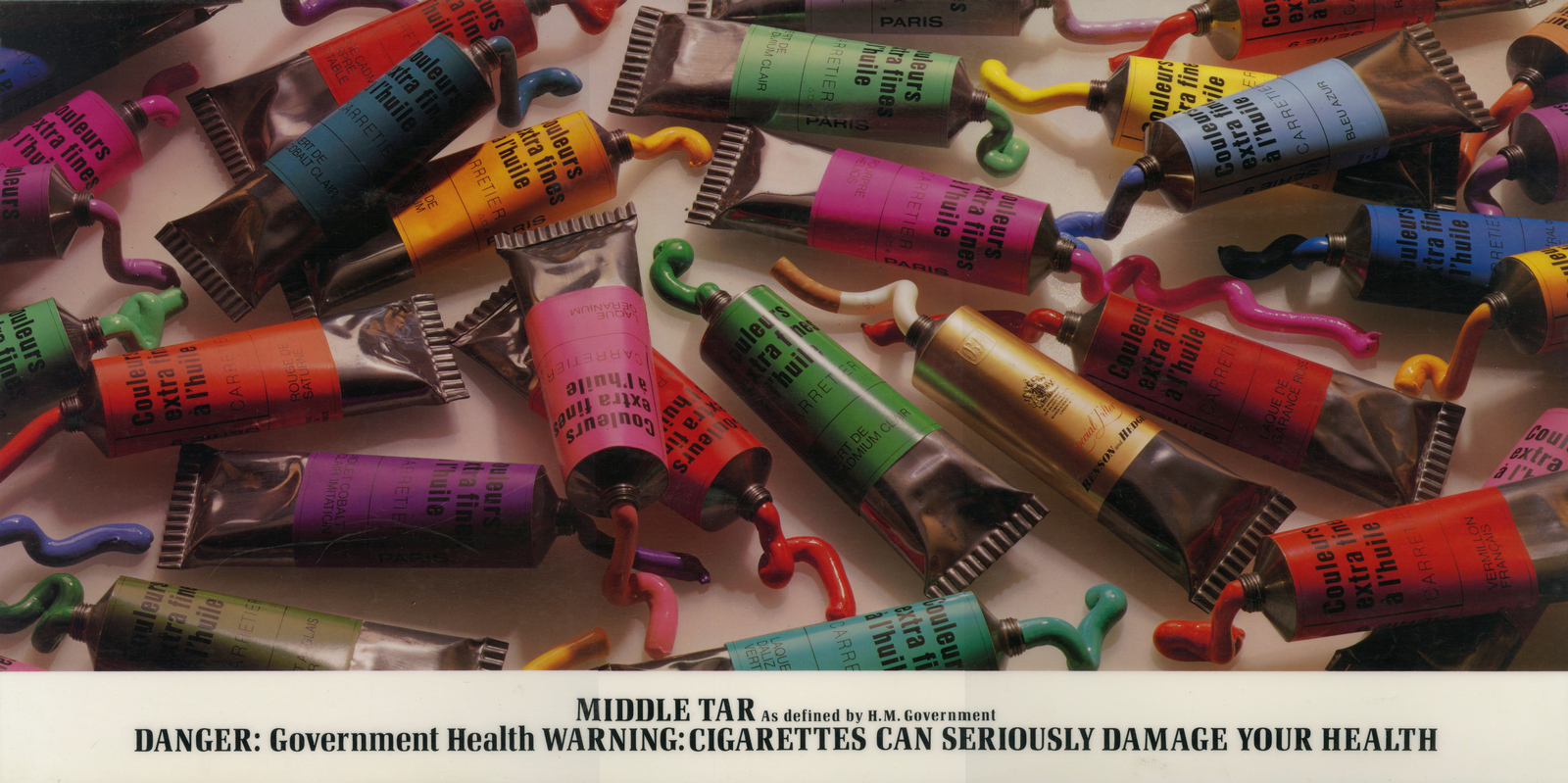
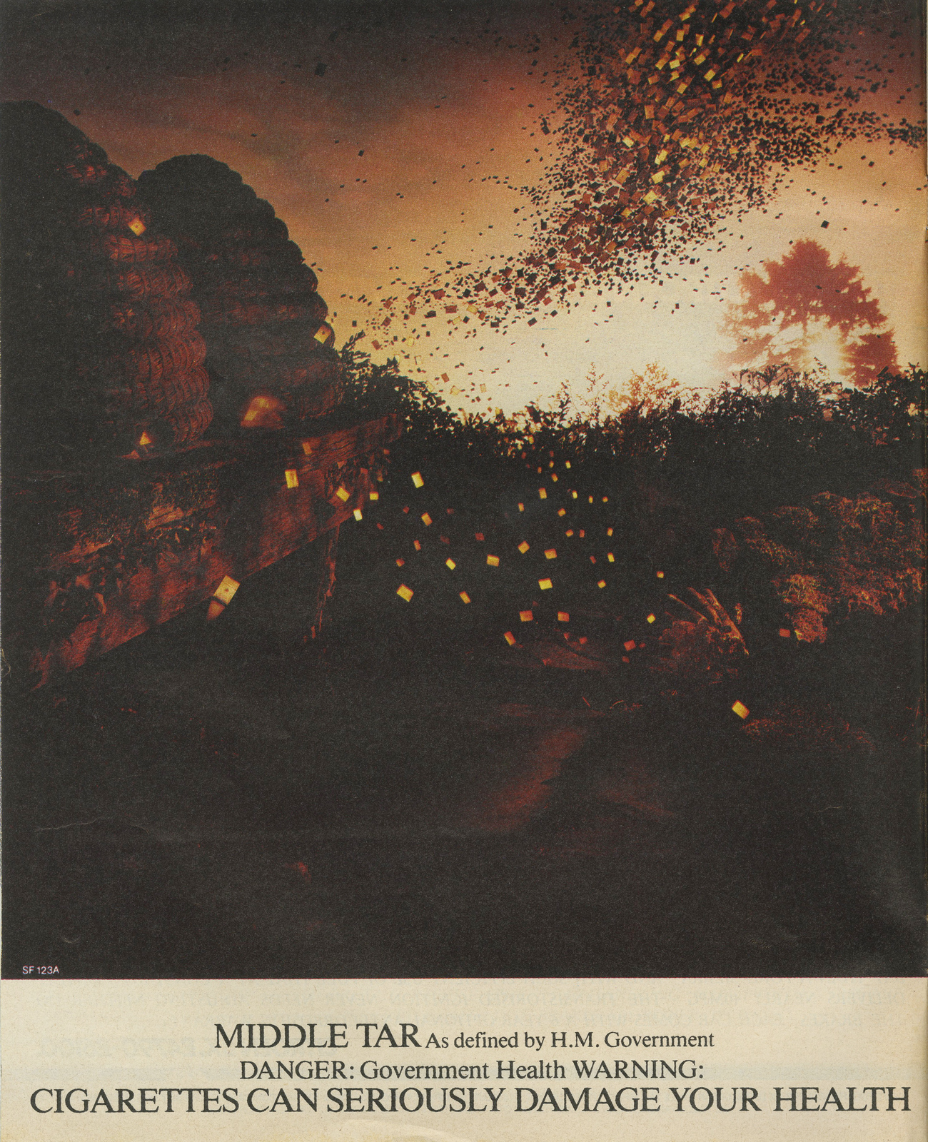
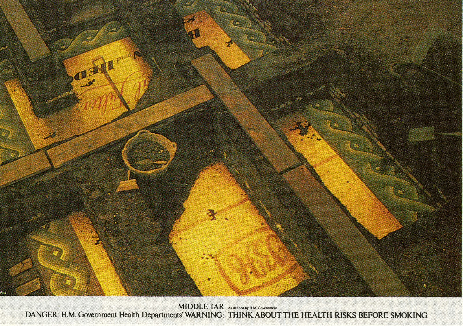
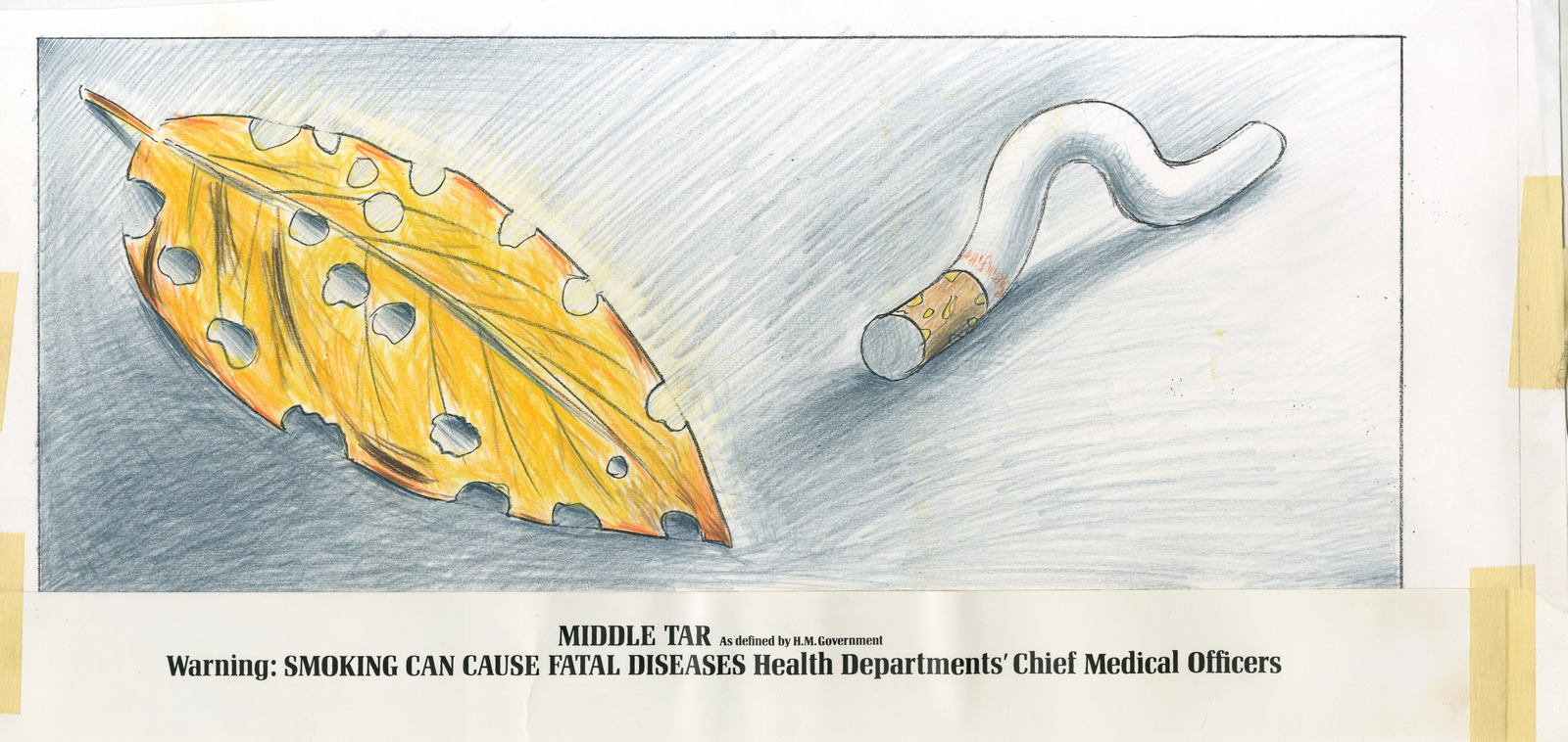
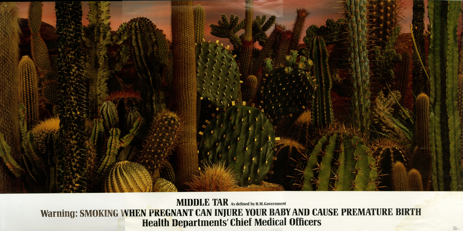
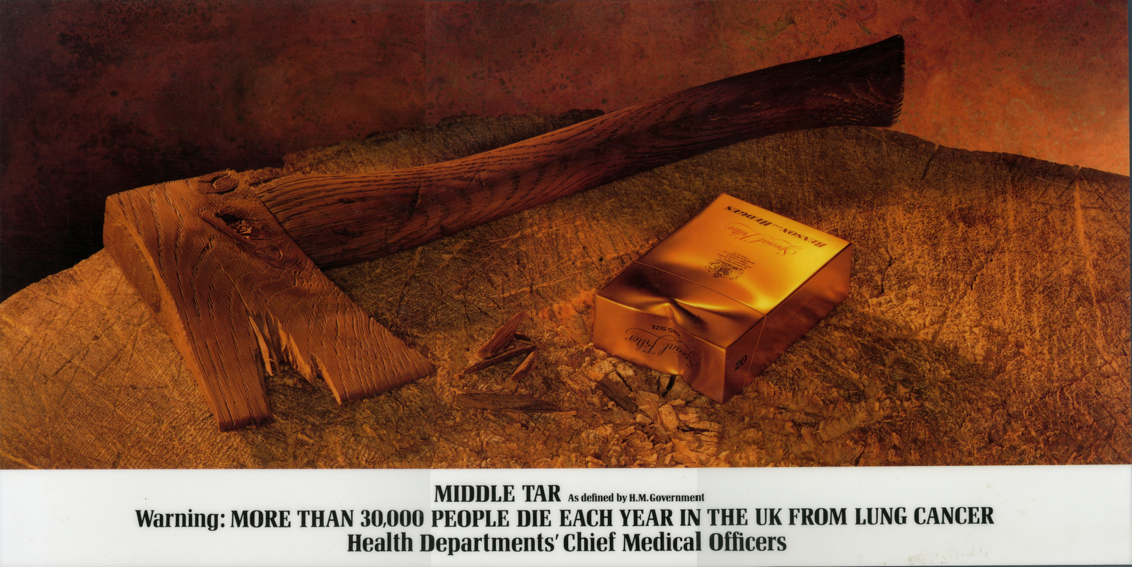
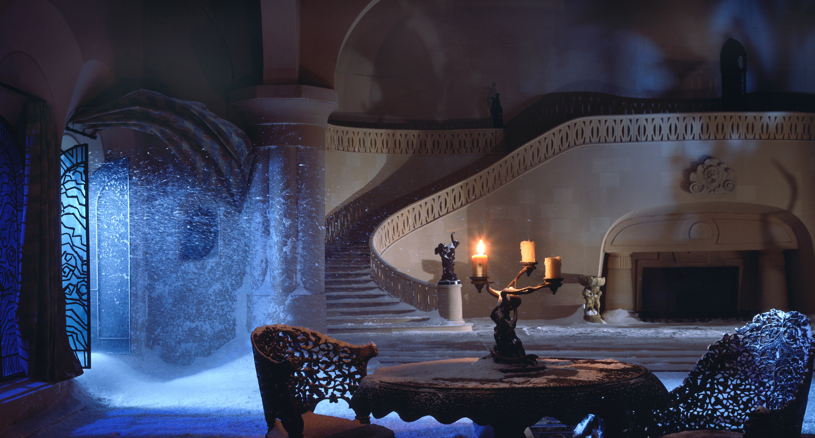
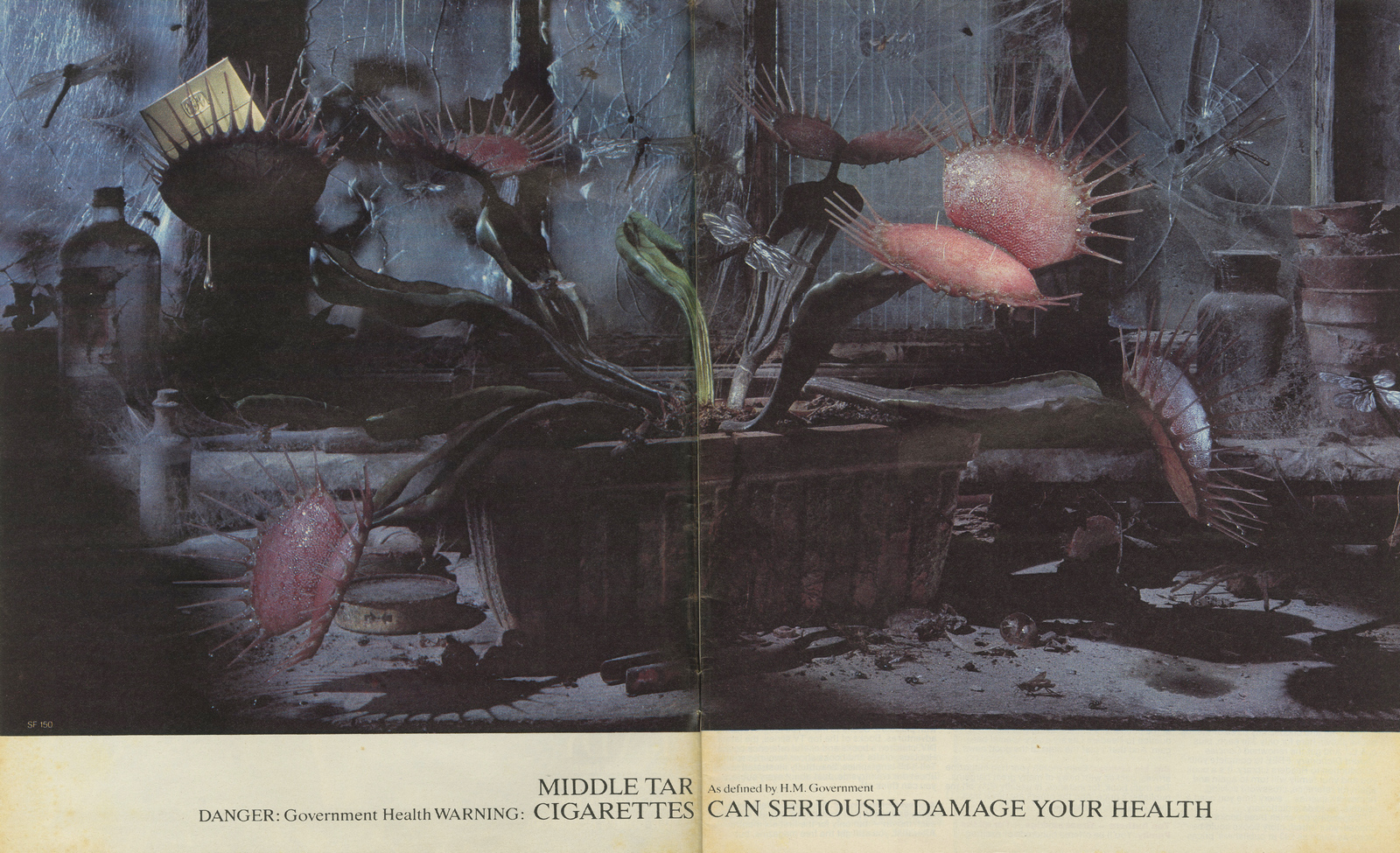
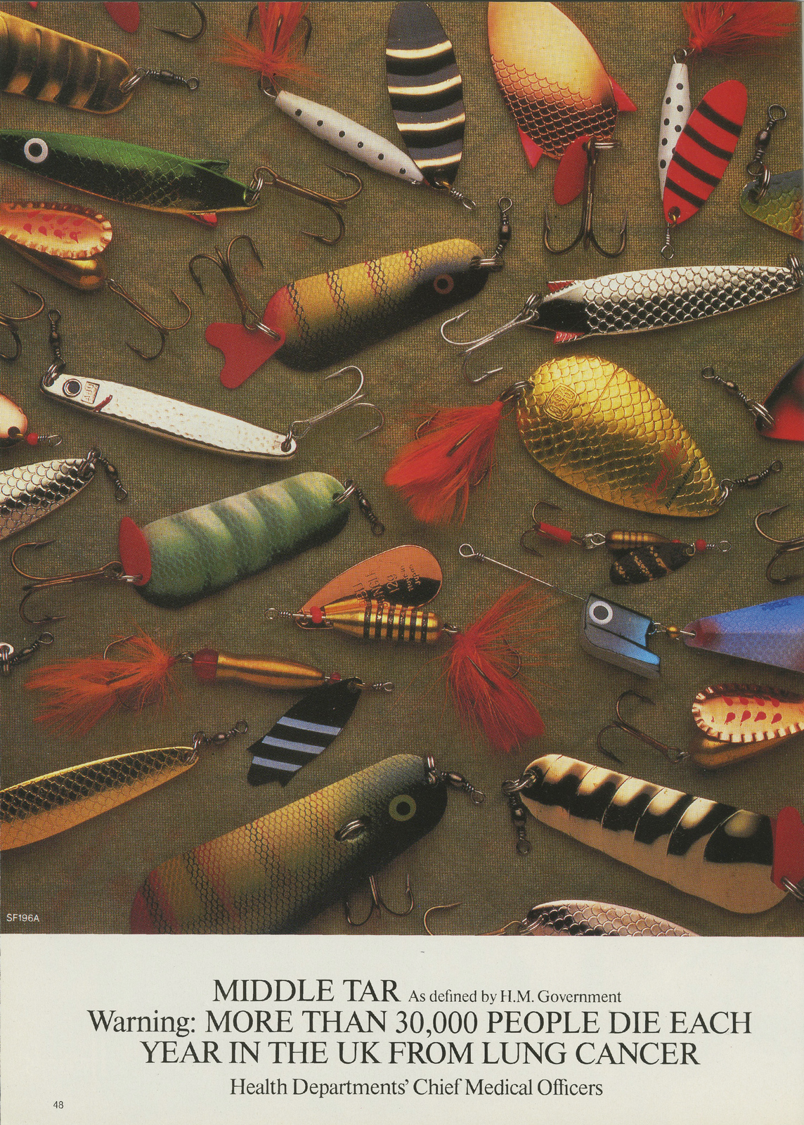
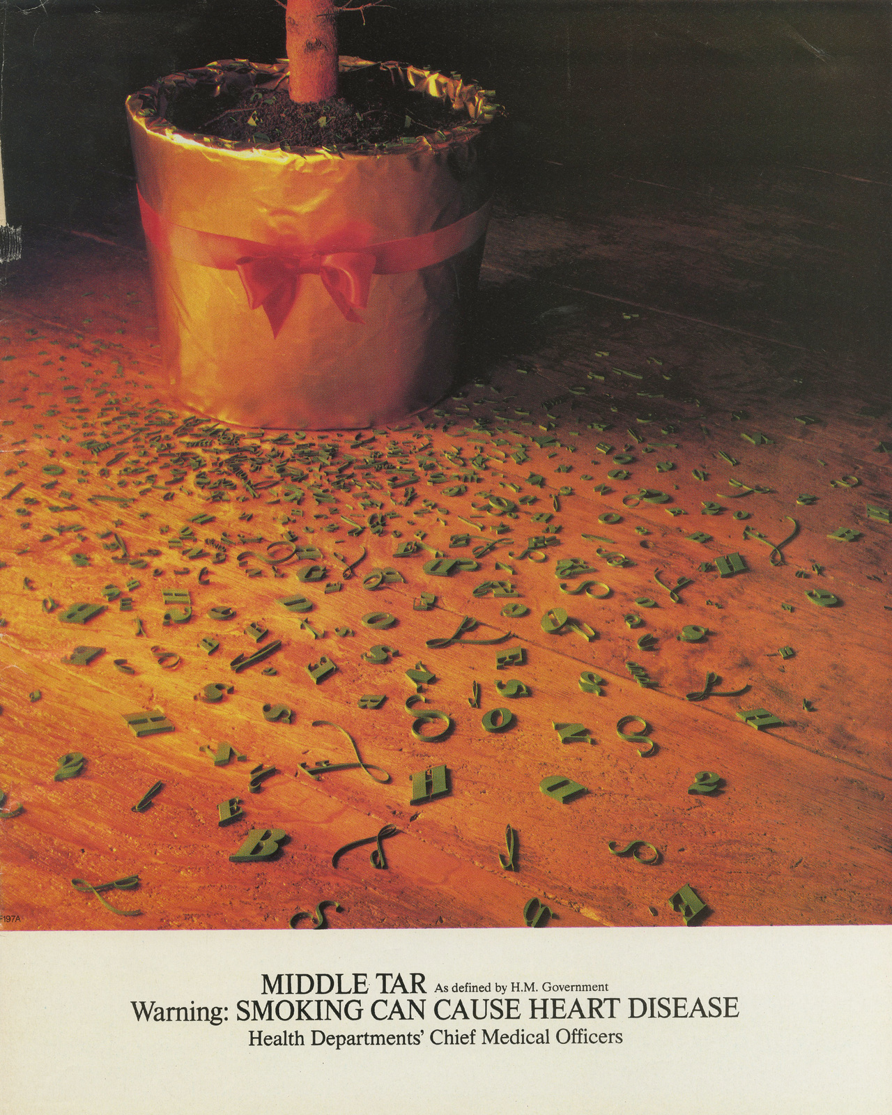
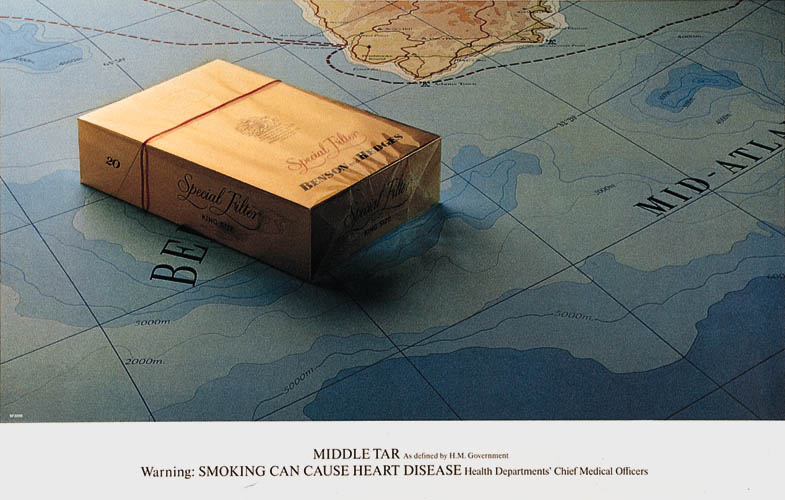
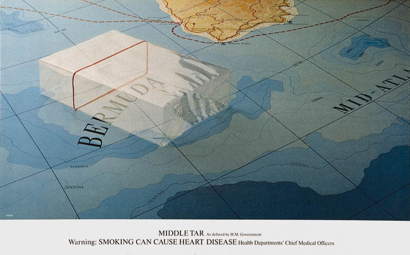
In the eighties, art director Nigel Rose takes the reins.
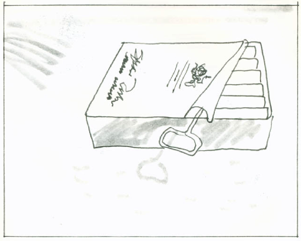
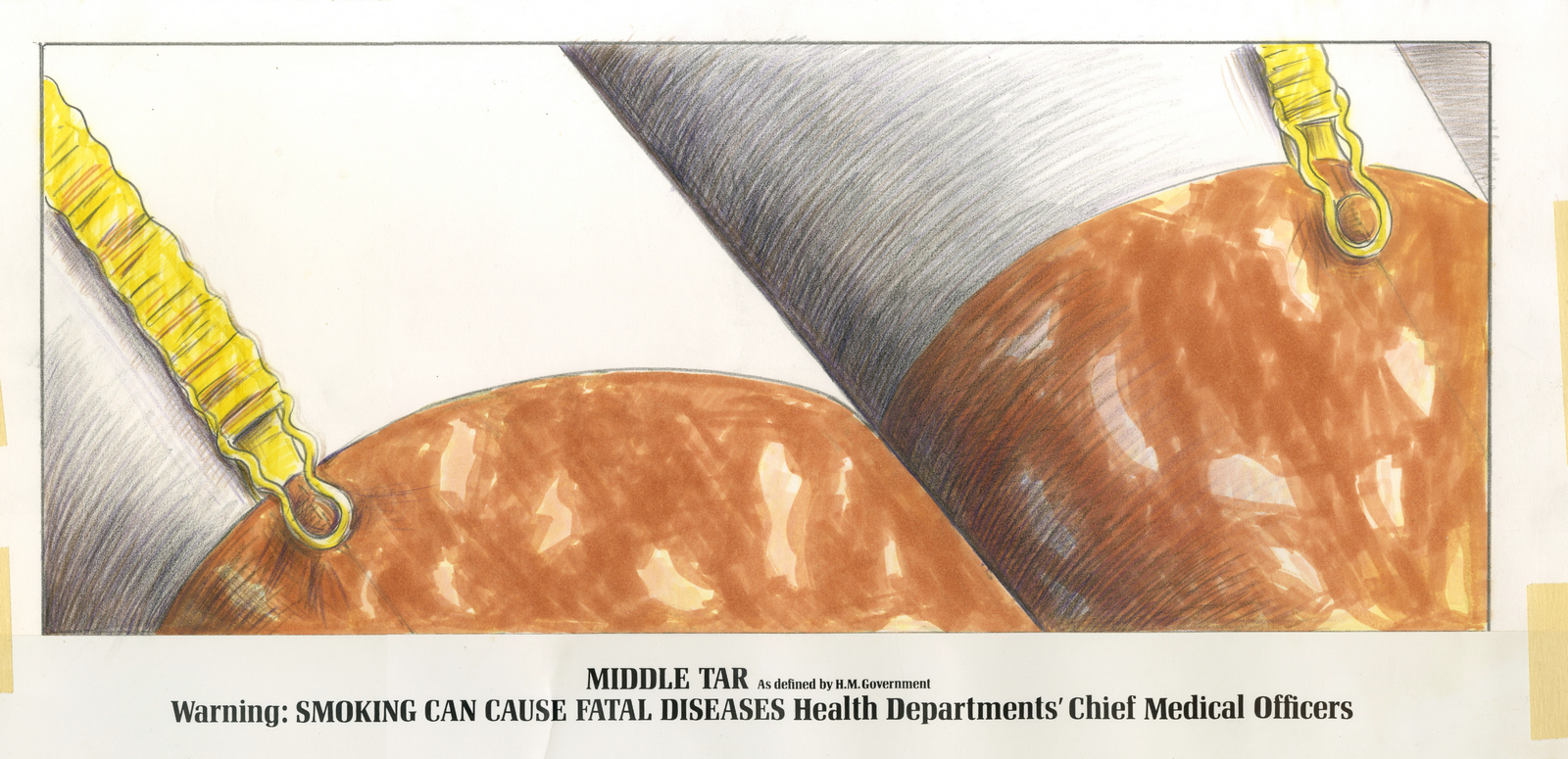
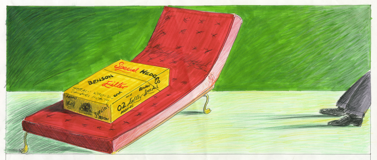
Here are some of Nigel’s fantastic roughs for ideas that didn't get bought.

Looking at back at these posters I can't help wondering why people aren’t producing posters like this at the moment.Instead of trying to shout a dull message across the street, why not create something that intrigues, makes people lean in, then rewards them by creating a smile in the mind?Kind of interactive.


Lorem ipsum dolor sit amet, consectetur adipiscing elit. Suspendisse varius enim in eros elementum tristique. Duis cursus, mi quis viverra ornare, eros dolor interdum nulla, ut commodo diam libero vitae erat. Aenean faucibus nibh et justo cursus id rutrum lorem imperdiet. Nunc ut sem vitae risus tristique posuere. uis cursus, mi quis viverra ornare, eros dolor interdum nulla, ut commodo diam libero vitae erat. Aenean faucibus nibh et justo cursus id rutrum lorem imperdiet. Nunc ut sem vitae risus tristique posuere.
Delete